From Pop Art to interior design in its historical and contemporary meaning, the Pop style is characterized by dynamic and fresh interiors. Iconic objects, saturated and bright colors define fresh and youthful environments that are always current.
Giving a sparkling touch to the Pop-style home is quick and easy… let’s see how!
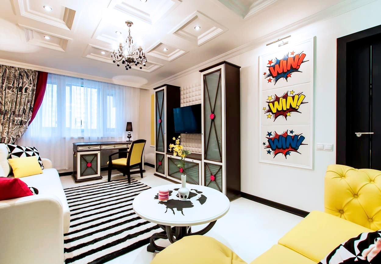
example of a room in a pop style, with a strong color point and geometric references in black and white.
The origin of Pop Art
The style of furniture that we know as Pop and its contemporary meaning derive from the artistic movement developed in the United States. Born in the second half of the fifties, it knows its best period of development in the subsequent sixties and seventies.
These are the years of the economic boom and the rise of unbridled consumerism as a consequence of an ever greater economic well-being of society.
The name pop art is the abbreviation for “popular art”, which emphasizes the strong relationship between the new artistic current and “popular” objects. The goal of Pop Art is precisely to stage the consumer society by adopting an almost ironic meaning.
Desecrating the courtly conception of art by comparing it to objects extrapolated directly from mass society. In doing this, the expressive language used directly takes up the same expressive forms of the consumer society. The result is a vision of the artistic work perceived as a commercial product.
Advertising, television, cinema and supermarket shelves, the new temples of consumerism, become the subjects of works of art. Among these, Warhol’s famous Campbell sauce cans, whose graphic design is taken directly from the advertising prints of the time.
The bright colors and their full shades are taken up by the heroes of cinema and entertainment reproduced in cartoons, comics and serigraphs. After the resilience of war and the vision of a world in black and white, the colors of the new well-being invade society, rapidly changing its values.
Warhol, Lichtenstein and the other pop art artists tell this revolution through the symbols of the consumer society. The provocation itself becomes a force of consumerism, like a frame from which it is impossible to get out.
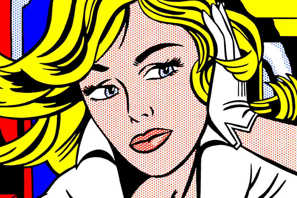
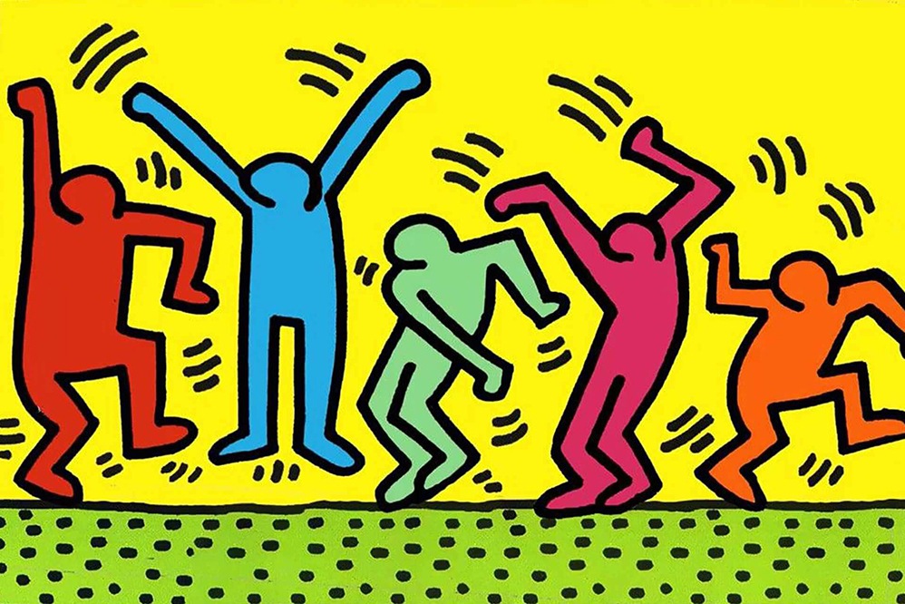
The expressive language of Pop Art between serigraphs and cartoons: Roy Lichtenstein and Keith Haring are among the best known exponents
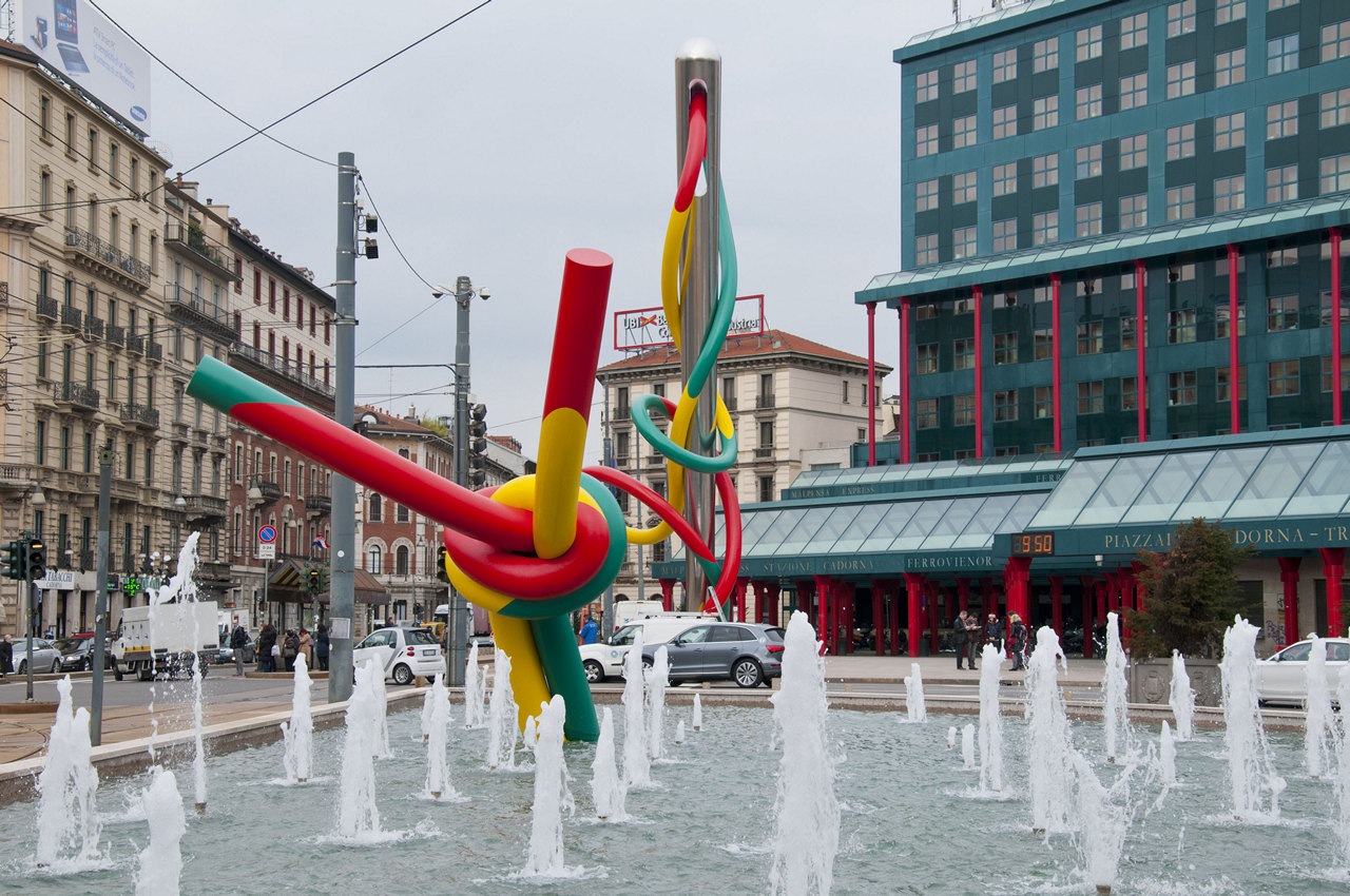
Claes Oldenburg and Coosje van Bruggen, Ago e Filo, Milan
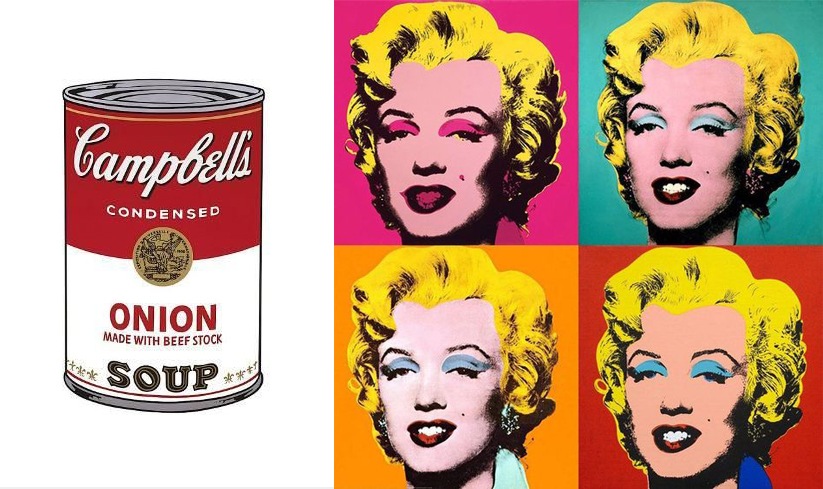
Andy Wahrol is definitely the Pop Art artist par excellence, with his illustrations of the Camper Souce and the reproductions of the face of Marilyn Monroe
Design icons
The improvement of the company’s economic conditions allows the purchase of products that are not only functional but also purely aesthetic. The design of furniture and home interiors adapts accordingly by changing shapes, materials and values.
Precisely for this reason, in those years, Industrial Design, intended as a serial production of elements, had the apex of its development. The increasingly conspicuous demand of the company satisfies the manufacturing industry which responds with new, impactful and original objects.
The designers of the time best express their creativity by experimenting with new materials. Experimenting with alternative manufacturing techniques also allows them to shape the material to better convey the design idea. The many icons of Design, especially Italian, that still crowd the collective imagination date back to those years.
These also become the characterizing element of the interiors, giving them an eternal and whimsical character. Some examples are the Vitra chairs designed by Verner Panton, the Ball Chair by Eero Aarnio, the trolleys by Joe Colombo and all the products of a nascent Kartell.
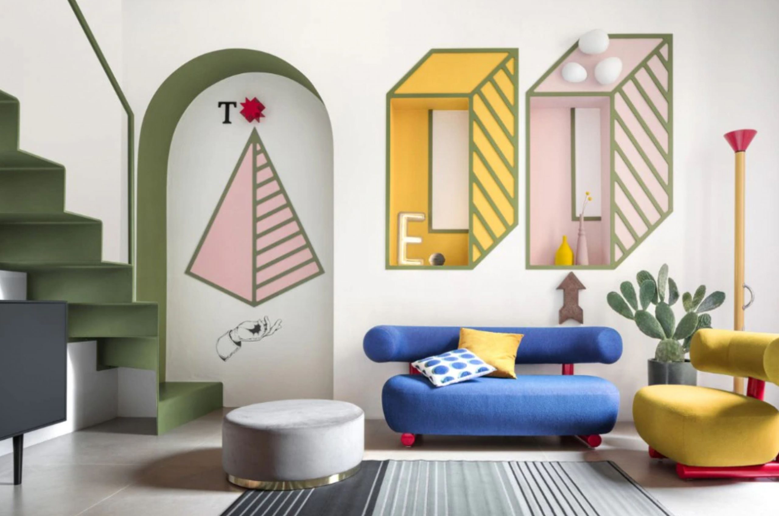
Paradisiartificiali Studio, Tribute to Ettore Sottsass, Milan
Plastic and plexiglass are appreciated for their ductility and material expressiveness in the Pop style. The design icons are characterized by bright colors and soft shapes.
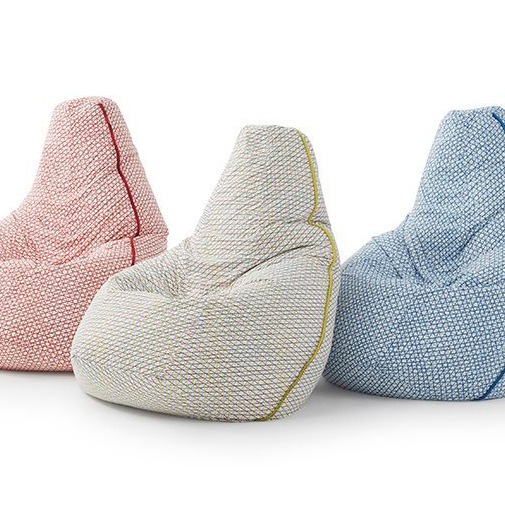
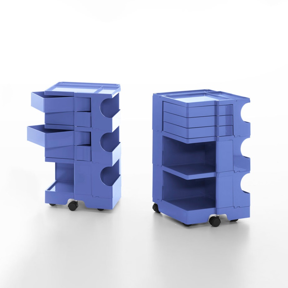
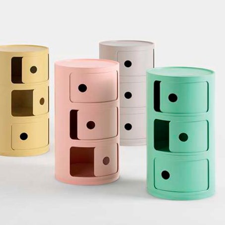
Here are some icons of Design: Zanotta’s Sacco armchair, Joe Colombo’s Boby trolleys and Kartell modular units revisited in a modern key with new pastel colors and innovative textures.
Pop Art in house interiors
For a Pop Art style décor, the first to lead the chorus are the bright and lively colors. Especially chosen in their saturated and bright colors, they completely exclude the use of shades in favor of full colors. The importance of visual coherence between the different rooms of the house is reflected precisely in the use of well-balanced colored hues.
The furniture inside the rooms does not exceed in number but rather stand out for the fluidity of the shapes and the chromatic choice. The choice to place iconic design objects is appreciable. Pieces of furniture that have marked history.
Compared to the Boho style, this choice of antiques, however, is not aimed at abundance but is limited to a few significant pieces. One of the most famous examples is the Mouth-shaped sofa by Gufram, inspired by Marilyn’s lips. Its strong visual impact and its iconicity make it the protagonist of the rooms to the point of being enough to define the stylistic imprint of the entire room.
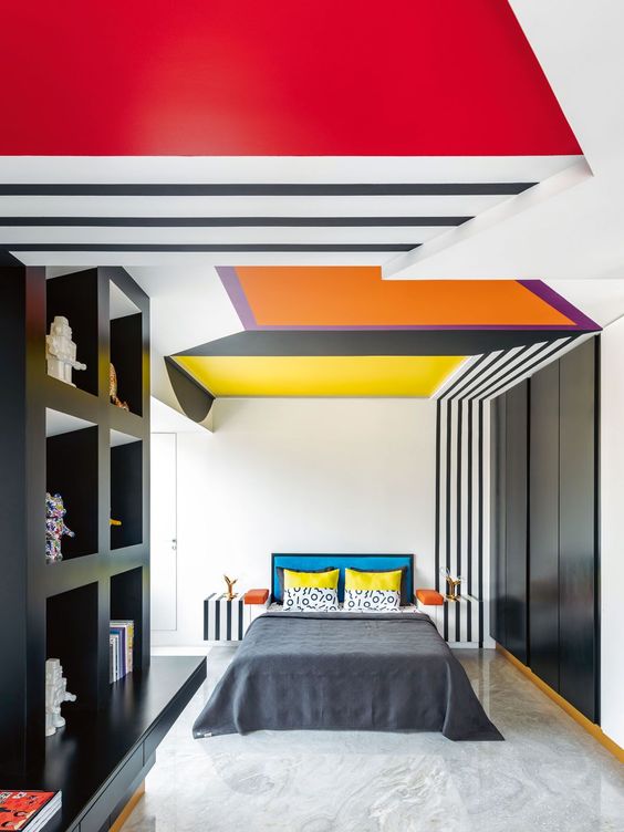
A bedroom inspired by the design of the Memphis group designed by Jannat Vasi. On the right: a Pop-style living area amidst colorful furnishings and minimal graphics
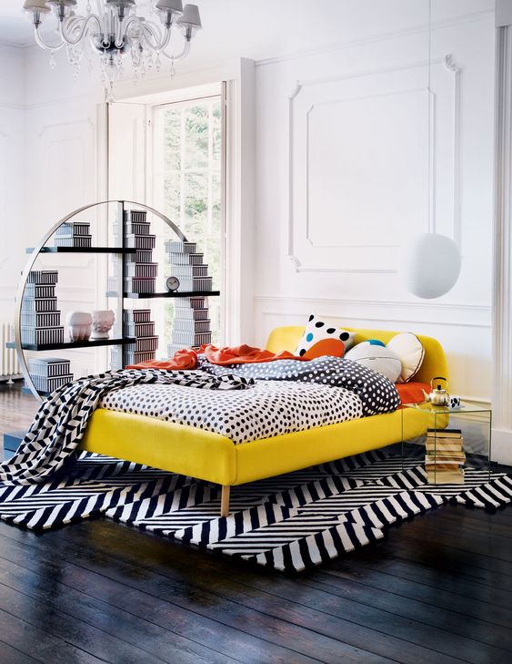
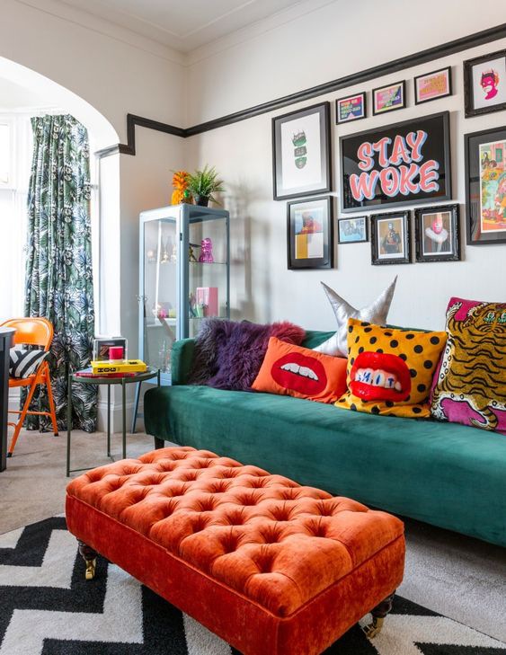
Carpets, fabrics, stylistic shapes and chronatic choices respond to a balanced overall vision in the Pop style.
The Pop style is recognized for the choice of plastic materials and resins, which exploded in use and experimentation in those years. The flexibility and ductility of these materials allow the designers to have the maximum artistic expression, managing to produce series furniture with original and fluid shapes.
To these is added the plexiglass, appreciated for its transparency that assimilates it to the noblest glass, but extremely resistant. To enrich the Pop-style interiors, paintings and decorations whose graphics are directly inspired by the world of comics and screen printing.
These stand out among colored walls, sometimes covered with wallpaper with graphics characterized by abstract and hypnotic lines, also used in the choice of carpets.
Minimalist graphics and furnishings with bizarre shapes, including colors and products of the Pop style
The pop style according to Modulor: the contemporary variant
The grit and character of the Pop style is certainly appreciable for dynamic interiors and young personalities. Its highly characterizing expressive charge applied to contemporary interiors sometimes risks creating environments that, when experienced daily, tend to “tire”.
For this reason, the variant in our projects always tends to contain the Pop imprint of some elements within the home furnishings. Few elements that, in terms of shapes and colors, lead back to the freshness and creativity of this style, but blend perfectly with neutral and contemporary interiors.
Combined with the brightness of white furnishings and environments, they are also able to further enhance themselves, becoming stylistic icons of home furnishings.
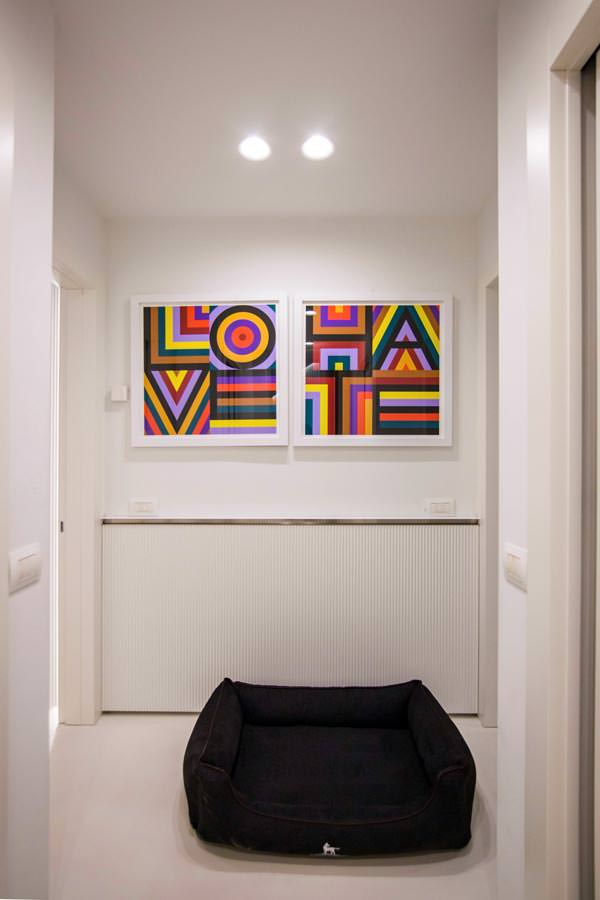
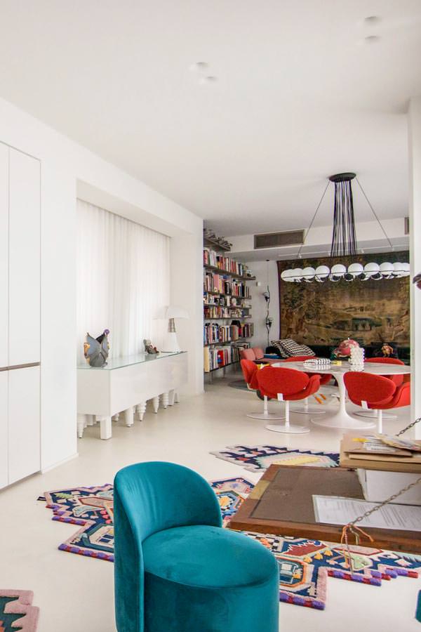
A Modulor creation on a project by Studio MILO in a contemporary style with refined Pop details: from the choice of the paintings, to the precious carpets by CC-Tapis passing through the living area in perfect Pop style
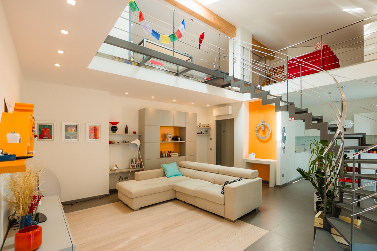
A few details in chromatic uniformity are enough to give grit and character to an interior: walls and furnishings of this creation give a decisive touch while remaining balanced overall
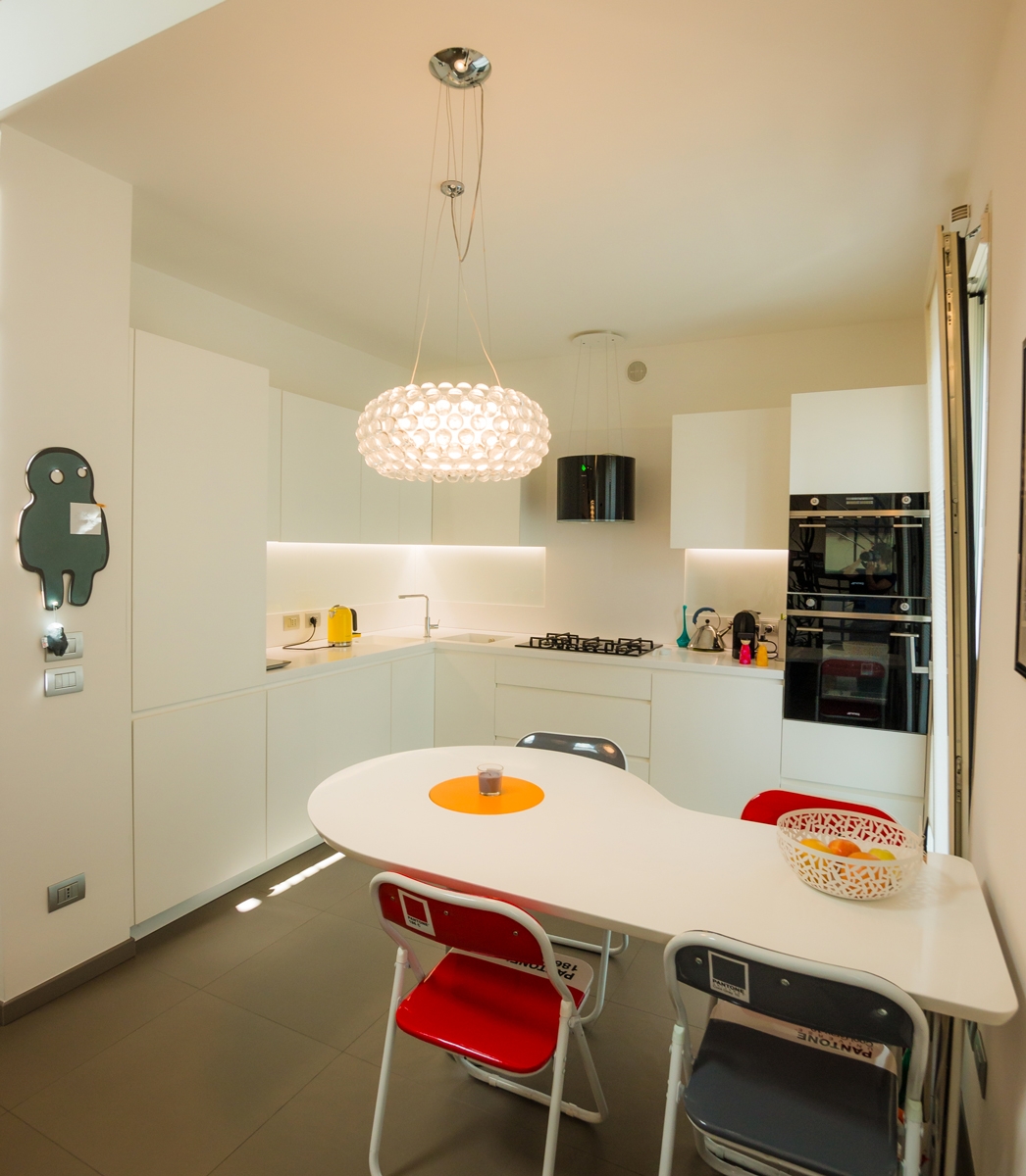
Our project of Omelette table with rotating yolk flanked by red Pantone chairs and a kitchen in black and white.
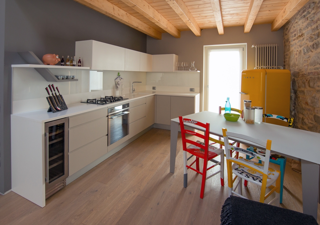
A brightly colored Smeg refrigerator and an artfully crafted table complement a linear kitchen in this splendid Bergamasco Loft.
The Pop style in its traditional and contemporary meanings responds perfectly to strong charisms. A little eccentric and certainly very creative personalities, who do not, however, give up balance and stylistic elegance. Far from being chaotic, the well-balanced Pop style instead expresses a stylistic and conceptual refinement, as well as a passion for visual art forms.

