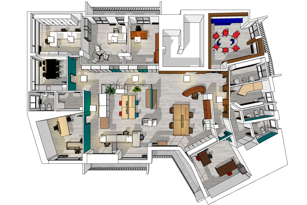
In the center of Bergamo, 130 square meters of offices overturn their configuration and aesthetics with a renovation that mainly involves the architectural setting of the interiors. Open space and management offices communicate with each other in an environment designed to make the flow of users as functional as possible.
The concept of transparency
Developing the project of working spaces was fundamental the identification of the concept. The latter clarifies on the one hand the message to be conveyed to the public, on the other it becomes a guideline in the choice of materials and finishes. The first step in the renovation was the analysis of the intended use of these offices, reserved for accountants with their collaborators and secretaries, archive areas and meeting points, waiting and conviviality. The definition of different typologies made clear the concept of transparency, the design metaphor of the subsequent architectural configuration. In fact, thinking about the role of the accountant, and his management of sensitive files and documents, the message we wanted to convey is that of transparency, also synonymous with trust and security. This is declined according to the type of interior in different configurations, imagining it as a shade from more to less transparent depending on the degree of “protection” required.
Each function has its level of transparency
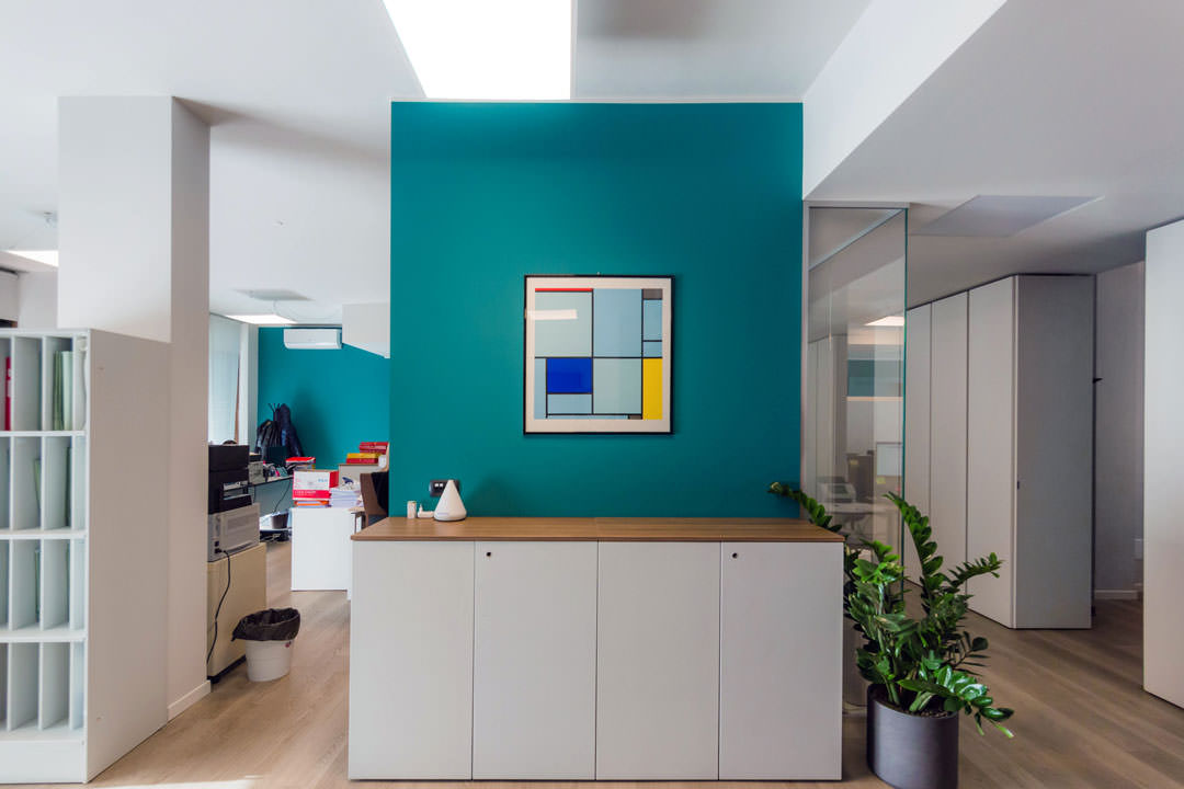
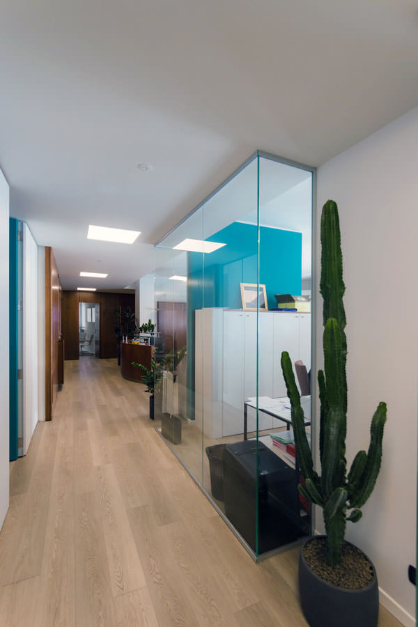
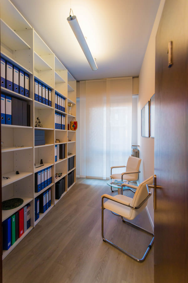
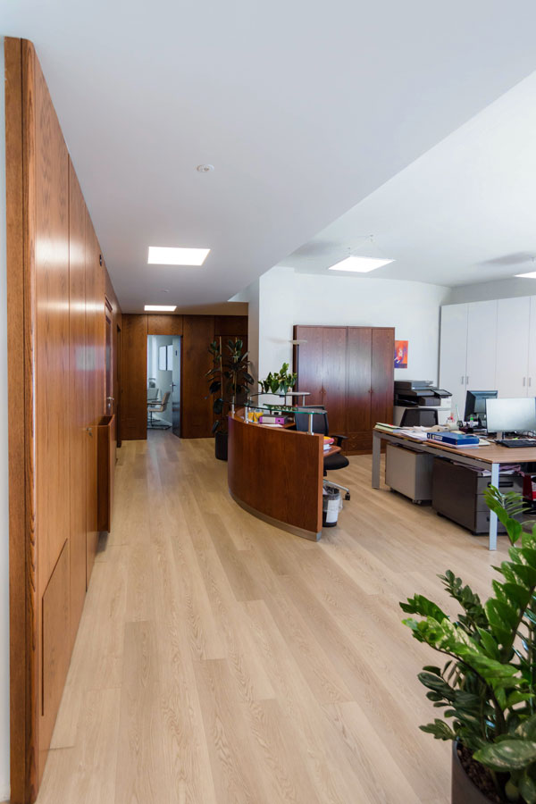
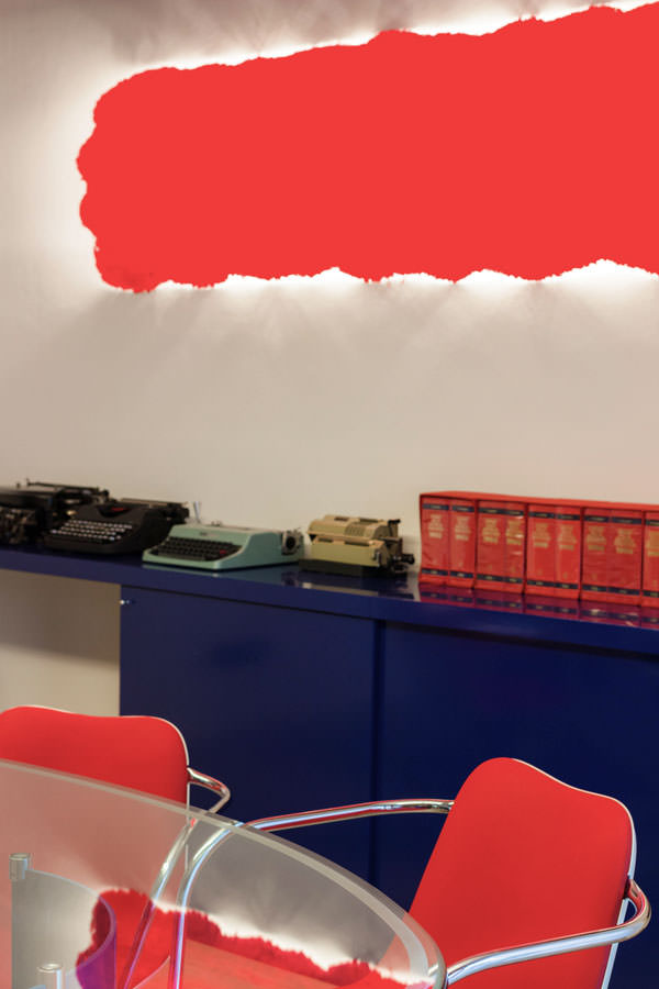
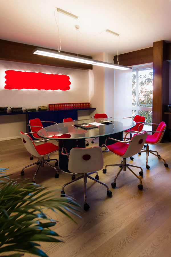
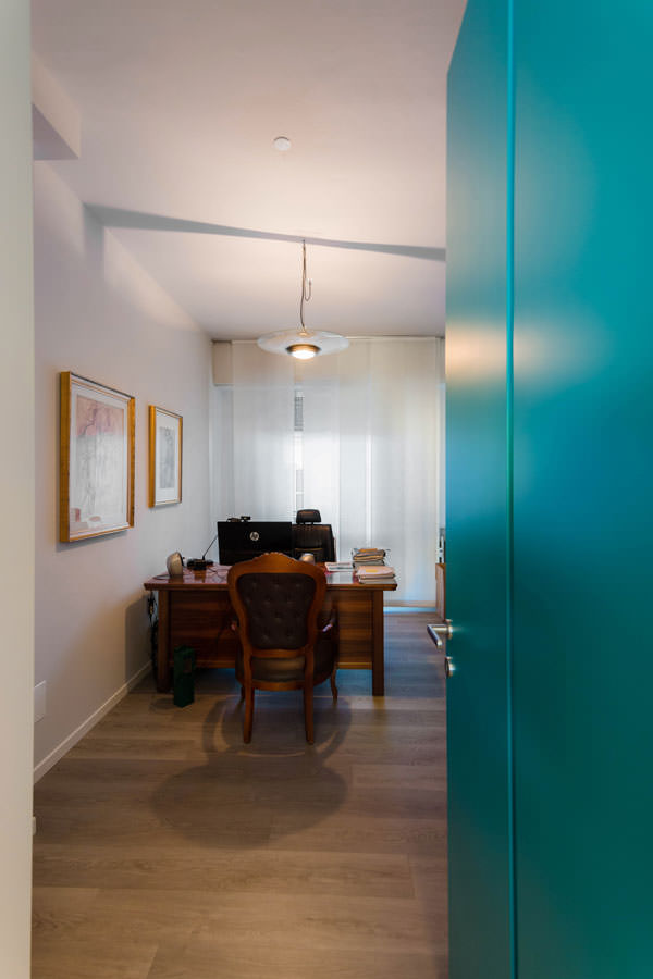
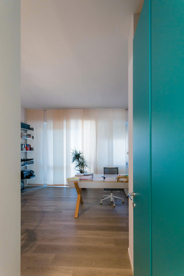
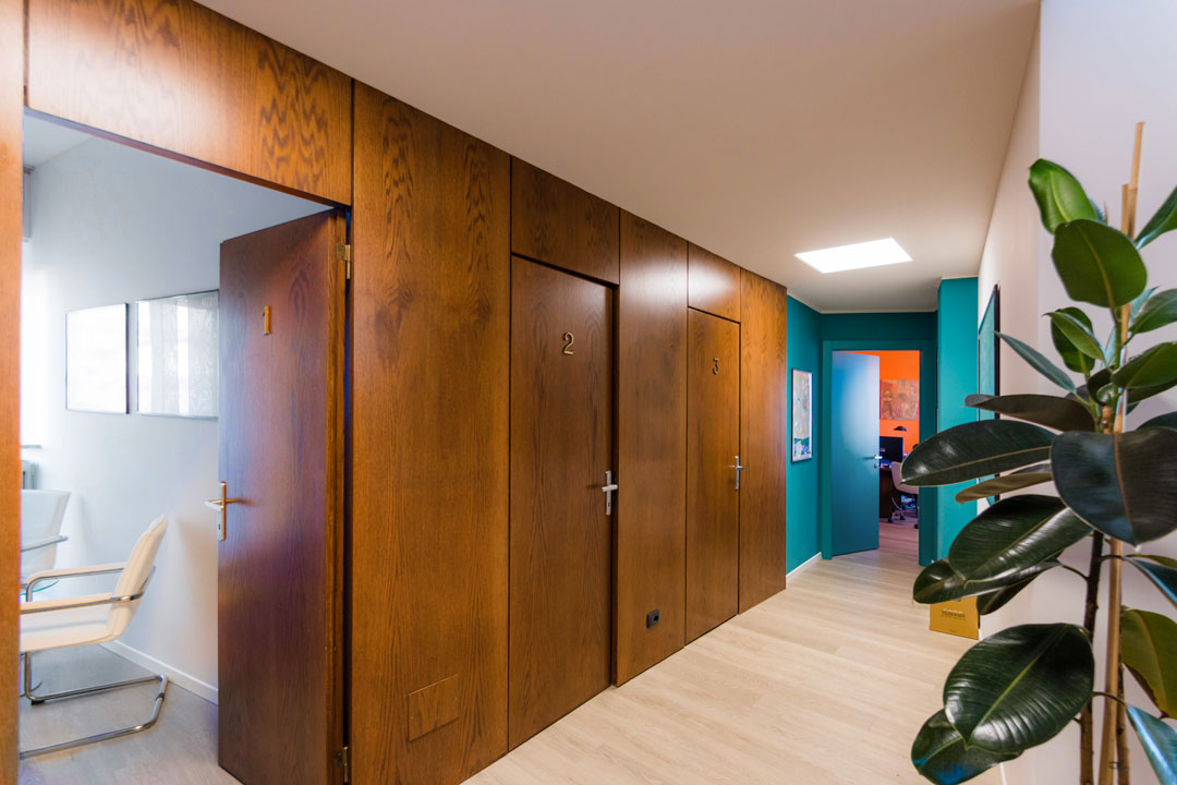
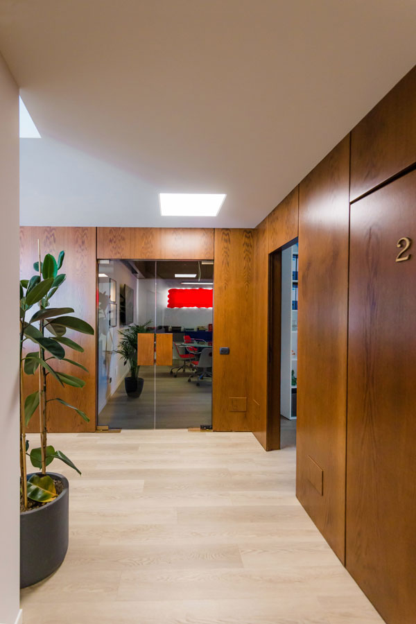
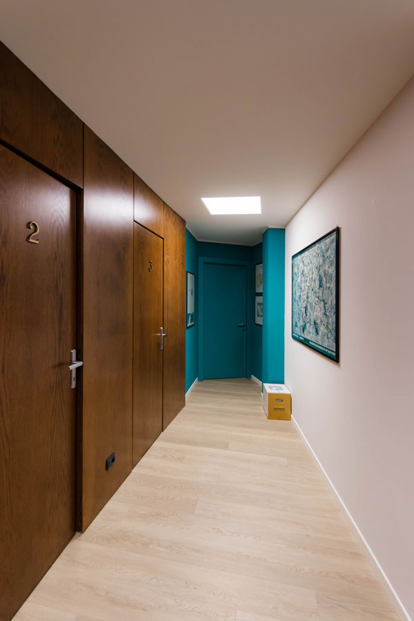
By entering the space, the client is projected into an open space, where the production part entrusted to the secretaries finds space. To distinguish and separate the various workstations only furniture of different heights and glass walls, which delimit the work area from the corridor. This represents the point of greater transparency where the customer, despite not having direct access to the environment, has full visual control. Moving on to the waiting, conviviality and meeting functions, a greater degree of privacy is required. These functions find space in well-defined environments, limited to rooms, but easy to access. Here the theme of transparency is declined in construction details, one of all, glass doors for the meeting room. Although they are limited spaces, their access is free and they are located near the main entrance. For the third type of function, on the other hand, the management offices of Chartered Accountants, the level of privacy is considerably higher. In opposition to the central open space, the studios are configured in more or less spacious rooms located along the external perimeter of the floor plan. Access is through corridors or secluded doors, which almost tend to disappear or blend into the surrounding furnishings. This is to guarantee total confidentiality, creating a unique and exclusive relationship between professional and client.
Office renovation: architectural development
The initial internal configuration, chosen by the previous tenants, was based on the use of movable walls with an aesthetic that is now largely outdated. Furthermore, on the floor, a faded blue carpet, also used as the covering of some pillars. From the first sight, however, what fascinated the new tenants was the great brightness coming from the large perimeter windows. This represented the turning point in the evolution of the project. Also, from the plant engineering point of view, a complete renovation was necessary, which could equip each workstation with cable connection to the data network, telephone setting for internal switchboard, and connection to a Wi-Fi network for printers. To better manage the large influx of electrical predispositions and at the same time allow an air conditioning system via split, a false ceiling was created in the main corridor, capable of serving all rooms. At the same time, it allows a greater perceptual distinction between public environments and restricted access work areas.
The renovation of the offices: choice of colors and materials
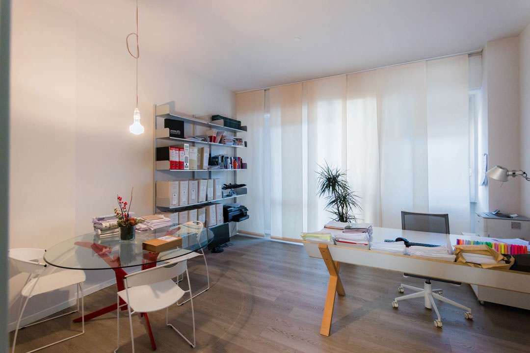
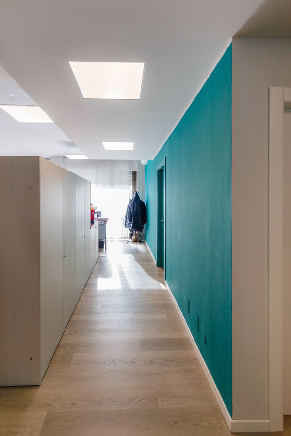
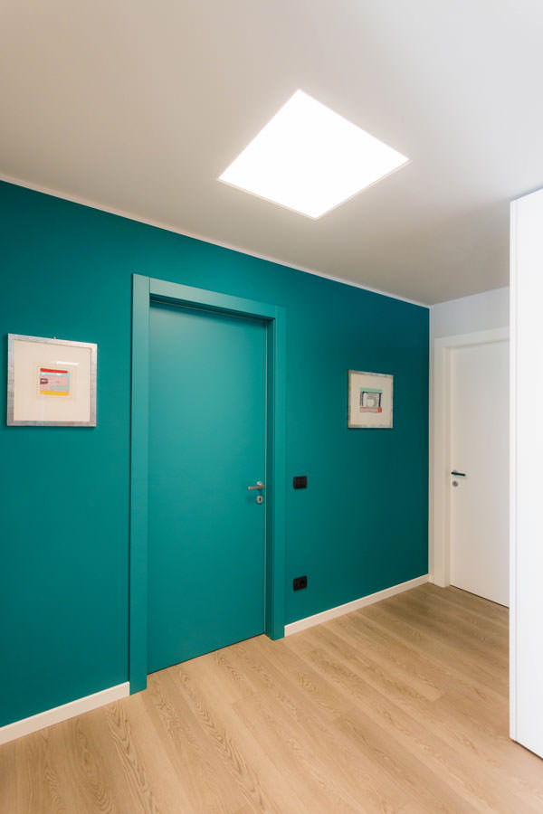
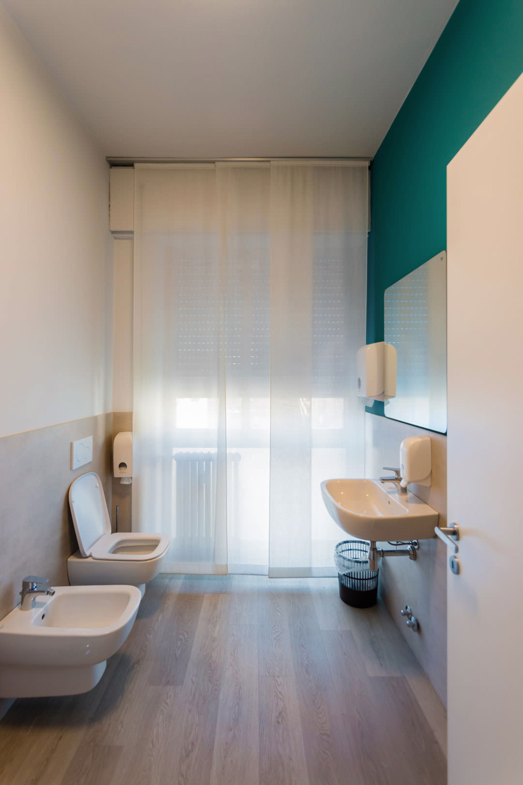
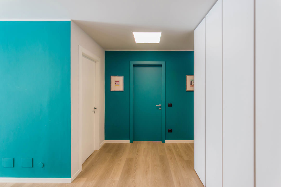
The aesthetics of colors and materials are defined in neutral tones, with a parquet-effect floor in bleached oak, ice gray walls interspersed with Vardo-colored surfaces from the Farrow and Ball collection. These define the visual rhythm in the interior scan. The ice gray chosen for the painting of the main walls is made even brighter by the great natural lighting. The result is almost close to white, while giving a touch of additional softness compared to the asepticity of the latter. To see other examples of ice gray in the private apartment context: a contemporary-style tavern and glimpses of antiquity in a contemporary attic. At the entrance, the only trace of the initial layout is a full-height paneling in cherry wood that develops at an angle embracing the access to the meeting room, the archive rooms and the corridor with access to the second archive room and bathroom of the personal. The choice of cherry is also taken up in the furnishings of the reception through a shaped counter with matching closet.
Furniture: from the relocation of the existing to the functionality of “custom made”
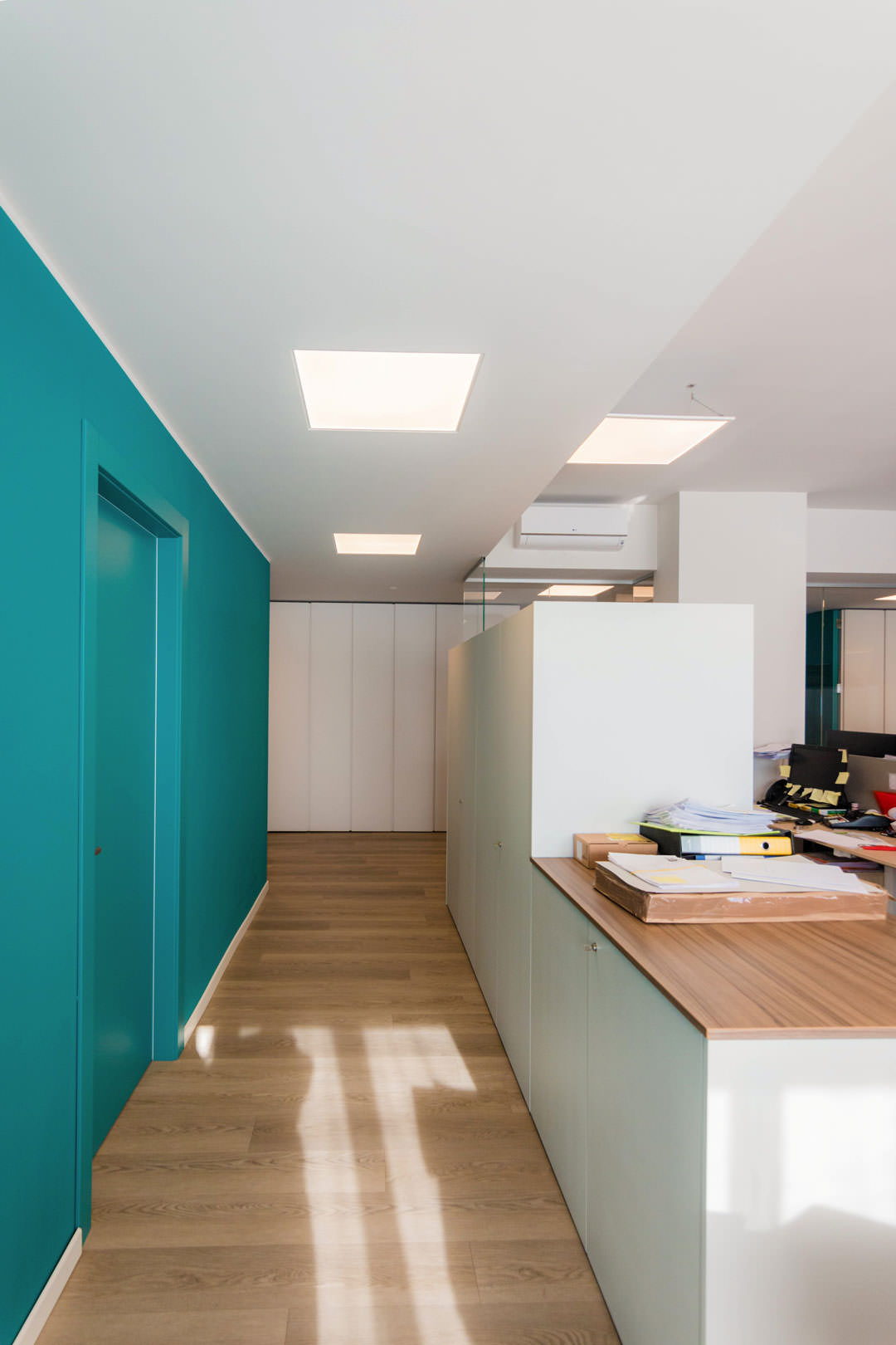
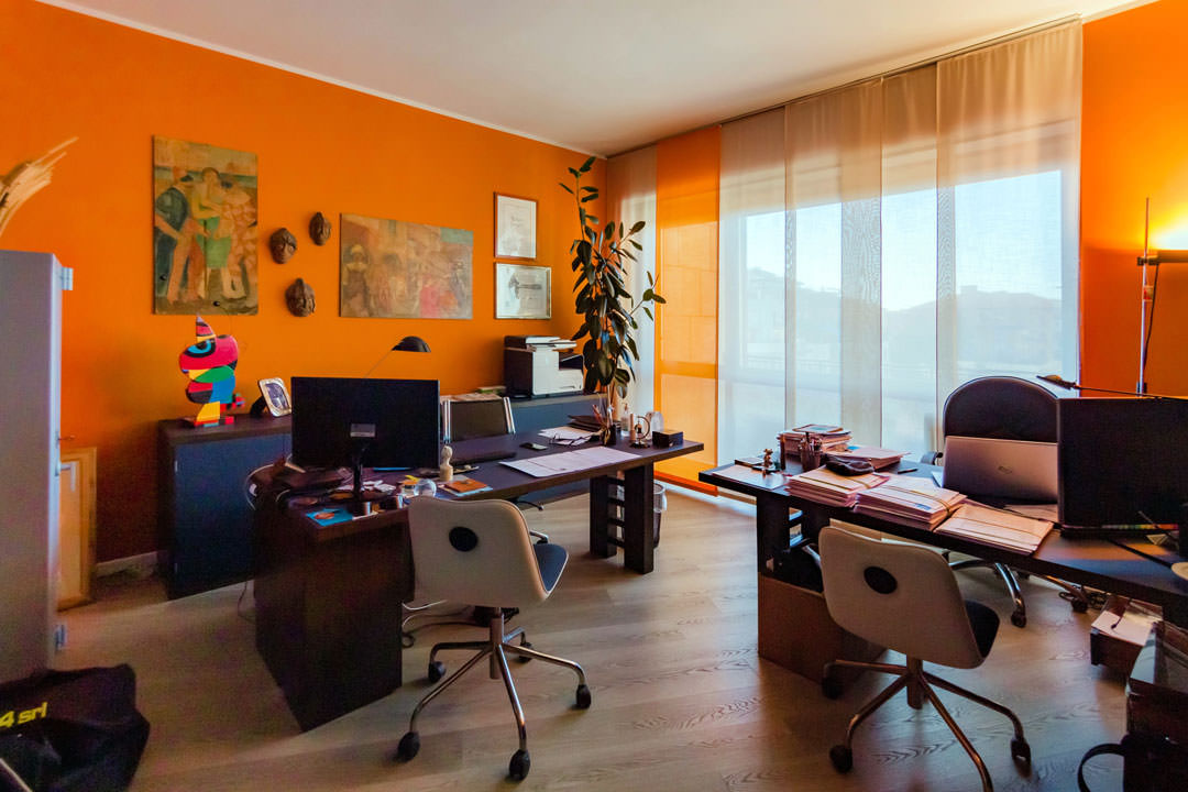
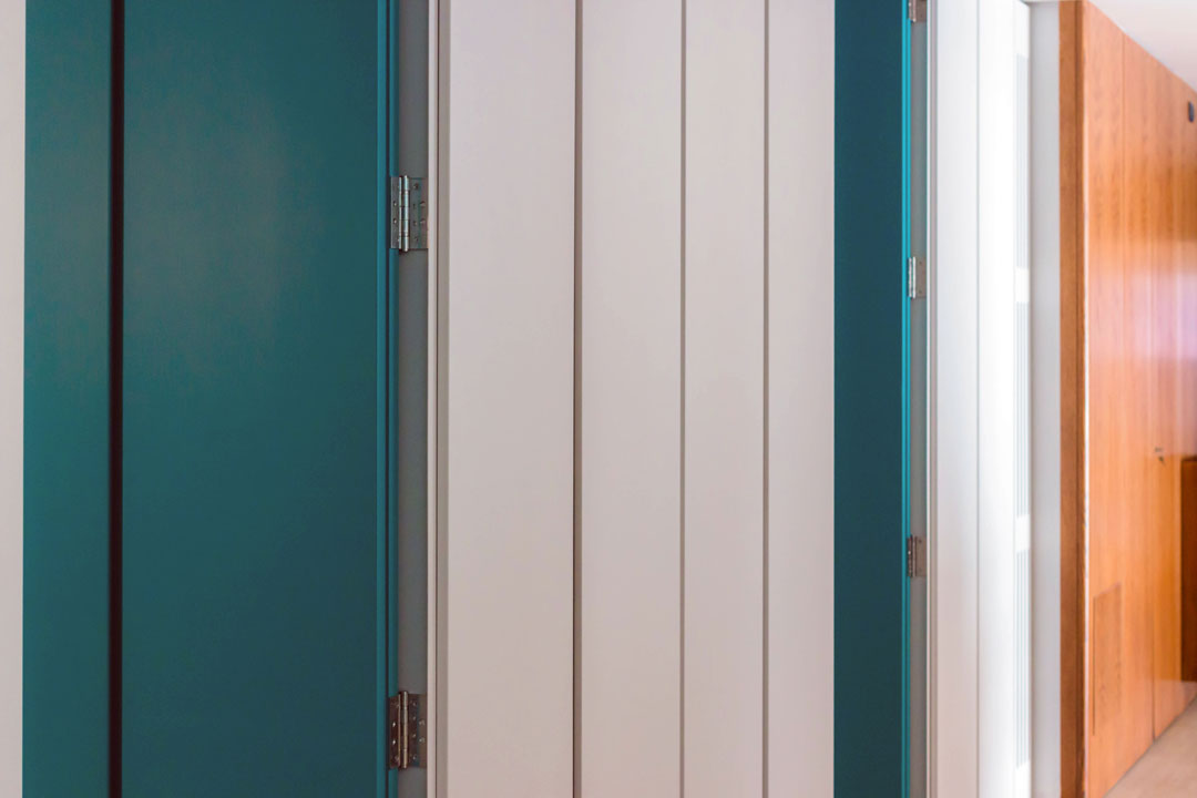
The existing furnishings find space within this well-defined color contrast. The main difficulty in a renovation project is knowing how to combine furnishings from different offices, with completely different aesthetics and functionality. For the common areas, the most neutral solutions were therefore opted for, with medium gray elements combined with wood-effect bilaminate tops. To intersperse the different environments, and to distinguish their different functions, furnishings in a darker neutral tone. Each room therefore has a unique aesthetic, which can communicate with general neutrality while expressing the strong intrinsic character of each environment. So also, the management offices vary from a classic décor with cherry wood furniture, to essential interiors in light tones or even renewed furnishings with modern blue laminate tops on a wengé wood structure. The most functional point of the interior is represented by the large custom-made wardrobe in the corridor. This serves as an archive and collection point for paperwork and files, with full-height lacquered doors with an essential appearance. Internal shelves adjustable in height allow the best optimization and management of the internal space. Recessed handles run along the longitudinal development of the door, marking the overall rhythm of the furniture. In the same way, the access doors to two management offices are inserted, in which the neutral aesthetic of ice gray is interrupted by vardo-colored inserts. The presence of the handle thus identifies the access point to each room, while remaining discreet in the general perception of the furniture.
Small tips to renovate offices
An office renovation does not only imply changing the general approach in favor of fresher materials and aesthetics. In the first place it means above all choosing the message to be transmitted and knowing how to translate it from an architectural and communicative point of view. Knowing how to combine the stylistic language of existing furnishings is the next step, in which the uniformity factor often lies in the choice of neutral colors and materials for the common areas.

