Between classic and contemporary
A renovated villa that maintains its rigorous and classic style without renouncing contemporary elements able to give lightness and brightness.
Project: Modulor
Year: 2005
Site: Gorle
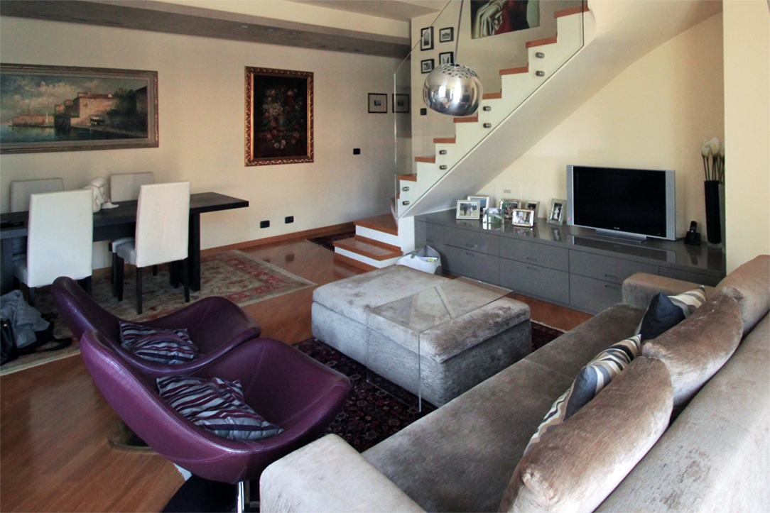
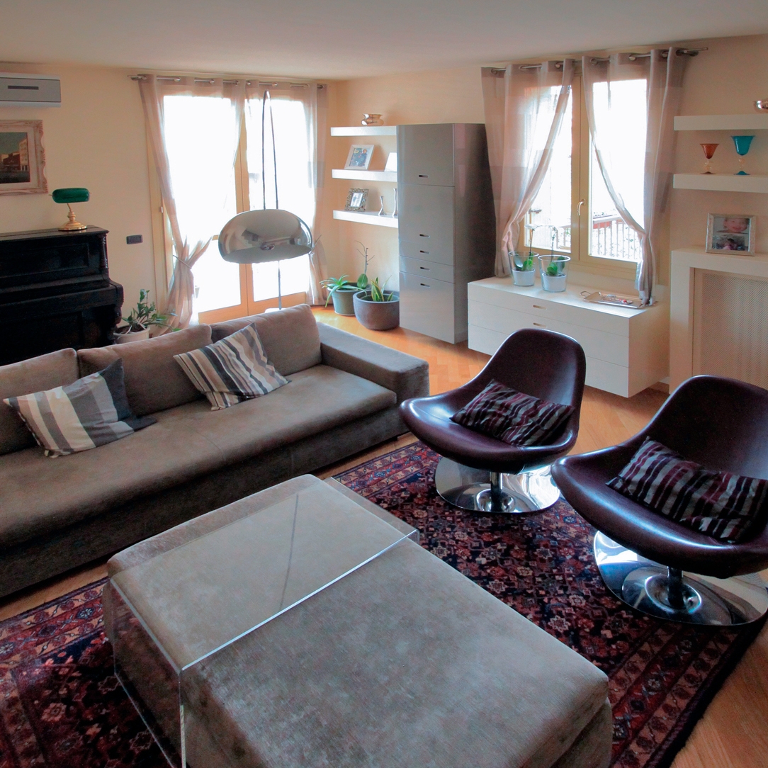
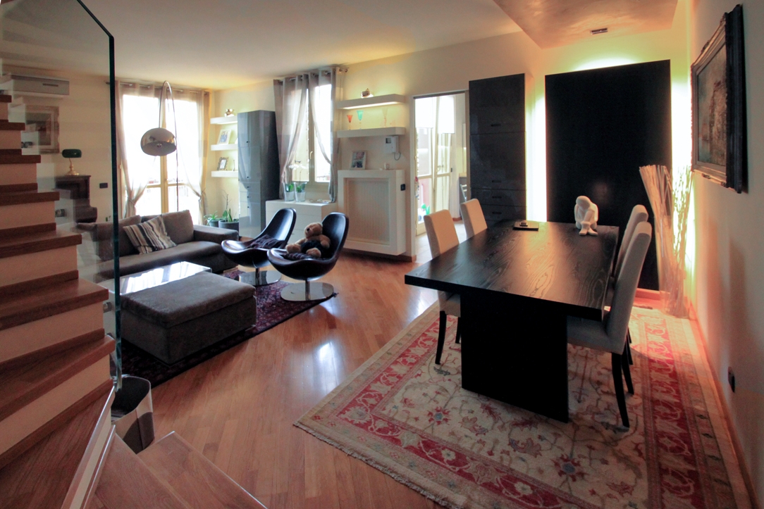
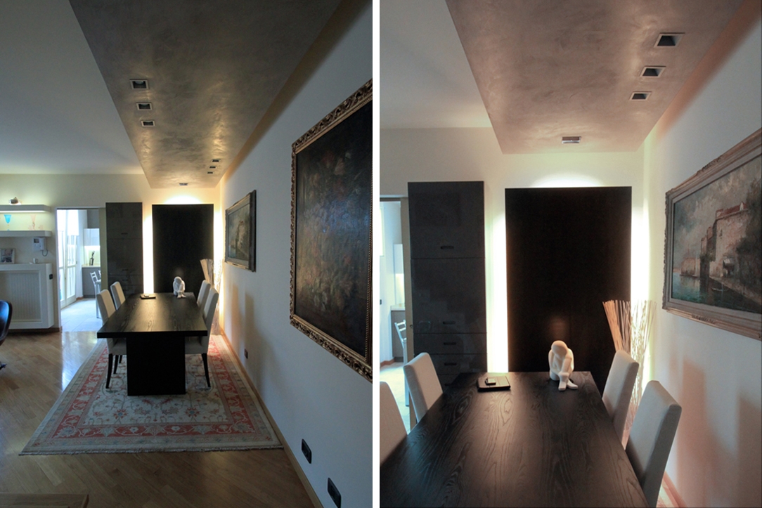
Two large windows provide natural lighting in the living room, whose warm tones of polished wooden floor are combined with the cream-white painting of all walls. A match that allows a warm taste of the room. The soften the tones is a silver-gray velvet sofa which is also combined with a pouf of the same material with a glass table. Modern style armchairs in plum-purple colour in colour range, in order to balance the perception of the environment. The inserted furnishings are essential in the design lines, but their pantographed handles are a reference to the classic style of the living area. Classic and contemporary are combined in this environment not only for the choice of style furniture but above all in the attention to detail of each of them. The medium gray shades in glossy lacquer are the TV cabinet, that occupies the void under the stairs and the vertical containing element that faces it. This is flanked by a white glossy lacquered chest of drawers that fills the part below the window, underlining its brightness. At the two ends of the same wall shelves with an important profile take place. One of them incorporates the support surface that frames the radiator. On the side, this room houses the dining area, with an important dark wooden table. To identify this area is also the lowered and spotlight false ceiling, with medium gray spatula finish. On the side wall, alongside the access to the kitchen, there is a second medium gray vertical container element and a backlit paneling.
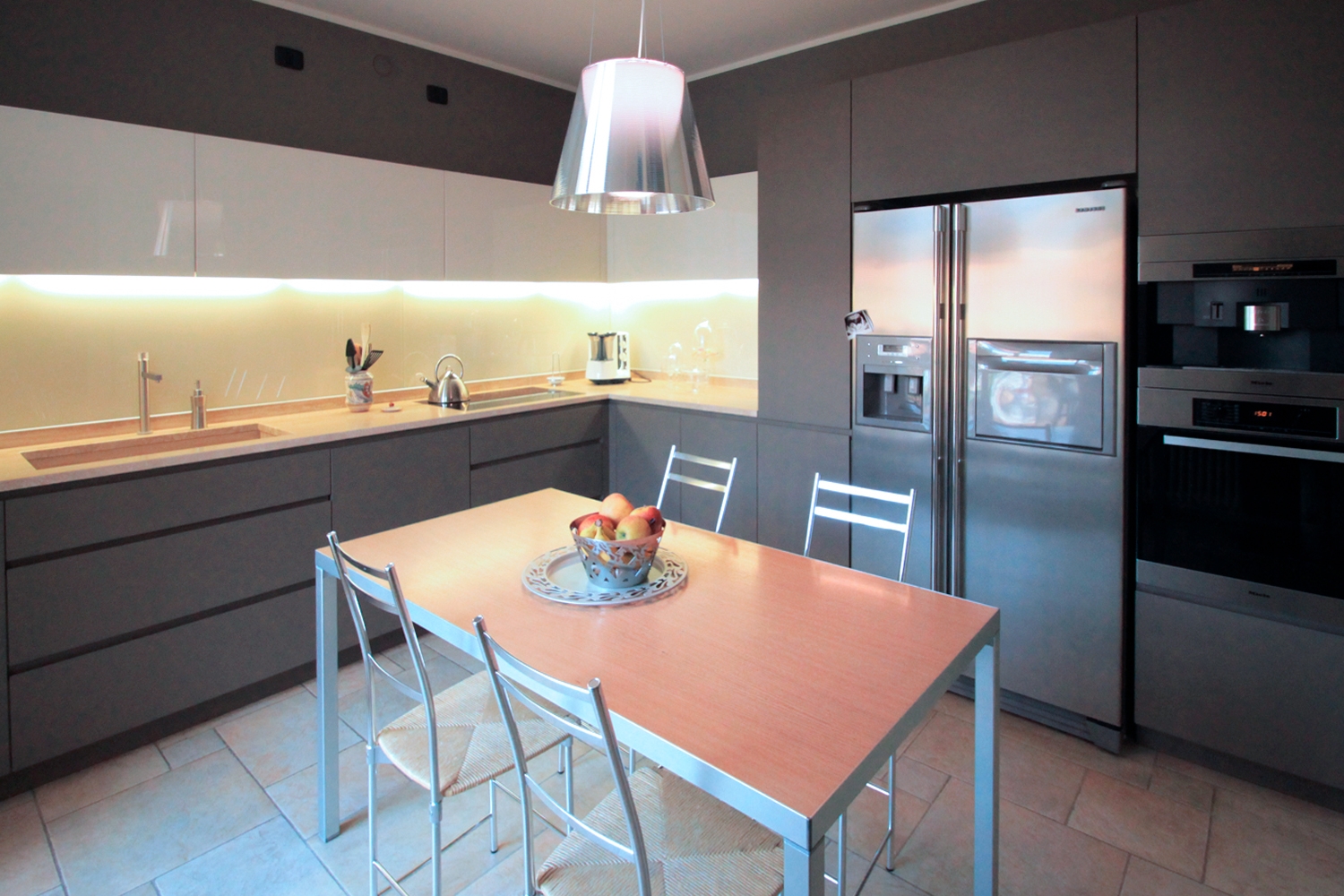
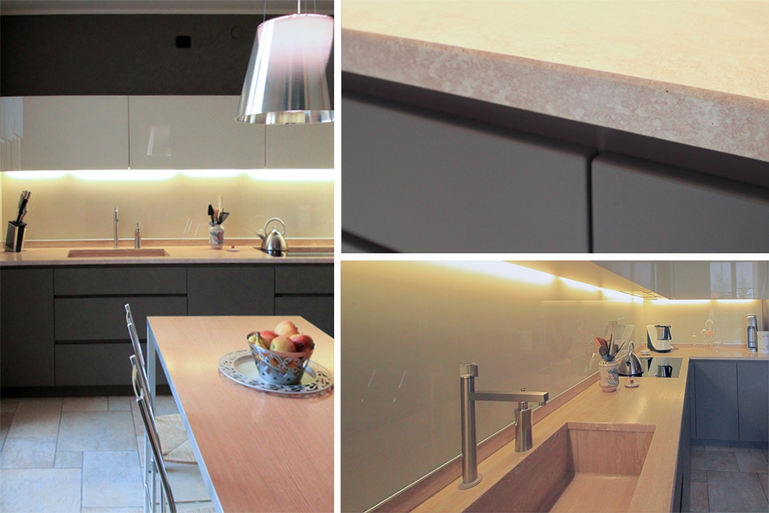
The kitchen instead responds to an extremely contemporary setting. Arranged on the corner, it consists of a full-height part which holds the double-door refrigerator and recessed ovens. The countertop occupies the remaining part and then develops in the adjacent wall. With warm tones, it acts as a bright and chromatic interlude between the lower part in medium gray and the white wall units. The difference between the two components is also visible for the material choice of keeping the upper wall units in glossy white lacquer, as in the living area, and the remaining medium gray volumes treated opaque in order to create an elegant contrast.
Between classic and contemporary
A renovated villa that maintains its rigorous and classic style without renouncing contemporary elements able to give lightness and brightness.
Project: Modulor
Year: 2005
Site: Gorle
