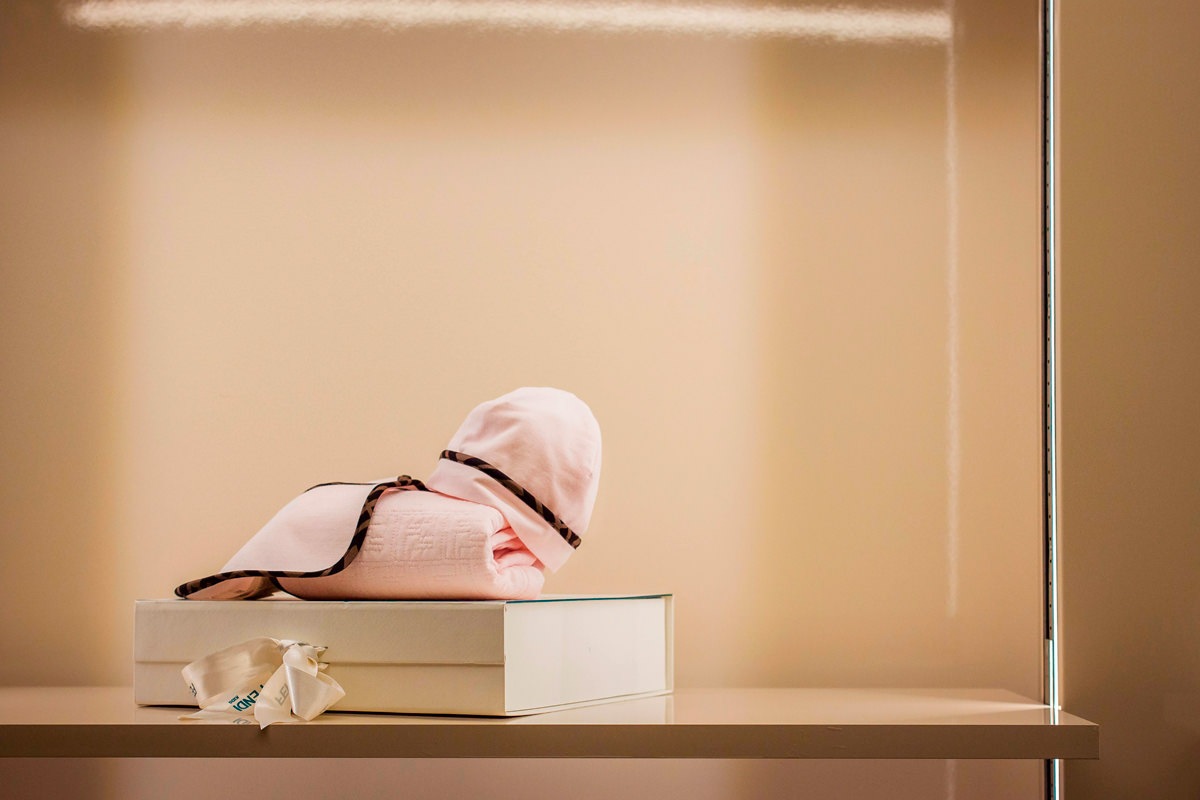
The end of summer saw the inauguration of the Kids corner in the historic Tiziana Fausti boutique, reorganizing the spatial layout to host a retail space for children.
From the previous commercial space in Via Monte Sabotino, now reserved for the urban concept of THE F1RST sneakers, the outfitting for the Kids store moves to the historic women’s store, modernizing its image on a project by the Storage Associati architecture studio.
The exhibition layout
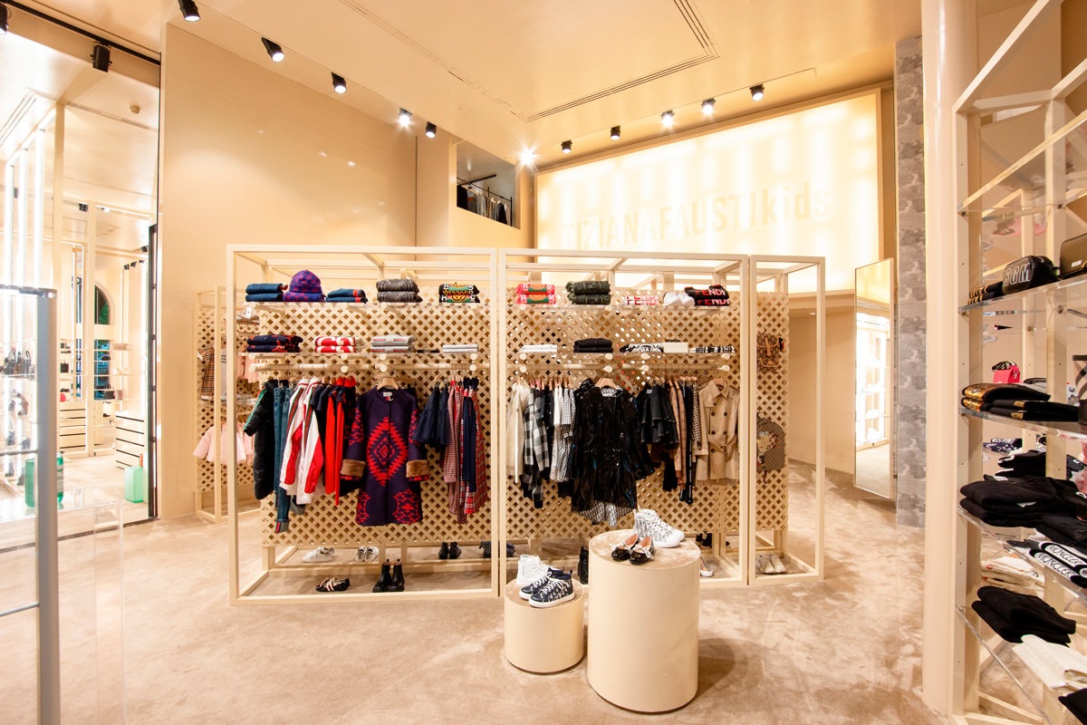
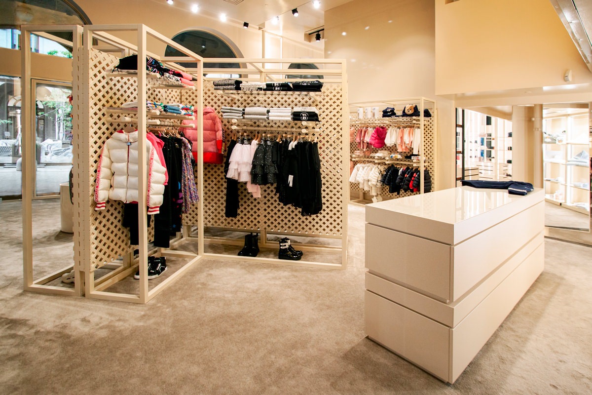
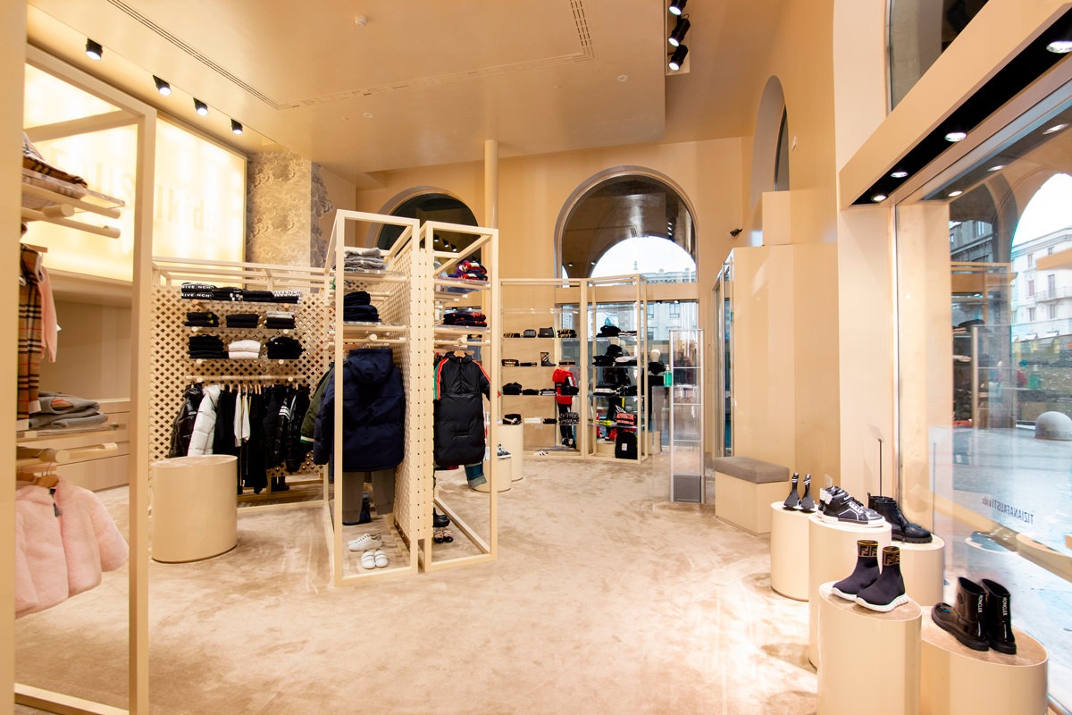
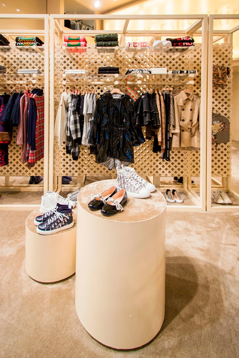
From a project by the Storage Associati studio, the retail space reserved to children takes on a dynamic and fresh configuration on the ground floor of the Tiziana Fausti boutique.
The display elements develop vertically, serving as a pivot in the center of the space.
The flow of customers is thus distributed in a circular way, avoiding spatial gaps.
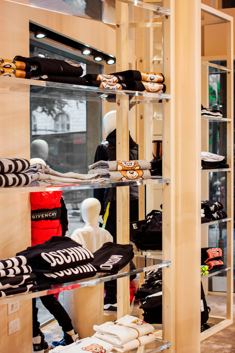
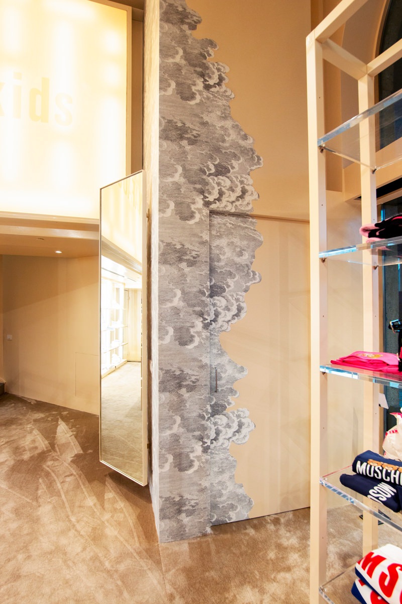
Along the side windows there are other vertical elements that exploit the double visibility both from outside and from inside for the product distribution. Transparent shelves that allow natural light to spread all over the interior space, struggling between the products on display.
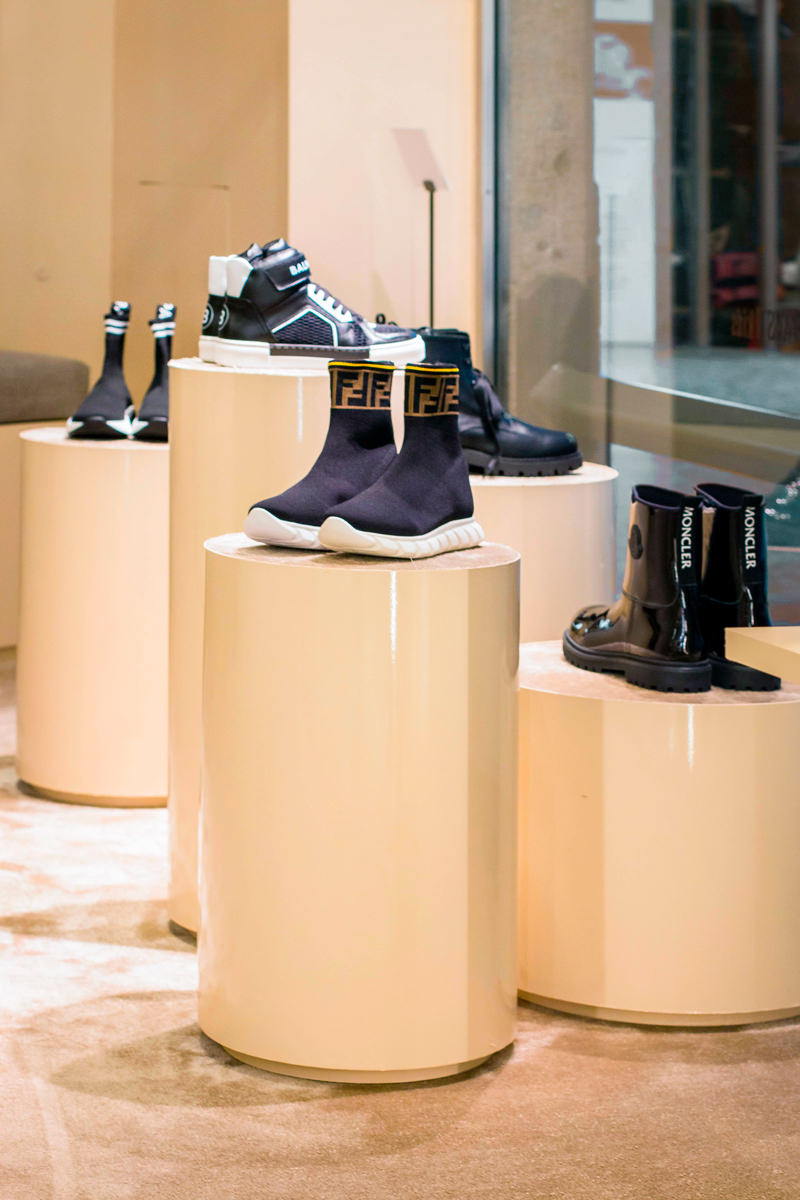
The showcase on the left of the entrance instead takes up the typology used in the women’s department with cylindrical volumes rising to different heights.
Taking advantage of their expressive essentiality, these volumes with a carpeted upper covering are also scattered throughout the retail space, enlivening the outfitting.
A store dedicated to children that is inspired by the world of the little ones, with dynamic and flexible display products configured with the interlocking theme.
Joint matters
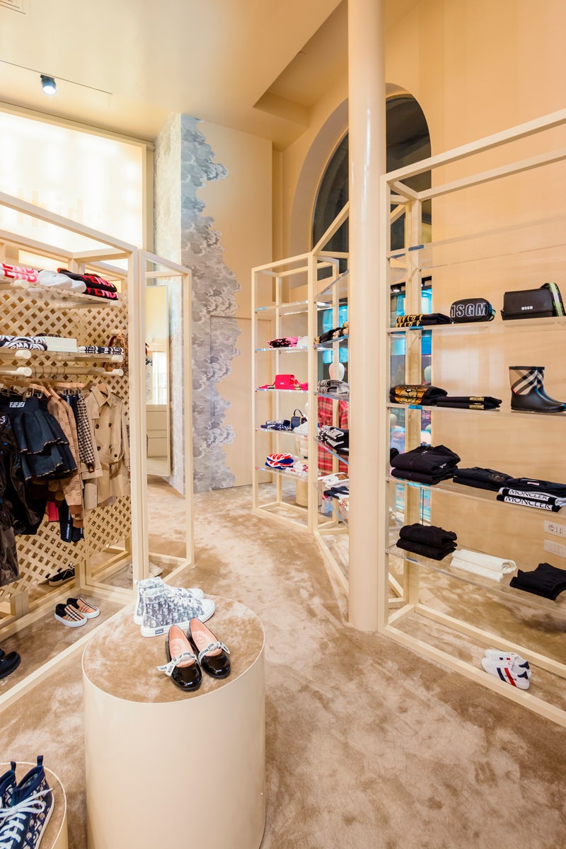
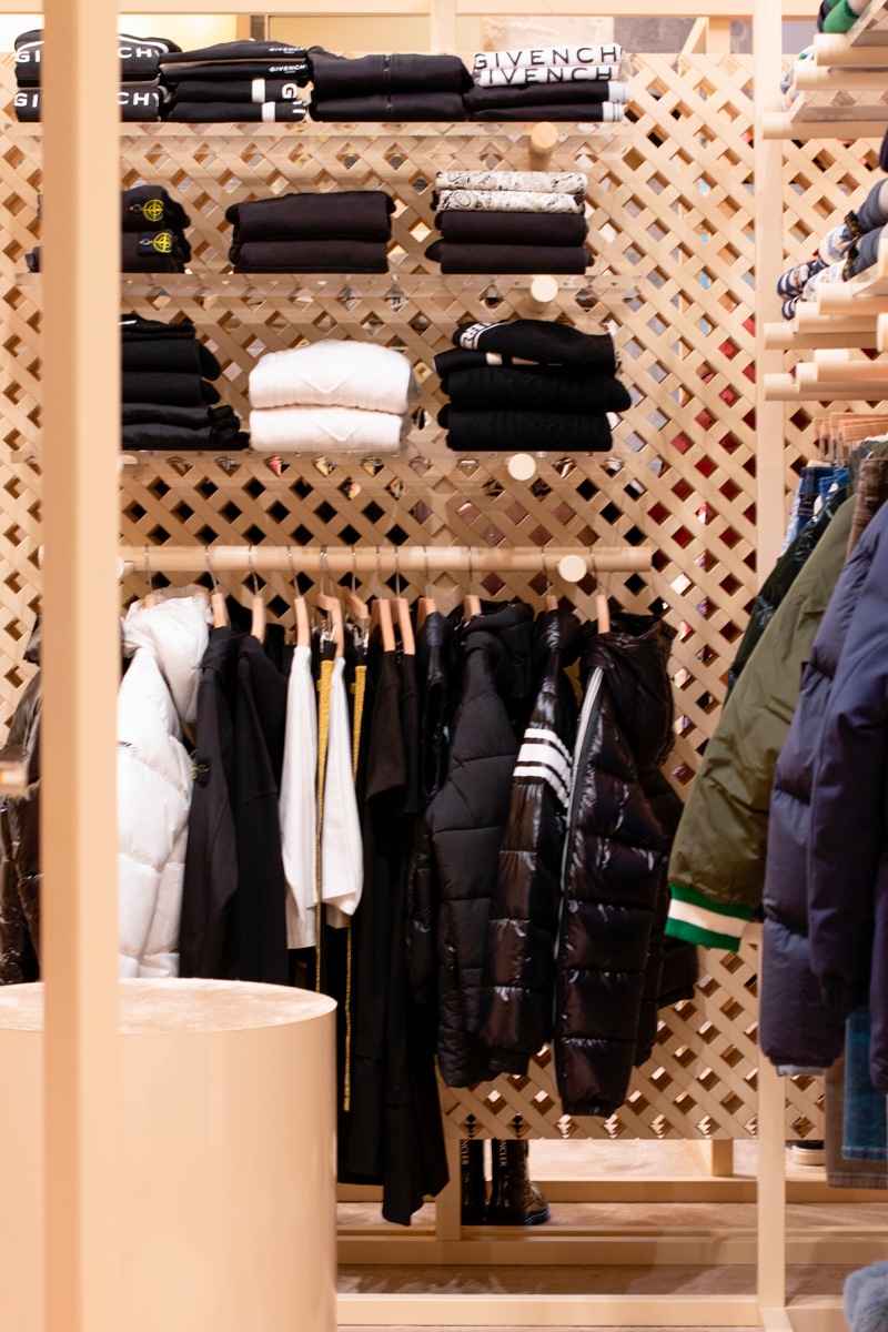
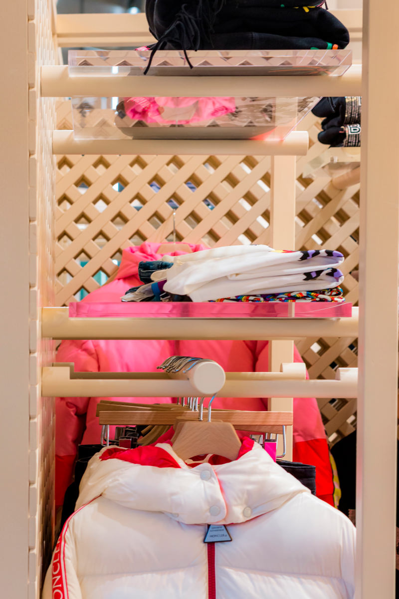
The logic of the joint is certainly the basis of the retail design project. Just like in Lego constructions, even plexiglass and wooden tubular shelves fit together allowing different project configurations, which are in turn inserted into the bottom panel.
This simple and practical display logic focuses on the use of three different elements.
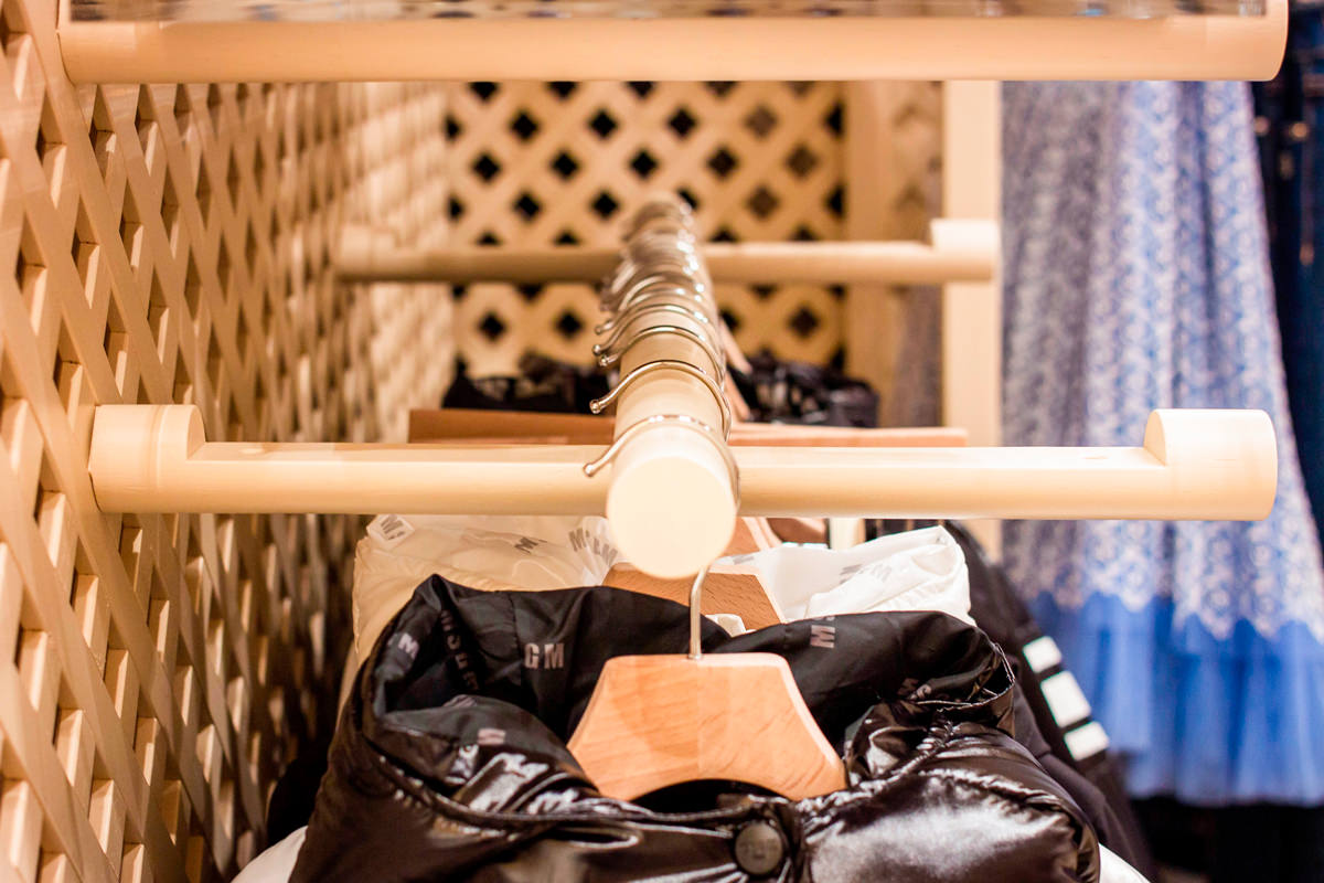
The first, and fundamental, is essential to define the different display heights, being the element that communicates with the back wall. It is in fact a wooden tubular with a shaped end so that it can be embedded in any point of the reticular bottom wall.
Its length was then worked through a specific section to be able to fit the other two display elements: plexiglass shelves and tubular hangers.
The first were obviously made of the same width as the tubular section, thus becoming visible light signs that are interchangeable with each other. On the other hand, the tubulars used for hangers, , take advantage of the negative of the shaping by bringing the interlocking elements along their diameter to ensure stability and visual linearity.
Give new life to the display elements
The world of retail design is constantly changing. To cope with the incessant succession of trends in the fashion world, even the spaces that host it must adapt by developing new configurations.
Therefore, it is fundamental to avoid waste of any kind to design furnishings that can undergo variations over time and become flexible to new changes.
This is the case of the wall units chosen for the outfitting dedicated to children in the historic Tiziana Fausti boutique. Equipped walls that exploit the voids between the different crossed wooden panels to allow the interlocking of wooden tubes. Recovered from the original layout of the Kids store, the perforated wooden walls have been subjected to careful quality control with a meticulous recovery of the damaged features.
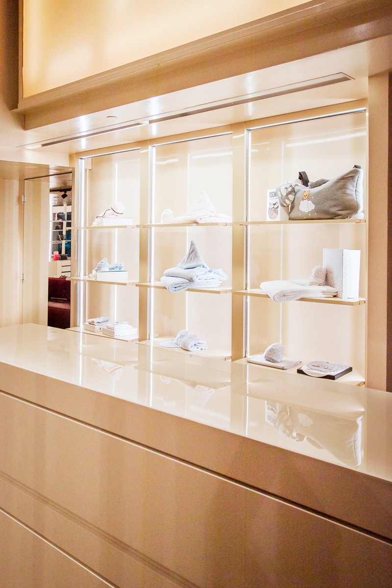
In the same way, some existing furnishings, such as the cash desk display cabinet, have received new grit through a new film, to make them uniform with the general aesthetics.
A new life that characterizes them with a fresh and dynamic soul, which fully reflects the sparkling character of children, reinterpreted in a design key for the historic luxury boutique in the heart of Bergamo.
