High ceilings and contemporary boiserie in a Ligurian apartment

High ceilings and contemporary boiserie in a Ligurian apartment

The interiors of the past were characterized by the presence of high ceilings, which in a contemporary perspective risk making houses disproportionate in the perception of spaces.

A possible solution can be to introduce a counter-wall capable of keeping the original structure intact but revolutionizing the interior spaces by providing them with a new height.


THE CONTEXT
THE INTERVENTION
LIVING ROOM AND KITCHEN
BEDROOM
BATHROOM
COLOURS AND MATERIALS


THE CONTEXT

Liguria is the sea with high, rocky and jagged coasts, but also the region with ancient culinary traditions and small towns close to the hills.

Characterized by small historical cities, it responds to a still traditional setting with houses often placed against each other and narrow passages to take the most advantage from the spaces.

For this reason, most of the interiors are currently dated and difficult to expand.

As in most old houses, the ceilings are very high and can modify the perception of the spaces.

Characteristic spreads throughout Italy, whose solutions can vary considerably depending on the context. Sometimes taking advantage of verticality can be the design choice capable of characterizing the project, as in the case of this New York Apartment

However, in case of small spaces, the already very high ceilings are further accentuated by the planimetric dimensions of the interiors.
dining room high ceiling

THE INTERVENTION

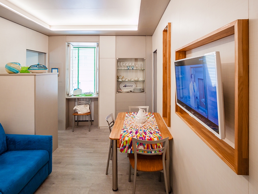
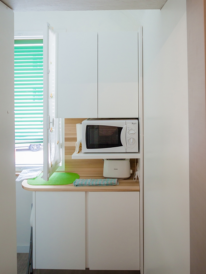
The design project aims to restore the right eight to each room, while giving a fresh and contemporary look. Working on the internal heights was possible through the use of a wall covering, a boiserie whose height of 240cm re-establishes the usual proportion of the rooms, allowing in the same time, to keep the original structure intact.

It is exactly on this fundamental feature that the renovation of apartment is based: building a sort of exoskeleton able to maintain the original ceilings and making it equipped where necessary. At the same time, it creates an internal setting that respond to the customer’s needs.

The intervention involved all the rooms of the apartment, of which however the kitchen and the bathroom were affected in a reduced way because they preserve original in the internal height.
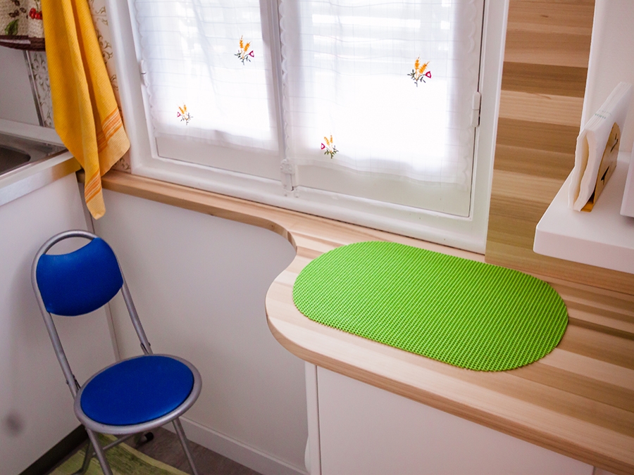
wooden kitchen countertop
living room high ceiling recess glass shwcase
kitchen countertop wood
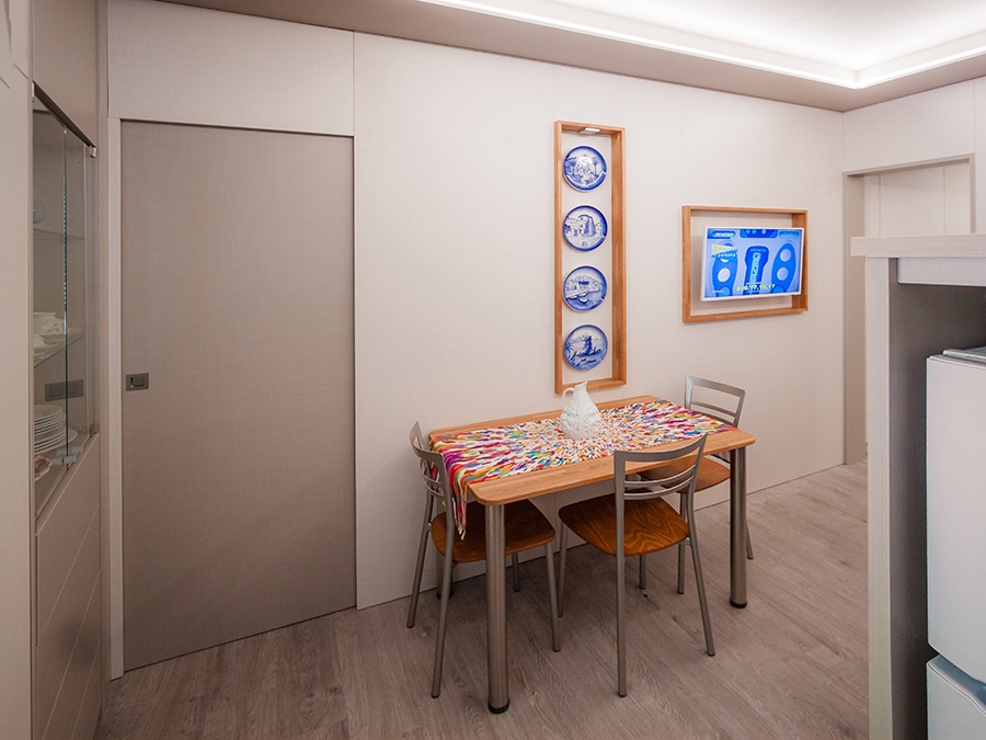
wood dining table high ceiling
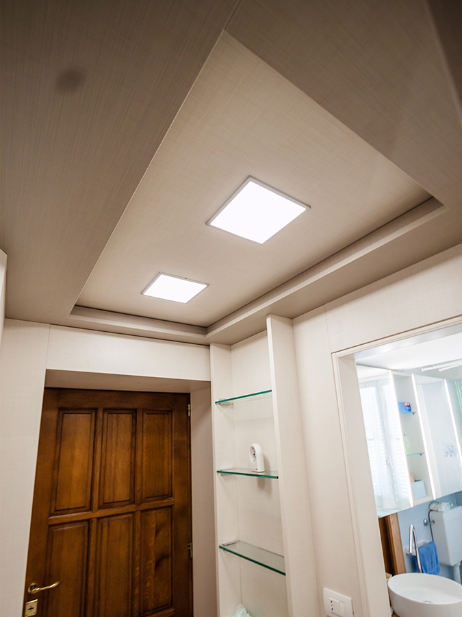
high ceiling false ceiling closed
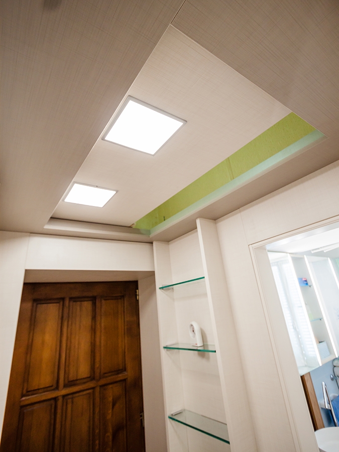
high ceiling false ceiling open

LIVING ROOM AND KITCHEN

Starting from the entrance, the new compact structure of boiserie encloses the false ceiling with zenithal lighting.

The difference between the original and the reconstructed height is still accessible and serves as a storage element. In doing so, it’s takes the most advantage from the existing space, providing greater functionality.

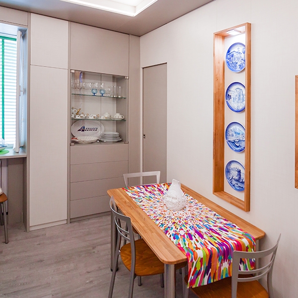
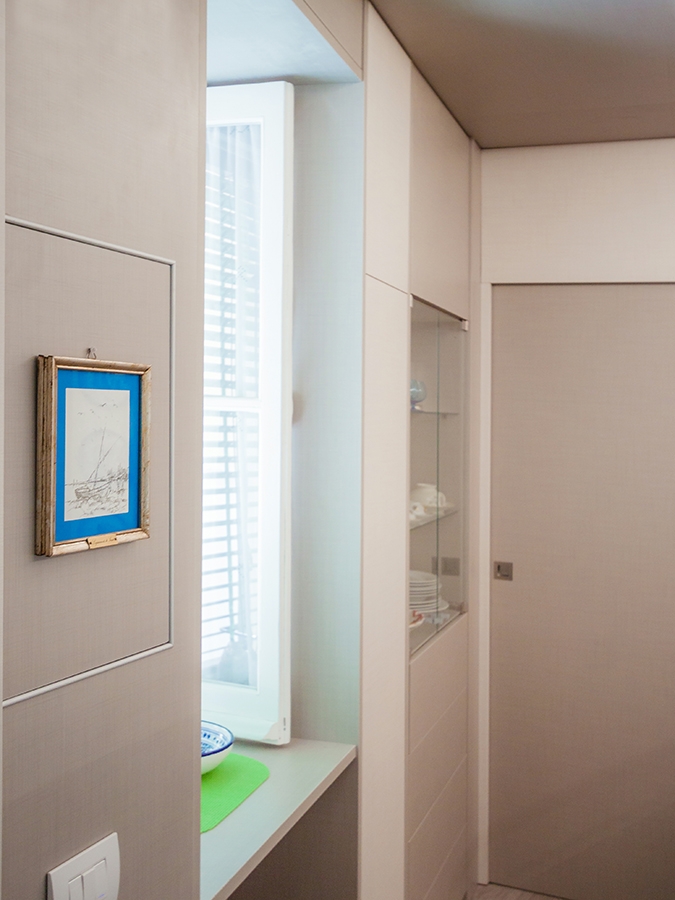
The living room was instead equipped with a niche used as laundry room, flanked by a small glass showcase embedded in the double wall.

Turning instead to the kitchen room, it is the shaped laminated wood with light colours that gives a touch of freshness and modernity, recalling the chromatic shade of wood used for the dining table. Wall and storage unites fill the remaining gaps by taking the most of every corner of the small apartment, without making it oppressive.
wardrobe open bedroom
bedroom boiserie
bedroom boiserie high ceiling

BEDROOM

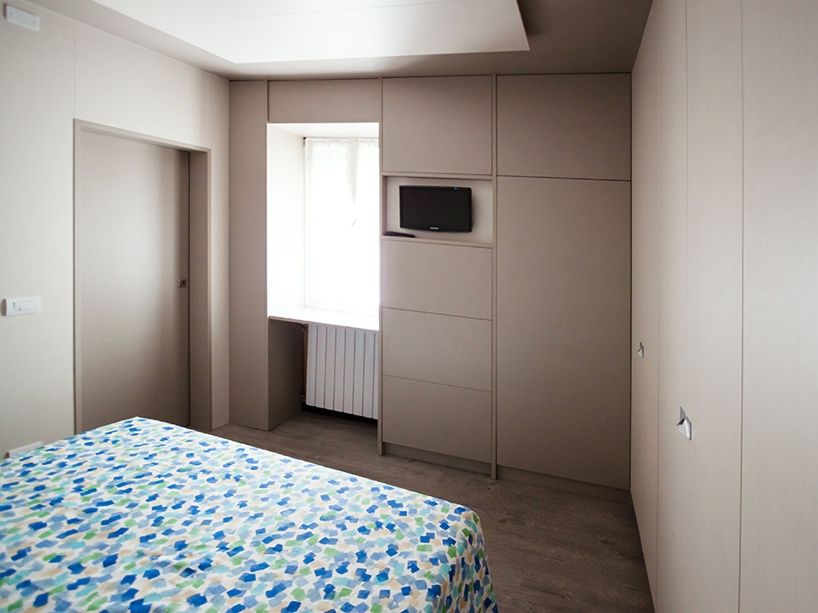
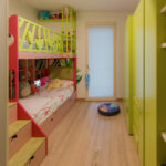
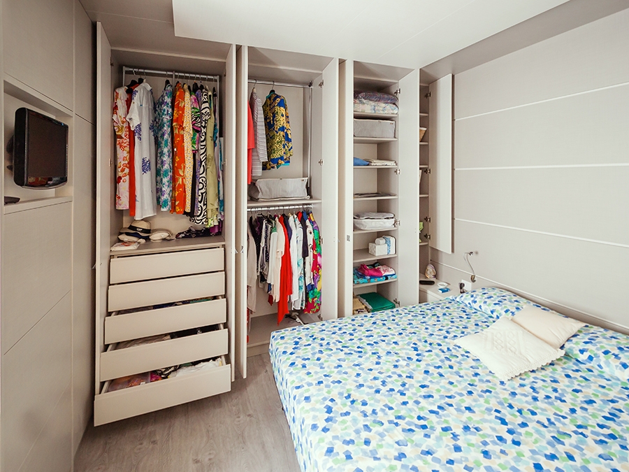
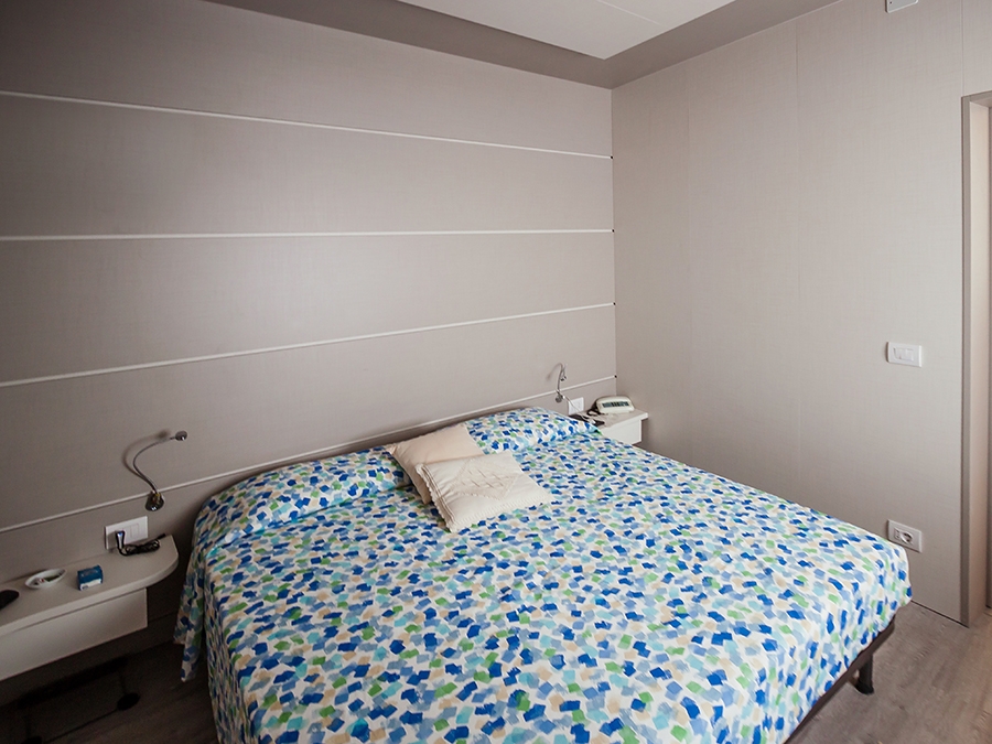
The use of the full-height boiserie allows the bedroom to better hide the service wardrobes.

Organized along two corner walls, they consist of niches with multiple functions capable of containing drawers, hangers and shelves at different height. In the same way, the television is also included in a special custom-made niche.

The extreme functionality of the corner wardrobe becomes an extremely stylistic clean and contemporary element in this design system. Added to this, the backlit false ceiling is able to provide diffused and elegant lighting.

In order to give greater dynamism and personality to the boiserie, horizontal cuts were inserted to create an innovate stylistic linearity. It is also possible to equip these horizontal cuts with possible supports, to make the bedroom even more functional.
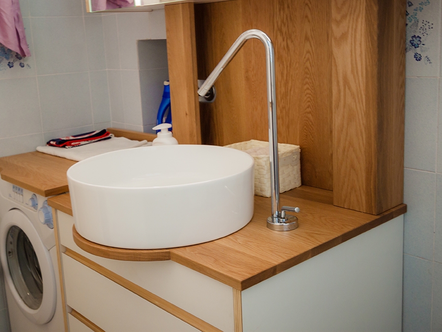
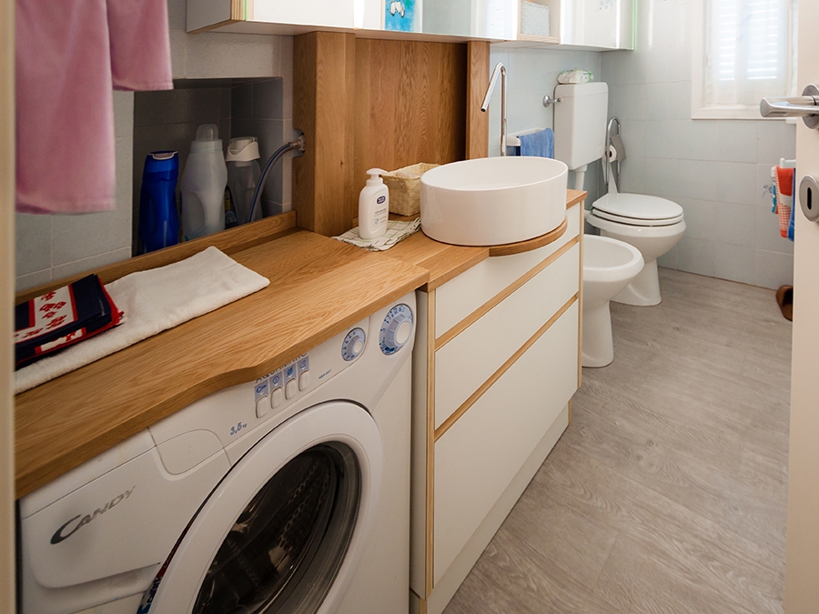
sink design Ligurian apartment
bathroom high ceiling
furniture bathroom drawers

BATHROOM

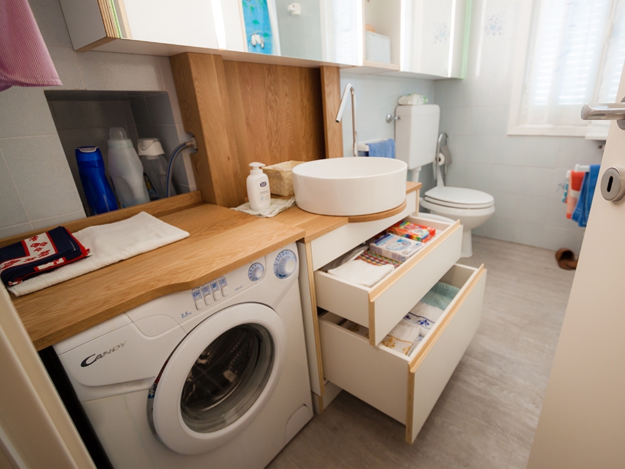
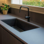
Evoking the use of laminated wood that characterizes the kitchen countertop and the display elements of the living room near the dining table. Even the bathroom is characterized by a contemporary and extremely fresh stylistic element. The storage units host a niche for the washing machine and a chest of drawers with marked edge that perfectly fits with neutral tones of the room.

COLOURS AND MATERIALS

Concerning the chromatic and material choice, we opted for a project in continuity between different rooms. The textured laminated wood was chosen for both the walls and furnishing elements, whose texture recalling that of the fabrics, gives greater domesticity and softness to the interiors. A contemporary aspect that can also be found in the neutral shades adopted: two different shades of gray which create a very elegant internal movement.

Finally, the introduction of laminated wood in the living room and in the bathroom gives a decisive touch able to make the environment younger. It is exactly in these two rooms that the high ceilings have been maintained.
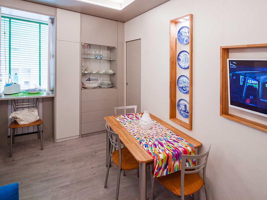
dining table and glass showcase

One kitchen a week, part 4: essential and elegant

One kitchen a week, part 4: essential and elegant

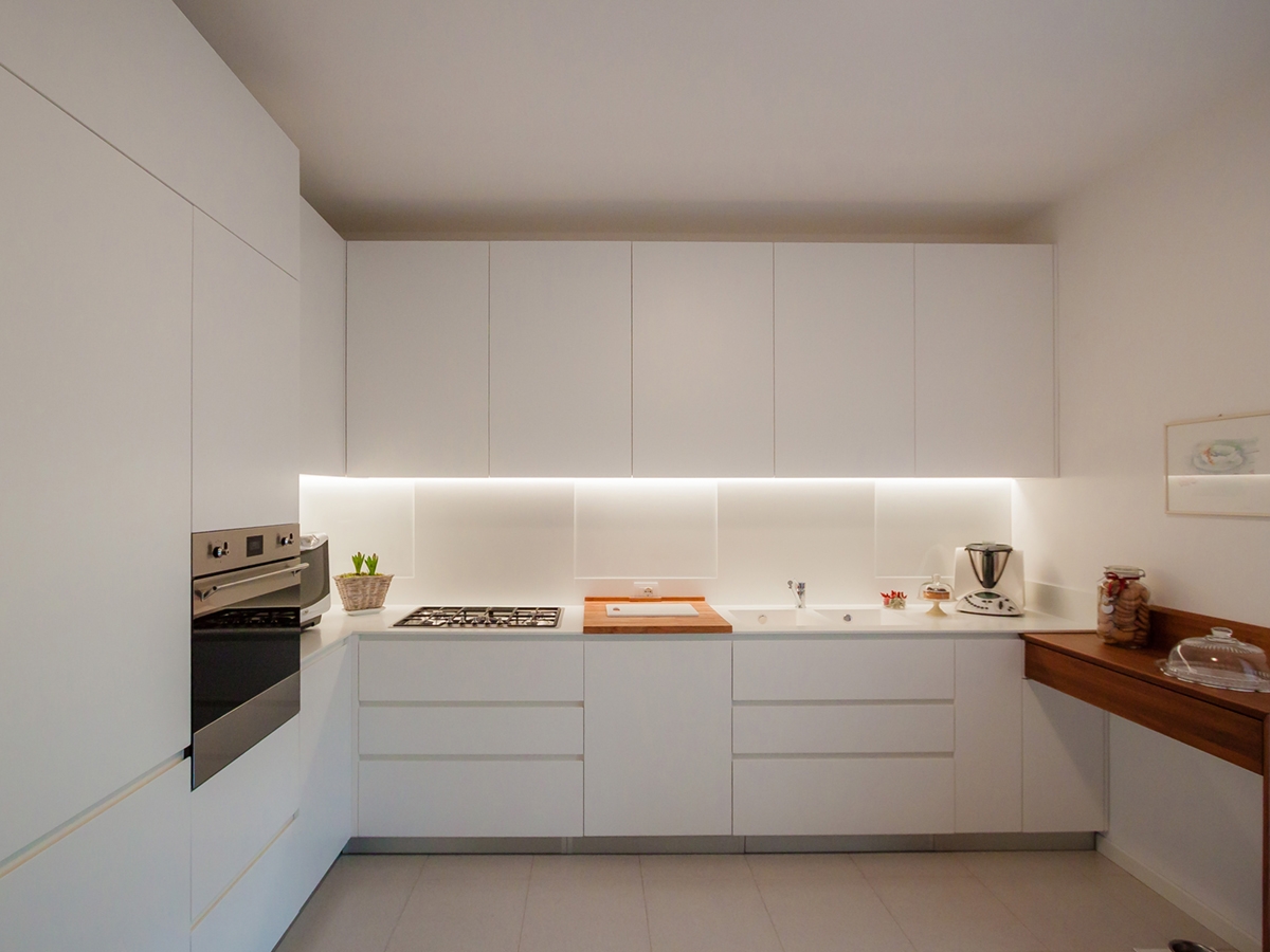
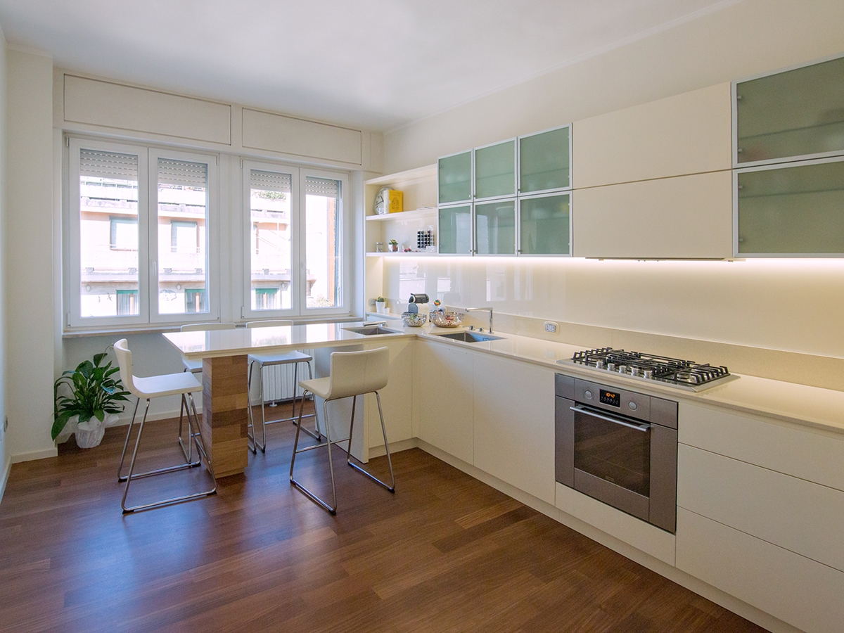
A contemporary and essential kitchen, which minimal lines define an elegant interior total white.

prospective essential elegant kitchen

THE PROJECT

The most elegant contemporary interiors are characterized by simplicity, created with opaque surfaces often white.

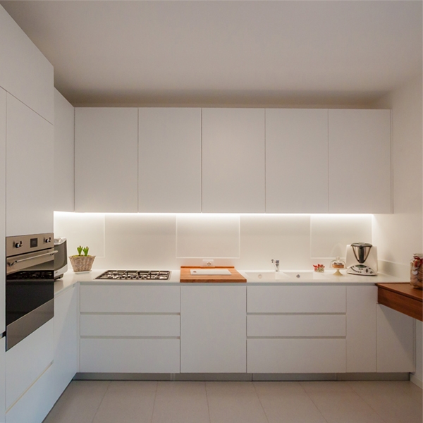
It’s the case of this kitchen, which essential setting does not give up contrasting elements such as the central cutting board and the snack bar on the right.

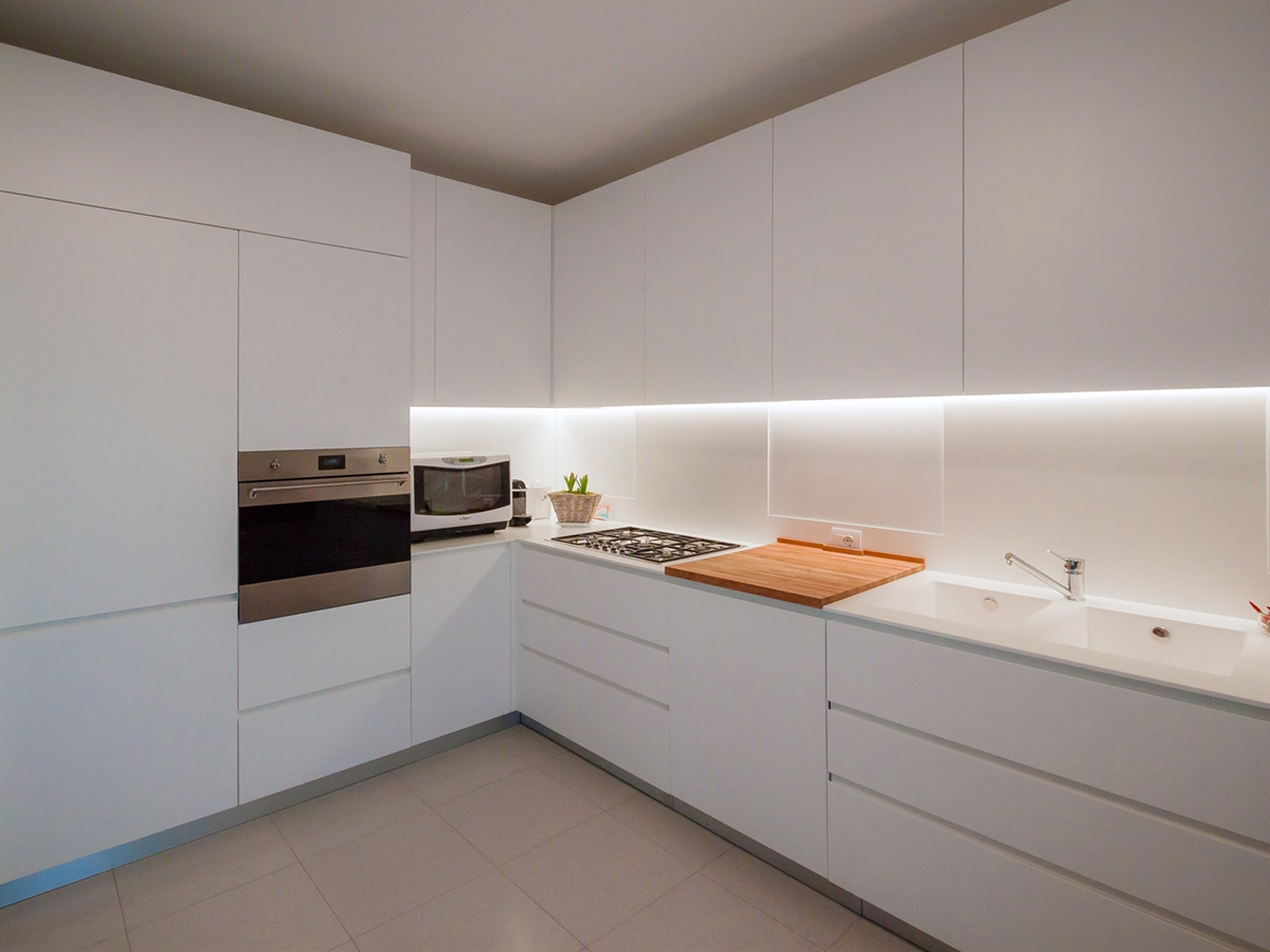
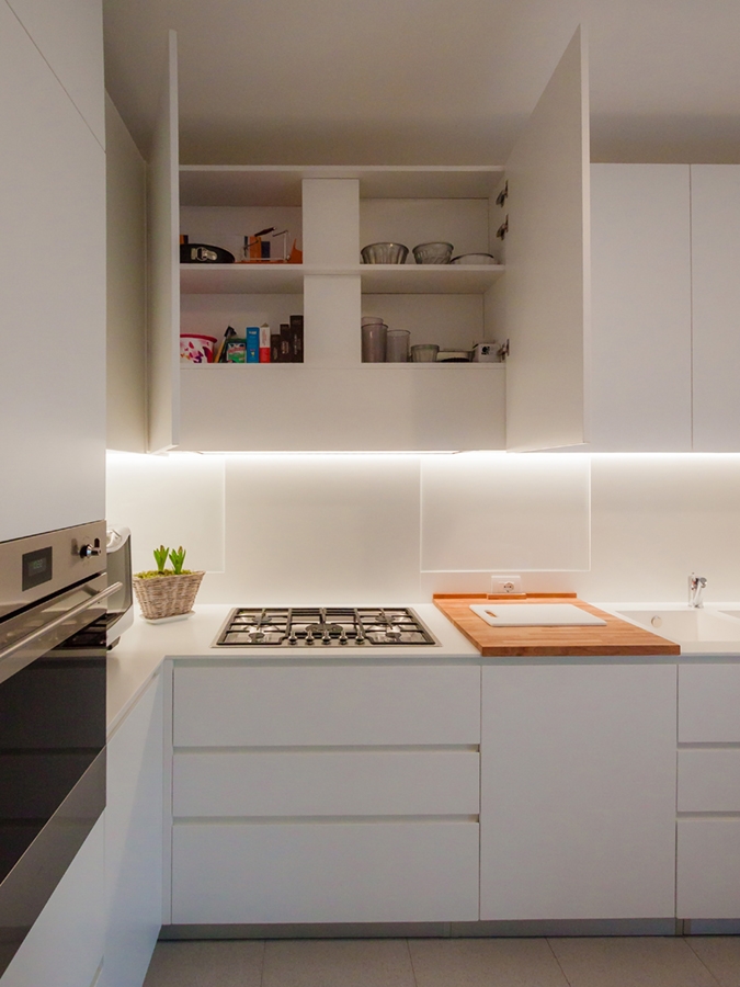
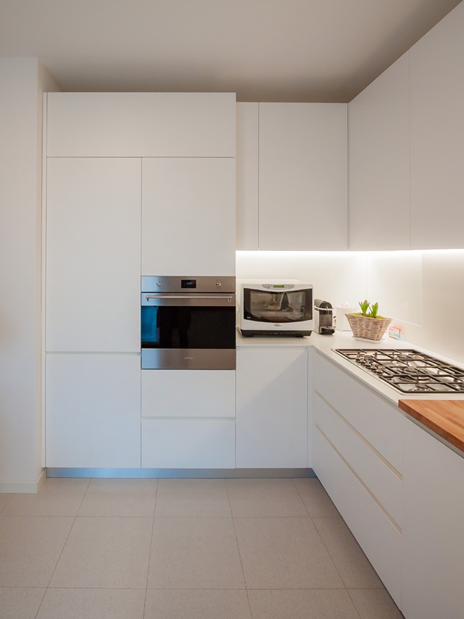
Placed at the angle, it has a visual and conceptual asymmetry that creates different visual solutions: on one side the full-height door holds containing shelves and drawers in a continuous visual surface.  The recess oven occupies the lateral part in communication with the countertop that uses the internal corner.

The main side is instead occupied by the horizontal subdivision between the upper wall units and the lower containing volumes. The linear lighting, hidden in the edge of wall units, creates a feeling of emptiness able to give lighten to the room’s perception.

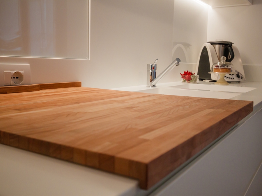
In particular, the upper wall units are made up of fixed-width doors with an extremely elegant profile, spaced from each other by a visual line obtained with a small slot. The lower part instead consists of two drawers with recessed handles symmetrically mirrored to the central door. This takes up the width od the warm-coloured wooden cutting board which creates an essential and extremely elegant contrast in the choice. On the right wall, ending the kitchen project, a wooden support takes origin whose abutment reaches the floor. It is precisely the latter that gives greater dynamism to the room by inserting a chromatic element in contrast with the surrounding neutrality. It also recalls  the finishes of the fixtures chosen for French-door on the side.


SHAPES, COLOURS AND MATERIALS

The elegance of this project lies precisely in the choice of essential stylistic lines: privileging straight lines to curved and dynamic shapes, the resulting visual composition is extremely simplified. Essentiality has therefore become the key-word to design furniture, which renounce exposed handles in favour of recessed edge. These are visible through the play od shadows created by the use of different depths.

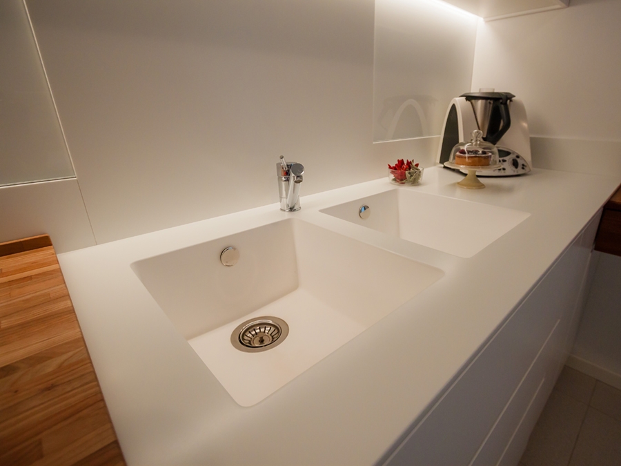
In an extremely contemporary project like this one, Corian is the obvious choice fot the kitchen countertop, which allows to hide edges, returning the idea of a very clean and elegant continuous surface.

The Corian countertop also continues on the back surface of the hob and sink, creating an interesting material alternation with the white lacobel. For the remaining surfaces, a textured matt lacquered MDF was chosen.

 
open wall units matt lacquered MDF
essential elegant kitchen ovens
wood cutting board essential kitchen
Corian sink essential kitchen
frontal view essential elegant kitchen

One kitchen a week, part 3: contemporary hi-tech

One kitchen a week, part 3: contemporary hi-tech

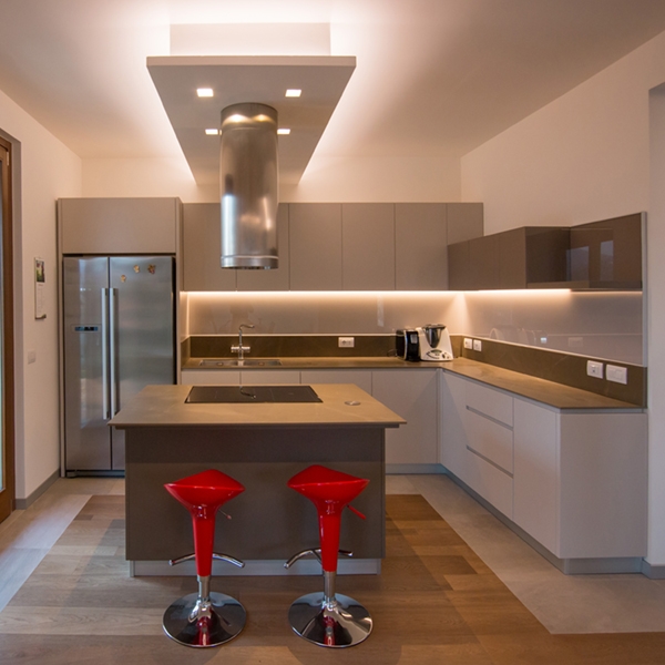
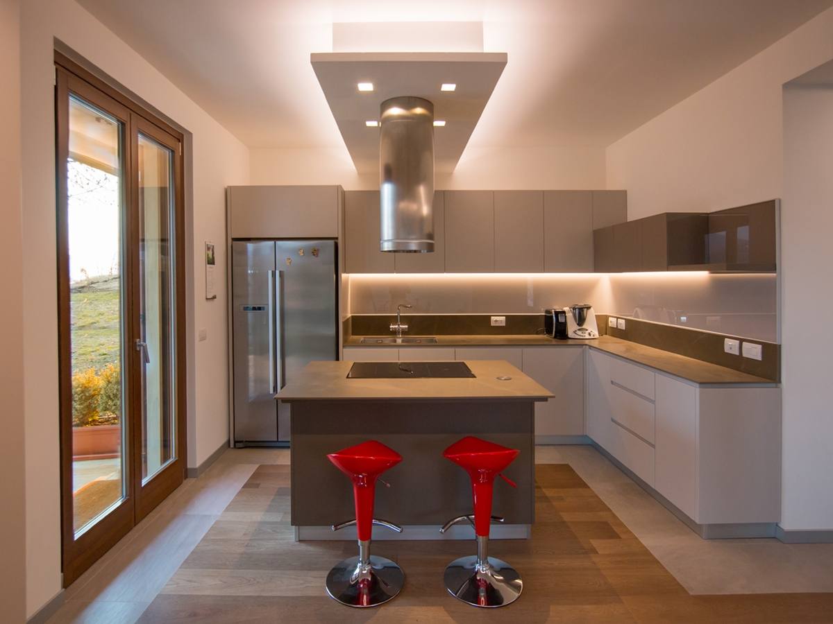
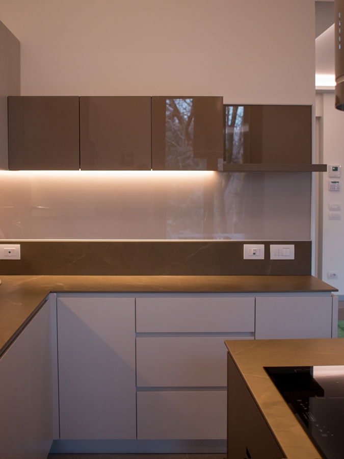
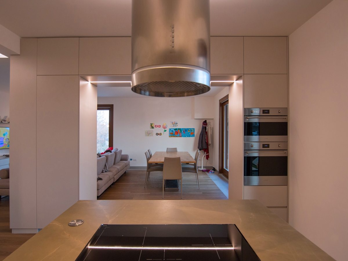
A contemporary hi-tech kitchen whose aesthetic line is very dynamic thanks to the choice of metallic materials, to the play of reflections and opacity, but at the same time, it has warm and soft colours.

hi-tech kitchen front view

The contemporary design of the appliances increasingly accustoms us to metal surfaces, glossy finishes and technological elements with an aerospace-inspired design.  Often inserting these elements in our kitchens means having to deal with the resulting visual impact. In response, on the one hand, we can see industrial-style kitchens, strongly focused on the total harmony of the furnishing with metals and reflective surfaces. On the other side, we can find increasingly contemporary interiors trying to mix the style of the different components by exploiting the chromatic and material contrasts. These two currents do not necessarily represent the opposite of the other. In fact, it is possible to uniform the elements in a style that is so contemporary, but which also manages to reflect the elegance and domesticity of the rooms.  

THE PORJECT

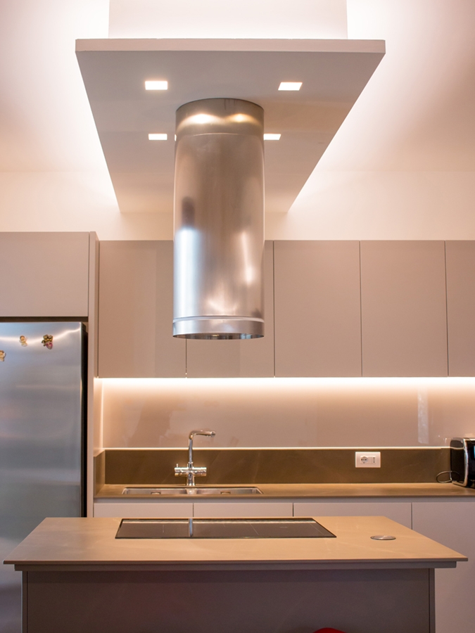
This kitchen with a hi-tech scent is an excellent example: the customer’s taste responds to the trend of mocha colour, with its warm and soft tones. Taking advantage from the alternation of more or less warm colours and glossy surfaces combined with the opaquer ones, an elegant and at the same time dynamic interior has been achieved. Starting from the separating element of the living area, which is equipped to host storage doors supporting the living room on one side, and recessed ovens and others storage units from the inside. The result is a deconstructed kitchen, which does not give up to the functionality of a compact kitchen, but which takes advantage of the visual opening of the open space. The passage of this partition is underlined by a led strip whose linearity refers to the most dynamic and technological interiors. The central island with its mocha-coloured upholstery holds the induction hobs and free surfaces used for preparing meals. An extremely functional element is the cylinder that houses the electrical service outlets, which can be activated by pushing. A recessed element whose extraction technology is extremely simple. It is also capable of transforming an often visually cumbersome component into a design element. The lower part of the island acts as storage point while in the upper part, a cylindrical design fan is suspended from the backlit false ceiling. The latter can give greater dynamism to the kitchen. The two corner components of the remaining part respond in the same way with the upper wall units organized with doors and containing volumes in the lower part. The different height of the upper wall units creates dynamism also recalled in the chromatic choice.  

COLOURS AND MATERIALS

The technological setting of this hi-tech kitchen is also visible in the choice of materials with excellent technical performance. In fact, the mocha-coloured dekton was chosen for the kitchen countertop, incorporating the island’s one. In addition to a significant aesthetic value, which summarizes elegance and modernity, it enjoys excellent technical performance, such as perfect resistance to high temperatures and hardness. It therefore lends itself to be an excellent material in its field while giving a strong stylistic imprint. The back shelf of the countertop alternates the mocha-coloured dekton with a glossy lacobel with a neutral hue. The alternation of opaque to glossy surfaces is possible using textured lacquered MDF which is turn coated, where necessary, by lacobel.

 
island kitchen with extractor fan
hi-tech kitchen divider
cylinder soket push hidden

Compare this hi-tech kitchen with the previous ones: contemporary pop kitchen and fresh, gritty and lively kitchen.


One kitchen a week, part 2: fresh, gritty and lively

One kitchen a week, part 2: fresh, gritty and lively

lively kitchen front vew

A lively kitchen with a gritty character and a touch of freshness between games of bright reflections and alternation of full and empty spaces.  

THE PROJECT

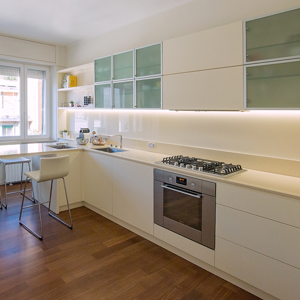
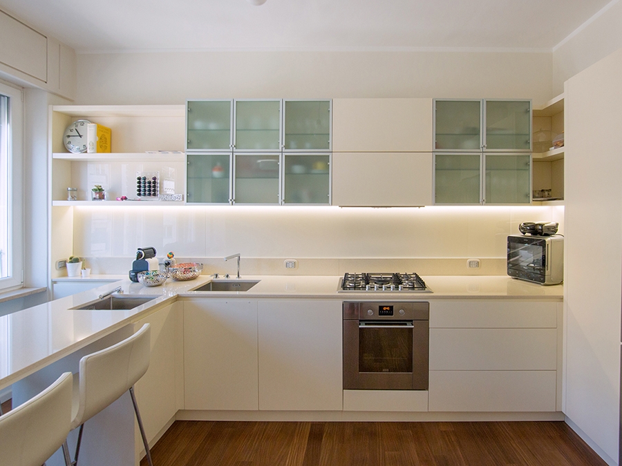
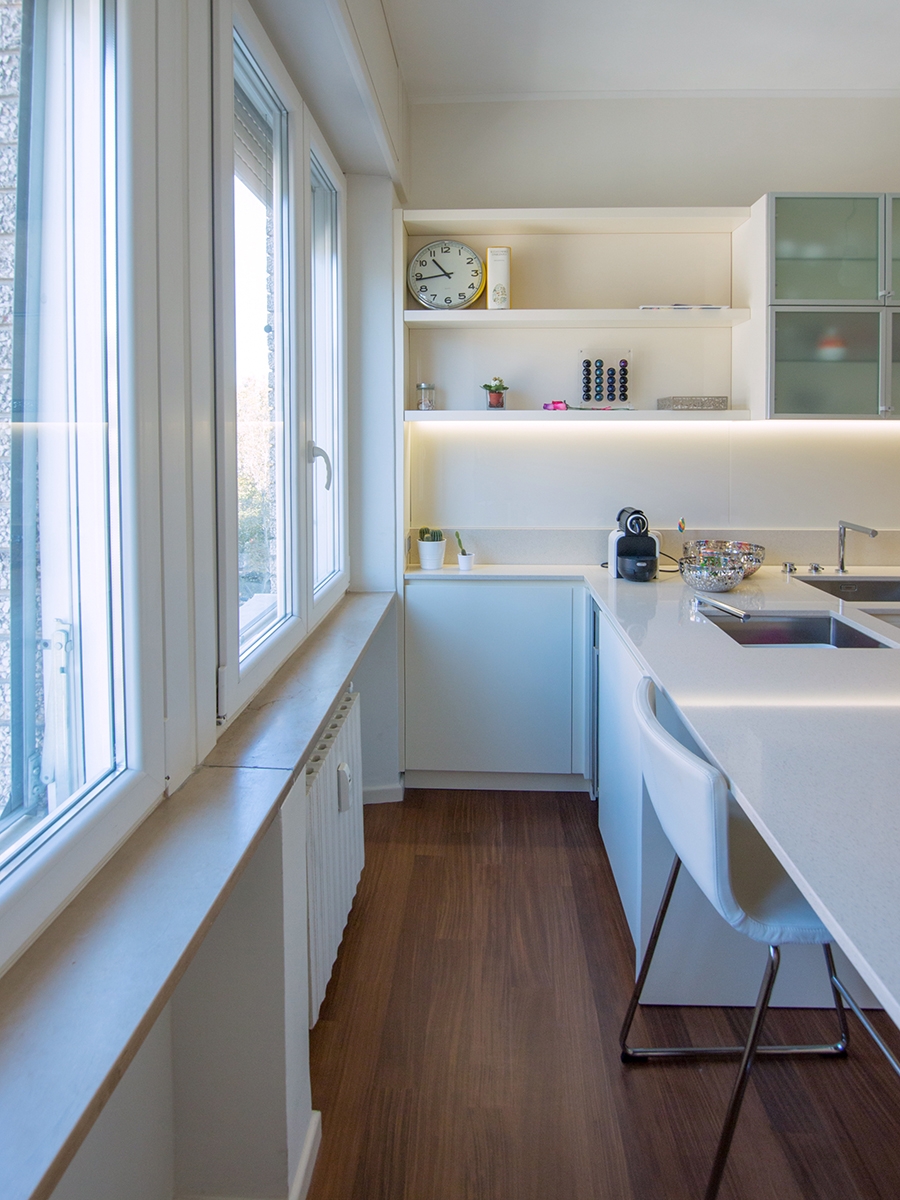
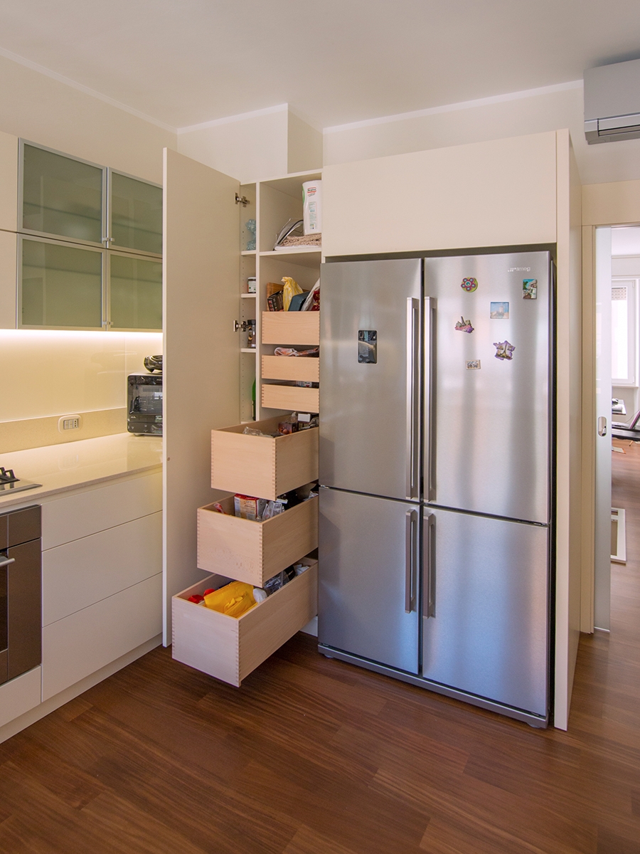
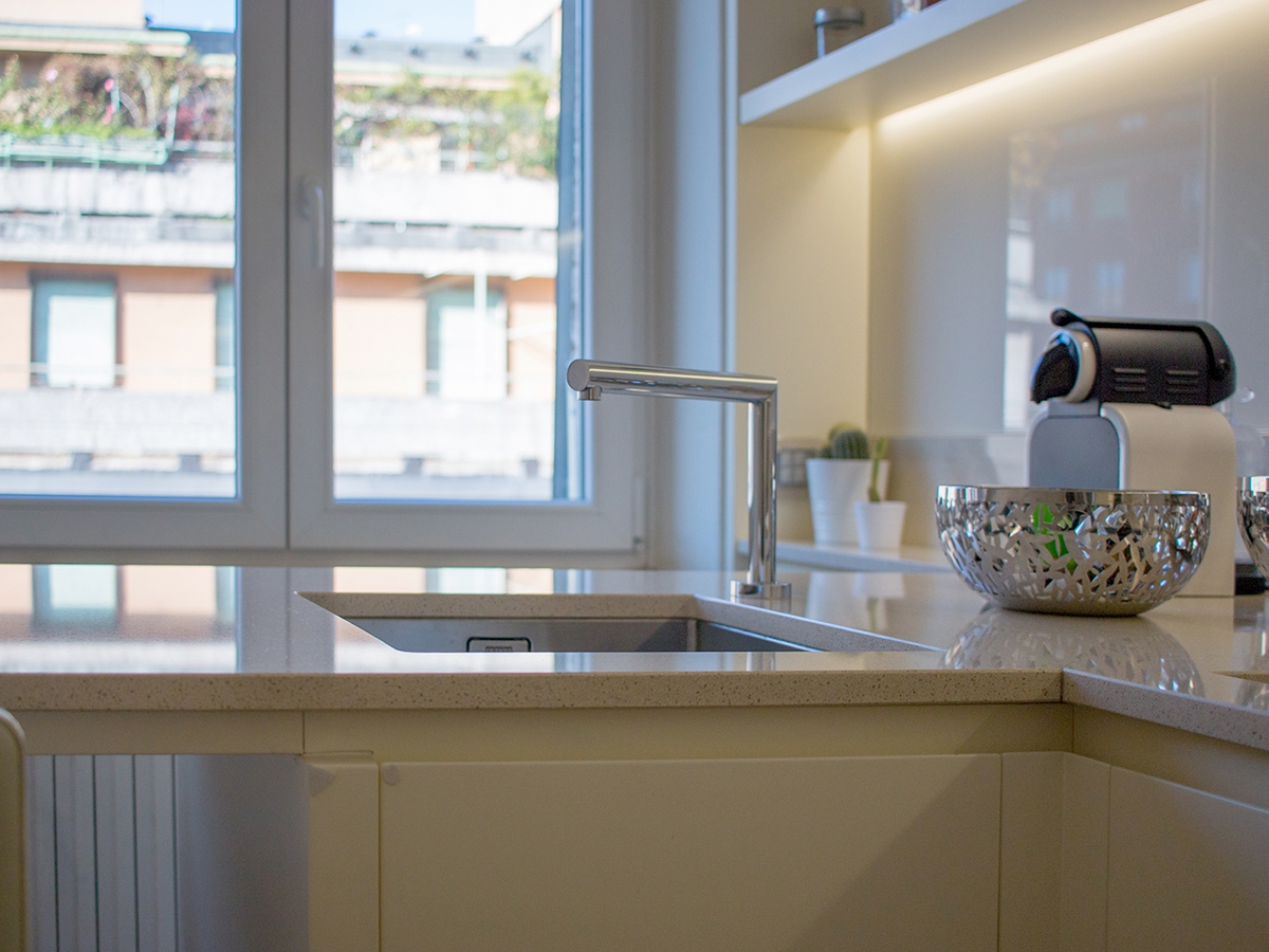
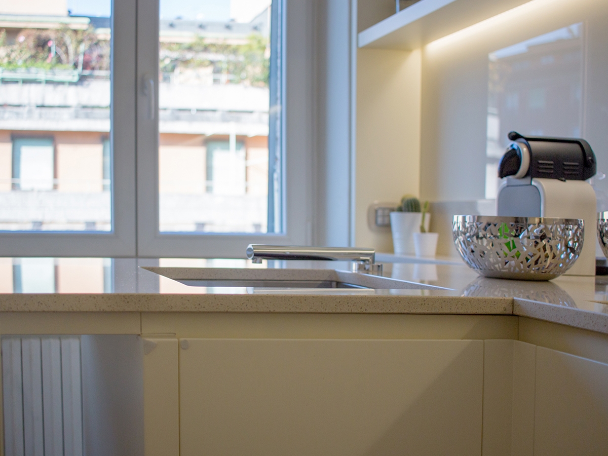
Added in the context of the always dynamic Milan, the kitchen is reckonable for its lively and fresh imprint, with both a gritty and elegant soul. A kitchen with a thousand resources, capable of keeping attention in all its parts. Starting from the wall units, which alternate empty and full volumes in which a game of transparencies is played on several levels. The shelves visually lighten the volume in the kitchen in both ends: in the area adjacent to the window, from which natural light radiates, and in the inner corner between the two sides of the room. This last one, also takes advantage of what could considered a critical point for comfort and functionality. Instead, arranged in asymmetrical geometric volumes on both sides of the extractor fan, there are the opal glass wall units able to give a touch of fresh colour and dynamism from which the contests can be glimpsed. The central wall unit hiding the extractor fan and the lower containing volumes are instead reckonable for their extremely elegant simple lines. The fitted sinks are arranged on the corner, taking advantage of the attachment point of the snack bar. This is equipped to accommodate up to 4 sitting using both sides. The gritty setting is also visible in the choice of details, such as the hidden tap able to allow the opening of the back window. As always, functionality is a fundamental requirement, which is also visible in the door alongside the large design refrigerator. This houses inside functional shelves with different heights and six drawers with a wooden finish.   THE MATERIAL CHOICE The games of brightness and reflections able to restore the idea of restoring the idea of liveliness and freshness are obtained especially thanks to the choice of materials. In particular, a quartz granulate topping was use for the countertop. It is able to capture and mirror the light, recalling the cream tones on the kitchen. While for the remaining elements it is the glossy lacobel that gives elegance and contemporaneity.

snack bar lively kitchen
lively kitchen with drawers and shelves
lively kitchen high tap
lively kitchen hidden tap
lively kitchen perspective

Compare this kitchen with the contemporary pop’s one.


One kitchen a week: contemporary pop

One kitchen a week: contemporary pop

contemporary pop kitchen front view

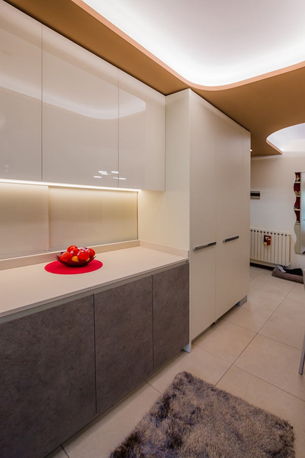
The first of four kitchens we want to present you is part of an interior that we can define as “contemporary pop”.  

THE RENOVATION

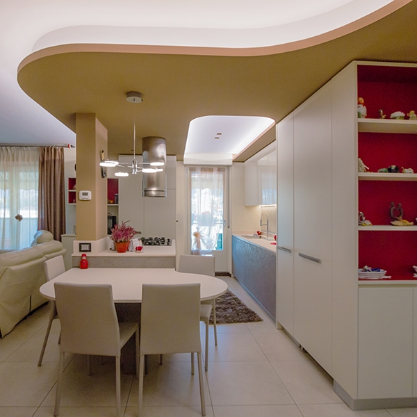
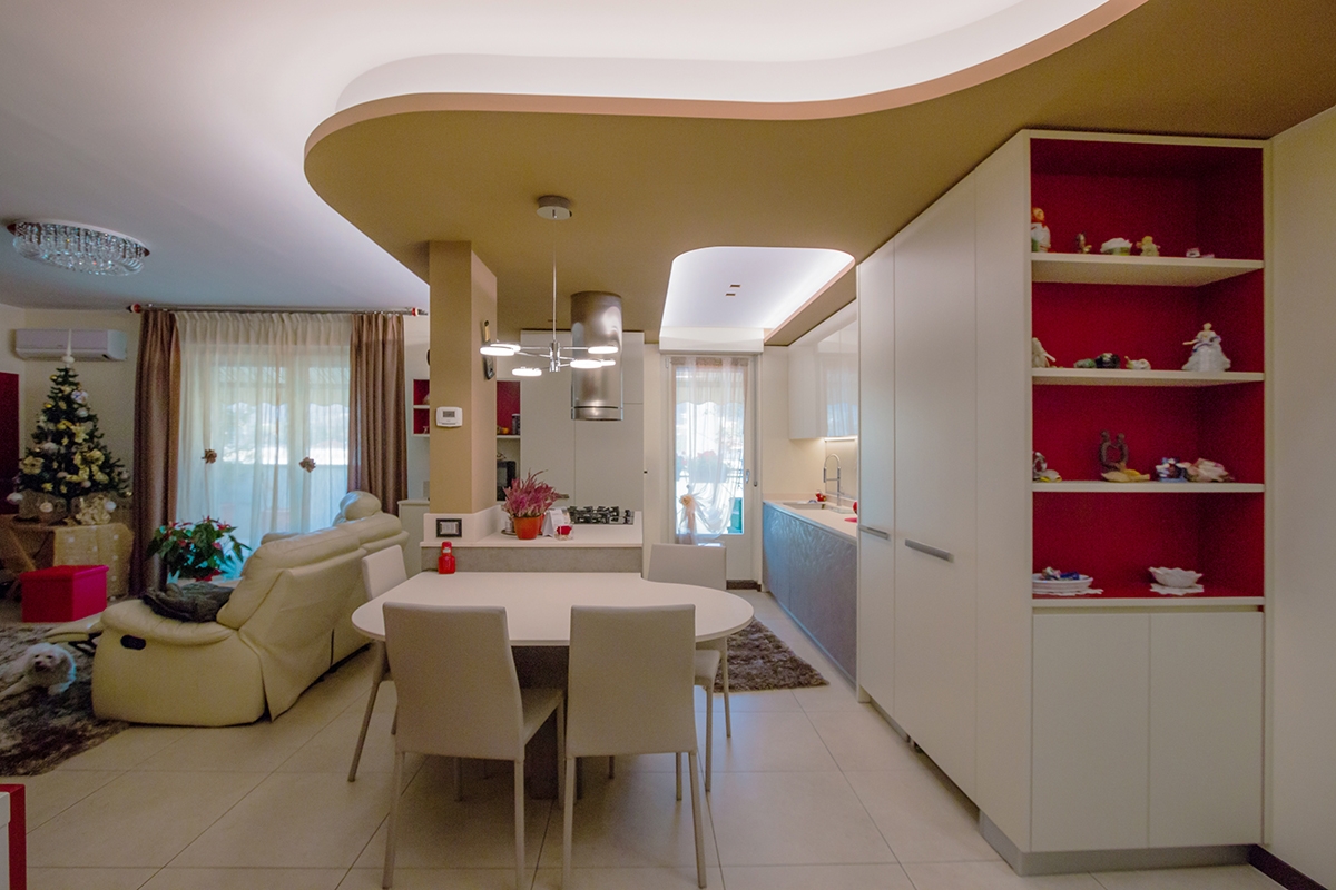
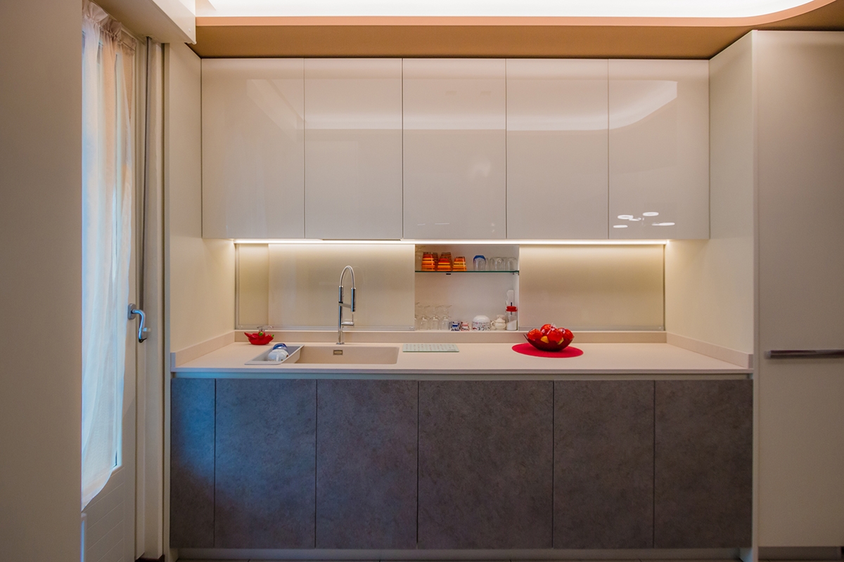
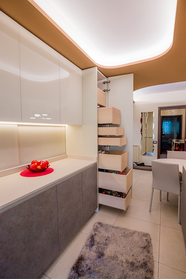
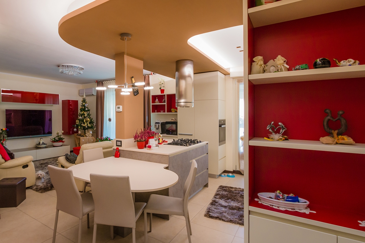
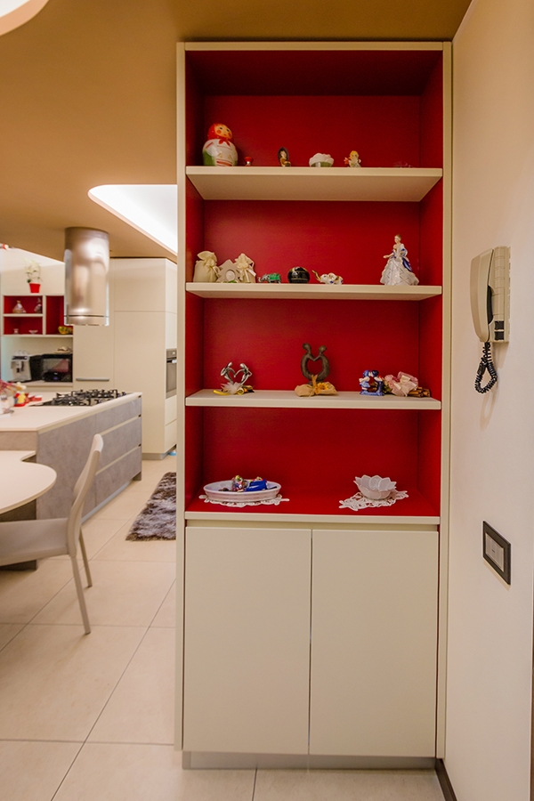
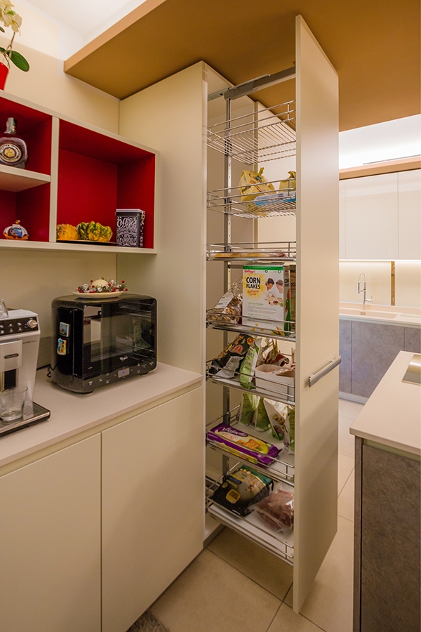
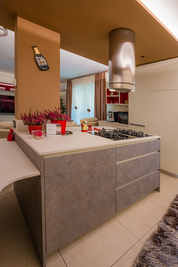
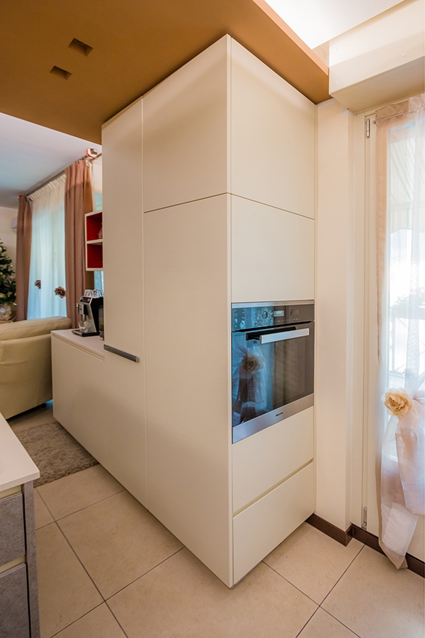
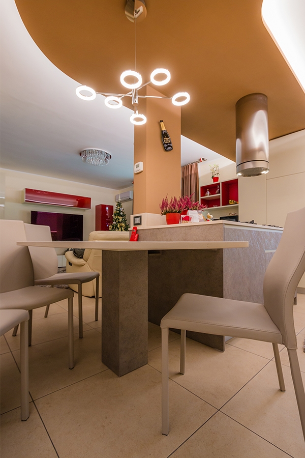
The renovation of the kitchen area develops around the element of golden curved false ceiling, strongly desired by the client. The design challenge consists of thinking at a room that could fit at best this existing element with a strongly stylistic character.  This ceiling is reckonable both for the chromatic choice and for the shaped profile, in addition to the strong dynamism underlined by the lighting following the shape. The closing wall and its entry door have been deleted in favour of an open-space. What remains is a load-bearing pillar, also gold-painted, to which an island worktop with lower containing volumes, cooking hob and drawers. The ovens are arranged in the full-height elements on the left side of the French door opening towards the kitchen’s interior. In doing so, they are almost hidden. The real development of the kitchen follows the course of the back wall which in turn is made of two different types. On one side, the full-height doors that house both the built-in refrigerator and storage shelves for food and drinks are placed directly facing the living area. The depth of the full-height element acts as a support for the living room lightened by service shelves. The red backdrop also recalls, giving further chromatism, some wall units in the living room and the choice of some furnishing elements such as vases. The second type, visually lighter, occupies the kitchen’s part adjacent the French door. It consists of a countertop with a built-in sink and suspended wall units with internal shelves. The lower part holds the washing machine compartment.  

SHAPES AND MATERIALS

Even the chromatic and material choice reflects the desire of giving incisiveness to the room, through the use of plastic laminate in two different shades of gray. A contemporary pop interior animated both in shapes and colours, in which the attention to the design of each components is easily visible. To further enrich the kitchen, the extractor fan as an element of design, and the suspended light that recalls the material choice. The dining table harmonizes the ceiling’s shapes, attached to the adjacent cooking island.

contemporary pop kitchen
countertop and wall units
dining table and shelves living room
red wall units and containing door
island kitchen contemporary pop
hidden fitted oven
contemporary pop dining table