Furniture for children according to the Montessori Method

Furniture for children according to the Montessori Method

Building furniture in Montessori style means creating a child-friendly, comfortable and accessible environment. The lines that characterize these furnishings are simple and the materials are natural, such as wood.

THE MONTESSORI METHOD

The Montessori educational method is based on free activity within an environment tailored to the structural and cognitive characteristics of children and teenagers.
The function of the environment and of the furnishings that complete their spaces is to allow them to spontaneously develop autonomy in all evolutionary areas. The environment must therefore be built in proportion to the child.
It must be beautiful, harmonious and clean, it must facilitate movement and activities, while limiting the tools.
A space free of obstacles and minimal, free to be experienced independently, without the help or interaction of an adult.
Children in these environments are free to choose, create, invent and become aware of themselves and their potential in a process of self-education and self-control.
Montessori pedagogy starts from birth and develops up to adolescence with the aim of making the child not only independent, but also responsible and aware towards individual, but also social growth.

MONTESSORI FURNITURES

A fundamental prerogative of Montessori furnishings is the possibility for the child to reach the object easily and independently for sensory activities.
Then leave it free to be “called” by the object.
Furniture with an impact that is not only physical but also visual, fantastic and emotional.
Elements that become playmates and life companions where adults are guests or spectators in the environment.

BOOKSHELF

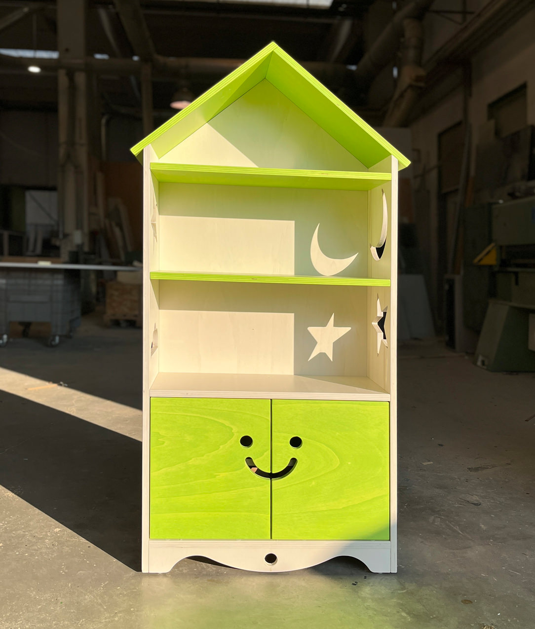
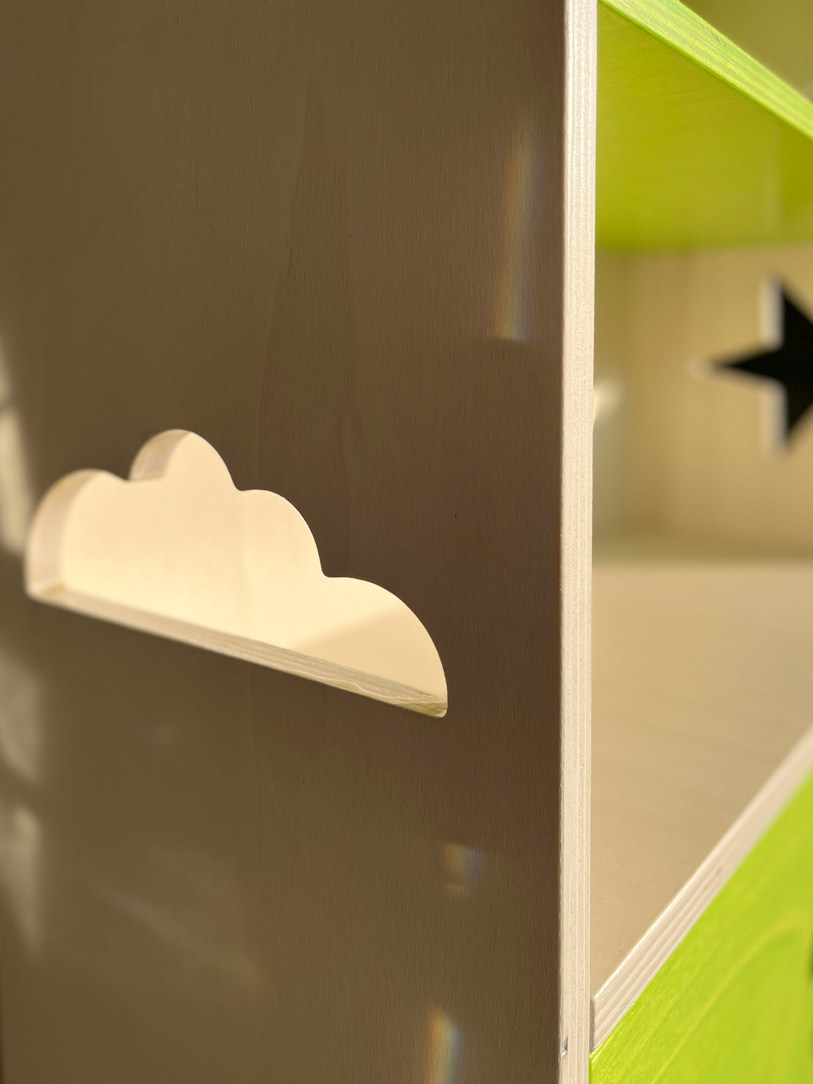
To marry the Montessori principles is this bookcase, made at child height in order to encourage the free choice of the favorite book.
All or most of the books are displayed in full view and in an orderly manner, even better if with the cover visible and not on the edge.
The shelves are easily accessible while the closed parts are designed to make opening easy and intuitive.

 Allegra Montessori Library
 Allegra Montessori Library
 Allegra Montessori Library

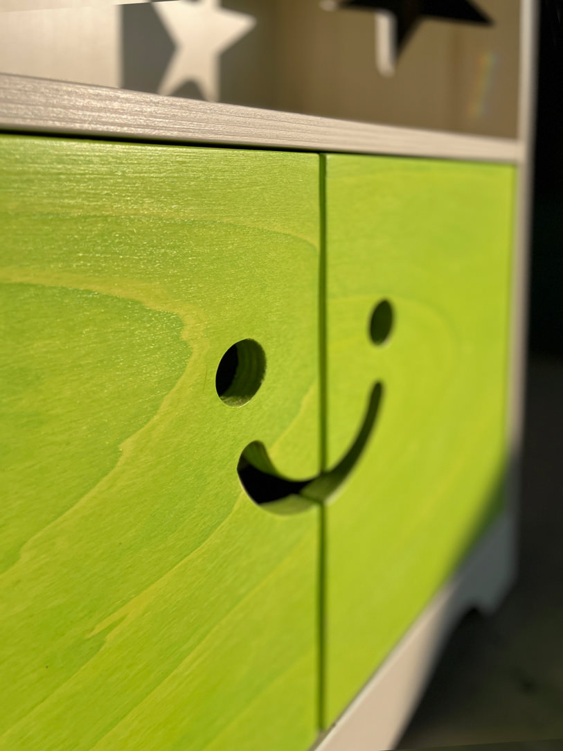
The “Little Cheerful Bookcase” in the shape of a house has shelves visible in the upper part and lower doors with a laser-cutted handle in the shape of a happy face.
The opening takes place precisely by inserting the fingers in the “voids” of the smiley, stimulating the touch for gripping the doors.
Internally, a shelf is available for any small items. Made of poplar wood it was subsequently painted with non-toxic water-based paints that still allow the natural grain of the poplar to be glimpsed.
All this to introduce the theme of colour, respecting the reference to nature present in the choice of material.

MONTESSORI TURRET

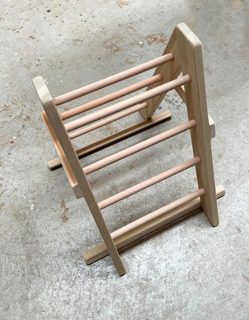
The Montessori turret is also called the Learning Tower.
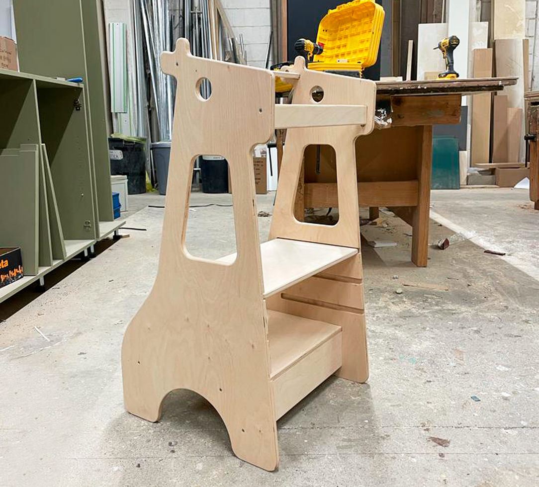
This is essentially a wooden ladder that allows the child to stand up, in total safety thanks to the side bulkheads.
Thanks to this “elevation from the ground” all the adult furnishings, such as the kitchen top, tables or sinks, also become accessible for the child.
The latter thus manages to carry out, in complete autonomy, various actions such as brushing his teeth, hands or carrying out small household chores which allow him to acquire autonomy.
The steps of the Montessori tower also train the child in the actions of going up and down which he will have to deal with when dealing with higher stairs.

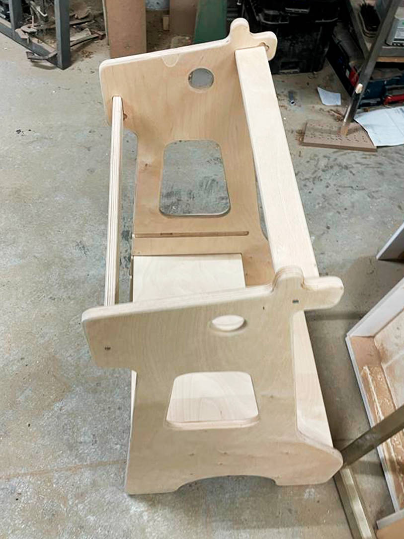
 Montessori giraffe turret

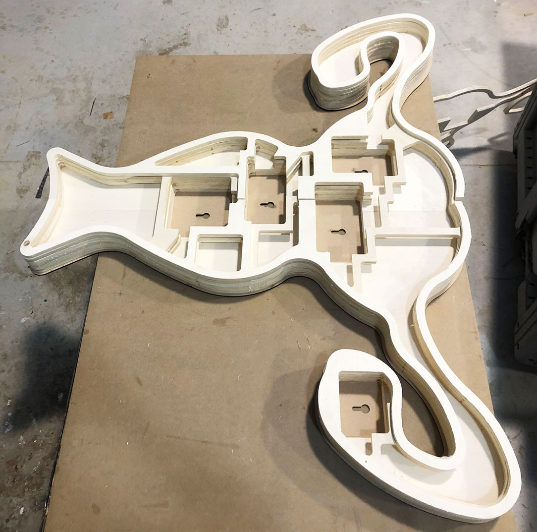
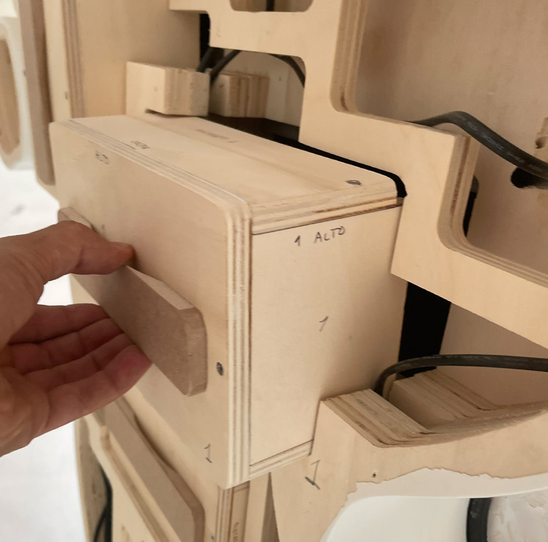
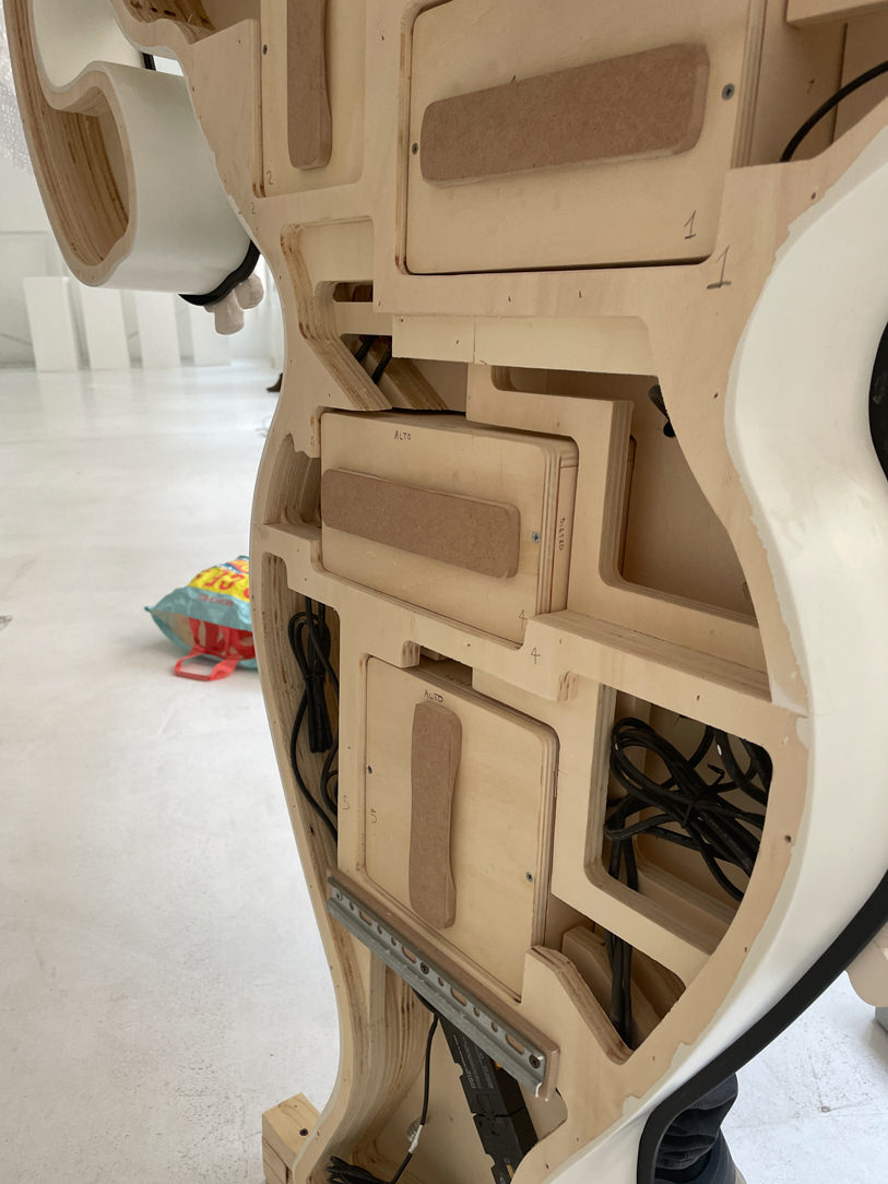
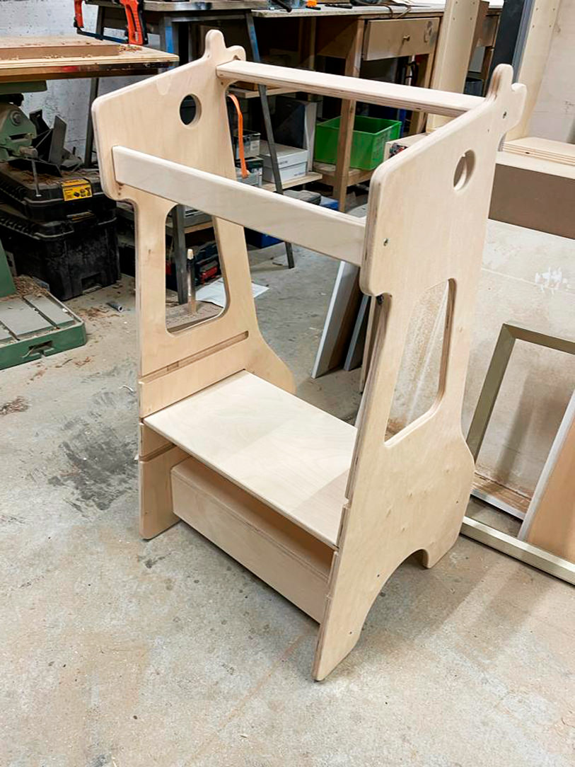
Here is our creation in the shape of a giraffe in which the second step is removable and can be raised according to the height of the child.
This turret is a useful accessory and can also be used as a stool; in fact, the child can sit on the first step and the second shelf acts as a back support.

Montessori giraffe turret detail

An example is our giraffe-shaped creation in which the second step is removable and can be raised according to the child’s height.
A multifunctional element, it can also be used as a stool using the first step as a seat, while the second shelf acts as a back support.

MONTESSORI BEDS

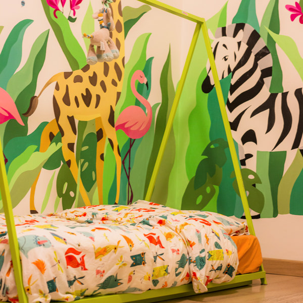
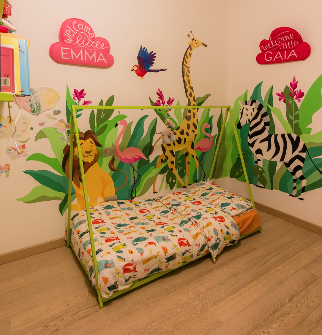
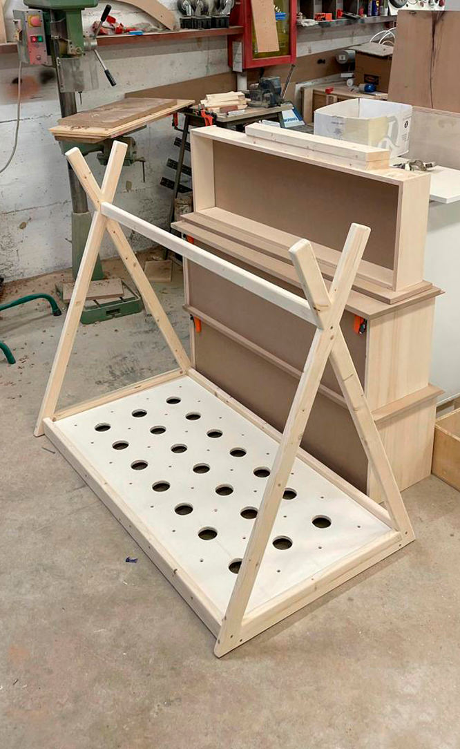
The Montessori bed is mainly characterized by its height designed to allow the child to get on and off in complete autonomy.
There are no side bars to impede movement, freedom becomes a design metaphor for essential and intuitive furniture.
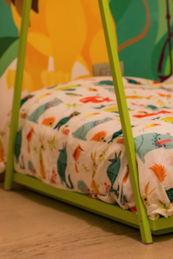
There is therefore no back headboard, but the mattress is rather embraced by the surrounding wooden structure.
Montessori cribs can have side bars that give them a cottage look or, as in these cases, an Indian hut.

Montessori bed
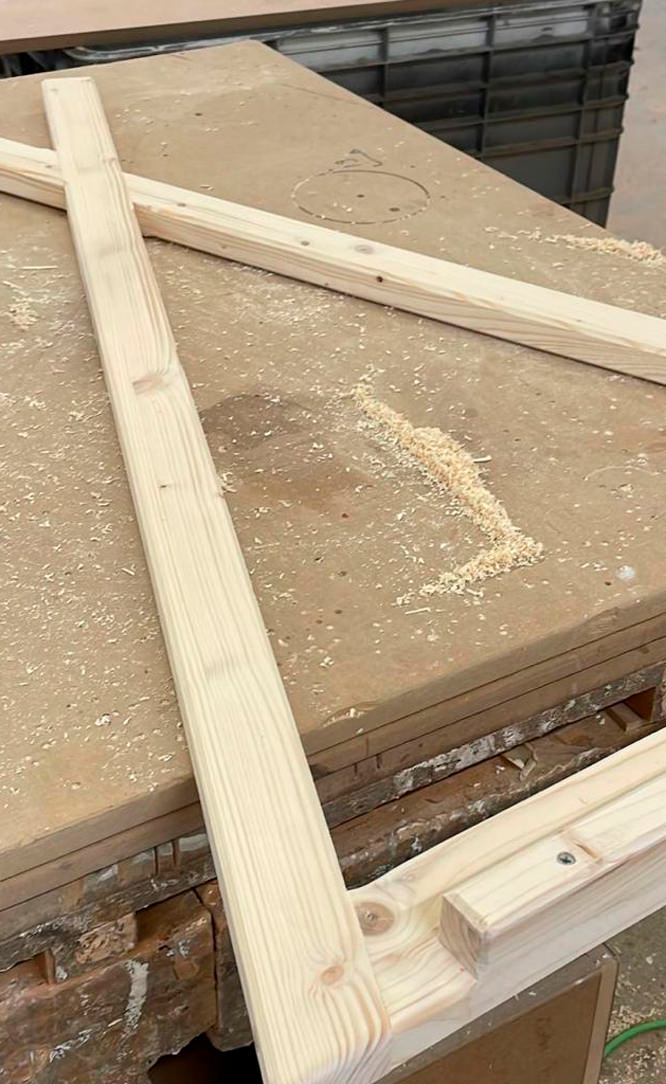
Montessori bed details

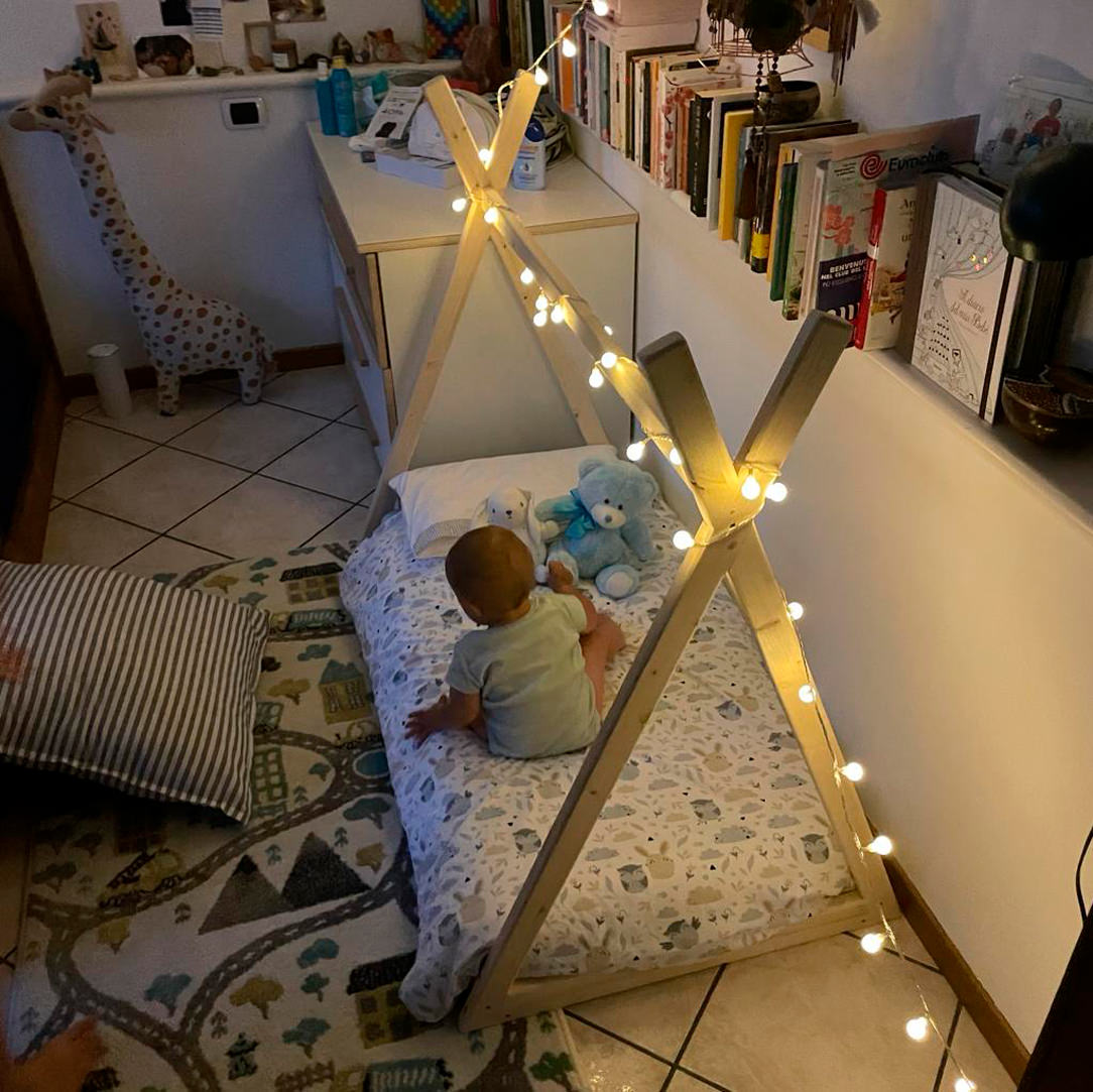
Lights, toys or possibly a sheet can be hung on the upper bar to underline the feeling of den and protection.
The vision and perception of the child inside his bedroom are therefore total visual freedom of the entire environment and his surroundings.

Montessori bed light
Montessori bed back
Montessori bed light

The bottom is rigid and breathable, becoming an excellent support for the development of the spine.
Although the Montessori bed is extremely safe, also thanks to the reduced height, a useful tip is to introduce it starting from the year of the child when he becomes independent in walking and moving.
Here is another of our articles dedicated to the safety of children in the home.

PIKLER TRIANGLE

The Pikler Triangle is a game-tool created by a Hungarian pediatrician, Emmi Pikler, based on the Montessori Method.
According to Pikler, it was important to follow the pace of development of each individual child, giving them the opportunity to move and experiment with the body and its movements in complete freedom.
In order to express their emotions, the child uses movement as the first means of communication.
For this reason, leaving them free to move and experiment is very important for growth and psychomotor development, as well as relational and emotional.

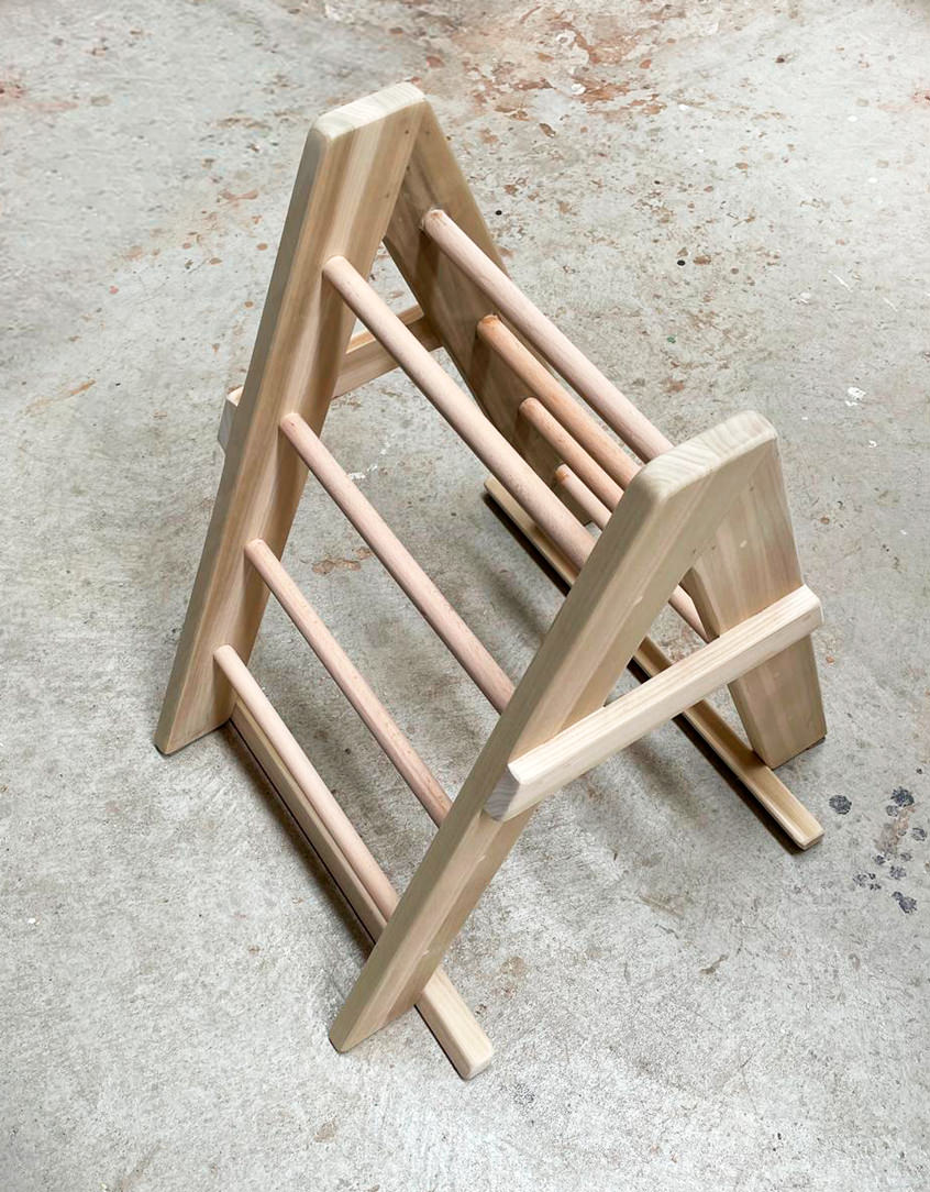
Triangol Pikler
Triangol Pikler
Triangol Pikler

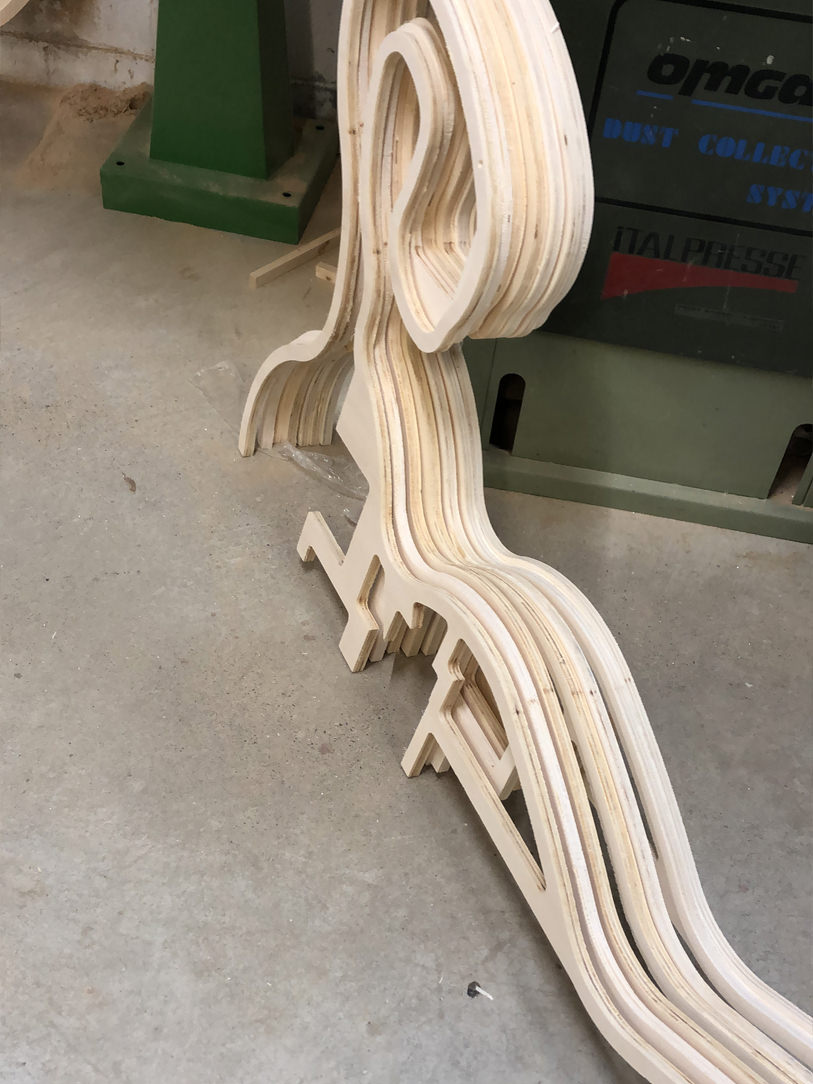
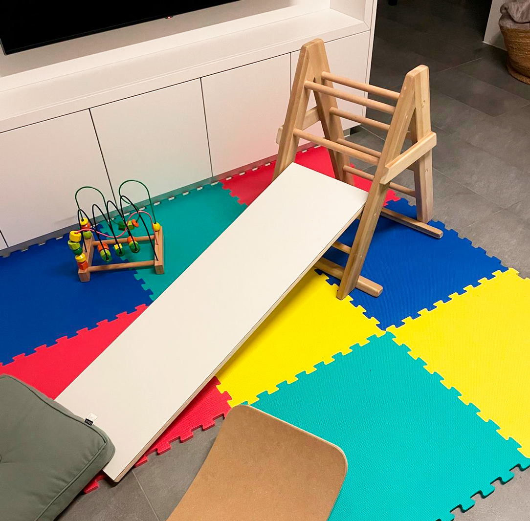
Here our Pikler triangle, characterized by a triangular-shaped wooden structure which can be associated with a platform-ramp, which hooks onto the pegs of the triangle. The latter can be used by the child to climb, go up or down and in a thousand other imaginative ways.
With this tool, children learn to discover and understand the movements of their body, control and manage movements, coordinate themselves.
It favors the development of the autonomous motor sense when used to climb, go up and down, but it is also an interesting stimulus for the imagination when used as a tunnel or hut, or much more.

CONCLUSIONS ON THE MONTESSORI METHOD

Montessori pedagogy is therefore not only based on independence, freedom and respect for the child’s natural physical, psychological and social development, but also on a sense of responsibility and awareness towards the network that links every small entity to a larger macrocosm.
Children deserve spaces where they can move, play and sleep, wake up and experiment.
Sometimes we think that a newborn baby is small, vulnerable and unable to open up to the world, but that’s not the case at all.
By trusting the child, right from birth, his growth will be balanced and independent and he will feel more secure in each new step.

The Kitchen Snack Table as an evolution of contemporary Cookery

The Kitchen Snack Table as an evolution of contemporary Cookery

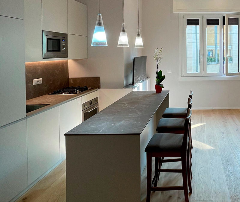
The Kitchen Snack Table has become increasingly common in contemporary cookery, representing an informal and multipurpose space. In addition to making the environment more convivial, it helps create a new hybrid connection between the kitchen and the living area.

A NEW WAY OF USING THE KITCHEN
THE DIFFERENT TYPES OF KITCHEN SNACK TABLE
• INTEGRATED TO THE PENINSULA
• INTEGRATED INTO THE ISLAND
• IN SUPPORT
• SLIDING
THE KITCHEN SNACK TABLE IN CONCLUSION


A NEW WAY OF USING THE KITCHEN

In the last decade, the kitchen has consolidated its focal role within the domestic environment. Thanks to the multitude of television programs with starred chefs, the pleasure of cooking has been rediscovered, bringing the excellence of the Italian culinary tradition back into force. By virtue of this, more and more attention are paid to the functionality of the kitchen: storage, preparation, cooking and tasting become fundamental points in the act of cooking, each with its own needs and requirements.

Kitchens have evolved over time, marrying the idea of ​​open spaces in recent years, blending into the living area. By breaking down the canonical subdivision into closed environments, the sense of openness has also contributed to modifying the conformation of the kitchens. These have become more and more protagonists both in their island and peninsula arrangement, in which they accompany the conformation of the architectural structure. From this point of view, the kitchen snack table plays a fundamental role in the new vision of the living area, acting as a functional element of conviviality and a trait d’union between the two different areas.

By Kitchen Snack Table we mean any type of extension of the kitchen worktop, whether it is coplanar or overlapping the latter. Being a hybrid element of both the kitchen and the dining area, it allows the tasting of quick lunches and snacks without having to sit down at the dining table. At the same time, it remains at the service of a work surface during the preparation of meals.

Made in the same material as the top or in contrast with it with a different material, it is characterized by a sophisticated design. Dimensions and locations vary according to the structure of the kitchen and the importance one wishes to give to the element itself.

wasabi peninsula kitchen

THE DIFFERENT TYPES OF KITCHEN SNACK TABLE

INTEGRATED TO THE PENINSULA

In the peninsula kitchen, the Snack Table has the same height as the worktop which is usually around 90cm and differs from the dining table which is 20cm lower. It is therefore necessary to use high or adjustable stools for a small number of diners, given the limited usable space.

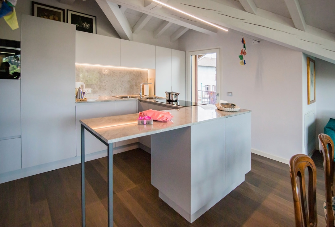
In these examples of peninsula kitchens, the Snack Table is designed in the same material as the top to give a sense of visual continuity.

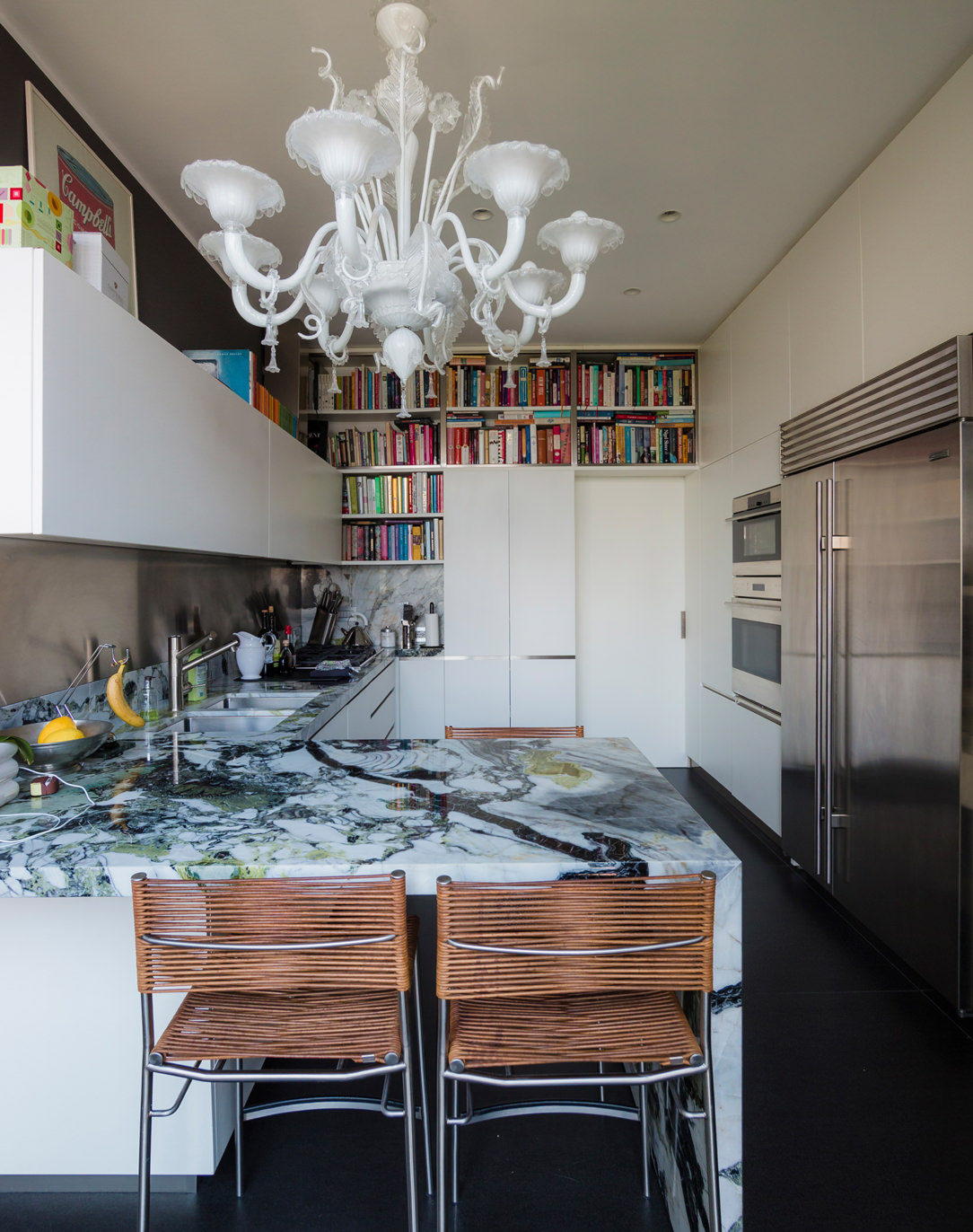
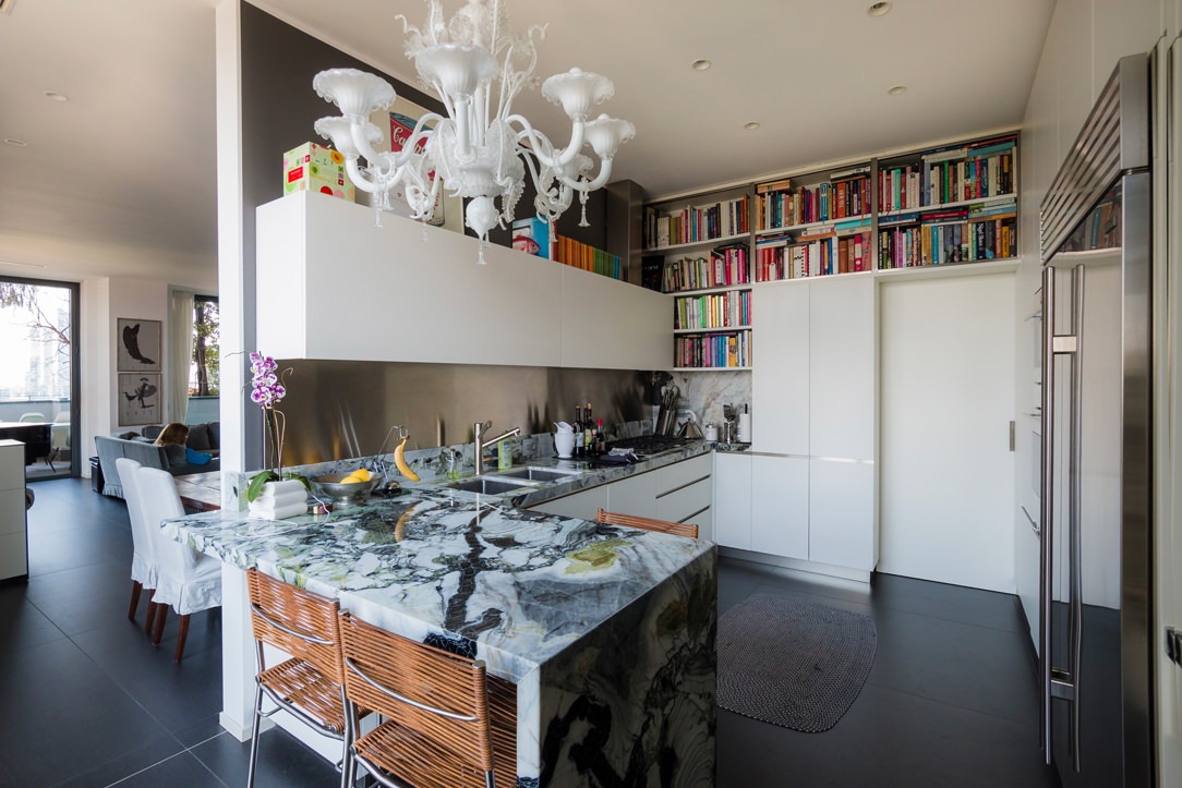
In this peninsula kitchen, the marble top stands out for its veins and elegance, becoming the undisputed protagonist of the environment. As such, it harmoniously embraces the development of the kitchen, declining towards the ground and restoring a sense of visual closure. In the second case, the worktop leaps towards the living area, supported by an anthracite gray painted iron structure with a linear aesthetic. The sense of openness created by this supporting structure allows maximum usability of this element.

lateral wasabi kitchen
peninsula gray snack table


INTEGRATED INTO THE ISLAND

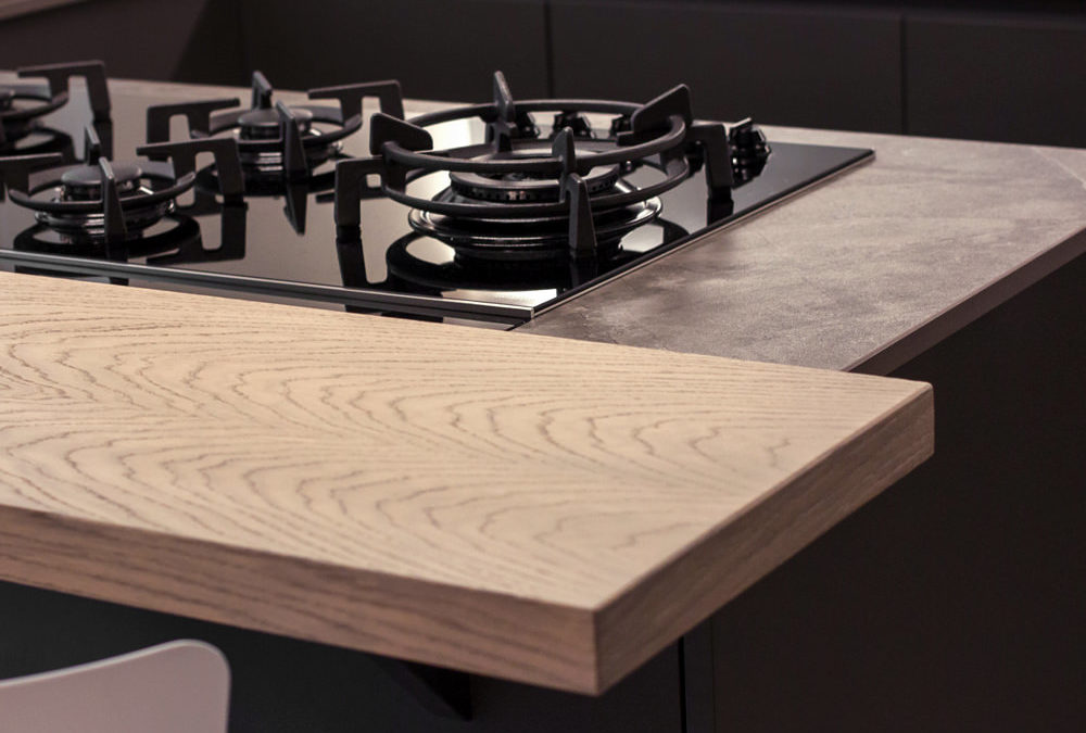
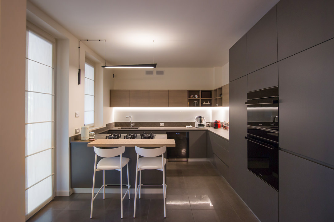
Born as a replica of an actual bar counter, it is in front of or to the side of the operational part of the kitchen, which very often incorporates the hob or sink. Usually shallow, no more than 30cm, it takes advantage of a small space both for support and for tasting. It can be raised above the kitchen top and made in a different material to create an interesting visual contrast. Here are two examples with a wooden top combined with a stone-effect kitchen top.

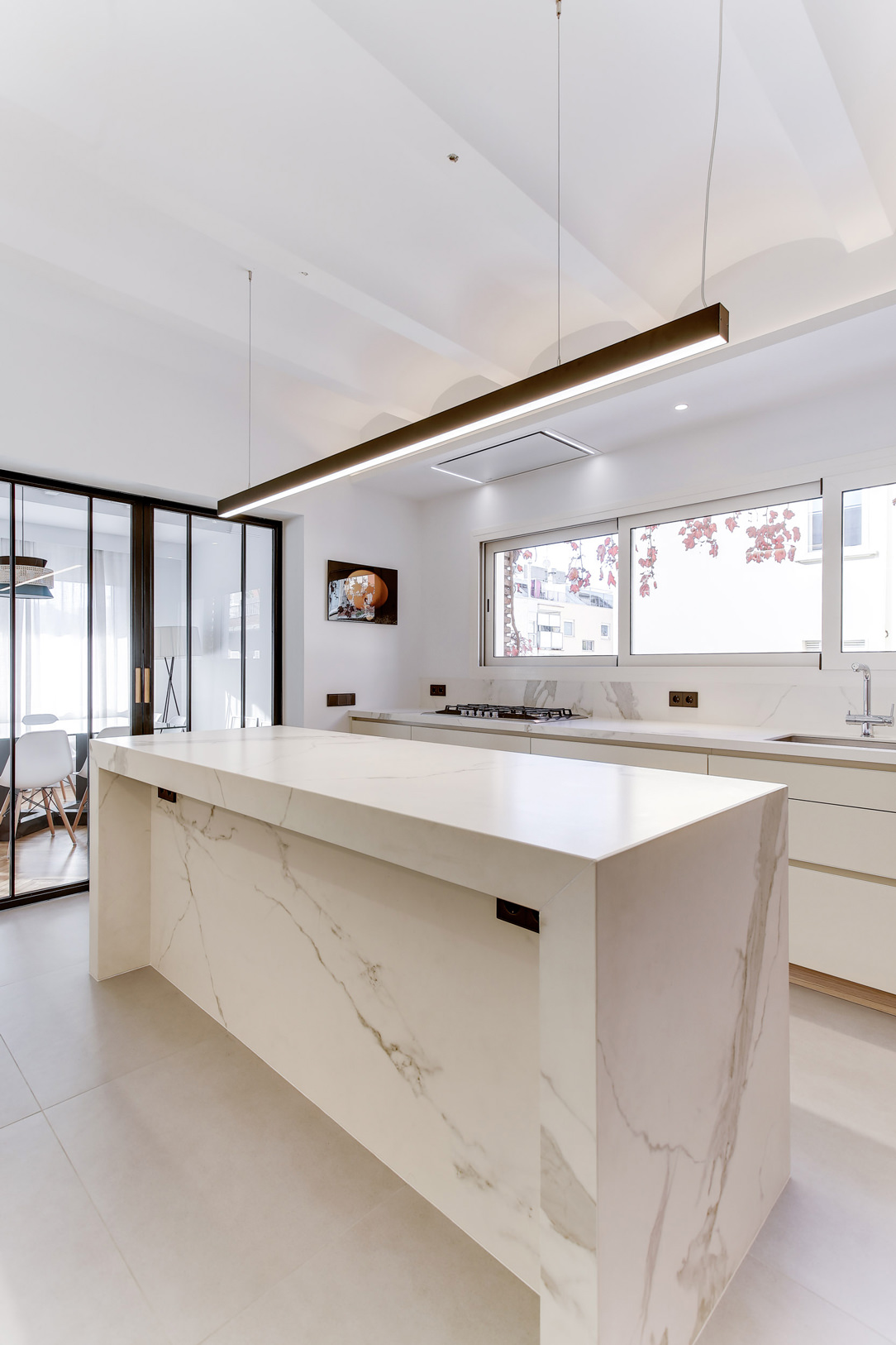
In the island, the snack top can continue with the same material, providing only a useful support and workspace as in these two cases.

light island kitchen Snack Table
gray white kitchen island

IN SUPPORT

The snack top can also be released from the island or peninsula and become an independent space for supporting or consuming quick meals. A singular element inside the kitchen, as in this case, where it becomes an additional surface for completing the kitchen on the wall.

kitchen with extended Snack Table

A disturbing architectural element, such as a pillar in the center of the kitchen, can integrate harmoniously by becoming a support for an additional snack top in the kitchen, as in this case.

kitchen with lateral Snack Table


SLIDING

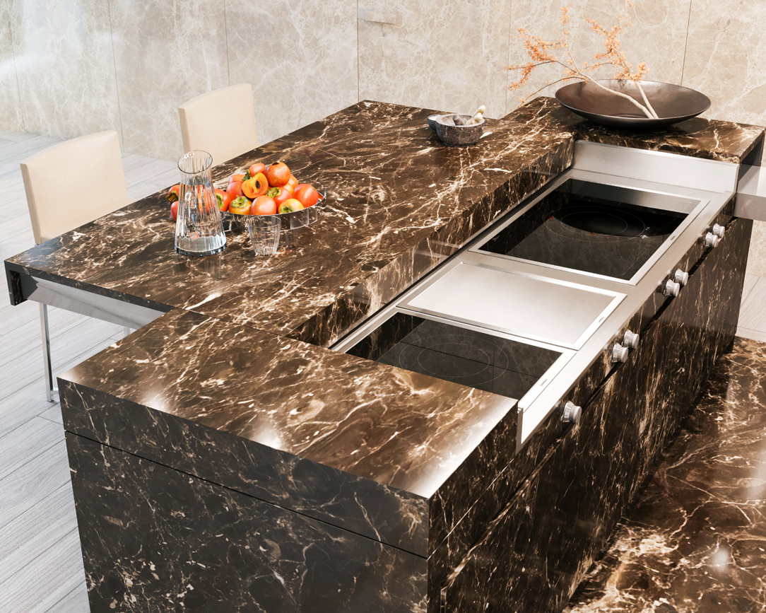
The Slide Snack Table is a sliding support capable of hiding part of the kitchen by closing it in a solid and defenseless monolith. This, thanks to a mechanical movement, changes its development by stretching the lid outwards and making it become an unconventional support surface.

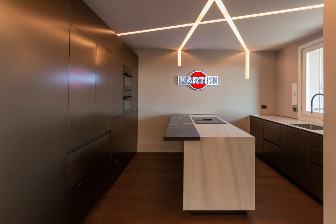
In this example, the whole island is clad in the same material, a dark emperador marble. When at rest, the structure appears fixed, while when it becomes operational, it shows the hob and the underlying materials, i.e. steel and ceramic glass.

island marble kitchen


THE KITCHEN SNACK TABLE IN CONCLUSION

We have seen how the island or peninsula of a kitchen can have a natural continuation of a multifunctional surface by becoming a Snack Table. A small but useful work surface that is used during the day for breakfasts and snacks. Or a sort of counter for quick lunches but also a support surface for enjoying aperitifs with friends.

In fact, the ritual of meals has lost its formality over time, becoming a moment to be optimized within the sometimes-hectic day. Therefore the snack top has become a fundamental element in the design of a contemporary kitchen.

A NEW CORNER FOR BURBERRY

A NEW CORNER FOR BURBERRY

Quickly and with a structured time schedule, a Corner of the Tiziana Fausti store in Bergamo was replaced by a new brand.

burberry corner front

CORNERS AND FASHION

introducing the concept of Corners we can say that they are single-brand exhibition spaces and are a mirror of the products displayed inside them.
In fact, Designers and Architects linked to the Fashion Atelier are working hardly to express the identity and image of the Brand.
The corners are used by the Brand to facilitate the direct control in terms of assortment, sales staff and visual merchandising.
Furthermore, Brand Loyalty improves, and the consumer is able to more clearly distinguish the value of the brand and the product they are going to buy.
However, a Corner has a short duration, of a few years, and is then usually updated or replaced.

burberry corner interior
burberry corner bergamo

CREATION OF A WHITE BOX FOR BURBERRY

In this case, after a few years, it was decided to replace the Corner of the Brand Stella McCartney in the Tiziana Fausti store with the Burberry one.
Once the change was defined, the Architects of the Maison had presented a design of the space, which was then approved by the property.
Usually, the furnishings of the Brand are supplied by a chosen company that takes care of all the dedicated Retail spaces.

Our task was therefore to create a White Box, which we also talked about in our old article, and to act as General Contractor.
All the useful actors for the replacement of the Corner were then recruited and the process followed step by step.

THE WORK SCHEDULE

Once defined the changes and the new arrangements to be created, the work scheduling as followed.
The replacement of a Corner must be quick so as not to preclude the normal sales trend of the shop.
The agreed program in fact included no more than two weeks of work. When the X date arrived, the Corner was isolated with a varnished wooden closing barrier, to preserve the nearby spaces from dust and allow a normal flow within the interested area.

closing barrier
Once the space was emptied, with the removal of plasterboard and floor, the foundations of the new Corner were set.
These began with the laying of the floor as a work of art, followed by the grouting, the first coat of primer on the walls and the change of the light tracks on the ceiling.
On the outside, the full-height black panel of the old Brand has been replaced with that one of Burberry, its logo laser cut and backlit by an opal plexiglass.
corner disassembly
corner floor laying
 laying of entrance tiles

At the end of the first week, the White Box was completed and all the electrical arrangements, including those for the illuminated sign on the wall, ready for the next actors.

front with new panel
positioning of electrical predispositions

The second week was fully reserved to the Lisar Company, who installed the new custom-made furnishings.
Bronze hangers recall the profiles of the central display cabinet, the backlit shelves and the baseboards on the ground.
The white furniture with some hints of color links the bronze with the beige and monochrome tiles in an elegant and austere way are best reflecting the British spirit of the Brand.

new mounting furniture

At the end of our time schedule, the last day was dedicated to supervision by Burberry, who checked the smallest detail and gave the green light to the inauguration of the space.
Here are the photos of the Burberry Corner, inaugurated in less than two weeks, after the intervention of the Visual Designers who exhibited the garments in an impeccable way.

Corner furnished
Burberry corner
interior Burberry corner

At this link the old article of the Tiziana Fausti shop’s Corners, in which Stella McCartney is present, if you want to compare the differences with the new space set up.
AN OLIVE GREEN KITCHEN IN THE OROBIC PREALPS

AN OLIVE GREEN KITCHEN IN THE OROBIC PREALPS

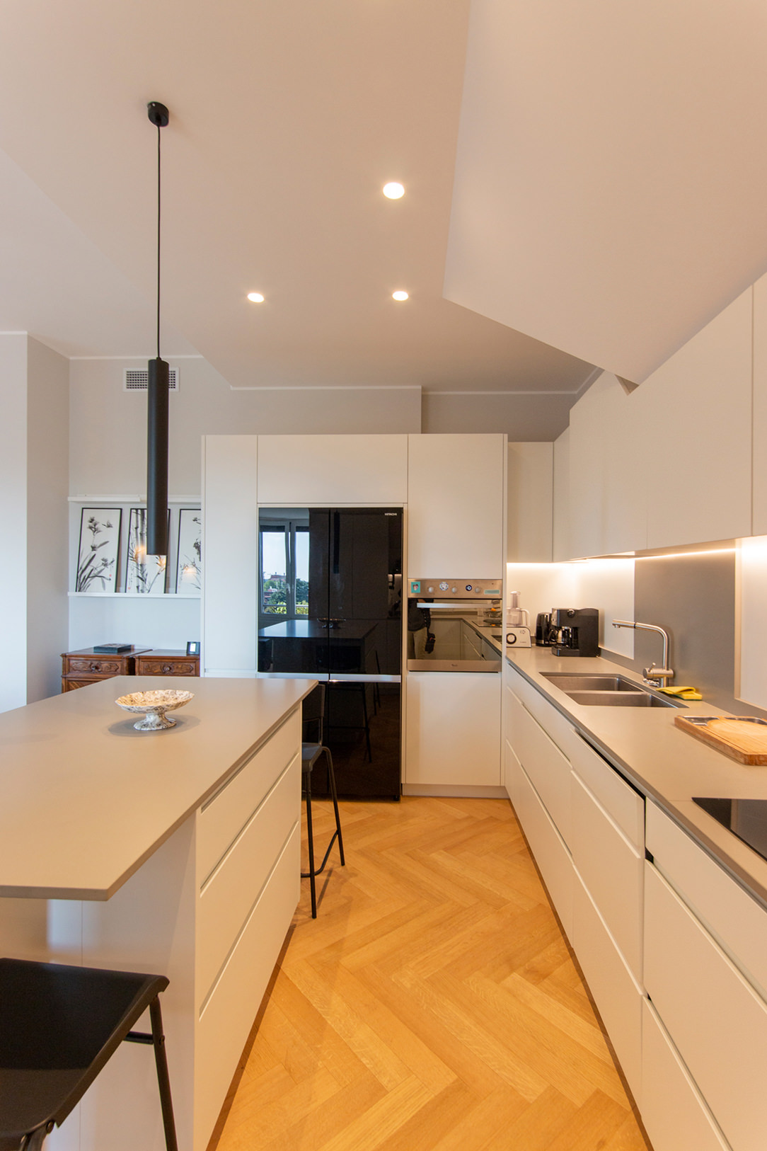
Immersed in the woods of the Seriana Valley, a splendid villa with panoramic views has renovated its interiors and the living area with a new olive-green kitchen.
Opening doors white kitchen with island

A FUNCTIONAL AND MODERN PROJECT

The heat of these summers has made us rediscover how beautiful, cool, and relaxing our second mountain homes are.
There has been a real repopulation of our Valleys and the trend is increasing.

After so many years living away from our second homes, however, we also want to return to live there by renovating them, to fully enjoy them.
The customers’ request was to have a new modern kitchen, open to the living room in a large, functional, and capacious Open Space.
A kitchen able to marry with some wooden elements already present in the house and with the new living area with fireplace in shades of gray.

Our interlocutors were not a single subject but several families who use this second mountain home, so we tried to satisfy all of them with a project in harmony with the context.

green and wood kitchen
detail of green door hollow handles
gas hob detail

THE KITCHEN PROJECT

Once the dividing wall was knocked down and the old access to the room closed, the kitchen had the opportunity to develop into a corner, right in front of the bright French window that overlooks the external panoramic terrace.


A first column volume on the left acts as a large pantry with shelves (useful for several users).
In the center and taking advantage of the corner, a hollow with low wall units houses the sink with drainer, the gas hob, and a good worktop.
The refrigerator column and the oven column with service doors in the upper part close the opposite corner.

green and wood kitchen
aventos detail
 dish drainer detail

GREEN KITCHEN: HARMONY BETWEEN INTERIORS AND EXTERIORS

The materials and colors was chosen to follow both the trends we found at the Salone del Mobile and, on a conceptual level, the external environment. The predominant color of the kitchen is in fact a very delicate olive green, which recalls all the forest green that can be glimpsed from the window. The walls are also in the same color tone but in a lighter shade. The floor is made of oak planks and rises to become the same plinth of the entire kitchen. In addition to aesthetics, however, a certain degree of resistance was required, as the house is used by several families, so both doors and wall units are made of plastic bilaminate. As far as the oak essence bilaminate is concerned, we sought the closest color to the parquet, but we preferred to move it away from the floor in a more linear rhythm and without obvious knots. The top is in HPL, that is a compound of cellulosic fiber impregnated with thermosetting resins, practical and resistant. The finish of the top is in Cardoso stone, in shades of gray, which incorporates the other elements in the living room and its irregularity, and its marked veins make it very similar to the sandstone rocks of the Valley. Green, wood, and rock, these are the harmonic references that we have chosen as the common thread between inside and outside and the result is really satisfying. Here the link to another renovated mountain apartment.
Gray furniture for a masculine apartment

Gray furniture for a masculine apartment

Furniture in shades of gray is spread over the two levels of this modern apartment with a masculine imprint. From the bookcase on the ground floor to the walk-in closet in the sleeping area, the furnishings are developed in an elegant and delicate way. The dark-colored wood chosen for the parquet flooring matches the slate tiles that embrace the kitchen and bathroom areas from the internal staircase.

gray masculine apartment furniture

THE LIVING AREA MEETS THE ELEGANCE OF GREY FURNITURE

In a newly built residential context, this two-level apartment stands out in which the masculine imprint is elegantly softened by the choice of monochromatic furnishings. The floors show character in the combination of smoked oak parquet and slate-effect tiles. The floor is therefore dark, which is chromatically balanced by the walls that are tinged with white and the light furnishings that lighten and brighten the environment.

livingroom gray tones furniture

The lighting of the ground floor is combined with steps on the side of the staircase, these mark a luminous rhythm and accompany the upper floor. To embrace the living area, a full-height bookcase combines anthracite gray backs with light gray shelves in the same shade as the surrounding furniture. The anthracite gray that we find here in the lacquered shoulders can be replaced by black iron, as for example in this apartment with the same masculine soul.

bookshelf in dark gray masculine furniture
step marker
shelves detail

Neutral tones thus become the protagonists of a story that narrates elegance and freshness. Here are some other examples of furnishings in neutral colors. The sofa is a darker gray and moved by velvety fabric, which is positioned laterally at the entrance and hides a lateral extension to allow maximum comfort. Behind it, the stair handrail in anthracite gray painted metal matches the vertical shoulders of the bookcase positioned right in front.

sofa and stairs
velvet sofa detail

THE RECOVERED KITCHEN

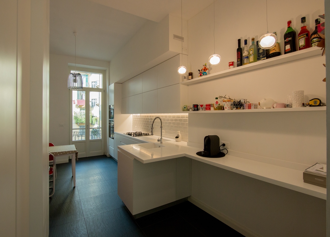
The bioethanol fireplace, housed in an open plasterboard structure, acts as a fusion element between the living area and the kitchen. This, recovered from the previous house, is characterized by powder and wood tones and is combined with a rustic table with light aluminum chairs. The wood of the kitchen and of the table, which are a lighter tone than the floor of the living area, recall it on a material level and create continuity between the two areas.

kitchen powder and wood

THE BATHROOMS IN ANTHRACITE GRAY

Accessing the service bathroom, full-height matt white bilaminate cabinets act as a storage room organized into shelves, hangers and drawers. This light-colored anteroom creates a nice contrast and a clear break with the bathroom characterized by dark tones.

white anteroom
details anteroom

In fact, the anthracite tiles rise on the sides remaining at a height of 120cm and is combined with a bathroom cabinet in the same shade with a matte black back lacquered top. Particularly the chosen sink, in transparent glass, which seems to disappear and get lost between the tiles and the top.

service bathroom
detail sink
The second master bathroom, located on the upper floor, amplifies its masculine nature by completely covering the tiles in anthracite gray up to the ceiling beam. The bathroom is very dark but the large skylight on the ceiling perfectly illuminates the room from above. Here too there is a bathroom cabinet in shades, with the top in glossy back lacquered rather than opaque, which goes well with the reflections of the Globo ceramic sink.
master bathroom black furniture
bathroom tiles

FROM THE GRAY FURNITURE ON THE LOWER FLOOR TO THE BLACK AND WHITE CONTRASTS IN THE BEDROOM: A WALK-IN WARDROBE IN THE BEDROOM

Se il piano inferiore si impreziosisce di un arredamento sui toni neutri del grigio, If the lower floor is embellished with furniture in neutral shades of gray, the sleeping area is characterized by a more subdued contrast. The recurring theme of anthracite gray is still found in the small study corner, through a desk with a metal structure and a medium gray linoleum top. Here are some other examples of Smartworking corners where the working sphere is combined with a domestic environment.

bedroom and walk-in closet masculine furniture

Behind this, a walk-in closet develops at an angle creating a limited but at the same time functional environment. Inside the walk-in closet the hangers alternate in height while in the center a central chest of drawers with upper shelves remains available for all the folded items. On the side facing the bed, a small niche remains at the service and serves as an open bedside table useful for supporting small objects.

walk-in closet masculine furniture
inside walk-in closet
details walk-in closet