Corner kitchen with peninsula: shades of grey and wood

Corner kitchen with peninsula: shades of grey and wood

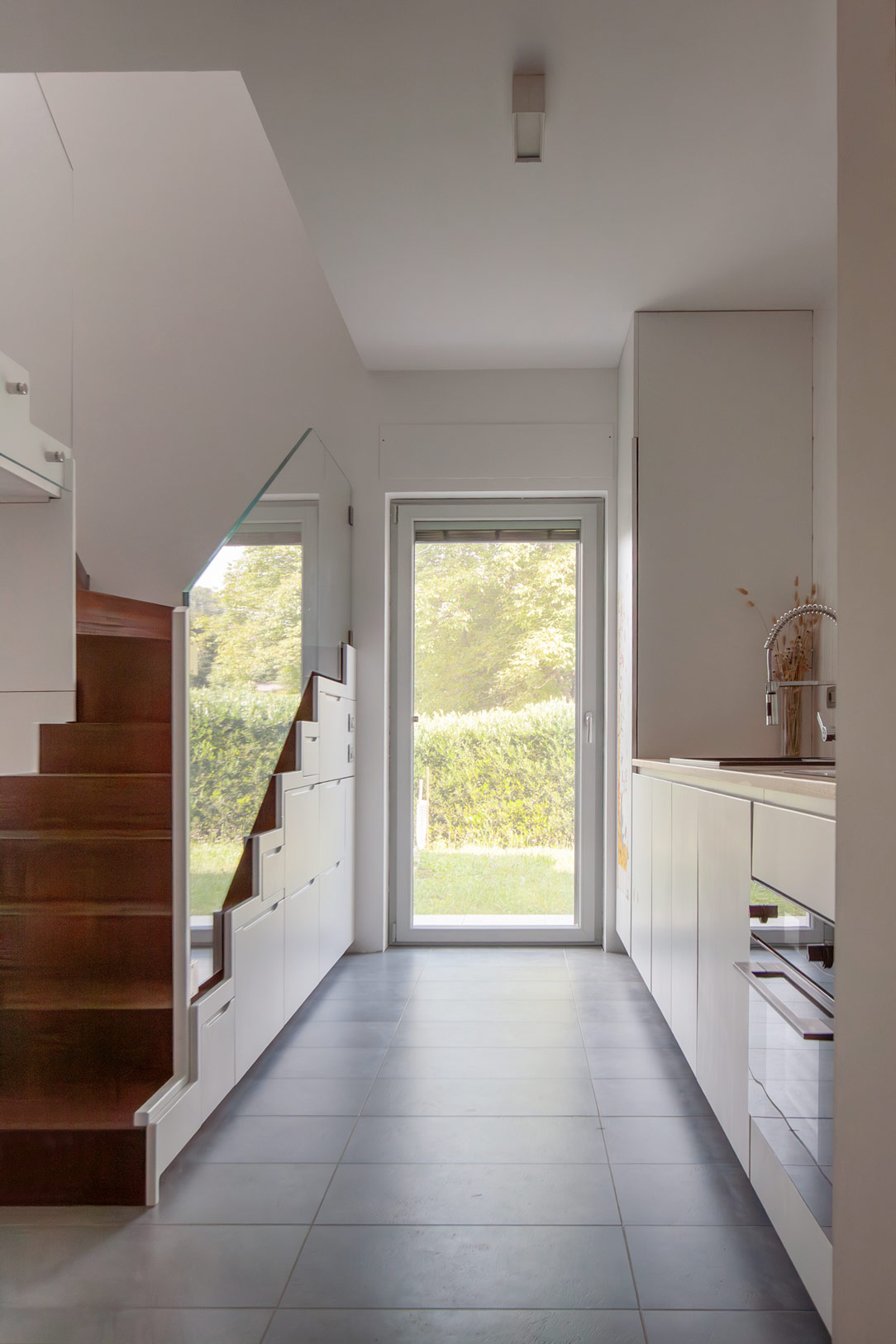
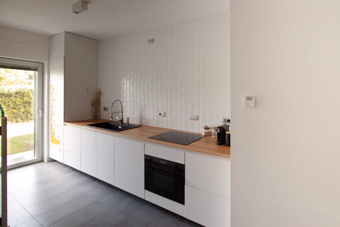
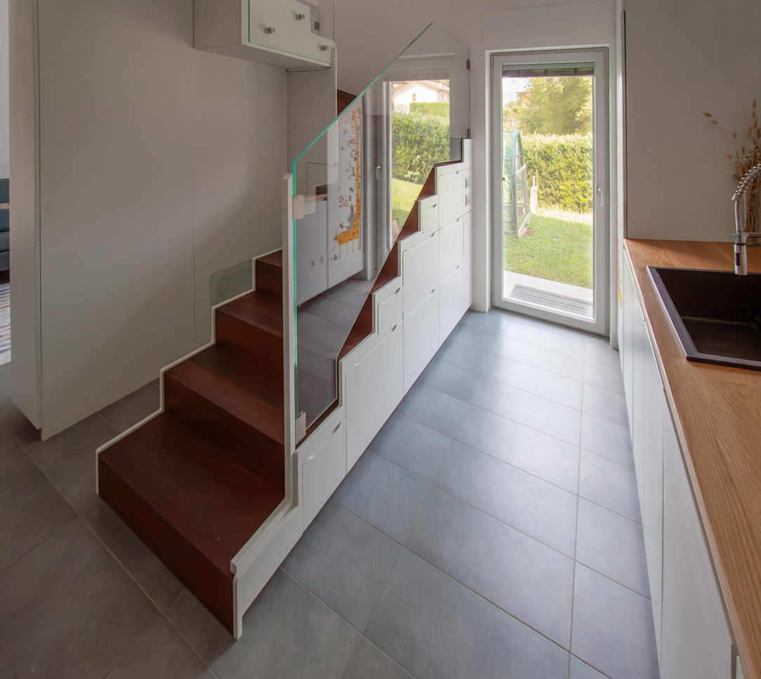
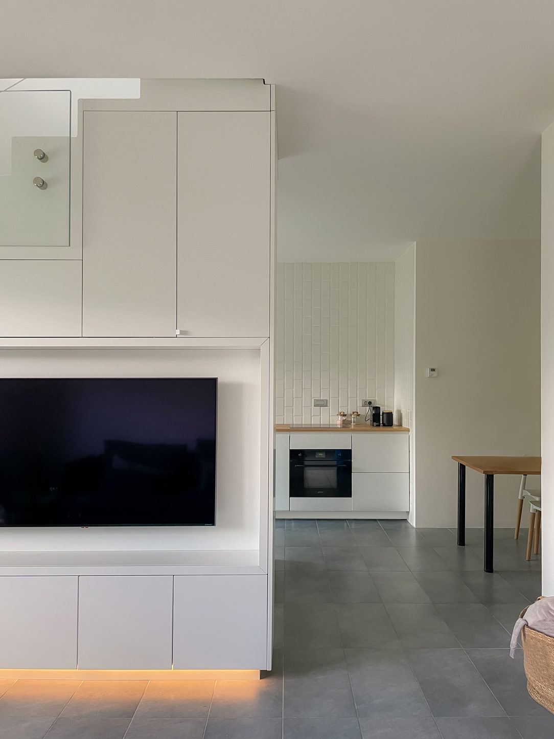
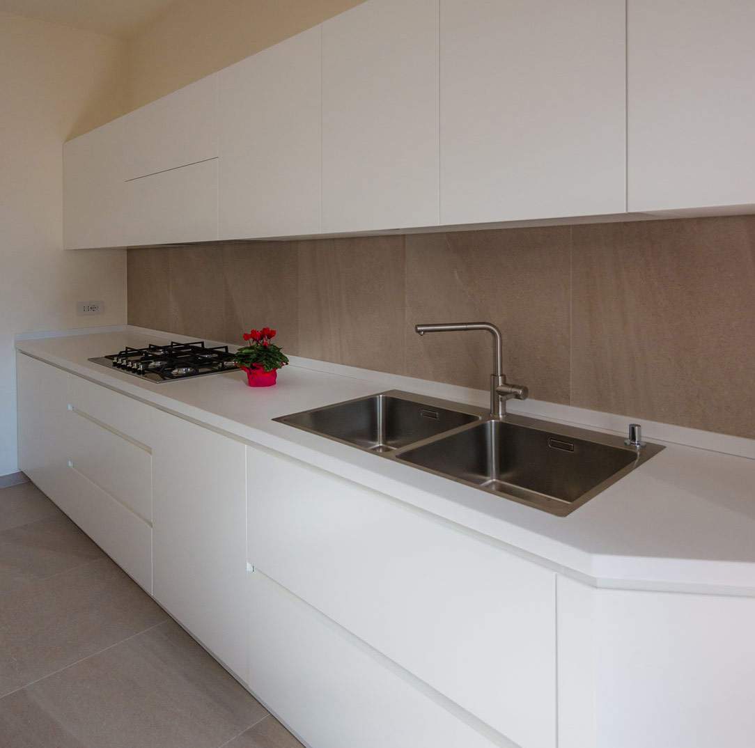
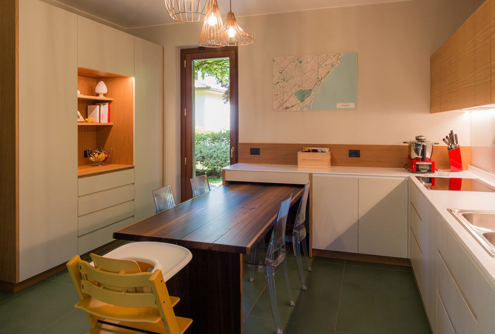
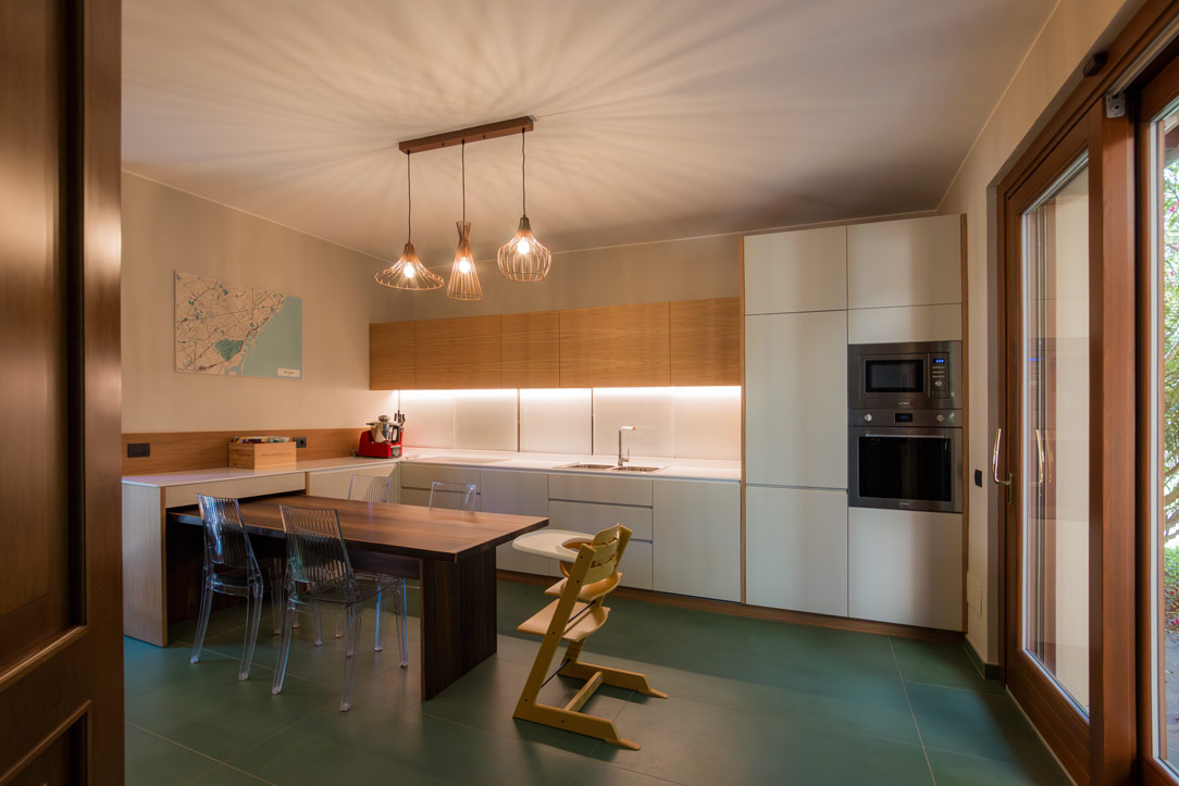
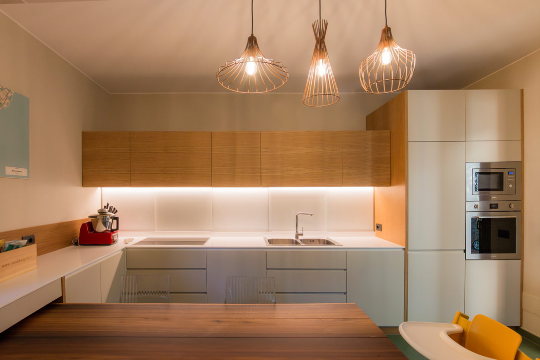
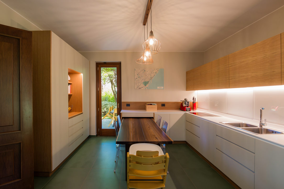
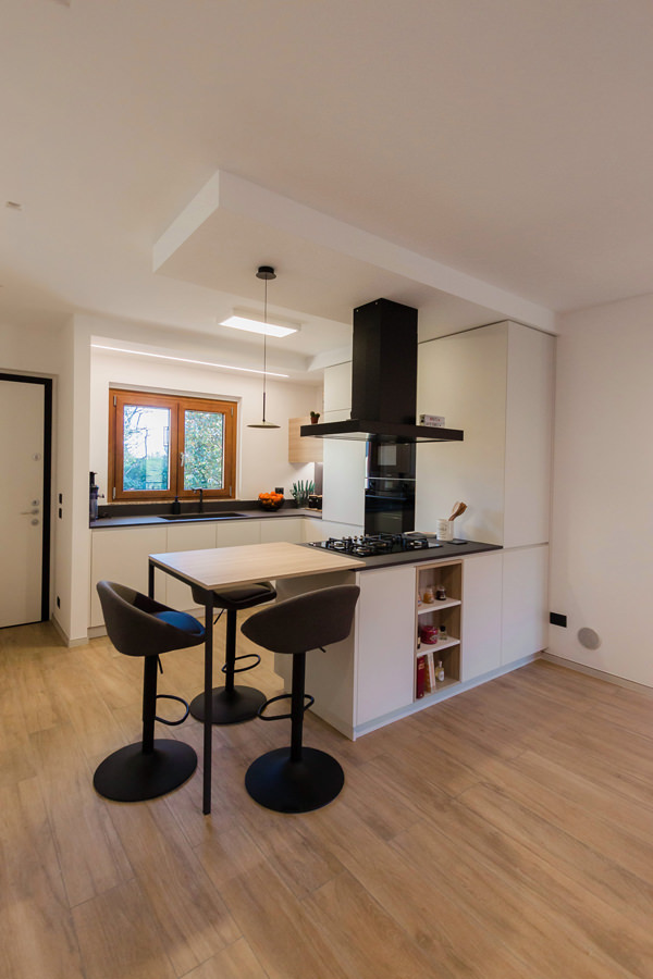
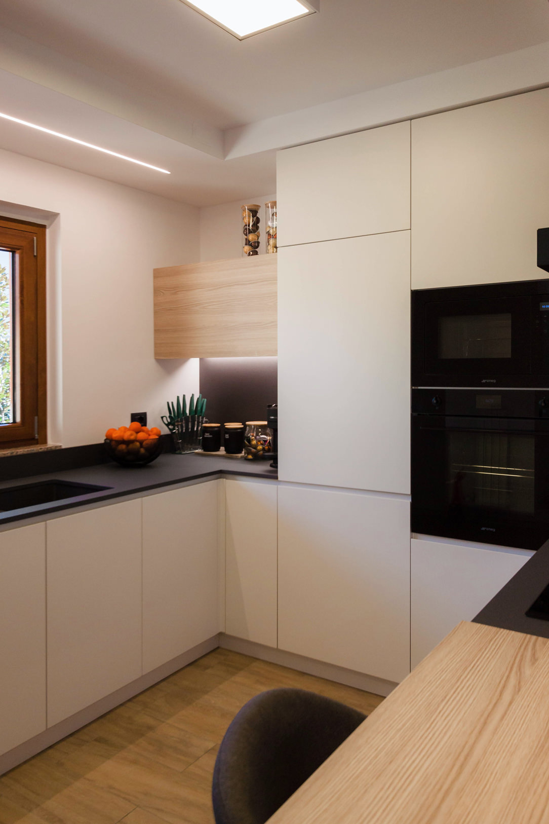
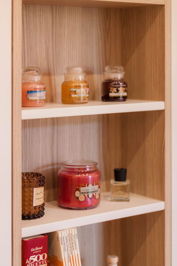
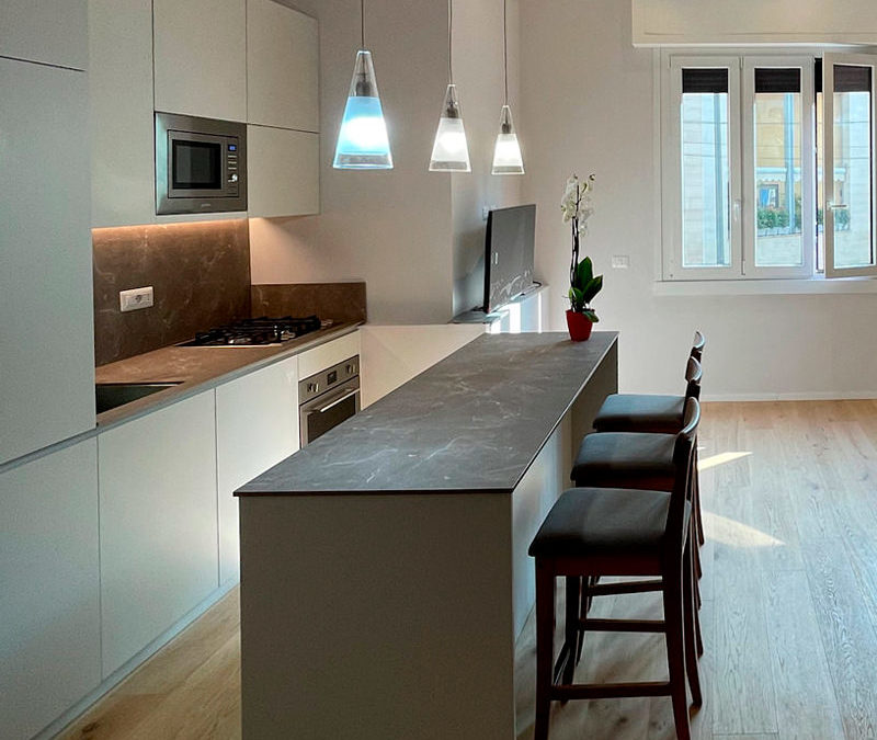
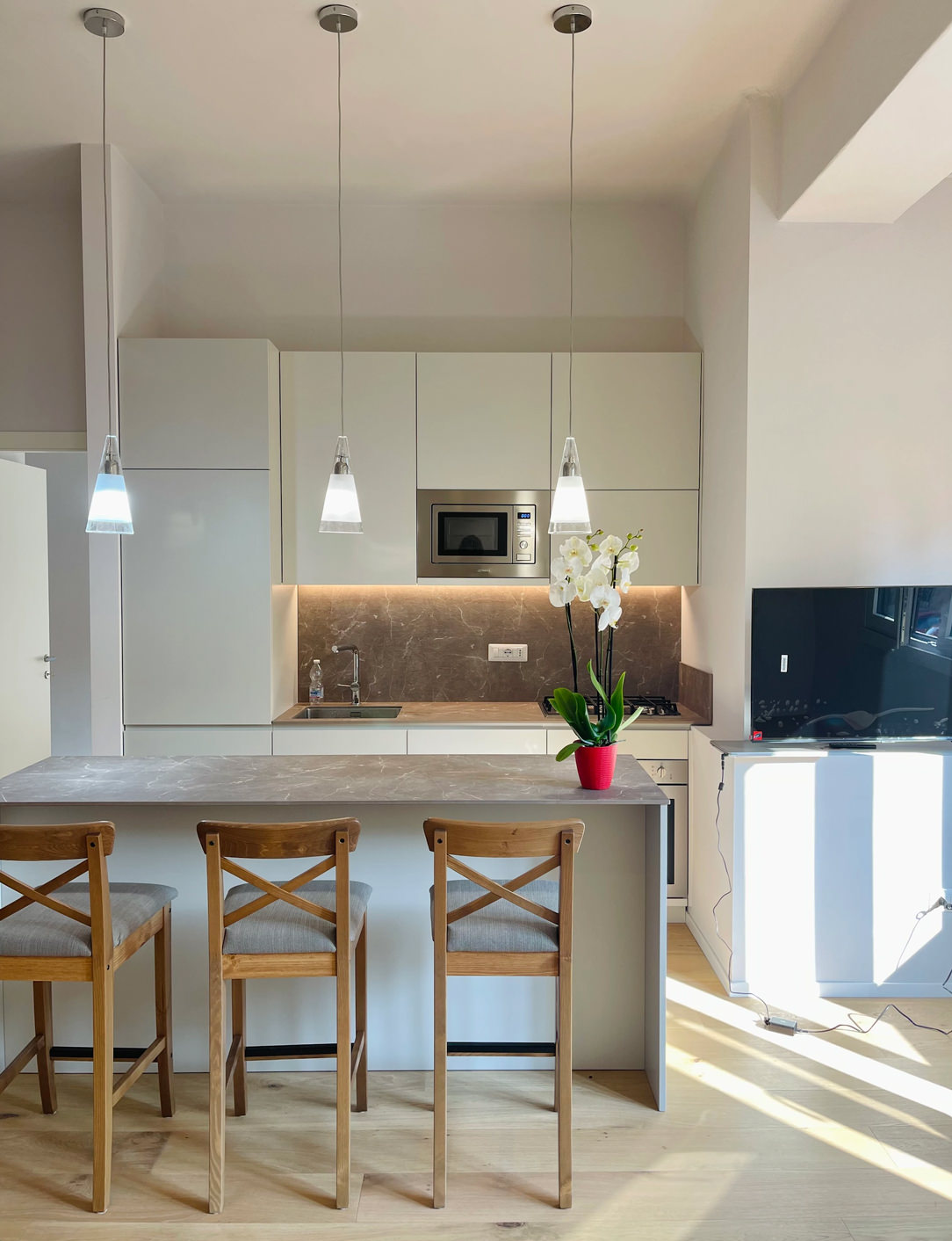
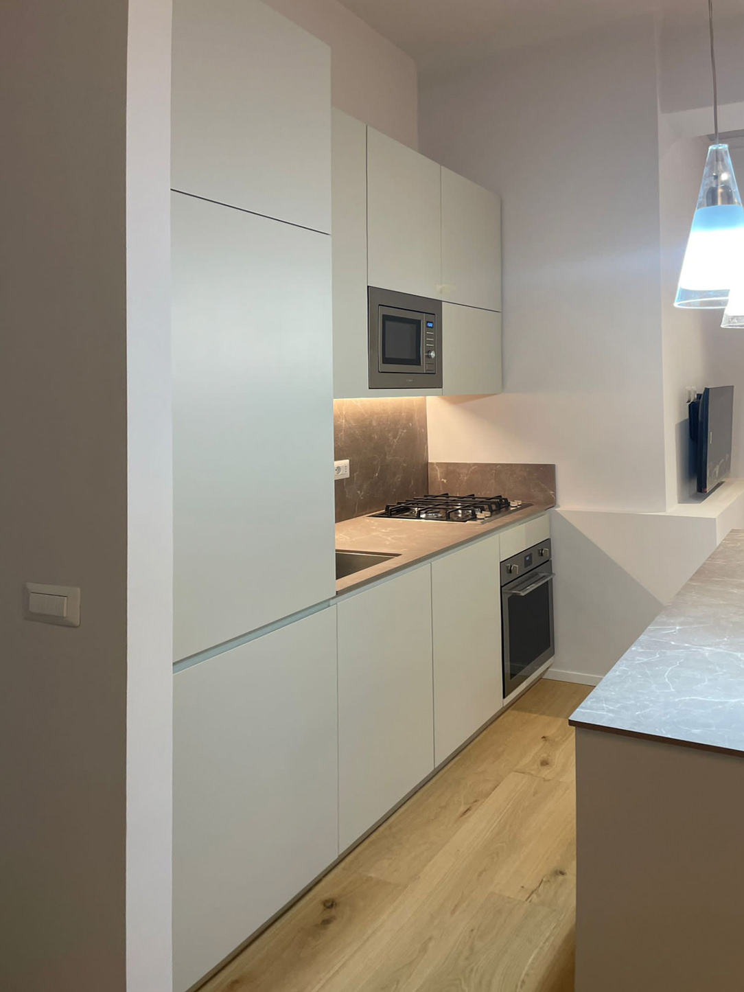
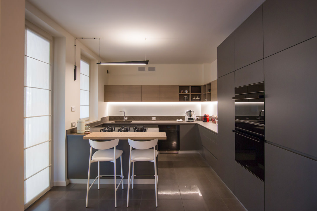
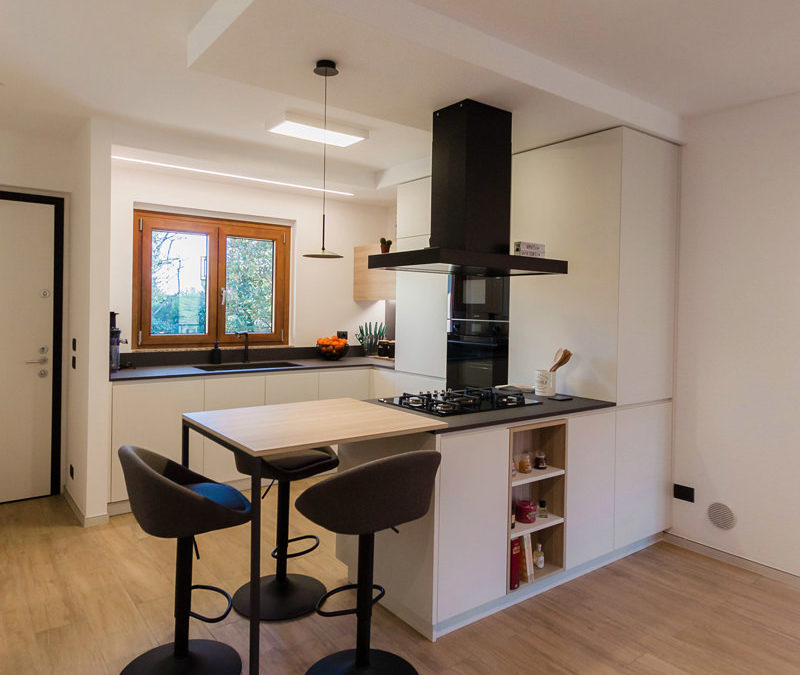
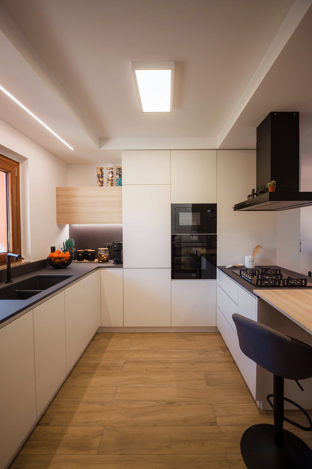
A corner kitchen with peninsula takes centre stage in an open-space obtained from the renovation of a flat. Different shades of grey marry the wood of the snack top and wall units, which is also echoed in the detail of the shelves compartment communicating with the living area.

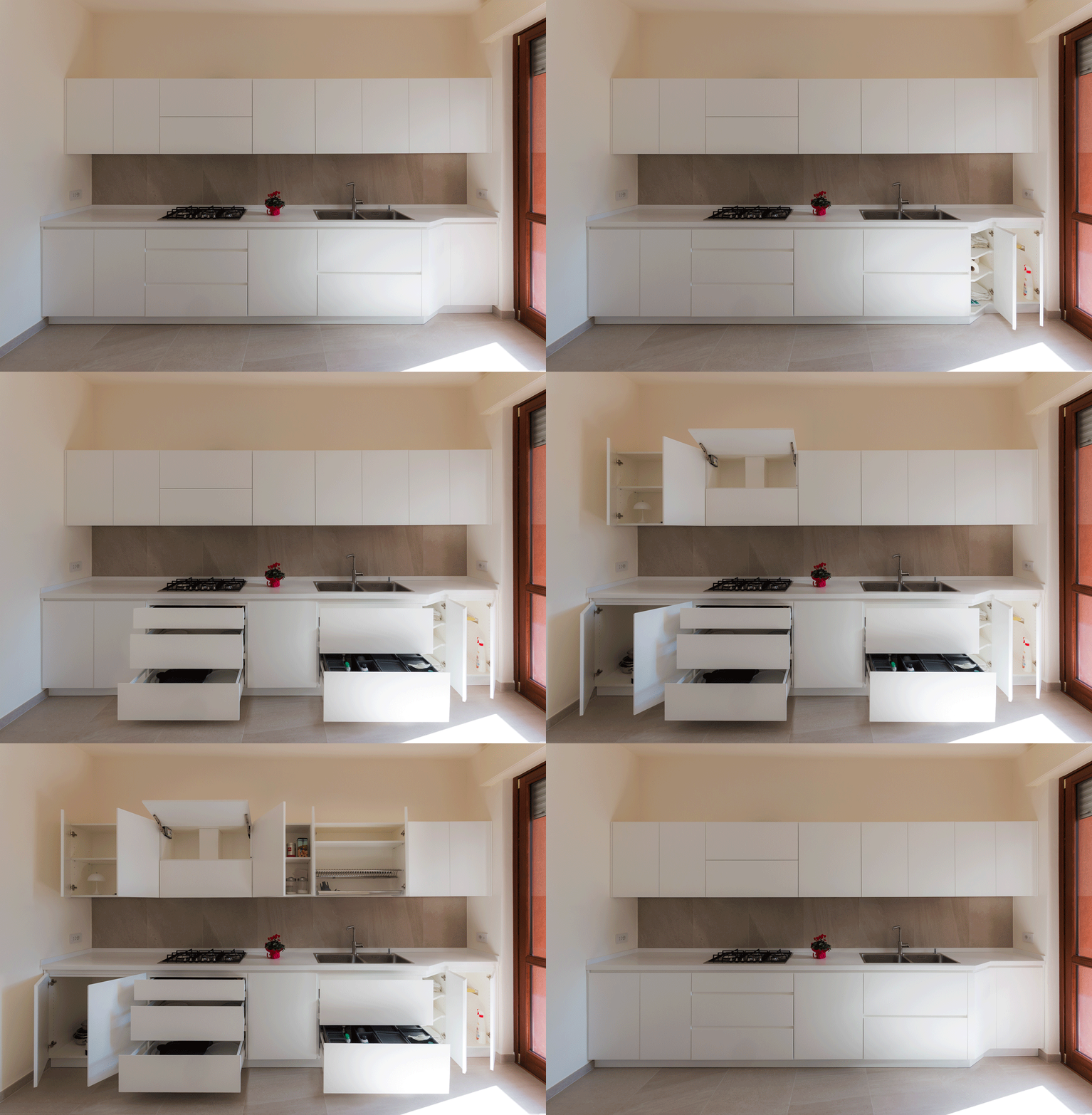
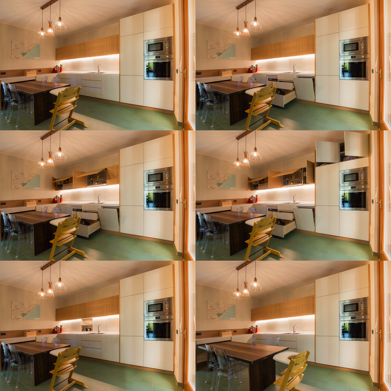
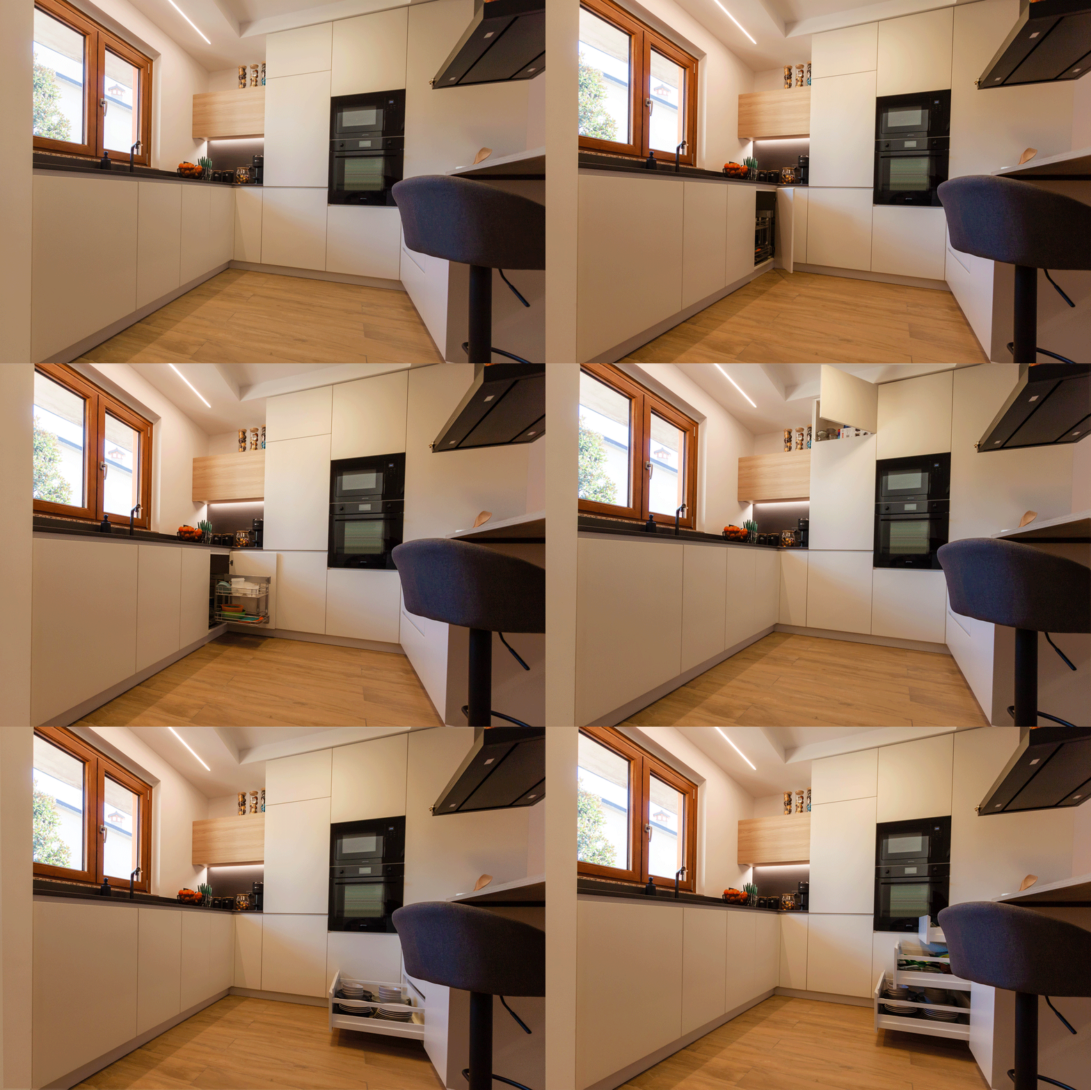
corner kitchen with peninsula animation small opening

Conformation of a corner kitchen with peninsula: between snack top and double-sided use

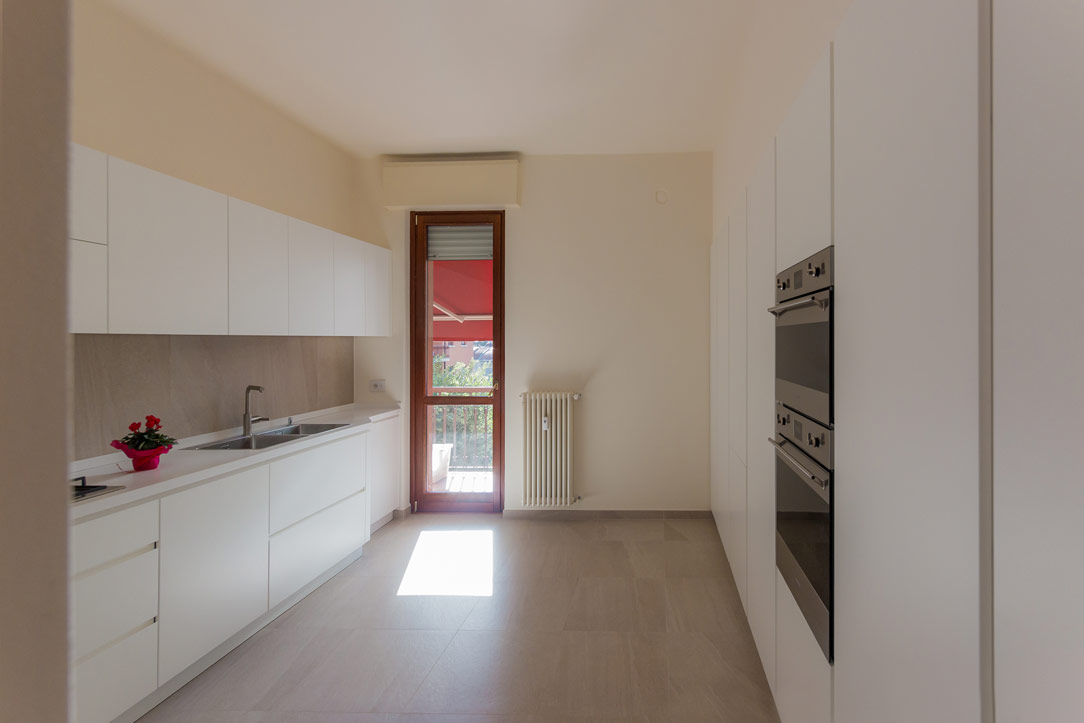
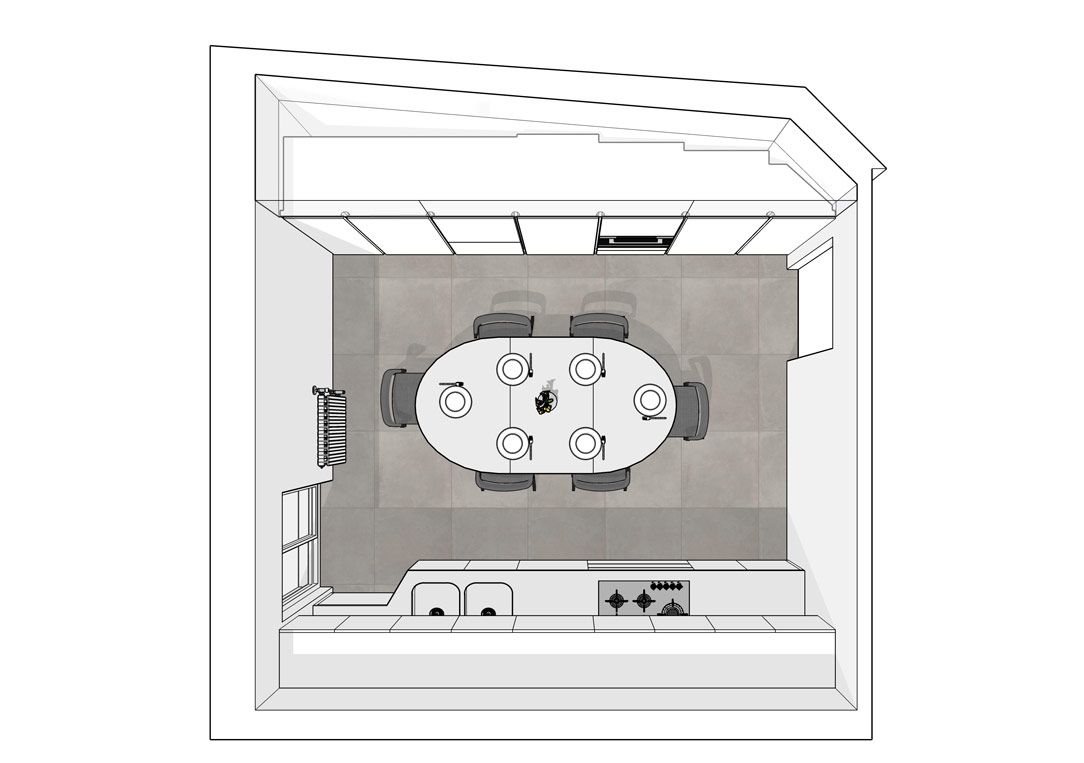
Before the renovation, the kitchen followed a corner shape within a confined room.
A separate room with side access, adjacent to the main door.
By knocking down two of the partition walls, it was possible to create an open space with the advantage of generating a brighter and visually larger room.

By following the existing electrical and plumbing arrangements and making only a few changes to the systems, the new kitchen has thus taken shape, expanding its development to embrace the living area.
Starting from the original corner shape, it then added a peninsula part that houses a hob and snack corner for a functional and youthful kitchen.

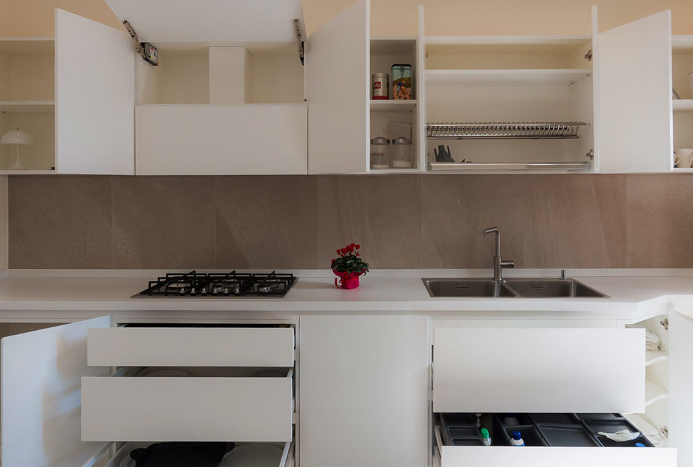
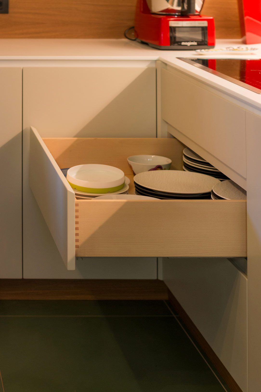
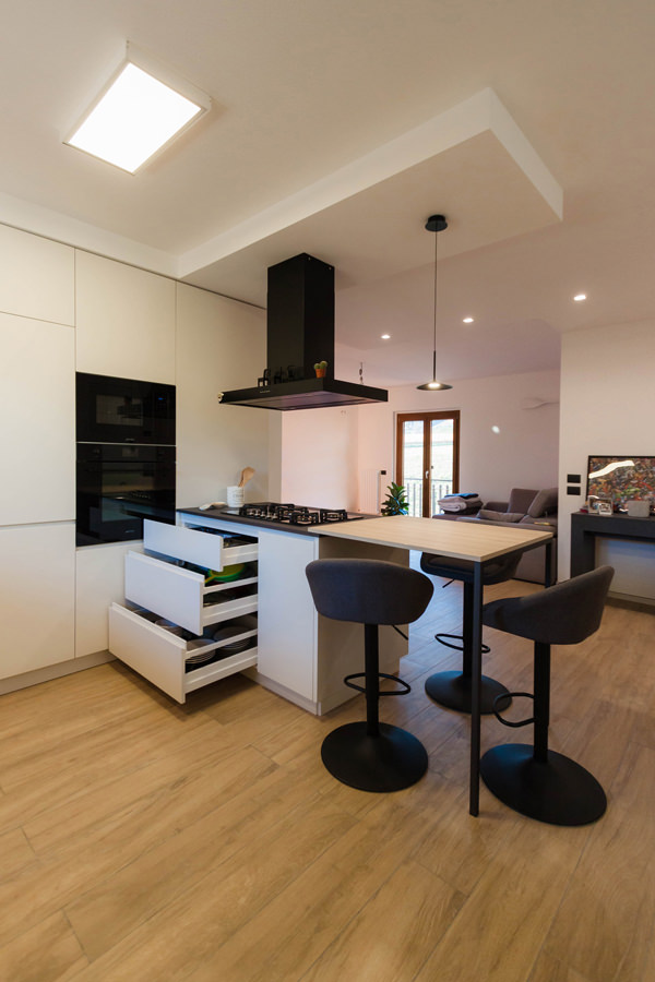
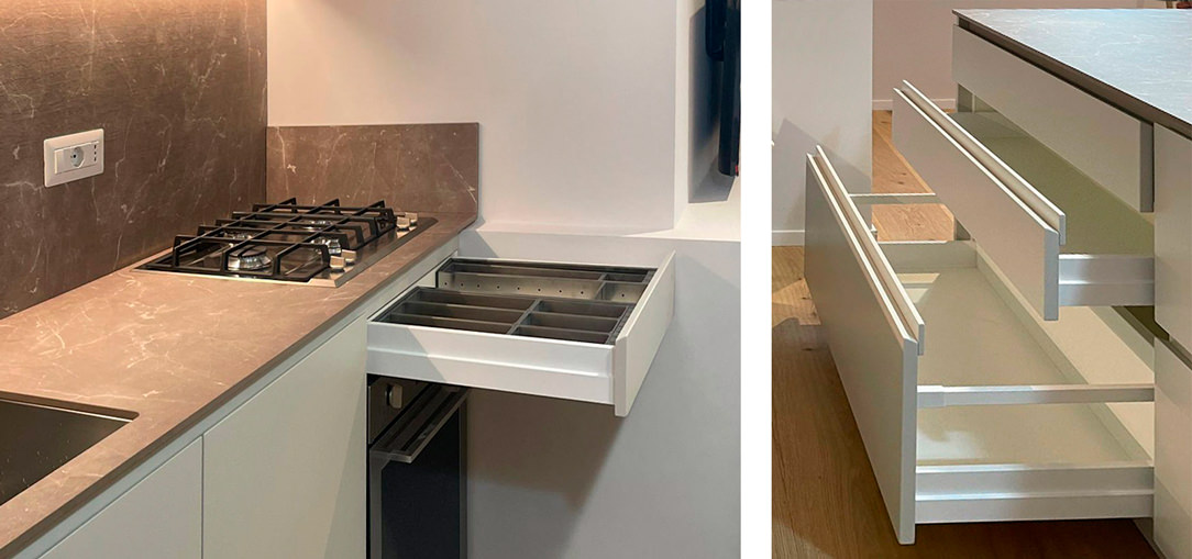
Corner kitchen with peninsula open drawers snack top
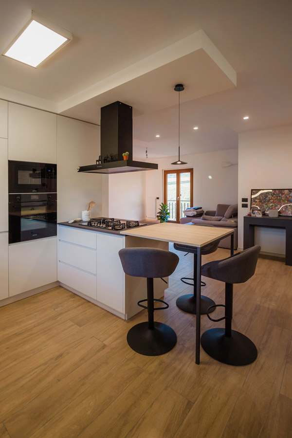
Corner kitchen with peninsula closed drawers snack top
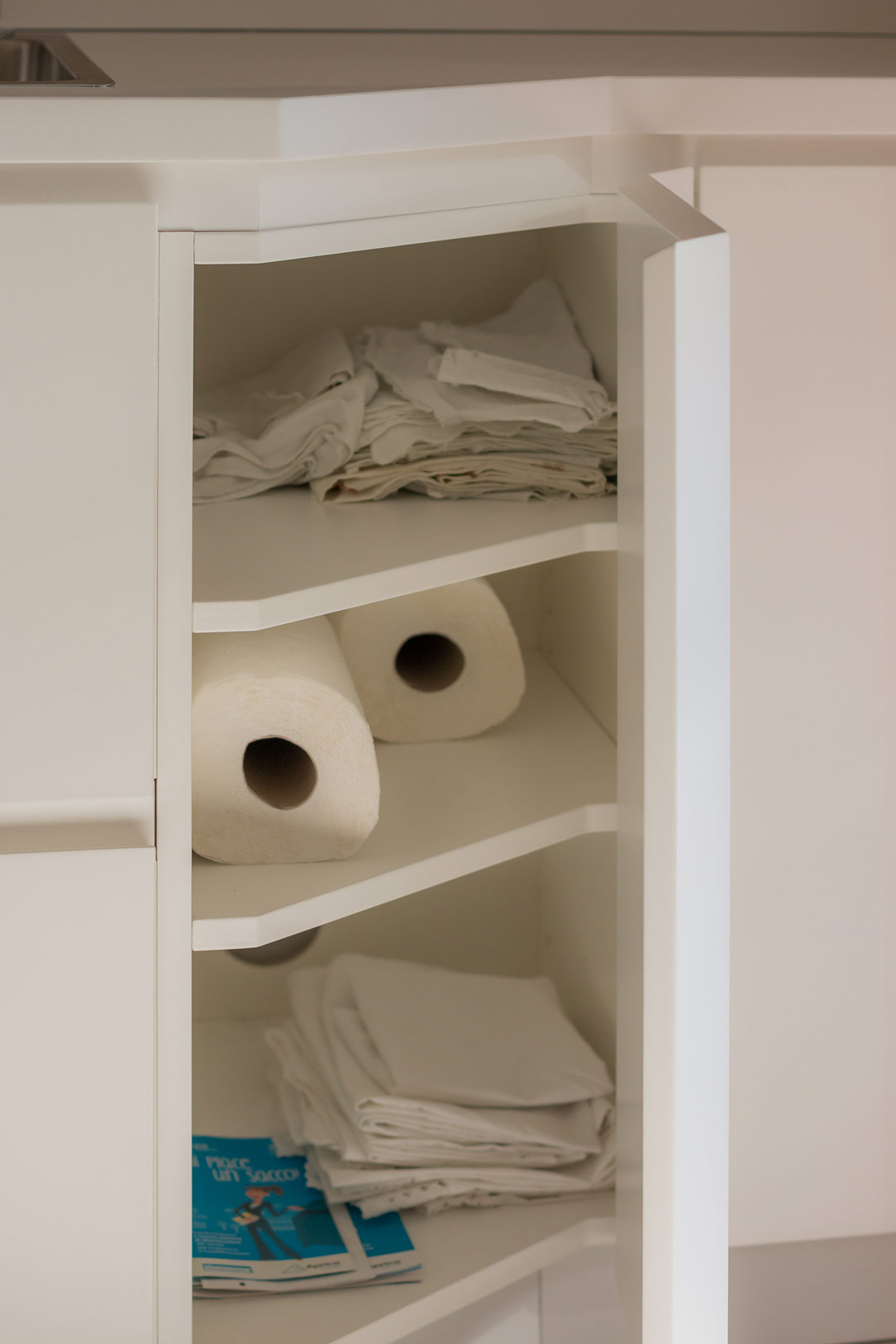
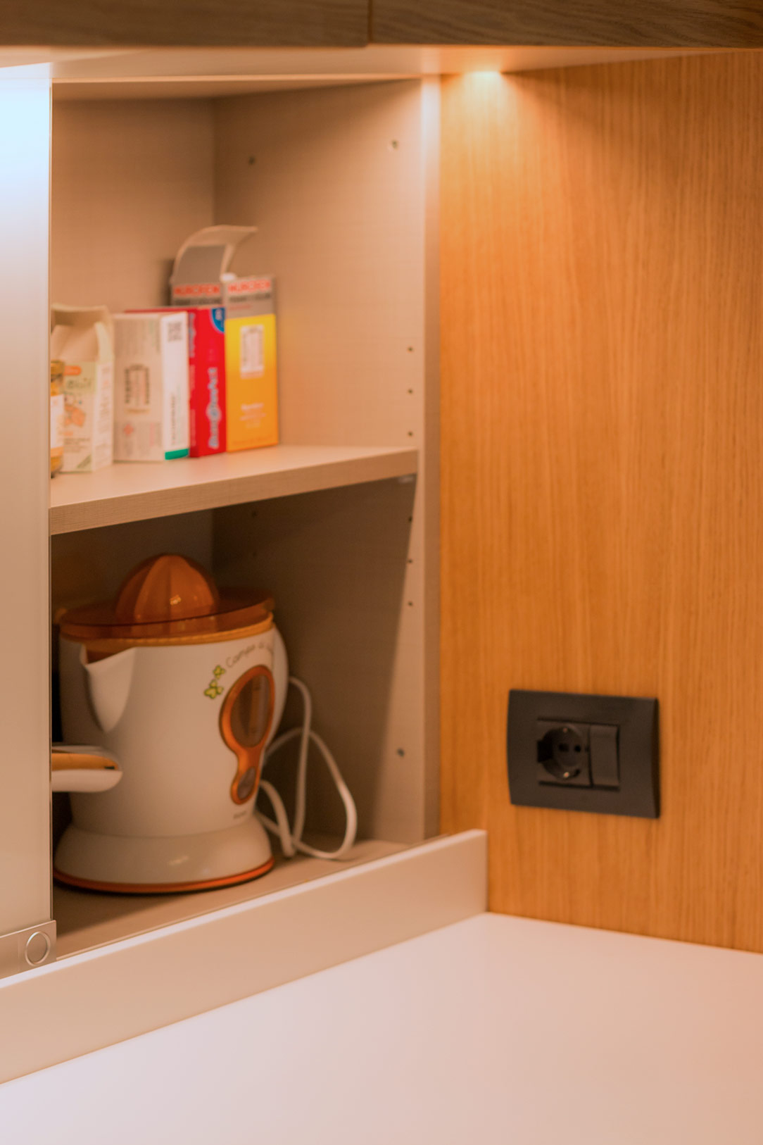
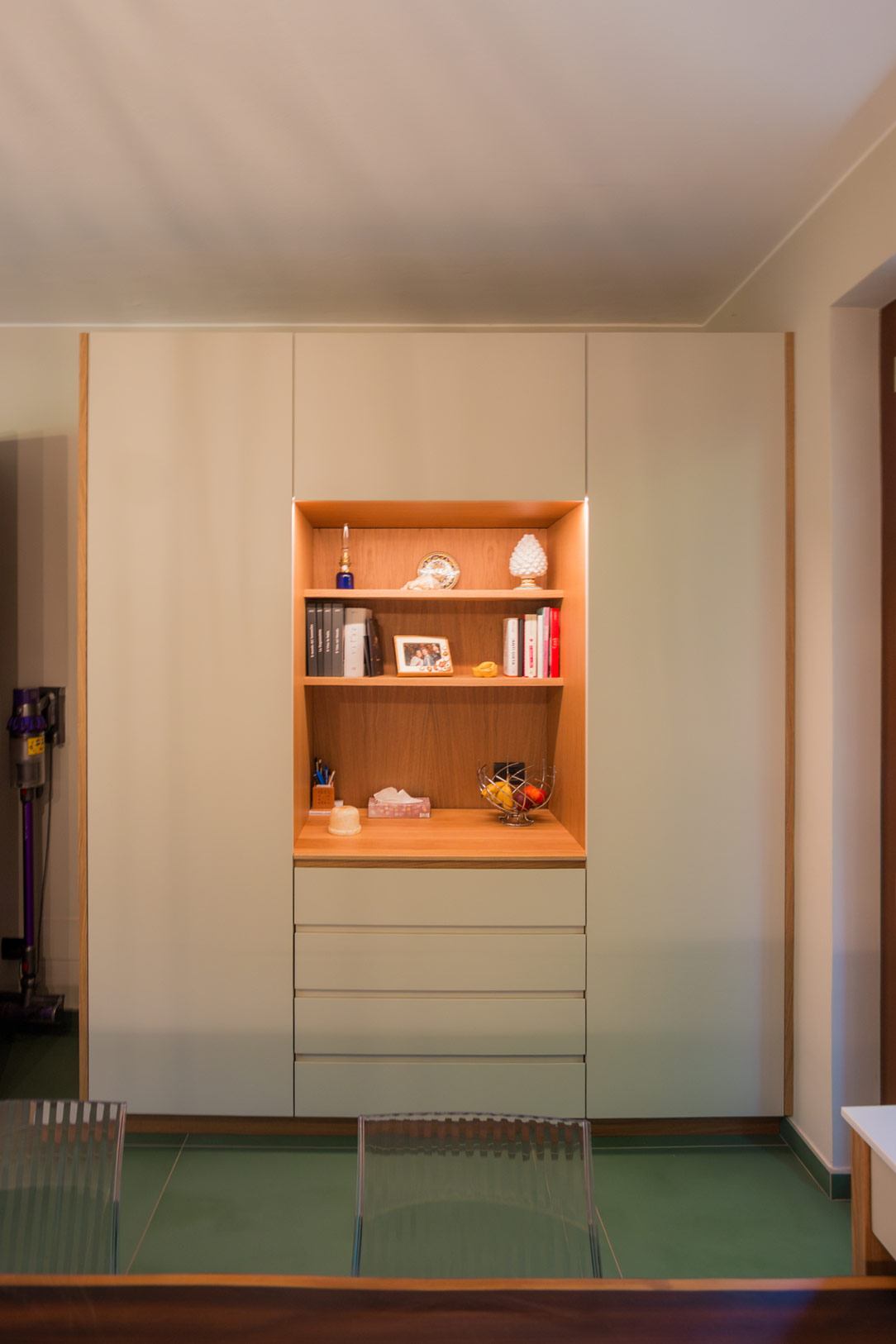
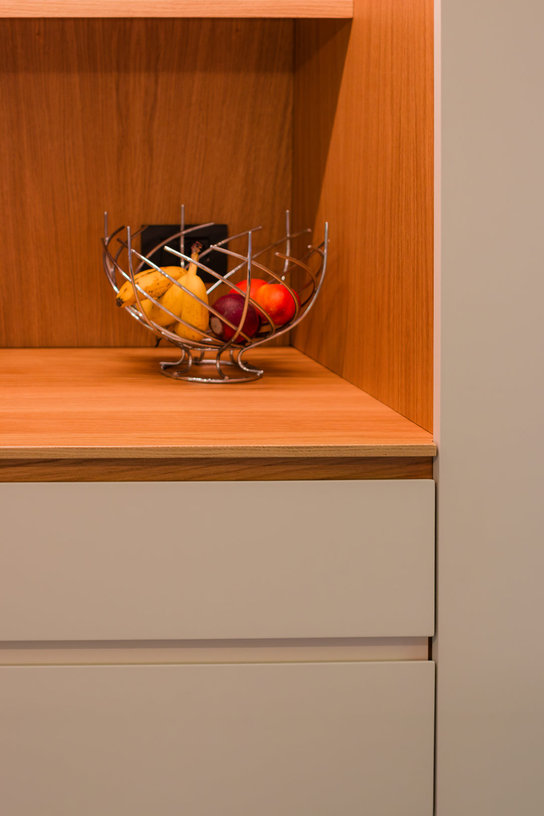
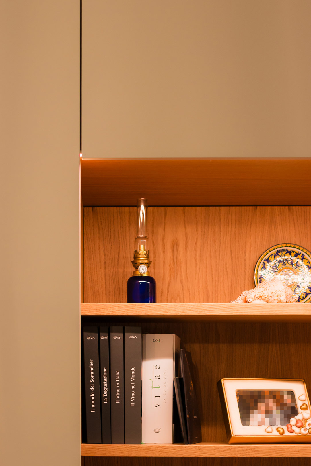
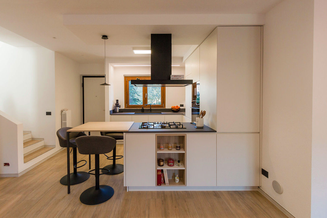
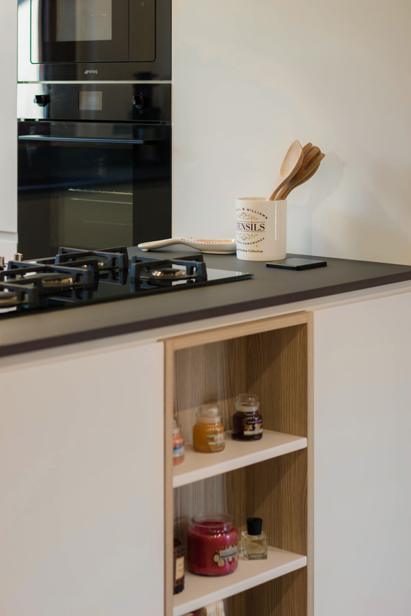
Corner kitchen with peninsula shades of grey oak wood open compartment

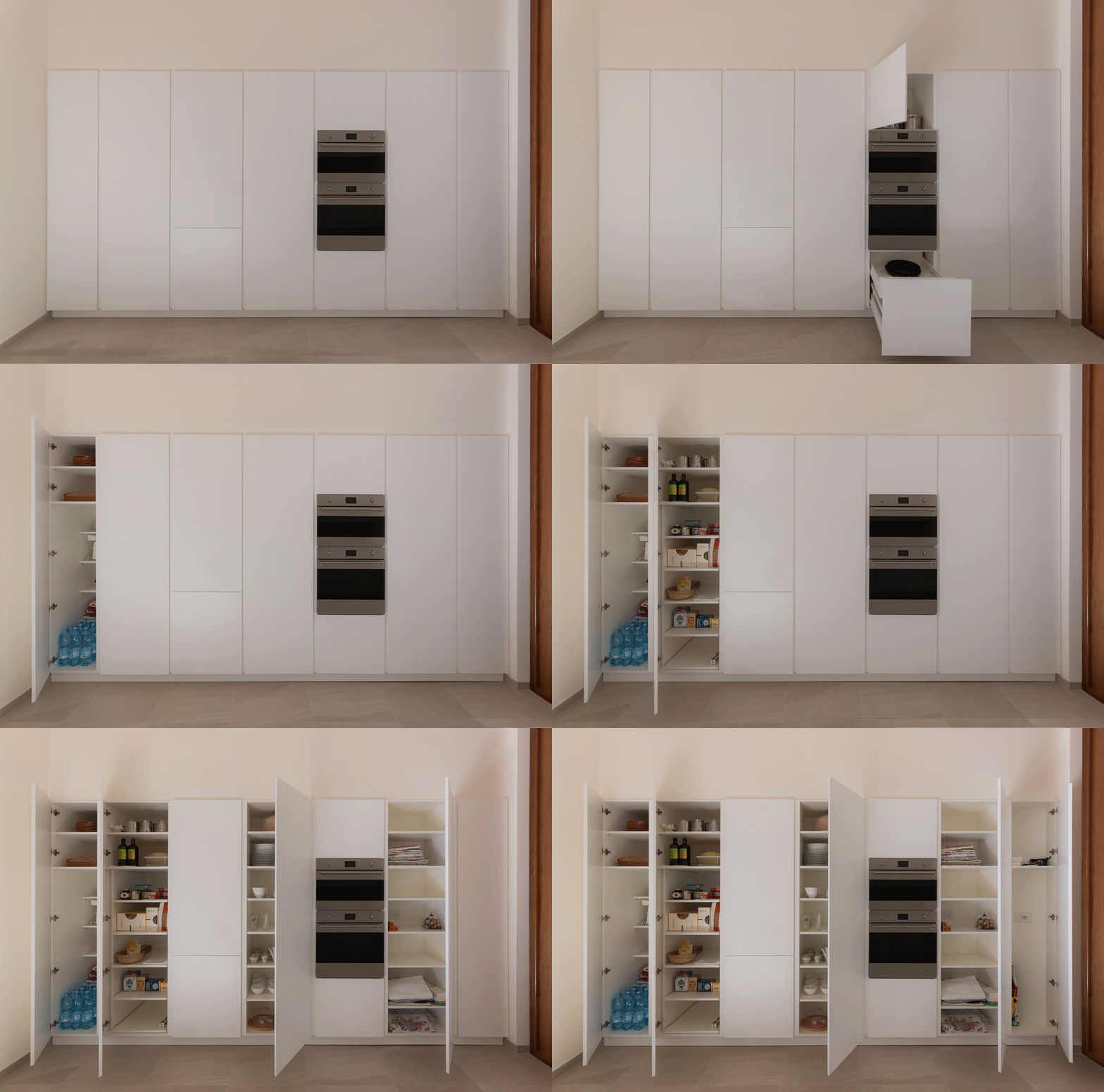
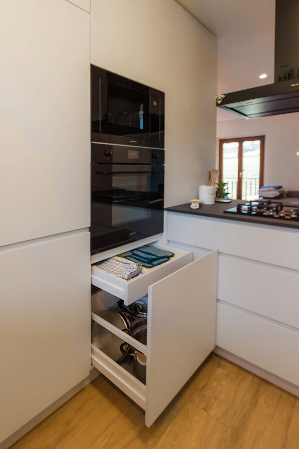
Column ovens, built-in refrigerator and pantry column are located along the side wall, from which the peninsula with double-sided access then develops.
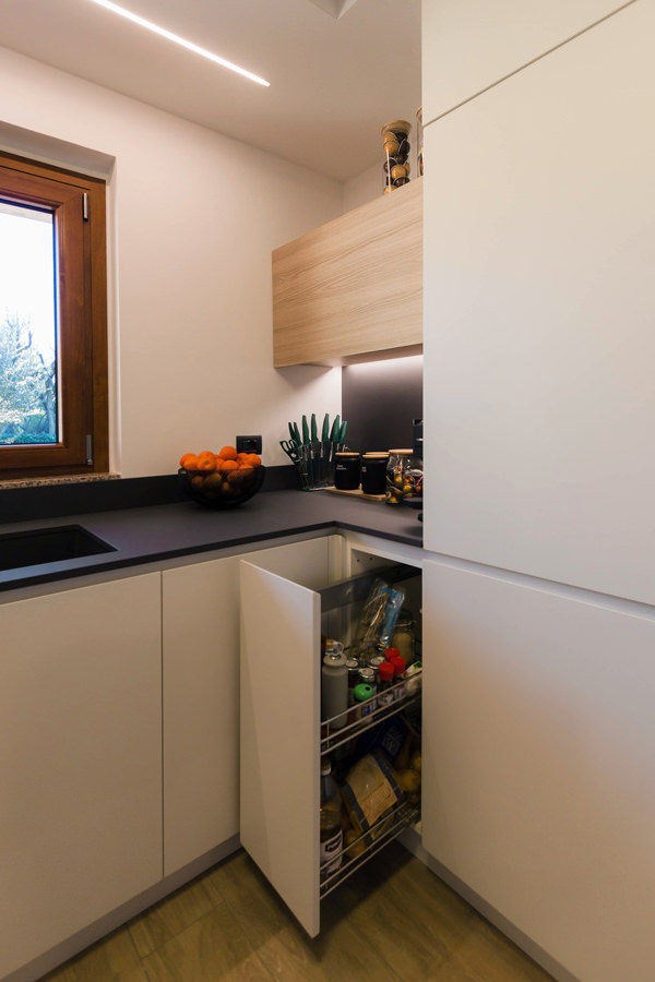
Adjacent to the ovens is the lower base unit, which also embraces the adjacent wall with a window and ends in the entrance storage wall. Next to it are the built-in dishwasher and the doors with fitted sink and pull-out corner.
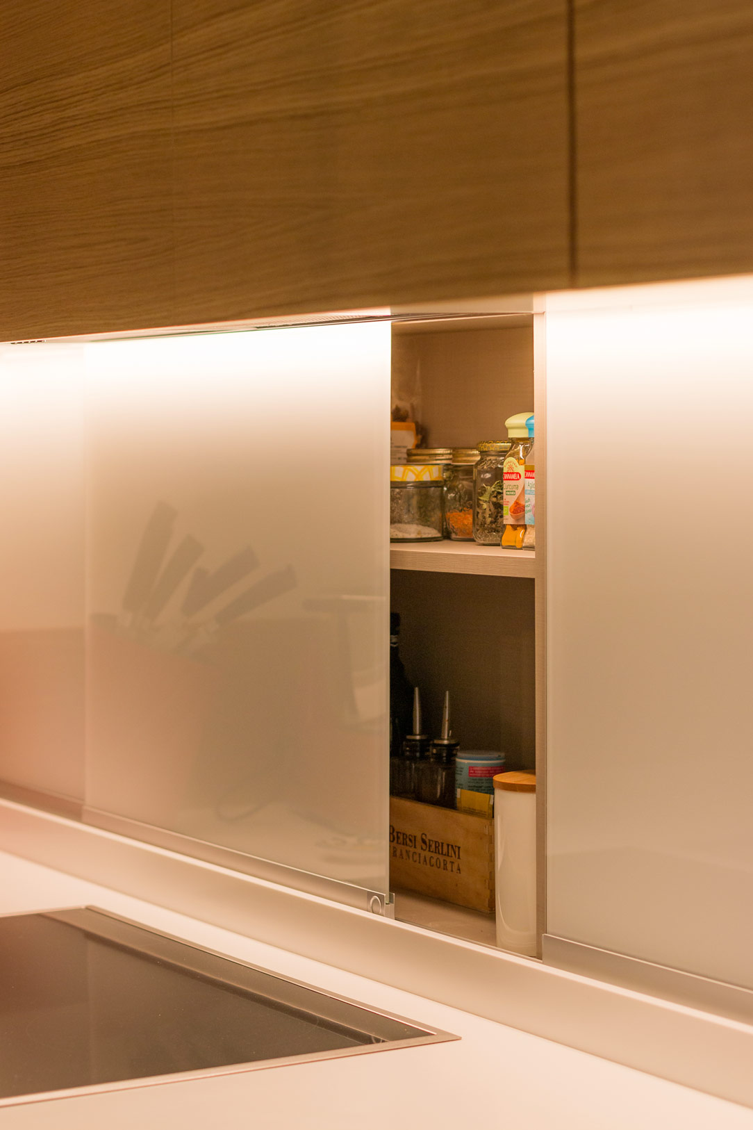
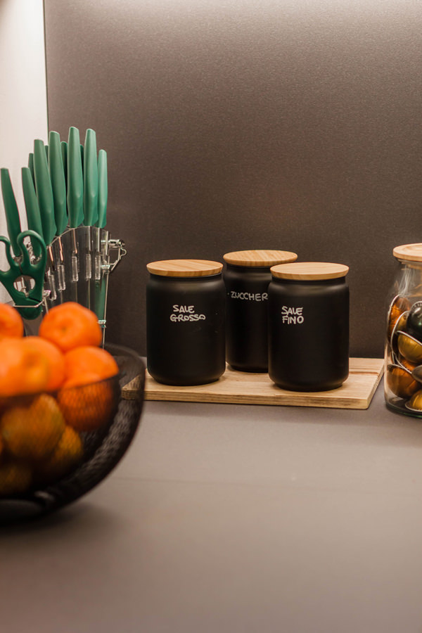
The narrow 30 cm wide door on the other side is nothing more than a front pull-out for storing spices and condiments.
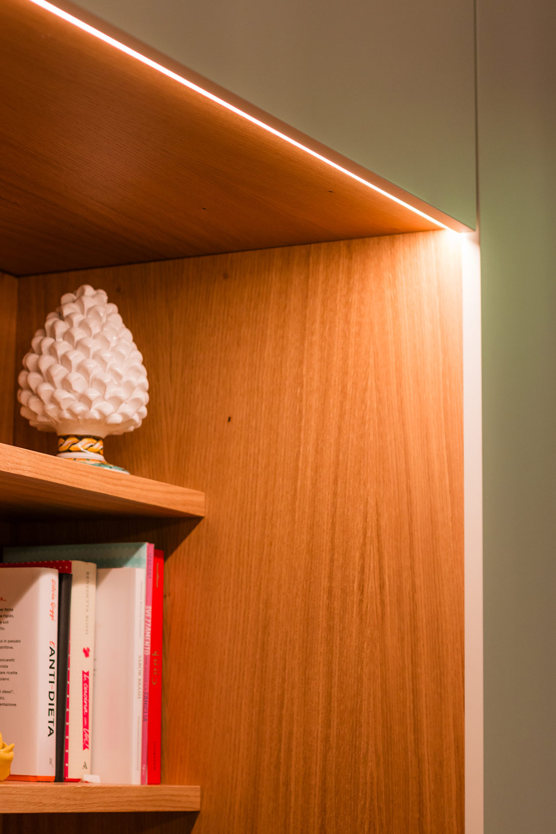
The upper wall unit with lighting underneath acts as a visual closing element providing additional storage space.
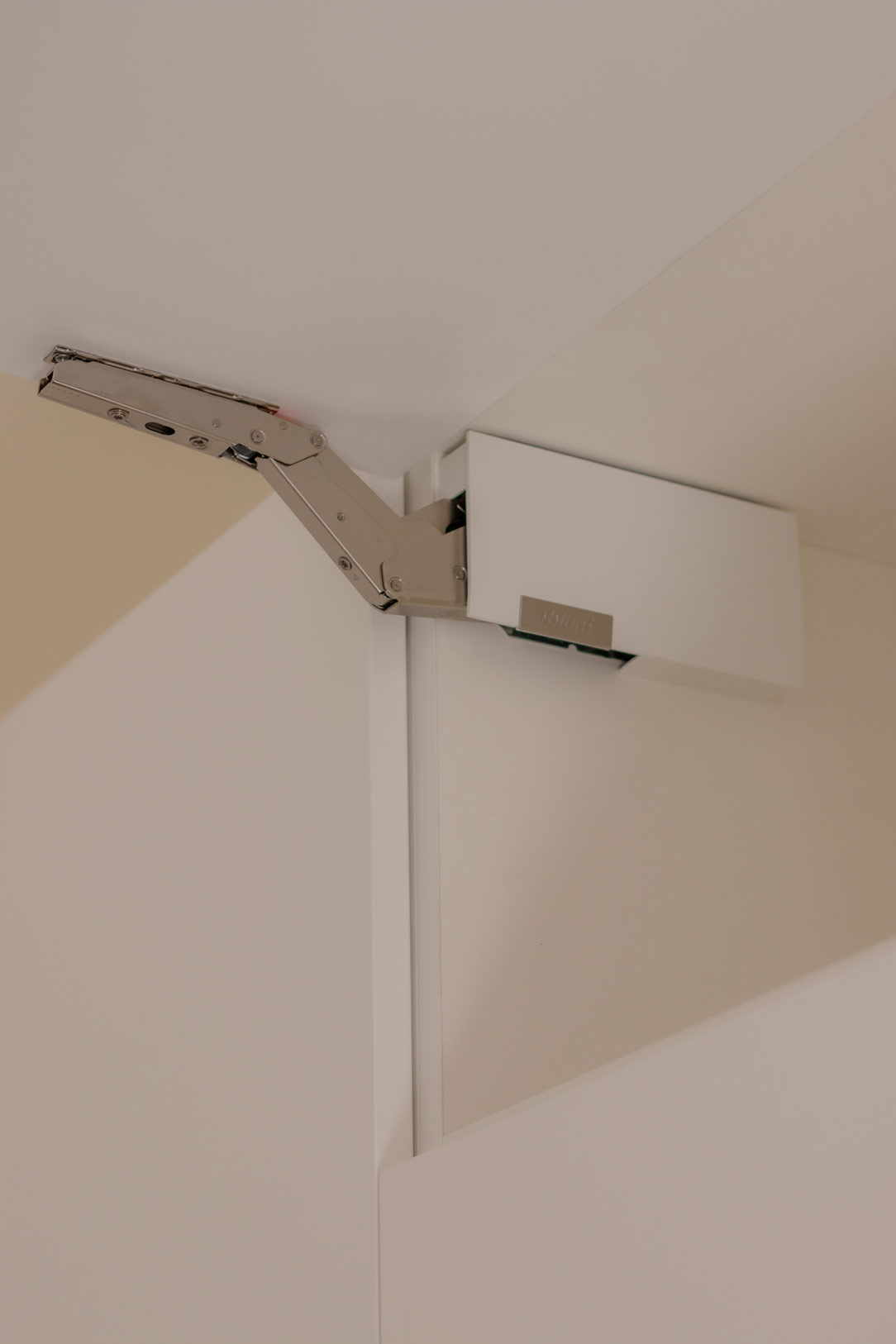
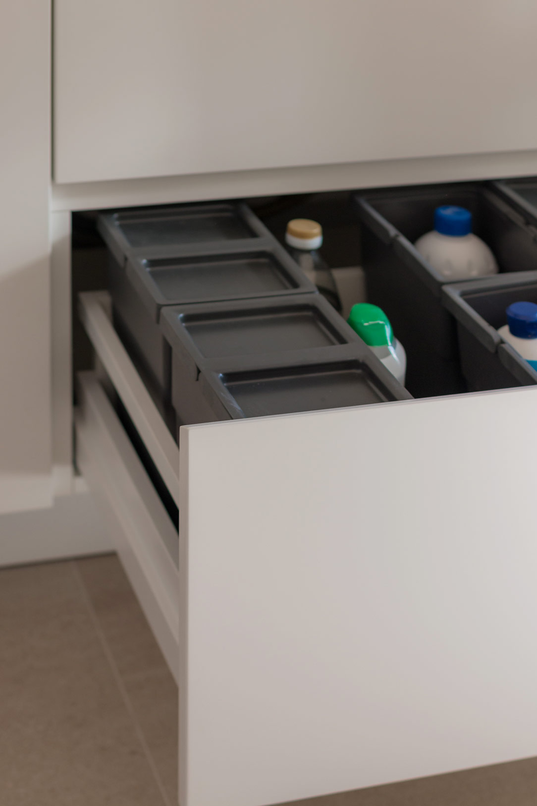
Completing the oven column is a storage drawer and door with a push-open top.

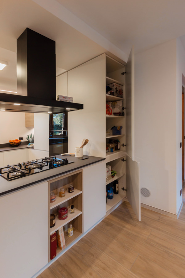
The larder unit with its large depth is accessible from the living area, making it more practical and functional.
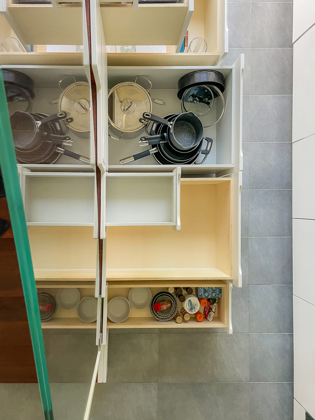
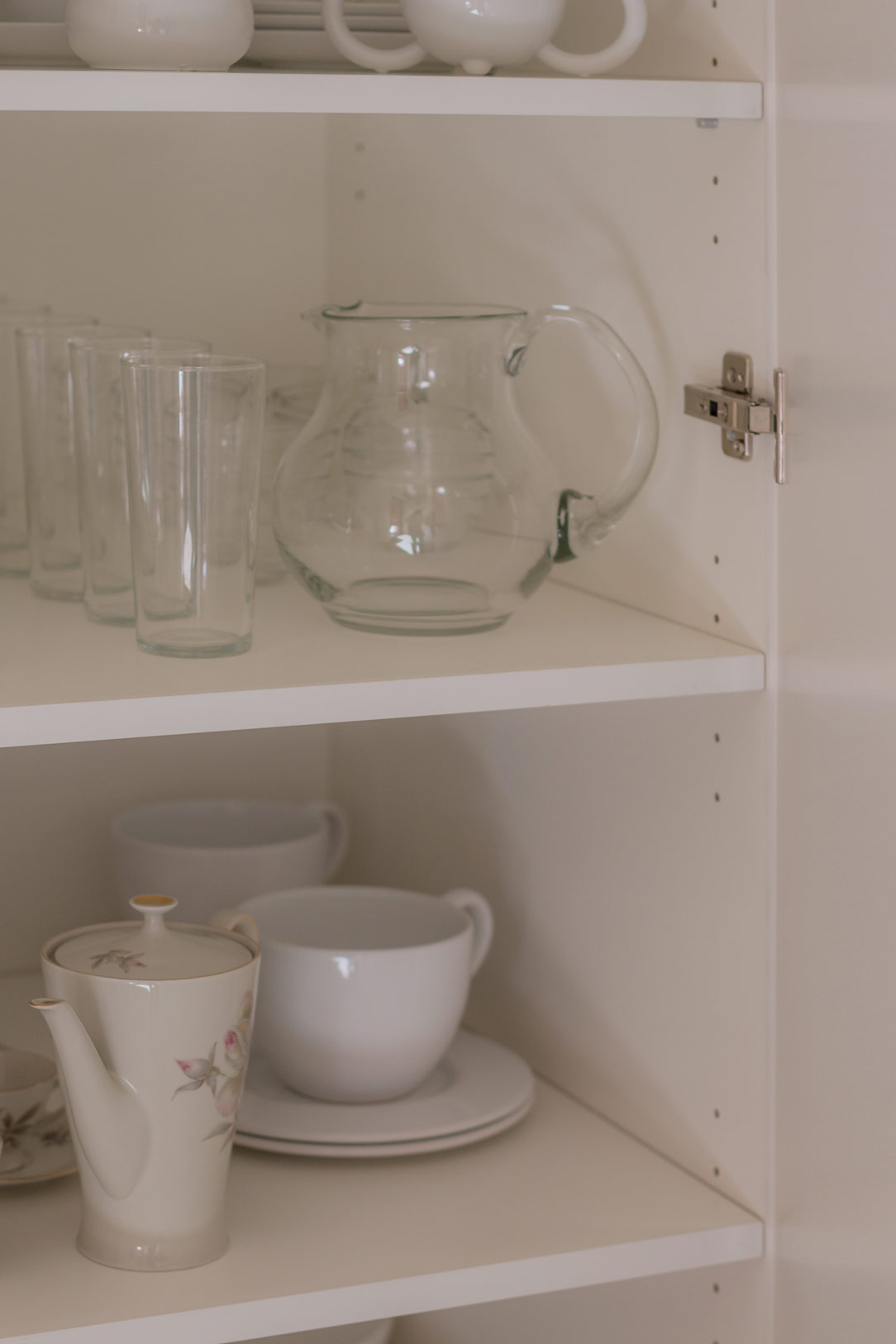
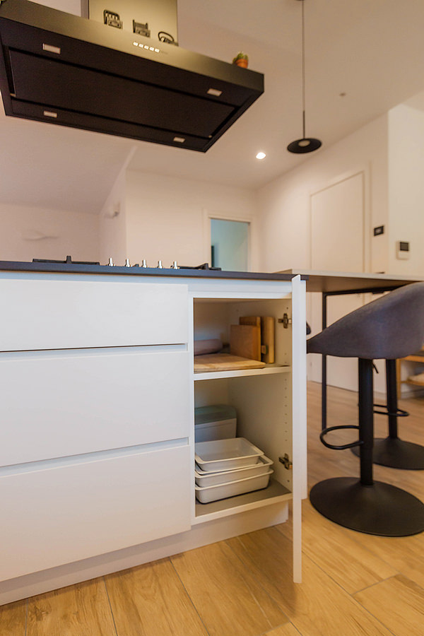
The peninsula is structured in the same way with double access, with drawers of different heights on the kitchen side and doors with small glass shelves on the living area side.
The open compartment facing the living area is instead arranged centrally.

internal composition of under-oven drawers
removable inner composition front spices
interior composition door shelves
extractable internal composition front spice detail
Corner kitchen with peninsula oak grey tones
double-sided opening peninsula pantry 01
double-sided opening peninsula pantry 02

Materials, finishes and colours: between shades of grey and light wood

Elegance and freshness are expressed through a colour palette of neutral tones of grey, anthracite for the kitchen top and ice for doors and shells, combined with oak-effect inserts to convey a sense of naturalness.
Different shades emphasise the volumetric development of this corner kitchen with peninsula through a series of combinations and joints.

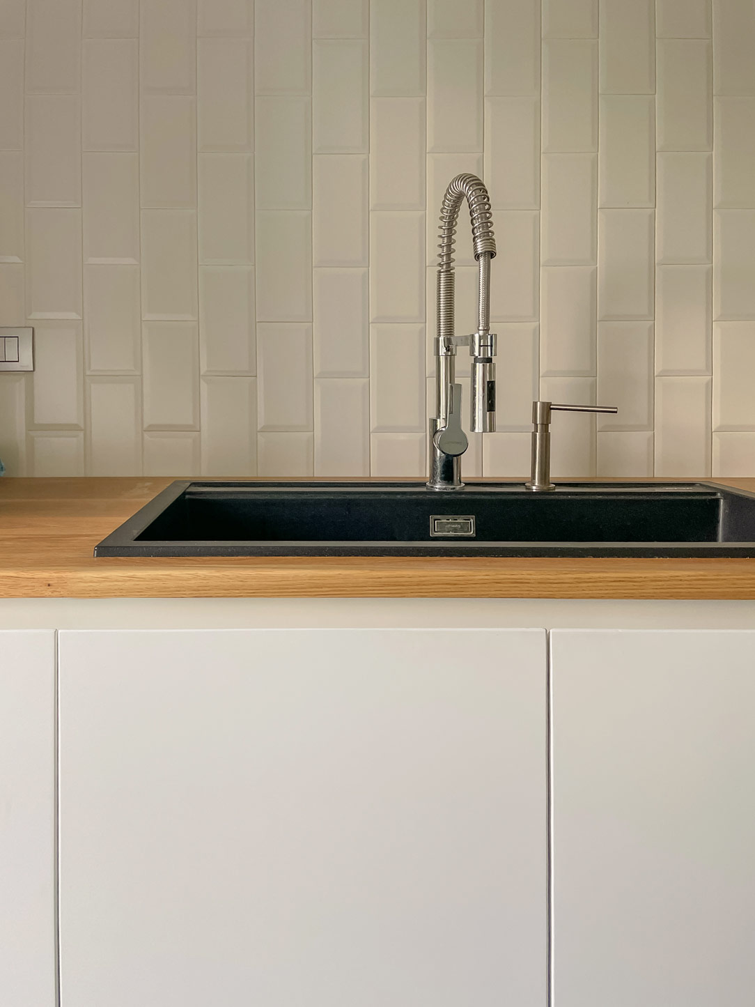
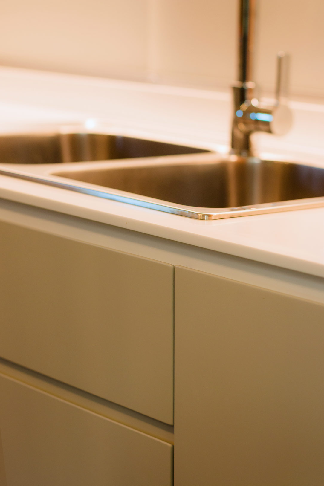
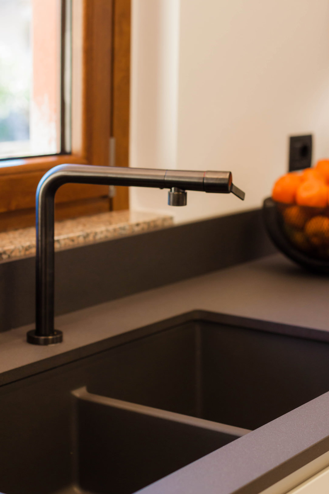
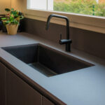
The top in Lapitec Anthracite with Lithos finish gives a uniform yet textured appearance, which is matched by the undermount sink in Stilgranit Blanco
Also in dark anthracite tones is the essential structure of the snack top.
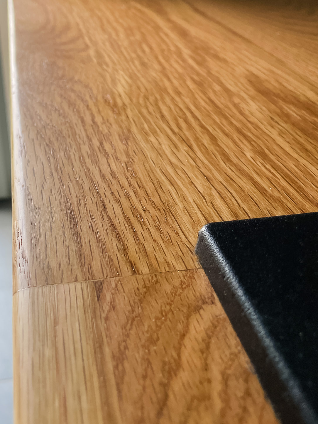
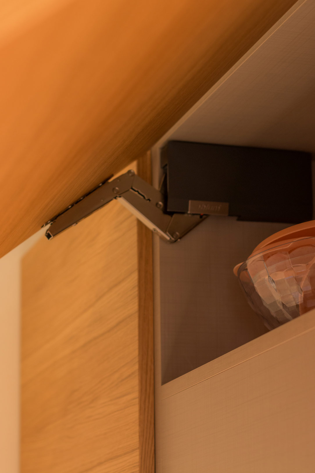
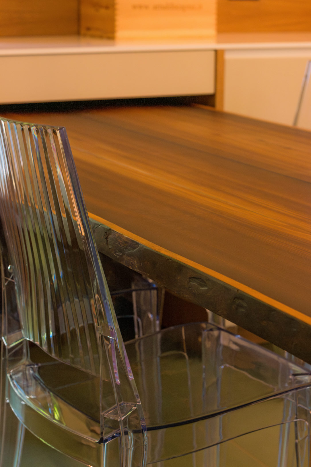
The latter features an oak-effect laminate top with a warm and cosy feel, which is also used for the wall unit with drop-down opening and the open compartment in the peninsula.

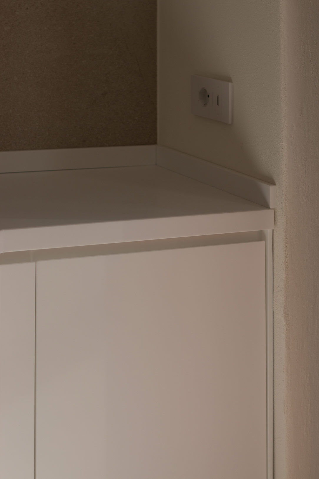
A refined detail is the overlapping of the snack top with respect to the worktop, which creates a visual detachment and also acts as a supporting element for the top itself.
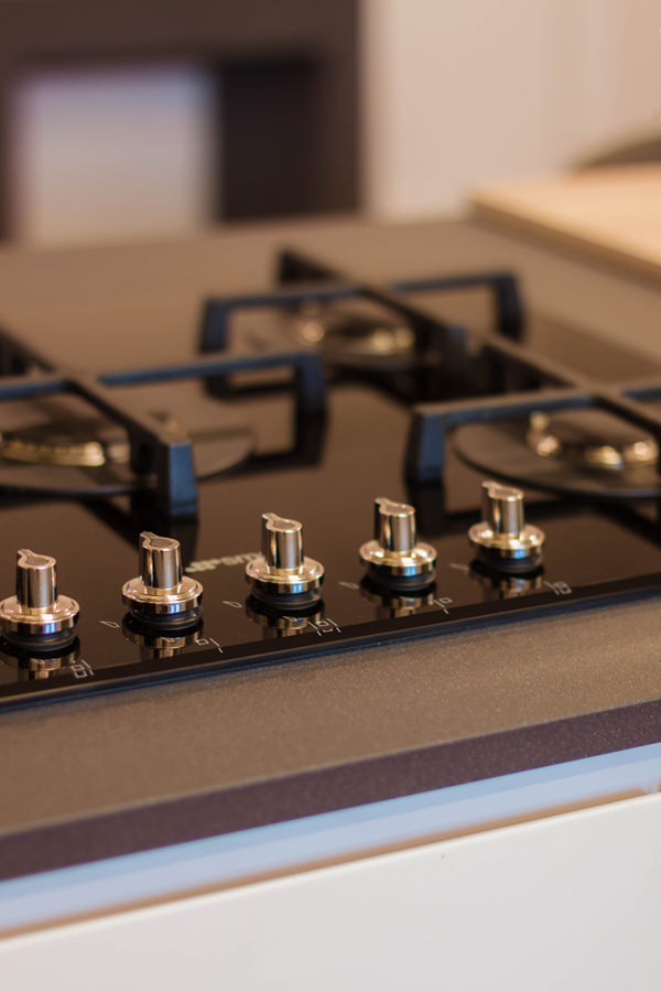
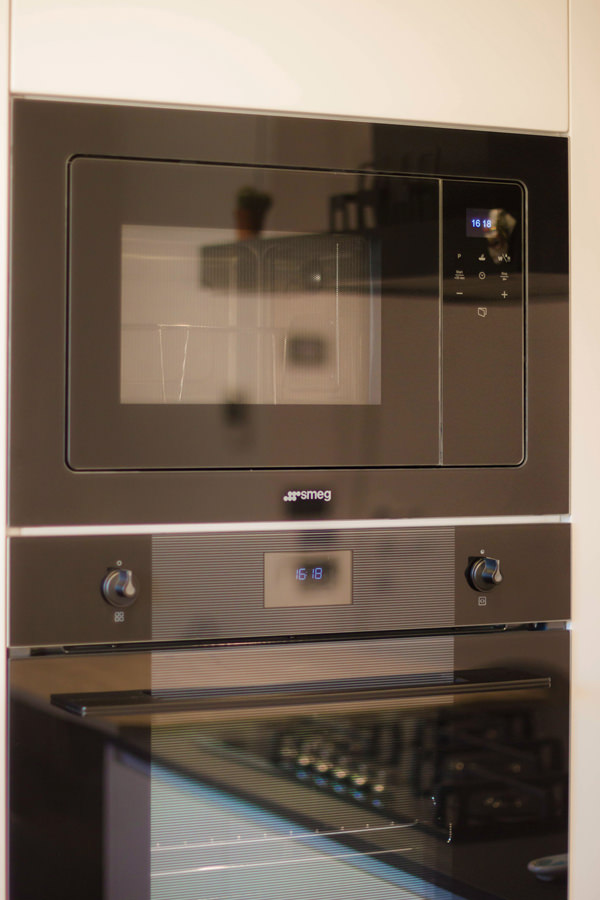
Completing the colour choice are the appliances and accessories. The ovens and gas hob in black ceramic glass echo the Falmec island hood and mixer tap.
Different materials united by the same total black aesthetic line.

Added to these is a delicate hanging lamp positioned above the snack top that provides functional lighting while respecting its minimalist aesthetic impact.
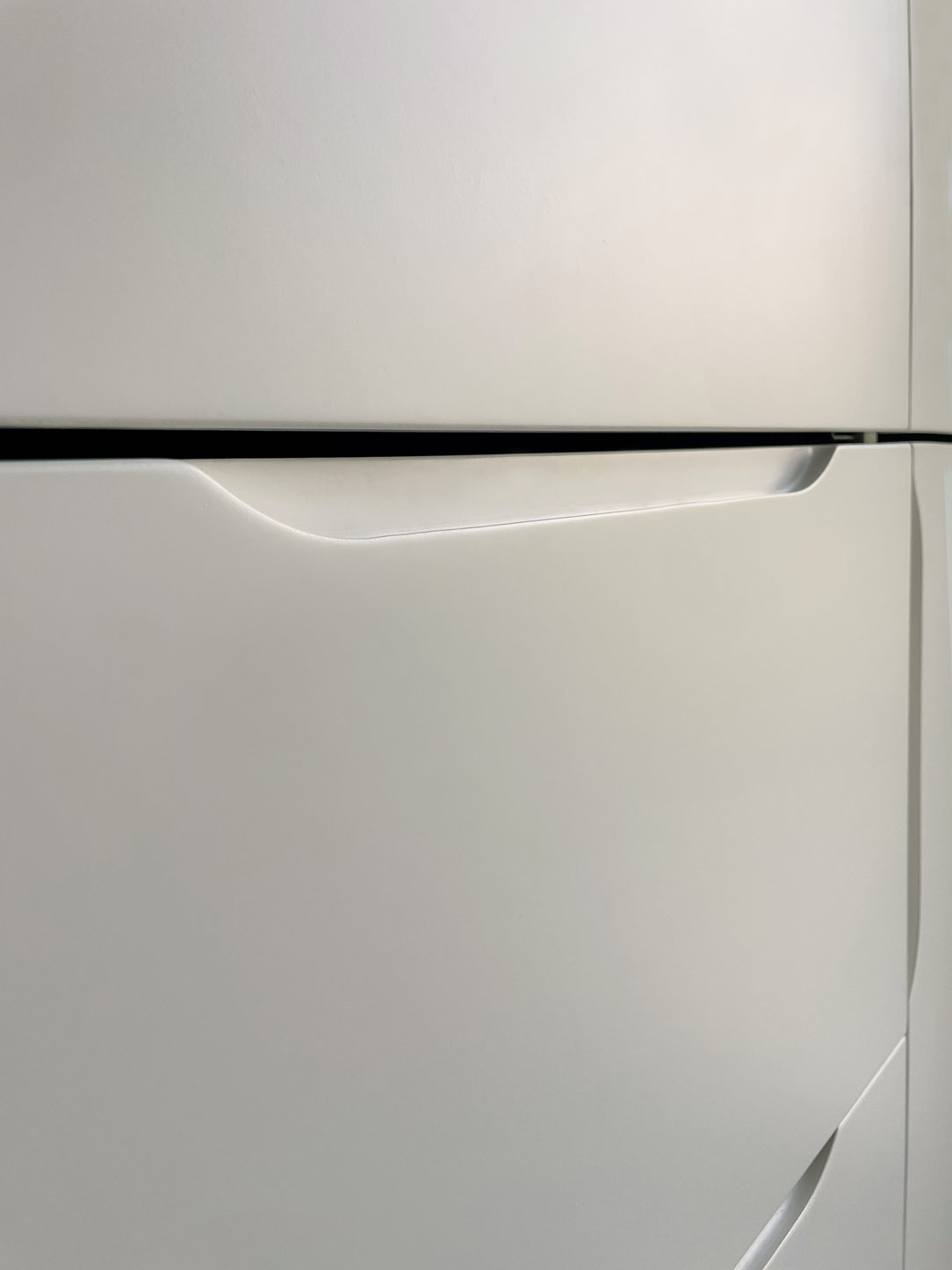
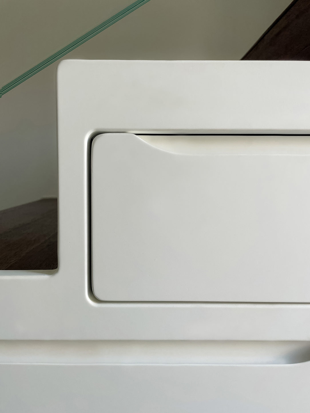
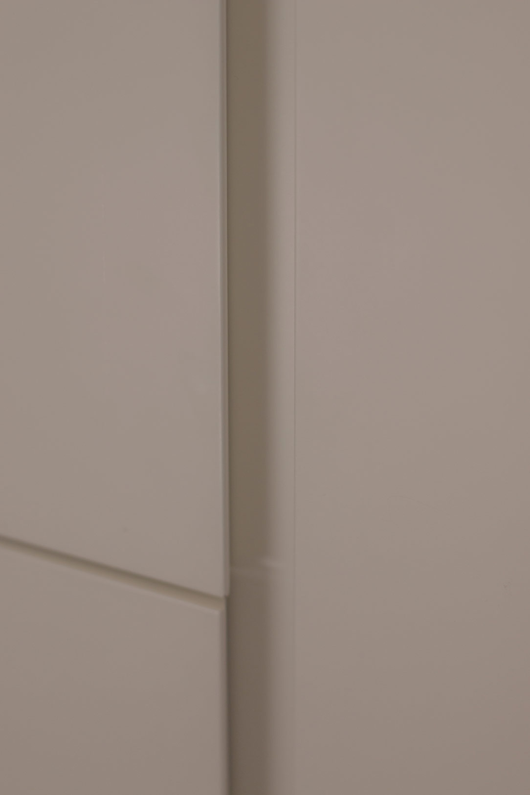
Minimalist visual lines with 45° shaped door and drawer grooves complete the whole.

Corner kitchen with peninsula in shades of grey lacquered doors oak wood top anthracite
materials and colours Lapitec top anthracite grey undermount sink
materials and colours Lapitec anthracite grey top
materials and colours open compartment wood oak effect 02
materials and colours gas glass ceramic hob black
materials and colours glass-ceramic ovens black

A corner kitchen with peninsula is recognisable by its elegant and youthful aesthetics through refined attention to detail. Functionality and openness become the keywords for a renovation that turns the aesthetics of the house upside down.  See more kitchens in light grey: a contemporary-style basement and a contemporary attic with glimpses of the past.

A Minimal Kitchen to optimize the living area

A Minimal Kitchen to optimize the living area

To optimize the available space, in a small two-room apartment in Milan, we have created this minimal, discreet, bright and elegant kitchen.

Minimal white Kitchen

ALL LIVING ROOM

As we wrote in this article dedicated to the Kitchen Snack Table, in contemporary kitchens the living area and the kitchen increasingly merge into a single open space.
There are no more partitions even at the entrance to the apartments, the door opens and everything we can have in a Living area is revealed in front of us.
So the kitchen, dining area and living room become a single room, just like in this article dedicated to a functional kitchen.
To give harmony to this triptych, the kitchen must therefore lose its “operative” spirit by hiding ladles, pots and groceries and becoming a more discreet element, which is revealed only when necessary.
Much more storage space and doors closed from view, while maintaining everything needed to cook, serve and enjoy food.

minimal kitchen lateral

​PHYSIOMY OF A MINIMAL KITCHEN

This kitchen, designed by Artecasa studio, optimize the most of the available space.
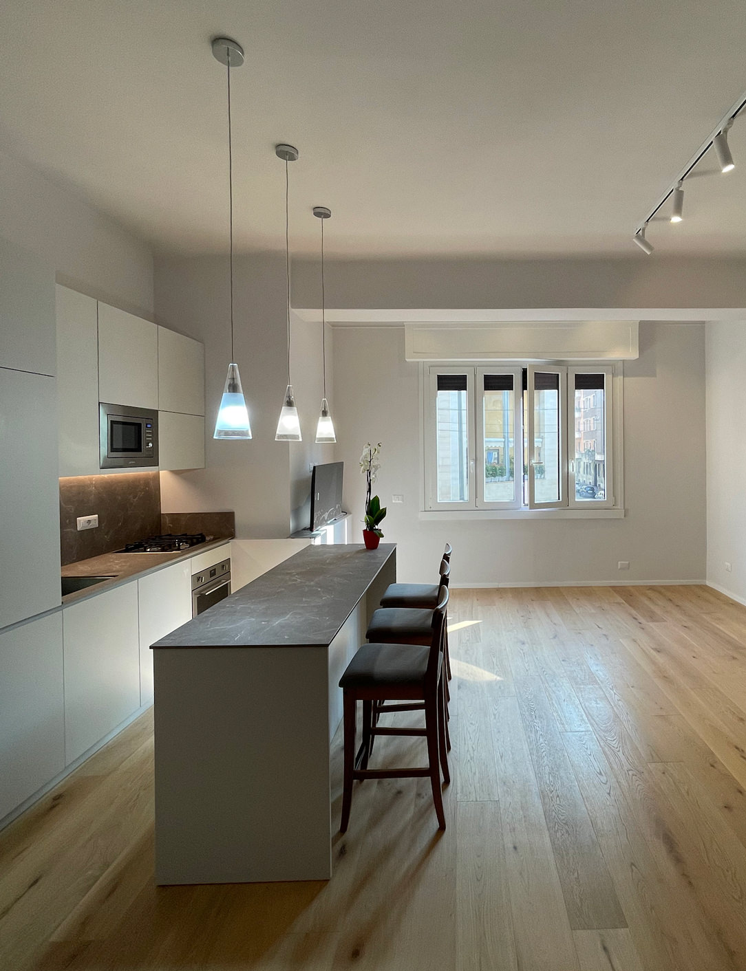
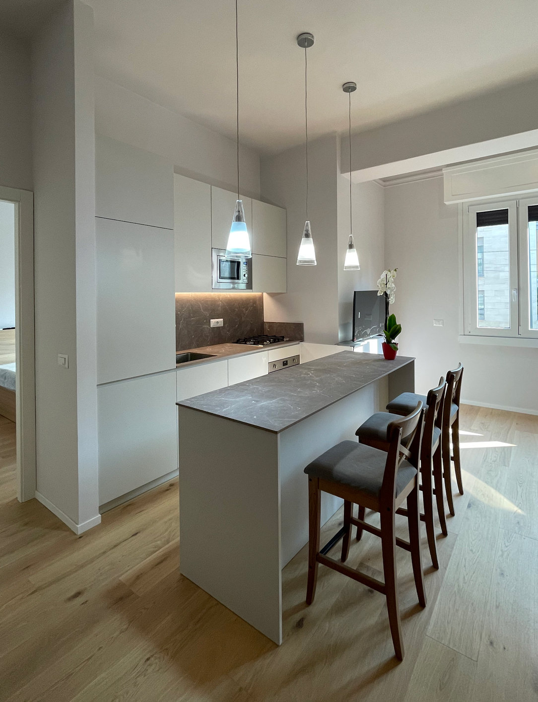
It develops in the niche of the side wall at the entrance with an equipped part and a front island that acts as an additional storage space and snack table for quick meals.
What can therefore be seen from the entrance are two horizontal gray stone floors, which develop parallel.

gray minimal kitchen countertops

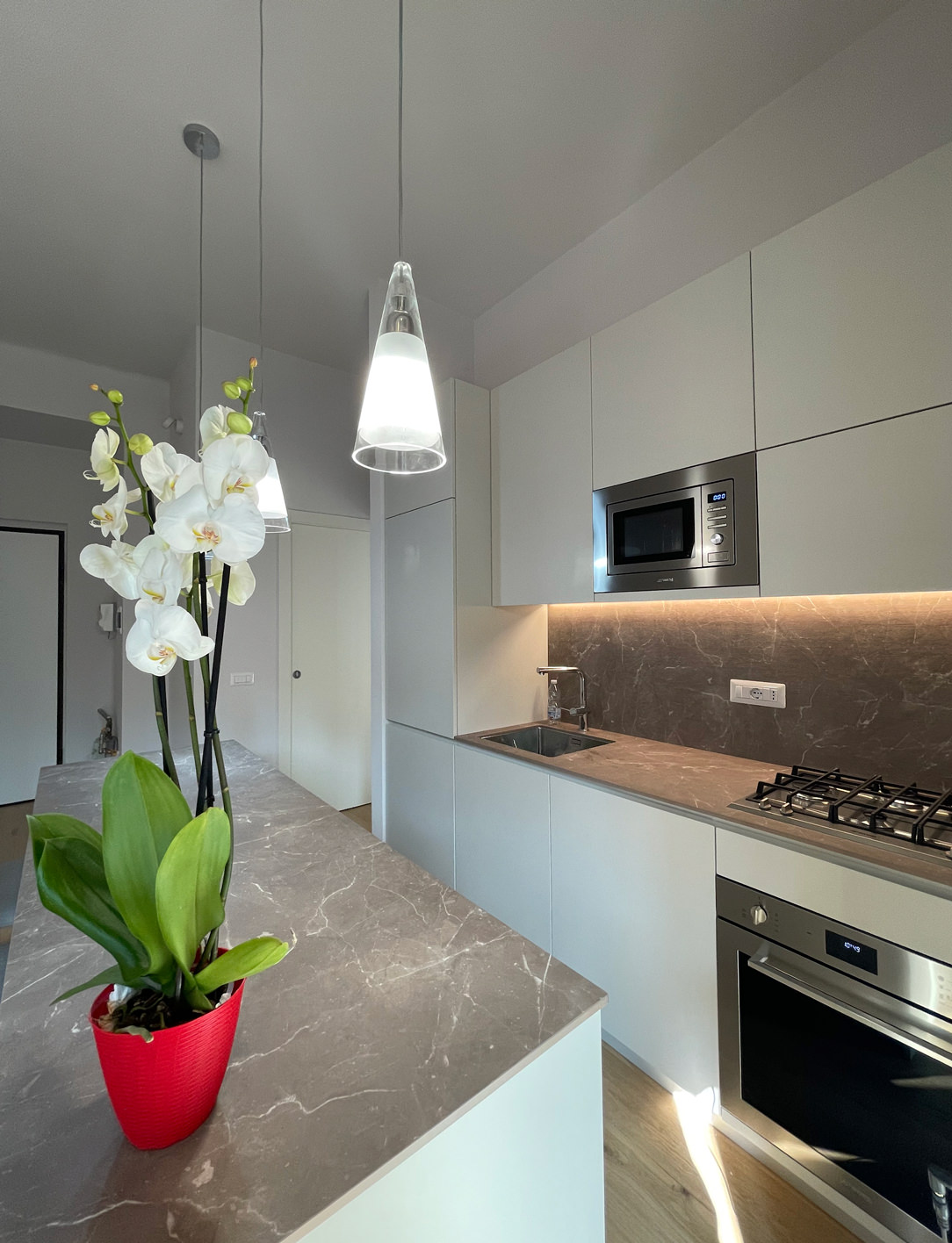
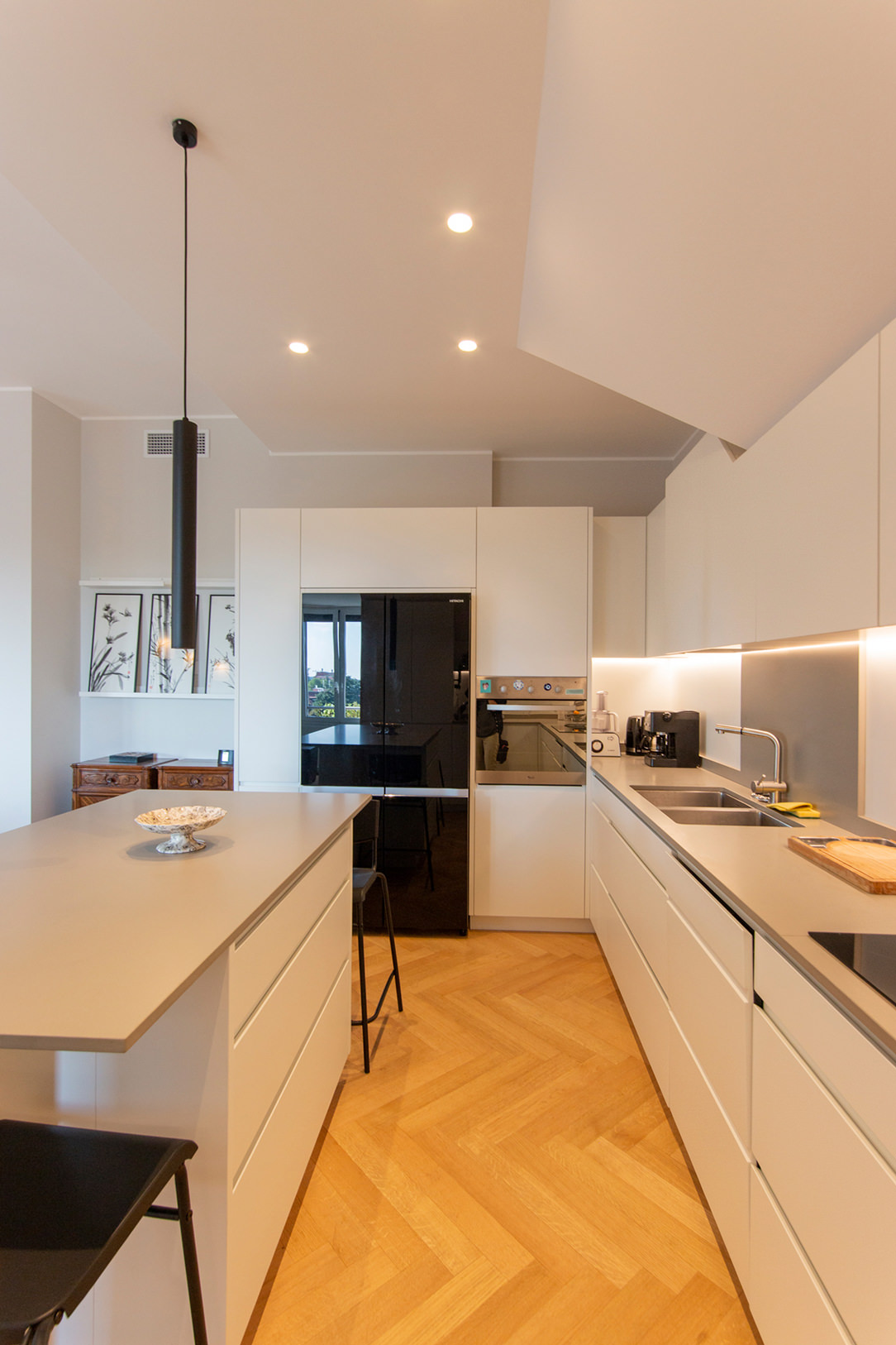
In the equipped part in the niche there are all the appliances needed in a minimal kitchen: a refrigerator column, a dishwasher with a two-bowl sink, a hob with an oven and a tall microwave.
In the island, lots of storage space, drawers for cutlery, pots and crockery and the top that extends towards the living area becoming a snack top to accommodate at least 3 diners.

details drawers
The atmosphere is convivial, and the lights are skilfully designed to amplify this feeling of intimacy and warmth.
Three ceiling lights descend punctually on the Kitchen Snack Table, the backlit wall units remain at the service of the kitchen while a track with adjustable spotlights illuminates the relaxation area.
The colors are light and glow in the light from the large windows at the back of the room.
minimal kitchen lateral

On the ground a natural oak parquet that matches well with the gray veined stone chosen for the countertops and the back of the kitchen and the light-colored furniture.
Here another minimal Milanese kitchen with similar combinations.

The Kitchen Snack Table as an evolution of contemporary Cookery

The Kitchen Snack Table as an evolution of contemporary Cookery

The Kitchen Snack Table has become increasingly common in contemporary cookery, representing an informal and multipurpose space. In addition to making the environment more convivial, it helps create a new hybrid connection between the kitchen and the living area.

A NEW WAY OF USING THE KITCHEN
THE DIFFERENT TYPES OF KITCHEN SNACK TABLE
• INTEGRATED TO THE PENINSULA
• INTEGRATED INTO THE ISLAND
• IN SUPPORT
• SLIDING
THE KITCHEN SNACK TABLE IN CONCLUSION


A NEW WAY OF USING THE KITCHEN

In the last decade, the kitchen has consolidated its focal role within the domestic environment. Thanks to the multitude of television programs with starred chefs, the pleasure of cooking has been rediscovered, bringing the excellence of the Italian culinary tradition back into force. By virtue of this, more and more attention are paid to the functionality of the kitchen: storage, preparation, cooking and tasting become fundamental points in the act of cooking, each with its own needs and requirements.

Kitchens have evolved over time, marrying the idea of ​​open spaces in recent years, blending into the living area. By breaking down the canonical subdivision into closed environments, the sense of openness has also contributed to modifying the conformation of the kitchens. These have become more and more protagonists both in their island and peninsula arrangement, in which they accompany the conformation of the architectural structure. From this point of view, the kitchen snack table plays a fundamental role in the new vision of the living area, acting as a functional element of conviviality and a trait d’union between the two different areas.

By Kitchen Snack Table we mean any type of extension of the kitchen worktop, whether it is coplanar or overlapping the latter. Being a hybrid element of both the kitchen and the dining area, it allows the tasting of quick lunches and snacks without having to sit down at the dining table. At the same time, it remains at the service of a work surface during the preparation of meals.

Made in the same material as the top or in contrast with it with a different material, it is characterized by a sophisticated design. Dimensions and locations vary according to the structure of the kitchen and the importance one wishes to give to the element itself.

wasabi peninsula kitchen

THE DIFFERENT TYPES OF KITCHEN SNACK TABLE

INTEGRATED TO THE PENINSULA

In the peninsula kitchen, the Snack Table has the same height as the worktop which is usually around 90cm and differs from the dining table which is 20cm lower. It is therefore necessary to use high or adjustable stools for a small number of diners, given the limited usable space.

In these examples of peninsula kitchens, the Snack Table is designed in the same material as the top to give a sense of visual continuity.

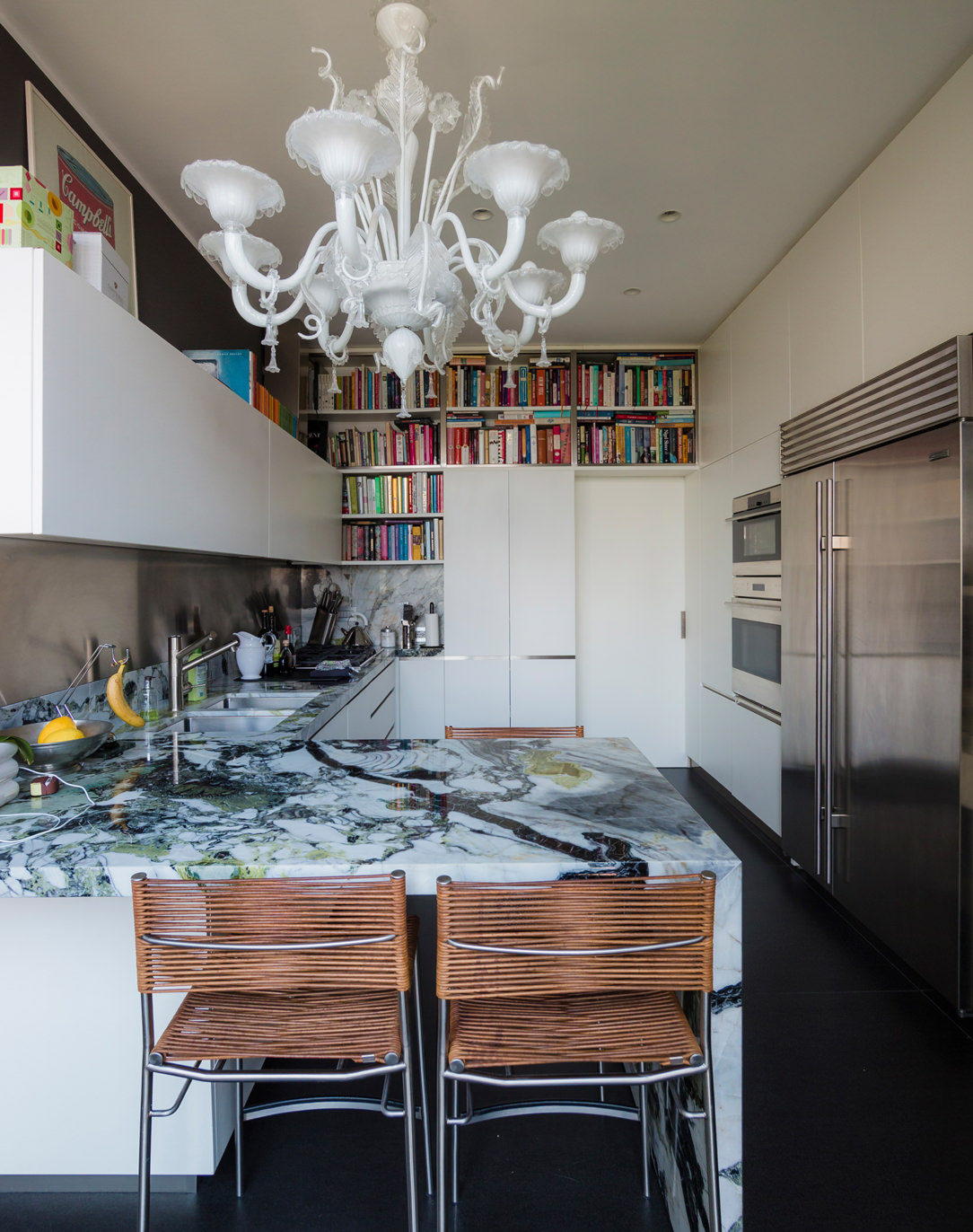
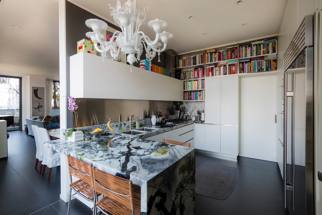
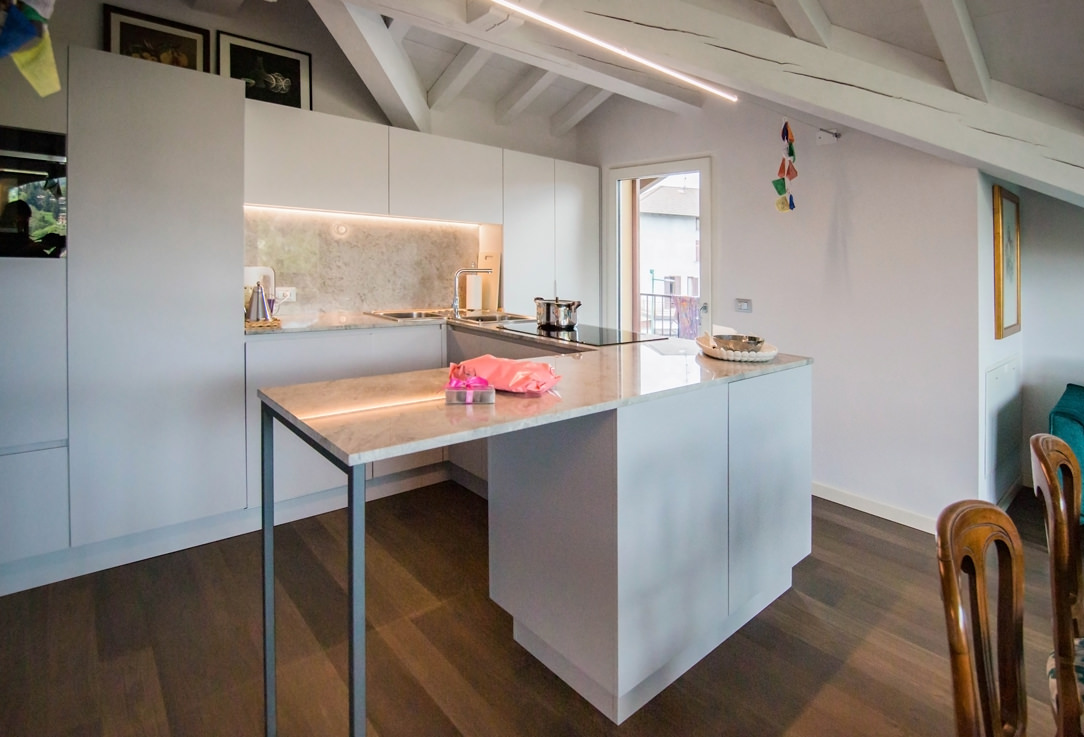
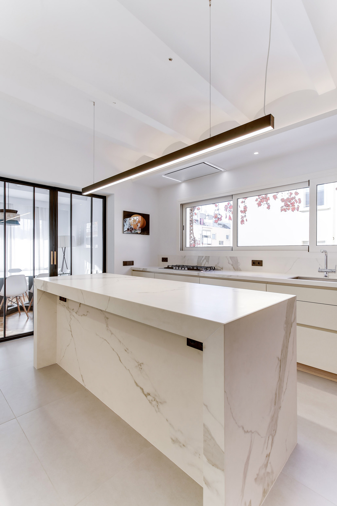
In this peninsula kitchen, the marble top stands out for its veins and elegance, becoming the undisputed protagonist of the environment. As such, it harmoniously embraces the development of the kitchen, declining towards the ground and restoring a sense of visual closure. In the second case, the worktop leaps towards the living area, supported by an anthracite gray painted iron structure with a linear aesthetic. The sense of openness created by this supporting structure allows maximum usability of this element.

lateral wasabi kitchen
peninsula gray snack table


INTEGRATED INTO THE ISLAND

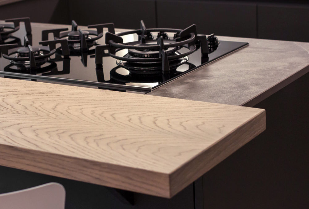
Born as a replica of an actual bar counter, it is in front of or to the side of the operational part of the kitchen, which very often incorporates the hob or sink. Usually shallow, no more than 30cm, it takes advantage of a small space both for support and for tasting. It can be raised above the kitchen top and made in a different material to create an interesting visual contrast. Here are two examples with a wooden top combined with a stone-effect kitchen top.

In the island, the snack top can continue with the same material, providing only a useful support and workspace as in these two cases.

light island kitchen Snack Table
gray white kitchen island

IN SUPPORT

The snack top can also be released from the island or peninsula and become an independent space for supporting or consuming quick meals. A singular element inside the kitchen, as in this case, where it becomes an additional surface for completing the kitchen on the wall.

kitchen with extended Snack Table

A disturbing architectural element, such as a pillar in the center of the kitchen, can integrate harmoniously by becoming a support for an additional snack top in the kitchen, as in this case.

kitchen with lateral Snack Table


SLIDING

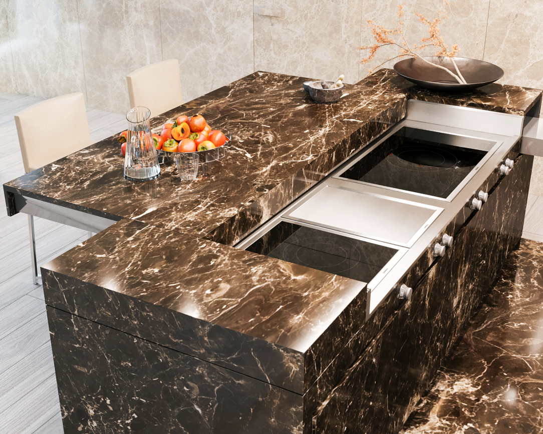
The Slide Snack Table is a sliding support capable of hiding part of the kitchen by closing it in a solid and defenseless monolith. This, thanks to a mechanical movement, changes its development by stretching the lid outwards and making it become an unconventional support surface.

In this example, the whole island is clad in the same material, a dark emperador marble. When at rest, the structure appears fixed, while when it becomes operational, it shows the hob and the underlying materials, i.e. steel and ceramic glass.

island marble kitchen


THE KITCHEN SNACK TABLE IN CONCLUSION

We have seen how the island or peninsula of a kitchen can have a natural continuation of a multifunctional surface by becoming a Snack Table. A small but useful work surface that is used during the day for breakfasts and snacks. Or a sort of counter for quick lunches but also a support surface for enjoying aperitifs with friends.

In fact, the ritual of meals has lost its formality over time, becoming a moment to be optimized within the sometimes-hectic day. Therefore the snack top has become a fundamental element in the design of a contemporary kitchen.

AN OLIVE GREEN KITCHEN IN THE OROBIC PREALPS

AN OLIVE GREEN KITCHEN IN THE OROBIC PREALPS

Immersed in the woods of the Seriana Valley, a splendid villa with panoramic views has renovated its interiors and the living area with a new olive-green kitchen.
Opening doors white kitchen with island

A FUNCTIONAL AND MODERN PROJECT

The heat of these summers has made us rediscover how beautiful, cool, and relaxing our second mountain homes are.
There has been a real repopulation of our Valleys and the trend is increasing.

After so many years living away from our second homes, however, we also want to return to live there by renovating them, to fully enjoy them.
The customers’ request was to have a new modern kitchen, open to the living room in a large, functional, and capacious Open Space.
A kitchen able to marry with some wooden elements already present in the house and with the new living area with fireplace in shades of gray.

Our interlocutors were not a single subject but several families who use this second mountain home, so we tried to satisfy all of them with a project in harmony with the context.

green and wood kitchen
detail of green door hollow handles
gas hob detail

THE KITCHEN PROJECT

Once the dividing wall was knocked down and the old access to the room closed, the kitchen had the opportunity to develop into a corner, right in front of the bright French window that overlooks the external panoramic terrace.


A first column volume on the left acts as a large pantry with shelves (useful for several users).
In the center and taking advantage of the corner, a hollow with low wall units houses the sink with drainer, the gas hob, and a good worktop.
The refrigerator column and the oven column with service doors in the upper part close the opposite corner.

green and wood kitchen
aventos detail
 dish drainer detail

GREEN KITCHEN: HARMONY BETWEEN INTERIORS AND EXTERIORS

The materials and colors was chosen to follow both the trends we found at the Salone del Mobile and, on a conceptual level, the external environment. The predominant color of the kitchen is in fact a very delicate olive green, which recalls all the forest green that can be glimpsed from the window. The walls are also in the same color tone but in a lighter shade. The floor is made of oak planks and rises to become the same plinth of the entire kitchen. In addition to aesthetics, however, a certain degree of resistance was required, as the house is used by several families, so both doors and wall units are made of plastic bilaminate. As far as the oak essence bilaminate is concerned, we sought the closest color to the parquet, but we preferred to move it away from the floor in a more linear rhythm and without obvious knots. The top is in HPL, that is a compound of cellulosic fiber impregnated with thermosetting resins, practical and resistant. The finish of the top is in Cardoso stone, in shades of gray, which incorporates the other elements in the living room and its irregularity, and its marked veins make it very similar to the sandstone rocks of the Valley. Green, wood, and rock, these are the harmonic references that we have chosen as the common thread between inside and outside and the result is really satisfying. Here the link to another renovated mountain apartment.
When a white kitchen with an island becomes a functional element of a youthful two-room apartment

When a white kitchen with an island becomes a functional element of a youthful two-room apartment

In the centre of Milan, a youthful flat is spread over two levels, welcoming a white kitchen with a functional island in the centre. On the upper floor, the elegance of total white is accompanied by a niche wardrobe with mirrored doors that amplify the perception of the sleeping area. Practical elements with linear and elegant aesthetics that define the look of the entire flat. Let’s discover together this realisation designed by architect Stefano Belotti!
Opening doors white kitchen with island

A white central island dominates the kitchen area

Upon entering the flat, with its small but practical dimensions, the view is projected onto the kitchen, the layout of which makes full use of the available height with storage compartments. Acting as a visual filter, but at the same time as a functional element for the cooking area, is the central island that echoes the white aesthetics of the kitchen.
The worktop, in matt white Corian, becomes not only a work surface, but also a convenient snack top for aperitifs and quick meals.
In this respect, the folding mechanism that allows the (future) service stools to be concealed plays a key role.
The front closure panels, in fact, rotate sideways to then be incorporated into the main structure and almost completely disappear.

white kitchen with island oven combination column
white kitchen with island wall units integrated lighting
detail Corian worktop integrated basin aluminium mixer
aluminium chain Corian top
white kitchen with combined oven island hidden door laundry area

The volume of the island consists of front-extension doors with internal drawers of different heights.
A solution that has now become predominant in the recently concluded edition of the Salone del Mobile, as well as clearly recognisable in previous editions.
The main advantage is certainly the more elegant and minimal aesthetics, in which horizontal cuts resulting from the division into drawers are eliminated in favour of a single door.

detail of internal drawers in white lacquered kitchen with island

From the wall unit to the laundry corner: functionality marries total white aesthetics

The adjoining wall unit is made up of multi-level volumetric plays.
The service columns, incorporating the built-in refrigerator on one side and the combi-oven to its right, are accompanied by compartments with hinged doors that extend across the entire upper part of the kitchen.
On the same depth level, matt lacquered doors with a dishwasher in the central area and internal shelves in the surrounding compartments.
The central area, on the other hand, is characterised by a break-out with worktop and sink, upper wall units with vertical partitioning and built-in lighting with a smaller depth.

To ensure the best functional configuration, the side wall to the kitchen and the central island accommodates a white lacquered door that covers the entire height of the room.
This conceals inside the laundry area with a washing machine and tumble dryer with columns accompanied by practical shelves for cleaning products.

The linear aesthetics are emphasised both in the choice of lighting, pendant above the white central island and LED strip lighting in the back wall of the kitchen, and also in the joining chain between the Corian top and doors below.
The material detachment through an aluminium profile becomes the horizontal reading element both for the back wall, joining the two side ends, and embracing the central island with kitchenette.

white kitchen with laundry corner island
White kitchen with island pull-out front drawer doors

A wardrobe with mirrored doors embellishes the sleeping area

On the upper floor, accessible via a white painted spiral staircase, a wardrobe with six mirror-covered doors dominates.
The rhythmic vertical division is interrupted by a single horizontal cut at the top, creating an interesting geometric subdivision in the overall aesthetics. The choice of mirrored doors on the one hand amplifies the brightness and perception of the room and at the same time enhances the overall aesthetics.

The division into six doors is reflected internally in a symmetrical composition with double central compartments accompanied by two single compartments at the ends.
Compartments with hanging tubes are favoured, but there are also internal drawers and adjustable shelves for better organisation of clothing.

If for the lower level the kitchen with central island favours a uniform white aesthetic, the sleeping area, on the other hand, marries contrasting aesthetics.
The bright exterior of the mirrored doors is in fact contrasted by the elegance of a matt black whole on which the elegant chrome hanging tubes can be seen.

mirrored door wardrobe
wardrobe mirror doors dark laminate interior drawers
Niche wardrobe with dark interior mirror doors
detail mirror cabinet doors interior lighting
two-room mirror-door wardrobe
detail of mirrored wardrobe doors in niche

The choice of a total white kitchen is always a contemporary and elegant solution. Its simplicity makes it easily adaptable to the surrounding context, whether it has a retro feel, as in this example, or contemporary pop, as in this realisation. It can also be combined with natural wood elements, such as chopping boards and snack tops, thus adding a hint of warmth, here’s an example! Or exploit plays of opacity and shine through different materials, making the room look fresh and bright, perfect for seaside homes!

Minimal style furniture for a youthful apartment in the city center

Minimal style furniture for a youthful apartment in the city center

An apartment in the city center shows all its freshness with bright interiors and light colors, while the minimal style furniture defines its elegance. Functional environments suitable for various needs and therefore excellent for short and long-term rentals. The geometric patterns and essential design lines return the idea of ​​freshness, presenting themselves as excellent companions in everyday life.

minimal style kitchen central island service columns

The living area: a minimal style kitchen with an industrial touch

The entrance to this apartment overlooks the living area illuminated by large windows located along the right side of the room.
The minimal kitchen also finds space here, divided from the living area by a half-height wall that acts as a conceptual filter for the two environments.

The development of the kitchen occupies the side adjacent to the entrance area with full-height columns and a central island. This becomes the functional element par excellence, acting as a pivot in the distribution of transit flows and welcoming the preparation, cooking and washing areas.
In the lower part, large drawers are placed under the induction hob, to house pots and accessories useful for cooking.
Beside them, two lacquered MDF doors house the countertop sink and the lower compartment for the differentiated waste bins.

The worktop in practical bilaminate in a medium gray tone recalls the industrial scent of the dining table with its material surface.
In the center between the cooking area and the washing area, the top is left free to allow the preparation of dishes. To facilitate the use of small appliances, a retractable socket tower.

On the column side, the built-in oven positioned at a comfortable height embrace, together with doors with internal shelves, the open compartment with bilaminate top and lacobel top. Element that acts as a useful support on the side of the oven or can be equipped with small appliances such as coffee machine and mixer, or Thermomix.
At the same time, it is also a significant aesthetic element, capable of attracting attention for the brightness that characterizes it.

The lacobel bottom reflects the light coming from the LED strip embedded in the upper part, giving further brightness.

 dining table metal structure industrial style top
furniture columns kitchen service minimal style bilaminate top lacobel day compartment
front view island drawers pans accessories induction cooking
white kitchen island retro doors detail
detail of the disappeared turret took a closed position
detail of the disappeared turret took the position of use

The functionality of the sleeping area with white furniture

The access corridor to the sleeping area is equipped with a full-height wardrobe shaped internally to restore the correct alignment of the rear walls. Internally, shelves of different heights allow the organization of household products while respecting the existing electrical arrangements and the counter compartments.
A functional element capable of blending into the minimal furnishings of the apartment and at the same time serving as an equipped piece of furniture in a closet.

To complete the sleeping area, a second full-height wardrobe with white lacquered doors and handles in white folded sheet metal with a minimal look.
This internally houses hanging tubes and drawers for linen allowing you to keep the garments in order.
In the master bedroom, essential white lacquered furnishings placed including a pair of bedside tables with storage drawers and a large side chest of drawers with recessed handles.
A desk, on the other hand, is inserted into a game of joints in a wall bookcase, creating an equipped point for smartworking.

full-height wardrobe doors sheet metal handles minimal furniture
internal wardrobe drawers linen tubes hangers
equipped corridor mobile closet minimal furniture
study corner bookcase wall desk shaped
chest of drawers bedroom minimal furniture white bedside tables
bedside table front view white lacquered handles hollow drawer black feet
white lacquered shaped shelves furniture minimal style furniture

The natural touch of the bathrooms

The two bathrooms with bold graphics reflect the minimal style of the furniture, giving a touch of freshness.
One, next to the master bedroom, incorporates the natural tones of green with a wallpaper with a vintage flavor. This is equipped with a cabinet with wooden finishes combined with a countertop washbasin with sinuous shapes. It is accompanied by a large designer bathtub that masters the corner of the bathroom and elegant furnishings.
The second bathroom, on the other hand, plays on the geometric textures of the wallpaper with more decisive colors, matched with a bathroom cabinet with the same characteristics as the first.

bathroom tub design natural colors vintage wallpaper
bathroom cabinet wood white countertop washbasin green wallpaper
bathroom furniture wood sink design support wallpaper vintage geometric pattern

City apartments require flexibility from both a functional and aesthetic point of view.
For this reason, the minimal style is perfectly suited to satisfy the tastes of future tenants. Another example of this type is this studio apartment in the center of Milan!
To deepen the minimal style instead, we can delve into the retail world with this shop in the center of Bergamo. Enjoy the reading!