An Emperador Marble kitchen

An Emperador Marble kitchen

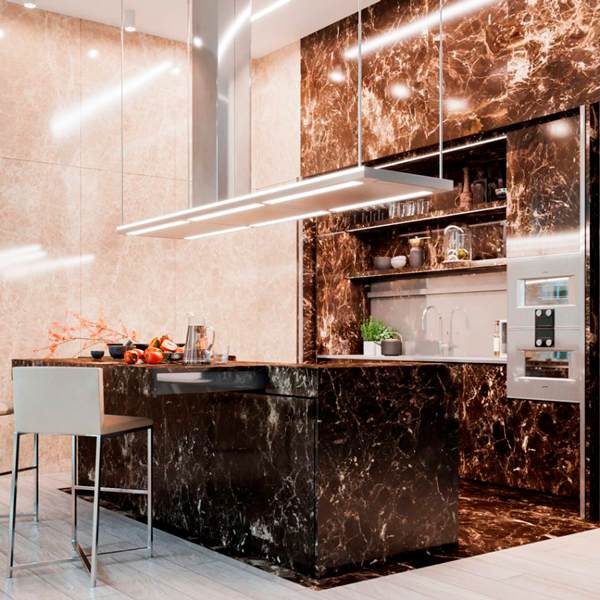
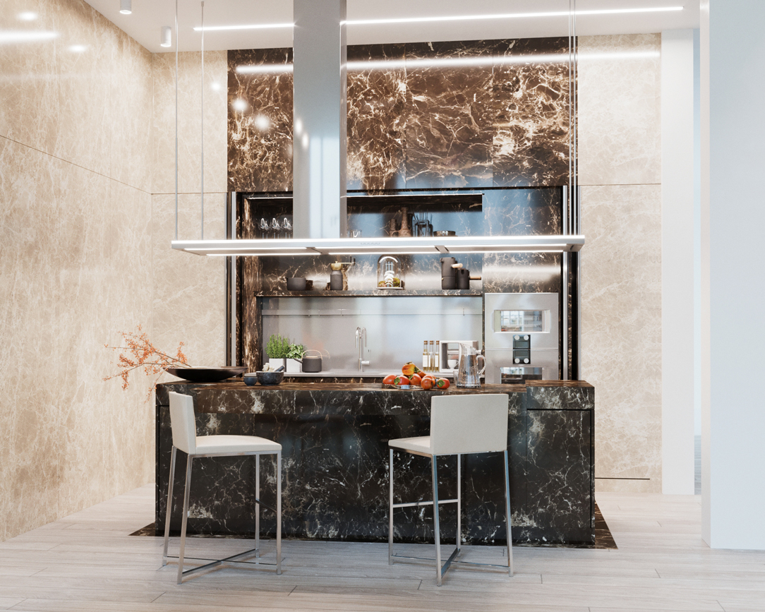
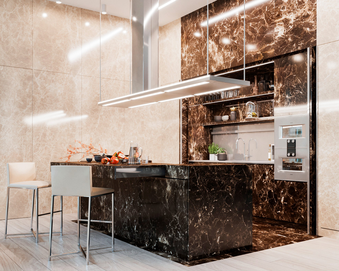
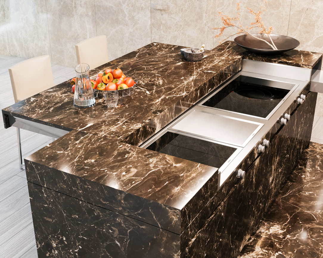
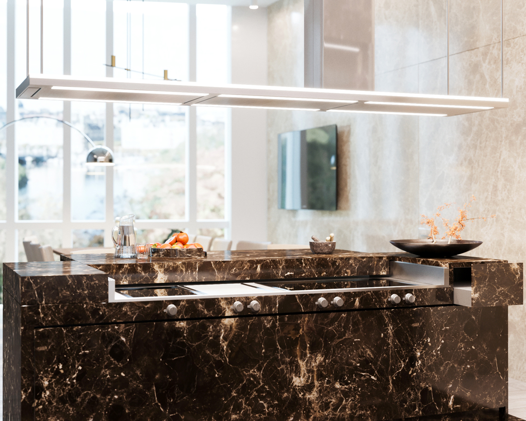
A monolithic kitchen, entirely covered in marble, shows all its elegance in a project that emphasizes such a precious and distinctive material. Walls and surfaces, in Emperador marble, are recognized for their very dense and varied white and beige streaks on a warm gray / brown background. Such a sophisticated design line can only be accompanied by modern and innovative mechanisms.

THE PROJECT

The renderings provided by Tanya Kutzmina, a cosmopolitan Russian designer we had the pleasure of working with, immediately show the intrinsic characteristics of the project. The concept of the master kitchen, part of an open space, encloses high walls and monolithic surfaces in an ambivalent environment, inert at first glance but able to transform itself into an equipped and representative kitchen for the guests of the house when needed. Two types of marble alternate in this large space. On the one hand, Emperador dark marble, which symbolically defines the functional parts of the kitchen, becoming a scenographic setting for “acting”. On the other, Emperador light marble, clear and bright, which amplifies the perception of the environment by reflecting the light of the large windows and embodies the essence of everyday life. Living and acting therefore become the reading keys not only of the stylistic composition of the rooms, but also define the way to relate to them.

marble kitchen render 01
marble kitchen render 02
kitchen island  sliding mechanism
Emperador marble kitchen render 02

THE COMPOSITION

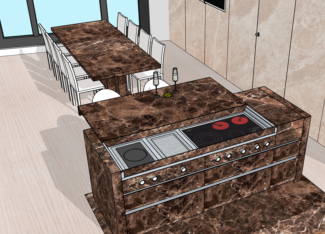
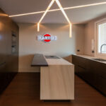
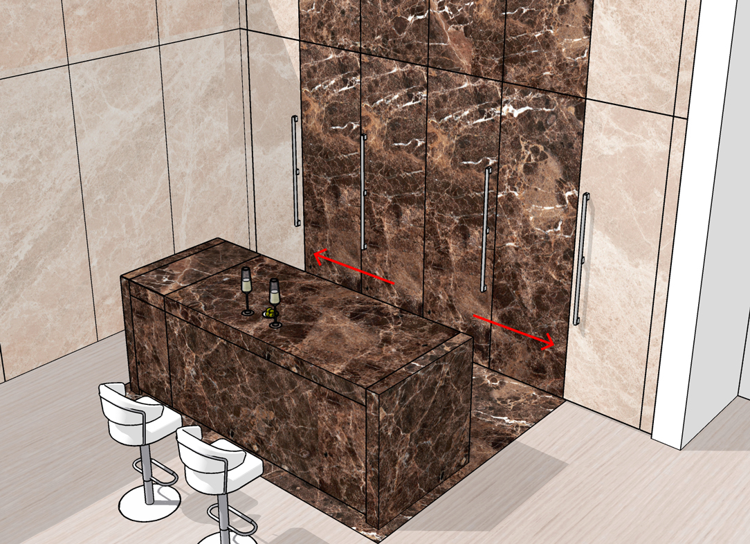
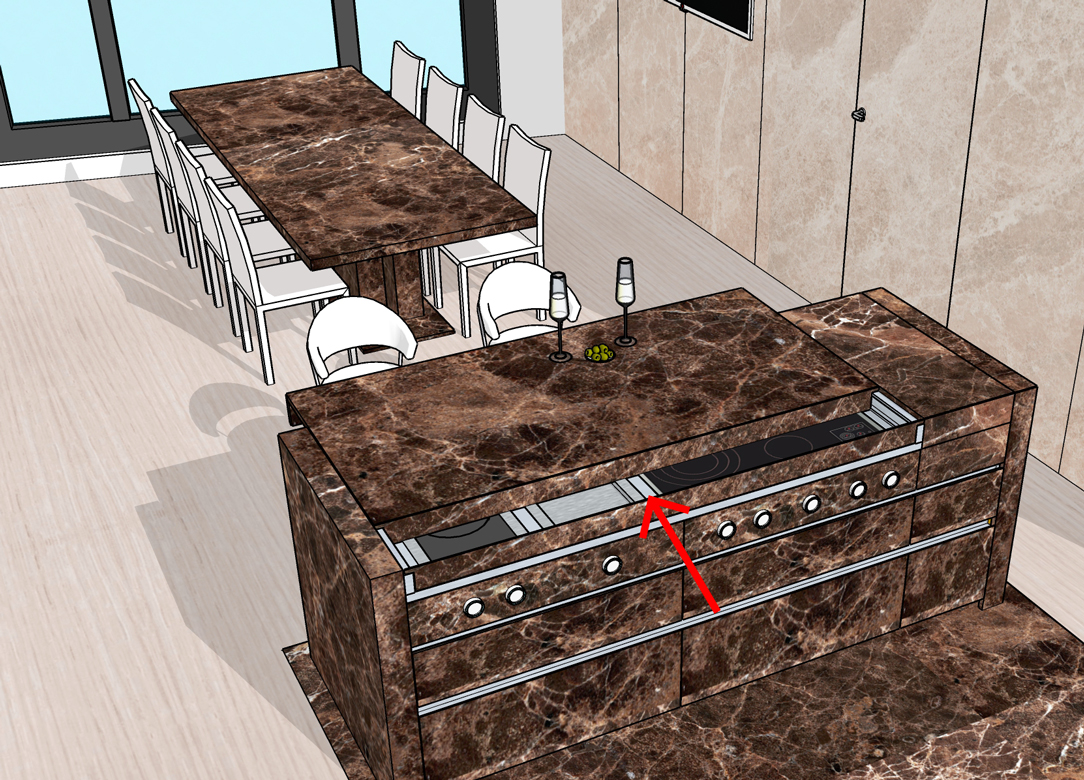
The structure of the marble kitchen is an island and the central monolith opens with a drag mechanism that becomes a snack corner. Opening, it also shows a cooking area with three different types of fires: induction – teppanyaki – grill. On the internal front there are drawers entirely covered in the same marble and equipped with cutlery holders, crockery holders and potholders. Above it stands a splendid custom-made hood in stainless steel, as large as the island, equipped with filters and LED lights. All made with laser cuts and remote engine preparation. The dark marble of the island spreads into the floor and flows into the back wall. An ingenious book system opens the central doors folding up into two side compartments and revealing a broken interior that houses a sink, a dishwasher, baskets inside the doors, an oven column and exposed shelves with underlying LED lighting. The stainless steel top and back give a touch of modernity between the eternal elegance of the Emperador dark marble with which the surrounding surfaces are covered. On both sides, two large and spacious refrigerators enclose the central block of the kitchen. The covering of the Emperador light doors continues along the entire adjacent wall, hiding an access door to the second service kitchen. At the center of the room, a huge table stands for several diners in dark Emperador with bases made to measure in stainless steel and marble. These counterbalance both visually and physically the grand plan.
 
Emperador marble kitchen Moscow
island render Moscow project
island project Moscow 02
Emperador marble kitchen Moscow
island render Moscow project
island project Moscow 02

THE REALIZATION

Creating this kitchen was a new, arduous and stimulating experience. We accepted the challenge by finding solutions to the various executive problems that immediately arose. Among these, the union of two materials, wood and marble, so different in finishes, weights and typological characteristics. Obtaining the dynamism of the kitchen, with mechanisms suitable for the fluid movement of the parts and the arrangements on site for their perfect functioning with different materials and systems, required a lot of attention and an active collaboration with Tanya in Moscow, who followed the construction site. The marble, which was provided to us by Marmi Galli, a company with which we have been collaborating for long time, was used in 2 distinct thicknesses: 20 mm with 45° cuts to cover all the structures, and 5 mm thick screened for the application on the retractable doors to guarantee the functioning of the mechanisms with respect to the weight. We have taken great care of the quality of the mechanisms and the guides, both manual and motorized, especially for the doors of the shelf and the island snack top. We leave this video of Tanya the task of accompanying you in the living area and guiding you to the kitchen. Seeing it accomplished is a great emotion for us and awards our commitment.

The Moscow marble kitchen project fits perfectly into the series of single-material projects we have made. Among them, a kitchen entirely covered in steel.


High altitude renovation of a traditional two-room apartment

High altitude renovation of a traditional two-room apartment

In the context of Bergamo mountains, a small two-room apartment renovated to improve its functionality, whose contemporary style well balances with traditional furnishing.

THE CONTEXT THE INTERVENTION KITCHEN AND LIVING AREA BATHROOM THE MATERIAL AND CHROMATIC CHOICE

THE CONTEXT

Style never goes on vacation! Or yes maybe, and in this case, it goes on mountain! Lodges and small wooden apartments always have their charm, bringing a sense of hospitality with their warm and natural colours. Inspired from the surrounding landscapes, the interiors are often characterised by the abundance of wood, used both in furniture and in the finishes of floors and ceilings. A perfect example is this two-room apartment in Lizzola, designed in the eighties style which the entire village has maintained the strong stylistic mark. In fact, is exactly in that period that the small residential area experienced its best time. The main roads were swarmed by tourists and surroundings’ valleys inhabitants who reached the area for an out-of-town weekend or entire weeks of vacation. An undisputed choice between the mountains’ resort. Set up as the typical “mountain house” the Lizzola’s two-room apartment needed a renovation, in order to make it contemporary in style and at the same time more functionally, without deleting the traditional imprint which is characterized by and makes it welcoming and typical.  
THE INTERVENTION

The design choice has been that of preserve the stylistic element and the furnishing which best represent the atmosphere of the two-room apartment. Concerning the new elements designed, the deliberately choice is a slightly invasive solution that can fit harmoniously into the existing context. From this perspective, the cherry-wooden garret was preserved from its original environment, even taking the main role in the stylistic definition of the room. As a consequence, the cherry wood parquet has stolen the stylistic characteristic of the ceiling, adjusted to the renovation of electrical and heating system. The renovation involved the entire apartment, going to specially attend the kitchen and bathroom interiors.

KITCHEN AND LIVING AREA

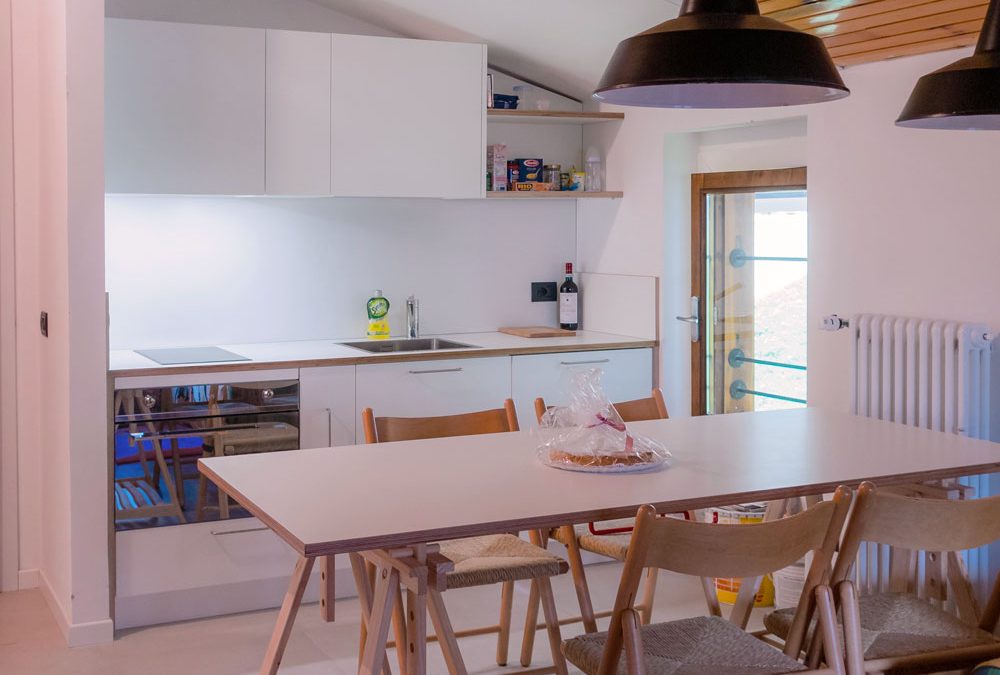
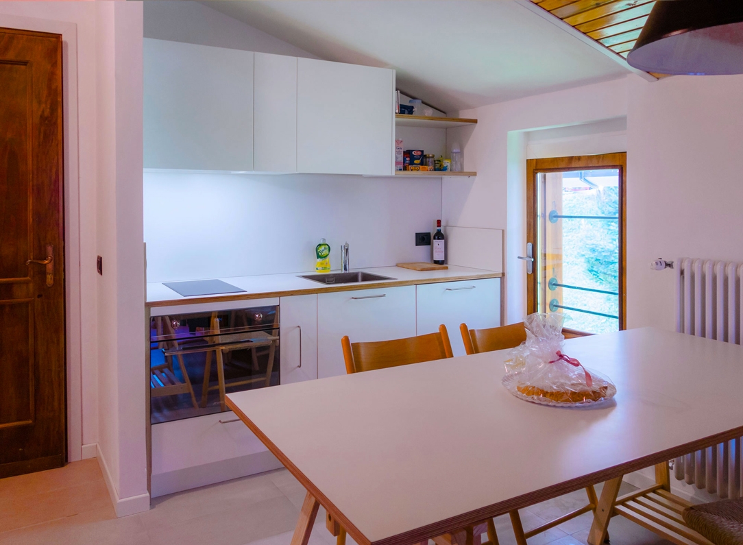
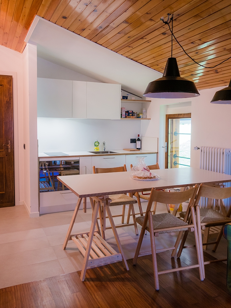
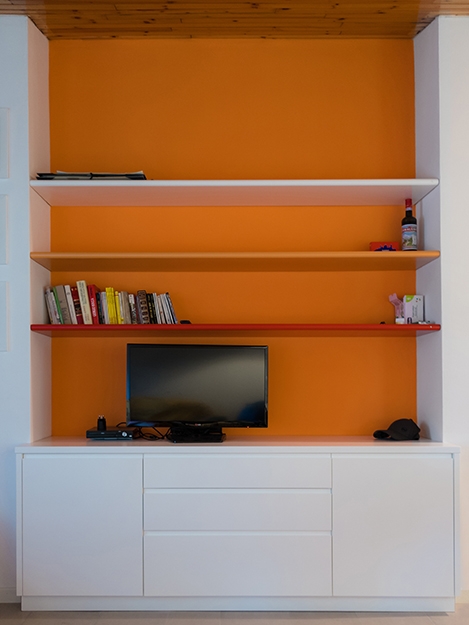
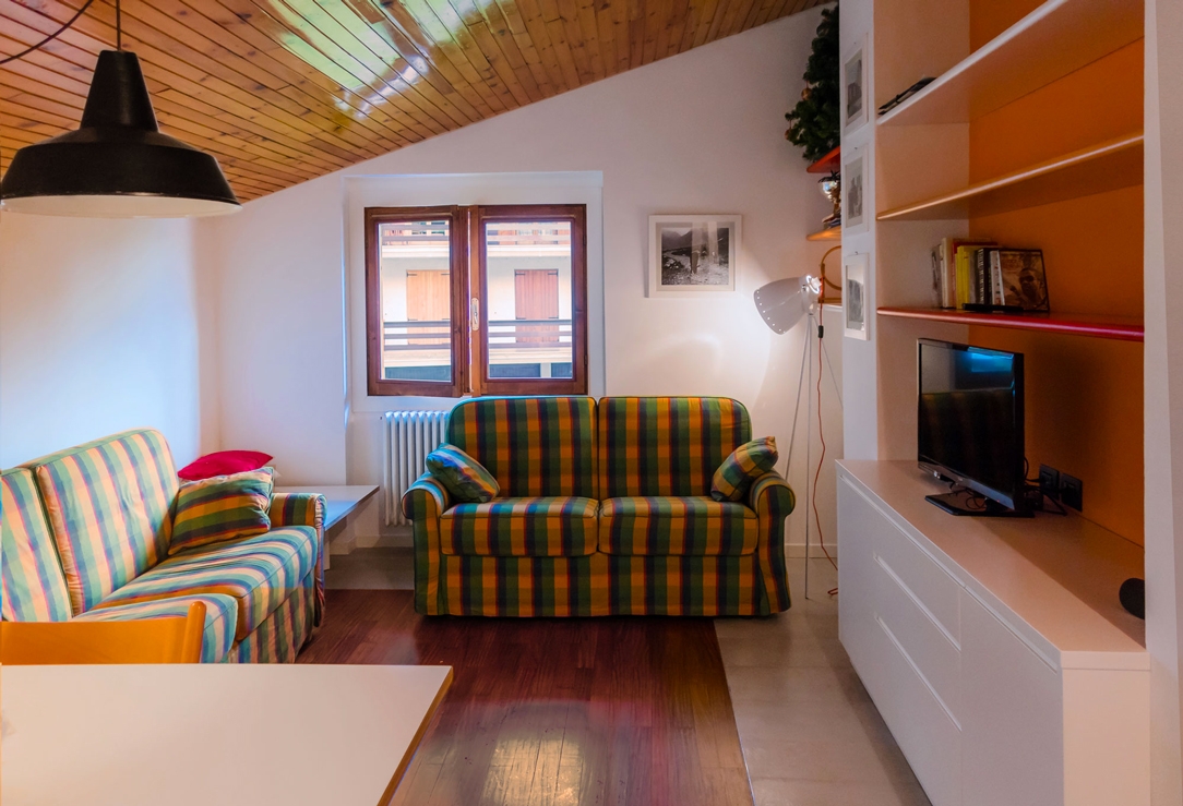
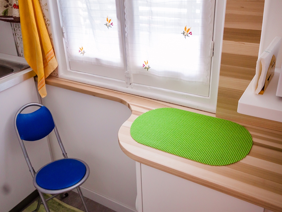
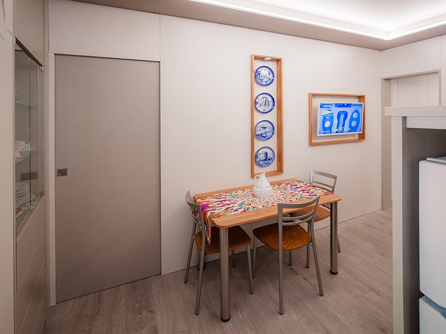
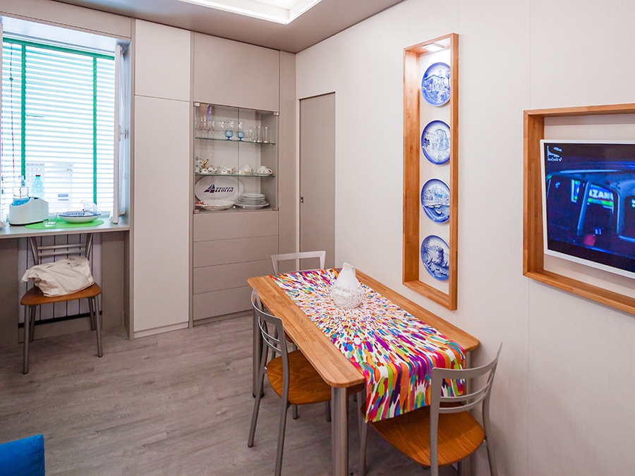
Reduced in size, the kitchen of the two-room apartment in mountains, has an essential but extremely functional setting. Being a residence designed for shorter stays the kitchen occupies a small part of the environment, without giving its contemporaneity and practicality away. There’s no lack of necessary appliances: starting from the small-seized induction hob, passing through the combined oven with microwave and refrigerator with freezer compartment. The extraction fan is instead the kitchen cabinets’ excess, used as a pantry for food and dishes. Concerning the dining table, the wooden chairs with traditional and soft profiles fit well into the room, reason why it’s been preserved. On the other hand, a support surface was combined with folding leg has been supplied in order to provide an additional support space and, at the same time, to become extremely practical for close and move the furniture. Functionality is the main element considered to the living room design, allowing to take the best advantage from the sofa-beds there and to customize and rearrange the space as needed. The original suspension lamps now become protagonists of the dining room by introducing a chromatic contrast with the black outer finish of the cap. The living room furniture with its contemporary style houses the free-standing TV and becomes a containing element both for kitchen, by its proximity, and for other objects of the entire apartment.

BATHROOM

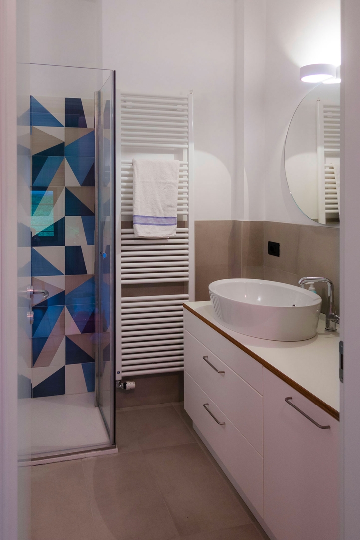
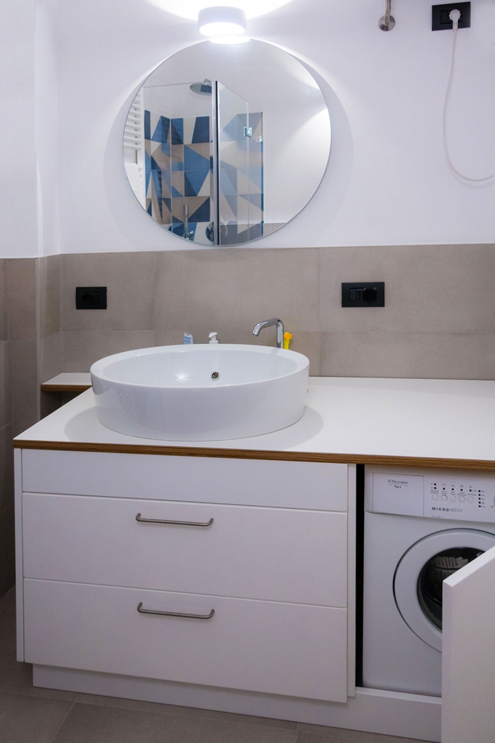
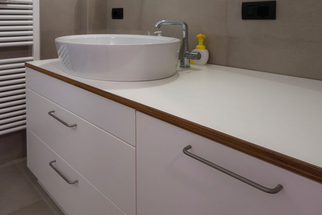
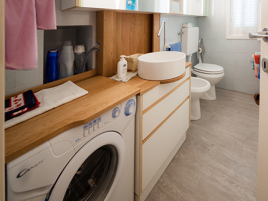
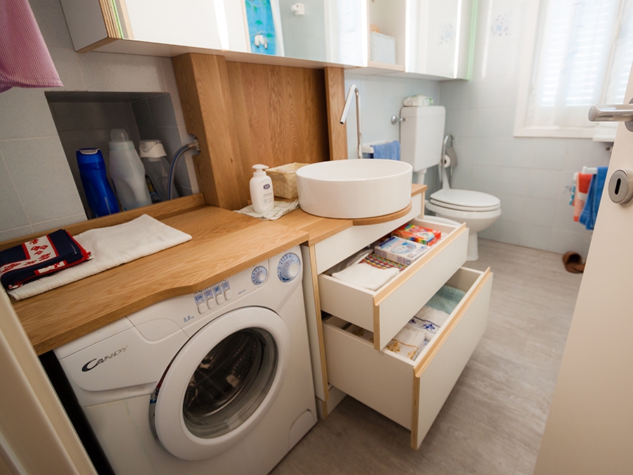
The bathroom intervention has also provided its expansion, thus managing to house all the container elements inside and equip it with a washing machine compartment. It is probably in this room that the contemporary style is most visible, starting from the extremely elegant and clear in the stylistic lines of the glass shower, moving to the semi-recessed sink with an oval shape and rounded profiles and ending with the choice of the covering tiles for the shower interior with its bright and fresh colours, which remain in perfect harmony with the surrounding neutral tones. The cabinet with large storage drawers also includes the possibility of a built-in washing-machine. The plywood top refers itself to those of the kitchen and table, becoming a stylistic element in continuity with all rooms.  

THE MATERIAL AND CHROMATIC CHOICE

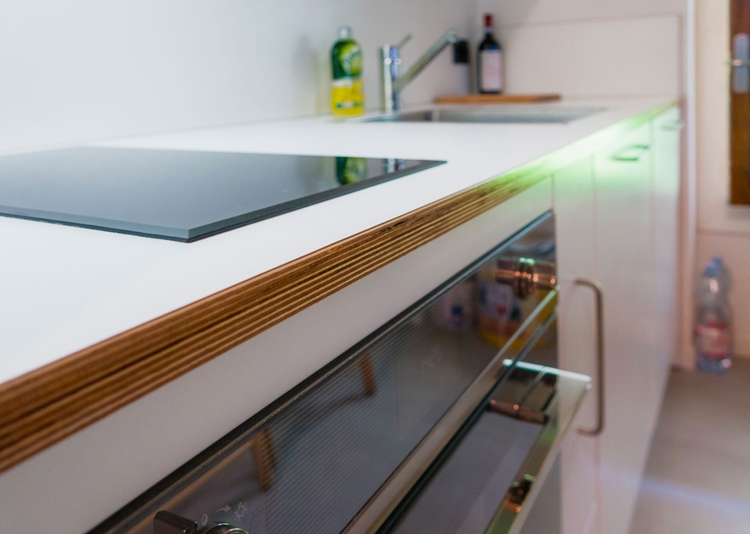
As already seen, it is certainly the plywood that defines the material mark of the whole two-room apartment. An economic material, also young and dynamic, but at the same time that can be easily fit into traditional interiors. Its main feature is its structure, which is visible in the edge of the tops, becoming the stylistic signature of the project, emphasizing the geometric lines of furniture with a recognizable touch. The balance between the orange tones of cherry wood and the white of plywood creates internal divisions able to give rhythm at the room. The internal subdivisions underlined by the change of flooring, which from the most intimate and comfortable rooms of bedroom and living room are changed into uniform surfaces with gray stoneware for better practicality. Being more wear-resistant and easier to clean, the stoneware has in fact been chosen for the kitchen and bathroom where they elegantly relate to the white of contemporary style. In conclusion, a renovation that takes origin from the traditional setting of the two-room apartment, without turning its featured upside-down but instead adding contemporary elements that give freshness.

High ceilings and contemporary boiserie in a Ligurian apartment

High ceilings and contemporary boiserie in a Ligurian apartment

The interiors of the past were characterized by the presence of high ceilings, which in a contemporary perspective risk making houses disproportionate in the perception of spaces.

A possible solution can be to introduce a counter-wall capable of keeping the original structure intact but revolutionizing the interior spaces by providing them with a new height.


THE CONTEXT
THE INTERVENTION
LIVING ROOM AND KITCHEN
BEDROOM
BATHROOM
COLOURS AND MATERIALS


THE CONTEXT

Liguria is the sea with high, rocky and jagged coasts, but also the region with ancient culinary traditions and small towns close to the hills.

Characterized by small historical cities, it responds to a still traditional setting with houses often placed against each other and narrow passages to take the most advantage from the spaces.

For this reason, most of the interiors are currently dated and difficult to expand.

As in most old houses, the ceilings are very high and can modify the perception of the spaces.

Characteristic spreads throughout Italy, whose solutions can vary considerably depending on the context. Sometimes taking advantage of verticality can be the design choice capable of characterizing the project, as in the case of this New York Apartment

However, in case of small spaces, the already very high ceilings are further accentuated by the planimetric dimensions of the interiors.

dining room high ceiling

THE INTERVENTION

The design project aims to restore the right eight to each room, while giving a fresh and contemporary look. Working on the internal heights was possible through the use of a wall covering, a boiserie whose height of 240cm re-establishes the usual proportion of the rooms, allowing in the same time, to keep the original structure intact.

It is exactly on this fundamental feature that the renovation of apartment is based: building a sort of exoskeleton able to maintain the original ceilings and making it equipped where necessary. At the same time, it creates an internal setting that respond to the customer’s needs.

The intervention involved all the rooms of the apartment, of which however the kitchen and the bathroom were affected in a reduced way because they preserve original in the internal height.

wooden kitchen countertop
living room high ceiling recess glass shwcase
kitchen countertop wood
wood dining table high ceiling
high ceiling false ceiling closed
high ceiling false ceiling open

LIVING ROOM AND KITCHEN

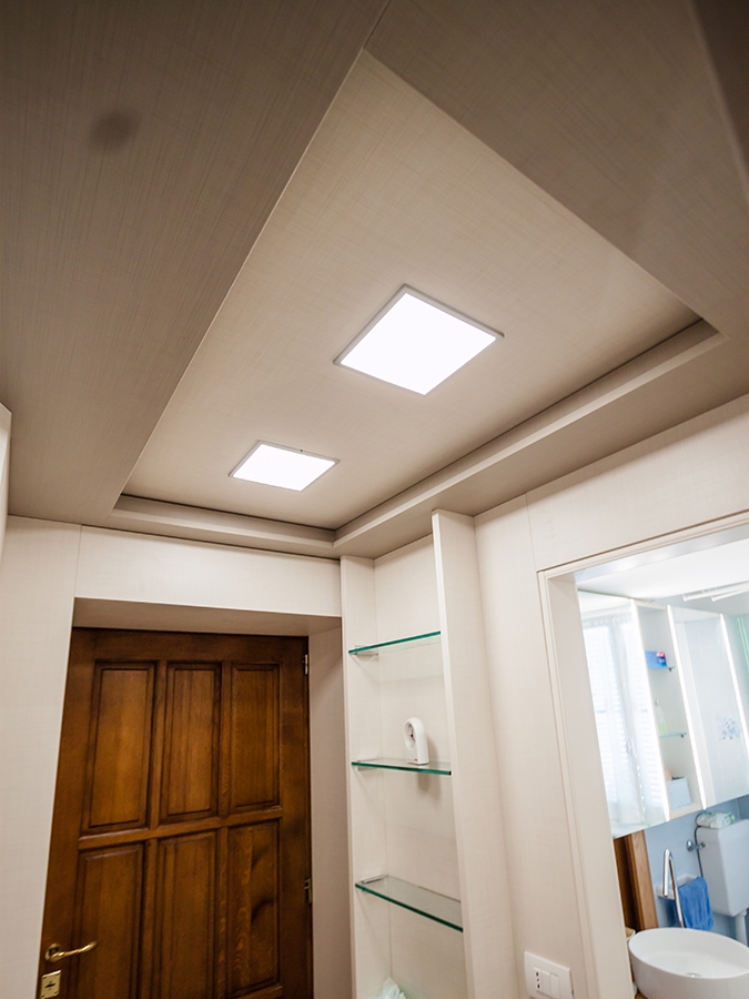
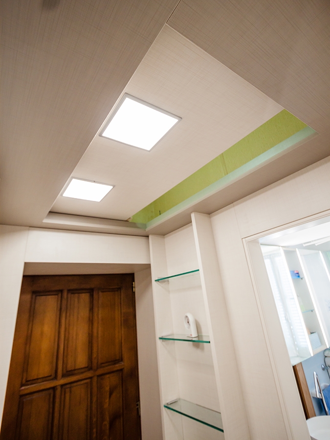
Starting from the entrance, the new compact structure of boiserie encloses the false ceiling with zenithal lighting.

The difference between the original and the reconstructed height is still accessible and serves as a storage element. In doing so, it’s takes the most advantage from the existing space, providing greater functionality.

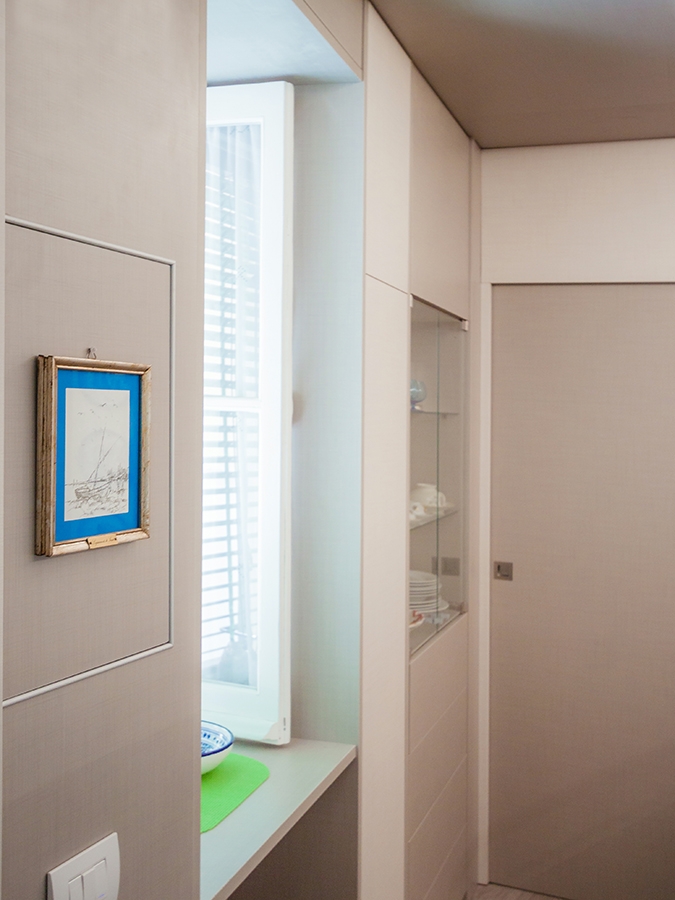
The living room was instead equipped with a niche used as laundry room, flanked by a small glass showcase embedded in the double wall.

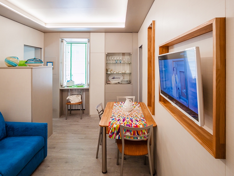
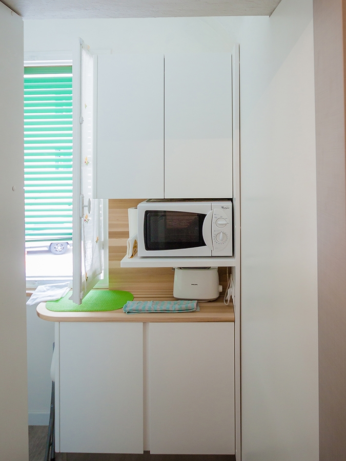
Turning instead to the kitchen room, it is the shaped laminated wood with light colours that gives a touch of freshness and modernity, recalling the chromatic shade of wood used for the dining table. Wall and storage unites fill the remaining gaps by taking the most of every corner of the small apartment, without making it oppressive.

wardrobe open bedroom
bedroom boiserie
bedroom boiserie high ceiling

BEDROOM

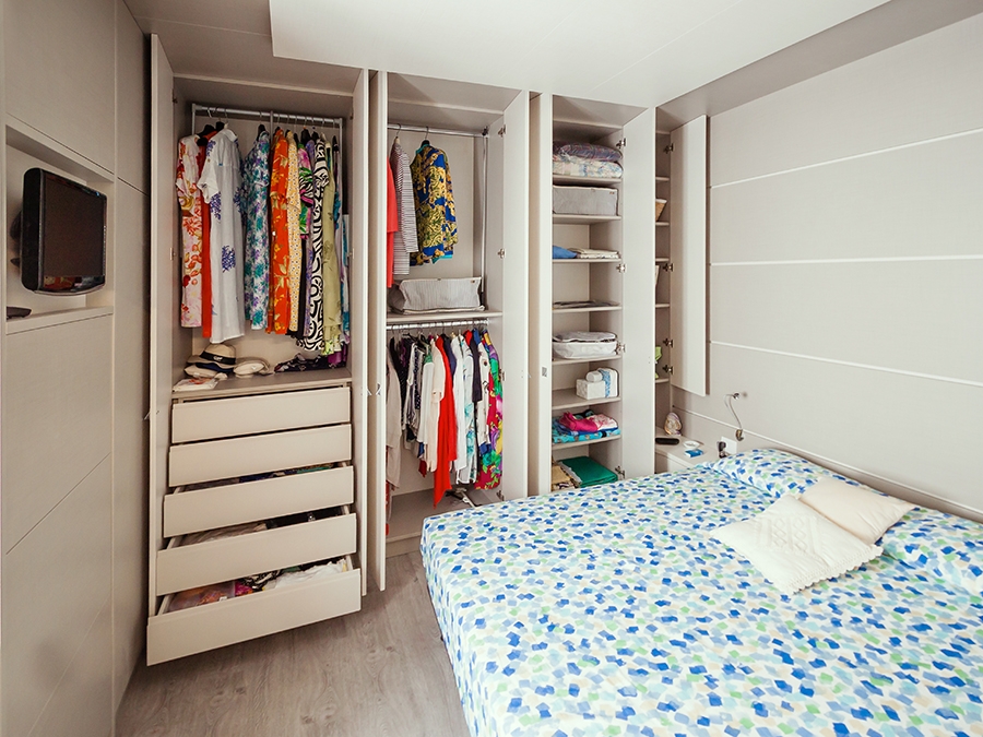
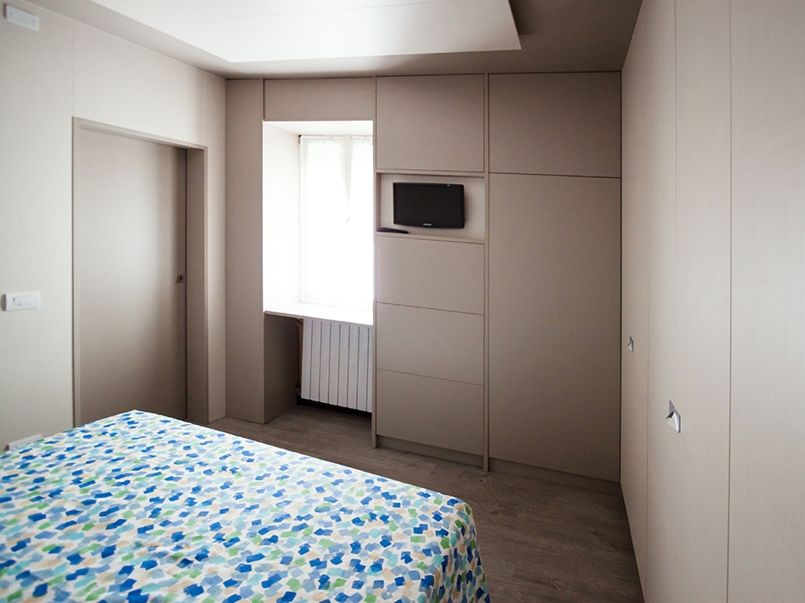
The use of the full-height boiserie allows the bedroom to better hide the service wardrobes.

Organized along two corner walls, they consist of niches with multiple functions capable of containing drawers, hangers and shelves at different height. In the same way, the television is also included in a special custom-made niche.

The extreme functionality of the corner wardrobe becomes an extremely stylistic clean and contemporary element in this design system. Added to this, the backlit false ceiling is able to provide diffused and elegant lighting.

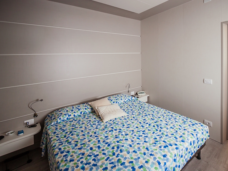
In order to give greater dynamism and personality to the boiserie, horizontal cuts were inserted to create an innovate stylistic linearity. It is also possible to equip these horizontal cuts with possible supports, to make the bedroom even more functional.

sink design Ligurian apartment
bathroom high ceiling
furniture bathroom drawers

BATHROOM

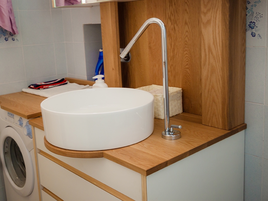
Evoking the use of laminated wood that characterizes the kitchen countertop and the display elements of the living room near the dining table. Even the bathroom is characterized by a contemporary and extremely fresh stylistic element. The storage units host a niche for the washing machine and a chest of drawers with marked edge that perfectly fits with neutral tones of the room.

COLOURS AND MATERIALS

Concerning the chromatic and material choice, we opted for a project in continuity between different rooms. The textured laminated wood was chosen for both the walls and furnishing elements, whose texture recalling that of the fabrics, gives greater domesticity and softness to the interiors. A contemporary aspect that can also be found in the neutral shades adopted: two different shades of gray which create a very elegant internal movement.

Finally, the introduction of laminated wood in the living room and in the bathroom gives a decisive touch able to make the environment younger. It is exactly in these two rooms that the high ceilings have been maintained.

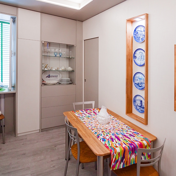
dining table and glass showcase

A kitchen entirely steel covered

A kitchen entirely steel covered

A kitchen completely covered in steel but with a soul to discover.

STRUCTURE

Sometimes when in front of our eyes there is a piece of furniture entirely covered with a material, it is assumed that that external material is the only one used in its composition, it is not easy to thought that behind that facade there may be a skeleton of a different material that creates its structure and defines its entity. Here we want to show you how we have created a kitchen completely covered in stainless steel destined to a client in Boston.
CONSTRUCTION STEP

First point, the internal modular structure: in the central part, the elements of  sink, dishwasher, hob and all our storage elements. In the upper part the wall units and on the side the columns hosting other storage elements and appliances, such as ovens and a refrigerator. For some elements, a back is not necessary, as in the case of the refrigerating column, because the element will be perfectly inserted inside and it will have access to the electrical outlets on the walls.

kitchen steel assembly step 01
front view lab phase

Then the bases, the rear elements and the doors are made. The whole structure is made of wood and, once assembled, with precise millimeter drawings, all the covers of the various elements are made of very thin stainless steel sheets. these will completely cover, without weighing down, our skeleton. Here are some pictures of the kitchen ready to be dismantled and shipped overseas. On each steel element is visible a protective film in order to preserve its surface from scratches and accidental impacts.
 
stell kitchen with protective film
assembly test lab phase

And here are the latest images of our kitchen assembled on site, in a general view and in a more specific detailed one, which highlights how, in the upper part, our structure perfectly follows the exposed beams of the ceiling. The recessed handles that characterize the entire kitchen are also clearly visible.

steel kitchen on place
covering details

CONCLUSIONS

To conclude, never take anything for granted! Behind every realization there is a great job that concerns multiple aspects. From the management of impeccably precise executive measures, to the creation of complex structures that support and enhance the materials used in the final result.

One kitchen a week, part 4: essential and elegant

One kitchen a week, part 4: essential and elegant

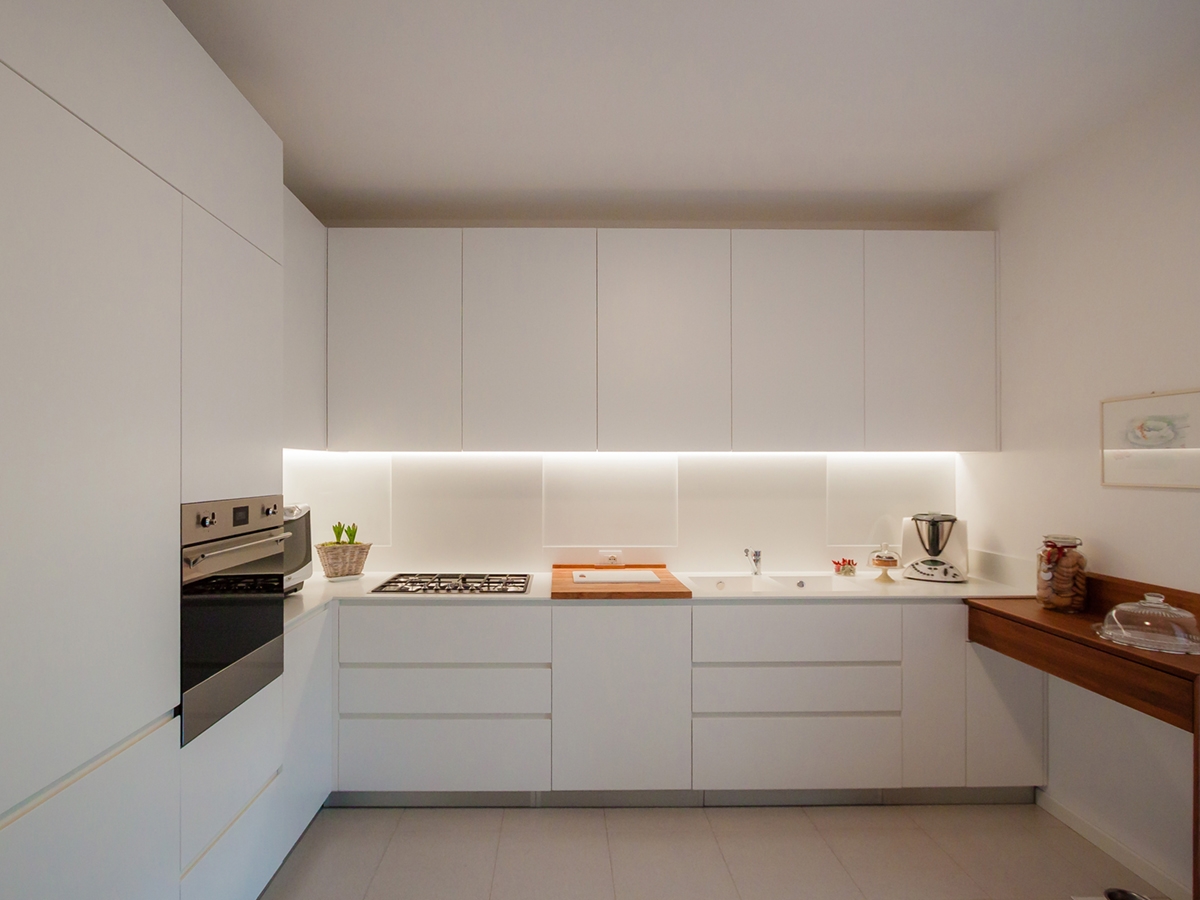
A contemporary and essential kitchen, which minimal lines define an elegant interior total white.

prospective essential elegant kitchen

THE PROJECT

The most elegant contemporary interiors are characterized by simplicity, created with opaque surfaces often white.

It’s the case of this kitchen, which essential setting does not give up contrasting elements such as the central cutting board and the snack bar on the right.

Placed at the angle, it has a visual and conceptual asymmetry that creates different visual solutions: on one side the full-height door holds containing shelves and drawers in a continuous visual surface.  The recess oven occupies the lateral part in communication with the countertop that uses the internal corner.

The main side is instead occupied by the horizontal subdivision between the upper wall units and the lower containing volumes. The linear lighting, hidden in the edge of wall units, creates a feeling of emptiness able to give lighten to the room’s perception.

In particular, the upper wall units are made up of fixed-width doors with an extremely elegant profile, spaced from each other by a visual line obtained with a small slot. The lower part instead consists of two drawers with recessed handles symmetrically mirrored to the central door. This takes up the width od the warm-coloured wooden cutting board which creates an essential and extremely elegant contrast in the choice. On the right wall, ending the kitchen project, a wooden support takes origin whose abutment reaches the floor. It is precisely the latter that gives greater dynamism to the room by inserting a chromatic element in contrast with the surrounding neutrality. It also recalls  the finishes of the fixtures chosen for French-door on the side.


SHAPES, COLOURS AND MATERIALS

The elegance of this project lies precisely in the choice of essential stylistic lines: privileging straight lines to curved and dynamic shapes, the resulting visual composition is extremely simplified. Essentiality has therefore become the key-word to design furniture, which renounce exposed handles in favour of recessed edge. These are visible through the play od shadows created by the use of different depths.

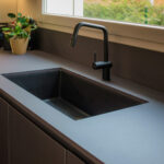
In an extremely contemporary project like this one, Corian is the obvious choice fot the kitchen countertop, which allows to hide edges, returning the idea of a very clean and elegant continuous surface.

The Corian countertop also continues on the back surface of the hob and sink, creating an interesting material alternation with the white lacobel. For the remaining surfaces, a textured matt lacquered MDF was chosen.

 
open wall units matt lacquered MDF
essential elegant kitchen ovens
wood cutting board essential kitchen
Corian sink essential kitchen
frontal view essential elegant kitchen

One kitchen a week, part 3: contemporary hi-tech

One kitchen a week, part 3: contemporary hi-tech

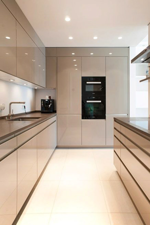
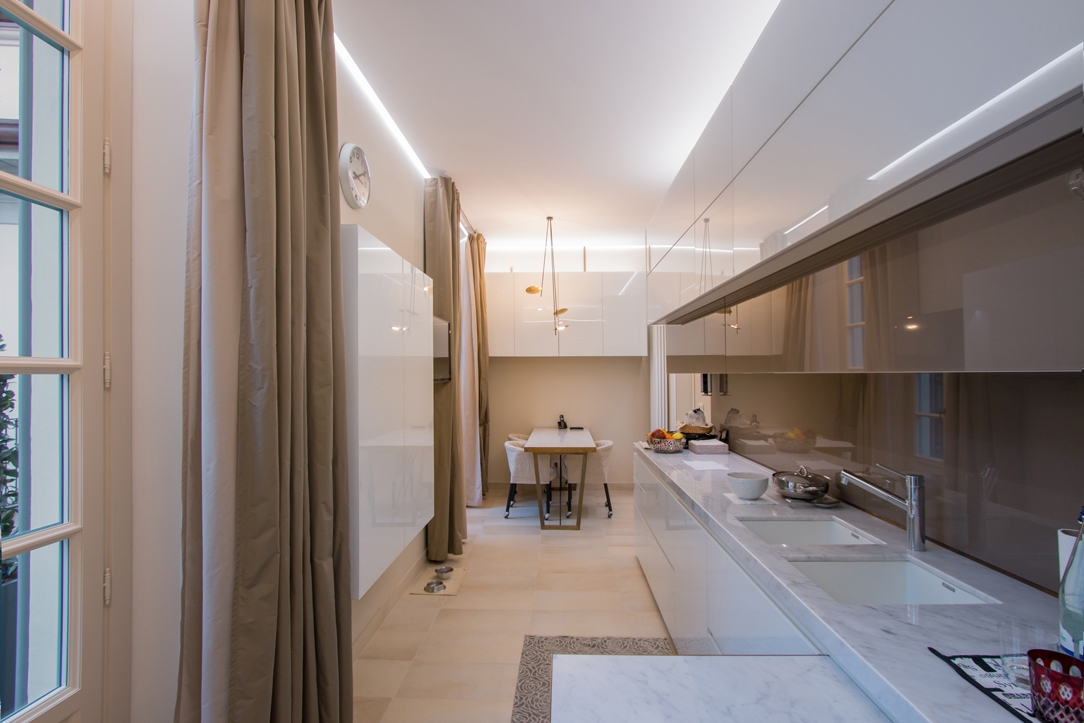
A contemporary hi-tech kitchen whose aesthetic line is very dynamic thanks to the choice of metallic materials, to the play of reflections and opacity, but at the same time, it has warm and soft colours.

hi-tech kitchen front view

The contemporary design of the appliances increasingly accustoms us to metal surfaces, glossy finishes and technological elements with an aerospace-inspired design.  Often inserting these elements in our kitchens means having to deal with the resulting visual impact. In response, on the one hand, we can see industrial-style kitchens, strongly focused on the total harmony of the furnishing with metals and reflective surfaces. On the other side, we can find increasingly contemporary interiors trying to mix the style of the different components by exploiting the chromatic and material contrasts. These two currents do not necessarily represent the opposite of the other. In fact, it is possible to uniform the elements in a style that is so contemporary, but which also manages to reflect the elegance and domesticity of the rooms.  

THE PORJECT

This kitchen with a hi-tech scent is an excellent example: the customer’s taste responds to the trend of mocha colour, with its warm and soft tones. Taking advantage from the alternation of more or less warm colours and glossy surfaces combined with the opaquer ones, an elegant and at the same time dynamic interior has been achieved. Starting from the separating element of the living area, which is equipped to host storage doors supporting the living room on one side, and recessed ovens and others storage units from the inside. The result is a deconstructed kitchen, which does not give up to the functionality of a compact kitchen, but which takes advantage of the visual opening of the open space. The passage of this partition is underlined by a led strip whose linearity refers to the most dynamic and technological interiors. The central island with its mocha-coloured upholstery holds the induction hobs and free surfaces used for preparing meals. An extremely functional element is the cylinder that houses the electrical service outlets, which can be activated by pushing. A recessed element whose extraction technology is extremely simple. It is also capable of transforming an often visually cumbersome component into a design element. The lower part of the island acts as storage point while in the upper part, a cylindrical design fan is suspended from the backlit false ceiling. The latter can give greater dynamism to the kitchen. The two corner components of the remaining part respond in the same way with the upper wall units organized with doors and containing volumes in the lower part. The different height of the upper wall units creates dynamism also recalled in the chromatic choice.  

COLOURS AND MATERIALS

The technological setting of this hi-tech kitchen is also visible in the choice of materials with excellent technical performance. In fact, the mocha-coloured dekton was chosen for the kitchen countertop, incorporating the island’s one. In addition to a significant aesthetic value, which summarizes elegance and modernity, it enjoys excellent technical performance, such as perfect resistance to high temperatures and hardness. It therefore lends itself to be an excellent material in its field while giving a strong stylistic imprint. The back shelf of the countertop alternates the mocha-coloured dekton with a glossy lacobel with a neutral hue. The alternation of opaque to glossy surfaces is possible using textured lacquered MDF which is turn coated, where necessary, by lacobel.

 
island kitchen with extractor fan
hi-tech kitchen divider
cylinder soket push hidden

Compare this hi-tech kitchen with the previous ones: contemporary pop kitchen and fresh, gritty and lively kitchen.