One kitchen a week, part 2: fresh, gritty and lively

One kitchen a week, part 2: fresh, gritty and lively

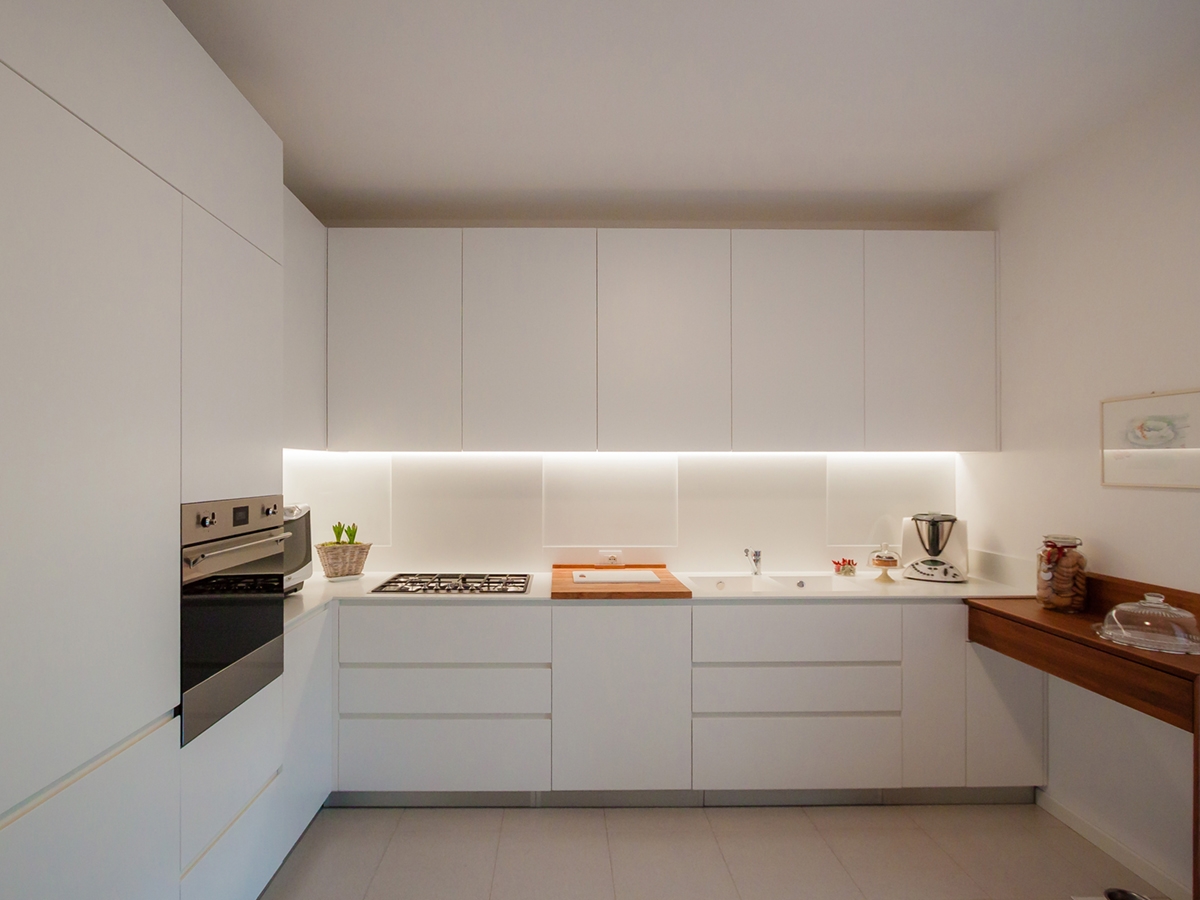
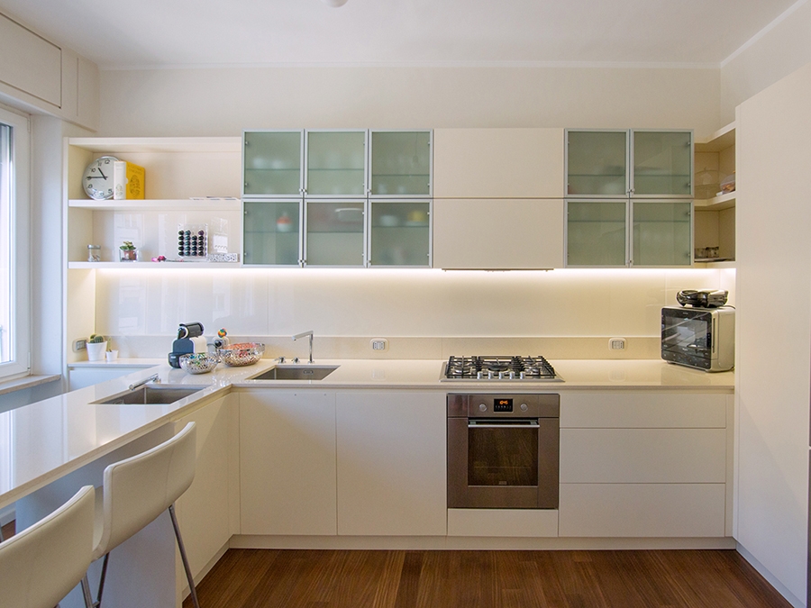
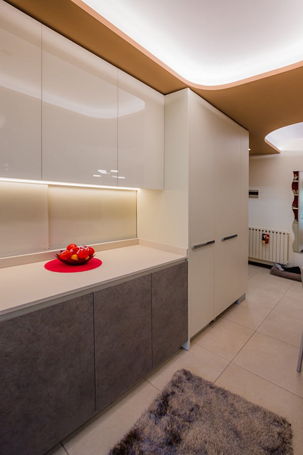
lively kitchen front vew

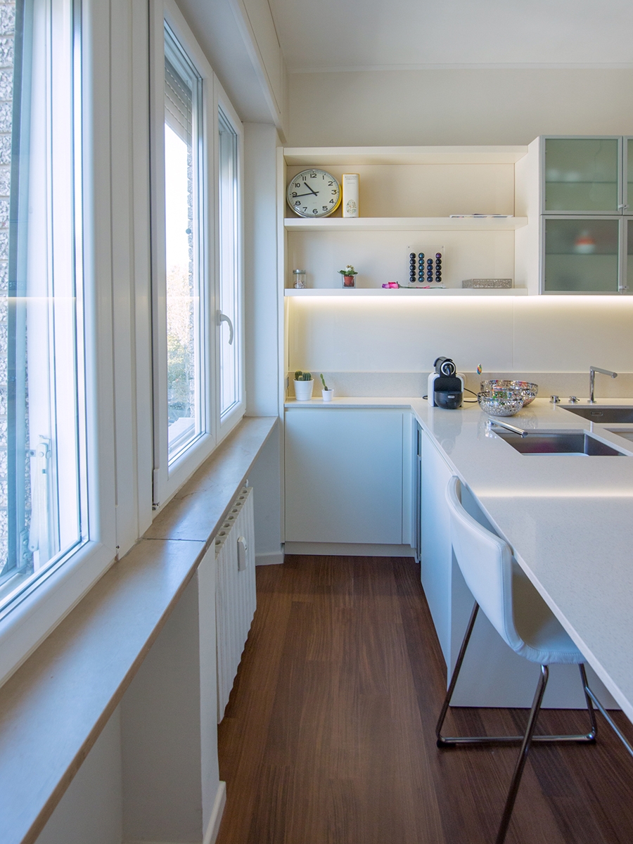
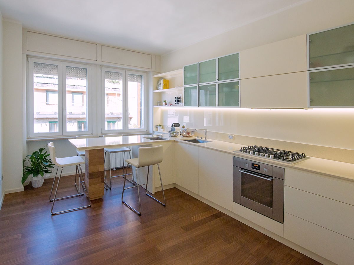
A lively kitchen with a gritty character and a touch of freshness between games of bright reflections and alternation of full and empty spaces.  

THE PROJECT

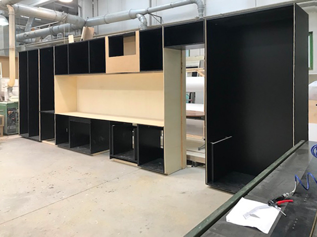
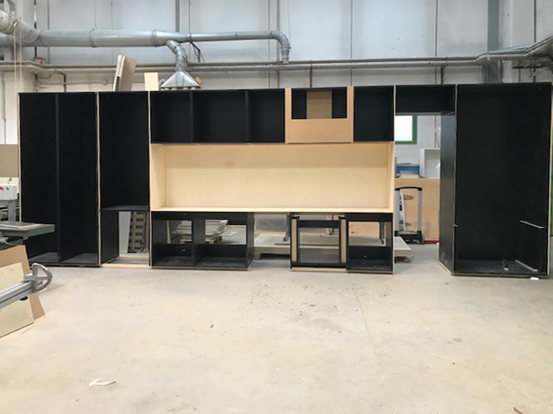
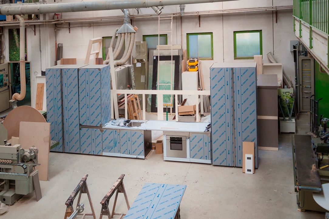
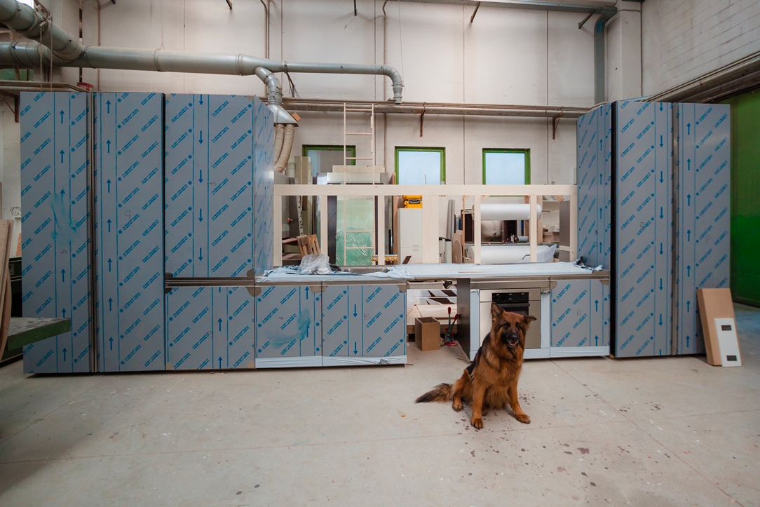
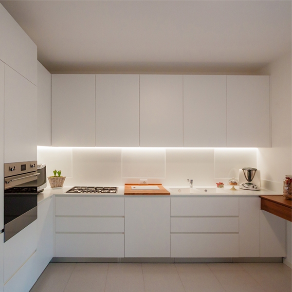
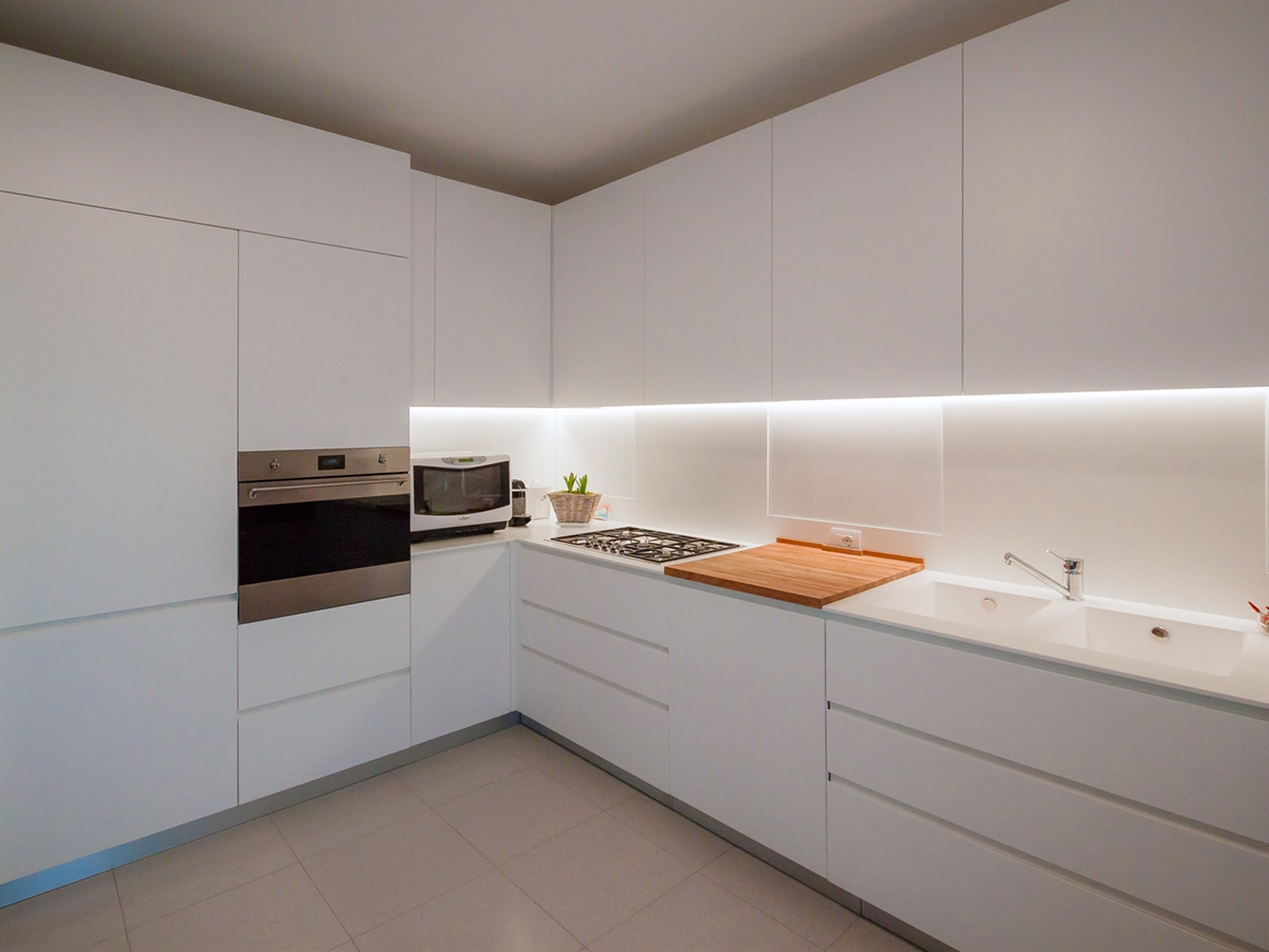
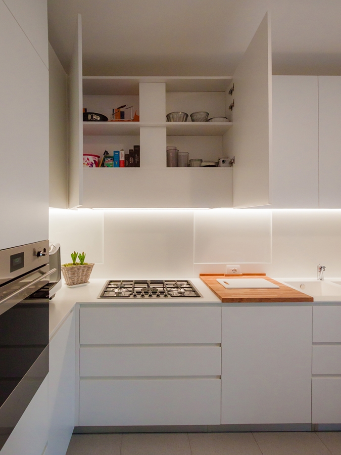
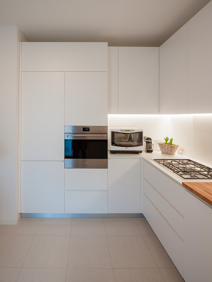
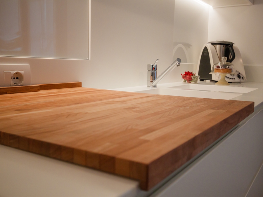
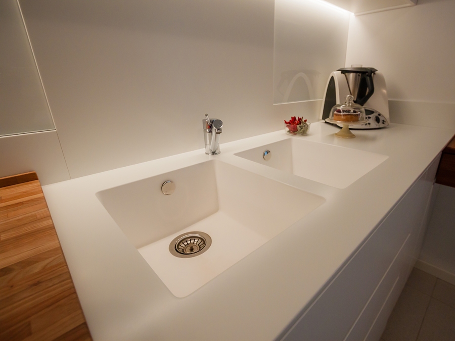
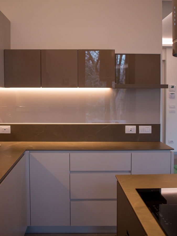
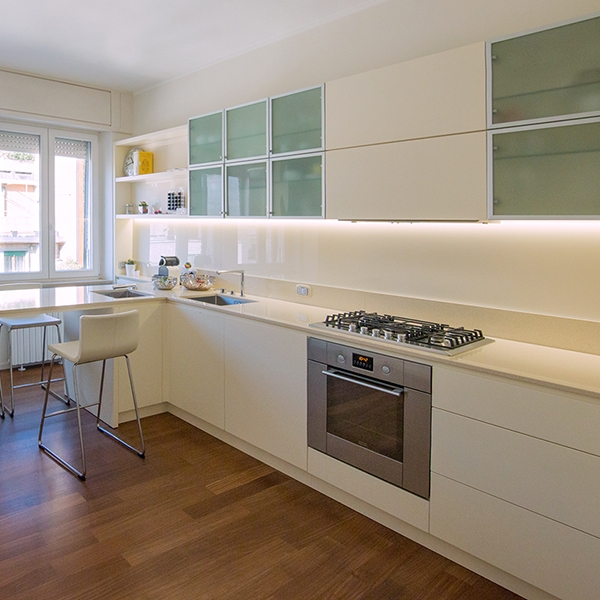
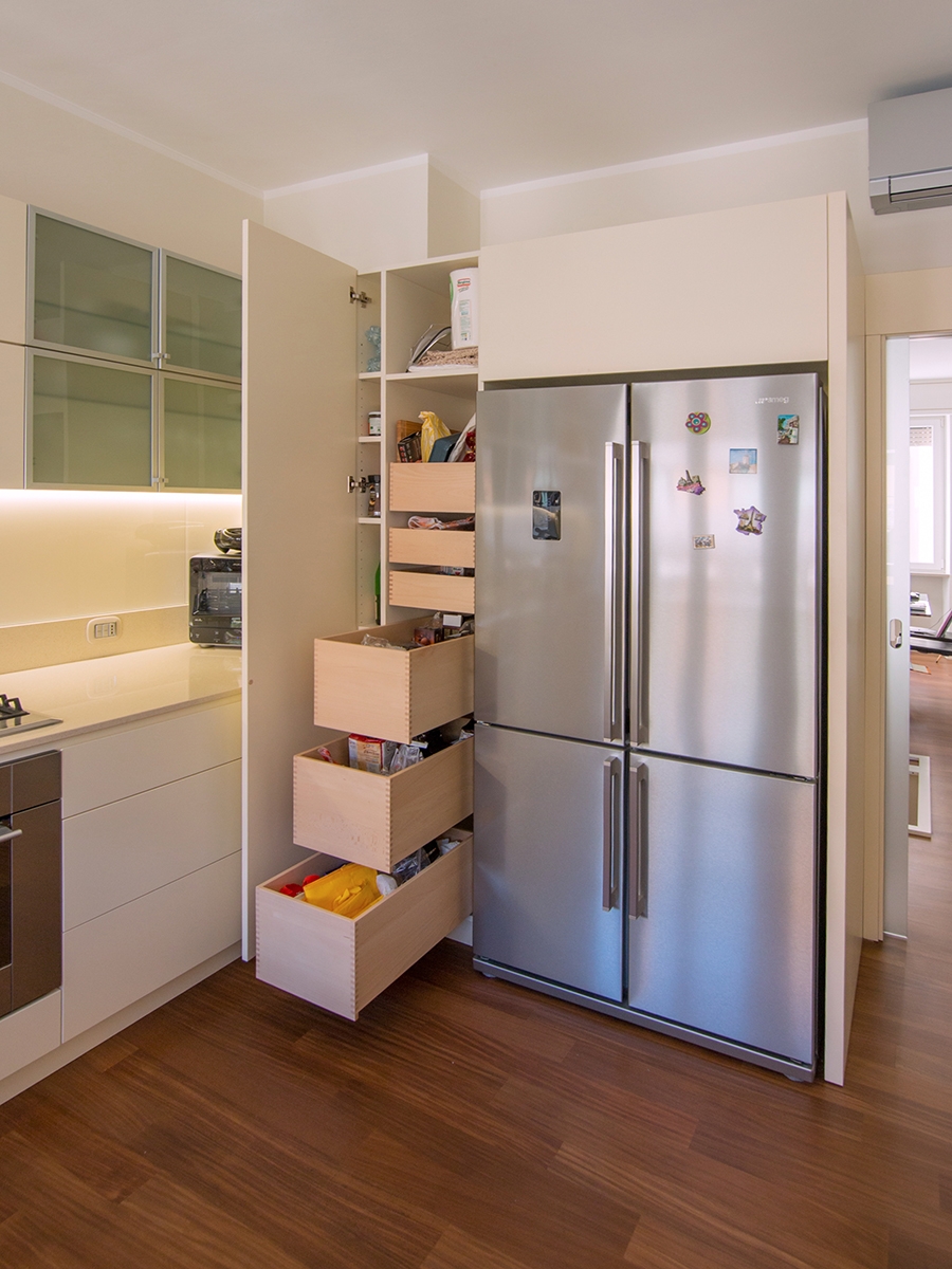
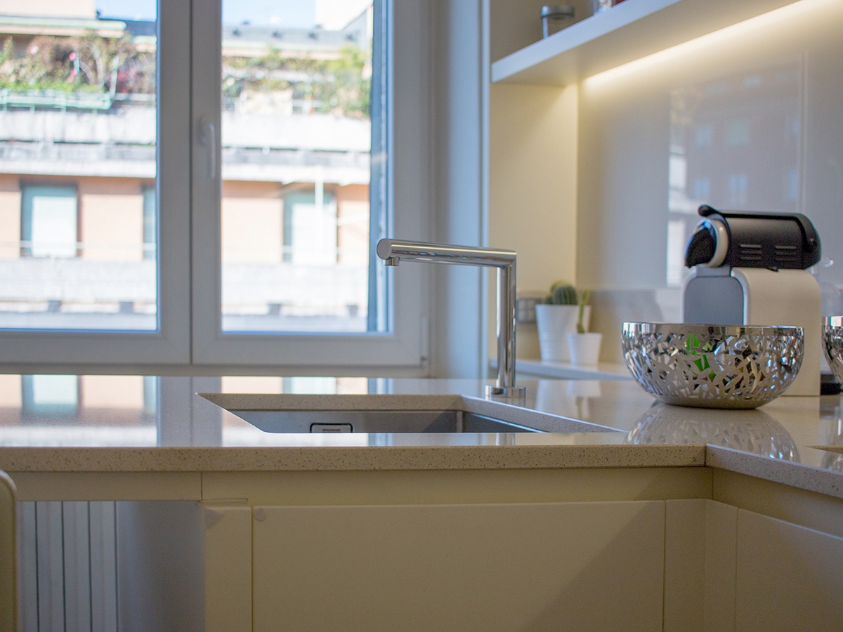
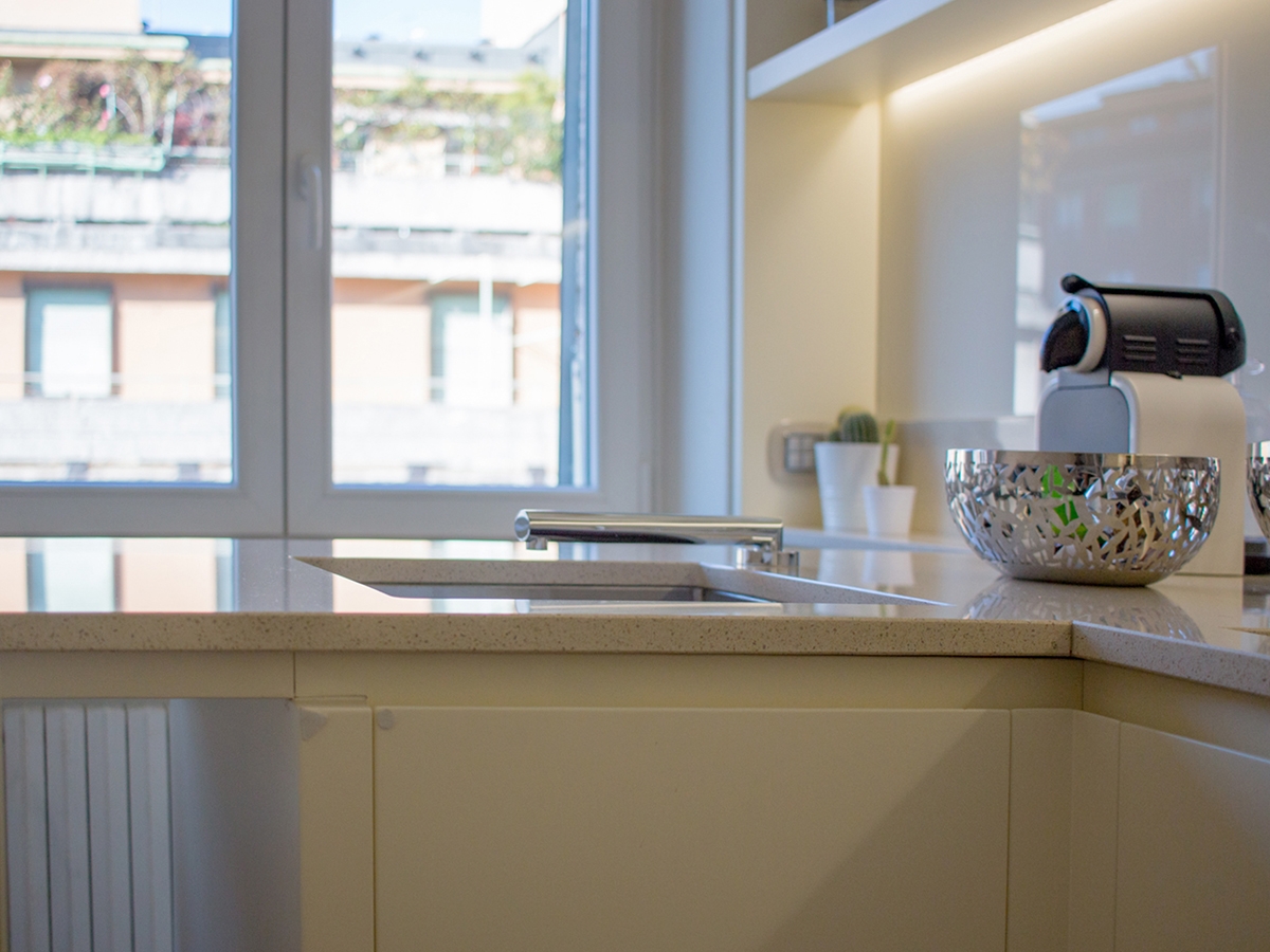
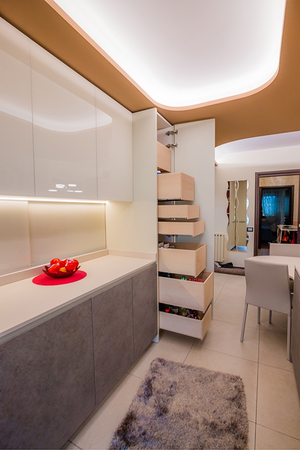
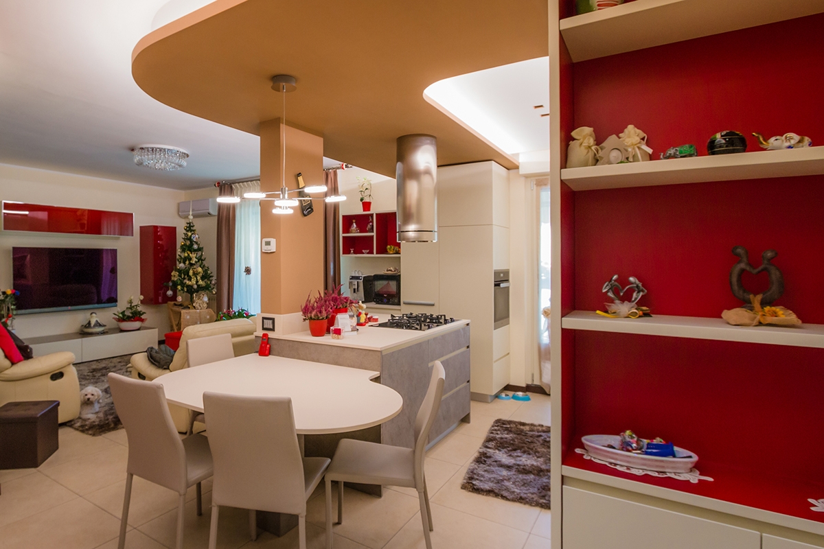
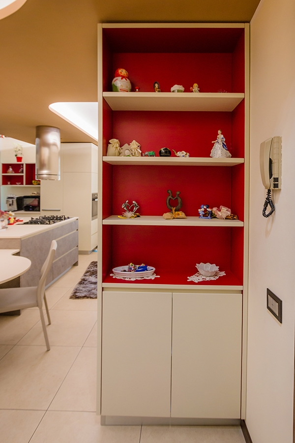
Added in the context of the always dynamic Milan, the kitchen is reckonable for its lively and fresh imprint, with both a gritty and elegant soul. A kitchen with a thousand resources, capable of keeping attention in all its parts. Starting from the wall units, which alternate empty and full volumes in which a game of transparencies is played on several levels. The shelves visually lighten the volume in the kitchen in both ends: in the area adjacent to the window, from which natural light radiates, and in the inner corner between the two sides of the room. This last one, also takes advantage of what could considered a critical point for comfort and functionality. Instead, arranged in asymmetrical geometric volumes on both sides of the extractor fan, there are the opal glass wall units able to give a touch of fresh colour and dynamism from which the contests can be glimpsed. The central wall unit hiding the extractor fan and the lower containing volumes are instead reckonable for their extremely elegant simple lines. The fitted sinks are arranged on the corner, taking advantage of the attachment point of the snack bar. This is equipped to accommodate up to 4 sitting using both sides. The gritty setting is also visible in the choice of details, such as the hidden tap able to allow the opening of the back window. As always, functionality is a fundamental requirement, which is also visible in the door alongside the large design refrigerator. This houses inside functional shelves with different heights and six drawers with a wooden finish.   THE MATERIAL CHOICE The games of brightness and reflections able to restore the idea of restoring the idea of liveliness and freshness are obtained especially thanks to the choice of materials. In particular, a quartz granulate topping was use for the countertop. It is able to capture and mirror the light, recalling the cream tones on the kitchen. While for the remaining elements it is the glossy lacobel that gives elegance and contemporaneity.

snack bar lively kitchen
lively kitchen with drawers and shelves
lively kitchen high tap
lively kitchen hidden tap
lively kitchen perspective

Compare this kitchen with the contemporary pop’s one.


One kitchen a week: contemporary pop

One kitchen a week: contemporary pop

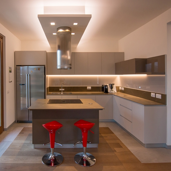
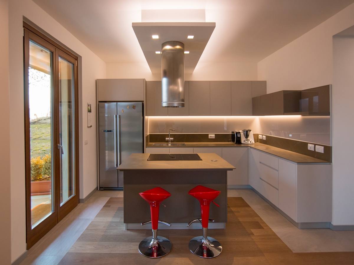
contemporary pop kitchen front view

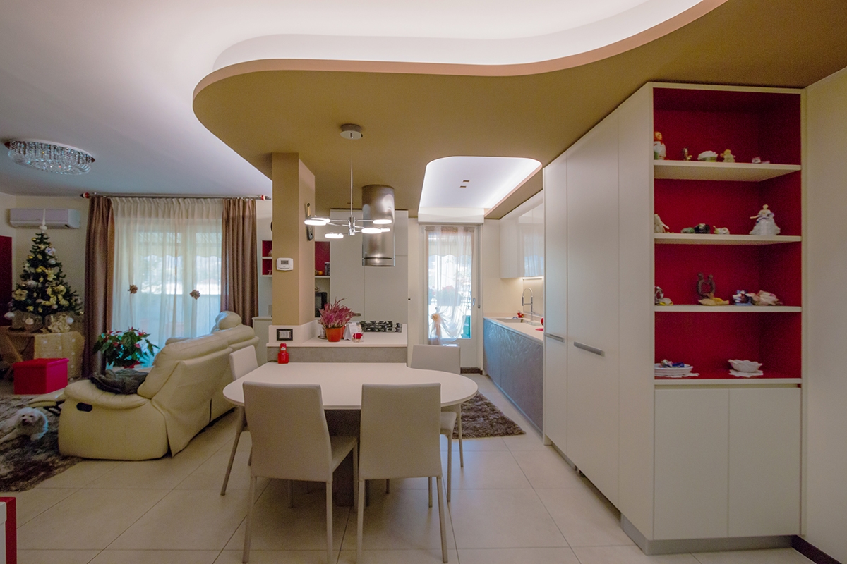
The first of four kitchens we want to present you is part of an interior that we can define as “contemporary pop”.  

THE RENOVATION

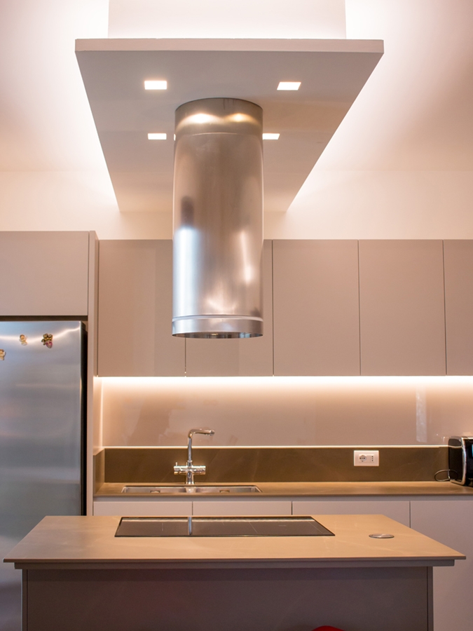
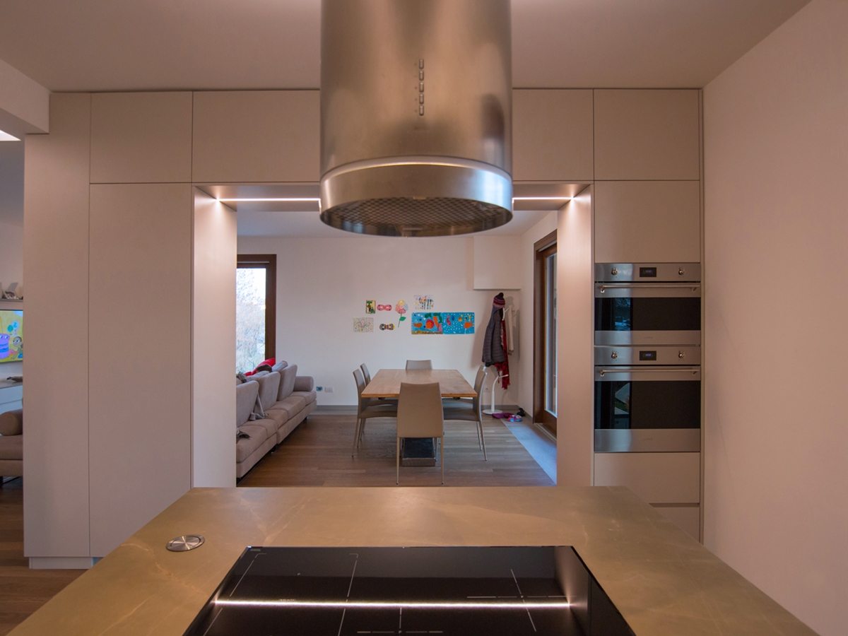
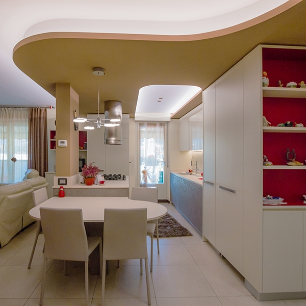
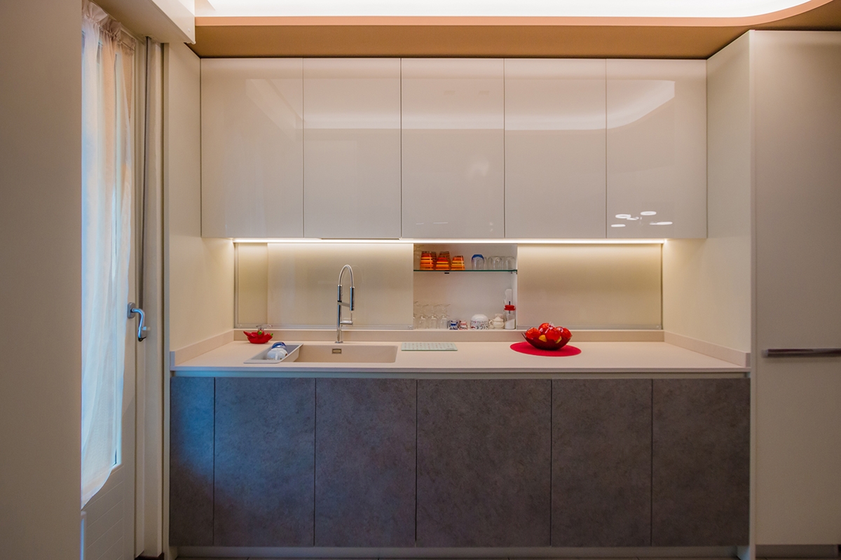
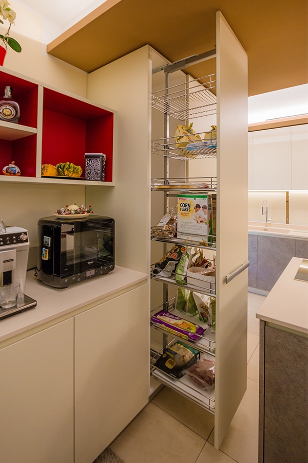
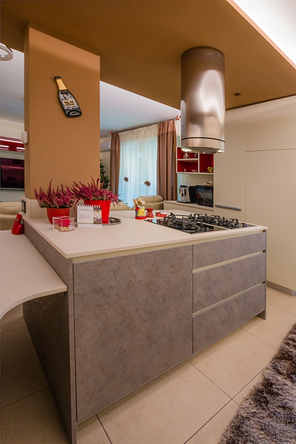
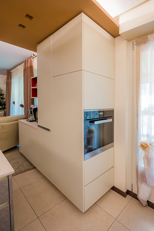
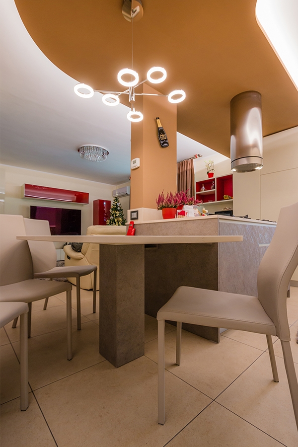
The renovation of the kitchen area develops around the element of golden curved false ceiling, strongly desired by the client. The design challenge consists of thinking at a room that could fit at best this existing element with a strongly stylistic character.  This ceiling is reckonable both for the chromatic choice and for the shaped profile, in addition to the strong dynamism underlined by the lighting following the shape. The closing wall and its entry door have been deleted in favour of an open-space. What remains is a load-bearing pillar, also gold-painted, to which an island worktop with lower containing volumes, cooking hob and drawers. The ovens are arranged in the full-height elements on the left side of the French door opening towards the kitchen’s interior. In doing so, they are almost hidden. The real development of the kitchen follows the course of the back wall which in turn is made of two different types. On one side, the full-height doors that house both the built-in refrigerator and storage shelves for food and drinks are placed directly facing the living area. The depth of the full-height element acts as a support for the living room lightened by service shelves. The red backdrop also recalls, giving further chromatism, some wall units in the living room and the choice of some furnishing elements such as vases. The second type, visually lighter, occupies the kitchen’s part adjacent the French door. It consists of a countertop with a built-in sink and suspended wall units with internal shelves. The lower part holds the washing machine compartment.  
SHAPES AND MATERIALS

Even the chromatic and material choice reflects the desire of giving incisiveness to the room, through the use of plastic laminate in two different shades of gray. A contemporary pop interior animated both in shapes and colours, in which the attention to the design of each components is easily visible. To further enrich the kitchen, the extractor fan as an element of design, and the suspended light that recalls the material choice. The dining table harmonizes the ceiling’s shapes, attached to the adjacent cooking island.

contemporary pop kitchen
countertop and wall units
dining table and shelves living room
red wall units and containing door
island kitchen contemporary pop
hidden fitted oven
contemporary pop dining table
Living in small spaces: a minimal apartment in Milan

Living in small spaces: a minimal apartment in Milan

Living in small spaces means living the contemporaneity. Functionality is the key-word: knowing how to add take advantage of the interiors while being able to use all its potentialities.  

THE CONTEMPORARY PANORAMA THE CONTEXT THE WORK SHAPES, COLOURS AND MATERIALS


THE CONTEMPORARY PANORAMA

The increase in the number of the population necessarily interfaces with the problem of lack of space. In the contemporary architectural panorama, the solutions adopted use the verticality of the buildings, which tend to develop in height rather than in planimetry. An example of all is the spread of “capsule hotels” in the eastern continent. Without reaching the maximum expression of this architectural trend, even in the cities of our country there are various examples of reduction to minimum spaces. Living in small spaces means being able to optimize the rooms in the best way, managing to fit the different functions and reducing the furniture to the essentials. The minimal style perfectly interprets this need, succeeded in giving an aesthetic value to the most essential interiors.  

THE CONTEXT

Integrated in a contemporary residential context focused on the shades of gray and green, the studio apartment in Corso San Gottardo is suitable for a space optimization project, because it is extrapolated from an existing apartment. In particular, it consists of a single room with small kitchenette and a mezzazine for the sleeping area, extracted from one of the main rooms of the old apartment. Being able to organize at the best the room without sacrificing comfort and aesthetic taste was the design challenge with which we interfaced to. The characteristic that allowed to reach the goal is the very wide height on the interior enhanced by suggestive exposed beams.

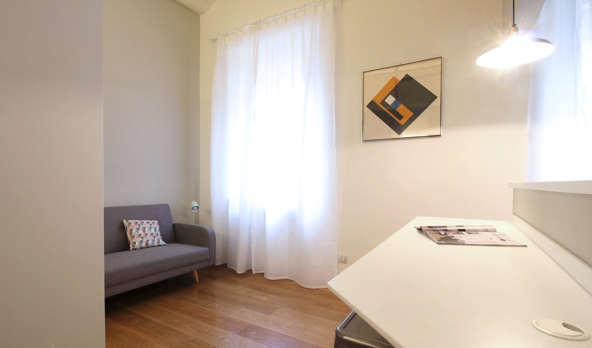
small spaces sofa and snack bar
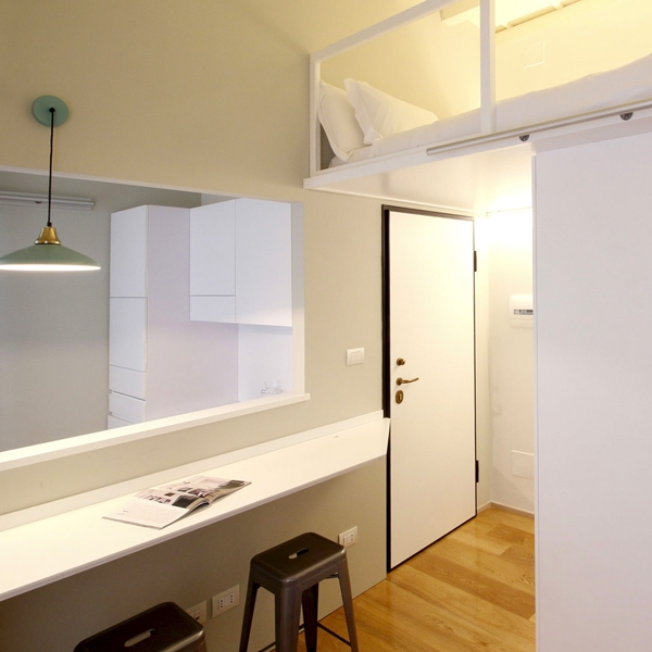
entrance minimal apartment Milan

THE WORK

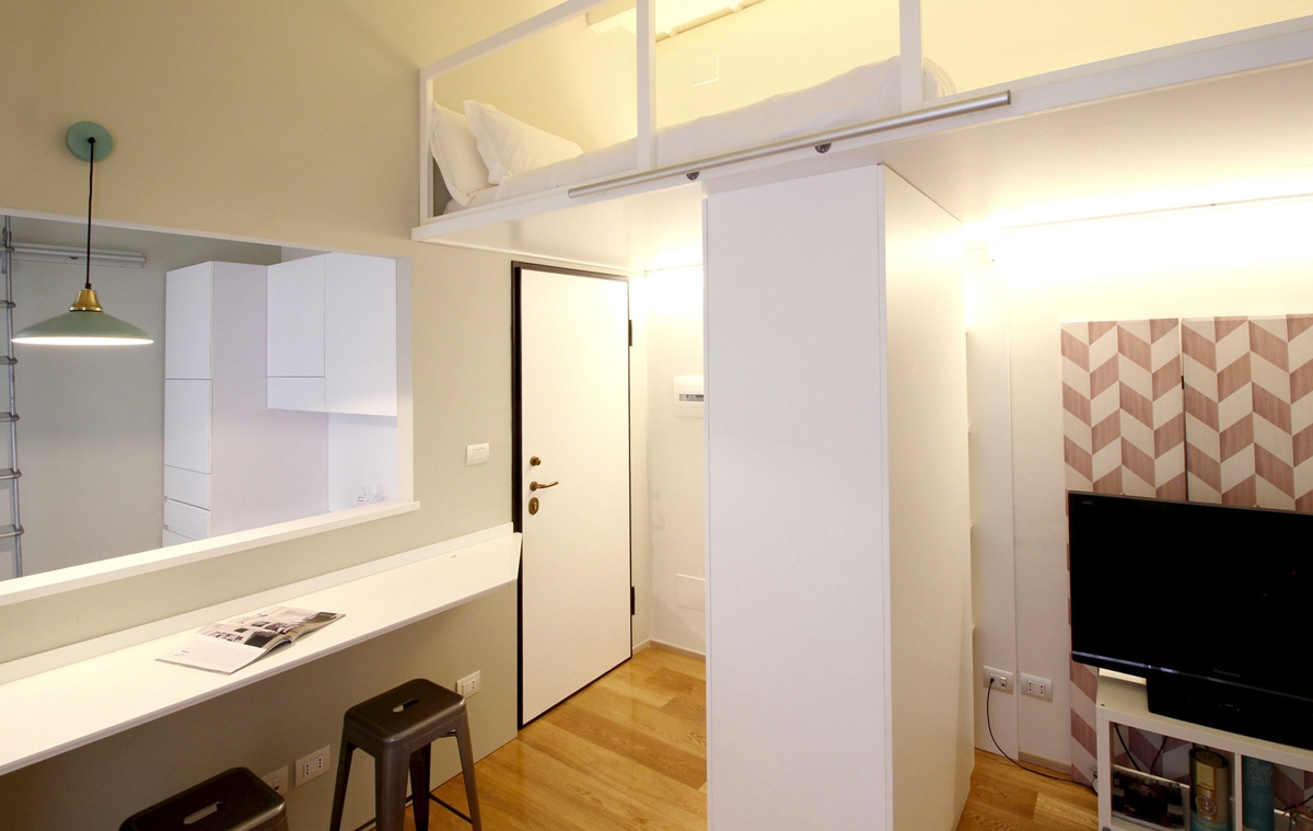
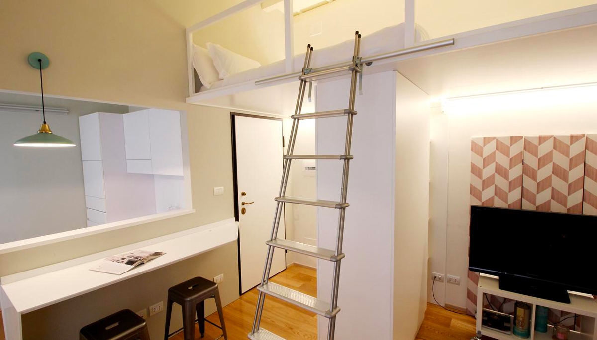
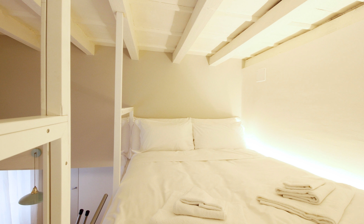
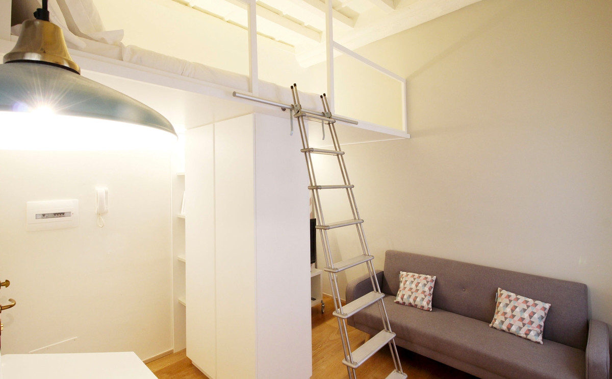
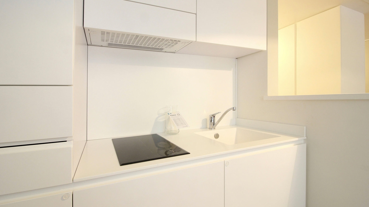
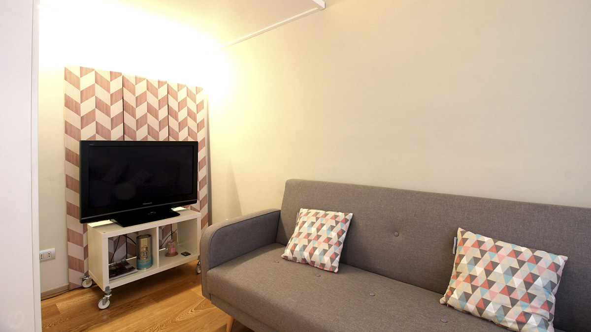
Taking advantage of the reduced spaces, it was possible to design the plan layout focused on a living area in visual contact with the small equipped kitchen with snack bar, and an elevated bedroom accessible through a service ladder. The kitchen is reduced to the essentials, but not for this reason is poorly equipped: in fact, it has a kitchenette with induction hobs of the minimum size, flanked by a built-in sink and container units in the remaining parts. A dividing wall with snack bar attached divides the kitchen from the living room, keeping at the same time the spaces visually open. This is also thanks to the presence fs the service windows, which creates a dynamic and contemporary cut in the room.  The surface used as a snack bar accommodates up to 3/4 people, and the shaped profile with a 45° cut is able to make it look more welcoming. The living room with a two-seated sofa leads to the upper level use as bedroom with a double bed and containing niches. The storage compartment is accessible as the mezzazine with a service ladder that leans against special rails. The mezzanine is back-lit by a linear profile capable of providing the correct illumination both the bedroom area above and the lower living room.

small spaces apartment Milan
kitchen apartment Milan
living room apartment Milan
double bedroom small spaces

SHAPES, COLOURS AND MATERIALS

The contemporaneity of the apartment is visible both in the choice of clean linear shapes and in the material’s one. In fact, Corian was chosen for the snack bar and the kitchen too. It is an extremely fashionable material nowadays due to its elegance reached with the uniform surfaces with hided joints. Made in the same light-shades, the kitchen furniture in textured white lacquered MDF refers itself to the idea of an essential but well-designed space.

bedroom access step-ladder

Functionality and small spaces transform this studio apartment into a reality of its own. It leads to becoming a love nest for its inhabitants, but it is also perfect to be used as a B&B for tourists and short stays.

A traditional villa surrounded by the citrus groves of Sicily

A traditional villa surrounded by the citrus groves of Sicily

On the island of lemons and oranges with their intense aroma, a traditional-style villa leaves room for modern classic furnishing with light and fresh tones.

San Tommaso villa outside citrus grove

THE CONTEXT

Surrounded by a citrus grove with intense scents and colours, Villa San Tommaso fits in perfect harmony with nature. Offering every kind of comfort, from the swimming pool to the jacuzzi, it looks from the outside as a rural construction in perfect symbiosis with the local tradition. It is exactly in this perspective that the interventions are inserted, trying to keep the true traditional scent intact, but adding a modern touch. The private residence spreads on two levels is also rented during the summer season by a high-level English rental company. A corner of paradise where the architectural structure fits in perfect harmony with nature. Like in most rural residences, the interior of the villa is characterized by dark wood interiors and light walls, with traditional terracotta floors that increase its authenticity in value. For this reason, the insertion of modern furniture has to relate with the already strongly existing elements. Do not make the scene heavier but instead try to lighten it, adding a touch of brightness and clarity. The design proposal mainly involved the kitchen, providing some furniture in the living room, but also touched the rooms on the upper floor.

 
San Tommaso villa outside table

LIVING ROOM

The essential and contemporary kitchen delicately inserts itself providing brightness and elegance. In fact, it consists of a corner structure that embrace the large window on the outside with which it relates to the surrounding. Below this, there are container drawers and storage units with recessed handles that simplify the shapes. The kitchen countertop carries on the corner on both sides becoming almost a real exposition element. At the adjacent wall, the suspended wall units are made up of door of the same width whose bevels create visual light lines. The back of the countertop in glossy lacobel gives further freshness and brightness. The large double-door design refrigerator is built into a customed design structure that also holds doors with internal shelves. The oak snack bar embraces the central pillar of the kitchen, giving a natural and contemporary touch. In the wall opposite the window, a full-height structure alternates doors with symmetrical drawers to accommodate dishes and pots but also food and drinks. At the centre of this, a recessed shelf whose back in glossy lacobel fits in style to the rest of the kitchen. The two recessed ovens with a practical height are symmetrically placed with respect to the latter. In the living room the traditional furnishing in treated dark wood are certainly the undisputed protagonists. However, there is no lack of rustic-chic design elements such as suspended lights. The furniture of the main room are designed in continuity with the traditional ones already present in the villa. This is the case, for example, of the bottom showcase illuminated along the side profiles. Certainly, to attract attention is the ancient stone crusher placed in the centre of the room.

 
traditional villa Sicily kitchen front view
traditional villa Sicily kitchen lateral view
traditional villa Sicily dining table
traditional villa Sicily kitchen view

BEDROOM

The bedrooms resume characteristics in common with the living room, such as the use of terracotta tiles which relates well to the wooden beams od the ceiling. The latter reflect the existing furniture in dark colours and polishing, reflecting the elegant rustic style of the traditional villa. The white walls create a striking contrast providing greater brightness and freshness to the environment. Even in this case, the designed elements have to necessarily relate to a highly visible stylistic settlement. Reason why, the headboards of the beds in the respective rooms change from each case to better relate to the context. In most cases they are also backlit to give further dynamism and brightness. They respond to a classic modern style with white wood strips combined with the bedside table, or essential contemporary style that enhances the  height of the room.

master bedroom villa Sicily side
master bedroom villa Sicily front light
 bedroom traditional villa modern classic
bedroom classic modern front
Sicilian villa bedroom with light
Sicilian villa wardrobe

A professional stainless steel kitchen

A professional stainless steel kitchen

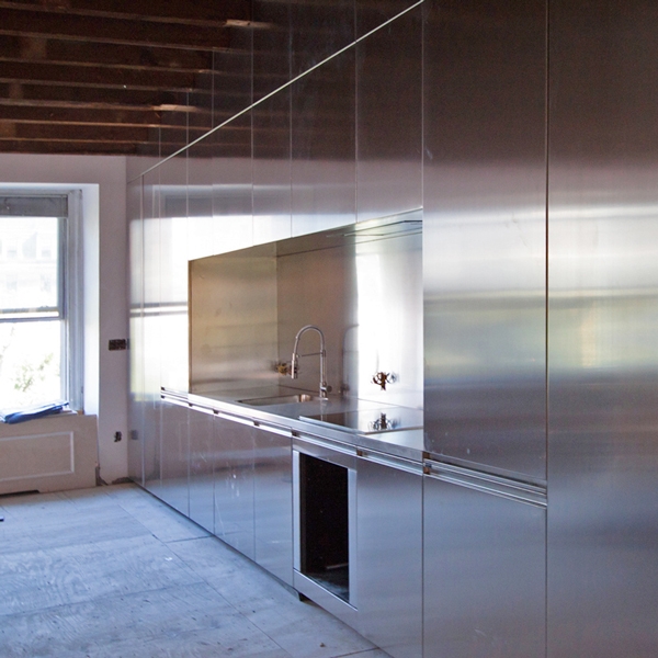
For stove enthusiasts Masterchef is a fact, fully equipped kitchens in polished steel, complete with all the coordinated appliances make you want to create delicious dishes.

STAINLESS STEEL

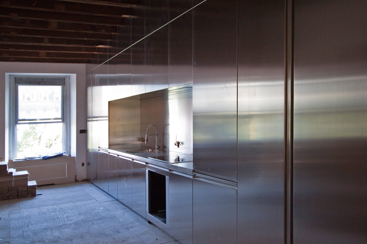
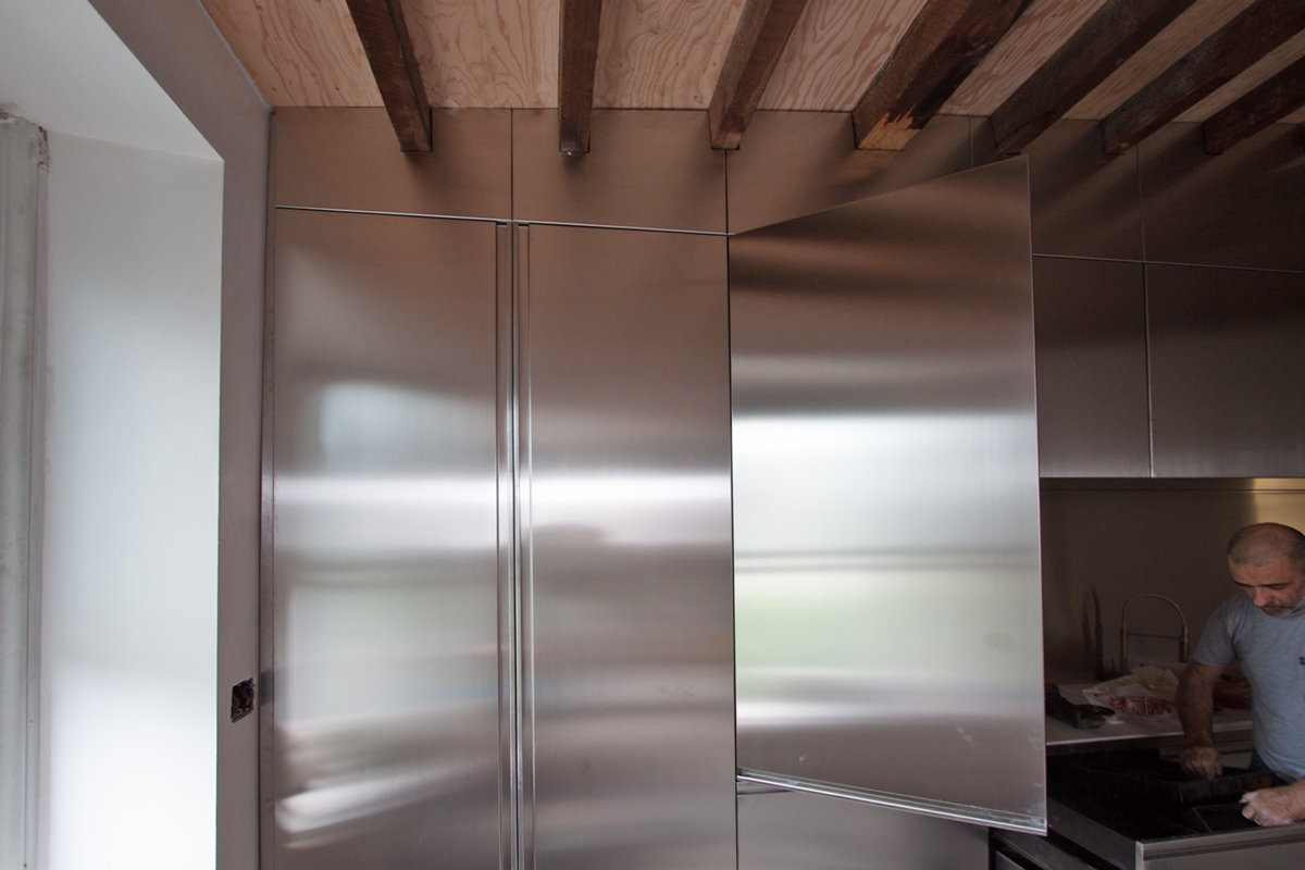
It is the most used material in the kitchens of great chefs, which is why steel cooking is very trendy today. Most of the appliances and hobs are completely in steel or in any case have characterizing steel finishes, having a single-material kitchen certainly uniforms the environment in which it is inserted. Resistant, durable, hygienic and shiny, steel has all the characteristics that are needed by those who love to cook in order and rigor and are looking forward to showing their diners new culinary creations. But be careful not to make the kitchen too aseptic, to insert an industrial kitchen in a family environment it is useful to create a harmonious project that also gives it a little personality and warmth.

CONTEXT

The kitchen we analize here is located inside a very modern villa, located in Hanoi, Vietnam, surrounded by a garden with lush flora. The entire structure was built with a light building envelope, characterized by large windows and thin white painted iron rods, it has external wooden paved passages with transparent covers. Light filters everywhere and the industrialized structure is consistent with the interior design project and goes well with the wild nature outside.

PROJECT AND REALIZATION

The design of this large and bright kitchen was made from a renowned Milanese studio, successful in the arduous task of balancing spaces and materials. An harmonious union in industrial style but with the soul of a domestic kitchen. In this large open space room the kitchen is divided into different compnents. At the center, a well-equipped central island with a ceramic hob takes place. Two side cooking elements with grill and teppanyaki housed on a light gray marble top follow that central part. A huge central hood covers the entire surface of the island and arriving towards the kitchen area the first thing you notice is this central monolithic block which is illuminated by the light of the large rear windows. On the left side there is an element consisting of two refrigerated columns and an oven column, in the upper part of the open compartments with symmetrical central shelves in sheet metal. This side is reflected in the elements on the right, where there is another built-in refrigerator, a wine cellar and again open shelves in the upper part. The “bar” cabinet on the side of the window is interesting, consisting of a low steel cabinet with shelves and an upper light box from where a series of glass holders in metal tubes and plexiglass are ready to welcome a wide service of wine glasses.

professional kitchen in steel
steel kitchen
light box element

Mini version of Omelette table

Mini version of Omelette table

The Omelette table was born as a customizable furnishing accessory, which original dimensions can be adapted, as in this case, to the needs of customers.  

OMELETTE TABLE

A short description of the project: Omelette was born as a peninsula table, from the need to have an asymmetrical support, with a wider and more comfortable part and a narrower one. The rectilinear shaping of the latter also allows a possible practical support on the wall. Unlike the snack tables in production, its sinuous shape allows you to have more comfort and accommodate more diners. The rotating yolk recalls the oriental tables. Here the desire for conviviality and sharing prevail and lead to the exchange and tasting of food by all those present at the table. With a central support point and legs on wheels it can be easily moved to the center of the dining area and then repositioned to rest on the wall. At this link a deepening on the project.  

MINI VERSION

The Omelette table was made in different finishes. The original one provides a coating of the upper surface with a GetaCore® slab finished at 45 ° and a central orange matt lacquered yolk. This on, that can also be usea as cutting board, rotates on a support swivel and a support structure consisting of a pillar and two legs on wheels in polished steel. To contain the prices, especially for the polished steel part, a second version in textured painted iron is provided. Concerning  the surface, the GetaCore® sheet can be replaced by a textured matt lacquered MDF. The second version is the one chosen by a couple of special customers from Naples, who felt in love with our project. the reduced spaces and the preference for a less impactful finish bring that the Mini version fully embraced their requests. The niche, in which the table was to be located, was smaller than the original design size, for this reason we resized the shape of the table leaving the spaces in proportion to each other and keeping, from an ergonomic point of view, the right space to devote to each person. The result is a delicious version of the table in a “Mini” version, the diners are reduced from 8 to 5 but the “scrambled egg” shape remains. The central pillar and legs were painted white and as regards the wheels, we used a version of Rotola, produced by OgTm, of a smaller size but with the same white and orange finishes.  

Omelette Table Mini version
leg detail
coupling detail
Mini Omelette lateral view
Mini Omelette front view