Designing a smartworking corner according to Modulor

Designing a smartworking corner according to Modulor

During the last few months, our daily life has been completely changed by the global pandemic.
Not only our habits have changed, from small daily gestures to the way we use services, but also the working and private world have been seen from a different perspective.
If until recently, in fact, the coexistence between home and work life was a voluntary choice of a few people, now almost all families have faced concepts such as smartworking, DAD and online meetings.

But what does it mean at a spatial level to introduce smartworking? How have customers’ needs changed to cope with this now habitual type of work?

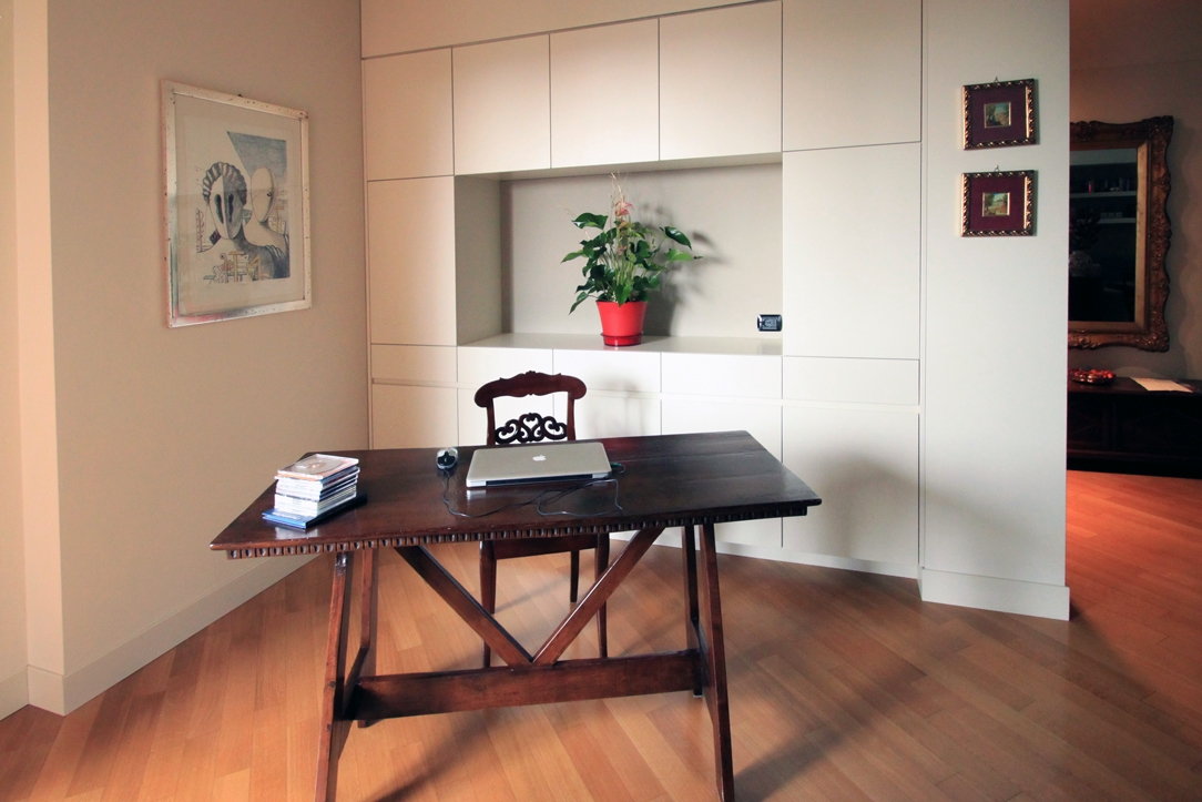
classic villa 01 corner of smartworking

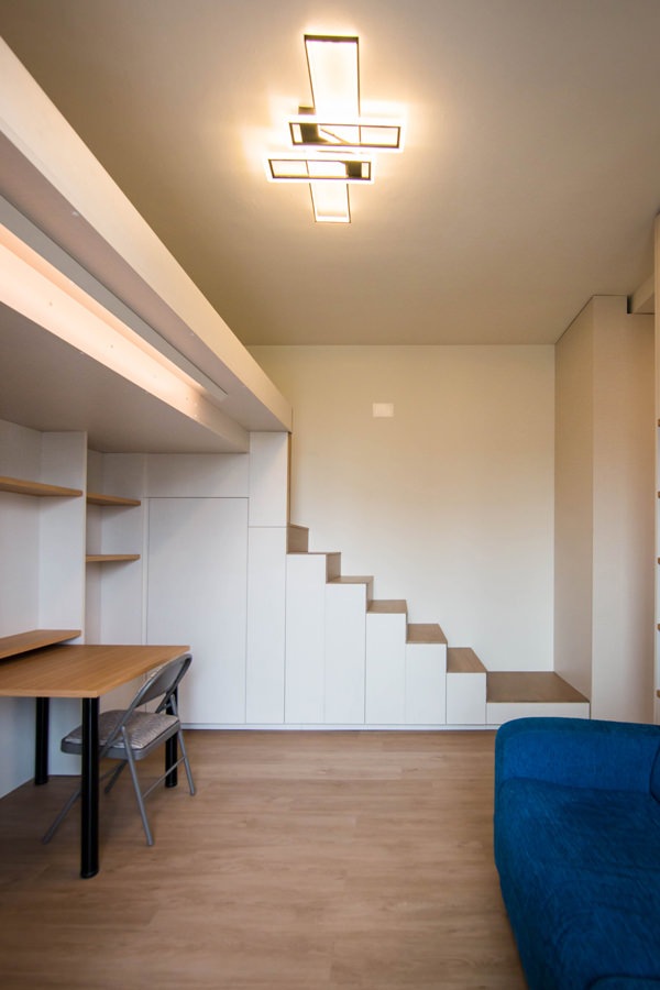
A retro-style wooden desk with a modern equipped wall for a classic and contemporary smartworking corner

THE COEXISTENCE BETWEEN THE PRIVATE SPHERE AND THE WORKING WORLD

The change in habits and lifestyles has involved all aspects of our daily life. From simple gestures such as shaking hands as a sign of knowledge and respect or greeting each other with a warm hug, to participating in cultural and recreational activities such as shows or concerts. The changes that have necessarily been introduced have certainly upset our perception of the private sphere and relating.

Added to this is a new conception of the working world that has increasingly entered our domestic environments.
Previously, in fact, working remotely had been a choice or opportunity for a few, who deliberately knew how to relate both aspects in a single environment. Whether reserving an entire room or dividing domestic spaces with a well-defined design logic.
This is the case, for example, of this studio-home whose design has followed the principles of Feng Shui to organize the internal activities.

From a refined choice, the introduction of a smartworking corner has now become a necessary requirement. All the more so if in the same household the different users need a computer station and well isolated settings to be able to carry out online lessons or conferences on Zoom without interference.

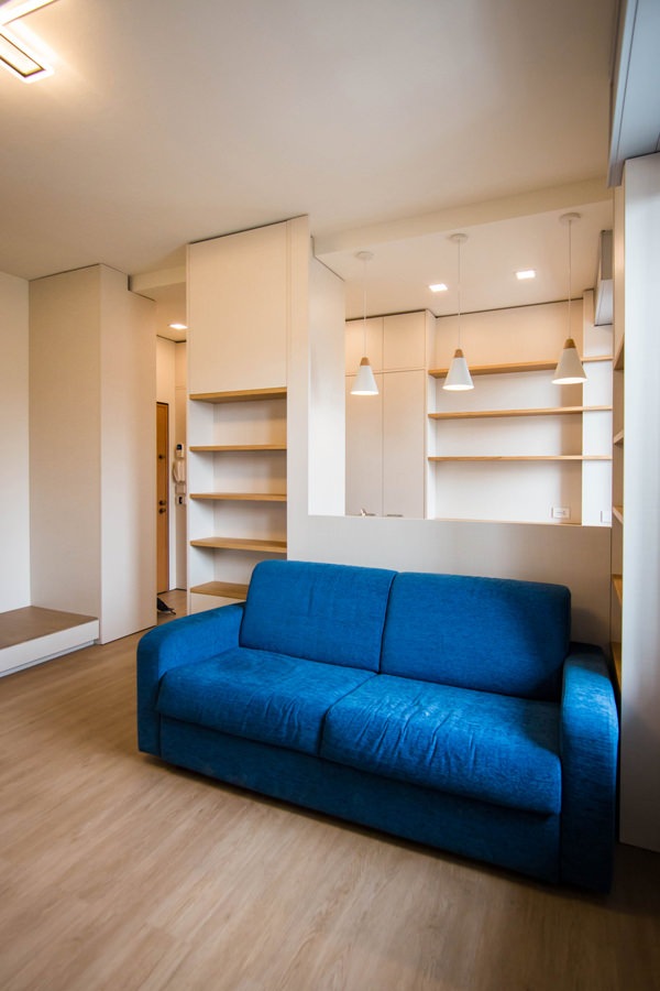
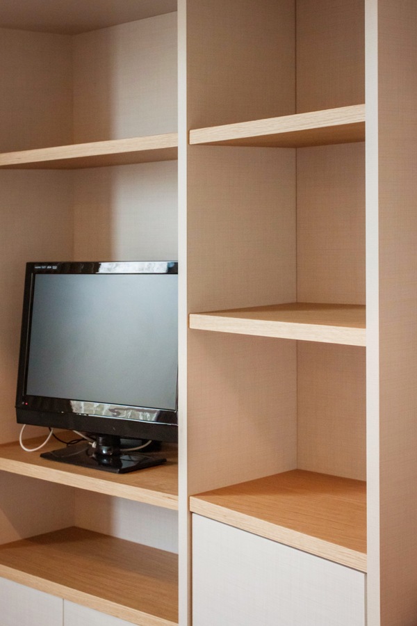
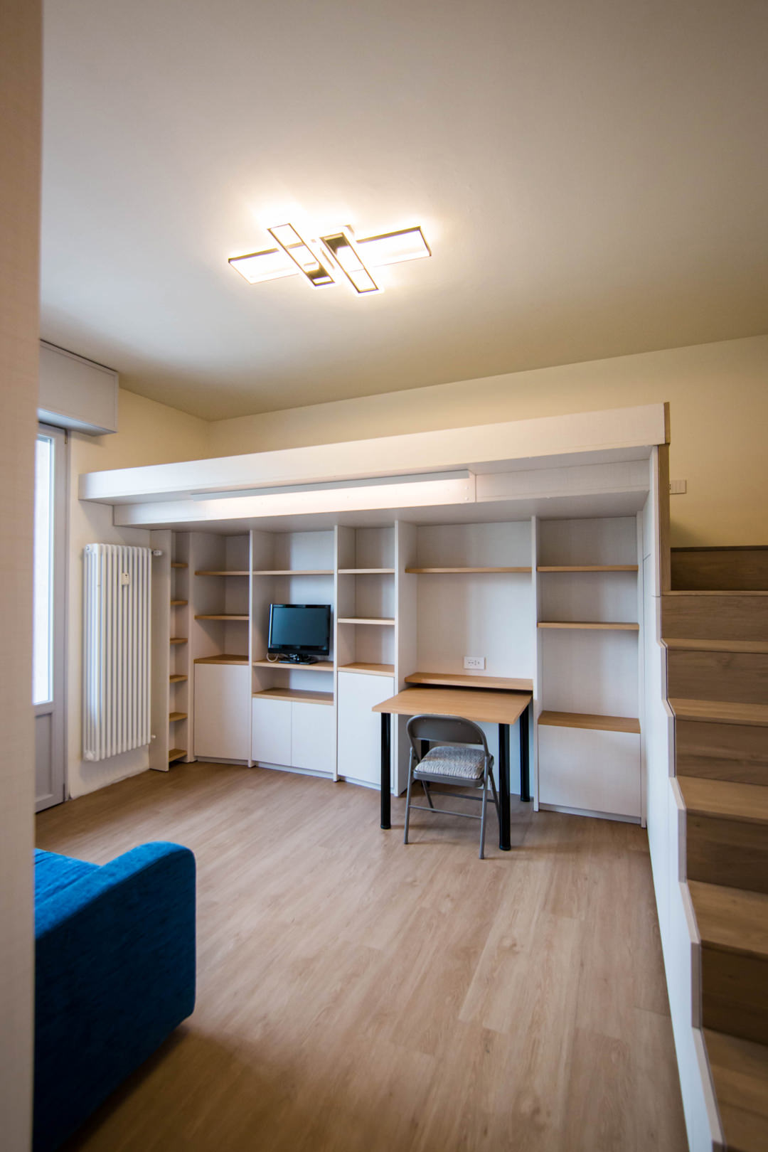
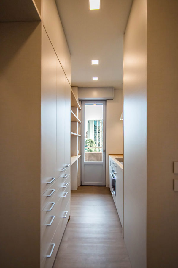
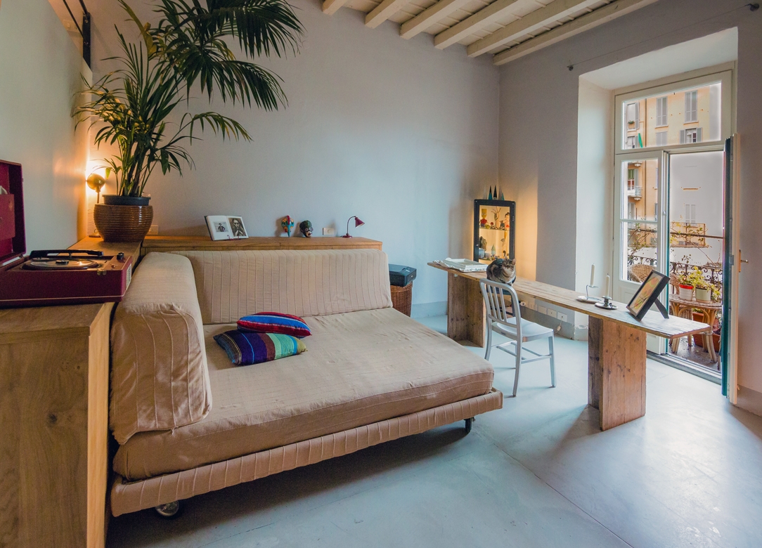
 Milan studio living room 03

Romantic and Shabby Chic atmosphere for this essential worktop

HOW HAVE CUSTOMER NEEDS CHANGED DURING LOCKDOWN?

The months of “confinement” between the first lockdown and the subsequent subdivision into regions according to the chromatic distinction have certainly influenced our way of living the house.
Just think of the number of hours spent at home in the last few months.

As a consequence of this, first of all, a critical vision of one’s own interiors has been introduced. Small improvements to be made, more refined aesthetic details, functional additions in each room.
To demonstrate this, it is enough to recalling the endless queues in the furniture megastores and DIY stores after the first opening in May 2020. More or less improvised solutions, which many times also involve a “self-taught” component to create greater satisfaction in the final result.

Even in custom-made furnishings, customers have followed this wave of changes with requests that could make the spaces in the home more functional. Whether it is a greater attention to the aesthetic impact or a technical improvement, it was certainly the way of seeing one’s home that changed. To all this is added the aforementioned parameter of necessity, and here is the most common request in recent months: providing a corner for smart working.

FROM THE LARGE WORK SPACES …

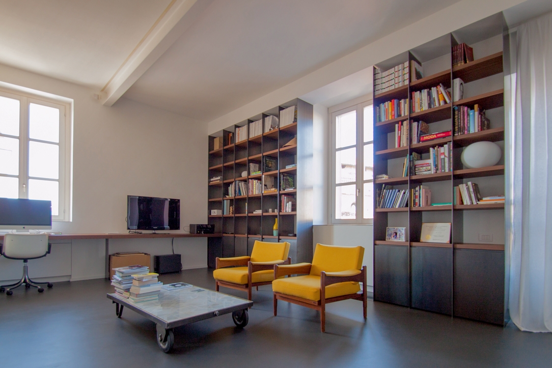
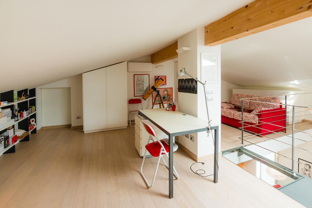
In our previous creations, we had already faced with study corners and walls equipped with desks to make the different rooms more functional. Surely bookcases and most of all desks have become the center of attention. In some cases, these have occupied an entire dedicated room with large and bright rooms. This is the case, for example, of this workstation with an industrial touch inserted in full-height bookcases. A linear element runs along the wall perforated by large windows providing a comfortable support and work points. To embrace the central relaxation area, bookcases with black waxed iron sides and wooden shelves. Another example is this gallery equipped as a study, which exploits the slope of the beamed ceiling to place an essential desk overlooking the living area, and a bookcase embedded in the lower heights.

Alba apartment 03

The oak worktop develops along the side wall with linearity and essentiality in the industrial interior of this apartment

loft studio

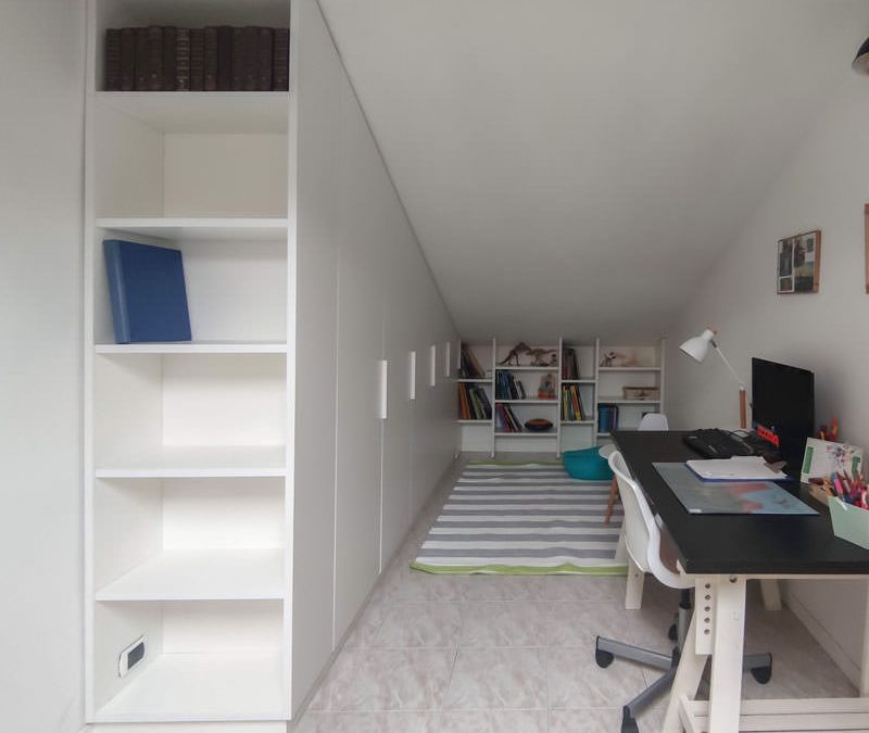
Equipping an attic as a study allows you to take advantage of the internal heights while respecting the brightness of the interior.
A minimalist desk overlooks the contemporary pop interior of this apartment

With the passage of time and changing needs, even the work spaces have adapted to the existing furnishings, making them as functional and essential as possible.

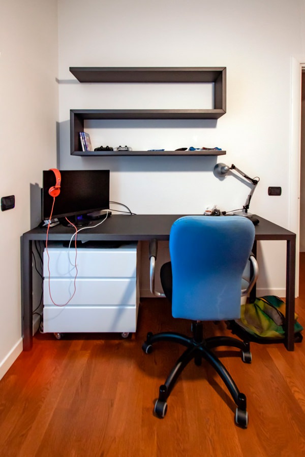
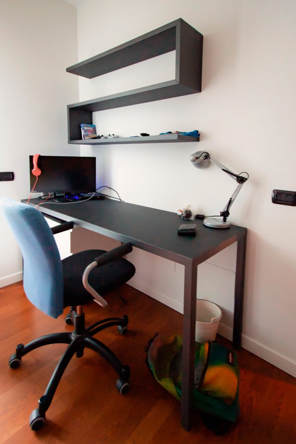
Among these, the classic large desks with drawers and a service bookcase. This version offers a material and chromatic combination with a masculine touch: anthracite gray linoleum top with painted iron supports. It is accompanied by a shaped shelf with black waxed iron covering that with simplicity and elegance provides a practical support for small objects or books.
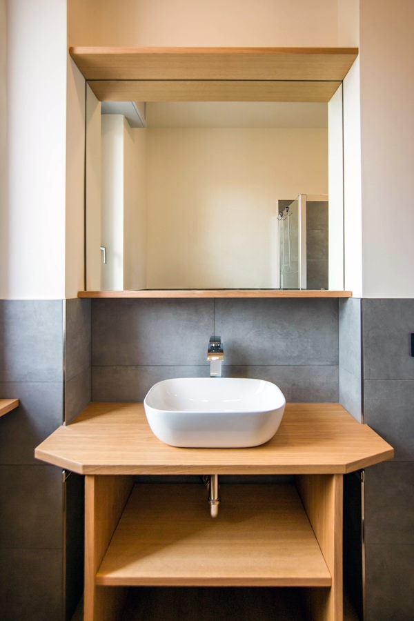
On the side, a bookcase with shelves which is part of the compact structure which also includes the bed with a trunk opening and wardrobe with bridge component. The black waxed iron sides contrast with the matt lacquered MDF shelves, creating material and chromatic contrasts with a strong character.

 Smartworking anthracite metal desk
anthracite metal desk front view

A desk with an anthracite gray linoleun top and iron profiles defines the masculine stylistic imprint of this bedroom

Details MDF and metal bookcase

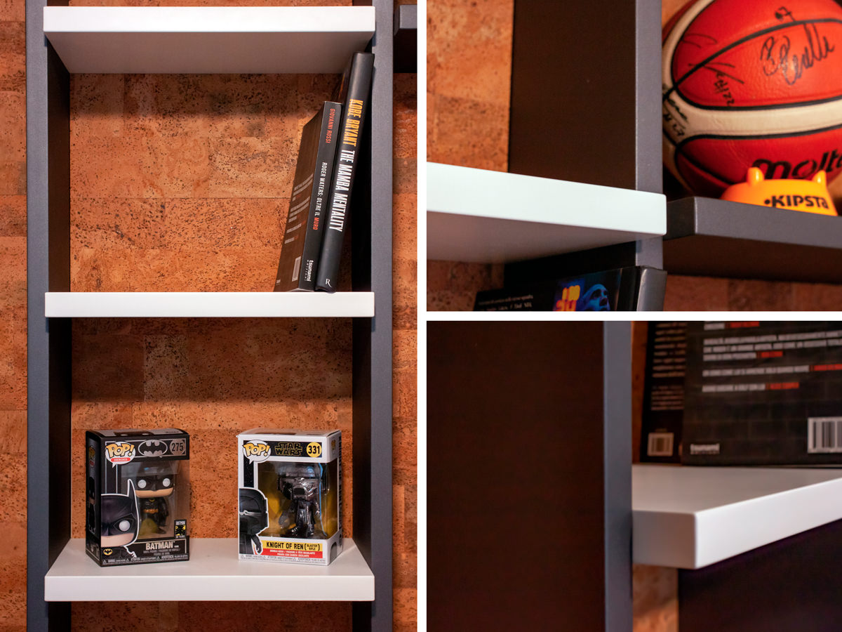
Details of the bookcase and shelves in black waxed iron and matt lacquered MDF.
Material and chromatic contrasts.

TO THE SMALL CORNERS OF SMARTWORKING

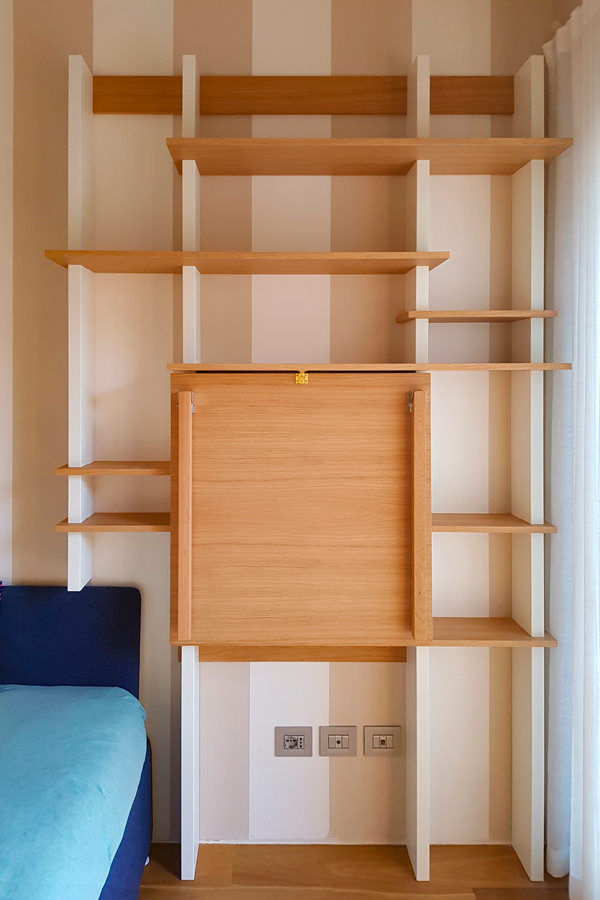
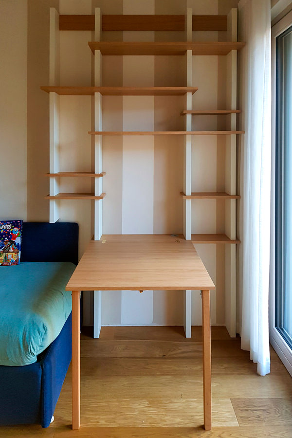
The passage of time has given rise to more essential projects, which also exploit small spaces with practical and compact solutions. Among these, a support surface with flap opening attached to the existing bookcase.
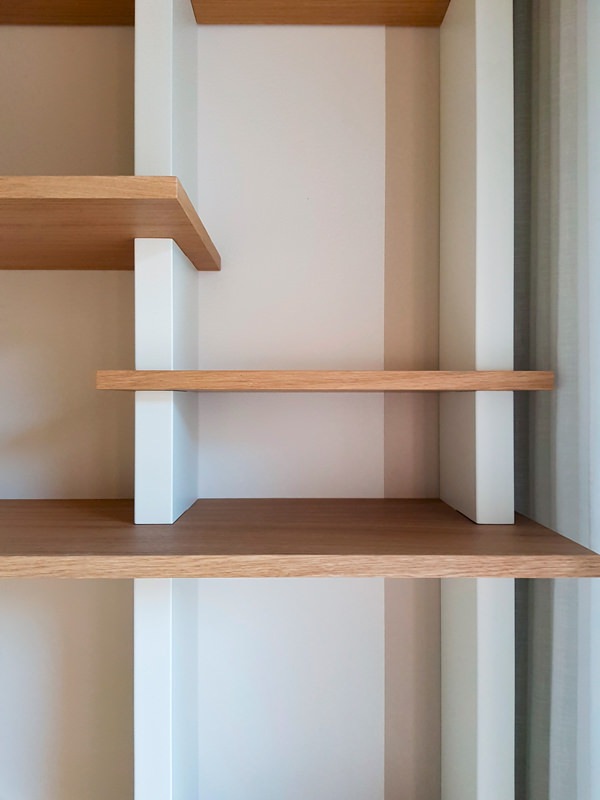
The wooden shelves become the key to horizontal reading, appearing almost set between the vertical sides in lacquered MDF. Games of depth and geometry give life to a room marked by an essential visual rhythm.

 bookcase with closed smartworking top
 bookcase with opened smartworking top

The top of this wooden bookcase exploits its flap opening to optimize the space

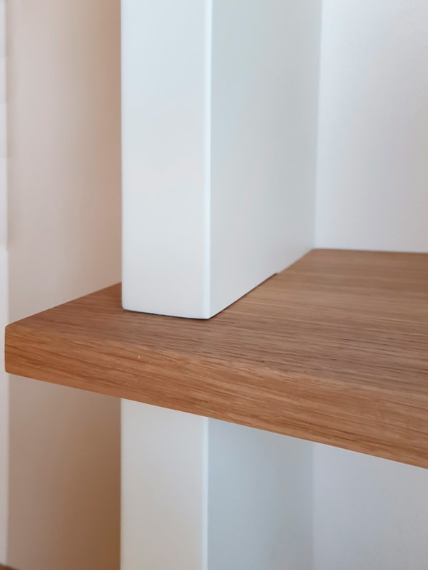
 detail tops in oak MDF shoulders
 detail front view of bookcase shelves

Material details with a strong aesthetic character: the wooden shelves are embedded in the shoulders by the vertical reading in MDF

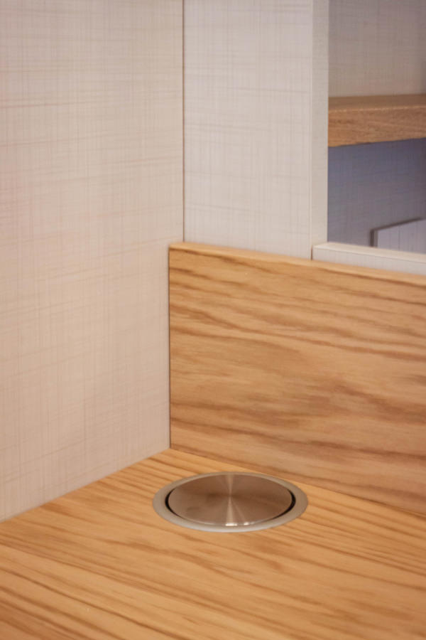
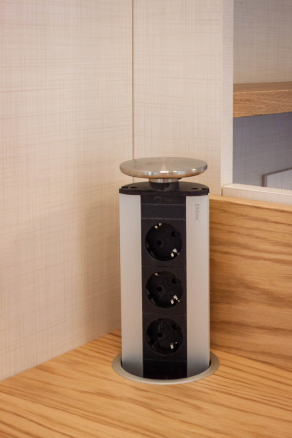
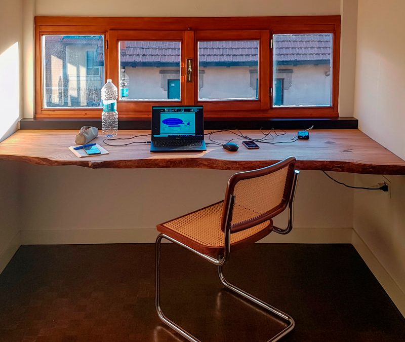
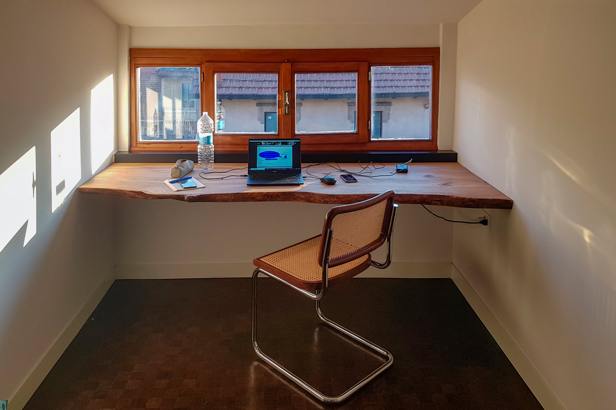
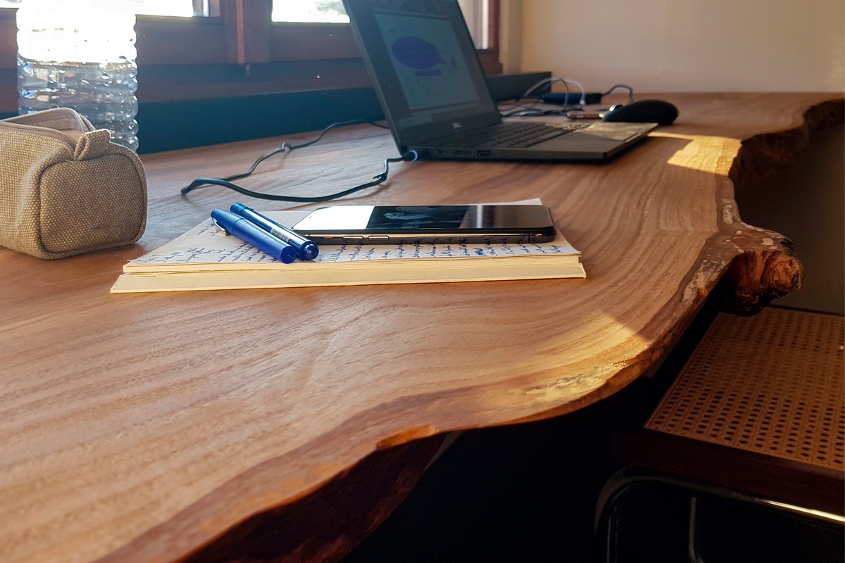
On the other hand, the solutions that take advantage of the reduced heights with rough and natural surfaces have a more romantic soul. In this example, a cherry wood worktop expresses all its material uniqueness with visible knots and a rustic profile, without sacrificing sophisticated details. However, the simple but incisive design line does not renounce practicality. For this reason, a hole has been provided for the passage of cables along the depth of the top, making it also functional for the electrical preparation.

 front view cherry wood desk smartworking

Modern furnishings and natural elements harmonize in this smartworking corner with an authentic soul

 smartworking cherry wood desk top details

A raw cherry wood top expresses all its naturalness

The smart working that has overwhelmingly spread in these difficult times will most likely not remain a transitory phenomenon but will increasingly become part of our life, it will become a necessary space in the home. We designers are ready not to forget it in the design phase and follow its evolutions.

Children in safety

Children in safety

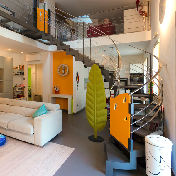
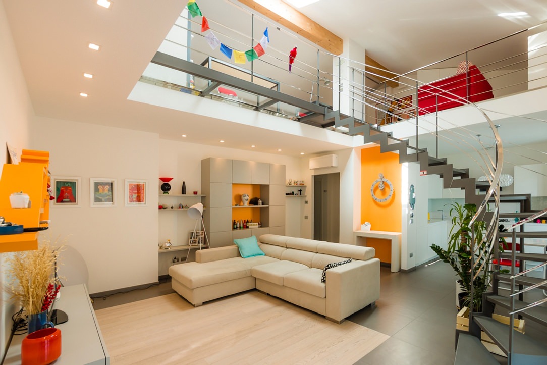
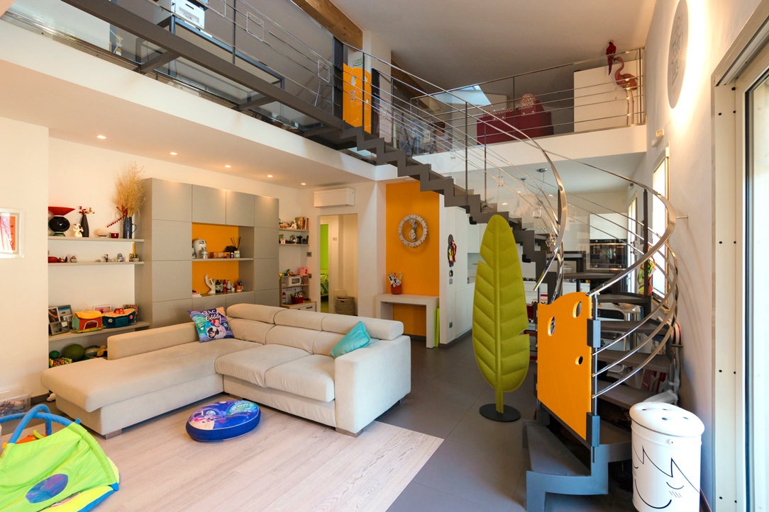
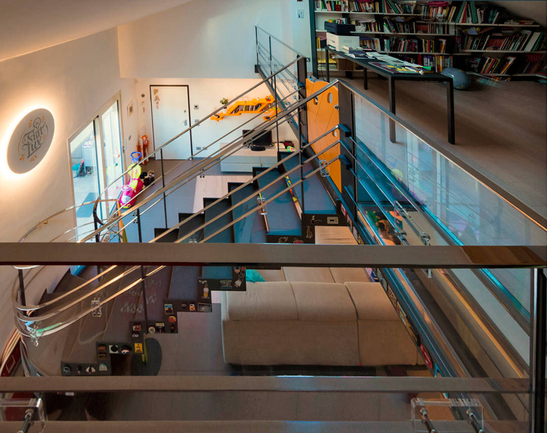
Not all environments may be suitable for the safety of children. Designers are used to designing solutions tailor-made for customers’s needs. However, these can change over the years. In this case, a beautiful aerial staircase in a stately home can become an element of danger with the arrival of the progeny. Here the project of the whole apartment.

house with aerial staircase

the staircase before the intervention

THE CHILDREN

The small creatures under the meter who are experimenting with the use of their body in fact do not yet have the sense of danger. All the elements and objects of the house must be reconceived with their eyes. What can be attractive but fragile and in their reach must be moved, dangerous edges and corners must be covered and empty spaces, in which one can slip and fall, closed or buffered. Every element such as stairs, furniture and hallways of the house must be secured. In this case the danger of the staircase was given by the open part under the middle stainless steel bands of the central barrier, which wind along the entire slope and on the gallery.

house with aerial ladder in child safety

the aerial ladder after

SECURITY

PLEXIGLASS

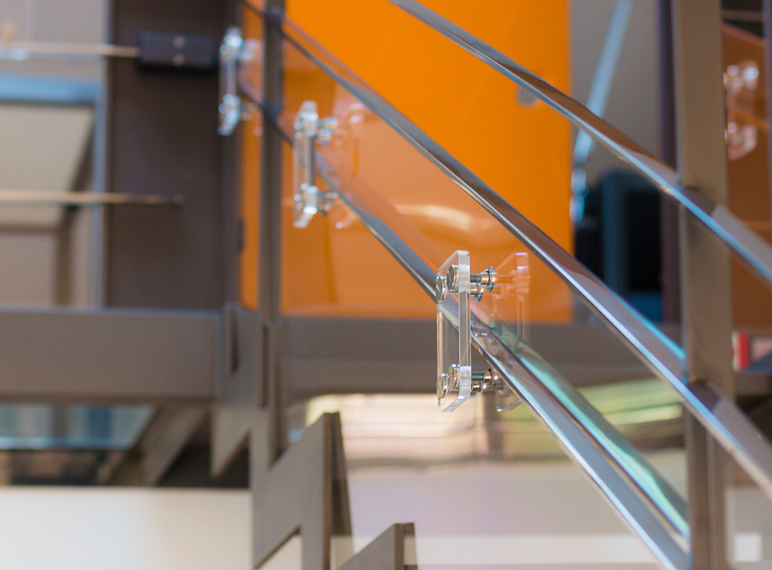
We have found an effective, very elegant, minimally invasive and inexpensive solution to solve this problem. To secure the ladder we have used 3 mm polycarbonate, sized, cutted and fixed to the inside of the barrier, leaving the handrail and the first band at child height free for the grip. Square elements in Plexiglas were then fixed with stainless steel design studs from the outside of the staircase, leaving the handrail and its central bands untouched and using them as a sandwich thickness. In this way, all the plastic part are fixed and safe. For the balcony we have used 1cm hardened Plexiglas that is more resistant in the case of heavy impacts with objects thrown without reason by our little users. As a fastening system the same as the ladder. Seeing the before and after photos you will notice that these plastic elements seem to disappear within the general view of the house. Only by looking carefully can you see the reflections of the Plexiglas and polycarbonate and the studded squares.

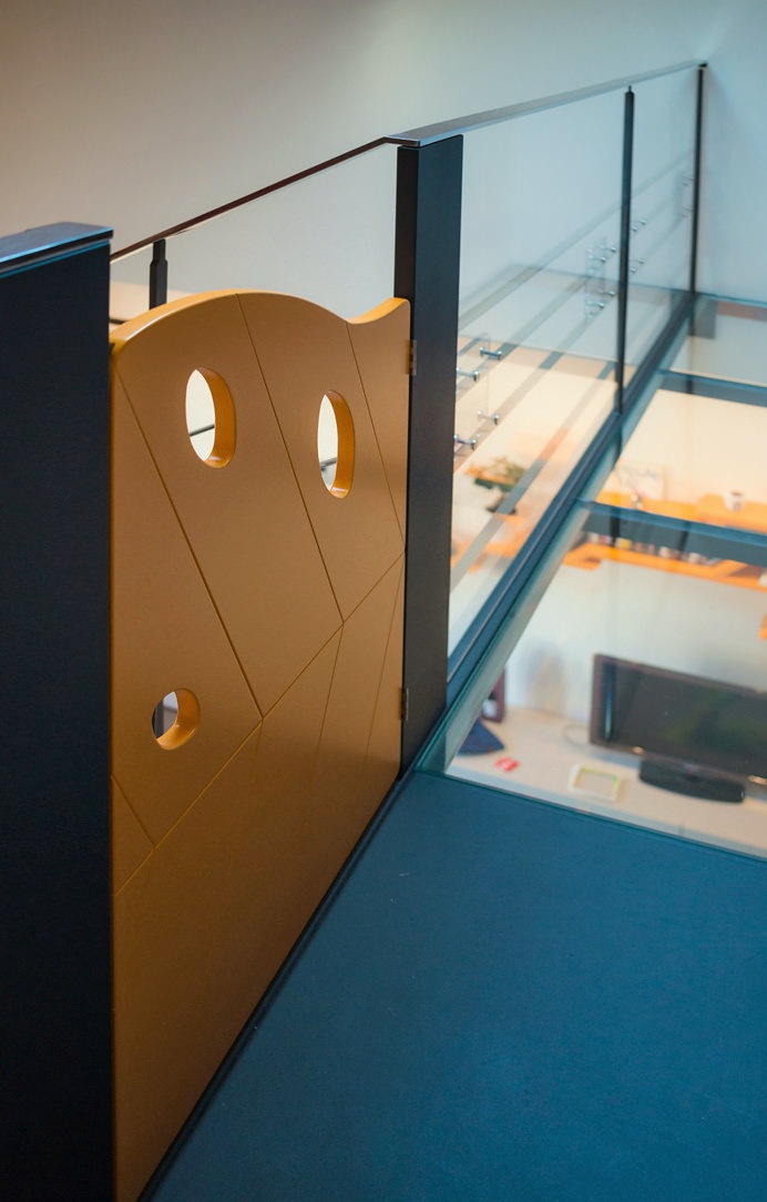
children's gate on steel structure
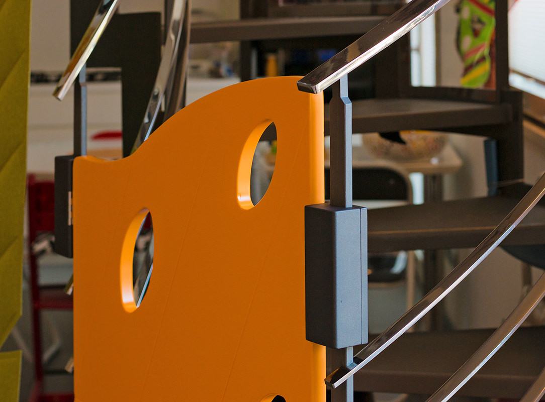
children's gate details
plexiglass details

SHAPED CHILDREN’S GATE

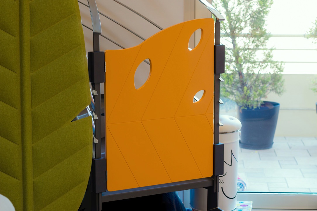
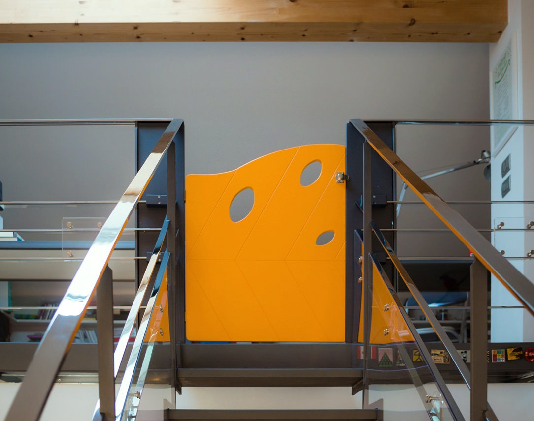
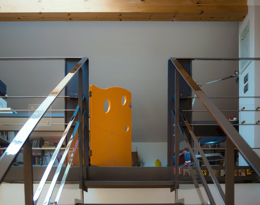
For access to the stairs custom-made gates have been designed: one for the lower access and a second for the upper part of the gallery. The gates were made of MDF, shaped and engraved with a numerical control machine and then lacquered with matte orange paint. In the same color tone the other points of orange present in the living area.

children's gate

The shape of the gates are that of an autumn leaf, its symmetrical veins remain in the center of the design while three holes, always recalling a leaf, are found in the upper part to lighten the element. There are no holes in the lower part to avoid climbing daredevil little climbers. Both gates were fixed to the staircase thanks to wooden blocks fixed together on the upright of the staircase and then painted in the same dark anthracite. At the back of the gates, in a strategic position not reachable by children, there is a sliding bolt for close and open them.

children's gate
children's gate

TEMPORARY

This intervention has absolutely not touched the existing staircase and when it will be disassembled everything will back as before. It is a temporary solution but satisfies the eye to the point that it could remain mounted more than necessary. For the moment, the important thing is that the children are safe, free to walk up and down the ladder independently and stay and play in the attic part of the house.

closing balcony and child safety gates

A studio house designed with Feng Shui

A studio house designed with Feng Shui

Spaces where we live, as well as representing us, must have a positive influence on the quality of our life and has to be studied and designed in the best possible way. Even more when, as in this case, life and work take place in the same environment. Designing a studio home with Feng Shui means making these two aspects coexisting harmoniously in everyday life and spaces.


THE FENH SHUI

We have often heard of Feng Shui, but what is it? It is certainly neither a philosophy, nor a religious or spiritual practice, it is not a style of furniture and not even a form of bio-architecture.

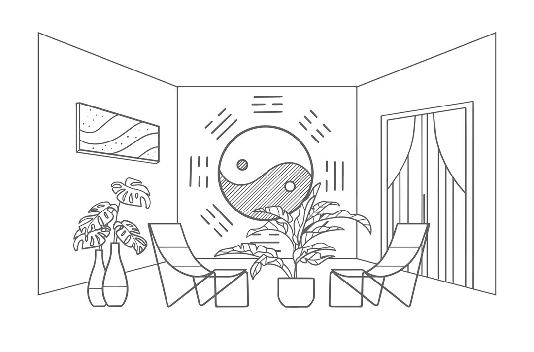
Feng Shui can be defined as the study of how natural and built environments influence our psychophysical conditions.
Practicing this discipline means understanding how the various elements of an environment that affect our physical conditions, our moods and our behaviors, are activated by our primordial instincts. These include: shape, proportions, symmetry, number, color, tactile sensations, sun exposure, artificial light, sound and attention paths.

Feng Shui literally means “wind and water”, in honor of the two elements that shape the earth. In fact, with their flow, they determine the characteristics of a particular place.
It could be said that the profound meaning of this discipline is “Creating the best conditions for the development of life”. Its goal is to make an environment suitable for the people who lives there or for the activities that take place there.

In fact, each of us relates to the room in a non-verbal way: what surrounds us inspires us with emotions or instinctive reactions of which we are almost always unaware and some of these are universal for the human species.

Matter of Feng Shui are these sensations and to work on the human psyche we act on the physical world.

feng shui

A STUDIO HOUSE

The greatest representation of the coexistence of home-work based on Feng Shui is this realization in the Lombard capital. Our client, a holistic operator, needed an ambivalent space in chaotic Milan to be used both as a residence and as a location for her courses.

For this reason, she turned to Marzia and Germana from SpazioUmano to make the apartment as suitable as possible for her needs through Feng Shui. The housing unit on two floors is located in the context of a condominium still under construction, chosen near the city center.

Having always been sensitive to Feng Shui, we have followed the two architects with pleasure. Reading and interpreting their design choices in the best possible way has been a source of inspiration for us and a professional challenge accepted with enthusiasm.

Each building has a recognable front and a back. This polarity determines the orientation of the house in the space that is symbolically guarded by two celestial animals: the black turtle and the red phoenix. The first is associated with protection and health and it is identified with the most intimate areas of the house such as the bedroom and bathroom. The red phoenix is ​​instead an indication of freedom and identified with the entrance and the “active” areas of the house.

The other two animals supporting the main ones are the green dragon, linked to our more rational left hemisphere and therefore synonymous with organization, home management and work, and the white tiger, linked to the more intuitive right hemisphere, therefore associated with emotionality and artistic activities.

THE PROJECT

Being a home-studio, the active areas of living and working had to coexist according to Feng Shui principles, in the part of the red phoenix, but still be separated from each other.

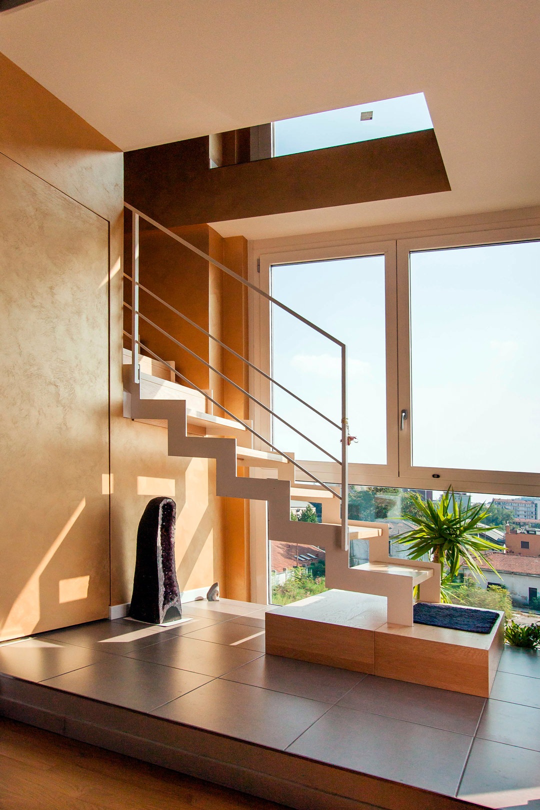
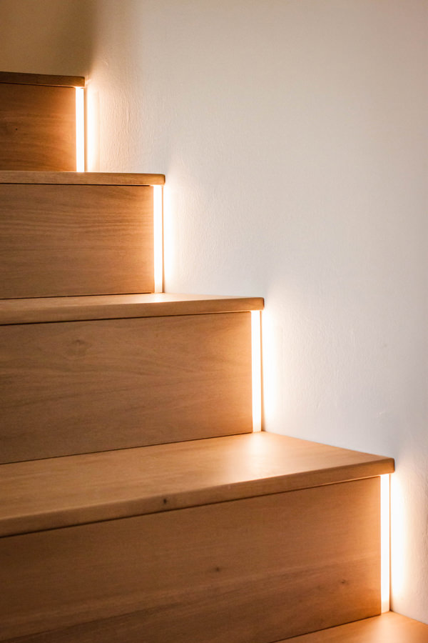
The access to the apartment is therefore characterized by a scenic aerial staircase illuminated on the right side by a large glass wall. This staircase, made with white painted aluminum support and wooden treads, leads to the upper floor used for holistic courses. The instinct is to go up, choosing to be accompanied on this almost emotional path of ascent.

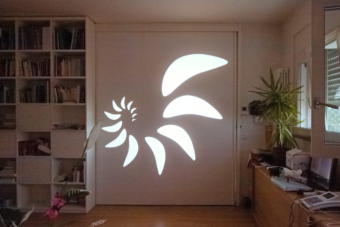
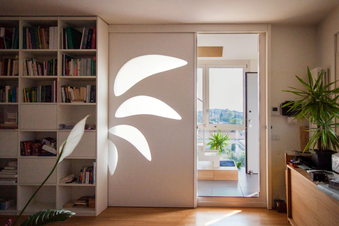
On the opposite side of the large window, the access to the private house is out of sight. A sliding wall decorated with a spiral geometric pattern with opal inserts hides the everyday life’ interior. The light coming from the outside filters through the opal shapes of the sliding wall, creating plays of light inside the apartment.

The living area that opens to the view is an open space with a square plan, whose kitchen is placed on the corner opposite the opening.

Feng Shui entrance
Sliding wall Feng Shui
Wall Feng Shui

A FENG SHUI KITCHEN

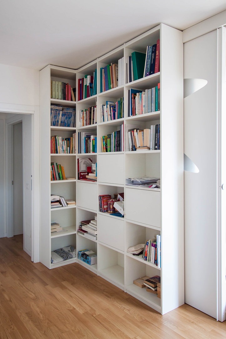
The entrance with living area is characterized by the presence of a full-height corner bookcase, where vertical and horizontal shelves gives rhythm. Small objects and books become the real protagonists, standing out among the matt lacquered MDF profiles of the bookcase.
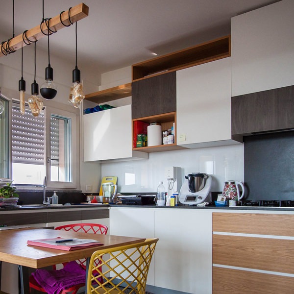
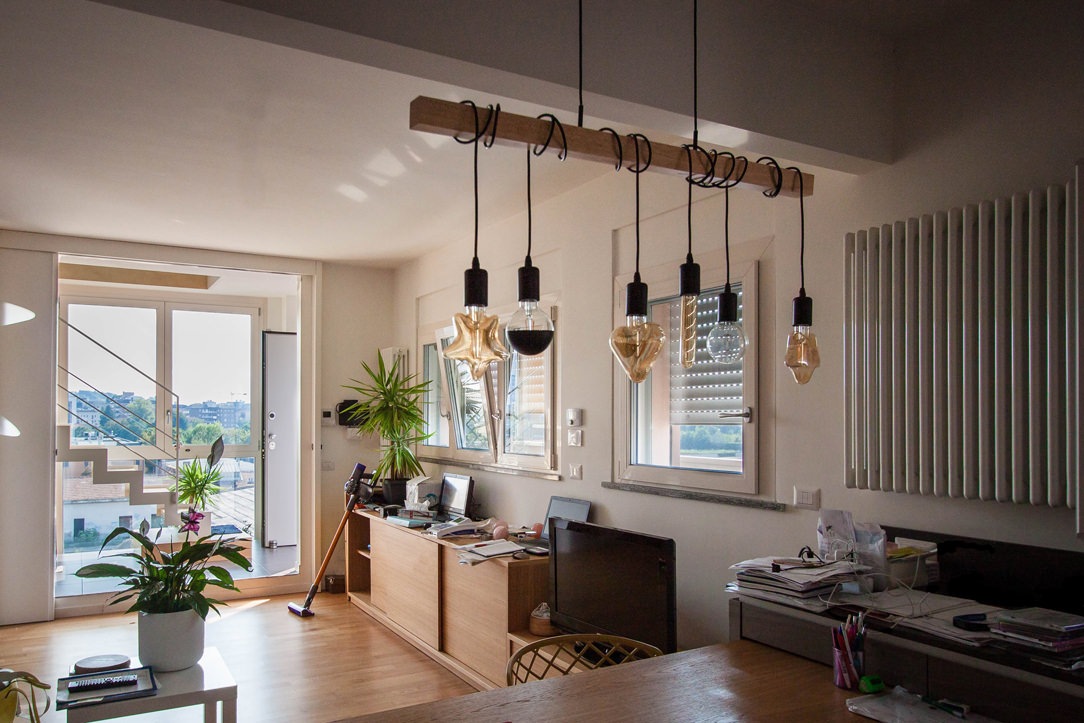
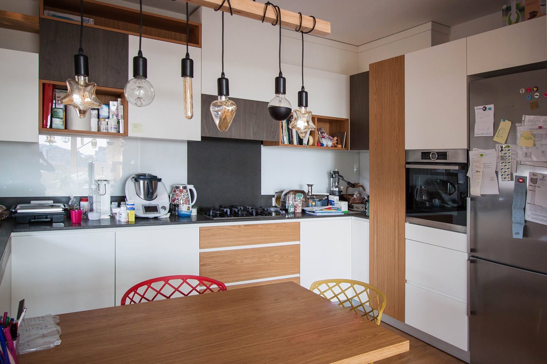
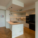
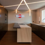
In front of this, the low open cabinet with doors and internal shelves visually closes the room by introducing the kitchen. The latter is arranged at an angle and anticipated by a large table in natural oak and support profiles in black iron. Above this, a witty and youthful light point with suspension elements of different shapes that intertwine on the horizontal support element.

Further element of character are the chairs that surround the table, with bright colors and simple profiles.

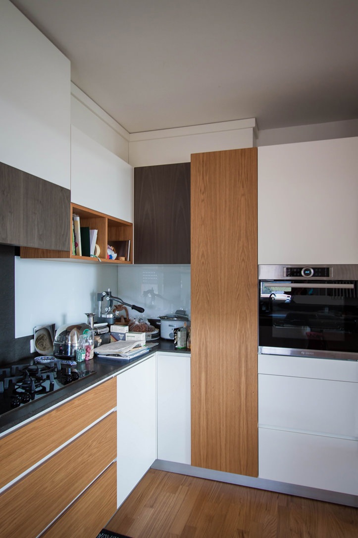
The actual block of the kitchen is made up of mutually intersecting volumes, creating a rhythm and visual dynamism also reflected in the material choice of the coverings. On the one hand, the block with service columns which also houses the free-standing refrigerator and built-in oven. Doors in matt lacquered MDF are interspersed with natural and dark-stained oak inserts, creating visual dynamism.

At the front, the basaltine countertop is transformed into a backsplash and back surface in the firing area, giving life to material and luminous contrasts with the uniform riser in white Lacobel.

The overlying wall units best express this play of intersected volumes with open compartments in natural oak that alternate doors in matt white lacquer and inserts in dark stained oak.

Natural materials with a soft touch blend perfectly with darker and rough inserts. Distinctive signs can also be recognized in the lower volumes, such as the drawers with oak fronts that underline the horizontal reading of the kitchen.

Feng Shui lights kitchen
Side kitchen oak doors
bookcase entrance laquered white
Kitchen table oak wood

ADVICE

Designing a multipurpose interior means being able to bring together different aspects of everyday life. Especially when it comes to connecting the working world to the private one, the home environment plays a fundamental role so that nothing can be left to chance. Choosing to design with Feng Shui involved in this example the coexistence of instincts belonging to two aspects of our life, in a single home-work environment.

We are ready to calibrate your daily and working space on the basis of your needs and desires, in order to create interiors in perfect harmony and balance even with your inner “I”.

A cerulean blue modern kitchen

A cerulean blue modern kitchen

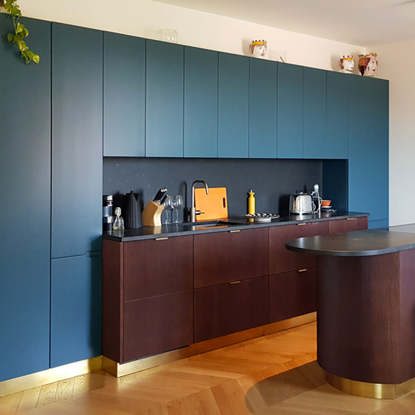
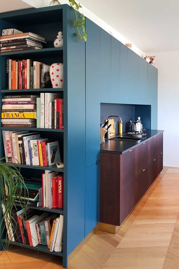
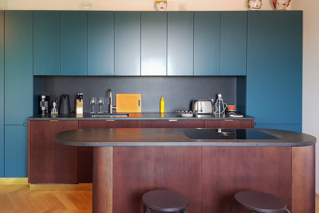
The cerulean blue hue defines the stylistic firm of this modern kitchen, set on dark wood tones with brass finishes. The care of detail gives shape to an extremely elegant project, modern in aesthetics and contemporary in settings.

Modulor modern kitchen with dark tones_01

The on-view composition

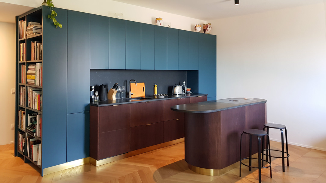
An interior that becomes furniture. The design of this kitchen diverges from the traditional vision of the closed room to become an open space composed of different volumes.
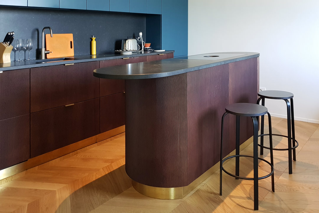
The main block is a visual union of the low volume in ribbed wood set between wall units with a vertical subdivision and full-height columns.

The common thread that contain the perception of the environment is the brass base, taken from the light and linear handles.
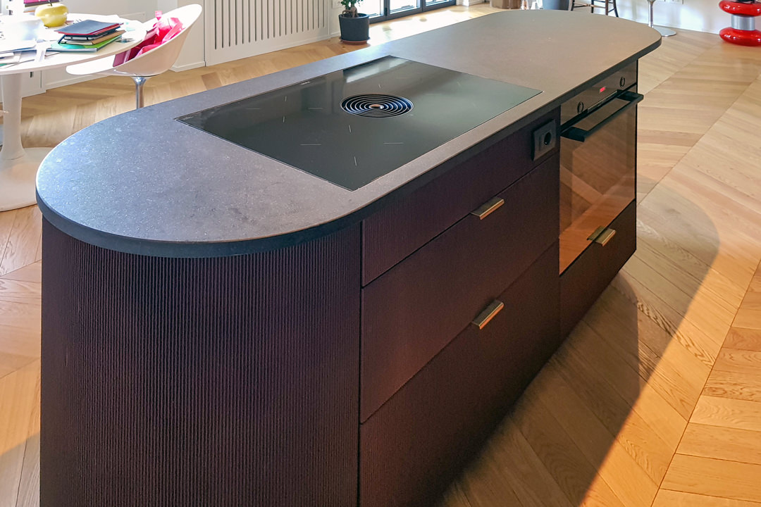
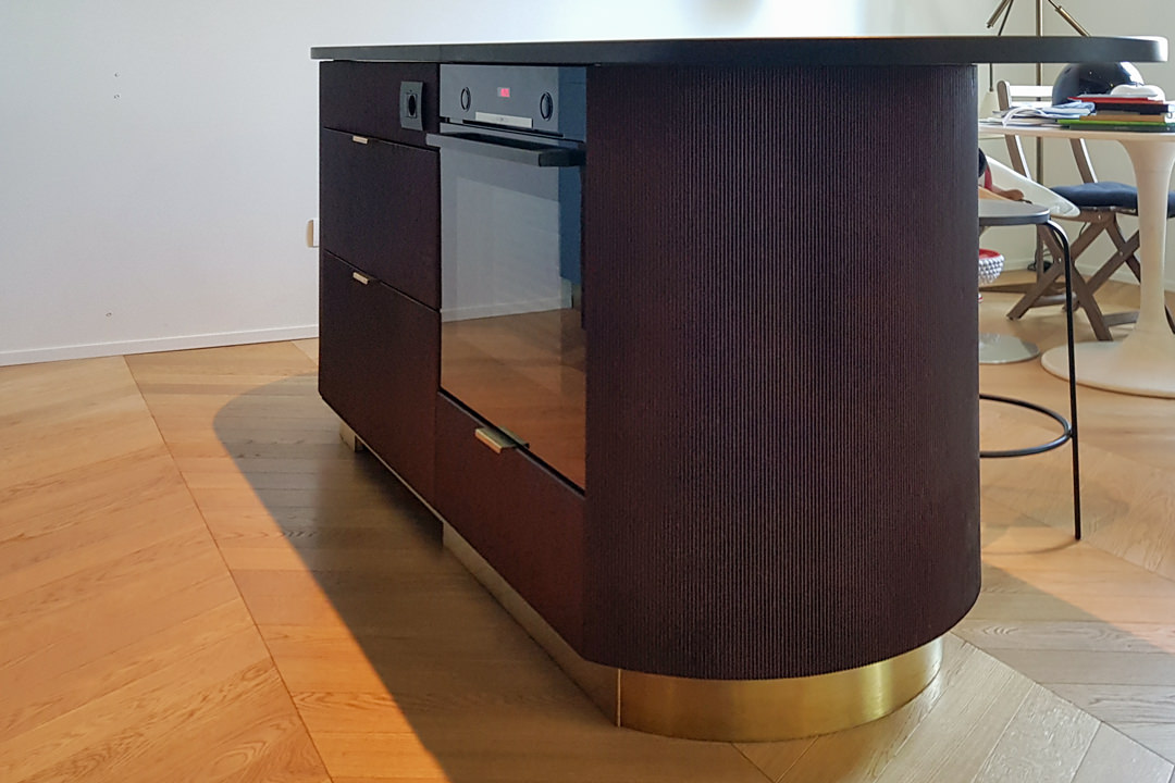
The island block with rounded shapes and overhang countertop, elegantly conforms to the main volume, despite a stylistic change in the design forms.

Indeed, it is this difference between the straight and geometric shapes of the back unit and the rounding of the profile in the central island that defines the stylistic imprint of this kitchen.

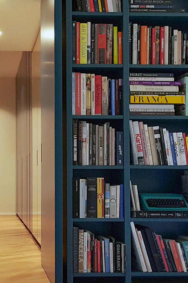
The traditional closing shoulder is replaced by a recessed library that visually lightens the perception of the kitchen characterizing the furniture. A full-height bookcase compartment that alternates shelves in a well-balanced geometric composition.

recessed bookcase side abutment
bookcase abutment division sleeping area
Modulor modern kitchen with dark tones_02

Functionality and aesthetics in symbiosis

Not only the general volumetric setting, but also the internal organization demonstrates a perfect relationship between functionality and aesthetics.

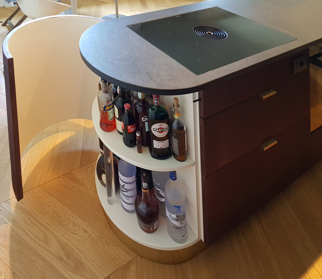
As a demonstration of this, the central island is equipped with rounded corner doors in order to make the best use of each available corners.
Shaped white shelves stand out among the dark tones and blue doors of this modern kitchen, showing all their functionality. The choice of appliances is also avant-garde, as for example the induction hob with attached extractor hood that reduces the functional components to the essential in favor of visual essentiality without sacrificing the practicality.

Modular kitchen island ribbed wood
open door with shaped shelves

Colors and materials

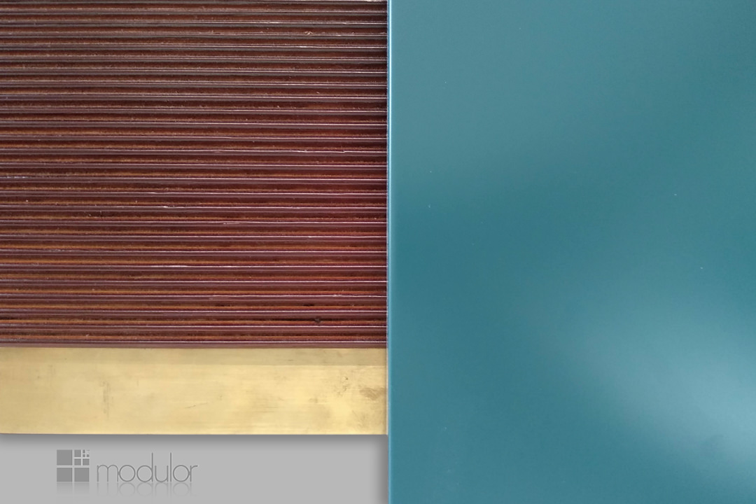
Cerulean blue matt lacquered MDF, dark ribbed wood and brass are the protagonists of this modern kitchen in which dark tones are chosen for their elegance.

A rigorous environment that is being fascinated by contemporary functionality.

The chosen shade of blue, extremely modern, is enriched with a warm appearance especially when combined with the dark-dyed ribbed.

It is precisely the materiality in the latter’s finish that enriches the main volumes of the kitchen with movement and rhythm.

The brass of skirting boards and handles, underlines the design lines with a precious character that gives refinement to the project.

Modulor materialboard
Modulor modern kitchen with dark tones front view
Modulor materials finishes

Advice

The choice of colors and materials often defines the character of an interior. We are often intimidated by intense colors and dark tones, especially if imagined on large surfaces. The final impact can instead reserve great surprises, and give a touch of freshness and modernity.
Here is another example, in this case a dark gray kitchen with oak inserts.

How to equip a bathroom with laundry corner

How to equip a bathroom with laundry corner

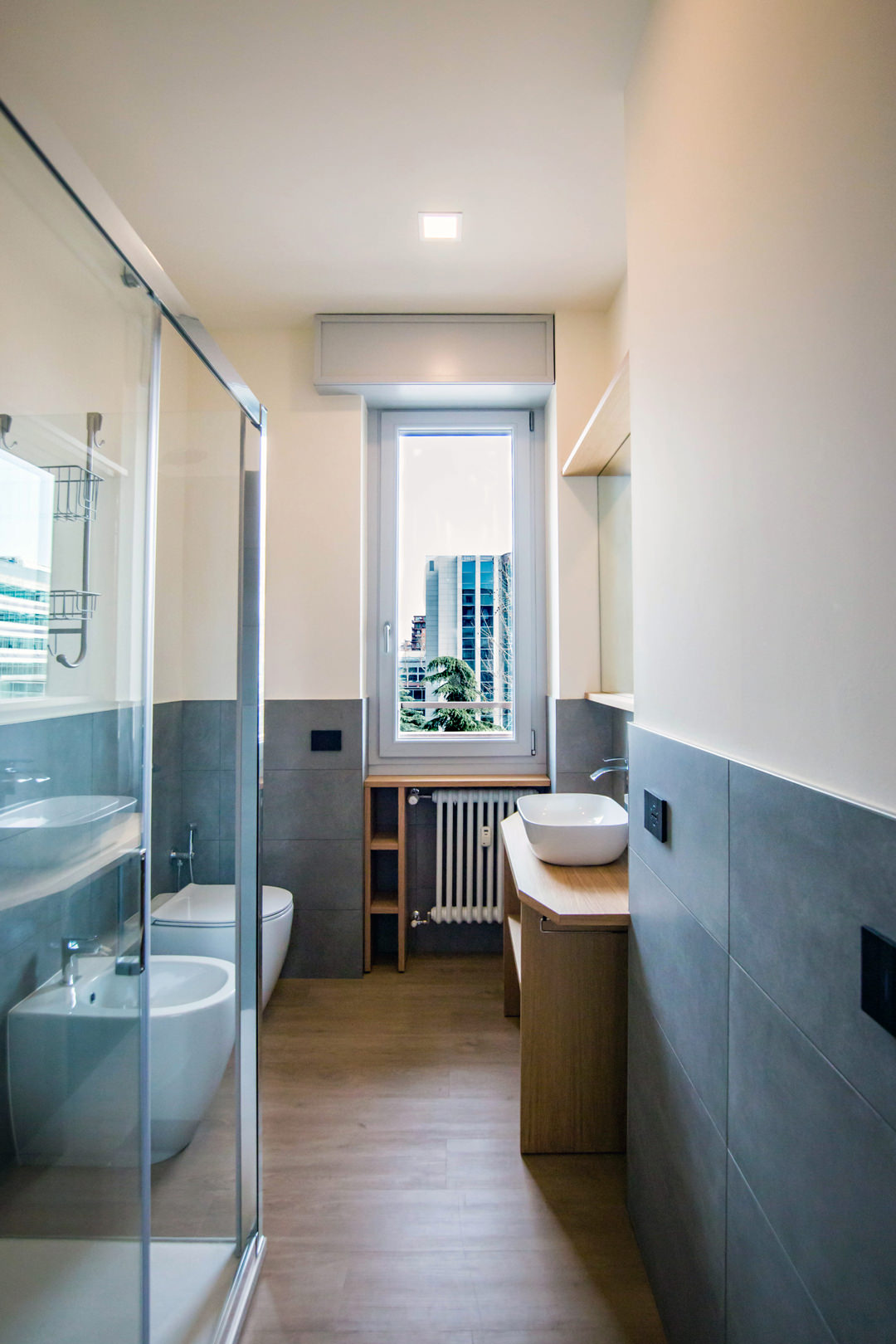
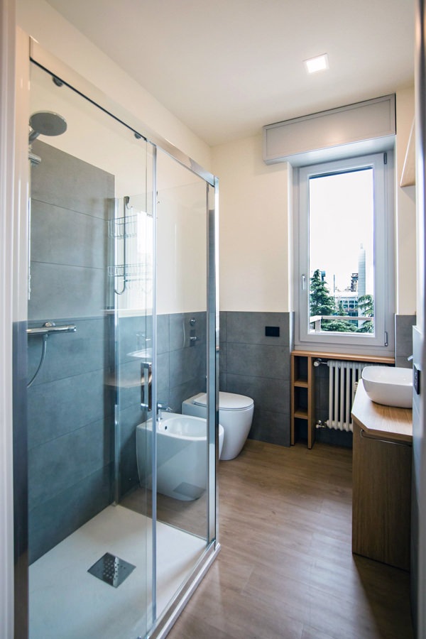
A functional and aesthetic analysis of the laundry corner. An environment that in contemporary reality is forced to give up its autonomous room to blend in a small bathroom or equipped corridor. The aim is giving space to the services that define our daily life, making them aesthetically interesting.

laundry corner

Laundry corner with showed washing machine, basin and compartments furniture

equipped corridor

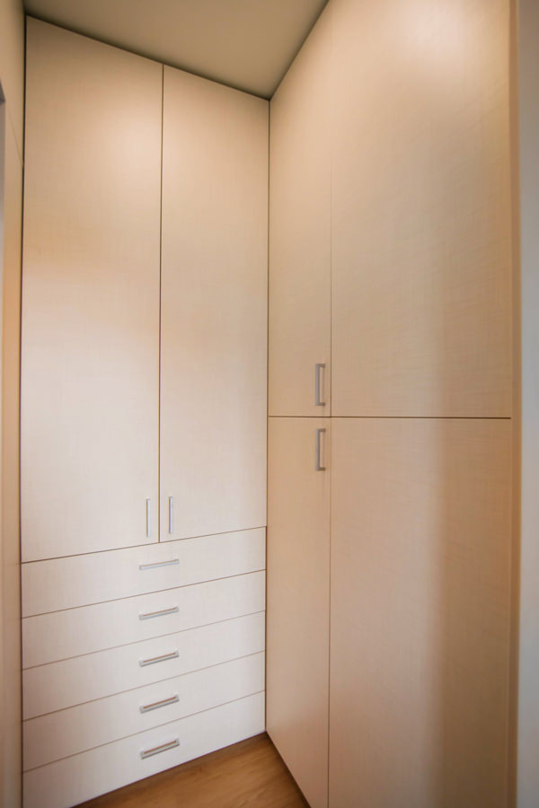
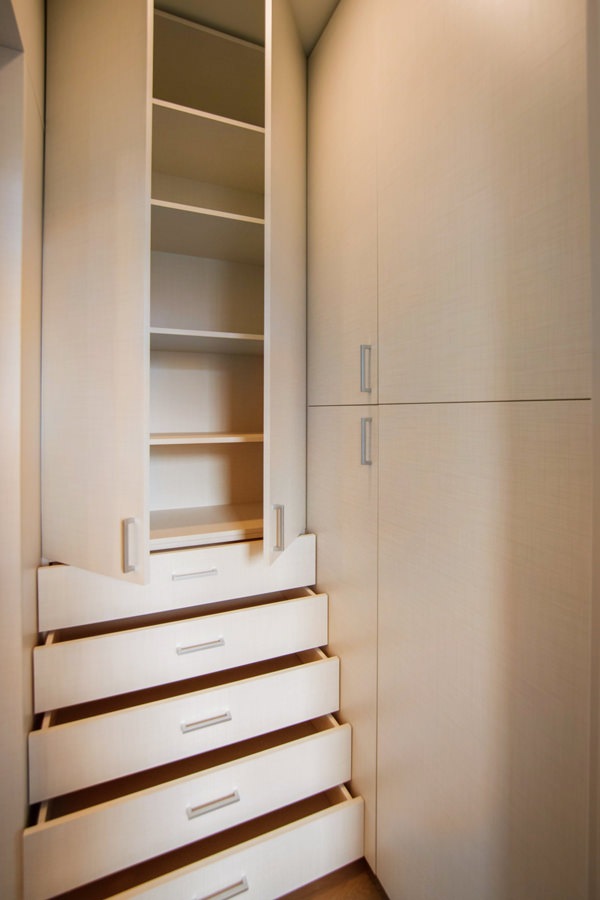
Optimize spaces equipping corridors with serviced wardrobes View the project

Space to services

Speaking of interior design, we are used to imagine elegant living rooms and modern kitchens, contemporary bedrooms and essential-style dining rooms. Over the past few years , the interior design has increasingly taken on the aesthetic meaning of architecture. Let’s remember, however, that design was born as the perfect combination between aesthetics and functionality. The morphology of furniture is nothing else than the natural result of perfect efficiency. It is exactly with this spirit that we want to highlight those “corners of the house” that we usually tend to hide because they are not “beautiful” even though they are basics in the functionality of our domestic spaces. The project layout of each house gets us used to dividing rooms between “living area” and “bedrooms”. The first includes all those rooms that are used to welcoming guests, designed with the aim of return the best public images of the owners. In the “sleeping area”, the most intimate and personal rooms of the owners come to life. However, in this typological distinction are missing all the rooms which, whether private or public, carry out a real function. Among these, just think of the laundry room, which over the years has changed its conformation adapting to the needs of the time.

washing machine recess

A laundry niche uses the available passage corner to house the washing machine and shelves View the project

From public washrooms to bathrooms equipped with laundry corners

Over the years, the home laundry has become increasingly important in private houses. Whole rooms were equipped with basins and ironing corners, which gradually witnessed the coming of appliances capable of simplifying manual work and obtaining excellent results. Private rooms that replaced the traditional public lavatories for an increasingly elitist concept of personal care and cleaning. The widespread use of washing machines, and modern dryers, has meant that laundry rooms take up less and less space inside private houses. Furthermore, in the contemporary vision of the house, open spaces have swarmed the architectural panorama more and more, reducing the functional closings to the bare minimum. As a consequence, to optimize space, the laundry room is often eliminated in favor of bathrooms equipped with washing machines, dryers and service cupboards. Making the appliances “invisible” was the next step. Here then come equipped wardrobes able to hold not only washing machines and dryers but also baskets and pull-out compartments for cleaning products.

laundry bathroom detail

A bathroom with contemporary wooden surfaces hide extractable functional elements. View the project

Composition of a laundry-corner

Equipping a bathroom with a laundry corner first of all means providing an insertion point for the washing machine. This can remain visible, favoring the opening of the porthole without interfering with any surrounding doors or being built-in the washbasin cabinet. To better hide the washing machine, however, it is necessary to provide a service cabinet that rests on the ground. It means excluding suspended solutions or light supports, and study a customed solution that allows the opening of the tray and the easily maintenance of the appliance. To this is often added a service cabinet with internal shelves and removable baskets that can contain cleaning products and accessories of different sizes. Often these latter two solutions come together in one, with folding or sliding doors, which act as a closure for the furniture element. Internal accessories such as dividers and hanging elements are additional options that can make the space more functional and optimize the overall dimensions.

bathroom with washing machine in view

The bathroom cabinet with wooden top and finishes houses the washing machine View the project

bathroom cabinet with open drawers

Drawers of different heights are extremely functional elements for organizing personal products View the project

bathroom service closet

A large service cupboard with internal shelves and removable basket for the bulky products View the project

It is the functionality that defines the composition of these equipped corners. Our task is to optimize spaces in the best possible way by creating practical and aesthetically satisfying solutions. Whether they are service points hidden in other rooms or clearly visible and recognizable elements, it is essential to be able to organize them in the best way, using all the available centimeters without however giving shape to narrow solutions.

An Emperador Marble kitchen

An Emperador Marble kitchen

A monolithic kitchen, entirely covered in marble, shows all its elegance in a project that emphasizes such a precious and distinctive material. Walls and surfaces, in Emperador marble, are recognized for their very dense and varied white and beige streaks on a warm gray / brown background. Such a sophisticated design line can only be accompanied by modern and innovative mechanisms.

THE PROJECT

The renderings provided by Tanya Kutzmina, a cosmopolitan Russian designer we had the pleasure of working with, immediately show the intrinsic characteristics of the project. The concept of the master kitchen, part of an open space, encloses high walls and monolithic surfaces in an ambivalent environment, inert at first glance but able to transform itself into an equipped and representative kitchen for the guests of the house when needed. Two types of marble alternate in this large space. On the one hand, Emperador dark marble, which symbolically defines the functional parts of the kitchen, becoming a scenographic setting for “acting”. On the other, Emperador light marble, clear and bright, which amplifies the perception of the environment by reflecting the light of the large windows and embodies the essence of everyday life. Living and acting therefore become the reading keys not only of the stylistic composition of the rooms, but also define the way to relate to them.

marble kitchen render 01
marble kitchen render 02
kitchen island  sliding mechanism
Emperador marble kitchen render 02

THE COMPOSITION

The structure of the marble kitchen is an island and the central monolith opens with a drag mechanism that becomes a snack corner. Opening, it also shows a cooking area with three different types of fires: induction – teppanyaki – grill. On the internal front there are drawers entirely covered in the same marble and equipped with cutlery holders, crockery holders and potholders. Above it stands a splendid custom-made hood in stainless steel, as large as the island, equipped with filters and LED lights. All made with laser cuts and remote engine preparation. The dark marble of the island spreads into the floor and flows into the back wall. An ingenious book system opens the central doors folding up into two side compartments and revealing a broken interior that houses a sink, a dishwasher, baskets inside the doors, an oven column and exposed shelves with underlying LED lighting. The stainless steel top and back give a touch of modernity between the eternal elegance of the Emperador dark marble with which the surrounding surfaces are covered. On both sides, two large and spacious refrigerators enclose the central block of the kitchen. The covering of the Emperador light doors continues along the entire adjacent wall, hiding an access door to the second service kitchen. At the center of the room, a huge table stands for several diners in dark Emperador with bases made to measure in stainless steel and marble. These counterbalance both visually and physically the grand plan.

 
Emperador marble kitchen Moscow
island render Moscow project
island project Moscow 02
Emperador marble kitchen Moscow
island render Moscow project
island project Moscow 02

THE REALIZATION

Creating this kitchen was a new, arduous and stimulating experience. We accepted the challenge by finding solutions to the various executive problems that immediately arose. Among these, the union of two materials, wood and marble, so different in finishes, weights and typological characteristics. Obtaining the dynamism of the kitchen, with mechanisms suitable for the fluid movement of the parts and the arrangements on site for their perfect functioning with different materials and systems, required a lot of attention and an active collaboration with Tanya in Moscow, who followed the construction site. The marble, which was provided to us by Marmi Galli, a company with which we have been collaborating for long time, was used in 2 distinct thicknesses: 20 mm with 45° cuts to cover all the structures, and 5 mm thick screened for the application on the retractable doors to guarantee the functioning of the mechanisms with respect to the weight. We have taken great care of the quality of the mechanisms and the guides, both manual and motorized, especially for the doors of the shelf and the island snack top. We leave this video of Tanya the task of accompanying you in the living area and guiding you to the kitchen. Seeing it accomplished is a great emotion for us and awards our commitment.
The Moscow marble kitchen project fits perfectly into the series of single-material projects we have made. Among them, a kitchen entirely covered in steel.