The verticality as a design element of an apartment
Knowing how to relate to room with high ceilings means being able to transform verticality into a design element without renouncing the correct perception of the internal environments.
THE CONTEXT THE CONCEPT MIRROR DIVIDER FULL HEIGHT LIBRARY CLOSING DOORS OF CORRIDORS
THE CONTEXT
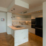
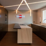
America is the continent of endless distance, large dimensions and a taste for excess. The American taste is an eclectic panorama, in which each piece of furniture plays a fundamental role in defining the general character. A peculiar feature between the overseas apartments and some ancient interiors of the old continent is the use of very high ceilings that give a sense of greater openness to the interiors. Sometimes, however, they risk becoming disturbing elements in the perception of the room. The furnishing elements risk being undersized or de-contextualized due to the lack of a correctly perceived upper limit. For this reason, identifying the main characteristics of the apartment to enhance its decisive features is the starting point for good project.
THE CONCEPT
The design line takes origin from the setting of the apartment itself, focused on a contemporary style in which the chromatic contrasts creates elegant visual lines. Verticality is certainly the key-element of the project as it is a critical point for the internal perception of the environments which can however become the characterizing design line if it is interpreted with the right elegance. It is exactly on the design element of verticality that the architectural studio with which we collaborate has set up the three interventions within this apartment in New York which we have handle the production: the divider with mirrored elements, the full-height bookcase and the closing doors of the corridor.

MIRROR DIVIDER
Taking advantage of the play of reflections obtained by the mirrors, the divider has a double function of increasing the perception of space and dematerializing its borders. It is the graphic line that underlines its vertical setting, which is visible both in the black iron edge that defines each modular element, and in the lesser width of the mirrors of which it is composed. This difference in width creates an additional vertical division able to give greater dynamism. The alternation of full and empty, light and dark, lights and shadows, defines a design vision strongly focused on rhythmicity, obtained by the alternation of vertical elements.

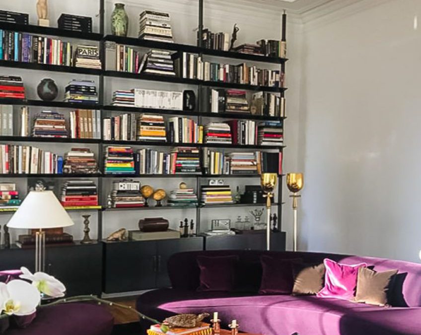
FULL HEIGHT LIBRARY
The geometric rigor defined by marked black profiles also returns to the element of the library, with which the mirror divider fits in well. Taking advantage of all the available height, the vertical tie-rods become the most visible graphic lines, which naturally seem to flow into the false ceiling. The horizontal dividing elements are attached to these responding to a rigorous and geometric approach. To visually compensate of the alternation between full and empty spaces of the upper part, there are three container volumes placed in the lower band which act as structural and above all, as a perceptive base for the library. The matt black laminate ensures the game of chromatic contrast with the white back wall that characterizes contemporary interiors.

CLOSING DOORS OF THE CORRIDOR
Verticality interpreted as a design element has also become the solution of the closing doors of the corridor. Going beyond the standard dimensions of the doors represents a considerable technical challenge, the solution of which must necessarily be able to respond to functional rather than aesthetic needs. Having included doors with a total height of 3 meters, we wanted to completely test our technical knowledge, obtaining excellent results. The textured white lacquered doors seem to be a natural component of the back wall, from which they elegantly detach, also thanks to the play of lights and shadows created in the internal slot. The sliding rails are integrated in the profiles of the false ceiling, allowing a detachment from the ground both functional, to avoid the contrast with the carpets present, and aesthetic, to visually unburden the weight of the door. The contrast between black and white colours is elegantly reproduced in the choice of rugs that refers to the setting of the living room and in the presence of an exhibition element with an essential profile in the back wall.