BLACK IRON IN FURNITURE

BLACK IRON IN FURNITURE

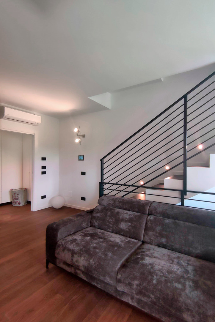
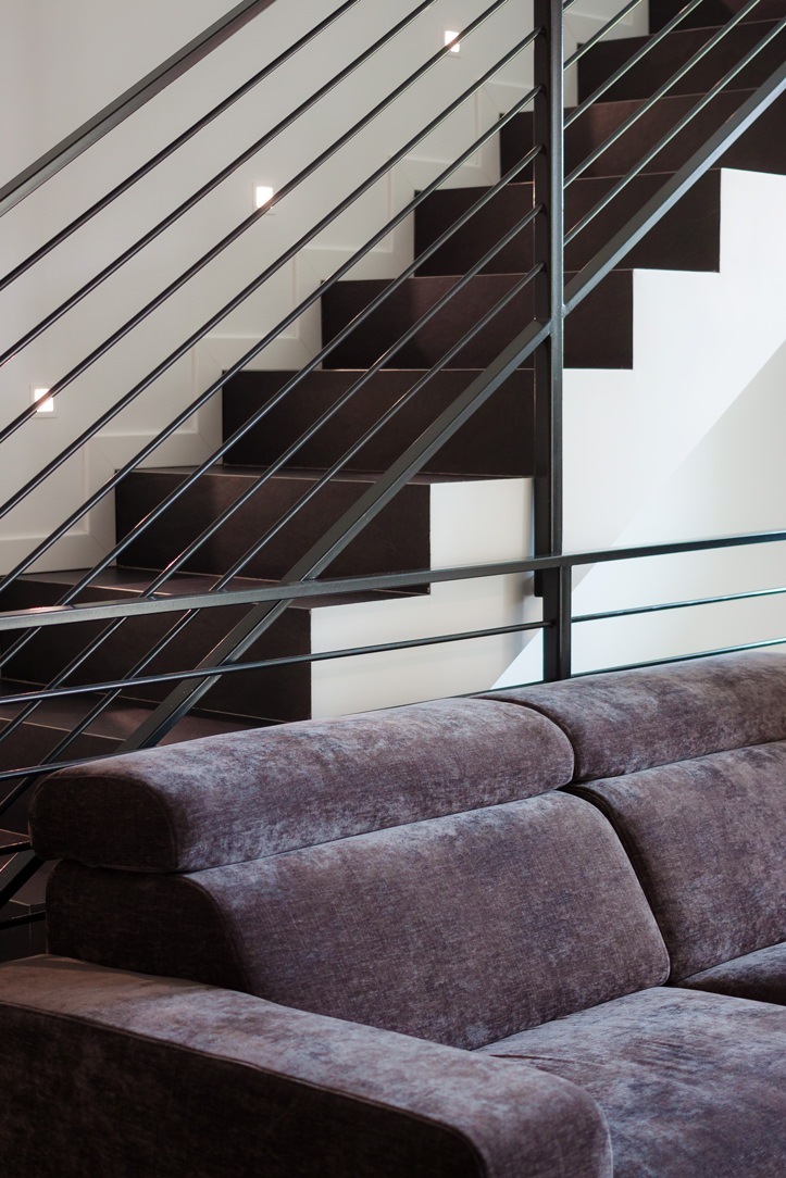
Nowadays the iron and the metals that are inserted in the furnishings have been returning to their natural finish, called in jargon “raw” (raw iron is commonly called black). This brings out the material with which the product was made and its natural imperfections make it even more alive and unique in its kind.

THE BLACK IRON

The word “iron” in common parlance is usually used to also indicate low strength “iron alloys” and mild steels which have a silvery-gray appearance. Very resistant, ductile and malleable, they are distinguished by black iron which is darker, more delicate and is used exclusively for indoor structures, therefore much less exposed to atmospheric agents. To preserve it from humidity and the risk of rust appearing even in sheltered environments, black iron is usually treated in a very natural way with beeswax or transparent varnish, both solutions make it slightly brighter and create a sort of film protective.

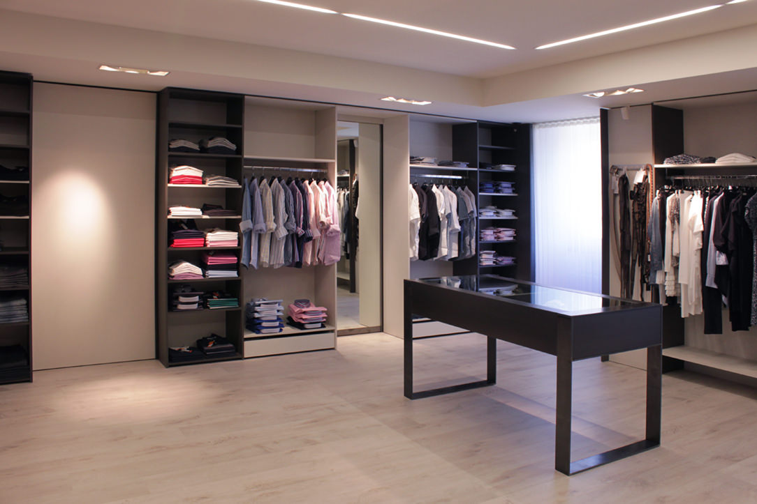
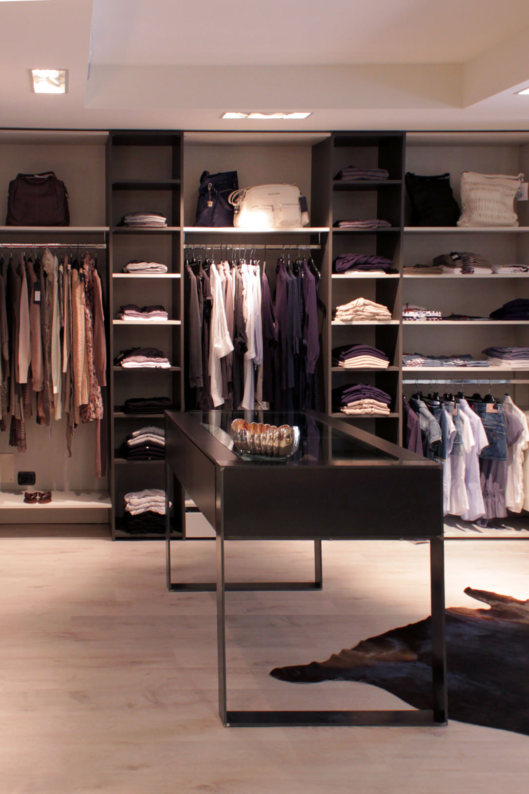
boutique made in black iron
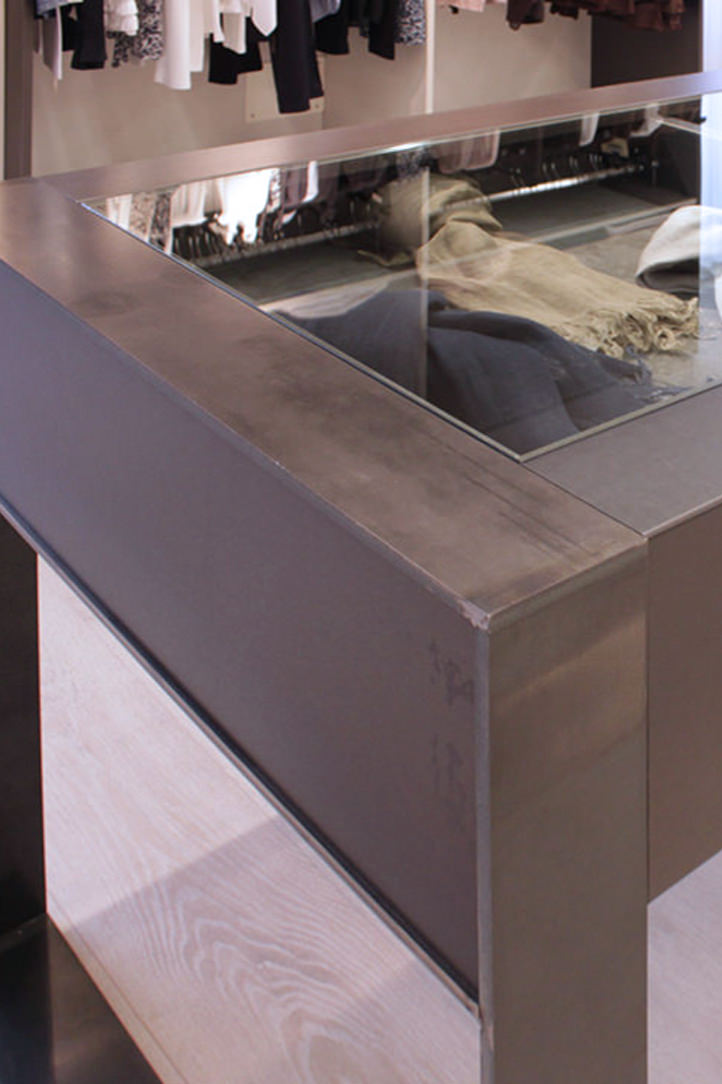
details black iron table

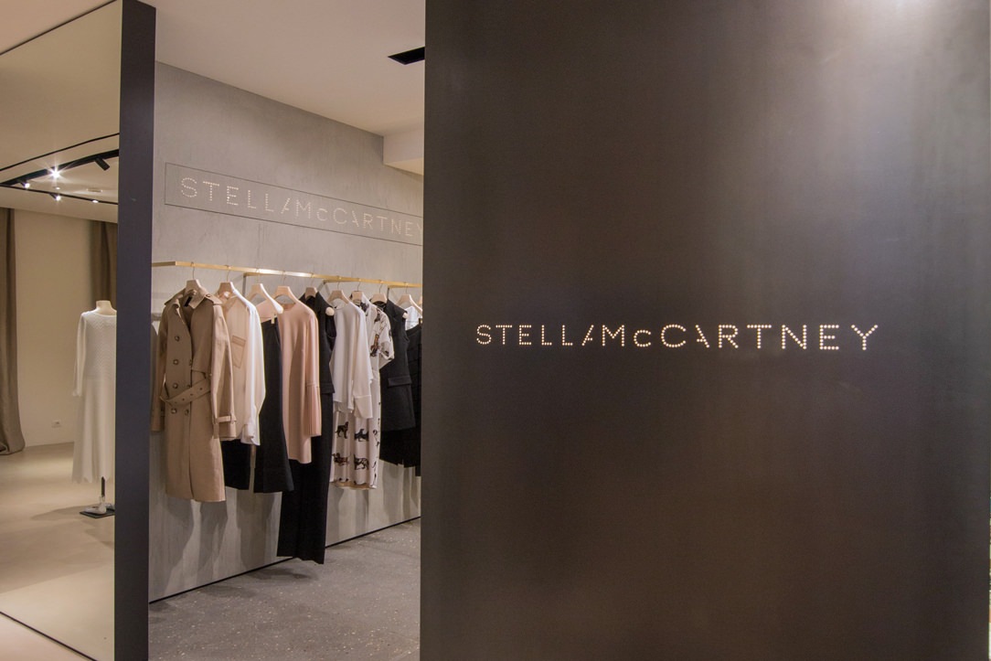
A Boutique realized where the concept Fil Rouge was precisely the combined black iron and material finishes

THE IRON IN THE STRUCTURES OF THE ELEMENTS

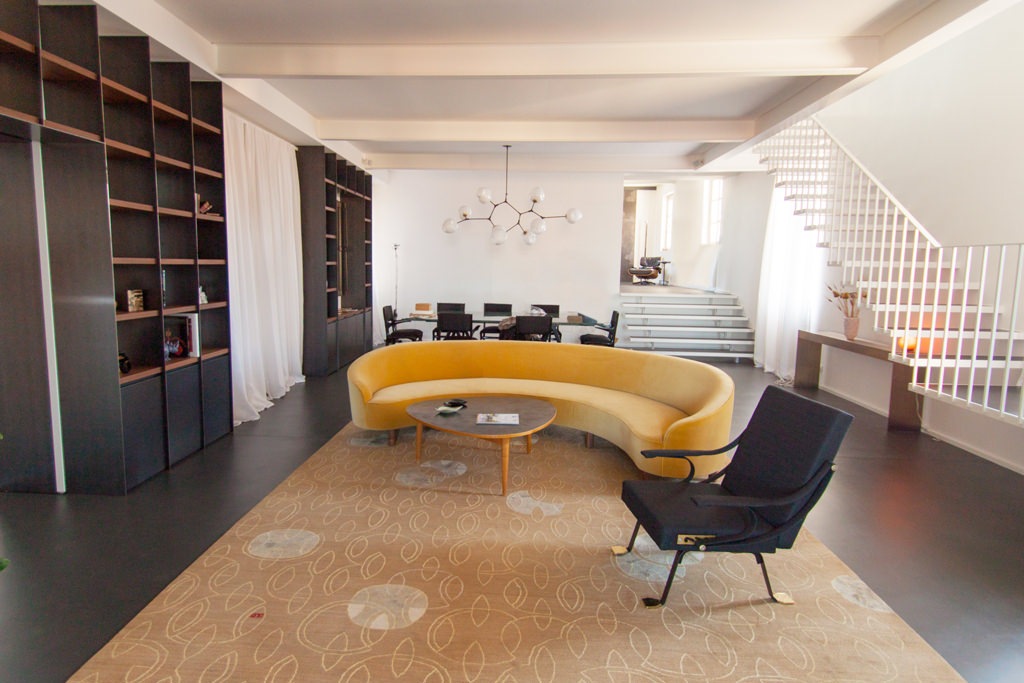
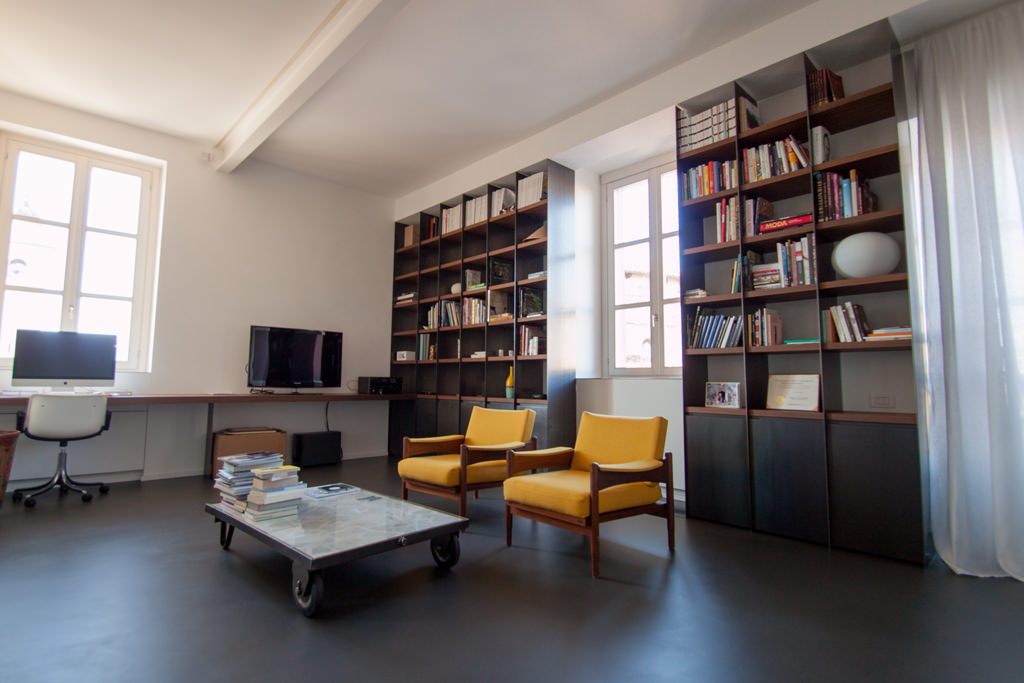
The peculiarity of polymaterial structures is that the different materials are harmoniously associated with their aesthetic and structural characteristics. In terms of resistance, what wood supports with its 2 cm, metal can do with a tenth of the thickness. This is why we like to use metals in load-bearing structures, such as the backs of bookcases or furniture. Black iron kept in its natural color can also act as a contrast with a very light lacquer or with a wood-colored essence. Below are some examples where you can see how the structure is light even if extremely dark.

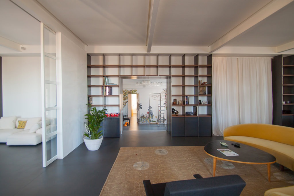
bookshelf in black iron
environment in black iron
bookshelf in black iron

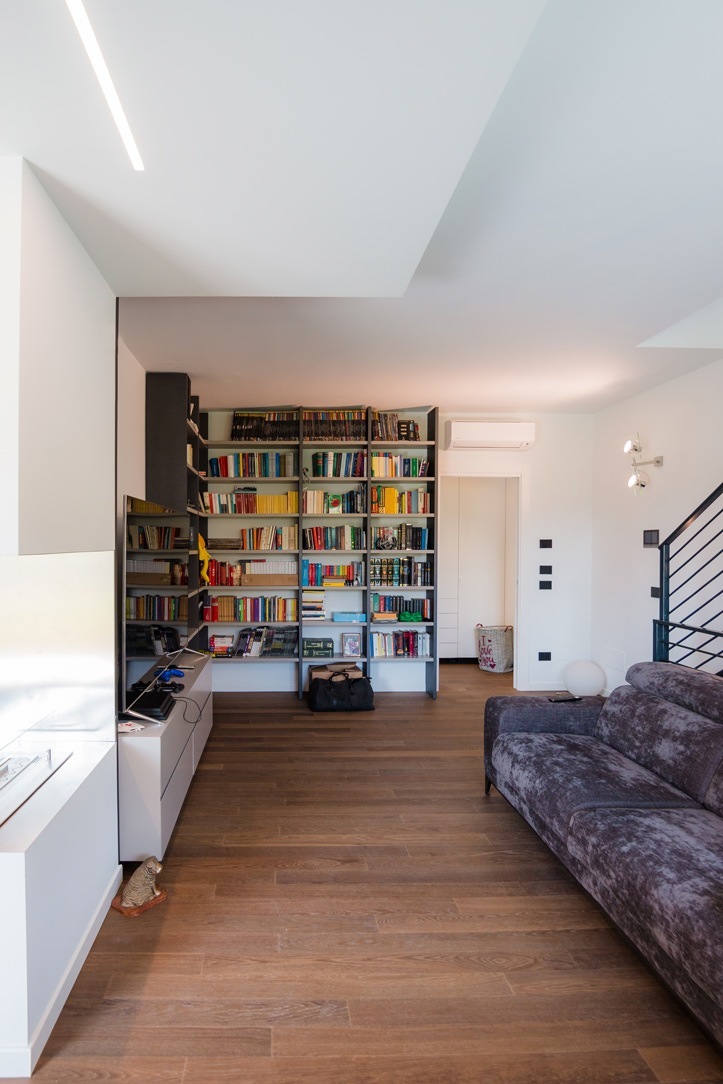
black iron bookcases populate the living area of this elegant apartment

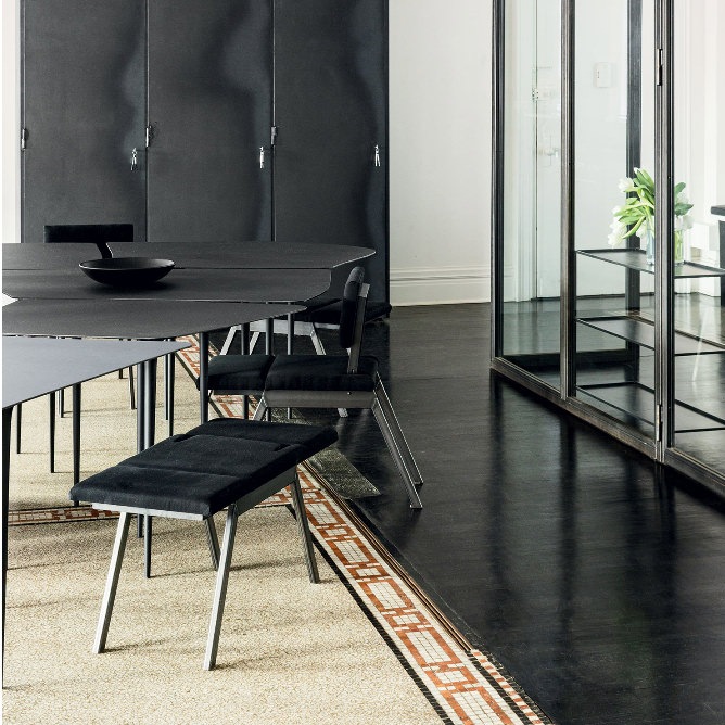
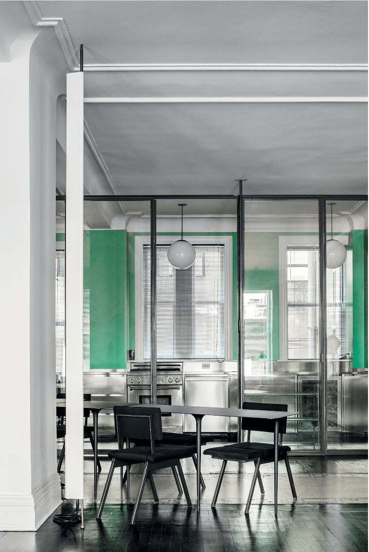
Also used for fixtures in its industrial spirit, it never abandons glass in combination with room dividers, as for the kitchen below which is separated from the living area. The shaped tops of the tables and the turned legs are also in very thin black iron sheet.

black iron fixtures and tables

partitions and tables in black iron in this Newyorkers Apartment

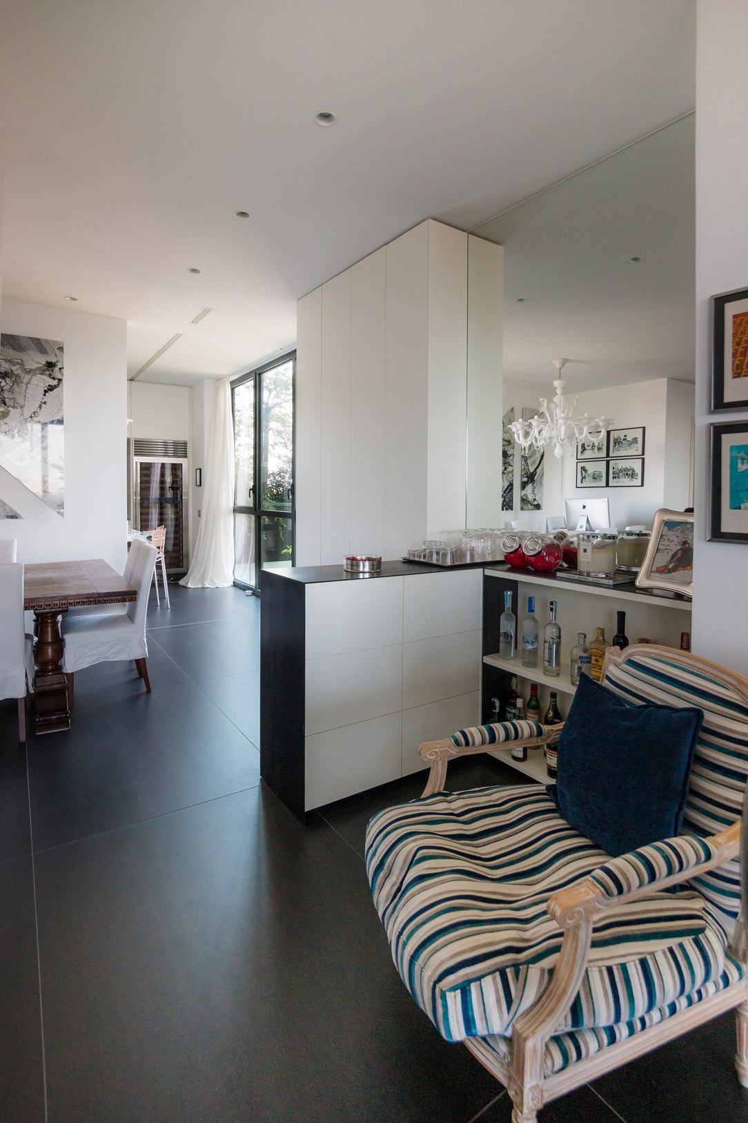
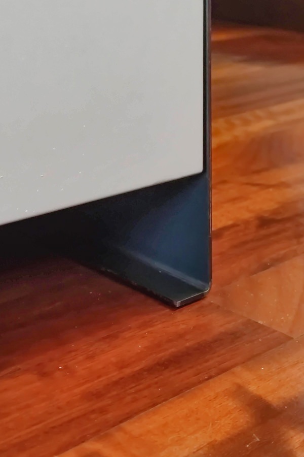
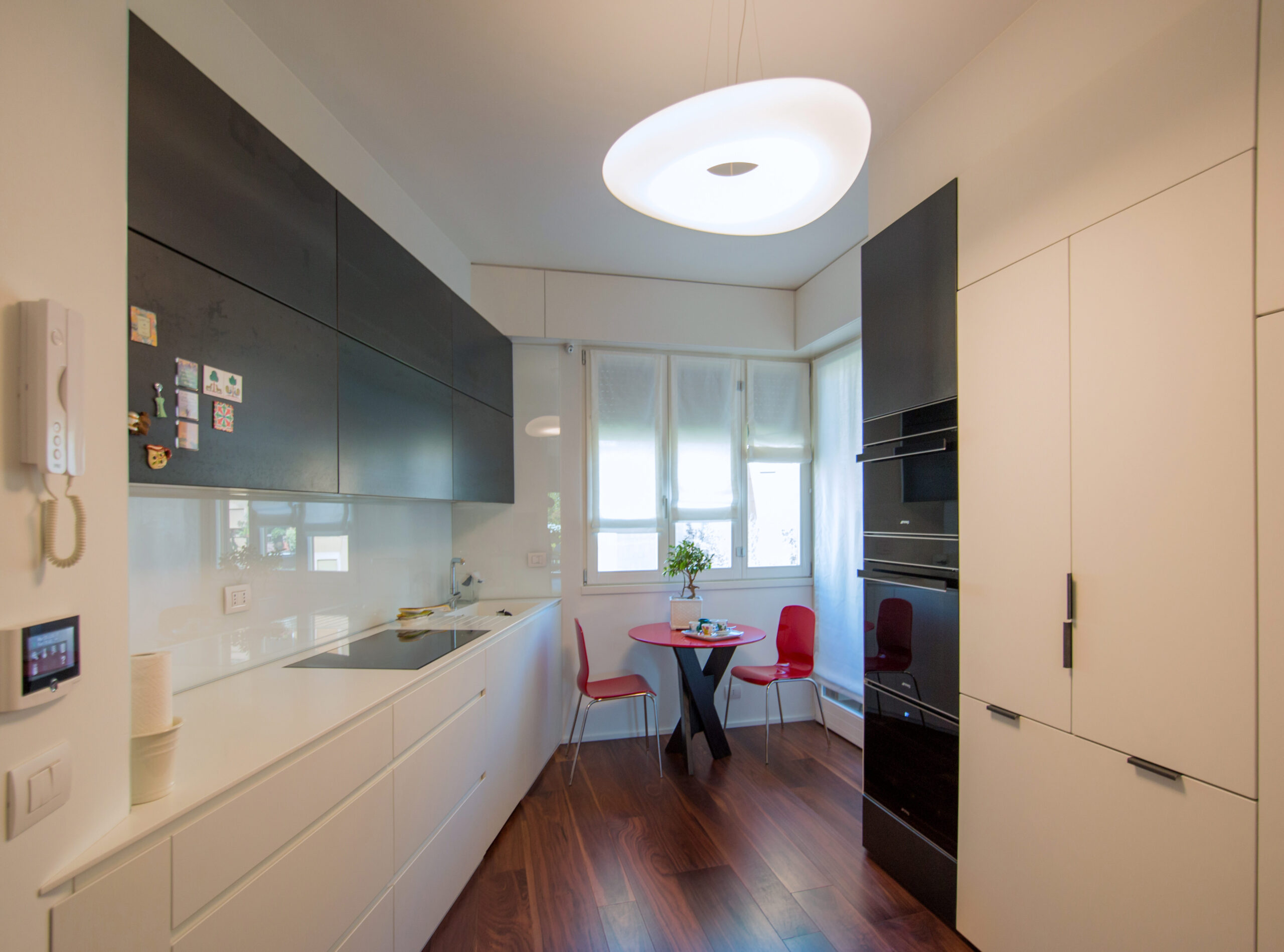
Black iron is also often used as a “lid” for furniture, a sort of thin blanket that envelops the entire element and sometimes reaches the floor, becoming a base. An example are the doors and the column of this kitchen and in the bar cabinet below, where the iron in addition to supporting it repairs the support surface, which, like all horizontal surfaces, is more subject to wear than vertical ones.

living room bookcase iron black
Iron and lacquered bar cabinet
 iron base detail
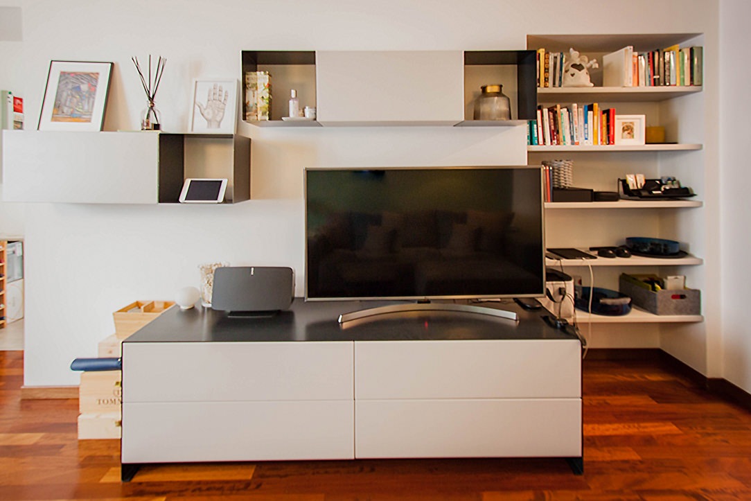
iron tv cabinet

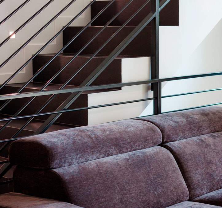
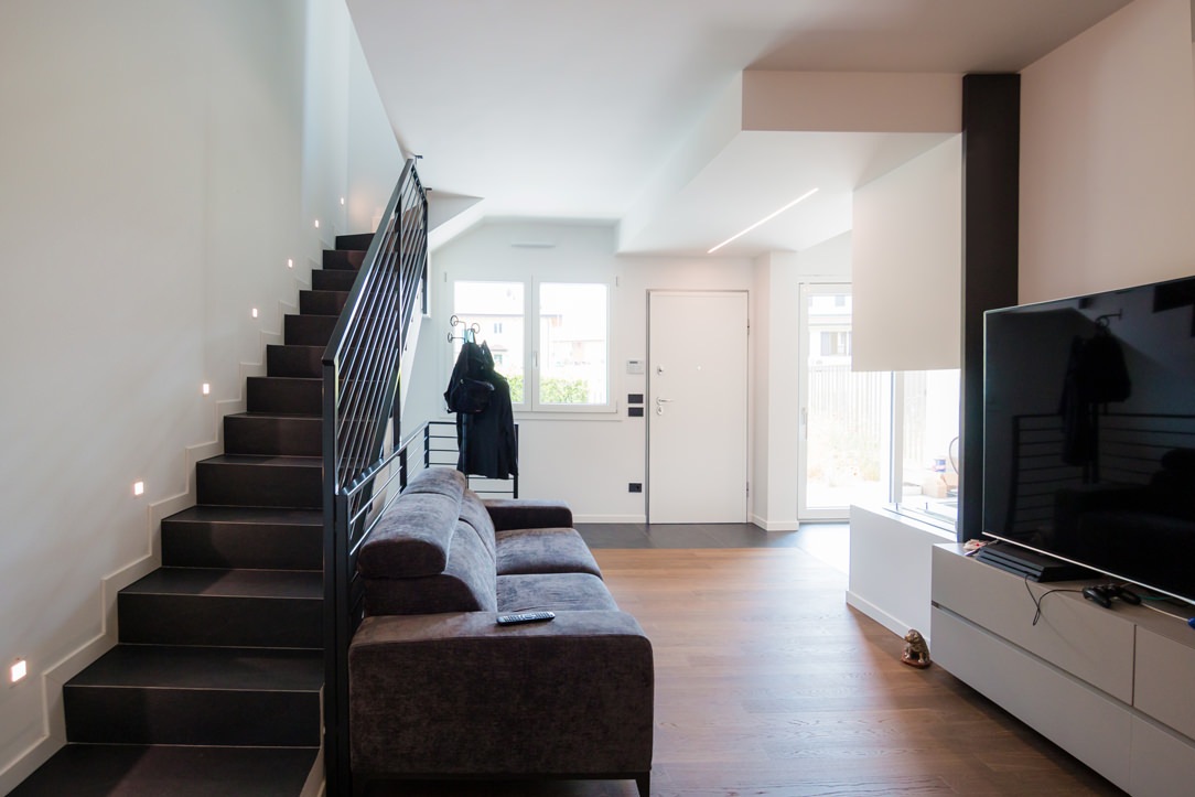
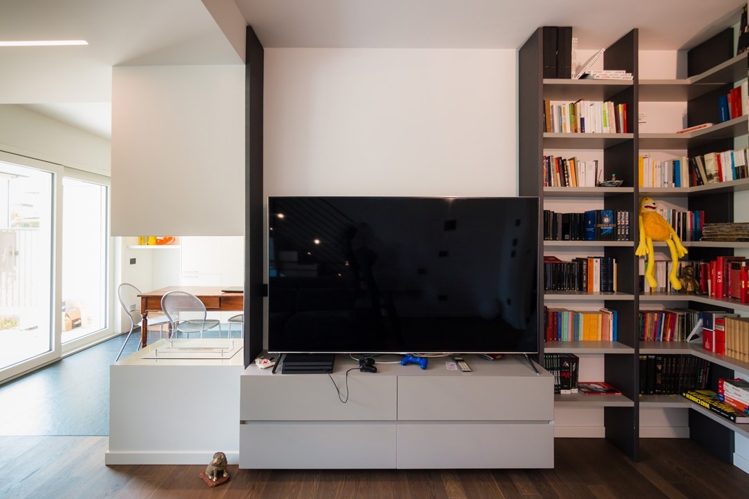
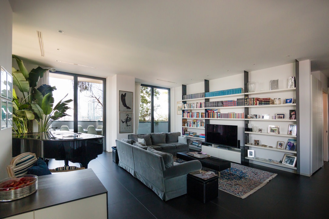
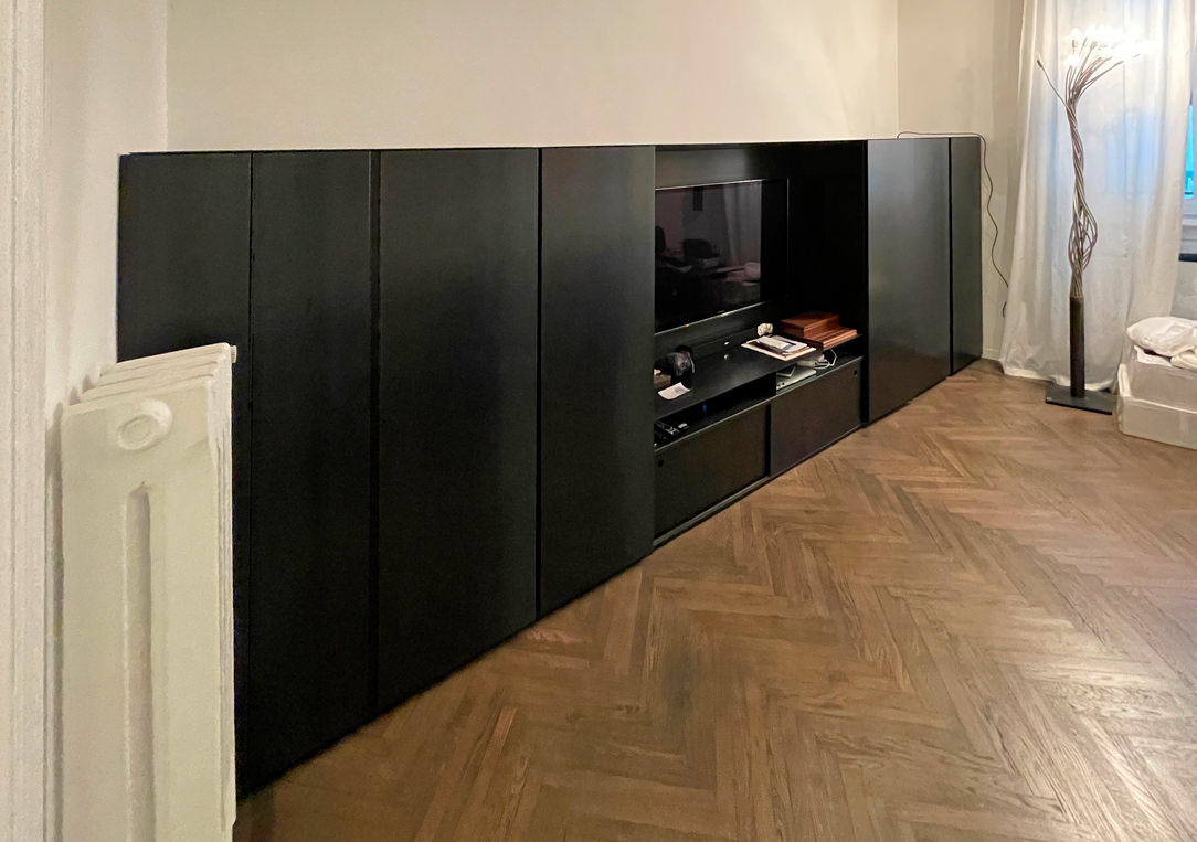
Two Apartment, one in the center of Milan and one in Bergamo, where black iron structures bookcases and the top of the TV and bar cabinets.

Here, on the other hand, it is used as a covering for the doors and the niche of an elegant Kitchen in Milan.
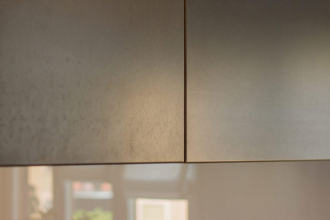
 kitchen doors covered with black iron
covered doors detail
handles in black iron

THE BLACK IRON IN THE COVERINGS

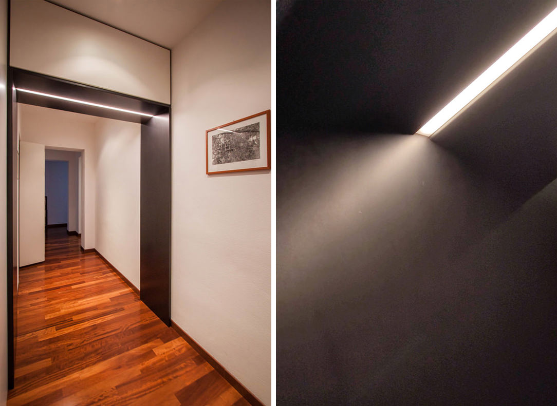
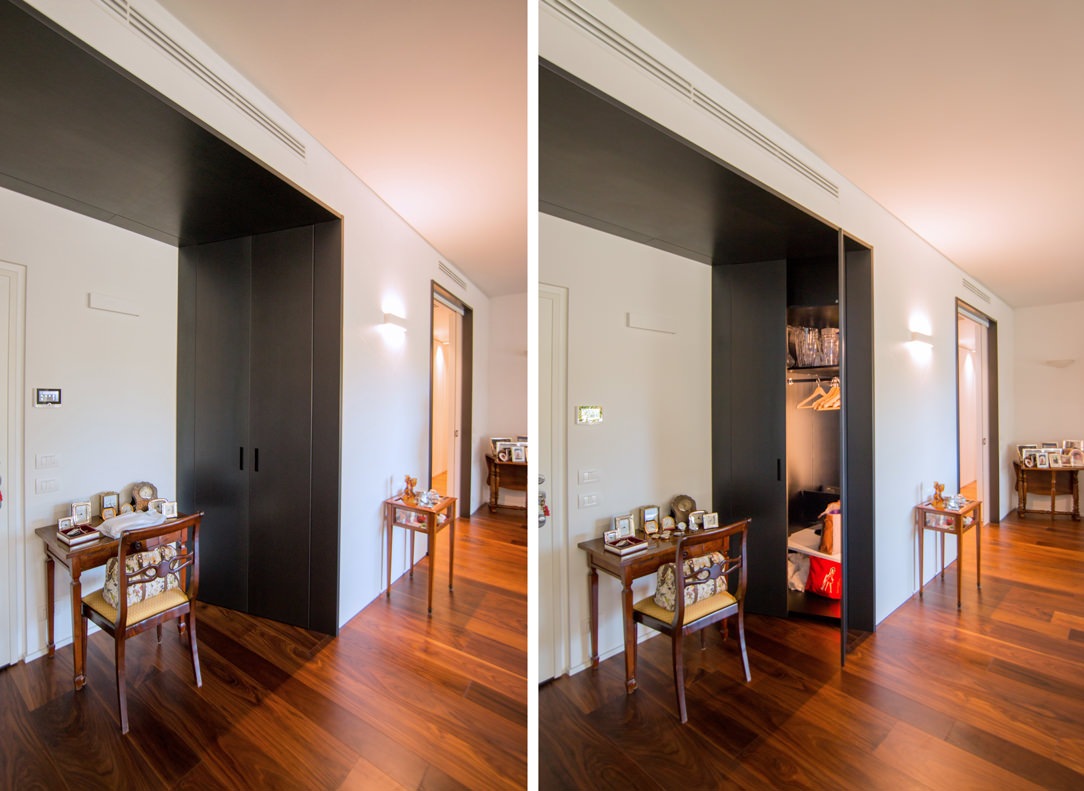
Due to its dark and irregular color, very masculine and elegant, black iron can also be used as a wall covering to create a sort of partition or portal. A portal to divide the rooms inside the house, at a symbolic level to make the user cross towards a place that will be able to express himself only when he crosses the black threshold, many times illuminated from above or sideways with LED strips. Here are some examples of portals, some inserted only in the doorway and others much more structured, with also an equipped part in which to hide some furniture at the service of the house.
lighted portals
equipped portal

Portals that act as partitions and equipped portals

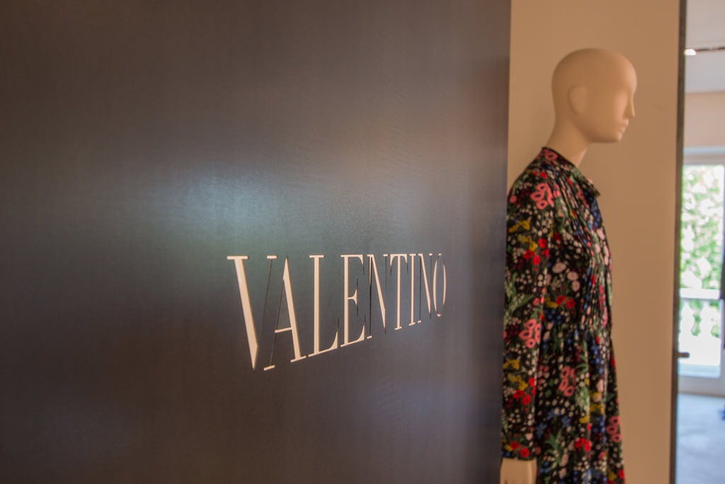
Branding paneling, on the other hand, is very common in the Retail sector, for example the corners of the Tiziana Fausti shop, in which the black iron panels visible from the central space have externally the laser engraved logo of the Brand which is located inside the box used for it.

brand logo in iron
external panel black iron

Laser cutted Brand’s logo on black iron partitionsin the Tiziana Fausti shop in Bergamo

ALL BLACK

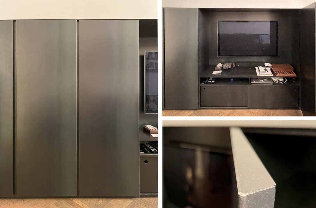
Having a furniture completely made of black iron is not only possible, but sometimes it is the right choice for certain types of environments and goes well with the rest of the furniture. Here is our realization of a niche furniture in which doors and structure, both external and internal, are covered or structured in black iron.

iron covered furniture
details black iron furniture

Here is also another example of a black iron structure with desks and tables in the same material made by Locatelli & Partners inside a church, their old operational headquarters. The contrast of the cold and dark material inserted in a context that does not belong to it, as in this case a Baroque church with warm tones and completely frescoed walls enhances the material and turns out to be a harmonious union.

THE BLACK IRON IN THE DETAILS

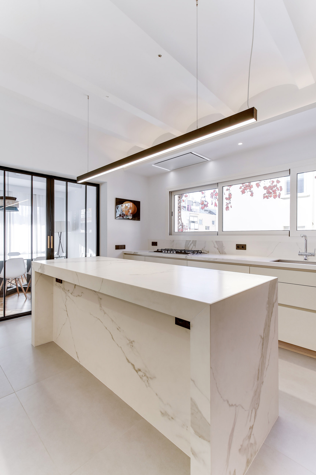
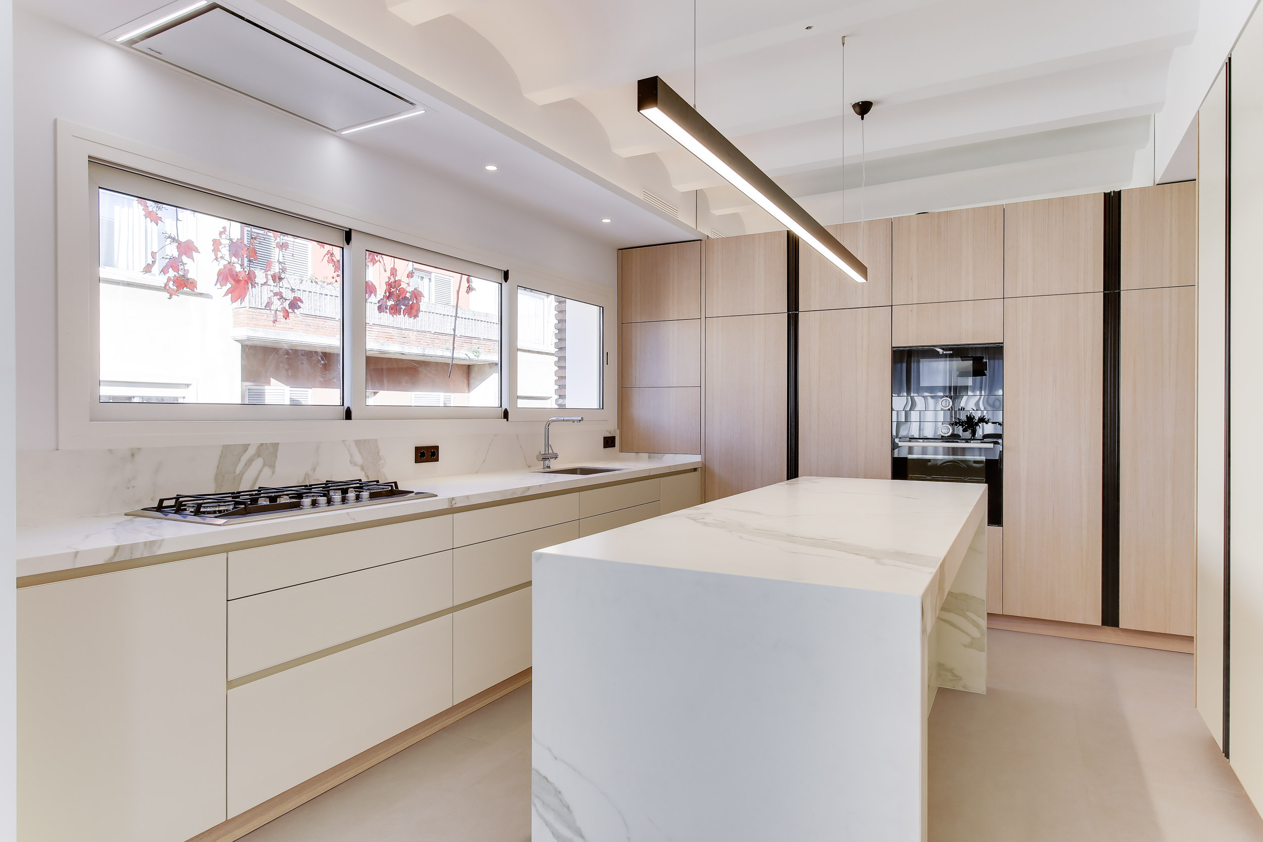
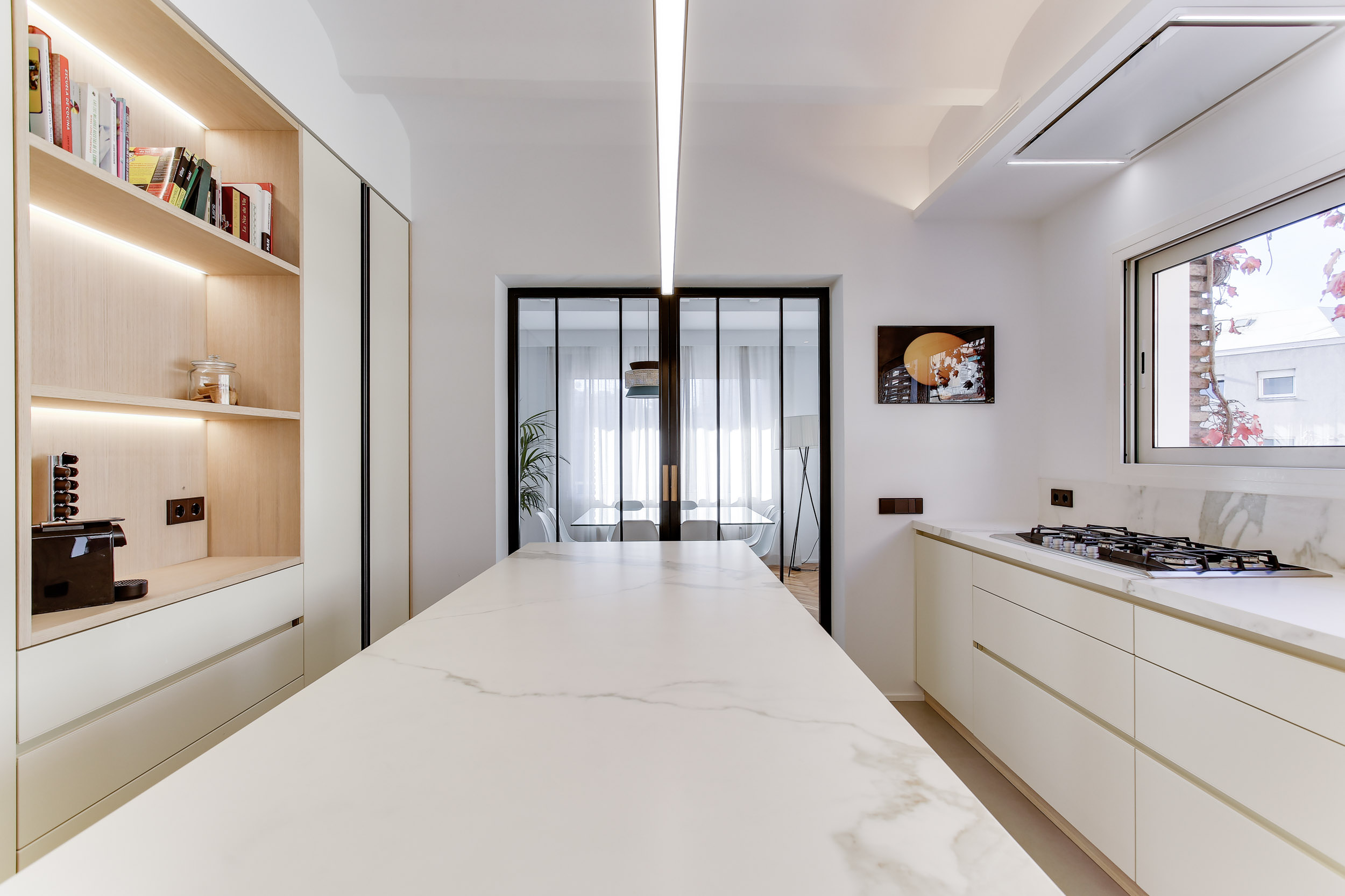
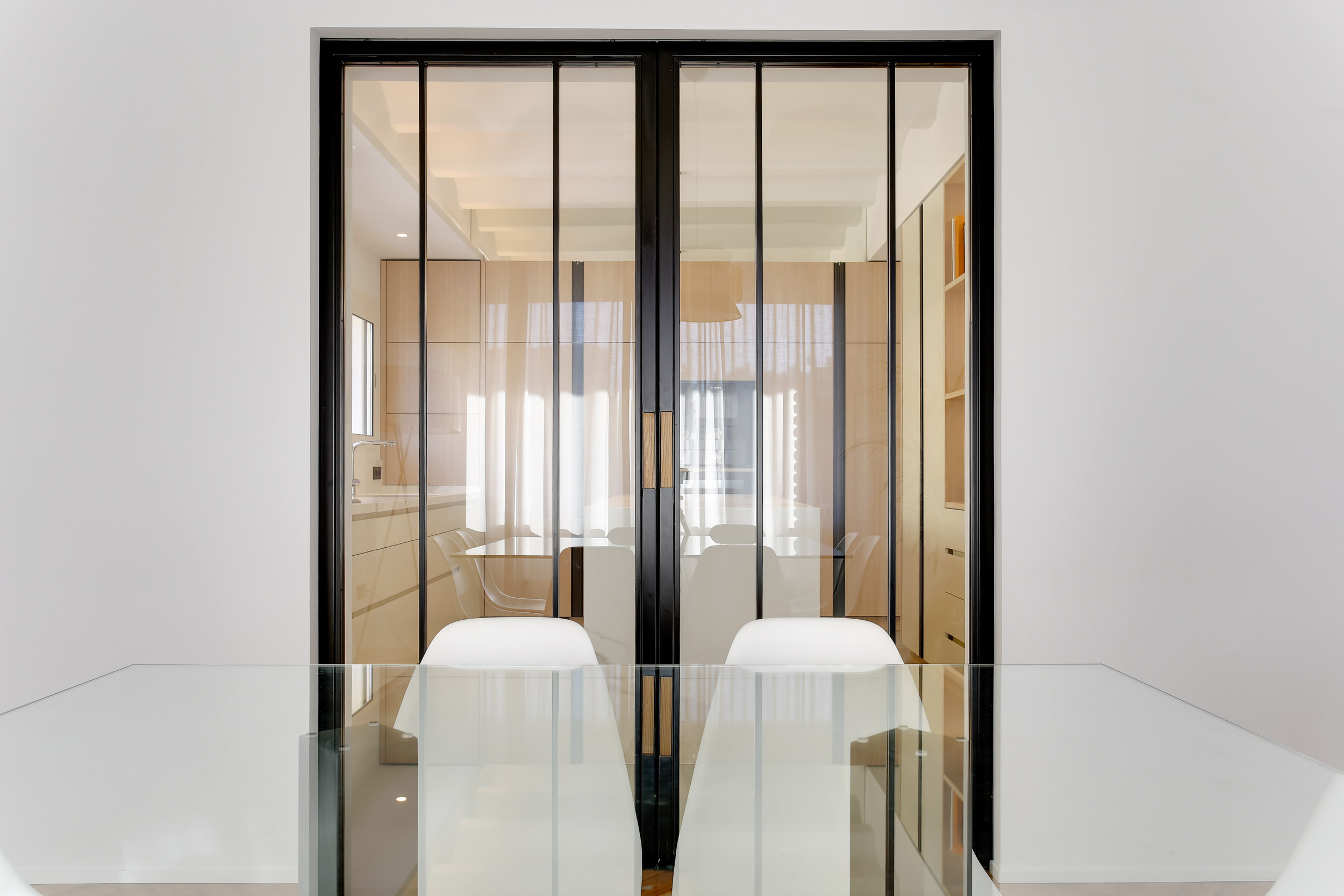
Black iron can also be found in small details and accessories, such as handles and frames. They turn out to be a touch of color and a detachment of fundamental material for some very clear and bright environments. The detail gives an extra touch of elegance to the environment and characterizes it, an example are these full-height handles that reflect the frame of the glass partition of this splendid kitchen made in Barcelona.

kitchen Barcellona black iron details
black iron handel
black iron kitchen details

MATERIAL FINISHES

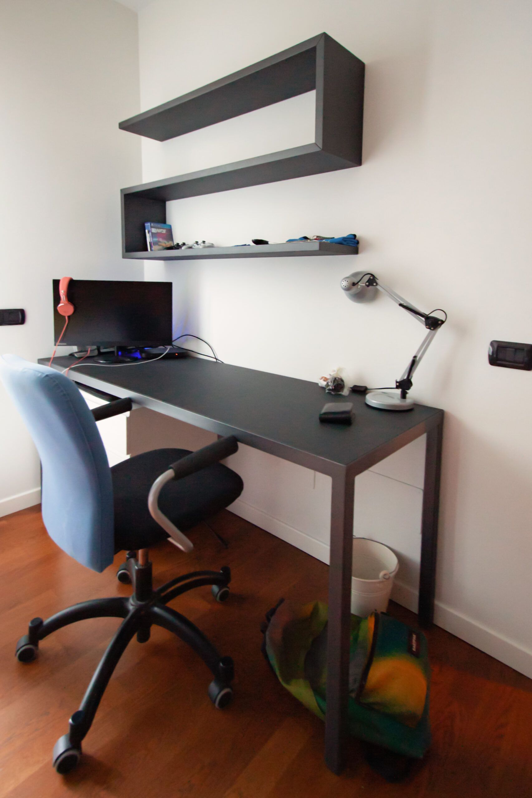
We have previously said that the surfaces of raw materials can be non-uniform and have defects such as scratches or changes in tone in the plate. Excellent for industrial-style interiors, black iron was in fact very common in production workshops at the height of the industrial revolution, sometimes even rusty and together with oxidized brass, ceramics, knotty solid wood and antiqued glass it became the symbol of those years. This raw effect of raw materials has become a trend of companies and design and architecture studios and in recent years it is in great demand. Precisely for this reason, numerous products have been created that reproduce the textures inspired by the essences of wood, black iron or natural stones for exclusive wall coverings or home furniture. The important thing about these finishes in addition to the visual aspect are the tactile emotions capable of arousing thanks to rough and often irregular surfaces, which together are called material finishes. Together with black iron, an anthracite-colored textured paint can give a hint of color and roughness to other elements in which iron is not present but which are in the same environment. An example are these shaped shelves associated with a black iron desk with a Linoleum desktop in the same shade of gray in the center of the top.

desk and shelves
bookshelf in dark gray

THE BLACK IRON IN THE PROJECTS

After all these examples we can only break a lance in favor of raw black iron, like a dark dress that is always in fashion its use, which is both bold and bold or minimized in small details in home furnishings makes it alive, vintage and fascinating at the same time.

THE FURNISHING OF A TAVERN IN A CONTEMPORARY STYLE

THE FURNISHING OF A TAVERN IN A CONTEMPORARY STYLE

The interior design of the taverns with the passage of time requires small retouchers to return to their original beauty and allow the owners to rediscover that desire to fully living the space. Here the case of a tavern adapted in a contemporary style.

Modern wooden table tavern

THE TAVERN

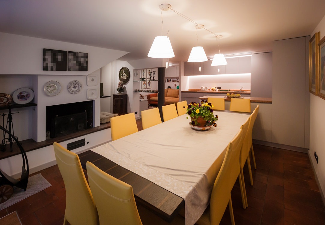
The tavern is a home environment that risks not to being exploited to the fullest, especially if it is used as a second living area. However, what makes it different from the traditional living area is an intrinsic intimacy that makes it the most welcoming place in the whole house. How many people immediately think of the tavern when they have to organize a dinner with friends? Or when they want to enjoy a bit of tranquility, how many of them are isolating themselves in the company of a good book in their relaxing corner? Precisely for this reason the tavern can be elected as the most convivial and intimate place in the house, although its furniture must always be functional and in line with the other environments.

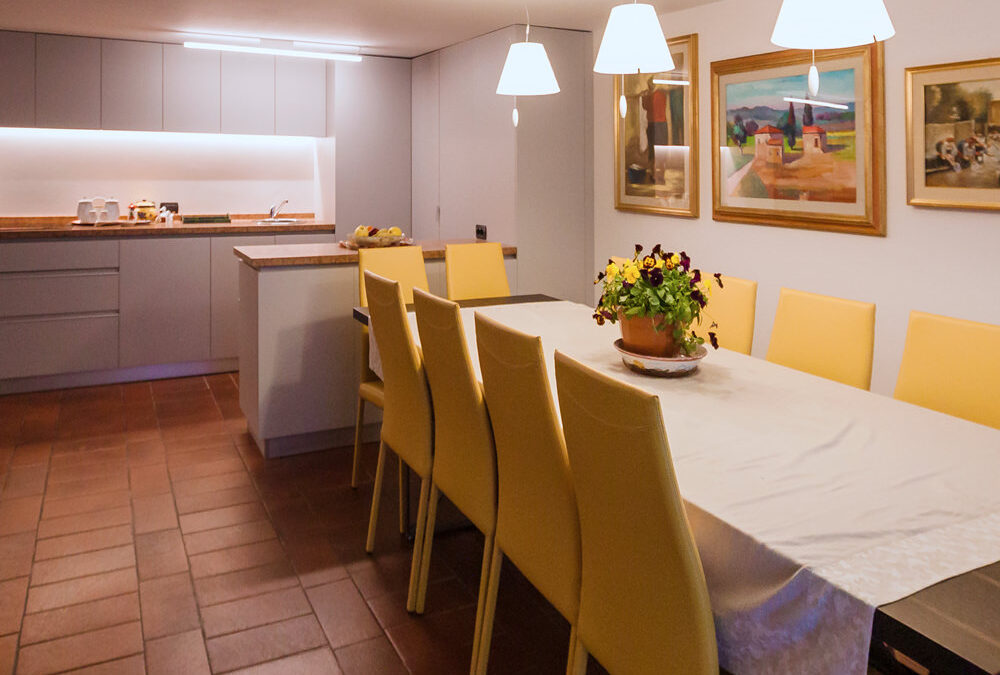
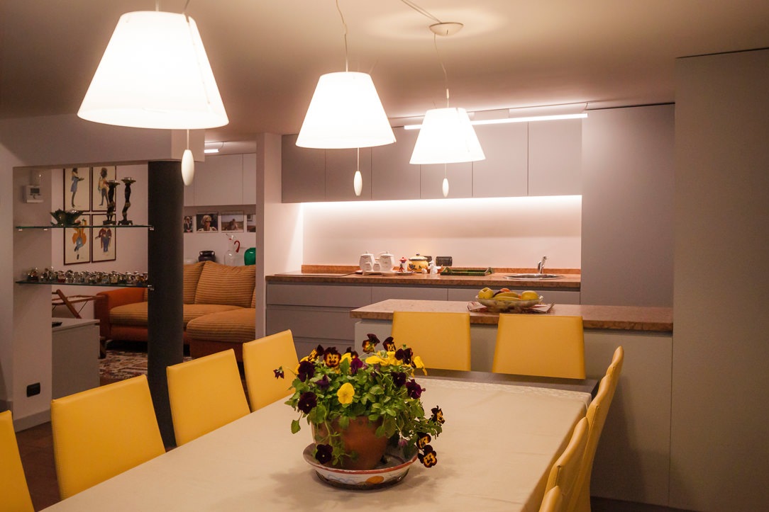
Kitchen tavern table lights

the living area connects to the kitchen, an equipped floor divides them.

FIREPLACE

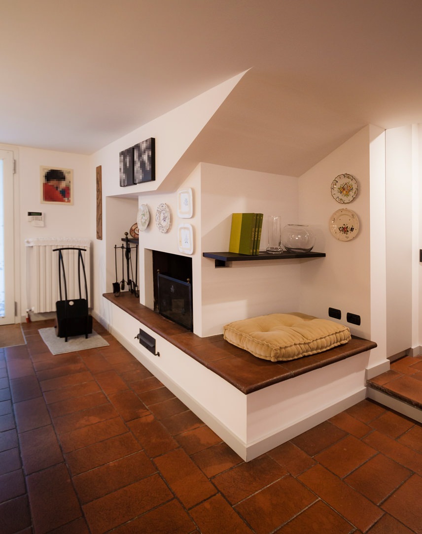
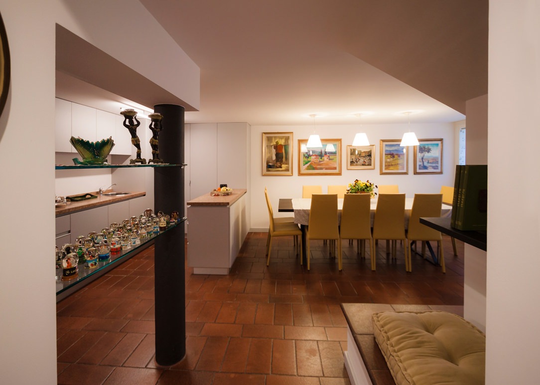
As already mentioned in the article dedicated to Hygge, a fireplace or a wood stove are elements that can best convey warmth and intimacy; usually the fulcrum of the environment in which they are located are the perfect places to spend time chatting with loved ones and a hot tea or a good glass of wine in your hands. In the case of this renovated tavern in a contemporary style, a large fireplace becomes the focal point of the entire living area. It also acts as a connecting element between the living area of the apartment, located on the ground floor, and the exit to the courtyard. The terracotta floor take up the choice of keeps the materials of the rest of the house. This also covers the raised base, becoming both a seat and a support surface according to the different depths. A large cushion makes it even more comfortable to use, welcoming a comfortable reading corner.

fireplace e higgelig

THE DINING AREA

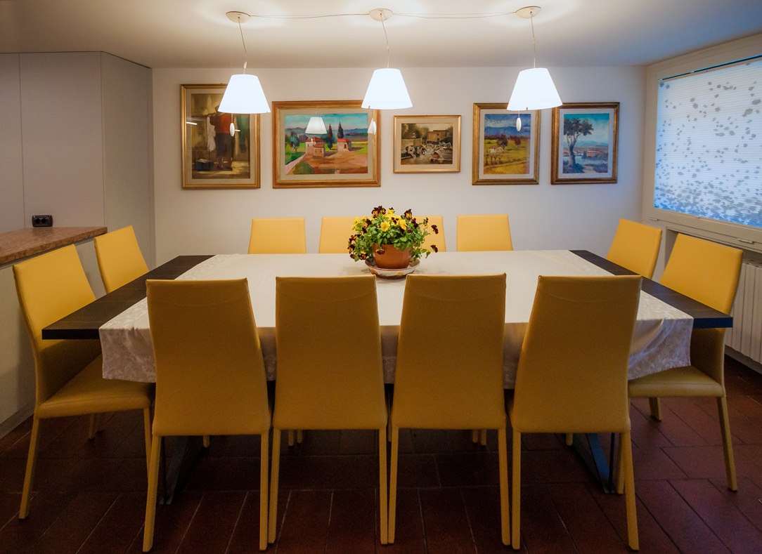
In front of the fireplace there is a large heat-treated oak table with warm veins and a simple and linear aesthetic structure (which we also find in this creation), with a light base in anthracite painted iron. Surrounded by lovely mustard-colored armchairs, it is able to liven up the environment and ready to accommodate up to 12 diners. To emphasize the warmth and intimacy of this environment, three pendant lamps mark a visual rhythm with their diffused and soft light. The new lampshade in a pure opal white amplifies the general brightness of the environment.

table lights in the living area
detail of the armchairs
drapery detail

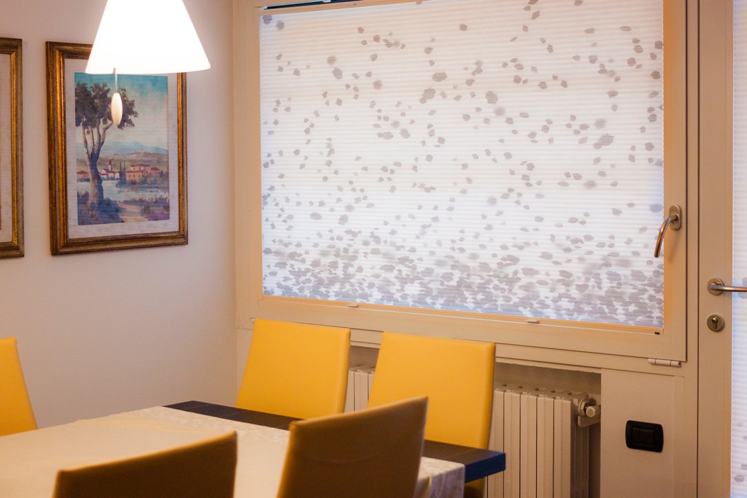
Details of the mustard eco-leather armchairs and double venetian blinds with gray “drop” decoration downwards.

THE KITCHEN

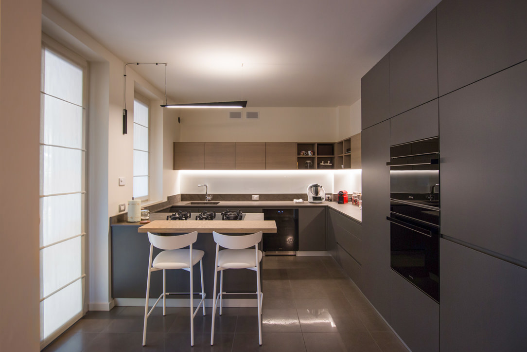
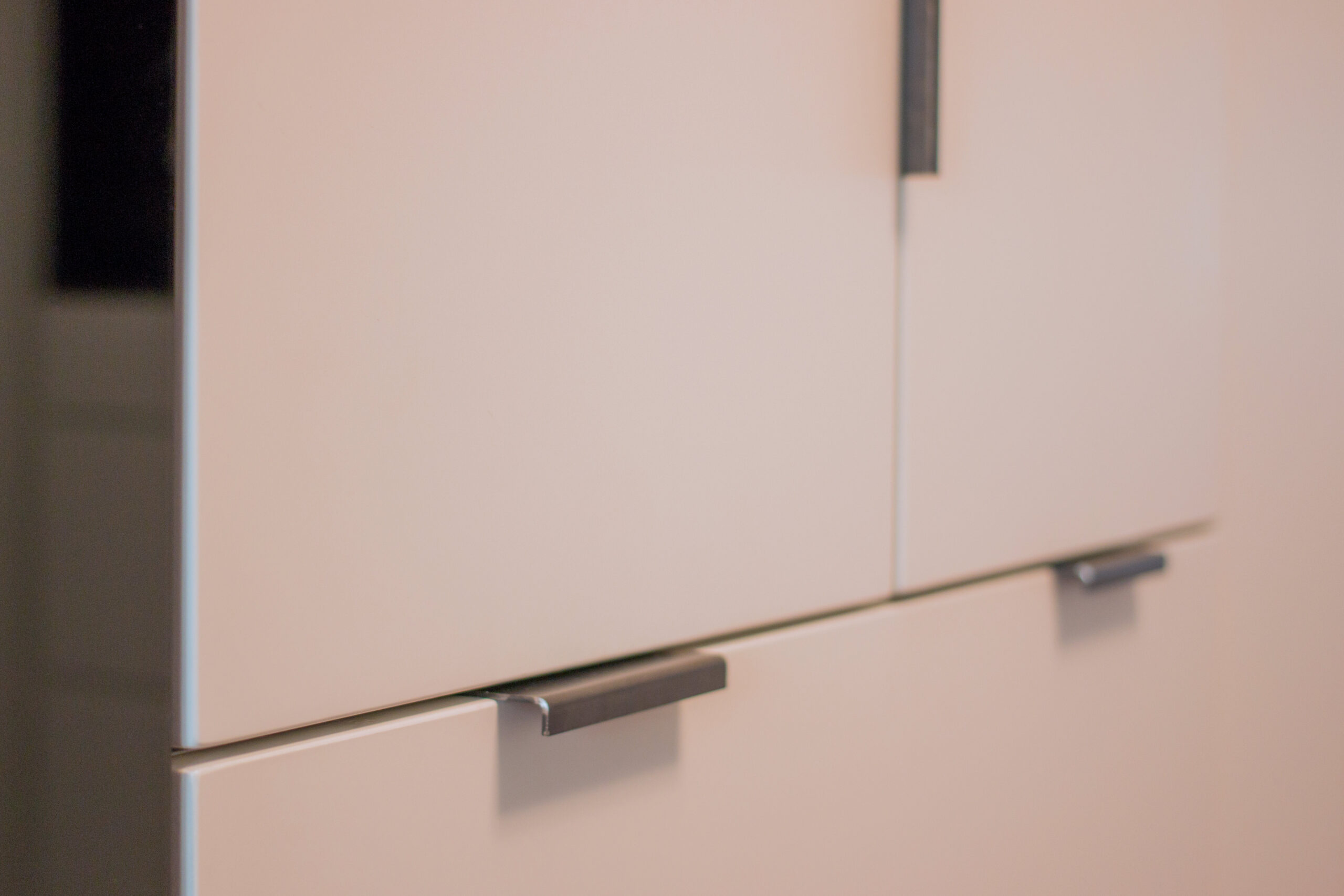
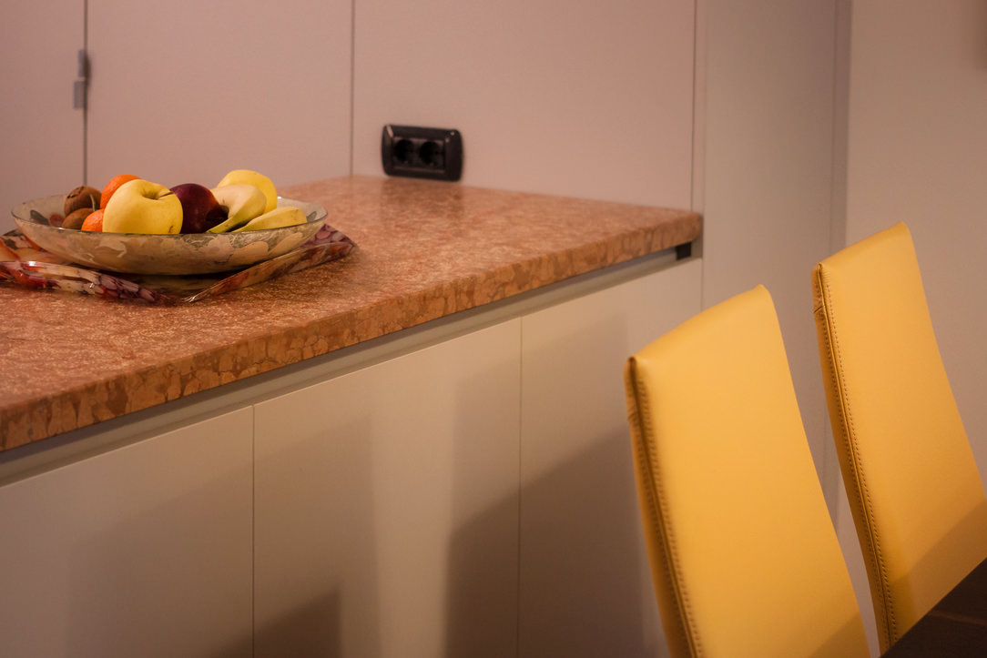
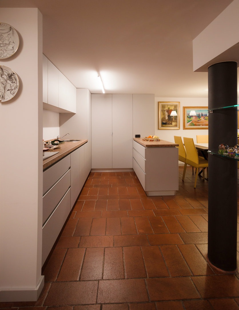
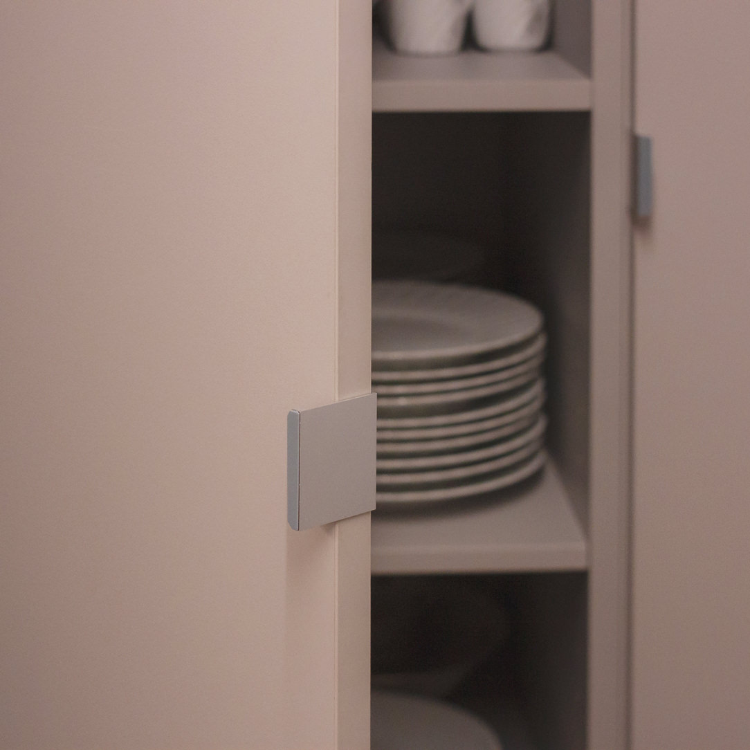
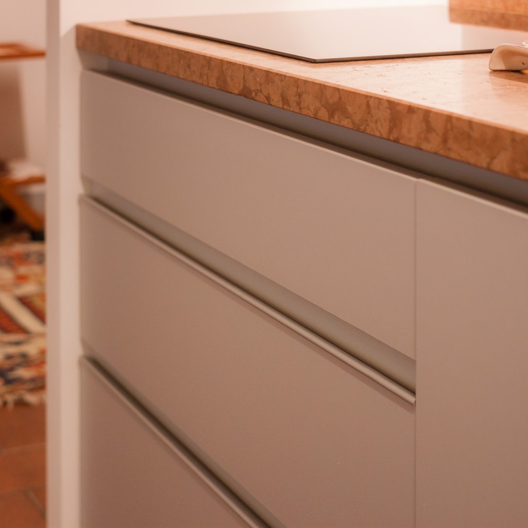
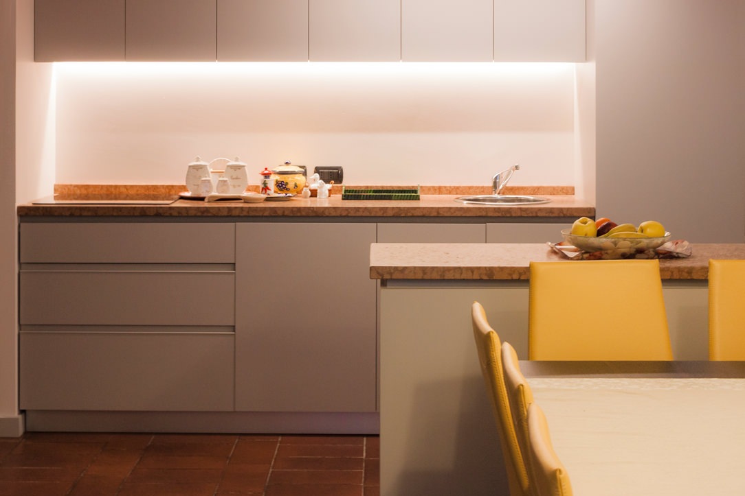
The kitchen changes position compared to the original plan and is an extension of the living area, facing the dining table with an equipped worktop, which can also act as a support surface. The floors, recovered from the originals in Rosso Verona marble, very distinctive and decisive, blend well with the terracotta floor. To stand out and at the same time make the marble more sober and elegant, the furnishings of the entire kitchen, as well as that of the entire tavern, are in a light gray with cold tones. The handles are invisible for the wall units, shaped to measure for the tall unit in the center while, as regards the base of the wall units, reinforced with an aluminum profile matching the color of the lacquering.

lateral kitchen
handles details
handles details
kitchen snack

The kitchen with its colors and the details of the different handles.

THE RELAXATION LIVING ROOM

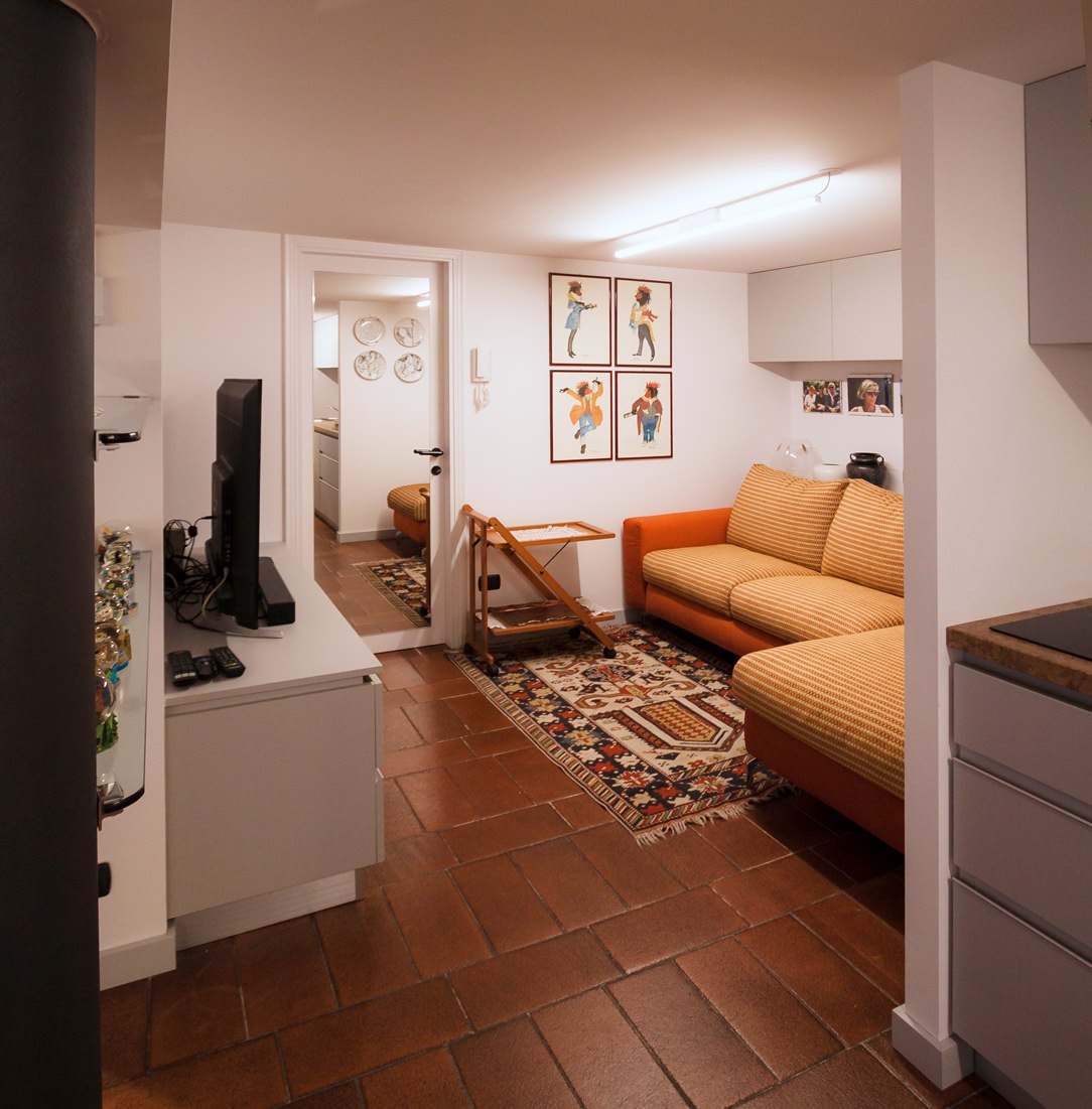
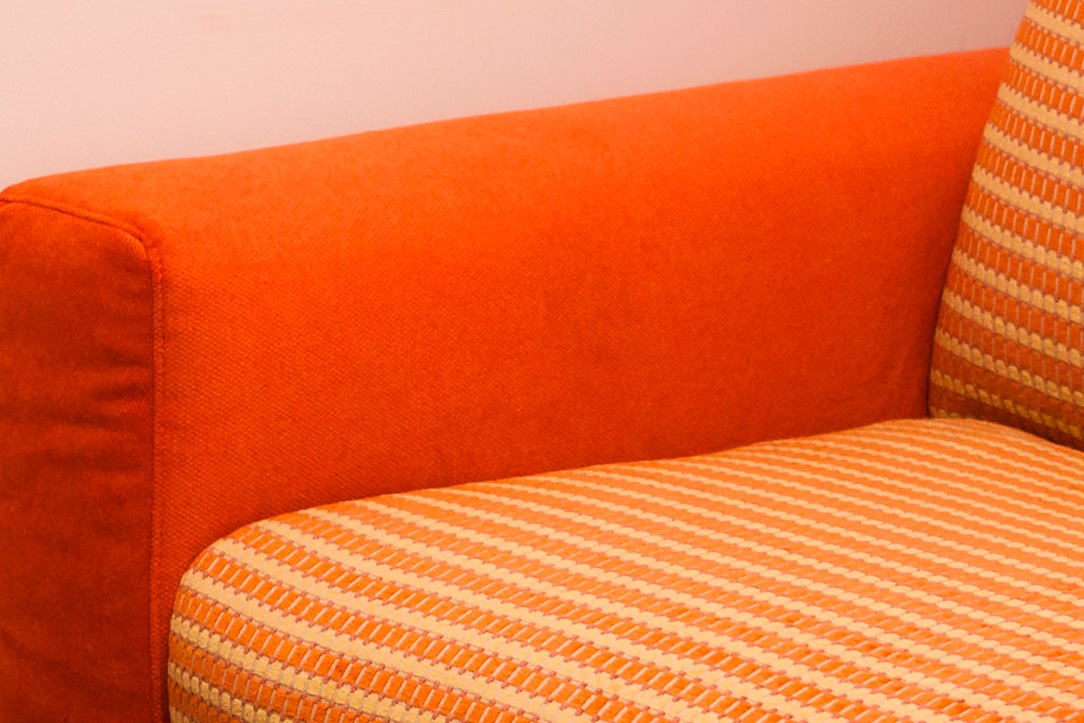
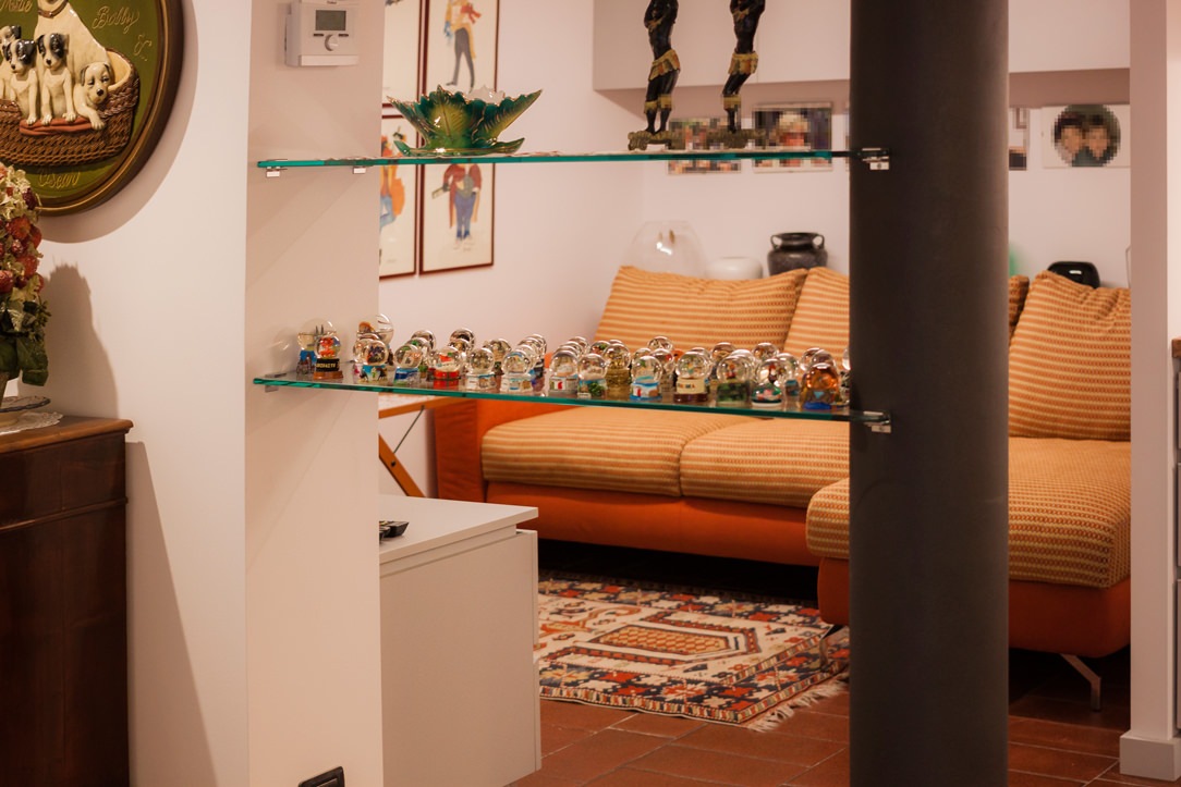
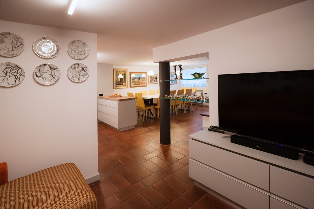
In the same finish as the kitchen, to maintain stylistic continuity, the TV cabinet in the relaxation lounge has also been lacquered, which is positioned in the most intimate and hidden part of the tavern. Reupholstered with a bright orange fabric, the sofa features cushions and backrests with refined pandance textures. The living room can be glimpsed at the entrance to the tavern, on the left, through glass shelves that cross the space to arrive, shaped, at the supporting column, painted anthracite like the legs of the dining table.

living room relax
textile details
zona relax
tv cabinet

THE FURNISHINGS OF THE TAVERN AT THE CONCLUSION

Furnishing the tavern means knowing how to convey sensations such as the sense of warmth, well-being and intimacy. It is important to develop the main elements in stylistic harmony with each other and in line with the rest of the apartment. If a tavern is dated and is left as such for too long, it risks losing its charm and becoming a second home cellar, in which stored unused objects.

tavern entrance

A wooden bedroom with warm natural tonalities. Functional passages and connected rooms.

A wooden bedroom with warm natural tonalities. Functional passages and connected rooms.

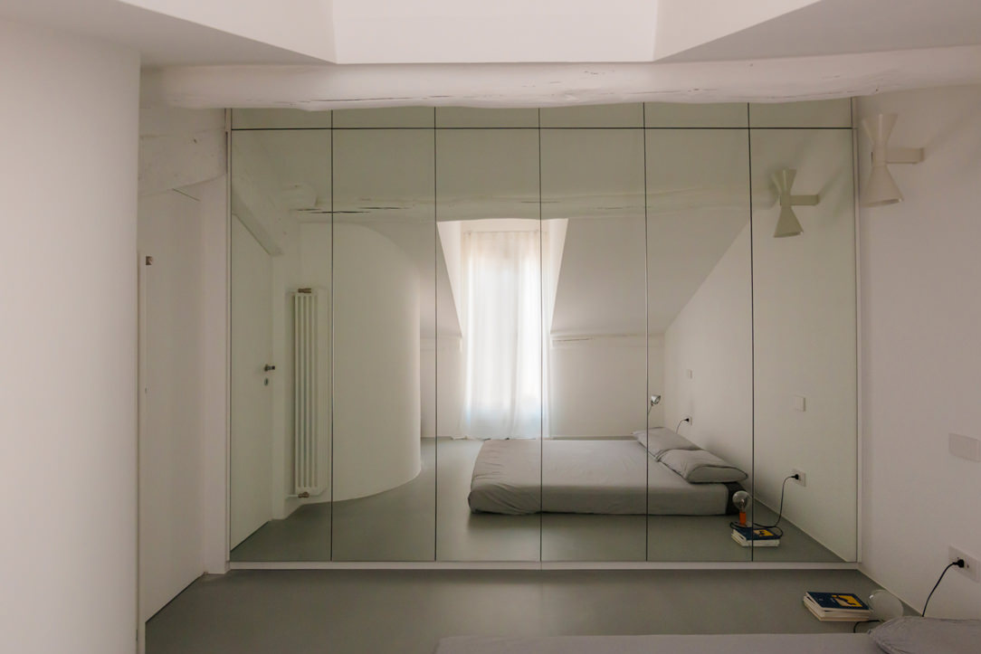
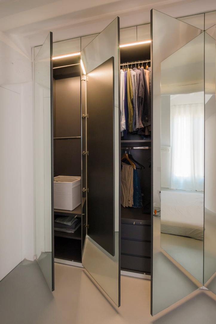
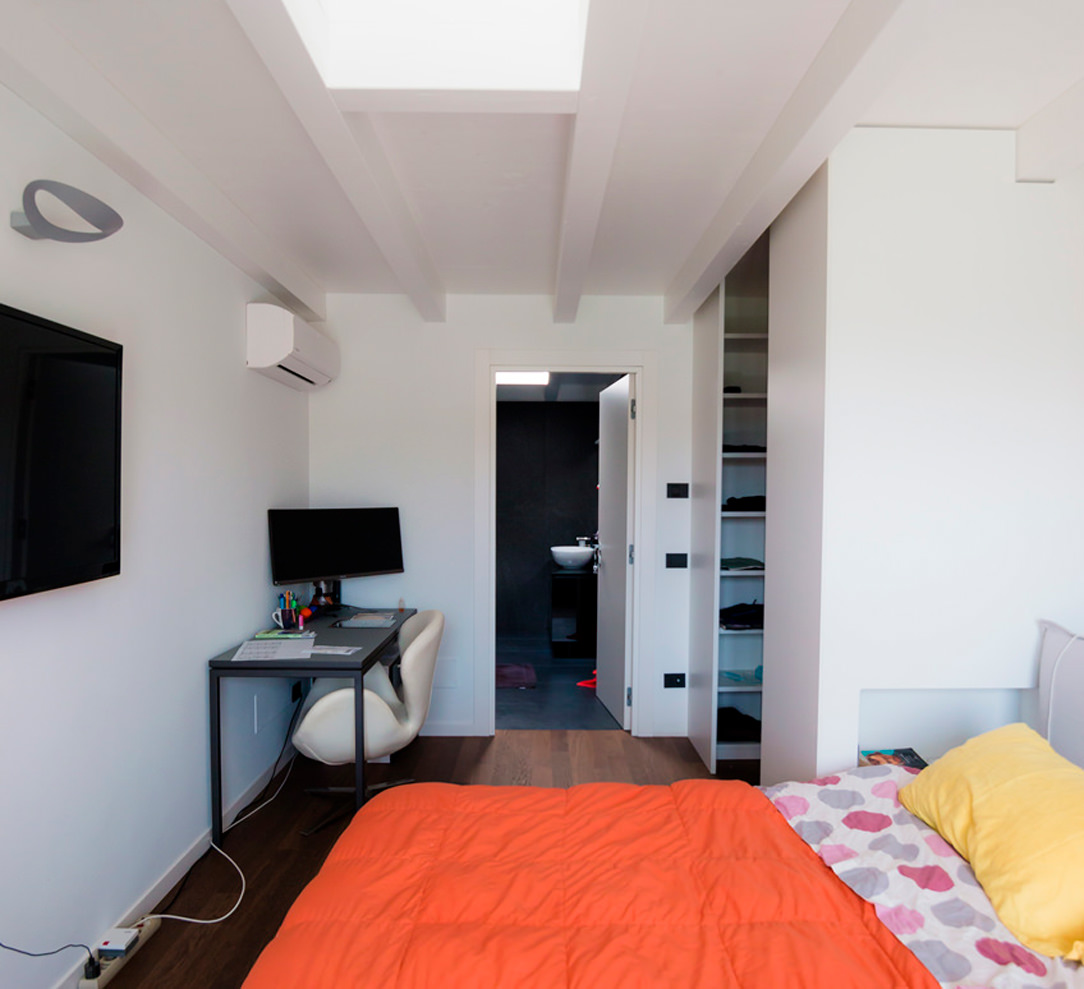
A large wooden room in natural tones picks up on the architectural elements of the attic sleeping area, also housing a walk-in wardrobe in the back structure. Adjacent to the bedroom, a textured glass sliding door leads to the large master bathroom, which also communicates with the study.

Curnis animation walk-in wardrobe door openings

The wooden master bedroom with a cosy atmosphere

The architectural context of this sleeping area responds to a well-defined character. On the floor is a parquet floor with a rustic look, with marked knots and grains and a light polish that emphasises its softness. The ceiling, on the other hand, is enriched by wooden beams in warm amber tones with a central ridge. On the sides, elegant draperies embrace the window with large windows, filtering natural light in favour of an intimate and cosy ambience.

A combination of rustic and elegant elements, also echoed in the choice of the wrought iron bed frame, which is matched by important golden velvets. Picking up on the material choice of the architectural envelope, the structure behind the bed conceals the bilateral access to the walk-in wardrobe.

In fact, the doors and covering panels of the structure are concealed by a geometric composition that marks the visual rhythm of the wall.
In the centre of this is an open compartment with an ochre lacobel bottom and base which, illuminated by a recessed LED strip in the upper part, is enriched with a golden hue.

dettaglio vano giorno lacobel ocra illuminazione LED superiore velluti letto
camera da letto in legno vista frontale retroletto attrezzato cabina armadio vista laterale destra
camera da- etto in legno vista frontale retroletto attrezzato cabina armadio vista laterale sinistra

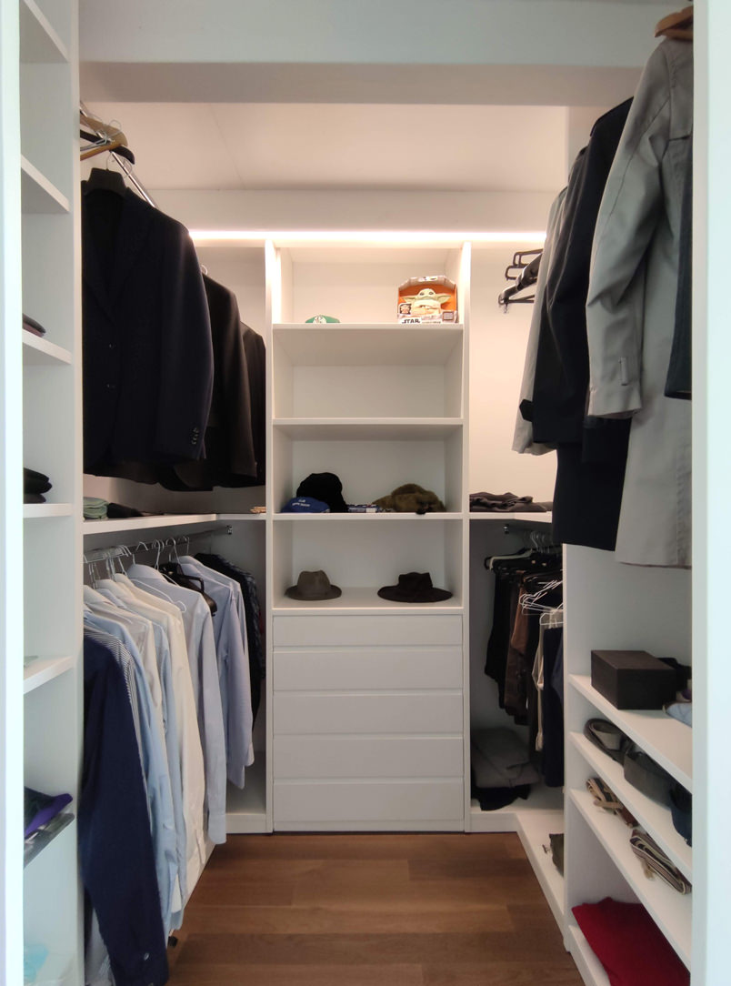
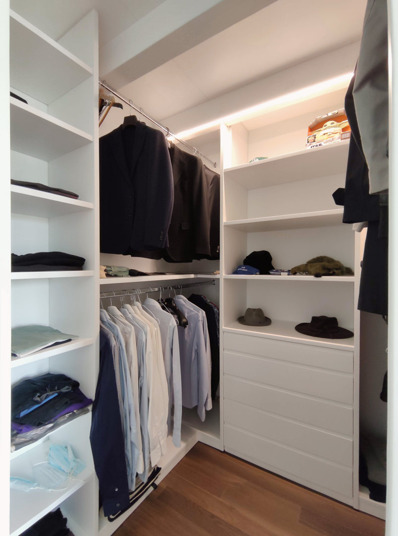
A walk-in wardrobe created in the space behind the bed

In order to optimise space, having a large double bedroom, the solution that best meets functionality is to equip the back of the bed with a wooden structure that also serves as access to the walk-in wardrobe. This, as already realised in this classic villa, exploits the longitudinal layout to alternate hanging tubes, folding shelves and linen drawers.

The conformation of the walk-in wardrobe and its bilateral access define its user flow and usability. Also in this micro-environment, the material choice of the individual components plays a fundamental role in defining the overall aesthetic impact. In particular, the shoulders and vertical elements in general are characterised by matt white lacquering, while the horizontality is emphasised with wooden shelves and drawer fronts.

camera-da-letto-in-legno cabina armadio retroletto apertura ante
cabina armadio retroletto legno e bianco
cabina armadio retroletto legno e bianco fronte
cabina armadio spalle laccato bianco ripiani fronte cassetti legno aperti
cabina -armadio spalle laccato bianco ripiani fronte cassetti legno

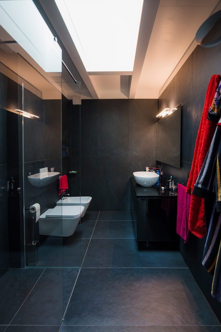
The communicating bathroom in natural tones

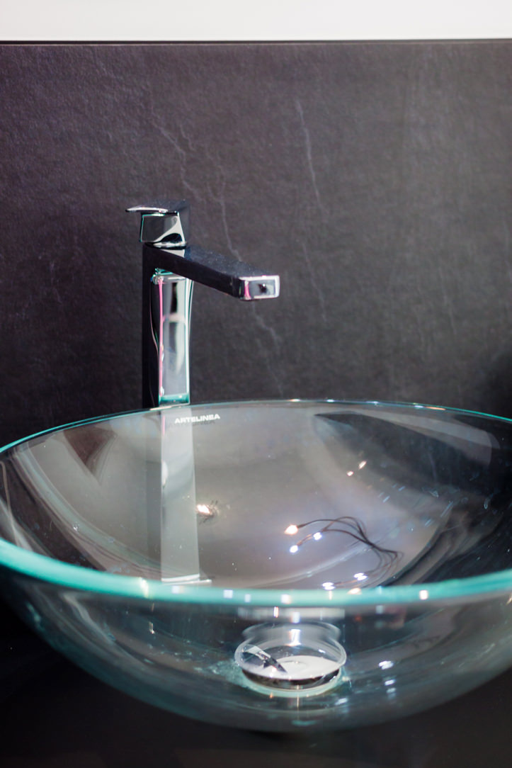
A sliding glass door leads from the wooden room to the bathroom, whose wooden furniture echoes the material choice of the entire bedroom area.
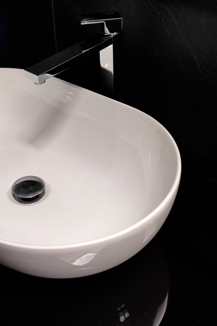
This is characterised by the presence of large push-open drawers surmounted by a white lacobel top with a ceramic countertop washbasin. The wall-mounted stainless steel tapware is framed by a white lacobel plate that echoes the bathroom vanity top.

A large mirror with integrated lighting amplifies the perception of space, giving additional brightness to the room. The use of LED strips is also taken up in this room, emphasising the material transition between the tile covering and the wall.
The bathroom becomes a communicating room between the bedroom and the study, exploiting the double side access. The latter is accessed from the bedroom side by means of a textured glass sliding door in wood effect, from the study side by means of a hinged door of the same aesthetic line.

mobile bagno comunicante cassettoni legno piano lacobel bianco
mobile bagno apertura cassetti fronte legno
mobile bagno comunicante cassettoni piano lacobel bianco lavabo appoggio specchio con illuminazione
dettaglio lavabo appoggio rubinettera inox a parete specchio con illuminazione
dettaglio maniglia porta scorrevole texturizzata legno vetro bagno comunicante

A wooden room with a natural feel uses the functionality of a walk-in wardrobe behind the bed to optimise space. The choice of natural materials and soft lighting, with a hint of Hygge, creates a relaxing and hospitable environment. To further explore the theme of the wooden sleeping area, here are two other realisations in which the natural material par excellence becomes the protagonist: Comfort among the peaks and a Shabby Chic studio apartment.

Minimal style furniture for a youthful apartment in the city center

Minimal style furniture for a youthful apartment in the city center

An apartment in the city center shows all its freshness with bright interiors and light colors, while the minimal style furniture defines its elegance. Functional environments suitable for various needs and therefore excellent for short and long-term rentals. The geometric patterns and essential design lines return the idea of ​​freshness, presenting themselves as excellent companions in everyday life.

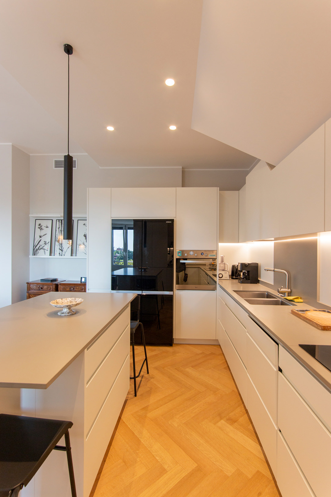
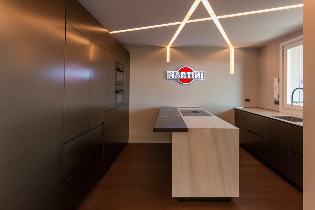
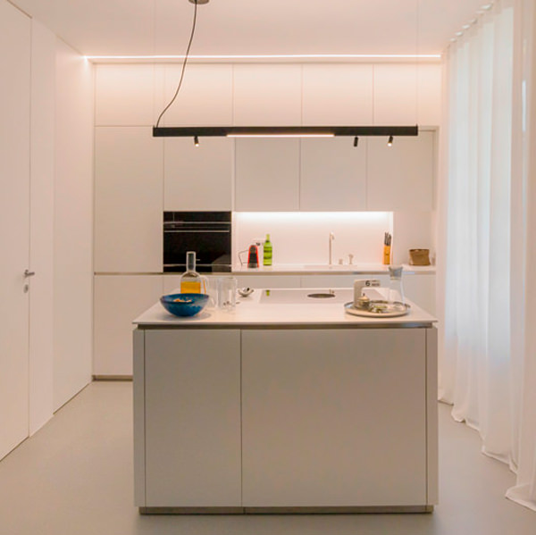
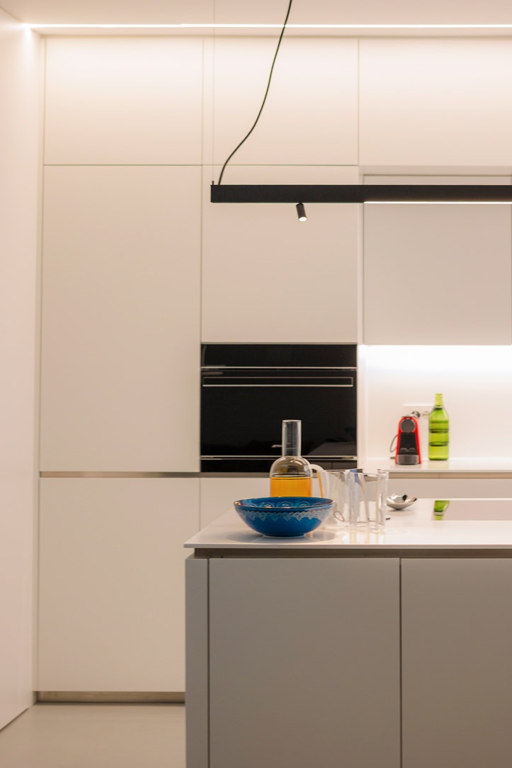
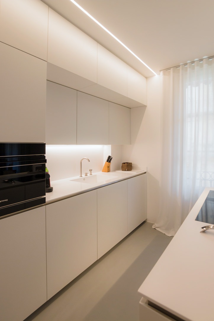
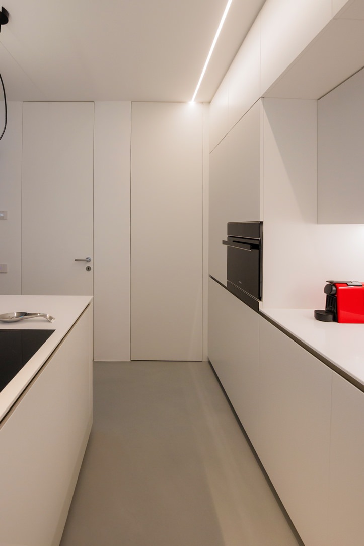
minimal style kitchen central island service columns

The living area: a minimal style kitchen with an industrial touch

The entrance to this apartment overlooks the living area illuminated by large windows located along the right side of the room.
The minimal kitchen also finds space here, divided from the living area by a half-height wall that acts as a conceptual filter for the two environments.

The development of the kitchen occupies the side adjacent to the entrance area with full-height columns and a central island. This becomes the functional element par excellence, acting as a pivot in the distribution of transit flows and welcoming the preparation, cooking and washing areas.
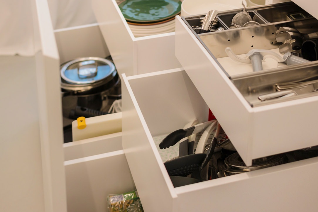
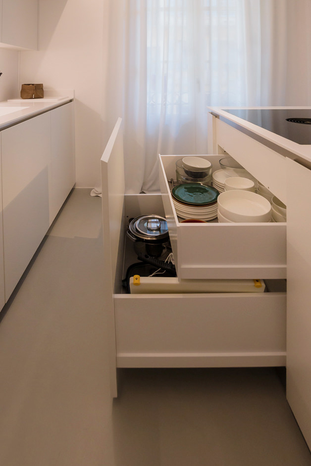
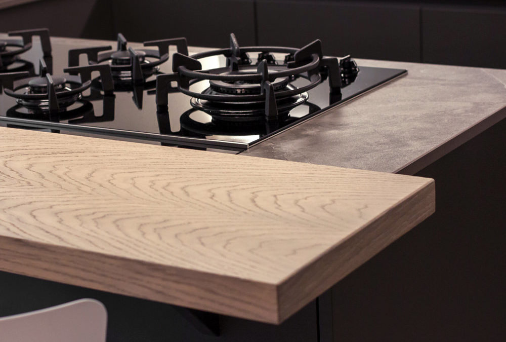
In the lower part, large drawers are placed under the induction hob, to house pots and accessories useful for cooking.
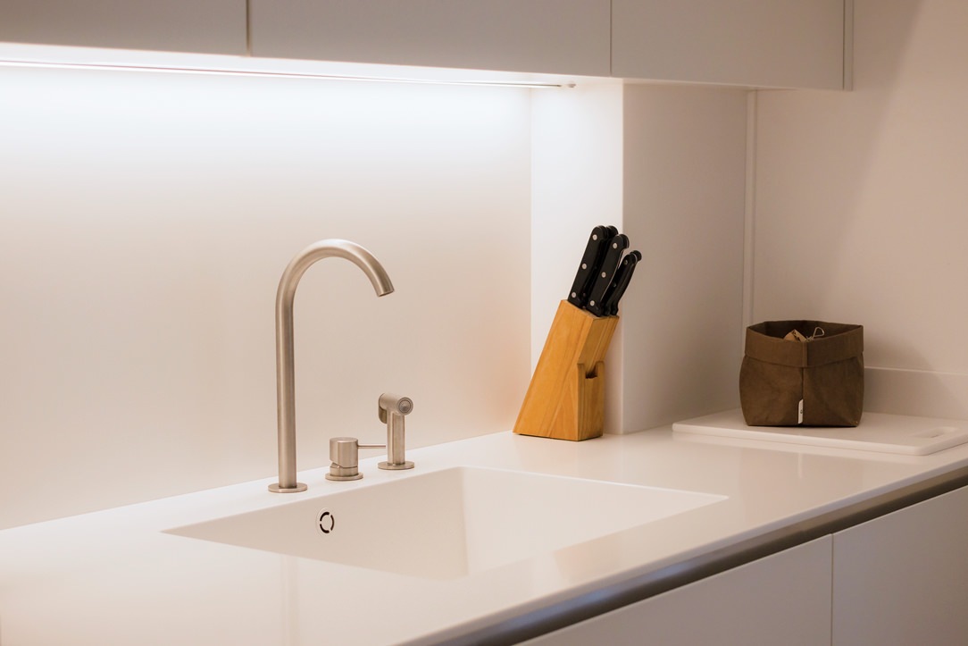
Beside them, two lacquered MDF doors house the countertop sink and the lower compartment for the differentiated waste bins.

The worktop in practical bilaminate in a medium gray tone recalls the industrial scent of the dining table with its material surface.
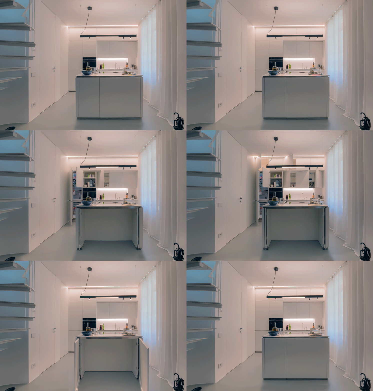
In the center between the cooking area and the washing area, the top is left free to allow the preparation of dishes. To facilitate the use of small appliances, a retractable socket tower.

On the column side, the built-in oven positioned at a comfortable height embrace, together with doors with internal shelves, the open compartment with bilaminate top and lacobel top. Element that acts as a useful support on the side of the oven or can be equipped with small appliances such as coffee machine and mixer, or Thermomix.
At the same time, it is also a significant aesthetic element, capable of attracting attention for the brightness that characterizes it.

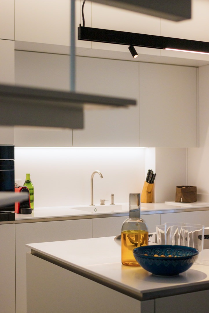
The lacobel bottom reflects the light coming from the LED strip embedded in the upper part, giving further brightness.

 dining table metal structure industrial style top
furniture columns kitchen service minimal style bilaminate top lacobel day compartment
front view island drawers pans accessories induction cooking
white kitchen island retro doors detail
detail of the disappeared turret took a closed position
detail of the disappeared turret took the position of use

The functionality of the sleeping area with white furniture

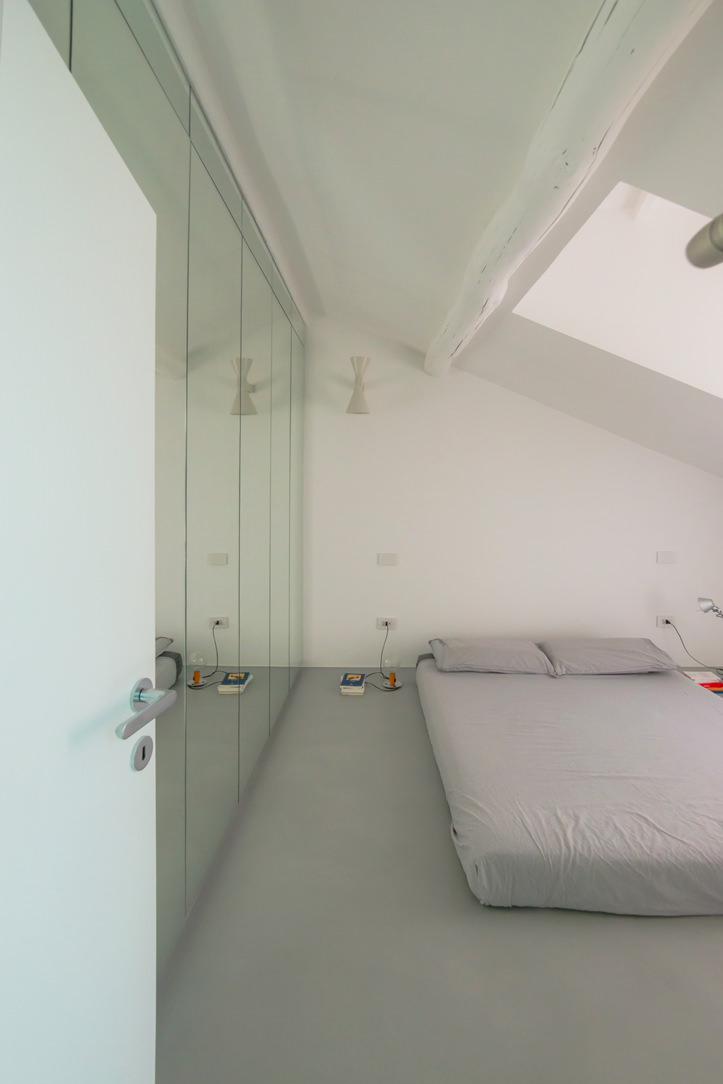
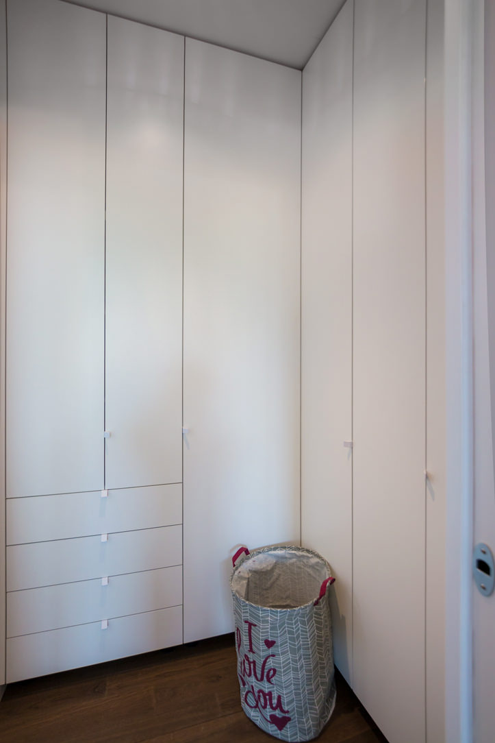
The access corridor to the sleeping area is equipped with a full-height wardrobe shaped internally to restore the correct alignment of the rear walls. Internally, shelves of different heights allow the organization of household products while respecting the existing electrical arrangements and the counter compartments.
A functional element capable of blending into the minimal furnishings of the apartment and at the same time serving as an equipped piece of furniture in a closet.

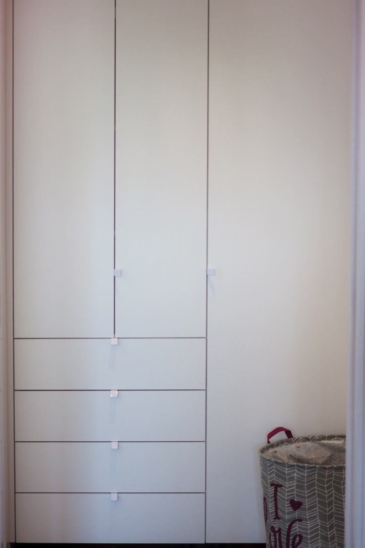
To complete the sleeping area, a second full-height wardrobe with white lacquered doors and handles in white folded sheet metal with a minimal look.
This internally houses hanging tubes and drawers for linen allowing you to keep the garments in order.
In the master bedroom, essential white lacquered furnishings placed including a pair of bedside tables with storage drawers and a large side chest of drawers with recessed handles.
A desk, on the other hand, is inserted into a game of joints in a wall bookcase, creating an equipped point for smartworking.

full-height wardrobe doors sheet metal handles minimal furniture
internal wardrobe drawers linen tubes hangers
equipped corridor mobile closet minimal furniture
study corner bookcase wall desk shaped
chest of drawers bedroom minimal furniture white bedside tables
bedside table front view white lacquered handles hollow drawer black feet
white lacquered shaped shelves furniture minimal style furniture

The natural touch of the bathrooms

The two bathrooms with bold graphics reflect the minimal style of the furniture, giving a touch of freshness.
One, next to the master bedroom, incorporates the natural tones of green with a wallpaper with a vintage flavor. This is equipped with a cabinet with wooden finishes combined with a countertop washbasin with sinuous shapes. It is accompanied by a large designer bathtub that masters the corner of the bathroom and elegant furnishings.
The second bathroom, on the other hand, plays on the geometric textures of the wallpaper with more decisive colors, matched with a bathroom cabinet with the same characteristics as the first.

bathroom tub design natural colors vintage wallpaper
bathroom cabinet wood white countertop washbasin green wallpaper
bathroom furniture wood sink design support wallpaper vintage geometric pattern

City apartments require flexibility from both a functional and aesthetic point of view.
For this reason, the minimal style is perfectly suited to satisfy the tastes of future tenants. Another example of this type is this studio apartment in the center of Milan!
To deepen the minimal style instead, we can delve into the retail world with this shop in the center of Bergamo. Enjoy the reading!

HYGGE : THE DANISH WAY TO HAPPINESS

HYGGE : THE DANISH WAY TO HAPPINESS

To have Hygge at home it is necessary to give it that sense of warmth, well-being and intimacy that perhaps it lacks. It is well established that living better in the home environment not only makes us feel better but makes us appreciate our daily life more till making us more happy.

intimate Hygge Living room

a warm and welcoming Hygge living room.

WHAT IS HYGGE?

A survey has identified in the Danish people the happiest in the world and in the Hygge its recipe for happiness, which is why it is so fashionable and more and more people try to steal its secrets to obtain a better psychophysical well-being. However, giving a meaning to the Danish term Hygge is not easy, it is linked more to an atmosphere and an experience than something tangible. It is the feeling of being at home, protected from the world and safe, conversing about the big or small things in life with friends or enjoying a cup of hot chocolate alone in total relaxation. Due to their specific social-cultural-economic conditions, the Danes spend 71% of their free time at home, which is why Interior Design is essential to experience the Hiemmehygge, or the Homemade Hygge. But what are the keys to success for having a more Higgelig home?

modern Hygge living room
Vintage Hygge living room

two Higgelig living rooms, one more modern and the second more vintage.

WHAT ARE THE FEATURES OF THE HYGGELIG HOME?

LIGHTS

The lights are fundamental in the Hyggelig house, soft and “alive” like those of candles, many and everywhere, together with excellent artificial lighting.
In fact, the Danes have a real obsession with lamps, they choose and strategically place them inside the house.
They prefer design lamps, such as the PH lamp by Henningsten or the Panton VP Globe by Verner Panton capable of diffusing a soft light which is however reflected by the structure of the lamp using in combination with bulbs with low and warm voltages, on 1800 K.

moodboard Hygge style

Moodboard of the Hygge style, from the lights, to the furnishings and colors.

HYGGEKROG

In the Hygge headquarters, that is our home, a Hyggekrog could be the strategic point dedicated to pure relaxation, the area of a room where you like to snuggle under a blanket holding a book and a cup of tea.
It can be near a light source, like a window, or next to a warm place, like a wood-burning fireplace.
This love for confined spaces or real “dens” has been with us since we were children but has an ancestral origin. Sitting in a Hyggekrog makes us feel safe away from any potential threats, allowing us to relax.

dedicated Hyggekrog in wood
Hyggekrog obtained from the side windows.
minimal Hyggekrog

Three different Hyggekrogs: one specially designed to the side of the light source and two instead obtained as window / glazing work, one richer and the other more minimal

FIRE

A fireplace or a wood stove are just as Hyggelig, as well as being a source of warmth and comfort, the sinuous movement of the burning logs relaxes the view and the area around the fireplace becomes convivial, a place to spend time with loved ones and accentuate the intimacy of home life.
In the large living room of this contemporary-style villa, the sofas look out at an angle to a side wood-burning fireplace that warms the room without becoming the protagonist of the scene.

Moder Hygge Living room
Intimate fireplace corner
Details fireplace and cushions

The corner coexists on the side of the fireplace and some finishing details and accessories.

MATERIALS

The main material is wood, in floors, furniture and even in small household items.
Wood makes us feel closer to nature and this is exactly what we want to bring into the house.
In fact, there is also a green corner or just leaves, nuts, twigs, anything that makes us feel in the midst of nature.

Hygge green veranda

The smell of wood and its being a soft and lively material makes it simple and natural, just like the concept of Hygge itself.
Here a mountain apartment entirely covered with a splendid heat-treated and natural brushed larch.

living room in larch wood
corridor with high wooden paneling
cozy bedroom

Tall wooden boiserie are accompanied by a modern fireplace and other wooden elements such as the kitchen table and the backrests and bedside tables in the sleeping area.

BOOKS

If you think about relaxation and intimacy, you also think about the pleasure of reading, if the house is Hygge there will be shelves full of voluminous books. All books are in fact Hyggelige, but the classics written by authors such as Jane Austen, Charlotte Brontë or Charles Dickens must occupy a special place among the shelves.

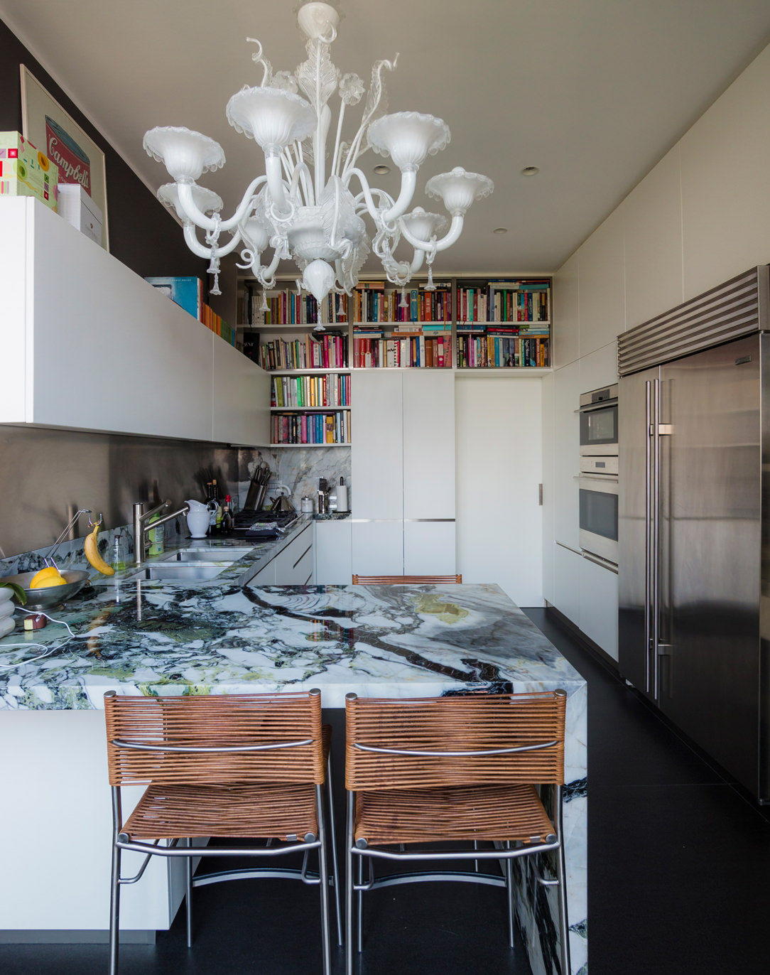
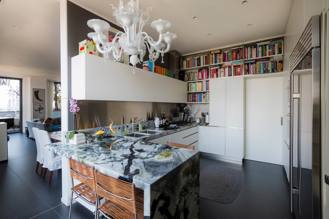
In this modern Milanese kitchen we could define this space dedicated to cookbooks very Higgelig, folders overlap each other but remain available to experience a different form of relaxation, the peace and gratification of well cooking.
If Hygge were a person, its could be a cook, who approaches life by understanding the value of a good meal in pleasant company.

Kitchen and books Higgelig

Books crowd this small corner dedicated to good food.

THINK OF TOUCH

As initially specified, Hygge is an experience that involves all our senses, including touch. In fact, the materials that inspire positive sensations when touched are also very important, a soft wool or even a hot ceramic cup.

Small colorful accessories, such as the famous Kähler vases, cups, blankets and pillows must not be missing.

Home with ceramics and green
pillows and blankets Hygge

Here are houses with blankets, soft pillows and ceramics./p>

THE BEST PERIOD TO PRACTICE THE HYGGE

The best time of the year to enjoy Hygge is about to begin: when the first cold arrives, winter is coming and the days are getting shorter, you feel the need to stay at home more.
This is the right time to prepare your “Home Sweet Home” to be warm and welcoming in the coldest season of the year.

What to do after having furnished it? A nice supply of warm sweaters and socks to put on and a nice playlist of songs to listen to while lying on the sofa.

Furthermore, a nice selection of films ready to be seen or a photo album to bring back old and pleasant memories cannot be missing. And above all… lots of sweets, a nice glass of wine, herbal teas and hot chocolates to be enjoyed in peace near your own home.

Enjoy Hygge everyone!!

Hygge book and tea

A bespoke wardrobe in the attic: sloping doors and large bookcases

A bespoke wardrobe in the attic: sloping doors and large bookcases

To make the most of the sloping ceiling of this attic, a large custom-made wardrobe is mixed between a functional element and a large bookcase. A hybrid furniture, usable internally for the seasonable wardrobe change, but linear in aesthetics to create a suggestive and small reading hall for our little client Francesco.

bespoke wardrobe attic sloping ceiling bookcase in front of sloping doors

Equip an attic with sloped ceiling with a custom-made wardrobe

The attic is the project environment with great aesthetic potential but with strong architectural design constraints.
The presence of a sloping roof creates different usability areas imposed by the different internal heights of the room.
In this case, the architectural conformation of the attic, with a narrow and long plan with access to the center of the ridge, ideally divides the room into two different environments.
In one of these two the large custom-made wardrobe stands, able to exploit even the lowest corner of the attic with a bookcase in the niche.

To ensure that the sloping cut doors are not obstructed in the opening direction by the attic ceiling, it is necessary to provide single doors with fastening on the longer side. This also allows an internal division with shelves marked by single and not double modules as in a traditional wardrobe.
The backs of the bookcase are shaped in the same way in order to respect the inclination of the ceiling and optimize the overall dimensions.

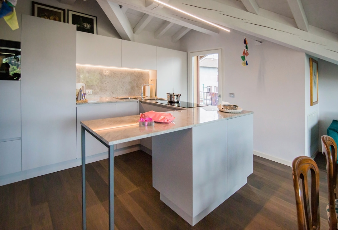
To explore the theme of rooms with sloping ceilings, here are these two attics: one in a contemporary style with antique elements and the other in a modern style. To these is also added this mezzanine equipped with wardrobe and bookcase for a functional study area.

bespoke wardrobe attic sloping ceiling front bookcase
detail handles white aluminum profile wardrobe
interior hanger wardrobe custom attic season change
inside wardrobe change of house linen season
bespoke wardrobe attic sloping ceiling side bookcase
internal shelves bilaminate wardrobe made to measure attic change of season

A reading corner for our most demanding small customers

Francesco is our little client with very clear needs. If mom Laura is kindly allowed to use the inside wardrobe for the seasonable wardrobe change and household linen, the niche-bookcase must be able to accommodate books and dinosaurs divided by specific themes and colors.
The shaped shoulders accommodate fixed shelves at different heights, creating a lively but elegant visual rhythm.

Even the fresh and elegant tone of the white bilaminate creates a luminous reading area in which a delicate Scandinavian design coffee table finds space.
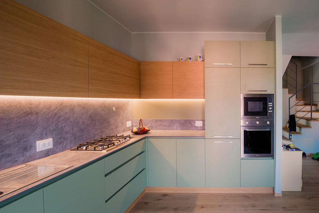
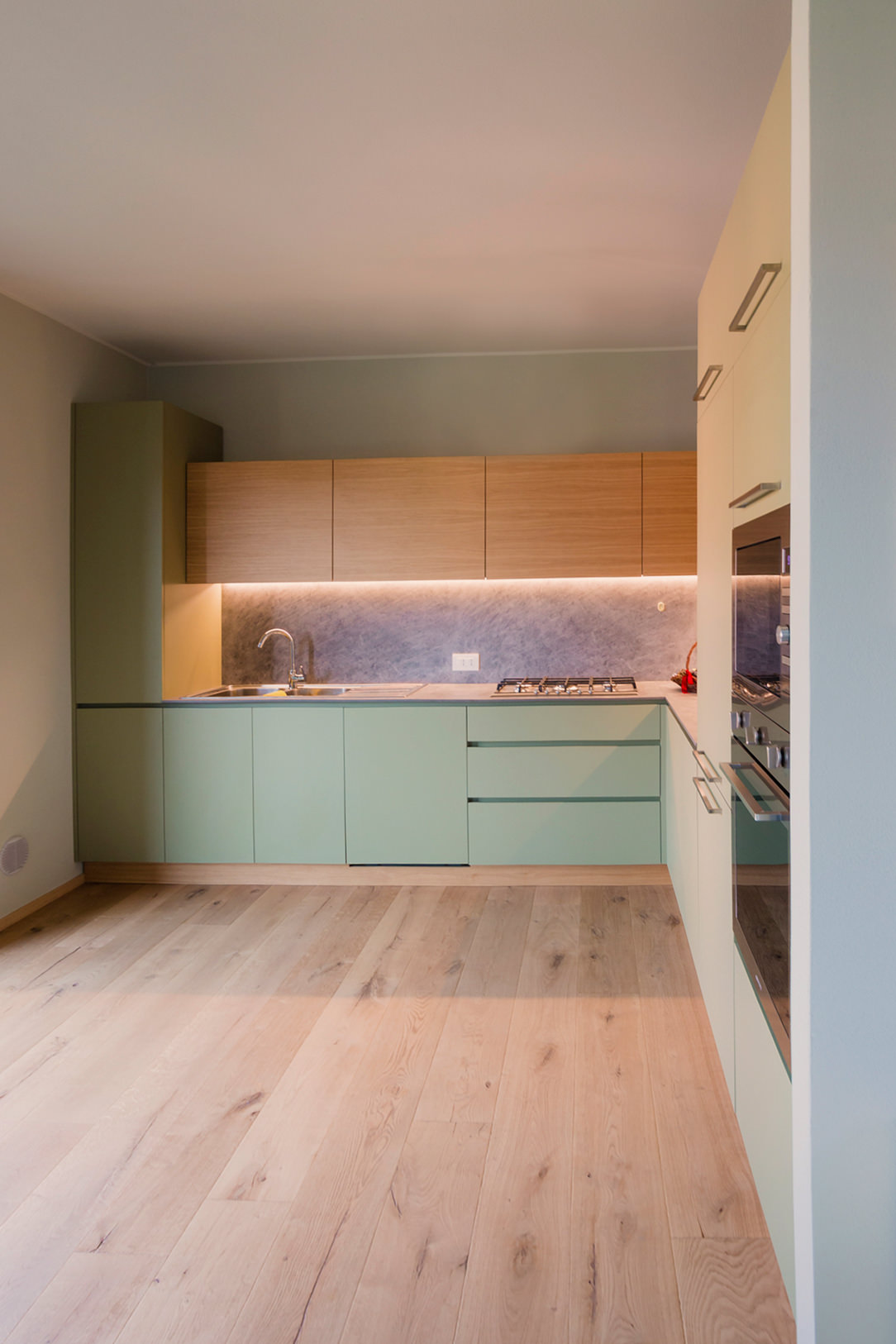
To take advantage of the depth of the wardrobe, a second bookcase is grafted onto the side shoulder, also visually closing the furniture with a characterizing detail. The same solution was also adapted in this cerulean blue kitchen in modern style.
In this case, the shelves are positioned at a greater height so that they can also accommodate more bulky folders and books.
The reading corner is thus embraced by the multifunctional furniture that from a simple wardrobe serving an attic it also becomes a custom-made bookcase.

reading corner bookcase in niche shelves fixed height
bookcase detail with fixed door and white bilaminate shelves
detail of white bilaminate bookcase shelves
attic bookcase with fixed shelves
bookcase detail in front of the wardrobe
detail handles white aluminum profile cabinet front