Boho Chic Style: a mix of vintage and modern

Boho Chic Style: a mix of vintage and modern

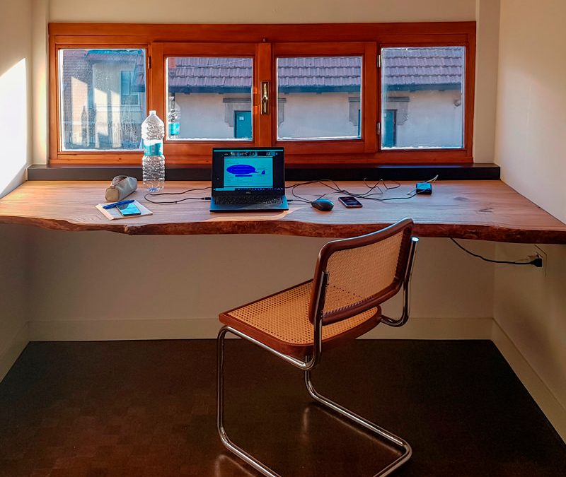
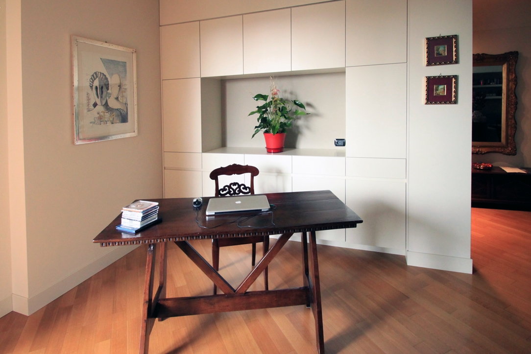
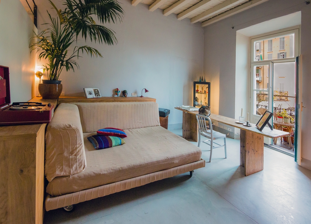
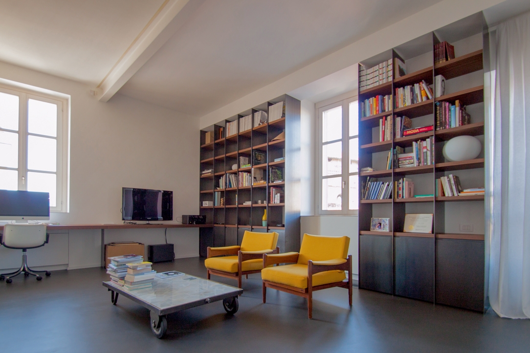
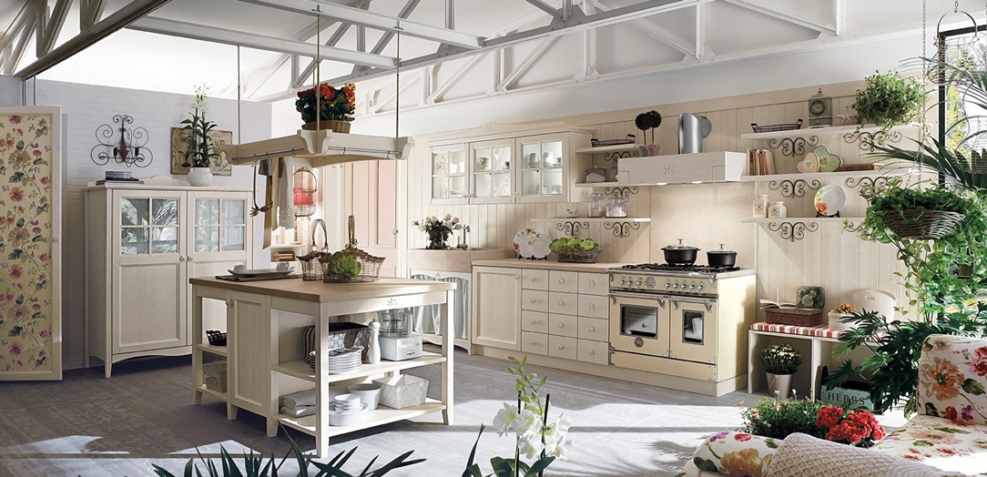
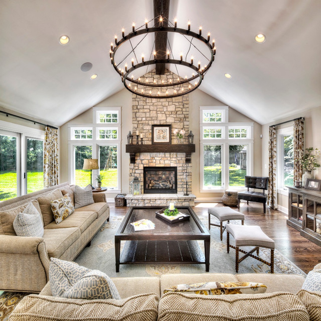
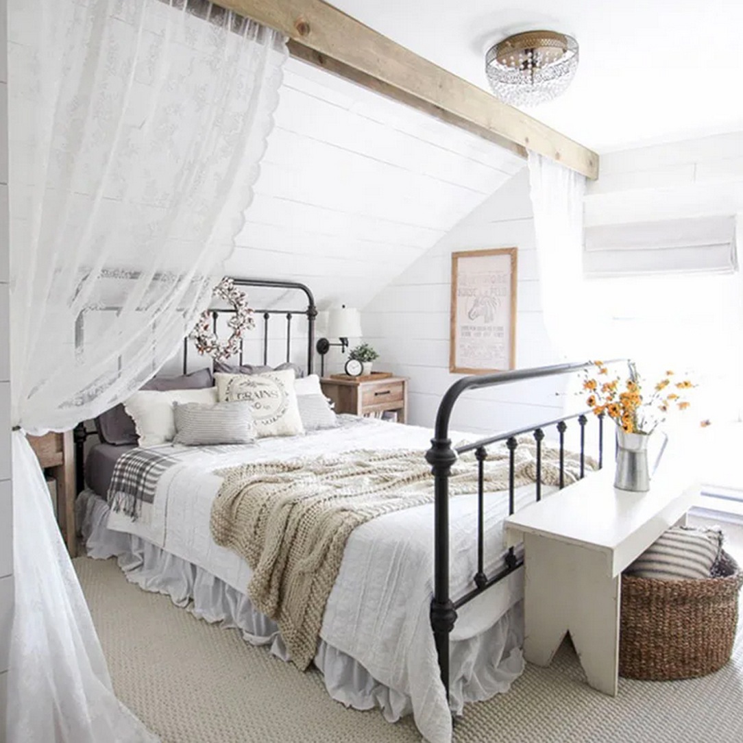
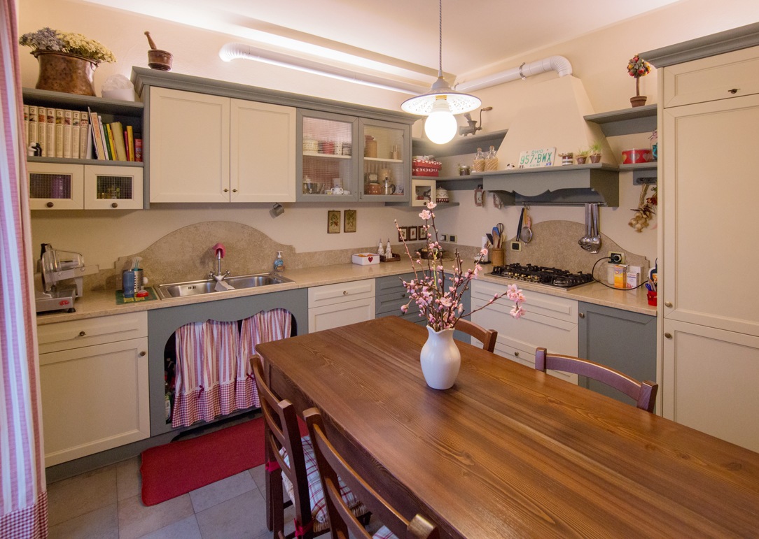
Very popular in recent years, the Boho Chic style is characterized by the combination of various other styles that flow into a balanced mix of furnishings. Since there are no precise guidelines, if not the freedom of spirit of its inhabitants, we must be very careful not to furnish the house in a chaotic and disharmonic way.

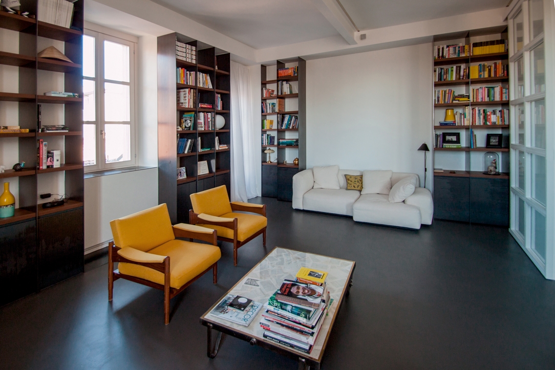
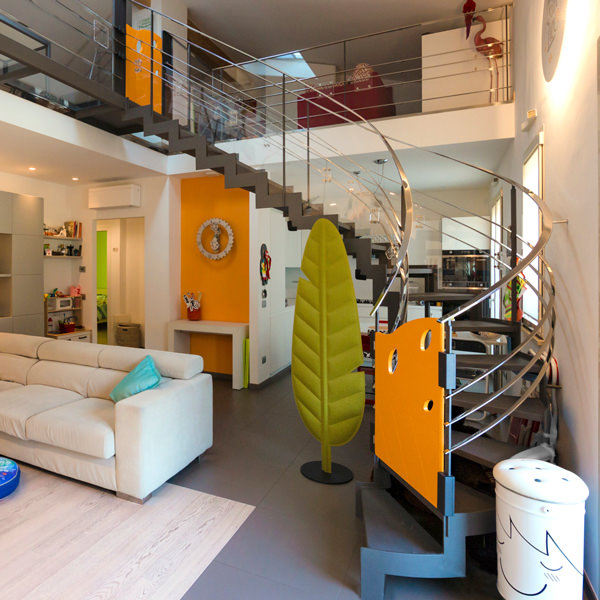
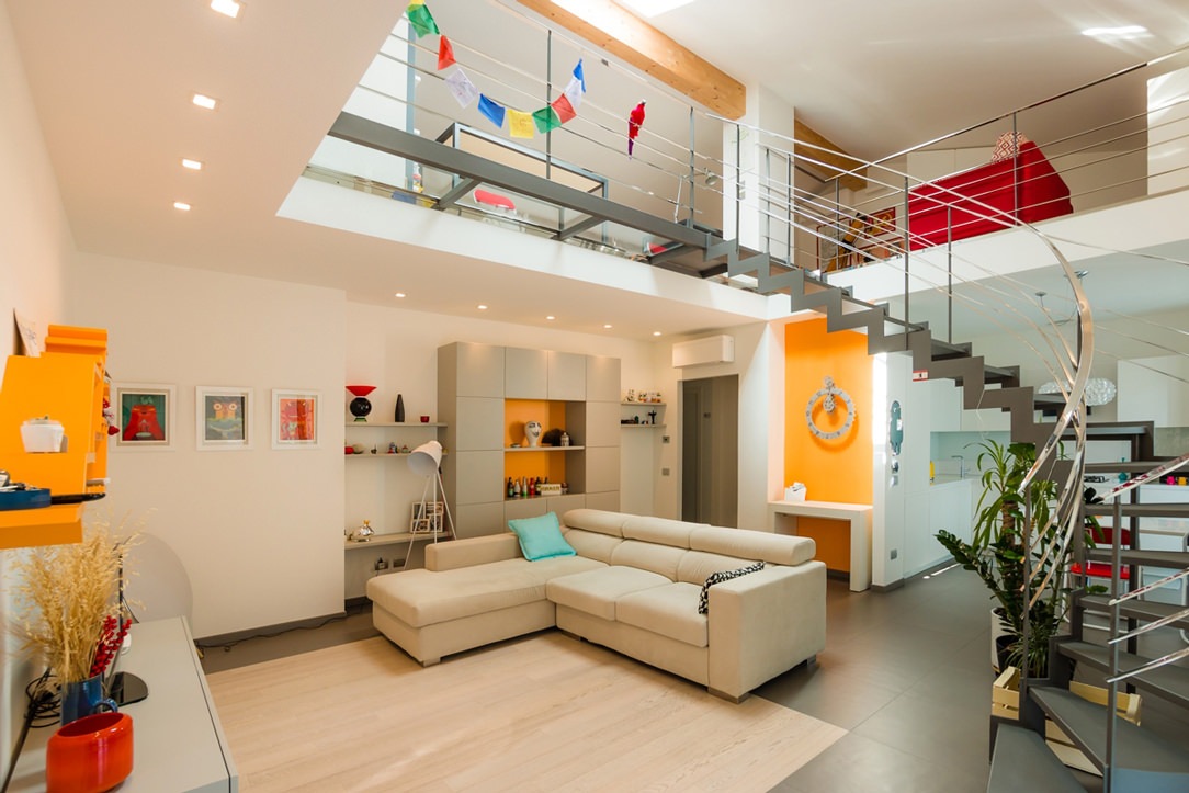
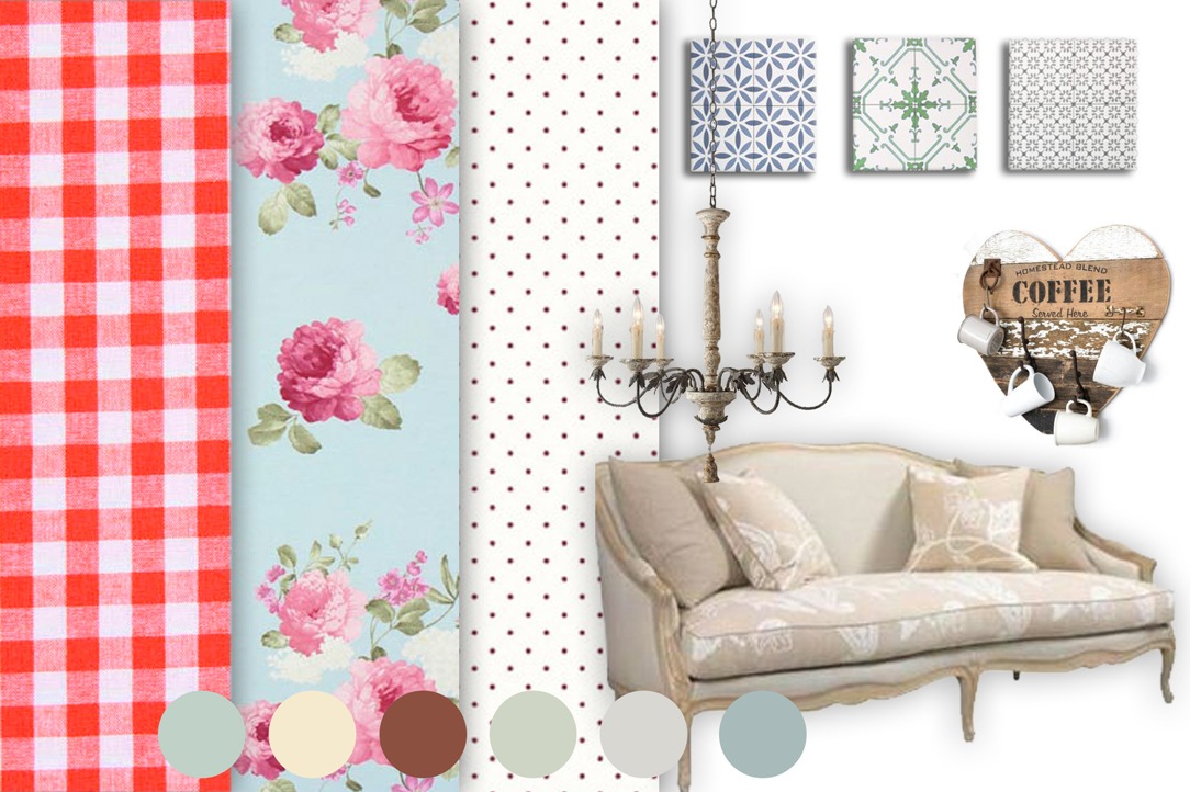
living room reference

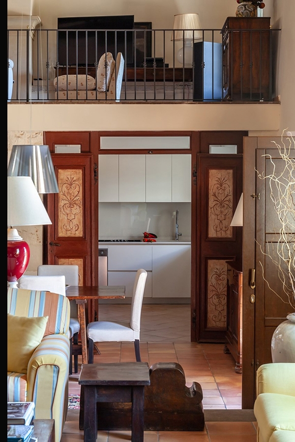
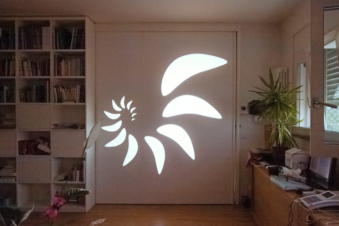
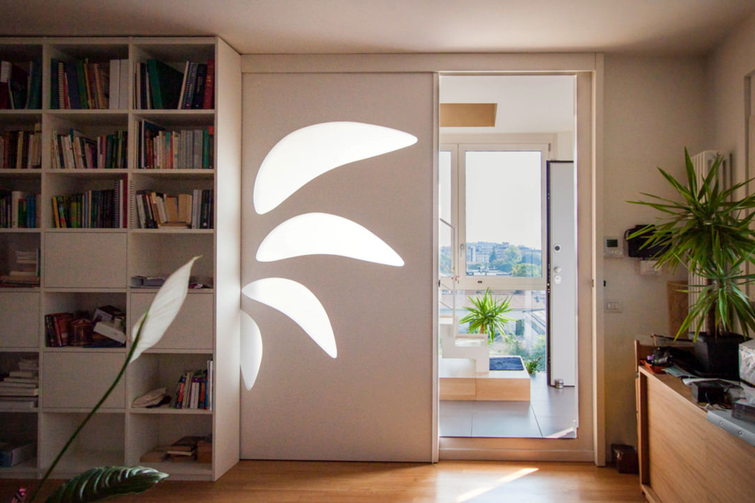
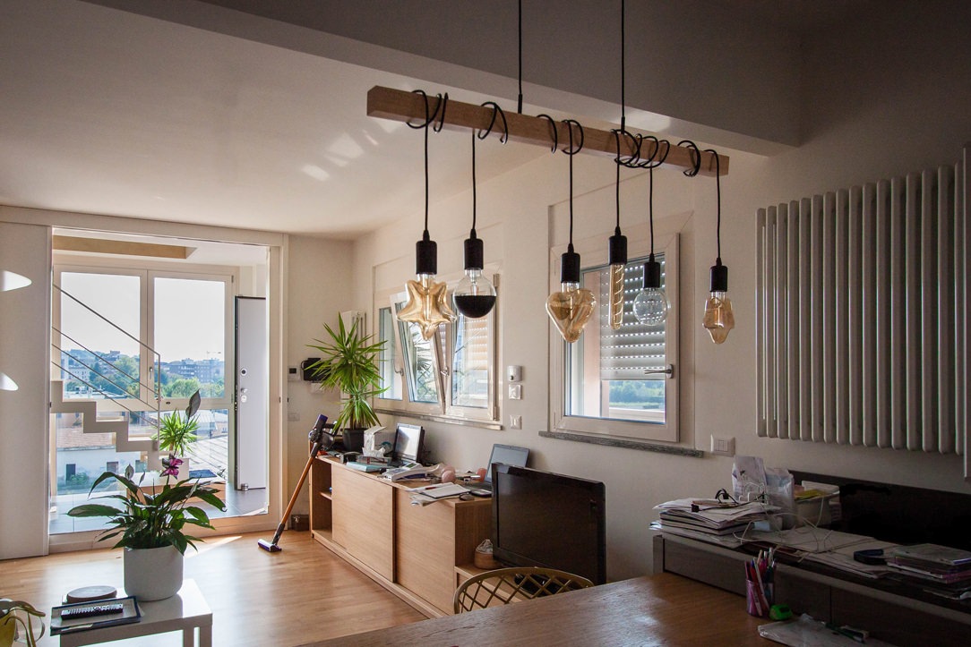
Entrance and living room in Boho Chic style.

The meaning of the word

There is a lot of talk about Boho Chic style, but what is the meaning of this term? Boho comes from the abbreviation of “Bohémien“, a French word born in the nineteenth century to identify the unconventional lifestyle of penniless artists, writers, musicians and actors of the major European cities, combined with the word “Chic” which indicates the modern trend to make even a style that was originally more rustic and natural elegant and refined. This expression took hold at the beginning of the millennium in the fashion world but soon merged into interior design as well. The Boho Chic style is an original combination of Nordic, ethnic, hippie and modern furnishings that everyone can interpret in their own way, also as regards the colors and finishes, different from each other and the unique pieces that distinguish it. Each space must tell the story of those who live there and the houses furnished in this style have some common points but they never resemble each other.

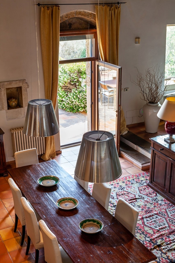
 Parisian style dining room

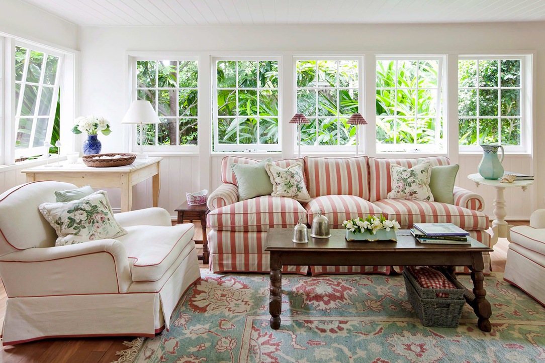
A bright Boho Chic style living area, with play of colors and wallpaper.

Boho Chic living room

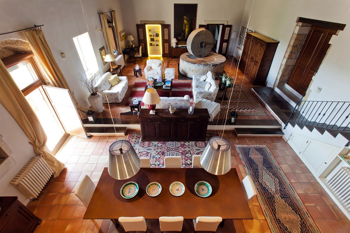
In comparison, a living area in the same style based on the dark tones of wood and leather.

Vintage and unique pieces

A necessary element in this type of style is the recovery of antique or vintage pieces of furniture to be combined with other modern ones. The two eras in comparison give this cross-section of “timeless home” to the environment and each piece of furniture, each object and each decorative element contains a history and a personal and indissoluble bond with its owner. A Boho Chic home is constantly evolving, up to the filling of every available square meter. Thus an eccentric environment comes to life, made of unique colors and objects, travel memories and emotions.

Boho Chic living room

Boho Chic living room with antique sofas and armchairs, of different styles and eras.

 Parisian style living room
 Parisian style dining room

Here are two images of a living room and a dining area that Modulor created in Parisian Bohemian style

Materials and Colors

The colors are strong and lively in the Boho Chic furniture, even if light and bright tones are preferable, especially for the walls that highlight the color of the furnishings and accessories, whose shades can range from the ivory of the curtains to the terracotta of the vases, green plants or the textures of carpets, cushions and chandeliers. Colors reminiscent of foreign spices, such as turmeric, paprika, cinnamon and saffron, are highly recommended, or in recent years the most popular themes for any wallpaper on the walls are jungle and tropical. Very important are also the fabrics, the velvets, the opulent or geometric patterns that recall countries such as Morocco and India and the woven wood of armchairs and sofas.

texture and colors in Boho Chic style

Wallpapers and natural colors are fundamental in the Boho Chic style.

boho chic entrance

An entrance characterized by woven wood furnishings.

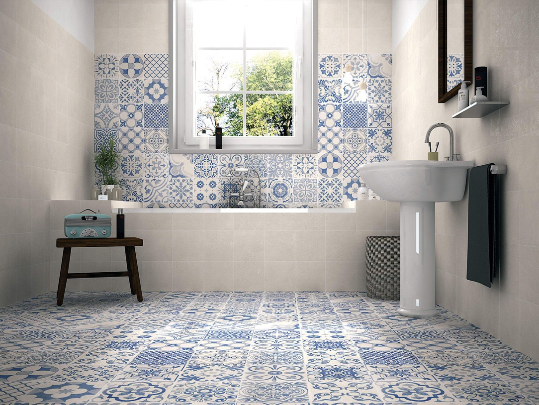
bathroom reference

Bathroom with neutral colors, wooden elements and green plants.

Lights and Plants

Having a lively domestic vegetation is fundamental in the Boho Chic home, the insertion of plants, vases on the ground, wall and ceiling makes the house even more warm, welcoming and hippie. Plants can also be functional elements of the space in their function of separating the various portions of the home environment. Another fundamental element are the lights, which are not uniform and homogeneous as in modern furniture but are located in several parts of the environment and with very different characteristics, both in intensity and in type. The soft lights must not be missing and also the projection of textures on the wall through lanterns with geometries engraved on the surface.

green as furniture reference
lights Boho Chic

Lights and plants, undisputed protagonists of the Boho Chic style.

Boho Chic living room

Oriental rugs, plants and decorations in these Boho Chic living areas, undisputed giants of Boho Chic style.

Those who choose the Boho Chic style love to travel, even if only with their thoughts and bring many cultures and souls into their home that make it a real cosmopolitan environment.

Luxury style: care of detail and high quality

Luxury style: care of detail and high quality

Timeless and always updated, the luxury style is surrounded by refined and elegant interiors. The care of detail goes perfectly with the choice of high quality materials, manufacturing and design.

Luxury living room

Zona living in stile luxury. GEZA Gri e Zucchi Architettura, DLN Penthouse. Foto: Gianni Antoniali

Modulor elegant dining room

Careful furniture selection for this Modulor dining room

Modulor burnished brass display cabinet

Burnished brass details enrich this display cabinet in the living room

The luxury style in the western concept

Speaking about luxury style could means excess and opulence of Arab culture with furniture covered in gold leaves, mirrors and golden mosaics with excessively sinuous lines. It is therefore important to refer of this style in its western concept, which renounces opulence and excesses dictated by a deliberately exhibited richness in favor of attention to detail and refined preciousness. The luxury style in its western sense rather expresses a taste of elegance and uniqueness of the products, often owner-oriented designed.

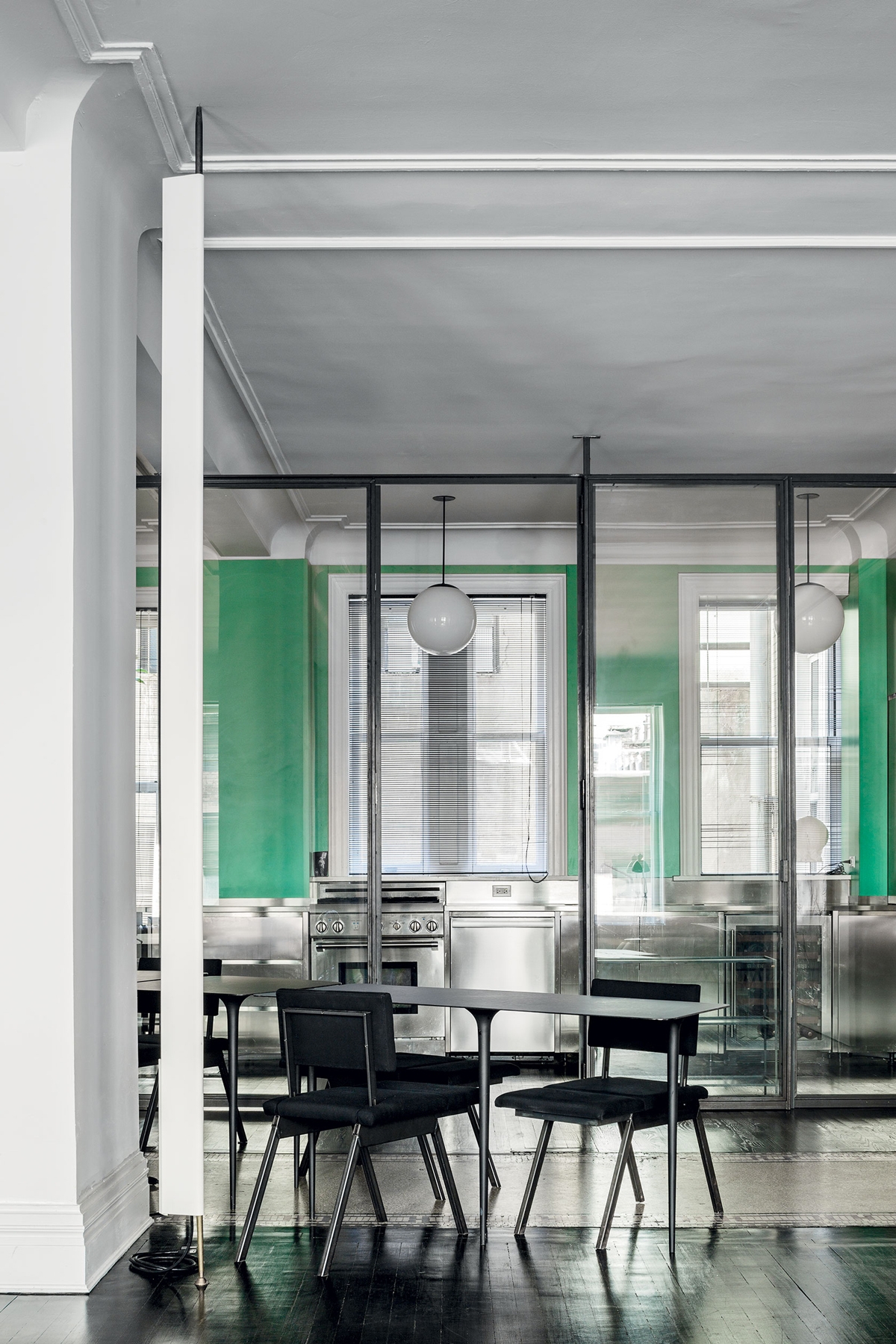
Modulor luxury kitchen Milan

Plays of reflections for this Modulor kitchen of neutral colours

luxury industrail apartment 08

An entire marble covering bathroom shows all its elegance between linear shapes and polished metals

Finishes and material

Traditional materials are chosen for their timeless beauty, even more if characterized by a fine finish. Without a doubt, the luxury style is the explosion of the marbles in their most colorful veins. Coming from all over the world, they show their preciousness with strongly characterizing ventures or slight chromatic alterations. The precious essences of the wood are also protagonists, often matching refined finishes. These were accompanied by fabrics with particular textures and the inevitable velvets, which have come back into vogue in recent years. The heart of luxury style lies in privileging quality: quality of materials, manufacturing and design. In its contemporary sense then, the luxury style meets brass details, inserts in painted glass and plays of reflection of shiny materials.
Modulor luxury materials selection

The marbles in the most colorful essences are the undisputed protagonists of the Luxury style

luxury fabrics Milan apartment

Velvets, suede and metal effects for this Modulor-signed bedroom

Modulor wooden finish

Inner lighting and wooden textured covering for this luxury wardrobe

Modulor selection luxury furniture and fabrics

Velvet and fine fabrics accompanied by metal finishes enrich the furniture.

Modulor 3D wood finish

An elegant and contemporary 3D finish for this Modulor work

The contemporary luxury style

One of the most constant styles in the history of interior design, it owes its continuous success to the ability of adapting to stylistic changes over the years. Contemporary luxury in particular eliminates even more excesses and extravagances. In combination with the minimal style, it becomes more and more a sort of “added value” inside the domestic interior, standing out for its particularity. It tends to enhance the interiors in which it is, rather than the single product, becoming an elegant but delicate stylistic imprint. Contemporary luxury is a lover of brass finishes, even better if combined with velvets and suede. It meets stylistic variations according to the context. It manages to appear light and delicate if contextualized in essential interiors or with a strong impact if set on dark color ranges.

detail hanoi vietnam

Care of detail and high quality materials for this prestigious Modulor work in Hanoi, Vietnam

master bedroom

Burnished brass and velvet define the details of this Modulor master bedroom

reference luxury bedroom
reference luxury living room
reference luxury kitchen

Selection of contemporary luxury references, between feeble chromatical palette and particular material finishes

Choosing the luxury style means choosing quality materials and refined design. Perfect for those who are addicted to details and a lover of elegance. Suitable for determined personalities and people fascinated by perfection.

A cerulean blue modern kitchen

A cerulean blue modern kitchen

The cerulean blue hue defines the stylistic firm of this modern kitchen, set on dark wood tones with brass finishes. The care of detail gives shape to an extremely elegant project, modern in aesthetics and contemporary in settings.

Modulor modern kitchen with dark tones_01

The on-view composition

An interior that becomes furniture. The design of this kitchen diverges from the traditional vision of the closed room to become an open space composed of different volumes.
The main block is a visual union of the low volume in ribbed wood set between wall units with a vertical subdivision and full-height columns.

The common thread that contain the perception of the environment is the brass base, taken from the light and linear handles.
The island block with rounded shapes and overhang countertop, elegantly conforms to the main volume, despite a stylistic change in the design forms.

Indeed, it is this difference between the straight and geometric shapes of the back unit and the rounding of the profile in the central island that defines the stylistic imprint of this kitchen.

The traditional closing shoulder is replaced by a recessed library that visually lightens the perception of the kitchen characterizing the furniture. A full-height bookcase compartment that alternates shelves in a well-balanced geometric composition.

recessed bookcase side abutment
bookcase abutment division sleeping area
Modulor modern kitchen with dark tones_02

Functionality and aesthetics in symbiosis

Not only the general volumetric setting, but also the internal organization demonstrates a perfect relationship between functionality and aesthetics.

As a demonstration of this, the central island is equipped with rounded corner doors in order to make the best use of each available corners.
Shaped white shelves stand out among the dark tones and blue doors of this modern kitchen, showing all their functionality. The choice of appliances is also avant-garde, as for example the induction hob with attached extractor hood that reduces the functional components to the essential in favor of visual essentiality without sacrificing the practicality.

Modular kitchen island ribbed wood
open door with shaped shelves

Colors and materials

Cerulean blue matt lacquered MDF, dark ribbed wood and brass are the protagonists of this modern kitchen in which dark tones are chosen for their elegance.

A rigorous environment that is being fascinated by contemporary functionality.

The chosen shade of blue, extremely modern, is enriched with a warm appearance especially when combined with the dark-dyed ribbed.

It is precisely the materiality in the latter’s finish that enriches the main volumes of the kitchen with movement and rhythm.

The brass of skirting boards and handles, underlines the design lines with a precious character that gives refinement to the project.

Modulor materialboard
Modulor modern kitchen with dark tones front view
Modulor materials finishes

Advice

The choice of colors and materials often defines the character of an interior. We are often intimidated by intense colors and dark tones, especially if imagined on large surfaces. The final impact can instead reserve great surprises, and give a touch of freshness and modernity.
Here is another example, in this case a dark gray kitchen with oak inserts.

How to equip a bathroom with laundry corner

How to equip a bathroom with laundry corner

A functional and aesthetic analysis of the laundry corner. An environment that in contemporary reality is forced to give up its autonomous room to blend in a small bathroom or equipped corridor. The aim is giving space to the services that define our daily life, making them aesthetically interesting.

laundry corner

Laundry corner with showed washing machine, basin and compartments furniture

equipped corridor

Optimize spaces equipping corridors with serviced wardrobes View the project

Space to services

Speaking of interior design, we are used to imagine elegant living rooms and modern kitchens, contemporary bedrooms and essential-style dining rooms. Over the past few years , the interior design has increasingly taken on the aesthetic meaning of architecture. Let’s remember, however, that design was born as the perfect combination between aesthetics and functionality. The morphology of furniture is nothing else than the natural result of perfect efficiency. It is exactly with this spirit that we want to highlight those “corners of the house” that we usually tend to hide because they are not “beautiful” even though they are basics in the functionality of our domestic spaces. The project layout of each house gets us used to dividing rooms between “living area” and “bedrooms”. The first includes all those rooms that are used to welcoming guests, designed with the aim of return the best public images of the owners. In the “sleeping area”, the most intimate and personal rooms of the owners come to life. However, in this typological distinction are missing all the rooms which, whether private or public, carry out a real function. Among these, just think of the laundry room, which over the years has changed its conformation adapting to the needs of the time.

washing machine recess

A laundry niche uses the available passage corner to house the washing machine and shelves View the project

From public washrooms to bathrooms equipped with laundry corners

Over the years, the home laundry has become increasingly important in private houses. Whole rooms were equipped with basins and ironing corners, which gradually witnessed the coming of appliances capable of simplifying manual work and obtaining excellent results. Private rooms that replaced the traditional public lavatories for an increasingly elitist concept of personal care and cleaning. The widespread use of washing machines, and modern dryers, has meant that laundry rooms take up less and less space inside private houses. Furthermore, in the contemporary vision of the house, open spaces have swarmed the architectural panorama more and more, reducing the functional closings to the bare minimum. As a consequence, to optimize space, the laundry room is often eliminated in favor of bathrooms equipped with washing machines, dryers and service cupboards. Making the appliances “invisible” was the next step. Here then come equipped wardrobes able to hold not only washing machines and dryers but also baskets and pull-out compartments for cleaning products.

laundry bathroom detail

A bathroom with contemporary wooden surfaces hide extractable functional elements. View the project

Composition of a laundry-corner

Equipping a bathroom with a laundry corner first of all means providing an insertion point for the washing machine. This can remain visible, favoring the opening of the porthole without interfering with any surrounding doors or being built-in the washbasin cabinet. To better hide the washing machine, however, it is necessary to provide a service cabinet that rests on the ground. It means excluding suspended solutions or light supports, and study a customed solution that allows the opening of the tray and the easily maintenance of the appliance. To this is often added a service cabinet with internal shelves and removable baskets that can contain cleaning products and accessories of different sizes. Often these latter two solutions come together in one, with folding or sliding doors, which act as a closure for the furniture element. Internal accessories such as dividers and hanging elements are additional options that can make the space more functional and optimize the overall dimensions.

bathroom with washing machine in view

The bathroom cabinet with wooden top and finishes houses the washing machine View the project

bathroom cabinet with open drawers

Drawers of different heights are extremely functional elements for organizing personal products View the project

bathroom service closet

A large service cupboard with internal shelves and removable basket for the bulky products View the project

It is the functionality that defines the composition of these equipped corners. Our task is to optimize spaces in the best possible way by creating practical and aesthetically satisfying solutions. Whether they are service points hidden in other rooms or clearly visible and recognizable elements, it is essential to be able to organize them in the best way, using all the available centimeters without however giving shape to narrow solutions.

Discovering Scandinavian style: essential and functional

Discovering Scandinavian style: essential and functional

Being able to identify the style that best suits our personality is a strong point in the design of domestic interiors. For this reason, we have thought to collect for you a series of references that can best show the different styles of the interior design. Accompanying you in their discovery means setting the first references that will allow us to undertake customized solutions, in which different stylistic elements harmonize in a unique and identifying way. We start our journey with a Scandinavian style, essential but extremely functional. We will show you images of our creations matched with material and chromatic references and with extremely identifying design icons and interiors in order to give you the best overview of this style.

The Scandinavian style in its architectural settings

Scandinavian style has swarmed our home’ interiors in recent years. Originally from Northern European countries, it has fascinated us more and more with its essentiality and harmony with nature. It is from the latter that Nordic designers and architects, first of all Alvar Aalto and Arne Jacobsen, drew inspiration to create projects in perfect harmony and functional balance. Before on the furniture terms, the Scandinavian style analyzes the relationship between Man and Nature on an architectural level. From this, the choice of the orientation of the building and the relationship with natural light become of fundamental importance. This, at high latitudes, in the winter months becomes very scarce, if not completely absent. It is therefore essential being capable of making the most of what nature offers with large windows and bright surfaces.

Alvar Aalto Carrè House Scandinavian Style

Alvar Aalto, Maison Carrè

Arne Jacobsen St. Catherine's College

Arne Jacobsen, St. Catherine’s College

Colors and materials

Fresh and bright environments are the distinctive feature of the Scandinavian style. If on one hand the architectural conformation wants to make the most of natural light, on the other it is up to the chromatic choice the ability to illuminate and lighten the interior. Here then the white becomes the undisputed protagonist of the interior. The visual delicacy identifies this style and is obtained by adopting soft colors, preferring pastel shades. To these are added the natural essences of woods, a material certainly preferred in the Nordic interiors. But pay attention to this: wood is chosen for its naturalness and refinement. Therefore, painting and surface processing that alter the original perception of the material are excluded. Favor the natural essences of oak, walnut, oak, larch, ash and first of all birch.

Scandinavian style, reference 01

Sinuous lines for greater ergonomics of the furniture

Scandinavian style Modulor palette

Natural materials and chromatic palette in neutral tones

Modulor selection forniture and materials

light wood essence chosen for essential furniture

Scandinavian style kitchen

Pastel colors for a fresh touch and character

Modulor pastel colors palette

Pastel colors for a touch of grit without sacrificing delicacy

Lines and geometries

Above all the essentiality that characterizes this style is given by the conformation of the furniture and the interiors themselves. Simple and regular geometric lines are preferred, which allow themselves to be fascinated by the sinuous forms of nature but only if justified by greater ergonomics. Geometric patterns and organic lines influence each other to give shape to a light image, but first of all to respond to greater functionality.

traditional villa Sicily kitchen front view

White with its brightness is the color par excellence in the Scandinavian style, as this Modulor kitchen

Scandinavian style living room

Essential furniture and delicate colors for this living room

living room library

Recessed library between wooden essences and pastel colors

Conclusions

Choosing the Scandinavian style means choosing a delicate and fresh interior. If your personality is careful to detail and a lover of simplicity, you will surely be fascinated by it. Airy and bright spaces like your light thoughts and delicate and natural colors like your character, in symbiosis with nature and its perfection.

An Emperador Marble kitchen

An Emperador Marble kitchen

A monolithic kitchen, entirely covered in marble, shows all its elegance in a project that emphasizes such a precious and distinctive material. Walls and surfaces, in Emperador marble, are recognized for their very dense and varied white and beige streaks on a warm gray / brown background. Such a sophisticated design line can only be accompanied by modern and innovative mechanisms.

THE PROJECT

The renderings provided by Tanya Kutzmina, a cosmopolitan Russian designer we had the pleasure of working with, immediately show the intrinsic characteristics of the project. The concept of the master kitchen, part of an open space, encloses high walls and monolithic surfaces in an ambivalent environment, inert at first glance but able to transform itself into an equipped and representative kitchen for the guests of the house when needed. Two types of marble alternate in this large space. On the one hand, Emperador dark marble, which symbolically defines the functional parts of the kitchen, becoming a scenographic setting for “acting”. On the other, Emperador light marble, clear and bright, which amplifies the perception of the environment by reflecting the light of the large windows and embodies the essence of everyday life. Living and acting therefore become the reading keys not only of the stylistic composition of the rooms, but also define the way to relate to them.

marble kitchen render 01
marble kitchen render 02
kitchen island  sliding mechanism
Emperador marble kitchen render 02

THE COMPOSITION

The structure of the marble kitchen is an island and the central monolith opens with a drag mechanism that becomes a snack corner. Opening, it also shows a cooking area with three different types of fires: induction – teppanyaki – grill. On the internal front there are drawers entirely covered in the same marble and equipped with cutlery holders, crockery holders and potholders. Above it stands a splendid custom-made hood in stainless steel, as large as the island, equipped with filters and LED lights. All made with laser cuts and remote engine preparation. The dark marble of the island spreads into the floor and flows into the back wall. An ingenious book system opens the central doors folding up into two side compartments and revealing a broken interior that houses a sink, a dishwasher, baskets inside the doors, an oven column and exposed shelves with underlying LED lighting. The stainless steel top and back give a touch of modernity between the eternal elegance of the Emperador dark marble with which the surrounding surfaces are covered. On both sides, two large and spacious refrigerators enclose the central block of the kitchen. The covering of the Emperador light doors continues along the entire adjacent wall, hiding an access door to the second service kitchen. At the center of the room, a huge table stands for several diners in dark Emperador with bases made to measure in stainless steel and marble. These counterbalance both visually and physically the grand plan.

 
Emperador marble kitchen Moscow
island render Moscow project
island project Moscow 02
Emperador marble kitchen Moscow
island render Moscow project
island project Moscow 02

THE REALIZATION

Creating this kitchen was a new, arduous and stimulating experience. We accepted the challenge by finding solutions to the various executive problems that immediately arose. Among these, the union of two materials, wood and marble, so different in finishes, weights and typological characteristics. Obtaining the dynamism of the kitchen, with mechanisms suitable for the fluid movement of the parts and the arrangements on site for their perfect functioning with different materials and systems, required a lot of attention and an active collaboration with Tanya in Moscow, who followed the construction site. The marble, which was provided to us by Marmi Galli, a company with which we have been collaborating for long time, was used in 2 distinct thicknesses: 20 mm with 45° cuts to cover all the structures, and 5 mm thick screened for the application on the retractable doors to guarantee the functioning of the mechanisms with respect to the weight. We have taken great care of the quality of the mechanisms and the guides, both manual and motorized, especially for the doors of the shelf and the island snack top. We leave this video of Tanya the task of accompanying you in the living area and guiding you to the kitchen. Seeing it accomplished is a great emotion for us and awards our commitment.

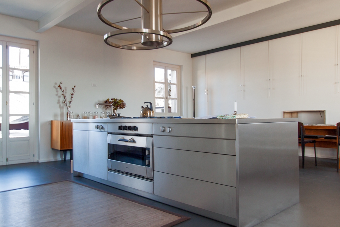
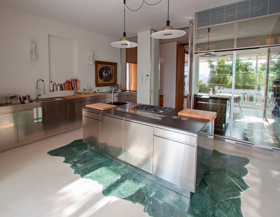
The Moscow marble kitchen project fits perfectly into the series of single-material projects we have made. Among them, a kitchen entirely covered in steel.