The beauty of hand-drawn projects

The beauty of hand-drawn projects

In the race for progress there are still those who remain tied to the art of manual drawing which preserves its timeless charm. The hand-drawn project are able to comunicate authenticity and to estabilish an almost intimate relationship.

THE ART OF DRAWING

New technologies have greatly simplified the design of a project. We still remember the times when all the drawings were made by hand: top, front and side views, and even prospects, each modification involved the redesign of all the views and rolls on rolls of paper with revisions of a single project were stacked in a corner. There were drafting machines in the studios, we worked on sheets of transparent paper so that we could speed up the new changes and once finished, with a heliostatic roller machine, disseminating ammonia odor throughout the study, the drawing was transferred to a roll of bluish paper ready to be trimmed and then hand-colored with watercolors or pastels. In the past 15-20 years everything has changed, the programs have evolved to such an extent that there are now three-dimensional creations that seem to be true  photographs of the furniture made and very few have preserved the art of manual design. Among these rare cases is the studio of the architect Pierluigi Fasoli and we want to share with you his projects that still retain the charm of the past. At this link you can view the photos of the whole project. Below the plan of the house, divided into zones and with a small explanation that recalls the interventions carried out in the different areas.
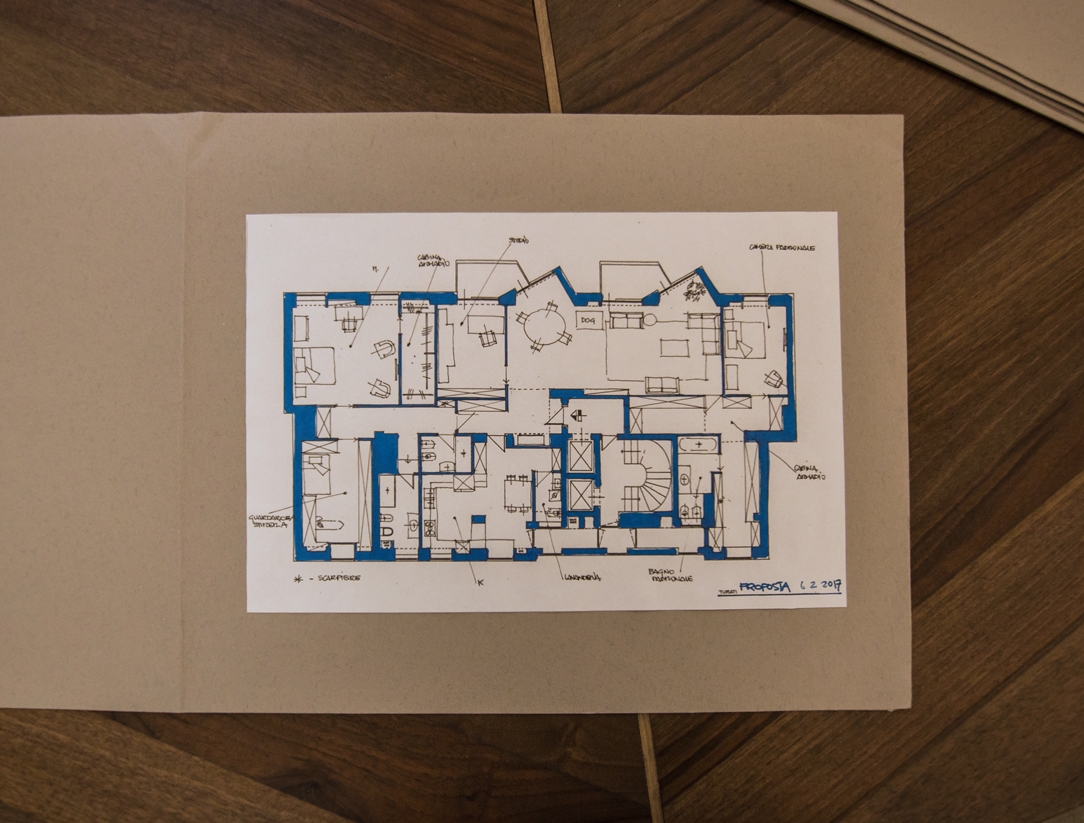
hand-drawn project

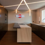
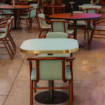
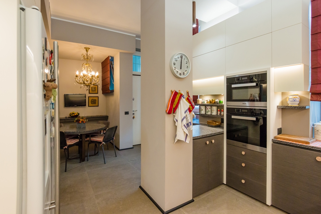
Below the kitchen project and a watercolor perspective that defines its style and materials. On the side, the visual suggestion for the furnishing accessories, in this case the chairs to be combined with the master table. At the end, a photo, in a slightly different view of the final creation.
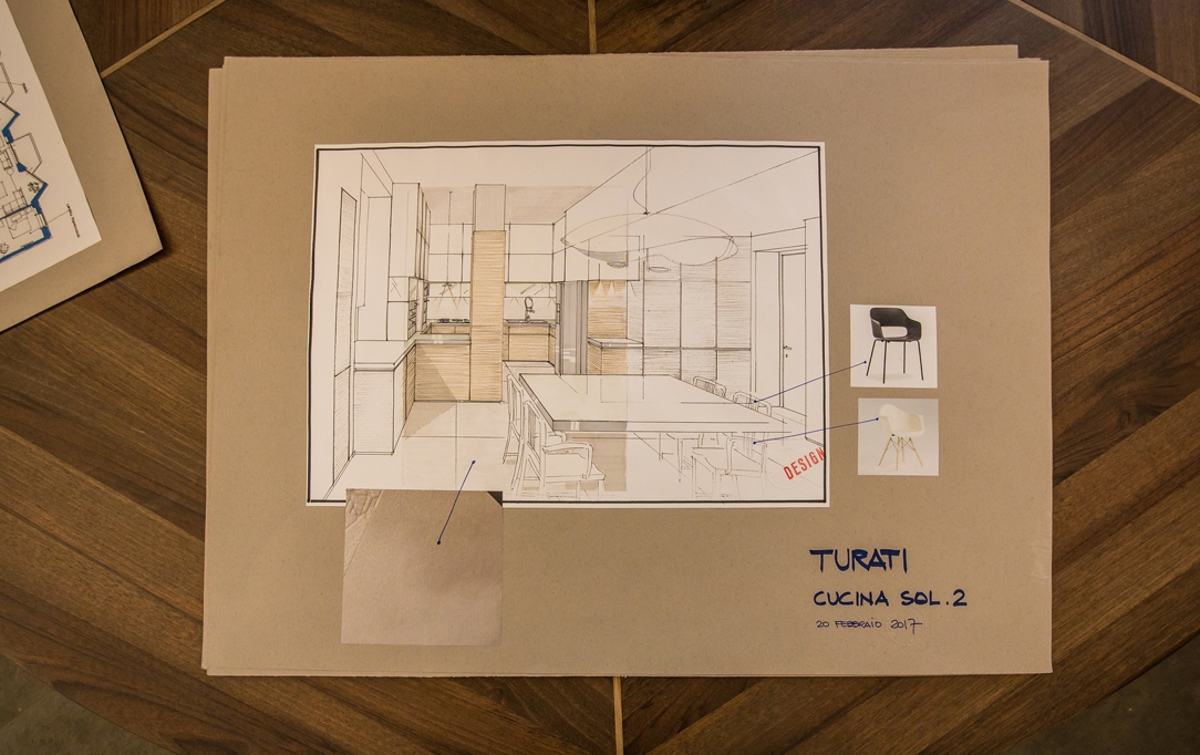
 
hand-drawn project kitchen
realized kitchen

And here is also the living area, with its detailed design that also sees the candlestick in the center of the table in the dining area. Follows an image of the living room made in detail. Not present in the project drawing but added later the particular rear wall in matt black shaped MDF. In its surface, entrance door of the studio also covered with the same finishing.
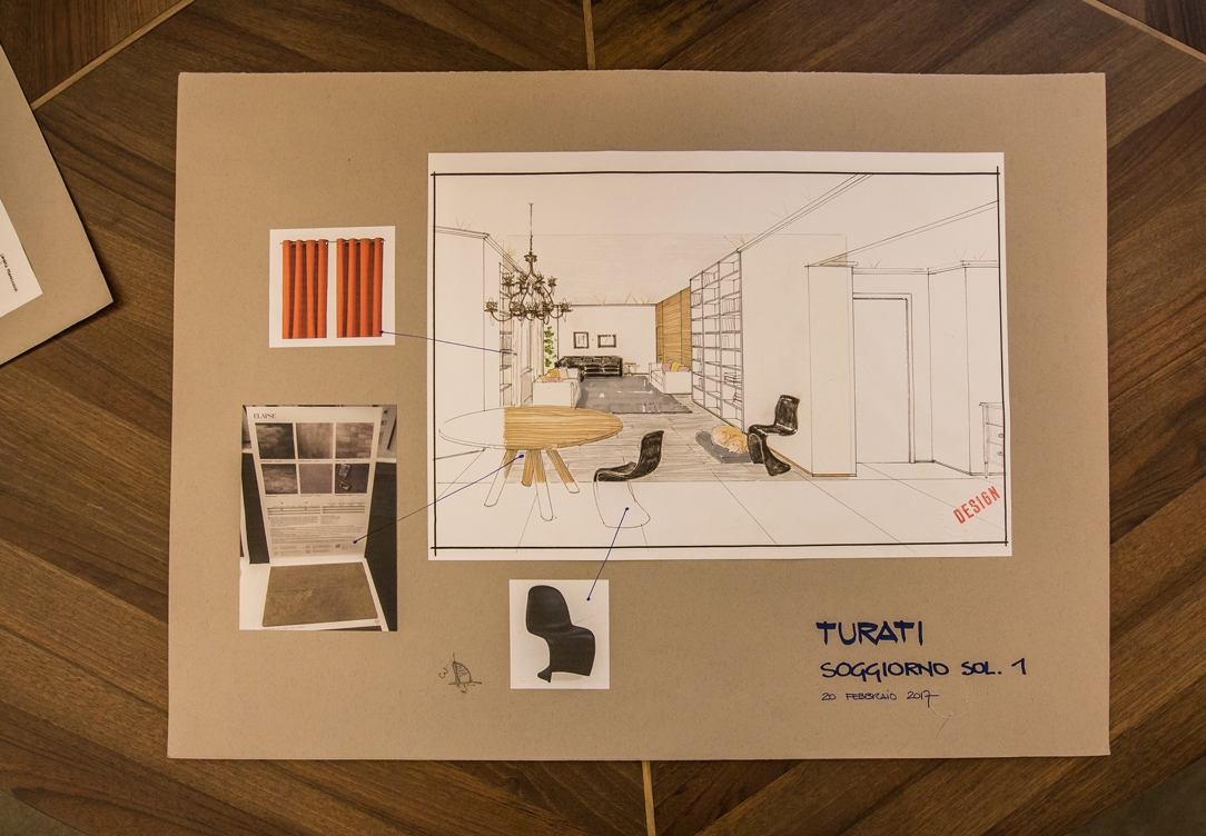
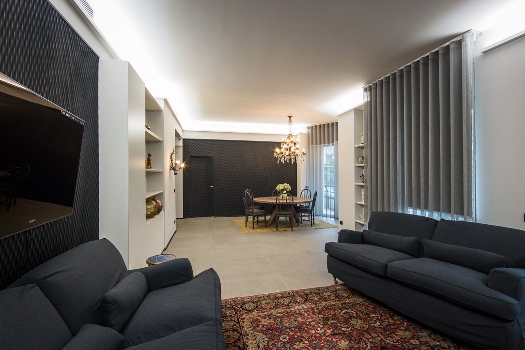
hand-drawn project living room
realization living room

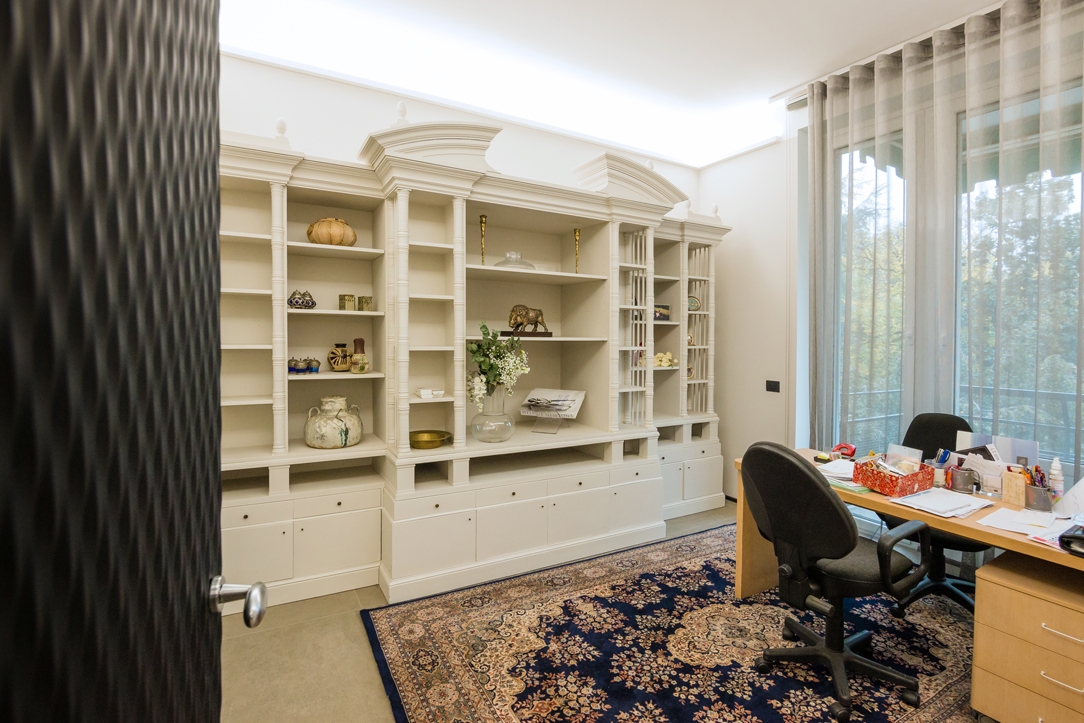
To finish the project of the studio and the image of its realization, in which we wanted to recover an existing library furniture, restored and painted in white so as not to weigh down these refreshed and lightened spaces too much.
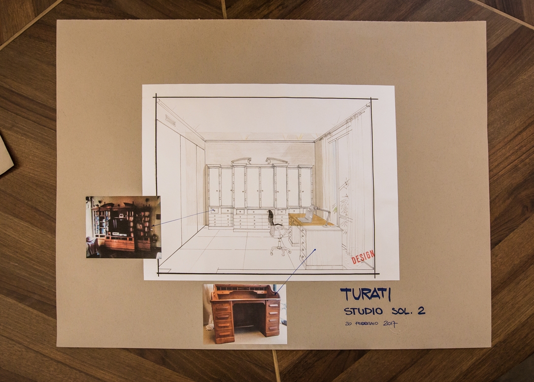
hand-drawn project studio
studio realized

Mini version of Omelette table

Mini version of Omelette table

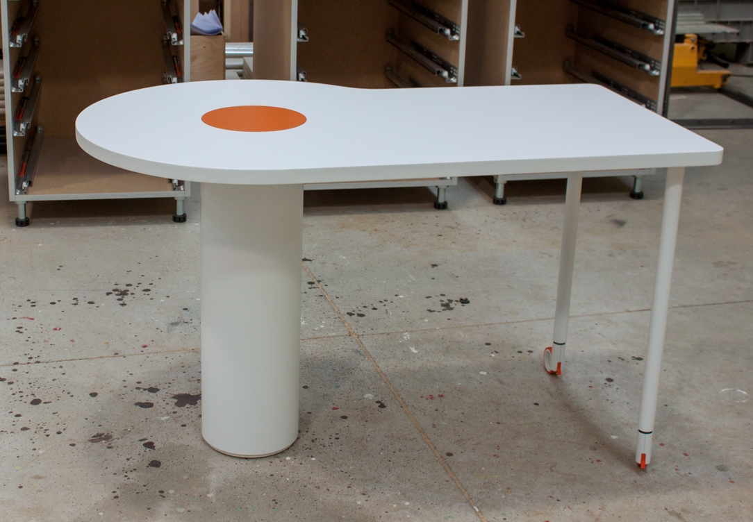
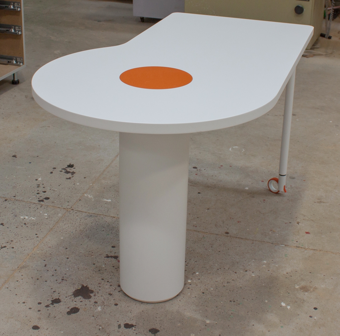
The Omelette table was born as a customizable furnishing accessory, which original dimensions can be adapted, as in this case, to the needs of customers.  

OMELETTE TABLE

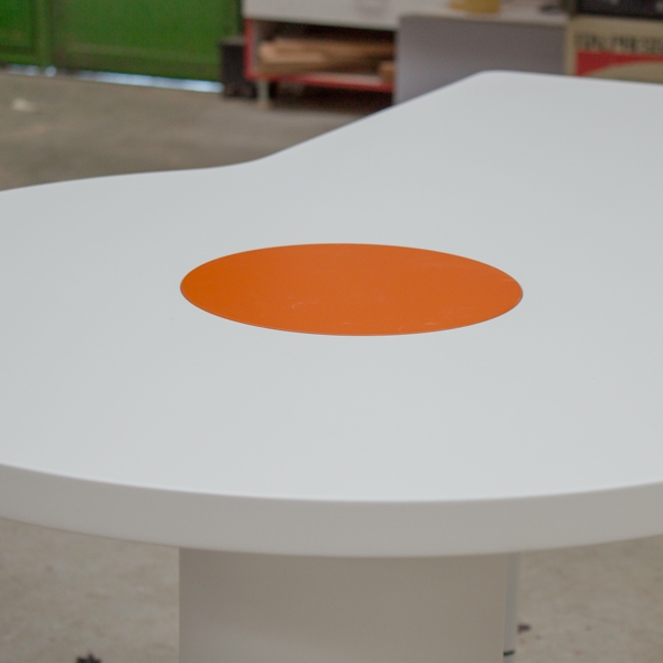
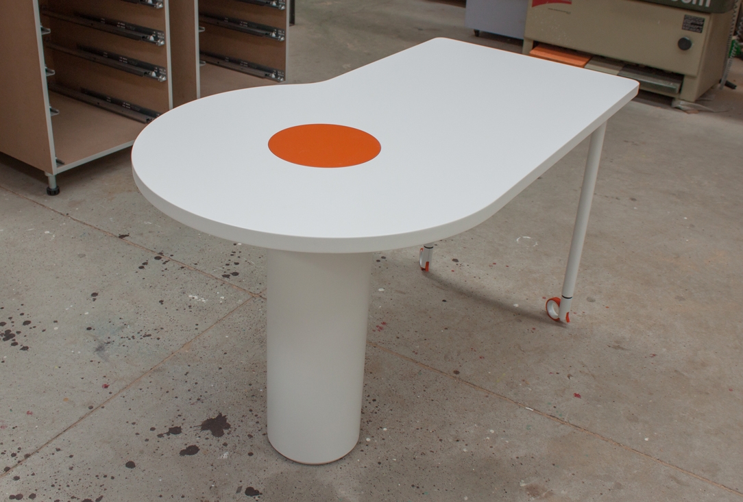
A short description of the project: Omelette was born as a peninsula table, from the need to have an asymmetrical support, with a wider and more comfortable part and a narrower one. The rectilinear shaping of the latter also allows a possible practical support on the wall. Unlike the snack tables in production, its sinuous shape allows you to have more comfort and accommodate more diners. The rotating yolk recalls the oriental tables. Here the desire for conviviality and sharing prevail and lead to the exchange and tasting of food by all those present at the table. With a central support point and legs on wheels it can be easily moved to the center of the dining area and then repositioned to rest on the wall. At this link a deepening on the project.  

MINI VERSION

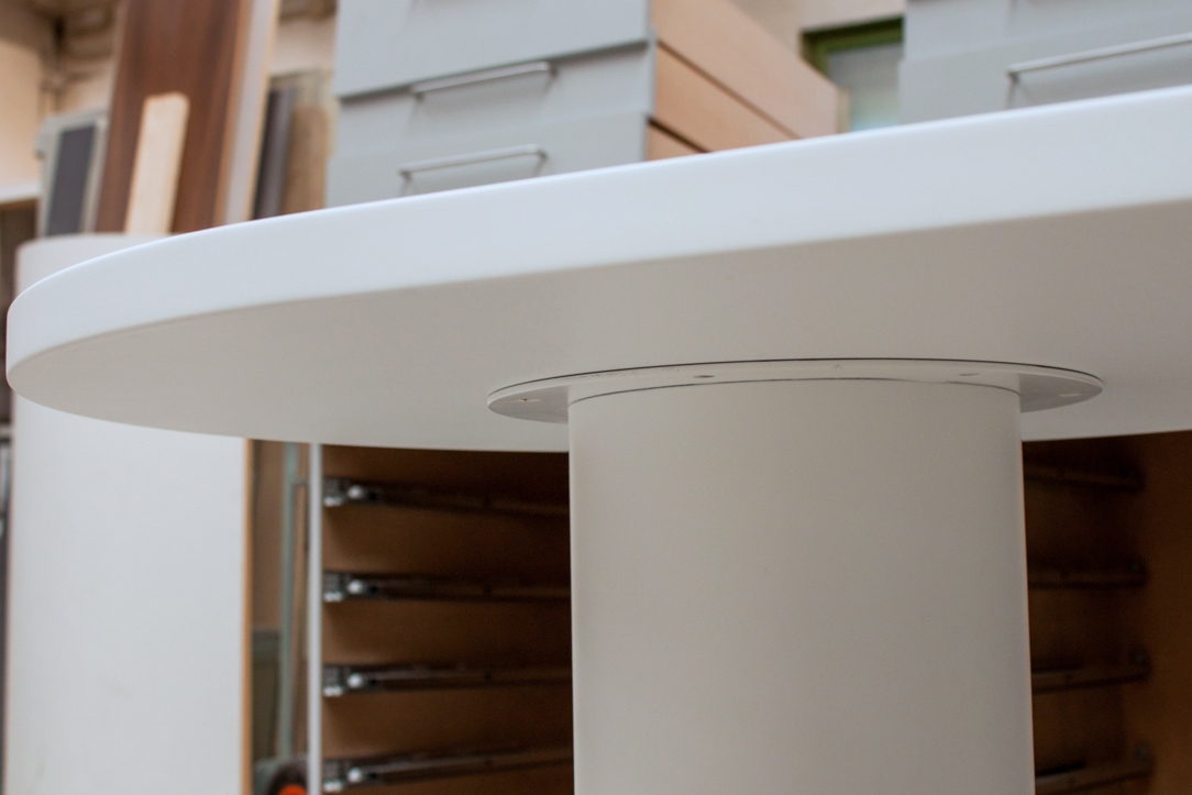
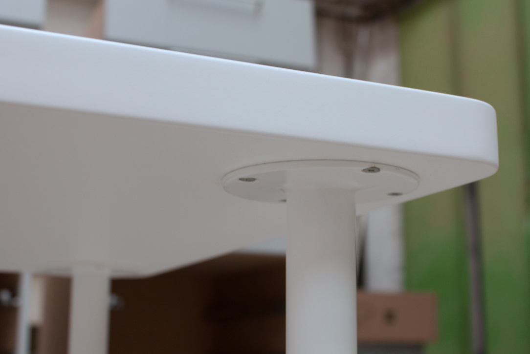
The Omelette table was made in different finishes. The original one provides a coating of the upper surface with a GetaCore® slab finished at 45 ° and a central orange matt lacquered yolk. This on, that can also be usea as cutting board, rotates on a support swivel and a support structure consisting of a pillar and two legs on wheels in polished steel. To contain the prices, especially for the polished steel part, a second version in textured painted iron is provided. Concerning  the surface, the GetaCore® sheet can be replaced by a textured matt lacquered MDF. The second version is the one chosen by a couple of special customers from Naples, who felt in love with our project. the reduced spaces and the preference for a less impactful finish bring that the Mini version fully embraced their requests. The niche, in which the table was to be located, was smaller than the original design size, for this reason we resized the shape of the table leaving the spaces in proportion to each other and keeping, from an ergonomic point of view, the right space to devote to each person. The result is a delicious version of the table in a “Mini” version, the diners are reduced from 8 to 5 but the “scrambled egg” shape remains. The central pillar and legs were painted white and as regards the wheels, we used a version of Rotola, produced by OgTm, of a smaller size but with the same white and orange finishes.  

Omelette Table Mini version
leg detail
coupling detail
Mini Omelette lateral view
Mini Omelette front view

A quick ovrview of the 40 Years of Modulor

A quick ovrview of the 40 Years of Modulor

Today we celebrate the 40th Anniversary of foundation of Modulor! Exactly forty years ago the young Carla started her business in a small shed in Torre Boldone.

40 years Modulor graphic

In those years she has lived, observed and taken inspiration for his projects from the furnishing trends that have followed one another quickly. But what has changed in people’s taste over the years? Carla grows with the eccentricity of the 60s. An explosion of colors as a response to the austerities of the war, the term kitsch is coined precisely because of these contrasting combinations. There are geometric patterns in the floors and plastic is chosen as an innovative and exclusive material, to be used in any sphere and shape. Ps: Remember that in the 60s Andy Warhol’s Pop Art was born with the exaltation of the main symbols of the consumer society. In the 70s the teenager Carla participated in the Hippie movement also called “Children of the flowers”. The unbridled use of floral symbols and geometric and psychedelic shapes are the fundamental stylistic signatures of those years. The plastic is put aside for a moment and in its place more traditional materials are reintroduced, such as leather. The latter is mainly used in its natural color and metals.


THE CAREFULNESS OF THE 80’S

And finally we arrive at the doors of the 80s when the Modulor Company was born with the aim to become a guideline for architecture and interior design on a human scale, relating in harmony and in symbiosis with the needs of its customers. The term “Le Modulor” is coined directly by Le Corbusier around the 50s of the twentieth century, which defines a scale of proportions derived from human measurements. What was avant-garde forty years ago, is now back in fashion. A style characterized by the permanence of bright colors, sometimes even in opaque colors and the use of a mix of contrasting materials, which find themselves happily living together in the same room. In furnishing accessories, handles and profiles, in wood or metal, take importance. In fact, they are not left in a natural finish but painted in colors such as red, very fashionable, or even green and black. The living area becomes the fulcrum of the home and there cannot be missing large leather sofas, chairs and designer lamps. It is precisely in recent years that there is a surge in the production and variety of design objects for the living area. Deserving of mention, the famous pop works of Alessandro Mendini, while for the most sought after, we remember icons of design with a modern style. Achille Castiglioni’s unforgettable Arco or Parentesi, Marcel Breuer’s Wassily armchair, or Mies Van der Rohe’s Barcellona are just a few examples. The first soft colors are also introduced and the new material that takes the place of traditional glass is synthetic plexiglass.

 
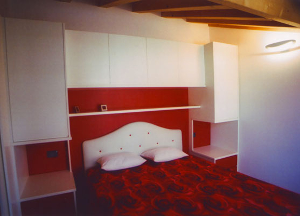
80s Modulor
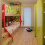
bed 80s

SOBRIETY IS BACK IN THE 90’S

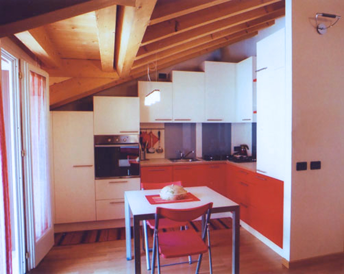
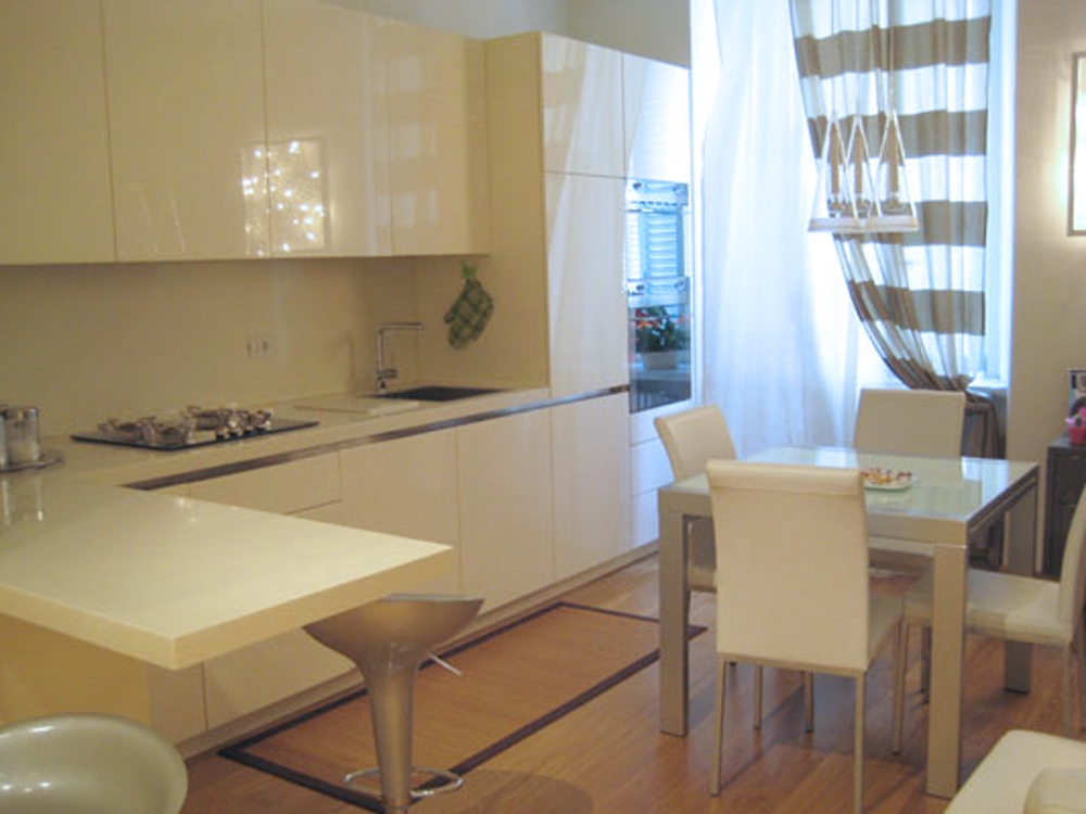
The furniture leaves the rounded shapes and sinuous lines that had distinguished them in previous years to return to simple, essential and minimal geometric shapes. Smooth and shiny surfaces are in fashion, here in fact the first bases are laid for what will be the essence of contemporary furniture. The colored plastic makes space entirely for classic materials such as glass, wood and wrought iron. Even the bright colors of previous years leave room for the soft hues, which from the walls expand to the furnishings and accessories. An explosion of beige, blush and pure white that sometimes matches with dark colors such as anthracite gray and black. The carpet and the parquet, two opposite floors live in harmony and the colored synthetic fur spreads mainly on armchairs and poufs as material. The functionality of the elements, which are designed for the purpose of the activity to be carried out by them, still leave room for creativity, especially in the original and unique forms.  

kitchen 90s Modulor
living room 90s

THE YEARS 2000 AND THE MULTIFUNCTIONALITY

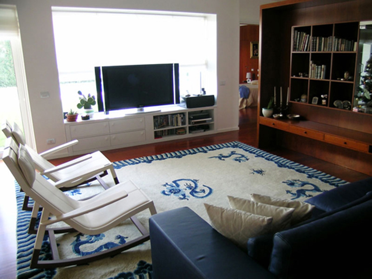
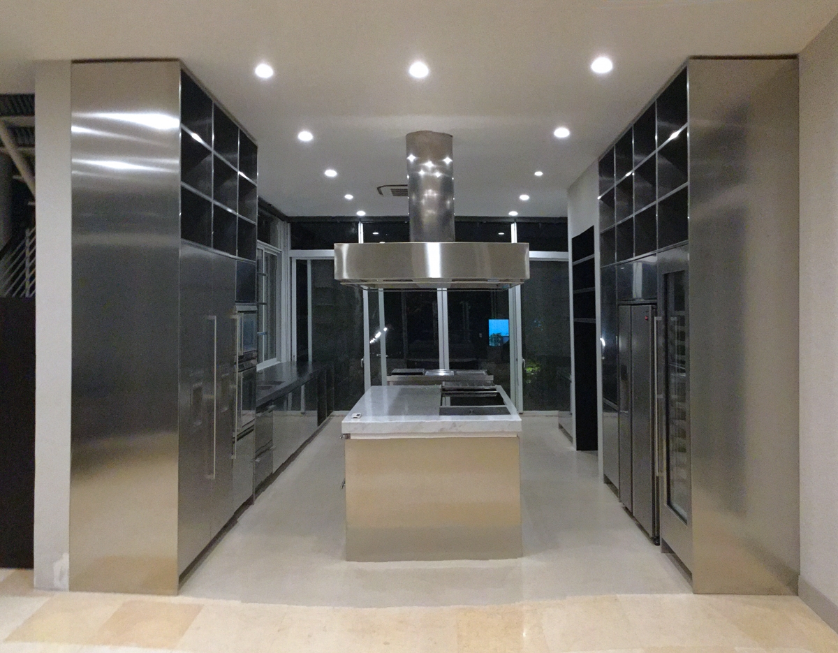
The sizes of the houses are reduced in the projects of new apartments. The airy houses of the previous eras are downsized according to need and practicality. This entails rethinking the different furniture with a view to maximizing optimization for spaces and functions favouring convertible sofa beds, extendable tables and consoles. The materials become more flexible and lighter. There is in fact the passage from solid wood, heavy and subject to deformations related to humidity, towards the MDF or blockboard, a high quality compound excellent for lacquering. Various furnishing trends are beginning to emerge such as Urban or Hi-Tech, which leave space to essential lines and industrial materials. Technology officially enters the world of interior design, becoming a functional and aesthetic feature. In total opposition, the Bohemian style is back in vogue and the Shabby Chic is born, the “elegant scruffy”. Vintage antique furniture dominates the interior of the house, defining a retro taste revisited in a contemporary perspective.

steel kitchen Modulor
velvet and metals living

MODULOR PREPARES TO FACE THE NEW STYLISTIC CHALLENGES OF THE BECOMING YEARS

What will the trends of the coming years hold for us? Surely fashion will increasingly become part of all areas related to design, including the interior. The trendy nuances will then dictate the rules, such as more feminine colors or green accents, which also recall the eco and bio trend. More and more wallpapers with geometric graphic will be used, which can already be found in tiles and accessories, or with large floral motifs. Velvet will be one of the materials that will characterize the years to come, being the perfect blend of luxury and comfort to which  different finishes of metallic materials, such as silver, gold, tin and copper will be matched.  

CONCLUSIONS

In all these years curiosity has never left Carla who today, with all of us, is looking forward to discovering what the new trends are and offering them enthusiastically to her customers. The 40 years of Modulor’s activity are only a starting point and an incentive for continuous growth and research. Ps: even if the years go by Carla is always young, she’s never gets old 🙂

La Cartolibreria, a shop for the little ones

La Cartolibreria, a shop for the little ones

A stationery store that is also a bookshop. La Cartolibreria, an innovative and unique project: it is quickly entered the hearts of people in an entire town and beyond.  

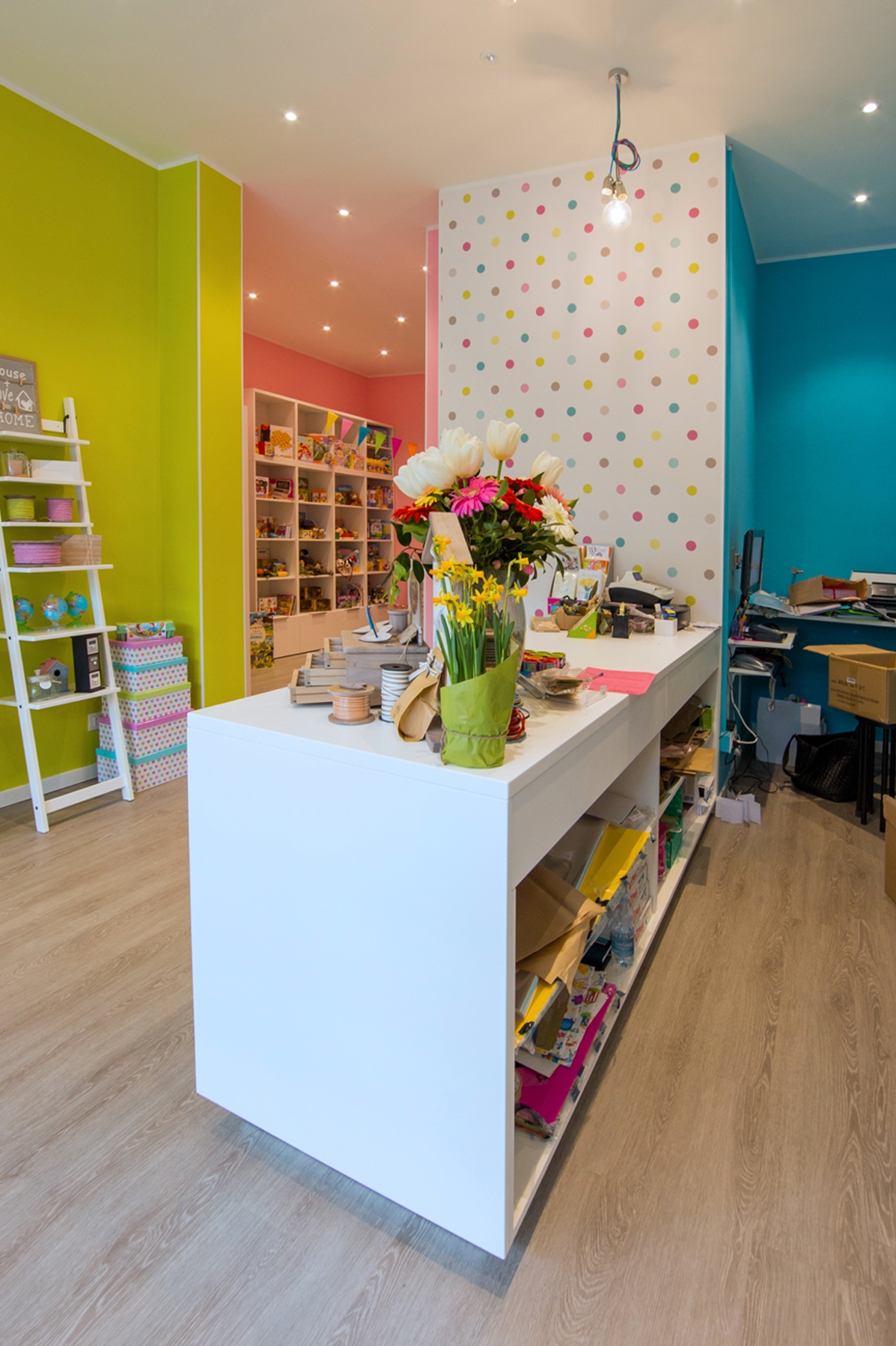
cartolibreria internal part

THE SHOP

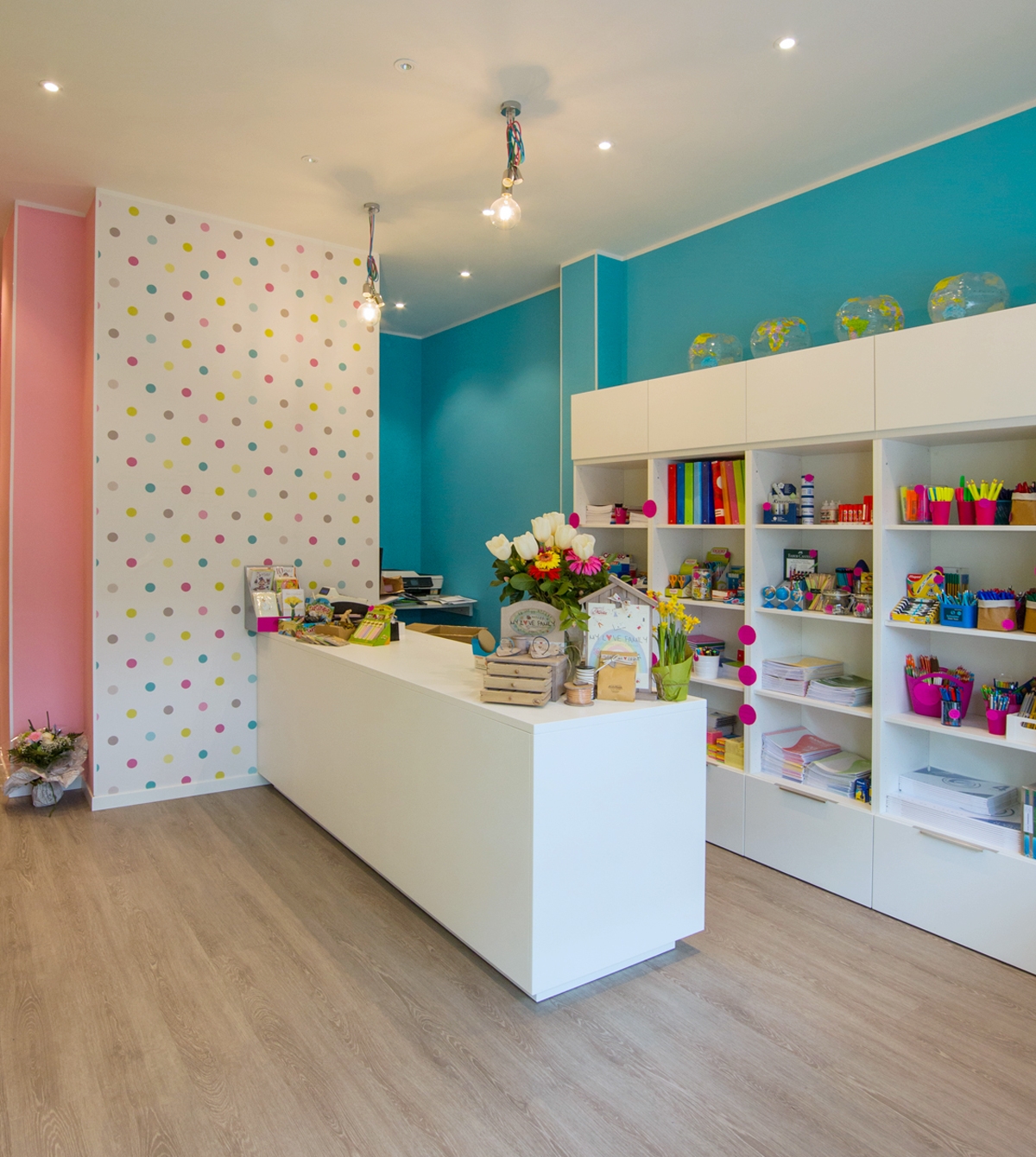
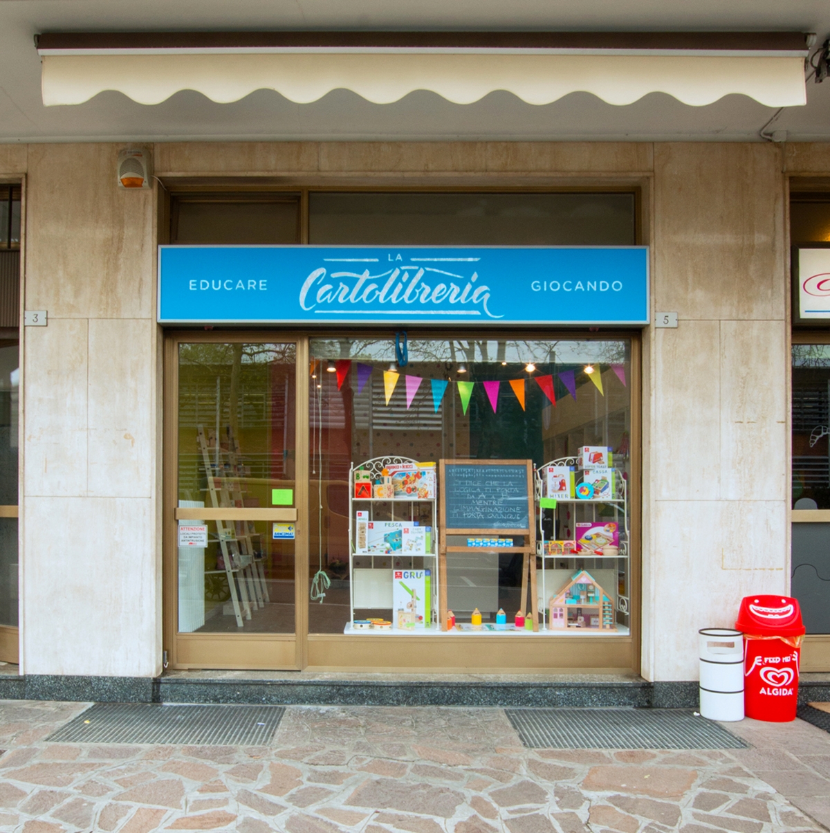
When this place, a long time ago, was still a flower shop, Silvia and Elisabetta, entering it, already imagined how it would become after their intervention. The whole environment has been totally rethought and managed to its full potential, keeping costs as low as possible. A place where lenght is higher than largeness. For that precisely reason, all the walls towards the bottom has been equipped with exposed shelves. Books, games and various objects become the protagonists of his essential exposition with its fresh taste. The entrance has been kept airy, enhanced by the main large window that provides natural lighting. The right side holds the  counter area and its back, equipped with stationery elements, while on the left small light displays show the bare essentials so as not to weigh down the room. Even if the space is unique, it could virtually divided into two parts: a more frequented area in the entrance and a more intimate one towards the back. The dominant colour is the white of the furniture, which visually expands the room. Reason why, the feeling you get when entering is always that of freshness and cleanliness. This matches with walls colored with exuberant hues, such as pink, turquoise and acid green. A touch of liveliness for children, the main users to whom the Cartolibreria is aimed. The same colours are visible in the polka dot of the wallpaper in the front wall at the entrance, which extends high towards the ceiling. It gives that delicate and non-invasive touch of class. The spotlighted ceiling provide the best lighting to all areas. Moreover, above the counter, symmetrical light bulbs descend to alternate heights to create a bit of dynamism. La Cartolibreria is not a common shop, but young users are also involved with events and workshops. In fact at the back, the most reserved part dedicated to reading, there is a table at rest. This, during the initiatives, is moved to the center of the room and is packed with curious children, who can’t wait to create some chores to take home.

cartolibreria external

OUR INTERVENTION

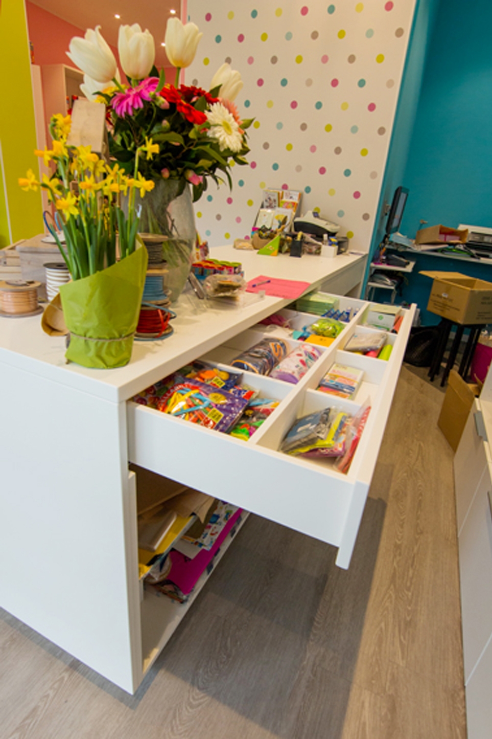
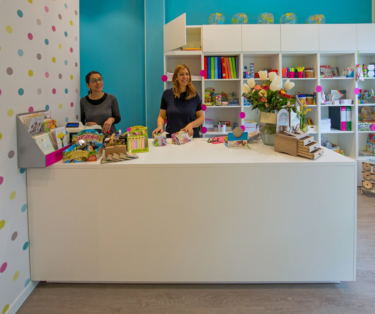
Sometimes even a small project can give many satisfactions, as in this case, where we have created a multifunctional counter. Silvia and Elisabetta’s needs were to have a large table top, to be used as a crate, work table, container, display and to be left available to customers for the support of the chosen goods. We have thus conceived and created this visually very simple element, which however hides very deep drawers with good guides In the upper part the drawers are narrower to hold all the small and more requested elements, which must be quick to find and deliver. While the lower shelves are much higher and more capacious. The material is a textured white lacquered MDF, which small porosity in the paint allows a higher resistance than normal lacquer and is recommended above all on horizontal surfaces, or in any case the most used ones. The logo was also created for La Cartolibreria, in an English cursive revisited with Brush Pen and the whole coordinated image.

counter
open counter

CONCLUSIONS

A small space where time stands still and pampers its own “inner self”, a shop that is not only liked by children but also by adults. What else to say, if you have not yet gone to visit Silvia and Elisabetta what are you waiting for? Run, they are waiting for you!

Aliens looking for books land at the kindergarten in Villa di Serio

Aliens looking for books land at the kindergarten in Villa di Serio

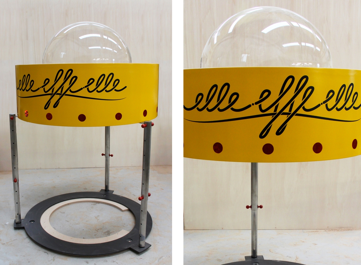
We are happy to share with you a special project for the kindergarten of Villa di Serio, which we have followed with pleasure, of the spaceship Elle Effe Elle.

A few days ago a brightly colored spaceship landed in the garden of the Cavalli nursery school in Villa di Serio. The two Martians Bi and Ci have landed in search of books.

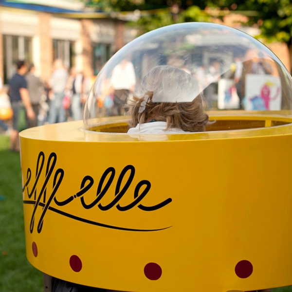
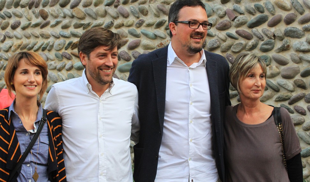
The name of the unidentified object, all made in Valle Seriana, is Elle Effe Elle which stands for Little Free Library: inside it will host children for an exchange based on “take a book, leave a book.” Promoter of the project is the association Traiettorie Instabili which, with the sponsorship of the Municipality, carried out the project for free with the collaboration of private companies to encourage the reading habits. “We wanted to give the children a house of books – explained Alessandro Longhi of Traiettorie Instabili, before cutting the ribbon -, but when the manager asked us that it was suitable for the Under 6, without edges and without doors, we involved the friends of Officina Idea”. Giovanni Nervi and Paolo Carrara thus had the idea of ​​creating a spaceship, made of wood and steel, with a cap underneath where you have to get in to access the internal shelf that houses the books. To make Elle Effe Elle even more intriguing, Alice Tebaldi, a young designer who lives in Villa di Serio, conceived and digitally illustrated the rhymed story that tells of young aliens looking for books. “It is a very interesting project to encourage to read books,” said Mayor Bruno Rota at the inauguration. For now, the book-swap spaceship is a single prototype made by Modulor Progetti of Ranica, in collaboration with the MetalArredo Bonomi company in Alzano lombardo, but it cannot be ruled out that others can be landed at primary school or in the park. Today the vehicle will fly to the town hall square for the autumn festival. “The spaceship – explain the engineers-architects Carrara and Nervi – has a transparent cap to bring natural light inside but also to look at the sky just like an alien would do; the legs are adjustable, this allows you to reach the height suitable for the type of user expected for each library and to keep the library level even if positioned on uneven ground. The legs are fixed to an iron base which is then tied to the ground “.

Elle Effe Elle spaceship Villa di Serio
Elle Effe Elle presentation
Elle Effe Elle Villa di Serio