Iron furniture for a contemporary style apartment with refined details

Iron furniture for a contemporary style apartment with refined details

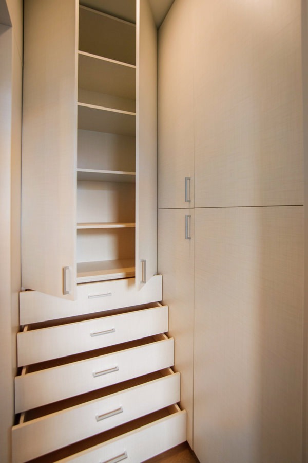
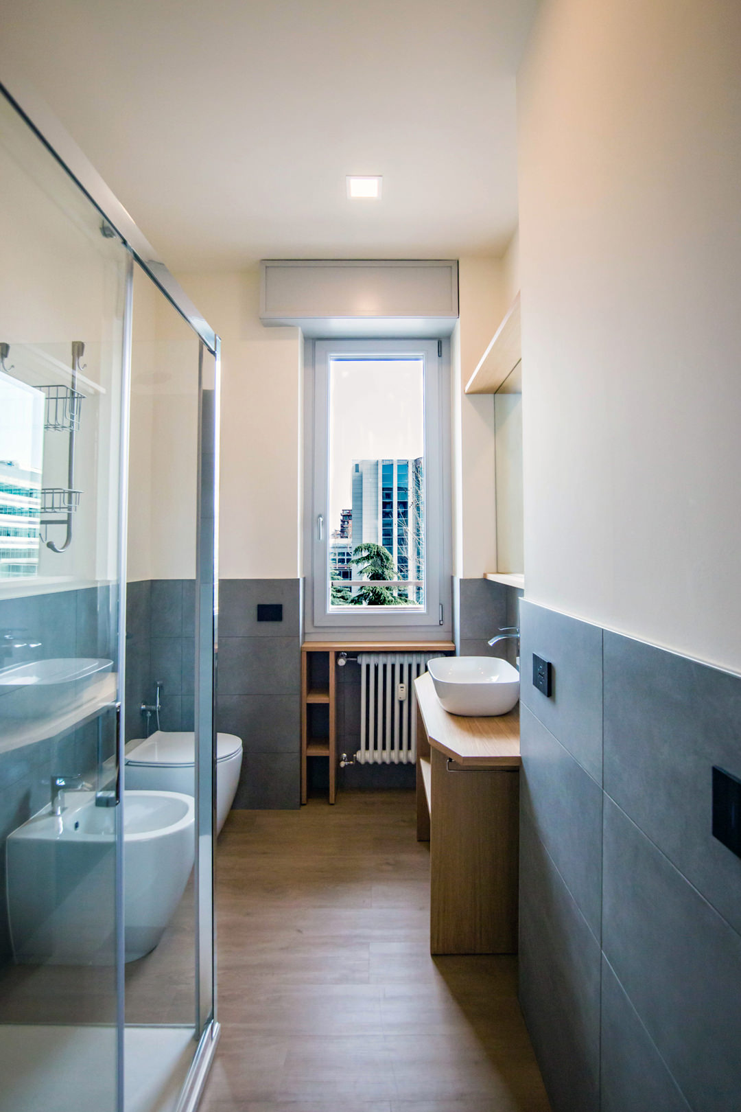
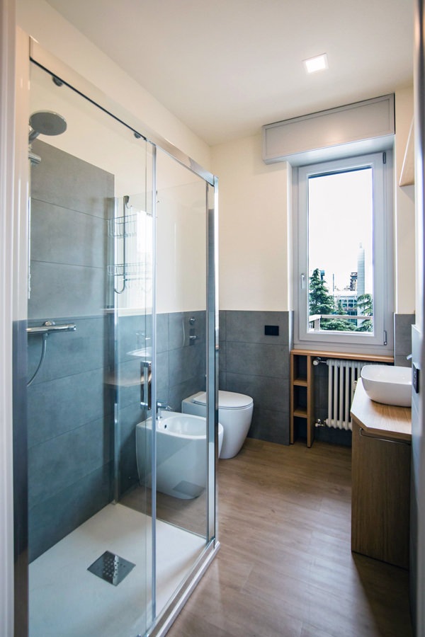
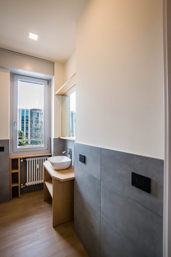
Iron details constitute the leitmotif for the contemporary style furniture of this city apartment. From the living area to the bedroom, passing through the passageways that underline the threshold of each room. In the bedroom, a walk-in closet located on the side of the entrance is a compact but capacious structure.

details-iron-cabinet-TV-portal-entrance

The passageways: the iron portals to underline the threshold

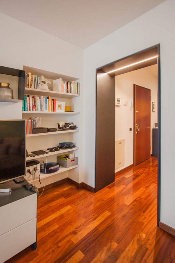
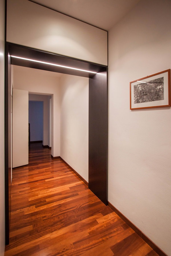
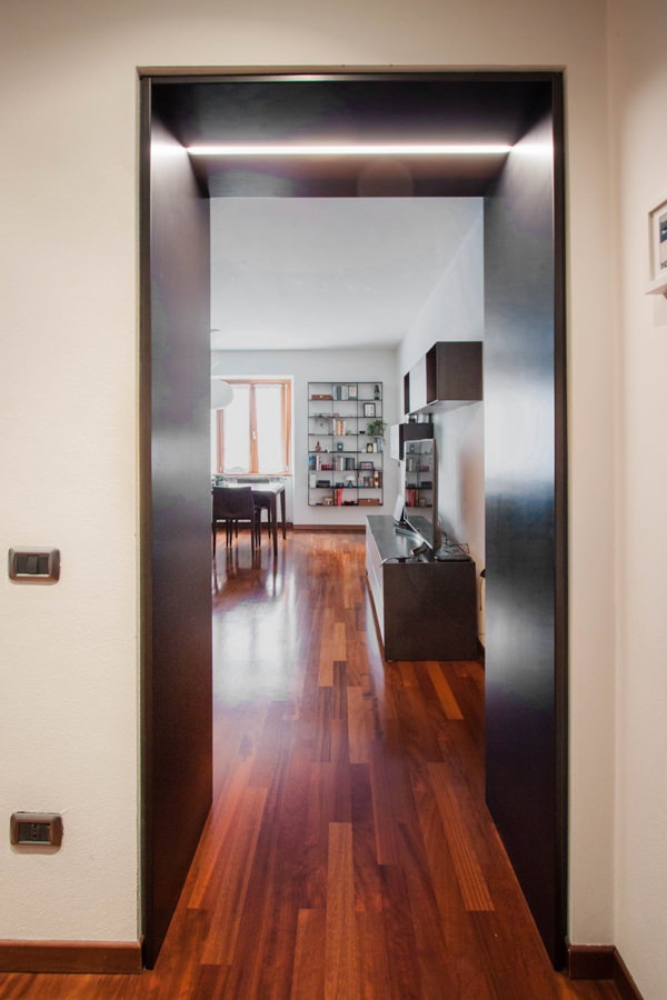
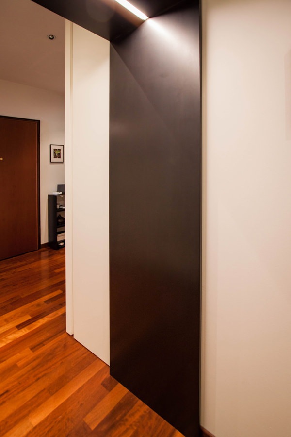
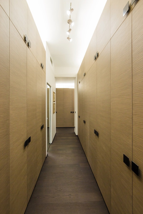
From the entrance, the corridor unfolds, joining the living area with that night. To delimit the passage, emphasizing the threshold of each room, an iron portal with integrated lighting.
These accompany the passage between the different environments with a coating that laterally flows from the top.

A portal that visually and conceptually marks the crossing point, characterizing each room.
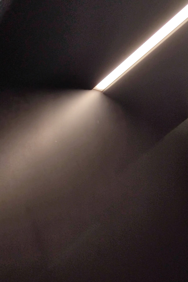
Recessed in the upper part there is also a LED strip able to horizontally illuminate the portal.

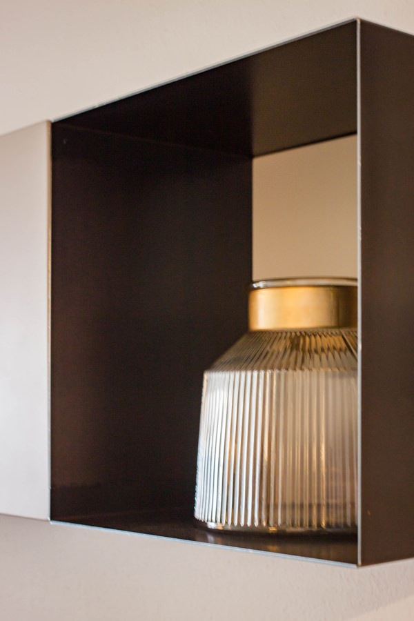
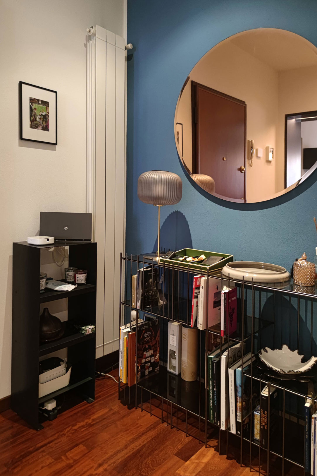
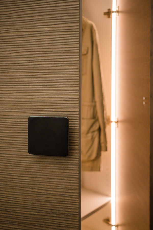
The choice of black waxed iron is echoed in the cabinet serving the entrance, the Metrica Console by Mogg. This is accompanied by a custom-made cabinet empties pockets entirely made of iron.

portal-iron-corridor-integrated-lighting
entrance-portal-hall-iron-black-waxed-recessed-lighting
furniture-in-iron-entrance-apartment-contemporary-style
detail-lighting-LED-portals-iron-corridor
corridor-portal-passage-iron-waxed-lighting

The living area. TV cabinet and wall units with iron details

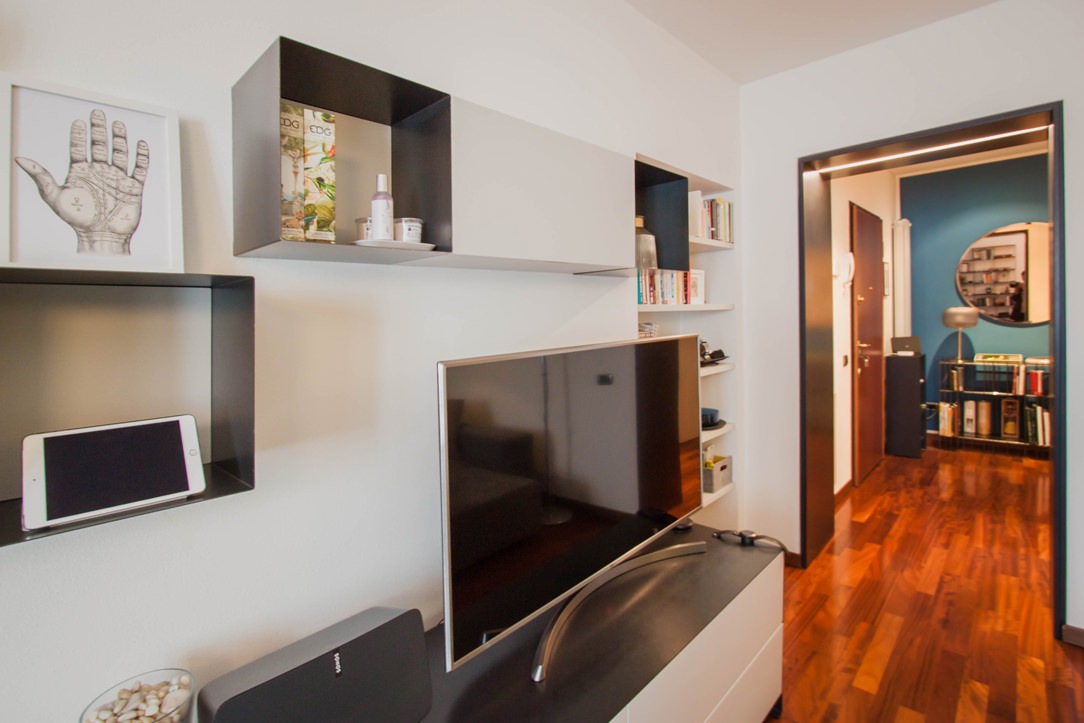
From the entrance, the iron portal with integrated lighting marks the passage to the living area.
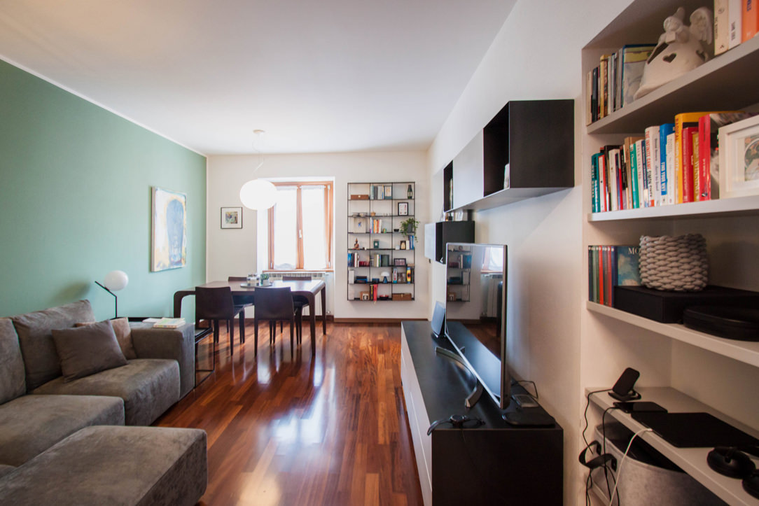
This houses a large corner sofa that stands out against a sage green back wall. A touch of color that rejuvenates the environment making it elegant and gritty.

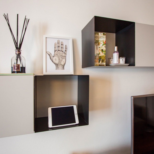
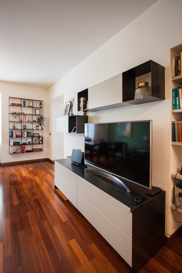
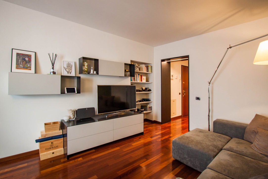
From the front, the furniture serving the TV is at home with a system of shelves and wall units with iron details.
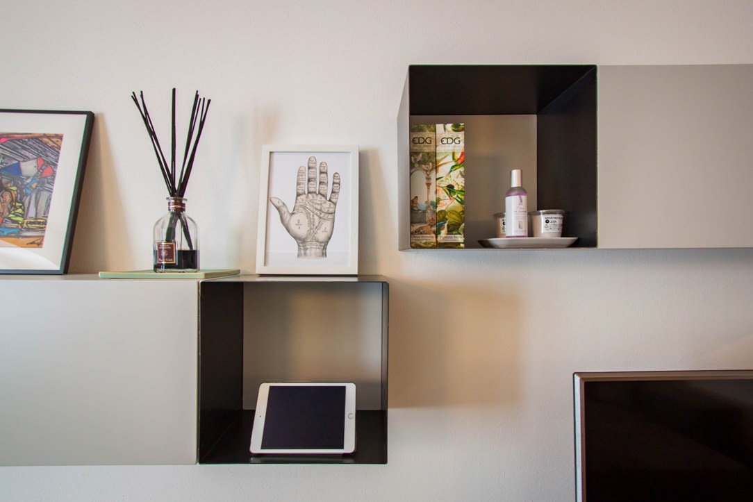
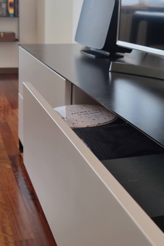
A composition of solids and voids that alternates the thin thickness of the iron sheet with the more massive dimensions of the matt lacquered MDF.
In particular, the open compartments in sheet metal are laterally inserted to the wall units with drop-down opening. The doors in matt lacquered MDF reflect the stylistic line of the TV cabinet in the color.
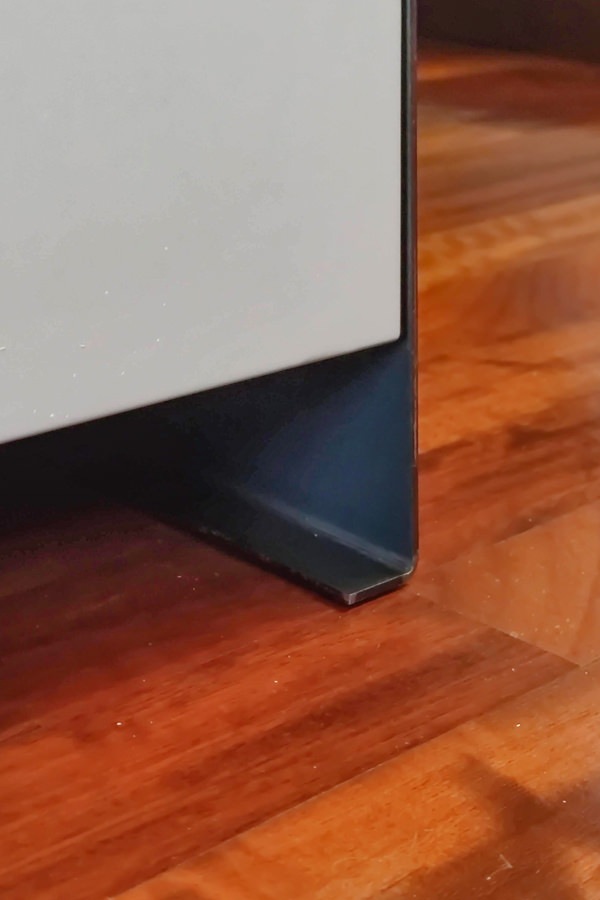
The latter is equipped with sheet metal shoulders which, by bending at the end, become a load-bearing structural element.

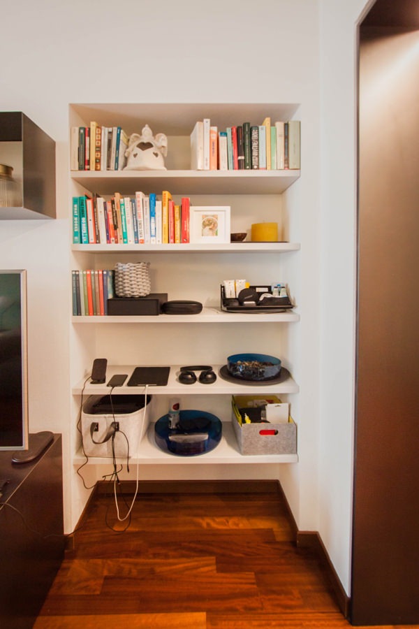
An equipped niche to the side of the TV cabinet accommodates custom-made shelves for small objects or books.

living-room-contemporary-iron-furniture-side-view
furniture-TV-details-iron-shelves-service
iron-furniture-living-area-detail-portals
living room-modern-cabinet-TV-wall-units-iron
detail-front-wall-units-flap-bookcase-iron-TV cabinet
detail-iron-shelves-TV-living-area
black-waxed-iron-tv-cabinet-drawers-handle-hollow
front-view-bookcase-niche-shelves
detail-furniture-in-iron-shoulder-support-feet

The sleeping area between the workstation and a walk-in closet created in the master bedroom

The corridor characterized by the presence of black waxed iron doors also leads to the sleeping area.
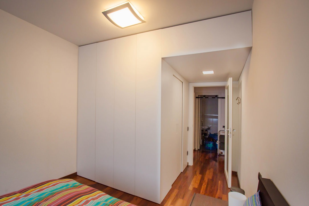
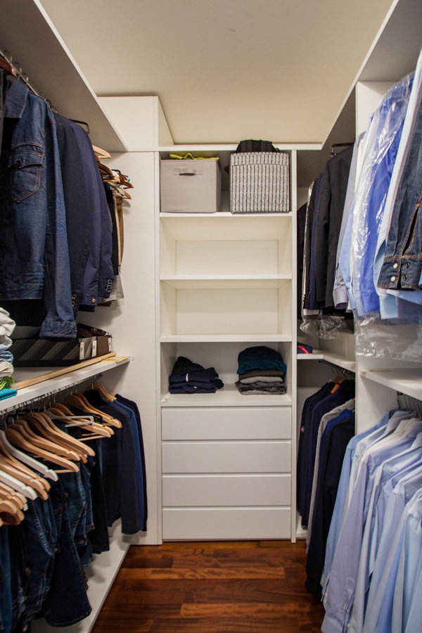
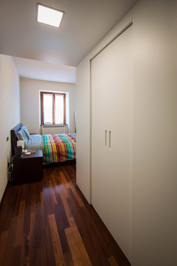
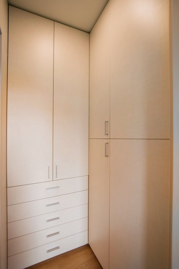
In the master bedroom the architectural conformation creates a space that allows the insertion of a custom-made walk-in closet.

Its compact but roomy layout is set on the side access adjacent to the bedroom door. Two sliding doors fit into the white MDF closing panels, denoting access to the environment.
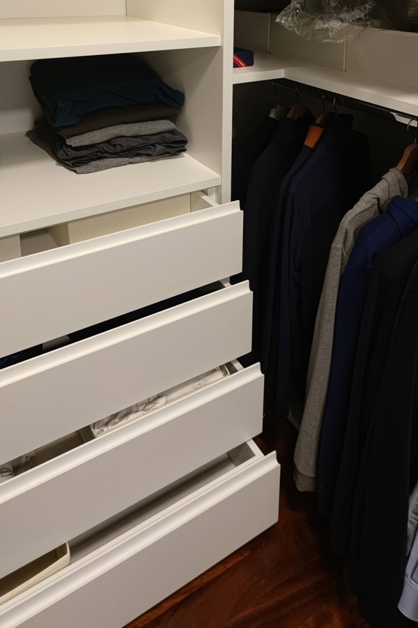
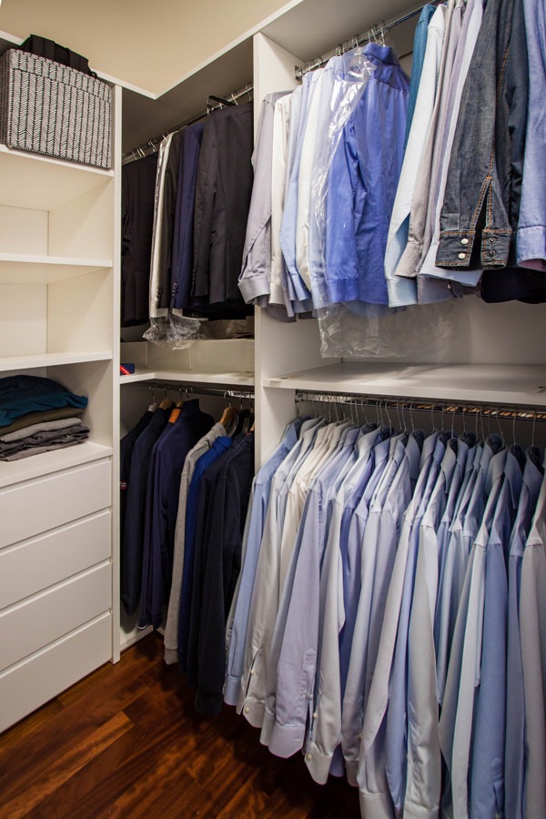
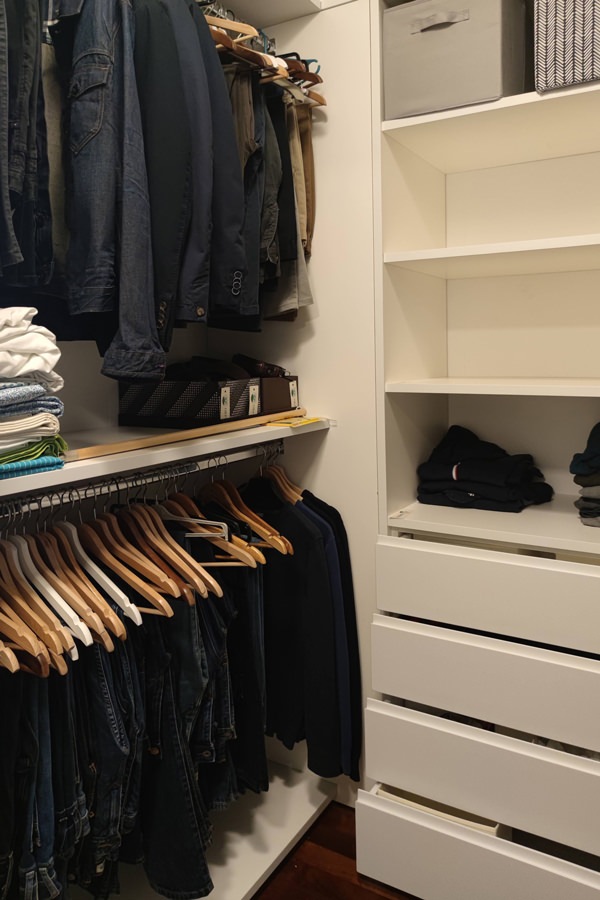
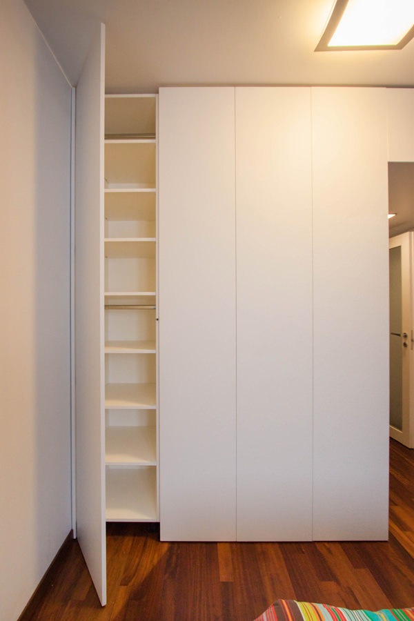
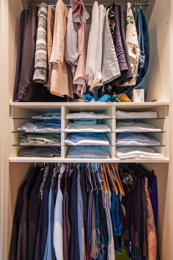
Here the central compartment is occupied by a series of linen drawers in the lower part and shelves above.
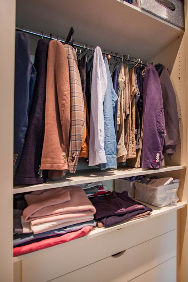
On the sides, on the other hand, hangers are arranged using the double height to organize shirts, jackets and trousers.

The containment structure is divided into panels that create a visual rhythm and allow in one extreme to take advantage of a niche accessible from the outside. Internal shelves adjustable in height make it functional for various uses.

walk-in-closet-bedroom-structure
composition-walk-in-closet-drawers-shelves-hangers
detail-opening-drawers-linen-walk-in-closet-handles-recess
fixed-tubular-detail-hanger-shirts-walk-in closet
double-height-hangers-shirts-jackets-walk-in closet
side-view-hanger-walk-in-closet-drawers-linen
walk-in closet-bedroom-double-access-sliding-doors
external-walk-in-closet-door-accessible-shelves-inside

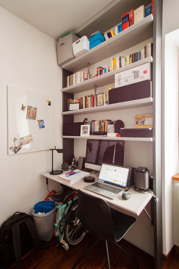
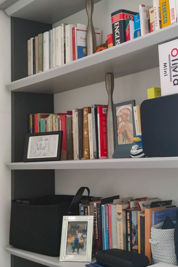
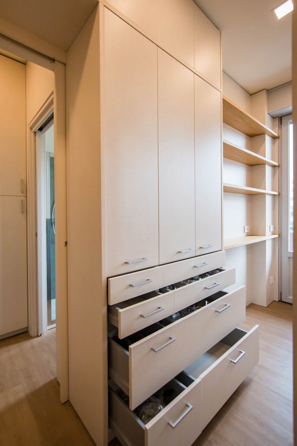
In the adjacent service room, there is instead a large desk with attached bookcase. A tailor-made solution that is increasingly current in times of smartworking. The upper bookcase has MDF shelves and iron side panels that also become load-bearing elements for the desk top, inserted to form a compact piece of furniture. The care of detail is expressed in this case with the 45 ° shaping of the front of the shelves. The effect obtained is to visually thin the elements, creating stylistic modernity.

mobile-desk-bookcase-shoulders-iron
detail-bookcase-shelves-shaped-profile-iron-shoulders

Inserting iron furniture in your apartment means endowing the rooms with character and elegance. Versatile and practical, this material manages to combine high resistance with reduced thickness, declining in different design solutions. Furnishings able to define the stylistic imprint of the interiors, they fit perfectly into interiors in a contemporary style, but also modern, industrial and boho chic ones.

Modern style: rigorous, elegant and prestigious

Modern style: rigorous, elegant and prestigious

The modern style links the vision of interior design to architecture, in a relationship of mutual collaboration. Between rigorous furnishings, bright rooms and a prestigious appearance, the modern-style interiors express timeless elegance.

The modern style in history: the masters of design

To fully understand the modern style, it is useful to take a few steps back in time to its historical origins.
We are between the two World Wars in a context of renewal that involves the formal plan of architecture, but also urban planning and design.

Under the classification of Modern Movement, also known as International Style, belong the currents De Stijl, Bauhaus, Constructivism and Italian Rationalism.
The main exponents are architects of the caliber of Le Corbusier, Frank Lloyd Wright, Mies Van Der Rohe, Alvar Aalto and Walter Gropius.

Starting from a strong conception of architecture as an organic structure in relation to the external context to which it belongs, the Modern Movement also sees the house for its social use and not just as a family unit. Frank Lloyd Wright with his organic architecture gives excellent examples.
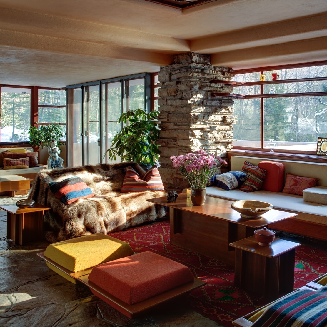
Among these, the Waterfall House, designed in its architectural conformation in strong relationship with the surrounding geological and natural context. Each element is configured both on the architectural level and on the interior design level based on a strong contamination between inside and outside. In doing this, the choice of proportions based on the human figure is fundamental.

Natural materials combined with organic shapes that favor horizontality, but also harmony and brightness become the key principles of the Modern Movement. Instead, the priority need is to achieve the best functionality of the building, which can also determine its aesthetic beauty.
In doing this, the house frees itself from the unitary vision to which it was accustomed to take on a social meaning in relation to the surrounding buildings.
The extreme example is the building that itself becomes a city, as in the case of Le Corbusier’s Unitè d’Habitation.

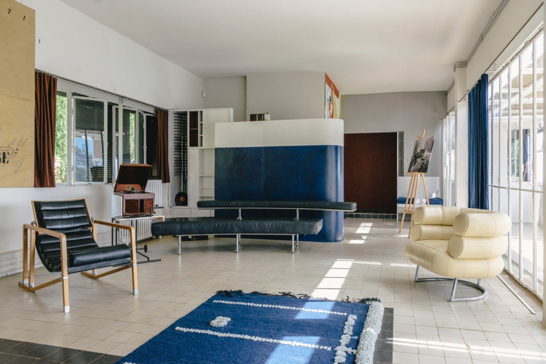
eileen-gray-villa-E-1027

Eileen Gray’s E-1027 House, a modern style living room with iconic piece of furniture.

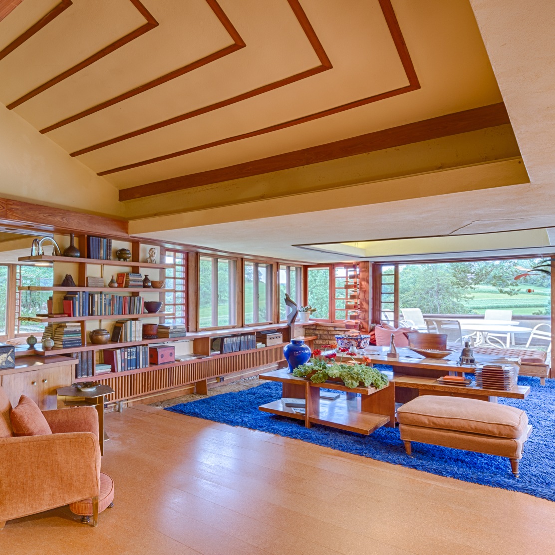
TaliesinInterior_Andrew-Pielage-3
Fallingwater-2012_13_15_18_20

Left: modern style living area (Photo: Andrew Pielage, Frank Lloyd Wright Foundation)
Right: Fallinwater House by Frank Lloyd Wright (Photo: courtesy of the Western Pennsylvania Conservancy)

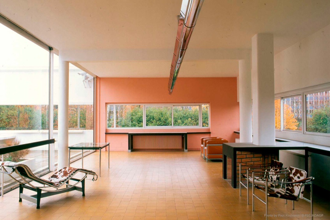
Villa-Savoye-interior-Le-Corbusier

Villa Savoye by le Corbusier. The relationship between inside and outside is expressed in bright rooms and ribbon windows

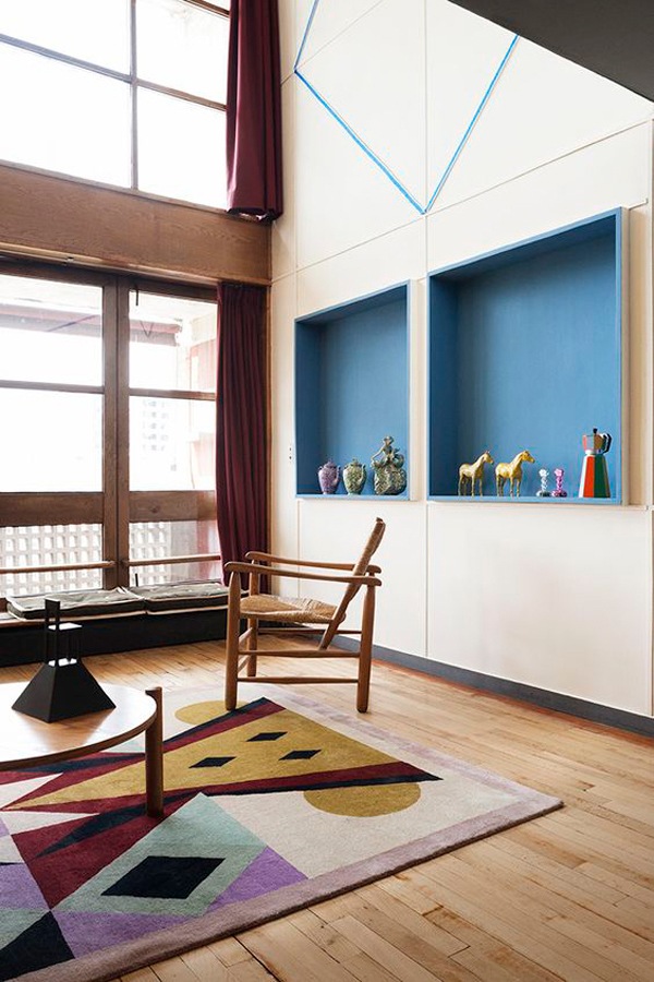
unitè-habitation-marsilla-le-corbusier
unitè-habitation-marsilla-le-corbusier_esterno

Unitè D’Habitation, Le Corbusier. The building becomes a social community by offering, in addition to the family housing units, all the services necessary for individual life.

Modern style furniture: the strong relationship with architecture

The modern-style interiors both in the course of history and in the contemporary context are based on a strong relationship with the architectural context in which they are inserted.
This is how bright environments are created. Here, the exterior constantly communicates with the interior through functional choices that also justify the aesthetics.
Therefore, windows can take on a more elongated shape and it occupy a higher position than the standard ones. This allows the entry of natural light, which will obviously be studied according to the optimal orientation of the house, but at the same time allow the inhabitants not to be seen from the outside.

The subdivision of the rooms between the sleeping and living areas is based on a logic that considers the orientation of the house and its visibility or protection from external factors.
The hearth is definitely a central point in the design of a modern style home.
A place of aggregation and socializing, it expresses hospitality and intimacy at the same time, creating a strong suggestive interior.
For this reason, in modern homes par excellence it occupies the central position with respect to the living area, becoming the fulcrum for the arrangement of the remaining rooms.

 attic entrance

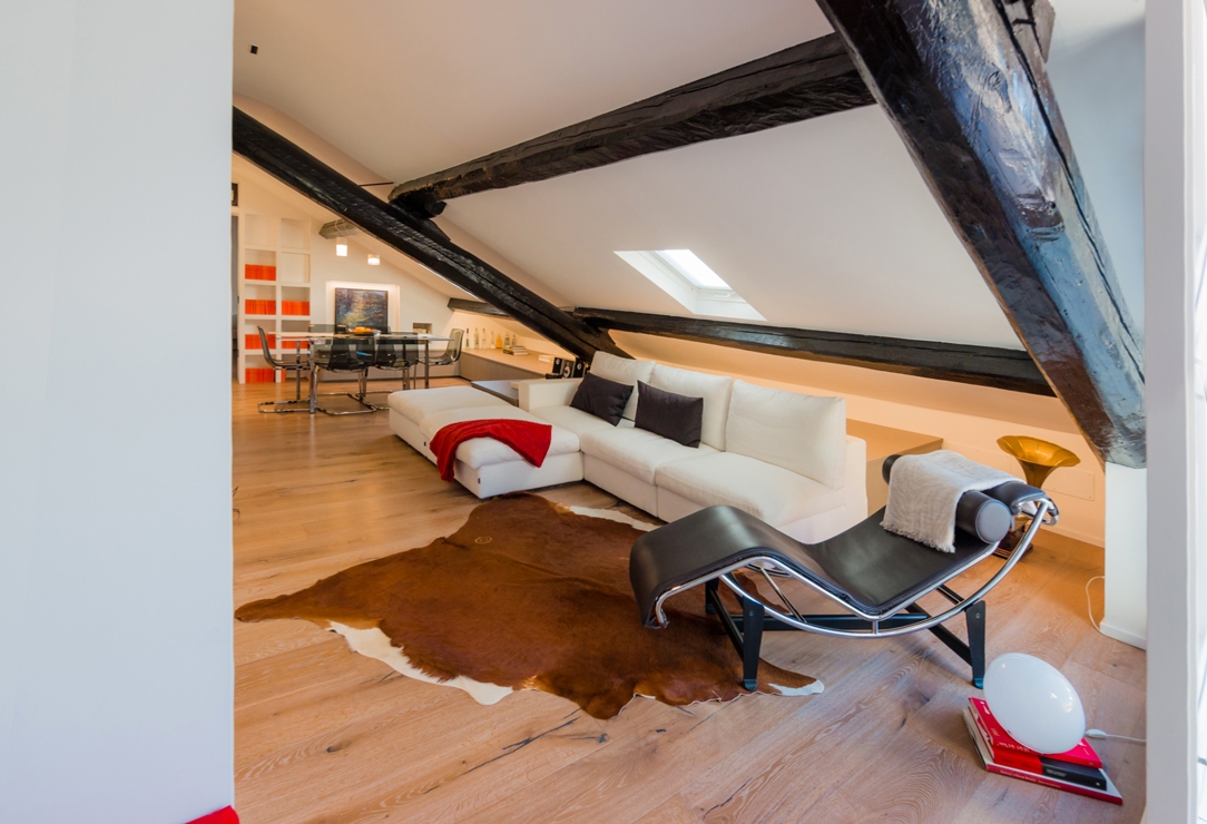
The living area of ​​this modern style attic with the iconic chaise longue designed by Le Corbusier

vertical living room

Modern style kitchen and living room with reflective materials and simple lines for this Modulor creation

Fine living room view

A modern living area on the bottom of which an elegant wall with a three-dimensional effect is identified

doors-modern-style-cabinets-corridor
 cabinets-corridor-finishing-elegant-modern-style

The equipped corridors of this Modulor realization express their modernity in the choice of material.
Soft and textured to the touch and extremely elegant to the eye.

Modulor modern kitchen in dark tones_01

Una cucina moderna firmata Modulor con particolare attenzione alla scelta cromatica e materica

Shapes, colors and materials between past and present

The choice of materials in a modern style also comes from the contamination between inside and outside.
Great importance is given to materials capable of enhancing the brightness of environments through their reflective and brilliant surface, even better if of natural origin.

Wood knows its maximum expression both in the traditional form of the Modern Movement and in its contemporary conception.
Chosen for its malleability and natural aesthetics, it brings the exterior directly into the home interior, also molding itself into irregular shapes. Over the years, it has also known the polishing treatments and the recent painting that make it possible to obtain reflective surfaces capable of giving brightness to the environment.

Neutral tones are favored, starting with the classic white, but colored variants are also welcome especially in the current years. In this sense, it is important to underline how the contemporary trend in the modern style prefers monochromatic colors and tone-on-tone games that opt ​​for desaturated colors.
Prestigious and elegant interiors that do not, however, give up a touch of color capable of giving character to the rooms.

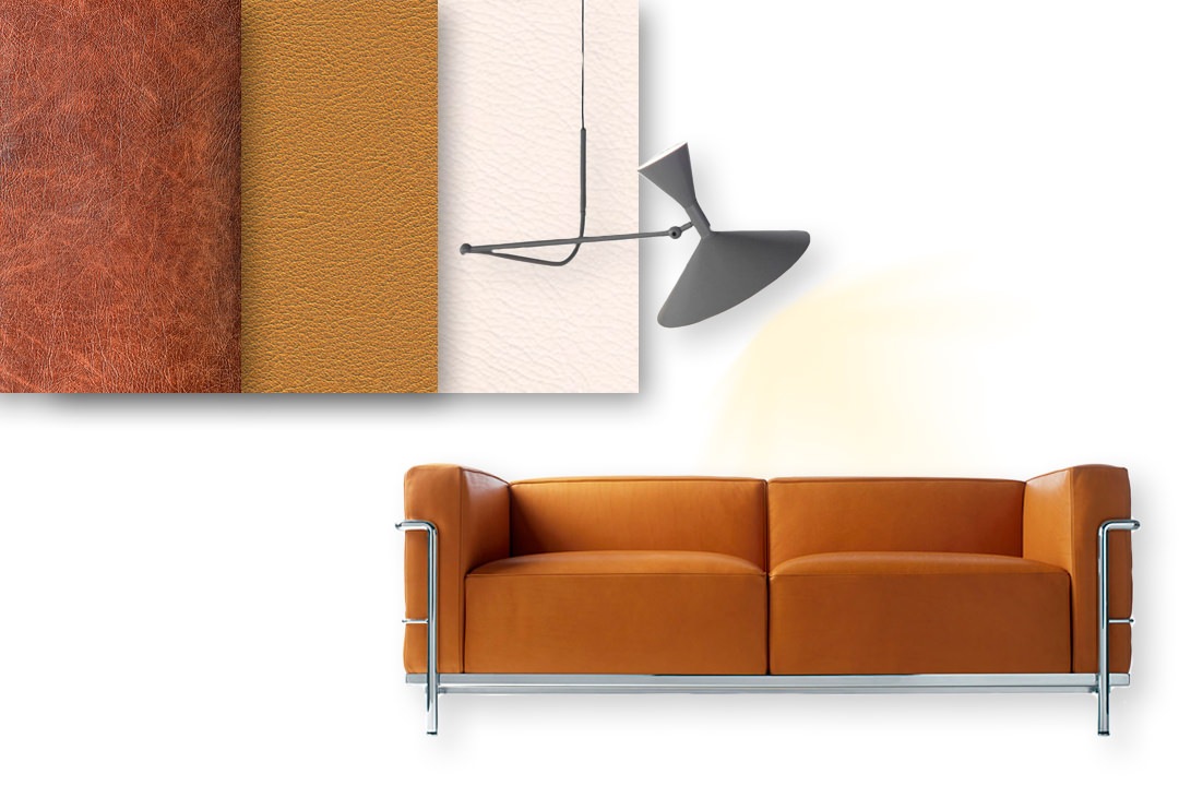
The design forms abandon their rigidity and linearity in favor of simple but sometimes irregular solutions. To enrich a modern style home, the icons of Modern design cannot be missing. Here then are seats with leather padding and chromed aluminum structure with slender lines.

moodboard-modern-style-Modulor-sofa-materials-leather

Materials, finishes and aesthetics of the modern style, including upholstery in warm-colored leather and chromed aluminum

modern-style-MDF-wave-wall-Modulor

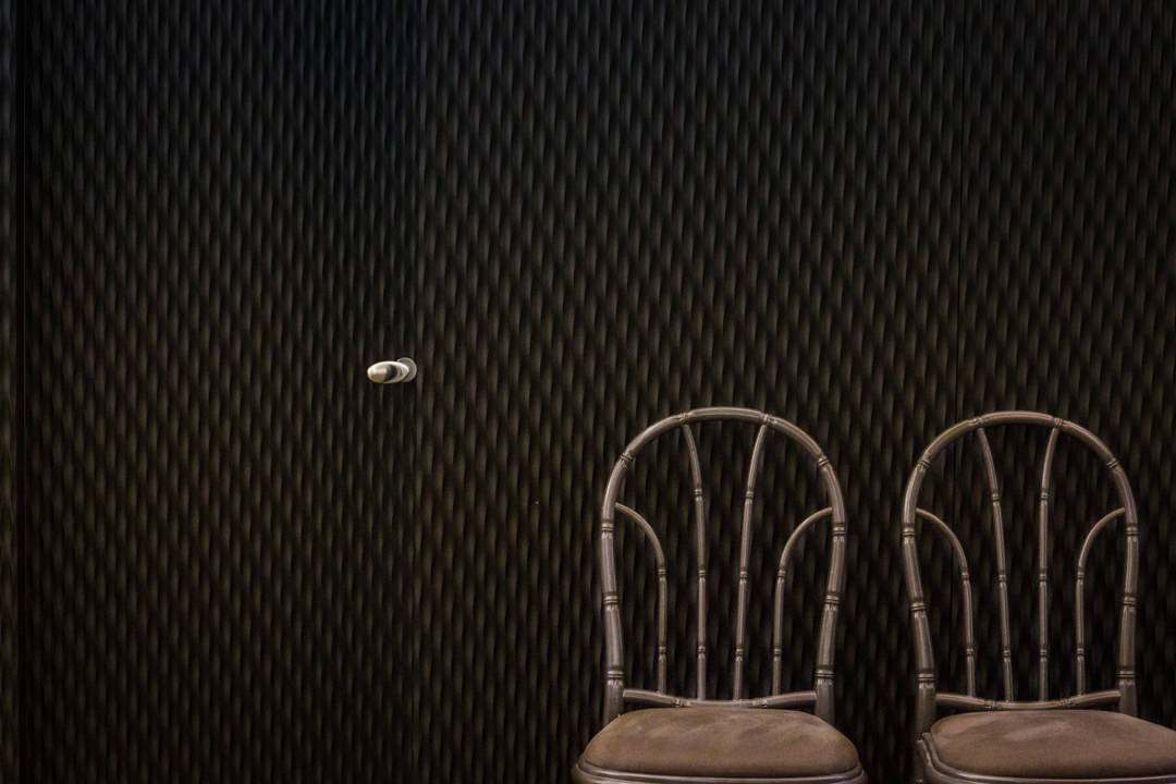
The attention to detail of this wall is expressed in an elegant and monochromatic three-dimensional surface inserted in a prestigious Milanese apartment.
Inside there is a door identifiable by the handle with soft modern shapes.

moodboard-modern-style-colors-icons-design

In the modern style of recent years, the great icons of design are often inserted in environments that are more daring, not only with neutral colors but also desaturated colors with a timeless beauty

The rediscovery of modern style

In recent years the modern style has undergone a great revaluation. The soft but rigorous shapes of the design icons of the Thirties are back in vogue in a contemporary reinterpretation proposed by the main brands.

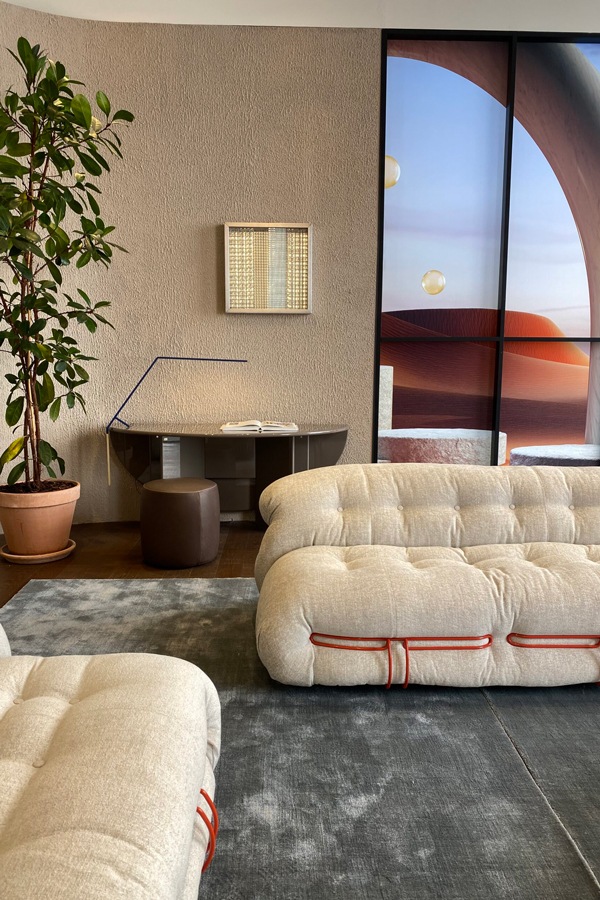
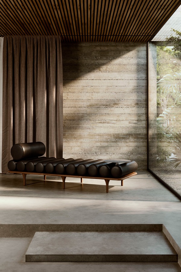
Just think of the Five To Nine dormeuse proposal, born from the Studiopepe project for Tacchini (2020) or the Camaleonda modular sofa designed by Mario Bellini for B&B Italia (2020). But also, the new Pacific (project by Patricia Urquiola for Moroso) and Soriana (design by Tobie and Afra Bianchin Scarpa for Cassina) both launched on the market during Digital Design Week 2021.

Soriana-Cassina-sofa-2021
Tacchini-FivetoNine-Studiopepe

Soriana, Tobia Scarpa and Afra Bianchin Scarpa, Cassina, 2021
Five to Nine, Studiopepe, Tacchini, 2020

With its rigorous and prestigious interiors, the modern style is aimed directly at personalities who love architecture and its relationship with nature. Characterized by a timeless beauty, it is aimed at rigorous characters but at the same time open to new changes.

Giving new life to furniture: adapting them after a move

Giving new life to furniture: adapting them after a move

Facing a move means turning your life around, renovating your home and introducing new furnishing accessories.
Beginning to pack, you make a natural selection of the objects to take with you, recognizing for each their own emotional value.
Many times, this process also involves the world of furnishings, which accompany the owners in this moment of transition.
Giving new life to furniture also means renewing the context in which they are inserted, managing to adapt them in terms of aesthetics and functionality to the new environments.
Adapting furnishing to a new context

When the furnishings are custom designed, their conformation responds to the needs of the customers, perfectly matching with the architectural context in which they are inserted. In doing this, a strong link is born between the rooms in which they are inserted and the shapes, proportions and mechanisms of use of the furnishings.
This would suggest an indissoluble bond between the two components, which would break when the furniture undergoes a relocation.
It is absolutely not said!

In fact, among the potential of custom-made furniture there is a flexibility factor that allows us to give new life to furniture by making few changes.
These make it possible to transform the general imprint of the furniture in order to adapt it to the new context both in terms of aesthetics and functionality.

A perfect example are the adaptations made to these furnishing extrapolated from an apartment between classic and contemporary. Let’s discovery this apartment among transformed furniture and new additions.

The kitchen: increases the work space and storage volumes

The kitchen certainly represents the beating heart of a home.
In the case of this apartment between modern and contemporary, its conformation was born from a natural reading of the architectural context in which it was inserted.

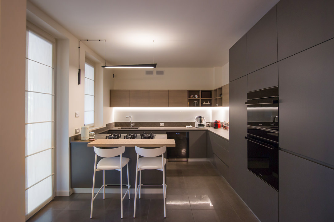
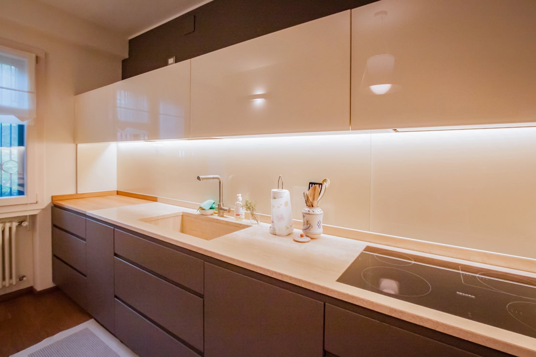
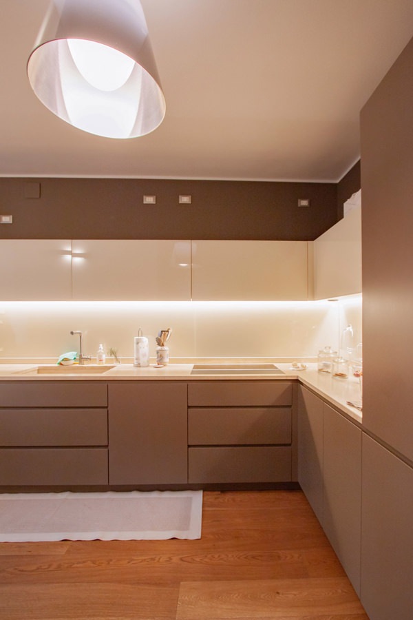
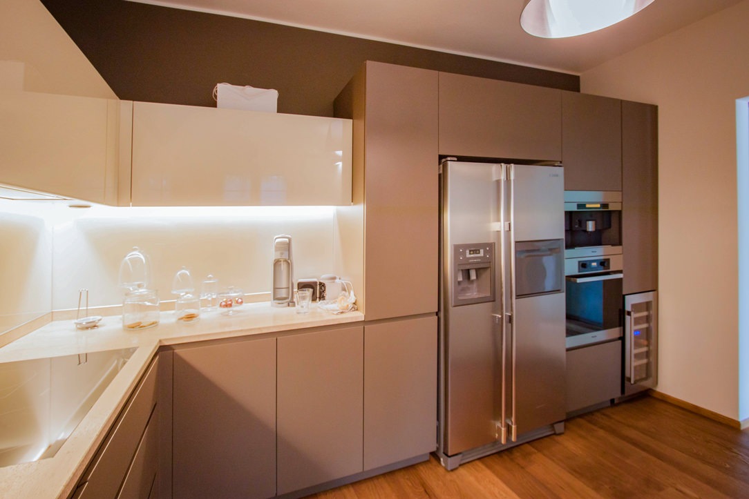
The corner development made it possible to exploit the side part with service columns with anthracite gray lacquered MDF doors.
These are equipped with column ovens on the right, pantry with removable trays and a central compartment for the free-standing refrigerator. The front is made up of lower volumes with large drawers and service doors and upper wall units in a brilliant white Lacobel.

The new arrangement has provided additional useful space for the overall dimensions. Being able to use additional space on both sides, the most natural solution was to exploit the remaining gaps with additional volumes.
On the right, we provide a service column which houses a modern wine cellar accompanied by a door with height-adjustable internal shelves.

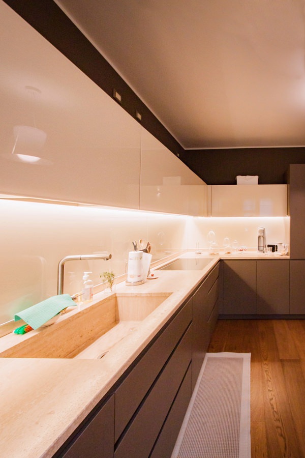
On the opposite end, the main problem arises when the worktop is made of natural stone, which has undergone a chromatic change over the years.
To avoid incurring a visible difference between the added part and the existing one, a wooden top was thus created. It also acts as a cutting board for preparing meals. An element that not only solves an aesthetically weak point, but also provides a functional solution.

giving-new-life-furniture-kitchen-move-cupboard-modify
modern-kitchen-front-view-counterop-natural-stone
side-view-kitchen-undertop-sink-white-lacobel-cabinet
kitchen-countertop-detail-natural-stone-white-lacobel-back-surface
kitcehn-service-columns-wine-cellar

The living area: a new contemporary aesthetic

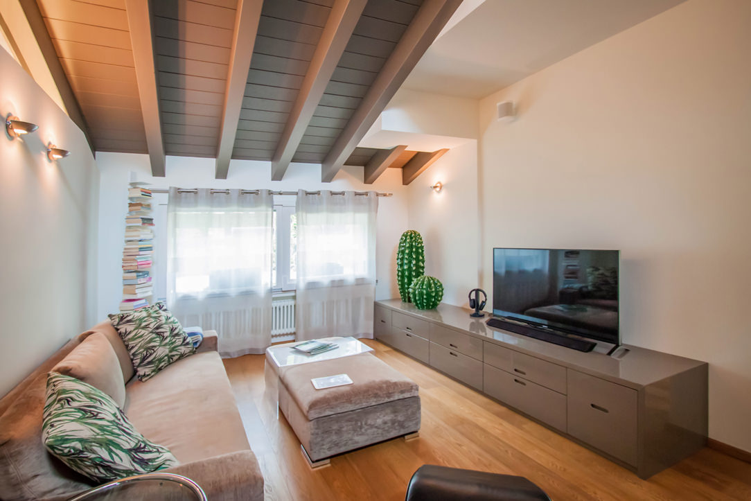
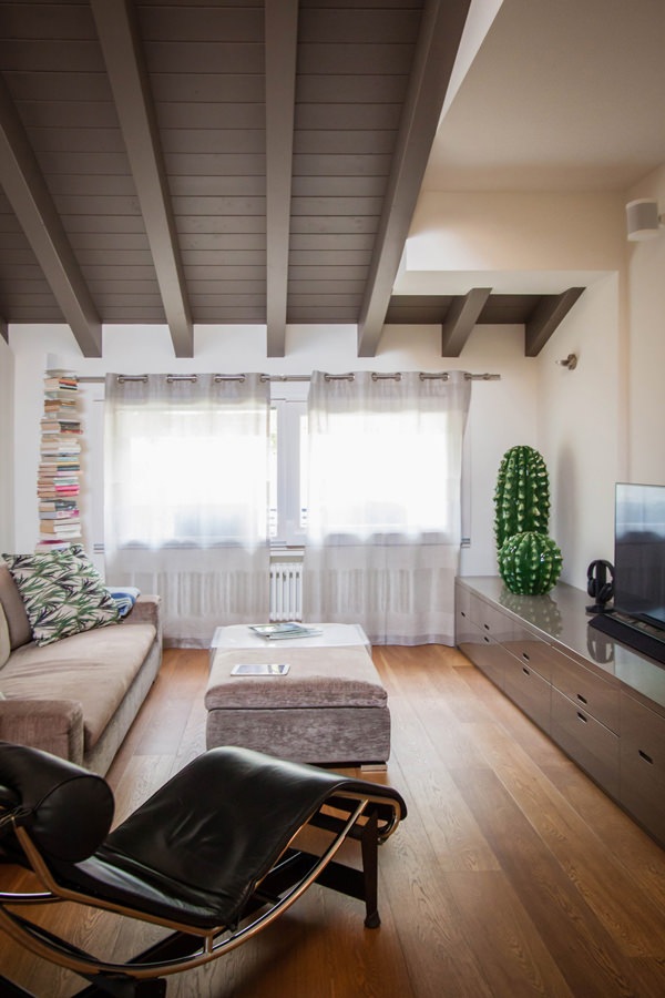
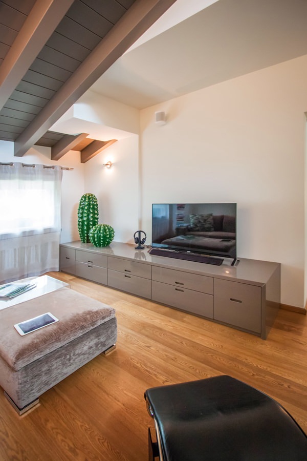
To equip the living area, we recovered the furniture made in 2006.
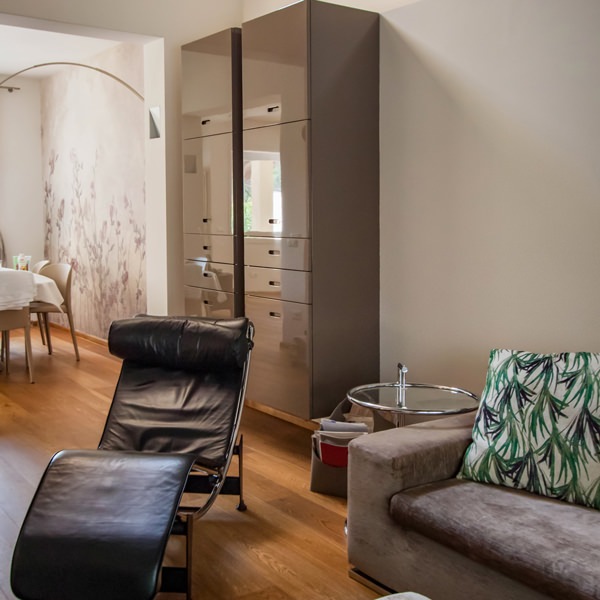
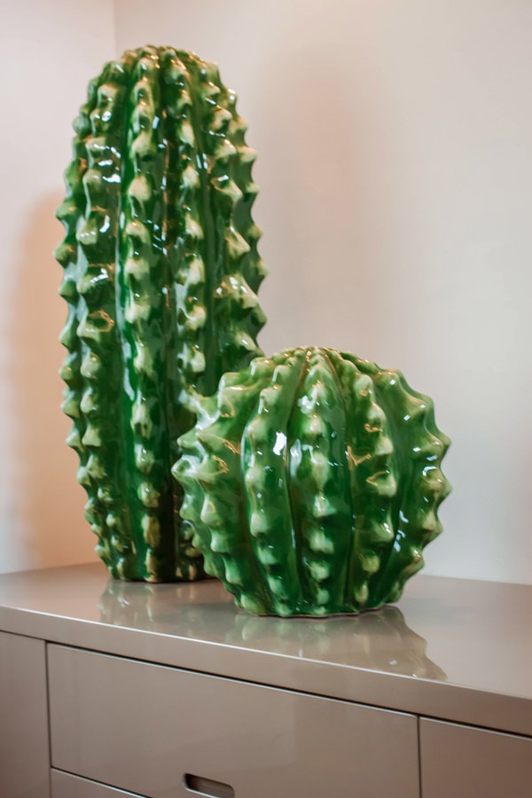
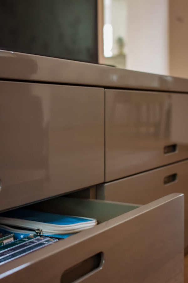
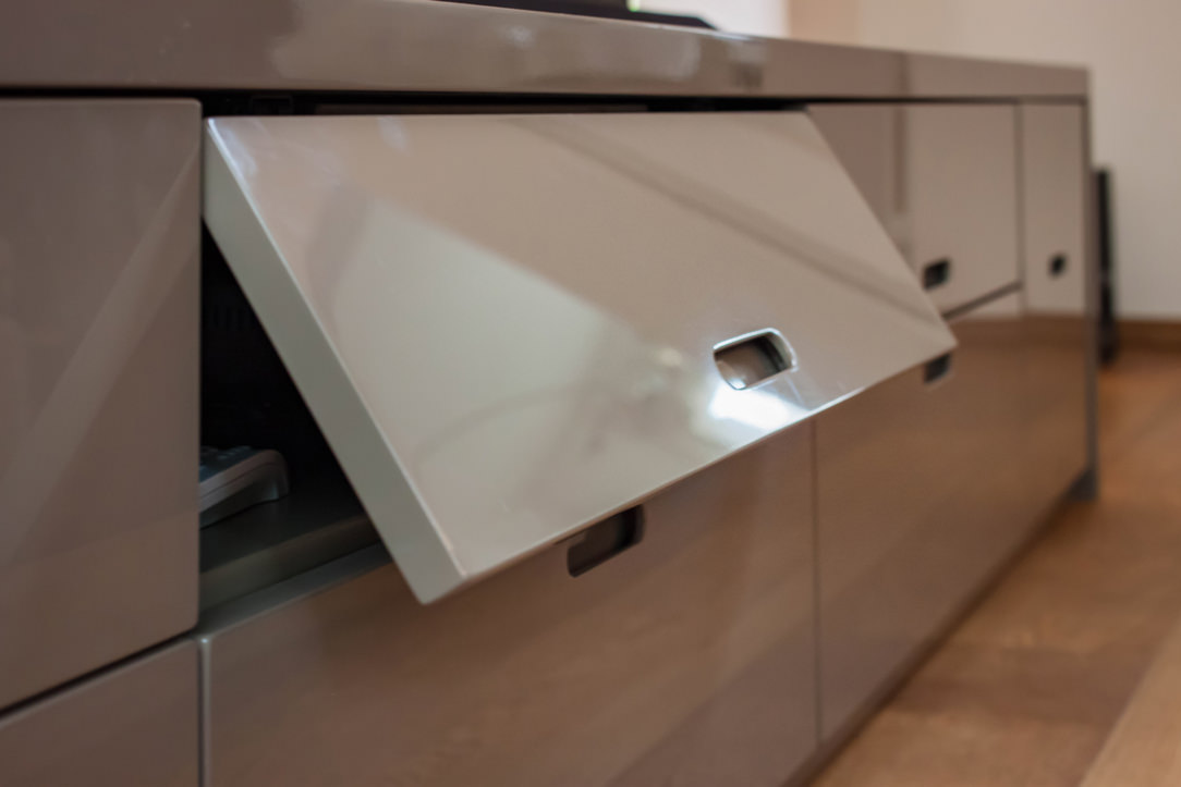
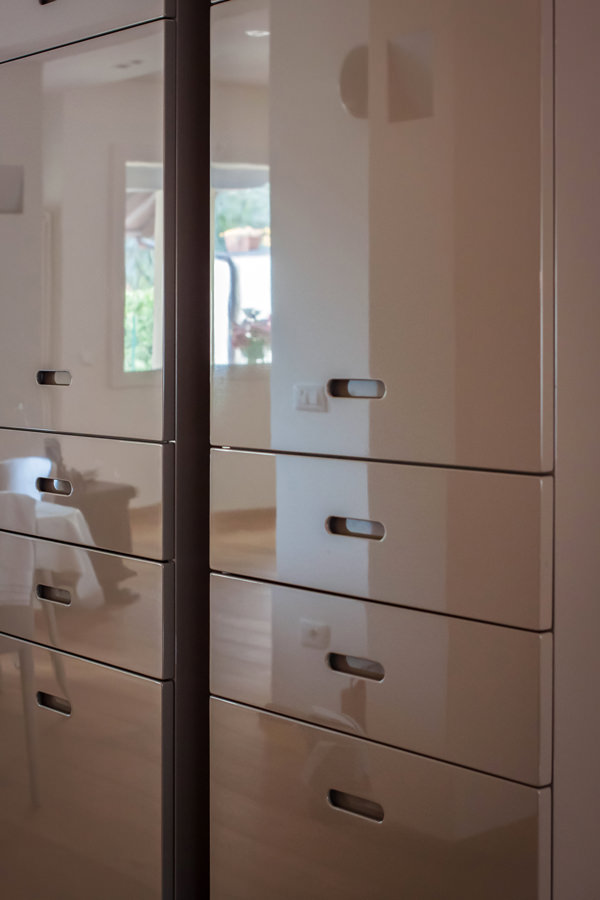
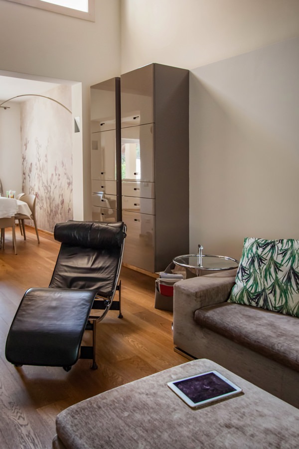
The choice of colors was already avant-garde at the time. Even in a contemporary reworking they can adapt perfectly, resulting elegant and current. The TV cabinet in glossy anthracite gray lacquered MDF alternates flap doors with service drawers, whose recessed handles give visual lightness.

In this case, giving new life to furniture means adapting them to the new context in which they are inserted, managing to exploit the flexibility of the same.
Small changes have been made, mostly considered maintenance. Re-lacquering where necessary or remaking of structural parts.
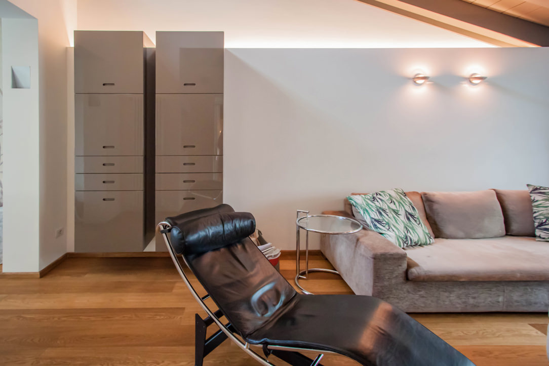
The same approach was then applied to the service hanging columns, which are made up of doors in the upper part and small drawers in the lower part. Their new position side by side allows them to welcome guests introducing them to the living area and, at the same time, create a visual divider from the more intimate dining room.

give-new-life-furniture-living-room-tv-cabinet
detail-top-MDF-shiny-laquered-dove-gray
open-drawers-flap-door-tv-cabinet
flap-door-recessed-shaped-handle-tv-cabinet
modern-living-room-design-tv-cabinet
give-new-life-furniture-living-room-tv-cabinet-shiny-laquered
service-cabinet-living-room-drawers-door-shaped-recessed-handle
shiny-laquered-doors-dove-gray-recessed-shaped-handle
modern-living-room-furniture-cabinet-shiny-laquered

Children’s bedrooms: new tailor-made solutions to exploit architectural voids

The sleeping area houses the two small bedrooms whose conformation alternates architectural voids with important structural elements.
A tailor-made solution was therefore designed in both rooms in order to include all the necessary furnishings without sacrificing practicality and visual freedom.
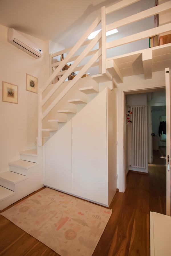
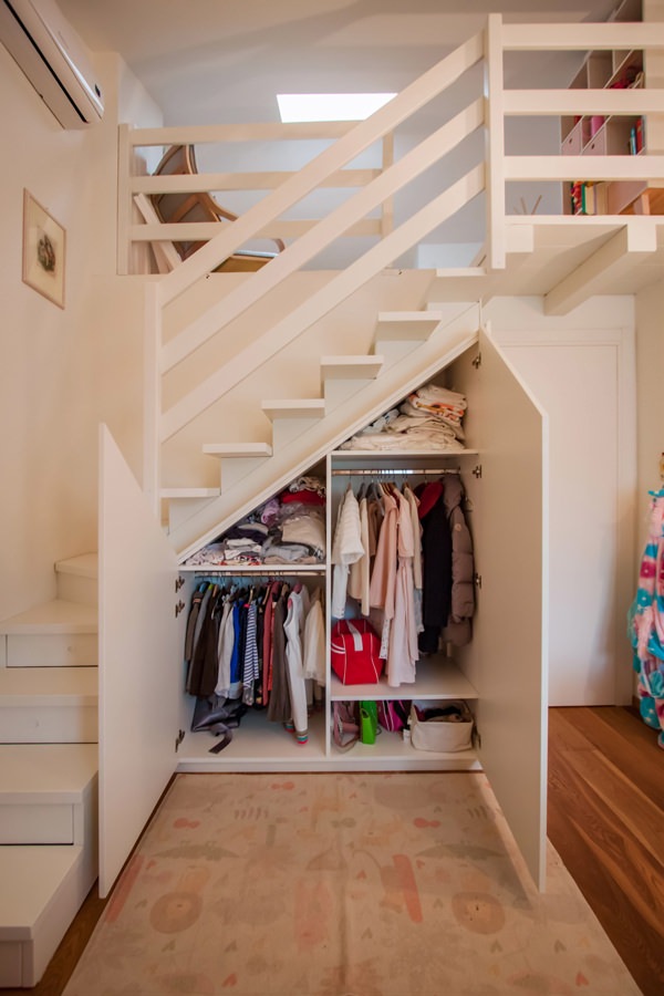
For the first bedroom it was therefore decided to take advantage of the basement that leads to the mezzanine area to equip it with a shaped wardrobe.
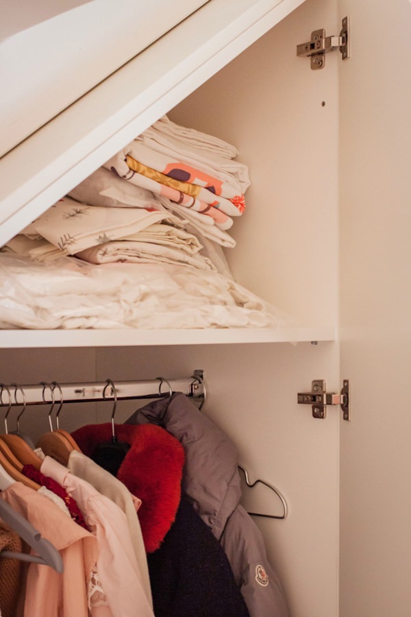
Since the room is intended for a child, the dimensions and heights necessary for the clothes have certainly facilitated the design. Despite having little space available, taking advantage of the inclined height of the basement, it was still possible to create a double-height wardrobe with alternating shelves with fixed hangers.
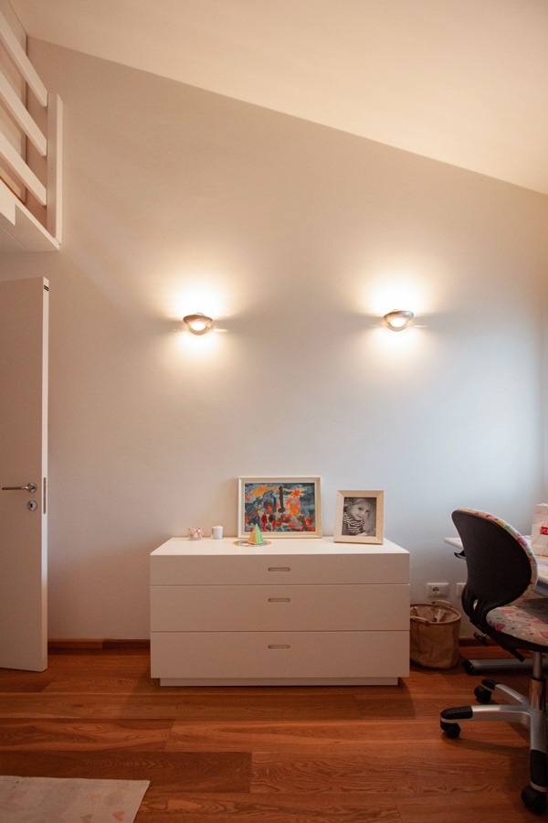
The wardrobe is accompanied by a standing alone chest of drawers which is also used as a support surface.
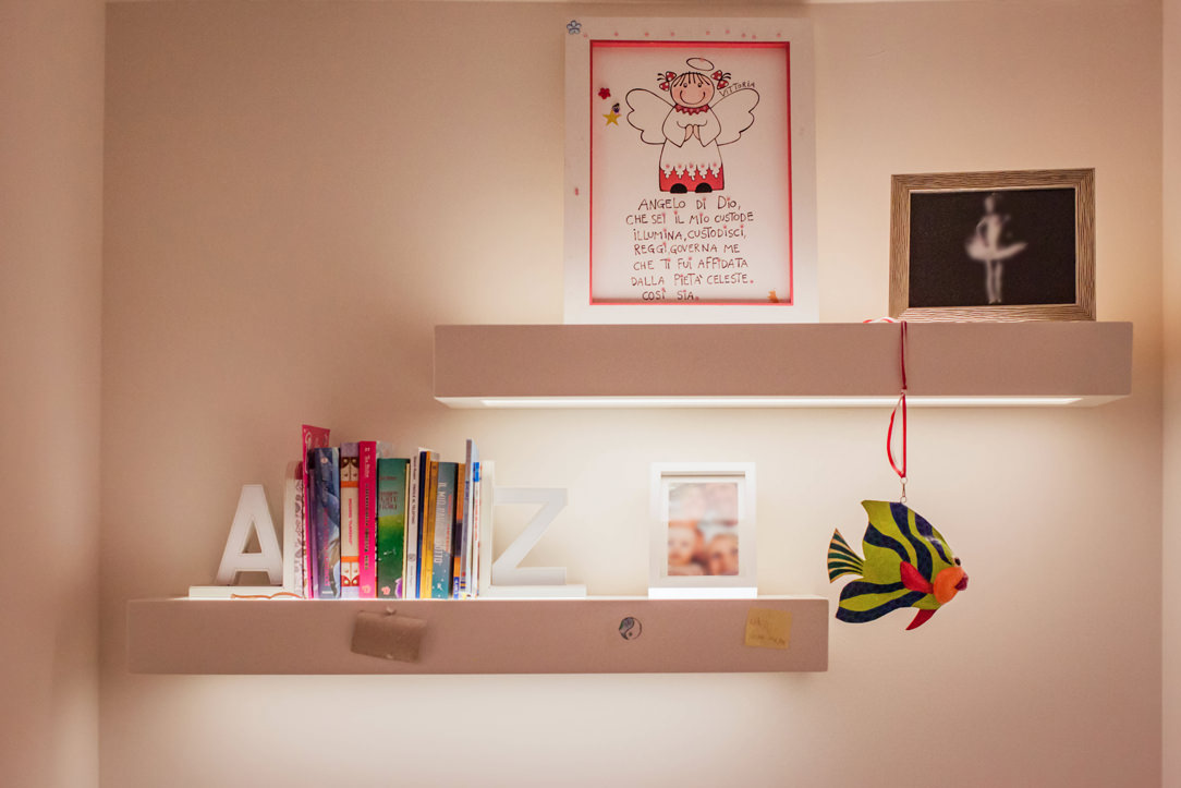
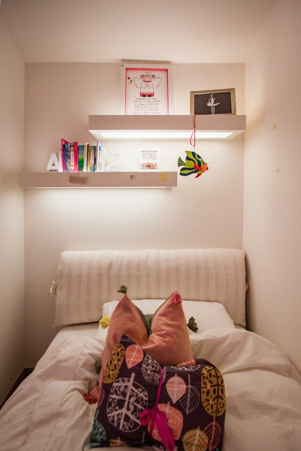
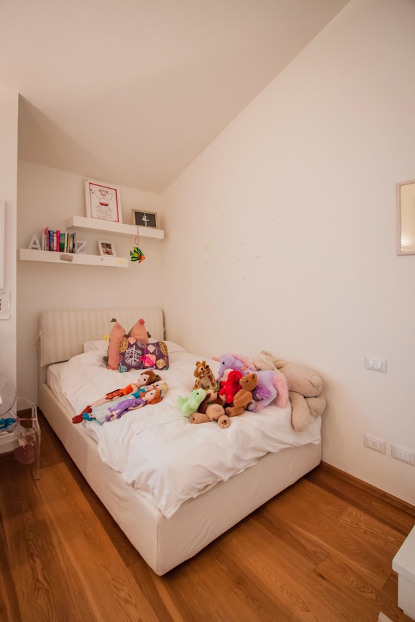
The large one and a half bed is inserted in a niche. The latter used in the depth to fix shelves with hidden lighting.

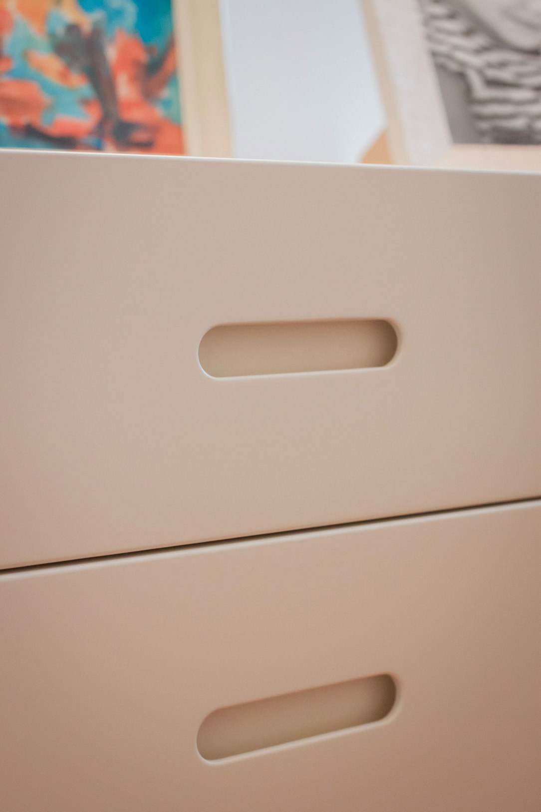
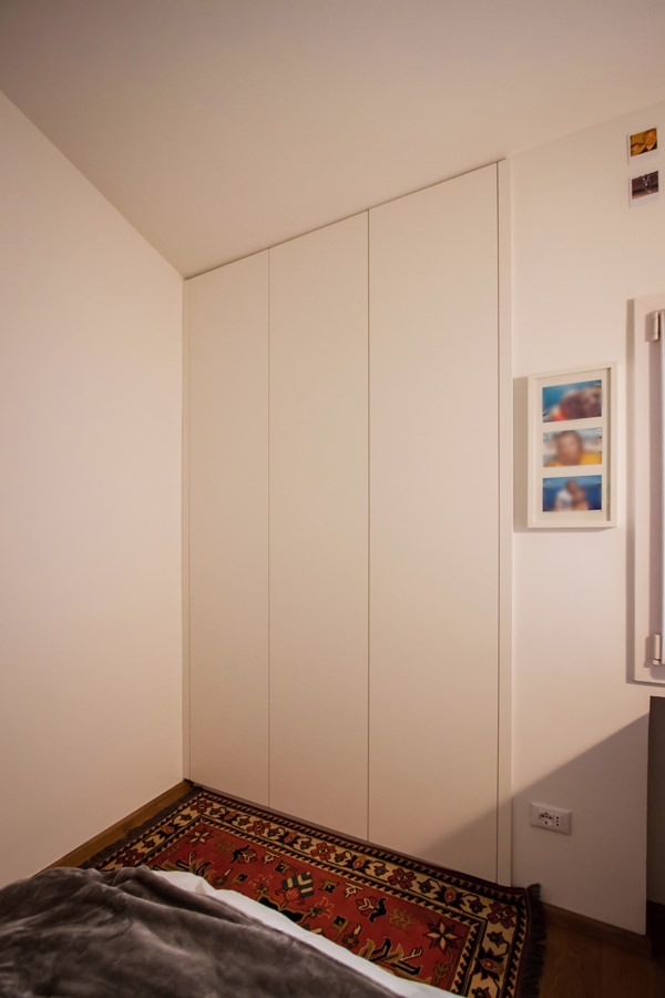
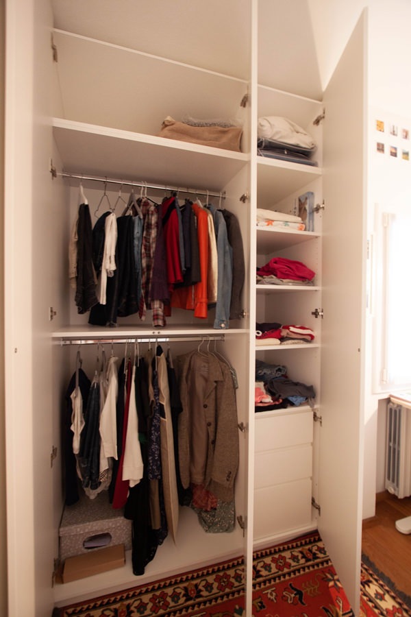
In the second small room, the depth of the niche is useful for a certainly wider wardrobe. Full-height doors with push opening accommodate fixed tubulars, drawers for linen and shelves for folded items to satisfy the needs of a young girl.

shaped-wardrobe-basement-niche
service-drawers-bedroom
recessed-handle-shaped-detail-drawers
internal-wardrobe-composition-shap-bedroom
detail-hanger-shaped-shelves-wardrobe-bedroom
detail-shelves-integrated-lighting-bedroom
niche-bed-girl-illuminated-shelves
giving-new-life-furniture-niche-bed
shaped-niche-wardrobe-push-opening
interior-composition-wardrobe-bedroom-niche
internal-tubular-hanger-shelves-closet-bedroom
drawers-handle-hollow-inside-cabinet

The master bedroom: a wardrobe like new

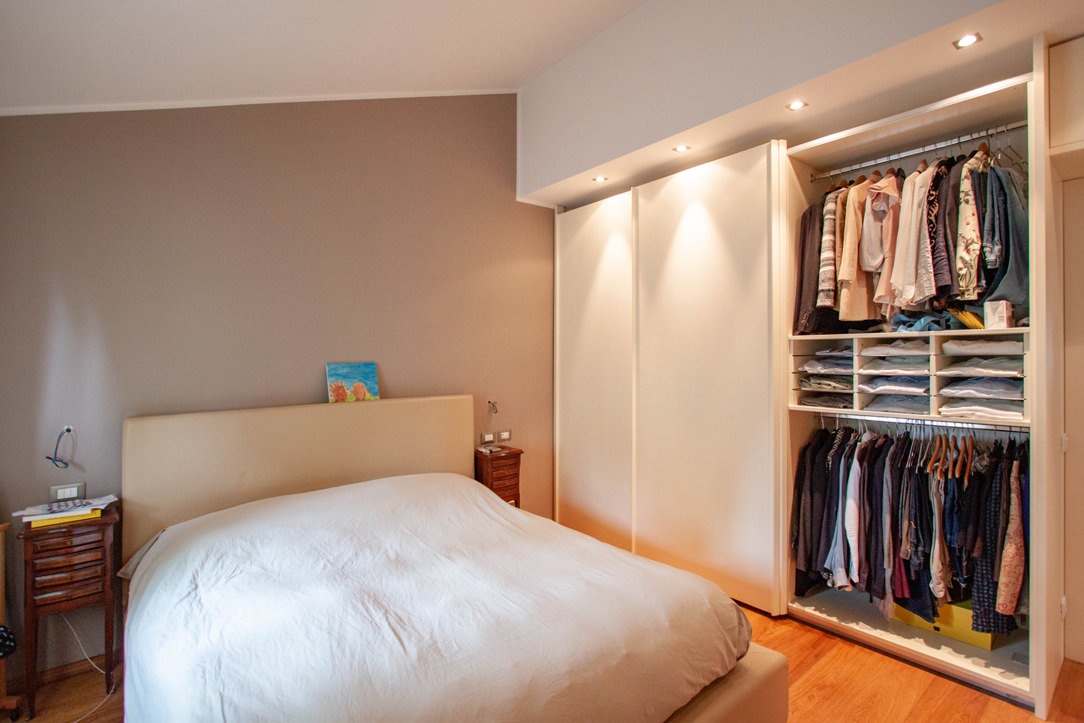
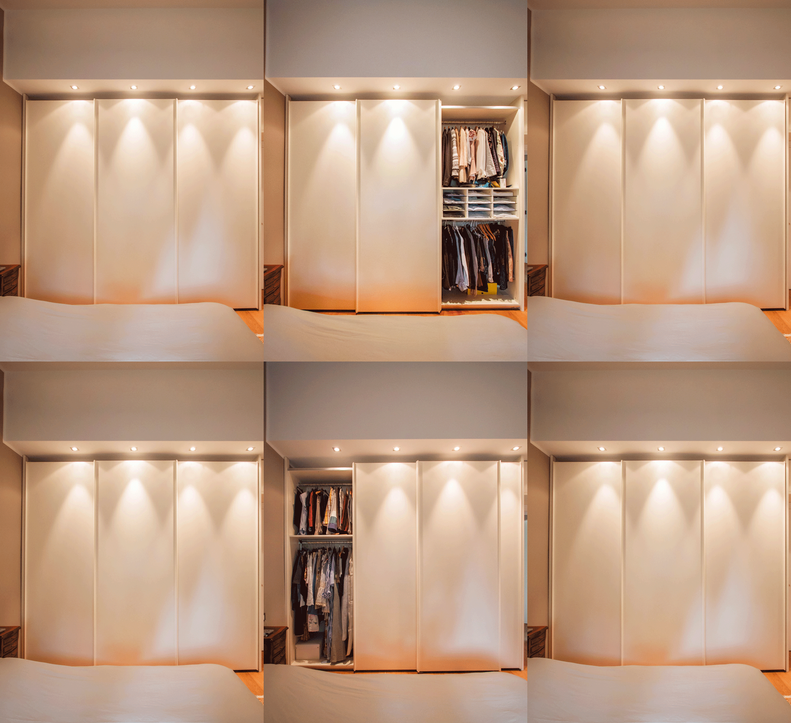
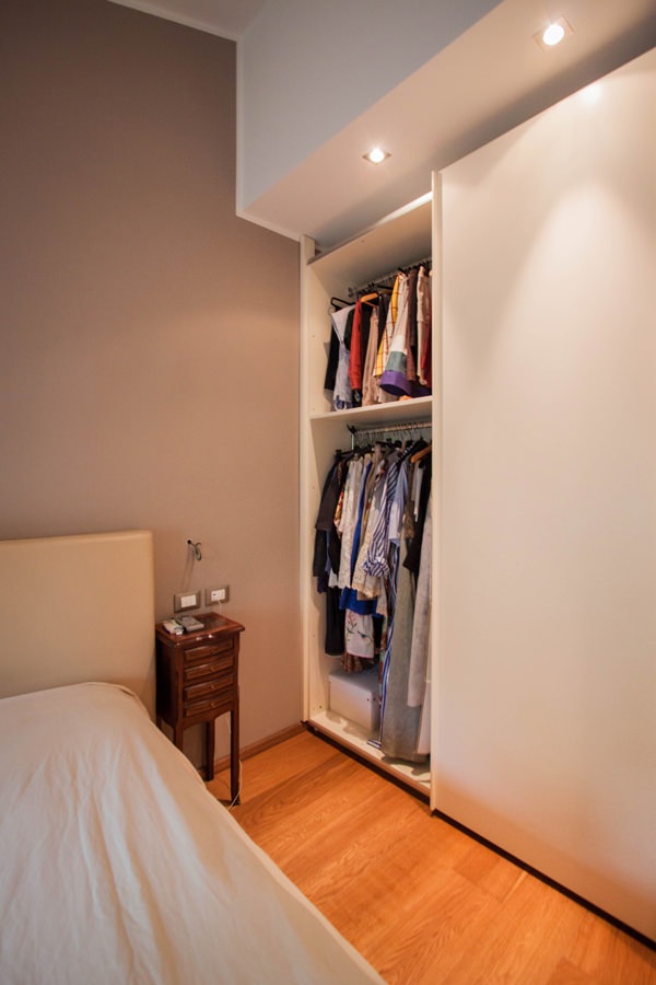
The master bedroom is best equipped with a large wardrobe with sliding doors placed parallel to the bed.
Its linear aesthetic combined with spot ceiling lighting allows at the same time to hide its grandeur.
The result is a capacious and functional volume which, in the aesthetic impact of the room, tends to disappear while giving character and elegance.
Relocated from the old house, the different internal height has led to a reduction in height which has thus made it possible to better adapt to new environments.

The composition of the wardrobe comes from a natural division into three departments, corresponding to the division of the sliding doors.
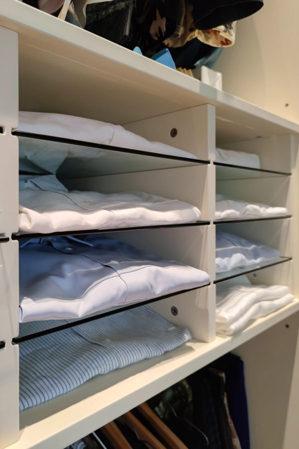
On the outside, the double-height hanger houses removable glass shelves in the center. These are particularly suitable for storing folded shirts using the external sliding mechanism to reduce the internal height between the trays.
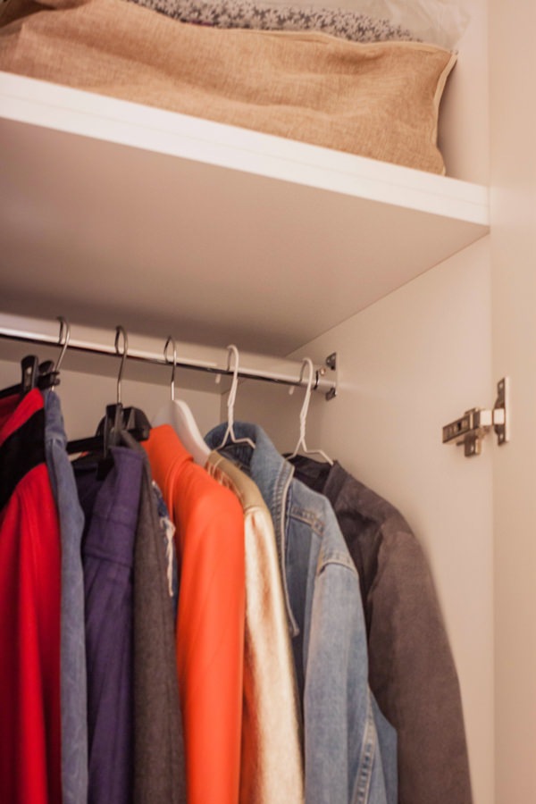
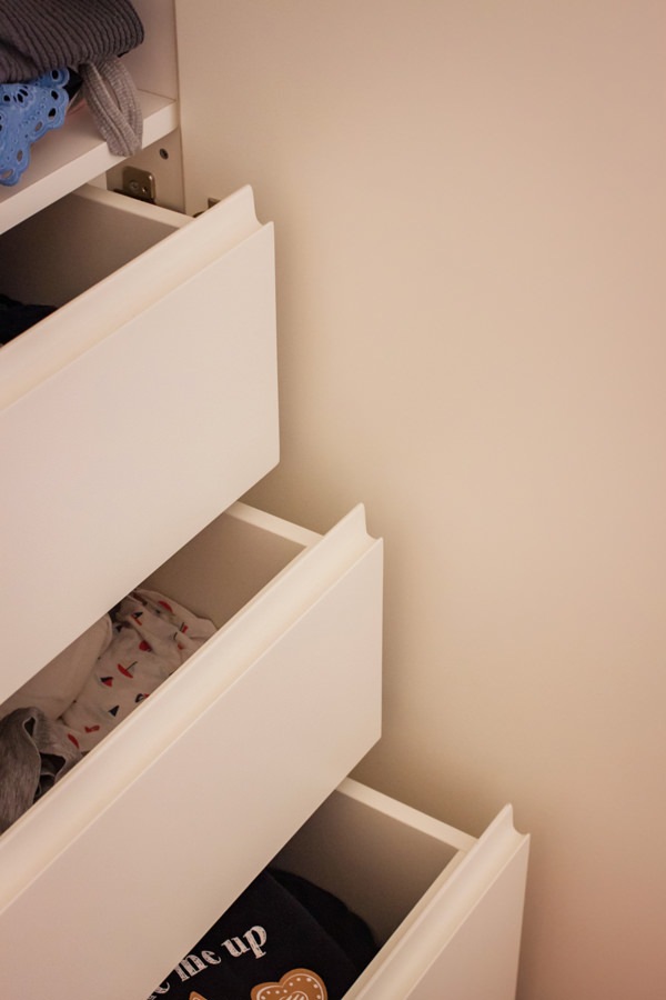
In the central compartment, the large linen drawers are accompanied by a pair of shelves for folded items and hangers in the upper part.
The left compartment instead houses a double hanger to accommodate long dresses and coats whose greater height compensates for the reduced space reserved for folded trousers and skirts.

master-bedroom-wardrobe-open-tray-extractable
animation-opening-wardrobe-internal-composition-giving-new-life-furniture
internal-composition-wardrobe-hangers-pull-out-trays
detail-trays-removable-glass-wardrobe-bedroom
detail-trays-removable-glass-wardrobe
internal-wardrobe-double-hanger
internal-composition-wardrobe-hangers-drawers

Giving new life to furniture does not only mean rejuvenating it and making changes to its aesthetics. The bespoke design allows you to create furnishings that are versatile and able to adapt to new environments. Restoring a balance between aesthetic conformation in relation to the room and functional needs becomes the main goal.

If you want to deepen the theme of furniture flexibility, we suggest you this article in which series furniture and tailor-made solutions help each other!

Contemporary Pop Style: young and bright environments

Contemporary Pop Style: young and bright environments

From Pop Art to interior design in its historical and contemporary meaning, the Pop style is characterized by dynamic and fresh interiors. Iconic objects, saturated and bright colors define fresh and youthful environments that are always current.

Giving a sparkling touch to the Pop-style home is quick and easy… let’s see how!

Pop interiors

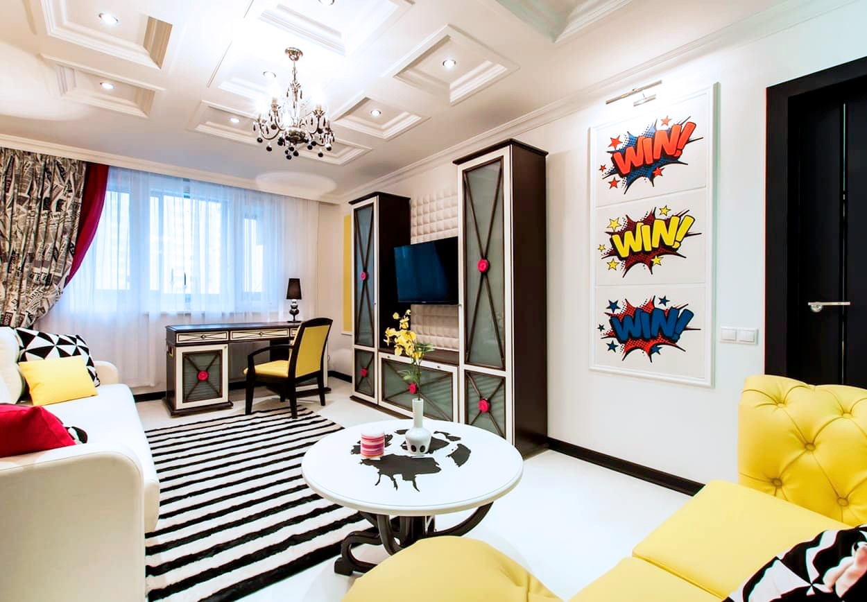
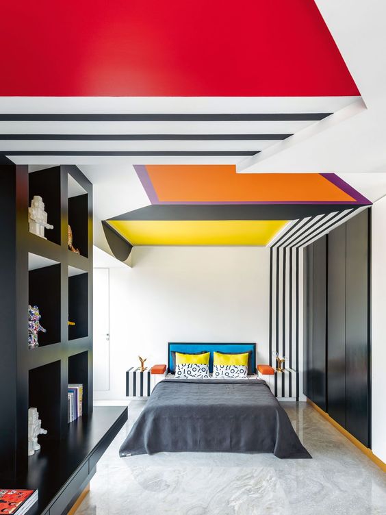
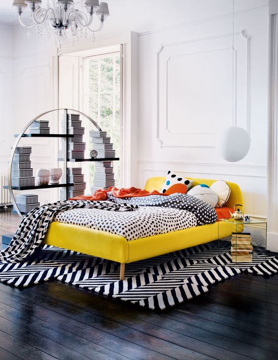
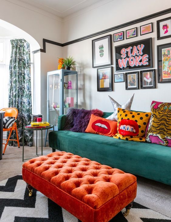
example of a room in a pop style, with a strong color point and geometric references in black and white.

The origin of Pop Art

The style of furniture that we know as Pop and its contemporary meaning derive from the artistic movement developed in the United States. Born in the second half of the fifties, it knows its best period of development in the subsequent sixties and seventies.

These are the years of the economic boom and the rise of unbridled consumerism as a consequence of an ever greater economic well-being of society.

The name pop art is the abbreviation for “popular art”, which emphasizes the strong relationship between the new artistic current and “popular” objects. The goal of Pop Art is precisely to stage the consumer society by adopting an almost ironic meaning.

Desecrating the courtly conception of art by comparing it to objects extrapolated directly from mass society. In doing this, the expressive language used directly takes up the same expressive forms of the consumer society. The result is a vision of the artistic work perceived as a commercial product.

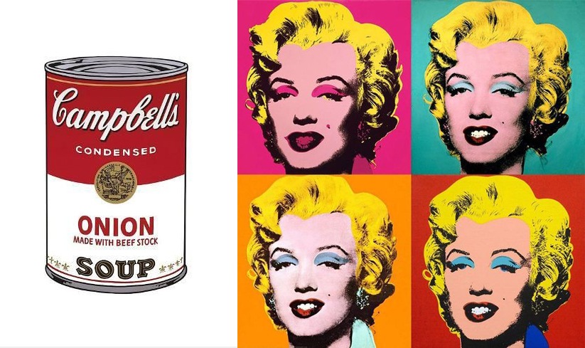
Advertising, television, cinema and supermarket shelves, the new temples of consumerism, become the subjects of works of art. Among these, Warhol’s famous Campbell sauce cans, whose graphic design is taken directly from the advertising prints of the time.

The bright colors and their full shades are taken up by the heroes of cinema and entertainment reproduced in cartoons, comics and serigraphs. After the resilience of war and the vision of a world in black and white, the colors of the new well-being invade society, rapidly changing its values.

Warhol, Lichtenstein and the other pop art artists tell this revolution through the symbols of the consumer society. The provocation itself becomes a force of consumerism, like a frame from which it is impossible to get out.

roy lichtenstein pop art
keith haring pop art

The expressive language of Pop Art between serigraphs and cartoons: Roy Lichtenstein and Keith Haring are among the best known exponents

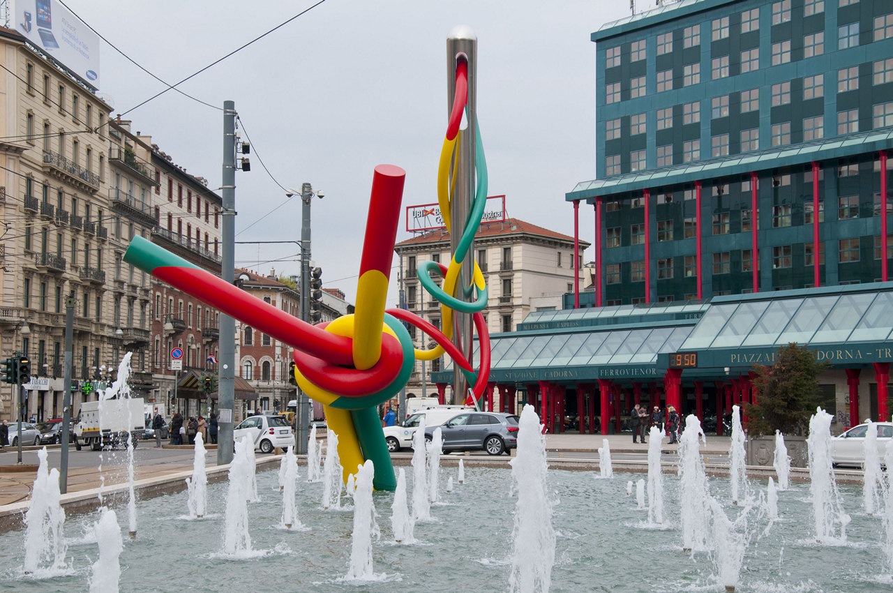
oldenburg cadorna

Claes Oldenburg and Coosje van Bruggen, Ago e Filo, Milan

Andy Warhol Campbel Monroe

Andy Wahrol is definitely the Pop Art artist par excellence, with his illustrations of the Camper Souce and the reproductions of the face of Marilyn Monroe

Design icons

The improvement of the company’s economic conditions allows the purchase of products that are not only functional but also purely aesthetic. The design of furniture and home interiors adapts accordingly by changing shapes, materials and values.

Precisely for this reason, in those years, Industrial Design, intended as a serial production of elements, had the apex of its development. The increasingly conspicuous demand of the company satisfies the manufacturing industry which responds with new, impactful and original objects.

The designers of the time best express their creativity by experimenting with new materials. Experimenting with alternative manufacturing techniques also allows them to shape the material to better convey the design idea. The many icons of Design, especially Italian, that still crowd the collective imagination date back to those years.

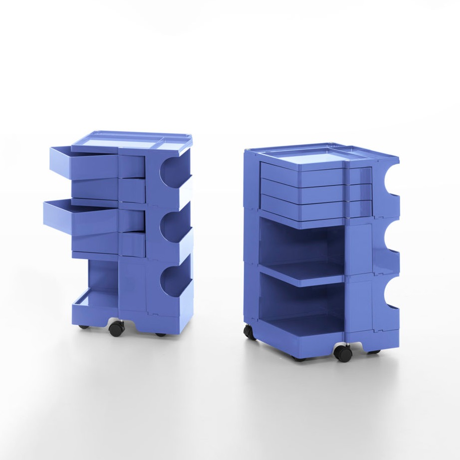
These also become the characterizing element of the interiors, giving them an eternal and whimsical character. Some examples are the Vitra chairs designed by Verner Panton, the Ball Chair by Eero Aarnio, the trolleys by Joe Colombo and all the products of a nascent Kartell.

ettore sottsass Milan interior

Paradisiartificiali Studio, Tribute to Ettore Sottsass, Milan

pop material icon design

Plastic and plexiglass are appreciated for their ductility and material expressiveness in the Pop style. The design icons are characterized by bright colors and soft shapes.

Sacco chair
Joe Colombo
Kartell

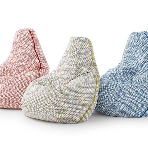
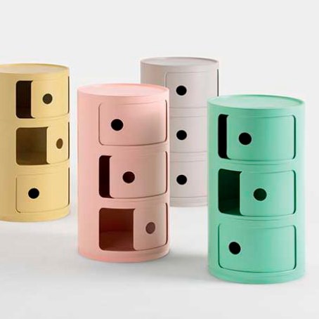
Here are some icons of Design: Zanotta’s Sacco armchair, Joe Colombo’s Boby trolleys and Kartell modular units revisited in a modern key with new pastel colors and innovative textures.

Pop Art in house interiors

For a Pop Art style décor, the first to lead the chorus are the bright and lively colors. Especially chosen in their saturated and bright colors, they completely exclude the use of shades in favor of full colors. The importance of visual coherence between the different rooms of the house is reflected precisely in the use of well-balanced colored hues.

The furniture inside the rooms does not exceed in number but rather stand out for the fluidity of the shapes and the chromatic choice. The choice to place iconic design objects is appreciable. Pieces of furniture that have marked history.

Compared to the Boho style, this choice of antiques, however, is not aimed at abundance but is limited to a few significant pieces. One of the most famous examples is the Mouth-shaped sofa by Gufram, inspired by Marilyn’s lips. Its strong visual impact and its iconicity make it the protagonist of the rooms to the point of being enough to define the stylistic imprint of the entire room.

bedroom colors graphics
living room icons drawings

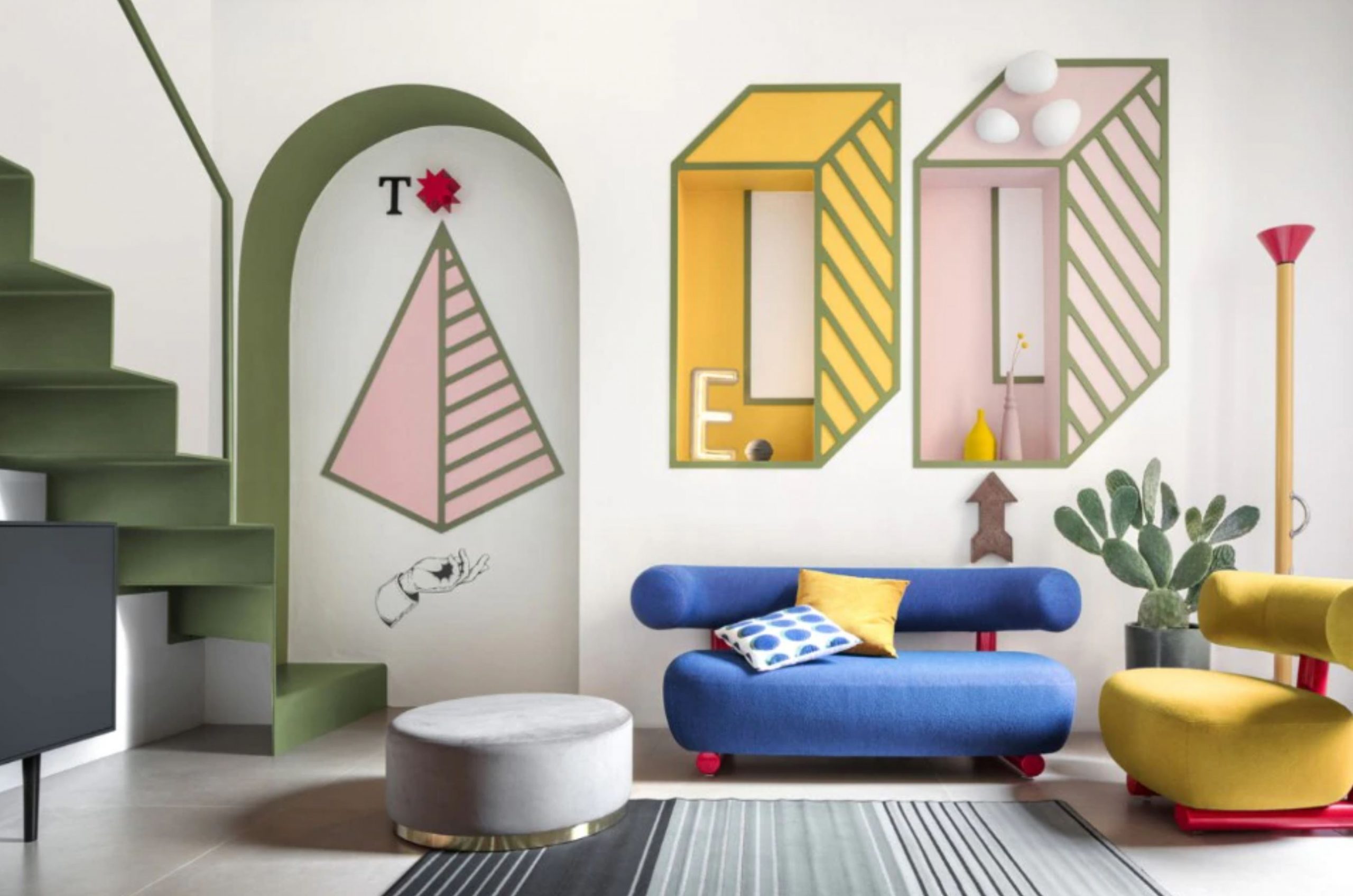
A bedroom inspired by the design of the Memphis group designed by Jannat Vasi. On the right: a Pop-style living area amidst colorful furnishings and minimal graphics

bedroom pop style minimal
living room pop style

Carpets, fabrics, stylistic shapes and chronatic choices respond to a balanced overall vision in the Pop style.

The Pop style is recognized for the choice of plastic materials and resins, which exploded in use and experimentation in those years. The flexibility and ductility of these materials allow the designers to have the maximum artistic expression, managing to produce series furniture with original and fluid shapes.

To these is added the plexiglass, appreciated for its transparency that assimilates it to the noblest glass, but extremely resistant. To enrich the Pop-style interiors, paintings and decorations whose graphics are directly inspired by the world of comics and screen printing.

These stand out among colored walls, sometimes covered with wallpaper with graphics characterized by abstract and hypnotic lines, also used in the choice of carpets.

pop icons design graphics

Minimalist graphics and furnishings with bizarre shapes, including colors and products of the Pop style

The pop style according to Modulor: the contemporary variant

The grit and character of the Pop style is certainly appreciable for dynamic interiors and young personalities. Its highly characterizing expressive charge applied to contemporary interiors sometimes risks creating environments that, when experienced daily, tend to “tire”.

For this reason, the variant in our projects always tends to contain the Pop imprint of some elements within the home furnishings. Few elements that, in terms of shapes and colors, lead back to the freshness and creativity of this style, but blend perfectly with neutral and contemporary interiors.

Combined with the brightness of white furnishings and environments, they are also able to further enhance themselves, becoming stylistic icons of home furnishings.

pop art house corridor pop art
living room pop details

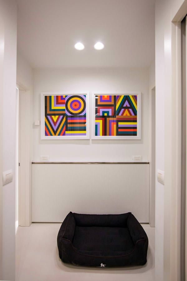
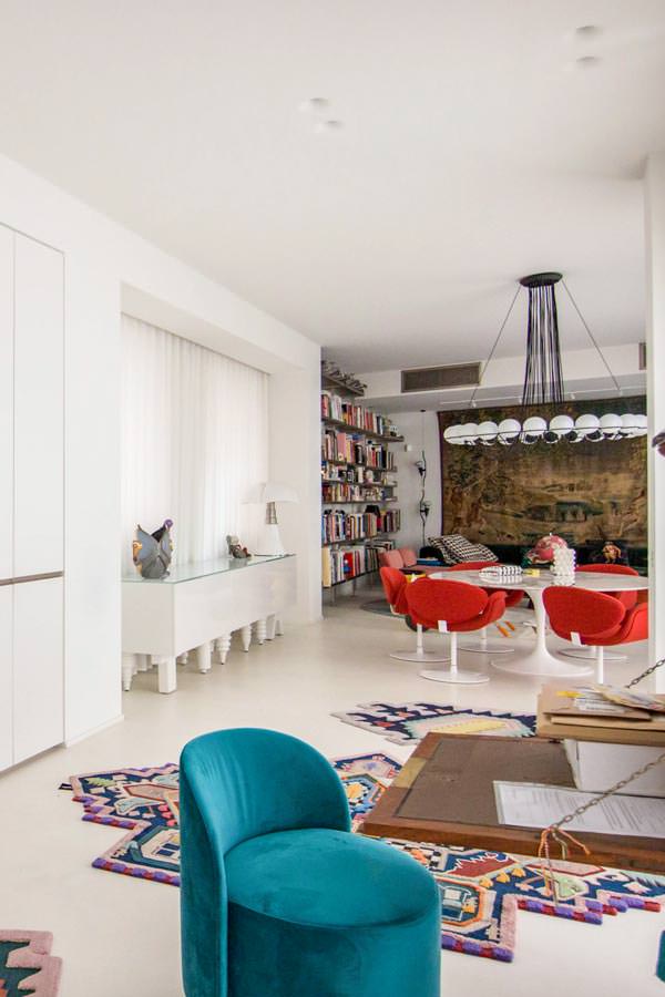
A Modulor creation on a project by Studio MILO in a contemporary style with refined Pop details: from the choice of the paintings, to the precious carpets by CC-Tapis passing through the living area in perfect Pop style

pop living room

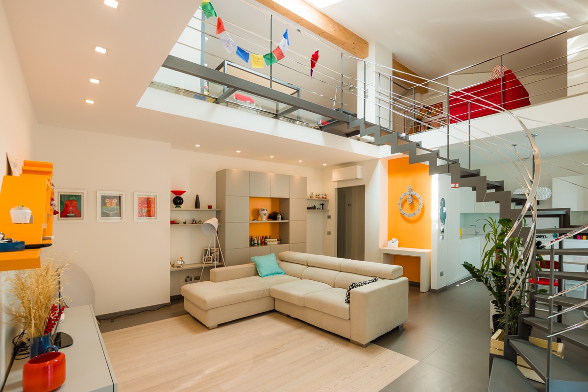
A few details in chromatic uniformity are enough to give grit and character to an interior: walls and furnishings of this creation give a decisive touch while remaining balanced overall

pop kitchen

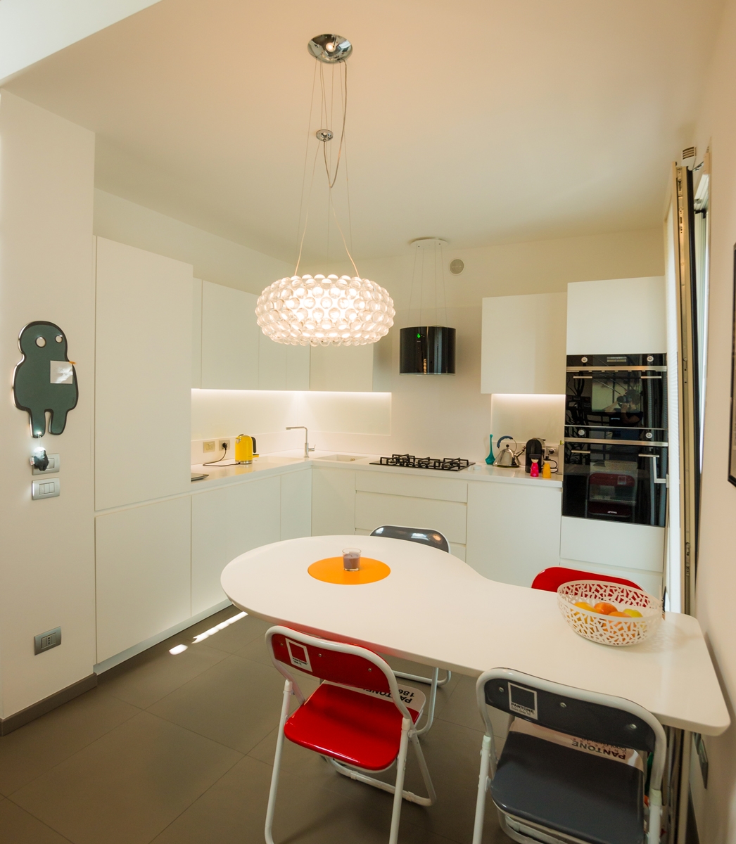
Our project of Omelette table with rotating yolk flanked by red Pantone chairs and a kitchen in black and white.

Bergamo industrial attic

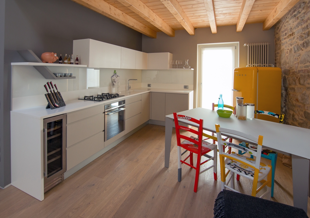
A brightly colored Smeg refrigerator and an artfully crafted table complement a linear kitchen in this splendid Bergamasco Loft.

The Pop style in its traditional and contemporary meanings responds perfectly to strong charisms. A little eccentric and certainly very creative personalities, who do not, however, give up balance and stylistic elegance. Far from being chaotic, the well-balanced Pop style instead expresses a stylistic and conceptual refinement, as well as a passion for visual art forms.

Optimizing spaces with functional furniture: a studio apartment in Milan

Optimizing spaces with functional furniture: a studio apartment in Milan

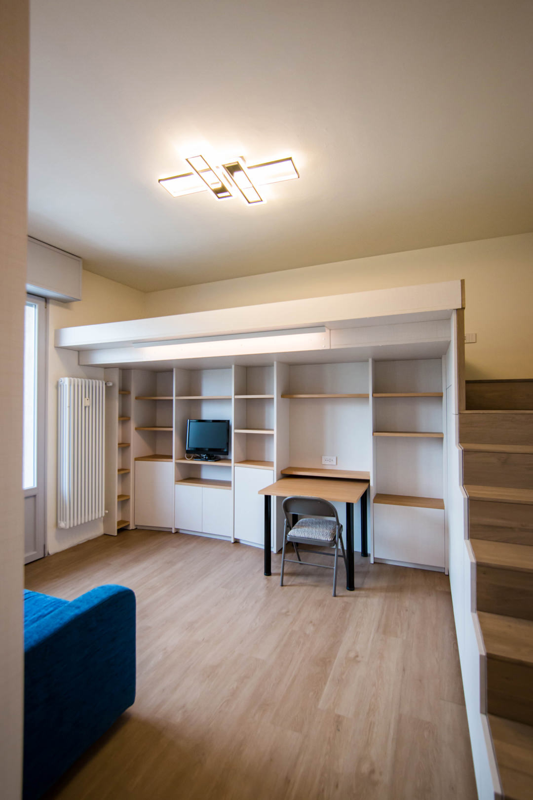
A studio apartment in the suburbs of Milan able to optimize the available space with functional furniture. The choice of materials expresses simplicity and naturalness, to make the bespoke interiors of this welcoming apartment contemporary.

living-room-studio-apartment-open-table-position-optimizing-spoaces-with-functional-furniture
studio-apartment-with-furniture-to-optminize-space-01

A cozy looking studio apartment in Milan

We have already addressed the issue of living in small spaces with this minimal style apartment in the heart of Milan. After a few years, the need to optimize spaces has not lost interest but has instead increased the demand for functional furniture. The example of this studio apartment in the suburbs of Milan best expresses the concept of practicality combined with a natural aesthetic line.

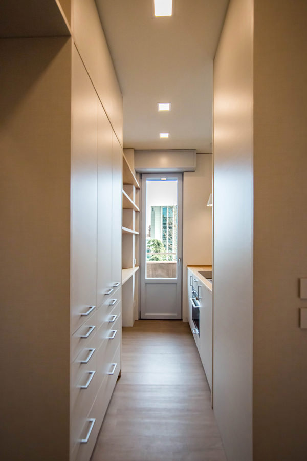
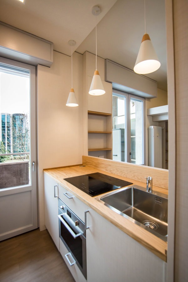
Starting from the original structure of the apartment, the renovation project began primarily with the spatial organization of the rooms. The entrance, working as a filter, acts as a pivot for the management of internal flows. From the front opens the view of the kitchen, essential but well equipped, which visually communicates with the loft living area where a large bed is located.

On the left of the entrance is the anteroom, equipped as a closet with service wardrobes. From here, direct access to the bathroom with a large glass shower and sink area with service cabinet.

equipped-columns-shelves-and-doors-living-room-optimize-spaces
equipped-wall-detail-furniture-to-optimize-spaces
living-room-desk-furniture-to-optimize-spaces
kitchen-access-with-full-height-doors-to-optimize-spaces
side-view-kitchen-with-windows-on-living-room-optimize-spaces-with-furniture

Furniture designed to optimize space

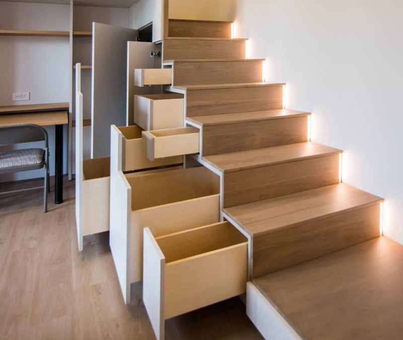
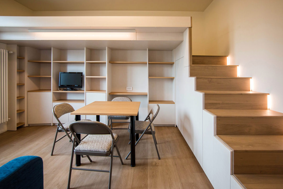
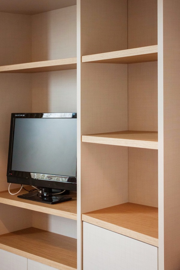
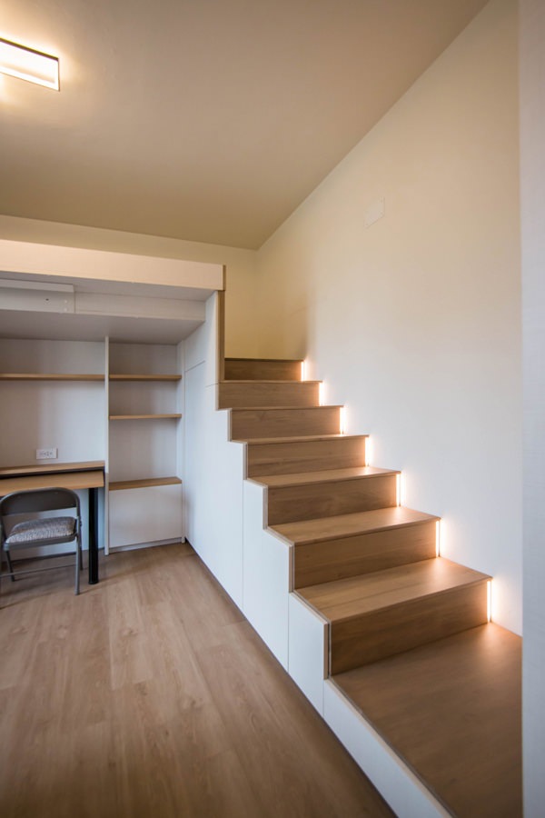
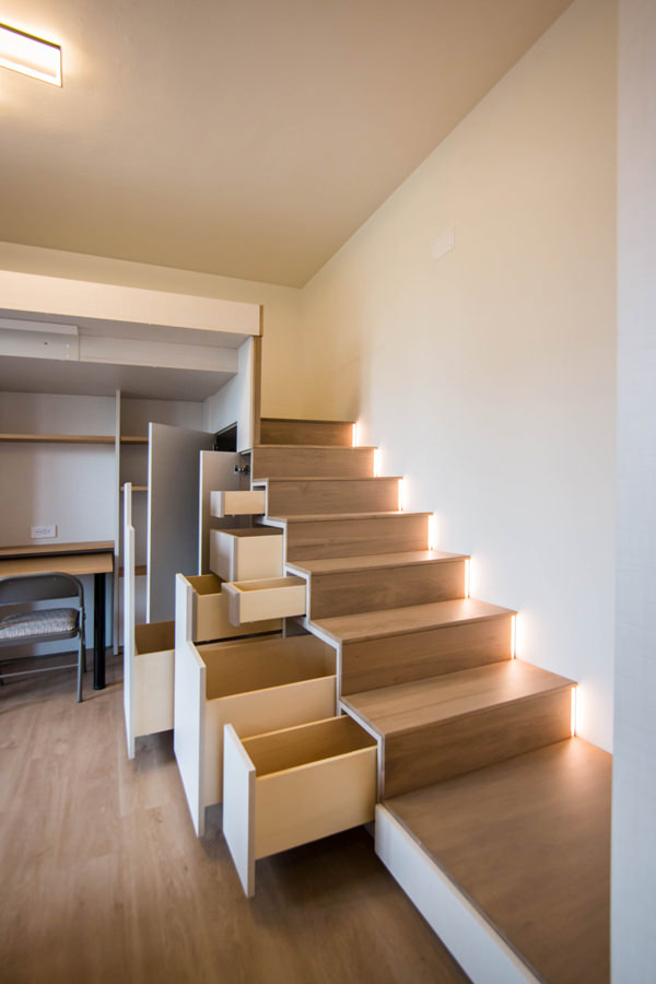
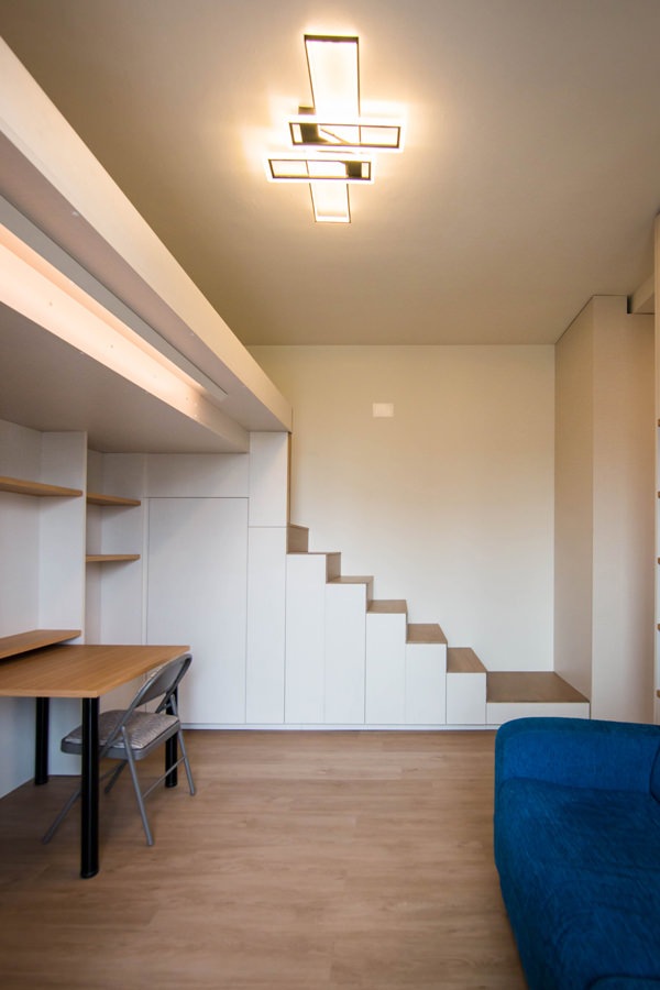
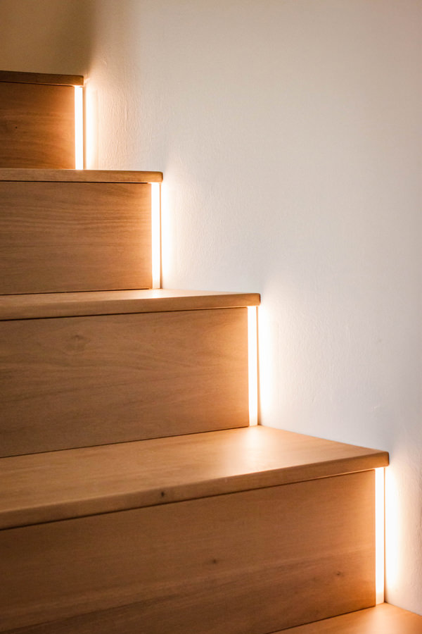
To make the most of the available space, the furniture of this studio apartment has been custom designed by obtaining service rooms from structural voids and architectural constraints. The best example is certainly the creation of the under-stairs compartment with doors and push-pull trays useful for arranging objects of various sizes. In fact, starting from the modularity of the risers and treads of the access ladder to the mezzanine, doors are created with a vertical reading whose opening takes place via push pull. Depending on the need, each internal compartment takes up the space of two or more steps, equipping itself with additional extractable volumes where necessary. From this perspective, the dining table can also be in a resting position, attached to the equipped wall of the TV area and used as a desk, or moved to the center of the room to accommodate other diners.

Even the equipped wall, to gain additional service space, is made up of three distinct modules, the sides of which are slightly inclined. The shaping of the different elements allows an optimal management of the architectural corners, also creating a greater sense of welcome.

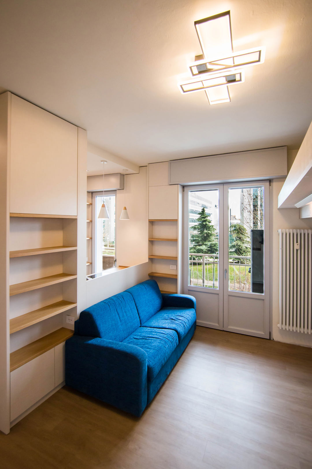
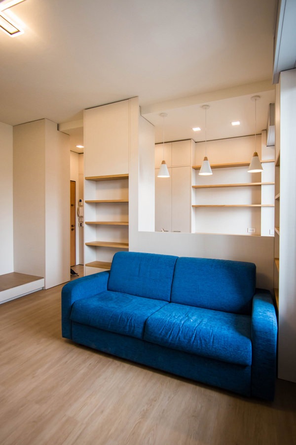
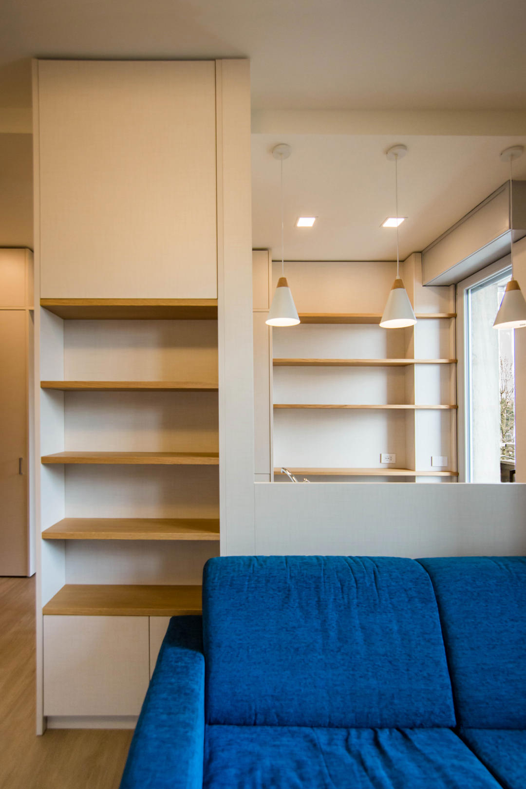
The architectural void then becomes the new design theme, equipping cavities and niches with shelves and open compartments. This is the case, for example, of the main pillar, incorporated in the dividing structure between the kitchen and the living area. The lower part houses internal shelves accessible through a door with push opening, while the upper part consists of exposed shelves in the niche.

under-stairs-equipped-closed-doors
under-stairs-equipped-open-doors-to-optimize-spaces-with-furniture
living-room-studio-apartment-milan-natural-material
front-view-equipped-under-stairs-compartments
kitchen-doors-to-organize-spaces-drawers-furniture-to-optimize-space
electrical-tower-down
eletrical-tower-up

Functional but also conceptual steps

Another focal point is the anteroom, which from an environment required by law also becomes a useful space for the storage of cleaning products and service cabinets. Drawers and doors with height-adjustable internal shelves are used for the products storage of different sizes.

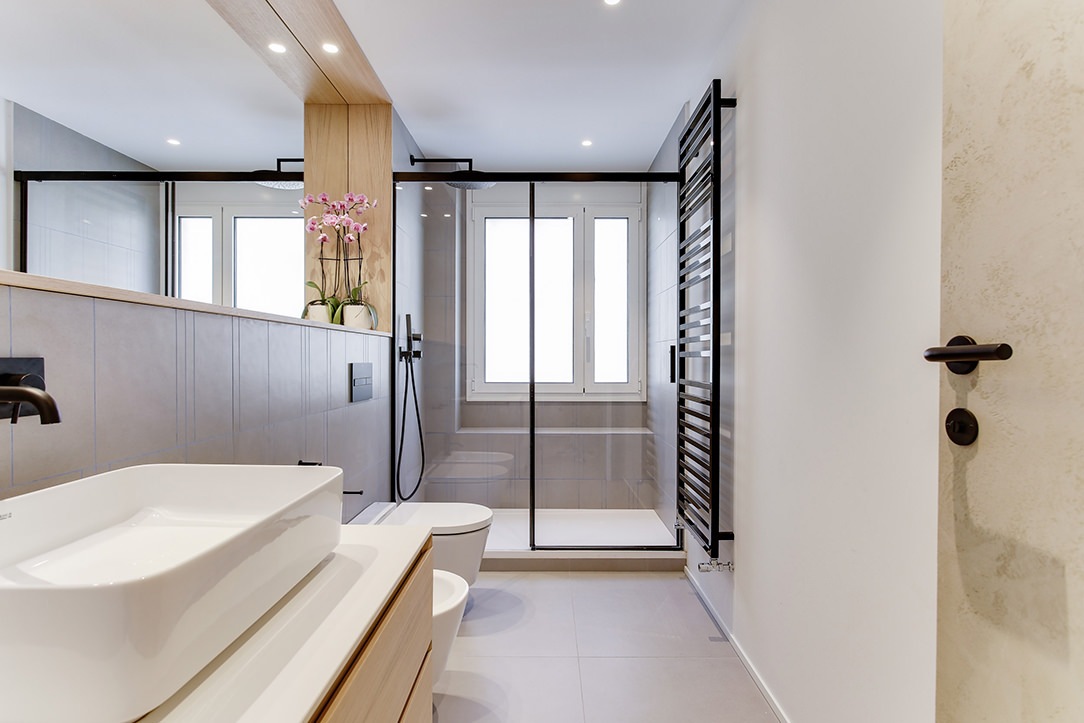
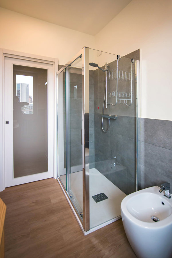
Even in the bathroom, the design of the furnishings in order to make them functional gives life to a large and bright environment. The change of flooring marks the transition not only physical but also conceptual and visual to a more intimate and reserved environment. The front view on the window offers ample natural lighting, diffused throughout the room thanks to the choice of materials. The glass closure of the shower minimizes the aluminum details, while the large mirror attached to the service cabinet expands the perception of space.

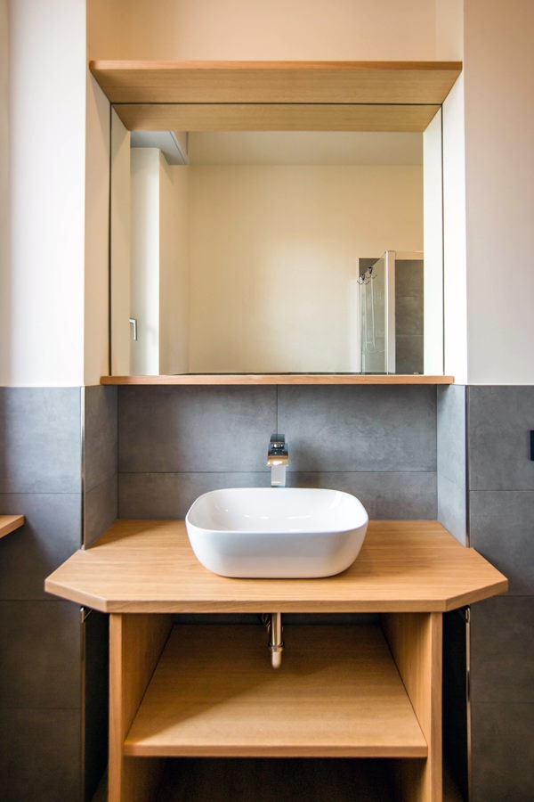
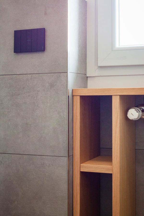
Optimizing the space in the bathroom means taking advantage of all the service cavities: an example is the open oak cabinet under the window. The service shelves for toilet paper and small personal hygiene products in wooden finish in fact obtain their space on the side of the radiator, without however being oppressive. Small accessories such as the pull-out towel holder enrich the functionality of an aesthetically simple and clean bathroom cabinet. Simple and authentic forms are thus valued.

equipped-anteroom-service-cabinet
optimize-spaces-with-functional-anteroom
contemporary-bathroom-gray-furniture-to-optimize-spaces
contemporary-bathroom-glass-door-shower
bathroom-studio-apartment-milan-optimize-spaces
glass-shower-bathroom-contemporary-gray
shaped-furniture-wood-bathroom

Natural colors and materials for a contemporary studio apartment

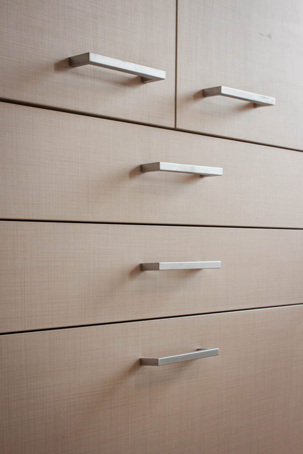
The practicality of the furnishings is not only found in their composition and spatial arrangement, but also in the choice of materials that characterize them. For horizontal surfaces, the choice fell on oak, a natural wood par excellence with great resistance and workability characteristics. Its aesthetic line with warm veins makes it welcoming and transmits spontaneity and tradition. From the parquet floor to the kitchen top and shelves of the open compartments, its presence becomes the touch of authenticity of the stylistic line adopted. For the vertical surfaces, on the other hand, the canvas bilaminate was chosen, whose warm but neutral tones make it delicate but incisive at the same time. Among the major advantages of this material, it certainly has high resistance combined with a very affordable price. Its finish also makes it soft to the aesthetic impact and textured to the touch, expressing attention to detail.

detail-LED-light-stairs
detail-canvas-bilaminate-doors
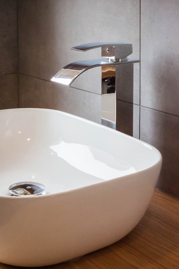
bathroom-countertop-basin-design-tap
detail-customed-bathroom-furniture

The renovation of this studio in Milan involved all levels of reading of the project. From the planimetric distribution of the rooms to the choice of materials and finishes. The choice of functional furniture allows you to optimize spaces by providing environments that are not only aesthetically pleasing but also practical and easily livable.

Architectural voids and structural elements hide great potential, just look at them with creative eyes!

To see other examples of small rooms optimized in spaces with functional furnishings, you can take a peek at this minimal style studio apartment or at this shabby chic style creation

Classic style: Elegant and welcoming

Classic style: Elegant and welcoming

The Classic style is typical of an elegant, spacious house, capable of transmitting feelings of welcome and warmth without appearing severe. Those who choose the classic style certainly love retro-flavored furniture, wood with its inlays and oversized upholstered sofas.

Classic Living room

a Classic living room with upholstered sofas and armchairs, elegant chandeliers and large curtains.

CHARACTERISTICS OF THE CLASSIC STYLE

Although the years fashions are passing quickly, the Classic style can be defined timeless. Recognizing himself for his inspiration from the noble houses of the past, he refers itself precisely to that ancient luxury. This style is synonymous of elegance and often also the declaration of a certain socio-economic status and a certain type of taste.

Great attention is given to the authentic beauty of the furniture and finishes rather than functionality or technology. Two factors are therefore important to furnish in a classic style: a large space to devote to furnishings and accessories and no limits of budget. People who choose the classic style often have a passion for fine antiques and a very spacious house ready to welcome them.

 modern classic living room

a living room in Classic Modern style, more minimal but equally elegant.

BETWEEN ARCHITECTURAL CONFORMATION AND INTERIOR DESIGN ELEMENTS

In the Classic Style’s architecture there is no shortage of columns with capitals, sometimes not structural but a simple pretext of aesthetic refinement. Stuccos, vaults, ceiling moldings and frescoes find their best expression. Another key element are the chandeliers, usually in crystal and clearly visible in the center of the rooms. Art is very important for classic-style homes, an inevitable touch of class. Very large paintings seem to transform domestic interiors into museum spaces, or many squares of various sizes crowd an entire wall as if they were the scenography of “The Best Offer”“The best offer”. There is no shortage of statues or sculptures, both for the outside and for the inside.

When we talk about classic style it is good to underline that we are referring to a world of interior design that embraces different influences, eras and traditions. Think of the imperial, rococo, baroque and all the currents that define the taste of tradition. Of all the facets known throughout history, the most popular one in the world of interior design is the Modern Classic. We could define an extremely chic and refined Modern Classic, comparing itself in certain aspects and interpretations to the Luxury style.

boiserie white
boiserie gray

both for the Classic and Modern Classic styles, the Boiserie are fundamental.

MATERIALI E COLORI

Wood always prevails and is usually “solid”, recognizing itself for physical and visual prominence with important thicknesses and large surfaces. In fact, at the design level, the tops and backs of bookcases and furniture tend to be tall and wide and most of the time with a characterizing profile or elaborate decorative details. Noble woods such as mahogany, oak, cherry and beech prevail.

Then there are wooden elements such as chests and cupboards which, as for the Boho Chic style, are indispensable. The materials combined with wood are noble and luxurious, such as marble for the floors or even for the kitchen and bathroom countertops, glass for the doors of cupboards and dividing doors, precious stones for small decorations, porcelain for knick-knacks, sanitary ware and sinks. The lines of the furnishings are never essential but rather sophisticated. An example are the closing doors of the furniture, usually embellished with a central band that is broken or in relief.

The pieces of furniture abound without leaving anything to chance. From the Country style it inherits coatings and boiserie. The wall in its architectural essence is forgotten, covering itself with decorative elements capable of characterizing it. For this reason, wallpapers are very popular and the decorations alternate complex details with small and refined textures.

Even the fabrics of the curtains, usually in silk or fine cotton, are enriched with decorations and large draperies. There is no shortage in the living area as well as in the bedroom velvet cushions and fine carpets, preferably antique Persians.

The sofas are padded and oversized. The meaning you want to convey is precisely that of opulence and hospitality.

Leather is the most used material for sofas, which however also know the alternative in precious velvets. The classic-style houses transmit warmth thanks also to the light colors of the walls, others to the warm white, which we at Modulor identify with the classic 9010, light dove gray, cream and beige are welcome. These colors go very well with wood, highlighting it and helping to create a feeling of warmth as a whole.

classic style materials

The Modulor selection of colors, textures and furniture references for the Classico moodboard.

THE MODERN CLASSIC STYLE

The Modern Classic style follows all the characteristics of the Classic style but differs for its essentiality and linearity. We could define it elegant and refined but without exceeding. The choice of wood in the Modern Classic style is recognized for the finish: almost never natural, but much more frequently dyed. Thus the stylistic features of the furnishings are emphasized, in particular the banding and also the shells and shaped profiles. Unlike the Country or Shabby Chic style, the varnishing of the wooden furniture is not done “by hand”, that is leaving the mark of the brushstroke visible which makes them so handcrafted, but with a flat-color matt lacquer that even hides the vein. The range of colors expands and is dared with bright and modern colors, both for the lacquering of the furnishings and for the walls. The wallpaper as well as the paints characterized by particular colors, favor more geometric and contemporary decorations.

gray modern classic kitchen
green modern classic kitchen

Two examples of Modern Classic style kitchens with variations in the chromatic choice.

THE ROOMS OF THE HOUSE

The Living Room is the most important part of the house, precisely because it is the place of conviviality, where time is dedicated to guests and to oneself. For this reason, its dimensions are often important, reflecting the privileged role played by this environment. Since the contemporary houses have ever smaller rooms, to maintain an important living room, a single open space environment can be created by also incorporating the dining room. The resulting environment will thus be used in a part as a dining area, equipped with a large table with important chairs, even better if padded armchairs, and the relaxation area will find space on the side. To characterize the latter, large sofas combined with upholstered armchairs with a retro taste. The classic style does not include island sofas, but prefers classic conformations accompanied by matching armchairs, even better if in leather.

Classic Living room

A Classic Modern Living Room.

The kitchen is elegant and simple; it is a space used only for the preparation of meals and not for its consumption. Essentiality is the key word for this. As with the Country style, appliances tend to be hidden, usually leaving only the oven with its characteristic steel knobs exposed.

classic kitchen creamy
classic kitchen cupboard
classic kitchen creamy

A Classic kitchen part of a Parisian style project.

In the bedroom you can play with the headboards, very important to which you combine antique furniture, such as a chest of drawers with decorations and inlays or a petineuse with mirror.

One of the characteristics of the classic-style bedrooms is precisely the presence of a cabinet dedicated to make-up and evening preparation, together with large mirrors and majestic wardrobes. ​

classic room beams
 classic room wooden chest of drawers

Refined headboards characterize this Sicilian villa with a classic taste.

In the bathroom it is better to prefer a beautiful freestanding white ceramic bathtub instead of huge and ultra-technological shower heads. A wallpaper on a wall or antique paintings cannot be missing.

The entrance, or in many cases the corridor that leads from the main door to the majestic living room, must live in harmony with the rest of the house. For this a small low cupboard with drawers and a mirror with a precious frame can be the winning card.

classic entrance

The entrance of an elegant Milanese apartment.

The Classic style and its modern meaning are suitable for rigorous characters, lovers of aesthetics and its traditional refinement. It perfectly marries personality lovers of the past, attentive to details but with an excellent overview. The classic style interior setting is almost scenographic. A style that loves beauty and the arts in all their expressive forms.