Adapting standar furniture with tailor-made solutions

Adapting standar furniture with tailor-made solutions

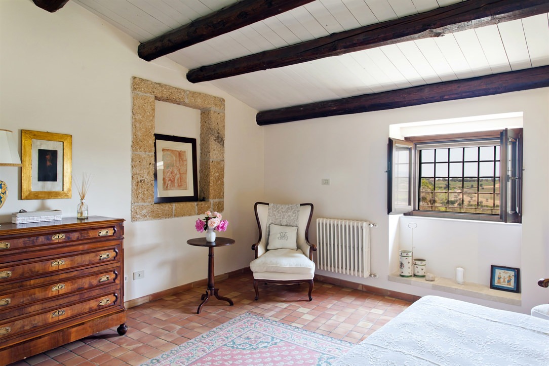
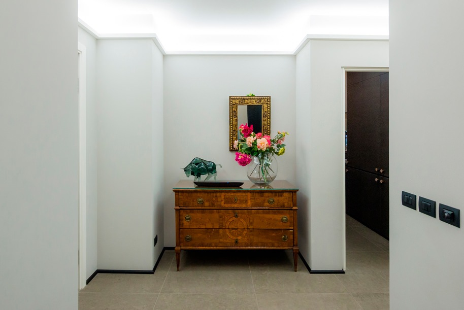
Custom-made furniture and stardar products belong to two different worlds, bringing with them a large repertoire of solutions and projects. Each has great strengths and opportunities, but both also know their weaknesses. Sometimes it happens that these two worlds come into contact, helping and supporting each other. After all, it is well known: unity is strength!

bathroom-luxury-standard-furniture

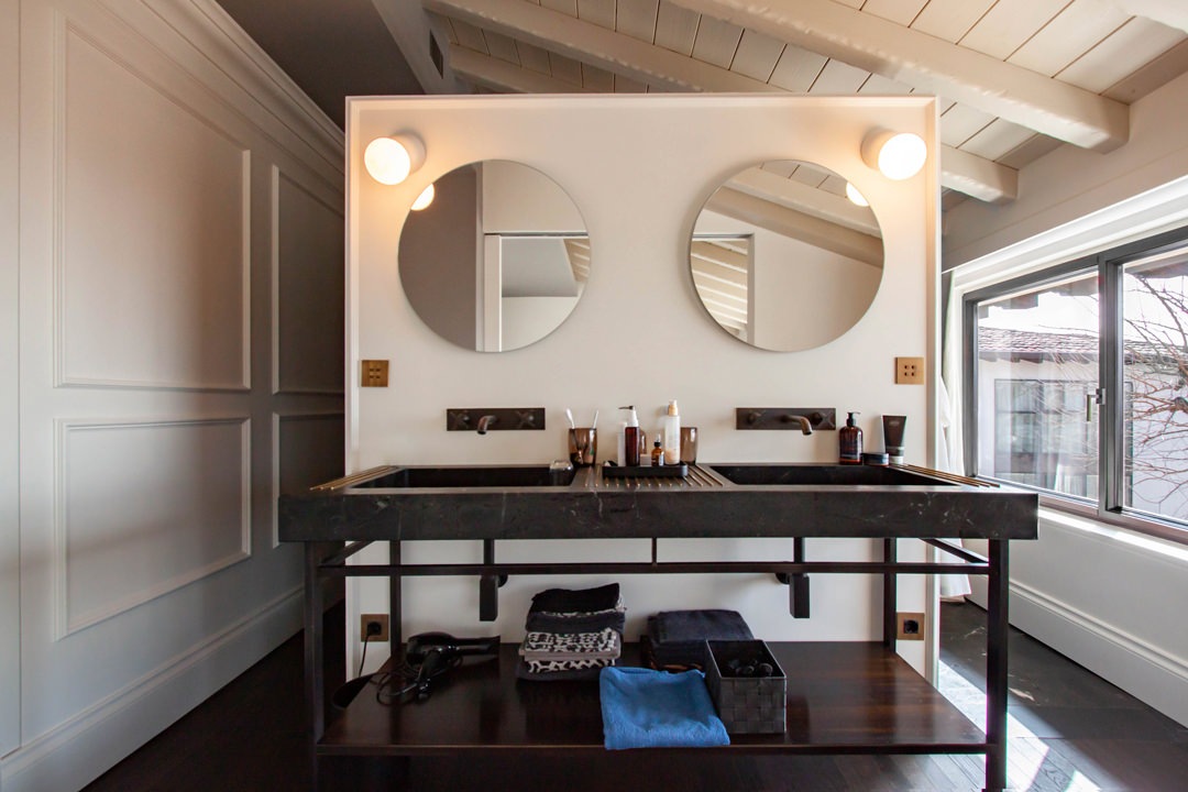
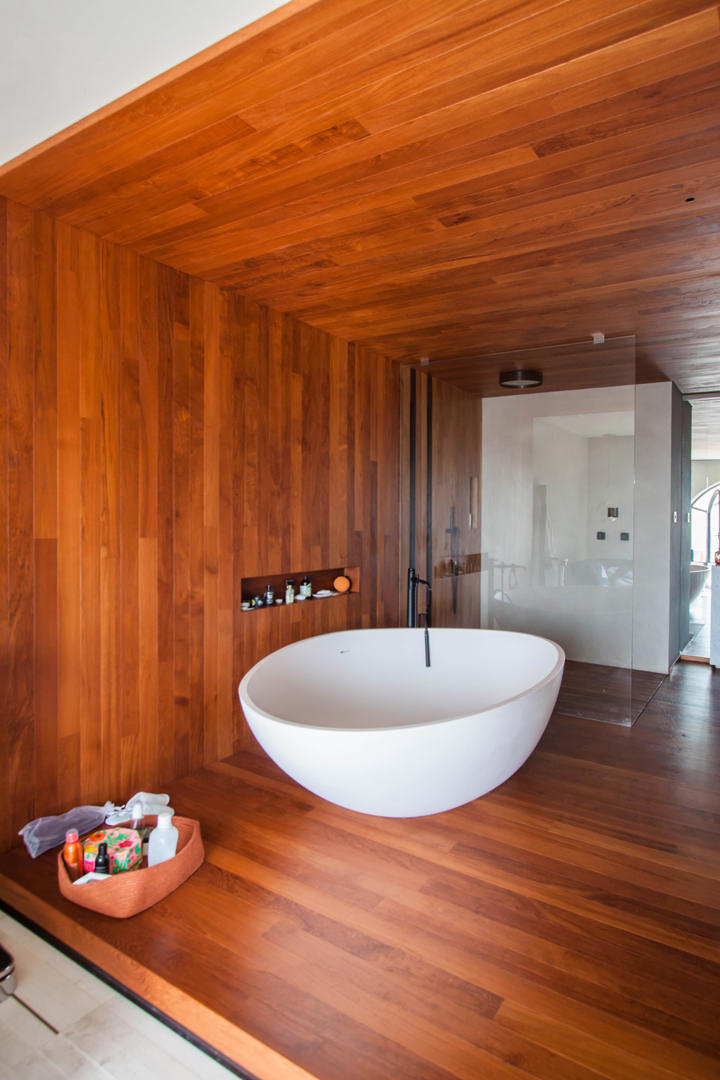
A master bathroom with elegant series furniture.
On the side, made-to-measure valances hide the support rails of the curtains

Standard and customed furniture: eternal rivals? Not at all!

It is common belief that standard furniture and custom-made solutions are ruthless competitors. Nothing true!

In fact, these are different realities that provide valid project proposals to customers, offering them a market capable of satisfying every request. Tastes, needs and desires of customers often interface with intrinsic constraints.
These include: budget limits, production restrictions, delivery times, availability and variety of alternatives.
Within the world of furniture design and production there are in fact an infinite number of secondary aspects that define the strengths, but also the limits of each company.

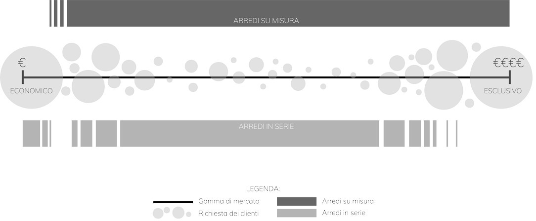
We can imagine the world of furniture as a range of parameters, at the extremes of which lie the cardinal principles of the two worlds.
On the one hand, standard furniture at super cheap prices capable of destroying any competitive market.
Its philosophy is certainly linked to a democratization of design that exploits large industrial production to contain prices and make its products accessible to all.

At the opposite end, a niche market, linked to the concept of “exclusivity”, chosen for its impossibility of identical reproduction and the opportunity for customization.
The choice of this type of furniture is linked to a feeling of privilege in its availability.

Between these two opposites there are the infinite number of companies that experience design on a daily basis.
Embracing the entire range of the market in this sector would be impossible and counterproductive, leading to poor results both for the manufacturer and for the customer himself.

It necessarily follows a specialization in the type of products and an identification of the reference target.
Precisely for this reason, standard furniture and tailor-made solutions cannot be considered competitors because they embrace different philosophies, targets and production systems. Their relationship is instead collaborative and mutually supportive, making the most of the potential of each party.
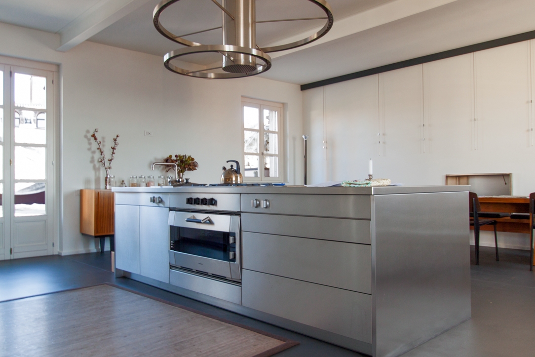
inpho-graphic-furniture-market

Potential and constraints of standard products

One of the main advantages of series furniture is the vastness of the market to which they belong.
This makes it possible to satisfy the tastes of each customer, providing a wide choice of solutions and variants. To this is added an economic advantage deriving from the optimization of production.In fact, by exploiting the industrial production and the repetition of the pieces, it is possible to optimize the production phase in the best possible way, managing to contain costs. This also implies an ever more careful precision and improvement of the single elements.
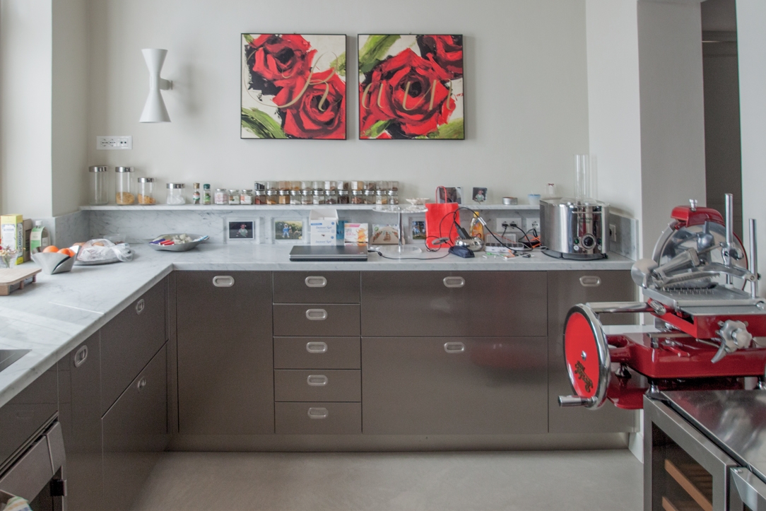
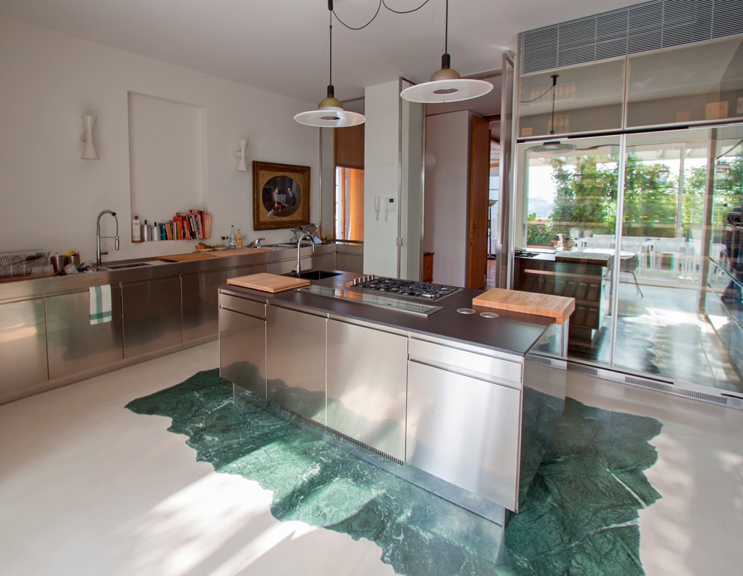
On the other hand, this specific reproducibility limits the scope for intervention and customization. The world of mass-produced furniture works in reproducible and combinable “modules”.
Customization consists in knowing how to combine the individual elements and organize them in a different way, but it certainly does not allow for specific product customization as in custom-made furniture.

So here are island, peninsula or monobloc kitchens that take on different shapes depending on the environment in which they are inserted.
However, these find their first obstacles when there are architectural constraints or special requests from customers.
Customization does not cover all levels of furniture reading.

This is where bespoke design comes in, offering its attention to detail and custom design.

spa-room-standard-furniture
customed-mirror-spa-sink-standard-furniture

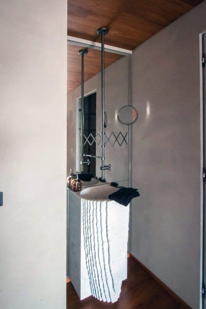
When standard and customed furniture meet each other: a full-height shaped mirror fits into a SPA context with scenographic furnishings from important manufacturers

Works of tailor-made workmanship: a contemporary style kitchen

Where the supply of standard furniture reaches its limit of customization, the flexibility and spirit of adaptation of bespoke furniture comes into play.

An excellent example of this, is this luxury-style house distributed over three levels.
The maintenance and collaboration with Modulor involved different rooms.

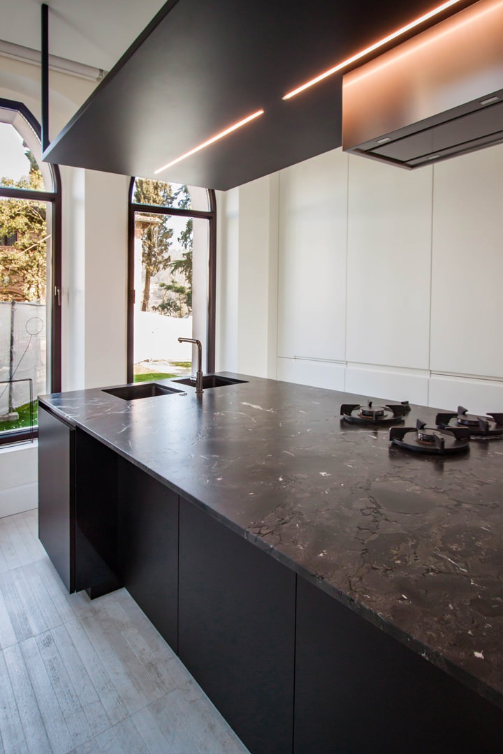
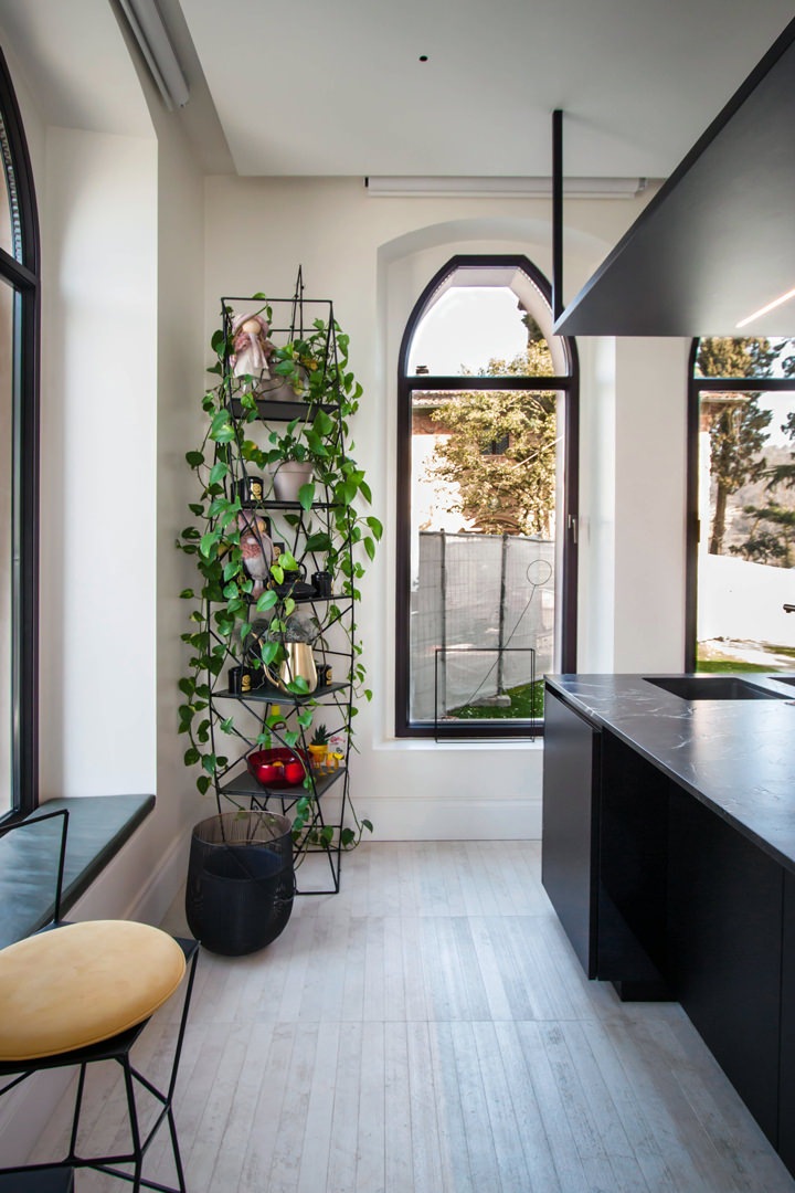
First of all, the kitchen, consisting of a wall equipped with full-height doors on the right side of the access and a central island with a design hood. Precisely in this last element, the volumetric composition of the furniture provides a large surface that can be used as a worktop, but it prevents its use of meals.
In fact, by equipping the worktop with doors and lower drawers, it could not be used as a support surface for quick meals, as it did not provide adequate space for the user’s seat.

Finding tailor-made solutions in this example meant creating a lateral niche in the volume of the island. In this way, even with a not very wide depth, it was possible for customers to find the right space to sit comfortably while keeping their legs perpendicular to the structure. A comfortable snack bar for 2/3 people that does not give up on a work surface and support surface.

island-kitchen-adaption
standard-island-kitchen

An important island kitchen modified with tailor-made solutions: a niche has been created in the lower volume in order to use the worktop also as a support point for the consumption of quick meals

The sleeping area between secret passages and princess bedrooms

Even in the sleeping area, custom-made design has found ease to express its experience and personalization.

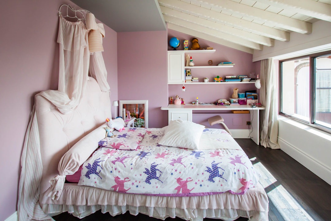
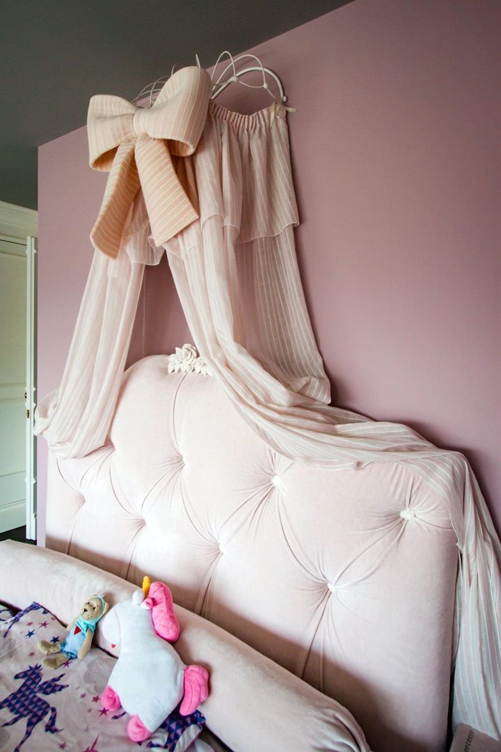
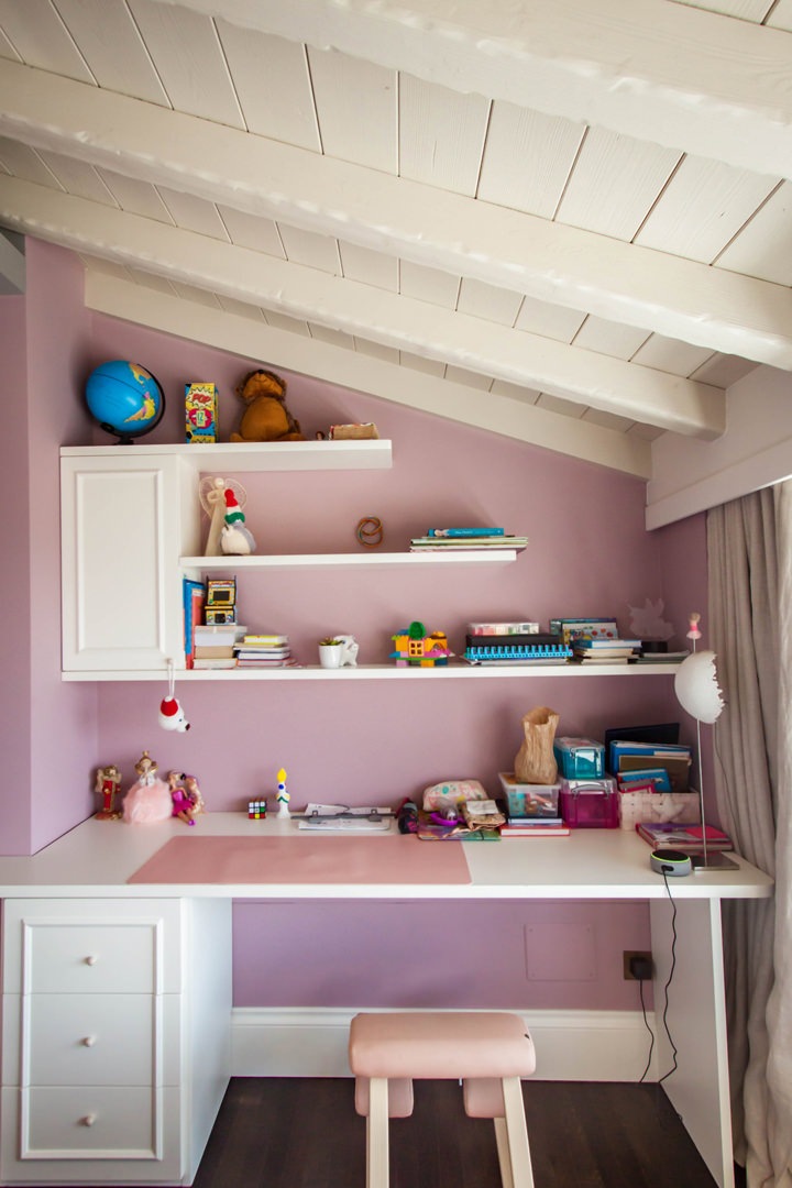
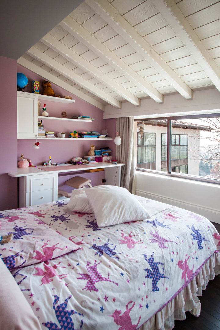
The classic-style bedroom is characterized by the presence of an important bed with drapery and padded headboard with a fairytale look. Taking advantage of a lateral architectural niche, a desk with wall unit and shaped shelves was inserted in order to make it an integral part of the spatial configuration.

The custom-made desk top is accompanied by a chest of drawers with bands that also acts as a load-bearing element.
This is accompanied by a wall unit with a molded door and shelves in matt white lacquered MDF that reflect the boiserie.

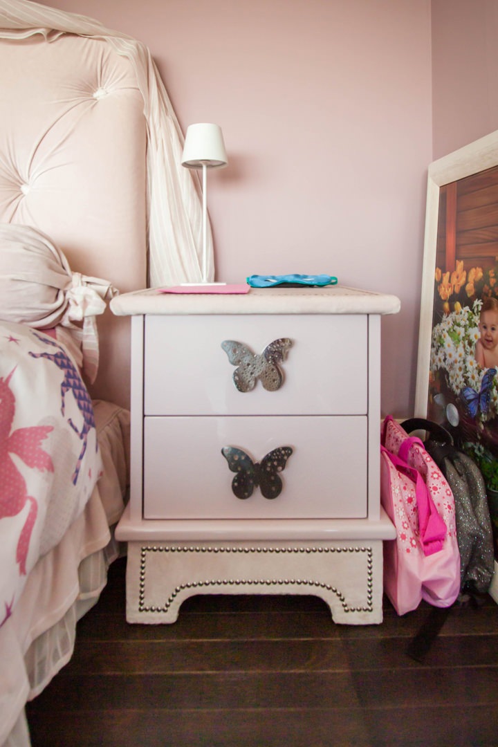
Even the bedside tables take up the style of the bedroom with handles in customed sheet metal in the shape of butterflies.
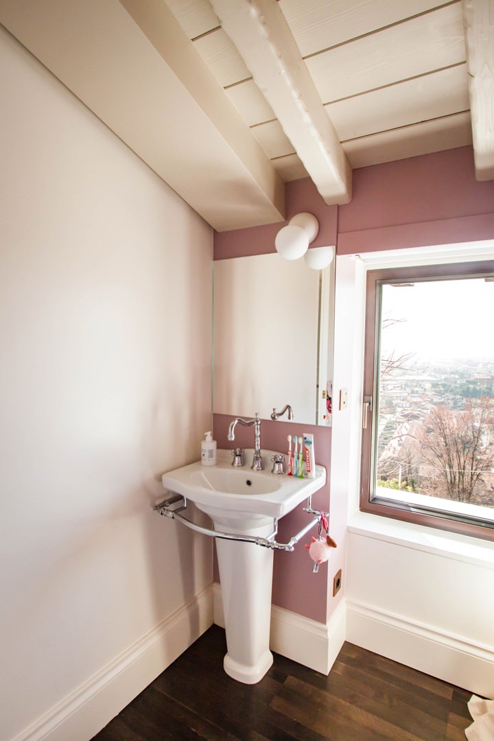
The side service bathroom illuminates the room with a glossy white tile wall cladding, crystal shower and pedestal sink with custom wall mirror.

classic-style-bedroom-princess-bed-standard-furniture

Every princess’s dream bedroom hosts an important bed with drapery and padded back

details-princess-bad-padded-back-drapery
details-bedside-tables-girl-bedroom

Details of a small bedroom from large-scale distribution: upholstered draperies and backrests perfectly match bedside tables with shaped sheet metal handles

customed-desk-bedroom
classic-style-bedroom-customed-desk

The desk in the niche takes up the classic style of the boiserie paneling through door moldings

detail-molded-door-bedroom
detail-white-laquered-shelves-bedroom

Shelves and doors in white lacquered MDF in warm tones for this classic style desk

customed-mirror-standing-sink
customed-mirror-standard-standing-sink

The made-to-measure mirror accompanies the classic style design pedestal washbasin

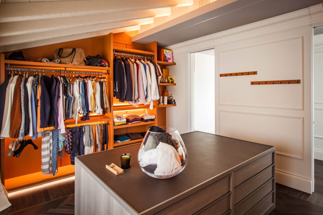
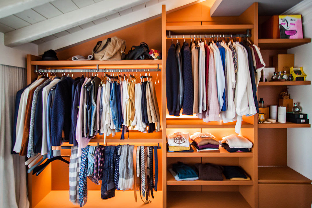
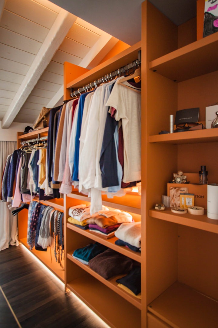
Always in the upper floor, takes place the walk-in closet, whose orange tones give a touch of character and freshness to the room while remaining elegant and impressive.

A retractable mechanism is hidden inside the side structure.
What apparently looks like a support bench hides a flap door with a system of internal channels that allow dirty clothes to be brought directly to the laundry area. This internal conduit channel is also intercepted at the level of the living area through the opening of a door on the external front of the kitchen. What apparently seems to be part of the molded boiserie is transformed into a storage point for the tea towels which, using the internal slope, are taken directly to the laundry.

standard-furniture-walk-in-closet-leather-finishes

Composition of a walk-in closet with elements in series: on the sides hangers and shelves covered in orange leather, in the center a chest of drawers in textured bilaminate

walk-in-closet-flap-door

The side wall of the walk-in closet with shelves and hangers.
On the right, the small service bench hides the channel that leads to the laundry

detail-flap-door-walk-in-closet
molded-boiserie-open-door

Left: the folding door mechanism from which the conduit for soiled garments starts. Right: the door incorporated in the boiserie that intercepts the path for the kitchen products.

Industrial style: from the raw soul to the professional mark

Industrial style: from the raw soul to the professional mark

The industrial style has increasingly characterized the interiors of recent years, becoming the emblem of an authentic and essential lifestyle. From its traditional rustic meaning, it then meets the refined and contemporary variant, influenced by luxury finishes and lines.

Especially in the reality of custom-made kitchens, the raw and traditional mark has given way to modern conformations, inspired by professional cooking solutions. Functionality and efficiency become the keywords for an essential and modern style.

Alba apartment 04 industrial style

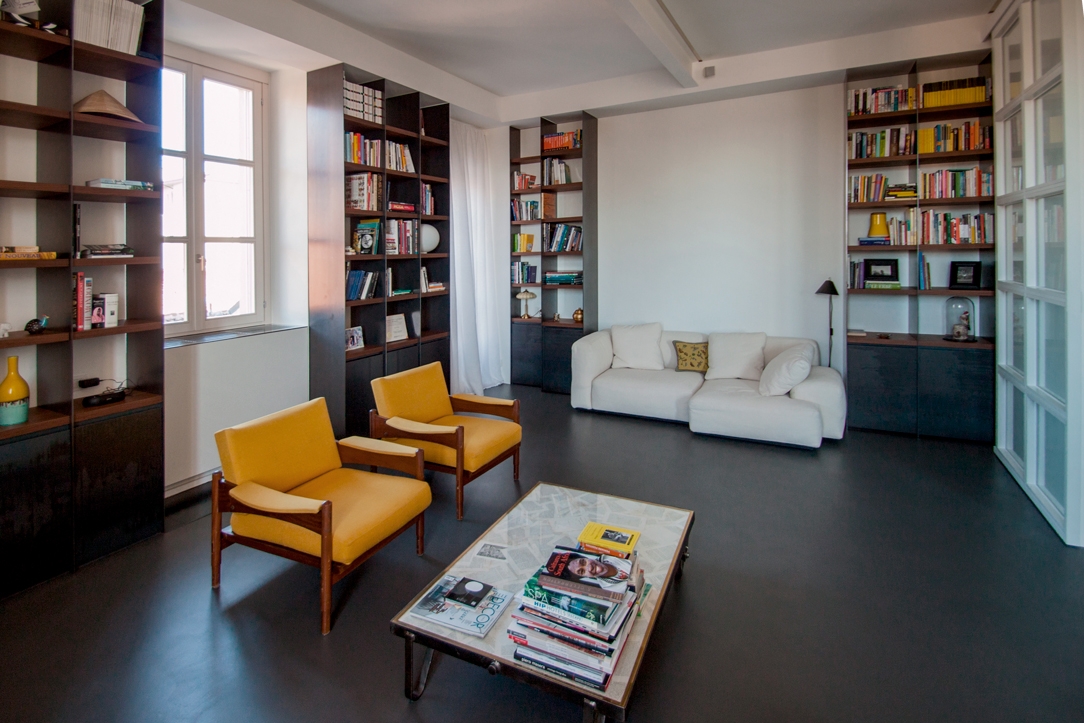
Iron bookcases with wooden details enrich this industrial-style relax room designed by Locatelli Partners and made by Modulor

The industrial style in its historical evolution

To trace the origins of the Industrial Style we have to move overseas, more precisely to New York. We are in the postwar years, when in the 1950s, the demand for low-cost housing flowed into the reuse of abandoned spaces. The strong stylistic imprint linked to these environments, gives rise to a real fascination for industrial archeology.

The iconographic references of the time, contextualized in the world of art and cinematography, accentuate this stylistic movement, increasingly introducing the perception of the architectural wreck as a scenario of everyday life.
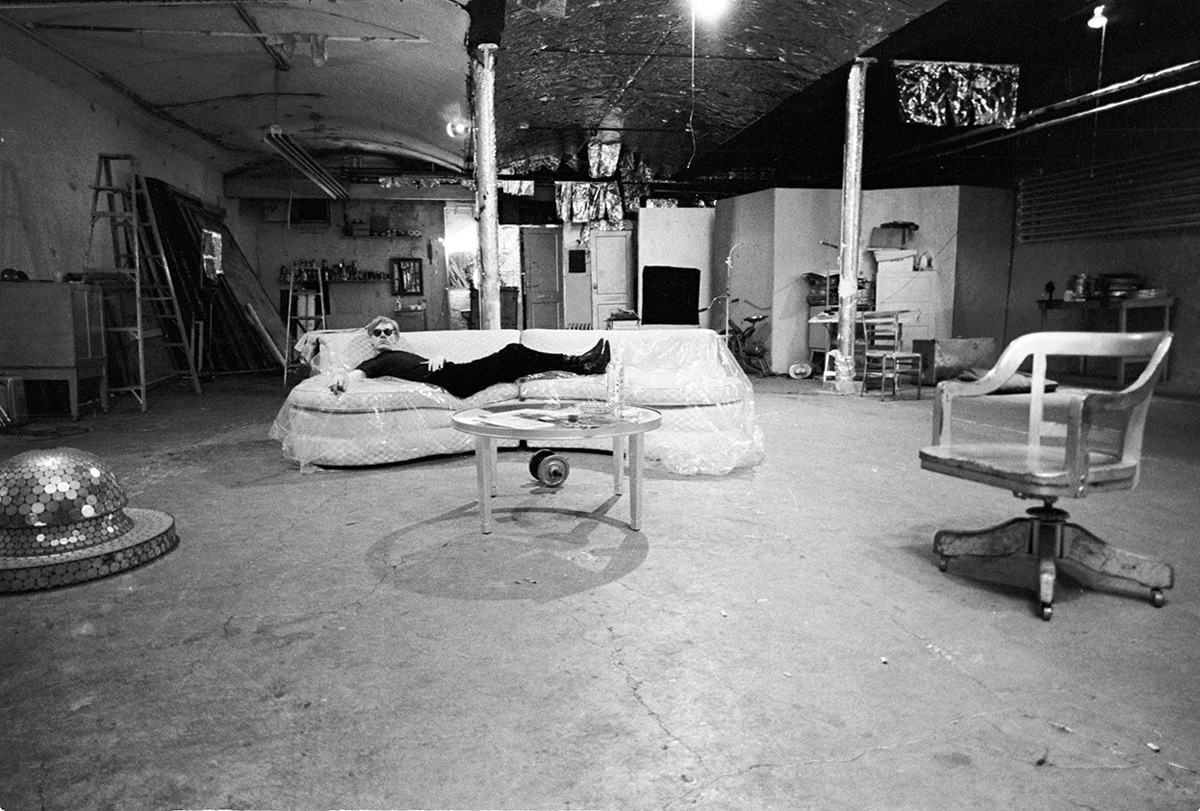
An example of all, is Andy Warhol’s Factory, a studio for his works during the boom years of Pop Art.

From the American metropolises, the new style was then moved to small local realities and landed in Europe during the 1980s.
Trends from the new continent are enthusiastically welcomed by the great revolutionary cities of London and Berlin.
It is no coincidence that London was the protagonist of the Great Industrial Revolution, from which setting, the industrial style drew on the development of new domestic scenarios.

The subsequent spread to the remaining countries of Europe and World coincided with the simultaneous need to reduce land use.

Andy Warhol Factory

Andy Warhol in his factory, a film icon in the successful years of Pop Art

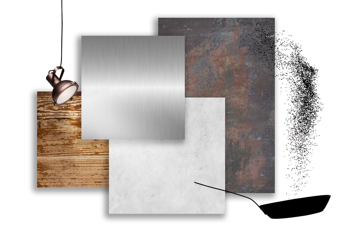
industrial style materials

Metals are the protagonists of the industrial style, matched with raw woods, concrete and industrial resins

The charm of the industrial style in its architectural concept

The industrial world as a reference point for the domestic reality was well assimilated by the culture of the time also due to its revolutionary breath.
The industry has in fact marked a breaking point with the traditional, especially for the social changes that the revolution of the late 19th century has introduced.

The industrial style enhances the “architectural wreck”, bringing a romantic vision of the passage of time on buildings.
The reuse of industrial spaces thus favors functional architectures, transforming the structural elements into focal points of interest.
Pipes, concrete pillars, large windows with metal frames, exposed bricks and peeling walls are elements to be carefully preserved.

industrial attic Bergamo 05

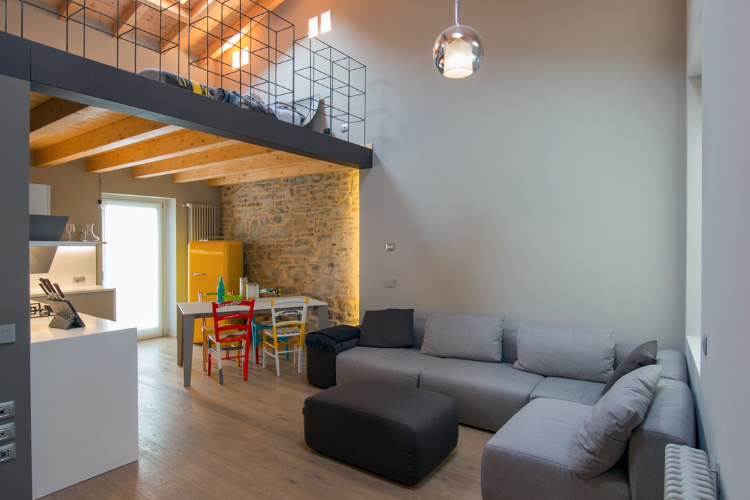
In this attic, the exposed beams and traditional walls represent the stylistic signature of the interior

 traditional rustic loft

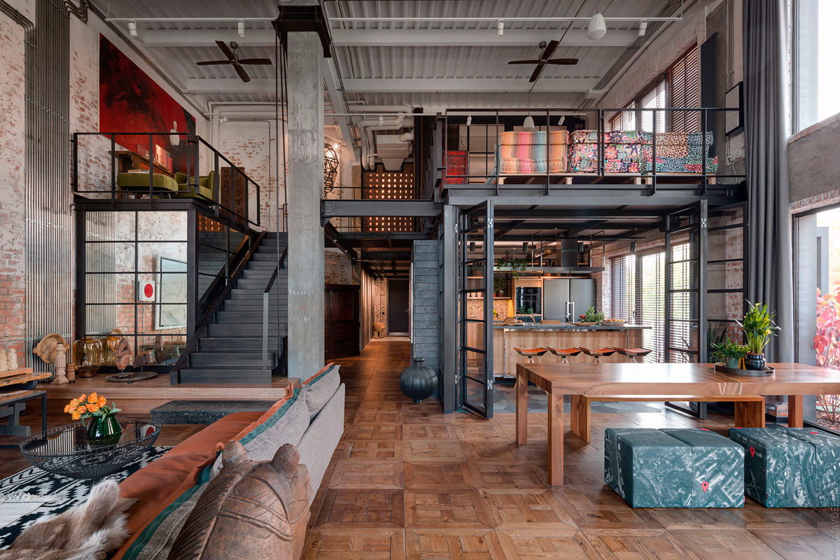
Large windows, exposed brick and metal structure for this rustic loft in Kyiv.
Photograph: Andrey Avdeenko

Between exposed systems, materials and floors ..

From the point of view of spatial organization, the open space and large ceilings certainly play a fundamental role: free-plan spaces characterized by the lack of vertical partitions, even better if set up to take advantage of the large heights.

The myth of the Loft is born, in which the functional organization of domestic interiors revolves around the exploitation of double heights.

By keeping the skeleton of the infrastructure on view, the system design components become synonymous of authenticity and strongly characterize the space.
The floors are mostly rough, with concrete or industrial resins, while the lighting takes place from the large windows. These maintain their industrial setting with a metal frame and vertical partitions, absolutely abolishing curtains or sunshades. Artificial lighting takes place through rough-looking exposed fixtures, certainly made of metal and in most cases through visible suspension structures such as rails or tie rods.

furniture and colors industrial style

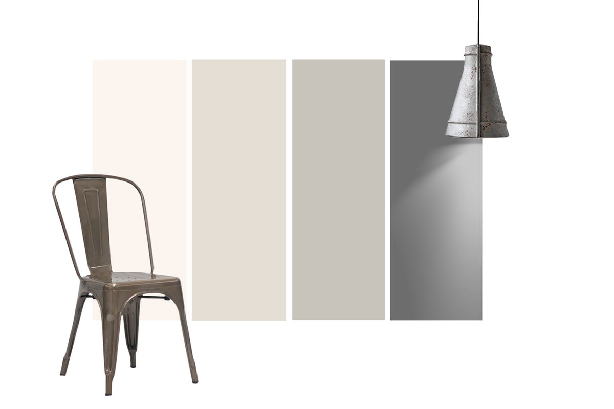
Color references and furnishings in typical industrial style

Alba apartment 09

The large wooden table gives warmth to this kitchen

The contemporary meaning

In its contemporary meaning, the industrial style meets two different variants.

On the one hand, taking back its natural spirit, it marries the vintage interest by adorning the space with antiques and a strong traditional imprint.
With this in mind, wrought iron wall clock appears while metal chairs different from each other are combined with the inevitable solid wood table.
Even better if it is reused from an old workshop so that it keeps traces and signs of use on its surface.

living room industrial loft

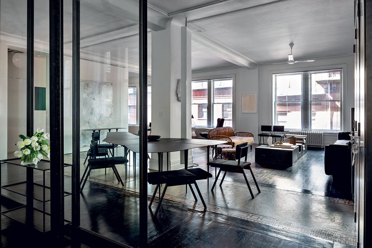
A prestigious industrial loft with black waxed iron furnishings reflects the architectural context in which it is inserted

kitchen industrial loft

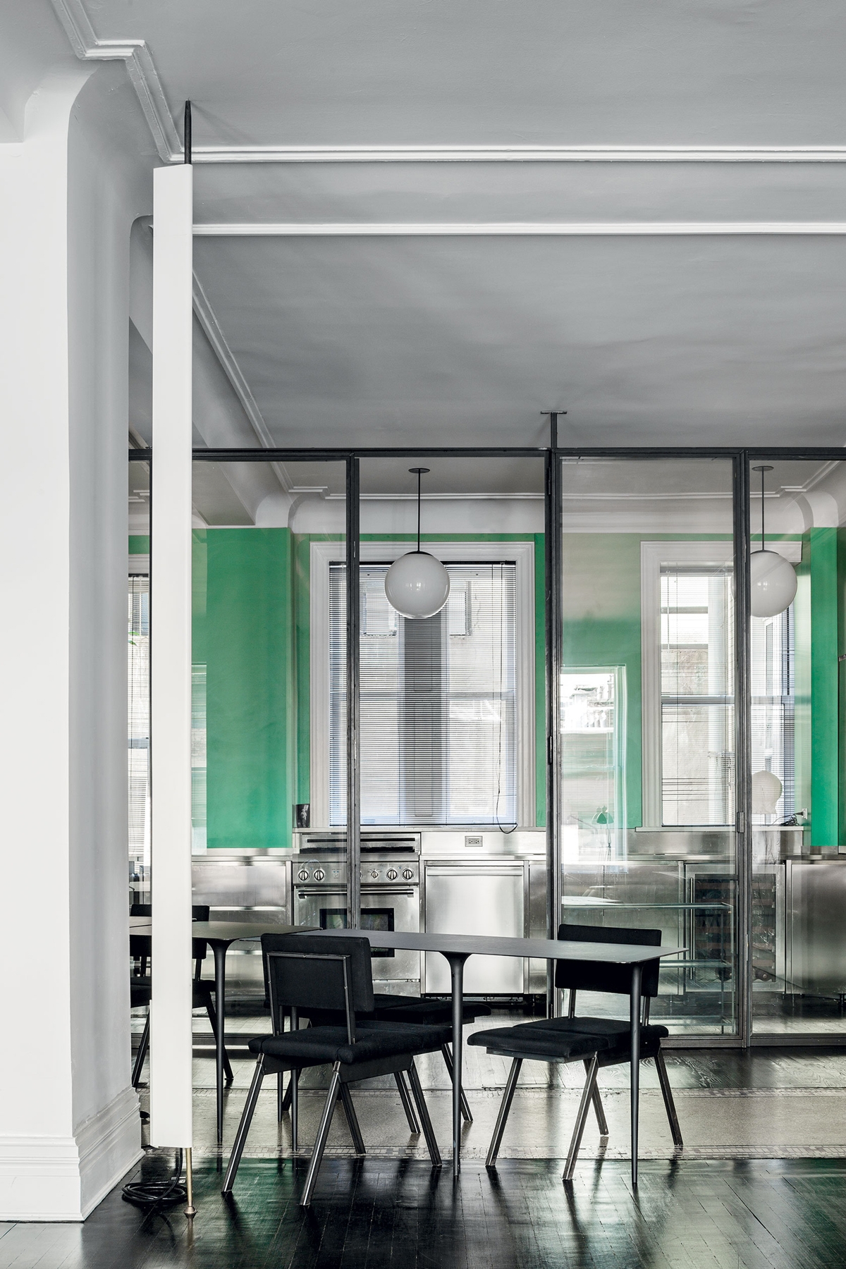
A kitchen entirely covered in steel for this New York loft

Professional kitchens as a source of inspiration

On the other hand, the inspiration of increasingly functional and equipped industrial kitchens forcefully enters the common imagination. Just think of the quantity of television programs that every day offer us steel worktops with an island structure and industrial hoods with a strong stylistic imprint.

From the reality of industrial kitchens, it draws the trend that could be defined as “luxury” of contemporary industrial style. Combined with marble or retro-painted glass, contemporary industrial-style kitchens are clad in stainless steel. Equipped with state-of-the-art appliances, they favor functionality and highly resistant materials.

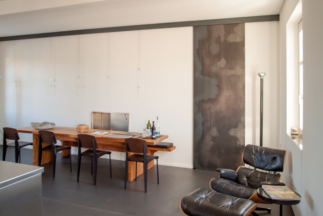
However, even the contemporary industrialist does not renounce a warm and welcoming interior. So, the wooden dining table or the leather design armchair characterize the space, giving warmth and elegance.

Alba apartment 05

Professional kitchen is the world of inspiration for materials and types of this Piedmontese kitchen

industrial luxury apartment 04

A kitchen between industrial and luxury style, enriched by the marble top and shaped profiles of the handles

essential steel kitchen

The island structure is the most common type for industrial kitchens

Functional and extremely practical, the Industrial Style is aimed at decisive personalities who are always on the move. Its simple lines matched with highly resistant materials make it practical and eternal, without giving up a touch of traditional warmth.

Designing a smartworking corner according to Modulor

Designing a smartworking corner according to Modulor

During the last few months, our daily life has been completely changed by the global pandemic.
Not only our habits have changed, from small daily gestures to the way we use services, but also the working and private world have been seen from a different perspective.
If until recently, in fact, the coexistence between home and work life was a voluntary choice of a few people, now almost all families have faced concepts such as smartworking, DAD and online meetings.

But what does it mean at a spatial level to introduce smartworking? How have customers’ needs changed to cope with this now habitual type of work?

classic villa 01 corner of smartworking

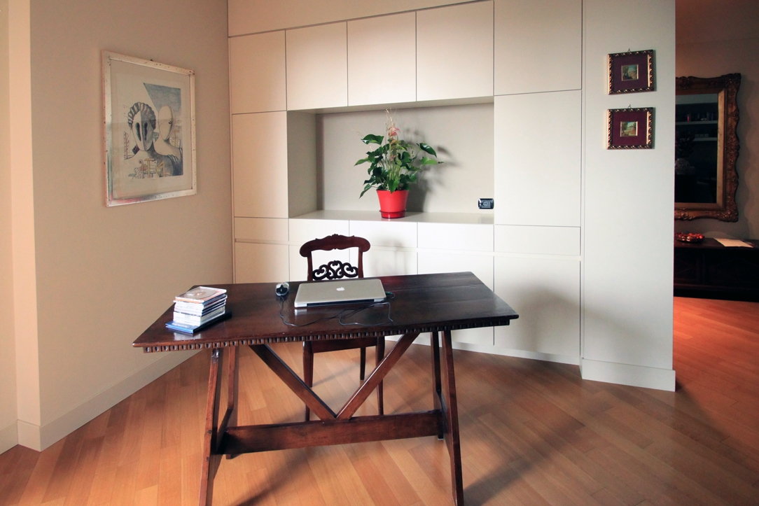
A retro-style wooden desk with a modern equipped wall for a classic and contemporary smartworking corner

THE COEXISTENCE BETWEEN THE PRIVATE SPHERE AND THE WORKING WORLD

The change in habits and lifestyles has involved all aspects of our daily life. From simple gestures such as shaking hands as a sign of knowledge and respect or greeting each other with a warm hug, to participating in cultural and recreational activities such as shows or concerts. The changes that have necessarily been introduced have certainly upset our perception of the private sphere and relating.

Added to this is a new conception of the working world that has increasingly entered our domestic environments.
Previously, in fact, working remotely had been a choice or opportunity for a few, who deliberately knew how to relate both aspects in a single environment. Whether reserving an entire room or dividing domestic spaces with a well-defined design logic.
This is the case, for example, of this studio-home whose design has followed the principles of Feng Shui to organize the internal activities.

From a refined choice, the introduction of a smartworking corner has now become a necessary requirement. All the more so if in the same household the different users need a computer station and well isolated settings to be able to carry out online lessons or conferences on Zoom without interference.

 Milan studio living room 03

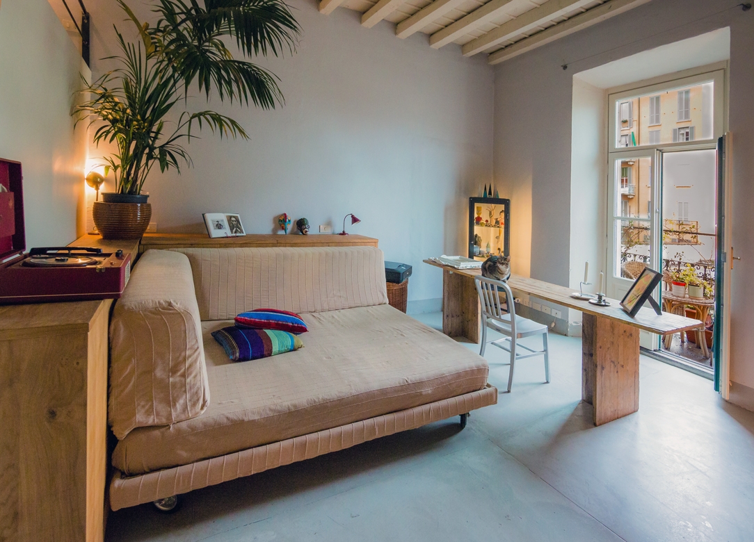
Romantic and Shabby Chic atmosphere for this essential worktop

HOW HAVE CUSTOMER NEEDS CHANGED DURING LOCKDOWN?

The months of “confinement” between the first lockdown and the subsequent subdivision into regions according to the chromatic distinction have certainly influenced our way of living the house.
Just think of the number of hours spent at home in the last few months.

As a consequence of this, first of all, a critical vision of one’s own interiors has been introduced. Small improvements to be made, more refined aesthetic details, functional additions in each room.
To demonstrate this, it is enough to recalling the endless queues in the furniture megastores and DIY stores after the first opening in May 2020. More or less improvised solutions, which many times also involve a “self-taught” component to create greater satisfaction in the final result.

Even in custom-made furnishings, customers have followed this wave of changes with requests that could make the spaces in the home more functional. Whether it is a greater attention to the aesthetic impact or a technical improvement, it was certainly the way of seeing one’s home that changed. To all this is added the aforementioned parameter of necessity, and here is the most common request in recent months: providing a corner for smart working.

FROM THE LARGE WORK SPACES …

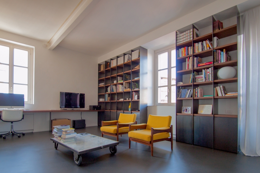
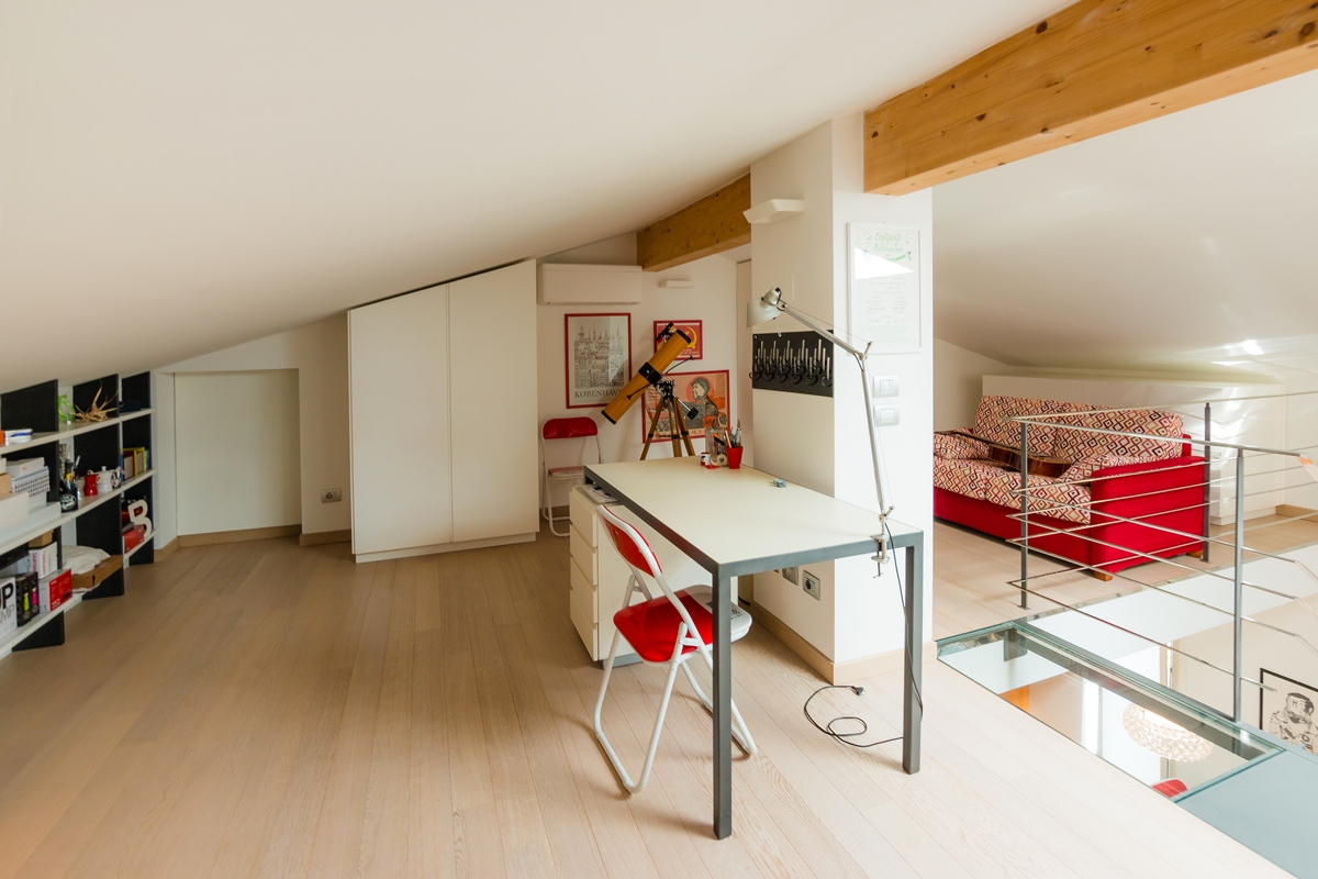
In our previous creations, we had already faced with study corners and walls equipped with desks to make the different rooms more functional. Surely bookcases and most of all desks have become the center of attention. In some cases, these have occupied an entire dedicated room with large and bright rooms. This is the case, for example, of this workstation with an industrial touch inserted in full-height bookcases. A linear element runs along the wall perforated by large windows providing a comfortable support and work points. To embrace the central relaxation area, bookcases with black waxed iron sides and wooden shelves. Another example is this gallery equipped as a study, which exploits the slope of the beamed ceiling to place an essential desk overlooking the living area, and a bookcase embedded in the lower heights.

Alba apartment 03

The oak worktop develops along the side wall with linearity and essentiality in the industrial interior of this apartment

loft studio

Equipping an attic as a study allows you to take advantage of the internal heights while respecting the brightness of the interior.
A minimalist desk overlooks the contemporary pop interior of this apartment

With the passage of time and changing needs, even the work spaces have adapted to the existing furnishings, making them as functional and essential as possible.

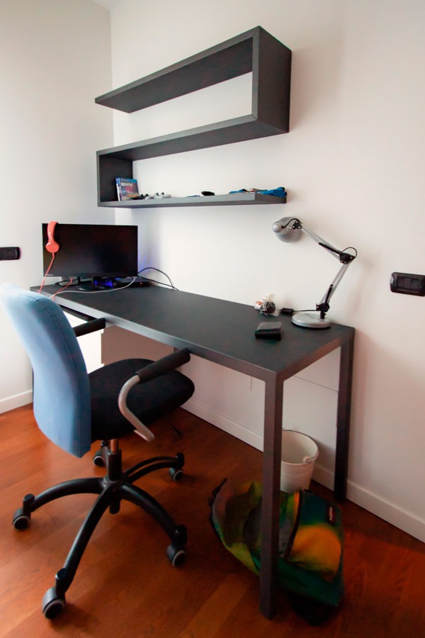
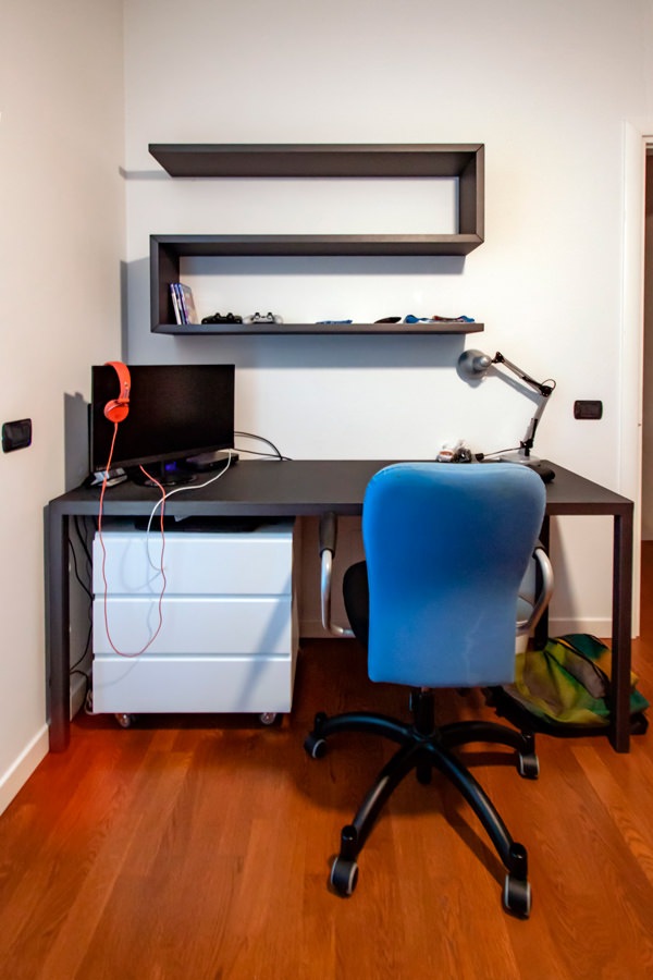
Among these, the classic large desks with drawers and a service bookcase. This version offers a material and chromatic combination with a masculine touch: anthracite gray linoleum top with painted iron supports. It is accompanied by a shaped shelf with black waxed iron covering that with simplicity and elegance provides a practical support for small objects or books.
On the side, a bookcase with shelves which is part of the compact structure which also includes the bed with a trunk opening and wardrobe with bridge component. The black waxed iron sides contrast with the matt lacquered MDF shelves, creating material and chromatic contrasts with a strong character.

 Smartworking anthracite metal desk
anthracite metal desk front view

A desk with an anthracite gray linoleun top and iron profiles defines the masculine stylistic imprint of this bedroom

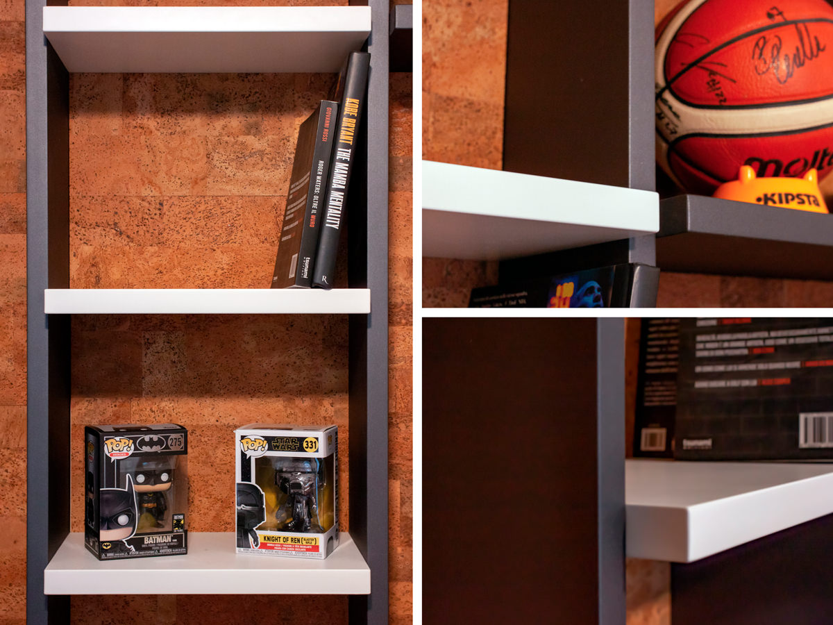
Details MDF and metal bookcase

Details of the bookcase and shelves in black waxed iron and matt lacquered MDF.
Material and chromatic contrasts.

TO THE SMALL CORNERS OF SMARTWORKING

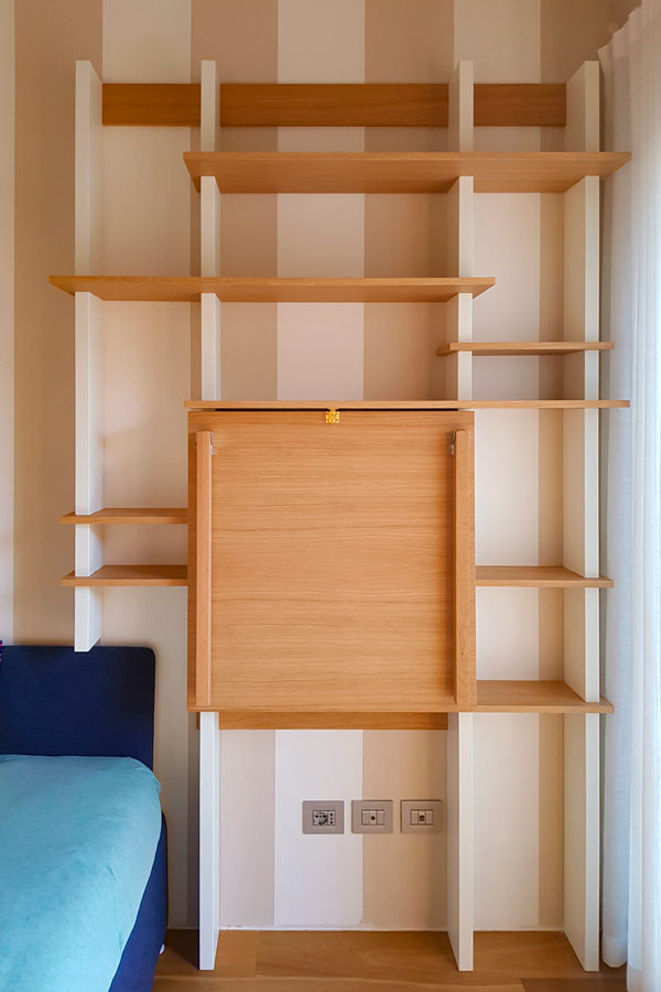
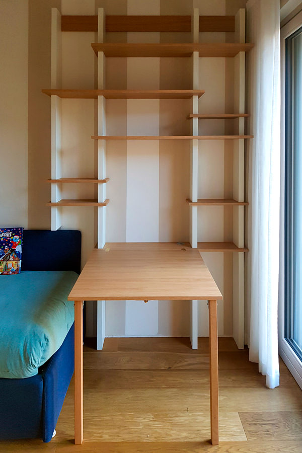
The passage of time has given rise to more essential projects, which also exploit small spaces with practical and compact solutions. Among these, a support surface with flap opening attached to the existing bookcase.
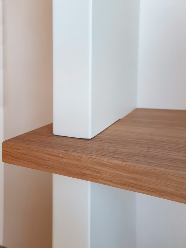
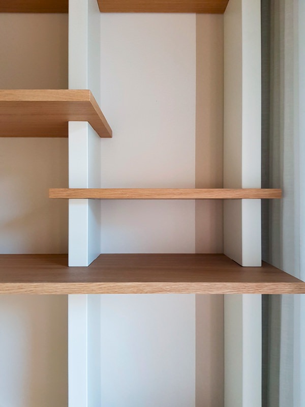
The wooden shelves become the key to horizontal reading, appearing almost set between the vertical sides in lacquered MDF. Games of depth and geometry give life to a room marked by an essential visual rhythm.

 bookcase with closed smartworking top
 bookcase with opened smartworking top

The top of this wooden bookcase exploits its flap opening to optimize the space

 detail tops in oak MDF shoulders
 detail front view of bookcase shelves

Material details with a strong aesthetic character: the wooden shelves are embedded in the shoulders by the vertical reading in MDF

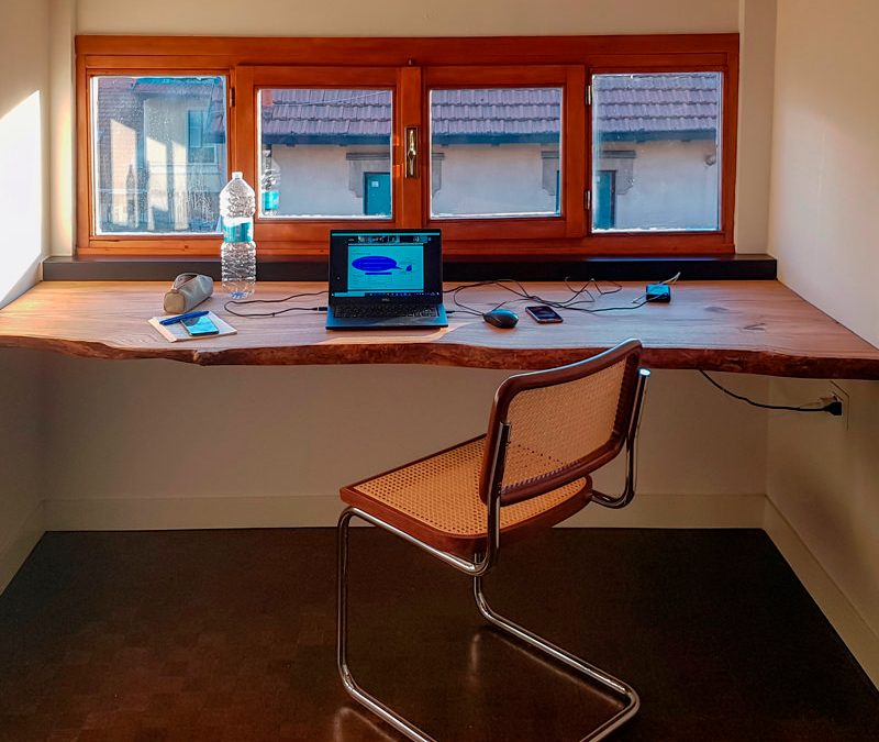
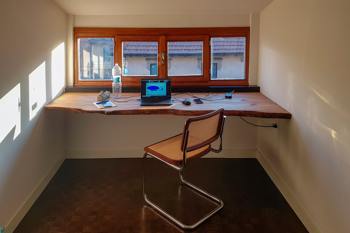
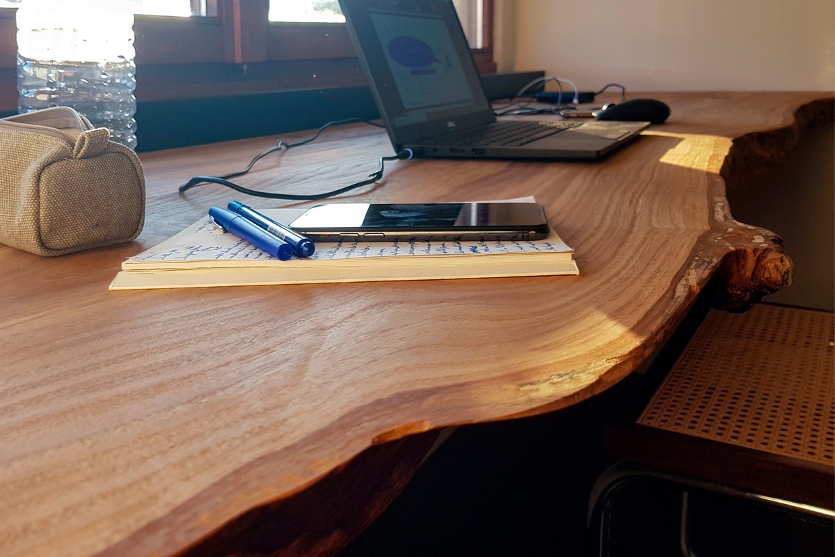
On the other hand, the solutions that take advantage of the reduced heights with rough and natural surfaces have a more romantic soul. In this example, a cherry wood worktop expresses all its material uniqueness with visible knots and a rustic profile, without sacrificing sophisticated details. However, the simple but incisive design line does not renounce practicality. For this reason, a hole has been provided for the passage of cables along the depth of the top, making it also functional for the electrical preparation.

 front view cherry wood desk smartworking

Modern furnishings and natural elements harmonize in this smartworking corner with an authentic soul

 smartworking cherry wood desk top details

A raw cherry wood top expresses all its naturalness

The smart working that has overwhelmingly spread in these difficult times will most likely not remain a transitory phenomenon but will increasingly become part of our life, it will become a necessary space in the home. We designers are ready not to forget it in the design phase and follow its evolutions.

Designing in details a customed wardrobe

Designing in details a customed wardrobe

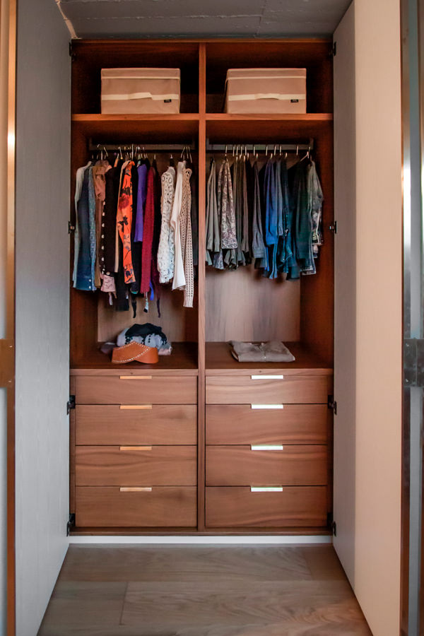
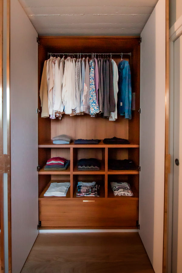
From the needs of the customers and the type of clothing used, the project for a customed wardrobe is born, studied in its internal configuration in the smallest details. A careful choice of materials and finishes give importance and elegance to the project.

internal configuration wardrobe man shelves detail

Studying the internal configuration of a customed wardrobe

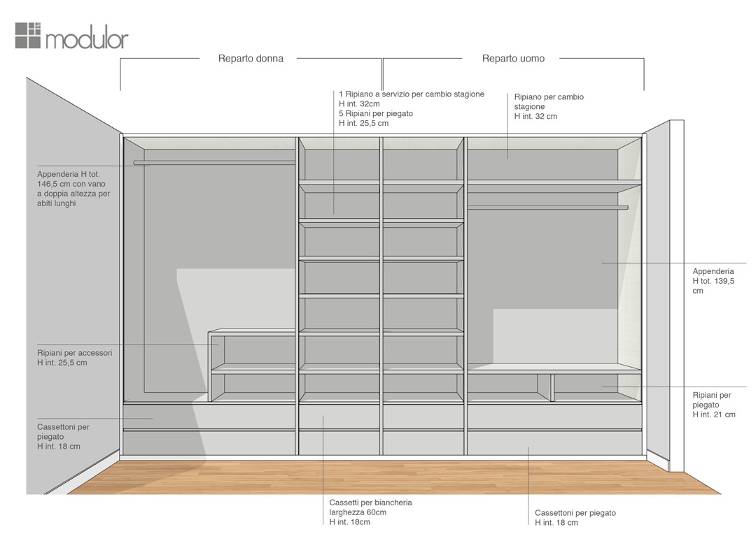
Studying the internal configuration of a wardrobe, it is essential, as a first step, to analyze the type of clothing owned. Tubular hangers and shelves for folded items are balanced to best meet the needs of customers, making the most of the space. In fact, shirts, jackets, trousers and dresses occupy different dimensions depending on how they are folded. For this reason, it would be counterproductive to design a “universal” wardrobe.
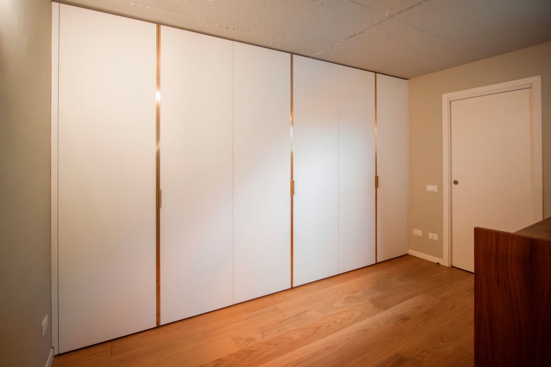
The first step in designing a made-to-measure wardrobe is therefore to study the customer: to know their habits, tastes and needs. In the case of this young couple, the six-door wardrobe has been divided equally into two compartments: the women’s section, in which the hanger certainly prevails, but in which there are also small shelves for folded items, and the men’s section balanced between folded and hung.

Each item has its own space

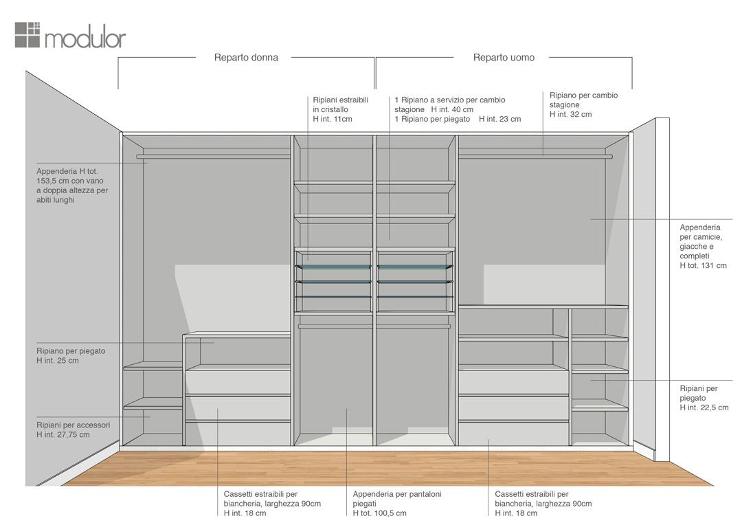
The next step in the design was to study different typological variants of the wardrobe product in order to maintain a uniform line of sight in both sectors, but at the same time find the optimal solution for the internal organization of the space.

The internal layout has been designed in such a way as to respect the two divisions and keep them mirroring each other. The pair of central doors was thus conceived with a symmetrical internal division reserved for folded items.

Modulor internal configuration wardrobe proposal 01


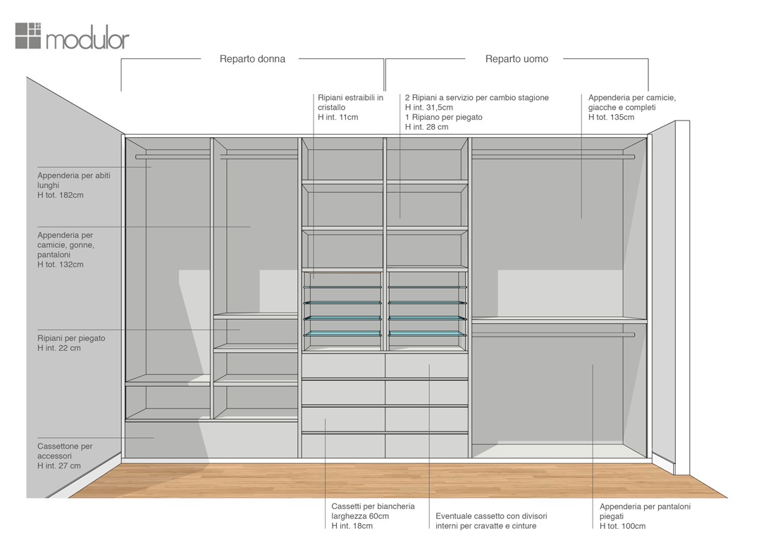
In the first solution, extractable glass shelves are designed for folded shirts and t-shirts in order to store them in a more orderly and elegant way. In the women’s department, the hanging division allows the set of long dresses on the left side, and short dresses with folded trousers on the right side. The women’s department is completed by a chest of drawers for bags and accessories and upper shelves. The conformation of the men’s department is instead characterized by fixed tubulars for trousers folded in the lower part, shirts and jackets in the upper part.

Modulor internal configuration wardrobe proposal 02
Modulor internal configuration wardrobe proposal 03
Modulor internal configuration wardrobe proposal 04

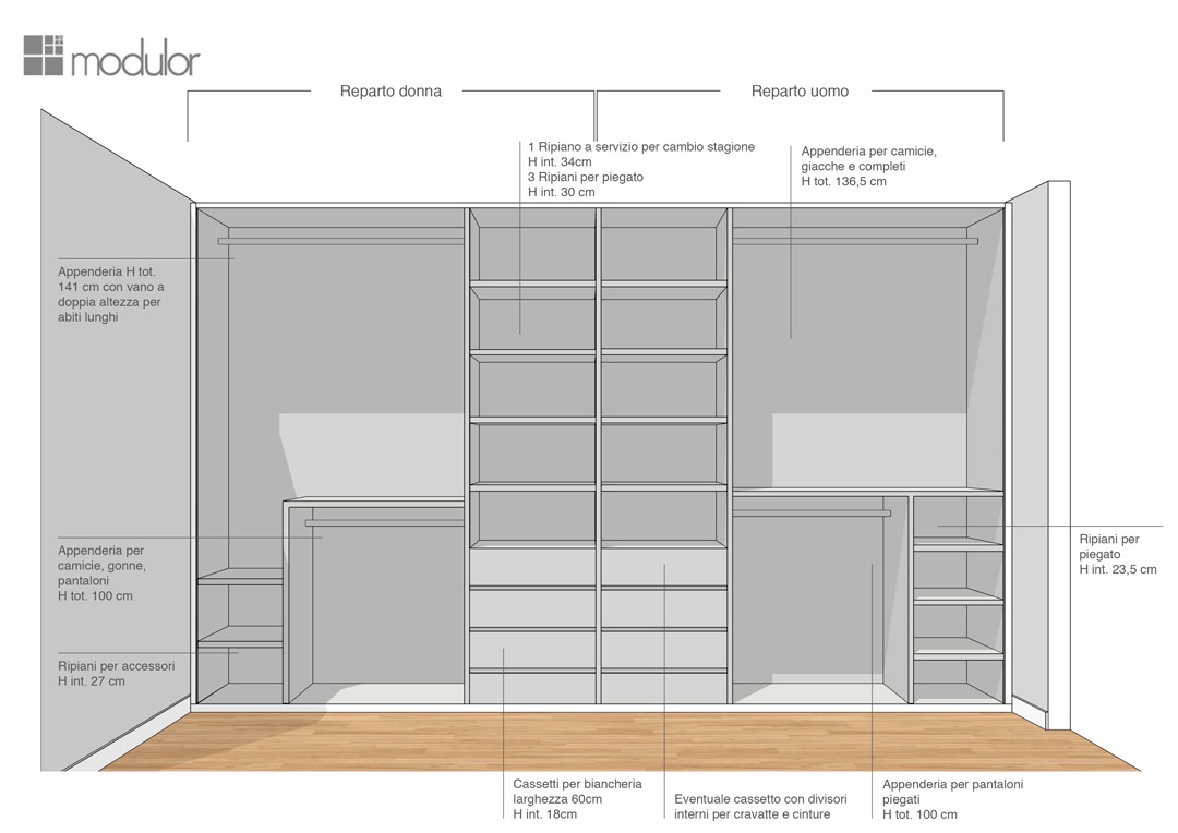
The second solution proposed sees both components configured in the same way. The only difference is in the women’s part, where a side shelf is eliminated to accommodate long dresses. The third and fourth solutions also see the alternation of shelves and tubulars in order to ensure the double height of the hangers on one side, and a good number of drawers for underwear on the other.

internal configuration wardrobe front view woman part

The definitive conformation.

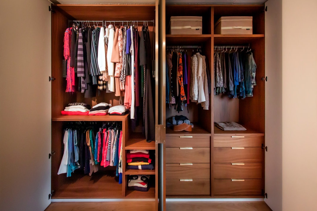
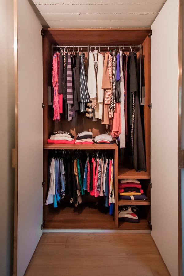
Among the various solutions proposed, after a comparison and mutual relationship with customers, the project proposal was born and then became reality. A configuration that respects the needs of each part, setting up a women’s department with hangers in the upper part that hosts dresses of different lengths. At the service of this, for greater practicality, a dark-toned side table with painted aluminum tubing that guarantees great resistance and capacity. In the lower part, a fixed tubular for skirts, blouses and shelves for sweaters and bulky items. 

Modulor internal configuration wardrobe woman
Modulor internal configuration wardrobe drawers
Modulor internal configuration wardrobe man

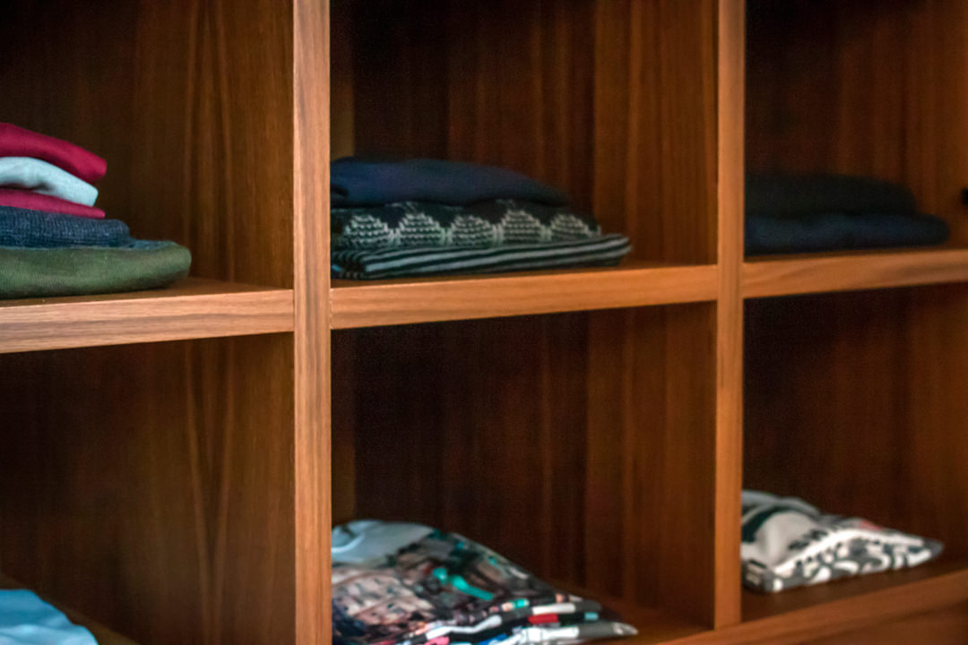
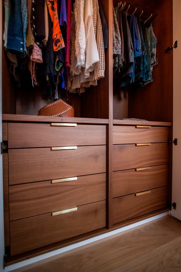
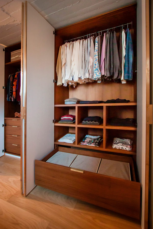
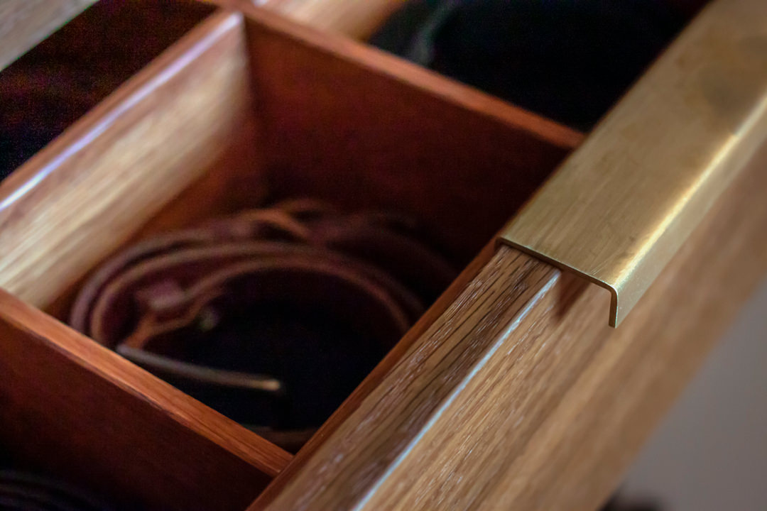
The pair of central doors, mirrored on both sides, has a fixed hanger for folded trousers in the upper part and linen drawers in the lower part. The first of these is characterized by the presence of internal dividers and velvet bottom to keep the belts in order. In the masculine part, the upper part with servetto is dedicated to jackets and shirts, while the lower part houses fixed shelves for folded items and a large drawer on the bottom for bulky. To accompany the whole, a chest of drawers with central compartment for accessories and upper service shelf.

Servetto brown detail
internal configuration wardrobe drawers with brass handles
open drawers detail internal configuration wardrobe man
internal configuration wardrobe woman hanger
oak shelves detail
chest of drawers side view
chest of drawers front view
chest of drawers detail

Materials and finishes

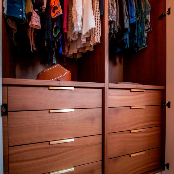
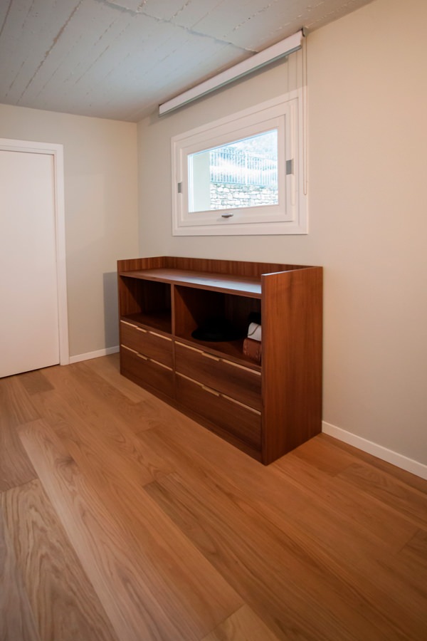
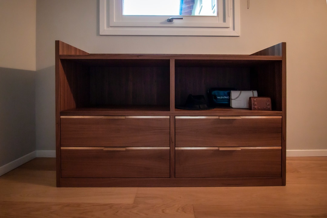
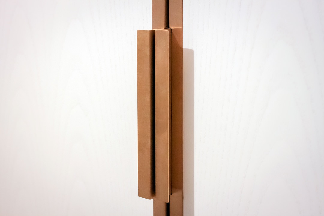
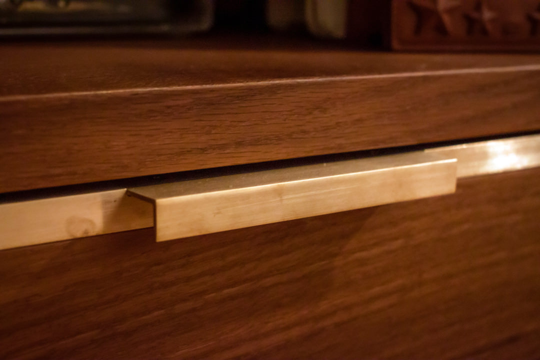
Even the choice of materials and finishes reflects a particular attention to detail and a refined taste. The doors in white-stained ash are combined with handles in satin brass sheet with joint and fold system that makes them elegant and refined. The same type of handles, with sheet metal coplanar with the wooden structure, is used in the external chest of drawers, whose development follows a horizontal rather than a vertical trend. The interior of the wardrobe and the structure of the chest of drawers are in smoked oak, whose warm and soft shades perfectly match the existing natural oak parquet. A reference to brass is also present in the internal drawers of the wardrobe, with very simple but elegant folded sheet metal handles that rest on the front of the drawers. Servetti with brown aluminum finish, fixed tubulars and hinges with black color finish complete the overall view with uniformity and elegance.

wardrobe doors white ash
brass sheet handle detail
brass handle detail chest of drawers
internal divider detail belt tray
fixed hanger brown detail
black hinge detail

Designing a made-to-measure wardrobe means thinking about an internal conformation that best meets the needs and practicality of customers. Like an item of clothing, furniture must also perfectly fit the personality of the user.

Country style: the countryside at home

Country style: the countryside at home

Scent of countryside, the relaxation of a warm and welcoming home, the search for a natural but at the same time refined style. All this is the Country style and more and more people are choosing it for their home furnishings.

country kitchen

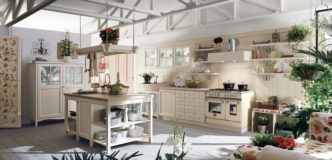
a bright Country Style kitchen with white furnishings and glass inserts

MEANING OF THE WORD

Synonyms of the term country are “countryside, rustic, rural”, therefore everything related to the earth, to nature. A return to our peasant origins in opposition to a world that chases technological progress with increasingly aseptic environments.

Simplicity and refinement make it current even if its origins are distant. In fact, it was born in England in the late nineteenth century, when the English nobility needed to get away from the Victorian splendor and rediscover the country peace.

This style of furniture in fact favors wood and, more generally, all warm and natural materials. It can also be declined in variants such as: romantic, Provencal, chic, rustic, American or modern according to the taste and preferences of those who choose it for their home environment.

country living room.

a Country Style living room that enhances the details with dark wood.

country bedroom

A room that marries the country style also in the choice of embroidered fabrics.

THE DOMINANT CHARACTERISTICS OF THE COUNTRY STYLE

The country style is characterized by classic furnishings, with shaped profiles and interior decorations. Its best expressed in an environment with exposed stone, ceiling with wooden beams and a nice warm fireplace in the center of the living area.

The aim is to be able to convey the sense of relaxation typical of a country house even in a city context. However, the “rusticity” of the style is enhanced by an extreme refinement in the elements and details that fill the environment and nothing is left to chance.

Typical complements of country furniture are the tables in solid untreated wood, the chests made entirely of wood or with elegant metal legs and the curtains that also become an integral part of the furniture.

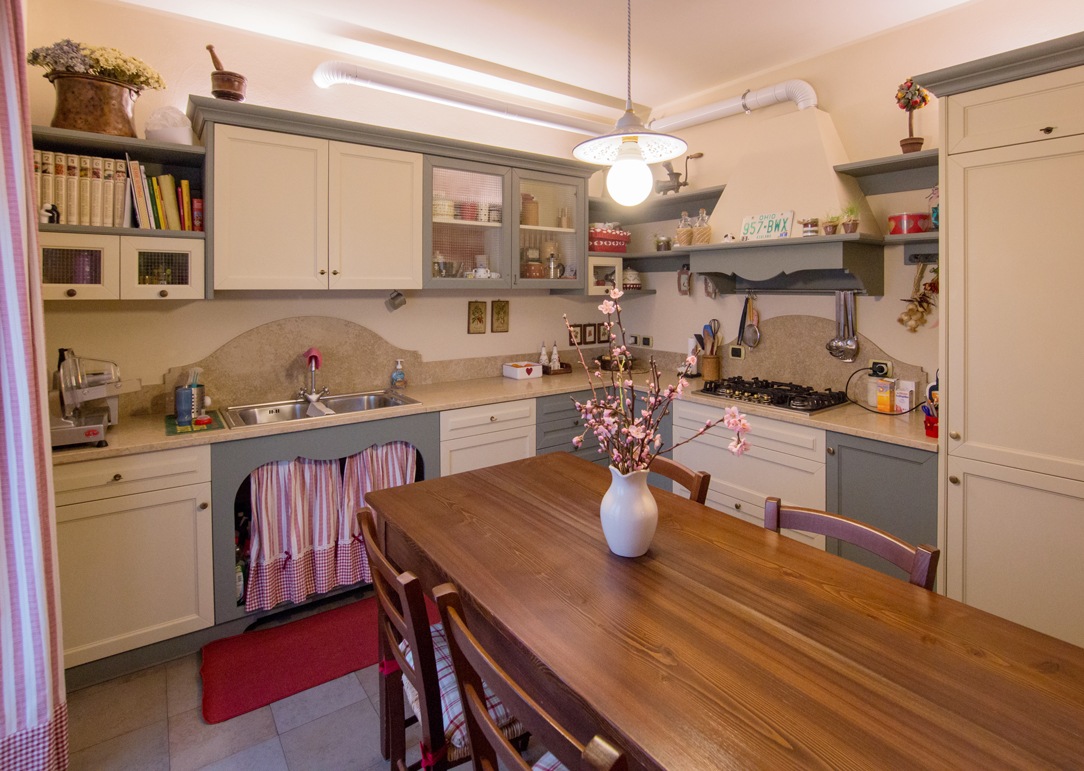
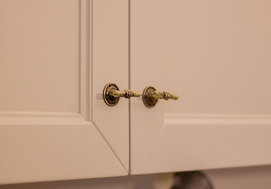
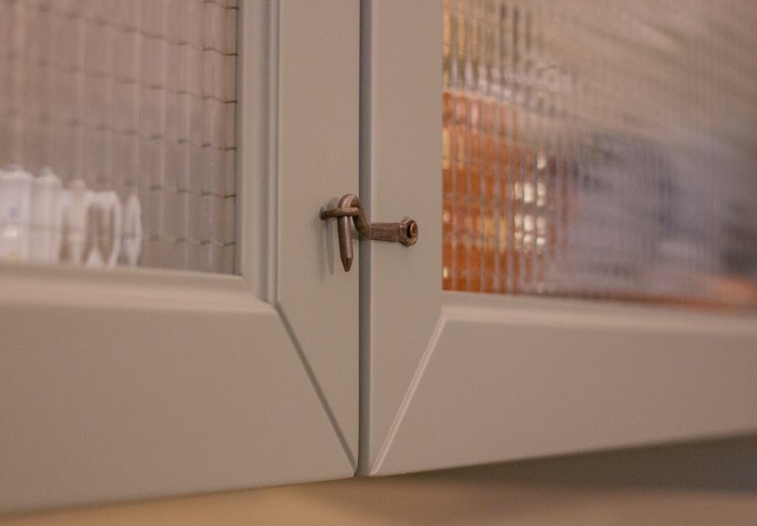
In this country-style kitchen we made, the checkered curtain takes the place of the doors under the sink. Refrigerator and dishwasher are strictly built-in, while the oven and hood are visible and represent the heart of the kitchen. Speaking of details, here each knob has its own characterization and has been chosen with care.


country style kitchen

Our Country Style kitchen with a touch of color and refined details.

country style kitchen details

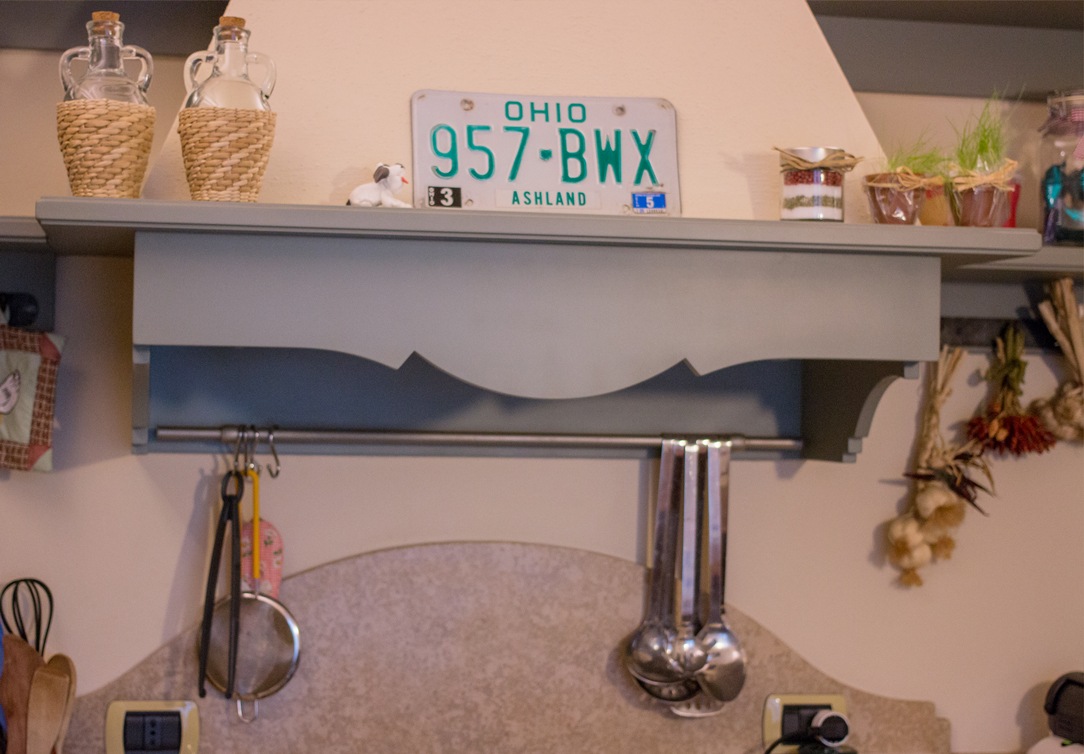
Details of the sugar paper shaped hood and knobs.

Are often used recycled furniture such as old sideboards, bedside tables, dressers, wardrobes. In the country bathroom, a free-standing bathtub with a vintage look and stone walls cannot be missing. Vintage and “decorative recycling” objects are inevitable, that is glass bottles, jars or all those small objects that, cleaned and decorated, can change their intended use and become nice decorative elements or containers.

To enrich the environment, knick-knacks are welcome, especially if in ceramic and old crochet doilies. Vases with plants and flowers cannot be missing either, the impression must be that of a really countryside house. Flowers are an essential element because they give delicacy and a touch of romantic mood to all rooms.

country bathroom

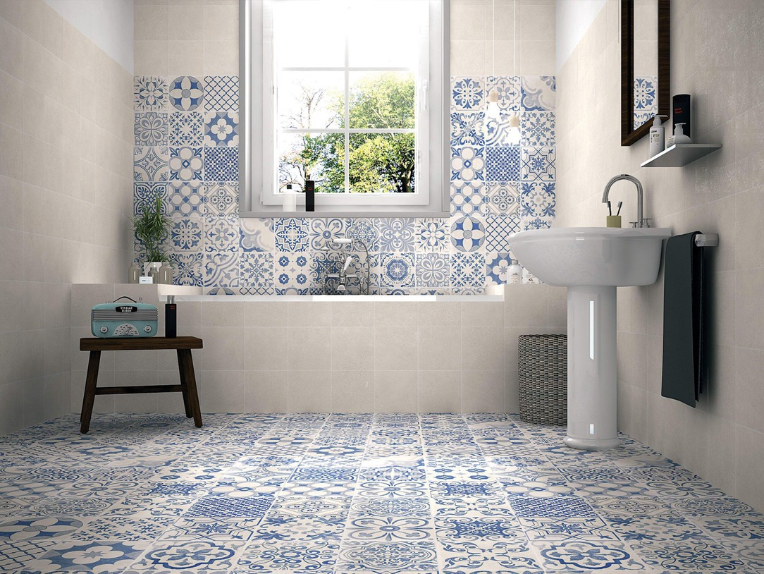
Two examples of a contemporary country style bathroom area, with a focus on the choice of colors.

COLORS AND MATERIALS

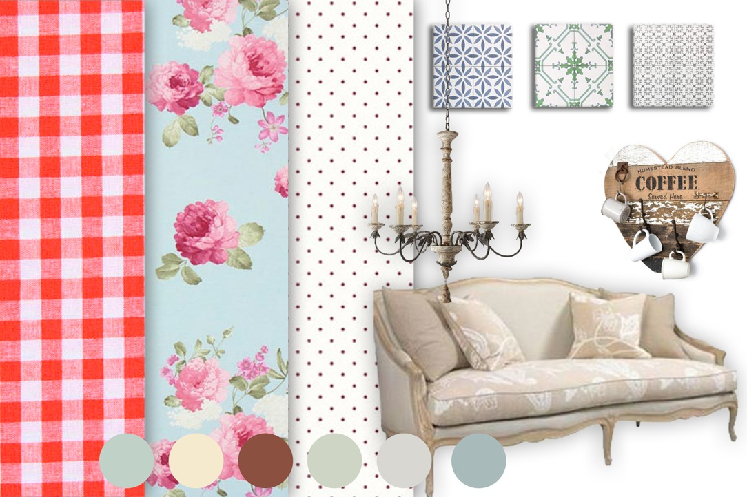
Country style prefers natural colors, such as those of wood, used as a base for more decisive color combinations, like cherry red, sun yellow, baby blue, ivory and all shades of green.

These shades immediately give to the environment a decidedly welcoming and romantic atmosphere. For the armchairs and other upholstered items, the choice goes to the floral textures, which are then embellished with many colored or neutral colored cushions.

In fact, the country foresees a great use of fabrics with particular textures and decorations, such as checks for tablecloths and flowers and polka dots for curtains and sofas. Even for the bedrooms you can opt for wallpapers and, as a complement, themed bedspreads and sheets.

The materials to be used are wood, stone and wrought iron especially in the chandeliers and headboards of the beds. For the back of the kitchen and for the bathroom, white ceramic tiles or in some patterns of blue, gray, sage or delicate pink are preferred.

country style elements

The Modulor selection of colors, textures and furniture references for the Country moodboard

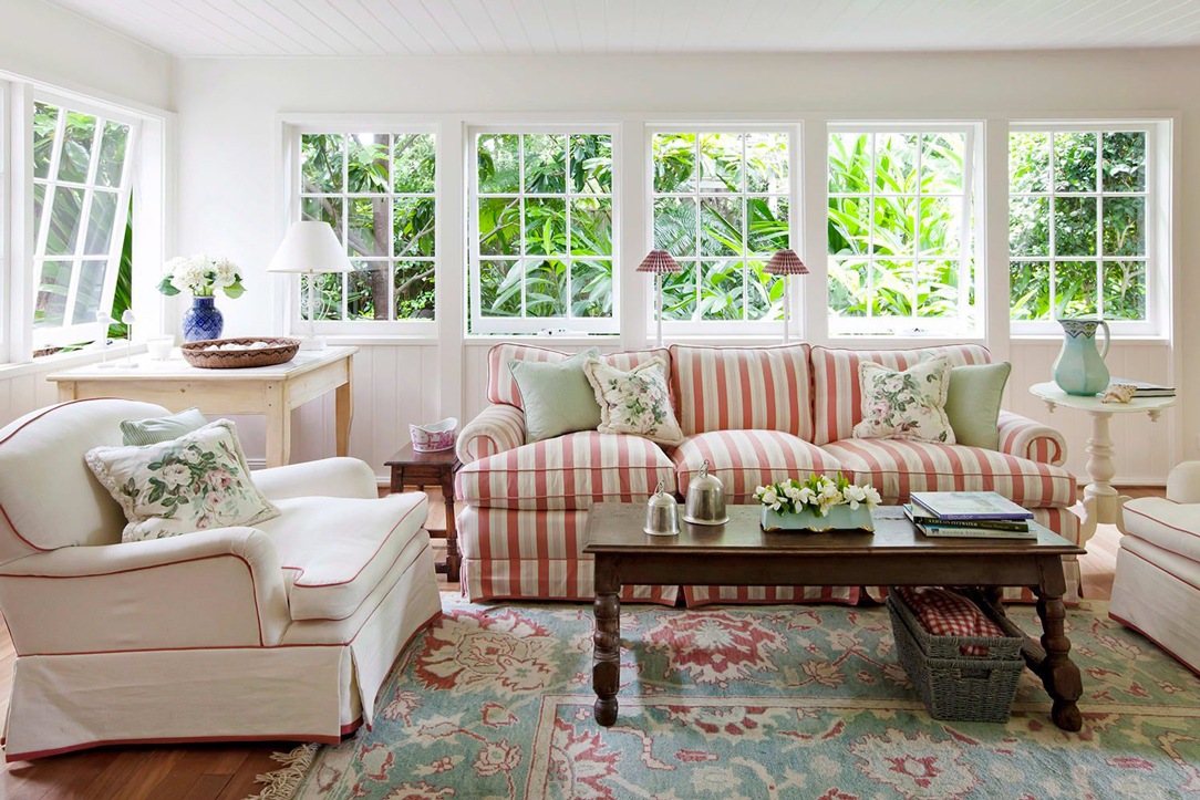
country living room.

A very bright living room that emphasizes the Country style in the choice of fabrics.

MODERN COUNTRY

The variants of the country style are many, but the one we prefer is the Modern Country style, less characterizing but more suitable for everyday use.

The Modern Country mixes vintage furnishing accessories with minimal or industrial ones. Sometimes it is enough to leave stone walls or exposed brick walls, opt for a large solid wood table and it is already possible to recreate a country atmosphere but not overly ancient.

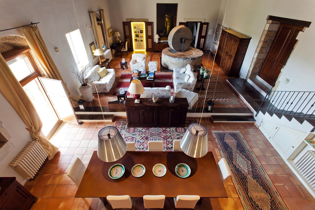
This flavor of modern country can also be found by modernizing the style of old peasant houses with pieces of modern design that make them more refined. Here we present the living area of ​​a splendid Sicilian Villa in which the ancient stone oil mill is located in the center of the room, surrounded by traditional dark wood furnishings and stone walls, but also very minimal backlit elements.


country style sicilian villa

The ancient oil mill, classic and modern furnishings.

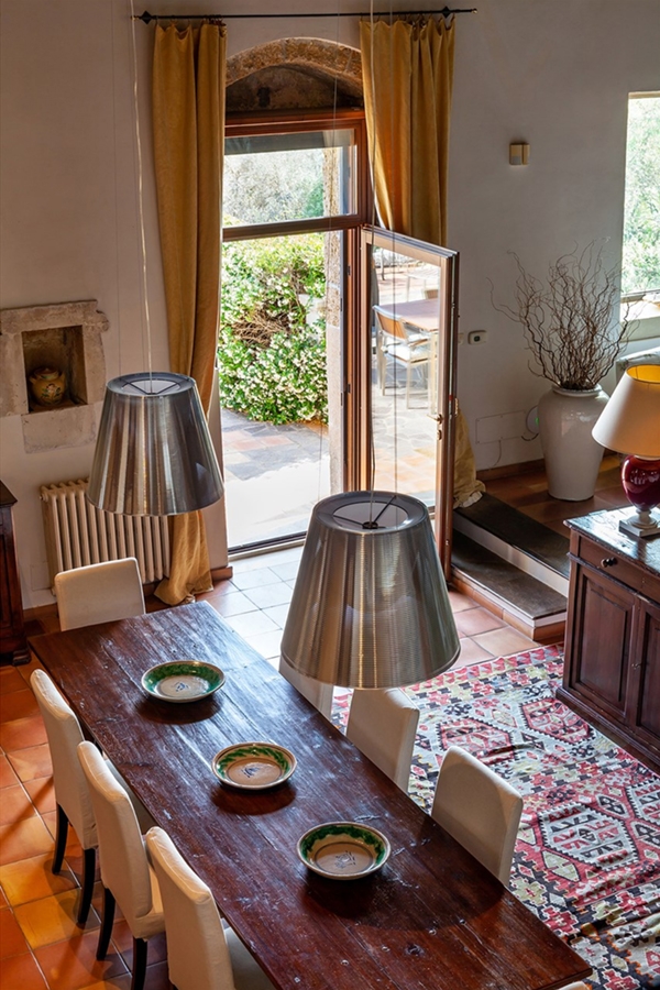
traditional villa Sicily dining table
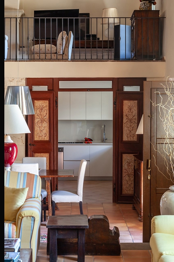
traditional villa Sicily kitchen view

Details of the large living area between traditional furnishings and new elements.

Those who choose the Country style have a romantic spirit and love to enjoy their “home sweet home” in relax.

A studio house designed with Feng Shui

A studio house designed with Feng Shui

Spaces where we live, as well as representing us, must have a positive influence on the quality of our life and has to be studied and designed in the best possible way. Even more when, as in this case, life and work take place in the same environment. Designing a studio home with Feng Shui means making these two aspects coexisting harmoniously in everyday life and spaces.


THE FENH SHUI

We have often heard of Feng Shui, but what is it? It is certainly neither a philosophy, nor a religious or spiritual practice, it is not a style of furniture and not even a form of bio-architecture.

Feng Shui can be defined as the study of how natural and built environments influence our psychophysical conditions.
Practicing this discipline means understanding how the various elements of an environment that affect our physical conditions, our moods and our behaviors, are activated by our primordial instincts. These include: shape, proportions, symmetry, number, color, tactile sensations, sun exposure, artificial light, sound and attention paths.

Feng Shui literally means “wind and water”, in honor of the two elements that shape the earth. In fact, with their flow, they determine the characteristics of a particular place.
It could be said that the profound meaning of this discipline is “Creating the best conditions for the development of life”. Its goal is to make an environment suitable for the people who lives there or for the activities that take place there.

In fact, each of us relates to the room in a non-verbal way: what surrounds us inspires us with emotions or instinctive reactions of which we are almost always unaware and some of these are universal for the human species.

Matter of Feng Shui are these sensations and to work on the human psyche we act on the physical world.

feng shui

A STUDIO HOUSE

The greatest representation of the coexistence of home-work based on Feng Shui is this realization in the Lombard capital. Our client, a holistic operator, needed an ambivalent space in chaotic Milan to be used both as a residence and as a location for her courses.

For this reason, she turned to Marzia and Germana from SpazioUmano to make the apartment as suitable as possible for her needs through Feng Shui. The housing unit on two floors is located in the context of a condominium still under construction, chosen near the city center.

Having always been sensitive to Feng Shui, we have followed the two architects with pleasure. Reading and interpreting their design choices in the best possible way has been a source of inspiration for us and a professional challenge accepted with enthusiasm.

Each building has a recognable front and a back. This polarity determines the orientation of the house in the space that is symbolically guarded by two celestial animals: the black turtle and the red phoenix. The first is associated with protection and health and it is identified with the most intimate areas of the house such as the bedroom and bathroom. The red phoenix is ​​instead an indication of freedom and identified with the entrance and the “active” areas of the house.

The other two animals supporting the main ones are the green dragon, linked to our more rational left hemisphere and therefore synonymous with organization, home management and work, and the white tiger, linked to the more intuitive right hemisphere, therefore associated with emotionality and artistic activities.

THE PROJECT

Being a home-studio, the active areas of living and working had to coexist according to Feng Shui principles, in the part of the red phoenix, but still be separated from each other.

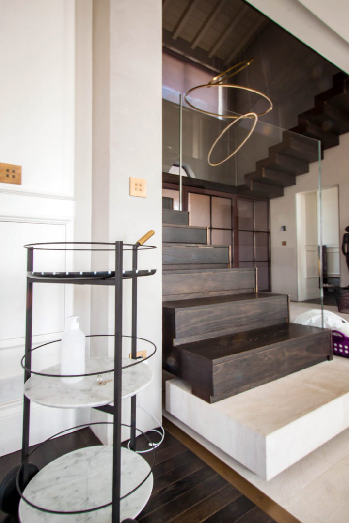
The access to the apartment is therefore characterized by a scenic aerial staircase illuminated on the right side by a large glass wall. This staircase, made with white painted aluminum support and wooden treads, leads to the upper floor used for holistic courses. The instinct is to go up, choosing to be accompanied on this almost emotional path of ascent.

On the opposite side of the large window, the access to the private house is out of sight. A sliding wall decorated with a spiral geometric pattern with opal inserts hides the everyday life’ interior. The light coming from the outside filters through the opal shapes of the sliding wall, creating plays of light inside the apartment.

The living area that opens to the view is an open space with a square plan, whose kitchen is placed on the corner opposite the opening.

Feng Shui entrance
Sliding wall Feng Shui
Wall Feng Shui

A FENG SHUI KITCHEN

The entrance with living area is characterized by the presence of a full-height corner bookcase, where vertical and horizontal shelves gives rhythm. Small objects and books become the real protagonists, standing out among the matt lacquered MDF profiles of the bookcase.

In front of this, the low open cabinet with doors and internal shelves visually closes the room by introducing the kitchen. The latter is arranged at an angle and anticipated by a large table in natural oak and support profiles in black iron. Above this, a witty and youthful light point with suspension elements of different shapes that intertwine on the horizontal support element.

Further element of character are the chairs that surround the table, with bright colors and simple profiles.

The actual block of the kitchen is made up of mutually intersecting volumes, creating a rhythm and visual dynamism also reflected in the material choice of the coverings. On the one hand, the block with service columns which also houses the free-standing refrigerator and built-in oven. Doors in matt lacquered MDF are interspersed with natural and dark-stained oak inserts, creating visual dynamism.

At the front, the basaltine countertop is transformed into a backsplash and back surface in the firing area, giving life to material and luminous contrasts with the uniform riser in white Lacobel.

The overlying wall units best express this play of intersected volumes with open compartments in natural oak that alternate doors in matt white lacquer and inserts in dark stained oak.

Natural materials with a soft touch blend perfectly with darker and rough inserts. Distinctive signs can also be recognized in the lower volumes, such as the drawers with oak fronts that underline the horizontal reading of the kitchen.

Feng Shui lights kitchen
Side kitchen oak doors
bookcase entrance laquered white
Kitchen table oak wood

ADVICE

Designing a multipurpose interior means being able to bring together different aspects of everyday life. Especially when it comes to connecting the working world to the private one, the home environment plays a fundamental role so that nothing can be left to chance. Choosing to design with Feng Shui involved in this example the coexistence of instincts belonging to two aspects of our life, in a single home-work environment.

We are ready to calibrate your daily and working space on the basis of your needs and desires, in order to create interiors in perfect harmony and balance even with your inner “I”.