Guide to Materials in Interior Design: From Solid Wood to Laminate and Melamine-Faced Panels

Guide to Materials in Interior Design: From Solid Wood to Laminate and Melamine-Faced Panels

When entering the world of furniture, one comes across many technical terms related to wood that can be difficult to interpret. With this article, we hope to dispel any doubts and help you discover how this material has evolved in this specific industry.

SOLID WOOD

Many people still believe that furniture is mainly made of solid wood, meaning actual pieces of logs with the required thickness and specific wood type. However, this perception is no longer entirely accurate.
In recent years, the use of solid wood in furniture has decreased due to its heaviness and its extreme sensitivity to moisture, temperature variations, and direct exposure to sunlight, which in some cases can cause the wood to warp.
Solid wood is still used for special woodworking techniques, such as curved or round shapes, where veneering becomes difficult or for specific requests.
Additionally, apart from technical limitations, there is an economic limit that discourages the use of panels made entirely of wood.
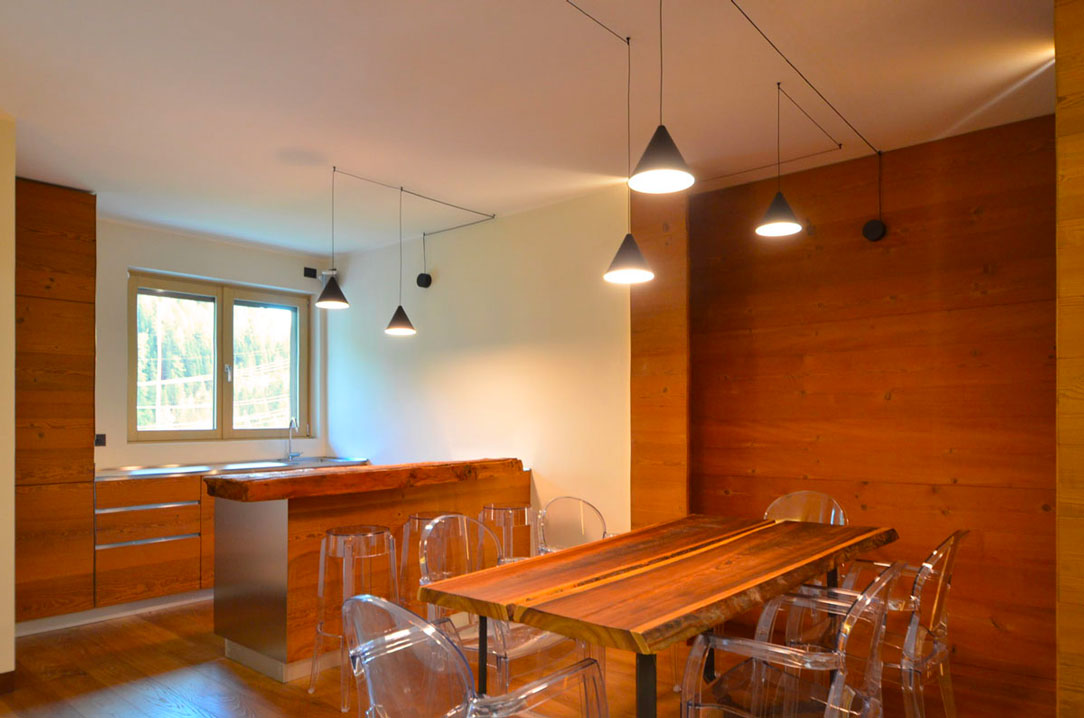
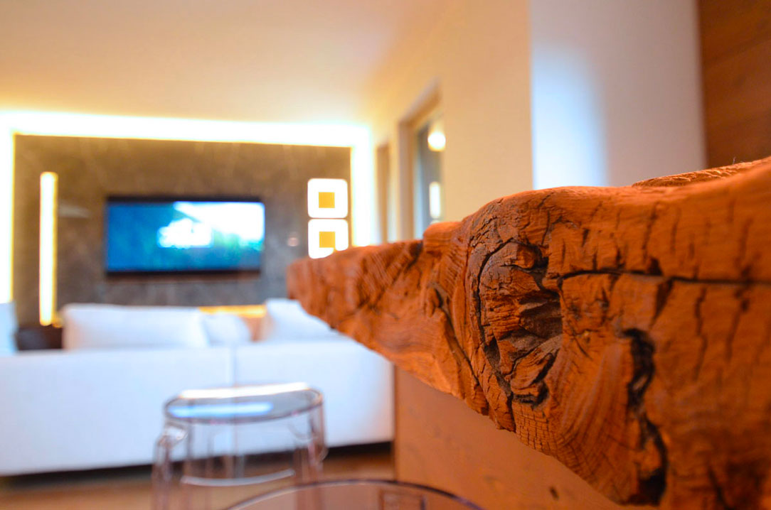
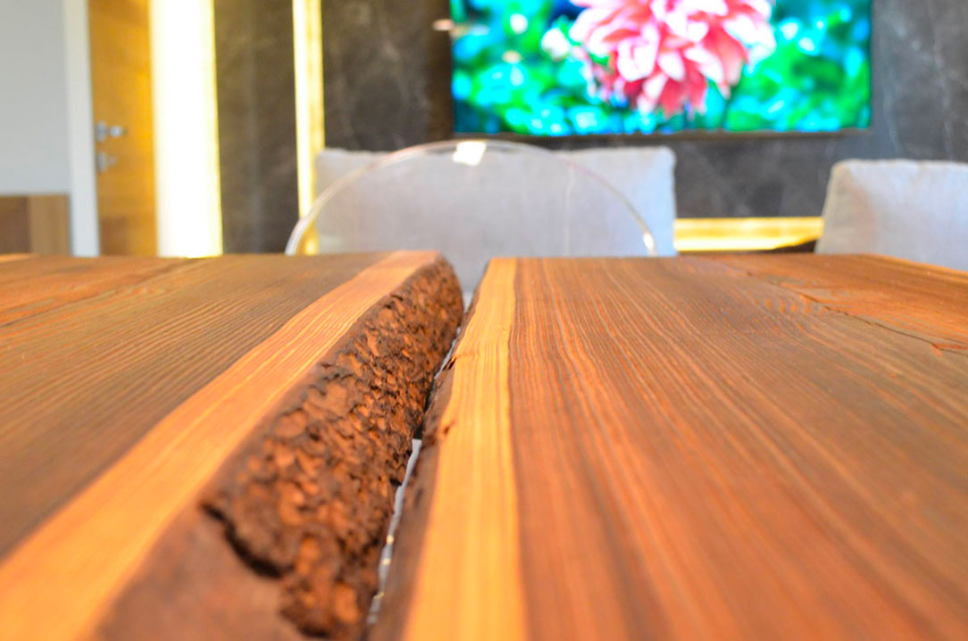
Lately, the trend has been to use solid wood with its outer bark and tree shaping, treating only the surface.

Sliced  wooden table with bark

VENEERED WOOD

Solid wood has been replaced for about thirty years with much lighter panels made of wood fiber, which surpass it in quality and durability and are subsequently veneered, meaning glued and pressed, with thin sheets of wood (down to a minimum of 2 tenths of a millimeter).
These are called veneers and are obtained through the rotary horizontal cutting of logs. You can choose the wood type, grain, or backing, but only the outer part represents the true essence of the wood. Inside the panels, there is a sandwich of wood particleboard.
Among the most common materials are high-quality chipboard (generally made of poplar), MDF (medium-density fiberboard), fire-resistant or waterproof MDF (for humid environments or specific regulations in the hotel industry), and plywood (made by overlaying multiple layers of wood).
This makes the structure lighter and stronger and, from a technical standpoint, it does not overload internal elements such as hinges, lift-up doors, or sliding mechanisms, allowing for greater size variety.
The term “veneer” is often improperly used to indicate any non-precious wood covering, but it is not the case.

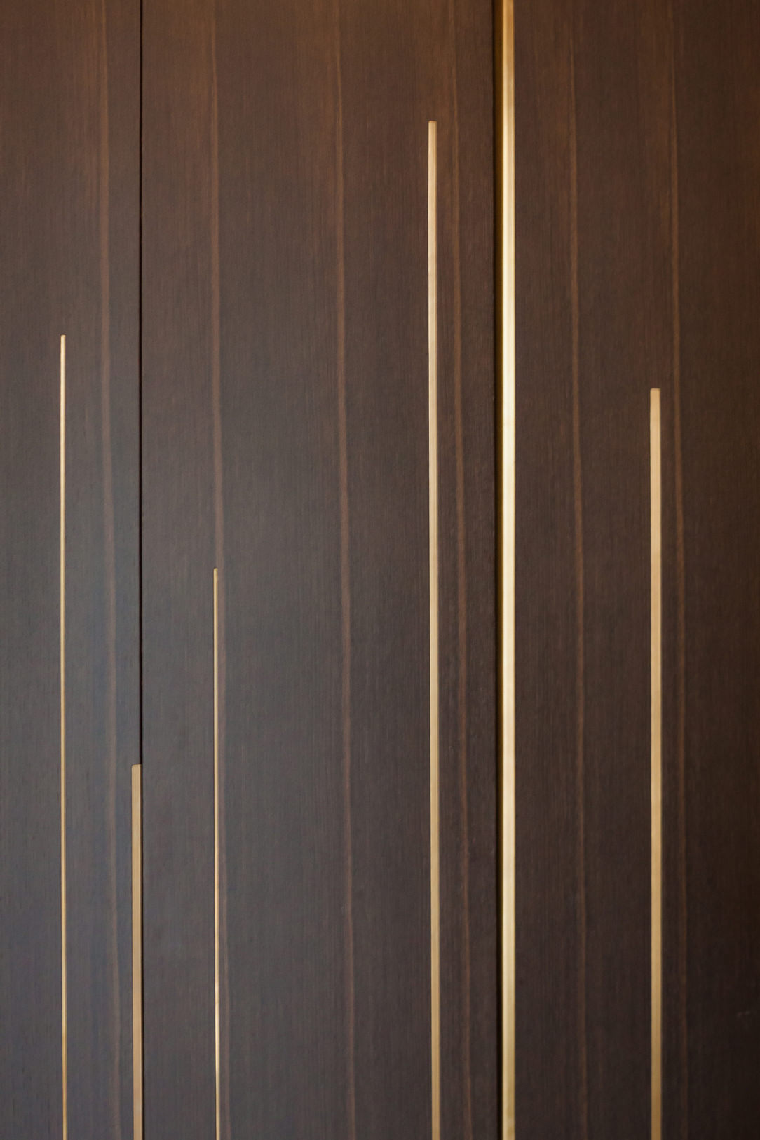
heat-treated oak veneered wood
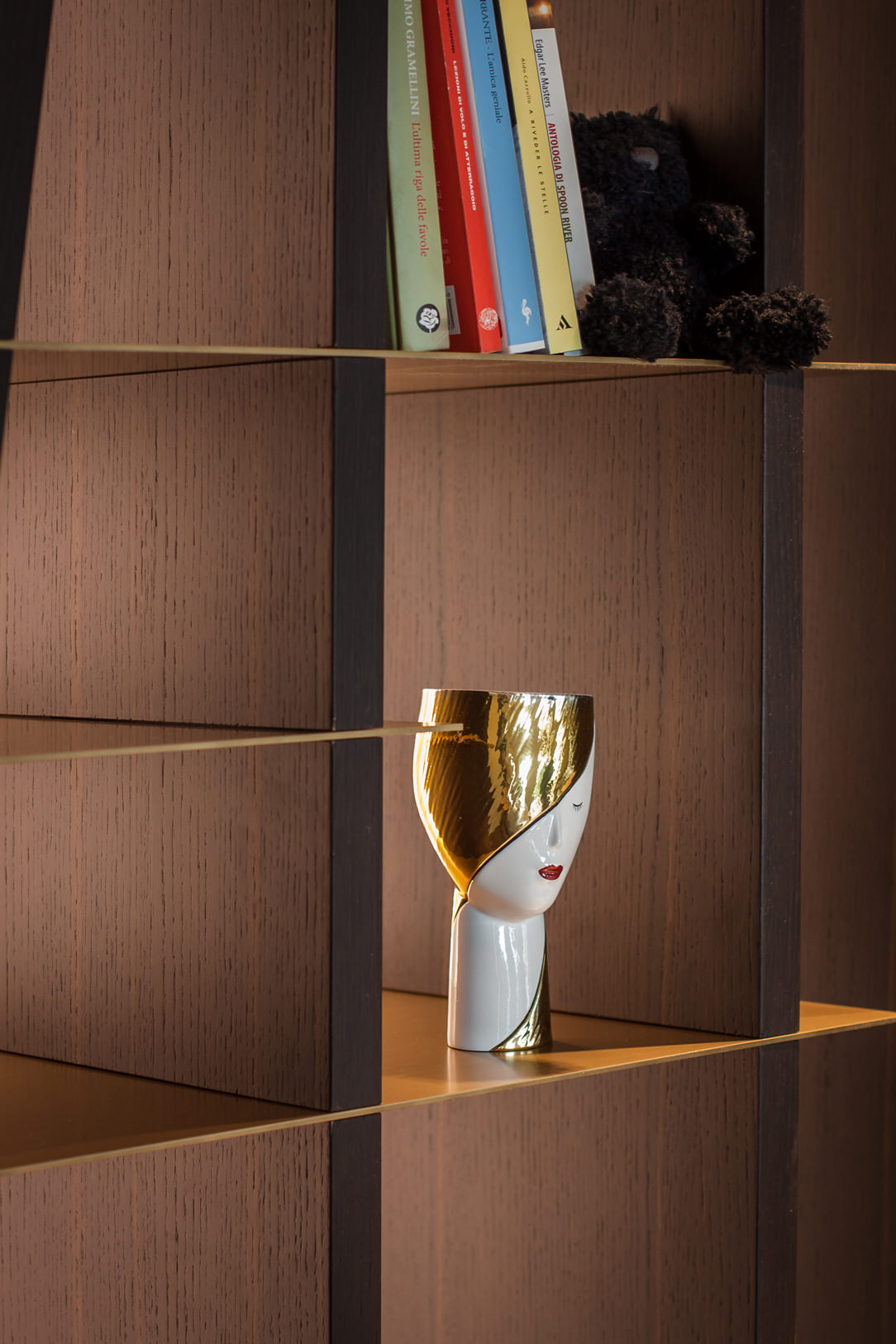
 heat-treated oak veneer detail bookcase
 heat-treated oak veneer detail bookcase

There are types of veneers that are not obtained by reducing a precious wood log into sheets but through the gluing of various sheets of colored wood (usually non-precious) to recreate a fake log, simulating the rings, grains, and patterns, and subsequently cutting it into sheets.
This type of veneer is called engineered veneer, and like veneers and solid wood, it can undergo tonal variations due to sunlight. However, this natural phenomenon is significantly reduced since the woods used in production are specially selected.
Engineered veneer also allows for creating imaginative wood essences or, more commonly, recreating exotic, rare, or protected woods using less precious woods from plantations or certified forests.
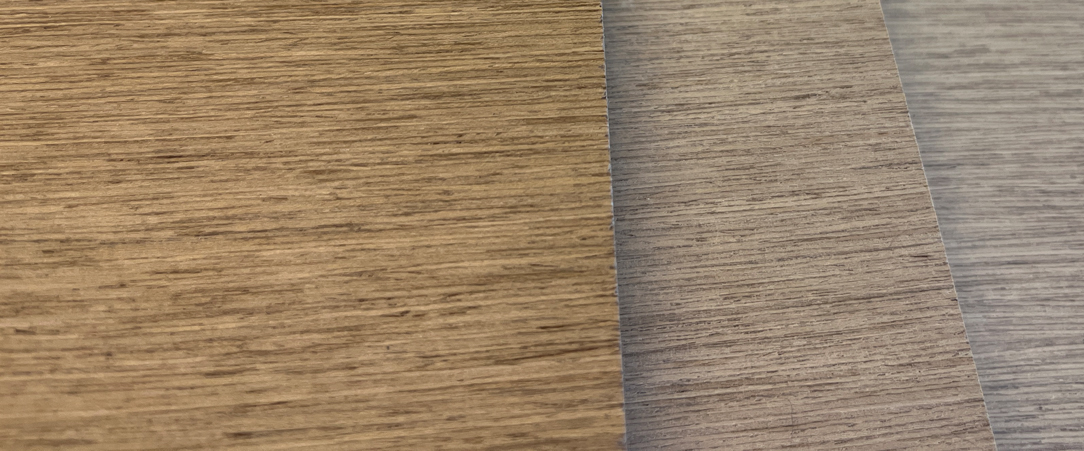
A famous Italian company that produces engineered veneer is Alpi Wood and here a sample of their production.

alpi wood

MDF

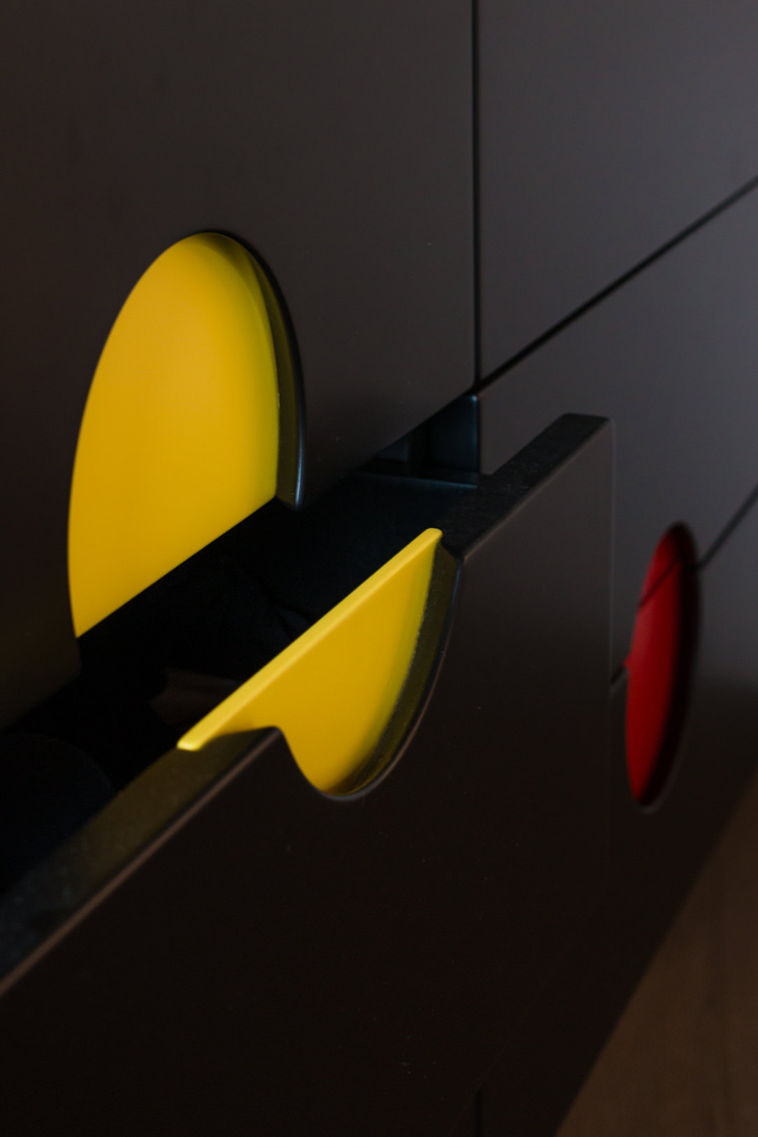
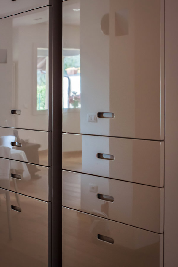
The materials present in veneered panels can also be used individually. The most well-known and versatile material, ideal for creating matte, satin, semi-gloss, and glossy lacquered furnishings, is MDF, which stands for Medium Density Fiberboard.
This material, without undulations that could compromise the final result of the object, guarantees a smooth and uniform surface.
The raw material used for MDF includes various types of wood, mainly softwood, which are shredded and subsequently dried or mixed with water (similar to the paper production process).
The result is lightweight and compact wood panels in various thicknesses, thanks to the process that exploits the thermoplastic characteristics of the naturally present lignin in wood.

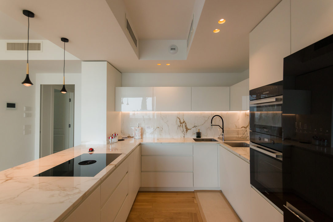
 kitchen in matt and glossy lacquered MDF
 lacquered mdf shaping
 inclinations lacquered MDF
 shaped and lacquered MDF detail
 shaping glossy lacquered doors

Some particular processes in matt and glossy lacquered MDF.

LAMINATE AND PLASTIC BILAMINATE

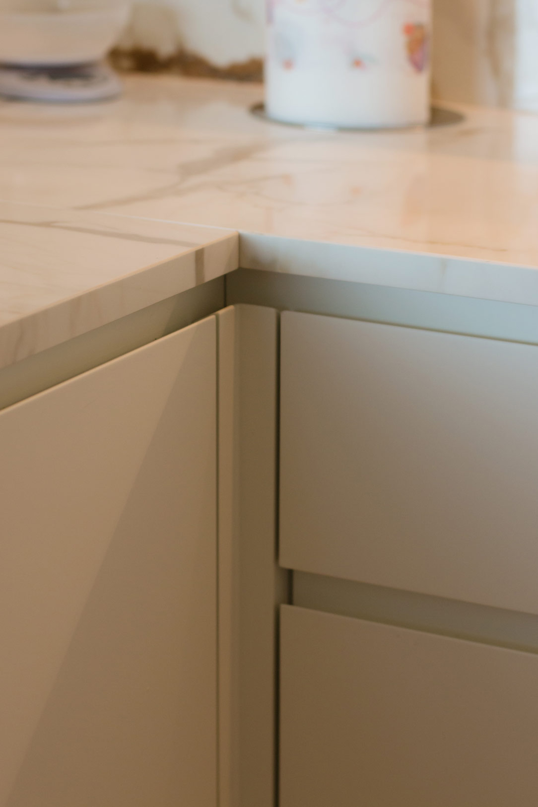
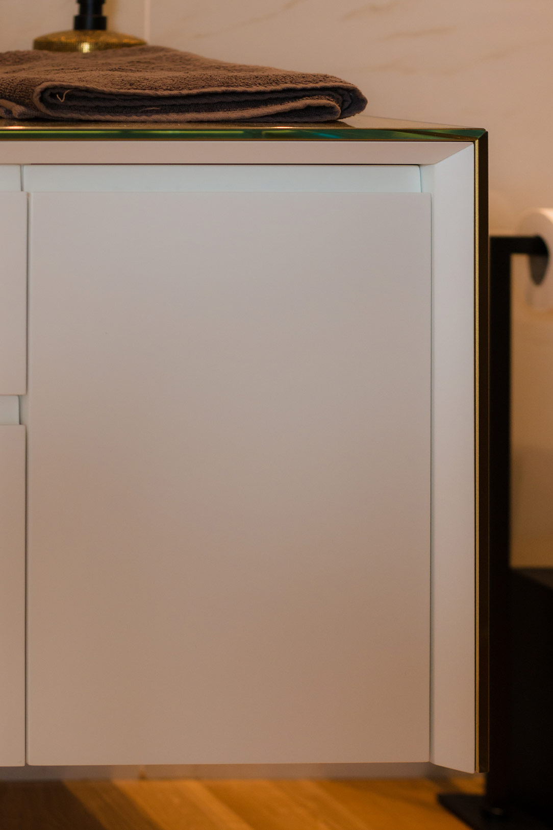
Starting from plywood, chipboard, or MDF panels, they can be covered with laminate sheets instead of real wood. Plastic laminate is a sheet obtained by pressing various layers of paper impregnated with plastic resins (phenolic or melamine).
It is a highly wear-resistant material, resistant to aggressive solvents, acids, ammonia, and abrasion.
This makes it highly appreciated for creating worktops in kitchens, bathrooms, floors, parquets, and desks.
It is an economical alternative to natural stones and steel.

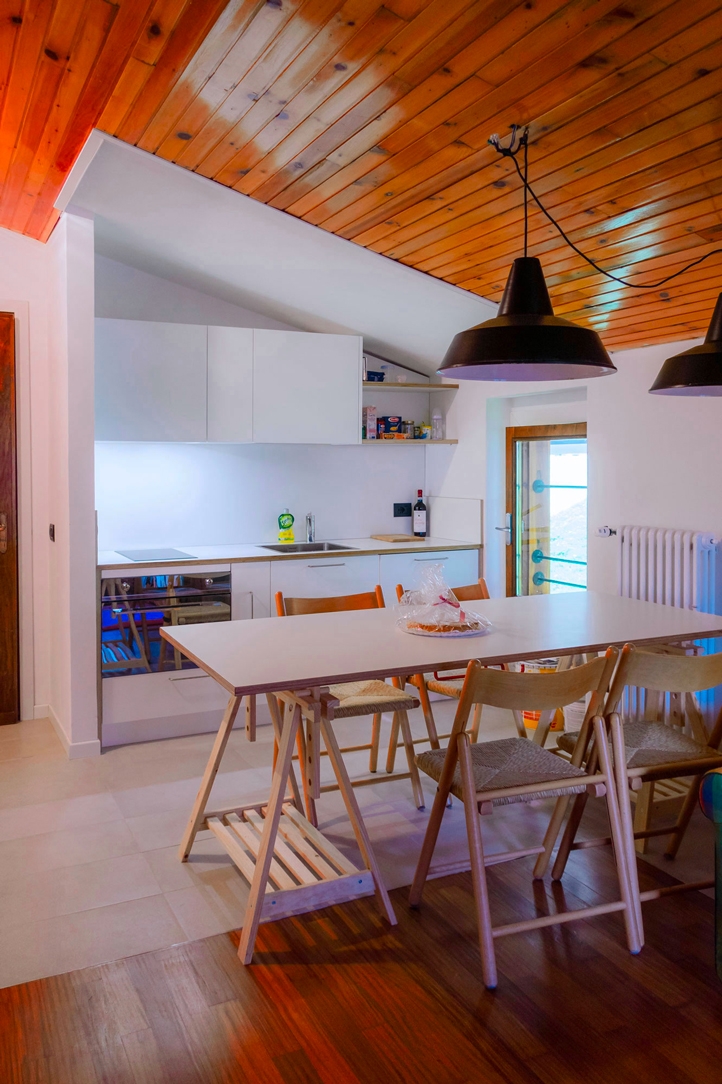
Mountains one bedroom apartment
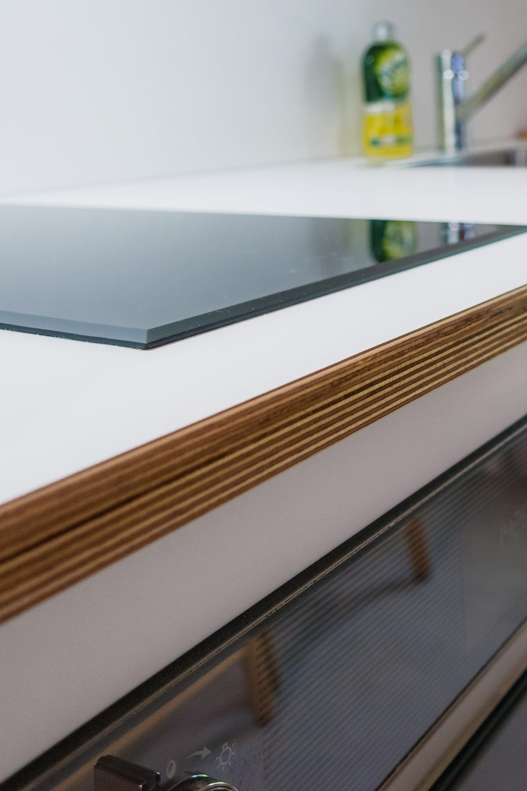
 plywood and laminate

The term bilaminate refers to a panel coated on both sides with a very thin laminate.
This is an ideal solution for kitchen structures and internal shelves that come into contact with substances and liquids and therefore need to be easily cleaned.
If durability is required, bilaminate can also be used for external kitchen doors, cabinets, and furniture.
It is not possible to create special workings such as handle grooves or shaping, but if linear panels are expected, the wide range of colors and finishes of laminates can satisfy every taste.

Among the most famous companies that specialize in phenolic and melamine laminates, we find One World, Abet e Polyrey.

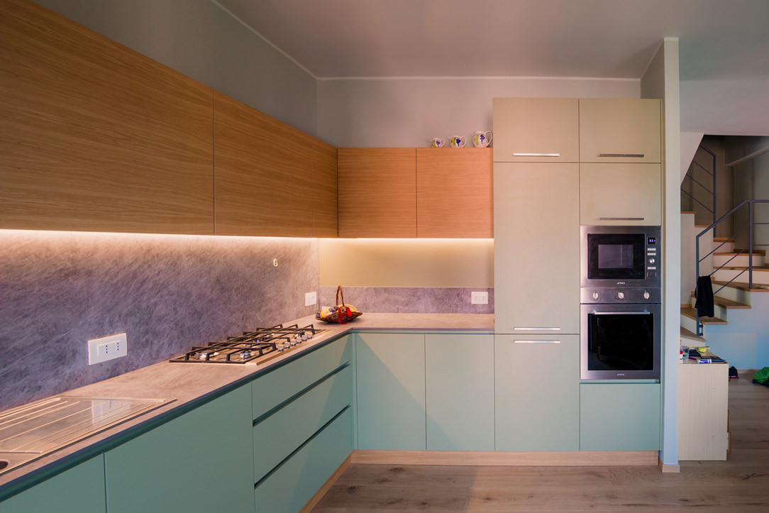
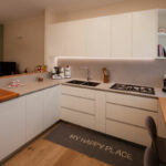
green and wood kitchen
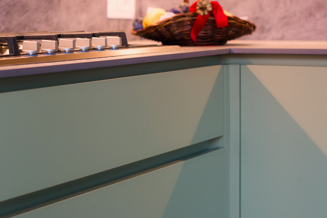
detail of green door hollow handles
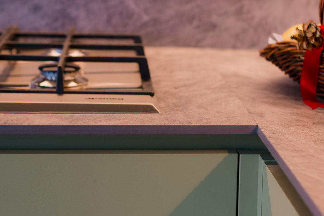
gas hob detail
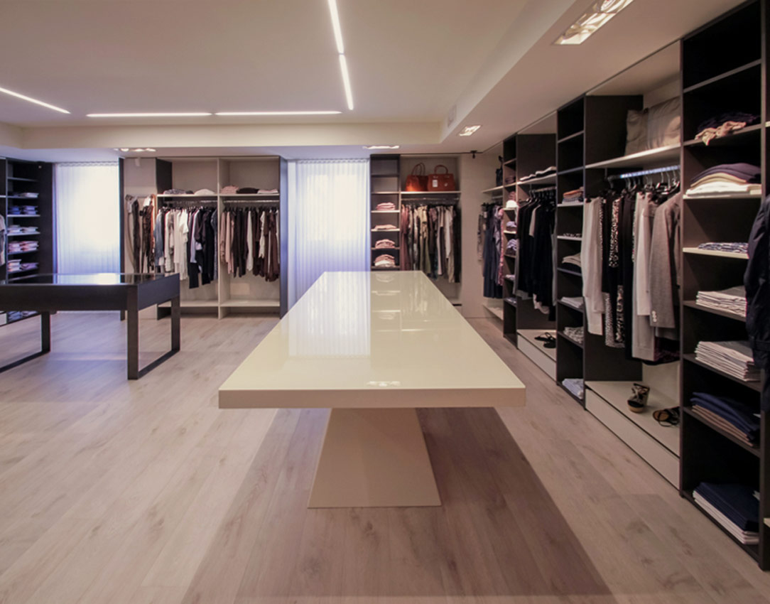
Selvino Shop
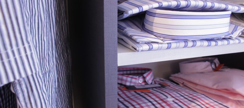
detail textured finishing

MELAMINE-FACED PANEL

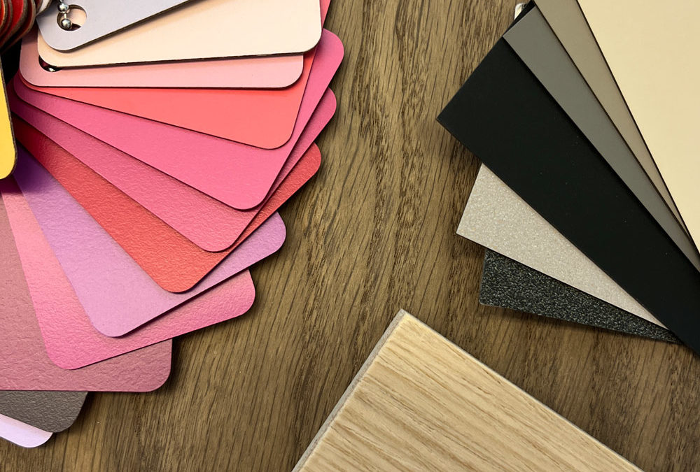
Melamine-faced panels refer to a particular type of material derived from wood veneering, but with a substantial difference: veneered wood has a thickness of only 0.5-1 mm, while melamine-faced panels have a thickness of 0.2-0.6 mm, obtained through digital printing of melamine or phenolic papers that replicate the essences, colors, and textures of different materials.
This allows for obtaining highly resistant, practical, and easy-to-clean surfaces.
Melamine-faced panels are widely used in modern and contemporary furniture for their versatility, durability, and ease of maintenance.
Among the many available textures, many wood-effect ones have a truly realistic appearance.

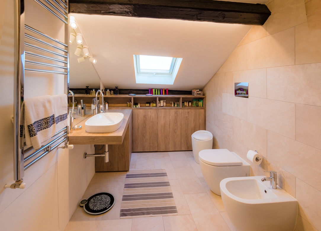
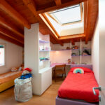
 Attic bathroom

CONCLUSION

In modern furniture, solid wood is increasingly less used and replaced by lighter, durable, and versatile materials such as laminate, MDF, plywood, and melamine-faced panels. These materials offer a wide range of colors, finishes, and textures that allow for creating customized and high-quality aesthetic solutions to meet every need and furnishing style. In addition to aesthetic considerations, it is important to also evaluate the technical characteristics of the materials used, such as resistance to moisture, temperature variations, and sunlight, in order to ensure optimal durability and functionality over time.

Design Week 2023: New trends in the record edition

Design Week 2023: New trends in the record edition

Milan Design Week 2023: the year of records! Confirming expectations, this edition finally returned in April with a boom in visitors and not only industry insiders.

2023 Colour Trends in Interior Design

Retracing the time course of the colours in trend in recent years, we start with the colour brass which accompanied the design world in the years 2019 and 2020, with a slight trailing off also in the first half of 2021.

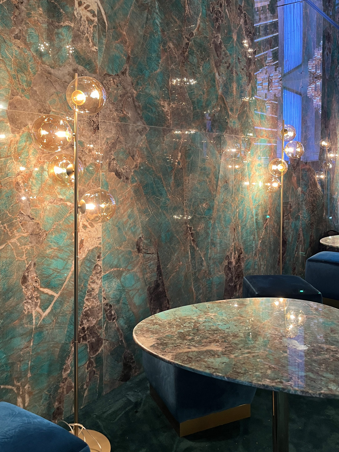
Now completely disappeared, its decline has instead sanctioned the introduction of greens in all its shades. Starting with light shades such as sage, it then turned to the dark, intense tones also found in the Verde Alpi and Guatemala marbles. Already appearing in the first post-covid editions, it reached its peak in the 2021-2022 two-year period often combined with pastel pink. It also reappears in Design Week 2023, albeit in a different form. In fact, it can be found in veined marbles and open-pore wood and lacquer shades, combined with charged tones of red and terracotta but also with neutral tones of beige and powder grey.

Fuorisalone 2023 sage green
Design Week 2023 powder grey
Design Week 2023 blue Klein terracotta

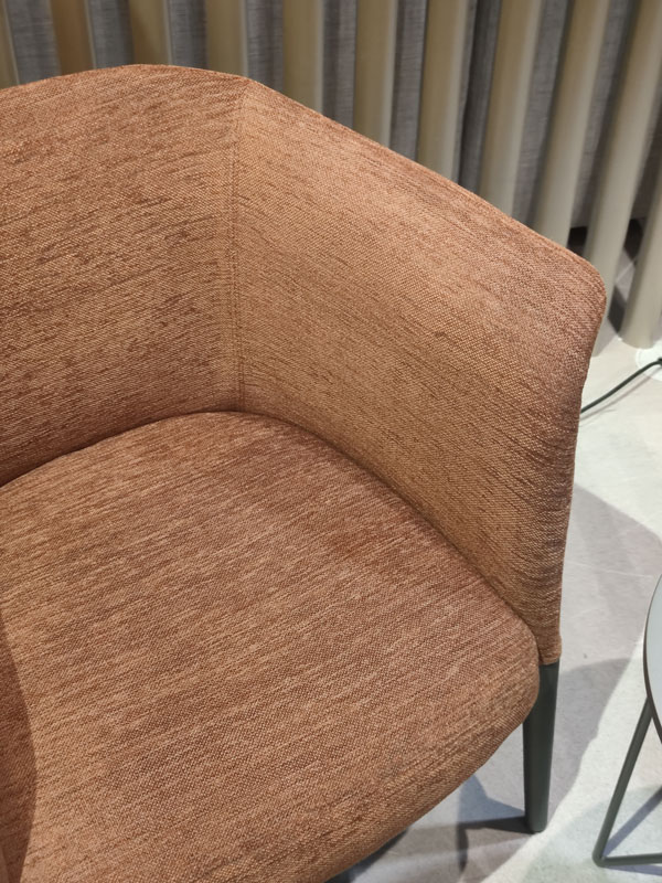
Whether warm or cool, they certainly play a key role in the contemporary design scene. Terracotta tones, the great protagonists of the previous edition, are not slow to reappear in monochrome interiors or combined with intense blues.

The latter, which timidly appeared in the form of Klein blue in 2022, find their greatest expression in the current edition. Combining with the increasingly popular powder or ice grey and veering towards their darker hues, they create elegant contrasts by softening their shapes. Giving a foretaste of this is, as always, the fashion world, which in the autumn-winter 2023/2024 fashion shows in London and New York proposes interesting combinations of silver grey with darker tones of blue and burgundy.

Design Week 2023 cream terracotta
Salon green marble stained wood

The materials protagonists of Design Week 2023

Continuing the theme of the trends of this Design Week 2023, one cannot ignore the chapter on materials. The common denominator is certainly the desire to dare and experiment, underlined already by the choice of colours.

Fuorisalone desk petineuse metallic lacquered leather insert
Salon metallic copper scratched natural wood
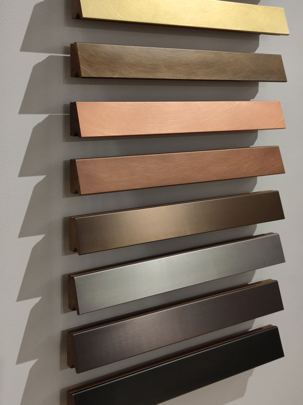
Fuorisalone metal sample palettes
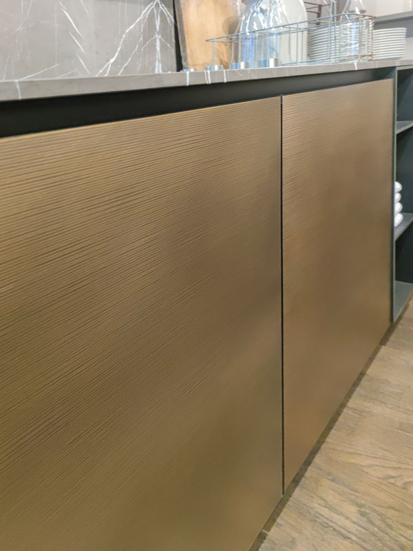
Salon kitchen metallic effect burnished brass

Metals certainly dominate the scene, experimenting with satin finishes, vibrations and chemical treatments. Lacquers also look in this direction with metallic effects ranging from delicate uniform shades to more pronounced finishes.

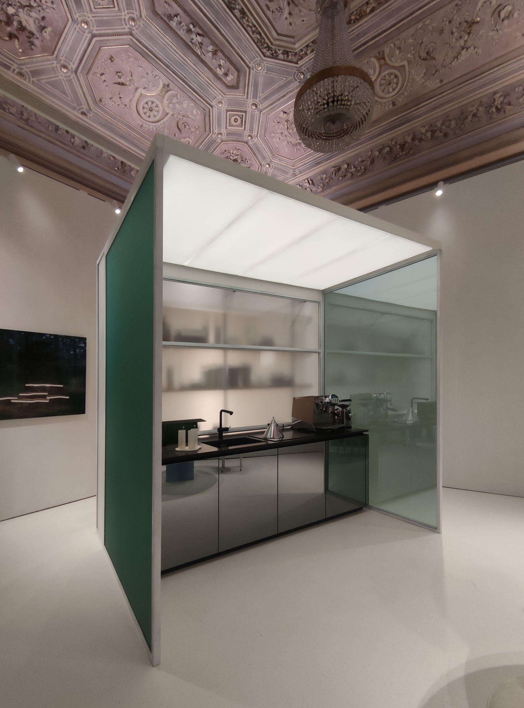
Design Week 2023 Elle Decor Art Light kitchen glass mirror
Salon glasswork geometries 02
Salon glazing geometries 01
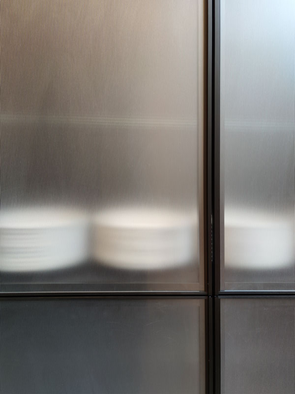
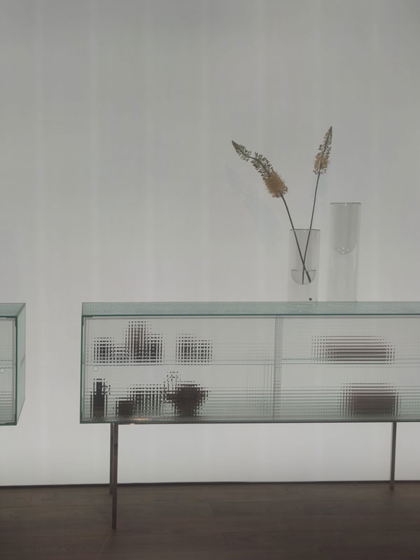
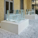
Design Week 2023 transparent corrugated glass
Design Week 2023 green corrugated glass
Design Week 2023 black corrugated glass
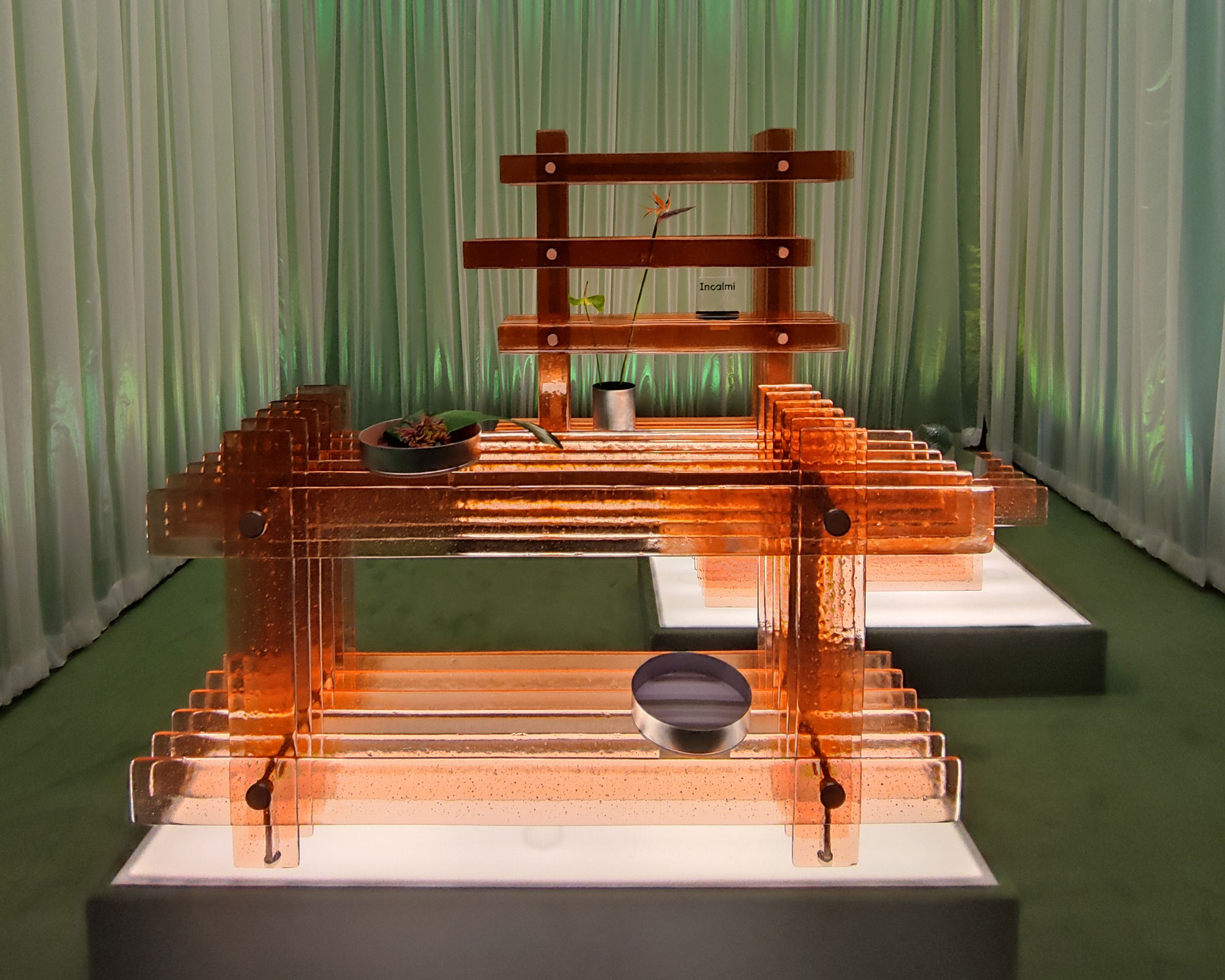
Design Week 2023 orange corrugated glass
Salon corrugated glass 01
Corrugated Glass Salon 02

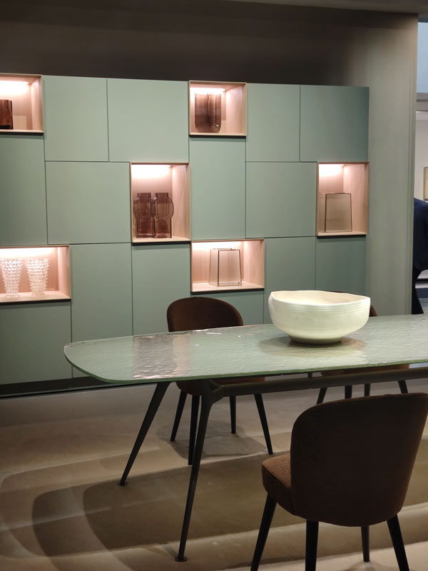
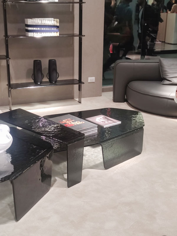
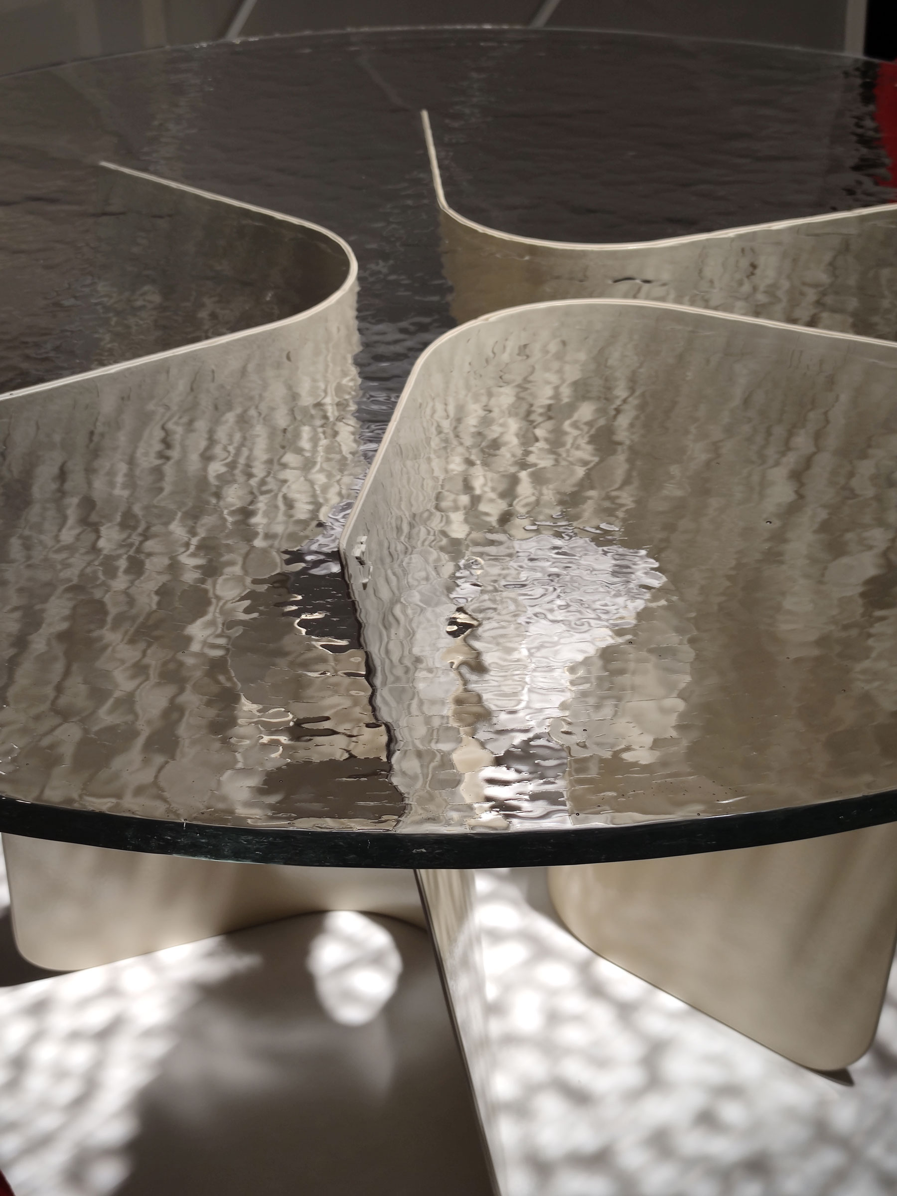
In keeping with the theme of reflections, mirrors and coloured glass are combined with these. The latter deserve a short parenthesis. During this Design Week 2023 in the Rho Fiera spaces, there was a veritable invasion of glass. Already in previous editions, they had been recognised for their caned and wavy shapes, with workmanship aimed at geometric rigour. In this edition, the attention paid to this material emerges even more, through corrugated glass that seems to recall rippled waves and sinuous movements.

Design Week 2023 transparent corrugated glass detail
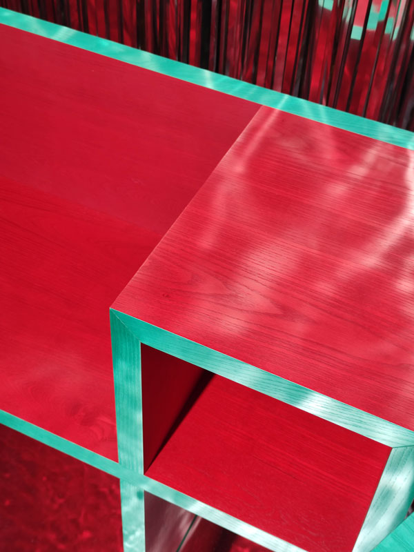
Fuorisalone ash stained aqua green red
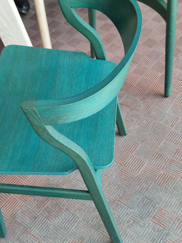
Fuorisalone ash stained aqua green
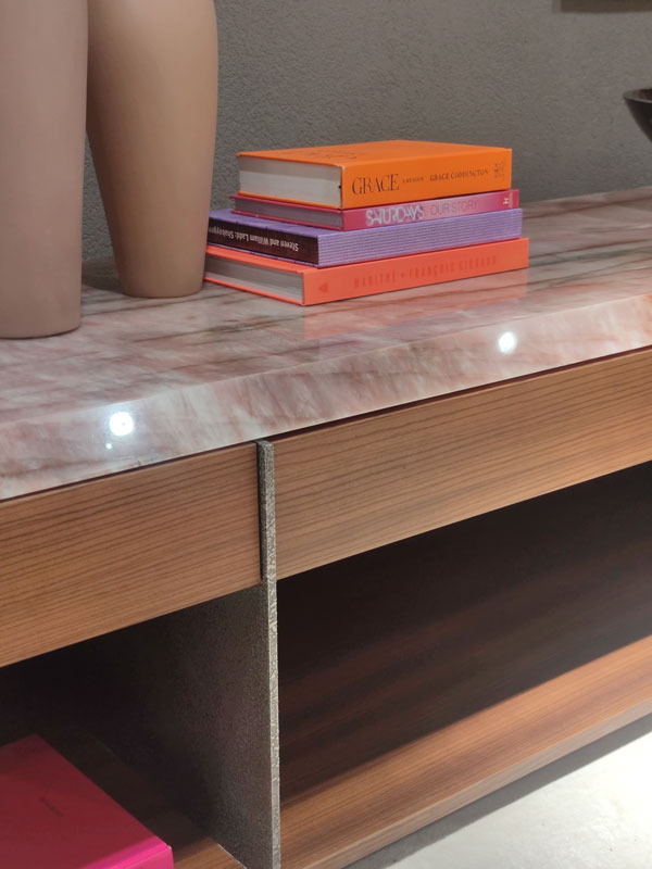
Salon pink veined marble wood metal
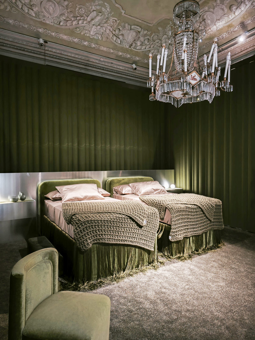
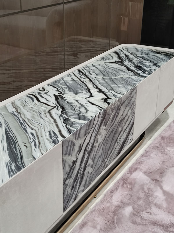
Velvet green veined marble salon

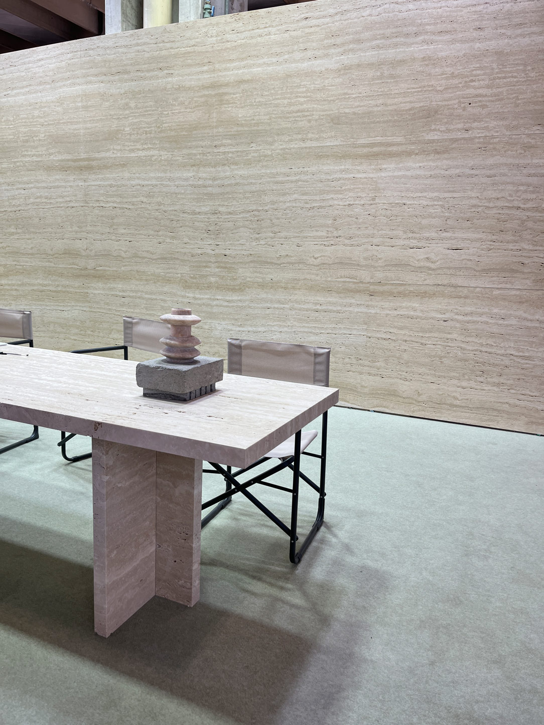
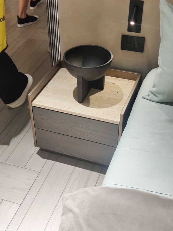
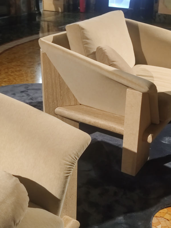
The desire for grit and character can also be found in the choice of woods, which dare iridescent colours such as red, blue and green treated and lacquered in both closed-pore and, above all, open-pore finishes. Marbles are also of the same type, as veined and coloured as possible. Among them all, however, is the neutrality of Travertine, which with its elegant porosity and reference to tradition embraces furnishings of all kinds.

Design Week 2023 bedside table travertine metallic lacquered dark wood
Fuorisalone armchairs travertine structure
Salone tessuti intrecciati 01
Salon woven fabrics 02
Salon woven fabrics 05
Salon woven fabrics 06
Furniture Exhibition Metallised fabric

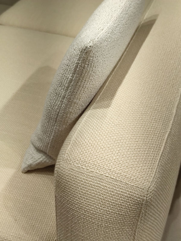
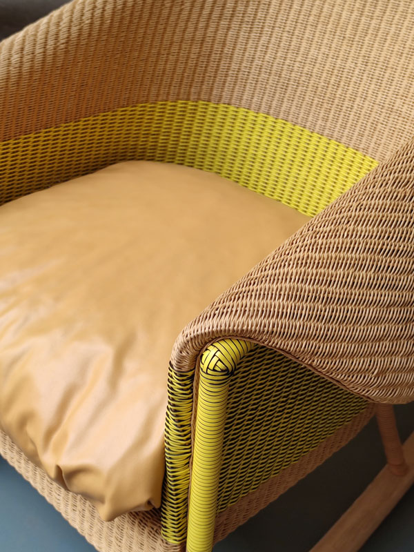
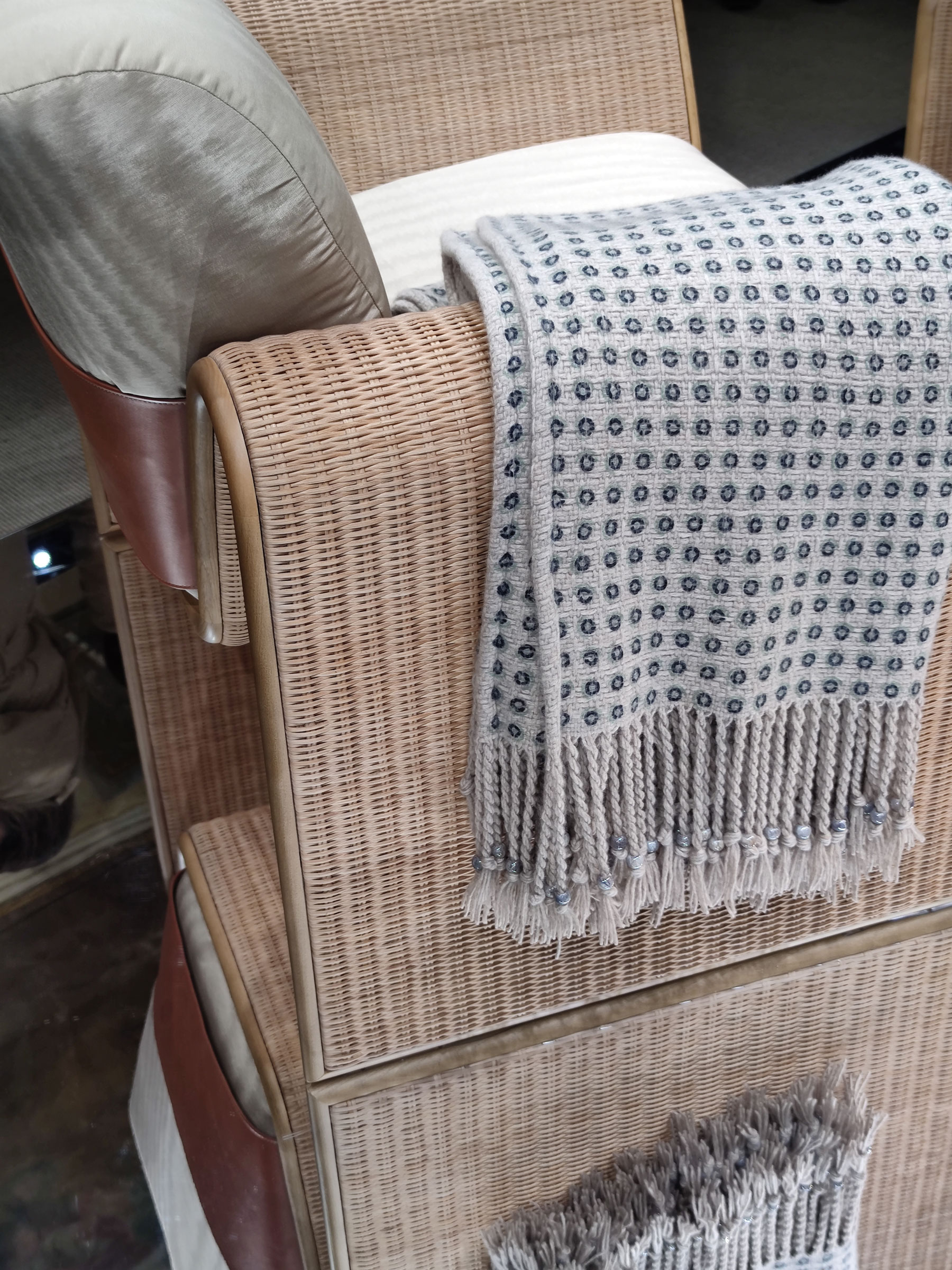
The last chapter relates to the textile world, where the bouclet in trend in 2022 has given way to cottons and stripes with stronger contrasts, almost simulating the jeans effect. Great attention is also paid to weaves and textures, first and foremost straw. It is found both as a characterising element of chairs and armchairs, but also interpreted as a decorative element, layered with glass or mirrors.

All these trends espouse the philosophy of contrast, the guiding principle of this Design Week 2023, whether it is material through strong choices of materials that are, however, chromatically uniform, or tonal contrasts, even daring bold colours as opposed to neutrality.

Design Week 2023 straw laminated panels glass
Fuorisalone Loewe weaves
Fuorisalone Armani home weaves straw fabrics

The theme of light at Design Week 2023

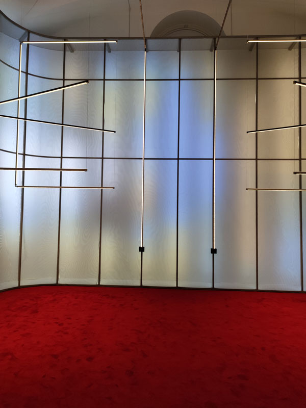
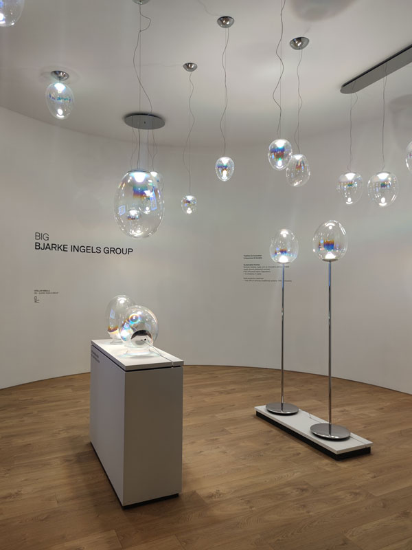
Great attention in this Design Week 2023 is certainly reserved for light, not only in the spaces of the Salone in Rho, through Euroluce, but also in the many installations in the off-site area.

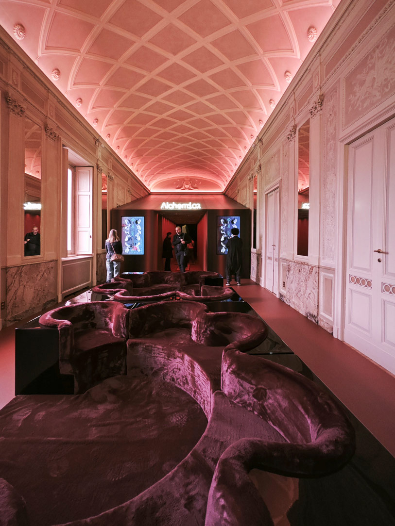
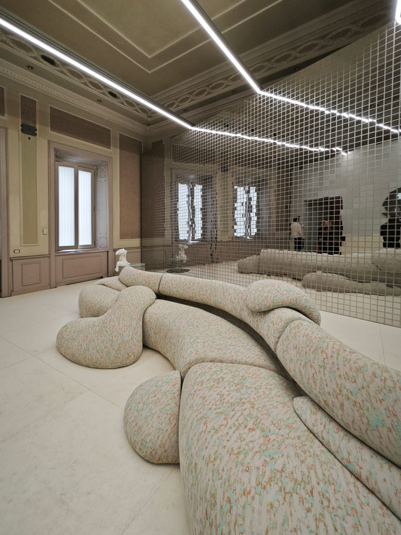
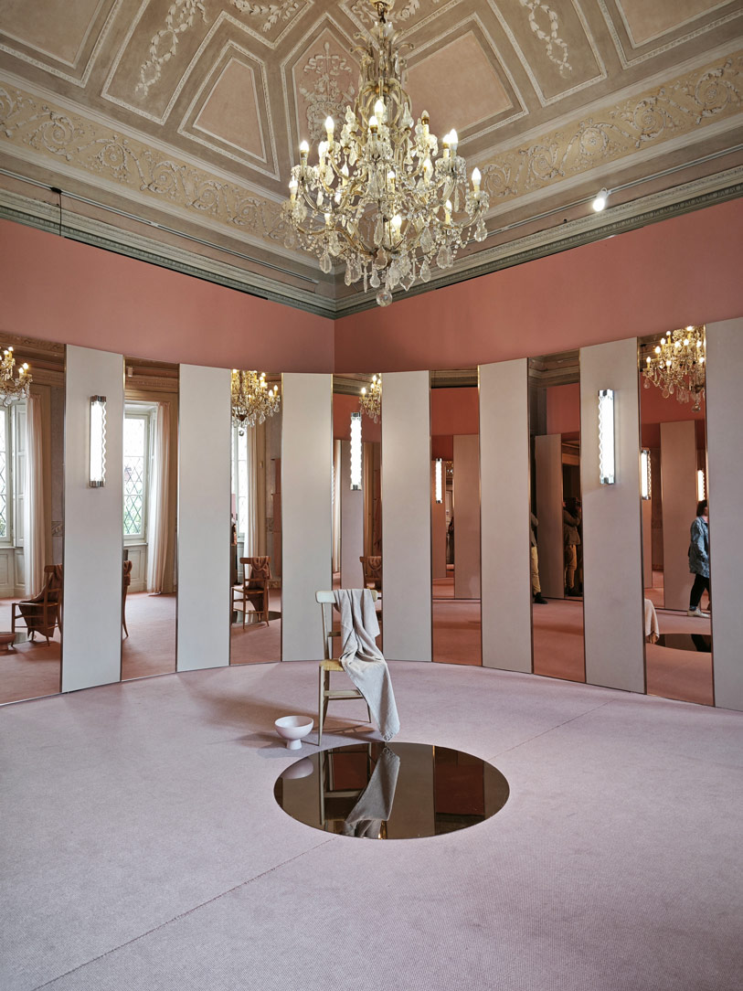
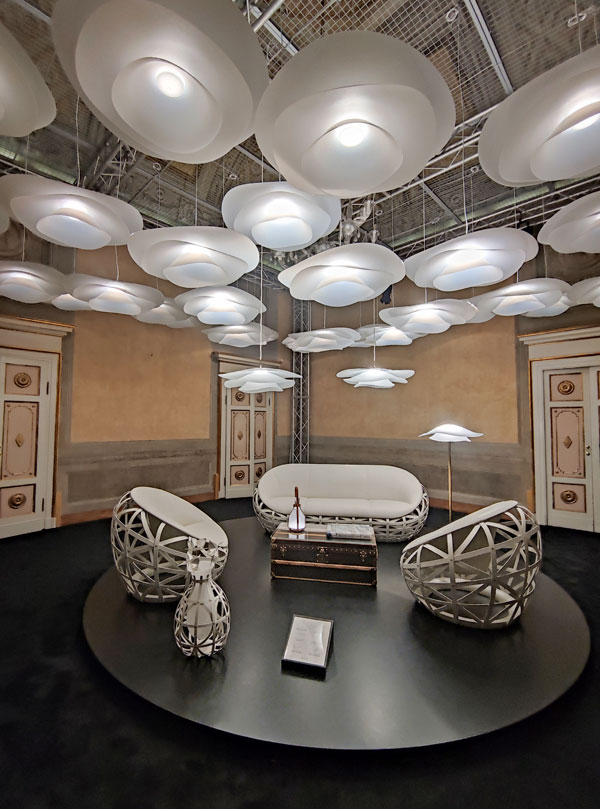
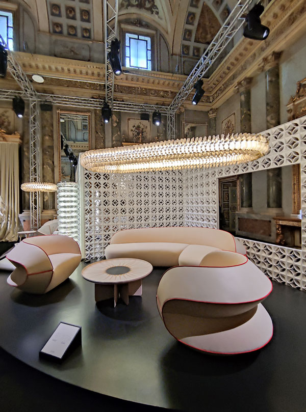
Among the various installations of note, The Art of Light curated by Elle Decor certainly stands out. The historic rooms of Palazzo Bovara, which has been home to the renowned trade publication for years, are metaphorically translated into the highlights of the home. The focus is precisely on the change in their perception depending on the type of light and time of day.
Thus the living area goes from being a bright room with diffuse natural lighting, conveying energy and freshness, to a comfortable environment with artificial lighting.
The latter certainly provide a more theatrical light, calibrating its intensity in relation to darkness. Indeed, the latter becomes a co-star in the design of a home.

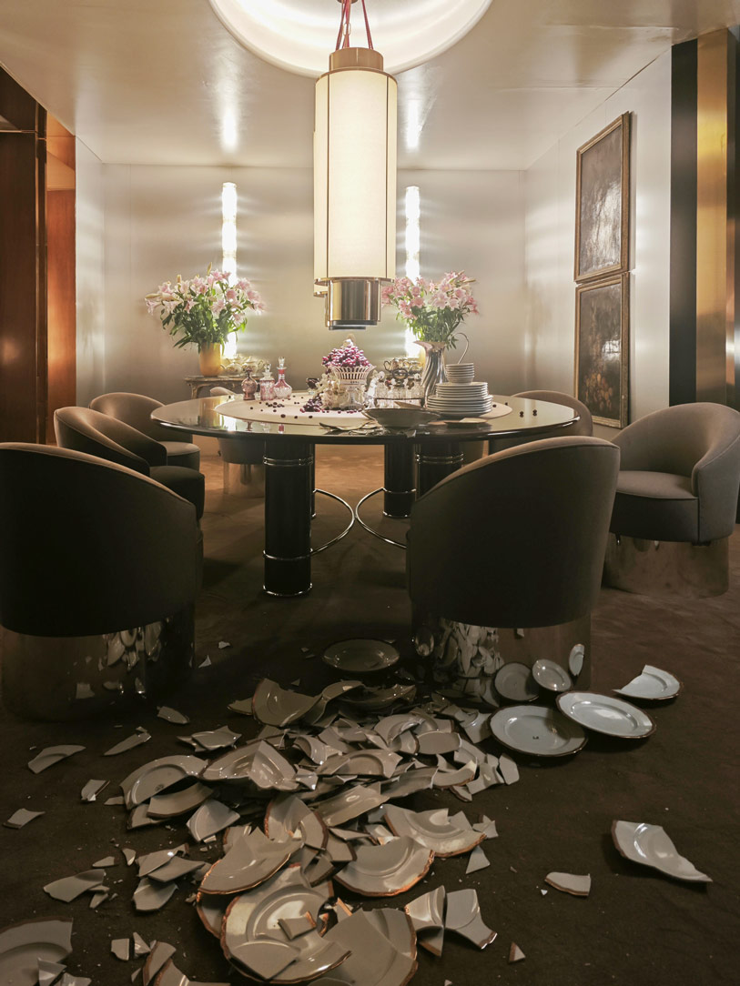
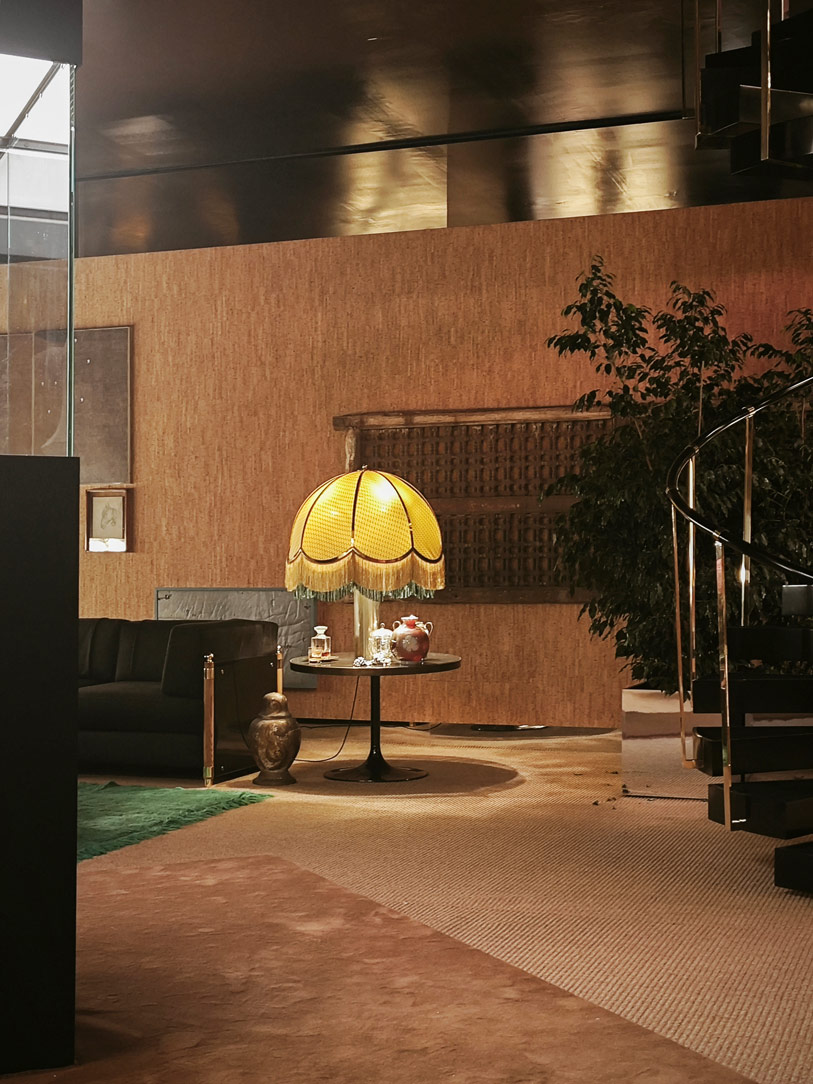
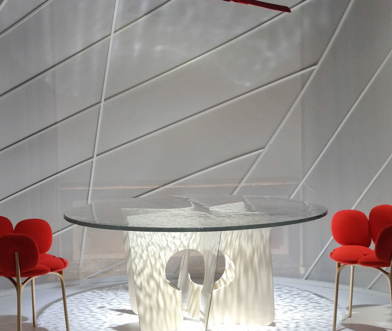
At Villa Necchi Campiglio, it is the Occhio brand that analyses the future of light through a convivial space of discussion rather than mere exhibition. Enclosing the essence of the new proposals is an immersive installation in which the products come alive through elegant movements and dances. The theatricality of light reappears in this Design Week 2023 in the subways of the Stazione Centrale and in the nearby via Sammartini, where Dimore Gallery stages settings on the borderline between cinema, art and design.

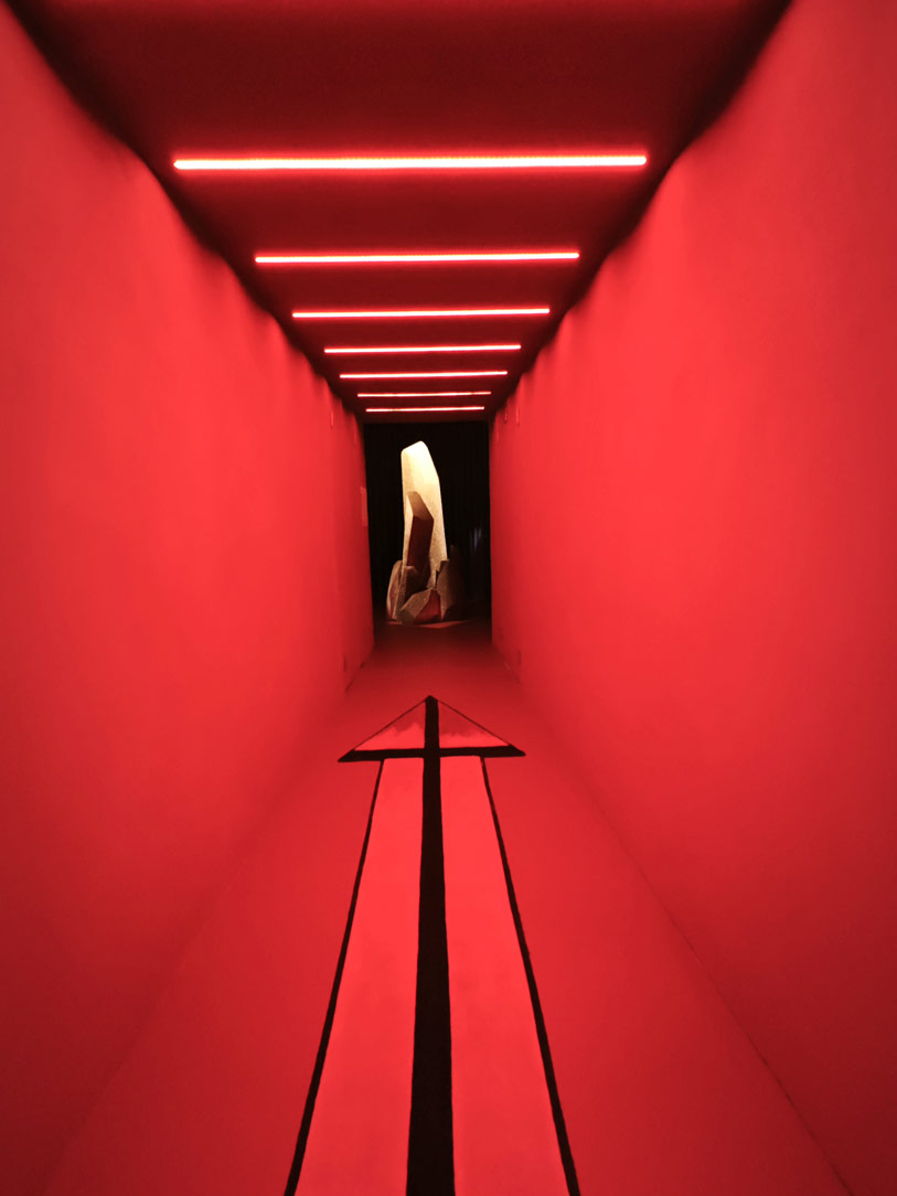
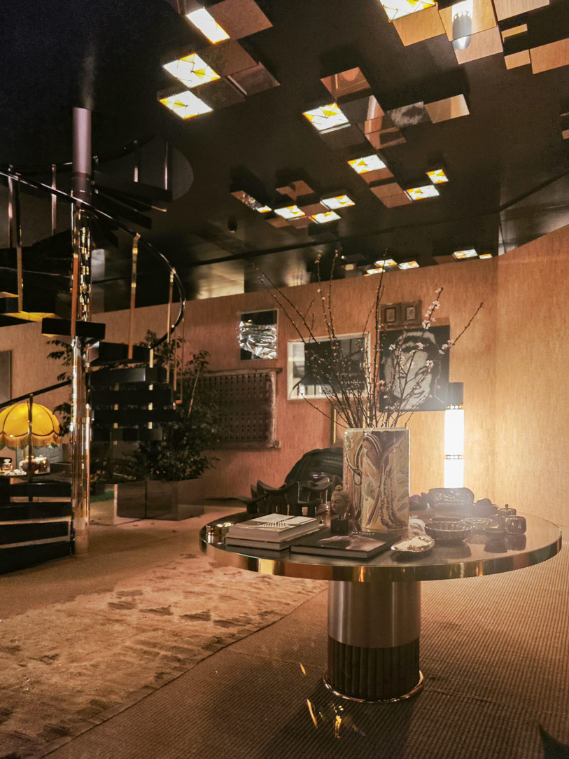
Fuorisalone Elle Decor Art Light entrance hallway
Fuorisalone Elle Decor Art Light hall
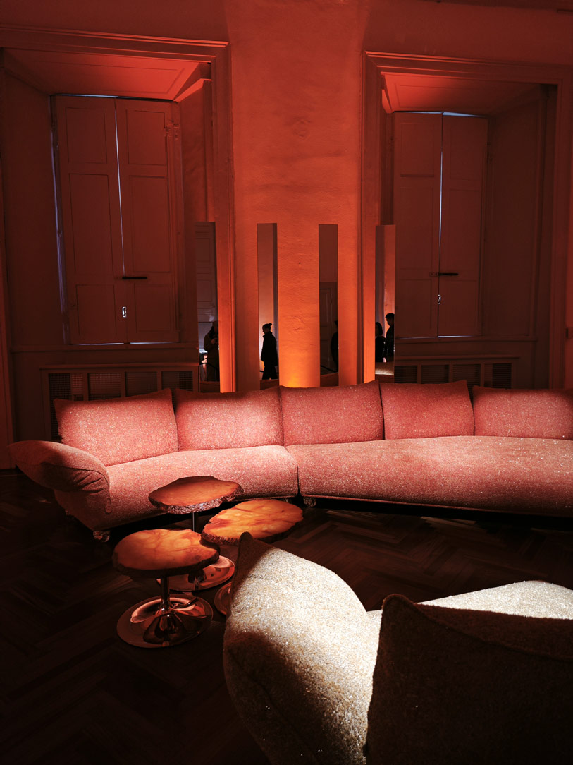
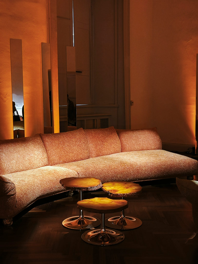
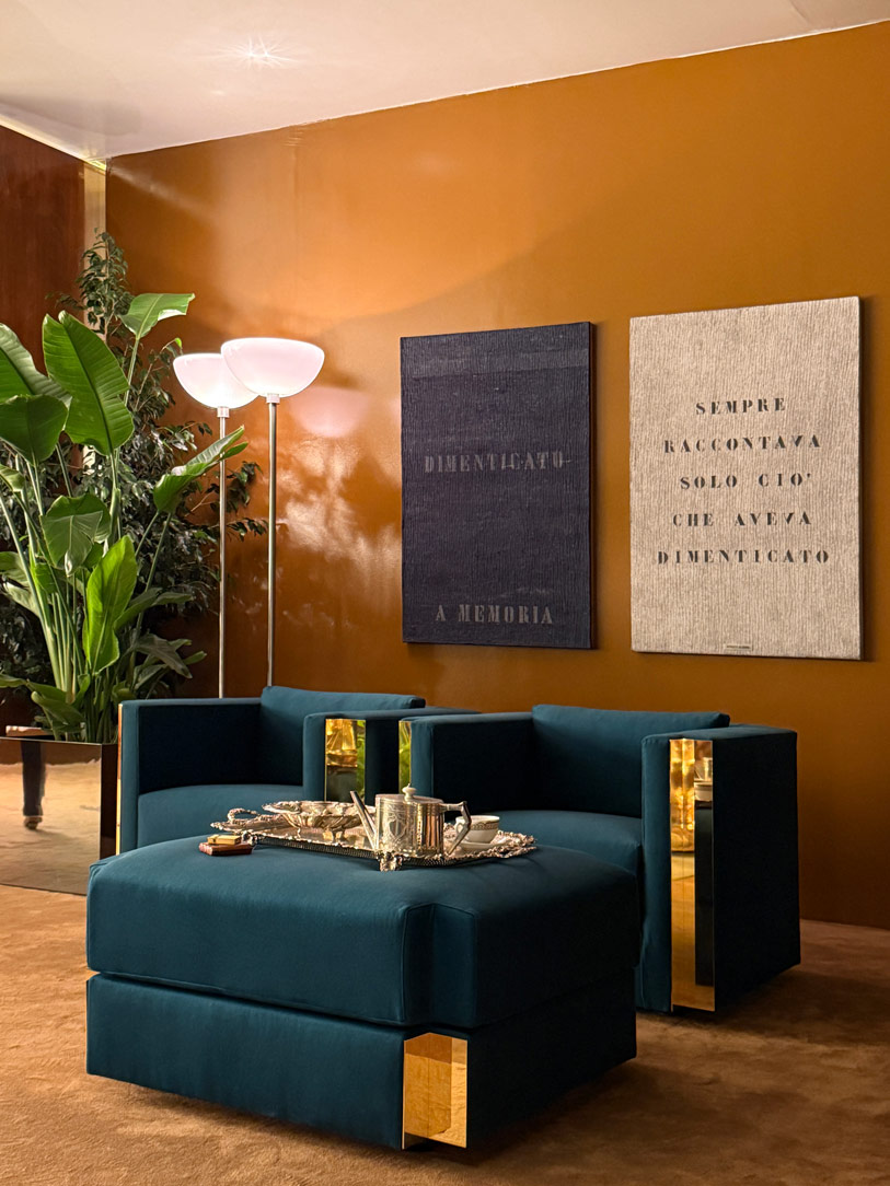
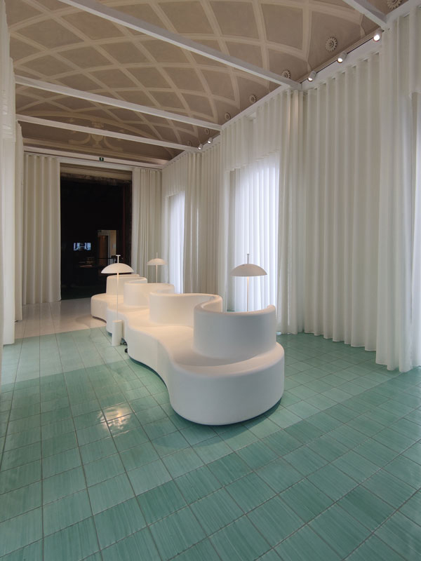
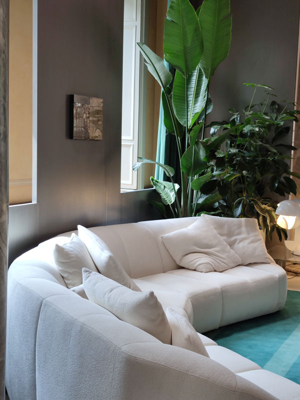
Fuorisalone Elle Decor Art Light sofa room
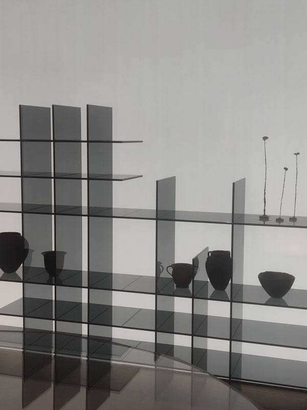
Salon bookcase black glass lighting transparencies
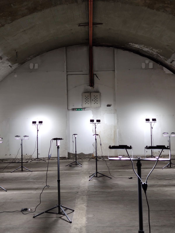
Fuorisalone ventura central subway
Fuorisalone ventura centrale subway 02
Design Week 2023 Louis Vuitton 01
Fuorisalone Brera District light installation
Salone Mobile Euroluce BIG

The universe of fragrances

A recurring and unusual theme during this Design Week 2023 is the focus on olfaction as a design element. Analysed both as an added value of an environment and as a characterising element, it contributes to creating a perceptive memory. Analysing this theme is Mooi through its digital perfumery.

Algorithmic Perfumery mixes tailor-made fragrances thanks to a creative and experimental test integrating artificial intelligence. It is no coincidence that the installation focuses its main rooms around this machine. Placed in the centre of the entrance, it welcomes the visitor by immediately making itself known as the protagonist of the scene. It is then found on the outside, in a sort of contemporary square, where its presence can be likened to that of a bar with seating and conviviality points arranged around it. Elements that underline the importance of the experience.

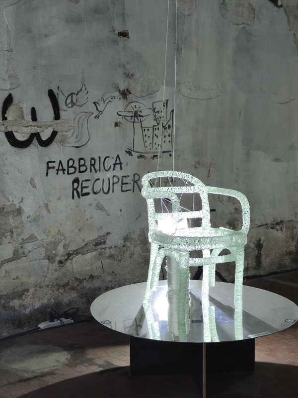
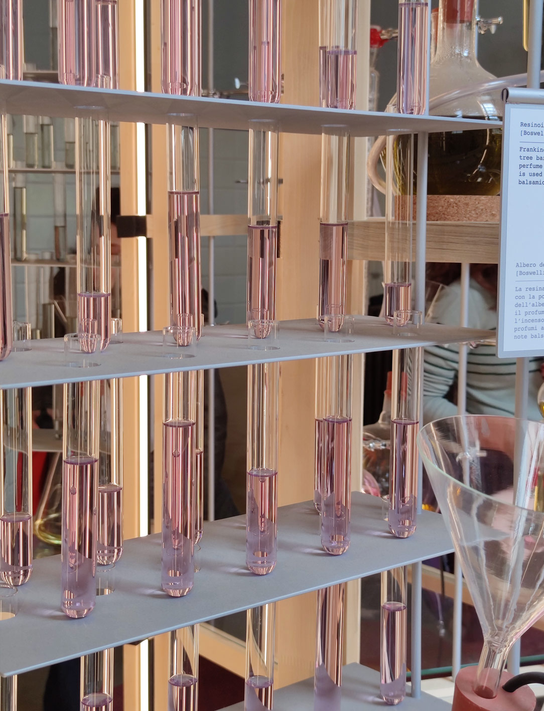
At Alcova, whose location during Design Week 2023 will be moved to the former slaughterhouse of Porta Vittoria, the brand Les Eaux Primordiales, to launch its latest essence, proposes a sensorial installation composed of two towers inspired by the industrial buildings of Northern France. In the first tower, in a sort of conceptual and physical decomposition, the individual essences are presented in their purity, usable by the visitor through glass ampoules. The interactive component represents the crucial moment of the installation, also allowing the creation of movement and fluidity in the space.

Profumeria algoritmica Moooi
Acque primordiali di Alcova

Design and Haute Couture

As in past editions, contaminations from the world of fashion dominate the design scene during this Design Week 2023.

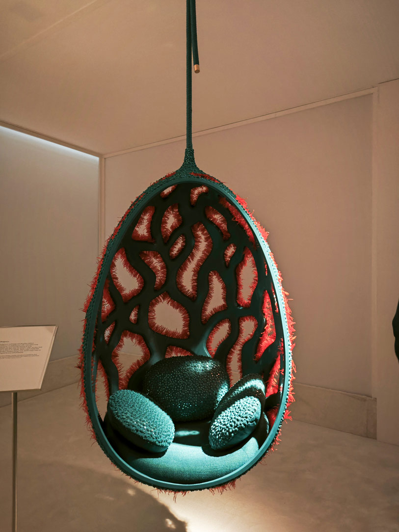
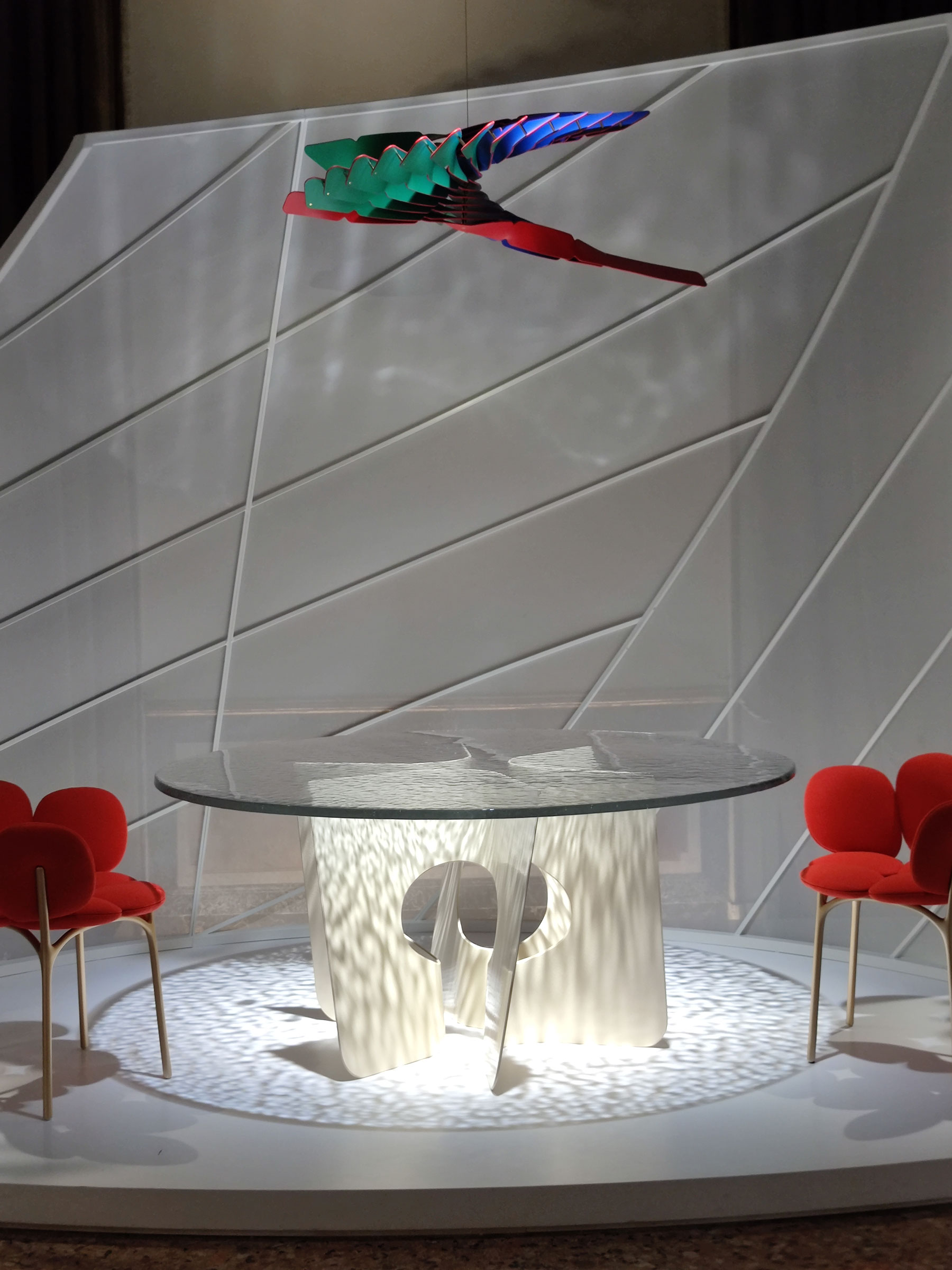
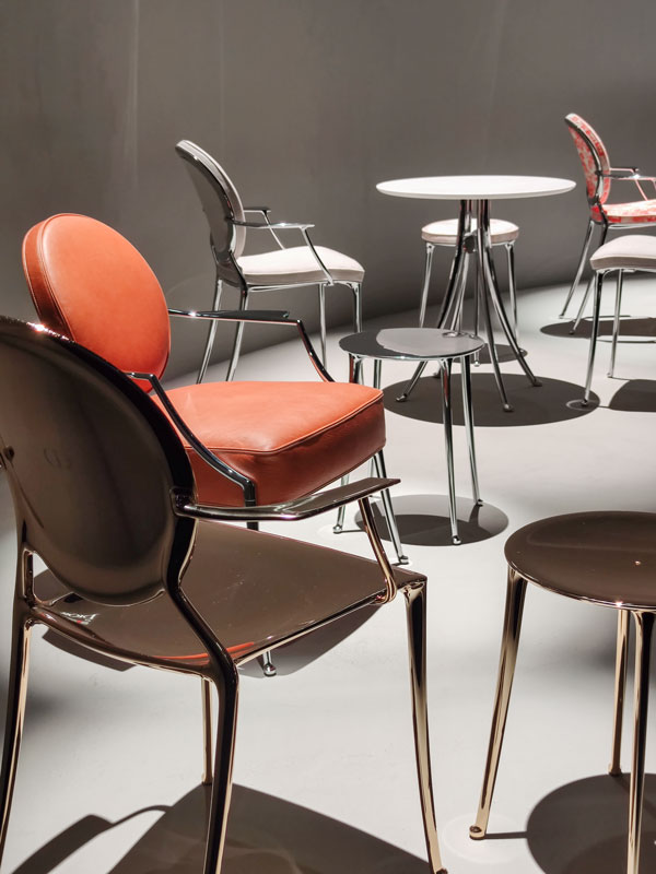
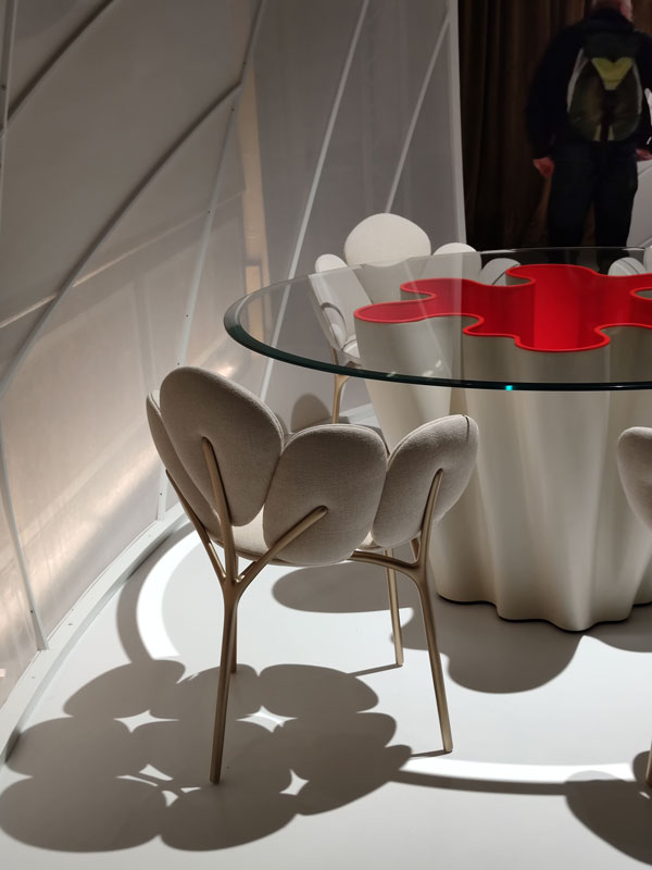
The partnership between Dior and Philippe Starck continues in the spaces of Palazzo Citterio, re-proposing the Medaillon Chair in a colourful guise. Fluid and elegant movements take the form of a path on the borderline between triumphal march and design catwalk.

Fuorisalone Dior Medaillon Chair Philippe Starck 02
Fuorisalone Dior Medaillon Chair Philippe Starck 01
Missoni

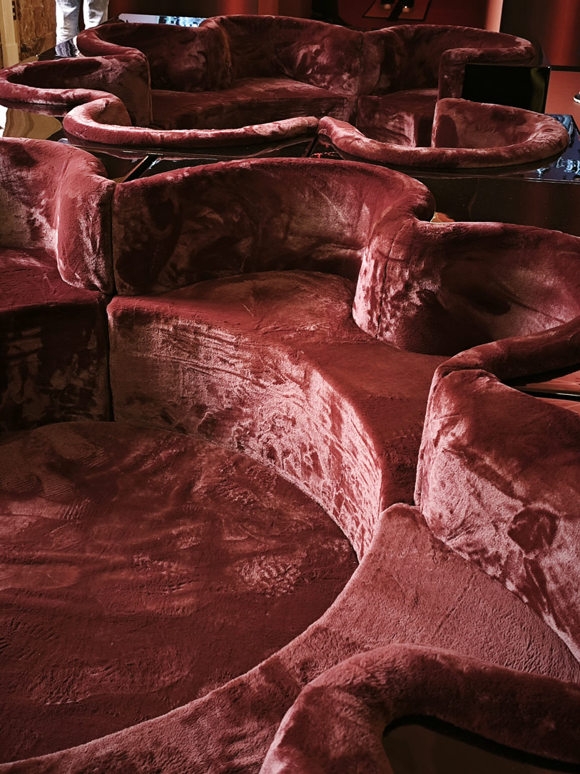
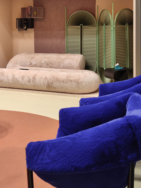
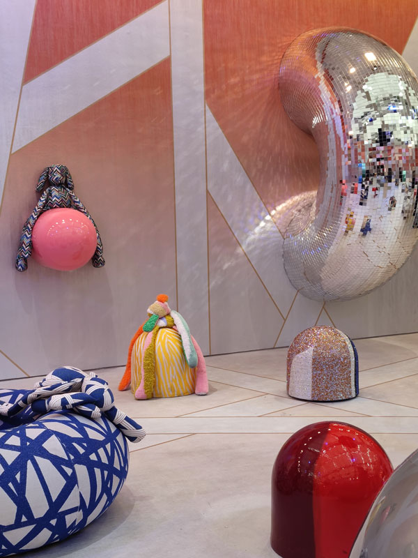
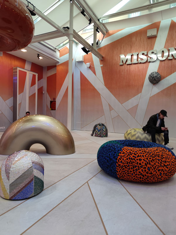
Like every year, Missoni gives energy and lightheartedness by creating a dreamlike world in which fabrics embrace doughnut and panettone seats. An environment in which to become a child again, breathing an air of freshness and brightness.

Fuorisalone Missoni 01
Fuorisalone Missoni 02
Bottega Veneta

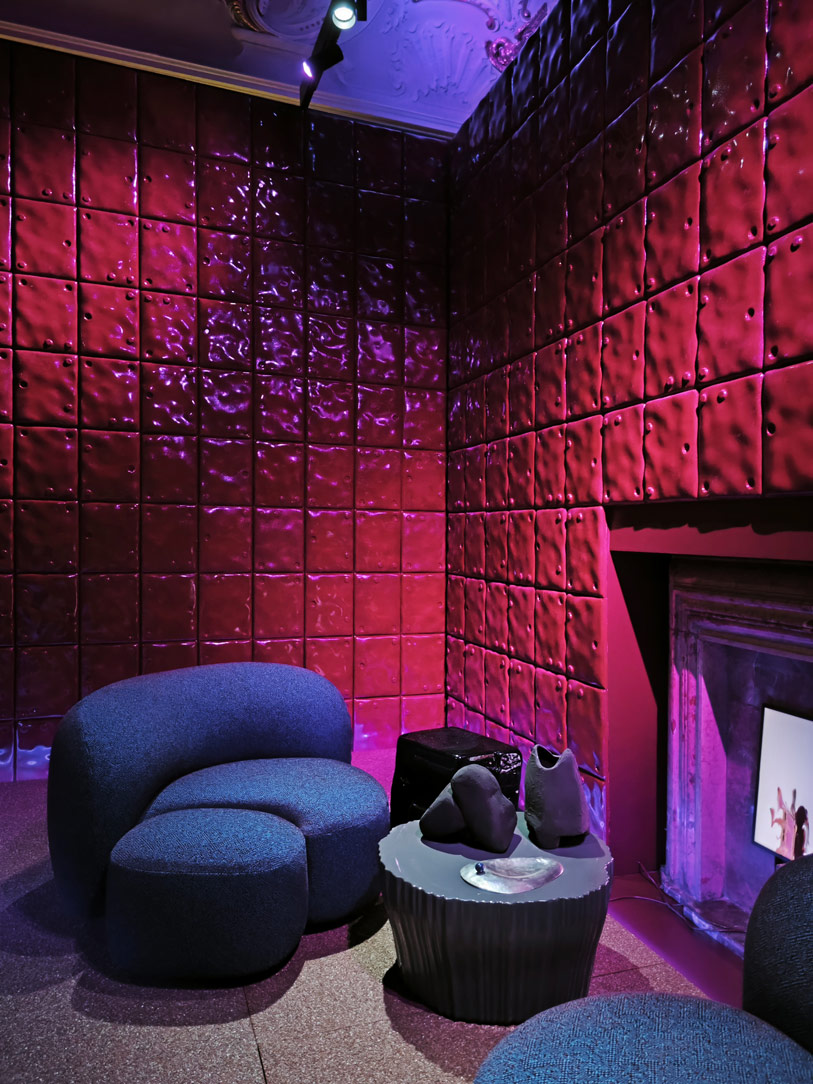
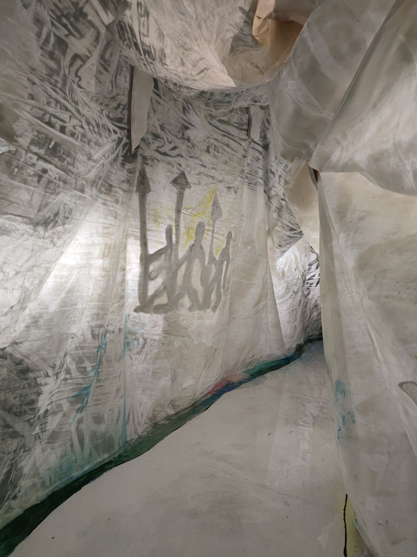
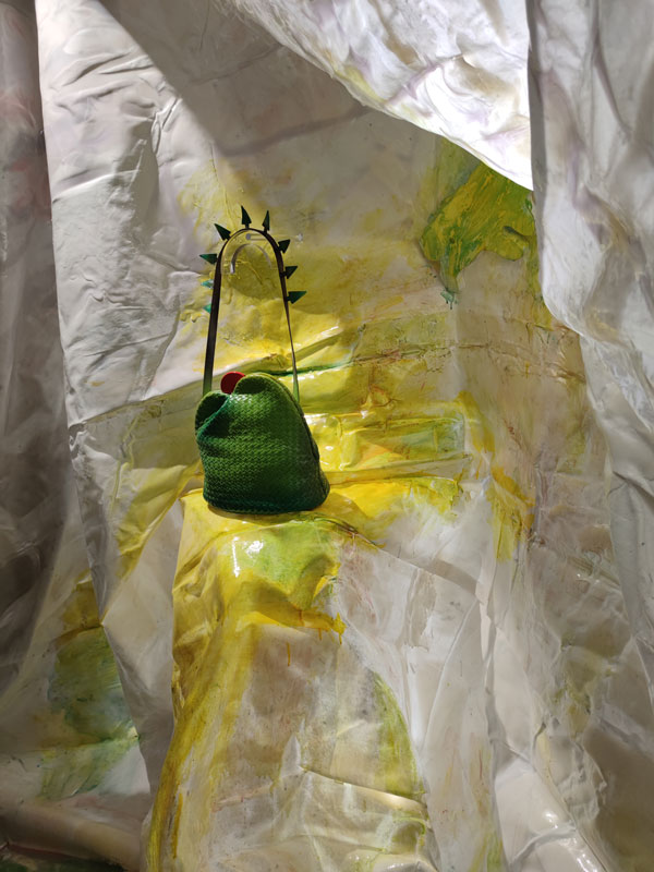
Bottega Veneta entrusts Gaetano Pesce with the presentation and design of two new Limited Edition bags. Through a contemporary cave with resin walls and rock carvings in green tones, he combines the mountains of Este and the American prairies.

Fuorisalone Bottega Veneta Gaetano Pesce 02
Fuorisalone Bottega Veneta Gaetano Pesce 01
Furla

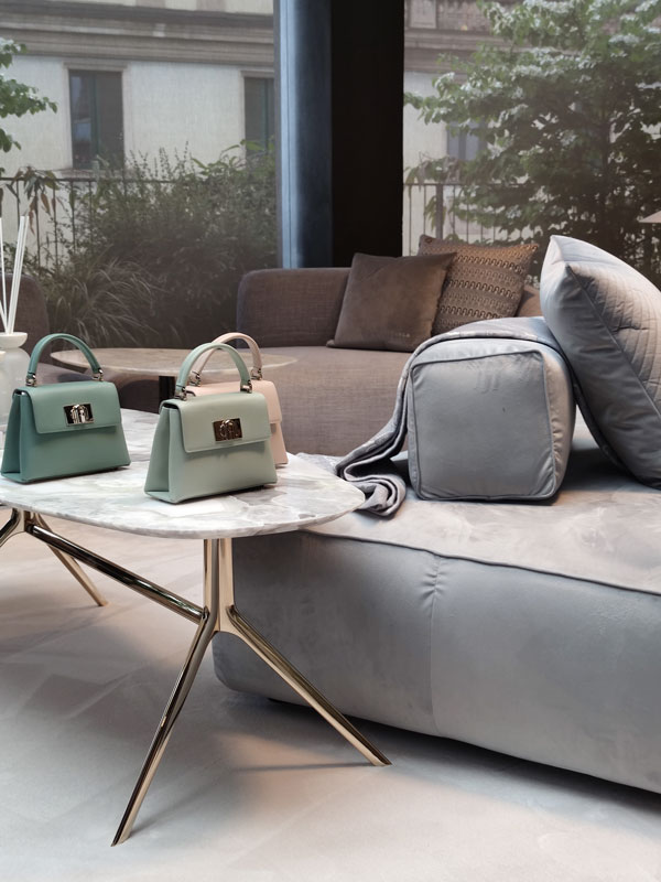
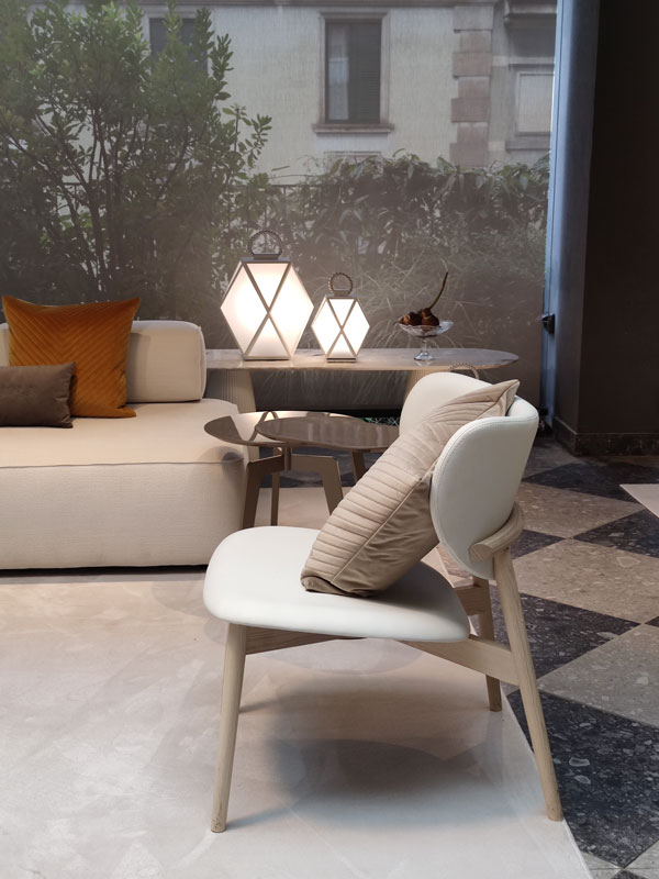
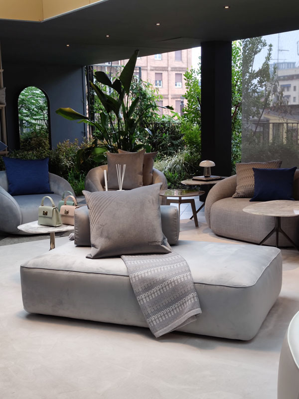
Furla interprets its home line through delicate neutral tones, combined with more decisive touches of colour such as green, midnight blue and bronze. Here then, at Design Week 2023, it proposes sophisticated combinations of fabrics, leathers, metallic effect lacquers, velvets, metals and the ever-present marble. A glimpse of the oriental world can be found in the choice of materials and shapes, such as the proposal of round tables instead of the traditional western-style rectangular ones.

Fuorisalone Furla home 01
Design Week 2023 Furla home powder grey midnight blue
Louis Vuitton

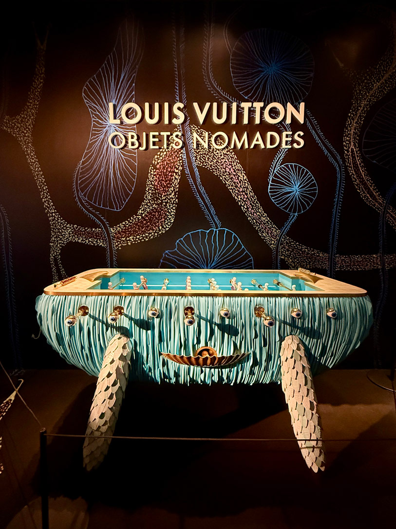
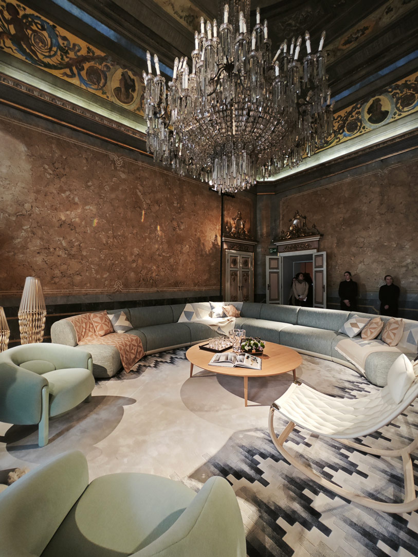
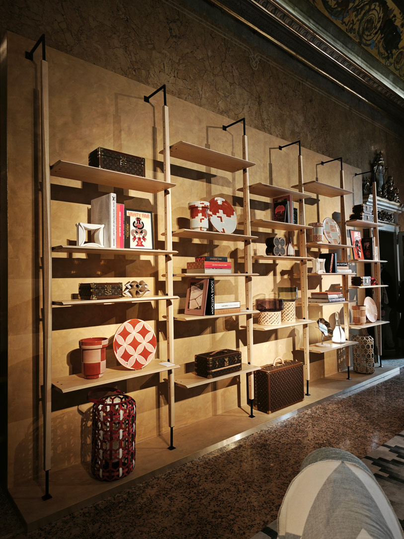
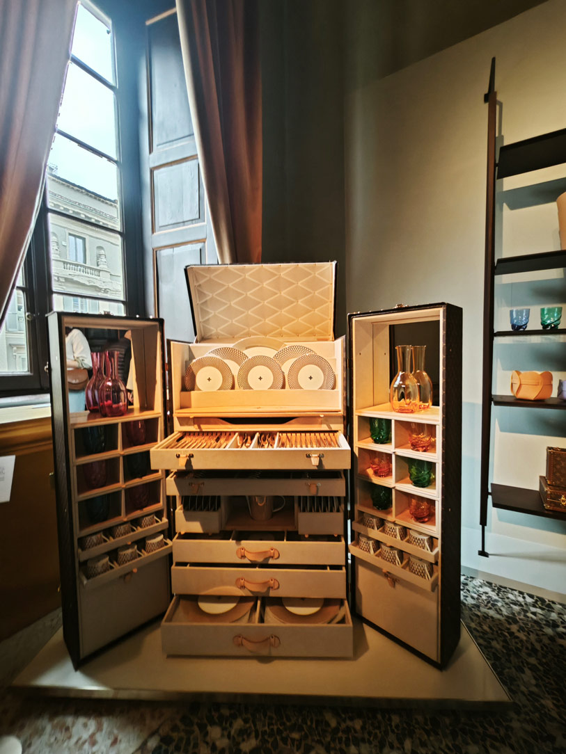
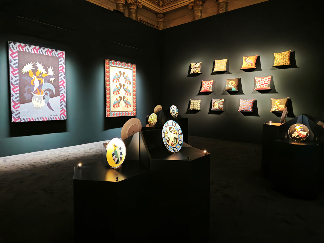
Louis Vuitton returns to Palazzo Serbelloni with Objects Nomades, a metaphorical journey among iconic furnishings set in a timeless context. In this example too, light becomes a design element in which furniture in neutral tones is inserted, as if to further soften its forms.

Fuorisalone Louis Vuitton 01
Louis Vuitton Fuorisalone 02
Loewe

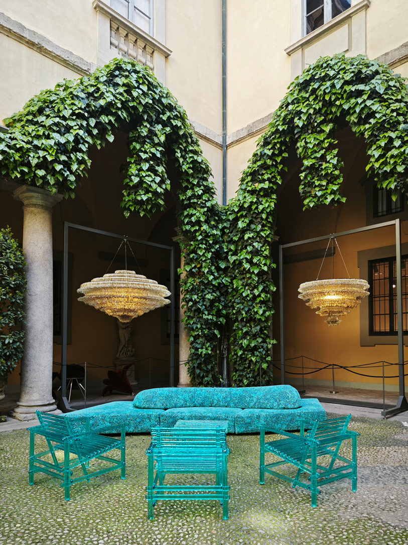
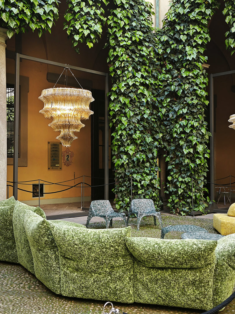
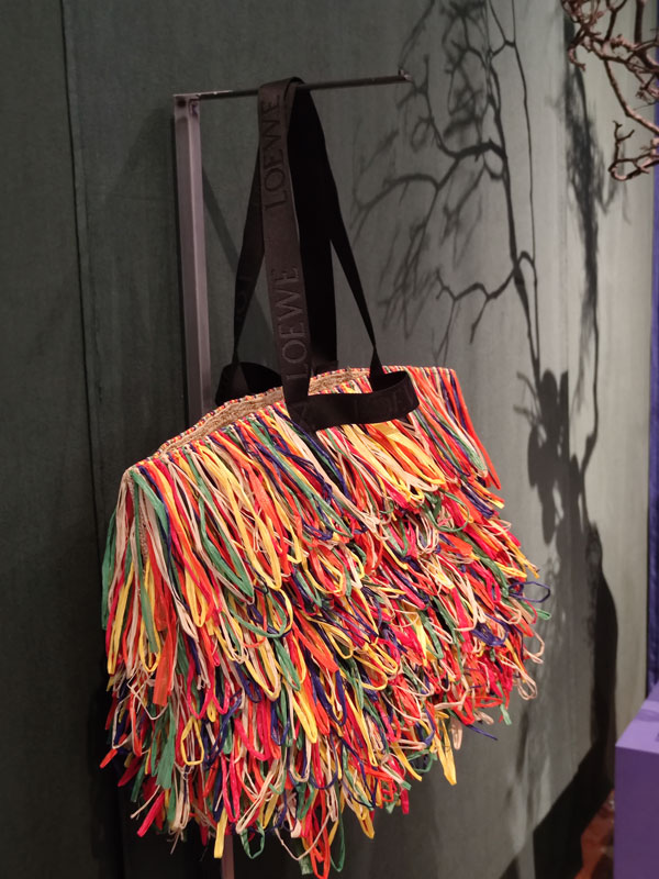
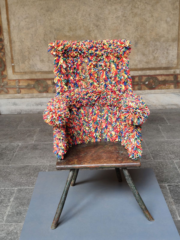
Loewe instead interprets the design-fashion binomial through a parallelism between the new bags and the Loewe Chairs proposals. In the evocative inner courtyard of Palazzo Isimbardi, craftsmanship is translated into weaves and refined techniques among iridescent colours and provocative proposals.

Fuorisalone Bottega Veneta 01
Fuorisalone Bottega Veneta 02
Armani Casa

Texturality can also be read in the interior proposals of Armani Casa, which for the first time opens the doors of the historic Palazzo Orsini to the public. Between straw, onyx and jacquard fabric, one recognises the timeless elegance and mastery of Armani, in an interpretation that unites the outdoor and indoor lines in the sign of essentiality. The combination of diametrically opposed materials, such as straw and onyx, results in an absolutely recognisable stylistic interpretation. Special attention is paid to the Italian tradition and its craftsmanship, hence the choice of materials for most of the interior proposals.

Fuorisalone Armani Casa 01
Fuorisalone Armani Casa 02
Hermes

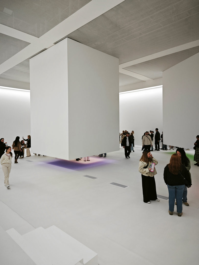
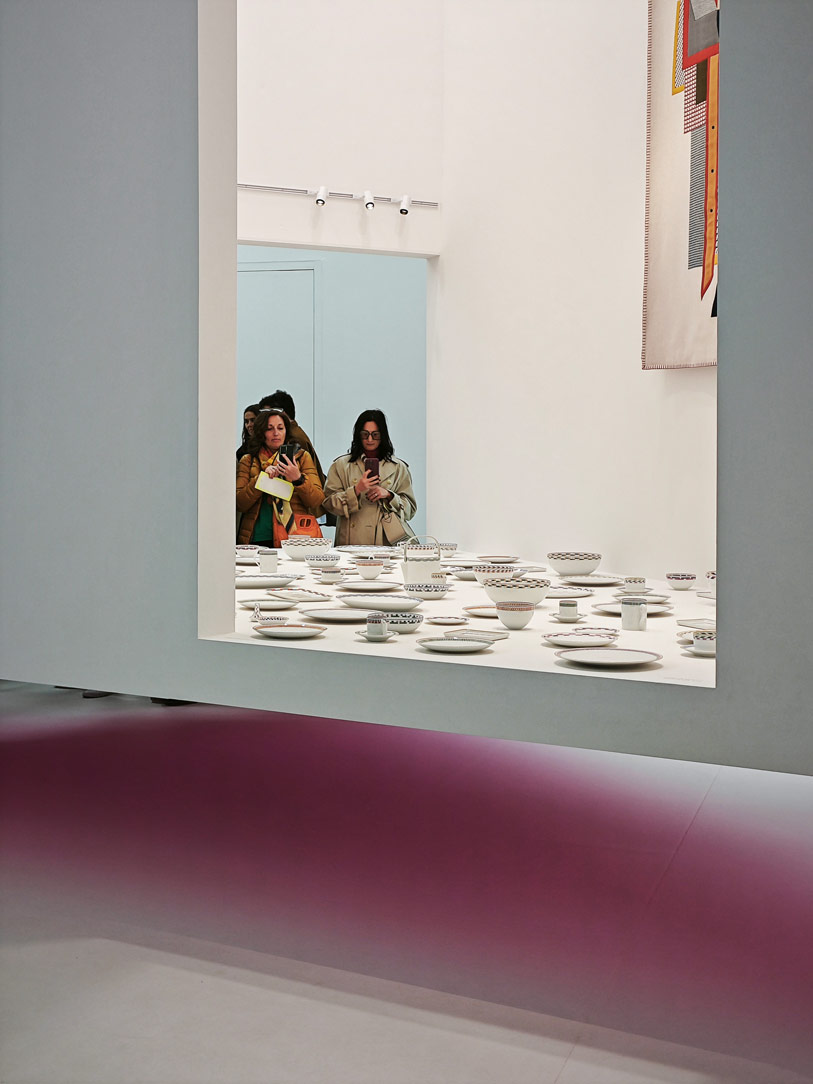
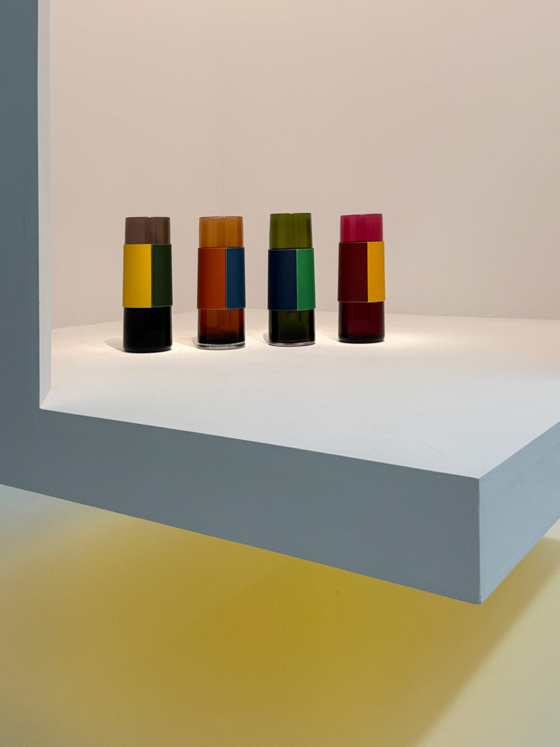
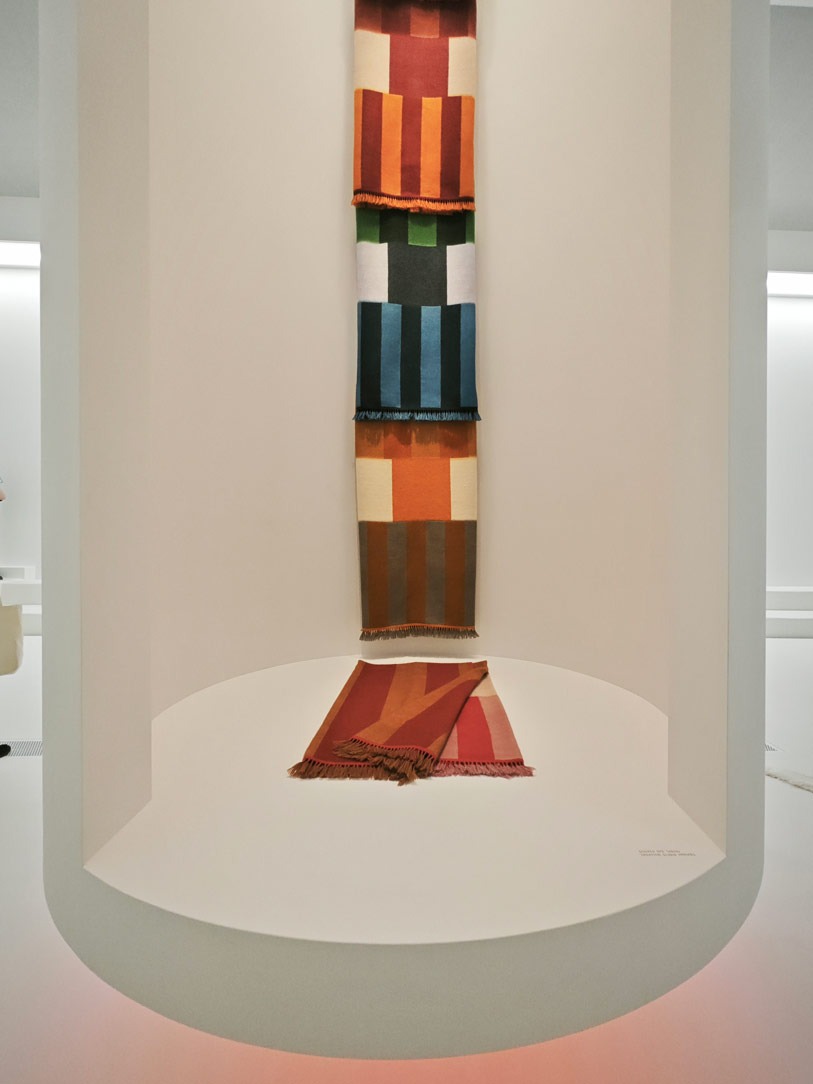
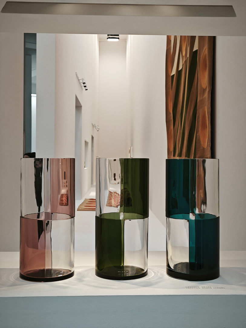
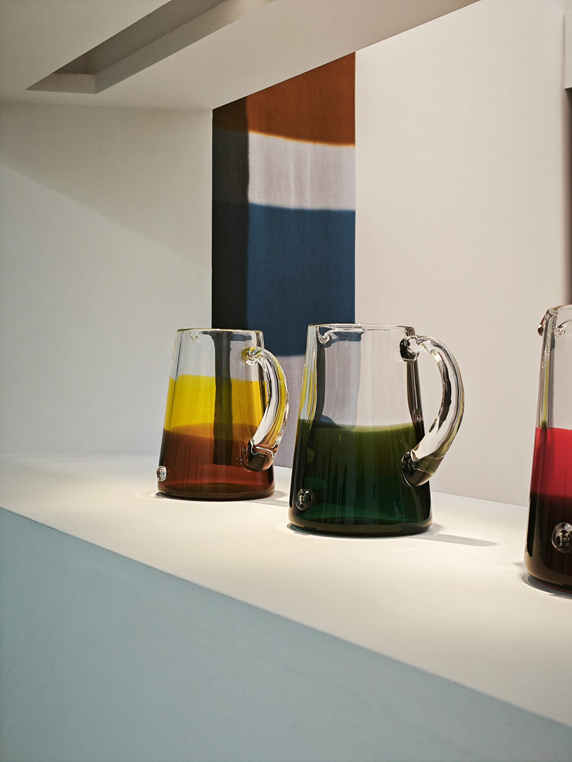
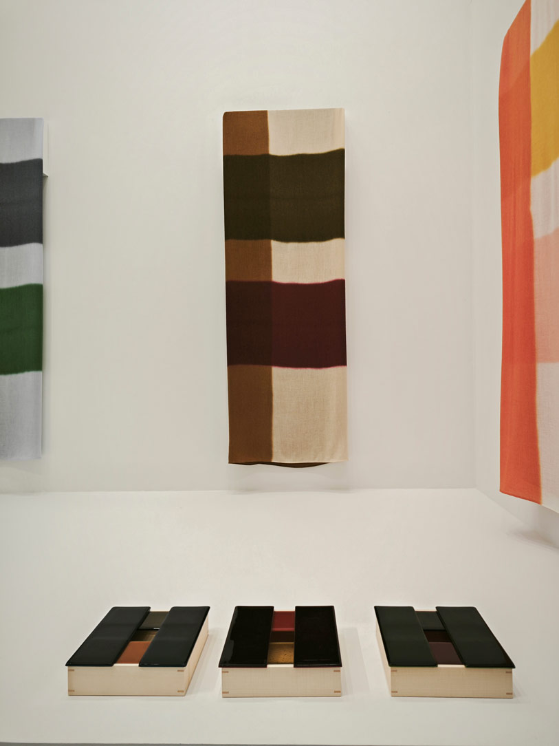
Closing the circle is the always masterful interpretation of Hermès‘ home proposals, in the well-established La Pelota location. Cement and iron are dematerialised from the building context to which they belong to become synonymous with lightness and elegance in a stylistic oxymoron. The Maison’s theatrical interpretation succeeds in transposing elements that are by nature raw and robust into light, somewhat ephemeral stylistic traits.

Settimana del design 2023 Hermes 01
Settimana del design 2023 Hermes 02

Bye bye Milan Design Week, see you in April 2024

This edition, too, concludes amid historic districts and new proposals. From the world of fashion to the influence of artificial intelligence, craftsmanship and labour.

Contaminations play a leading role in giving life to an eclectic panorama in continuous movement. Undoubtedly the great protagonists of Design Week 2023 were the palaces and historical residences that with their extraordinary opening attracted not only professionals but also families and the curious, who thus had the opportunity to get to know the world of design.

It is no coincidence that this edition was certainly one of the most complete and high-performing, as witnessed by the large numbers and huge queues to access the exhibition spaces. An edition marked by grit and personality that dares strong colour and material contrasts, but does not renounce elegance and uniformity. Let’s close the curtain with a reminder for next year!

Corner kitchen with peninsula: shades of grey and wood

Corner kitchen with peninsula: shades of grey and wood

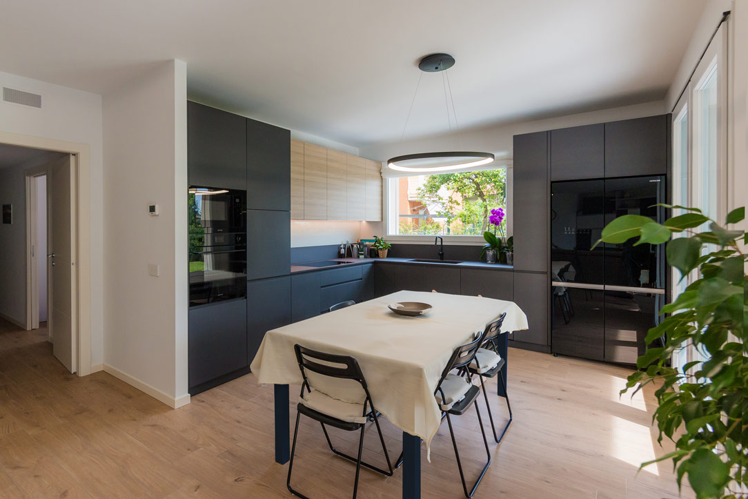
A corner kitchen with peninsula takes centre stage in an open-space obtained from the renovation of a flat. Different shades of grey marry the wood of the snack top and wall units, which is also echoed in the detail of the shelves compartment communicating with the living area.

corner kitchen with peninsula animation small opening

Conformation of a corner kitchen with peninsula: between snack top and double-sided use

Before the renovation, the kitchen followed a corner shape within a confined room.
A separate room with side access, adjacent to the main door.
By knocking down two of the partition walls, it was possible to create an open space with the advantage of generating a brighter and visually larger room.

By following the existing electrical and plumbing arrangements and making only a few changes to the systems, the new kitchen has thus taken shape, expanding its development to embrace the living area.
Starting from the original corner shape, it then added a peninsula part that houses a hob and snack corner for a functional and youthful kitchen.

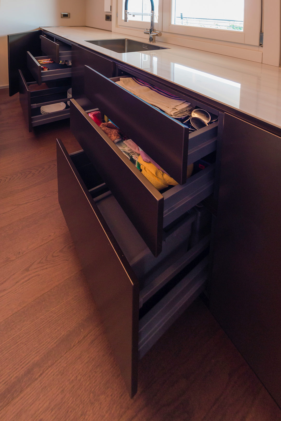
Corner kitchen with peninsula open drawers snack top
Corner kitchen with peninsula closed drawers snack top
Corner kitchen with peninsula shades of grey oak wood open compartment

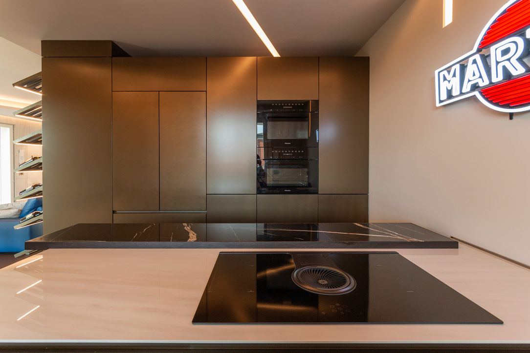
Column ovens, built-in refrigerator and pantry column are located along the side wall, from which the peninsula with double-sided access then develops.
Adjacent to the ovens is the lower base unit, which also embraces the adjacent wall with a window and ends in the entrance storage wall. Next to it are the built-in dishwasher and the doors with fitted sink and pull-out corner.
The narrow 30 cm wide door on the other side is nothing more than a front pull-out for storing spices and condiments.
The upper wall unit with lighting underneath acts as a visual closing element providing additional storage space.
Completing the oven column is a storage drawer and door with a push-open top.

The larder unit with its large depth is accessible from the living area, making it more practical and functional.
The peninsula is structured in the same way with double access, with drawers of different heights on the kitchen side and doors with small glass shelves on the living area side.
The open compartment facing the living area is instead arranged centrally.

internal composition of under-oven drawers
removable inner composition front spices
interior composition door shelves
extractable internal composition front spice detail
Corner kitchen with peninsula oak grey tones
double-sided opening peninsula pantry 01
double-sided opening peninsula pantry 02

Materials, finishes and colours: between shades of grey and light wood

Elegance and freshness are expressed through a colour palette of neutral tones of grey, anthracite for the kitchen top and ice for doors and shells, combined with oak-effect inserts to convey a sense of naturalness.
Different shades emphasise the volumetric development of this corner kitchen with peninsula through a series of combinations and joints.

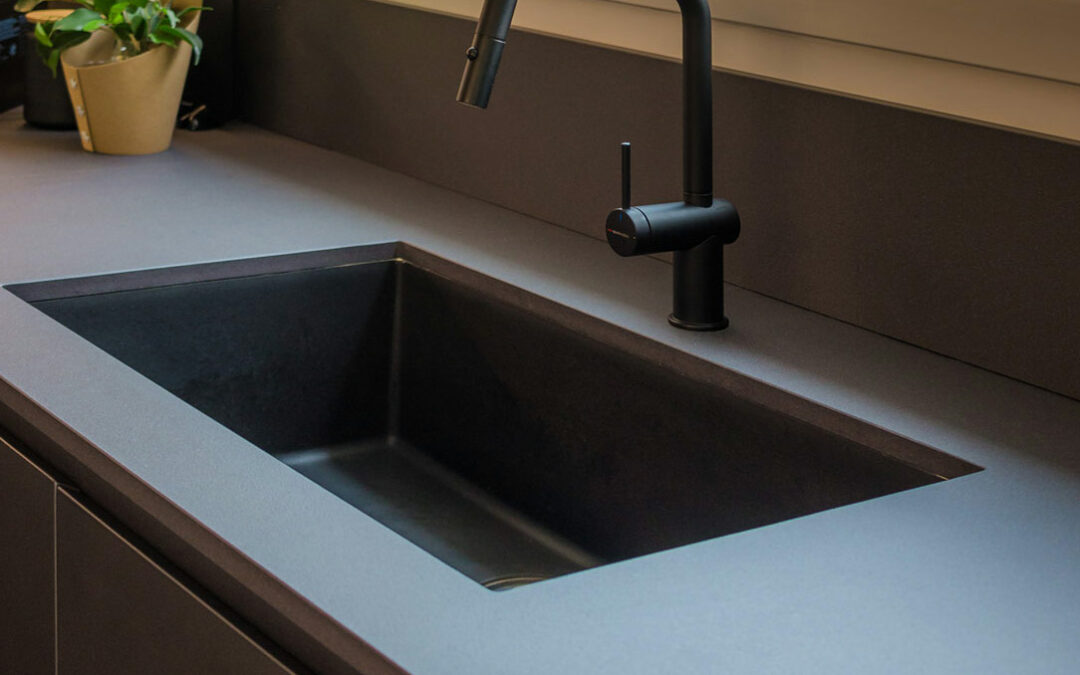
The top in Lapitec Anthracite with Lithos finish gives a uniform yet textured appearance, which is matched by the undermount sink in Stilgranit Blanco
Also in dark anthracite tones is the essential structure of the snack top.
The latter features an oak-effect laminate top with a warm and cosy feel, which is also used for the wall unit with drop-down opening and the open compartment in the peninsula.

A refined detail is the overlapping of the snack top with respect to the worktop, which creates a visual detachment and also acts as a supporting element for the top itself.
Completing the colour choice are the appliances and accessories. The ovens and gas hob in black ceramic glass echo the Falmec island hood and mixer tap.
Different materials united by the same total black aesthetic line.

Added to these is a delicate hanging lamp positioned above the snack top that provides functional lighting while respecting its minimalist aesthetic impact.
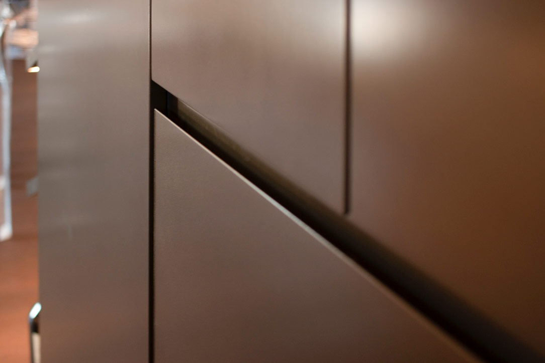
Minimalist visual lines with 45° shaped door and drawer grooves complete the whole.

Corner kitchen with peninsula in shades of grey lacquered doors oak wood top anthracite
materials and colours Lapitec top anthracite grey undermount sink
materials and colours Lapitec anthracite grey top
materials and colours open compartment wood oak effect 02
materials and colours gas glass ceramic hob black
materials and colours glass-ceramic ovens black

A corner kitchen with peninsula is recognisable by its elegant and youthful aesthetics through refined attention to detail. Functionality and openness become the keywords for a renovation that turns the aesthetics of the house upside down.  See more kitchens in light grey: a contemporary-style basement and a contemporary attic with glimpses of the past.

A Minimal Kitchen to optimize the living area

A Minimal Kitchen to optimize the living area

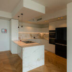
To optimize the available space, in a small two-room apartment in Milan, we have created this minimal, discreet, bright and elegant kitchen.

Minimal white Kitchen

ALL LIVING ROOM

As we wrote in this article dedicated to the Kitchen Snack Table, in contemporary kitchens the living area and the kitchen increasingly merge into a single open space.
There are no more partitions even at the entrance to the apartments, the door opens and everything we can have in a Living area is revealed in front of us.
So the kitchen, dining area and living room become a single room, just like in this article dedicated to a functional kitchen.
To give harmony to this triptych, the kitchen must therefore lose its “operative” spirit by hiding ladles, pots and groceries and becoming a more discreet element, which is revealed only when necessary.
Much more storage space and doors closed from view, while maintaining everything needed to cook, serve and enjoy food.

minimal kitchen lateral

​PHYSIOMY OF A MINIMAL KITCHEN

This kitchen, designed by Artecasa studio, optimize the most of the available space.
It develops in the niche of the side wall at the entrance with an equipped part and a front island that acts as an additional storage space and snack table for quick meals.
What can therefore be seen from the entrance are two horizontal gray stone floors, which develop parallel.

gray minimal kitchen countertops

In the equipped part in the niche there are all the appliances needed in a minimal kitchen: a refrigerator column, a dishwasher with a two-bowl sink, a hob with an oven and a tall microwave.
In the island, lots of storage space, drawers for cutlery, pots and crockery and the top that extends towards the living area becoming a snack top to accommodate at least 3 diners.

details drawers
The atmosphere is convivial, and the lights are skilfully designed to amplify this feeling of intimacy and warmth.
Three ceiling lights descend punctually on the Kitchen Snack Table, the backlit wall units remain at the service of the kitchen while a track with adjustable spotlights illuminates the relaxation area.
The colors are light and glow in the light from the large windows at the back of the room.
minimal kitchen lateral

On the ground a natural oak parquet that matches well with the gray veined stone chosen for the countertops and the back of the kitchen and the light-colored furniture.
Here another minimal Milanese kitchen with similar combinations.

When a white kitchen with an island becomes a functional element of a youthful two-room apartment

When a white kitchen with an island becomes a functional element of a youthful two-room apartment

In the centre of Milan, a youthful flat is spread over two levels, welcoming a white kitchen with a functional island in the centre. On the upper floor, the elegance of total white is accompanied by a niche wardrobe with mirrored doors that amplify the perception of the sleeping area. Practical elements with linear and elegant aesthetics that define the look of the entire flat. Let’s discover together this realisation designed by architect Stefano Belotti!

Opening doors white kitchen with island

A white central island dominates the kitchen area

Upon entering the flat, with its small but practical dimensions, the view is projected onto the kitchen, the layout of which makes full use of the available height with storage compartments. Acting as a visual filter, but at the same time as a functional element for the cooking area, is the central island that echoes the white aesthetics of the kitchen.

The worktop, in matt white Corian, becomes not only a work surface, but also a convenient snack top for aperitifs and quick meals.
In this respect, the folding mechanism that allows the (future) service stools to be concealed plays a key role.
The front closure panels, in fact, rotate sideways to then be incorporated into the main structure and almost completely disappear.

white kitchen with island oven combination column
white kitchen with island wall units integrated lighting
detail Corian worktop integrated basin aluminium mixer
aluminium chain Corian top
white kitchen with combined oven island hidden door laundry area

The volume of the island consists of front-extension doors with internal drawers of different heights.
A solution that has now become predominant in the recently concluded edition of the Salone del Mobile, as well as clearly recognisable in previous editions.
The main advantage is certainly the more elegant and minimal aesthetics, in which horizontal cuts resulting from the division into drawers are eliminated in favour of a single door.

detail of internal drawers in white lacquered kitchen with island

From the wall unit to the laundry corner: functionality marries total white aesthetics

The adjoining wall unit is made up of multi-level volumetric plays.
The service columns, incorporating the built-in refrigerator on one side and the combi-oven to its right, are accompanied by compartments with hinged doors that extend across the entire upper part of the kitchen.
On the same depth level, matt lacquered doors with a dishwasher in the central area and internal shelves in the surrounding compartments.
The central area, on the other hand, is characterised by a break-out with worktop and sink, upper wall units with vertical partitioning and built-in lighting with a smaller depth.

To ensure the best functional configuration, the side wall to the kitchen and the central island accommodates a white lacquered door that covers the entire height of the room.
This conceals inside the laundry area with a washing machine and tumble dryer with columns accompanied by practical shelves for cleaning products.

The linear aesthetics are emphasised both in the choice of lighting, pendant above the white central island and LED strip lighting in the back wall of the kitchen, and also in the joining chain between the Corian top and doors below.
The material detachment through an aluminium profile becomes the horizontal reading element both for the back wall, joining the two side ends, and embracing the central island with kitchenette.

white kitchen with laundry corner island
White kitchen with island pull-out front drawer doors

A wardrobe with mirrored doors embellishes the sleeping area

On the upper floor, accessible via a white painted spiral staircase, a wardrobe with six mirror-covered doors dominates.
The rhythmic vertical division is interrupted by a single horizontal cut at the top, creating an interesting geometric subdivision in the overall aesthetics. The choice of mirrored doors on the one hand amplifies the brightness and perception of the room and at the same time enhances the overall aesthetics.

The division into six doors is reflected internally in a symmetrical composition with double central compartments accompanied by two single compartments at the ends.
Compartments with hanging tubes are favoured, but there are also internal drawers and adjustable shelves for better organisation of clothing.

If for the lower level the kitchen with central island favours a uniform white aesthetic, the sleeping area, on the other hand, marries contrasting aesthetics.
The bright exterior of the mirrored doors is in fact contrasted by the elegance of a matt black whole on which the elegant chrome hanging tubes can be seen.

mirrored door wardrobe
wardrobe mirror doors dark laminate interior drawers
Niche wardrobe with dark interior mirror doors
detail mirror cabinet doors interior lighting
two-room mirror-door wardrobe
detail of mirrored wardrobe doors in niche

The choice of a total white kitchen is always a contemporary and elegant solution. Its simplicity makes it easily adaptable to the surrounding context, whether it has a retro feel, as in this example, or contemporary pop, as in this realisation. It can also be combined with natural wood elements, such as chopping boards and snack tops, thus adding a hint of warmth, here’s an example! Or exploit plays of opacity and shine through different materials, making the room look fresh and bright, perfect for seaside homes!

Gray furniture for a masculine apartment

Gray furniture for a masculine apartment

Furniture in shades of gray is spread over the two levels of this modern apartment with a masculine imprint. From the bookcase on the ground floor to the walk-in closet in the sleeping area, the furnishings are developed in an elegant and delicate way. The dark-colored wood chosen for the parquet flooring matches the slate tiles that embrace the kitchen and bathroom areas from the internal staircase.

gray masculine apartment furniture

THE LIVING AREA MEETS THE ELEGANCE OF GREY FURNITURE

In a newly built residential context, this two-level apartment stands out in which the masculine imprint is elegantly softened by the choice of monochromatic furnishings. The floors show character in the combination of smoked oak parquet and slate-effect tiles. The floor is therefore dark, which is chromatically balanced by the walls that are tinged with white and the light furnishings that lighten and brighten the environment.

livingroom gray tones furniture

The lighting of the ground floor is combined with steps on the side of the staircase, these mark a luminous rhythm and accompany the upper floor. To embrace the living area, a full-height bookcase combines anthracite gray backs with light gray shelves in the same shade as the surrounding furniture. The anthracite gray that we find here in the lacquered shoulders can be replaced by black iron, as for example in this apartment with the same masculine soul.

bookshelf in dark gray masculine furniture
step marker
shelves detail

Neutral tones thus become the protagonists of a story that narrates elegance and freshness. Here are some other examples of furnishings in neutral colors. The sofa is a darker gray and moved by velvety fabric, which is positioned laterally at the entrance and hides a lateral extension to allow maximum comfort. Behind it, the stair handrail in anthracite gray painted metal matches the vertical shoulders of the bookcase positioned right in front.

sofa and stairs
velvet sofa detail

THE RECOVERED KITCHEN

The bioethanol fireplace, housed in an open plasterboard structure, acts as a fusion element between the living area and the kitchen. This, recovered from the previous house, is characterized by powder and wood tones and is combined with a rustic table with light aluminum chairs. The wood of the kitchen and of the table, which are a lighter tone than the floor of the living area, recall it on a material level and create continuity between the two areas.

kitchen powder and wood

THE BATHROOMS IN ANTHRACITE GRAY

Accessing the service bathroom, full-height matt white bilaminate cabinets act as a storage room organized into shelves, hangers and drawers. This light-colored anteroom creates a nice contrast and a clear break with the bathroom characterized by dark tones.

white anteroom
details anteroom

In fact, the anthracite tiles rise on the sides remaining at a height of 120cm and is combined with a bathroom cabinet in the same shade with a matte black back lacquered top. Particularly the chosen sink, in transparent glass, which seems to disappear and get lost between the tiles and the top.

service bathroom
detail sink

The second master bathroom, located on the upper floor, amplifies its masculine nature by completely covering the tiles in anthracite gray up to the ceiling beam. The bathroom is very dark but the large skylight on the ceiling perfectly illuminates the room from above. Here too there is a bathroom cabinet in shades, with the top in glossy back lacquered rather than opaque, which goes well with the reflections of the Globo ceramic sink.

master bathroom black furniture
bathroom tiles

FROM THE GRAY FURNITURE ON THE LOWER FLOOR TO THE BLACK AND WHITE CONTRASTS IN THE BEDROOM: A WALK-IN WARDROBE IN THE BEDROOM

Se il piano inferiore si impreziosisce di un arredamento sui toni neutri del grigio, If the lower floor is embellished with furniture in neutral shades of gray, the sleeping area is characterized by a more subdued contrast. The recurring theme of anthracite gray is still found in the small study corner, through a desk with a metal structure and a medium gray linoleum top. Here are some other examples of Smartworking corners where the working sphere is combined with a domestic environment.

bedroom and walk-in closet masculine furniture

Behind this, a walk-in closet develops at an angle creating a limited but at the same time functional environment. Inside the walk-in closet the hangers alternate in height while in the center a central chest of drawers with upper shelves remains available for all the folded items. On the side facing the bed, a small niche remains at the service and serves as an open bedside table useful for supporting small objects.

walk-in closet masculine furniture
inside walk-in closet
details walk-in closet