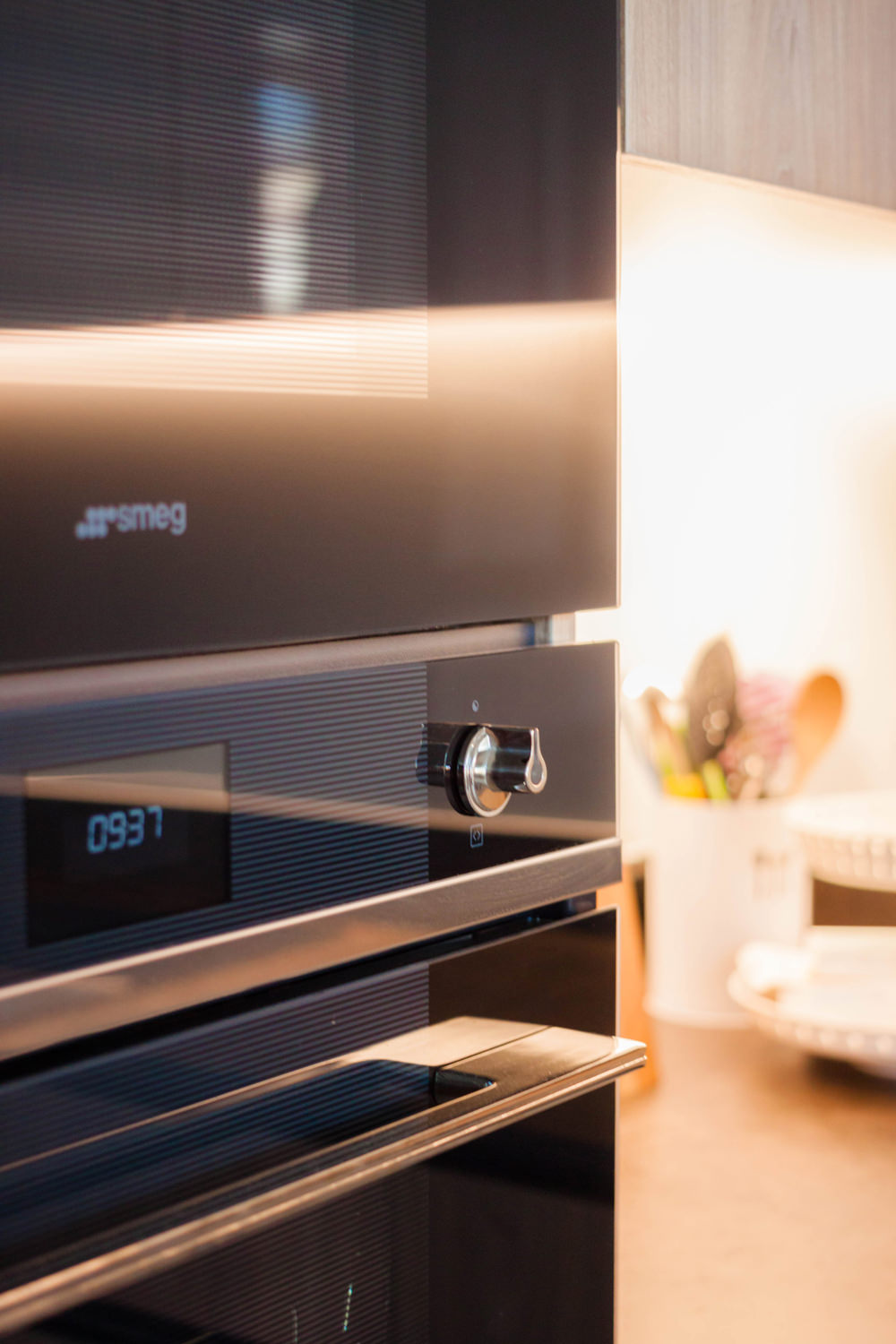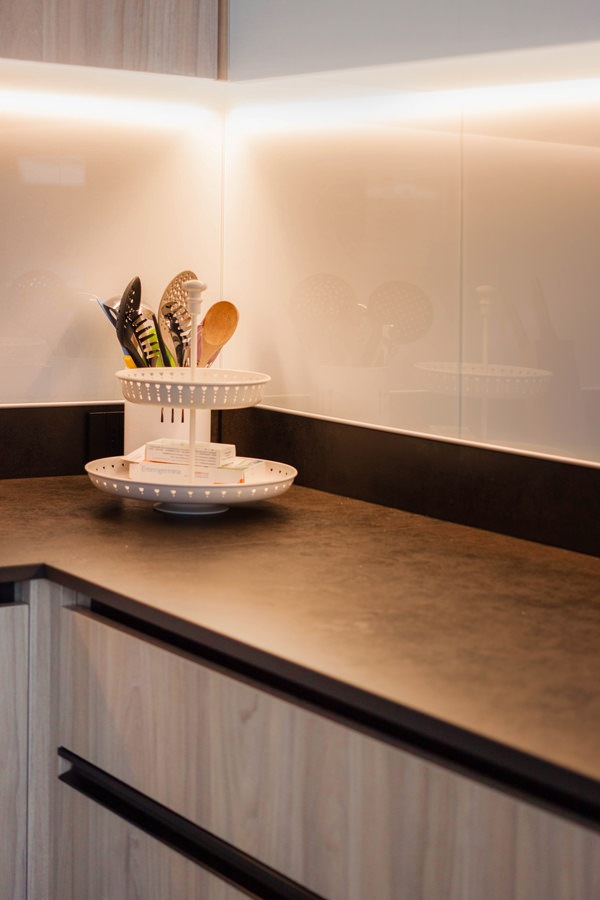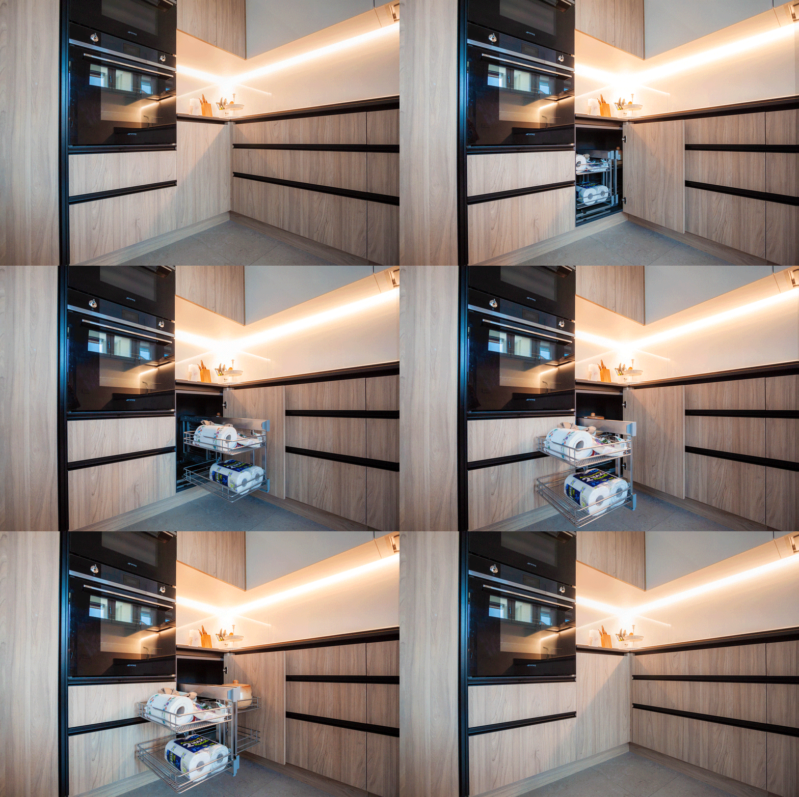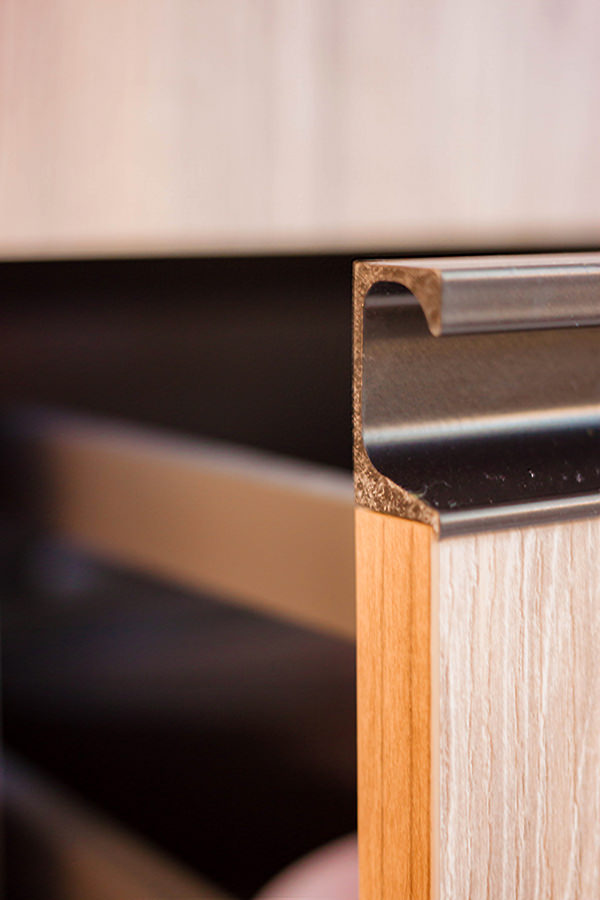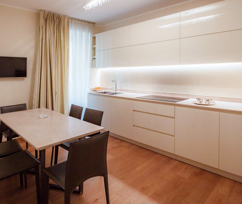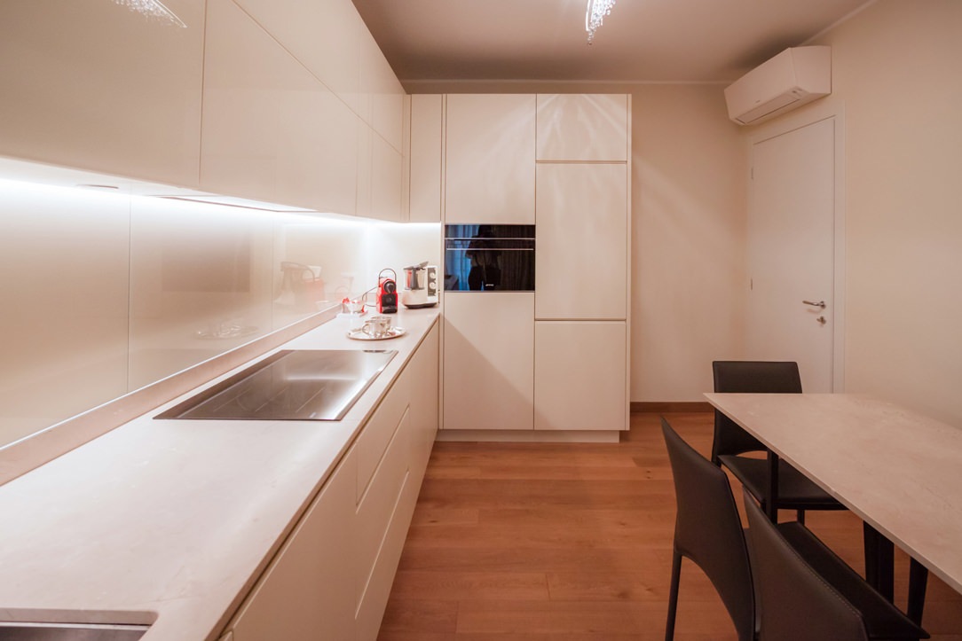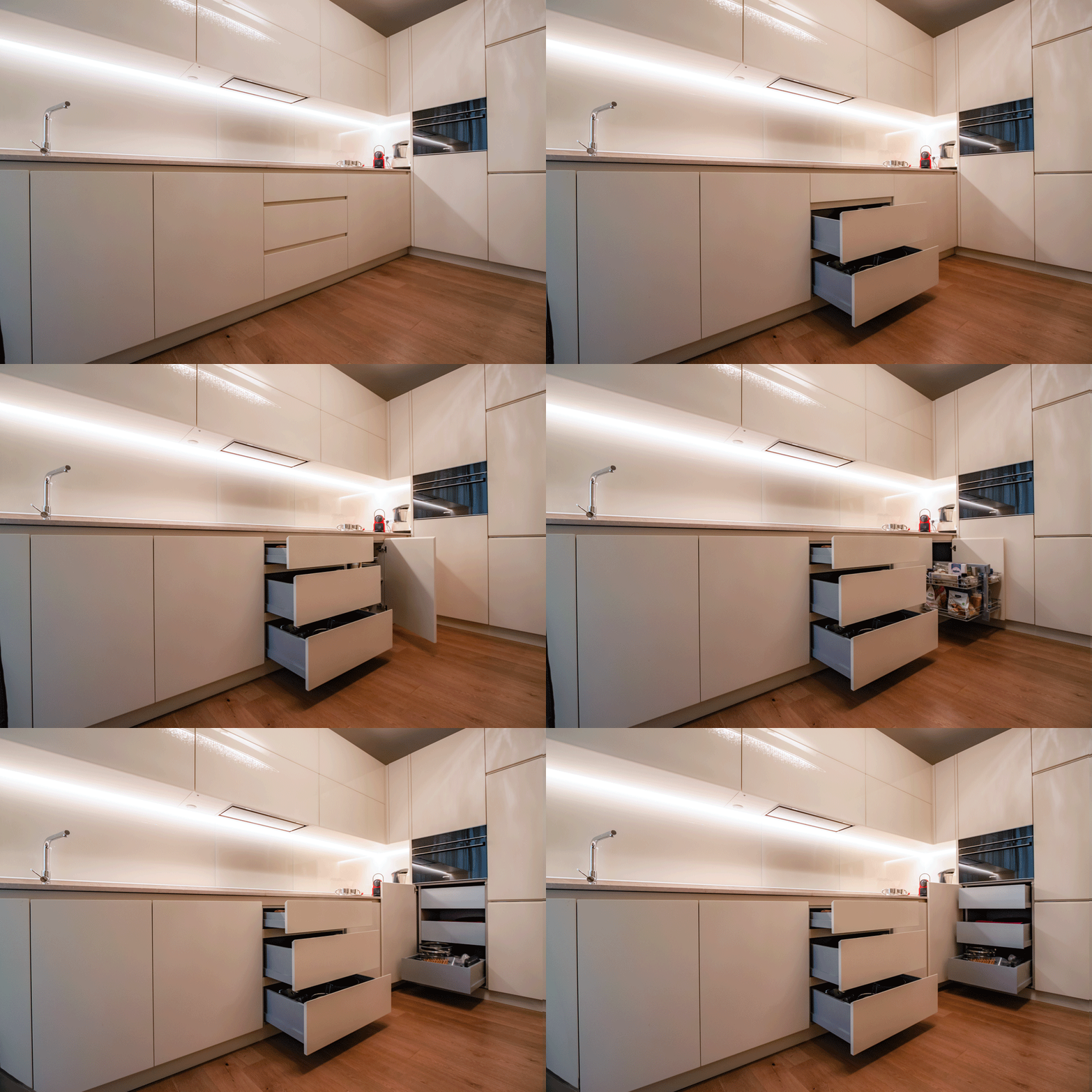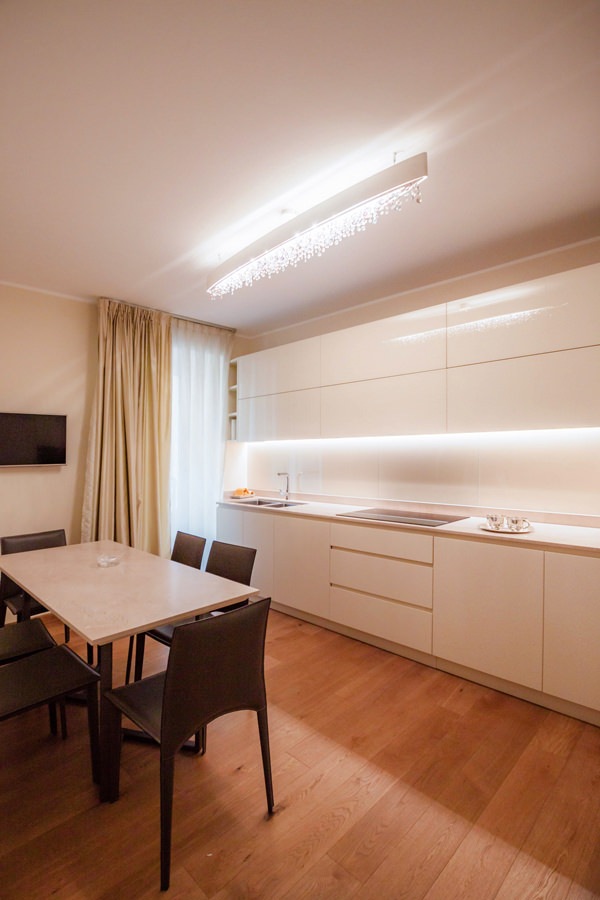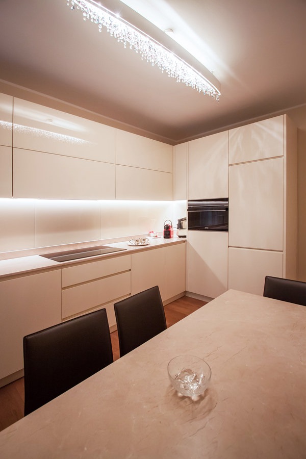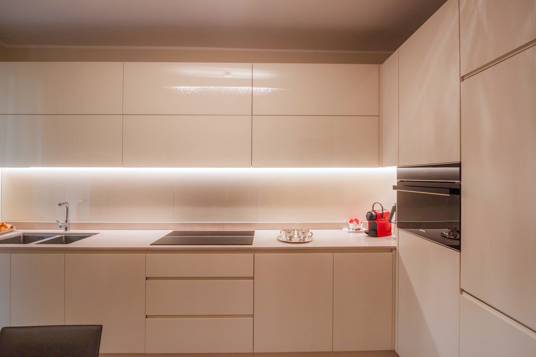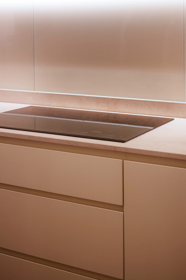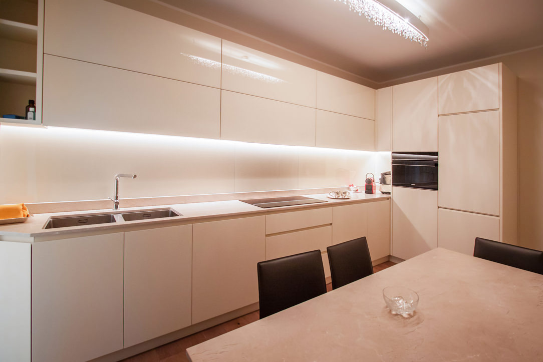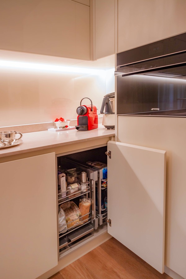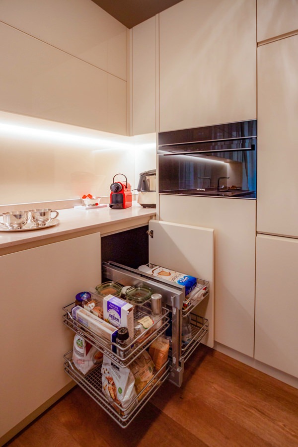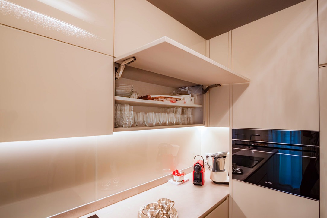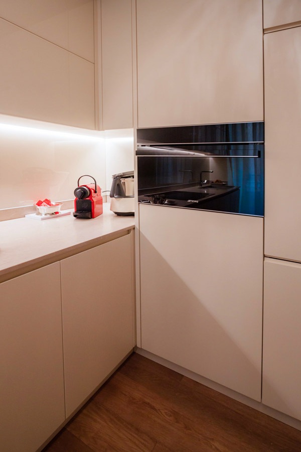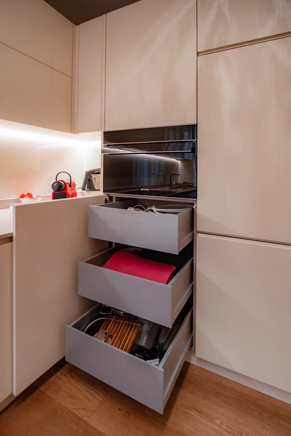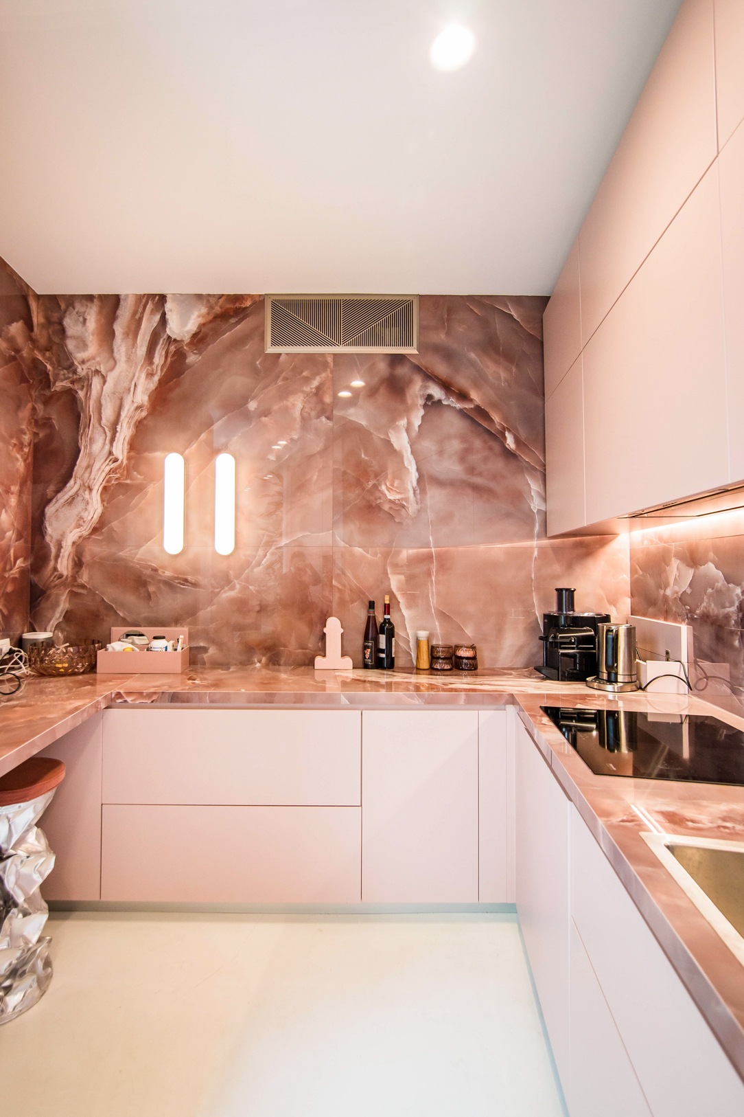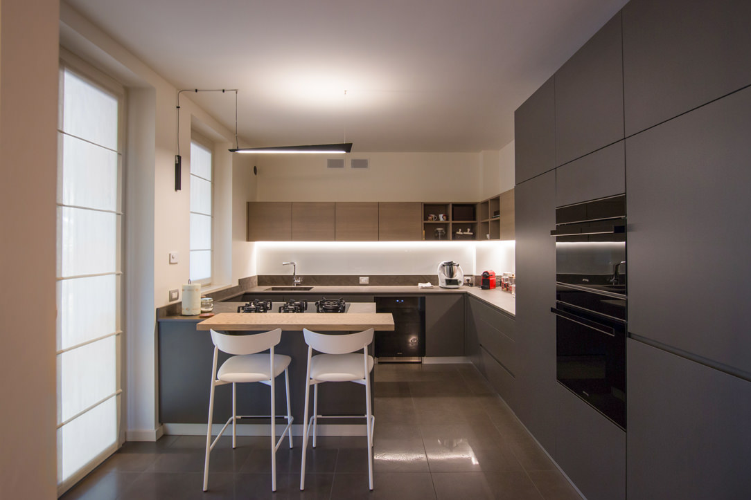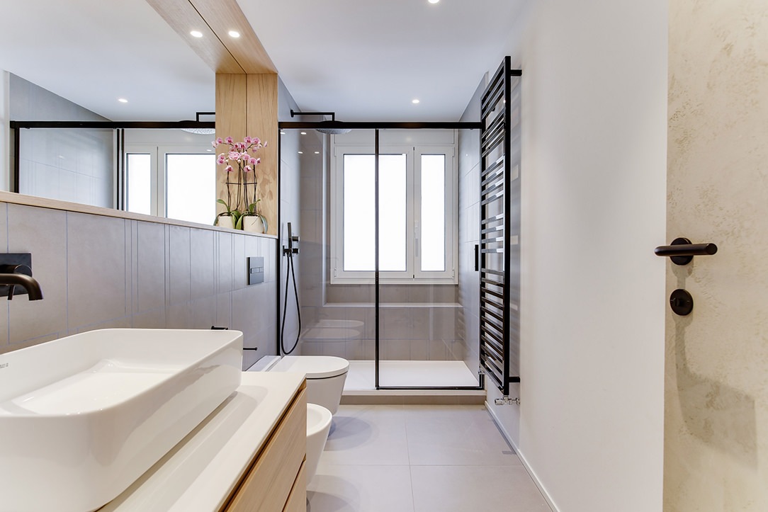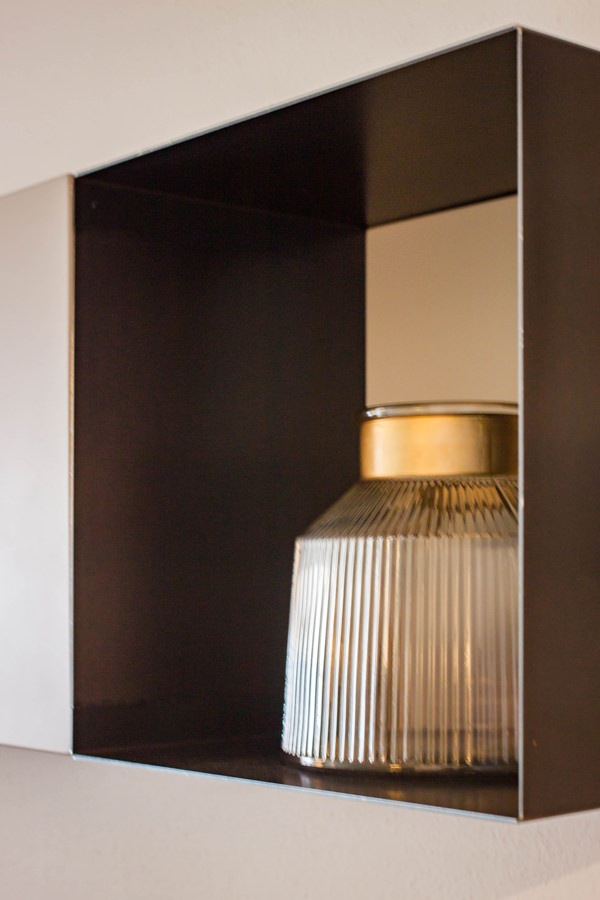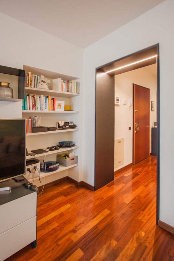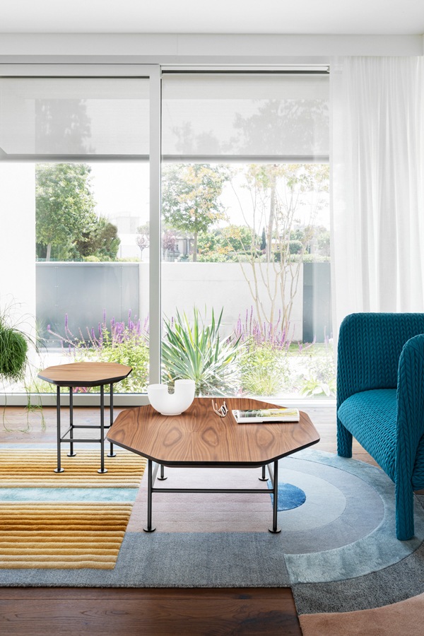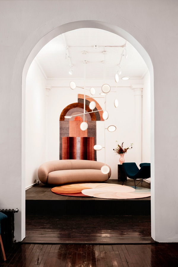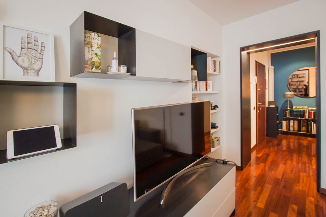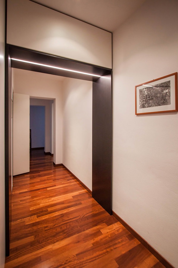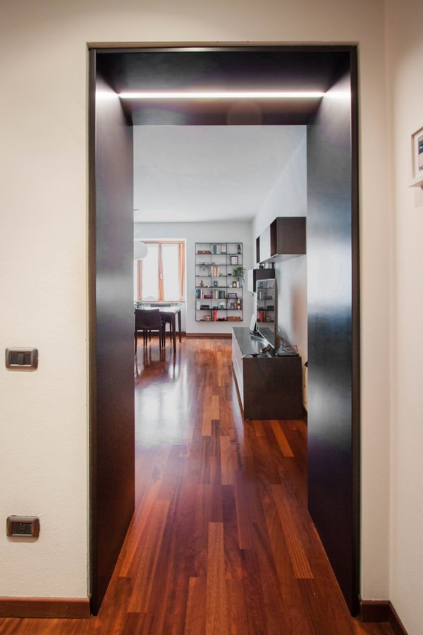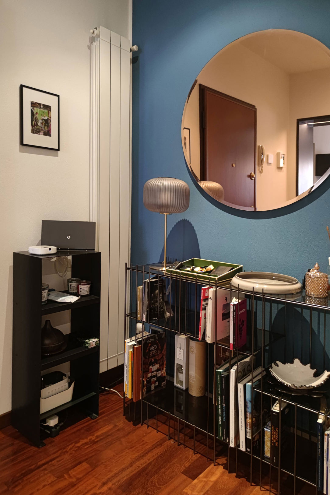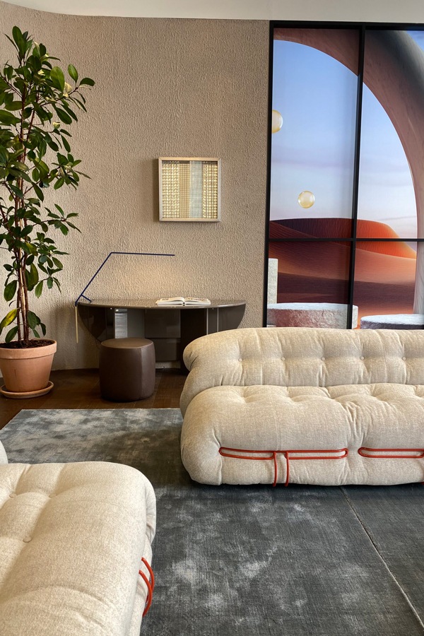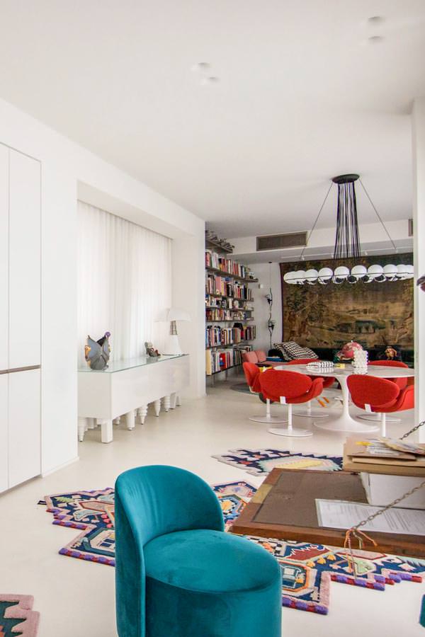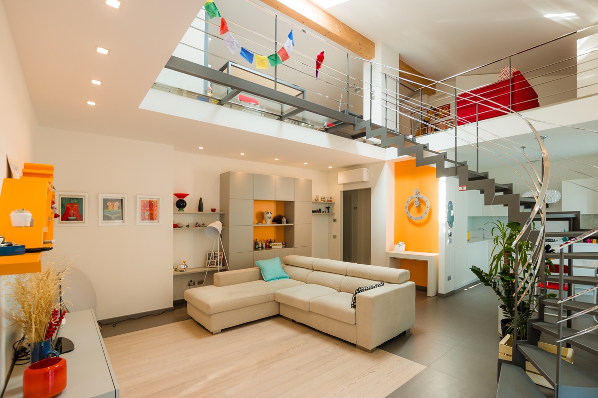
Modern style: rigorous, elegant and prestigious

Modern style: rigorous, elegant and prestigious

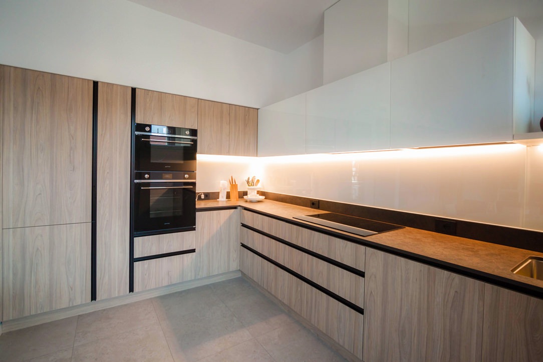
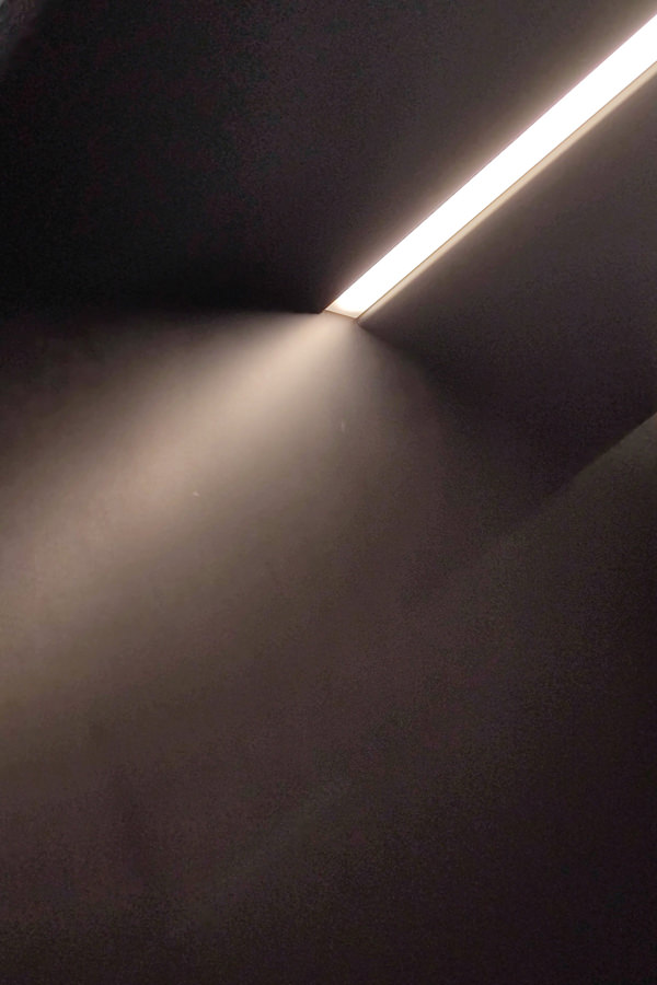
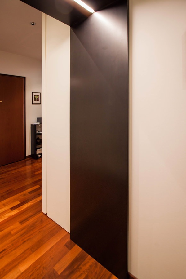
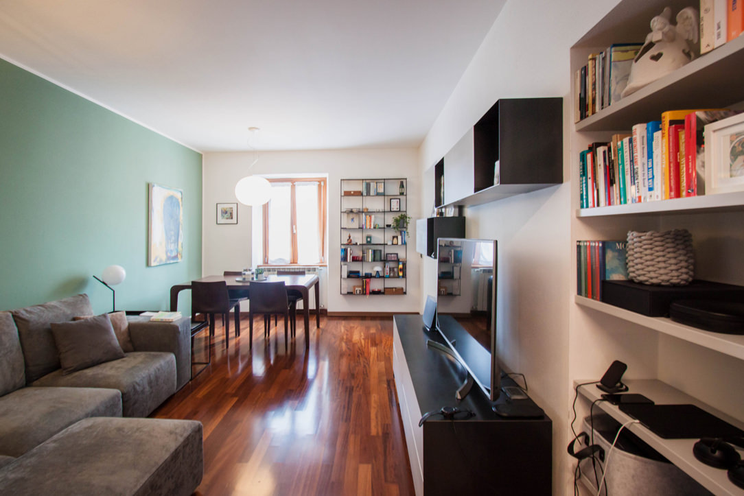
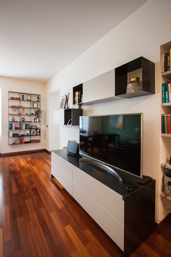
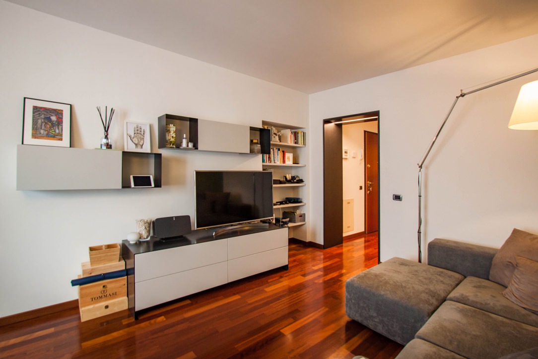
The modern style links the vision of interior design to architecture, in a relationship of mutual collaboration. Between rigorous furnishings, bright rooms and a prestigious appearance, the modern-style interiors express timeless elegance.

The modern style in history: the masters of design

To fully understand the modern style, it is useful to take a few steps back in time to its historical origins.
We are between the two World Wars in a context of renewal that involves the formal plan of architecture, but also urban planning and design.

Under the classification of Modern Movement, also known as International Style, belong the currents De Stijl, Bauhaus, Constructivism and Italian Rationalism.
The main exponents are architects of the caliber of Le Corbusier, Frank Lloyd Wright, Mies Van Der Rohe, Alvar Aalto and Walter Gropius.

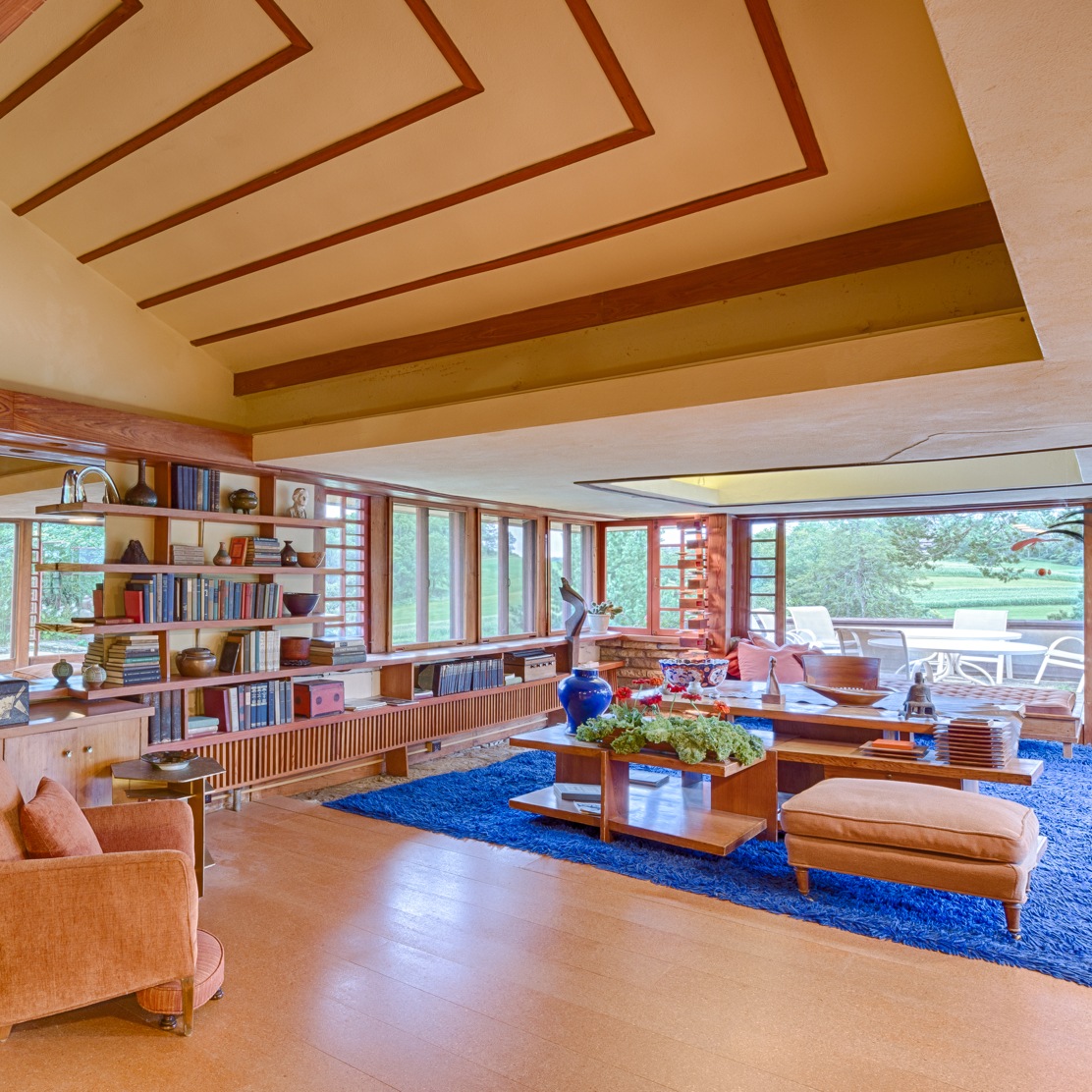
Starting from a strong conception of architecture as an organic structure in relation to the external context to which it belongs, the Modern Movement also sees the house for its social use and not just as a family unit. Frank Lloyd Wright with his organic architecture gives excellent examples.
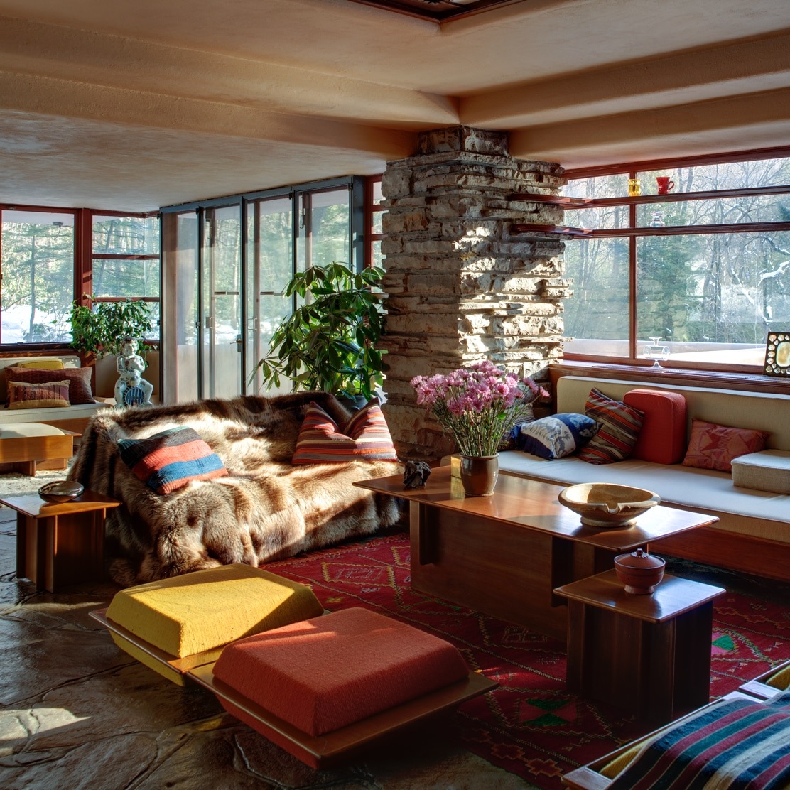
Among these, the Waterfall House, designed in its architectural conformation in strong relationship with the surrounding geological and natural context. Each element is configured both on the architectural level and on the interior design level based on a strong contamination between inside and outside. In doing this, the choice of proportions based on the human figure is fundamental.

Natural materials combined with organic shapes that favor horizontality, but also harmony and brightness become the key principles of the Modern Movement. Instead, the priority need is to achieve the best functionality of the building, which can also determine its aesthetic beauty.
In doing this, the house frees itself from the unitary vision to which it was accustomed to take on a social meaning in relation to the surrounding buildings.
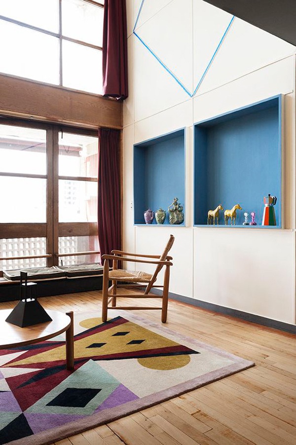
The extreme example is the building that itself becomes a city, as in the case of Le Corbusier’s Unitè d’Habitation.

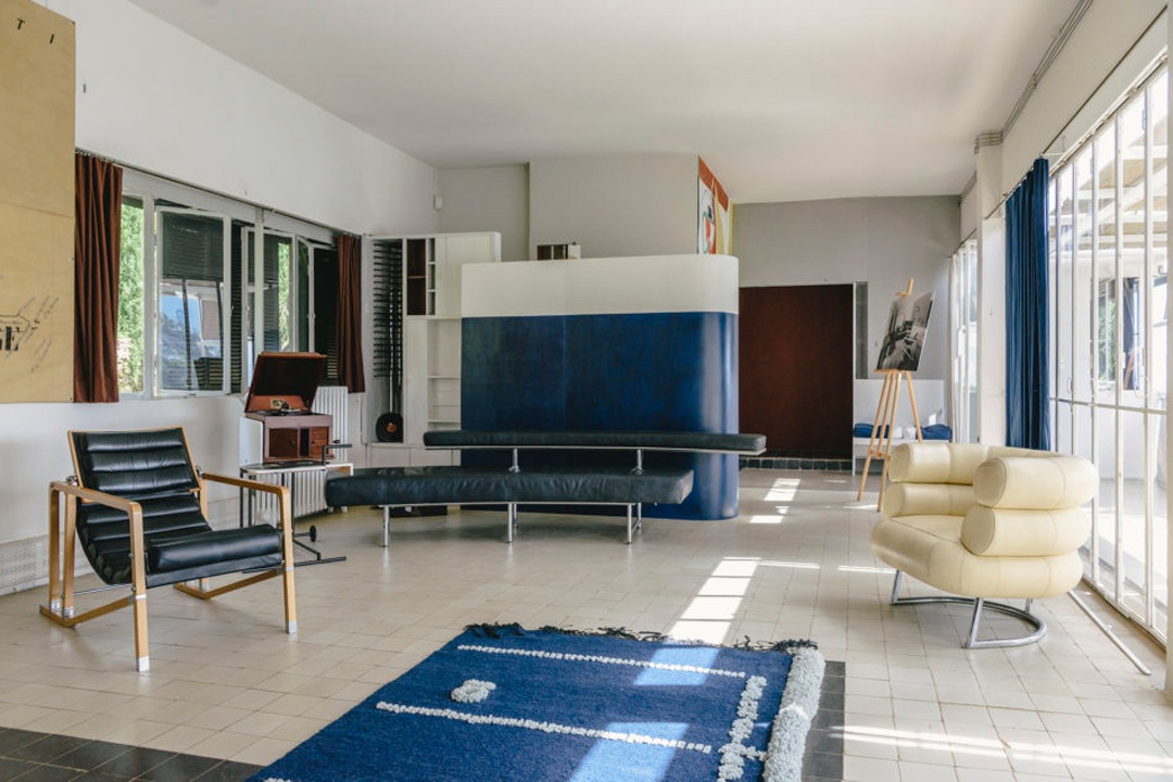
eileen-gray-villa-E-1027

Eileen Gray’s E-1027 House, a modern style living room with iconic piece of furniture.

TaliesinInterior_Andrew-Pielage-3
Fallingwater-2012_13_15_18_20

Left: modern style living area (Photo: Andrew Pielage, Frank Lloyd Wright Foundation)
Right: Fallinwater House by Frank Lloyd Wright (Photo: courtesy of the Western Pennsylvania Conservancy)

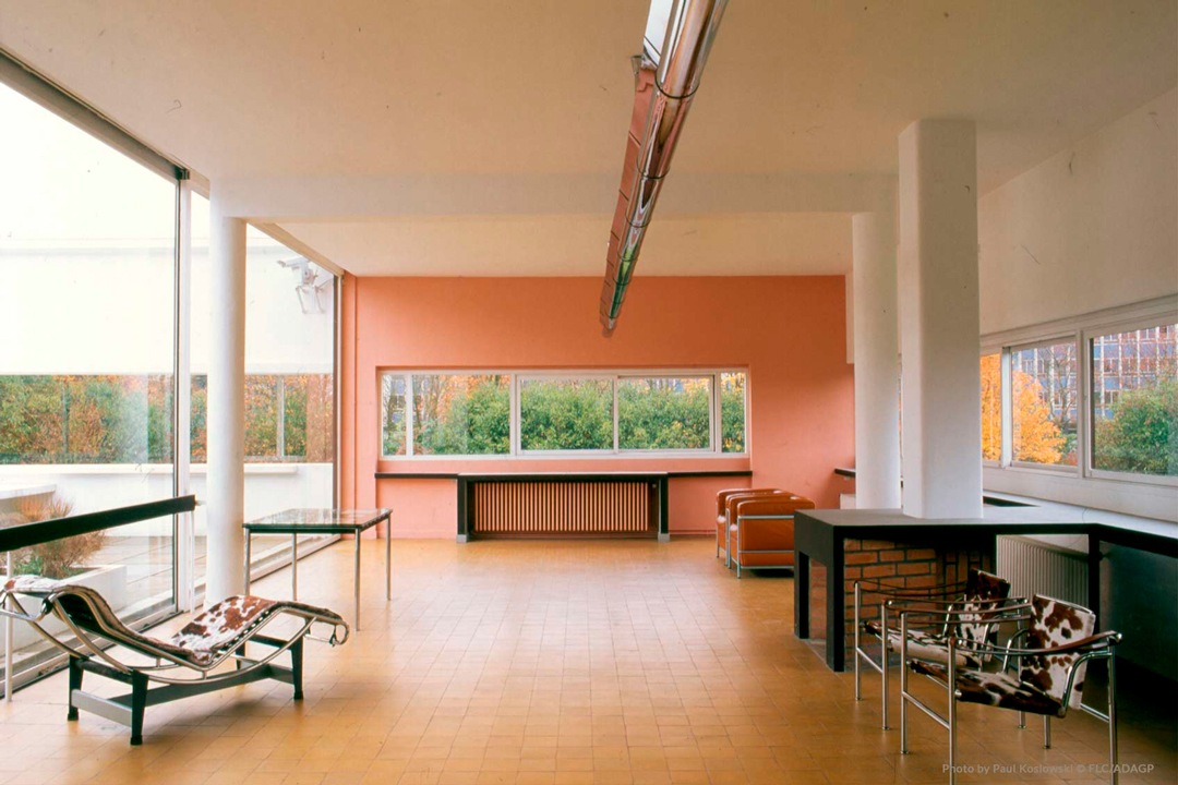
Villa-Savoye-interior-Le-Corbusier

Villa Savoye by le Corbusier. The relationship between inside and outside is expressed in bright rooms and ribbon windows

unitè-habitation-marsilla-le-corbusier
unitè-habitation-marsilla-le-corbusier_esterno

Unitè D’Habitation, Le Corbusier. The building becomes a social community by offering, in addition to the family housing units, all the services necessary for individual life.

Modern style furniture: the strong relationship with architecture

The modern-style interiors both in the course of history and in the contemporary context are based on a strong relationship with the architectural context in which they are inserted.
This is how bright environments are created. Here, the exterior constantly communicates with the interior through functional choices that also justify the aesthetics.
Therefore, windows can take on a more elongated shape and it occupy a higher position than the standard ones. This allows the entry of natural light, which will obviously be studied according to the optimal orientation of the house, but at the same time allow the inhabitants not to be seen from the outside.

The subdivision of the rooms between the sleeping and living areas is based on a logic that considers the orientation of the house and its visibility or protection from external factors.
The hearth is definitely a central point in the design of a modern style home.
A place of aggregation and socializing, it expresses hospitality and intimacy at the same time, creating a strong suggestive interior.
For this reason, in modern homes par excellence it occupies the central position with respect to the living area, becoming the fulcrum for the arrangement of the remaining rooms.

 attic entrance

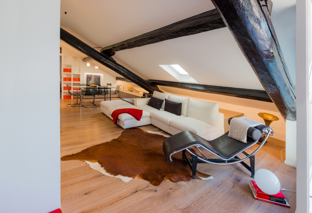
The living area of ​​this modern style attic with the iconic chaise longue designed by Le Corbusier

vertical living room

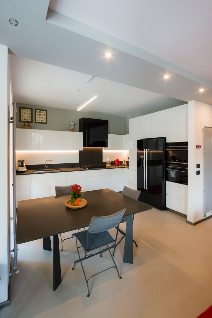
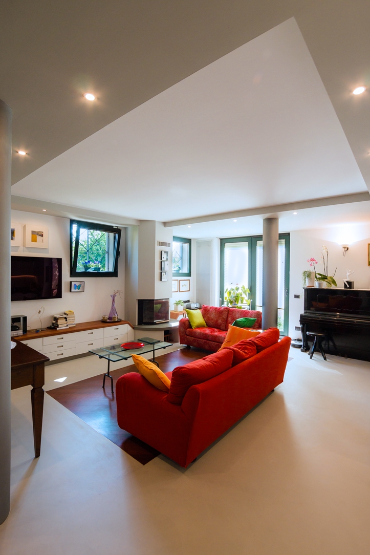
Modern style kitchen and living room with reflective materials and simple lines for this Modulor creation

Fine living room view

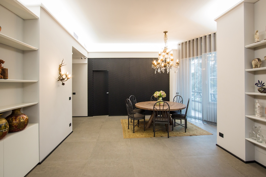
A modern living area on the bottom of which an elegant wall with a three-dimensional effect is identified

doors-modern-style-cabinets-corridor
 cabinets-corridor-finishing-elegant-modern-style

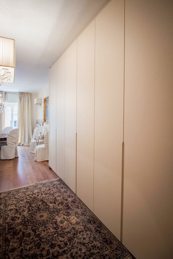
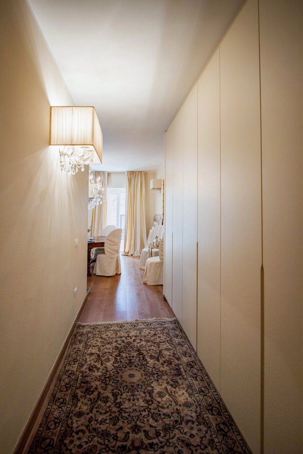
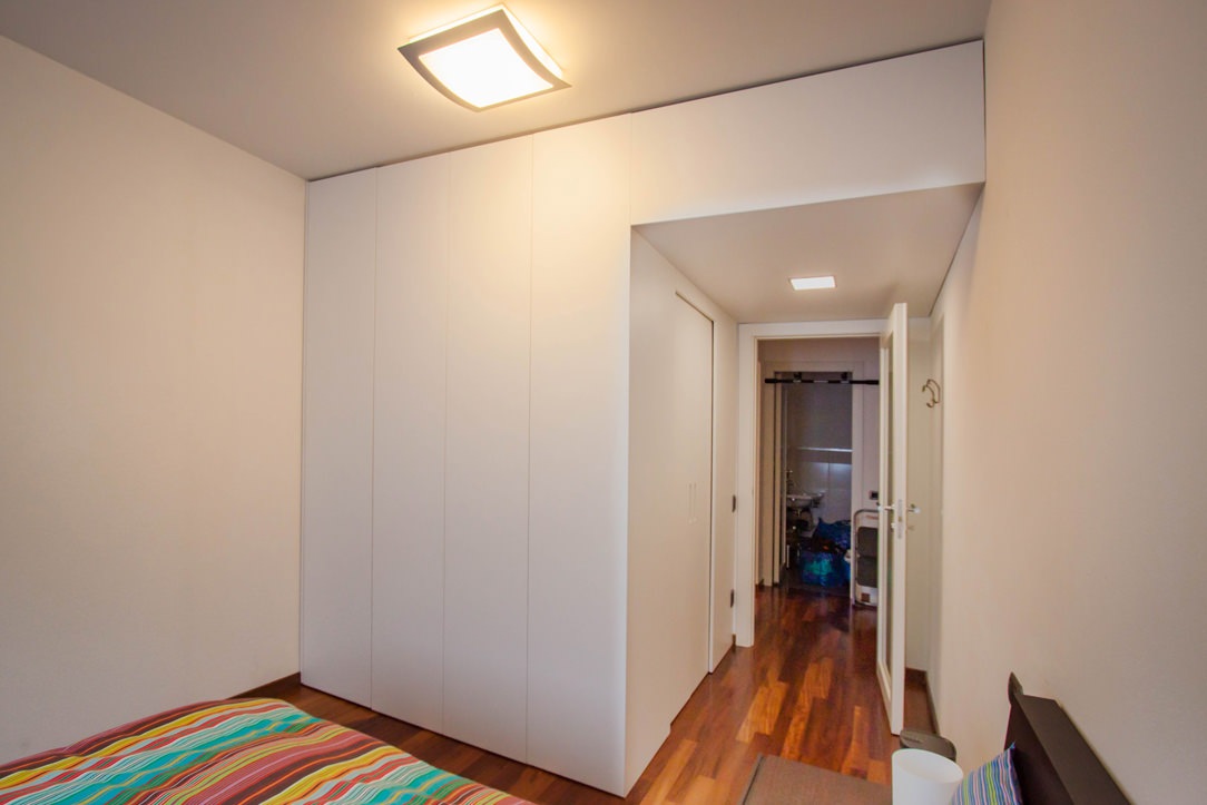
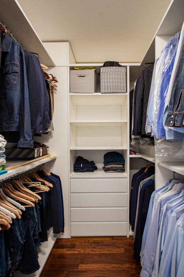
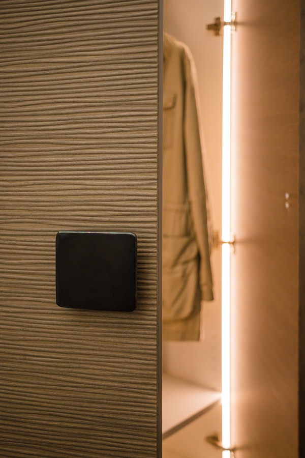
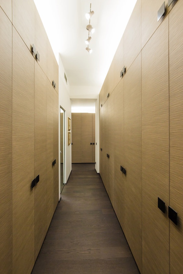
The equipped corridors of this Modulor realization express their modernity in the choice of material.
Soft and textured to the touch and extremely elegant to the eye.

Modulor modern kitchen in dark tones_01

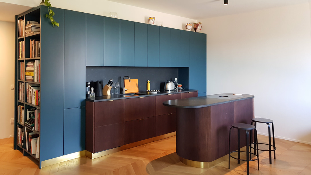
Una cucina moderna firmata Modulor con particolare attenzione alla scelta cromatica e materica

Shapes, colors and materials between past and present

The choice of materials in a modern style also comes from the contamination between inside and outside.
Great importance is given to materials capable of enhancing the brightness of environments through their reflective and brilliant surface, even better if of natural origin.

Wood knows its maximum expression both in the traditional form of the Modern Movement and in its contemporary conception.
Chosen for its malleability and natural aesthetics, it brings the exterior directly into the home interior, also molding itself into irregular shapes. Over the years, it has also known the polishing treatments and the recent painting that make it possible to obtain reflective surfaces capable of giving brightness to the environment.

Neutral tones are favored, starting with the classic white, but colored variants are also welcome especially in the current years. In this sense, it is important to underline how the contemporary trend in the modern style prefers monochromatic colors and tone-on-tone games that opt ​​for desaturated colors.
Prestigious and elegant interiors that do not, however, give up a touch of color capable of giving character to the rooms.

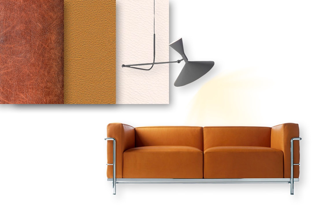
The design forms abandon their rigidity and linearity in favor of simple but sometimes irregular solutions. To enrich a modern style home, the icons of Modern design cannot be missing. Here then are seats with leather padding and chromed aluminum structure with slender lines.

moodboard-modern-style-Modulor-sofa-materials-leather

Materials, finishes and aesthetics of the modern style, including upholstery in warm-colored leather and chromed aluminum

modern-style-MDF-wave-wall-Modulor

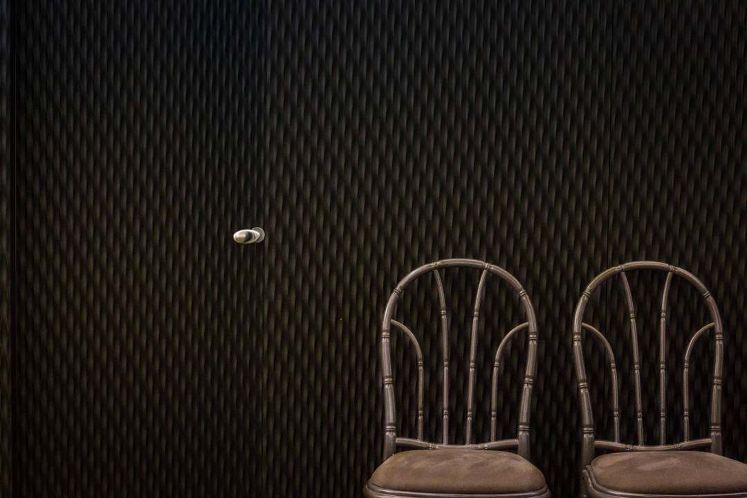
The attention to detail of this wall is expressed in an elegant and monochromatic three-dimensional surface inserted in a prestigious Milanese apartment.
Inside there is a door identifiable by the handle with soft modern shapes.

moodboard-modern-style-colors-icons-design

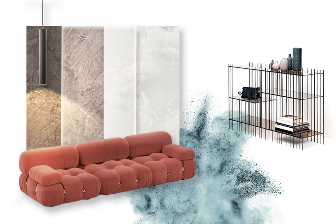
In the modern style of recent years, the great icons of design are often inserted in environments that are more daring, not only with neutral colors but also desaturated colors with a timeless beauty

The rediscovery of modern style

In recent years the modern style has undergone a great revaluation. The soft but rigorous shapes of the design icons of the Thirties are back in vogue in a contemporary reinterpretation proposed by the main brands.

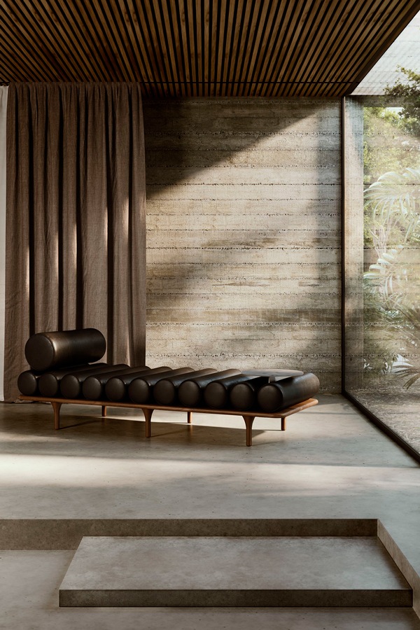
Just think of the Five To Nine dormeuse proposal, born from the Studiopepe project for Tacchini (2020) or the Camaleonda modular sofa designed by Mario Bellini for B&B Italia (2020). But also, the new Pacific (project by Patricia Urquiola for Moroso) and Soriana (design by Tobie and Afra Bianchin Scarpa for Cassina) both launched on the market during Digital Design Week 2021.

Soriana-Cassina-sofa-2021
Tacchini-FivetoNine-Studiopepe

Soriana, Tobia Scarpa and Afra Bianchin Scarpa, Cassina, 2021
Five to Nine, Studiopepe, Tacchini, 2020

With its rigorous and prestigious interiors, the modern style is aimed directly at personalities who love architecture and its relationship with nature. Characterized by a timeless beauty, it is aimed at rigorous characters but at the same time open to new changes.

Contemporary Pop Style: young and bright environments

Contemporary Pop Style: young and bright environments

From Pop Art to interior design in its historical and contemporary meaning, the Pop style is characterized by dynamic and fresh interiors. Iconic objects, saturated and bright colors define fresh and youthful environments that are always current.

Giving a sparkling touch to the Pop-style home is quick and easy… let’s see how!

Pop interiors

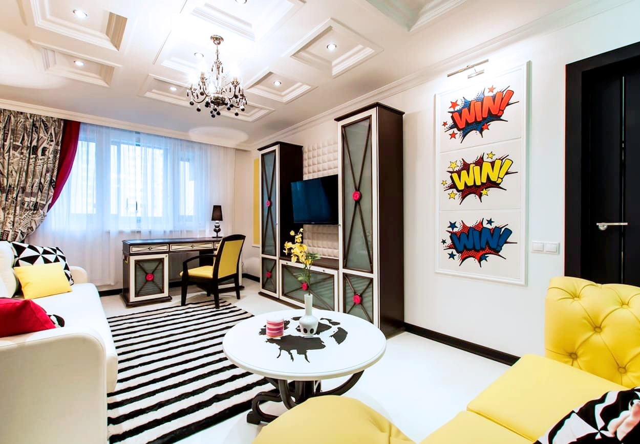
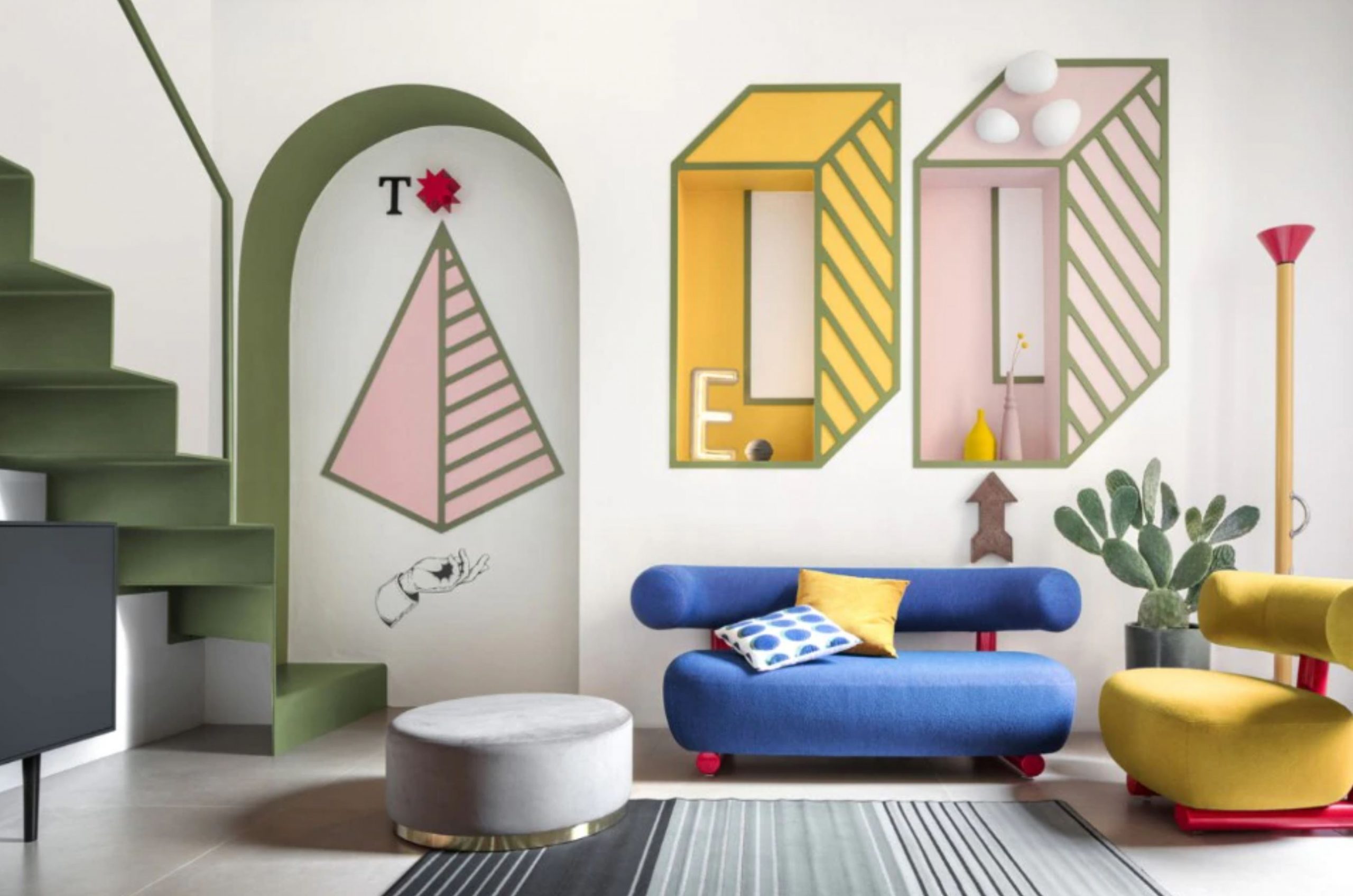
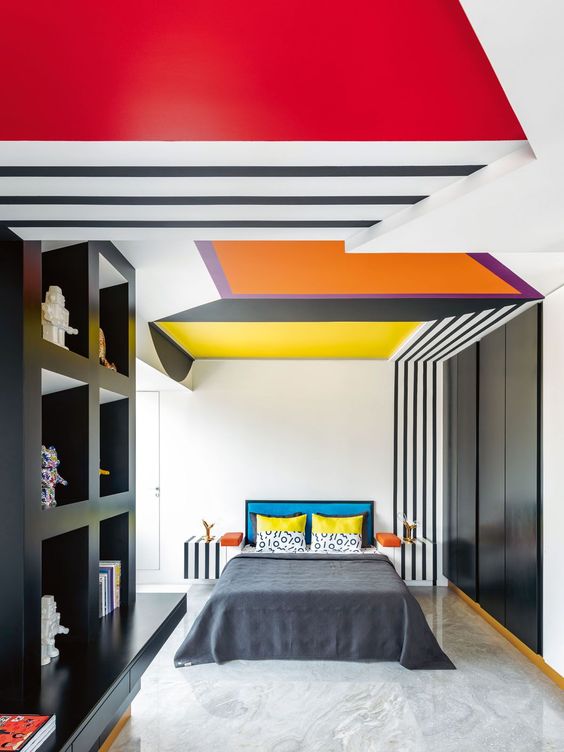
example of a room in a pop style, with a strong color point and geometric references in black and white.

The origin of Pop Art

The style of furniture that we know as Pop and its contemporary meaning derive from the artistic movement developed in the United States. Born in the second half of the fifties, it knows its best period of development in the subsequent sixties and seventies.

These are the years of the economic boom and the rise of unbridled consumerism as a consequence of an ever greater economic well-being of society.

The name pop art is the abbreviation for “popular art”, which emphasizes the strong relationship between the new artistic current and “popular” objects. The goal of Pop Art is precisely to stage the consumer society by adopting an almost ironic meaning.

Desecrating the courtly conception of art by comparing it to objects extrapolated directly from mass society. In doing this, the expressive language used directly takes up the same expressive forms of the consumer society. The result is a vision of the artistic work perceived as a commercial product.

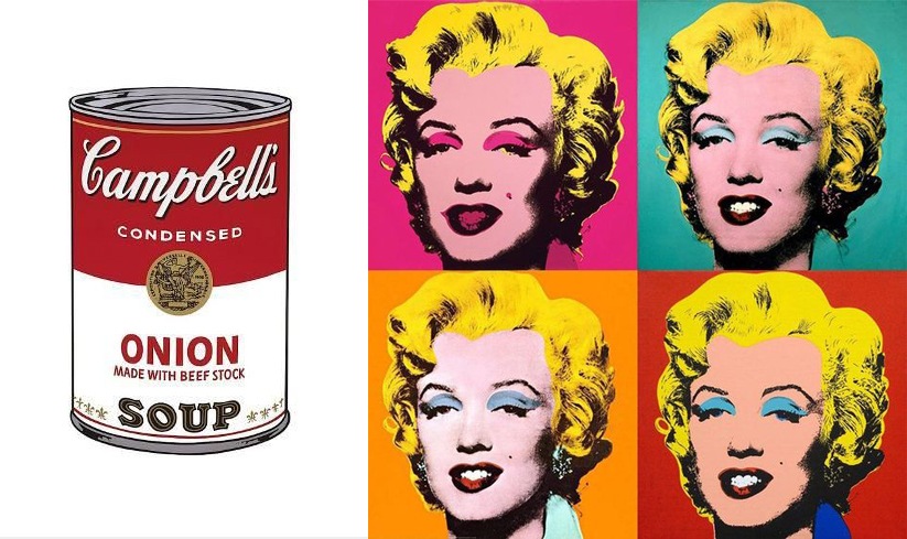
Advertising, television, cinema and supermarket shelves, the new temples of consumerism, become the subjects of works of art. Among these, Warhol’s famous Campbell sauce cans, whose graphic design is taken directly from the advertising prints of the time.

The bright colors and their full shades are taken up by the heroes of cinema and entertainment reproduced in cartoons, comics and serigraphs. After the resilience of war and the vision of a world in black and white, the colors of the new well-being invade society, rapidly changing its values.

Warhol, Lichtenstein and the other pop art artists tell this revolution through the symbols of the consumer society. The provocation itself becomes a force of consumerism, like a frame from which it is impossible to get out.

roy lichtenstein pop art
keith haring pop art

The expressive language of Pop Art between serigraphs and cartoons: Roy Lichtenstein and Keith Haring are among the best known exponents

oldenburg cadorna

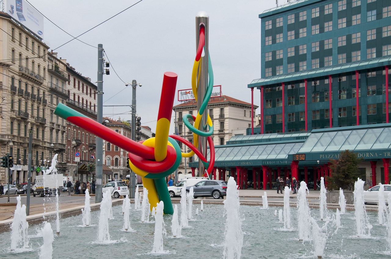
Claes Oldenburg and Coosje van Bruggen, Ago e Filo, Milan

Andy Warhol Campbel Monroe

Andy Wahrol is definitely the Pop Art artist par excellence, with his illustrations of the Camper Souce and the reproductions of the face of Marilyn Monroe

Design icons

The improvement of the company’s economic conditions allows the purchase of products that are not only functional but also purely aesthetic. The design of furniture and home interiors adapts accordingly by changing shapes, materials and values.

Precisely for this reason, in those years, Industrial Design, intended as a serial production of elements, had the apex of its development. The increasingly conspicuous demand of the company satisfies the manufacturing industry which responds with new, impactful and original objects.

The designers of the time best express their creativity by experimenting with new materials. Experimenting with alternative manufacturing techniques also allows them to shape the material to better convey the design idea. The many icons of Design, especially Italian, that still crowd the collective imagination date back to those years.

These also become the characterizing element of the interiors, giving them an eternal and whimsical character. Some examples are the Vitra chairs designed by Verner Panton, the Ball Chair by Eero Aarnio, the trolleys by Joe Colombo and all the products of a nascent Kartell.

ettore sottsass Milan interior

Paradisiartificiali Studio, Tribute to Ettore Sottsass, Milan

pop material icon design

Plastic and plexiglass are appreciated for their ductility and material expressiveness in the Pop style. The design icons are characterized by bright colors and soft shapes.

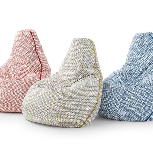
Sacco chair
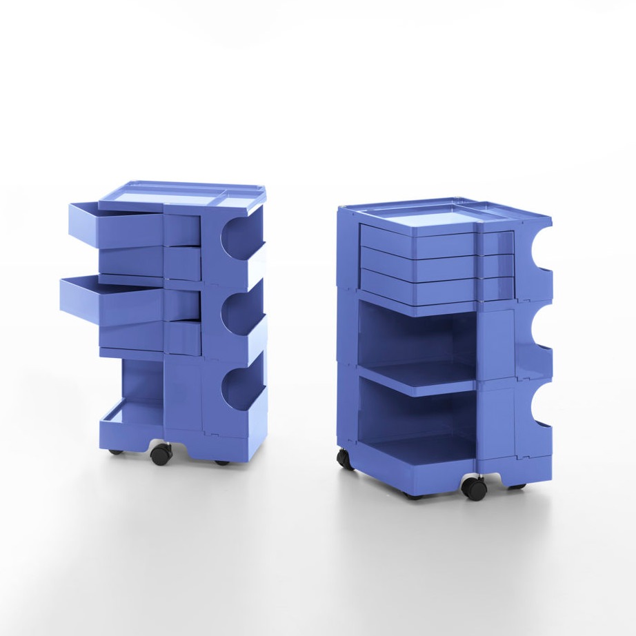
Joe Colombo
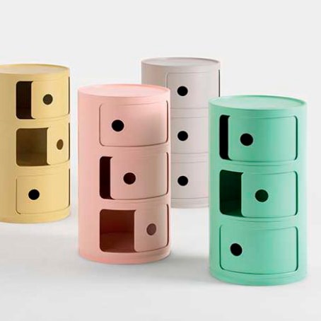
Kartell

Here are some icons of Design: Zanotta’s Sacco armchair, Joe Colombo’s Boby trolleys and Kartell modular units revisited in a modern key with new pastel colors and innovative textures.

Pop Art in house interiors

For a Pop Art style décor, the first to lead the chorus are the bright and lively colors. Especially chosen in their saturated and bright colors, they completely exclude the use of shades in favor of full colors. The importance of visual coherence between the different rooms of the house is reflected precisely in the use of well-balanced colored hues.

The furniture inside the rooms does not exceed in number but rather stand out for the fluidity of the shapes and the chromatic choice. The choice to place iconic design objects is appreciable. Pieces of furniture that have marked history.

Compared to the Boho style, this choice of antiques, however, is not aimed at abundance but is limited to a few significant pieces. One of the most famous examples is the Mouth-shaped sofa by Gufram, inspired by Marilyn’s lips. Its strong visual impact and its iconicity make it the protagonist of the rooms to the point of being enough to define the stylistic imprint of the entire room.

bedroom colors graphics
living room icons drawings

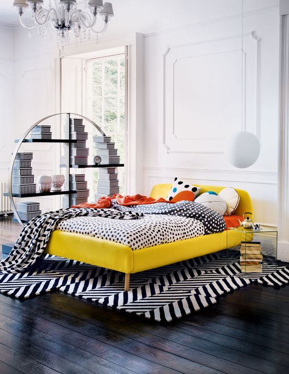
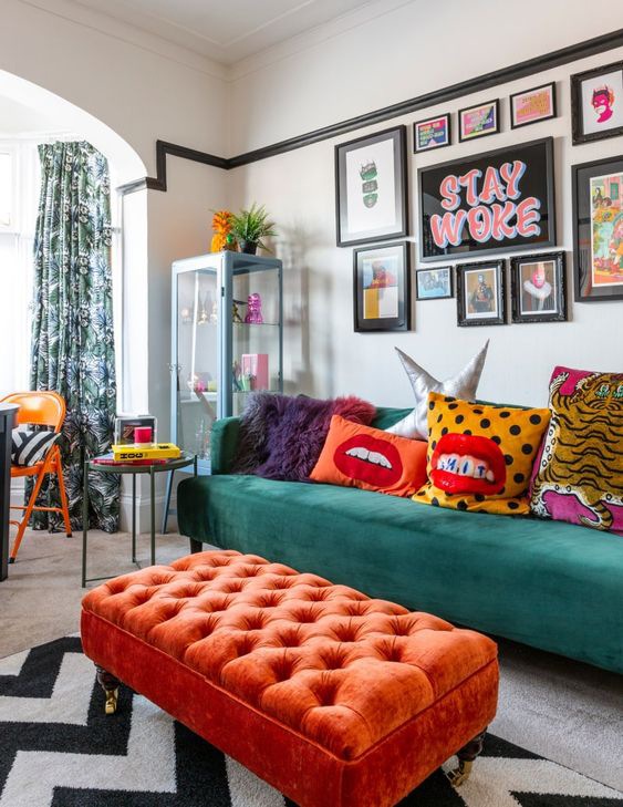
A bedroom inspired by the design of the Memphis group designed by Jannat Vasi. On the right: a Pop-style living area amidst colorful furnishings and minimal graphics

bedroom pop style minimal
living room pop style

Carpets, fabrics, stylistic shapes and chronatic choices respond to a balanced overall vision in the Pop style.

The Pop style is recognized for the choice of plastic materials and resins, which exploded in use and experimentation in those years. The flexibility and ductility of these materials allow the designers to have the maximum artistic expression, managing to produce series furniture with original and fluid shapes.

To these is added the plexiglass, appreciated for its transparency that assimilates it to the noblest glass, but extremely resistant. To enrich the Pop-style interiors, paintings and decorations whose graphics are directly inspired by the world of comics and screen printing.

These stand out among colored walls, sometimes covered with wallpaper with graphics characterized by abstract and hypnotic lines, also used in the choice of carpets.

pop icons design graphics

Minimalist graphics and furnishings with bizarre shapes, including colors and products of the Pop style

The pop style according to Modulor: the contemporary variant

The grit and character of the Pop style is certainly appreciable for dynamic interiors and young personalities. Its highly characterizing expressive charge applied to contemporary interiors sometimes risks creating environments that, when experienced daily, tend to “tire”.

For this reason, the variant in our projects always tends to contain the Pop imprint of some elements within the home furnishings. Few elements that, in terms of shapes and colors, lead back to the freshness and creativity of this style, but blend perfectly with neutral and contemporary interiors.

Combined with the brightness of white furnishings and environments, they are also able to further enhance themselves, becoming stylistic icons of home furnishings.

pop art house corridor pop art
living room pop details

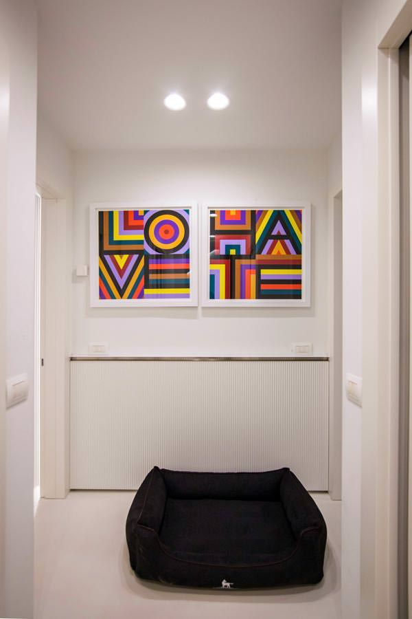
A Modulor creation on a project by Studio MILO in a contemporary style with refined Pop details: from the choice of the paintings, to the precious carpets by CC-Tapis passing through the living area in perfect Pop style

pop living room

A few details in chromatic uniformity are enough to give grit and character to an interior: walls and furnishings of this creation give a decisive touch while remaining balanced overall

pop kitchen

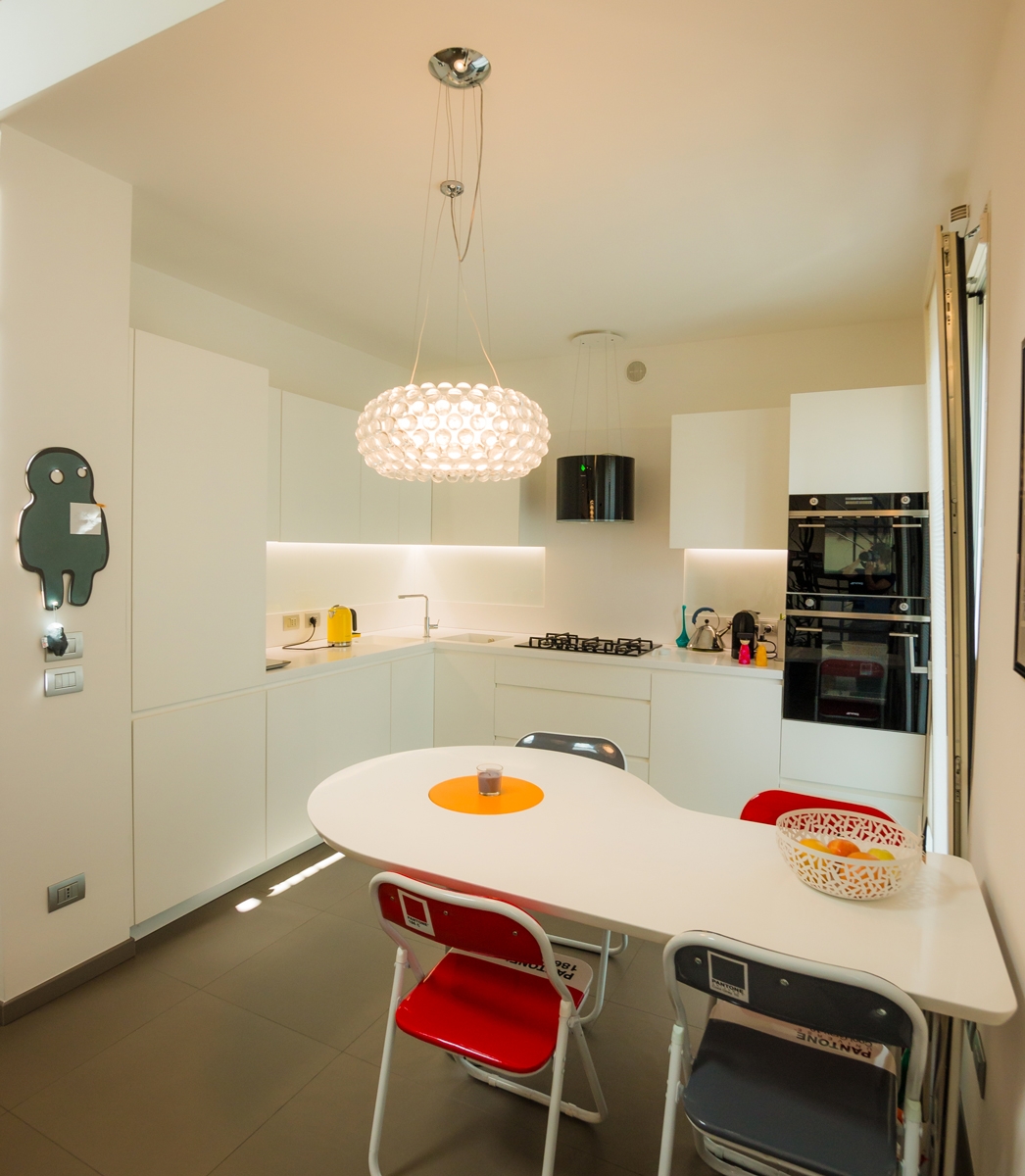
Our project of Omelette table with rotating yolk flanked by red Pantone chairs and a kitchen in black and white.

Bergamo industrial attic

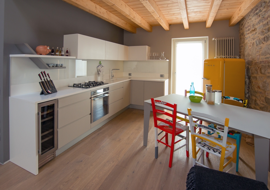
A brightly colored Smeg refrigerator and an artfully crafted table complement a linear kitchen in this splendid Bergamasco Loft.

The Pop style in its traditional and contemporary meanings responds perfectly to strong charisms. A little eccentric and certainly very creative personalities, who do not, however, give up balance and stylistic elegance. Far from being chaotic, the well-balanced Pop style instead expresses a stylistic and conceptual refinement, as well as a passion for visual art forms.

Digital Design Week 2021: our selection and thoughts

Digital Design Week 2021: our selection and thoughts

The 2021 edition of Digital Design Week has just ended on digital platforms, with the hope of seeing taken the traditional version on place in September.

The Salone del Mobile makes Milan the undisputed protagonist in the world of contemporary design, turning the spotlight on new projects, cutting-edge proposals and events capable of enhancing Italian “know-how” but also its international contamination.

We at Modulor also remotely participated in the rich schedule of talks and webinars offered on the main digital platforms … here are some of our thoughts!

Missoni-Milan-Design-Week-2019
Nendo-fuorisalone-2019

Outfitting of Fuorisalone during its 2019th edition: on the left the installation “Home sweet home” by Missoni in Via Solferino. On the right Nendo in “Breeze of light”

Time-machine-ventura-centrale-fuorisalone-2017

Time Machine, the installation durinf Fuorisalone 2017 in the new design district of Ventura Centrale

citizen-time-is-time-fuorisalone-2016

Time is time, an immersive environmet setted in the Superstudio’s place during the 2016 Design Week, focused on the theme of time

Salone del Mobile and Fuorisalone: ​​Milan the capital of design

It seems centuries have passed since Milan, in the central weeks of April, was filled with international tourists, young emerging designers, professionals hunting for innovative proposals and university students eager for events and new product launches.
From the design enthusiast, to the sector’s professional, to the simple citizen who loves social life: the week of the Salone del Mobile has always managed to capture everyone’s interests.

One of the few events able to involve such a large audience as to transform Milan into a great “design community”.
Impossible to walk along the streets of the county seat during those days and not be involved in the beating heart of the Design Week.
Colorful graphics that identify the various districts, art installations and advertising banners with pieces of furniture just launched on the market reach every corner of the city.

The professional variant of the Salone del Mobile, in the huge spaces of Rho Fiera and even more its Fuorisalone organized in ever-changing design areas now seem an old memory. Two realities that over the years have known such success that they have become distinct entities, each with its own target audience.

fuorisalone2019_district_map
salone-mobile-logo

Fuorisalone, the design districts map of the 2019 edition.
On the right, the official logo of Salone del Mobile.

Digital Design Week: what is it and what changes does it make to the traditional version?

The cancellation of last year due to the health emergency and its uncertain future also for the 2021 version did not, however, stop the creativity of Design Week. The 2020 edition of the Design Week had already moved to digital channels, meeting the approval and involvement of both the realities that make it up.
Salone del Mobile and Fuorisalone never as today find themselves in dialogue with each other to create a rich schedule of events.
Talks, webinars and reflections on what it means making design nowadays and on the various facets of this world. The stringent safety restrictions have also completely revolutionized the methodology for presenting new products. Physical presence is now too restrictive a possibility, so naturally the attention shifts to the digital world. In order not to stop the great design machine, the realities that have always accompanied the traditional edition of Milan Design Week have organized a digital version. Digital Design Week 2021 took place on the web platforms of Interni (historic magazine associated with the week of the Salone), Fuorisalone and Ad Italia. From 12th to 19th of April, a series of talks involving professional figures took place. From the world of furniture, to architecture, but also literature, technology, art and craftsmanship, opinions and reflections are exchanged on the contemporary themes that drive design. Furthermore, in the specific case of Interni, its version continued until 23th April, with a fixed evening appointment scheduled for 6.30 pm in streaming.

Digital-Design-Week-quote-custom-Marco-Spinelli-Poliform
san-siro-seat-cappellini-jasper-morrison

A Marco Spinelli quote, shared on social pages of AD Italy that underlines the importance of “custom-made”. 
On the right: San Siro seat, designed by Jasper Morrison for Cappellini and launched during the Digital Design Week 2021

table-bentley-home-digital-design-week-2021

Aldford table by Bentley Home – Luxury Living Group disegned by LLG Creative Team

Smartworking and a new perception of the domestic environment

Undoubtedly a contemporary theme during this Digital Design Week was the introduction of the concept of smartworking and the new domesticity.
We at Modulor have already addressed this issue, also bringing design examples from the previous months.

In this regard, the interpretation proposed by Lara Facchinetti, HR Manager of Zamperla, in the “Study” chapter of the laboratory proposed by Strategy Innovation is interesting. The theme of reflection shifts to the hybridization between work from home and office life, noting how the best working condition derives from the integration of both.
If before the working world and the private sphere were very distinct areas of our daily life, now it often happens during an online conference to witness small “intrusions”. Children intrigued by the screen and pets who have run away from their places become actors of a connection that is not only conceptual, but also physical and visual. With this in mind, the best productivity is achieved by being able to take advantage of both work contexts.
The home is identified as the environment of concentration, where one can isolate oneself from colleagues, and the office is instead an environment of sharing.

What is missing during smartworking are in fact the impromptu meetings and the brainstorming process that spontaneously arise during a coffee break.
Linked to the new needs of spatial reconfiguration, as also confirmed by our experience, the change in the perception of the working space opens in parallel.

In this regard, it is interesting to report the point of view of Marco Roversi, colleague specialized in the design of custom-made furnishings in the contract sector. In fact, if the reconfiguration of the home environment is often restrictive, and bound to changes that are not too intrusive, the workspace undergoes a radical change. It is rethought in its basic setting, making flexibility its founding feature.

carlotta-bevilacqua-funivia-artemide-digital-design-week

Funivia, sunspended lighting design by  Carlotta Bevilacqua for Artmide 

6x6_roversi_arredamenti_Digital_design_week_2021
6x6_cesare_roversi

6x6the modular system for office designed by Roversi

The reinterpretation of system engineering components

The continuous search for flexibility in the working place brings the contract further closer to the world of retail, used to constant changes.
The design of the architectural component then becomes a fundamental point to guarantee infinite spatial configurations.
As in the case of white boxes for the retail world, the system engineering component is reinterpreted now more than ever for its aesthetic impact.

A great example is certainly the design thinking of Davide Groppi during the talk “Living the work space” proposed by Lombardini22. The vision of the internationally renowned designer is precisely linked to the flexibility of light, which is released from the electrical system to which it belongs.
The solutions proposed over the years by the designer himself have always been designed with the desire to make light free from pre-existing plant constraints.
Providing the right light does not only mean allowing you to see the space but also to feel it.
A setting that becomes more and more scenographic with a design work that becomes a work of elegance.

The second example is the series of projects brought by architect Duccio Grassi during the talk Design beyond Matter.
A relationship between the architectural and system design components that goes beyond the level of necessity to become a project integration with the aesthetic vision.

Another issue connected to the relationship between structural needs and project flexibility is that of the exploitation of interstices, the so-called architecture in between. We have recently analyzed the potential of designing functional furniture capable of optimizing spaces and therefore we fully share the reflections of Daniele Lago, founder of the well-known mass-production furniture company.
The in-between is not only a domestic environment design issue but also a metaphor for the relationship between the brand and its community.

Davide_Groppi_Infinito

Infinito, Davide Groppi

Zara-Rome-Duccio-Grassi-Architects

Zara Rome, Duccio Grassi Architects.
Engeneering system and outfitting matches in a design element which disappear in the environment.

duccio_grassi_architects_max_mara_tokyo_ginza_home

Max Mara Tokyo Ginza Home, Duccio Grassi Architects

Sustainability and environmental impact: visions related to design

Perhaps one of the most inflated issues in recent years is certainly linked to sustainability and environmental impact.
Countless could be the visions and projects that make it the flag carrier.
From the world of design, the theme of the circular economy directly moves to the productive world, finding infinite results.

But what does it actually mean to be sustainable today?
Producing using recycled material is not always the ultimate solution. In fact, it is necessary to put the entire life cycle of the furnishings on the scales and consider their environmental impact over the years.
Here then is that the word “recycling” appears several times during this Digital Design Week.

The architect and designer Paola Navone brings her vision of recycled objects as a series of handmade products obtained from processing waste.
A vision that wants to break the mold by bringing color and joy into the projects, managing to enhance what is the local craftsmanship.

Giuseppe Pedrali, CEO of the homonymous company from Bergamo, also focuses on the regulatory aspect of sustainability.
“Being sustainable” has now become the common motto of various manufacturing companies, but how many of them actually focus on the certifications that can officially certify this characteristic? Are the production processes actually controlled and designed in order to reduce waste and affect the environment as little as possible?

Ico Migliore, architect of Migliore + Servetto, underlines how the issue of sustainability is not only linked to materials but to user behavior.

Of all the thoughts analyzed, the one that we at Modulor certainly fully embrace is the one proposed by the architect and designer Piero Lissoni during the conversation “Everything is a project” available on AD Italy.
Sustainability consists in designing furniture that can last over time

What does it mean to design nowadays? How to emerge within an increasingly large market?

We share once again the words of Piero Lissoni as the fulcrum and summary of this Digital Design Week.
The world of design now looks worldwide, what allows it to be valued is high quality and knowing how to maintain and preserve the “craftsmanship”.

While knowing the relationship to the increasingly frequent technology and the world of the intangible, it is essential to recognize the wealth offered by craftsmanship. The new model of craftsmanship, although it has lost some qualities transmitted over the years, meets new possibilities.

Knowing how to relate the ability to use hands, touch materials and interpret them with incredible technologies is the design of the future.
A less drawn and more product design. Although the very term “design” or industrial design, it would seem to live in the opposite of the concept of craftsmanship, the conjunction of these worlds is the real innovative key for the future of interior design.

Digital-Design-Week-quote-Giulia-Molteni
Round-D.154.5-molteni-Digital-Design-Week-2021

Round D.154.5, the historic armchair designed by Gio Ponti and reinterpreted in a contemporary way by Molteni & Co

Cassina_Soriana_armchair_Afra_Tobia_Scarpa
Moroso_Patricia_Urquiola_Pacific

Soriana, Afra and Tobia Scarpa forCassina
On the right: Pacific,the new collection signed Patricia Urquiola for Moroso

Minotti_Connery_Rodolfo_Dordoni

The Connery seating system designed by Rodolfo Dordoni for Minotti

Classic style: Elegant and welcoming

Classic style: Elegant and welcoming

The Classic style is typical of an elegant, spacious house, capable of transmitting feelings of welcome and warmth without appearing severe. Those who choose the classic style certainly love retro-flavored furniture, wood with its inlays and oversized upholstered sofas.

Classic Living room

a Classic living room with upholstered sofas and armchairs, elegant chandeliers and large curtains.

CHARACTERISTICS OF THE CLASSIC STYLE

Although the years fashions are passing quickly, the Classic style can be defined timeless. Recognizing himself for his inspiration from the noble houses of the past, he refers itself precisely to that ancient luxury. This style is synonymous of elegance and often also the declaration of a certain socio-economic status and a certain type of taste.

Great attention is given to the authentic beauty of the furniture and finishes rather than functionality or technology. Two factors are therefore important to furnish in a classic style: a large space to devote to furnishings and accessories and no limits of budget. People who choose the classic style often have a passion for fine antiques and a very spacious house ready to welcome them.

 modern classic living room

a living room in Classic Modern style, more minimal but equally elegant.

BETWEEN ARCHITECTURAL CONFORMATION AND INTERIOR DESIGN ELEMENTS

In the Classic Style’s architecture there is no shortage of columns with capitals, sometimes not structural but a simple pretext of aesthetic refinement. Stuccos, vaults, ceiling moldings and frescoes find their best expression. Another key element are the chandeliers, usually in crystal and clearly visible in the center of the rooms. Art is very important for classic-style homes, an inevitable touch of class. Very large paintings seem to transform domestic interiors into museum spaces, or many squares of various sizes crowd an entire wall as if they were the scenography of “The Best Offer”“The best offer”. There is no shortage of statues or sculptures, both for the outside and for the inside.

When we talk about classic style it is good to underline that we are referring to a world of interior design that embraces different influences, eras and traditions. Think of the imperial, rococo, baroque and all the currents that define the taste of tradition. Of all the facets known throughout history, the most popular one in the world of interior design is the Modern Classic. We could define an extremely chic and refined Modern Classic, comparing itself in certain aspects and interpretations to the Luxury style.
boiserie white
boiserie gray

both for the Classic and Modern Classic styles, the Boiserie are fundamental.

MATERIALI E COLORI

Wood always prevails and is usually “solid”, recognizing itself for physical and visual prominence with important thicknesses and large surfaces. In fact, at the design level, the tops and backs of bookcases and furniture tend to be tall and wide and most of the time with a characterizing profile or elaborate decorative details. Noble woods such as mahogany, oak, cherry and beech prevail.

Then there are wooden elements such as chests and cupboards which, as for the Boho Chic style, are indispensable. The materials combined with wood are noble and luxurious, such as marble for the floors or even for the kitchen and bathroom countertops, glass for the doors of cupboards and dividing doors, precious stones for small decorations, porcelain for knick-knacks, sanitary ware and sinks. The lines of the furnishings are never essential but rather sophisticated. An example are the closing doors of the furniture, usually embellished with a central band that is broken or in relief.

The pieces of furniture abound without leaving anything to chance. From the Country style it inherits coatings and boiserie. The wall in its architectural essence is forgotten, covering itself with decorative elements capable of characterizing it. For this reason, wallpapers are very popular and the decorations alternate complex details with small and refined textures.

Even the fabrics of the curtains, usually in silk or fine cotton, are enriched with decorations and large draperies. There is no shortage in the living area as well as in the bedroom velvet cushions and fine carpets, preferably antique Persians.

The sofas are padded and oversized. The meaning you want to convey is precisely that of opulence and hospitality.

Leather is the most used material for sofas, which however also know the alternative in precious velvets. The classic-style houses transmit warmth thanks also to the light colors of the walls, others to the warm white, which we at Modulor identify with the classic 9010, light dove gray, cream and beige are welcome. These colors go very well with wood, highlighting it and helping to create a feeling of warmth as a whole.

classic style materials

The Modulor selection of colors, textures and furniture references for the Classico moodboard.

THE MODERN CLASSIC STYLE

The Modern Classic style follows all the characteristics of the Classic style but differs for its essentiality and linearity. We could define it elegant and refined but without exceeding. The choice of wood in the Modern Classic style is recognized for the finish: almost never natural, but much more frequently dyed. Thus the stylistic features of the furnishings are emphasized, in particular the banding and also the shells and shaped profiles. Unlike the Country or Shabby Chic style, the varnishing of the wooden furniture is not done “by hand”, that is leaving the mark of the brushstroke visible which makes them so handcrafted, but with a flat-color matt lacquer that even hides the vein. The range of colors expands and is dared with bright and modern colors, both for the lacquering of the furnishings and for the walls. The wallpaper as well as the paints characterized by particular colors, favor more geometric and contemporary decorations.
gray modern classic kitchen
green modern classic kitchen

Two examples of Modern Classic style kitchens with variations in the chromatic choice.

THE ROOMS OF THE HOUSE

The Living Room is the most important part of the house, precisely because it is the place of conviviality, where time is dedicated to guests and to oneself. For this reason, its dimensions are often important, reflecting the privileged role played by this environment. Since the contemporary houses have ever smaller rooms, to maintain an important living room, a single open space environment can be created by also incorporating the dining room. The resulting environment will thus be used in a part as a dining area, equipped with a large table with important chairs, even better if padded armchairs, and the relaxation area will find space on the side. To characterize the latter, large sofas combined with upholstered armchairs with a retro taste. The classic style does not include island sofas, but prefers classic conformations accompanied by matching armchairs, even better if in leather.

Classic Living room

A Classic Modern Living Room.

The kitchen is elegant and simple; it is a space used only for the preparation of meals and not for its consumption. Essentiality is the key word for this. As with the Country style, appliances tend to be hidden, usually leaving only the oven with its characteristic steel knobs exposed.

classic kitchen creamy
classic kitchen cupboard
classic kitchen creamy

A Classic kitchen part of a Parisian style project.

In the bedroom you can play with the headboards, very important to which you combine antique furniture, such as a chest of drawers with decorations and inlays or a petineuse with mirror.

One of the characteristics of the classic-style bedrooms is precisely the presence of a cabinet dedicated to make-up and evening preparation, together with large mirrors and majestic wardrobes. ​

classic room beams
 classic room wooden chest of drawers

Refined headboards characterize this Sicilian villa with a classic taste.

In the bathroom it is better to prefer a beautiful freestanding white ceramic bathtub instead of huge and ultra-technological shower heads. A wallpaper on a wall or antique paintings cannot be missing.

The entrance, or in many cases the corridor that leads from the main door to the majestic living room, must live in harmony with the rest of the house. For this a small low cupboard with drawers and a mirror with a precious frame can be the winning card.

classic entrance

The entrance of an elegant Milanese apartment.

The Classic style and its modern meaning are suitable for rigorous characters, lovers of aesthetics and its traditional refinement. It perfectly marries personality lovers of the past, attentive to details but with an excellent overview. The classic style interior setting is almost scenographic. A style that loves beauty and the arts in all their expressive forms.

Industrial style: from the raw soul to the professional mark

Industrial style: from the raw soul to the professional mark

The industrial style has increasingly characterized the interiors of recent years, becoming the emblem of an authentic and essential lifestyle. From its traditional rustic meaning, it then meets the refined and contemporary variant, influenced by luxury finishes and lines.

Especially in the reality of custom-made kitchens, the raw and traditional mark has given way to modern conformations, inspired by professional cooking solutions. Functionality and efficiency become the keywords for an essential and modern style.
Alba apartment 04 industrial style

Iron bookcases with wooden details enrich this industrial-style relax room designed by Locatelli Partners and made by Modulor

The industrial style in its historical evolution

To trace the origins of the Industrial Style we have to move overseas, more precisely to New York. We are in the postwar years, when in the 1950s, the demand for low-cost housing flowed into the reuse of abandoned spaces. The strong stylistic imprint linked to these environments, gives rise to a real fascination for industrial archeology.

The iconographic references of the time, contextualized in the world of art and cinematography, accentuate this stylistic movement, increasingly introducing the perception of the architectural wreck as a scenario of everyday life.
An example of all, is Andy Warhol’s Factory, a studio for his works during the boom years of Pop Art.

From the American metropolises, the new style was then moved to small local realities and landed in Europe during the 1980s.
Trends from the new continent are enthusiastically welcomed by the great revolutionary cities of London and Berlin.
It is no coincidence that London was the protagonist of the Great Industrial Revolution, from which setting, the industrial style drew on the development of new domestic scenarios.

The subsequent spread to the remaining countries of Europe and World coincided with the simultaneous need to reduce land use.

Andy Warhol Factory

Andy Warhol in his factory, a film icon in the successful years of Pop Art

industrial style materials

Metals are the protagonists of the industrial style, matched with raw woods, concrete and industrial resins

The charm of the industrial style in its architectural concept

The industrial world as a reference point for the domestic reality was well assimilated by the culture of the time also due to its revolutionary breath.
The industry has in fact marked a breaking point with the traditional, especially for the social changes that the revolution of the late 19th century has introduced.

The industrial style enhances the “architectural wreck”, bringing a romantic vision of the passage of time on buildings.
The reuse of industrial spaces thus favors functional architectures, transforming the structural elements into focal points of interest.
Pipes, concrete pillars, large windows with metal frames, exposed bricks and peeling walls are elements to be carefully preserved.

industrial attic Bergamo 05

In this attic, the exposed beams and traditional walls represent the stylistic signature of the interior

 traditional rustic loft

Large windows, exposed brick and metal structure for this rustic loft in Kyiv.
Photograph: Andrey Avdeenko

Between exposed systems, materials and floors ..

From the point of view of spatial organization, the open space and large ceilings certainly play a fundamental role: free-plan spaces characterized by the lack of vertical partitions, even better if set up to take advantage of the large heights.

The myth of the Loft is born, in which the functional organization of domestic interiors revolves around the exploitation of double heights.

By keeping the skeleton of the infrastructure on view, the system design components become synonymous of authenticity and strongly characterize the space.
The floors are mostly rough, with concrete or industrial resins, while the lighting takes place from the large windows. These maintain their industrial setting with a metal frame and vertical partitions, absolutely abolishing curtains or sunshades. Artificial lighting takes place through rough-looking exposed fixtures, certainly made of metal and in most cases through visible suspension structures such as rails or tie rods.

furniture and colors industrial style

Color references and furnishings in typical industrial style

Alba apartment 09

The large wooden table gives warmth to this kitchen

The contemporary meaning

In its contemporary meaning, the industrial style meets two different variants.

On the one hand, taking back its natural spirit, it marries the vintage interest by adorning the space with antiques and a strong traditional imprint.
With this in mind, wrought iron wall clock appears while metal chairs different from each other are combined with the inevitable solid wood table.
Even better if it is reused from an old workshop so that it keeps traces and signs of use on its surface.

living room industrial loft

A prestigious industrial loft with black waxed iron furnishings reflects the architectural context in which it is inserted

kitchen industrial loft

A kitchen entirely covered in steel for this New York loft

Professional kitchens as a source of inspiration

On the other hand, the inspiration of increasingly functional and equipped industrial kitchens forcefully enters the common imagination. Just think of the quantity of television programs that every day offer us steel worktops with an island structure and industrial hoods with a strong stylistic imprint.

From the reality of industrial kitchens, it draws the trend that could be defined as “luxury” of contemporary industrial style. Combined with marble or retro-painted glass, contemporary industrial-style kitchens are clad in stainless steel. Equipped with state-of-the-art appliances, they favor functionality and highly resistant materials.

However, even the contemporary industrialist does not renounce a warm and welcoming interior. So, the wooden dining table or the leather design armchair characterize the space, giving warmth and elegance.

Alba apartment 05

Professional kitchen is the world of inspiration for materials and types of this Piedmontese kitchen

industrial luxury apartment 04

A kitchen between industrial and luxury style, enriched by the marble top and shaped profiles of the handles

essential steel kitchen

The island structure is the most common type for industrial kitchens

Functional and extremely practical, the Industrial Style is aimed at decisive personalities who are always on the move. Its simple lines matched with highly resistant materials make it practical and eternal, without giving up a touch of traditional warmth.

Country style: the countryside at home

Country style: the countryside at home

Scent of countryside, the relaxation of a warm and welcoming home, the search for a natural but at the same time refined style. All this is the Country style and more and more people are choosing it for their home furnishings.

country kitchen

a bright Country Style kitchen with white furnishings and glass inserts

MEANING OF THE WORD

Synonyms of the term country are “countryside, rustic, rural”, therefore everything related to the earth, to nature. A return to our peasant origins in opposition to a world that chases technological progress with increasingly aseptic environments.

Simplicity and refinement make it current even if its origins are distant. In fact, it was born in England in the late nineteenth century, when the English nobility needed to get away from the Victorian splendor and rediscover the country peace.

This style of furniture in fact favors wood and, more generally, all warm and natural materials. It can also be declined in variants such as: romantic, Provencal, chic, rustic, American or modern according to the taste and preferences of those who choose it for their home environment.

country living room.

a Country Style living room that enhances the details with dark wood.

country bedroom

A room that marries the country style also in the choice of embroidered fabrics.

THE DOMINANT CHARACTERISTICS OF THE COUNTRY STYLE

The country style is characterized by classic furnishings, with shaped profiles and interior decorations. Its best expressed in an environment with exposed stone, ceiling with wooden beams and a nice warm fireplace in the center of the living area.

The aim is to be able to convey the sense of relaxation typical of a country house even in a city context. However, the “rusticity” of the style is enhanced by an extreme refinement in the elements and details that fill the environment and nothing is left to chance.

Typical complements of country furniture are the tables in solid untreated wood, the chests made entirely of wood or with elegant metal legs and the curtains that also become an integral part of the furniture.

In this country-style kitchen we made, the checkered curtain takes the place of the doors under the sink. Refrigerator and dishwasher are strictly built-in, while the oven and hood are visible and represent the heart of the kitchen. Speaking of details, here each knob has its own characterization and has been chosen with care.


country style kitchen

Our Country Style kitchen with a touch of color and refined details.

country style kitchen details

Details of the sugar paper shaped hood and knobs.
Are often used recycled furniture such as old sideboards, bedside tables, dressers, wardrobes. In the country bathroom, a free-standing bathtub with a vintage look and stone walls cannot be missing. Vintage and “decorative recycling” objects are inevitable, that is glass bottles, jars or all those small objects that, cleaned and decorated, can change their intended use and become nice decorative elements or containers.

To enrich the environment, knick-knacks are welcome, especially if in ceramic and old crochet doilies. Vases with plants and flowers cannot be missing either, the impression must be that of a really countryside house. Flowers are an essential element because they give delicacy and a touch of romantic mood to all rooms.

country bathroom

Two examples of a contemporary country style bathroom area, with a focus on the choice of colors.

COLORS AND MATERIALS

Country style prefers natural colors, such as those of wood, used as a base for more decisive color combinations, like cherry red, sun yellow, baby blue, ivory and all shades of green.

These shades immediately give to the environment a decidedly welcoming and romantic atmosphere. For the armchairs and other upholstered items, the choice goes to the floral textures, which are then embellished with many colored or neutral colored cushions.
In fact, the country foresees a great use of fabrics with particular textures and decorations, such as checks for tablecloths and flowers and polka dots for curtains and sofas. Even for the bedrooms you can opt for wallpapers and, as a complement, themed bedspreads and sheets.
The materials to be used are wood, stone and wrought iron especially in the chandeliers and headboards of the beds. For the back of the kitchen and for the bathroom, white ceramic tiles or in some patterns of blue, gray, sage or delicate pink are preferred.

country style elements

The Modulor selection of colors, textures and furniture references for the Country moodboard

country living room.

A very bright living room that emphasizes the Country style in the choice of fabrics.

MODERN COUNTRY

The variants of the country style are many, but the one we prefer is the Modern Country style, less characterizing but more suitable for everyday use.

The Modern Country mixes vintage furnishing accessories with minimal or industrial ones. Sometimes it is enough to leave stone walls or exposed brick walls, opt for a large solid wood table and it is already possible to recreate a country atmosphere but not overly ancient.

This flavor of modern country can also be found by modernizing the style of old peasant houses with pieces of modern design that make them more refined. Here we present the living area of ​​a splendid Sicilian Villa in which the ancient stone oil mill is located in the center of the room, surrounded by traditional dark wood furnishings and stone walls, but also very minimal backlit elements.


country style sicilian villa

The ancient oil mill, classic and modern furnishings.

traditional villa Sicily dining table
traditional villa Sicily kitchen view

Details of the large living area between traditional furnishings and new elements.

Those who choose the Country style have a romantic spirit and love to enjoy their “home sweet home” in relax.