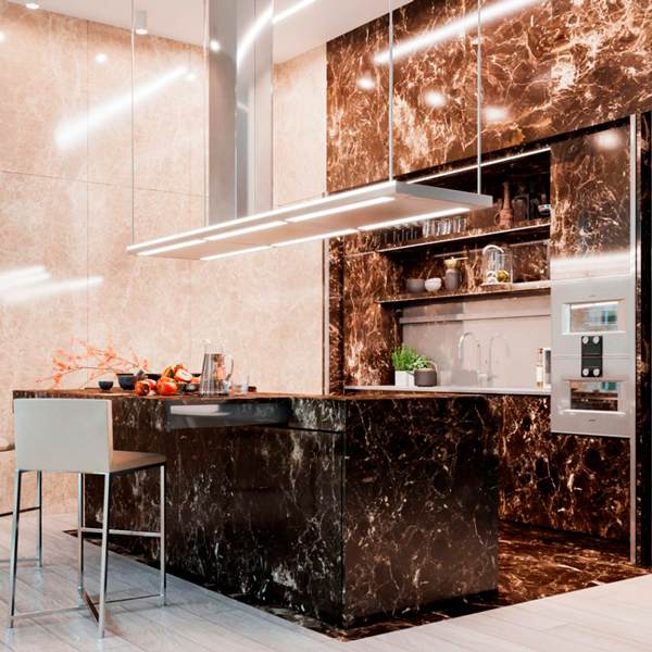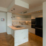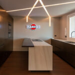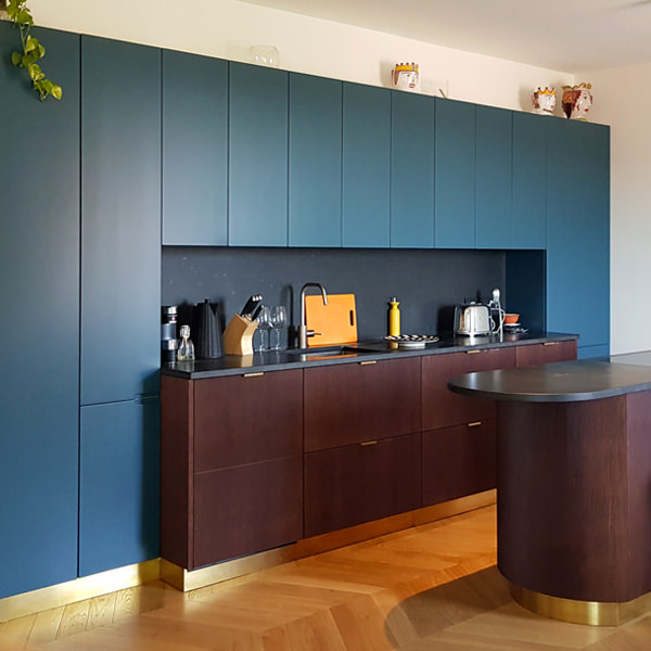
A cerulean blue modern kitchen
The cerulean blue hue defines the stylistic firm of this modern kitchen, set on dark wood tones with brass finishes. The care of detail gives shape to an extremely elegant project, modern in aesthetics and contemporary in settings.

The on-view composition
An interior that becomes furniture. The design of this kitchen diverges from the traditional vision of the closed room to become an open space composed of different volumes.
The main block is a visual union of the low volume in ribbed wood set between wall units with a vertical subdivision and full-height columns.
The common thread that contain the perception of the environment is the brass base, taken from the light and linear handles.
The island block with rounded shapes and overhang countertop, elegantly conforms to the main volume, despite a stylistic change in the design forms.
Indeed, it is this difference between the straight and geometric shapes of the back unit and the rounding of the profile in the central island that defines the stylistic imprint of this kitchen.
The traditional closing shoulder is replaced by a recessed library that visually lightens the perception of the kitchen characterizing the furniture. A full-height bookcase compartment that alternates shelves in a well-balanced geometric composition.


Functionality and aesthetics in symbiosis
Not only the general volumetric setting, but also the internal organization demonstrates a perfect relationship between functionality and aesthetics.
As a demonstration of this, the central island is equipped with rounded corner doors in order to make the best use of each available corners.
Shaped white shelves stand out among the dark tones and blue doors of this modern kitchen, showing all their functionality. The choice of appliances is also avant-garde, as for example the induction hob with attached extractor hood that reduces the functional components to the essential in favor of visual essentiality without sacrificing the practicality.


Colors and materials
Cerulean blue matt lacquered MDF, dark ribbed wood and brass are the protagonists of this modern kitchen in which dark tones are chosen for their elegance.
A rigorous environment that is being fascinated by contemporary functionality.
The chosen shade of blue, extremely modern, is enriched with a warm appearance especially when combined with the dark-dyed ribbed.
It is precisely the materiality in the latter’s finish that enriches the main volumes of the kitchen with movement and rhythm.
The brass of skirting boards and handles, underlines the design lines with a precious character that gives refinement to the project.


Advice
The choice of colors and materials often defines the character of an interior. We are often intimidated by intense colors and dark tones, especially if imagined on large surfaces. The final impact can instead reserve great surprises, and give a touch of freshness and modernity.
Here is another example, in this case a dark gray kitchen with oak inserts.