Wood as an element to experiment with

Wood as an element to experiment with

Wood is a versatile, varied and extremely suitable material to be “experimented” in the most particular shapes and combinations.

THE ART OF INLAY

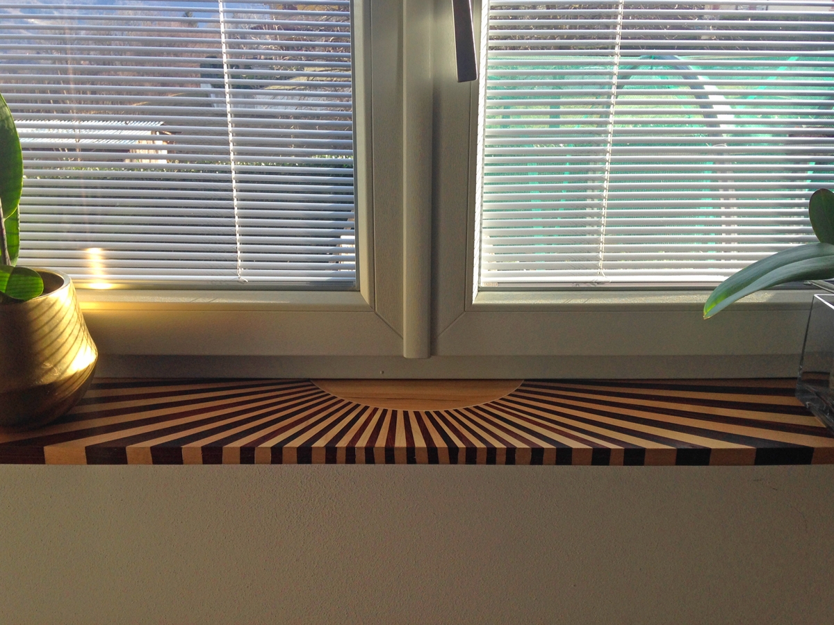
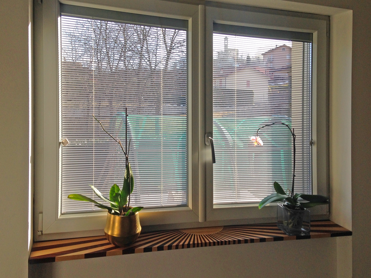
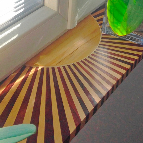
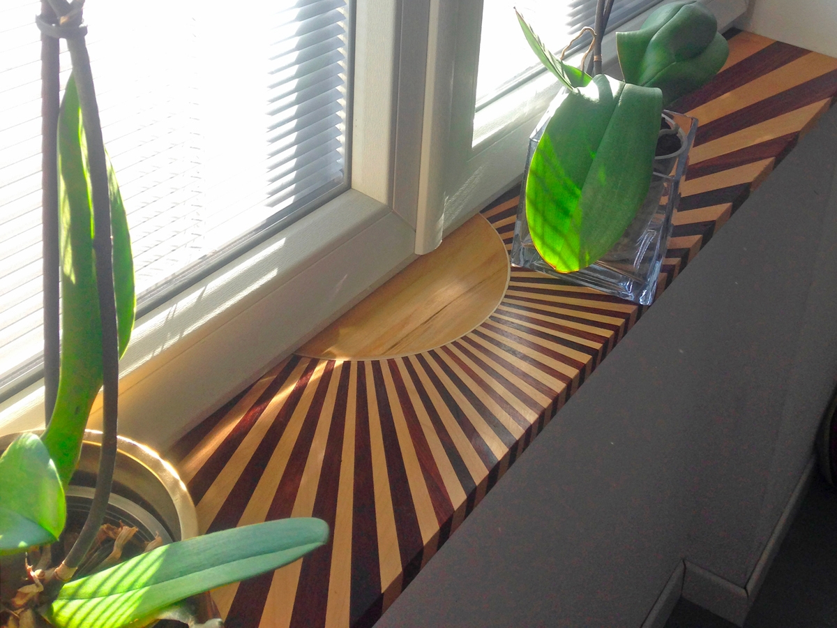
The skill of our craftsmen is also evident in these unusual works, which recall an art now dormant with time, the one of inlay. We are from Bergamo, wa are descendant of the best carpenters in Italy, we can enjoy every day some of the most important inlays at national level. Entering the church of Santa Maria Maggiore in Città Alta is enougth and, looking at the Choir, observe the magnificent creations designed by Lorenzo Lotto. A small digression to underline these works, which request is now even more reduced, but a demostration of painstaking work, patience and dedication. Here we have created the top of a window in the living area by flanking, on all its thickness, various types of wood which are then joined with a sunburst to create the motif of a shining sun.

 
windowsill wooden inlay works
Front view windowsill wood
Side view windowsill inlay works

RAW CHANDELIER

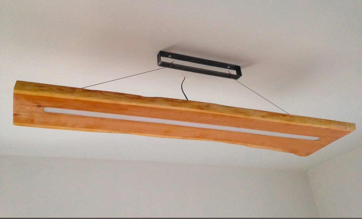
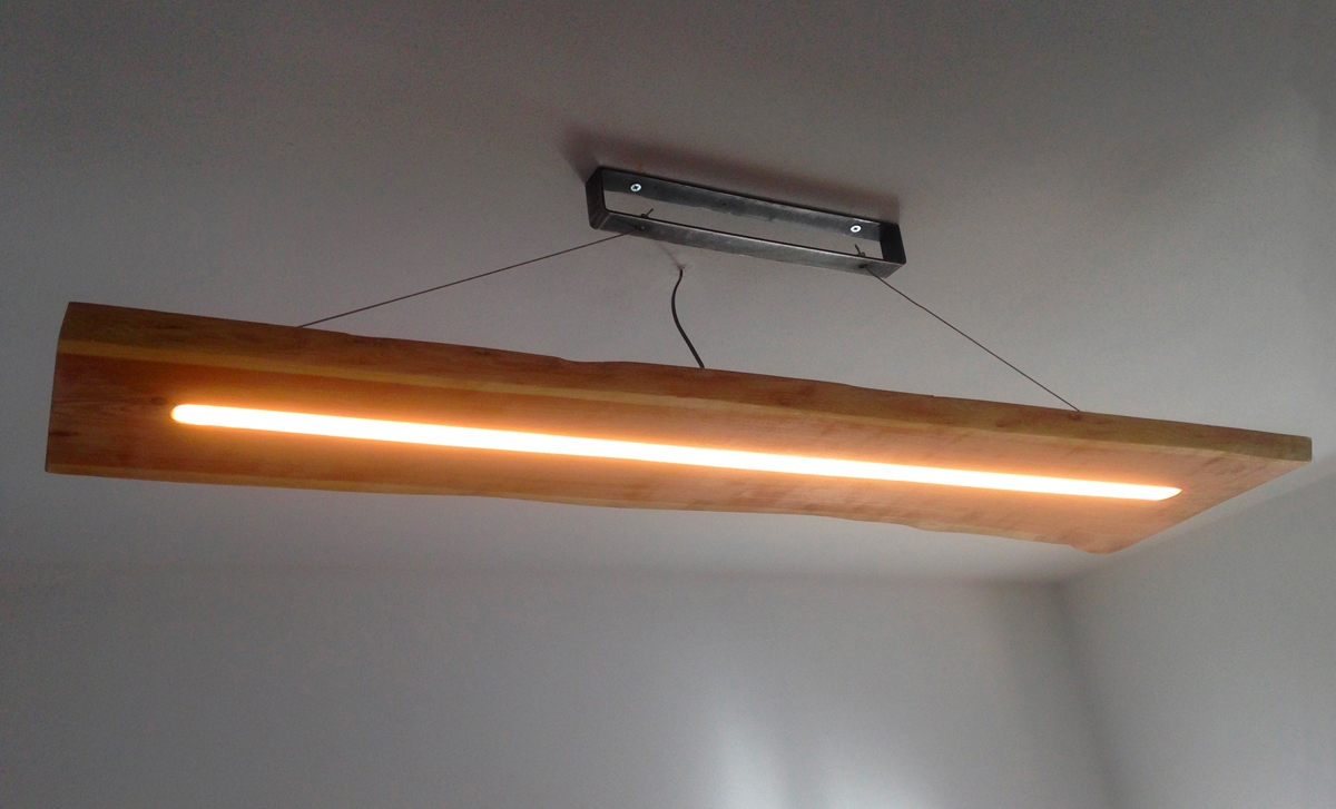
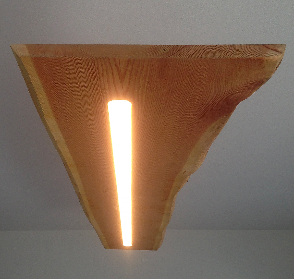
A wooden board with its materic bark has a timeless charm. For that it’s coming back into fashion and it often happens to see, not only in the alpine environment, but also in trendy clubs or in town houses, tables in the raw state. Are exactly their characteristic bark, their knots left rough and some imperfections of the surface, such as reliefs or burrows to make them recognizable. But why not provide other furnishing elements with this particular style? Here we propose one of our laboratory experiments: a lamp with a rounded central slot that houses a strip LED and a thin, taut cable unites it gently on the ceiling. Te material we have chosen is a warm and comfortable wood, the fir. Its rough exposed veins  its natural state and the shades of the wood that lighten towards the external sides are clearly visible.

 
fir wood chandelier off
fir wood chandelier on
fir chandelier detail

Work in progress of particular furniture

Work in progress of particular furniture

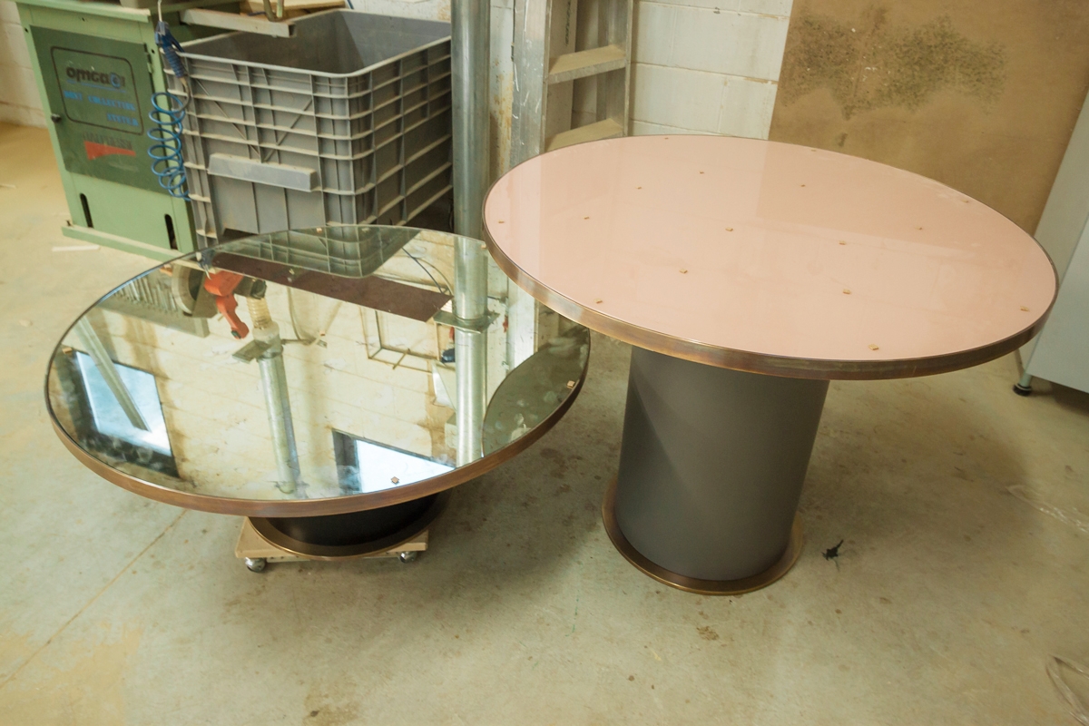
Two coffee tables of various heights and a headboard. Details and materials chosen and studied for unique furniture accessories.


FURNITURE ACCESSORIES

Where the offer, in recent years, of furniture accessories of any kind and type is not lacking and overwhelmingly invades the market, we find ourselves having more and more requests for small customized elements. Probably in a saturated market our customers are increasingly feeling the need to have unique objects by their side. In this particular case we realized, on the project of a prestigious studio based in Milan, tables for the living area and a headboard for the sleeping area. Refined furniture accessories to be sent to UK.  

BRONZED BRASS

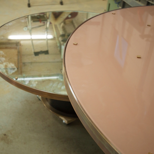
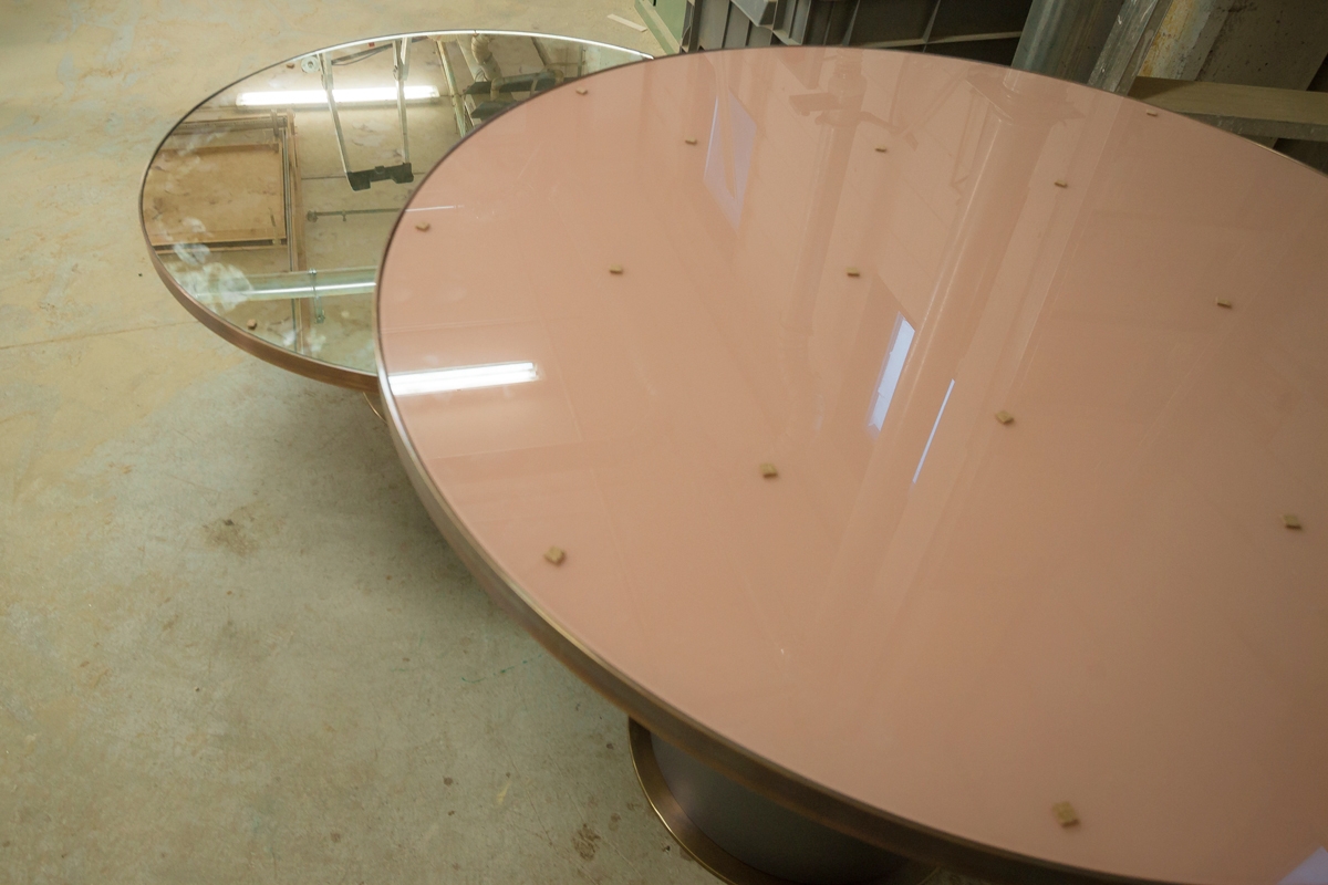
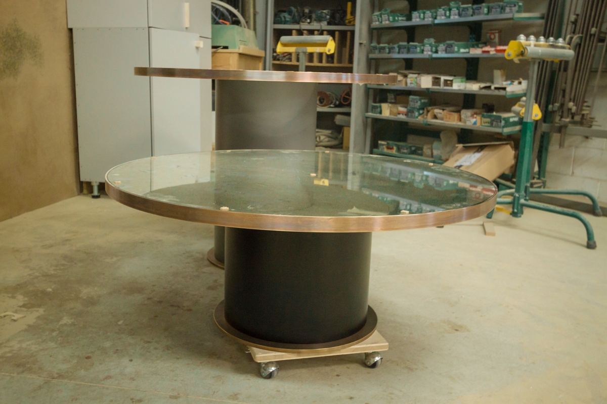
  Brass is a very soft and malleable material, for years forgotten and only now back in fashion. Its natural finish is very impactful, its bright, yellowish color and is very difficult to combine inside a house, so are often used different finishes of brass, such as bronzed. Burnishing is the surface coloring of a metal that is practiced either through galvanic baths or with particular stabilizing paints, both allow to provide both protection against oxidation to the metal but also a different chromatic characteristic. The bronzed brass turns out to be darker and more varied, but does not turn absolutely to green, as happens instead to the oxidized brass. Here we can see beautiful tables made with a profile and a base in bronzed brass and in the center, a surface in a delicate powder pink Lacobel and an antique mirror. The cylindrical base of different diameters and heights has been painted in two shades, one medium gray for the highest table and the other black for the wider and lower table.  

bronzed brass furniture accessories

HEADBOARD

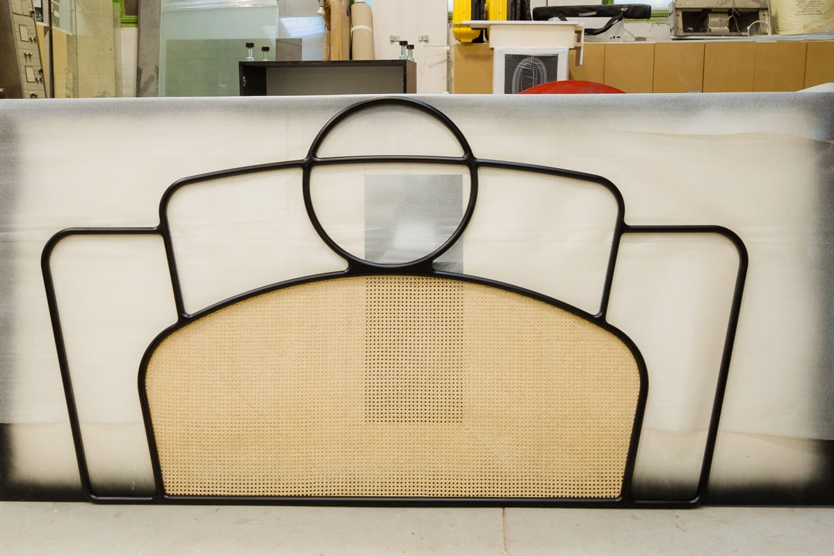
  The headboard of the back bed, on the other hand, has been pantographed in a style that is very reminiscent of the Liberty of the late ‘800, characterized by flexible shapes that reflect nature and its sweetness. The wooden structure was then painted in matt black and in its central part there is an insert in vienna straw.  

headboard furniture accessories

New corners incoming for the Tiziana Fausti luxury store

New corners incoming for the Tiziana Fausti luxury store

After the success of the single-brand corners included in the 2015 set-up, one year later Tiziana Fausti’s luxury store widens its boundaries to host four new brands.

2016 new corners

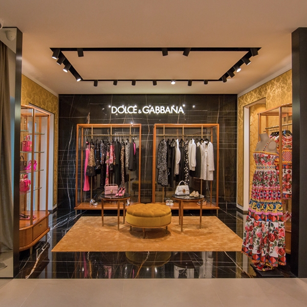
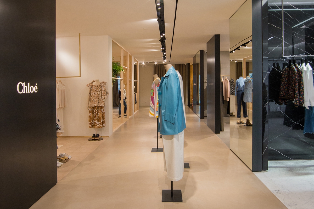
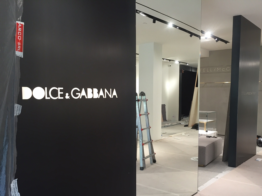
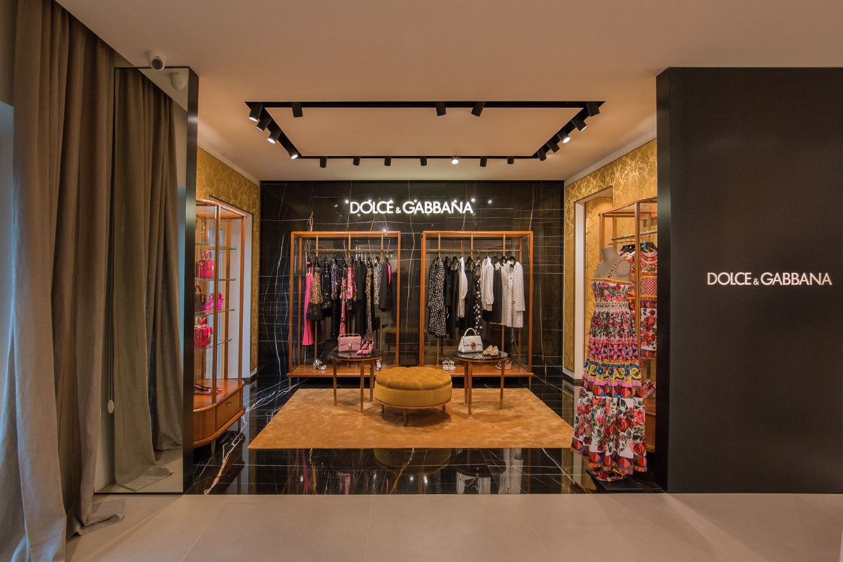
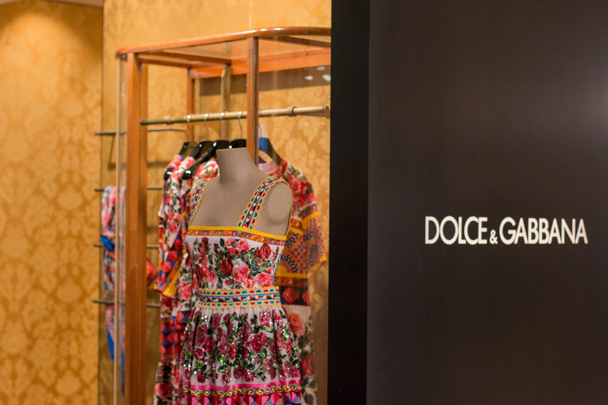
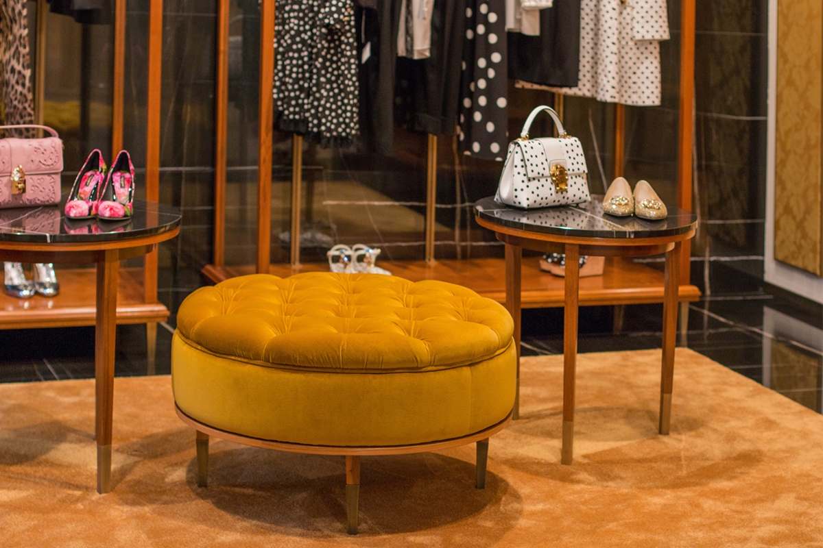
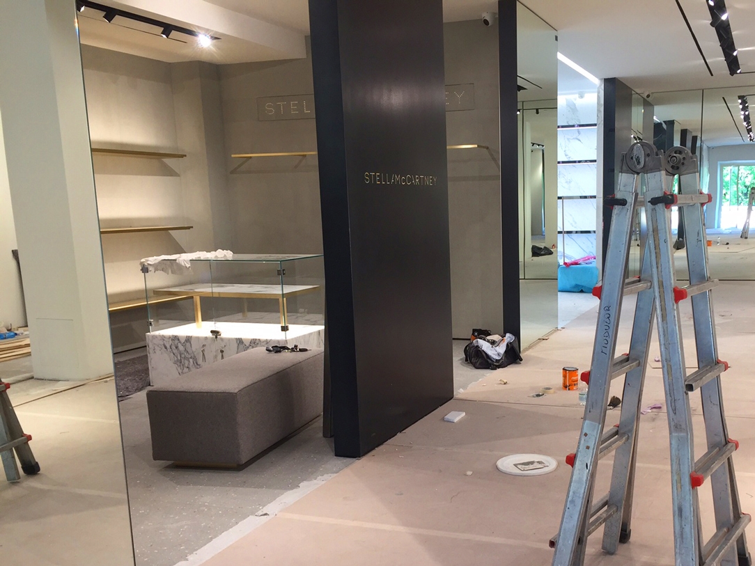
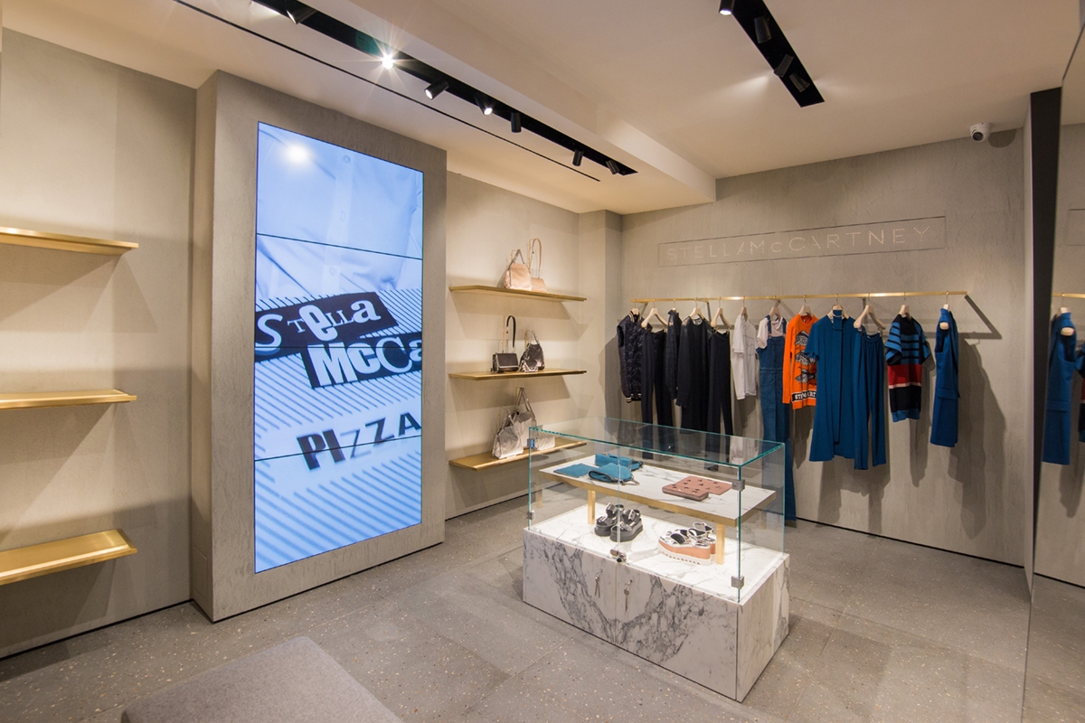
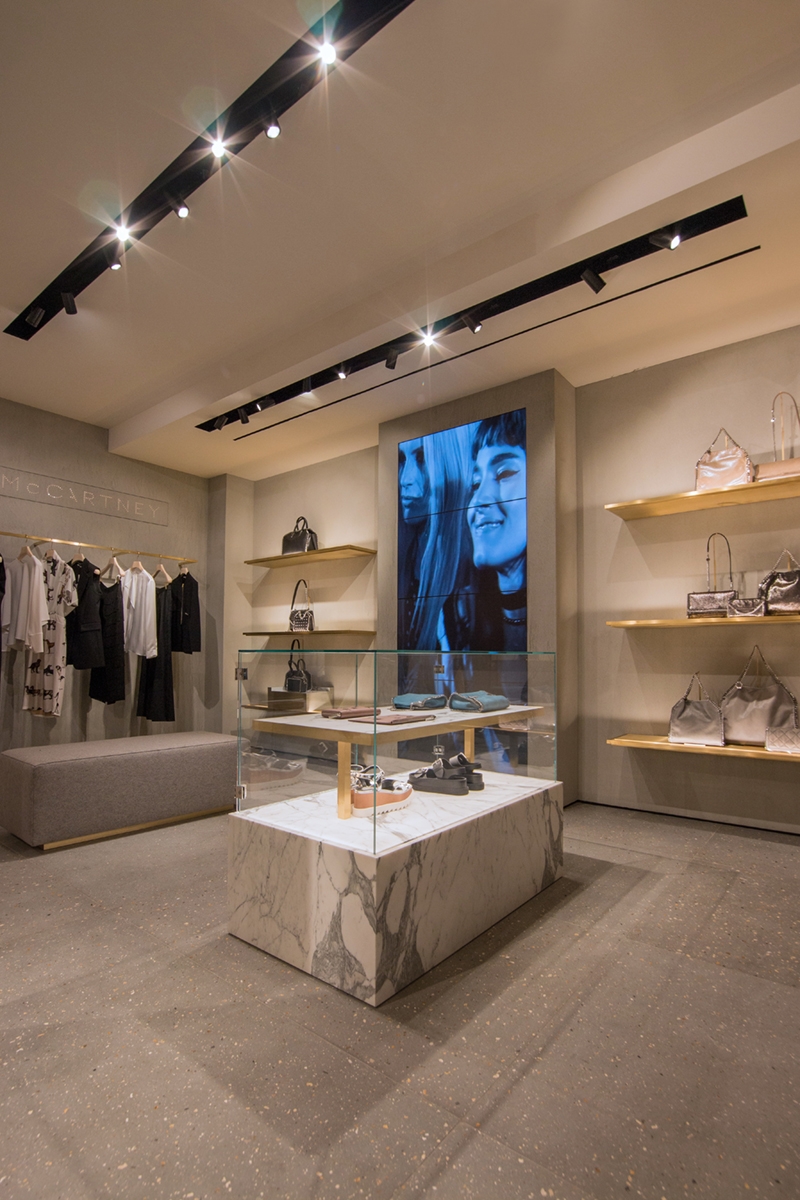
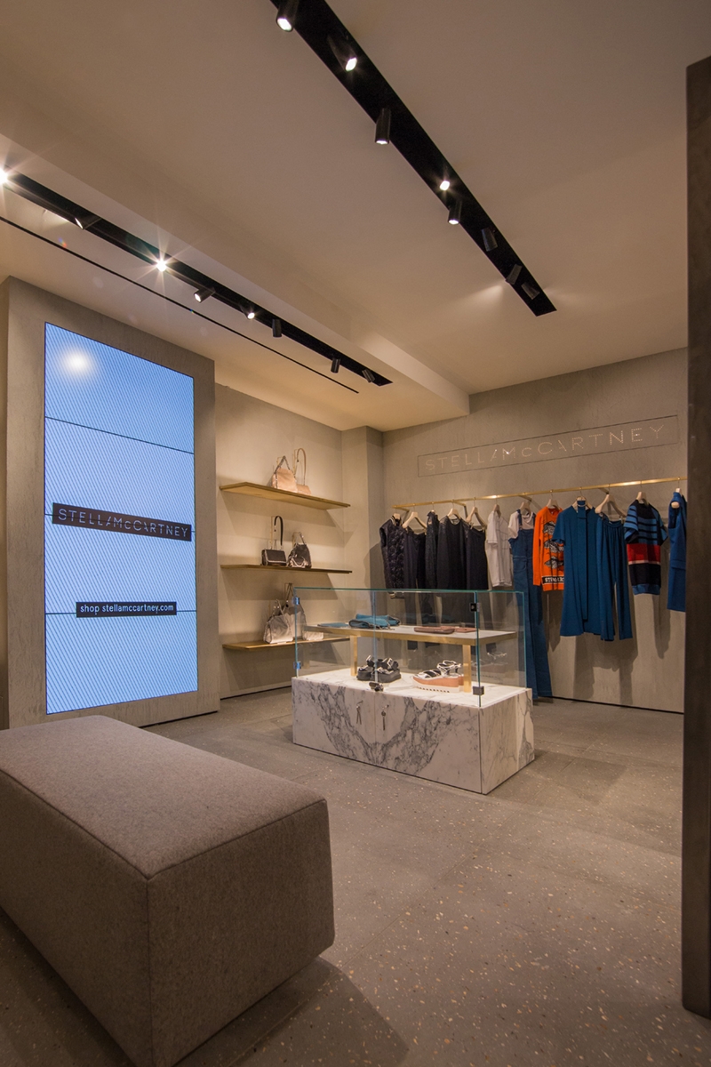
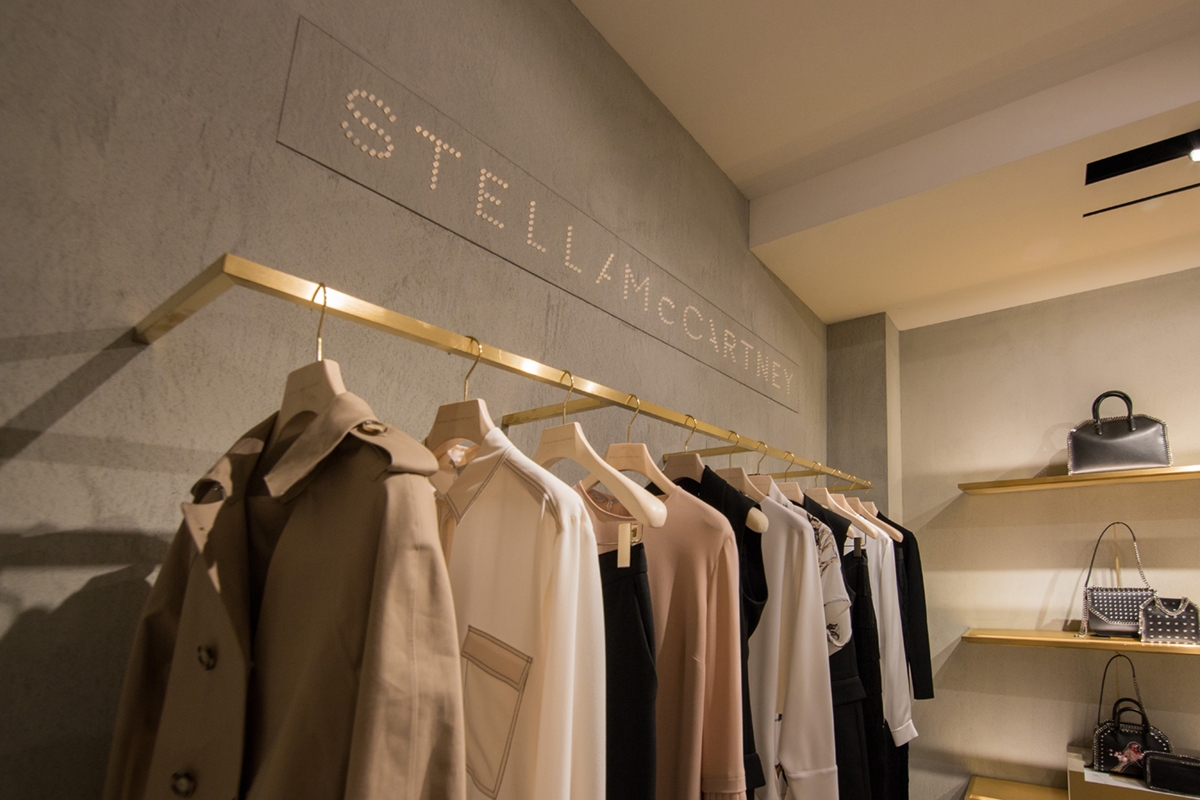
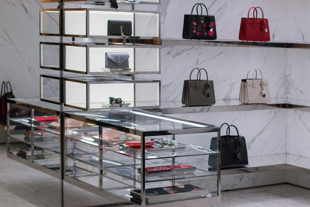
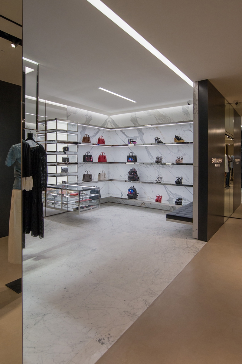
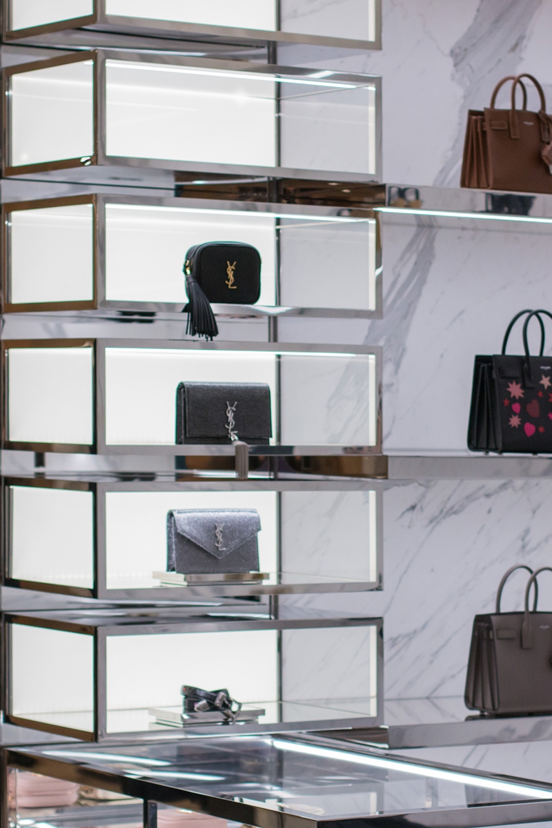
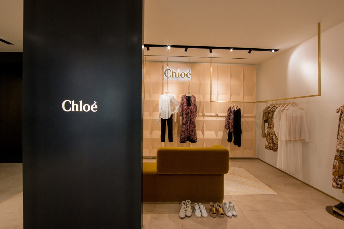
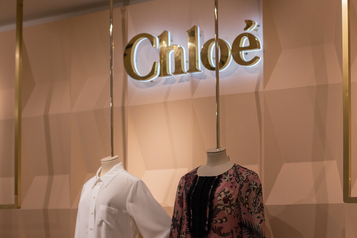
The provision of the exhibition layout design by the architect Marco Costanzi in August 2015 was a great success especially regarding the white boxes of the corners located on the back wall. (if you missed the article, click here) For this reason, the multibrand Tiziana Fausti wanted to expand its woman’s commercial space by acquiring a new wing of the historic building previously occupied by the Ciao restaurant chain. The goal is primarily to add four new single-brand corners with the same approach as the existing ones. To achieve this, it was decided to demolish a wall near the lift and set up new white boxes. THE NEW CORNERS Assigned to the luxury brands of Dolce & Gabbana, Yves Saint Laurent, Chloè and Stella Mc Cartney, they all respond to the same external approach. Full height black waxed iron panels with laser-cut and blacklit logo. For the internal layout, as in the previous white boxes, we set-up internal lighting with directional spots, air conditioning and any electrical outlets. In the event that the furniture provided by individual brands in accordance with their visual identity have illuminated display cases, it is necessary to provide wall-mounted electrical outlets in order to prepare them for attachment. For the air conditioning, recessed ducts have boon arranged in the false ceiling which can sometimes be changed depending on the need. This is the case of the Dolce & Gabbana corner, whose air conditioning system renounces the ducts preferring shaped shells along the perimeter, Even the side walls and the ceilings have to be structured in order to possibly support the weight of internal coverings. Once again, the corner of Dolce & Gabbana offers an excellent example with the veined black marble covering. The preparation and the internal project of the corners are entrusted to the visual designers of the respective brands. Here are some photos work in progress N.B. Photos of the completed corners have been included after the inauguration on 9th September 2016.

 
WIP corner D&G
Modulor new corner DG
Modulor DG zoom 01
Modulor DG zoom 02
WIP Stella Mc Cartney 2016
New corner 2016 Stella Mc Cartney
corner Stella zoom 01
corner Stella zoom 02
corner Stella zoom 03
Modulor new corner YSL
Modulor YSL zoom 01
Modulor YSL zoom 02
Nuovi corner 2016 Chloè
Corner Chloè zoom 01

WIP: organize a shop based on functional macro areas

WIP: organize a shop based on functional macro areas

A breath of fresh air in a shop in a seaside town, which does not live only on summer tourism. The scent of the sea in its center makes you feel on vacation all year round. A shop with very large interiors organized in macro functional display areas that allow the optimization of the environments and the best management of customer flows.

CONTEXT

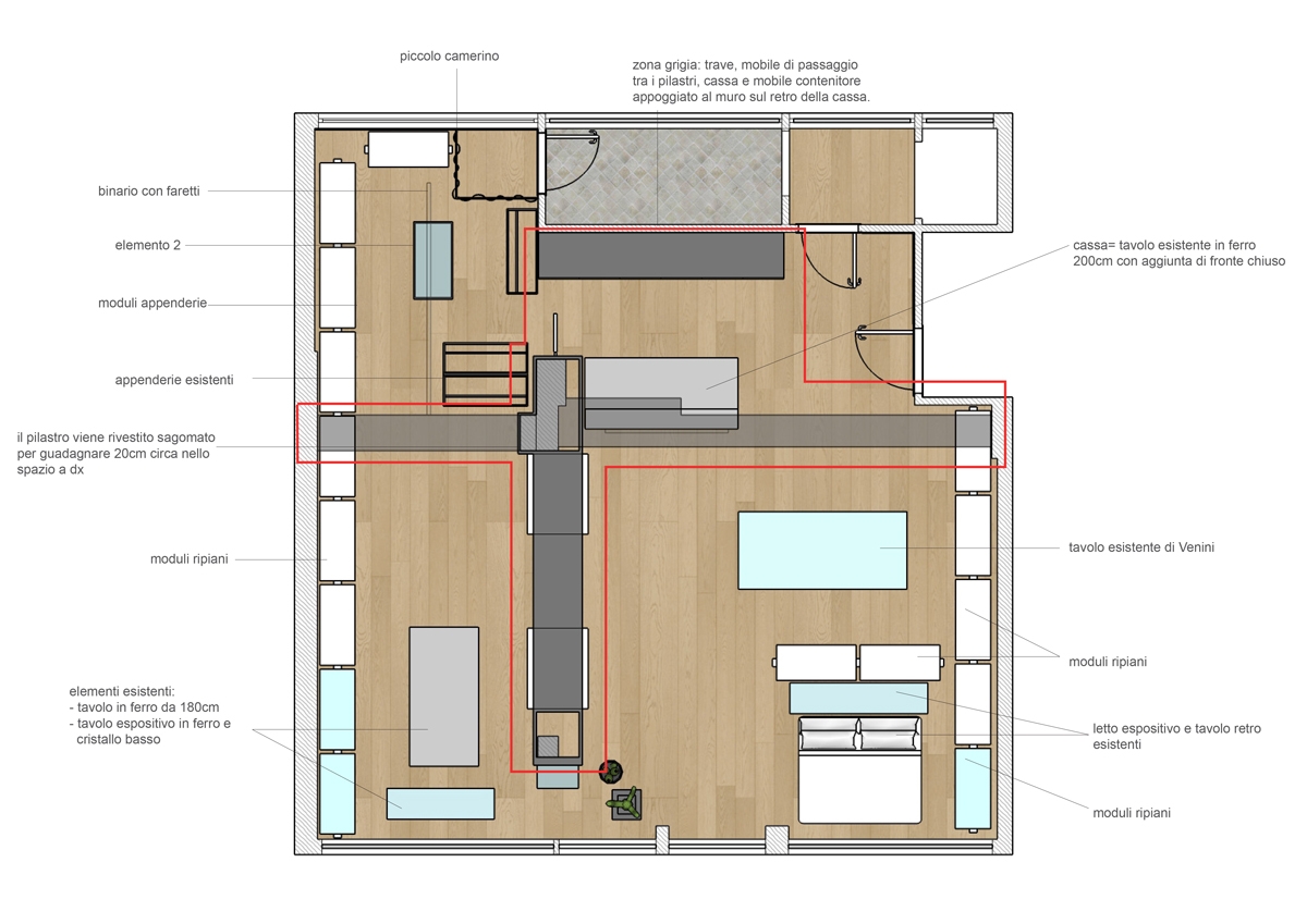
Lignano Sabbiadoro is one of the most renowned tourist resorts on the Adriatic. Bathing establishment always in vogue, it maintains the retro charm of an urban structure linked to the 50s, the period in which Lignano Pineta develops. In the center of the village, under the fresh porticoes, this shop of homemade objects and clothing tooks place. The amplitude is certainly a point in favor of each shop, but sometimes it risks becoming a critical point resulting dispersive. A logistical order for the arrangement of the wares and a general review of the display furnishings become necessary for our customer at this time. The space, with a rectangular plan, introduce itself as an open space visually divided only by structural pillars equipped with electrical outlets. From these we started in the division into various functional macro areas, each structured with service elements for each type of wares on display.

THE PROJECT: THE PRODUCT AREAS AND THE FUNCTIONAL ARRANGEMENT

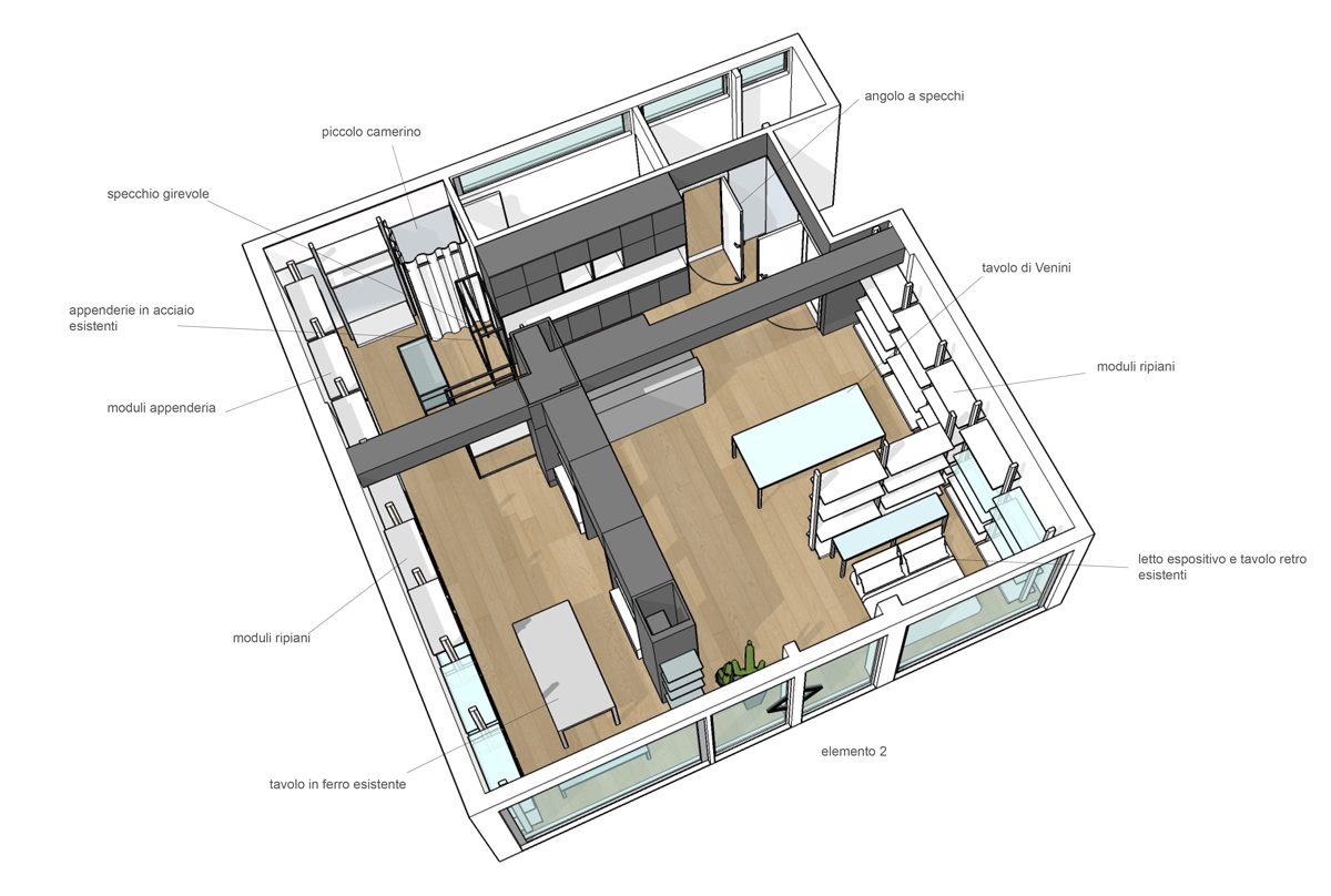
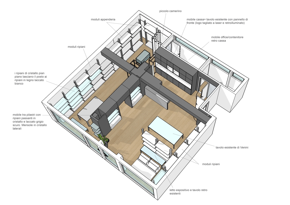
The main problem of large and visually free spaces is the possible confusion created into the user. In fact, not knowing exactly how to move, he is absurdly discouraged from exploring the shop. For this reason, our subdivision with visual elements into established areas allows customers to move smoothly in the room, directing them to internal use. A spatial division that arises from the arrangement of two equipped walls, from whose asymmetrical intersection four main rooms took place. Two of these were then combined for a wider and more airy perception of the exhibition space, while the storage area is located in the back of the cash desk.

ENTRANCE AND CASH

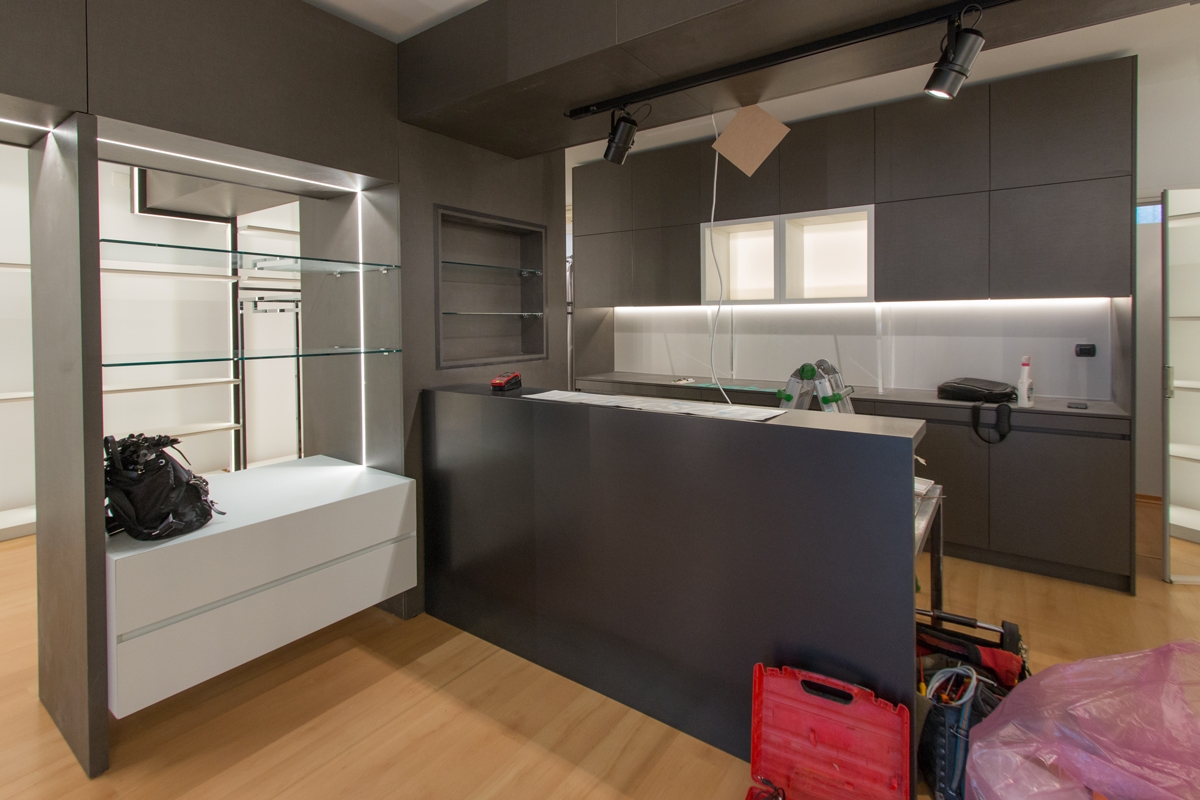
The checkout functionality defines the first area, in which the cashier certainly plays the main role. Positioned in front of the entrance, it however leave the entrance comfortable and not to oppress space. A large piece of furniture defines this area, which allows the owner to have workspace and better serve customers. To close this area, a column which has a large back that can be used as a goods display and storage point.

LINEN AND HOUSEHOLD OBJECTS

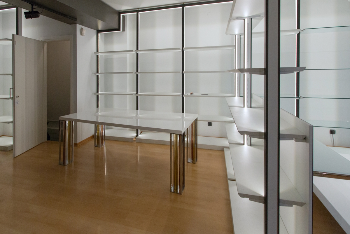
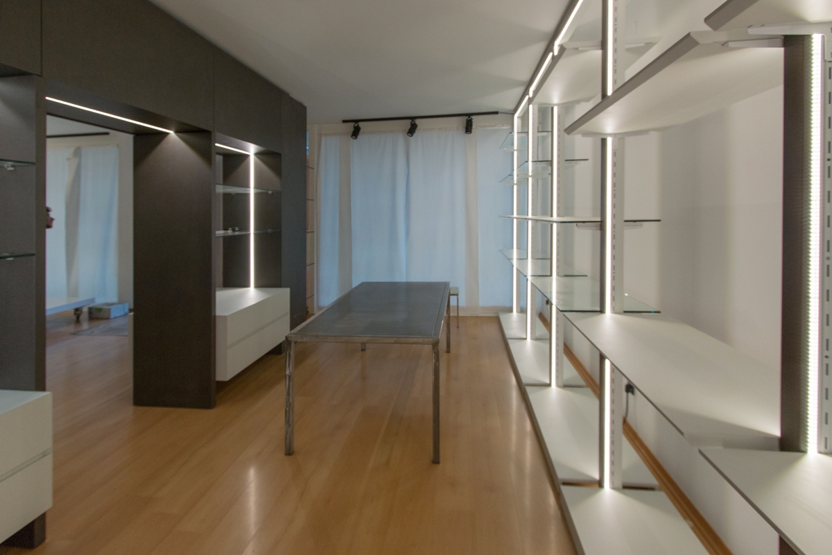
The asymmetrical subdivision of the internal spaces gives rise to a more developed exhibition area dedicated to bed and all household linen. Located at the side of the entrance, it allows a better management of customer flows, as well as a visual hierarchy that identifies this room as the main one in the fruition of the shop. In the centre, a design glass table surrounded by shelf modules is useful for displaying small household items. While, a full-height dividing element visually reproduces the wall elements creating an internal division. A smaller space set up for display where the customer can observe the contextualized products. On the back walls common to the exhibition areas, functional elements alternate whose shelves are organized according to the wares on display. The different distances between each shelf allow the placement of bulky objects or small decorative elements as needed.

CLOTHING

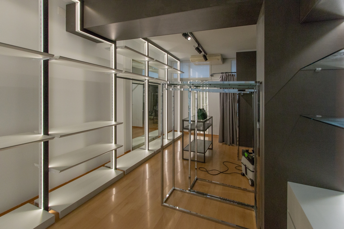
To mark the boundary of this room is an equipped portal, serving the property for the storage of goods not on show. This allows the passage to the remaining area dedicated to clothing. Here, our modules become hangers and the shelves are used for folding. A dressing room for clothing testing concludes this room, which connects directly to the cash desk area. Approaching the showcase, the shelf modules become closer for bags and small prêt-à-porter objects.
project Lignano shop 01
project Lignano shop 02
project Lignano shop 03 functional areas

MODULES AND STYLE

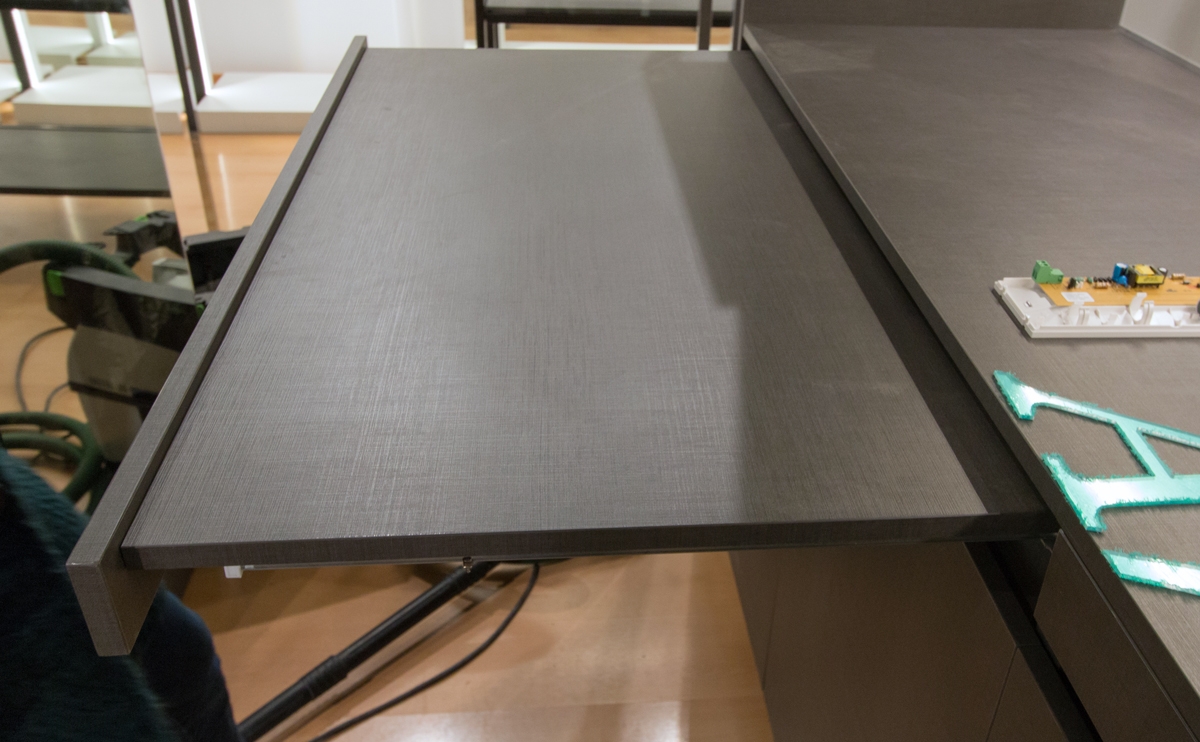
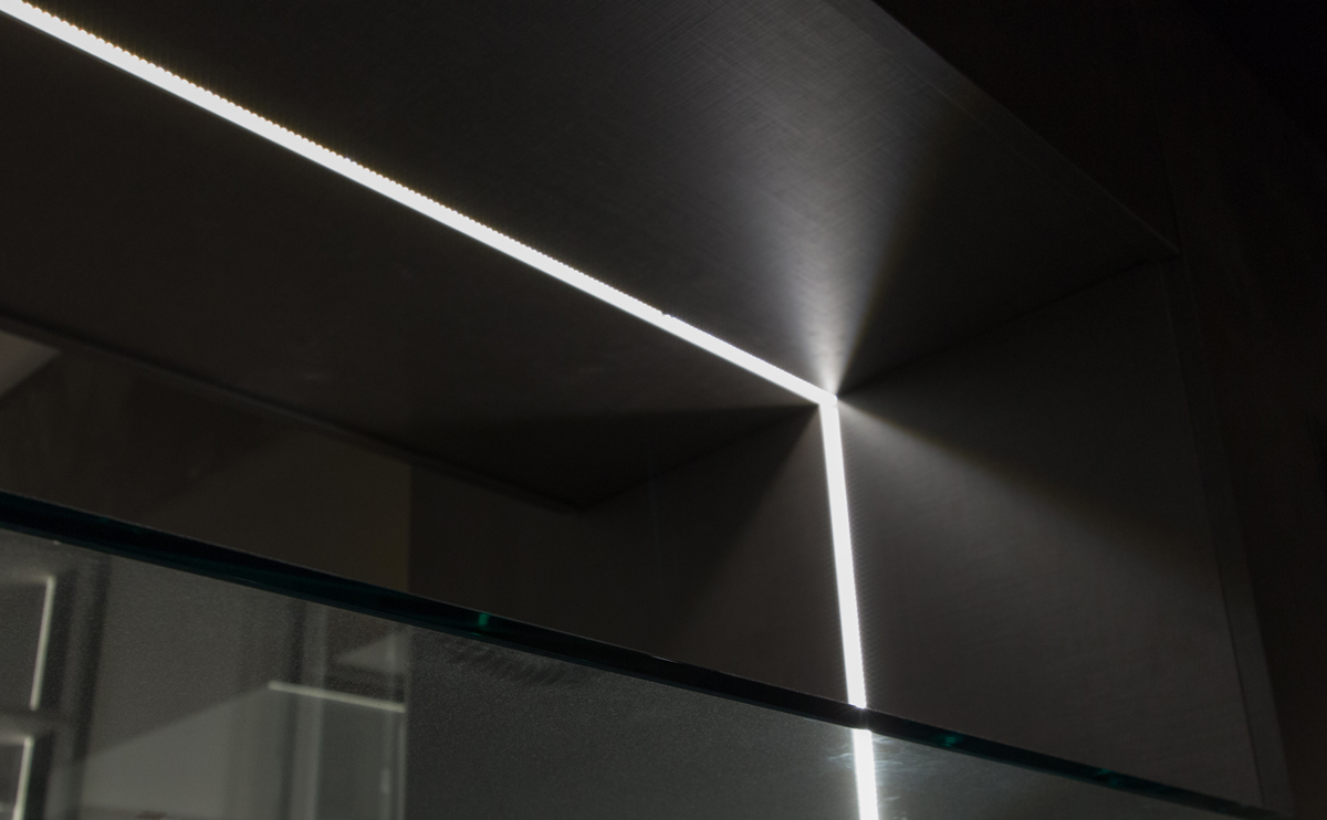
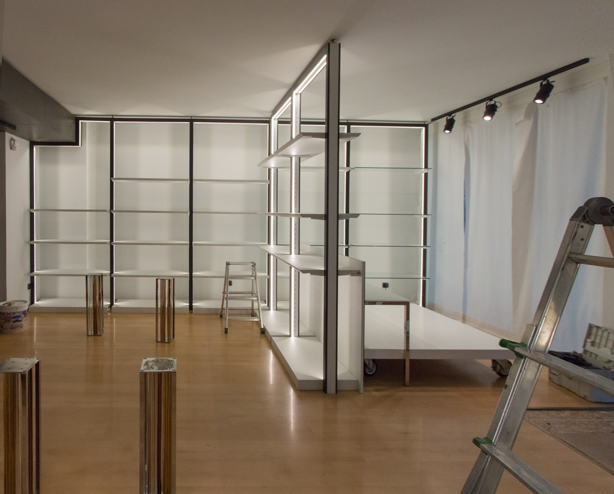
As far as materials, colors and types of furniture are concerned, we have focused on the modern, gritty and essential style. The two colors that alternate with the white walls are a dark gray with bold tones, which also defines the cash area and the illuminated portal for access to the clothing area and a very light gray tending to blue, which recalls the nearby sea and characterizes shelves and low storage elements. The exhibition modules are of two types: the shelf modules are tall, in chromed steel with a bright internal LED profile with lacquered shelves that alternate with crystal shelves that act as display elements and separate the various areas. The others are low, in steel and crystal and act as an exhibition support for the tall elements. Here some Work in Progress photos, we hope to make soon an holiday in Lignano seafront and return to admire the set up shop!
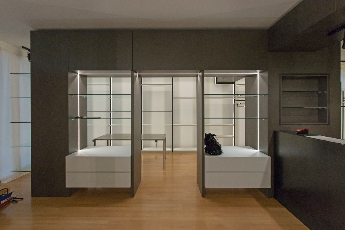
cash counter area shop
divider functional areas
shelves back wall display areas
lighting shelves back wall display areas
shop details
shop lighting details
display area bed and home line
table and shelves Lignano shop

In the world of luxury retail, the white boxes for Tiziana Fausti

In the world of luxury retail, the white boxes for Tiziana Fausti

Luxury corners in the retail world have a universal language, this is what white boxes are and how we made them for the Tiziana Fausti multibrand in Bergamo.

WHITE BOXES

The world of fashion speaks a universal language. A language composed of functionality, simplicity and beauty. Three keywords that become the fundamental requirements in the design of the white boxes. These constitute the basic module of the exhibit system of any corner: essential rooms that build the “basic display units”. A sort of empty box, perfect in the executive realization that can be declined in all contexts depending on the brand’s exhibition project. An extremely versatile element equipped with lighting, arrangement of electrical outlets and air conditioning ducts as planned. It should then be destinated to the single luxury brand. White boxes are certainly among the fundamental requests of each general contractor, also for their duration over the years. If it is true that the world of retail is the first to always dictate new trend and to continually renew itself, the white boxes instead constitute a timeless element capable of becoming a constant for the internal layout of the corners. A flexible room that will experience as few structural changes as possible. The design of the internal exhibition spaces and their management are entrusted to the visual and interior designers of the single brand.  

PROJECT LAYOUT

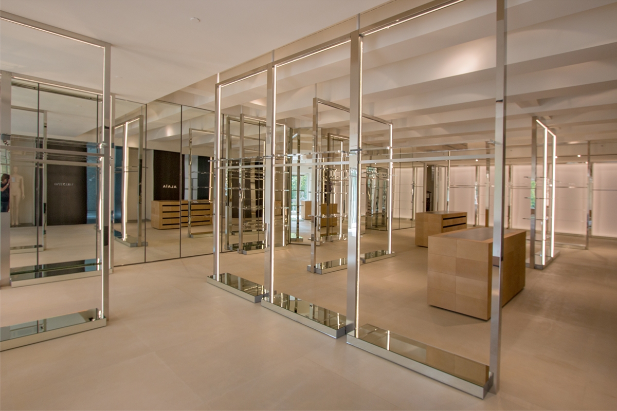
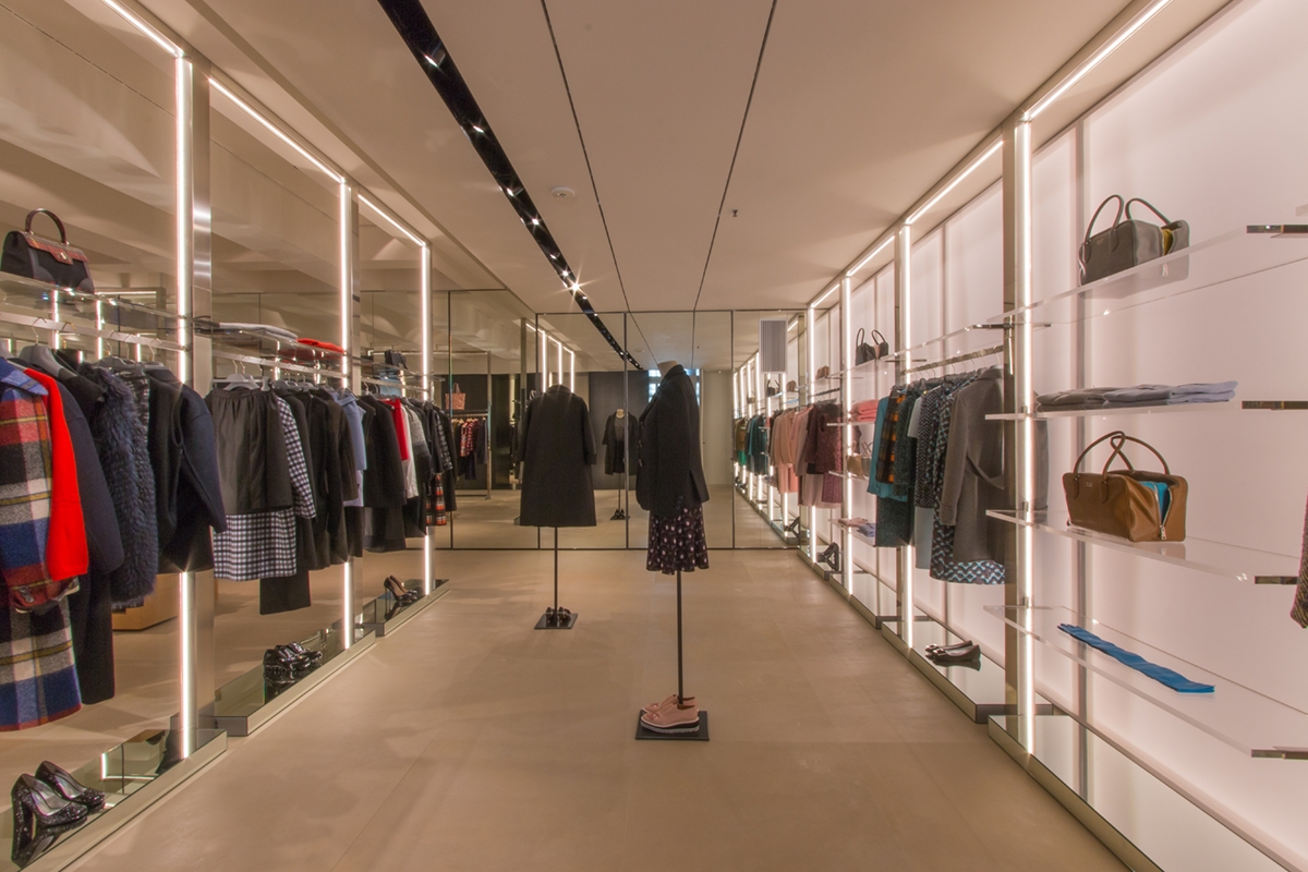
For the Tiziana Fausti luxury store in the centre of Bergamo we have realized the white boxes as designed by the architect Marco Costanzi. In particular, the lyout of the commercial space was intended to hoas a multibrand space equipped with linear display elements in its central area and to host three luxury brands in the respective white boxes on the back wall.

MULTIBRAND

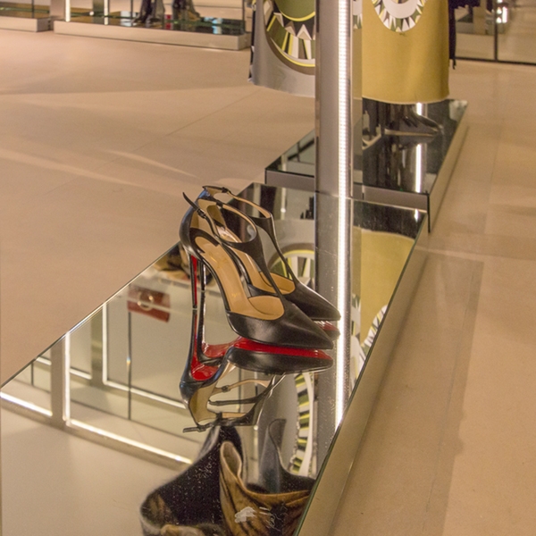
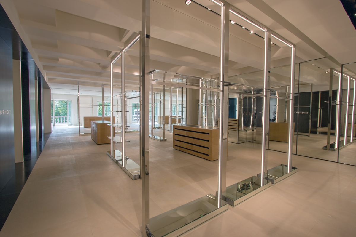
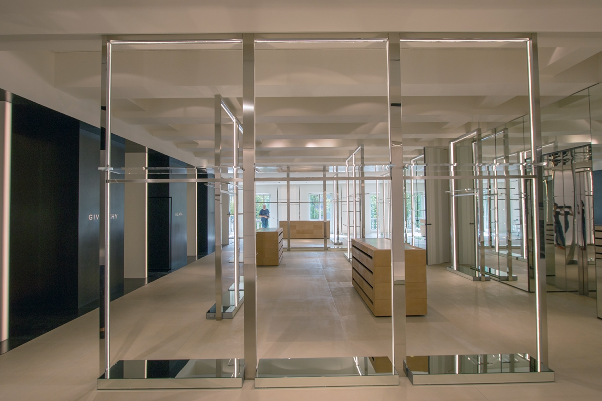
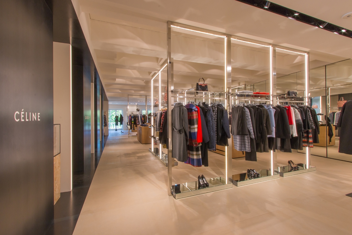
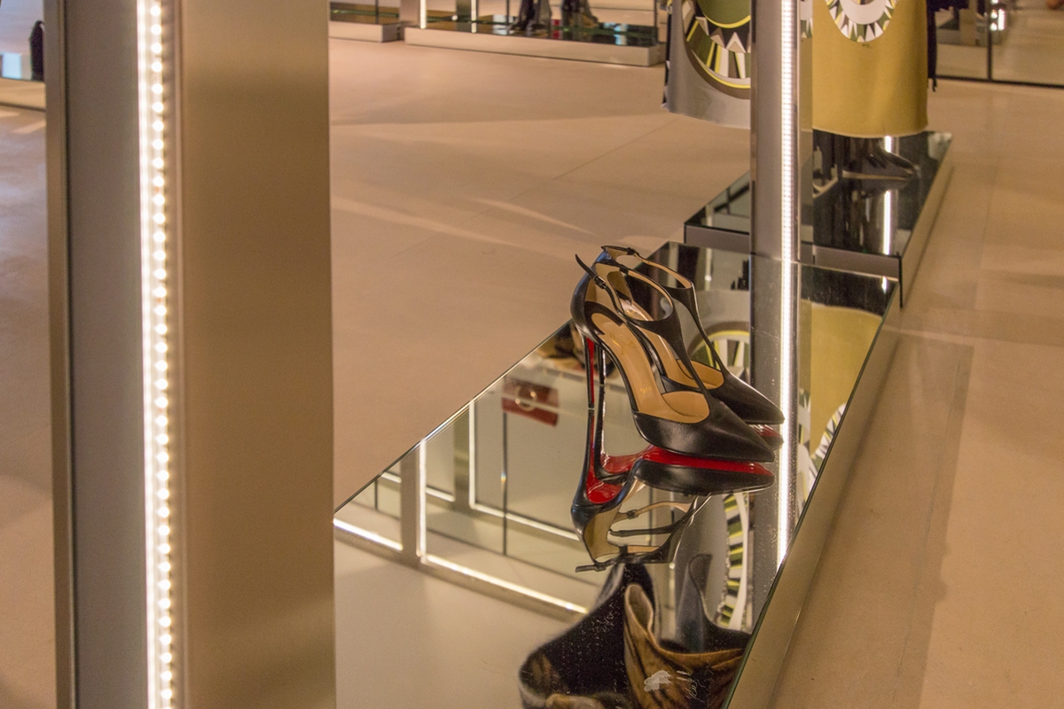
In the central space, linear elements that can also contain lighting in their essential profiles, as well as glass display shelves are designed. Made of polished stainless steel, they hold the cable system at the base, which allows linear lighting which also acts as a luminous frame. In this way, they function as stand-alone elements, providing the necessary light for the correct illumination of the products, but they also not exclude the use of any external spotlights that can improve their visibility.

TIZIANA FAUSTI WHITE BOXES

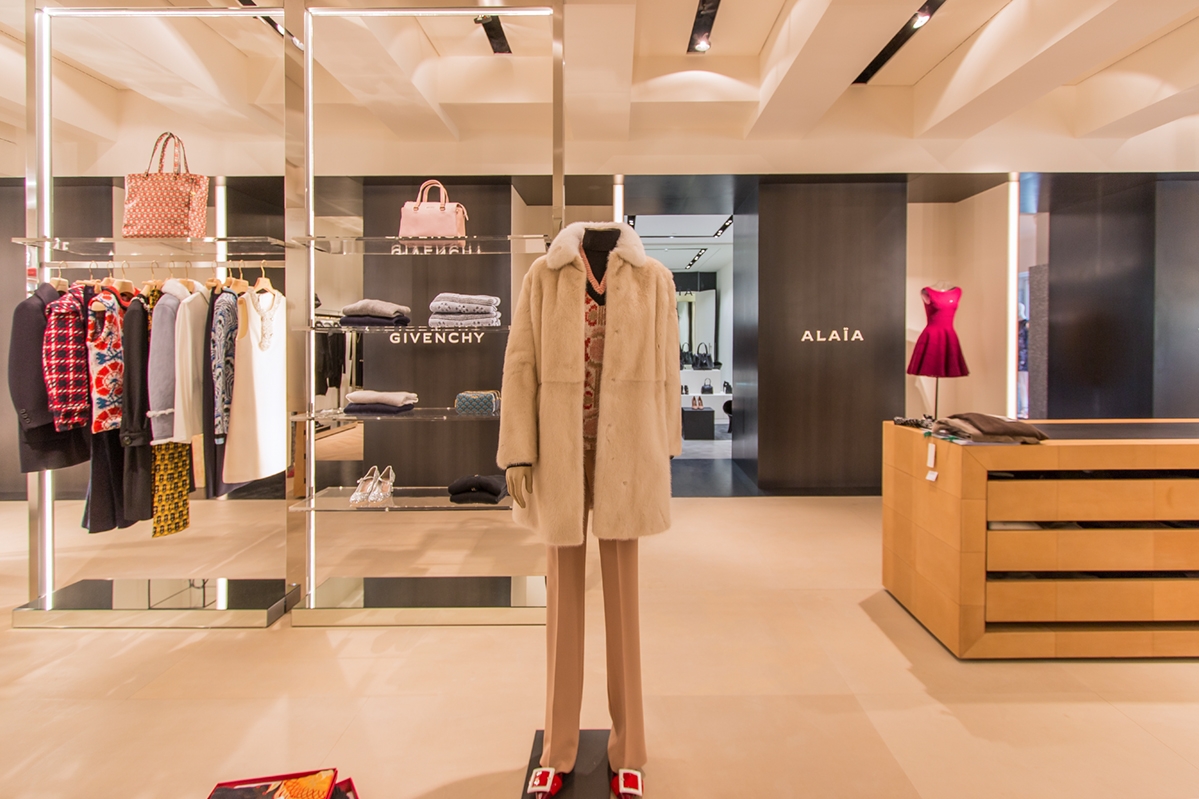
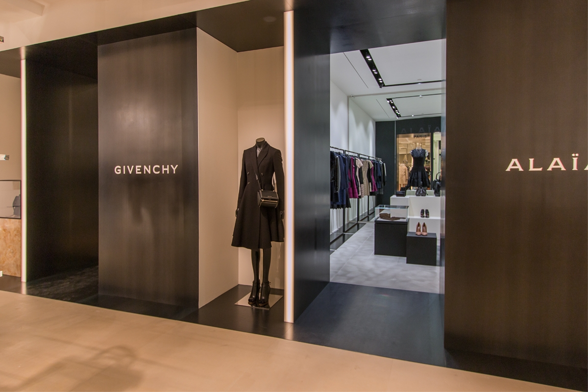
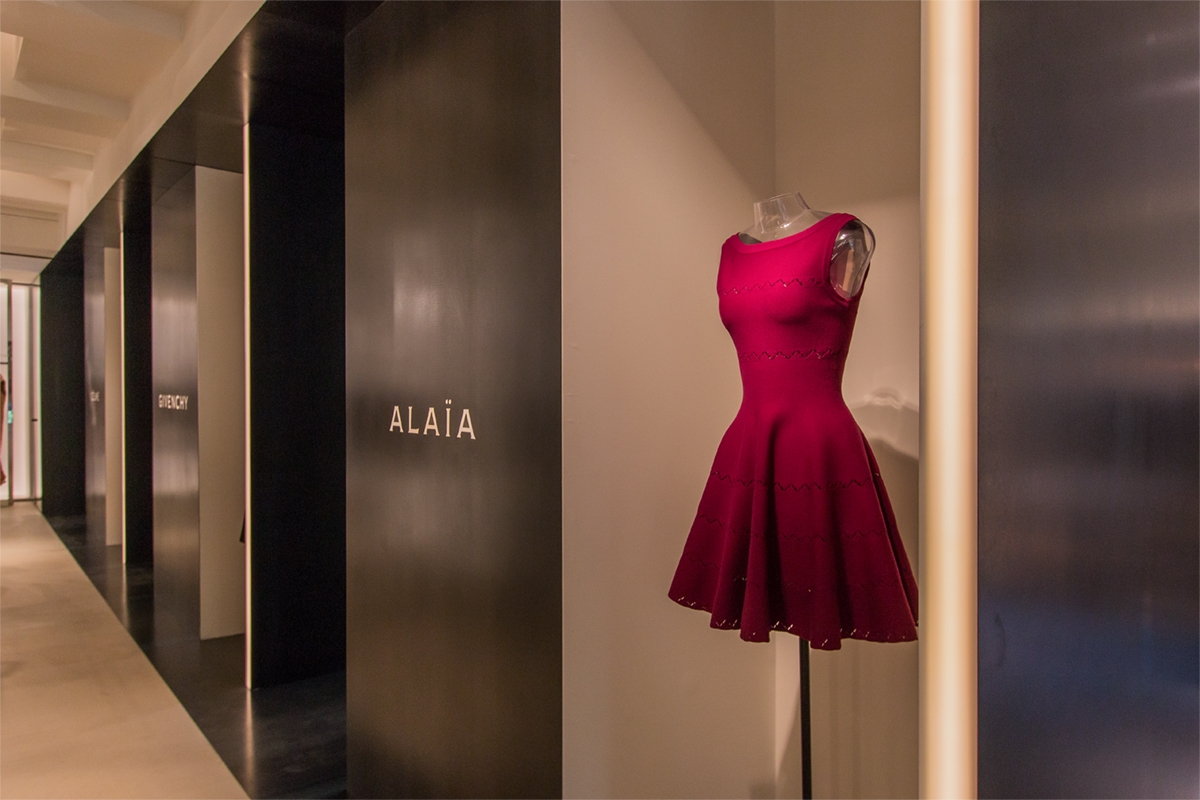
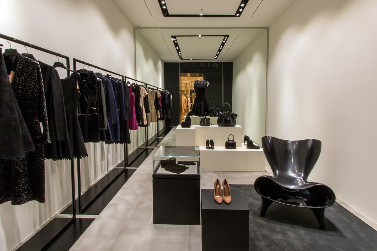
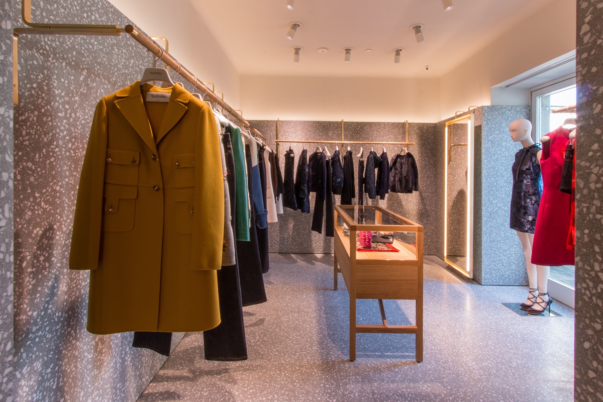
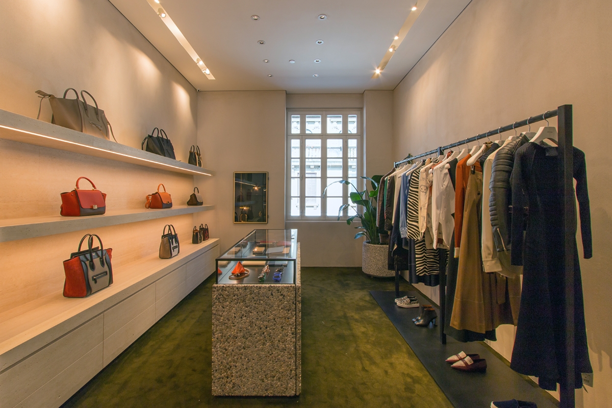
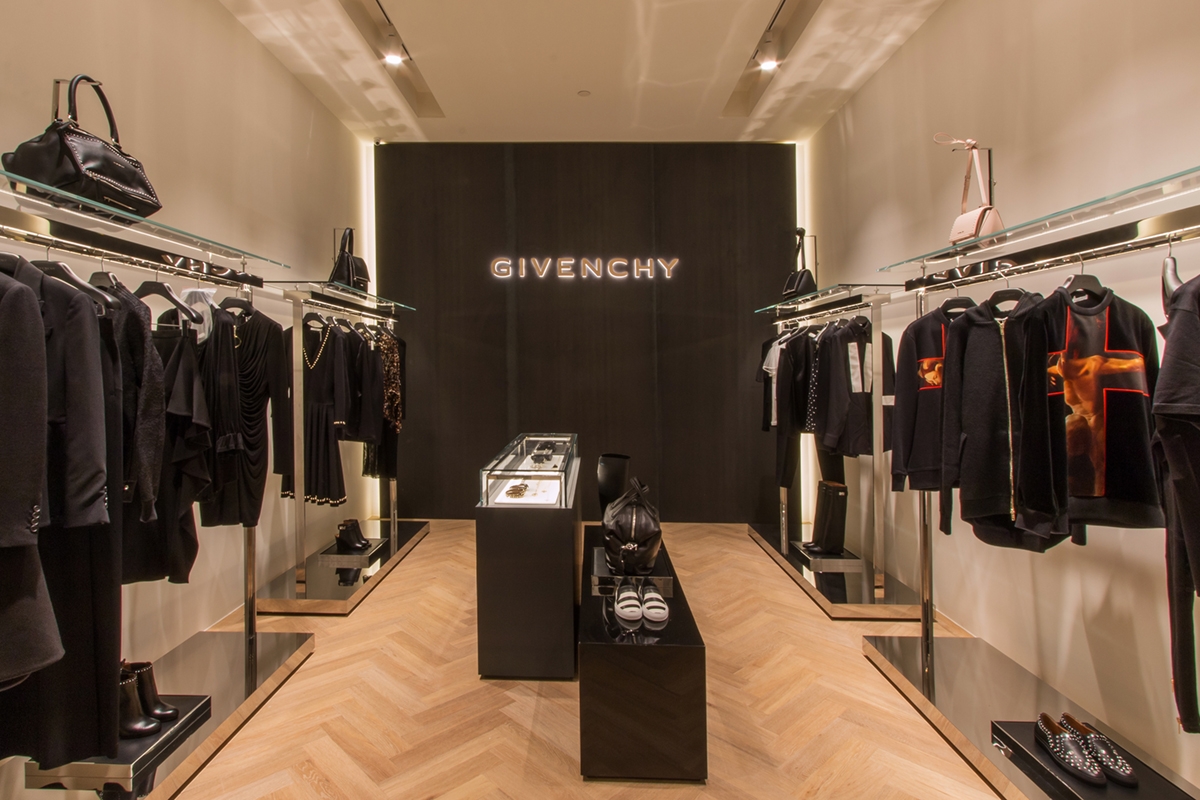
On the back wall there are four white boxes used to shortly host the corner of Alaia, Givenchy, Celine and Valentino. These have been equipped with a recessed lighting profile to which the directional spotlights are attached. The profile follows a rectangular shape and it is placed in the centre of the false ceiling. The electrical set-up and the placement of electrical outlets for potential wall displays or illuminated central showcase constituted the interior layout of the rooms. These were also equipped with the air conditioning system and the wall and ceiling structure was mounted according to the project. This is the case, for example, of the corner of Valentino, whose project envisaged a marble wall cladding that needs a supporting structure behind it. Concerning the external front view, the white boxes were characterized by clack waxed iron closing panels. These chromatically detaches themselves for the choice of black in which the logo of the luxury brands inside the corner are laser shaped. The size of the logo and its blacklighting is a dimensional constraint fixed by Architect Costanzi’s studio on each brand to visually standardize the external front view in accordance with the general project.  The niches created between the corners are equipped to hold the mannequins of the brand as a sort of recessed showcase. Some photos of work in progress are shown below. N.B.  We in retrospect added the photos of the fitting completed in August 2015 for a greater success of the visual representation.

 
white boxes Tiziana Fausti work in progress
Tiziana Fausti work in progress
white boxes display Tiziana Fausti
white boxes detail
display Tiziana Fausti 2015
white boxes exterior
front view exterior mannequin zoom
Tiziana Fausti Alaia
Tiziana Fausti Valentino
Tiziana Fausti Celine
Tiziana Fausti Givenchy

Work in progress with the bitter taste of a coffee

Work in progress with the bitter taste of a coffee

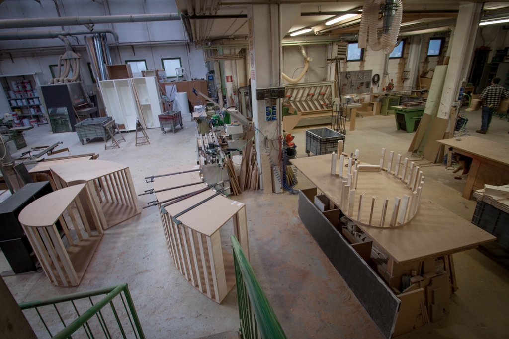
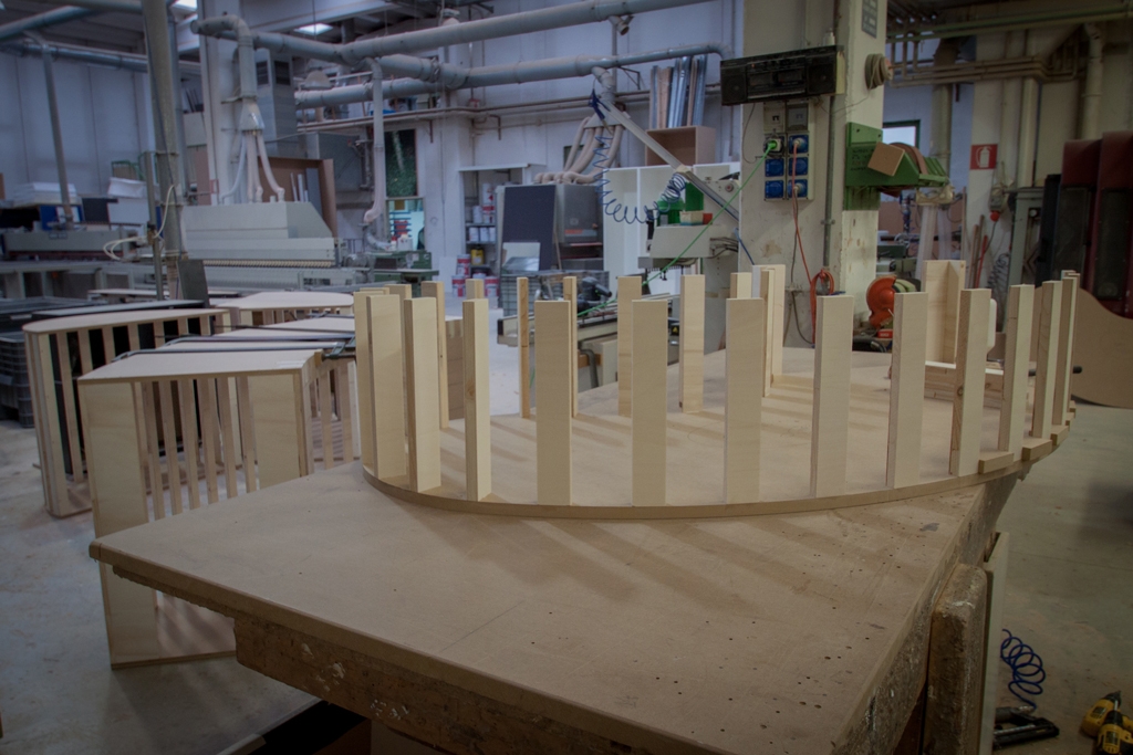
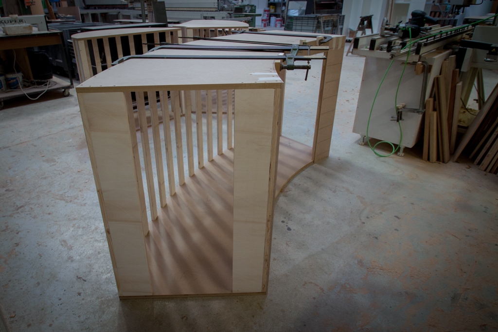
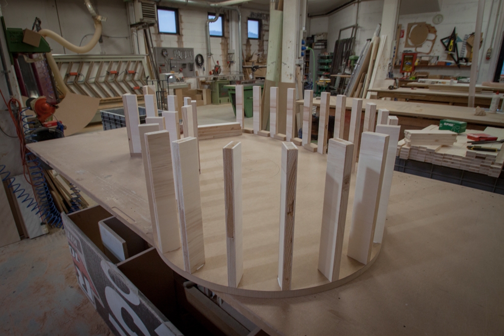
Directly from our laboratory, some photos of the work in progress project of a coffee shop in Ibiza. The Officina iDEa project concerns a retail space where coffee is the undisputed protagonist. An experiential rather than design concept, in which what conception of Italian coffee meets the European experiential context. The realization of the display elements establishes a structure composed of an upper curved MDF template to which the pantographed profiles are anchored, always in natural MDF. The whole is subsequently lacquered obtaining a slight alteration of the natural colour turning to a darker one. An unusual execution technique, which tested the technical processing skills. We will soon could observe the results together when the outfitting is complete, in the meantime we will let you peek through the works.

 
work in progress Ibiza coffee 01
work in progress Ibiza  02
work in progress Ibiza coffee 03
work in progress Ibiza 04