Versatility in Study and Hospitality

Versatility in Study and Hospitality

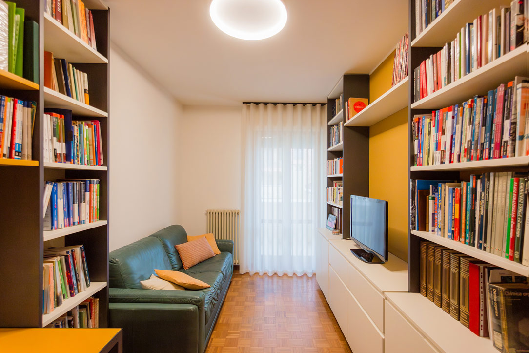
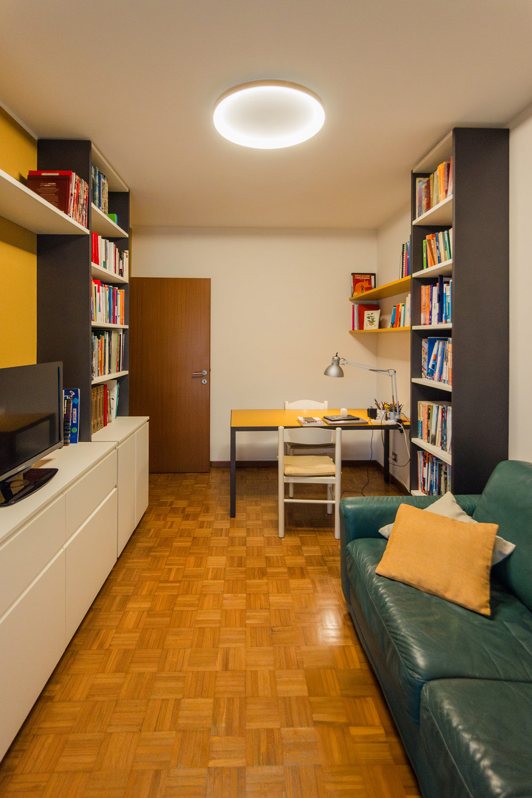
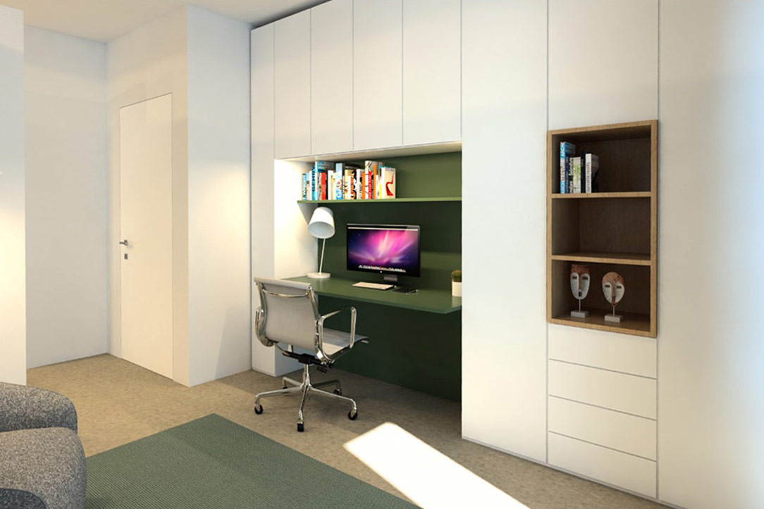
In a world that demands increasingly flexible spaces, we reimagined the study of two friendly professors who often work from home, transforming it into a multifunctional room capable of welcoming both students and guests with ease.

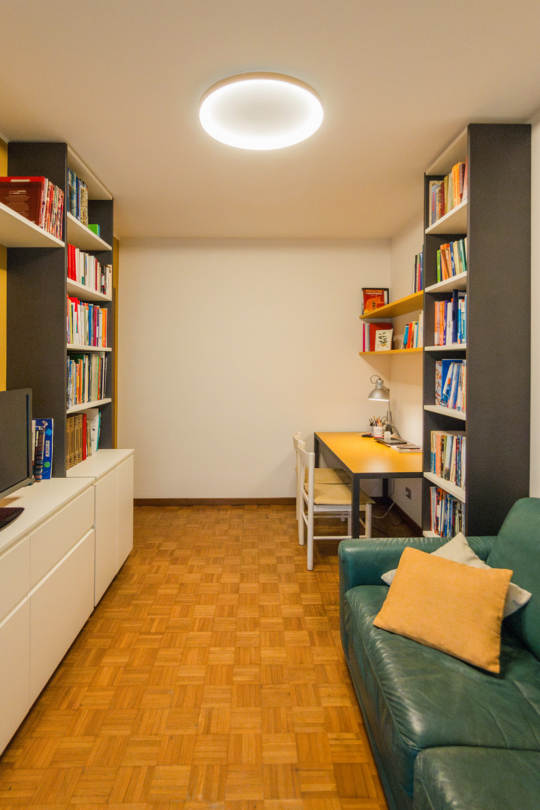
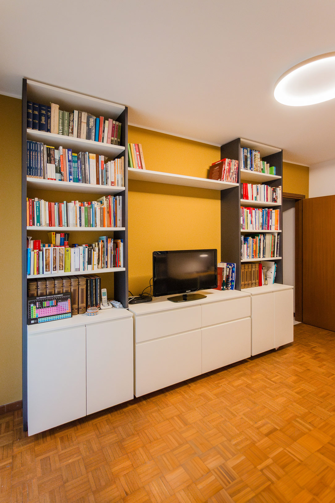
The heart of this transformation lies in the long side bookshelf, an elegant composition that houses textbooks and novels, bringing both order and beauty to the space. At the center, a dedicated compartment for a large television becomes a didactic tool for interactive lessons and, at the same time, a source of entertainment for those staying in the room.

multifunctional studio

Study Mode

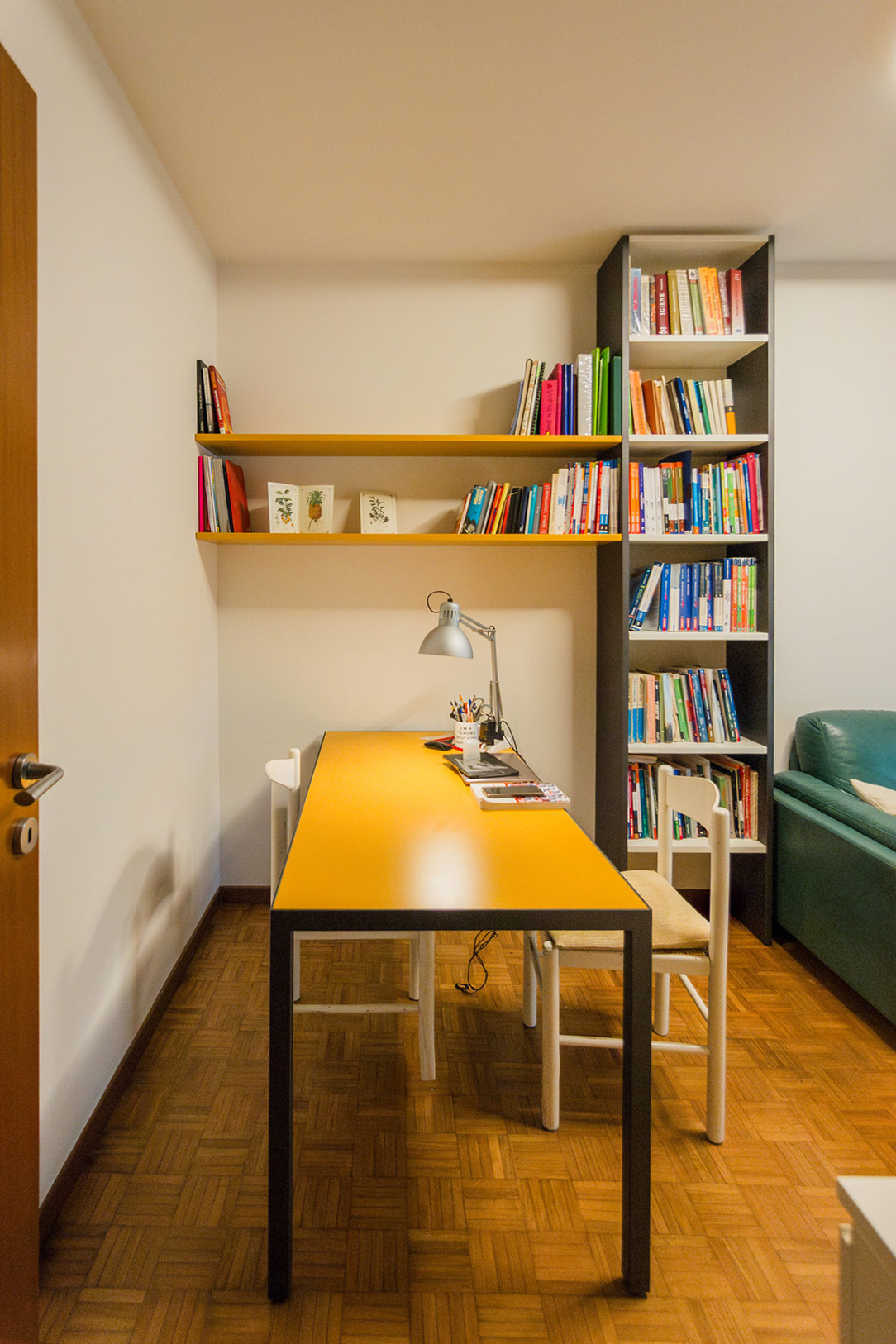
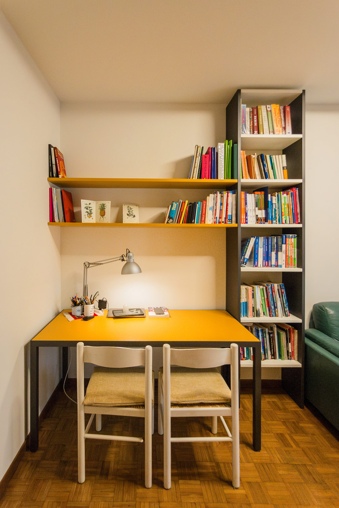
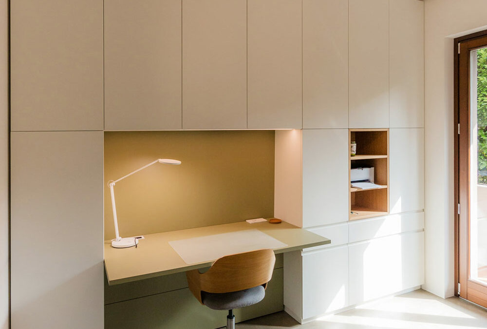
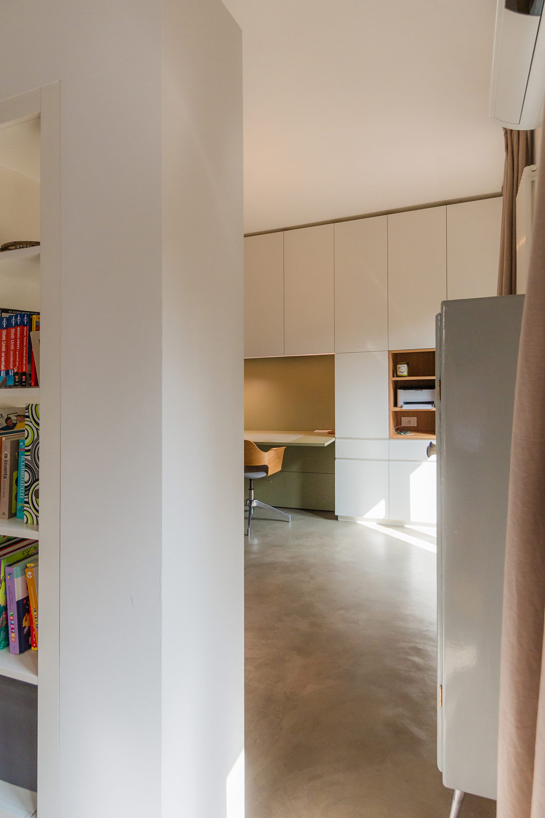
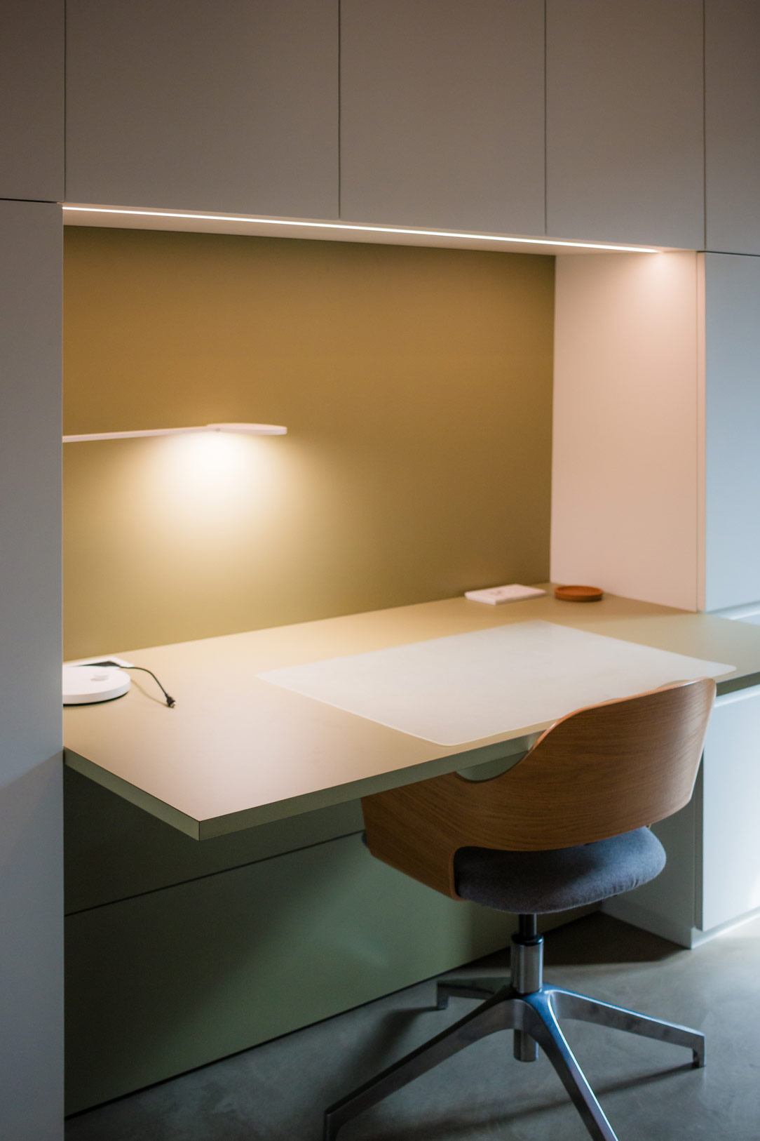
When the study comes to life, the space takes on a well-defined role. The desk, framed by a vertical bookshelf, becomes the focal point of the room. Positioned so that the student can sit directly across from the teacher, with the room unfolding in the background, it facilitates dialogue and learning.

study mode
study mode

Guest Mode

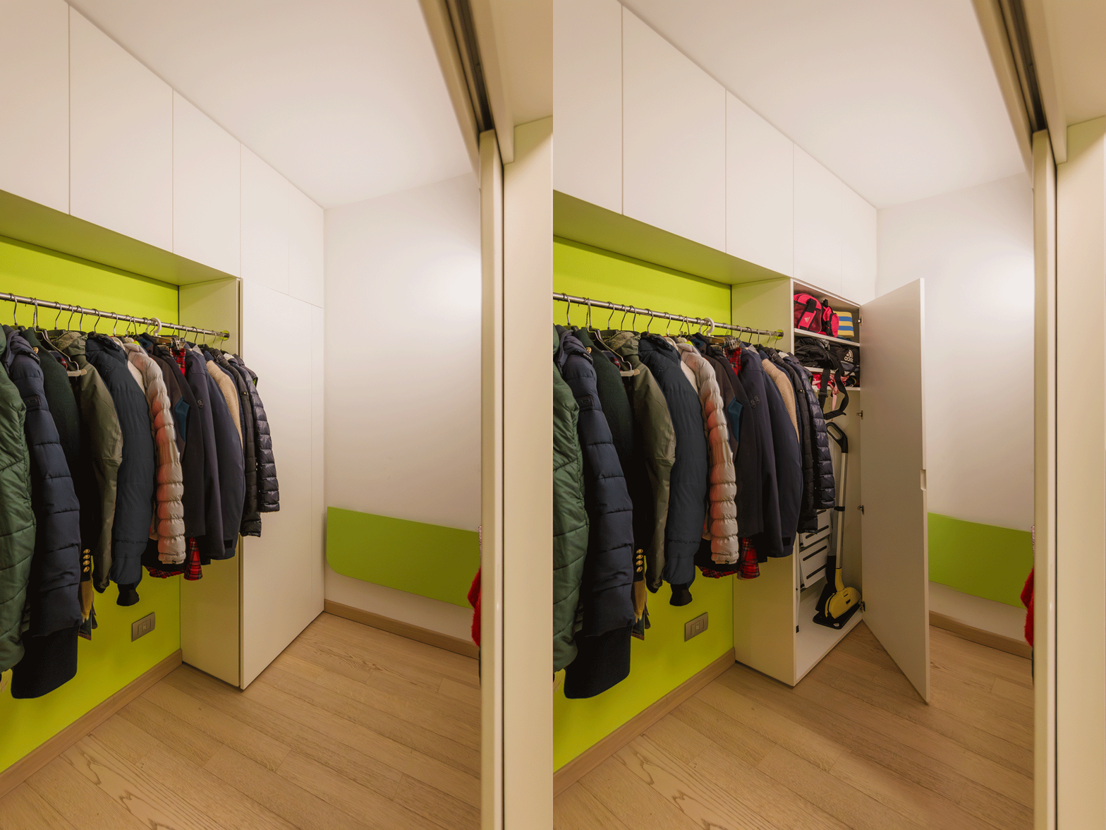
When the room hosts a guest, versatility takes center stage. The sofa transforms into a comfortable bed, while the desk, repositioned against the wall, disappears without disturbing the room’s harmony. Every movement flow is smooth and thoughtfully designed to ensure maximum comfort.

guest mode
guest mode

Balance Between Visible and Hidden

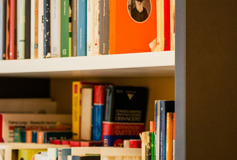
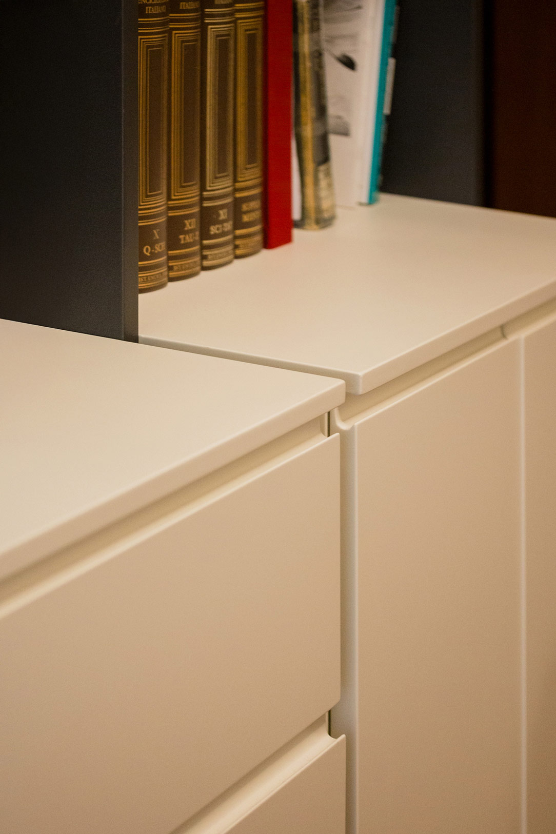
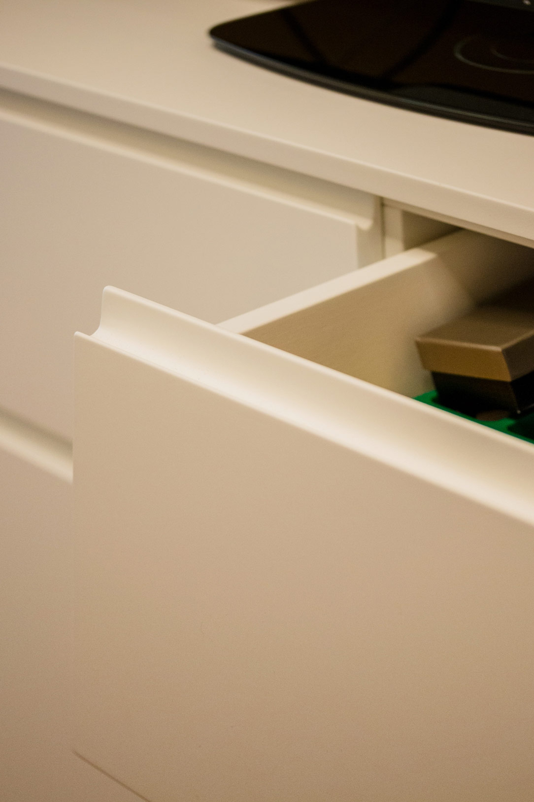
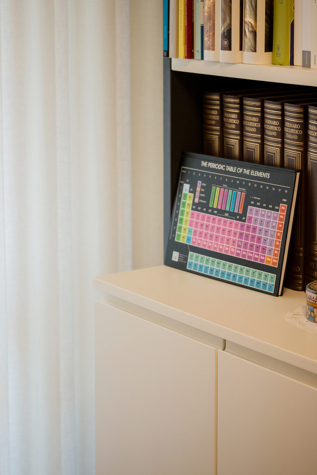
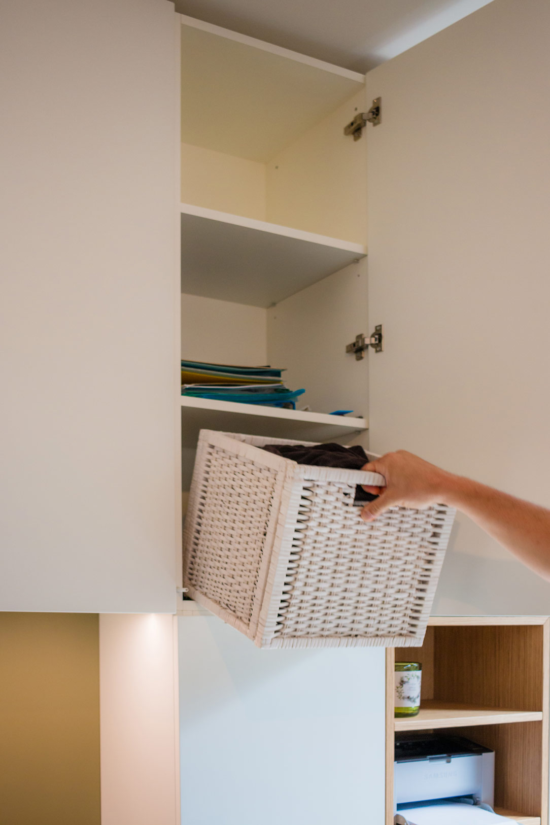
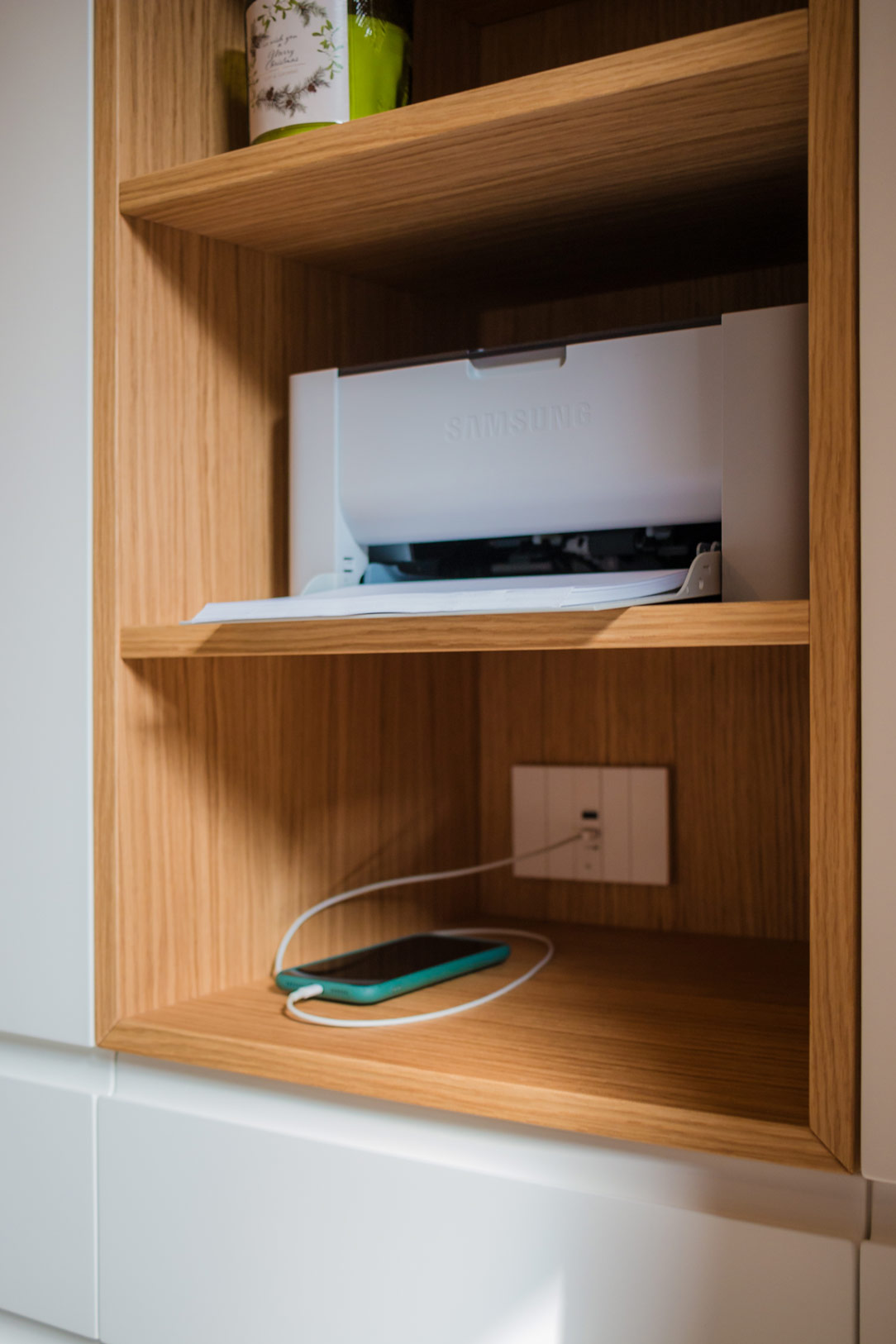
The bookshelf tells a story of balance between what is on display and what is concealed. On the open shelves, books that decorate and enrich the space find their place, while in the lower part, hidden behind doors and drawers, everything that shouldn’t distract such as files, documents, and electronic devices, is neatly stored. A difference in depth between the open and closed sections ensures greater storage capacity without overwhelming the overall aesthetic.

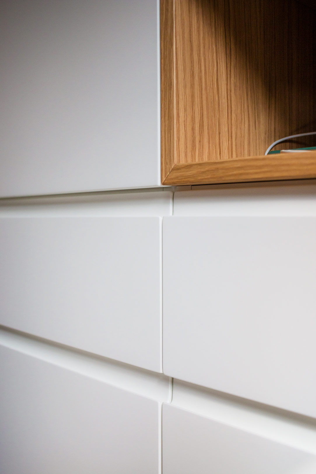
details drawers
details drawers
details anthracite

Colors and Atmosphere

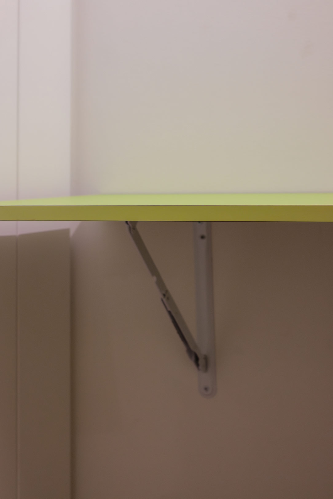
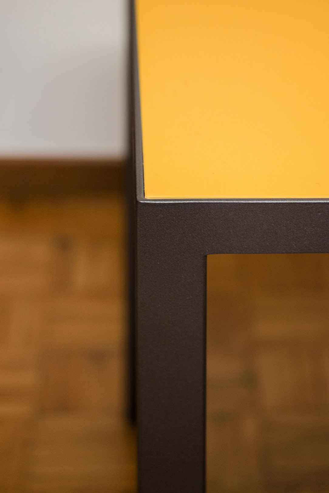
Colors play a fundamental role in defining the space’s identity. The equipped shelves, with anthracite gray metallic uprights and white shelves, offer a neutral and sophisticated base. In contrast, the desk’s mustard-colored desktop adds a touch of vibrancy. This color not only catches the eye but stimulates creativity and concentration, making the space ideal for studying. The same yellow tone can be found on the wall behind the equipped bookshelf, enveloping the room with warmth and energy.

desk detail
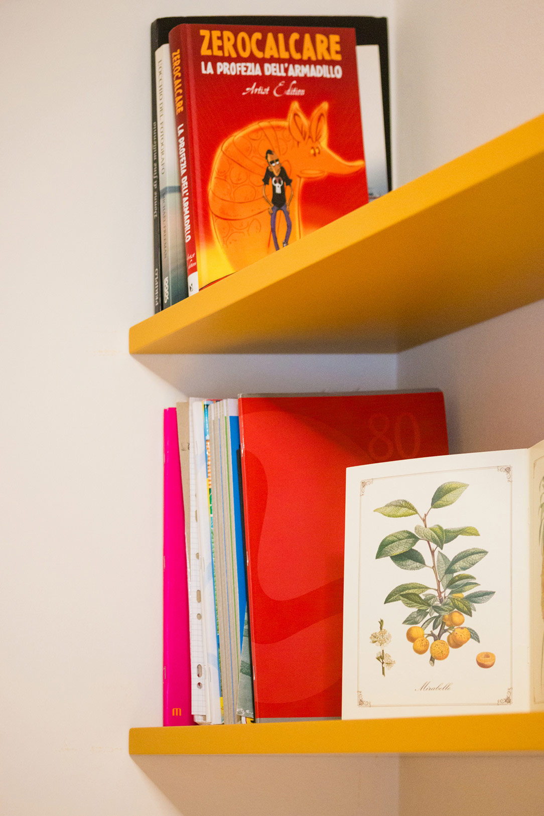
details mustard shelf

In this way, the space becomes a haven for knowledge, a place of versatility and hospitality, ready to transform to meet every need.

bookshelf

The Art of Smartworking in an Equipped Wall with Poetic and Functional Design

The Art of Smartworking in an Equipped Wall with Poetic and Functional Design

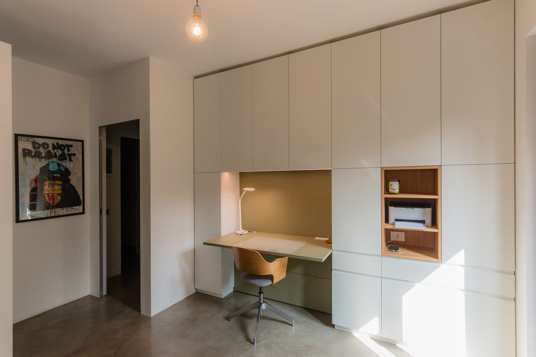
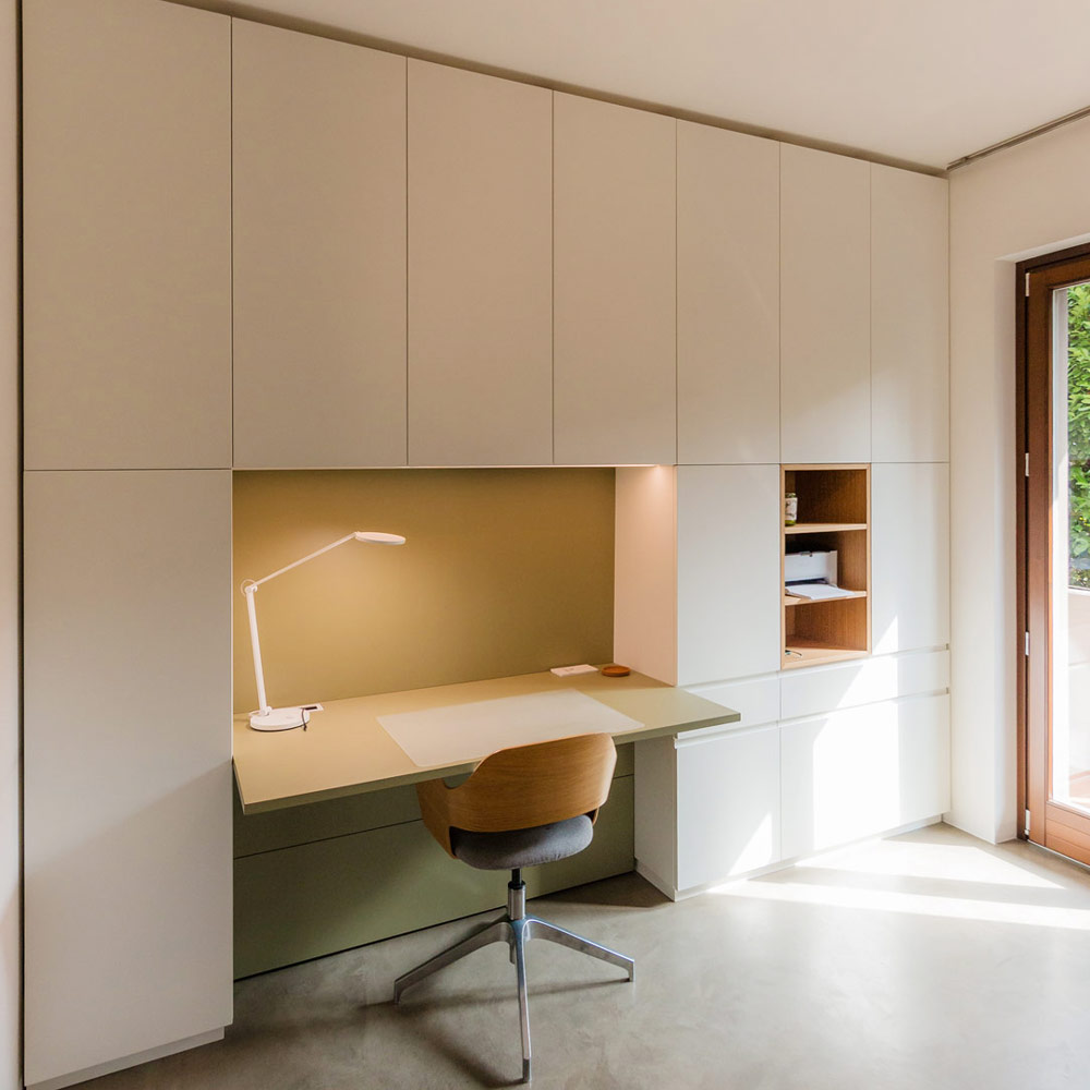
In the heart of the modern home, where every corner is designed to combine aesthetics and functionality, the equipped wall by Officina Idea stands out as a poetic and innovative project that transforms the everyday experience of smartworking into a fluid one.

Equipped Wall

From Design to Realization

The initial renders created by Paolo of Officina Idea illustrated the project in great detail, including color schemes, providing a clear vision of how the unit should look. Thanks to this precise design foundation, we were able to realize the equipped wall as faithfully as possible.

Render Paolo
like Render Paolo

Organized Spaces for Every Need

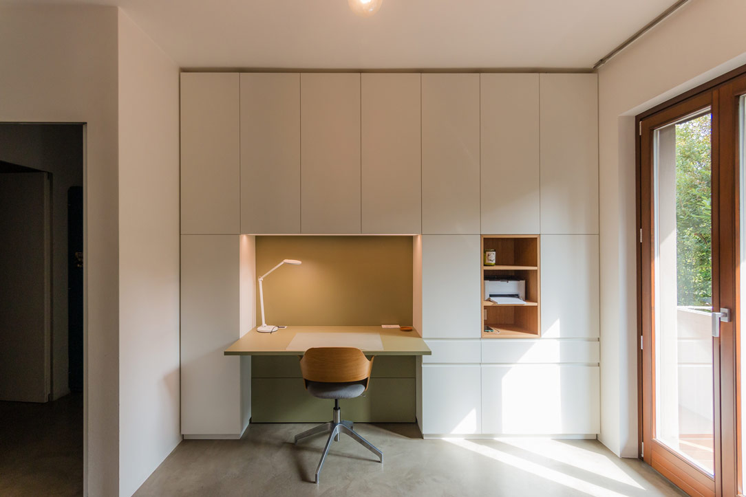
Imagine a wall that, like a blank canvas, blends seamlessly with the surrounding environment, imparting a sense of order. This is not just a piece of furniture, but a true organizational system that embraces the needs of home working. The spaces have been divided so that one section is dedicated to storing useful materials, another is left open for easy access, and a third is designated for the desk.

front view equiped unit
olive green desk
detail hidden handle

Functionality in an Equipped Wall

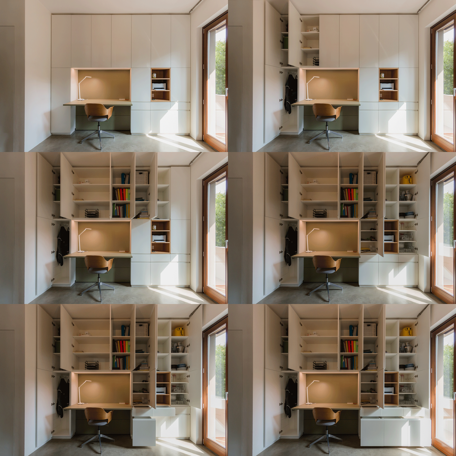
The wall, extending up to the ceiling, is divided into carefully organized spaces. The upper section, featuring doors, is dedicated to storing files and books, neatly arranged on shelves designed to accommodate standard-sized containers. The lower section, with drawers and large drawers, holds stationery and equipment, keeping everything within reach. An open compartment is reserved for technology, with space for a printer and other mobile devices, while the desk serves as the central hub of creativity and productivity.

storing books
device in the open compartment
desk detail

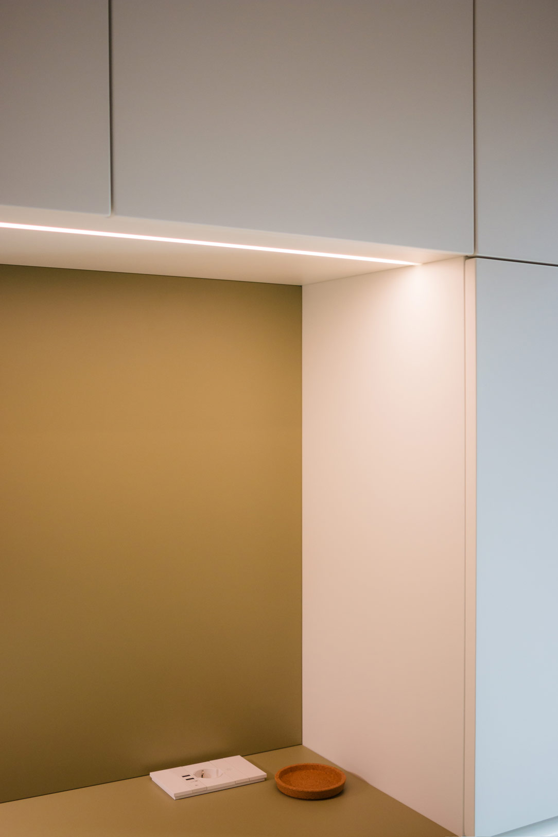
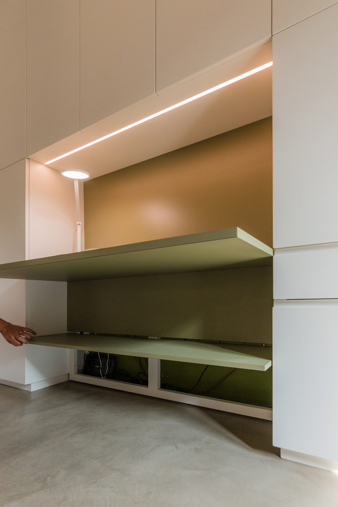
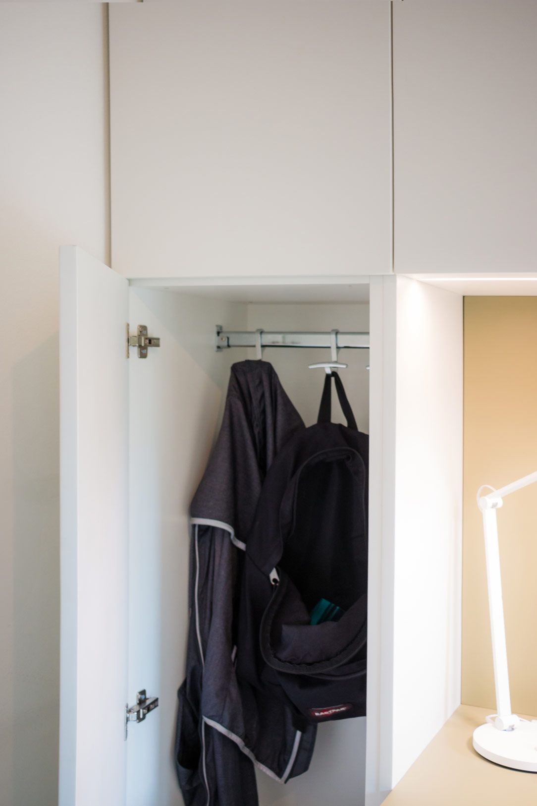
The two lateral sections serve the living area, hosting kitchen supplies and, thanks to a hanging bar, some coats. Beneath the desk, an accessible rear compartment hides all the electrical connections and various devices, with switches and outlets available on both the desk surface and the back of the open element. In the desk niche, overhead LEDs provide targeted lighting for the work surface.

Here, we revisit our entire article dedicated to smartworking.

high LEDs
electrical connections
hanging bar

Chromatic Harmony and Style Details

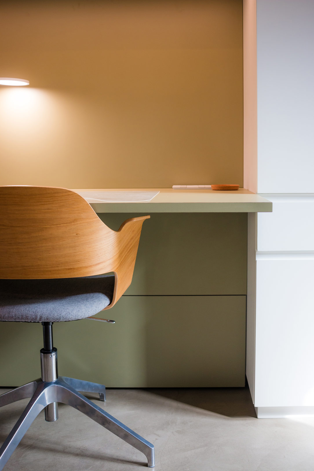
The immaculate white that characterizes the entire structure provides the ideal backdrop for two distinctive elements: the olive green desk and the open compartment in stained oak. These touches of color not only enliven the space but also create a visual balance that lightens the environment while maintaining a refined elegance.

We also find olive green in this kitchen in the Orobic Prealps.

equipped wall open and close
desk detail
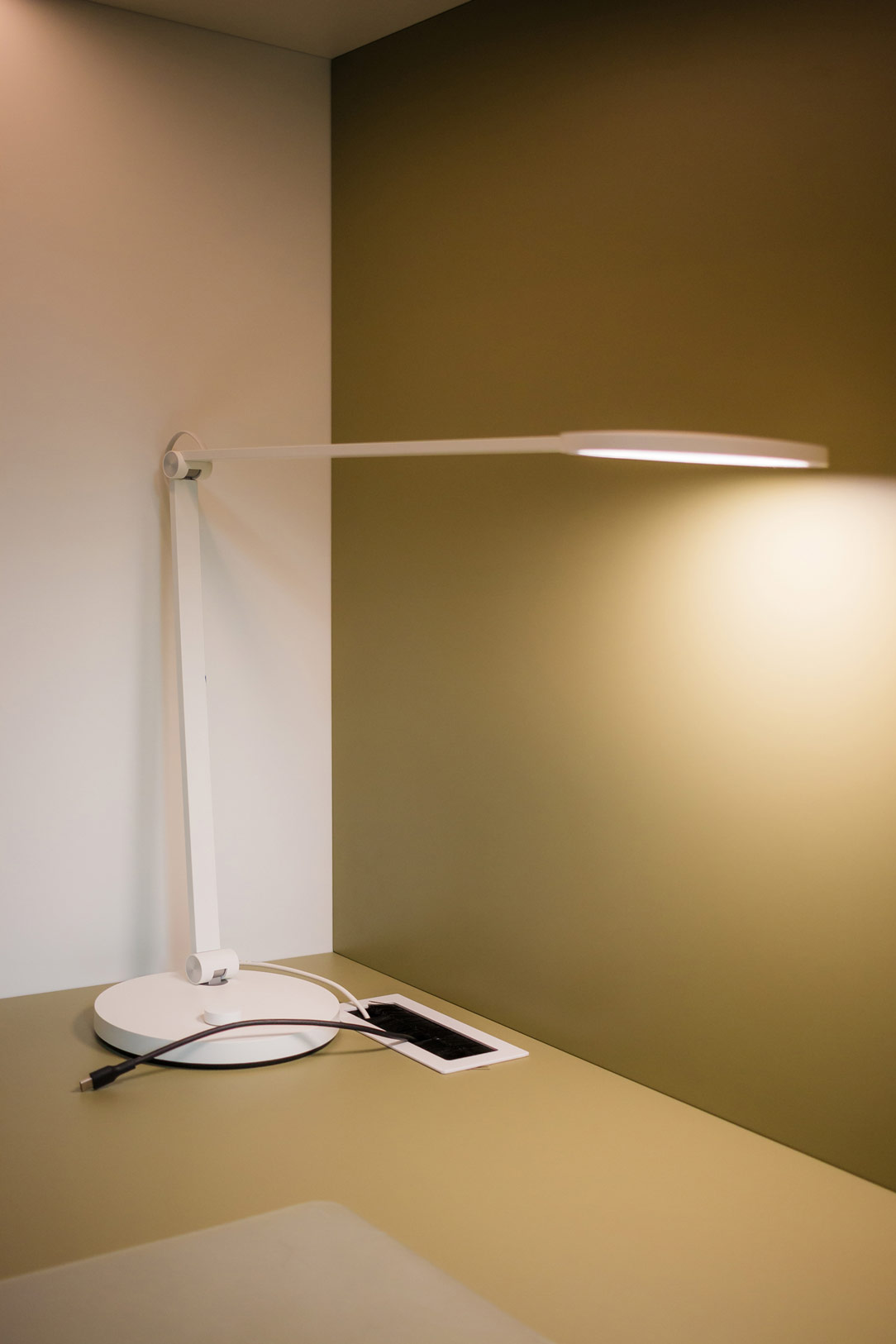
detail lamp and connection

Conclusions

In conclusion, the equipped wall by Officina Idea represents the perfect blend of form and function, combining aesthetics, practicality, and innovation in a project that makes smartworking not only more efficient but also more enjoyable. An ideal solution for those looking to transform their workspace into an oasis of tranquility and organization.

equipped wall smartworking

Light and Shadow: The Magic of a Multifunctional Anthracite Gray Kitchen

Light and Shadow: The Magic of a Multifunctional Anthracite Gray Kitchen

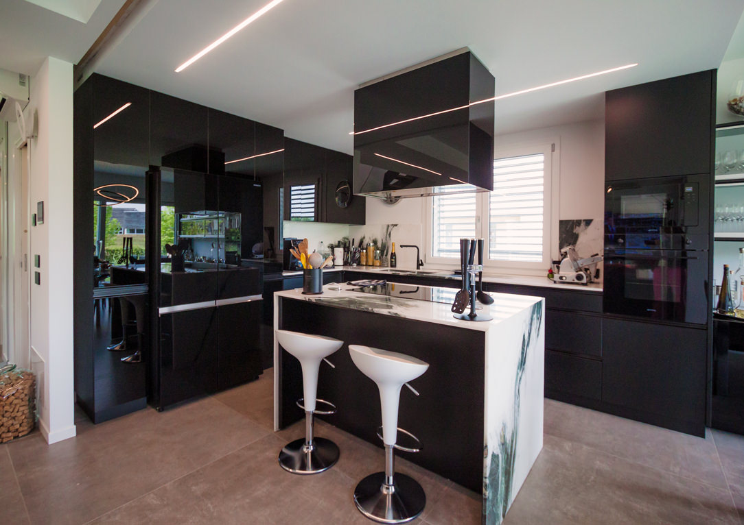
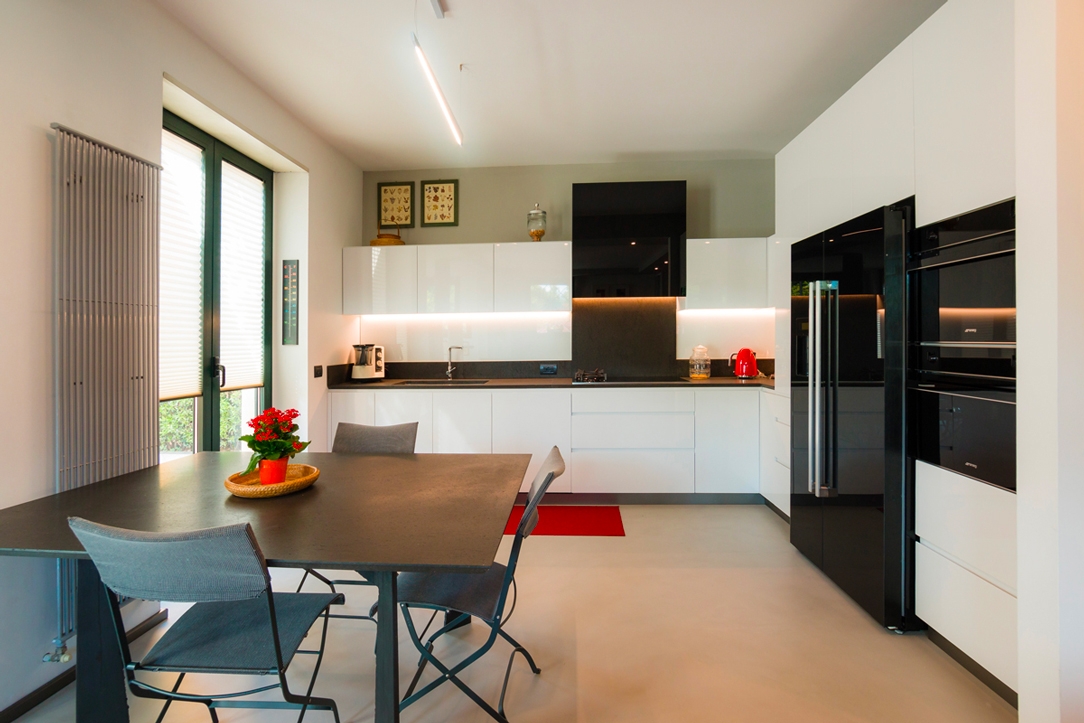
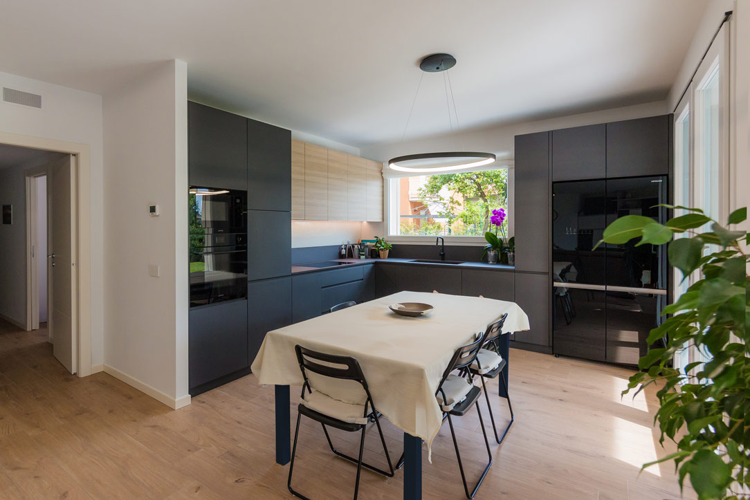
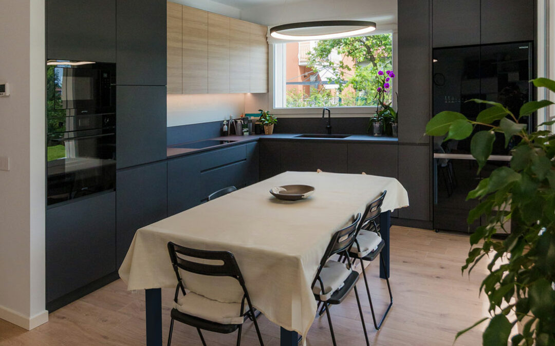
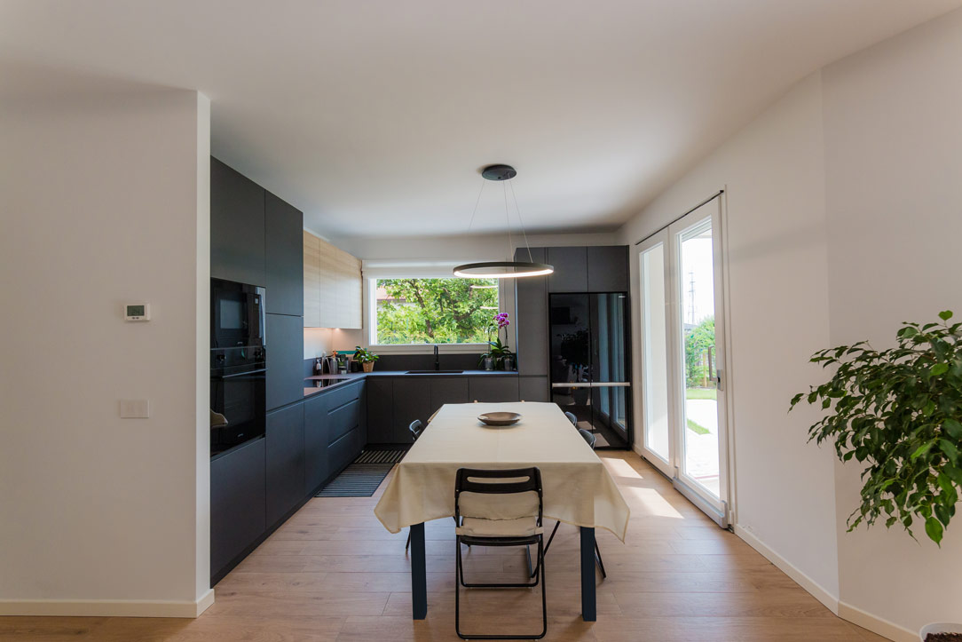
In a modern apartment just a stone’s throw from Bergamo, nestled at the edge of a quiet, green forest, we have designed an anthracite gray kitchen, crafted to be not only aesthetically refined but also extremely multifunctional.

anthracite gray kitchen

Kitchen Design

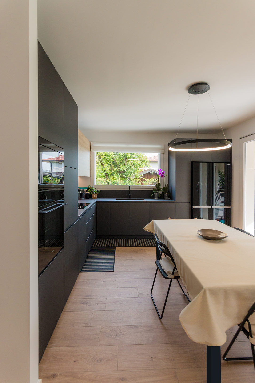
During the design phase, we considered the room’s square layout and the family’s habits. This led us to choose a corner kitchen, leaving the central space free for an extendable table, perfectly illuminated by a centrally positioned designer chandelier.

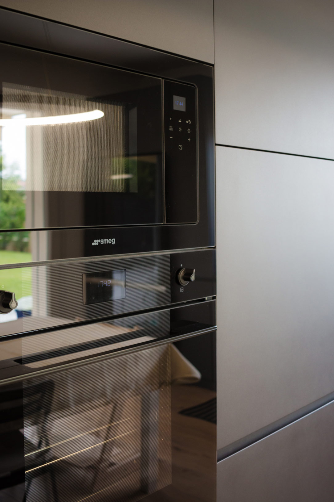
On the left side, the kitchen structure begins with a series of tall columns housing the pantry and ovens. From here, a long worktop extends to embrace the corner. One part of the countertop is equipped with high wall units, while the other part leaves space for a window overlooking the garden. Completing the opposite side, a large free-standing refrigerator is framed by a unit with a side pull-out.

anthracite gray kitchen front
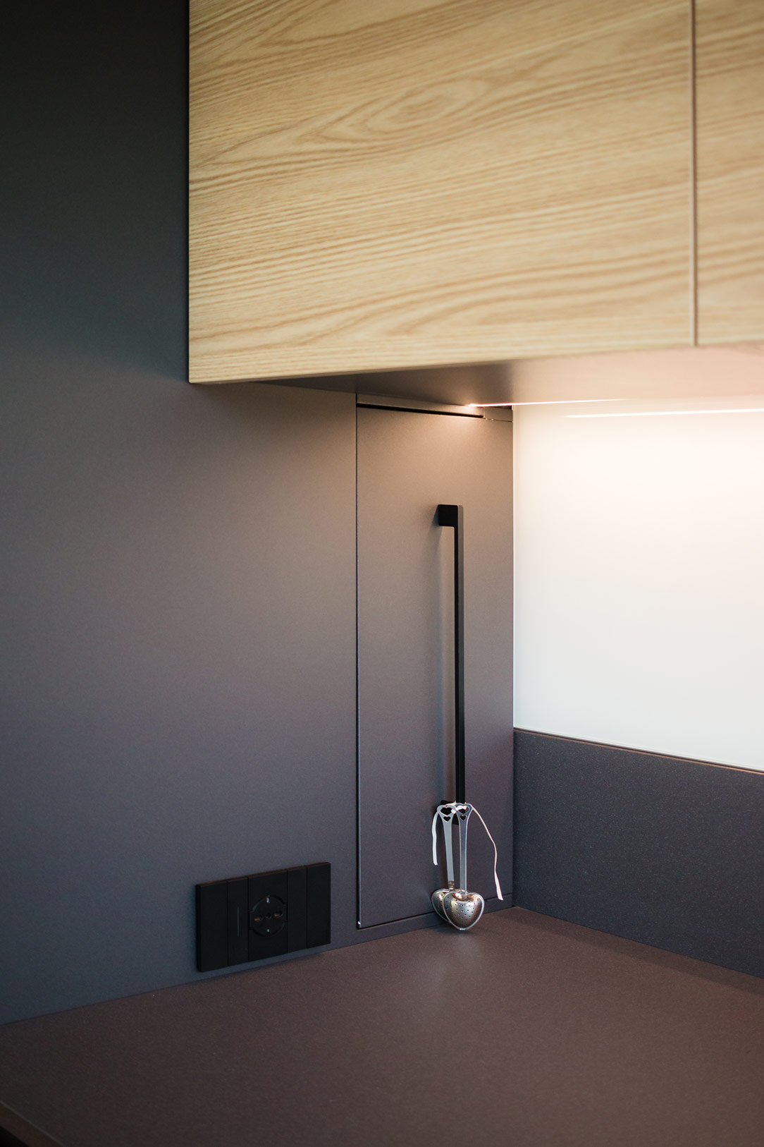
kitchen details
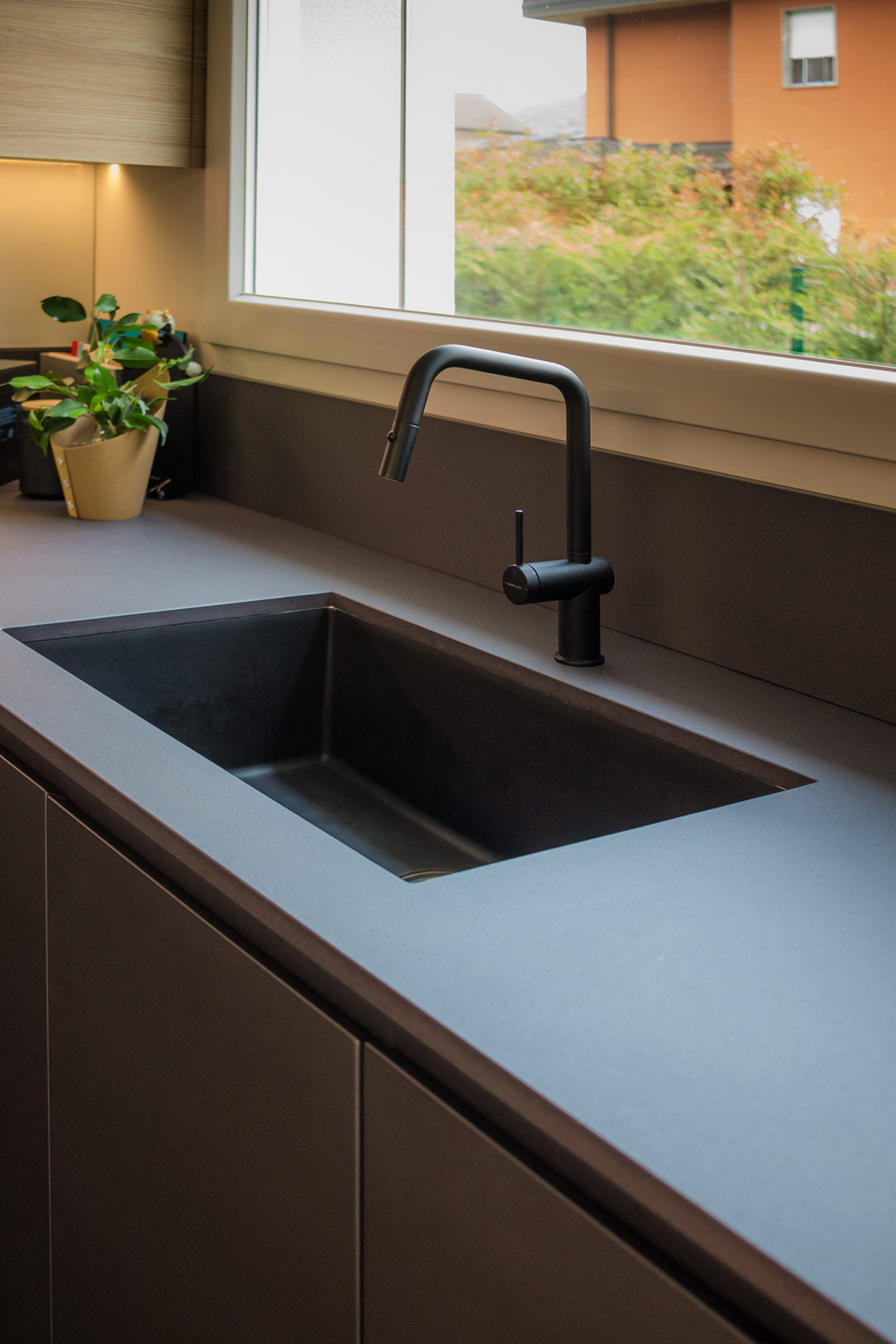
 sink details
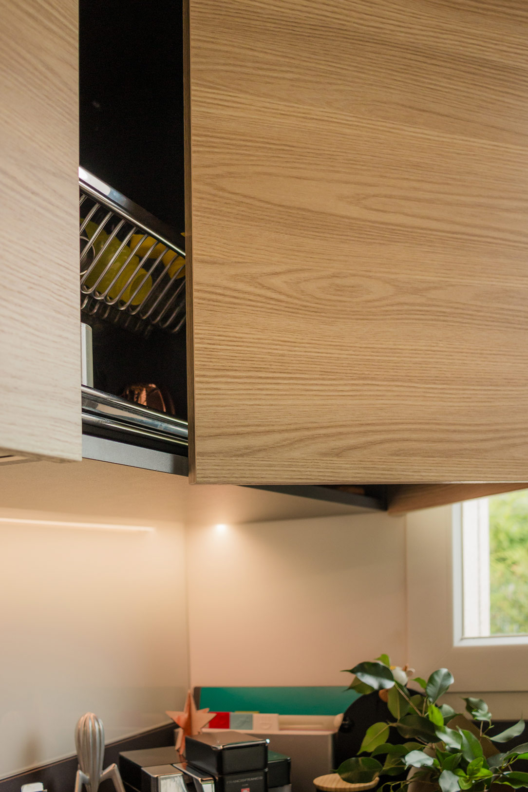
wall units details

Multifunctional Additions

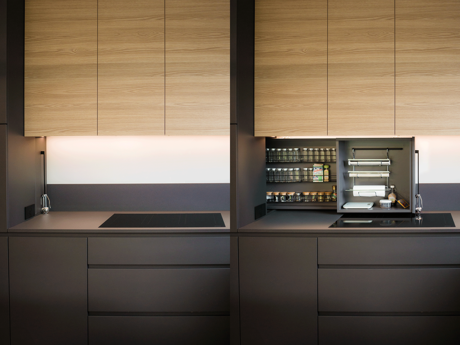
One of the most interesting aspects of the design is the retractable spice rack. By utilizing additional depth, we managed to integrate a pull-out system placed behind the initial columns. This element, which opens laterally to the induction hob, features compartments for spices, small accessories, and a paper towel holder, making everything within reach during food preparation.

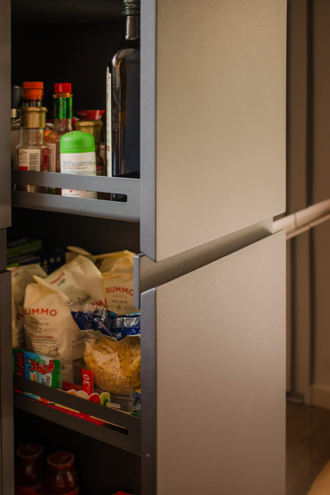
Other useful components include trash can drawers, a foldable door in the cabinets, and a column with a front extraction system that allows access from both sides. These features enhance practicality and efficiency, making it a true multifunctional hub.

spice rack open and close
spice rack details
extraction system details

Materials and Finishes

Considering the very bright environment, we chose to dare with anthracite gray, a dark and striking color that contrasts with the predominant white. The oak veneer wall units complement the honey-toned wood-effect porcelain stoneware, bringing a touch of nature into the home.

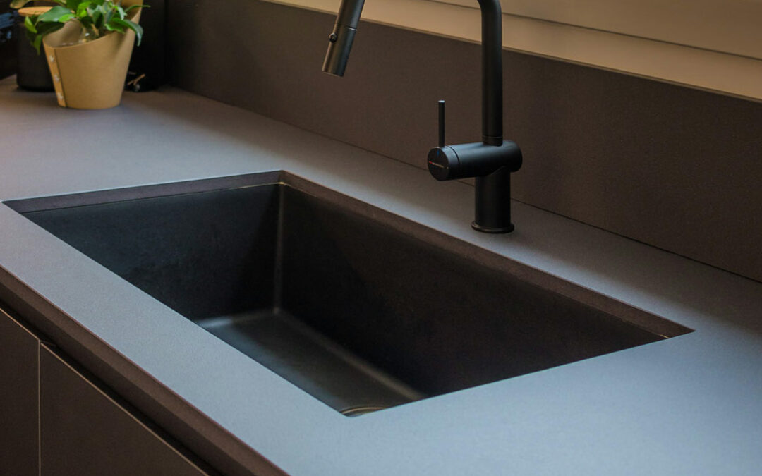
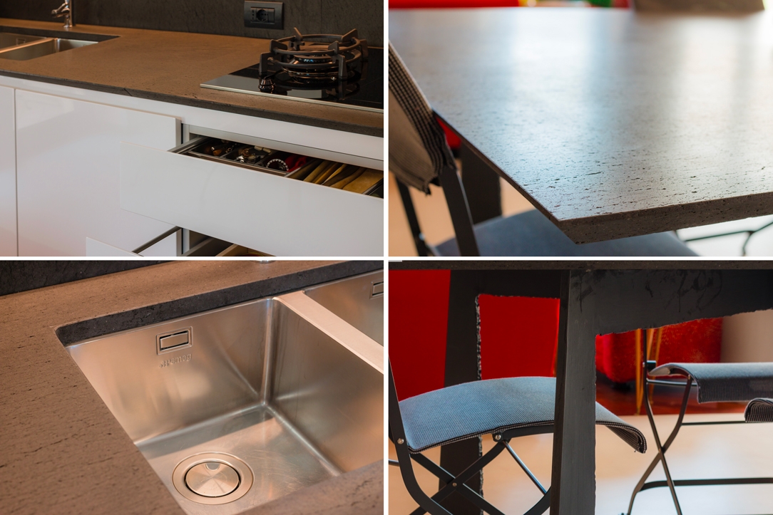
The worktop is made of Lapitec, a high-performance ceramic material with a slightly speckled, rough texture. It harmoniously blends, almost merging, with the anthracite color of the kitchen and the sink in the same shade of granite.

At the back of the kitchen, a glossy white Lacobel panel, in the same shade as the wall, creates a clear contrast between the gray countertop and the wood of the cabinets.

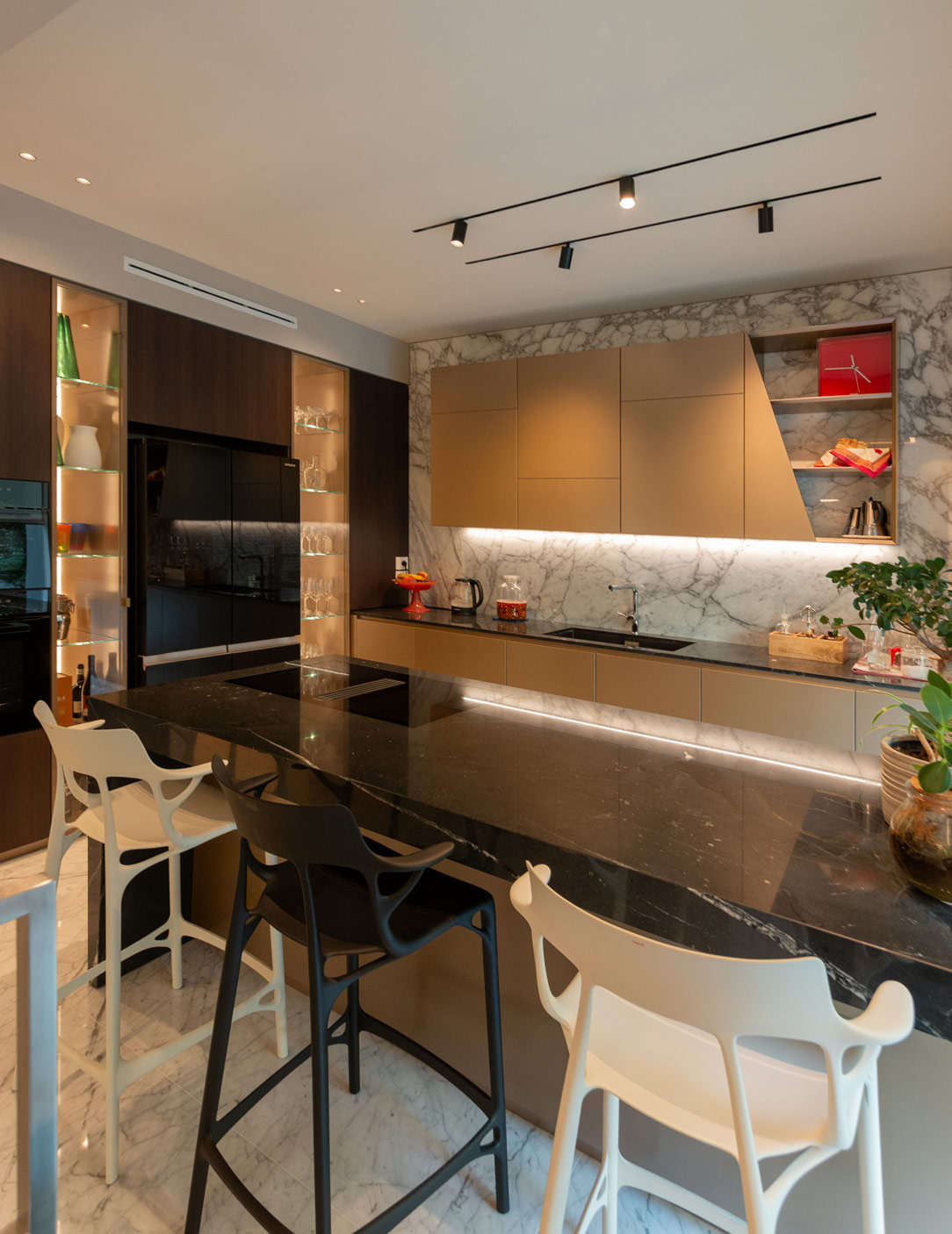
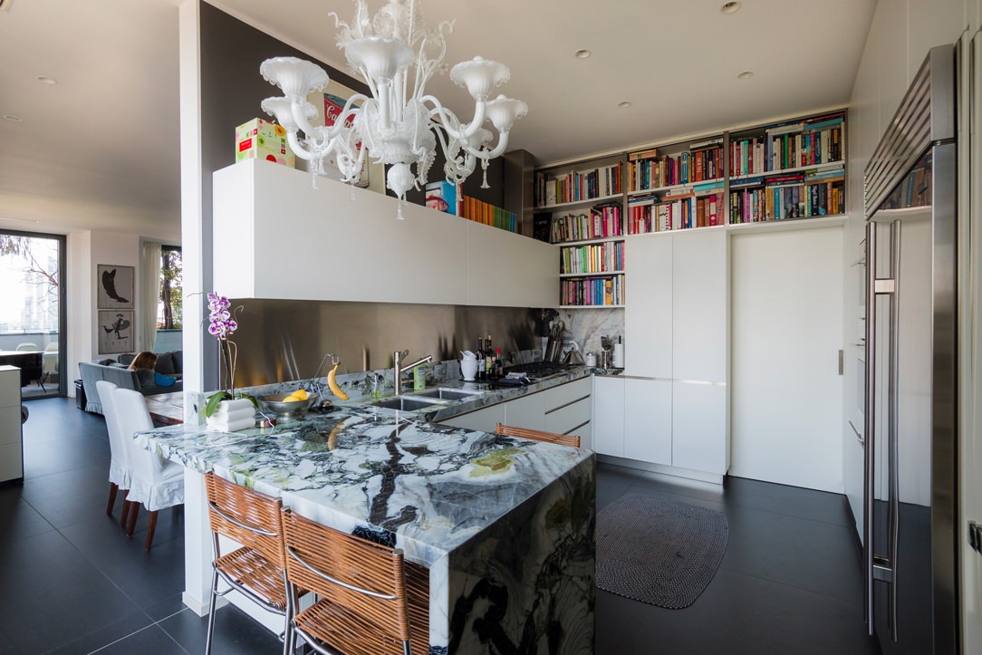
We present two more examples of anthracite kitchens: the first is a corner kitchen with a cooking island, while the second features a C-shaped layout ending in a central peninsula.

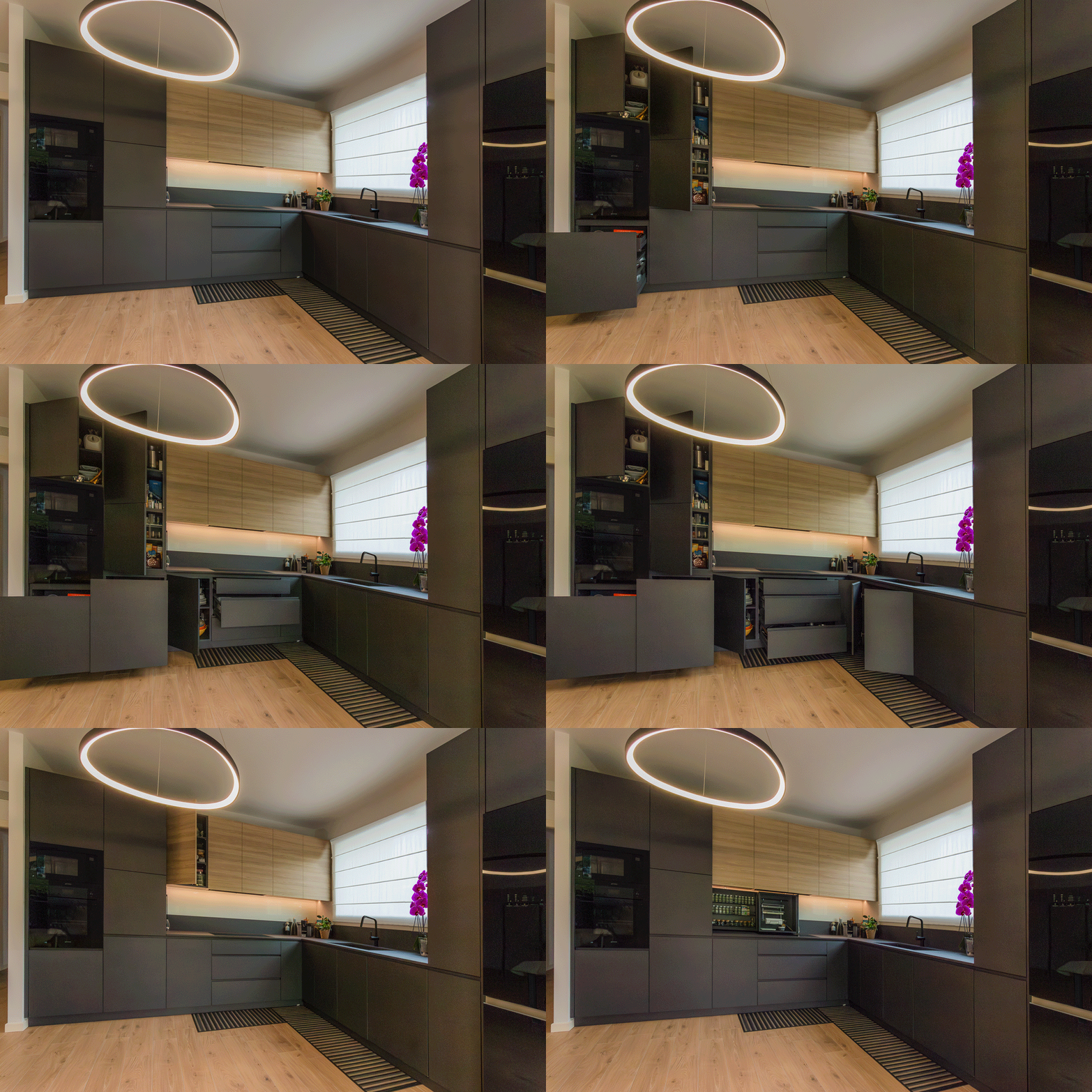
timelapse open and close

Coordination in the Space

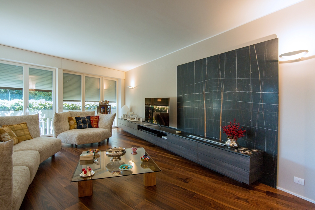
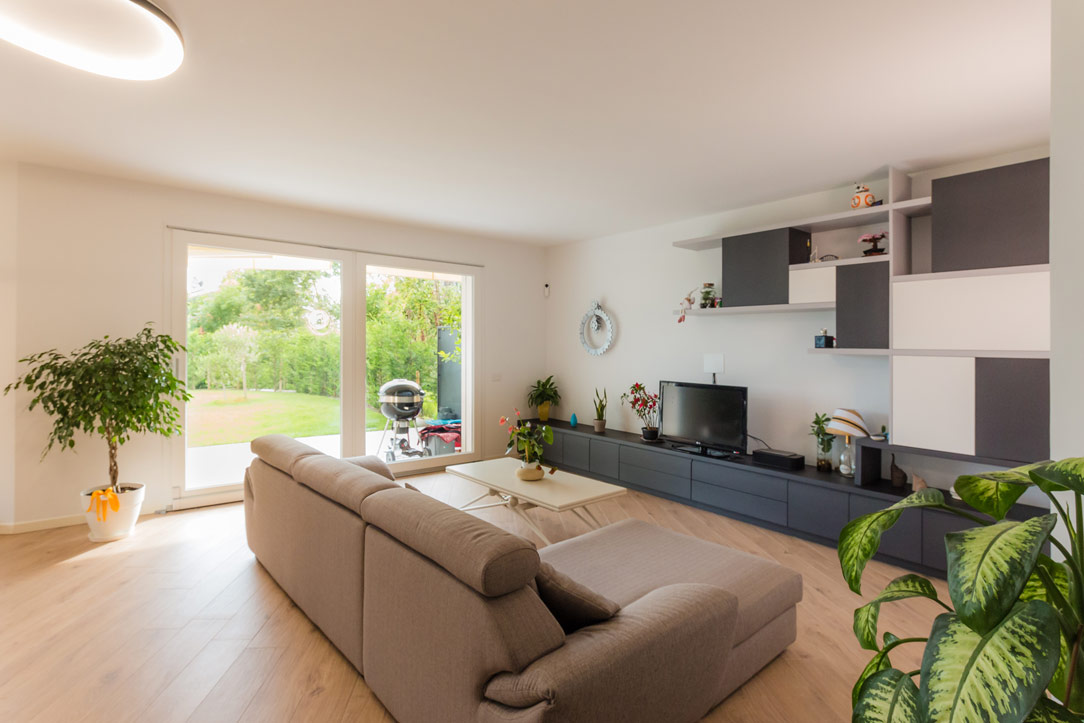
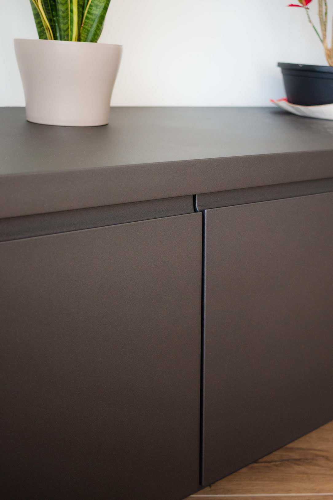
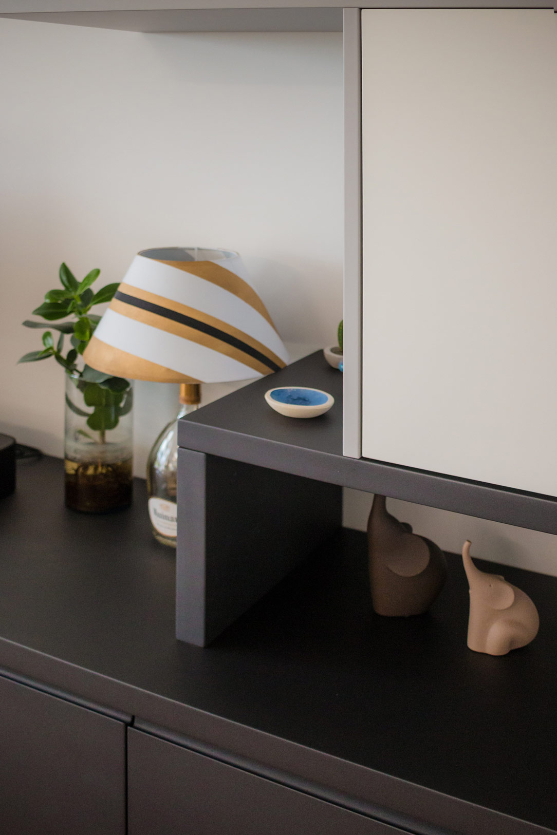
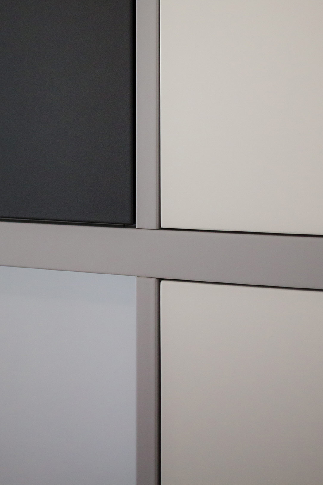
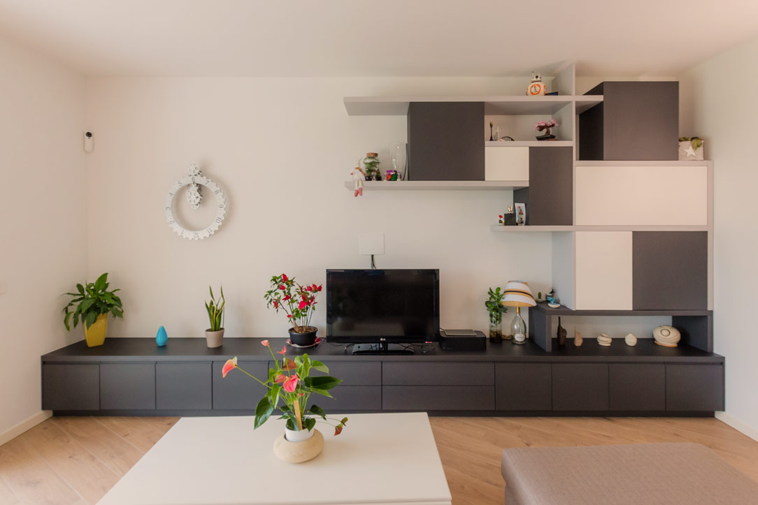
The TV cabinet, facing the kitchen, has also been designed and built in the same anthracite gray, completing the space in a discreet and harmonious manner. Comprising drawers and doors with internal shelves, it offers ample space for storing elements and accessories related to the living area and kitchen. Next to the television, wall elements in white, gray, and anthracite alternate, creating a play of shapes and symmetries that enrich the overall aesthetic of the space.

TV cabinet anthracite gray
details tv cabinet
details shelves
details cubes
detail front of the cabinet

Conclusions

There is no need to fear using dark colors, especially in bright environments or where white is predominant. In this project, anthracite gray was the perfect choice to balance the abundance of light tones, infusing the space with a decisive and refined elegance. This kitchen, combined with the living area, demonstrates how functionality and aesthetics can merge into perfect harmony.

Design Week 2024

Design Week 2024

The Design Week of this year, just concluded, left us with eyes full of wonder and inspiration, eager to share with you all that we have discovered. In this article, we will try to recount our experiences both from the Salone and the Fuorisalone, although the crowd that filled the stands and the streets of Milan prevented us from seeing everything we would have liked.

This year’s Design week was a real magnet for designers, architects, and design enthusiasts from around the world. Every corner of Milan exuded a fascinating mix of cultures, charm, and originality, making the experience even more engaging. The fair at Rho managed to gather in its countless pavilions the production of Italian and foreign design. This year, unfortunately, the luxury sector was absent, but EuroCucina and the Salone del Bagno shone in the forefront.

As in the past editions of 2023 and Design Week 2022, the leitmotif of the event was sustainability, technological innovation, and functionality, themes that also found resonance in the new approach to digital design. Furthermore, the important role of circular economy, reuse, and sustainability of processes and materials was emphasized, underlining the importance of conscious practices that promote efficient use of resources and minimize environmental impact.

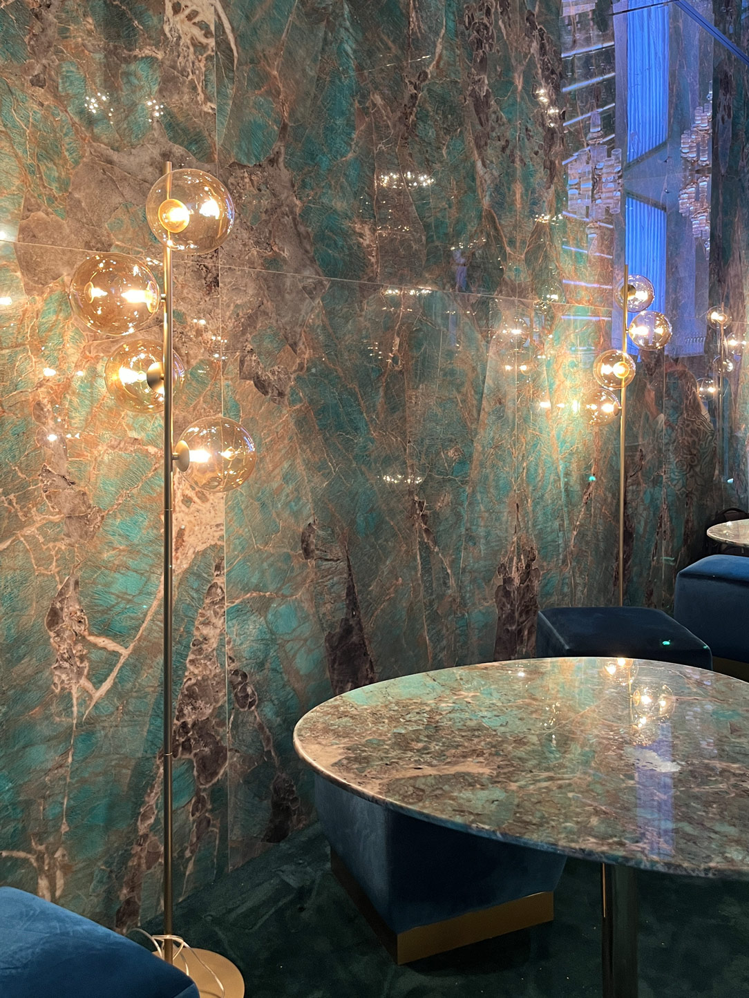
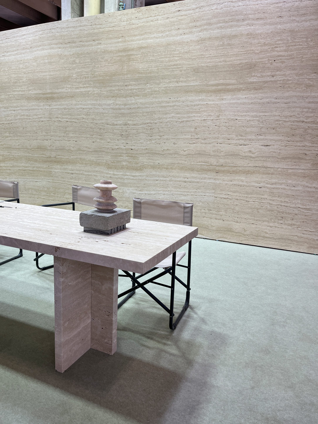
Orac materials

Clever Lamps by iGuzzini and materials by Orac

BATHROOM

The bathroom appears in a never-before-seen guise: ceramic, traditionally candid and discreet, has transformed into a palette of vibrant colors, embracing pastel shades like delicate pink and refined pearl gray, but also bold colors like seductive bordeaux. The washbasins, true design jewels, oscillate between circular and ovalized shapes for countertop models, while those recessed maintain their elegant rectangular geometry, offering a variety of options. Materials such as fragranite and transparent crystal emerge as undisputed protagonists of the contemporary bathroom, adding transparencies and chromatic plays that confer modernity to the spaces. The plumbing stands out for a variety of finishes and colors, with a decrease in stainless steel in favor of bronze coatings, pale gold, and rose gold. But the real revolution occurs in the sanitary ware, which embraces artificial intelligence and home automation with innovative solutions. Companies like Rocha present automated models capable of anticipating our every need, from the autonomous opening of the lid to the cleaning of the bowl, offering an unprecedented experience of comfort and practicality inspired by Japanese culture. The simplicity of old-fashioned sanitary ware thus transforms into a sophisticated fusion of design and technology, reflecting the evolution of needs and desires.

boredeaux  washbasin
stand alone  washbasin
intelligent wc

Washbasin Arbi Bathroom, stand alone Washbasin Sanycces e Intelligent Wc by Kolher

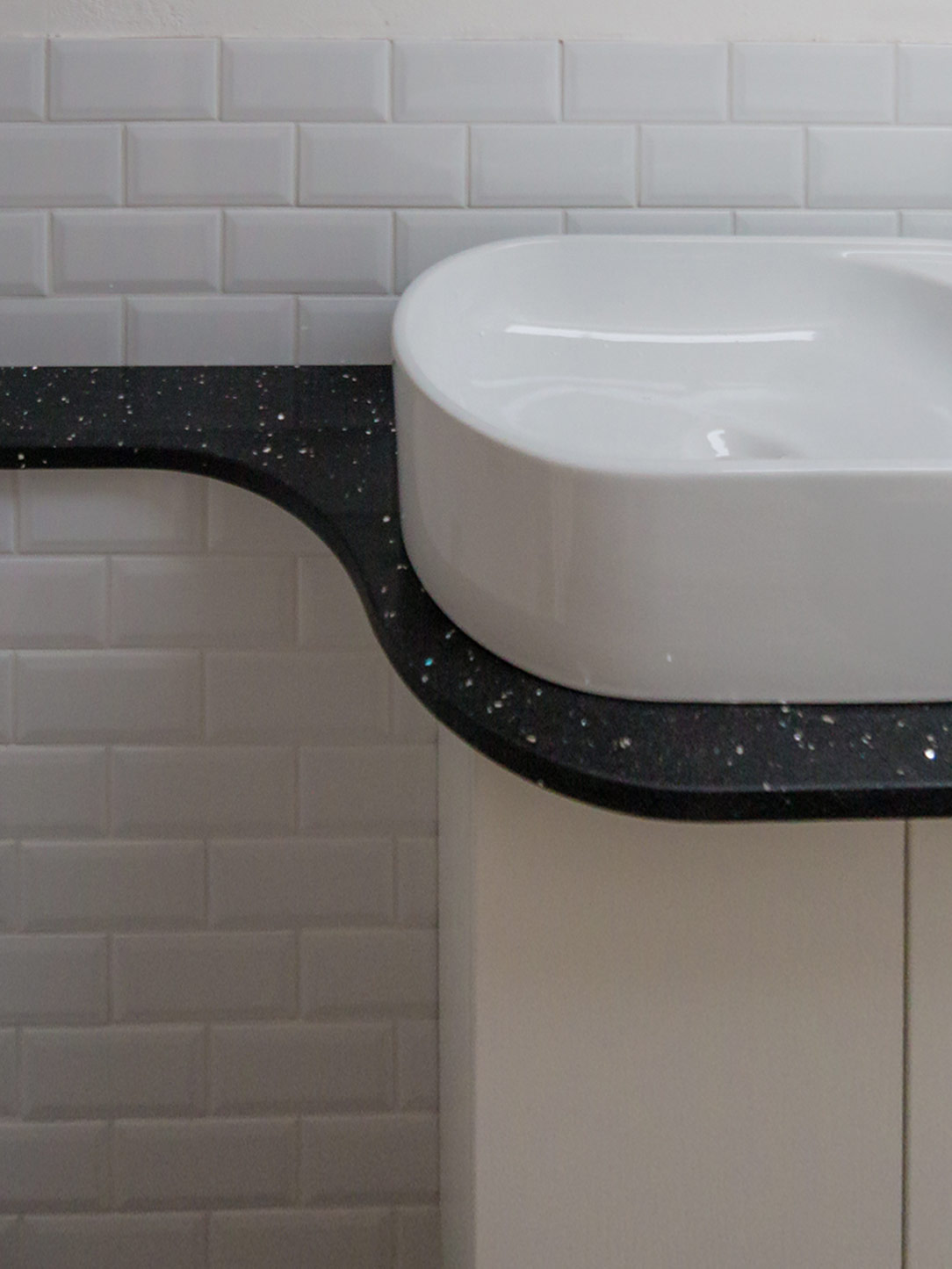
 washbasin terrazzo
tap finishes
 radiators Tubes

Washbasin tops in terrazzo, new finishes of taps and vertical furnishing radiators Tubes

KITCHEN


In the kitchen, island and peninsula continue to reign supreme in our favorite environment, the one that indulges our palate and allows us to relax while cooking. More and more space is dedicated to storing utensils, which are proudly displayed or discreetly hidden behind elegant glass doors, revealing both their contents and the intricate details of the kitchen.

modulnova
kitchen shelves displayed
modulnova

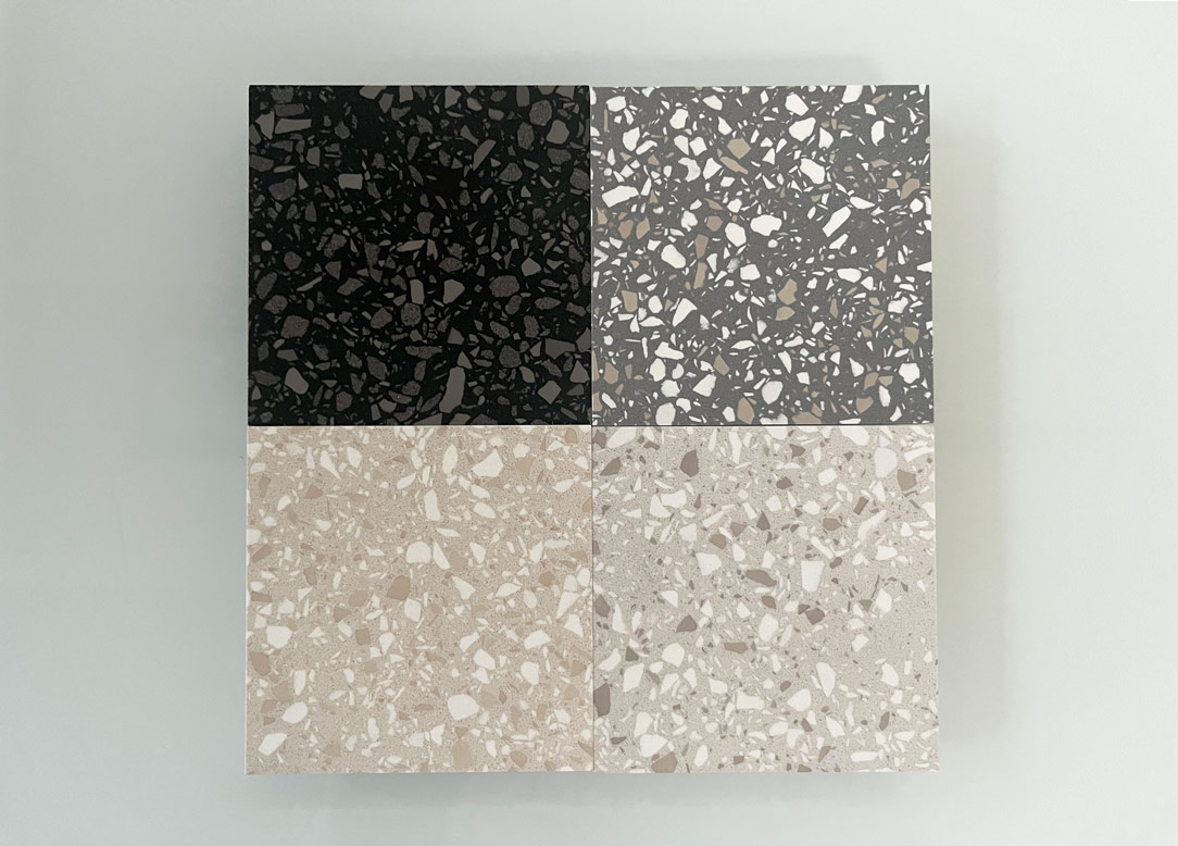
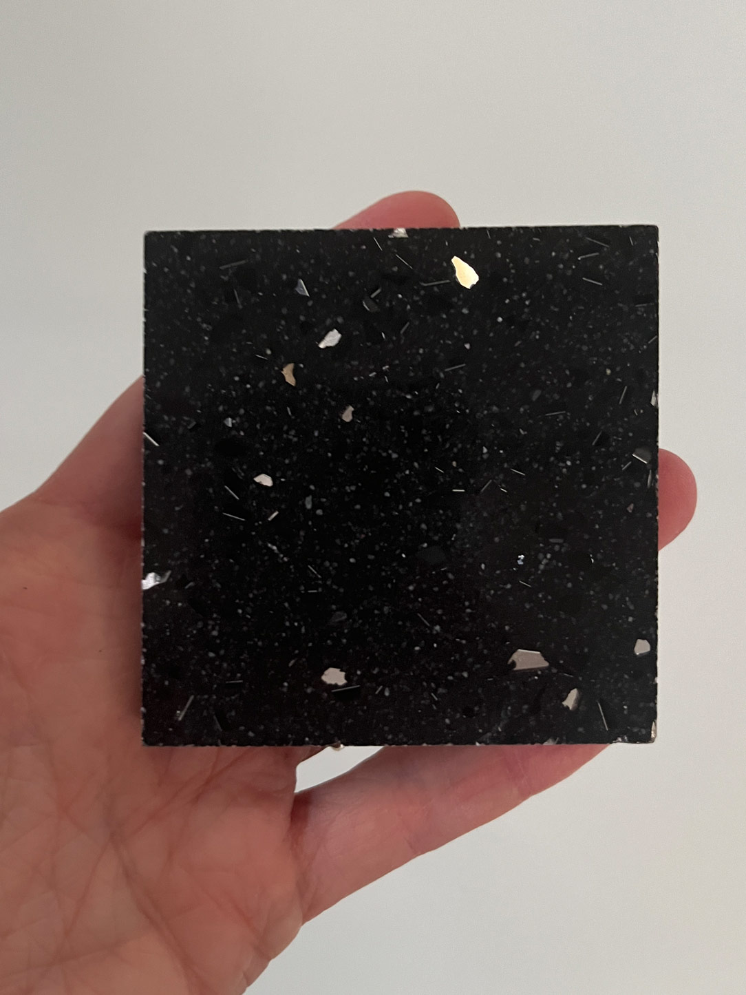
Once again, the enthusiasm for terrazzo finishing is palpable this year, with its rich range of earthy tones captivating the senses. However, we still encounter resistance in convincing clients to fully embrace it. Hopefully, it will finally establish itself in the collective imagination.

Kitchen terrazzo rho
terrazzo finish

Solid top or HPL countertops, adorned in uniform hues, and marble, whether natural or reproduced on ceramic surfaces, remain steadfast choices. Additionally, kitchen spaces are enriched with elegant metallic finishes or claddings in satin-finished iron or steel, aimed at infusing the kitchen with subtle metallic reflections.

kitchen metallic finish
interior of metallic finish kitchen

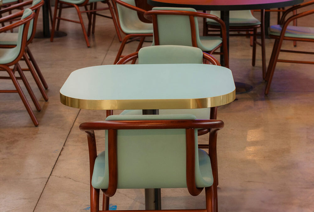
For those nostalgic for the ’80s, the comeback of bullnose kitchen countertops, with pronounced edges, is a joy like no other. Even the snack counter embraces softly, with few linear surfaces and many with rounded forms, enveloping the kitchen with gentleness and harmony. Dining tables follow this trend, with few sharp-cornered examples and many gradually rounding off to become almost oval, making room for round tables, true protagonists of the kitchen space.

calligaris table
rho kitchen rounded
bullnose
kitchen details
wall units glass

Thus, we witness a vintage revival in the kitchen, juxtaposed with increasingly advanced technology, as exemplified by TFK – Technology for Kitchen. In household appliances, new features emerge, with vibrant touchscreen displays allowing us to entrust the oven with selecting the optimal cooking settings for our dishes, all while it cleans itself with remarkable efficiency, as seen in the brand-new Bosch oven. The trending finish for appliances proves to be black stainless steel, a matte anthracite shade so deep it verges on black.

 home appliances
black stainless steel

HOME ENVIRONMENT


Exploring the world of home furnishings, we encounter a wide range of intriguing options. Sofas, the true protagonists of living spaces, appear increasingly imposing and enveloping, with circular shapes that embrace the surrounding environment, delicately hovering just above the floor without revealing a hint of legs. The bouclé cream upholstery, despite requiring some care in cleaning, remains a beloved choice for its softness to the touch and elegant appearance.

Minotti
Minotti

Living Room by Minotti

Hommes
Hommes

installation Hommés at Casa del Manzoni

As for materials, wood in its natural tones and reeded wood maintain their prominent role, both in their raw and varnished form. Finishes diverge from stainless steel, opting for softer and more vintage tones like bronze and pale gold, imparting spaces with a touch of refined elegance.

Garofoli Group
reeded wood

Living Room by Garofoli Gruop e reeded wood detail

De Castelli
De Castelli
De Castelli

Metallic finishes by DeCastelli

The current trend increasingly favors exposed elements over those hidden behind doors, with symmetrical bookcases alternating with metallic supports and wooden backings.

The motto of modern homes, especially for those who inhabit them, is order. Orderliness is sought in open bookshelves and increasingly transparent wardrobes with fewer usable shelves.

However, it should be noted that this aesthetic pursuit may sometimes compromise the actual practicality of spaces. Current trends lean towards larger, freer, and lighter homes, which can detract from actual living volumes, inversely proportional to the prevailing trends.

Moooi

Moreover, bold, vibrant colors, along with enveloping textures, transform walls and furniture into true works of art, with daring graphics that stimulate the mind while evoking a sense of dream and wonder.

Pedrali
Driade

Sofa by Pedrali e cabinet by Driade

Magis
Magis

Stand di Magis

Moooi
Moooi
Moooi

Wallpaper and furnitures by Moooi at Salone dei Tessuti

FASHION


Fashion is increasingly merging with the world of interior design, creating a unique blend of personal style and home environment. The influence of colors and materials worn is reflected in furnishings, fostering a harmonious synergy between fashion and design. Renowned brands like Hermès and Loewe utilize leather not only for bags and accessories but also for lamps and magazine racks, seamlessly blending fashion and home decor into a singular expression of style. Additionally, raw and natural materials such as bricks, stones, and wood harmoniously coexist with fabric textures and colors. The concept of “vintage” intertwines with the contemporary, creating an intriguing ambiguity between what is past and what is current. Fashion knows no age.

Hermes
Hermes
Loewe
Loewe

Objects by Hermès – Lamps in leather and paper by Loewe

LUXURY


The concept of luxury in interior design has evolved to encompass not only elegance and opulence but also a relentless pursuit of exquisite materials and unique craftsmanship. Even though luxury products may originate from industrial processes, they must still embody a spirit and execution of artisanal craftsmanship. Every detail matters, down to the hinge of a wardrobe, which must be custom-made. The more challenging the transformation of materials into forms, the more excellent the result, and the more luxurious the object becomes.

The brands that consistently meet these expectations are the major automotive-associated houses. In Bentley and Bugatti, a synesthetic relationship is formed between the vehicle and the furnishings, creating an almost indissoluble and recognizable bond between the two. The clean lines and bold curves seen in automotive design are translated into furniture, with leather inserts found in both cars and desks, and fluid surfaces echoing the natural world.


Bentley Bugatti
Bentley
Bentley
details Bentley
Bugatti
Bugatti
Bugatti library

THE HOUSE BY ELLE DECOR – MATERIAL HOME


Exploring the home according to Elle Decor is a sensory journey through seven distinct environments that reflect our vision of domestic life. Among the standout materials, we find cement, lime, and terrazzo, derived from the mixing, cooking, and recomposition of powders, seamlessly blending with metals, woods, and leather. This creates a play of reflections and material illusions that capture the gaze and stimulate the senses. The colors, initially soft and muted, intensify as we move through the different rooms, giving rise to a crescendo of visual emotions.


materials elle decor
kitchen elle decor

Within these spaces enveloped by light and shadow, we find iconic design pieces that lend an aura of elegance and sophistication to every area. Light itself becomes a key element, enveloping and delineating the furnishings, giving them dimensionality and depth. The surfaces, transforming, adapt to the surrounding environments, becoming soft and enveloping in the bedrooms, while wall coverings create cozy and relaxing atmospheres.

surfaces
curved surfaces

Finally, a nod to our connection with nature, with walls clad in materials such as hemp, ash, and cotton canvas, prompting us to reflect on the sustainability of resources and the future of construction, inviting us to create spaces that harmonize with the surrounding environment.

Elle Decor
Elle Decor

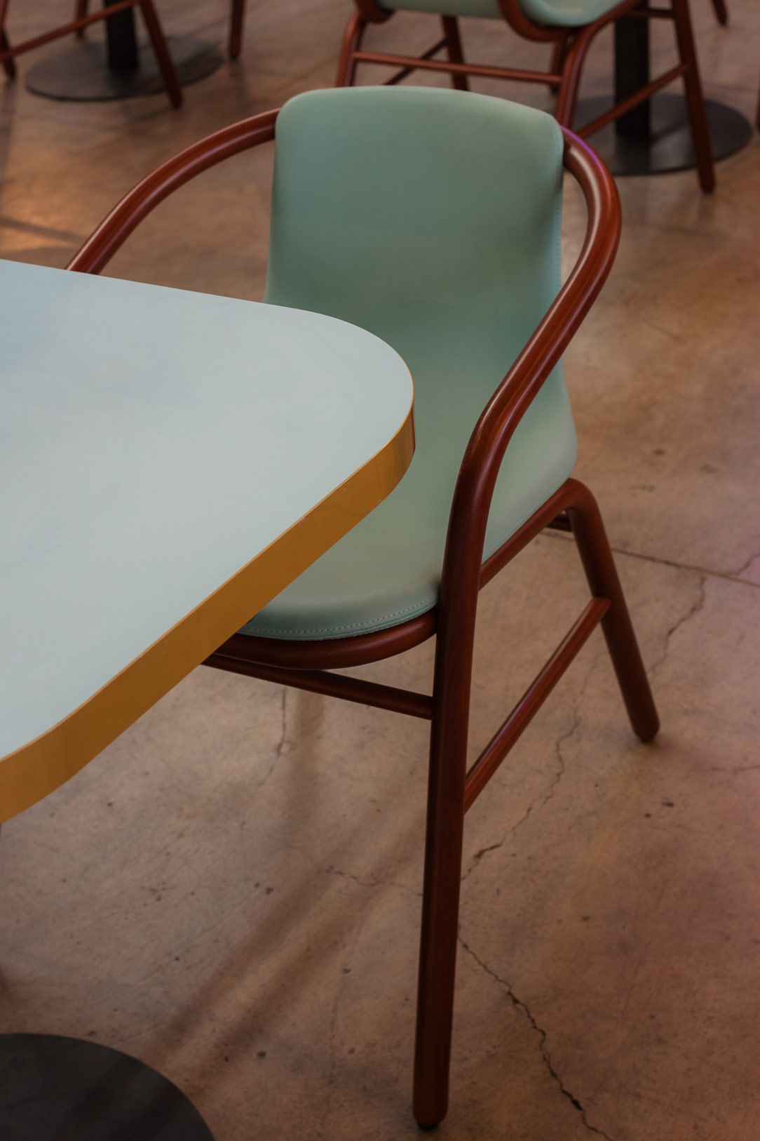
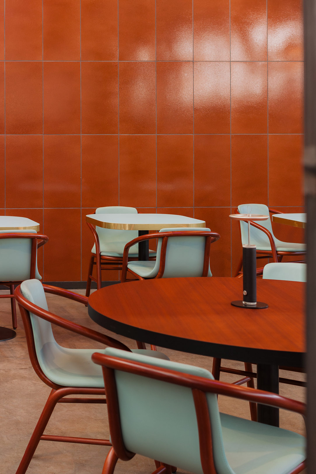
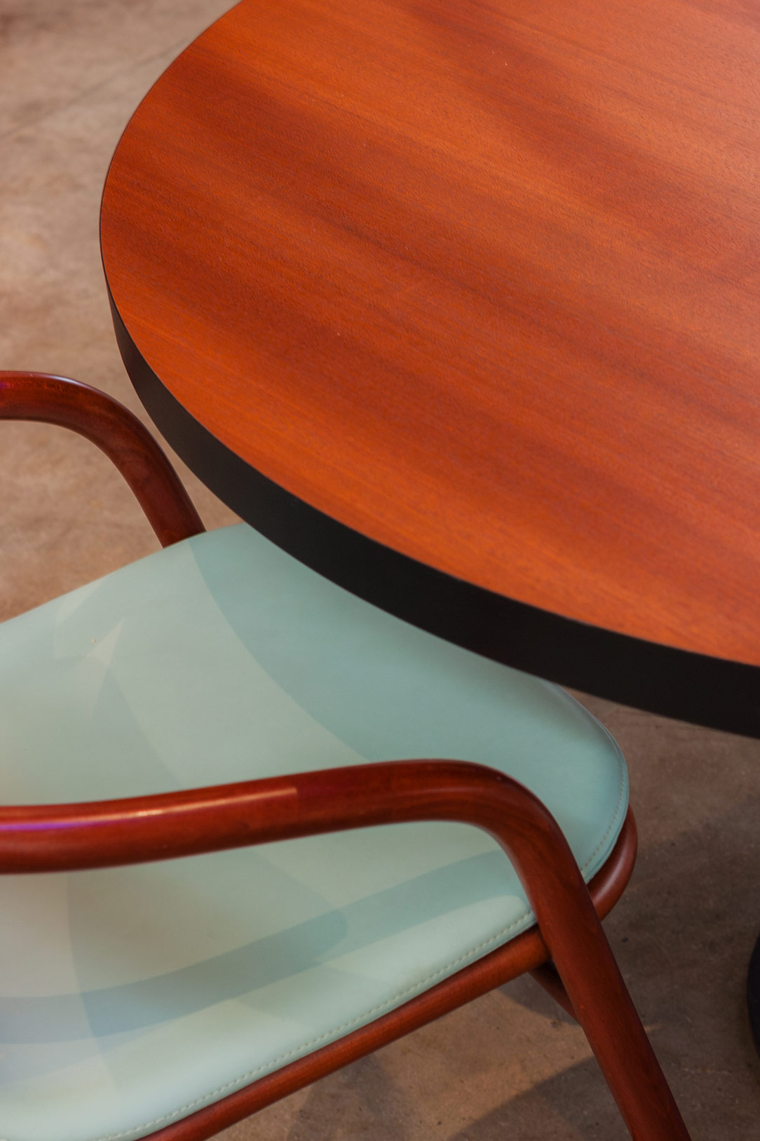
The restaurant area, a creation by Elisa Ossino, stands out for its creative use of geometries and the thicknesses of hand-glazed lava stone. The walls are adorned with decorated terracotta paneling adorned with circles, harmoniously interacting with a diamond-patterned floor. Refined, tactile fabrics with a suggestive painterly effect are used for perimeter draperies and as upholstery for sofas, poufs, and armchairs. The tableware also stands out for its mix of materials, while the lamps precisely illuminate tables and seats.


Restaurant elle decor

PALAZZO LITTA AND STATALE


Palazzo Litta stands tall as an embodiment of dreams, where dreamlike installations and artistic performances harmoniously blend with design works, transforming this excellent location into a journey through aesthetics and innovation. Its majestic Baroque structure, imposing and captivating, surprises and enchants at first sight, welcoming visitors into a world of wonders. At the entrance, one finds oneself enveloped by a light installation, “Extraordinary,” which evokes the gracefulness of clouds, conveying sensations of air and warmth with suggestive power. In one of the rooms, the gaze is captured by the iconic mouth-shaped sofa, a lively and dynamic work conceived by Gufram and MotionItalia, which seems to come to life and smile like a real mouth. In the subsequent rooms, projects unfold around three fundamental pillars: aesthetics, functionality, and sustainability.


Palazzo Litta
Bocca Sofa
Palazzo Litta
interiors palazzo Litta

In the vast spaces of the Università Statale, works by various designers alternate in an artistic and conceptual play, ranging from the luminous spheres by Cyril Lancelin to the chandelier created by Faggini. A particularly evocative installation is “The Amazing Walk,” conceived by MAD Architects studio, which transports the visitor into a world of suggestions, with a mountain reflecting on a water mirror, traversing a suspended path in the void, a metaphorical symbol of journey and exploration of deeper artistic dimensions.

Amazing Walk Statale

CONCLUSIONS ON THE DESIGN WEEK


We declare the death of white. No longer its pristine brilliance on countertops, in cabinets, nor even in bathrooms. As a white enthusiast myself, I admit it was a blow to the heart, but I will strive to broaden my perspective and imagine a new universe without white, not even on the walls. Natural colors, like rope or brick, are emerging as the new pillars of contemporary aesthetics, becoming a canvas on which to paint our creativity.
Wood continues to dictate the rules, confirming its eternal dominance in the realm of furniture and design.
We conclude with this reflection: the trend of recent years is moving towards an increasingly green future, with a growing focus on sustainability as the cornerstone of the creative and design process. This will be our guide and our responsibility towards the future.

Furniture with a Minimalist Approach for Multifunctional Solutions

Furniture with a Minimalist Approach for Multifunctional Solutions

In a valley rich in history, architectural and artistic presence, surrounded by the greenery of nature, a young family has discovered the perfect solution to optimize the spaces. Through innovative design, the focus has been on the living area, utilizing minimal and multifunctional furniture to create an open, bright, and versatile environment.

kitchen entrance and multifunctional stairs

THE MINIMAL KITCHEN

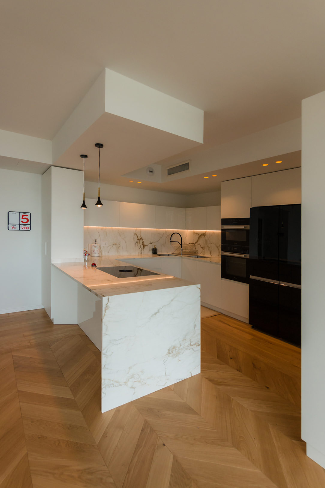
Integrated into a fitted wall, the kitchen embodies the essence of minimal. With a palette of light colors and the use of natural materials, it provides everything needed without burdening the space. The laminated natural oak wood countertop recalls the external wooded environment and accommodates a modern black granite sink and a induction hob.

The choice of matte white MDF for the kitchen base and refrigerator column, along with ceiling tiles, contributes to maintaining a clean and luminous aesthetic. The light and variegated gray ceramic floor complete the welcoming atmosphere, ensuring ease of maintenance and cleaning, harmonizing with the materials and colors of the house. 

minimal kitchen
details kitchen top
details kitchen top

THE MULTIFUNCTIONAL SIDE STAIRCASE

A light staircase in front of the kitchen serves a dual purpose. Besides connecting the living area to the sleeping area, it has been designed with a structure of modular equipped wood and metal, making it both aesthetic and functional.

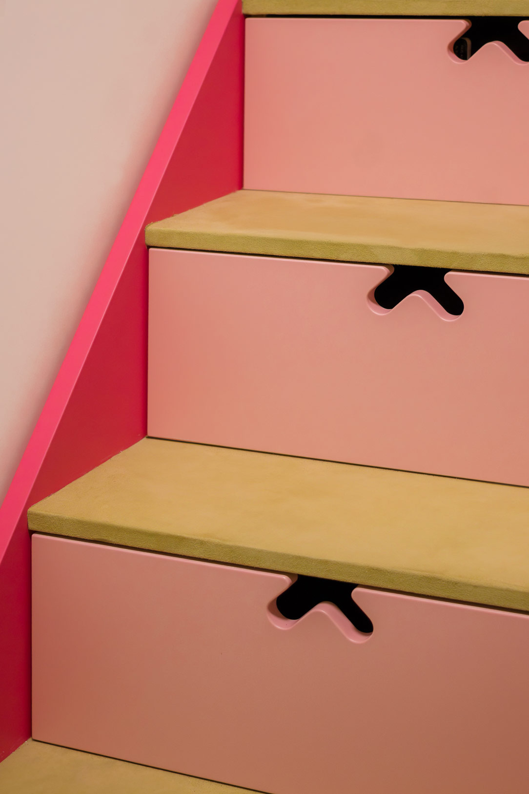
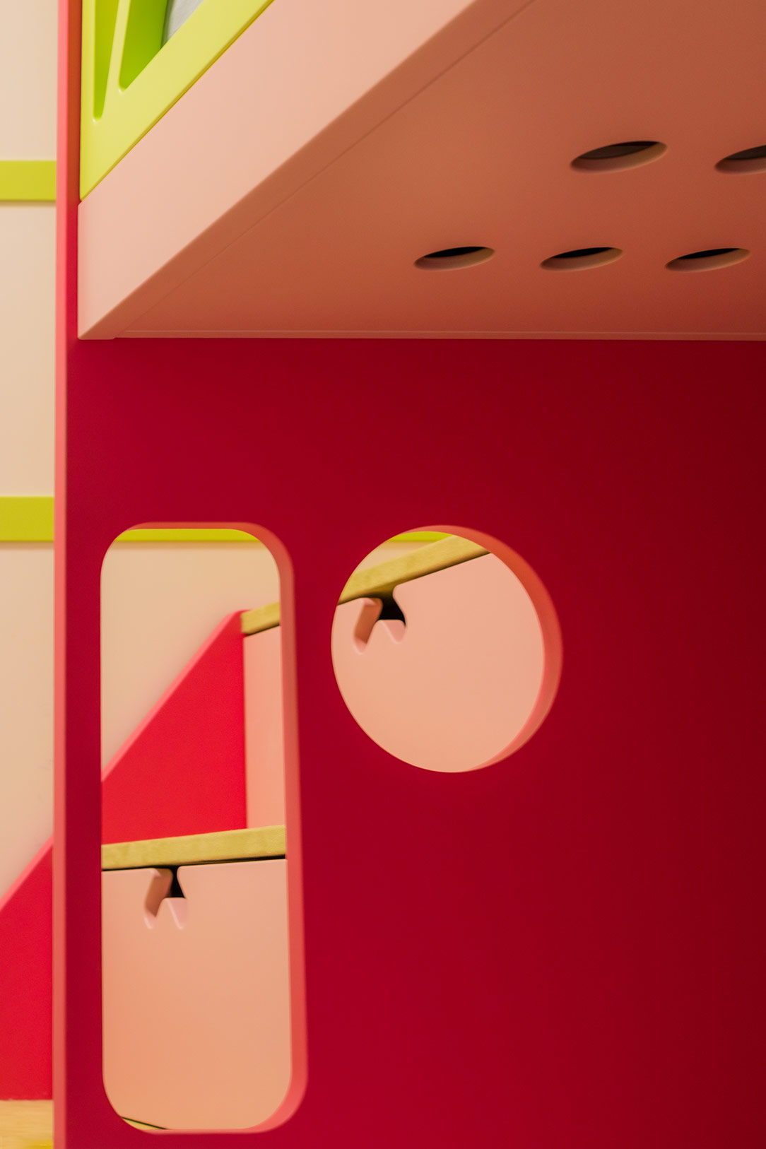
It houses shaped drawers that provide additional storage space, avoiding the wall unit to the kitchen for maintaining a light and minimal appearance while providing all the necessary storage space in an unexpected location.

Here’s another example of a staircase solution equipped with drawers.

lateral stairs with drawers
drawers from the top
details drawers
shaped drawes

THE WELL-EQUIPPED LIVING AREA

The living area is designed with careful attention to internal flows related to space utilization. A laminated oak wood dining table, coordinated with the kitchen countertop, accommodates 4 to 6 diners and is positioned in a passageway between the kitchen and the living room. It is convenient and non-intrusive.

Upon entering the living area, the eye is drawn to a free-standing sofa against the wall with a slim high shelf in white lacquered sheet metal, contributing to maintaining a sense of openness and lightness. The frontal TV cabinet, acting as a partition between the kitchen and the living room and supporting the staircase, is an example of well-thought-out storage and organization element. Shaped on the steps, it contains well-studied doors and shelves, utilizing every available centimeter. A true demonstration of how minimalism can be functional. 

kitchen living room dining table
minimal living room
Tv cabinet open and close
lighted cabinet
lightweight sheet metal shelf

MINIMAL MULTIFUNCTIONAL FURNISHINGS

In conclusion, the entire apartment is an example of how multifunctional furnishings with a minimalistic spirit can optimize spaces without weighing them down. The most storage-intensive elements are integrated into the staircase support, while the upper part, thanks to glass handrails, rises transparent and luminous.

Everything around this central monolith of furnishings is essential, allowing to enjoy an airy, bright, tidy, and aesthetically satisfying environment. Living in a compact space does not imply sacrificing comfort and style.

Here’s another example of a minimal multifunctional apartment.

The Elegance of the Garage in a Fusion of Collecting and Modern Interior Design

The Elegance of the Garage in a Fusion of Collecting and Modern Interior Design

In the enchanting setting of a modern villa on the outskirts of the city, the basement transforms into a multifunctional space. Through the skillful use of precious materials and meticulously designed lighting, it reveals a harmonious fusion of garage, collecting, leisure, and additional service-oriented interior design.

multifunctional space

MULTIFUNCTIONAL ORGANIZATION OF THE BASEMENT

The basement is divided into various zones, each designed for a specific purpose and crafted by  studio di Architettura Mario Cassinelli. A significant portion of this space has been transformed into an authentic automotive art gallery, where Carrara marble and soft parquet come together to form a luxurious frame for a collection of vintage and limited-edition cars. Attention to detail is evident not only in the material pairing but also in the lighting, with lights specifically designed to enhance every detail of the vehicles.

automotive exhibition space

Adjacent to this space, contrasting black marble creates the perfect setting for a spacious, well-lit gym, complete with equipment for leisure activities. This area remains at a lower level, with the ceilings rising as a grand staircase with crystal handrails leads to the upper part.

well-lit gym
 marble staircase to go down
 marble staircase to climb

These two spaces are connected by a long corridor that transforms into a refined relaxation and waiting area with a comfortable sofa at the entrance.

corridor relax space

SERVICE CABINET FOR THE BASEMENT

The entire floor has been equipped with usability as the focal point of the project. Strategic cabinets have been incorporated, starting from the garage area. These cabinets conceal technical compartments and also serve as useful space for household items and an additional shoe rack. Illuminated at the base, they feature a customized handle, a symbol emblematic of the villa’s design.

cabinet external garage
shelves detail
details technical space
detail handle design

A second set of cabinets is strategically positioned near the staircase leading to the ground floor. Developed at full height, they serve as additional hanging space, accommodating coats and seasonal clothing. Attention to detail is also reflected in internal features, with double hinges supporting large doors and an internal lighting sensor that activates horizontal LEDs upon opening.

 cupboards under the stairs

The pristine white tone of the cabinets harmonizes perfectly with the dominant materials of the basement, from marble to the warm shades of parquet, creating a visual balance while remaining secondary to the undisputed protagonists of the space.

closed cupboards under the stairs
wardrobe garage
double internal door hinge
 opening light sensor
Horizontal internal LEDs

THE ENTRANCE DOOR

The entrance door to the basement, connecting the garage to the interior space, is a true work of art realized by Guerini Ferruccio. Characterized by a double covering of contrasting marbles, light on the inside and dark on the outside, it distinctively welcomes guests.

The same material language found inside is anticipated by this bifacial door, becoming the standard-bearer and, with its three crystal squares, offering a glimpse into the space beyond the threshold.

black marble external garage door
 light marble internal garage door

HOUSE ILLUMINATION

The basement features diverse light sources. Starting from the entrance, a unique corridor lighting with asymmetric fissures containing irregular length LEDs creates a rain of light effect, adding a touch of magic to the surroundings.

These elements darken, becoming simple black iron inserts towards the entrance but resume at the bottom of the exhibition area after a block of a fair-finished false ceiling. The spotlights are arranged in groups and can be oriented in four directions, providing customizable lighting for the area below.

Three large lamps with a golden profile peek into the sports area, warming the atmosphere with their soft colors.

Here, another project where lighting plays a fundamental role in defining the spaces.

Wall entrance LED light rain
LED details
detail of black iron inserts
spotlighted false ceiling

THE LEGACY OF ELEGANCE AND FUNCTIONALITY

In conclusion, the basement of this villa is not merely a functional space but an expression of taste and personality. The timeless elegance of the materials, the intelligent arrangement of spaces, and attention to detail make this underground space a masterpiece that seamlessly blends aesthetic beauty with functional efficiency.

Here’s another basement of a majestic villa utilized in a multifunctional manner.