Restyling of the living room between ancient and contemporary

Restyling of the living room between ancient and contemporary

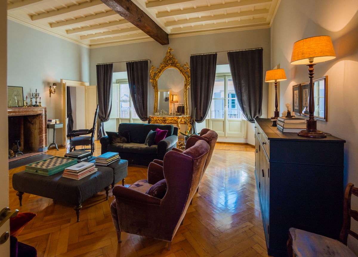
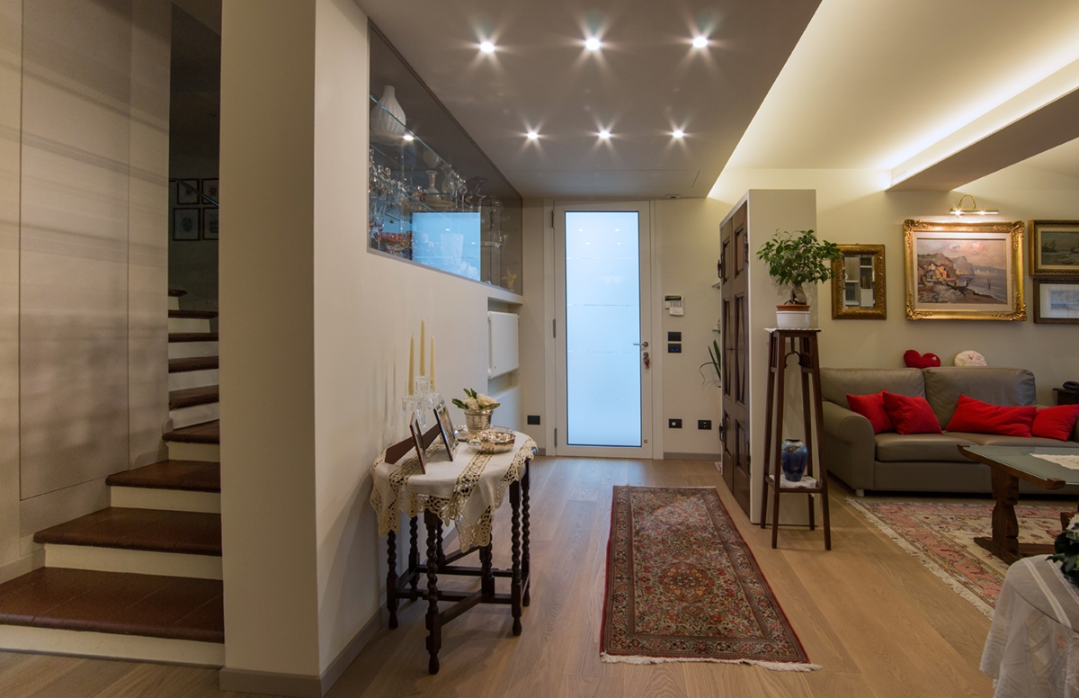
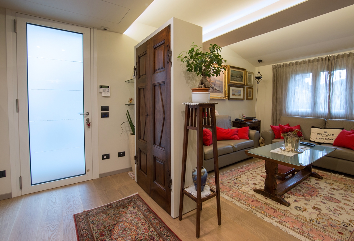
The ancient and the contemporary styles harmonize in the renovation of the living area of this house with a classic taste. An intervention that revised the layout of the entrance in favour of greater functionality and visual elegance of the external façade. A new interior layout of the living room has also been designed and a new look in order to communicate with the antique furniture existing. The old layout of this classic style private residence had the main entrance raised above the remaining rooms. The landing took place on a mezzanine level in correspondence with the staircase leading to the night area.  In doing so, an entrance area was certainly identified, separating from the rest of the rooms. The raised position compromised its functionality.

new entrance ancient contemporary 01

THE NEW ENTRANCE

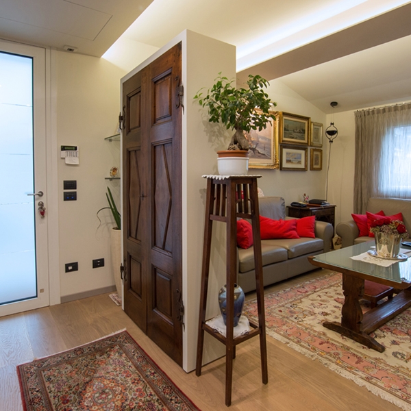
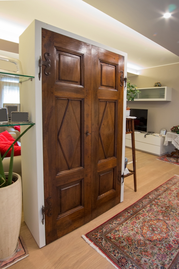
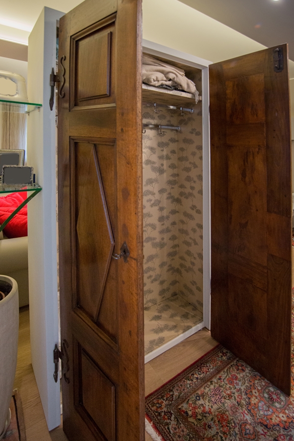
By bringing the main entrance to the ground floor, on the same level as the living room, the renovation also involved the appearance of the external façade, restoring visual balance. A wall equipped with a recessed showcase therefore closed the previous entrance area. This showcase is in an extremely essential style, with glass shelves and closure in order to show small collectibles.  At the same time, it lightens the closing wall and constitutes an excellent protection element considering the raised position. To define an area that can act as a filter between the exposure of the external space and the privacy of the internal rooms, we chose a false ceiling with punctual lights. This visually detaches itself from the remaining ceiling both for a difference in the real and perceived height, and for the backlight, that underlines its borders. In order to delimit this room with the adjacent living room, a wardrobe took place with doors salvaged from an old wardrobe. The plasterboard structure gives more solidity to the furniture that naturally fits into the context as a sort of equipped dividing wall. The dark wooden doors of the eighteenth century, in addition to being an antique furniture to deserve greater visibility, relates consistently to the other old existing furniture. Like a sort of chamber of wonders, a wunderkammer to resume historical and artistic terminology, the interior holds a surprise. A gold wallpaper recovers all walls whit its contemporary graphics but classic in style. The best representation of the match between contemporary and ancient that characterizes the project concept. Glass shelves are attached to the external structure and act as a connection with the entrance wall, recalling the style of the showcase.

 
entrance ancient wardrobe
wardrobe closed doors
wardrobe open doors

LIVING ROOM

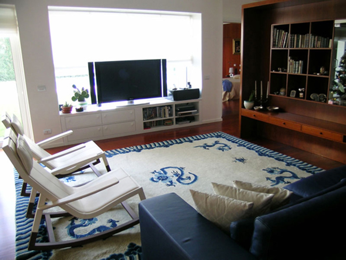
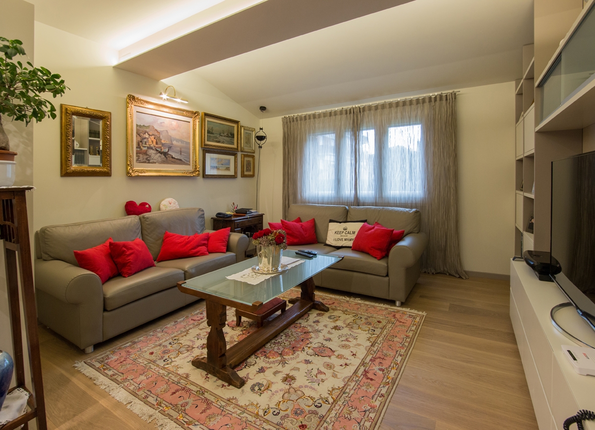
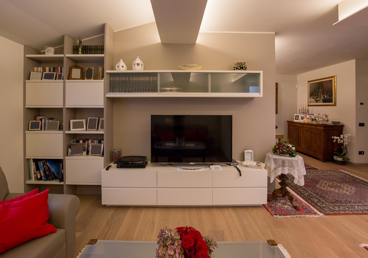
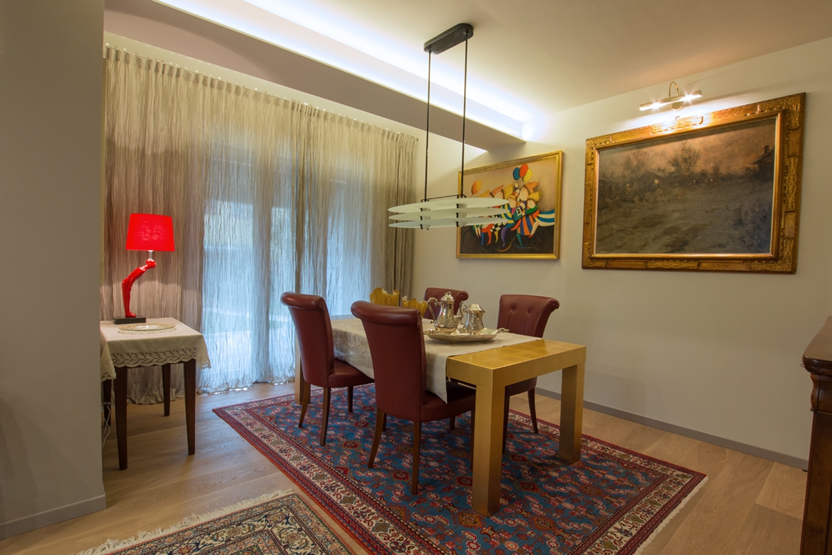
The living room has been modifies in its layout and slightly enlarged. This meant that the dividing wall with the dining room could be equipped with contemporary furniture capable of perfectly fit with the room. In particular, it consists of an essential TV cabinet n white lacquered MDF with upper glass wall units. A recurring material in the entrance and living room. Placed on the corner, instead a library alternates empty elements with full volumes whose colours reflect the medium gray of the plaster and the white of the contemporary furniture. An often-winning combination, both as concerning the reinterpretation of modern classic style, and in a contemporary perspective. The colour match is also visible in the choice of the new gray leather sofas that stand out against the white back wall. Beyond the dividing wall of the living room, there is the dining room with an important, linear and extremely elegant dining table covered with gold leaves. The real treasure of this room. It matches with classic dark leather seats that perfectly relate to the colour choice. An antique dark walnut storage units recovered from other rooms, relates to these, further enhancing the dining room.

 
living room ancient contemporary
tv cabinet library living room
dining room table golden leaves ancient furniture

Ancient and contemporary can perfectly match creating suggestive environments. Here is another example, in this case surrounded by a citrus grove in Sicily. Click here to be fascinated by.


WIP: organize a shop based on functional macro areas

WIP: organize a shop based on functional macro areas

A breath of fresh air in a shop in a seaside town, which does not live only on summer tourism. The scent of the sea in its center makes you feel on vacation all year round. A shop with very large interiors organized in macro functional display areas that allow the optimization of the environments and the best management of customer flows.

CONTEXT

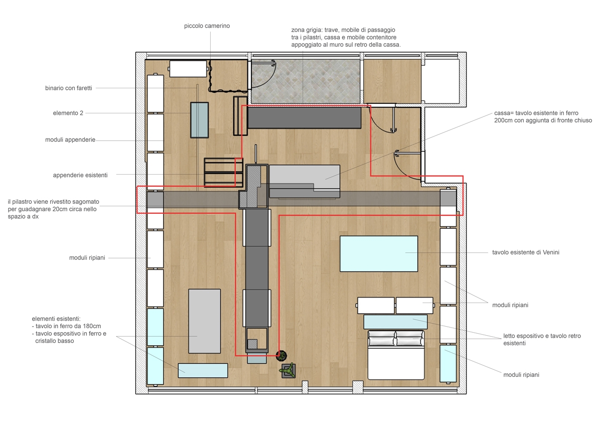
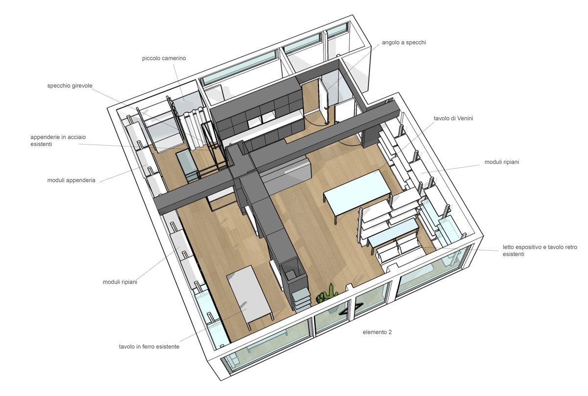
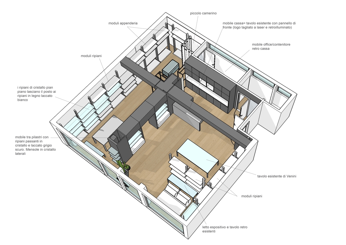
Lignano Sabbiadoro is one of the most renowned tourist resorts on the Adriatic. Bathing establishment always in vogue, it maintains the retro charm of an urban structure linked to the 50s, the period in which Lignano Pineta develops. In the center of the village, under the fresh porticoes, this shop of homemade objects and clothing tooks place. The amplitude is certainly a point in favor of each shop, but sometimes it risks becoming a critical point resulting dispersive. A logistical order for the arrangement of the wares and a general review of the display furnishings become necessary for our customer at this time. The space, with a rectangular plan, introduce itself as an open space visually divided only by structural pillars equipped with electrical outlets. From these we started in the division into various functional macro areas, each structured with service elements for each type of wares on display.

THE PROJECT: THE PRODUCT AREAS AND THE FUNCTIONAL ARRANGEMENT

The main problem of large and visually free spaces is the possible confusion created into the user. In fact, not knowing exactly how to move, he is absurdly discouraged from exploring the shop. For this reason, our subdivision with visual elements into established areas allows customers to move smoothly in the room, directing them to internal use. A spatial division that arises from the arrangement of two equipped walls, from whose asymmetrical intersection four main rooms took place. Two of these were then combined for a wider and more airy perception of the exhibition space, while the storage area is located in the back of the cash desk.

ENTRANCE AND CASH

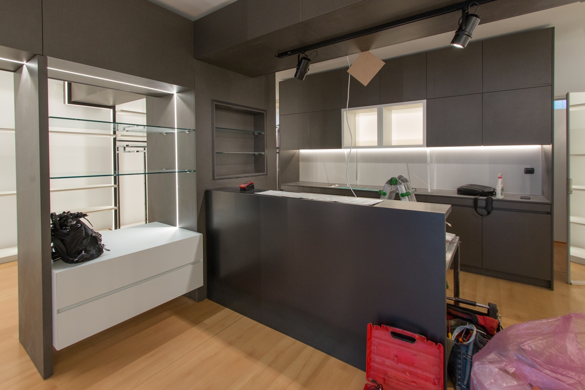
The checkout functionality defines the first area, in which the cashier certainly plays the main role. Positioned in front of the entrance, it however leave the entrance comfortable and not to oppress space. A large piece of furniture defines this area, which allows the owner to have workspace and better serve customers. To close this area, a column which has a large back that can be used as a goods display and storage point.

LINEN AND HOUSEHOLD OBJECTS

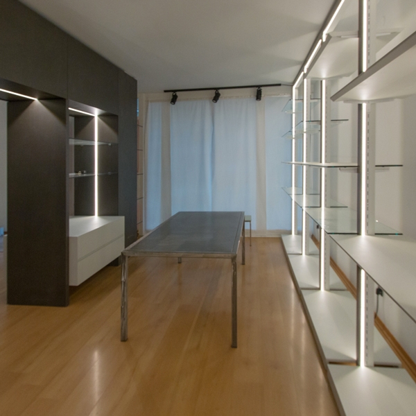
The asymmetrical subdivision of the internal spaces gives rise to a more developed exhibition area dedicated to bed and all household linen. Located at the side of the entrance, it allows a better management of customer flows, as well as a visual hierarchy that identifies this room as the main one in the fruition of the shop. In the centre, a design glass table surrounded by shelf modules is useful for displaying small household items. While, a full-height dividing element visually reproduces the wall elements creating an internal division. A smaller space set up for display where the customer can observe the contextualized products. On the back walls common to the exhibition areas, functional elements alternate whose shelves are organized according to the wares on display. The different distances between each shelf allow the placement of bulky objects or small decorative elements as needed.

CLOTHING

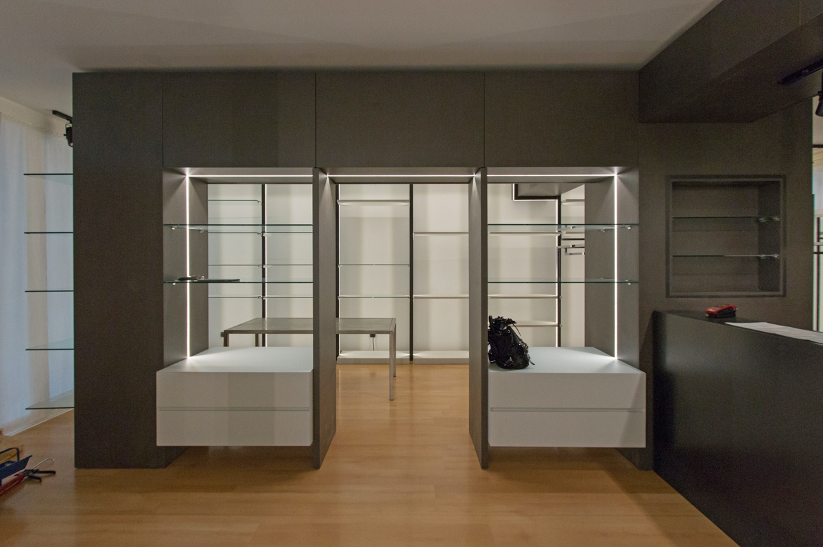
To mark the boundary of this room is an equipped portal, serving the property for the storage of goods not on show. This allows the passage to the remaining area dedicated to clothing. Here, our modules become hangers and the shelves are used for folding. A dressing room for clothing testing concludes this room, which connects directly to the cash desk area. Approaching the showcase, the shelf modules become closer for bags and small prêt-à-porter objects.

project Lignano shop 01
project Lignano shop 02
project Lignano shop 03 functional areas

MODULES AND STYLE

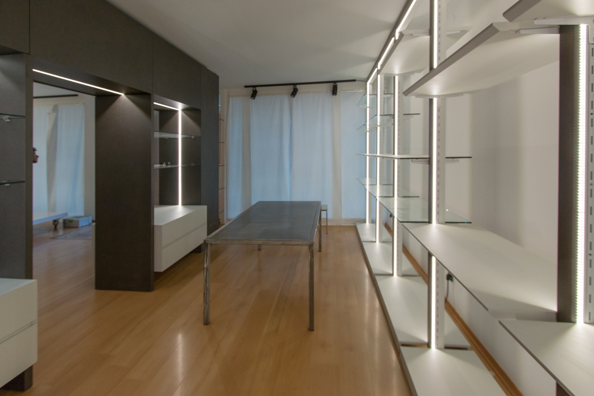
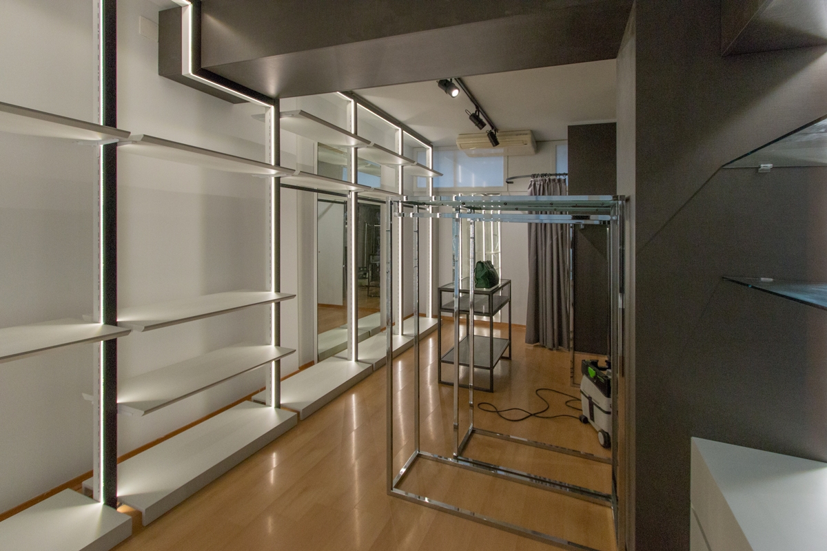
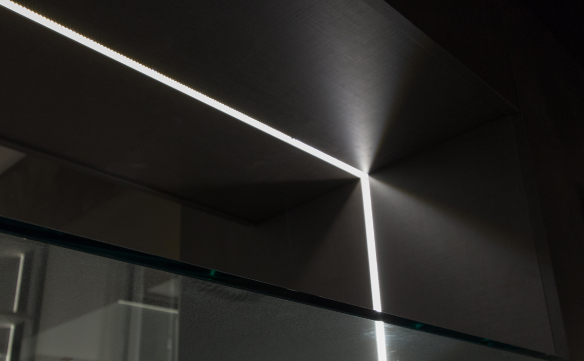
As far as materials, colors and types of furniture are concerned, we have focused on the modern, gritty and essential style. The two colors that alternate with the white walls are a dark gray with bold tones, which also defines the cash area and the illuminated portal for access to the clothing area and a very light gray tending to blue, which recalls the nearby sea and characterizes shelves and low storage elements. The exhibition modules are of two types: the shelf modules are tall, in chromed steel with a bright internal LED profile with lacquered shelves that alternate with crystal shelves that act as display elements and separate the various areas. The others are low, in steel and crystal and act as an exhibition support for the tall elements. Here some Work in Progress photos, we hope to make soon an holiday in Lignano seafront and return to admire the set up shop!

cash counter area shop
divider functional areas
shelves back wall display areas
lighting shelves back wall display areas
shop details
shop lighting details
display area bed and home line
table and shelves Lignano shop

In the world of luxury retail, the white boxes for Tiziana Fausti

In the world of luxury retail, the white boxes for Tiziana Fausti

Luxury corners in the retail world have a universal language, this is what white boxes are and how we made them for the Tiziana Fausti multibrand in Bergamo.

WHITE BOXES

The world of fashion speaks a universal language. A language composed of functionality, simplicity and beauty. Three keywords that become the fundamental requirements in the design of the white boxes. These constitute the basic module of the exhibit system of any corner: essential rooms that build the “basic display units”. A sort of empty box, perfect in the executive realization that can be declined in all contexts depending on the brand’s exhibition project. An extremely versatile element equipped with lighting, arrangement of electrical outlets and air conditioning ducts as planned. It should then be destinated to the single luxury brand. White boxes are certainly among the fundamental requests of each general contractor, also for their duration over the years. If it is true that the world of retail is the first to always dictate new trend and to continually renew itself, the white boxes instead constitute a timeless element capable of becoming a constant for the internal layout of the corners. A flexible room that will experience as few structural changes as possible. The design of the internal exhibition spaces and their management are entrusted to the visual and interior designers of the single brand.  

PROJECT LAYOUT

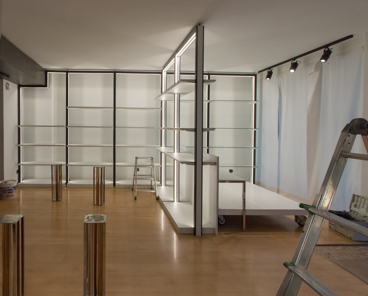
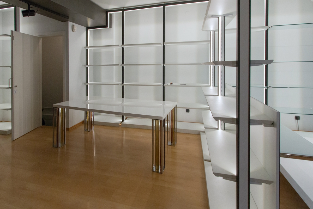
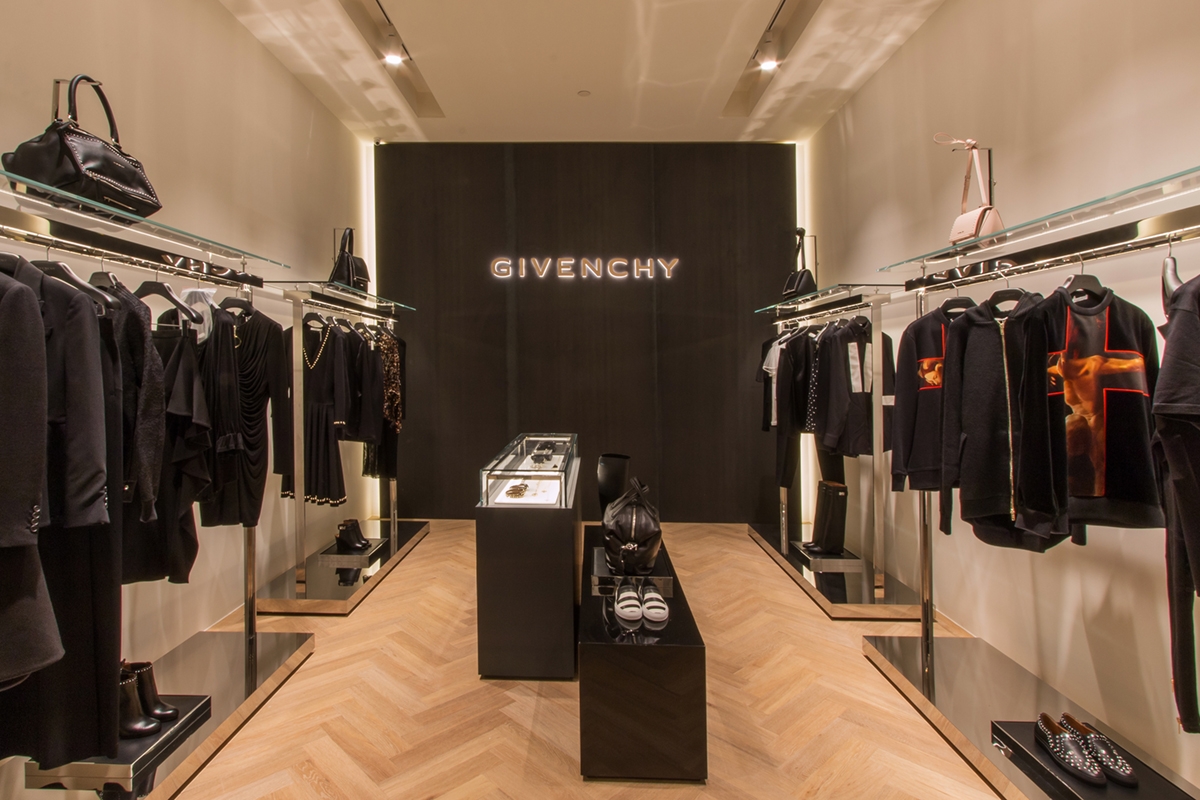
For the Tiziana Fausti luxury store in the centre of Bergamo we have realized the white boxes as designed by the architect Marco Costanzi. In particular, the lyout of the commercial space was intended to hoas a multibrand space equipped with linear display elements in its central area and to host three luxury brands in the respective white boxes on the back wall.

MULTIBRAND

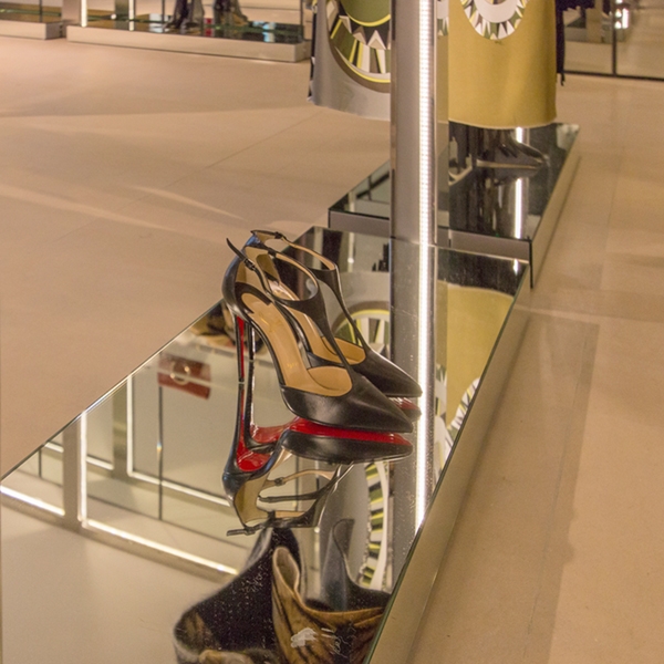
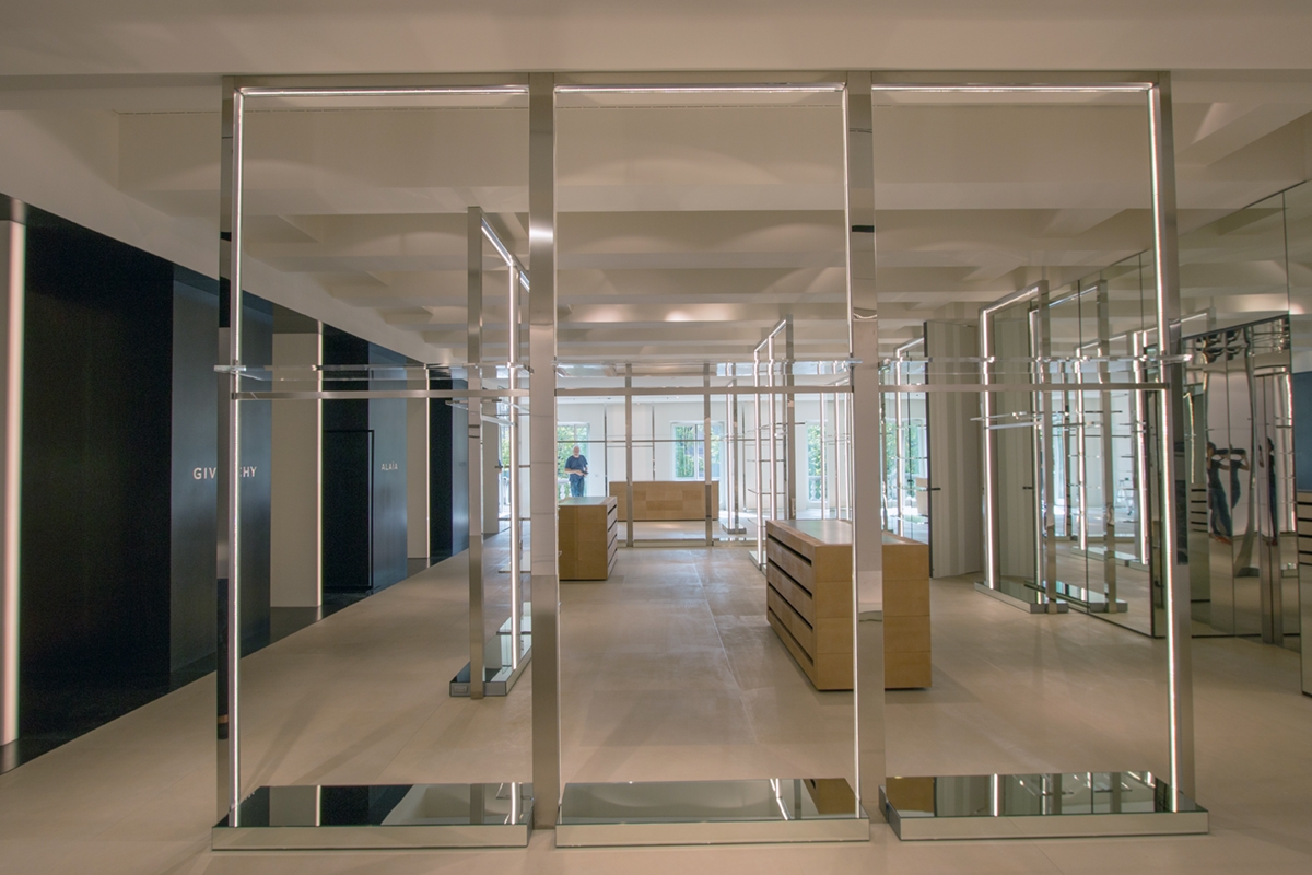
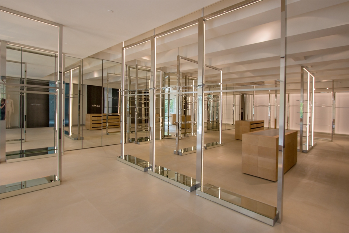
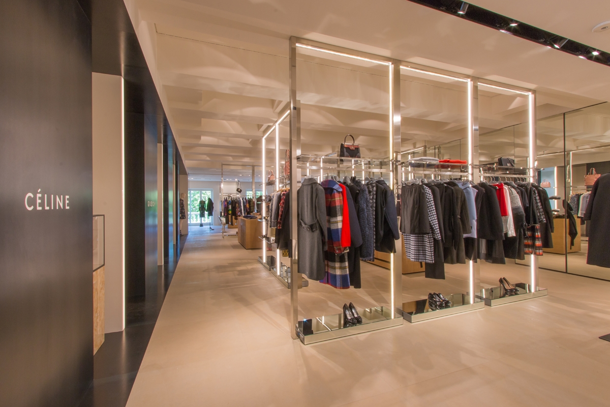
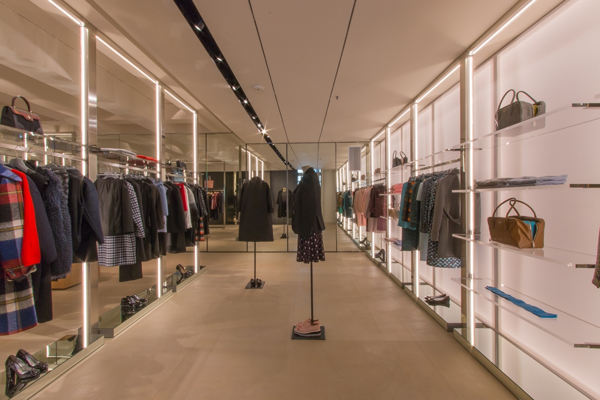
In the central space, linear elements that can also contain lighting in their essential profiles, as well as glass display shelves are designed. Made of polished stainless steel, they hold the cable system at the base, which allows linear lighting which also acts as a luminous frame. In this way, they function as stand-alone elements, providing the necessary light for the correct illumination of the products, but they also not exclude the use of any external spotlights that can improve their visibility.

TIZIANA FAUSTI WHITE BOXES

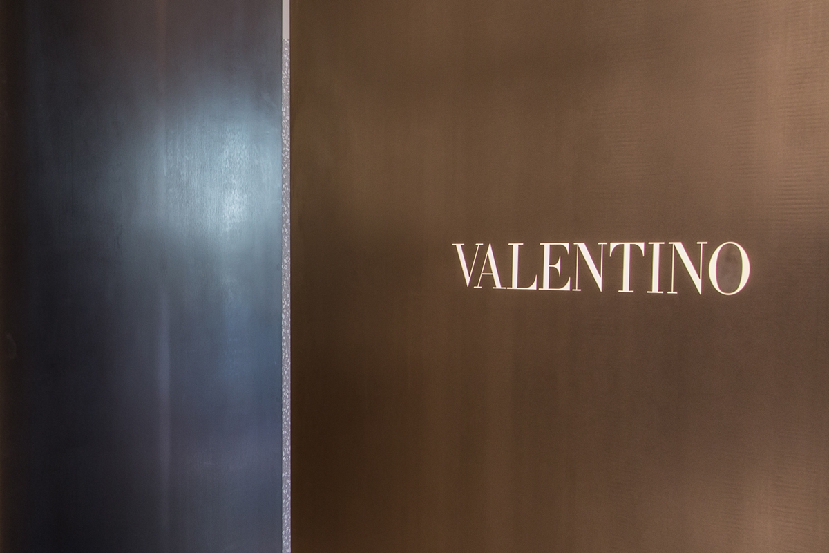
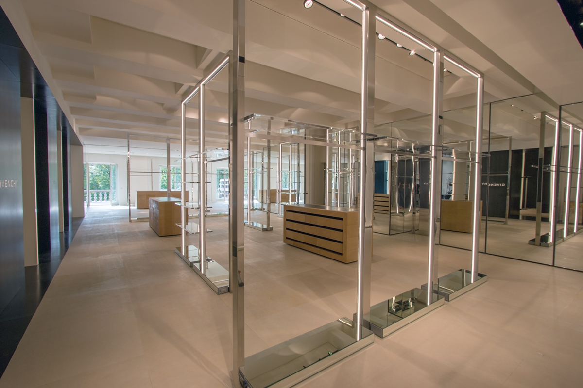
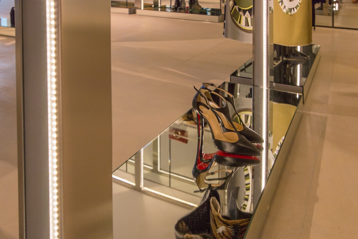
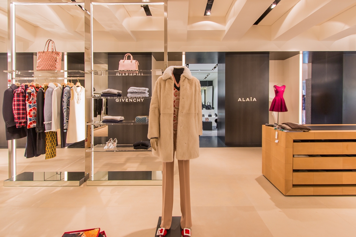
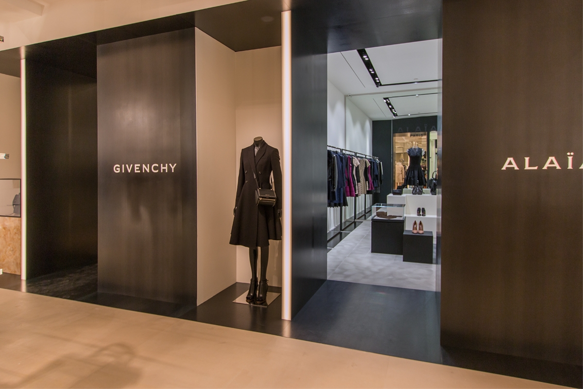
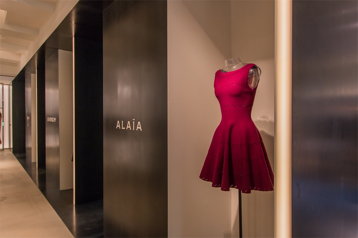
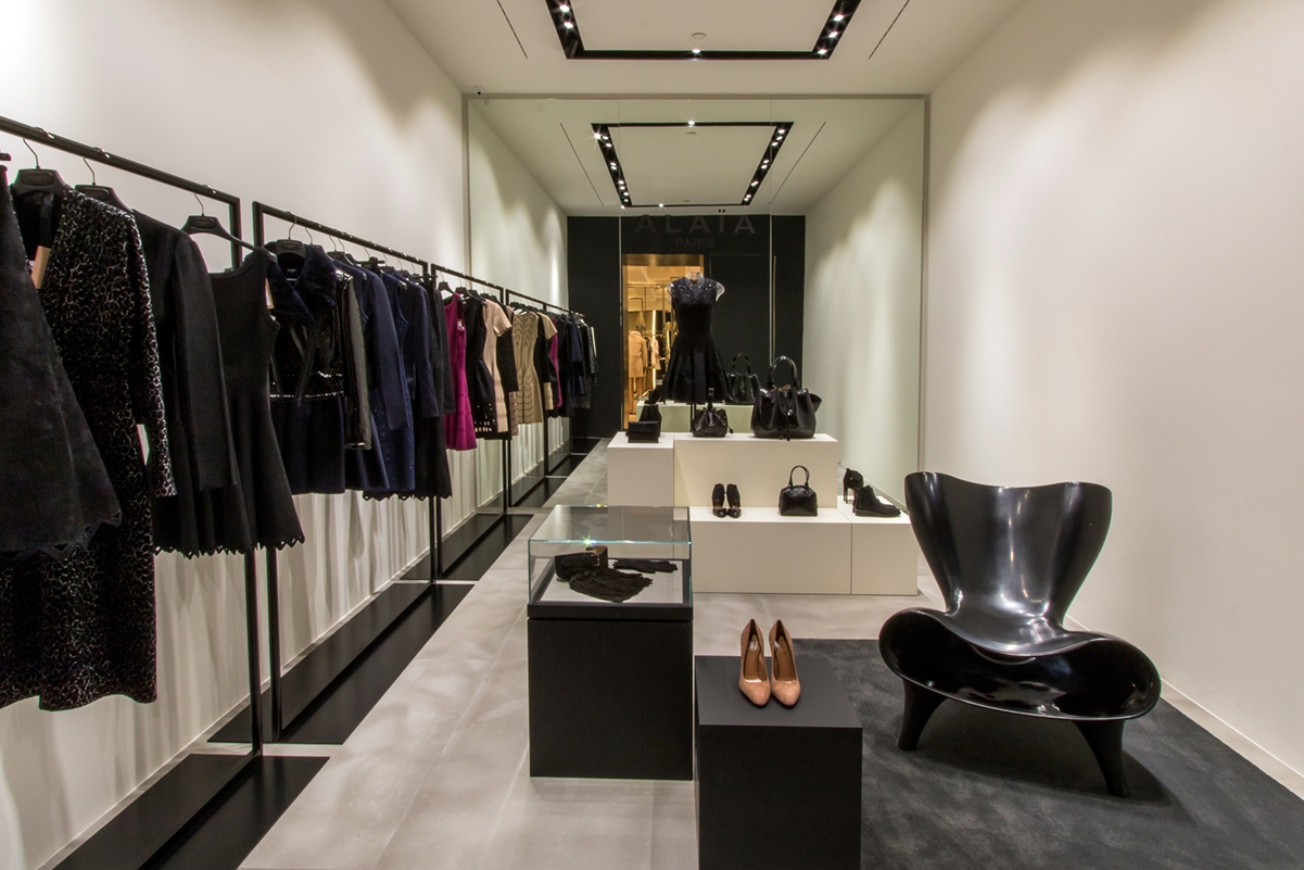
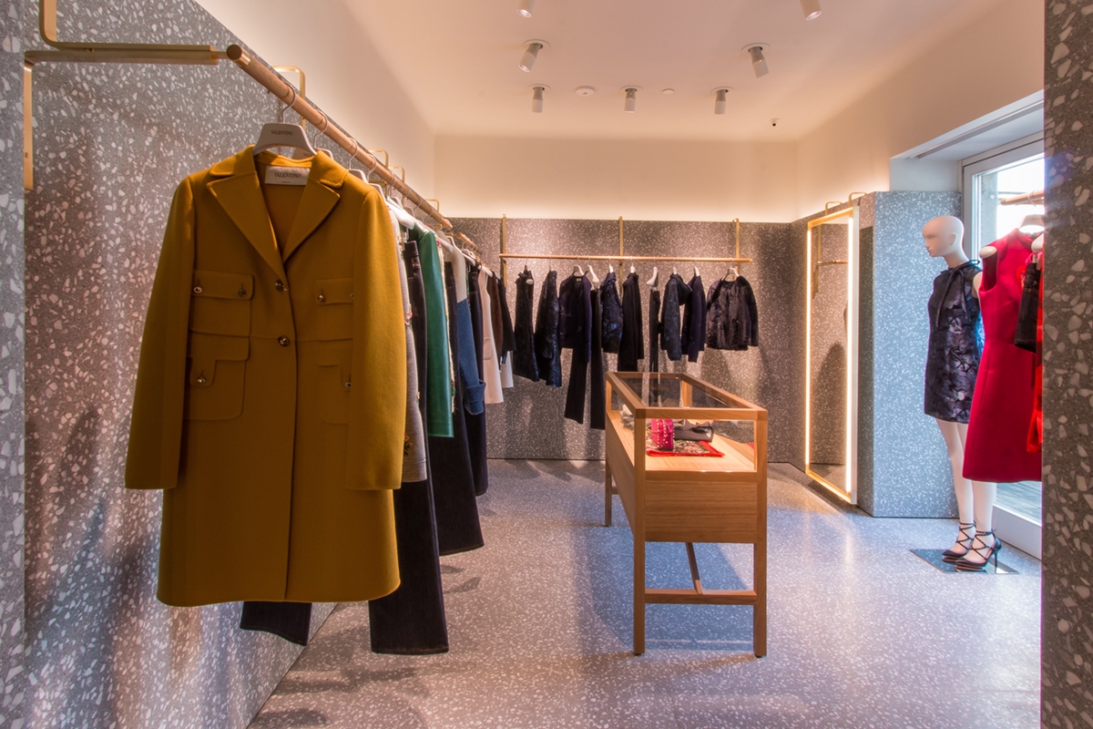
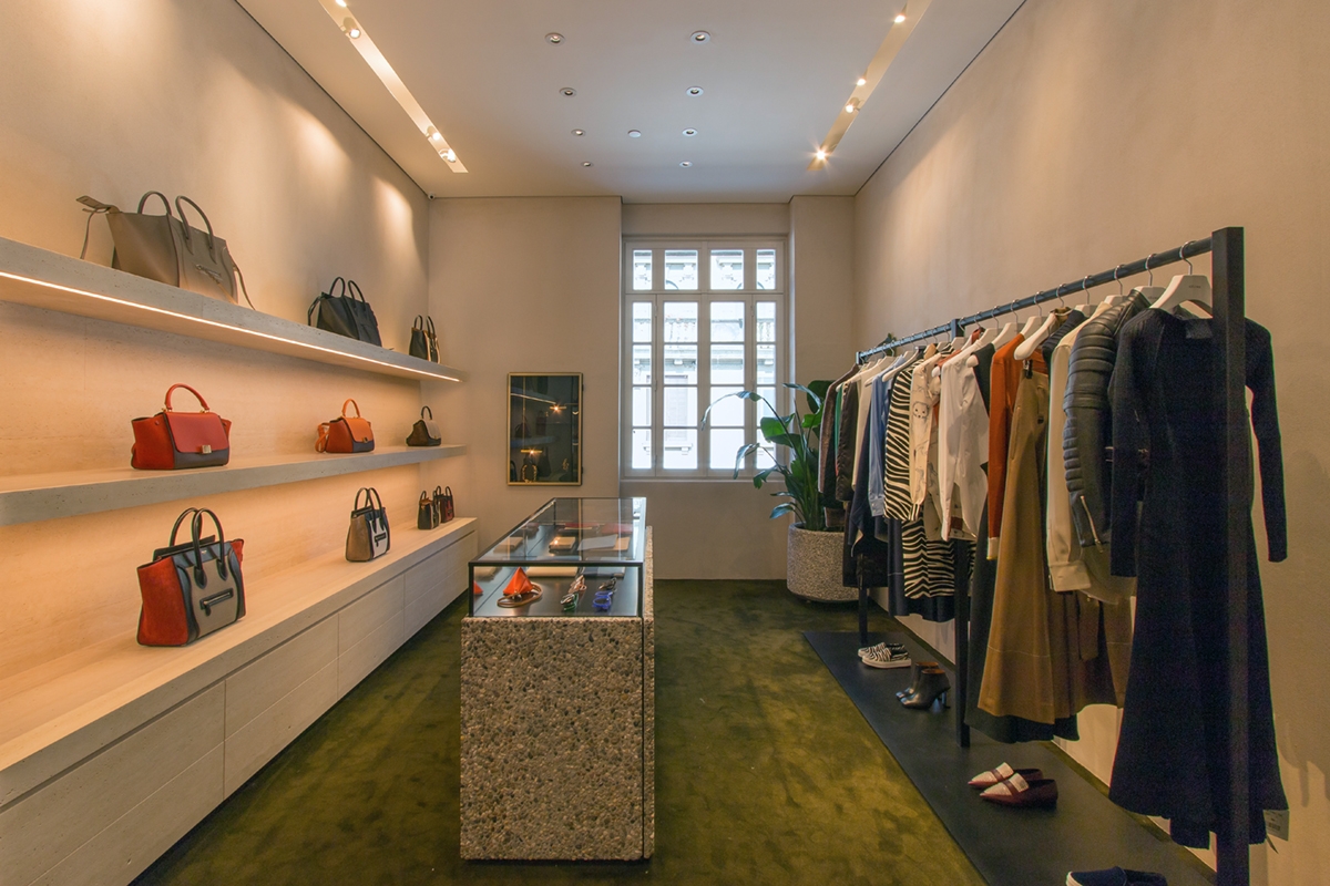
On the back wall there are four white boxes used to shortly host the corner of Alaia, Givenchy, Celine and Valentino. These have been equipped with a recessed lighting profile to which the directional spotlights are attached. The profile follows a rectangular shape and it is placed in the centre of the false ceiling. The electrical set-up and the placement of electrical outlets for potential wall displays or illuminated central showcase constituted the interior layout of the rooms. These were also equipped with the air conditioning system and the wall and ceiling structure was mounted according to the project. This is the case, for example, of the corner of Valentino, whose project envisaged a marble wall cladding that needs a supporting structure behind it. Concerning the external front view, the white boxes were characterized by clack waxed iron closing panels. These chromatically detaches themselves for the choice of black in which the logo of the luxury brands inside the corner are laser shaped. The size of the logo and its blacklighting is a dimensional constraint fixed by Architect Costanzi’s studio on each brand to visually standardize the external front view in accordance with the general project.  The niches created between the corners are equipped to hold the mannequins of the brand as a sort of recessed showcase. Some photos of work in progress are shown below. N.B.  We in retrospect added the photos of the fitting completed in August 2015 for a greater success of the visual representation.

 
white boxes Tiziana Fausti work in progress
Tiziana Fausti work in progress
white boxes display Tiziana Fausti
white boxes detail
display Tiziana Fausti 2015
white boxes exterior
front view exterior mannequin zoom
Tiziana Fausti Alaia
Tiziana Fausti Valentino
Tiziana Fausti Celine
Tiziana Fausti Givenchy

The Coffee Market, a store in Ibiza that smells like coffee

The Coffee Market, a store in Ibiza that smells like coffee

The Lavazza coffee store inaugurated in Ibiza, in collaboration with Officina iDEa. Here the famous bitter grain becomes the protagonist and it expresses all its cultural and experiential variations.

coffee market Ibiza 01
coffee store Ibiza 01

COFFEE BREAK

Coffee culture is a tradition that passed down all over the world for years, knowing different variations according to the context in which it is settled. There is no continent without any charm of its essence, making it a real ritual. Did you know, for example, that in Ethiopia the preparation of Arabica coffee takes place in all its phases in a domestic environment? As a real ritual, starting from roasting, passing through the grinding and ending with the infusion, everything is done at home. Each culture knows its own technique, which ranges from preparation to tasting. An overview is available in this article from the Lavazza magazine. Italy is undoubtedly the homeland of coffee, with the unique and inimitable espresso. Its own definition encompasses the essence of Italian coffee. If in fact other countries conceives the coffee as a stop to calmly taste and enjoy, in the beautiful country it is often served at the counter, by standing and very quickly. <the barista expresses its skills knowing how to master the coffee machine by cranking out one cup after the other. It is no coincidence that the main feature of the espresso is that you can finish it in three sips. An espresso is perfect at any time of the day, nothing to do with the cappuccino with croissants that denotes the breakfast ritual.  An espresso is a quickly break before going to work, but also a refill after lunch or the perfect closing of the day.

THE CONCEPT

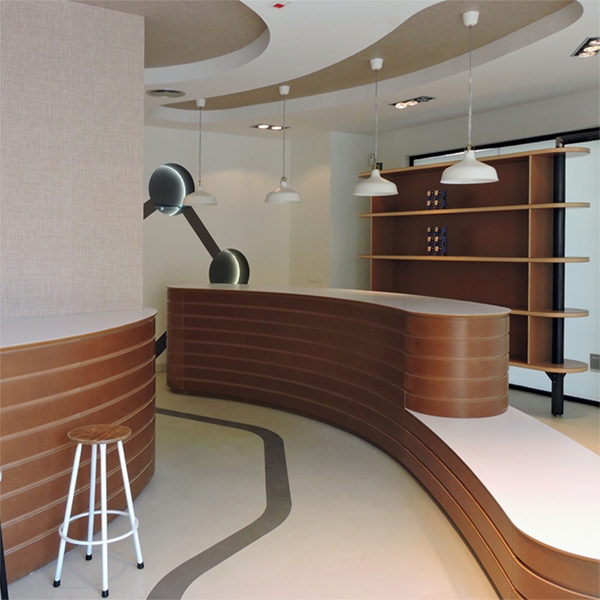
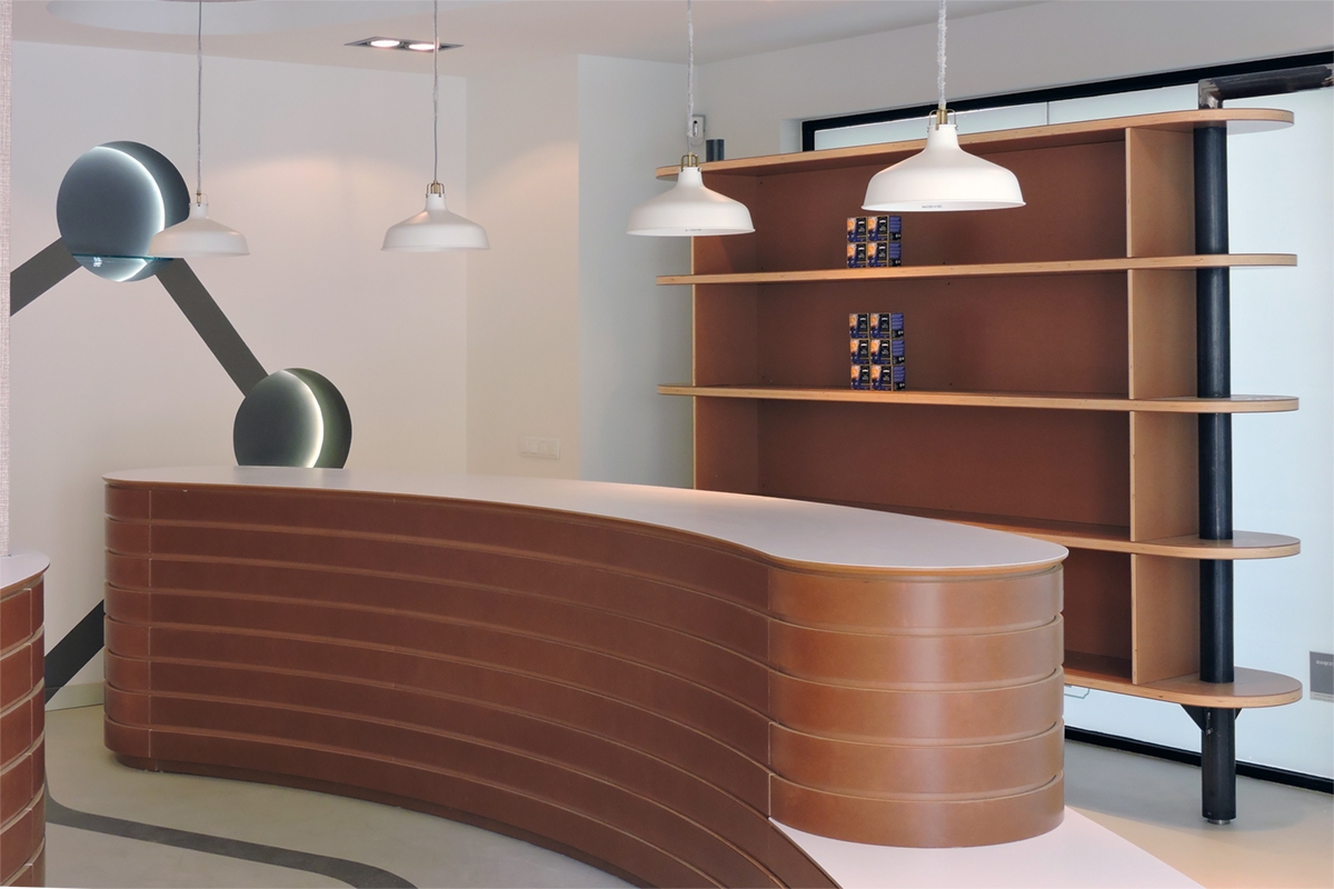
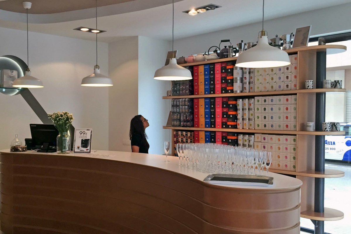
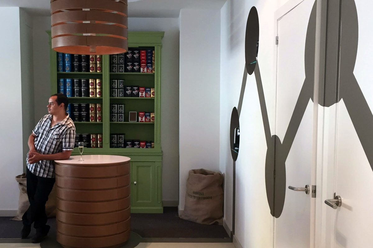
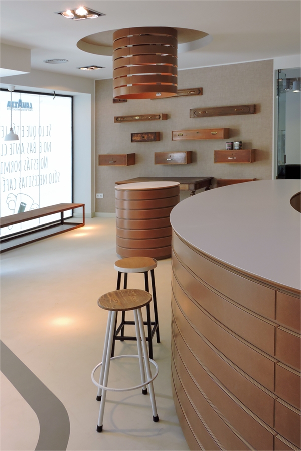
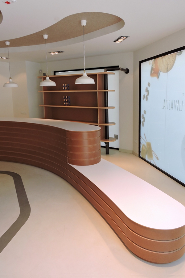
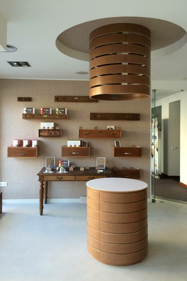
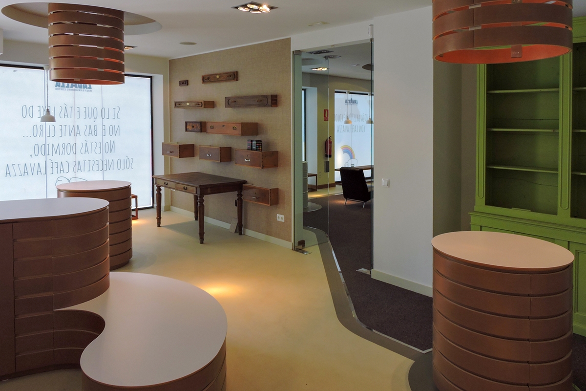
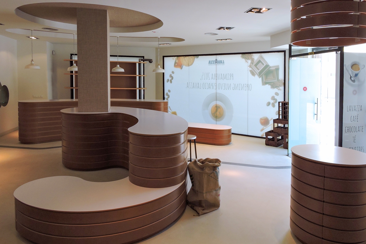
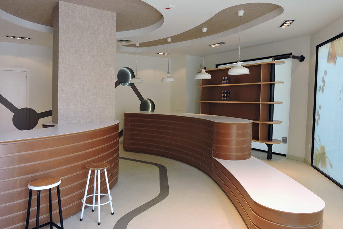
The project, of which we had anticipated you some work in progress photos, follows the Officina iDEa’s concept, focused on the morphology of the coffee grain. Not only has that, the commercial space rather than a simple shop and bar fit perfectly into the category of concept store. It is in fact a retail space mostly focused on the experience and philosophy behind the band, which is in this case Lavazza. The atmosphere recalls for lines and shapes the sinuosity of the coffee grain, also matches with colours and materials that define it. This is the reason why a textured fabric-like laminate was chosen for the finish of the false ceiling and for the central pillar, to recall the texture of the jute bags in which the precious product is kept. The internal layout of the spaces provides a direct sales area for products, with relative exhibition, a tasting area to enjoy the sacred moment of the coffee break in a European concept. But also a series of infopoints where you can get closer to the cultural world and curiosities of the Italian coffee, and an import and export office visible from the large windows. The projects also considers the graphic point of view, establishing a user experience with a line that accompanies the customer towards the main display elements and in the tasting and sales area. A graphic line that also develops on the sidewalls from the floor, becoming three-dimensional displays elements.

 
coffee store Ibiza counter zoom
coffee store Ibiza showcase zoom
coffee store Ibiza 02

MORPHOLOGY, COLOURS AND MATERIALS

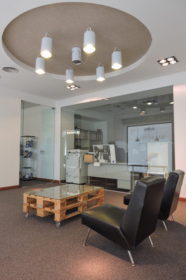
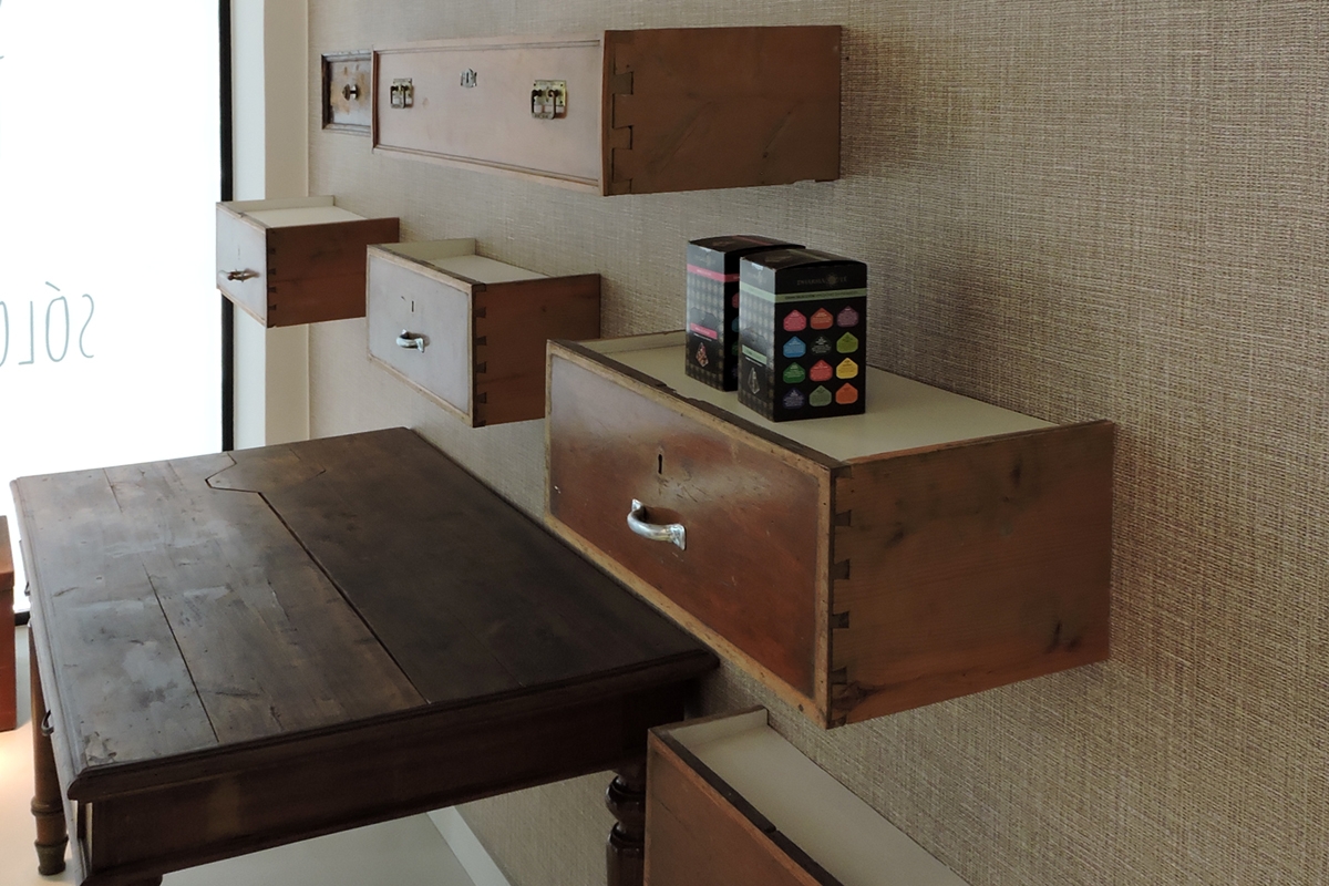
The concept store follows a conceptual development of its spaces. Each of these is clearly identifiable in the forms and graphic lines, fitting harmoniously as a natural passage between the zones. The presence of exhibition volumes that emerge from the ground as a horizontal stratification of several layers mainly characterizes the space used for the product’s display and sale. If in the lower part these elements are made of natural lacquered curved MDF profiles with horizontal closing surface in white laminate, the upper part takes on its shape to incorporate the lighting. A stylistic line that characterizes the whole store, providing dynamism and graphic elegance. These elements are interspersed with other exhibition objects, recovered from yesterday’s time contexts and added to convey the ideas of authenticity and tradition. This is the case, for example, of the drawers spreads all over the back wall, becoming display elements for the various essence of coffee. Even the display cabinet with bright green doors has been recovered from an old context to take on new life. To enrich the space, we can found jute bags at the corners of the furnishings, which texture is takes from the sidewalls. The coffee bar is equipped with punctual lighting, with suspension lamps with a contemporary design. On the back, a linear display element took place, the external lines of which are rounded in accordance with the general design line. The tasting area is much more essential in design, to focus attention on the experience itself. Classic armchairs in black leather accompany reinvented pellets with metal wheels and glass support surface. Punctual lighting is set up on sight in the recessed false ceiling. It is exactly from this room, that the area for import and export offices takes place visible through a large window, making it a multifunctional environment.

 
coffee store Ibiza drawer zoom
coffee store Ibiza 04
coffee store Ibiza 05
store Ibiza 06
store Ibiza 07
coffee store Ibiza 08

Work in progress with the bitter taste of a coffee

Work in progress with the bitter taste of a coffee

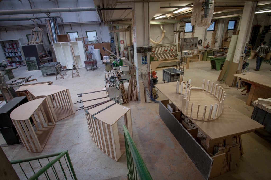
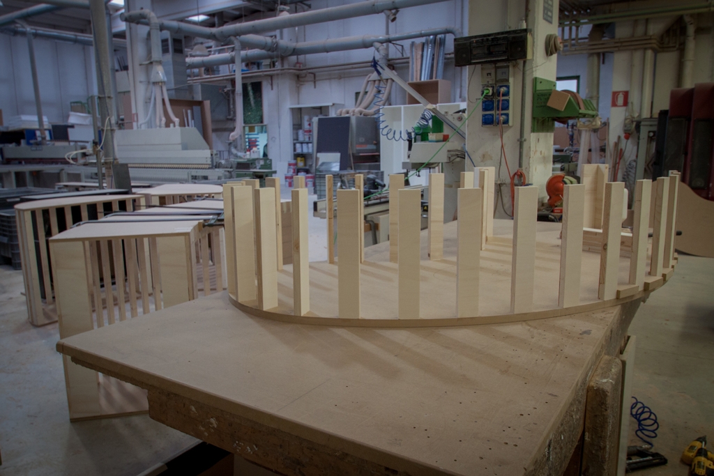
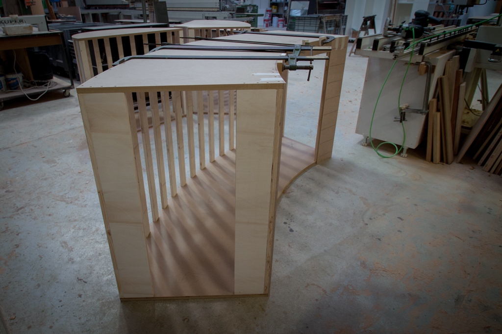
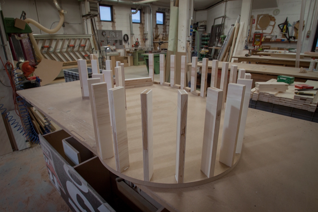
Directly from our laboratory, some photos of the work in progress project of a coffee shop in Ibiza. The Officina iDEa project concerns a retail space where coffee is the undisputed protagonist. An experiential rather than design concept, in which what conception of Italian coffee meets the European experiential context. The realization of the display elements establishes a structure composed of an upper curved MDF template to which the pantographed profiles are anchored, always in natural MDF. The whole is subsequently lacquered obtaining a slight alteration of the natural colour turning to a darker one. An unusual execution technique, which tested the technical processing skills. We will soon could observe the results together when the outfitting is complete, in the meantime we will let you peek through the works.

 
work in progress Ibiza coffee 01
work in progress Ibiza  02
work in progress Ibiza coffee 03
work in progress Ibiza 04