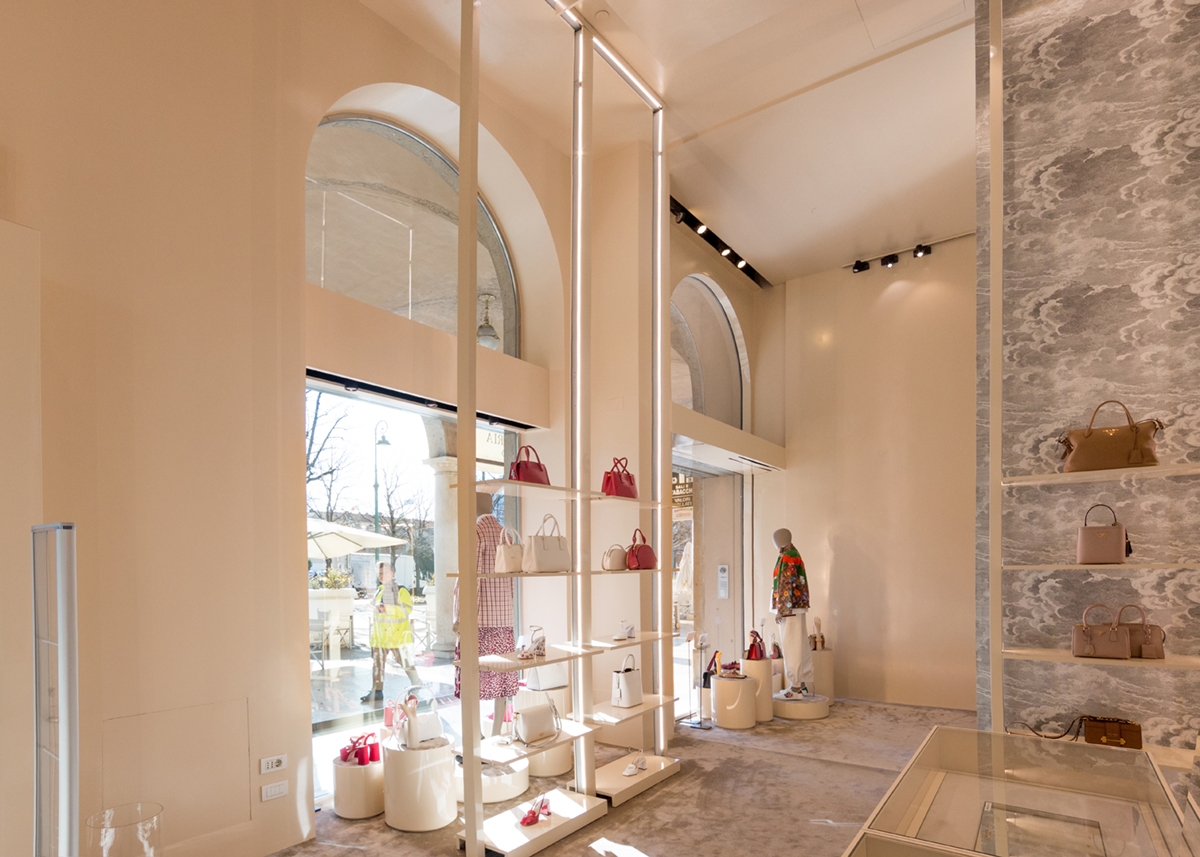
Il rosa nelle sue tonalità più delicate diventa protagonista dell’allestimento 2020 del negozio Haute Couture Tiziana Fausti. Dopo l’intervento del 2017 e l’allestimento del 2016, Modulor progetti torna a realizzare gli arredi del luxury corner con raffinatezza ed eleganza.
IL ROSA NELLE SUE SFUMATURE PIÙ TENUI
Le sfilate di moda per la primavera 2020 vedono l’esplosione del rosa nelle sue infinite sfumature, decontestualizzandolo dal colore di genere a cui siamo abituati. (Ecco un esempio in questo articolo di Vogue Italia dedicato al rosa nelle collezioni primaverili 2020)
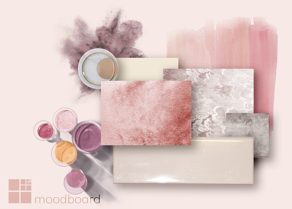
Specialmente nelle sue sfumature più tenue, che si avvicinano anche al bianco panna, è un colore in grado di donare estrema delicatezza agli interni. Una sorta di realtà a sé stante in cui l’interno sembra quasi ovattato e addolcito da queste leggere gradazioni.
In questo contesto si inseriscono perfettamente carte da parati e velluti, ma anche laccature rosa pallido e bianco panna. Un’atmosfera delicata, la cui efficacia è raggiunta dalla totale uniformità di pareti, arredi e pavimenti.
TIZIANA FAUSTI PAINTS ITSELF OF PINK
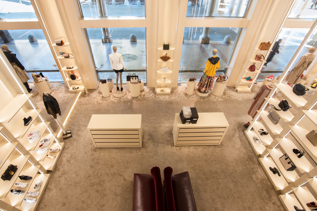
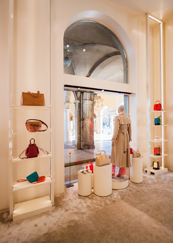
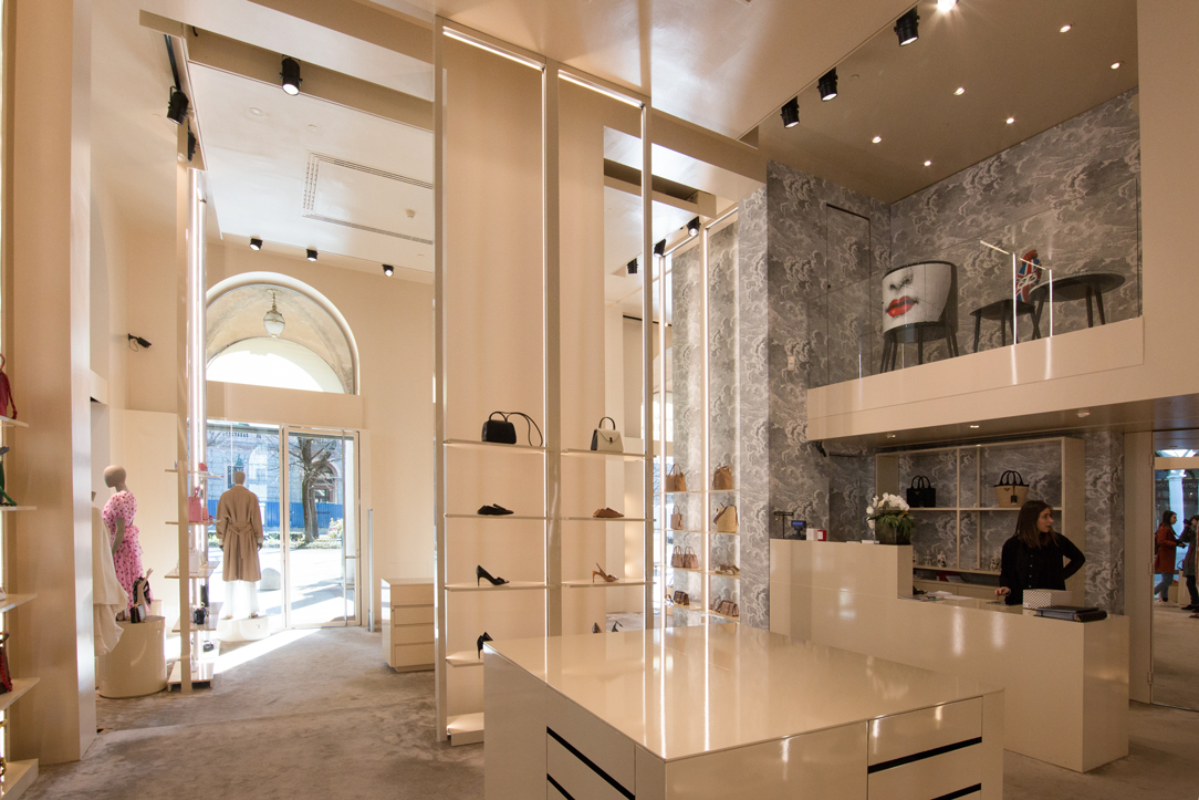
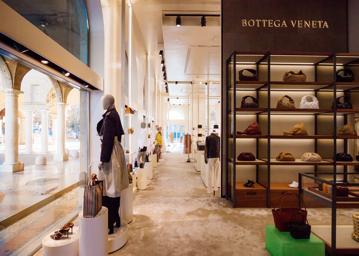
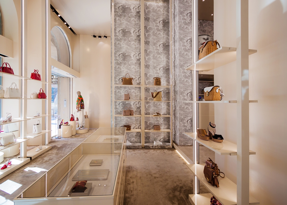
From the shop windows to the vertical display elements, from the uniform carpet to the painting of walls, the whole set-up of the accessories sector speaks the same soft and delicate language. Taking the existing furnishings in polished stainless steel and the dark-painted tables, the work has changed the visual approach of the shop with pink shell painting.
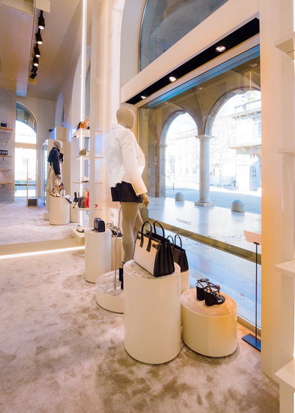
Concerning the shop windows, the expressive delicacy refers to cylindrical volumes of different heights and diameters on which the products displayed stands out. The topper surface is in the pale pink carpet of the floor. Visually distributing the elements at different heights means to create a light and subtle dynamism capable of keeping the attention of the user active.
The carpet itself can prove dynamism. Its surface responds to the main feature of the velvet to reflect light in opposite directions. This is in fact able to take on darker shade, tending to dove-gary, if observed backlight, and very soft powder pink in the opposite direction. A visual feature capable of moving the interiors and creating suggestive environments in which contrasts and overlapping tones are perfectly matched.
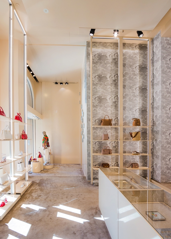
Linear lighting runs along the edge of the display elements creating very elegant luminous frames.
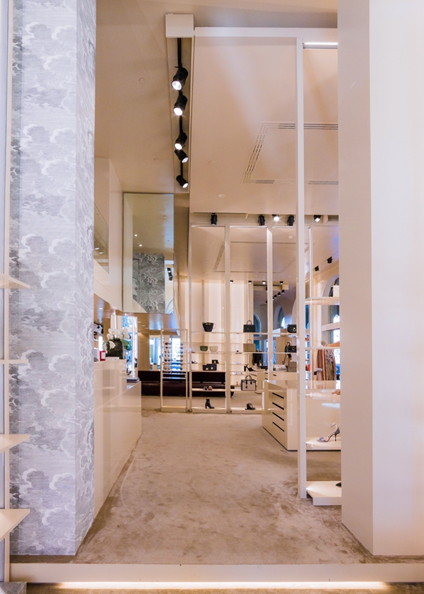
From the cash desk, also rigorously lacquered, a Fornasetti wallpaper stands out on the back wall, which is elegantly inserted in the lift direction. To give greater visual uniformity to the wallpaper, extremely punctual laying was used. In fact, rather than a straight cut, it was chosen to shape it n correspondence with the cloud texture in order to hide the joint point.
This is at the same time an elegant and characterizing graphic, whose chromatic range approaches the more soft gray whit which pink perfectly married.
