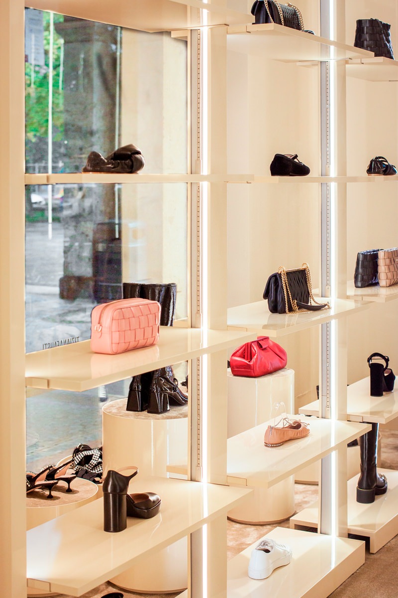
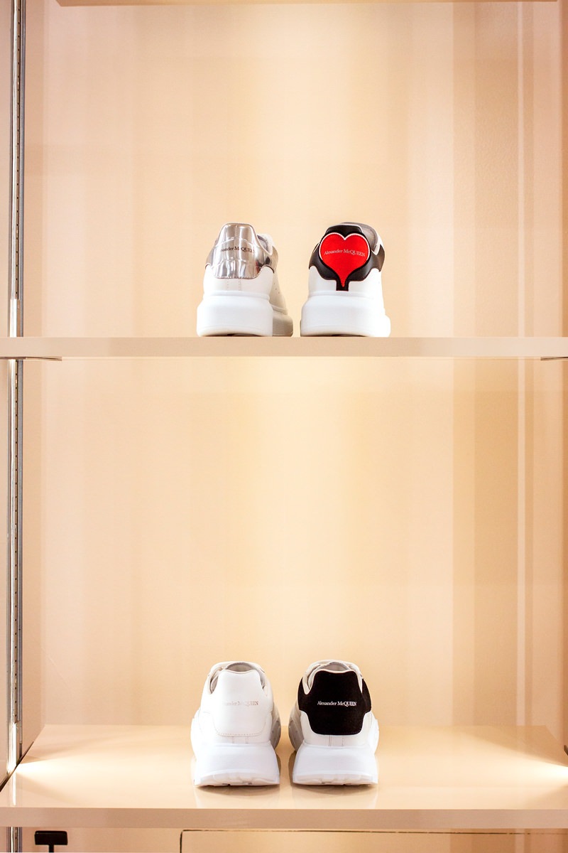
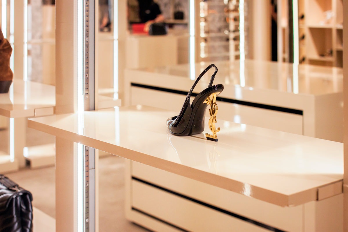
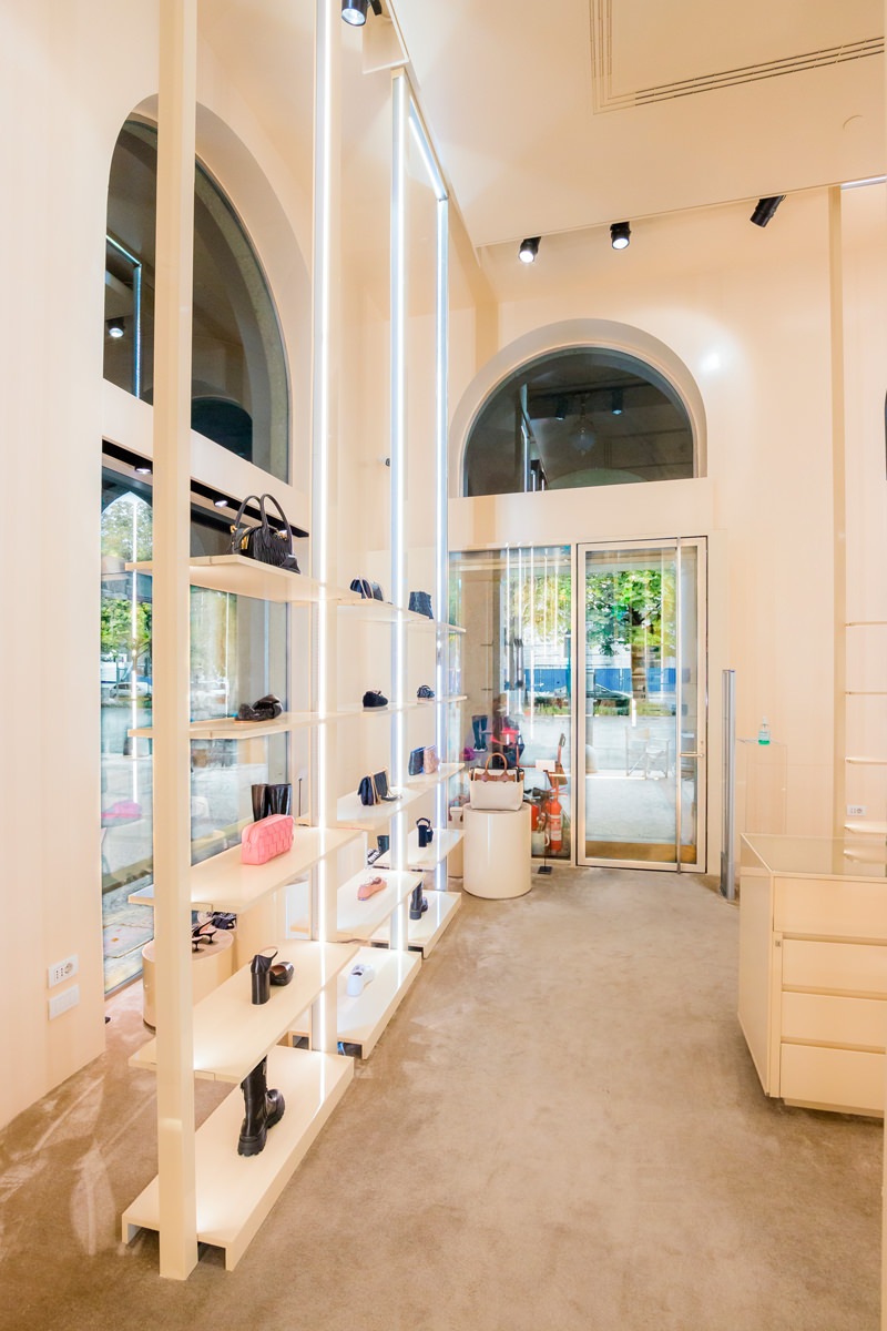
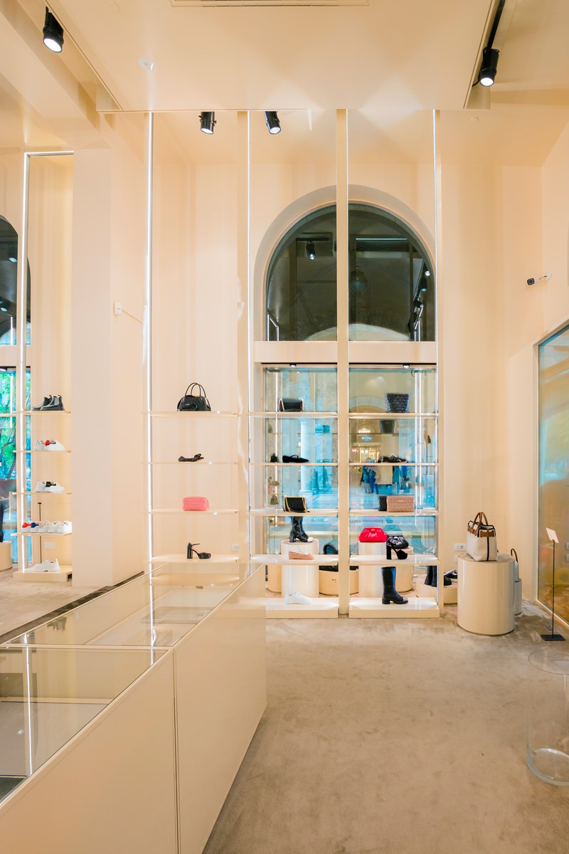
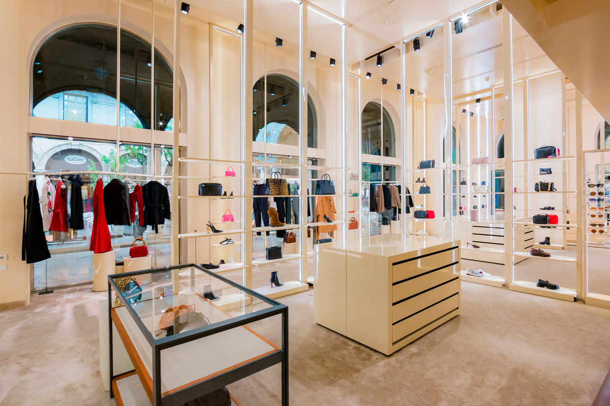
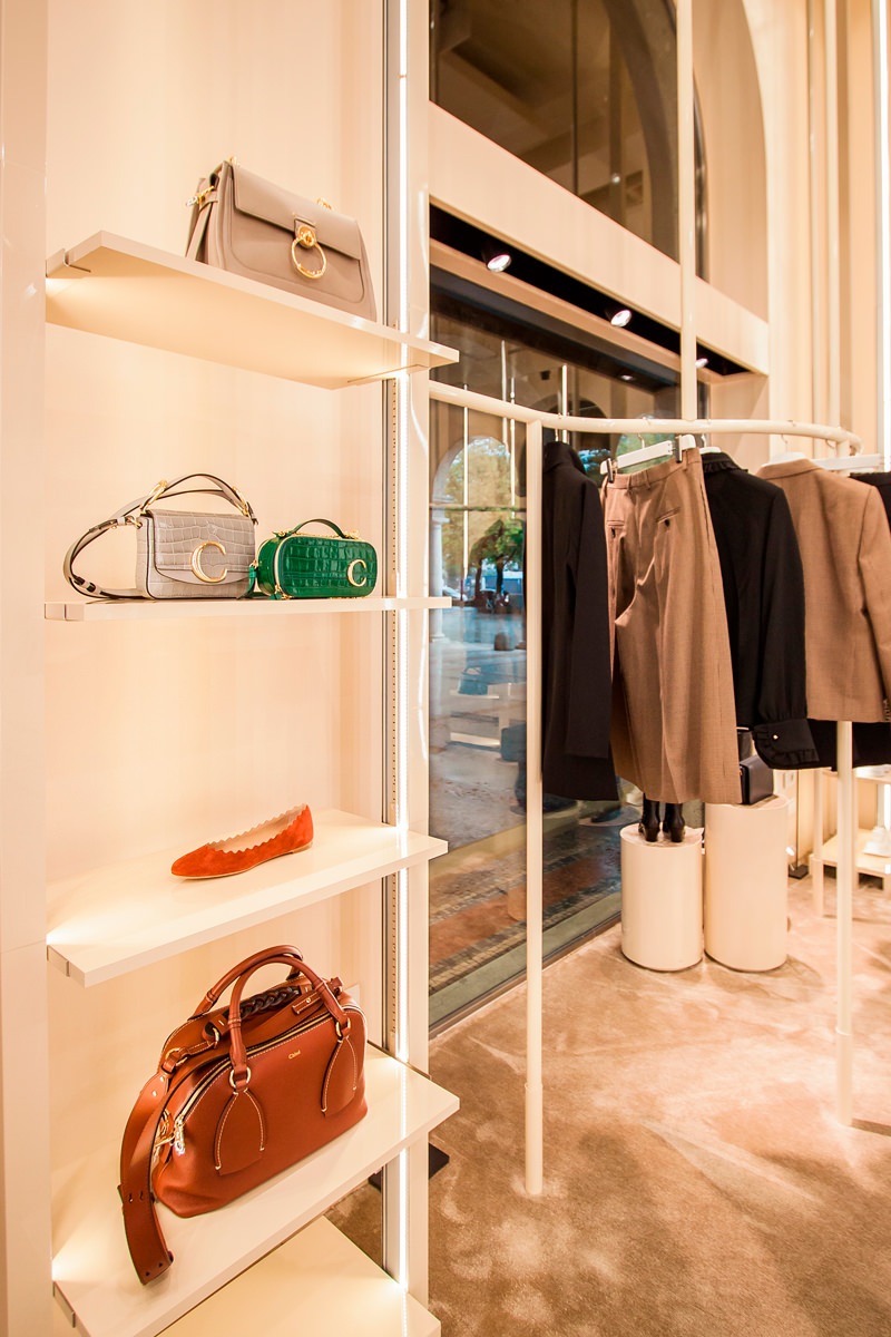
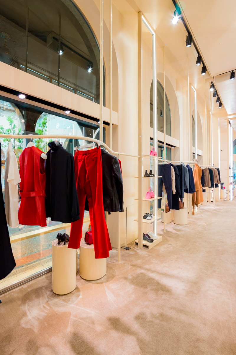
The new hanging system becomes the leitmotif for the windows of the Tiziana Fausti women’s and accessories shop. Linear elements that unfold in the air supporting the products displayed with elegance and lightness.
Always in constant change
The new layout of the Kids department on the ground floor of the historic Tiziana Fausti building has also led to a series of changes in the women’s store.
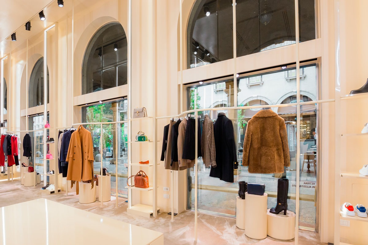
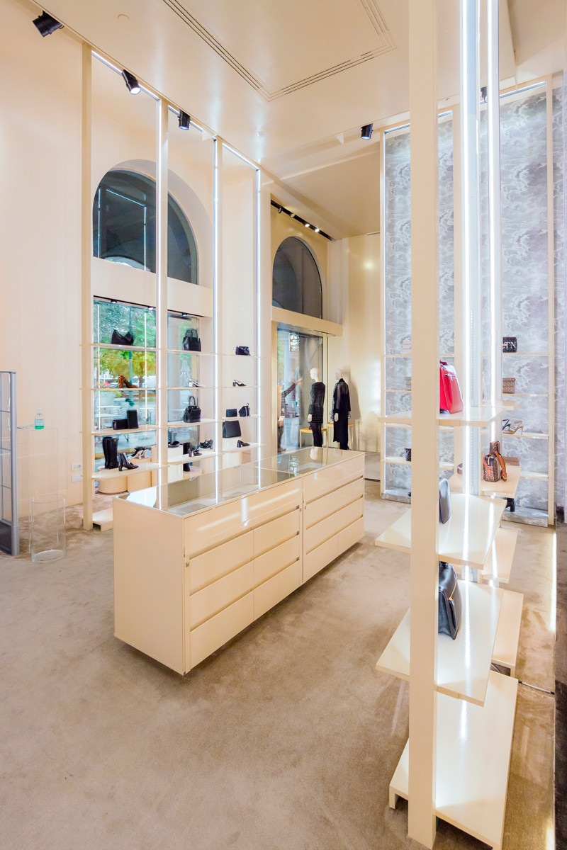
The latest fitting focused on the neutral tones of pink saw the prevalence of vertical elements that underline the large heights of the rooms.
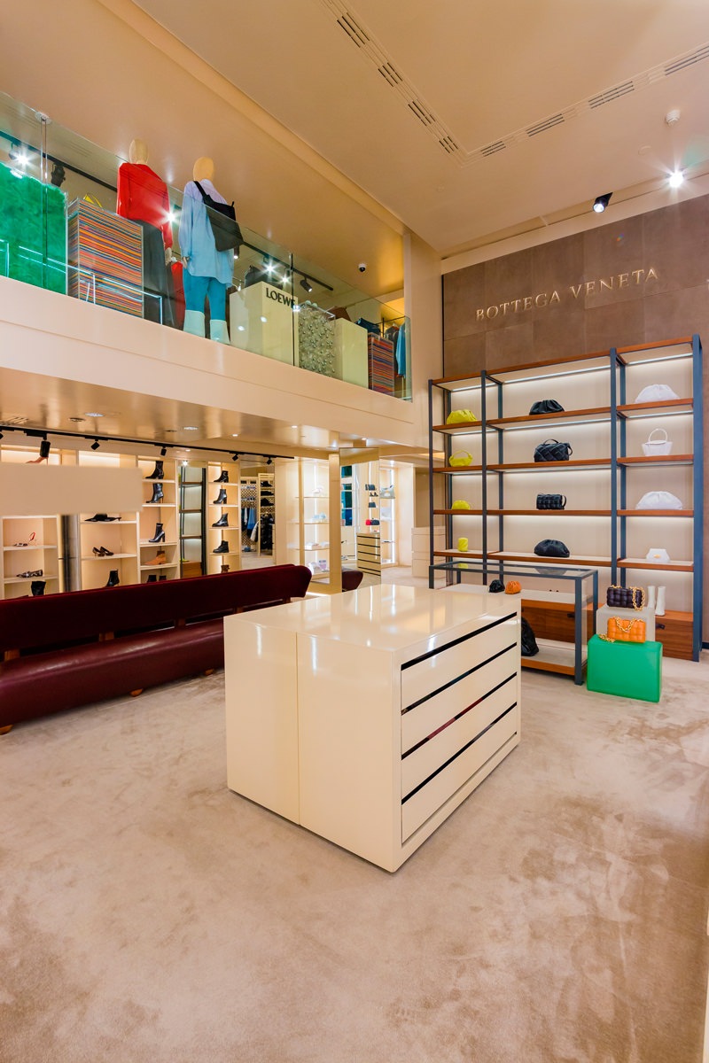
To make space for the Kids department and uniform it from a design point of view, it was necessary to move some elements. Among these, the important wall that houses the Bottega Veneta display cabinet, whose dark tones and a light industrial touch are recognizable for their aesthetics and character. The entire wall occupied by that display system has been recovered, with careful restoration work.
Designing furniture that can be disassembled and rearranged while preserving all the components in the best possible way is a fundamental requirement for retail designers.
The new display system for shop windows
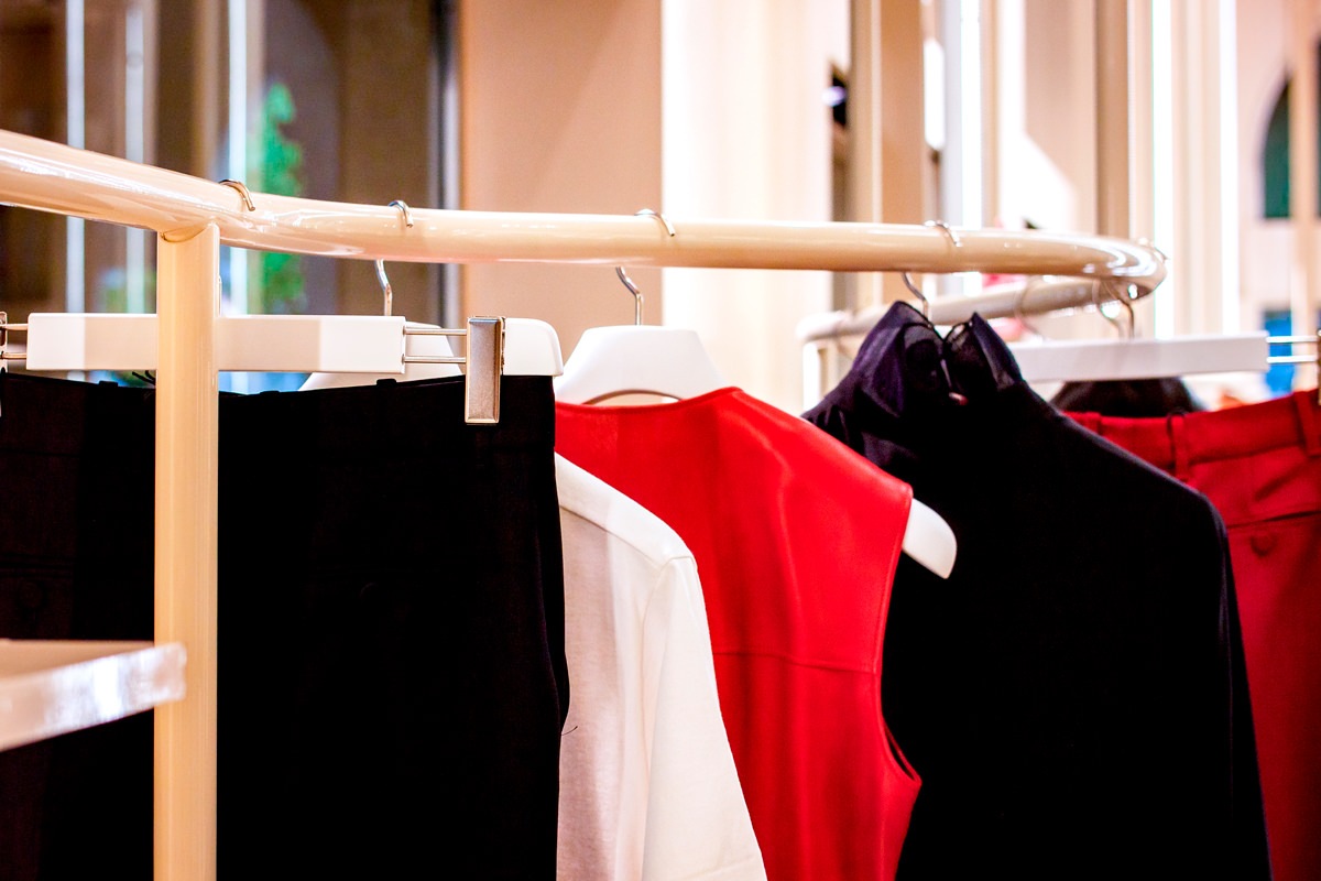
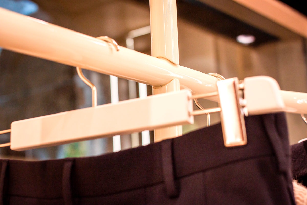
Like sinuous lines, the new tubular hangers elegantly wind their way along the various side windows. To support them, vertical profiles that develop from the floor to the ceiling.
Exposed joints allow connections between the horizontal and vertical components, making the aesthetics of the display system essential. The soft color of the paint perfectly matches the existing furnishings.
A design line that introduces the theme of horizontality, in a set-up that emphasizes the vertical read.
To move the shop windows, cylinders with a velvet top covering in different heights.
A scenographic entrance
The changes made during the new layout also involved the entrance area, which now takes on greater importance.
If in fact in the previous configuration the two accesses to the floor could be equal in aesthetics and function, now it becomes essential to keep the women’s department separate from the Kids one.
To emphasize the scenographic setting of this strategic point, three exhibition totems have been added.
Just like the existing ones, the side lighting develops along the vertical profiles, illuminating the different shelves with soft pink film.
A sort of luminous wall that identifies all the design characteristics of the women’s department: essentiality, lightness and elegance.
