Luxury corners in the retail world have a universal language, this is what white boxes are and how we made them for the Tiziana Fausti multibrand in Bergamo.
WHITE BOXES
The world of fashion speaks a universal language. A language composed of functionality, simplicity and beauty. Three keywords that become the fundamental requirements in the design of the white boxes. These constitute the basic module of the exhibit system of any corner: essential rooms that build the “basic display units”. A sort of empty box, perfect in the executive realization that can be declined in all contexts depending on the brand’s exhibition project. An extremely versatile element equipped with lighting, arrangement of electrical outlets and air conditioning ducts as planned. It should then be destinated to the single luxury brand. White boxes are certainly among the fundamental requests of each general contractor, also for their duration over the years. If it is true that the world of retail is the first to always dictate new trend and to continually renew itself, the white boxes instead constitute a timeless element capable of becoming a constant for the internal layout of the corners. A flexible room that will experience as few structural changes as possible. The design of the internal exhibition spaces and their management are entrusted to the visual and interior designers of the single brand.
PROJECT LAYOUT
For the Tiziana Fausti luxury store in the centre of Bergamo we have realized the white boxes as designed by the architect Marco Costanzi. In particular, the lyout of the commercial space was intended to hoas a multibrand space equipped with linear display elements in its central area and to host three luxury brands in the respective white boxes on the back wall.
MULTIBRAND
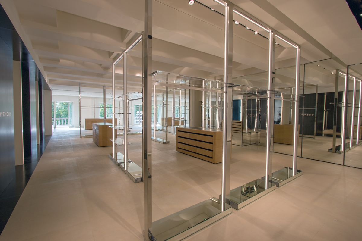
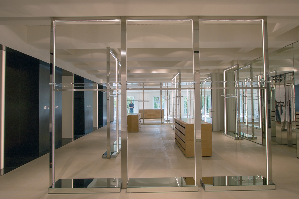
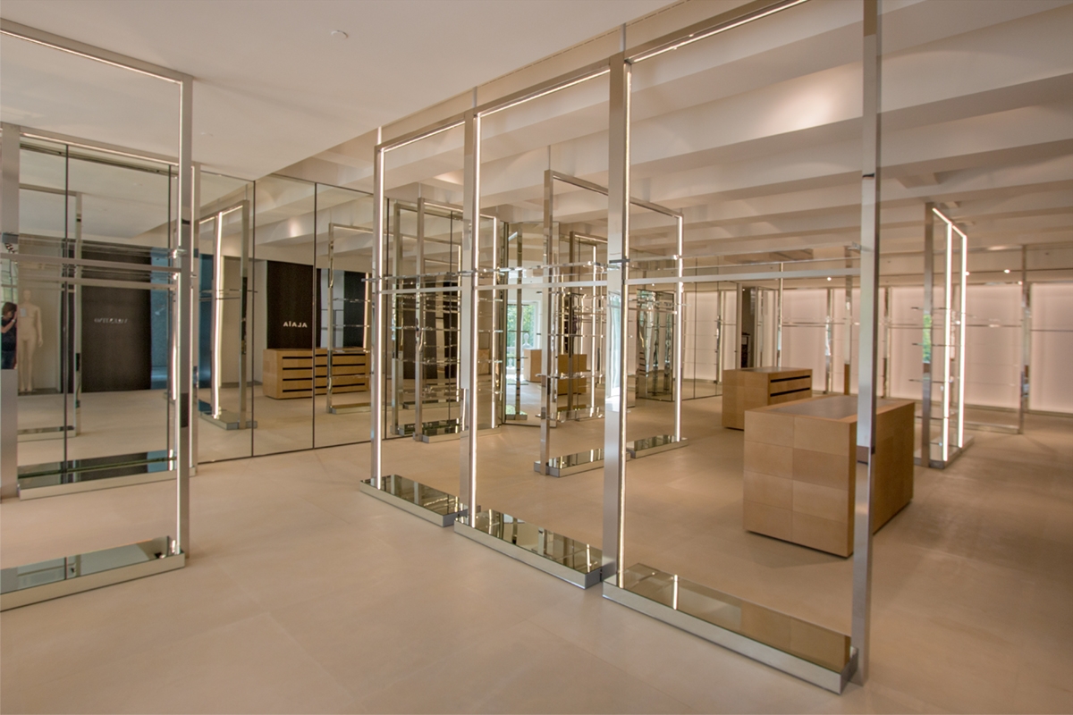
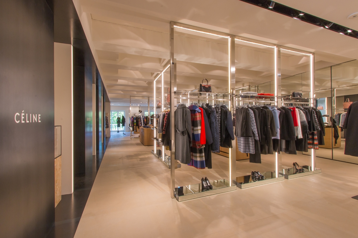
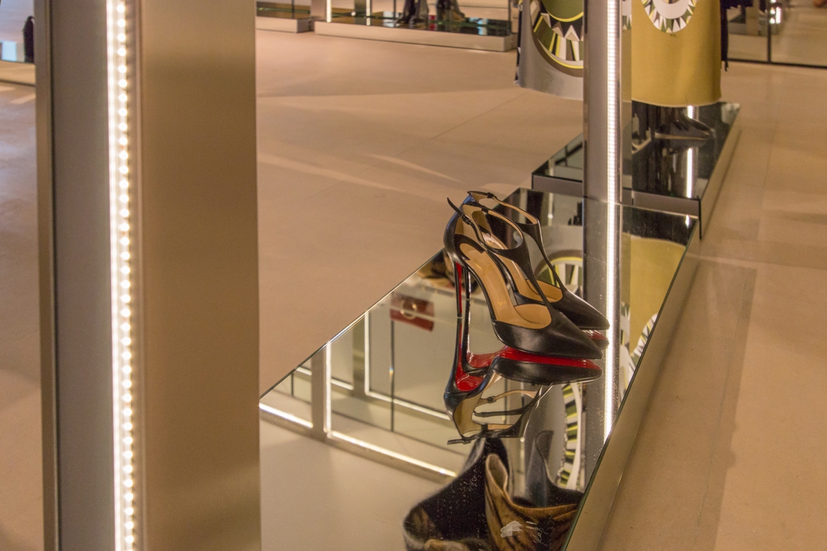
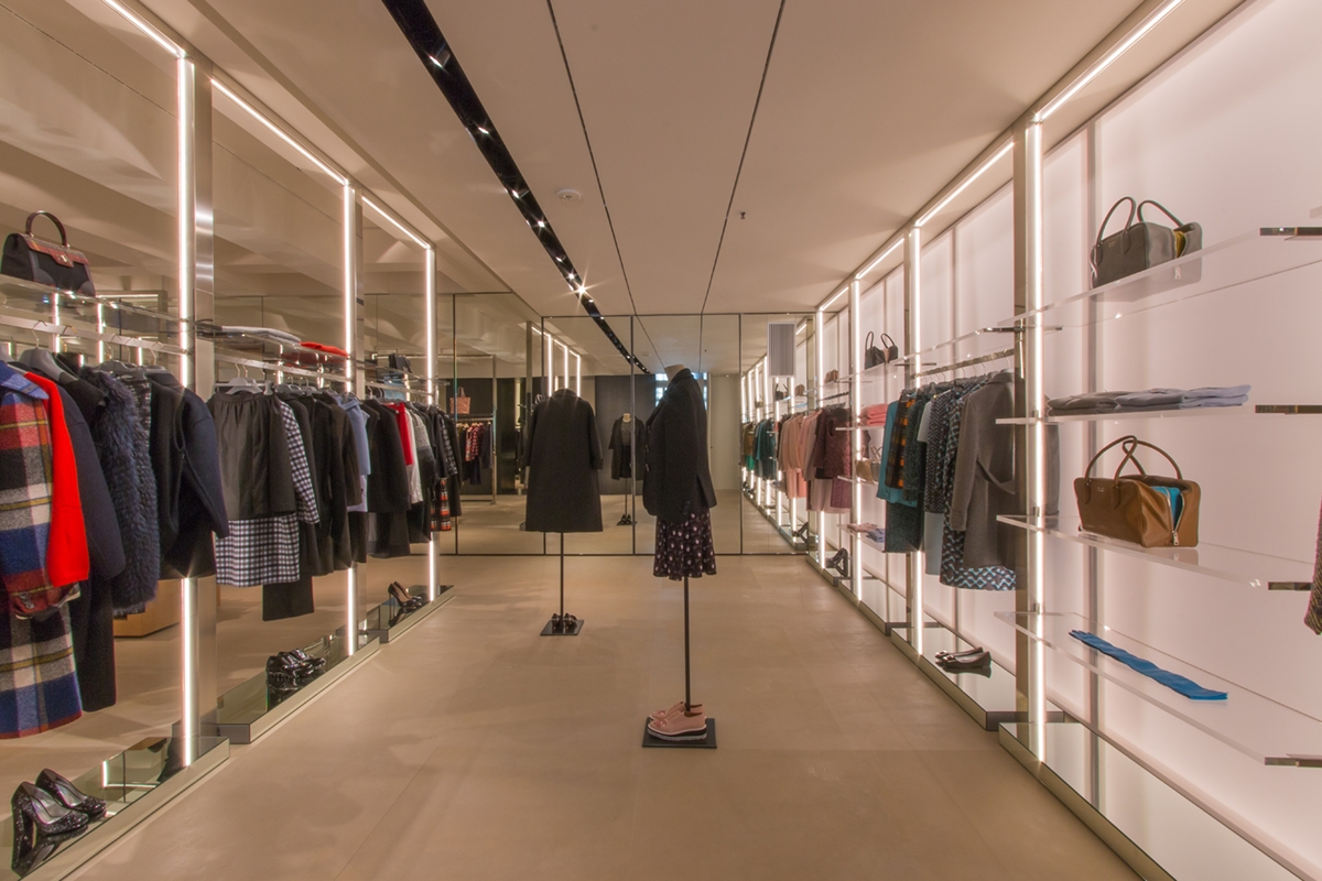
In the central space, linear elements that can also contain lighting in their essential profiles, as well as glass display shelves are designed. Made of polished stainless steel, they hold the cable system at the base, which allows linear lighting which also acts as a luminous frame. In this way, they function as stand-alone elements, providing the necessary light for the correct illumination of the products, but they also not exclude the use of any external spotlights that can improve their visibility.
TIZIANA FAUSTI WHITE BOXES
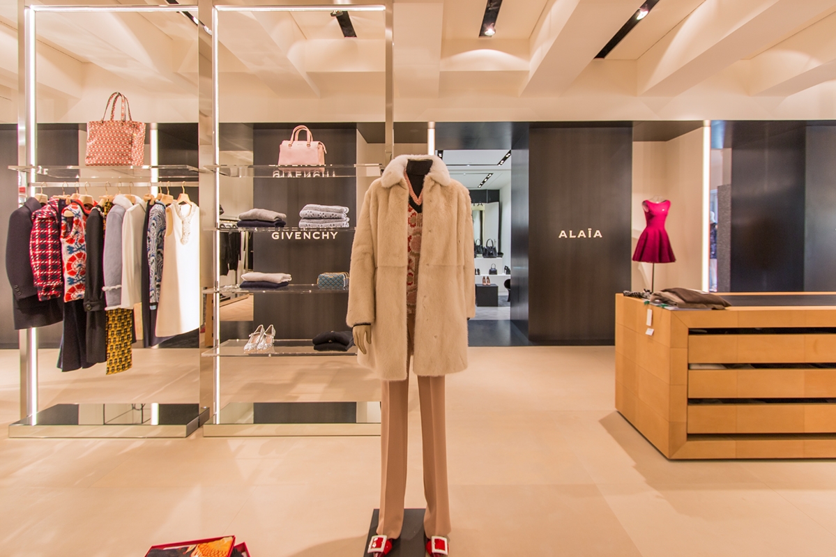
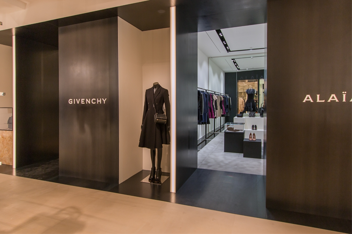
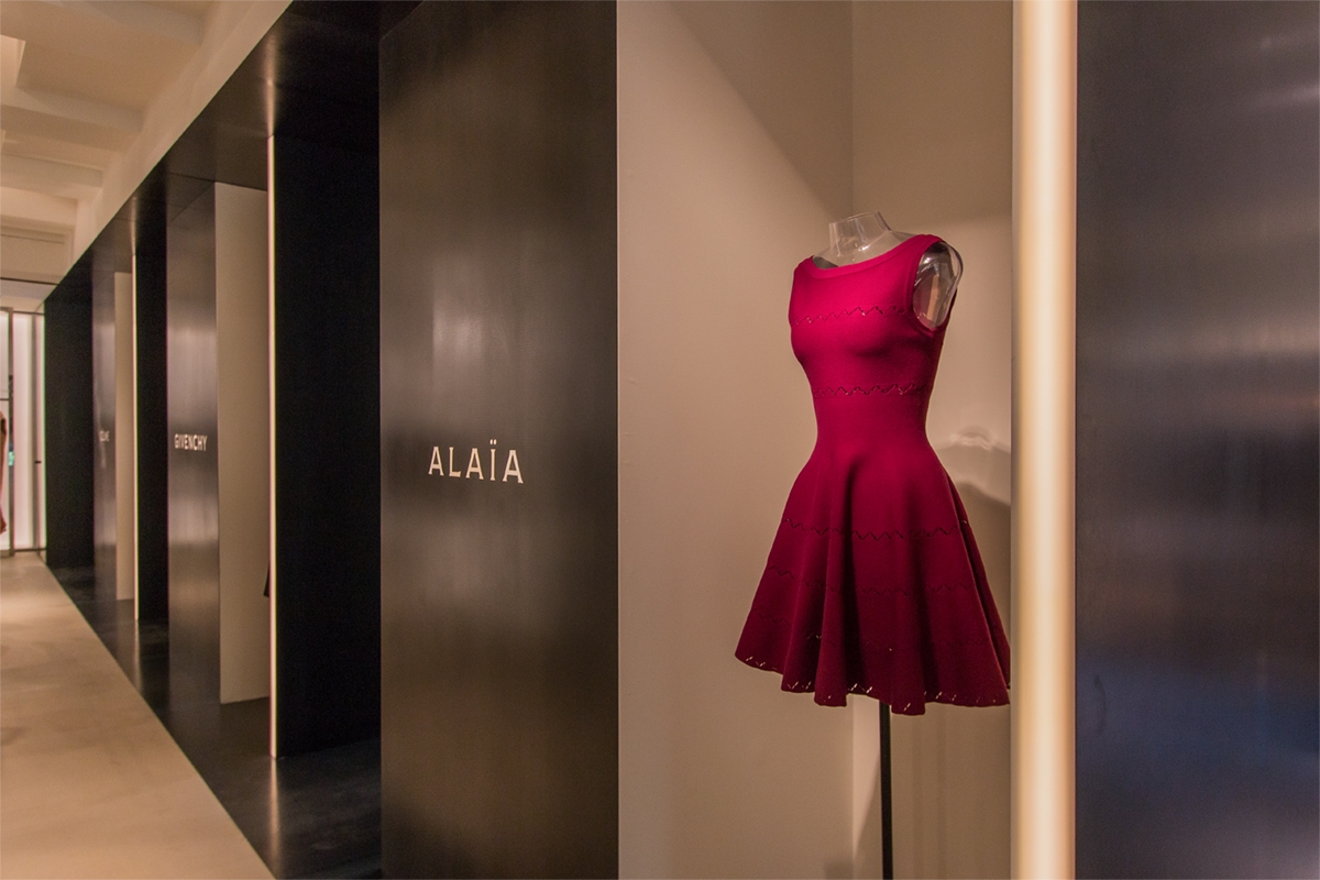
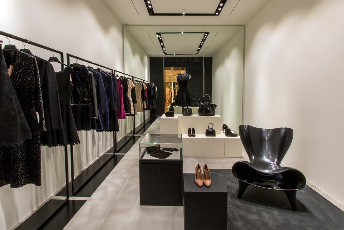
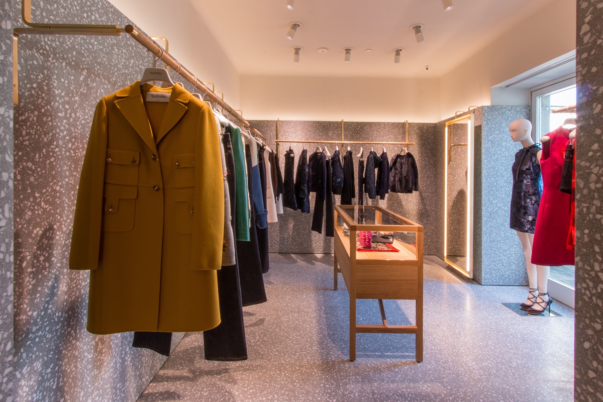
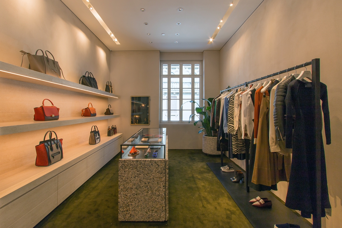
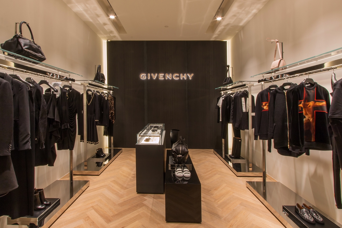
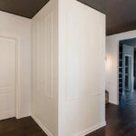
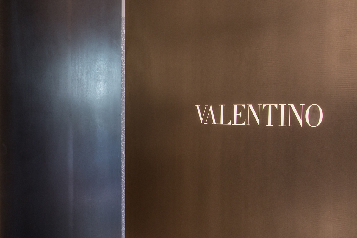
On the back wall there are four white boxes used to shortly host the corner of Alaia, Givenchy, Celine and Valentino. These have been equipped with a recessed lighting profile to which the directional spotlights are attached. The profile follows a rectangular shape and it is placed in the centre of the false ceiling. The electrical set-up and the placement of electrical outlets for potential wall displays or illuminated central showcase constituted the interior layout of the rooms. These were also equipped with the air conditioning system and the wall and ceiling structure was mounted according to the project. This is the case, for example, of the corner of Valentino, whose project envisaged a marble wall cladding that needs a supporting structure behind it. Concerning the external front view, the white boxes were characterized by clack waxed iron closing panels. These chromatically detaches themselves for the choice of black in which the logo of the luxury brands inside the corner are laser shaped. The size of the logo and its blacklighting is a dimensional constraint fixed by Architect Costanzi’s studio on each brand to visually standardize the external front view in accordance with the general project. The niches created between the corners are equipped to hold the mannequins of the brand as a sort of recessed showcase. Some photos of work in progress are shown below. N.B. We in retrospect added the photos of the fitting completed in August 2015 for a greater success of the visual representation.
