A stationery store that is also a bookshop. La Cartolibreria, an innovative and unique project: it is quickly entered the hearts of people in an entire town and beyond.
THE SHOP
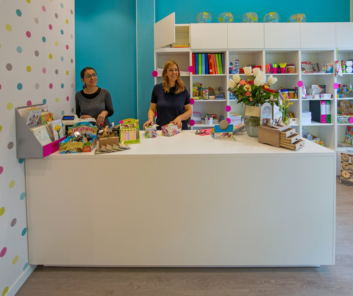
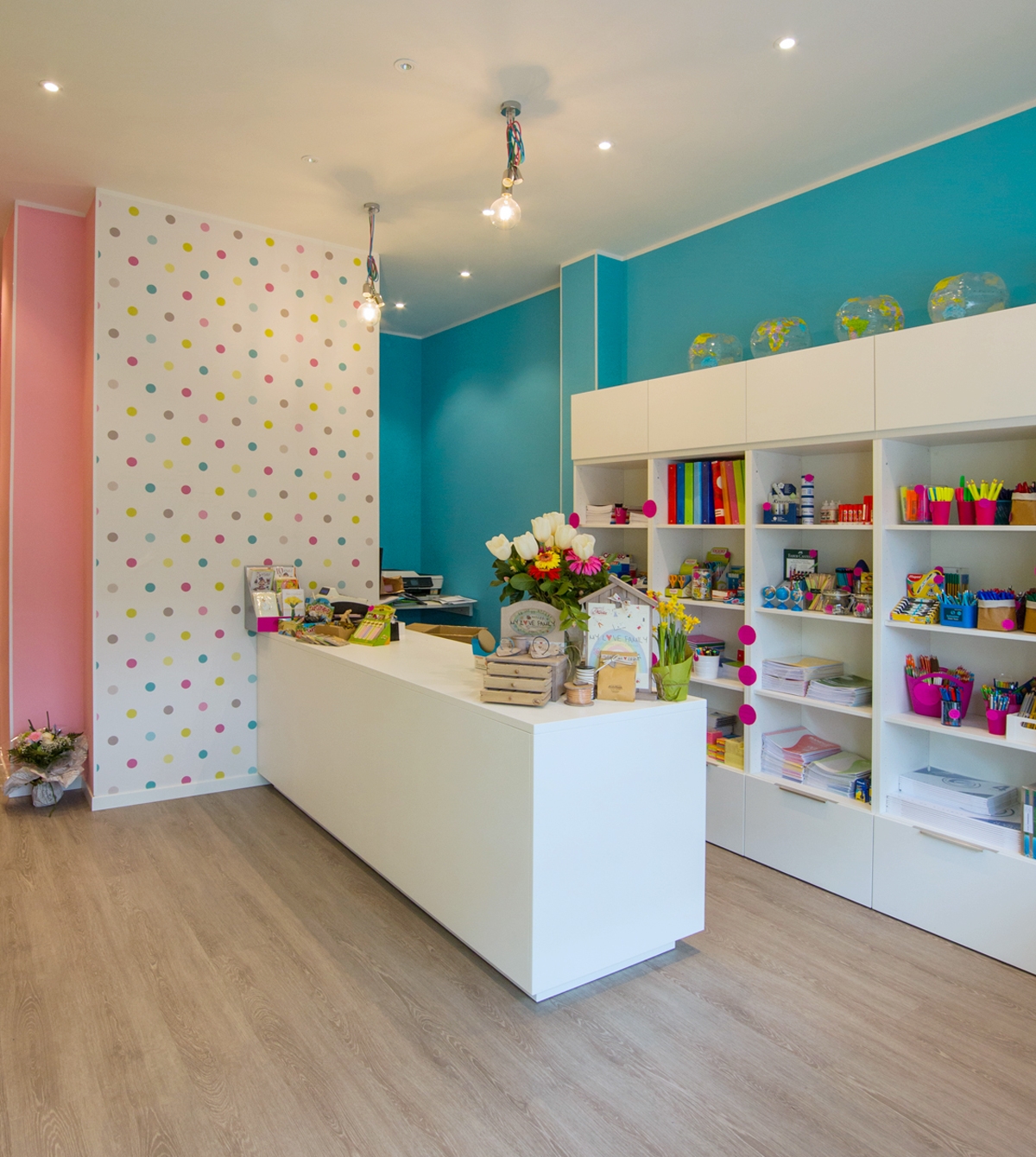
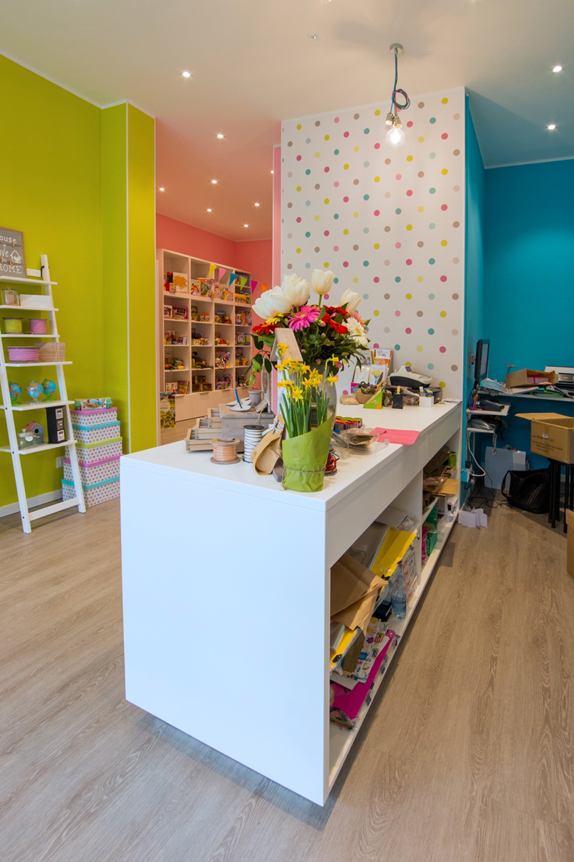
When this place, a long time ago, was still a flower shop, Silvia and Elisabetta, entering it, already imagined how it would become after their intervention. The whole environment has been totally rethought and managed to its full potential, keeping costs as low as possible. A place where lenght is higher than largeness. For that precisely reason, all the walls towards the bottom has been equipped with exposed shelves. Books, games and various objects become the protagonists of his essential exposition with its fresh taste. The entrance has been kept airy, enhanced by the main large window that provides natural lighting. The right side holds the counter area and its back, equipped with stationery elements, while on the left small light displays show the bare essentials so as not to weigh down the room. Even if the space is unique, it could virtually divided into two parts: a more frequented area in the entrance and a more intimate one towards the back. The dominant colour is the white of the furniture, which visually expands the room. Reason why, the feeling you get when entering is always that of freshness and cleanliness. This matches with walls colored with exuberant hues, such as pink, turquoise and acid green. A touch of liveliness for children, the main users to whom the Cartolibreria is aimed. The same colours are visible in the polka dot of the wallpaper in the front wall at the entrance, which extends high towards the ceiling. It gives that delicate and non-invasive touch of class. The spotlighted ceiling provide the best lighting to all areas. Moreover, above the counter, symmetrical light bulbs descend to alternate heights to create a bit of dynamism. La Cartolibreria is not a common shop, but young users are also involved with events and workshops. In fact at the back, the most reserved part dedicated to reading, there is a table at rest. This, during the initiatives, is moved to the center of the room and is packed with curious children, who can’t wait to create some chores to take home.
OUR INTERVENTION
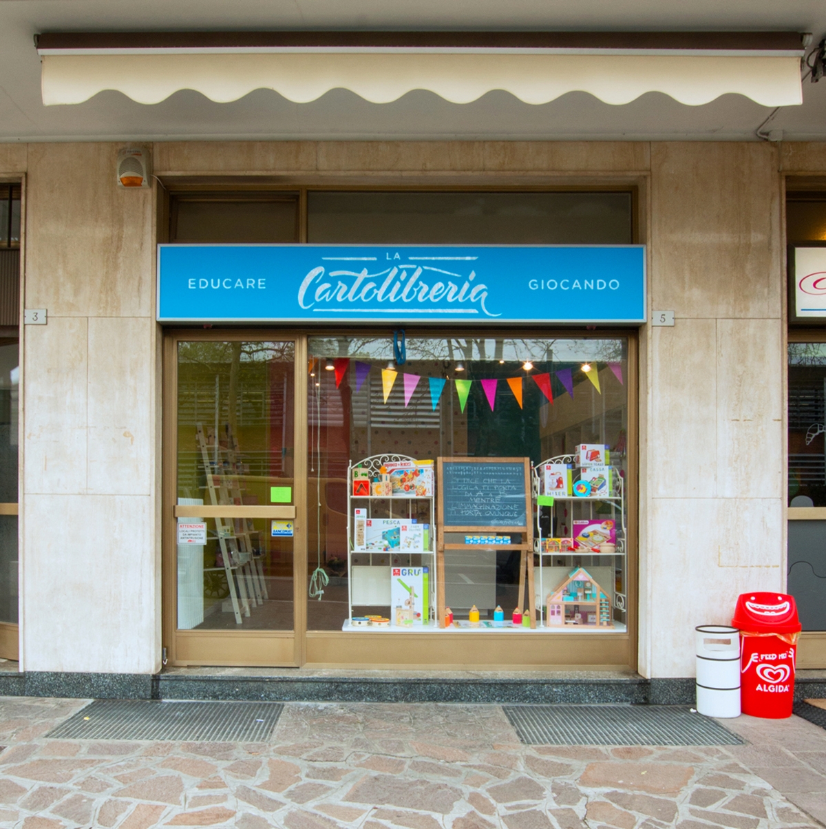
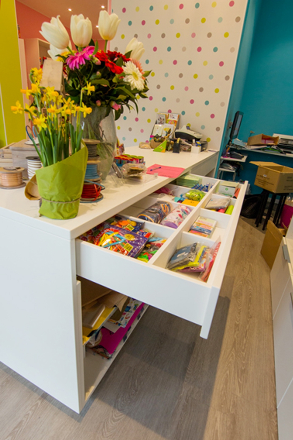
Sometimes even a small project can give many satisfactions, as in this case, where we have created a multifunctional counter. Silvia and Elisabetta’s needs were to have a large table top, to be used as a crate, work table, container, display and to be left available to customers for the support of the chosen goods. We have thus conceived and created this visually very simple element, which however hides very deep drawers with good guides In the upper part the drawers are narrower to hold all the small and more requested elements, which must be quick to find and deliver. While the lower shelves are much higher and more capacious. The material is a textured white lacquered MDF, which small porosity in the paint allows a higher resistance than normal lacquer and is recommended above all on horizontal surfaces, or in any case the most used ones. The logo was also created for La Cartolibreria, in an English cursive revisited with Brush Pen and the whole coordinated image.
CONCLUSIONS
A small space where time stands still and pampers its own “inner self”, a shop that is not only liked by children but also by adults. What else to say, if you have not yet gone to visit Silvia and Elisabetta what are you waiting for? Run, they are waiting for you!
