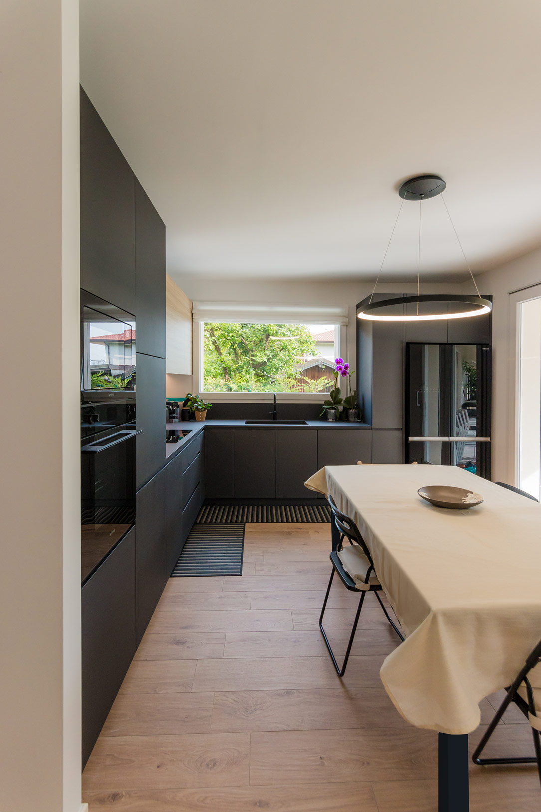
In a modern apartment just a stone’s throw from Bergamo, nestled at the edge of a quiet, green forest, we have designed an anthracite gray kitchen, crafted to be not only aesthetically refined but also extremely multifunctional.
Kitchen Design
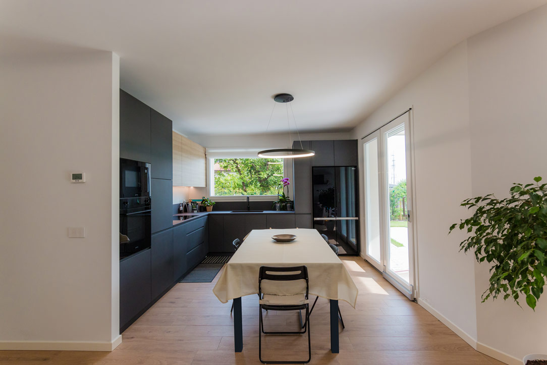
During the design phase, we considered the room’s square layout and the family’s habits. This led us to choose a corner kitchen, leaving the central space free for an extendable table, perfectly illuminated by a centrally positioned designer chandelier.
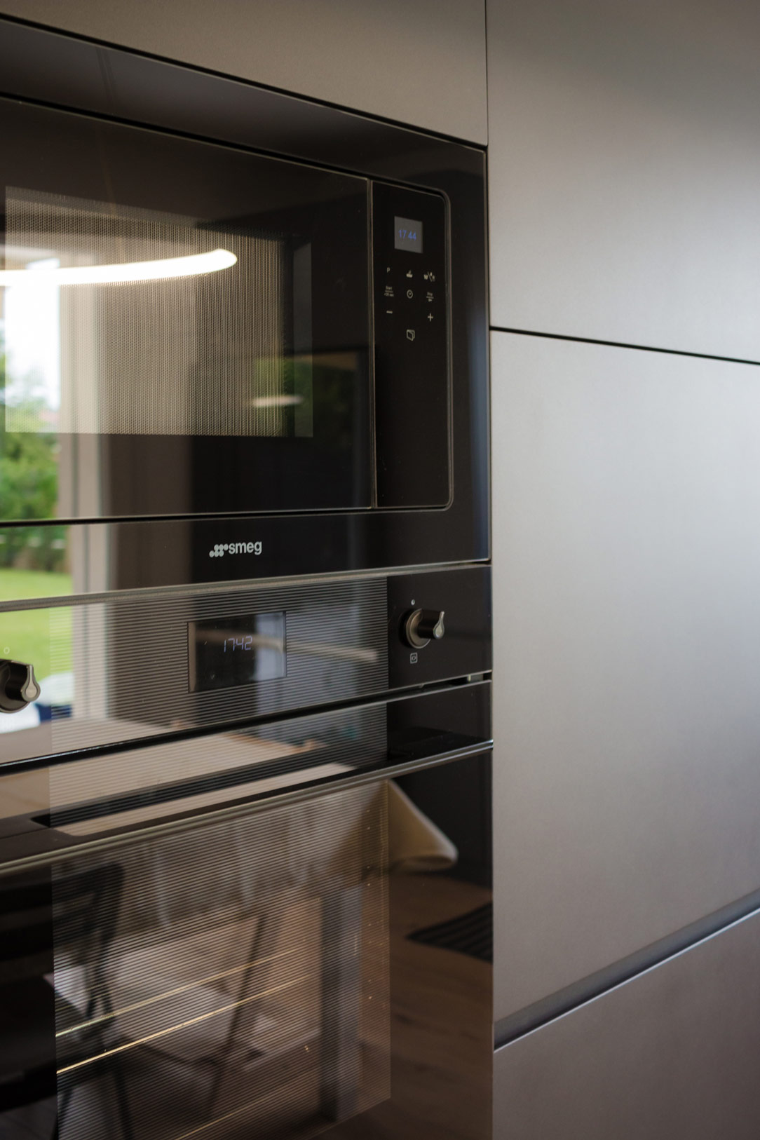
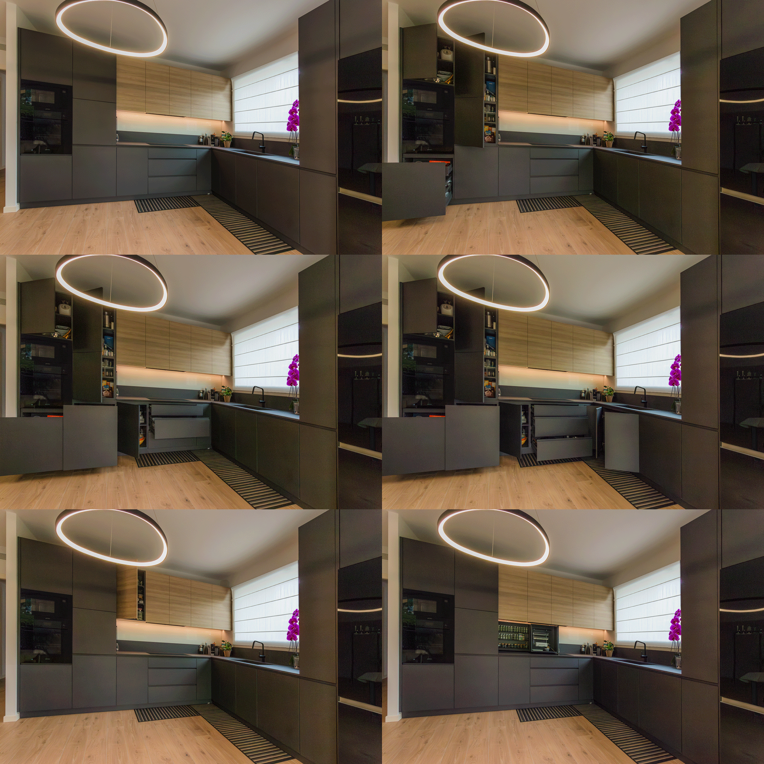
On the left side, the kitchen structure begins with a series of tall columns housing the pantry and ovens. From here, a long worktop extends to embrace the corner. One part of the countertop is equipped with high wall units, while the other part leaves space for a window overlooking the garden. Completing the opposite side, a large free-standing refrigerator is framed by a unit with a side pull-out.
Multifunctional Additions
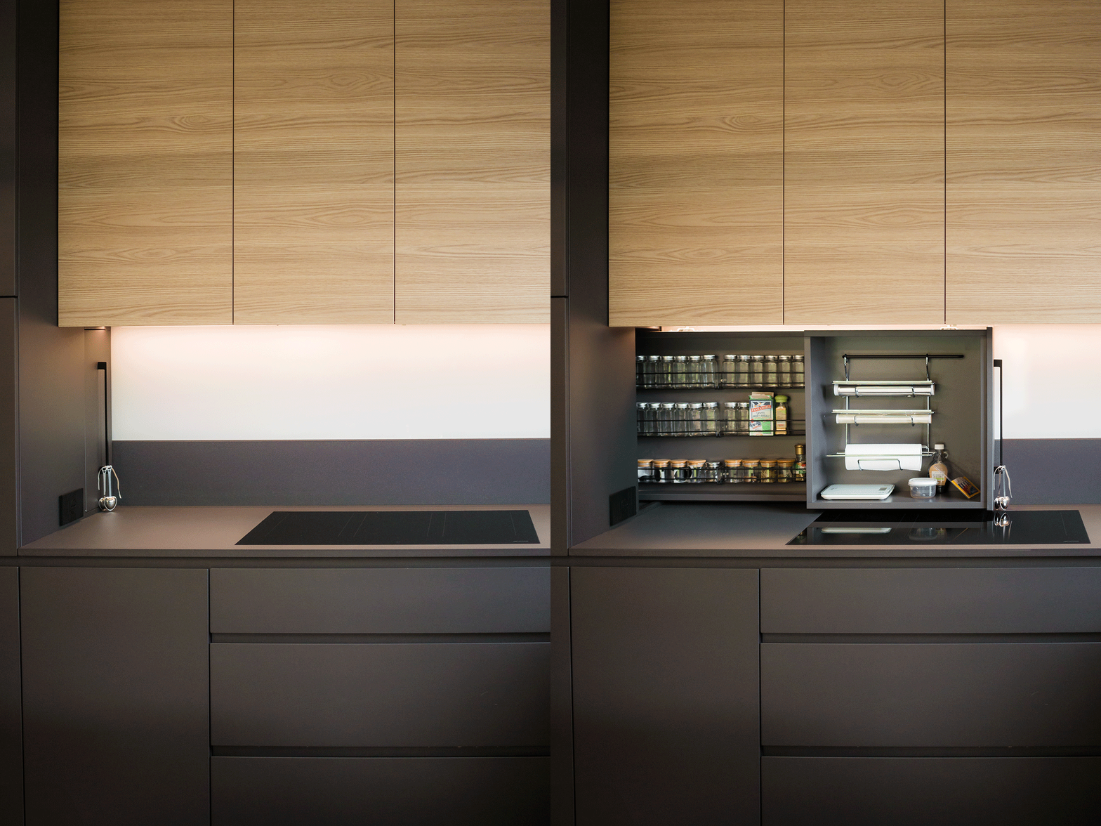
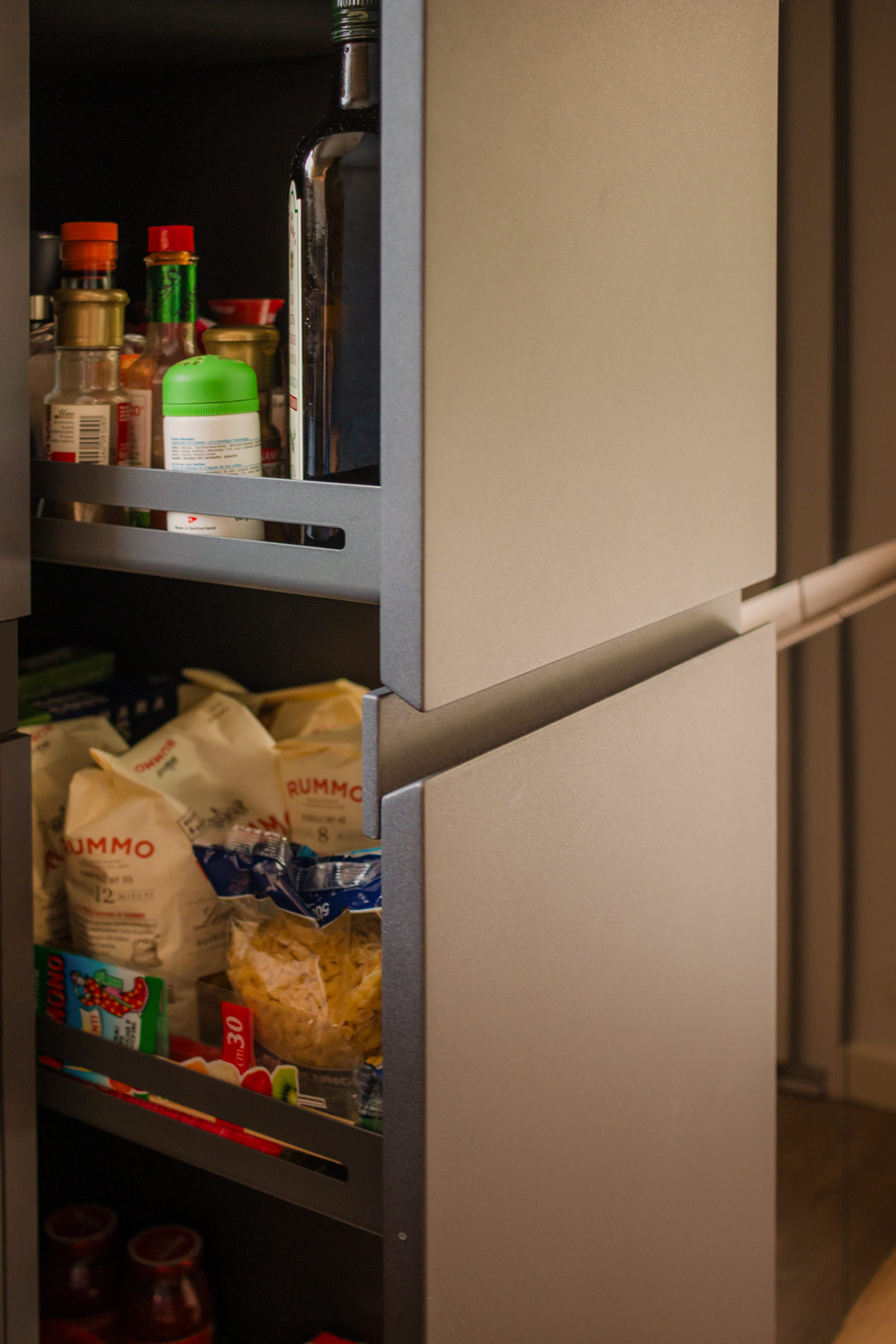
One of the most interesting aspects of the design is the retractable spice rack. By utilizing additional depth, we managed to integrate a pull-out system placed behind the initial columns. This element, which opens laterally to the induction hob, features compartments for spices, small accessories, and a paper towel holder, making everything within reach during food preparation.
Other useful components include trash can drawers, a foldable door in the cabinets, and a column with a front extraction system that allows access from both sides. These features enhance practicality and efficiency, making it a true multifunctional hub.
Materials and Finishes
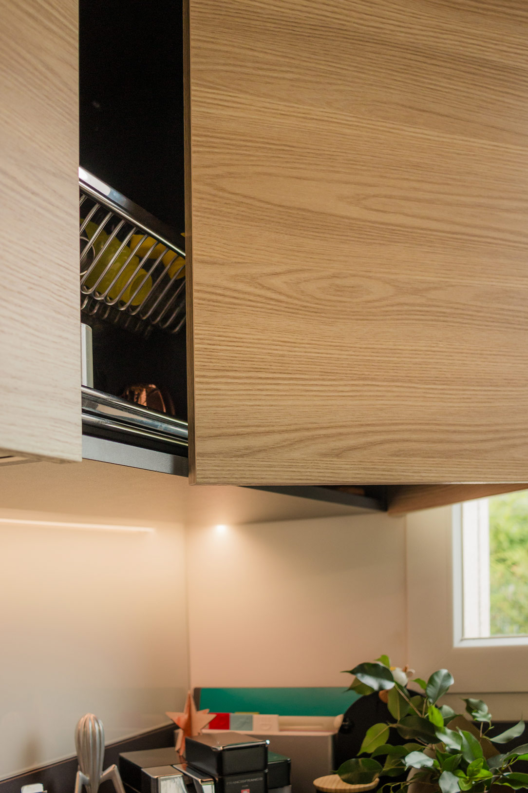
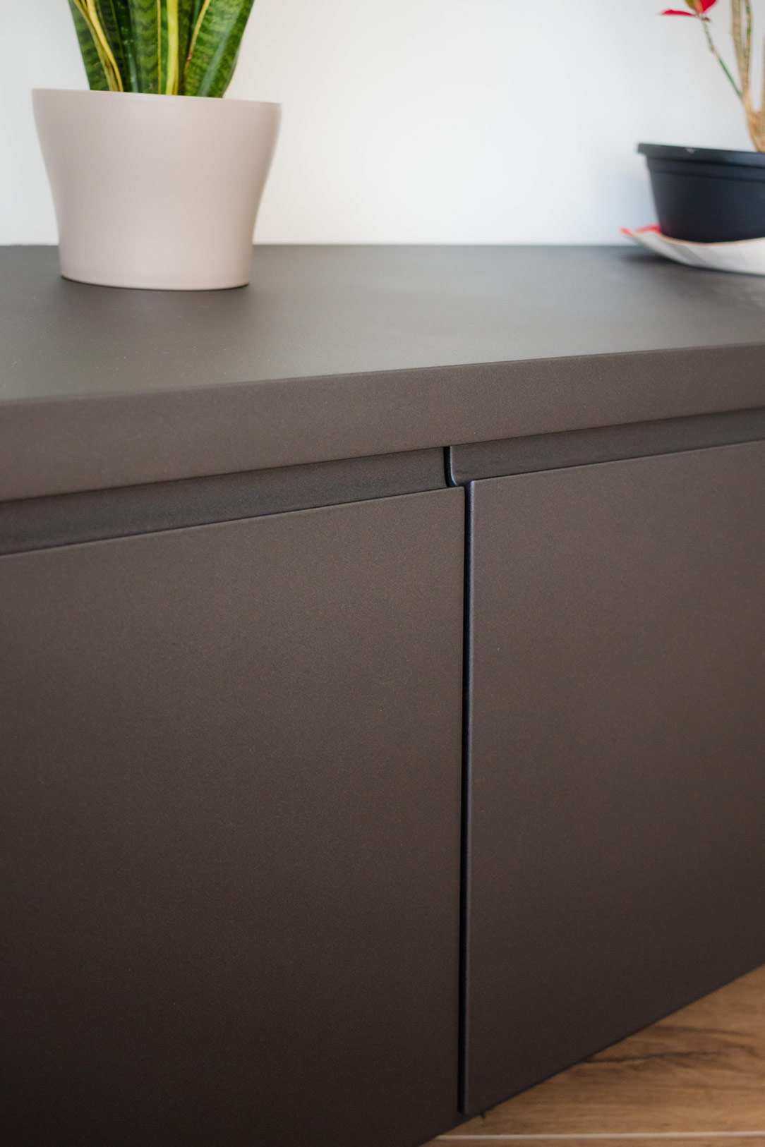
Considering the very bright environment, we chose to dare with anthracite gray, a dark and striking color that contrasts with the predominant white. The oak veneer wall units complement the honey-toned wood-effect porcelain stoneware, bringing a touch of nature into the home.
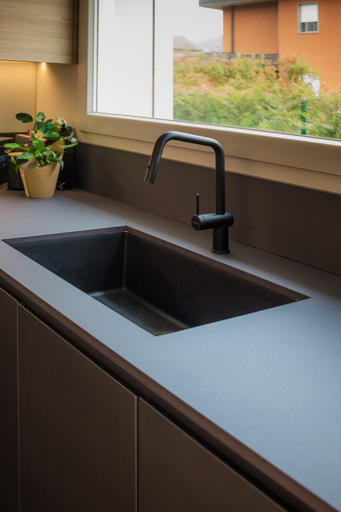
The worktop is made of Lapitec, a high-performance ceramic material with a slightly speckled, rough texture. It harmoniously blends, almost merging, with the anthracite color of the kitchen and the sink in the same shade of granite.
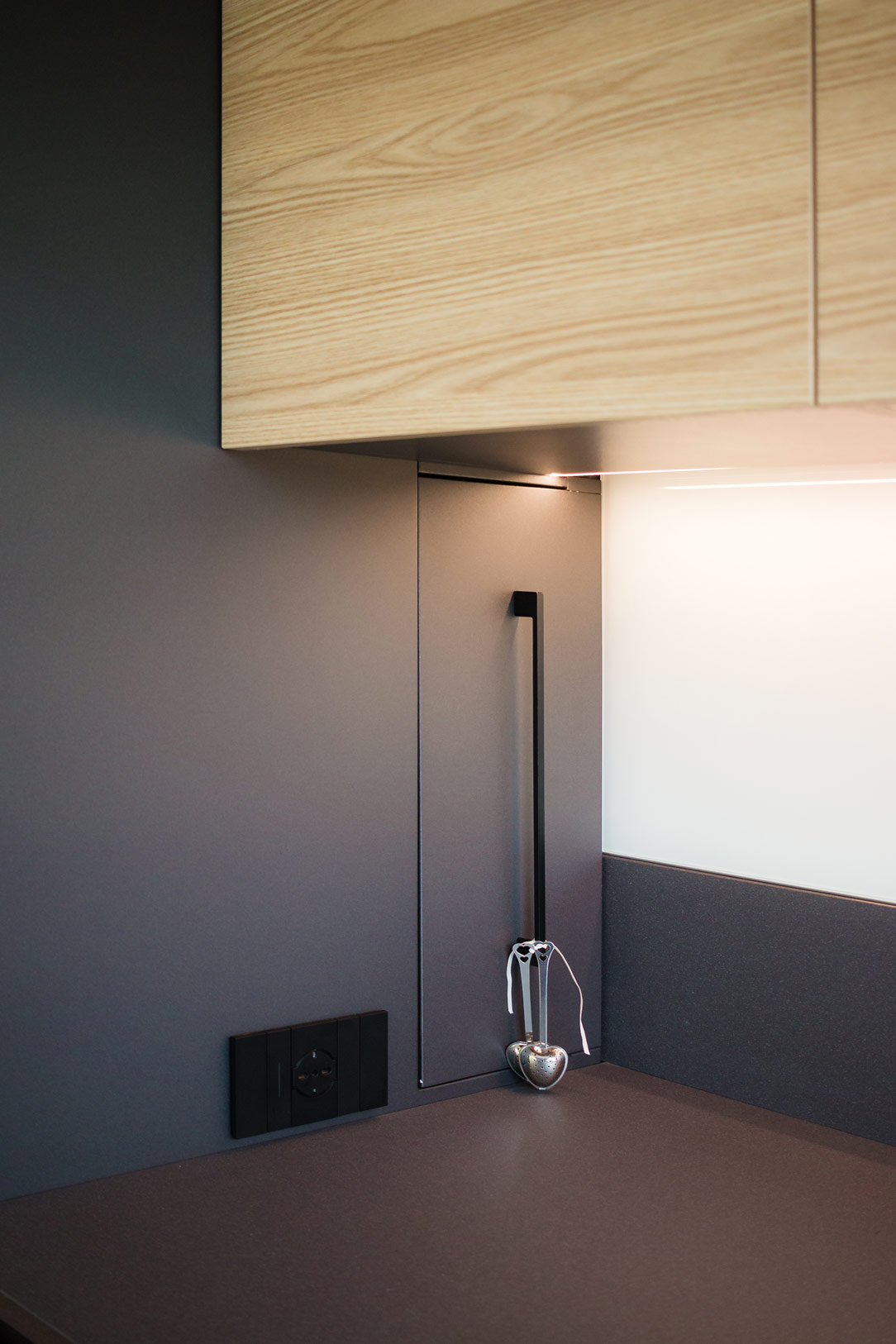
At the back of the kitchen, a glossy white Lacobel panel, in the same shade as the wall, creates a clear contrast between the gray countertop and the wood of the cabinets.
We present two more examples of anthracite kitchens: the first is a corner kitchen with a cooking island, while the second features a C-shaped layout ending in a central peninsula.
Coordination in the Space
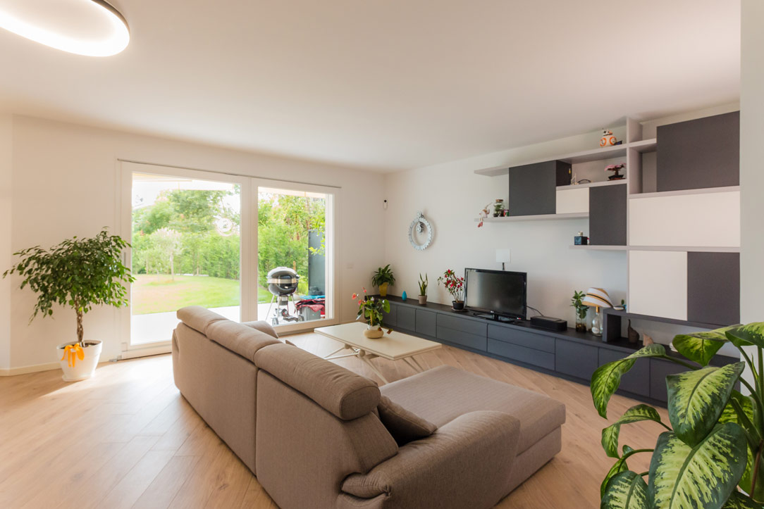
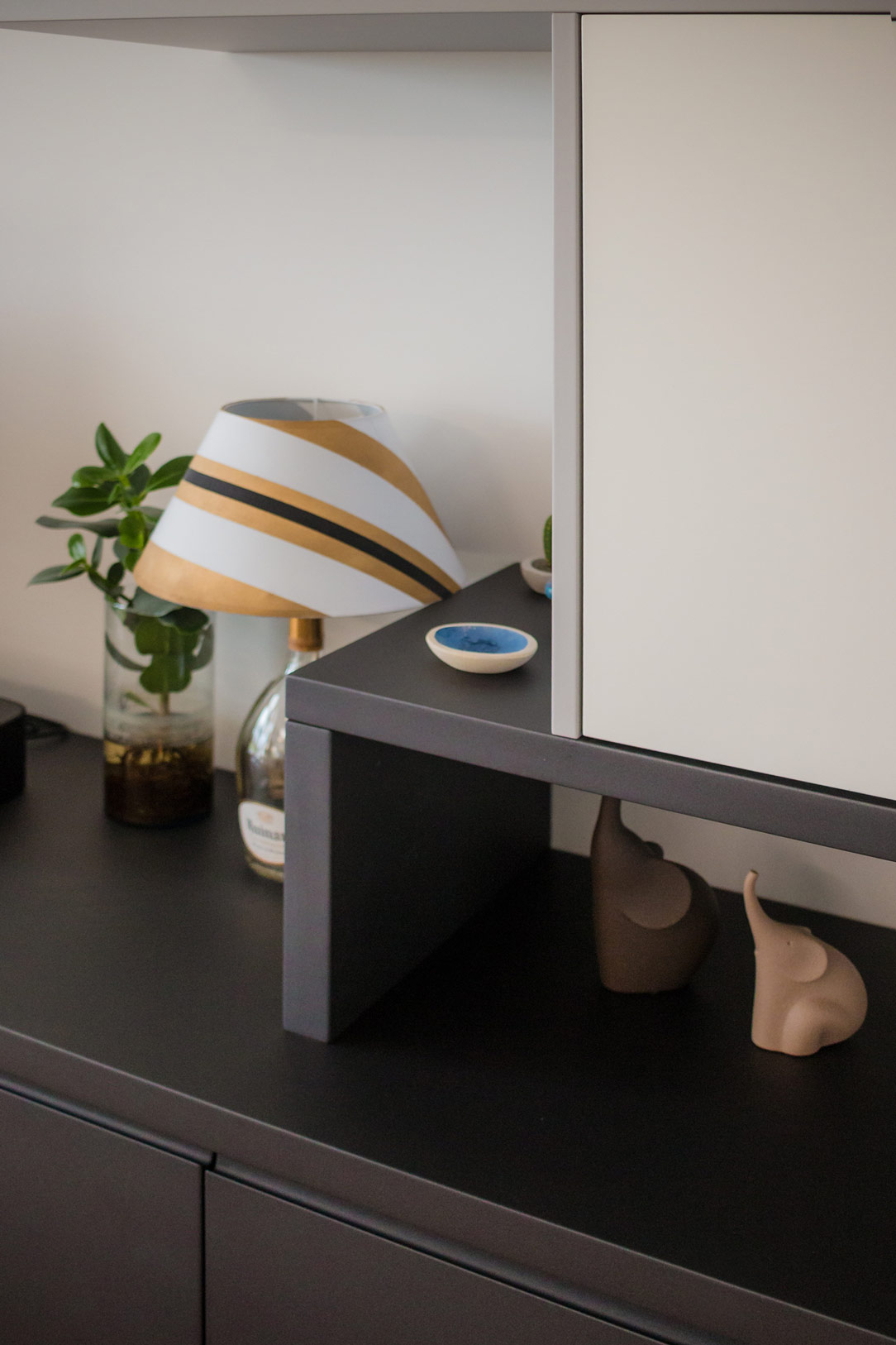
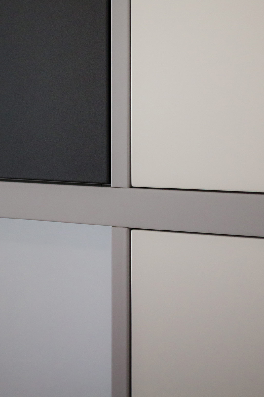
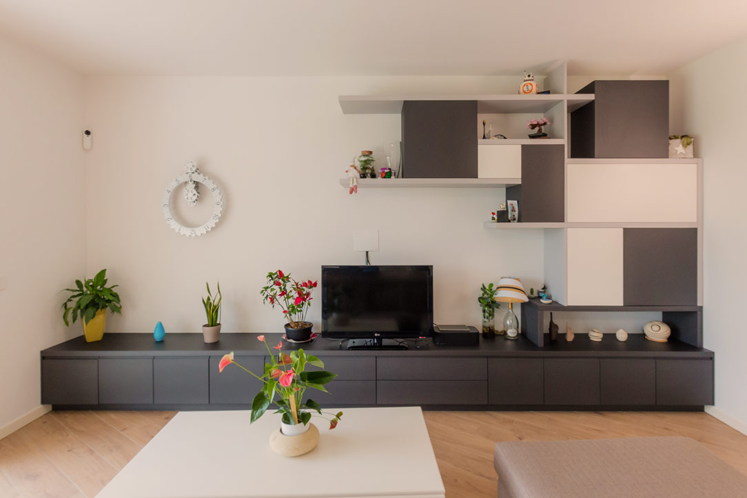
The TV cabinet, facing the kitchen, has also been designed and built in the same anthracite gray, completing the space in a discreet and harmonious manner. Comprising drawers and doors with internal shelves, it offers ample space for storing elements and accessories related to the living area and kitchen. Next to the television, wall elements in white, gray, and anthracite alternate, creating a play of shapes and symmetries that enrich the overall aesthetic of the space.
Conclusions
There is no need to fear using dark colors, especially in bright environments or where white is predominant. In this project, anthracite gray was the perfect choice to balance the abundance of light tones, infusing the space with a decisive and refined elegance. This kitchen, combined with the living area, demonstrates how functionality and aesthetics can merge into perfect harmony.

