Organize the room can be a difficult task, especially if this room is small and not very functional, but often the solution is just around the corner: in this case, around a corner library which hosts a secret door. THE PROBLEM ANALYSIS THE PROJECT PROPOSAL COLOURS, SHAPES AND MATERIALS THE ADVICE
THE PROBLEM ANALYSIS
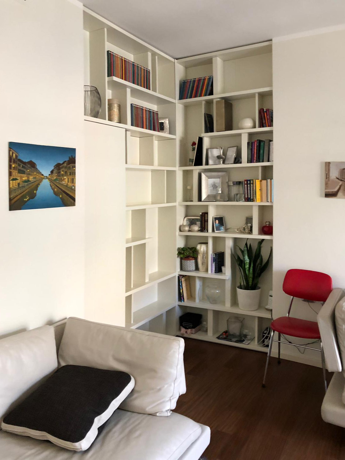
Living in big cities often means to interacts with the lack of space and environments with small dimensions. In those contexts, the functionality it’s an indispensable design element: It allows us to take the most advantage from each room without sacrificing comfort and aesthetic values, while at the same time it solves important problems. The functionality is not just the added value to our interiors, but first at all a stylistic key. A proof of that is this Milan’s apartment. The entrance overlooks a comfortable and contemporary living room characterized by light colours of walls and furniture which create a contrast with an elegant wooden dark floor with which it harmoniously communicates. The design challenge provide for two mainly solutions: on one hand the lack of a real library, which can easily become a characterized element of the room showing at the same time small design object and souvenir able to describe the personality of its inhabitants. On the other hand, the need of hide the bath entrance which is more intimate and private, whose door faces directly in the living room, in a contact view with the entrance hall.
THE PROJECT PROPOSAL
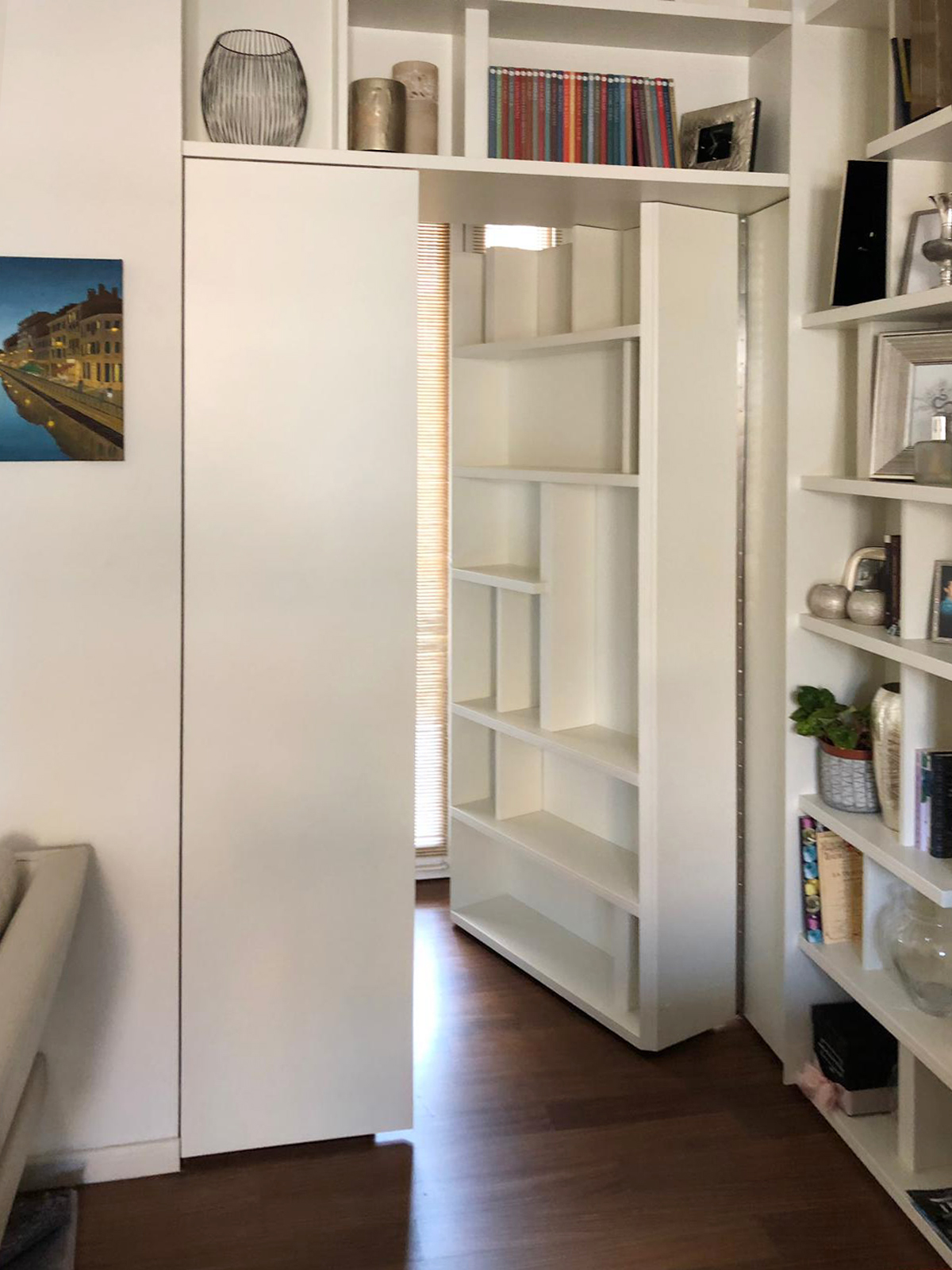
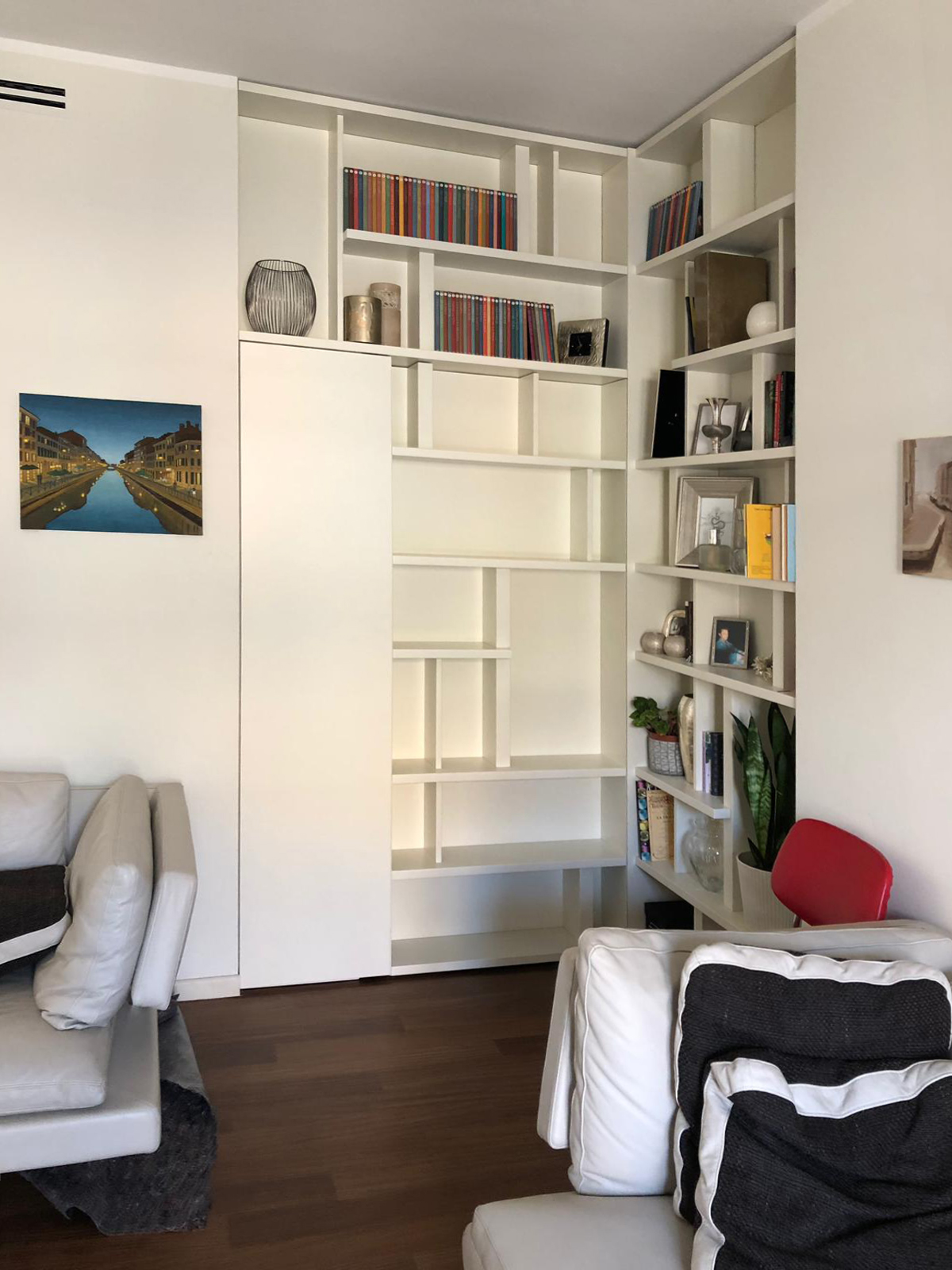
The design solution manages to solve both problems in a single functional element: a wall unit able to provide display support for books and small objects and, at the same time, combines the real bathroom’s door. A dynamic bookcase that reflects the intentionally asymmetric layout in both corner elements. Taking advantage from the corner position, in fact, the two different components of the bookcase are organized as autonomous elements whose shelves could easily become the stylistic line enable to give rhythm and harmony. This, defines the internal recess of the library which allows the management of exposed elements as a costumed setting, a sort of display windows of the inhabitants’ personalities. The entrance to the bathroom takes place with complete discretion, as a sort of a real “secret passage”, activated by pressing. In particular, the door consists of a fixed narrower shutter, even equipped in the bathroom’s ambient, and a main shutter that in its external side has a considerably bigger thickness than the traditional in order to accommodate books and small objects.
COLOURS, SHAPES AND MATERIALS
The contemporary imprint is visible both in the graphic layout of the library, which combines full and empty space in perfectly harmony as in a typographic composition, but above all for the material and chromatic choice. In particular, a white opaque lacquered MDF was chosen to create the partition wall. This because it allows a better versatility clearly visible for example, in the different thickness with which were made the numerous internal shelves. The 9010 white recalls the dining’s wall and the contemporary furniture, inserting itself without intrusiveness in the room but at the same time managing to define the stylistic print.
THE ADVICE
No problems had to remains unsolved! Sometimes a furniture element becomes the custom-made solution able to solve in the best way different problems, as it can be the lack of space or the need to divide rooms.
The wall units perfectly combine elegancy and functionality and can also contain hidden mechanism to take the most advantage from its practicality. A mechanism that can also be fun! Divide the rooms has never been so easy, a library with a secret door it’s enough.
