A rigorous store with modern colours

A rigorous store with modern colours
negozio Milano Voulaz 01
negozio Milano Voulaz 02
negozio Milano Voulaz 05
retail Milano Voulaz dettaglio
retail Milano Voulaz 04
retail Milano Voulaz 06
negozio Milano Voulaz piano superiore
retail Milano Voulaz 03

A rigorous store with modern colours
 

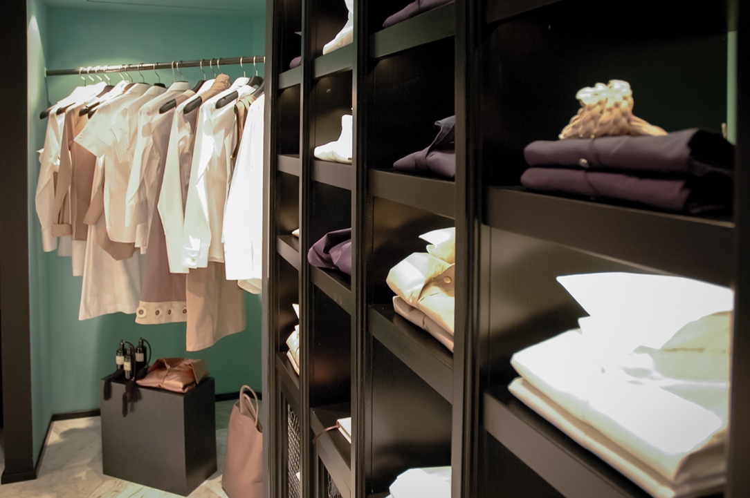
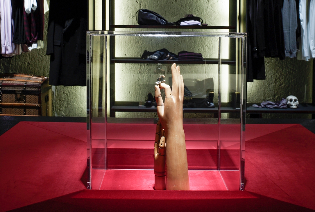
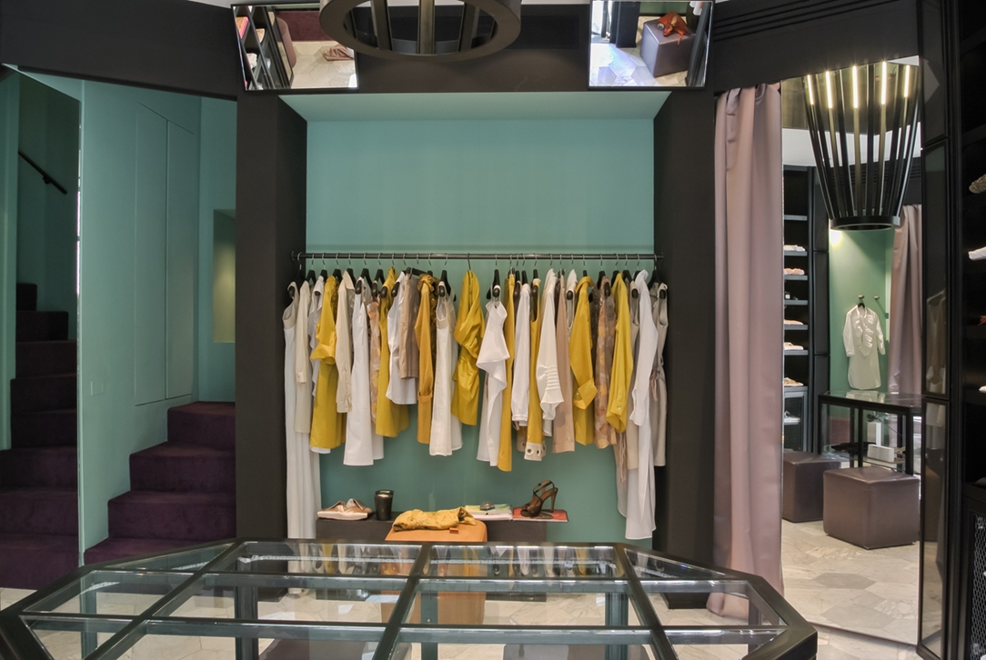
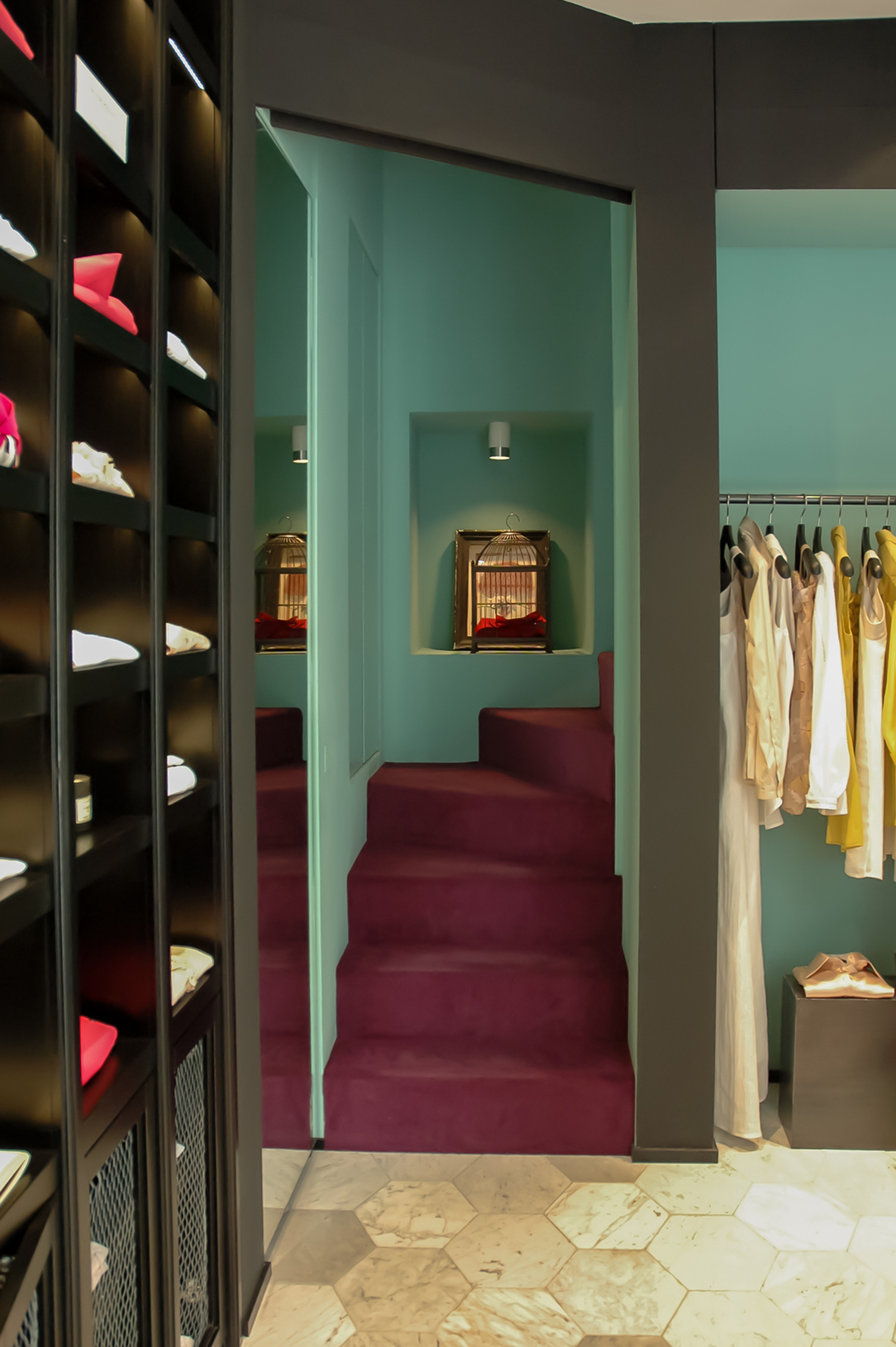
A rigorous store in Milan of tailor-made clothing in which materials and colours define its modern style. Purple velvet for staircase and green patina painting on the walls surround a prism with luminous edges that invade both store floors.

Project: CLS Architects
Year: 2012
Site: Milan

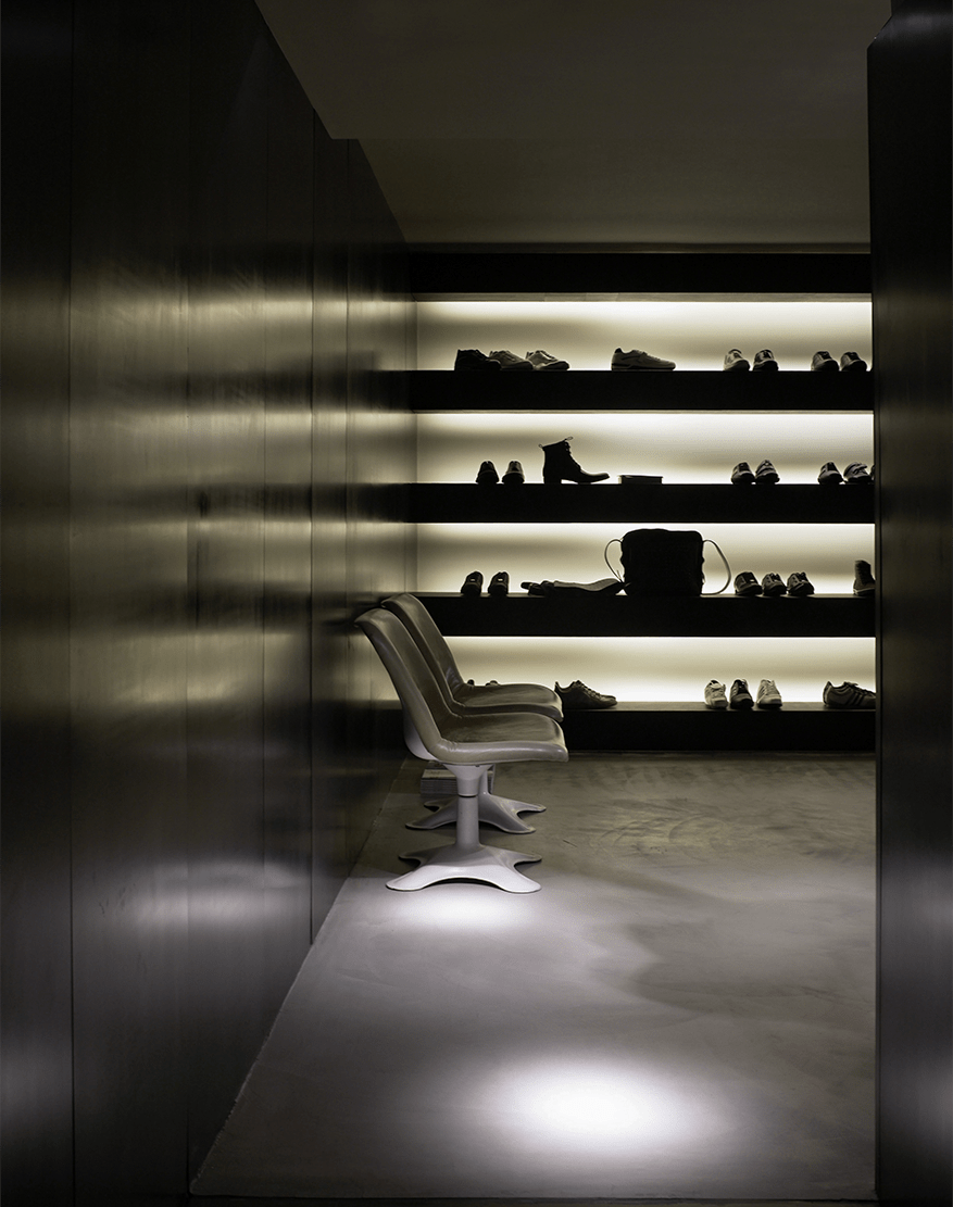
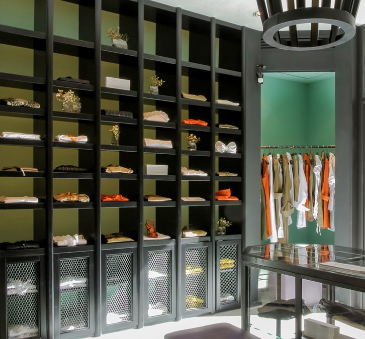
Customed shirts and clothing find their best appreciation in this shop in Milan designed by CLS Architects. A rigorous store in which black display elements reproduce the characteristic architectural profiles.
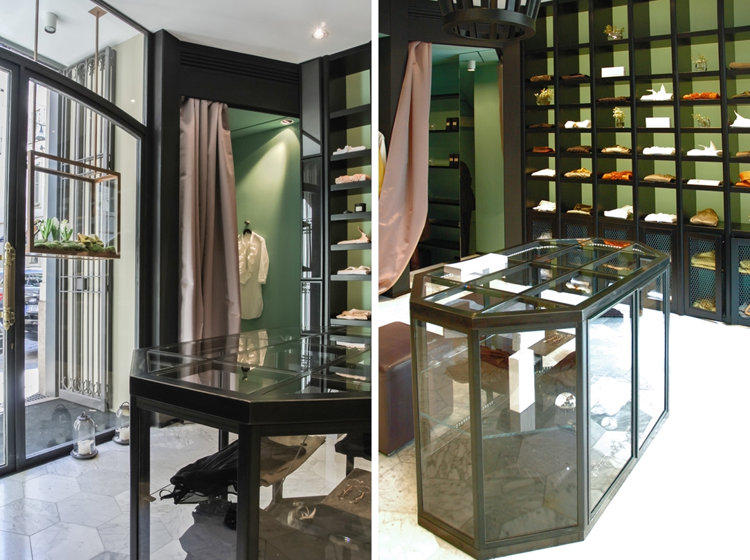
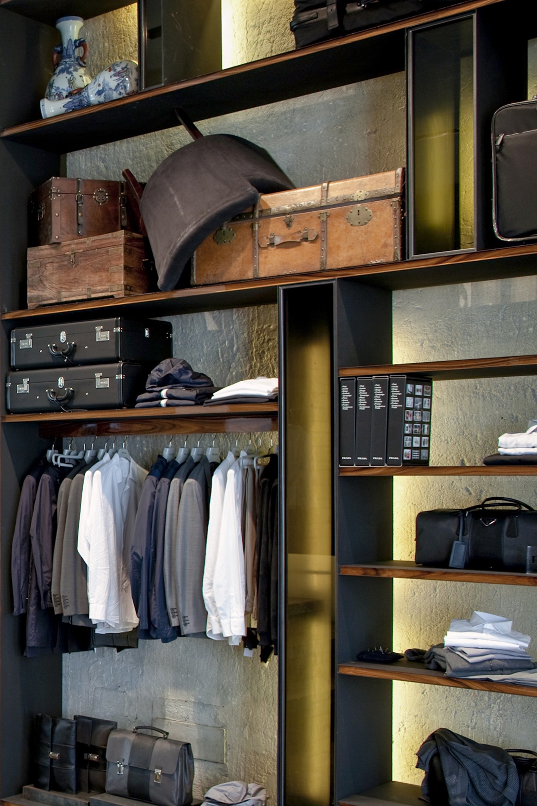
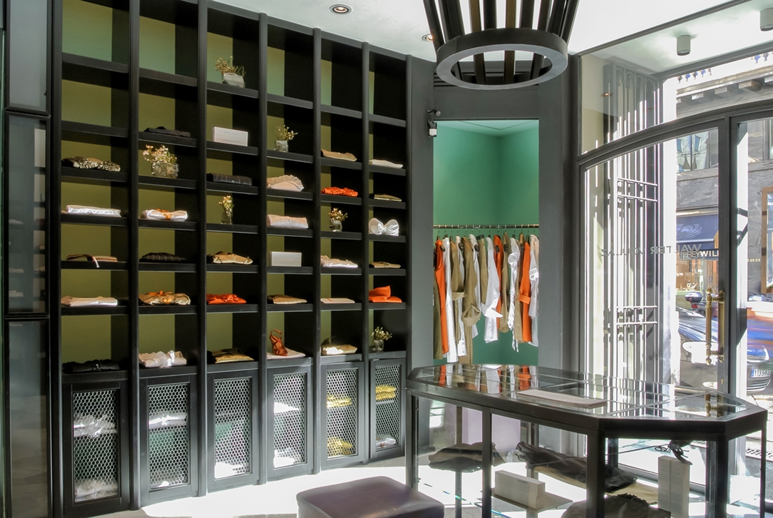
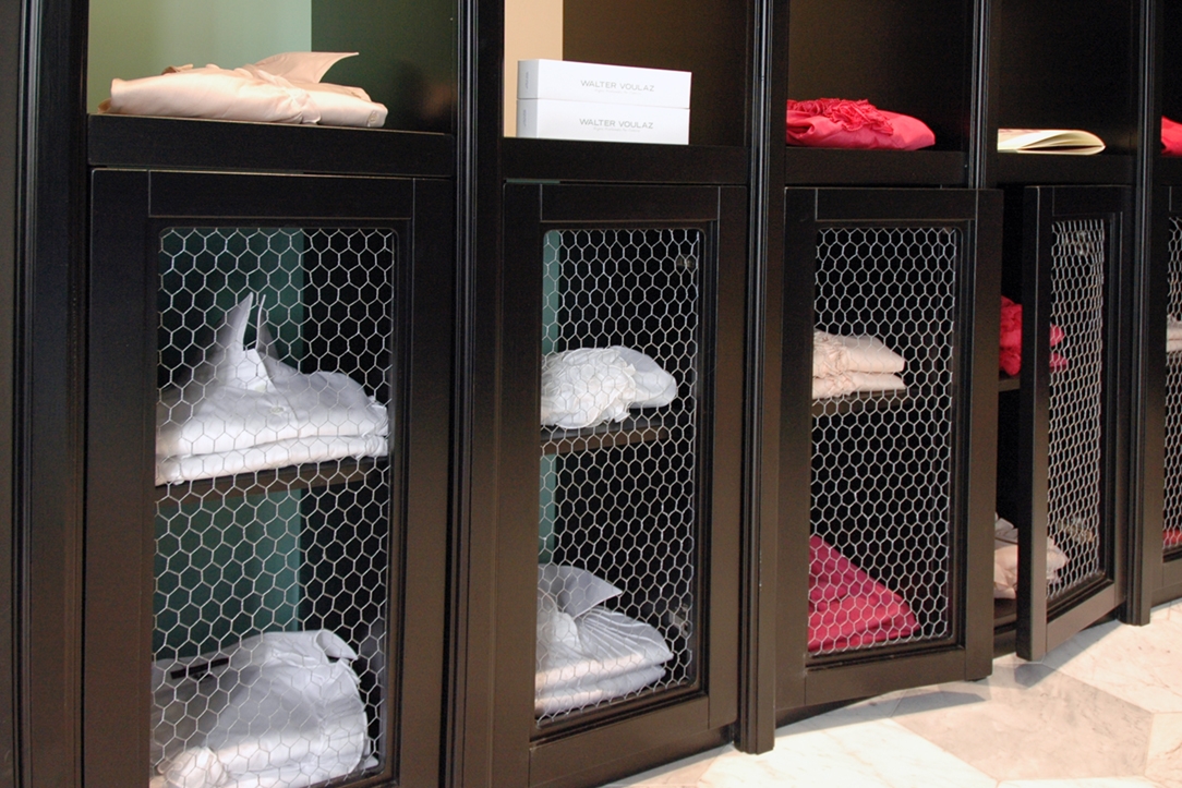
The alternation of full-height modular display systems with linear niches characterizes the ground floor. The former consist of an exhibition volume at the base in which the doors house inside the decorative bands an hexagonal metal mesh. The vertical profiles are born from the rhythmicity of these solid elements of the lower part to continue at full height also in the upper part, defining a reticular display system. Shelves, shoulders and doors are recognizable by their black paint in contrast with the patina green on the walls. This chromatic alternation also characterizes the display niches in which there is only a horizontal profile supporting the display system.

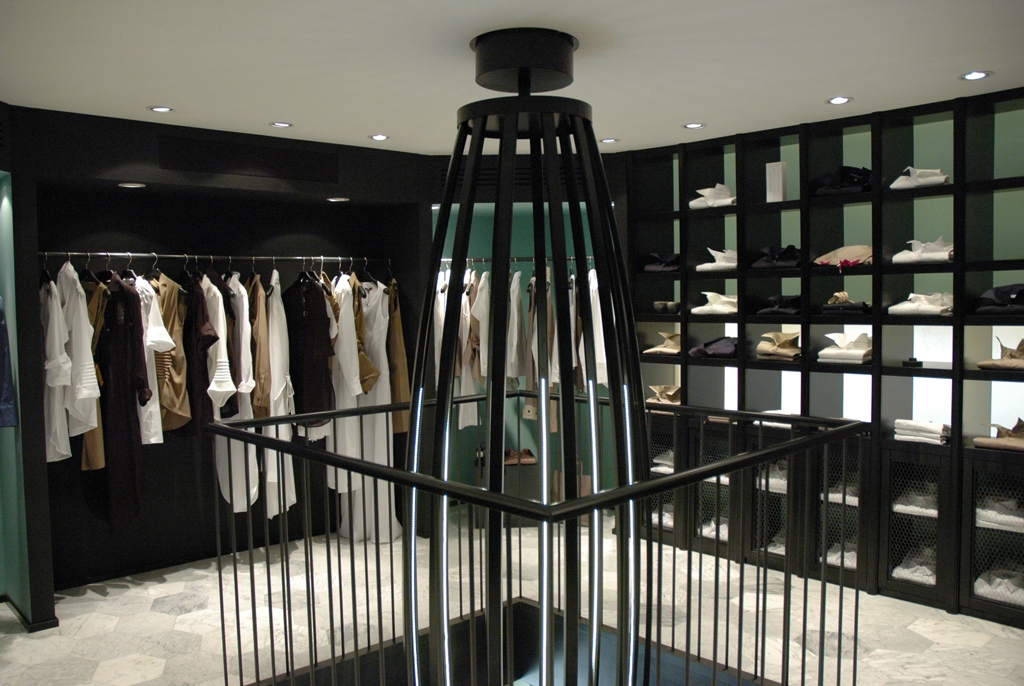
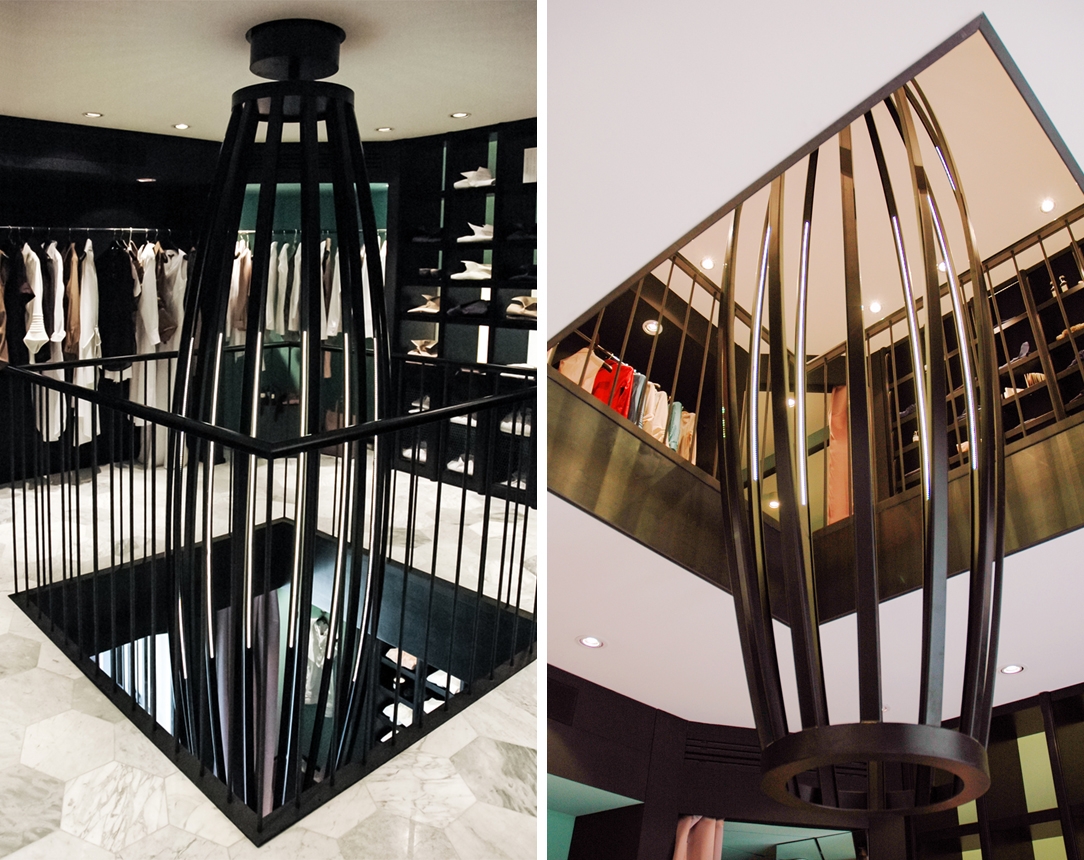
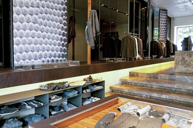
A purple velvet carpet leads to the upper floor accompanying the customer in a sort of exhibition path between niches with spot lighting. The upper floor sees the dominance of the black linear profiles in a rigorous regular layout. Parallel to these equipped walls runs a row of ceiling spotlights that demarcate the border. A black waxed iron balustrade that holds a dynamically shaped chandelier with LED inserts in the centre occupies the central void.
The luminous prism from the upper floor goes down to the ground floor, virtually joining the glass and black iron display cabinet at the entrance.

A rigorous store with modern colours
 

A rigorous store in Milan of tailor-made clothing in which materials and colours define its modern style. Purple velvet for staircase and green patina painting on the walls surround a prism with luminous edges that invade both store floors.

Project: CLS Architects
Year: 2012
Site: Milan

A boutique with textile finishes

A boutique with textile finishes

boutique franci 01
boutique franci 03
boutique franci 02
negozio selvino 01
dettaglio tavolo ferro cerato
boutique franci 04
dettaglio negozio selvino 01
boutique franci 05
dettaglio negozio selvino

A boutique with textile finishes


A layout that allows freedom of movement and visual continuity for a boutique in Selvino where fabrics also invade the display elements. Refined and contemporary finishes in a retail interior with elegant contrasts.

Project: Modulor
Year: 2011
Site: Selvino

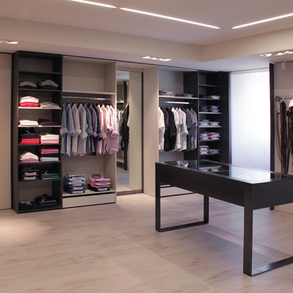
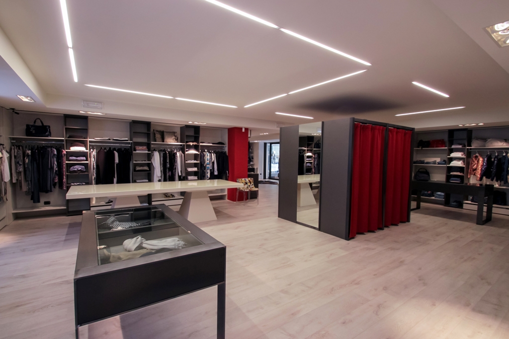
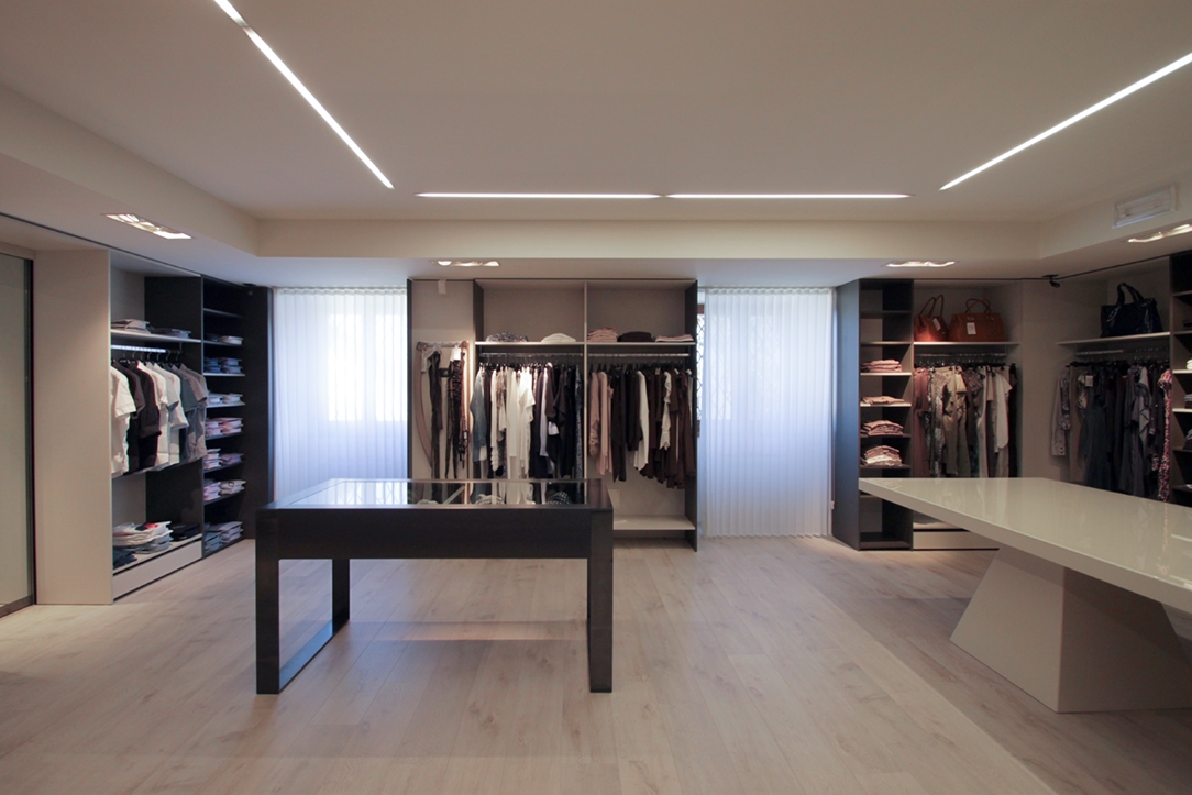
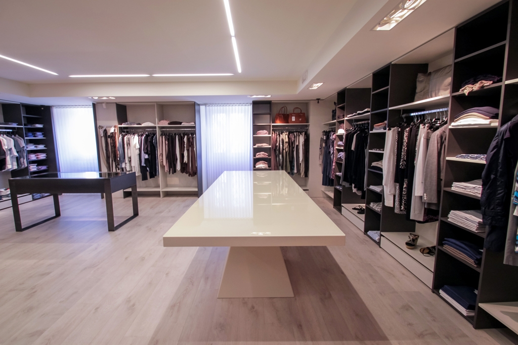
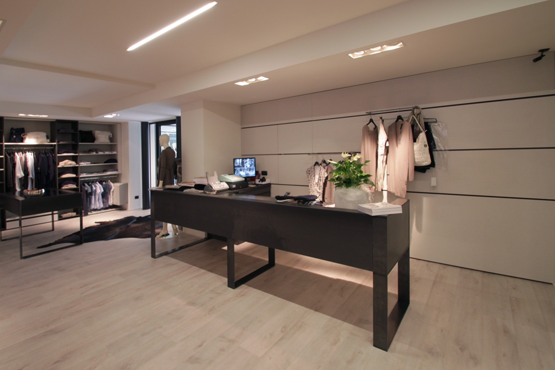
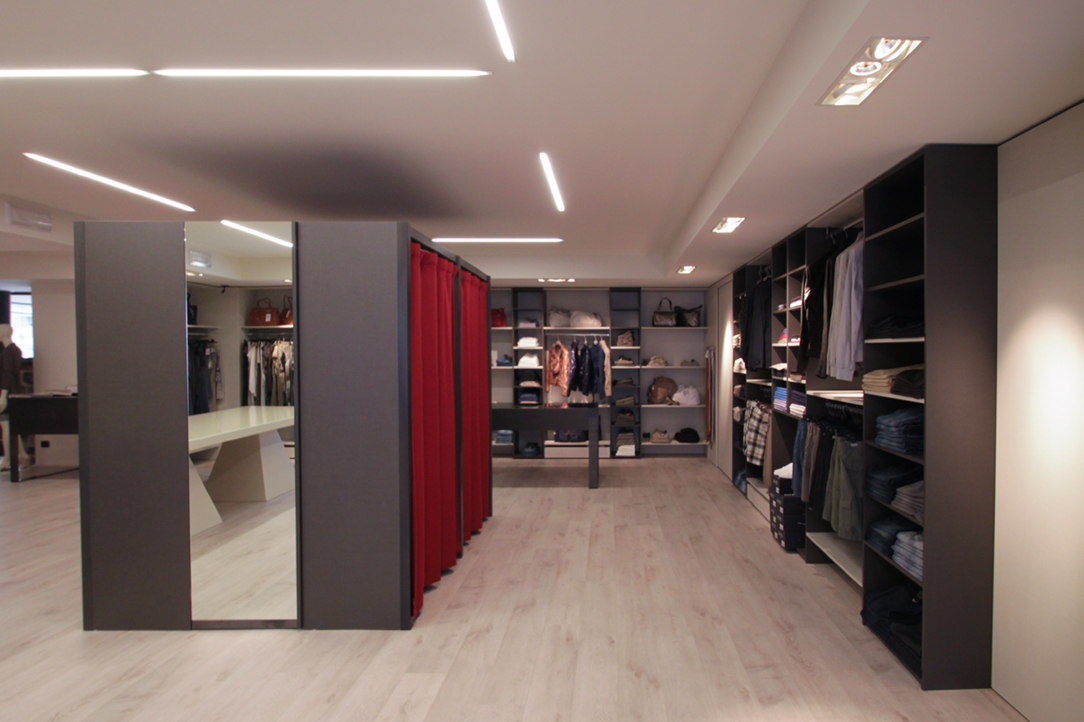
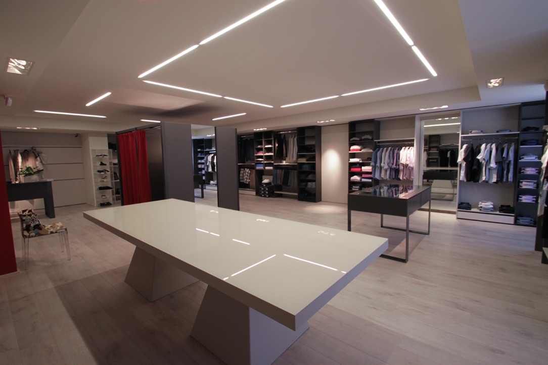
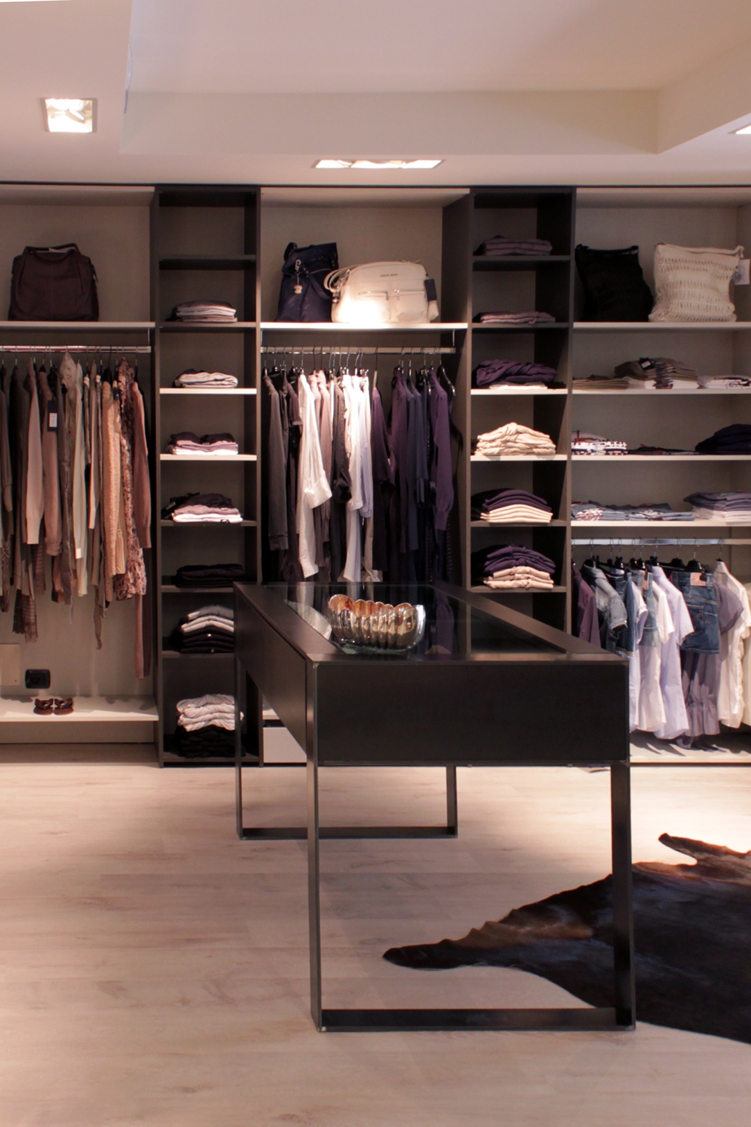
Boutique Franci is the project of a contemporary retail store, which takes the most from the wide spaces in order to prove a better circulation of the customers’ flow. Along the back walls, the main display elements are arranged alternating full-height shelves and horizontal display profiles with drawers and shelves. The circulation of customers takes freely place starting from the external perimeter, passing through the display tables of different sizes, up to the definition of central macro areas. These act as a pivot and hold the dressing rooms within important rigorous volumes. The choice of materials and their finishes defines the stylistic taste of this boutique.

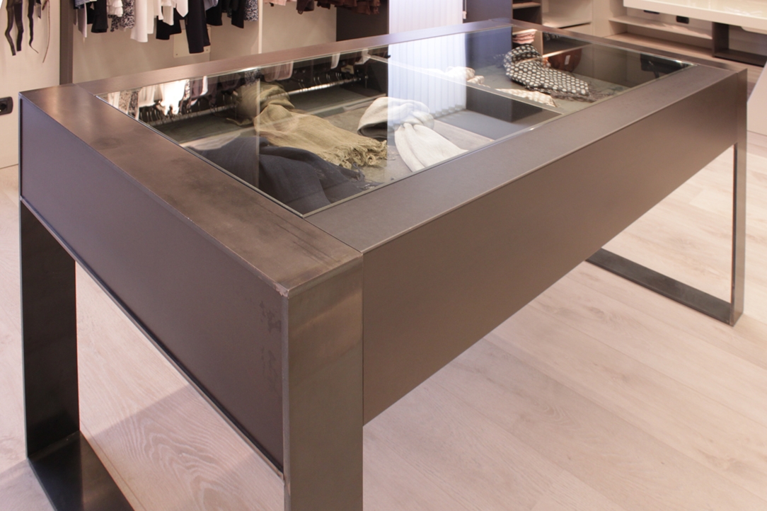
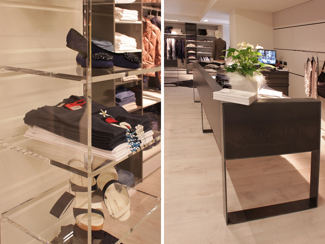
For the wall display units, shelves alternate in an elegant chromatic contrast a textured laminate whose finish seems extrapolated directly from the textile world. A reference to the materiality of the clothes themselves, which see the finishing of their fabrics invade even the display elements. The central tables are in black waxed iron providing an industrial touch to the environment. The design lines are straight and precise, offering a double vision of the furniture. It is important in the side elevation and essential in its effective thickness. The boutique’s banner was also made in the same material, whose logo designed in the graphics to restore this sense of contemporary elegance, was laser cut and backlit.
A boutique with textile finishes


A layout that allows freedom of movement and visual continuity for a boutique in Selvino where fabrics also invade the display elements. Refined and contemporary finishes in a retail interior with elegant contrasts.

Project: Modulor
Year: 2011
Site: Selvino

Ice atmosphere for Runway Store

Ice atmosphere for Runway Store

Runway Store Ho Chi Minh 01
Runway Store Ho Chi Minh 02
Runway Store Ho Chi Minh 03
Ho Chi Minh dettaglio 01
Ho Chi Minh interno 01
Runway Store Ho Chi Minh 07
Ho Chi Minh dettaglio 02
Runway Store Ho Chi Minh 04
Runway Store Ho Chi Minh 05
Ho Chi Minh dettaglio 03
Runway Store Ho Chi Minh 06
Ho Chi Minh dettaglio 04
Ho Chi Minh dettaglio 05

Ice atmosphere for Runway Store


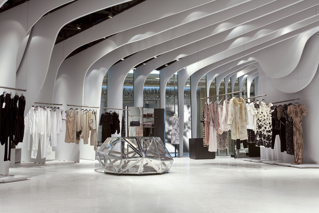
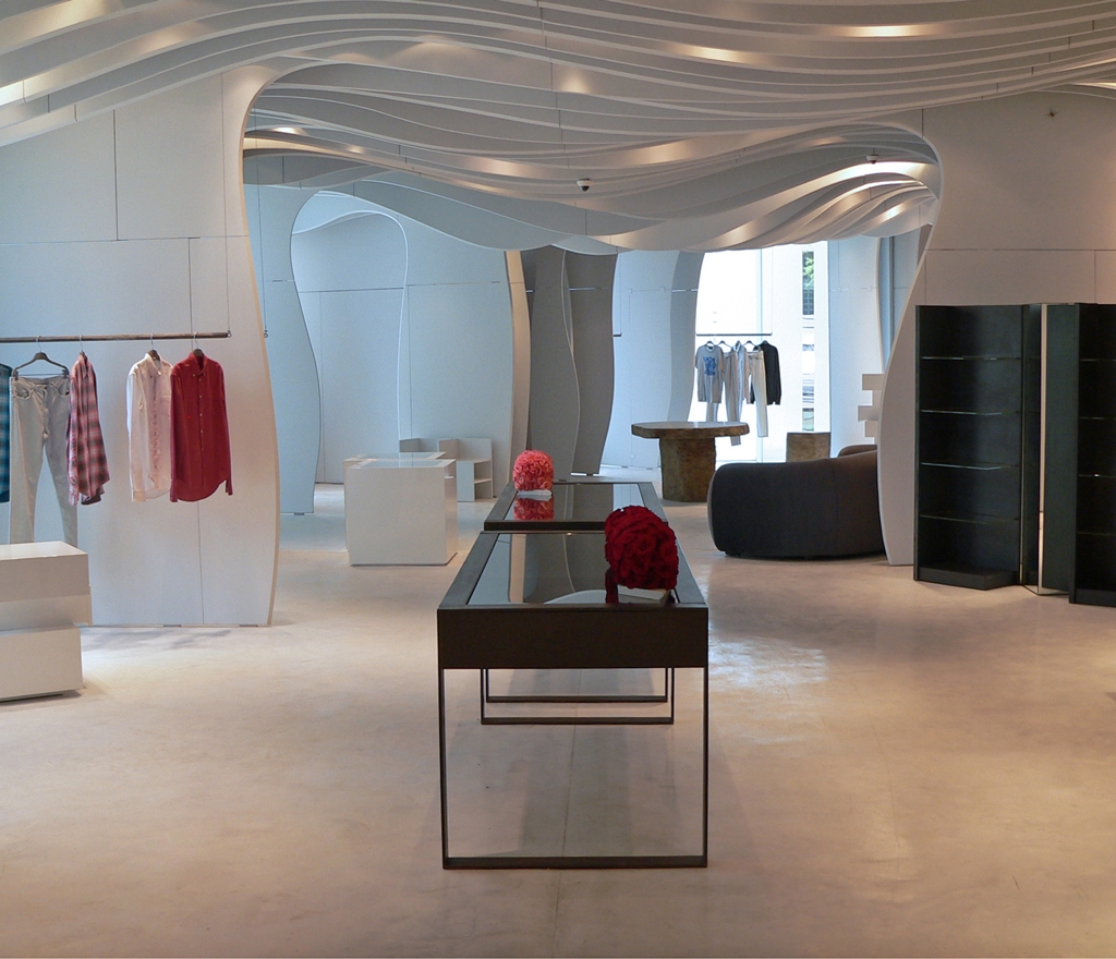
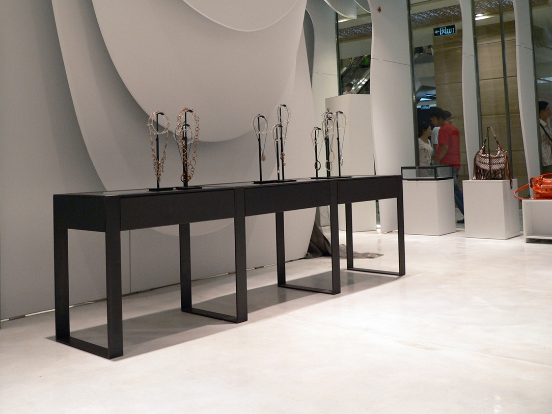
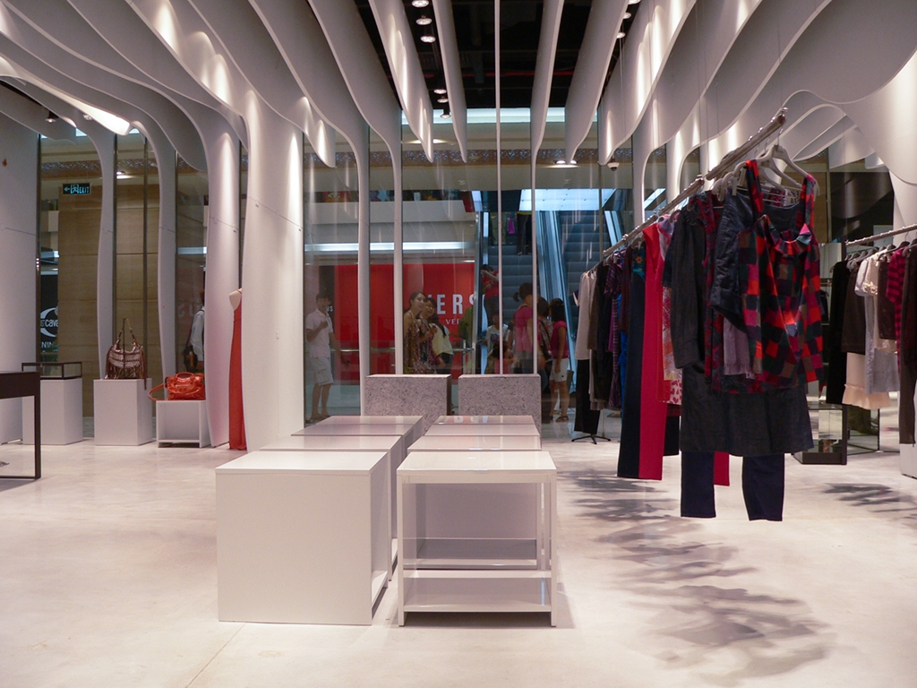
Set in an ice interior, the installation for the Runway Store in Ho Chi Minh designed by CLS Architects takes note. The side walls are transformed into a sinuous stratification while the central void holds a beating heart fragmented by luminous reflections.

Project: CLS Architects
Year: 2010
Site: Ho Chi Minh

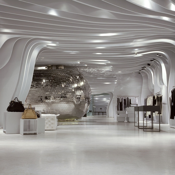
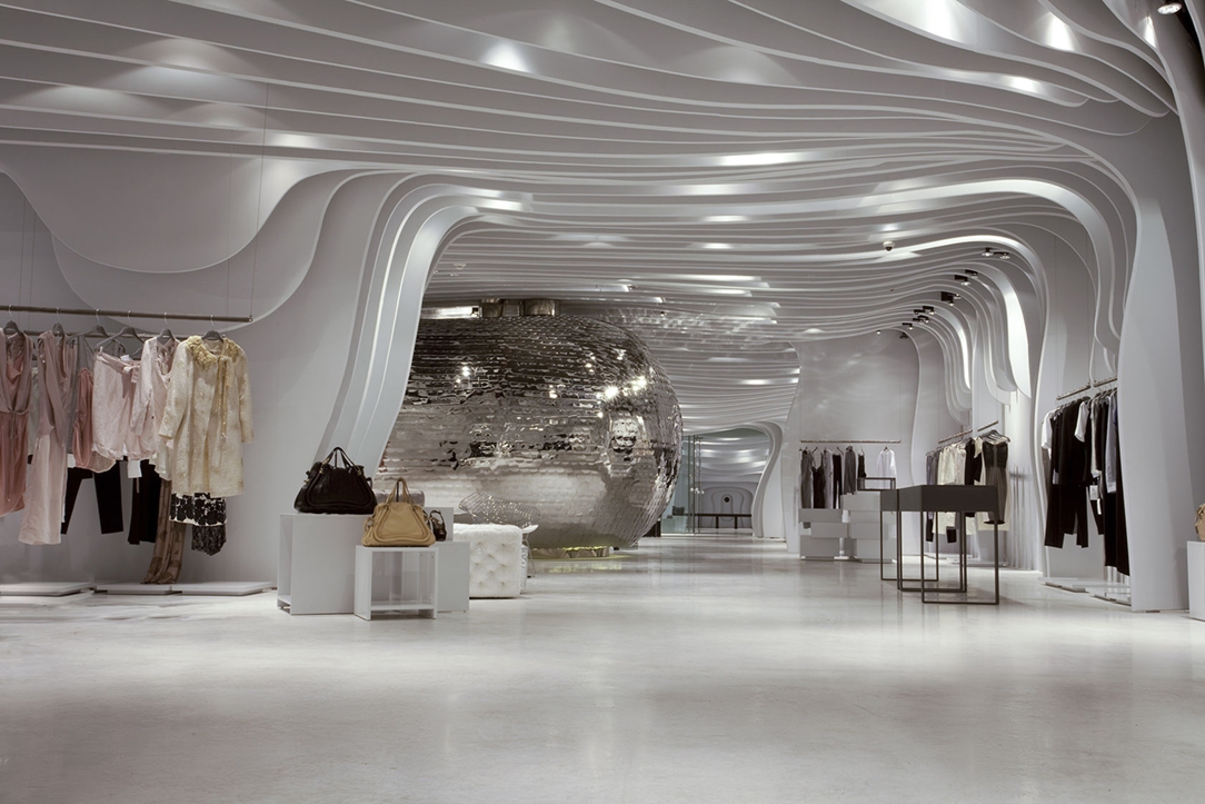
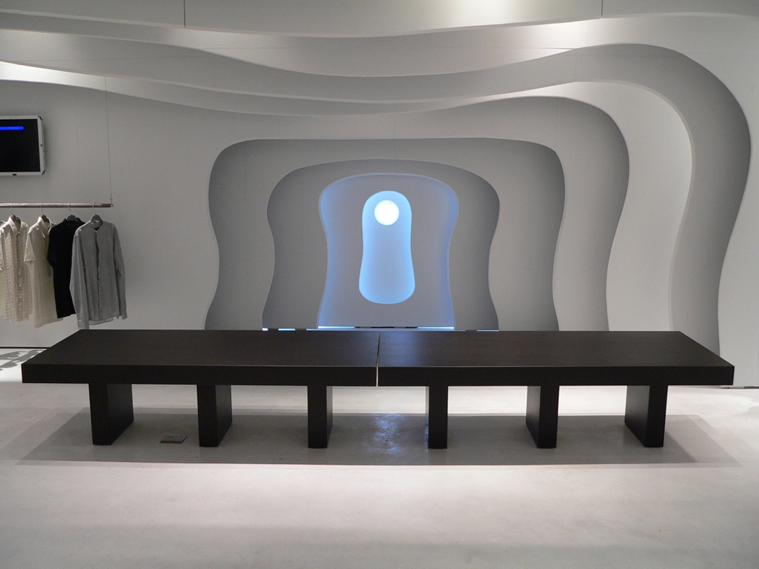
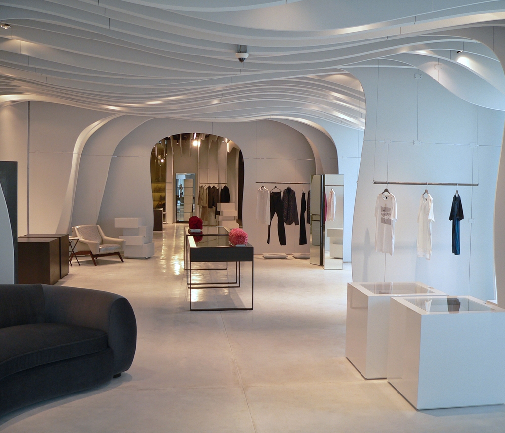
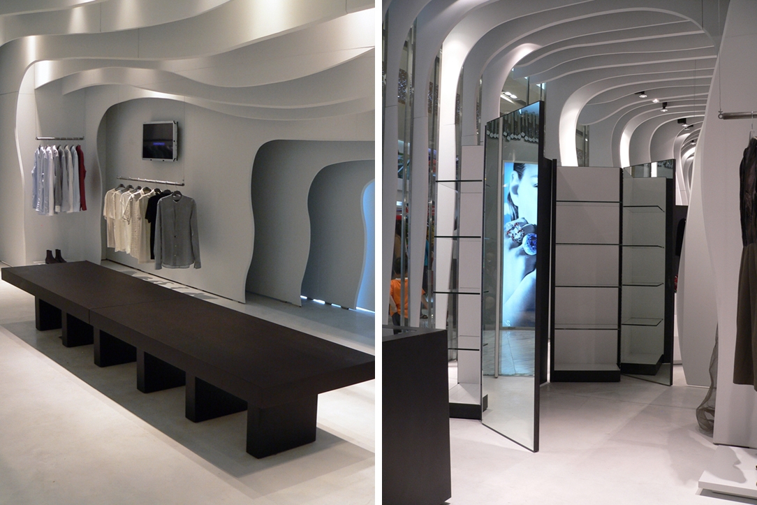
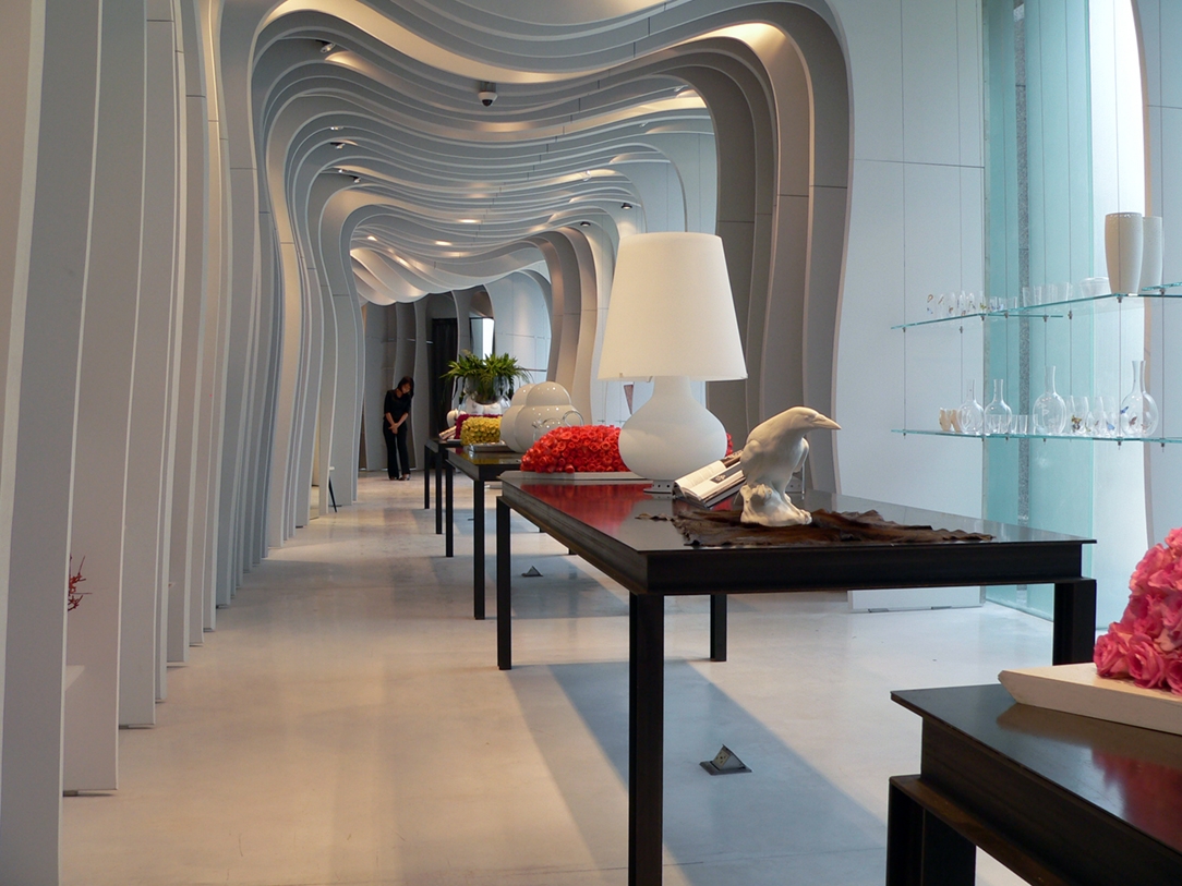
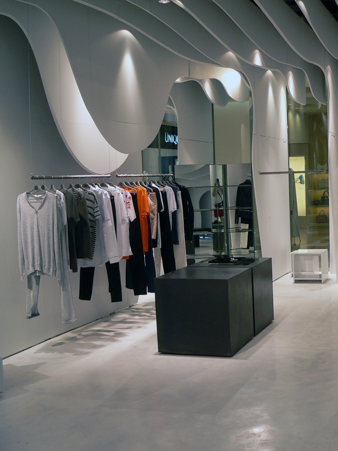
Runway Store is the project of a fairytale environment, where the retail space is created inside an ice cave. The signs of these stratifications are visible on the walls, with shaped slats with a sinuous profile in four different shades of white. The distance between each of them allows an internal rhythm and dynamism, capable of producing different visual effects according to the point of view. A suspended environment in which the overall effect, although recalling a sort of contemporary igloo, does not become hostile and excessively cold for the customer. A contemporary reinterpretation that instead seems frozen in time, but at the same way elegant and dynamic.

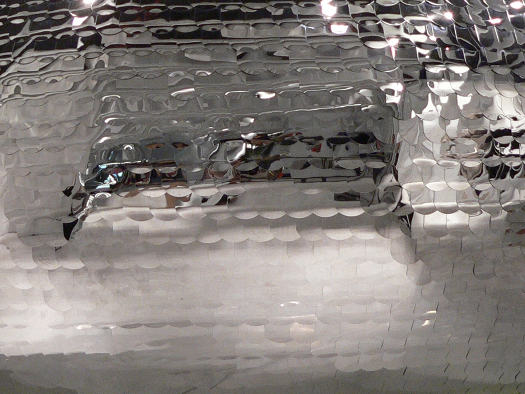
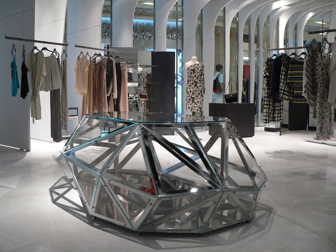
The central void hosts a beating heart, a sphere set inserted in the room which houses a private room. Its surface is sprinkled with mirror scales that reflect light and dematerialize the reflected image.
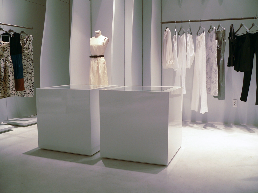
The furnishings are essential in the shapes, alternating white glossy lacquered surfaces with the opacity of the black waxed iron volumes. Glass inserts give the idea of ​​purity and lightness. In this perspective, play of reflections have a fundamental role, underlined by the choice of materials that tend to make the interiors even more scenographic.

Ice atmosphere for Runway Store


Set in an ice interior, the installation for the Runway Store in Ho Chi Minh designed by CLS Architects takes note. The side walls are transformed into a sinuous stratification while the central void holds a beating heart fragmented by luminous reflections.

Project: CLS Architects
Year: 2010
Site: Ho Chi Minh

China Red for Tiziana Fausti

China Red for Tiziana Fausti

Tiziana Fausti Flavio Favelli China red vetrine
china red Tiziana Fausti Flavio Favelli 01
reparto uomo Tiziana Fausti Flavio Favelli 02
china red Tiziana Fausti Flavio Favelli 03
allestimento Tiziana Fausti Flavio Favelli 05
allestimento Tiziana Fausti Flavio Favelli 03
allestimento Tiziana Fausti Flavio Favelli 02
allestimento China Red Tiziana Fausti
allestimento Tiziana Fausti Flavio Favelli dettaglio

Tiziana Fausti dyed red with Flavio Favelli’s art installation “China Red”


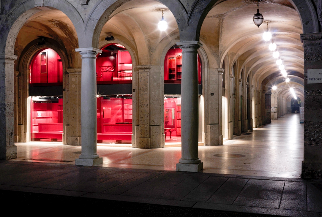
The spaces of Tiziana Fausti’s boutique are transformed into a real art gallery with the installation China Red by the artist Flavio Favelli. Real-life places dyed red in a contamination between ancient and modern, exotic and western.

Project: Flavio Favelli
Year: 2010
Site: Bergamo

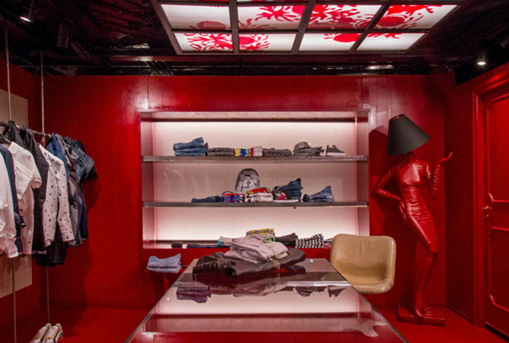
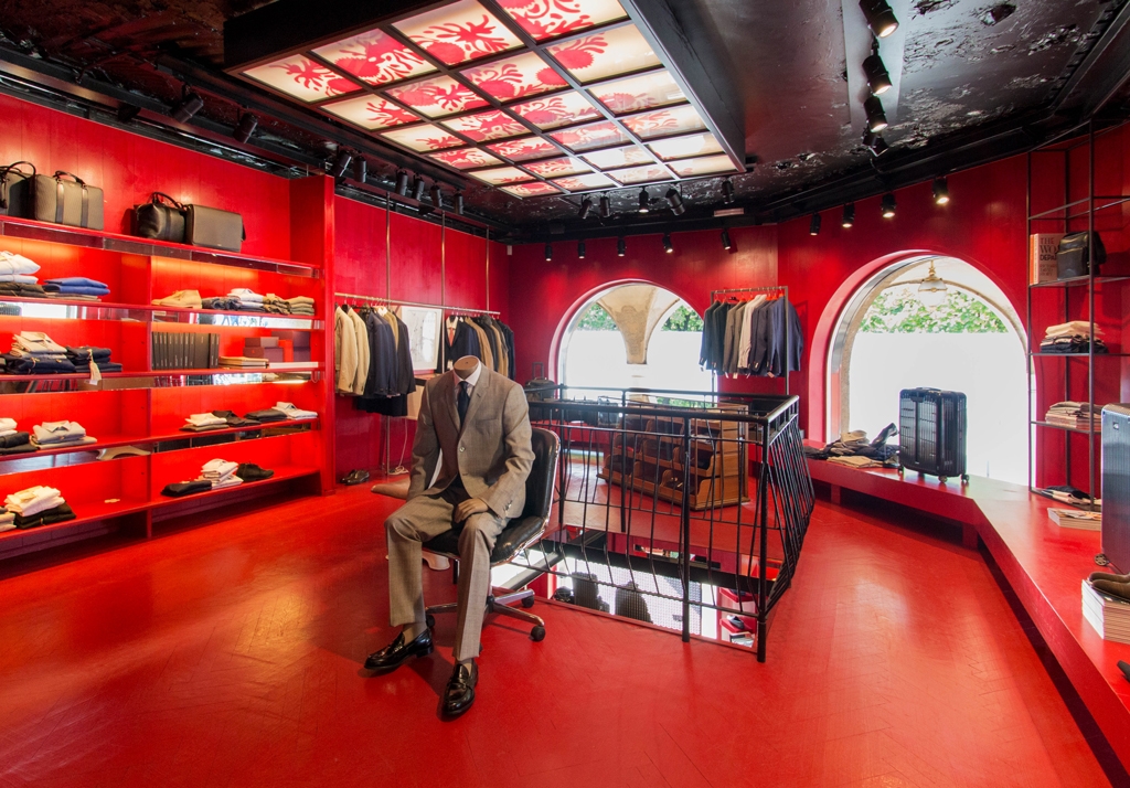
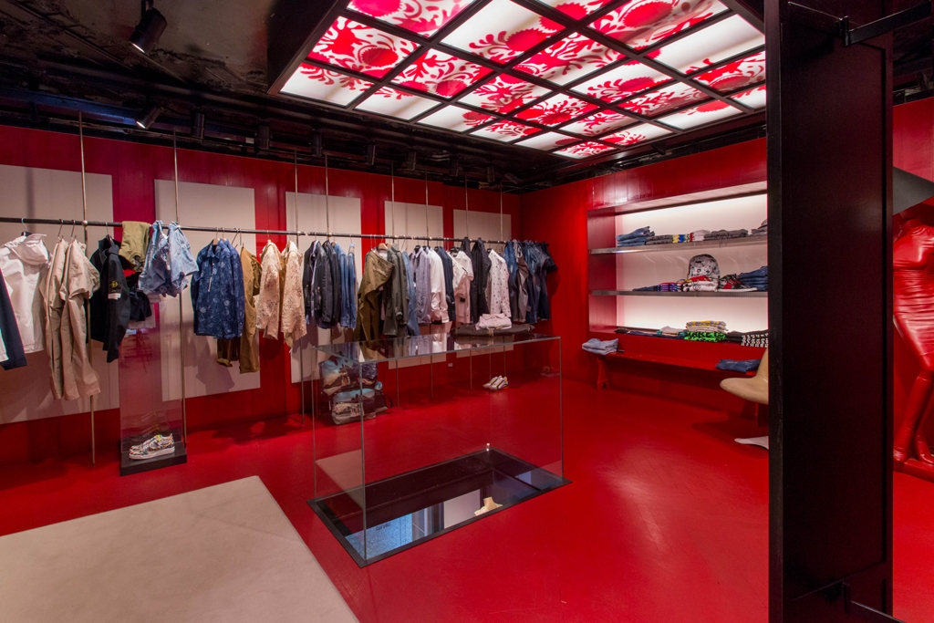
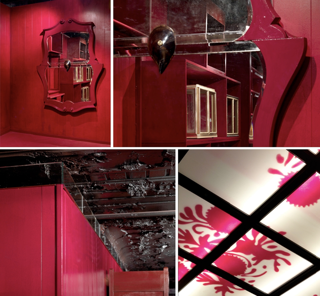
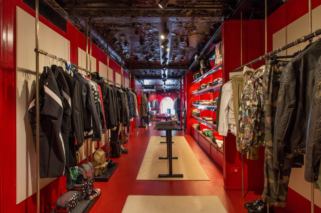
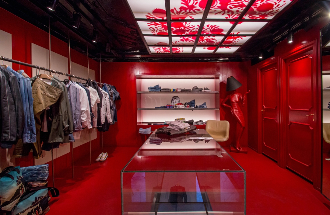
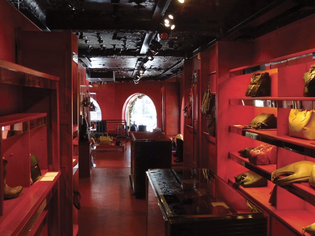
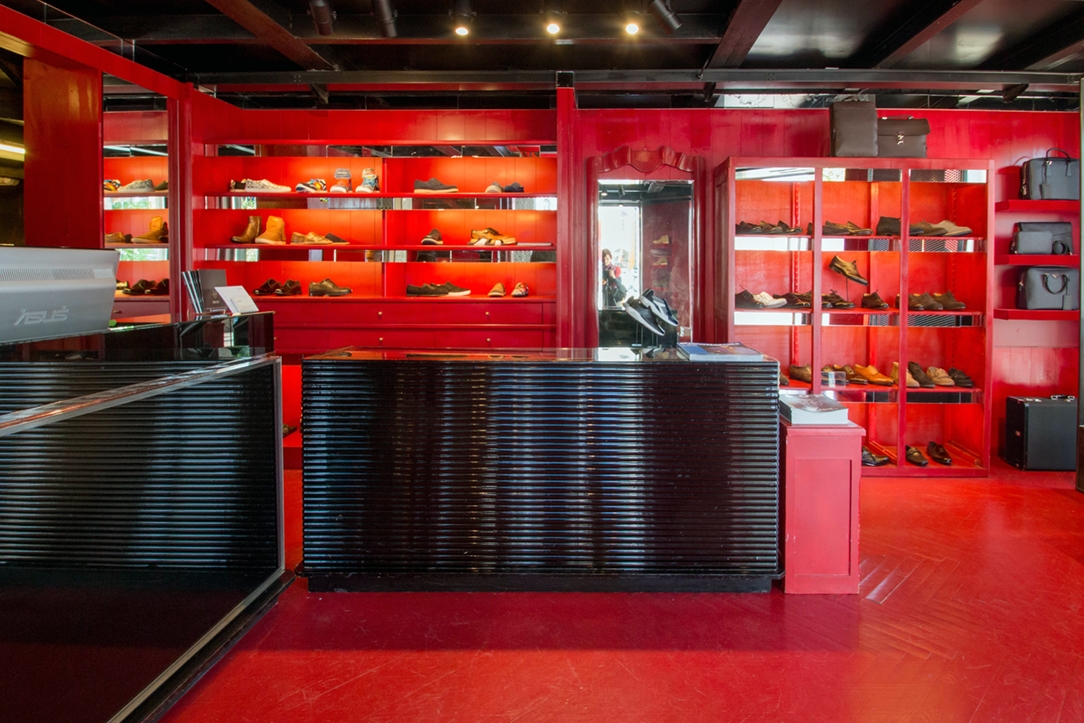
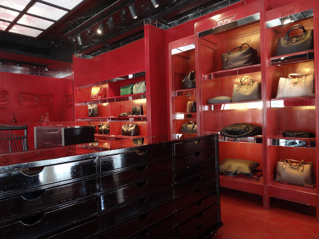
Fashion spaces and art environments contaminate each other, making its dividing boundary faint. Between red floors and walls and black ceilings with an almost wear effect, the set-up, at the limit with the definition of an artwork, by the artist Flavio Favelli takes note. A meeting between the eastern world, in whose culture red is a fundamental colour and a symbol of good luck, and the western one with its recycled objects and contemporary contaminations. Accessing the spaces of the boutique means entering into art, achieving both physical and emotional involvement in order to stimulate creativity. An almost surreal environment, where attention focuses on recovered objects such as mirrors, a vetch railing, wardrobes and bookcases.

Recycled and manipulated objects, which are dyed red and inserted in a new context, creating timeless connections. Different styles and times, which materialize and take on meaning only in this particular context. Certainly, a direct connection with the oriental world are the ceiling lights decorated with a motif taken from the old Fabbri Amarena vases dyed red like the surfaces of shelves and objects. A glossy varnish that refers to oriental lacquers and invades the whole floor. The ceiling, on the other hand, has irregularities, also incorporated in a single black-coloured surface. Here the shop becomes an almost emotional environment, in which participation becomes a fundamental element.

Following this recycling and handling process meant seeing the objects in another perspective. Not a simple painting but a conception of furniture as an artwork, a detail of a fundamental overall vision. The creation of customed furnishings, such as brass display elements, takes on a new meaning, in which the contamination between different styles and epochs becomes the only constant.

References:
China red: Tiziana Fausti boutique by Flavio Favelli on Domusweb
Sul Sentierone arriva China Red on L’Eco di Bergamo

Tiziana Fausti dyed red with Flavio Favelli’s art installation “China Red”


The spaces of Tiziana Fausti’s boutique are transformed into a real art gallery with the installation China Red by the artist Flavio Favelli. Real-life places dyed red in a contamination between ancient and modern, exotic and western.

Project: Flavio Favelli
Year: 2010
Site: Bergamo

Tiziana Fausti men’s collection

Tiziana Fausti men’s collection

Tiziana Fausti man esterno 01
Tiziana Fausti man vetrine
Tiziana Fausti Uomo 01
Tiziana Fausti Uomo 02
Tiziana Fausti man 04
Tiziana Fausti Uomo 03
Tiziana Fausti man 03
Tiziana Fausti uomo dettaglio
Tiziana Fausti Uomo dettaglio
Tiziana Fausti Uomo 06
Tiziana Fausti uomo 06
Tiziana Fausti man ingresso
Tiziana Fausti uomo underground

Tiziana Fausti men’s collection


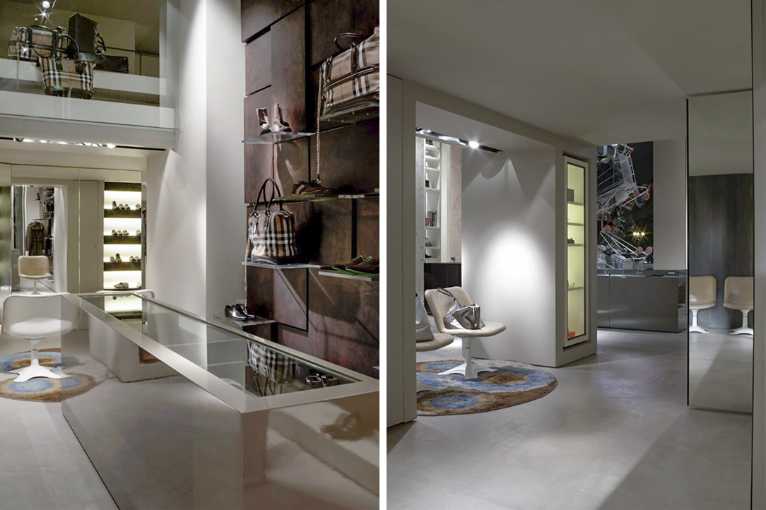
Like a respectable gentleman, the men’s department of the Luxury Store Tiziana Fausti expresses its charm and personality. On the ground floor the charm of a rigorous collection, between precious marbles and elegant surfaces. In the basement there is an underground collection, for younger customers, with an industrial interior style.

Project: Marco Costanzi Architects
Year: 2006
Site: Bergamo

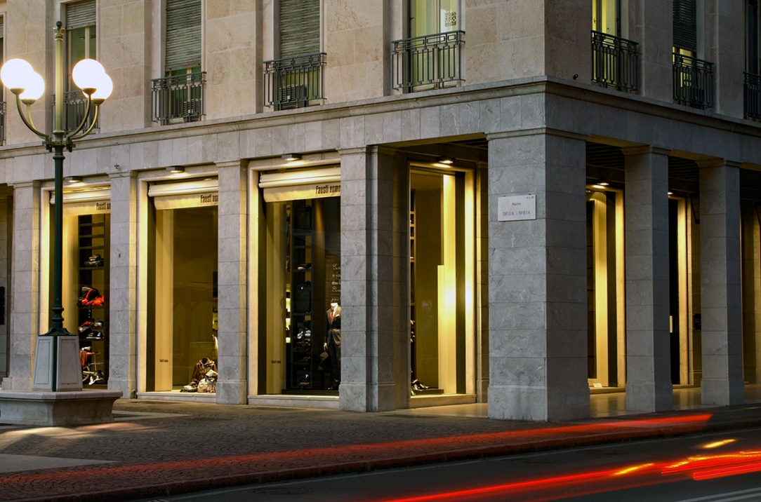
Overlooking Piazza della Libertà, in the heart of Bergamo, the men’s department of the Tiziana Fausti boutique takes place. An environment that wants to restore the personalities of the male client, on a project by the Marco Costanzi Architects studio.
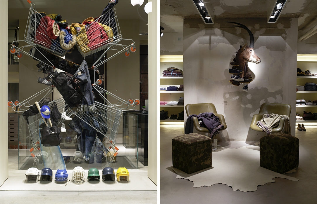
The neutral and balanced entrance leads to the underground collection in the basement. An interior that reflects this young and rebellious personality with an industrial style. Exposed concrete finishes and metal display elements that renounce painting to show their rawer soul. A dynamic, jaunty setting that prefers gray tones with black contrasts. To characterize it the common thread of the metal shopping cart that identify the checkout area and go down to the lower floor.

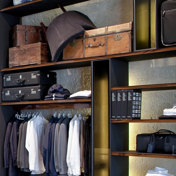
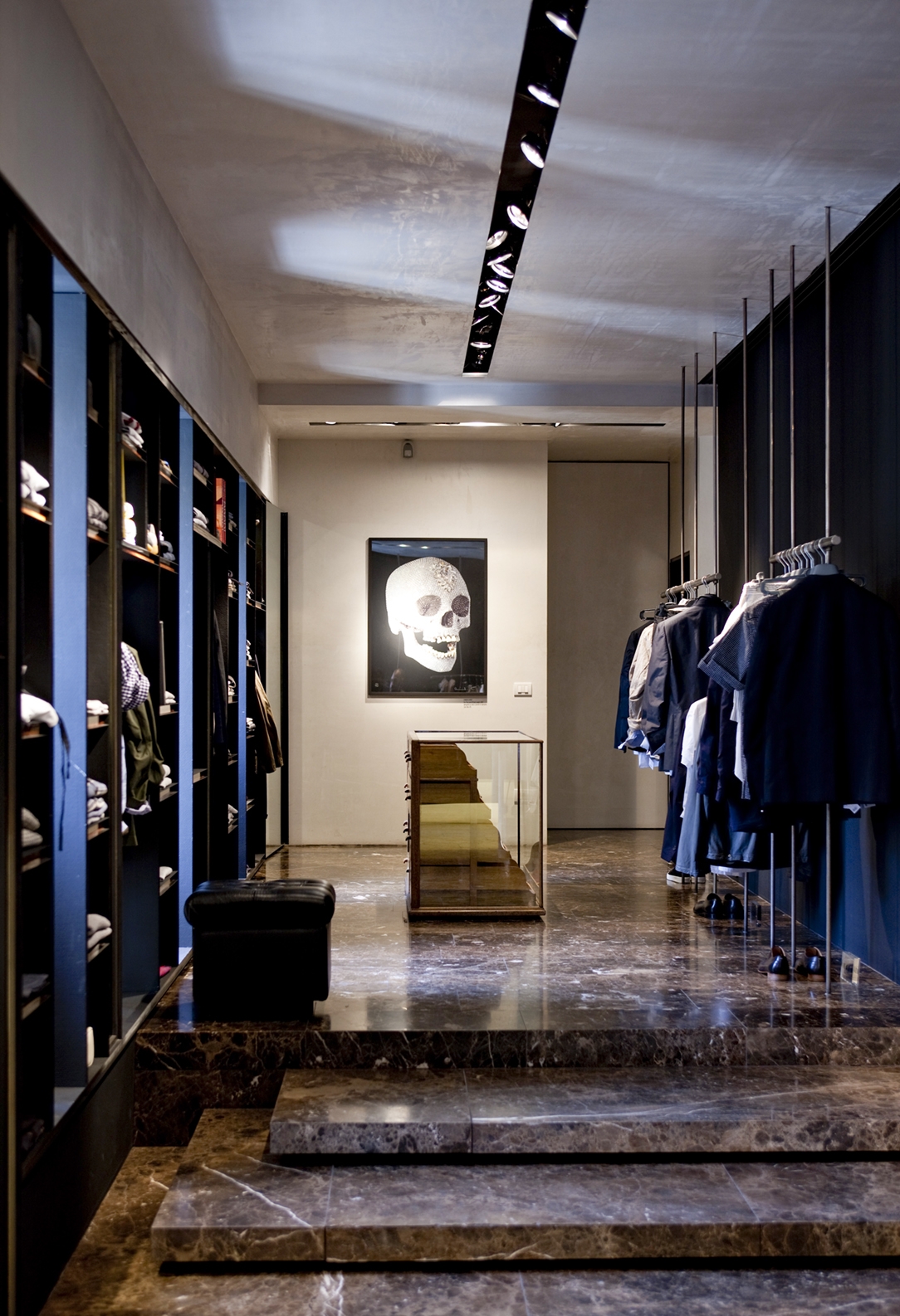
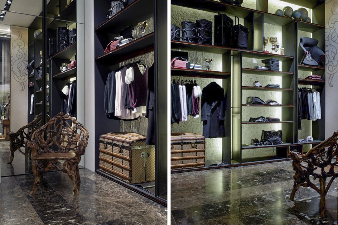
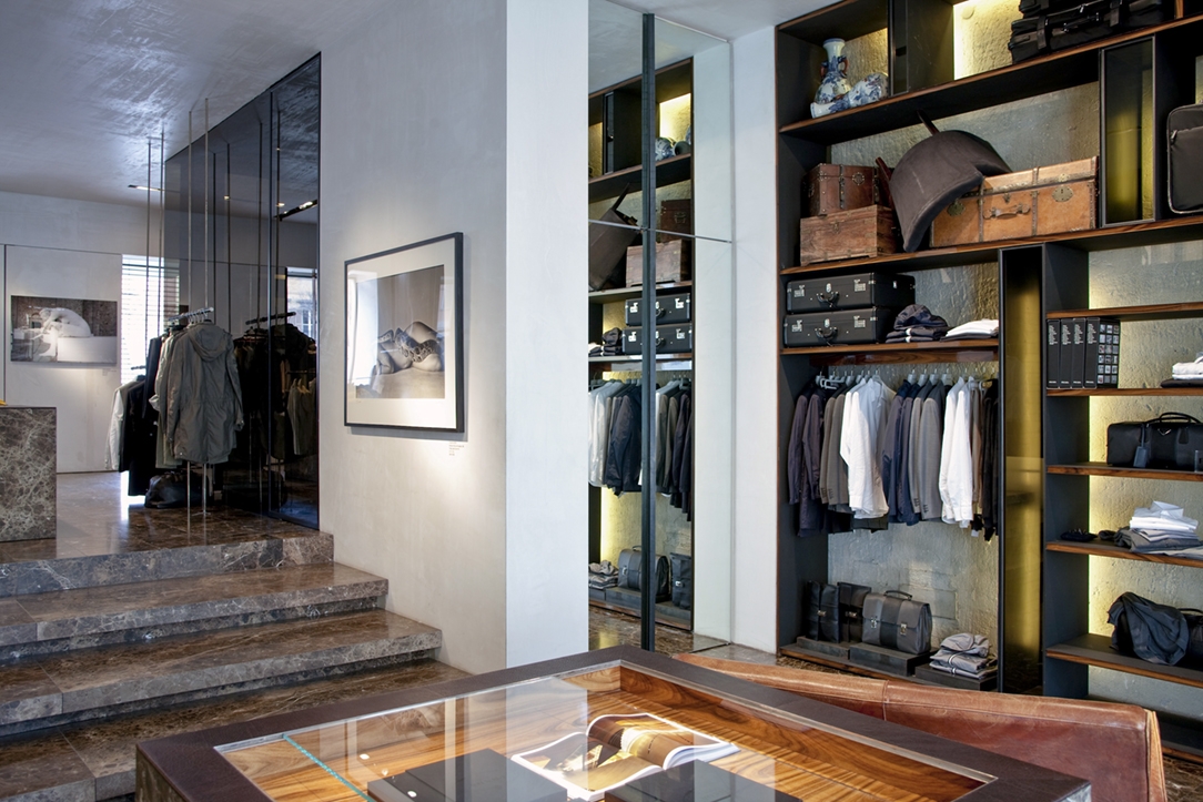
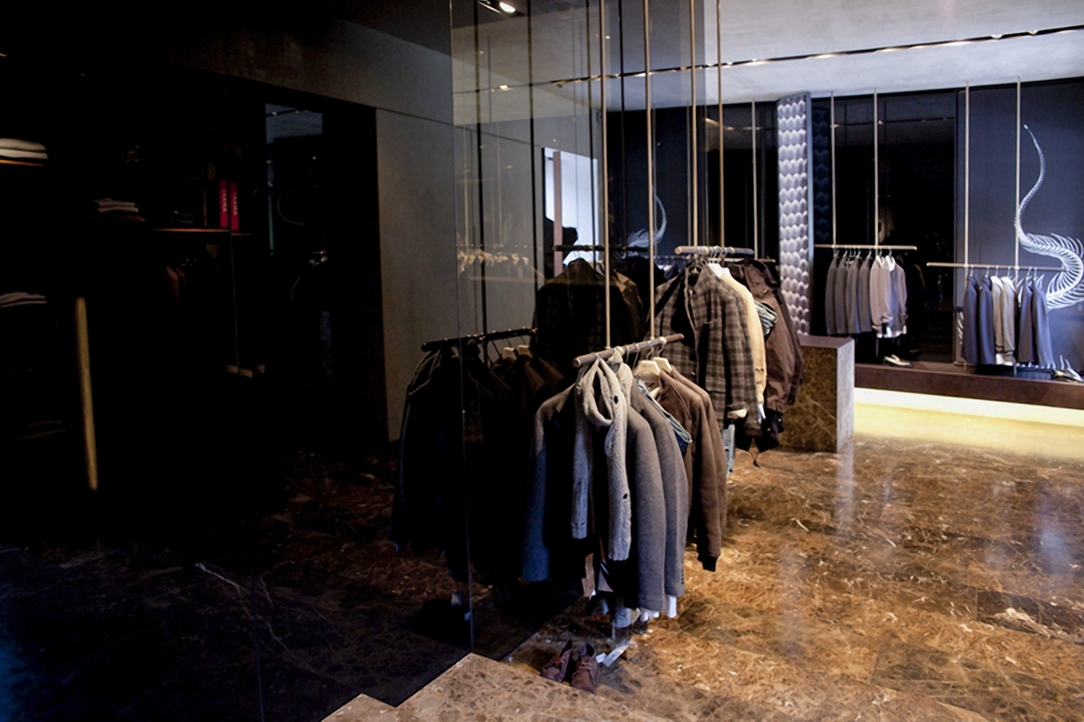
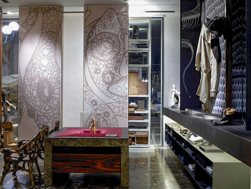
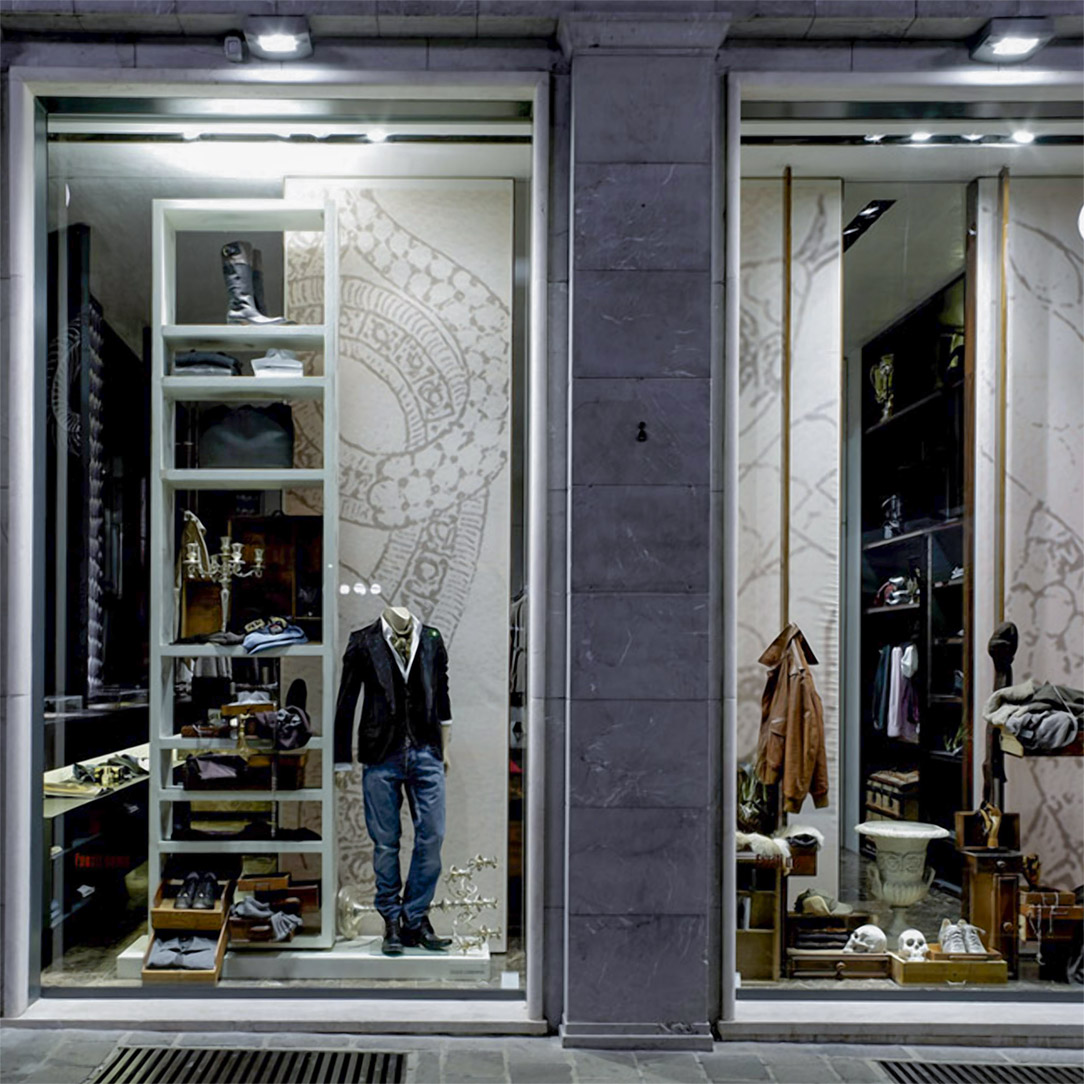
On the ground floor, a more rigorous and elegant personality comes to life. Emperador marble floor with marked veins, which stands out for its eternal charm. The walls are glossy and black with an almost sensual note on which the linear hanging elements with elegant and precious profiles can be recognized. Retro elements are spread in the environment, with a modern and timeless taste. Old suitcases and leather armchairs alternate with waxed wooden tables with integrated display cabinets.

Tiziana Fausti men’s collection


Like a respectable gentleman, the men’s department of the Luxury Store Tiziana Fausti expresses its charm and personality. On the ground floor the charm of a rigorous collection, between precious marbles and elegant surfaces. In the basement there is an underground collection, for younger customers, with an industrial interior style.

Project: Marco Costanzi Architects
Year: 2006
Site: Bergamo