Gray furniture for a masculine apartment

Gray furniture for a masculine apartment

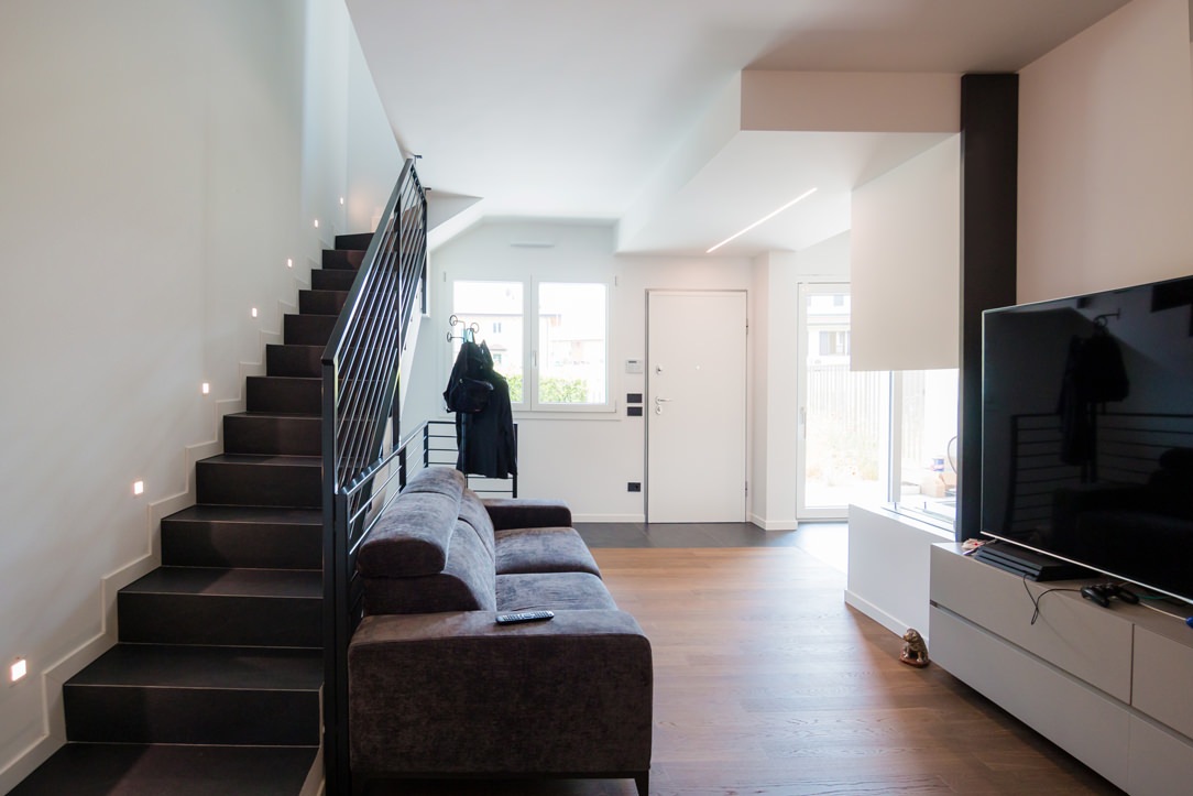
Furniture in shades of gray is spread over the two levels of this modern apartment with a masculine imprint. From the bookcase on the ground floor to the walk-in closet in the sleeping area, the furnishings are developed in an elegant and delicate way. The dark-colored wood chosen for the parquet flooring matches the slate tiles that embrace the kitchen and bathroom areas from the internal staircase.
gray masculine apartment furniture

THE LIVING AREA MEETS THE ELEGANCE OF GREY FURNITURE

In a newly built residential context, this two-level apartment stands out in which the masculine imprint is elegantly softened by the choice of monochromatic furnishings. The floors show character in the combination of smoked oak parquet and slate-effect tiles. The floor is therefore dark, which is chromatically balanced by the walls that are tinged with white and the light furnishings that lighten and brighten the environment.
livingroom gray tones furniture

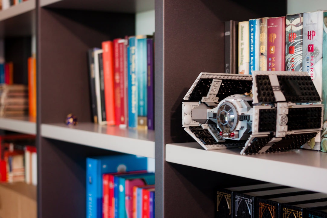
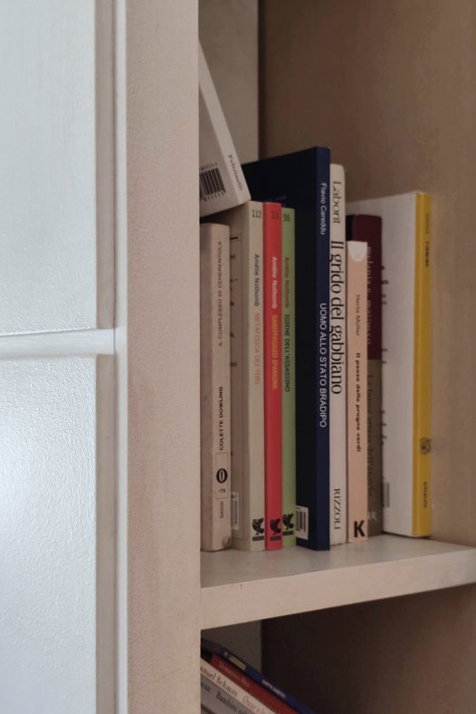
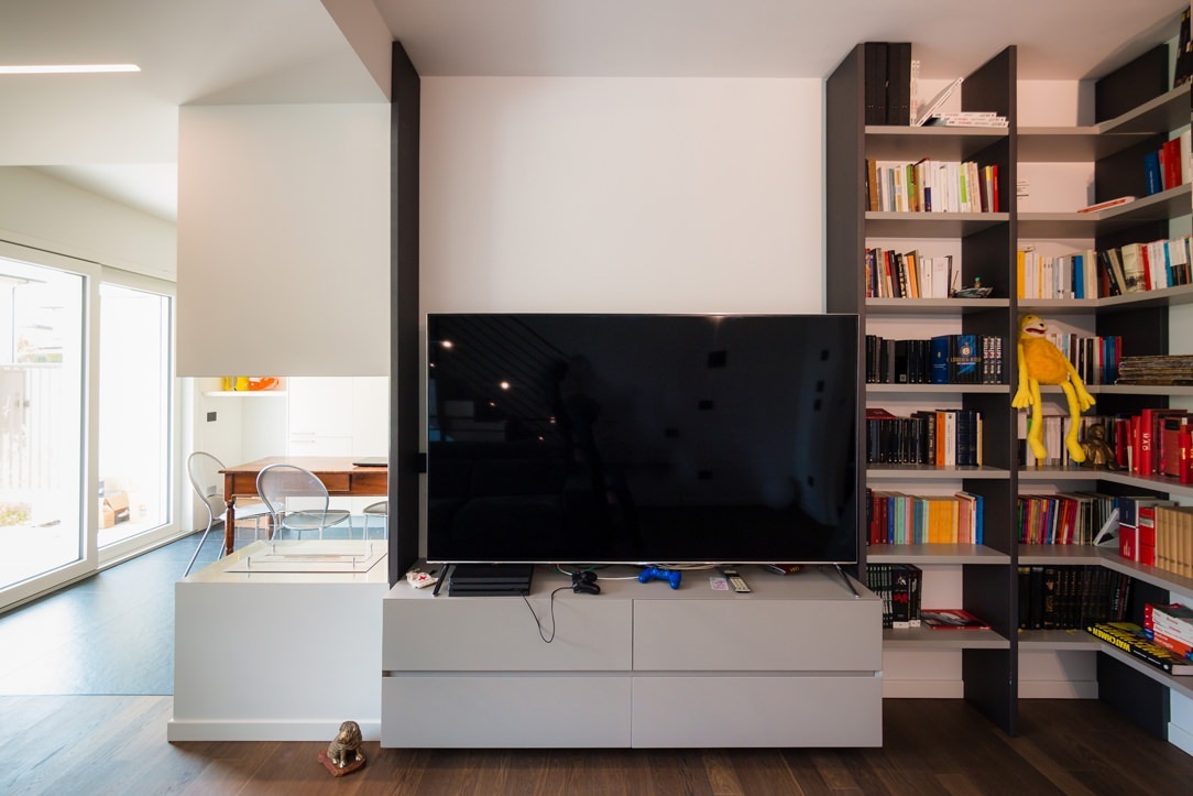
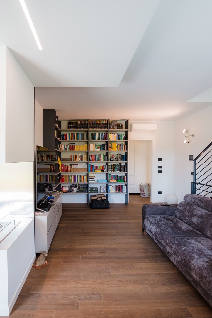
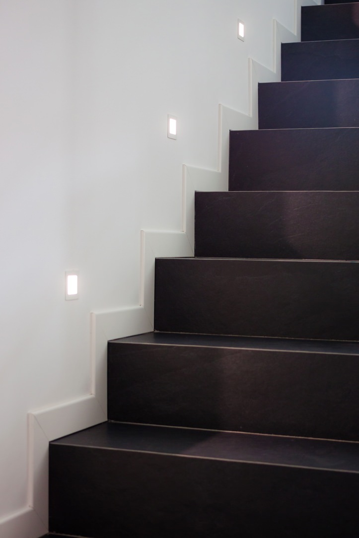
The lighting of the ground floor is combined with steps on the side of the staircase, these mark a luminous rhythm and accompany the upper floor. To embrace the living area, a full-height bookcase combines anthracite gray backs with light gray shelves in the same shade as the surrounding furniture. The anthracite gray that we find here in the lacquered shoulders can be replaced by black iron, as for example in this apartment with the same masculine soul.
bookshelf in dark gray masculine furniture
step marker
shelves detail

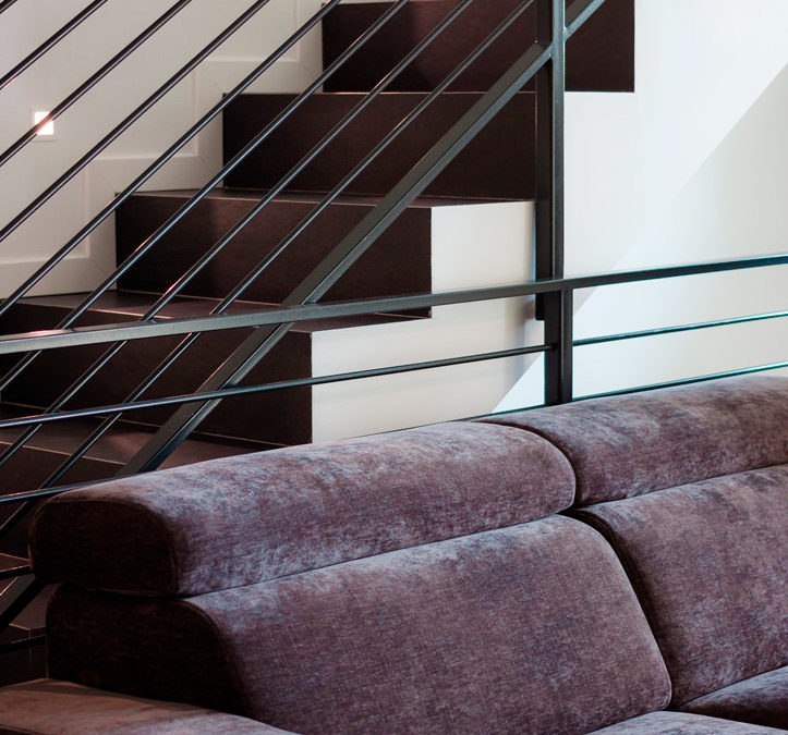
Neutral tones thus become the protagonists of a story that narrates elegance and freshness. Here are some other examples of furnishings in neutral colors. The sofa is a darker gray and moved by velvety fabric, which is positioned laterally at the entrance and hides a lateral extension to allow maximum comfort. Behind it, the stair handrail in anthracite gray painted metal matches the vertical shoulders of the bookcase positioned right in front.
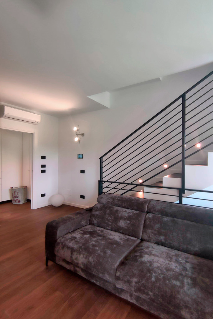
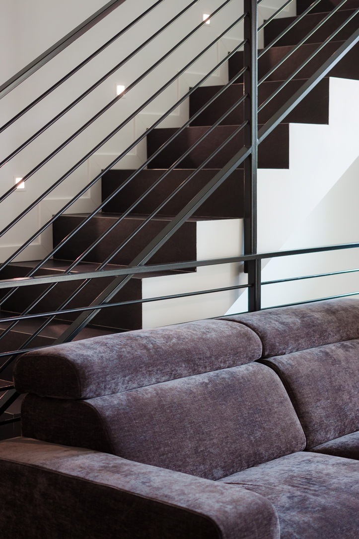
sofa and stairs
velvet sofa detail

THE RECOVERED KITCHEN

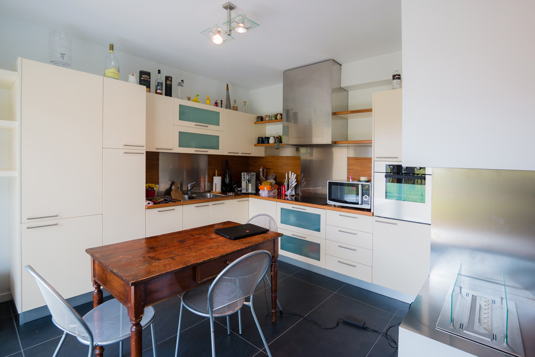
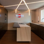
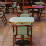
The bioethanol fireplace, housed in an open plasterboard structure, acts as a fusion element between the living area and the kitchen. This, recovered from the previous house, is characterized by powder and wood tones and is combined with a rustic table with light aluminum chairs. The wood of the kitchen and of the table, which are a lighter tone than the floor of the living area, recall it on a material level and create continuity between the two areas.

kitchen powder and wood

THE BATHROOMS IN ANTHRACITE GRAY

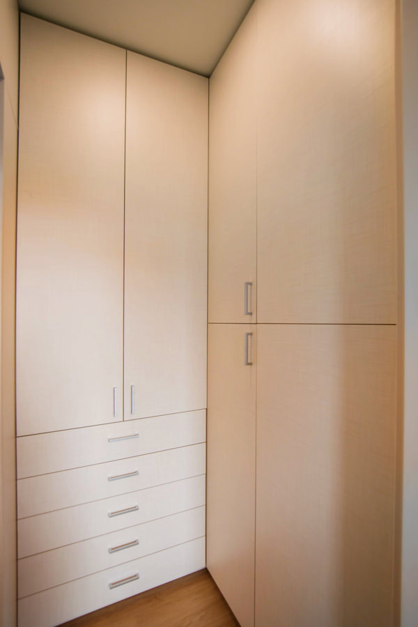
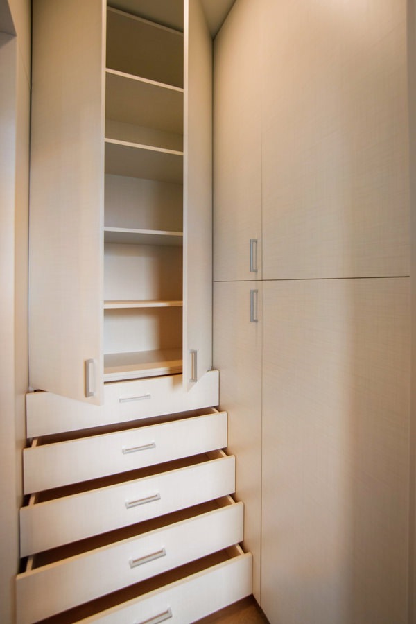
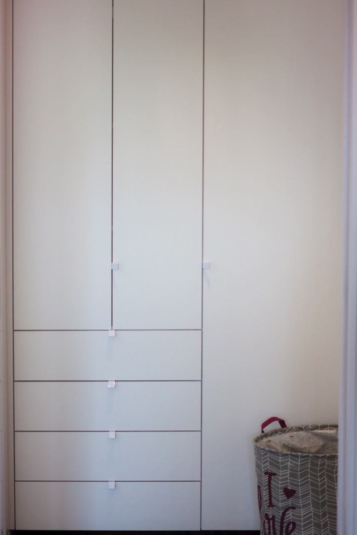
Accessing the service bathroom, full-height matt white bilaminate cabinets act as a storage room organized into shelves, hangers and drawers. This light-colored anteroom creates a nice contrast and a clear break with the bathroom characterized by dark tones.
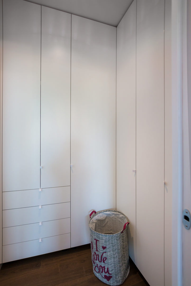
white anteroom
details anteroom

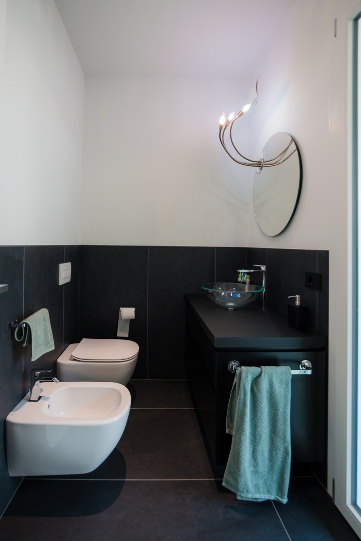
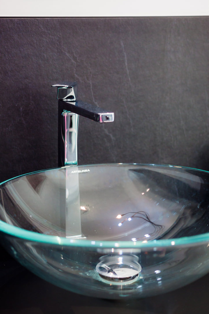
In fact, the anthracite tiles rise on the sides remaining at a height of 120cm and is combined with a bathroom cabinet in the same shade with a matte black back lacquered top. Particularly the chosen sink, in transparent glass, which seems to disappear and get lost between the tiles and the top.

service bathroom
detail sink

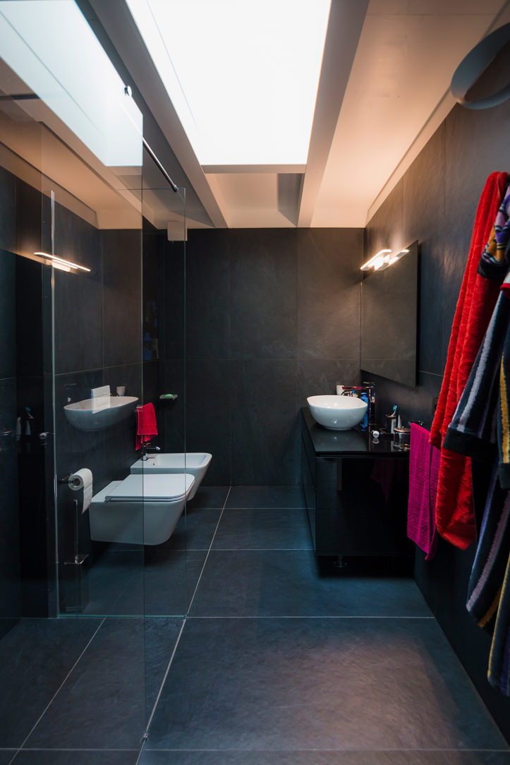
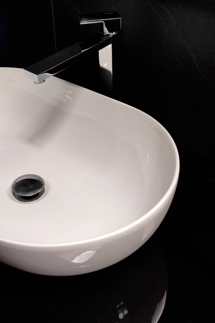
The second master bathroom, located on the upper floor, amplifies its masculine nature by completely covering the tiles in anthracite gray up to the ceiling beam. The bathroom is very dark but the large skylight on the ceiling perfectly illuminates the room from above. Here too there is a bathroom cabinet in shades, with the top in glossy back lacquered rather than opaque, which goes well with the reflections of the Globo ceramic sink.

master bathroom black furniture
bathroom tiles

FROM THE GRAY FURNITURE ON THE LOWER FLOOR TO THE BLACK AND WHITE CONTRASTS IN THE BEDROOM: A WALK-IN WARDROBE IN THE BEDROOM

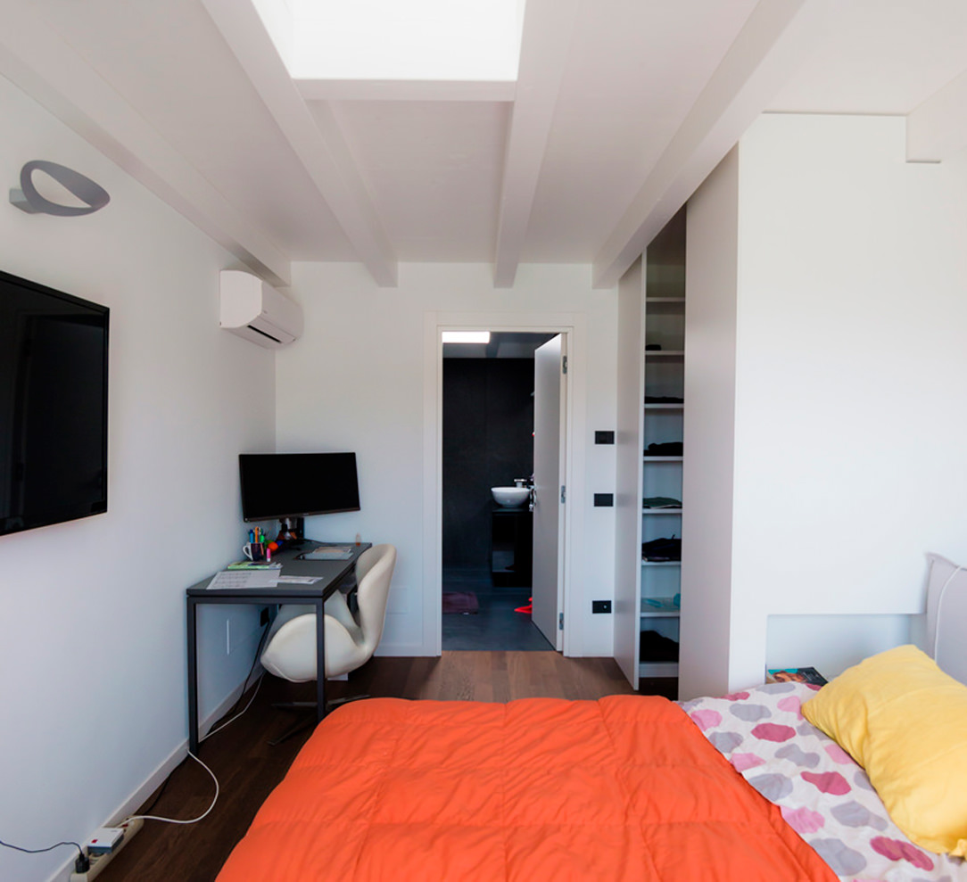
Se il piano inferiore si impreziosisce di un arredamento sui toni neutri del grigio, If the lower floor is embellished with furniture in neutral shades of gray, the sleeping area is characterized by a more subdued contrast. The recurring theme of anthracite gray is still found in the small study corner, through a desk with a metal structure and a medium gray linoleum top. Here are some other examples of Smartworking corners where the working sphere is combined with a domestic environment.
bedroom and walk-in closet masculine furniture

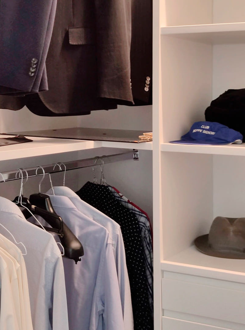
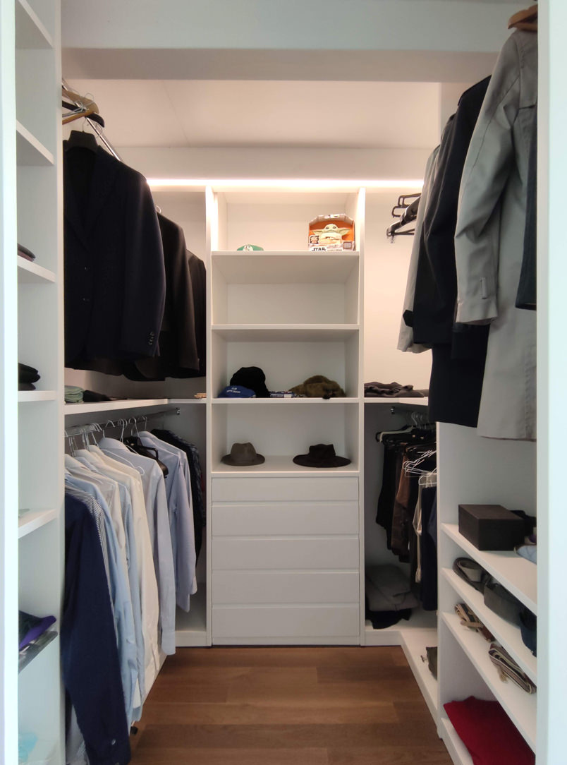
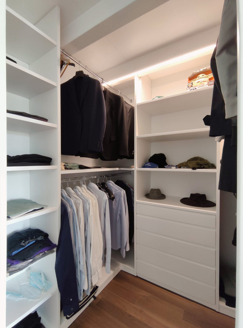
Behind this, a walk-in closet develops at an angle creating a limited but at the same time functional environment. Inside the walk-in closet the hangers alternate in height while in the center a central chest of drawers with upper shelves remains available for all the folded items. On the side facing the bed, a small niche remains at the service and serves as an open bedside table useful for supporting small objects.
walk-in closet masculine furniture
inside walk-in closet
details walk-in closet

Renewed classic furniture with contemporary kitchen

Renewed classic furniture with contemporary kitchen

The classic style furnishings of this villa built about thirty years ago rediscovers its eternal charm even after many years.
To rejuvenate it and make it current, a contemporary style kitchen with essential lines has been added. The harmonious combination of the two styles refreshes the rooms and softens the features of the predominant style.

classic living room

Classical furniture between past and present

The passage of time and the succession of different historical periods has allowed a wide development of furnishing styles. Over the course of history these have known their maximum expression with distinct characters, while in the contemporary era they have been reinterpreted, giving life to continuously updated variants.

This house, built between the late eighties and early nineties, responds to a classic style at the time very popular among villas and elegant apartments. Revived today, it discovers its contemporary meaning with an elegant kitchen with essential lines. The warm tones of the lacquers soften the design lines of these interiors, in perfect harmony with contemporary trends.

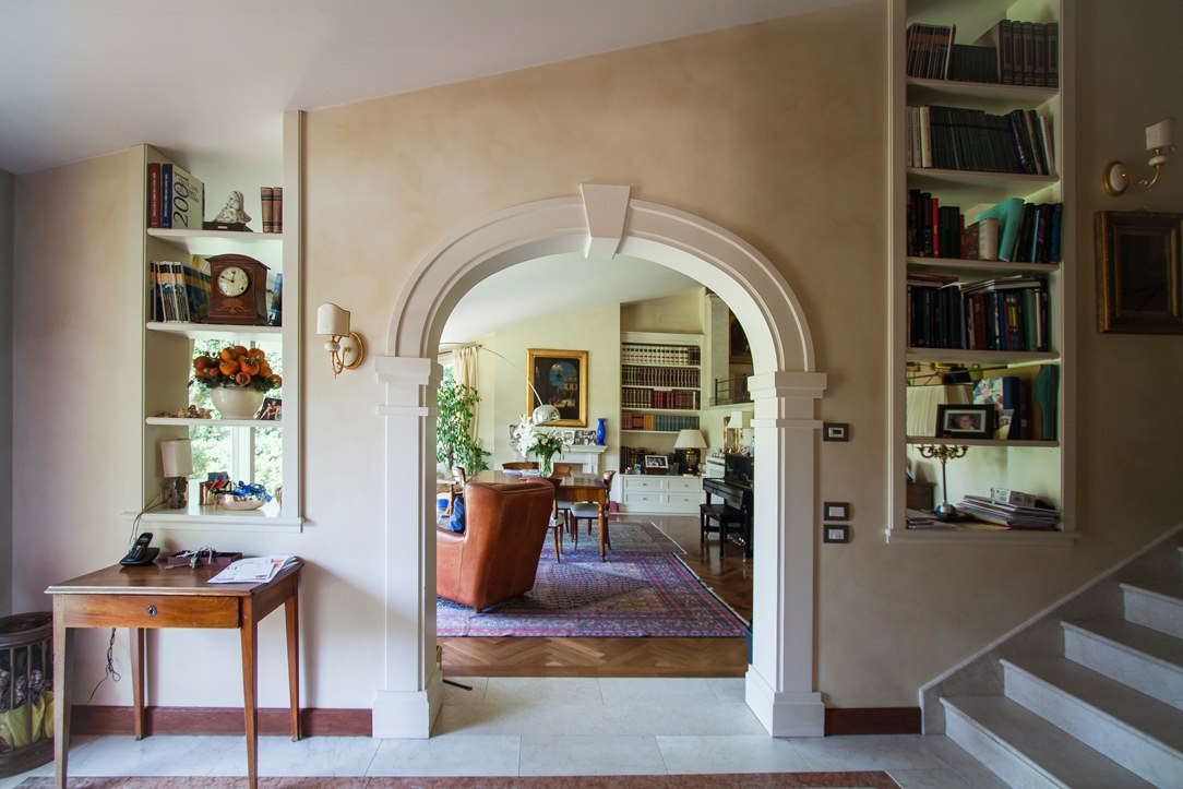
entrance passage with classic arch
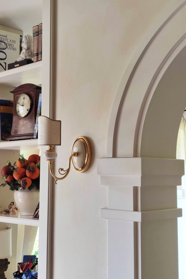
classic style entrance details arch moldings
detail of the villa entrance light blades

The living area in classic style

The classic furnishings already develop in the entrance area with moldings that emphasize the architectural lines of this villa.
On the left, an arch with shaped profiles marks the entrance to the living area, flanked by a pair of blades of light that allow a glimpse of the large interior living room.
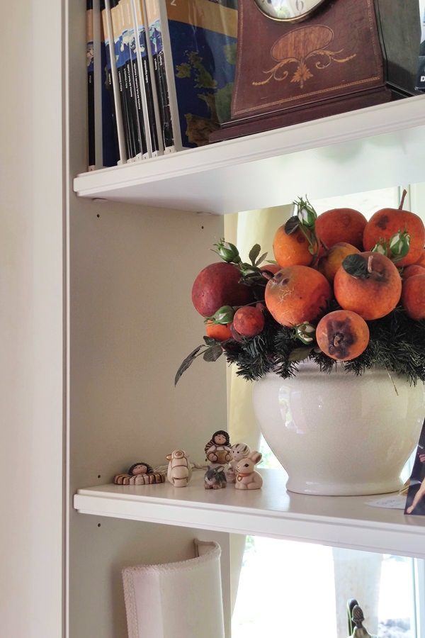
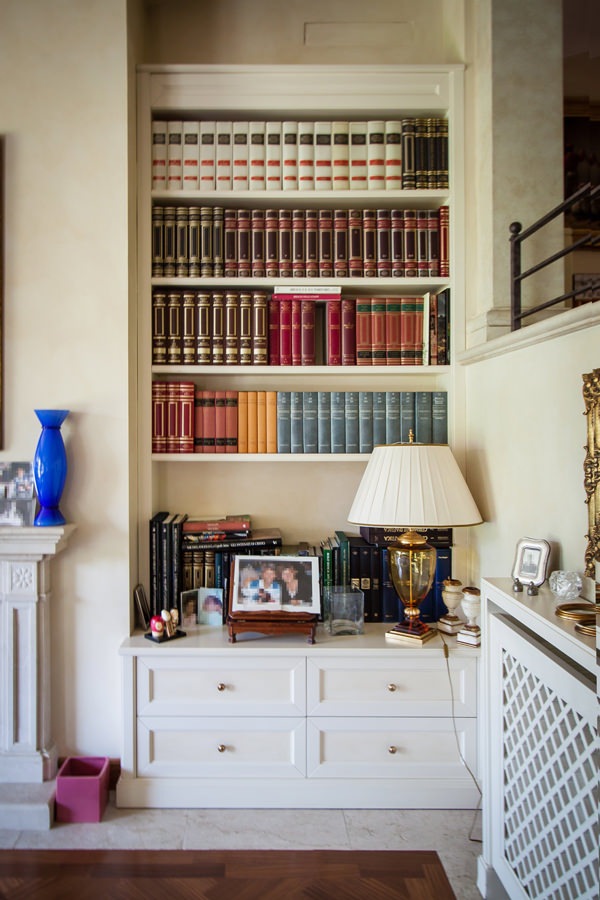
The profile of the internal shelves, slightly recessed, is a shrewdness that makes the aesthetic impact of the element lighter, recalling the characteristics of the classic style.
The painting of the walls in a warm slightly cloudy tone acts as a leitmotif in the different rooms, enhancing the light furnishings.

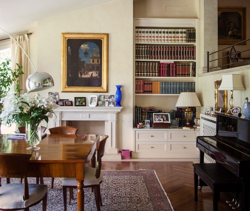
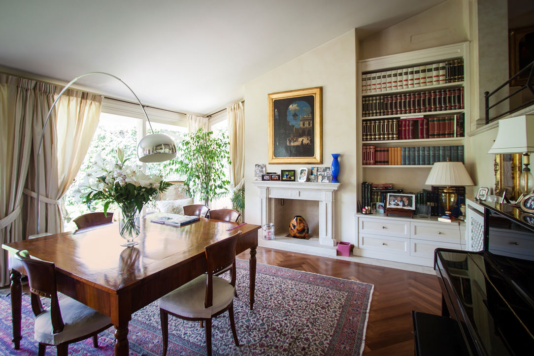
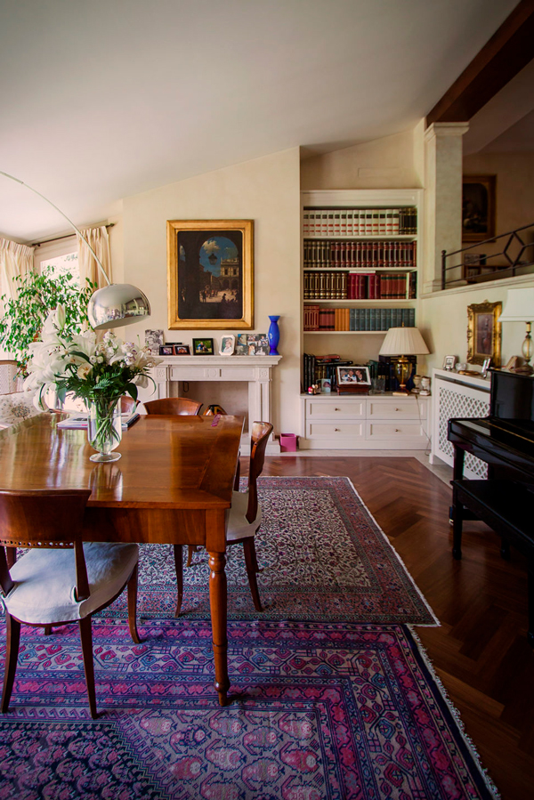
The living room has a central solid wood main table matched with other antiques that give elegance and prestige.
Among these, the large damask carpet, the adjacent wall piano and the Arco lamp by Castiglioni, a timeless design icon.
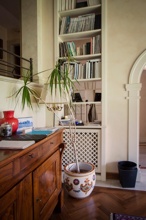
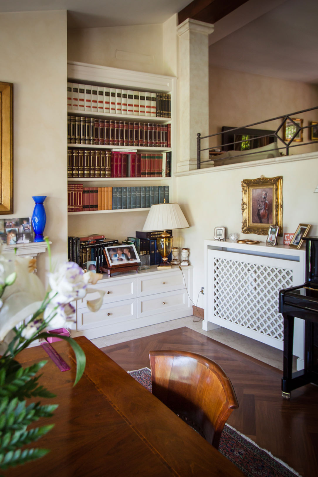
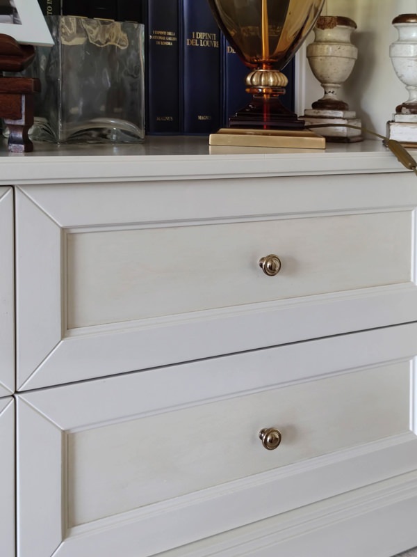
Low cabinets, honeycomb radiator covers and niche bookcases with recurring aesthetic characteristics accompany them. Moldings, doors decorated with tone-on-tone knockouts and brass knobs are in perfect classic style.
The chosen color of a light cream makes the interiors elegant, softening their features.

bookcase in niche details classic furnishings in the living area
details equipped windows bookshelves wooden furniture
classic style living room wood table
living room furniture classic niche bookcase
front molded drawers in classic style, tone-on-tone
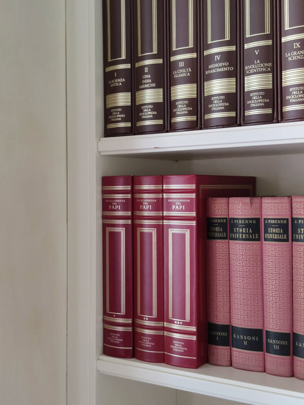
bookcase niche living room classic furniture shelves

From the equipped corridors to the sleeping area

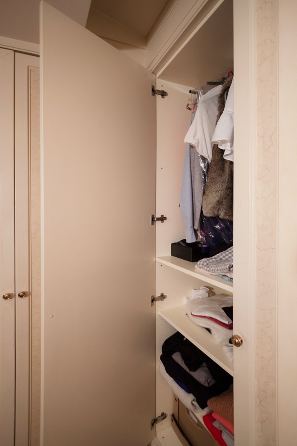
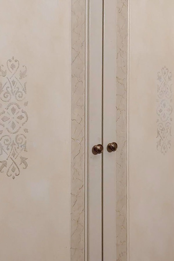
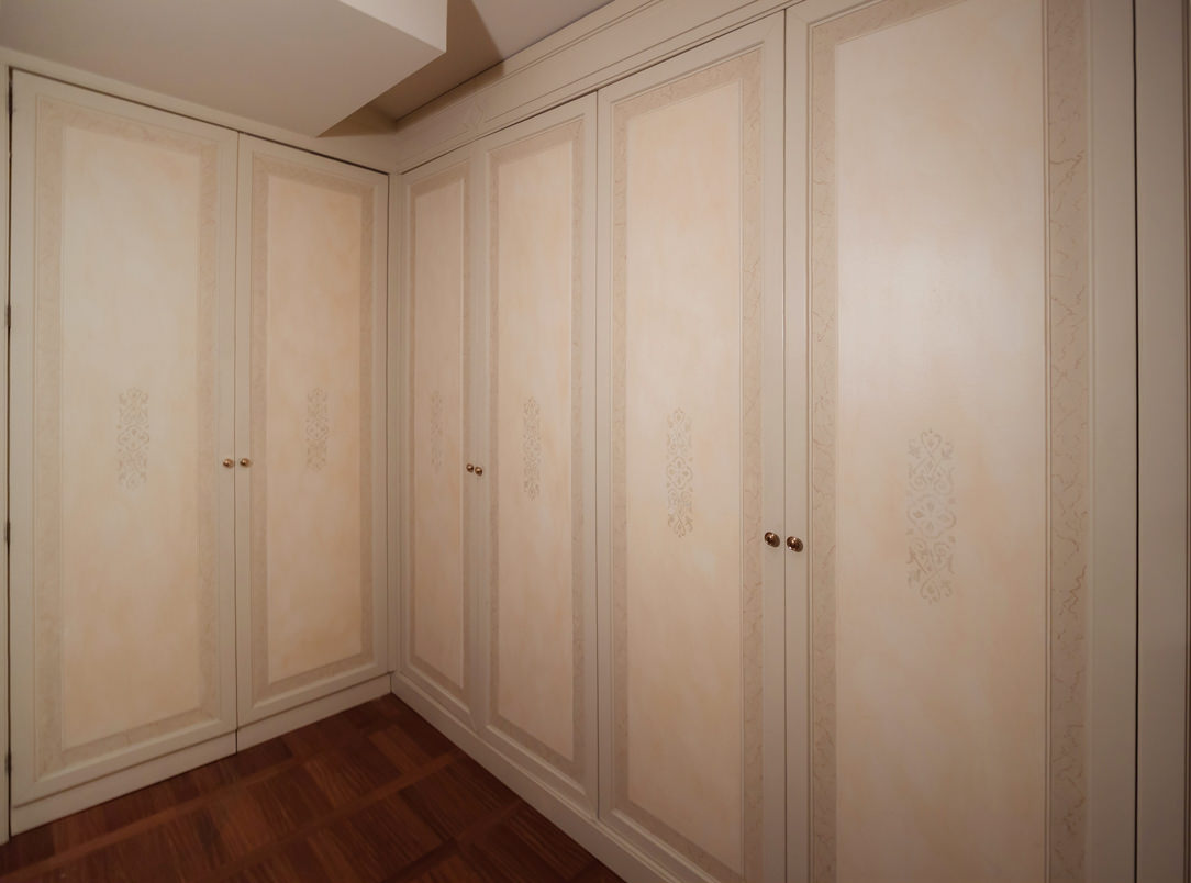
To anticipate the sleeping area, the corridors and passageways are equipped with full-height service wardrobes. These reproduce the characterizing lines of classic style furnishings, enriched with decorative floral motifs in a slight chromatic contrast.
The warm tone of the walls is echoed by the knock-out of the doors in a delicate tone-on-tone play. Internally, shelves and hangers alternate to make the most of the environments.

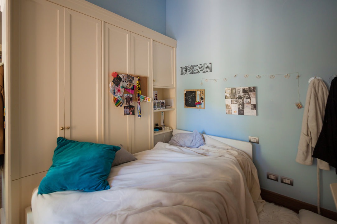
In the sleeping area, the bedroom uses a double-sided wardrobe that fits into the dividing wall between the sleeping area and the study corner, now equipped for distance learning. A structure with delicate warm tones which, combined with the light blue walls, is even brighter and fresher. Classic-style doors accommodate internal shelves and hangers, while in the terminal part they incorporate open compartments for small objects.
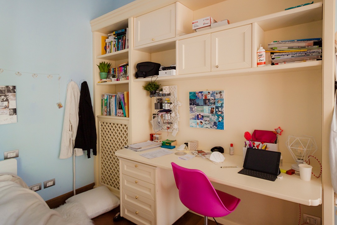
At the front, the equipped wall alternates shelves with wall units with molded doors, creating a dynamic visual rhythm. In the lower part there is a desk with a chest of drawers incorporated into the structure.

classic style bedroom bed
classic style bedroom desk
classic style wardrobes interior
detail decoration doors classic style furniture
classic style wardrobes decorated cream colored doors

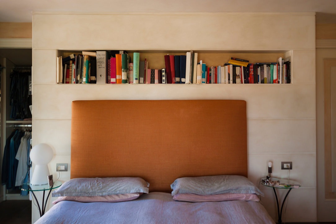
The master bedroom stands out for its contemporary elegance that only delicately hints at the classic tones of the remaining rooms. The caramel-colored padded headboard of the large double bed rests on the rear structure equipped with a front day compartment and bookcases along the side shoulders. To recall the classic style of the furniture is the linear aesthetic of the back wall with panels spaced at a fixed distance.
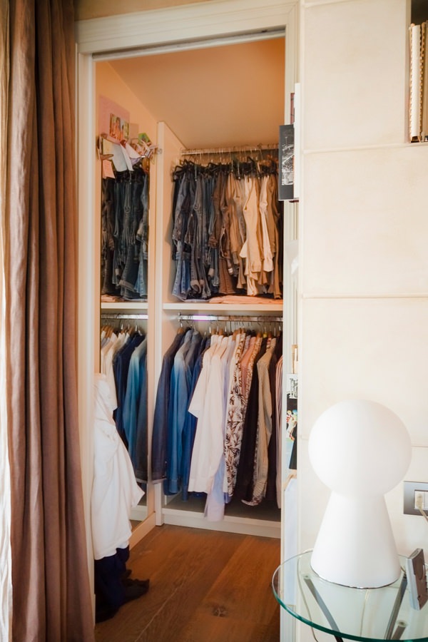
On both sides of the bed there is the access to the walk-in closet, contemporary in its design lines but with light tones that reflect the colors of the remaining furnishings.

cream colored shaped kitchen lacobel wall units
walk-in closet retro bed classic contemporary style
niche bookcase detail with headboard thickness
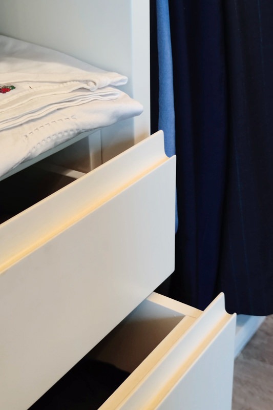
detail handles hollow linen drawers walk-in closet rear bed
internal walk-in closet chest of drawers hanging mirror
horizontal classic bathroom

The introduction of the contemporary style through the refurbishment of the kitchen

The timeless beauty of classic furniture, rediscovered even today, is confronted with the desire to renovate the interiors.
In terms of functionality and typology, the kitchen is the environment that best lends itself to a stylistic change with a contemporary flavor. Here then, after simplifying the existing doors with a linear aesthetic, this room also fits harmoniously into the existing complex.
A touch of lightness that balances the stylistic imprint of the villa.

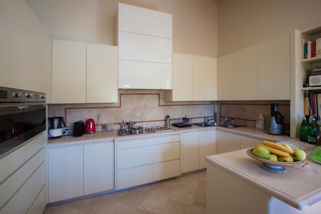
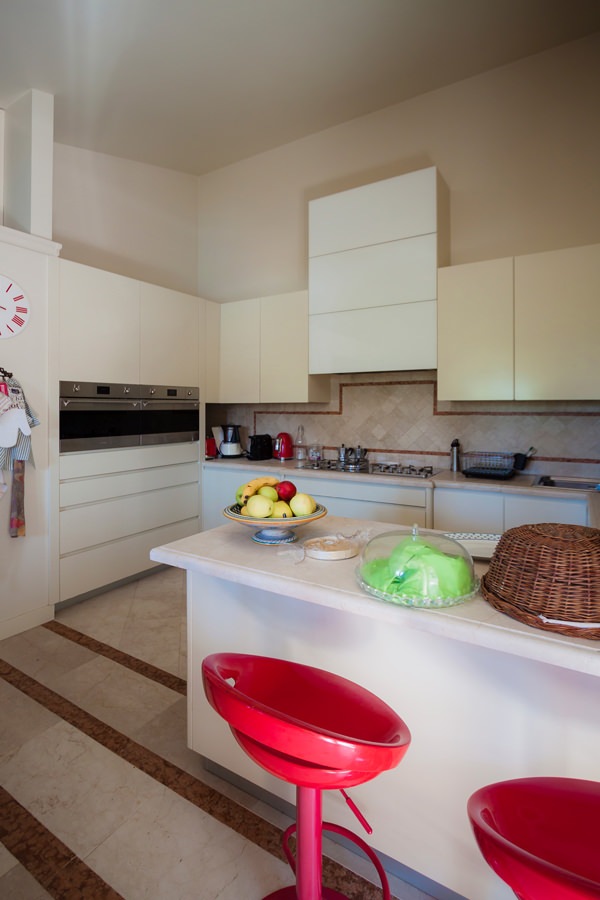
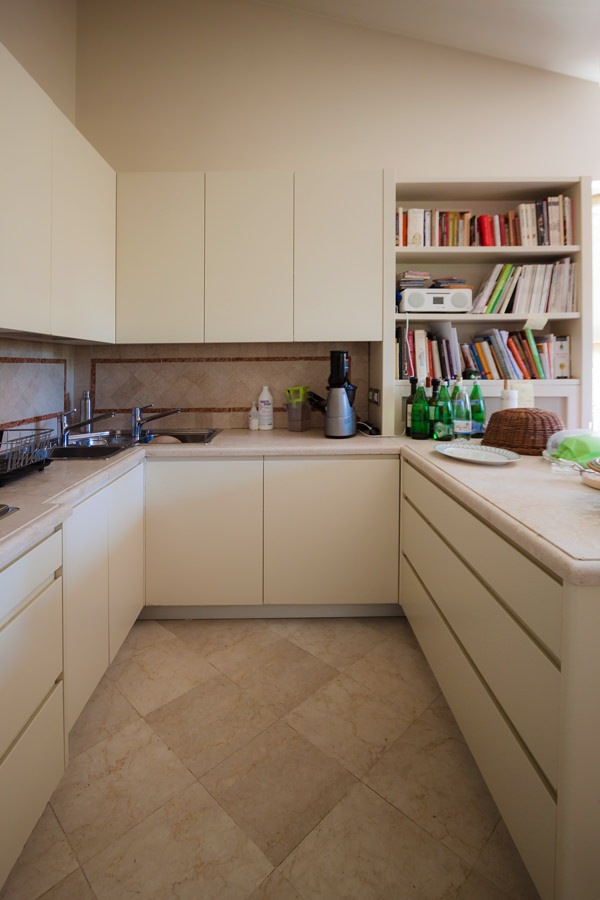
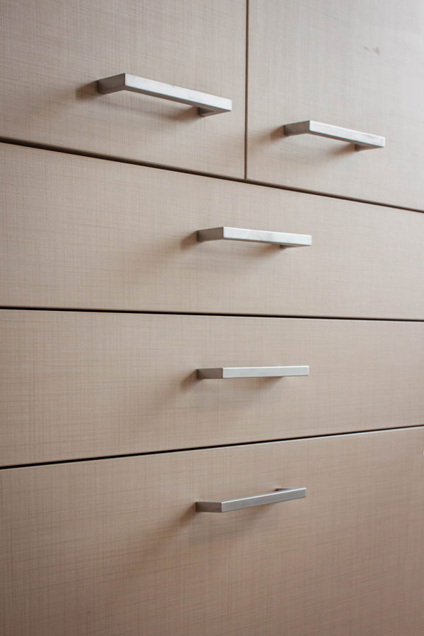
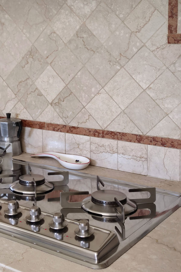
Preserving the top and the back surface of the terracotta kitchen with brick-colored geometric decorations, the refurbishment involved doors and front drawers of both the base units and the upper wall units. Recessed handles with a linear aesthetic and matt lacquer in full contemporary style are spread over the entire kitchen and the volume of the peninsula used as a snack bar placed at the front.
The hood, previously chosen as a “design” type, was inserted in a built-in structure entirely covered in white Lacobel, capable of giving brightness to the environment.
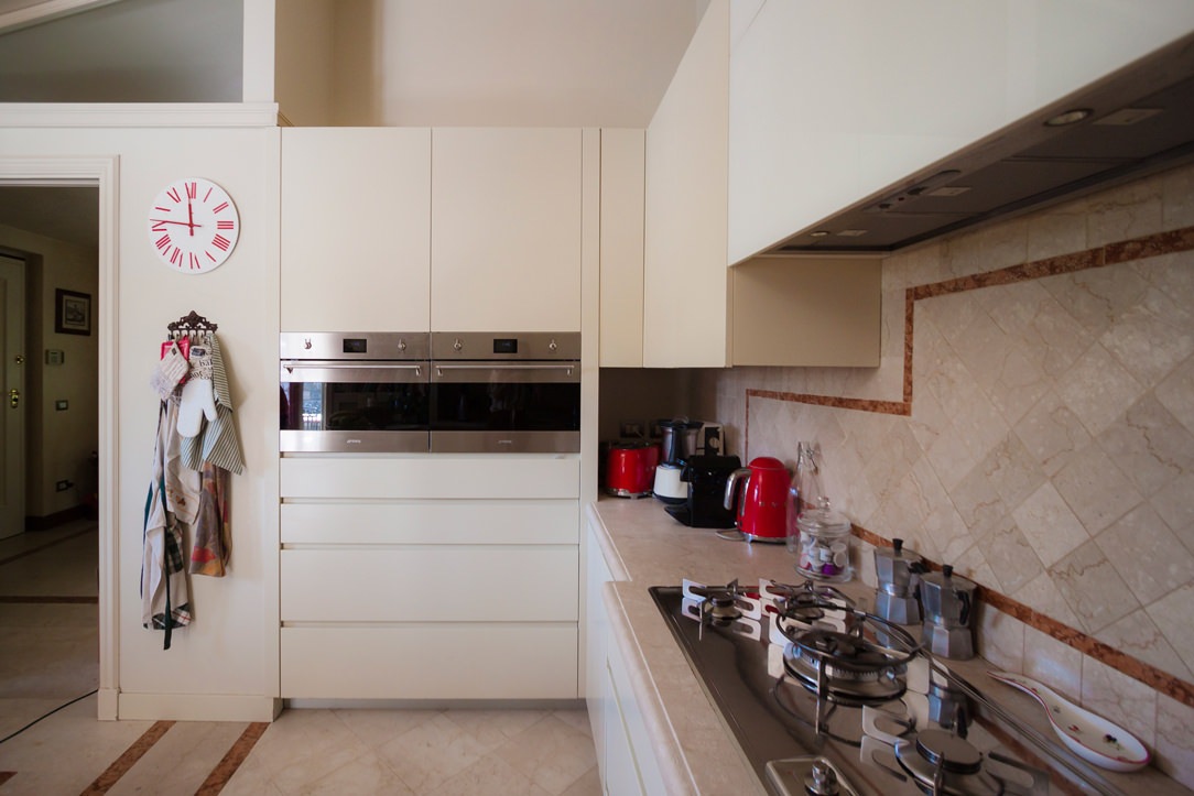
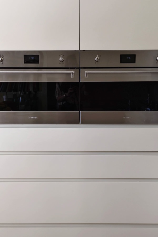
Appliances are also being renovated, including the built-in refrigerator and the pair of Smeg column ovens.

tubular horizontal hangers optimize coats space
contemporary style kitchen top snack bar red stools
modern classic style kitchen renovation on the peninsula side snack bar
modern classic kitchen 4
gas hob kitchen kitchen makeover
column ovens smeg contemporary kitchen drawers hollow handles

Conclusions: customize the classic furniture

The classic style, which today is witnessing a rediscovery, is easily combined with the essentiality of the contemporary style, creating an interesting combination. Restoring the stylistic balance of the interiors can also mean finding the right combinations between different styles, giving a decisive impression to the house.
To learn more, another example of a house with contemporary style and classic kitchen.

Optimizing spaces with functional furniture: a studio apartment in Milan

Optimizing spaces with functional furniture: a studio apartment in Milan

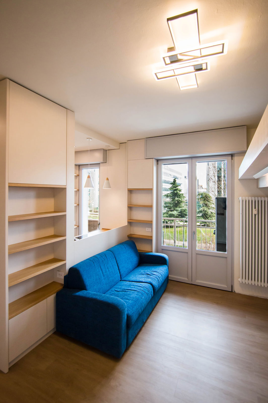
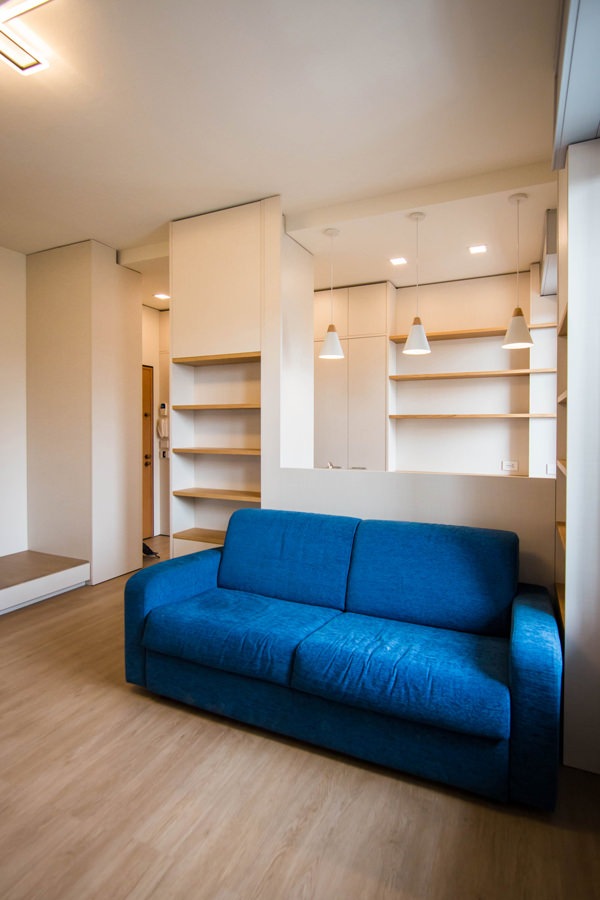
A studio apartment in the suburbs of Milan able to optimize the available space with functional furniture. The choice of materials expresses simplicity and naturalness, to make the bespoke interiors of this welcoming apartment contemporary.

living-room-studio-apartment-open-table-position-optimizing-spoaces-with-functional-furniture
studio-apartment-with-furniture-to-optminize-space-01

A cozy looking studio apartment in Milan

We have already addressed the issue of living in small spaces with this minimal style apartment in the heart of Milan. After a few years, the need to optimize spaces has not lost interest but has instead increased the demand for functional furniture. The example of this studio apartment in the suburbs of Milan best expresses the concept of practicality combined with a natural aesthetic line.

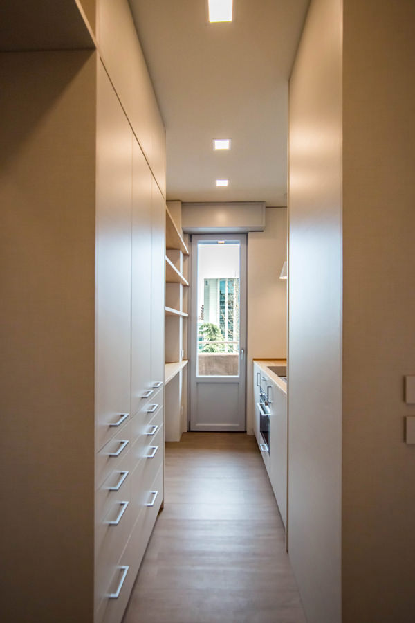
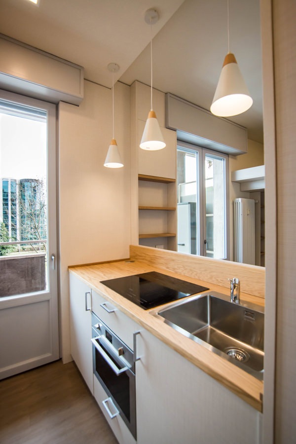
Starting from the original structure of the apartment, the renovation project began primarily with the spatial organization of the rooms. The entrance, working as a filter, acts as a pivot for the management of internal flows. From the front opens the view of the kitchen, essential but well equipped, which visually communicates with the loft living area where a large bed is located.

On the left of the entrance is the anteroom, equipped as a closet with service wardrobes. From here, direct access to the bathroom with a large glass shower and sink area with service cabinet.

equipped-columns-shelves-and-doors-living-room-optimize-spaces
equipped-wall-detail-furniture-to-optimize-spaces
living-room-desk-furniture-to-optimize-spaces
kitchen-access-with-full-height-doors-to-optimize-spaces
side-view-kitchen-with-windows-on-living-room-optimize-spaces-with-furniture

Furniture designed to optimize space

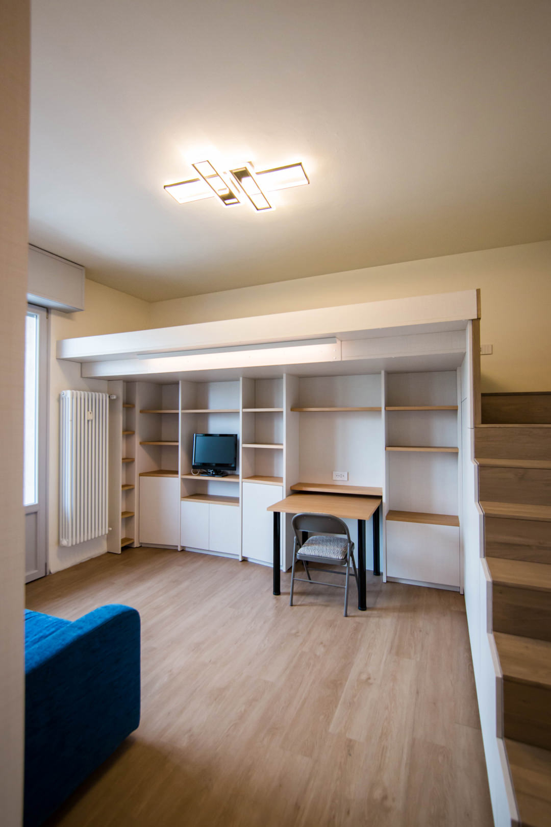
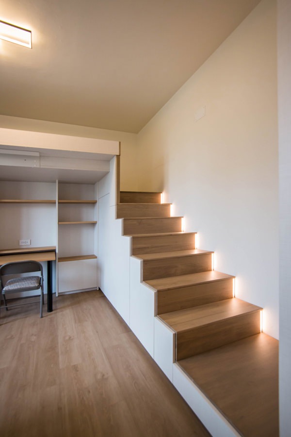
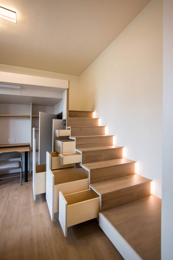
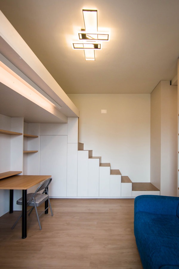
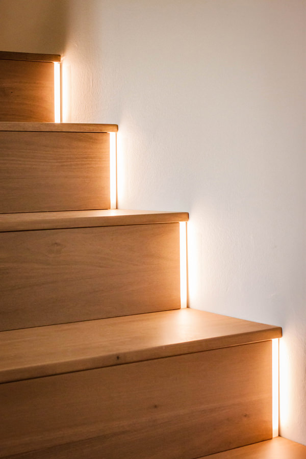
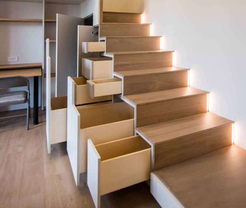
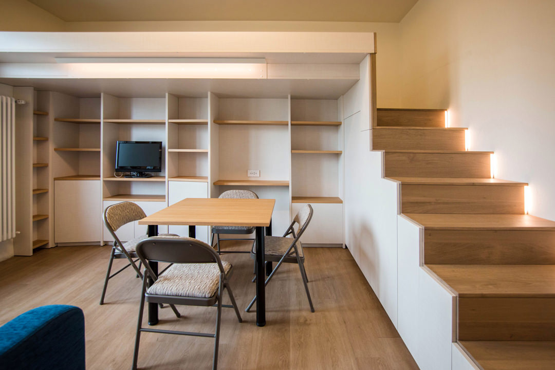
To make the most of the available space, the furniture of this studio apartment has been custom designed by obtaining service rooms from structural voids and architectural constraints. The best example is certainly the creation of the under-stairs compartment with doors and push-pull trays useful for arranging objects of various sizes. In fact, starting from the modularity of the risers and treads of the access ladder to the mezzanine, doors are created with a vertical reading whose opening takes place via push pull. Depending on the need, each internal compartment takes up the space of two or more steps, equipping itself with additional extractable volumes where necessary. From this perspective, the dining table can also be in a resting position, attached to the equipped wall of the TV area and used as a desk, or moved to the center of the room to accommodate other diners.

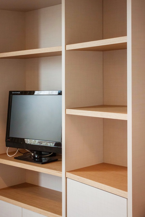
Even the equipped wall, to gain additional service space, is made up of three distinct modules, the sides of which are slightly inclined. The shaping of the different elements allows an optimal management of the architectural corners, also creating a greater sense of welcome.

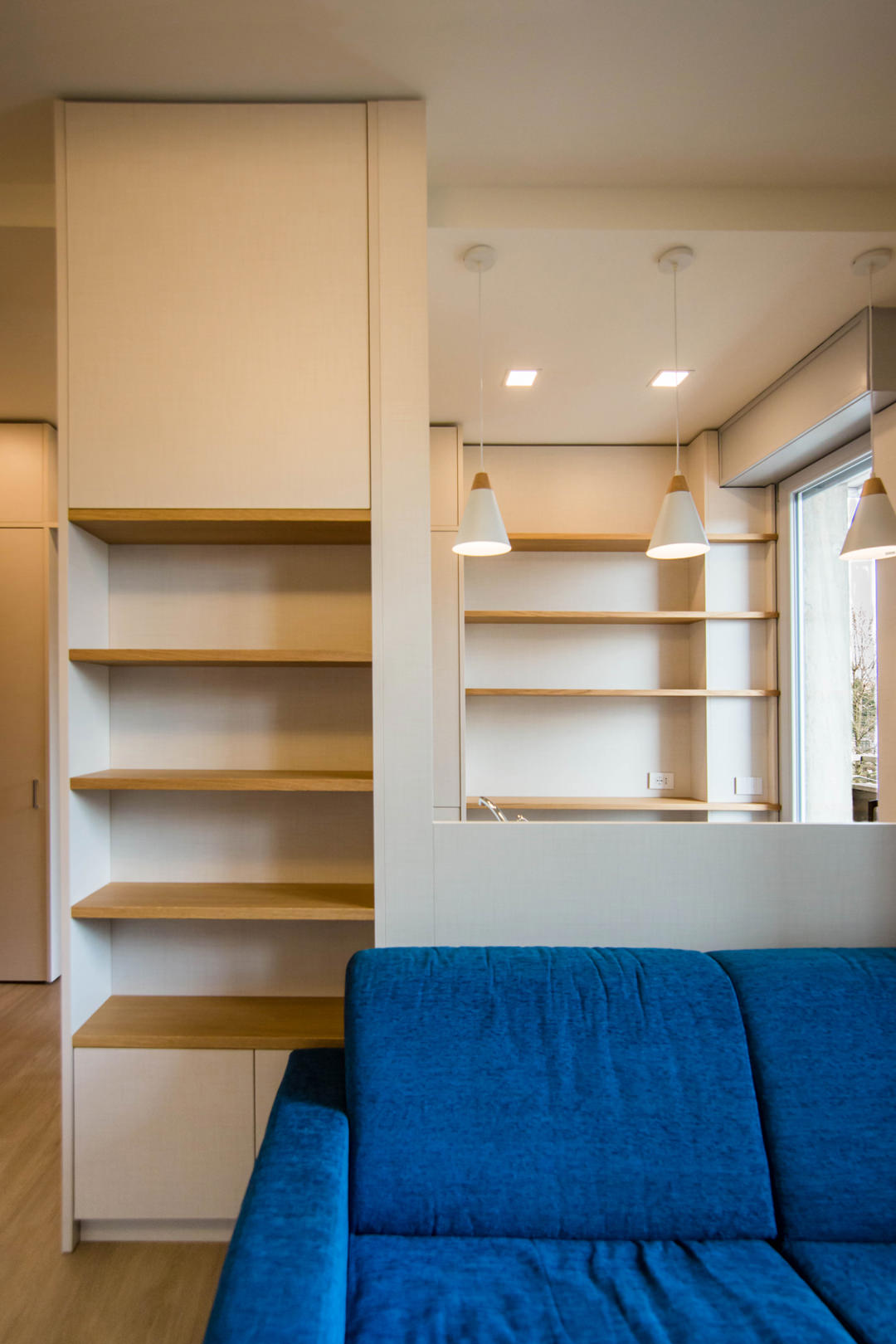
The architectural void then becomes the new design theme, equipping cavities and niches with shelves and open compartments. This is the case, for example, of the main pillar, incorporated in the dividing structure between the kitchen and the living area. The lower part houses internal shelves accessible through a door with push opening, while the upper part consists of exposed shelves in the niche.

under-stairs-equipped-closed-doors
under-stairs-equipped-open-doors-to-optimize-spaces-with-furniture
living-room-studio-apartment-milan-natural-material
front-view-equipped-under-stairs-compartments
kitchen-doors-to-organize-spaces-drawers-furniture-to-optimize-space
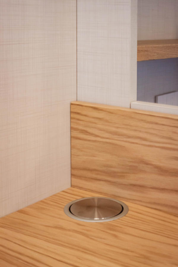
electrical-tower-down
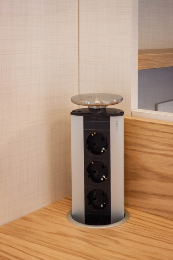
eletrical-tower-up

Functional but also conceptual steps

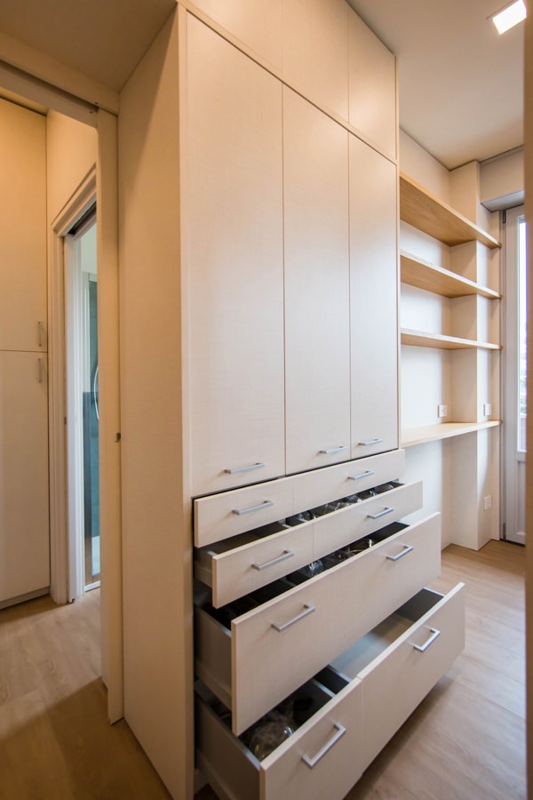
Another focal point is the anteroom, which from an environment required by law also becomes a useful space for the storage of cleaning products and service cabinets. Drawers and doors with height-adjustable internal shelves are used for the products storage of different sizes.

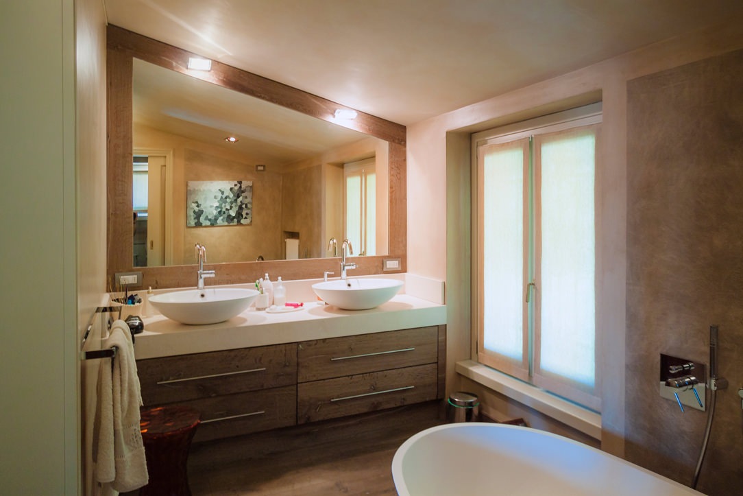
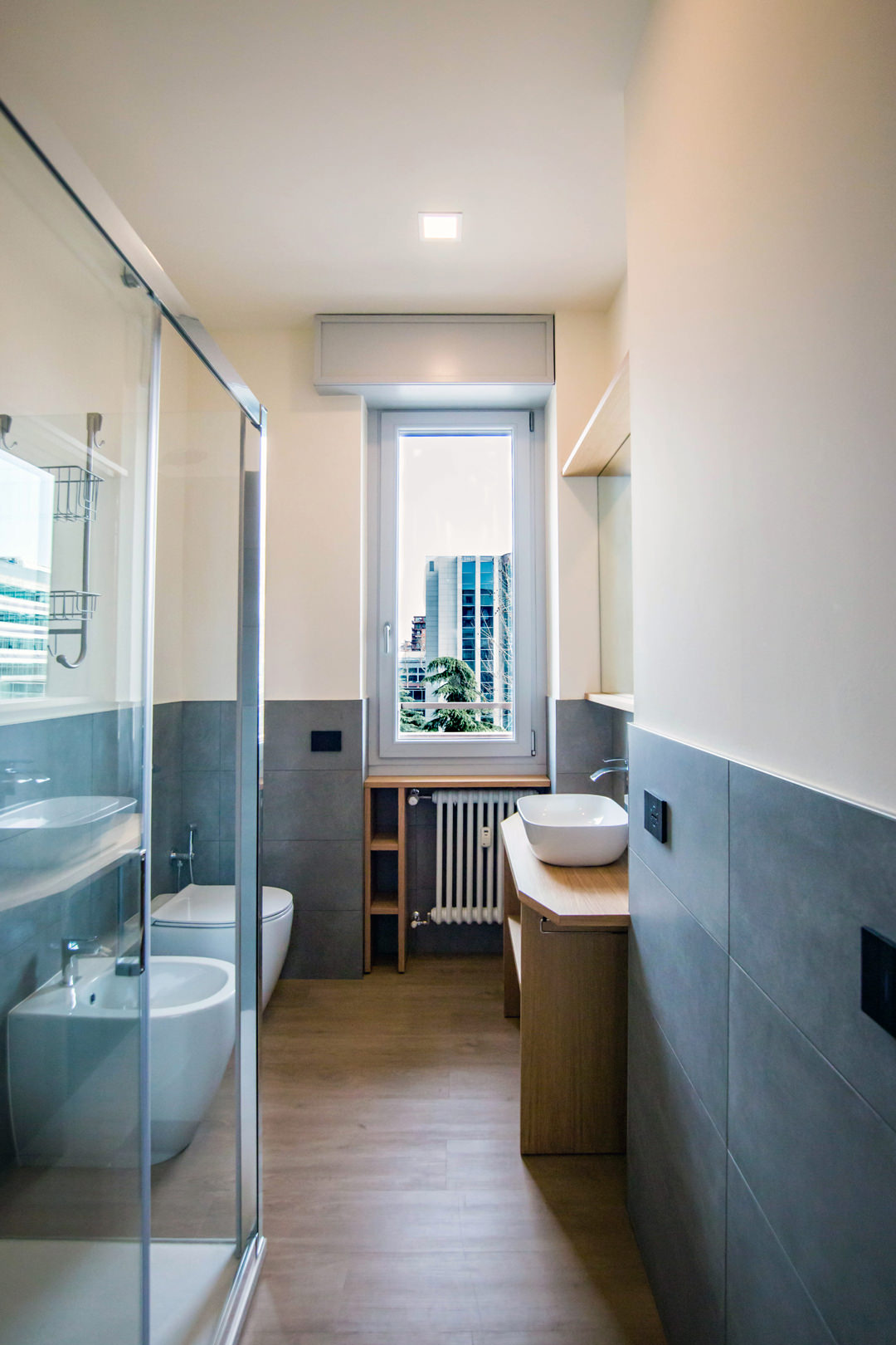
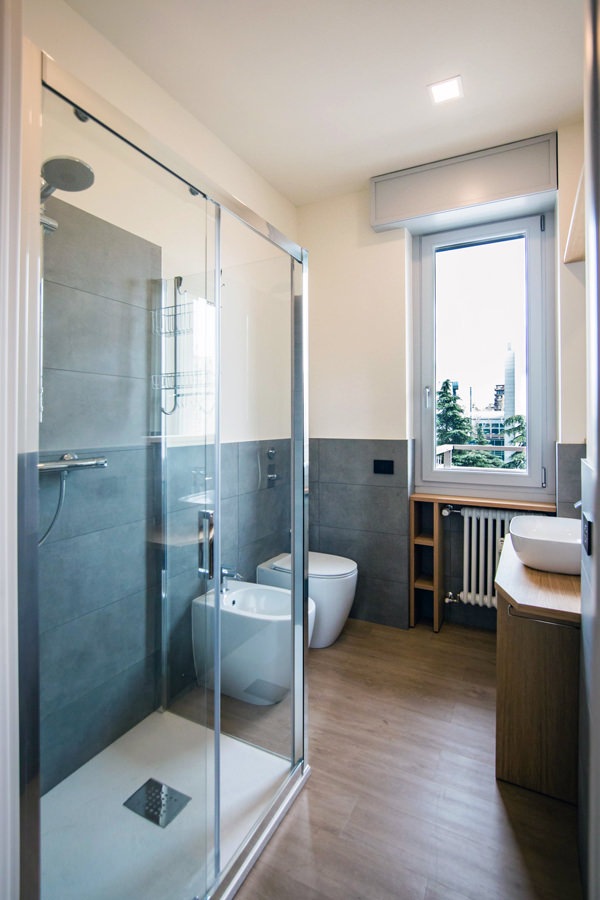
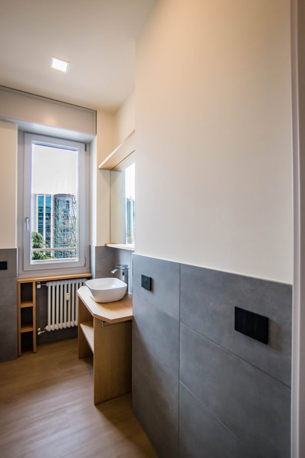
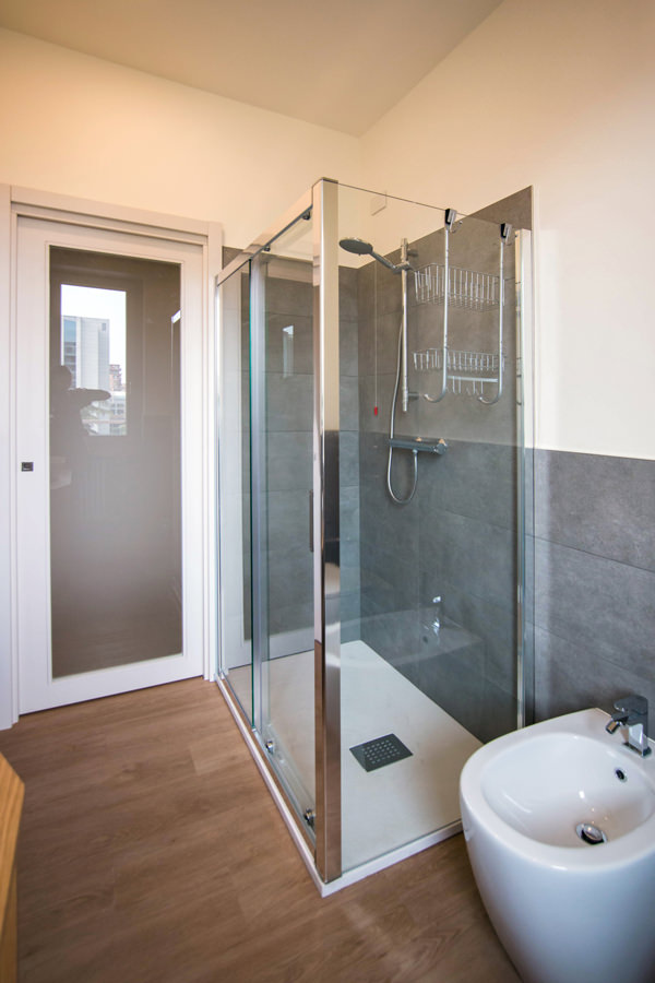
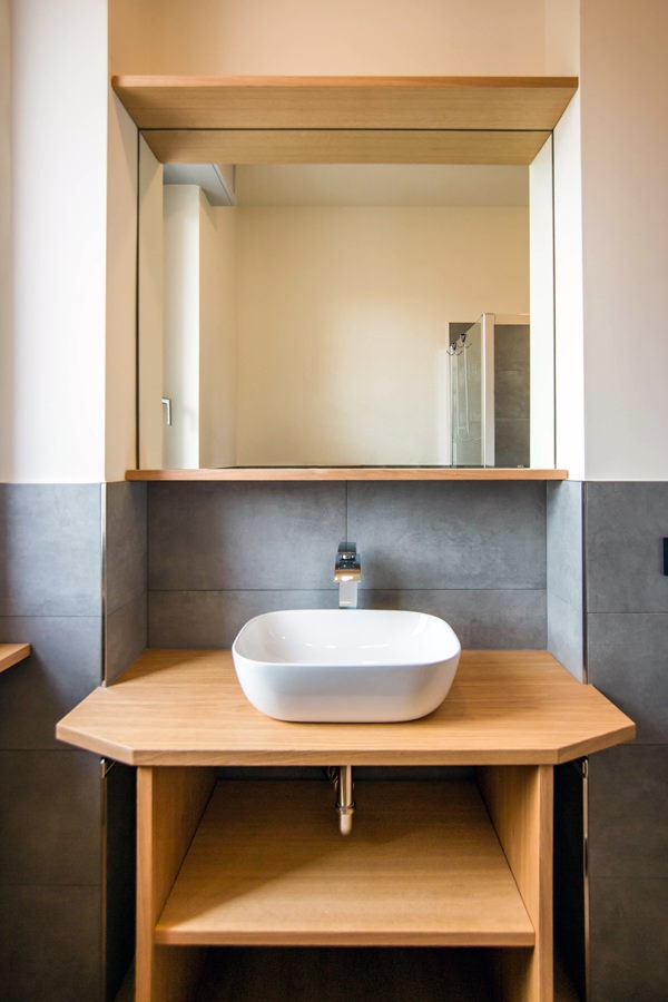
Even in the bathroom, the design of the furnishings in order to make them functional gives life to a large and bright environment. The change of flooring marks the transition not only physical but also conceptual and visual to a more intimate and reserved environment. The front view on the window offers ample natural lighting, diffused throughout the room thanks to the choice of materials. The glass closure of the shower minimizes the aluminum details, while the large mirror attached to the service cabinet expands the perception of space.

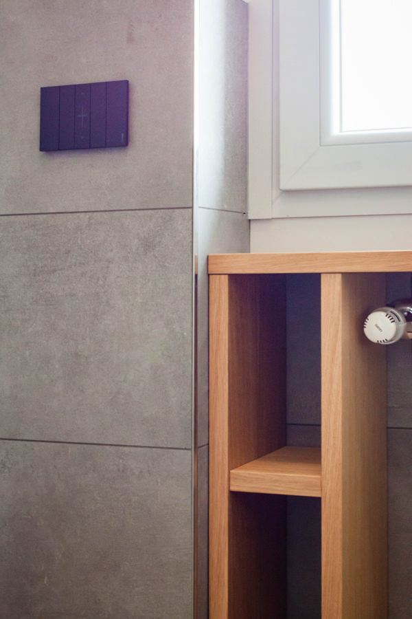
Optimizing the space in the bathroom means taking advantage of all the service cavities: an example is the open oak cabinet under the window. The service shelves for toilet paper and small personal hygiene products in wooden finish in fact obtain their space on the side of the radiator, without however being oppressive. Small accessories such as the pull-out towel holder enrich the functionality of an aesthetically simple and clean bathroom cabinet. Simple and authentic forms are thus valued.

equipped-anteroom-service-cabinet
optimize-spaces-with-functional-anteroom
contemporary-bathroom-gray-furniture-to-optimize-spaces
contemporary-bathroom-glass-door-shower
bathroom-studio-apartment-milan-optimize-spaces
glass-shower-bathroom-contemporary-gray
shaped-furniture-wood-bathroom

Natural colors and materials for a contemporary studio apartment

The practicality of the furnishings is not only found in their composition and spatial arrangement, but also in the choice of materials that characterize them. For horizontal surfaces, the choice fell on oak, a natural wood par excellence with great resistance and workability characteristics. Its aesthetic line with warm veins makes it welcoming and transmits spontaneity and tradition. From the parquet floor to the kitchen top and shelves of the open compartments, its presence becomes the touch of authenticity of the stylistic line adopted. For the vertical surfaces, on the other hand, the canvas bilaminate was chosen, whose warm but neutral tones make it delicate but incisive at the same time. Among the major advantages of this material, it certainly has high resistance combined with a very affordable price. Its finish also makes it soft to the aesthetic impact and textured to the touch, expressing attention to detail.

detail-LED-light-stairs
detail-canvas-bilaminate-doors
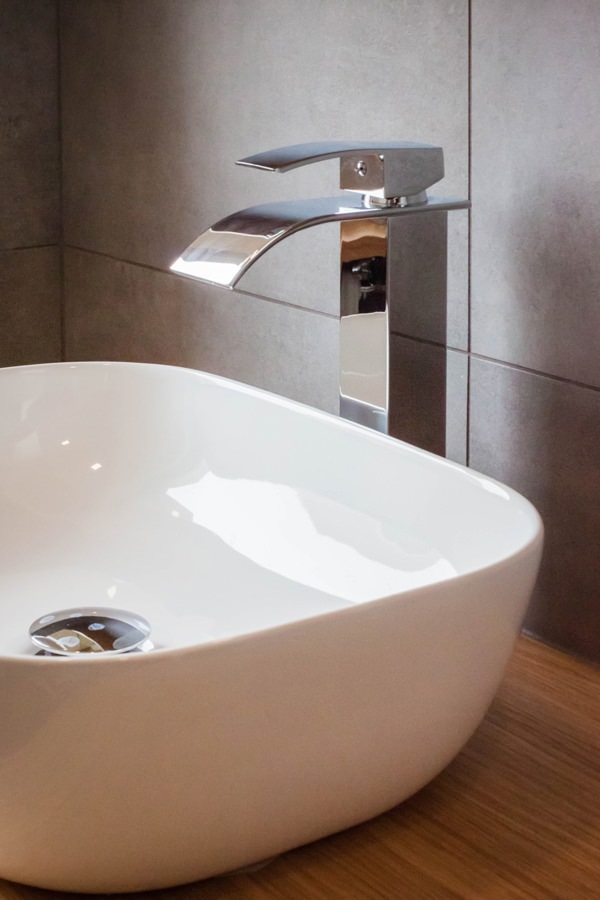
bathroom-countertop-basin-design-tap
detail-customed-bathroom-furniture

The renovation of this studio in Milan involved all levels of reading of the project. From the planimetric distribution of the rooms to the choice of materials and finishes. The choice of functional furniture allows you to optimize spaces by providing environments that are not only aesthetically pleasing but also practical and easily livable.

Architectural voids and structural elements hide great potential, just look at them with creative eyes!

To see other examples of small rooms optimized in spaces with functional furnishings, you can take a peek at this minimal style studio apartment or at this shabby chic style creation

Luxury style: care of detail and high quality

Luxury style: care of detail and high quality

Timeless and always updated, the luxury style is surrounded by refined and elegant interiors. The care of detail goes perfectly with the choice of high quality materials, manufacturing and design.

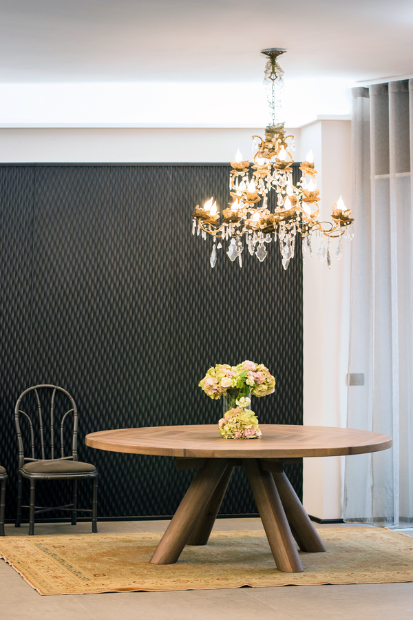
Luxury living room

Zona living in stile luxury. GEZA Gri e Zucchi Architettura, DLN Penthouse. Foto: Gianni Antoniali

Modulor elegant dining room

Careful furniture selection for this Modulor dining room

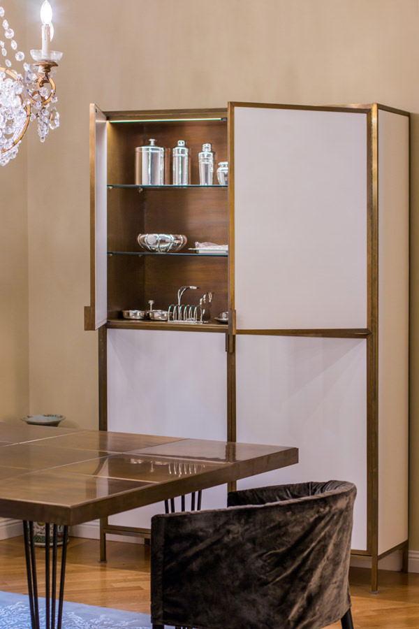
Modulor burnished brass display cabinet

Burnished brass details enrich this display cabinet in the living room

The luxury style in the western concept

Speaking about luxury style could means excess and opulence of Arab culture with furniture covered in gold leaves, mirrors and golden mosaics with excessively sinuous lines. It is therefore important to refer of this style in its western concept, which renounces opulence and excesses dictated by a deliberately exhibited richness in favor of attention to detail and refined preciousness. The luxury style in its western sense rather expresses a taste of elegance and uniqueness of the products, often owner-oriented designed.

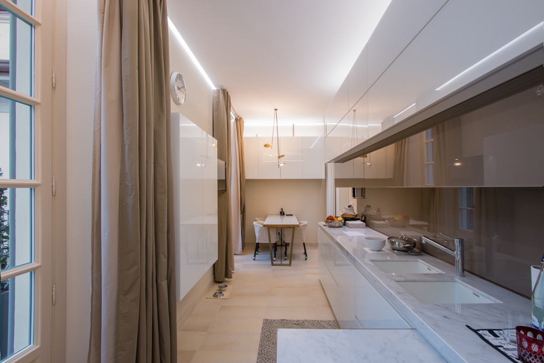
Modulor luxury kitchen Milan

Plays of reflections for this Modulor kitchen of neutral colours

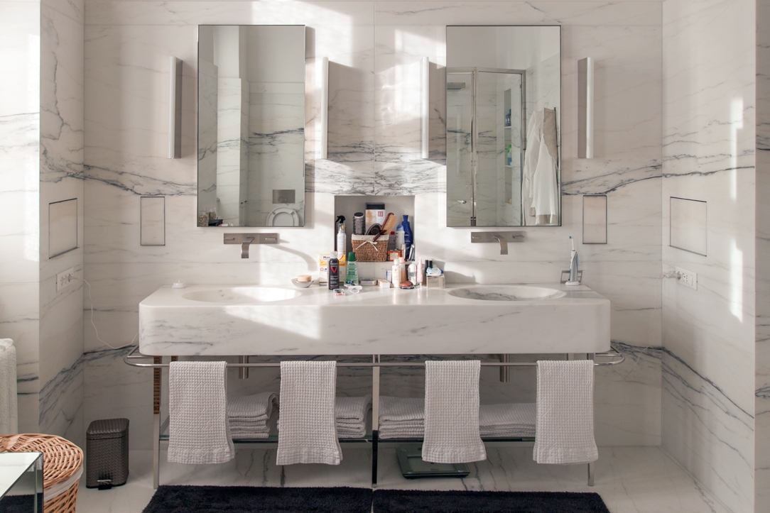
luxury industrail apartment 08

An entire marble covering bathroom shows all its elegance between linear shapes and polished metals

Finishes and material

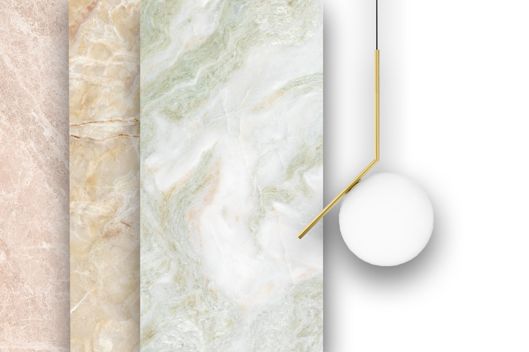
Traditional materials are chosen for their timeless beauty, even more if characterized by a fine finish. Without a doubt, the luxury style is the explosion of the marbles in their most colorful veins. Coming from all over the world, they show their preciousness with strongly characterizing ventures or slight chromatic alterations. The precious essences of the wood are also protagonists, often matching refined finishes. These were accompanied by fabrics with particular textures and the inevitable velvets, which have come back into vogue in recent years. The heart of luxury style lies in privileging quality: quality of materials, manufacturing and design. In its contemporary sense then, the luxury style meets brass details, inserts in painted glass and plays of reflection of shiny materials.

Modulor luxury materials selection

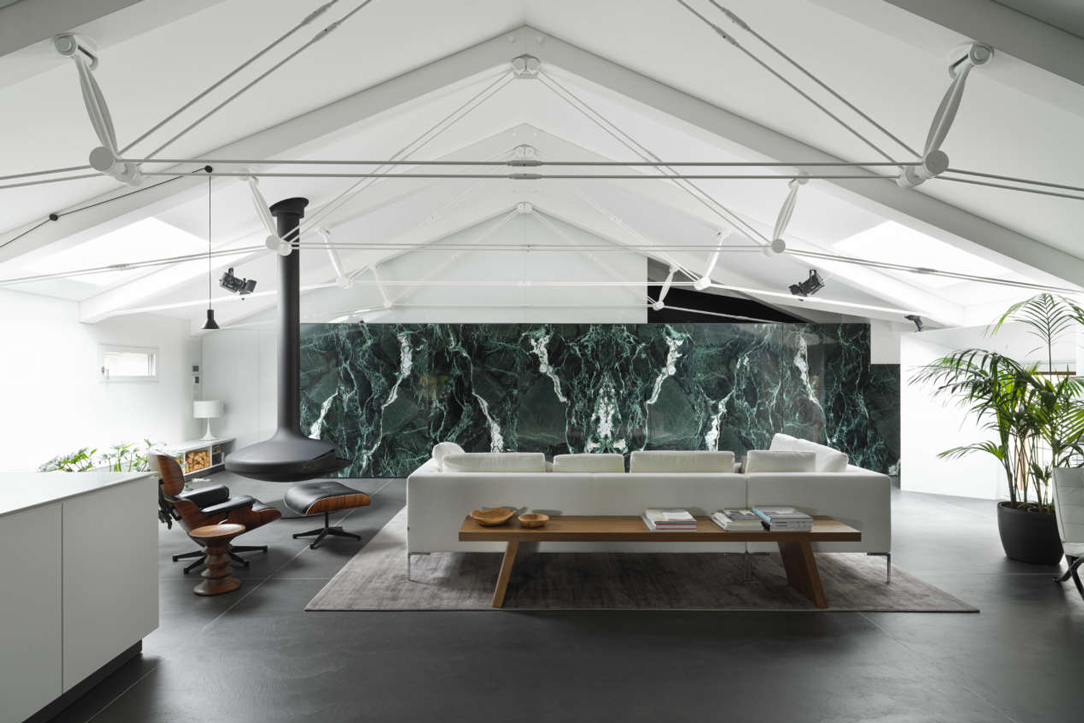
The marbles in the most colorful essences are the undisputed protagonists of the Luxury style

luxury fabrics Milan apartment

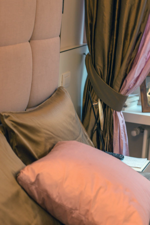
Velvets, suede and metal effects for this Modulor-signed bedroom

Modulor wooden finish

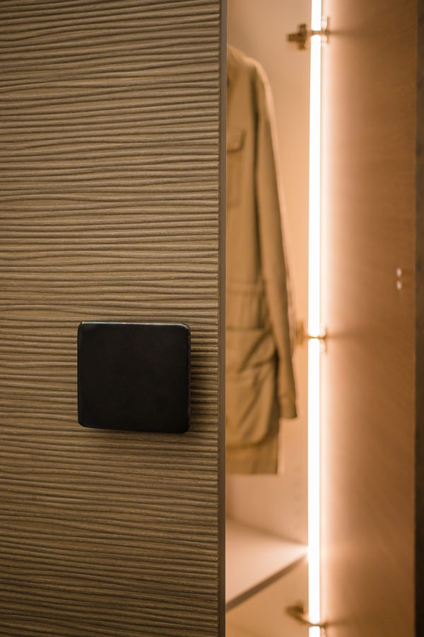
Inner lighting and wooden textured covering for this luxury wardrobe

Modulor selection luxury furniture and fabrics

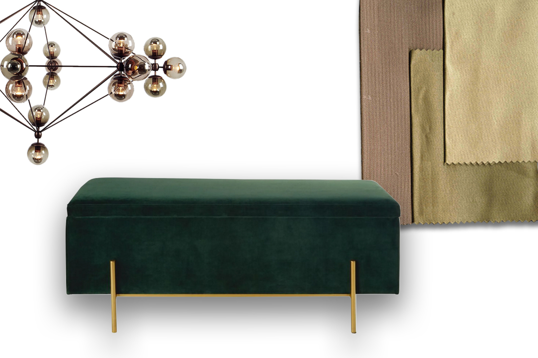
Velvet and fine fabrics accompanied by metal finishes enrich the furniture.

Modulor 3D wood finish

An elegant and contemporary 3D finish for this Modulor work

The contemporary luxury style

One of the most constant styles in the history of interior design, it owes its continuous success to the ability of adapting to stylistic changes over the years. Contemporary luxury in particular eliminates even more excesses and extravagances. In combination with the minimal style, it becomes more and more a sort of “added value” inside the domestic interior, standing out for its particularity. It tends to enhance the interiors in which it is, rather than the single product, becoming an elegant but delicate stylistic imprint. Contemporary luxury is a lover of brass finishes, even better if combined with velvets and suede. It meets stylistic variations according to the context. It manages to appear light and delicate if contextualized in essential interiors or with a strong impact if set on dark color ranges.

detail hanoi vietnam

Care of detail and high quality materials for this prestigious Modulor work in Hanoi, Vietnam

master bedroom

Burnished brass and velvet define the details of this Modulor master bedroom

reference luxury bedroom
reference luxury living room
reference luxury kitchen

Selection of contemporary luxury references, between feeble chromatical palette and particular material finishes

Choosing the luxury style means choosing quality materials and refined design. Perfect for those who are addicted to details and a lover of elegance. Suitable for determined personalities and people fascinated by perfection.

How to equip a bathroom with laundry corner

How to equip a bathroom with laundry corner

A functional and aesthetic analysis of the laundry corner. An environment that in contemporary reality is forced to give up its autonomous room to blend in a small bathroom or equipped corridor. The aim is giving space to the services that define our daily life, making them aesthetically interesting.

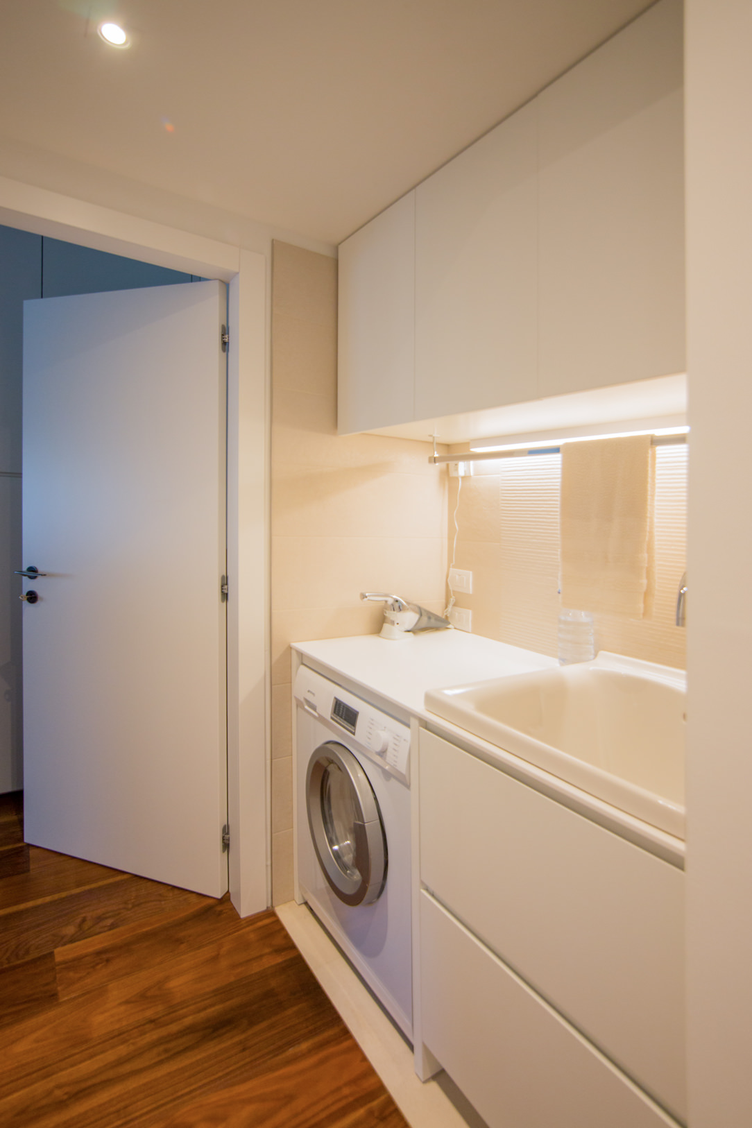
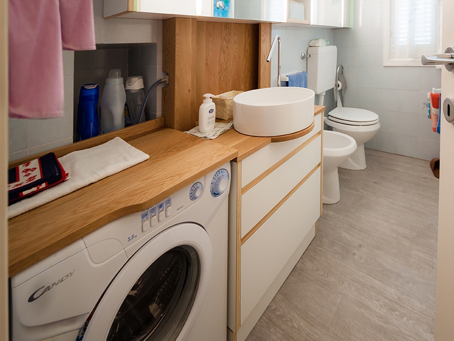
laundry corner

Laundry corner with showed washing machine, basin and compartments furniture

equipped corridor

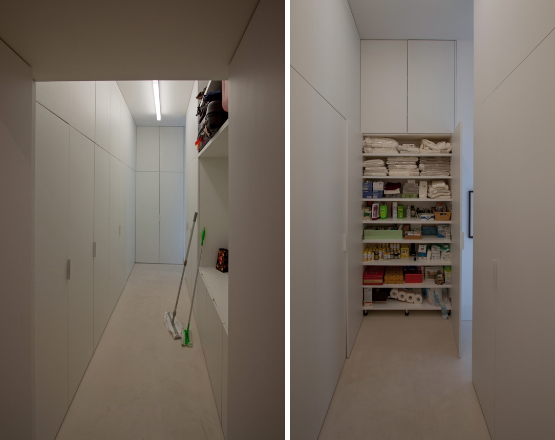
Optimize spaces equipping corridors with serviced wardrobes View the project

Space to services

Speaking of interior design, we are used to imagine elegant living rooms and modern kitchens, contemporary bedrooms and essential-style dining rooms. Over the past few years , the interior design has increasingly taken on the aesthetic meaning of architecture. Let’s remember, however, that design was born as the perfect combination between aesthetics and functionality. The morphology of furniture is nothing else than the natural result of perfect efficiency. It is exactly with this spirit that we want to highlight those “corners of the house” that we usually tend to hide because they are not “beautiful” even though they are basics in the functionality of our domestic spaces. The project layout of each house gets us used to dividing rooms between “living area” and “bedrooms”. The first includes all those rooms that are used to welcoming guests, designed with the aim of return the best public images of the owners. In the “sleeping area”, the most intimate and personal rooms of the owners come to life. However, in this typological distinction are missing all the rooms which, whether private or public, carry out a real function. Among these, just think of the laundry room, which over the years has changed its conformation adapting to the needs of the time.

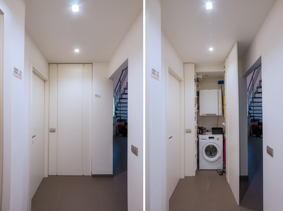
washing machine recess

A laundry niche uses the available passage corner to house the washing machine and shelves View the project

From public washrooms to bathrooms equipped with laundry corners

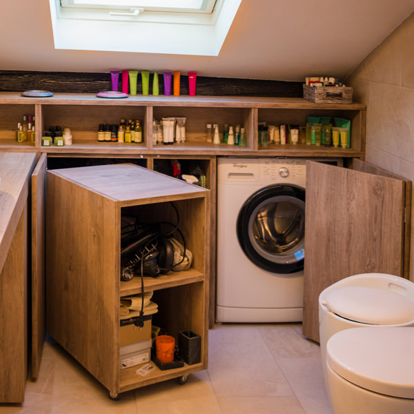
Over the years, the home laundry has become increasingly important in private houses. Whole rooms were equipped with basins and ironing corners, which gradually witnessed the coming of appliances capable of simplifying manual work and obtaining excellent results. Private rooms that replaced the traditional public lavatories for an increasingly elitist concept of personal care and cleaning. The widespread use of washing machines, and modern dryers, has meant that laundry rooms take up less and less space inside private houses. Furthermore, in the contemporary vision of the house, open spaces have swarmed the architectural panorama more and more, reducing the functional closings to the bare minimum. As a consequence, to optimize space, the laundry room is often eliminated in favor of bathrooms equipped with washing machines, dryers and service cupboards. Making the appliances “invisible” was the next step. Here then come equipped wardrobes able to hold not only washing machines and dryers but also baskets and pull-out compartments for cleaning products.
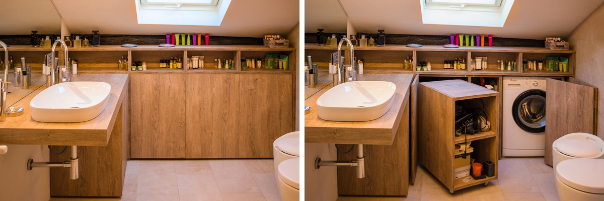
laundry bathroom detail

A bathroom with contemporary wooden surfaces hide extractable functional elements. View the project
Composition of a laundry-corner

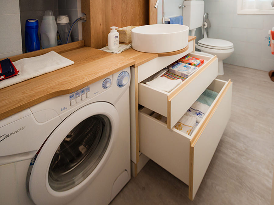
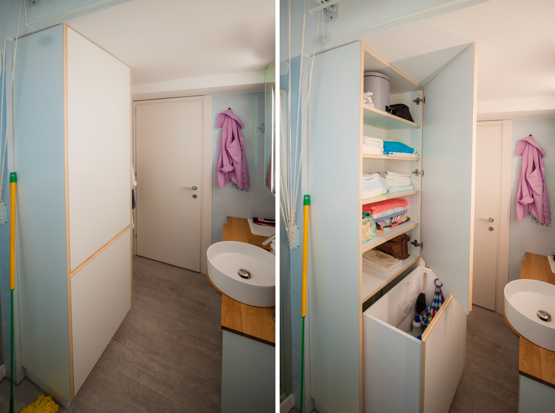
Equipping a bathroom with a laundry corner first of all means providing an insertion point for the washing machine. This can remain visible, favoring the opening of the porthole without interfering with any surrounding doors or being built-in the washbasin cabinet. To better hide the washing machine, however, it is necessary to provide a service cabinet that rests on the ground. It means excluding suspended solutions or light supports, and study a customed solution that allows the opening of the tray and the easily maintenance of the appliance. To this is often added a service cabinet with internal shelves and removable baskets that can contain cleaning products and accessories of different sizes. Often these latter two solutions come together in one, with folding or sliding doors, which act as a closure for the furniture element. Internal accessories such as dividers and hanging elements are additional options that can make the space more functional and optimize the overall dimensions.
bathroom with washing machine in view

The bathroom cabinet with wooden top and finishes houses the washing machine View the project

bathroom cabinet with open drawers

Drawers of different heights are extremely functional elements for organizing personal products View the project

bathroom service closet

A large service cupboard with internal shelves and removable basket for the bulky products View the project

It is the functionality that defines the composition of these equipped corners. Our task is to optimize spaces in the best possible way by creating practical and aesthetically satisfying solutions. Whether they are service points hidden in other rooms or clearly visible and recognizable elements, it is essential to be able to organize them in the best way, using all the available centimeters without however giving shape to narrow solutions.