Cream furniture for elegant interiors

Cream furniture for elegant interiors

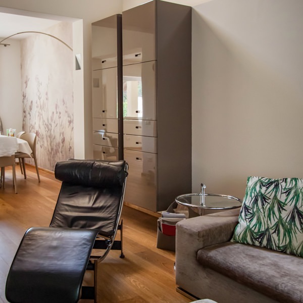
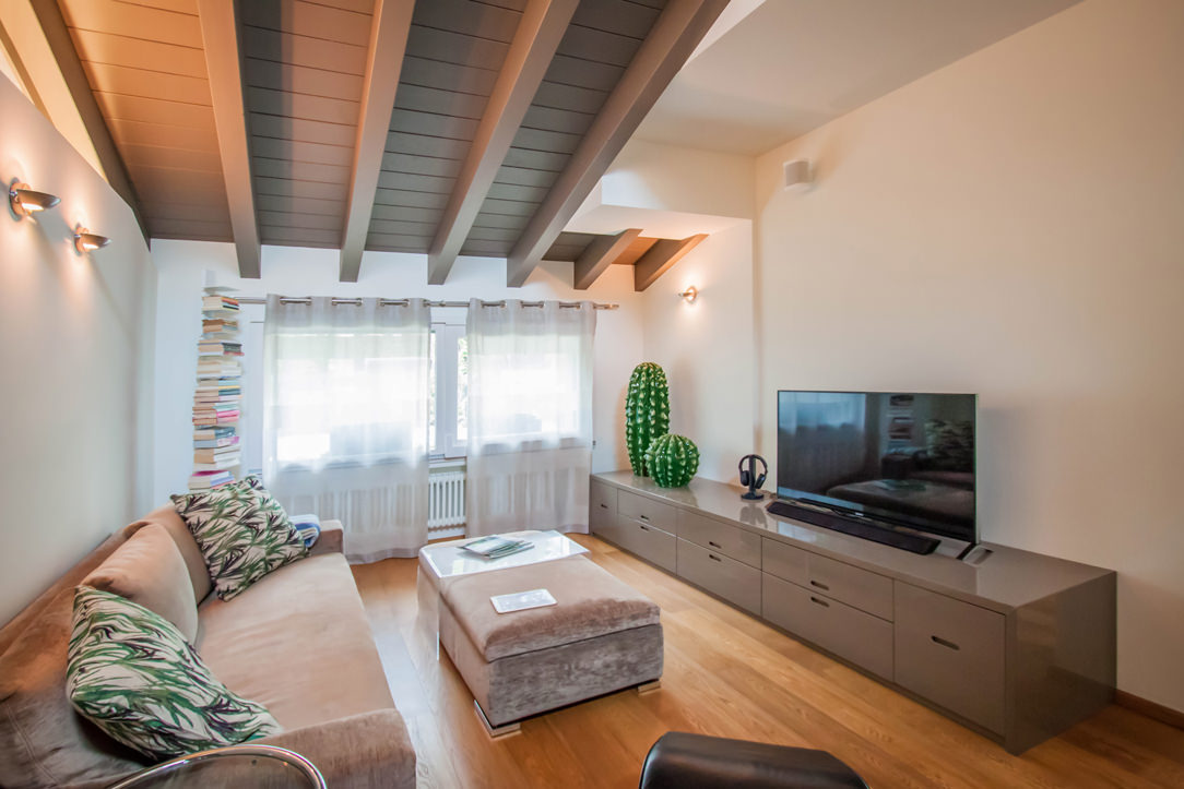
The elegant interiors of this apartment are recognized by the cream color of the furniture, declined in the different rooms with elegance and modernity.
The combination of materials with different finishes and nature creates plays of opacity and reflection.
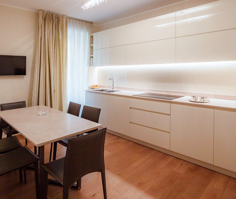
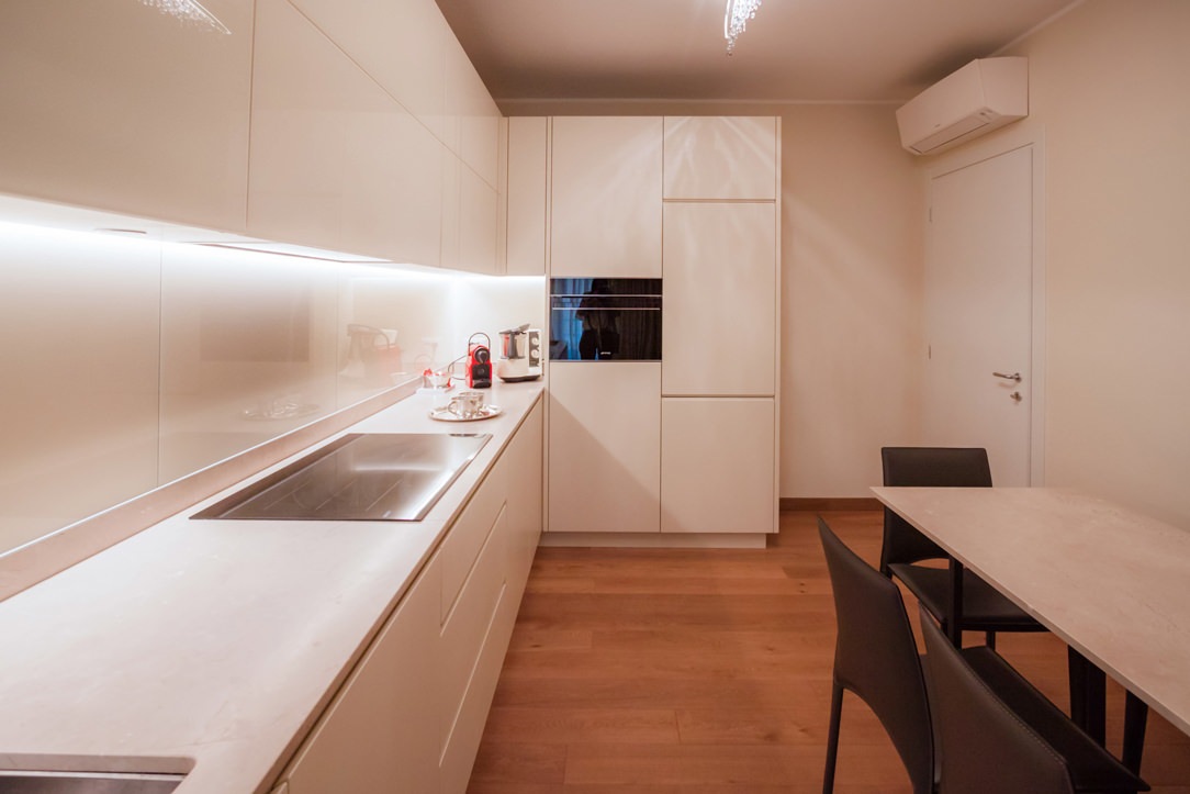
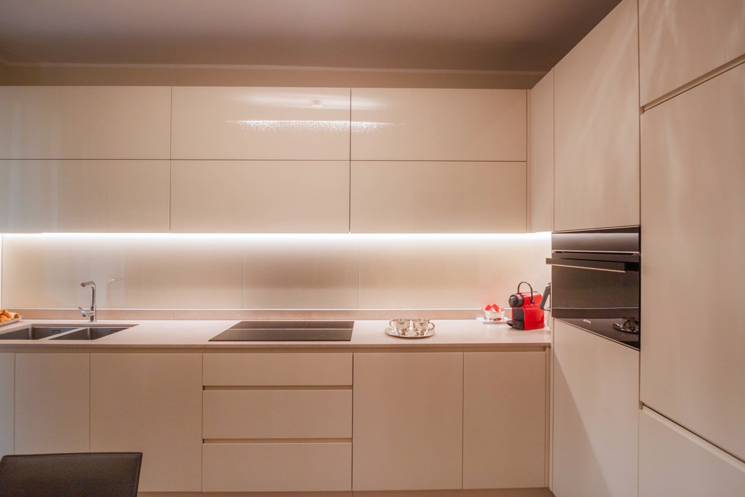
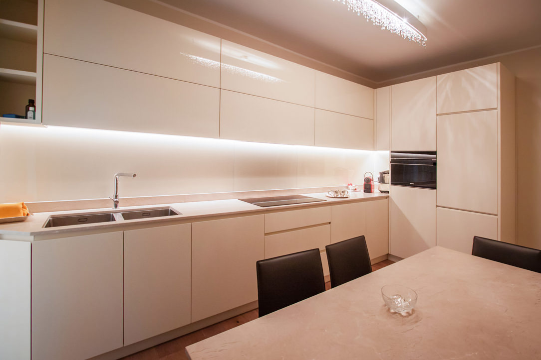
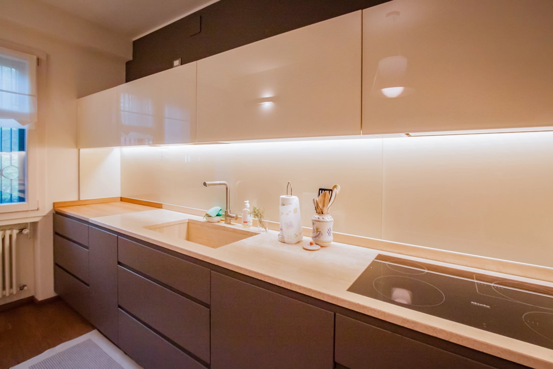
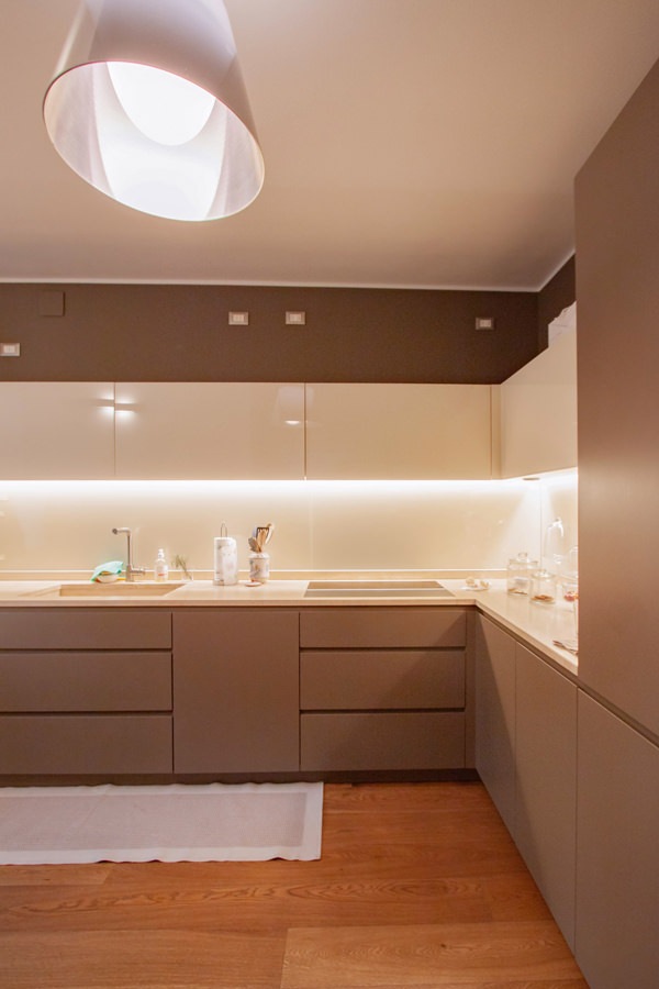
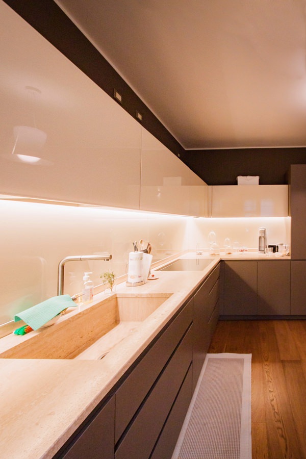
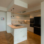
Among these, the contemporary style kitchen is recognized by the natural top, the lacquered doors and the wall units covered in Lacobel.
In the sleeping area, on the other hand, the master bathroom and the service bathroom can be recognized by the chromatic and material combinations between the tops and the structure of the shaped furniture.

modern cream colored kitchen side view
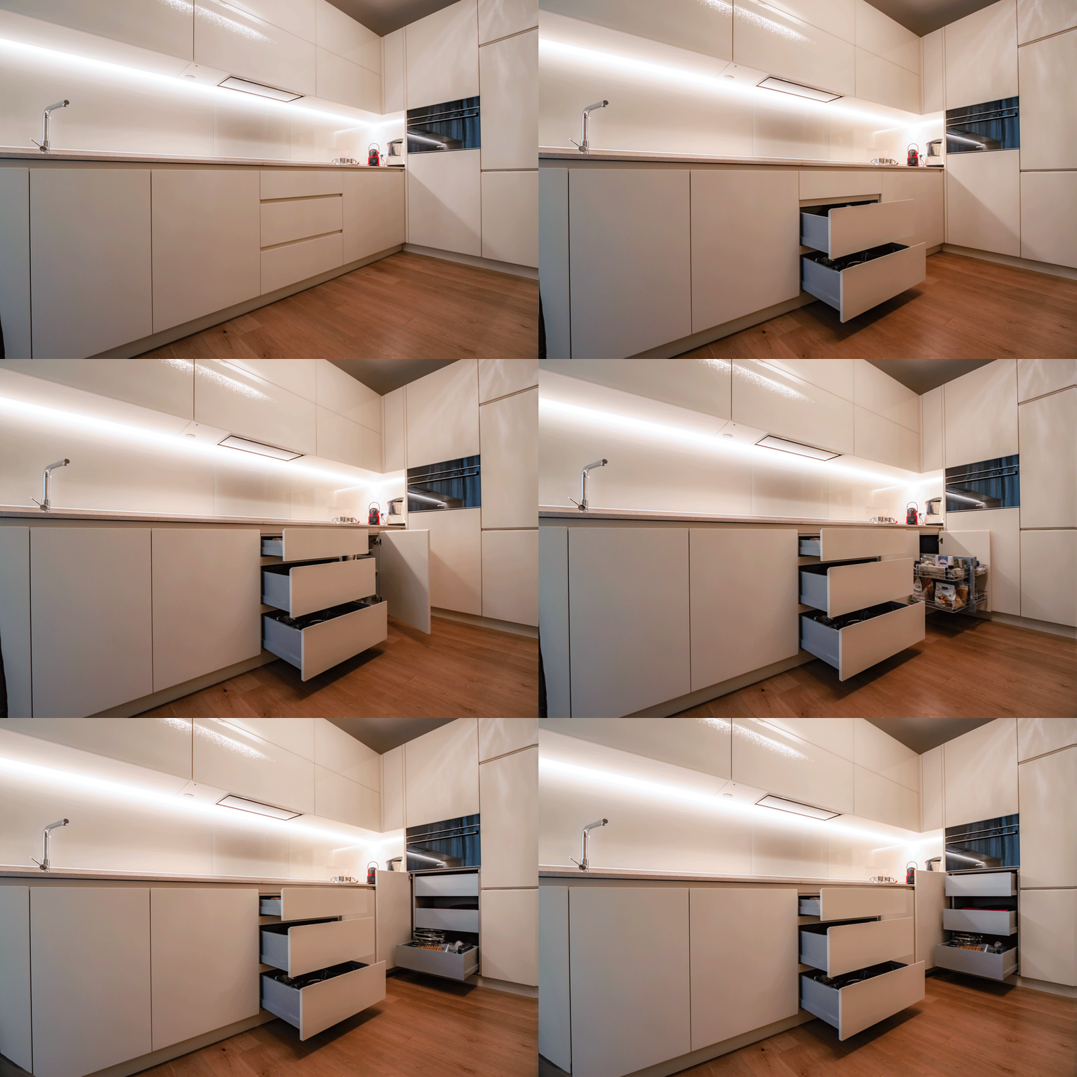
animation opening cream-colored kitchen doors

A kitchen with cream color furniture

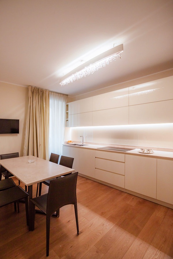
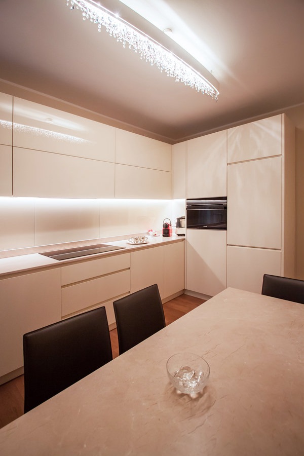
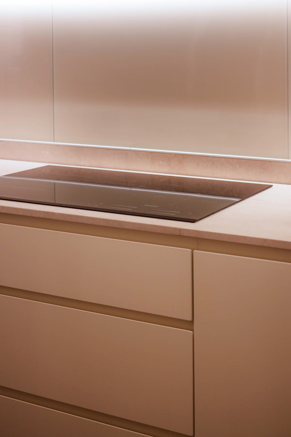
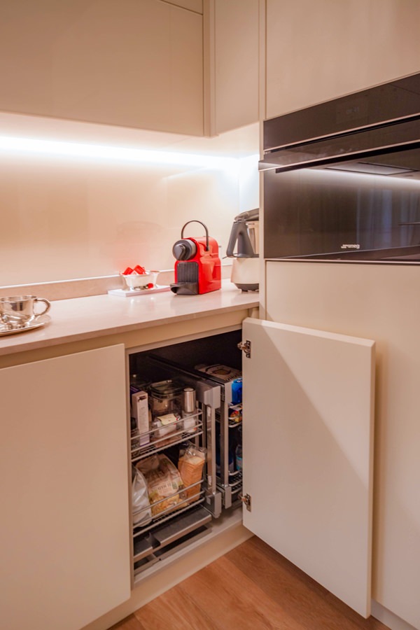
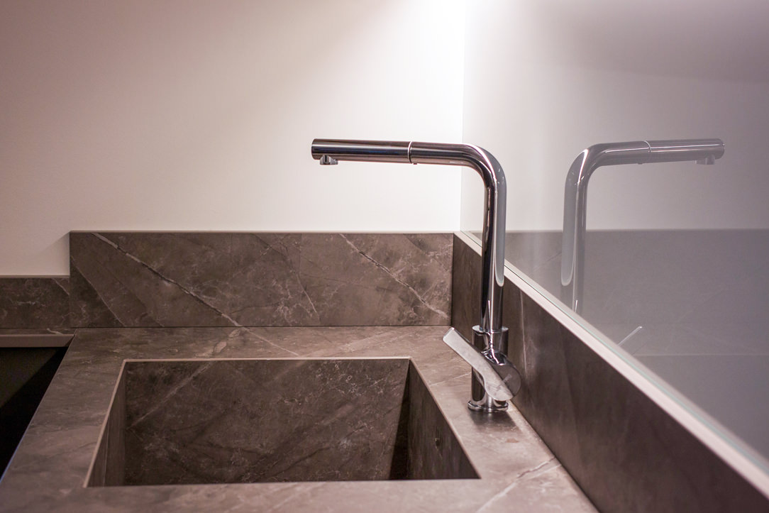
The beige natural stone worktop set the chromatic and material choice of this contemporary style kitchen.
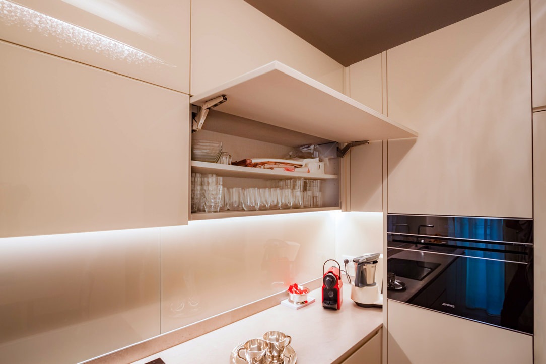
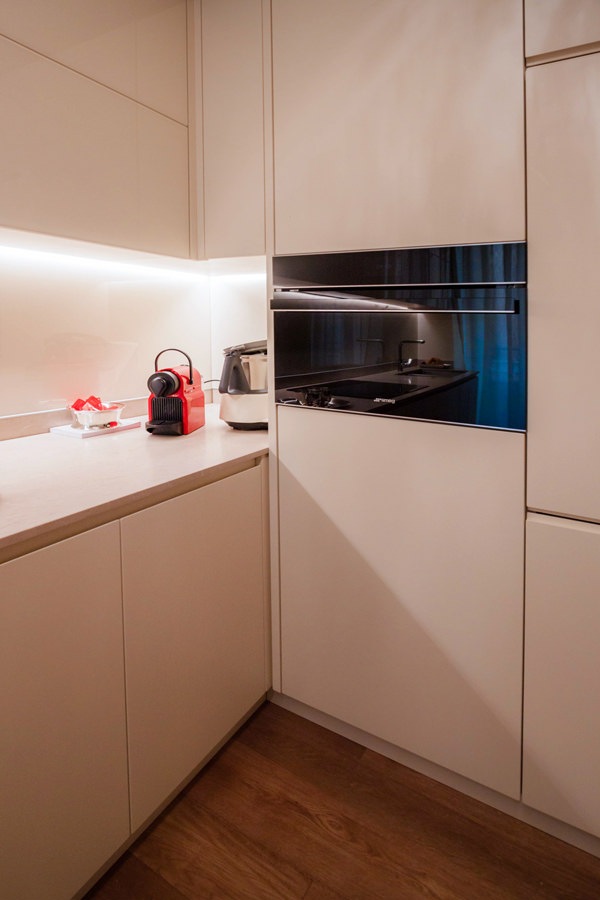
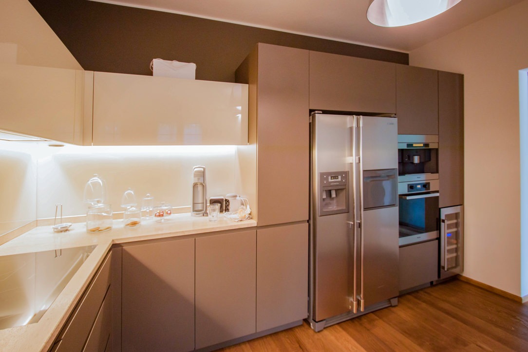
Maintaining the neutral tones of the cream color, the base units and side service columns in matt tone-on-tone lacquer accompany the wall units covered in white Lacobel.
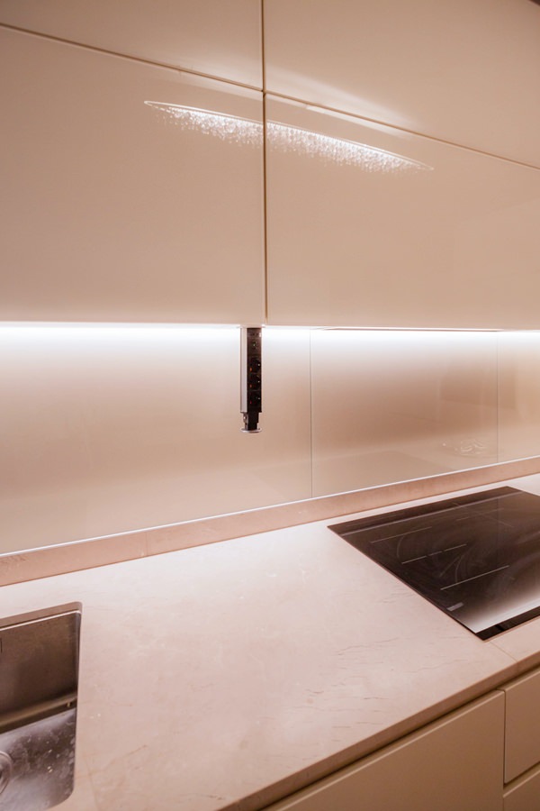
The recessed LED lighting is inserted inside the latter to provide support light for the preparation of meals.
The material choice of white Lacobel, capable of giving brightness and freshness to the room, is also reflected in the riser that accompanies the natural stone top.

cream color kitchen table anthracite metal structure natural stone top
 natural stone top kitchen table cream colored worktop
cream colored kitchen front view

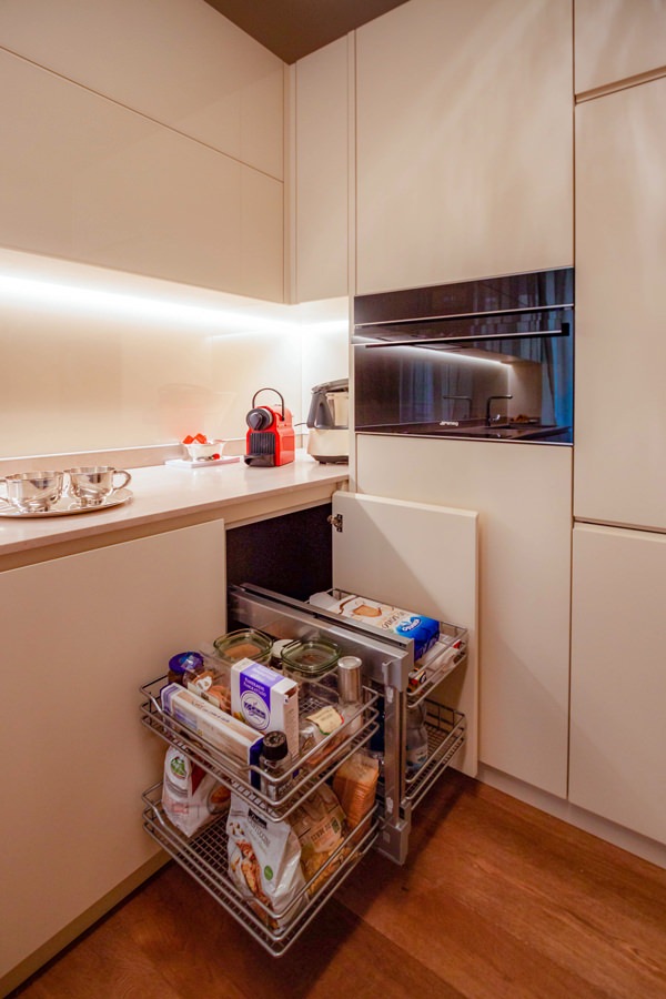
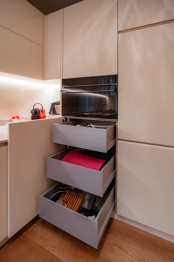
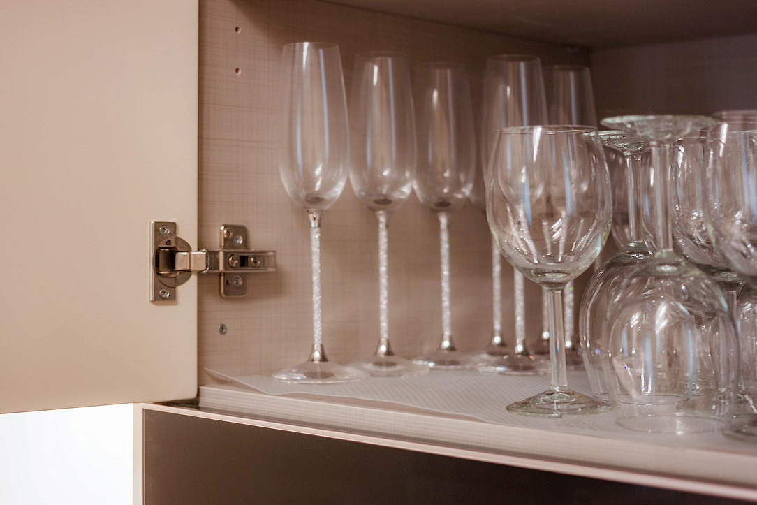
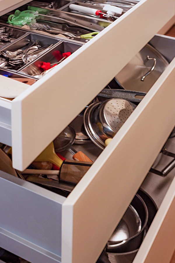
Functional elements such as the removable basket to take advantage of the corner, large drawers and doors with removable trays make the use of this kitchen even more practical.
The full-height side columns, housing the built-in refrigerator and the oven, leave ample space that can be used as a pantry.

On the opposite side, beyond the sink with two steel basins under the counter, the shaping of the base and wall units closes the kitchen block.
It is precisely the smoothed profile of his comparison that softens the design lines of this kitchen.

A table with an anthracite-colored metal structure and chairs in eco-leather in the same shade echoes the material choice of the kitchen top.

cream colored kitchen cabinets drawers recessed handle
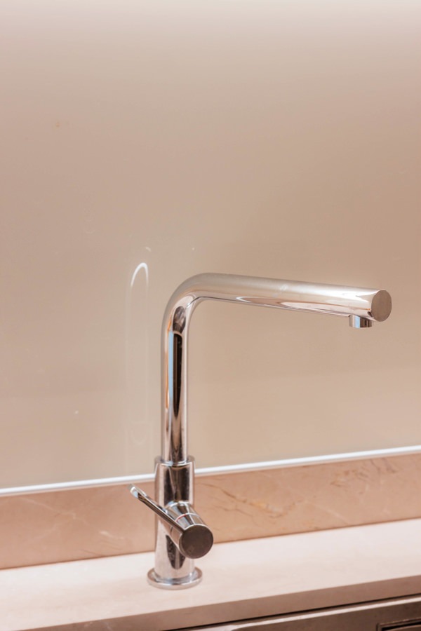
stainless steel kitchen sink faucet lacobel white kitchen cream color
cream-colored shaped kitchen lacobel wall units
cream-colored kitchen corner door internal basket closed position
kitchen corner door internal basket open position
lacobel cream kitchen wall units flap opening internal shelf
cream colored kitchen corner removable basket internal drawers
cream-colored kitchen door with aluminum internal drawers
cream-colored kitchen doors with canvas bilaminate interior
service outlets disappearing turret kitchen wall units
opening kitchen drawers inside aluminum cutlery tray

The entrance area: between functionality and elegance

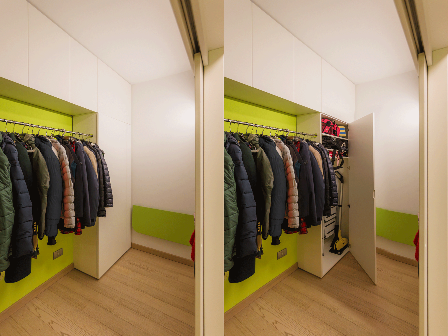
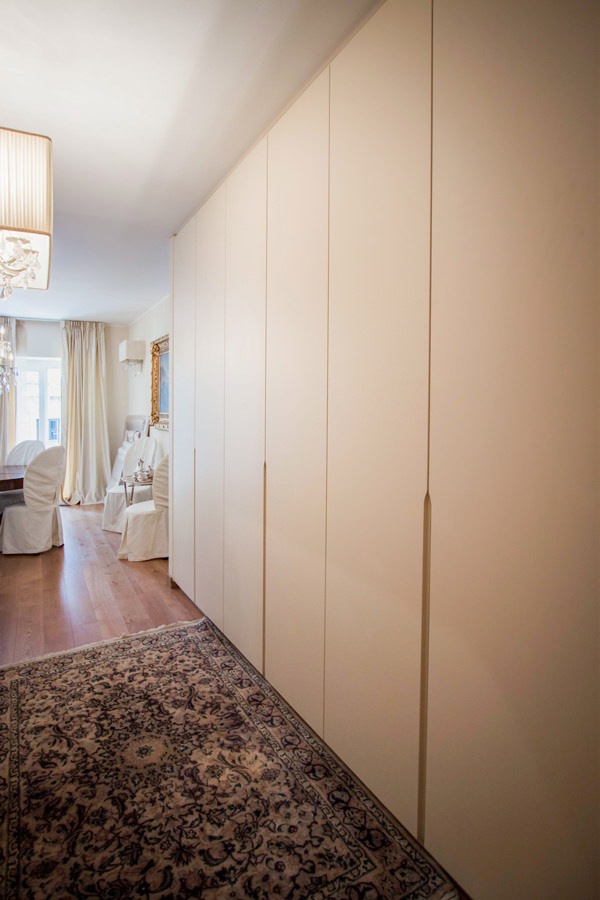
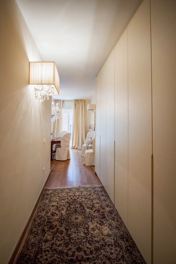
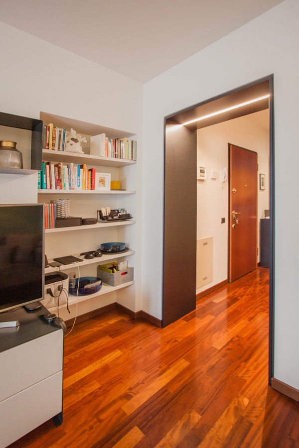
In the entrance area, a large service wardrobe acts as a functional element capable of optimizing space, while disappearing from view thanks to its linear aesthetic.
The stylistic choice takes up the cream-colored furniture of the remaining rooms of the house.
The full-height doors in matt lacquered MDF accommodate approximately half the height of the recessed handles shaped at the ends.

Internally, height-adjustable shelves provide useful space for the storage of household products, but also linen and kits for the change of season.
In the central doors, on the other hand, a hanging system exploits the horizontality in order to contain the depth of the wardrobe.

Compared to traditional hangers hung on tubular, this system consists of hooks that slide horizontally on a double row of tubulars, taking advantage of the available length. On the other hand, they have a slightly lower quality of maintenance of the garments. Not having the typical support structure for the shoulders of garments possessed by hangers, it is an optimal solution for coats and jackets that can be considered “in transit”.
As they do not require long-term accommodation, they are ideal for hosting guests’ coats and jackets or light clothing in temporary placement.

wardrobe hallway entrance handles half-height recess
cream-colored entrance hallway furniture
tubular horizontal hangers optimize coats space

The master bathroom: elegant and with attention to detail

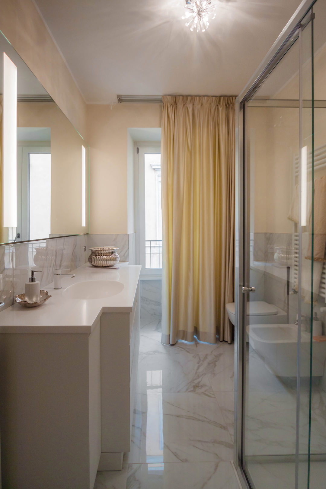
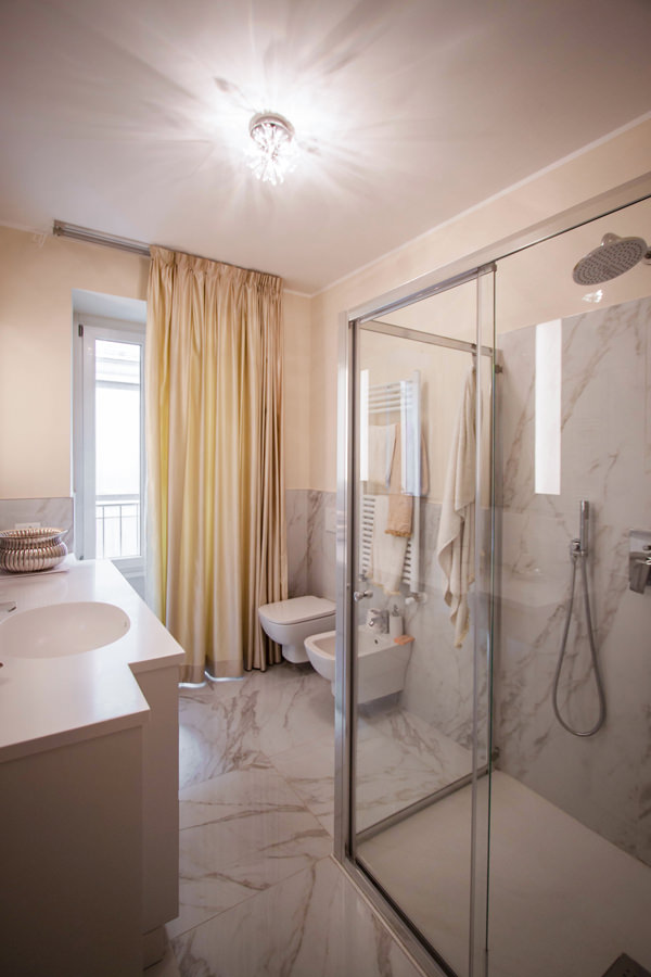
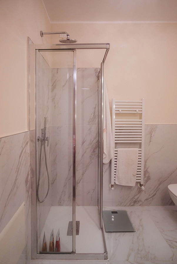
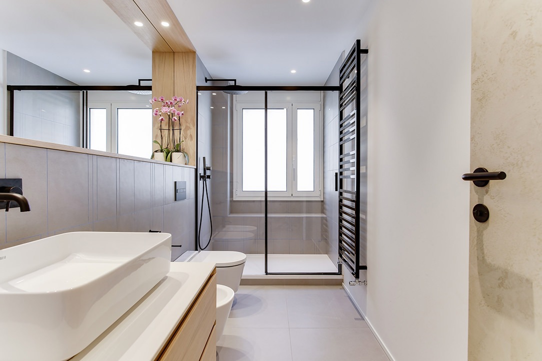
Introducing the sleeping area is a large bathroom also for guests with a glass shower and shaped furniture.
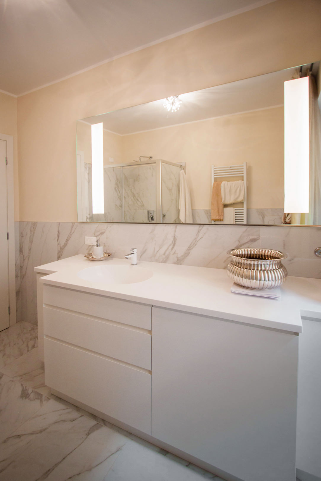
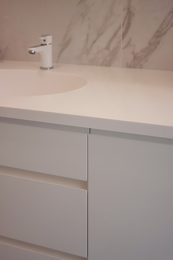
The latter is recognized by the choice of neutral tones and light colors. The shaped top in white Corian allows to host a pair of integrated washbasins in the same material, becoming a continuous element.

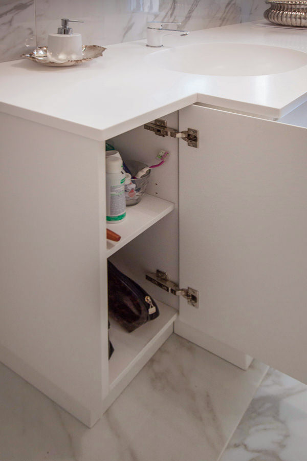
The composition of the piece of furniture consists of a pair of side doors with recessed handles shaped at 45 ° which are recessed with respect to the block of drawers and built-in washing machine next to it.
The stylistic line of this furniture guarantees a linear and elegant reading of the same, while not giving up the practicality of doors and drawers to contain products and bathroom linen. Accompanying the bathroom cabinet is a large mirror with integrated lighting.

elegant cream colored bathroom cabinet front view
elegant master bathroom with crystal shower view
elegant master bathroom with large crystal shower
contemporary style shaped bathroom cabinet with Corian top
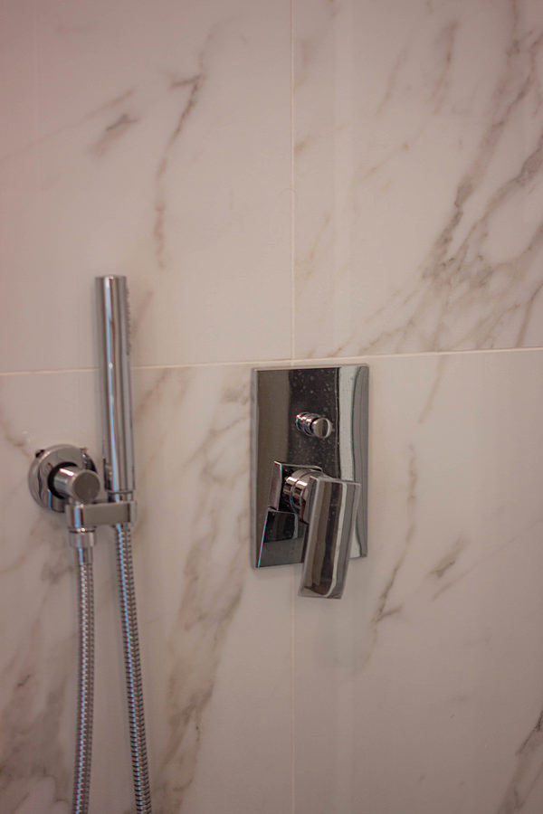
detail of stainless steel shower taps
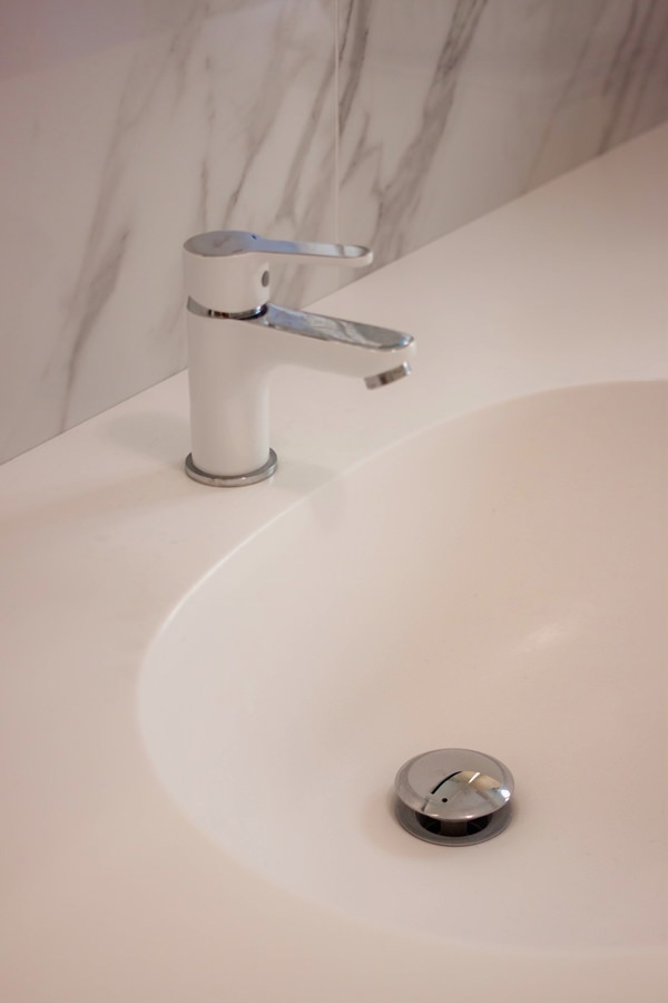
integrated bathroom vanity sink Corian top
opening bathroom cabinet door internal shelves
bathroom cabinet detail drawers handle recessed corian top

The sleeping area between the service bathroom and compact but roomy walk-in closet

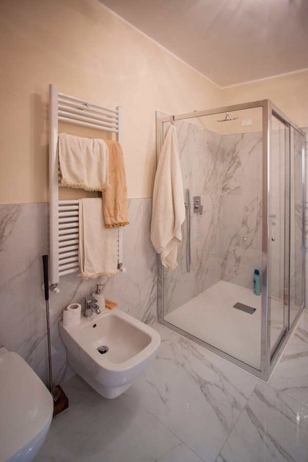
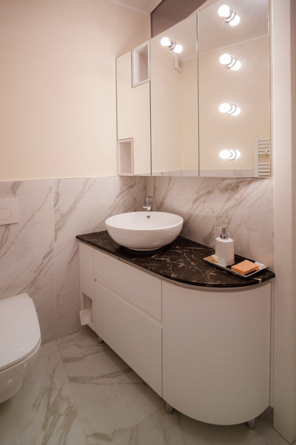
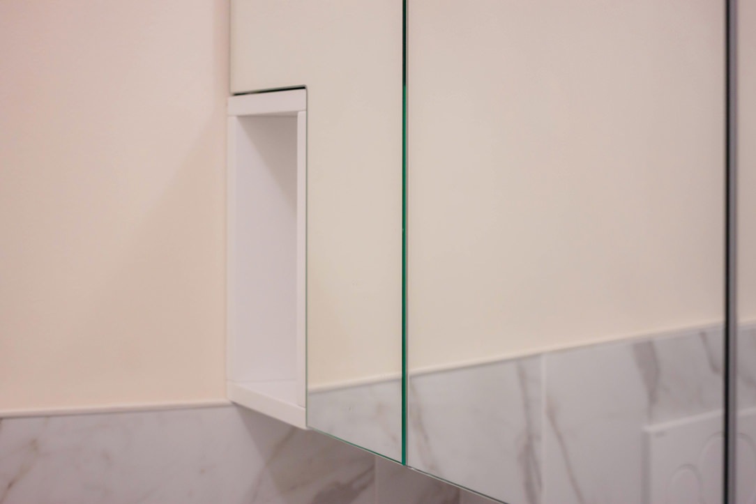
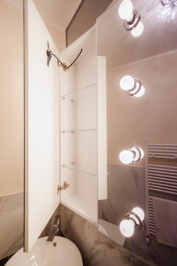
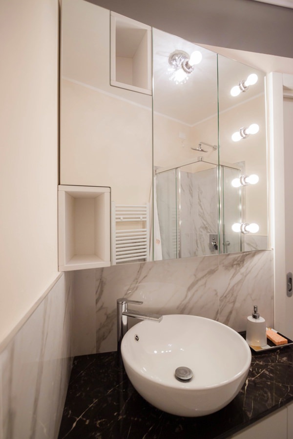
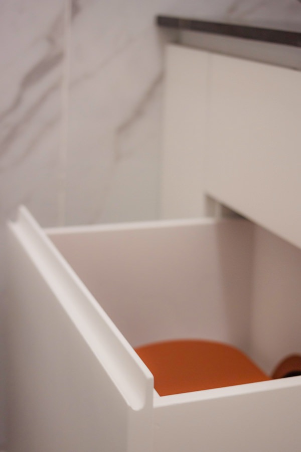
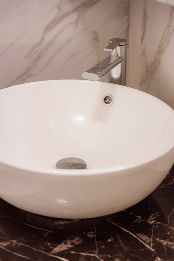
Adjacent to the master bedroom there is the service bathroom with a smaller-sized crystal shower. Also in this case, the service furniture is shaped to respond not only to functional needs but also to restore an elegant and characterizing image of the furniture. The black marble top houses a countertop washbasin and is shaped in the terminal part, softening its shapes. In the lower part, an open compartment adjacent to the wall becomes a support element to avoid floor stand or wall towel holder. Side by side, a pair of drawers provide useful space for small products, while leaving space for the bulk of the siphon and the pipes behind them. Finally, respecting the shape of the top, a curved door accommodates internal shelves. Accompanying the bathroom cabinet, providing additional space for the storage of products, is a wall unit covered in mirror. The aesthetics of this element responds to a division into three compartments whose conformation is light and soft to the eye. The division into three doors also allows you to take advantage of the central mirror part, inserting external light bulbs that give character and embellish the furniture. Sideways mirrored doors alternate with open compartments in white lacquered MDF, visually moving the aesthetic impact of the furniture.

bathroom service shower crystal marble coating
bathroom cabinet shaped service drawers curved door
detail of day compartment mirror bathroom wall cabinet
detail of bathroom cabinet with mirror door in white interior
bathroom cabinet mirror lighting external bulbs
handle recess drawers shaped curved bathroom cabinet
Corian countertop washbasin with marble top
walk-in closet MDF lacquered cream color hanger
detail shelves MDF matt lacquered cream color walk-in closet

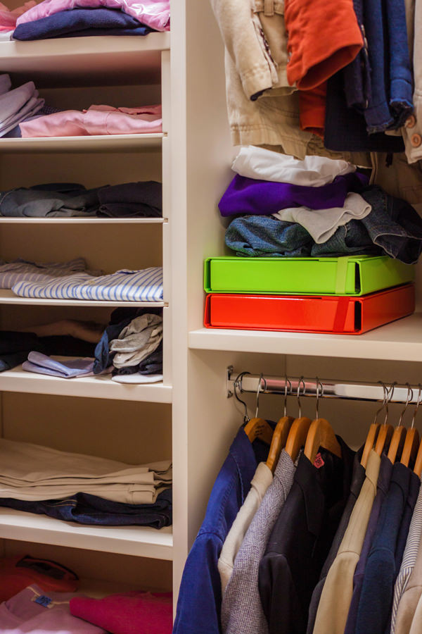
Next to the service bathroom, the small-sized walk-in closet guarantees excellent capacity by making the most of the space with lacquered MDF shelves and fixed tubular hangers. The development of the components occupies the three walls adjacent to the entrance, also taking advantage of the corner arrangement to place the hanging garments on double height. Also in this case, the chromatic choice of the elements takes up the cream color of the furniture placed in the remaining rooms.

The contemporary style: the world of furniture nowadays

The contemporary style: the world of furniture nowadays

The simplicity and elegance of the contemporary style furniture conquers the tastes of customers with its light and minimal lines. From the play of reflection and opacity to the choice of highly resistant materials, to the eye for the environment and eco-sustainable choices.
Trends in recent years in the world of interior design have a well-defined direction, albeit in constant change.

What does it mean by contemporary style furniture?

Terms such as “fashions” and “trends” are now also commonly used for the interior design sector.
It happens more and more frequently to hear about interiors in a modern style, meaning interiors with linear aesthetics, elegant and natural materials.
However, it is important to be careful not to confuse the modern style, characterized by rigorous interiors common since the 1950s, with the contemporary style.

The latter is in fact a constantly changing style, its definition changes from year to year depending on the materials, colors and design lines spread.It would be impossible, for now, to give a series of universal guidelines that can continuously identify this style. All the more so if the trend of recent years consists in a recovery of the modern style reinterpreted in a contemporary key.

So let’s analyze the contemporary style furniture that has spread in recent years, with a particular focus on current trends.

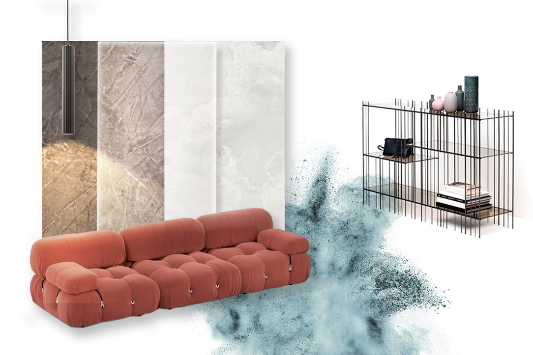
contemporary-style-moodboard-01

Moodbord in a contemporary style.
High resistance materials for kitchen tops, plays of light and reflections and furnishings between sinuous shapes and iron details.

Colors and materials

Over the last few years, the trends in colors and materials for furniture have developed along different paths.
On the one hand, soft colors and natural materials emphasize an elegance that is increasingly closer to scandinavian taste. On the other hand, touches of gritty colors and a choice of avantgarde materials appears in order to guarantee excellent resistance and refined aesthetics.

If the attention to the ecological impact has certainly an increasingly topical response, it should be emphasized, however, that it is this second trend that characterizes domestic interiors. all the more so if the choice of avantgarde materials is accompanied by experimentation on new materials produced with recycled components and with a low environmental impact.
An example of this are the fabrics produced by Ikea and presented during the last Digital Design Week 2021, made with recycled fibers from old jeans and the new kitchen tops with a percentage of recycled cellulose.

Here then is that at the constant of neutral colors appear more decisive tones that vary from a light pale pink to a delicate sage green. Up to more gritty colors that in the current years have varied from mustard to teal, in widespread use throughout 2020, ending with terracotta that has every intention of invading domestic interiors during 2021.

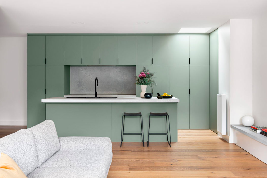
kitchen-green-sage-reference-contemporary-style

A sage green kitchen.
“The Bend” Residence, Arch. Rob Ryan.

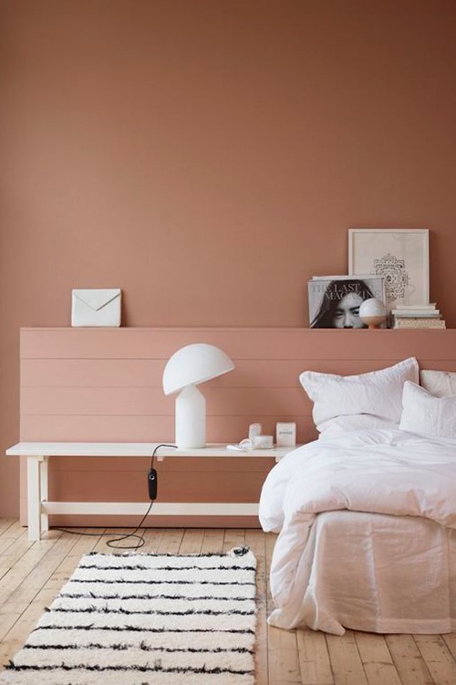
double-bedroom-terracotta-color-contemporary-style-furniture
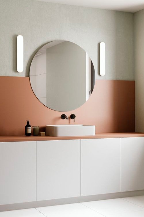
contemporary-style-bathroom-furniture-terracotta-color

Terracotta colors have prevailed for several months in contemporary interiors thanks to their natural but decisive tone

sofa-velvet-teal-color-contemporary-style-furniture

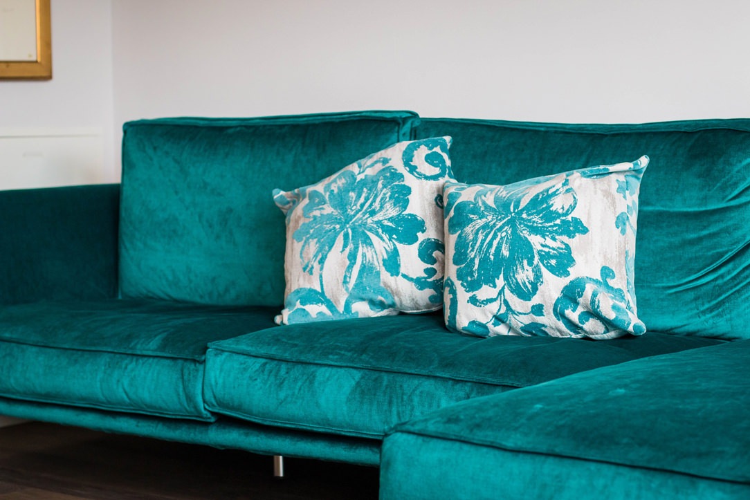
In this contemporary attic, a teal velvet sofa

The kitchen as a focal room of the living area

The changes in social and individual life brought about by the pandemic have also led to a different perception of the domestic environment.
The introduction of the smartworking concept has increasingly marked the demand from customers to provide angles for remote work within their homes.

Similarly, the kitchen, which has always played a fundamental role in domestic interiors, has rediscovered its centrality even more.
The passion for cooking, also underlined by the world of communication with programs and tv-shows focused on this theme, requires an ever-greater attention to the materials, aesthetics and functionality of this environment.
Here then is that the coverings of doors and drawers are equipped with increasingly sophisticated laminates.

The strength of these materials lies in the great resistance capacity and good maintenance, flanked by an increasingly refined aesthetic line. This is the case of fenix, a material appreciated for its absolute opacity which is accompanied by a softness to the touch.

As for the kitchen countertops, the principle of high resistance and excellent ductility translates into the choice of recomposed materials and innovative agglomerates. Here then is the choice of tops in Dekton and Neolith, and then move on to cheaper options such as Okite and laminated HPL.

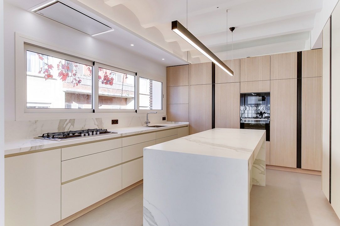
Barcelona contemporary kitchen side view

A contemporary style Barcelona kitchen with a Neolith Stauario top

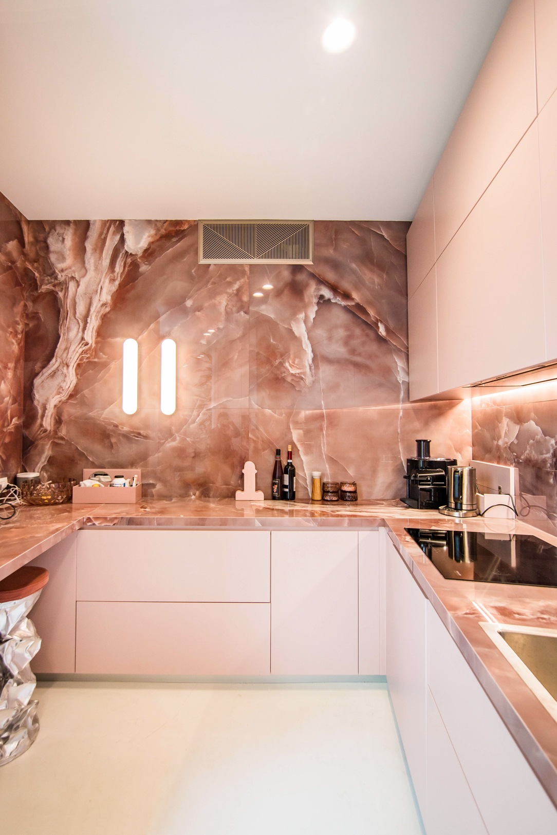
kitchen-pink-front-lighting

In this contemporary kitchen, the onyx-effect top gives a touch of grit and character, matching the soft pink doors

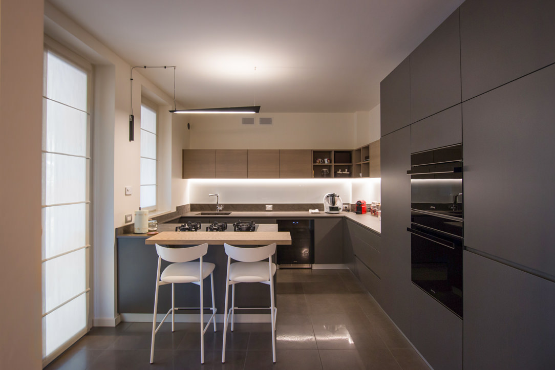
Bergamo apartment essential contemporary kitchen 01

The dark dekton top of this modulor work matches the chromatic choice of the matt lacquering of the doors, while the wall units in bleached oak laminate echo the snack top of the island.

Bergamo apartment essential contemporary kitchen details 02

Kitchen top in Kira Natural Dekton in warm and dark tones with integrated sink in the same material.

Contemporary style furniture: 2021 trends

Already during the last Digital Design Week the new trend of contemporary design is clearly identified: the recovery and reinterpretation of the Modern Style.

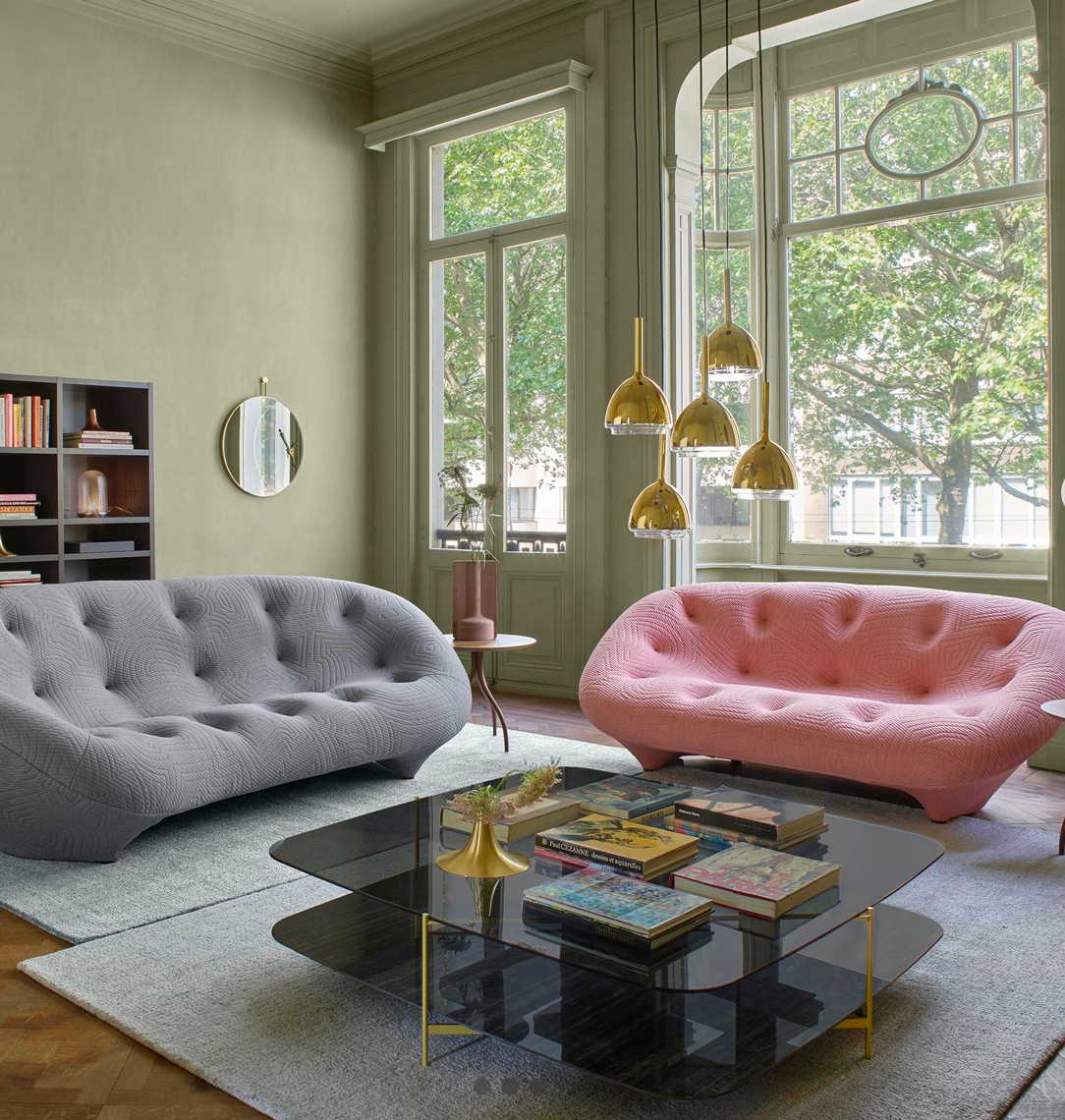
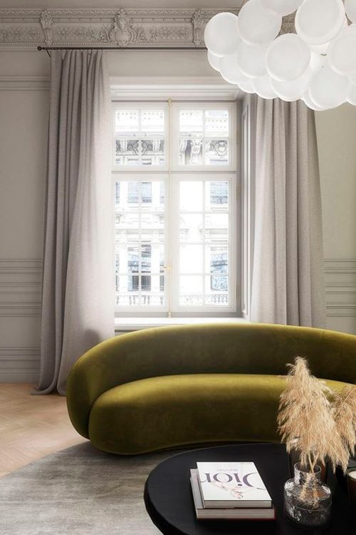
For the living world this translates into the choice of sofas with sinuous shapes that emphasize important padding, accentuated by the choice of velvets.
From the immense corner sofas to which we have become accustomed in the past years, we have now moved on to more compact conformations.
Two- or three-seater sofas accompanied in case by matching armchairs or chaise longue and dormouse. The latter are in fact back in vogue, made contemporary by dynamic and fluid design lines.
On the floor, colorful carpets appear, with geometric patterns that increasingly come closer to the world of art, and shaped shapes with an eccentric inspiration. A masterful example is certainly the cc tapis production, also present in the contemporary interiors of this work between soft pink and pure white.

In the sleeping area, on the other hand, the beds increasingly equipped with a trunk structure are enriched with padded headboards, most of them with capitonné aesthetics.
There is no lack of details, especially in the bathroom but also in the living area, in iron.
This denotes the design lines of a clean and minimal aesthetic. Often combined with the choice of extra-clear glass, it creates a chromatic and material contrast of contemporary elegance.

Countertop bathroom vanity unit

In this contemporary style bathroom, a large transparent glass shower is embellished with an iron frame that reflects the chromatic choice of the taps.

detail-iron-shelves-TV-living-area
iron-furniture-living-area-detail-portals

The choice of iron details for the TV cabinet in this living area denotes a contemporary elegance

CC-Tapis-Reference-02-carpets-furniture-contemporary-style
CC-Tapis-Reference-carpets-furniture-contemporary-style

CC Tapis rugs with a contemporary design and shaped shapes.
Left: Matter of Stuff, May 2019. Right: Miniforms 2019 Catalog, Laura Pozzi Studio, Photo Alessandro di Bon

living room-furniture-contemporary-style-sofas-design

A contemporary style living room with modern sofas reinterpreted in a contemporary key

contemporary-style-sofa
contemporary-modern-style-sofa

Some examples of trendy 2/3-seater sofas in 2021

To conclude …

The contemporary style furniture, albeit constantly changing, is characterized by well-defined design choices. It adapts perfectly to elegant and simple tastes, for souls predisposed to always remain in line with the latest trends and design products. Those who choose the interiors of their home in a contemporary style dare to choose character, even if combined with neutral contexts.

Giving new life to furniture: adapting them after a move

Giving new life to furniture: adapting them after a move

Facing a move means turning your life around, renovating your home and introducing new furnishing accessories.
Beginning to pack, you make a natural selection of the objects to take with you, recognizing for each their own emotional value.
Many times, this process also involves the world of furnishings, which accompany the owners in this moment of transition.
Giving new life to furniture also means renewing the context in which they are inserted, managing to adapt them in terms of aesthetics and functionality to the new environments.
Adapting furnishing to a new context

When the furnishings are custom designed, their conformation responds to the needs of the customers, perfectly matching with the architectural context in which they are inserted. In doing this, a strong link is born between the rooms in which they are inserted and the shapes, proportions and mechanisms of use of the furnishings.
This would suggest an indissoluble bond between the two components, which would break when the furniture undergoes a relocation.
It is absolutely not said!

In fact, among the potential of custom-made furniture there is a flexibility factor that allows us to give new life to furniture by making few changes.
These make it possible to transform the general imprint of the furniture in order to adapt it to the new context both in terms of aesthetics and functionality.

A perfect example are the adaptations made to these furnishing extrapolated from an apartment between classic and contemporary. Let’s discovery this apartment among transformed furniture and new additions.

The kitchen: increases the work space and storage volumes

The kitchen certainly represents the beating heart of a home.
In the case of this apartment between modern and contemporary, its conformation was born from a natural reading of the architectural context in which it was inserted.

The corner development made it possible to exploit the side part with service columns with anthracite gray lacquered MDF doors.
These are equipped with column ovens on the right, pantry with removable trays and a central compartment for the free-standing refrigerator. The front is made up of lower volumes with large drawers and service doors and upper wall units in a brilliant white Lacobel.

The new arrangement has provided additional useful space for the overall dimensions. Being able to use additional space on both sides, the most natural solution was to exploit the remaining gaps with additional volumes.
On the right, we provide a service column which houses a modern wine cellar accompanied by a door with height-adjustable internal shelves.

On the opposite end, the main problem arises when the worktop is made of natural stone, which has undergone a chromatic change over the years.
To avoid incurring a visible difference between the added part and the existing one, a wooden top was thus created. It also acts as a cutting board for preparing meals. An element that not only solves an aesthetically weak point, but also provides a functional solution.

giving-new-life-furniture-kitchen-move-cupboard-modify
modern-kitchen-front-view-counterop-natural-stone
side-view-kitchen-undertop-sink-white-lacobel-cabinet
kitchen-countertop-detail-natural-stone-white-lacobel-back-surface
kitcehn-service-columns-wine-cellar

The living area: a new contemporary aesthetic

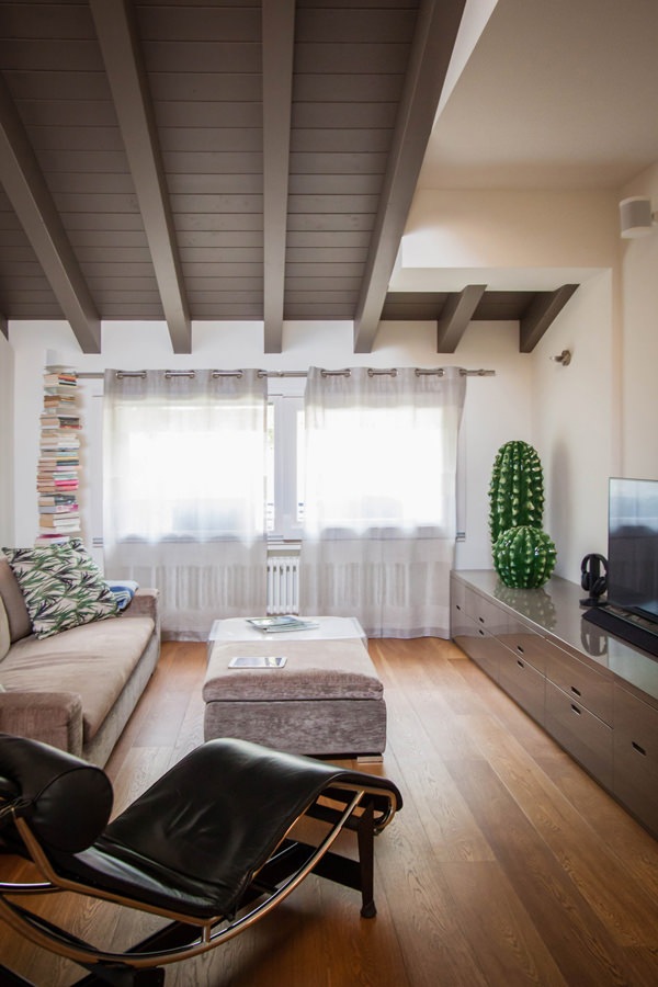
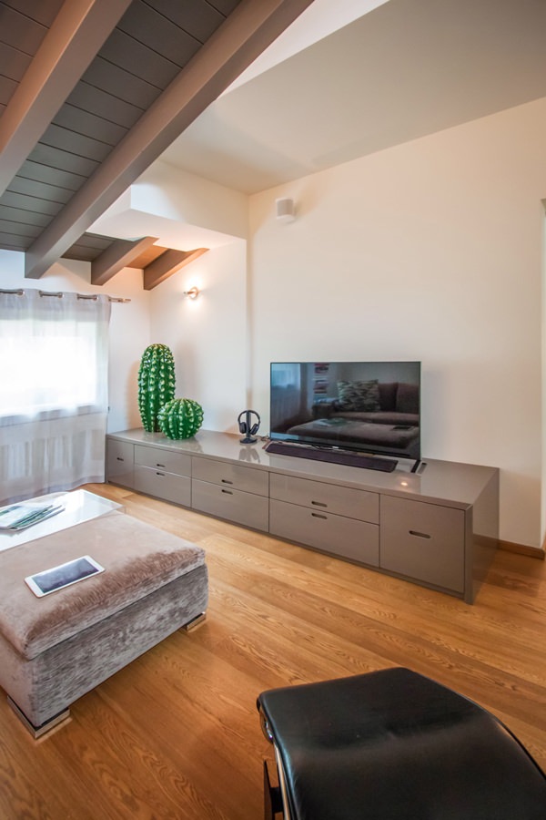
To equip the living area, we recovered the furniture made in 2006.
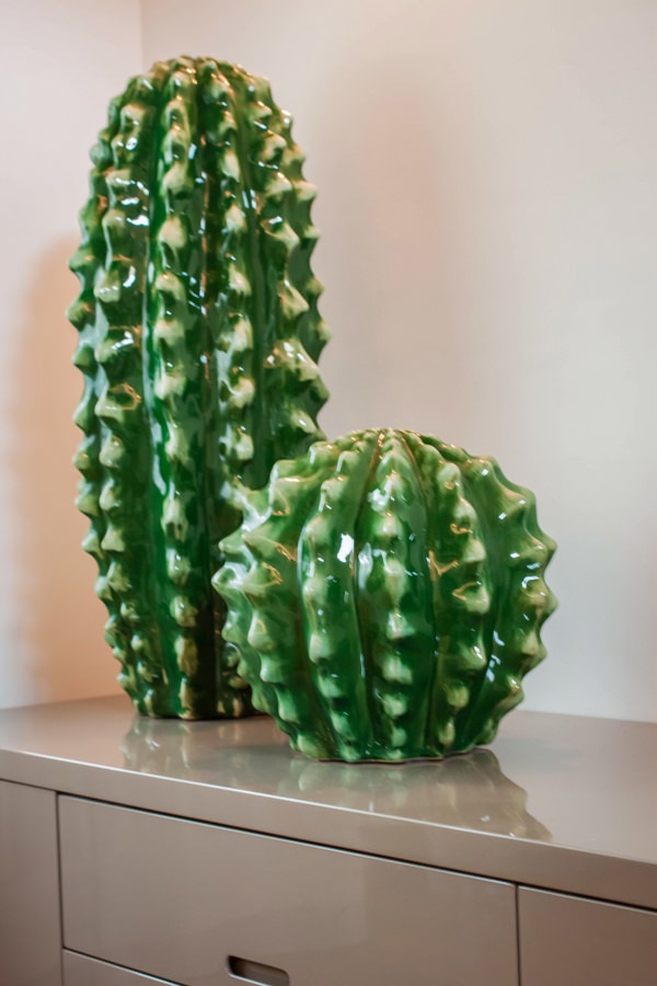
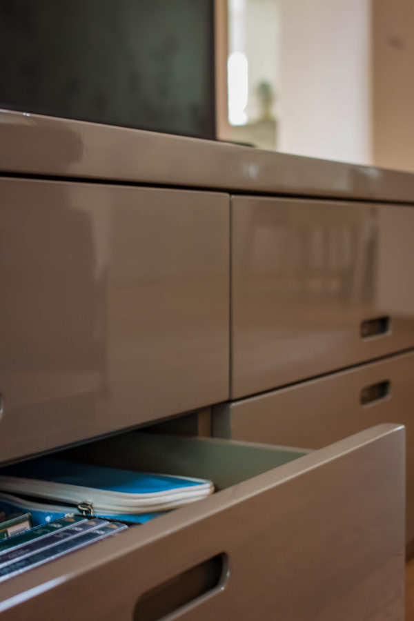
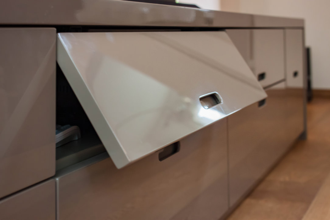
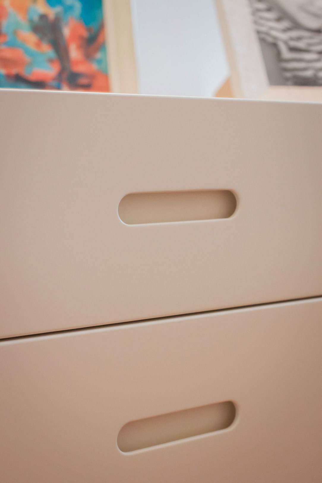
The choice of colors was already avant-garde at the time. Even in a contemporary reworking they can adapt perfectly, resulting elegant and current. The TV cabinet in glossy anthracite gray lacquered MDF alternates flap doors with service drawers, whose recessed handles give visual lightness.

In this case, giving new life to furniture means adapting them to the new context in which they are inserted, managing to exploit the flexibility of the same.
Small changes have been made, mostly considered maintenance. Re-lacquering where necessary or remaking of structural parts.
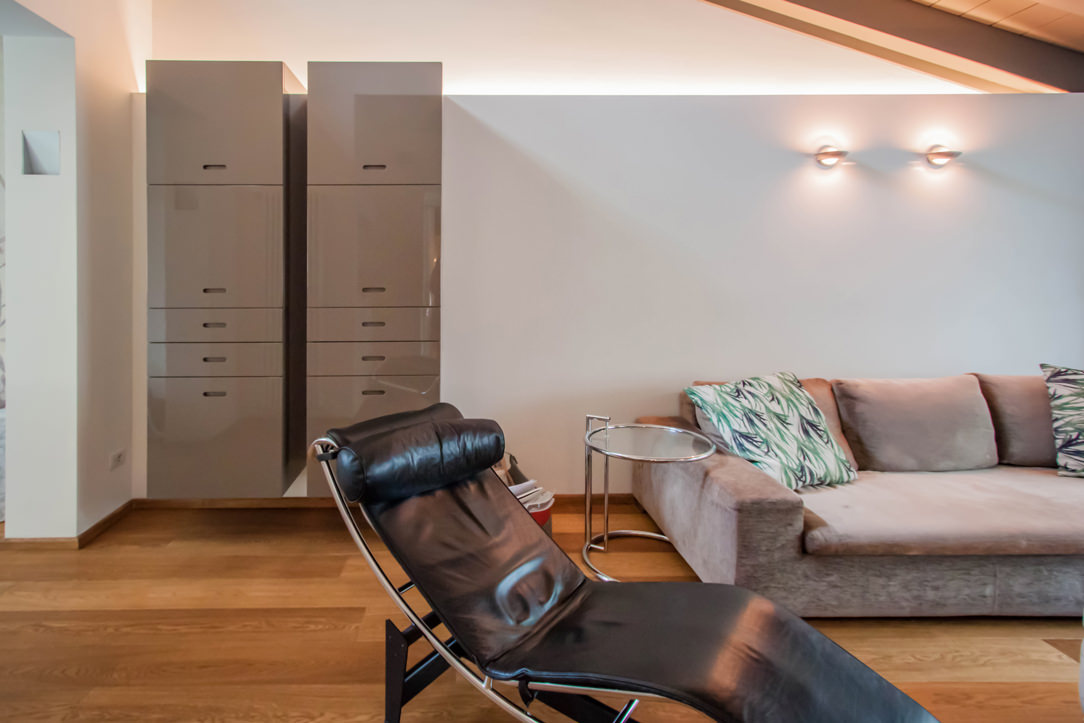
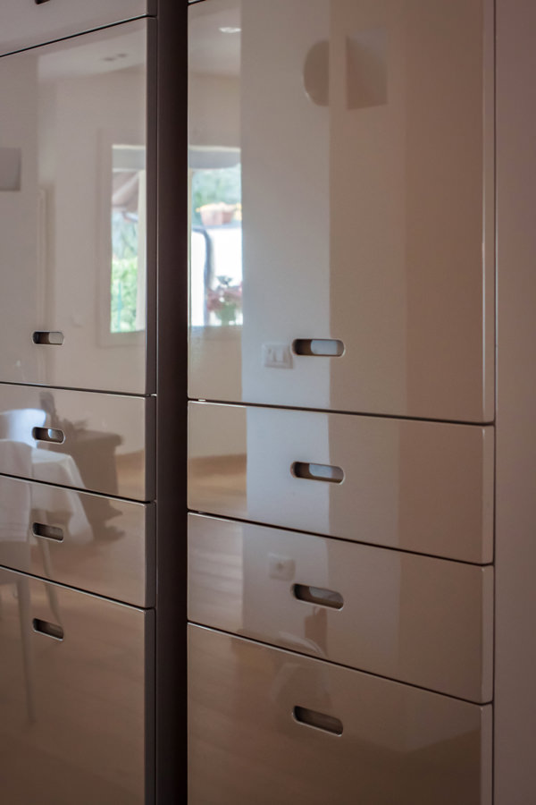
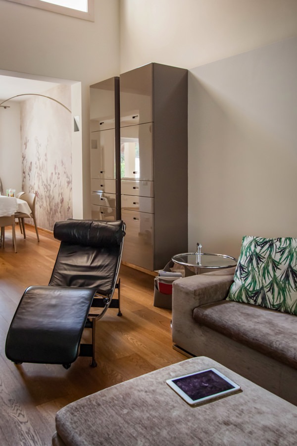
The same approach was then applied to the service hanging columns, which are made up of doors in the upper part and small drawers in the lower part. Their new position side by side allows them to welcome guests introducing them to the living area and, at the same time, create a visual divider from the more intimate dining room.

give-new-life-furniture-living-room-tv-cabinet
detail-top-MDF-shiny-laquered-dove-gray
open-drawers-flap-door-tv-cabinet
flap-door-recessed-shaped-handle-tv-cabinet
modern-living-room-design-tv-cabinet
give-new-life-furniture-living-room-tv-cabinet-shiny-laquered
service-cabinet-living-room-drawers-door-shaped-recessed-handle
shiny-laquered-doors-dove-gray-recessed-shaped-handle
modern-living-room-furniture-cabinet-shiny-laquered

Children’s bedrooms: new tailor-made solutions to exploit architectural voids

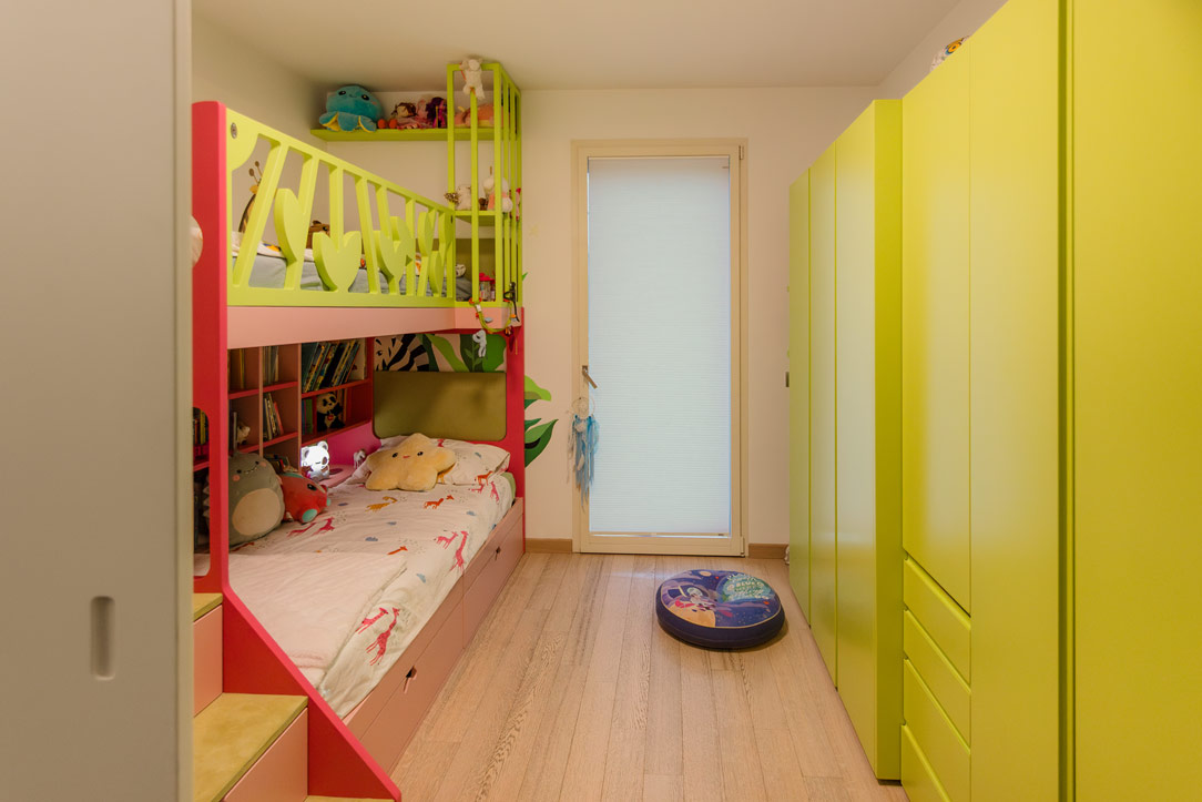
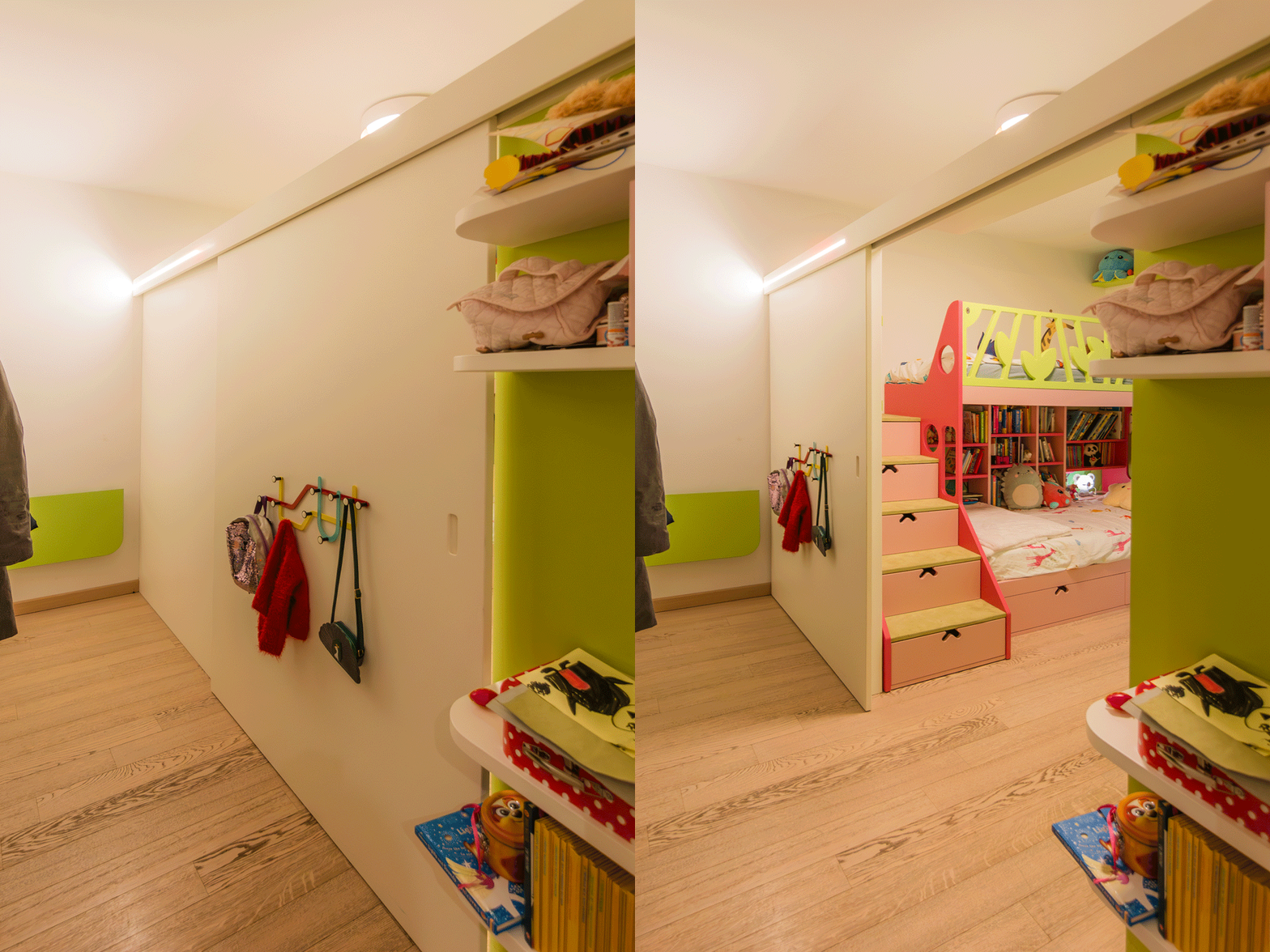
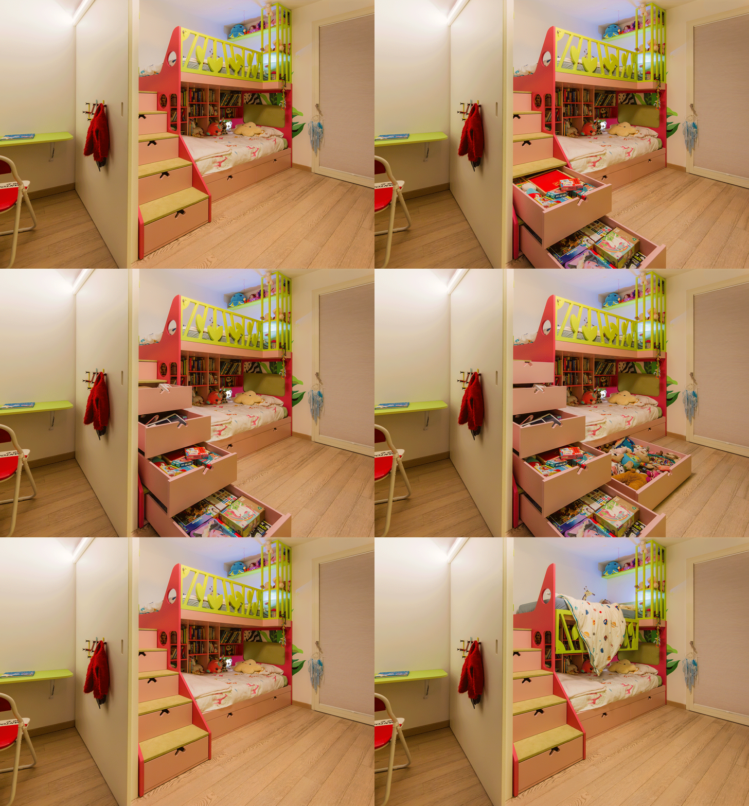
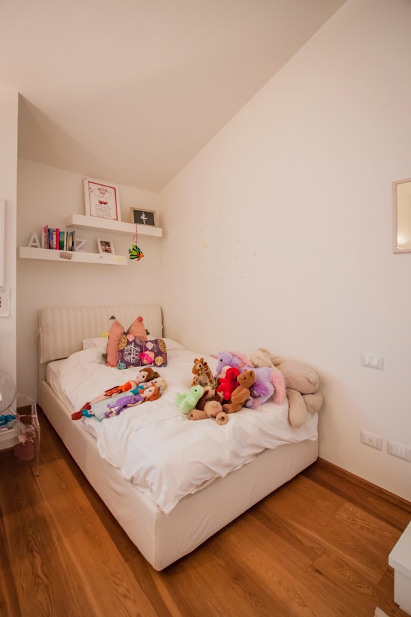
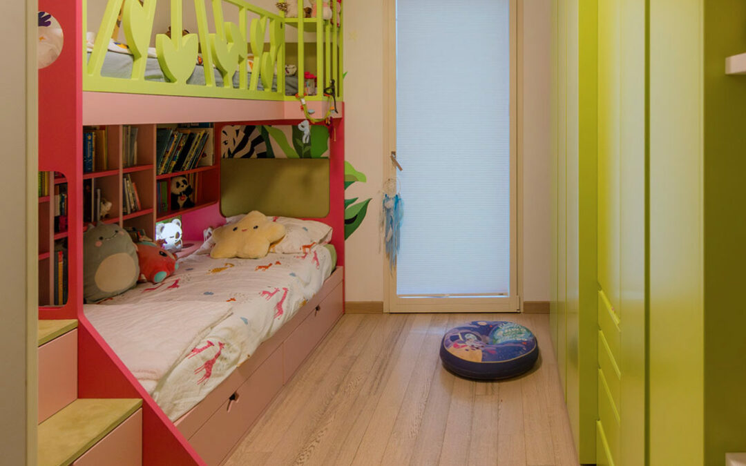
The sleeping area houses the two small bedrooms whose conformation alternates architectural voids with important structural elements.
A tailor-made solution was therefore designed in both rooms in order to include all the necessary furnishings without sacrificing practicality and visual freedom.
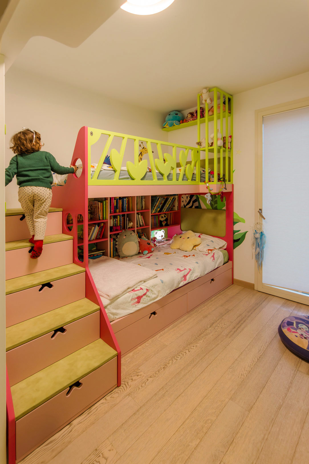
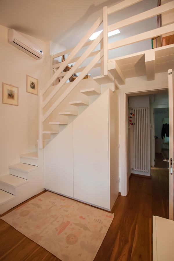
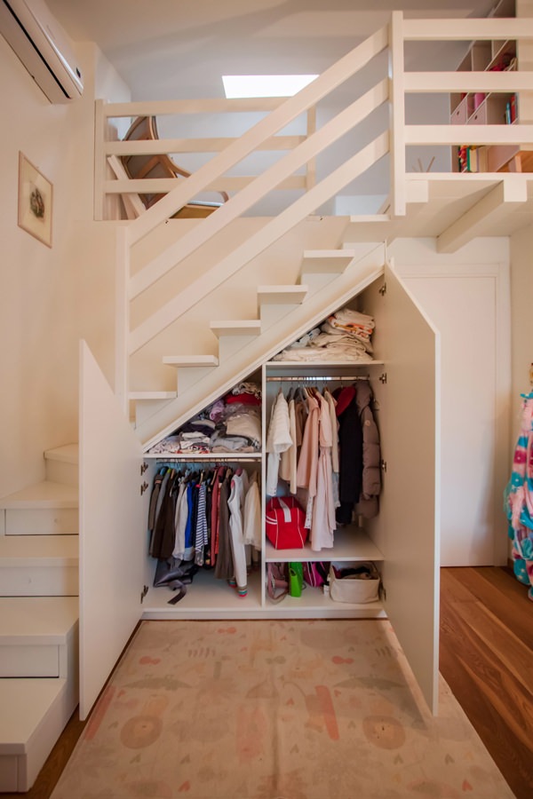
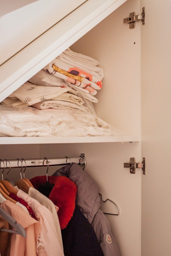
For the first bedroom it was therefore decided to take advantage of the basement that leads to the mezzanine area to equip it with a shaped wardrobe.
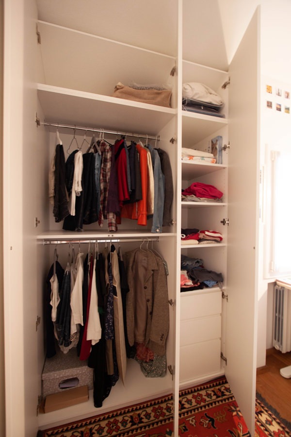
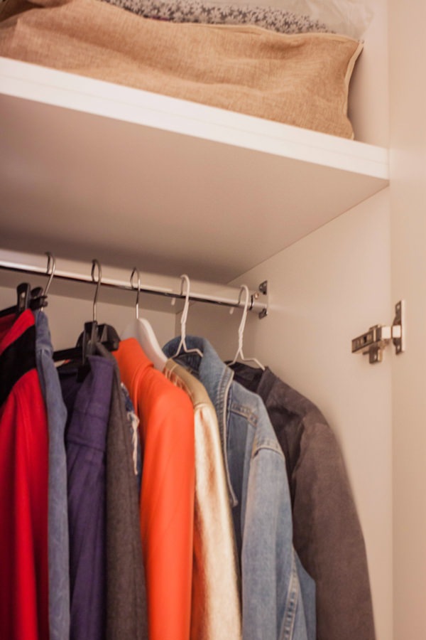
Since the room is intended for a child, the dimensions and heights necessary for the clothes have certainly facilitated the design. Despite having little space available, taking advantage of the inclined height of the basement, it was still possible to create a double-height wardrobe with alternating shelves with fixed hangers.
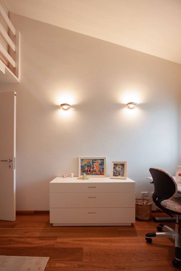
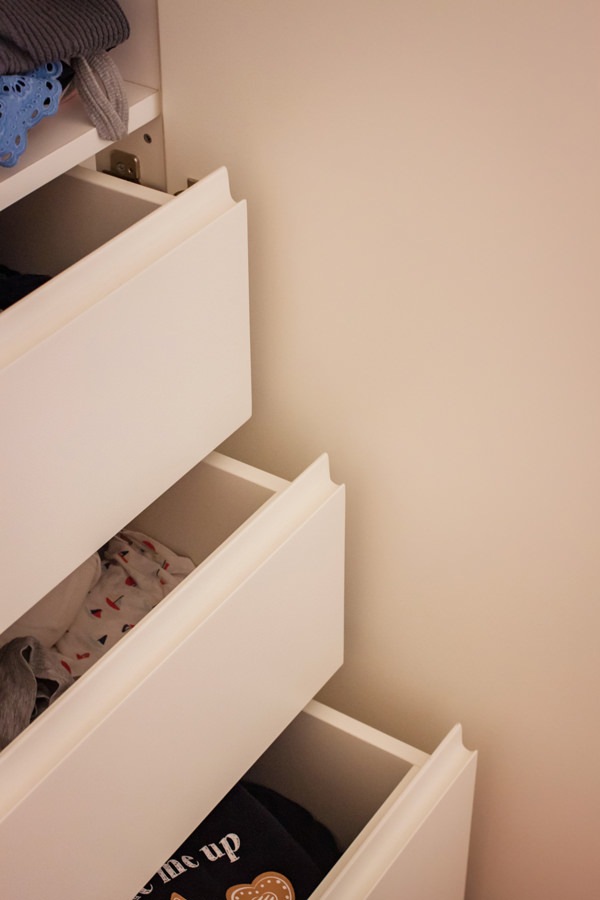
The wardrobe is accompanied by a standing alone chest of drawers which is also used as a support surface.
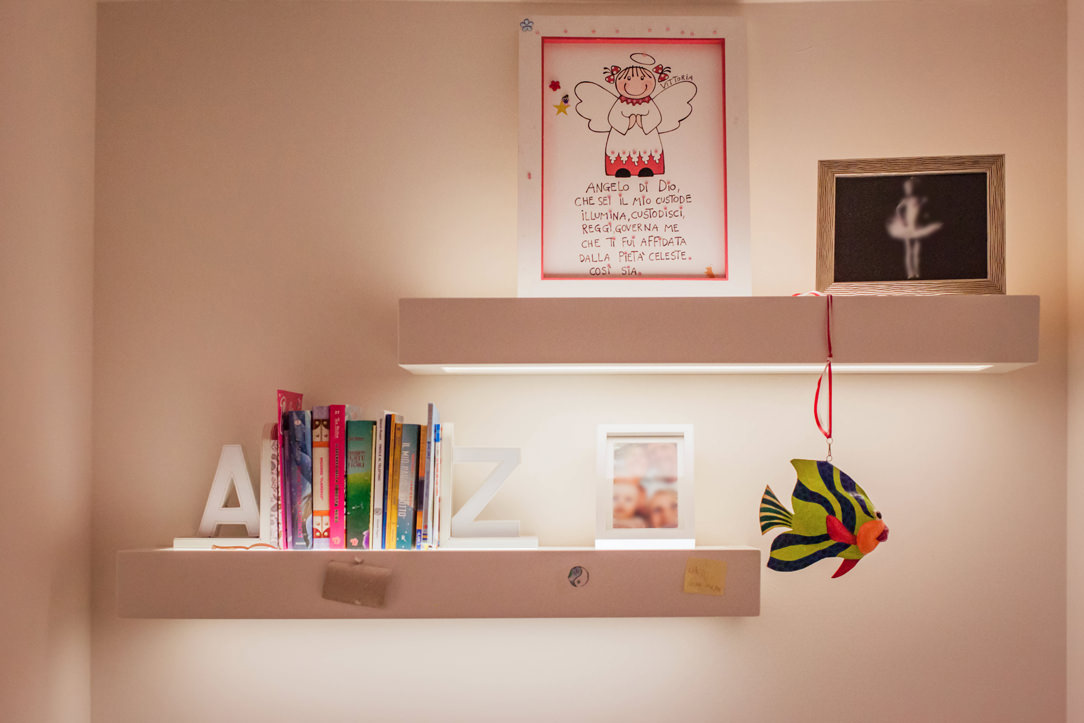
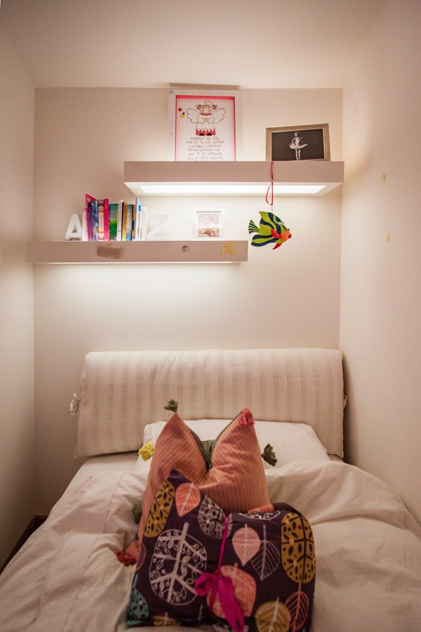
The large one and a half bed is inserted in a niche. The latter used in the depth to fix shelves with hidden lighting.

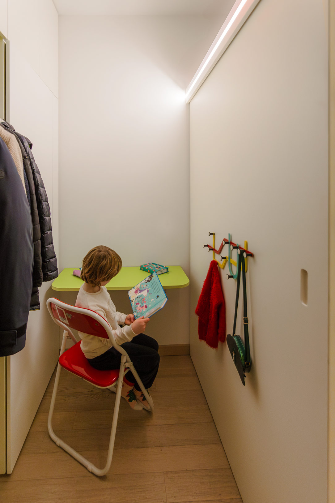
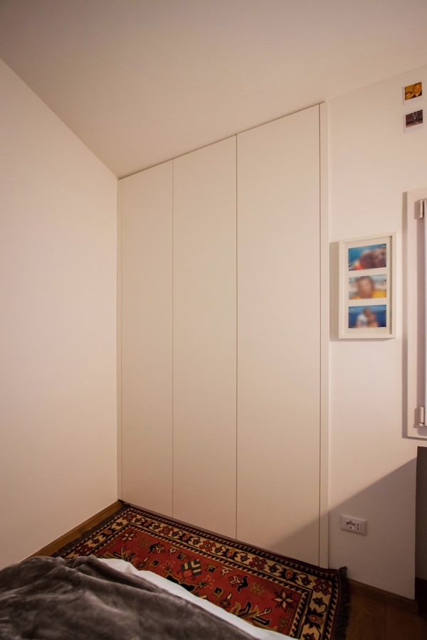
In the second small room, the depth of the niche is useful for a certainly wider wardrobe. Full-height doors with push opening accommodate fixed tubulars, drawers for linen and shelves for folded items to satisfy the needs of a young girl.

shaped-wardrobe-basement-niche
service-drawers-bedroom
recessed-handle-shaped-detail-drawers
internal-wardrobe-composition-shap-bedroom
detail-hanger-shaped-shelves-wardrobe-bedroom
detail-shelves-integrated-lighting-bedroom
niche-bed-girl-illuminated-shelves
giving-new-life-furniture-niche-bed
shaped-niche-wardrobe-push-opening
interior-composition-wardrobe-bedroom-niche
internal-tubular-hanger-shelves-closet-bedroom
drawers-handle-hollow-inside-cabinet

The master bedroom: a wardrobe like new

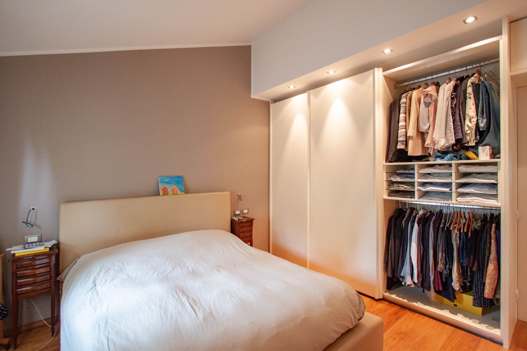
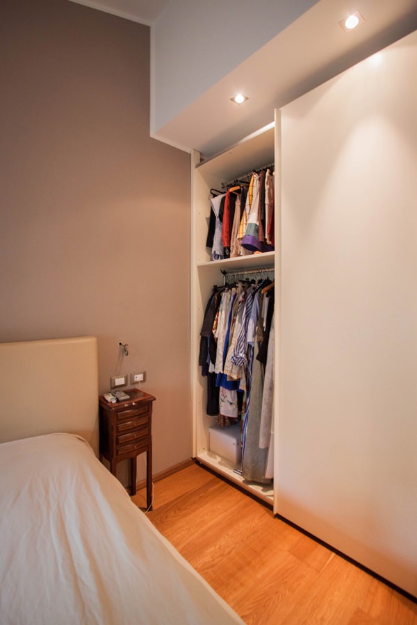
The master bedroom is best equipped with a large wardrobe with sliding doors placed parallel to the bed.
Its linear aesthetic combined with spot ceiling lighting allows at the same time to hide its grandeur.
The result is a capacious and functional volume which, in the aesthetic impact of the room, tends to disappear while giving character and elegance.
Relocated from the old house, the different internal height has led to a reduction in height which has thus made it possible to better adapt to new environments.

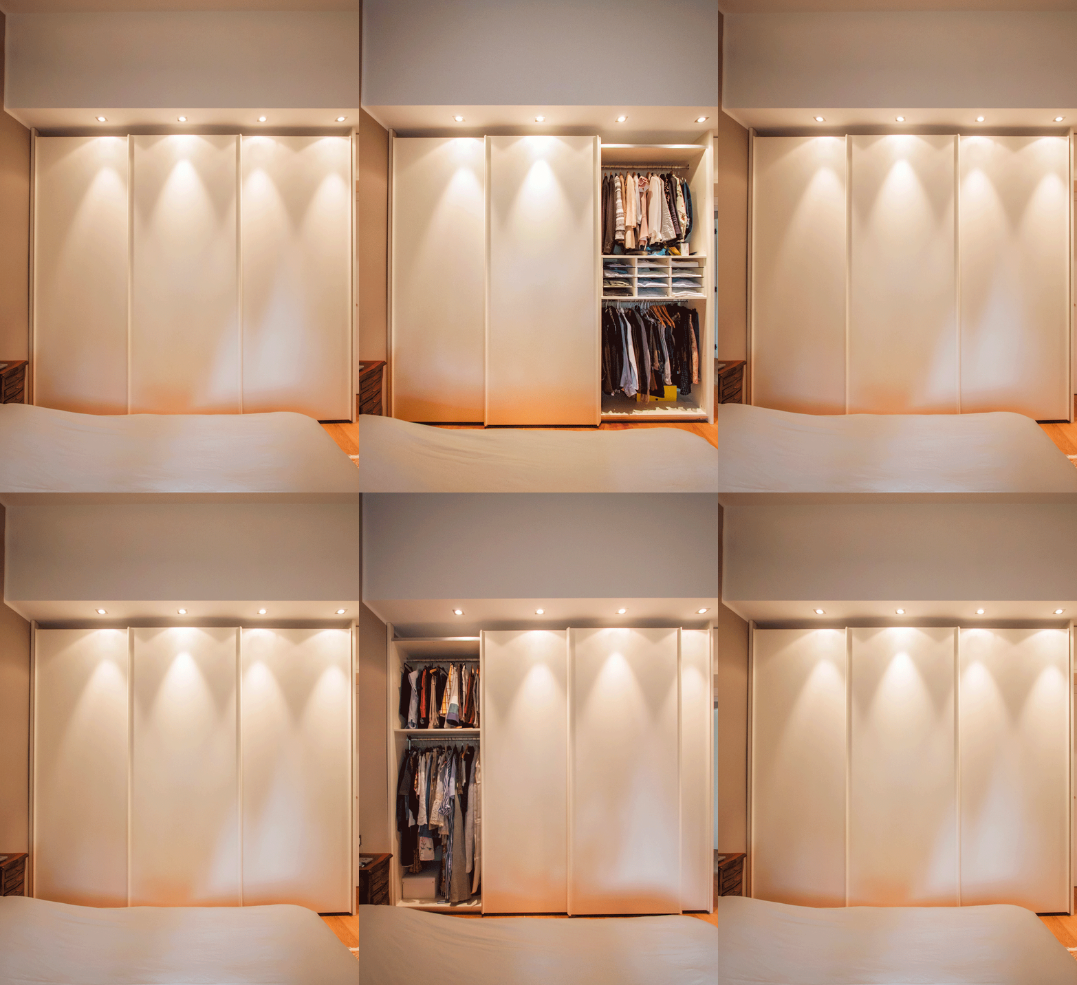
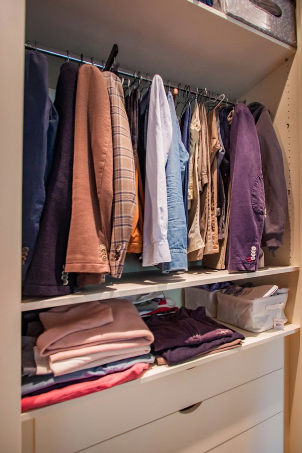
The composition of the wardrobe comes from a natural division into three departments, corresponding to the division of the sliding doors.
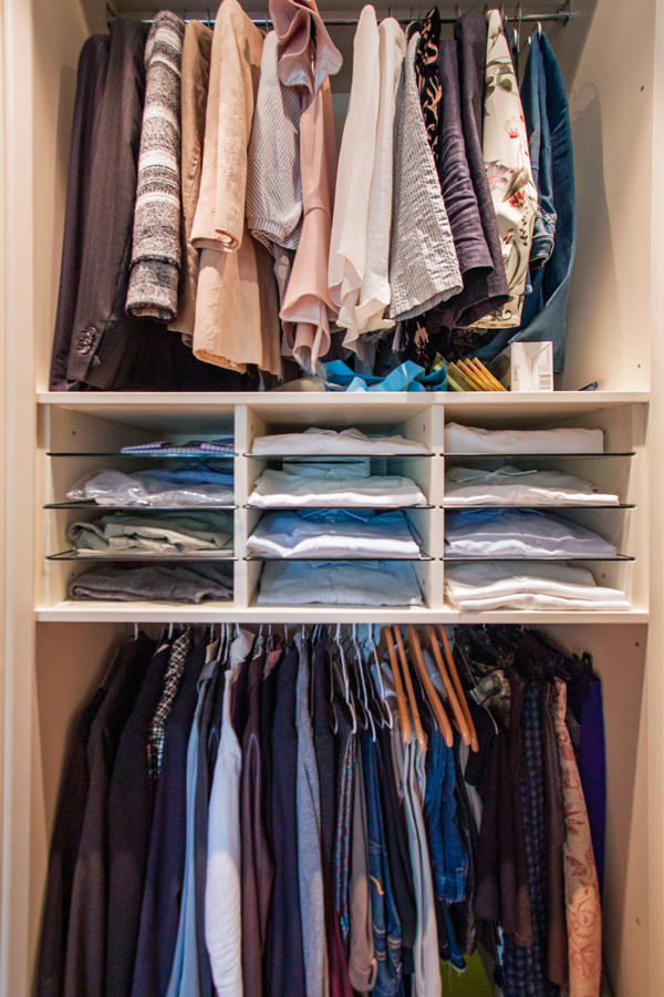
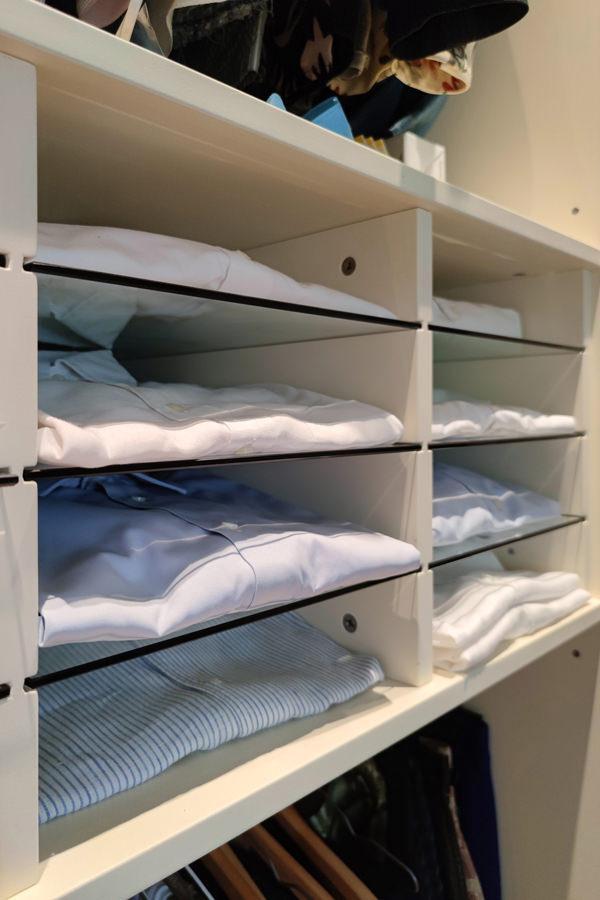
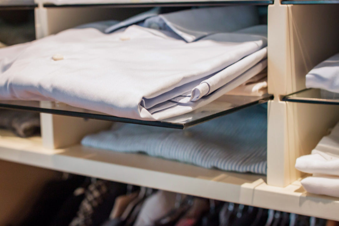
On the outside, the double-height hanger houses removable glass shelves in the center. These are particularly suitable for storing folded shirts using the external sliding mechanism to reduce the internal height between the trays.
In the central compartment, the large linen drawers are accompanied by a pair of shelves for folded items and hangers in the upper part.
The left compartment instead houses a double hanger to accommodate long dresses and coats whose greater height compensates for the reduced space reserved for folded trousers and skirts.

master-bedroom-wardrobe-open-tray-extractable
animation-opening-wardrobe-internal-composition-giving-new-life-furniture
internal-composition-wardrobe-hangers-pull-out-trays
detail-trays-removable-glass-wardrobe-bedroom
detail-trays-removable-glass-wardrobe
internal-wardrobe-double-hanger
internal-composition-wardrobe-hangers-drawers

Giving new life to furniture does not only mean rejuvenating it and making changes to its aesthetics. The bespoke design allows you to create furnishings that are versatile and able to adapt to new environments. Restoring a balance between aesthetic conformation in relation to the room and functional needs becomes the main goal.

If you want to deepen the theme of furniture flexibility, we suggest you this article in which series furniture and tailor-made solutions help each other!

Surfaces from the textures with asymmetric geometries

Surfaces from the textures with asymmetric geometries

A particular work of the surfaces to give a quid to the elements that relate within in the same environment.

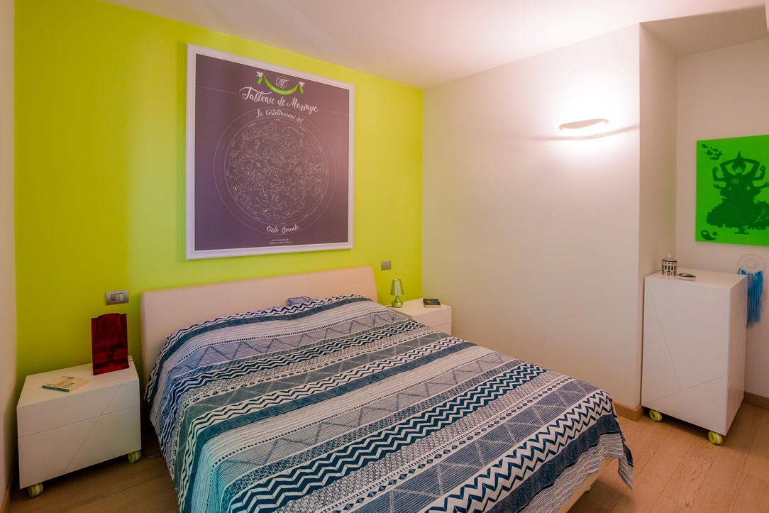
bedroom general view

A particular work of the surfaces to give a quid to the elements that relate within in the same environment.CONCEPT

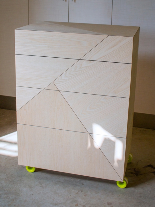
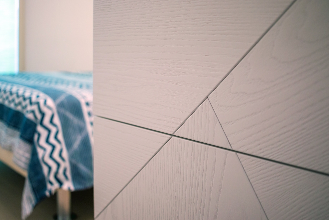
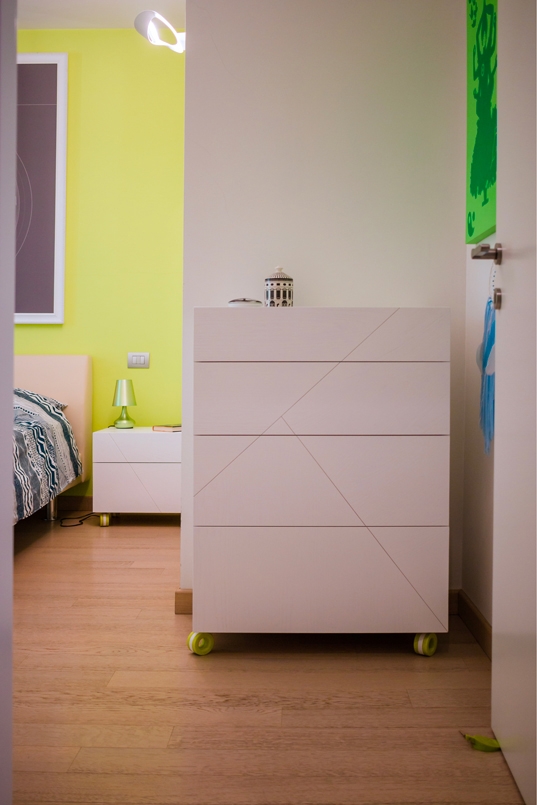
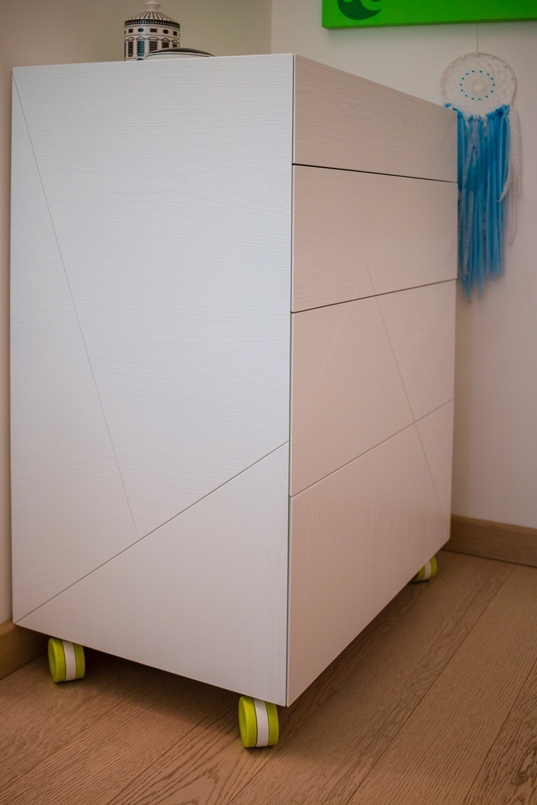
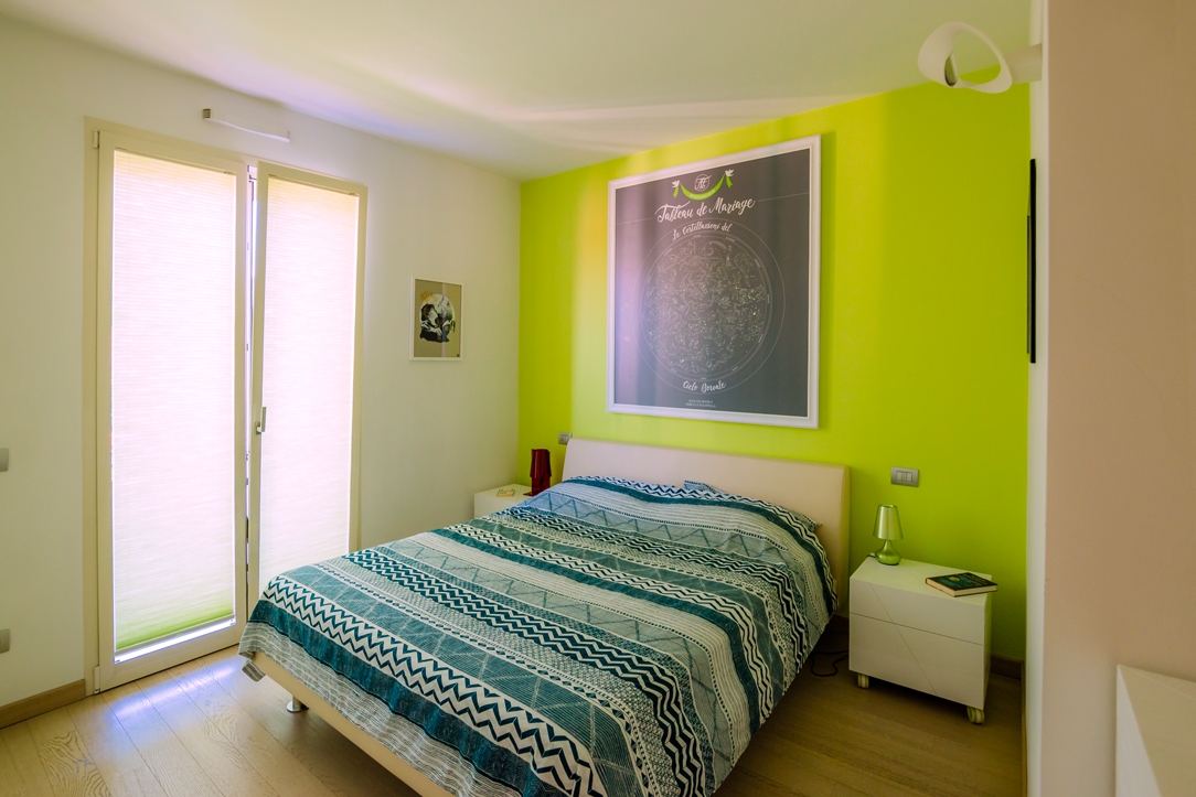
To create aesthetic dynamism we worked on the details of three elements, two bedside tables and a chest of drawers, that as to be inserted in an already furnished room. The environment was already defined by a full-height wardrobe in lacquered MDF in the same white as the side walls and facing a back wall with a dominant color, an acid green. We wanted to keep white as the base color, but with some peculiarities: we brushed the wood and finished it with white open-pore water-based paint, so that its veins could be glimpsed.  

WORKING PROCESS

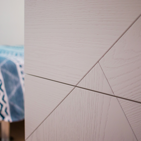
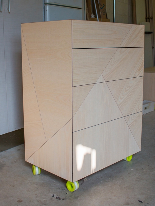
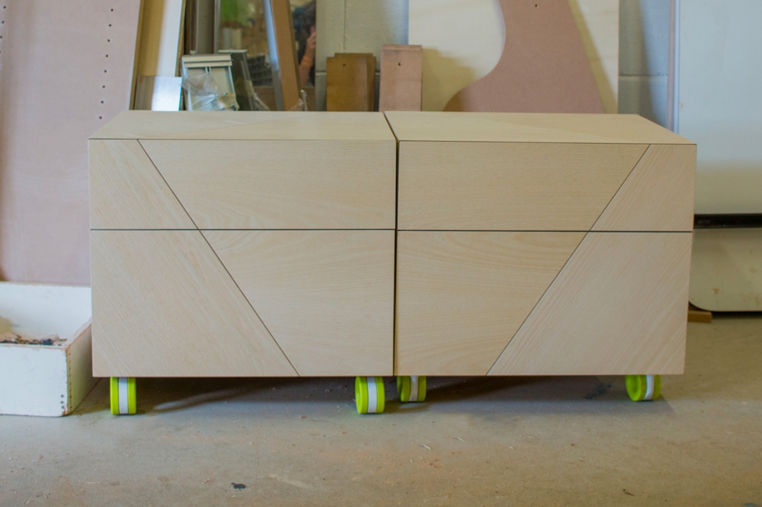
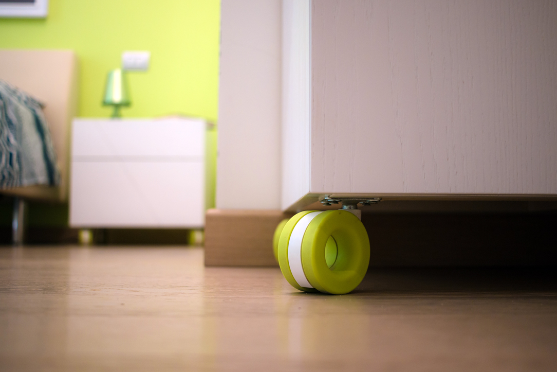
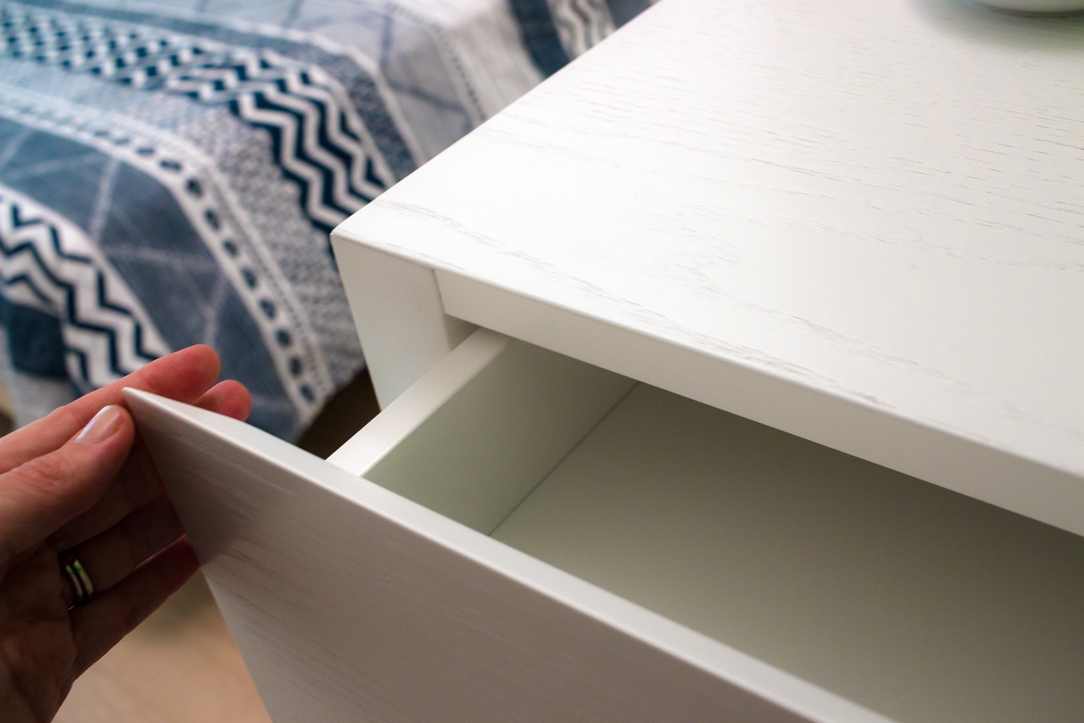
Is to underline the great initial work, the one of cutting the surfaces like the project and joint them in their various pieces by changing the inclination of the ash vein and keeping the direction of the cut also on the adjacent sides. The result is poetic, the cuts become the thread of a blade that rests on the three elements and tries to cut them in its three-dimensionality. The drawers are push-open, reached 45 ° and the drawer air corresponds to the thickness of our fake cut. These distinctive details do not shout their presence, but are noticeable only when you approach these elements and analyze them better. Inserted in the room, they blend perfectly with the general context. The particular design wheels are made by OgTM, the model is Moebius in his acid green color, like our characteristic back wall. We present some images of the work in progress with the elements assembled and not yet painted and then the finished pieces inlaid in the environment.

surfaces treatments night tables
surfaces treatments night tables 02
night tables front view asymmetric surfaces
night table front view
night table side view
bedroom general view 02
closure detail night tables
wheels detail night tables
surfaces detail night tables

High ceilings and contemporary boiserie in a Ligurian apartment

High ceilings and contemporary boiserie in a Ligurian apartment

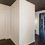
The interiors of the past were characterized by the presence of high ceilings, which in a contemporary perspective risk making houses disproportionate in the perception of spaces.

A possible solution can be to introduce a counter-wall capable of keeping the original structure intact but revolutionizing the interior spaces by providing them with a new height.


THE CONTEXT
THE INTERVENTION
LIVING ROOM AND KITCHEN
BEDROOM
BATHROOM
COLOURS AND MATERIALS


THE CONTEXT

Liguria is the sea with high, rocky and jagged coasts, but also the region with ancient culinary traditions and small towns close to the hills.

Characterized by small historical cities, it responds to a still traditional setting with houses often placed against each other and narrow passages to take the most advantage from the spaces.

For this reason, most of the interiors are currently dated and difficult to expand.

As in most old houses, the ceilings are very high and can modify the perception of the spaces.

Characteristic spreads throughout Italy, whose solutions can vary considerably depending on the context. Sometimes taking advantage of verticality can be the design choice capable of characterizing the project, as in the case of this New York Apartment

However, in case of small spaces, the already very high ceilings are further accentuated by the planimetric dimensions of the interiors.

dining room high ceiling

THE INTERVENTION

The design project aims to restore the right eight to each room, while giving a fresh and contemporary look. Working on the internal heights was possible through the use of a wall covering, a boiserie whose height of 240cm re-establishes the usual proportion of the rooms, allowing in the same time, to keep the original structure intact.

It is exactly on this fundamental feature that the renovation of apartment is based: building a sort of exoskeleton able to maintain the original ceilings and making it equipped where necessary. At the same time, it creates an internal setting that respond to the customer’s needs.

The intervention involved all the rooms of the apartment, of which however the kitchen and the bathroom were affected in a reduced way because they preserve original in the internal height.

wooden kitchen countertop
living room high ceiling recess glass shwcase
kitchen countertop wood
wood dining table high ceiling
high ceiling false ceiling closed
high ceiling false ceiling open

LIVING ROOM AND KITCHEN

Starting from the entrance, the new compact structure of boiserie encloses the false ceiling with zenithal lighting.

The difference between the original and the reconstructed height is still accessible and serves as a storage element. In doing so, it’s takes the most advantage from the existing space, providing greater functionality.

The living room was instead equipped with a niche used as laundry room, flanked by a small glass showcase embedded in the double wall.

Turning instead to the kitchen room, it is the shaped laminated wood with light colours that gives a touch of freshness and modernity, recalling the chromatic shade of wood used for the dining table. Wall and storage unites fill the remaining gaps by taking the most of every corner of the small apartment, without making it oppressive.

wardrobe open bedroom
bedroom boiserie
bedroom boiserie high ceiling

BEDROOM

The use of the full-height boiserie allows the bedroom to better hide the service wardrobes.

Organized along two corner walls, they consist of niches with multiple functions capable of containing drawers, hangers and shelves at different height. In the same way, the television is also included in a special custom-made niche.

The extreme functionality of the corner wardrobe becomes an extremely stylistic clean and contemporary element in this design system. Added to this, the backlit false ceiling is able to provide diffused and elegant lighting.

In order to give greater dynamism and personality to the boiserie, horizontal cuts were inserted to create an innovate stylistic linearity. It is also possible to equip these horizontal cuts with possible supports, to make the bedroom even more functional.

sink design Ligurian apartment
bathroom high ceiling
furniture bathroom drawers

BATHROOM

Evoking the use of laminated wood that characterizes the kitchen countertop and the display elements of the living room near the dining table. Even the bathroom is characterized by a contemporary and extremely fresh stylistic element. The storage units host a niche for the washing machine and a chest of drawers with marked edge that perfectly fits with neutral tones of the room.

COLOURS AND MATERIALS

Concerning the chromatic and material choice, we opted for a project in continuity between different rooms. The textured laminated wood was chosen for both the walls and furnishing elements, whose texture recalling that of the fabrics, gives greater domesticity and softness to the interiors. A contemporary aspect that can also be found in the neutral shades adopted: two different shades of gray which create a very elegant internal movement.

Finally, the introduction of laminated wood in the living room and in the bathroom gives a decisive touch able to make the environment younger. It is exactly in these two rooms that the high ceilings have been maintained.

dining table and glass showcase