Design Week 2024

Design Week 2024

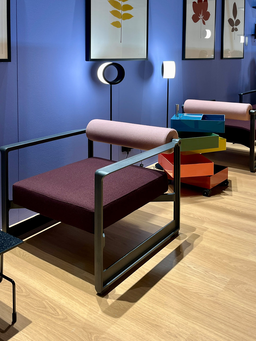
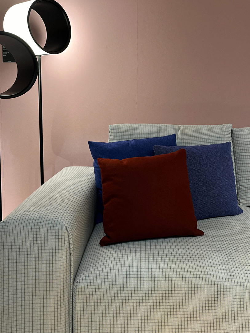
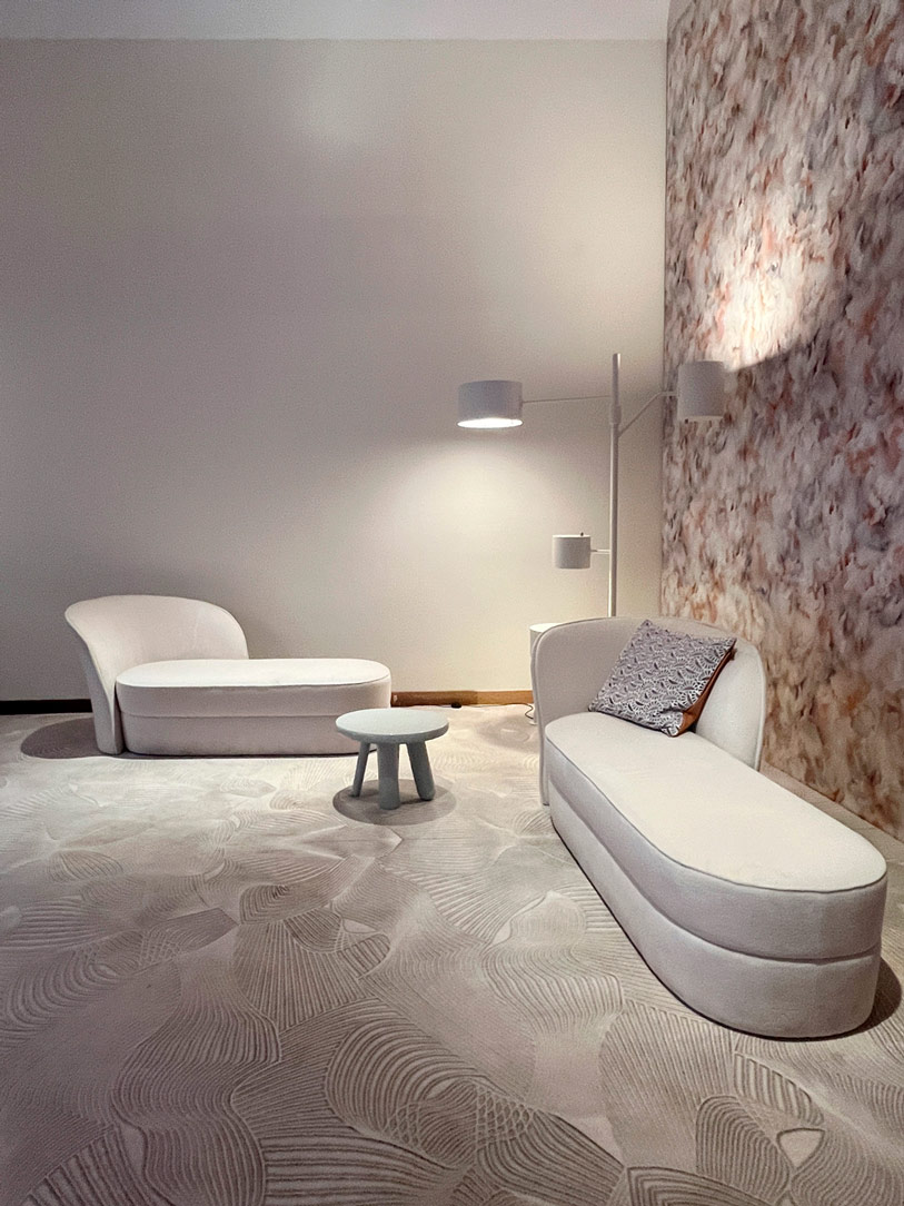
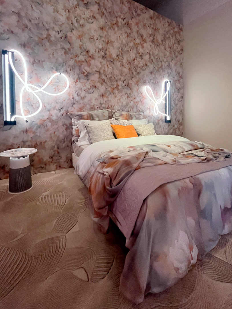
The Design Week of this year, just concluded, left us with eyes full of wonder and inspiration, eager to share with you all that we have discovered. In this article, we will try to recount our experiences both from the Salone and the Fuorisalone, although the crowd that filled the stands and the streets of Milan prevented us from seeing everything we would have liked.

This year’s Design week was a real magnet for designers, architects, and design enthusiasts from around the world. Every corner of Milan exuded a fascinating mix of cultures, charm, and originality, making the experience even more engaging. The fair at Rho managed to gather in its countless pavilions the production of Italian and foreign design. This year, unfortunately, the luxury sector was absent, but EuroCucina and the Salone del Bagno shone in the forefront.

As in the past editions of 2023 and Design Week 2022, the leitmotif of the event was sustainability, technological innovation, and functionality, themes that also found resonance in the new approach to digital design. Furthermore, the important role of circular economy, reuse, and sustainability of processes and materials was emphasized, underlining the importance of conscious practices that promote efficient use of resources and minimize environmental impact.
Orac materials

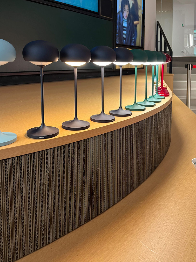
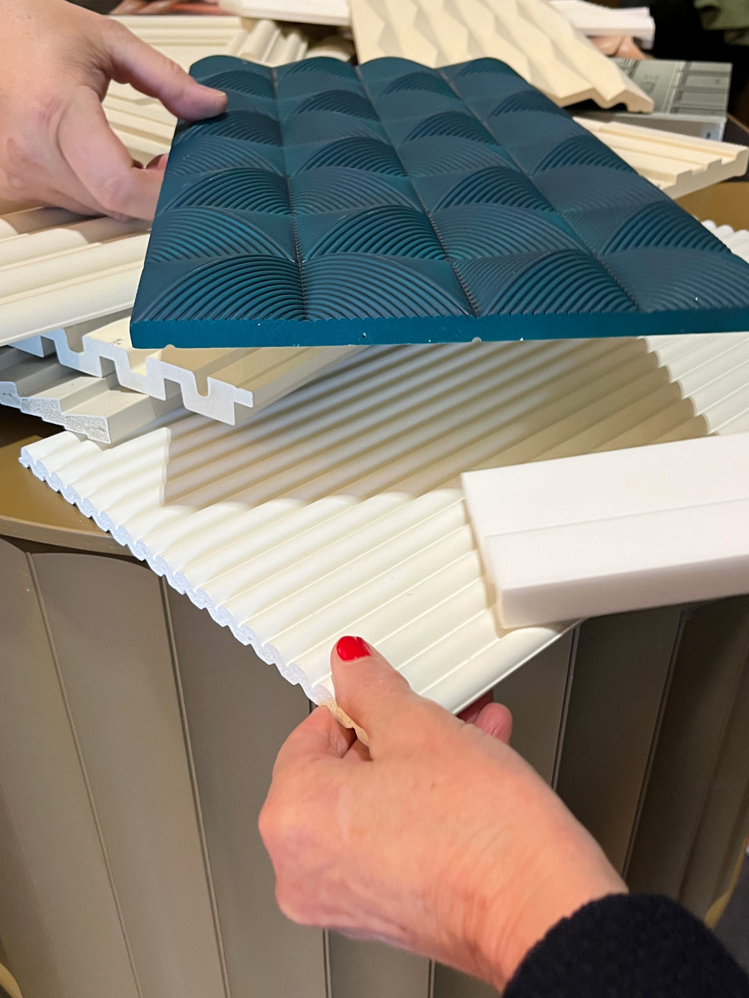
Clever Lamps by iGuzzini and materials by Orac

BATHROOM

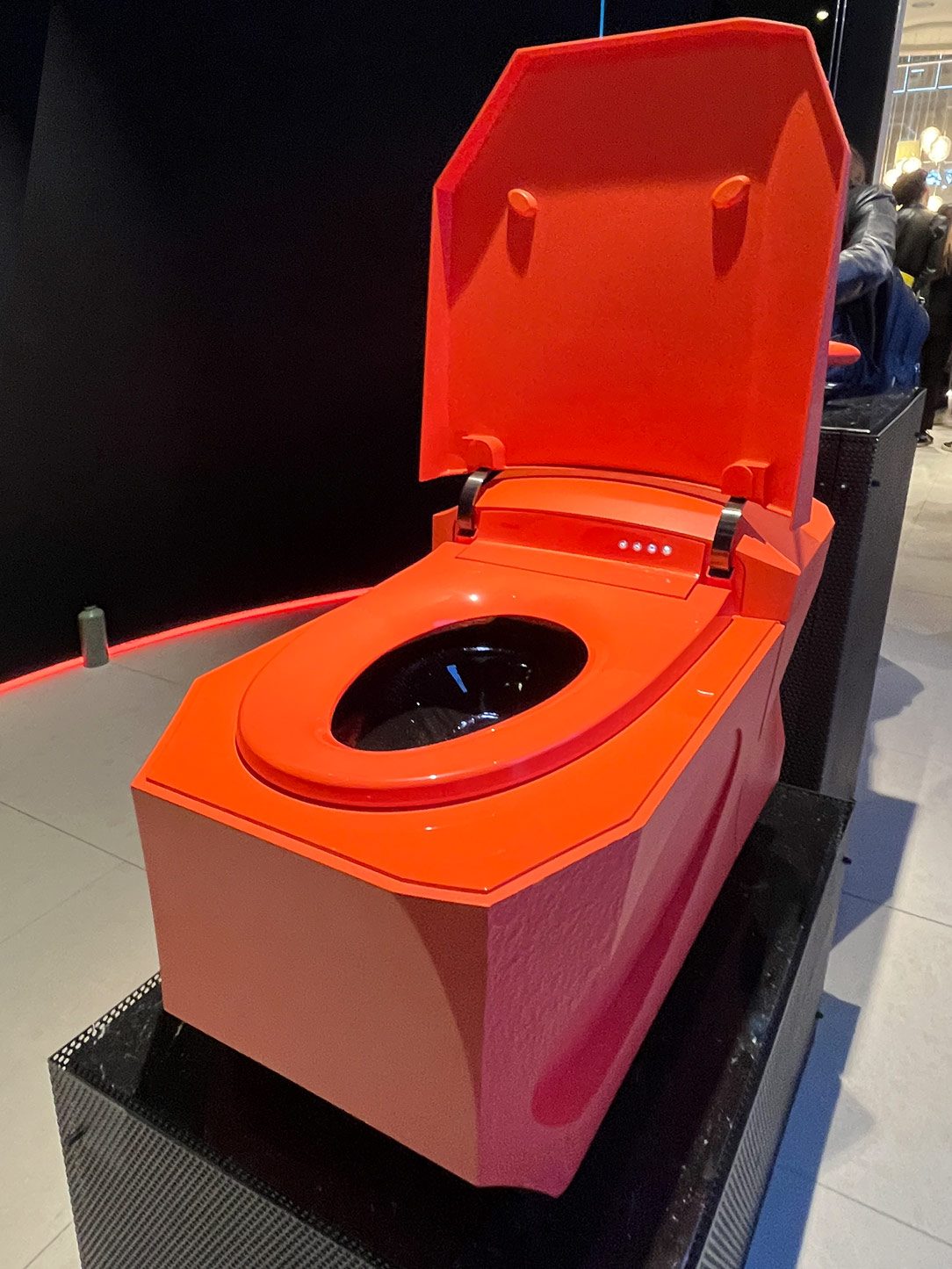
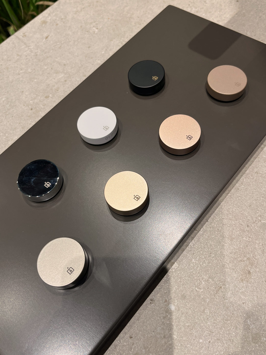
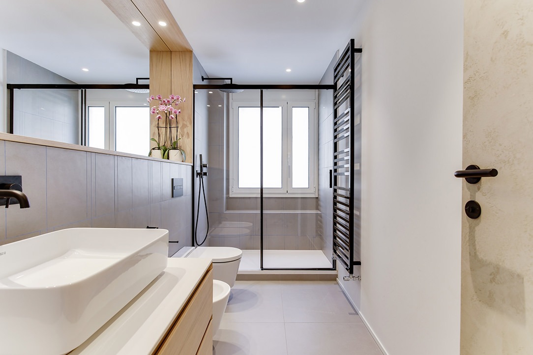
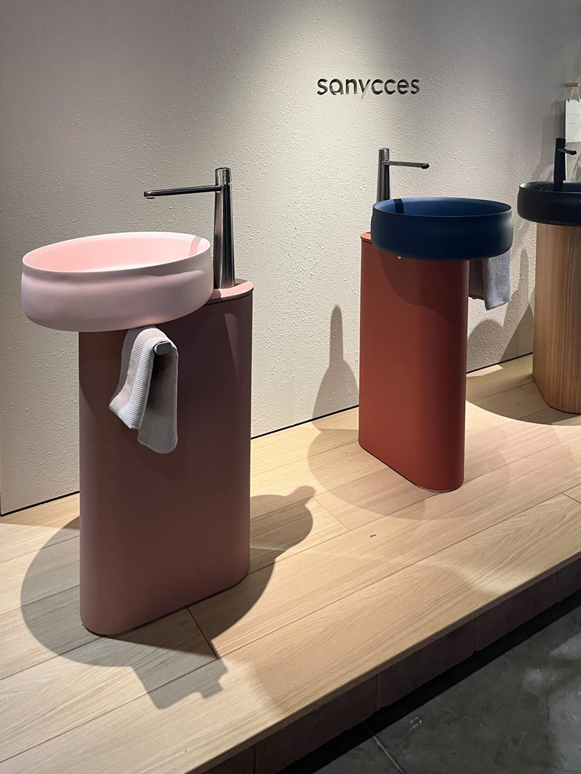
The bathroom appears in a never-before-seen guise: ceramic, traditionally candid and discreet, has transformed into a palette of vibrant colors, embracing pastel shades like delicate pink and refined pearl gray, but also bold colors like seductive bordeaux. The washbasins, true design jewels, oscillate between circular and ovalized shapes for countertop models, while those recessed maintain their elegant rectangular geometry, offering a variety of options. Materials such as fragranite and transparent crystal emerge as undisputed protagonists of the contemporary bathroom, adding transparencies and chromatic plays that confer modernity to the spaces. The plumbing stands out for a variety of finishes and colors, with a decrease in stainless steel in favor of bronze coatings, pale gold, and rose gold. But the real revolution occurs in the sanitary ware, which embraces artificial intelligence and home automation with innovative solutions. Companies like Rocha present automated models capable of anticipating our every need, from the autonomous opening of the lid to the cleaning of the bowl, offering an unprecedented experience of comfort and practicality inspired by Japanese culture. The simplicity of old-fashioned sanitary ware thus transforms into a sophisticated fusion of design and technology, reflecting the evolution of needs and desires.
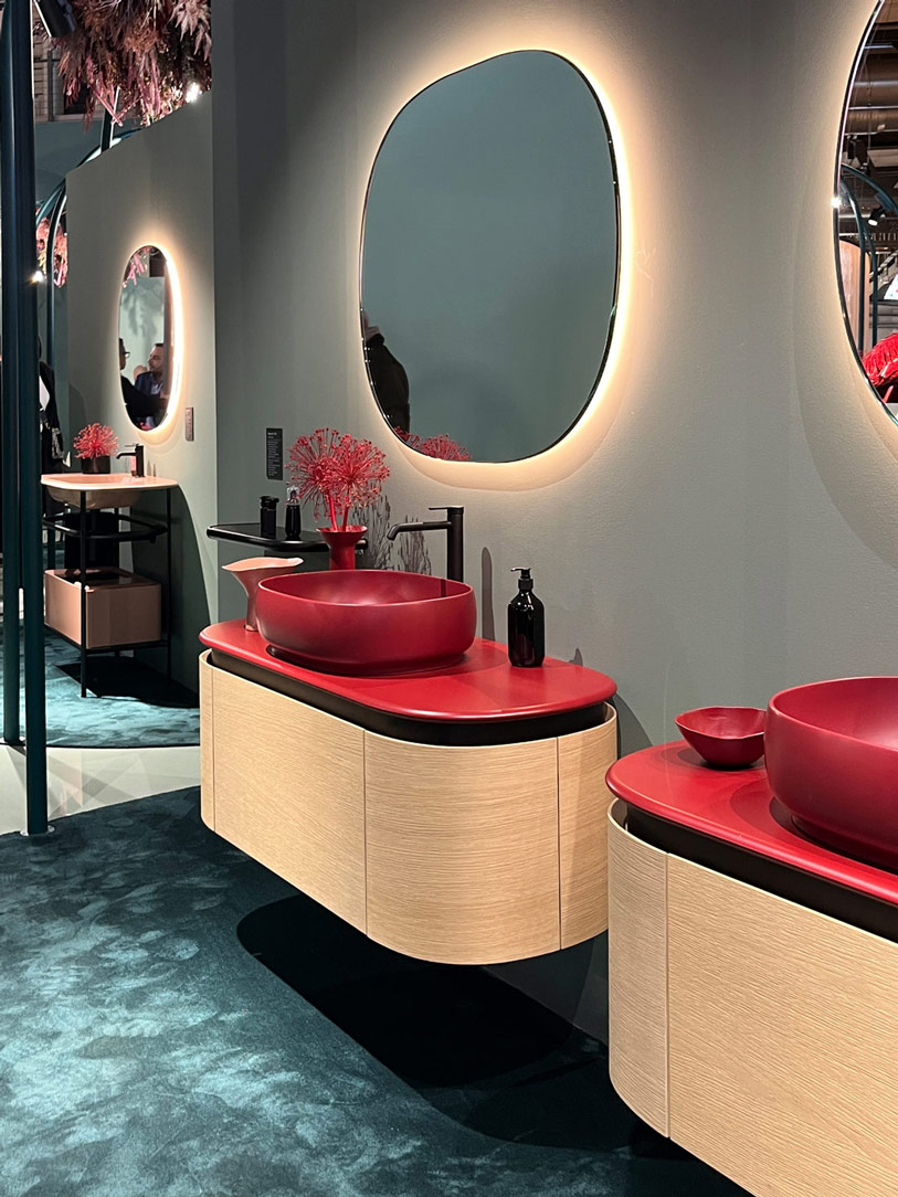
boredeaux  washbasin
stand alone  washbasin
intelligent wc

Washbasin Arbi Bathroom, stand alone Washbasin Sanycces e Intelligent Wc by Kolher
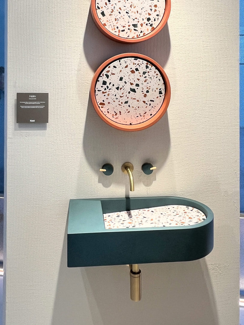
 washbasin terrazzo
tap finishes
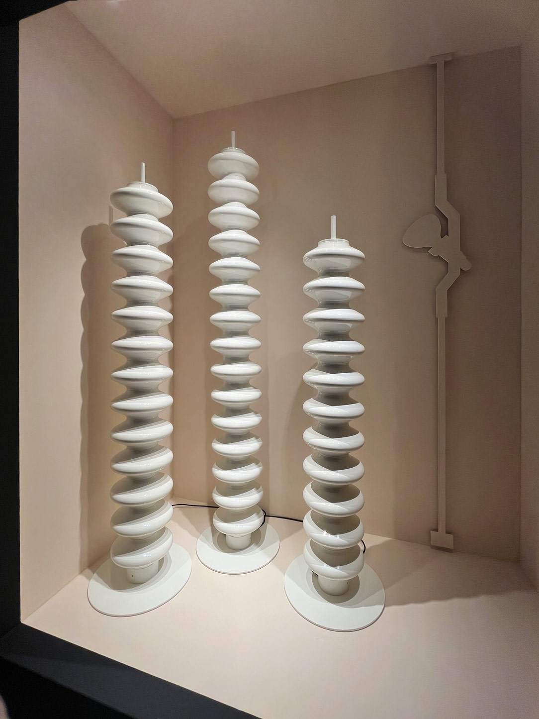
 radiators Tubes

Washbasin tops in terrazzo, new finishes of taps and vertical furnishing radiators Tubes

KITCHEN


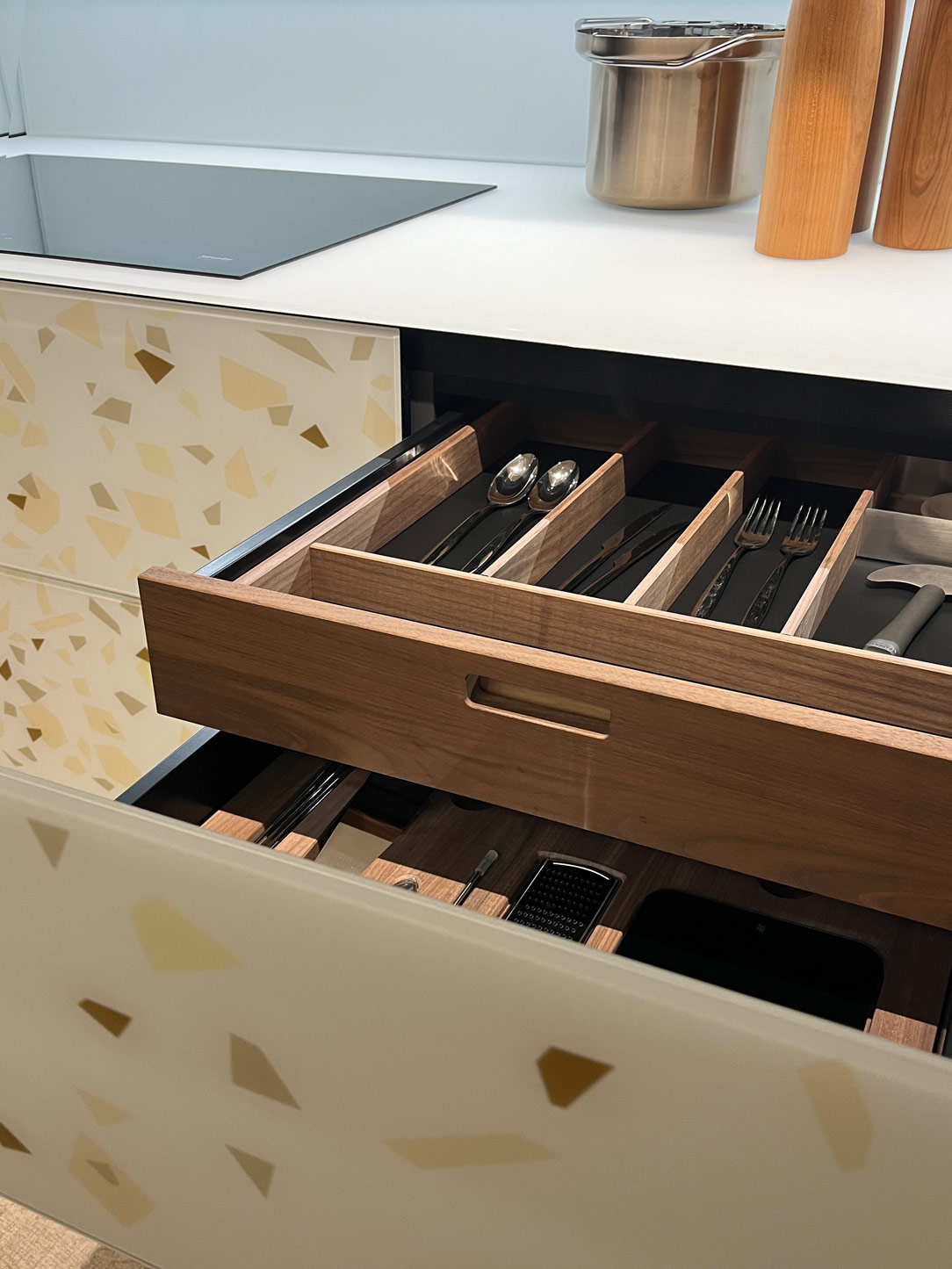
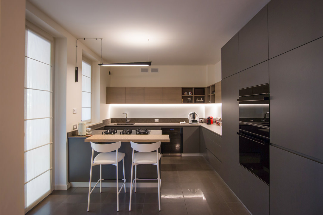
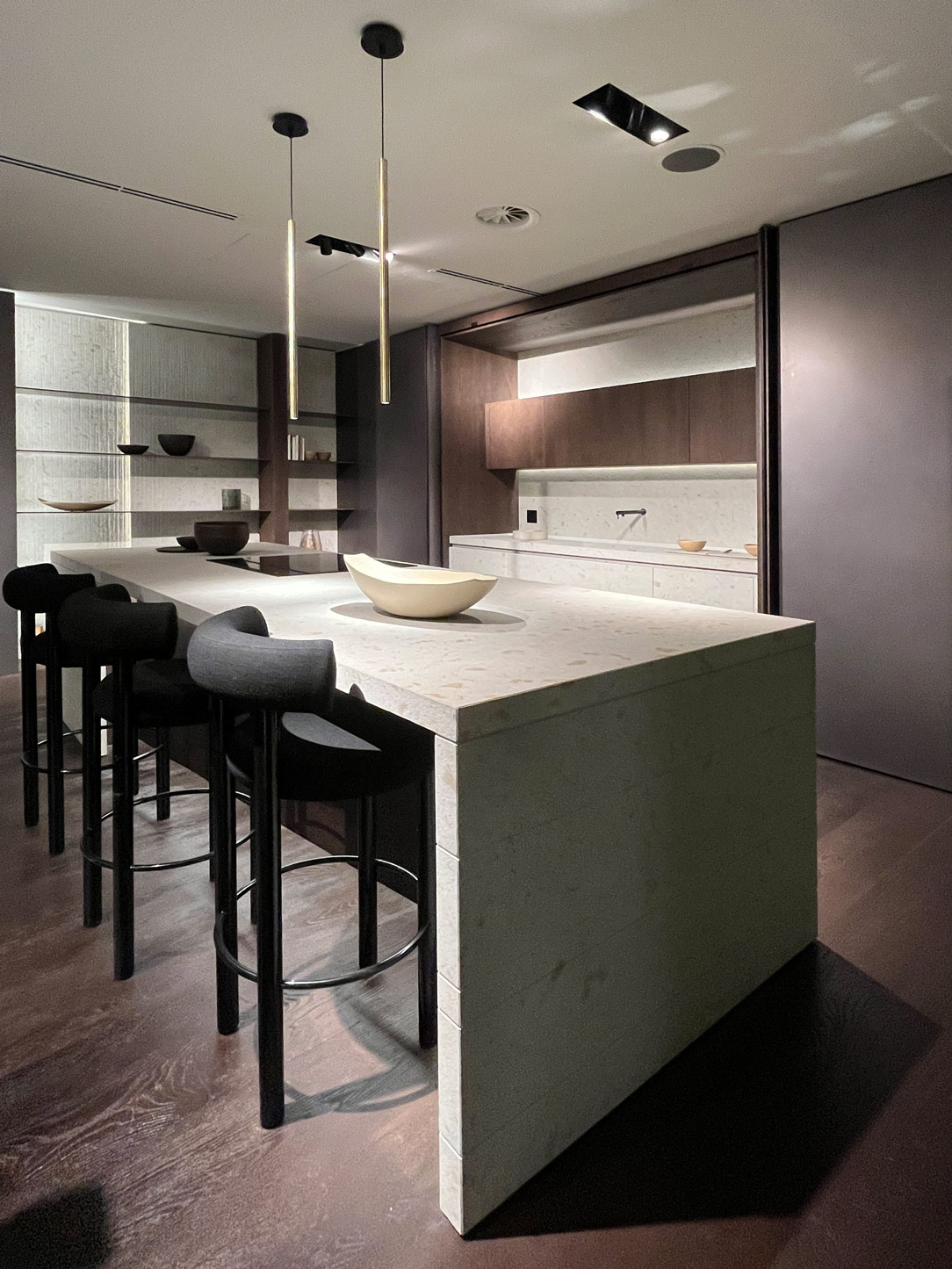
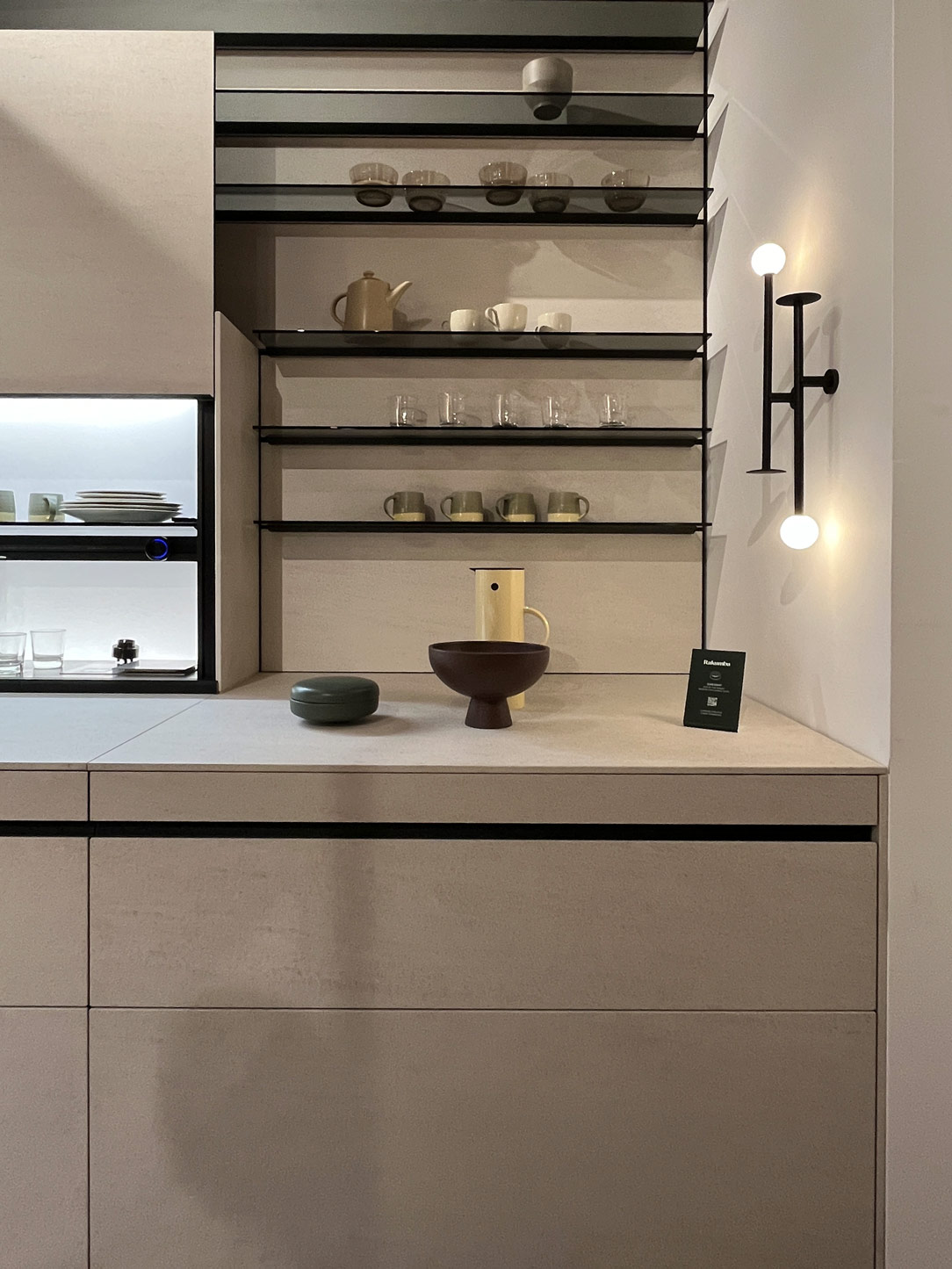
In the kitchen, island and peninsula continue to reign supreme in our favorite environment, the one that indulges our palate and allows us to relax while cooking. More and more space is dedicated to storing utensils, which are proudly displayed or discreetly hidden behind elegant glass doors, revealing both their contents and the intricate details of the kitchen.
modulnova
kitchen shelves displayed
modulnova

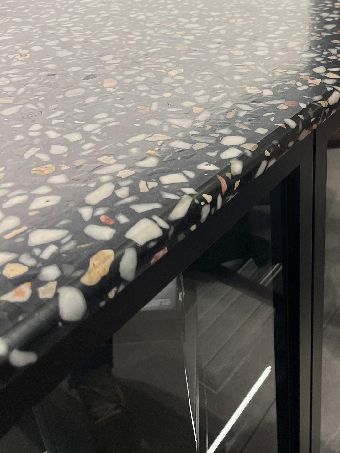
Once again, the enthusiasm for terrazzo finishing is palpable this year, with its rich range of earthy tones captivating the senses. However, we still encounter resistance in convincing clients to fully embrace it. Hopefully, it will finally establish itself in the collective imagination.
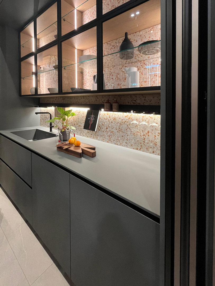
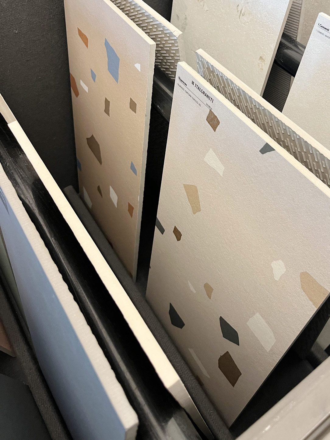
Kitchen terrazzo rho
terrazzo finish

Solid top or HPL countertops, adorned in uniform hues, and marble, whether natural or reproduced on ceramic surfaces, remain steadfast choices. Additionally, kitchen spaces are enriched with elegant metallic finishes or claddings in satin-finished iron or steel, aimed at infusing the kitchen with subtle metallic reflections.
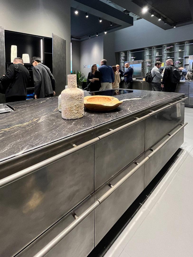
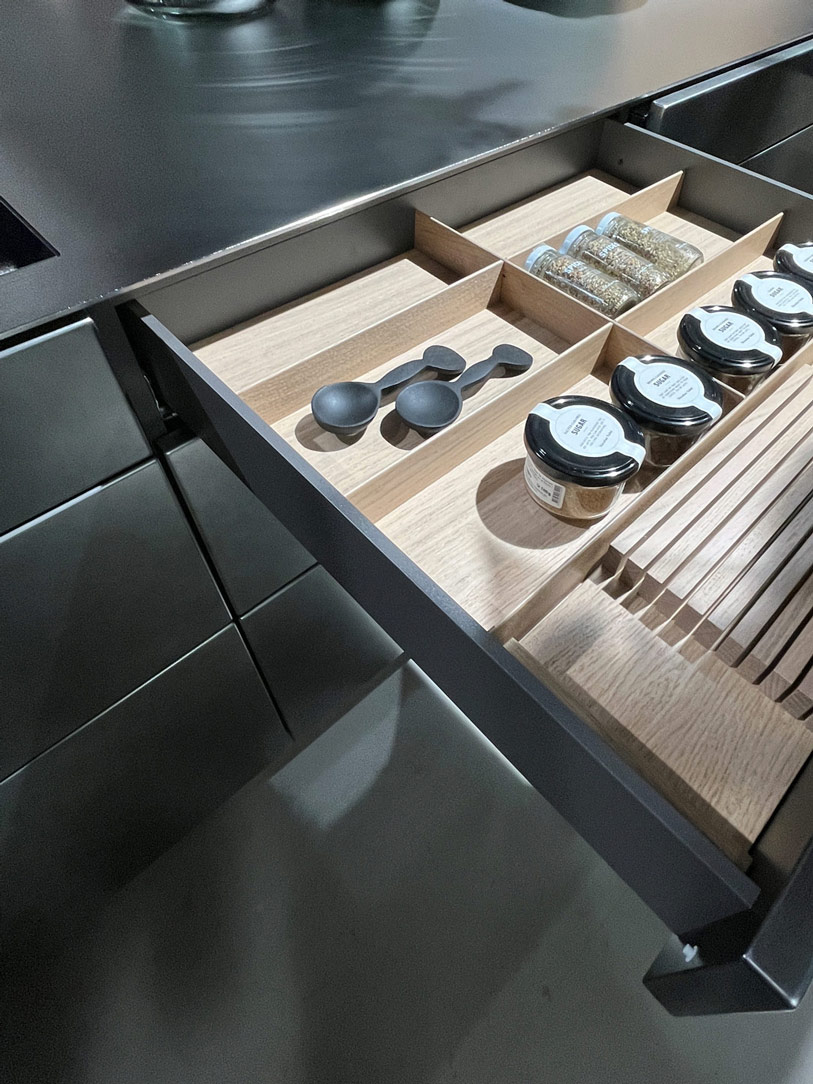
kitchen metallic finish
interior of metallic finish kitchen

For those nostalgic for the ’80s, the comeback of bullnose kitchen countertops, with pronounced edges, is a joy like no other. Even the snack counter embraces softly, with few linear surfaces and many with rounded forms, enveloping the kitchen with gentleness and harmony. Dining tables follow this trend, with few sharp-cornered examples and many gradually rounding off to become almost oval, making room for round tables, true protagonists of the kitchen space.
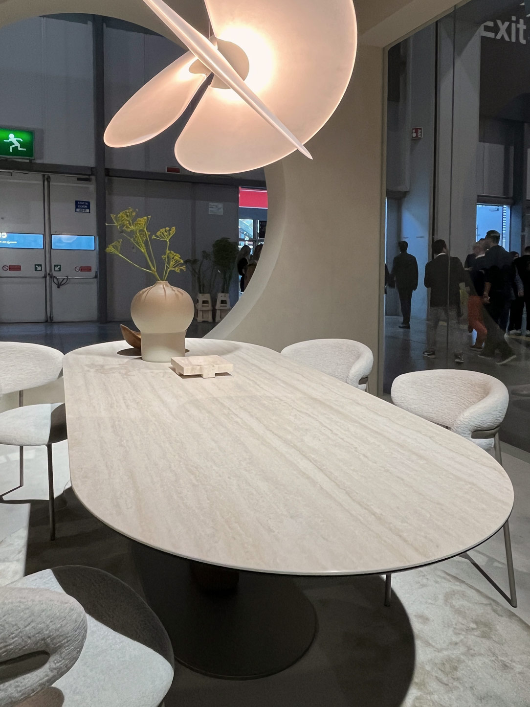
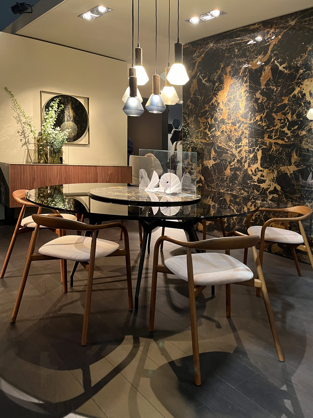
calligaris table
rho kitchen rounded
bullnose
kitchen details
wall units glass

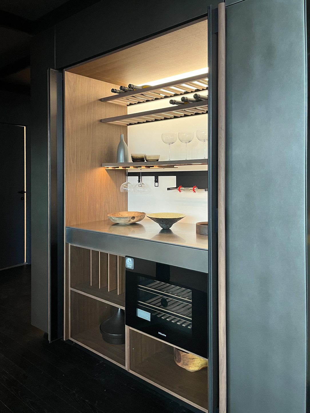
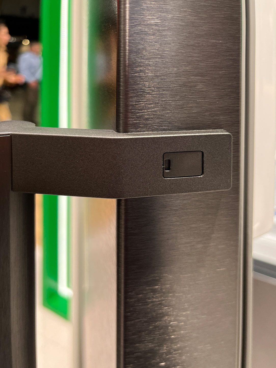
Thus, we witness a vintage revival in the kitchen, juxtaposed with increasingly advanced technology, as exemplified by TFK – Technology for Kitchen. In household appliances, new features emerge, with vibrant touchscreen displays allowing us to entrust the oven with selecting the optimal cooking settings for our dishes, all while it cleans itself with remarkable efficiency, as seen in the brand-new Bosch oven. The trending finish for appliances proves to be black stainless steel, a matte anthracite shade so deep it verges on black.
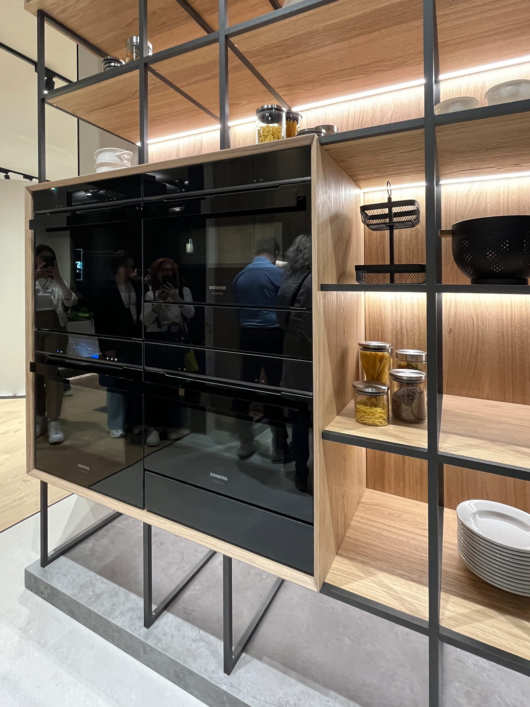
 home appliances
black stainless steel

HOME ENVIRONMENT


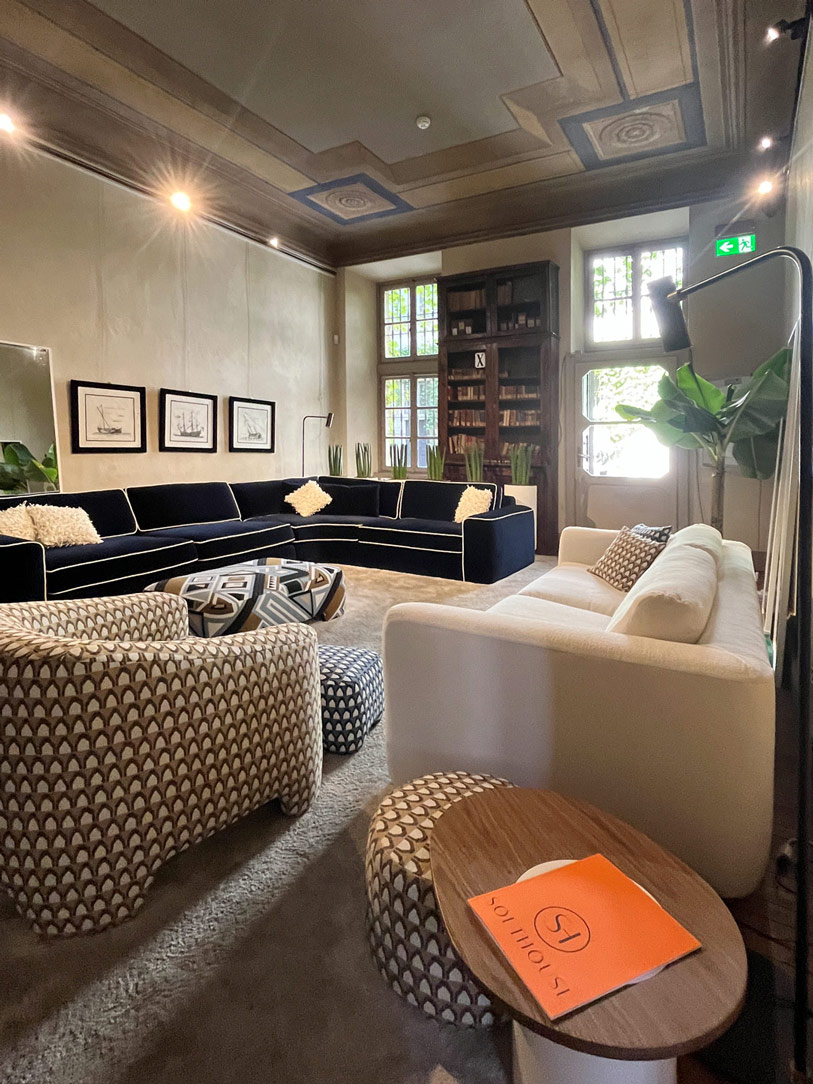
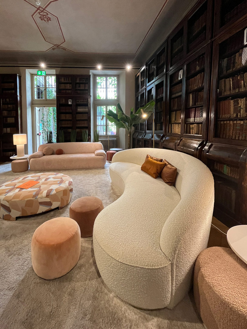
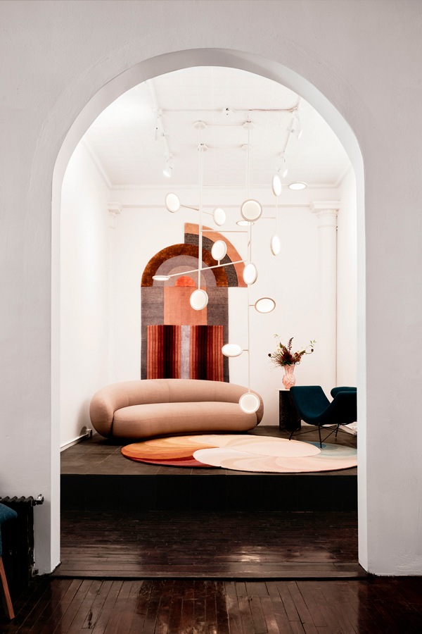
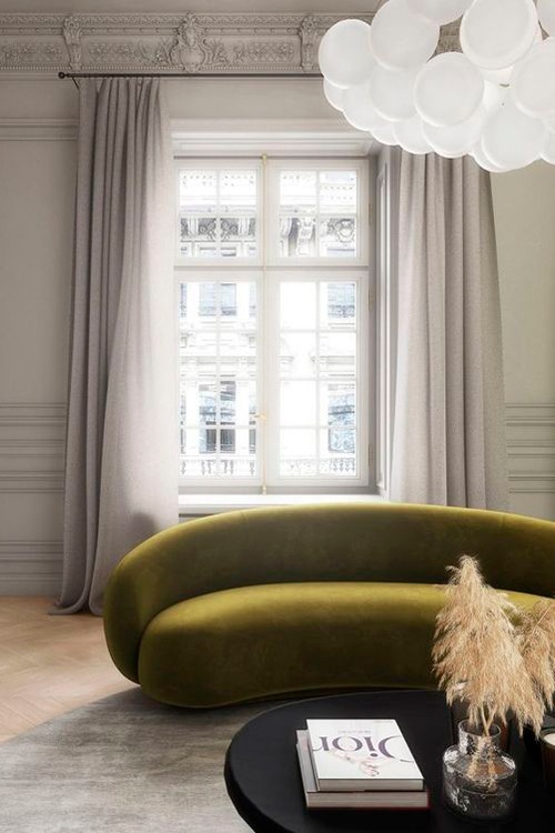
Exploring the world of home furnishings, we encounter a wide range of intriguing options. Sofas, the true protagonists of living spaces, appear increasingly imposing and enveloping, with circular shapes that embrace the surrounding environment, delicately hovering just above the floor without revealing a hint of legs. The bouclé cream upholstery, despite requiring some care in cleaning, remains a beloved choice for its softness to the touch and elegant appearance.
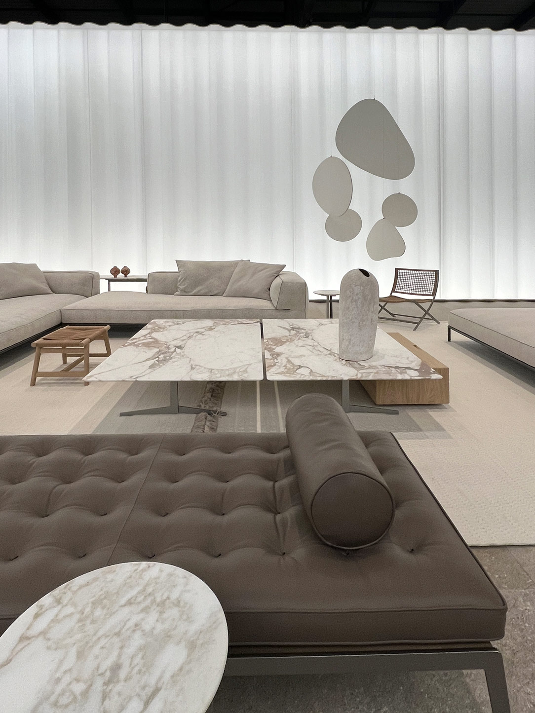
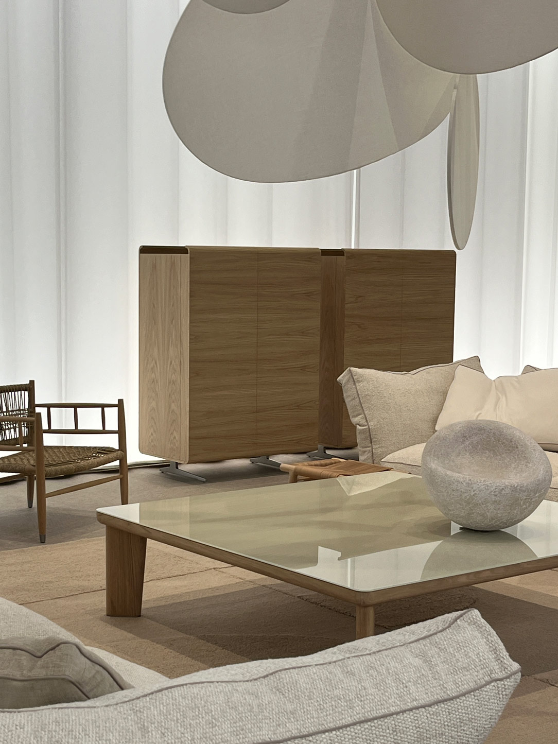
Minotti
Minotti

Living Room by Minotti

Hommes
Hommes

installation Hommés at Casa del Manzoni

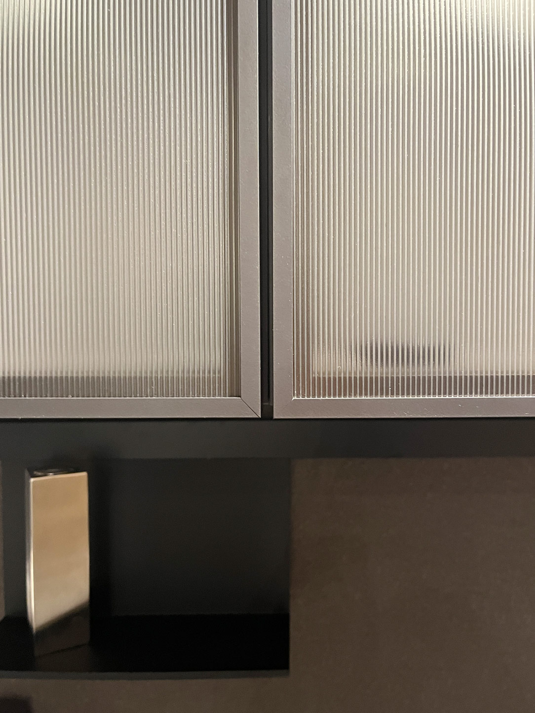
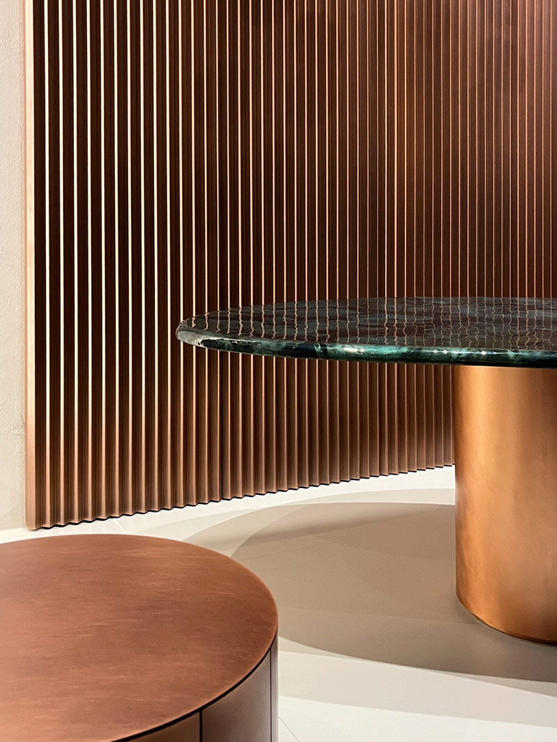
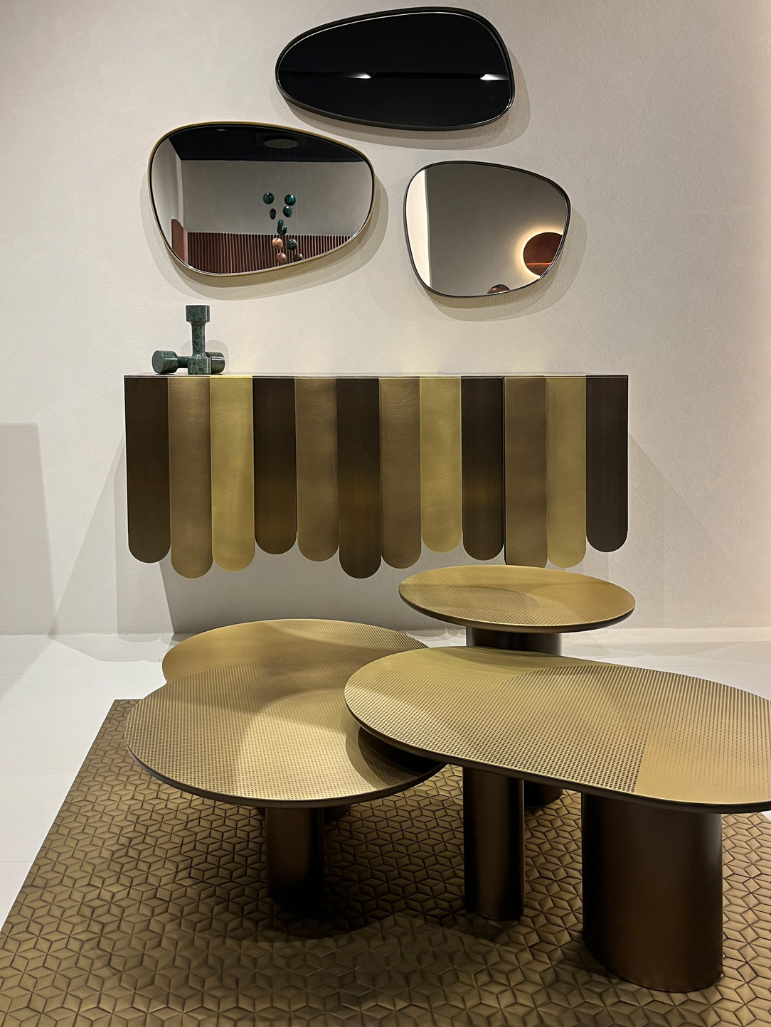
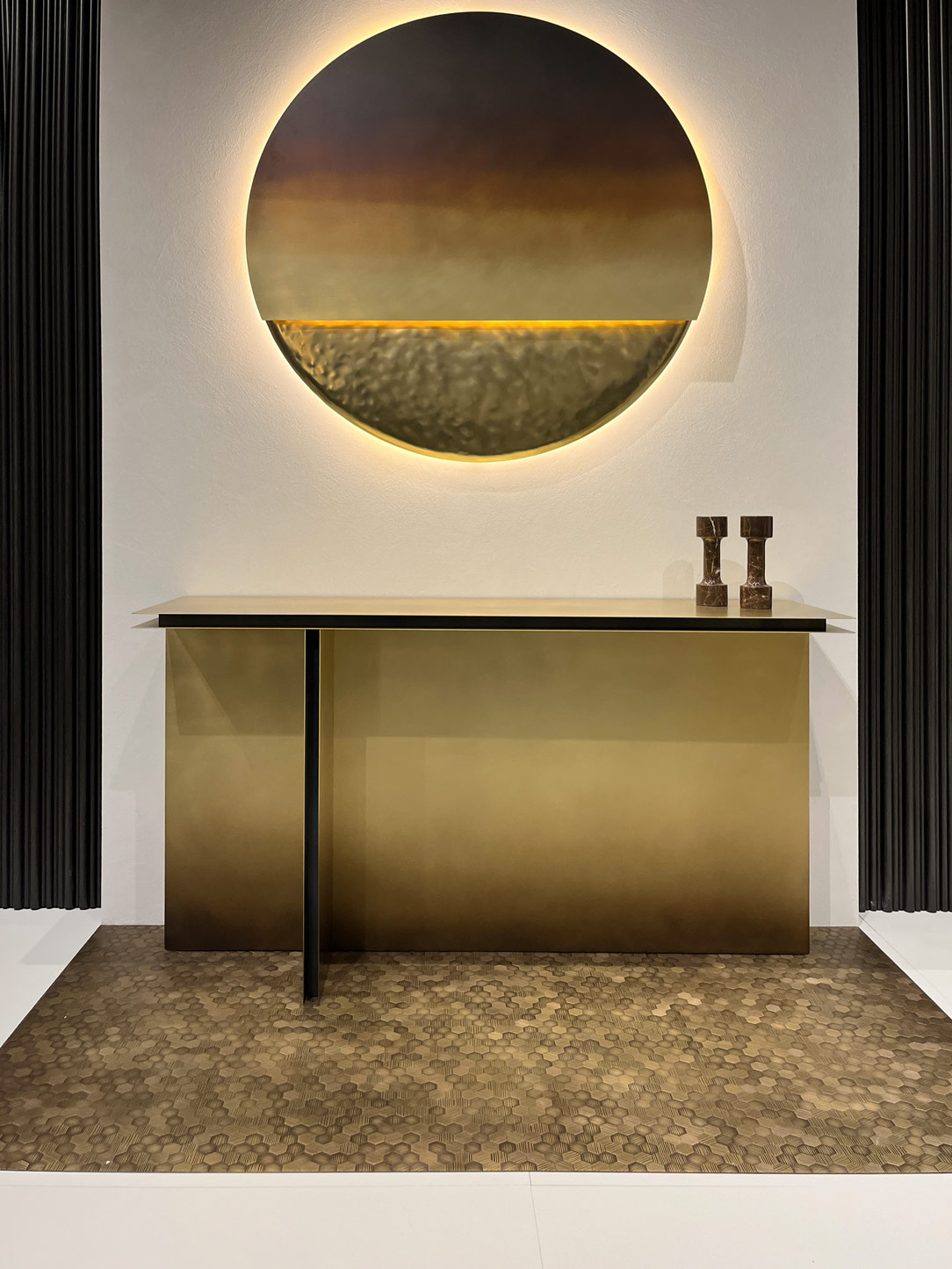
As for materials, wood in its natural tones and reeded wood maintain their prominent role, both in their raw and varnished form. Finishes diverge from stainless steel, opting for softer and more vintage tones like bronze and pale gold, imparting spaces with a touch of refined elegance.
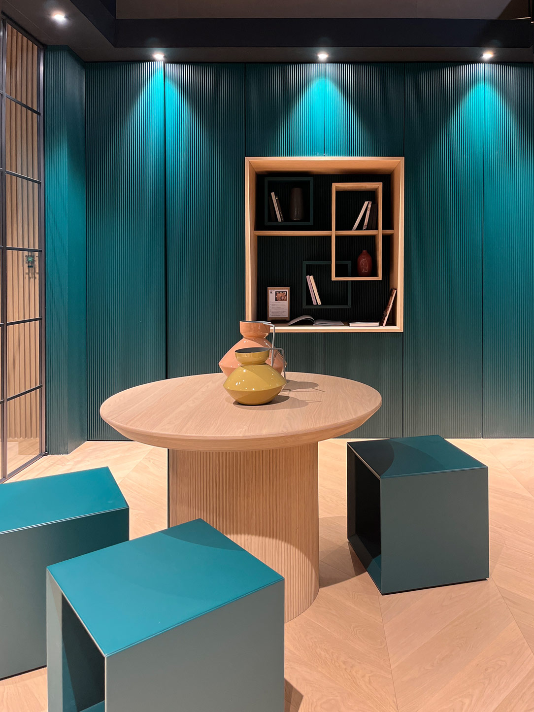
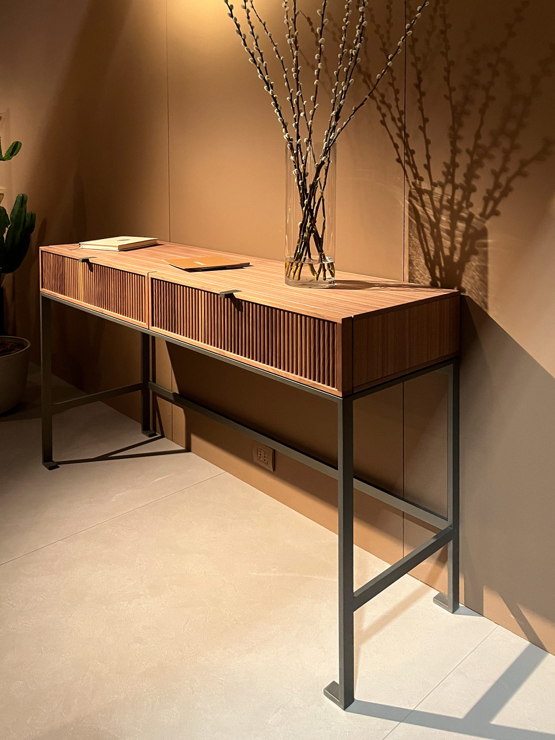
Garofoli Group
reeded wood

Living Room by Garofoli Gruop e reeded wood detail
De Castelli
De Castelli
De Castelli

Metallic finishes by DeCastelli

The current trend increasingly favors exposed elements over those hidden behind doors, with symmetrical bookcases alternating with metallic supports and wooden backings.

The motto of modern homes, especially for those who inhabit them, is order. Orderliness is sought in open bookshelves and increasingly transparent wardrobes with fewer usable shelves.

However, it should be noted that this aesthetic pursuit may sometimes compromise the actual practicality of spaces. Current trends lean towards larger, freer, and lighter homes, which can detract from actual living volumes, inversely proportional to the prevailing trends.
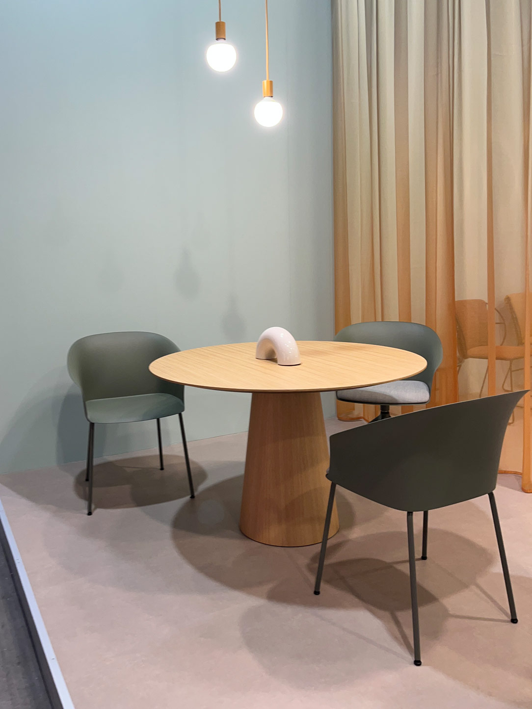
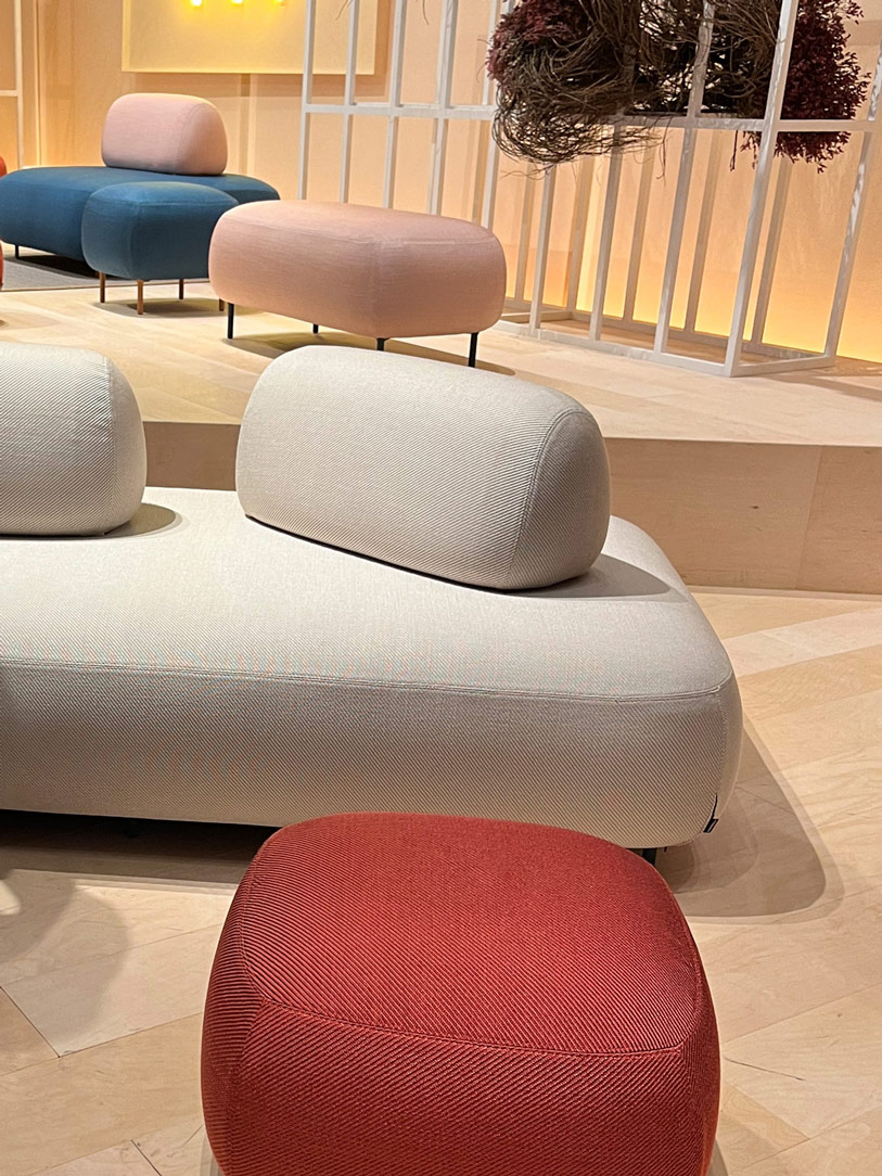
Moooi

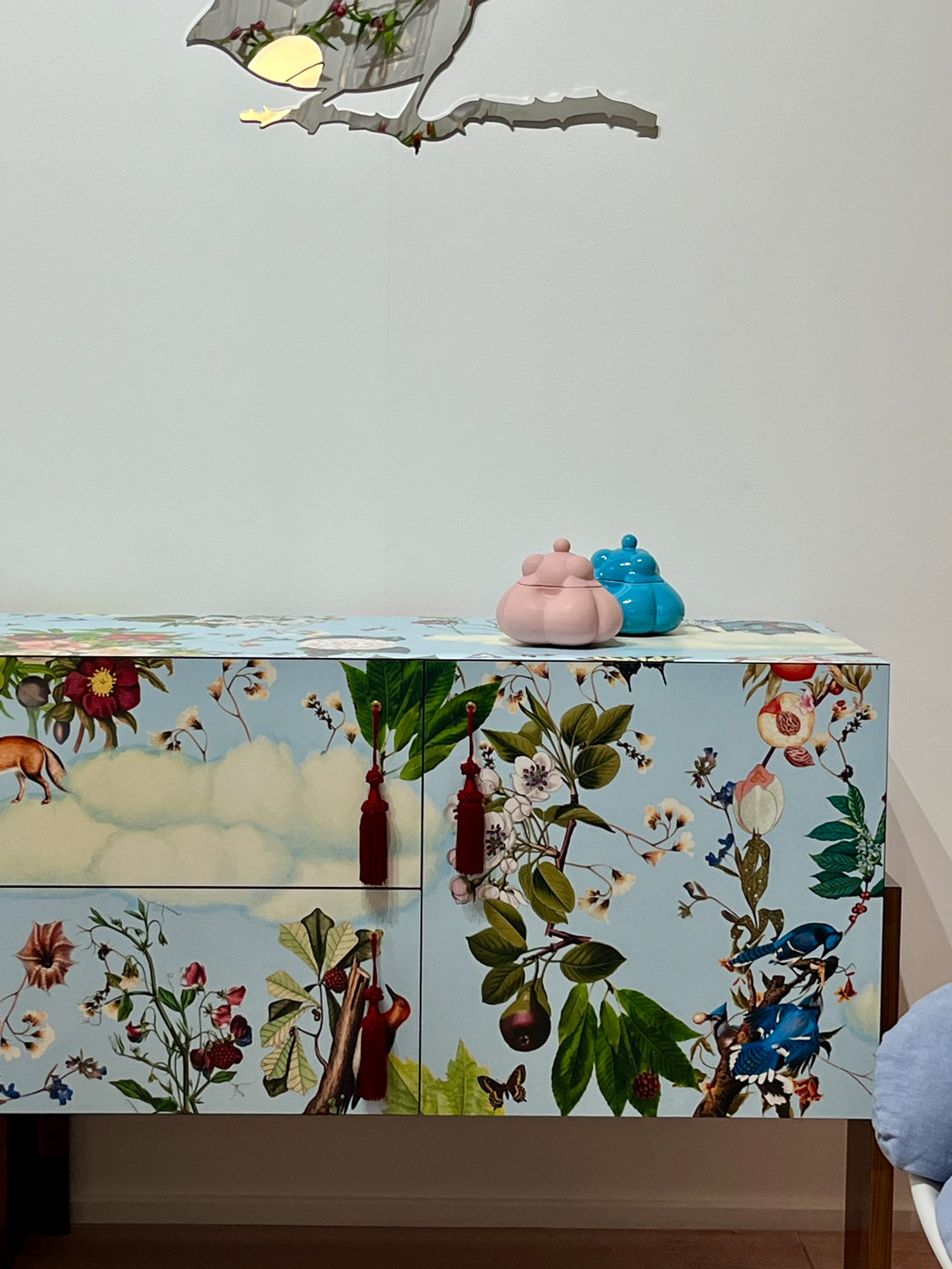
Moreover, bold, vibrant colors, along with enveloping textures, transform walls and furniture into true works of art, with daring graphics that stimulate the mind while evoking a sense of dream and wonder.

Pedrali
Driade

Sofa by Pedrali e cabinet by Driade

Magis
Magis

Stand di Magis

Moooi
Moooi
Moooi

Wallpaper and furnitures by Moooi at Salone dei Tessuti

FASHION


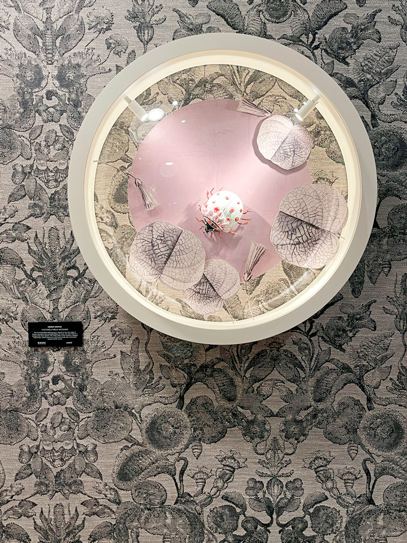
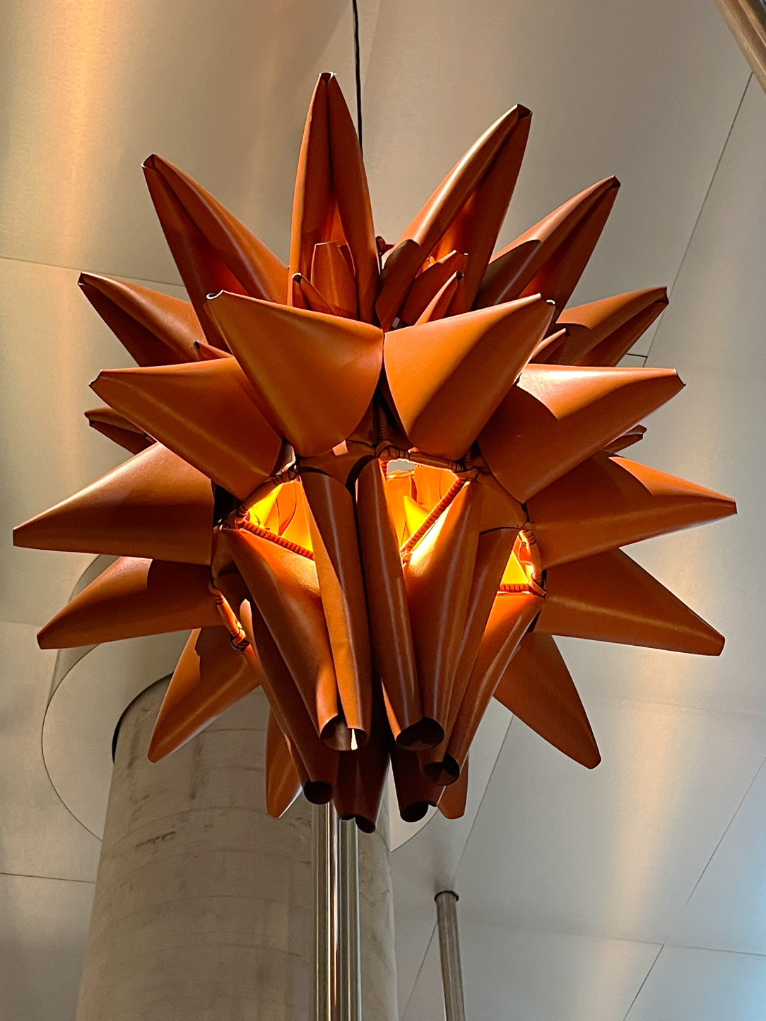
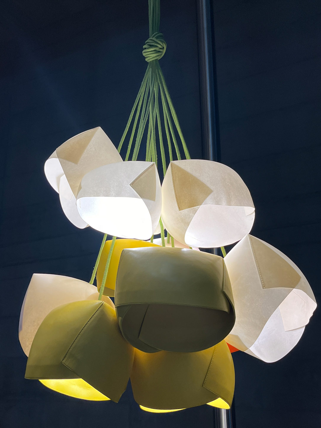
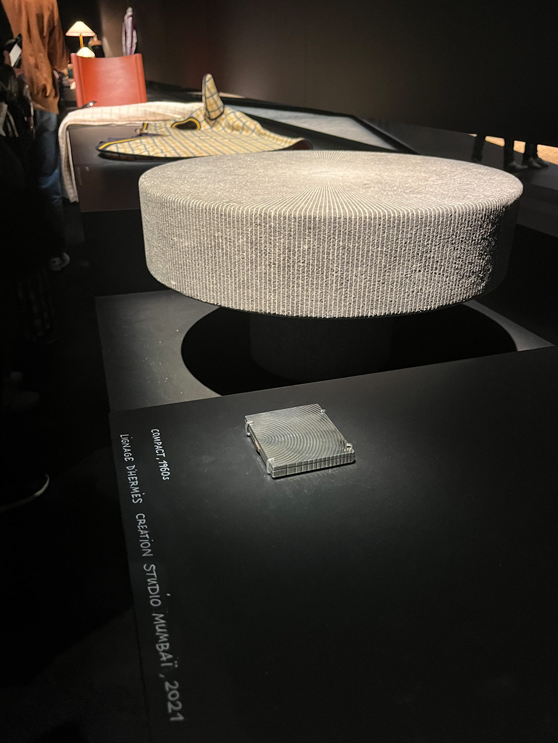
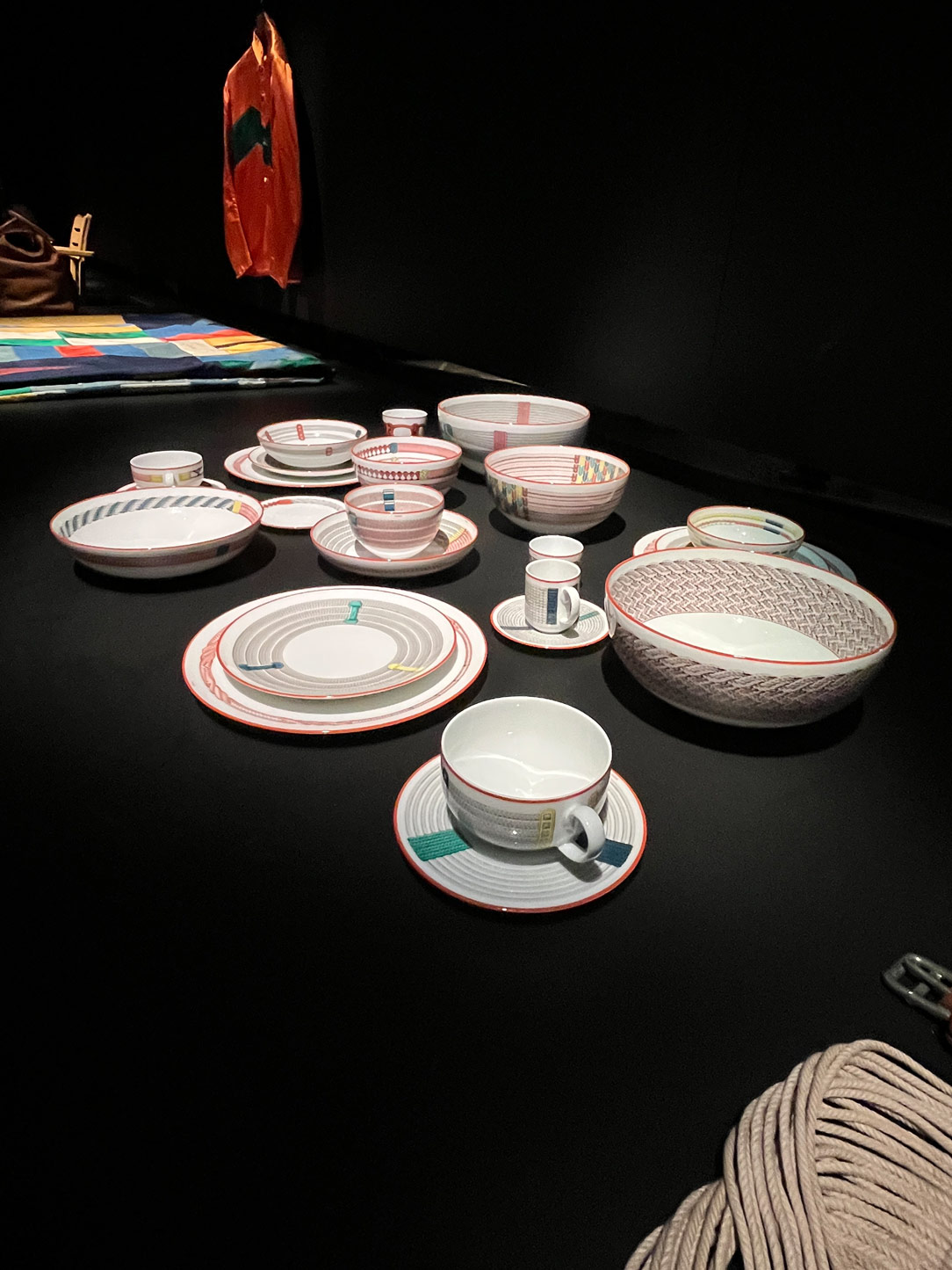
Fashion is increasingly merging with the world of interior design, creating a unique blend of personal style and home environment. The influence of colors and materials worn is reflected in furnishings, fostering a harmonious synergy between fashion and design. Renowned brands like Hermès and Loewe utilize leather not only for bags and accessories but also for lamps and magazine racks, seamlessly blending fashion and home decor into a singular expression of style. Additionally, raw and natural materials such as bricks, stones, and wood harmoniously coexist with fabric textures and colors. The concept of “vintage” intertwines with the contemporary, creating an intriguing ambiguity between what is past and what is current. Fashion knows no age.
Hermes
Hermes
Loewe
Loewe

Objects by Hermès – Lamps in leather and paper by Loewe

LUXURY


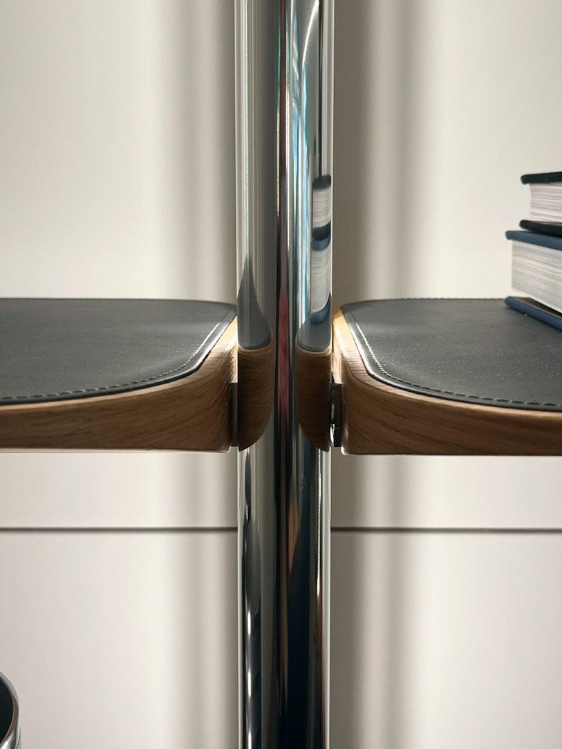
The concept of luxury in interior design has evolved to encompass not only elegance and opulence but also a relentless pursuit of exquisite materials and unique craftsmanship. Even though luxury products may originate from industrial processes, they must still embody a spirit and execution of artisanal craftsmanship. Every detail matters, down to the hinge of a wardrobe, which must be custom-made. The more challenging the transformation of materials into forms, the more excellent the result, and the more luxurious the object becomes.

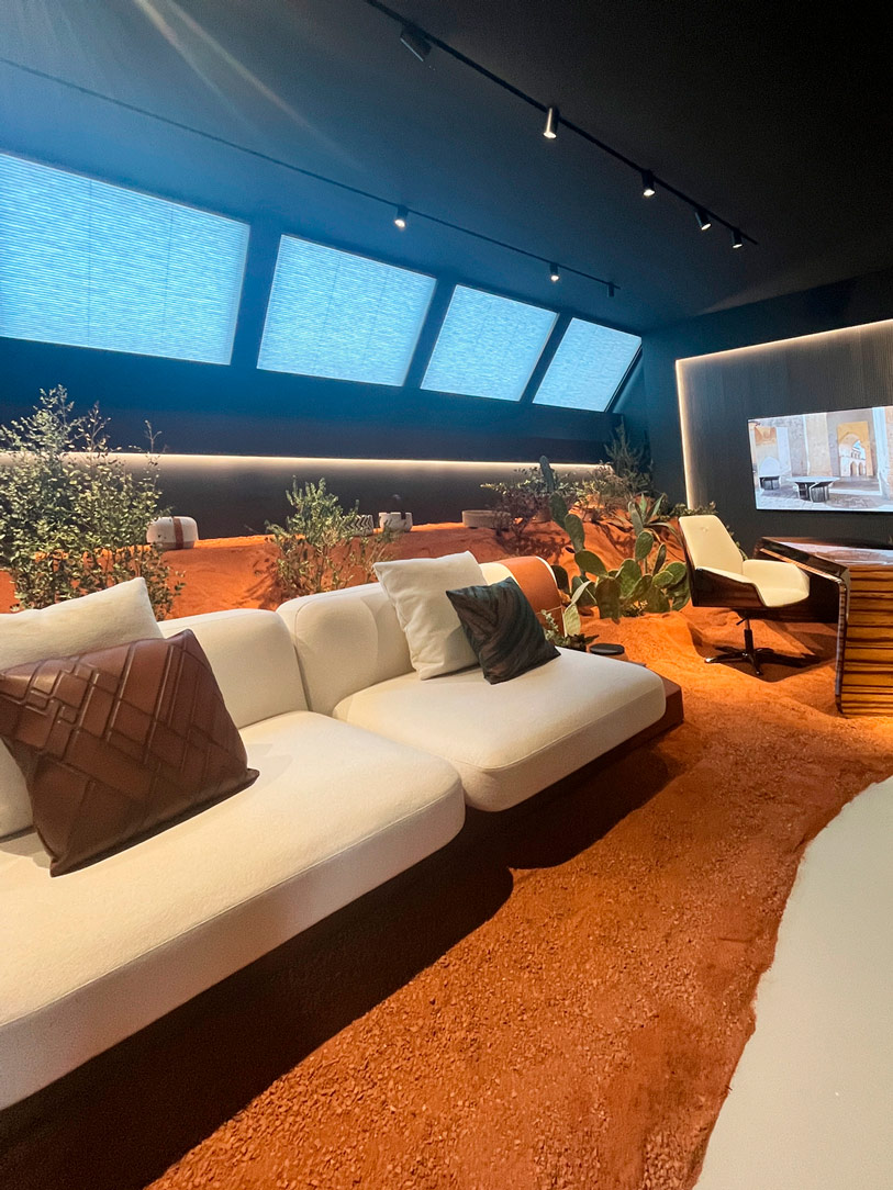
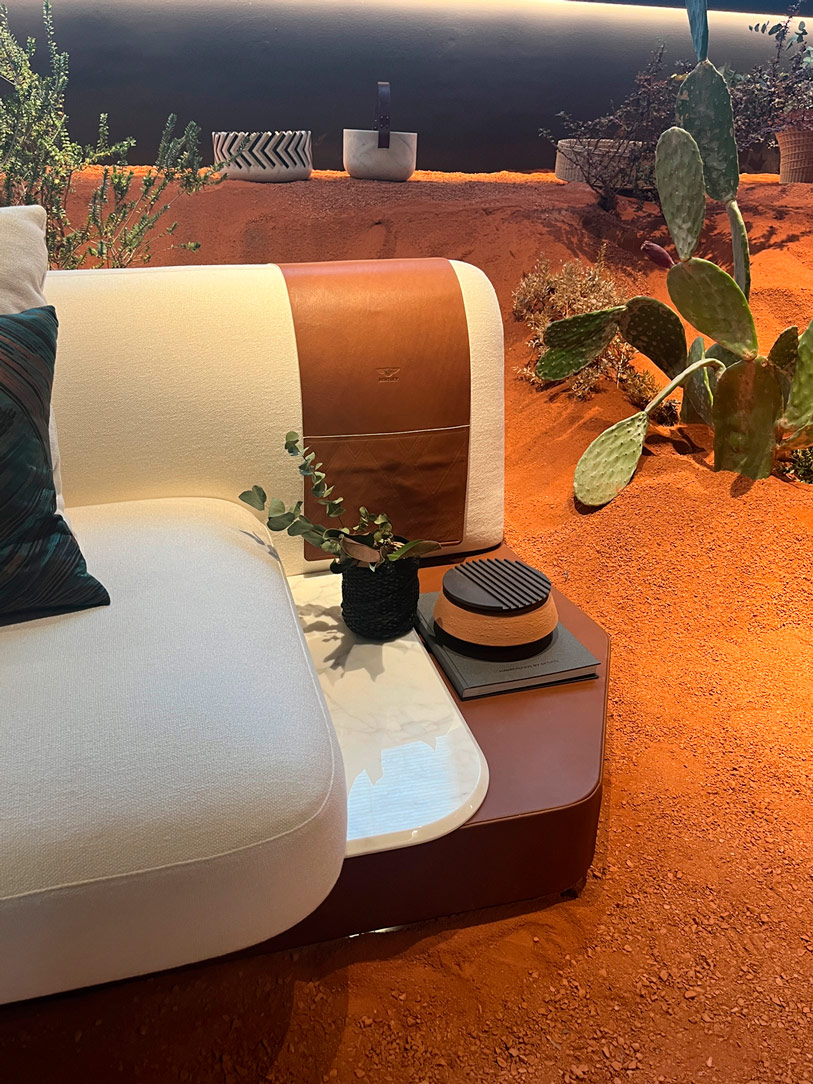
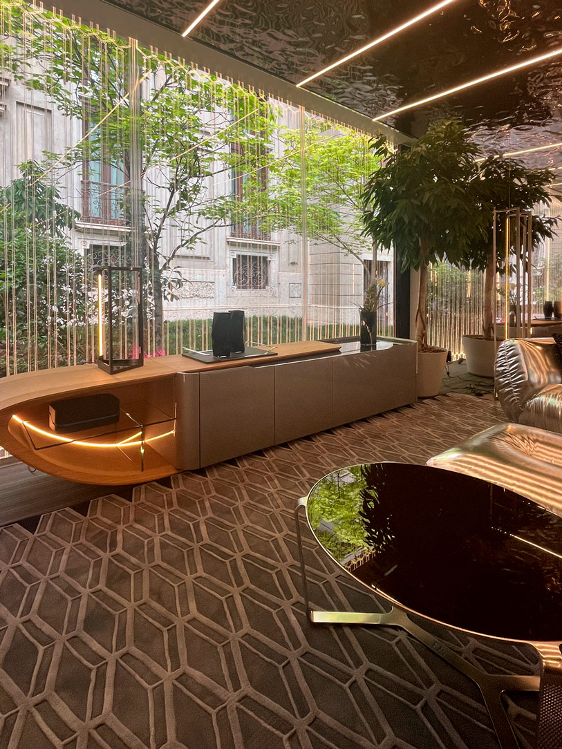
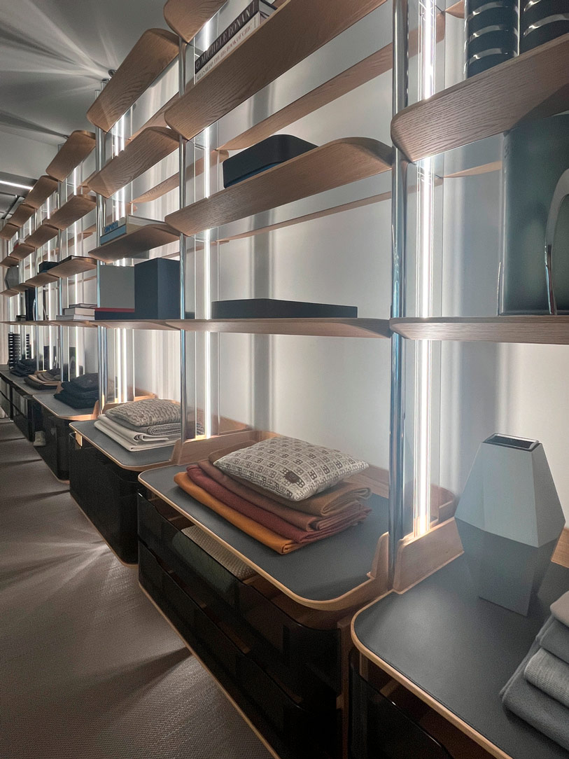
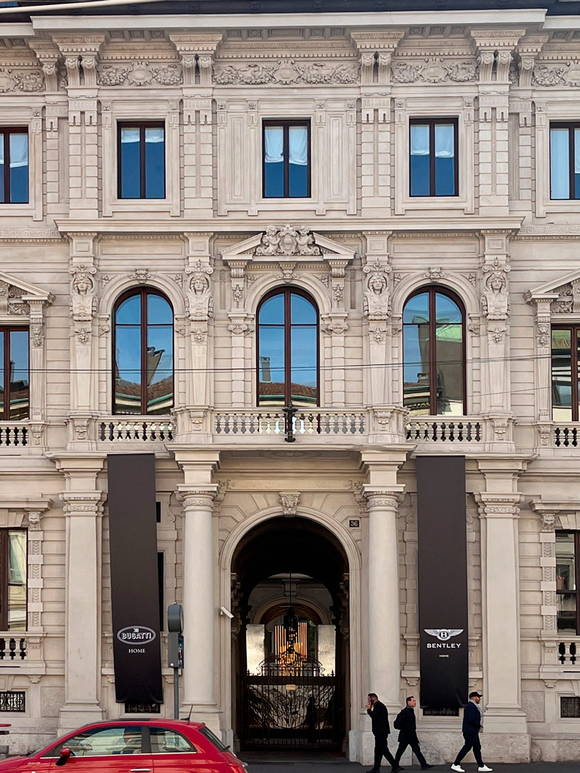
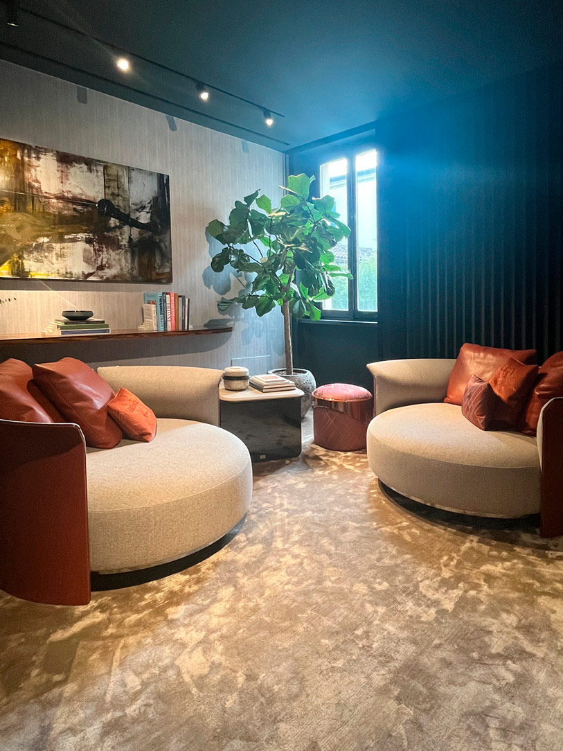
The brands that consistently meet these expectations are the major automotive-associated houses. In Bentley and Bugatti, a synesthetic relationship is formed between the vehicle and the furnishings, creating an almost indissoluble and recognizable bond between the two. The clean lines and bold curves seen in automotive design are translated into furniture, with leather inserts found in both cars and desks, and fluid surfaces echoing the natural world.
 

Bentley Bugatti
Bentley
Bentley
details Bentley
Bugatti
Bugatti
Bugatti library

THE HOUSE BY ELLE DECOR – MATERIAL HOME


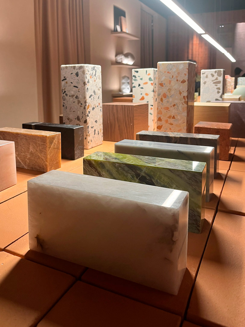
Exploring the home according to Elle Decor is a sensory journey through seven distinct environments that reflect our vision of domestic life. Among the standout materials, we find cement, lime, and terrazzo, derived from the mixing, cooking, and recomposition of powders, seamlessly blending with metals, woods, and leather. This creates a play of reflections and material illusions that capture the gaze and stimulate the senses. The colors, initially soft and muted, intensify as we move through the different rooms, giving rise to a crescendo of visual emotions.
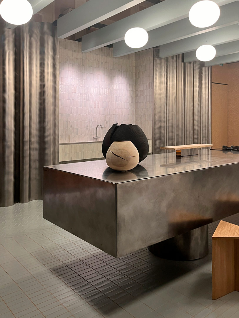
 

materials elle decor
kitchen elle decor

Within these spaces enveloped by light and shadow, we find iconic design pieces that lend an aura of elegance and sophistication to every area. Light itself becomes a key element, enveloping and delineating the furnishings, giving them dimensionality and depth. The surfaces, transforming, adapt to the surrounding environments, becoming soft and enveloping in the bedrooms, while wall coverings create cozy and relaxing atmospheres.
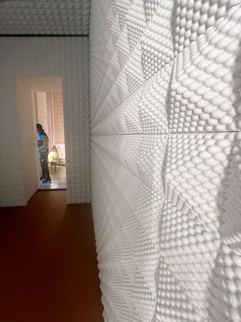
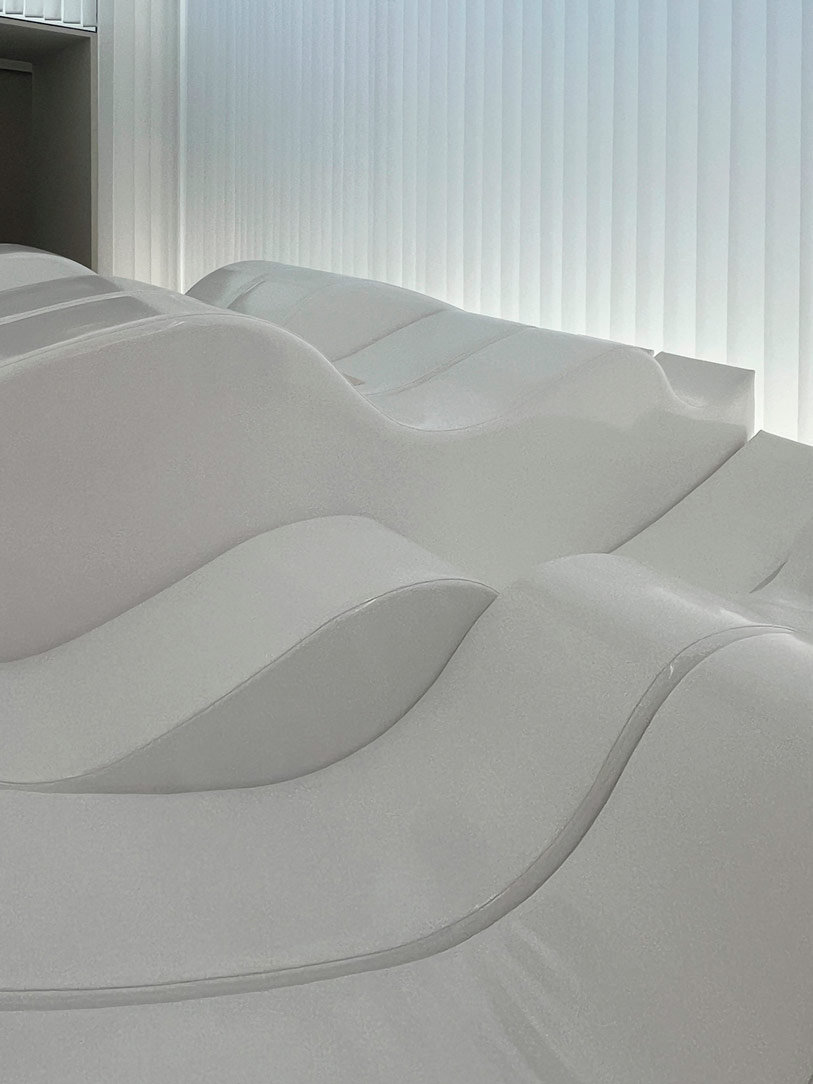
surfaces
curved surfaces

Finally, a nod to our connection with nature, with walls clad in materials such as hemp, ash, and cotton canvas, prompting us to reflect on the sustainability of resources and the future of construction, inviting us to create spaces that harmonize with the surrounding environment.
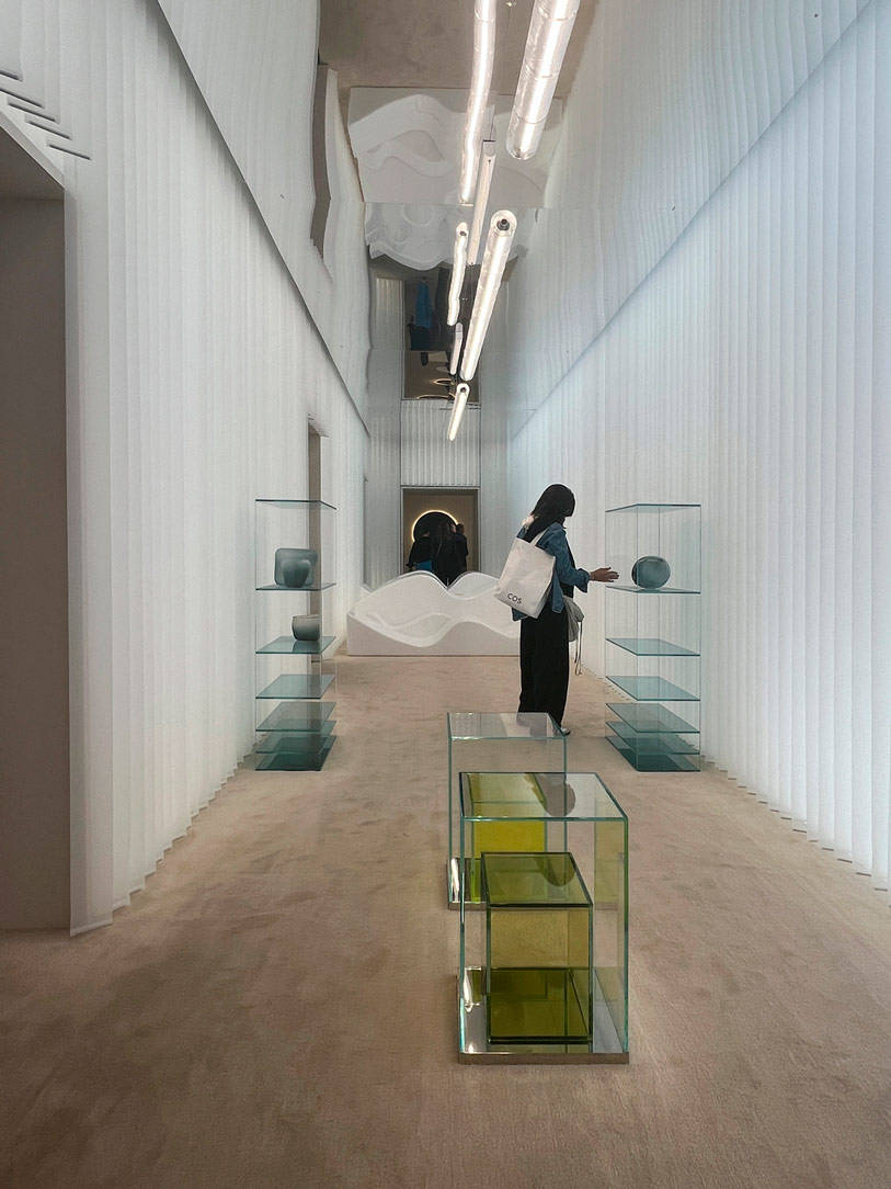
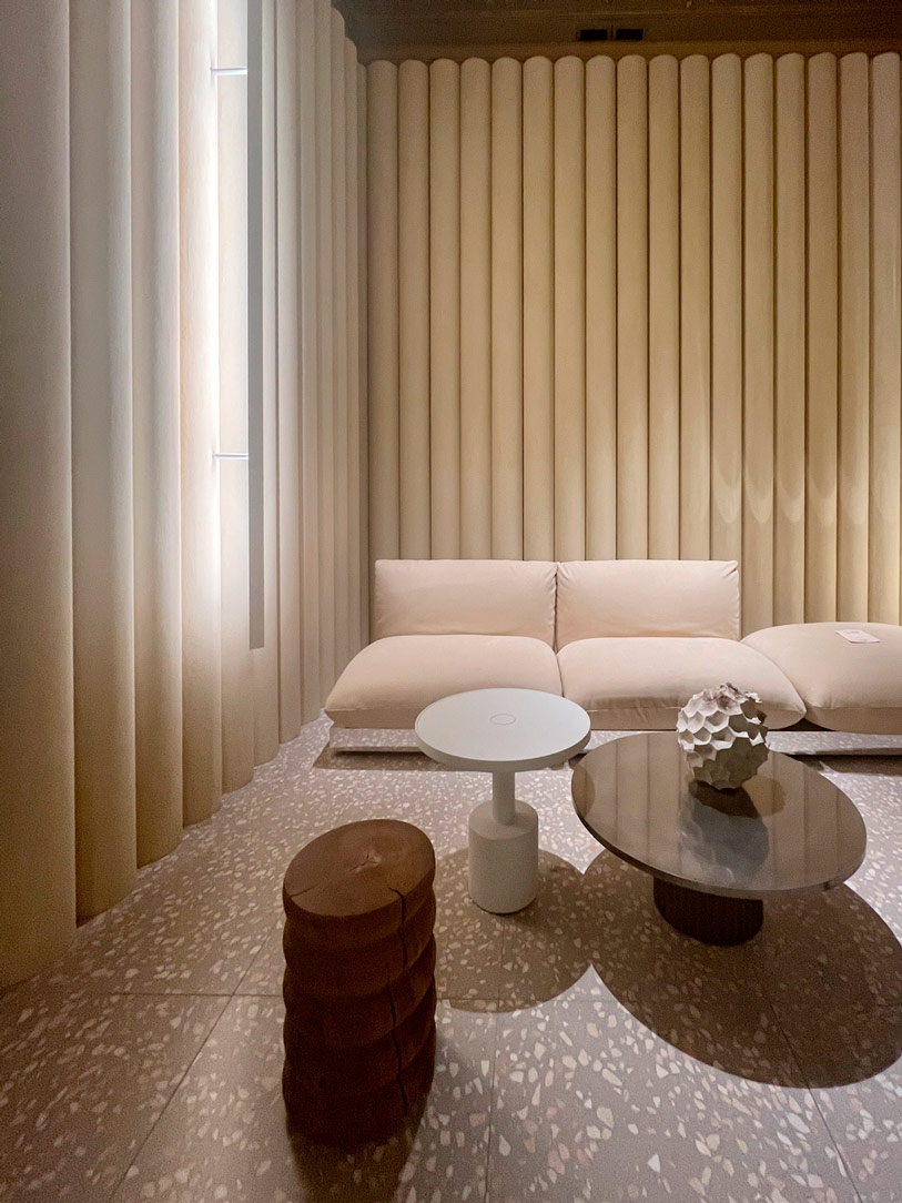
Elle Decor
Elle Decor

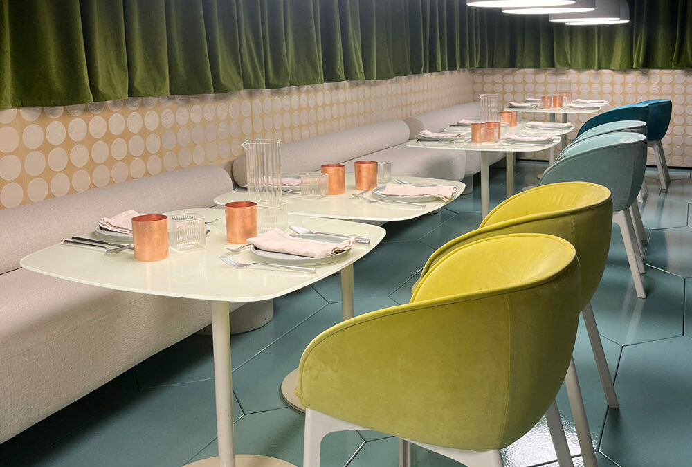
The restaurant area, a creation by Elisa Ossino, stands out for its creative use of geometries and the thicknesses of hand-glazed lava stone. The walls are adorned with decorated terracotta paneling adorned with circles, harmoniously interacting with a diamond-patterned floor. Refined, tactile fabrics with a suggestive painterly effect are used for perimeter draperies and as upholstery for sofas, poufs, and armchairs. The tableware also stands out for its mix of materials, while the lamps precisely illuminate tables and seats.
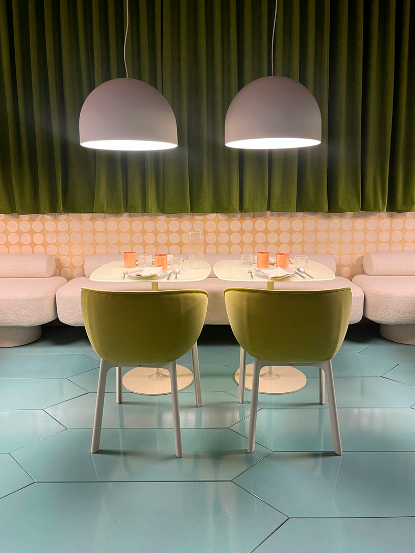
 

Restaurant elle decor

PALAZZO LITTA AND STATALE


Palazzo Litta stands tall as an embodiment of dreams, where dreamlike installations and artistic performances harmoniously blend with design works, transforming this excellent location into a journey through aesthetics and innovation. Its majestic Baroque structure, imposing and captivating, surprises and enchants at first sight, welcoming visitors into a world of wonders. At the entrance, one finds oneself enveloped by a light installation, “Extraordinary,” which evokes the gracefulness of clouds, conveying sensations of air and warmth with suggestive power. In one of the rooms, the gaze is captured by the iconic mouth-shaped sofa, a lively and dynamic work conceived by Gufram and MotionItalia, which seems to come to life and smile like a real mouth. In the subsequent rooms, projects unfold around three fundamental pillars: aesthetics, functionality, and sustainability.
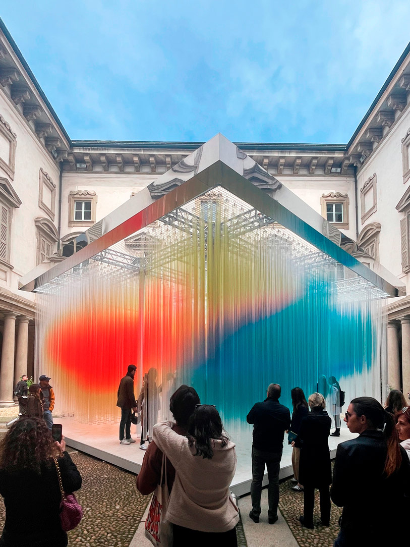
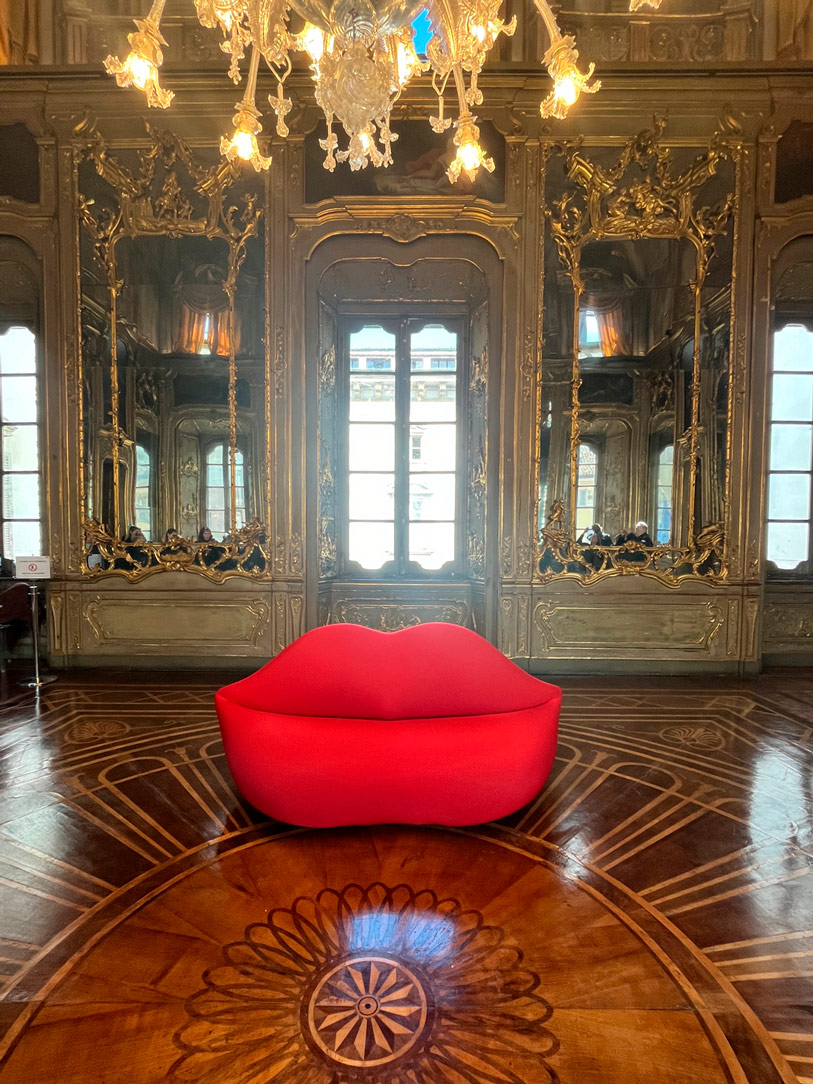
 

Palazzo Litta
Bocca Sofa
Palazzo Litta
interiors palazzo Litta

In the vast spaces of the Università Statale, works by various designers alternate in an artistic and conceptual play, ranging from the luminous spheres by Cyril Lancelin to the chandelier created by Faggini. A particularly evocative installation is “The Amazing Walk,” conceived by MAD Architects studio, which transports the visitor into a world of suggestions, with a mountain reflecting on a water mirror, traversing a suspended path in the void, a metaphorical symbol of journey and exploration of deeper artistic dimensions.
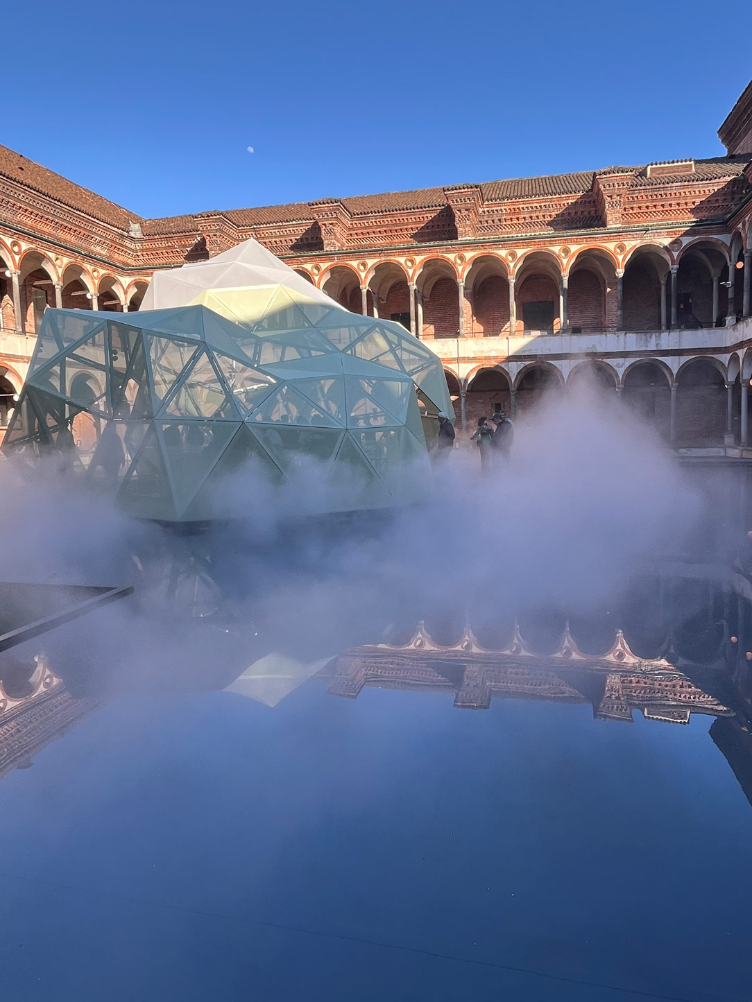
Amazing Walk Statale

CONCLUSIONS ON THE DESIGN WEEK


We declare the death of white. No longer its pristine brilliance on countertops, in cabinets, nor even in bathrooms. As a white enthusiast myself, I admit it was a blow to the heart, but I will strive to broaden my perspective and imagine a new universe without white, not even on the walls. Natural colors, like rope or brick, are emerging as the new pillars of contemporary aesthetics, becoming a canvas on which to paint our creativity.
Wood continues to dictate the rules, confirming its eternal dominance in the realm of furniture and design.
We conclude with this reflection: the trend of recent years is moving towards an increasingly green future, with a growing focus on sustainability as the cornerstone of the creative and design process. This will be our guide and our responsibility towards the future.

Cream furniture for elegant interiors

Cream furniture for elegant interiors

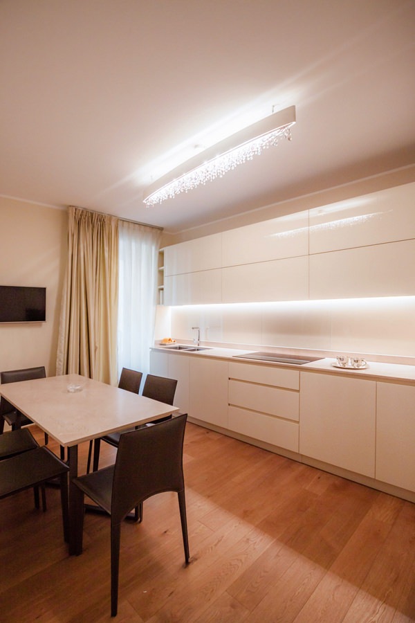
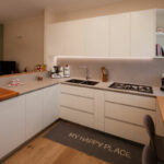
The elegant interiors of this apartment are recognized by the cream color of the furniture, declined in the different rooms with elegance and modernity.
The combination of materials with different finishes and nature creates plays of opacity and reflection.
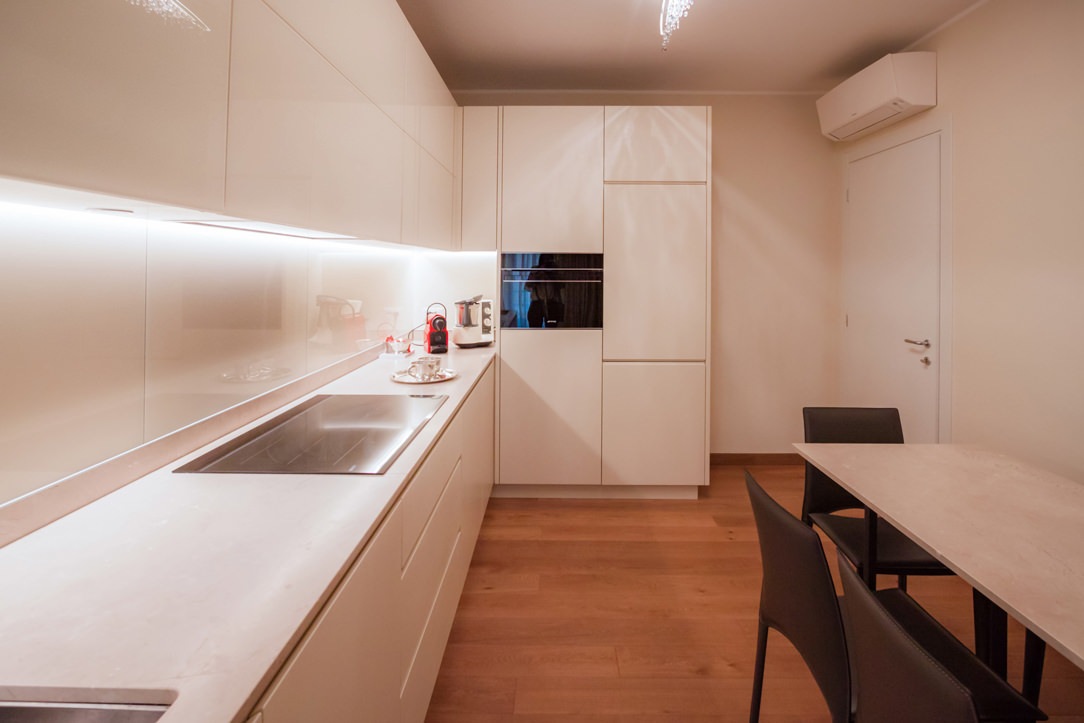
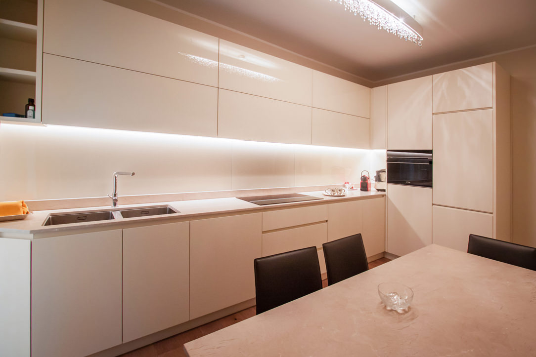
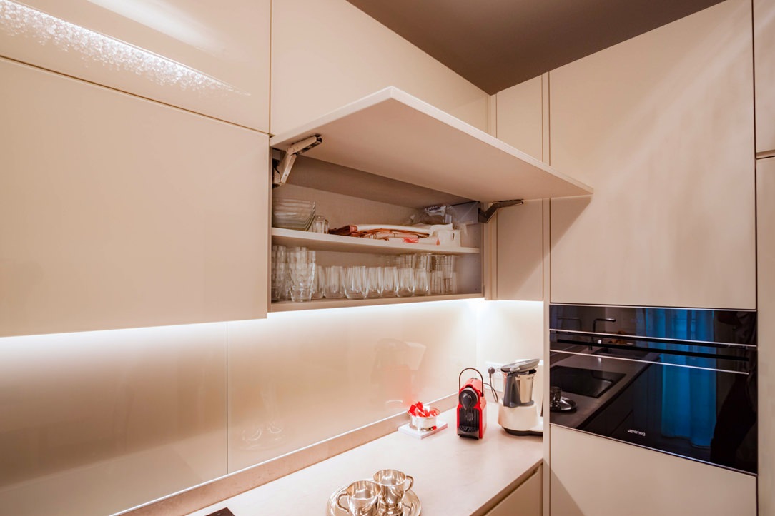
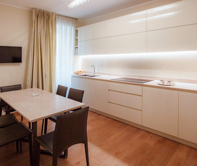
Among these, the contemporary style kitchen is recognized by the natural top, the lacquered doors and the wall units covered in Lacobel.
In the sleeping area, on the other hand, the master bathroom and the service bathroom can be recognized by the chromatic and material combinations between the tops and the structure of the shaped furniture.
modern cream colored kitchen side view
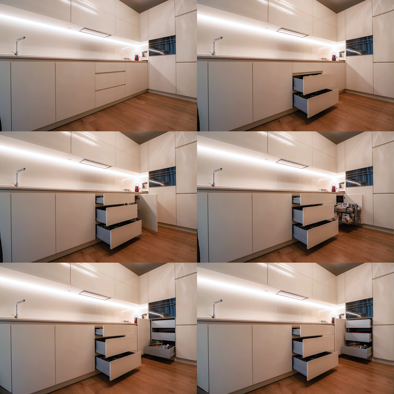
animation opening cream-colored kitchen doors

A kitchen with cream color furniture

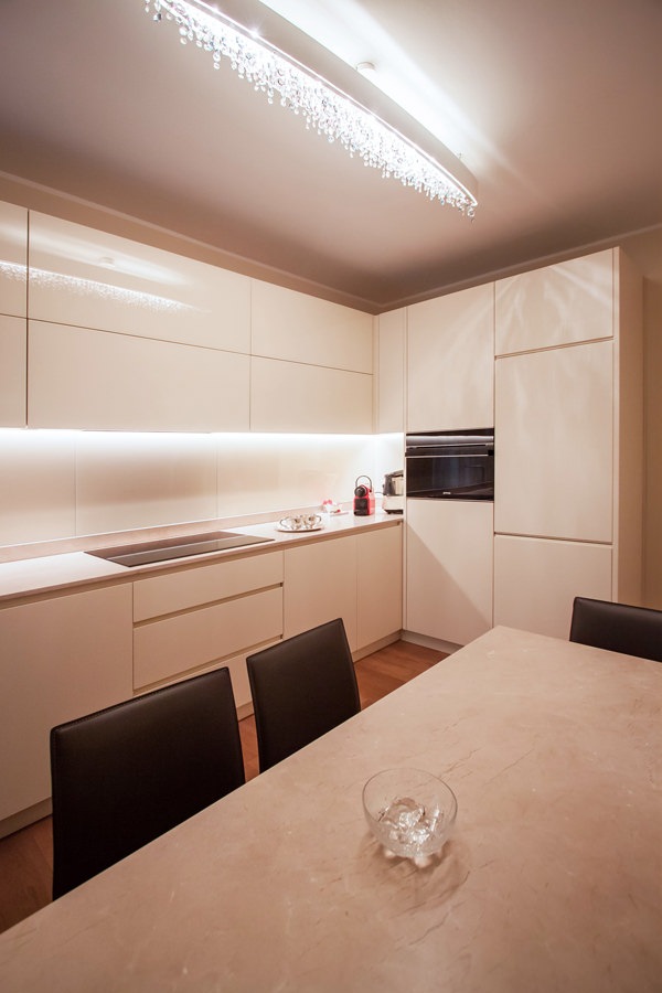
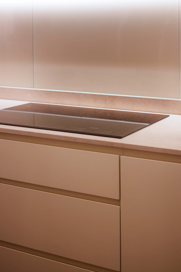
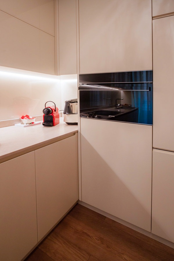
The beige natural stone worktop set the chromatic and material choice of this contemporary style kitchen.
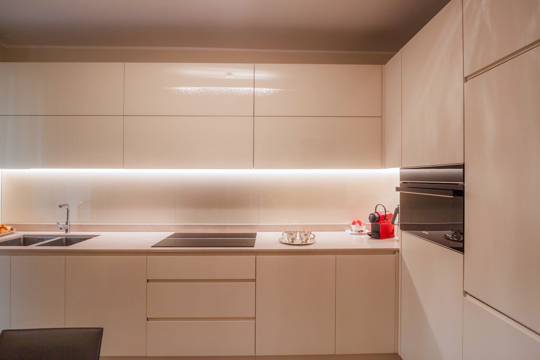
Maintaining the neutral tones of the cream color, the base units and side service columns in matt tone-on-tone lacquer accompany the wall units covered in white Lacobel.
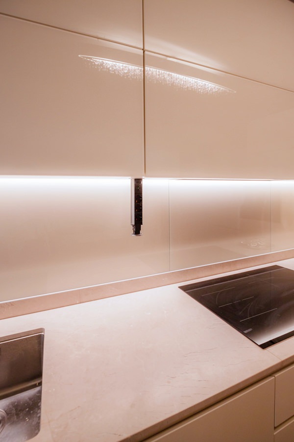
The recessed LED lighting is inserted inside the latter to provide support light for the preparation of meals.
The material choice of white Lacobel, capable of giving brightness and freshness to the room, is also reflected in the riser that accompanies the natural stone top.

cream color kitchen table anthracite metal structure natural stone top
 natural stone top kitchen table cream colored worktop
cream colored kitchen front view

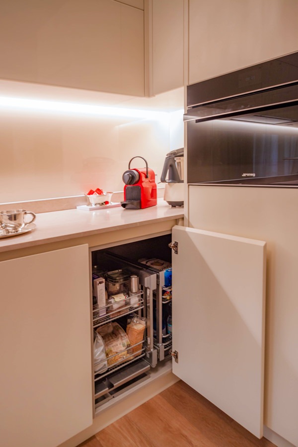
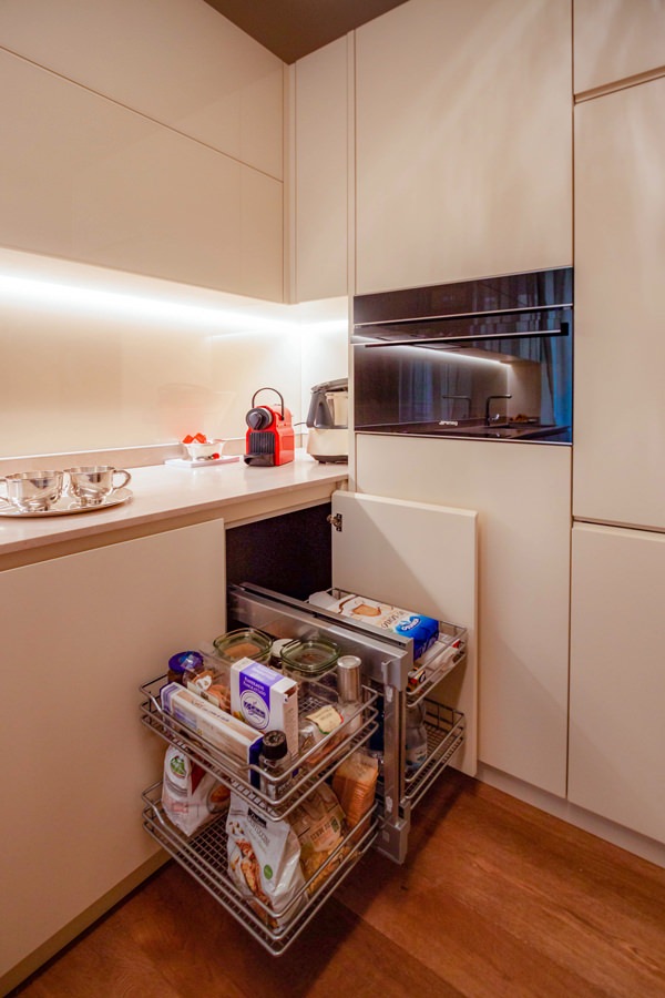
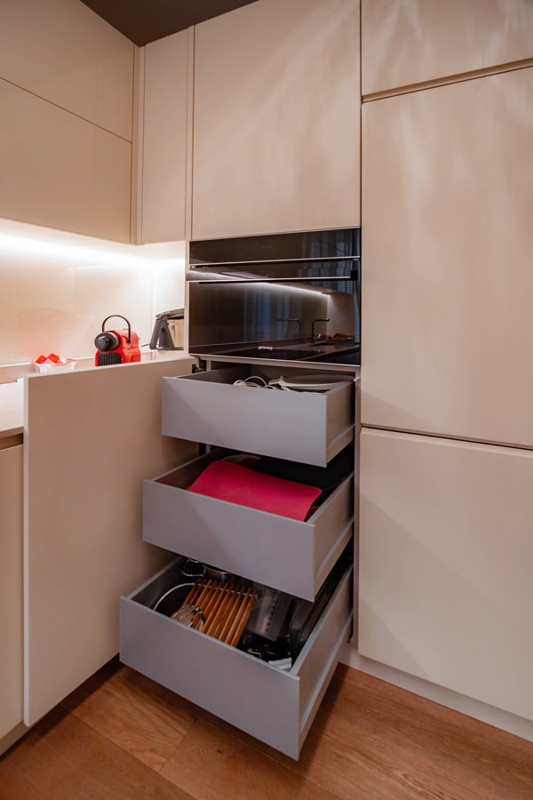
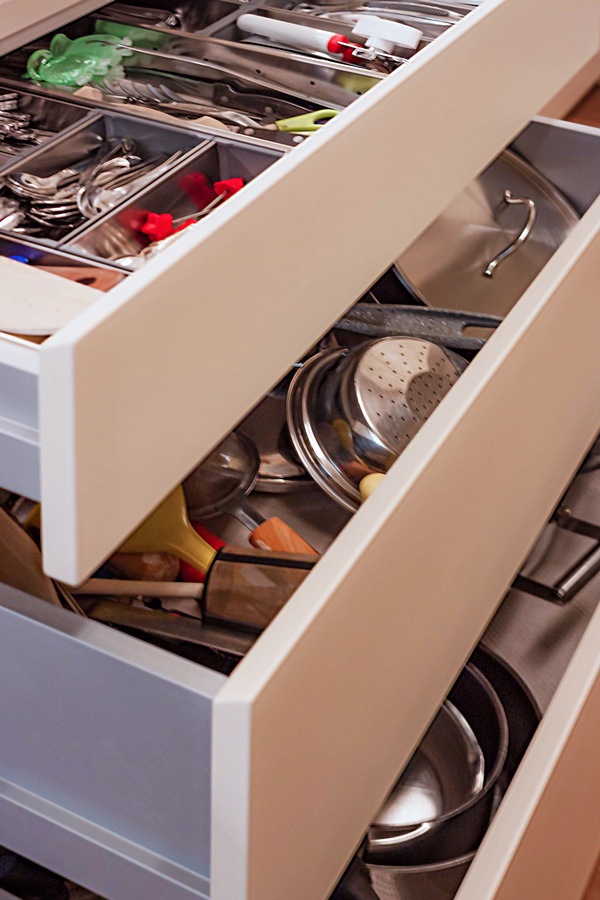
Functional elements such as the removable basket to take advantage of the corner, large drawers and doors with removable trays make the use of this kitchen even more practical.
The full-height side columns, housing the built-in refrigerator and the oven, leave ample space that can be used as a pantry.

On the opposite side, beyond the sink with two steel basins under the counter, the shaping of the base and wall units closes the kitchen block.
It is precisely the smoothed profile of his comparison that softens the design lines of this kitchen.

A table with an anthracite-colored metal structure and chairs in eco-leather in the same shade echoes the material choice of the kitchen top.

cream colored kitchen cabinets drawers recessed handle
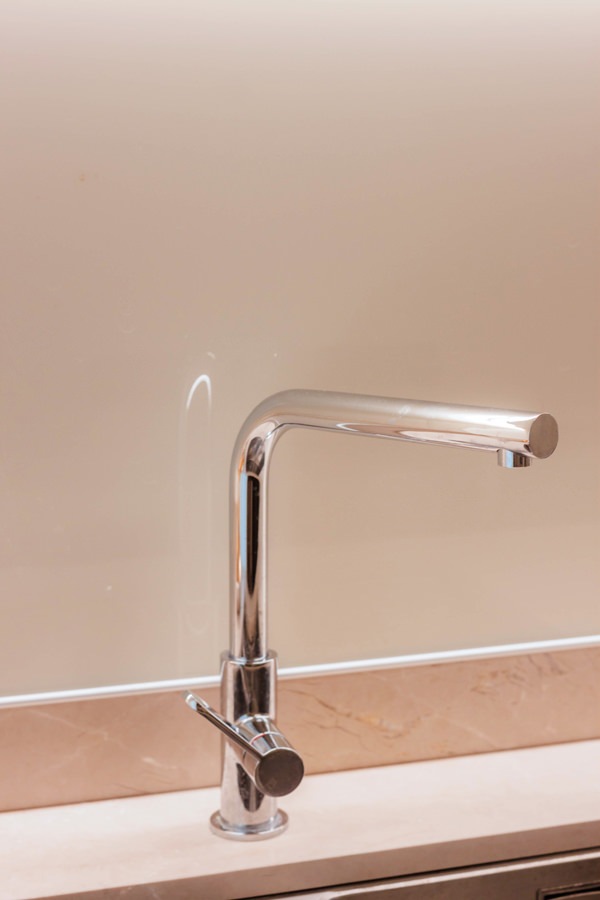
stainless steel kitchen sink faucet lacobel white kitchen cream color
cream-colored shaped kitchen lacobel wall units
cream-colored kitchen corner door internal basket closed position
kitchen corner door internal basket open position
lacobel cream kitchen wall units flap opening internal shelf
cream colored kitchen corner removable basket internal drawers
cream-colored kitchen door with aluminum internal drawers
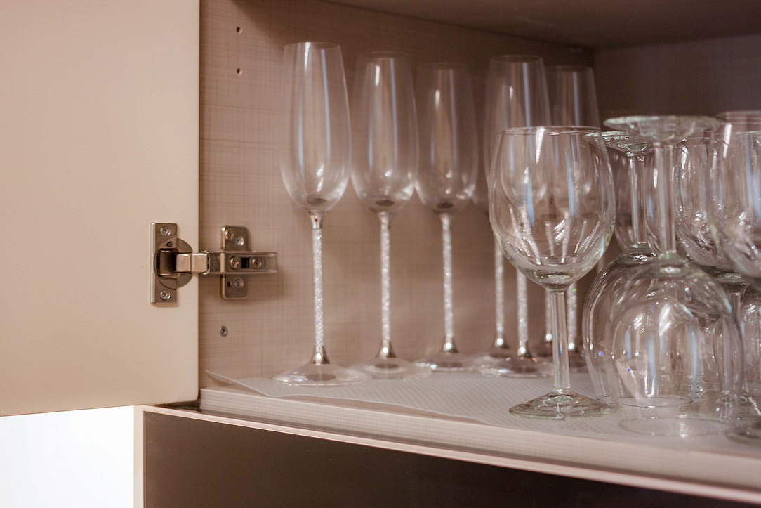
cream-colored kitchen doors with canvas bilaminate interior
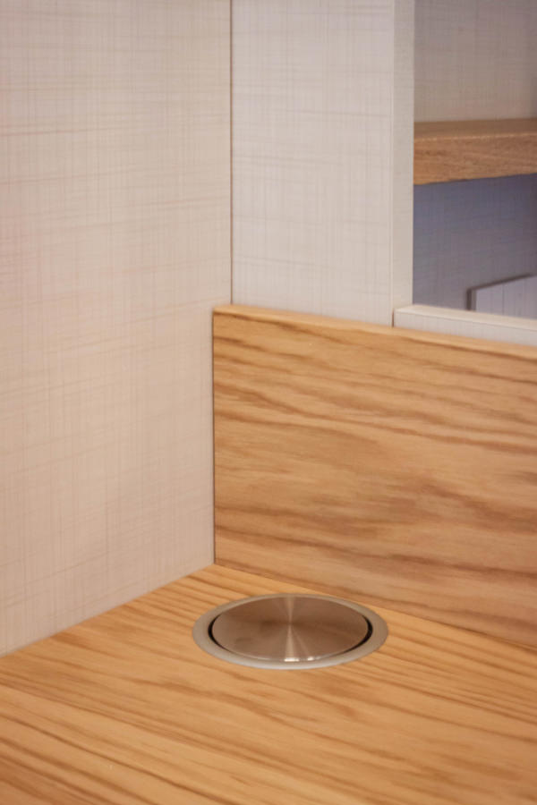
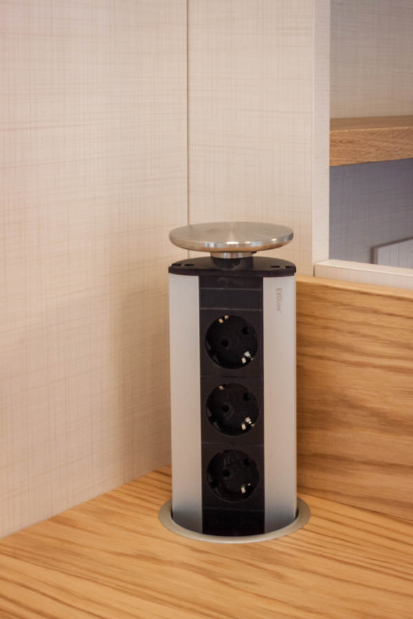
service outlets disappearing turret kitchen wall units
opening kitchen drawers inside aluminum cutlery tray

The entrance area: between functionality and elegance

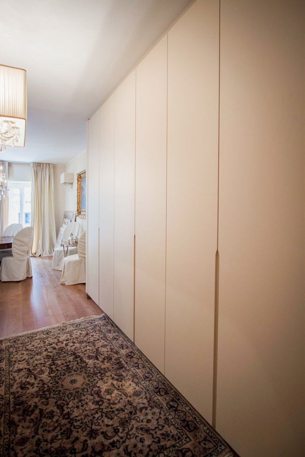
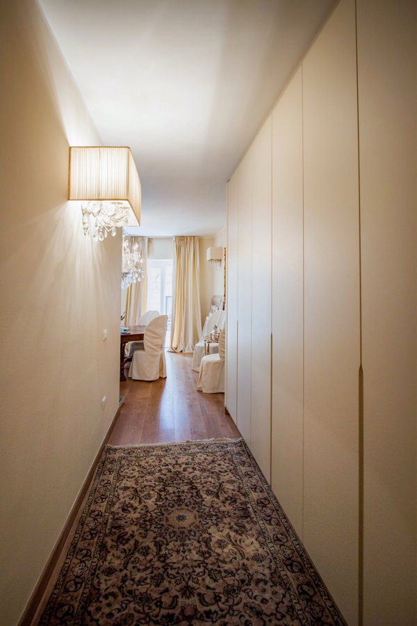
In the entrance area, a large service wardrobe acts as a functional element capable of optimizing space, while disappearing from view thanks to its linear aesthetic.
The stylistic choice takes up the cream-colored furniture of the remaining rooms of the house.
The full-height doors in matt lacquered MDF accommodate approximately half the height of the recessed handles shaped at the ends.

Internally, height-adjustable shelves provide useful space for the storage of household products, but also linen and kits for the change of season.
In the central doors, on the other hand, a hanging system exploits the horizontality in order to contain the depth of the wardrobe.

Compared to traditional hangers hung on tubular, this system consists of hooks that slide horizontally on a double row of tubulars, taking advantage of the available length. On the other hand, they have a slightly lower quality of maintenance of the garments. Not having the typical support structure for the shoulders of garments possessed by hangers, it is an optimal solution for coats and jackets that can be considered “in transit”.
As they do not require long-term accommodation, they are ideal for hosting guests’ coats and jackets or light clothing in temporary placement.

wardrobe hallway entrance handles half-height recess
cream-colored entrance hallway furniture
tubular horizontal hangers optimize coats space

The master bathroom: elegant and with attention to detail

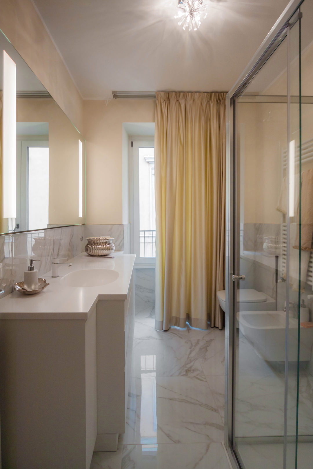
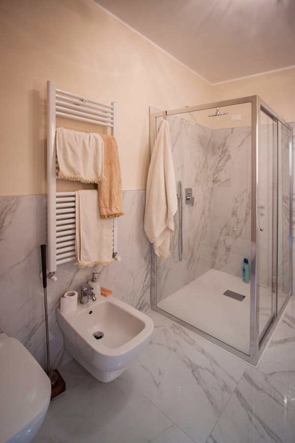
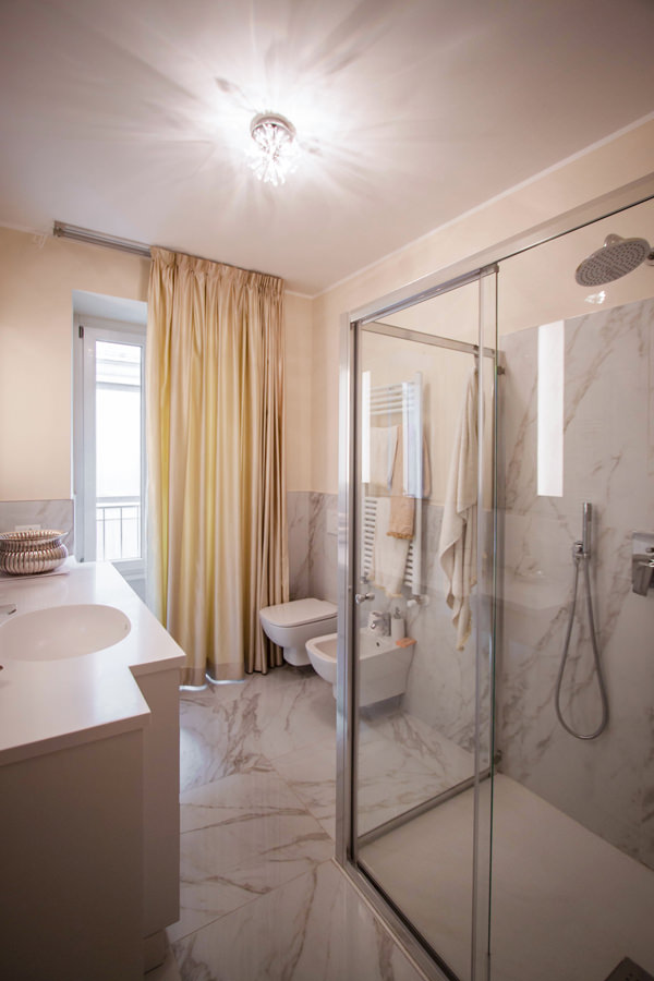
Introducing the sleeping area is a large bathroom also for guests with a glass shower and shaped furniture.
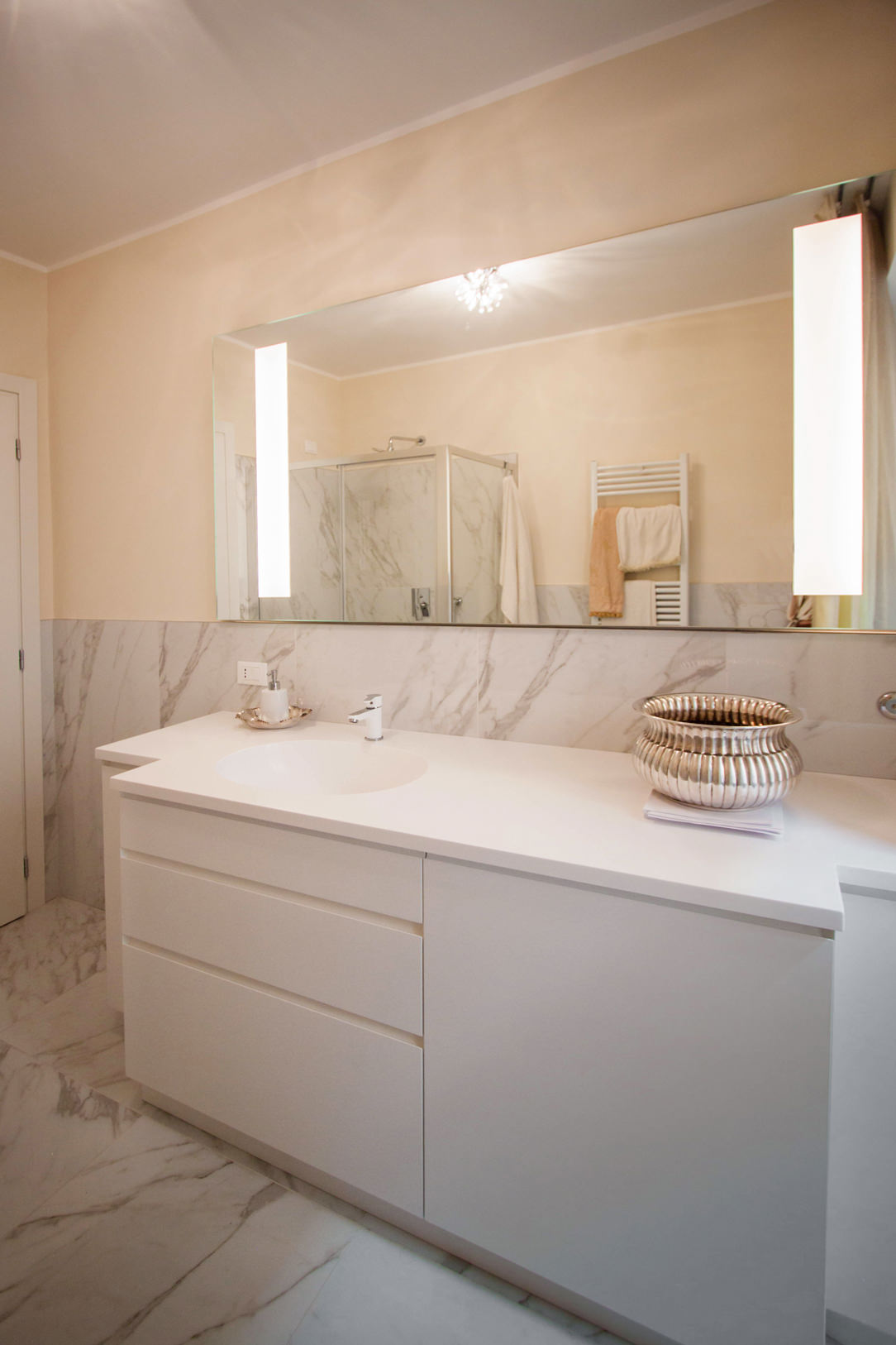
The latter is recognized by the choice of neutral tones and light colors. The shaped top in white Corian allows to host a pair of integrated washbasins in the same material, becoming a continuous element.

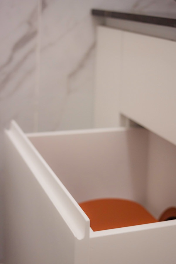
The composition of the piece of furniture consists of a pair of side doors with recessed handles shaped at 45 ° which are recessed with respect to the block of drawers and built-in washing machine next to it.
The stylistic line of this furniture guarantees a linear and elegant reading of the same, while not giving up the practicality of doors and drawers to contain products and bathroom linen. Accompanying the bathroom cabinet is a large mirror with integrated lighting.

elegant cream colored bathroom cabinet front view
elegant master bathroom with crystal shower view
elegant master bathroom with large crystal shower
contemporary style shaped bathroom cabinet with Corian top
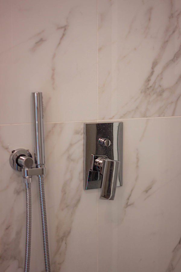
detail of stainless steel shower taps
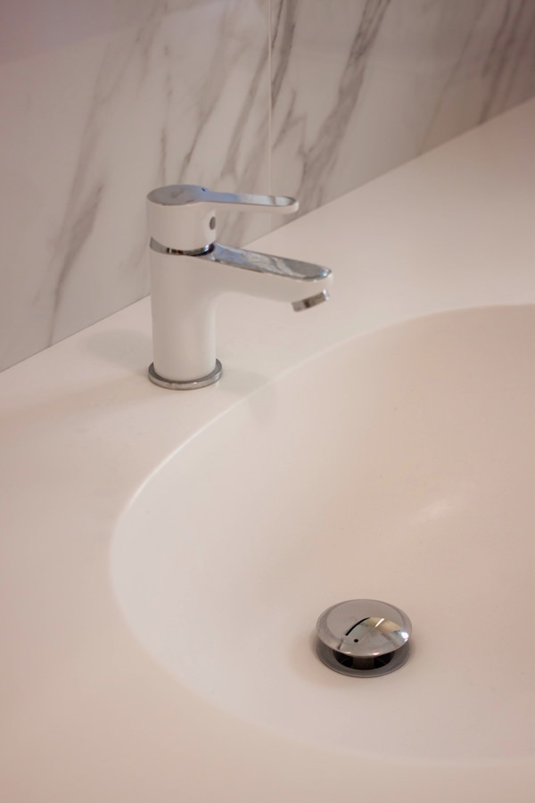
integrated bathroom vanity sink Corian top
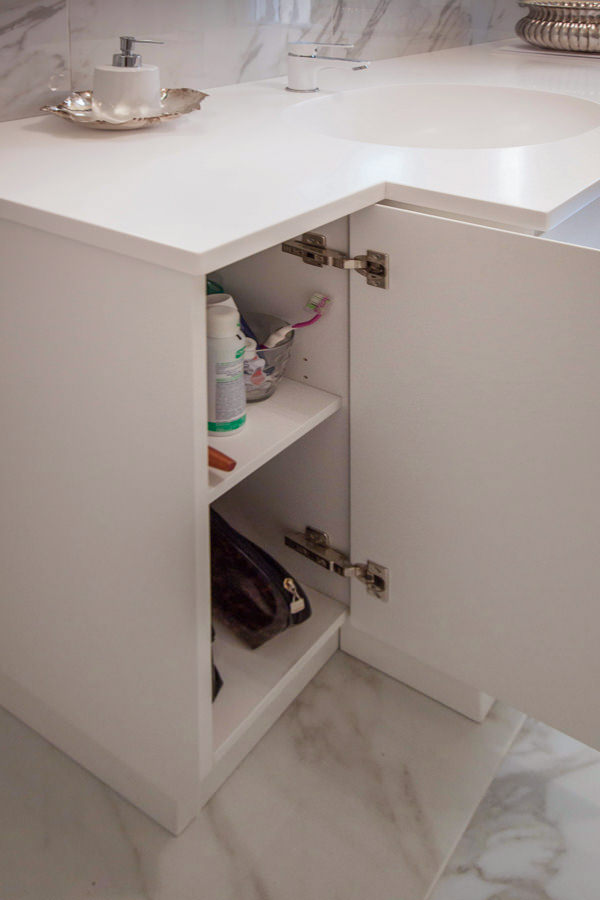
opening bathroom cabinet door internal shelves
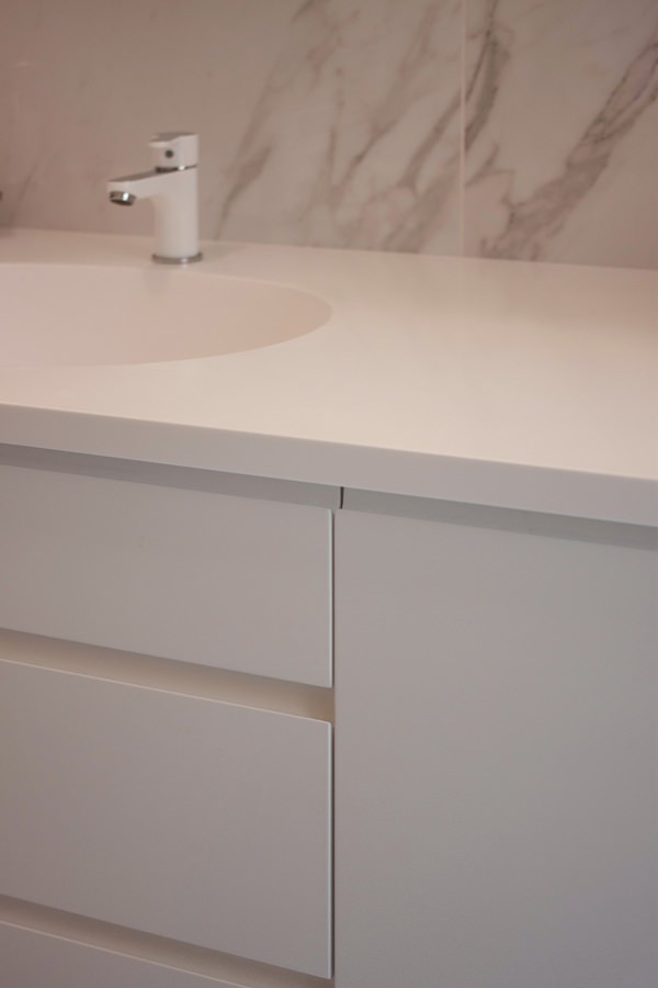
bathroom cabinet detail drawers handle recessed corian top

The sleeping area between the service bathroom and compact but roomy walk-in closet

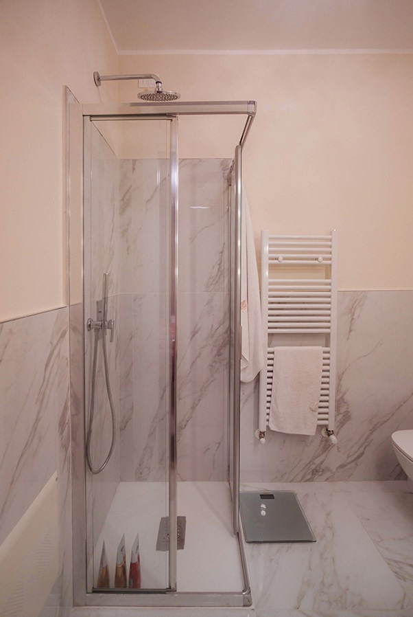
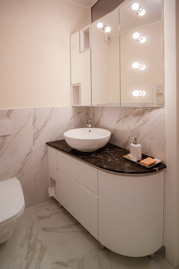
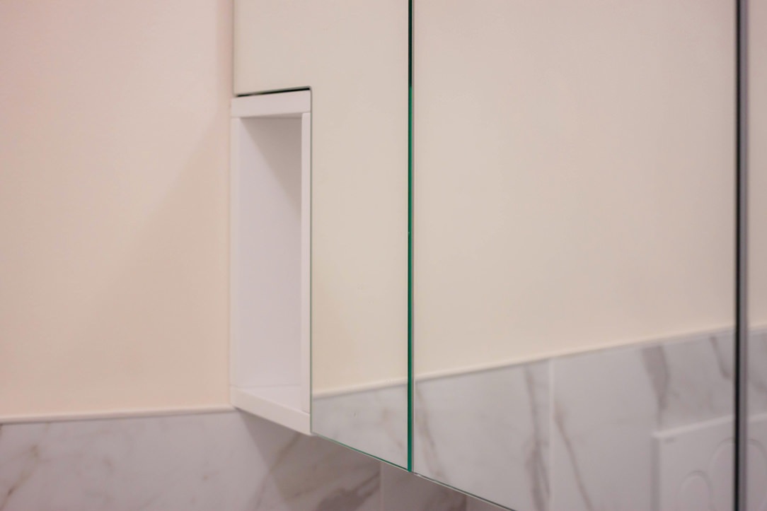
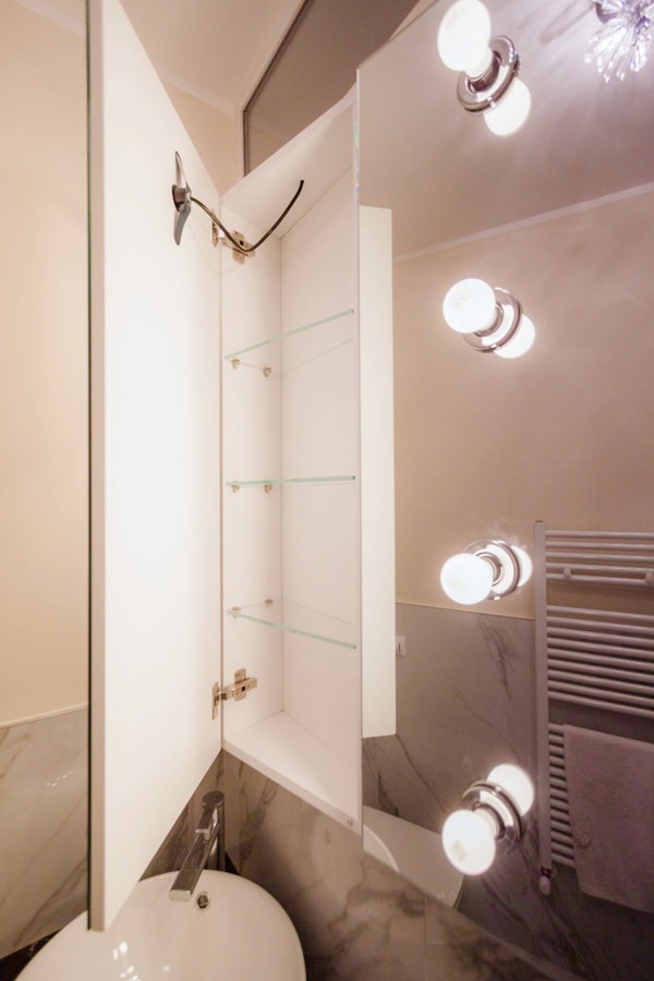
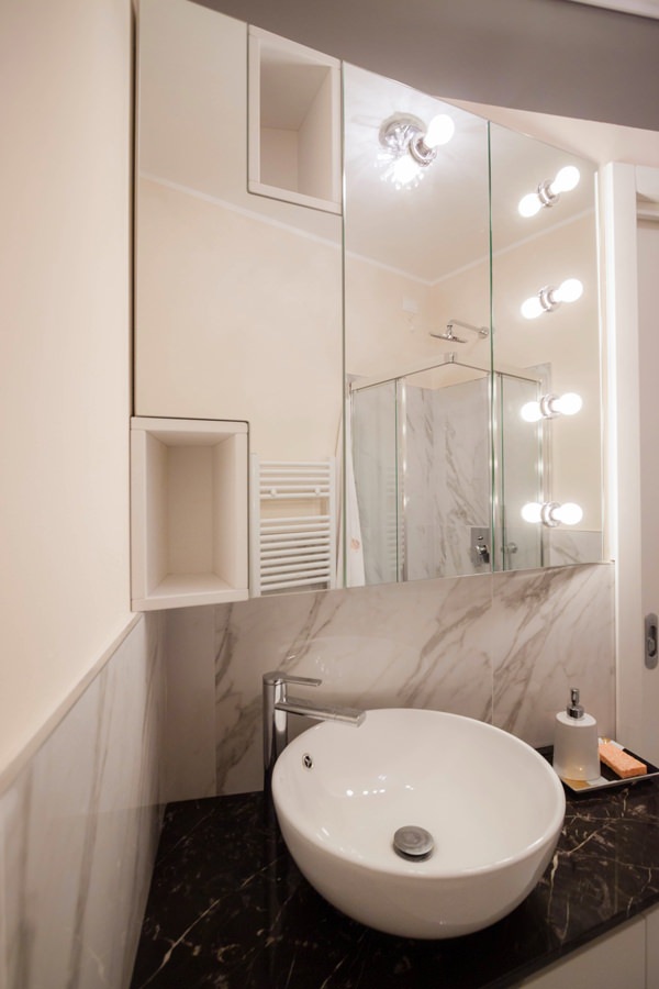
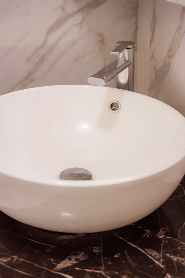
Adjacent to the master bedroom there is the service bathroom with a smaller-sized crystal shower. Also in this case, the service furniture is shaped to respond not only to functional needs but also to restore an elegant and characterizing image of the furniture. The black marble top houses a countertop washbasin and is shaped in the terminal part, softening its shapes. In the lower part, an open compartment adjacent to the wall becomes a support element to avoid floor stand or wall towel holder. Side by side, a pair of drawers provide useful space for small products, while leaving space for the bulk of the siphon and the pipes behind them. Finally, respecting the shape of the top, a curved door accommodates internal shelves. Accompanying the bathroom cabinet, providing additional space for the storage of products, is a wall unit covered in mirror. The aesthetics of this element responds to a division into three compartments whose conformation is light and soft to the eye. The division into three doors also allows you to take advantage of the central mirror part, inserting external light bulbs that give character and embellish the furniture. Sideways mirrored doors alternate with open compartments in white lacquered MDF, visually moving the aesthetic impact of the furniture.
bathroom service shower crystal marble coating
bathroom cabinet shaped service drawers curved door
detail of day compartment mirror bathroom wall cabinet
detail of bathroom cabinet with mirror door in white interior
bathroom cabinet mirror lighting external bulbs
handle recess drawers shaped curved bathroom cabinet
Corian countertop washbasin with marble top
walk-in closet MDF lacquered cream color hanger
detail shelves MDF matt lacquered cream color walk-in closet

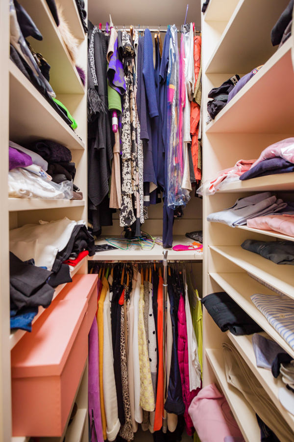
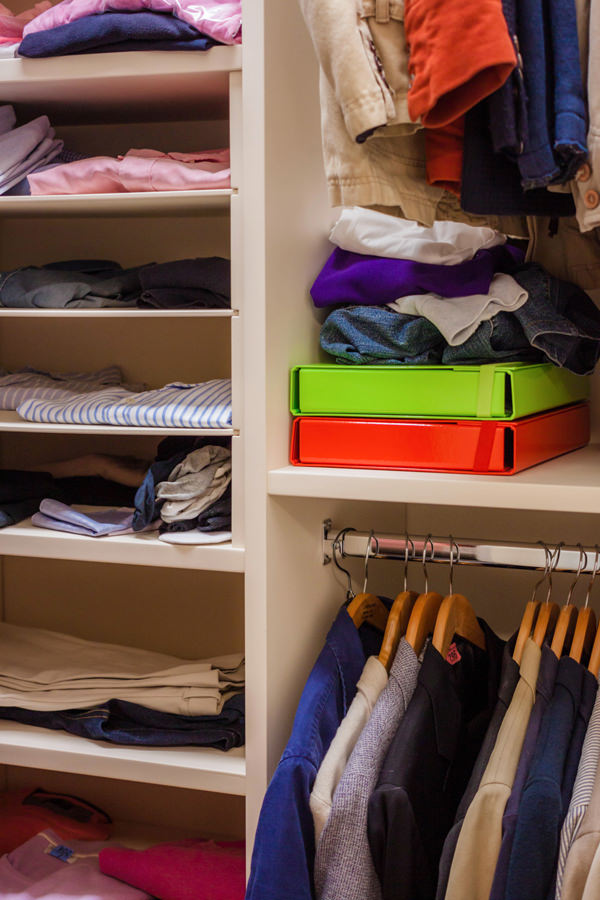
Next to the service bathroom, the small-sized walk-in closet guarantees excellent capacity by making the most of the space with lacquered MDF shelves and fixed tubular hangers. The development of the components occupies the three walls adjacent to the entrance, also taking advantage of the corner arrangement to place the hanging garments on double height. Also in this case, the chromatic choice of the elements takes up the cream color of the furniture placed in the remaining rooms.

The contemporary style: the world of furniture nowadays

The contemporary style: the world of furniture nowadays

The simplicity and elegance of the contemporary style furniture conquers the tastes of customers with its light and minimal lines. From the play of reflection and opacity to the choice of highly resistant materials, to the eye for the environment and eco-sustainable choices.
Trends in recent years in the world of interior design have a well-defined direction, albeit in constant change.

What does it mean by contemporary style furniture?

Terms such as “fashions” and “trends” are now also commonly used for the interior design sector.
It happens more and more frequently to hear about interiors in a modern style, meaning interiors with linear aesthetics, elegant and natural materials.
However, it is important to be careful not to confuse the modern style, characterized by rigorous interiors common since the 1950s, with the contemporary style.

The latter is in fact a constantly changing style, its definition changes from year to year depending on the materials, colors and design lines spread.It would be impossible, for now, to give a series of universal guidelines that can continuously identify this style. All the more so if the trend of recent years consists in a recovery of the modern style reinterpreted in a contemporary key.

So let’s analyze the contemporary style furniture that has spread in recent years, with a particular focus on current trends.

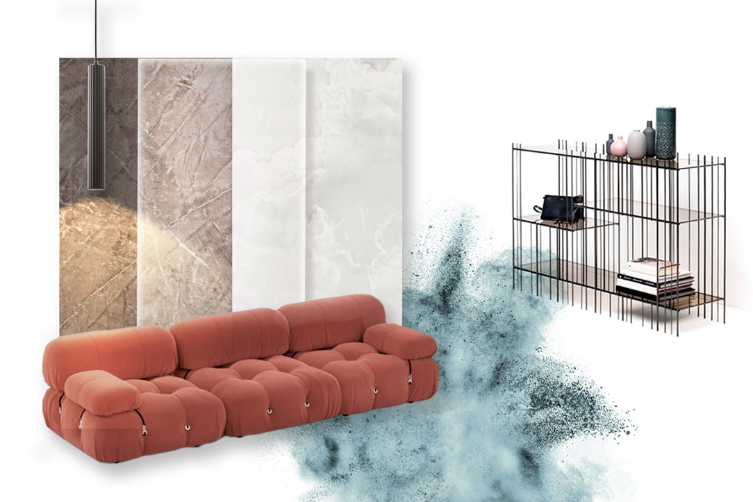
contemporary-style-moodboard-01

Moodbord in a contemporary style.
High resistance materials for kitchen tops, plays of light and reflections and furnishings between sinuous shapes and iron details.

Colors and materials

Over the last few years, the trends in colors and materials for furniture have developed along different paths.
On the one hand, soft colors and natural materials emphasize an elegance that is increasingly closer to scandinavian taste. On the other hand, touches of gritty colors and a choice of avantgarde materials appears in order to guarantee excellent resistance and refined aesthetics.

If the attention to the ecological impact has certainly an increasingly topical response, it should be emphasized, however, that it is this second trend that characterizes domestic interiors. all the more so if the choice of avantgarde materials is accompanied by experimentation on new materials produced with recycled components and with a low environmental impact.
An example of this are the fabrics produced by Ikea and presented during the last Digital Design Week 2021, made with recycled fibers from old jeans and the new kitchen tops with a percentage of recycled cellulose.

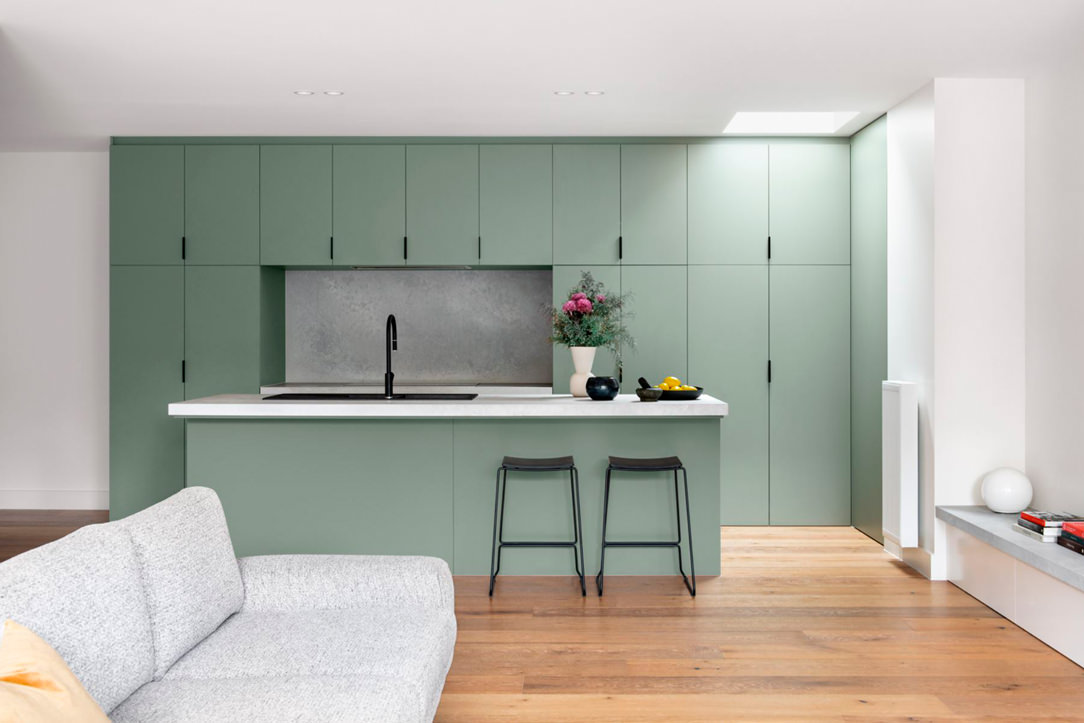
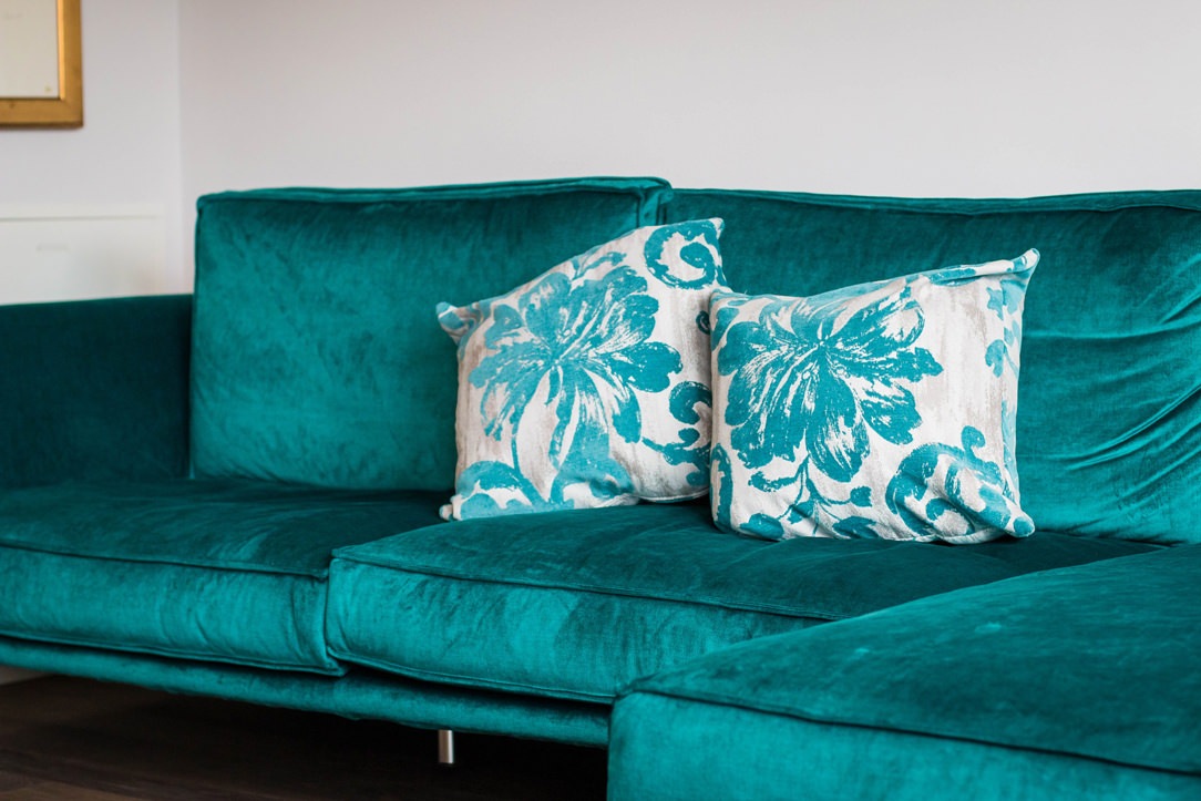
Here then is that at the constant of neutral colors appear more decisive tones that vary from a light pale pink to a delicate sage green. Up to more gritty colors that in the current years have varied from mustard to teal, in widespread use throughout 2020, ending with terracotta that has every intention of invading domestic interiors during 2021.

kitchen-green-sage-reference-contemporary-style

A sage green kitchen.
“The Bend” Residence, Arch. Rob Ryan.

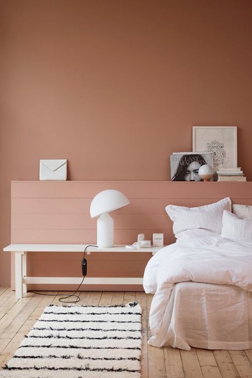
double-bedroom-terracotta-color-contemporary-style-furniture
contemporary-style-bathroom-furniture-terracotta-color

Terracotta colors have prevailed for several months in contemporary interiors thanks to their natural but decisive tone

sofa-velvet-teal-color-contemporary-style-furniture

In this contemporary attic, a teal velvet sofa

The kitchen as a focal room of the living area

The changes in social and individual life brought about by the pandemic have also led to a different perception of the domestic environment.
The introduction of the smartworking concept has increasingly marked the demand from customers to provide angles for remote work within their homes.

Similarly, the kitchen, which has always played a fundamental role in domestic interiors, has rediscovered its centrality even more.
The passion for cooking, also underlined by the world of communication with programs and tv-shows focused on this theme, requires an ever-greater attention to the materials, aesthetics and functionality of this environment.
Here then is that the coverings of doors and drawers are equipped with increasingly sophisticated laminates.

The strength of these materials lies in the great resistance capacity and good maintenance, flanked by an increasingly refined aesthetic line. This is the case of fenix, a material appreciated for its absolute opacity which is accompanied by a softness to the touch.

As for the kitchen countertops, the principle of high resistance and excellent ductility translates into the choice of recomposed materials and innovative agglomerates. Here then is the choice of tops in Dekton and Neolith, and then move on to cheaper options such as Okite and laminated HPL.

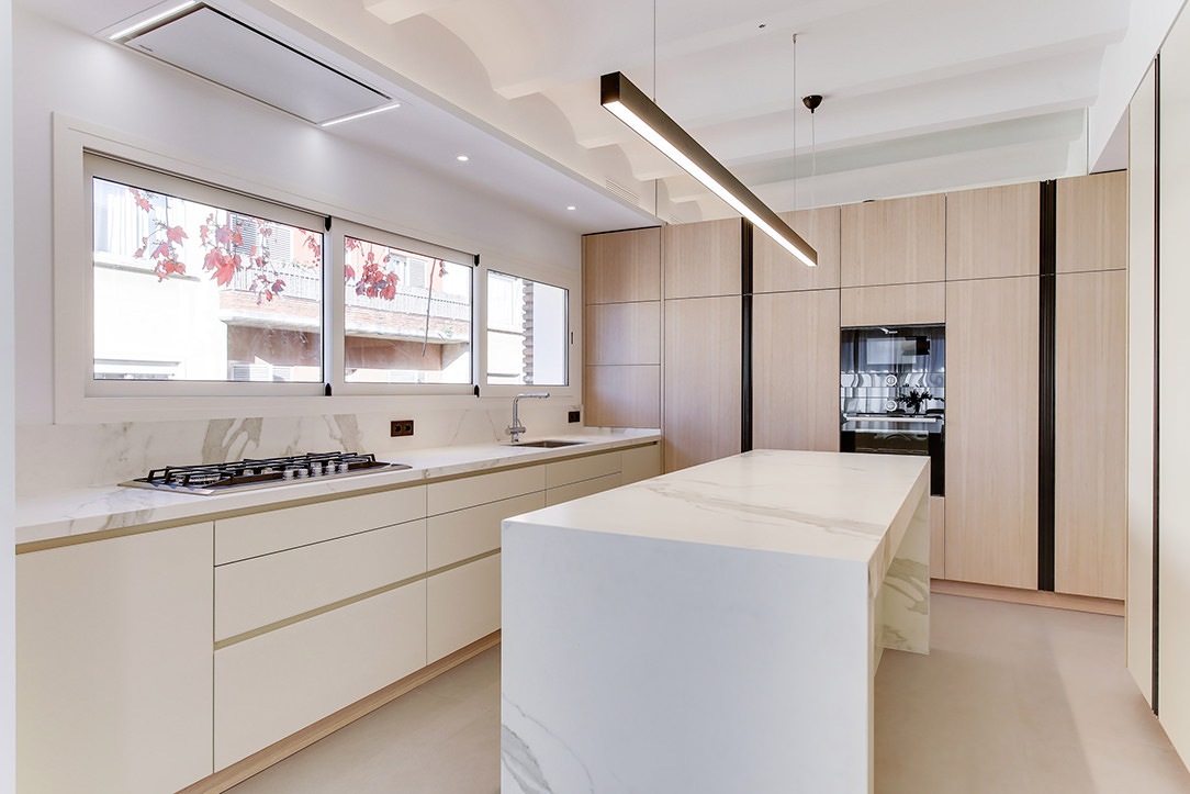
Barcelona contemporary kitchen side view

A contemporary style Barcelona kitchen with a Neolith Stauario top

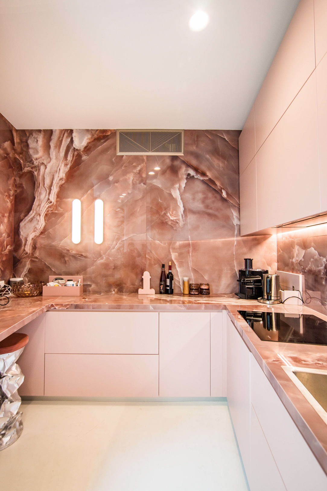
kitchen-pink-front-lighting

In this contemporary kitchen, the onyx-effect top gives a touch of grit and character, matching the soft pink doors

Bergamo apartment essential contemporary kitchen 01

The dark dekton top of this modulor work matches the chromatic choice of the matt lacquering of the doors, while the wall units in bleached oak laminate echo the snack top of the island.

Bergamo apartment essential contemporary kitchen details 02

Kitchen top in Kira Natural Dekton in warm and dark tones with integrated sink in the same material.

Contemporary style furniture: 2021 trends

Already during the last Digital Design Week the new trend of contemporary design is clearly identified: the recovery and reinterpretation of the Modern Style.

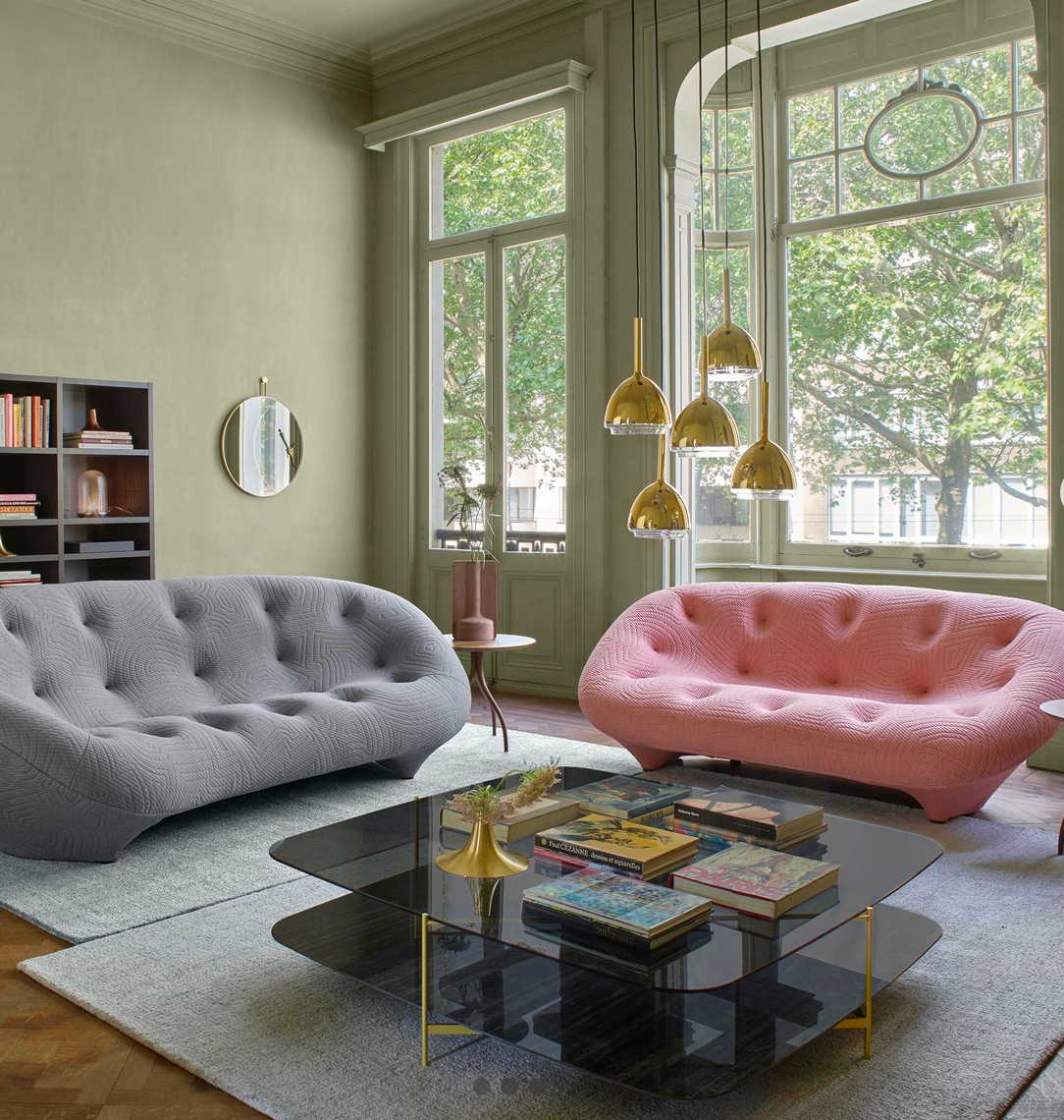
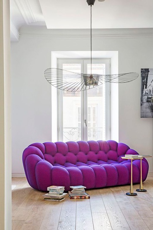
For the living world this translates into the choice of sofas with sinuous shapes that emphasize important padding, accentuated by the choice of velvets.
From the immense corner sofas to which we have become accustomed in the past years, we have now moved on to more compact conformations.
Two- or three-seater sofas accompanied in case by matching armchairs or chaise longue and dormouse. The latter are in fact back in vogue, made contemporary by dynamic and fluid design lines.

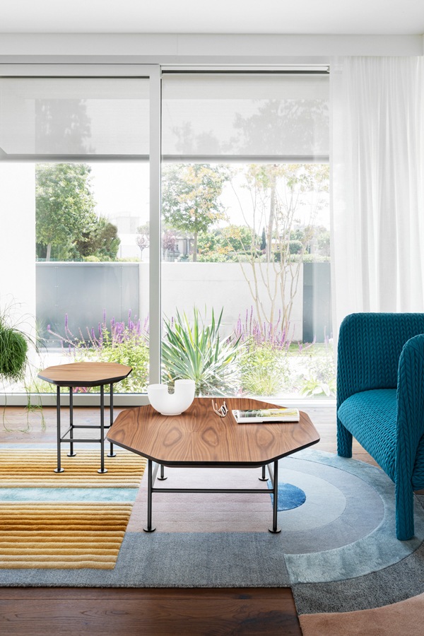
On the floor, colorful carpets appear, with geometric patterns that increasingly come closer to the world of art, and shaped shapes with an eccentric inspiration. A masterful example is certainly the cc tapis production, also present in the contemporary interiors of this work between soft pink and pure white.

In the sleeping area, on the other hand, the beds increasingly equipped with a trunk structure are enriched with padded headboards, most of them with capitonné aesthetics.
There is no lack of details, especially in the bathroom but also in the living area, in iron.
This denotes the design lines of a clean and minimal aesthetic. Often combined with the choice of extra-clear glass, it creates a chromatic and material contrast of contemporary elegance.

Countertop bathroom vanity unit

In this contemporary style bathroom, a large transparent glass shower is embellished with an iron frame that reflects the chromatic choice of the taps.

detail-iron-shelves-TV-living-area
iron-furniture-living-area-detail-portals

The choice of iron details for the TV cabinet in this living area denotes a contemporary elegance

CC-Tapis-Reference-02-carpets-furniture-contemporary-style
CC-Tapis-Reference-carpets-furniture-contemporary-style

CC Tapis rugs with a contemporary design and shaped shapes.
Left: Matter of Stuff, May 2019. Right: Miniforms 2019 Catalog, Laura Pozzi Studio, Photo Alessandro di Bon

living room-furniture-contemporary-style-sofas-design

A contemporary style living room with modern sofas reinterpreted in a contemporary key

contemporary-style-sofa
contemporary-modern-style-sofa

Some examples of trendy 2/3-seater sofas in 2021

To conclude …

The contemporary style furniture, albeit constantly changing, is characterized by well-defined design choices. It adapts perfectly to elegant and simple tastes, for souls predisposed to always remain in line with the latest trends and design products. Those who choose the interiors of their home in a contemporary style dare to choose character, even if combined with neutral contexts.

Optimizing spaces with functional furniture: a studio apartment in Milan

Optimizing spaces with functional furniture: a studio apartment in Milan

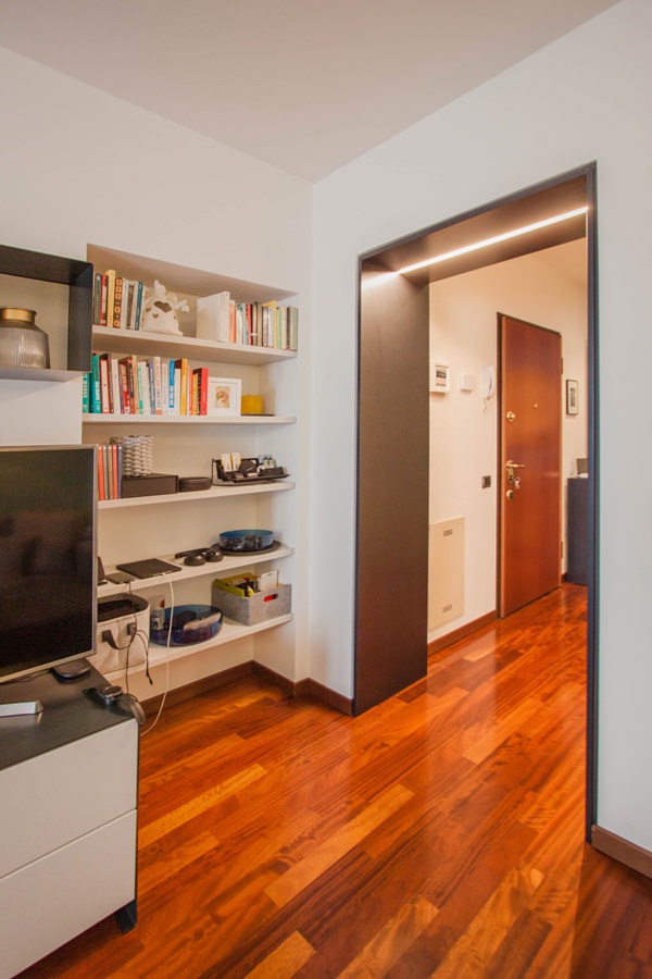
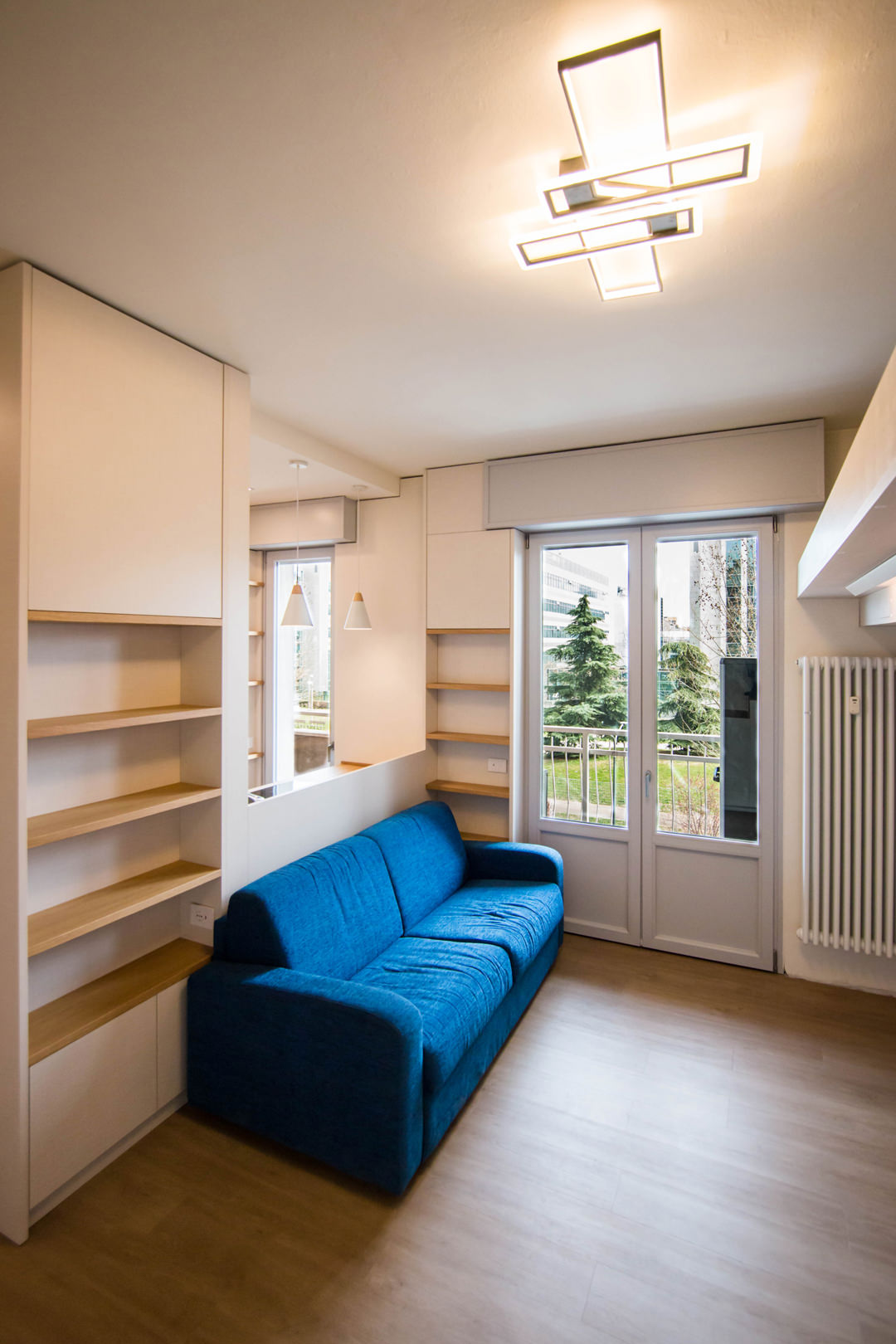
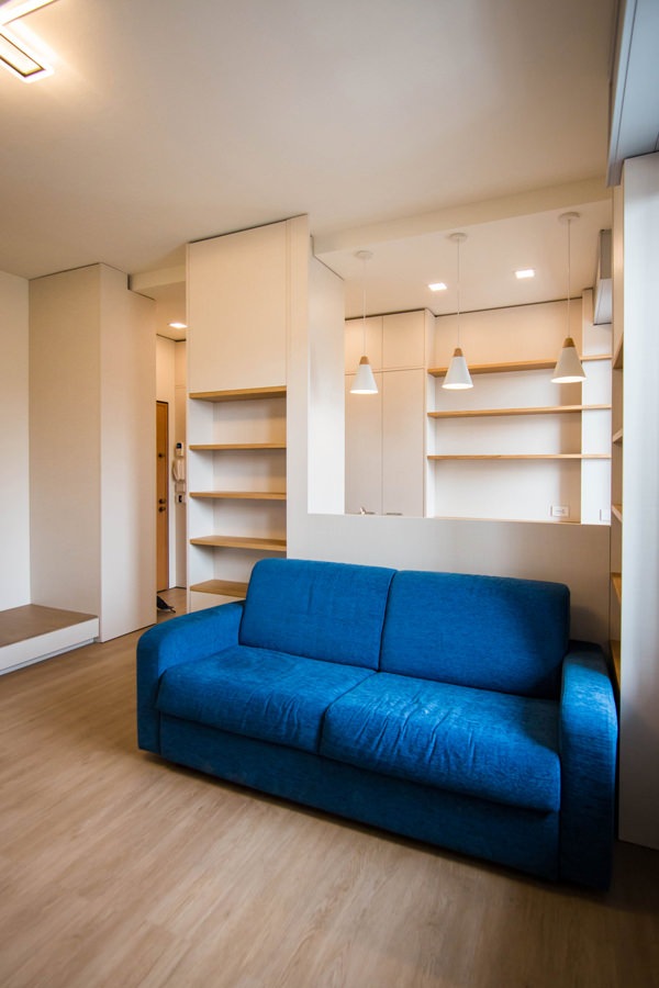
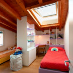
A studio apartment in the suburbs of Milan able to optimize the available space with functional furniture. The choice of materials expresses simplicity and naturalness, to make the bespoke interiors of this welcoming apartment contemporary.

living-room-studio-apartment-open-table-position-optimizing-spoaces-with-functional-furniture
studio-apartment-with-furniture-to-optminize-space-01

A cozy looking studio apartment in Milan

We have already addressed the issue of living in small spaces with this minimal style apartment in the heart of Milan. After a few years, the need to optimize spaces has not lost interest but has instead increased the demand for functional furniture. The example of this studio apartment in the suburbs of Milan best expresses the concept of practicality combined with a natural aesthetic line.

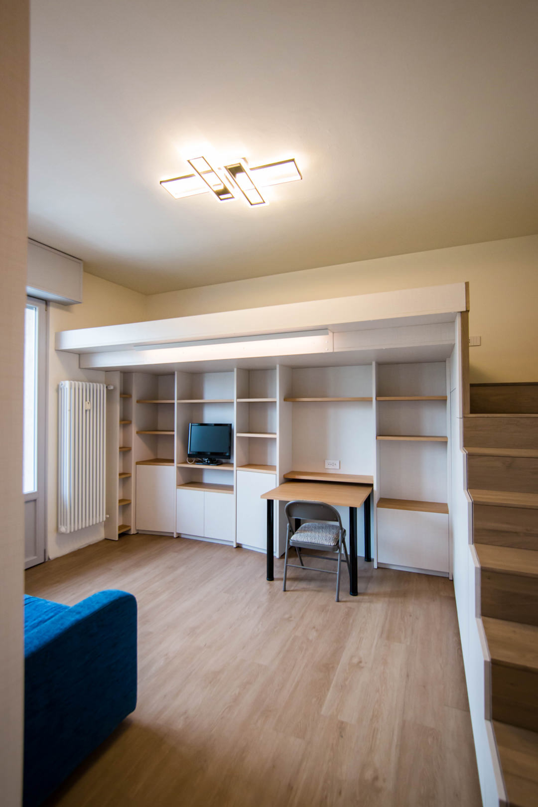
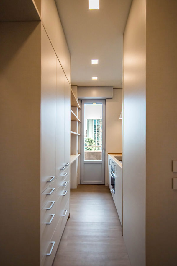
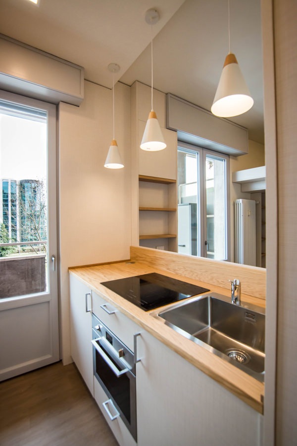
Starting from the original structure of the apartment, the renovation project began primarily with the spatial organization of the rooms. The entrance, working as a filter, acts as a pivot for the management of internal flows. From the front opens the view of the kitchen, essential but well equipped, which visually communicates with the loft living area where a large bed is located.

On the left of the entrance is the anteroom, equipped as a closet with service wardrobes. From here, direct access to the bathroom with a large glass shower and sink area with service cabinet.

equipped-columns-shelves-and-doors-living-room-optimize-spaces
equipped-wall-detail-furniture-to-optimize-spaces
living-room-desk-furniture-to-optimize-spaces
kitchen-access-with-full-height-doors-to-optimize-spaces
side-view-kitchen-with-windows-on-living-room-optimize-spaces-with-furniture

Furniture designed to optimize space

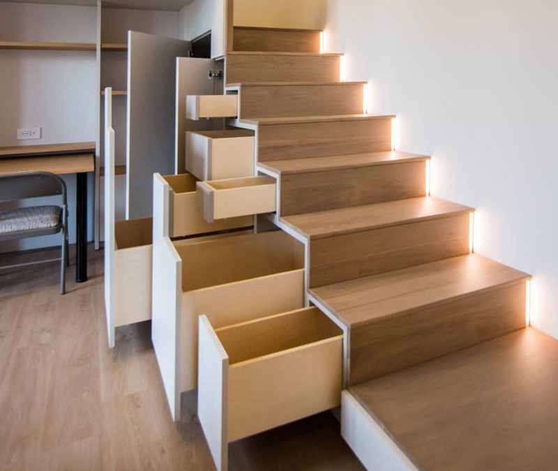
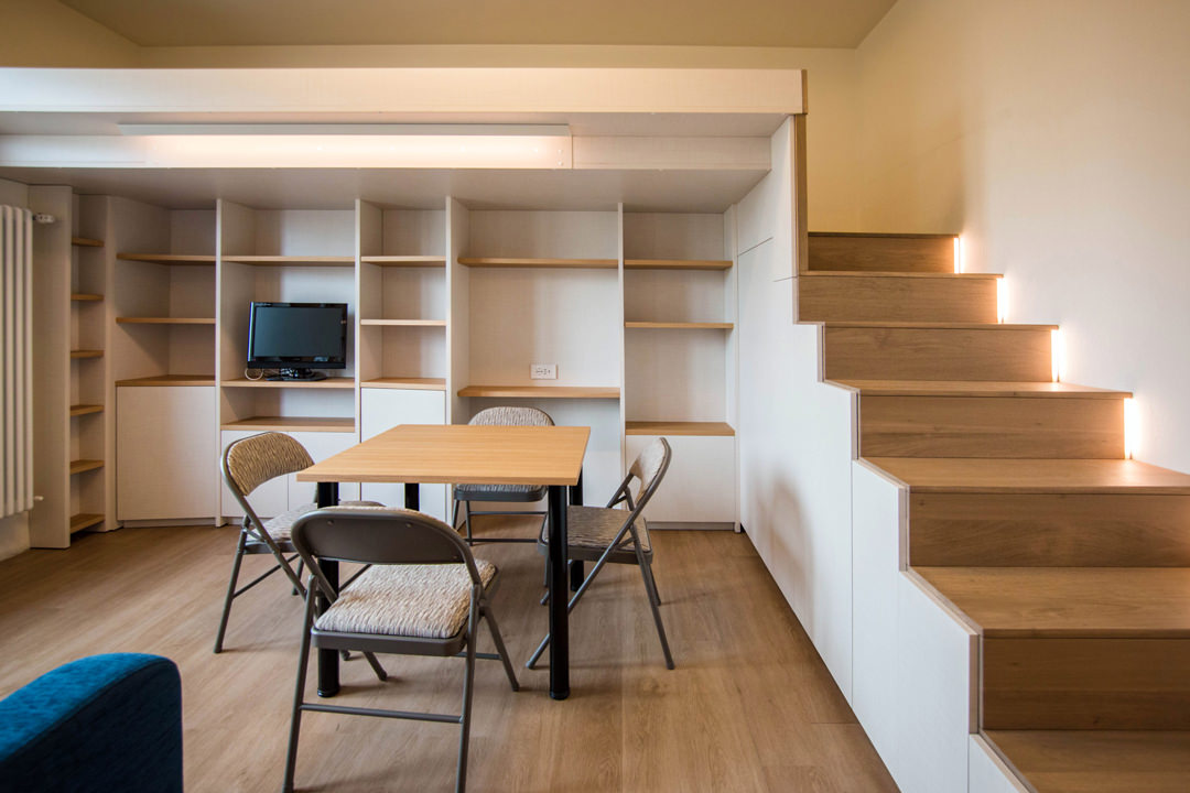
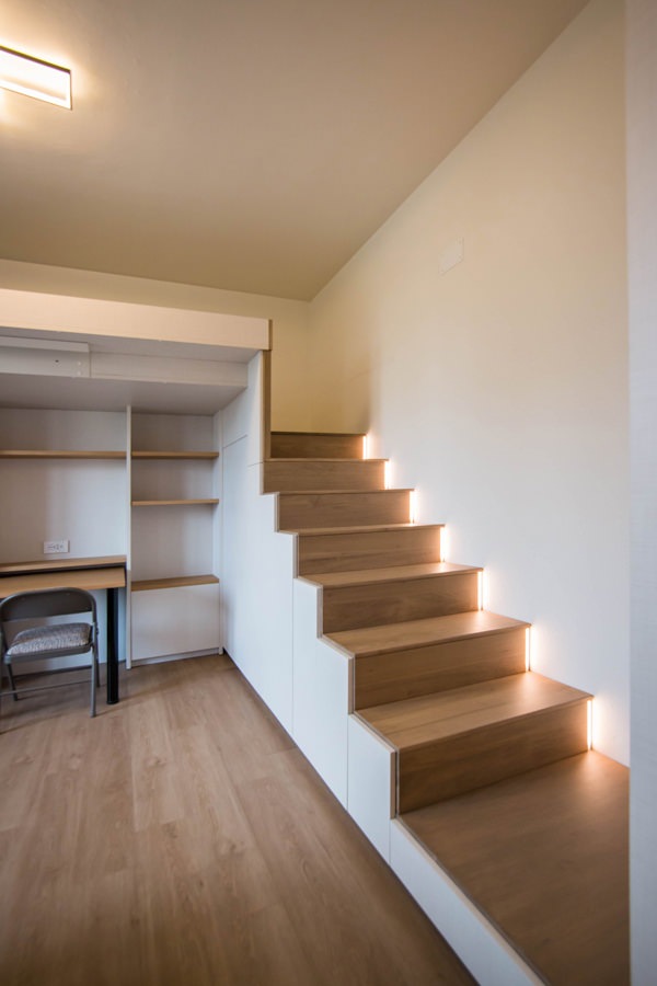
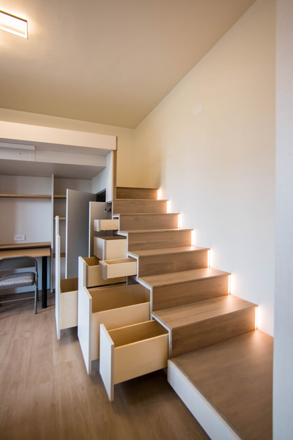
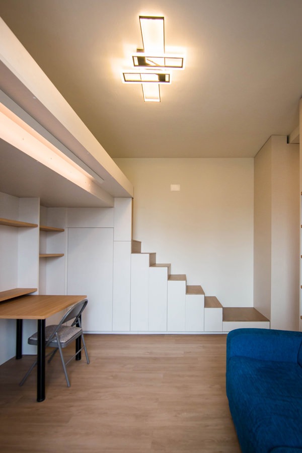
To make the most of the available space, the furniture of this studio apartment has been custom designed by obtaining service rooms from structural voids and architectural constraints. The best example is certainly the creation of the under-stairs compartment with doors and push-pull trays useful for arranging objects of various sizes. In fact, starting from the modularity of the risers and treads of the access ladder to the mezzanine, doors are created with a vertical reading whose opening takes place via push pull. Depending on the need, each internal compartment takes up the space of two or more steps, equipping itself with additional extractable volumes where necessary. From this perspective, the dining table can also be in a resting position, attached to the equipped wall of the TV area and used as a desk, or moved to the center of the room to accommodate other diners.

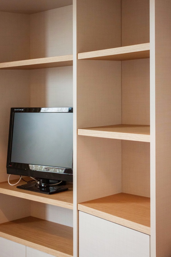
Even the equipped wall, to gain additional service space, is made up of three distinct modules, the sides of which are slightly inclined. The shaping of the different elements allows an optimal management of the architectural corners, also creating a greater sense of welcome.

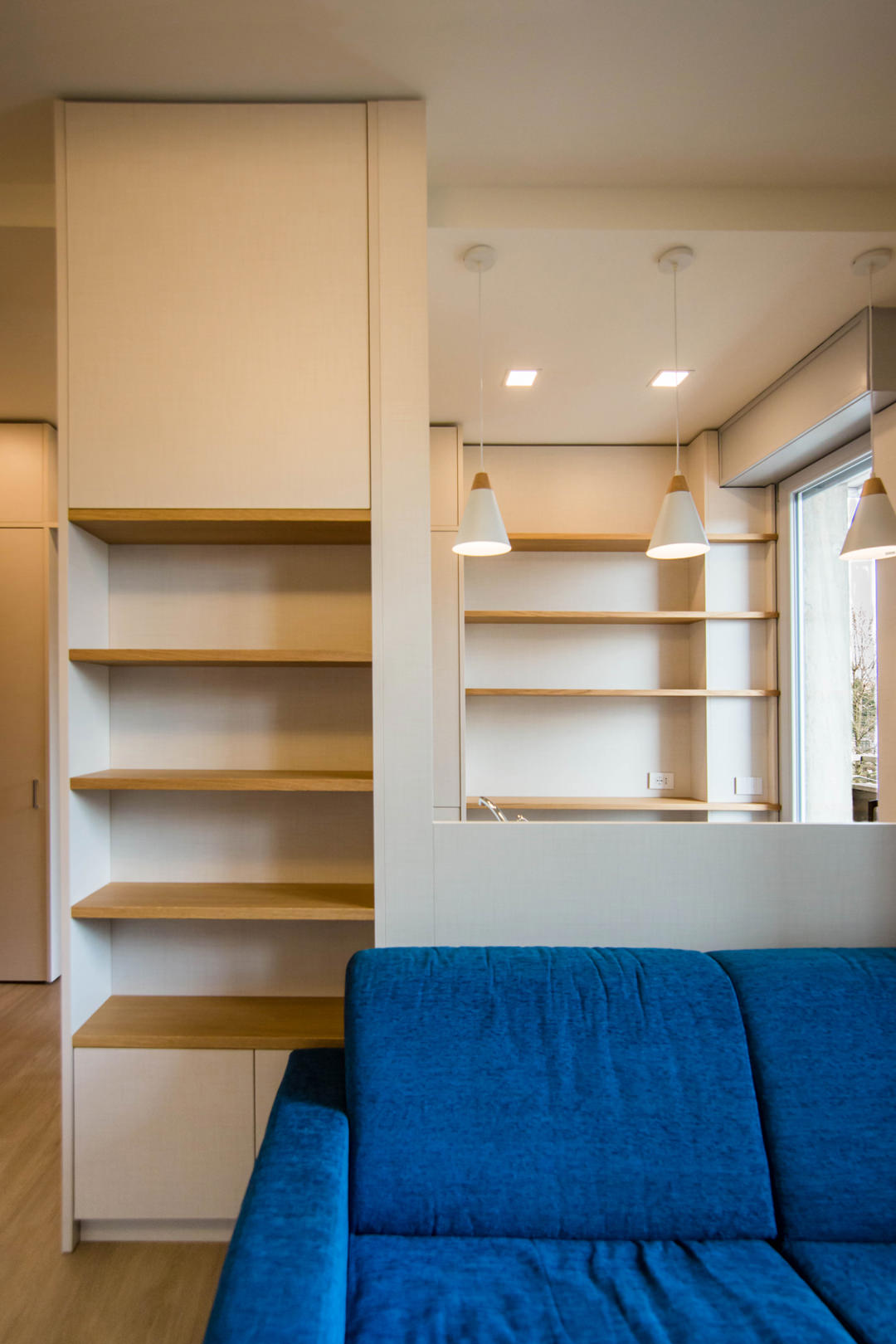
The architectural void then becomes the new design theme, equipping cavities and niches with shelves and open compartments. This is the case, for example, of the main pillar, incorporated in the dividing structure between the kitchen and the living area. The lower part houses internal shelves accessible through a door with push opening, while the upper part consists of exposed shelves in the niche.

under-stairs-equipped-closed-doors
under-stairs-equipped-open-doors-to-optimize-spaces-with-furniture
living-room-studio-apartment-milan-natural-material
front-view-equipped-under-stairs-compartments
kitchen-doors-to-organize-spaces-drawers-furniture-to-optimize-space
electrical-tower-down
eletrical-tower-up

Functional but also conceptual steps

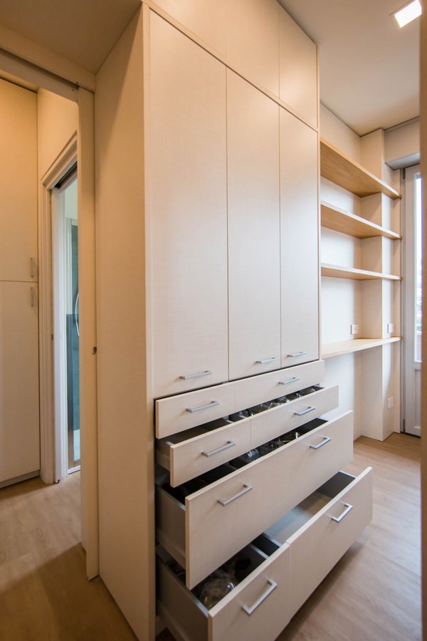
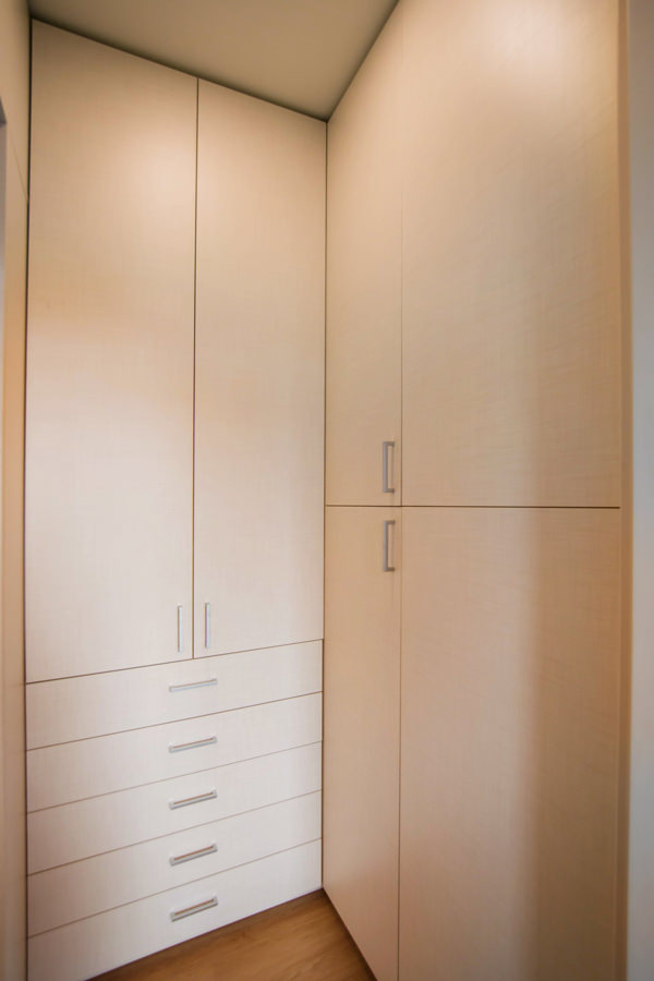
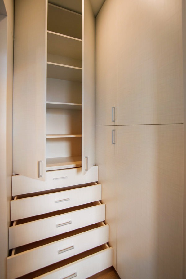
Another focal point is the anteroom, which from an environment required by law also becomes a useful space for the storage of cleaning products and service cabinets. Drawers and doors with height-adjustable internal shelves are used for the products storage of different sizes.

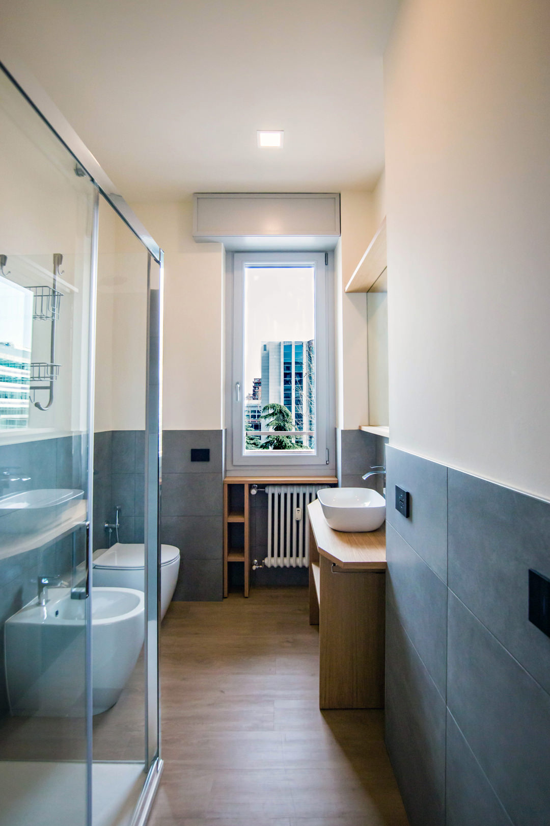
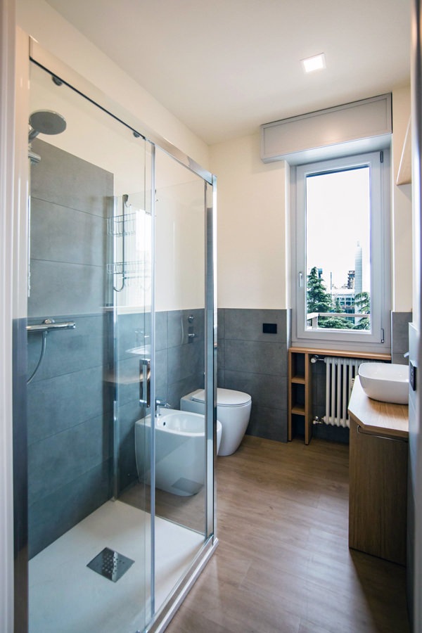
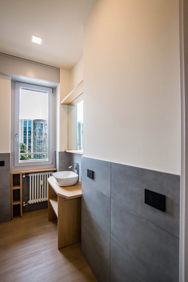
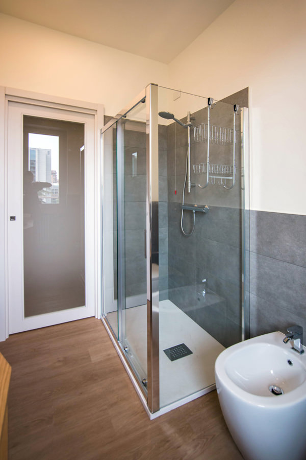
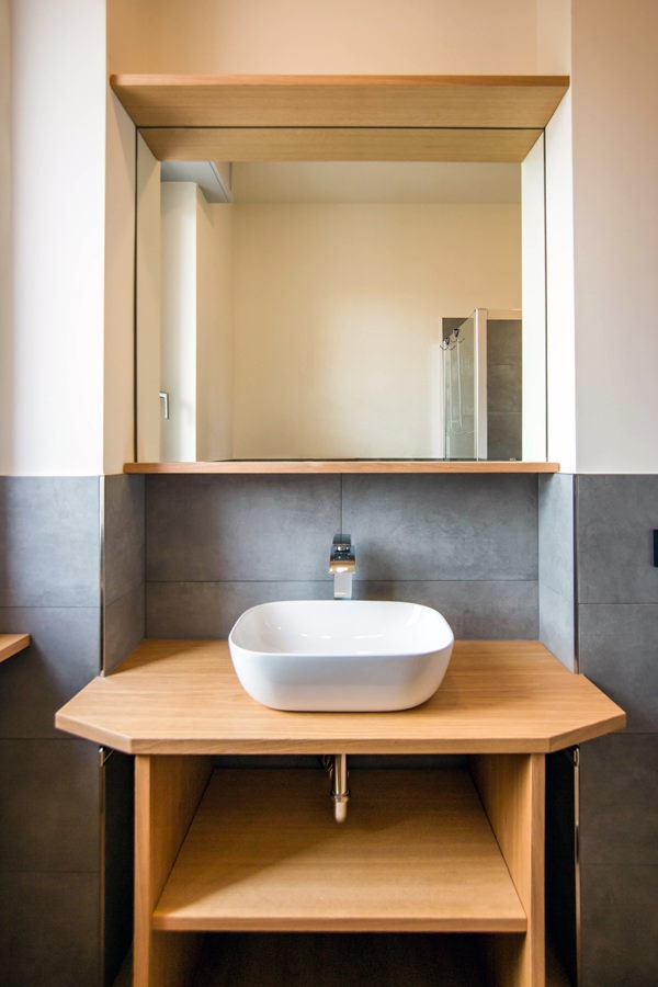
Even in the bathroom, the design of the furnishings in order to make them functional gives life to a large and bright environment. The change of flooring marks the transition not only physical but also conceptual and visual to a more intimate and reserved environment. The front view on the window offers ample natural lighting, diffused throughout the room thanks to the choice of materials. The glass closure of the shower minimizes the aluminum details, while the large mirror attached to the service cabinet expands the perception of space.

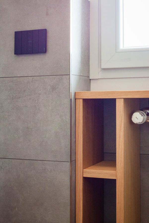
Optimizing the space in the bathroom means taking advantage of all the service cavities: an example is the open oak cabinet under the window. The service shelves for toilet paper and small personal hygiene products in wooden finish in fact obtain their space on the side of the radiator, without however being oppressive. Small accessories such as the pull-out towel holder enrich the functionality of an aesthetically simple and clean bathroom cabinet. Simple and authentic forms are thus valued.

equipped-anteroom-service-cabinet
optimize-spaces-with-functional-anteroom
contemporary-bathroom-gray-furniture-to-optimize-spaces
contemporary-bathroom-glass-door-shower
bathroom-studio-apartment-milan-optimize-spaces
glass-shower-bathroom-contemporary-gray
shaped-furniture-wood-bathroom

Natural colors and materials for a contemporary studio apartment

The practicality of the furnishings is not only found in their composition and spatial arrangement, but also in the choice of materials that characterize them. For horizontal surfaces, the choice fell on oak, a natural wood par excellence with great resistance and workability characteristics. Its aesthetic line with warm veins makes it welcoming and transmits spontaneity and tradition. From the parquet floor to the kitchen top and shelves of the open compartments, its presence becomes the touch of authenticity of the stylistic line adopted. For the vertical surfaces, on the other hand, the canvas bilaminate was chosen, whose warm but neutral tones make it delicate but incisive at the same time. Among the major advantages of this material, it certainly has high resistance combined with a very affordable price. Its finish also makes it soft to the aesthetic impact and textured to the touch, expressing attention to detail.

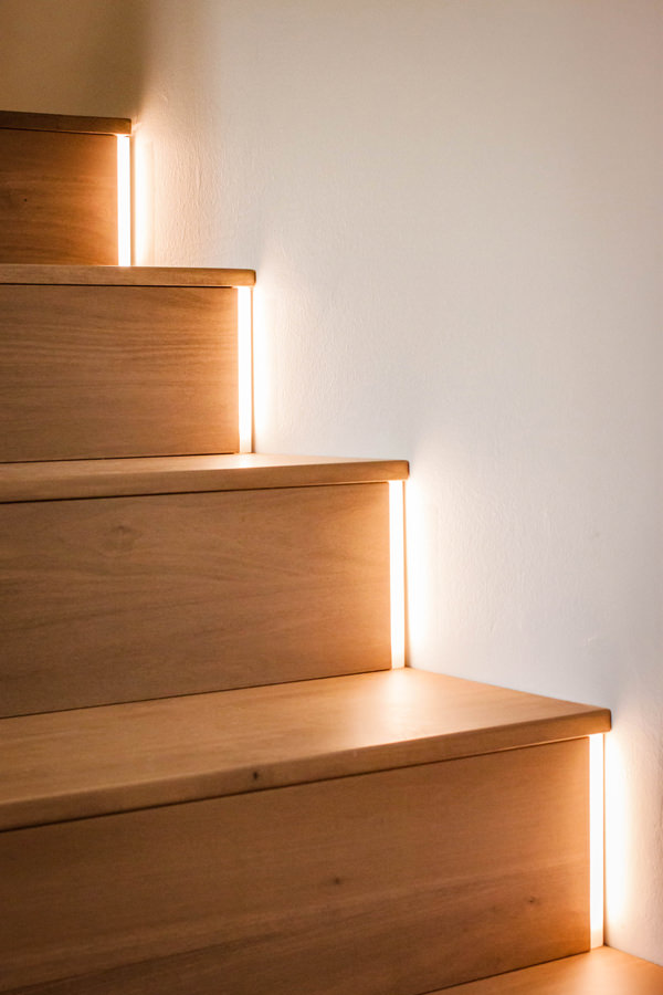
detail-LED-light-stairs
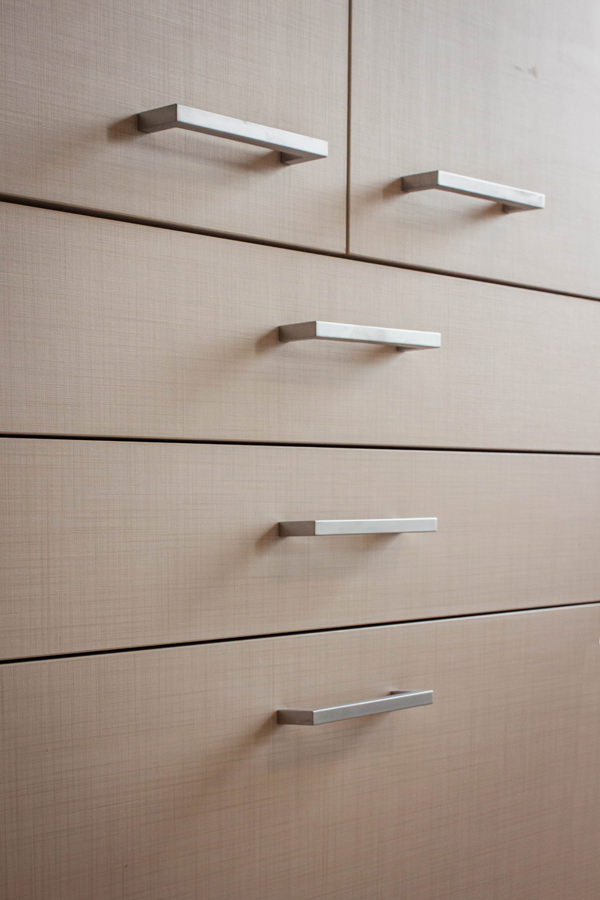
detail-canvas-bilaminate-doors
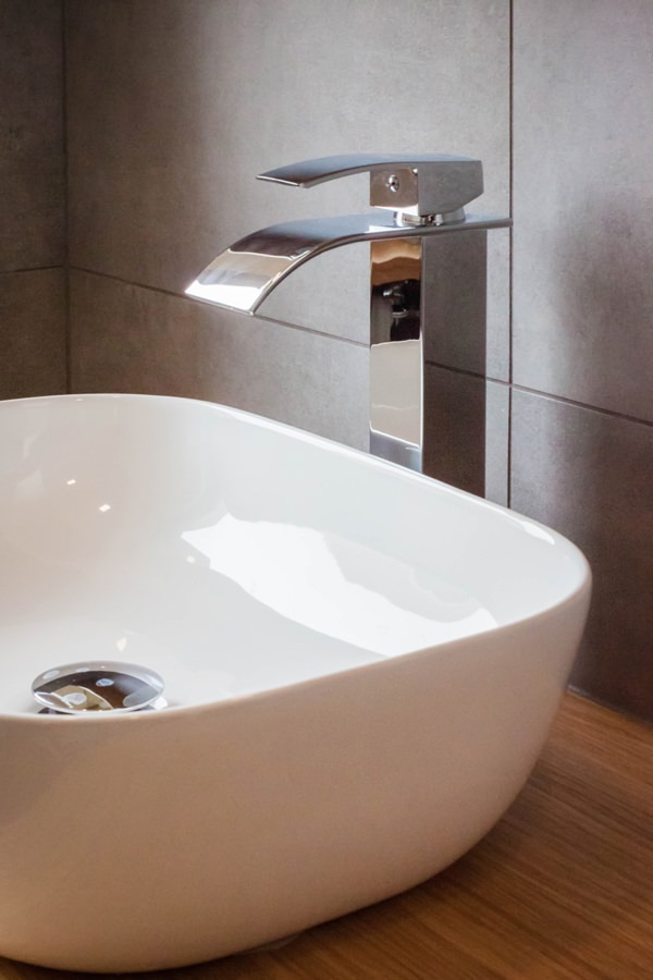
bathroom-countertop-basin-design-tap
detail-customed-bathroom-furniture

The renovation of this studio in Milan involved all levels of reading of the project. From the planimetric distribution of the rooms to the choice of materials and finishes. The choice of functional furniture allows you to optimize spaces by providing environments that are not only aesthetically pleasing but also practical and easily livable.

Architectural voids and structural elements hide great potential, just look at them with creative eyes!

To see other examples of small rooms optimized in spaces with functional furnishings, you can take a peek at this minimal style studio apartment or at this shabby chic style creation

How to equip a bathroom with laundry corner

How to equip a bathroom with laundry corner

A functional and aesthetic analysis of the laundry corner. An environment that in contemporary reality is forced to give up its autonomous room to blend in a small bathroom or equipped corridor. The aim is giving space to the services that define our daily life, making them aesthetically interesting.

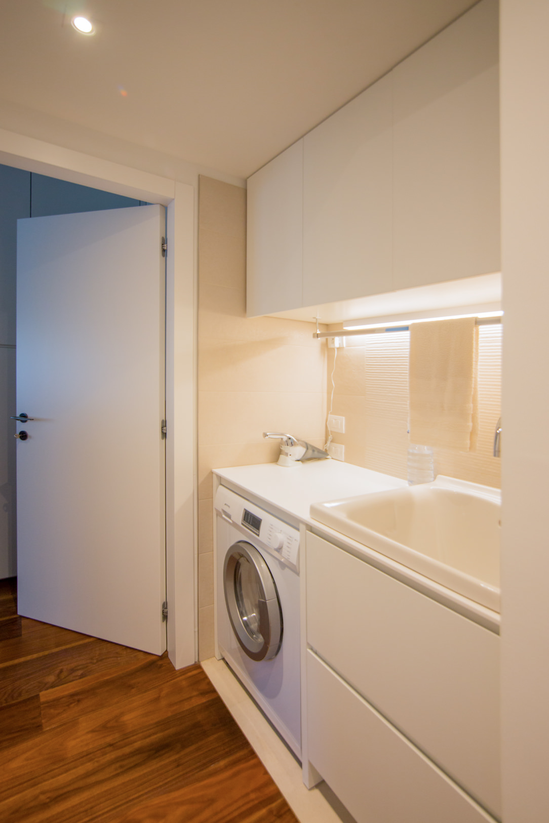
laundry corner

Laundry corner with showed washing machine, basin and compartments furniture

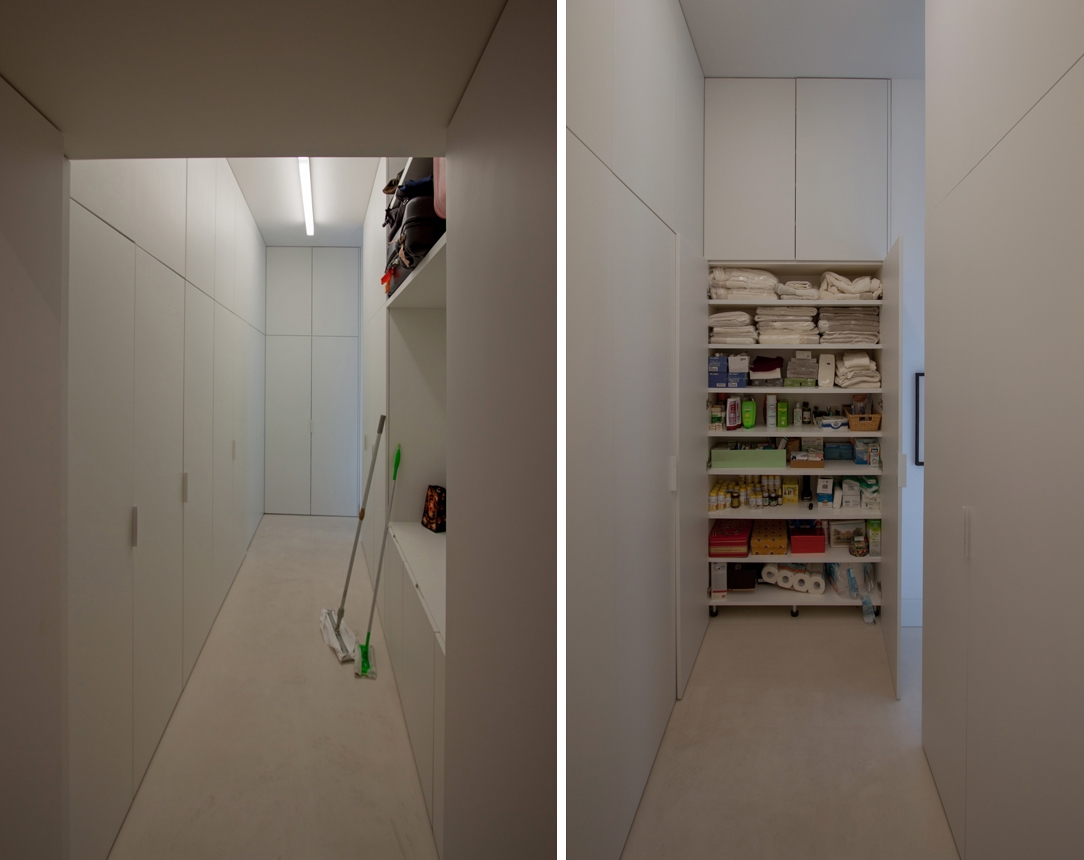
equipped corridor

Optimize spaces equipping corridors with serviced wardrobes View the project

Space to services

Speaking of interior design, we are used to imagine elegant living rooms and modern kitchens, contemporary bedrooms and essential-style dining rooms. Over the past few years , the interior design has increasingly taken on the aesthetic meaning of architecture. Let’s remember, however, that design was born as the perfect combination between aesthetics and functionality. The morphology of furniture is nothing else than the natural result of perfect efficiency. It is exactly with this spirit that we want to highlight those “corners of the house” that we usually tend to hide because they are not “beautiful” even though they are basics in the functionality of our domestic spaces. The project layout of each house gets us used to dividing rooms between “living area” and “bedrooms”. The first includes all those rooms that are used to welcoming guests, designed with the aim of return the best public images of the owners. In the “sleeping area”, the most intimate and personal rooms of the owners come to life. However, in this typological distinction are missing all the rooms which, whether private or public, carry out a real function. Among these, just think of the laundry room, which over the years has changed its conformation adapting to the needs of the time.

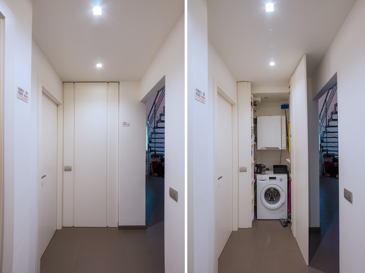
washing machine recess

A laundry niche uses the available passage corner to house the washing machine and shelves View the project

From public washrooms to bathrooms equipped with laundry corners

Over the years, the home laundry has become increasingly important in private houses. Whole rooms were equipped with basins and ironing corners, which gradually witnessed the coming of appliances capable of simplifying manual work and obtaining excellent results. Private rooms that replaced the traditional public lavatories for an increasingly elitist concept of personal care and cleaning. The widespread use of washing machines, and modern dryers, has meant that laundry rooms take up less and less space inside private houses. Furthermore, in the contemporary vision of the house, open spaces have swarmed the architectural panorama more and more, reducing the functional closings to the bare minimum. As a consequence, to optimize space, the laundry room is often eliminated in favor of bathrooms equipped with washing machines, dryers and service cupboards. Making the appliances “invisible” was the next step. Here then come equipped wardrobes able to hold not only washing machines and dryers but also baskets and pull-out compartments for cleaning products.

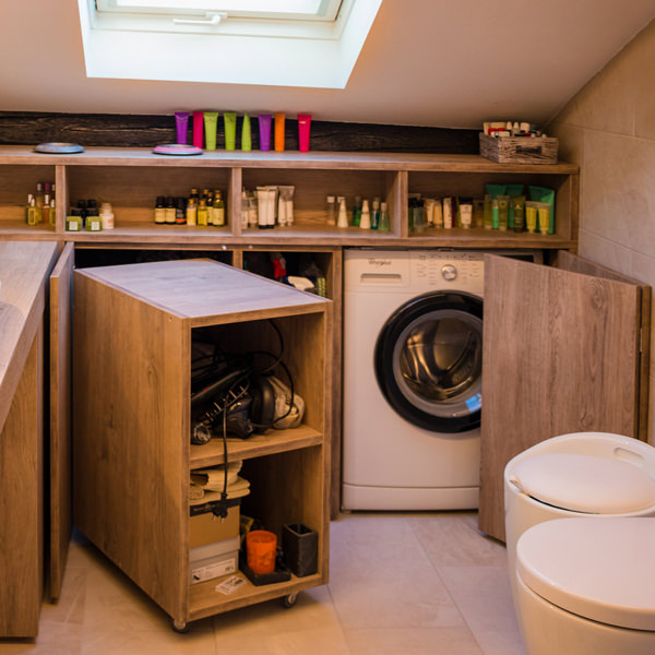
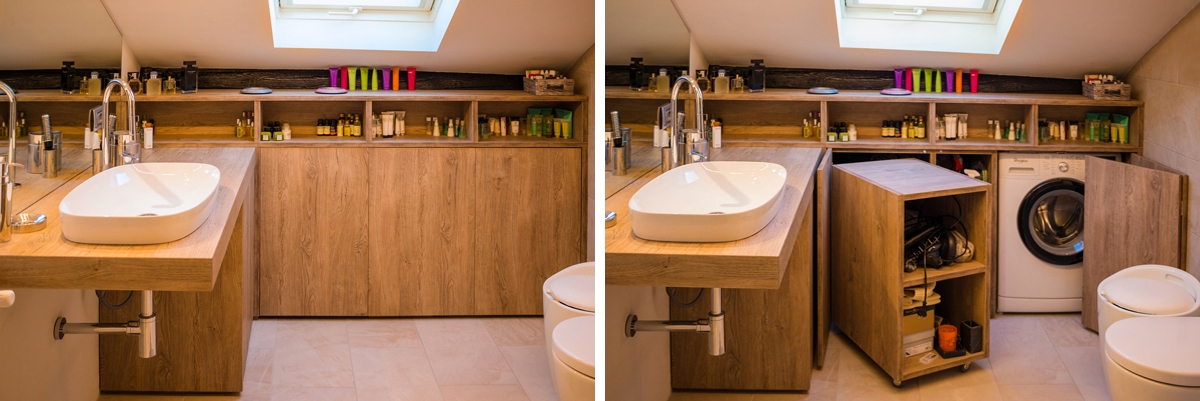
laundry bathroom detail

A bathroom with contemporary wooden surfaces hide extractable functional elements. View the project

Composition of a laundry-corner

Equipping a bathroom with a laundry corner first of all means providing an insertion point for the washing machine. This can remain visible, favoring the opening of the porthole without interfering with any surrounding doors or being built-in the washbasin cabinet. To better hide the washing machine, however, it is necessary to provide a service cabinet that rests on the ground. It means excluding suspended solutions or light supports, and study a customed solution that allows the opening of the tray and the easily maintenance of the appliance. To this is often added a service cabinet with internal shelves and removable baskets that can contain cleaning products and accessories of different sizes. Often these latter two solutions come together in one, with folding or sliding doors, which act as a closure for the furniture element. Internal accessories such as dividers and hanging elements are additional options that can make the space more functional and optimize the overall dimensions.

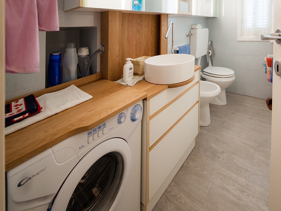
bathroom with washing machine in view

The bathroom cabinet with wooden top and finishes houses the washing machine View the project

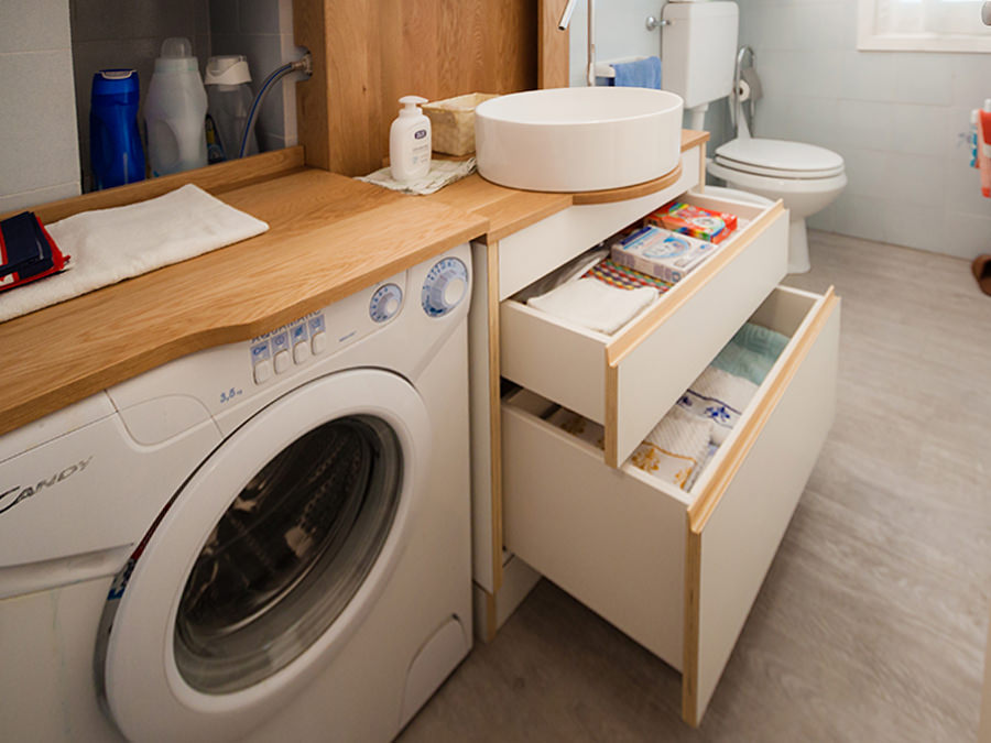
bathroom cabinet with open drawers

Drawers of different heights are extremely functional elements for organizing personal products View the project

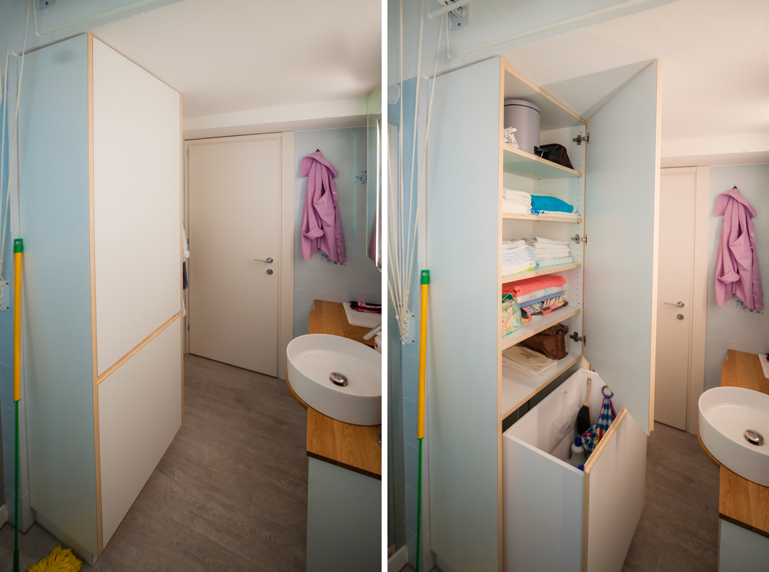
bathroom service closet

A large service cupboard with internal shelves and removable basket for the bulky products View the project

It is the functionality that defines the composition of these equipped corners. Our task is to optimize spaces in the best possible way by creating practical and aesthetically satisfying solutions. Whether they are service points hidden in other rooms or clearly visible and recognizable elements, it is essential to be able to organize them in the best way, using all the available centimeters without however giving shape to narrow solutions.