An office renovation in the center of Bergamo

An office renovation in the center of Bergamo

In the center of Bergamo, 130 square meters of offices overturn their configuration and aesthetics with a renovation that mainly involves the architectural setting of the interiors. Open space and management offices communicate with each other in an environment designed to make the flow of users as functional as possible.

office renovation vardo color wall farrow ball entrance

The concept of transparency

Developing the project of working spaces was fundamental the identification of the concept. The latter clarifies on the one hand the message to be conveyed to the public, on the other it becomes a guideline in the choice of materials and finishes. The first step in the renovation was the analysis of the intended use of these offices, reserved for accountants with their collaborators and secretaries, archive areas and meeting points, waiting and conviviality. The definition of different typologies made clear the concept of transparency, the design metaphor of the subsequent architectural configuration. In fact, thinking about the role of the accountant, and his management of sensitive files and documents, the message we wanted to convey is that of transparency, also synonymous with trust and security. This is declined according to the type of interior in different configurations, imagining it as a shade from more to less transparent depending on the degree of “protection” required.

glass walls internal dividers workstations
false ceiling offices open space workstations

Each function has its level of transparency

By entering the space, the client is projected into an open space, where the production part entrusted to the secretaries finds space. To distinguish and separate the various workstations only furniture of different heights and glass walls, which delimit the work area from the corridor. This represents the point of greater transparency where the customer, despite not having direct access to the environment, has full visual control. Moving on to the waiting, conviviality and meeting functions, a greater degree of privacy is required. These functions find space in well-defined environments, limited to rooms, but easy to access. Here the theme of transparency is declined in construction details, one of all, glass doors for the meeting room. Although they are limited spaces, their access is free and they are located near the main entrance. For the third type of function, on the other hand, the management offices of Chartered Accountants, the level of privacy is considerably higher. In opposition to the central open space, the studios are configured in more or less spacious rooms located along the external perimeter of the floor plan. Access is through corridors or secluded doors, which almost tend to disappear or blend into the surrounding furnishings. This is to guarantee total confidentiality, creating a unique and exclusive relationship between professional and client.

office renovation waiting room archive
entrance boiserie reception cherry wood open space
red lamp meeting room chairs detail
meeting-room-table-crystal chairs red wall lamp

Office renovation: architectural development

The initial internal configuration, chosen by the previous tenants, was based on the use of movable walls with an aesthetic that is now largely outdated. Furthermore, on the floor, a faded blue carpet, also used as the covering of some pillars. From the first sight, however, what fascinated the new tenants was the great brightness coming from the large perimeter windows. This represented the turning point in the evolution of the project. Also, from the plant engineering point of view, a complete renovation was necessary, which could equip each workstation with cable connection to the data network, telephone setting for internal switchboard, and connection to a Wi-Fi network for printers. To better manage the large influx of electrical predispositions and at the same time allow an air conditioning system via split, a false ceiling was created in the main corridor, capable of serving all rooms. At the same time, it allows a greater perceptual distinction between public environments and restricted access work areas.

Via Verdi project plan
executive office renovation with light furnishings
studio-accountant classic cherry wood furniture
studio-accountant brings to measure vardo ottanio
furniture recovered blue laminate orange colored walls

The renovation of the offices: choice of colors and materials

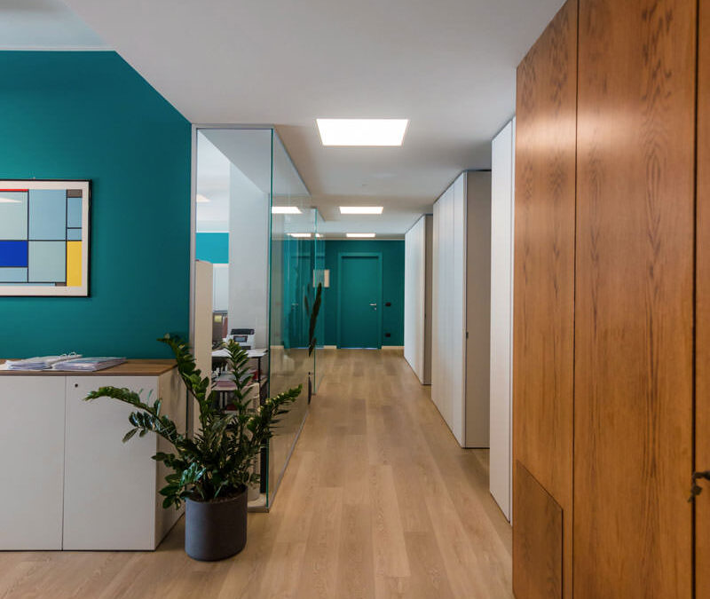
The aesthetics of colors and materials are defined in neutral tones, with a parquet-effect floor in bleached oak, ice gray walls interspersed with Vardo-colored surfaces from the Farrow and Ball collection. These define the visual rhythm in the interior scan. The ice gray chosen for the painting of the main walls is made even brighter by the great natural lighting. The result is almost close to white, while giving a touch of additional softness compared to the asepticity of the latter. To see other examples of ice gray in the private apartment context: a contemporary-style tavern and glimpses of antiquity in a contemporary attic. At the entrance, the only trace of the initial layout is a full-height paneling in cherry wood that develops at an angle embracing the access to the meeting room, the archive rooms and the corridor with access to the second archive room and bathroom of the personal. The choice of cherry is also taken up in the furnishings of the reception through a shaped counter with matching closet.

teal-colored walls for prestigious offices
elegant modern office walls color
office renovation-bathroom colored gray tiles wall
vardo color walls farrow ball office renovation
renovation-offices recovery of original wood paneling
full height cherry wood paneling entrance
vardo wooden wall paneling bleached oak parquet

Furniture: from the relocation of the existing to the functionality of “custom made”

The existing furnishings find space within this well-defined color contrast. The main difficulty in a renovation project is knowing how to combine furnishings from different offices, with completely different aesthetics and functionality. For the common areas, the most neutral solutions were therefore opted for, with medium gray elements combined with wood-effect bilaminate tops. To intersperse the different environments, and to distinguish their different functions, furnishings in a darker neutral tone. Each room therefore has a unique aesthetic, which can communicate with general neutrality while expressing the strong intrinsic character of each environment. So also, the management offices vary from a classic décor with cherry wood furniture, to essential interiors in light tones or even renewed furnishings with modern blue laminate tops on a wengé wood structure. The most functional point of the interior is represented by the large custom-made wardrobe in the corridor. This serves as an archive and collection point for paperwork and files, with full-height lacquered doors with an essential appearance. Internal shelves adjustable in height allow the best optimization and management of the internal space. Recessed handles run along the longitudinal development of the door, marking the overall rhythm of the furniture. In the same way, the access doors to two management offices are inserted, in which the neutral aesthetic of ice gray is interrupted by vardo-colored inserts. The presence of the handle thus identifies the access point to each room, while remaining discreet in the general perception of the furniture.

door opening lacquered doors wardrobe corridor

Small tips to renovate offices

An office renovation does not only imply changing the general approach in favor of fresher materials and aesthetics. In the first place it means above all choosing the message to be transmitted and knowing how to translate it from an architectural and communicative point of view. Knowing how to combine the stylistic language of existing furnishings is the next step, in which the uniformity factor often lies in the choice of neutral colors and materials for the common areas.

A bespoke wardrobe in the attic: sloping doors and large bookcases

A bespoke wardrobe in the attic: sloping doors and large bookcases

To make the most of the sloping ceiling of this attic, a large custom-made wardrobe is mixed between a functional element and a large bookcase. A hybrid furniture, usable internally for the seasonable wardrobe change, but linear in aesthetics to create a suggestive and small reading hall for our little client Francesco.

bespoke wardrobe attic sloping ceiling bookcase in front of sloping doors

Equip an attic with sloped ceiling with a custom-made wardrobe

The attic is the project environment with great aesthetic potential but with strong architectural design constraints.
The presence of a sloping roof creates different usability areas imposed by the different internal heights of the room.
In this case, the architectural conformation of the attic, with a narrow and long plan with access to the center of the ridge, ideally divides the room into two different environments.
In one of these two the large custom-made wardrobe stands, able to exploit even the lowest corner of the attic with a bookcase in the niche.

To ensure that the sloping cut doors are not obstructed in the opening direction by the attic ceiling, it is necessary to provide single doors with fastening on the longer side. This also allows an internal division with shelves marked by single and not double modules as in a traditional wardrobe.
The backs of the bookcase are shaped in the same way in order to respect the inclination of the ceiling and optimize the overall dimensions.

To explore the theme of rooms with sloping ceilings, here are these two attics: one in a contemporary style with antique elements and the other in a modern style. To these is also added this mezzanine equipped with wardrobe and bookcase for a functional study area.

bespoke wardrobe attic sloping ceiling front bookcase
detail handles white aluminum profile wardrobe
interior hanger wardrobe custom attic season change
inside wardrobe change of house linen season
bespoke wardrobe attic sloping ceiling side bookcase
internal shelves bilaminate wardrobe made to measure attic change of season

A reading corner for our most demanding small customers

Francesco is our little client with very clear needs. If mom Laura is kindly allowed to use the inside wardrobe for the seasonable wardrobe change and household linen, the niche-bookcase must be able to accommodate books and dinosaurs divided by specific themes and colors.
The shaped shoulders accommodate fixed shelves at different heights, creating a lively but elegant visual rhythm.

Even the fresh and elegant tone of the white bilaminate creates a luminous reading area in which a delicate Scandinavian design coffee table finds space.
To take advantage of the depth of the wardrobe, a second bookcase is grafted onto the side shoulder, also visually closing the furniture with a characterizing detail. The same solution was also adapted in this cerulean blue kitchen in modern style.
In this case, the shelves are positioned at a greater height so that they can also accommodate more bulky folders and books.
The reading corner is thus embraced by the multifunctional furniture that from a simple wardrobe serving an attic it also becomes a custom-made bookcase.

reading corner bookcase in niche shelves fixed height
bookcase detail with fixed door and white bilaminate shelves
detail of white bilaminate bookcase shelves
attic bookcase with fixed shelves
bookcase detail in front of the wardrobe
detail handles white aluminum profile cabinet front

Milan Design Week 2021: between the new Supersalone format and the fuorisalone districts.

Milan Design Week 2021: between the new Supersalone format and the fuorisalone districts.

Milan Design Week 2021 has finally arrived, exploded in all its energy!
Last week Milan brought back the ever-moving machine of the Salone del Mobile, in an extraordinary version, accompanied by the districts of Fuorisalone threatened in the urban fabric of the capital.
The long-awaited autumn edition has aroused an ever more tangible ferment, which was followed by a positivity and acceptance by the whole population. A clear message of restarting a Milan that is rediscovered in all its energy and desire for innovation.
The digital edition in April has also increased the desire to return to the presence, between stands and creative installations!

We also looked around the Supersalone stands and the fuorisalone exhibitions, looking for ideas and inspirations, for a continuous update on trends and design ideas.
Here is our balance of this autumn edition between considerations and personal selection!

Milan Fuorisalone Modulor map

KM covered

hours

location

calories burned

Between Fashion and Interior Design: care of visual

Over the years, the Fuorisalone has always been recognized for its thematic installations, on the edge between art exhibitions and immersive installation. In recent years, brands from the fashion world have been increasingly recognized.

In 2019 the most successful is certainly Cos at Palazzo Isimbardi with its unstructured portal in 3D printed volumes. Accompanying him, Hermès at the La Pelota complex and his attention to the handcrafted product, but also Missoni with Home Sweet Home staging a textile world permeated with saturated colors.

During the just ended Milan Design Week 2021, high fashion brands are once again recognized for their exhibition methodology and amazing sets. Hermès, Antonio Marras, Dior and Gucci certainly among the most nominated of this edition.

Hermès Milan design week 2021 La Pelota

Hermès, Collection for the Home – La Pelota

The French haute couture house returns to Pelota with a dreamlike setting: 5 display totems hand-decorated by the scenographers of the Teatro alla Scala, reinterpreting the concept of “home”. Internally, divided into different themes, Objects from the Home collection that enhance the materiality, the artisan imprint and the meticulous work of the handmade. An installation that strikes and remains impressed not only for its aesthetic impact, but also and above all for the values ​​transmitted and the emotionality of the space. To admire the obsessive attention to points of view, the architectural lines and the seriality of the graphics, the tactility of the materials enhanced by the objects that want to be touched and felt.

Hermes Fuorisalone 2021 La Pelota totem detail 01
Hermes Fuorisalone 2021 La pelota totem detail 02
Hermes Fuorisalone 2021 La Pelota totem detail 03
Hermes Fuorisalone 2021 La pelota totem detail 04
Hermes Fuorisalone 2021 La Pelota totem detail 05

Dior, The Dior Medallion Chair – Palazzo Citterio

The theatrical installation commissioned by Maria Grazia Chiuri comes to life at Palazzo Citterio. The protagonist is the iconic Medallion Chair, in Louis XVI style, chosen by Christian Dior as the essential emblem of the French Maison for its elegance and its “Parisian style”. 17 artists and designers were thus invited to reinterpret the original chair, giving life to objects at the mercy of fantastic creation, conceptual and graphic reinterpretation. Provocative, witty, haughty, deconstructed, impossible. An installation that fully enhances the various chairs, making them the protagonists of a masterful staging.

Milan Design Week 2021 Dior medallion Chair
detail Dior Medallion Chair 01
detail Dior Medallion Chair 02
detail Dior Medallion Chair 03

Left: Ma Yansong, Meteor
Center: India Mahdavi, Swan
Right: Seungjin Yang, Blowing chair for Dior

Alcova – Former Military Hospital

The charm of abandonment enchants visitors to Alcova, creating interesting conceptual and visual contrasts with the design works. Among exposed systems, peeling walls and sinks with rusted pipes of the former Military Hospital, contemporary design takes center stage.
Here settings with a sophisticated and immersive scenographic impact meet exhibition environments with a highly expressive concept.

An example is Brassless, curated by Studio Vedèt for Nilufar Galley, whose stated goal is to accelerate the end of the brass trend. Extremely used material from 2017 to today, whose diffusion has been emphasized by the fast distribution of the internet and social media, the exhibition does not want to sanction the end of brass, but rather a denunciation of the decadence of trends.
With this logic, 13 talented designers, deliberately extraneous to contemporary trends, were selectedwhose objects experience the ductility, resistance, aesthetics and technical properties of metals. From gold, to pressed aluminum, passing through nickel and copper, but also silver and steel. Transparent Landscapes by Studiozero, on the other hand, investigates the theme of transparency, declined in a sensorial set-up, between visual and sound, and in the presentation of three iconic objects: a mirror, a carpet and a floor lamp.

On the upper floor of the Laundry building, instead, one finds oneself projected into the surreal atmosphere of A Clockwork Orange through the revisited reproduction of the Milk Bar curated by HEAD.

Milan Design Week 2021 Nilufar Gallery Brassless
Milan Design Week 2021 Nilufar Gallery Objects of common use

Nilufar Gallery, Brassless e Object of Common Use, Alcova

Transparencies Alcova
Transparencies Alcova 02

Transparent Landscapes, Studio Zero, Alcova

Clockwork Orange Milk Bar Alcova
Clockwork Orange Milk Bar Alcova 02

Korova Milk Bar, HEAD

Turri, Supersalone

Elle Decor Palazzo Bovara 03

La Casa Fluida, Elle Decor

Senato Hotel Milano Aqva
Senato Hotel Milano Aqva detail

ACQVA, Senato Hotel Milano

Ferri Mobili Supersalone

Ferri mobil, Supersalone

Supersalone DeCastelli
Kerakoll Design Milan design week 2021

Left: De Castelli, Supersalone
Right: Kerakoll Design House, Kerakoll

Supersalone Connubia Milan Design Week 2021
Luigi Ghirri Mutina 2021

Left: Connubia, Supersalone
Right: Between the lines, Luigi Ghirri, Mutina

Milan design week 2021 Mohd studiopepe
Milan design week 2021 Mohd studiopepe 02
Milan design week 2021 Mohd studiopepe 03

Studiopepe per Mohd Milano

Between reflections and suggestive ideas: the importance of the concept

In this Milan Design Week 2021, the care of the concept and the message conveyed are undoubtedly given greater importance to the most successful installations. In addition to the aforementioned exemplary installations by Hermès and Dior, Nilufar Gallery by Alcova and La Casa Fluida by Elle Decor also find a double positive response.
The latter, already mentioned for the chromatic setting of its interiors, is even more appreciable because it is flanked by the development of contemporary themes.
The fluidity of domestic rooms gives light to some of the increasingly aware needs that the pandemic has left us.
11 environments decline these needs with increasingly flexible solutions and food for thought for the new domesticity.

Elle Decor Palazzo Bovara 03
Elle Decor Palazzo Bovara 01 Milan Design Week 2021

La Casa Fluida, Elle Decor

Living Corriere, Double signature – Palazzo Morando

At Palazzo Morando, among the projects presented in Living Corriere’s Double Signature, Ugo La Pietra pays homage to the crafts of art and genius loci through Vasi Architettura / Natura. The message transmitted, between provocative and denouncing, aims to protect urban greenery, often included in architectural and urban planning projects to justify and try to restore balance to the continuous construction action to which cities are subject. The architectures then become the cradle of land within which nature should find life, but is instead bound.

Milan design Week Doppiafirma Palazzo Morando

Vasi Architettura/Natura, Ugo La Pietra per Doppiafirma, Living Corriere

Interni, Interni Creative Collection – State University of Milan

At the State University of Milan, the theme of nature, linked to its animal species, returns with Survival within the Courtyard of Honor. A raft, a modern Noah’s Ark, welcomes the iconic animals of Qeebo in an extreme rescue attempt from global warming, loaded by means of mechanical elevators.

The exhibition curated by Nanda Vigo with Ctrlzak in the west loggia also has an almost apocalyptic vision. Two large glass cases welcome artifacts and artistic creations in a lunar landscape, enriching them with an otherworldly connotation.

Survival Qeebo Universita Statale Milano Milan Design Week

Survival, Qeebo

Saeturn Nanda Vigo CTRLZAK

Saeturn, Nanda Vigo and Ctrlzak

Care of detail: textured leather inserts for high-end products

If the Fuorisalone reserved great surprises during Milan Design Week 2021 as regards ideas, themes and installations, the credit for the attention to details and finishes certainly goes to the products displayed during the Supersalone. various brands, giving up distinct and iconographic stands, focus attention on the products.
Here then is that details and finishes are even more appreciable.

Among these we mention Turri, whose sofas have leather-covered seams create interesting chromatic and material contrasts.
Also reflected in the detail of the armrest, in which a visible light structure is re-proposed that recalls the initial of the logo.
Also in leather are the CPRN handles with a semicircular development, matching the warm orange color of the doors, also used in the top.

Ceppi embraces the soft structure of a large sofa with containing tie-rods which, rolling around the exposed structure, then winds around the entire external perimeter. Porada embellishes a dark wood console with prestigious pull-out drawers whose handles are replaced by knotted laces.
An almost masculine complement, with an austere and modern look.

The theme of the lace is also found in Hausen, whose bookcase has shelves connected to each other by a metal profile that winds around embracing the individual elements.

sofa detail Turri Supersalone 2021
Turri Supersalone 2021 leather armchair

Turri, Supersalone

Ceppi Supersalone 2021
CPRN Supersalone 2021

Hausen (Left) e Porada (Right), Supersalone

Hausen Supersalone
Porada Supersalone

Hausen (sinistra) e Porada (Destra), Supersalone

Materials among new trends, processes and sensations during Milan Design Week 2021

In the textile world, the well-identified address is witnessing the rebirth of bouclé both in light monochromatic shades and in two-tone variants.
Among the many examples exhibited in this Milan Design Week 2021 we can mention SEM Milano in Alcova and Porada itself.
Still as regards the fabrics, the chromatic choice and the thoughtful combinations of Hermès are masterful.

Turning instead to timeless marble, Salvatori’s proposals are extremely refined, as every year. Miniatures of domestic architecture are combined with objects of common use, made courtly by the eternal material par excellence.

To enhance its ductility, making it almost a fluid material, is the Agglomerati in Alcova proposal. Here the Palissandro marble seems to bend softly in an interesting interlocking game in the MASS proposal. In the Round Table variant, the same principle transforms the top into structural legs, gently unraveling like a soft fabric.

Also noteworthy is the new Antolini showroom inaugurated during Milan Design Week 2021 in Piazza Fontana. Here a spectacular open spot develops from the exhibition wall through double-sided strips. A perfectly successful scenographic effect capable not only of enhancing the beauty of the marble essences, but also the infinite processing skills. On the lower floor, different set-up methods expose the natural material distinguished by color, type or surface finish.

Agglomerati Alcova Milan Design Week 2021
SEM Milano Alcova Milan Design Week

Left: Agglomerati, MAAS
Right: SEM Milano, Alcova

Antolini Showroom Milano Design Week
Antolini black marble sample book
Onice bathtub Antolini Milan Design Week

Antolini Showroom in Piazza Fontana

Conclusions of the Milan Design Week 2021 in the autumn version

After the digital edition of Milan Design Week, what remains of this edition finally in attendance is a great desire to leave. Milan, which seemed almost passable and turned off during the period of the pandemic, instead showed the great car in turmoil that was feeding itself. The spotlights are therefore turned off for this edition, ready to turn on again from 4th to 10th April with the traditional and beloved week of furniture.


See you then in 2022, ready to welcome the news!

A wood-effect laminate kitchen

A wood-effect laminate kitchen

The stylistic choice of this kitchen derives from the profiles of the recessed handles in black aluminum in combination with the wood-effect laminate.
These are combined with the Dekton top in warm industrial-style tones and the white Lacobel coating that continues from the wall units to the back surface.

The material choice of the kitchen becomes the common thread for the remaining rooms of the house.
Furniture in black iron sheet and doors and drawers of the TV cabinet modified to take up the wood-effect laminate are an excellent example.

kitchen laminate wood effect white wall units
animation opening the kitchen doors

The project: the functional volumetric composition

The development of this kitchen, designed in collaboration with Officina iDEa, includes a side wall equipped with full-height service columns and a front part equipped with base units and upper wall units.

Accommodating the built-in refrigerator and the pair of column ovens, the adjacent space is reserved for a service door.
A pantry with a limited width, inside which height-adjustable shelves are comfortable.
To make the most of the space, a pair of drawers is placed under the ovens, accommodating pots and accessories for the kitchen.
Similarly, the upper part is available as an additional storage space that can be used through a flap door.

Flanked by the full-height volumes, the lower kitchen units come to life, accompanied by wall units with flap opening. These follow the development of the kitchen up to the opposite containment wall. To make the most of the corner, the best solution was to equip it with a removable basket. A solution adopted in several Modulor projects, an example of all this cream-colored kitchen.

On the adjacent side, instead, are the six wide-width drawers. These allow you to optimize the space due to the different internal height made available.
In conclusion, in the lower part there are the built-in dishwasher and a pair of doors in correspondence with the sink, useful for arranging the waste bins.

kitchen laminate wood effect columns service ovens refrigerator pantry
kitchen oven drawers laminate wood effect hollow handles aluminum black
smeg built-in column ovens
kitchen top dekton milar industrial white lacobel riser
corner basket animation 02

The material choice of the kitchen: from the wood-effect laminate doors, to the white lacobel of the wall units.

The material choice of this environment takes up the essential taste and natural scent typical of the Scandinavian style.
Fully embracing the principles of this style, the combination of light wood and white surfaces is reflected in the choice of laminate doors and Lacobel wall units with which the entire kitchen is covered.

To represent a care of detail and emphasize the stylistic line, handles with aluminum profile in a chromatic contrast.
Elements that underline the geometries of the various elements, developing horizontally or vertically depending on the case in a game of segments that creates dynamism and defines its stylistic imprint.
These also become functional elements capable of protecting the edges of doors and drawers, repairing them from scratches and wear.

In the upper part, the wall units with flap opening are developed.
The white Lacobel coating gives lightness and illuminates the room thanks to the play of reflections it creates.
When closed, a white lacquered MDF shelf further lightens the composition without obscuring the natural light coming from the adjacent window.
Taking up the chromatic choice of the black details, the service sockets also have a plate with a contemporary design in the same color.

As for the worktop, on the other hand, the choice fell on Dekton in its Milar variant, from the Industrial collection.
Its surface has a lively effect with shiny points that alternate with an effect of fake wear.
This is combined with a steel undercounter sink with double bowl and matching stainless-steel tap.

shaped handles painted black aluminum drawers doors
plan dekton milan industrial
stainless steel faucet undercounter sink double basin
kitchen laminate wood effect top dekton milar industrial raised lacobel white back-painted glass
kitchen laminate wood effect white wall units service columns
kitchen laminate wood effect top dekton industrial
white lacobel wall units matt white lacquered shelf

The living area

The kitchen communicates with the living area, which is also part of the open space that develops from the entrance.
Taking advantage of an architectural niche on the side of the French window, a full-height cabinet in black waxed iron houses the wine cellar in the upper part. Above, on the other hand, the thin shelves that exploit the reduced thickness of the iron sheet unfold.
This also becomes the element that ideally separates the two environments, albeit in continuous visual contact.

Precisely for this reason, the existing furniture room has undergone a change as regards the front of the drawers and doors.

Originally made in deep red gloss lacquer, they have been replaced with the same wood effect laminate as the kitchen. Also in this case, the result is a piece of furniture in full Scandinavian style, bright and delicate in aesthetics.

In black waxed iron sheet is also the wall unit that equips the corridor of the sleeping area, whose molded shape is not very intrusive but functional to the passage. Elegant and minimal material, it was also chosen in this work in order to furnish the livingroom.

Serving the anteroom, a service cabinet with recessed handles made of matt ice gray lacquered MDF. Internally it is equipped to become a closet with internal shelves with reduced depth that allow you to optimize space by also accommodating cleaning accessories.

living area TV cabinet in front of wooden laminate drawers
front detail of drawers in laminate wood furniture in the living area
detail of the TV cabinet in the living area in front of the drawers
shaped corner cabinet in black iron niche wine cellar
 corner shaped black iron wall unit
anti-bathroom corridor furniture full-height doors recessed handles
mobile corridor dressing room service laundry closet internal shelves

A laminate kitchen is the optimal solution for obtaining high resistance of materials without sacrificing the natural aesthetics of wood, albeit in its artificial variant.

Then combined with clear components, it illuminates the interior, giving visual lightness.
The choice of iron becomes interesting for sophisticated style combinations.

Cream furniture for elegant interiors

Cream furniture for elegant interiors

The elegant interiors of this apartment are recognized by the cream color of the furniture, declined in the different rooms with elegance and modernity.
The combination of materials with different finishes and nature creates plays of opacity and reflection.
Among these, the contemporary style kitchen is recognized by the natural top, the lacquered doors and the wall units covered in Lacobel.
In the sleeping area, on the other hand, the master bathroom and the service bathroom can be recognized by the chromatic and material combinations between the tops and the structure of the shaped furniture.

modern cream colored kitchen side view
animation opening cream-colored kitchen doors

A kitchen with cream color furniture

The beige natural stone worktop set the chromatic and material choice of this contemporary style kitchen.
Maintaining the neutral tones of the cream color, the base units and side service columns in matt tone-on-tone lacquer accompany the wall units covered in white Lacobel.
The recessed LED lighting is inserted inside the latter to provide support light for the preparation of meals.
The material choice of white Lacobel, capable of giving brightness and freshness to the room, is also reflected in the riser that accompanies the natural stone top.

cream color kitchen table anthracite metal structure natural stone top
 natural stone top kitchen table cream colored worktop
cream colored kitchen front view

Functional elements such as the removable basket to take advantage of the corner, large drawers and doors with removable trays make the use of this kitchen even more practical.
The full-height side columns, housing the built-in refrigerator and the oven, leave ample space that can be used as a pantry.

On the opposite side, beyond the sink with two steel basins under the counter, the shaping of the base and wall units closes the kitchen block.
It is precisely the smoothed profile of his comparison that softens the design lines of this kitchen.

A table with an anthracite-colored metal structure and chairs in eco-leather in the same shade echoes the material choice of the kitchen top.

cream colored kitchen cabinets drawers recessed handle
stainless steel kitchen sink faucet lacobel white kitchen cream color
cream-colored shaped kitchen lacobel wall units
cream-colored kitchen corner door internal basket closed position
kitchen corner door internal basket open position
lacobel cream kitchen wall units flap opening internal shelf
cream colored kitchen corner removable basket internal drawers
cream-colored kitchen door with aluminum internal drawers
cream-colored kitchen doors with canvas bilaminate interior
service outlets disappearing turret kitchen wall units
opening kitchen drawers inside aluminum cutlery tray

The entrance area: between functionality and elegance

In the entrance area, a large service wardrobe acts as a functional element capable of optimizing space, while disappearing from view thanks to its linear aesthetic.
The stylistic choice takes up the cream-colored furniture of the remaining rooms of the house.
The full-height doors in matt lacquered MDF accommodate approximately half the height of the recessed handles shaped at the ends.

Internally, height-adjustable shelves provide useful space for the storage of household products, but also linen and kits for the change of season.
In the central doors, on the other hand, a hanging system exploits the horizontality in order to contain the depth of the wardrobe.

Compared to traditional hangers hung on tubular, this system consists of hooks that slide horizontally on a double row of tubulars, taking advantage of the available length. On the other hand, they have a slightly lower quality of maintenance of the garments. Not having the typical support structure for the shoulders of garments possessed by hangers, it is an optimal solution for coats and jackets that can be considered “in transit”.
As they do not require long-term accommodation, they are ideal for hosting guests’ coats and jackets or light clothing in temporary placement.

wardrobe hallway entrance handles half-height recess
cream-colored entrance hallway furniture
tubular horizontal hangers optimize coats space

The master bathroom: elegant and with attention to detail

Introducing the sleeping area is a large bathroom also for guests with a glass shower and shaped furniture.
The latter is recognized by the choice of neutral tones and light colors. The shaped top in white Corian allows to host a pair of integrated washbasins in the same material, becoming a continuous element.

The composition of the piece of furniture consists of a pair of side doors with recessed handles shaped at 45 ° which are recessed with respect to the block of drawers and built-in washing machine next to it.
The stylistic line of this furniture guarantees a linear and elegant reading of the same, while not giving up the practicality of doors and drawers to contain products and bathroom linen. Accompanying the bathroom cabinet is a large mirror with integrated lighting.

elegant cream colored bathroom cabinet front view
elegant master bathroom with crystal shower view
elegant master bathroom with large crystal shower
contemporary style shaped bathroom cabinet with Corian top
detail of stainless steel shower taps
integrated bathroom vanity sink Corian top
opening bathroom cabinet door internal shelves
bathroom cabinet detail drawers handle recessed corian top

The sleeping area between the service bathroom and compact but roomy walk-in closet

Adjacent to the master bedroom there is the service bathroom with a smaller-sized crystal shower. Also in this case, the service furniture is shaped to respond not only to functional needs but also to restore an elegant and characterizing image of the furniture. The black marble top houses a countertop washbasin and is shaped in the terminal part, softening its shapes. In the lower part, an open compartment adjacent to the wall becomes a support element to avoid floor stand or wall towel holder. Side by side, a pair of drawers provide useful space for small products, while leaving space for the bulk of the siphon and the pipes behind them. Finally, respecting the shape of the top, a curved door accommodates internal shelves. Accompanying the bathroom cabinet, providing additional space for the storage of products, is a wall unit covered in mirror. The aesthetics of this element responds to a division into three compartments whose conformation is light and soft to the eye. The division into three doors also allows you to take advantage of the central mirror part, inserting external light bulbs that give character and embellish the furniture. Sideways mirrored doors alternate with open compartments in white lacquered MDF, visually moving the aesthetic impact of the furniture.

bathroom service shower crystal marble coating
bathroom cabinet shaped service drawers curved door
detail of day compartment mirror bathroom wall cabinet
detail of bathroom cabinet with mirror door in white interior
bathroom cabinet mirror lighting external bulbs
handle recess drawers shaped curved bathroom cabinet
Corian countertop washbasin with marble top
walk-in closet MDF lacquered cream color hanger
detail shelves MDF matt lacquered cream color walk-in closet

Next to the service bathroom, the small-sized walk-in closet guarantees excellent capacity by making the most of the space with lacquered MDF shelves and fixed tubular hangers. The development of the components occupies the three walls adjacent to the entrance, also taking advantage of the corner arrangement to place the hanging garments on double height. Also in this case, the chromatic choice of the elements takes up the cream color of the furniture placed in the remaining rooms.