Furniture with a Minimalist Approach for Multifunctional Solutions

Furniture with a Minimalist Approach for Multifunctional Solutions

In a valley rich in history, architectural and artistic presence, surrounded by the greenery of nature, a young family has discovered the perfect solution to optimize the spaces. Through innovative design, the focus has been on the living area, utilizing minimal and multifunctional furniture to create an open, bright, and versatile environment.

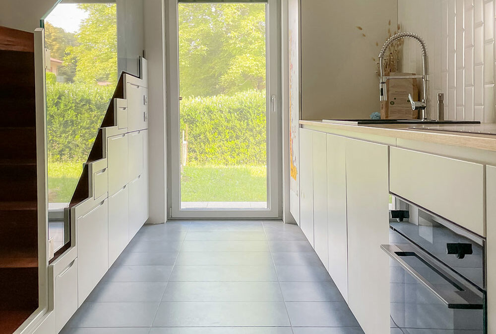
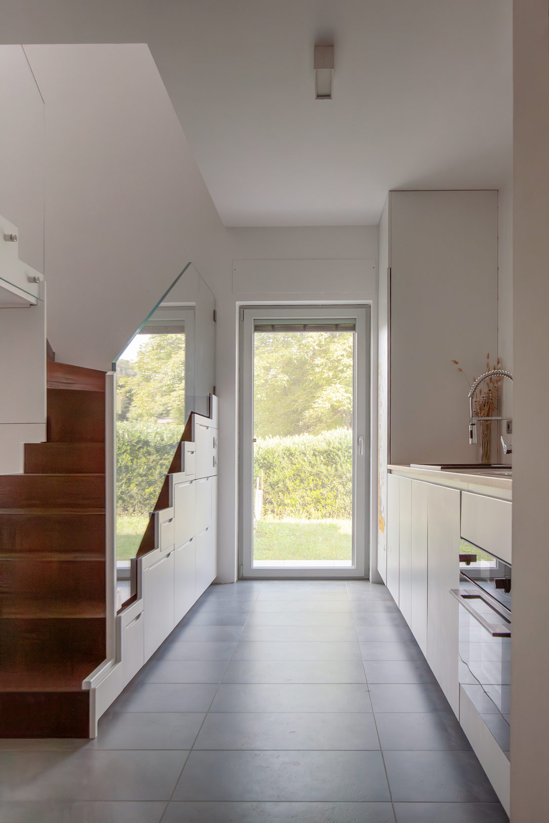
kitchen entrance and multifunctional stairs

THE MINIMAL KITCHEN

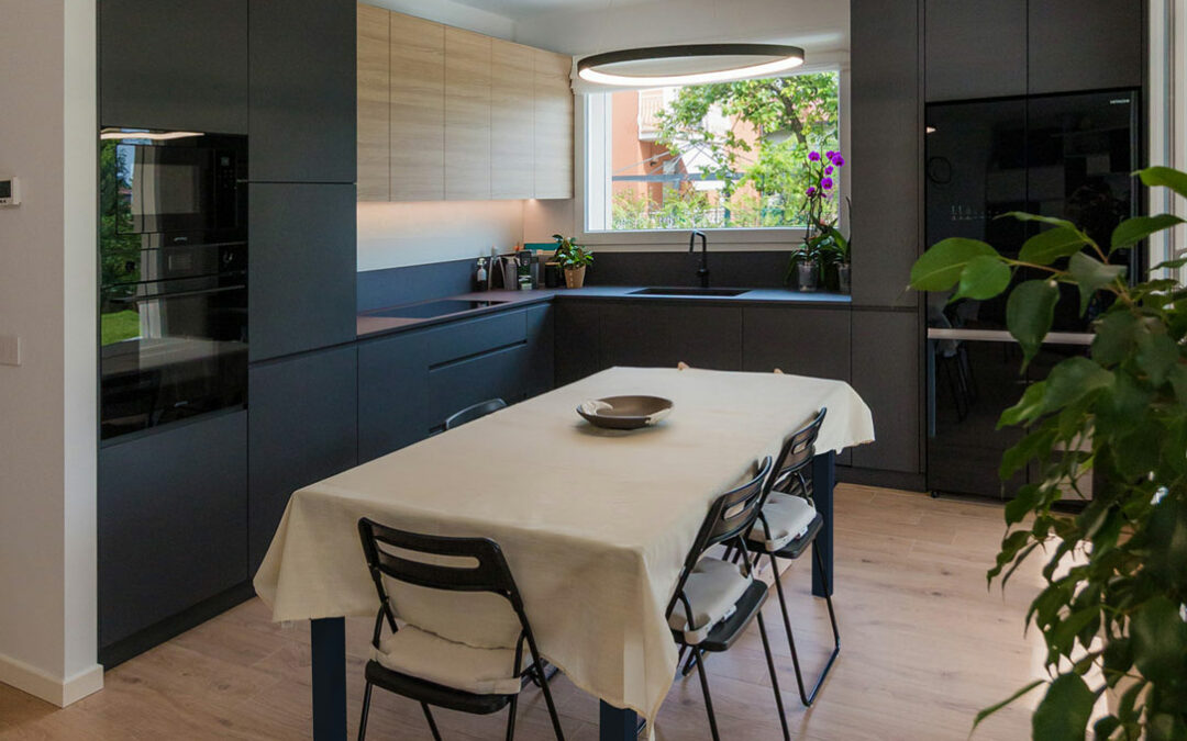
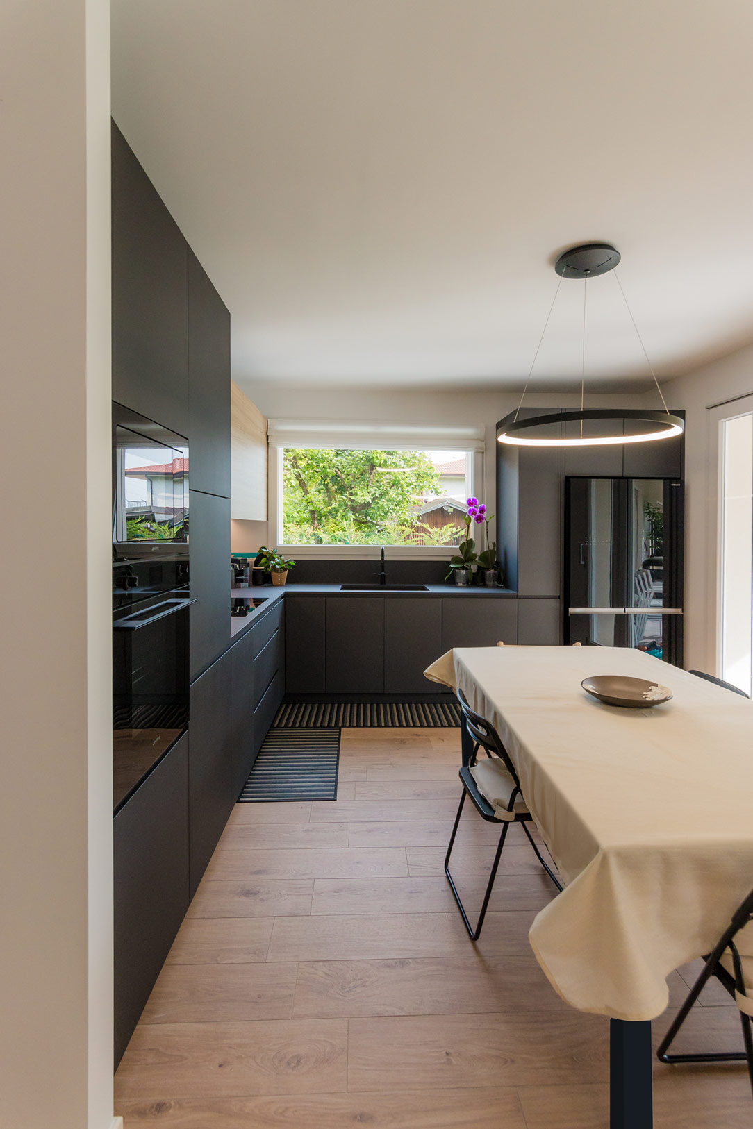
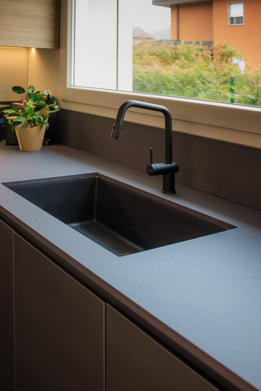
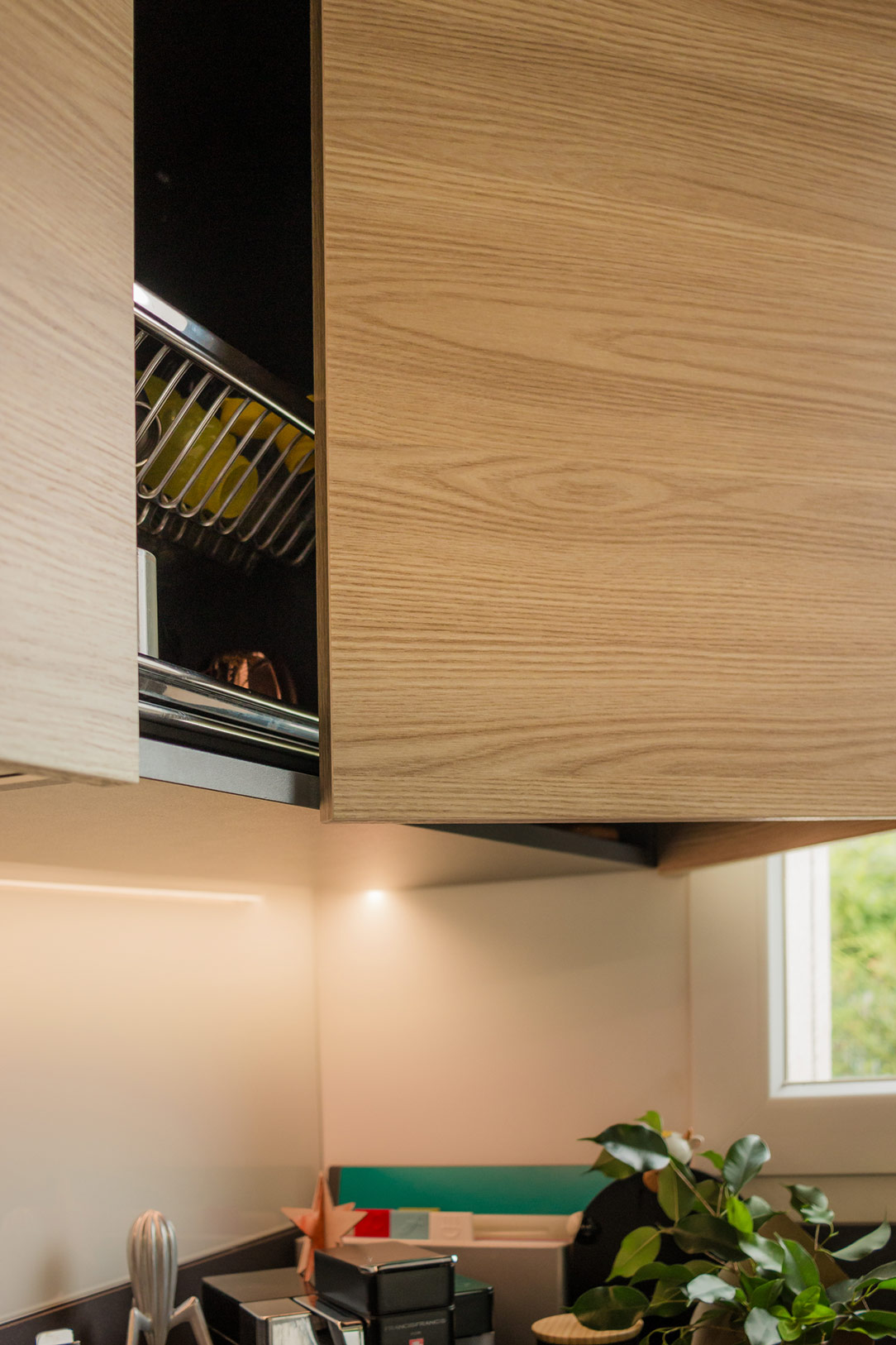
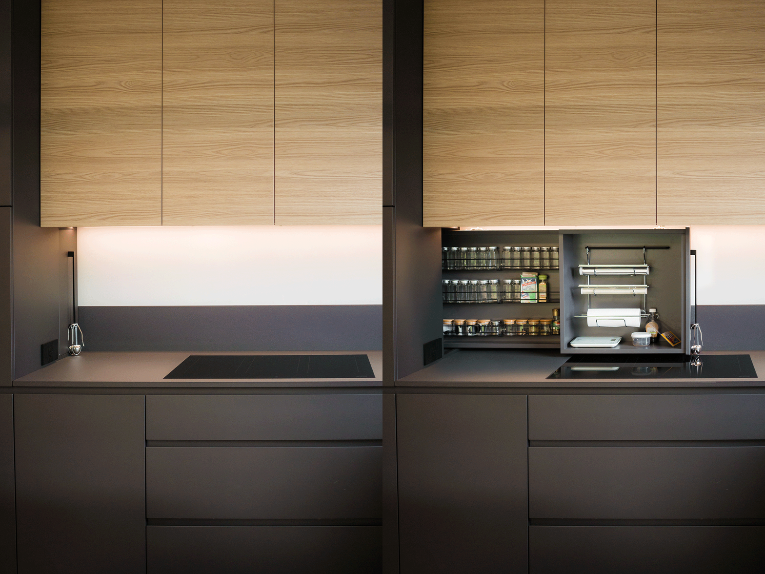
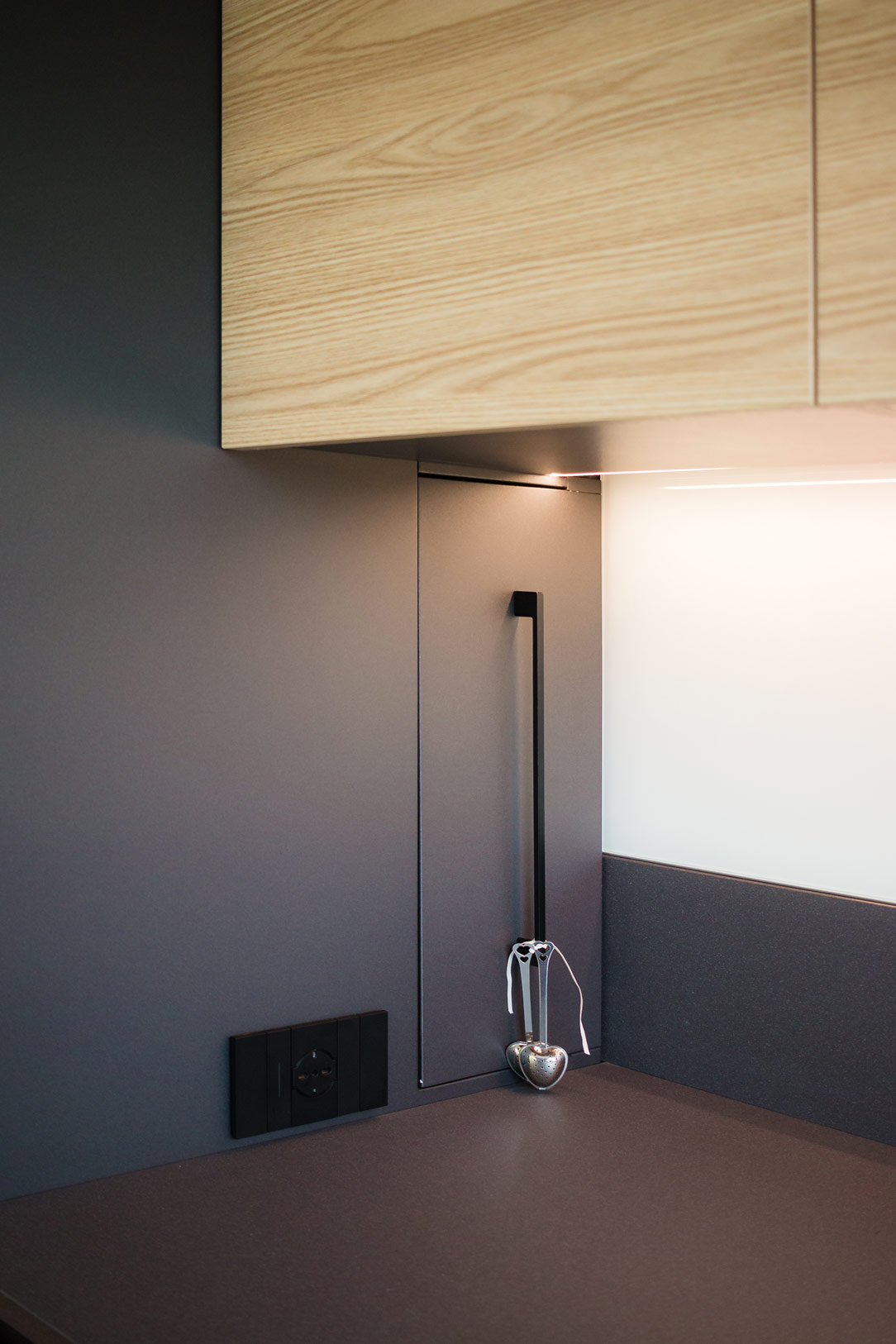
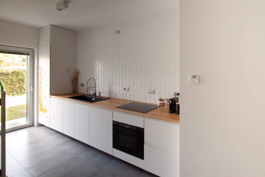
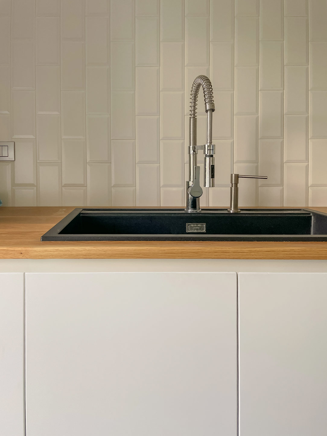
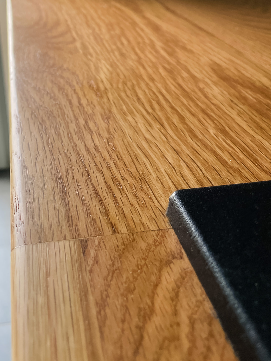
Integrated into a fitted wall, the kitchen embodies the essence of minimal. With a palette of light colors and the use of natural materials, it provides everything needed without burdening the space. The laminated natural oak wood countertop recalls the external wooded environment and accommodates a modern black granite sink and a induction hob.

The choice of matte white MDF for the kitchen base and refrigerator column, along with ceiling tiles, contributes to maintaining a clean and luminous aesthetic. The light and variegated gray ceramic floor complete the welcoming atmosphere, ensuring ease of maintenance and cleaning, harmonizing with the materials and colors of the house. 

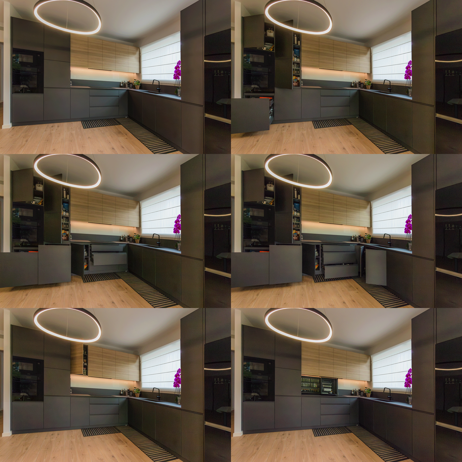
minimal kitchen
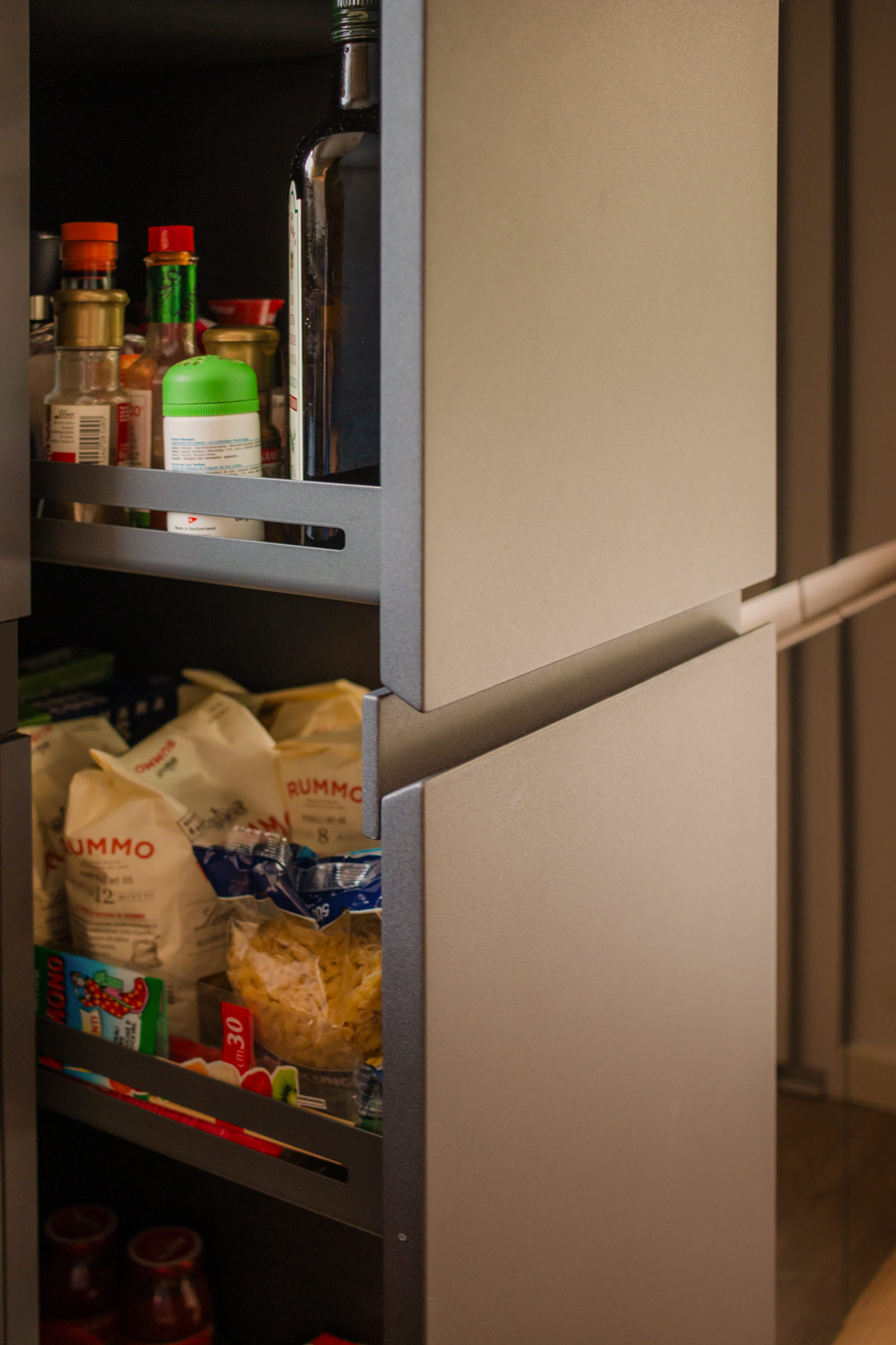
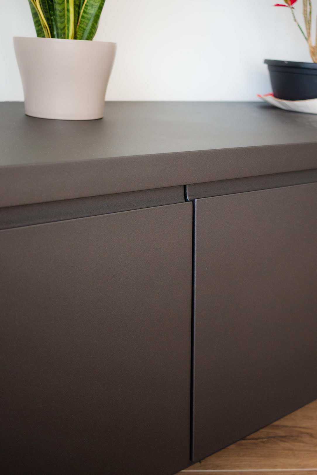
details kitchen top
details kitchen top

THE MULTIFUNCTIONAL SIDE STAIRCASE

A light staircase in front of the kitchen serves a dual purpose. Besides connecting the living area to the sleeping area, it has been designed with a structure of modular equipped wood and metal, making it both aesthetic and functional.

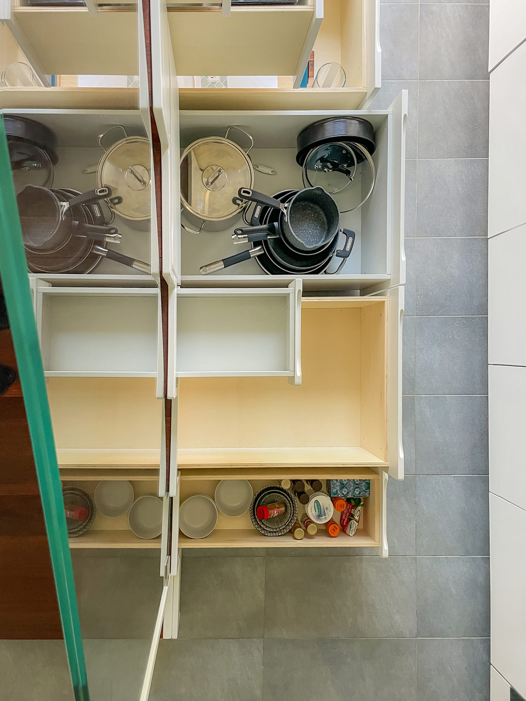
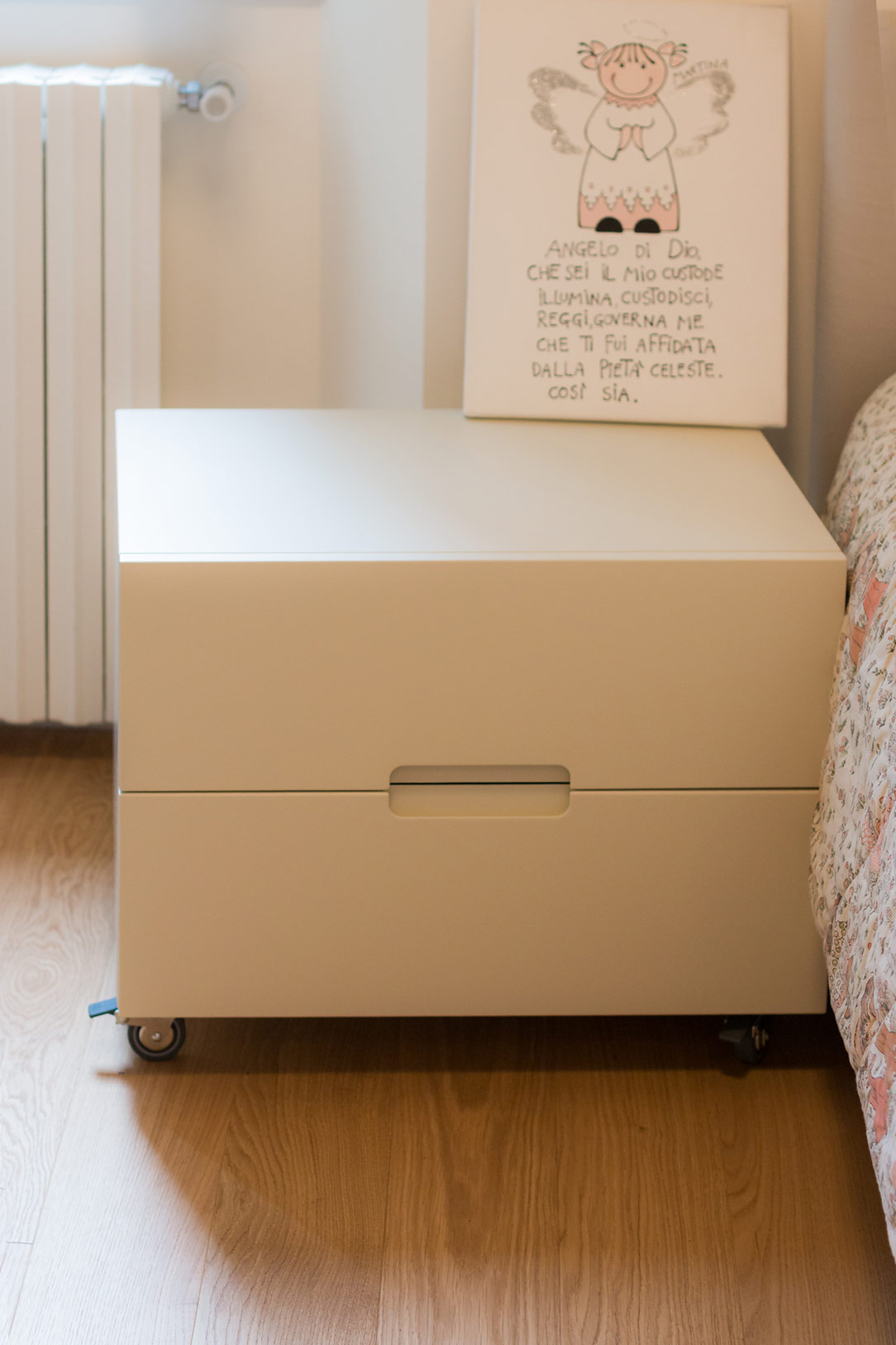
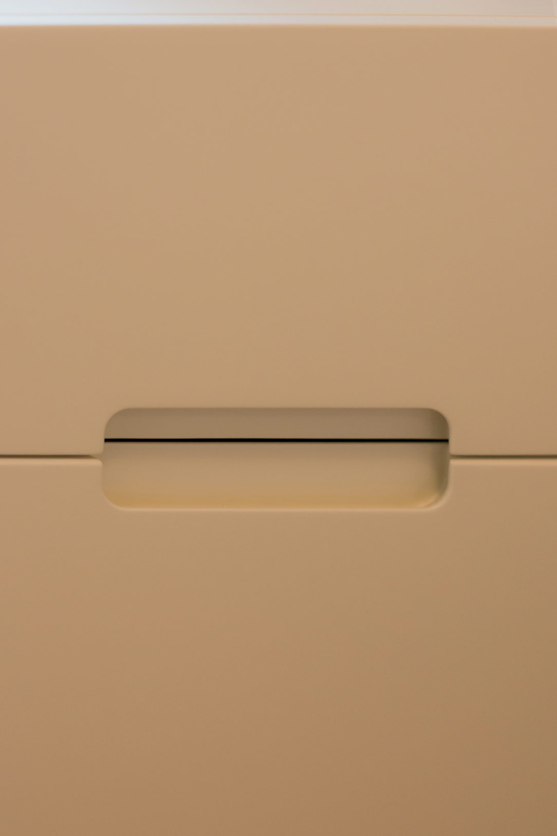
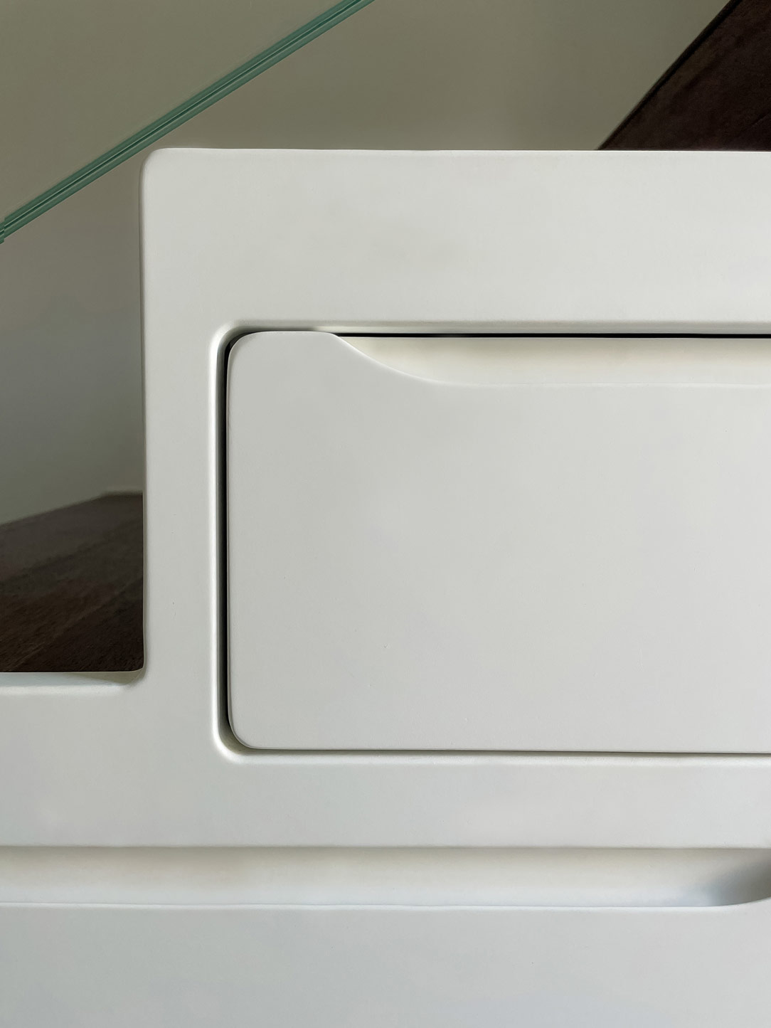
It houses shaped drawers that provide additional storage space, avoiding the wall unit to the kitchen for maintaining a light and minimal appearance while providing all the necessary storage space in an unexpected location.
Here’s another example of a staircase solution equipped with drawers.

lateral stairs with drawers
drawers from the top
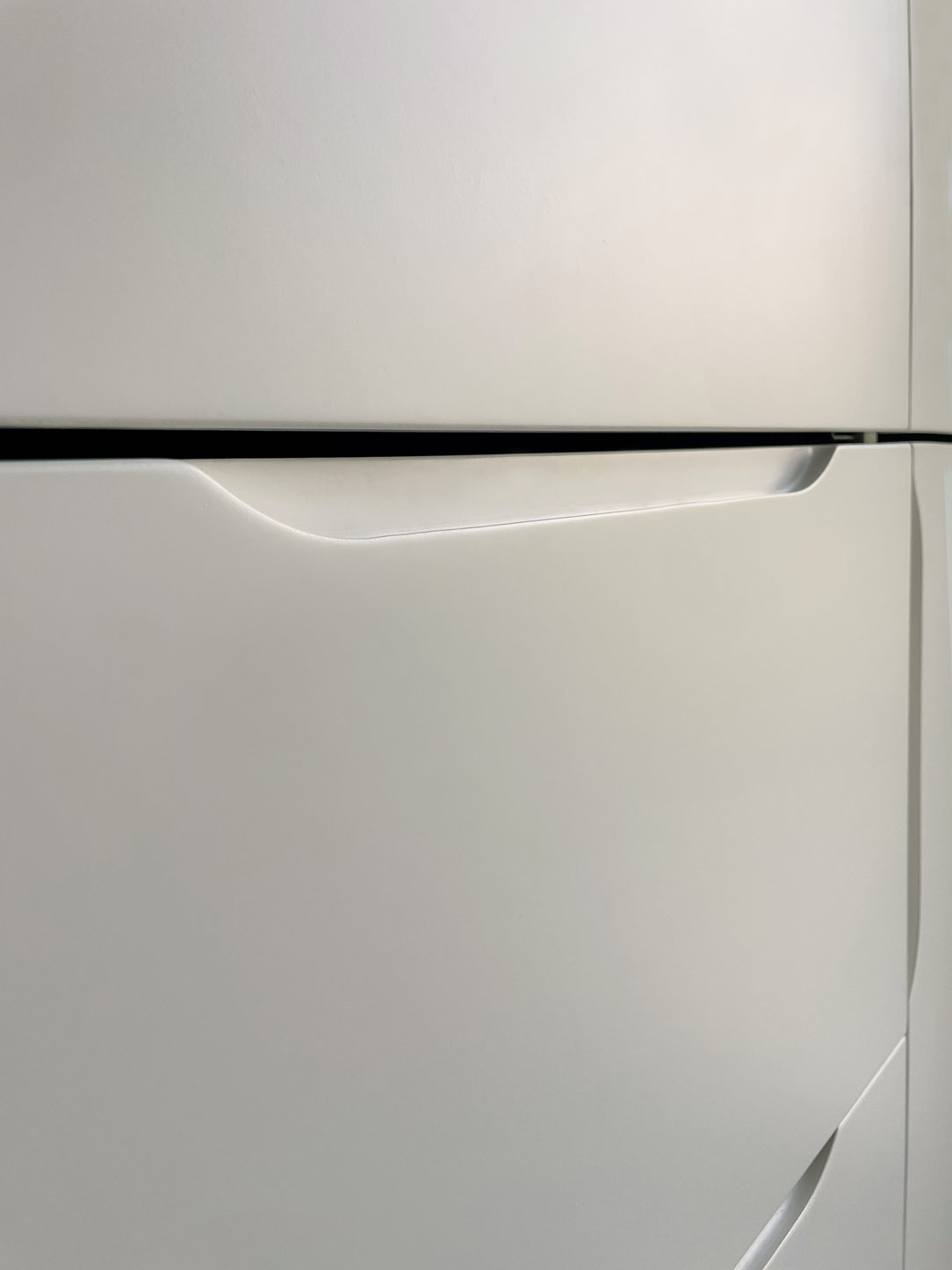
details drawers
shaped drawes

THE WELL-EQUIPPED LIVING AREA

The living area is designed with careful attention to internal flows related to space utilization. A laminated oak wood dining table, coordinated with the kitchen countertop, accommodates 4 to 6 diners and is positioned in a passageway between the kitchen and the living room. It is convenient and non-intrusive.
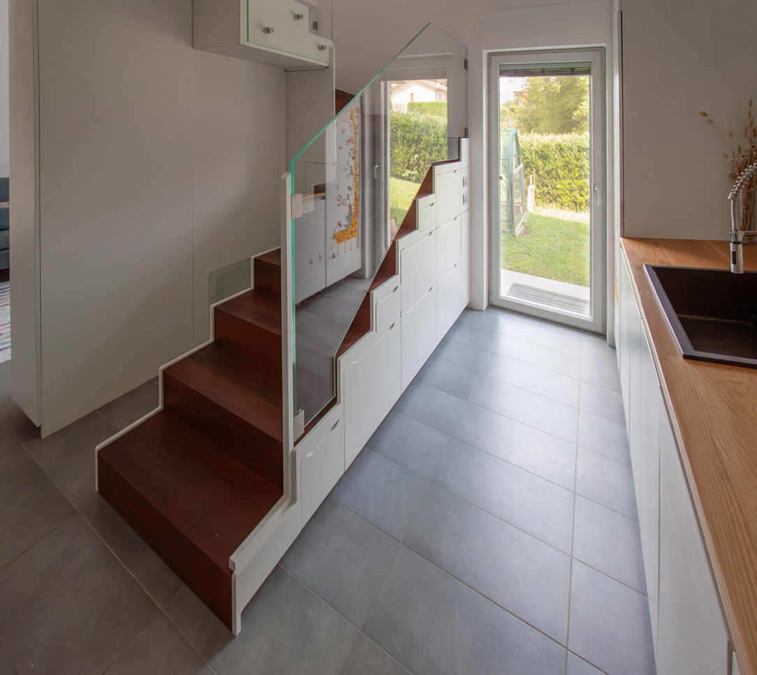
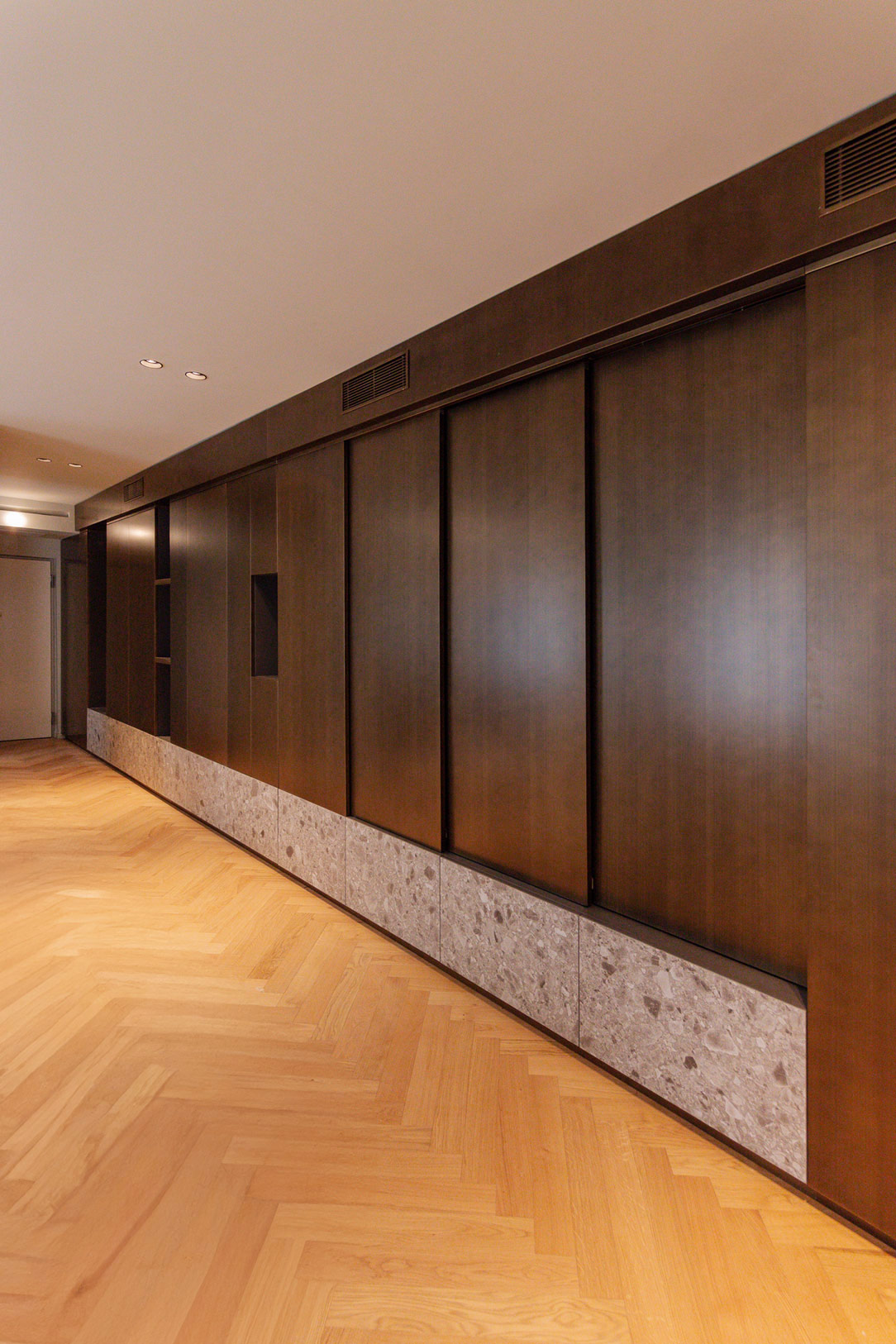
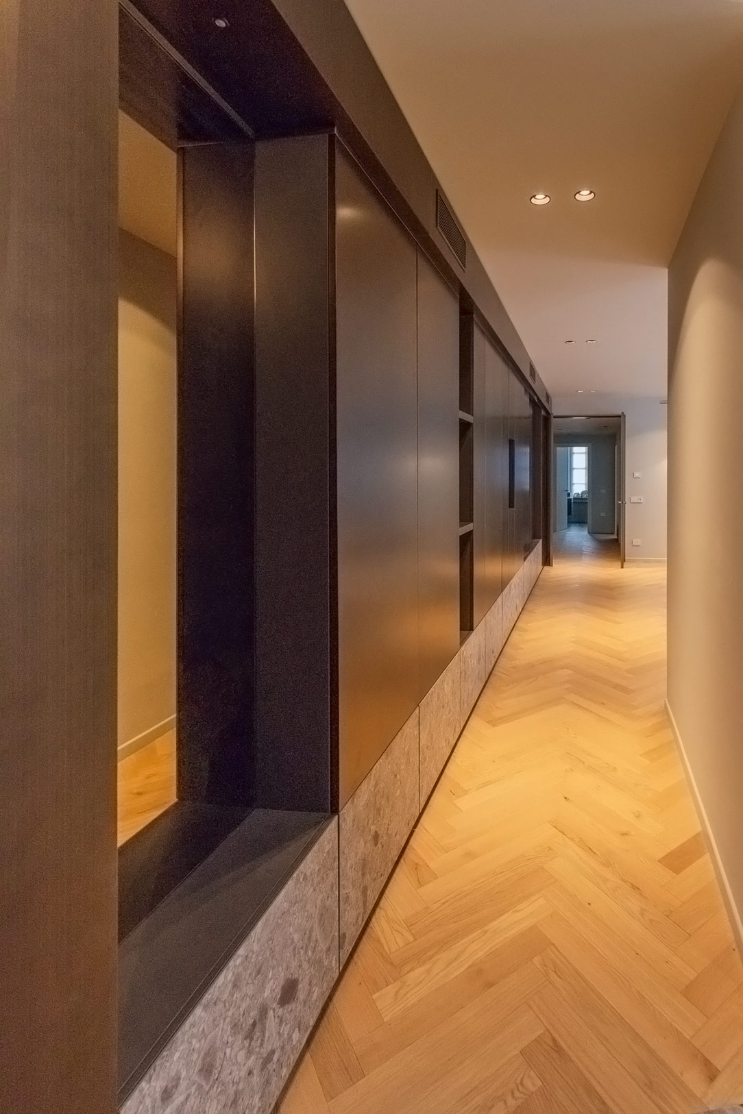
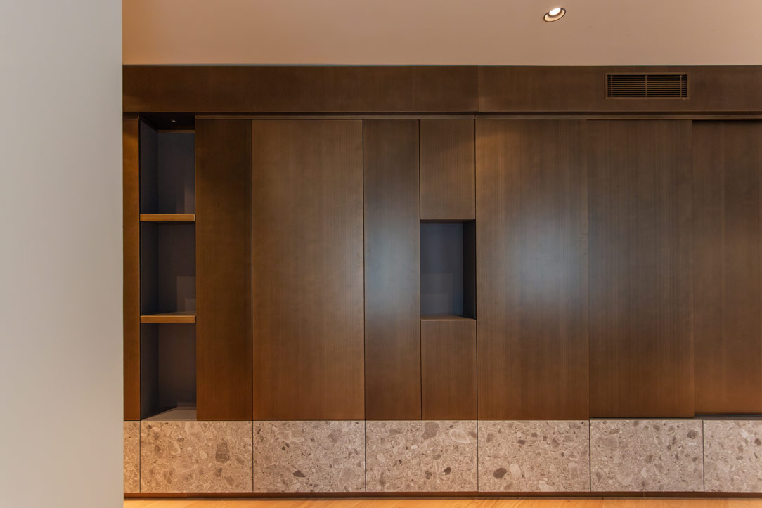
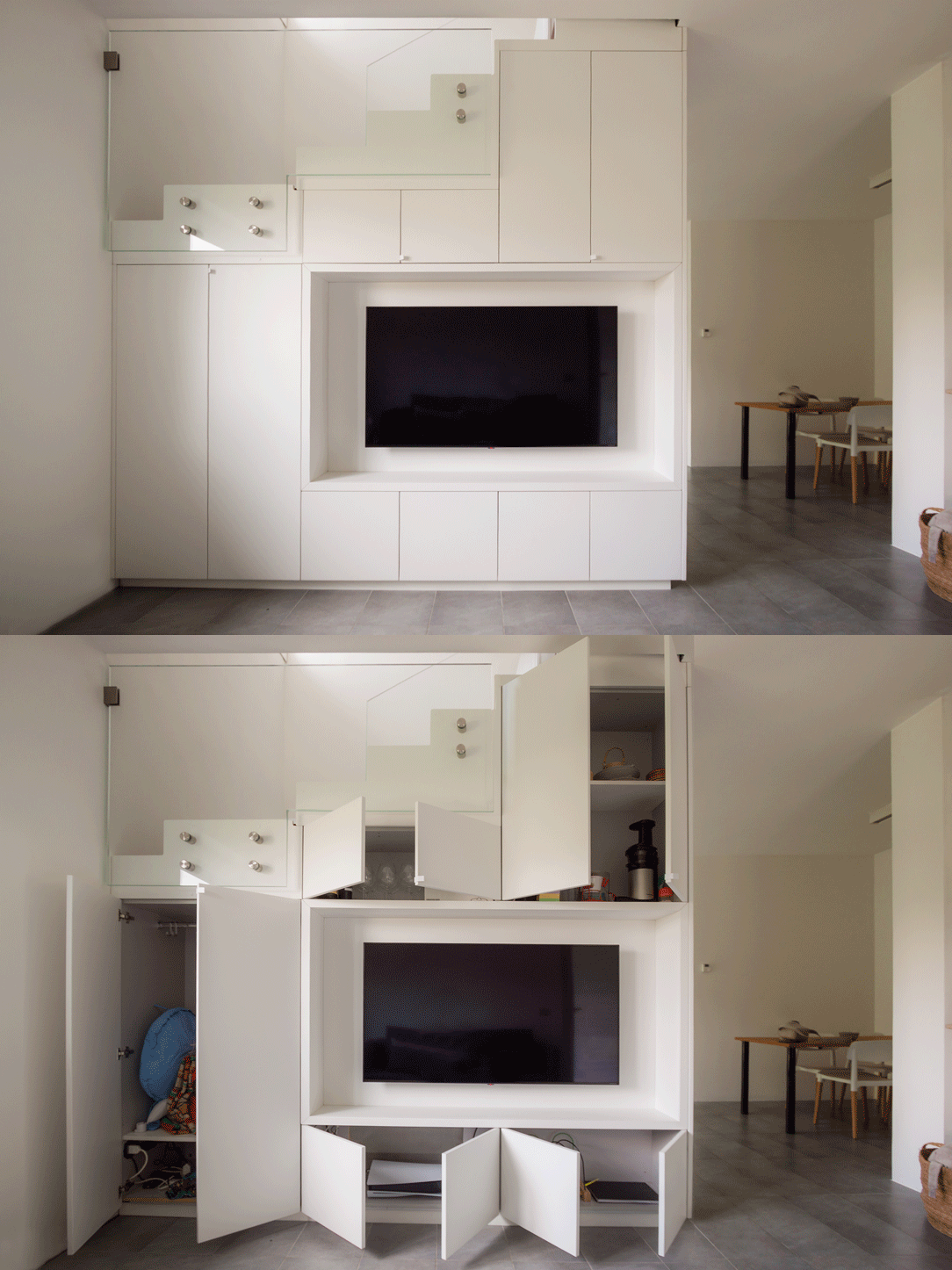
Upon entering the living area, the eye is drawn to a free-standing sofa against the wall with a slim high shelf in white lacquered sheet metal, contributing to maintaining a sense of openness and lightness. The frontal TV cabinet, acting as a partition between the kitchen and the living room and supporting the staircase, is an example of well-thought-out storage and organization element. Shaped on the steps, it contains well-studied doors and shelves, utilizing every available centimeter. A true demonstration of how minimalism can be functional. 

kitchen living room dining table
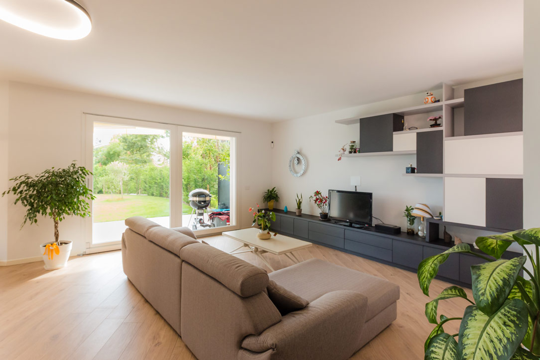
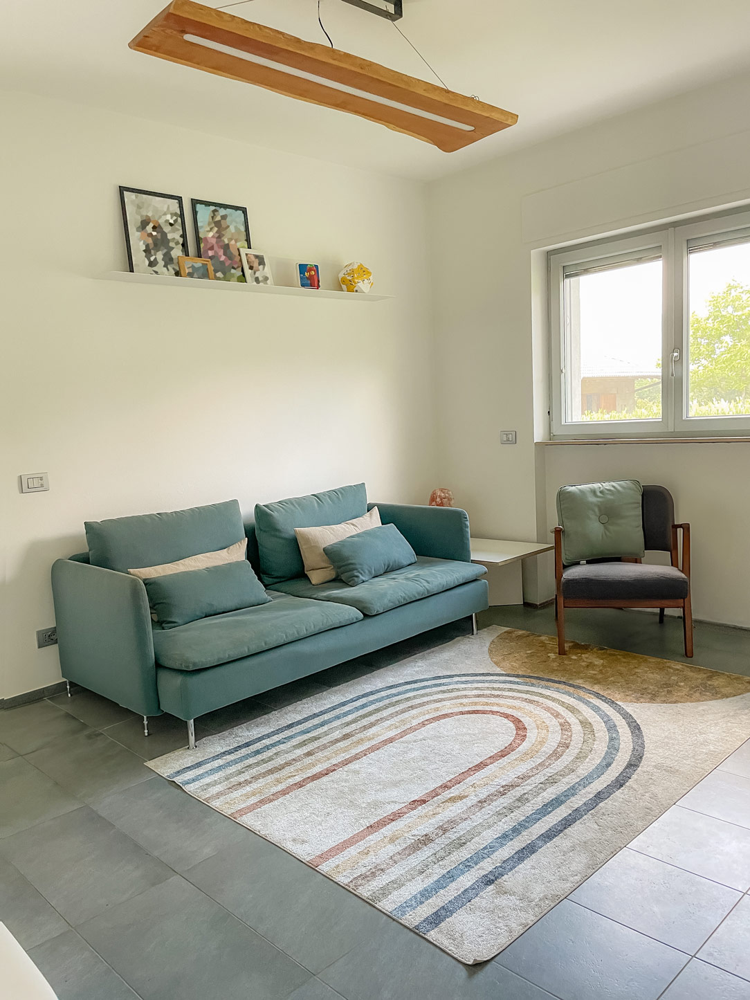
minimal living room
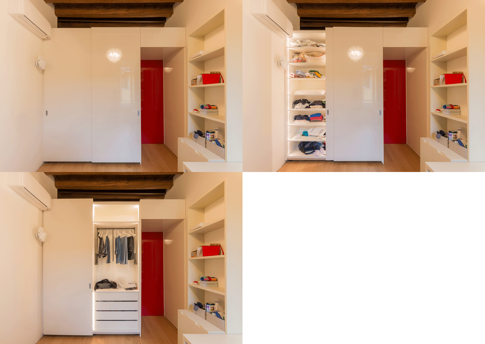
Tv cabinet open and close
lighted cabinet
lightweight sheet metal shelf

MINIMAL MULTIFUNCTIONAL FURNISHINGS

In conclusion, the entire apartment is an example of how multifunctional furnishings with a minimalistic spirit can optimize spaces without weighing them down. The most storage-intensive elements are integrated into the staircase support, while the upper part, thanks to glass handrails, rises transparent and luminous.
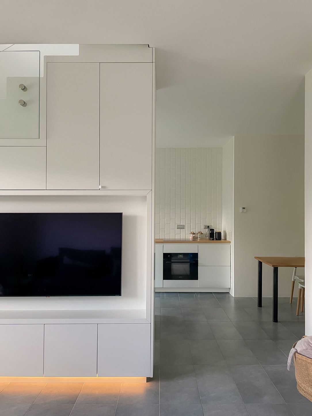
Everything around this central monolith of furnishings is essential, allowing to enjoy an airy, bright, tidy, and aesthetically satisfying environment. Living in a compact space does not imply sacrificing comfort and style.

Here’s another example of a minimal multifunctional apartment.

The Elegance of the Garage in a Fusion of Collecting and Modern Interior Design

The Elegance of the Garage in a Fusion of Collecting and Modern Interior Design

In the enchanting setting of a modern villa on the outskirts of the city, the basement transforms into a multifunctional space. Through the skillful use of precious materials and meticulously designed lighting, it reveals a harmonious fusion of garage, collecting, leisure, and additional service-oriented interior design.

multifunctional space

MULTIFUNCTIONAL ORGANIZATION OF THE BASEMENT

The basement is divided into various zones, each designed for a specific purpose and crafted by  studio di Architettura Mario Cassinelli. A significant portion of this space has been transformed into an authentic automotive art gallery, where Carrara marble and soft parquet come together to form a luxurious frame for a collection of vintage and limited-edition cars. Attention to detail is evident not only in the material pairing but also in the lighting, with lights specifically designed to enhance every detail of the vehicles.

automotive exhibition space

Adjacent to this space, contrasting black marble creates the perfect setting for a spacious, well-lit gym, complete with equipment for leisure activities. This area remains at a lower level, with the ceilings rising as a grand staircase with crystal handrails leads to the upper part.

well-lit gym
 marble staircase to go down
 marble staircase to climb

These two spaces are connected by a long corridor that transforms into a refined relaxation and waiting area with a comfortable sofa at the entrance.

corridor relax space

SERVICE CABINET FOR THE BASEMENT

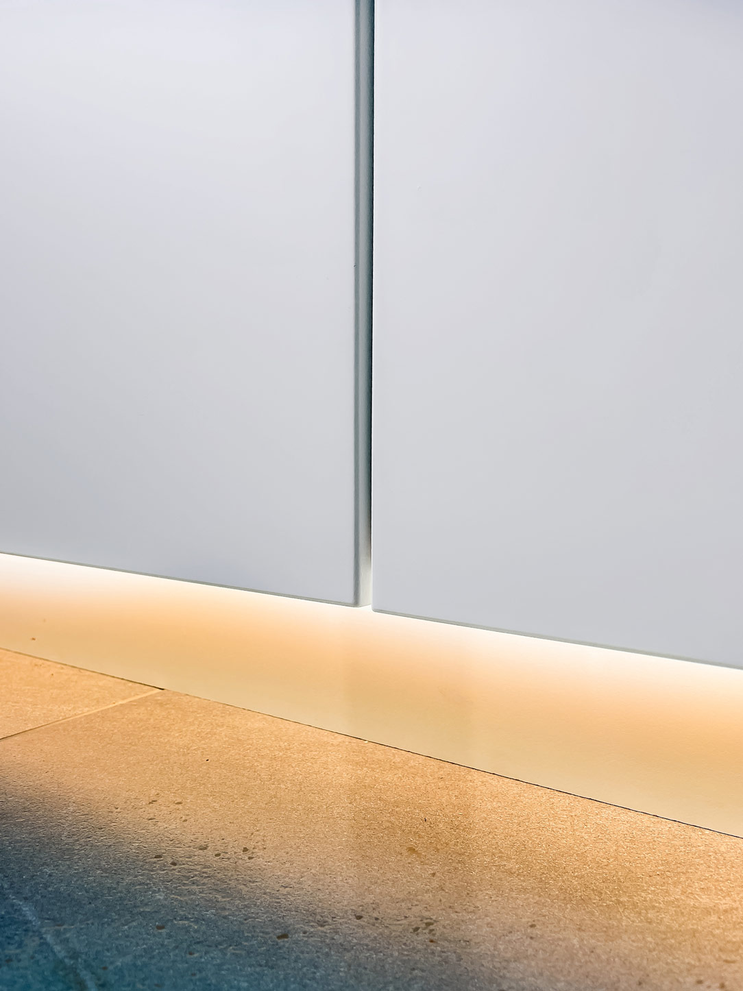
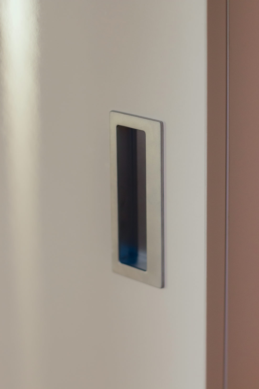
The entire floor has been equipped with usability as the focal point of the project. Strategic cabinets have been incorporated, starting from the garage area. These cabinets conceal technical compartments and also serve as useful space for household items and an additional shoe rack. Illuminated at the base, they feature a customized handle, a symbol emblematic of the villa’s design.

cabinet external garage
shelves detail
details technical space
detail handle design

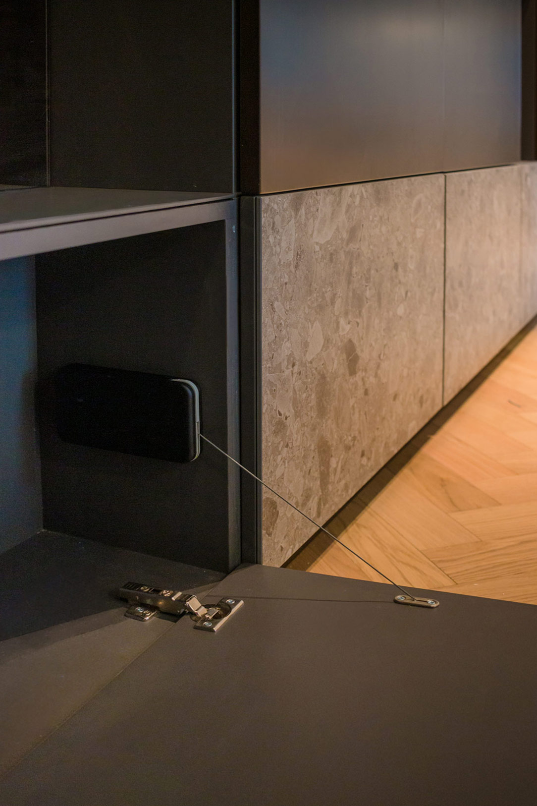
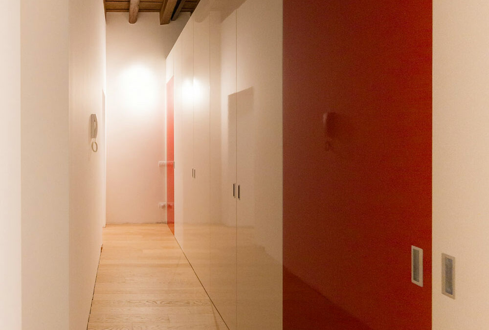
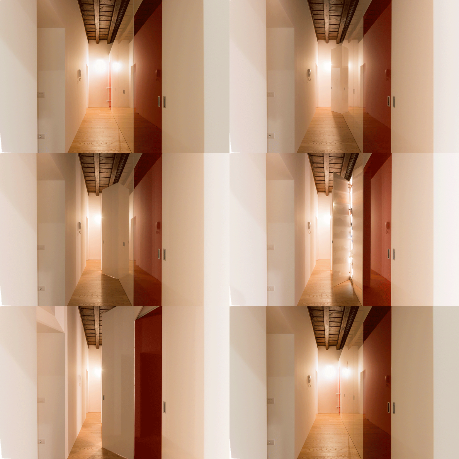
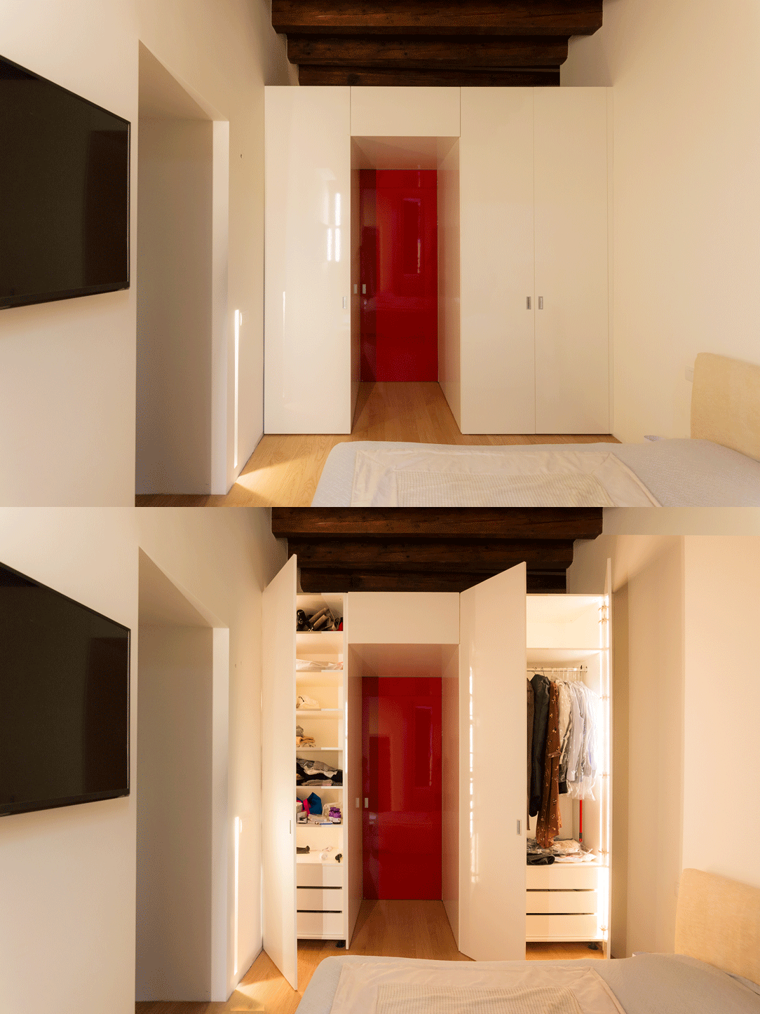
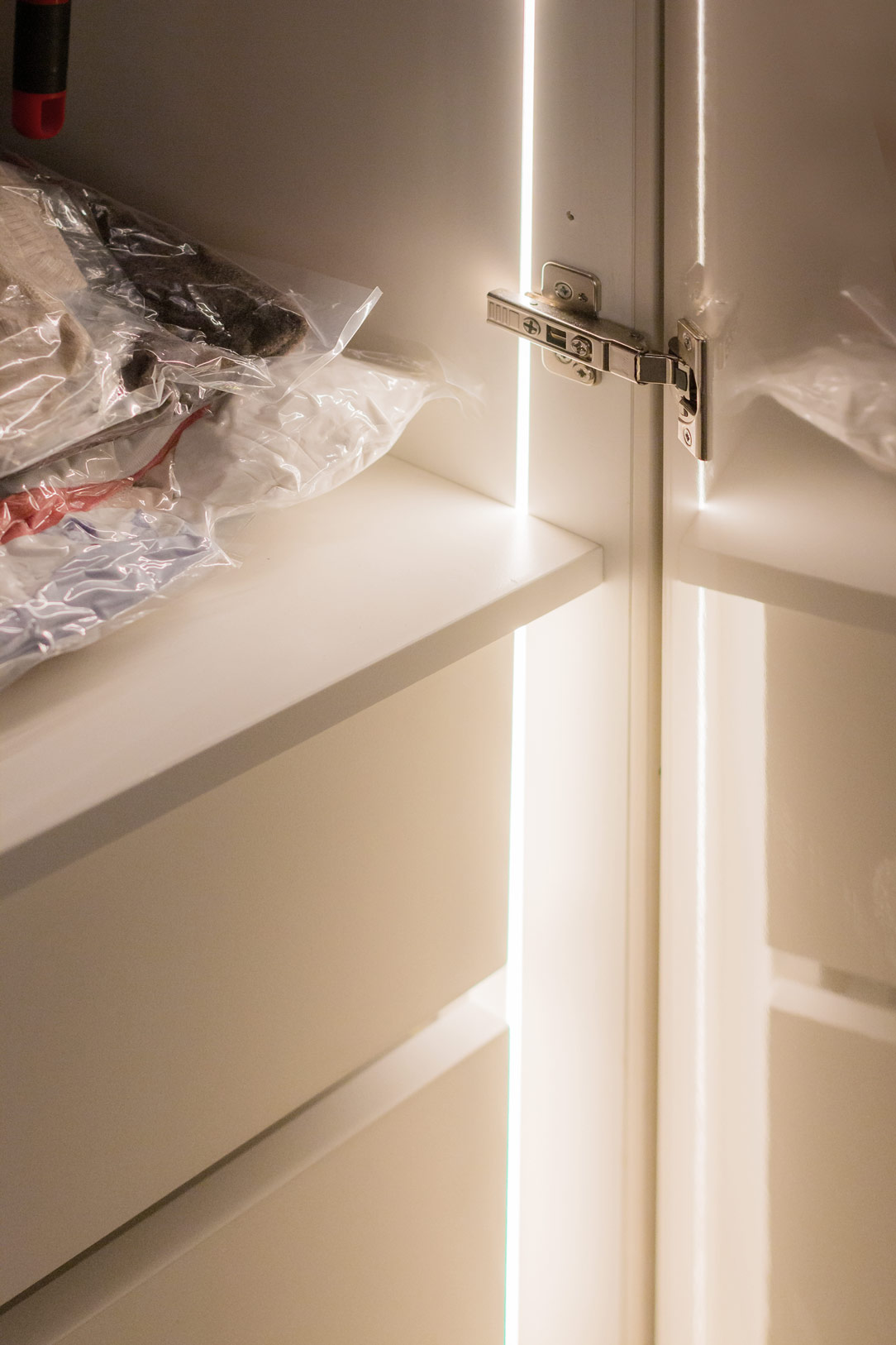
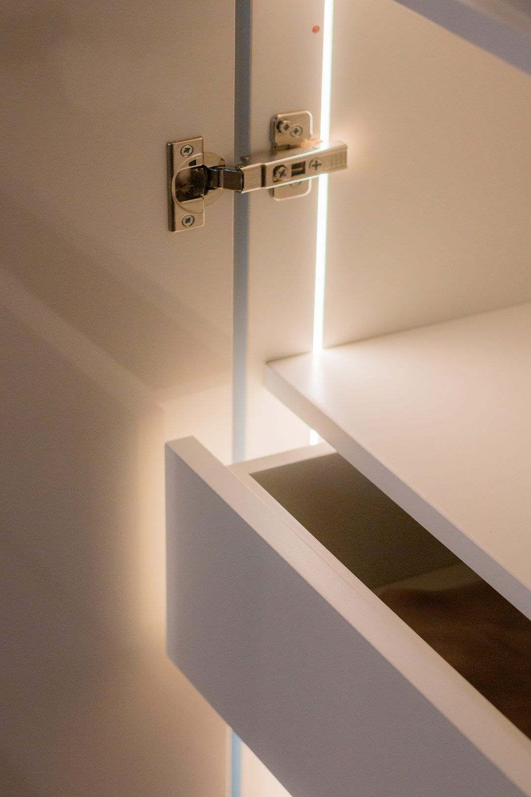
A second set of cabinets is strategically positioned near the staircase leading to the ground floor. Developed at full height, they serve as additional hanging space, accommodating coats and seasonal clothing. Attention to detail is also reflected in internal features, with double hinges supporting large doors and an internal lighting sensor that activates horizontal LEDs upon opening.

 cupboards under the stairs

The pristine white tone of the cabinets harmonizes perfectly with the dominant materials of the basement, from marble to the warm shades of parquet, creating a visual balance while remaining secondary to the undisputed protagonists of the space.

closed cupboards under the stairs
wardrobe garage
double internal door hinge
 opening light sensor
Horizontal internal LEDs

THE ENTRANCE DOOR

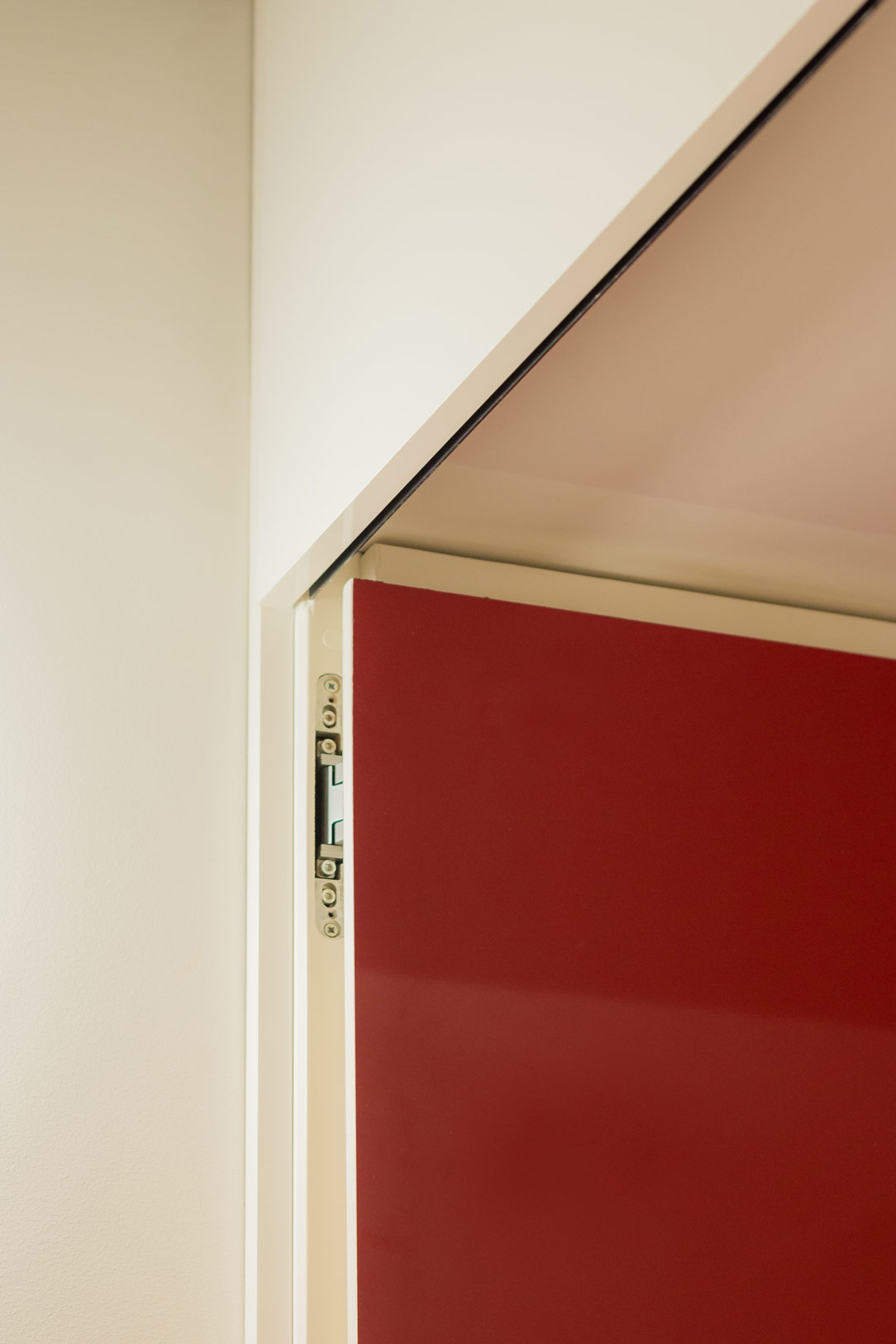
The entrance door to the basement, connecting the garage to the interior space, is a true work of art realized by Guerini Ferruccio. Characterized by a double covering of contrasting marbles, light on the inside and dark on the outside, it distinctively welcomes guests.

The same material language found inside is anticipated by this bifacial door, becoming the standard-bearer and, with its three crystal squares, offering a glimpse into the space beyond the threshold.

black marble external garage door
 light marble internal garage door

HOUSE ILLUMINATION

The basement features diverse light sources. Starting from the entrance, a unique corridor lighting with asymmetric fissures containing irregular length LEDs creates a rain of light effect, adding a touch of magic to the surroundings.

These elements darken, becoming simple black iron inserts towards the entrance but resume at the bottom of the exhibition area after a block of a fair-finished false ceiling. The spotlights are arranged in groups and can be oriented in four directions, providing customizable lighting for the area below.

Three large lamps with a golden profile peek into the sports area, warming the atmosphere with their soft colors.

Here, another project where lighting plays a fundamental role in defining the spaces.

Wall entrance LED light rain
LED details
detail of black iron inserts
spotlighted false ceiling

THE LEGACY OF ELEGANCE AND FUNCTIONALITY

In conclusion, the basement of this villa is not merely a functional space but an expression of taste and personality. The timeless elegance of the materials, the intelligent arrangement of spaces, and attention to detail make this underground space a masterpiece that seamlessly blends aesthetic beauty with functional efficiency.

Here’s another basement of a majestic villa utilized in a multifunctional manner.

Modern White Kitchen: The Elegance of Urban Minimalism

Modern White Kitchen: The Elegance of Urban Minimalism

In the heart of an urban setting, where modernity meets practicality, a kitchen has emerged that embodies the essence of contemporary design. This modern and white kitchen stretches across two sides, captivating the imagination with its timeless elegance and impeccable functionality.

total white kitchen

ARCHITECTURAL DESIGN

The kitchen has been conceived to optimize space and address the challenges posed by an out-of-square old wall. Based on the project of Arch.Haidy Nicotera, on one side, columns of varying depths have been created, providing space for refrigerators, ovens, and spacious shelves. These columns also feature doors that conceal practical pantries and a small storage area, contributing to maintaining order and cleanliness in the environment. These columns have been harmoniously enclosed by a suspended ceiling that completes the modern and minimalist look.

column overture

On the opposite side, the kitchen takes on a lighter feel, with a base that follows the wall’s profile and tapers with an oblique cut to reach the French doors. Here, the oblique silhouette of the kitchen becomes a prominent aesthetic detail. The lower cabinet door, in particular, follows the countertop’s design with clean lines and offers internal shelving for small useful items. The wall cabinets, on the other hand, remain linear, with internal shelves and upward-opening, high-performance aventos. They are also backlit, adding a touch of light and style to the environment.

kitchen overture

MATERIALS AND COLORS

The choice was immediately directed towards a “Total White” palette. All components, from the furniture to the work surfaces, are crafted in matte white lacquered MDF, creating a clean and luminous effect. The Krion countertop, also in an optical white, blends seamlessly with the rest of the environment. The only exception, where a hint of color remains, is found in the rear of the kitchen, where a slightly veined gray tile adds a contrasting touch to the surrounding light colors.

top details
details door
aventos detail

The kitchen’s shell, like most of our creations, is made of melamine-faced chipboard. This material embodies functionality and durability, being resistant to both scratches and aggressive detergents.

 shaped door
internal shelves
 dustbin drawer

Here are two more all-white kitchens, a delicate corner kitchen, and a modern kitchen with a peninsula and a snack bar for guests.

FLOW AND FUNCTIONALITY

At the heart of this modern white kitchen, as planned, a central round table will be positioned to accommodate 6 to 8 diners and become the focal point of the space. Contrary to what one might think, this central element does not disrupt the workflow in the kitchen; it instead perfectly blends conviviality and comfort.

Indeed, thanks to meticulous planning of internal flows, cooking from one side of the kitchen to the other is seamless and convenient. The spaces have been carefully designed to maximize efficiency and practicality, ensuring that everything is within reach.

Furthermore, to add a touch of elegance to the space, a central chandelier will be installed, providing soft and focused illumination over the table.

project kitchen

CONCLUSION

This modern white kitchen is an extraordinary example of how the elegance of urban minimalism combines with intelligent solutions for space and materials management. It is a place where aesthetic beauty harmonizes with practicality. With its palette of light colors and well-thought-out design details, it is ready to inspire new projects.

lateral white kitchen

A Minimal Kitchen to optimize the living area

A Minimal Kitchen to optimize the living area

To optimize the available space, in a small two-room apartment in Milan, we have created this minimal, discreet, bright and elegant kitchen.

Minimal white Kitchen

ALL LIVING ROOM

As we wrote in this article dedicated to the Kitchen Snack Table, in contemporary kitchens the living area and the kitchen increasingly merge into a single open space.
There are no more partitions even at the entrance to the apartments, the door opens and everything we can have in a Living area is revealed in front of us.
So the kitchen, dining area and living room become a single room, just like in this article dedicated to a functional kitchen.
To give harmony to this triptych, the kitchen must therefore lose its “operative” spirit by hiding ladles, pots and groceries and becoming a more discreet element, which is revealed only when necessary.
Much more storage space and doors closed from view, while maintaining everything needed to cook, serve and enjoy food.

minimal kitchen lateral

​PHYSIOMY OF A MINIMAL KITCHEN

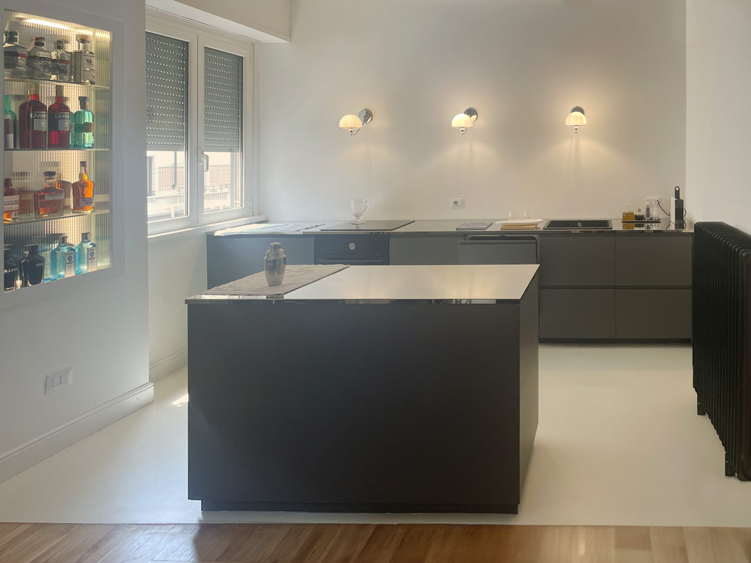
This kitchen, designed by Artecasa studio, optimize the most of the available space.
It develops in the niche of the side wall at the entrance with an equipped part and a front island that acts as an additional storage space and snack table for quick meals.
What can therefore be seen from the entrance are two horizontal gray stone floors, which develop parallel.

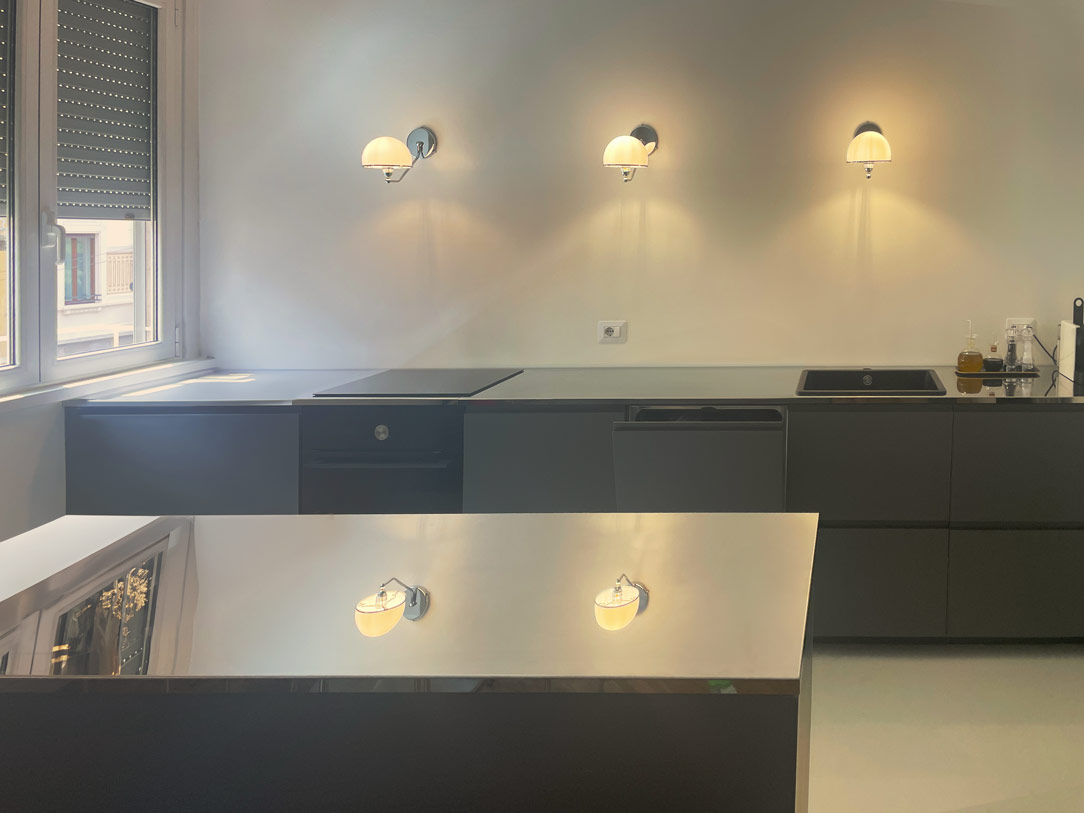
gray minimal kitchen countertops

In the equipped part in the niche there are all the appliances needed in a minimal kitchen: a refrigerator column, a dishwasher with a two-bowl sink, a hob with an oven and a tall microwave.
In the island, lots of storage space, drawers for cutlery, pots and crockery and the top that extends towards the living area becoming a snack top to accommodate at least 3 diners.

details drawers
The atmosphere is convivial, and the lights are skilfully designed to amplify this feeling of intimacy and warmth.
Three ceiling lights descend punctually on the Kitchen Snack Table, the backlit wall units remain at the service of the kitchen while a track with adjustable spotlights illuminates the relaxation area.
The colors are light and glow in the light from the large windows at the back of the room.
minimal kitchen lateral

On the ground a natural oak parquet that matches well with the gray veined stone chosen for the countertops and the back of the kitchen and the light-colored furniture.
Here another minimal Milanese kitchen with similar combinations.

The Kitchen Snack Table as an evolution of contemporary Cookery

The Kitchen Snack Table as an evolution of contemporary Cookery

The Kitchen Snack Table has become increasingly common in contemporary cookery, representing an informal and multipurpose space. In addition to making the environment more convivial, it helps create a new hybrid connection between the kitchen and the living area.

A NEW WAY OF USING THE KITCHEN
THE DIFFERENT TYPES OF KITCHEN SNACK TABLE
• INTEGRATED TO THE PENINSULA
• INTEGRATED INTO THE ISLAND
• IN SUPPORT
• SLIDING
THE KITCHEN SNACK TABLE IN CONCLUSION


A NEW WAY OF USING THE KITCHEN

In the last decade, the kitchen has consolidated its focal role within the domestic environment. Thanks to the multitude of television programs with starred chefs, the pleasure of cooking has been rediscovered, bringing the excellence of the Italian culinary tradition back into force. By virtue of this, more and more attention are paid to the functionality of the kitchen: storage, preparation, cooking and tasting become fundamental points in the act of cooking, each with its own needs and requirements.

Kitchens have evolved over time, marrying the idea of ​​open spaces in recent years, blending into the living area. By breaking down the canonical subdivision into closed environments, the sense of openness has also contributed to modifying the conformation of the kitchens. These have become more and more protagonists both in their island and peninsula arrangement, in which they accompany the conformation of the architectural structure. From this point of view, the kitchen snack table plays a fundamental role in the new vision of the living area, acting as a functional element of conviviality and a trait d’union between the two different areas.

By Kitchen Snack Table we mean any type of extension of the kitchen worktop, whether it is coplanar or overlapping the latter. Being a hybrid element of both the kitchen and the dining area, it allows the tasting of quick lunches and snacks without having to sit down at the dining table. At the same time, it remains at the service of a work surface during the preparation of meals.

Made in the same material as the top or in contrast with it with a different material, it is characterized by a sophisticated design. Dimensions and locations vary according to the structure of the kitchen and the importance one wishes to give to the element itself.

wasabi peninsula kitchen

THE DIFFERENT TYPES OF KITCHEN SNACK TABLE

INTEGRATED TO THE PENINSULA

In the peninsula kitchen, the Snack Table has the same height as the worktop which is usually around 90cm and differs from the dining table which is 20cm lower. It is therefore necessary to use high or adjustable stools for a small number of diners, given the limited usable space.

In these examples of peninsula kitchens, the Snack Table is designed in the same material as the top to give a sense of visual continuity.

In this peninsula kitchen, the marble top stands out for its veins and elegance, becoming the undisputed protagonist of the environment. As such, it harmoniously embraces the development of the kitchen, declining towards the ground and restoring a sense of visual closure. In the second case, the worktop leaps towards the living area, supported by an anthracite gray painted iron structure with a linear aesthetic. The sense of openness created by this supporting structure allows maximum usability of this element.

lateral wasabi kitchen
peninsula gray snack table


INTEGRATED INTO THE ISLAND

Born as a replica of an actual bar counter, it is in front of or to the side of the operational part of the kitchen, which very often incorporates the hob or sink. Usually shallow, no more than 30cm, it takes advantage of a small space both for support and for tasting. It can be raised above the kitchen top and made in a different material to create an interesting visual contrast. Here are two examples with a wooden top combined with a stone-effect kitchen top.

In the island, the snack top can continue with the same material, providing only a useful support and workspace as in these two cases.

light island kitchen Snack Table
gray white kitchen island

IN SUPPORT

The snack top can also be released from the island or peninsula and become an independent space for supporting or consuming quick meals. A singular element inside the kitchen, as in this case, where it becomes an additional surface for completing the kitchen on the wall.

kitchen with extended Snack Table

A disturbing architectural element, such as a pillar in the center of the kitchen, can integrate harmoniously by becoming a support for an additional snack top in the kitchen, as in this case.

kitchen with lateral Snack Table


SLIDING

The Slide Snack Table is a sliding support capable of hiding part of the kitchen by closing it in a solid and defenseless monolith. This, thanks to a mechanical movement, changes its development by stretching the lid outwards and making it become an unconventional support surface.

In this example, the whole island is clad in the same material, a dark emperador marble. When at rest, the structure appears fixed, while when it becomes operational, it shows the hob and the underlying materials, i.e. steel and ceramic glass.

island marble kitchen


THE KITCHEN SNACK TABLE IN CONCLUSION

We have seen how the island or peninsula of a kitchen can have a natural continuation of a multifunctional surface by becoming a Snack Table. A small but useful work surface that is used during the day for breakfasts and snacks. Or a sort of counter for quick lunches but also a support surface for enjoying aperitifs with friends.

In fact, the ritual of meals has lost its formality over time, becoming a moment to be optimized within the sometimes-hectic day. Therefore the snack top has become a fundamental element in the design of a contemporary kitchen.