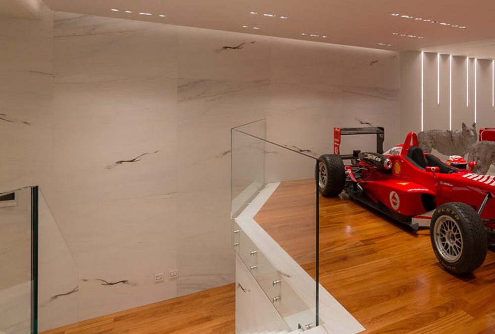
The Kitchen Snack Table as an evolution of contemporary Cookery

The Kitchen Snack Table as an evolution of contemporary Cookery

The Kitchen Snack Table has become increasingly common in contemporary cookery, representing an informal and multipurpose space. In addition to making the environment more convivial, it helps create a new hybrid connection between the kitchen and the living area.

A NEW WAY OF USING THE KITCHEN
THE DIFFERENT TYPES OF KITCHEN SNACK TABLE
• INTEGRATED TO THE PENINSULA
• INTEGRATED INTO THE ISLAND
• IN SUPPORT
• SLIDING
THE KITCHEN SNACK TABLE IN CONCLUSION


A NEW WAY OF USING THE KITCHEN

In the last decade, the kitchen has consolidated its focal role within the domestic environment. Thanks to the multitude of television programs with starred chefs, the pleasure of cooking has been rediscovered, bringing the excellence of the Italian culinary tradition back into force. By virtue of this, more and more attention are paid to the functionality of the kitchen: storage, preparation, cooking and tasting become fundamental points in the act of cooking, each with its own needs and requirements.

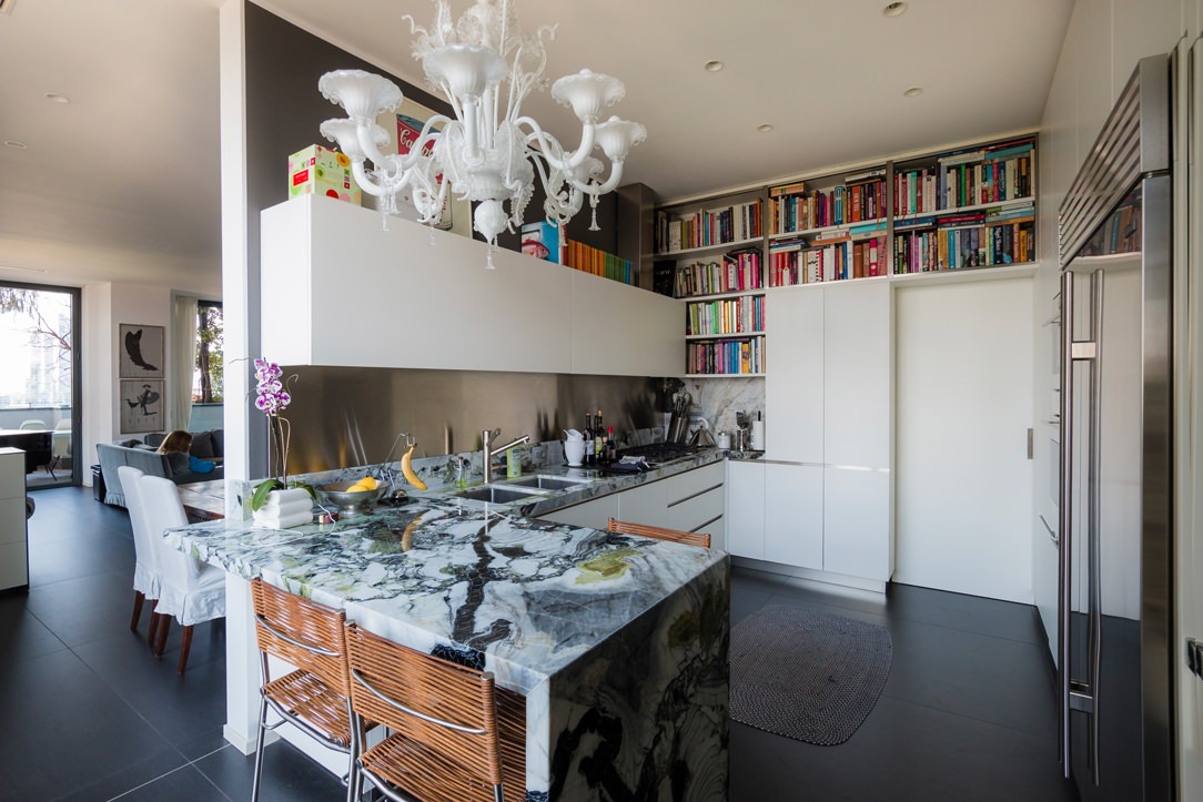
Kitchens have evolved over time, marrying the idea of ​​open spaces in recent years, blending into the living area. By breaking down the canonical subdivision into closed environments, the sense of openness has also contributed to modifying the conformation of the kitchens. These have become more and more protagonists both in their island and peninsula arrangement, in which they accompany the conformation of the architectural structure. From this point of view, the kitchen snack table plays a fundamental role in the new vision of the living area, acting as a functional element of conviviality and a trait d’union between the two different areas.

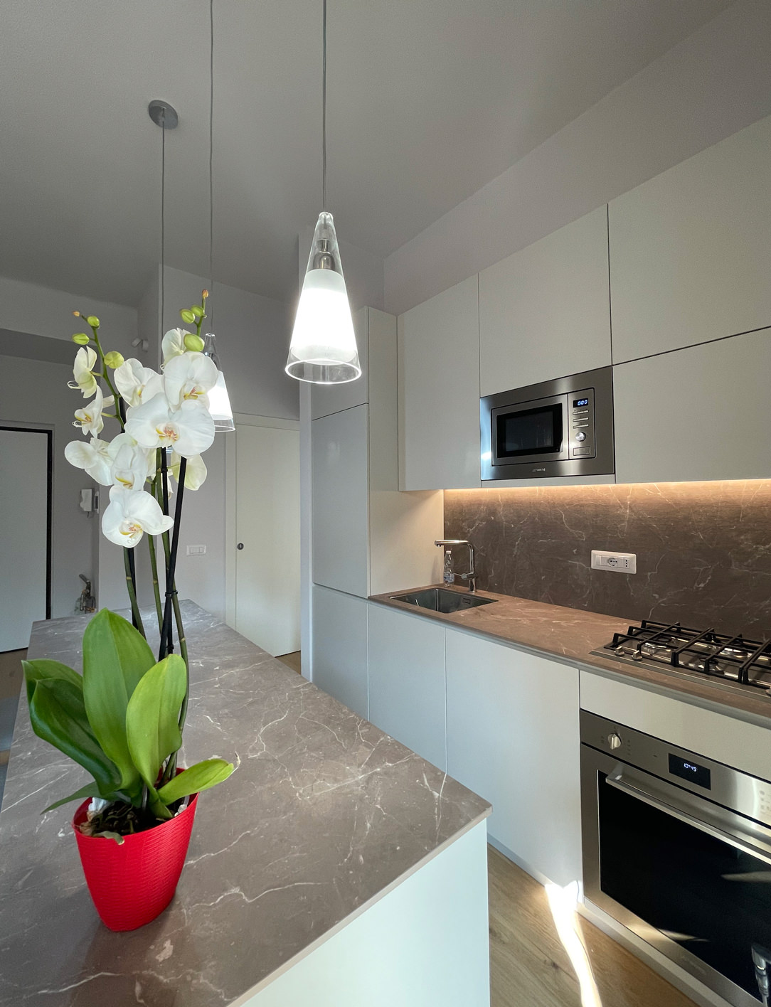
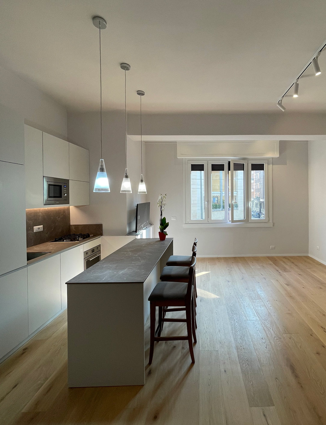
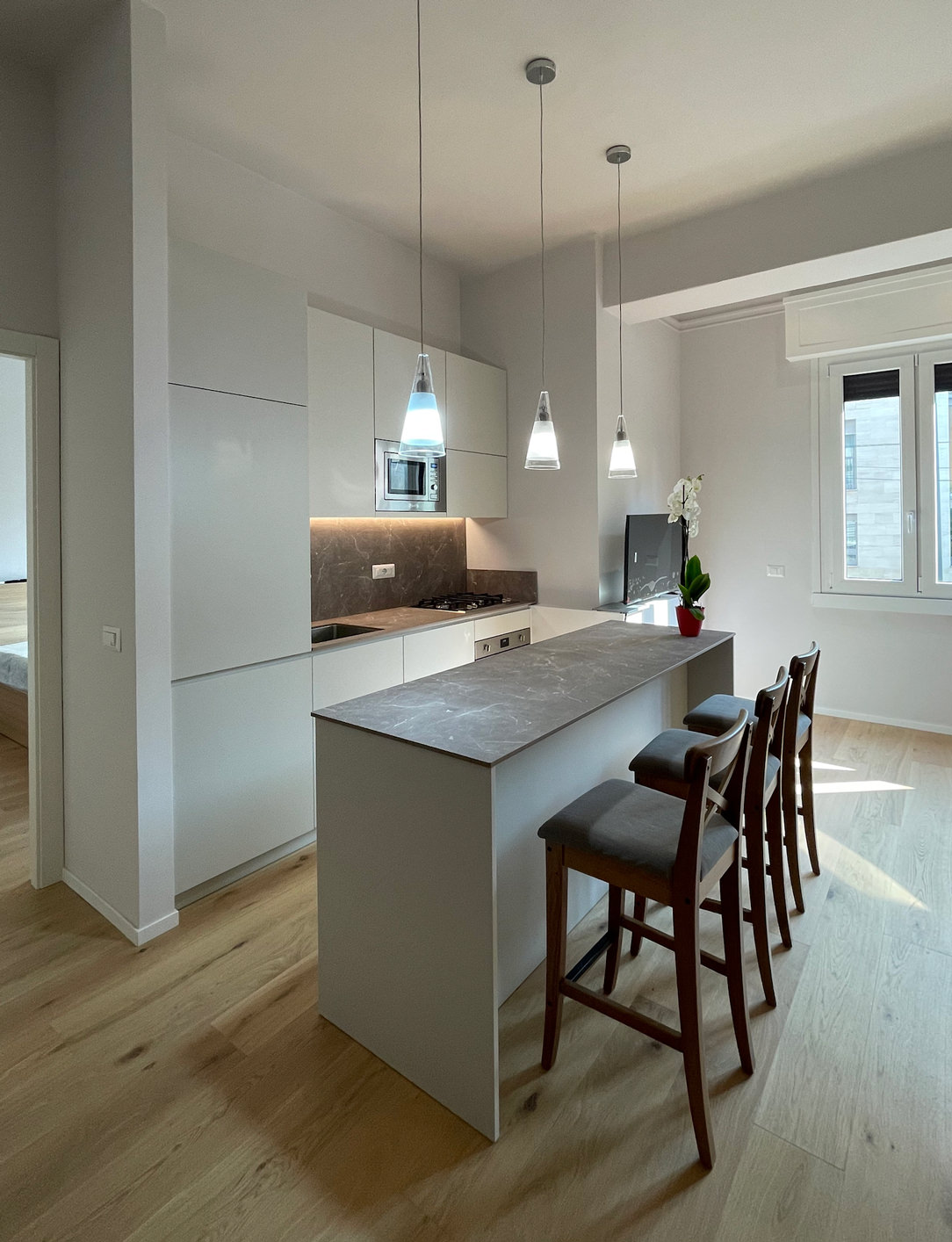
By Kitchen Snack Table we mean any type of extension of the kitchen worktop, whether it is coplanar or overlapping the latter. Being a hybrid element of both the kitchen and the dining area, it allows the tasting of quick lunches and snacks without having to sit down at the dining table. At the same time, it remains at the service of a work surface during the preparation of meals.

Made in the same material as the top or in contrast with it with a different material, it is characterized by a sophisticated design. Dimensions and locations vary according to the structure of the kitchen and the importance one wishes to give to the element itself.

wasabi peninsula kitchen

THE DIFFERENT TYPES OF KITCHEN SNACK TABLE

INTEGRATED TO THE PENINSULA

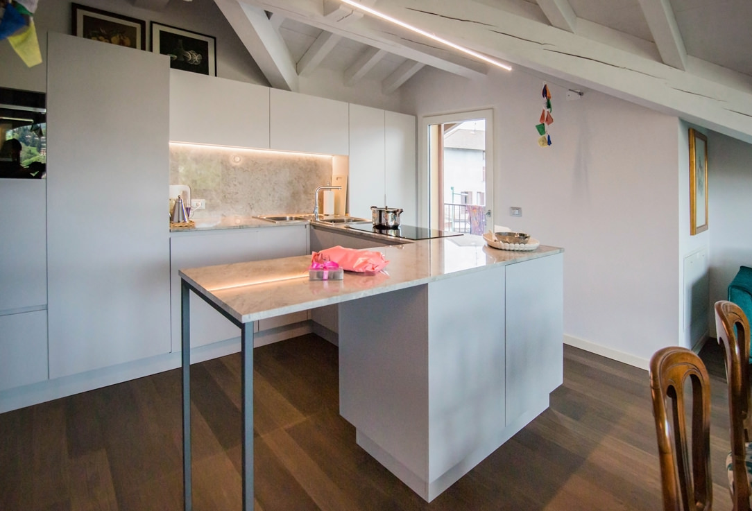
In the peninsula kitchen, the Snack Table has the same height as the worktop which is usually around 90cm and differs from the dining table which is 20cm lower. It is therefore necessary to use high or adjustable stools for a small number of diners, given the limited usable space.

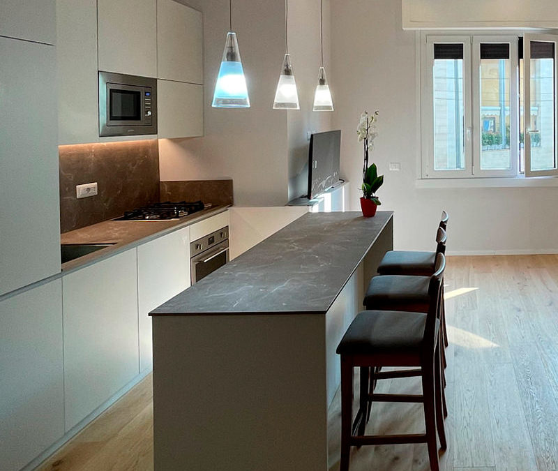
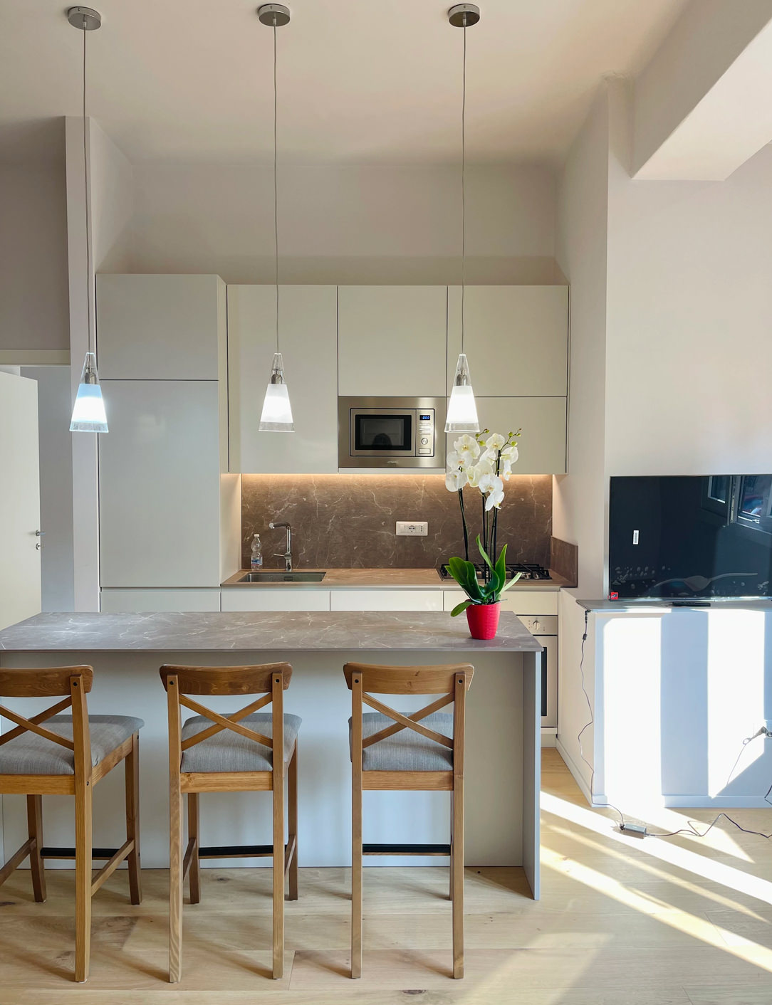
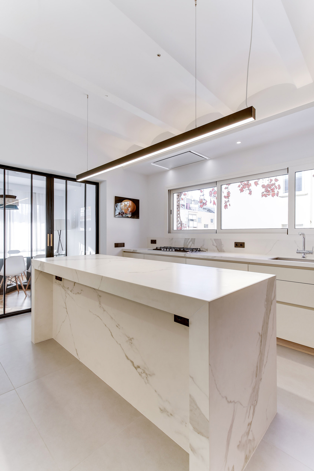
In these examples of peninsula kitchens, the Snack Table is designed in the same material as the top to give a sense of visual continuity.

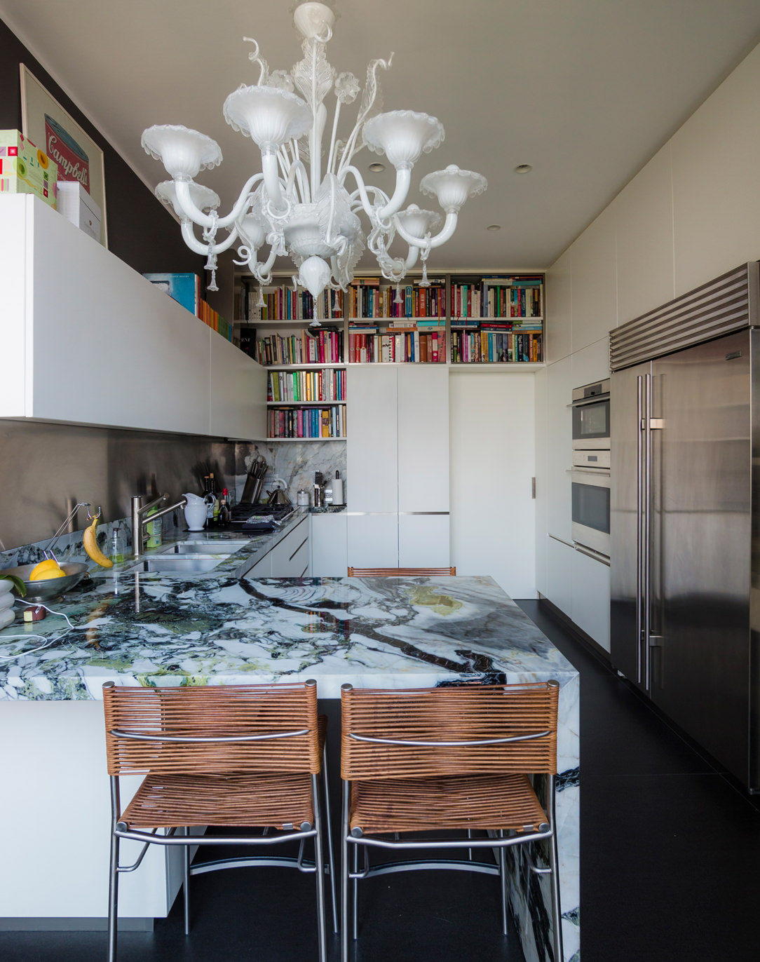
In this peninsula kitchen, the marble top stands out for its veins and elegance, becoming the undisputed protagonist of the environment. As such, it harmoniously embraces the development of the kitchen, declining towards the ground and restoring a sense of visual closure. In the second case, the worktop leaps towards the living area, supported by an anthracite gray painted iron structure with a linear aesthetic. The sense of openness created by this supporting structure allows maximum usability of this element.

lateral wasabi kitchen
peninsula gray snack table


INTEGRATED INTO THE ISLAND

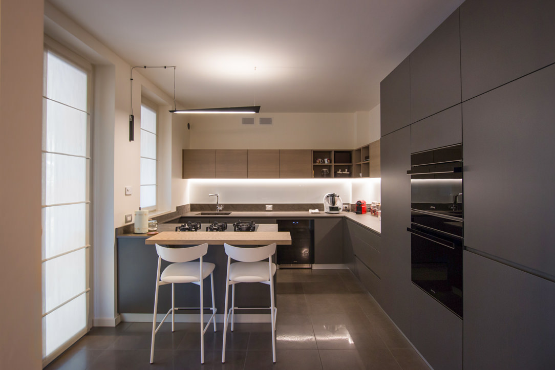
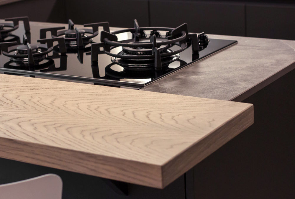
Born as a replica of an actual bar counter, it is in front of or to the side of the operational part of the kitchen, which very often incorporates the hob or sink. Usually shallow, no more than 30cm, it takes advantage of a small space both for support and for tasting. It can be raised above the kitchen top and made in a different material to create an interesting visual contrast. Here are two examples with a wooden top combined with a stone-effect kitchen top.

In the island, the snack top can continue with the same material, providing only a useful support and workspace as in these two cases.

light island kitchen Snack Table
gray white kitchen island

IN SUPPORT

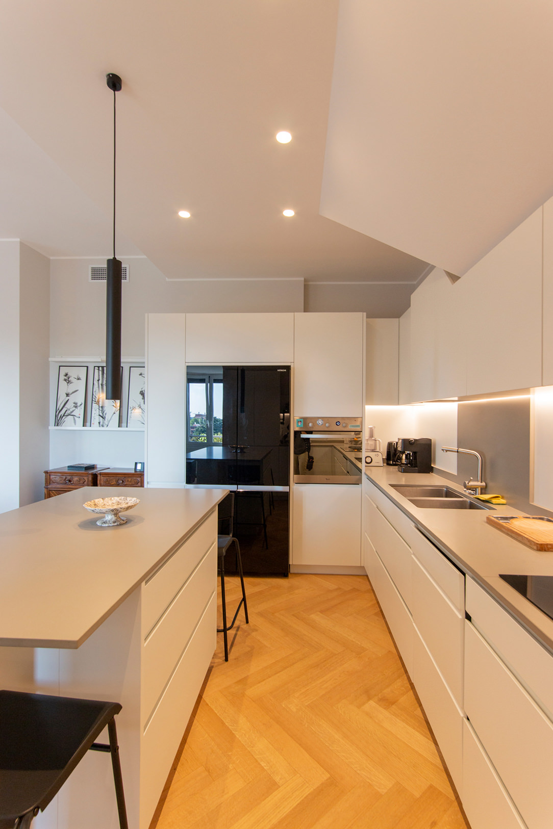
The snack top can also be released from the island or peninsula and become an independent space for supporting or consuming quick meals. A singular element inside the kitchen, as in this case, where it becomes an additional surface for completing the kitchen on the wall.

kitchen with extended Snack Table

A disturbing architectural element, such as a pillar in the center of the kitchen, can integrate harmoniously by becoming a support for an additional snack top in the kitchen, as in this case.

kitchen with lateral Snack Table


SLIDING

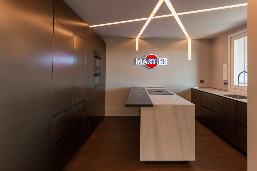
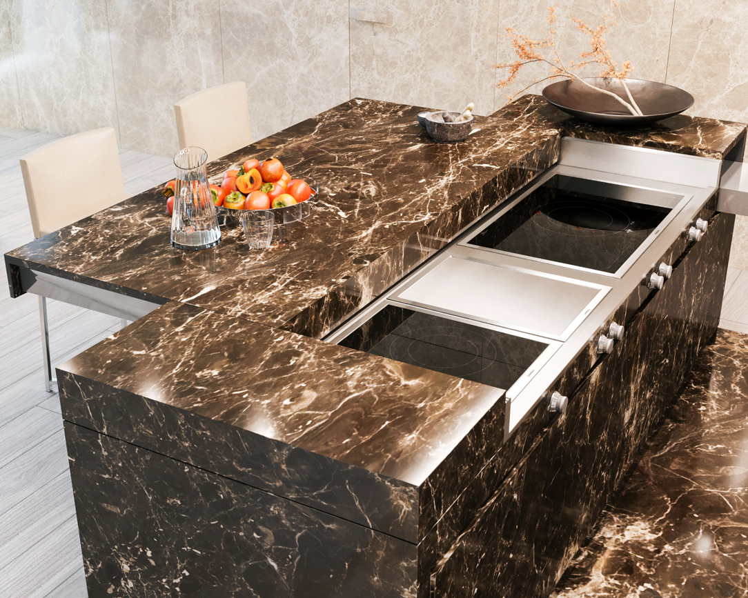
The Slide Snack Table is a sliding support capable of hiding part of the kitchen by closing it in a solid and defenseless monolith. This, thanks to a mechanical movement, changes its development by stretching the lid outwards and making it become an unconventional support surface.

In this example, the whole island is clad in the same material, a dark emperador marble. When at rest, the structure appears fixed, while when it becomes operational, it shows the hob and the underlying materials, i.e. steel and ceramic glass.

island marble kitchen


THE KITCHEN SNACK TABLE IN CONCLUSION

We have seen how the island or peninsula of a kitchen can have a natural continuation of a multifunctional surface by becoming a Snack Table. A small but useful work surface that is used during the day for breakfasts and snacks. Or a sort of counter for quick lunches but also a support surface for enjoying aperitifs with friends.

In fact, the ritual of meals has lost its formality over time, becoming a moment to be optimized within the sometimes-hectic day. Therefore the snack top has become a fundamental element in the design of a contemporary kitchen.

AN OLIVE GREEN KITCHEN IN THE OROBIC PREALPS

AN OLIVE GREEN KITCHEN IN THE OROBIC PREALPS

Immersed in the woods of the Seriana Valley, a splendid villa with panoramic views has renovated its interiors and the living area with a new olive-green kitchen.
Opening doors white kitchen with island

A FUNCTIONAL AND MODERN PROJECT

The heat of these summers has made us rediscover how beautiful, cool, and relaxing our second mountain homes are.
There has been a real repopulation of our Valleys and the trend is increasing.

After so many years living away from our second homes, however, we also want to return to live there by renovating them, to fully enjoy them.
The customers’ request was to have a new modern kitchen, open to the living room in a large, functional, and capacious Open Space.
A kitchen able to marry with some wooden elements already present in the house and with the new living area with fireplace in shades of gray.

Our interlocutors were not a single subject but several families who use this second mountain home, so we tried to satisfy all of them with a project in harmony with the context.

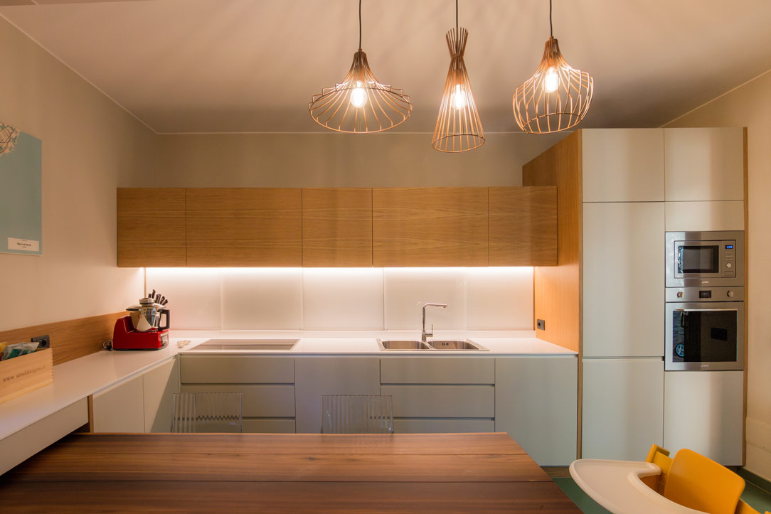
green and wood kitchen
detail of green door hollow handles
gas hob detail

THE KITCHEN PROJECT

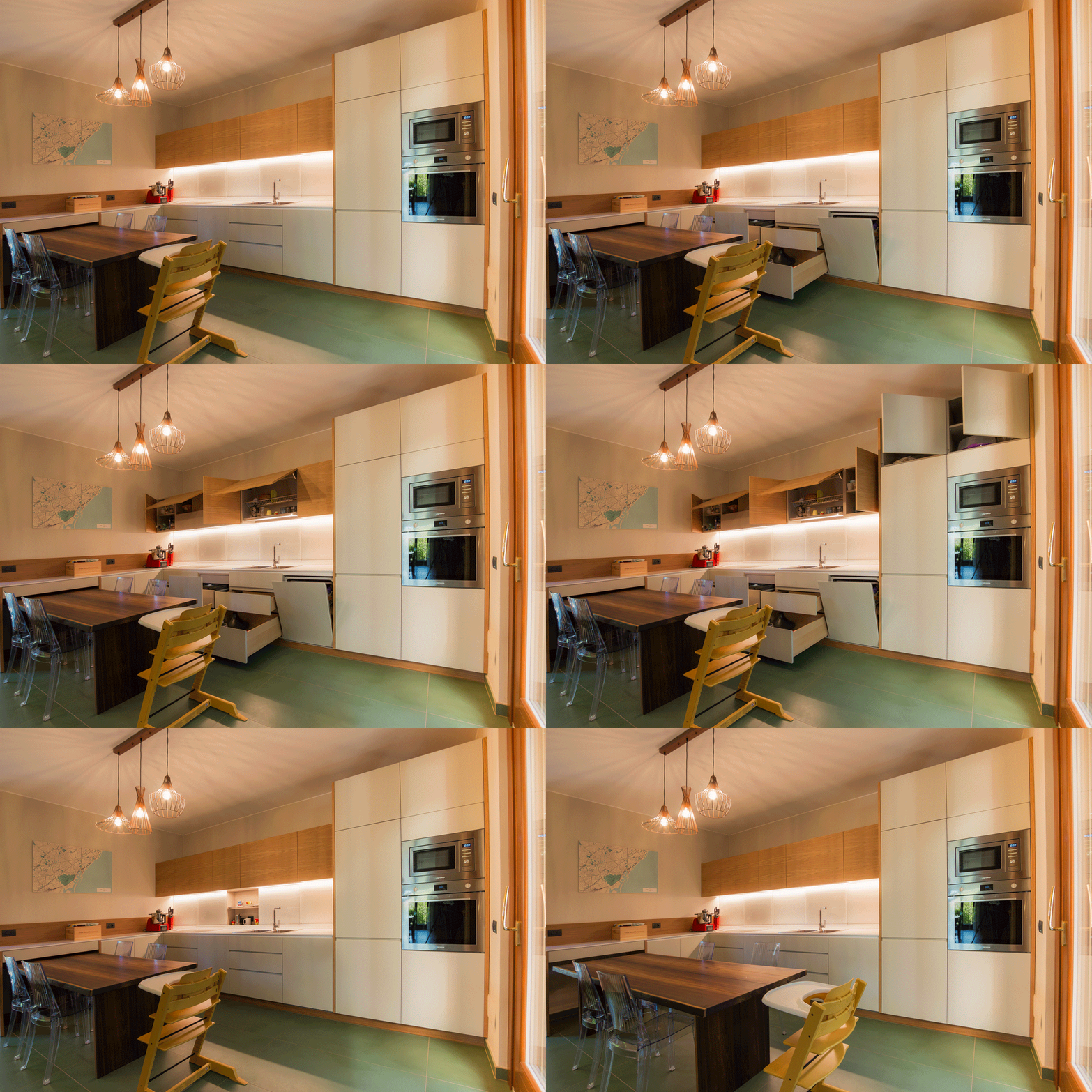
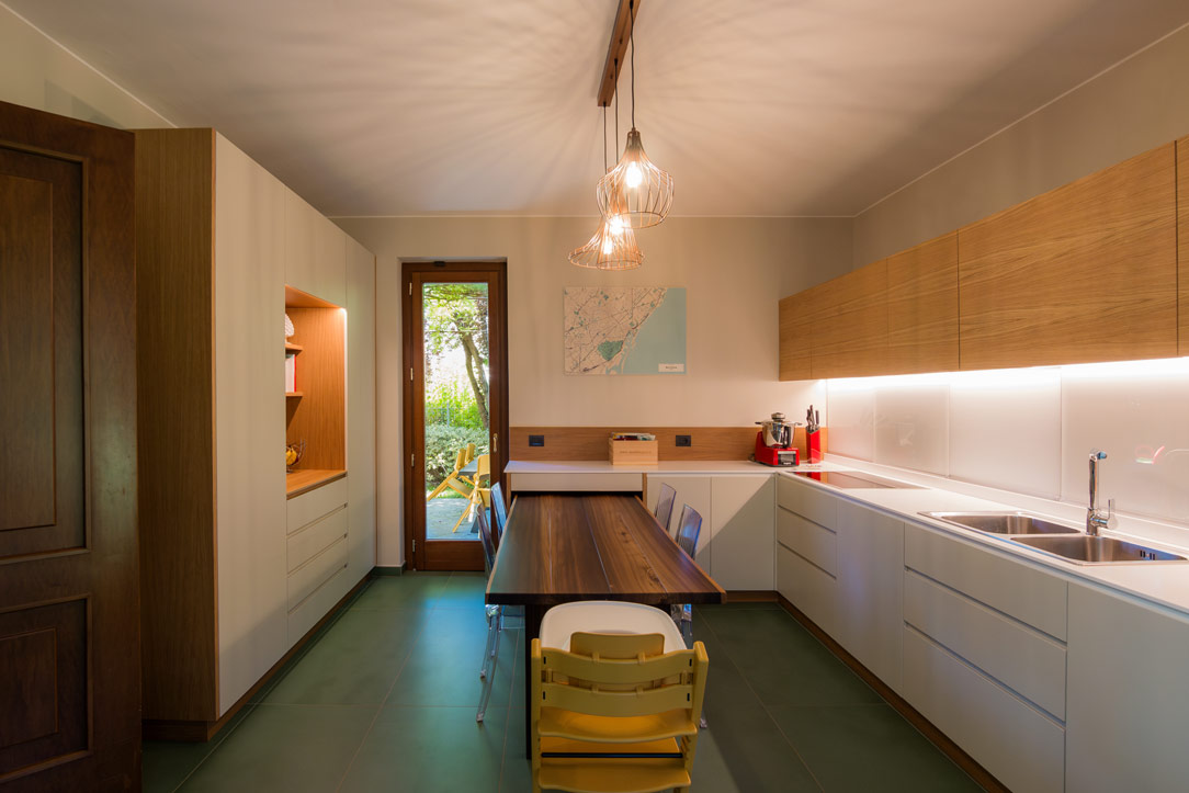
Once the dividing wall was knocked down and the old access to the room closed, the kitchen had the opportunity to develop into a corner, right in front of the bright French window that overlooks the external panoramic terrace.


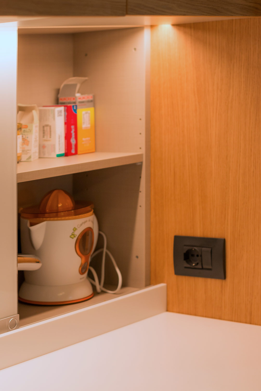
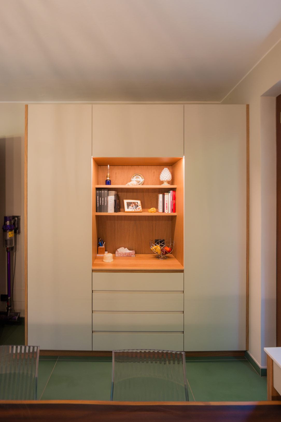
A first column volume on the left acts as a large pantry with shelves (useful for several users).
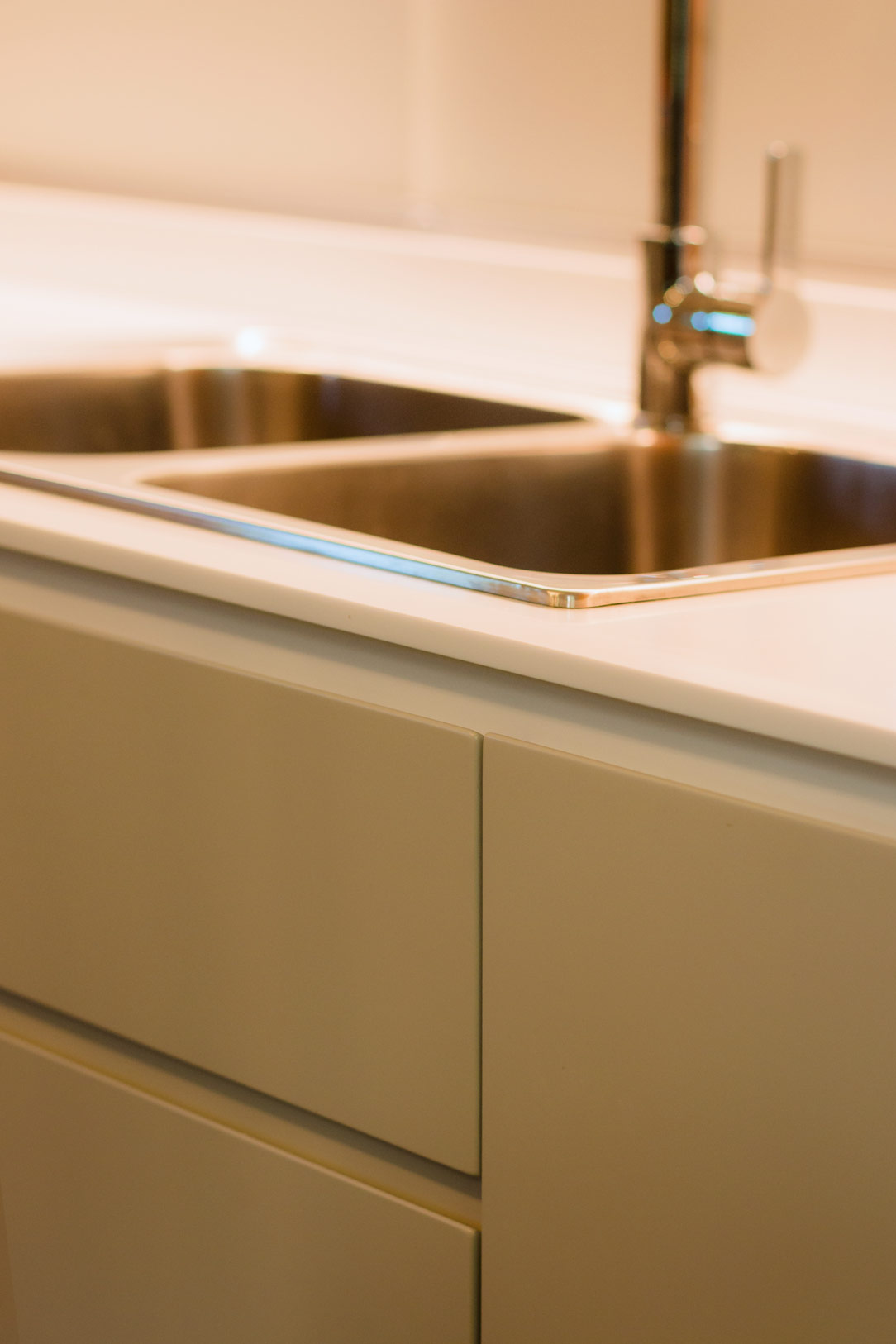
In the center and taking advantage of the corner, a hollow with low wall units houses the sink with drainer, the gas hob, and a good worktop.
The refrigerator column and the oven column with service doors in the upper part close the opposite corner.
green and wood kitchen
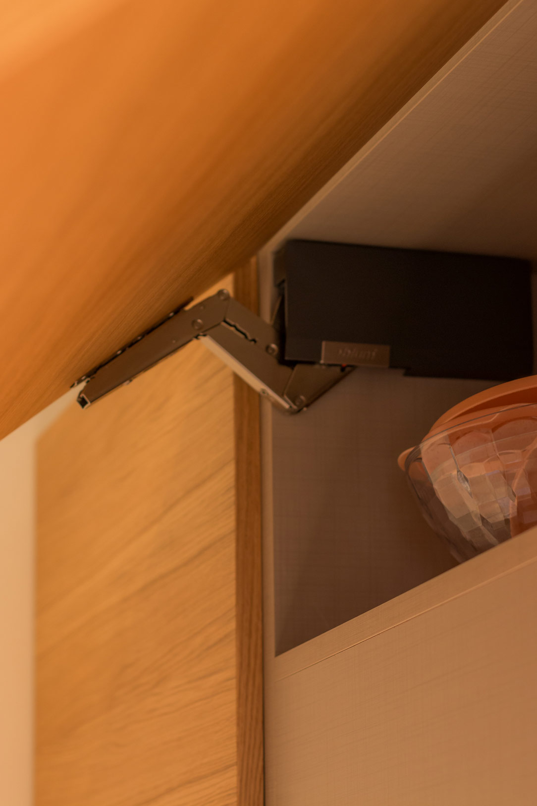
aventos detail
 dish drainer detail

GREEN KITCHEN: HARMONY BETWEEN INTERIORS AND EXTERIORS

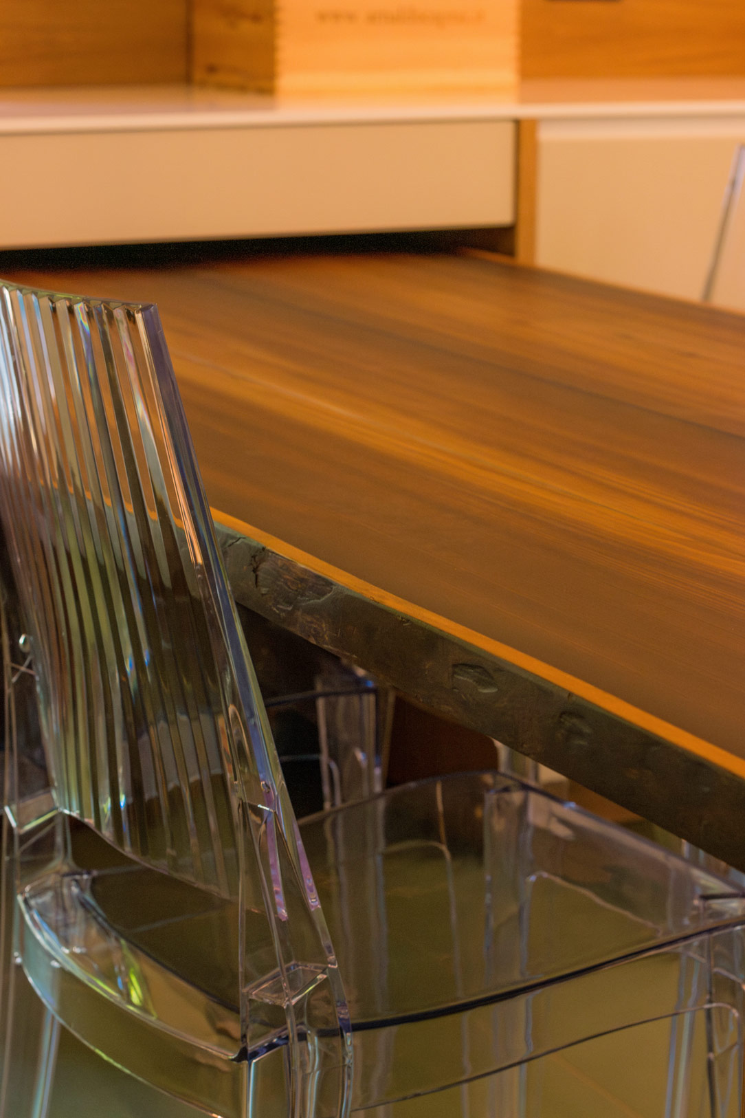
The materials and colors was chosen to follow both the trends we found at the Salone del Mobile and, on a conceptual level, the external environment. The predominant color of the kitchen is in fact a very delicate olive green, which recalls all the forest green that can be glimpsed from the window. The walls are also in the same color tone but in a lighter shade. The floor is made of oak planks and rises to become the same plinth of the entire kitchen. In addition to aesthetics, however, a certain degree of resistance was required, as the house is used by several families, so both doors and wall units are made of plastic bilaminate. As far as the oak essence bilaminate is concerned, we sought the closest color to the parquet, but we preferred to move it away from the floor in a more linear rhythm and without obvious knots. The top is in HPL, that is a compound of cellulosic fiber impregnated with thermosetting resins, practical and resistant. The finish of the top is in Cardoso stone, in shades of gray, which incorporates the other elements in the living room and its irregularity, and its marked veins make it very similar to the sandstone rocks of the Valley. Green, wood, and rock, these are the harmonic references that we have chosen as the common thread between inside and outside and the result is really satisfying. Here the link to another renovated mountain apartment.

Gray furniture for a masculine apartment

Gray furniture for a masculine apartment

Furniture in shades of gray is spread over the two levels of this modern apartment with a masculine imprint. From the bookcase on the ground floor to the walk-in closet in the sleeping area, the furnishings are developed in an elegant and delicate way. The dark-colored wood chosen for the parquet flooring matches the slate tiles that embrace the kitchen and bathroom areas from the internal staircase.

gray masculine apartment furniture

THE LIVING AREA MEETS THE ELEGANCE OF GREY FURNITURE

In a newly built residential context, this two-level apartment stands out in which the masculine imprint is elegantly softened by the choice of monochromatic furnishings. The floors show character in the combination of smoked oak parquet and slate-effect tiles. The floor is therefore dark, which is chromatically balanced by the walls that are tinged with white and the light furnishings that lighten and brighten the environment.

livingroom gray tones furniture

The lighting of the ground floor is combined with steps on the side of the staircase, these mark a luminous rhythm and accompany the upper floor. To embrace the living area, a full-height bookcase combines anthracite gray backs with light gray shelves in the same shade as the surrounding furniture. The anthracite gray that we find here in the lacquered shoulders can be replaced by black iron, as for example in this apartment with the same masculine soul.

bookshelf in dark gray masculine furniture
step marker
shelves detail

Neutral tones thus become the protagonists of a story that narrates elegance and freshness. Here are some other examples of furnishings in neutral colors. The sofa is a darker gray and moved by velvety fabric, which is positioned laterally at the entrance and hides a lateral extension to allow maximum comfort. Behind it, the stair handrail in anthracite gray painted metal matches the vertical shoulders of the bookcase positioned right in front.

sofa and stairs
velvet sofa detail

THE RECOVERED KITCHEN

The bioethanol fireplace, housed in an open plasterboard structure, acts as a fusion element between the living area and the kitchen. This, recovered from the previous house, is characterized by powder and wood tones and is combined with a rustic table with light aluminum chairs. The wood of the kitchen and of the table, which are a lighter tone than the floor of the living area, recall it on a material level and create continuity between the two areas.

kitchen powder and wood

THE BATHROOMS IN ANTHRACITE GRAY

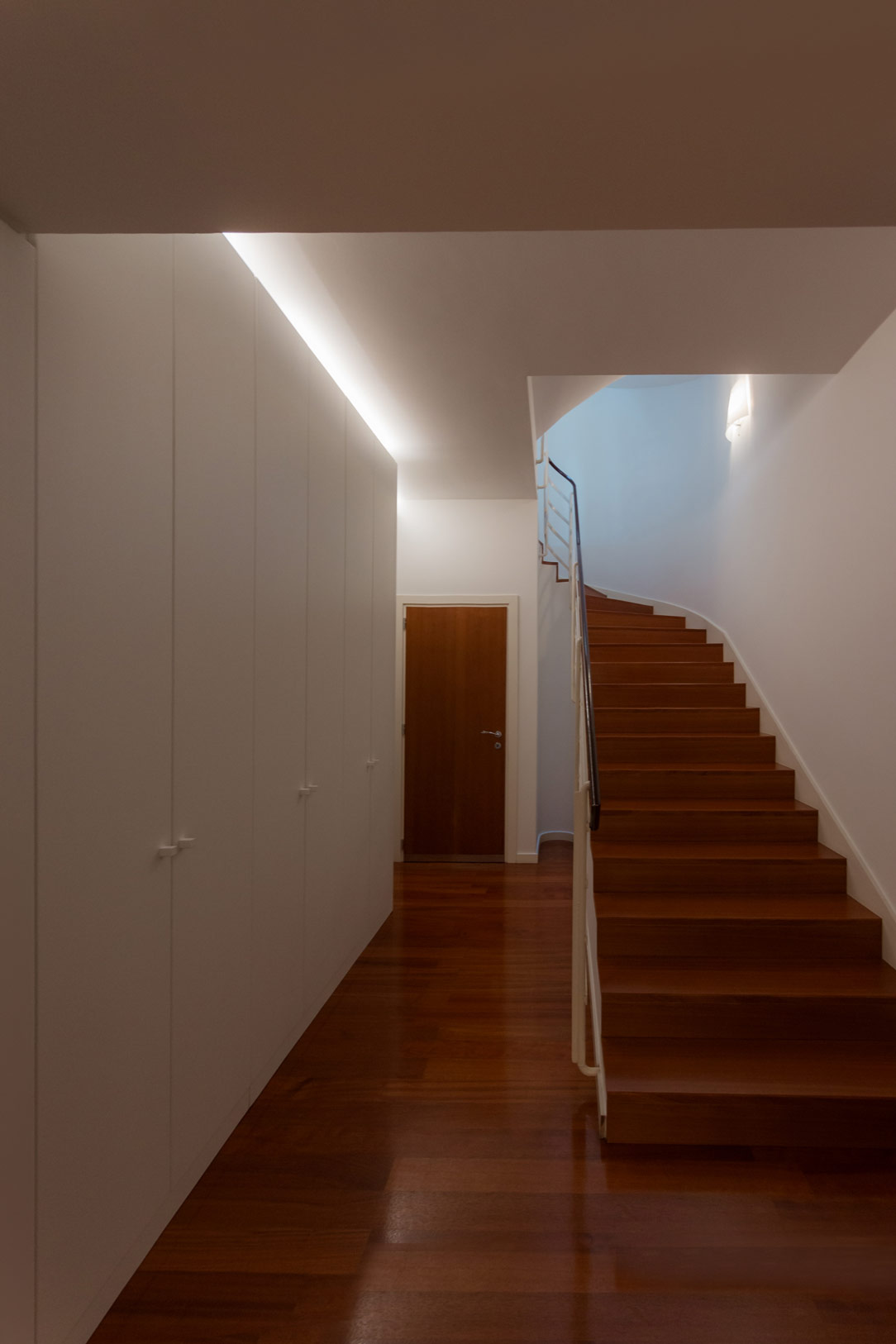
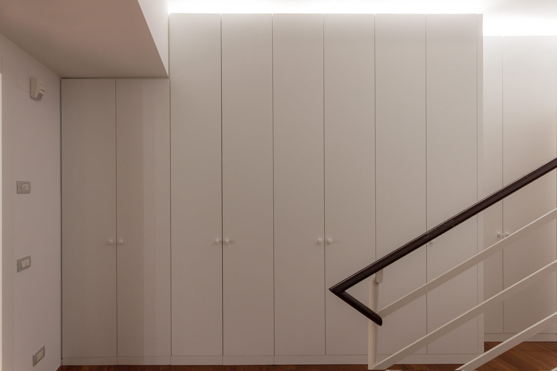
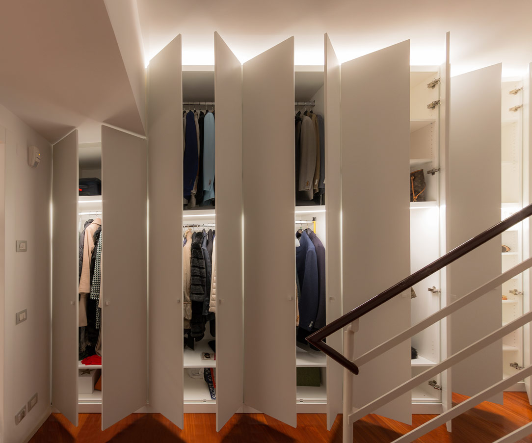
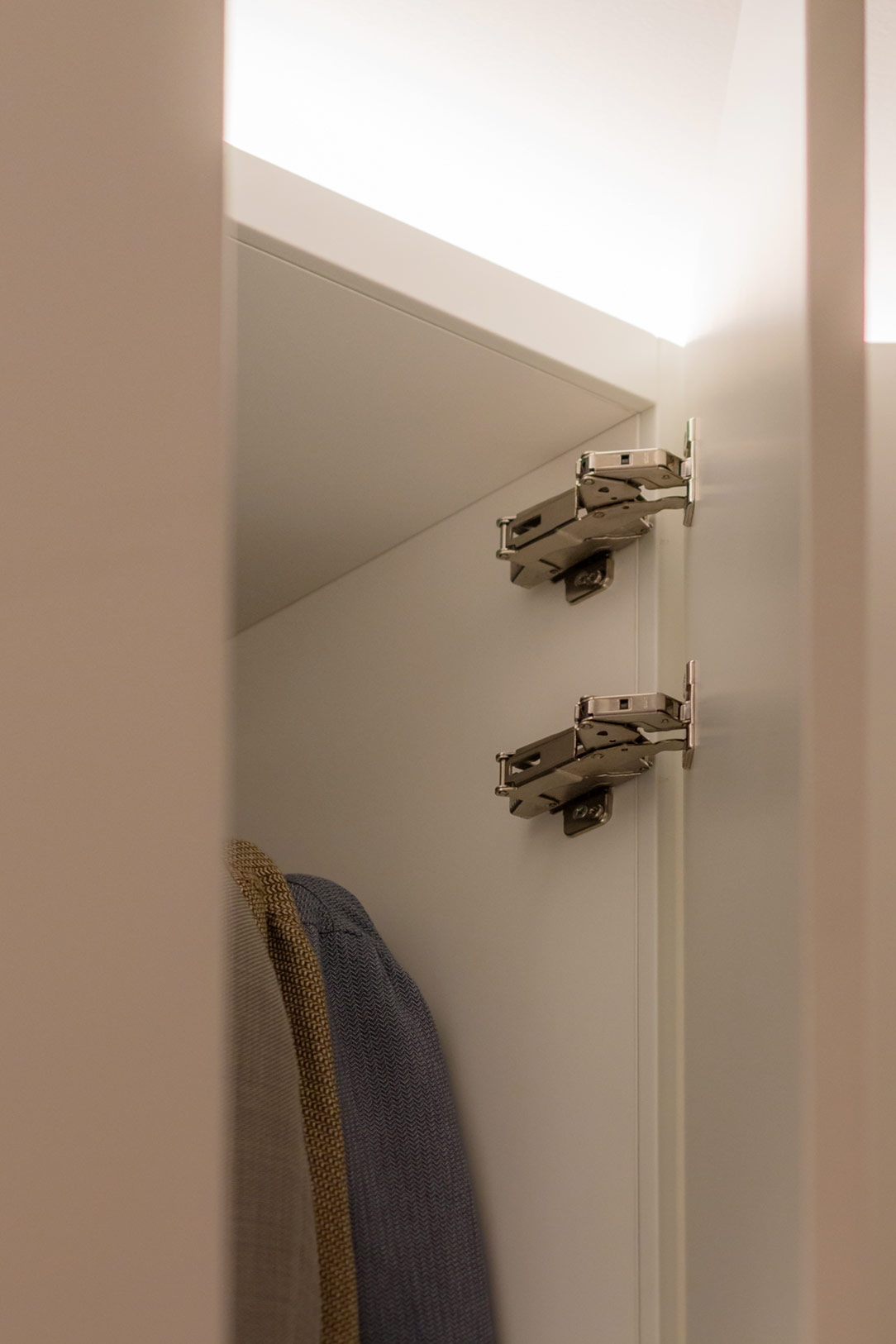
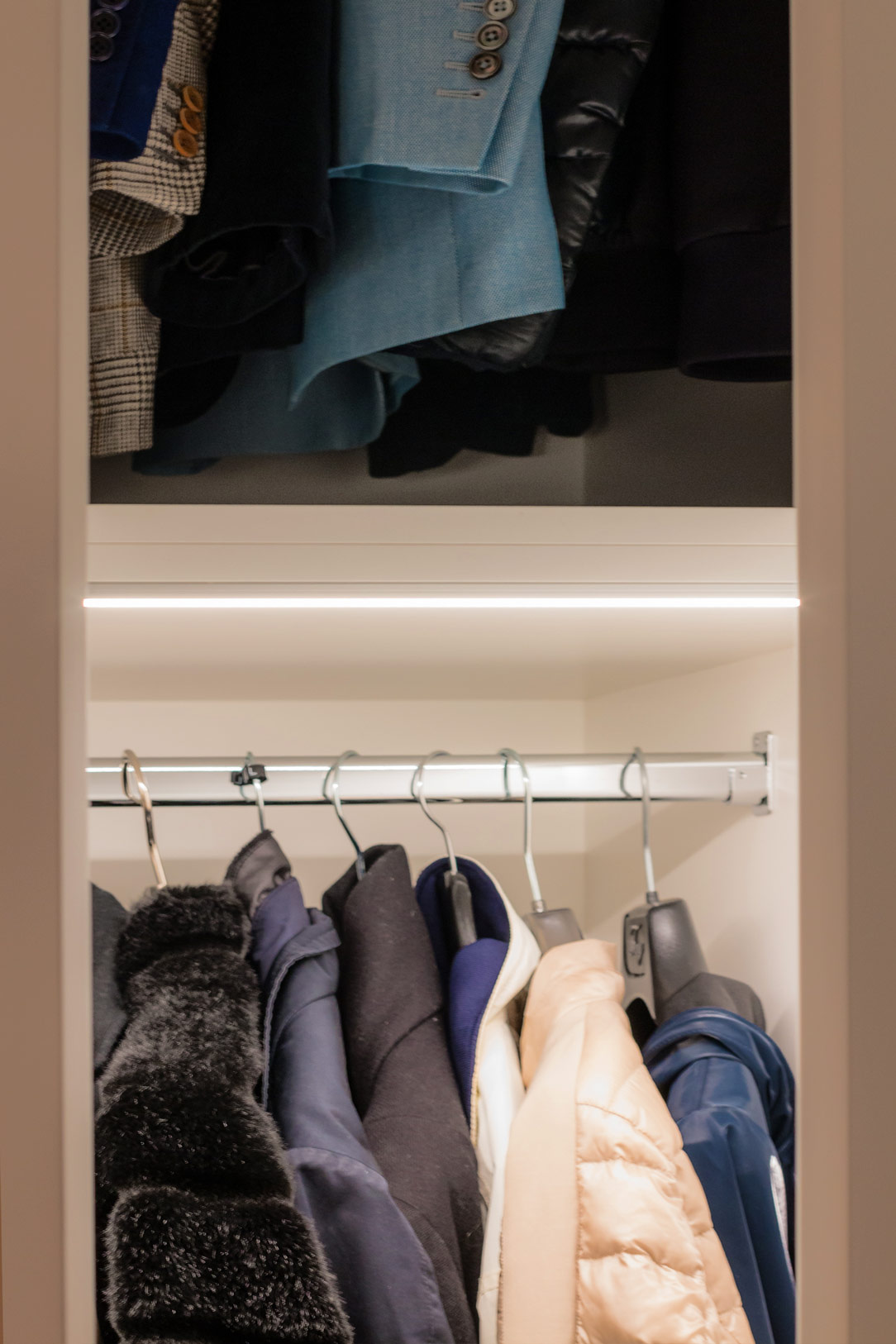
Accessing the service bathroom, full-height matt white bilaminate cabinets act as a storage room organized into shelves, hangers and drawers. This light-colored anteroom creates a nice contrast and a clear break with the bathroom characterized by dark tones.

white anteroom
details anteroom

In fact, the anthracite tiles rise on the sides remaining at a height of 120cm and is combined with a bathroom cabinet in the same shade with a matte black back lacquered top. Particularly the chosen sink, in transparent glass, which seems to disappear and get lost between the tiles and the top.

service bathroom
detail sink

The second master bathroom, located on the upper floor, amplifies its masculine nature by completely covering the tiles in anthracite gray up to the ceiling beam. The bathroom is very dark but the large skylight on the ceiling perfectly illuminates the room from above. Here too there is a bathroom cabinet in shades, with the top in glossy back lacquered rather than opaque, which goes well with the reflections of the Globo ceramic sink.

master bathroom black furniture
bathroom tiles

FROM THE GRAY FURNITURE ON THE LOWER FLOOR TO THE BLACK AND WHITE CONTRASTS IN THE BEDROOM: A WALK-IN WARDROBE IN THE BEDROOM

Se il piano inferiore si impreziosisce di un arredamento sui toni neutri del grigio, If the lower floor is embellished with furniture in neutral shades of gray, the sleeping area is characterized by a more subdued contrast. The recurring theme of anthracite gray is still found in the small study corner, through a desk with a metal structure and a medium gray linoleum top. Here are some other examples of Smartworking corners where the working sphere is combined with a domestic environment.

bedroom and walk-in closet masculine furniture

Behind this, a walk-in closet develops at an angle creating a limited but at the same time functional environment. Inside the walk-in closet the hangers alternate in height while in the center a central chest of drawers with upper shelves remains available for all the folded items. On the side facing the bed, a small niche remains at the service and serves as an open bedside table useful for supporting small objects.

walk-in closet masculine furniture
inside walk-in closet
details walk-in closet

A SPACE DEDICATED TO FLORA AND UNDERGROUND

A SPACE DEDICATED TO FLORA AND UNDERGROUND

As citizens of the world we have the opportunity to live in contact with nature and its luxuriant flora. We can immerse ourselves in a natural environment that is there, has always existed and can be found a stone’s throw from home or a half-day trip if we live in a large metropolis. But do we really know how to recognize all this greenery that surrounds us?

ingresso spazio Flo&s

THE MUNICIPAL OBJECTIVE

In the municipality of Ranica an ambitious project was born by the municipal council. Lapping the Parco dei Colli with all its splendor and beauty, the Ranica hill starts from a significant height and slowly descends towards the Serio river. In this very diversified panorama, given by the difference of heights and climatic conditions, we have the opportunity to find a variety of flora that characterizes the different areas concerned. Born from the desire to promote and encourage territorial discovery, a public space dedicated to this was born in the historic center of the town of Ranica and near the ascent to the hill.
FLORA AND UNDERGROUND SPACE

The FLO&S space (Flora and Underground) was born from the creative idea of ​​the architect Patrizia Berera, part of the Network of Botanical Gardens of Lombardy. Not far from our beloved Cartolibreria, it is located in the porch of via San Luigi in Ranica, an old renovated farmhouse in a foothill position. This has a raised access to the courtyard. Not being the multiplex space but developed for a long time as a large corridor, the project concept was able to optimize it by creating a sort of interactive path. Intended for a varied target, mainly school, it aims to show the various elements of flora and subsoil and to introduce their discovery through various communication methods.

entrace Floes space
back Floes space
Welcome to Flo&S Space

THE PROJECT

At the entrance, a walkway that cuts through the entire space guides the user inwards, making the visit even more immersive and evocative. This is made up of different types of stone and wood, the same ones that can be found, in their raw state, in the surrounding area. Among them, Zandobbio marble, Gré strain, cherry wood, oak and fir. The available walls have been divided into macro-areas:
space top view flora and subsoil

a top view of the hall with and the different exhibition areas.
The entrance was dedicated to welcoming and on the two sloping front walls a small text will explain the objectives and the meaning of the space. On the side, relevant information material are provided. After crossing this corridor, which narrows like a funnel, on the right side (called A) we find a long wall where there is a full-height illustration. Here, based on the elevation of the hill, it shows the species of trees, shrubs and herbaceous plants found in the local flora. This large panel illustrated by us (more details on this here) presents the silhouette of the tree or shrub, the flower and the fruit that allow its recognition and all the flowers and herbs on the ground. Beside the elements we have created small wooden boxes accessible to all for what is tactile communication. In fact, depending on the reference season, there will be flowers, leaves or fruits with which it will be possible to interact. In this way, you will have the perception of the roughness, the smell and the fragility or softness of the blooms that can be better recognized in an excursion on the hill.

illustrated panel
lateral panel
box details
illustrated panels with flowers

In the lower part, on the other hand, there are equipped furniture, which can either act as a “teaching room” or as service furniture for the storage of goods dedicated to space. These low seating elements, also present in the other two spaces that we will illustrate shortly, have drawers or flap opening.

drawers and flaps
image details

In the second wall (called B) the interaction is not only active but also “creative“. At the user’s disposal there is a blackboard surface and chalks with which to draw the favorite flora element. On the side, however, a box acts as a container for magnets or herbarium, inside magnetic letters or botanical cards that go into the whole theoretical part of the images found in the illustrated wall. This slate can be multifunctional, or at the service of the box with botanical cards or even useful for notices or seasonal thematic updates.

side chalkboard drawing
magnetic whiteboard

On the third wall (called C), on the other hand, all the issues related to the subsoil are explored. Inside the showcase and on the shelves, common minerals of the area are displayed in their pure state. The left side of the showcase has been deliberately designed with a “variable trim“. This means that the shelves can change their position within the space or be removed completely.

wall subsoil notice board
mineral panel

FINISHES AND MADE

Given the very neutral finishes of the space, which see a light gray stoneware floor and plastered walls in the same shade, our furnishings also wanted to be light and bright. Everything is white, with a wooden appeal in the display boxes. This is to let the images and the colorful central walkway be the protagonists of the space.

furniture neutral and light tones

MULTIFUNCTIONAL SPACE

The space will not only be a mirror of the Ranica’s flora but can also be used as an educational space for workshops and lessons. It will in fact be linked to some projects of the local school circuit. In anticipation of this we have created square tables that can extend, opening crosswise with hinges, to accommodate more users. These tables will be free to stop and arrange themselves, in time of need, with different arrangements. Useful as mobile displays, they will be stored in the small warehouse located at the entrance, mirroring the bathroom.

closed tables
open tables
multifunctional tables
disposition in space

here some proposals for the spatial arrangement of the open tables

INAUGURATION

Last weekend the FLO&S space was publicly inaugurated by the Mayor and the junta of Ranica. All the actors who have set up the space and will take care of it in the future have intervened. The donations of rare minerals have been substantial and make the space even more valuable. In addition, a list of events is already active starting from summer until next year. We can only encourage participation in events and trust that this space becomes an integral part of our community. Good luck Spazio FLO&S!

Ranica elevation relief
 seeds
interactive whiteboard
rare minerals

Funeral House

Funeral House

The Funeral House was recently inaugurated in Bergamo, a solemn but at the same time intimate and delicate place, intended to give the last farewell to loved ones.

Funeral House entrance

THE ARCHITECTURE OF THE PLACE

The structure, built within the urban context, becomes a living and integral part of the community with its strong stylistic and architectural connotation.
Given the nature of the large spaces, the feelings transmitted are one of tranquility and protection, with lounges dedicated to meditation and sharing.

There is a Laical room and a Room for the ceremony for the delivery of the ashes and Private rooms.

Laical Room
Funeral House private room

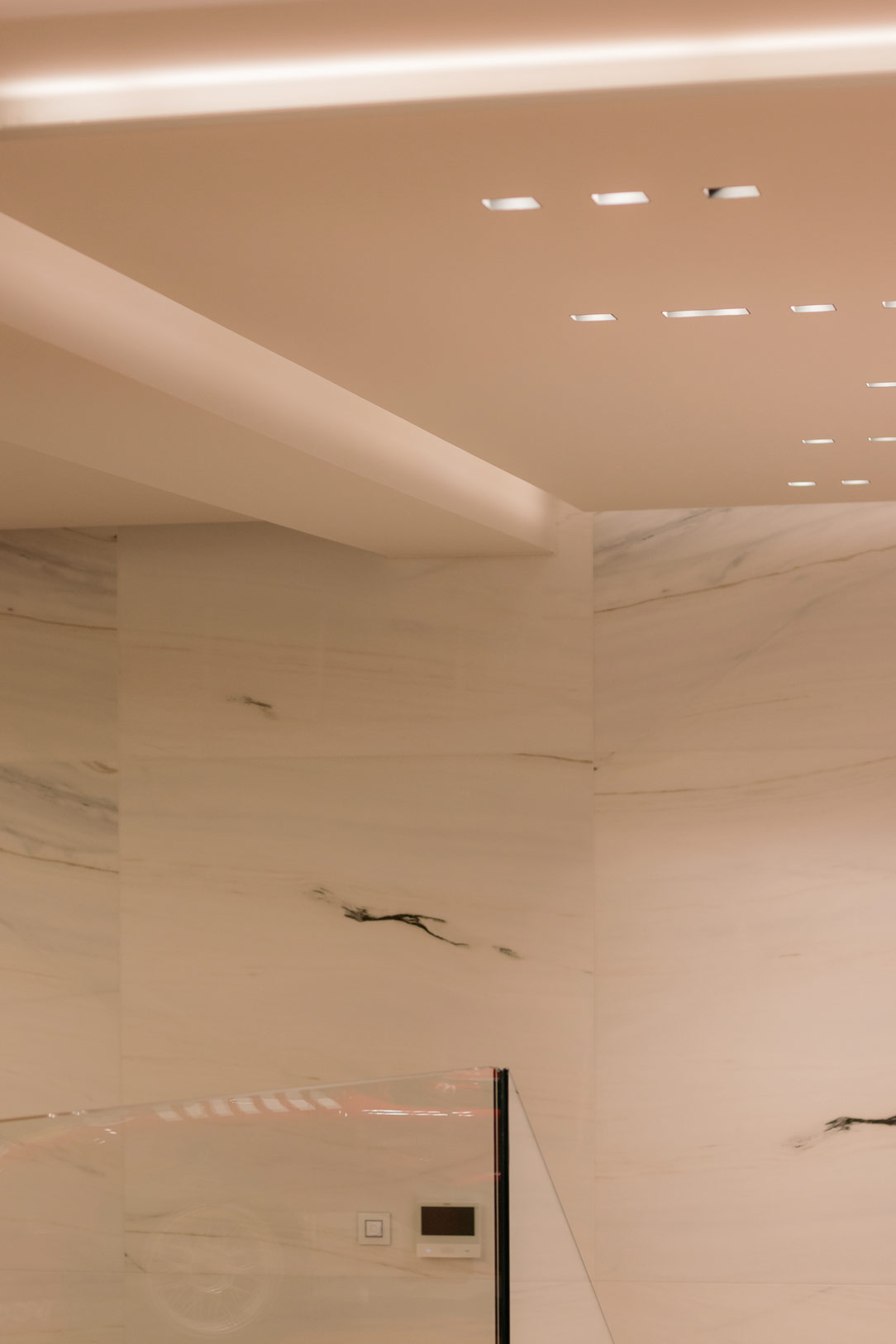
The lighting plays a fundamental role, it comes both from the outside, slightly obscured by smoked glass, and from the inside, expertly designed so that it is punctual but not excessive.
Round ceiling lights in the corridor part are flanked by sophisticated design chandeliers at the entrance and in the rooms.
All the light is dimmable to ensure that moments of wakefulness and intimacy are distinguished from others as the day progresses.

light details
ceiling wall lighting

Onyx-effect tiles are the material protagonists of the environment, covering most of the full-height walls.
These are combined with the soft gray stoneware on the floor and the dove-gray upholstery for the Laical Room.
The decorative fil rouge of all the rooms is walnut declined in the form of floor-to-ceiling slats. These are found in different points of the structure, marking its visual rhythms.

Funeral House entrance

A dedicated space has been created for children with a library made up of titles selected by Ursula Gruner for age groups.
This sweet thought for the little ones can be a valuable help to accompany them in understanding the importance of that moment.

space for children
books for childrens

OUR WORK

We took care of some of the furnishing elements of this imposing structure.
Mainly of the two executive offices, whose goal is to make them operational and functional while maintaining overall elegance and a sense of lightness.
Since the entire Funeral House is very characterized in terms of elements, colors and materials, a very neutral project was opted for.
In fact, the furniture, which has the same delicate color as the walls, disappears inside the two rooms and serves only as a logistical support.

big office

Doors and drawers hide folders, files and all the bureaucratic aspect of the structure, leaving only two light tables with a bronze structure in sight.
Here is another example of an office with a similar table structure but in stainless steel finish.
In the smaller office, the furniture from the niches develops in an equipped lateral extension that reaches the table, remaining at its side with a chest of drawers and internal shelves available.
The piece of furniture where the desk rests can be accessed from the side, next to another tall shelf unit.

 small vertical studio funeral house
smal studio lateral
details corner

In the second office, larger than the previous one, the furniture is developed in a U shape, using the niche of the large window as the largest equipped surface.
Here, in the center, there are drawers and doors with internal shelves, while the two side becomes an extension and display case for small marble objects and cinerary urns.
The representative table with bronze painted iron structure and medium gray top in Linoleum is positioned exactly under the spot lighting from the ceiling.

big office
details expo
details table bronze funeral house

Inside the Private rooms, small storage cabinets equip the room without visually invading it.

drawer units in the funeral house niche
drawer units in the farewell house niche

The consoles and tables of the rooms are based on our design, which have been skillfully made in painted folded sheet metal. The design concept was to obtain a light, load-bearing and unobtrusive structure. The console features two side legs with an inverted X structure, in which the narrow rectangular section of the structure changes its axis and is combined with the wide one. This allows for visual movement by varying the perspective of the element. An elegant slab of onyx-effect stoneware has been recessed into the top of the console, on which the Book of signatures will be placed. The same structure, combined with two “cross” side defines the low tables. The base of the latter recall the one of the consoles while the top is made in a round and thin sheet metal. As the color of both a slightly bronzed dark brown, which recalls the fixtures and finishes of the structure.

leg's console
consolle lateral

THE INAUGURATION OF THE FUNERAL HOUSE

The presentation of the Casa del Commiato was also innovative and interesting. The first access to the public was in fact crowned by a short but intense exhibition, Wish You Were Here. Here the works of 23 artists dealt with a delicate theme such as death, in empty and not yet furnished rooms. “An intimate and spiritual journey of the analysis of absence but also an attempt to crystallize and make eternal that extraordinary emotional tension that originates from the pain of loss, transforming it into a regenerating force. Through the powerful connotation of the place, the artists’ works resonate with the themes of infinity, beyond, melancholy, tension and desire, ensuring that even a painful concept such as absence can become a positive engine of creative production “. (cit. Gabriele Salvaterra) In the Laical Room an installation by Noemi Mirata shows a dying body give way to a new plant life, which rises upwards. On the back screen a video of Elisabetta di Sopra in which the gestures in caring for a life that is born and one that goes are repeated.

Noemi Mirata, La fisica dell’oltre Elisabetta Di Sopra, THE CARE

In the front La fisica dell’oltre Noemi Mirata. Video installation Elisabetta Di Sopra, THE CARE 

At the center of the large corridor is the work of Martina Cioffi made of raku ceramic. The sculpture tends to evoke a powerful nature, mixed animal and vegetable, creative and fruitful.

Martina Cioffi, Shape-shifting #1

Martina Cioffi, Shape-shifting #1 

In the smaller office the dreamlike work of Lorenzo D’Alba, in which two alien creatures find their natural habitat in empty space. In the larger office, the photographic series by Lidia Bianchi in which the memory of her father is mixed with Pierpaolo Pasolini’s thoughts on fireflies, a sign of the loss of an original nature, naivety, and amazement.

Lorenzo D'Alba
Lidia Bianchi

Lorenzo D’Alba Echinus and Lidia Bianchi Sono Tornate le Lucciole

These are just some of the installations of the exhibition that developed within all the rooms of the Funeral House. The inauguration took place between 25 and 28 March, exactly two years after the first lockdown due to the Covid-19 pandemic, which especially hit Bergamo and prevented many families from being able to greet their deceased with dignity. After two long years, Generali Onoranze Funebri and the Centro Funerario Bergamasco open a place, in the heart of the city, where death can find space and be included in life.