A SPACE DEDICATED TO FLORA AND UNDERGROUND

A SPACE DEDICATED TO FLORA AND UNDERGROUND

As citizens of the world we have the opportunity to live in contact with nature and its luxuriant flora. We can immerse ourselves in a natural environment that is there, has always existed and can be found a stone’s throw from home or a half-day trip if we live in a large metropolis. But do we really know how to recognize all this greenery that surrounds us?
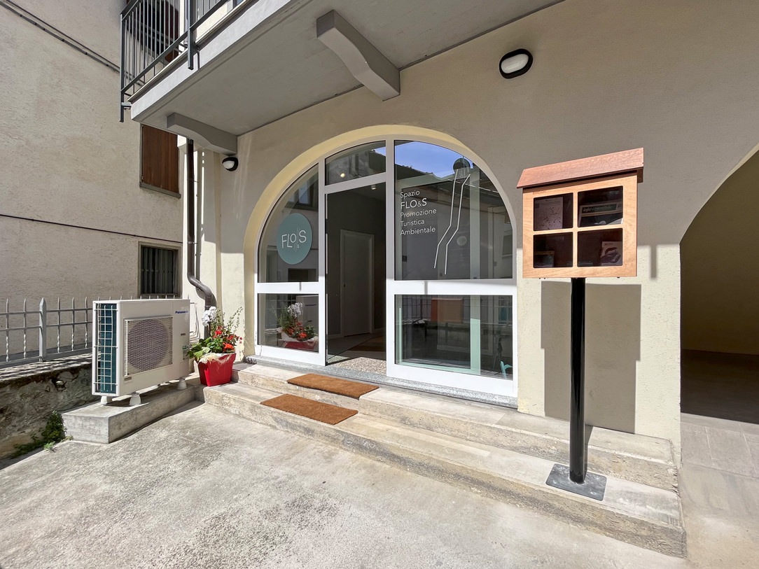
ingresso spazio Flo&s

THE MUNICIPAL OBJECTIVE

In the municipality of Ranica an ambitious project was born by the municipal council. Lapping the Parco dei Colli with all its splendor and beauty, the Ranica hill starts from a significant height and slowly descends towards the Serio river. In this very diversified panorama, given by the difference of heights and climatic conditions, we have the opportunity to find a variety of flora that characterizes the different areas concerned. Born from the desire to promote and encourage territorial discovery, a public space dedicated to this was born in the historic center of the town of Ranica and near the ascent to the hill.

FLORA AND UNDERGROUND SPACE

The FLO&S space (Flora and Underground) was born from the creative idea of ​​the architect Patrizia Berera, part of the Network of Botanical Gardens of Lombardy. Not far from our beloved Cartolibreria, it is located in the porch of via San Luigi in Ranica, an old renovated farmhouse in a foothill position. This has a raised access to the courtyard. Not being the multiplex space but developed for a long time as a large corridor, the project concept was able to optimize it by creating a sort of interactive path. Intended for a varied target, mainly school, it aims to show the various elements of flora and subsoil and to introduce their discovery through various communication methods.
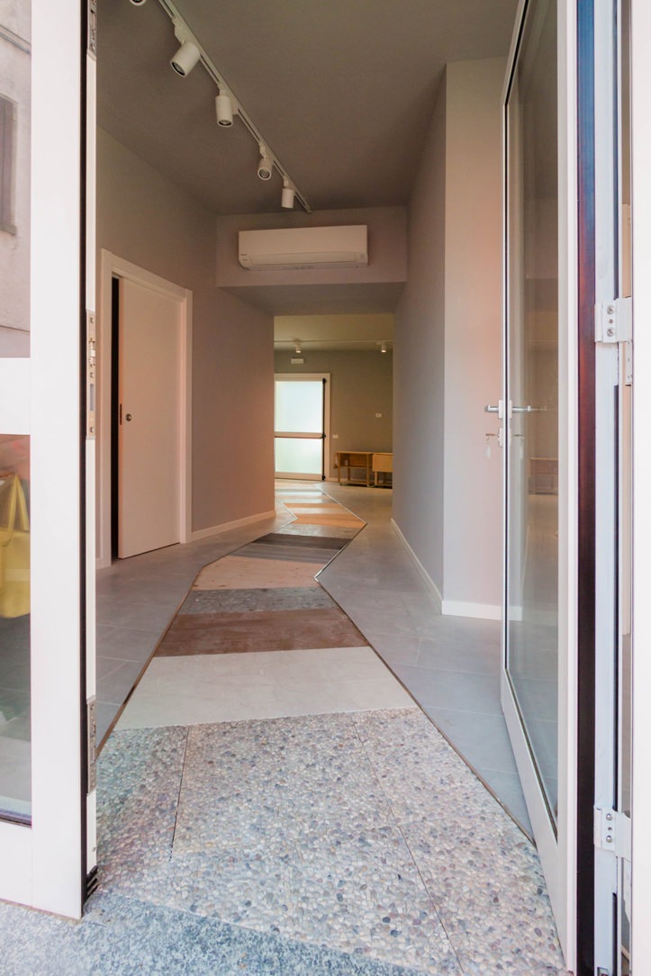
entrace Floes space
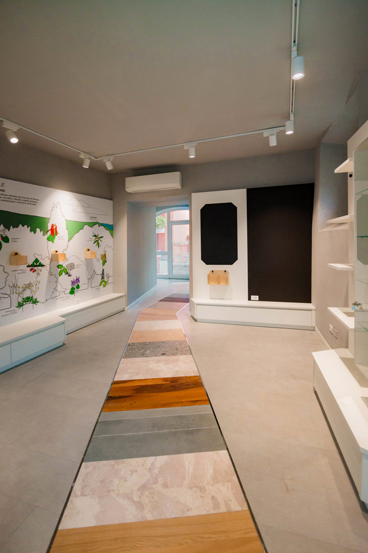
back Floes space
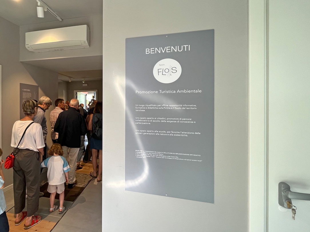
Welcome to Flo&S Space

THE PROJECT

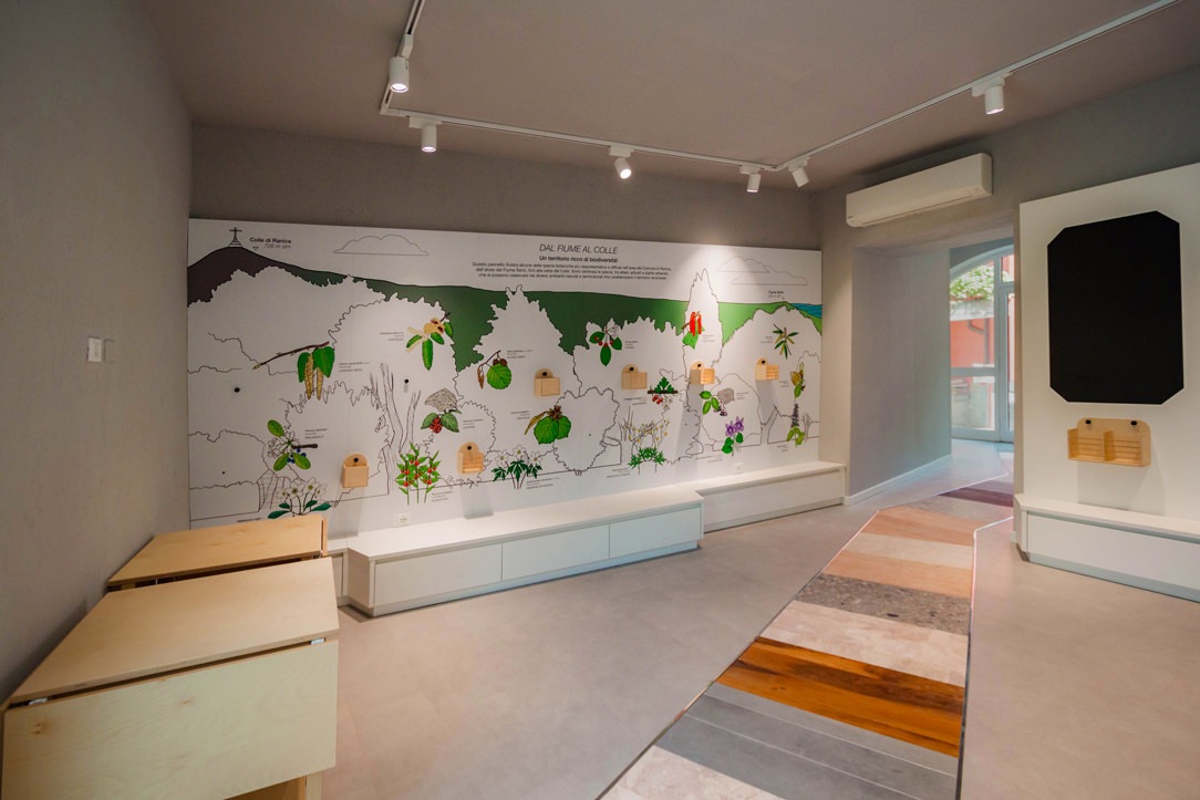
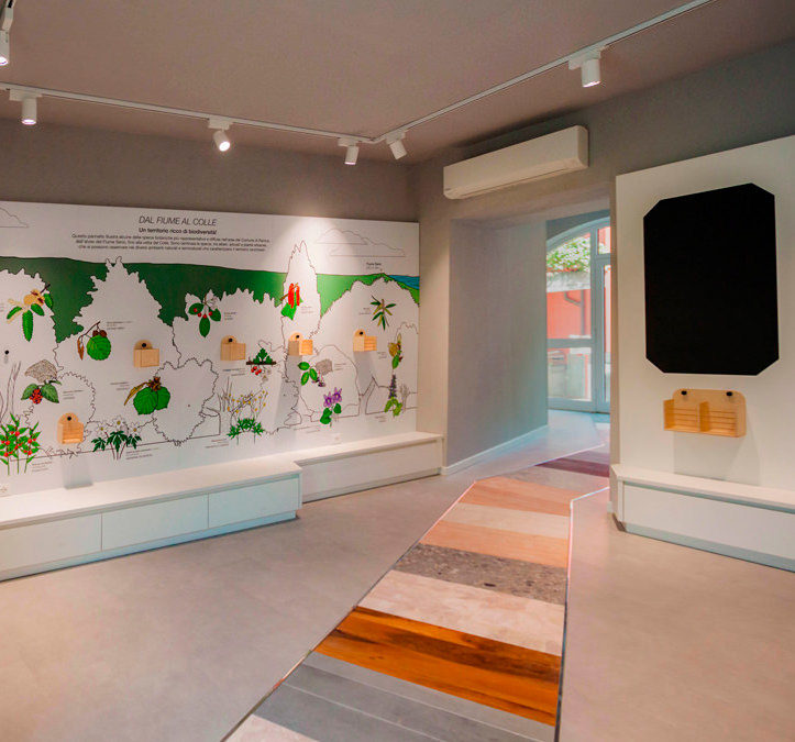
At the entrance, a walkway that cuts through the entire space guides the user inwards, making the visit even more immersive and evocative. This is made up of different types of stone and wood, the same ones that can be found, in their raw state, in the surrounding area. Among them, Zandobbio marble, Gré strain, cherry wood, oak and fir. The available walls have been divided into macro-areas:
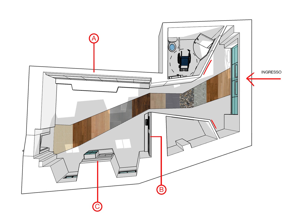
space top view flora and subsoil

a top view of the hall with and the different exhibition areas.

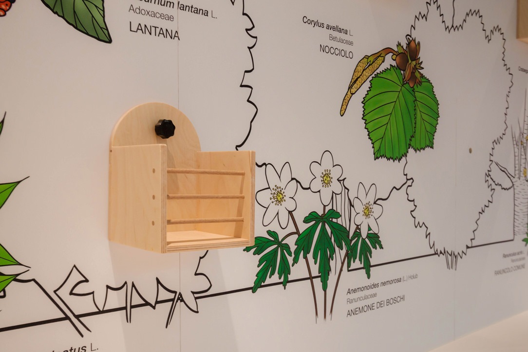
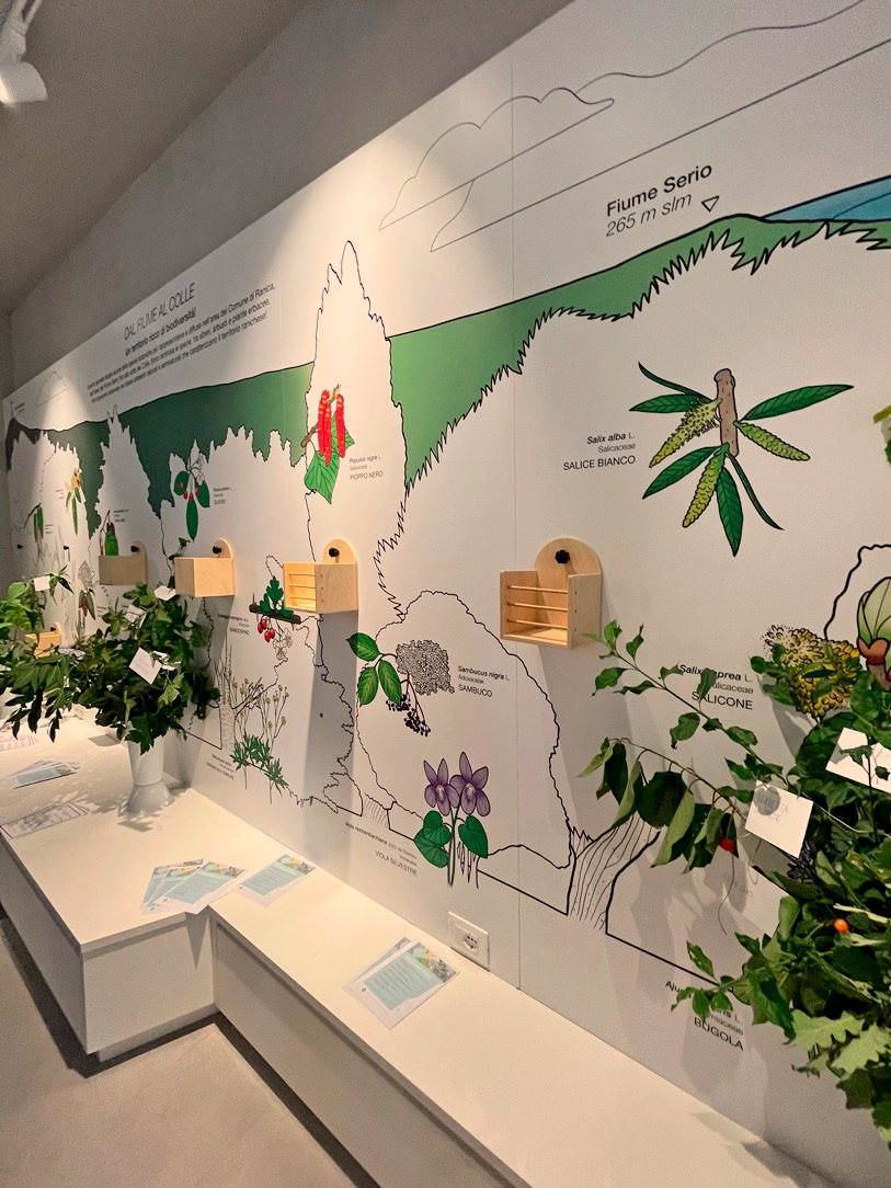
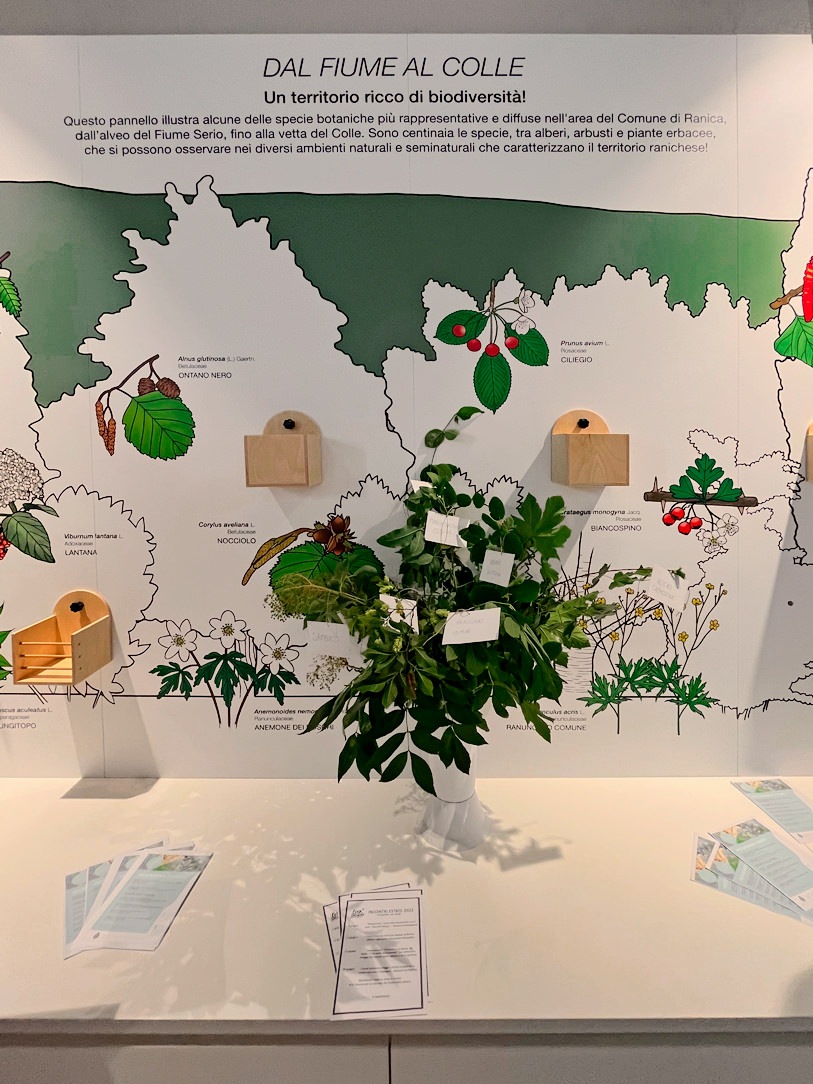
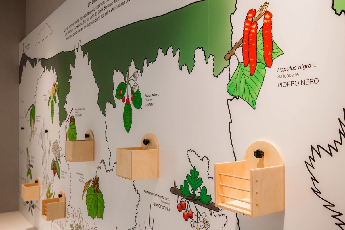
The entrance was dedicated to welcoming and on the two sloping front walls a small text will explain the objectives and the meaning of the space. On the side, relevant information material are provided. After crossing this corridor, which narrows like a funnel, on the right side (called A) we find a long wall where there is a full-height illustration. Here, based on the elevation of the hill, it shows the species of trees, shrubs and herbaceous plants found in the local flora. This large panel illustrated by us (more details on this here) presents the silhouette of the tree or shrub, the flower and the fruit that allow its recognition and all the flowers and herbs on the ground. Beside the elements we have created small wooden boxes accessible to all for what is tactile communication. In fact, depending on the reference season, there will be flowers, leaves or fruits with which it will be possible to interact. In this way, you will have the perception of the roughness, the smell and the fragility or softness of the blooms that can be better recognized in an excursion on the hill.
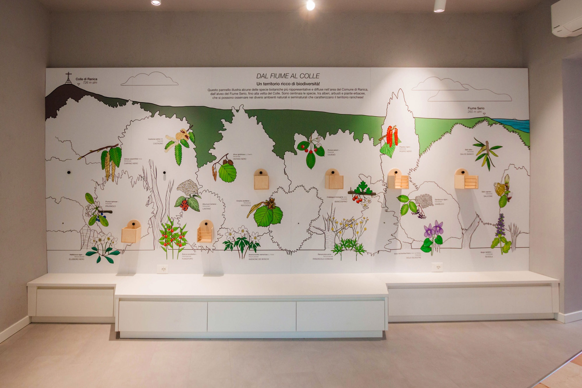
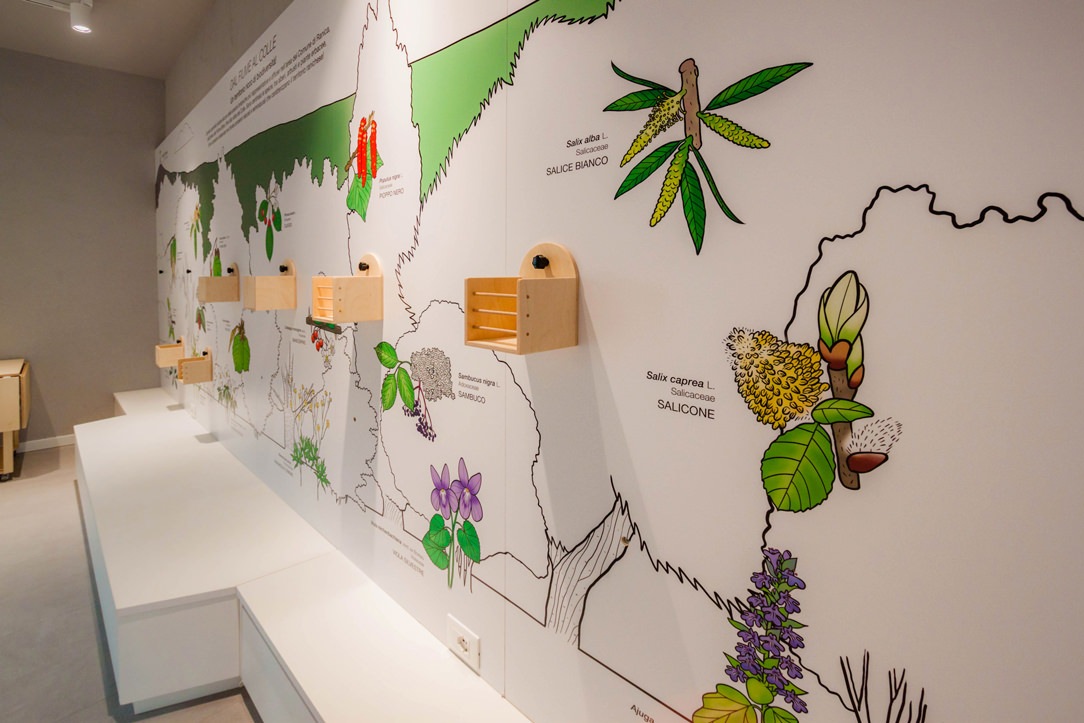
illustrated panel
lateral panel
box details
illustrated panels with flowers

In the lower part, on the other hand, there are equipped furniture, which can either act as a “teaching room” or as service furniture for the storage of goods dedicated to space. These low seating elements, also present in the other two spaces that we will illustrate shortly, have drawers or flap opening.
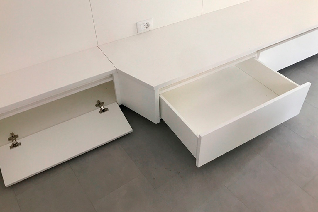
drawers and flaps
image details

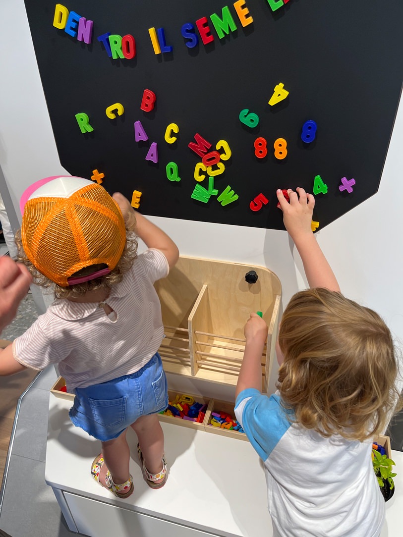
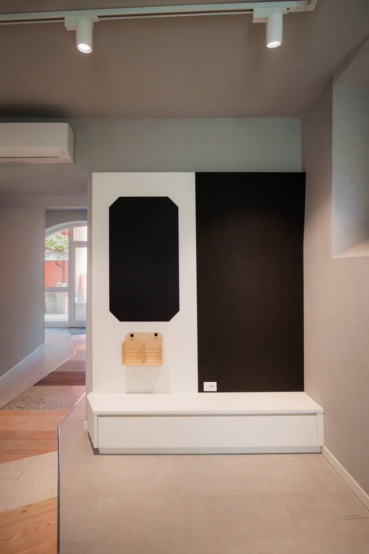
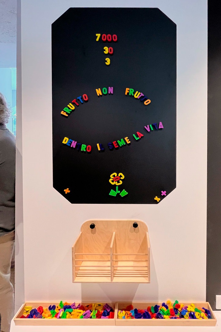
In the second wall (called B) the interaction is not only active but also “creative“. At the user’s disposal there is a blackboard surface and chalks with which to draw the favorite flora element. On the side, however, a box acts as a container for magnets or herbarium, inside magnetic letters or botanical cards that go into the whole theoretical part of the images found in the illustrated wall. This slate can be multifunctional, or at the service of the box with botanical cards or even useful for notices or seasonal thematic updates.
side chalkboard drawing
magnetic whiteboard

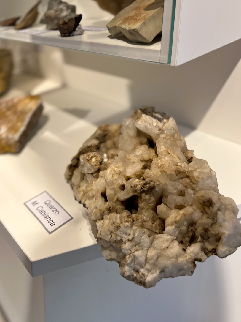
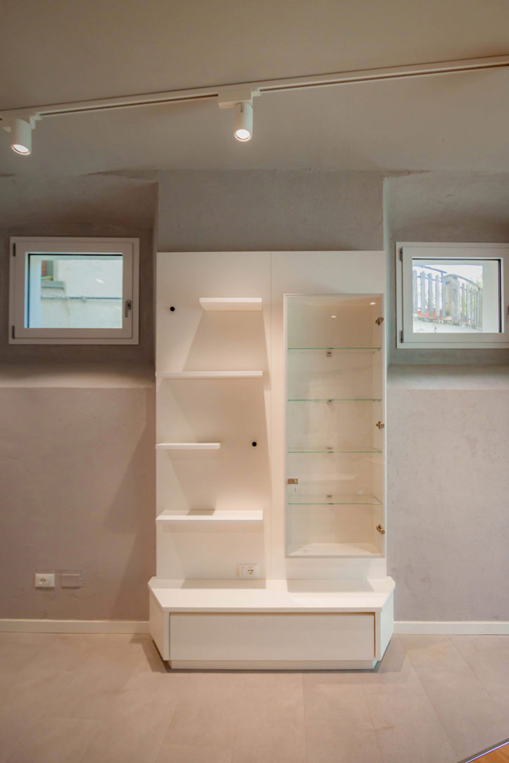
On the third wall (called C), on the other hand, all the issues related to the subsoil are explored. Inside the showcase and on the shelves, common minerals of the area are displayed in their pure state. The left side of the showcase has been deliberately designed with a “variable trim“. This means that the shelves can change their position within the space or be removed completely.
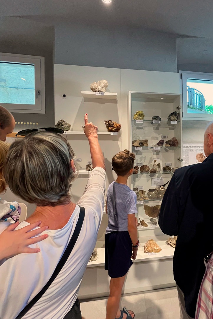
wall subsoil notice board
mineral panel

FINISHES AND MADE

Given the very neutral finishes of the space, which see a light gray stoneware floor and plastered walls in the same shade, our furnishings also wanted to be light and bright. Everything is white, with a wooden appeal in the display boxes. This is to let the images and the colorful central walkway be the protagonists of the space.

furniture neutral and light tones

MULTIFUNCTIONAL SPACE

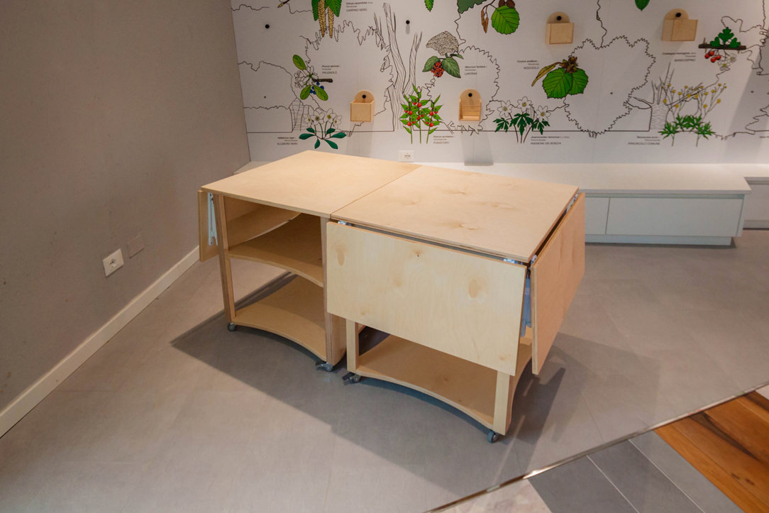
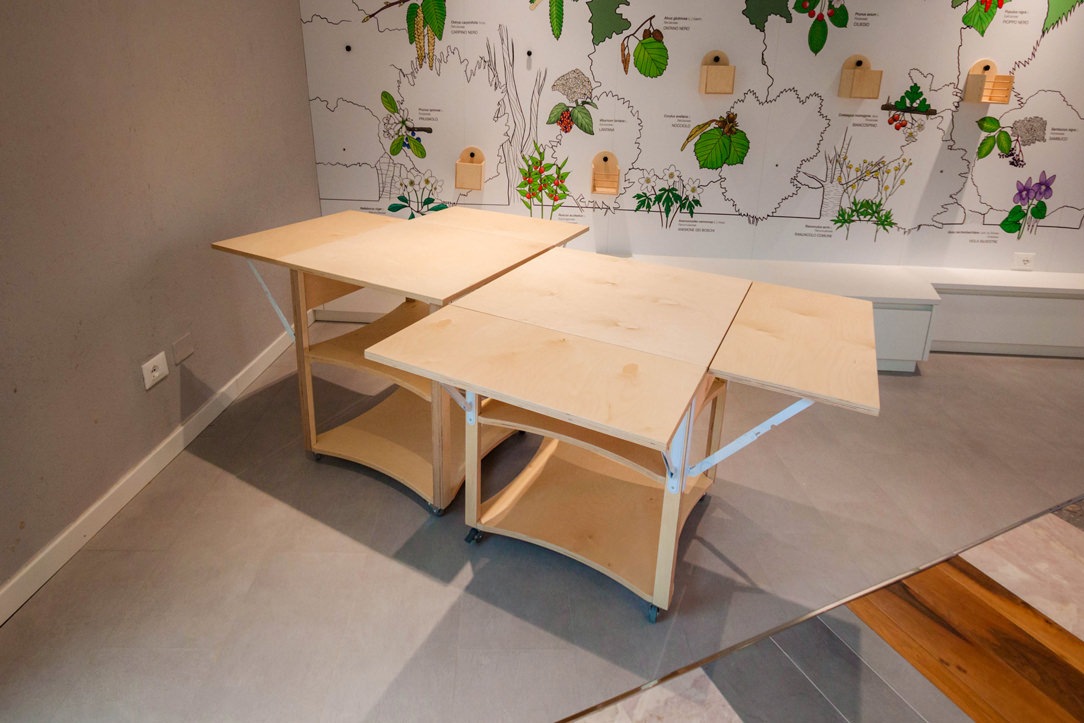
The space will not only be a mirror of the Ranica’s flora but can also be used as an educational space for workshops and lessons. It will in fact be linked to some projects of the local school circuit. In anticipation of this we have created square tables that can extend, opening crosswise with hinges, to accommodate more users. These tables will be free to stop and arrange themselves, in time of need, with different arrangements. Useful as mobile displays, they will be stored in the small warehouse located at the entrance, mirroring the bathroom.
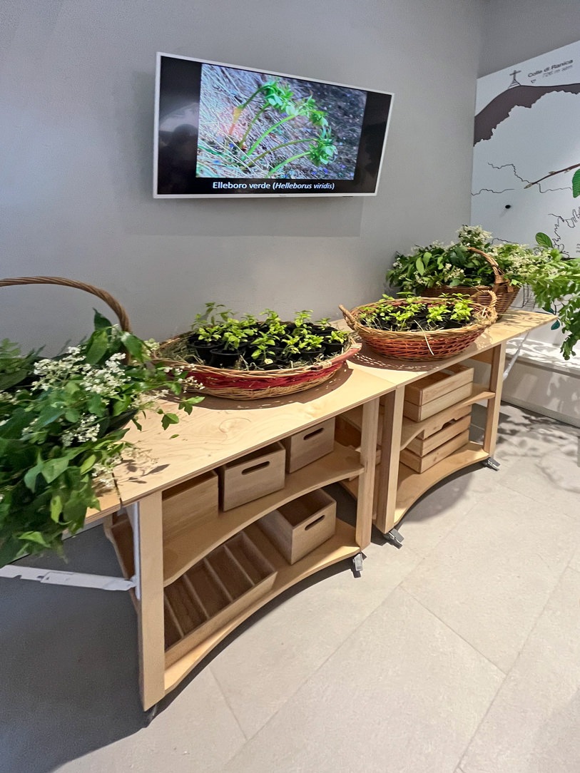
closed tables
open tables
multifunctional tables
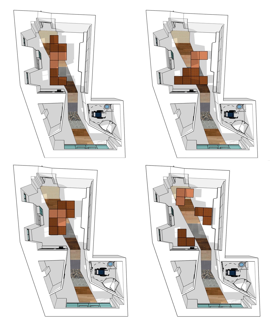
disposition in space

here some proposals for the spatial arrangement of the open tables

INAUGURATION

Last weekend the FLO&S space was publicly inaugurated by the Mayor and the junta of Ranica. All the actors who have set up the space and will take care of it in the future have intervened. The donations of rare minerals have been substantial and make the space even more valuable. In addition, a list of events is already active starting from summer until next year. We can only encourage participation in events and trust that this space becomes an integral part of our community. Good luck Spazio FLO&S!
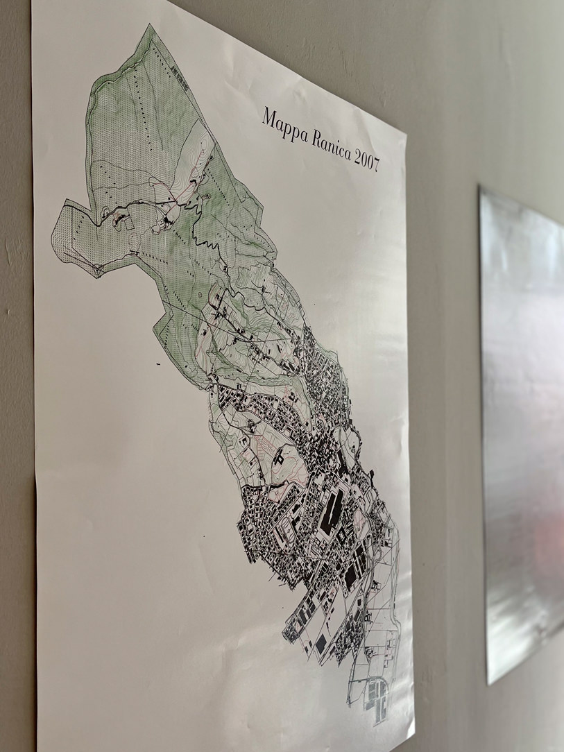
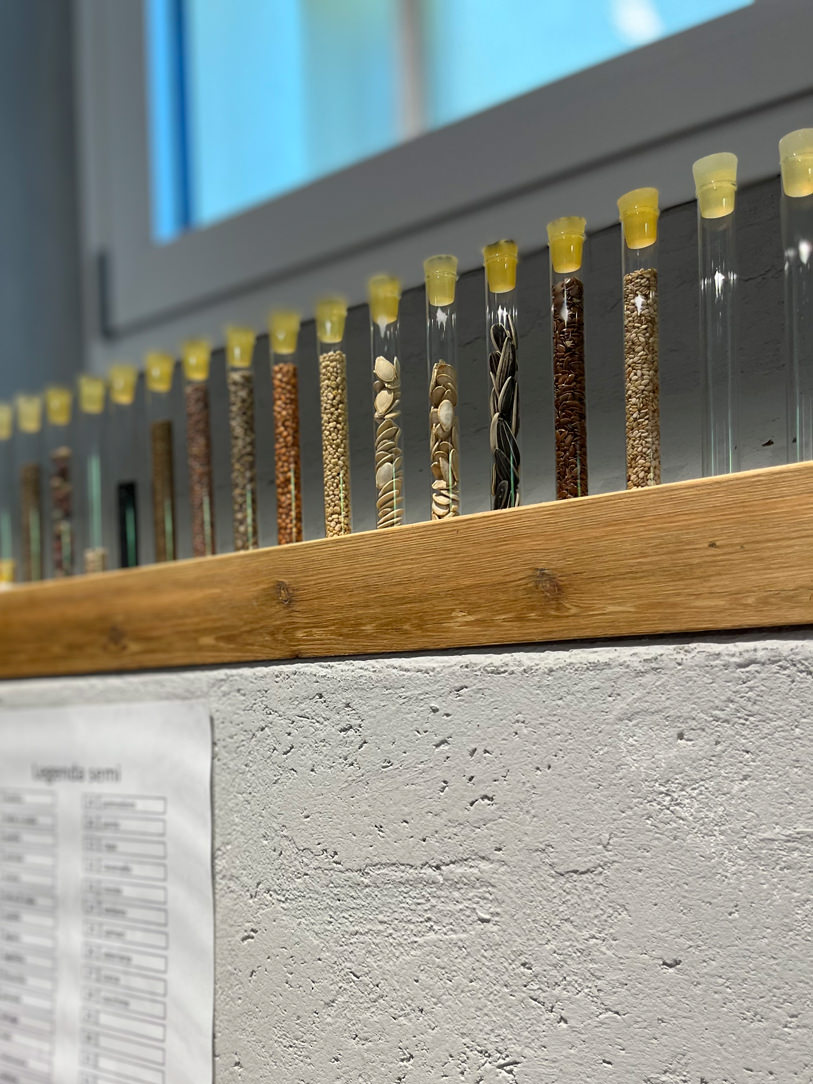
Ranica elevation relief
 seeds
interactive whiteboard
rare minerals

Funeral House

Funeral House

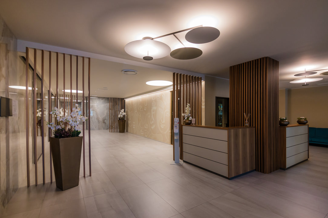
The Funeral House was recently inaugurated in Bergamo, a solemn but at the same time intimate and delicate place, intended to give the last farewell to loved ones.

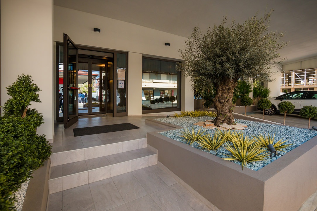
Funeral House entrance

THE ARCHITECTURE OF THE PLACE

The structure, built within the urban context, becomes a living and integral part of the community with its strong stylistic and architectural connotation.
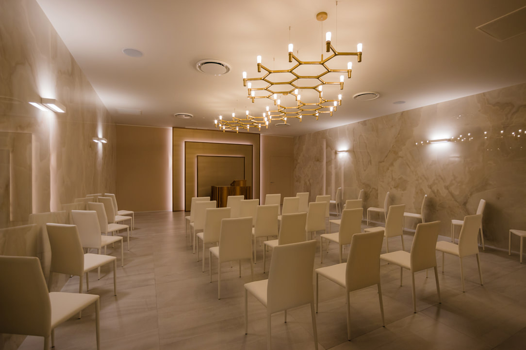
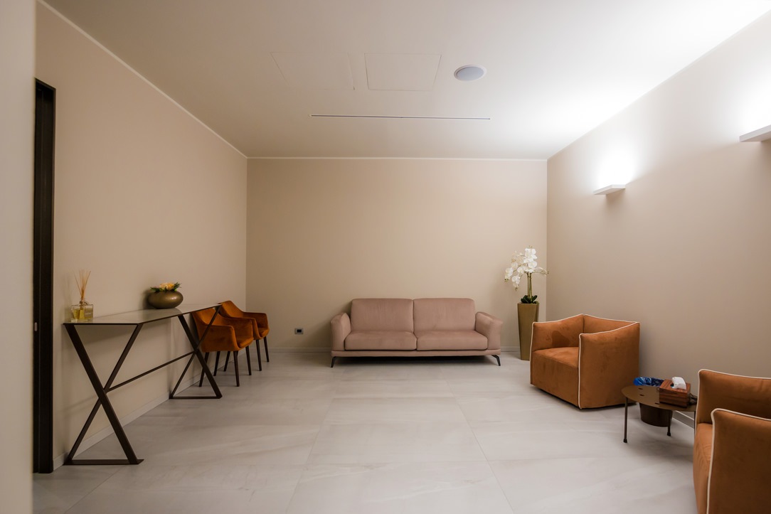
Given the nature of the large spaces, the feelings transmitted are one of tranquility and protection, with lounges dedicated to meditation and sharing.

There is a Laical room and a Room for the ceremony for the delivery of the ashes and Private rooms.

Laical Room
Funeral House private room

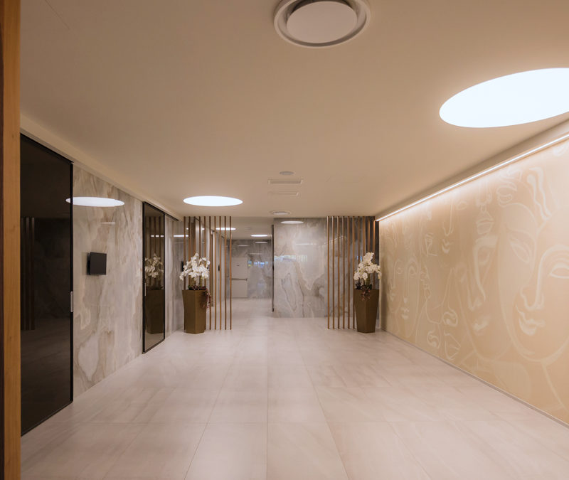
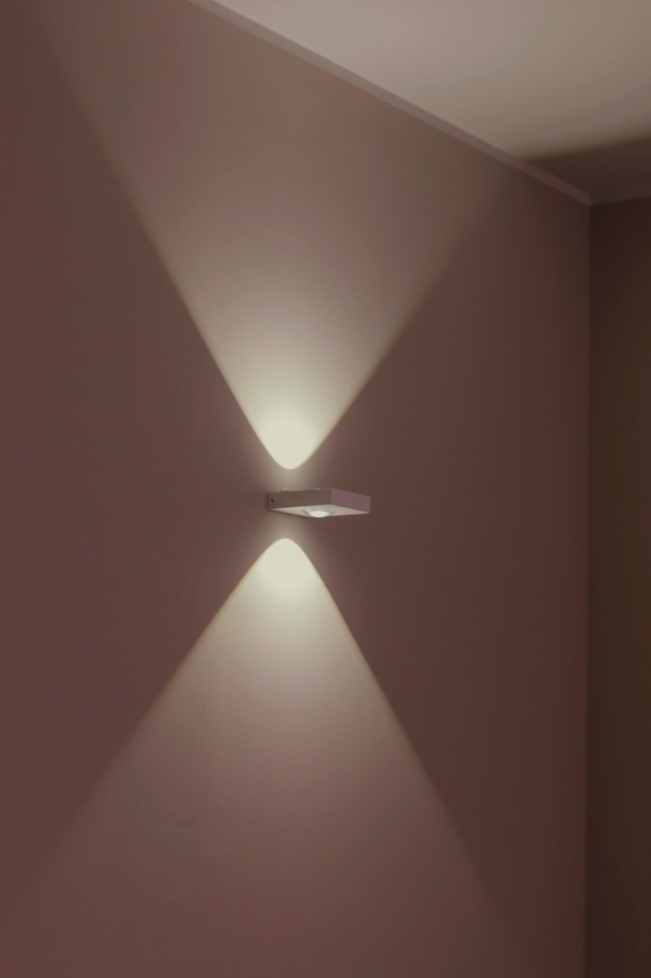
The lighting plays a fundamental role, it comes both from the outside, slightly obscured by smoked glass, and from the inside, expertly designed so that it is punctual but not excessive.
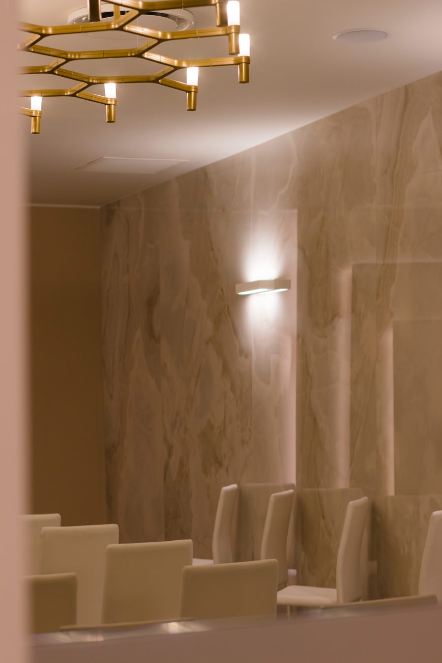
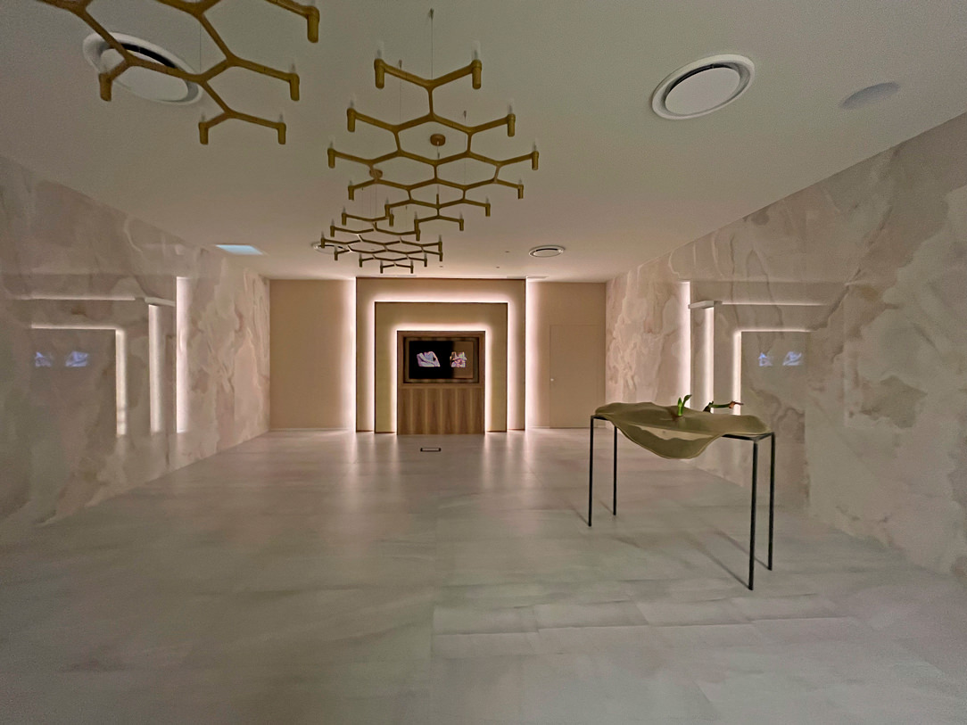
Round ceiling lights in the corridor part are flanked by sophisticated design chandeliers at the entrance and in the rooms.
All the light is dimmable to ensure that moments of wakefulness and intimacy are distinguished from others as the day progresses.

light details
ceiling wall lighting

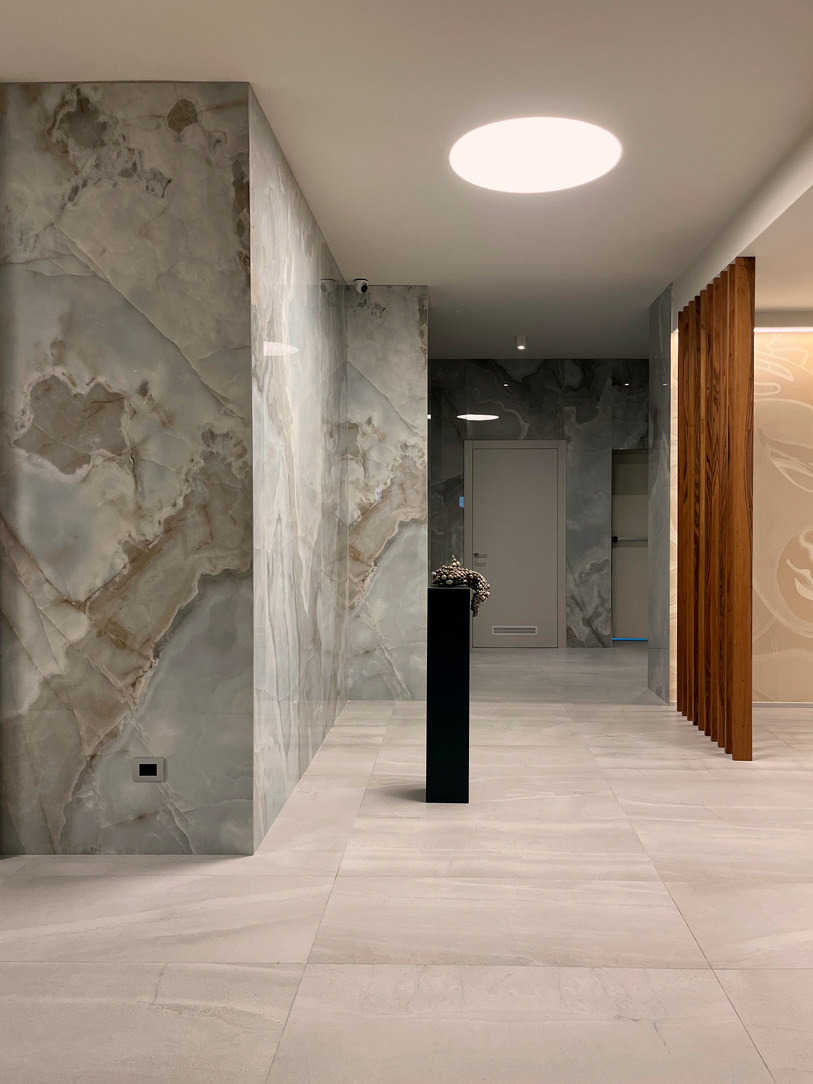
Onyx-effect tiles are the material protagonists of the environment, covering most of the full-height walls.
These are combined with the soft gray stoneware on the floor and the dove-gray upholstery for the Laical Room.
The decorative fil rouge of all the rooms is walnut declined in the form of floor-to-ceiling slats. These are found in different points of the structure, marking its visual rhythms.

Funeral House entrance

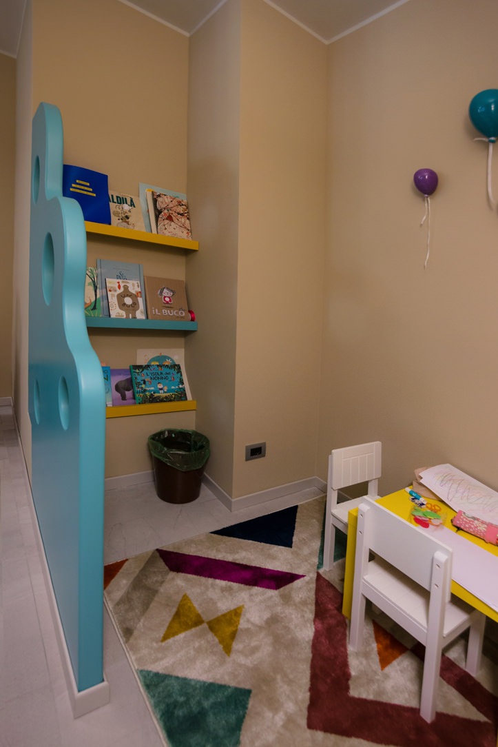
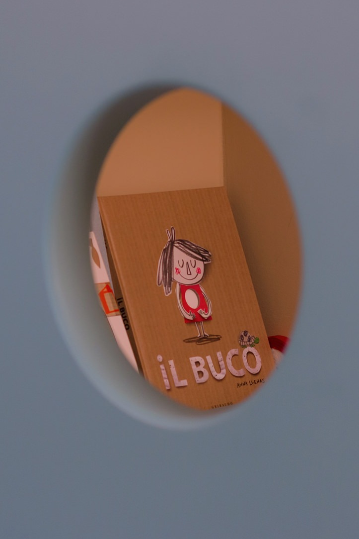
A dedicated space has been created for children with a library made up of titles selected by Ursula Gruner for age groups.
This sweet thought for the little ones can be a valuable help to accompany them in understanding the importance of that moment.

space for children
books for childrens

OUR WORK

We took care of some of the furnishing elements of this imposing structure.
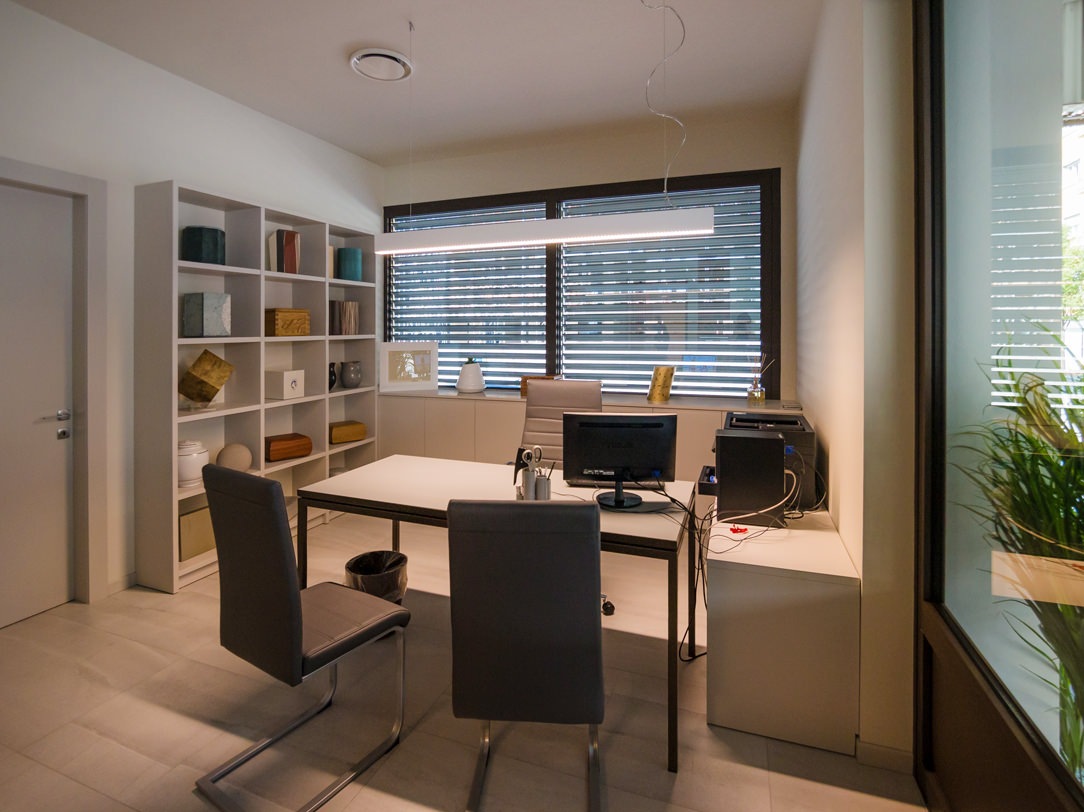
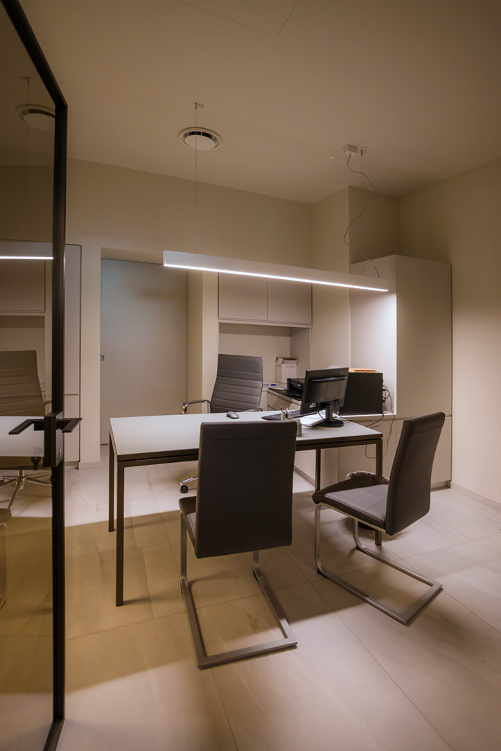
Mainly of the two executive offices, whose goal is to make them operational and functional while maintaining overall elegance and a sense of lightness.
Since the entire Funeral House is very characterized in terms of elements, colors and materials, a very neutral project was opted for.
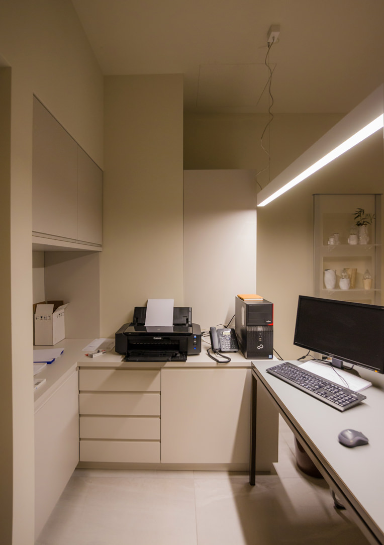
In fact, the furniture, which has the same delicate color as the walls, disappears inside the two rooms and serves only as a logistical support.

big office

Doors and drawers hide folders, files and all the bureaucratic aspect of the structure, leaving only two light tables with a bronze structure in sight.
Here is another example of an office with a similar table structure but in stainless steel finish.
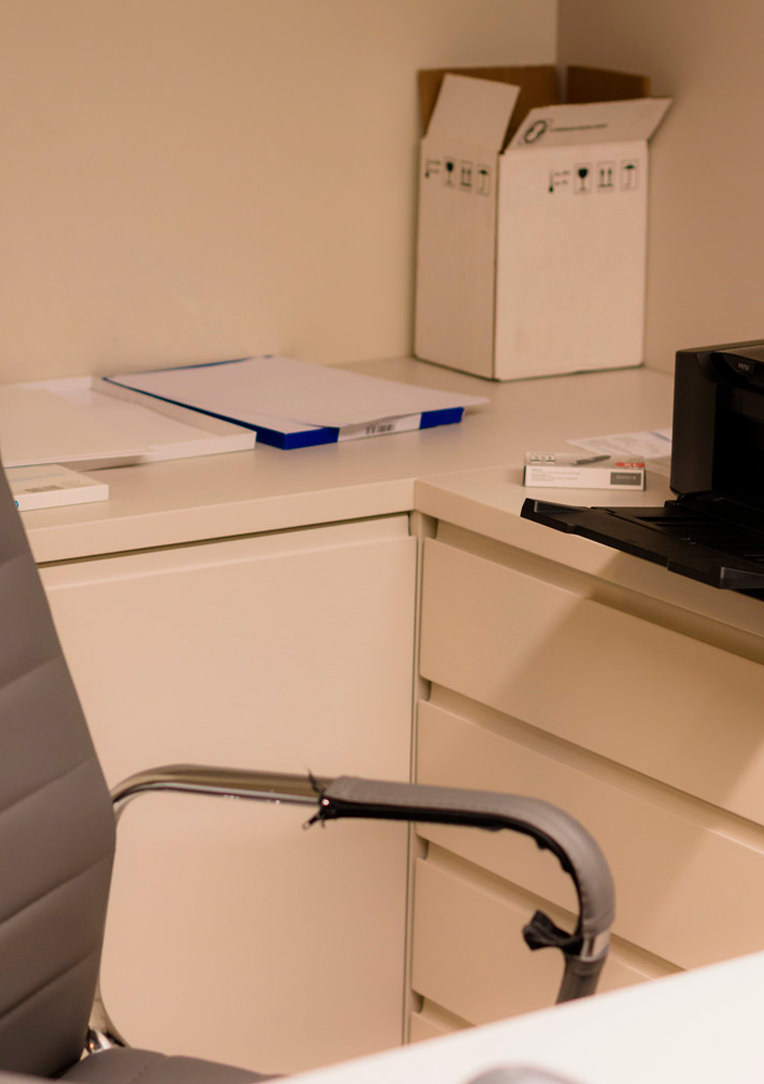
In the smaller office, the furniture from the niches develops in an equipped lateral extension that reaches the table, remaining at its side with a chest of drawers and internal shelves available.
The piece of furniture where the desk rests can be accessed from the side, next to another tall shelf unit.

 small vertical studio funeral house
smal studio lateral
details corner

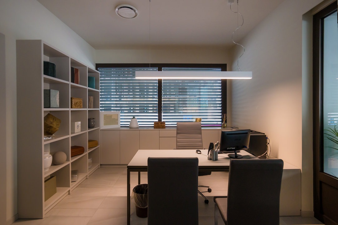
In the second office, larger than the previous one, the furniture is developed in a U shape, using the niche of the large window as the largest equipped surface.
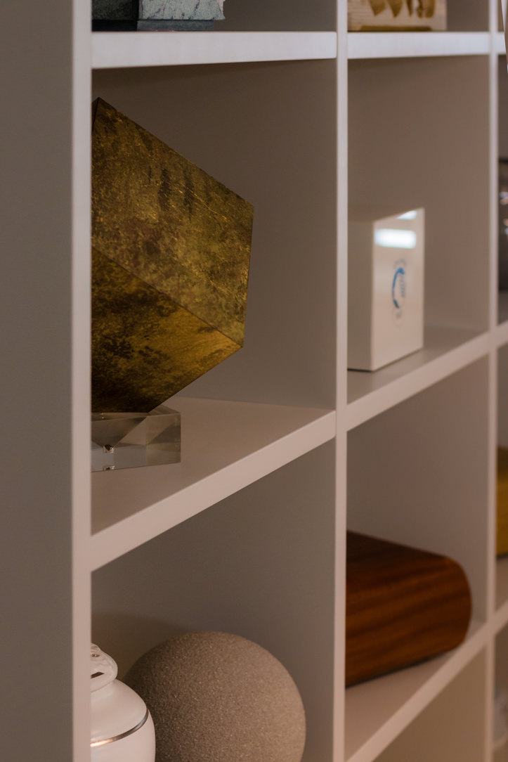
Here, in the center, there are drawers and doors with internal shelves, while the two side becomes an extension and display case for small marble objects and cinerary urns.
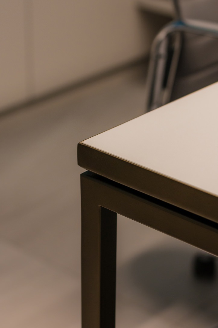
The representative table with bronze painted iron structure and medium gray top in Linoleum is positioned exactly under the spot lighting from the ceiling.

big office
details expo
details table bronze funeral house

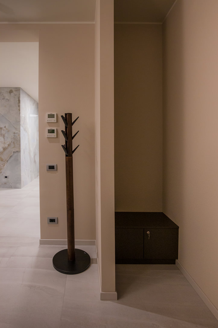
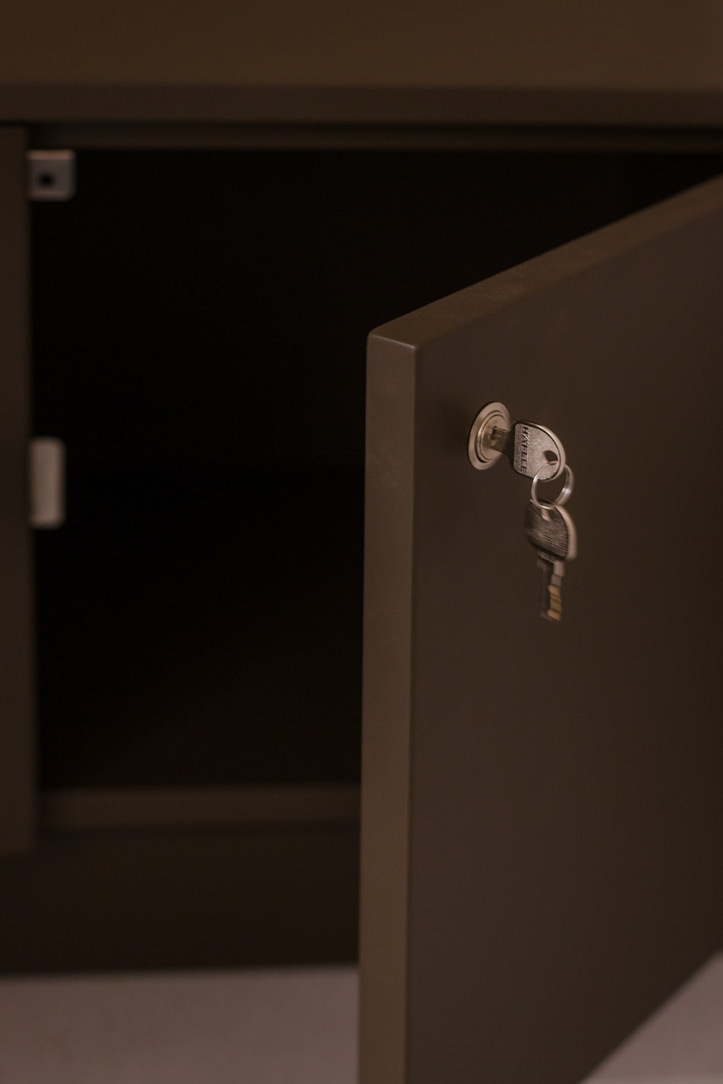
Inside the Private rooms, small storage cabinets equip the room without visually invading it.

drawer units in the funeral house niche
drawer units in the farewell house niche

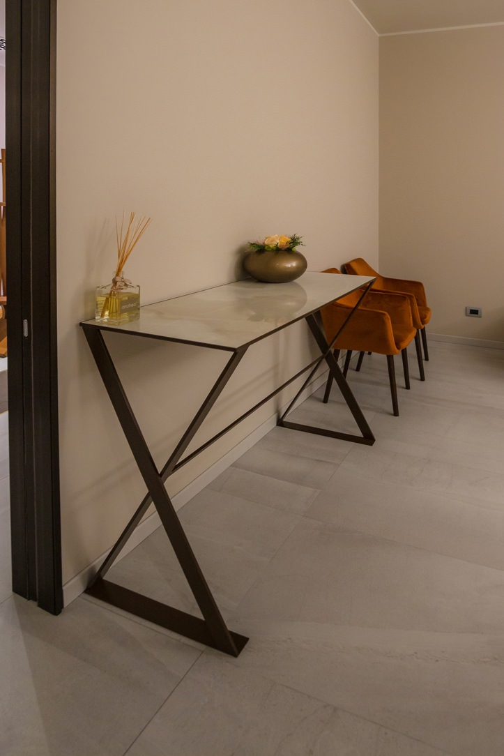
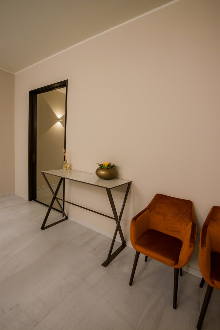
The consoles and tables of the rooms are based on our design, which have been skillfully made in painted folded sheet metal. The design concept was to obtain a light, load-bearing and unobtrusive structure. The console features two side legs with an inverted X structure, in which the narrow rectangular section of the structure changes its axis and is combined with the wide one. This allows for visual movement by varying the perspective of the element. An elegant slab of onyx-effect stoneware has been recessed into the top of the console, on which the Book of signatures will be placed. The same structure, combined with two “cross” side defines the low tables. The base of the latter recall the one of the consoles while the top is made in a round and thin sheet metal. As the color of both a slightly bronzed dark brown, which recalls the fixtures and finishes of the structure.

leg's console
consolle lateral

THE INAUGURATION OF THE FUNERAL HOUSE

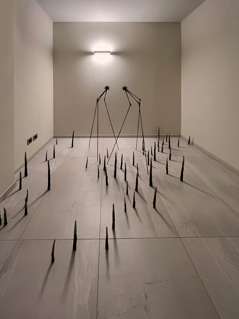
The presentation of the Casa del Commiato was also innovative and interesting. The first access to the public was in fact crowned by a short but intense exhibition, Wish You Were Here. Here the works of 23 artists dealt with a delicate theme such as death, in empty and not yet furnished rooms. “An intimate and spiritual journey of the analysis of absence but also an attempt to crystallize and make eternal that extraordinary emotional tension that originates from the pain of loss, transforming it into a regenerating force. Through the powerful connotation of the place, the artists’ works resonate with the themes of infinity, beyond, melancholy, tension and desire, ensuring that even a painful concept such as absence can become a positive engine of creative production “. (cit. Gabriele Salvaterra) In the Laical Room an installation by Noemi Mirata shows a dying body give way to a new plant life, which rises upwards. On the back screen a video of Elisabetta di Sopra in which the gestures in caring for a life that is born and one that goes are repeated.

Noemi Mirata, La fisica dell’oltre Elisabetta Di Sopra, THE CARE

In the front La fisica dell’oltre Noemi Mirata. Video installation Elisabetta Di Sopra, THE CARE 

At the center of the large corridor is the work of Martina Cioffi made of raku ceramic. The sculpture tends to evoke a powerful nature, mixed animal and vegetable, creative and fruitful.

Martina Cioffi, Shape-shifting #1

Martina Cioffi, Shape-shifting #1 

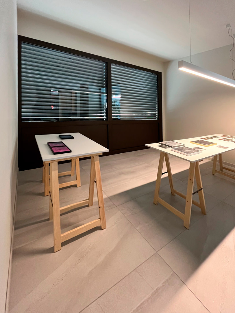
In the smaller office the dreamlike work of Lorenzo D’Alba, in which two alien creatures find their natural habitat in empty space. In the larger office, the photographic series by Lidia Bianchi in which the memory of her father is mixed with Pierpaolo Pasolini’s thoughts on fireflies, a sign of the loss of an original nature, naivety, and amazement.

Lorenzo D'Alba
Lidia Bianchi

Lorenzo D’Alba Echinus and Lidia Bianchi Sono Tornate le Lucciole

These are just some of the installations of the exhibition that developed within all the rooms of the Funeral House. The inauguration took place between 25 and 28 March, exactly two years after the first lockdown due to the Covid-19 pandemic, which especially hit Bergamo and prevented many families from being able to greet their deceased with dignity. After two long years, Generali Onoranze Funebri and the Centro Funerario Bergamasco open a place, in the heart of the city, where death can find space and be included in life.

Optimizing spaces with functional furniture: a studio apartment in Milan

Optimizing spaces with functional furniture: a studio apartment in Milan

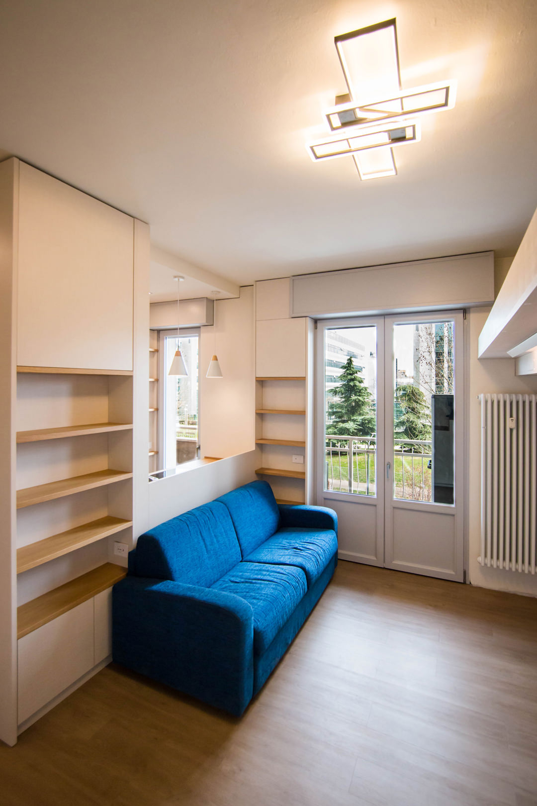
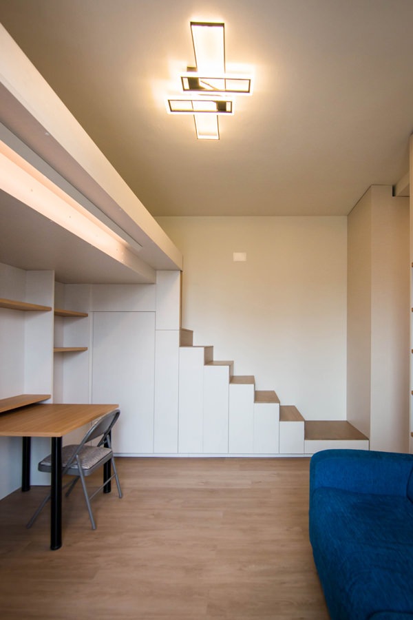
Optimizing space with functional furniture is the design intent of this studio apartment in Milan. The material selection expresses simplicity and naturalness, bringing a contemporary feel to the custom-designed interiors of this cozy home.

living-room-studio-apartment-open-table-position-optimizing-spoaces-with-functional-furniture
studio-apartment-with-furniture-to-optminize-space-01

A cozy looking studio apartment in Milan

We have already addressed the issue of living in small spaces with this minimal style apartment in the heart of Milan. After a few years, the need to optimize spaces has not lost interest but has instead increased the demand for functional furniture. The example of this studio apartment in the suburbs of Milan best expresses the concept of practicality combined with a natural aesthetic line.

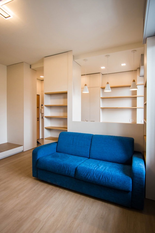
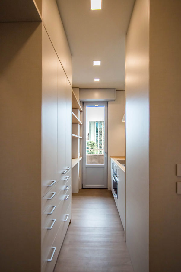
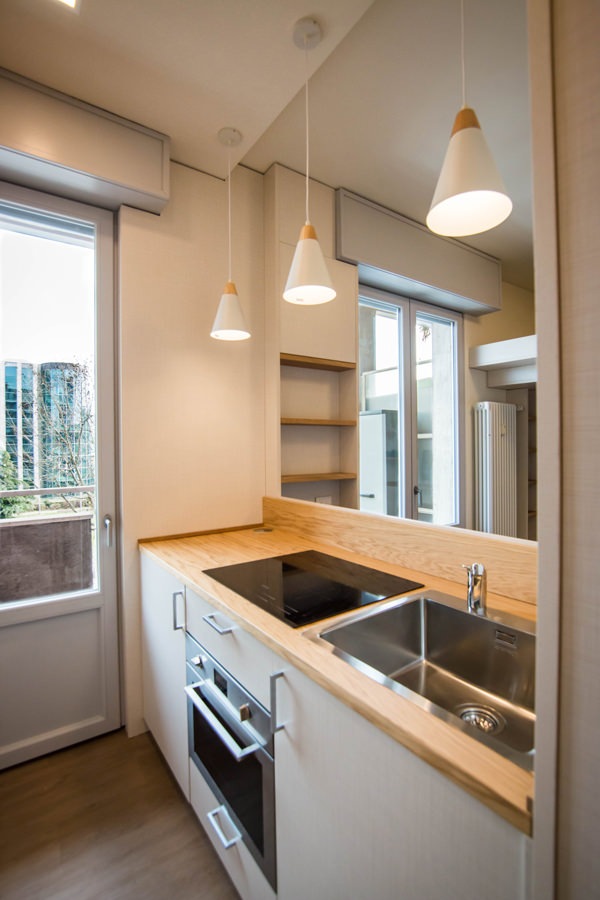
Starting from the original structure of the apartment, the renovation project began primarily with the spatial organization of the rooms. The entrance, working as a filter, acts as a pivot for the management of internal flows. From the front opens the view of the kitchen, essential but well equipped, which visually communicates with the loft living area where a large bed is located.

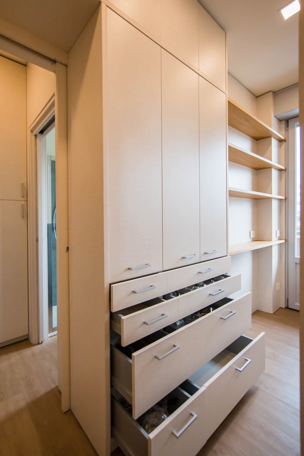
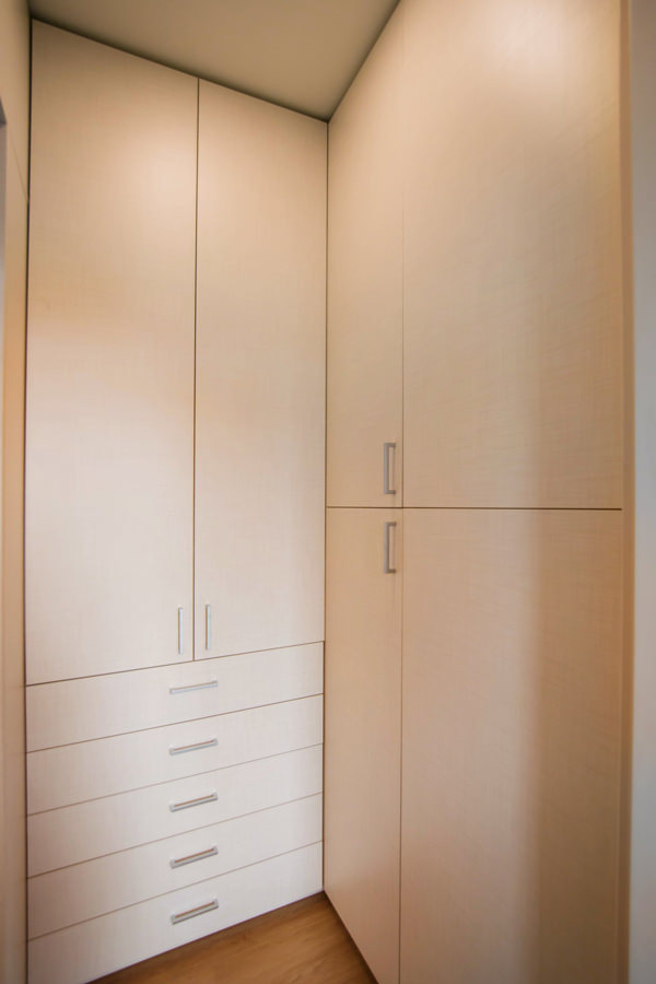
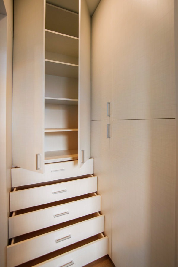
On the left of the entrance is the anteroom, equipped as a closet with service wardrobes. From here, direct access to the bathroom with a large glass shower and sink area with service cabinet.

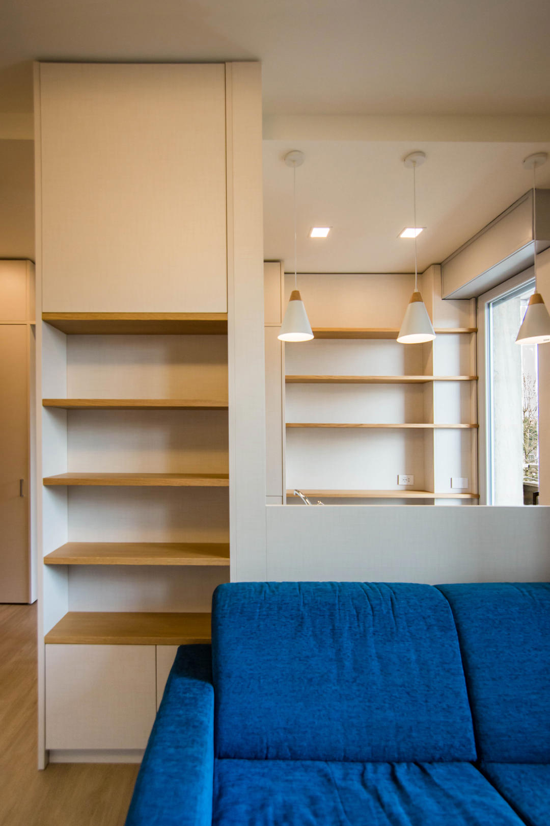
equipped-columns-shelves-and-doors-living-room-optimize-spaces
equipped-wall-detail-furniture-to-optimize-spaces
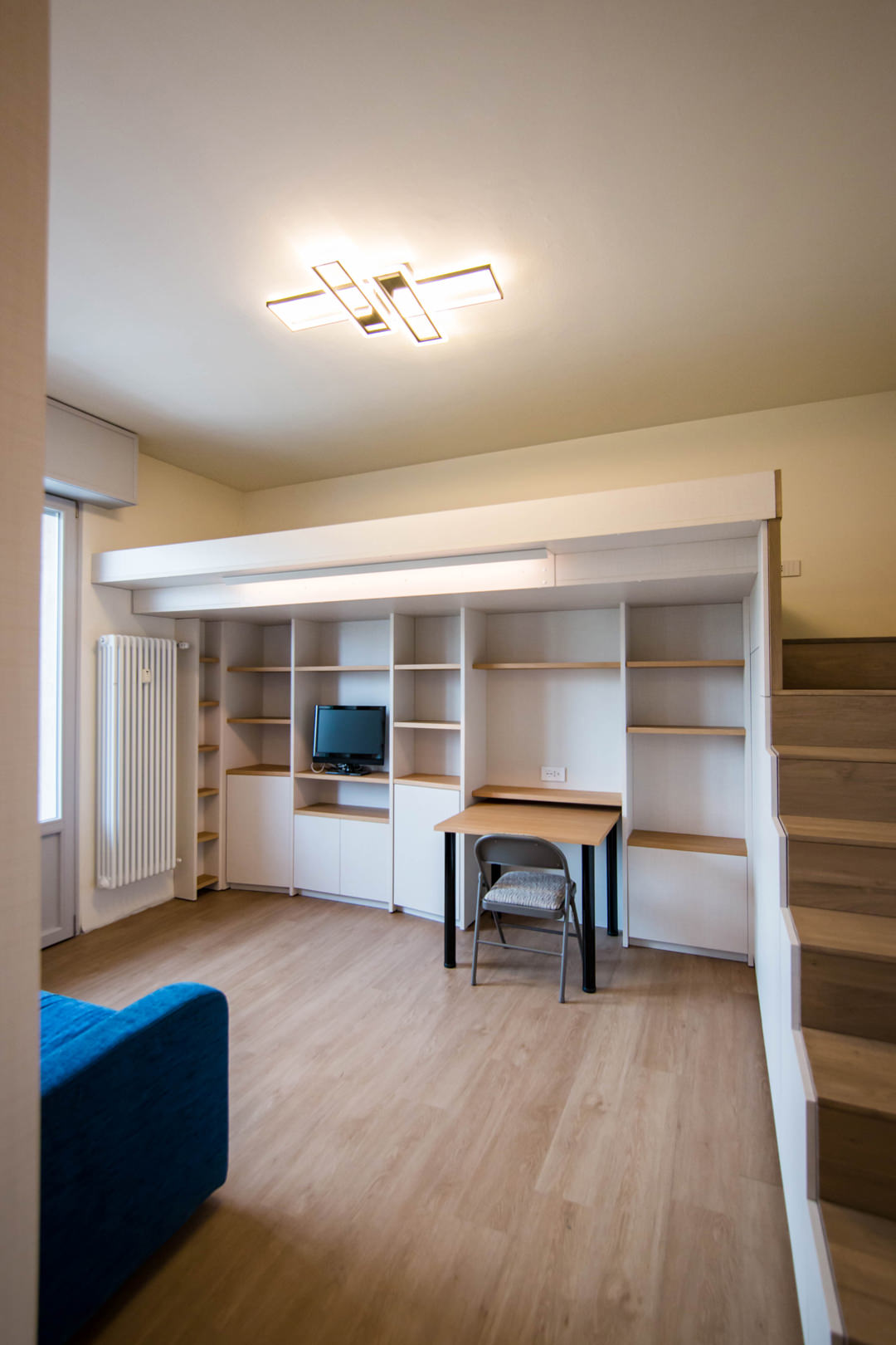
living-room-desk-furniture-to-optimize-spaces
kitchen-access-with-full-height-doors-to-optimize-spaces
side-view-kitchen-with-windows-on-living-room-optimize-spaces-with-furniture

Optimizing space with custom-made furniture

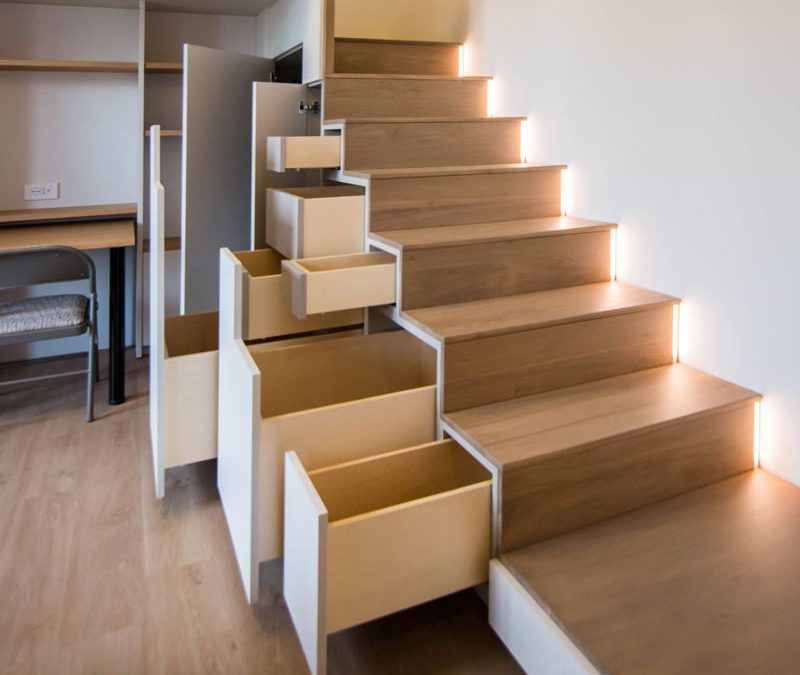
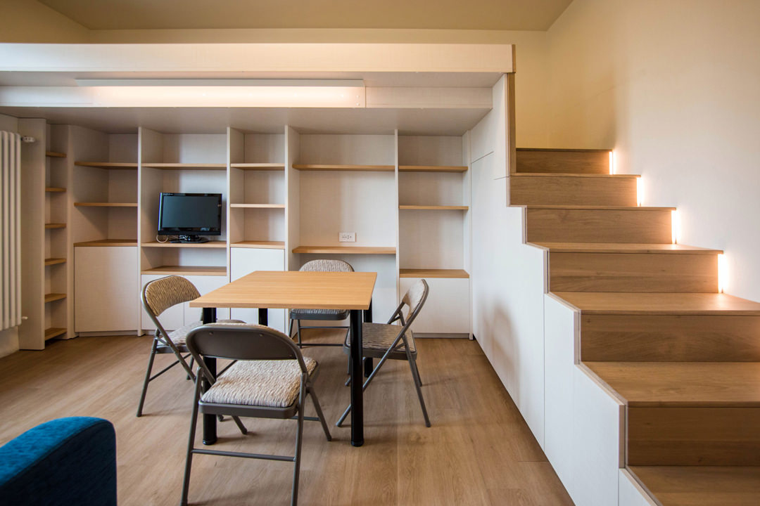
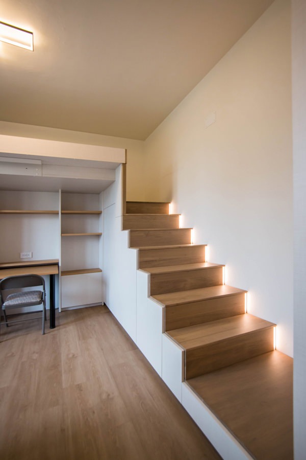
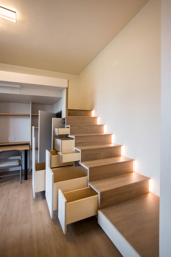
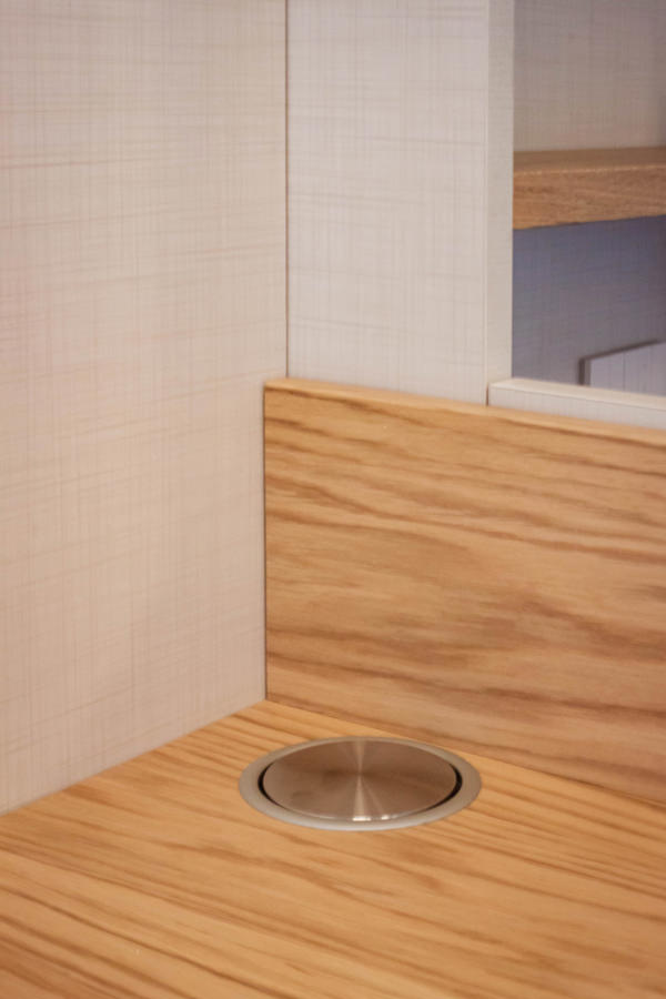
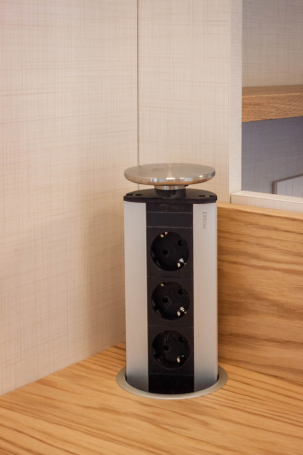
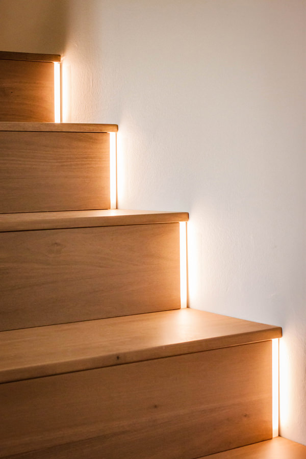
To make the most of the available space, the furniture of this studio apartment has been custom designed by obtaining service rooms from structural voids and architectural constraints. The best example is certainly the creation of the under-stairs compartment with doors and push-pull trays useful for arranging objects of various sizes. In fact, starting from the modularity of the risers and treads of the access ladder to the mezzanine, doors are created with a vertical reading whose opening takes place via push pull. Depending on the need, each internal compartment takes up the space of two or more steps, equipping itself with additional extractable volumes where necessary. From this perspective, the dining table can also be in a resting position, attached to the equipped wall of the TV area and used as a desk, or moved to the center of the room to accommodate other diners.

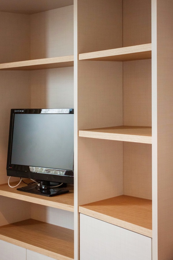
Even the equipped wall, to gain additional service space, is made up of three distinct modules, the sides of which are slightly inclined. The shaping of the different elements allows an optimal management of the architectural corners, also creating a greater sense of welcome.

The architectural void then becomes the new design theme, equipping cavities and niches with shelves and open compartments. This is the case, for example, of the main pillar, incorporated in the dividing structure between the kitchen and the living area. The lower part houses internal shelves accessible through a door with push opening, while the upper part consists of exposed shelves in the niche.

under-stairs-equipped-closed-doors
under-stairs-equipped-open-doors-to-optimize-spaces-with-furniture
living-room-studio-apartment-milan-natural-material
front-view-equipped-under-stairs-compartments
kitchen-doors-to-organize-spaces-drawers-furniture-to-optimize-space
electrical-tower-down
eletrical-tower-up

Functional but also conceptual steps

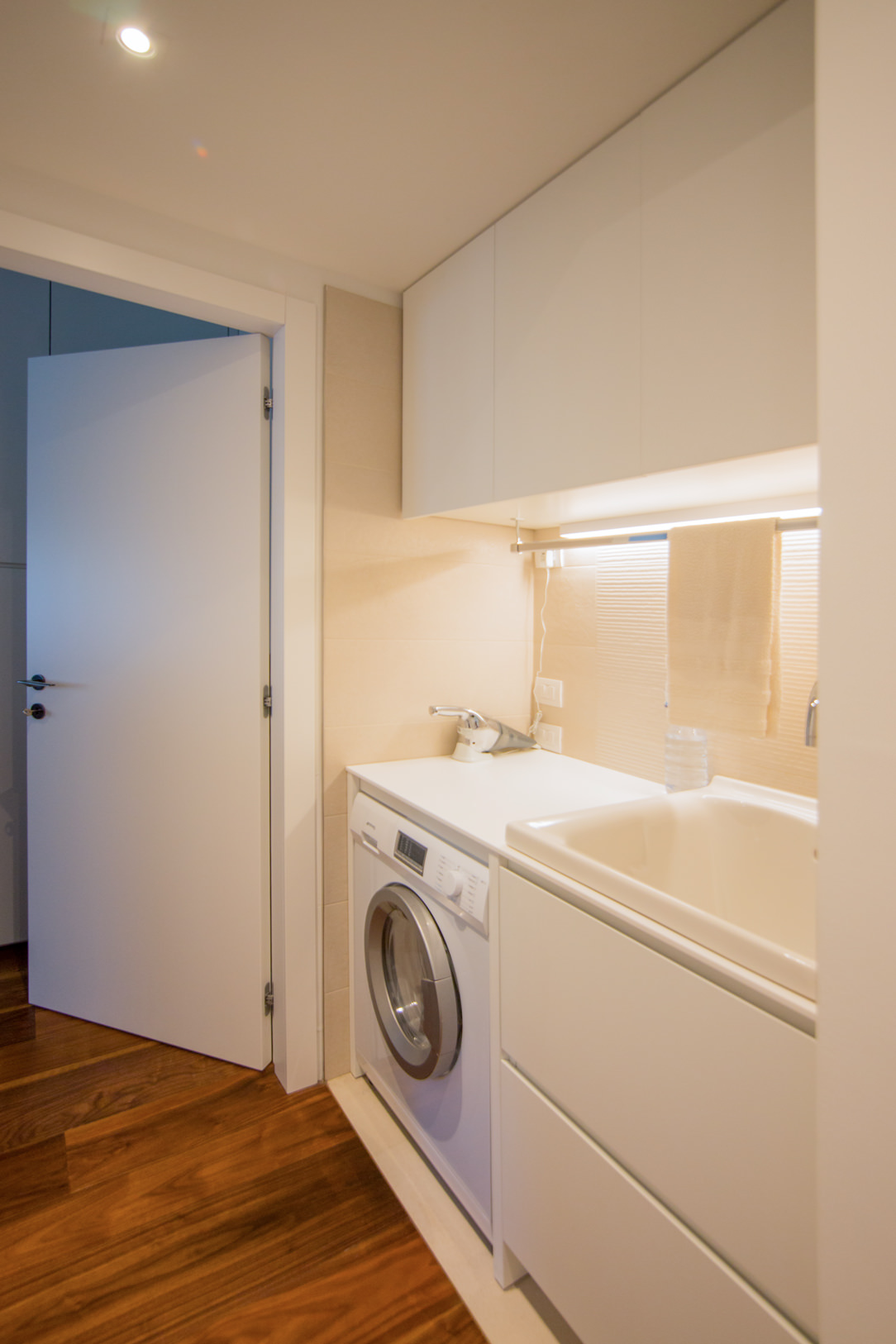
Another focal point is the anteroom, which from an environment required by law also becomes a useful space for the storage of cleaning products and service cabinets. Drawers and doors with height-adjustable internal shelves are used for the products storage of different sizes.

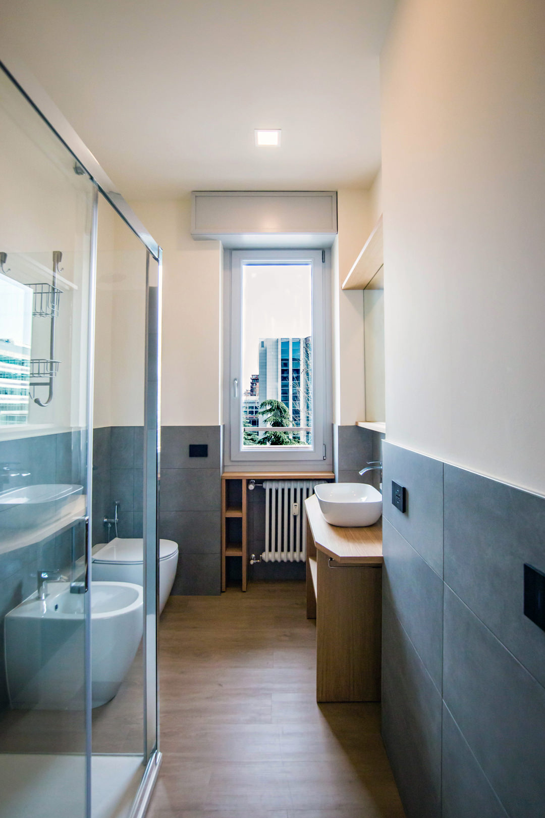
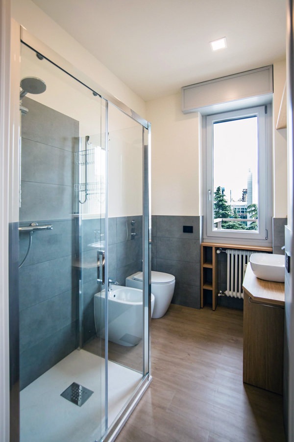
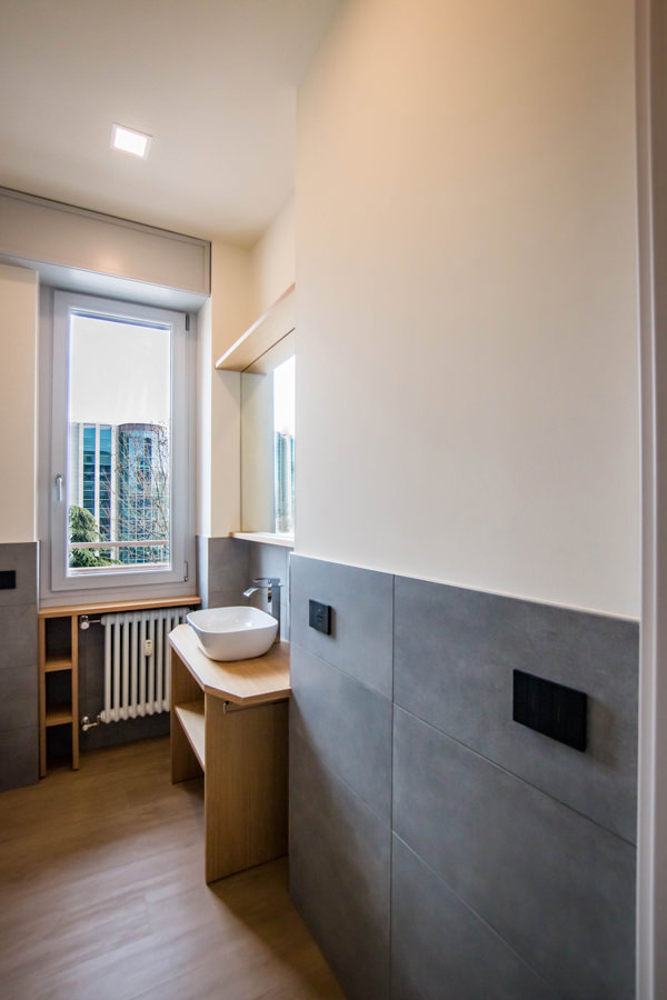
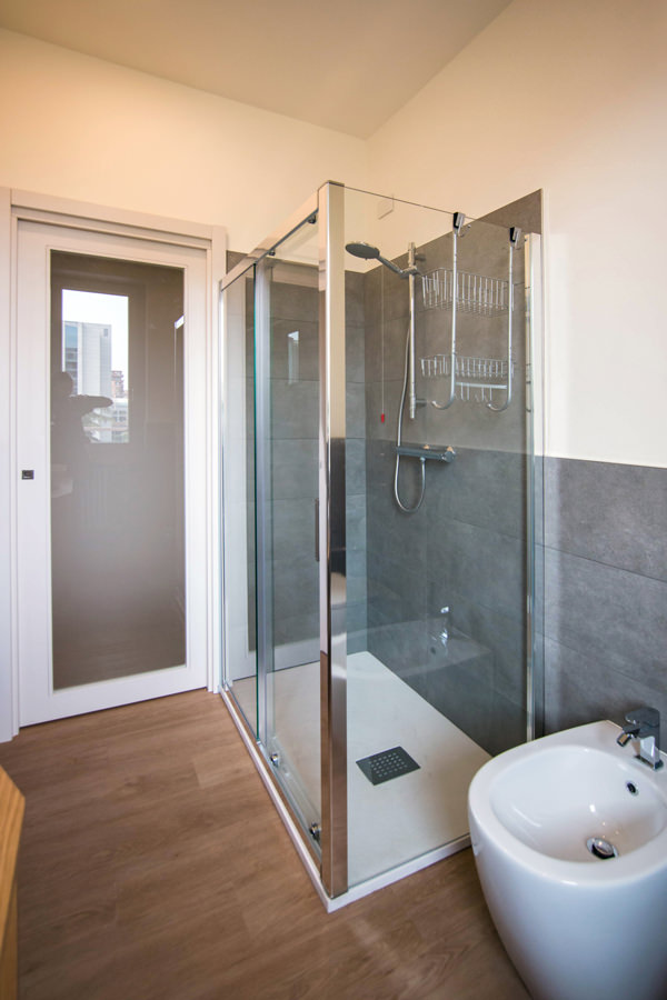
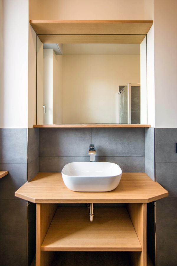
Even in the bathroom, the design of the furnishings in order to make them functional gives life to a large and bright environment. The change of flooring marks the transition not only physical but also conceptual and visual to a more intimate and reserved environment. The front view on the window offers ample natural lighting, diffused throughout the room thanks to the choice of materials. The glass closure of the shower minimizes the aluminum details, while the large mirror attached to the service cabinet expands the perception of space.

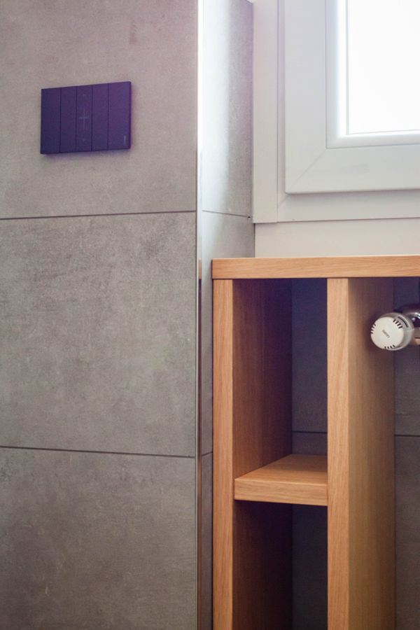
Optimizing the space in the bathroom means taking advantage of all the service cavities: an example is the open oak cabinet under the window. The service shelves for toilet paper and small personal hygiene products in wooden finish in fact obtain their space on the side of the radiator, without however being oppressive. Small accessories such as the pull-out towel holder enrich the functionality of an aesthetically simple and clean bathroom cabinet. Simple and authentic forms are thus valued.

equipped-anteroom-service-cabinet
optimize-spaces-with-functional-anteroom
contemporary-bathroom-gray-furniture-to-optimize-spaces
contemporary-bathroom-glass-door-shower
bathroom-studio-apartment-milan-optimize-spaces
glass-shower-bathroom-contemporary-gray
shaped-furniture-wood-bathroom

Natural colors and materials for a contemporary studio apartment

The practicality of the furnishings is not only found in their composition and spatial arrangement, but also in the choice of materials that characterize them. For horizontal surfaces, the choice fell on oak, a natural wood par excellence with great resistance and workability characteristics. Its aesthetic line with warm veins makes it welcoming and transmits spontaneity and tradition. From the parquet floor to the kitchen top and shelves of the open compartments, its presence becomes the touch of authenticity of the stylistic line adopted. For the vertical surfaces, on the other hand, the canvas bilaminate was chosen, whose warm but neutral tones make it delicate but incisive at the same time. Among the major advantages of this material, it certainly has high resistance combined with a very affordable price. Its finish also makes it soft to the aesthetic impact and textured to the touch, expressing attention to detail.

detail-LED-light-stairs
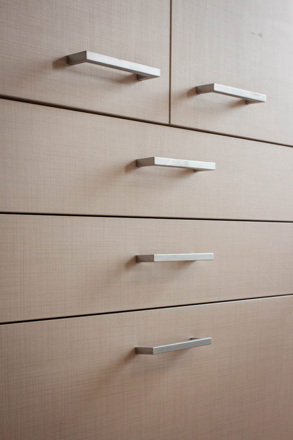
detail-canvas-bilaminate-doors
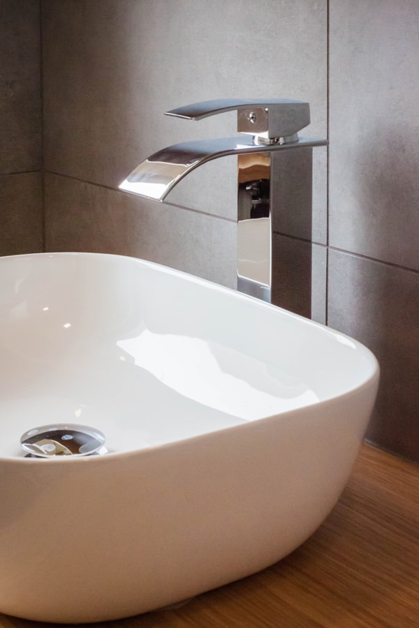
bathroom-countertop-basin-design-tap
detail-customed-bathroom-furniture

The renovation of this studio in Milan involved all levels of reading of the project. From the planimetric distribution of the rooms to the choice of materials and finishes. The choice of functional furniture allows you to optimize spaces by providing environments that are not only aesthetically pleasing but also practical and easily livable.

Architectural voids and structural elements hide great potential, just look at them with creative eyes!
To see other examples of small rooms optimized in spaces with functional furnishings, you can take a peek at this minimal style studio apartment or at this shabby chic style creation

How to equip a bathroom with laundry corner

How to equip a bathroom with laundry corner

A functional and aesthetic analysis of the laundry corner. An environment that in contemporary reality is forced to give up its autonomous room to blend in a small bathroom or equipped corridor. The aim is giving space to the services that define our daily life, making them aesthetically interesting.

laundry corner

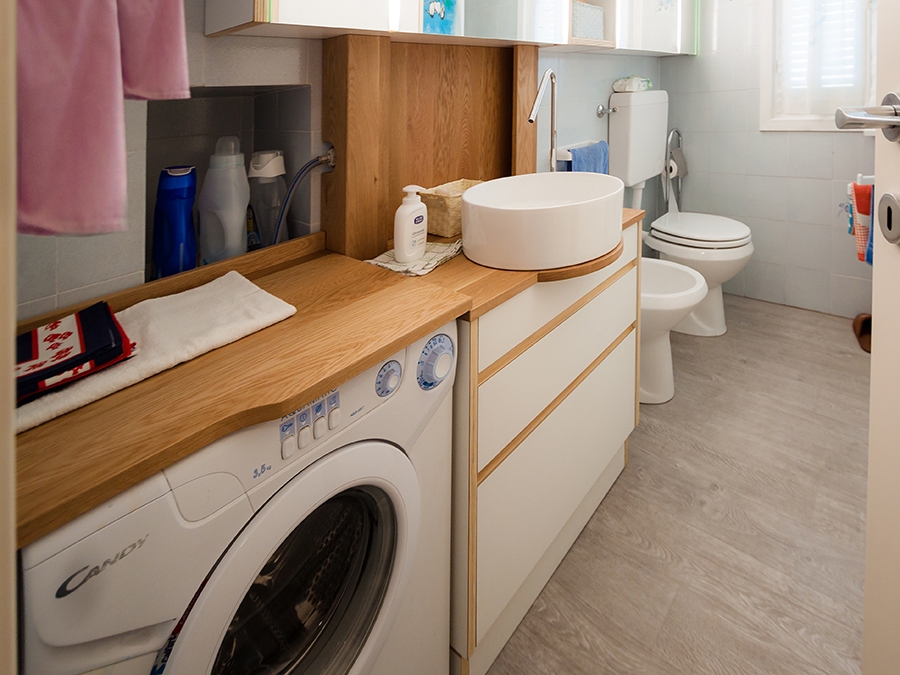
Laundry corner with showed washing machine, basin and compartments furniture

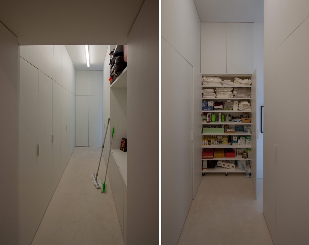
equipped corridor

Optimize spaces equipping corridors with serviced wardrobes View the project

Space to services

Speaking of interior design, we are used to imagine elegant living rooms and modern kitchens, contemporary bedrooms and essential-style dining rooms. Over the past few years , the interior design has increasingly taken on the aesthetic meaning of architecture. Let’s remember, however, that design was born as the perfect combination between aesthetics and functionality. The morphology of furniture is nothing else than the natural result of perfect efficiency. It is exactly with this spirit that we want to highlight those “corners of the house” that we usually tend to hide because they are not “beautiful” even though they are basics in the functionality of our domestic spaces. The project layout of each house gets us used to dividing rooms between “living area” and “bedrooms”. The first includes all those rooms that are used to welcoming guests, designed with the aim of return the best public images of the owners. In the “sleeping area”, the most intimate and personal rooms of the owners come to life. However, in this typological distinction are missing all the rooms which, whether private or public, carry out a real function. Among these, just think of the laundry room, which over the years has changed its conformation adapting to the needs of the time.

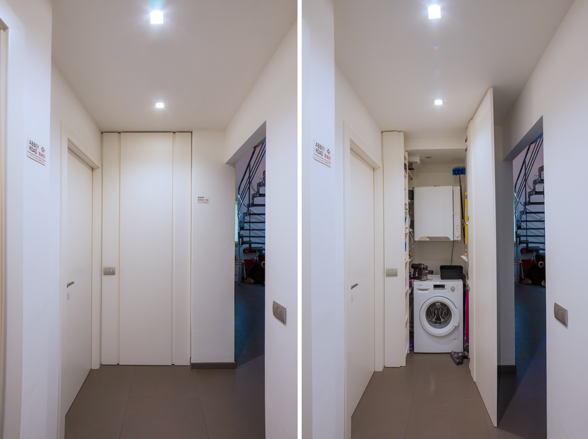
washing machine recess

A laundry niche uses the available passage corner to house the washing machine and shelves View the project

From public washrooms to bathrooms equipped with laundry corners

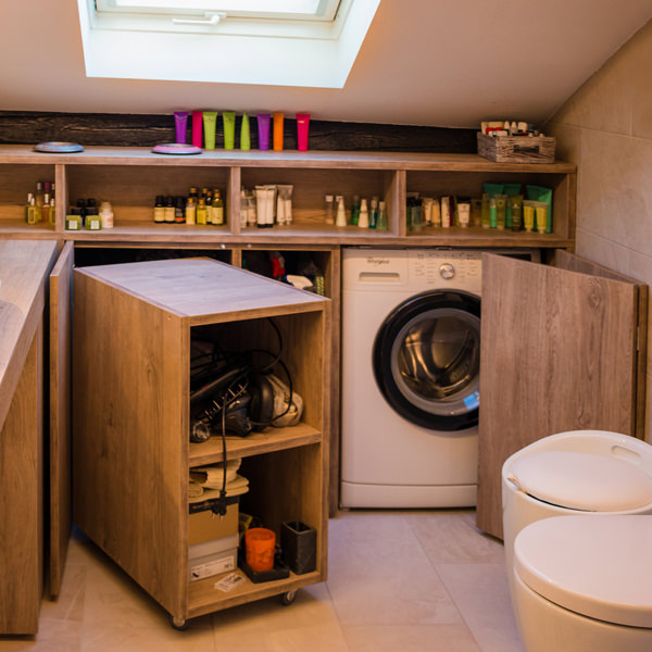
Over the years, the home laundry has become increasingly important in private houses. Whole rooms were equipped with basins and ironing corners, which gradually witnessed the coming of appliances capable of simplifying manual work and obtaining excellent results. Private rooms that replaced the traditional public lavatories for an increasingly elitist concept of personal care and cleaning. The widespread use of washing machines, and modern dryers, has meant that laundry rooms take up less and less space inside private houses. Furthermore, in the contemporary vision of the house, open spaces have swarmed the architectural panorama more and more, reducing the functional closings to the bare minimum. As a consequence, to optimize space, the laundry room is often eliminated in favor of bathrooms equipped with washing machines, dryers and service cupboards. Making the appliances “invisible” was the next step. Here then come equipped wardrobes able to hold not only washing machines and dryers but also baskets and pull-out compartments for cleaning products.

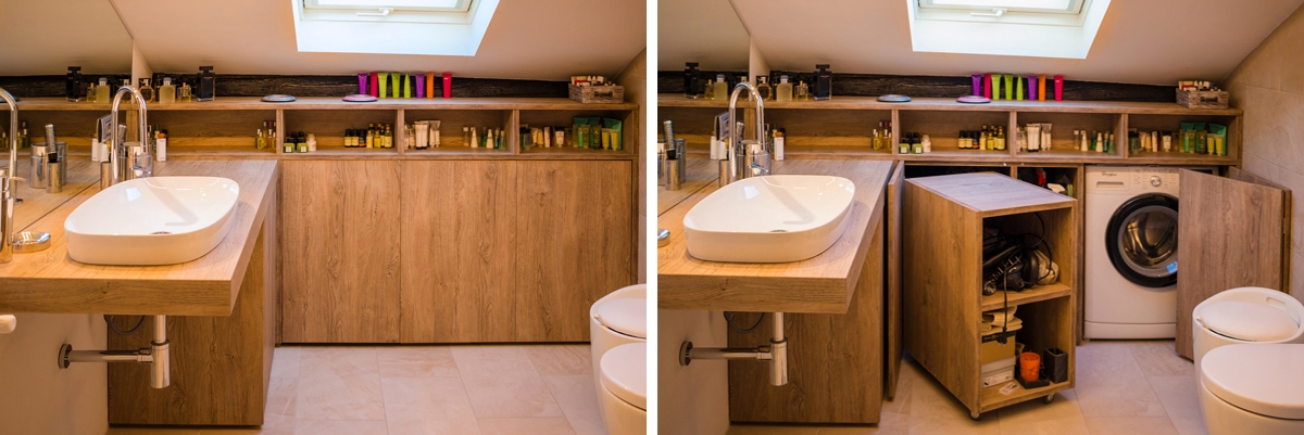
laundry bathroom detail

A bathroom with contemporary wooden surfaces hide extractable functional elements. View the project

Composition of a laundry-corner

Equipping a bathroom with a laundry corner first of all means providing an insertion point for the washing machine. This can remain visible, favoring the opening of the porthole without interfering with any surrounding doors or being built-in the washbasin cabinet. To better hide the washing machine, however, it is necessary to provide a service cabinet that rests on the ground. It means excluding suspended solutions or light supports, and study a customed solution that allows the opening of the tray and the easily maintenance of the appliance. To this is often added a service cabinet with internal shelves and removable baskets that can contain cleaning products and accessories of different sizes. Often these latter two solutions come together in one, with folding or sliding doors, which act as a closure for the furniture element. Internal accessories such as dividers and hanging elements are additional options that can make the space more functional and optimize the overall dimensions.

bathroom with washing machine in view

The bathroom cabinet with wooden top and finishes houses the washing machine View the project

bathroom cabinet with open drawers

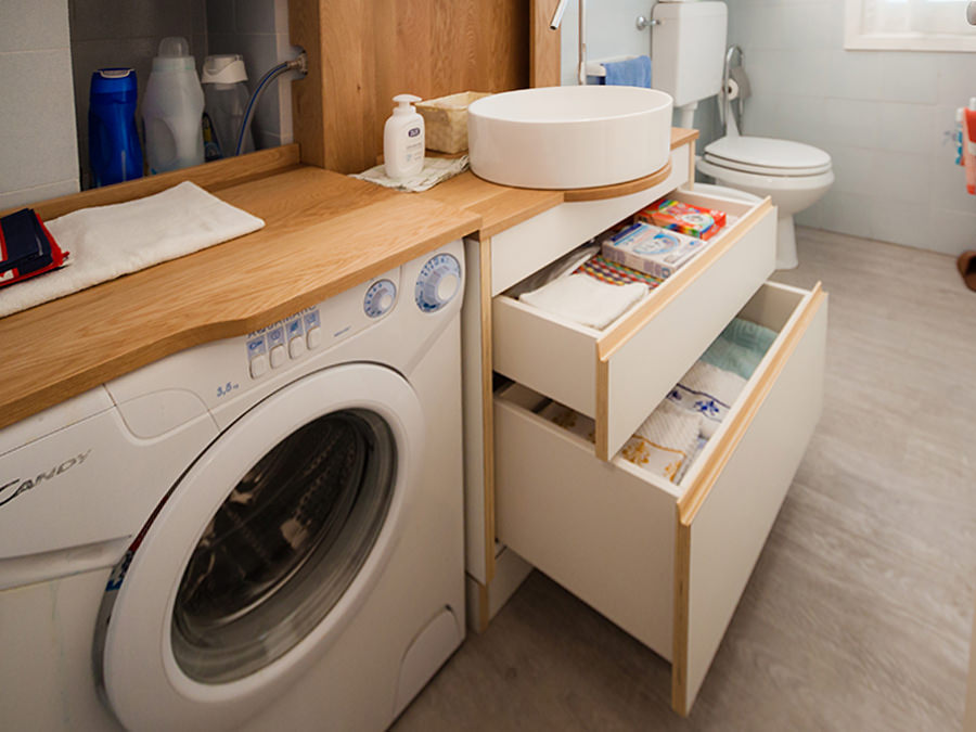
Drawers of different heights are extremely functional elements for organizing personal products View the project

bathroom service closet

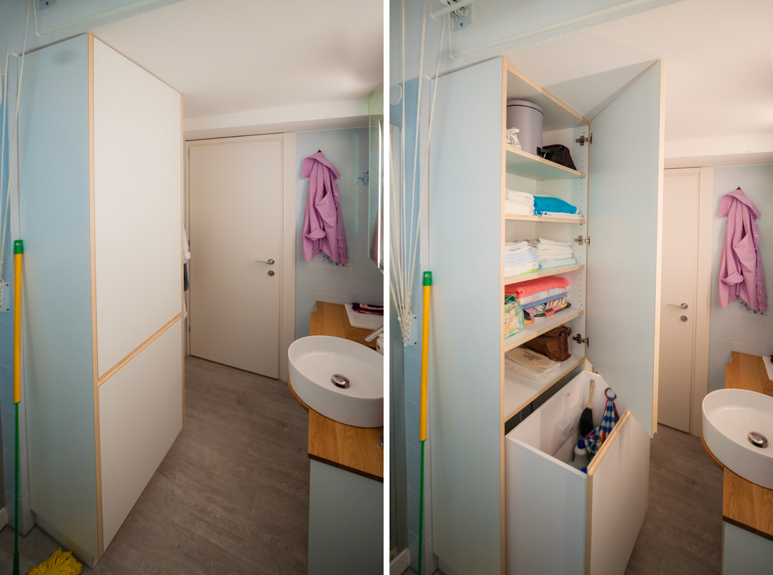
A large service cupboard with internal shelves and removable basket for the bulky products View the project

It is the functionality that defines the composition of these equipped corners. Our task is to optimize spaces in the best possible way by creating practical and aesthetically satisfying solutions. Whether they are service points hidden in other rooms or clearly visible and recognizable elements, it is essential to be able to organize them in the best way, using all the available centimeters without however giving shape to narrow solutions.

Organize rooms with a secret library

Organize rooms with a secret library

Organize the room can be a difficult task, especially if this room is small and not very functional, but often the solution is just around the corner: in this case, around a corner library which hosts a secret door. THE PROBLEM ANALYSIS THE PROJECT PROPOSAL COLOURS, SHAPES AND MATERIALS THE ADVICE  

THE PROBLEM ANALYSIS

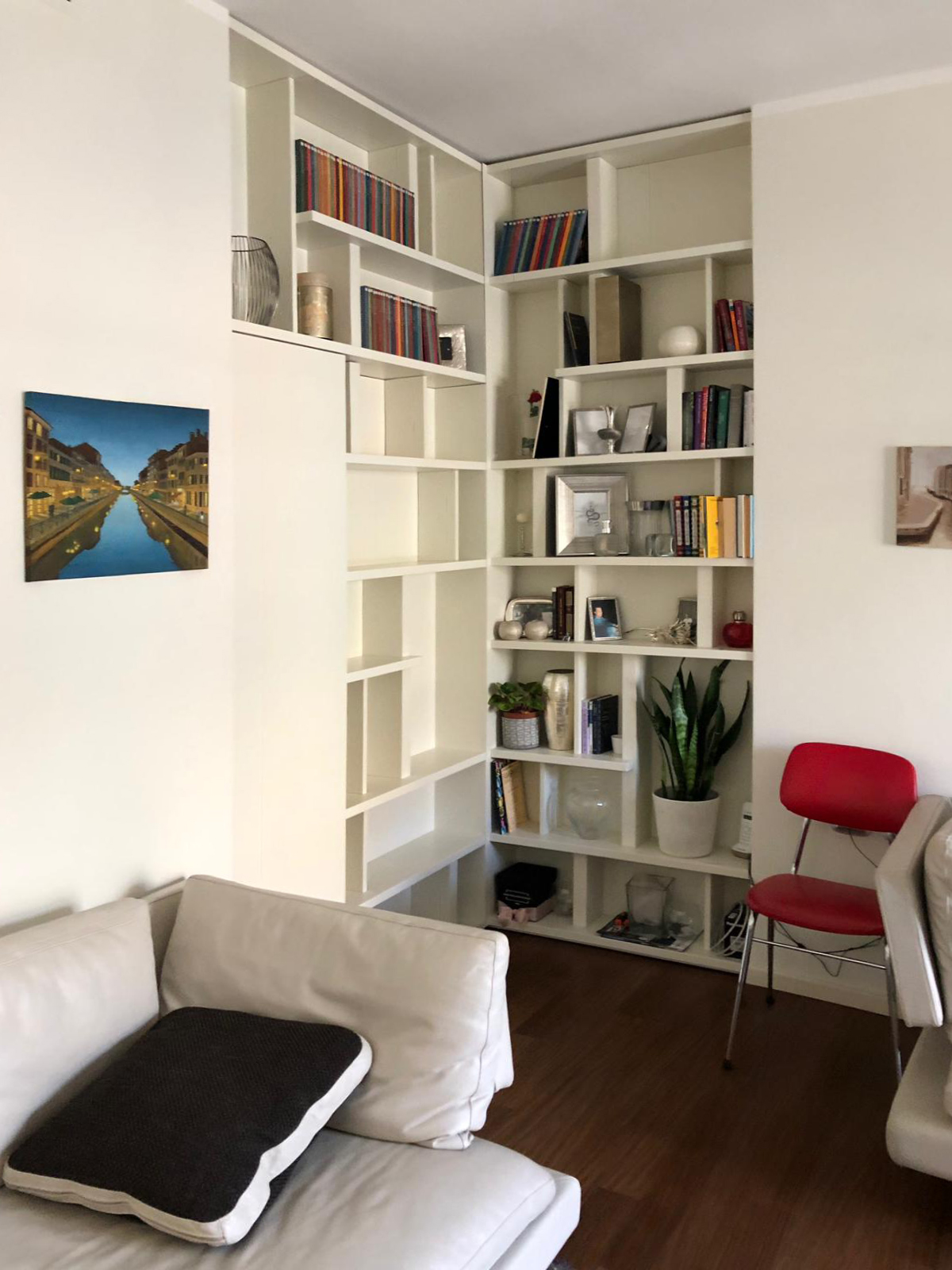
Living in big cities often means to interacts with the lack of space and environments with small dimensions. In those contexts, the functionality it’s an indispensable design element: It allows us to take the most advantage from each room without sacrificing comfort and aesthetic values, while at the same time it solves important problems. The functionality is not just the added value to our interiors, but first at all a stylistic key. A proof of that is this Milan’s apartment. The entrance overlooks a comfortable and contemporary living room characterized by light colours of walls and furniture which create a contrast with an elegant wooden dark floor with which it harmoniously communicates. The design challenge provide for two mainly solutions: on one hand the lack of a real library, which can easily become a characterized element of the room showing at the same time small design object and souvenir able to describe the personality of its inhabitants. On the other hand, the need of hide the bath entrance which is more intimate and private, whose door faces directly in the living room, in a contact view with the entrance hall.  

THE PROJECT PROPOSAL

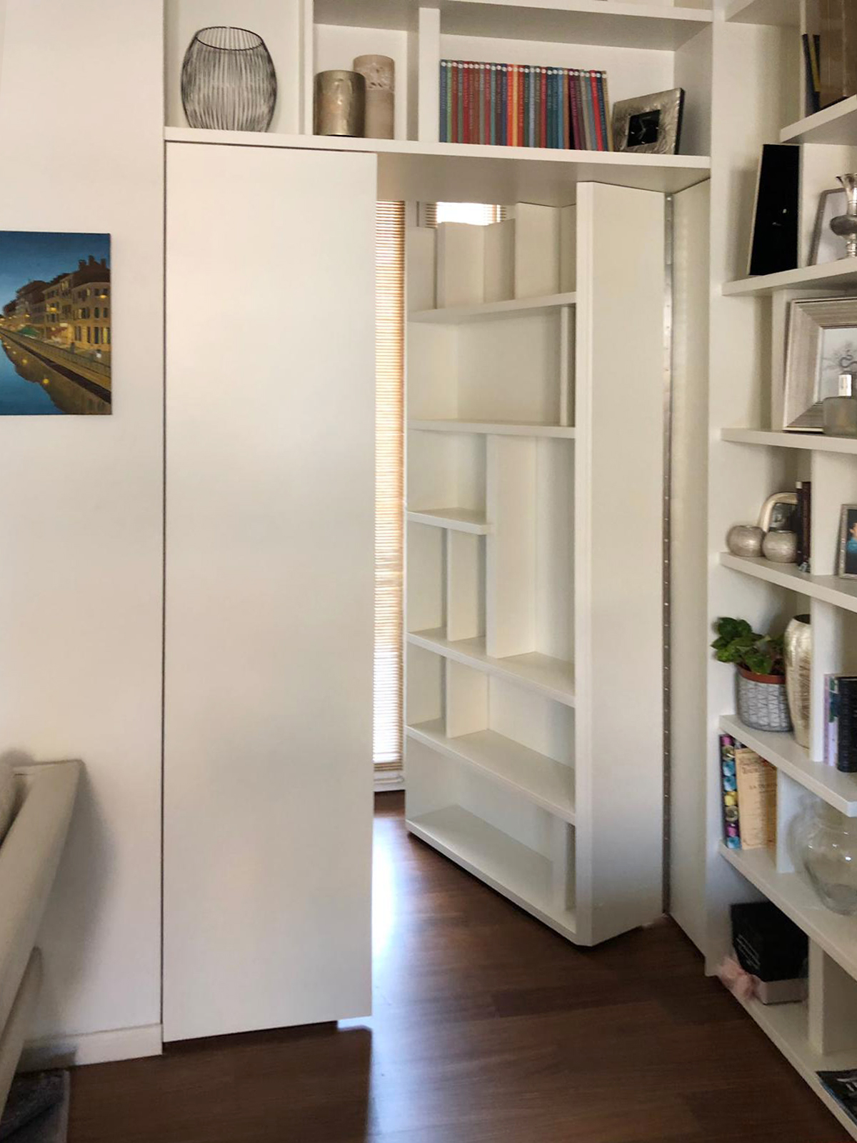
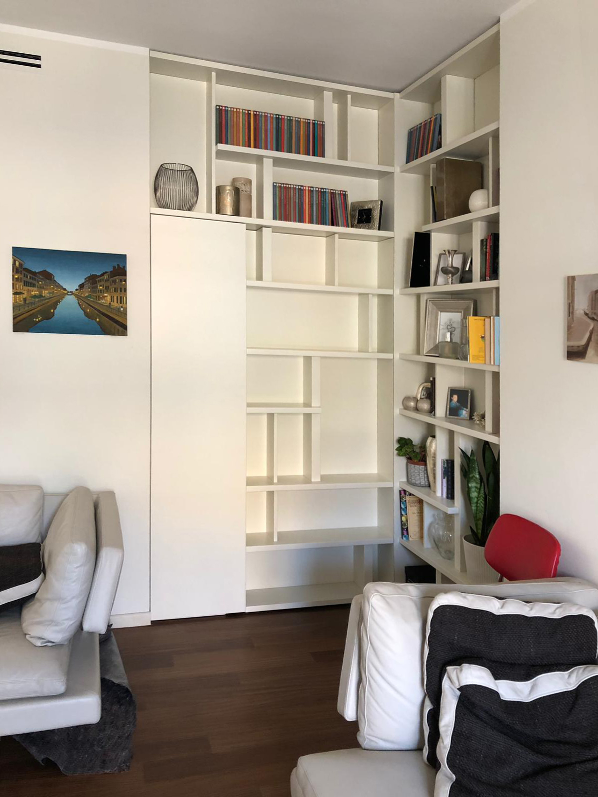
The design solution manages to solve both problems in a single functional element: a wall unit able to provide display support for books and small objects and, at the same time, combines the real bathroom’s door. A dynamic bookcase that reflects the intentionally asymmetric layout in both corner elements. Taking advantage from the corner position, in fact, the two different components of the bookcase are organized as autonomous elements whose shelves could easily become the stylistic line enable to give rhythm and harmony.  This, defines the internal recess of the library which allows the management of exposed elements as a costumed setting, a sort of display windows of the inhabitants’ personalities. The entrance to the bathroom takes place with complete discretion, as a sort of a real “secret passage”, activated by pressing. In particular, the door consists of a fixed narrower shutter, even equipped in the bathroom’s ambient, and a main shutter that in its external side has a considerably bigger thickness than the traditional in order to accommodate books and small objects.  

COLOURS, SHAPES AND MATERIALS

The contemporary imprint is visible both in the graphic layout of the library, which combines full and empty space in perfectly harmony as in a typographic composition, but above all for the material and chromatic choice. In particular, a white opaque lacquered MDF was chosen to create the partition wall. This because it allows a better versatility clearly visible for example, in the different thickness with which were made the numerous internal shelves. The 9010 white recalls the dining’s wall and the contemporary furniture, inserting itself without intrusiveness in the room but at the same time managing to define the stylistic print.  

THE ADVICE

No problems had to remains unsolved! Sometimes a furniture element becomes the custom-made solution able to solve in the best way different problems, as it can be the lack of space or the need to divide rooms.

The wall units perfectly combine elegancy and functionality and can also contain hidden mechanism to take the most advantage from its practicality. A mechanism that can also be fun! Divide the rooms has never been so easy, a library with a secret door it’s enough.

 
corner secret library
open door corner library
closed door corner library