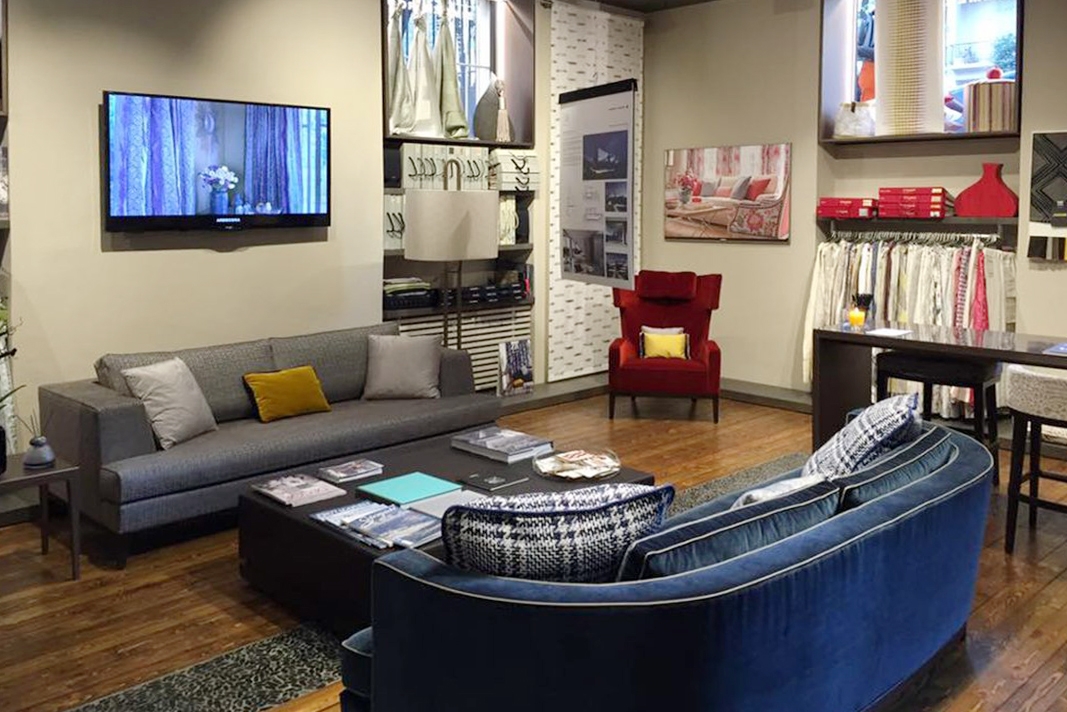
Here a preview of the new Zimmer Rohde showroom just inaugurated in Via Fratebenefratelli in Milan. An exhibition space where fabrics are the protagonists, expressing their uniqueness. Arranged on two levels, the project by architect Fernando Mosca provides for the basement a very large environment for the exhibition of the products and the offices, while the customer sale service takes place on the upper floor. The refinement and detail’s care of the fabrics showed is visible even in the particular finish of the furnishing. Addressing an elite clientele, the choice of furnishings also reflects an almost obsessive attention to detail. This is primarily visible in the choice of materials and in its finishes. Ash imitating tabu applied counter-silk, dark gray stained ash with Bolivar finish and bronze metallic lacquer. Materials and finishes interchanges in a tale of elegance and refinement that involves all the display elements that we dealt with.
BASEMENT FLOOR
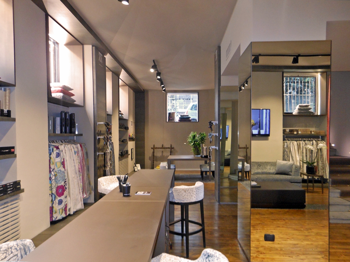
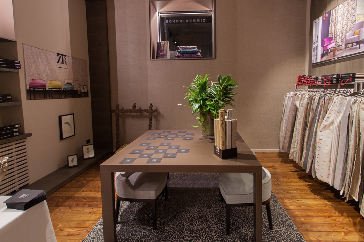
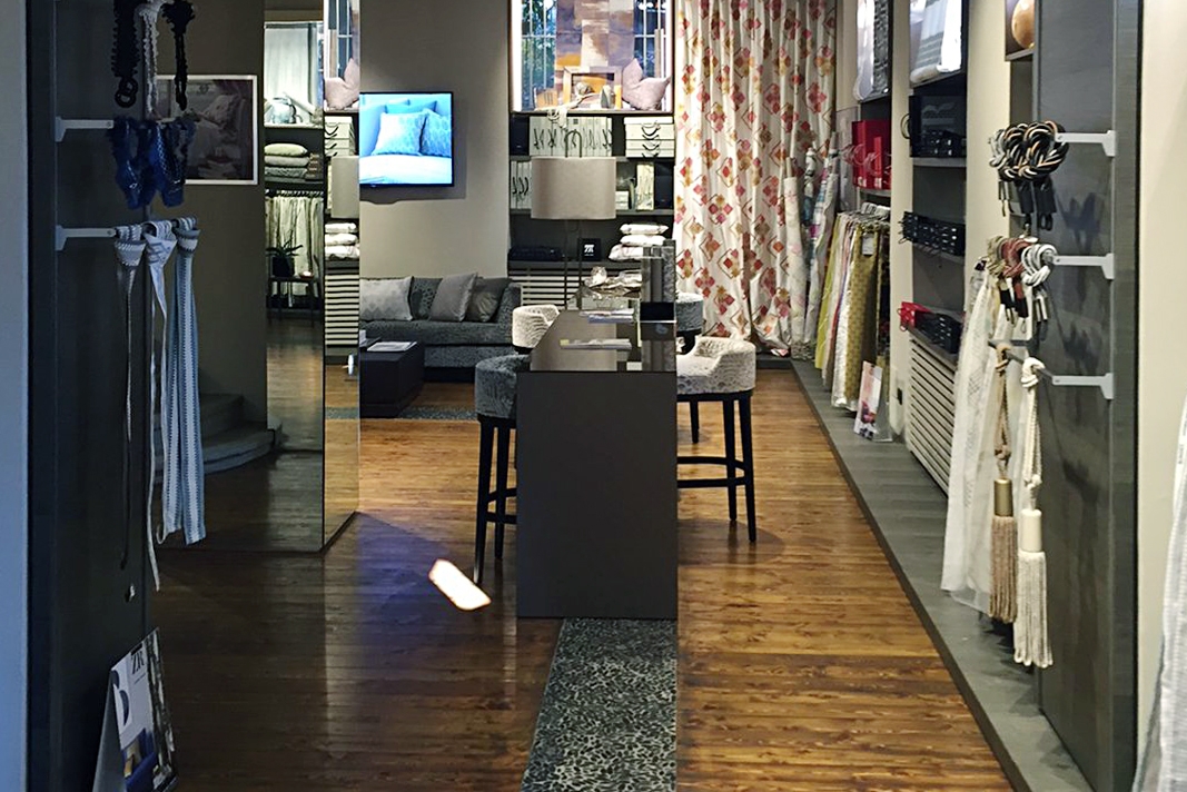
The table with an important but extremely clean presence mostly respond to the bronze finish, providing a uniform and suggestive background for the products on display. Concerning shelves and window frames instead, the ash is the choice. It characterizes the interior without overloading it with visual elements. The basement floor uses the raised windows to provide natural lighting and setting them up with a contour profile in order to equip them as shop window. These are in fact visible in the external view at the walking level, offering the opportunity to have small shop windows at regular intervals. For this reason, the internal frame element also incorporate lighting in order to function as a real showcase both during the day and in the evening. To characterize the interior, we can find the alternation of full-height branded panels with equipped niches carved into the masonry. These are mostly characterized by the presence of linear profiles able to support the weight of the exposed fabrics. Display profiles are also present in full-height panelling, hosting small object and samples. Another showing system is provided by the shelves, whose dark colour given by the wooden essence, elegantly fits in harmony with the frame element of windows. Both emerge from the white background paint creating an extremely refined contrast. To broaden the perception of space and to create a suggestive ambient, the mirror coating of some pillars takes place. It is also taken up in the ceiling that leads to the sales offices.
UPPER FLOOR
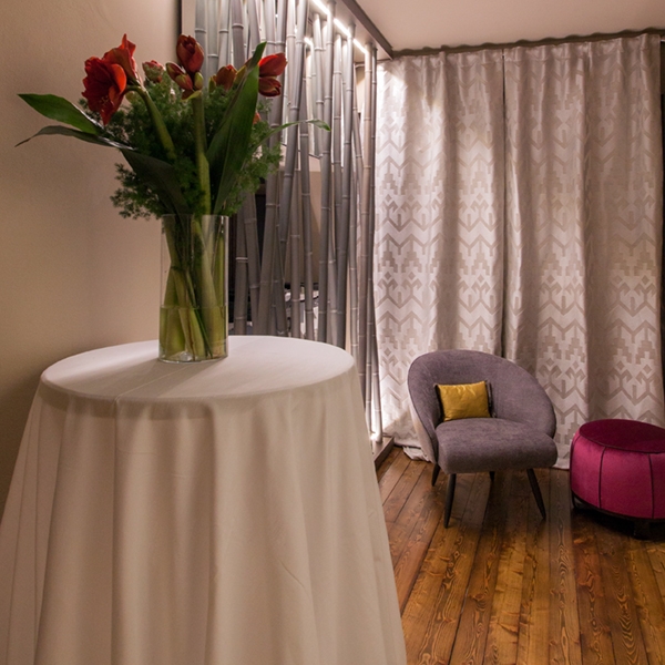
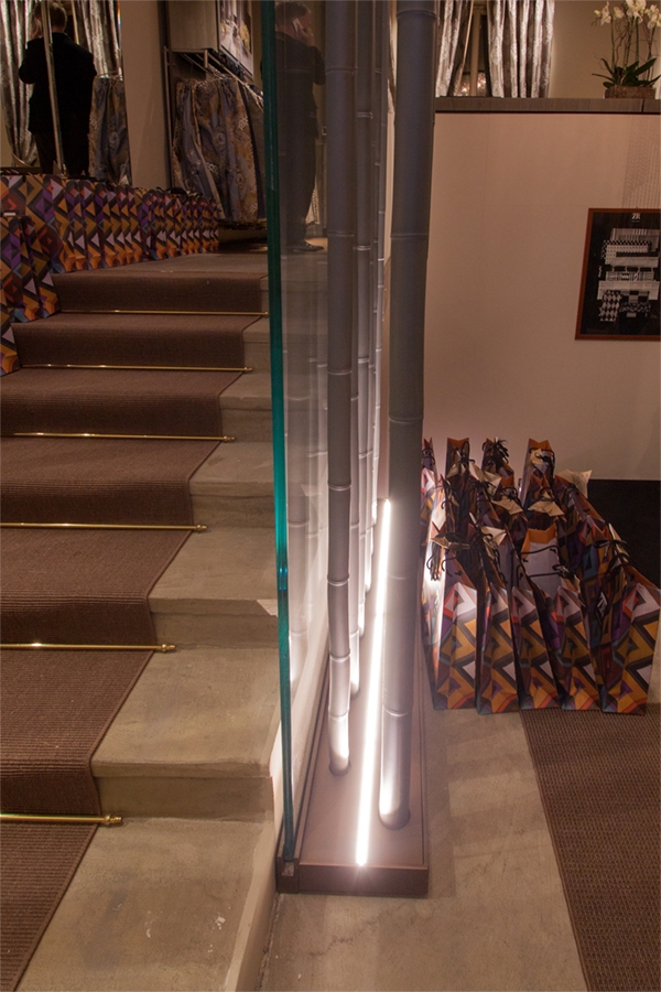
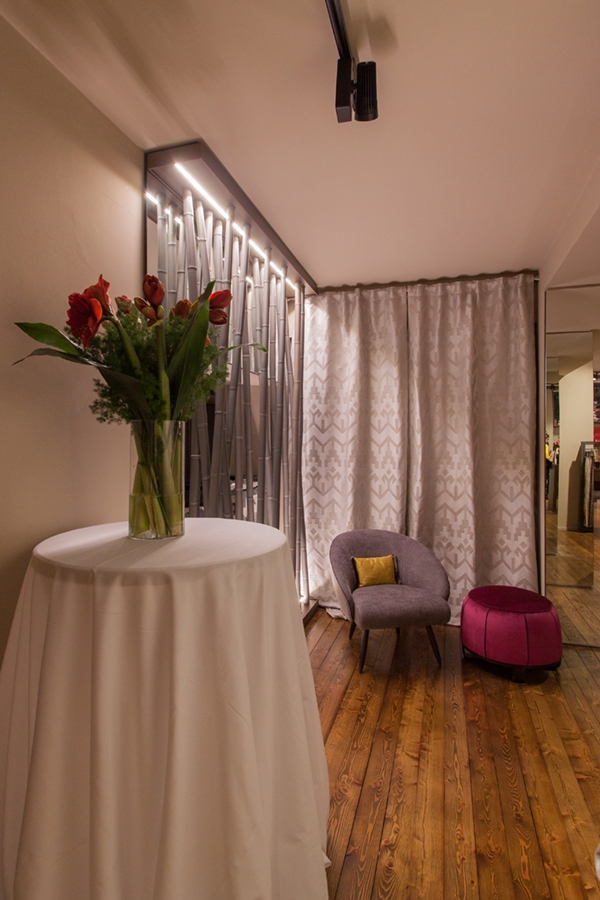
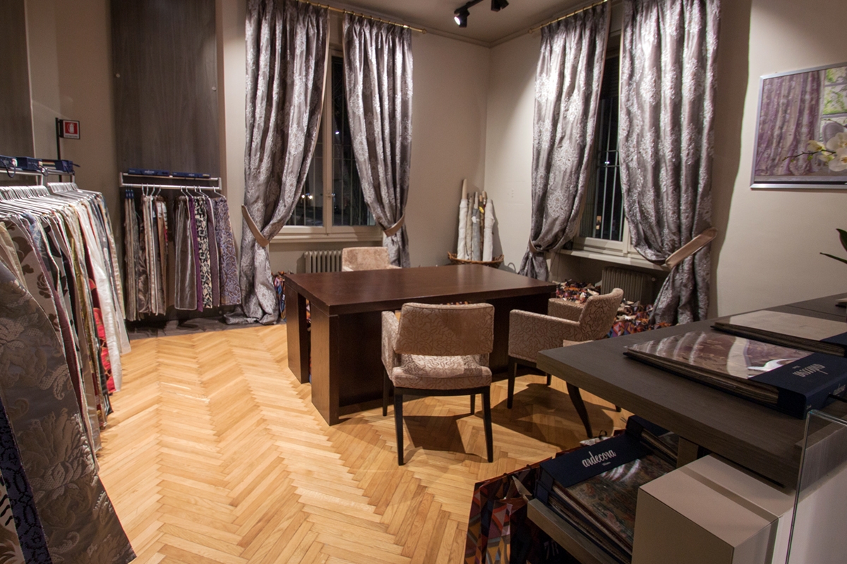
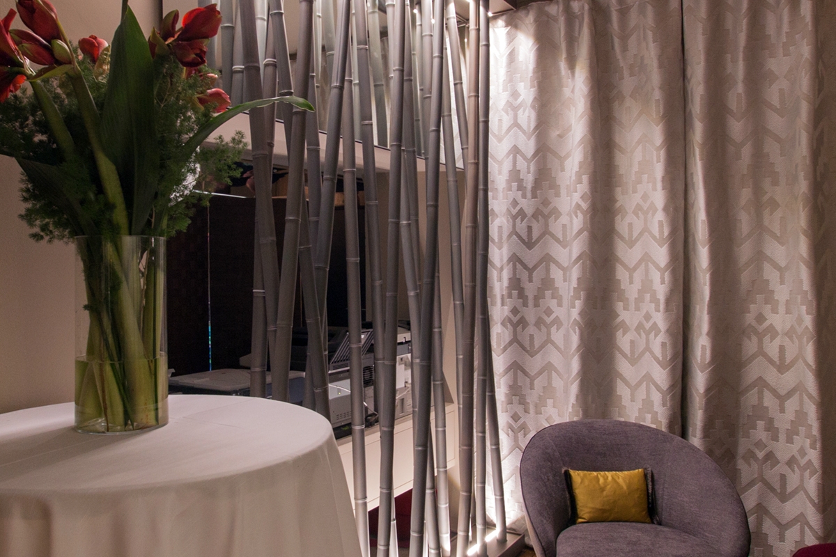
A staircase with large tread majestically enriched with dove-gray coloured upholstery, leads to the upper floor. This can be seen from the back of the artificial rushes that characterizes the entrance area and it is also recalled on the upper floor. An apparently natural alternation of bamboo canes, then lacquered in silver and illuminated with a linear profile on the ground or ceiling providing a touch of artificial elegance. Upstairs, between large curtains and luxury velvet furnishings, a room are located for the customer service. There is also space for smaller exhibition layout, which convey the idea of a more personalized and intimate relationship with the customer.
