Furniture for children according to the Montessori Method

Furniture for children according to the Montessori Method

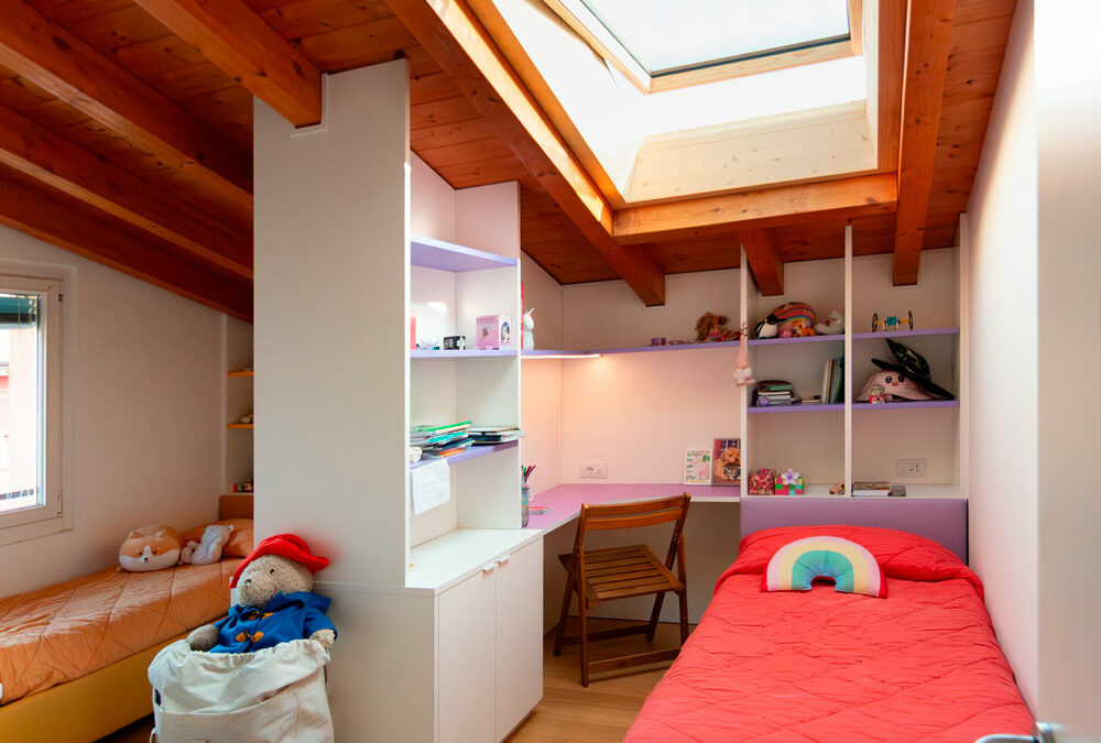
Building furniture in Montessori style means creating a child-friendly, comfortable and accessible environment. The lines that characterize these furnishings are simple and the materials are natural, such as wood.

THE MONTESSORI METHOD

The Montessori educational method is based on free activity within an environment tailored to the structural and cognitive characteristics of children and teenagers.
The function of the environment and of the furnishings that complete their spaces is to allow them to spontaneously develop autonomy in all evolutionary areas. The environment must therefore be built in proportion to the child.
It must be beautiful, harmonious and clean, it must facilitate movement and activities, while limiting the tools.
A space free of obstacles and minimal, free to be experienced independently, without the help or interaction of an adult.
Children in these environments are free to choose, create, invent and become aware of themselves and their potential in a process of self-education and self-control.
Montessori pedagogy starts from birth and develops up to adolescence with the aim of making the child not only independent, but also responsible and aware towards individual, but also social growth.

MONTESSORI FURNITURES

A fundamental prerogative of Montessori furnishings is the possibility for the child to reach the object easily and independently for sensory activities.
Then leave it free to be “called” by the object.
Furniture with an impact that is not only physical but also visual, fantastic and emotional.
Elements that become playmates and life companions where adults are guests or spectators in the environment.

BOOKSHELF

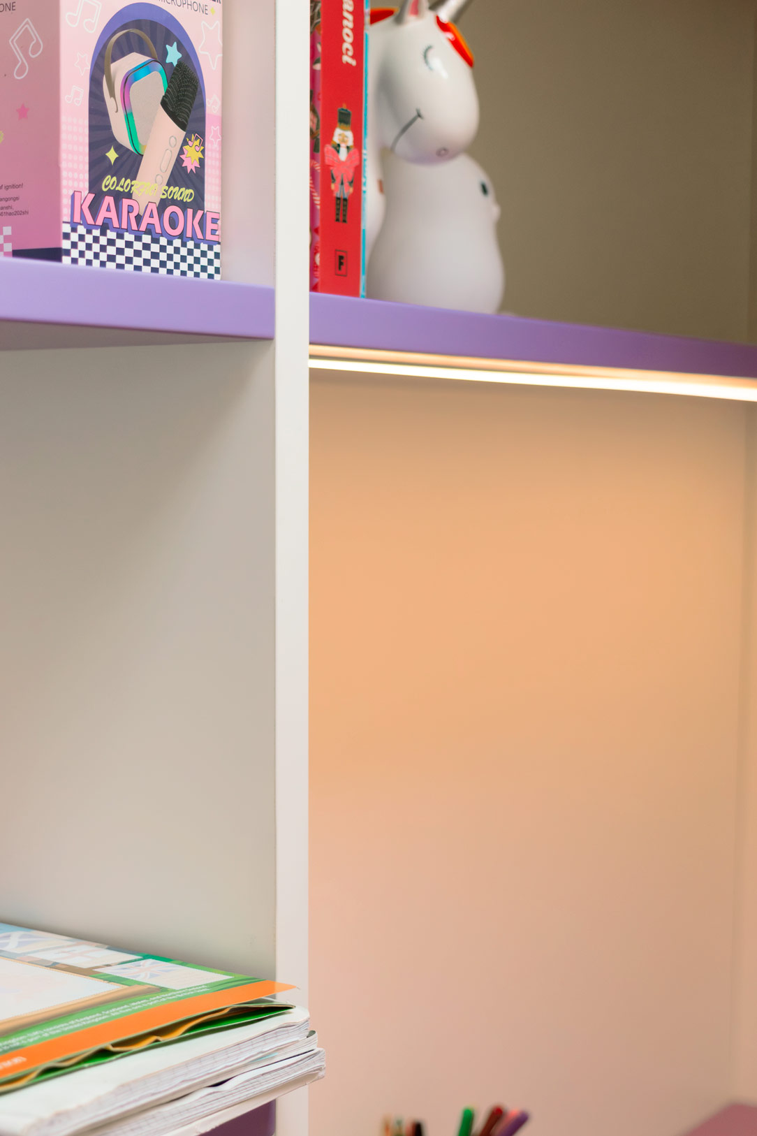
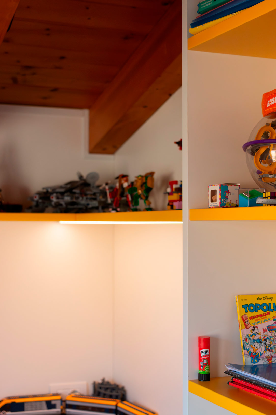
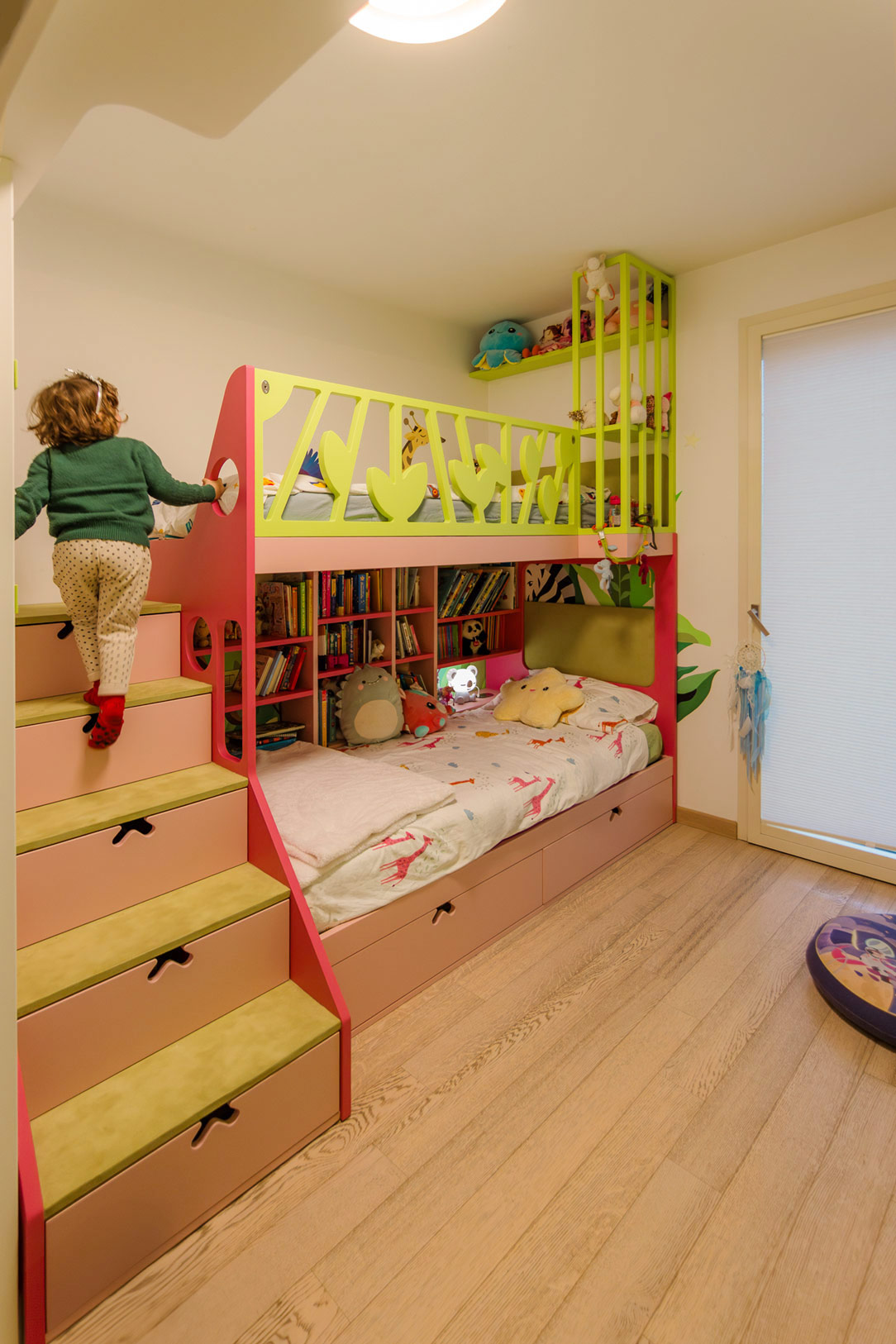
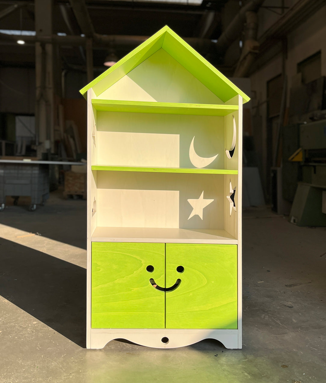
To marry the Montessori principles is this bookcase, made at child height in order to encourage the free choice of the favorite book.
All or most of the books are displayed in full view and in an orderly manner, even better if with the cover visible and not on the edge.
The shelves are easily accessible while the closed parts are designed to make opening easy and intuitive.

 Allegra Montessori Library
 Allegra Montessori Library
 Allegra Montessori Library

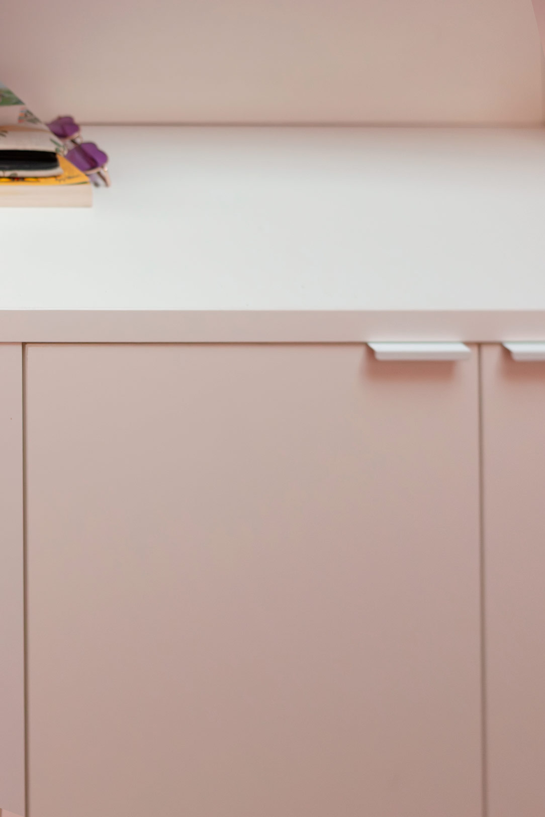
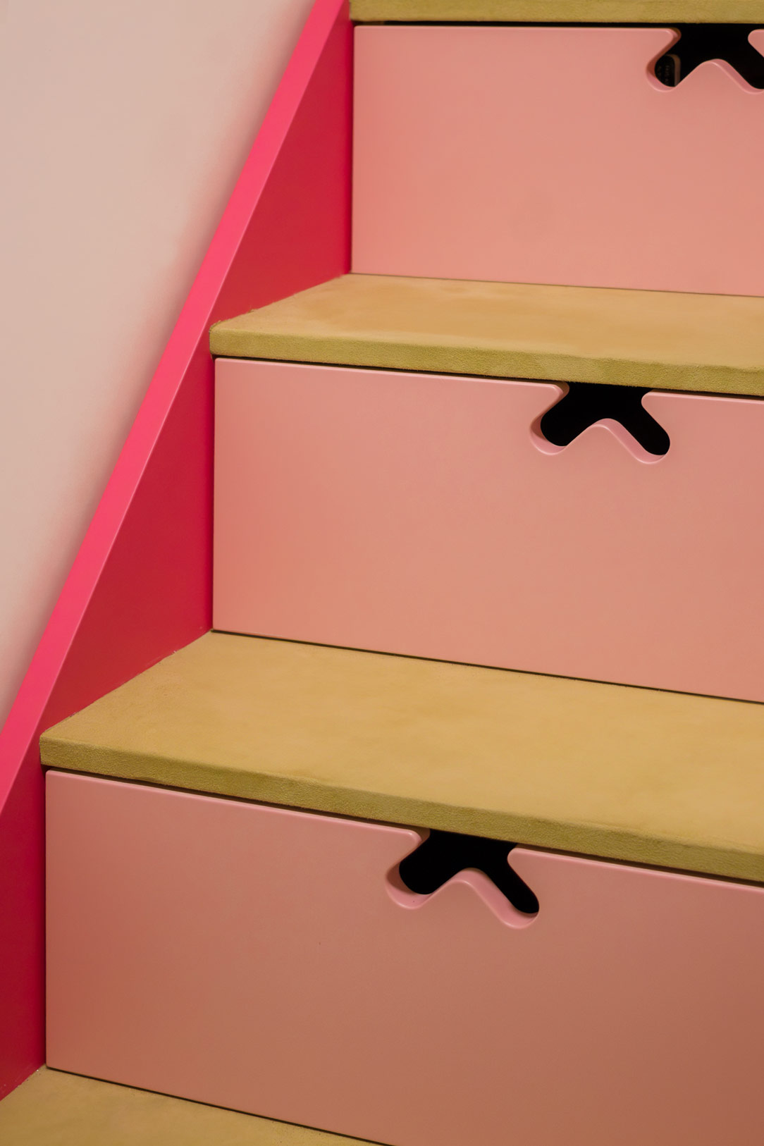
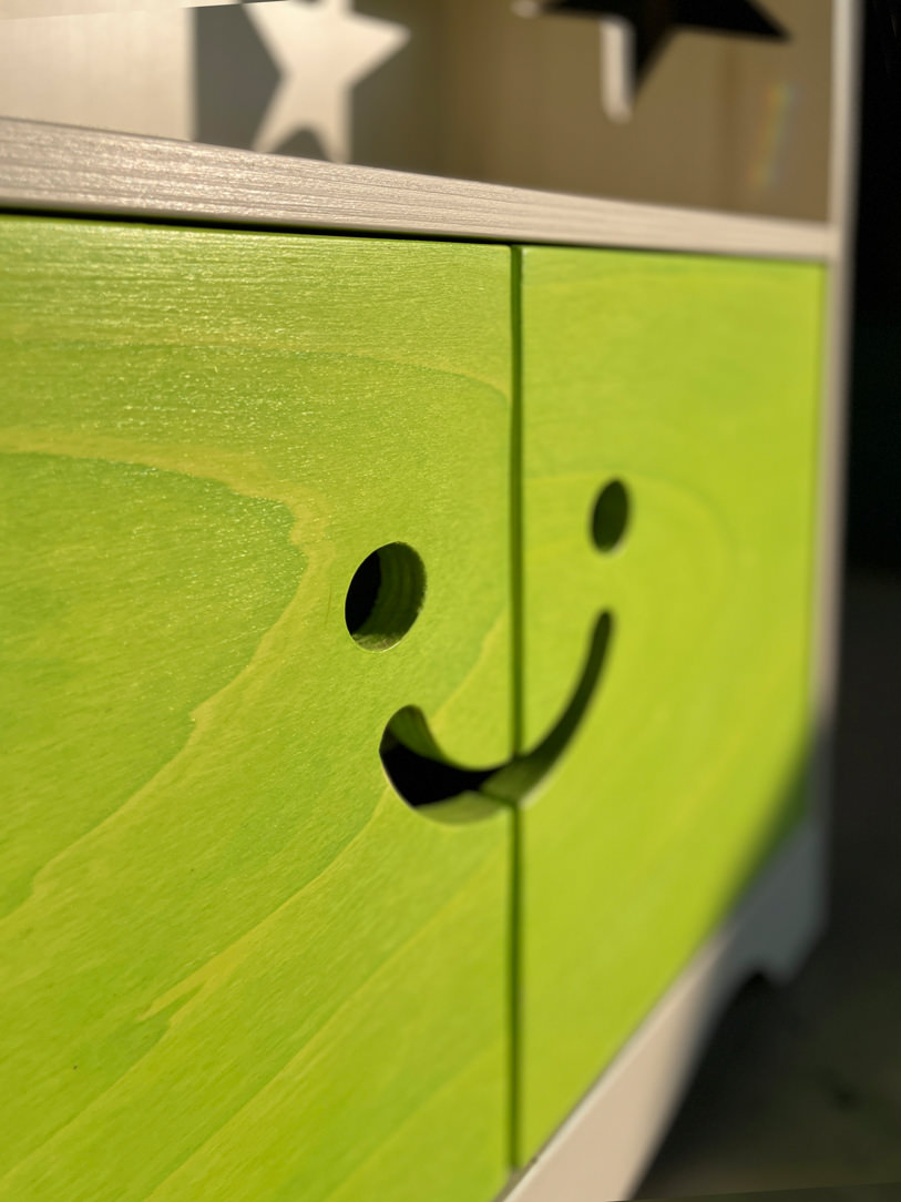
The “Little Cheerful Bookcase” in the shape of a house has shelves visible in the upper part and lower doors with a laser-cutted handle in the shape of a happy face.
The opening takes place precisely by inserting the fingers in the “voids” of the smiley, stimulating the touch for gripping the doors.
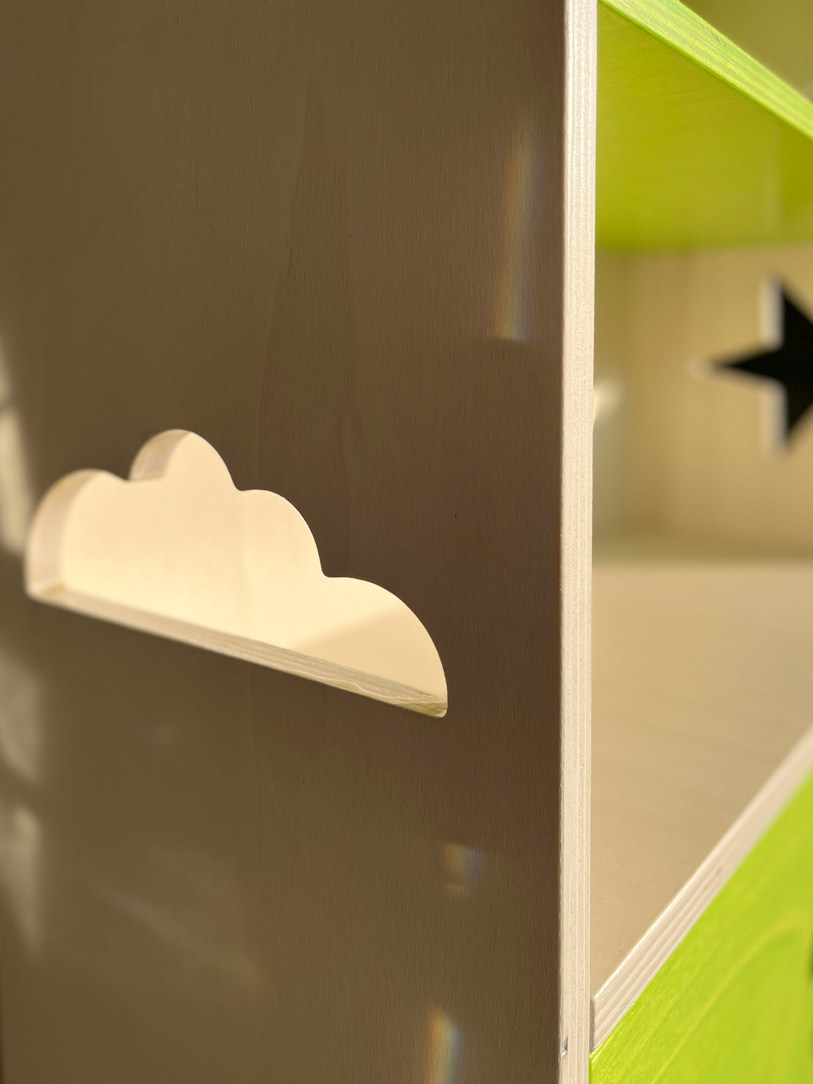
Internally, a shelf is available for any small items. Made of poplar wood it was subsequently painted with non-toxic water-based paints that still allow the natural grain of the poplar to be glimpsed.
All this to introduce the theme of colour, respecting the reference to nature present in the choice of material.

MONTESSORI TURRET

The Montessori turret is also called the Learning Tower.
This is essentially a wooden ladder that allows the child to stand up, in total safety thanks to the side bulkheads.
Thanks to this “elevation from the ground” all the adult furnishings, such as the kitchen top, tables or sinks, also become accessible for the child.
The latter thus manages to carry out, in complete autonomy, various actions such as brushing his teeth, hands or carrying out small household chores which allow him to acquire autonomy.
The steps of the Montessori tower also train the child in the actions of going up and down which he will have to deal with when dealing with higher stairs.

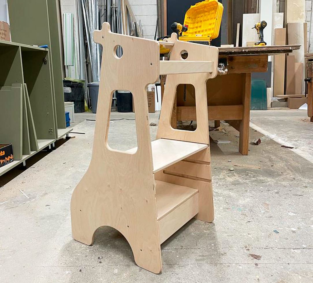
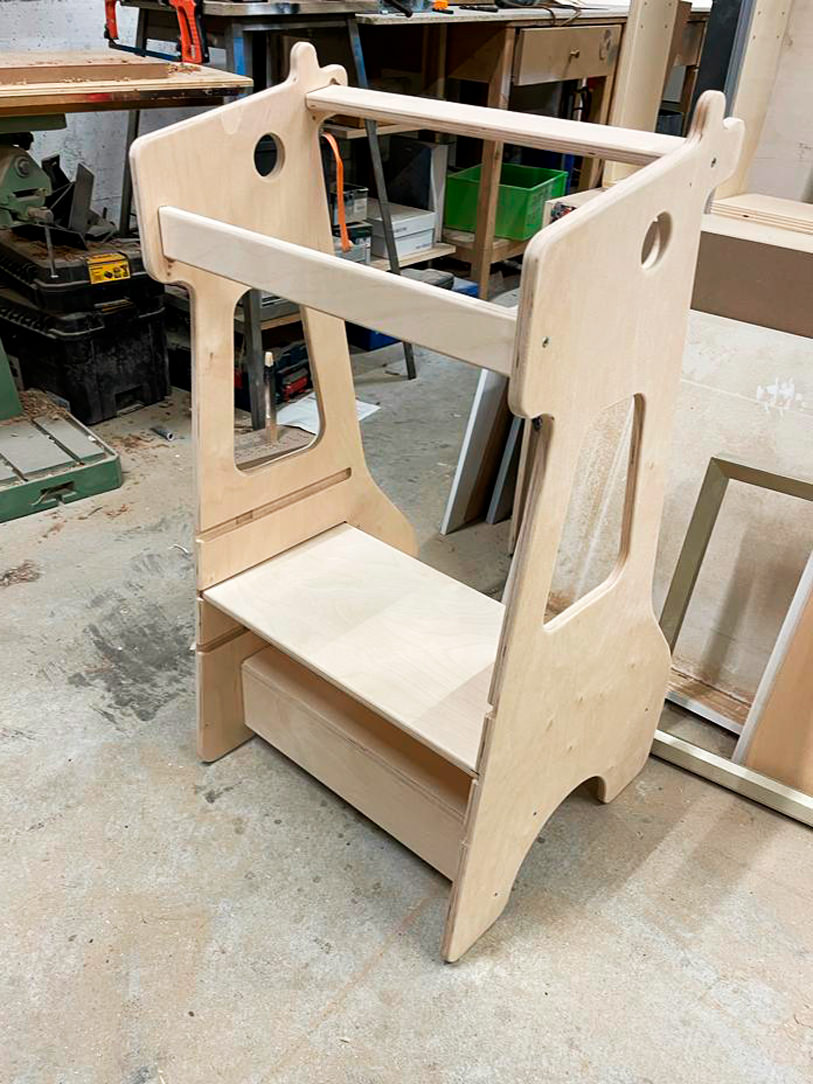
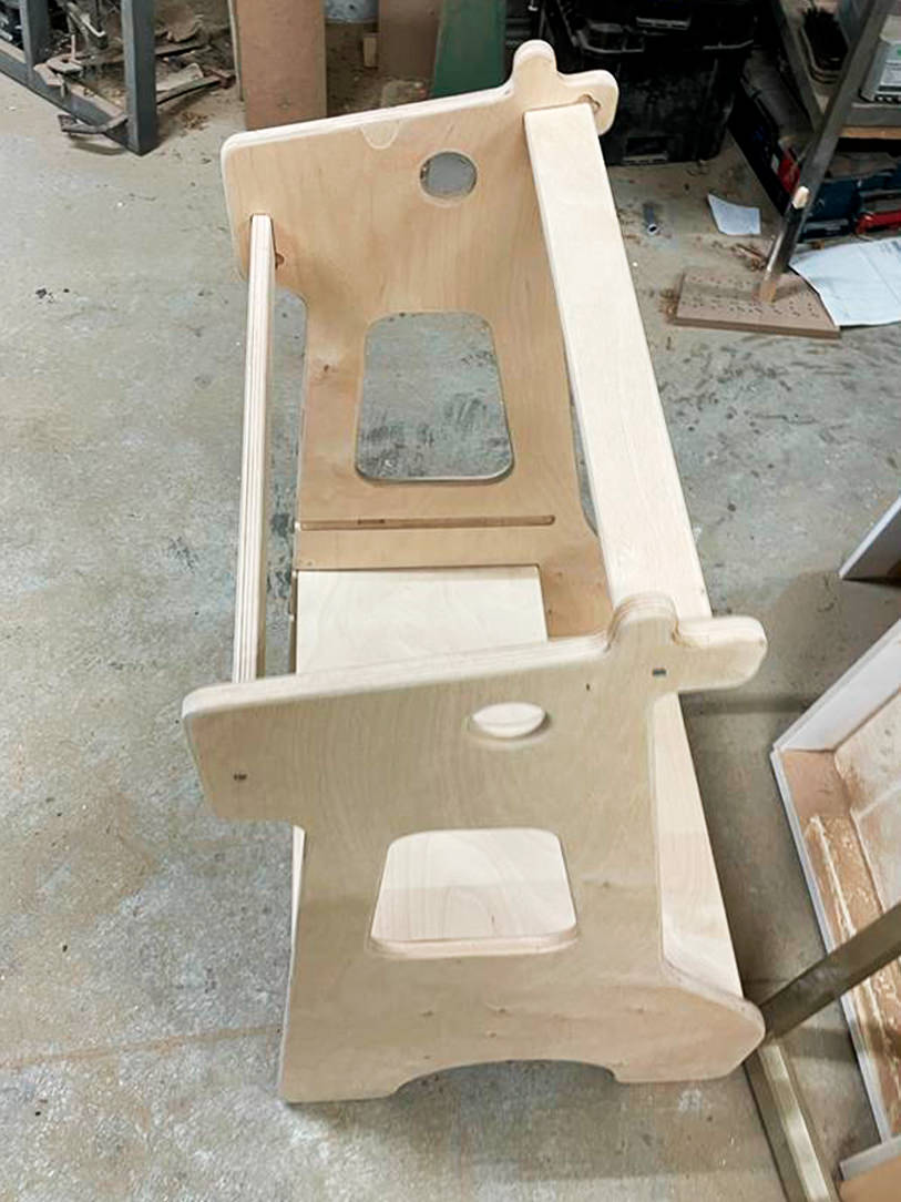
 Montessori giraffe turret

Here is our creation in the shape of a giraffe in which the second step is removable and can be raised according to the height of the child.
This turret is a useful accessory and can also be used as a stool; in fact, the child can sit on the first step and the second shelf acts as a back support.

Montessori giraffe turret detail

An example is our giraffe-shaped creation in which the second step is removable and can be raised according to the child’s height.
A multifunctional element, it can also be used as a stool using the first step as a seat, while the second shelf acts as a back support.

MONTESSORI BEDS

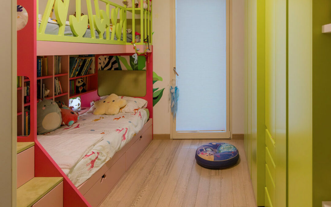
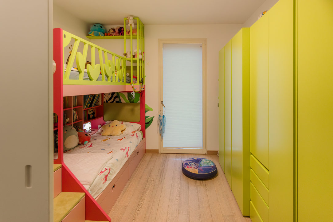
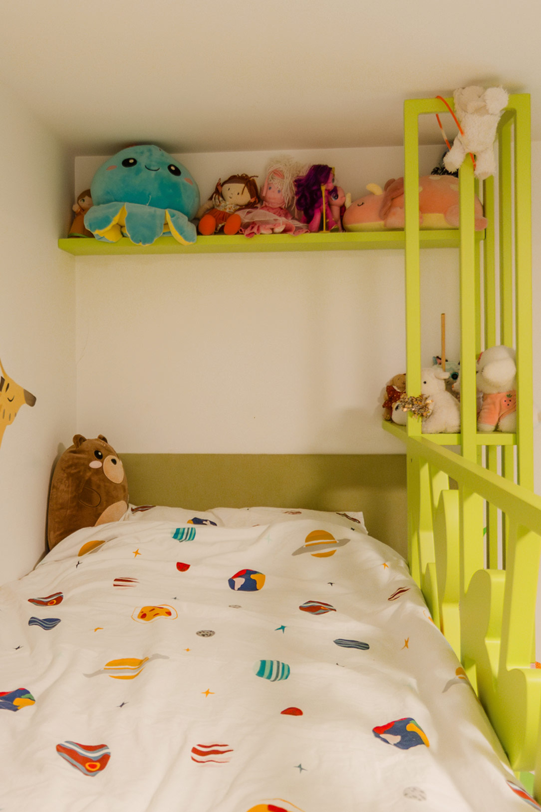
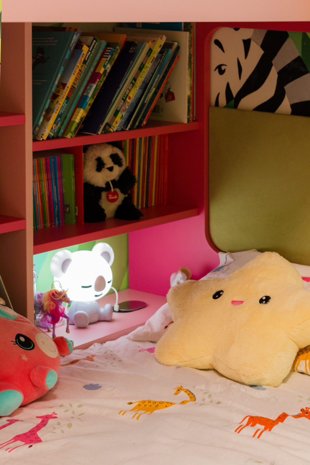
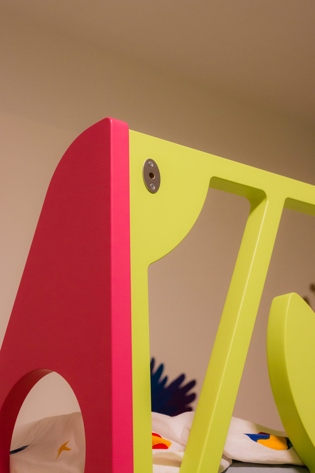
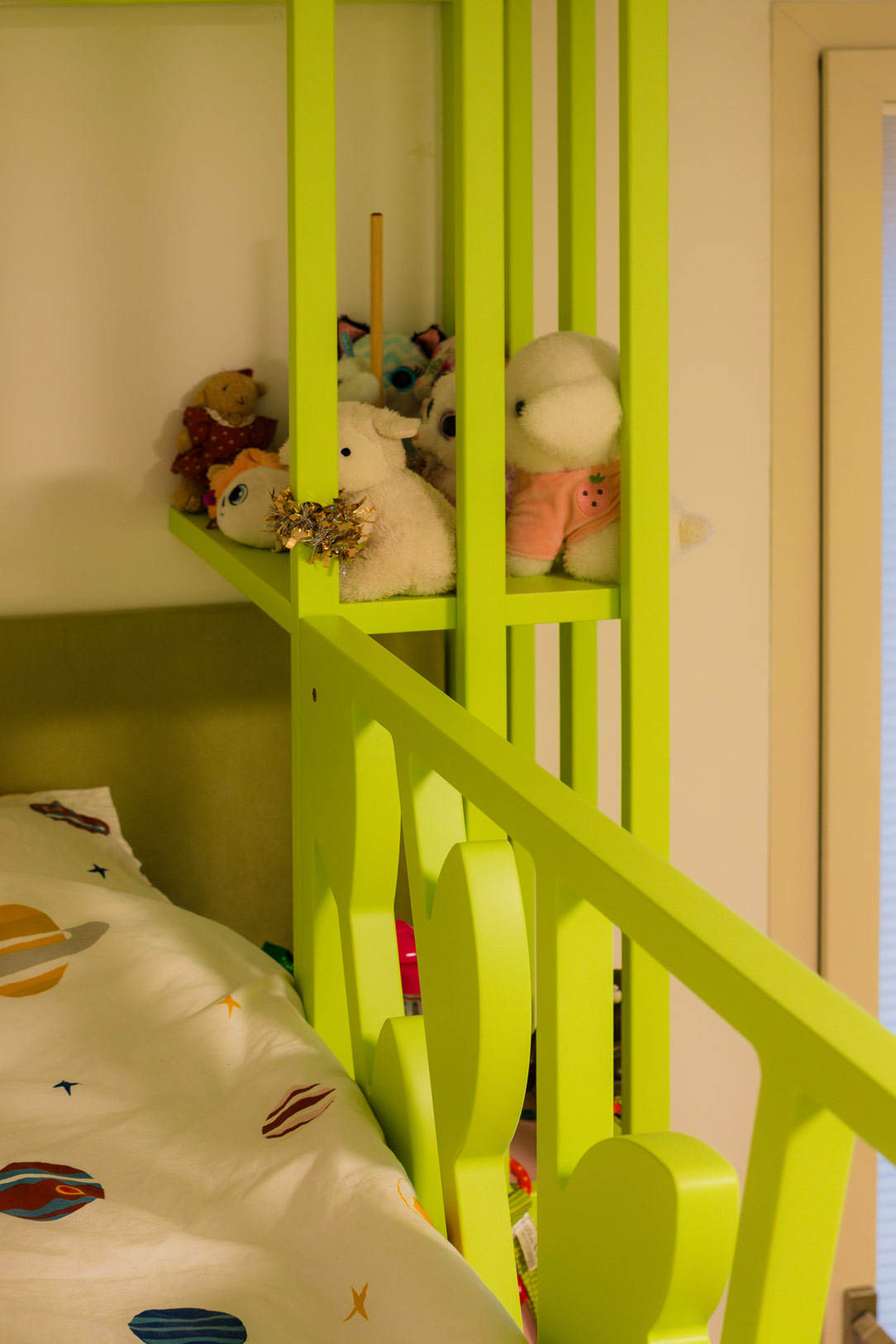
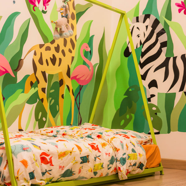
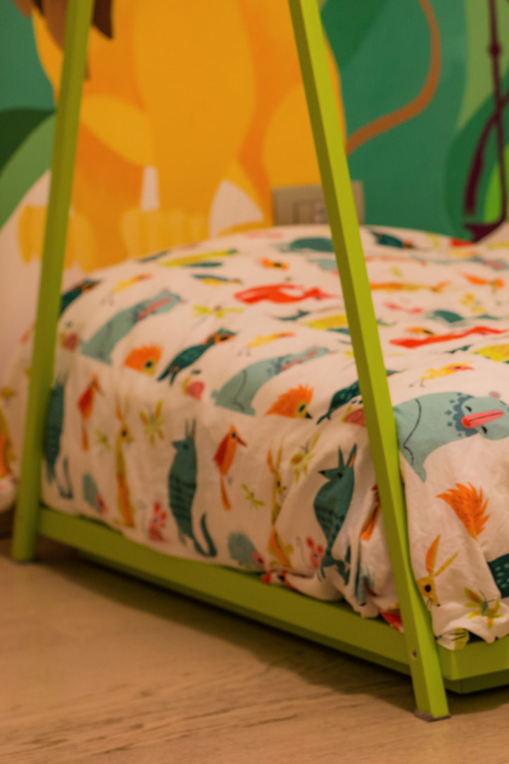
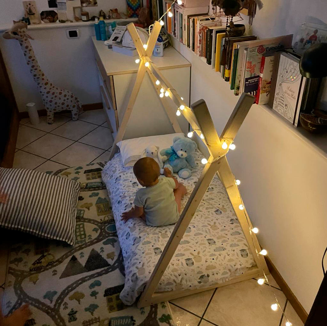
The Montessori bed is mainly characterized by its height designed to allow the child to get on and off in complete autonomy.
There are no side bars to impede movement, freedom becomes a design metaphor for essential and intuitive furniture.
There is therefore no back headboard, but the mattress is rather embraced by the surrounding wooden structure.
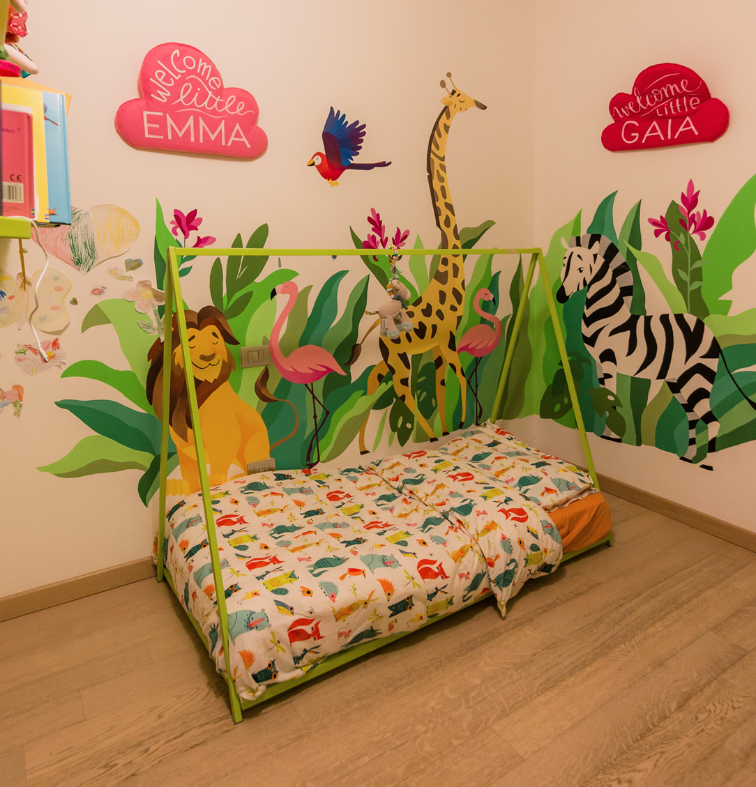
Montessori cribs can have side bars that give them a cottage look or, as in these cases, an Indian hut.

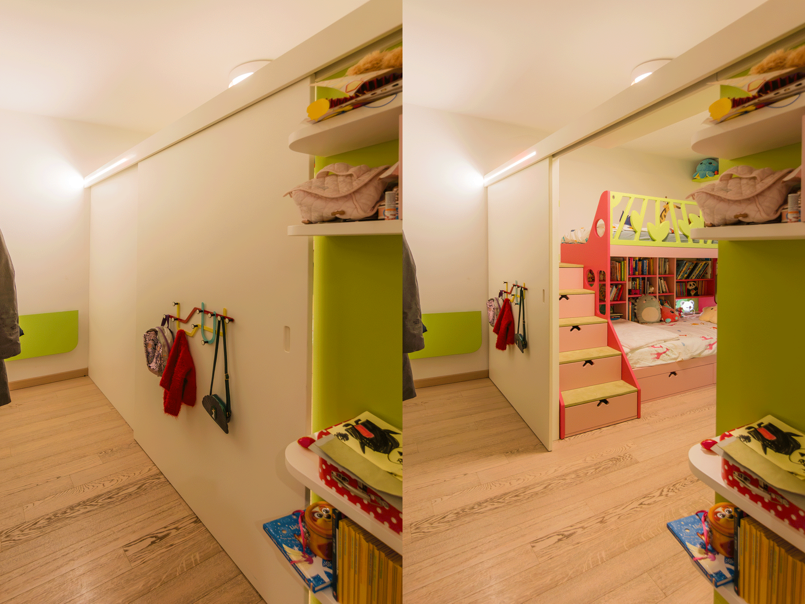
Montessori bed
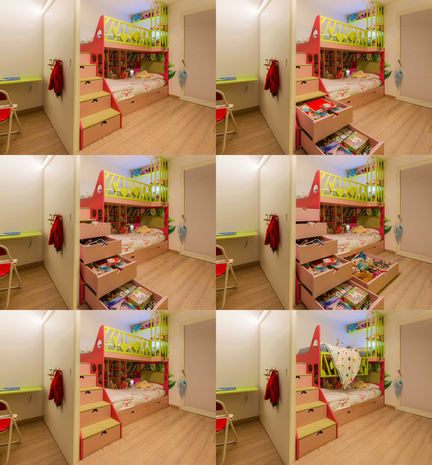
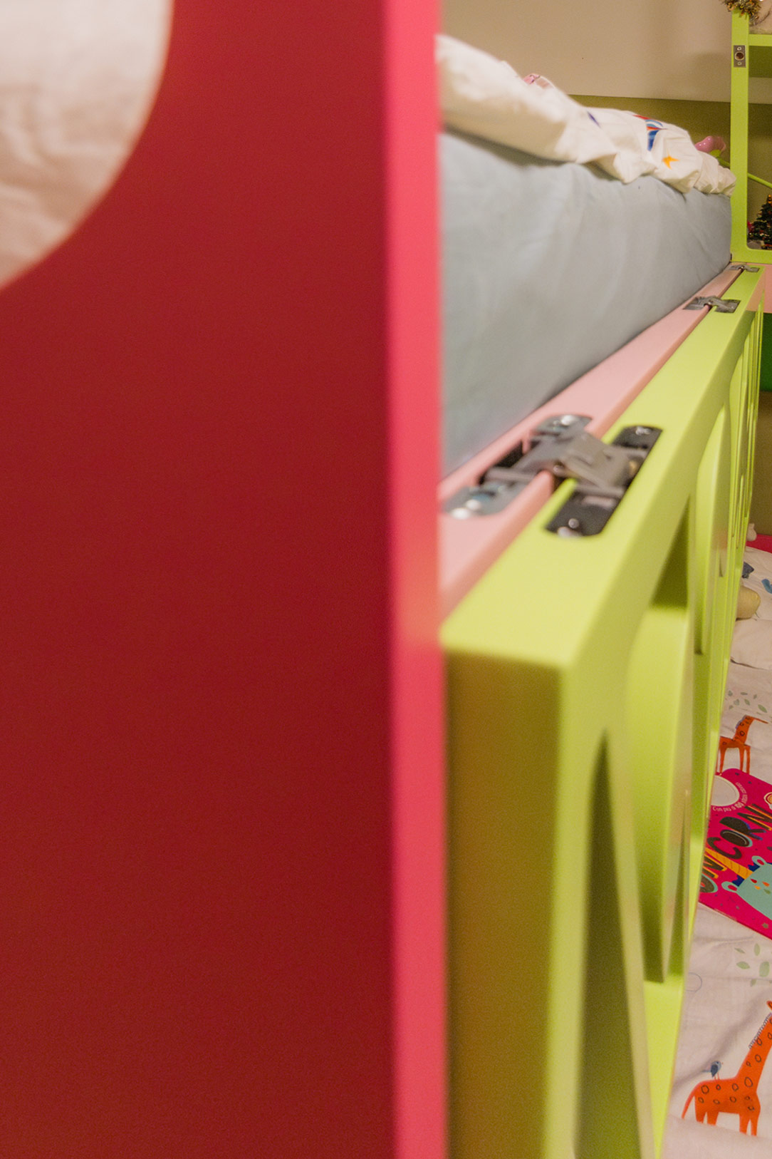
Montessori bed details

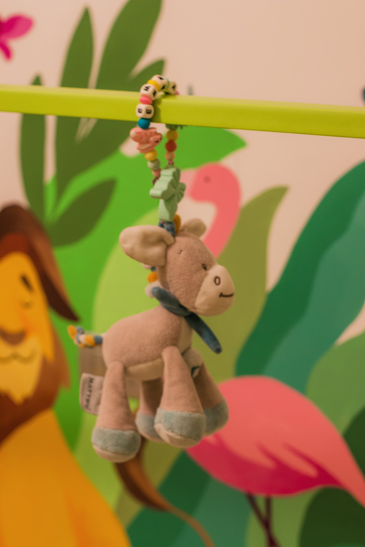
Lights, toys or possibly a sheet can be hung on the upper bar to underline the feeling of den and protection.
The vision and perception of the child inside his bedroom are therefore total visual freedom of the entire environment and his surroundings.

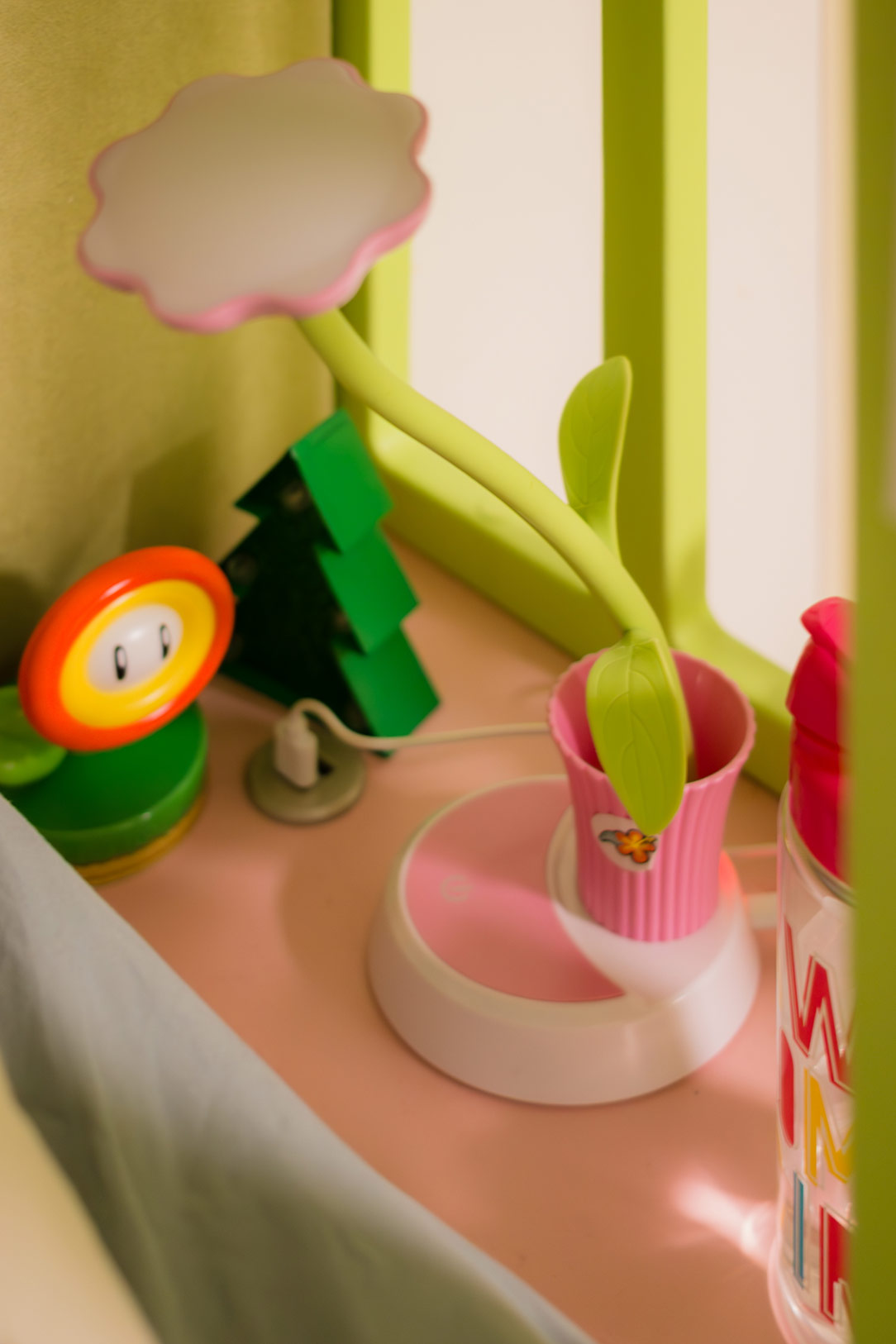
Montessori bed light
Montessori bed back
Montessori bed light

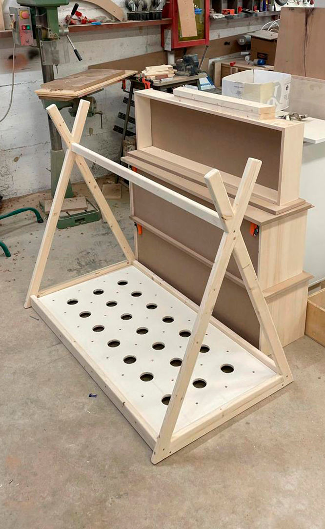
The bottom is rigid and breathable, becoming an excellent support for the development of the spine.
Although the Montessori bed is extremely safe, also thanks to the reduced height, a useful tip is to introduce it starting from the year of the child when he becomes independent in walking and moving.
Here is another of our articles dedicated to the safety of children in the home.

PIKLER TRIANGLE

The Pikler Triangle is a game-tool created by a Hungarian pediatrician, Emmi Pikler, based on the Montessori Method.
According to Pikler, it was important to follow the pace of development of each individual child, giving them the opportunity to move and experiment with the body and its movements in complete freedom.
In order to express their emotions, the child uses movement as the first means of communication.
For this reason, leaving them free to move and experiment is very important for growth and psychomotor development, as well as relational and emotional.

Triangol Pikler
Triangol Pikler
Triangol Pikler

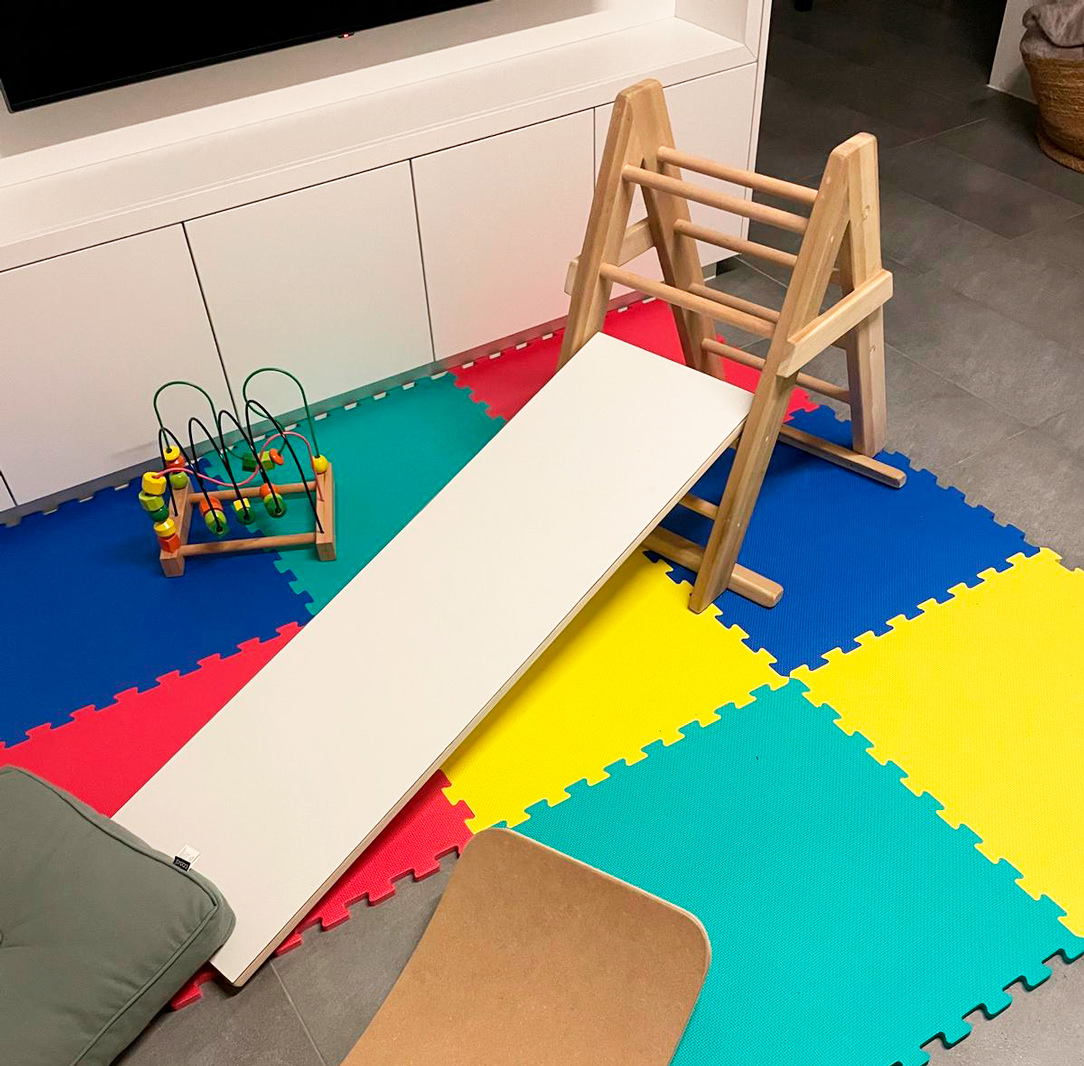
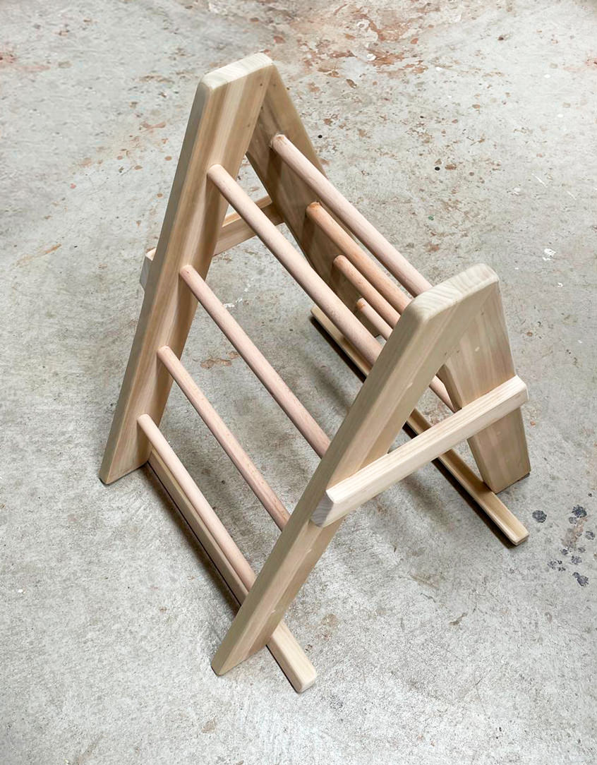
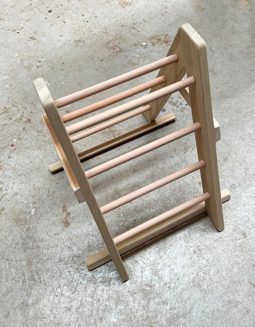
Here our Pikler triangle, characterized by a triangular-shaped wooden structure which can be associated with a platform-ramp, which hooks onto the pegs of the triangle. The latter can be used by the child to climb, go up or down and in a thousand other imaginative ways.
With this tool, children learn to discover and understand the movements of their body, control and manage movements, coordinate themselves.
It favors the development of the autonomous motor sense when used to climb, go up and down, but it is also an interesting stimulus for the imagination when used as a tunnel or hut, or much more.

CONCLUSIONS ON THE MONTESSORI METHOD

Montessori pedagogy is therefore not only based on independence, freedom and respect for the child’s natural physical, psychological and social development, but also on a sense of responsibility and awareness towards the network that links every small entity to a larger macrocosm.
Children deserve spaces where they can move, play and sleep, wake up and experiment.
Sometimes we think that a newborn baby is small, vulnerable and unable to open up to the world, but that’s not the case at all.
By trusting the child, right from birth, his growth will be balanced and independent and he will feel more secure in each new step.

Children in safety

Children in safety

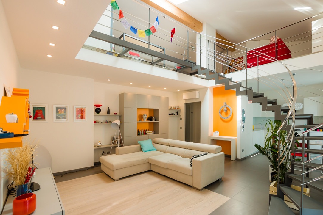
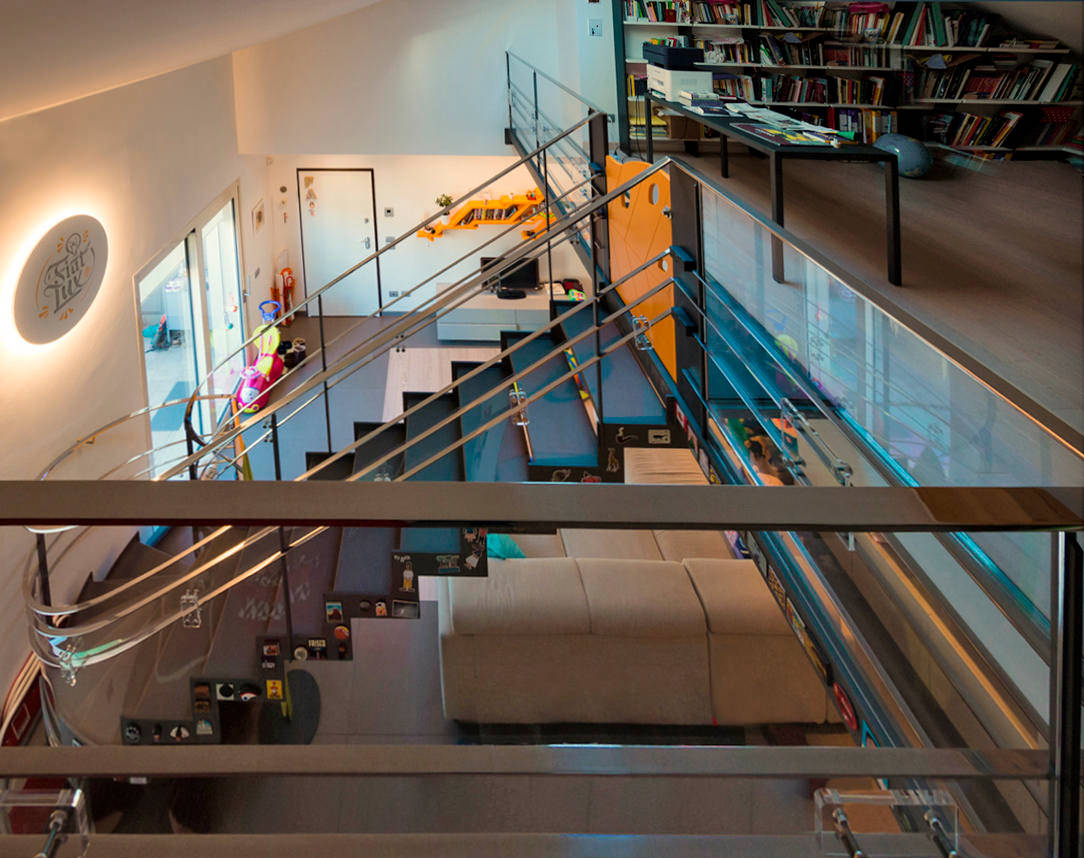
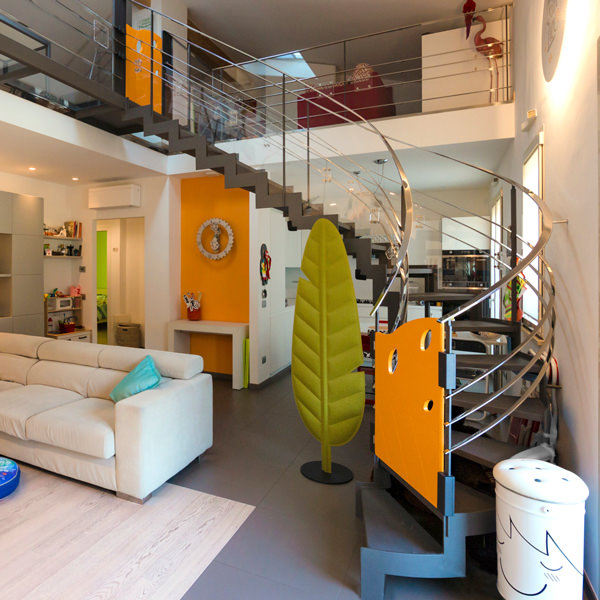
Not all environments may be suitable for the safety of children. Designers are used to designing solutions tailor-made for customers’s needs. However, these can change over the years. In this case, a beautiful aerial staircase in a stately home can become an element of danger with the arrival of the progeny. Here the project of the whole apartment.

house with aerial staircase

the staircase before the intervention

THE CHILDREN

The small creatures under the meter who are experimenting with the use of their body in fact do not yet have the sense of danger. All the elements and objects of the house must be reconceived with their eyes. What can be attractive but fragile and in their reach must be moved, dangerous edges and corners must be covered and empty spaces, in which one can slip and fall, closed or buffered. Every element such as stairs, furniture and hallways of the house must be secured. In this case the danger of the staircase was given by the open part under the middle stainless steel bands of the central barrier, which wind along the entire slope and on the gallery.

house with aerial ladder in child safety

the aerial ladder after

SECURITY

PLEXIGLASS

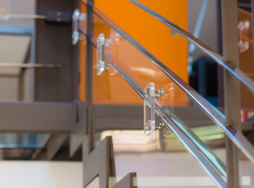
We have found an effective, very elegant, minimally invasive and inexpensive solution to solve this problem. To secure the ladder we have used 3 mm polycarbonate, sized, cutted and fixed to the inside of the barrier, leaving the handrail and the first band at child height free for the grip. Square elements in Plexiglas were then fixed with stainless steel design studs from the outside of the staircase, leaving the handrail and its central bands untouched and using them as a sandwich thickness. In this way, all the plastic part are fixed and safe. For the balcony we have used 1cm hardened Plexiglas that is more resistant in the case of heavy impacts with objects thrown without reason by our little users. As a fastening system the same as the ladder. Seeing the before and after photos you will notice that these plastic elements seem to disappear within the general view of the house. Only by looking carefully can you see the reflections of the Plexiglas and polycarbonate and the studded squares.

children's gate on steel structure
children's gate details
plexiglass details

SHAPED CHILDREN’S GATE

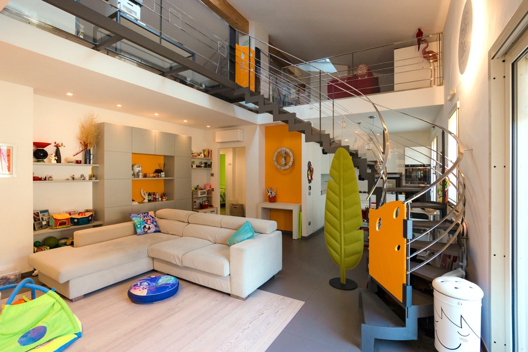
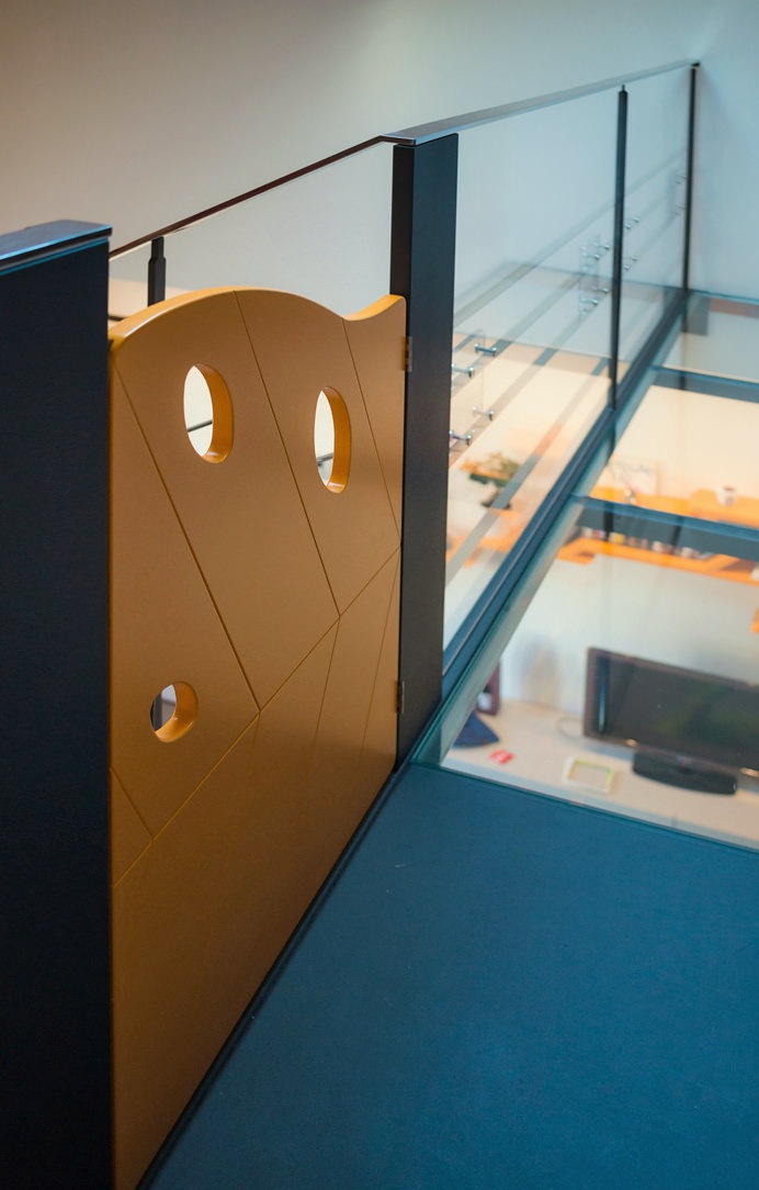
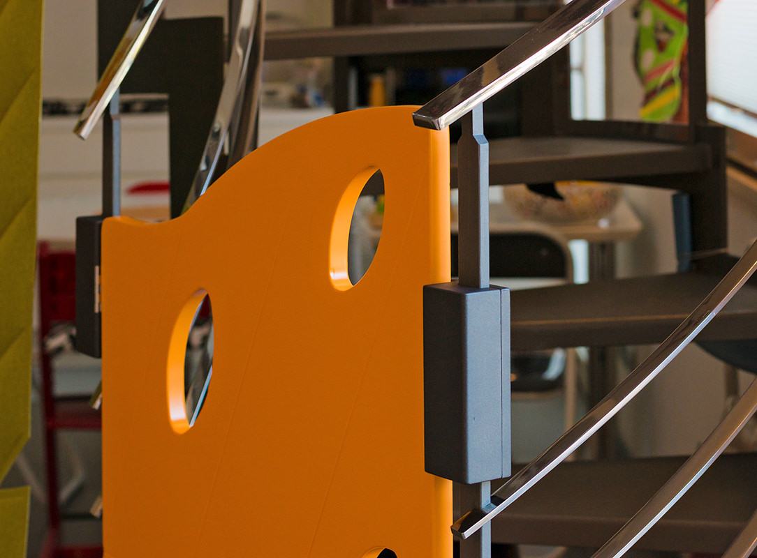
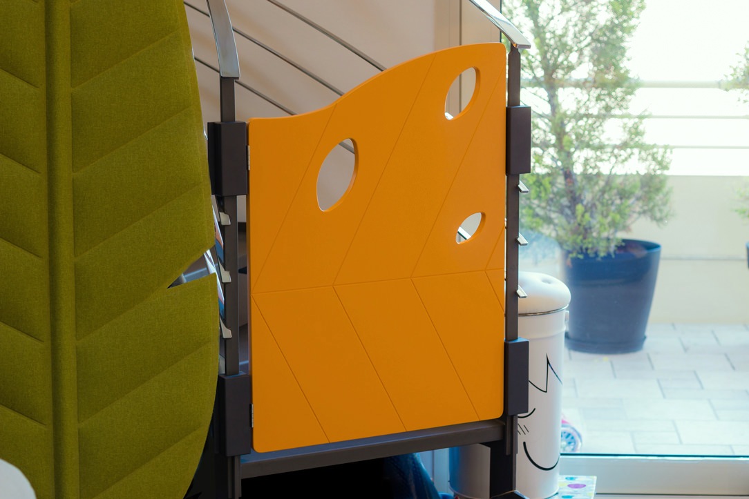
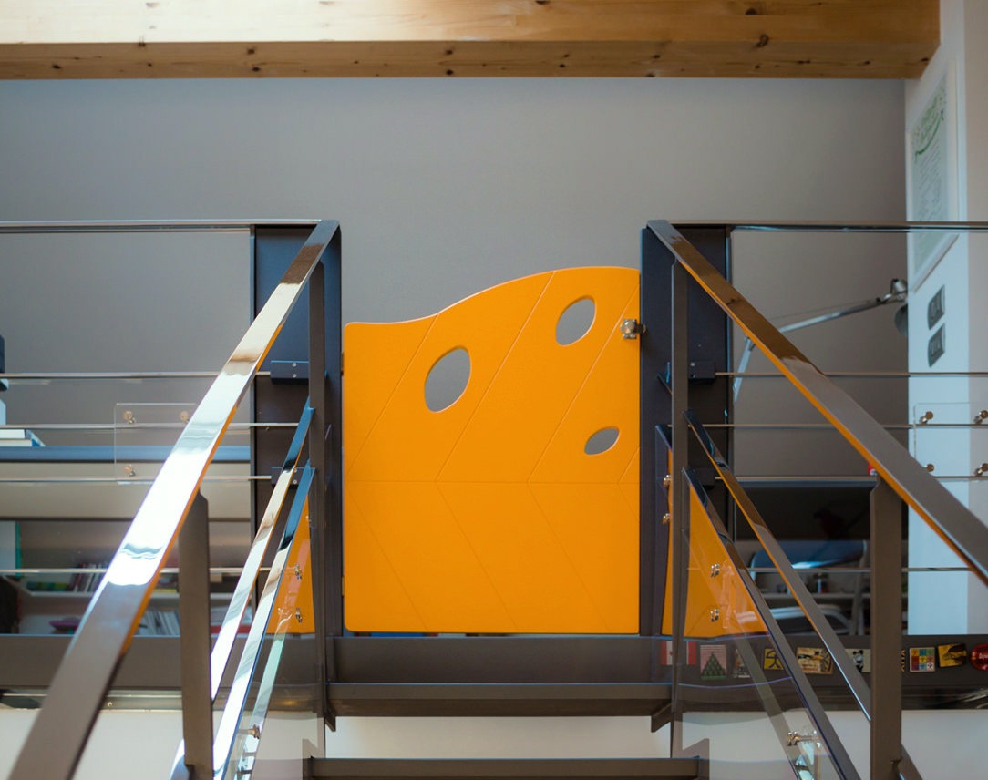
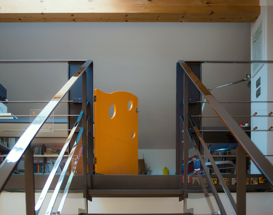
For access to the stairs custom-made gates have been designed: one for the lower access and a second for the upper part of the gallery. The gates were made of MDF, shaped and engraved with a numerical control machine and then lacquered with matte orange paint. In the same color tone the other points of orange present in the living area.

children's gate

The shape of the gates are that of an autumn leaf, its symmetrical veins remain in the center of the design while three holes, always recalling a leaf, are found in the upper part to lighten the element. There are no holes in the lower part to avoid climbing daredevil little climbers. Both gates were fixed to the staircase thanks to wooden blocks fixed together on the upright of the staircase and then painted in the same dark anthracite. At the back of the gates, in a strategic position not reachable by children, there is a sliding bolt for close and open them.

children's gate
children's gate

TEMPORARY

This intervention has absolutely not touched the existing staircase and when it will be disassembled everything will back as before. It is a temporary solution but satisfies the eye to the point that it could remain mounted more than necessary. For the moment, the important thing is that the children are safe, free to walk up and down the ladder independently and stay and play in the attic part of the house.

closing balcony and child safety gates

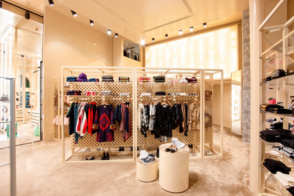
A boutique dedicated to children: Tiziana Fausti Kids

A boutique dedicated to children: Tiziana Fausti Kids

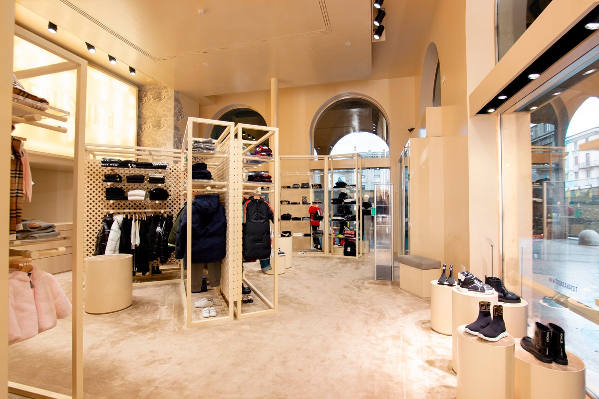
The end of summer saw the inauguration of the Kids corner in the historic Tiziana Fausti boutique, reorganizing the spatial layout to host a retail space for children.
From the previous commercial space in Via Monte Sabotino, now reserved for the urban concept of THE F1RST sneakers, the outfitting for the Kids store moves to the historic women’s store, modernizing its image on a project by the Storage Associati architecture studio.

Tiziana fausti Kids entrance view
cash desk children boutique Tiziana fausti Kids
display volumes windows boutique Tiziana Fausti
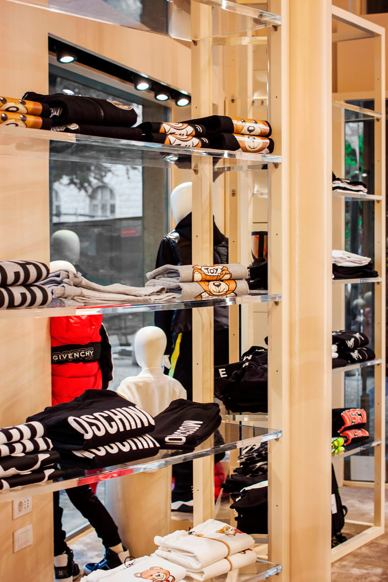
transparent shelves windows boutique Tiziana Fausti

The exhibition layout

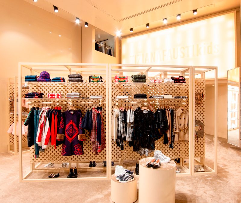
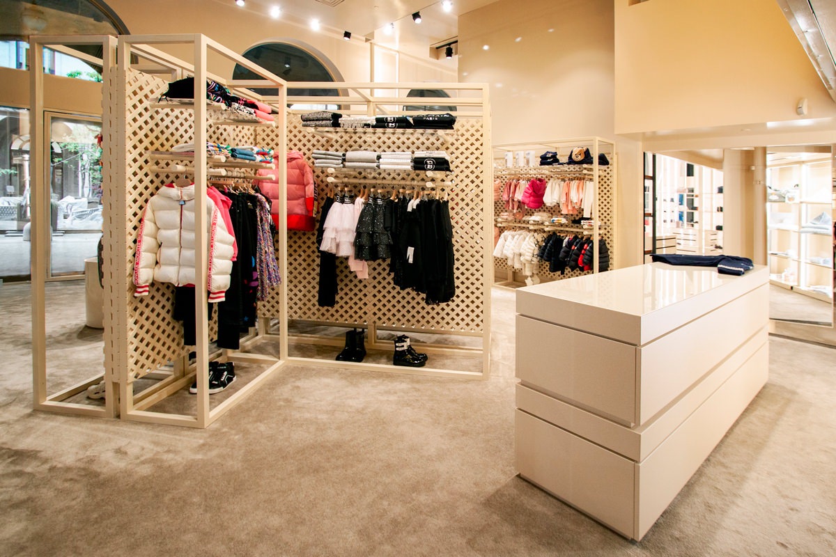
From a project by the Storage Associati studio, the retail space reserved to children takes on a dynamic and fresh configuration on the ground floor of the Tiziana Fausti boutique.
The display elements develop vertically, serving as a pivot in the center of the space.
The flow of customers is thus distributed in a circular way, avoiding spatial gaps.

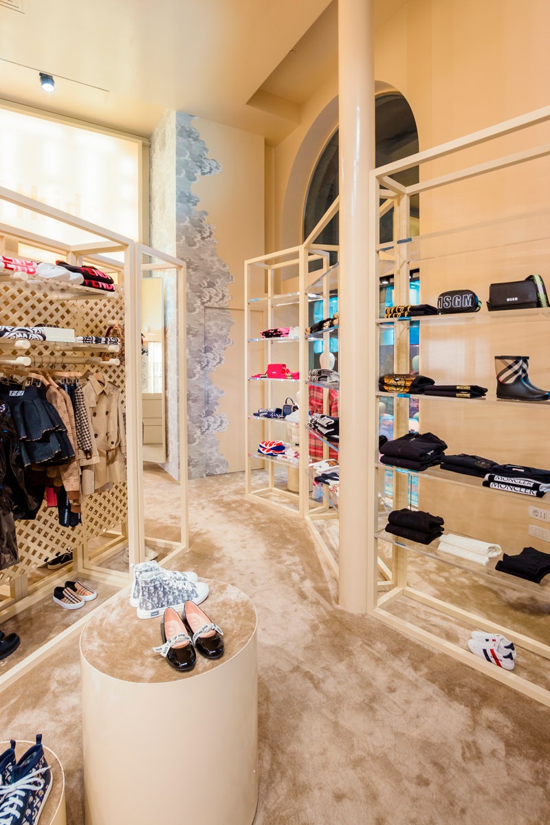
Along the side windows there are other vertical elements that exploit the double visibility both from outside and from inside for the product distribution. Transparent shelves that allow natural light to spread all over the interior space, struggling between the products on display.

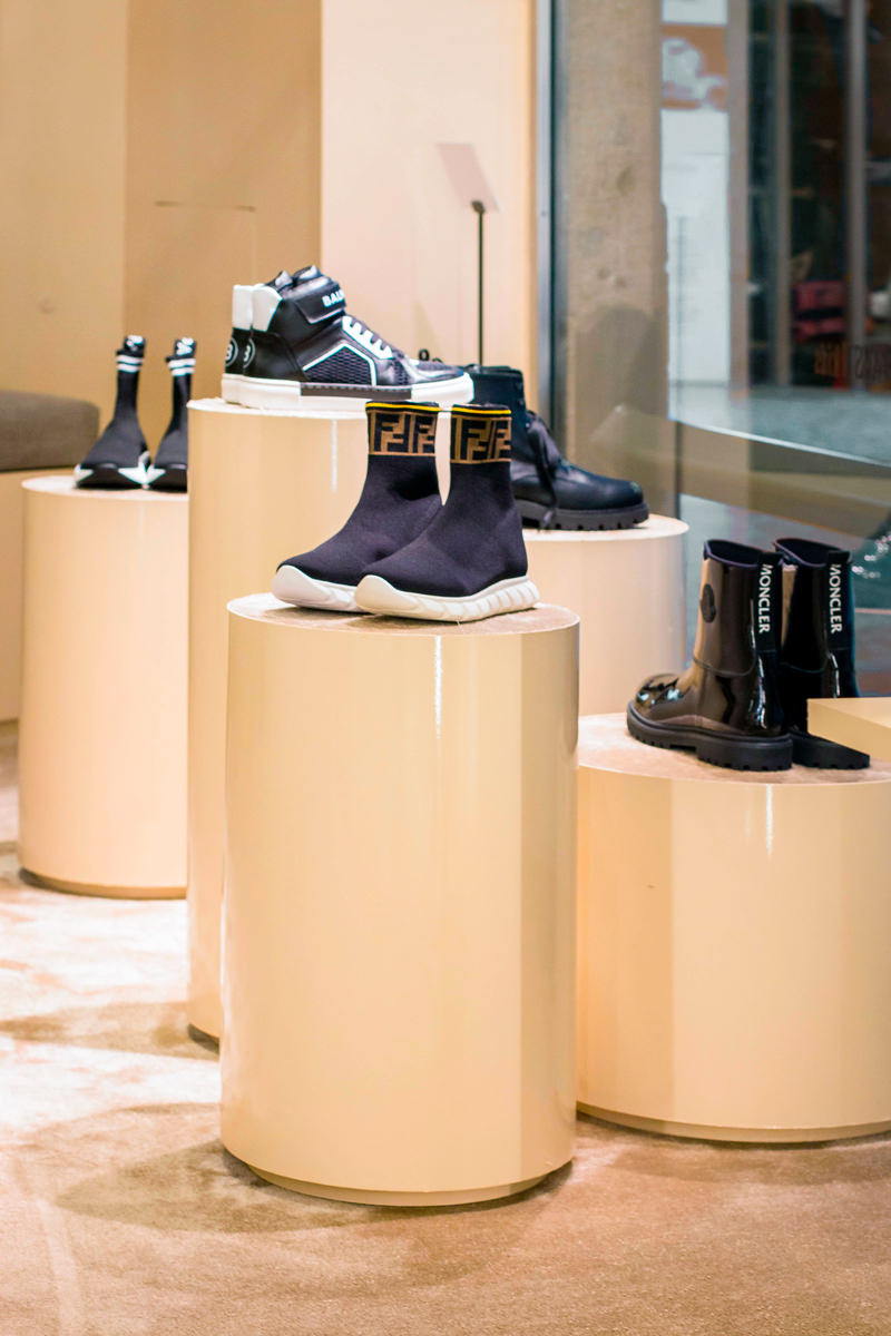
The showcase on the left of the entrance instead takes up the typology used in the women’s department with cylindrical volumes rising to different heights.
Taking advantage of their expressive essentiality, these volumes with a carpeted upper covering are also scattered throughout the retail space, enlivening the outfitting.

A store dedicated to children that is inspired by the world of the little ones, with dynamic and flexible display products configured with the interlocking theme.

display elements children boutique Tiziana Fausti
display windows children boutique
cylinder display moquette
window display back desk children boutique
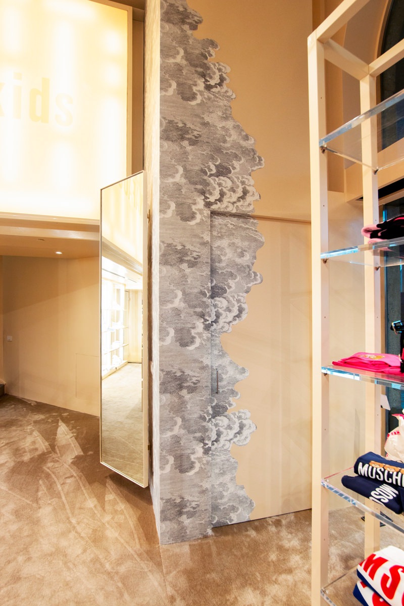
wallpaper dressing room

Joint matters

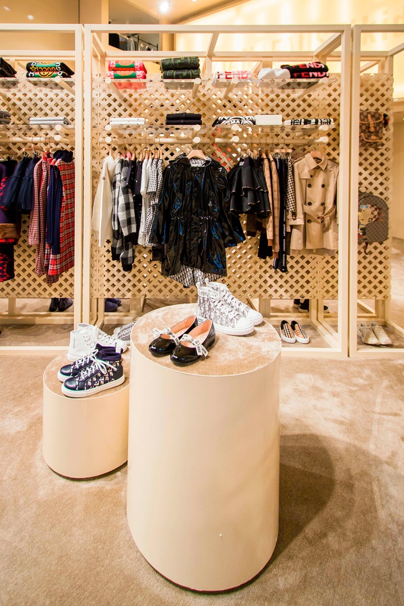
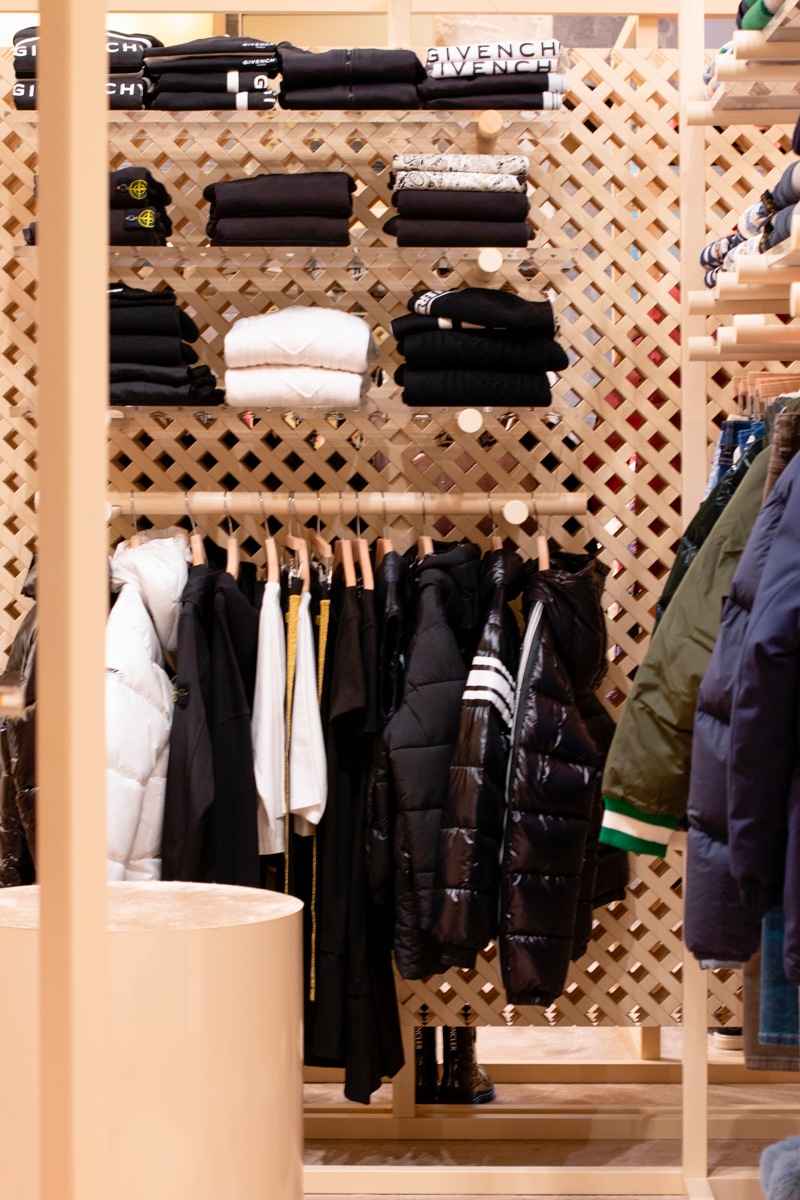
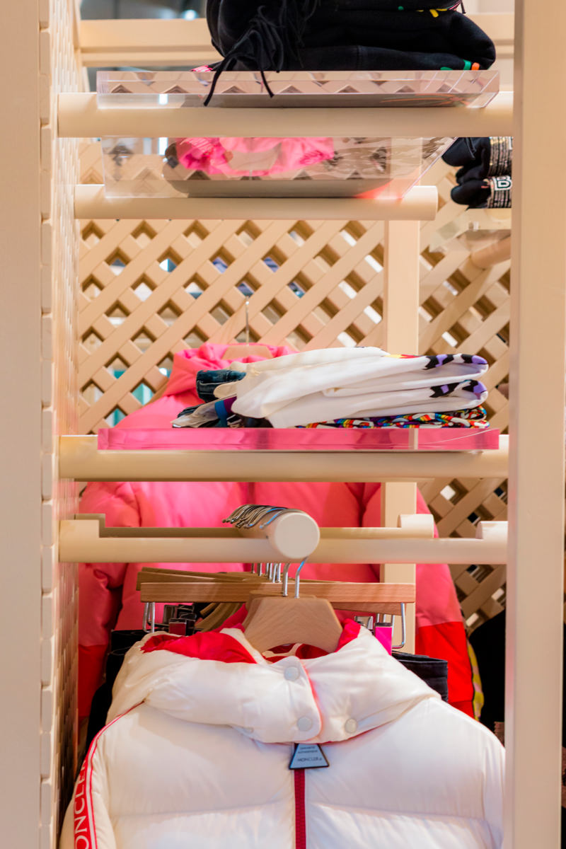
The logic of the joint is certainly the basis of the retail design project. Just like in Lego constructions, even plexiglass and wooden tubular shelves fit together allowing different project configurations, which are in turn inserted into the bottom panel.

This simple and practical display logic focuses on the use of three different elements.

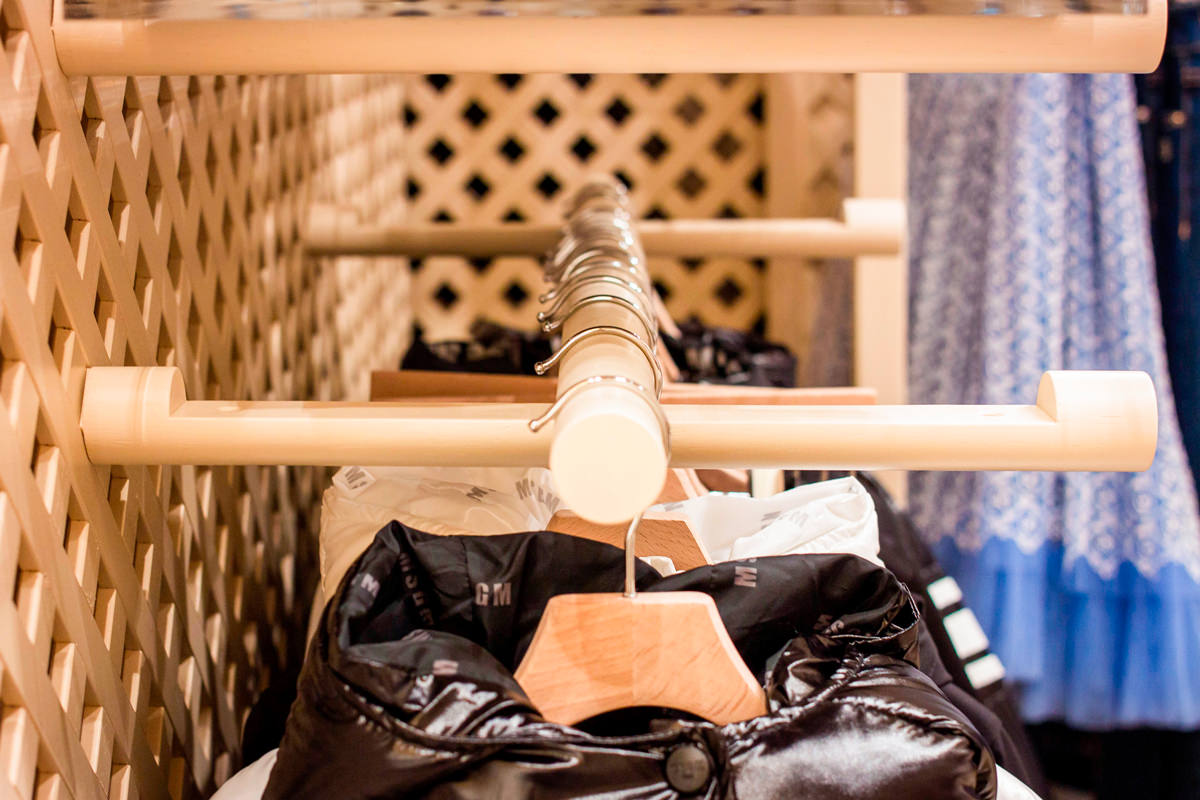
The first, and fundamental, is essential to define the different display heights, being the element that communicates with the back wall. It is in fact a wooden tubular with a shaped end so that it can be embedded in any point of the reticular bottom wall.
Its length was then worked through a specific section to be able to fit the other two display elements: plexiglass shelves and tubular hangers.

The first were obviously made of the same width as the tubular section, thus becoming visible light signs that are interchangeable with each other. On the other hand, the tubulars used for hangers, , take advantage of the negative of the shaping by bringing the interlocking elements along their diameter to ensure stability and visual linearity.

 tubular interlocking hangers
equipped wall front view
side view tubular interlocking

Give new life to the display elements

The world of retail design is constantly changing. To cope with the incessant succession of trends in the fashion world, even the spaces that host it must adapt by developing new configurations.
Therefore, it is fundamental to avoid waste of any kind to design furnishings that can undergo variations over time and become flexible to new changes.

This is the case of the wall units chosen for the outfitting dedicated to children in the historic Tiziana Fausti boutique. Equipped walls that exploit the voids between the different crossed wooden panels to allow the interlocking of wooden tubes. Recovered from the original layout of the Kids store, the perforated wooden walls have been subjected to careful quality control with a meticulous recovery of the damaged features.

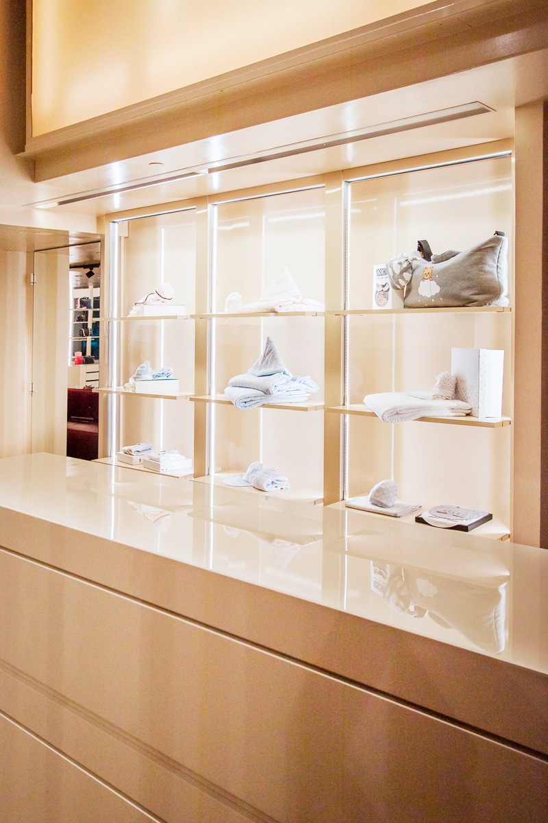
In the same way, some existing furnishings, such as the cash desk display cabinet, have received new grit through a new film, to make them uniform with the general aesthetics.

A new life that characterizes them with a fresh and dynamic soul, which fully reflects the sparkling character of children, reinterpreted in a design key for the historic luxury boutique in the heart of Bergamo.

film-covered shelves  detail

Surfaces from the textures with asymmetric geometries

Surfaces from the textures with asymmetric geometries

A particular work of the surfaces to give a quid to the elements that relate within in the same environment.

bedroom general view

A particular work of the surfaces to give a quid to the elements that relate within in the same environment.CONCEPT

To create aesthetic dynamism we worked on the details of three elements, two bedside tables and a chest of drawers, that as to be inserted in an already furnished room. The environment was already defined by a full-height wardrobe in lacquered MDF in the same white as the side walls and facing a back wall with a dominant color, an acid green. We wanted to keep white as the base color, but with some peculiarities: we brushed the wood and finished it with white open-pore water-based paint, so that its veins could be glimpsed.  
WORKING PROCESS

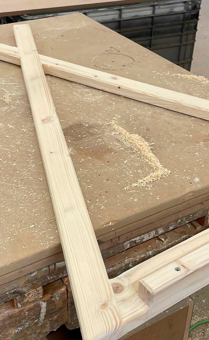
Is to underline the great initial work, the one of cutting the surfaces like the project and joint them in their various pieces by changing the inclination of the ash vein and keeping the direction of the cut also on the adjacent sides. The result is poetic, the cuts become the thread of a blade that rests on the three elements and tries to cut them in its three-dimensionality. The drawers are push-open, reached 45 ° and the drawer air corresponds to the thickness of our fake cut. These distinctive details do not shout their presence, but are noticeable only when you approach these elements and analyze them better. Inserted in the room, they blend perfectly with the general context. The particular design wheels are made by OgTM, the model is Moebius in his acid green color, like our characteristic back wall. We present some images of the work in progress with the elements assembled and not yet painted and then the finished pieces inlaid in the environment.

surfaces treatments night tables
surfaces treatments night tables 02
night tables front view asymmetric surfaces
night table front view
night table side view
bedroom general view 02
closure detail night tables
wheels detail night tables
surfaces detail night tables

A spring in OSB for the 2017 shop windows of Tiziana Fausti

A spring in OSB for the 2017 shop windows of Tiziana Fausti

The explosion of interest in the OSB has also reached the new set-up of the just concluded shop windows for Tiziana Fausti. An extremely versatile material that has fascinated the luxury store even to become the characterizing element of design for the display windows and clothing sector for 0-12 children on the upper floor.

windows OSB Fausti 2017
detail windows 01

THE MATERIAL

As a material that has always been used in the shipbuilding and construction sectors, the OSB has recently discovered a new success thanks to its particular texture. In fact, it consists of flakes of wood glued together with different orientation and it is certainly reckonable for its lively texture. Due to this characteristic, it distinguishes from chipboard panels by the larger size of the wood chips. Being a material with low economic cost and excellent technical performance, its traditional use relates to constructions. In fact, it has an excellent resistance to horizontal forces caused by wind and earthquakes. It therefore serves for bracing and in the stratifications of roofs. Besides, being available in panels of different sizes it has a particularly fast laying speeded. The reduced economic cost has favoured its wide use as with the similar chipboard’s one. Over the past few years, however, its aesthetic features have fascinated architects and interior designers who have increasingly incorporated it into their projects. The wide availability and the low cost, added to the speed of installation and the good resistance capacity, have meant the extrapolation of this material from its construction use to know new contexts. However, the increasing demand has sanctioned the growth of its sale cost. From a widely available economic element, he also began to know the retail sector with the consequently higher prices.

 
back window OSB Fausti 2017
Tiziana Fausti single window OSB 01
inside window Fausti 02
inside window Fausti 03
Tiziana Fausti shop windows OSB
Tiziana Fausti single window OSB 02

THE PROJECT FOR TIZIANA FAUSTI

The OSB has also fascinated luxury retail, which has inserted the “new” material into its store as a characterizing element for aesthetics and practicality. An interpretation that extrapolated it from its industrial context to take on a more chic and refined connotation. Even the Tiziana Fausti luxury store in Bergamo has chosen this material for the set-up of the spring shop displays. It is the protagonist able to be recognized for style without however diverting attention to the products shown. The latter seem instead valued for shapes and colours, as if they naturally stood out among the visual uniformity of the background OSB. Volumes of different sizes constitute the basic unit, which, depending on aggregations or detachment, create the fundamental visual dynamism for each shop display. The use of covering panels also for the back walls and for the floor, creates suggestive plays of depth. But not only that, the concept of the project made in collaboration with the architectural studio Marco Costanzi Architects, has also involved the setting up of the children’s department on the upper floor. This flanks the corners of Dolce & Gabbana, Yves Saint Laurent, Chloè and Stella Mc Cartney (if you want to look around these corners and learn more about their structure click here). OBS panels also become the perfect backdrop for enhancing clothing for children 0-12 years, covering the back wall and creating dynamic shapes in the flooring. It also enrich the exhibition space with dynamic volumes. In this way, the room is characterised by a fresh and young imprint, with an industrial-chic impact that does not do without elegance and refinement. Consistently inserted, to give further suggestions of freshness and spontaneity, we also find some small citrus plants that give a touch of colour and naturalness.

 
children department set-up OSB 01
children department set-up 02
children department OSB set-up 03
children department set-up OSB 02
children department set-up OSB 03
children department set-up 04
children department set-up 05