Surfaces from the textures with asymmetric geometries
A particular work of the surfaces to give a quid to the elements that relate within in the same environment.
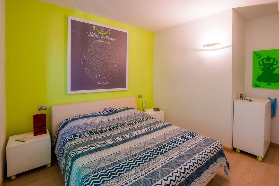
A particular work of the surfaces to give a quid to the elements that relate within in the same environment.CONCEPT
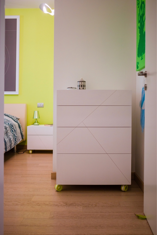
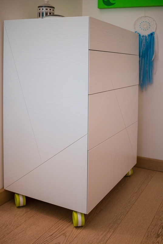
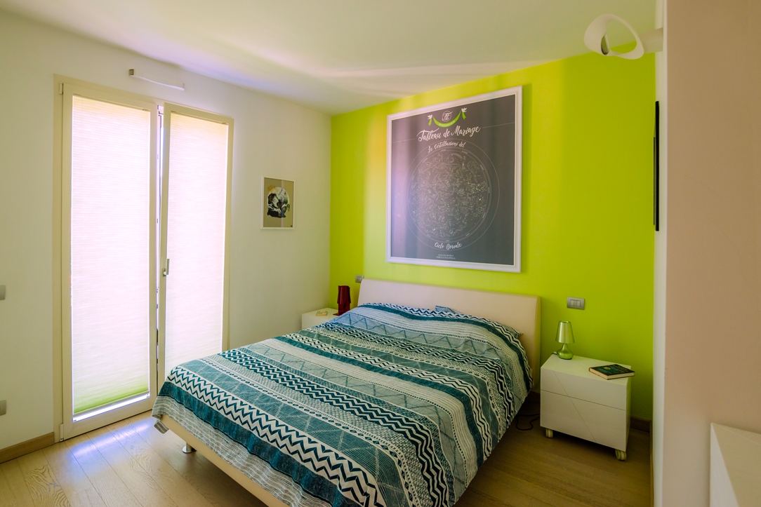
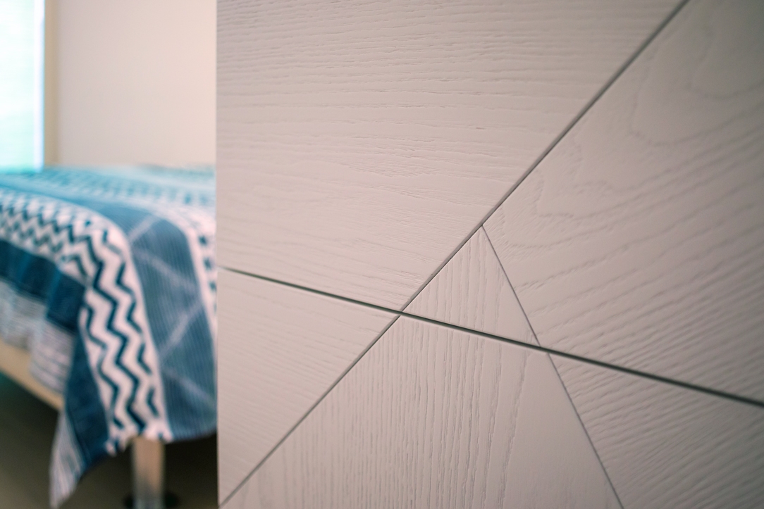
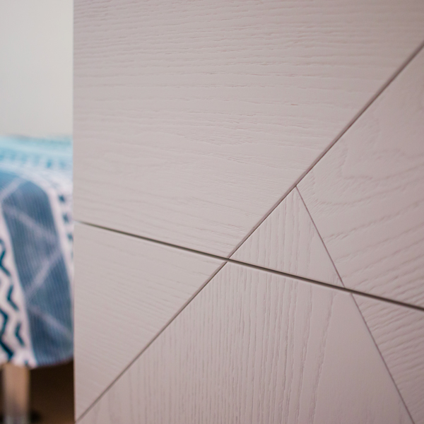
To create aesthetic dynamism we worked on the details of three elements, two bedside tables and a chest of drawers, that as to be inserted in an already furnished room. The environment was already defined by a full-height wardrobe in lacquered MDF in the same white as the side walls and facing a back wall with a dominant color, an acid green. We wanted to keep white as the base color, but with some peculiarities: we brushed the wood and finished it with white open-pore water-based paint, so that its veins could be glimpsed.
WORKING PROCESS
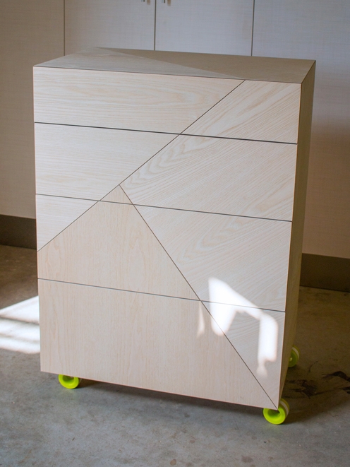
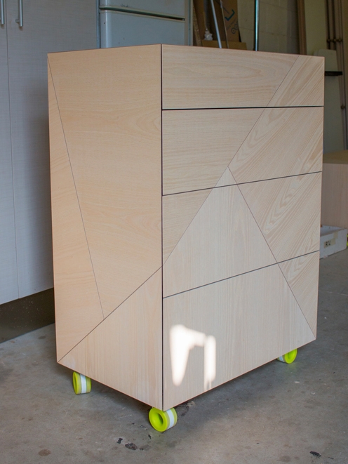
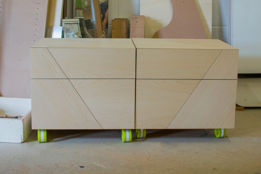
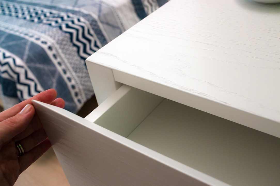
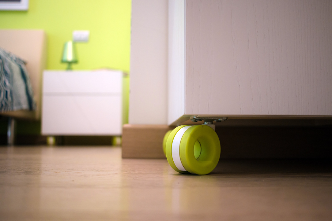
Is to underline the great initial work, the one of cutting the surfaces like the project and joint them in their various pieces by changing the inclination of the ash vein and keeping the direction of the cut also on the adjacent sides. The result is poetic, the cuts become the thread of a blade that rests on the three elements and tries to cut them in its three-dimensionality. The drawers are push-open, reached 45 ° and the drawer air corresponds to the thickness of our fake cut. These distinctive details do not shout their presence, but are noticeable only when you approach these elements and analyze them better. Inserted in the room, they blend perfectly with the general context. The particular design wheels are made by OgTM, the model is Moebius in his acid green color, like our characteristic back wall. We present some images of the work in progress with the elements assembled and not yet painted and then the finished pieces inlaid in the environment.
