The Kitchen Snack Table as an evolution of contemporary Cookery

The Kitchen Snack Table as an evolution of contemporary Cookery

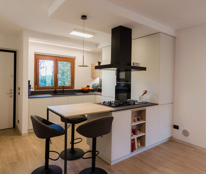
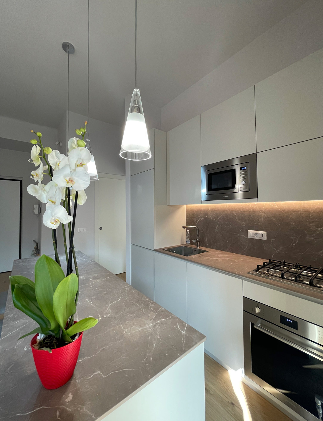
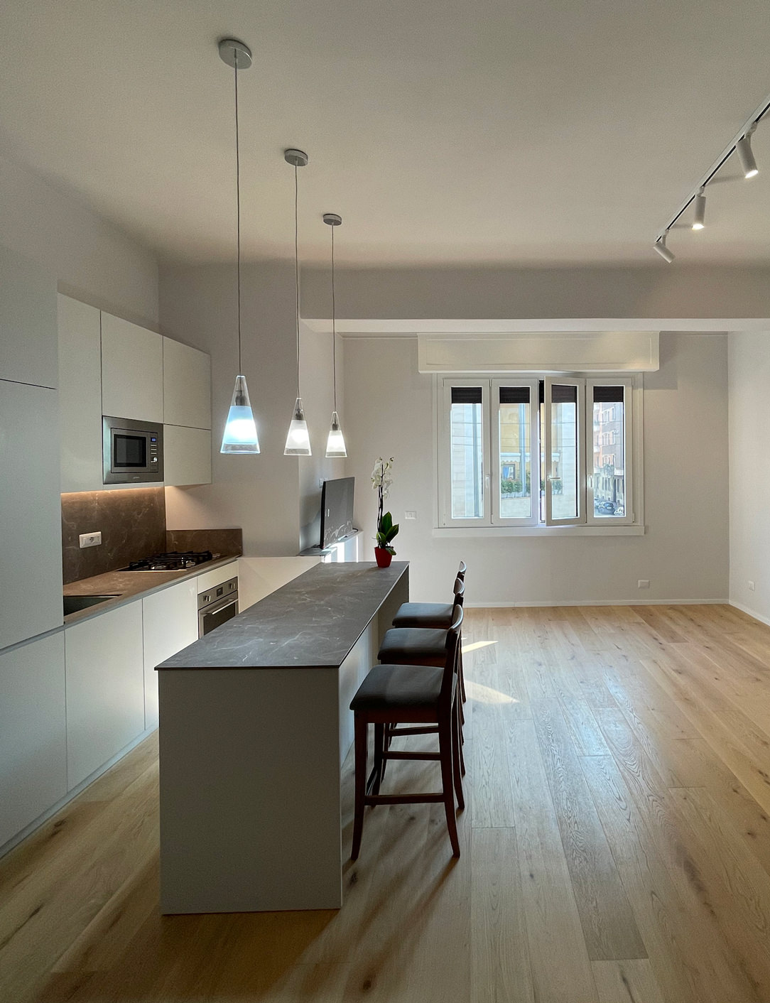
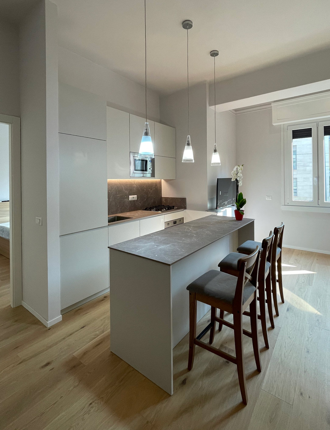
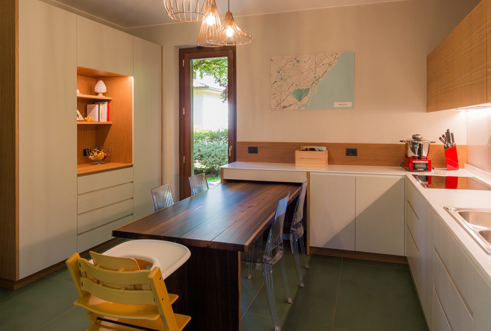
The Kitchen Snack Table has become increasingly common in contemporary cookery, representing an informal and multipurpose space. In addition to making the environment more convivial, it helps create a new hybrid connection between the kitchen and the living area.
A NEW WAY OF USING THE KITCHEN
THE DIFFERENT TYPES OF KITCHEN SNACK TABLE
• INTEGRATED TO THE PENINSULA
• INTEGRATED INTO THE ISLAND
• IN SUPPORT
• SLIDING
THE KITCHEN SNACK TABLE IN CONCLUSION


A NEW WAY OF USING THE KITCHEN

In the last decade, the kitchen has consolidated its focal role within the domestic environment. Thanks to the multitude of television programs with starred chefs, the pleasure of cooking has been rediscovered, bringing the excellence of the Italian culinary tradition back into force. By virtue of this, more and more attention are paid to the functionality of the kitchen: storage, preparation, cooking and tasting become fundamental points in the act of cooking, each with its own needs and requirements.

Kitchens have evolved over time, marrying the idea of ​​open spaces in recent years, blending into the living area. By breaking down the canonical subdivision into closed environments, the sense of openness has also contributed to modifying the conformation of the kitchens. These have become more and more protagonists both in their island and peninsula arrangement, in which they accompany the conformation of the architectural structure. From this point of view, the kitchen snack table plays a fundamental role in the new vision of the living area, acting as a functional element of conviviality and a trait d’union between the two different areas.

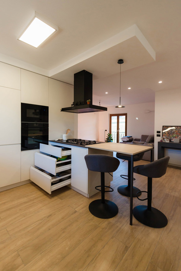
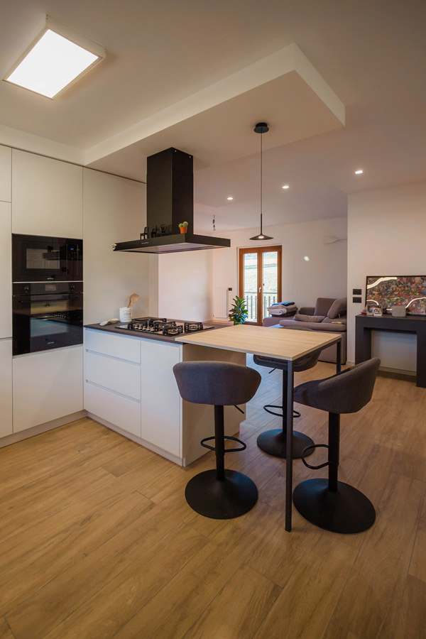
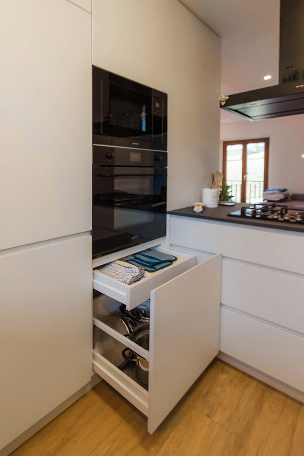
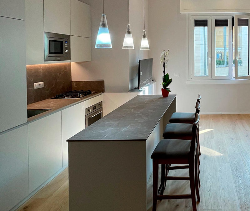
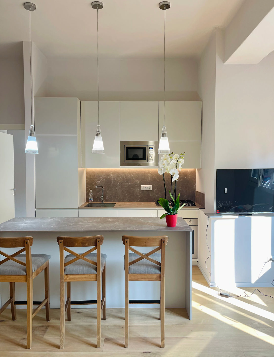
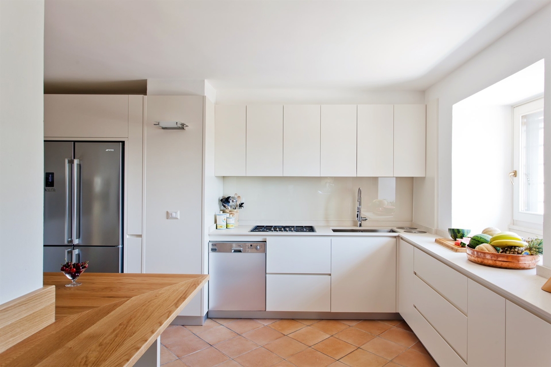
By Kitchen Snack Table we mean any type of extension of the kitchen worktop, whether it is coplanar or overlapping the latter. Being a hybrid element of both the kitchen and the dining area, it allows the tasting of quick lunches and snacks without having to sit down at the dining table. At the same time, it remains at the service of a work surface during the preparation of meals.

Made in the same material as the top or in contrast with it with a different material, it is characterized by a sophisticated design. Dimensions and locations vary according to the structure of the kitchen and the importance one wishes to give to the element itself.

wasabi peninsula kitchen

THE DIFFERENT TYPES OF KITCHEN SNACK TABLE

INTEGRATED TO THE PENINSULA

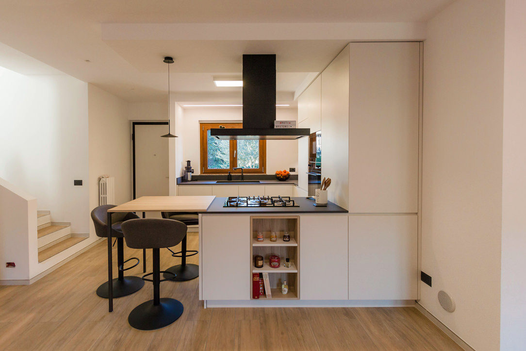
In the peninsula kitchen, the Snack Table has the same height as the worktop which is usually around 90cm and differs from the dining table which is 20cm lower. It is therefore necessary to use high or adjustable stools for a small number of diners, given the limited usable space.

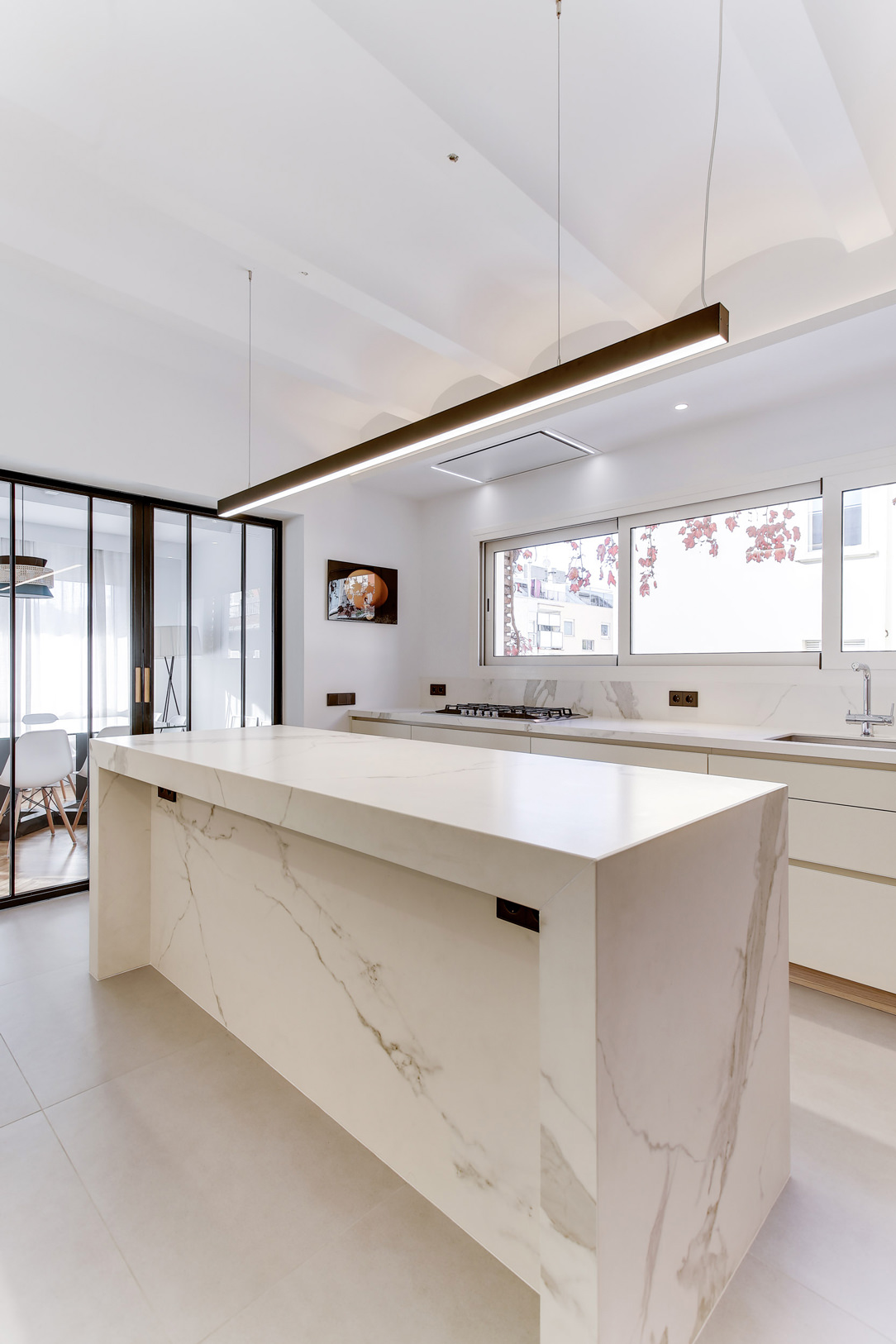
In these examples of peninsula kitchens, the Snack Table is designed in the same material as the top to give a sense of visual continuity.

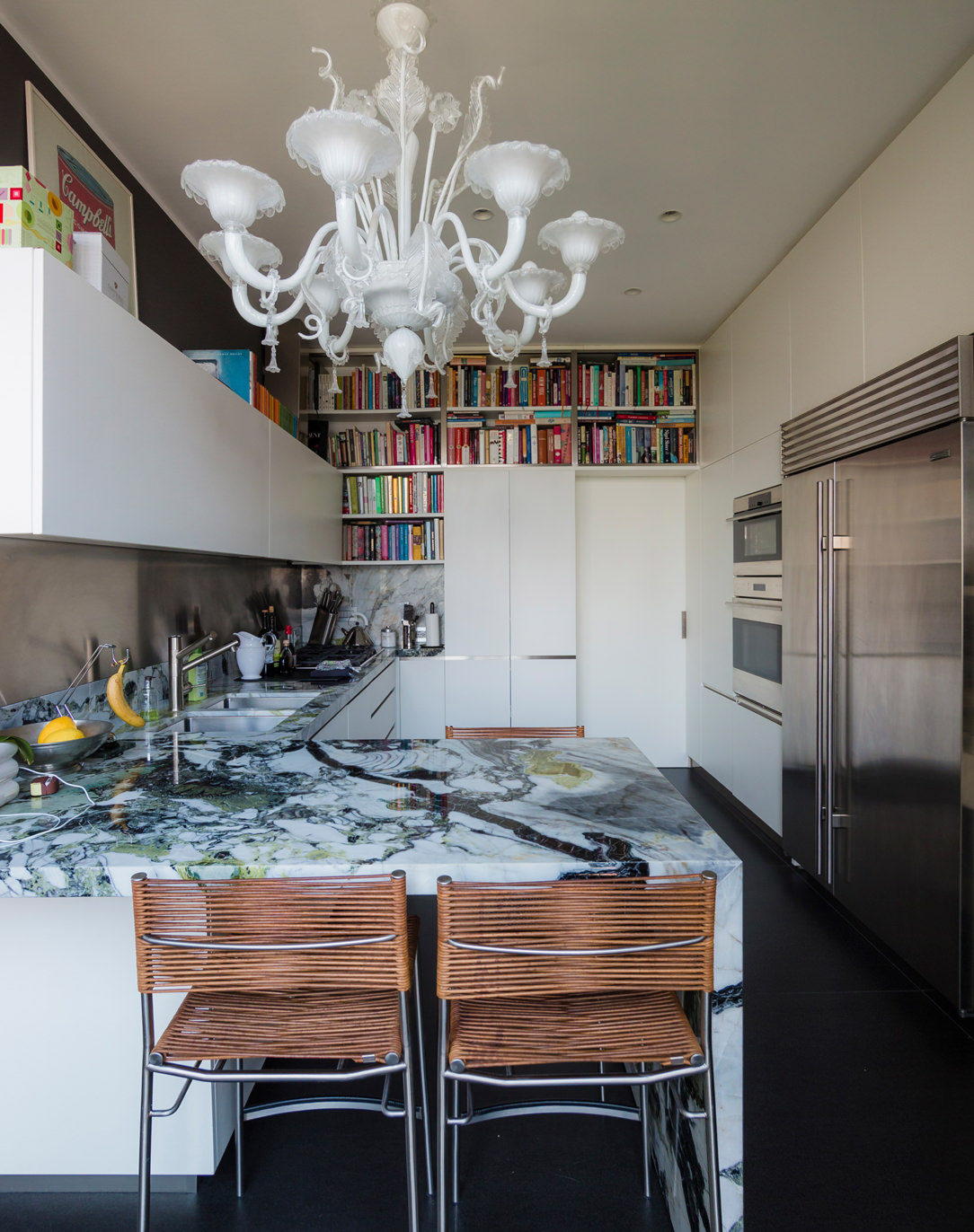
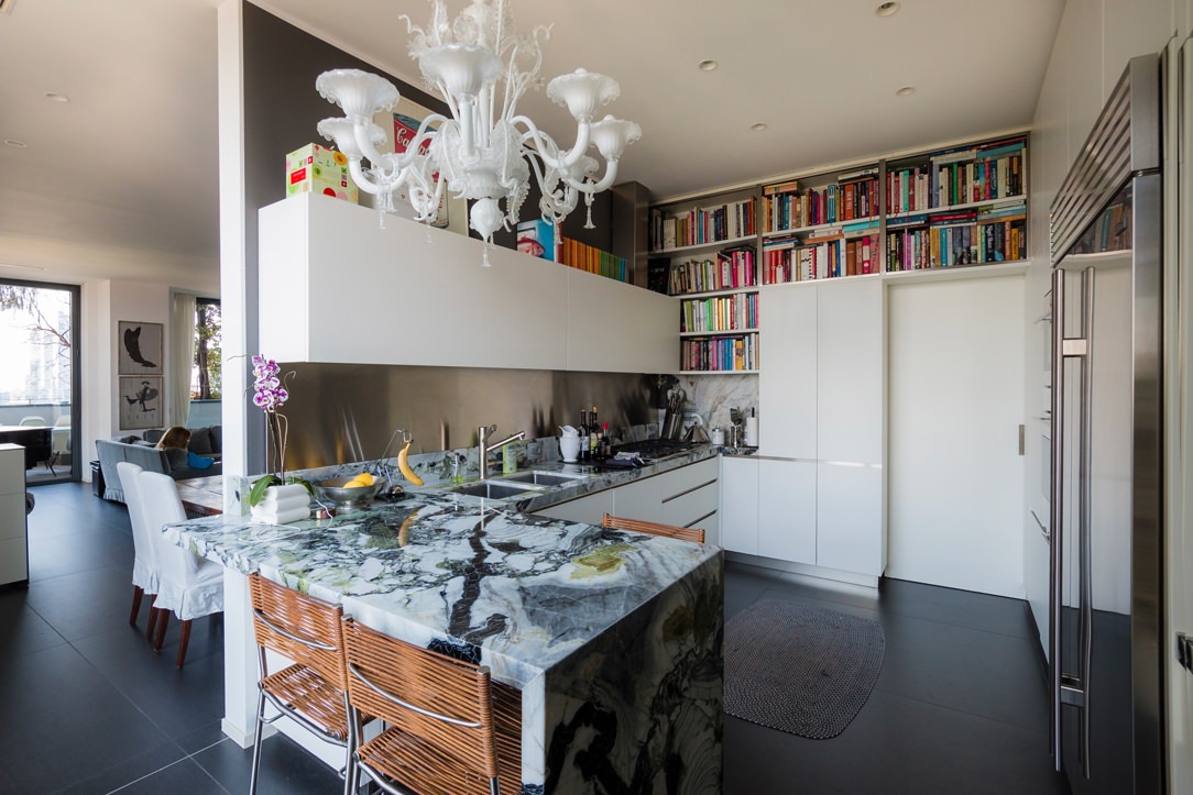
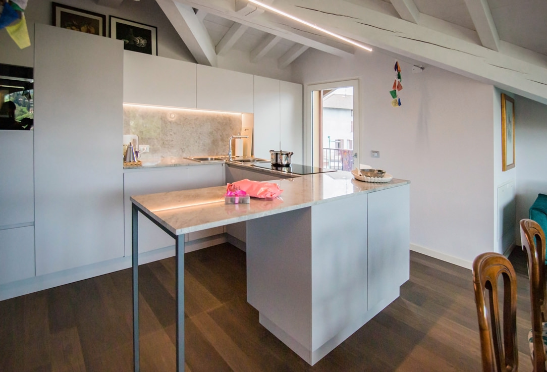
In this peninsula kitchen, the marble top stands out for its veins and elegance, becoming the undisputed protagonist of the environment. As such, it harmoniously embraces the development of the kitchen, declining towards the ground and restoring a sense of visual closure. In the second case, the worktop leaps towards the living area, supported by an anthracite gray painted iron structure with a linear aesthetic. The sense of openness created by this supporting structure allows maximum usability of this element.

lateral wasabi kitchen
peninsula gray snack table


INTEGRATED INTO THE ISLAND

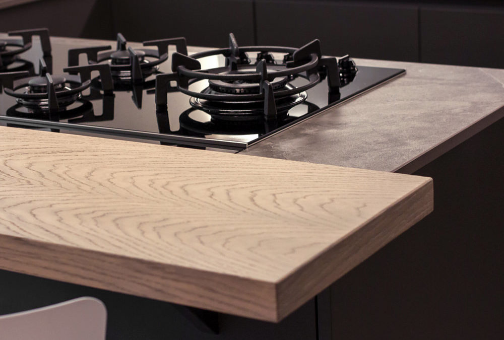
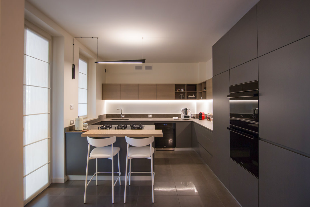
Born as a replica of an actual bar counter, it is in front of or to the side of the operational part of the kitchen, which very often incorporates the hob or sink. Usually shallow, no more than 30cm, it takes advantage of a small space both for support and for tasting. It can be raised above the kitchen top and made in a different material to create an interesting visual contrast. Here are two examples with a wooden top combined with a stone-effect kitchen top.

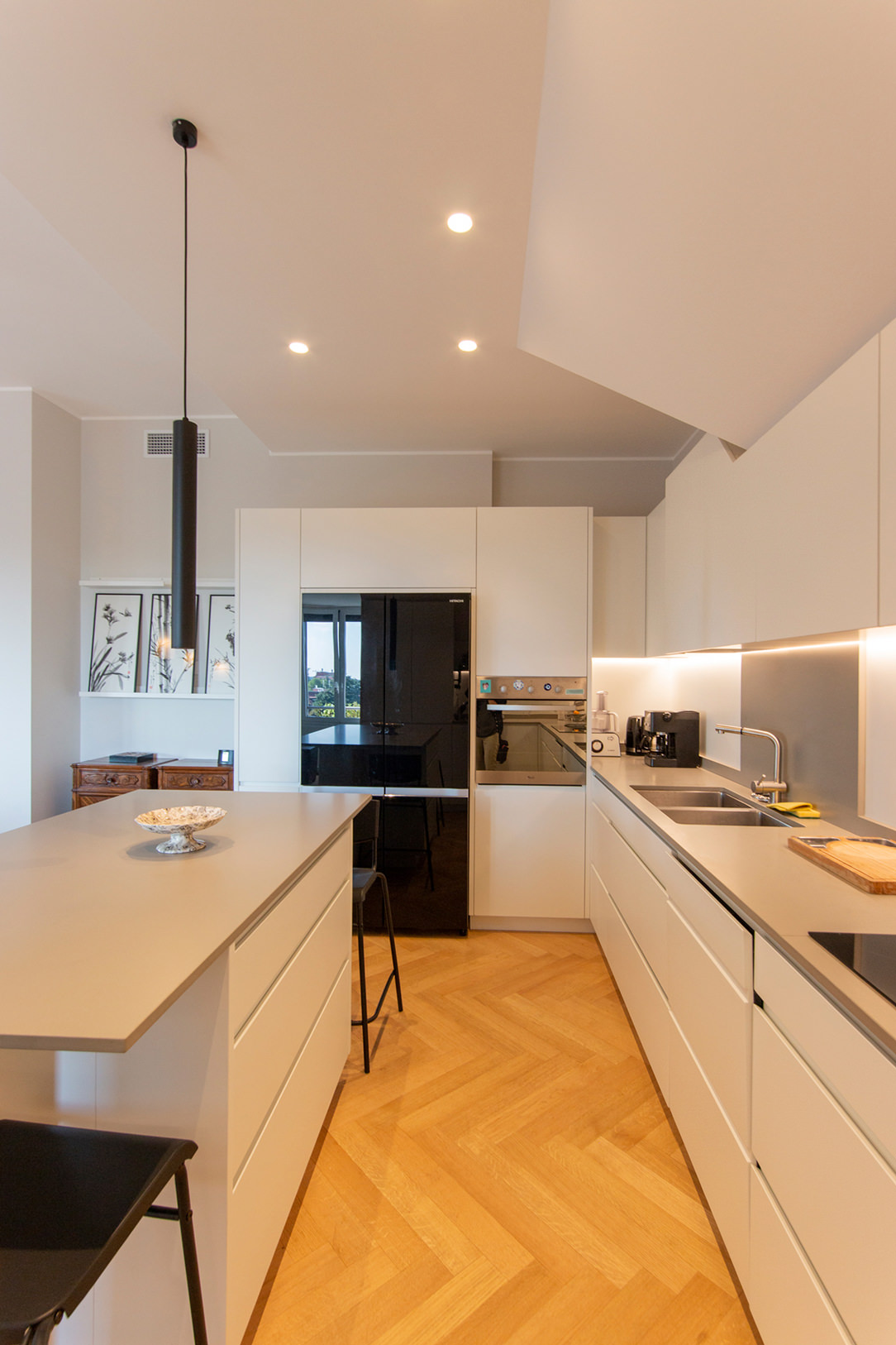
In the island, the snack top can continue with the same material, providing only a useful support and workspace as in these two cases.

light island kitchen Snack Table
gray white kitchen island

IN SUPPORT

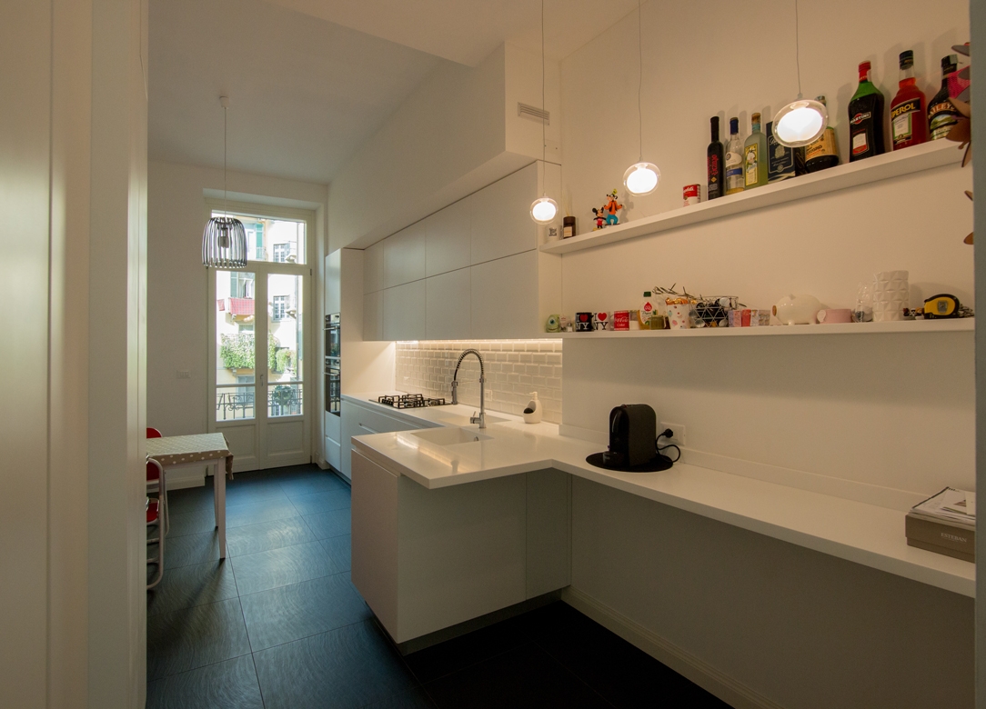
The snack top can also be released from the island or peninsula and become an independent space for supporting or consuming quick meals. A singular element inside the kitchen, as in this case, where it becomes an additional surface for completing the kitchen on the wall.

kitchen with extended Snack Table

A disturbing architectural element, such as a pillar in the center of the kitchen, can integrate harmoniously by becoming a support for an additional snack top in the kitchen, as in this case.

kitchen with lateral Snack Table


SLIDING

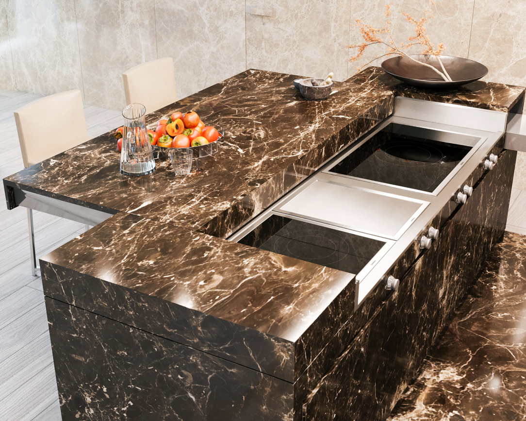
The Slide Snack Table is a sliding support capable of hiding part of the kitchen by closing it in a solid and defenseless monolith. This, thanks to a mechanical movement, changes its development by stretching the lid outwards and making it become an unconventional support surface.

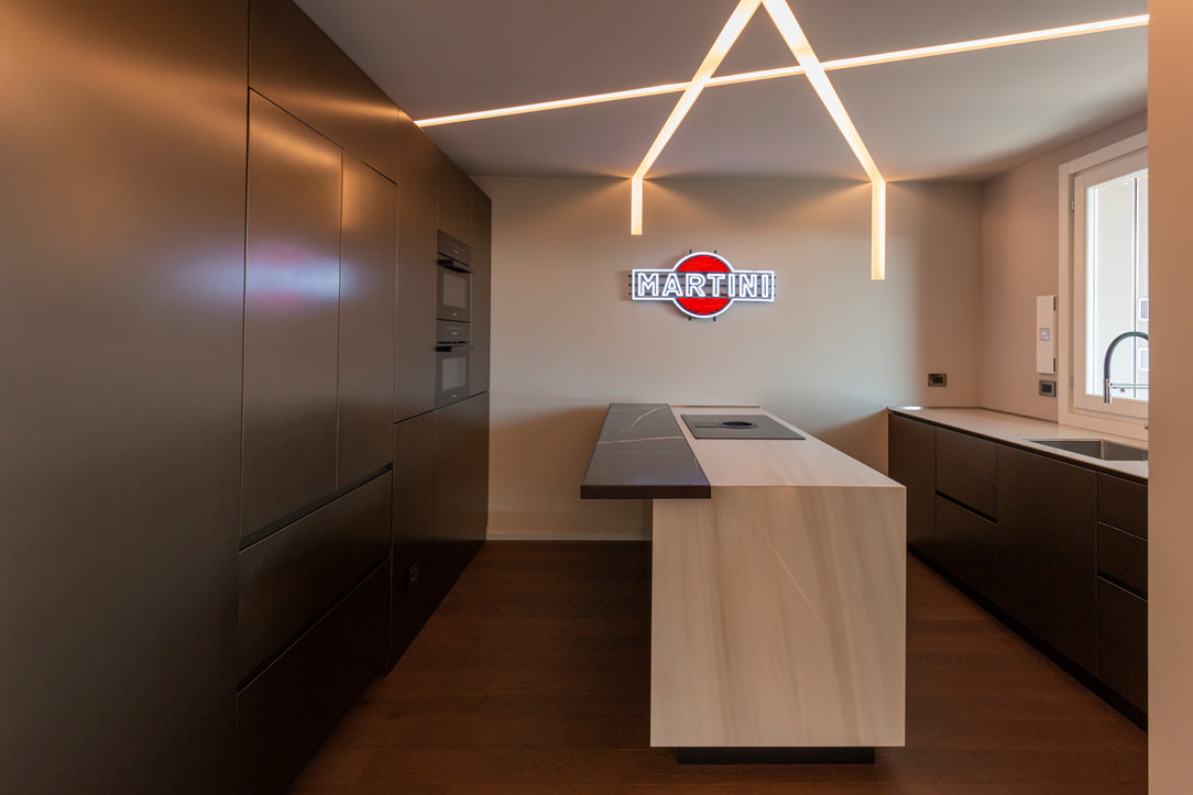
In this example, the whole island is clad in the same material, a dark emperador marble. When at rest, the structure appears fixed, while when it becomes operational, it shows the hob and the underlying materials, i.e. steel and ceramic glass.

island marble kitchen


THE KITCHEN SNACK TABLE IN CONCLUSION

We have seen how the island or peninsula of a kitchen can have a natural continuation of a multifunctional surface by becoming a Snack Table. A small but useful work surface that is used during the day for breakfasts and snacks. Or a sort of counter for quick lunches but also a support surface for enjoying aperitifs with friends.

In fact, the ritual of meals has lost its formality over time, becoming a moment to be optimized within the sometimes-hectic day. Therefore the snack top has become a fundamental element in the design of a contemporary kitchen.

AN OLIVE GREEN KITCHEN IN THE OROBIC PREALPS

AN OLIVE GREEN KITCHEN IN THE OROBIC PREALPS

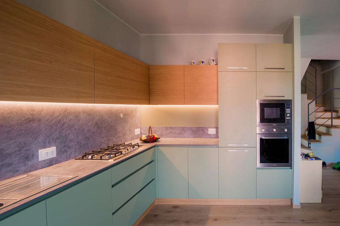
Immersed in the woods of the Seriana Valley, a splendid villa with panoramic views has renovated its interiors and the living area with a new olive-green kitchen.
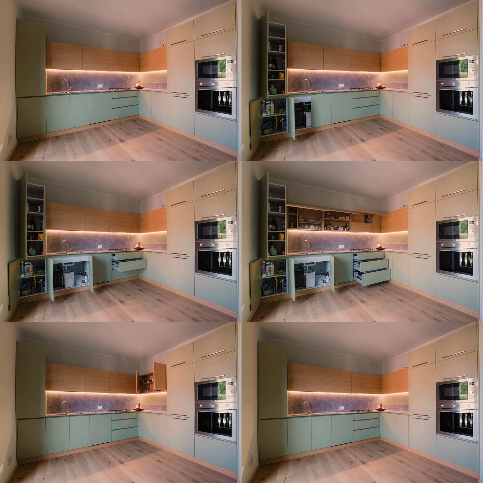
Opening doors white kitchen with island

A FUNCTIONAL AND MODERN PROJECT

The heat of these summers has made us rediscover how beautiful, cool, and relaxing our second mountain homes are.
There has been a real repopulation of our Valleys and the trend is increasing.

After so many years living away from our second homes, however, we also want to return to live there by renovating them, to fully enjoy them.
The customers’ request was to have a new modern kitchen, open to the living room in a large, functional, and capacious Open Space.
A kitchen able to marry with some wooden elements already present in the house and with the new living area with fireplace in shades of gray.

Our interlocutors were not a single subject but several families who use this second mountain home, so we tried to satisfy all of them with a project in harmony with the context.

green and wood kitchen
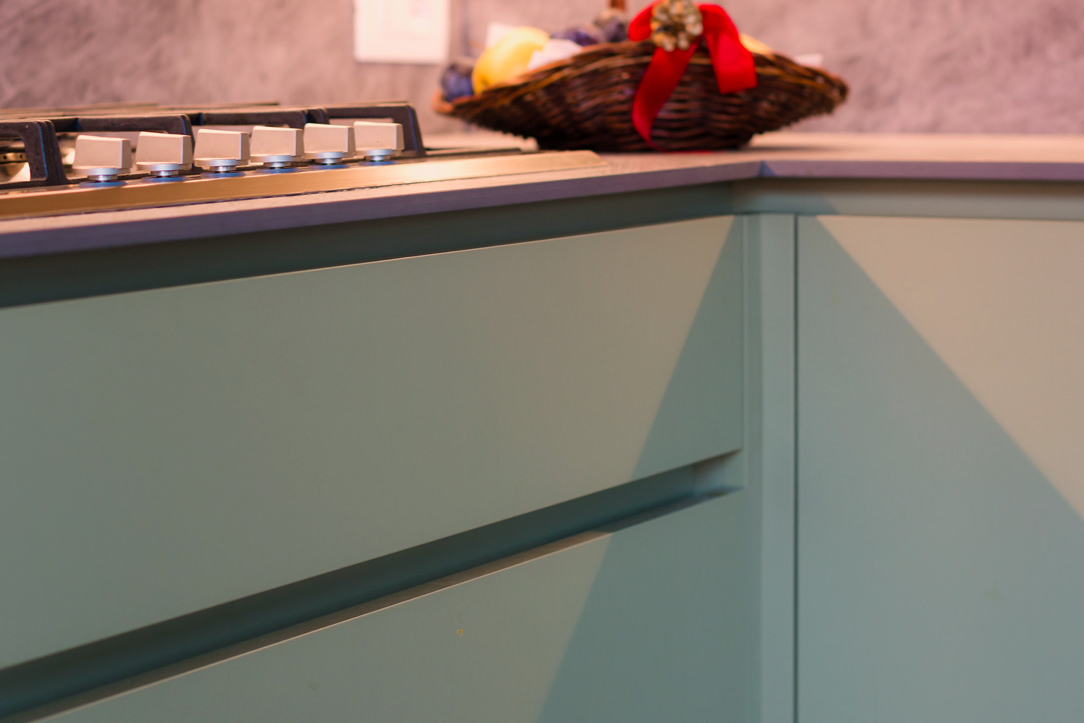
detail of green door hollow handles
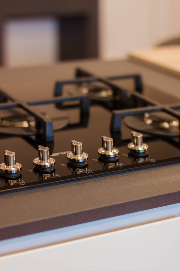
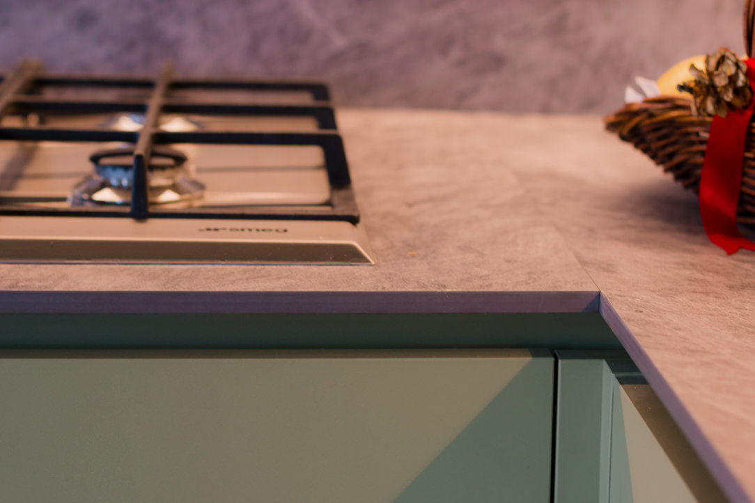
gas hob detail

THE KITCHEN PROJECT

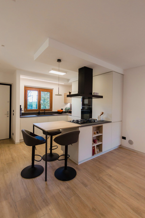
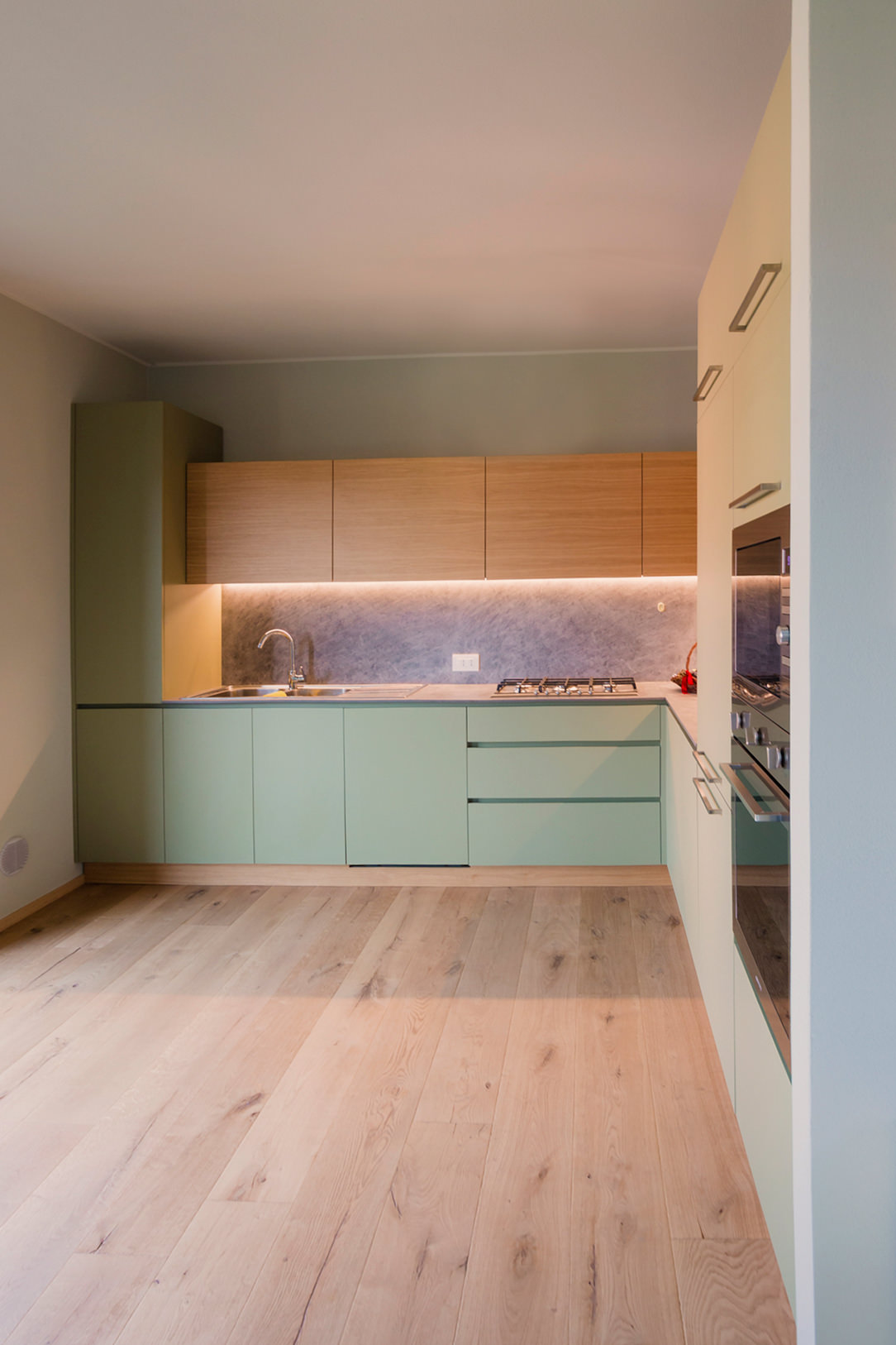
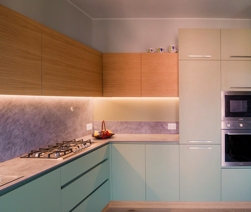
Once the dividing wall was knocked down and the old access to the room closed, the kitchen had the opportunity to develop into a corner, right in front of the bright French window that overlooks the external panoramic terrace.


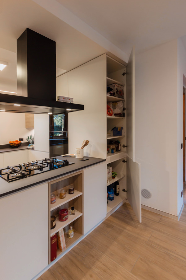
A first column volume on the left acts as a large pantry with shelves (useful for several users).
In the center and taking advantage of the corner, a hollow with low wall units houses the sink with drainer, the gas hob, and a good worktop.
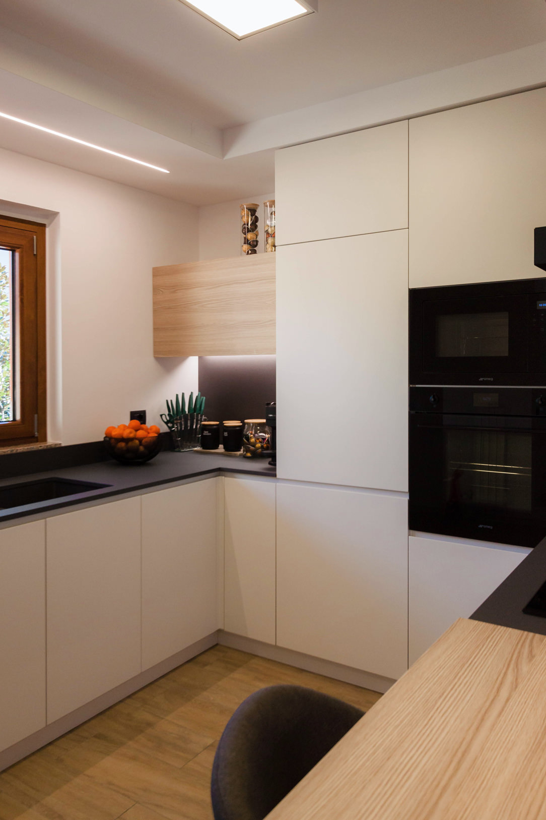
The refrigerator column and the oven column with service doors in the upper part close the opposite corner.

green and wood kitchen
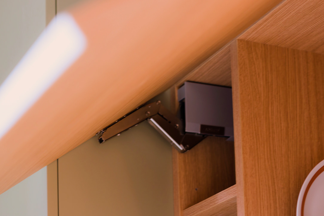
aventos detail
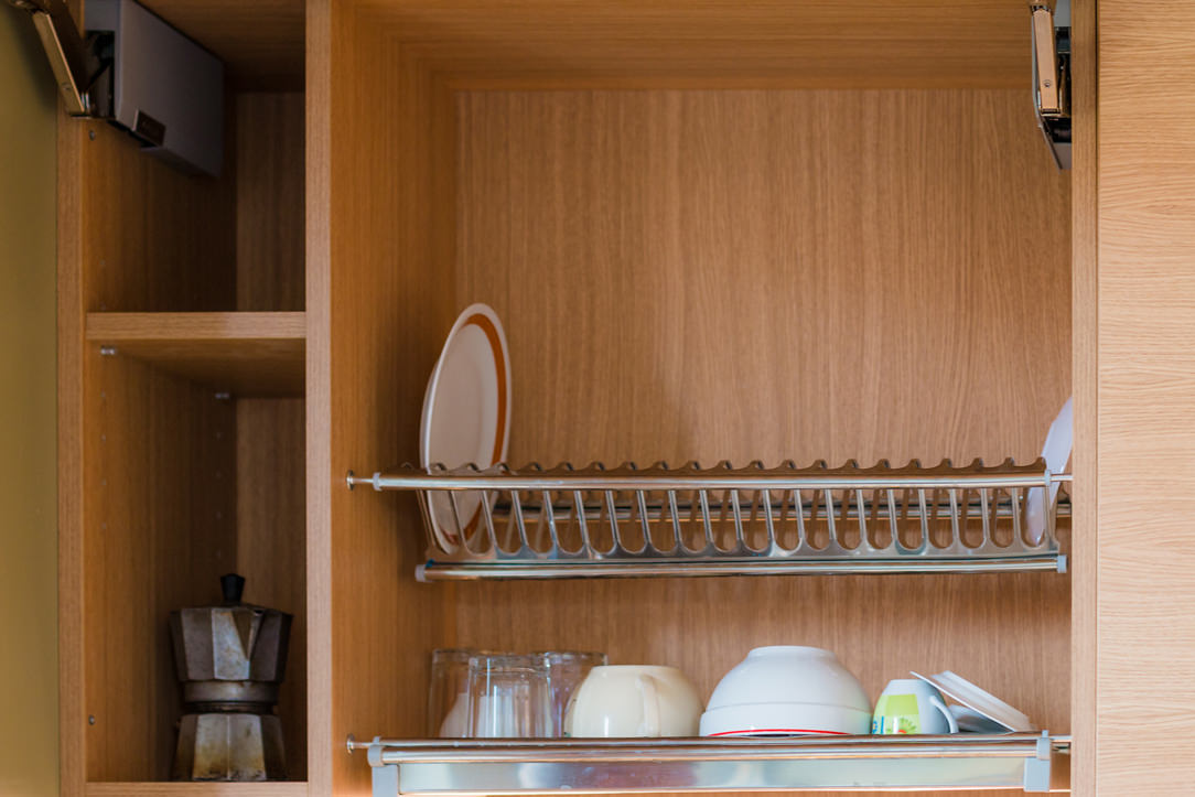
 dish drainer detail

GREEN KITCHEN: HARMONY BETWEEN INTERIORS AND EXTERIORS

The materials and colors was chosen to follow both the trends we found at the Salone del Mobile and, on a conceptual level, the external environment. The predominant color of the kitchen is in fact a very delicate olive green, which recalls all the forest green that can be glimpsed from the window. The walls are also in the same color tone but in a lighter shade. The floor is made of oak planks and rises to become the same plinth of the entire kitchen. In addition to aesthetics, however, a certain degree of resistance was required, as the house is used by several families, so both doors and wall units are made of plastic bilaminate. As far as the oak essence bilaminate is concerned, we sought the closest color to the parquet, but we preferred to move it away from the floor in a more linear rhythm and without obvious knots. The top is in HPL, that is a compound of cellulosic fiber impregnated with thermosetting resins, practical and resistant. The finish of the top is in Cardoso stone, in shades of gray, which incorporates the other elements in the living room and its irregularity, and its marked veins make it very similar to the sandstone rocks of the Valley. Green, wood, and rock, these are the harmonic references that we have chosen as the common thread between inside and outside and the result is really satisfying. Here the link to another renovated mountain apartment.

When a white kitchen with an island becomes a functional element of a youthful two-room apartment

When a white kitchen with an island becomes a functional element of a youthful two-room apartment

In the centre of Milan, a youthful flat is spread over two levels, welcoming a white kitchen with a functional island in the centre. On the upper floor, the elegance of total white is accompanied by a niche wardrobe with mirrored doors that amplify the perception of the sleeping area. Practical elements with linear and elegant aesthetics that define the look of the entire flat. Let’s discover together this realisation designed by architect Stefano Belotti!

Opening doors white kitchen with island

A white central island dominates the kitchen area

Upon entering the flat, with its small but practical dimensions, the view is projected onto the kitchen, the layout of which makes full use of the available height with storage compartments. Acting as a visual filter, but at the same time as a functional element for the cooking area, is the central island that echoes the white aesthetics of the kitchen.

The worktop, in matt white Corian, becomes not only a work surface, but also a convenient snack top for aperitifs and quick meals.
In this respect, the folding mechanism that allows the (future) service stools to be concealed plays a key role.
The front closure panels, in fact, rotate sideways to then be incorporated into the main structure and almost completely disappear.

white kitchen with island oven combination column
white kitchen with island wall units integrated lighting
detail Corian worktop integrated basin aluminium mixer
aluminium chain Corian top
white kitchen with combined oven island hidden door laundry area

The volume of the island consists of front-extension doors with internal drawers of different heights.
A solution that has now become predominant in the recently concluded edition of the Salone del Mobile, as well as clearly recognisable in previous editions.
The main advantage is certainly the more elegant and minimal aesthetics, in which horizontal cuts resulting from the division into drawers are eliminated in favour of a single door.

detail of internal drawers in white lacquered kitchen with island

From the wall unit to the laundry corner: functionality marries total white aesthetics

The adjoining wall unit is made up of multi-level volumetric plays.
The service columns, incorporating the built-in refrigerator on one side and the combi-oven to its right, are accompanied by compartments with hinged doors that extend across the entire upper part of the kitchen.
On the same depth level, matt lacquered doors with a dishwasher in the central area and internal shelves in the surrounding compartments.
The central area, on the other hand, is characterised by a break-out with worktop and sink, upper wall units with vertical partitioning and built-in lighting with a smaller depth.

To ensure the best functional configuration, the side wall to the kitchen and the central island accommodates a white lacquered door that covers the entire height of the room.
This conceals inside the laundry area with a washing machine and tumble dryer with columns accompanied by practical shelves for cleaning products.

The linear aesthetics are emphasised both in the choice of lighting, pendant above the white central island and LED strip lighting in the back wall of the kitchen, and also in the joining chain between the Corian top and doors below.
The material detachment through an aluminium profile becomes the horizontal reading element both for the back wall, joining the two side ends, and embracing the central island with kitchenette.

white kitchen with laundry corner island
White kitchen with island pull-out front drawer doors

A wardrobe with mirrored doors embellishes the sleeping area

On the upper floor, accessible via a white painted spiral staircase, a wardrobe with six mirror-covered doors dominates.
The rhythmic vertical division is interrupted by a single horizontal cut at the top, creating an interesting geometric subdivision in the overall aesthetics. The choice of mirrored doors on the one hand amplifies the brightness and perception of the room and at the same time enhances the overall aesthetics.

The division into six doors is reflected internally in a symmetrical composition with double central compartments accompanied by two single compartments at the ends.
Compartments with hanging tubes are favoured, but there are also internal drawers and adjustable shelves for better organisation of clothing.

If for the lower level the kitchen with central island favours a uniform white aesthetic, the sleeping area, on the other hand, marries contrasting aesthetics.
The bright exterior of the mirrored doors is in fact contrasted by the elegance of a matt black whole on which the elegant chrome hanging tubes can be seen.

mirrored door wardrobe
wardrobe mirror doors dark laminate interior drawers
Niche wardrobe with dark interior mirror doors
detail mirror cabinet doors interior lighting
two-room mirror-door wardrobe
detail of mirrored wardrobe doors in niche

The choice of a total white kitchen is always a contemporary and elegant solution. Its simplicity makes it easily adaptable to the surrounding context, whether it has a retro feel, as in this example, or contemporary pop, as in this realisation. It can also be combined with natural wood elements, such as chopping boards and snack tops, thus adding a hint of warmth, here’s an example! Or exploit plays of opacity and shine through different materials, making the room look fresh and bright, perfect for seaside homes!

SALONE DEL MOBILE 2022

SALONE DEL MOBILE 2022

SALONE DEL MOBILE 2022

We left last September full of expectations towards the Salone del Mobile 2022 and, after visiting it, we can say that it has amply satisfied them. The central themes of this edition were sustainability and ecological transition, it was interesting to discover how the world of serial production approached them.

INTRODUCTION

If last year Milan was ready to restart and to repopulate itself, in the latest weeks we have witnessed a real migration towards the pole of Italian Design. We were able to ascertain that Milan has not only flourished again and the machine of the Salone del Mobile has begun to march at full speed but the demand, which had remained silent in the last years of restrictions, has turned out to be hungry for novelty. The streets of the city were full of people and was a long time that we have not been on crowded subways, in noisy stands talking without fear and without masks about something that was totally linked to our work. I have to admit it was unexpected but cool.

salone fiera rho

MIXED REALITIES

Spaces and objects seem to have taken on a new meaning in these years of resilience. Our habits have changed and rooted within the home, it is as if several levels were superimposed in the home space containing all the activities that were previously external, from work to leisure. Interesting and excellent starting point was Huawei‘s immersive installation: Tomorrow Living, in which new mixed-reality living scenarios are shown. Here, intelligent technology allows us to experience the home intensely, reconnecting it with nature, optimizing consumption and space in an environment that is not only more sustainable but also more habitable. In favor of a psychophysical well-being, our home does not become our cage but a circumscribed environment in which it is possible to live in harmony, with ourselves but also with the neighborhood, creating small permanent communities.

Huawei tomorrow living

SUSTAINABILITY

From a Green perspective, on the recovery of goods and raw materials without waste or unnecessary scraps of materials, objects lose their transient essence and become long-lived. Tom Dixon in his installation Twenty, in addition to celebrating the two decades of activity, reflects on the complexity of sustainable objects, showing some ideas on which the studio is working. Among these is their symbolic project, Flamecut, a chair as an example of this design theory that survives over time, which will be able to overcome plagues, natural disasters, but above all, the passage of time unchanged.

Tom Dixon Flamecut
Tom Dixon twenty

A LIFE EXTRAORDINARY

Objects not only become long-lived but are also enriched with cognitive synapses. The new AI, that we also see in the Home Smart Automation devices, responds to our every desire and becomes a real life partner. Moooi on the wave of technology and in Partnership with LG and IDEO presents in its A Life Extraordinary at Palazzo dei Tessuti, Piro, an intelligent scent diffuser. Piro is able to dance to the rhythm of music, follow you with a motion sensor, change the color of its internal LEDs and, if deemed necessary, spray a delicate cloud of perfume in the air.

Its structure is the one of a mechanical arm used for automated productions, decontextualized, covered with a shiny and colored shell and programmed to become a sentient household object. The home itself becomes an extraordinary experience in Moooi’s Vision, including soft fabrics, upholstery that make you dream and refined and elegant objects. We thanks Marcel Wanders, the founder of the brand for his ever visionary creations.

Moooi chair and table
moooi walpaper
moooi sofa

THE TRENDS OF THE SALONE DEL MOBILE

The noble themes of this year arise from questions related to the future of living. Raw materials are constantly running out and have become, especially in recent years, a source of economic speculation. The central installation at the Salone, Design with Nature, a project developed with Mario Cucinella, aims to become a table for discussions and insights on the themes of the circular economy and reuse. The city could in fact become the reserve of the future, where to find most of the raw materials useful for construction in a virtuous ecosystem.

KITCHENS AND MATERIALS

In fact, two new areas in the pavilions were created from this cue, those related to FTK, that is the new Technologies for Kitchen, appliances capable of reducing their consumption from a home automation and intelligent point of view by raising the level of their performance. The new household appliances are multifunctional and professional, even if in the kitchen is tending to hide them from the view. We have noticed that in most of the new proposals of the oven column, doors are packaged laterally in ingenious systems with hinges and side guides that in a few centimeters house the door at rest and close themselves.

hidden kitchen

Valcucine with advanced motion sensors makes the kitchen a fluid mechanism capable of closing, opening or changing functionality with simple soft hand movements.

Valcucine Mendini
Mendini closed

Instead, the working space is highlighted and is further equipped in the rear part with modules dedicated to all the useful tools in the kitchen. From the knife holder, to the spice rack, to the cutting boards, to the paper roll, everything is tidy and accessible.

equiped rear kitchen
kitchen back
closed back kitchen

The work area is well lit and characterized by non-toxic and antibacterial materials. The main material of this Salone del Mobile is Lapitec. Green, resistant to thermal shock, scratches and is also a conductor of heat, has in fact patented the first invisible hob. The use is simple: equipped with magnetic sensors and a hidden coil, by placing a special silicone pad on the top, the touch controls are activated that allow the system to be switched on from two or four burners. Without the pad, the induction hob and its controls are inactive, safe and impossible to accidentally turn on. The top therefore remains completely free, distinguished only by a display and small engravings that emphasize the full-body nature of the material. This will not only helps in cleaning operations, but also allows the worktop to be used for other activities, from food preparation to welcoming convivial moments.

Lapitec chef

Together with Lapitec there are, again for the kitchen top, ceramic and stoneware materials, with veins printed on the surface reminiscent of trendy marbles or solid colors. The finish of the materials goes from Soft touch, velvety and soft, to rough and irregular surfaces. In fact, even the new Neolith production tends to emphasize the tactile inhomogeneity of their slabs.

Neolith texture
Marble effect top

From an aesthetic point of view, the Kitchen top is presented in two thicknesses, the very thin 12mm, which was so fashionable last year, a half size of about 6cm and a 12cm which in many cases, ingeniously, is equipped with drawers containing crockery and small kitchen items. Is also nice the play created with the voids, the undertop groove of the recessed handle (always in trend) and then the departure of the front door.

equiped top
Kitchen medium top in wood
kitchen stone drawer

The internal frames of the classic-style doors have been slightly changed in honor of modernity (here an insight into the reference style). The bands become almost three-dimensional and knobs or handles disappear in favor of hidden pushes.

kitchen modern frames
frames details

NEW COLOR PALETTE, MATERIALS AND DELICATES

We rediscover the terracotta color, elected color of the year 2021 in a more delicate shade even in the Solid tops and then taken up again in the laminate or lacquered doors. The visual connection that is thus created between different materials but united by the same shade is very nice. The Blue Klein color is striking in a very strong shade used for walls and day furniture, this fades and is found, in a more delicate powder-colored version, in the kitchen. Also for the tops we find the sage green, which with the marble Verde Alpi is back in vogue and many shades of gray.

color terracotta
color dust light blue
Color Blue Kline
Silestone proposals

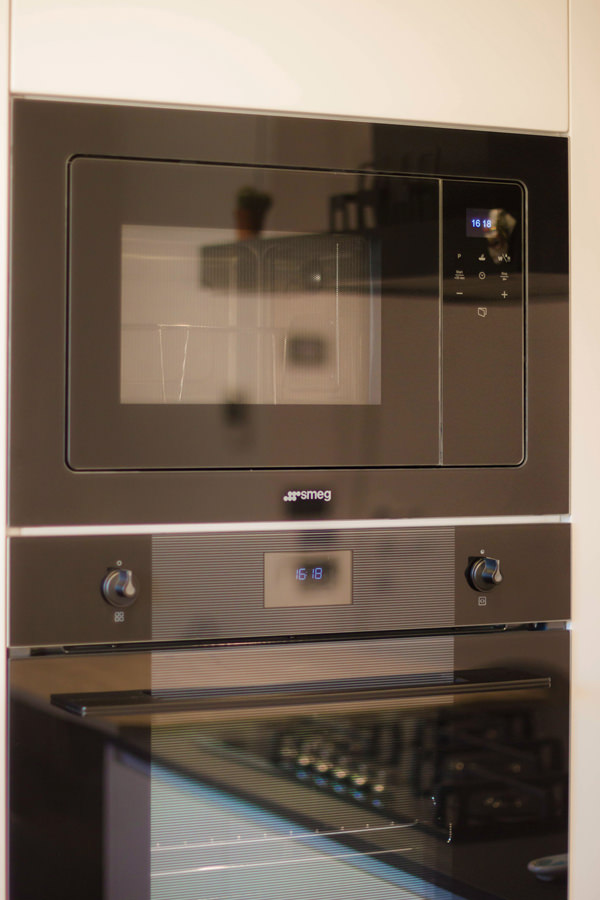
Anthracite gray is also introduced in the finishes of household appliances, taking the place of glossy black in the new Smeg proposals.

smeg anthracite

RIBBED AND MILLED WOOD

With its vintage soul, very elegant and established trend, it is the ribbed wood, which we are also using a lot. So wood is back but with a different dress, in uniform strips in natural or lacquered color. We found it on the doors of the kitchens, of the day furniture, in the sleeping area and also as wall paneling.

ribbed wood
ribbed wood
ribbed wood
ribbed staircase

The raw materials are then shown with textures and intertwining, the marble is milled in subtle geometries that expand the movement of the veins. The stones, on the other hand, fit together in mosaics capable of creating excellent visual dynamism.

trame di pietra
trame di pietra
trame mosaics

Even the glass is no longer a smooth and clean extra-clear crystal but is found in its fluted form, sometimes with a mirror back.

fluted glass
fluted glass

FORMS

A Salone del Mobile that looks to the past to take inspiration, both in materials and shapes. The rounded lines are back, mainly in the stand-alone furniture and in the living area, in the kitchen the snack top or the convivial table in the living room are softened.

rounded forms
rounded furniture
rounded furniture green
rounded ribbed furniture

FINISHES

Here we decree that stainless steel has lost its charm and has been replaced with many different finishes. As we have seen in recent years, the satin brass color and rose gold are the stylistic guides of the fashion industry, which, albeit indirectly, dictates the rules and also influences the world of design. In fact, we find metal profiles with these finishes in household appliances and in taps, if we do not want stainless steel we have the possibility to exclude it from any element for a valid alternative. These include the matt black, which can also be found in the matching preformed washbasins.

finishes taps

THE LOCATIONS OF THE FUORISALONE

The Salone del Mobile is also an opportunity to discover the wonderful buildings in the city center that open their doors and become an exhibition venue. Tom Dixon presented himself at Palazzo Serbelloni, while Palazzo Bovara welcomed, as last year, Elle Decor. Within the settings that describe and define the various areas through objects of timeless design. In the house we live in, objects, lamps and furnishings are arranged without apparent temporal and functional hierarchy, becoming interchangeable based on the activity carried out within it.

Palazzo Bovara
Palazzo Bovara restaurant
Palazzo Bovara Elle Decor

At Palazzo Citterio, the Maison Dior collaborates for the first time with Philippe Starck, inviting him to reinterpret the Médaillon chair, a symbol of the Louis XVI style, dear to Christian Dior.
The result is Miss Dior, an elegant chair that emphasises the lightness of aluminium in three variants, two finishes (polished and matt) and four colours, including chrome, copper, gunmetal and gold.
Here is the link to last year’s article, in which the same chair was reinterpreted by many different designers in even bizarre designs.

Dior and Stark
Dior rose gold

At Palazzo del Senato Kohler presents a world preview of a large-scale immersive art experience, entitled Divided Layers, in collaboration with one of the greatest artists on the contemporary scene: Daniel Arsham, who also created Rock.01 for the company, a 3D printed sink.

palazzo del senato
arsham

The alternative exhibition venue was instead the vault of a former bank in Piazza Affari where Pulpo‘s exhibits seemed even more precious.

Pulpo caveaux
Pulpo caveaux

STATALE UNIVERSITY

Statale University was totally occupied by over 40 projects that aim to reflect on what design could do for a better future. Regeneration, redevelopment, recovery and rebirth through eco-sustainable and dreamy installations. In the courtyards of the university, the theme of the labyrinth is chased, such as The A-maze Garden by Lissoni Associati with Amazon, or even Labyrinth Garden by Raffaello Galiotto. In the central courtyard stands the Sideral Station telescope tower, created with Whirlpool and signed by Michele De Lucchi. This is how he explained his project: «It is a tower to look up and imagine alternative visions of tomorrow. The immersive experience inside, where emotional spaces are explored, is designed to amaze and push the visitor to continue dreaming of a tomorrow worth living “.

statale main yard
statale labyrinth
statale idra
statale aula magna

HERMES, FENDI AND LOUIS VUITTON

The large space of the Pelota was, once again this year, the exhibition site of Hermes, which presented its latest collections dedicated to Home Decor. With extreme delicacy, the totems that contain the displayed elements, also divided by color ranges, are characterized by a light structure in wood and rice paper. Always the natural paper, structured in volumes of different heights, it is an exhibition venue for ceramics, leather containers and small bamboo objects.

Hermes ceramics
hermes leather
hermes small objects
hermes ceiling structure
Spazio Pelota Hermes

Fendi Casa presents its timeless home in a splendid building in Via Monte Napoleone. References to the past, new eco-sustainable materials such as bamboo, classic and modern shapes embrace each other in a sophisticated and attention to detail production.

Fendi Bar
Fendi home
fendi home details

The Luis Vuitton Objets Nomades exhibition is geared towards creative innovation, in which famous designers imagine experimental but functional furniture. The objects in the collection are characterized by an explosion of color, the beautiful Bulbo armchair by Fernando and Humberto Campana opens the collection and, during the visit, we were also lucky enough to immortalize Patricia Urquiola with her Overlay Bowl.

object nomades
object nomades louis vuitton
patricia urquiola
object nomades

THE BOLD INSTALLATIONS BY LEE BROOM, ALCOVA AND NILUFAR DEPOT

Lee Broom in the Brera Design District presented his Divine Inspiration, a series of six ethereal lamps that arise from the exploration of monumental design associated with religious architecture. A spiritual journey that transforms environments and evokes feelings of reverence and contemplation.

lee broom
lee broom
Lee broom
lee broom

Nilufar Depot presents Innesto, three floors of rich installations and a particular and exclusive type of design, which we could also define as unique. Because it arises from personal curiosity, from contamination, the appreciation of heterogeneity and the fusion of apparently distant worlds.

nilufar depot
nilufar bed

For the third consecutive year, Alcova confirms its attention to the evolutions and developments in the world of design, to offer a stimulating cross-section of it. In each room a different exhibition in which different projects alternate established professionals with young emerging talents to explore new frontiers from the point of view of technology, materials, sustainable production, social practices and any other current direction of design.

alcova portal
alcova window
alcova textiles

Interesting and inherent to the theme of reuse were the presentation of recycled materials from disused appliances.

home appliance

THE SALONE DEL MOBILE 2022 IN CONCLUSION

Production would never be with zero environmental impact, sustainability and ecological transition are therefore difficult issues to perform but at the same time interesting challenges. In the hope that we can really create a virtuous ecosystem on reuse to limit the large waste of our society, we give you an appointment at the Salone del Mobile in 2023!

THE FURNISHING OF A TAVERN IN A CONTEMPORARY STYLE

THE FURNISHING OF A TAVERN IN A CONTEMPORARY STYLE

The interior design of the taverns with the passage of time requires small retouchers to return to their original beauty and allow the owners to rediscover that desire to fully living the space. Here the case of a tavern adapted in a contemporary style.

Modern wooden table tavern

THE TAVERN

The tavern is a home environment that risks not to being exploited to the fullest, especially if it is used as a second living area. However, what makes it different from the traditional living area is an intrinsic intimacy that makes it the most welcoming place in the whole house. How many people immediately think of the tavern when they have to organize a dinner with friends? Or when they want to enjoy a bit of tranquility, how many of them are isolating themselves in the company of a good book in their relaxing corner? Precisely for this reason the tavern can be elected as the most convivial and intimate place in the house, although its furniture must always be functional and in line with the other environments.

Kitchen tavern table lights

the living area connects to the kitchen, an equipped floor divides them.

FIREPLACE

As already mentioned in the article dedicated to Hygge, a fireplace or a wood stove are elements that can best convey warmth and intimacy; usually the fulcrum of the environment in which they are located are the perfect places to spend time chatting with loved ones and a hot tea or a good glass of wine in your hands. In the case of this renovated tavern in a contemporary style, a large fireplace becomes the focal point of the entire living area. It also acts as a connecting element between the living area of the apartment, located on the ground floor, and the exit to the courtyard. The terracotta floor take up the choice of keeps the materials of the rest of the house. This also covers the raised base, becoming both a seat and a support surface according to the different depths. A large cushion makes it even more comfortable to use, welcoming a comfortable reading corner.

fireplace e higgelig

THE DINING AREA

In front of the fireplace there is a large heat-treated oak table with warm veins and a simple and linear aesthetic structure (which we also find in this creation), with a light base in anthracite painted iron. Surrounded by lovely mustard-colored armchairs, it is able to liven up the environment and ready to accommodate up to 12 diners. To emphasize the warmth and intimacy of this environment, three pendant lamps mark a visual rhythm with their diffused and soft light. The new lampshade in a pure opal white amplifies the general brightness of the environment.

table lights in the living area
detail of the armchairs
drapery detail

Details of the mustard eco-leather armchairs and double venetian blinds with gray “drop” decoration downwards.

THE KITCHEN

The kitchen changes position compared to the original plan and is an extension of the living area, facing the dining table with an equipped worktop, which can also act as a support surface. The floors, recovered from the originals in Rosso Verona marble, very distinctive and decisive, blend well with the terracotta floor. To stand out and at the same time make the marble more sober and elegant, the furnishings of the entire kitchen, as well as that of the entire tavern, are in a light gray with cold tones. The handles are invisible for the wall units, shaped to measure for the tall unit in the center while, as regards the base of the wall units, reinforced with an aluminum profile matching the color of the lacquering.

lateral kitchen
handles details
handles details
kitchen snack

The kitchen with its colors and the details of the different handles.

THE RELAXATION LIVING ROOM

In the same finish as the kitchen, to maintain stylistic continuity, the TV cabinet in the relaxation lounge has also been lacquered, which is positioned in the most intimate and hidden part of the tavern. Reupholstered with a bright orange fabric, the sofa features cushions and backrests with refined pandance textures. The living room can be glimpsed at the entrance to the tavern, on the left, through glass shelves that cross the space to arrive, shaped, at the supporting column, painted anthracite like the legs of the dining table.

living room relax
textile details
zona relax
tv cabinet

THE FURNISHINGS OF THE TAVERN AT THE CONCLUSION

Furnishing the tavern means knowing how to convey sensations such as the sense of warmth, well-being and intimacy. It is important to develop the main elements in stylistic harmony with each other and in line with the rest of the apartment. If a tavern is dated and is left as such for too long, it risks losing its charm and becoming a second home cellar, in which stored unused objects.

tavern entrance