Vintage Reflections: A Journey into the Interior Design of an Apartment in Milan

Vintage Reflections: A Journey into the Interior Design of an Apartment in Milan

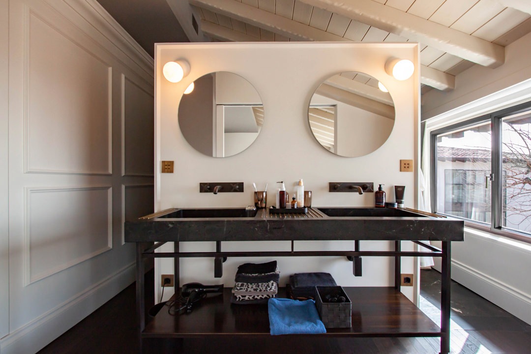
In the bustling heart of Milan, architect Lorenzo Visioli has breathed life into an apartment that seamlessly blends vintage charm with modernity through the skillful use of refined materials and details. Let’s explore how the soft reflections and captivating mirrors play a central role in this unique space that we’ve had the pleasure to furnish.

 Reflections, mirrors and roundness

ENTRANCE

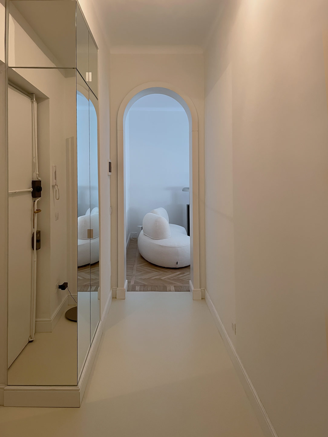
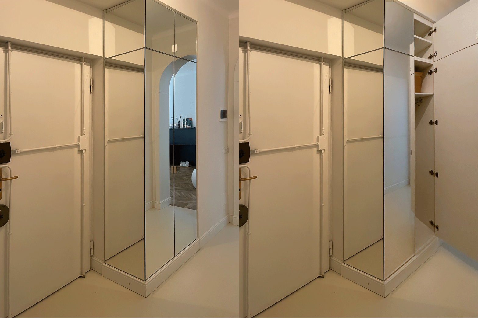
The entrance warmly welcomes guests with a floor covered in light gray mortar, illuminating a relatively narrow corridor. A service cabinet entirely clad in mirrors on one side visually expands this confined space, creating an effect of spaciousness and brightness. Inside the cabinet, shelves and hanging space add functionality without compromising style. 

Here’s another example of a mirror-clad cabinet welcoming at the entrance.

mobile entrance open closed
 handle detail

KITCHEN CORNER

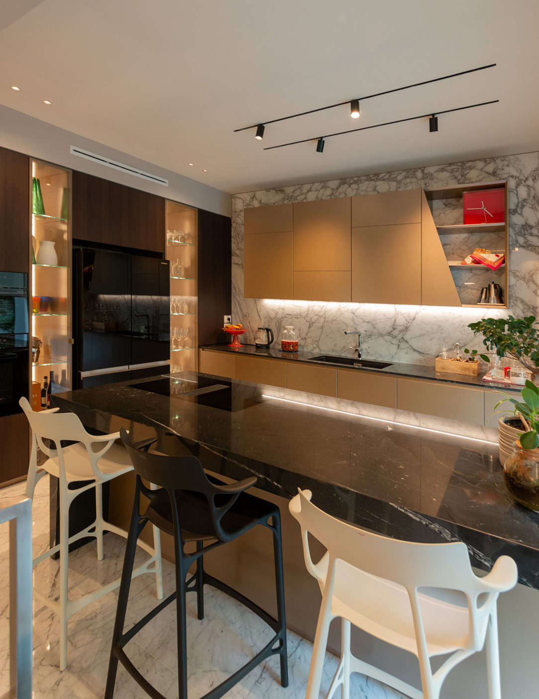
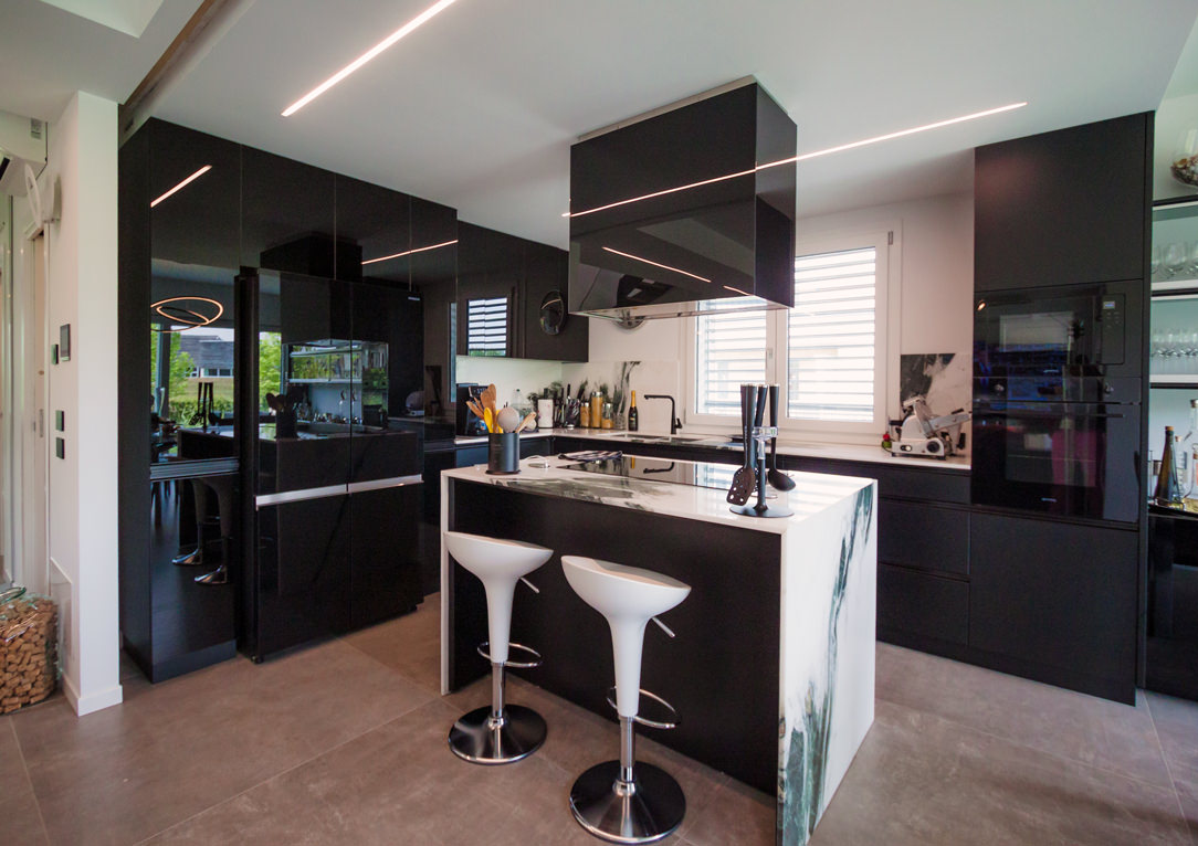
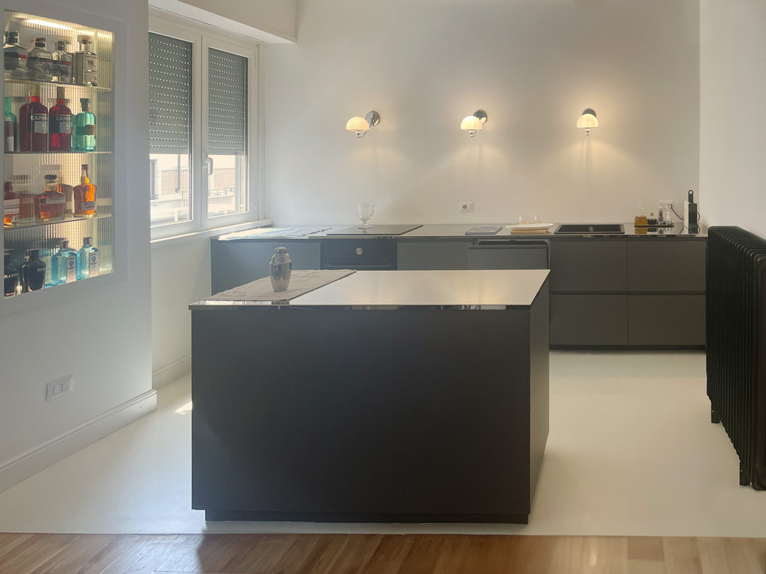
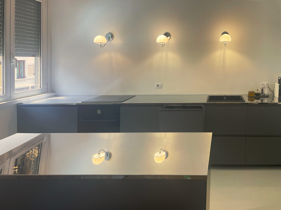
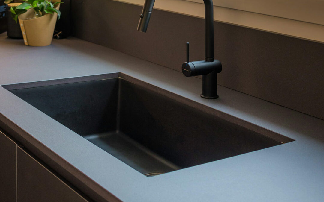
The kitchen, the heart of the home, embodies the fusion of style and functionality. Structured in a niche divided into two parts, with an equipped base and a frontal island, it stands out for the absence of conventional wall cabinets. In their place, vintage lamps in the style of “The Great Gatsby” illuminate the polished steel worktop, creating suggestive reflections that interact with the surrounding elements. The kitchen base, in a dark and clean tone, features concealed handles.

kitchen with island
kitchen zoom

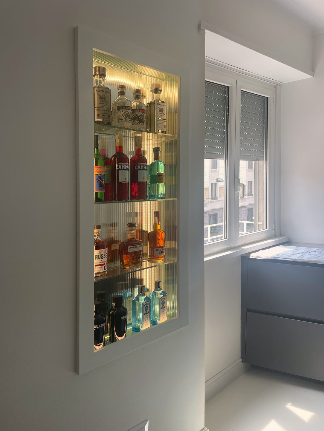
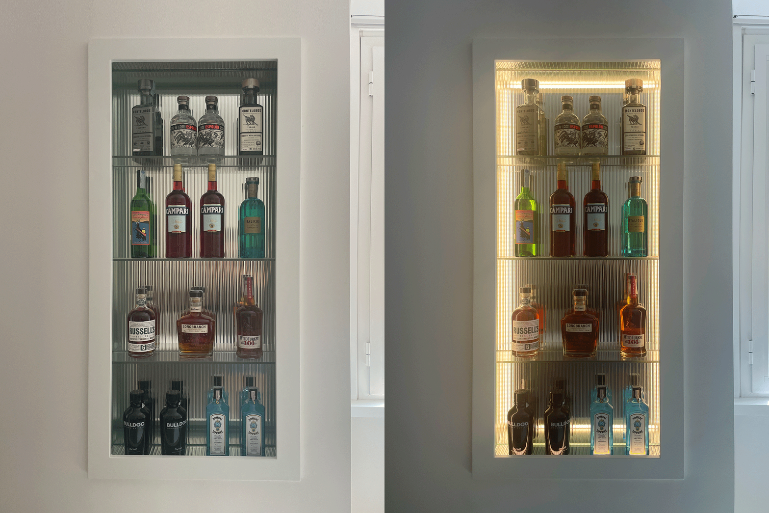
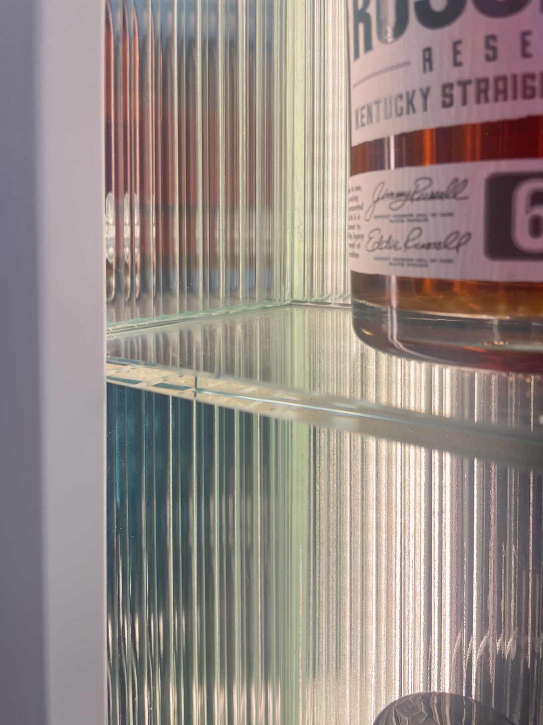
A touch of originality is introduced by the niche beside the window, transformed into an open bar with crystal shelves hosting selected spirits. The presence of undulated glass, now a major trend, on each side reflects bottles and liquids, adding a touch of color. Internal LED lights make this element even more captivating when switched on.

open bar niche and window
niche open bar
 wavy glass detail reflections

FUNCTIONAL STORAGE

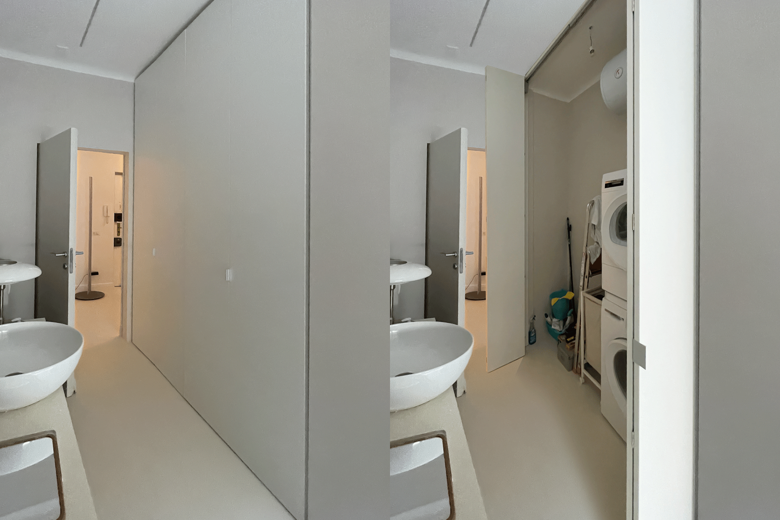
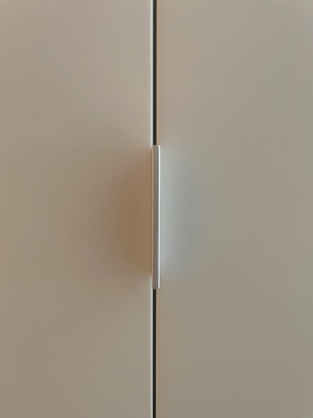
A key element of functionality and discretion is the integrated storage in the bathroom, where a washer and dryer find their place alongside all necessary household tools. Two tall, lacquered doors, matching the wall color, fold onto themselves, creating a visual effect that imparts continuity and harmony to the surrounding environment. This approach not only optimizes the available space but also adds a touch of sophistication to the overall design, thanks to slim handles and meticulous finishes.

 functional storage room
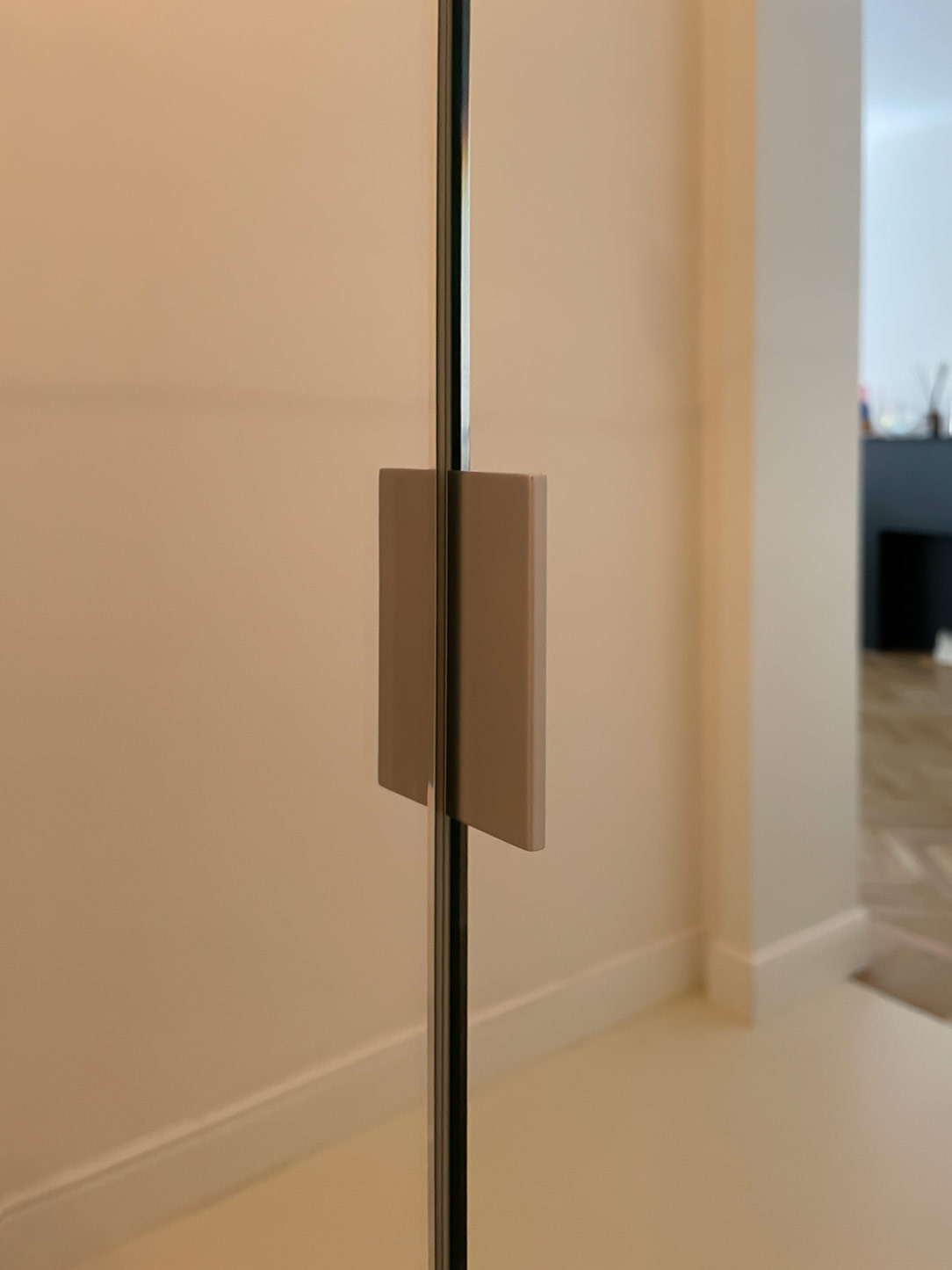
 handle detail

LIVING AREA

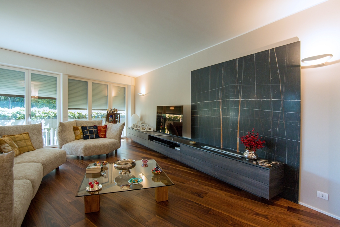
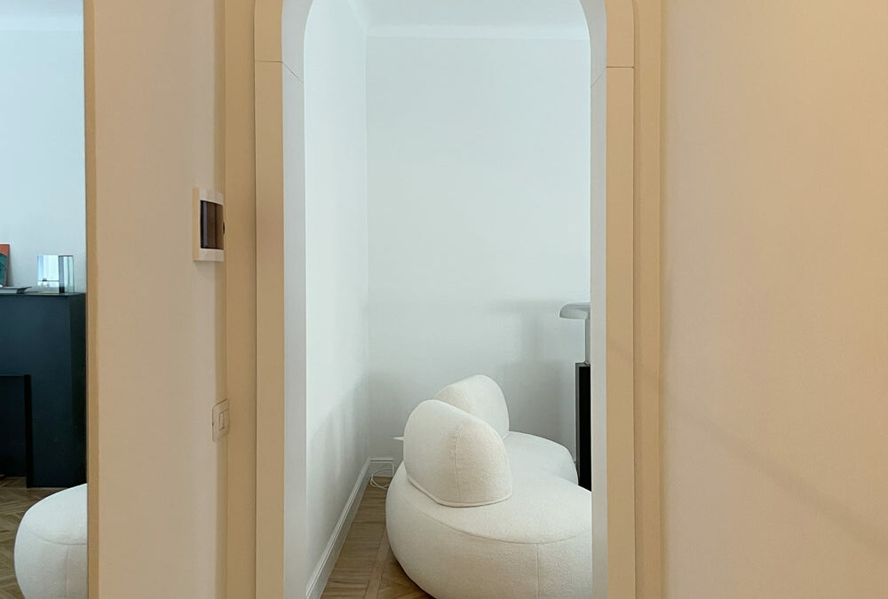
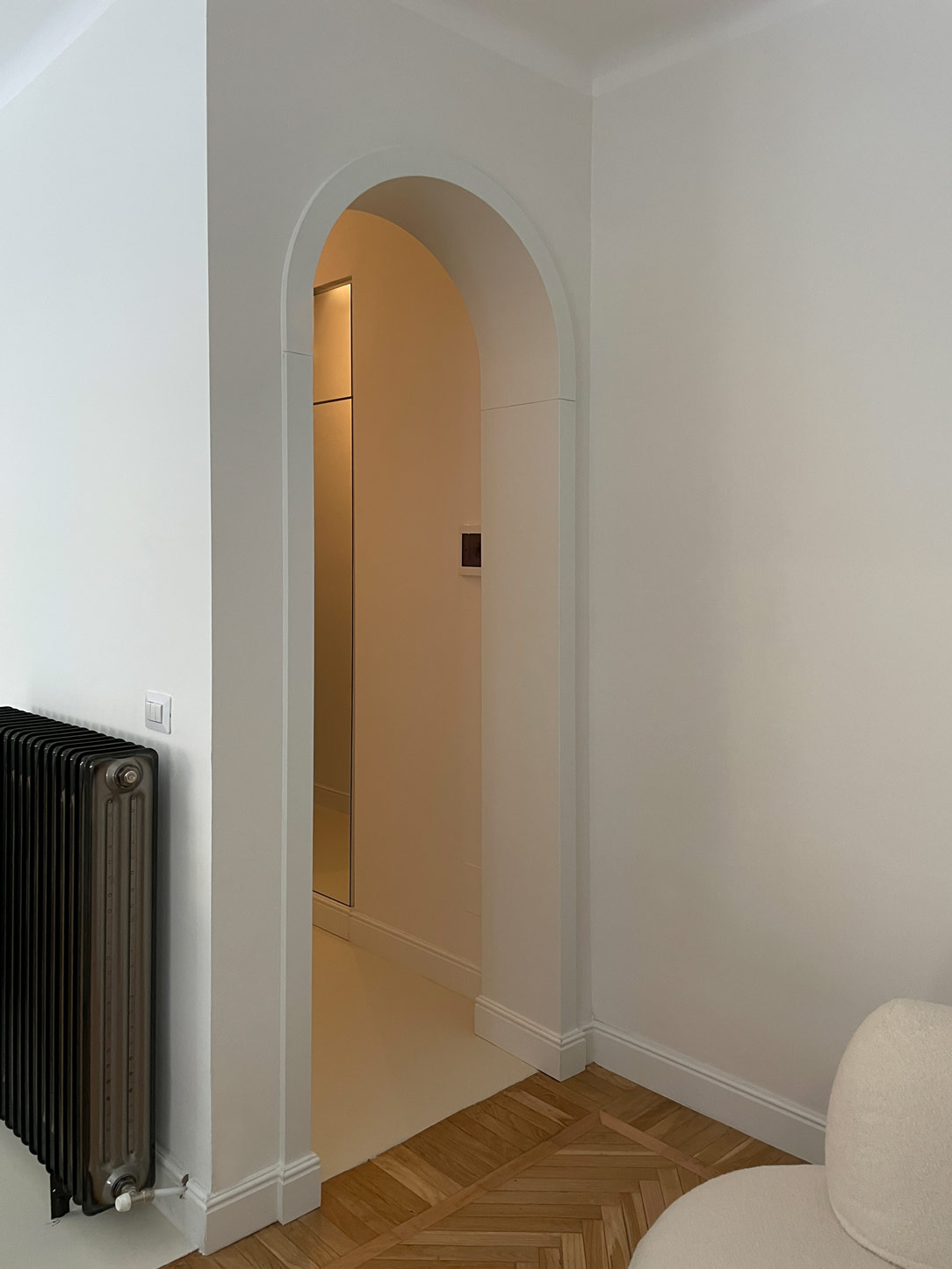
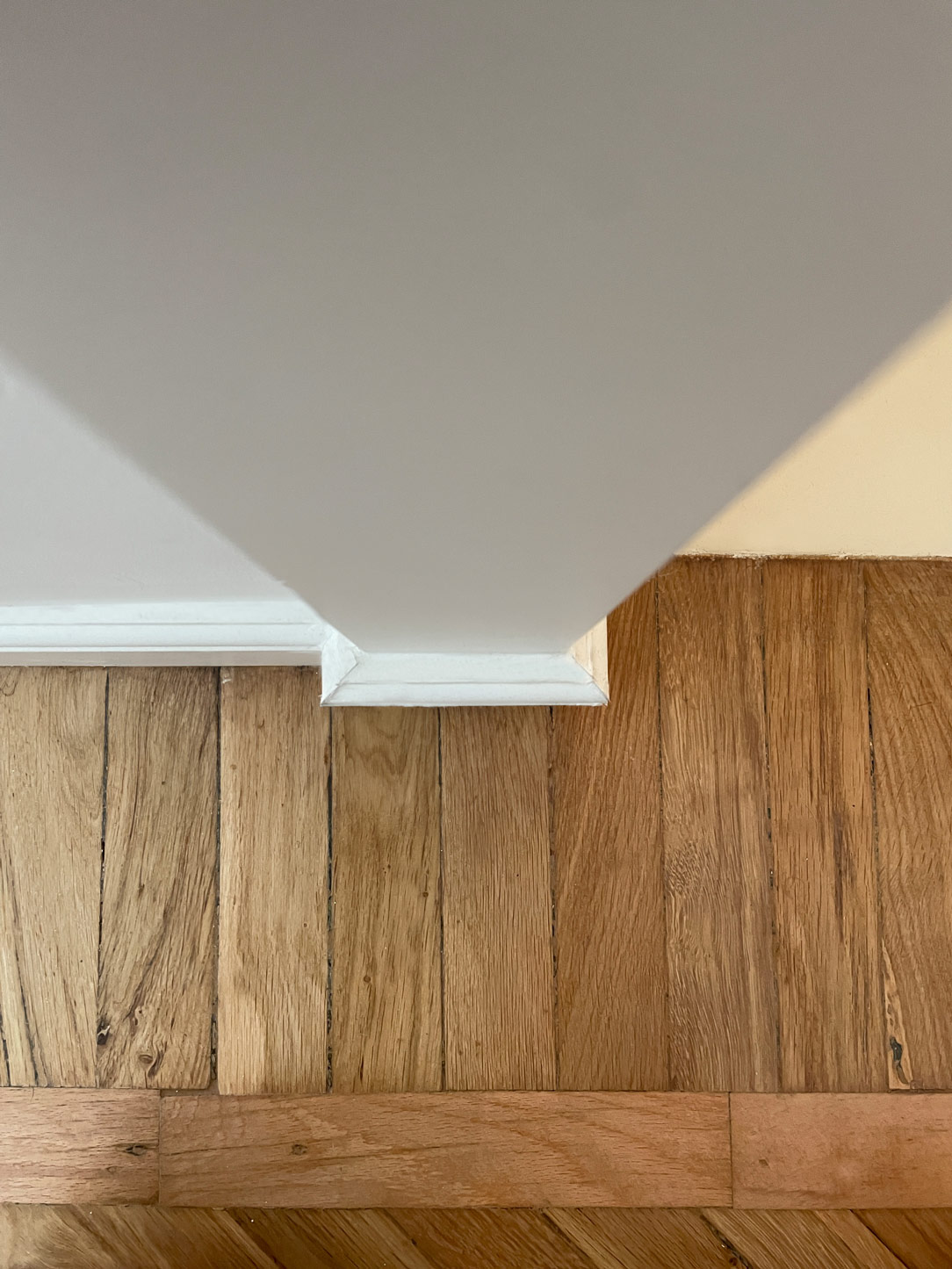
A delicate arch connects the entrance to the living and kitchen areas, introducing a sense of softness while emphasizing the importance of access. The flooring transitions from industrial mortar to vintage parquet, laid in three different patterns to enliven the pace. Refined details, such as reflections playing on materials and shapes, contribute to creating a dynamic and enveloping ambiance.

Here’s another example where reflective materials play a significant role in the project.

arch living area entrance
parquet detail

CONCLUSIONS

In conclusion, this vintage-inspired project distinguishes itself through the reflections generated by carefully chosen materials. Each element, from the luminous mirrors to the reflective surfaces, contributes to amplifying the spatial sense and creating a unique dynamism. A perfect blend of past and present, transforming living into an exquisite and timeless experience.

Adapting standar furniture with tailor-made solutions

Adapting standar furniture with tailor-made solutions

Custom-made furniture and stardar products belong to two different worlds, bringing with them a large repertoire of solutions and projects. Each has great strengths and opportunities, but both also know their weaknesses. Sometimes it happens that these two worlds come into contact, helping and supporting each other. After all, it is well known: unity is strength!

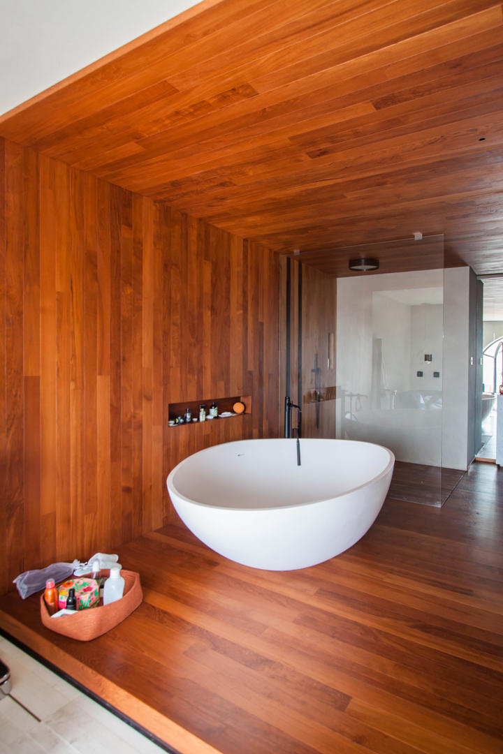
bathroom-luxury-standard-furniture

A master bathroom with elegant series furniture.
On the side, made-to-measure valances hide the support rails of the curtains

Standard and customed furniture: eternal rivals? Not at all!

It is common belief that standard furniture and custom-made solutions are ruthless competitors. Nothing true!

In fact, these are different realities that provide valid project proposals to customers, offering them a market capable of satisfying every request. Tastes, needs and desires of customers often interface with intrinsic constraints.
These include: budget limits, production restrictions, delivery times, availability and variety of alternatives.
Within the world of furniture design and production there are in fact an infinite number of secondary aspects that define the strengths, but also the limits of each company.

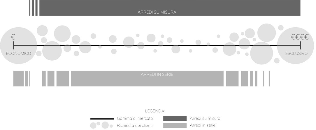
We can imagine the world of furniture as a range of parameters, at the extremes of which lie the cardinal principles of the two worlds.
On the one hand, standard furniture at super cheap prices capable of destroying any competitive market.
Its philosophy is certainly linked to a democratization of design that exploits large industrial production to contain prices and make its products accessible to all.

At the opposite end, a niche market, linked to the concept of “exclusivity”, chosen for its impossibility of identical reproduction and the opportunity for customization.
The choice of this type of furniture is linked to a feeling of privilege in its availability.

Between these two opposites there are the infinite number of companies that experience design on a daily basis.
Embracing the entire range of the market in this sector would be impossible and counterproductive, leading to poor results both for the manufacturer and for the customer himself.

It necessarily follows a specialization in the type of products and an identification of the reference target.
Precisely for this reason, standard furniture and tailor-made solutions cannot be considered competitors because they embrace different philosophies, targets and production systems. Their relationship is instead collaborative and mutually supportive, making the most of the potential of each party.

inpho-graphic-furniture-market

Potential and constraints of standard products

One of the main advantages of series furniture is the vastness of the market to which they belong.
This makes it possible to satisfy the tastes of each customer, providing a wide choice of solutions and variants. To this is added an economic advantage deriving from the optimization of production.In fact, by exploiting the industrial production and the repetition of the pieces, it is possible to optimize the production phase in the best possible way, managing to contain costs. This also implies an ever more careful precision and improvement of the single elements.

On the other hand, this specific reproducibility limits the scope for intervention and customization. The world of mass-produced furniture works in reproducible and combinable “modules”.
Customization consists in knowing how to combine the individual elements and organize them in a different way, but it certainly does not allow for specific product customization as in custom-made furniture.

So here are island, peninsula or monobloc kitchens that take on different shapes depending on the environment in which they are inserted.
However, these find their first obstacles when there are architectural constraints or special requests from customers.
Customization does not cover all levels of furniture reading.

This is where bespoke design comes in, offering its attention to detail and custom design.

spa-room-standard-furniture
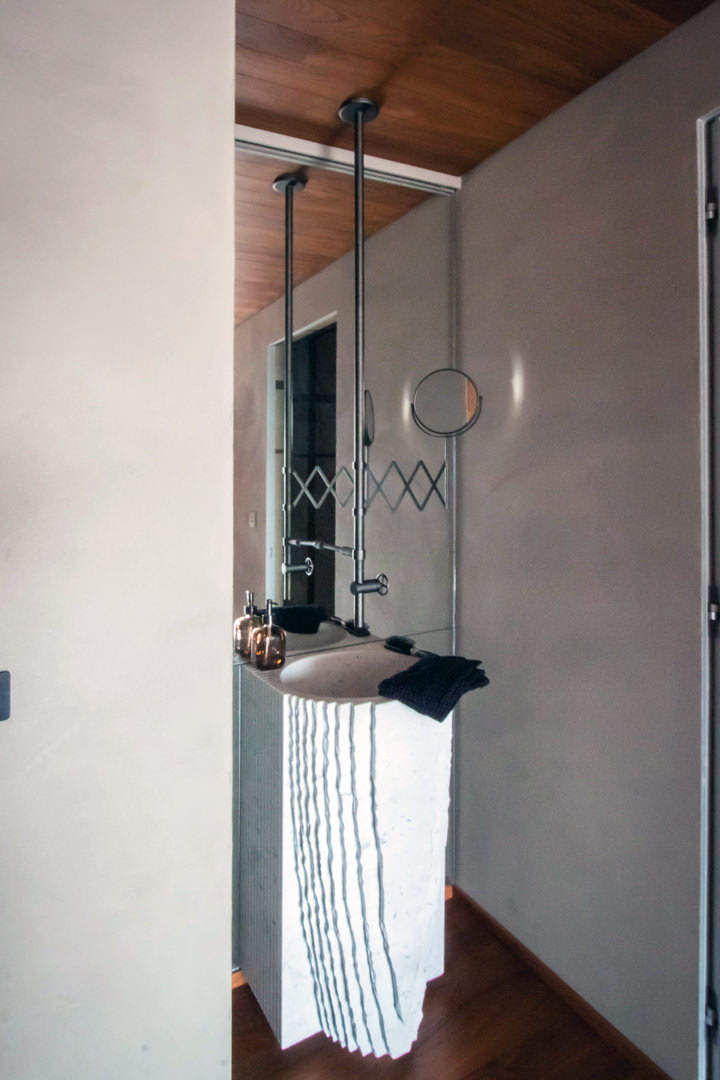
customed-mirror-spa-sink-standard-furniture

When standard and customed furniture meet each other: a full-height shaped mirror fits into a SPA context with scenographic furnishings from important manufacturers

Works of tailor-made workmanship: a contemporary style kitchen

Where the supply of standard furniture reaches its limit of customization, the flexibility and spirit of adaptation of bespoke furniture comes into play.

An excellent example of this, is this luxury-style house distributed over three levels.
The maintenance and collaboration with Modulor involved different rooms.

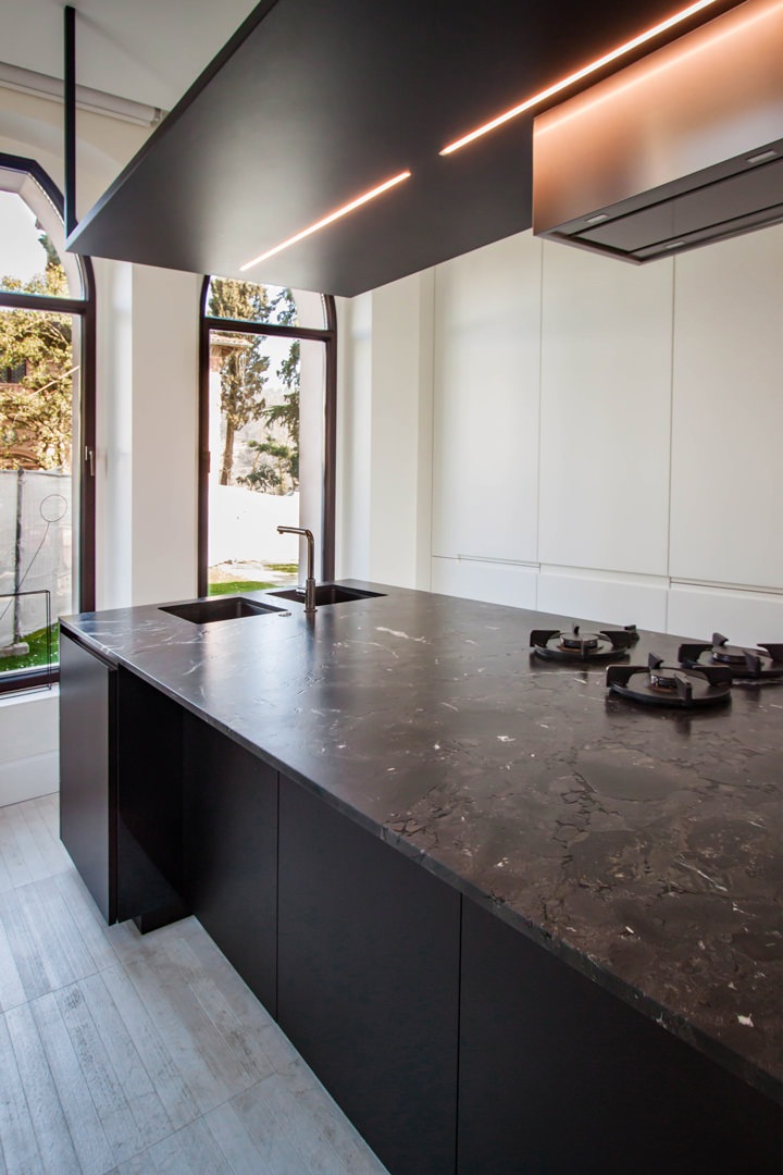
First of all, the kitchen, consisting of a wall equipped with full-height doors on the right side of the access and a central island with a design hood. Precisely in this last element, the volumetric composition of the furniture provides a large surface that can be used as a worktop, but it prevents its use of meals.
In fact, by equipping the worktop with doors and lower drawers, it could not be used as a support surface for quick meals, as it did not provide adequate space for the user’s seat.

Finding tailor-made solutions in this example meant creating a lateral niche in the volume of the island. In this way, even with a not very wide depth, it was possible for customers to find the right space to sit comfortably while keeping their legs perpendicular to the structure. A comfortable snack bar for 2/3 people that does not give up on a work surface and support surface.

island-kitchen-adaption
standard-island-kitchen

An important island kitchen modified with tailor-made solutions: a niche has been created in the lower volume in order to use the worktop also as a support point for the consumption of quick meals

The sleeping area between secret passages and princess bedrooms

Even in the sleeping area, custom-made design has found ease to express its experience and personalization.

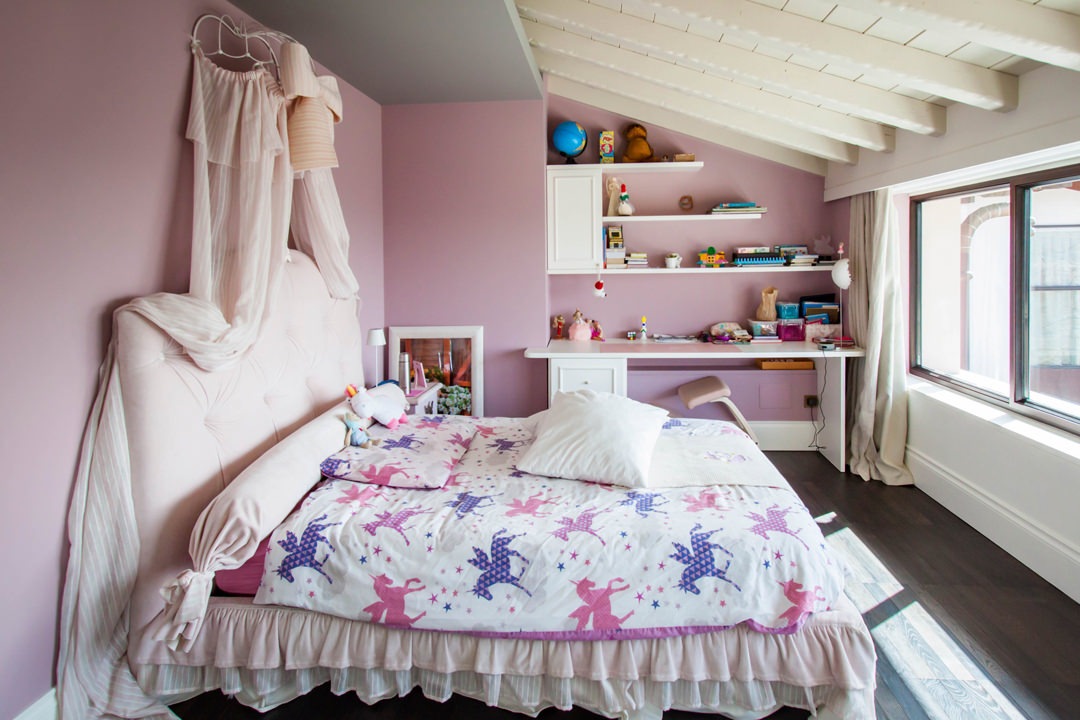
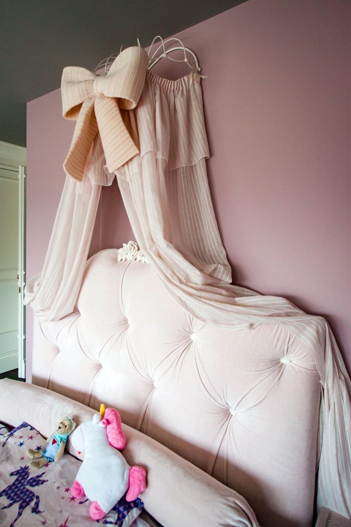
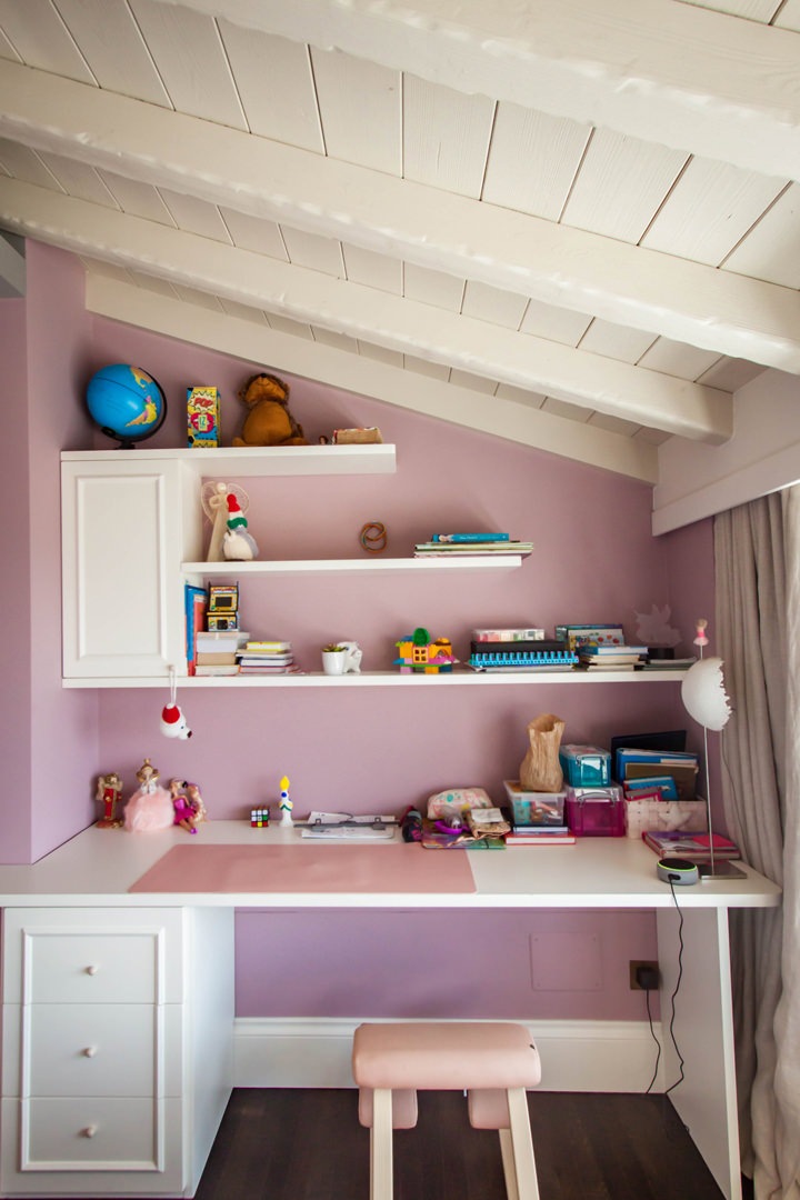
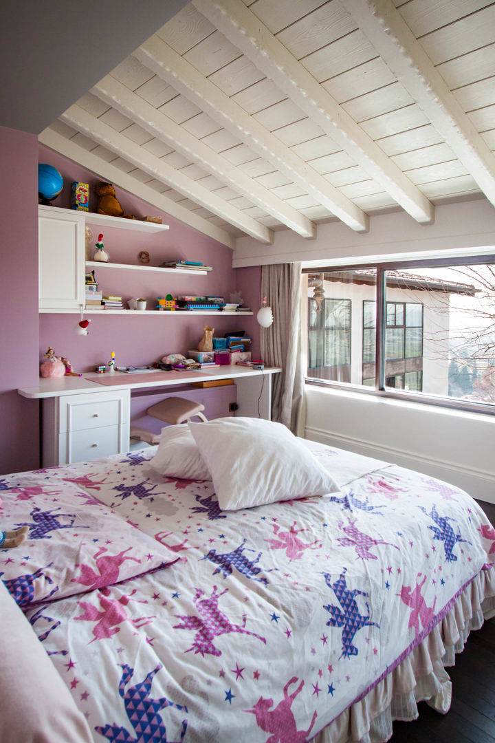
The classic-style bedroom is characterized by the presence of an important bed with drapery and padded headboard with a fairytale look. Taking advantage of a lateral architectural niche, a desk with wall unit and shaped shelves was inserted in order to make it an integral part of the spatial configuration.

The custom-made desk top is accompanied by a chest of drawers with bands that also acts as a load-bearing element.
This is accompanied by a wall unit with a molded door and shelves in matt white lacquered MDF that reflect the boiserie.

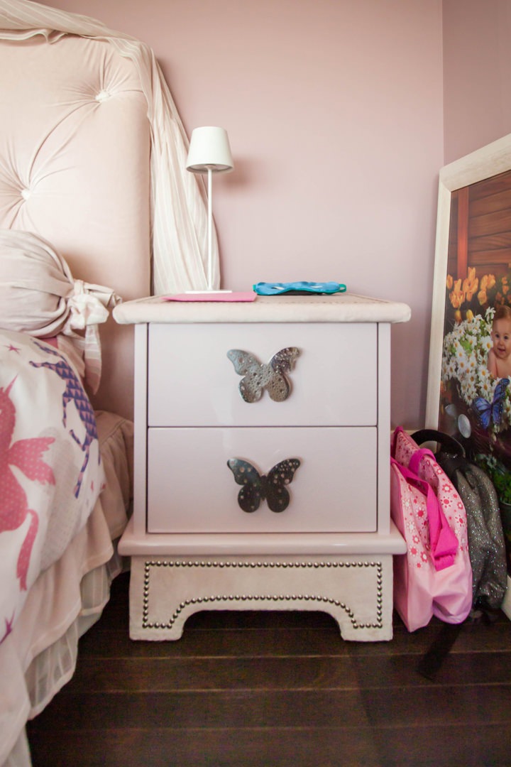
Even the bedside tables take up the style of the bedroom with handles in customed sheet metal in the shape of butterflies.
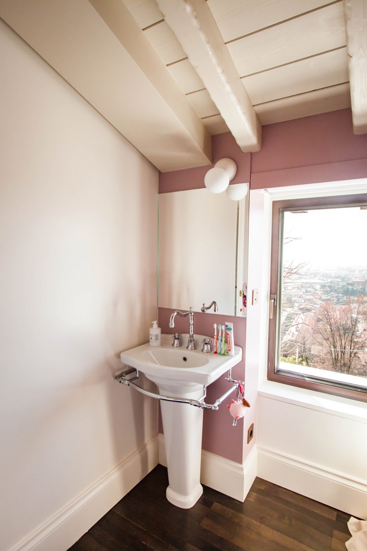
The side service bathroom illuminates the room with a glossy white tile wall cladding, crystal shower and pedestal sink with custom wall mirror.

classic-style-bedroom-princess-bed-standard-furniture

Every princess’s dream bedroom hosts an important bed with drapery and padded back

details-princess-bad-padded-back-drapery
details-bedside-tables-girl-bedroom

Details of a small bedroom from large-scale distribution: upholstered draperies and backrests perfectly match bedside tables with shaped sheet metal handles

customed-desk-bedroom
classic-style-bedroom-customed-desk

The desk in the niche takes up the classic style of the boiserie paneling through door moldings

detail-molded-door-bedroom
detail-white-laquered-shelves-bedroom

Shelves and doors in white lacquered MDF in warm tones for this classic style desk

customed-mirror-standing-sink
customed-mirror-standard-standing-sink

The made-to-measure mirror accompanies the classic style design pedestal washbasin

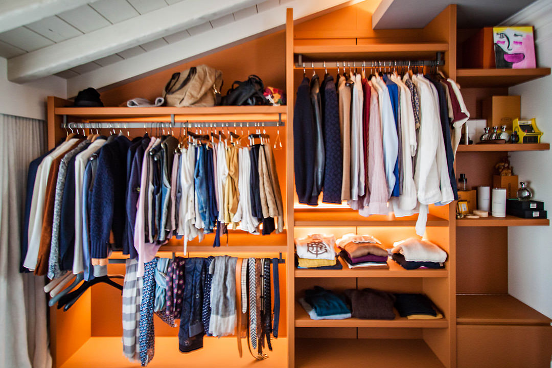
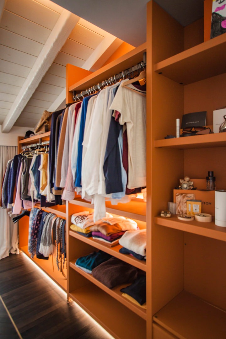
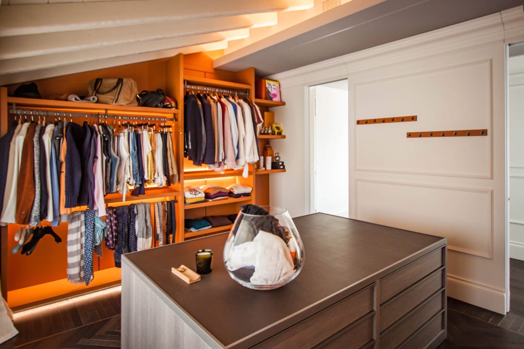
Always in the upper floor, takes place the walk-in closet, whose orange tones give a touch of character and freshness to the room while remaining elegant and impressive.

A retractable mechanism is hidden inside the side structure.
What apparently looks like a support bench hides a flap door with a system of internal channels that allow dirty clothes to be brought directly to the laundry area. This internal conduit channel is also intercepted at the level of the living area through the opening of a door on the external front of the kitchen. What apparently seems to be part of the molded boiserie is transformed into a storage point for the tea towels which, using the internal slope, are taken directly to the laundry.

standard-furniture-walk-in-closet-leather-finishes

Composition of a walk-in closet with elements in series: on the sides hangers and shelves covered in orange leather, in the center a chest of drawers in textured bilaminate

walk-in-closet-flap-door

The side wall of the walk-in closet with shelves and hangers.
On the right, the small service bench hides the channel that leads to the laundry

detail-flap-door-walk-in-closet
molded-boiserie-open-door

Left: the folding door mechanism from which the conduit for soiled garments starts. Right: the door incorporated in the boiserie that intercepts the path for the kitchen products.

How a kitchen takes life: the phases of realization

How a kitchen takes life: the phases of realization

Discovering bespoke furniture, have you ever wondered what are the phases of realization that give life to a kitchen? We are ready to show you our creation and production process! The design of a custom-made kitchen is born from the meeting between the customer’s wishes and personality and the designer’s experience, capable of satisfying the functional and aesthetic needs of both. What the customer sees is the transformation of the project, shown in its most satisfying graphic form, into a finished and complete product. However, there is a world behind the creation of a kitchen: from the artisan production phase, with boards with strong resistance and workability, to the painting of the components, from transport with packaging to final assembly. Let’s follow the production process of this minimal kitchen.

design phase perspective phase

The design: a continuous dialogue with the customer

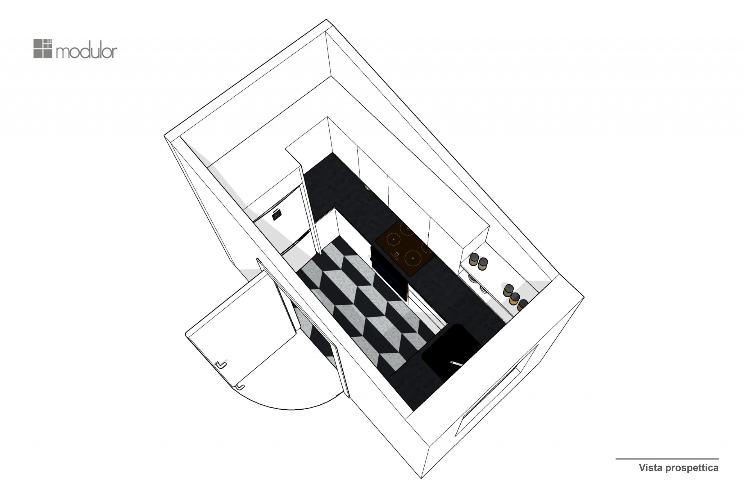
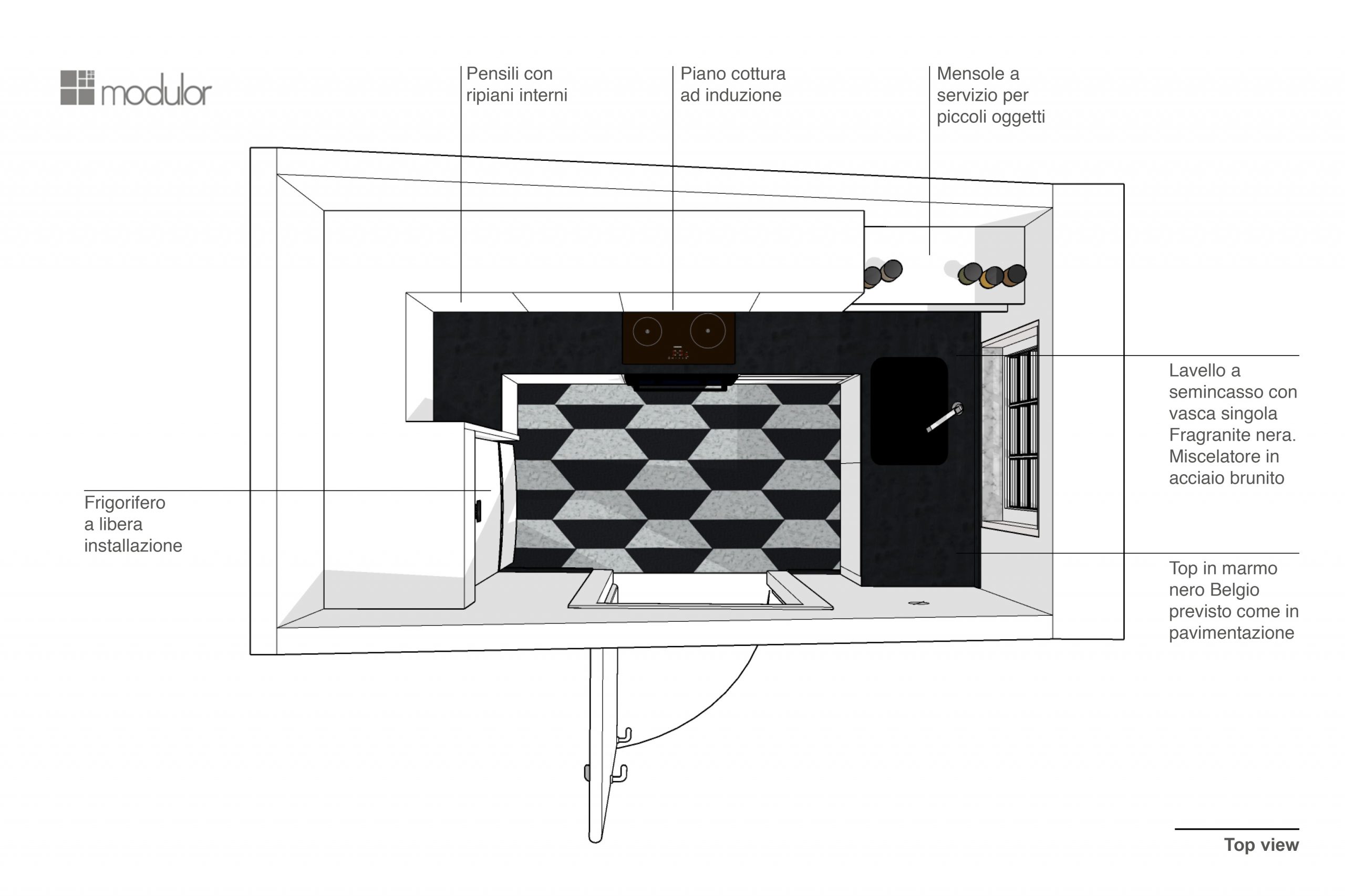
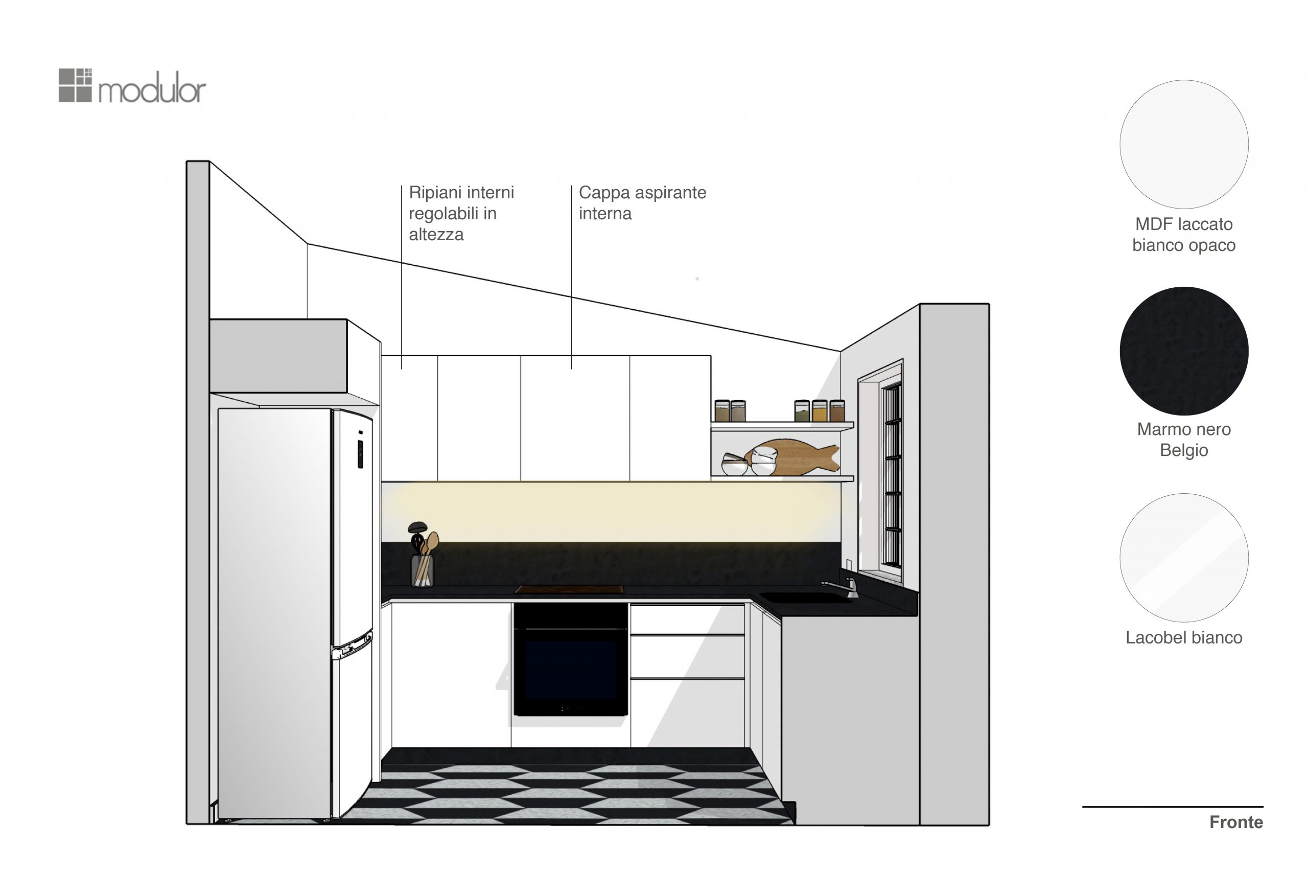
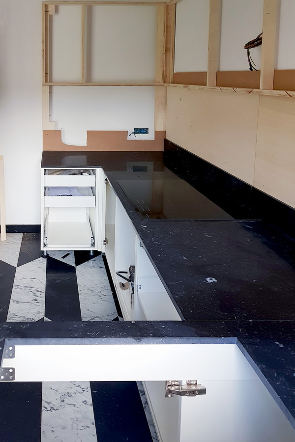
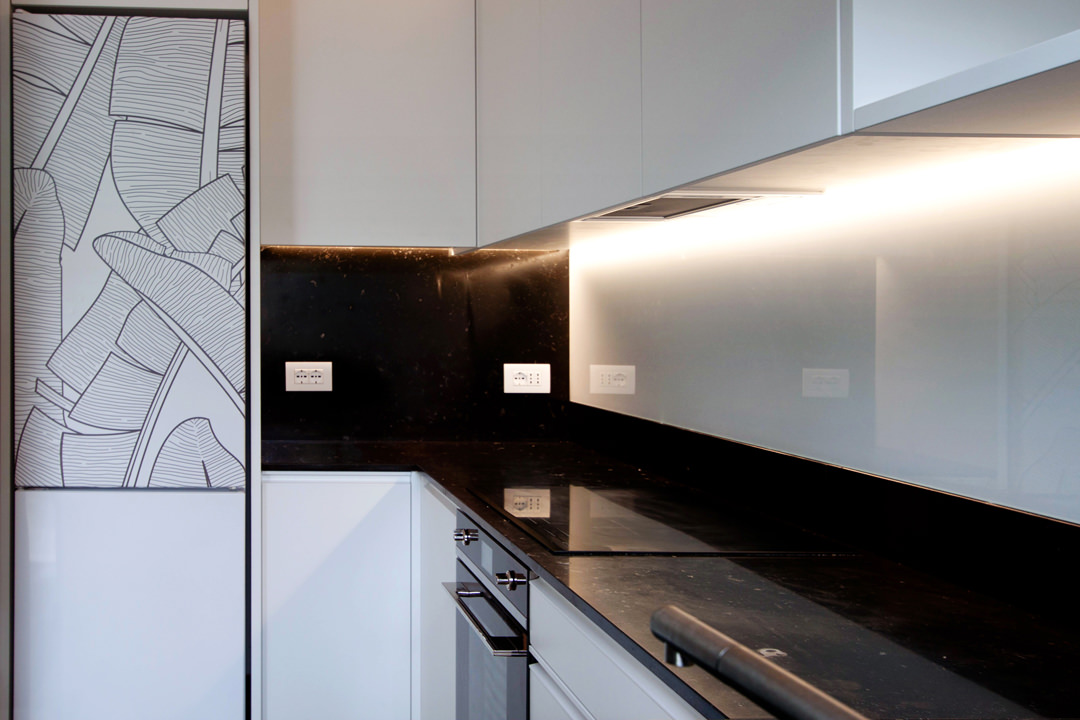
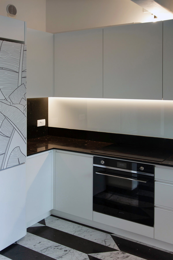
The design of this kitchen stems from the need to optimize spaces in an environment already strongly characterized by floors with geometric marble patterns. The presence of a relevant flooring has given rise to a project that responds to the same chromatic characteristics. In this way, the minimal line of this kitchen is born. Here, the lower volumes and upper wall units in matt white lacquered MDF give brightness and freshness. The black marble top houses the built-in sink and the induction hob, transforming into a splash back and side back. The vertical reading wall units holds the hidden lighting that is also reflected by the white Lacobel splash back. The graphic rendering of the project allows you to get an idea of ​​the general layout of the kitchen, studying the different components based on the best practicality. We try color and material combinations and studies alternatives in the volumetric composition. In this phase, the ability to read and interpret the client’s wishes is essential for the designer. On the other hand, the customer plays an active role, becoming an integral part of the design team. The best projects are in fact those that do not stop at the first solution, but undertake new design challenges, evolving from time to time following the brainstorming between the client and the designer.

design phase top view
Minimal kitchen Verona design  front

From the design offices to the lab: the executives

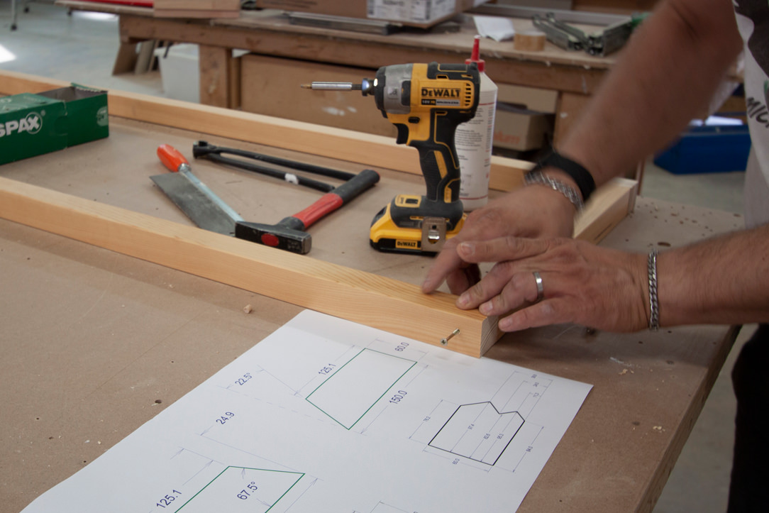
Once approved and defined in the smallest detail, the kitchen project goes directly to our laboratory, ready for the construction phase. The three-dimensional model developed during the design phase is reworked to take on a new look. From a graphic and realistic setting, it is transformed into a functional model from which the executive tables are processed to be addressed to our artisans. After an accurate on-site survey, where electrical predispositions, discharge and existing constraints are highlighted, the model is adapted and designed in detail. Extremely simple designs that give up their aesthetic presentation in favor of greater clarity of reading. Dimensions, cuts and joints are underlined to make the realization cleaner. Our kitchen is therefore broken down, from a three-dimensional model in digital format to A3 tables with plants and elevations so that the experience of our craftsmen can give life to the actual realization.

Between cuts and painting: the realization in laboratory

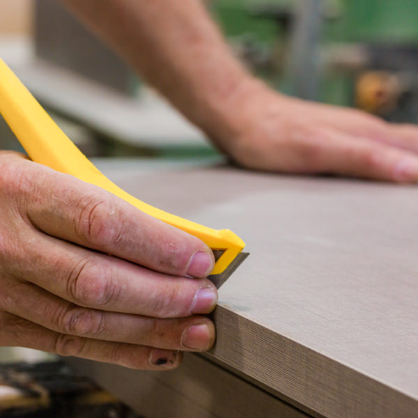
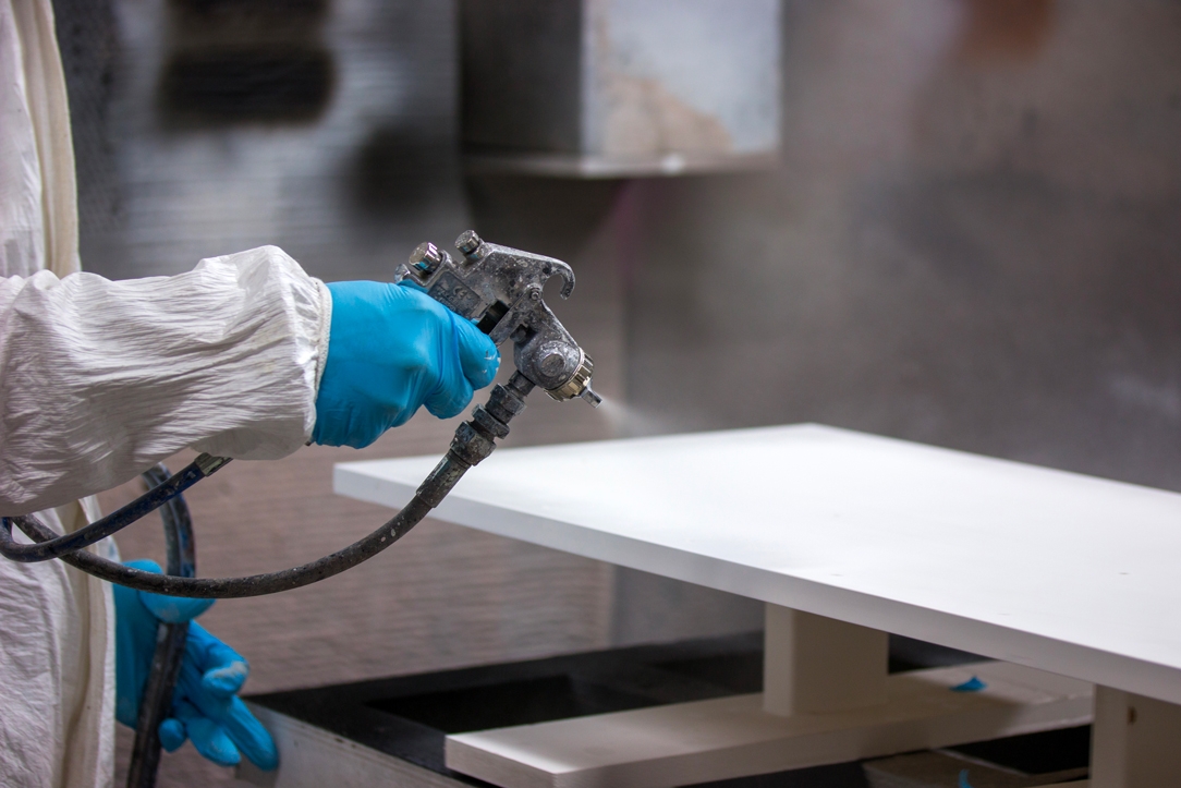
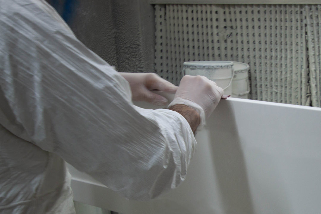
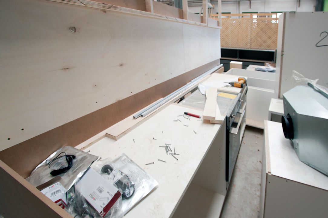
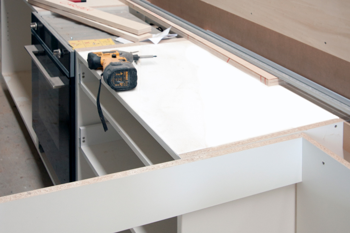
The MDF boards are cut with special machinery preparing the joints for household appliances and related attachment points. Any special processes are carried out with the numerical control machine or with the pantograph, at rest during this project. In the meantime, our guys in the internal painting department prepare the samples with the different chromatic shades. There are infinite shades of each color,. Even of white, that contextualized in an interior can give life to different effects and perceptions. Once the cutting of the single components is finished, the assembly test takes place. Screws, hinges and drawer guides now come into play by verifying the right composition of the kitchen, which is in full construction phase. If our bespoke furniture passes the assembly test, the components are broken down again and passed to the painting compartment.

minimal kitchen realization
painting laboratory
laboratorio piallatura
assembly test Minimal kitchen Verona
Assembly test laboratory

Traveling to the final destination

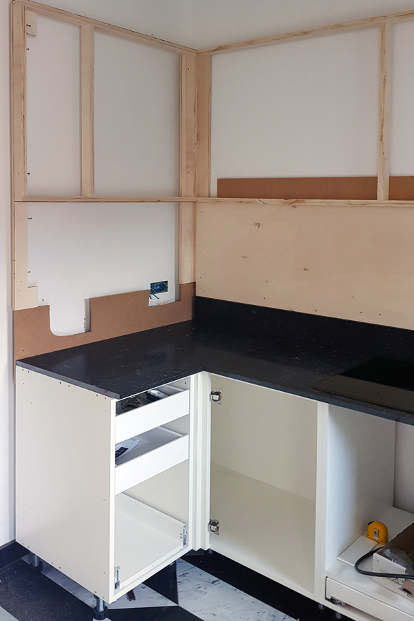
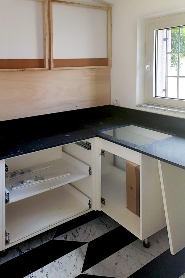
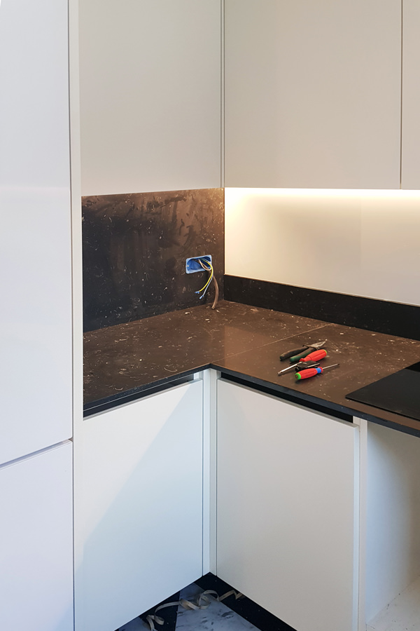
The different components are ready to undertake on their journey. The packaging is careful and punctual, ready to foresee and avoid damage during transport. The load is organized in order to optimize the movements, whether it is short distances or in the case of international travel. Packed properly and accompanied by all the appliances required, our kitchen leaves for Verona, ready for the big day of presentation to the customer. Expert hands and assembly tool kits quickly shape our minimal kitchen. The load-bearing structures for wall units and lower volumes are prepared, to which the various external components are gradually added. Lighting under the wall unit, handles with aluminum shell, shelves with rods for height adjustment. All details that now become fundamental for the final realization of the kitchen. Once the assembly is complete, broom hands, dustpan, vacuum cleaner and good hand works. Everything is cleaned from dust and work shavings, removing any protections and any construction site structures. And here it is, bright and minimal, functional and able to accommodate products and foods of all kinds.

assembly phase Minimal kitchen Verona 01
assembly phase Minimal kitchen Verona 02
assembly phase Minimal kitchen Verona 03
assembly phase Minimal kitchen Verona 04

A minimal kitchen: the final product

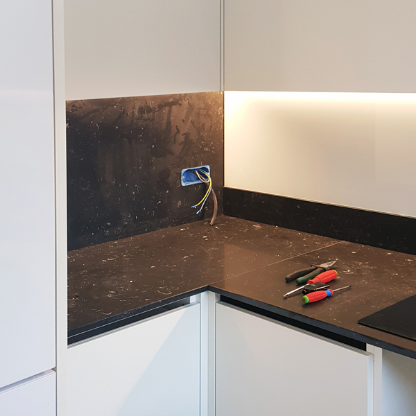
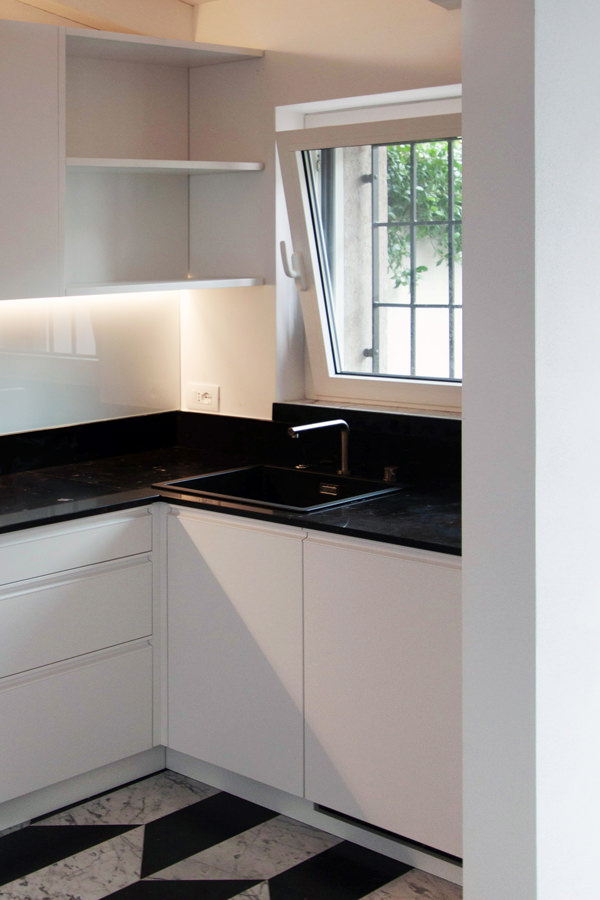
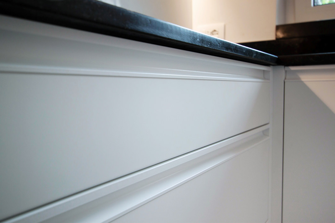
The day of the official presentations has finally arrived. The black marble top chromatically contrasts the lower volumes and white lacquered wall units. Different storage points ensure space optimization with removable trays and baskets but also height-adjustable internal shelves. The drawers for cutlery, table linen and pots are designed in different heights depending on their use. The recessed handle makes the aesthetic impact elegant and essential, while the white painted shell ensures greater durability and resistance over time. Upper shelves are perfect for small objects, visually lightening the terminal part of the wall units. In this way the natural light diffused by the side window spreads freely in the space giving a touch of freshness. After viewing the finished product with the customer, with a good handshake and the wish for a next collaboration, we come back to the base, ready for new challenges! Other projects are already under construction and willing to become reality. To continue your journey discovering the creation of a kitchen, you can learn more about the types of cladding: an Emperador marble kitchen and a kitchen entirely steel covered.

finished product minimal kitchen
windows view kitchen
refrigerator view minimal kitchen
recessed handle drawers detail

Luxury style: care of detail and high quality

Luxury style: care of detail and high quality

Timeless and always updated, the luxury style is surrounded by refined and elegant interiors. The care of detail goes perfectly with the choice of high quality materials, manufacturing and design.

Luxury living room

Zona living in stile luxury. GEZA Gri e Zucchi Architettura, DLN Penthouse. Foto: Gianni Antoniali

Modulor elegant dining room

Careful furniture selection for this Modulor dining room

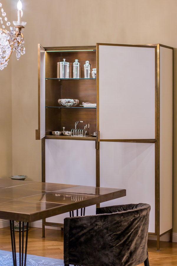
Modulor burnished brass display cabinet

Burnished brass details enrich this display cabinet in the living room

The luxury style in the western concept

Speaking about luxury style could means excess and opulence of Arab culture with furniture covered in gold leaves, mirrors and golden mosaics with excessively sinuous lines. It is therefore important to refer of this style in its western concept, which renounces opulence and excesses dictated by a deliberately exhibited richness in favor of attention to detail and refined preciousness. The luxury style in its western sense rather expresses a taste of elegance and uniqueness of the products, often owner-oriented designed.
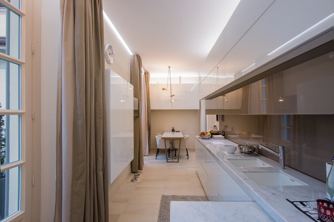
Modulor luxury kitchen Milan

Plays of reflections for this Modulor kitchen of neutral colours

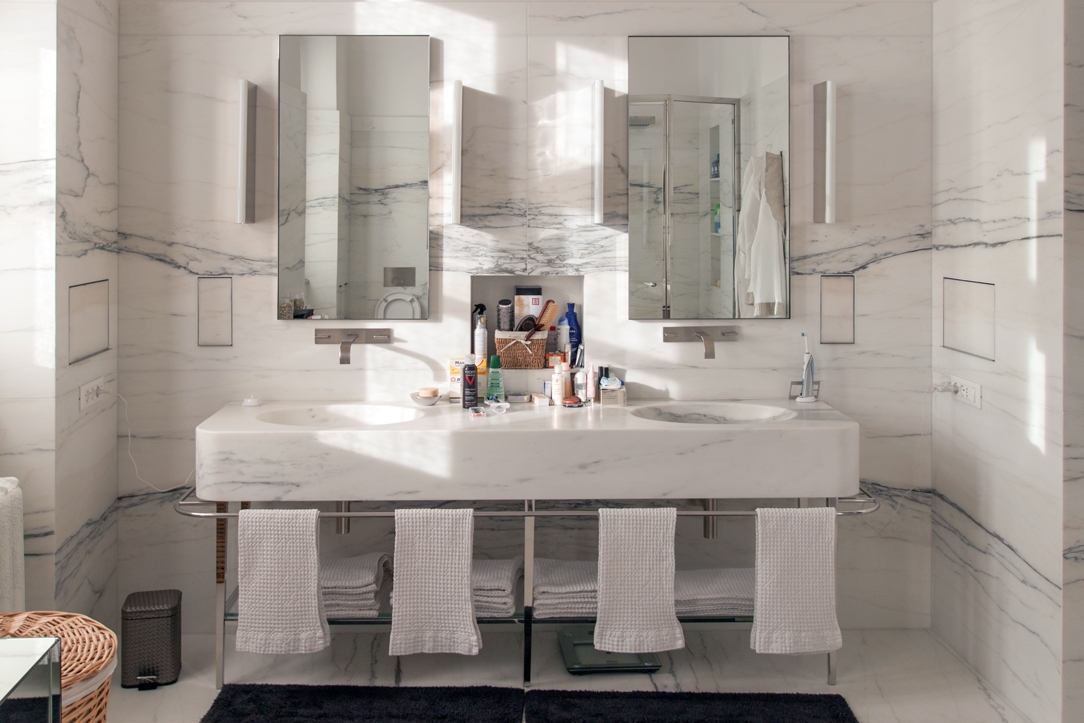
luxury industrail apartment 08

An entire marble covering bathroom shows all its elegance between linear shapes and polished metals

Finishes and material

Traditional materials are chosen for their timeless beauty, even more if characterized by a fine finish. Without a doubt, the luxury style is the explosion of the marbles in their most colorful veins. Coming from all over the world, they show their preciousness with strongly characterizing ventures or slight chromatic alterations. The precious essences of the wood are also protagonists, often matching refined finishes. These were accompanied by fabrics with particular textures and the inevitable velvets, which have come back into vogue in recent years. The heart of luxury style lies in privileging quality: quality of materials, manufacturing and design. In its contemporary sense then, the luxury style meets brass details, inserts in painted glass and plays of reflection of shiny materials.
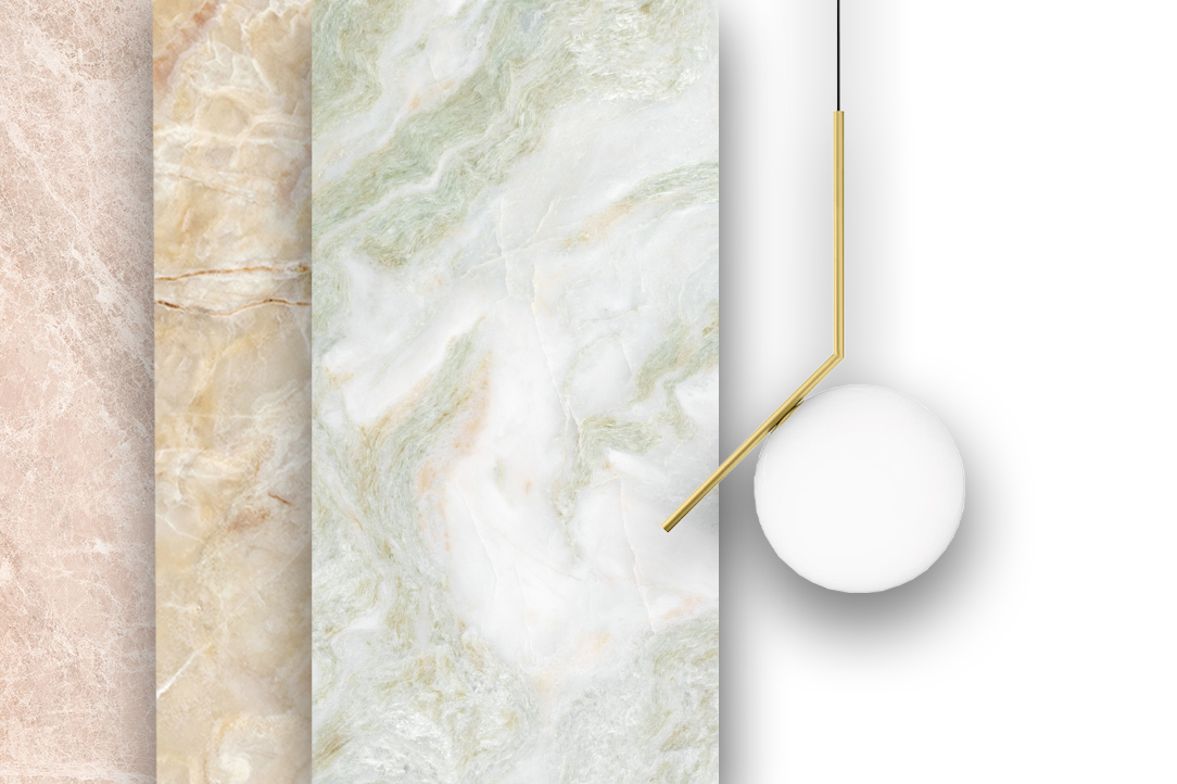
Modulor luxury materials selection

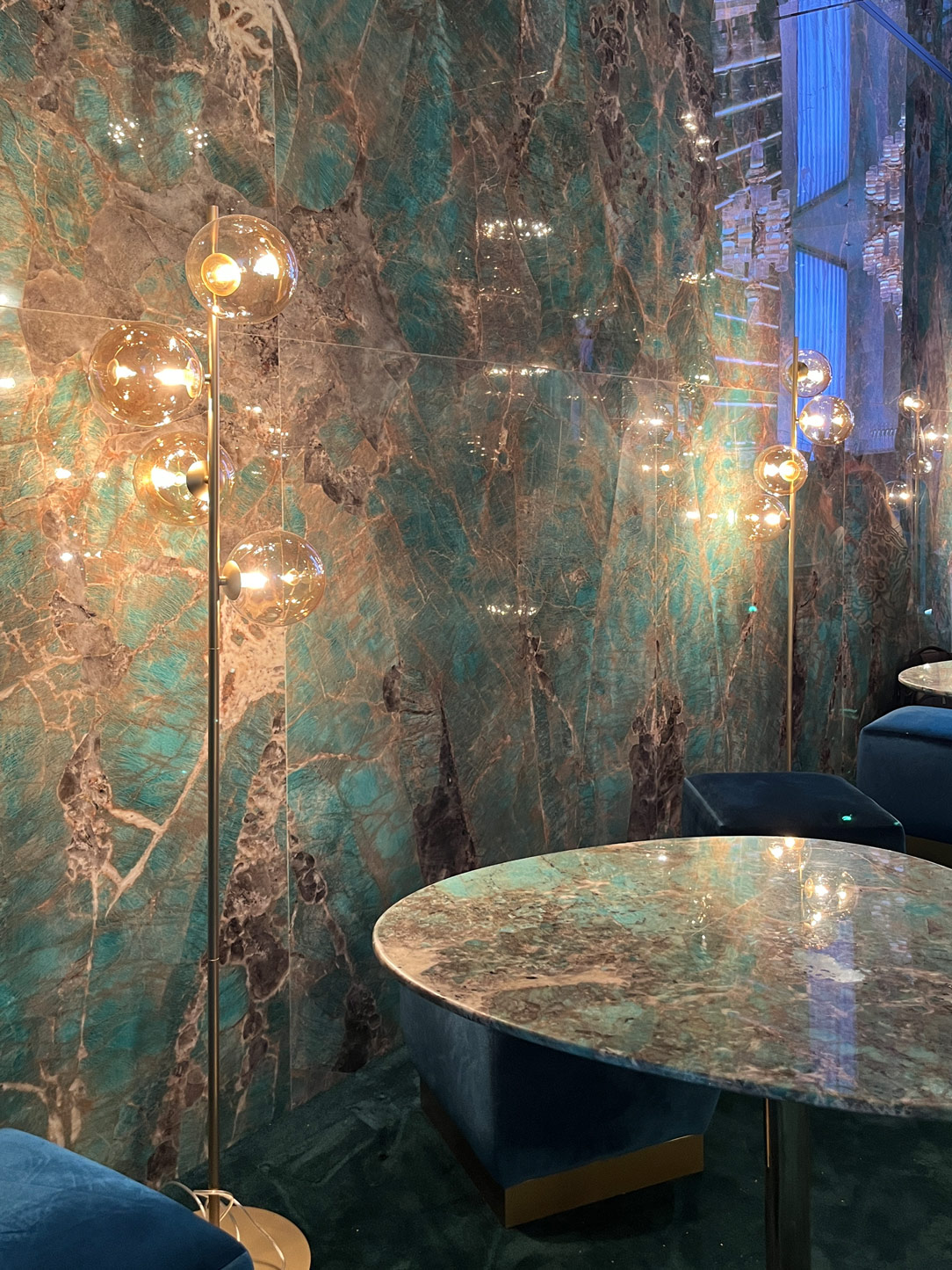
The marbles in the most colorful essences are the undisputed protagonists of the Luxury style

luxury fabrics Milan apartment

Velvets, suede and metal effects for this Modulor-signed bedroom

Modulor wooden finish

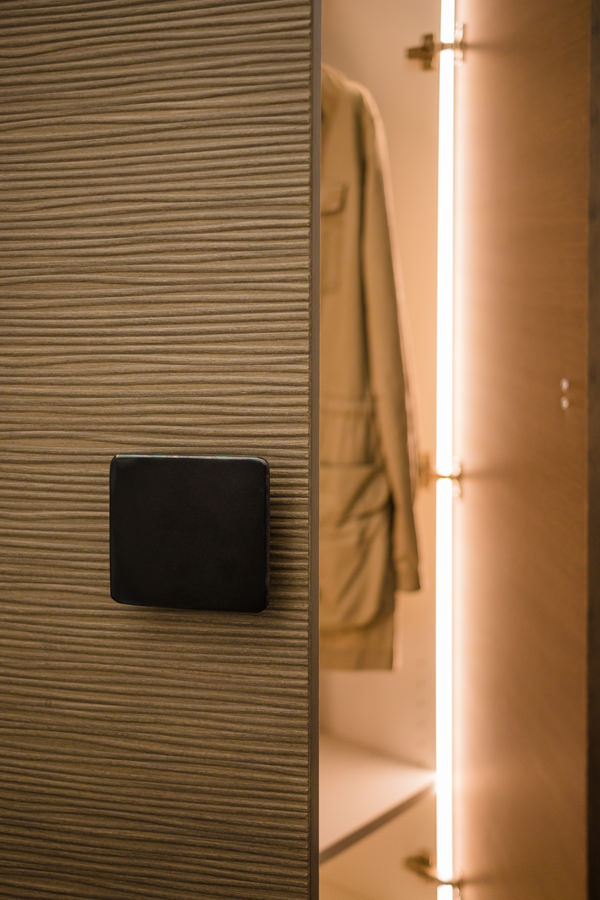
Inner lighting and wooden textured covering for this luxury wardrobe

Modulor selection luxury furniture and fabrics

Velvet and fine fabrics accompanied by metal finishes enrich the furniture.

Modulor 3D wood finish

An elegant and contemporary 3D finish for this Modulor work

The contemporary luxury style

One of the most constant styles in the history of interior design, it owes its continuous success to the ability of adapting to stylistic changes over the years. Contemporary luxury in particular eliminates even more excesses and extravagances. In combination with the minimal style, it becomes more and more a sort of “added value” inside the domestic interior, standing out for its particularity. It tends to enhance the interiors in which it is, rather than the single product, becoming an elegant but delicate stylistic imprint. Contemporary luxury is a lover of brass finishes, even better if combined with velvets and suede. It meets stylistic variations according to the context. It manages to appear light and delicate if contextualized in essential interiors or with a strong impact if set on dark color ranges.

detail hanoi vietnam

Care of detail and high quality materials for this prestigious Modulor work in Hanoi, Vietnam

master bedroom

Burnished brass and velvet define the details of this Modulor master bedroom

reference luxury bedroom
reference luxury living room
reference luxury kitchen

Selection of contemporary luxury references, between feeble chromatical palette and particular material finishes

Choosing the luxury style means choosing quality materials and refined design. Perfect for those who are addicted to details and a lover of elegance. Suitable for determined personalities and people fascinated by perfection.

A cerulean blue modern kitchen

A cerulean blue modern kitchen

The cerulean blue hue defines the stylistic firm of this modern kitchen, set on dark wood tones with brass finishes. The care of detail gives shape to an extremely elegant project, modern in aesthetics and contemporary in settings.

Modulor modern kitchen with dark tones_01

The on-view composition

An interior that becomes furniture. The design of this kitchen diverges from the traditional vision of the closed room to become an open space composed of different volumes.
The main block is a visual union of the low volume in ribbed wood set between wall units with a vertical subdivision and full-height columns.

The common thread that contain the perception of the environment is the brass base, taken from the light and linear handles.
The island block with rounded shapes and overhang countertop, elegantly conforms to the main volume, despite a stylistic change in the design forms.

Indeed, it is this difference between the straight and geometric shapes of the back unit and the rounding of the profile in the central island that defines the stylistic imprint of this kitchen.

The traditional closing shoulder is replaced by a recessed library that visually lightens the perception of the kitchen characterizing the furniture. A full-height bookcase compartment that alternates shelves in a well-balanced geometric composition.

recessed bookcase side abutment
bookcase abutment division sleeping area
Modulor modern kitchen with dark tones_02

Functionality and aesthetics in symbiosis

Not only the general volumetric setting, but also the internal organization demonstrates a perfect relationship between functionality and aesthetics.

As a demonstration of this, the central island is equipped with rounded corner doors in order to make the best use of each available corners.
Shaped white shelves stand out among the dark tones and blue doors of this modern kitchen, showing all their functionality. The choice of appliances is also avant-garde, as for example the induction hob with attached extractor hood that reduces the functional components to the essential in favor of visual essentiality without sacrificing the practicality.

Modular kitchen island ribbed wood
open door with shaped shelves

Colors and materials

Cerulean blue matt lacquered MDF, dark ribbed wood and brass are the protagonists of this modern kitchen in which dark tones are chosen for their elegance.

A rigorous environment that is being fascinated by contemporary functionality.

The chosen shade of blue, extremely modern, is enriched with a warm appearance especially when combined with the dark-dyed ribbed.

It is precisely the materiality in the latter’s finish that enriches the main volumes of the kitchen with movement and rhythm.

The brass of skirting boards and handles, underlines the design lines with a precious character that gives refinement to the project.

Modulor materialboard
Modulor modern kitchen with dark tones front view
Modulor materials finishes

Advice

The choice of colors and materials often defines the character of an interior. We are often intimidated by intense colors and dark tones, especially if imagined on large surfaces. The final impact can instead reserve great surprises, and give a touch of freshness and modernity.
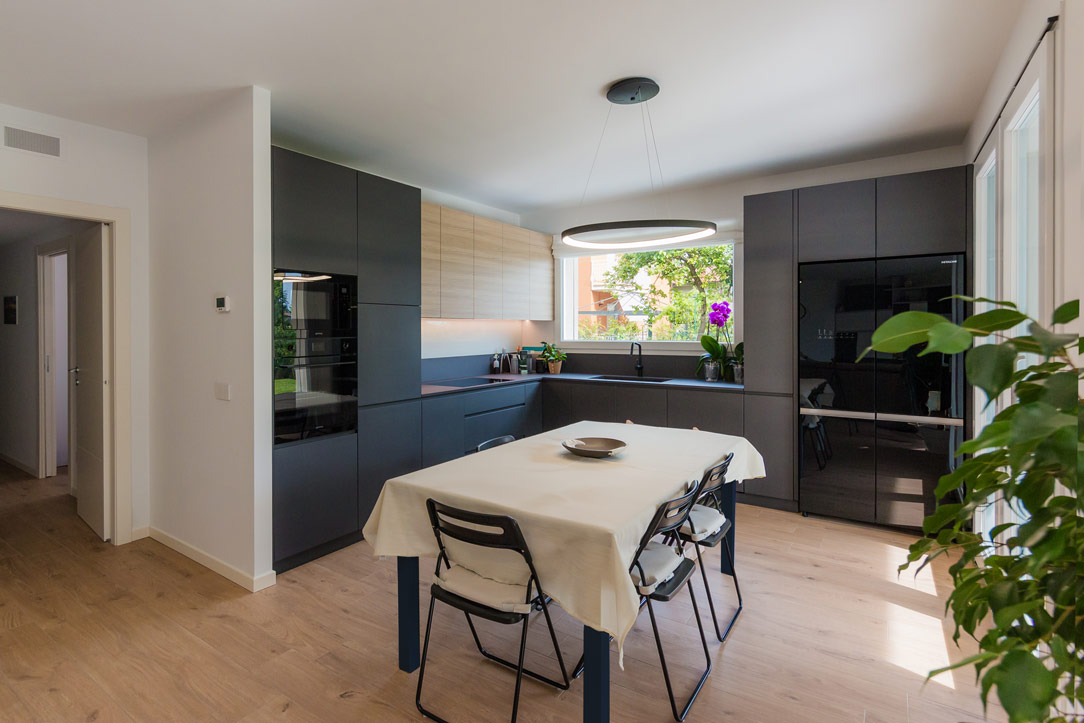
Here is another example, in this case a dark gray kitchen with oak inserts.