Minimal style furniture for a youthful apartment in the city center

Minimal style furniture for a youthful apartment in the city center

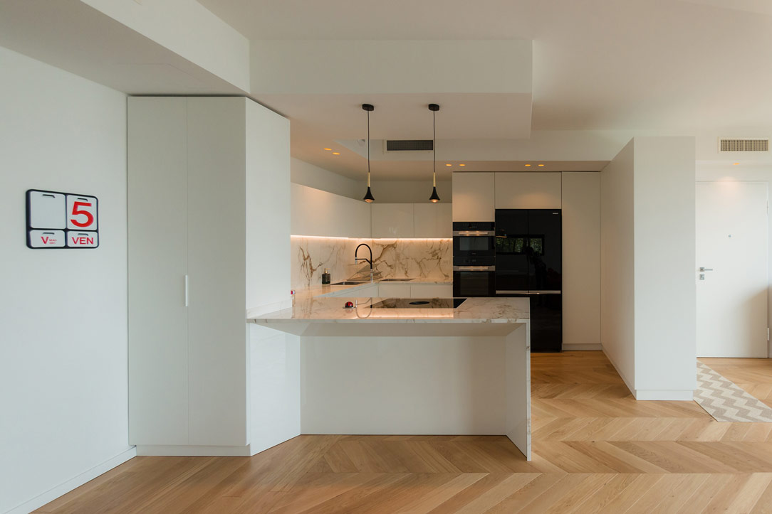
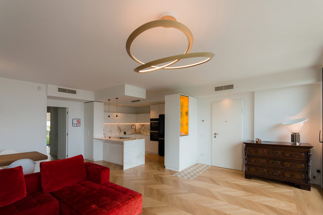
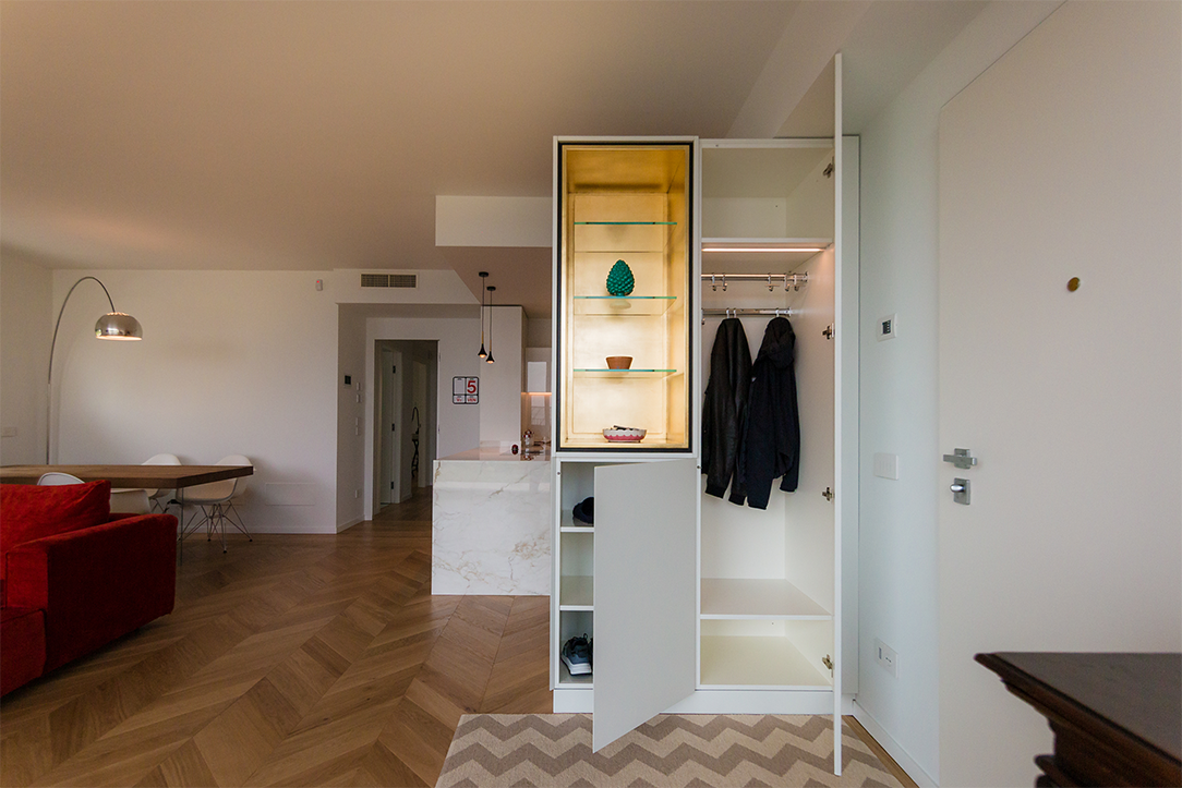
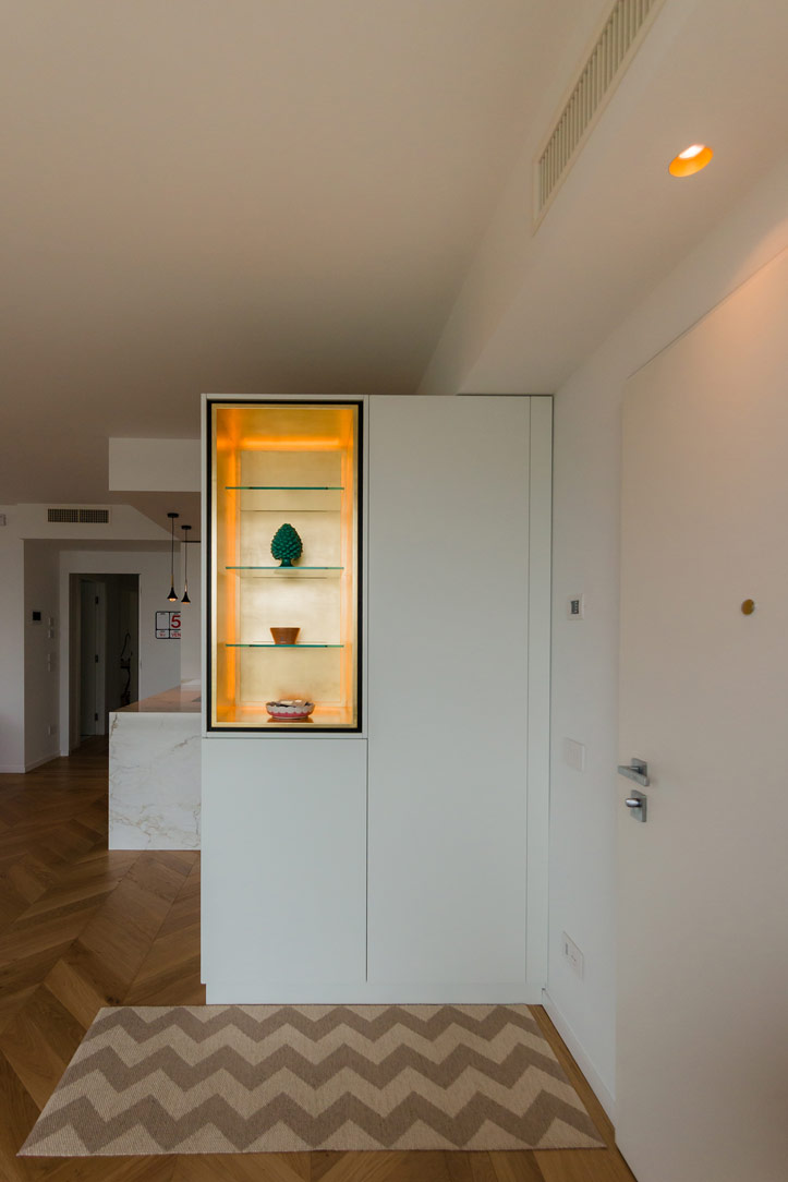
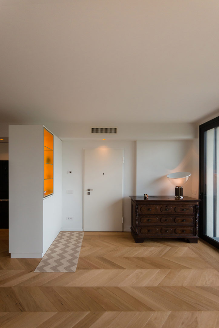
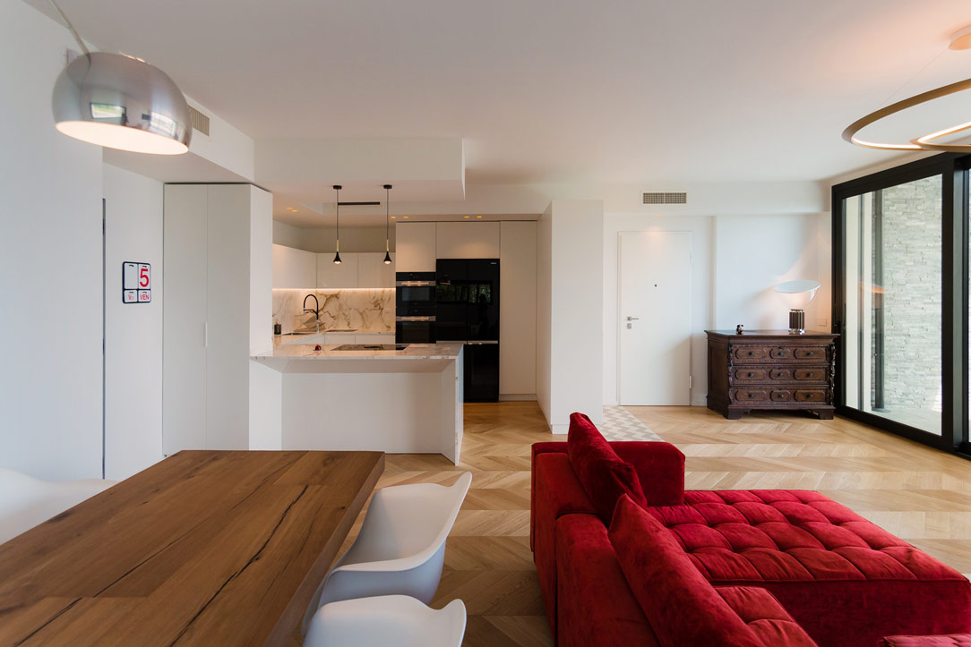
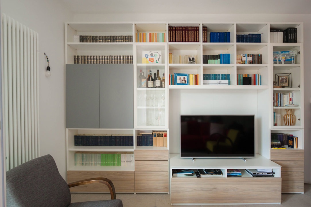
An apartment in the city center shows all its freshness with bright interiors and light colors, while the minimal style furniture defines its elegance. Functional environments suitable for various needs and therefore excellent for short and long-term rentals. The geometric patterns and essential design lines return the idea of ​​freshness, presenting themselves as excellent companions in everyday life.

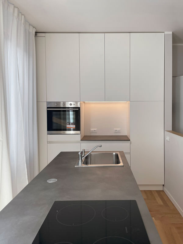
minimal style kitchen central island service columns

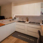
The living area: a minimal style kitchen with an industrial touch

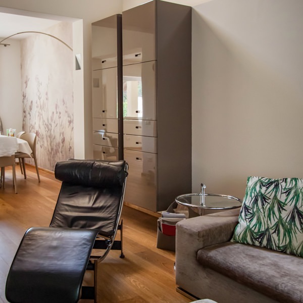
The entrance to this apartment overlooks the living area illuminated by large windows located along the right side of the room.
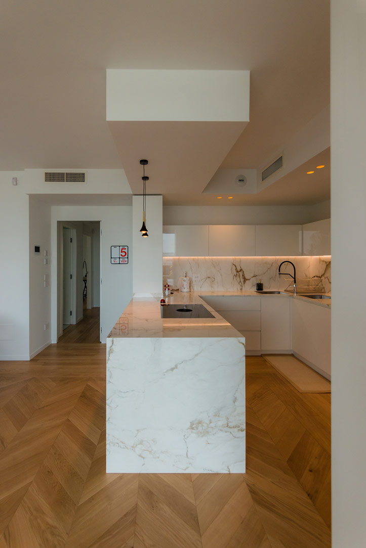
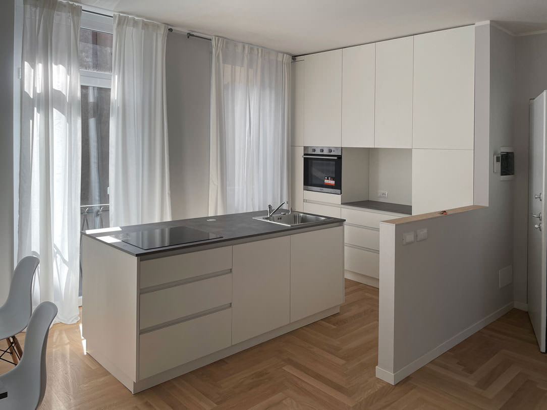
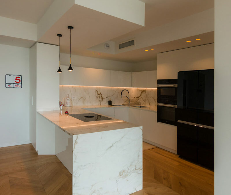
The minimal kitchen also finds space here, divided from the living area by a half-height wall that acts as a conceptual filter for the two environments.
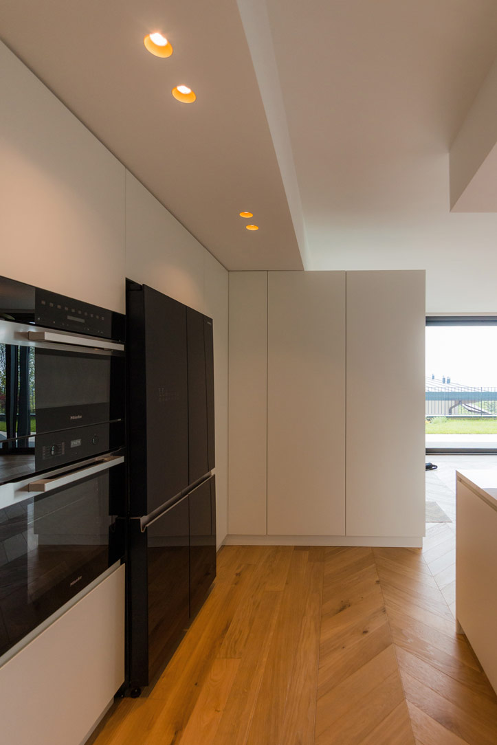
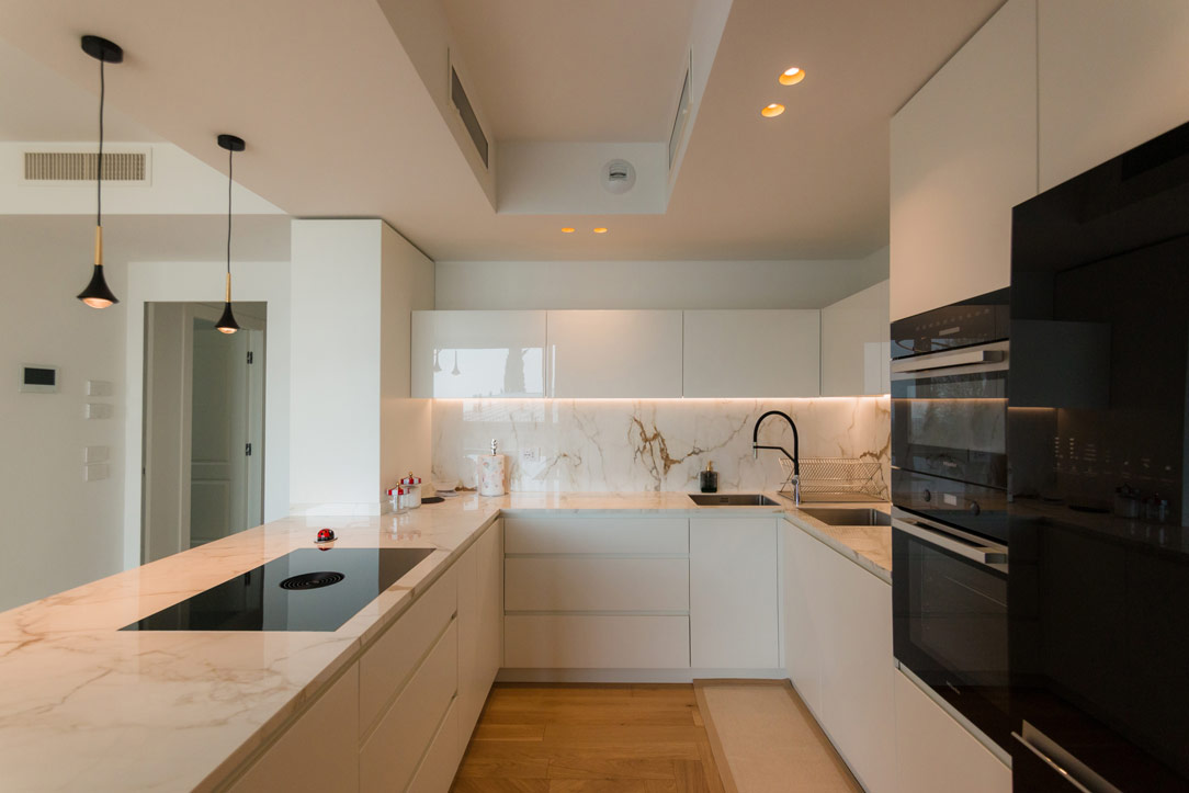
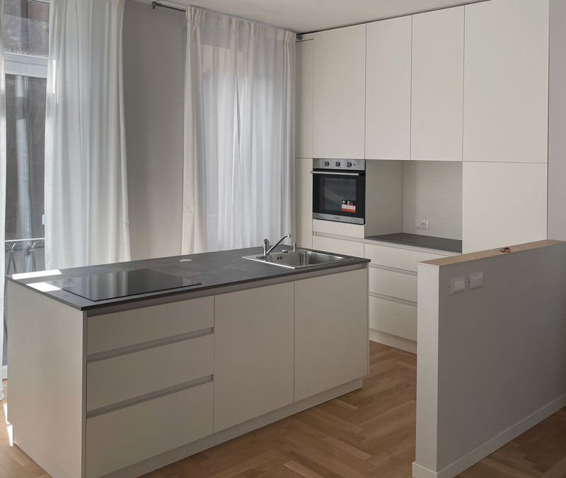
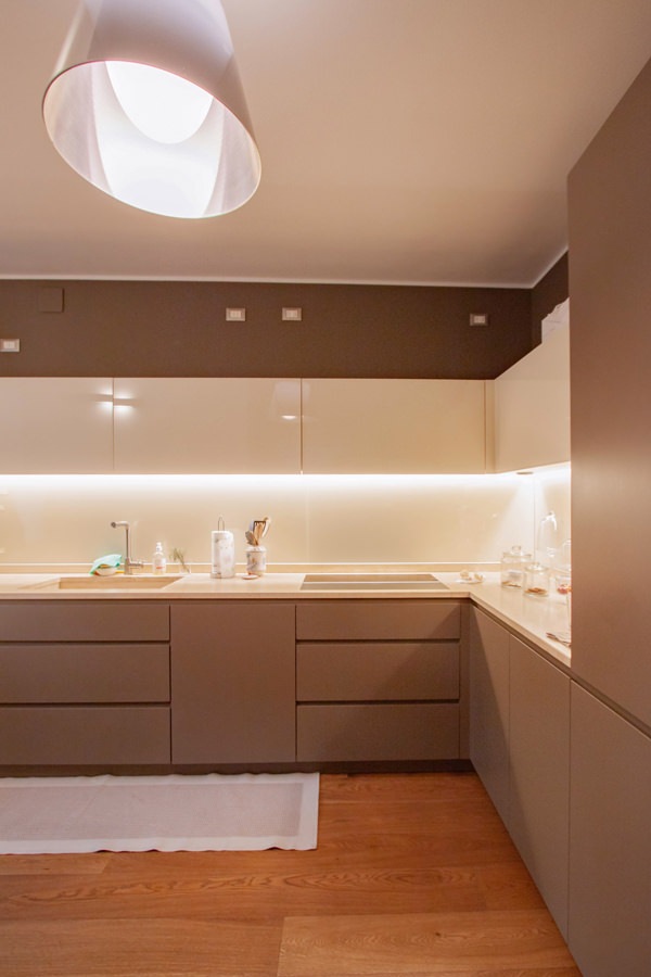
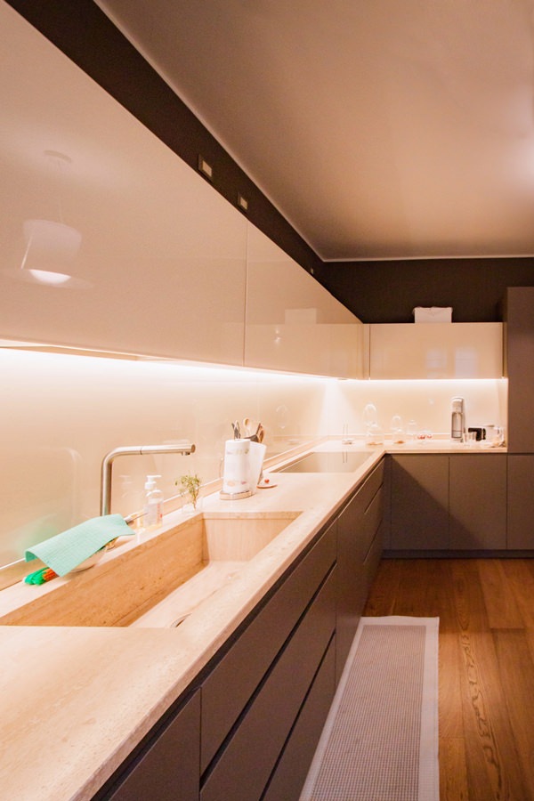
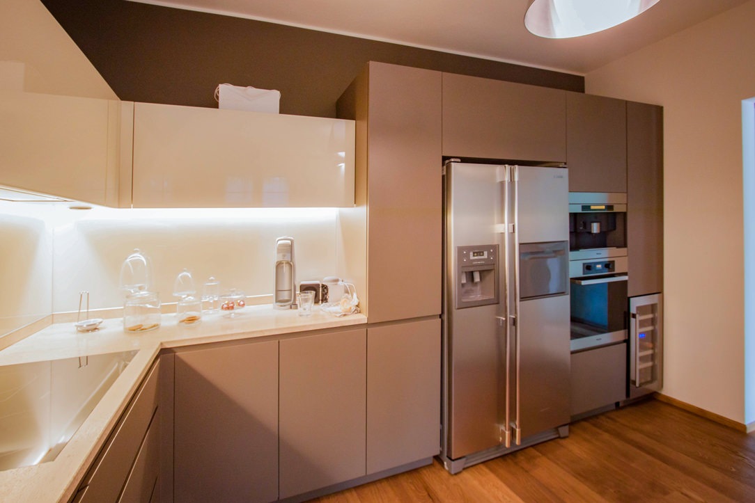
The development of the kitchen occupies the side adjacent to the entrance area with full-height columns and a central island. This becomes the functional element par excellence, acting as a pivot in the distribution of transit flows and welcoming the preparation, cooking and washing areas.
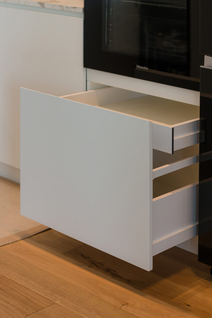
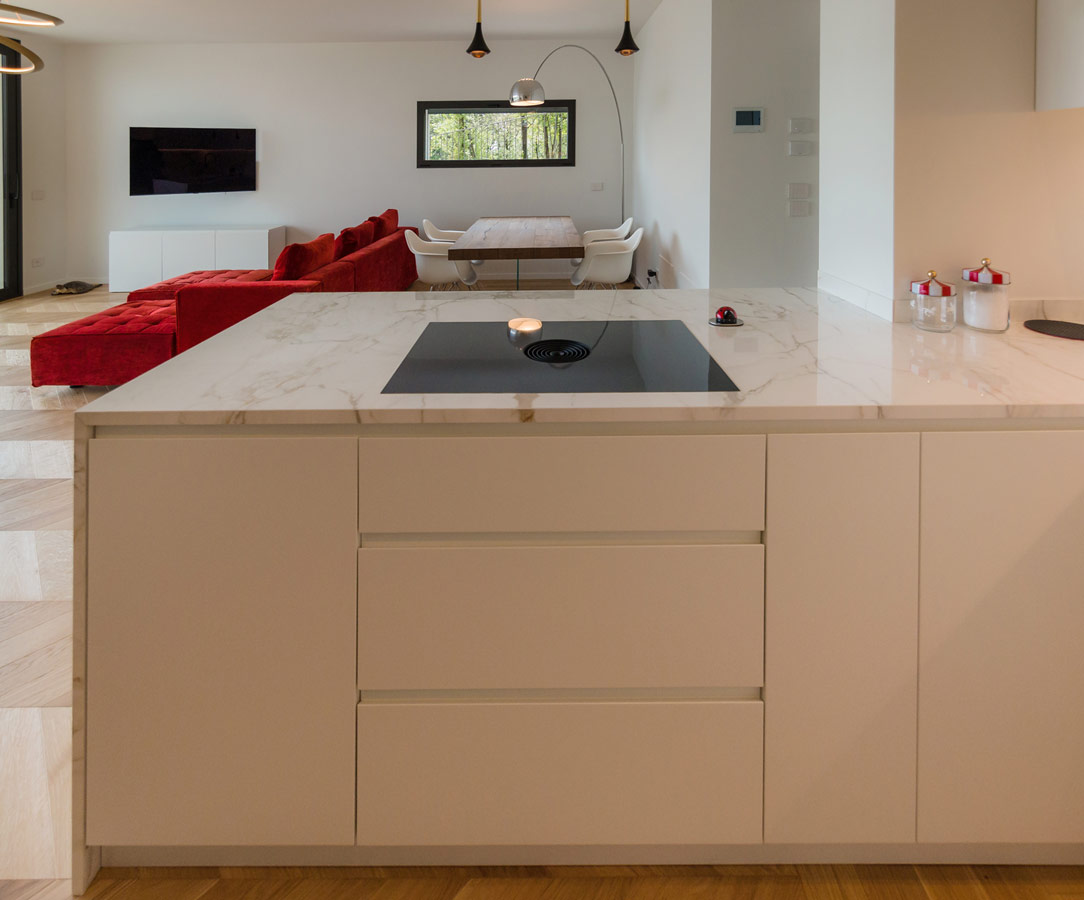
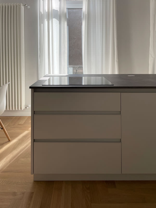
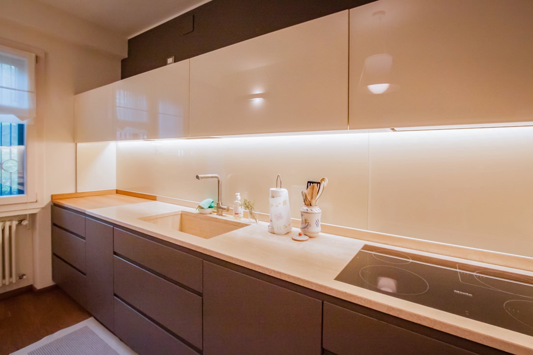
In the lower part, large drawers are placed under the induction hob, to house pots and accessories useful for cooking.
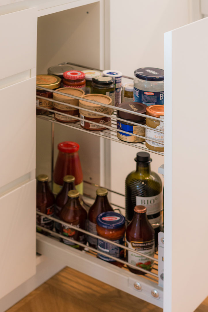
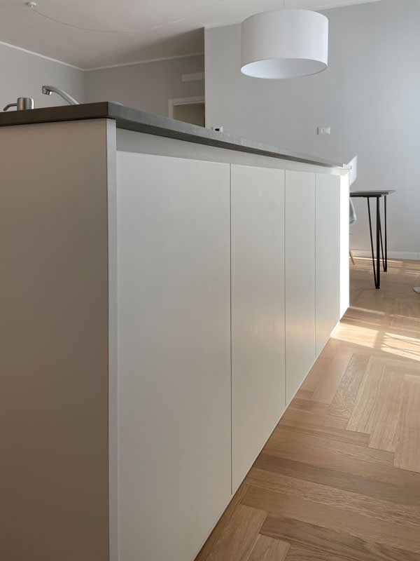
Beside them, two lacquered MDF doors house the countertop sink and the lower compartment for the differentiated waste bins.

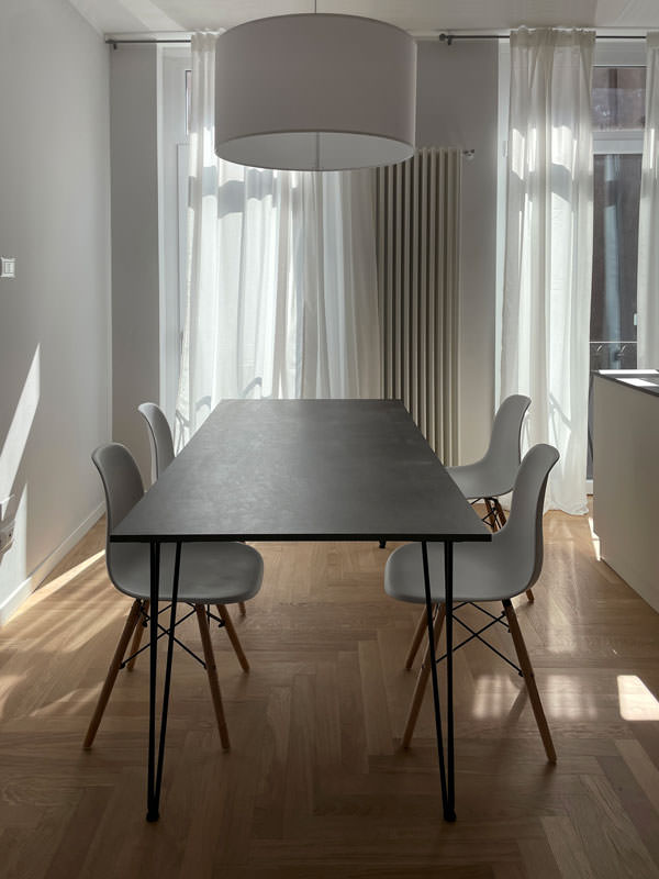
The worktop in practical bilaminate in a medium gray tone recalls the industrial scent of the dining table with its material surface.
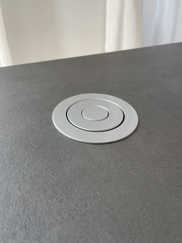
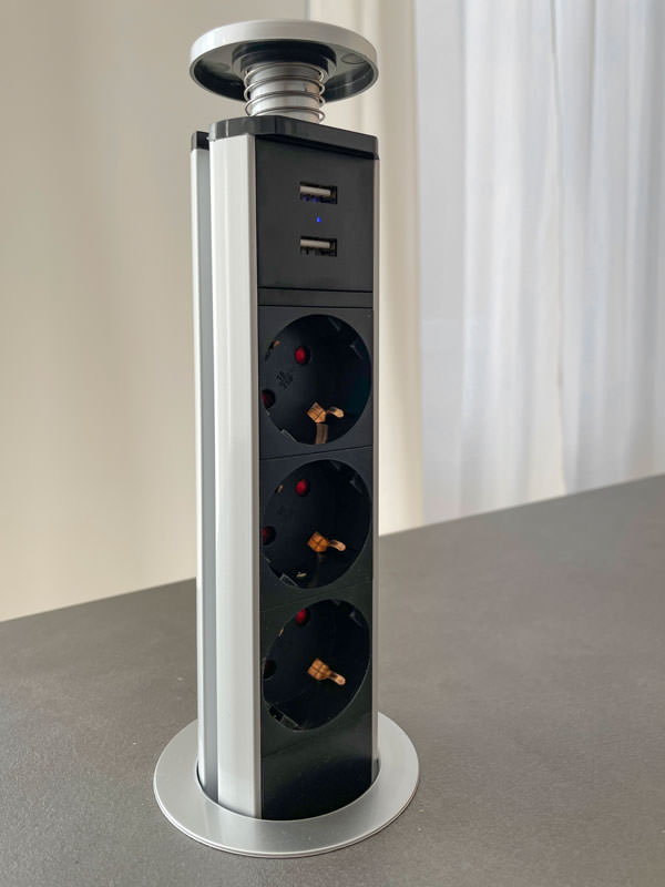
In the center between the cooking area and the washing area, the top is left free to allow the preparation of dishes. To facilitate the use of small appliances, a retractable socket tower.

On the column side, the built-in oven positioned at a comfortable height embrace, together with doors with internal shelves, the open compartment with bilaminate top and lacobel top. Element that acts as a useful support on the side of the oven or can be equipped with small appliances such as coffee machine and mixer, or Thermomix.
At the same time, it is also a significant aesthetic element, capable of attracting attention for the brightness that characterizes it.

The lacobel bottom reflects the light coming from the LED strip embedded in the upper part, giving further brightness.

 dining table metal structure industrial style top
furniture columns kitchen service minimal style bilaminate top lacobel day compartment
front view island drawers pans accessories induction cooking
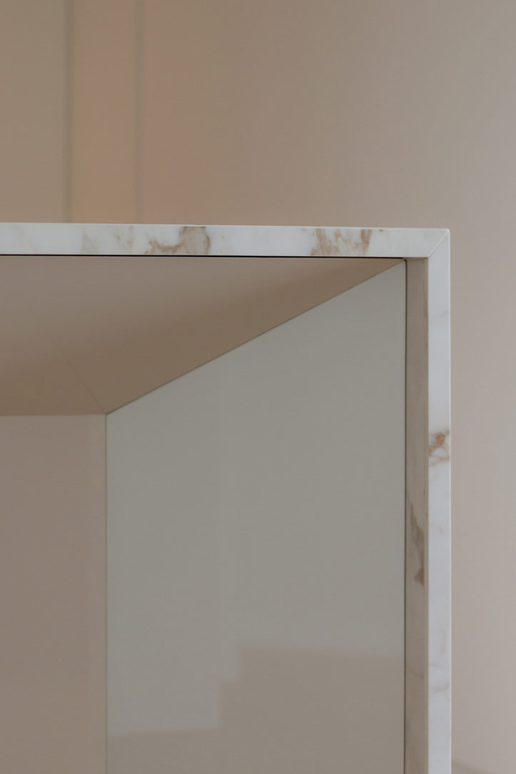
white kitchen island retro doors detail
detail of the disappeared turret took a closed position
detail of the disappeared turret took the position of use

The functionality of the sleeping area with white furniture

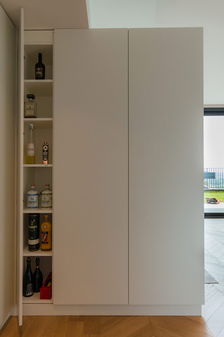
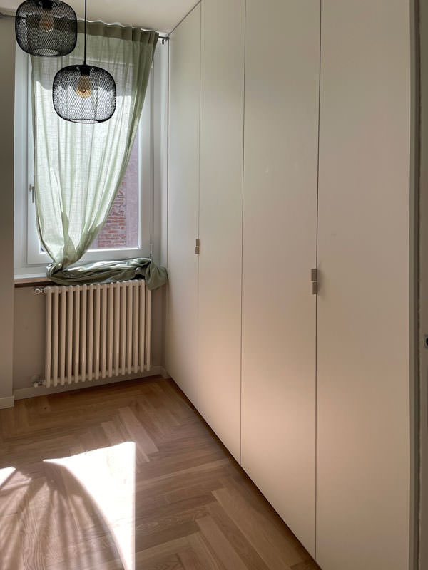
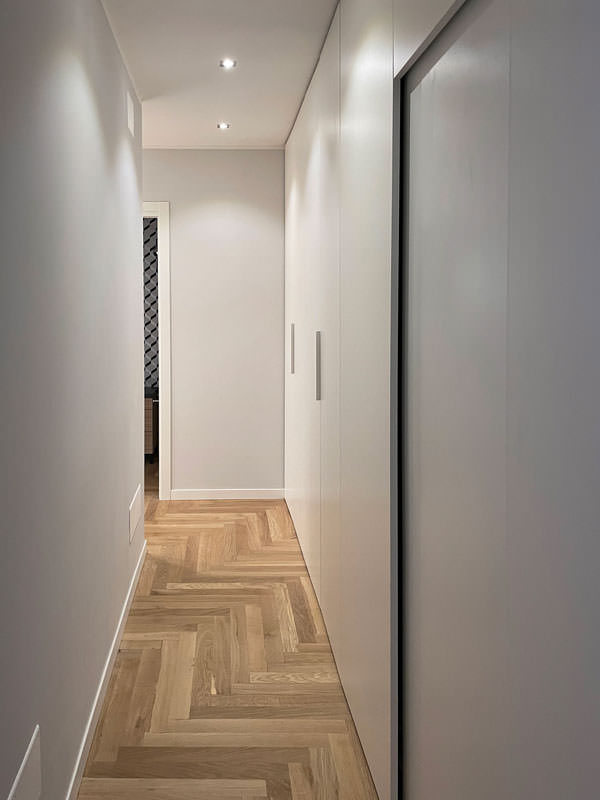
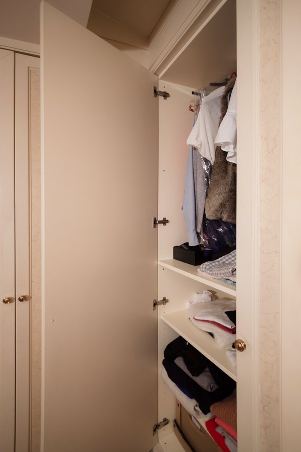
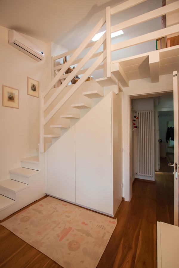
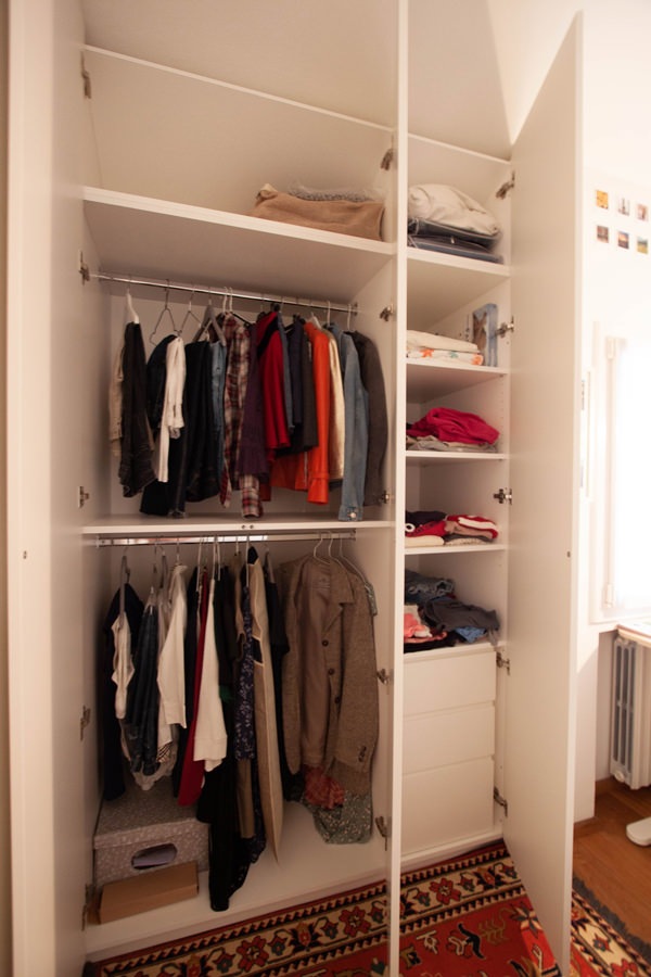
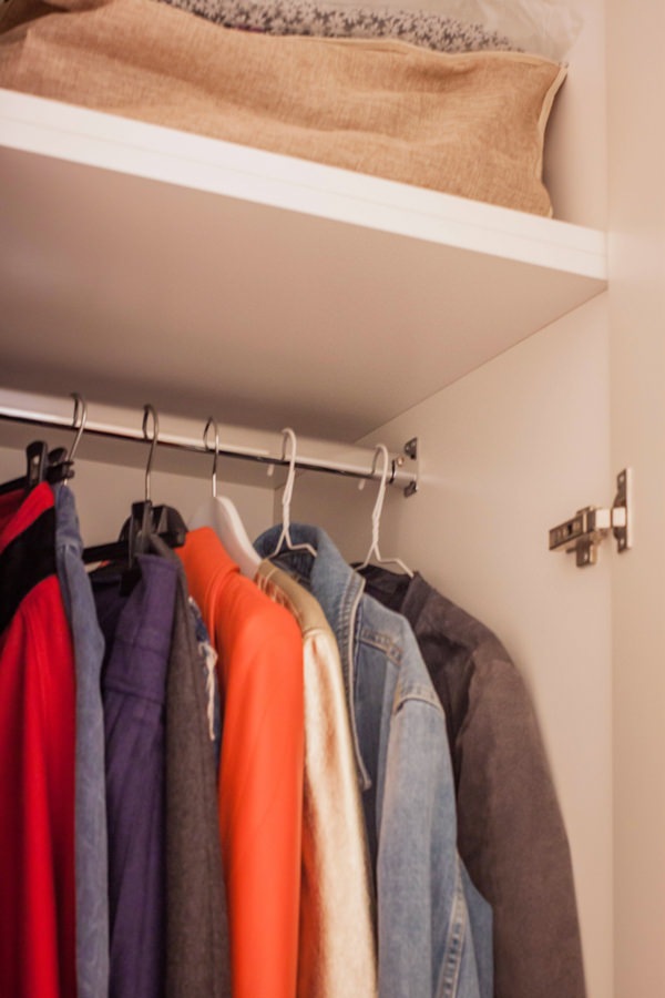
The access corridor to the sleeping area is equipped with a full-height wardrobe shaped internally to restore the correct alignment of the rear walls. Internally, shelves of different heights allow the organization of household products while respecting the existing electrical arrangements and the counter compartments.
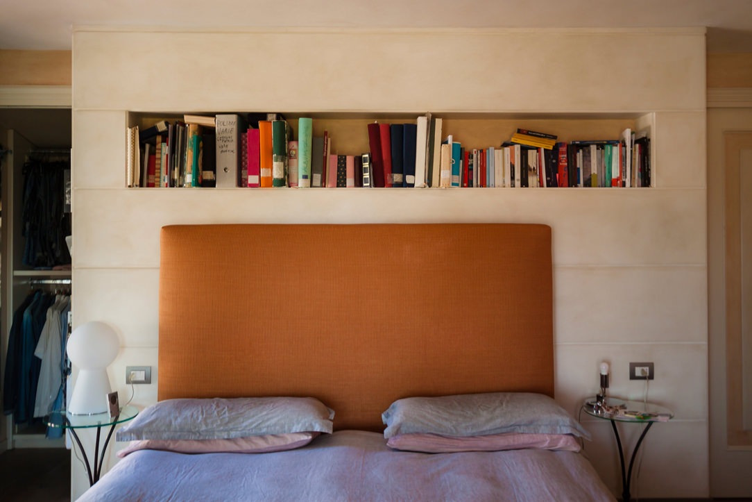
A functional element capable of blending into the minimal furnishings of the apartment and at the same time serving as an equipped piece of furniture in a closet.

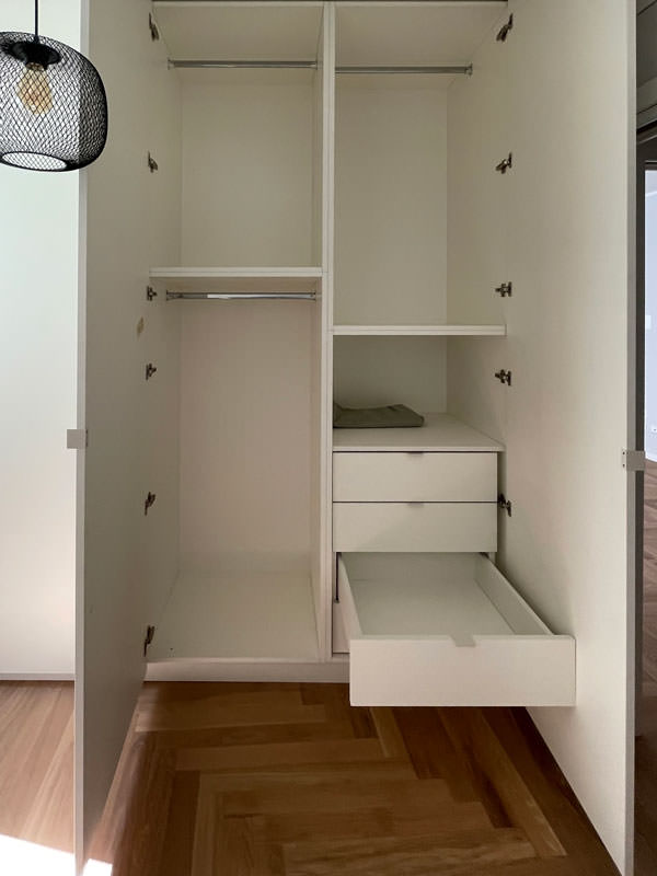
To complete the sleeping area, a second full-height wardrobe with white lacquered doors and handles in white folded sheet metal with a minimal look.
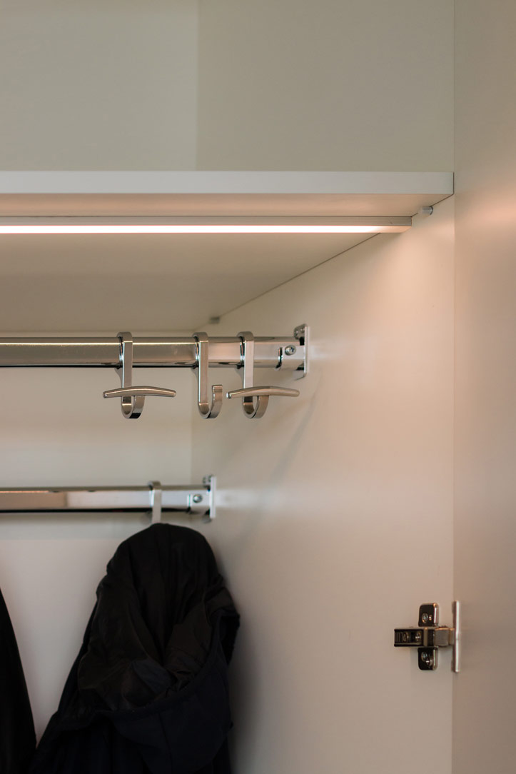
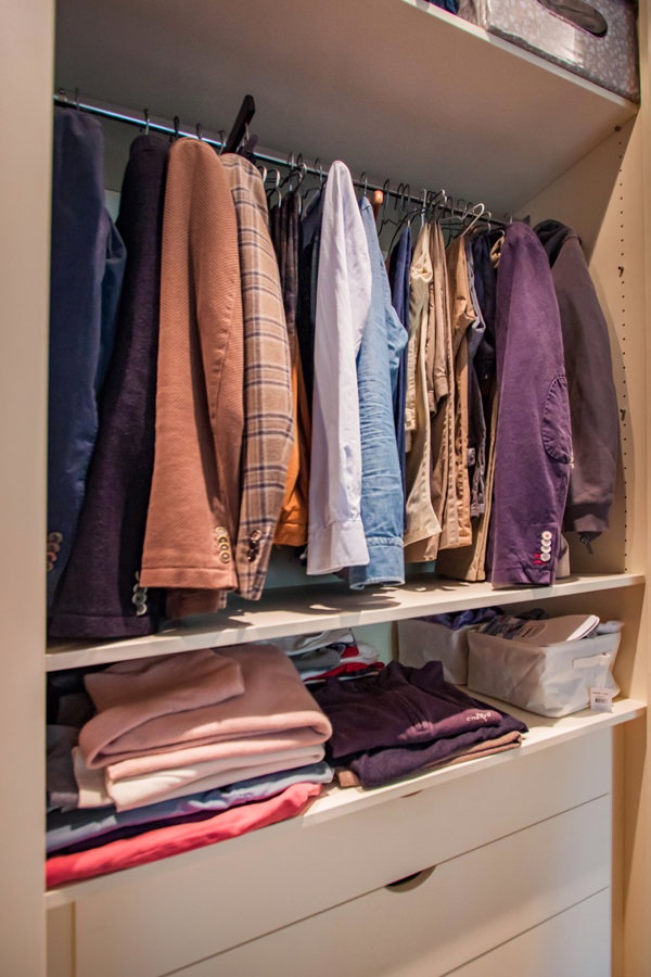
This internally houses hanging tubes and drawers for linen allowing you to keep the garments in order.
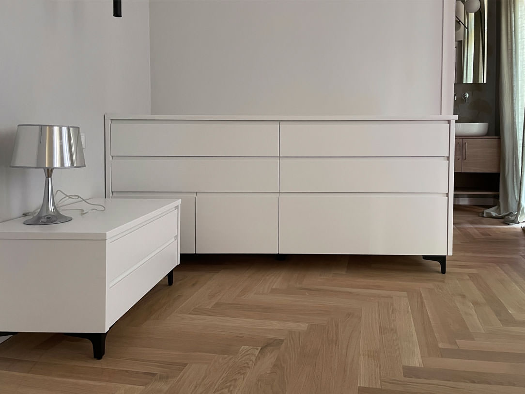
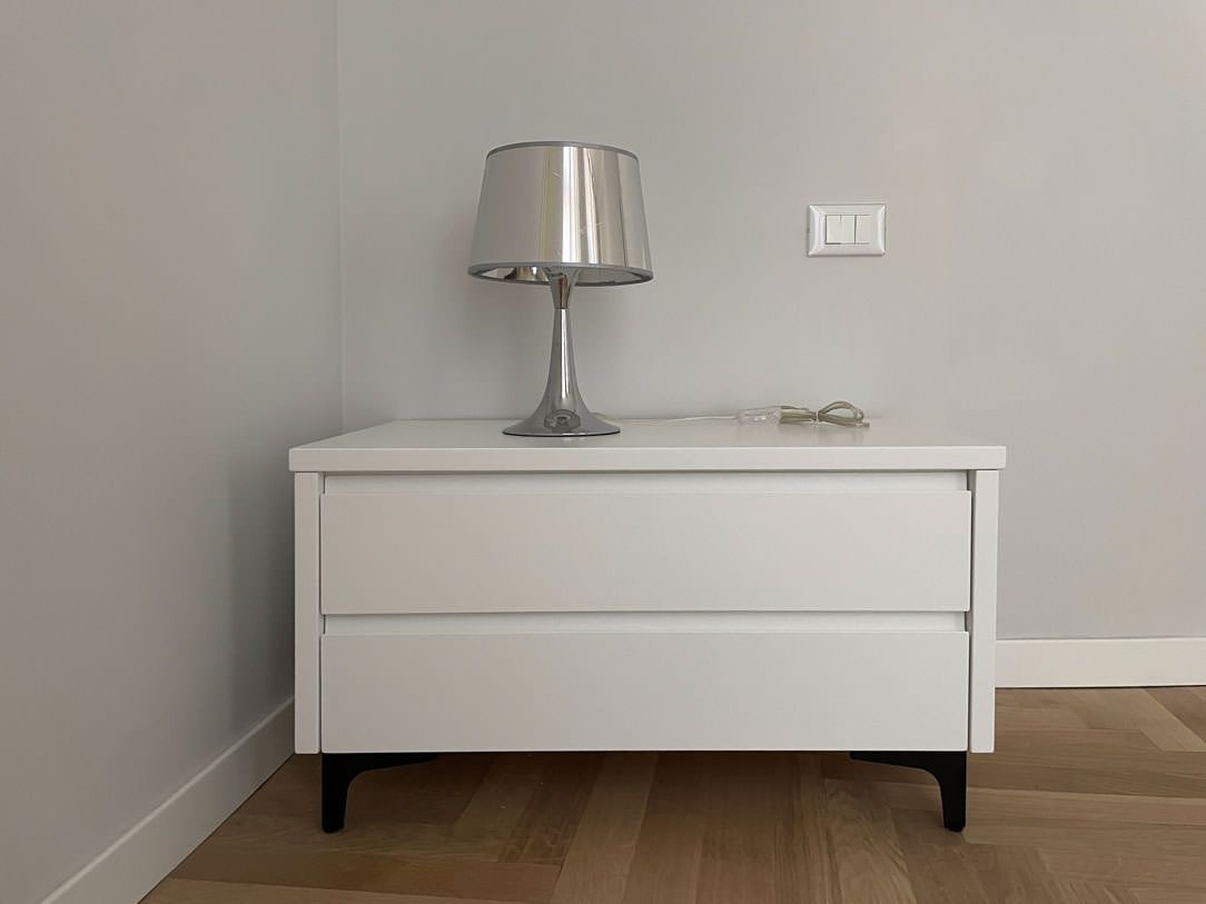
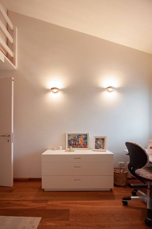
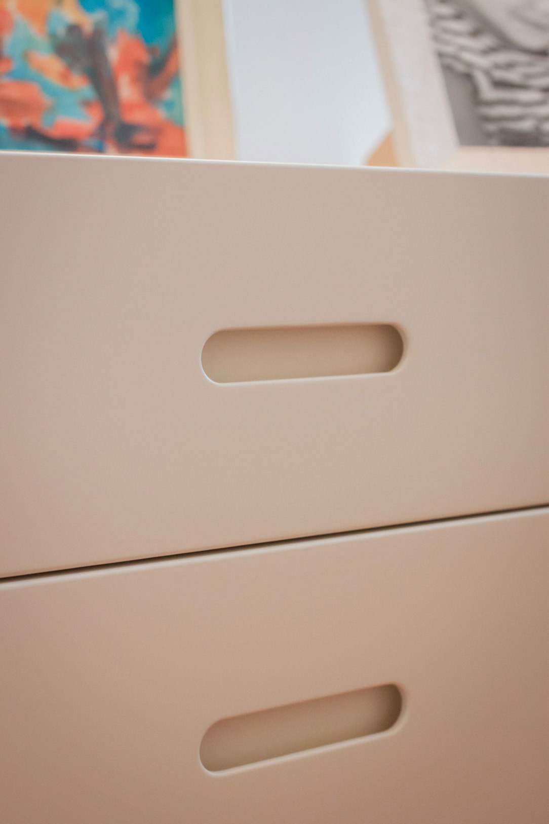
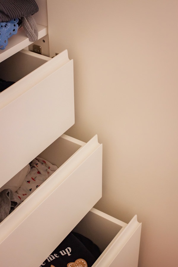
In the master bedroom, essential white lacquered furnishings placed including a pair of bedside tables with storage drawers and a large side chest of drawers with recessed handles.
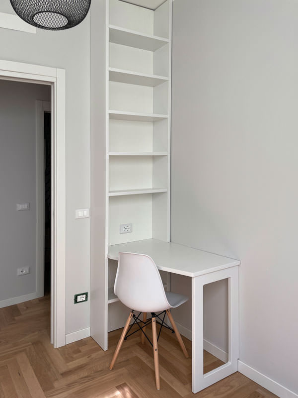
A desk, on the other hand, is inserted into a game of joints in a wall bookcase, creating an equipped point for smartworking.

full-height wardrobe doors sheet metal handles minimal furniture
internal wardrobe drawers linen tubes hangers
equipped corridor mobile closet minimal furniture
study corner bookcase wall desk shaped
chest of drawers bedroom minimal furniture white bedside tables
bedside table front view white lacquered handles hollow drawer black feet
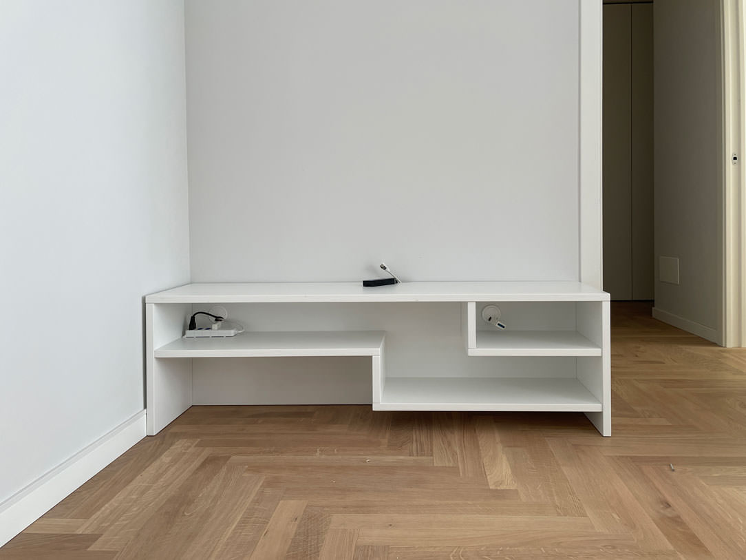
white lacquered shaped shelves furniture minimal style furniture

The natural touch of the bathrooms

The two bathrooms with bold graphics reflect the minimal style of the furniture, giving a touch of freshness.
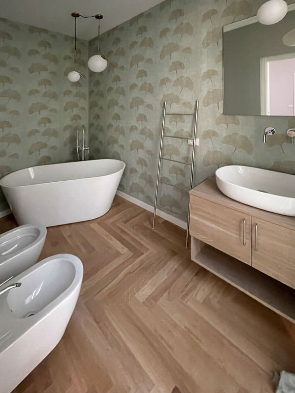
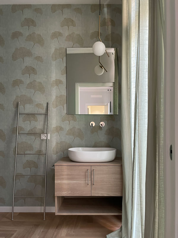
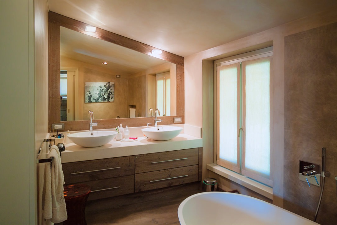
One, next to the master bedroom, incorporates the natural tones of green with a wallpaper with a vintage flavor. This is equipped with a cabinet with wooden finishes combined with a countertop washbasin with sinuous shapes. It is accompanied by a large designer bathtub that masters the corner of the bathroom and elegant furnishings.
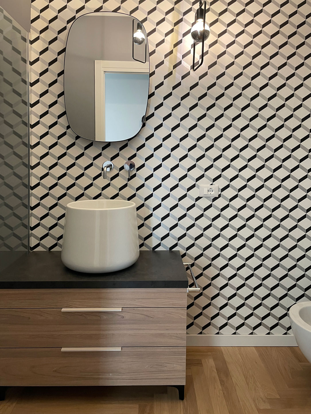
The second bathroom, on the other hand, plays on the geometric textures of the wallpaper with more decisive colors, matched with a bathroom cabinet with the same characteristics as the first.

bathroom tub design natural colors vintage wallpaper
bathroom cabinet wood white countertop washbasin green wallpaper
bathroom furniture wood sink design support wallpaper vintage geometric pattern

City apartments require flexibility from both a functional and aesthetic point of view.
For this reason, the minimal style is perfectly suited to satisfy the tastes of future tenants. Another example of this type is this studio apartment in the center of Milan!
To deepen the minimal style instead, we can delve into the retail world with this shop in the center of Bergamo. Enjoy the reading!

Renewed classic furniture with contemporary kitchen

Renewed classic furniture with contemporary kitchen

The classic style furnishings of this villa built about thirty years ago rediscovers its eternal charm even after many years.
To rejuvenate it and make it current, a contemporary style kitchen with essential lines has been added. The harmonious combination of the two styles refreshes the rooms and softens the features of the predominant style.
classic living room

Classical furniture between past and present

The passage of time and the succession of different historical periods has allowed a wide development of furnishing styles. Over the course of history these have known their maximum expression with distinct characters, while in the contemporary era they have been reinterpreted, giving life to continuously updated variants.

This house, built between the late eighties and early nineties, responds to a classic style at the time very popular among villas and elegant apartments. Revived today, it discovers its contemporary meaning with an elegant kitchen with essential lines. The warm tones of the lacquers soften the design lines of these interiors, in perfect harmony with contemporary trends.
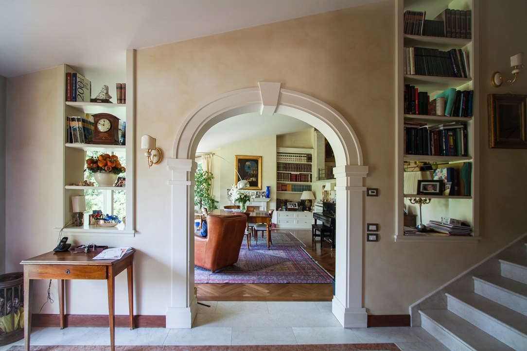
entrance passage with classic arch
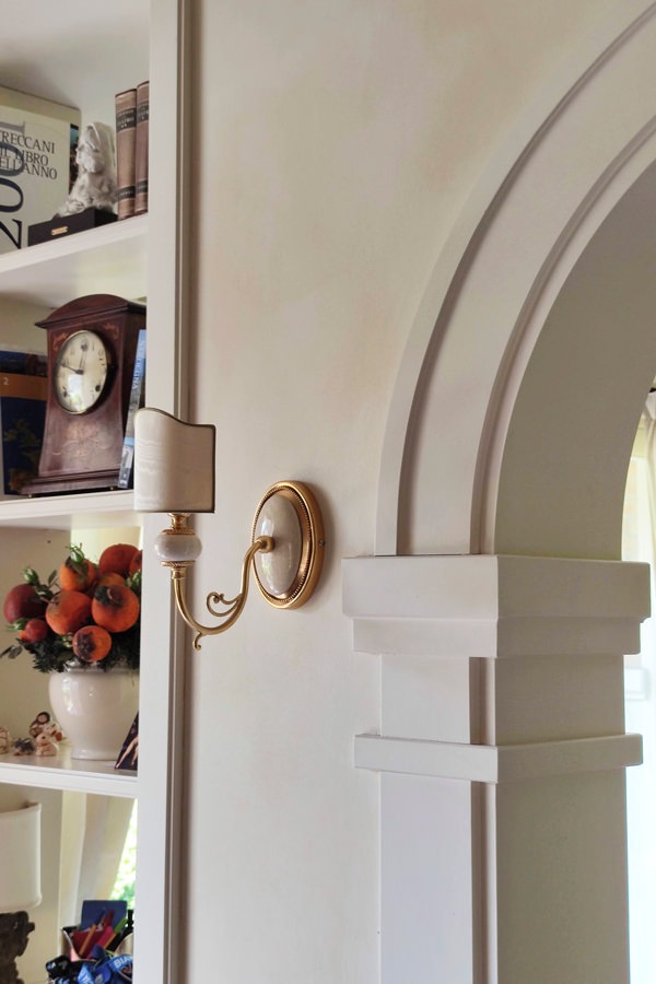
classic style entrance details arch moldings
detail of the villa entrance light blades

The living area in classic style

The classic furnishings already develop in the entrance area with moldings that emphasize the architectural lines of this villa.
On the left, an arch with shaped profiles marks the entrance to the living area, flanked by a pair of blades of light that allow a glimpse of the large interior living room.
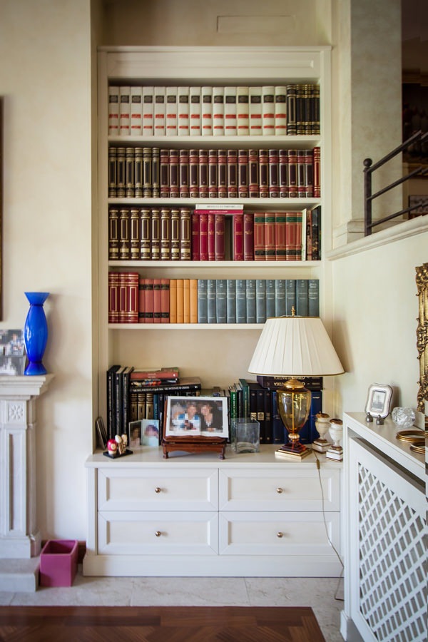
The profile of the internal shelves, slightly recessed, is a shrewdness that makes the aesthetic impact of the element lighter, recalling the characteristics of the classic style.
The painting of the walls in a warm slightly cloudy tone acts as a leitmotif in the different rooms, enhancing the light furnishings.

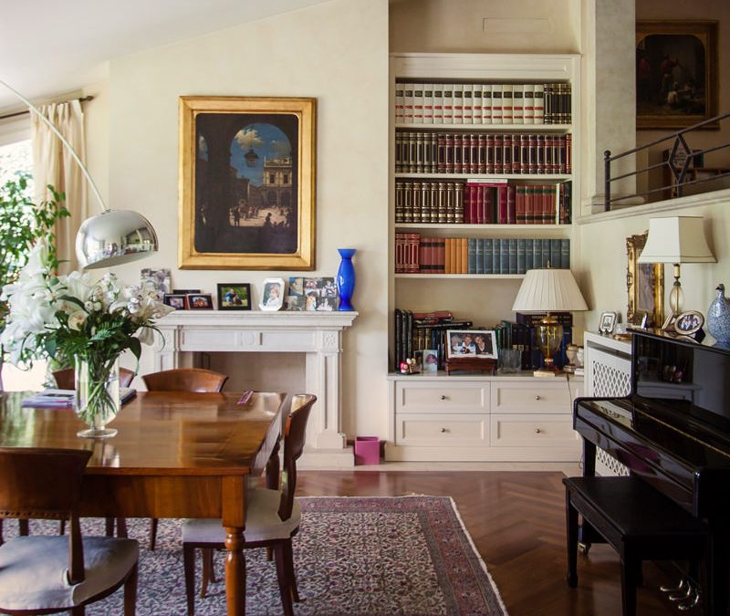
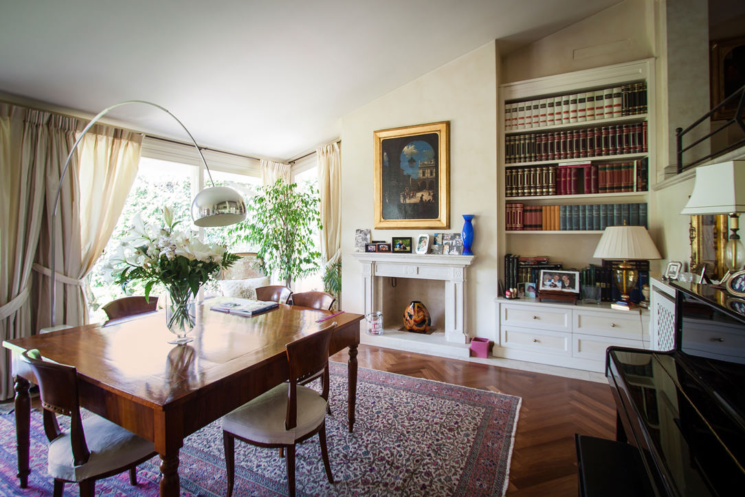
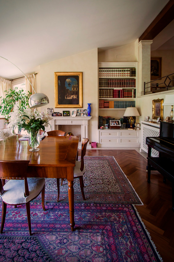
The living room has a central solid wood main table matched with other antiques that give elegance and prestige.
Among these, the large damask carpet, the adjacent wall piano and the Arco lamp by Castiglioni, a timeless design icon.
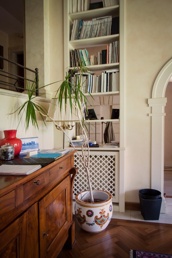
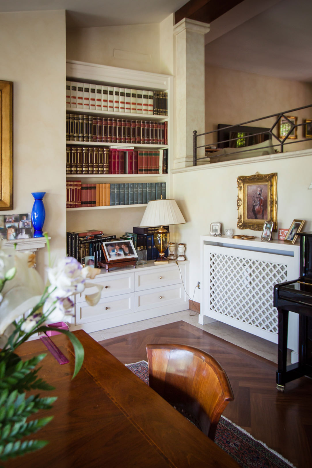
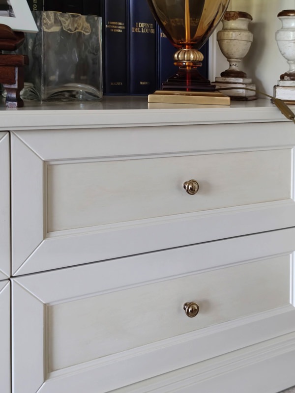
Low cabinets, honeycomb radiator covers and niche bookcases with recurring aesthetic characteristics accompany them. Moldings, doors decorated with tone-on-tone knockouts and brass knobs are in perfect classic style.
The chosen color of a light cream makes the interiors elegant, softening their features.

bookcase in niche details classic furnishings in the living area
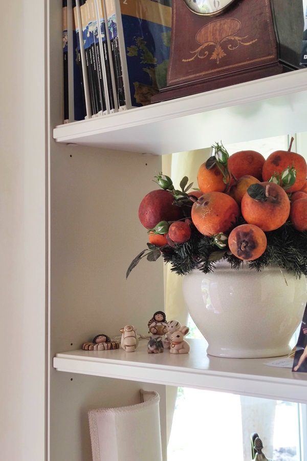
details equipped windows bookshelves wooden furniture
classic style living room wood table
living room furniture classic niche bookcase
front molded drawers in classic style, tone-on-tone
bookcase niche living room classic furniture shelves

From the equipped corridors to the sleeping area

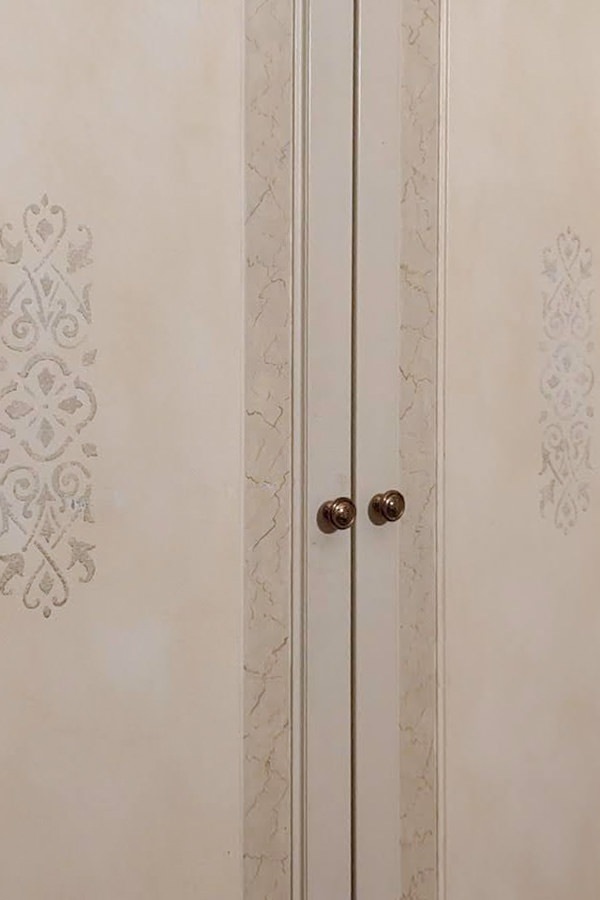
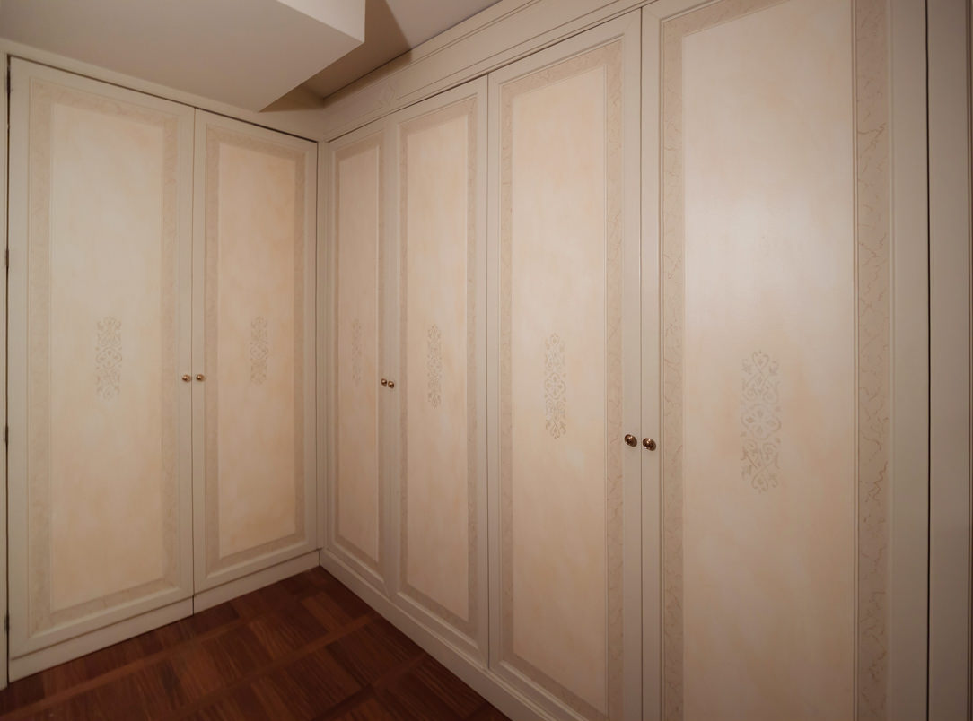
To anticipate the sleeping area, the corridors and passageways are equipped with full-height service wardrobes. These reproduce the characterizing lines of classic style furnishings, enriched with decorative floral motifs in a slight chromatic contrast.
The warm tone of the walls is echoed by the knock-out of the doors in a delicate tone-on-tone play. Internally, shelves and hangers alternate to make the most of the environments.
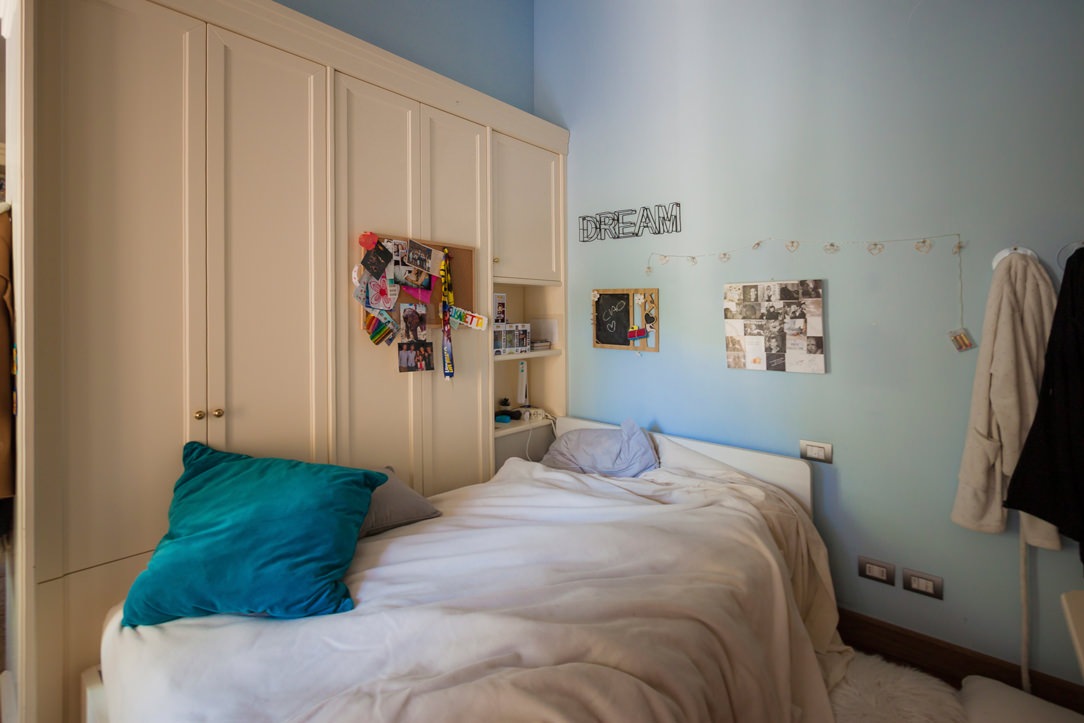
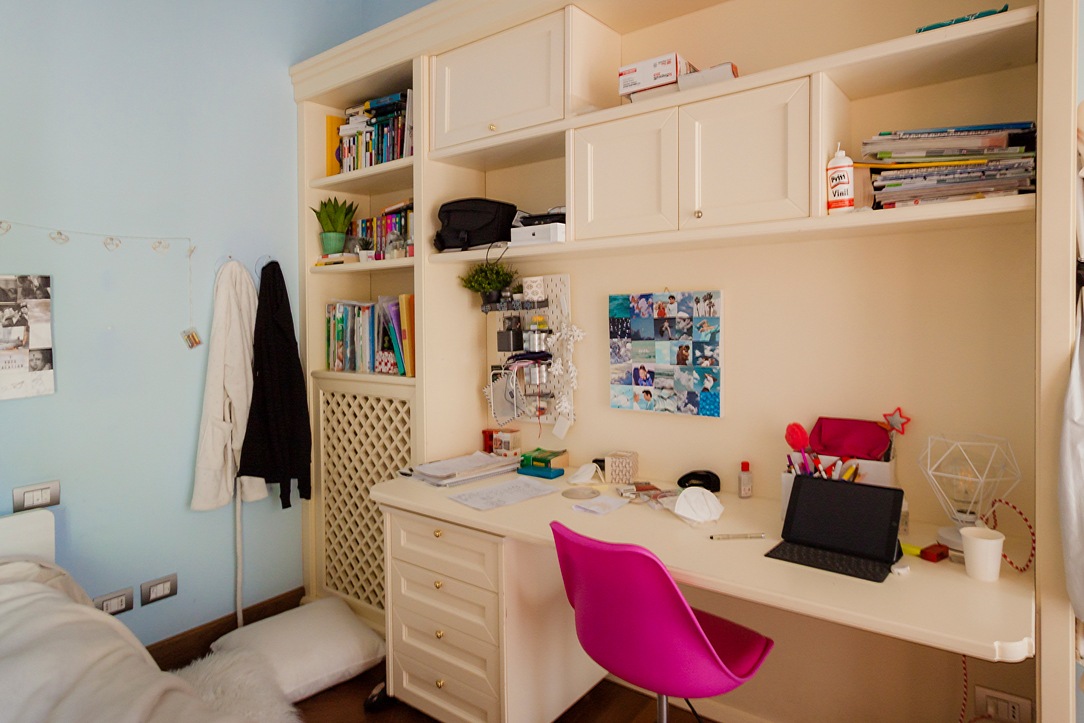
In the sleeping area, the bedroom uses a double-sided wardrobe that fits into the dividing wall between the sleeping area and the study corner, now equipped for distance learning. A structure with delicate warm tones which, combined with the light blue walls, is even brighter and fresher. Classic-style doors accommodate internal shelves and hangers, while in the terminal part they incorporate open compartments for small objects.
At the front, the equipped wall alternates shelves with wall units with molded doors, creating a dynamic visual rhythm. In the lower part there is a desk with a chest of drawers incorporated into the structure.

classic style bedroom bed
classic style bedroom desk
classic style wardrobes interior
detail decoration doors classic style furniture
classic style wardrobes decorated cream colored doors

The master bedroom stands out for its contemporary elegance that only delicately hints at the classic tones of the remaining rooms. The caramel-colored padded headboard of the large double bed rests on the rear structure equipped with a front day compartment and bookcases along the side shoulders. To recall the classic style of the furniture is the linear aesthetic of the back wall with panels spaced at a fixed distance.
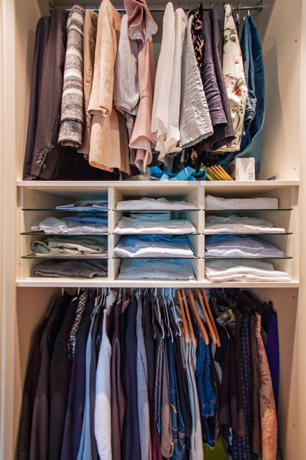
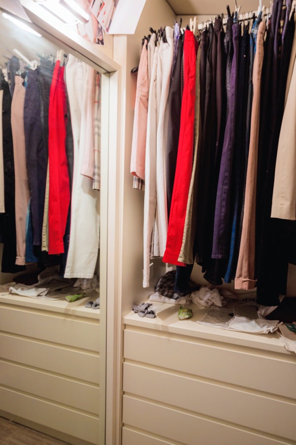
On both sides of the bed there is the access to the walk-in closet, contemporary in its design lines but with light tones that reflect the colors of the remaining furnishings.

cream colored shaped kitchen lacobel wall units
walk-in closet retro bed classic contemporary style
niche bookcase detail with headboard thickness
detail handles hollow linen drawers walk-in closet rear bed
internal walk-in closet chest of drawers hanging mirror
horizontal classic bathroom

The introduction of the contemporary style through the refurbishment of the kitchen

The timeless beauty of classic furniture, rediscovered even today, is confronted with the desire to renovate the interiors.
In terms of functionality and typology, the kitchen is the environment that best lends itself to a stylistic change with a contemporary flavor. Here then, after simplifying the existing doors with a linear aesthetic, this room also fits harmoniously into the existing complex.
A touch of lightness that balances the stylistic imprint of the villa.

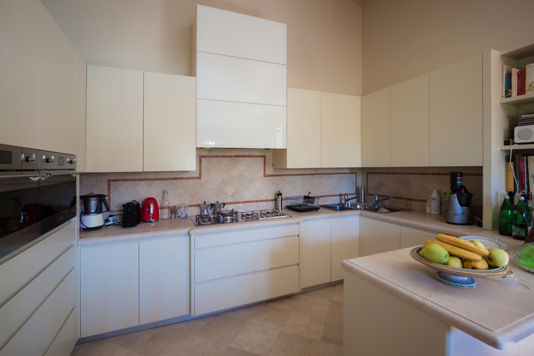
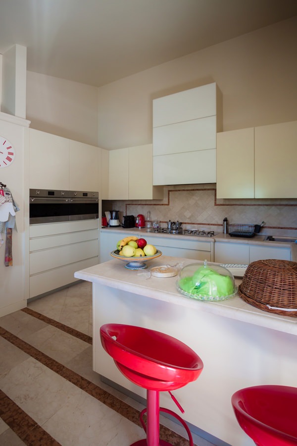
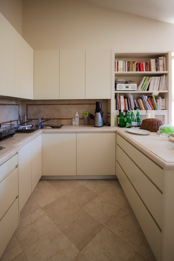
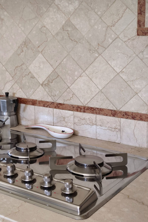
Preserving the top and the back surface of the terracotta kitchen with brick-colored geometric decorations, the refurbishment involved doors and front drawers of both the base units and the upper wall units. Recessed handles with a linear aesthetic and matt lacquer in full contemporary style are spread over the entire kitchen and the volume of the peninsula used as a snack bar placed at the front.
The hood, previously chosen as a “design” type, was inserted in a built-in structure entirely covered in white Lacobel, capable of giving brightness to the environment.
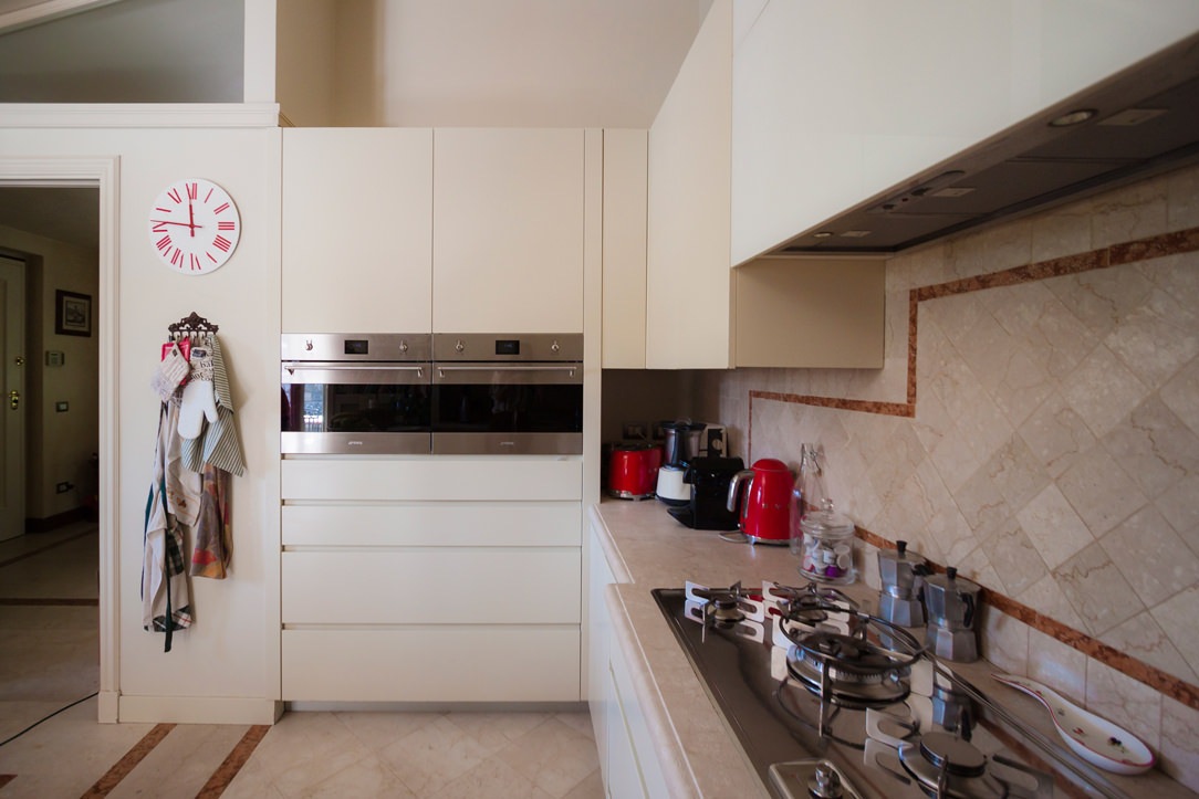
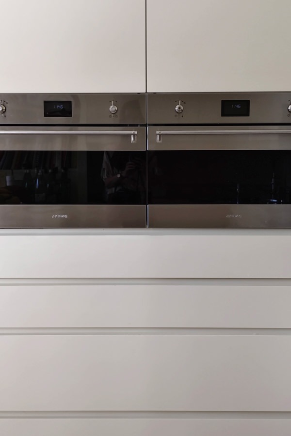
Appliances are also being renovated, including the built-in refrigerator and the pair of Smeg column ovens.

tubular horizontal hangers optimize coats space
contemporary style kitchen top snack bar red stools
modern classic style kitchen renovation on the peninsula side snack bar
modern classic kitchen 4
gas hob kitchen kitchen makeover
column ovens smeg contemporary kitchen drawers hollow handles

Conclusions: customize the classic furniture

The classic style, which today is witnessing a rediscovery, is easily combined with the essentiality of the contemporary style, creating an interesting combination. Restoring the stylistic balance of the interiors can also mean finding the right combinations between different styles, giving a decisive impression to the house.
To learn more, another example of a house with contemporary style and classic kitchen.

A wood-effect laminate kitchen

A wood-effect laminate kitchen

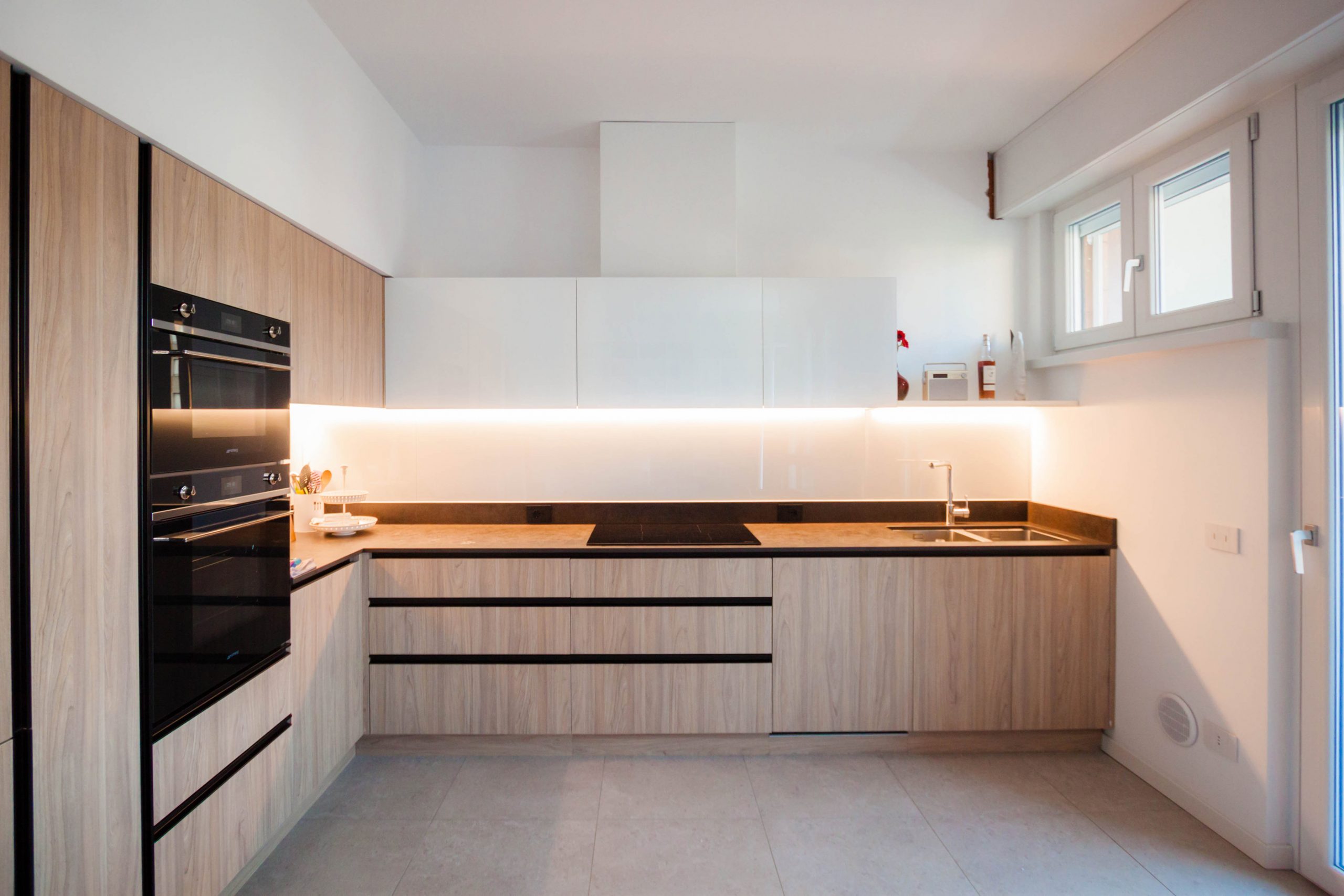
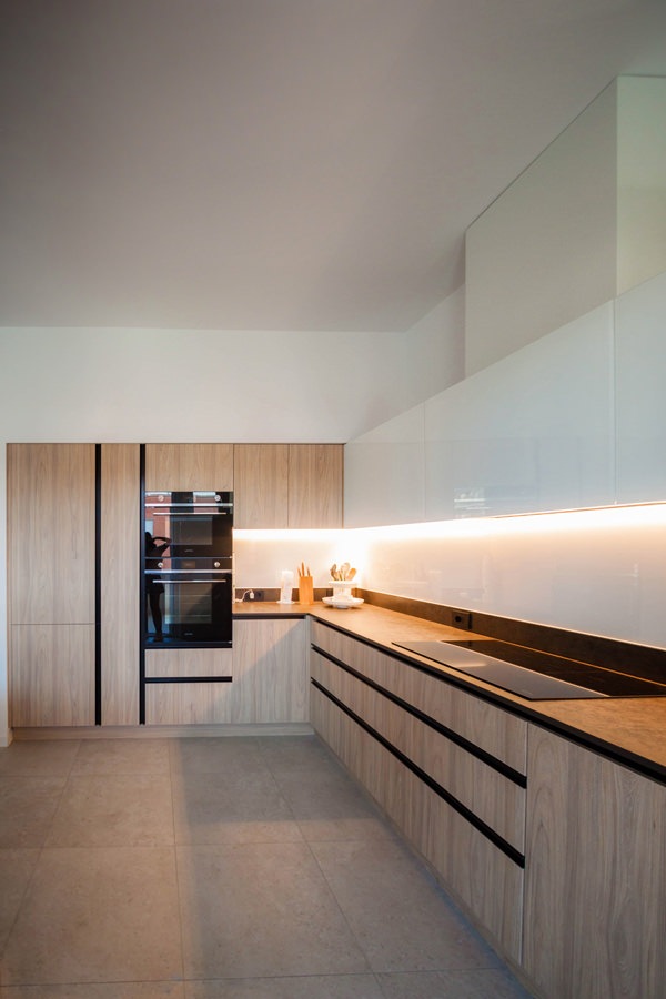
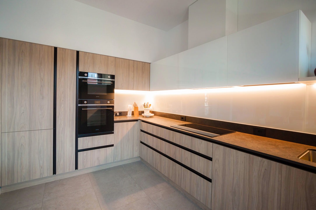
The stylistic choice of this kitchen derives from the profiles of the recessed handles in black aluminum in combination with the wood-effect laminate.
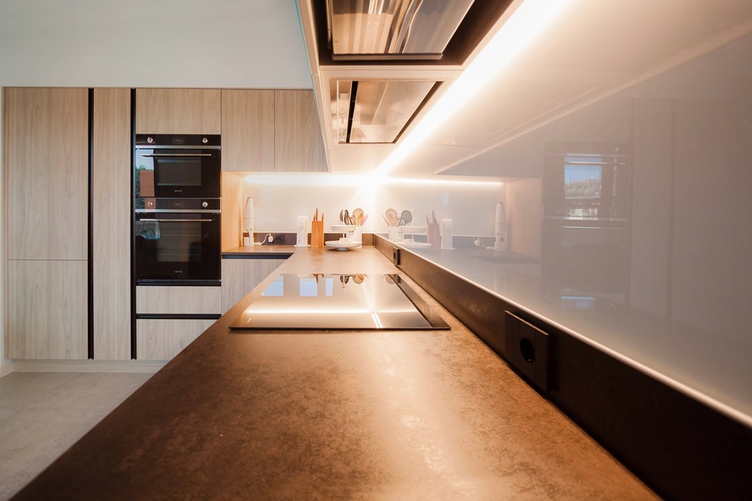
These are combined with the Dekton top in warm industrial-style tones and the white Lacobel coating that continues from the wall units to the back surface.

The material choice of the kitchen becomes the common thread for the remaining rooms of the house.
Furniture in black iron sheet and doors and drawers of the TV cabinet modified to take up the wood-effect laminate are an excellent example.

kitchen laminate wood effect white wall units
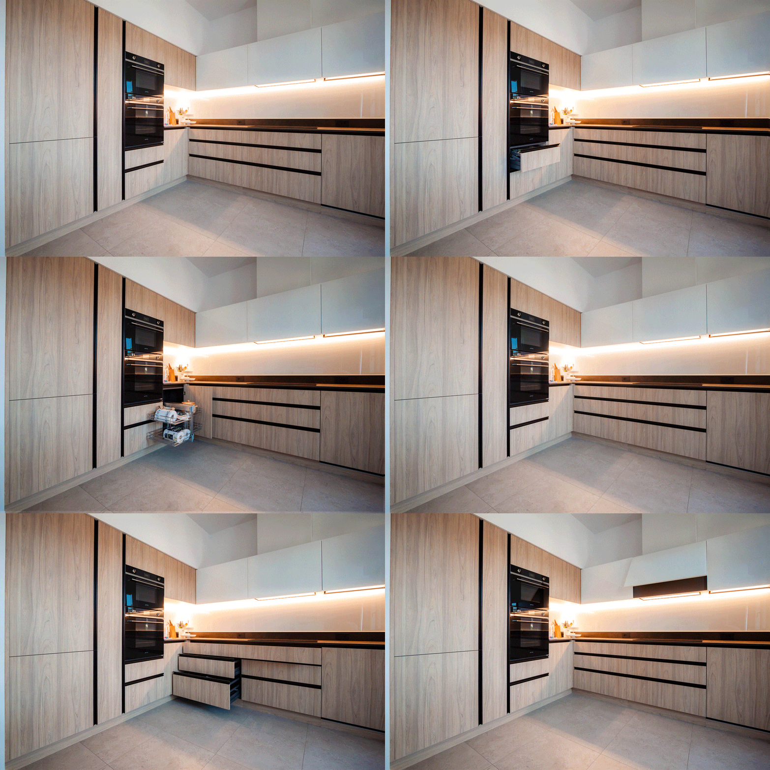
animation opening the kitchen doors

The project: the functional volumetric composition

The development of this kitchen, designed in collaboration with Officina iDEa, includes a side wall equipped with full-height service columns and a front part equipped with base units and upper wall units.

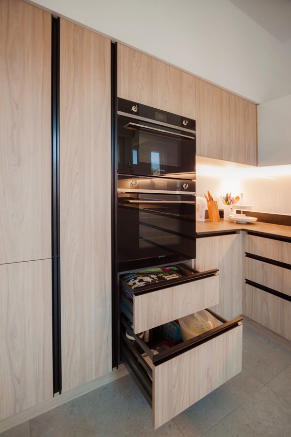
Accommodating the built-in refrigerator and the pair of column ovens, the adjacent space is reserved for a service door.
A pantry with a limited width, inside which height-adjustable shelves are comfortable.
To make the most of the space, a pair of drawers is placed under the ovens, accommodating pots and accessories for the kitchen.
Similarly, the upper part is available as an additional storage space that can be used through a flap door.

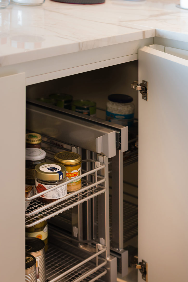
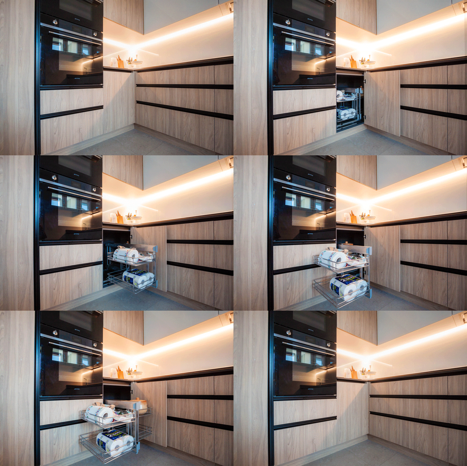
Flanked by the full-height volumes, the lower kitchen units come to life, accompanied by wall units with flap opening. These follow the development of the kitchen up to the opposite containment wall. To make the most of the corner, the best solution was to equip it with a removable basket. A solution adopted in several Modulor projects, an example of all this cream-colored kitchen.

On the adjacent side, instead, are the six wide-width drawers. These allow you to optimize the space due to the different internal height made available.
In conclusion, in the lower part there are the built-in dishwasher and a pair of doors in correspondence with the sink, useful for arranging the waste bins.

kitchen laminate wood effect columns service ovens refrigerator pantry
kitchen oven drawers laminate wood effect hollow handles aluminum black
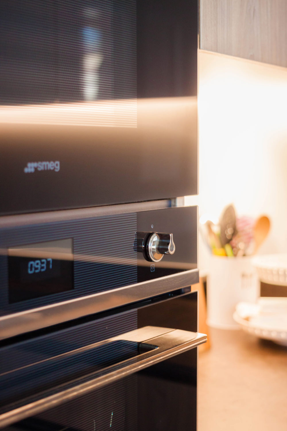
smeg built-in column ovens
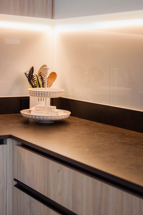
kitchen top dekton milar industrial white lacobel riser
corner basket animation 02

The material choice of the kitchen: from the wood-effect laminate doors, to the white lacobel of the wall units.

The material choice of this environment takes up the essential taste and natural scent typical of the Scandinavian style.
Fully embracing the principles of this style, the combination of light wood and white surfaces is reflected in the choice of laminate doors and Lacobel wall units with which the entire kitchen is covered.

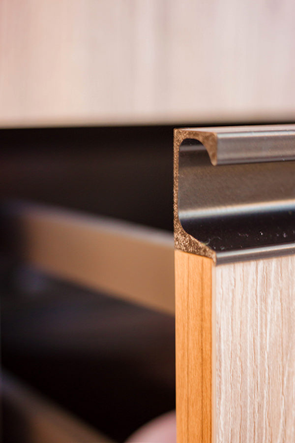
To represent a care of detail and emphasize the stylistic line, handles with aluminum profile in a chromatic contrast.
Elements that underline the geometries of the various elements, developing horizontally or vertically depending on the case in a game of segments that creates dynamism and defines its stylistic imprint.
These also become functional elements capable of protecting the edges of doors and drawers, repairing them from scratches and wear.

In the upper part, the wall units with flap opening are developed.
The white Lacobel coating gives lightness and illuminates the room thanks to the play of reflections it creates.
When closed, a white lacquered MDF shelf further lightens the composition without obscuring the natural light coming from the adjacent window.
Taking up the chromatic choice of the black details, the service sockets also have a plate with a contemporary design in the same color.

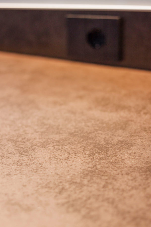
As for the worktop, on the other hand, the choice fell on Dekton in its Milar variant, from the Industrial collection.
Its surface has a lively effect with shiny points that alternate with an effect of fake wear.
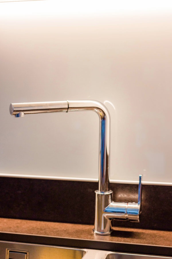
This is combined with a steel undercounter sink with double bowl and matching stainless-steel tap.

shaped handles painted black aluminum drawers doors
plan dekton milan industrial
stainless steel faucet undercounter sink double basin
kitchen laminate wood effect top dekton milar industrial raised lacobel white back-painted glass
kitchen laminate wood effect white wall units service columns
kitchen laminate wood effect top dekton industrial
white lacobel wall units matt white lacquered shelf

The living area

The kitchen communicates with the living area, which is also part of the open space that develops from the entrance.
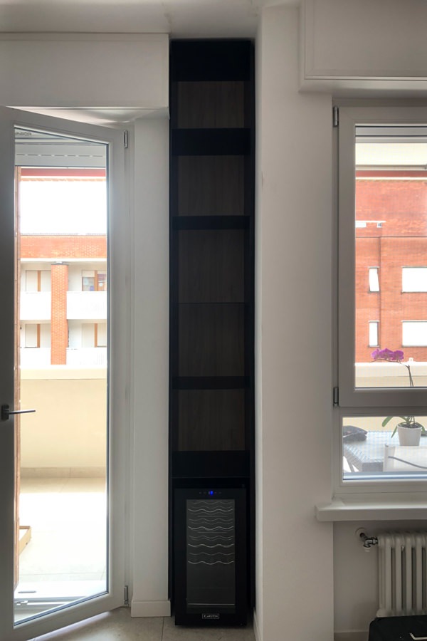
Taking advantage of an architectural niche on the side of the French window, a full-height cabinet in black waxed iron houses the wine cellar in the upper part. Above, on the other hand, the thin shelves that exploit the reduced thickness of the iron sheet unfold.
This also becomes the element that ideally separates the two environments, albeit in continuous visual contact.

Precisely for this reason, the existing furniture room has undergone a change as regards the front of the drawers and doors.

Originally made in deep red gloss lacquer, they have been replaced with the same wood effect laminate as the kitchen. Also in this case, the result is a piece of furniture in full Scandinavian style, bright and delicate in aesthetics.

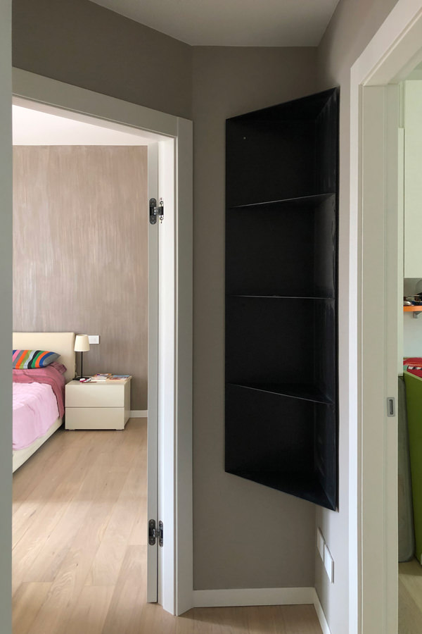
In black waxed iron sheet is also the wall unit that equips the corridor of the sleeping area, whose molded shape is not very intrusive but functional to the passage. Elegant and minimal material, it was also chosen in this work in order to furnish the livingroom.

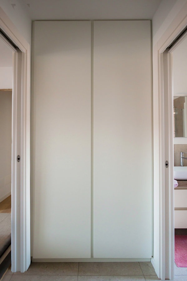
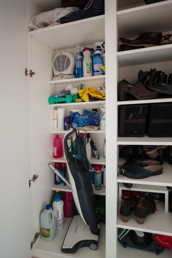
Serving the anteroom, a service cabinet with recessed handles made of matt ice gray lacquered MDF. Internally it is equipped to become a closet with internal shelves with reduced depth that allow you to optimize space by also accommodating cleaning accessories.

living area TV cabinet in front of wooden laminate drawers
front detail of drawers in laminate wood furniture in the living area
detail of the TV cabinet in the living area in front of the drawers
shaped corner cabinet in black iron niche wine cellar
 corner shaped black iron wall unit
anti-bathroom corridor furniture full-height doors recessed handles
mobile corridor dressing room service laundry closet internal shelves

A laminate kitchen is the optimal solution for obtaining high resistance of materials without sacrificing the natural aesthetics of wood, albeit in its artificial variant.

Then combined with clear components, it illuminates the interior, giving visual lightness.
The choice of iron becomes interesting for sophisticated style combinations.

Giving new life to furniture: adapting them after a move

Giving new life to furniture: adapting them after a move

Facing a move means turning your life around, renovating your home and introducing new furnishing accessories.
Beginning to pack, you make a natural selection of the objects to take with you, recognizing for each their own emotional value.
Many times, this process also involves the world of furnishings, which accompany the owners in this moment of transition.
Giving new life to furniture also means renewing the context in which they are inserted, managing to adapt them in terms of aesthetics and functionality to the new environments.

Adapting furnishing to a new context

When the furnishings are custom designed, their conformation responds to the needs of the customers, perfectly matching with the architectural context in which they are inserted. In doing this, a strong link is born between the rooms in which they are inserted and the shapes, proportions and mechanisms of use of the furnishings.
This would suggest an indissoluble bond between the two components, which would break when the furniture undergoes a relocation.
It is absolutely not said!

In fact, among the potential of custom-made furniture there is a flexibility factor that allows us to give new life to furniture by making few changes.
These make it possible to transform the general imprint of the furniture in order to adapt it to the new context both in terms of aesthetics and functionality.

A perfect example are the adaptations made to these furnishing extrapolated from an apartment between classic and contemporary. Let’s discovery this apartment among transformed furniture and new additions.

The kitchen: increases the work space and storage volumes

The kitchen certainly represents the beating heart of a home.
In the case of this apartment between modern and contemporary, its conformation was born from a natural reading of the architectural context in which it was inserted.

The corner development made it possible to exploit the side part with service columns with anthracite gray lacquered MDF doors.
These are equipped with column ovens on the right, pantry with removable trays and a central compartment for the free-standing refrigerator. The front is made up of lower volumes with large drawers and service doors and upper wall units in a brilliant white Lacobel.

The new arrangement has provided additional useful space for the overall dimensions. Being able to use additional space on both sides, the most natural solution was to exploit the remaining gaps with additional volumes.
On the right, we provide a service column which houses a modern wine cellar accompanied by a door with height-adjustable internal shelves.

On the opposite end, the main problem arises when the worktop is made of natural stone, which has undergone a chromatic change over the years.
To avoid incurring a visible difference between the added part and the existing one, a wooden top was thus created. It also acts as a cutting board for preparing meals. An element that not only solves an aesthetically weak point, but also provides a functional solution.

giving-new-life-furniture-kitchen-move-cupboard-modify
modern-kitchen-front-view-counterop-natural-stone
side-view-kitchen-undertop-sink-white-lacobel-cabinet
kitchen-countertop-detail-natural-stone-white-lacobel-back-surface
kitcehn-service-columns-wine-cellar

The living area: a new contemporary aesthetic

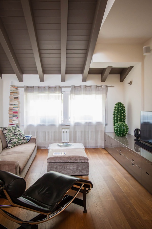
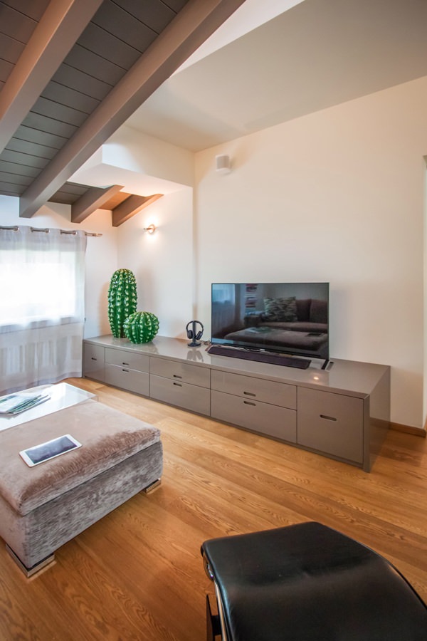
To equip the living area, we recovered the furniture made in 2006.
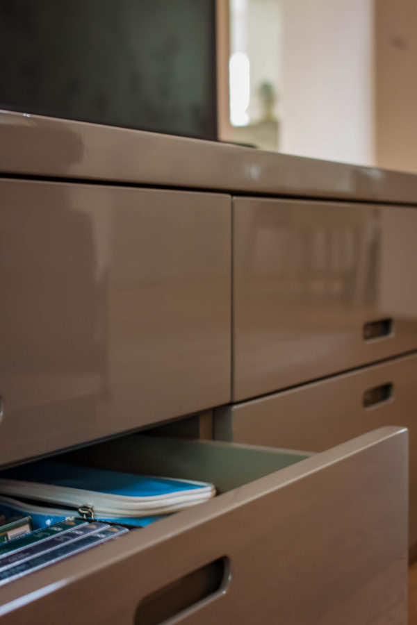
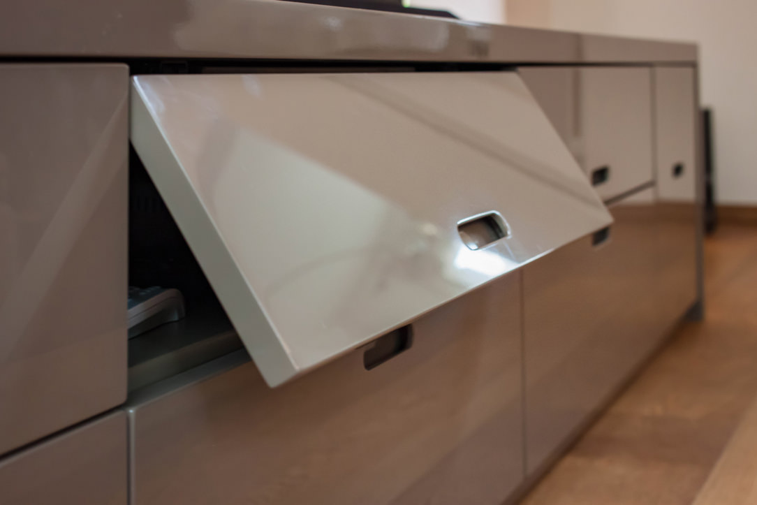
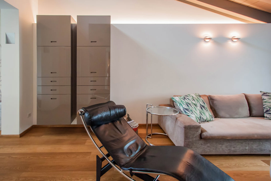
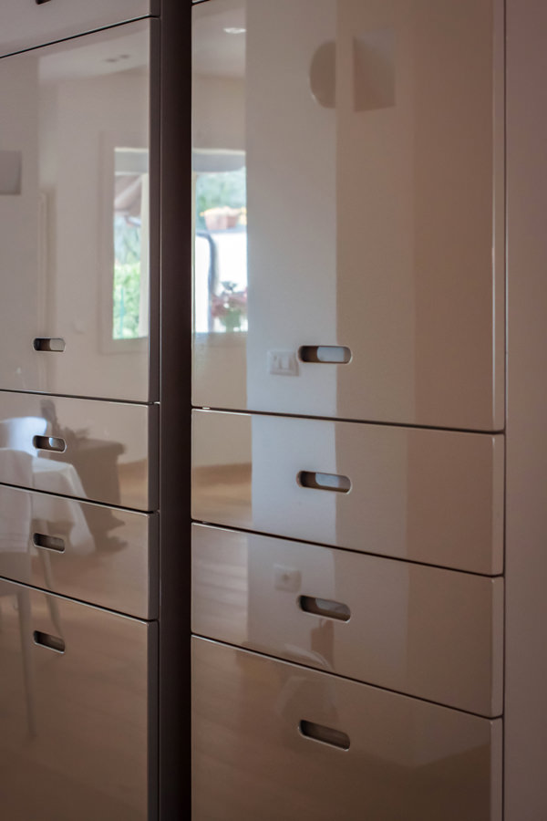
The choice of colors was already avant-garde at the time. Even in a contemporary reworking they can adapt perfectly, resulting elegant and current. The TV cabinet in glossy anthracite gray lacquered MDF alternates flap doors with service drawers, whose recessed handles give visual lightness.

In this case, giving new life to furniture means adapting them to the new context in which they are inserted, managing to exploit the flexibility of the same.
Small changes have been made, mostly considered maintenance. Re-lacquering where necessary or remaking of structural parts.

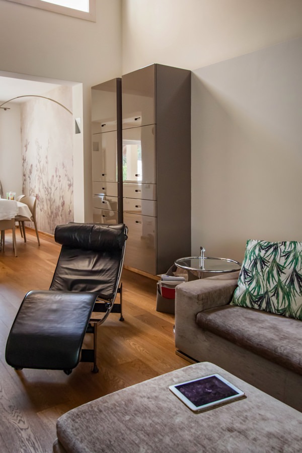
The same approach was then applied to the service hanging columns, which are made up of doors in the upper part and small drawers in the lower part. Their new position side by side allows them to welcome guests introducing them to the living area and, at the same time, create a visual divider from the more intimate dining room.

give-new-life-furniture-living-room-tv-cabinet
detail-top-MDF-shiny-laquered-dove-gray
open-drawers-flap-door-tv-cabinet
flap-door-recessed-shaped-handle-tv-cabinet
modern-living-room-design-tv-cabinet
give-new-life-furniture-living-room-tv-cabinet-shiny-laquered
service-cabinet-living-room-drawers-door-shaped-recessed-handle
shiny-laquered-doors-dove-gray-recessed-shaped-handle
modern-living-room-furniture-cabinet-shiny-laquered

Children’s bedrooms: new tailor-made solutions to exploit architectural voids

The sleeping area houses the two small bedrooms whose conformation alternates architectural voids with important structural elements.
A tailor-made solution was therefore designed in both rooms in order to include all the necessary furnishings without sacrificing practicality and visual freedom.

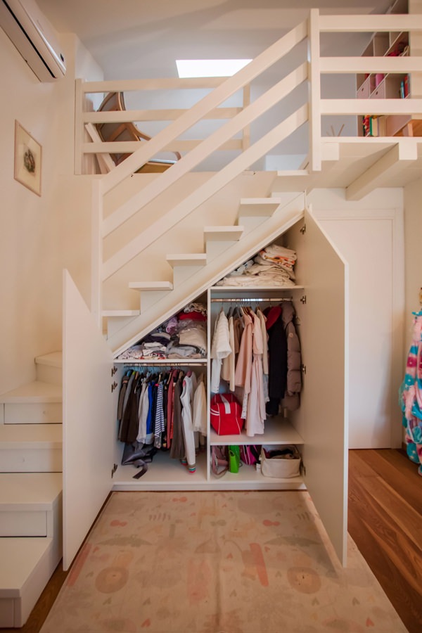
For the first bedroom it was therefore decided to take advantage of the basement that leads to the mezzanine area to equip it with a shaped wardrobe.
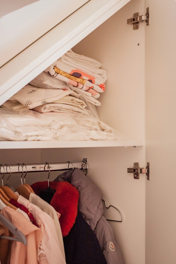
Since the room is intended for a child, the dimensions and heights necessary for the clothes have certainly facilitated the design. Despite having little space available, taking advantage of the inclined height of the basement, it was still possible to create a double-height wardrobe with alternating shelves with fixed hangers.
The wardrobe is accompanied by a standing alone chest of drawers which is also used as a support surface.
The large one and a half bed is inserted in a niche. The latter used in the depth to fix shelves with hidden lighting.

In the second small room, the depth of the niche is useful for a certainly wider wardrobe. Full-height doors with push opening accommodate fixed tubulars, drawers for linen and shelves for folded items to satisfy the needs of a young girl.

shaped-wardrobe-basement-niche
service-drawers-bedroom
recessed-handle-shaped-detail-drawers
internal-wardrobe-composition-shap-bedroom
detail-hanger-shaped-shelves-wardrobe-bedroom
detail-shelves-integrated-lighting-bedroom
niche-bed-girl-illuminated-shelves
giving-new-life-furniture-niche-bed
shaped-niche-wardrobe-push-opening
interior-composition-wardrobe-bedroom-niche
internal-tubular-hanger-shelves-closet-bedroom
drawers-handle-hollow-inside-cabinet

The master bedroom: a wardrobe like new

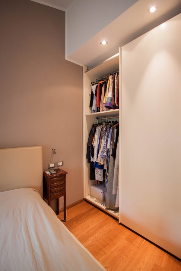
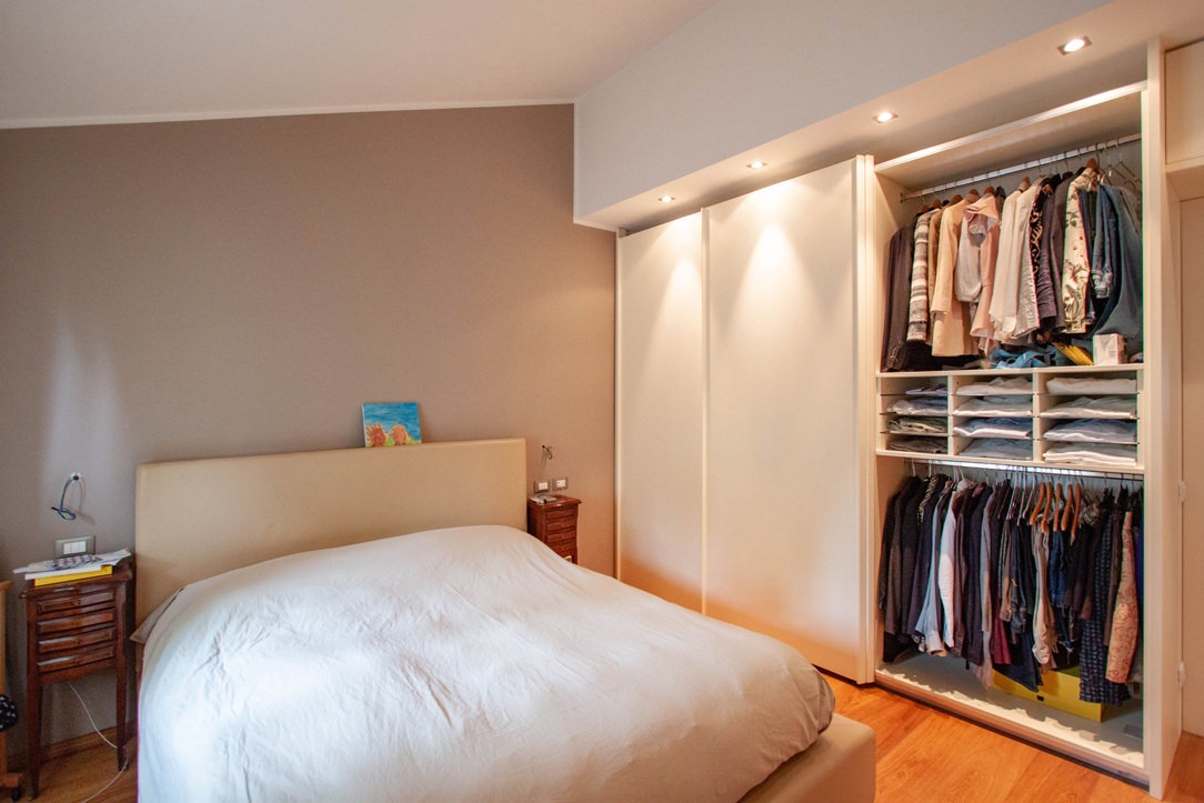
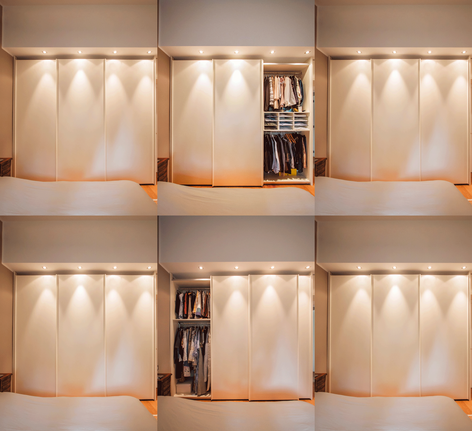
The master bedroom is best equipped with a large wardrobe with sliding doors placed parallel to the bed.
Its linear aesthetic combined with spot ceiling lighting allows at the same time to hide its grandeur.
The result is a capacious and functional volume which, in the aesthetic impact of the room, tends to disappear while giving character and elegance.
Relocated from the old house, the different internal height has led to a reduction in height which has thus made it possible to better adapt to new environments.

The composition of the wardrobe comes from a natural division into three departments, corresponding to the division of the sliding doors.
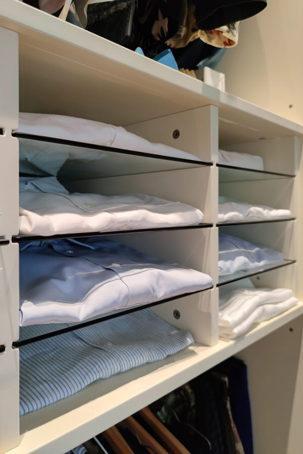
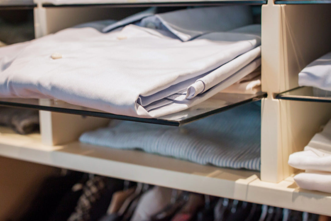
On the outside, the double-height hanger houses removable glass shelves in the center. These are particularly suitable for storing folded shirts using the external sliding mechanism to reduce the internal height between the trays.
In the central compartment, the large linen drawers are accompanied by a pair of shelves for folded items and hangers in the upper part.
The left compartment instead houses a double hanger to accommodate long dresses and coats whose greater height compensates for the reduced space reserved for folded trousers and skirts.

master-bedroom-wardrobe-open-tray-extractable
animation-opening-wardrobe-internal-composition-giving-new-life-furniture
internal-composition-wardrobe-hangers-pull-out-trays
detail-trays-removable-glass-wardrobe-bedroom
detail-trays-removable-glass-wardrobe
internal-wardrobe-double-hanger
internal-composition-wardrobe-hangers-drawers

Giving new life to furniture does not only mean rejuvenating it and making changes to its aesthetics. The bespoke design allows you to create furnishings that are versatile and able to adapt to new environments. Restoring a balance between aesthetic conformation in relation to the room and functional needs becomes the main goal.

If you want to deepen the theme of furniture flexibility, we suggest you this article in which series furniture and tailor-made solutions help each other!

One kitchen a week, part 3: contemporary hi-tech

One kitchen a week, part 3: contemporary hi-tech

A contemporary hi-tech kitchen whose aesthetic line is very dynamic thanks to the choice of metallic materials, to the play of reflections and opacity, but at the same time, it has warm and soft colours.

hi-tech kitchen front view

The contemporary design of the appliances increasingly accustoms us to metal surfaces, glossy finishes and technological elements with an aerospace-inspired design.  Often inserting these elements in our kitchens means having to deal with the resulting visual impact. In response, on the one hand, we can see industrial-style kitchens, strongly focused on the total harmony of the furnishing with metals and reflective surfaces. On the other side, we can find increasingly contemporary interiors trying to mix the style of the different components by exploiting the chromatic and material contrasts. These two currents do not necessarily represent the opposite of the other. In fact, it is possible to uniform the elements in a style that is so contemporary, but which also manages to reflect the elegance and domesticity of the rooms.  

THE PORJECT

This kitchen with a hi-tech scent is an excellent example: the customer’s taste responds to the trend of mocha colour, with its warm and soft tones. Taking advantage from the alternation of more or less warm colours and glossy surfaces combined with the opaquer ones, an elegant and at the same time dynamic interior has been achieved. Starting from the separating element of the living area, which is equipped to host storage doors supporting the living room on one side, and recessed ovens and others storage units from the inside. The result is a deconstructed kitchen, which does not give up to the functionality of a compact kitchen, but which takes advantage of the visual opening of the open space. The passage of this partition is underlined by a led strip whose linearity refers to the most dynamic and technological interiors. The central island with its mocha-coloured upholstery holds the induction hobs and free surfaces used for preparing meals. An extremely functional element is the cylinder that houses the electrical service outlets, which can be activated by pushing. A recessed element whose extraction technology is extremely simple. It is also capable of transforming an often visually cumbersome component into a design element. The lower part of the island acts as storage point while in the upper part, a cylindrical design fan is suspended from the backlit false ceiling. The latter can give greater dynamism to the kitchen. The two corner components of the remaining part respond in the same way with the upper wall units organized with doors and containing volumes in the lower part. The different height of the upper wall units creates dynamism also recalled in the chromatic choice.  

COLOURS AND MATERIALS

The technological setting of this hi-tech kitchen is also visible in the choice of materials with excellent technical performance. In fact, the mocha-coloured dekton was chosen for the kitchen countertop, incorporating the island’s one. In addition to a significant aesthetic value, which summarizes elegance and modernity, it enjoys excellent technical performance, such as perfect resistance to high temperatures and hardness. It therefore lends itself to be an excellent material in its field while giving a strong stylistic imprint. The back shelf of the countertop alternates the mocha-coloured dekton with a glossy lacobel with a neutral hue. The alternation of opaque to glossy surfaces is possible using textured lacquered MDF which is turn coated, where necessary, by lacobel.

 
island kitchen with extractor fan
hi-tech kitchen divider
cylinder soket push hidden

Compare this hi-tech kitchen with the previous ones: contemporary pop kitchen and fresh, gritty and lively kitchen.