The Art of Smartworking in an Equipped Wall with Poetic and Functional Design

The Art of Smartworking in an Equipped Wall with Poetic and Functional Design

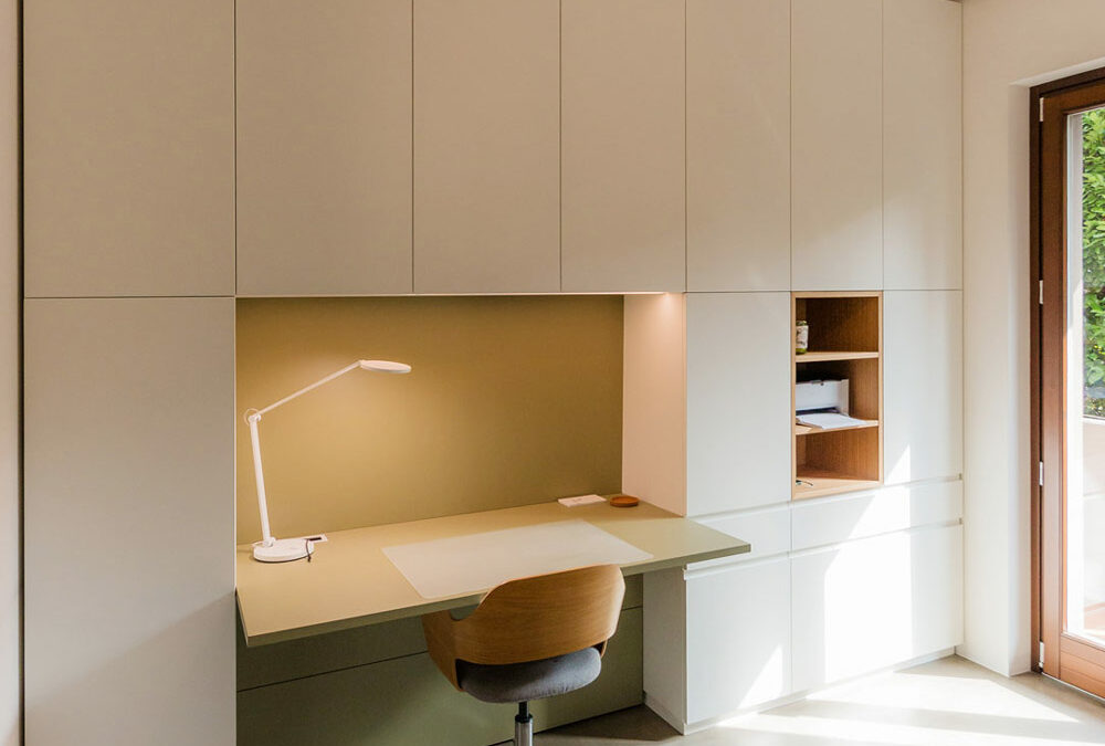
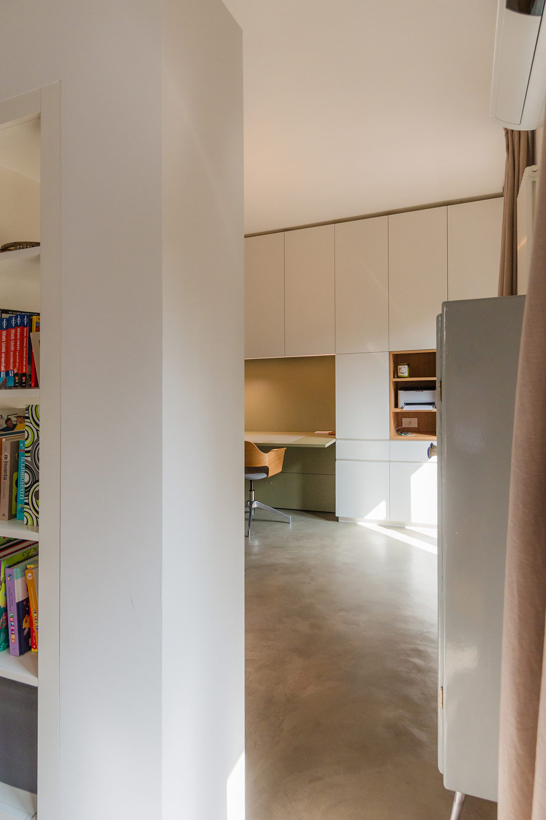
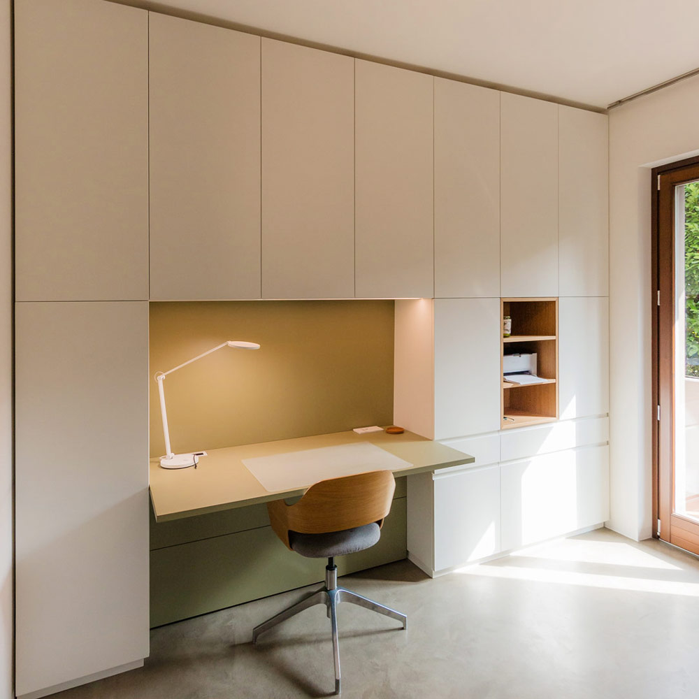
In the heart of the modern home, where every corner is designed to combine aesthetics and functionality, the equipped wall by Officina Idea stands out as a poetic and innovative project that transforms the everyday experience of smartworking into a fluid one.
Equipped Wall

From Design to Realization

The initial renders created by Paolo of Officina Idea illustrated the project in great detail, including color schemes, providing a clear vision of how the unit should look. Thanks to this precise design foundation, we were able to realize the equipped wall as faithfully as possible.
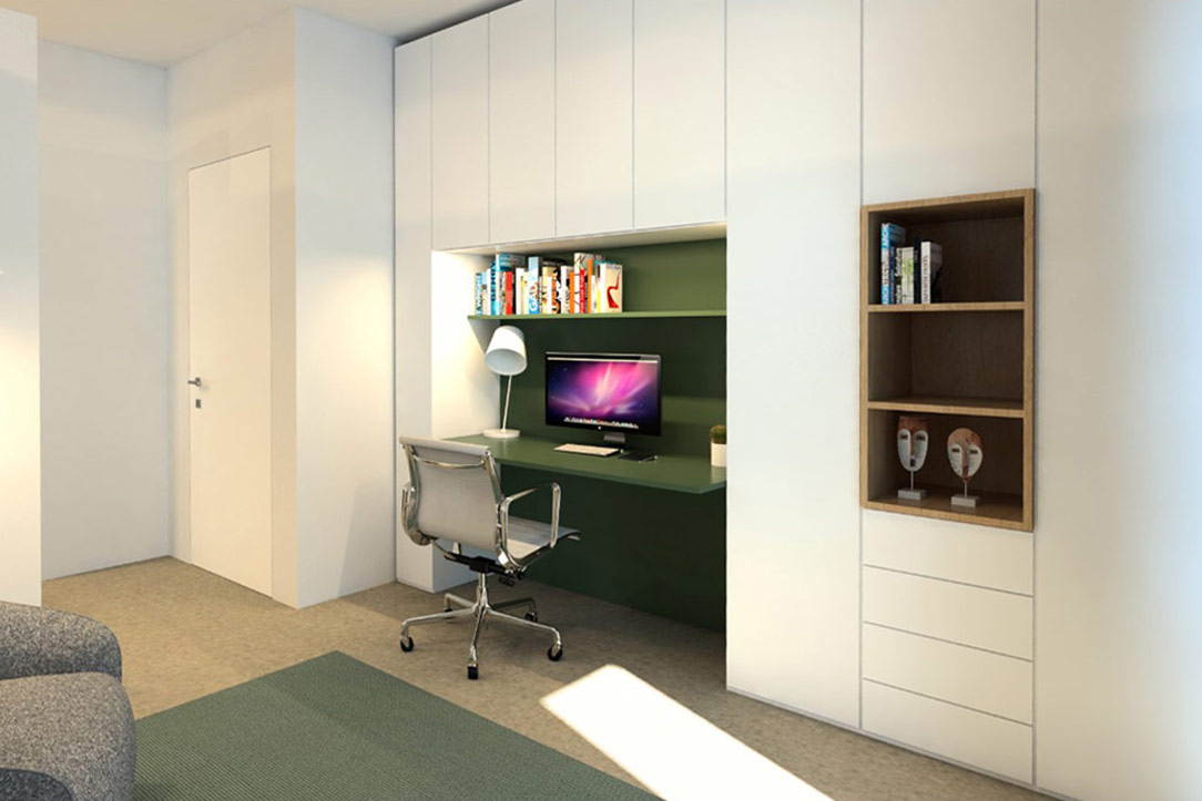
Render Paolo
like Render Paolo

Organized Spaces for Every Need

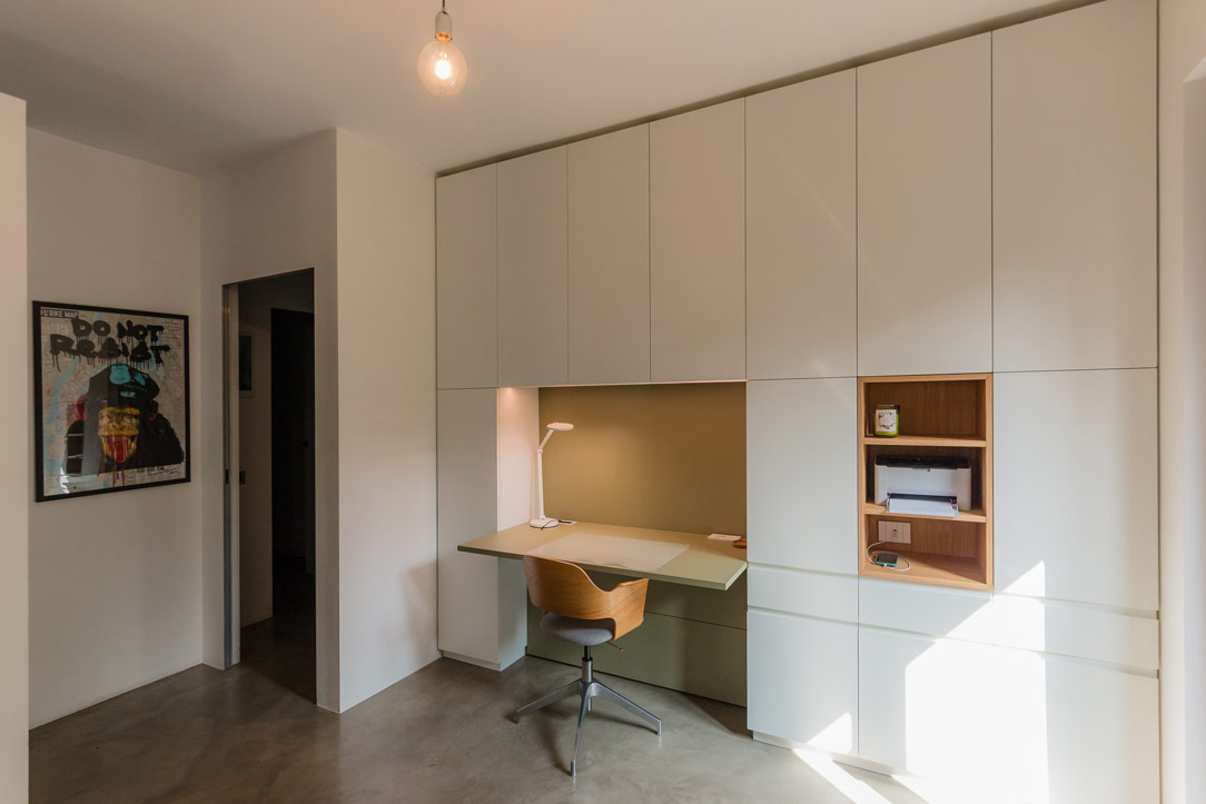
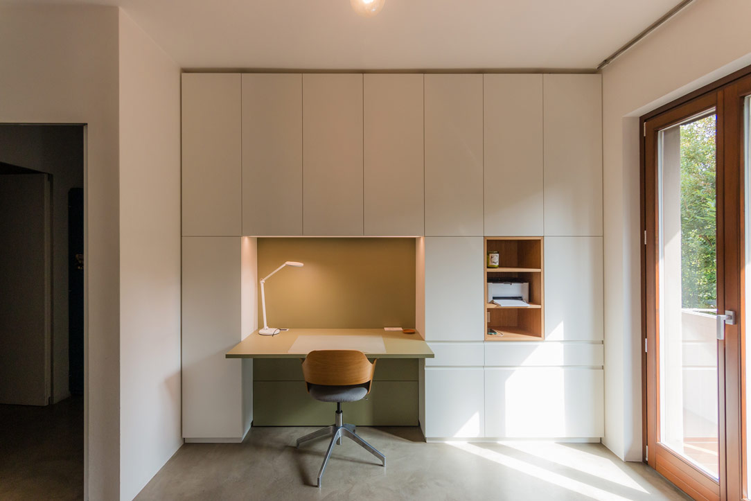
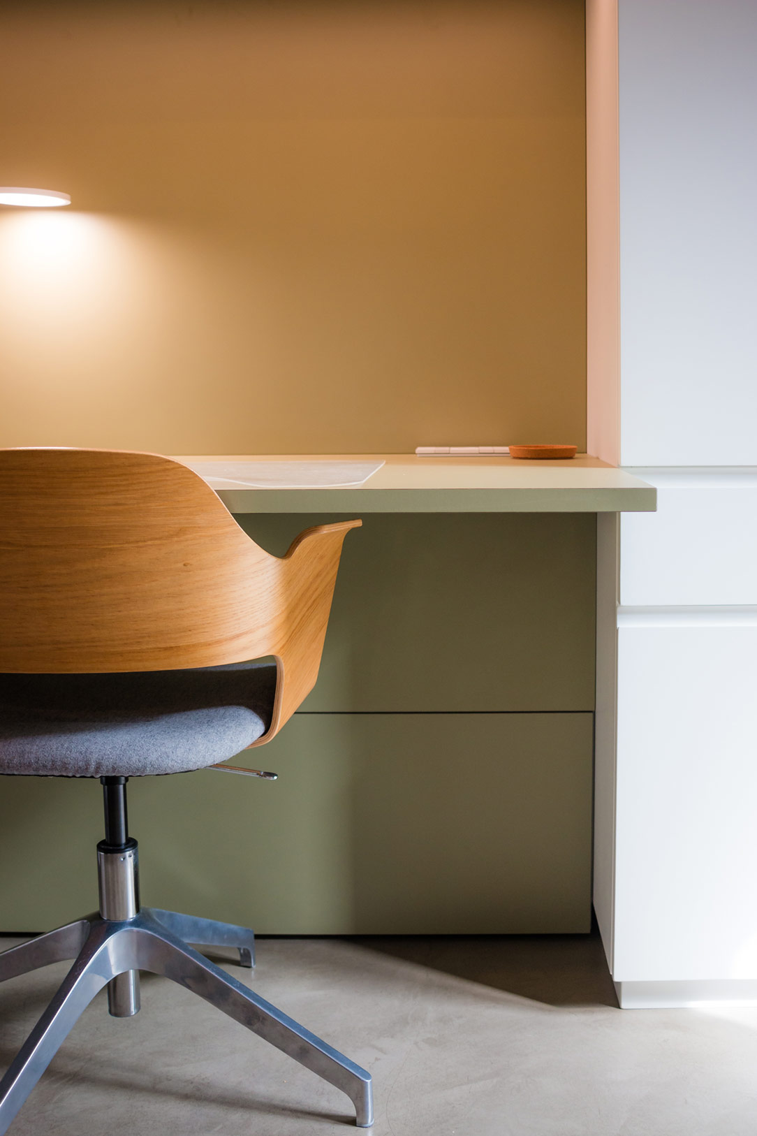
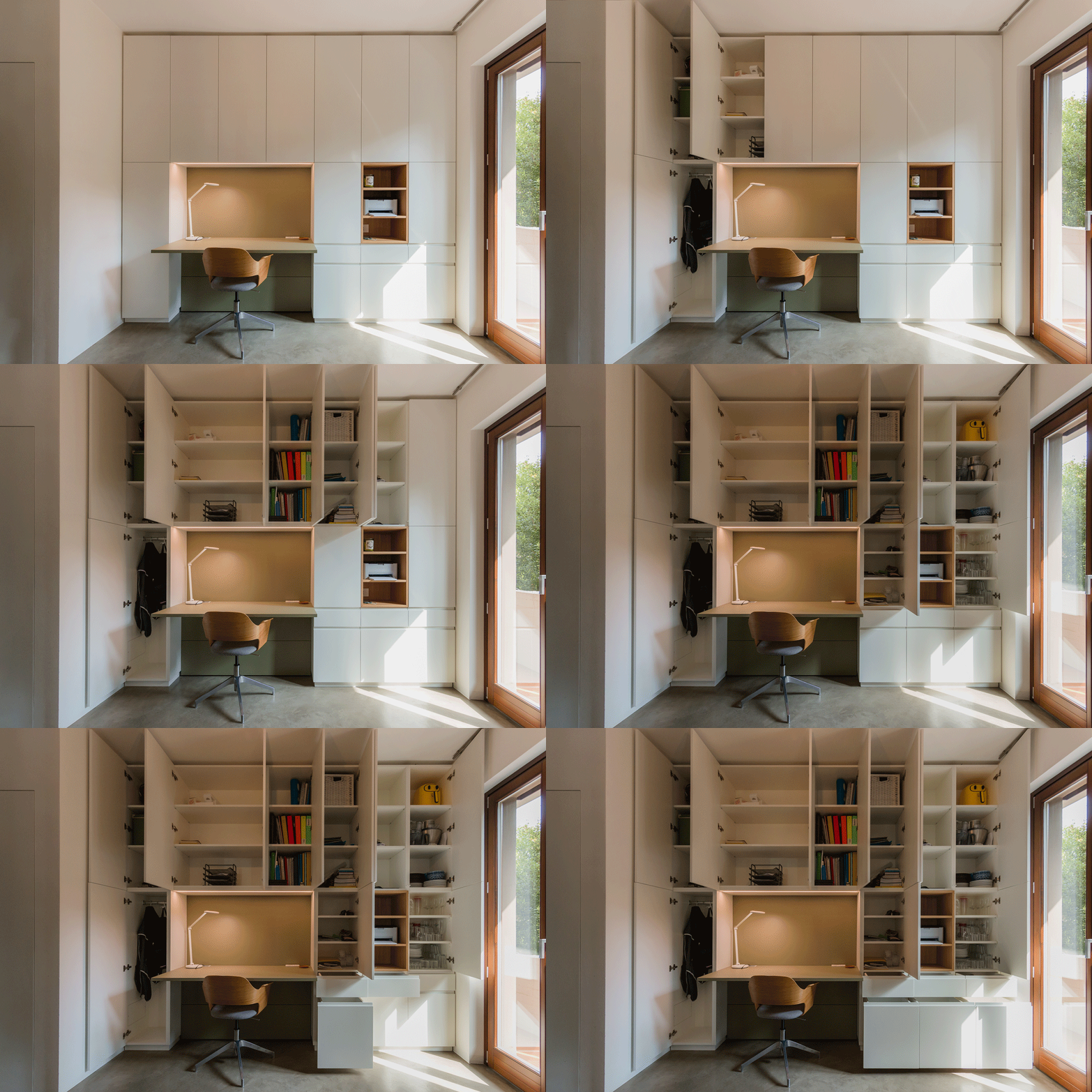
Imagine a wall that, like a blank canvas, blends seamlessly with the surrounding environment, imparting a sense of order. This is not just a piece of furniture, but a true organizational system that embraces the needs of home working. The spaces have been divided so that one section is dedicated to storing useful materials, another is left open for easy access, and a third is designated for the desk.
front view equiped unit
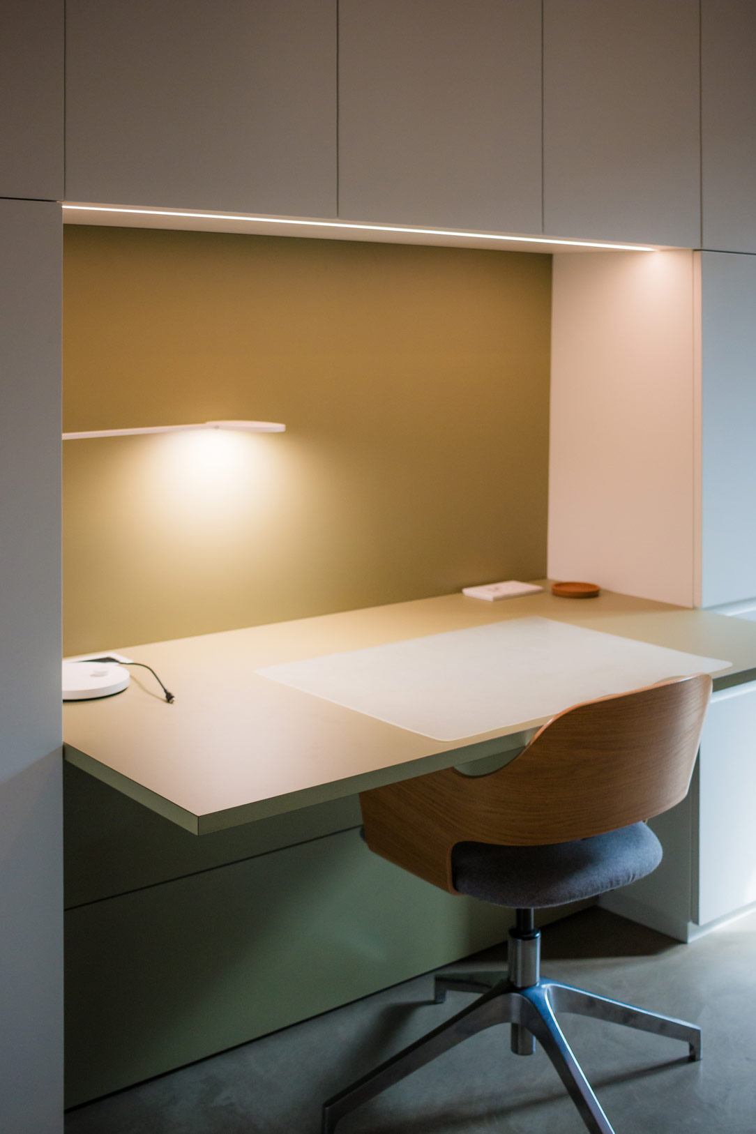
olive green desk
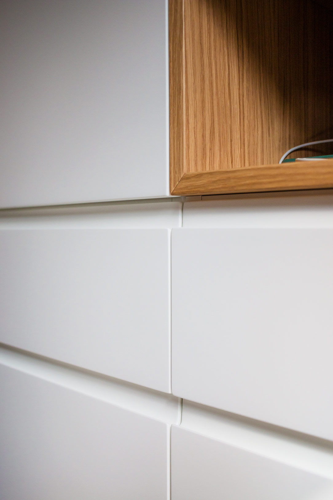
detail hidden handle

Functionality in an Equipped Wall

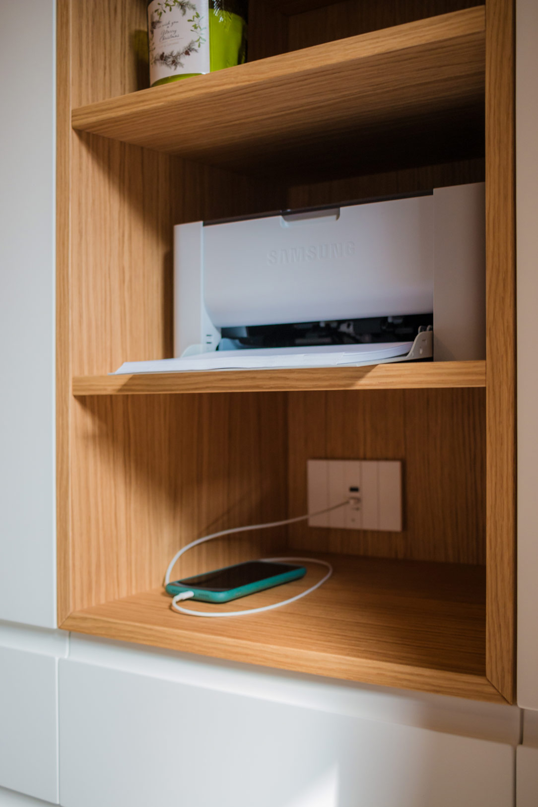
The wall, extending up to the ceiling, is divided into carefully organized spaces. The upper section, featuring doors, is dedicated to storing files and books, neatly arranged on shelves designed to accommodate standard-sized containers. The lower section, with drawers and large drawers, holds stationery and equipment, keeping everything within reach. An open compartment is reserved for technology, with space for a printer and other mobile devices, while the desk serves as the central hub of creativity and productivity.
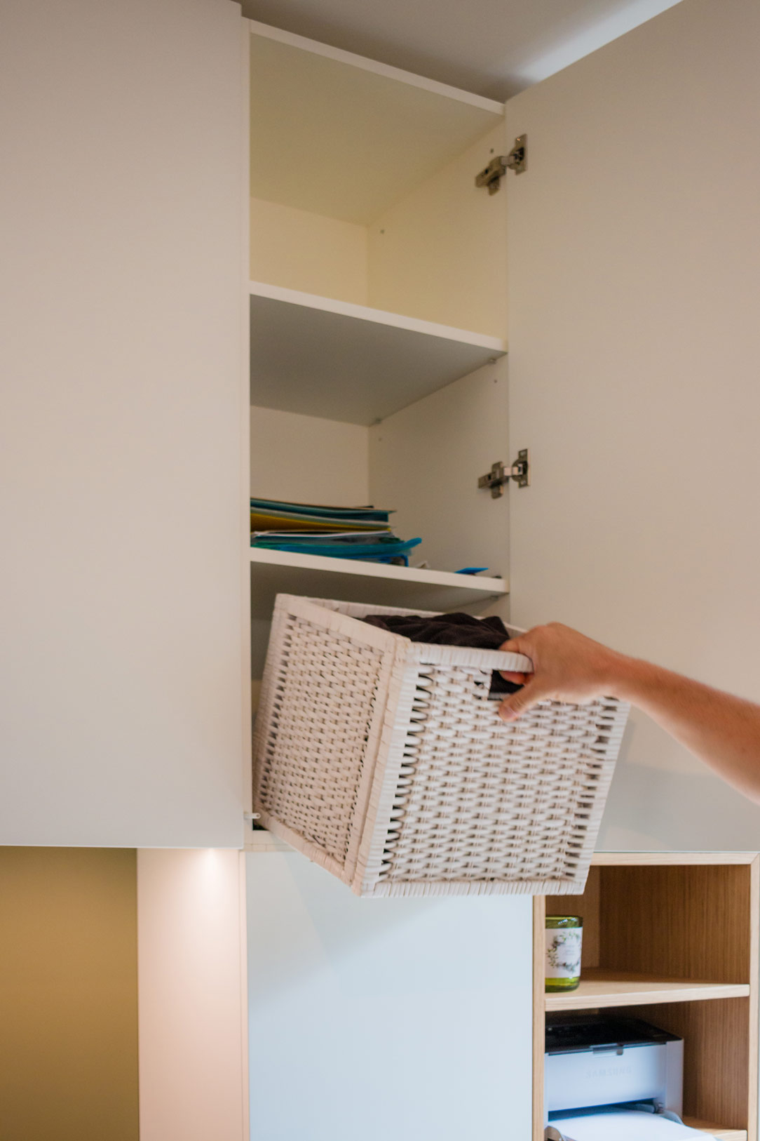
storing books
device in the open compartment
desk detail

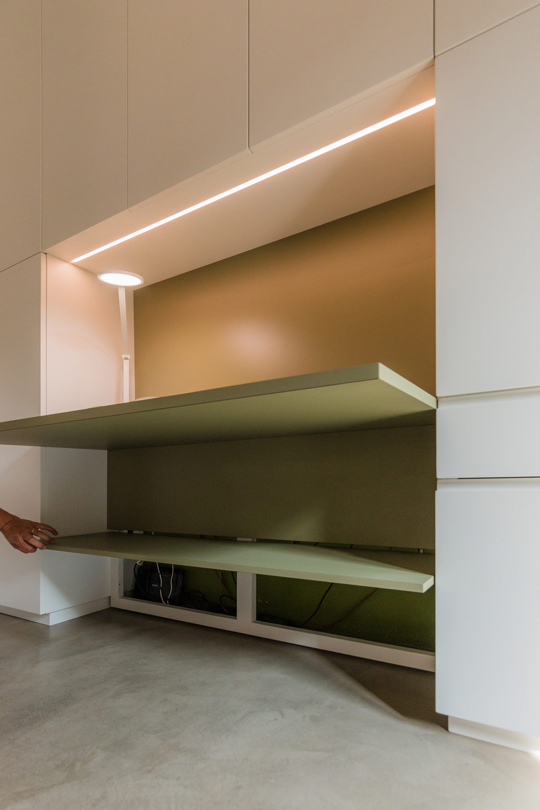
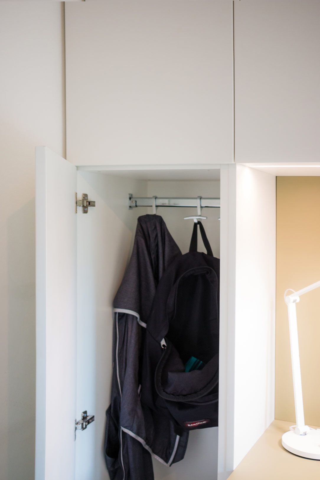
The two lateral sections serve the living area, hosting kitchen supplies and, thanks to a hanging bar, some coats. Beneath the desk, an accessible rear compartment hides all the electrical connections and various devices, with switches and outlets available on both the desk surface and the back of the open element. In the desk niche, overhead LEDs provide targeted lighting for the work surface.

Here, we revisit our entire article dedicated to smartworking.
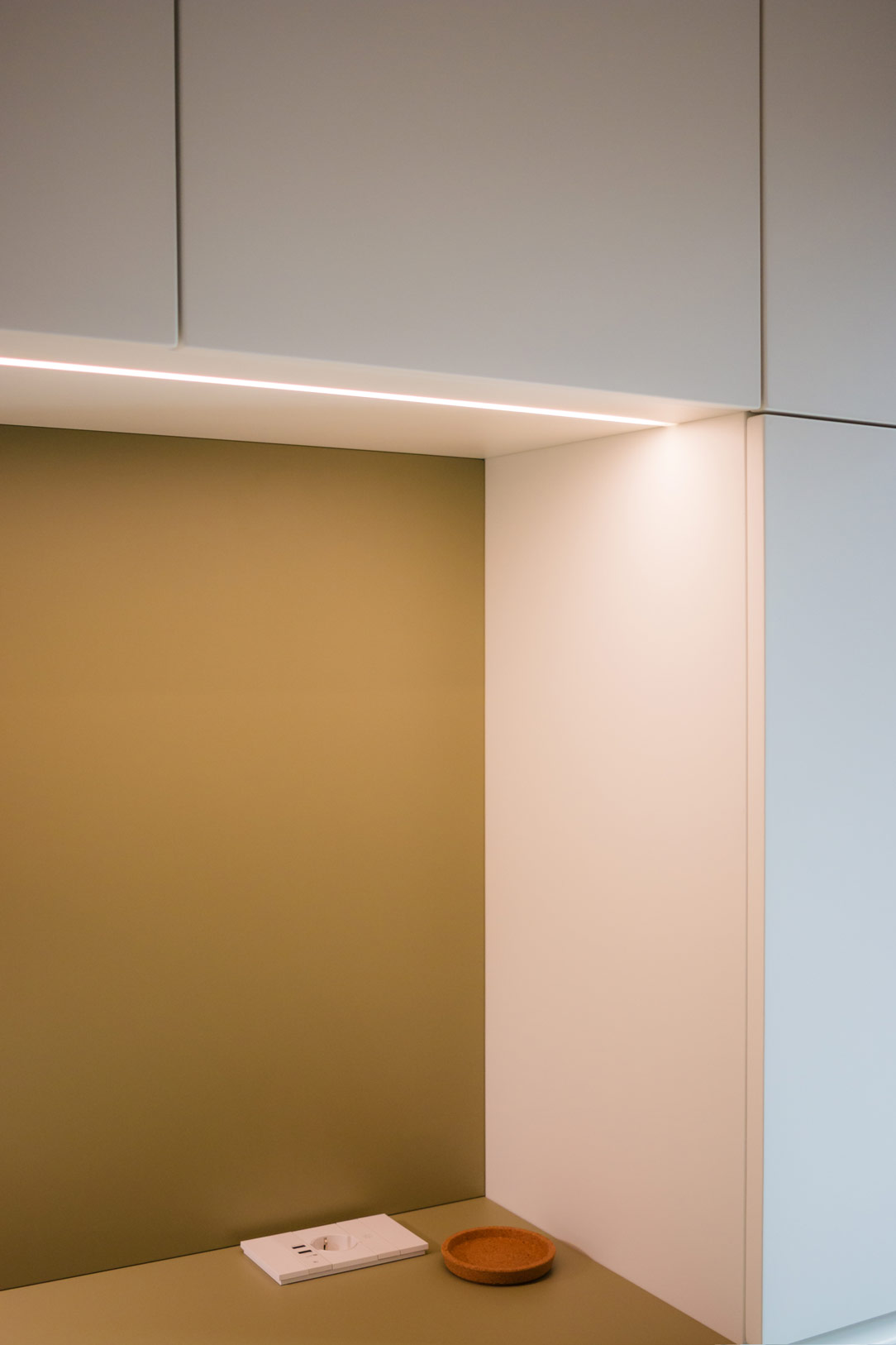
high LEDs
electrical connections
hanging bar

Chromatic Harmony and Style Details

The immaculate white that characterizes the entire structure provides the ideal backdrop for two distinctive elements: the olive green desk and the open compartment in stained oak. These touches of color not only enliven the space but also create a visual balance that lightens the environment while maintaining a refined elegance.

We also find olive green in this kitchen in the Orobic Prealps.
equipped wall open and close
desk detail
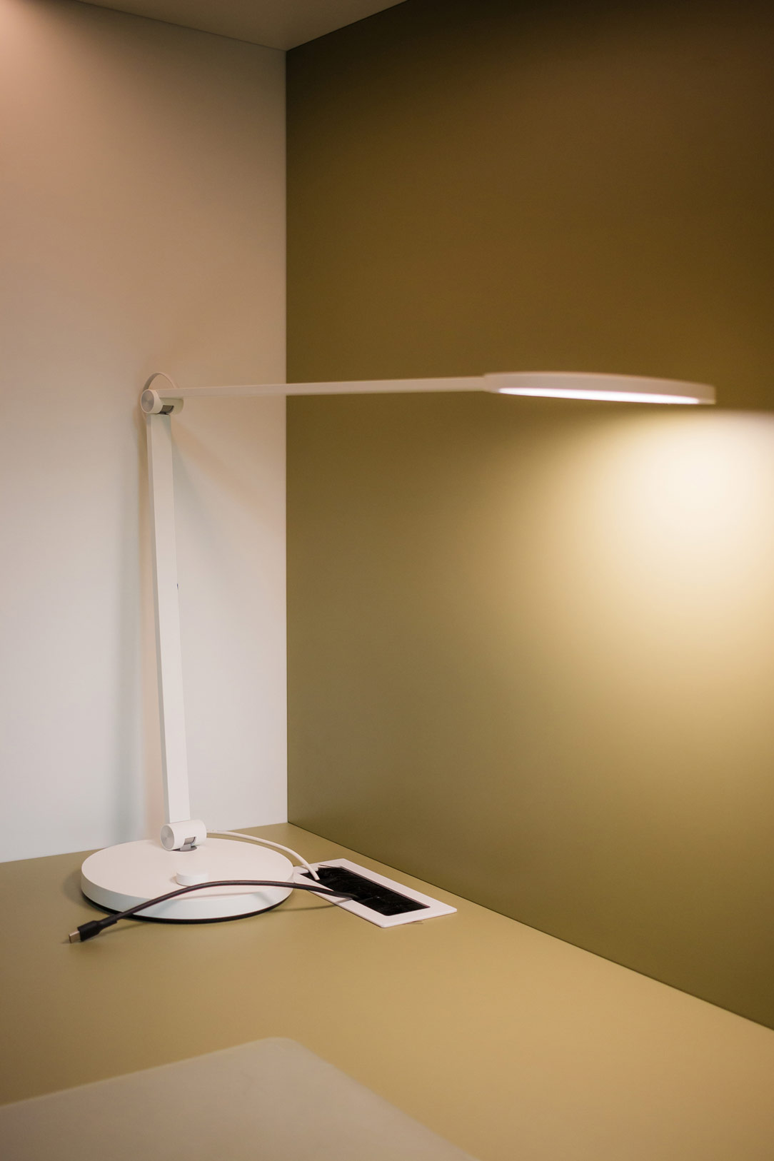
detail lamp and connection

Conclusions

In conclusion, the equipped wall by Officina Idea represents the perfect blend of form and function, combining aesthetics, practicality, and innovation in a project that makes smartworking not only more efficient but also more enjoyable. An ideal solution for those looking to transform their workspace into an oasis of tranquility and organization.
equipped wall smartworking

Material Harmony in the Heart of Como with Ceppo di Gre and Metallic Finishes

Material Harmony in the Heart of Como with Ceppo di Gre and Metallic Finishes

In the enchanting setting of Como’s urban center, an architectural gem rises within a meticulously restored historic building. Here, in a perfect blend of history and modernity, lies an apartment we had the privilege of contributing to. The brainchild of the creative genius of the Studio Milo, this living space stands out for the captivating fusion of raw Ceppo di Gre and elegant bronze metallic finishes, accompanied by warm brick tones.

mobile ingresso

Material and Color Contrasts

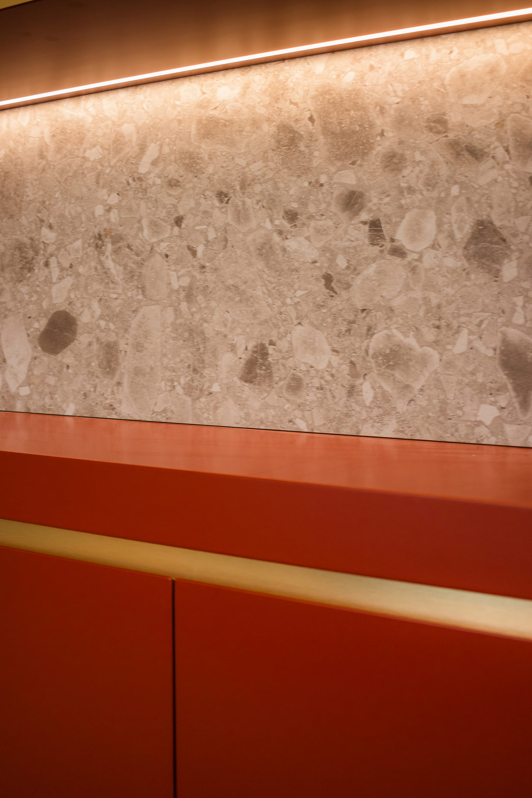
The living area of the apartment is a masterpiece of material and color contrasts, where the natural roughness of Ceppo di Gre meets the sophisticated shine of metallic finishes. This combination not only gives the space a unique appearance but also creates a warm and welcoming atmosphere while maintaining timeless elegance.

The Equipped Wall: Functionality and Aesthetics

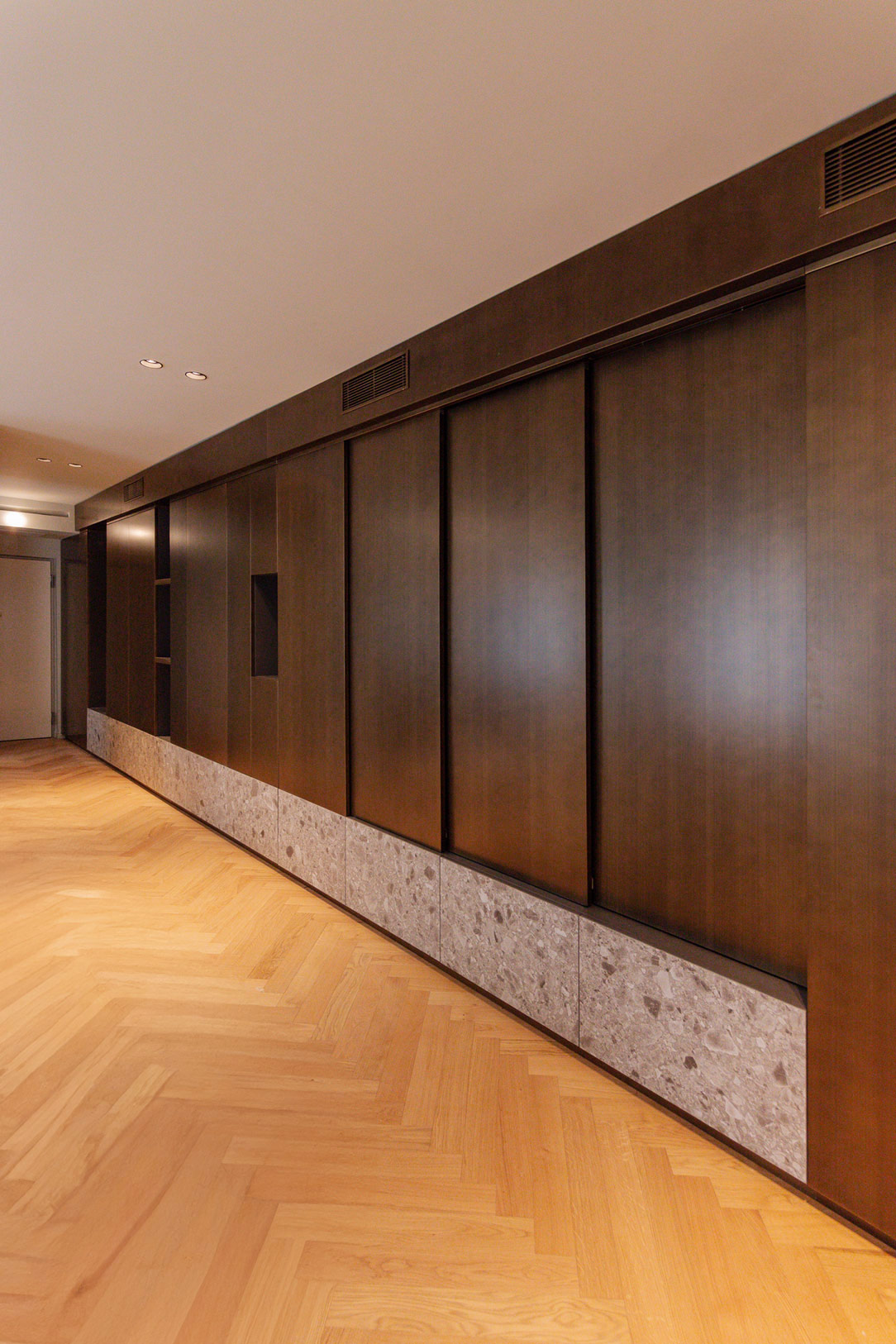
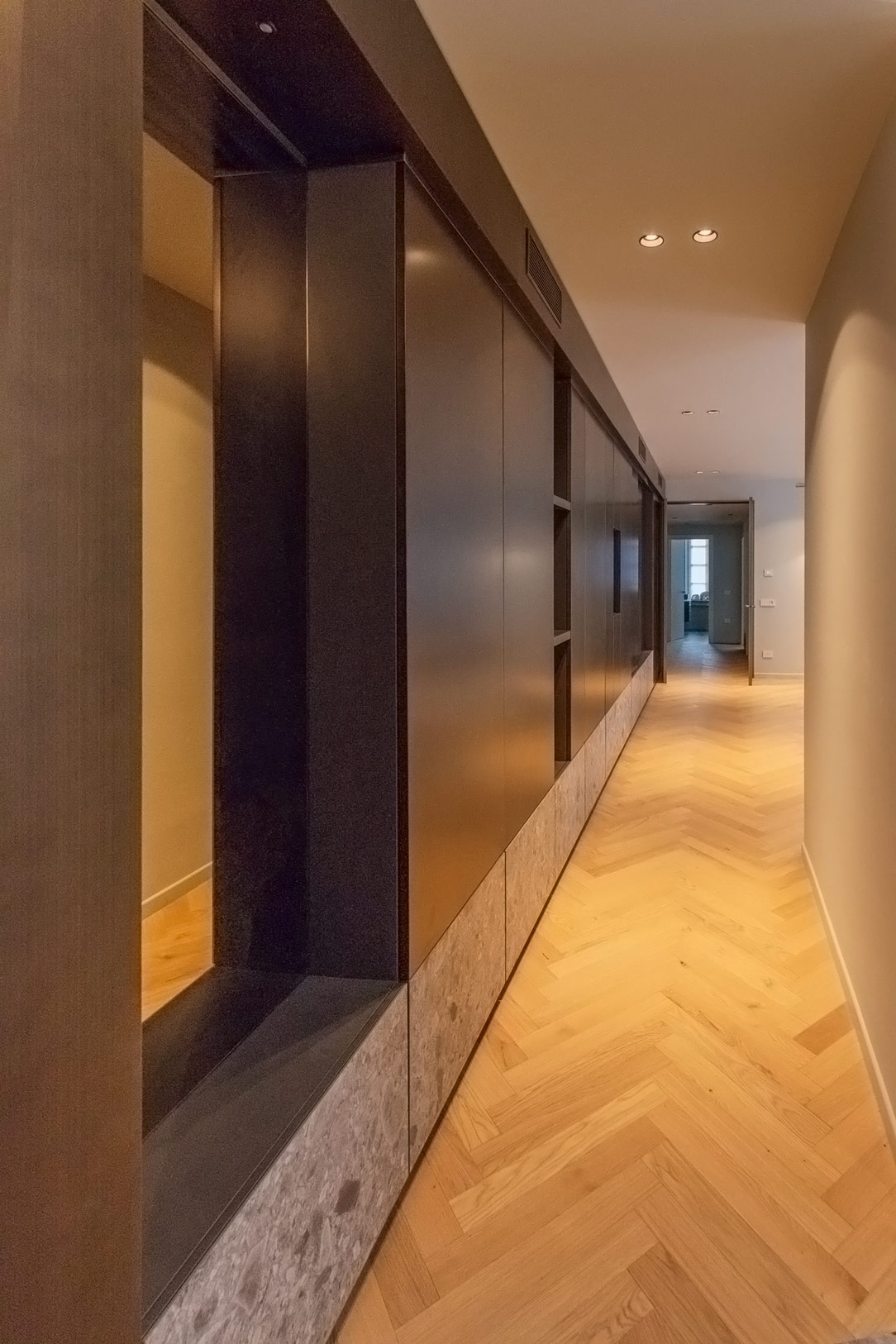
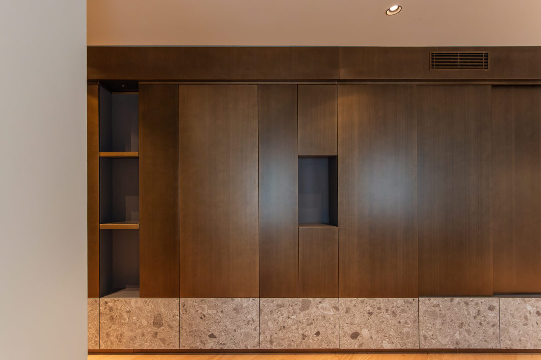
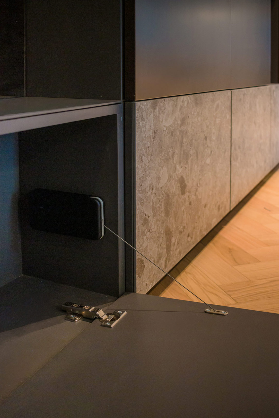
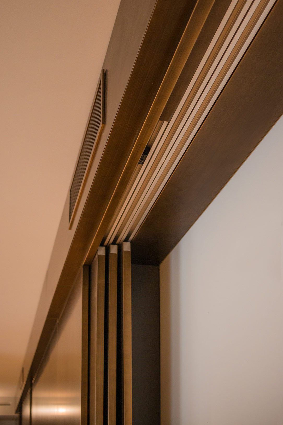
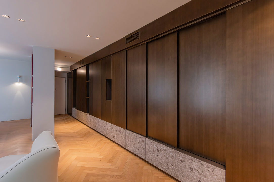
Upon crossing the threshold, you are greeted by a floor-to-ceiling equipped wall that impresses with its versatility. Made of wood painted with bronze metallic finishes, it is paired with a lower section consisting of ceramic doors with a Ceppo di Gre effect. These are designed to open downwards with a stop system that prevents contact with the floor, a solution that not only optimizes storage space but also adds a touch of practicality and ingenuity.

ingresso ceppo di Gre e finiture metalliche
metallic finishes
details lower part of furniture
details high part

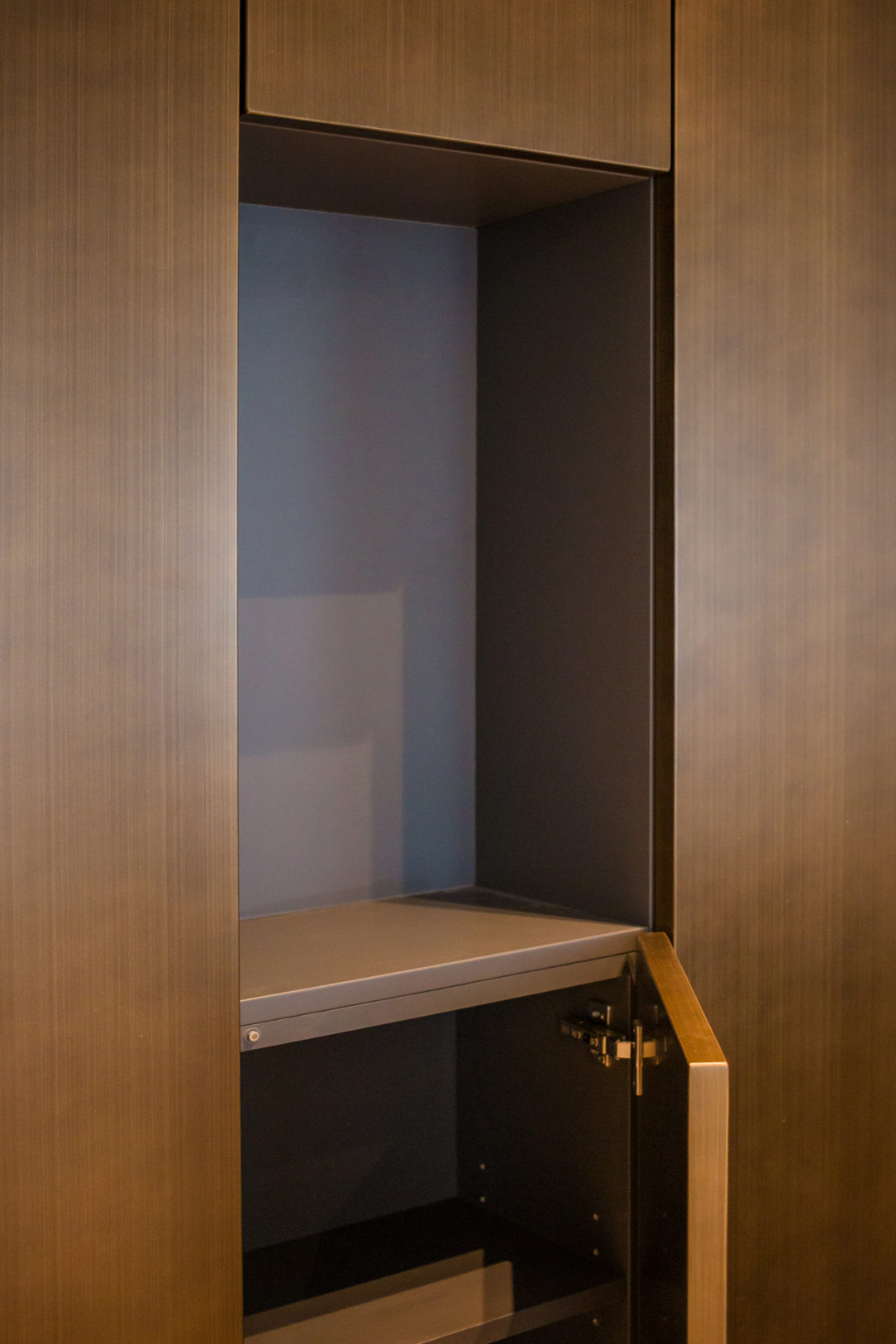
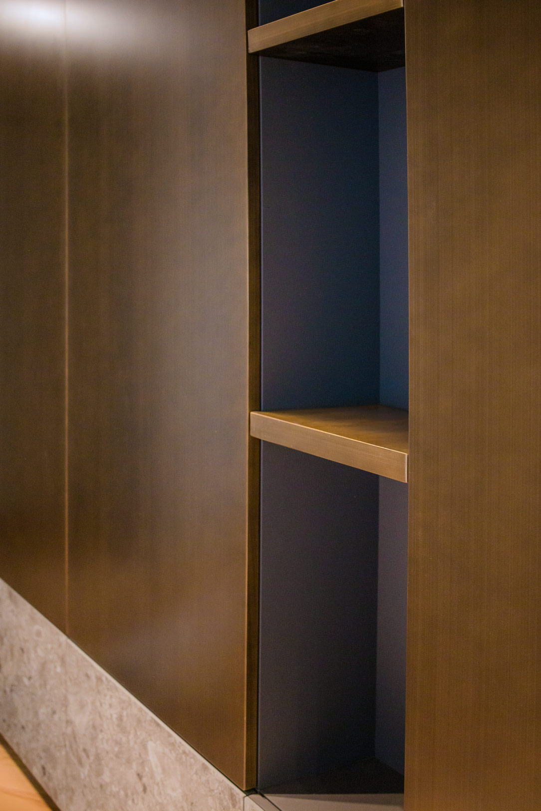
The interiors of the upper part are finished in warm gray, with shelves offering ample organizational possibilities. The open compartments, with coordinated shelves in the same metallic finish, add further dynamism and functionality to the structure. One of the most fascinating features of the wall is the sliding door system that, when needed, reveals a wall-mounted television, integrating technology discreetly and elegantly.

details open spaces
detail sliding door system

The Bar Cabinet: A Touch of Elegance and Color

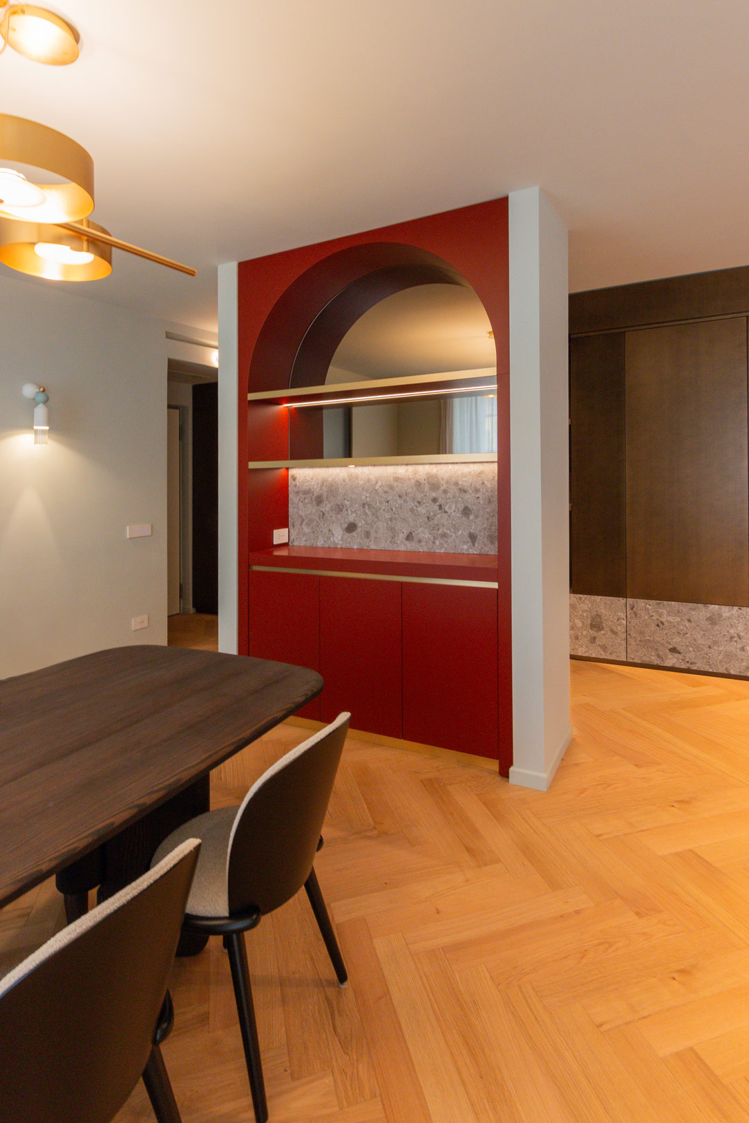
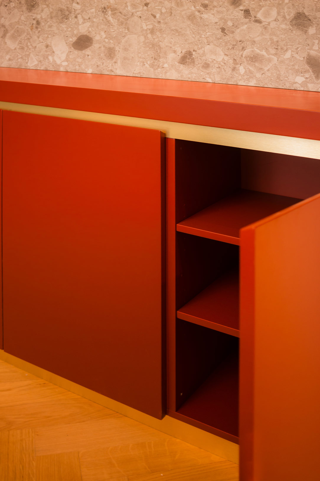
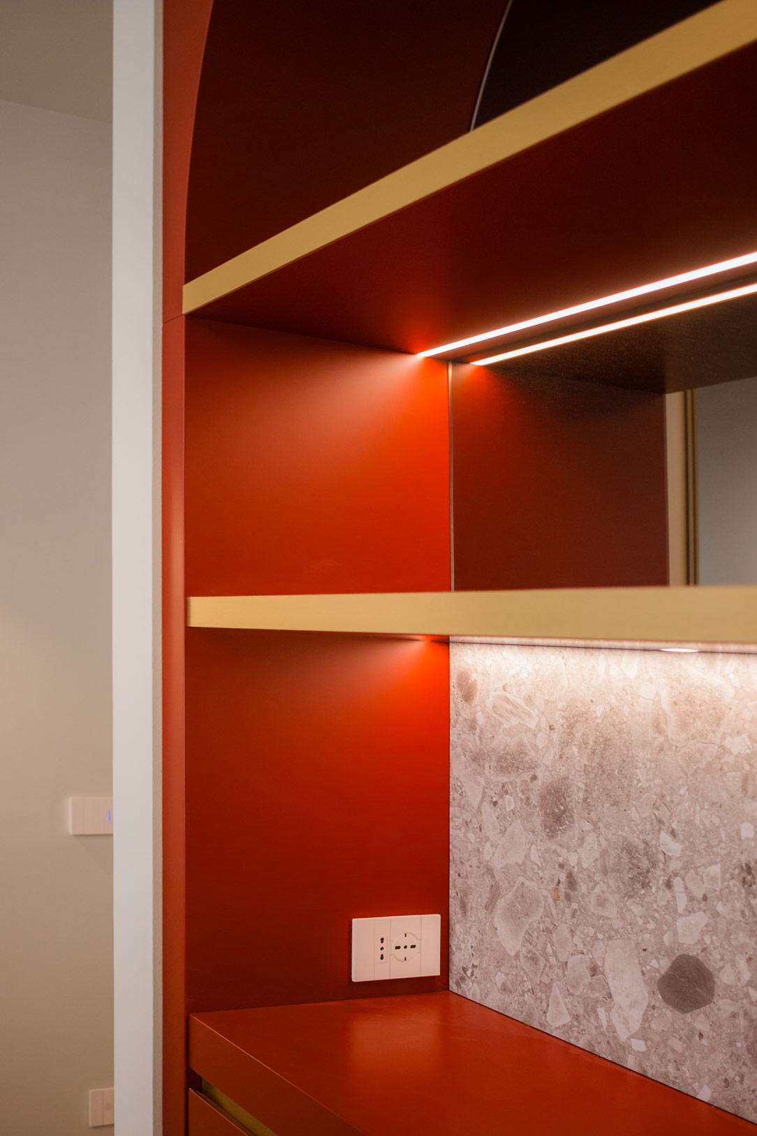
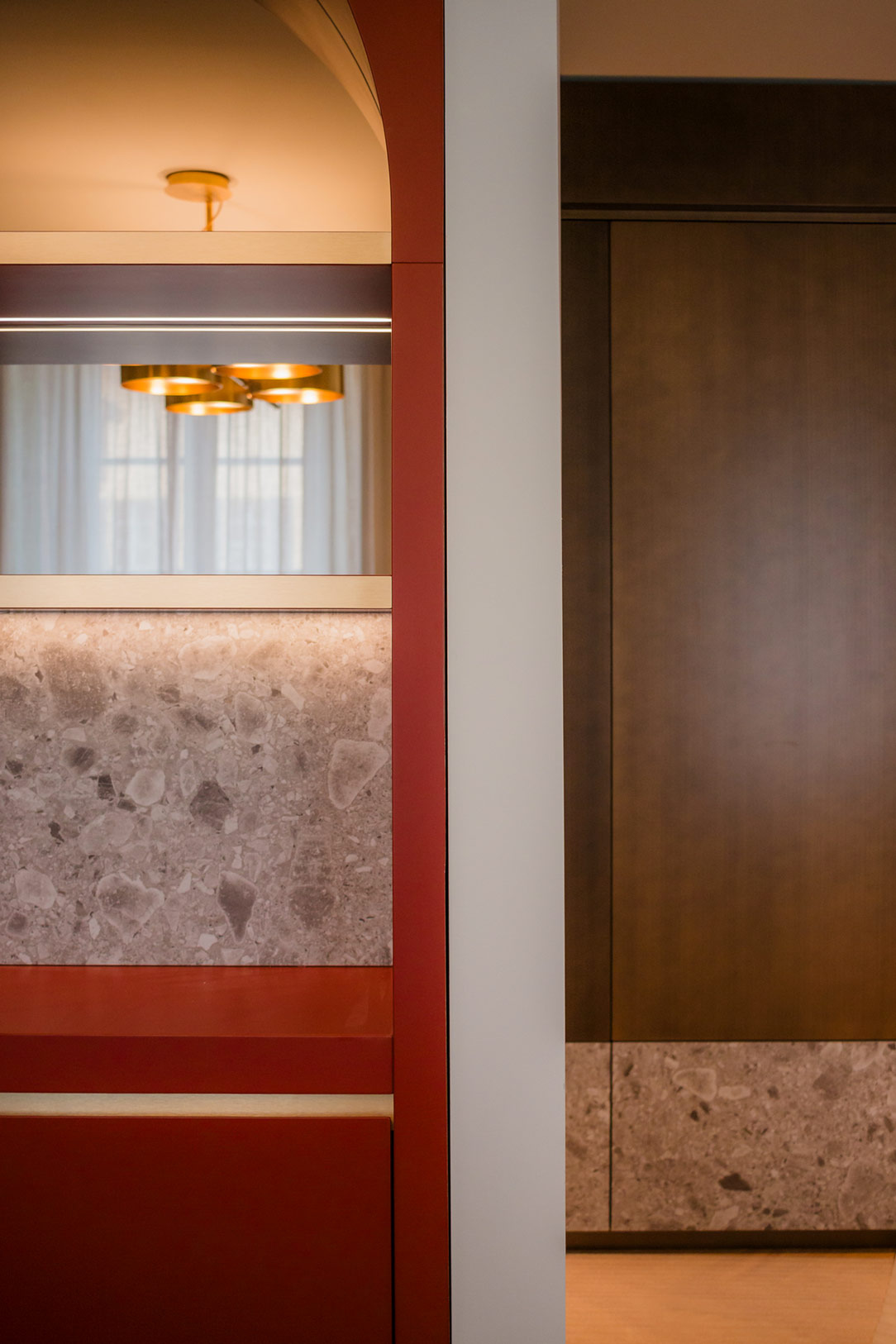
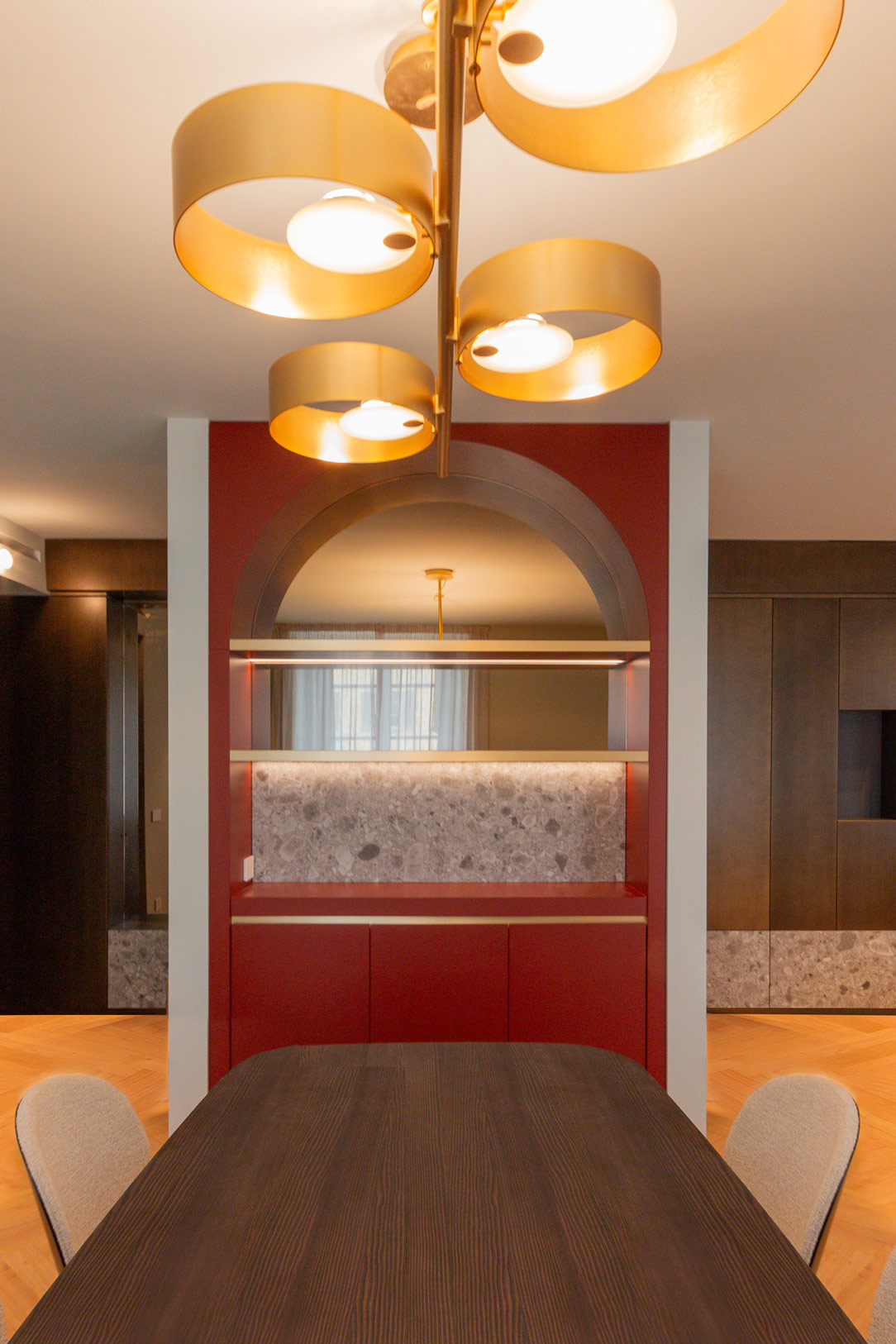
In the living room, next to a central pillar, is a refined bar cabinet in brick red tones. This distinctive piece features a lower section closed by doors that hide internal shelves, ideal for organizing glasses and bottles. The upper part, on the other hand, features backlit shelves that create a scenic effect, elegantly illuminating the bar area.

bar cabinet
details bar cabinet
details bar cabinet

The back of the cabinet is closed by a circular arch, in which a mirror reflects the slightly rounded dark wood dining table positioned in front. This play of reflections amplifies the perception of space, adding depth and a touch of sophistication. A classy detail is the recessed handle chains with a bronze finish, recalling the finishes of the rest of the furnishings and completing the living room’s aesthetic harmony.

Arches and rounded architectural details are making a comeback. Here is another example of a recent creation where an arch serves as a divider between two different home environments.

detail handle chains
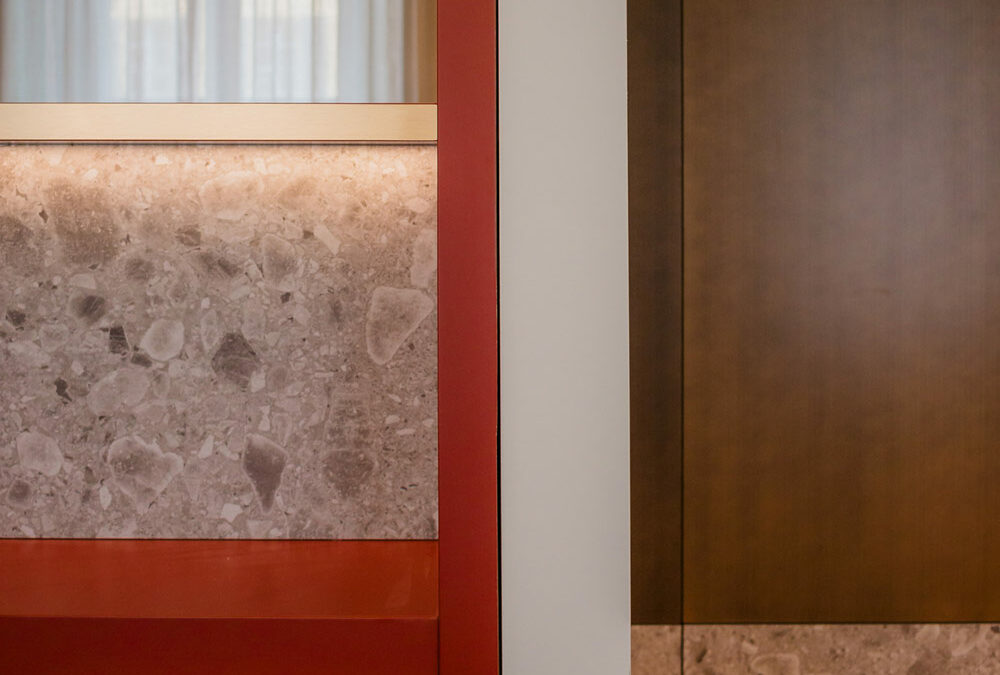
material details
bar cabinet in front

The Home Office: A Haven of Creativity and Concentration

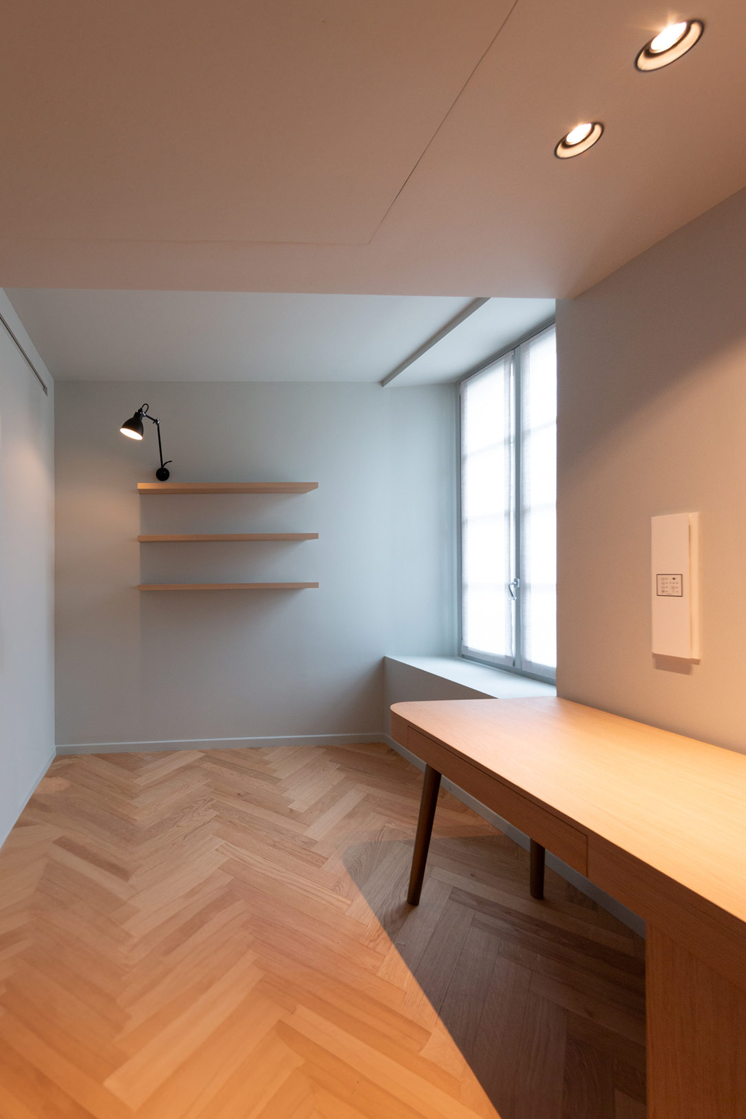
Moving away from the materials used in the living room but maintaining the same soft blue wallpaper background, you find the home office. This space is enclosed by bronze-finished frames, giving a sense of continuity with the rest of the apartment. Inside, a desk and shelves are entirely made of oak, where the wood finds its fullest expression.

home office prospective
home office details
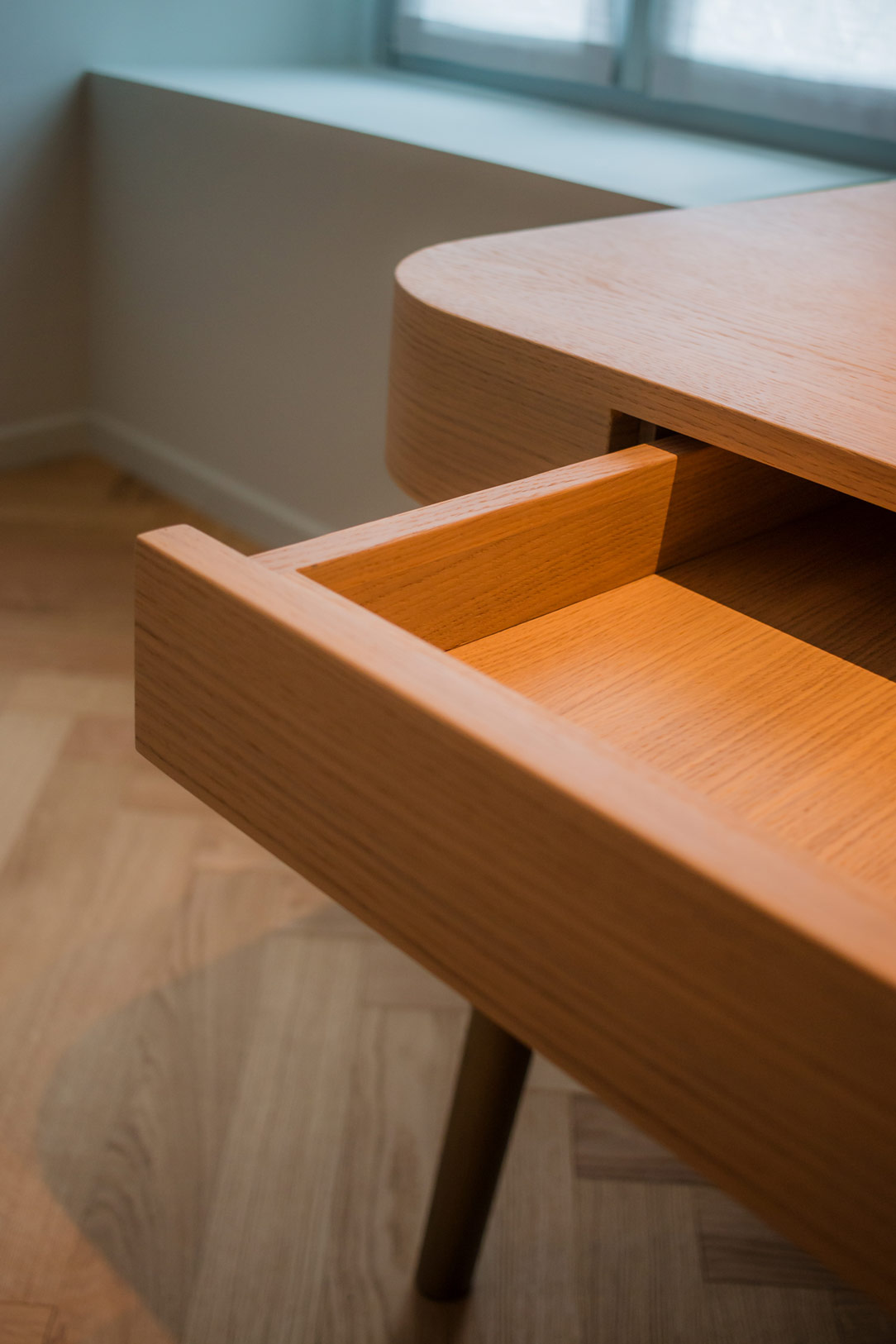
details drawers

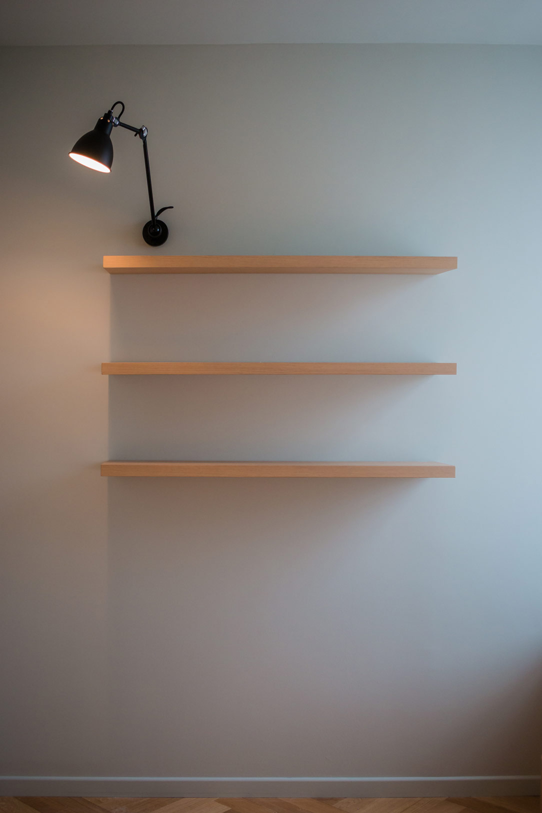
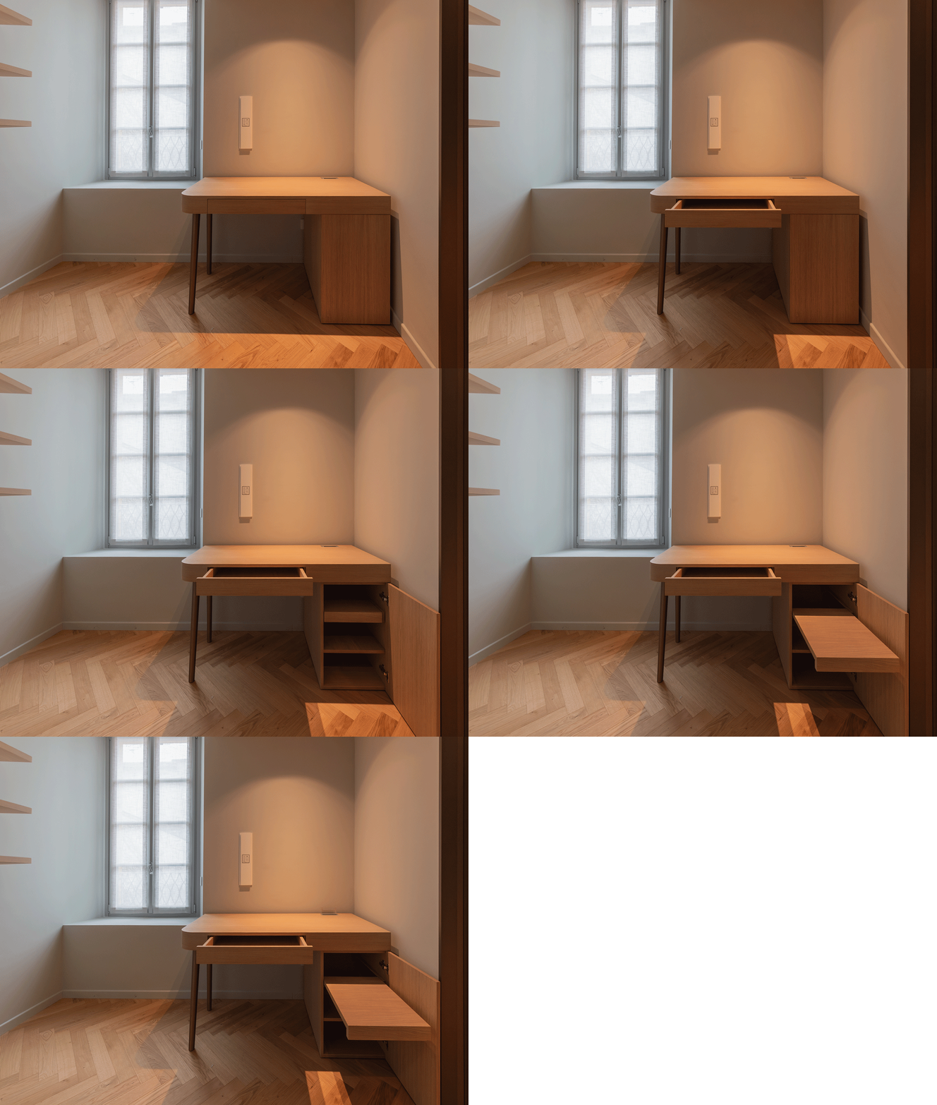
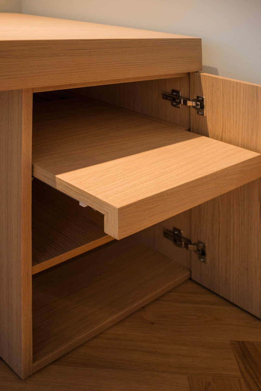
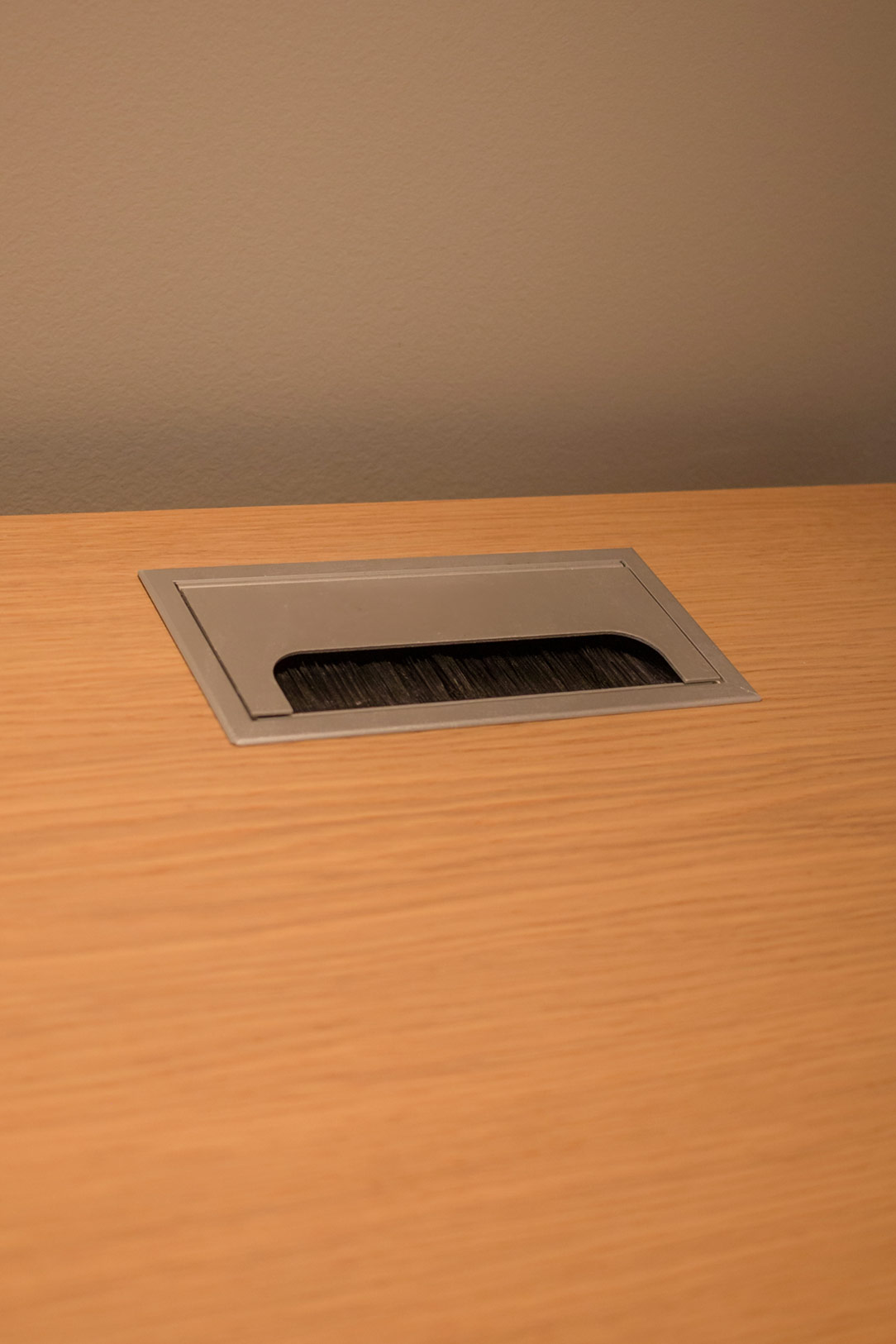
The multifunctional desk is a design masterpiece: it features a rounded corner, a part equipped with a pull-out shelf, and a cable pass-through at the back to maintain order. The wall shelves, illuminated by a study shelf light, provide an ideal environment for reading and working, adding a touch of warmth and coziness.

Here is an article entirely dedicated to home office corners designed for smart working.

home office closed and open
home office details
 cable gland

Details that Make the Difference

In the living area, the vital core of this apartment on Lake Como, every detail has been meticulously curated. From the raw Ceppo di Gre to the selection of warm and welcoming colors, from the peculiarly designed wall lights to the double pair of ceiling spotlights, each element offer not only functionality but also a strong aesthetic value. The perfect lighting and the skillful placement of each piece enhance the entire environment. The fine materials and sophisticated finishes blend in perfect harmony, highlighting the natural beauty and inherent elegance of each detail.

mobile ceppo di gre e finiture metallizzate

An Invitation to Live in Style

This apartment represents the perfect meeting point between past and present, a place where history intertwines with modernity, creating a unique environment, designed to offer a bespoke living experience. The combination of Ceppo di Gre, with its rough and authentic texture, and the bronze metallic finishes, with their sophisticated charm, creates a harmonious dialogue between tradition and innovation.

Light and Shadow: The Magic of a Multifunctional Anthracite Gray Kitchen

Light and Shadow: The Magic of a Multifunctional Anthracite Gray Kitchen

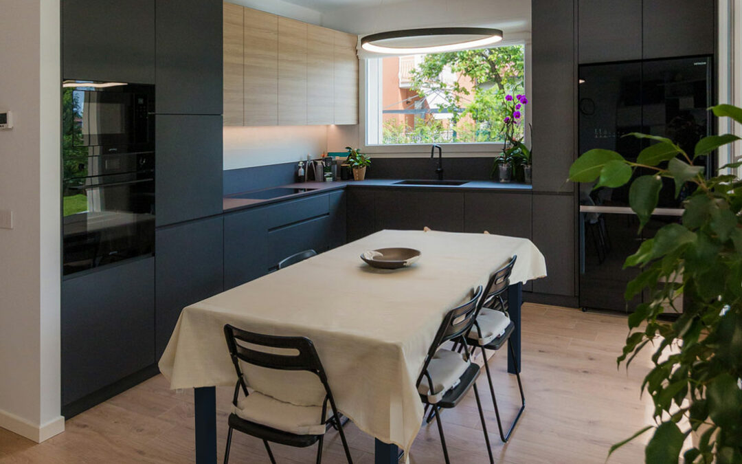
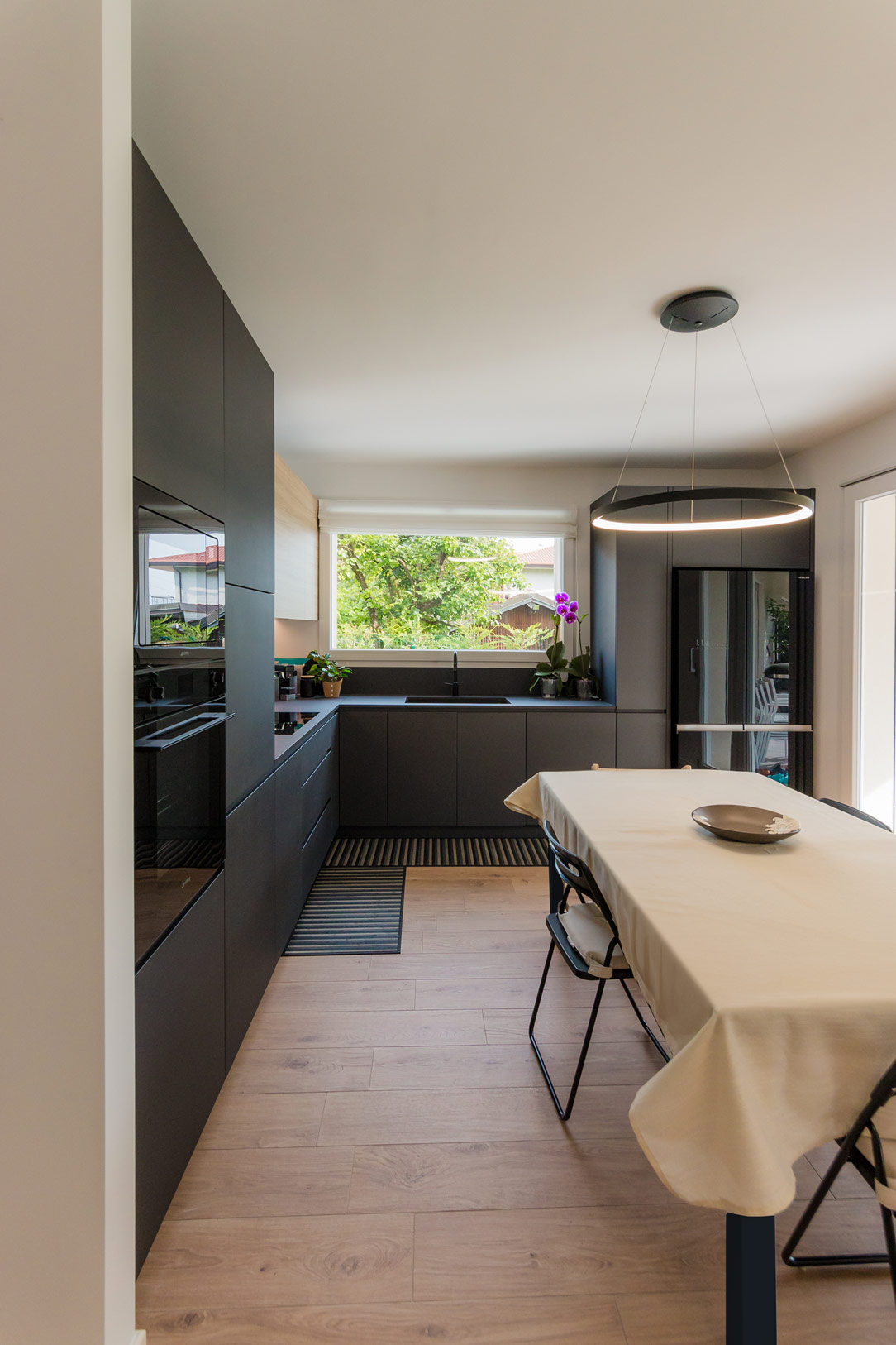
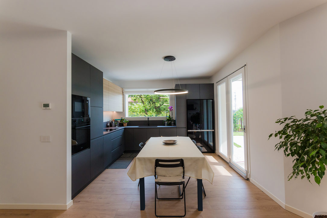
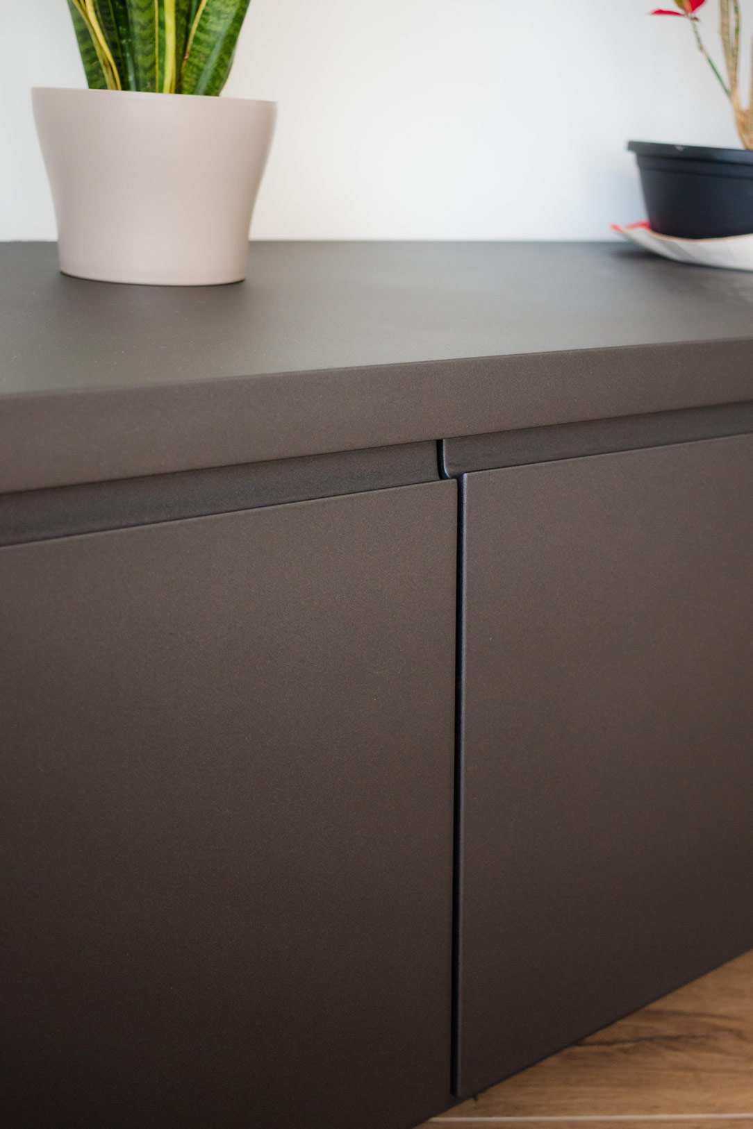
In a modern apartment just a stone’s throw from Bergamo, nestled at the edge of a quiet, green forest, we have designed an anthracite gray kitchen, crafted to be not only aesthetically refined but also extremely multifunctional.

anthracite gray kitchen

Kitchen Design

During the design phase, we considered the room’s square layout and the family’s habits. This led us to choose a corner kitchen, leaving the central space free for an extendable table, perfectly illuminated by a centrally positioned designer chandelier.

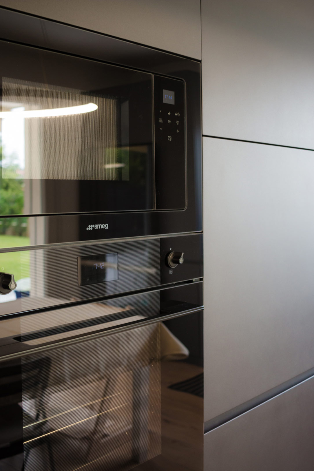
On the left side, the kitchen structure begins with a series of tall columns housing the pantry and ovens. From here, a long worktop extends to embrace the corner. One part of the countertop is equipped with high wall units, while the other part leaves space for a window overlooking the garden. Completing the opposite side, a large free-standing refrigerator is framed by a unit with a side pull-out.

anthracite gray kitchen front
kitchen details
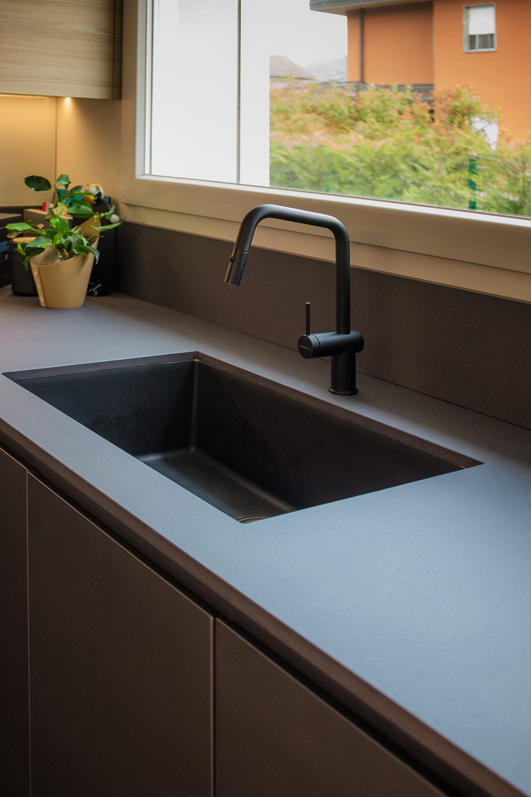
 sink details
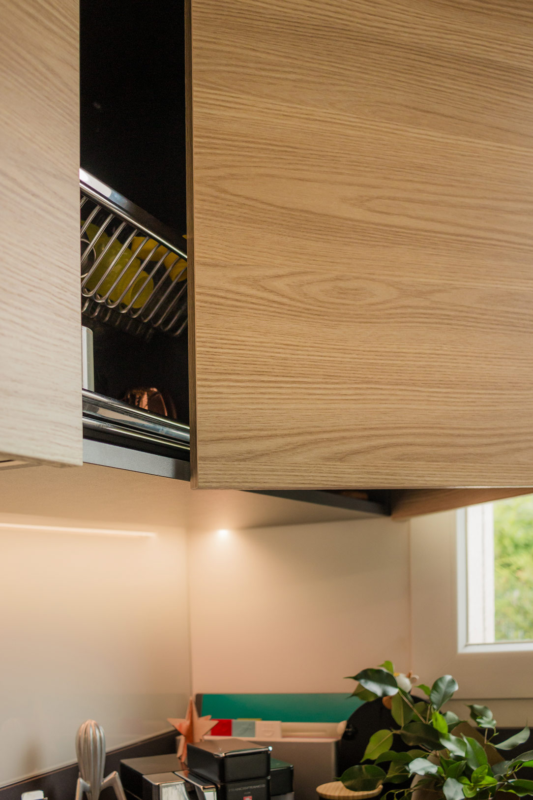
wall units details

Multifunctional Additions

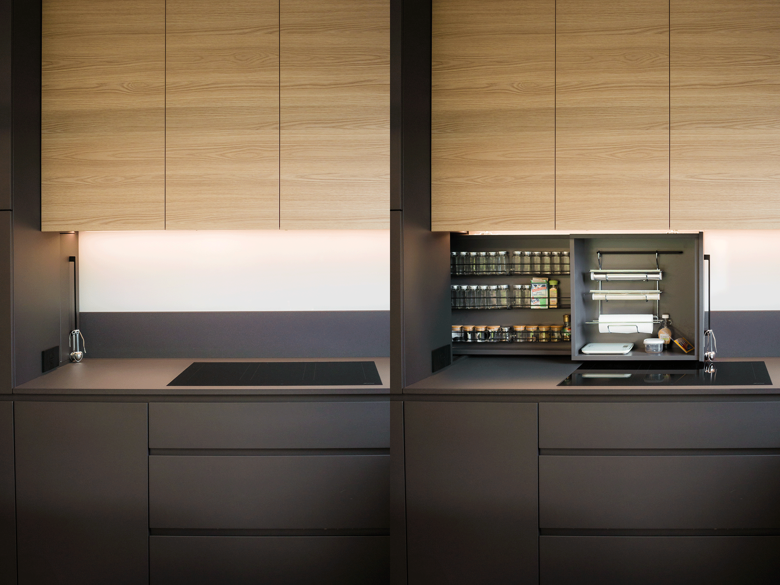
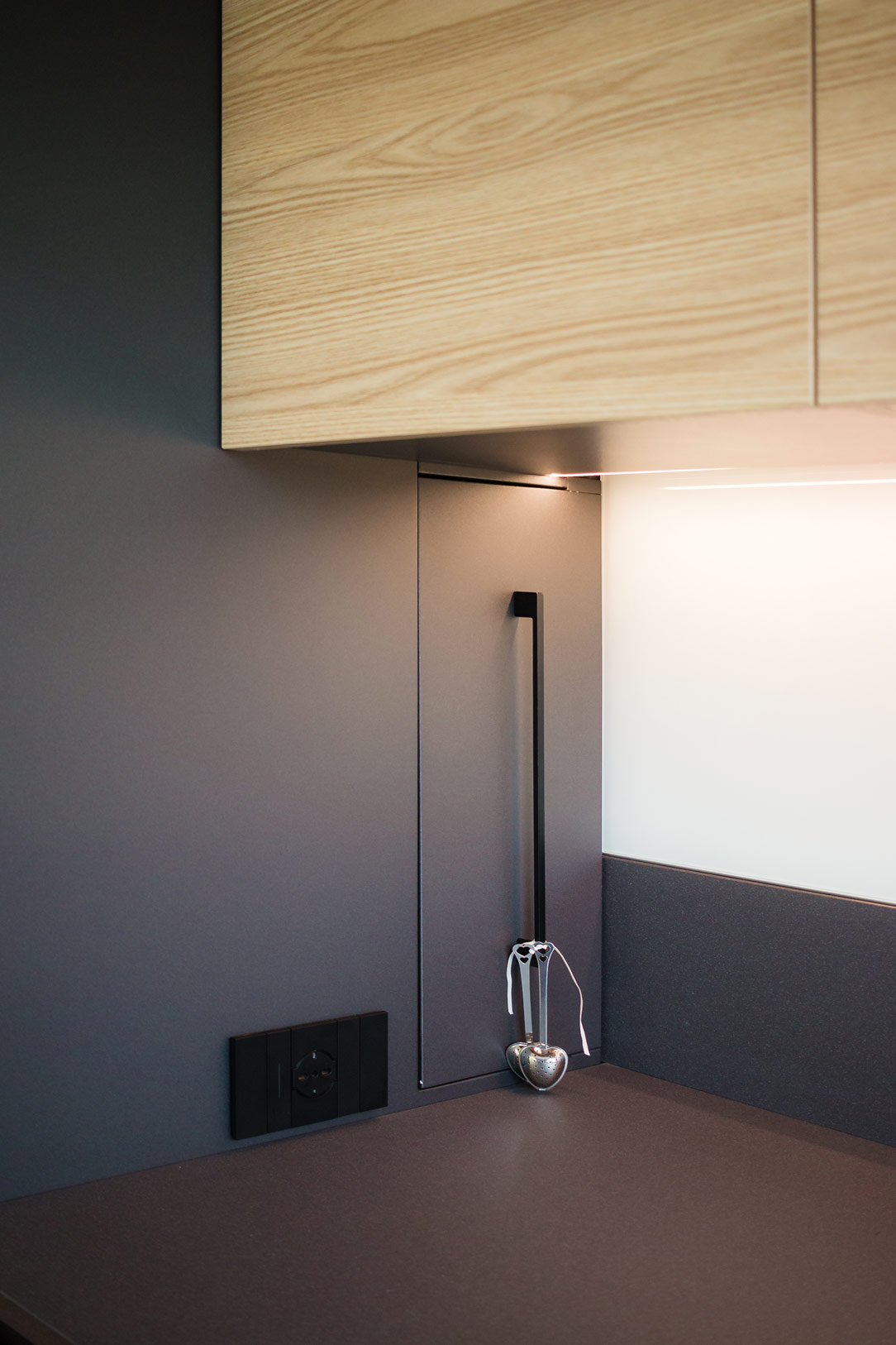
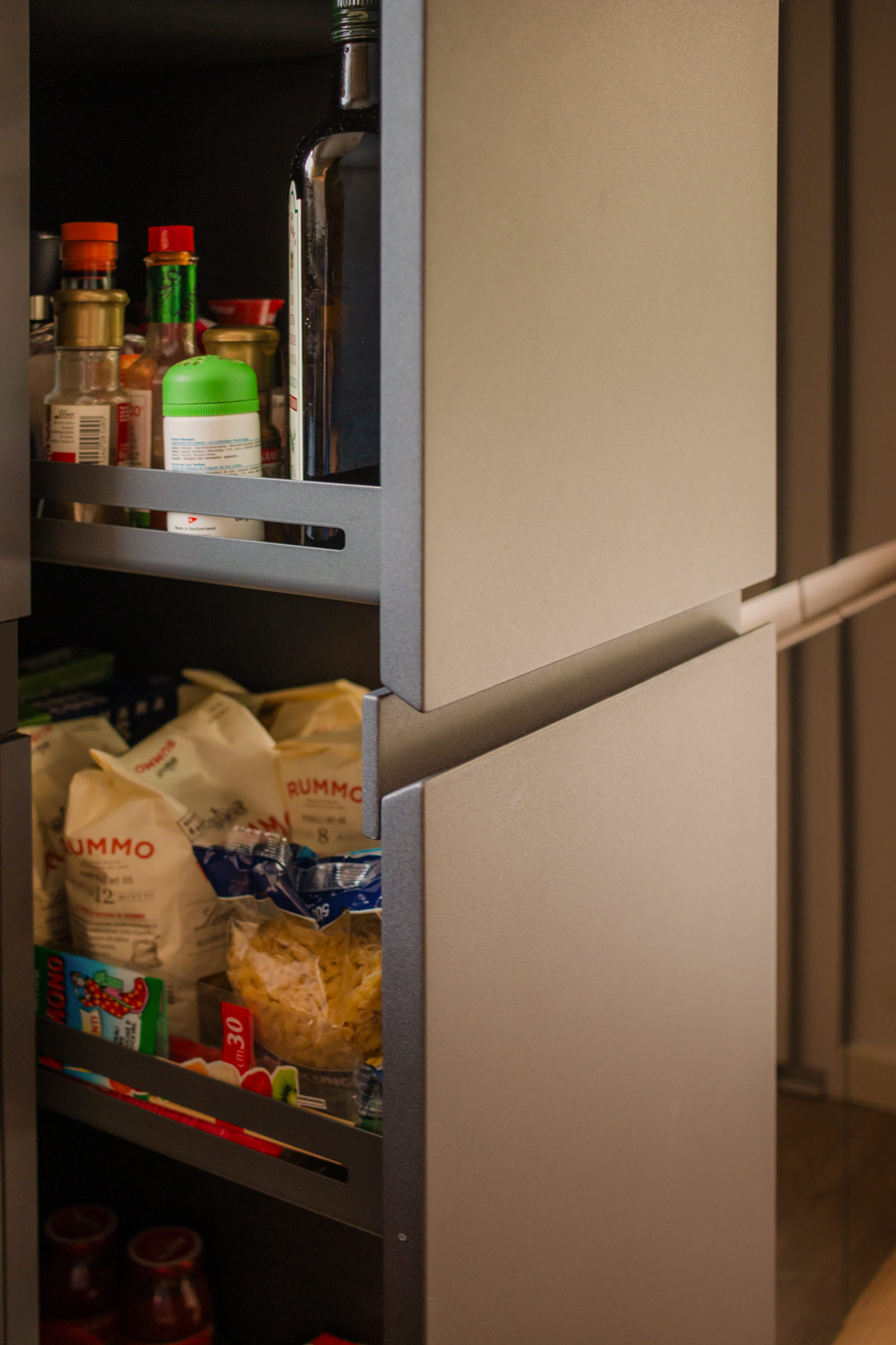
One of the most interesting aspects of the design is the retractable spice rack. By utilizing additional depth, we managed to integrate a pull-out system placed behind the initial columns. This element, which opens laterally to the induction hob, features compartments for spices, small accessories, and a paper towel holder, making everything within reach during food preparation.

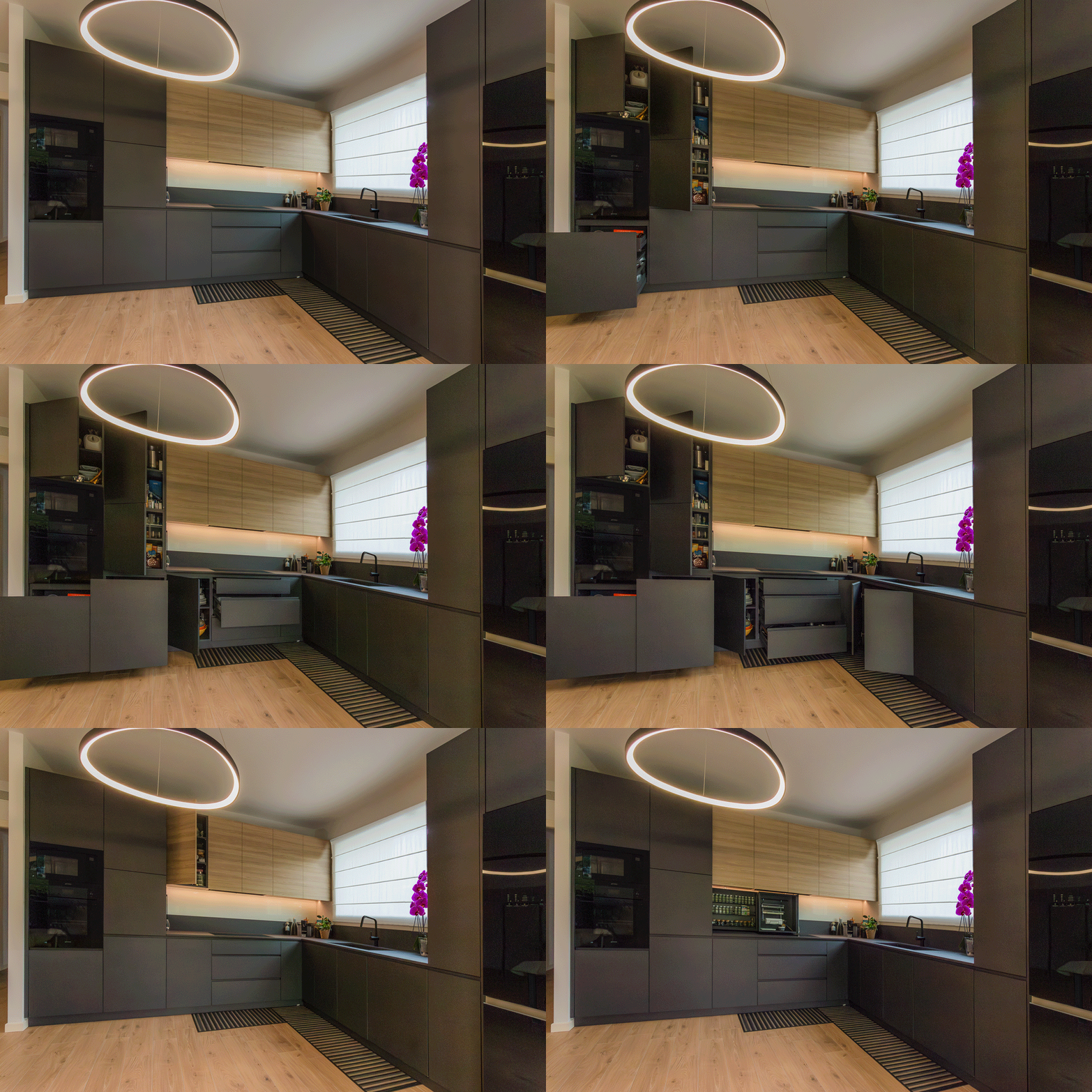
Other useful components include trash can drawers, a foldable door in the cabinets, and a column with a front extraction system that allows access from both sides. These features enhance practicality and efficiency, making it a true multifunctional hub.

spice rack open and close
spice rack details
extraction system details

Materials and Finishes

Considering the very bright environment, we chose to dare with anthracite gray, a dark and striking color that contrasts with the predominant white. The oak veneer wall units complement the honey-toned wood-effect porcelain stoneware, bringing a touch of nature into the home.

The worktop is made of Lapitec, a high-performance ceramic material with a slightly speckled, rough texture. It harmoniously blends, almost merging, with the anthracite color of the kitchen and the sink in the same shade of granite.

At the back of the kitchen, a glossy white Lacobel panel, in the same shade as the wall, creates a clear contrast between the gray countertop and the wood of the cabinets.

We present two more examples of anthracite kitchens: the first is a corner kitchen with a cooking island, while the second features a C-shaped layout ending in a central peninsula.

timelapse open and close

Coordination in the Space

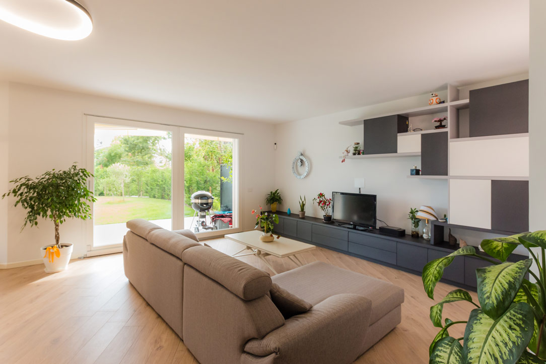
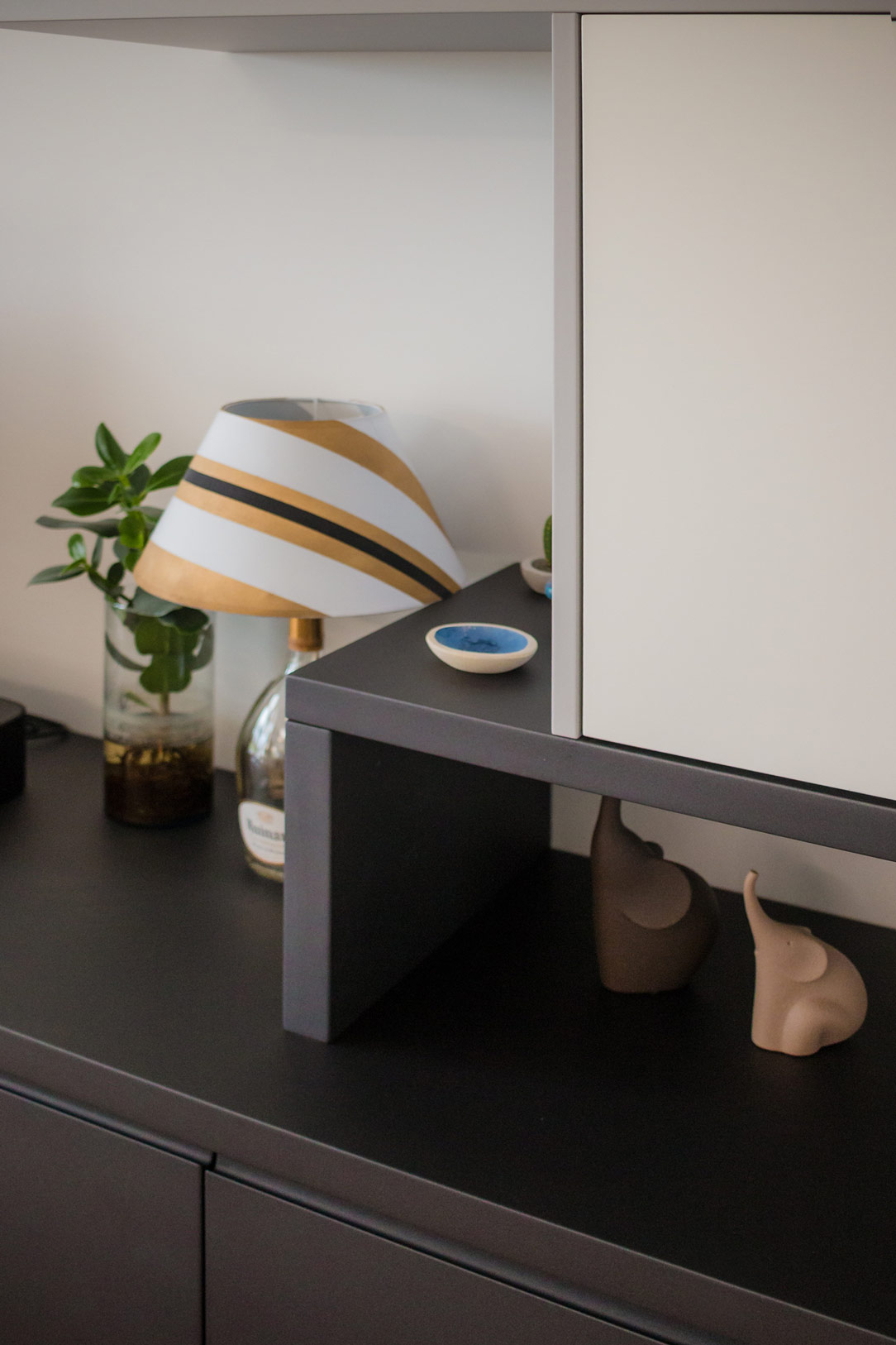
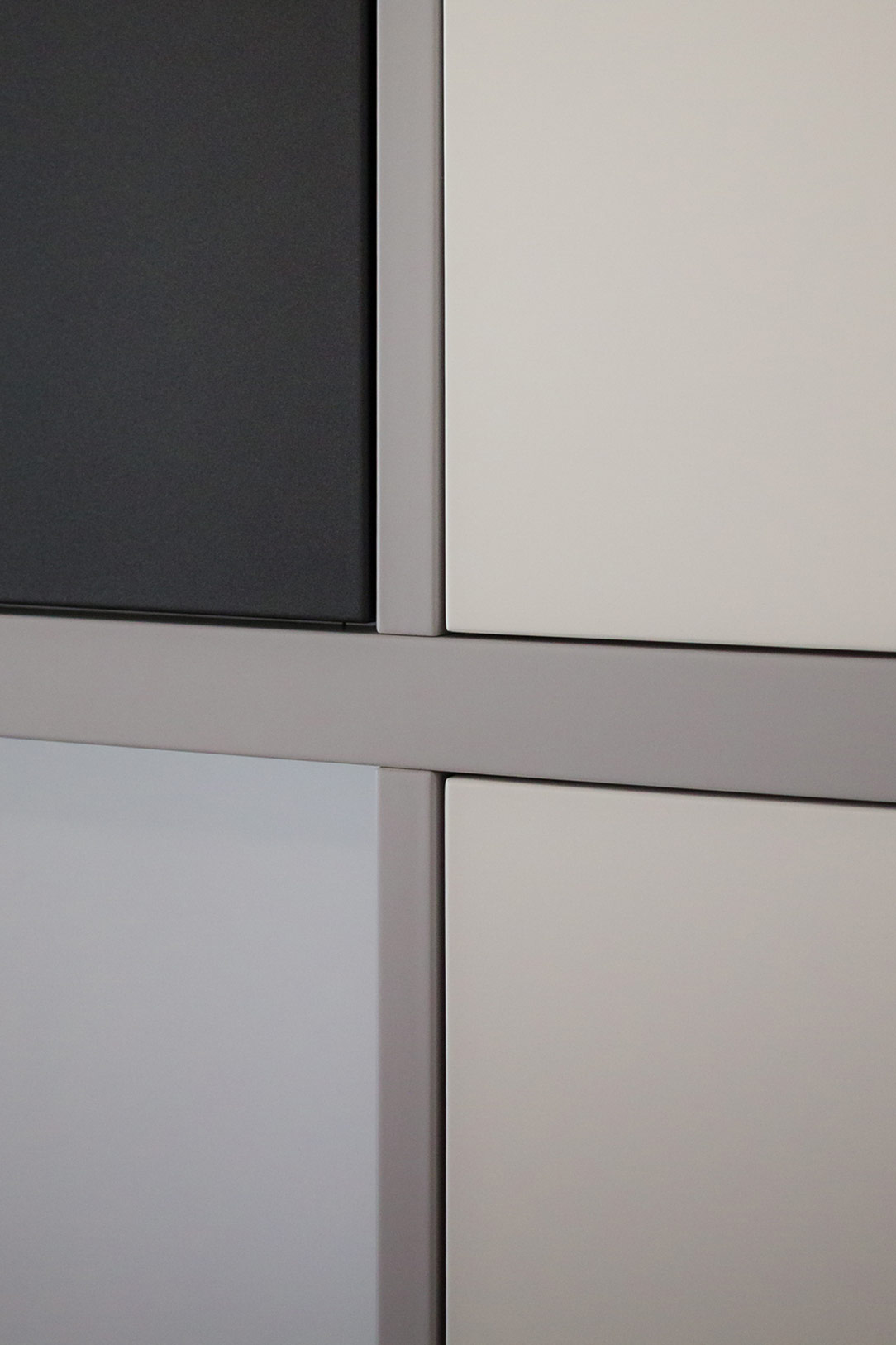
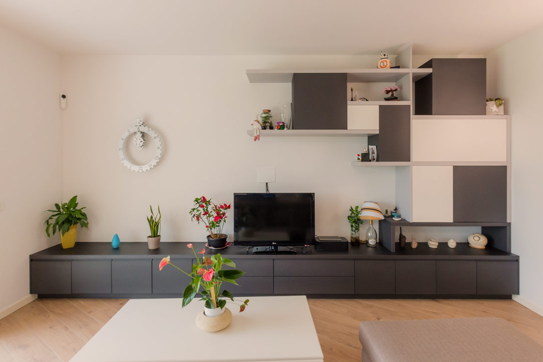
The TV cabinet, facing the kitchen, has also been designed and built in the same anthracite gray, completing the space in a discreet and harmonious manner. Comprising drawers and doors with internal shelves, it offers ample space for storing elements and accessories related to the living area and kitchen. Next to the television, wall elements in white, gray, and anthracite alternate, creating a play of shapes and symmetries that enrich the overall aesthetic of the space.

TV cabinet anthracite gray
details tv cabinet
details shelves
details cubes
detail front of the cabinet

Conclusions

There is no need to fear using dark colors, especially in bright environments or where white is predominant. In this project, anthracite gray was the perfect choice to balance the abundance of light tones, infusing the space with a decisive and refined elegance. This kitchen, combined with the living area, demonstrates how functionality and aesthetics can merge into perfect harmony.

Furniture with a Minimalist Approach for Multifunctional Solutions

Furniture with a Minimalist Approach for Multifunctional Solutions

In a valley rich in history, architectural and artistic presence, surrounded by the greenery of nature, a young family has discovered the perfect solution to optimize the spaces. Through innovative design, the focus has been on the living area, utilizing minimal and multifunctional furniture to create an open, bright, and versatile environment.

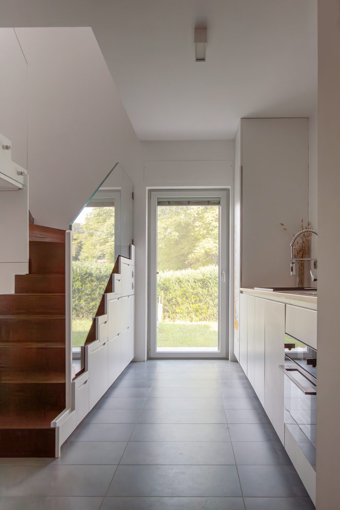
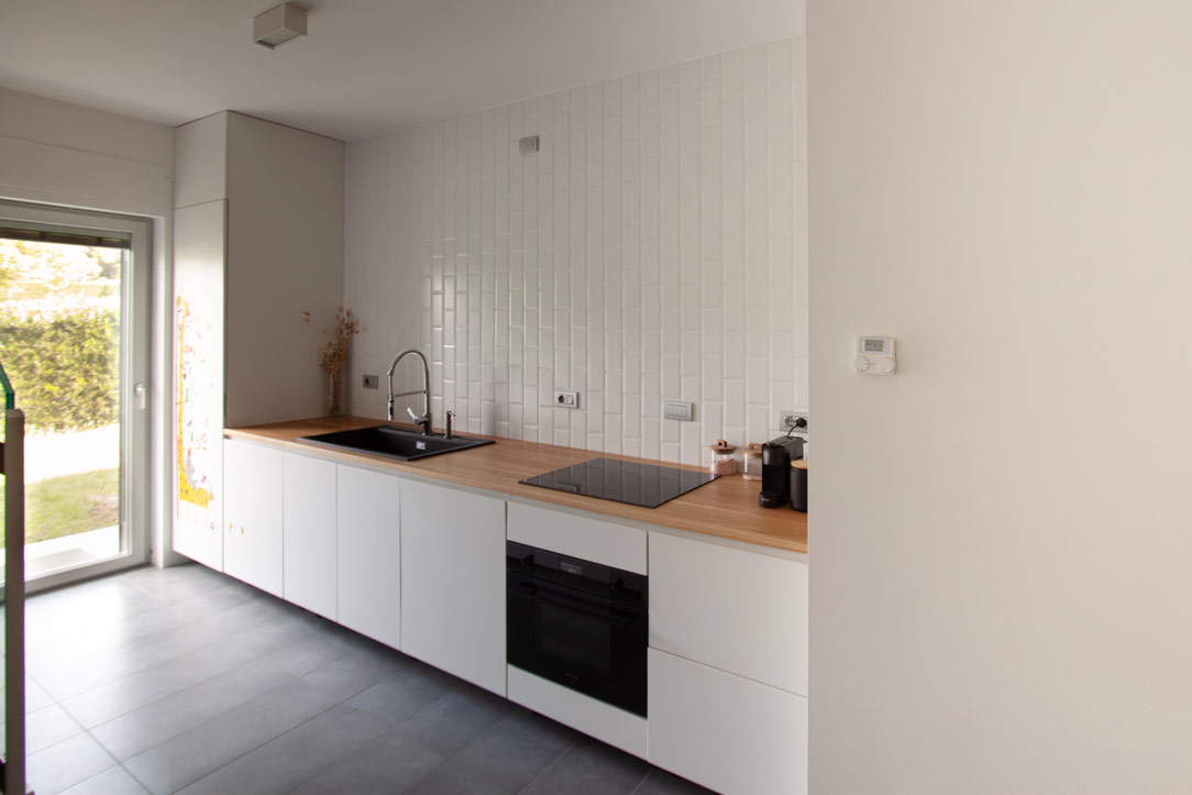
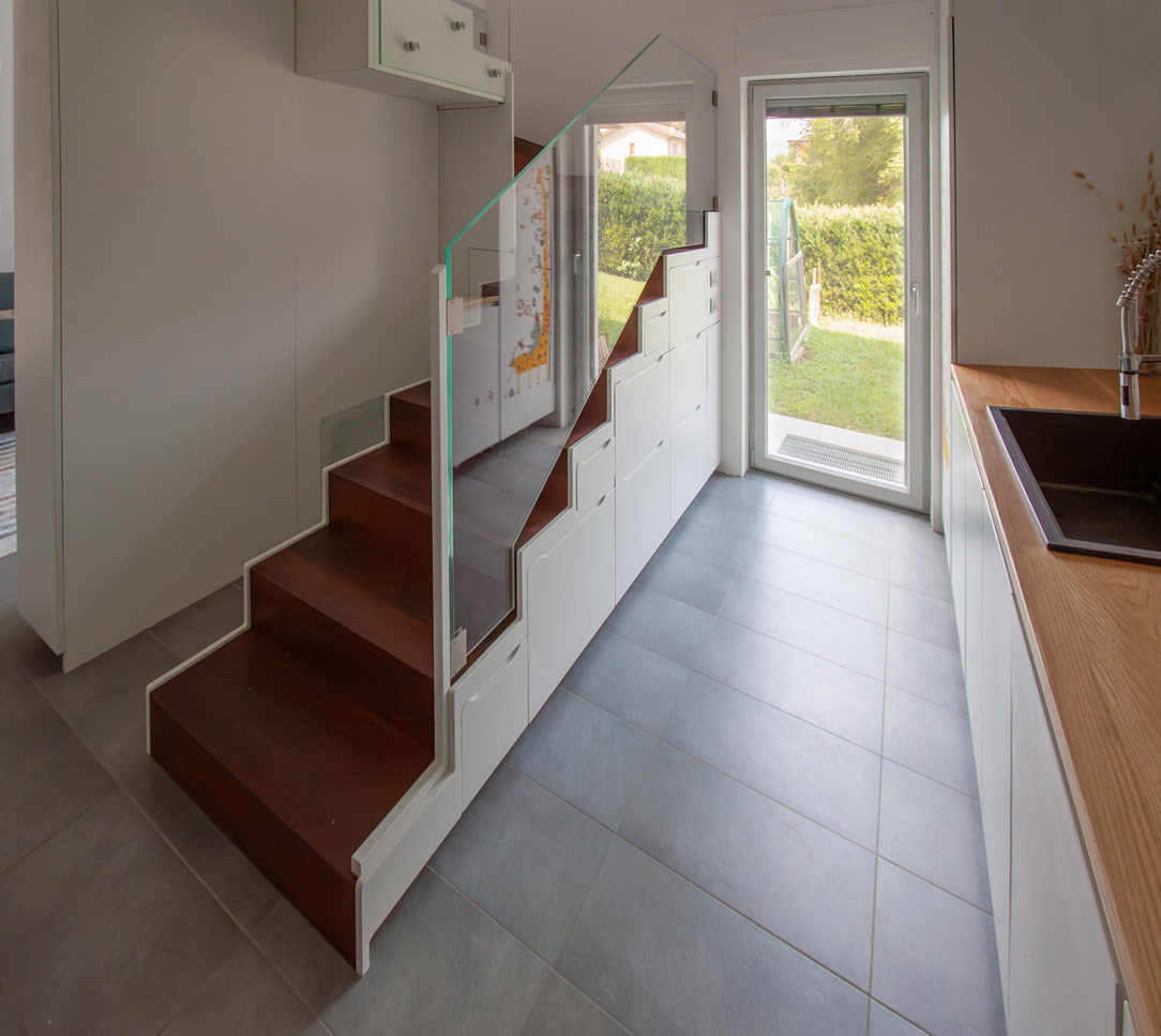
kitchen entrance and multifunctional stairs

THE MINIMAL KITCHEN

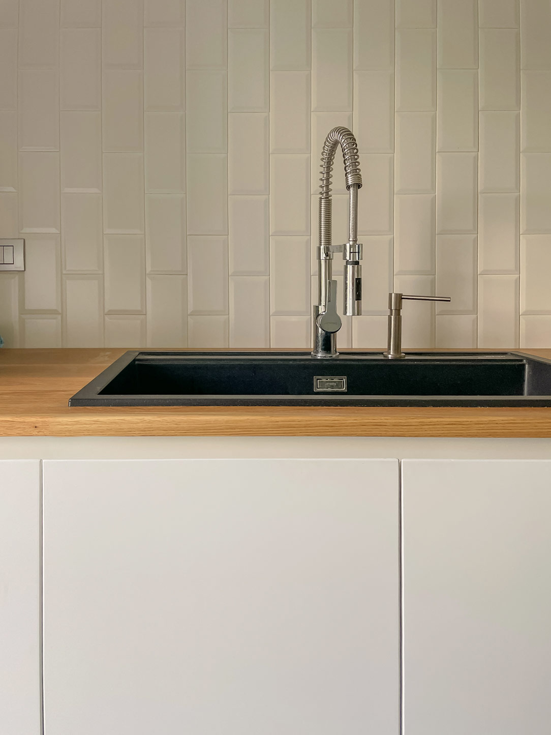
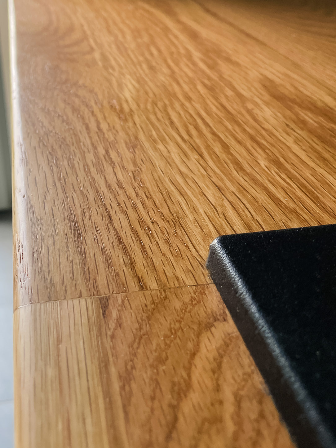
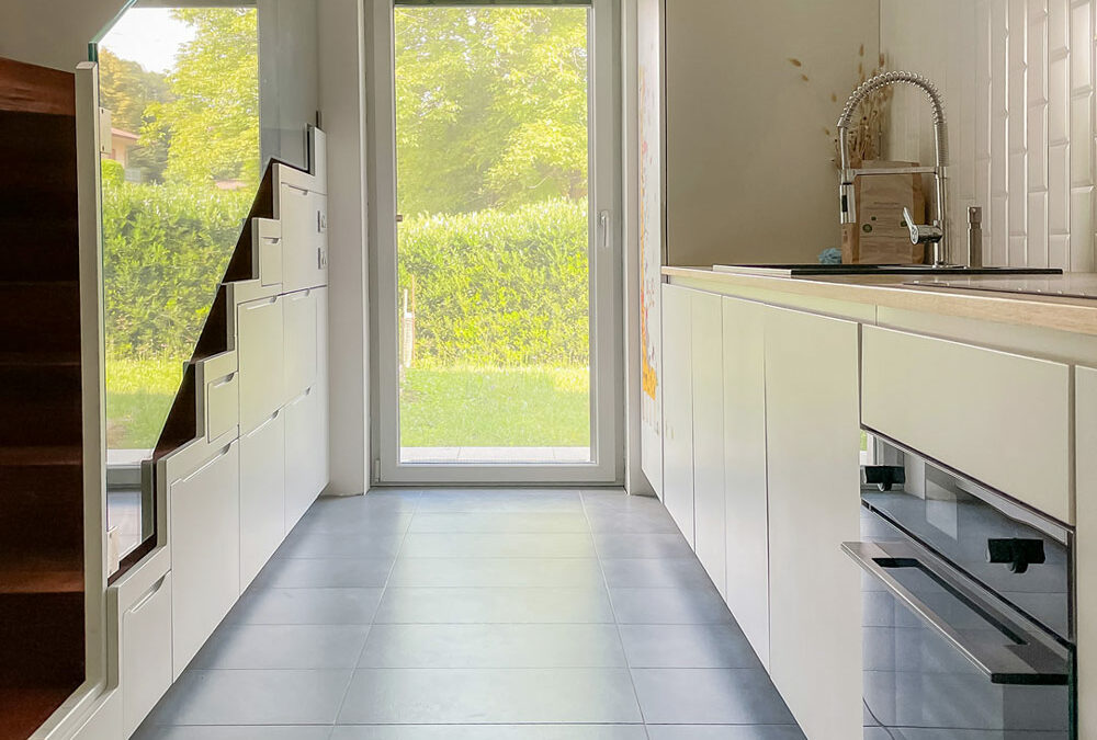
Integrated into a fitted wall, the kitchen embodies the essence of minimal. With a palette of light colors and the use of natural materials, it provides everything needed without burdening the space. The laminated natural oak wood countertop recalls the external wooded environment and accommodates a modern black granite sink and a induction hob.

The choice of matte white MDF for the kitchen base and refrigerator column, along with ceiling tiles, contributes to maintaining a clean and luminous aesthetic. The light and variegated gray ceramic floor complete the welcoming atmosphere, ensuring ease of maintenance and cleaning, harmonizing with the materials and colors of the house. 

minimal kitchen
details kitchen top
details kitchen top

THE MULTIFUNCTIONAL SIDE STAIRCASE

A light staircase in front of the kitchen serves a dual purpose. Besides connecting the living area to the sleeping area, it has been designed with a structure of modular equipped wood and metal, making it both aesthetic and functional.

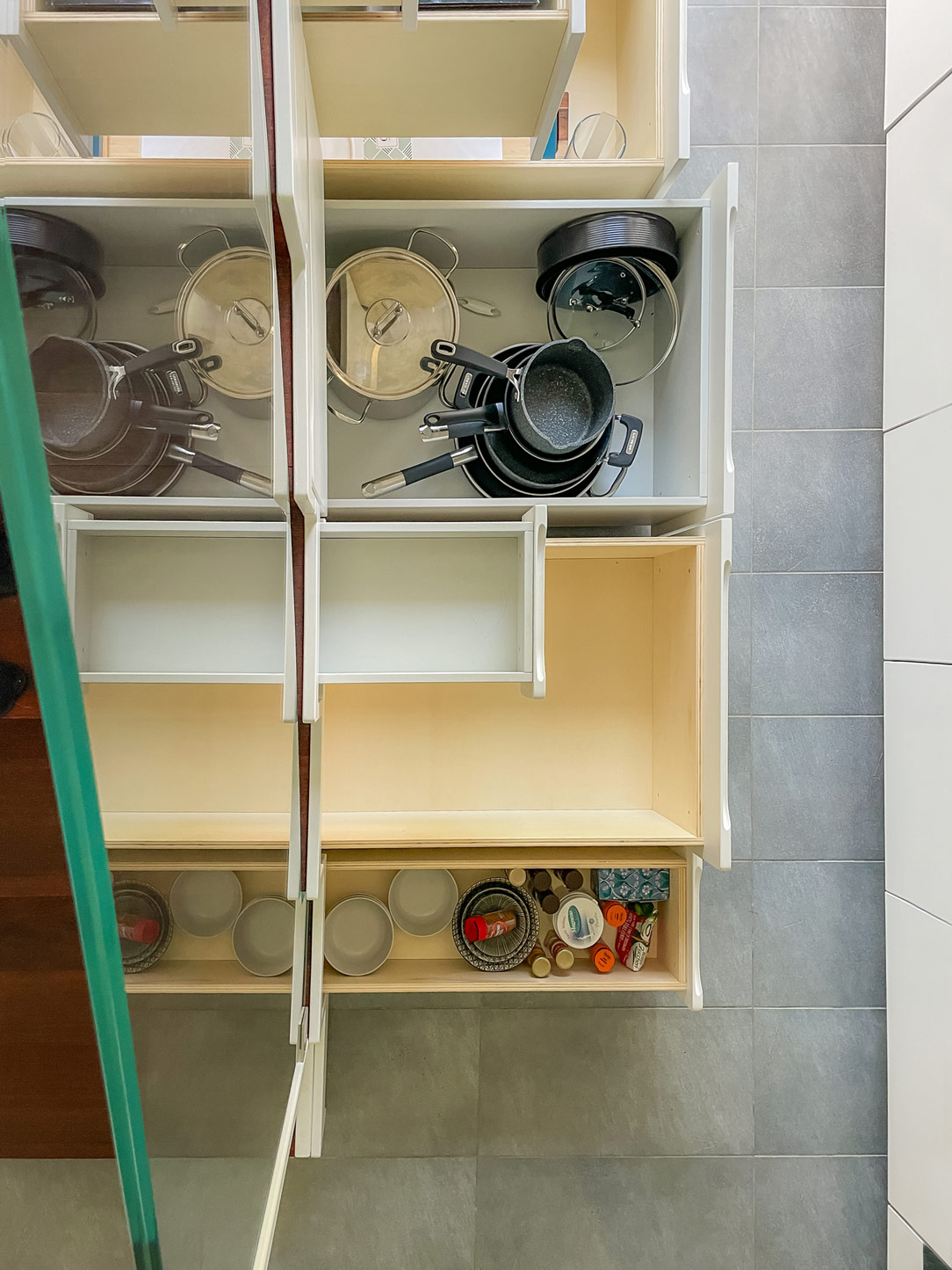
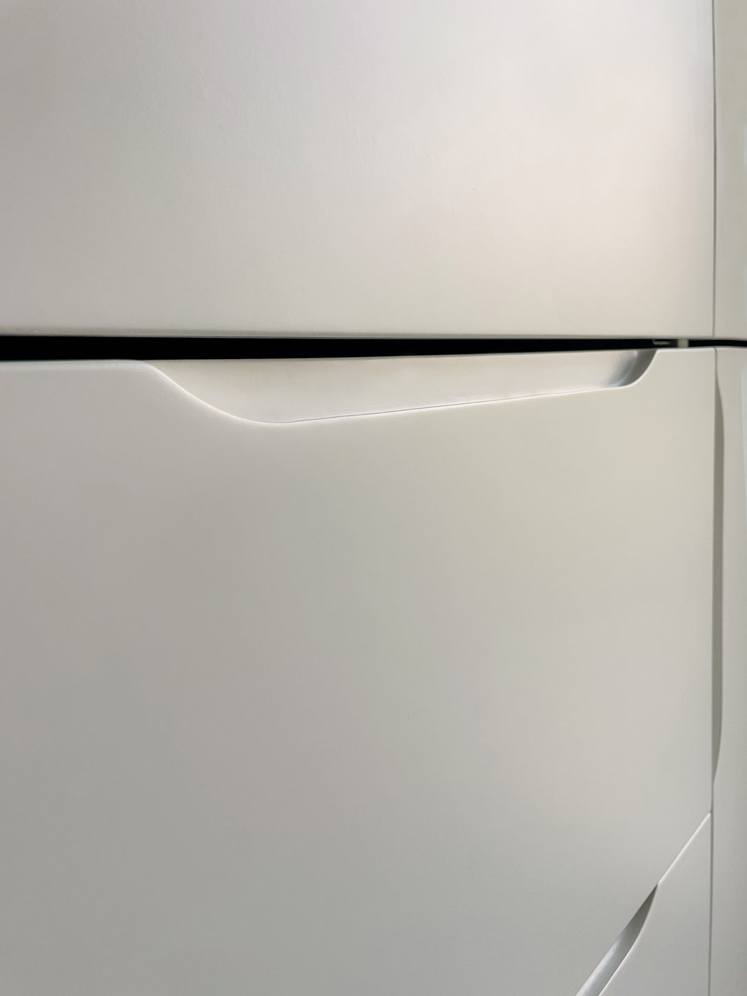
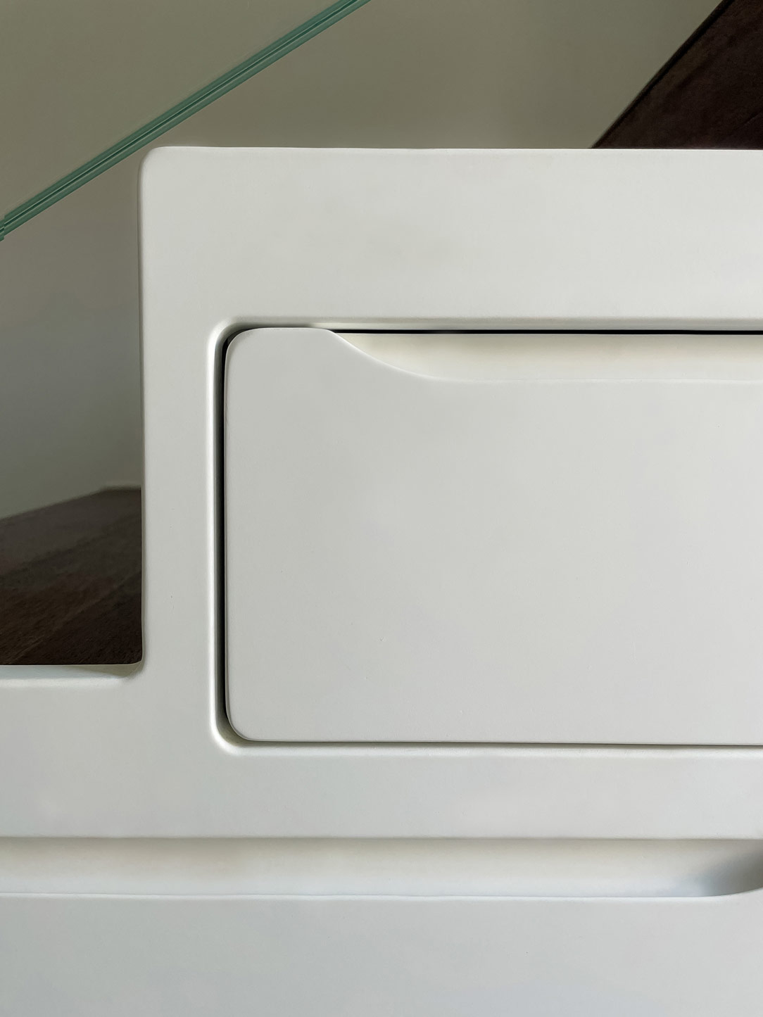
It houses shaped drawers that provide additional storage space, avoiding the wall unit to the kitchen for maintaining a light and minimal appearance while providing all the necessary storage space in an unexpected location.

Here’s another example of a staircase solution equipped with drawers.

lateral stairs with drawers
drawers from the top
details drawers
shaped drawes

THE WELL-EQUIPPED LIVING AREA

The living area is designed with careful attention to internal flows related to space utilization. A laminated oak wood dining table, coordinated with the kitchen countertop, accommodates 4 to 6 diners and is positioned in a passageway between the kitchen and the living room. It is convenient and non-intrusive.
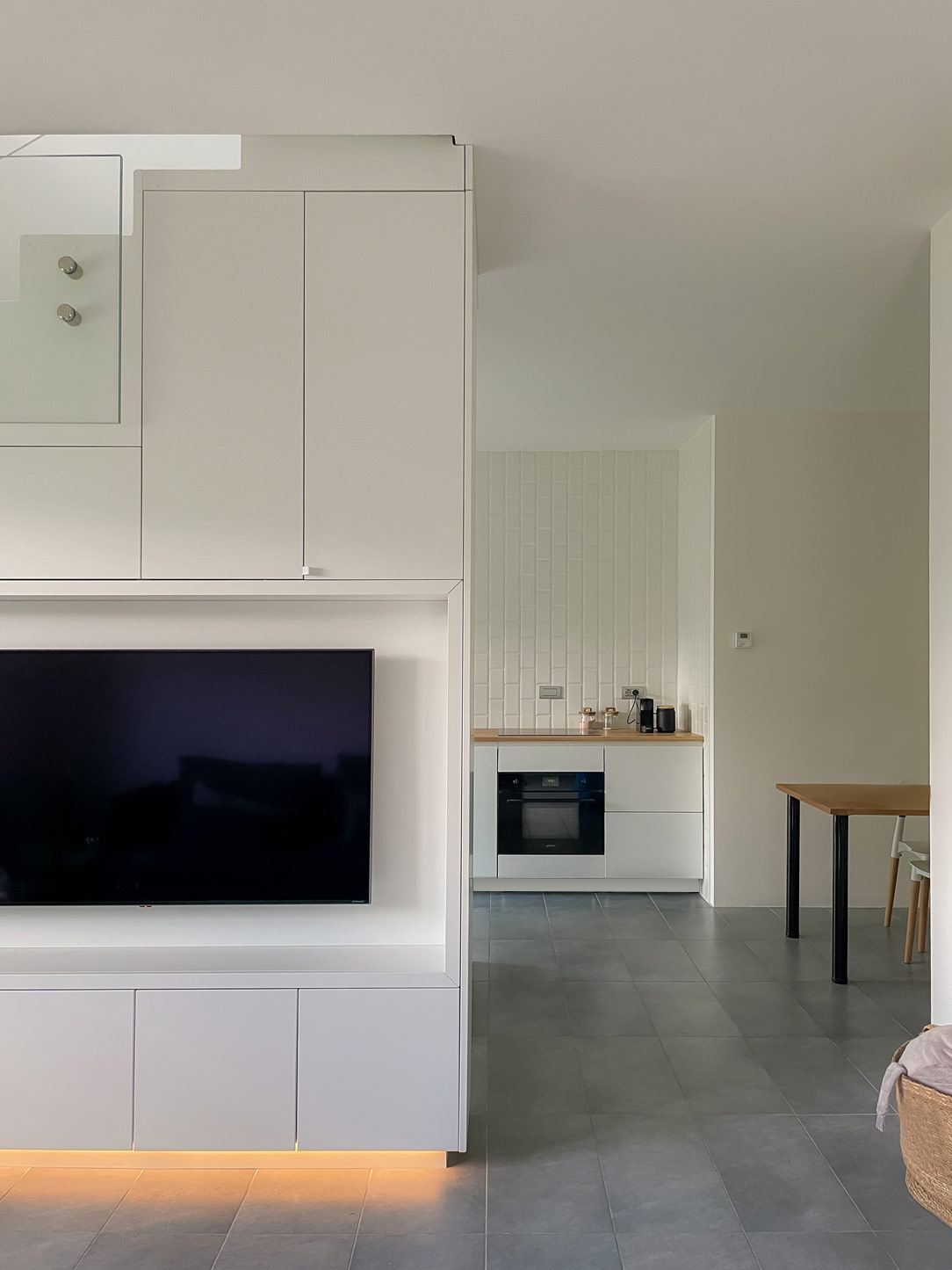
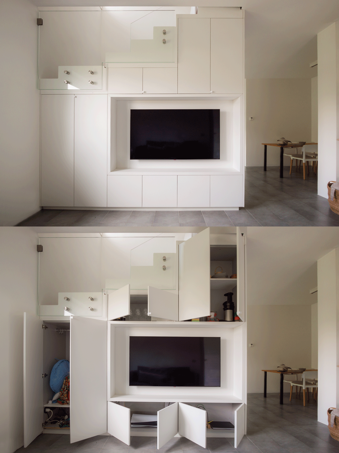
Upon entering the living area, the eye is drawn to a free-standing sofa against the wall with a slim high shelf in white lacquered sheet metal, contributing to maintaining a sense of openness and lightness. The frontal TV cabinet, acting as a partition between the kitchen and the living room and supporting the staircase, is an example of well-thought-out storage and organization element. Shaped on the steps, it contains well-studied doors and shelves, utilizing every available centimeter. A true demonstration of how minimalism can be functional. 

kitchen living room dining table
minimal living room
Tv cabinet open and close
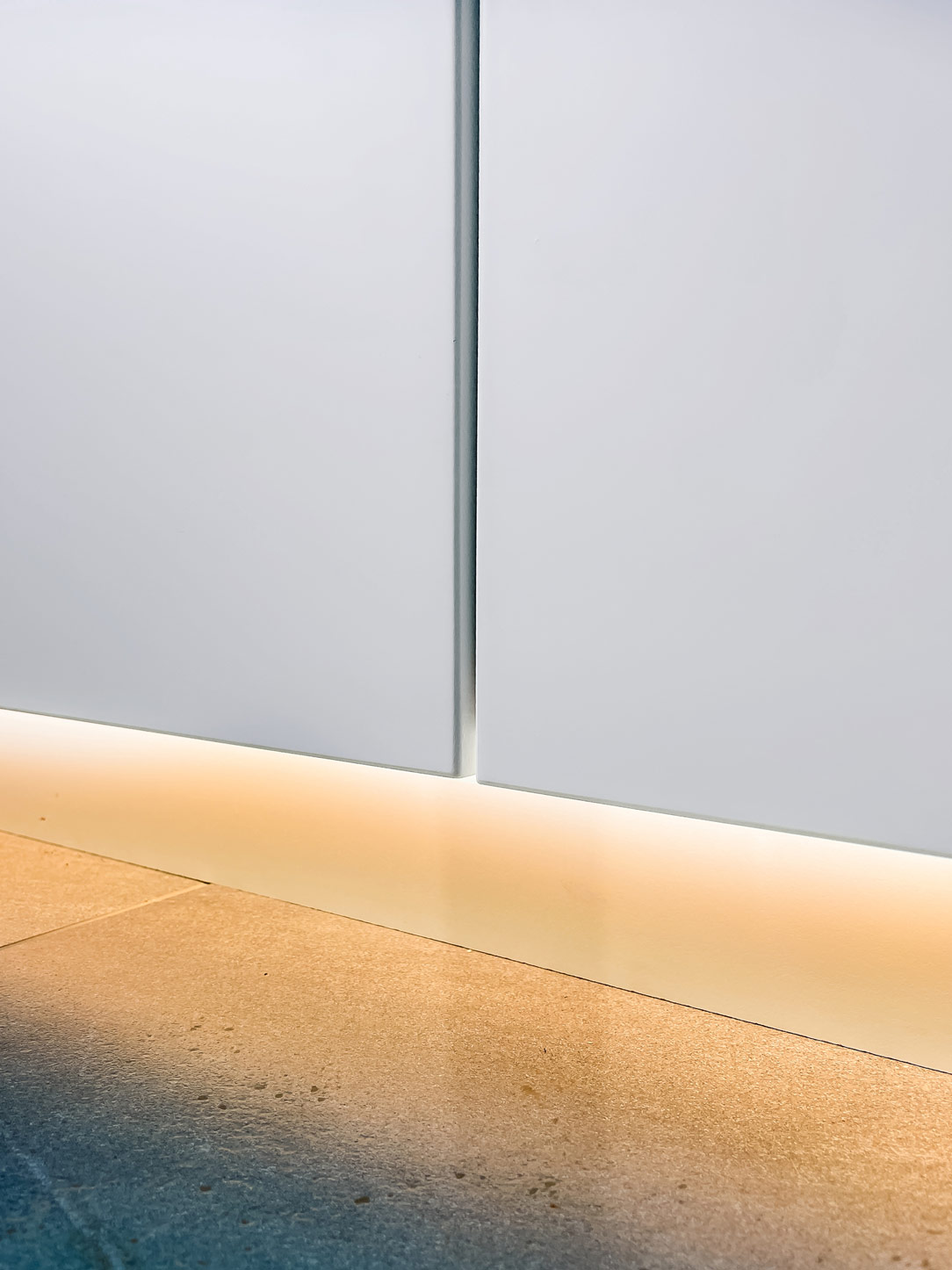
lighted cabinet
lightweight sheet metal shelf

MINIMAL MULTIFUNCTIONAL FURNISHINGS

In conclusion, the entire apartment is an example of how multifunctional furnishings with a minimalistic spirit can optimize spaces without weighing them down. The most storage-intensive elements are integrated into the staircase support, while the upper part, thanks to glass handrails, rises transparent and luminous.
Everything around this central monolith of furnishings is essential, allowing to enjoy an airy, bright, tidy, and aesthetically satisfying environment. Living in a compact space does not imply sacrificing comfort and style.

Here’s another example of a minimal multifunctional apartment.

Corner kitchen with peninsula: shades of grey and wood

Corner kitchen with peninsula: shades of grey and wood

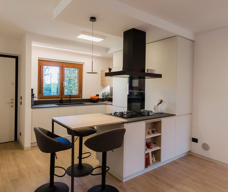
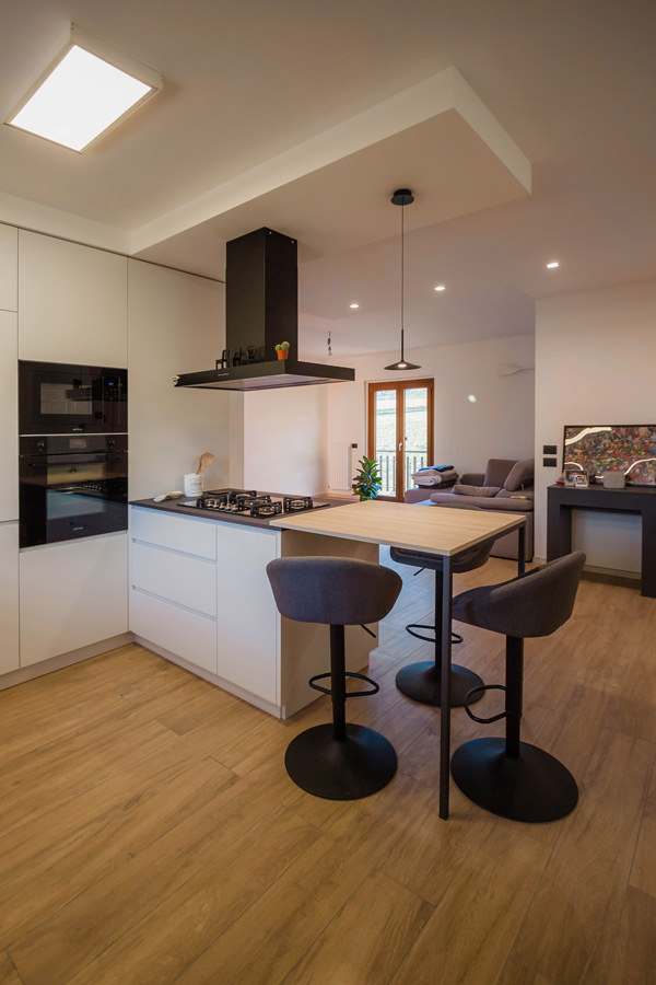
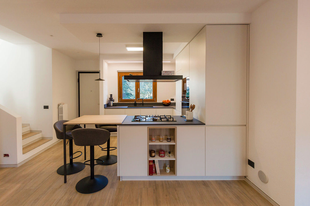
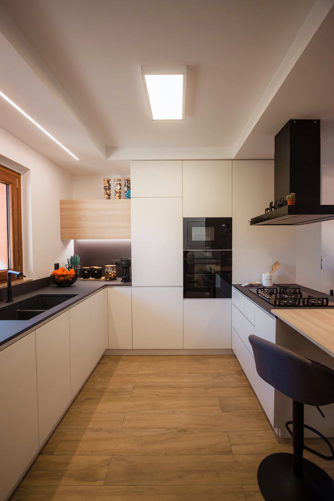
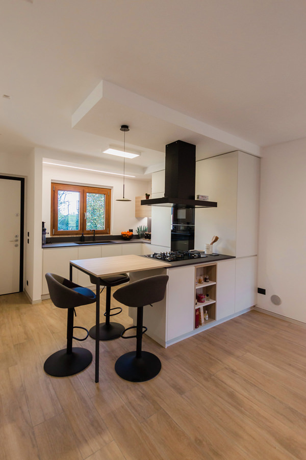
A corner kitchen with peninsula takes centre stage in an open-space obtained from the renovation of a flat. Different shades of grey marry the wood of the snack top and wall units, which is also echoed in the detail of the shelves compartment communicating with the living area.

corner kitchen with peninsula animation small opening

Conformation of a corner kitchen with peninsula: between snack top and double-sided use

Before the renovation, the kitchen followed a corner shape within a confined room.
A separate room with side access, adjacent to the main door.
By knocking down two of the partition walls, it was possible to create an open space with the advantage of generating a brighter and visually larger room.

By following the existing electrical and plumbing arrangements and making only a few changes to the systems, the new kitchen has thus taken shape, expanding its development to embrace the living area.
Starting from the original corner shape, it then added a peninsula part that houses a hob and snack corner for a functional and youthful kitchen.

Corner kitchen with peninsula open drawers snack top
Corner kitchen with peninsula closed drawers snack top
Corner kitchen with peninsula shades of grey oak wood open compartment

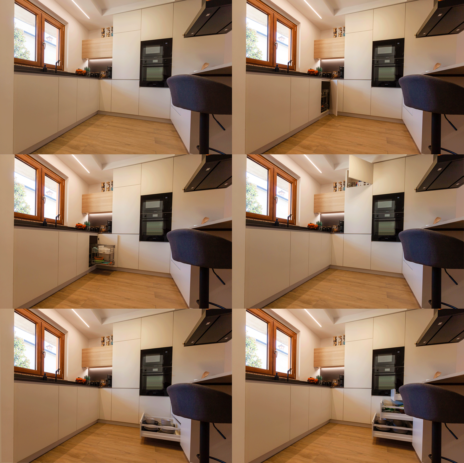
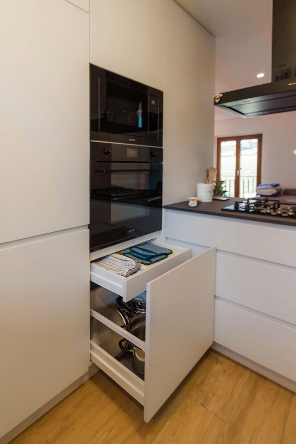
Column ovens, built-in refrigerator and pantry column are located along the side wall, from which the peninsula with double-sided access then develops.
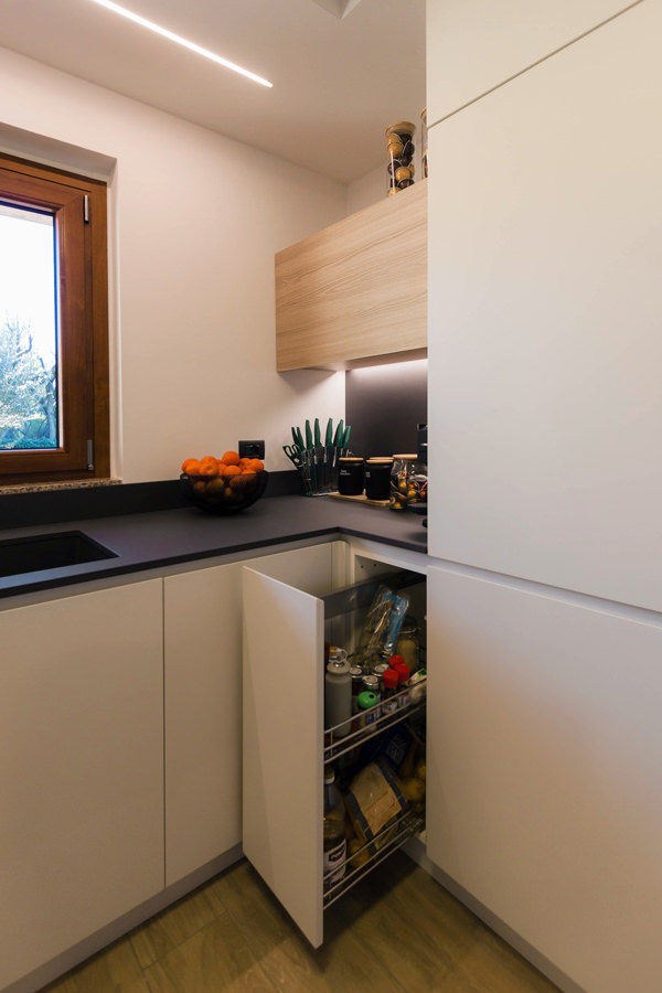
Adjacent to the ovens is the lower base unit, which also embraces the adjacent wall with a window and ends in the entrance storage wall. Next to it are the built-in dishwasher and the doors with fitted sink and pull-out corner.
The narrow 30 cm wide door on the other side is nothing more than a front pull-out for storing spices and condiments.
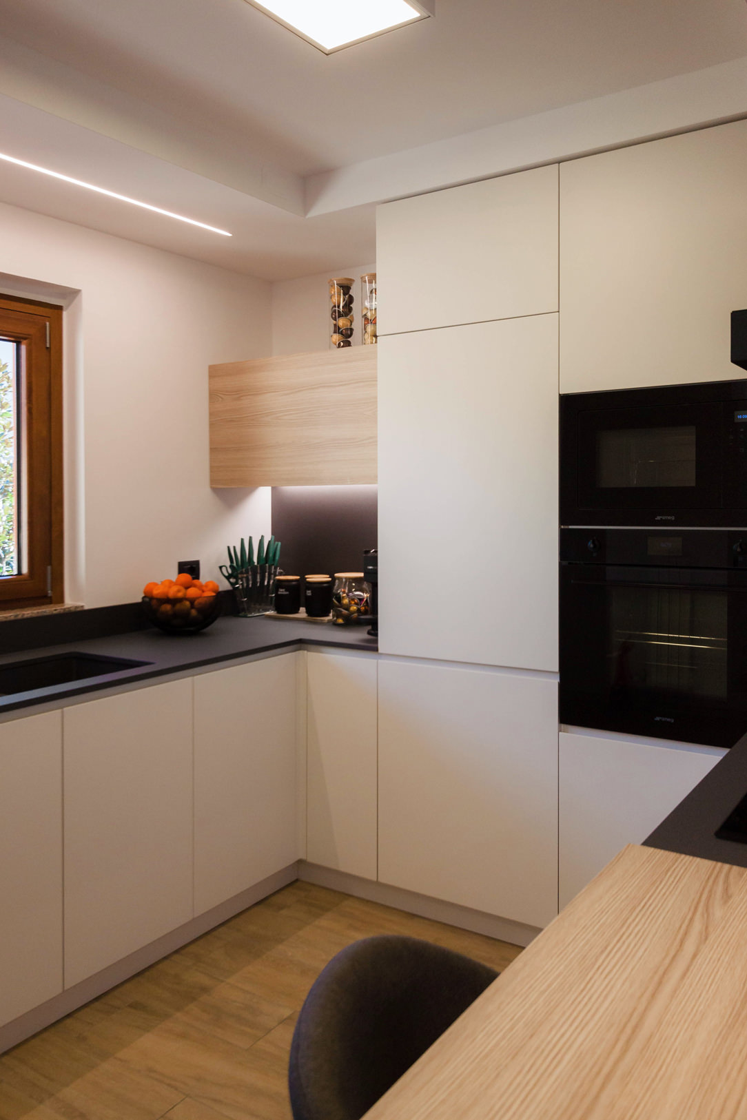
The upper wall unit with lighting underneath acts as a visual closing element providing additional storage space.
Completing the oven column is a storage drawer and door with a push-open top.

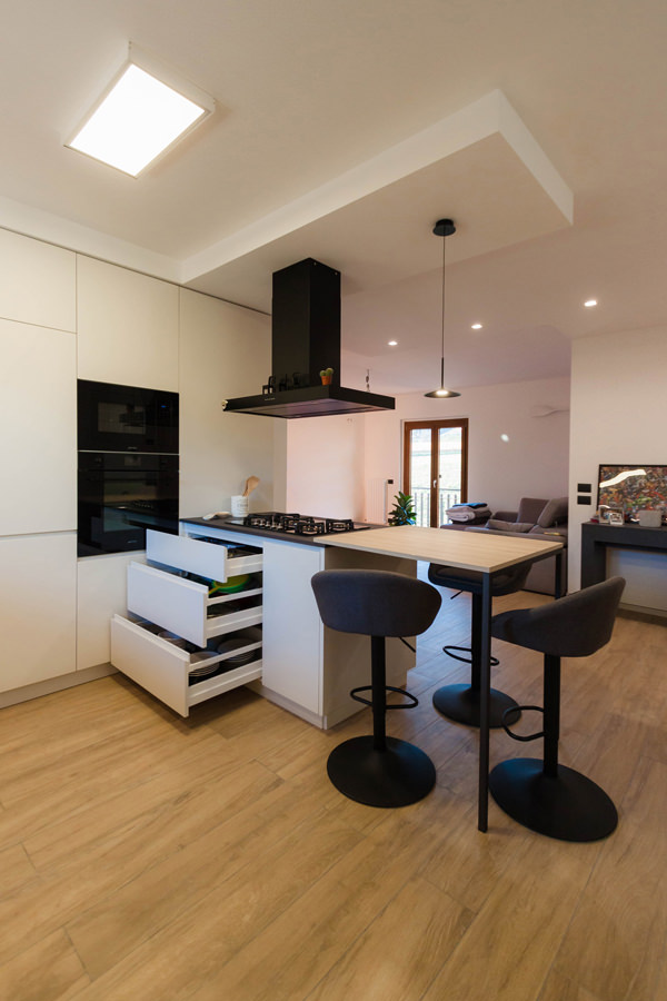
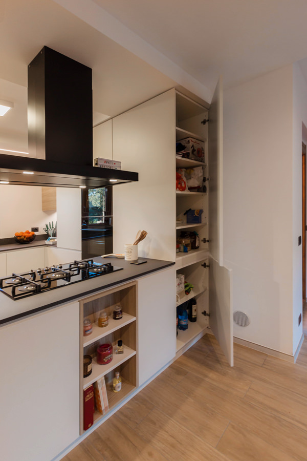
The larder unit with its large depth is accessible from the living area, making it more practical and functional.
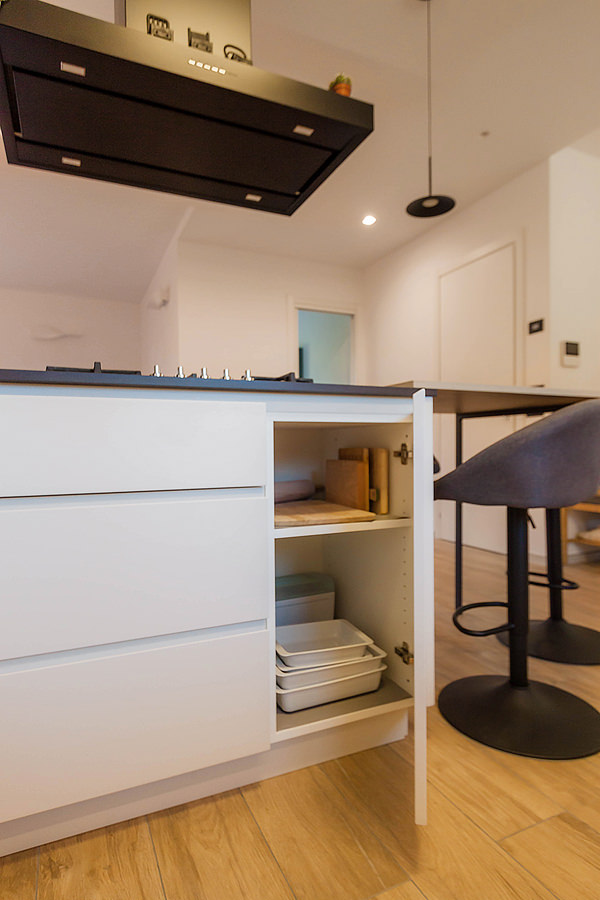
The peninsula is structured in the same way with double access, with drawers of different heights on the kitchen side and doors with small glass shelves on the living area side.
The open compartment facing the living area is instead arranged centrally.

internal composition of under-oven drawers
removable inner composition front spices
interior composition door shelves
extractable internal composition front spice detail
Corner kitchen with peninsula oak grey tones
double-sided opening peninsula pantry 01
double-sided opening peninsula pantry 02

Materials, finishes and colours: between shades of grey and light wood

Elegance and freshness are expressed through a colour palette of neutral tones of grey, anthracite for the kitchen top and ice for doors and shells, combined with oak-effect inserts to convey a sense of naturalness.
Different shades emphasise the volumetric development of this corner kitchen with peninsula through a series of combinations and joints.

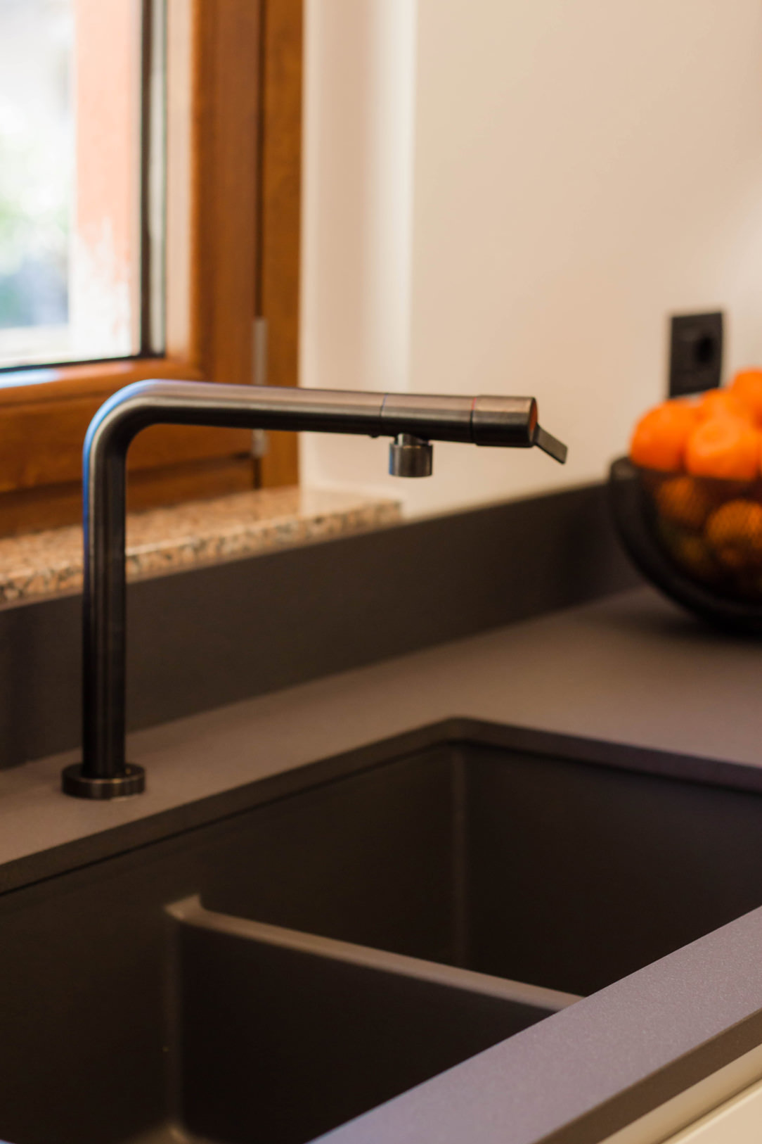
The top in Lapitec Anthracite with Lithos finish gives a uniform yet textured appearance, which is matched by the undermount sink in Stilgranit Blanco
Also in dark anthracite tones is the essential structure of the snack top.
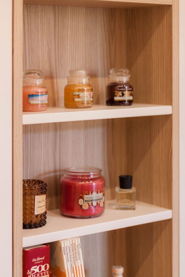
The latter features an oak-effect laminate top with a warm and cosy feel, which is also used for the wall unit with drop-down opening and the open compartment in the peninsula.

A refined detail is the overlapping of the snack top with respect to the worktop, which creates a visual detachment and also acts as a supporting element for the top itself.
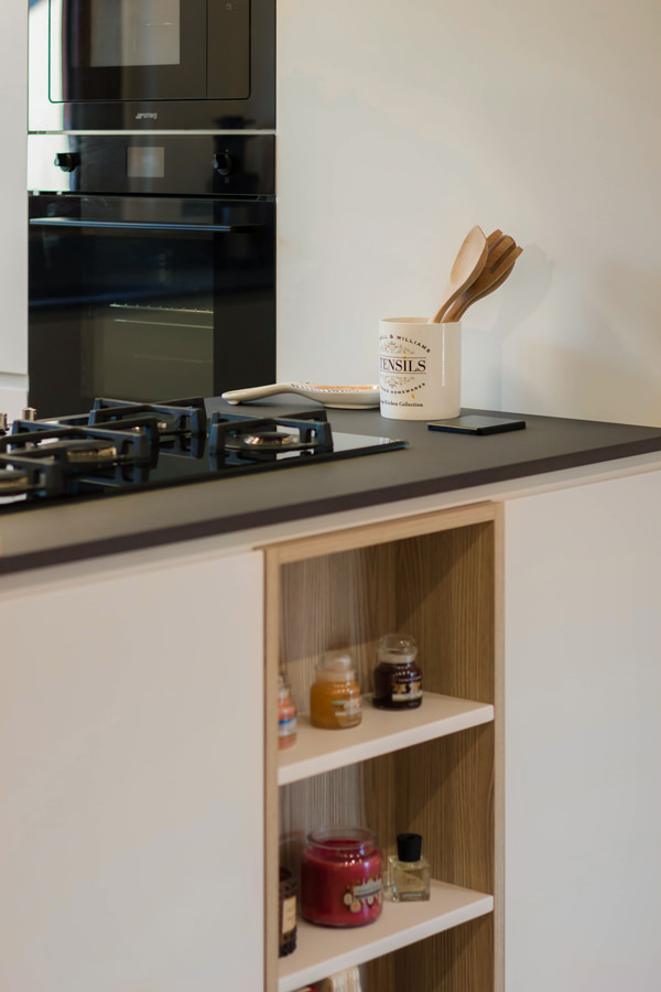
Completing the colour choice are the appliances and accessories. The ovens and gas hob in black ceramic glass echo the Falmec island hood and mixer tap.
Different materials united by the same total black aesthetic line.

Added to these is a delicate hanging lamp positioned above the snack top that provides functional lighting while respecting its minimalist aesthetic impact.
Minimalist visual lines with 45° shaped door and drawer grooves complete the whole.

Corner kitchen with peninsula in shades of grey lacquered doors oak wood top anthracite
materials and colours Lapitec top anthracite grey undermount sink
materials and colours Lapitec anthracite grey top
materials and colours open compartment wood oak effect 02
materials and colours gas glass ceramic hob black
materials and colours glass-ceramic ovens black

A corner kitchen with peninsula is recognisable by its elegant and youthful aesthetics through refined attention to detail. Functionality and openness become the keywords for a renovation that turns the aesthetics of the house upside down.  See more kitchens in light grey: a contemporary-style basement and a contemporary attic with glimpses of the past.