When a white kitchen with an island becomes a functional element of a youthful two-room apartment

When a white kitchen with an island becomes a functional element of a youthful two-room apartment

In the centre of Milan, a youthful flat is spread over two levels, welcoming a white kitchen with a functional island in the centre. On the upper floor, the elegance of total white is accompanied by a niche wardrobe with mirrored doors that amplify the perception of the sleeping area. Practical elements with linear and elegant aesthetics that define the look of the entire flat. Let’s discover together this realisation designed by architect Stefano Belotti!
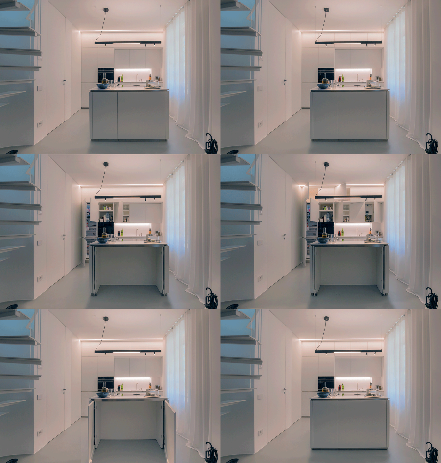
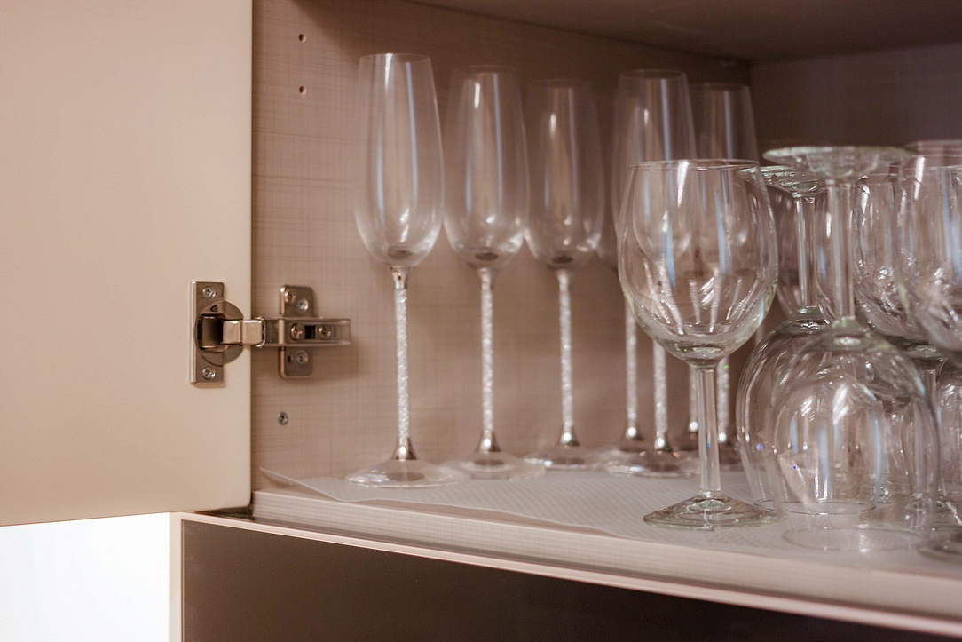
Opening doors white kitchen with island

A white central island dominates the kitchen area

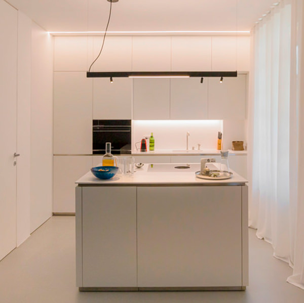
Upon entering the flat, with its small but practical dimensions, the view is projected onto the kitchen, the layout of which makes full use of the available height with storage compartments. Acting as a visual filter, but at the same time as a functional element for the cooking area, is the central island that echoes the white aesthetics of the kitchen.

The worktop, in matt white Corian, becomes not only a work surface, but also a convenient snack top for aperitifs and quick meals.
In this respect, the folding mechanism that allows the (future) service stools to be concealed plays a key role.
The front closure panels, in fact, rotate sideways to then be incorporated into the main structure and almost completely disappear.
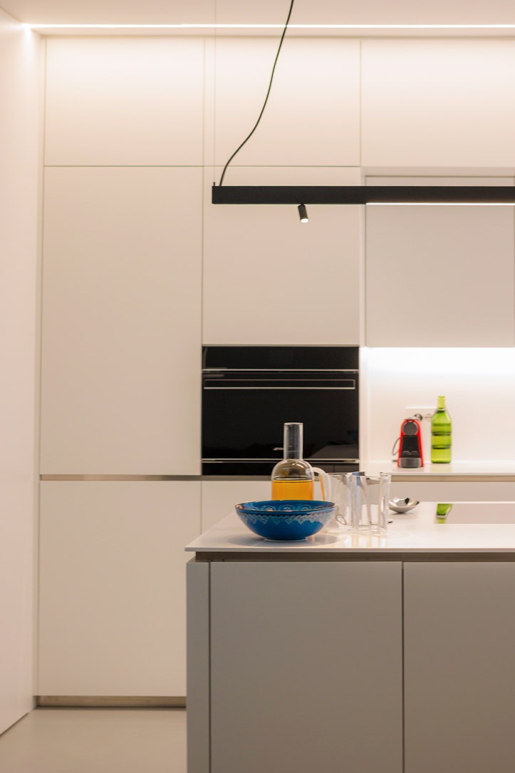
white kitchen with island oven combination column
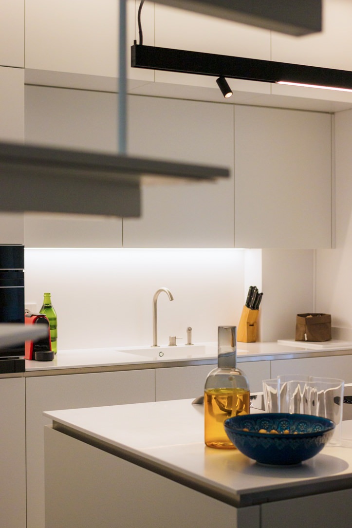
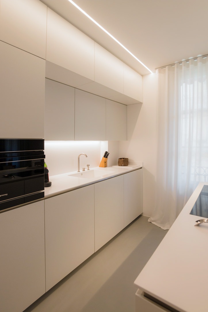
white kitchen with island wall units integrated lighting
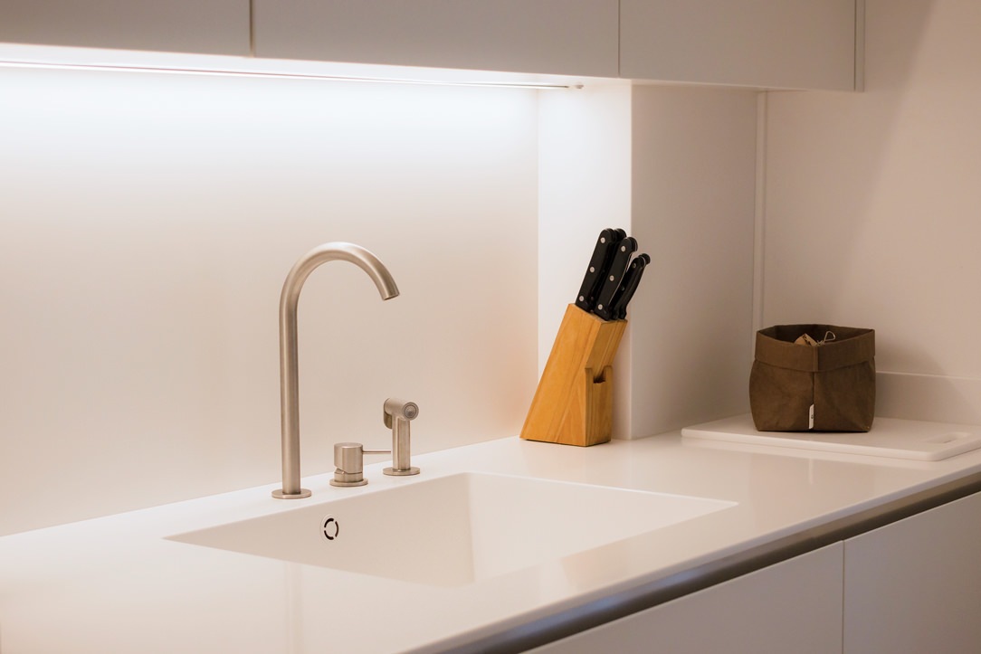
detail Corian worktop integrated basin aluminium mixer
aluminium chain Corian top
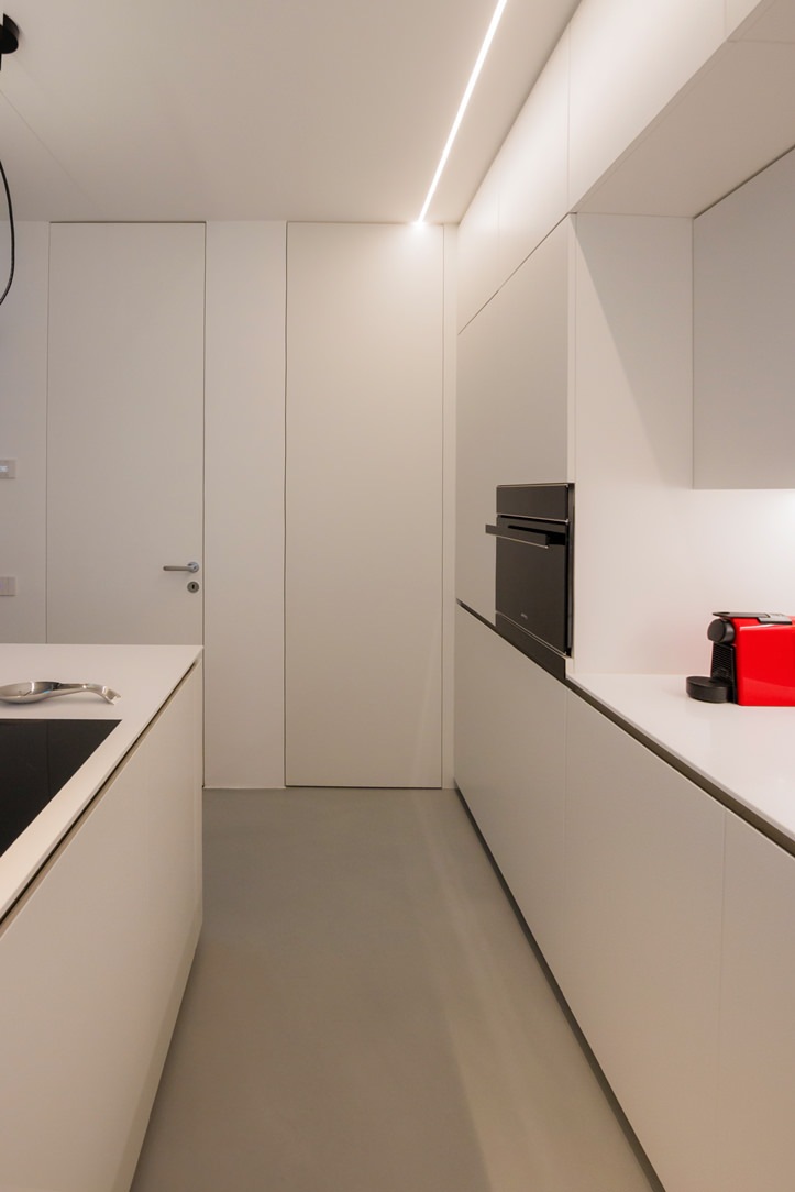
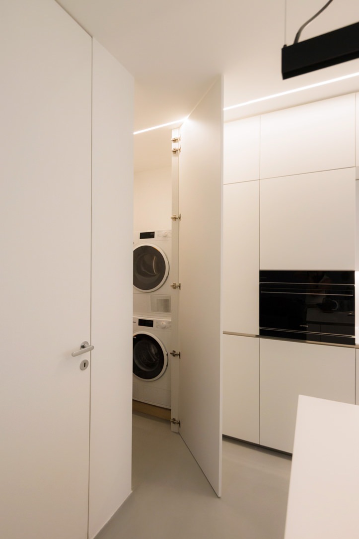
white kitchen with combined oven island hidden door laundry area

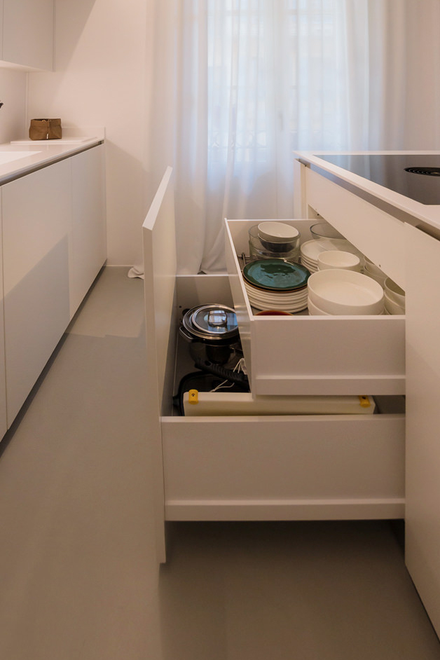
The volume of the island consists of front-extension doors with internal drawers of different heights.
A solution that has now become predominant in the recently concluded edition of the Salone del Mobile, as well as clearly recognisable in previous editions.
The main advantage is certainly the more elegant and minimal aesthetics, in which horizontal cuts resulting from the division into drawers are eliminated in favour of a single door.
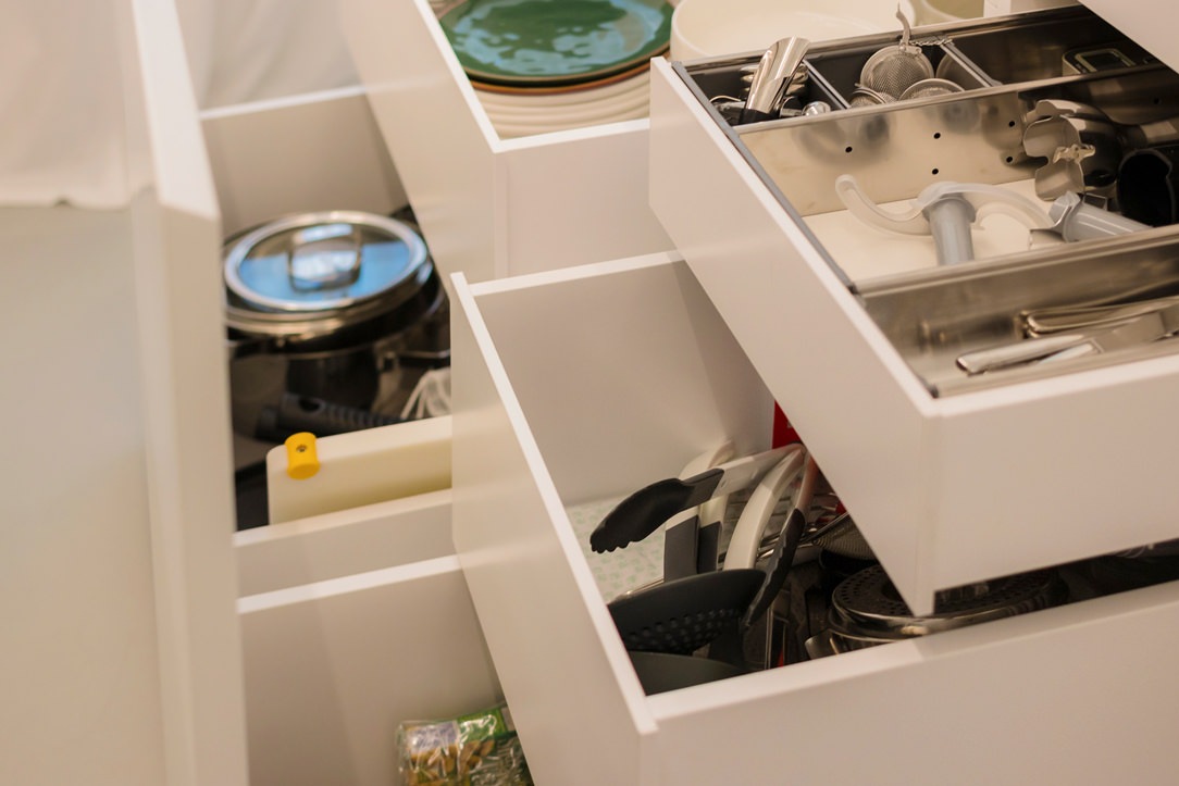
detail of internal drawers in white lacquered kitchen with island

From the wall unit to the laundry corner: functionality marries total white aesthetics

The adjoining wall unit is made up of multi-level volumetric plays.
The service columns, incorporating the built-in refrigerator on one side and the combi-oven to its right, are accompanied by compartments with hinged doors that extend across the entire upper part of the kitchen.
On the same depth level, matt lacquered doors with a dishwasher in the central area and internal shelves in the surrounding compartments.
The central area, on the other hand, is characterised by a break-out with worktop and sink, upper wall units with vertical partitioning and built-in lighting with a smaller depth.

To ensure the best functional configuration, the side wall to the kitchen and the central island accommodates a white lacquered door that covers the entire height of the room.
This conceals inside the laundry area with a washing machine and tumble dryer with columns accompanied by practical shelves for cleaning products.

The linear aesthetics are emphasised both in the choice of lighting, pendant above the white central island and LED strip lighting in the back wall of the kitchen, and also in the joining chain between the Corian top and doors below.
The material detachment through an aluminium profile becomes the horizontal reading element both for the back wall, joining the two side ends, and embracing the central island with kitchenette.
white kitchen with laundry corner island
White kitchen with island pull-out front drawer doors

A wardrobe with mirrored doors embellishes the sleeping area

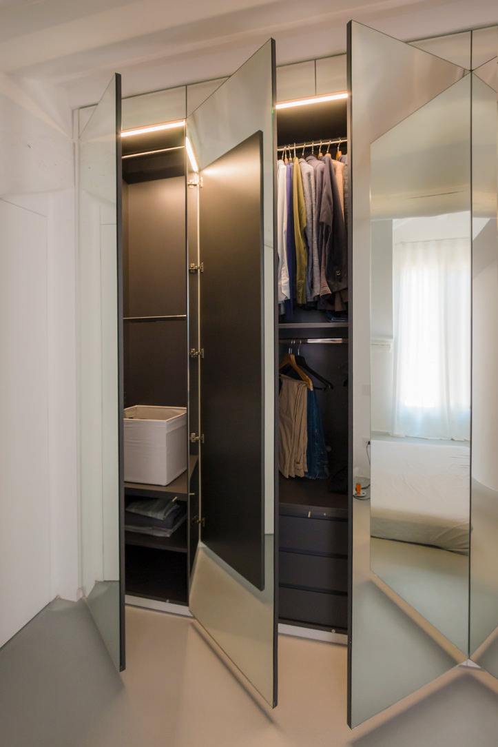
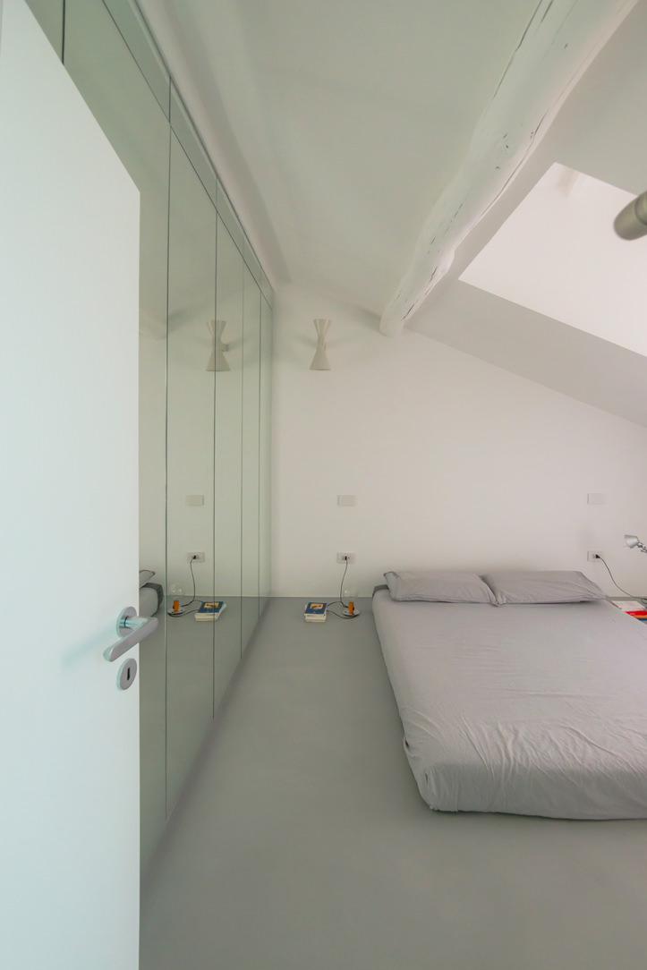
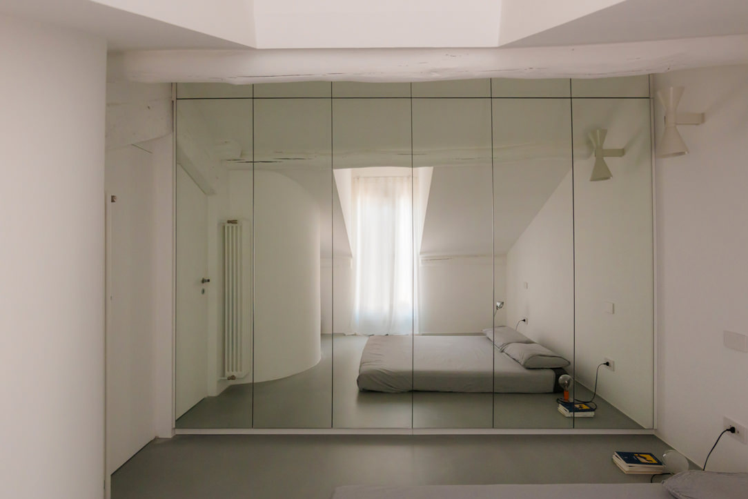
On the upper floor, accessible via a white painted spiral staircase, a wardrobe with six mirror-covered doors dominates.
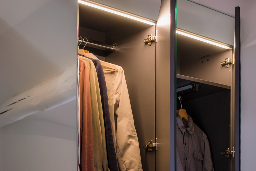
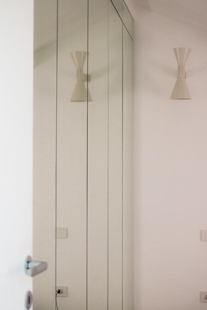
The rhythmic vertical division is interrupted by a single horizontal cut at the top, creating an interesting geometric subdivision in the overall aesthetics. The choice of mirrored doors on the one hand amplifies the brightness and perception of the room and at the same time enhances the overall aesthetics.

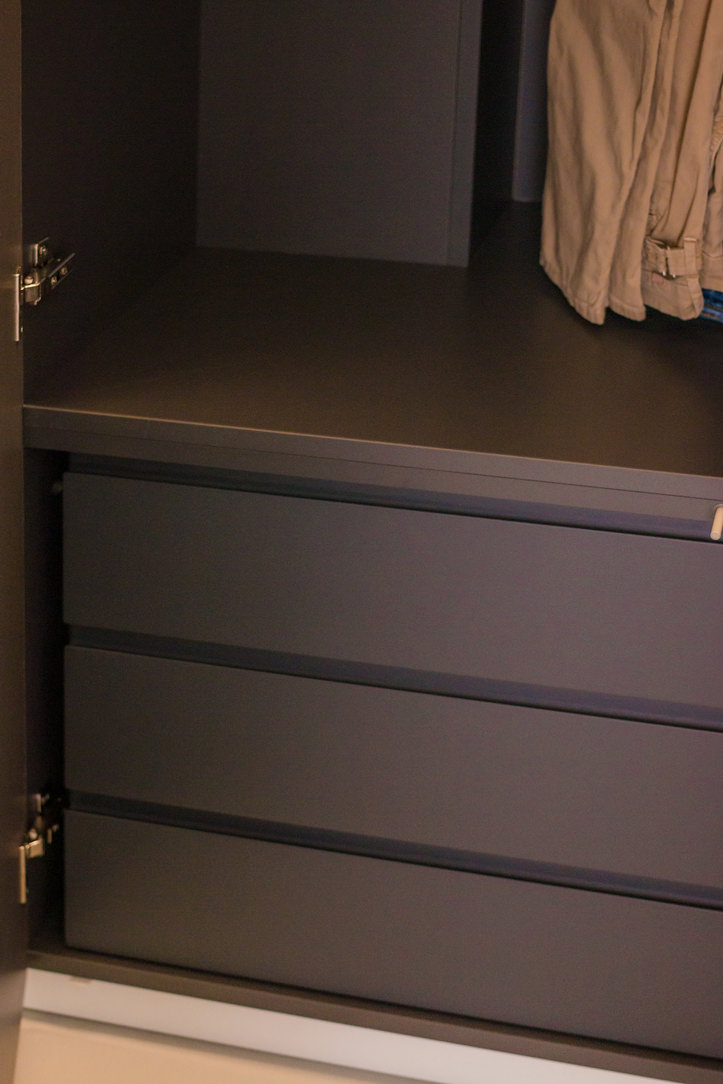
The division into six doors is reflected internally in a symmetrical composition with double central compartments accompanied by two single compartments at the ends.
Compartments with hanging tubes are favoured, but there are also internal drawers and adjustable shelves for better organisation of clothing.

If for the lower level the kitchen with central island favours a uniform white aesthetic, the sleeping area, on the other hand, marries contrasting aesthetics.
The bright exterior of the mirrored doors is in fact contrasted by the elegance of a matt black whole on which the elegant chrome hanging tubes can be seen.
mirrored door wardrobe
wardrobe mirror doors dark laminate interior drawers
Niche wardrobe with dark interior mirror doors
detail mirror cabinet doors interior lighting
two-room mirror-door wardrobe
detail of mirrored wardrobe doors in niche

The choice of a total white kitchen is always a contemporary and elegant solution. Its simplicity makes it easily adaptable to the surrounding context, whether it has a retro feel, as in this example, or contemporary pop, as in this realisation. It can also be combined with natural wood elements, such as chopping boards and snack tops, thus adding a hint of warmth, here’s an example! Or exploit plays of opacity and shine through different materials, making the room look fresh and bright, perfect for seaside homes!

THE FURNISHING OF A TAVERN IN A CONTEMPORARY STYLE

THE FURNISHING OF A TAVERN IN A CONTEMPORARY STYLE

The interior design of the taverns with the passage of time requires small retouchers to return to their original beauty and allow the owners to rediscover that desire to fully living the space. Here the case of a tavern adapted in a contemporary style.

Modern wooden table tavern

THE TAVERN

The tavern is a home environment that risks not to being exploited to the fullest, especially if it is used as a second living area. However, what makes it different from the traditional living area is an intrinsic intimacy that makes it the most welcoming place in the whole house. How many people immediately think of the tavern when they have to organize a dinner with friends? Or when they want to enjoy a bit of tranquility, how many of them are isolating themselves in the company of a good book in their relaxing corner? Precisely for this reason the tavern can be elected as the most convivial and intimate place in the house, although its furniture must always be functional and in line with the other environments.

Kitchen tavern table lights

the living area connects to the kitchen, an equipped floor divides them.

FIREPLACE

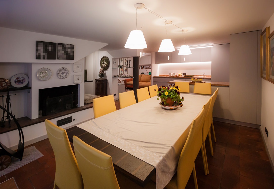
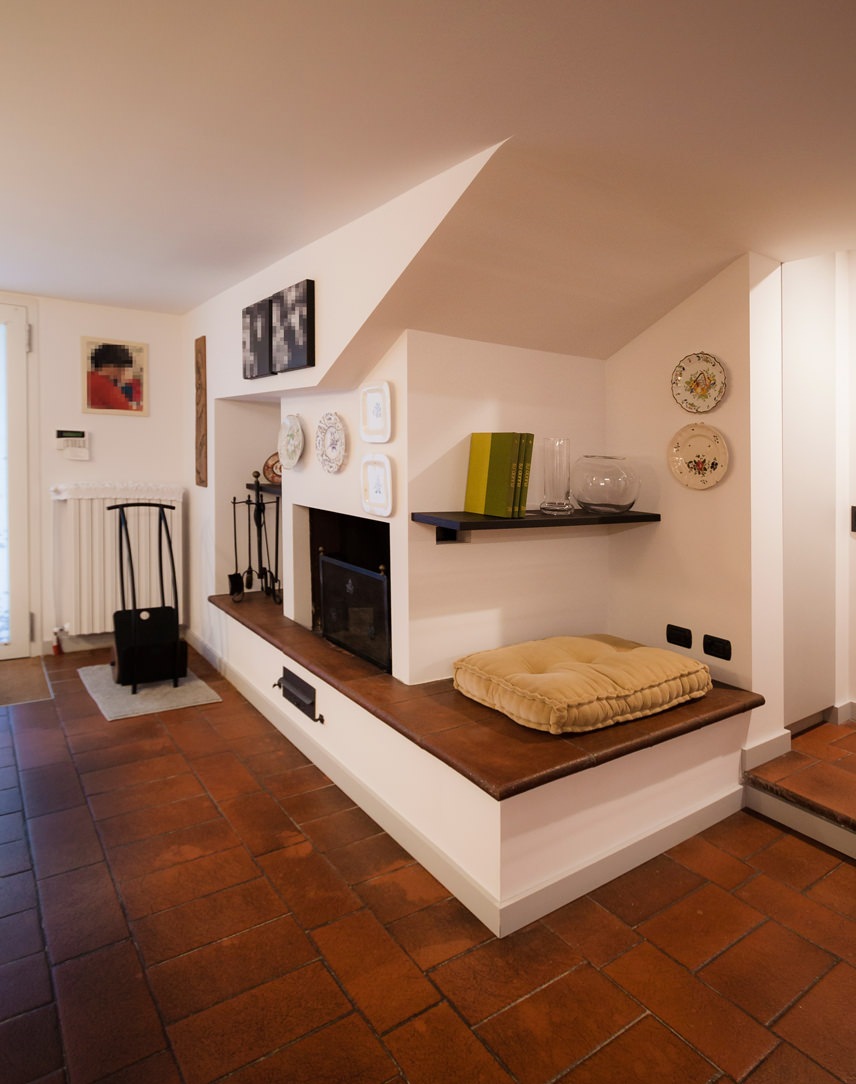
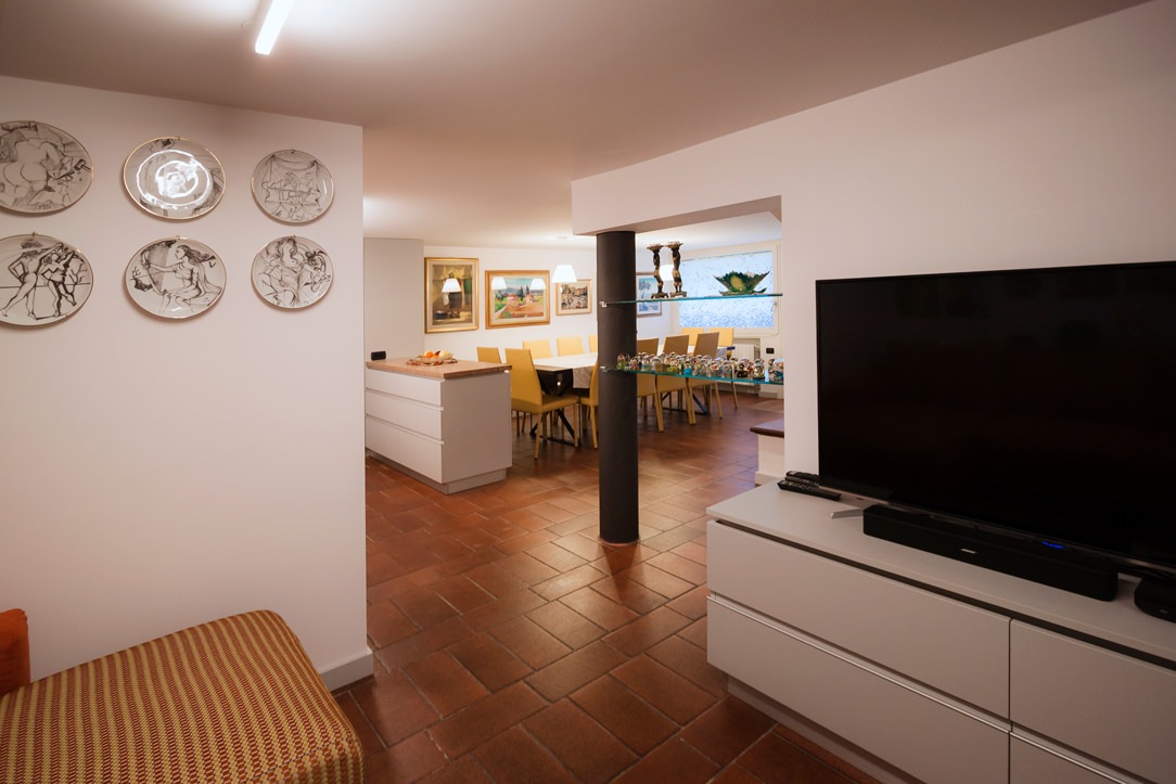
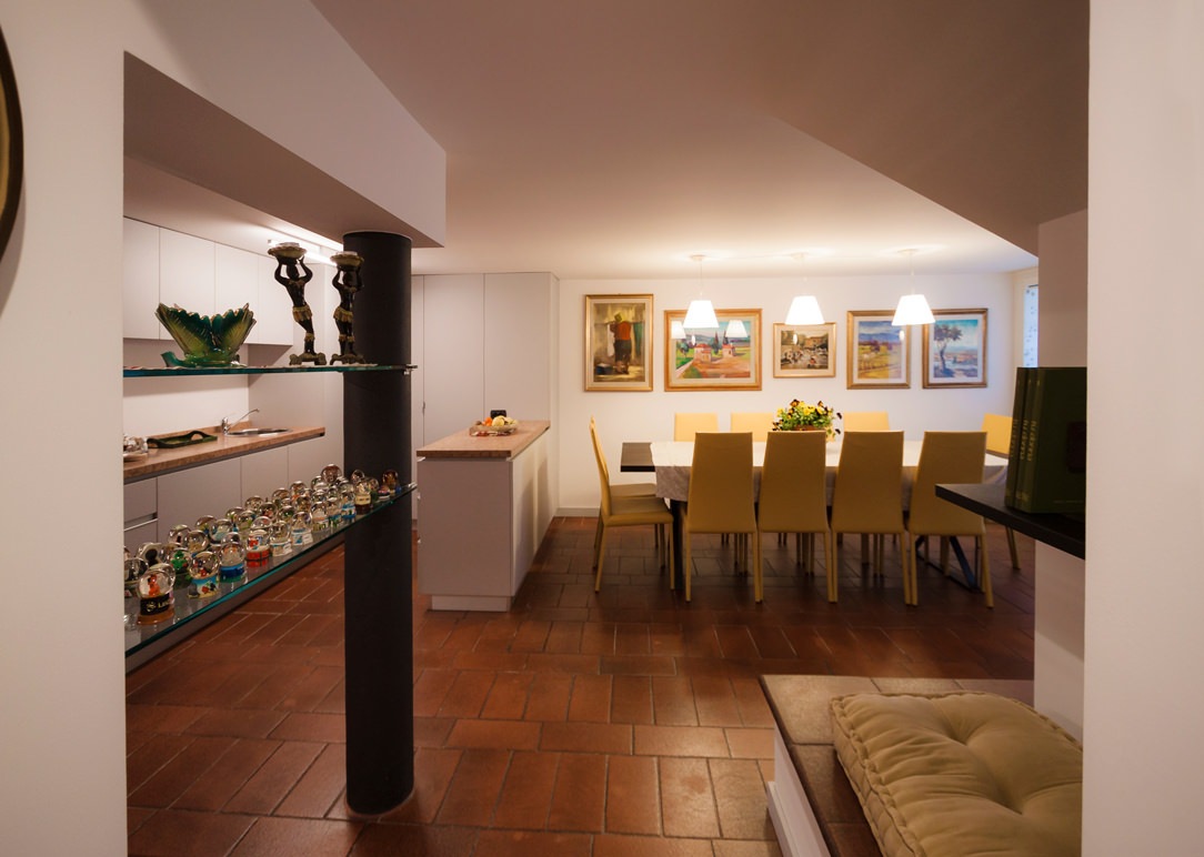
As already mentioned in the article dedicated to Hygge, a fireplace or a wood stove are elements that can best convey warmth and intimacy; usually the fulcrum of the environment in which they are located are the perfect places to spend time chatting with loved ones and a hot tea or a good glass of wine in your hands. In the case of this renovated tavern in a contemporary style, a large fireplace becomes the focal point of the entire living area. It also acts as a connecting element between the living area of the apartment, located on the ground floor, and the exit to the courtyard. The terracotta floor take up the choice of keeps the materials of the rest of the house. This also covers the raised base, becoming both a seat and a support surface according to the different depths. A large cushion makes it even more comfortable to use, welcoming a comfortable reading corner.

fireplace e higgelig

THE DINING AREA

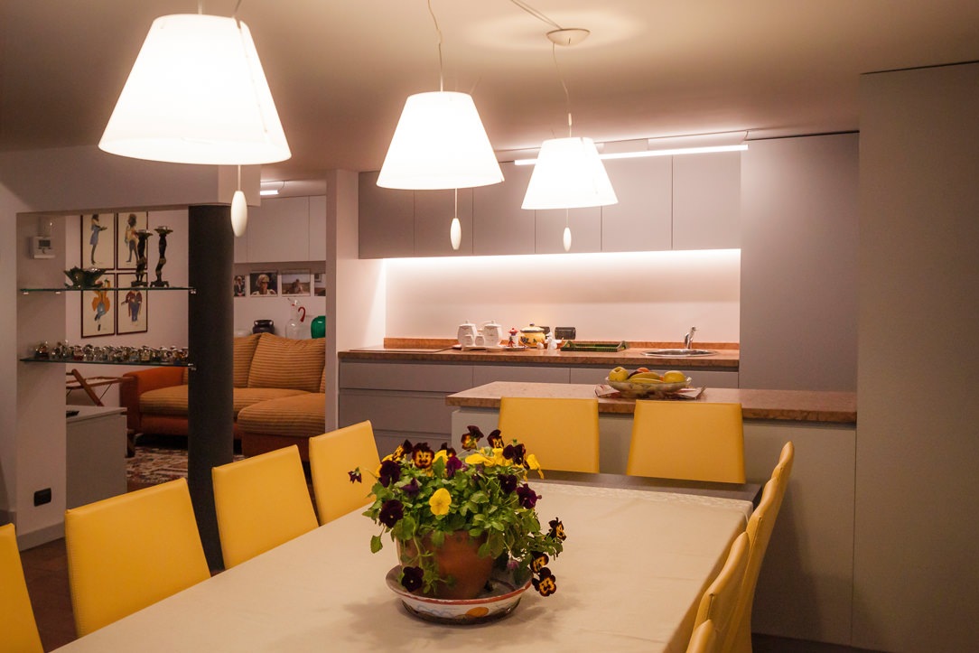
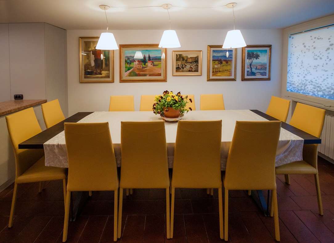
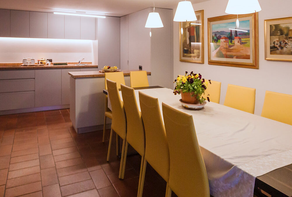
In front of the fireplace there is a large heat-treated oak table with warm veins and a simple and linear aesthetic structure (which we also find in this creation), with a light base in anthracite painted iron. Surrounded by lovely mustard-colored armchairs, it is able to liven up the environment and ready to accommodate up to 12 diners. To emphasize the warmth and intimacy of this environment, three pendant lamps mark a visual rhythm with their diffused and soft light. The new lampshade in a pure opal white amplifies the general brightness of the environment.

table lights in the living area
detail of the armchairs
drapery detail

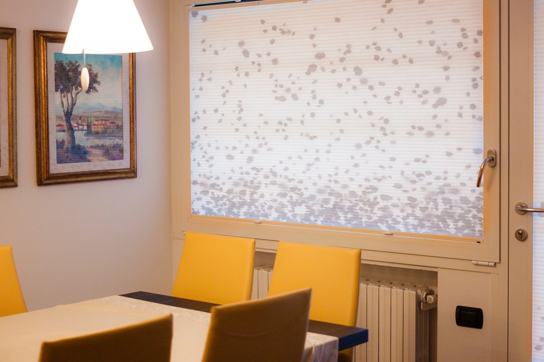
Details of the mustard eco-leather armchairs and double venetian blinds with gray “drop” decoration downwards.

THE KITCHEN

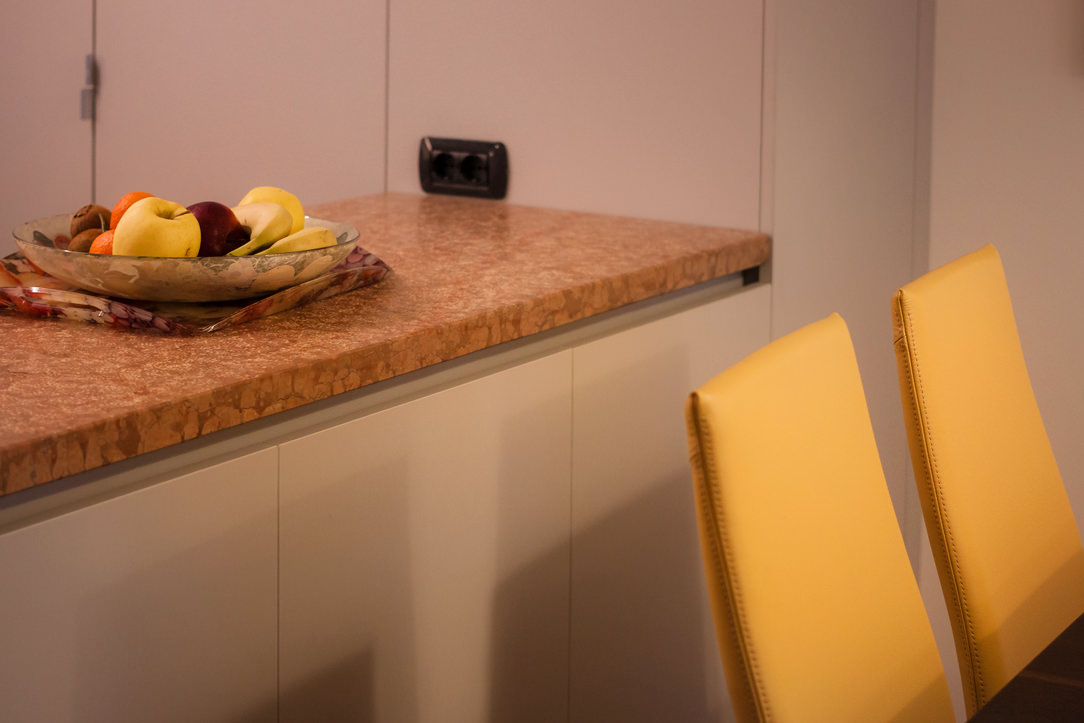
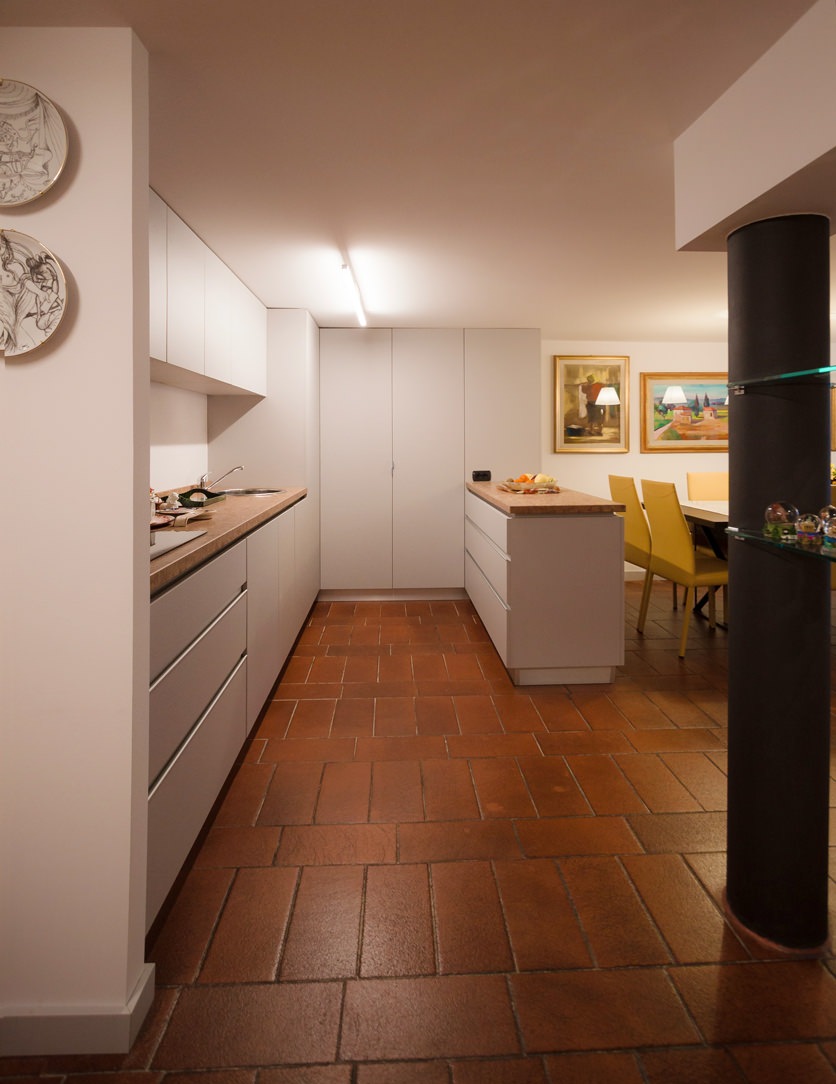
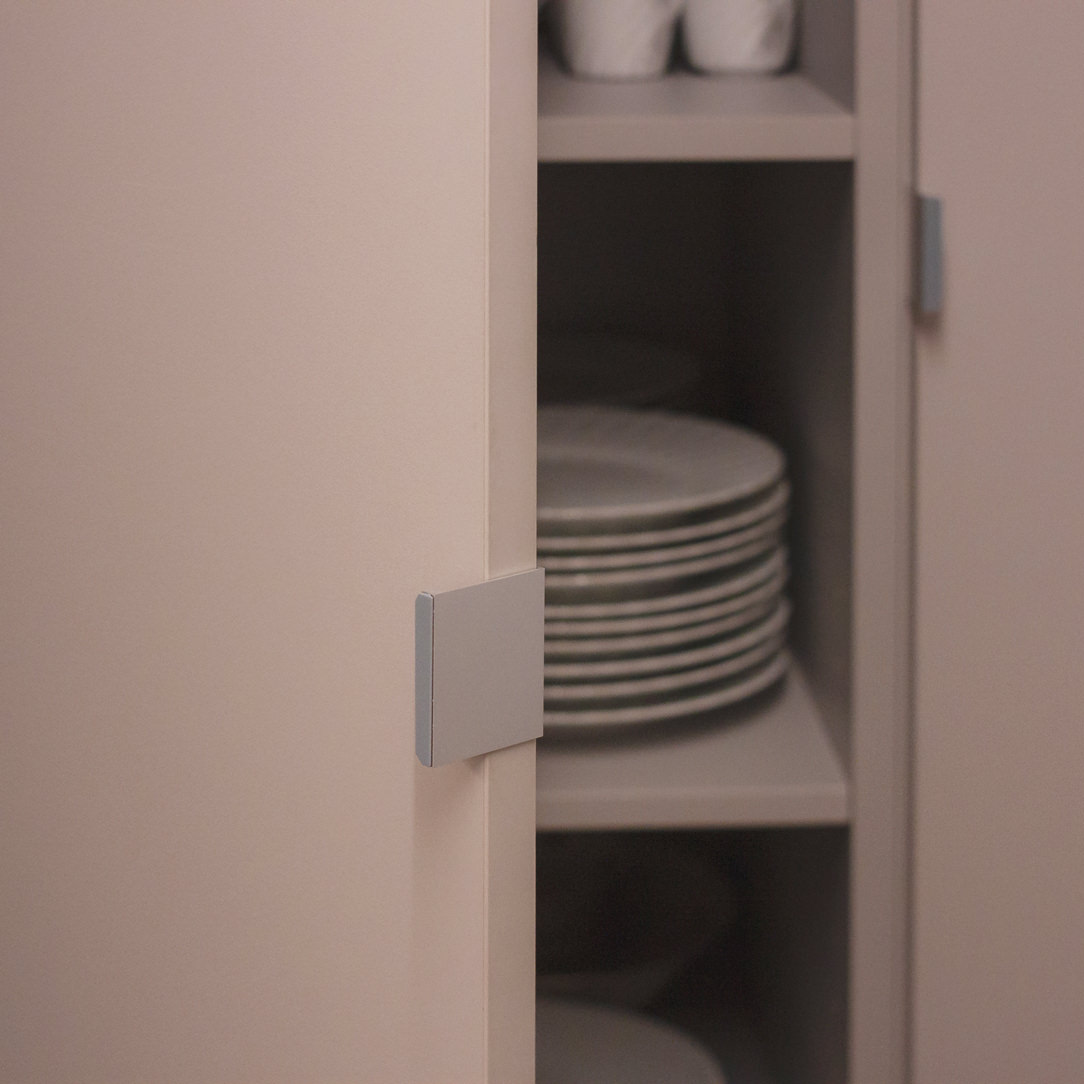
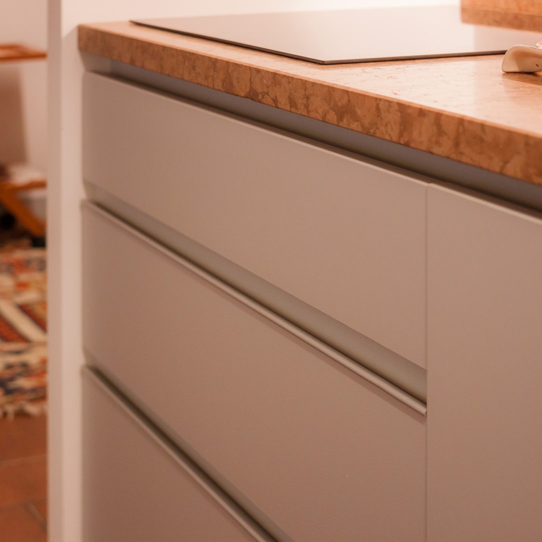
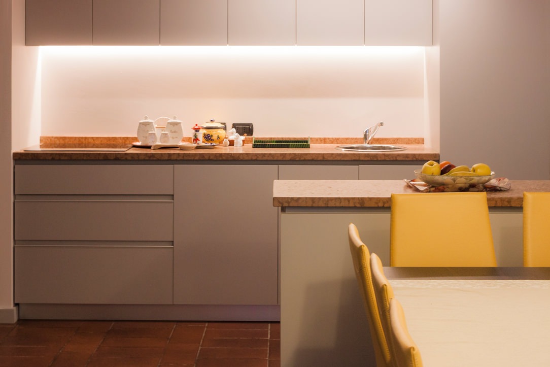
The kitchen changes position compared to the original plan and is an extension of the living area, facing the dining table with an equipped worktop, which can also act as a support surface. The floors, recovered from the originals in Rosso Verona marble, very distinctive and decisive, blend well with the terracotta floor. To stand out and at the same time make the marble more sober and elegant, the furnishings of the entire kitchen, as well as that of the entire tavern, are in a light gray with cold tones. The handles are invisible for the wall units, shaped to measure for the tall unit in the center while, as regards the base of the wall units, reinforced with an aluminum profile matching the color of the lacquering.

lateral kitchen
handles details
handles details
kitchen snack

The kitchen with its colors and the details of the different handles.

THE RELAXATION LIVING ROOM

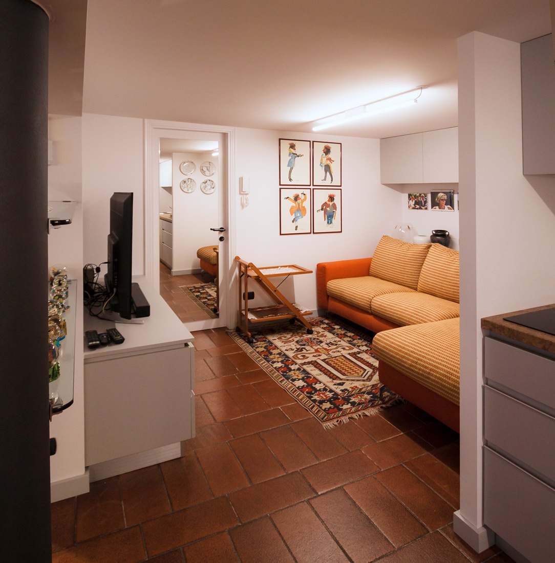
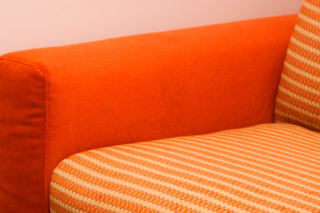
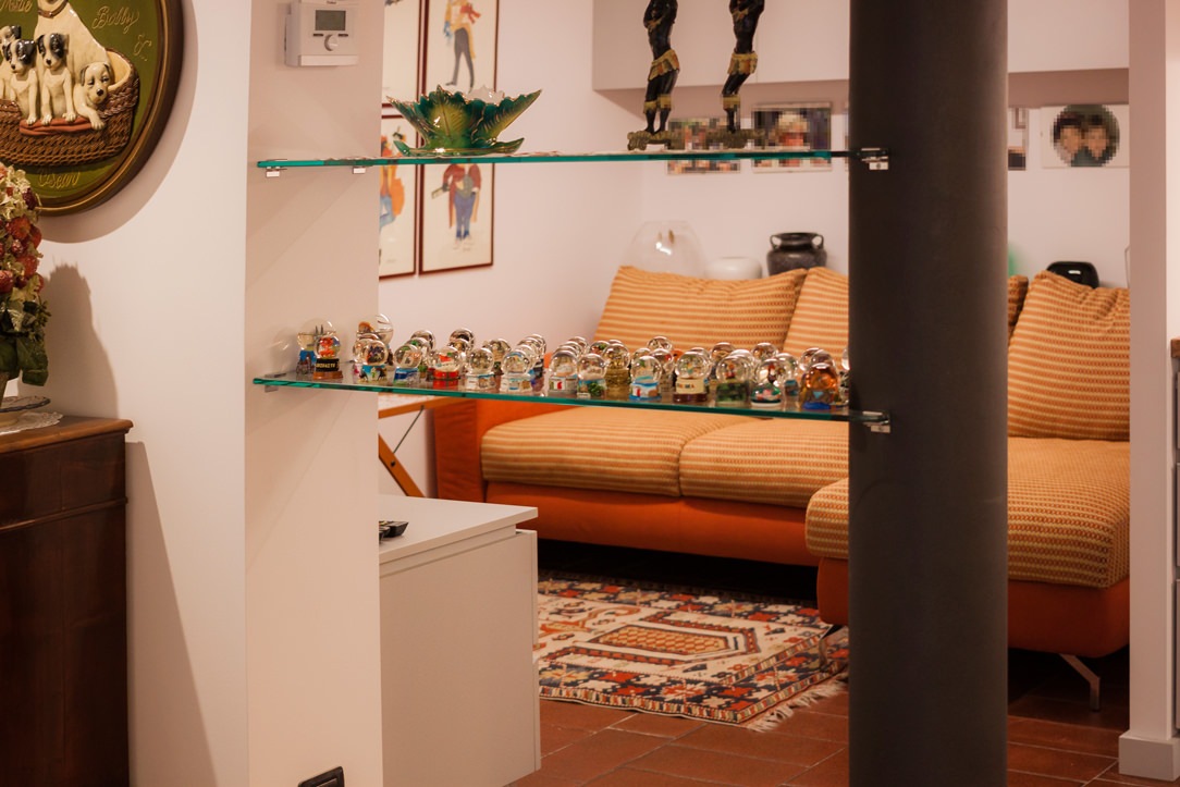
In the same finish as the kitchen, to maintain stylistic continuity, the TV cabinet in the relaxation lounge has also been lacquered, which is positioned in the most intimate and hidden part of the tavern. Reupholstered with a bright orange fabric, the sofa features cushions and backrests with refined pandance textures. The living room can be glimpsed at the entrance to the tavern, on the left, through glass shelves that cross the space to arrive, shaped, at the supporting column, painted anthracite like the legs of the dining table.

living room relax
textile details
zona relax
tv cabinet

THE FURNISHINGS OF THE TAVERN AT THE CONCLUSION

Furnishing the tavern means knowing how to convey sensations such as the sense of warmth, well-being and intimacy. It is important to develop the main elements in stylistic harmony with each other and in line with the rest of the apartment. If a tavern is dated and is left as such for too long, it risks losing its charm and becoming a second home cellar, in which stored unused objects.

tavern entrance

A bespoke wardrobe in the attic: sloping doors and large bookcases

A bespoke wardrobe in the attic: sloping doors and large bookcases

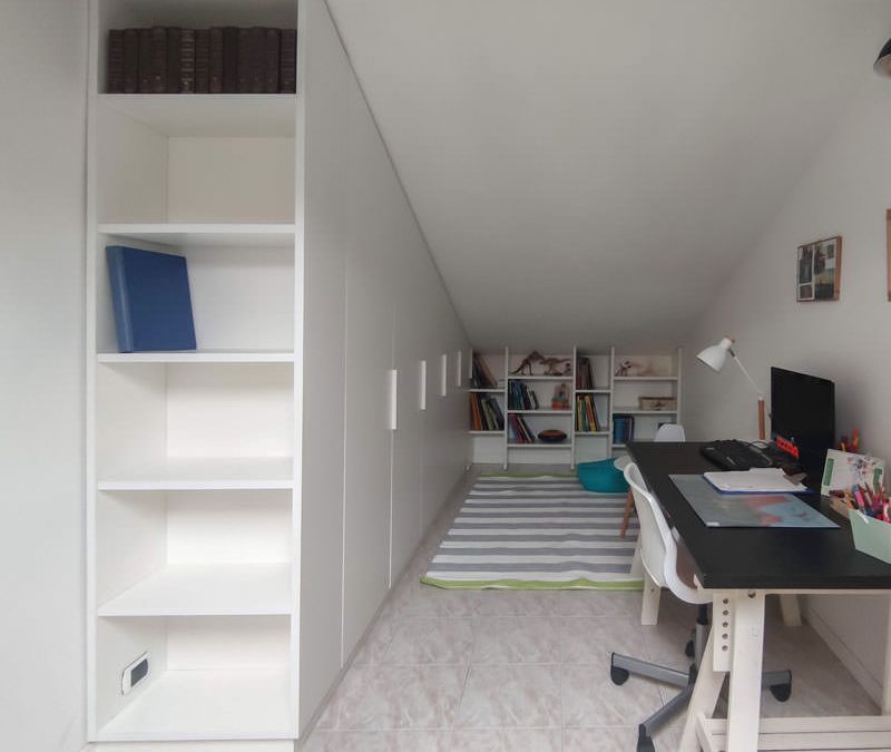
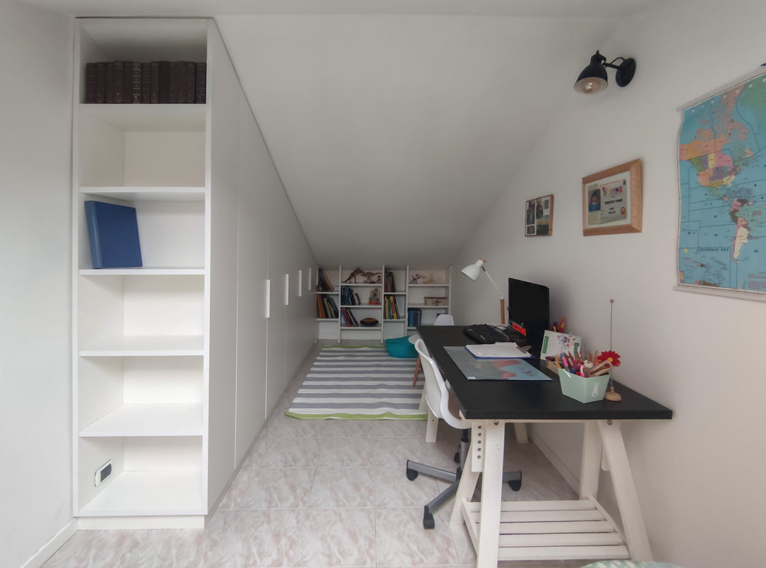
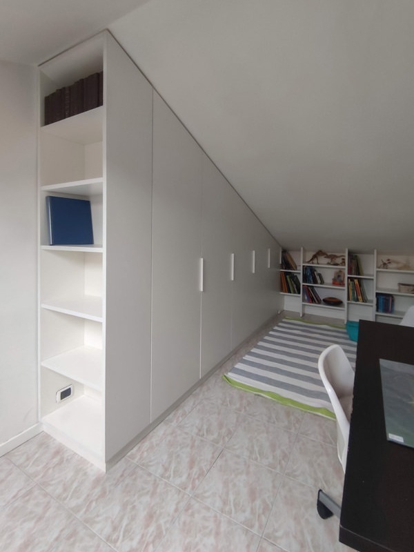
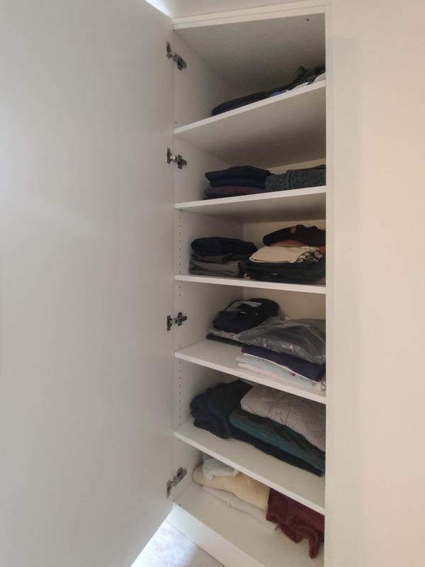
To make the most of the sloping ceiling of this attic, a large custom-made wardrobe is mixed between a functional element and a large bookcase. A hybrid furniture, usable internally for the seasonable wardrobe change, but linear in aesthetics to create a suggestive and small reading hall for our little client Francesco.

bespoke wardrobe attic sloping ceiling bookcase in front of sloping doors

Equip an attic with sloped ceiling with a custom-made wardrobe

The attic is the project environment with great aesthetic potential but with strong architectural design constraints.
The presence of a sloping roof creates different usability areas imposed by the different internal heights of the room.
In this case, the architectural conformation of the attic, with a narrow and long plan with access to the center of the ridge, ideally divides the room into two different environments.
In one of these two the large custom-made wardrobe stands, able to exploit even the lowest corner of the attic with a bookcase in the niche.

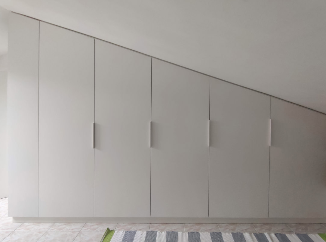
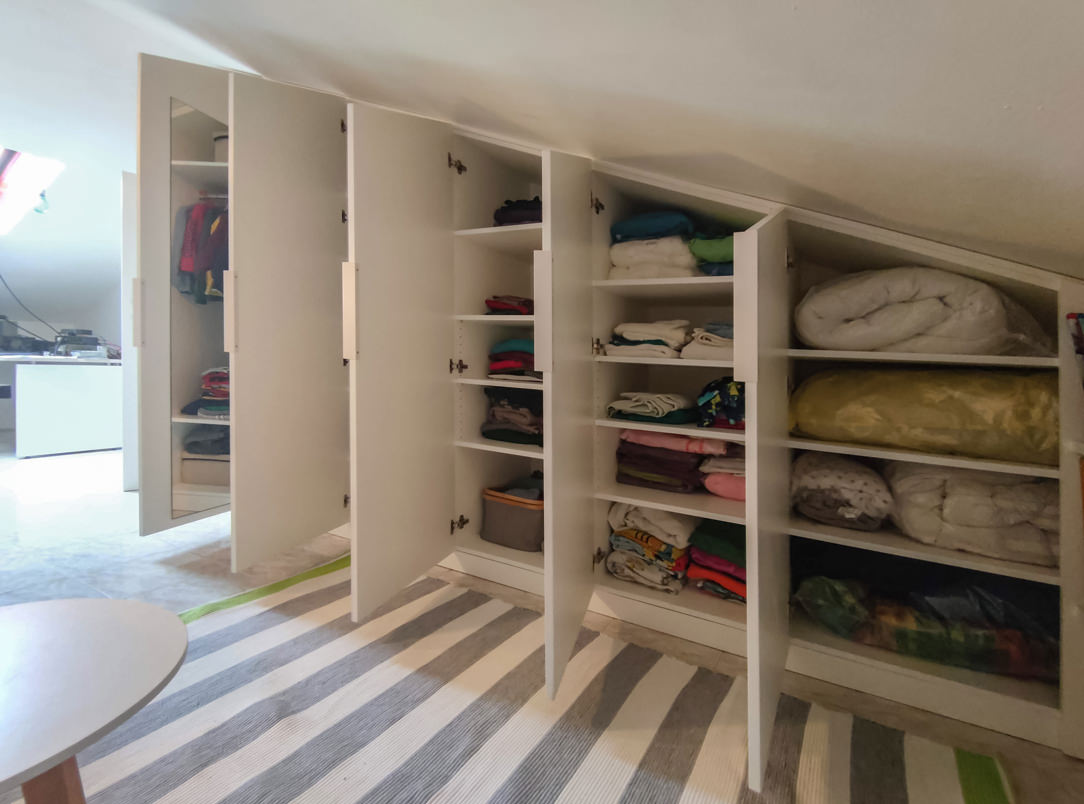
To ensure that the sloping cut doors are not obstructed in the opening direction by the attic ceiling, it is necessary to provide single doors with fastening on the longer side. This also allows an internal division with shelves marked by single and not double modules as in a traditional wardrobe.
The backs of the bookcase are shaped in the same way in order to respect the inclination of the ceiling and optimize the overall dimensions.

To explore the theme of rooms with sloping ceilings, here are these two attics: one in a contemporary style with antique elements and the other in a modern style. To these is also added this mezzanine equipped with wardrobe and bookcase for a functional study area.

bespoke wardrobe attic sloping ceiling front bookcase
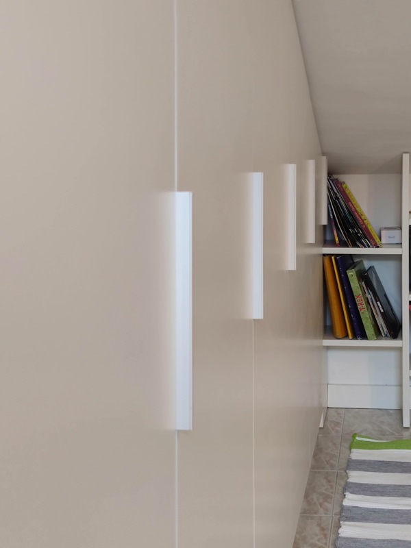
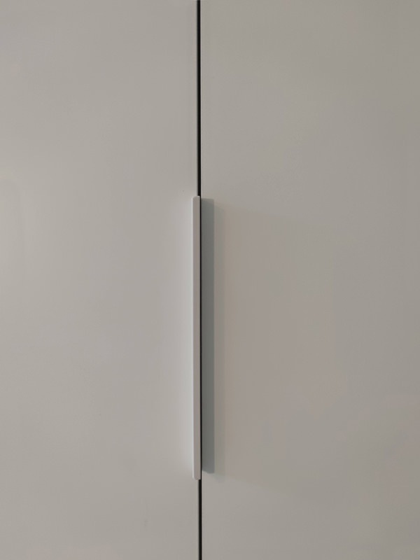
detail handles white aluminum profile wardrobe
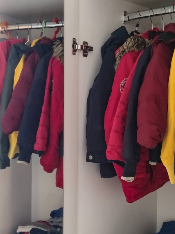
interior hanger wardrobe custom attic season change
inside wardrobe change of house linen season
bespoke wardrobe attic sloping ceiling side bookcase
internal shelves bilaminate wardrobe made to measure attic change of season

A reading corner for our most demanding small customers

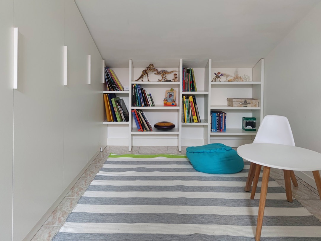
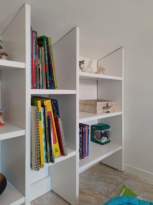
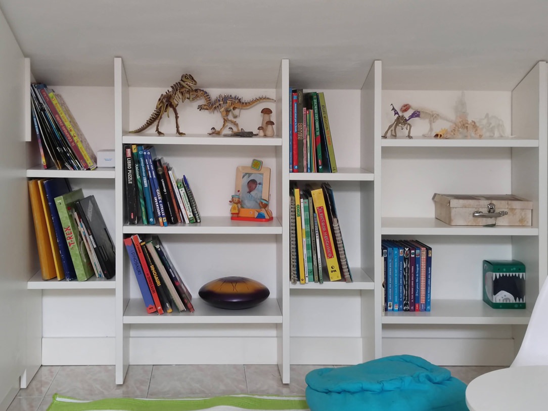
Francesco is our little client with very clear needs. If mom Laura is kindly allowed to use the inside wardrobe for the seasonable wardrobe change and household linen, the niche-bookcase must be able to accommodate books and dinosaurs divided by specific themes and colors.
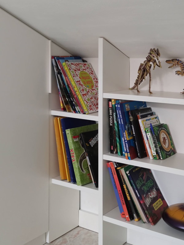
The shaped shoulders accommodate fixed shelves at different heights, creating a lively but elegant visual rhythm.

Even the fresh and elegant tone of the white bilaminate creates a luminous reading area in which a delicate Scandinavian design coffee table finds space.
To take advantage of the depth of the wardrobe, a second bookcase is grafted onto the side shoulder, also visually closing the furniture with a characterizing detail. The same solution was also adapted in this cerulean blue kitchen in modern style.
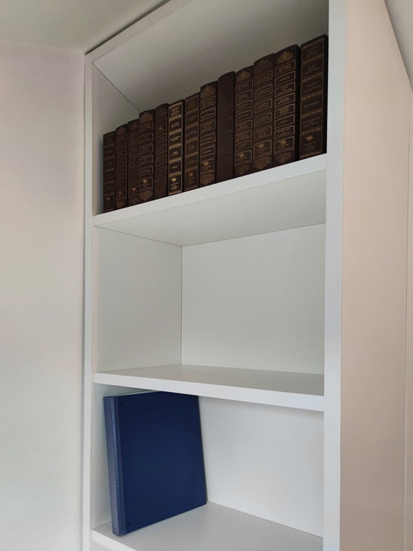
In this case, the shelves are positioned at a greater height so that they can also accommodate more bulky folders and books.
The reading corner is thus embraced by the multifunctional furniture that from a simple wardrobe serving an attic it also becomes a custom-made bookcase.

reading corner bookcase in niche shelves fixed height
bookcase detail with fixed door and white bilaminate shelves
detail of white bilaminate bookcase shelves
attic bookcase with fixed shelves
bookcase detail in front of the wardrobe
detail handles white aluminum profile cabinet front

A wood-effect laminate kitchen

A wood-effect laminate kitchen

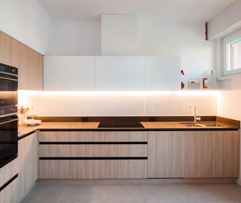
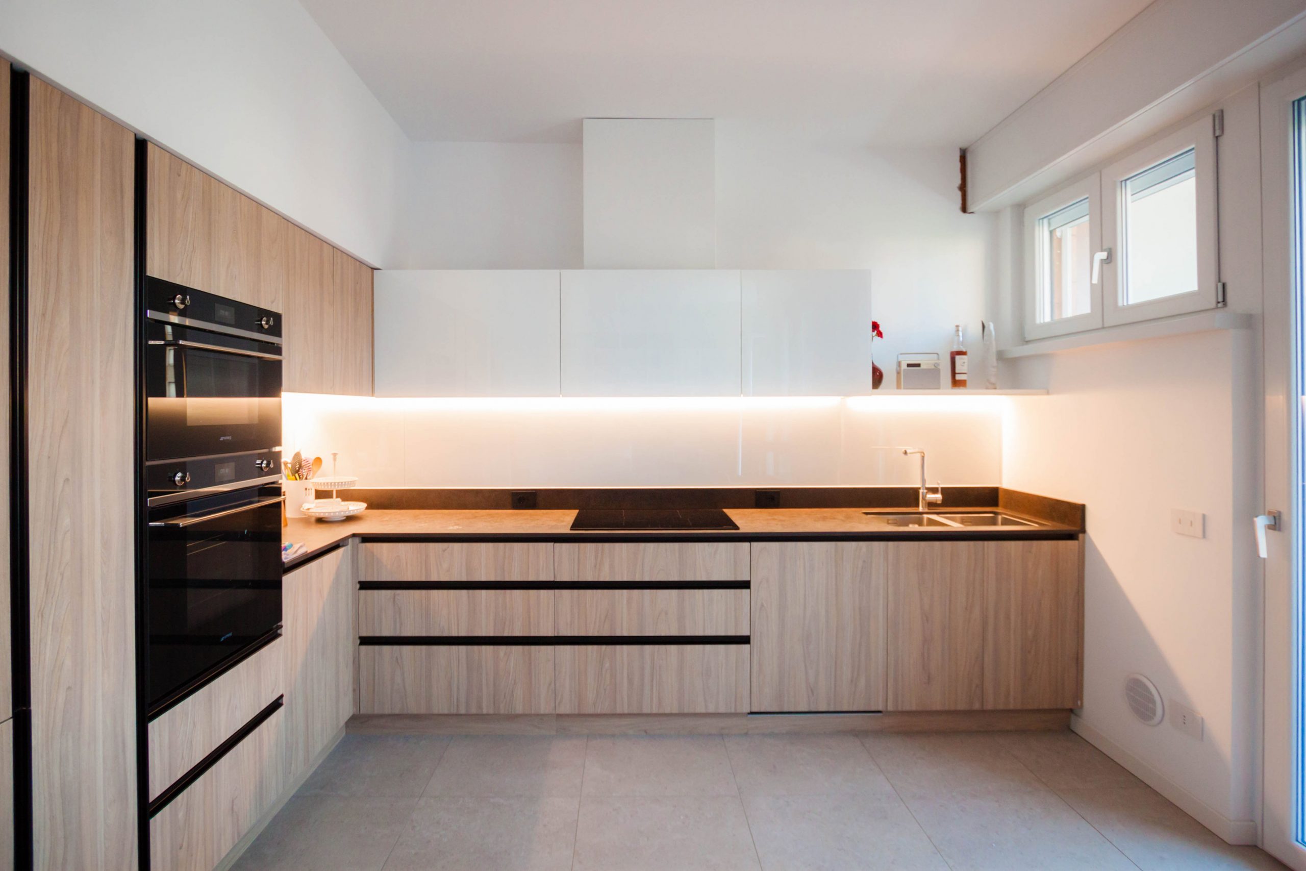
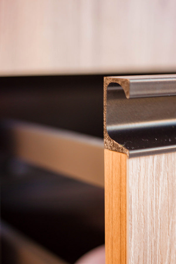
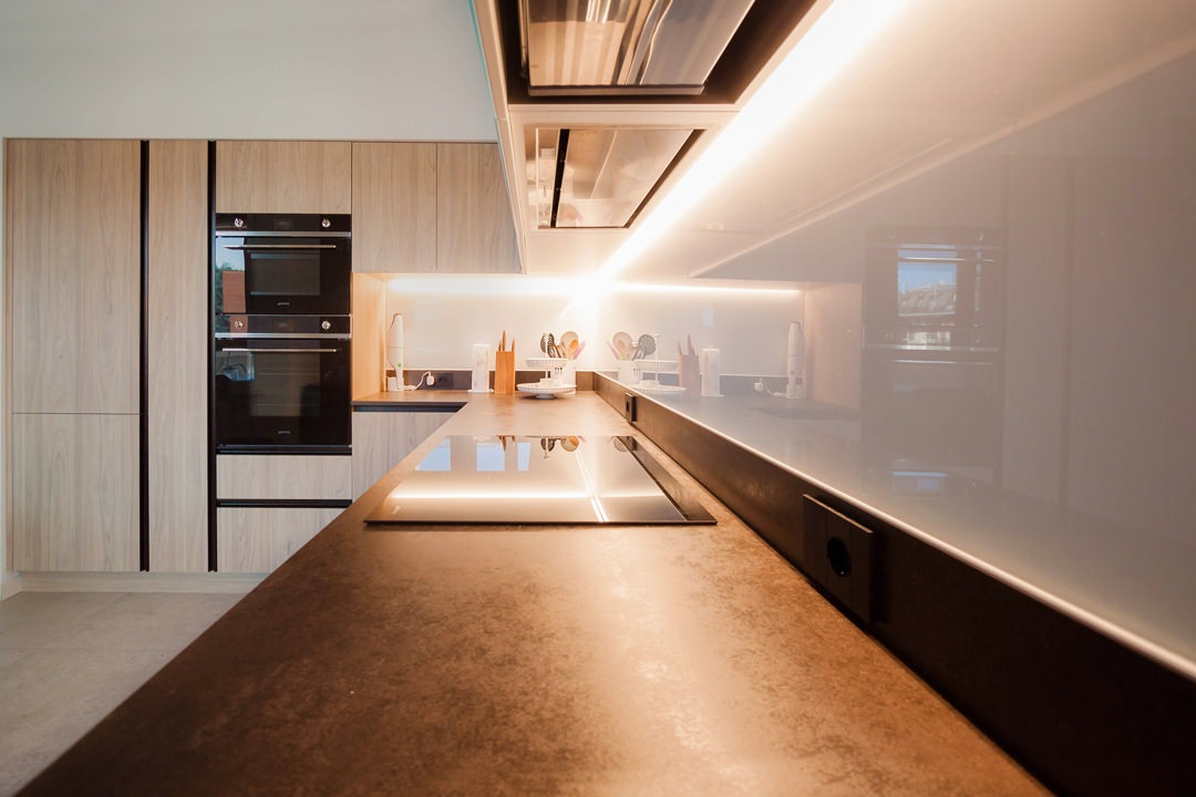
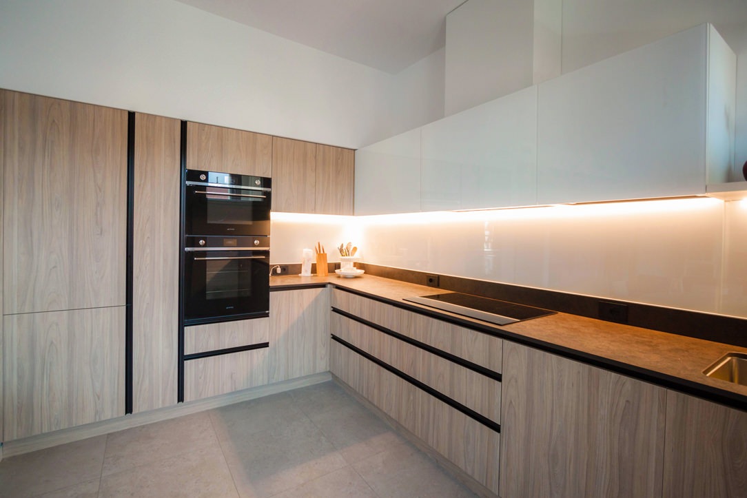
The stylistic choice of this kitchen derives from the profiles of the recessed handles in black aluminum in combination with the wood-effect laminate.
These are combined with the Dekton top in warm industrial-style tones and the white Lacobel coating that continues from the wall units to the back surface.

The material choice of the kitchen becomes the common thread for the remaining rooms of the house.
Furniture in black iron sheet and doors and drawers of the TV cabinet modified to take up the wood-effect laminate are an excellent example.

kitchen laminate wood effect white wall units
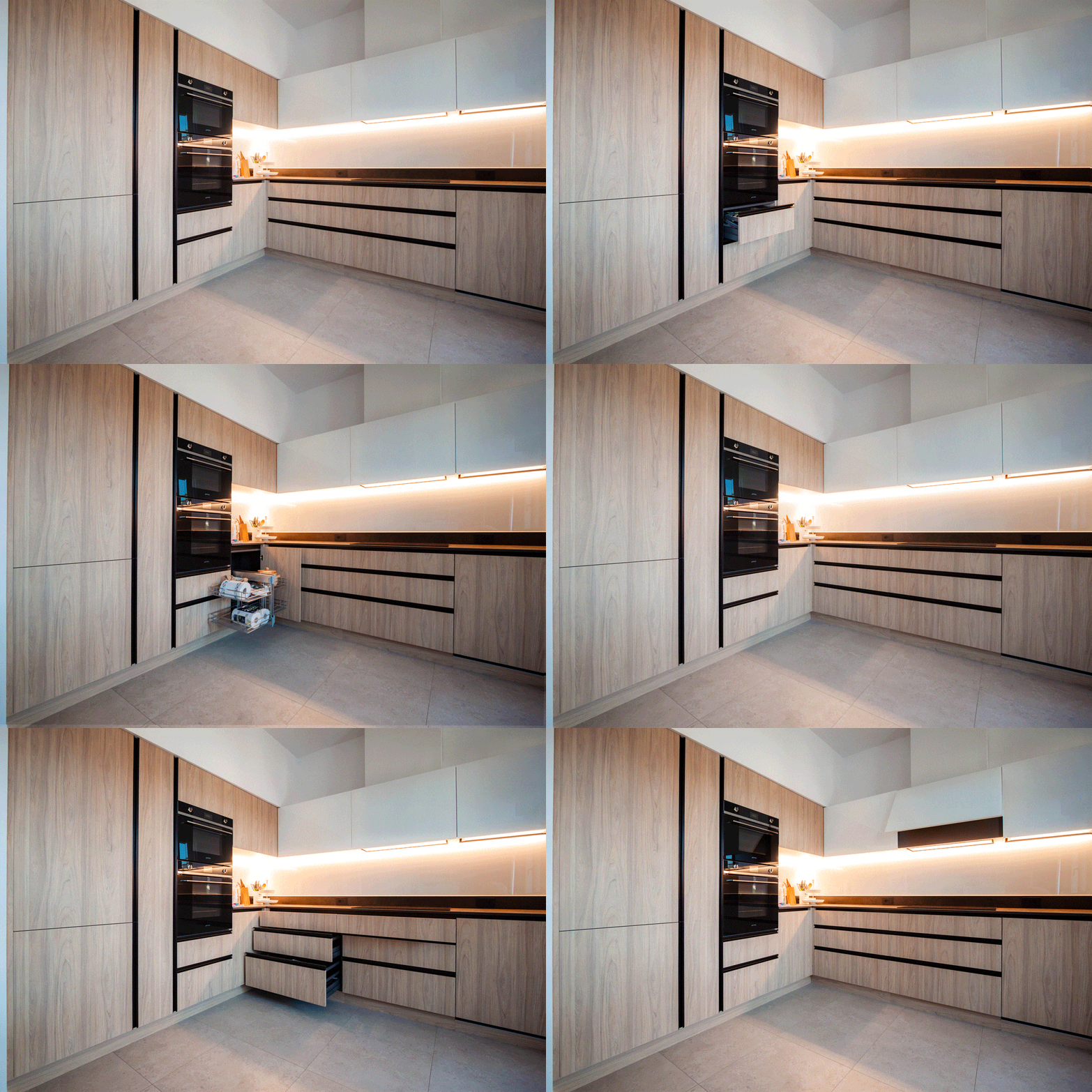
animation opening the kitchen doors

The project: the functional volumetric composition

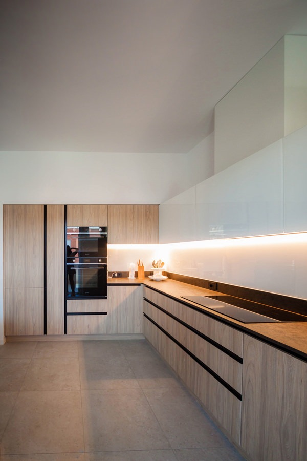
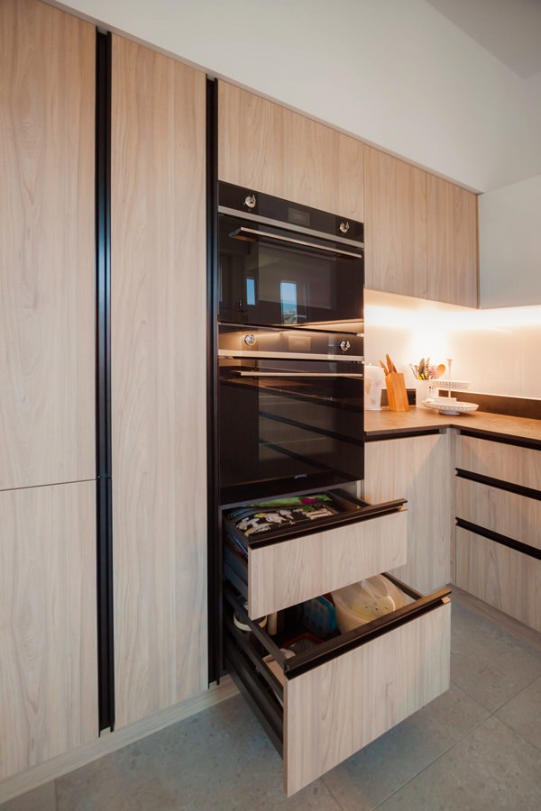
The development of this kitchen, designed in collaboration with Officina iDEa, includes a side wall equipped with full-height service columns and a front part equipped with base units and upper wall units.

Accommodating the built-in refrigerator and the pair of column ovens, the adjacent space is reserved for a service door.
A pantry with a limited width, inside which height-adjustable shelves are comfortable.
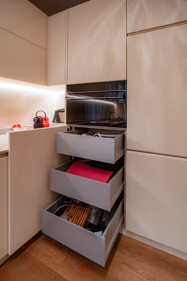
To make the most of the space, a pair of drawers is placed under the ovens, accommodating pots and accessories for the kitchen.
Similarly, the upper part is available as an additional storage space that can be used through a flap door.

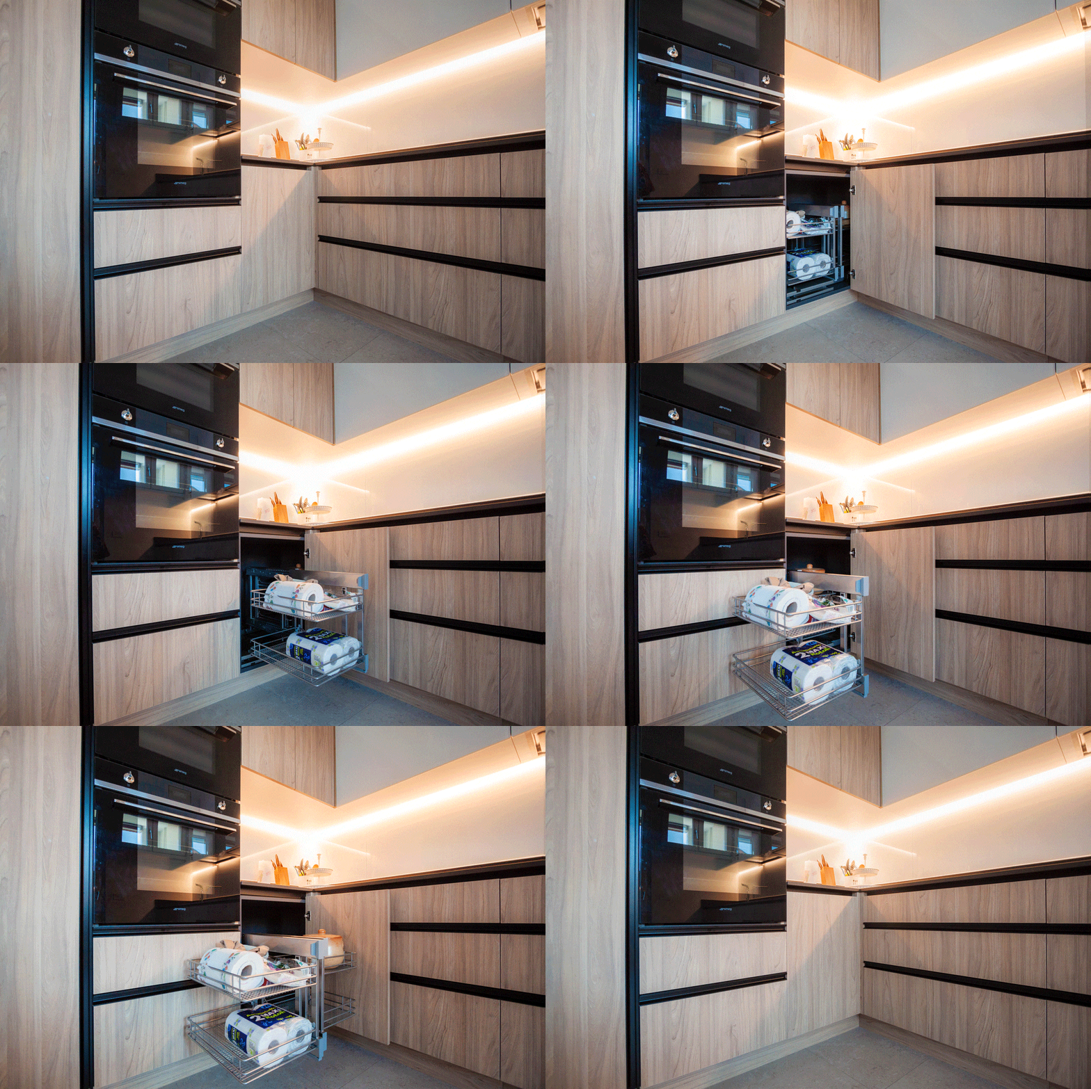
Flanked by the full-height volumes, the lower kitchen units come to life, accompanied by wall units with flap opening. These follow the development of the kitchen up to the opposite containment wall. To make the most of the corner, the best solution was to equip it with a removable basket. A solution adopted in several Modulor projects, an example of all this cream-colored kitchen.

On the adjacent side, instead, are the six wide-width drawers. These allow you to optimize the space due to the different internal height made available.
In conclusion, in the lower part there are the built-in dishwasher and a pair of doors in correspondence with the sink, useful for arranging the waste bins.

kitchen laminate wood effect columns service ovens refrigerator pantry
kitchen oven drawers laminate wood effect hollow handles aluminum black
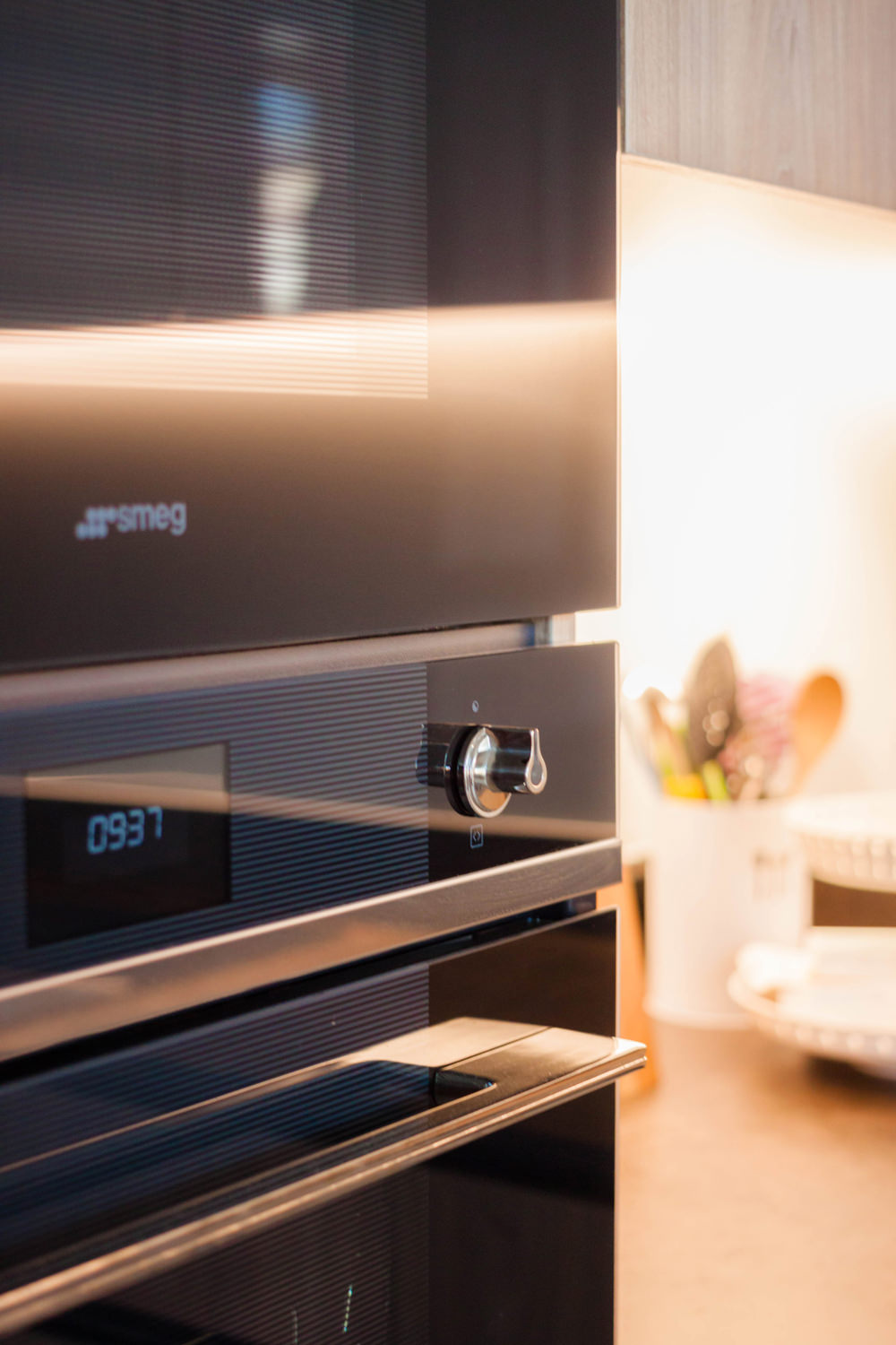
smeg built-in column ovens
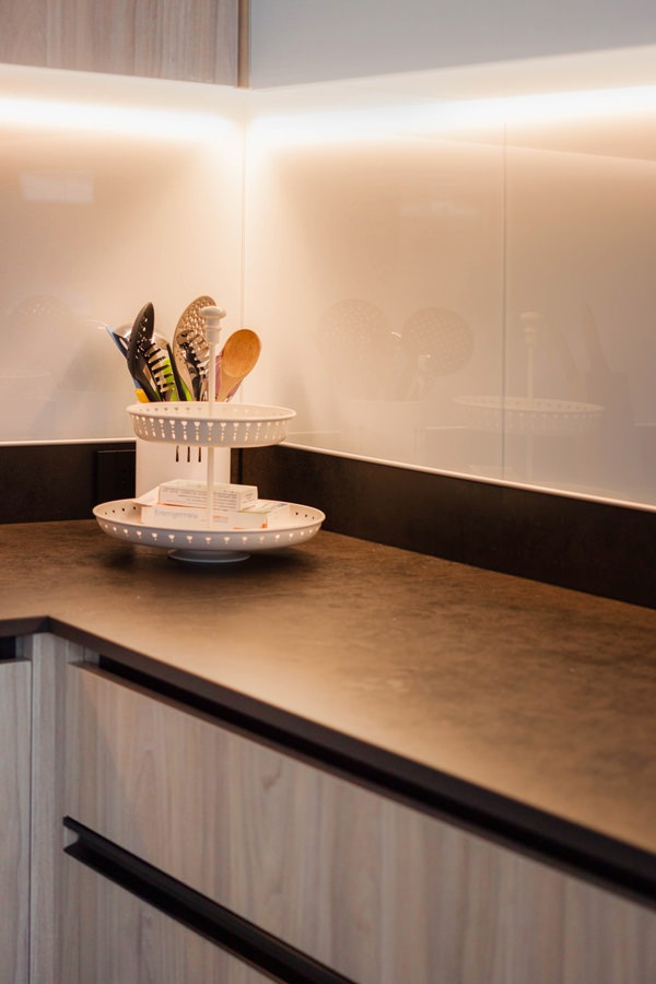
kitchen top dekton milar industrial white lacobel riser
corner basket animation 02

The material choice of the kitchen: from the wood-effect laminate doors, to the white lacobel of the wall units.

The material choice of this environment takes up the essential taste and natural scent typical of the Scandinavian style.
Fully embracing the principles of this style, the combination of light wood and white surfaces is reflected in the choice of laminate doors and Lacobel wall units with which the entire kitchen is covered.

To represent a care of detail and emphasize the stylistic line, handles with aluminum profile in a chromatic contrast.
Elements that underline the geometries of the various elements, developing horizontally or vertically depending on the case in a game of segments that creates dynamism and defines its stylistic imprint.
These also become functional elements capable of protecting the edges of doors and drawers, repairing them from scratches and wear.

In the upper part, the wall units with flap opening are developed.
The white Lacobel coating gives lightness and illuminates the room thanks to the play of reflections it creates.
When closed, a white lacquered MDF shelf further lightens the composition without obscuring the natural light coming from the adjacent window.
Taking up the chromatic choice of the black details, the service sockets also have a plate with a contemporary design in the same color.

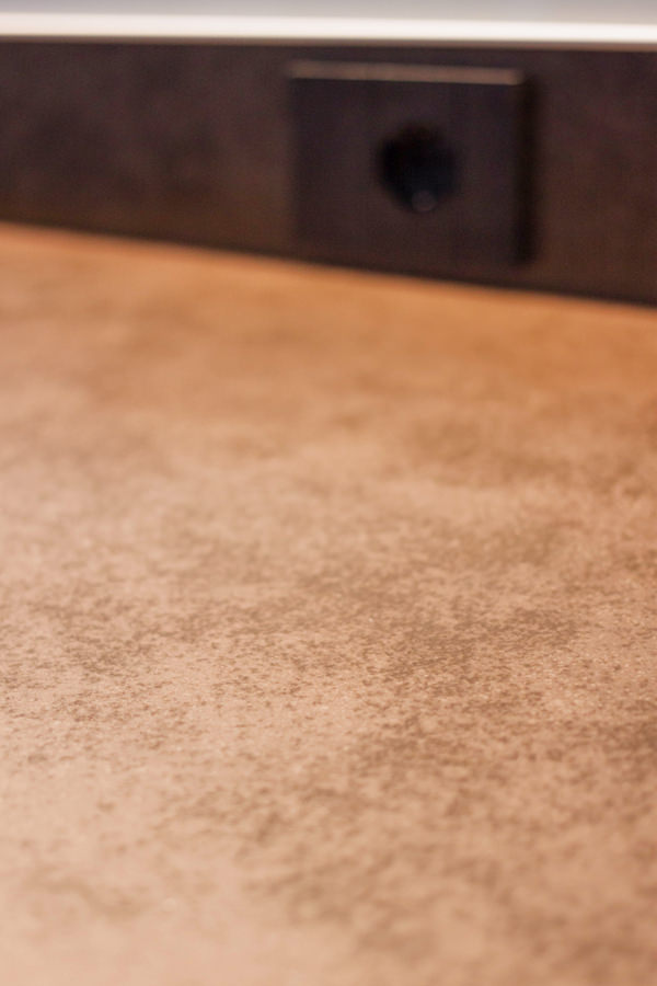
As for the worktop, on the other hand, the choice fell on Dekton in its Milar variant, from the Industrial collection.
Its surface has a lively effect with shiny points that alternate with an effect of fake wear.
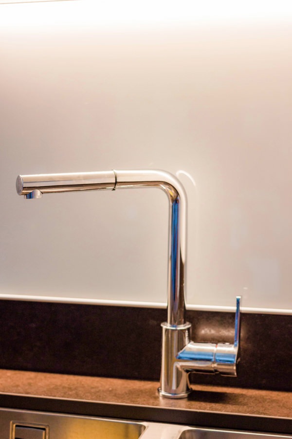
This is combined with a steel undercounter sink with double bowl and matching stainless-steel tap.

shaped handles painted black aluminum drawers doors
plan dekton milan industrial
stainless steel faucet undercounter sink double basin
kitchen laminate wood effect top dekton milar industrial raised lacobel white back-painted glass
kitchen laminate wood effect white wall units service columns
kitchen laminate wood effect top dekton industrial
white lacobel wall units matt white lacquered shelf

The living area

The kitchen communicates with the living area, which is also part of the open space that develops from the entrance.
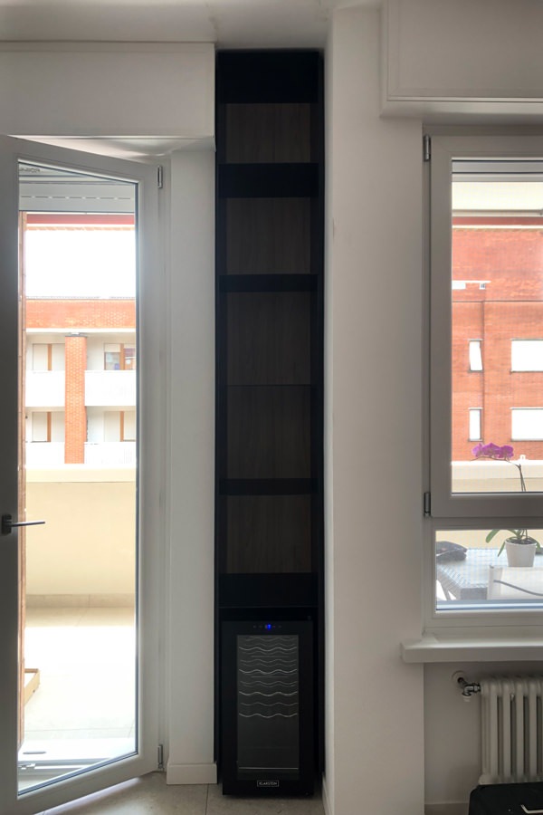
Taking advantage of an architectural niche on the side of the French window, a full-height cabinet in black waxed iron houses the wine cellar in the upper part. Above, on the other hand, the thin shelves that exploit the reduced thickness of the iron sheet unfold.
This also becomes the element that ideally separates the two environments, albeit in continuous visual contact.

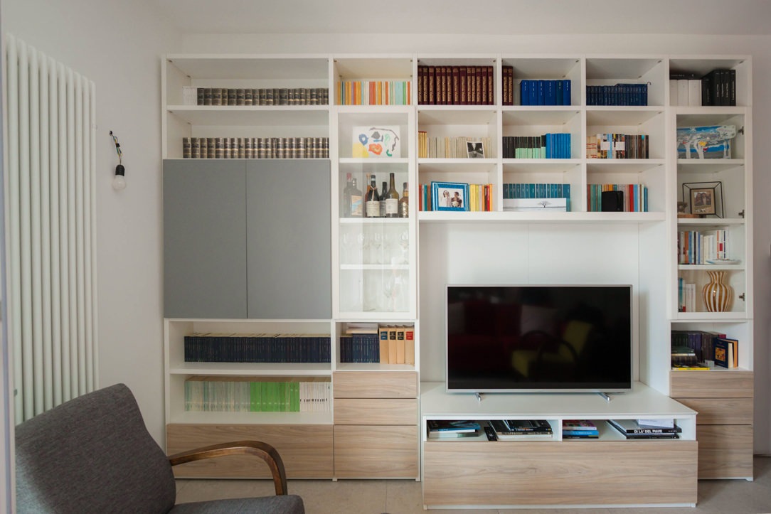
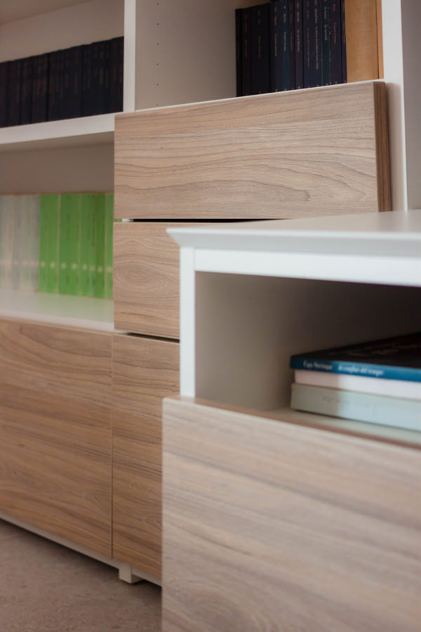
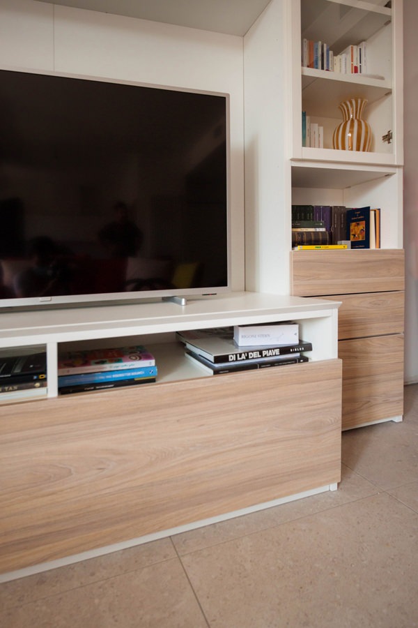
Precisely for this reason, the existing furniture room has undergone a change as regards the front of the drawers and doors.

Originally made in deep red gloss lacquer, they have been replaced with the same wood effect laminate as the kitchen. Also in this case, the result is a piece of furniture in full Scandinavian style, bright and delicate in aesthetics.

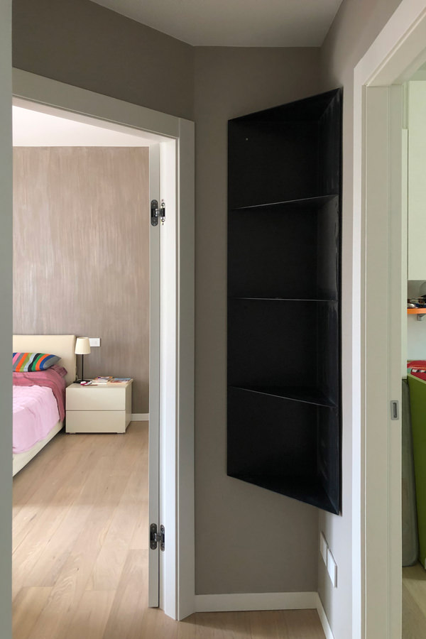
In black waxed iron sheet is also the wall unit that equips the corridor of the sleeping area, whose molded shape is not very intrusive but functional to the passage. Elegant and minimal material, it was also chosen in this work in order to furnish the livingroom.

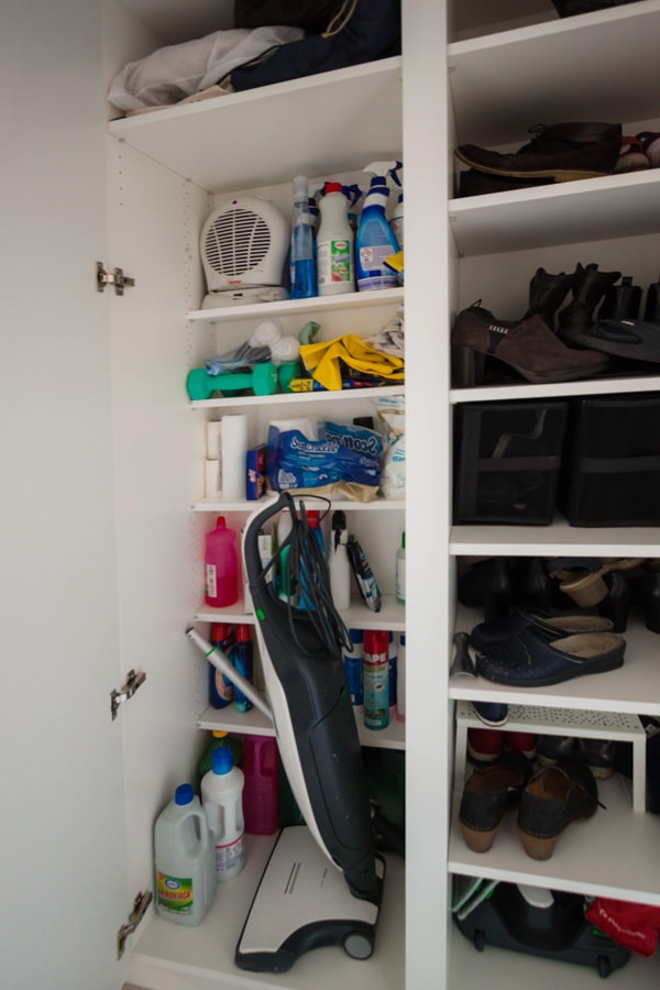
Serving the anteroom, a service cabinet with recessed handles made of matt ice gray lacquered MDF. Internally it is equipped to become a closet with internal shelves with reduced depth that allow you to optimize space by also accommodating cleaning accessories.

living area TV cabinet in front of wooden laminate drawers
front detail of drawers in laminate wood furniture in the living area
detail of the TV cabinet in the living area in front of the drawers
shaped corner cabinet in black iron niche wine cellar
 corner shaped black iron wall unit
anti-bathroom corridor furniture full-height doors recessed handles
mobile corridor dressing room service laundry closet internal shelves

A laminate kitchen is the optimal solution for obtaining high resistance of materials without sacrificing the natural aesthetics of wood, albeit in its artificial variant.

Then combined with clear components, it illuminates the interior, giving visual lightness.
The choice of iron becomes interesting for sophisticated style combinations.

Cream furniture for elegant interiors

Cream furniture for elegant interiors

The elegant interiors of this apartment are recognized by the cream color of the furniture, declined in the different rooms with elegance and modernity.
The combination of materials with different finishes and nature creates plays of opacity and reflection.
Among these, the contemporary style kitchen is recognized by the natural top, the lacquered doors and the wall units covered in Lacobel.
In the sleeping area, on the other hand, the master bathroom and the service bathroom can be recognized by the chromatic and material combinations between the tops and the structure of the shaped furniture.

modern cream colored kitchen side view
animation opening cream-colored kitchen doors

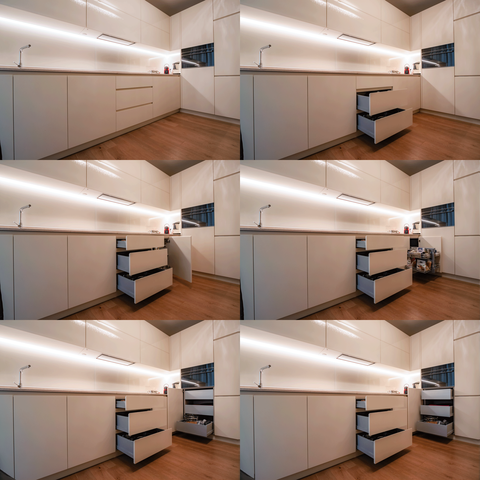
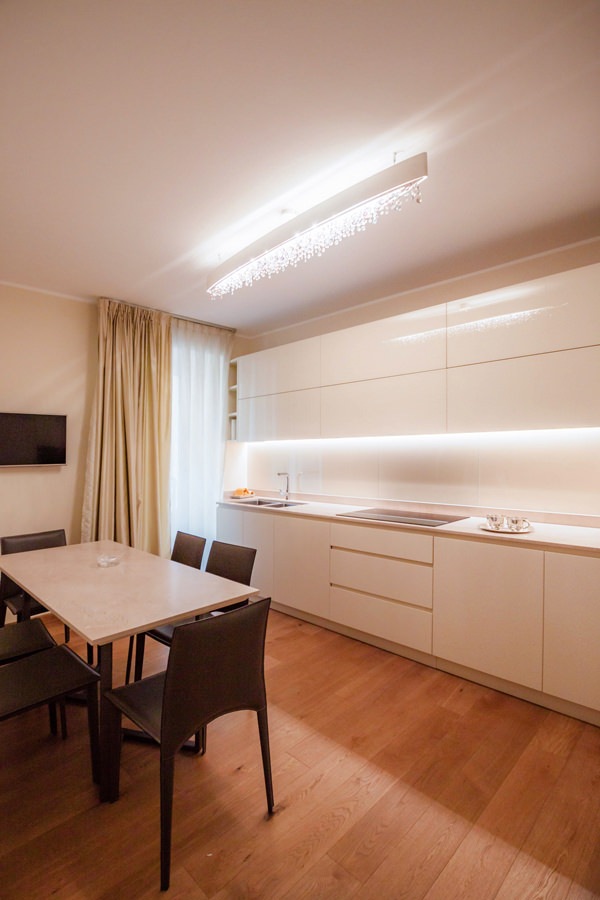
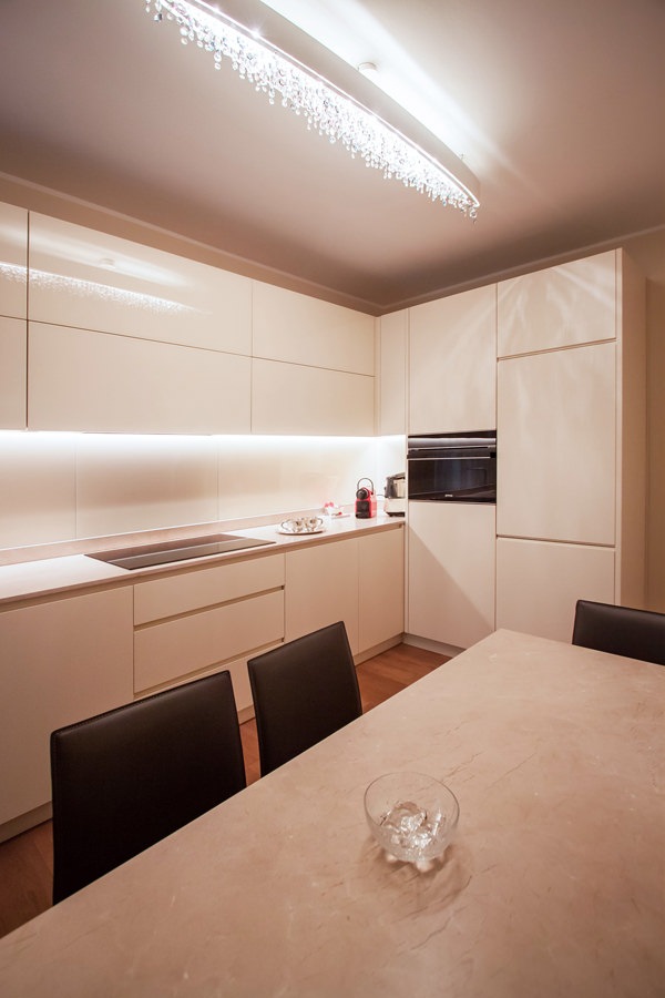
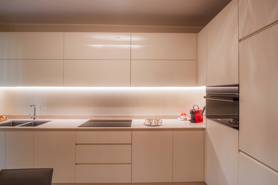
A kitchen with cream color furniture

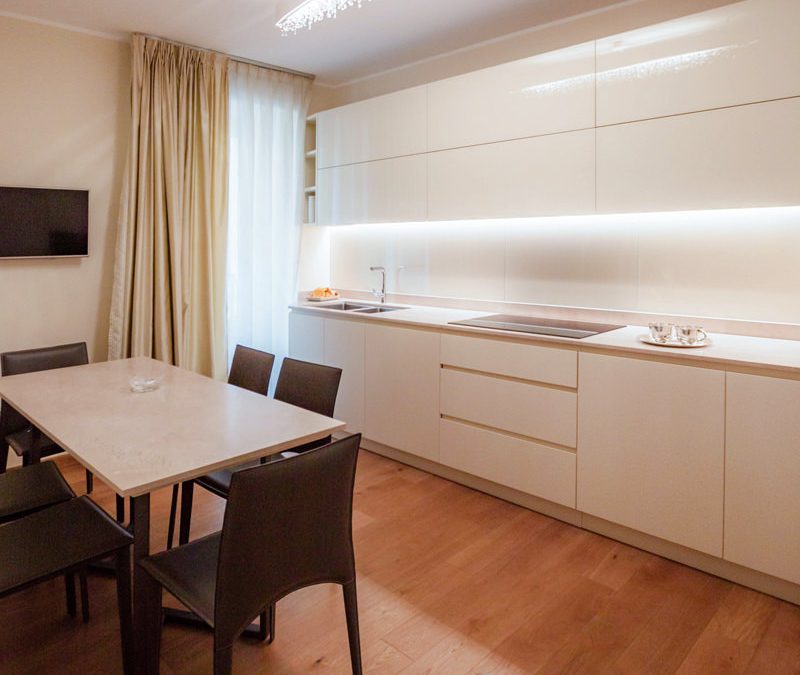
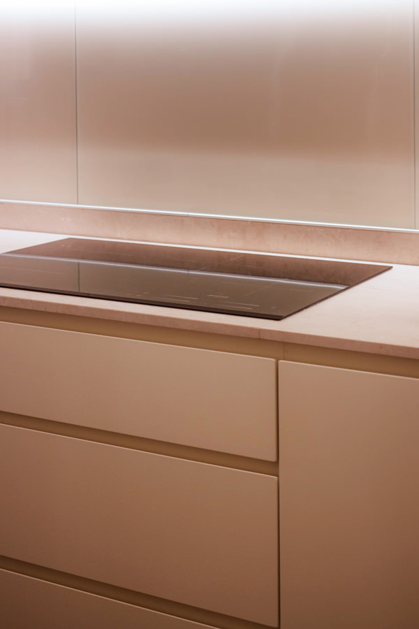
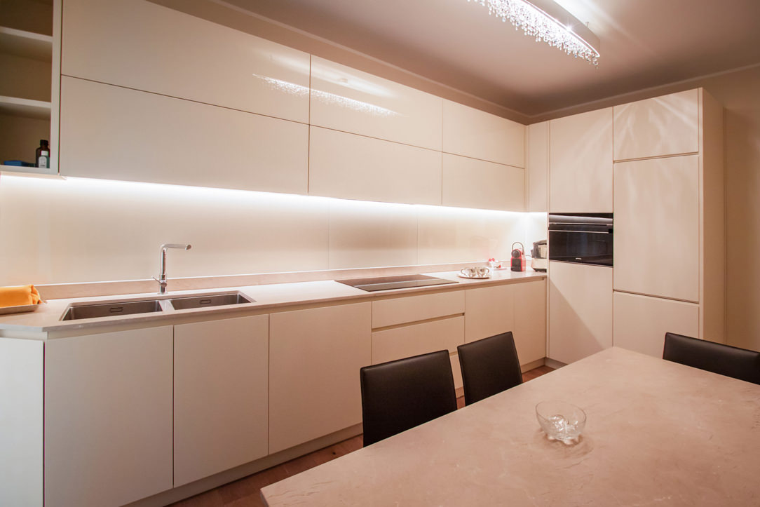
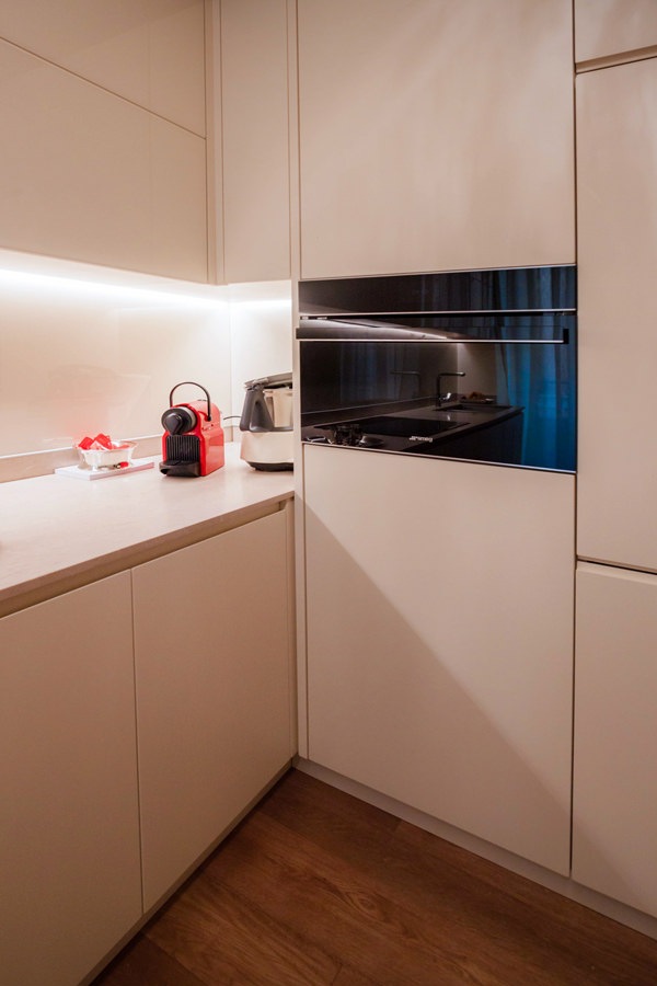
The beige natural stone worktop set the chromatic and material choice of this contemporary style kitchen.
Maintaining the neutral tones of the cream color, the base units and side service columns in matt tone-on-tone lacquer accompany the wall units covered in white Lacobel.
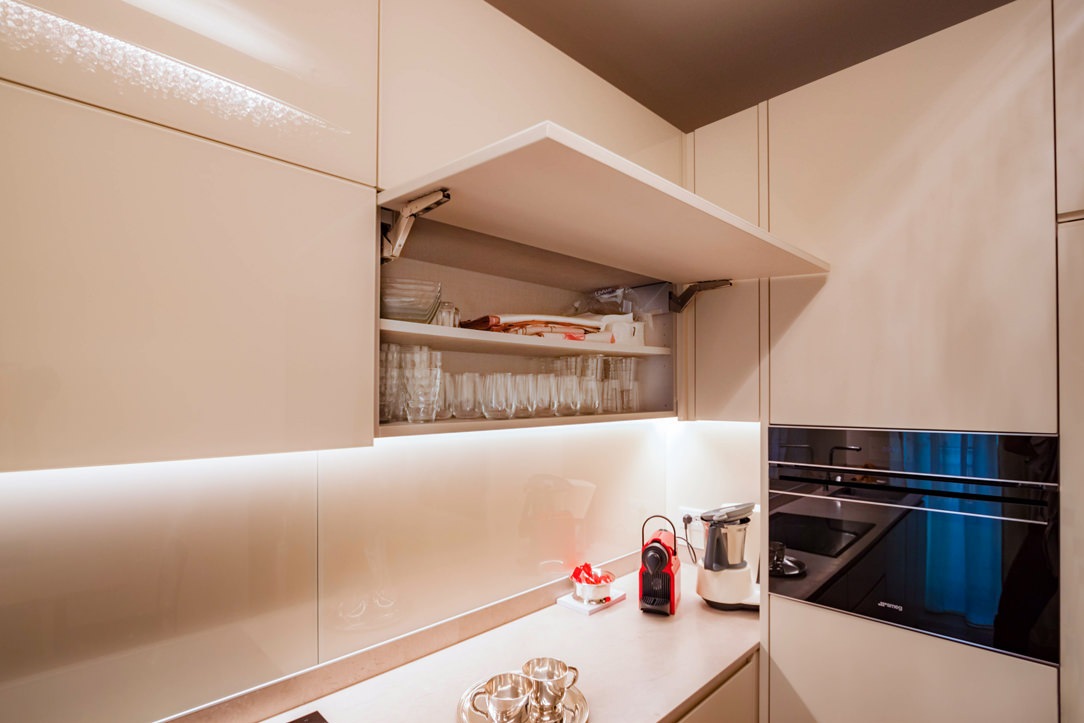
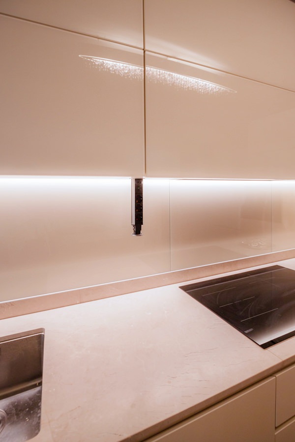
The recessed LED lighting is inserted inside the latter to provide support light for the preparation of meals.
The material choice of white Lacobel, capable of giving brightness and freshness to the room, is also reflected in the riser that accompanies the natural stone top.

cream color kitchen table anthracite metal structure natural stone top
 natural stone top kitchen table cream colored worktop
cream colored kitchen front view

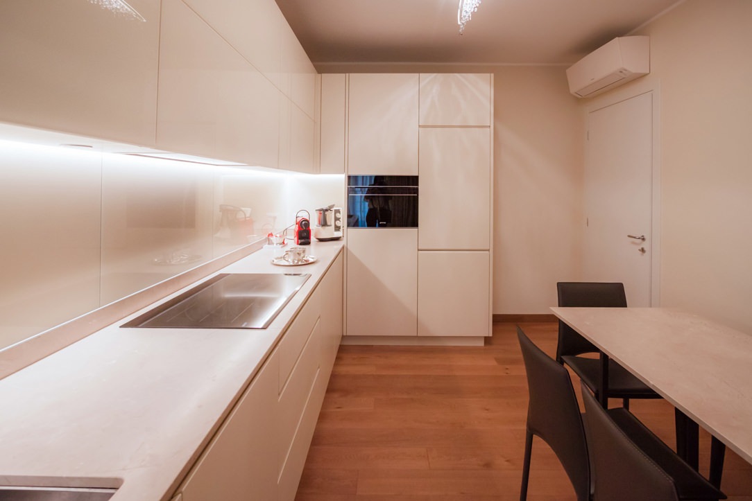
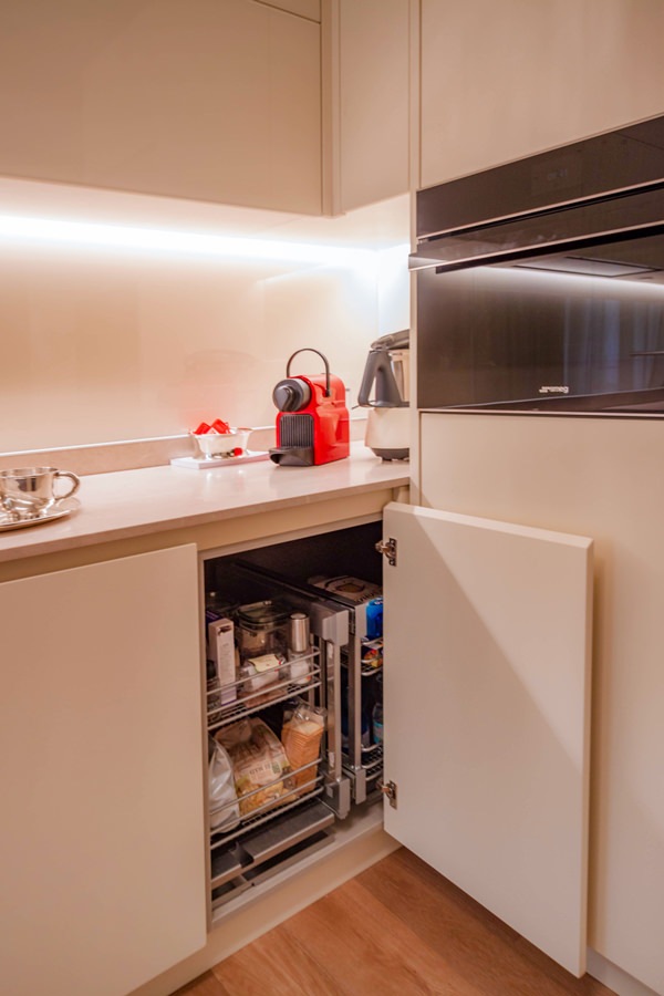
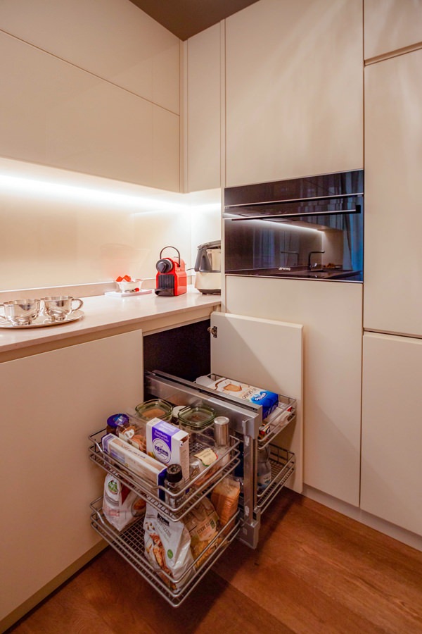
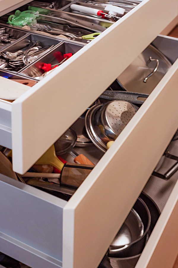
Functional elements such as the removable basket to take advantage of the corner, large drawers and doors with removable trays make the use of this kitchen even more practical.
The full-height side columns, housing the built-in refrigerator and the oven, leave ample space that can be used as a pantry.

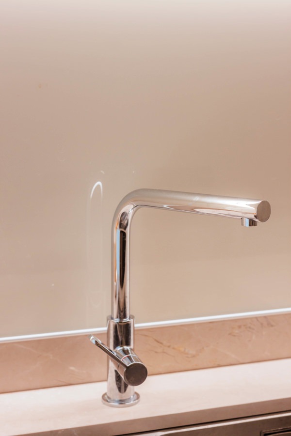
On the opposite side, beyond the sink with two steel basins under the counter, the shaping of the base and wall units closes the kitchen block.
It is precisely the smoothed profile of his comparison that softens the design lines of this kitchen.

A table with an anthracite-colored metal structure and chairs in eco-leather in the same shade echoes the material choice of the kitchen top.

cream colored kitchen cabinets drawers recessed handle
stainless steel kitchen sink faucet lacobel white kitchen cream color
cream-colored shaped kitchen lacobel wall units
cream-colored kitchen corner door internal basket closed position
kitchen corner door internal basket open position
lacobel cream kitchen wall units flap opening internal shelf
cream colored kitchen corner removable basket internal drawers
cream-colored kitchen door with aluminum internal drawers
cream-colored kitchen doors with canvas bilaminate interior
service outlets disappearing turret kitchen wall units
opening kitchen drawers inside aluminum cutlery tray

The entrance area: between functionality and elegance

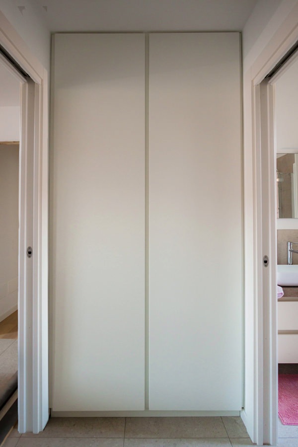
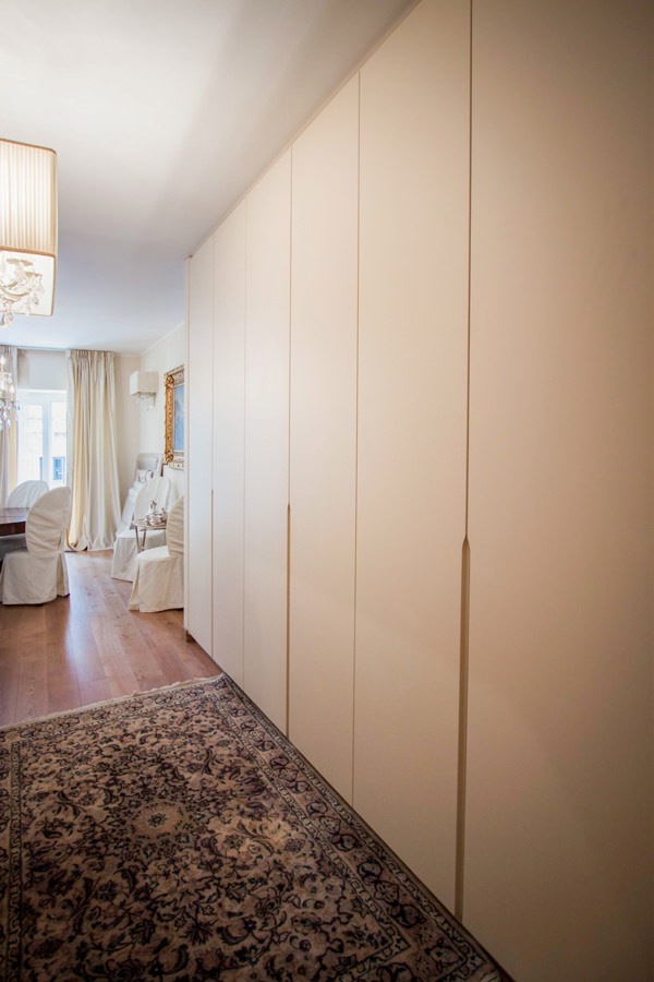
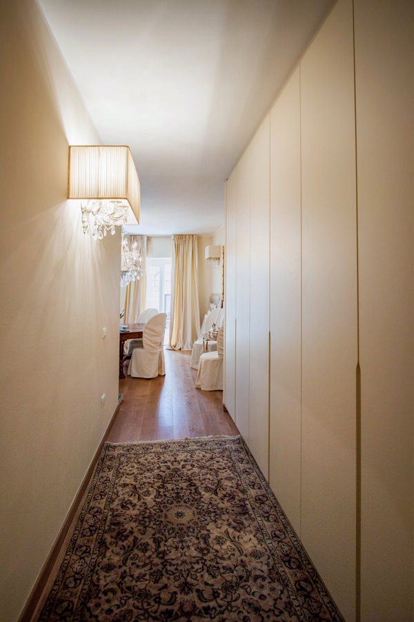
In the entrance area, a large service wardrobe acts as a functional element capable of optimizing space, while disappearing from view thanks to its linear aesthetic.
The stylistic choice takes up the cream-colored furniture of the remaining rooms of the house.
The full-height doors in matt lacquered MDF accommodate approximately half the height of the recessed handles shaped at the ends.

Internally, height-adjustable shelves provide useful space for the storage of household products, but also linen and kits for the change of season.
In the central doors, on the other hand, a hanging system exploits the horizontality in order to contain the depth of the wardrobe.

Compared to traditional hangers hung on tubular, this system consists of hooks that slide horizontally on a double row of tubulars, taking advantage of the available length. On the other hand, they have a slightly lower quality of maintenance of the garments. Not having the typical support structure for the shoulders of garments possessed by hangers, it is an optimal solution for coats and jackets that can be considered “in transit”.
As they do not require long-term accommodation, they are ideal for hosting guests’ coats and jackets or light clothing in temporary placement.

wardrobe hallway entrance handles half-height recess
cream-colored entrance hallway furniture
tubular horizontal hangers optimize coats space

The master bathroom: elegant and with attention to detail

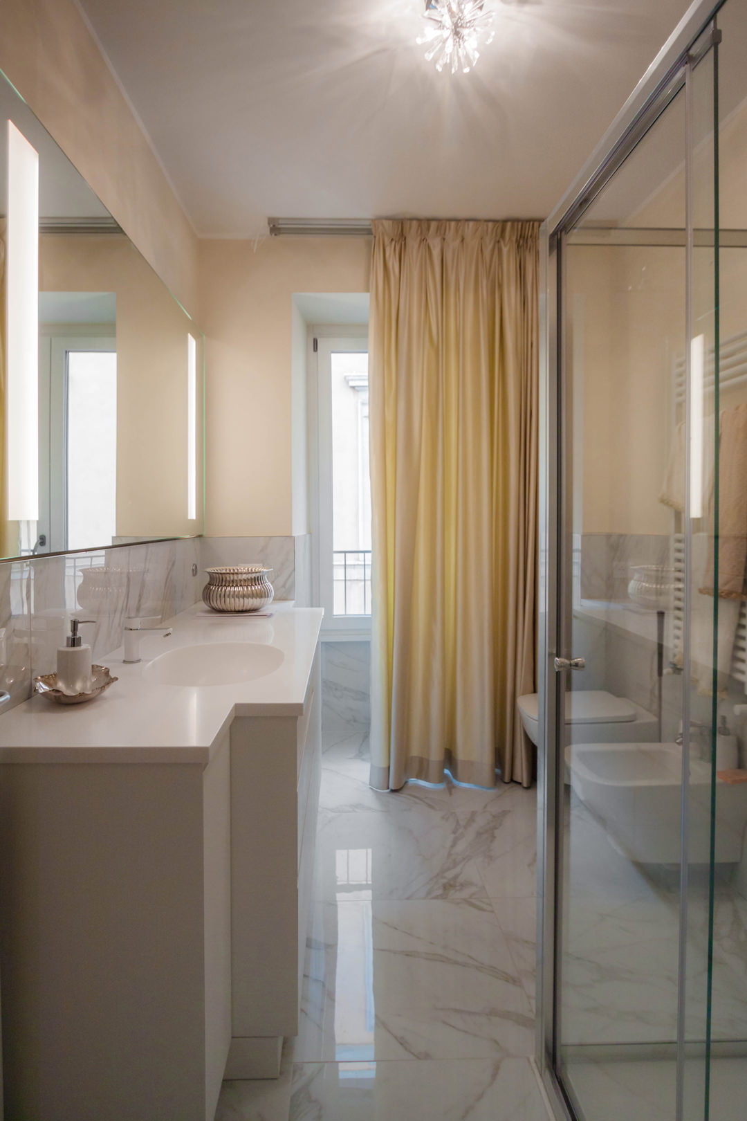
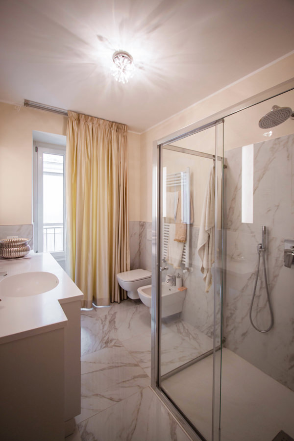
Introducing the sleeping area is a large bathroom also for guests with a glass shower and shaped furniture.
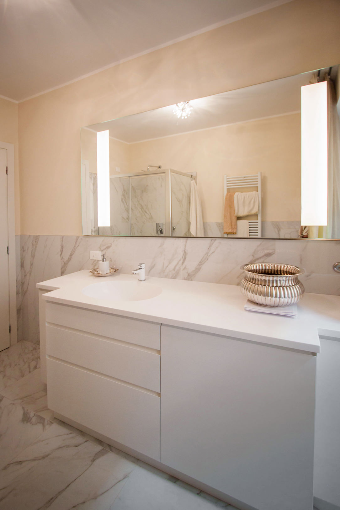
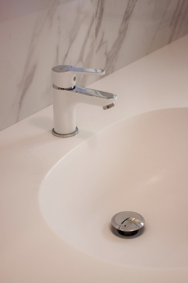
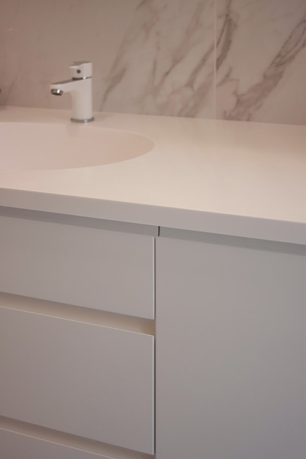
The latter is recognized by the choice of neutral tones and light colors. The shaped top in white Corian allows to host a pair of integrated washbasins in the same material, becoming a continuous element.

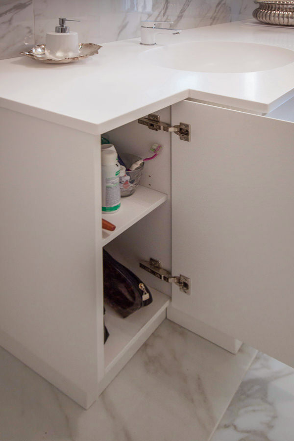
The composition of the piece of furniture consists of a pair of side doors with recessed handles shaped at 45 ° which are recessed with respect to the block of drawers and built-in washing machine next to it.
The stylistic line of this furniture guarantees a linear and elegant reading of the same, while not giving up the practicality of doors and drawers to contain products and bathroom linen. Accompanying the bathroom cabinet is a large mirror with integrated lighting.

elegant cream colored bathroom cabinet front view
elegant master bathroom with crystal shower view
elegant master bathroom with large crystal shower
contemporary style shaped bathroom cabinet with Corian top
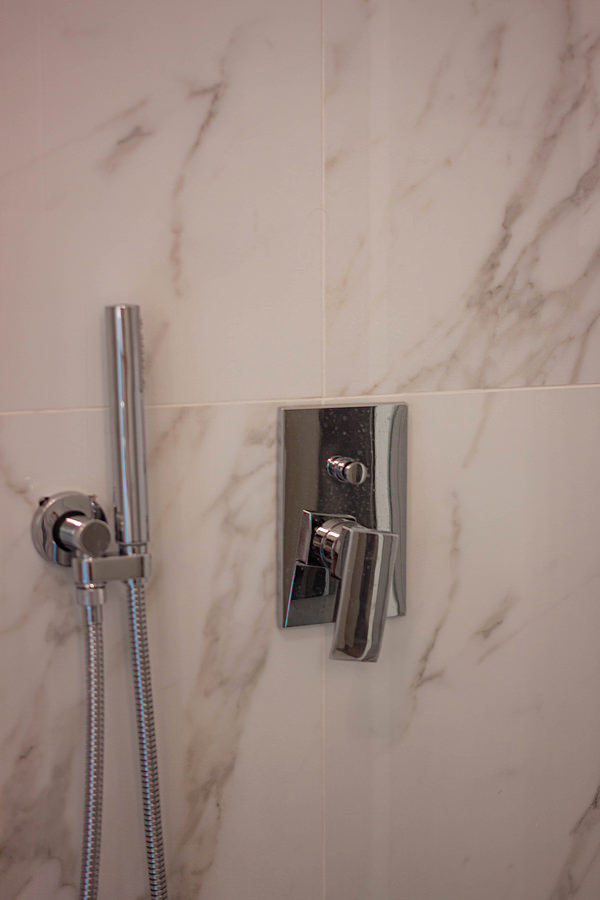
detail of stainless steel shower taps
integrated bathroom vanity sink Corian top
opening bathroom cabinet door internal shelves
bathroom cabinet detail drawers handle recessed corian top

The sleeping area between the service bathroom and compact but roomy walk-in closet

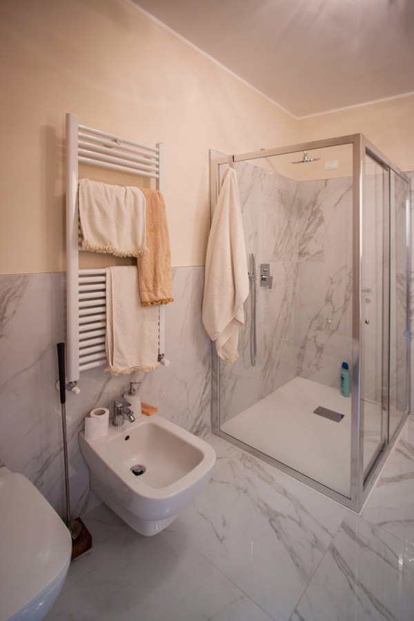
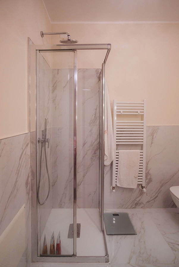
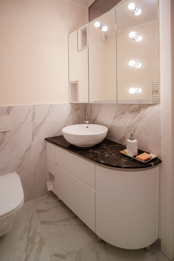
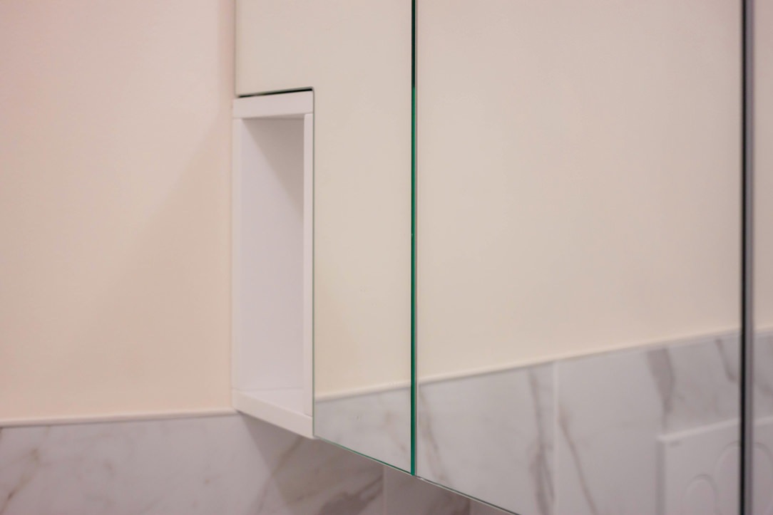
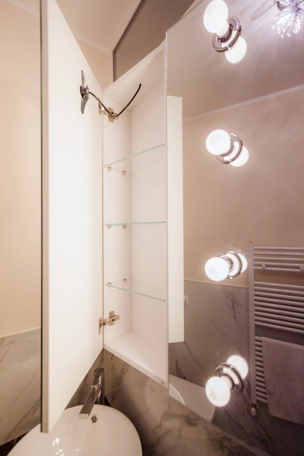
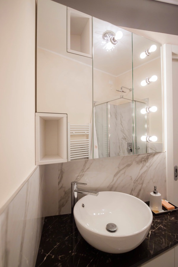
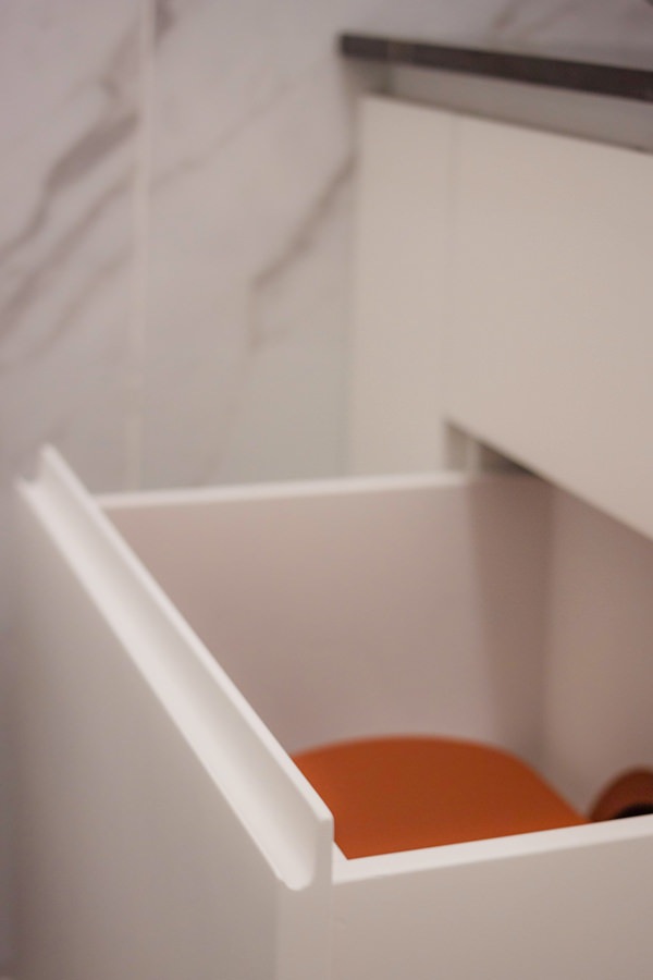
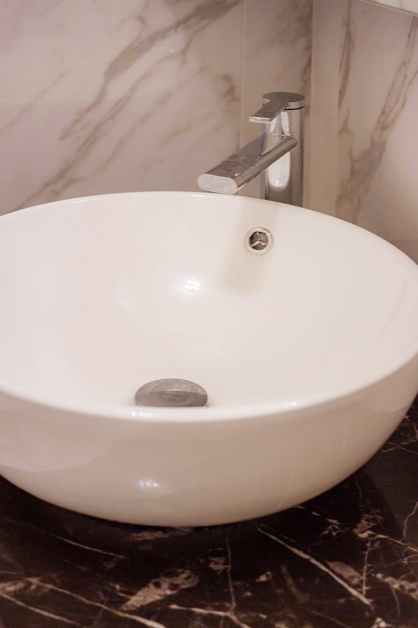
Adjacent to the master bedroom there is the service bathroom with a smaller-sized crystal shower. Also in this case, the service furniture is shaped to respond not only to functional needs but also to restore an elegant and characterizing image of the furniture. The black marble top houses a countertop washbasin and is shaped in the terminal part, softening its shapes. In the lower part, an open compartment adjacent to the wall becomes a support element to avoid floor stand or wall towel holder. Side by side, a pair of drawers provide useful space for small products, while leaving space for the bulk of the siphon and the pipes behind them. Finally, respecting the shape of the top, a curved door accommodates internal shelves. Accompanying the bathroom cabinet, providing additional space for the storage of products, is a wall unit covered in mirror. The aesthetics of this element responds to a division into three compartments whose conformation is light and soft to the eye. The division into three doors also allows you to take advantage of the central mirror part, inserting external light bulbs that give character and embellish the furniture. Sideways mirrored doors alternate with open compartments in white lacquered MDF, visually moving the aesthetic impact of the furniture.

bathroom service shower crystal marble coating
bathroom cabinet shaped service drawers curved door
detail of day compartment mirror bathroom wall cabinet
detail of bathroom cabinet with mirror door in white interior
bathroom cabinet mirror lighting external bulbs
handle recess drawers shaped curved bathroom cabinet
Corian countertop washbasin with marble top
walk-in closet MDF lacquered cream color hanger
detail shelves MDF matt lacquered cream color walk-in closet

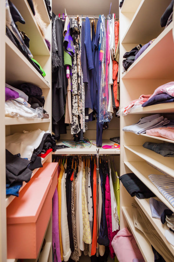
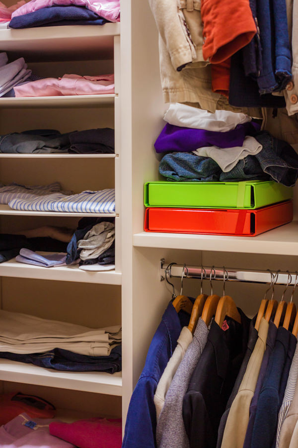
Next to the service bathroom, the small-sized walk-in closet guarantees excellent capacity by making the most of the space with lacquered MDF shelves and fixed tubular hangers. The development of the components occupies the three walls adjacent to the entrance, also taking advantage of the corner arrangement to place the hanging garments on double height. Also in this case, the chromatic choice of the elements takes up the cream color of the furniture placed in the remaining rooms.