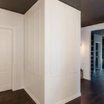
Classic White Wardrobe
Nestled among the green hills of the Bergamo area, in a refined home, we designed and built a custom-made classic white wardrobe, seamlessly integrated into the existing interior.
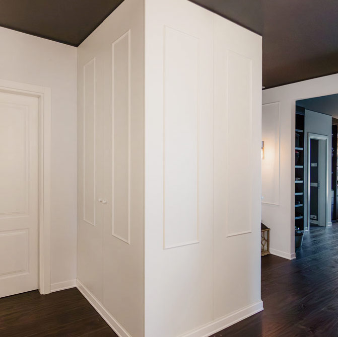
In the wide hallway of the sleeping area, the client’s request was to create additional storage space without compromising the elegance of the surroundings. The project turned a structural constraint – the central pillar – into a design feature, giving life to a double-sided wardrobe.

The Balance Between Classic and Contemporary
This tailor-made solution was created to enhance and equip a spacious transitional area. The villa’s style has a distinct identity, defined by classical details such as wall mouldings, door casings, and an ornate skirting board – all set within a modern architectural framework.
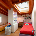
Here you can find another example of classic-style furniture.
Our classic white wardrobe subtly reflects these elements: the front and side panels are decorated to echo the wall finishes, the skirting board continues seamlessly around the unit, and the tone-on-tone lacquer finish makes it almost invisible, perfectly blending into the surrounding space.


Intelligent Functionality and Optimized Space
Beyond its refined appearance, the wardrobe meets multiple functional needs. It includes:
- an additional hanging space for the adjacent bedrooms,
- a dedicated area for cleaning supplies, with shallow rear shelves for detergents and a front compartment for buckets and a vacuum cleaner,
- a fold-out ironing board, ready for quick touch-ups.

This last feature of the ironing board, cleverly positioned in the shallower section of the wardrobe where the pillar limits depth, opens out toward the front and makes the most of every available centimeter. Integrated LED lighting ensures that each area of the wardrobe is well illuminated and easy to use.


Conclusion
When practical needs arise, it’s possible, as in this case, to find solutions that don’t sacrifice aesthetic quality. It is entirely feasible to integrate a new element while preserving the elegance of the space and enriching it with made-to-measure functionality.