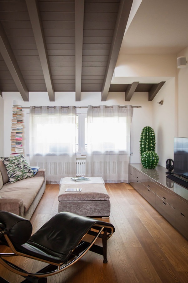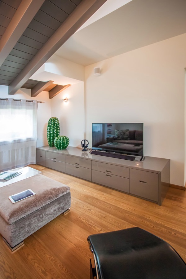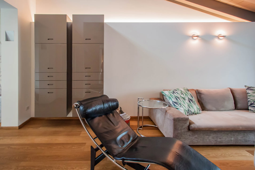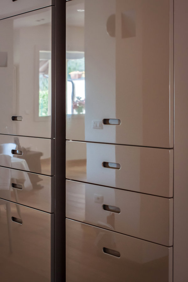
Designing a smartworking corner according to Modulor

Designing a smartworking corner according to Modulor

During the last few months, our daily life has been completely changed by the global pandemic.
Not only our habits have changed, from small daily gestures to the way we use services, but also the working and private world have been seen from a different perspective.
If until recently, in fact, the coexistence between home and work life was a voluntary choice of a few people, now almost all families have faced concepts such as smartworking, DAD and online meetings.

But what does it mean at a spatial level to introduce smartworking? How have customers’ needs changed to cope with this now habitual type of work?

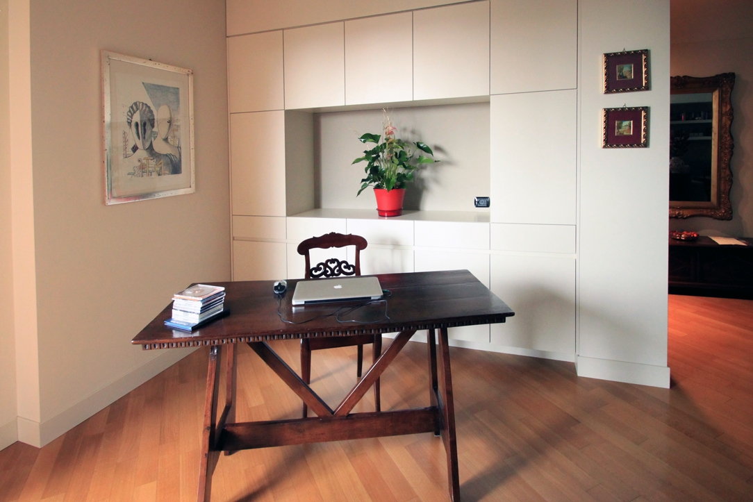
classic villa 01 corner of smartworking

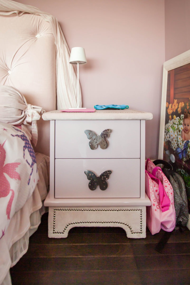
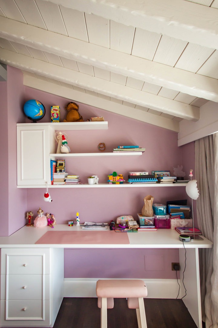
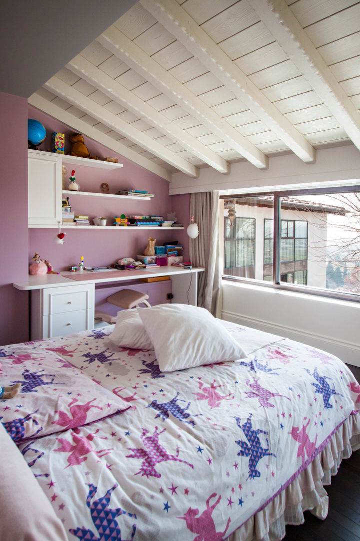
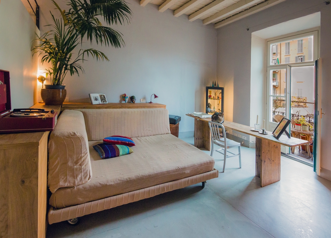
A retro-style wooden desk with a modern equipped wall for a classic and contemporary smartworking corner

THE COEXISTENCE BETWEEN THE PRIVATE SPHERE AND THE WORKING WORLD

The change in habits and lifestyles has involved all aspects of our daily life. From simple gestures such as shaking hands as a sign of knowledge and respect or greeting each other with a warm hug, to participating in cultural and recreational activities such as shows or concerts. The changes that have necessarily been introduced have certainly upset our perception of the private sphere and relating.

Added to this is a new conception of the working world that has increasingly entered our domestic environments.
Previously, in fact, working remotely had been a choice or opportunity for a few, who deliberately knew how to relate both aspects in a single environment. Whether reserving an entire room or dividing domestic spaces with a well-defined design logic.
This is the case, for example, of this studio-home whose design has followed the principles of Feng Shui to organize the internal activities.

From a refined choice, the introduction of a smartworking corner has now become a necessary requirement. All the more so if in the same household the different users need a computer station and well isolated settings to be able to carry out online lessons or conferences on Zoom without interference.

 Milan studio living room 03

Romantic and Shabby Chic atmosphere for this essential worktop

HOW HAVE CUSTOMER NEEDS CHANGED DURING LOCKDOWN?

The months of “confinement” between the first lockdown and the subsequent subdivision into regions according to the chromatic distinction have certainly influenced our way of living the house.
Just think of the number of hours spent at home in the last few months.

As a consequence of this, first of all, a critical vision of one’s own interiors has been introduced. Small improvements to be made, more refined aesthetic details, functional additions in each room.
To demonstrate this, it is enough to recalling the endless queues in the furniture megastores and DIY stores after the first opening in May 2020. More or less improvised solutions, which many times also involve a “self-taught” component to create greater satisfaction in the final result.

Even in custom-made furnishings, customers have followed this wave of changes with requests that could make the spaces in the home more functional. Whether it is a greater attention to the aesthetic impact or a technical improvement, it was certainly the way of seeing one’s home that changed. To all this is added the aforementioned parameter of necessity, and here is the most common request in recent months: providing a corner for smart working.

FROM THE LARGE WORK SPACES …

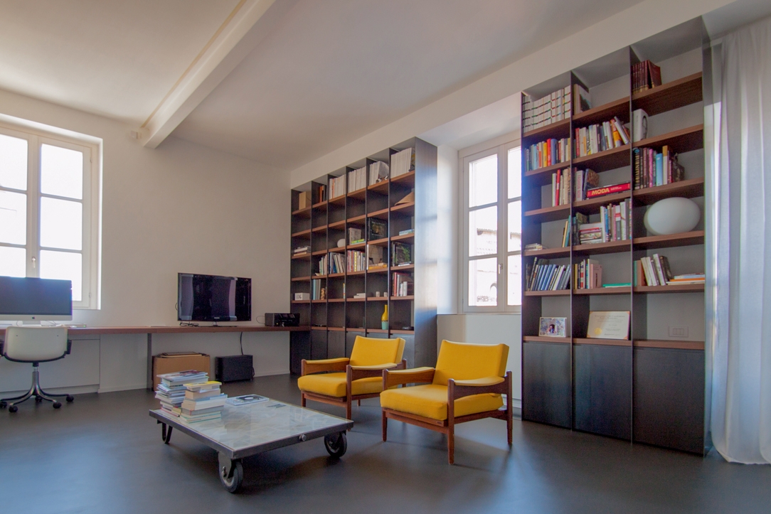
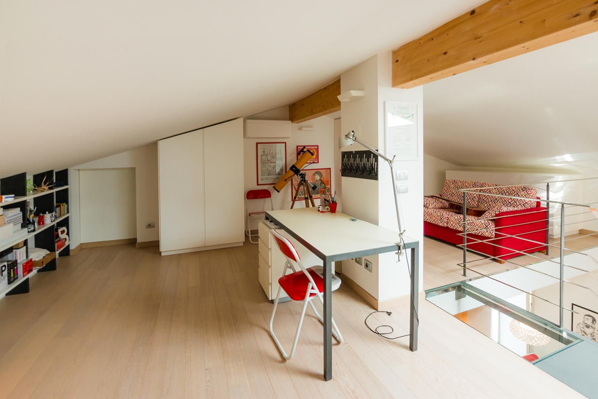
In our previous creations, we had already faced with study corners and walls equipped with desks to make the different rooms more functional. Surely bookcases and most of all desks have become the center of attention. In some cases, these have occupied an entire dedicated room with large and bright rooms. This is the case, for example, of this workstation with an industrial touch inserted in full-height bookcases. A linear element runs along the wall perforated by large windows providing a comfortable support and work points. To embrace the central relaxation area, bookcases with black waxed iron sides and wooden shelves. Another example is this gallery equipped as a study, which exploits the slope of the beamed ceiling to place an essential desk overlooking the living area, and a bookcase embedded in the lower heights.

Alba apartment 03

The oak worktop develops along the side wall with linearity and essentiality in the industrial interior of this apartment

loft studio

Equipping an attic as a study allows you to take advantage of the internal heights while respecting the brightness of the interior.
A minimalist desk overlooks the contemporary pop interior of this apartment

With the passage of time and changing needs, even the work spaces have adapted to the existing furnishings, making them as functional and essential as possible.

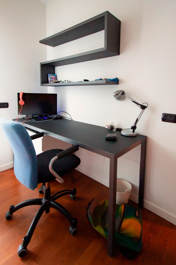
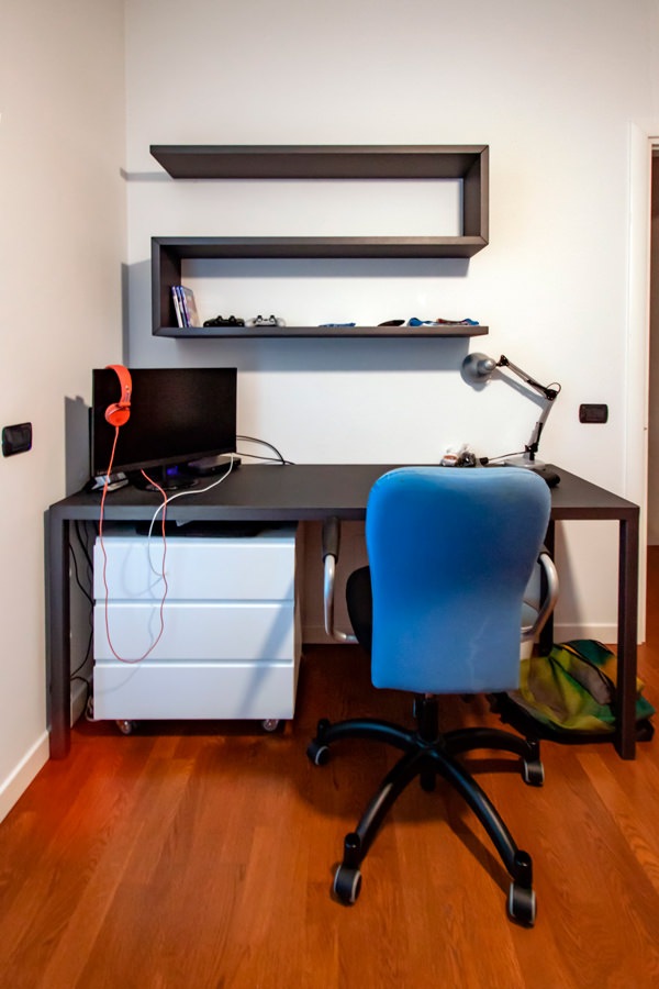
Among these, the classic large desks with drawers and a service bookcase. This version offers a material and chromatic combination with a masculine touch: anthracite gray linoleum top with painted iron supports. It is accompanied by a shaped shelf with black waxed iron covering that with simplicity and elegance provides a practical support for small objects or books.
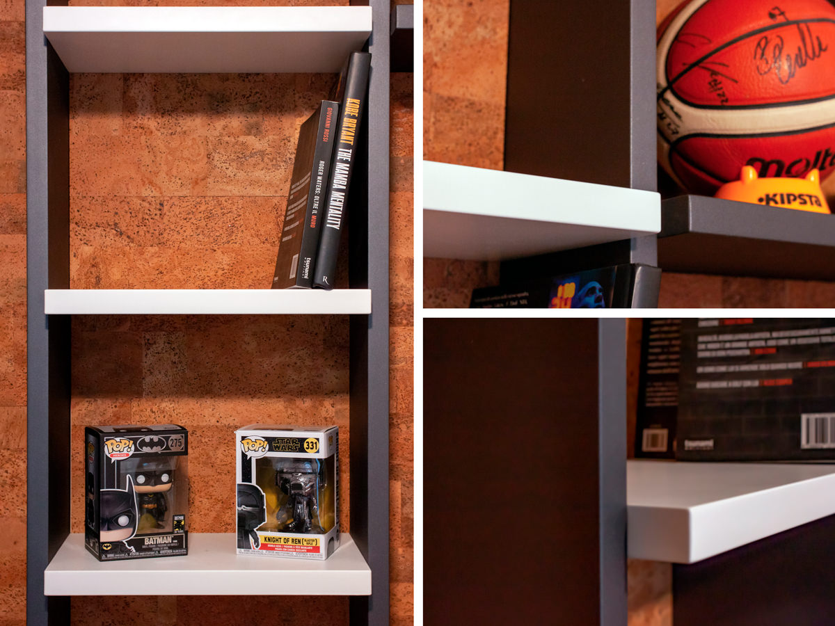
On the side, a bookcase with shelves which is part of the compact structure which also includes the bed with a trunk opening and wardrobe with bridge component. The black waxed iron sides contrast with the matt lacquered MDF shelves, creating material and chromatic contrasts with a strong character.

 Smartworking anthracite metal desk
anthracite metal desk front view

A desk with an anthracite gray linoleun top and iron profiles defines the masculine stylistic imprint of this bedroom

Details MDF and metal bookcase

Details of the bookcase and shelves in black waxed iron and matt lacquered MDF.
Material and chromatic contrasts.

TO THE SMALL CORNERS OF SMARTWORKING

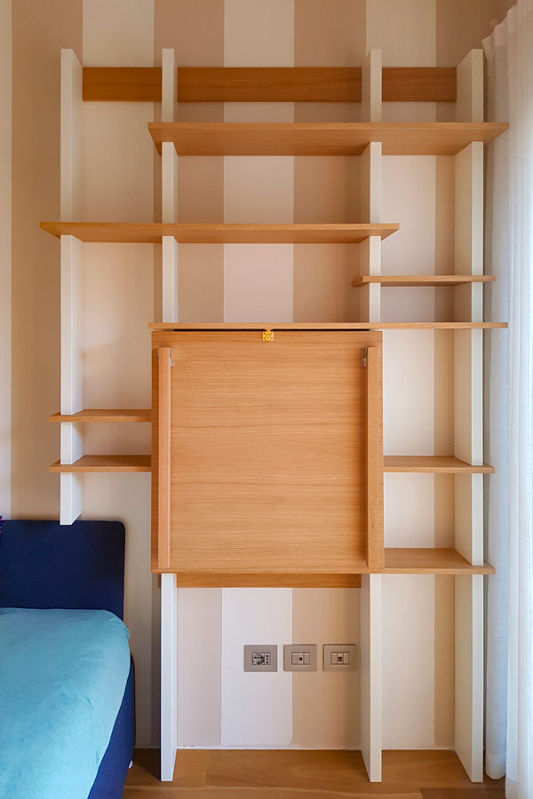
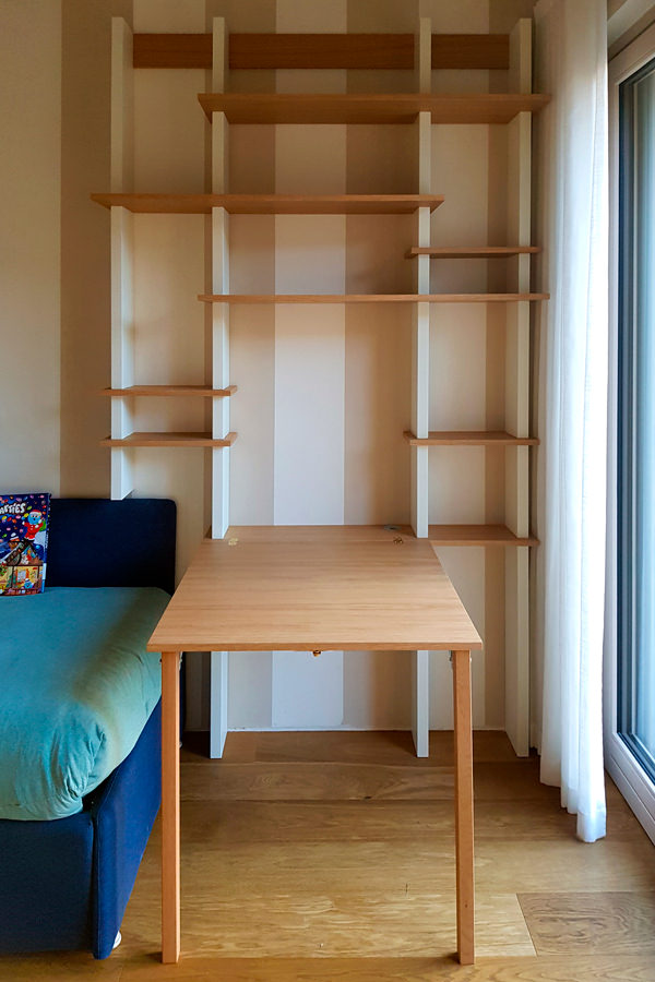
The passage of time has given rise to more essential projects, which also exploit small spaces with practical and compact solutions. Among these, a support surface with flap opening attached to the existing bookcase.
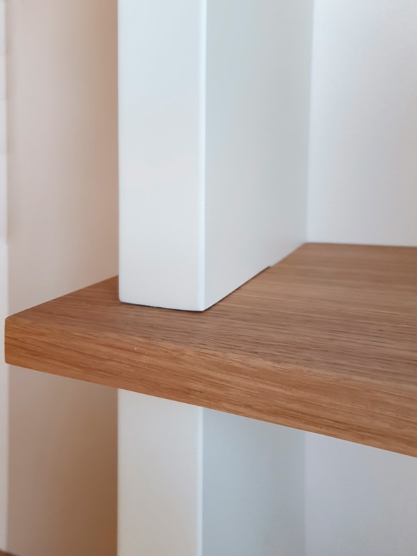
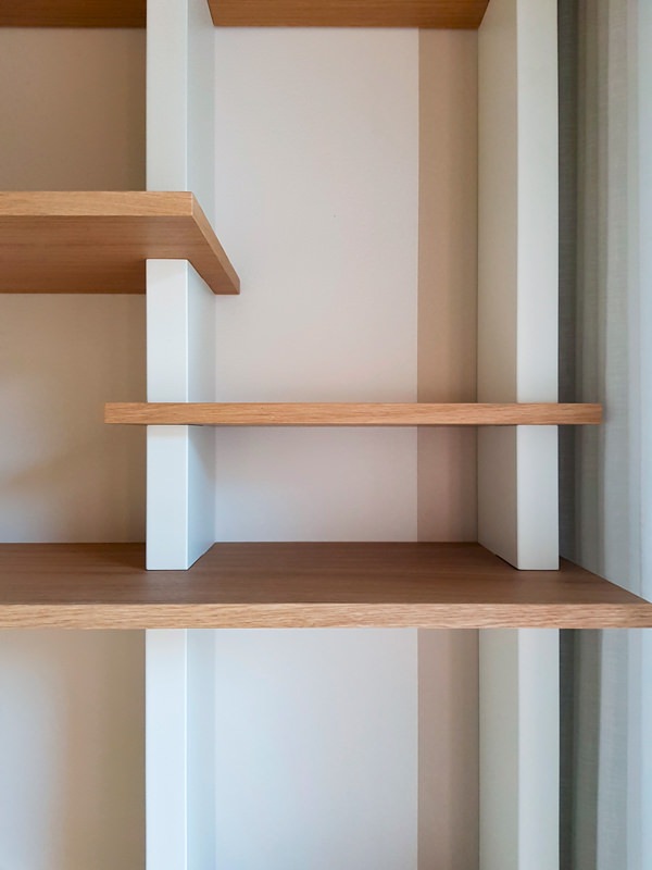
The wooden shelves become the key to horizontal reading, appearing almost set between the vertical sides in lacquered MDF. Games of depth and geometry give life to a room marked by an essential visual rhythm.

 bookcase with closed smartworking top
 bookcase with opened smartworking top

The top of this wooden bookcase exploits its flap opening to optimize the space

 detail tops in oak MDF shoulders
 detail front view of bookcase shelves

Material details with a strong aesthetic character: the wooden shelves are embedded in the shoulders by the vertical reading in MDF

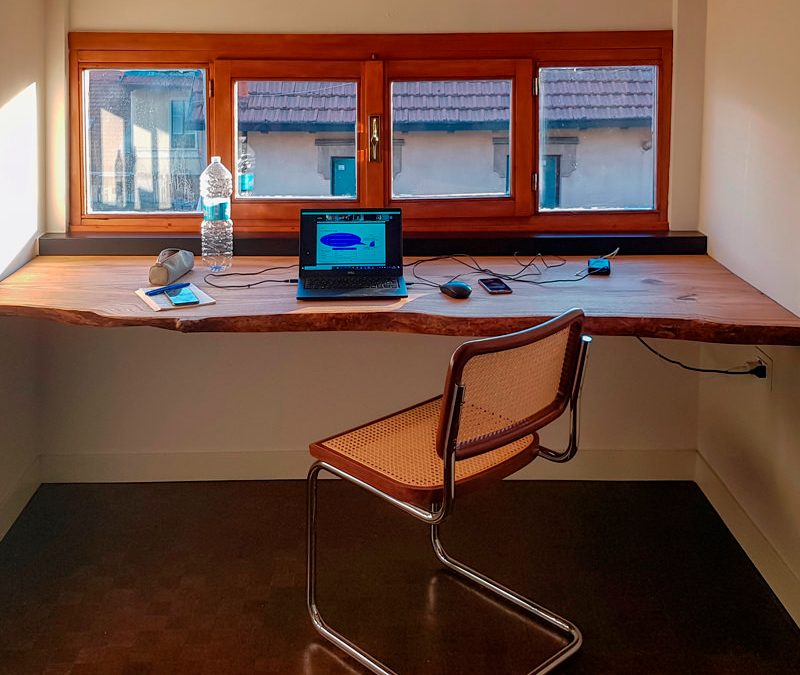
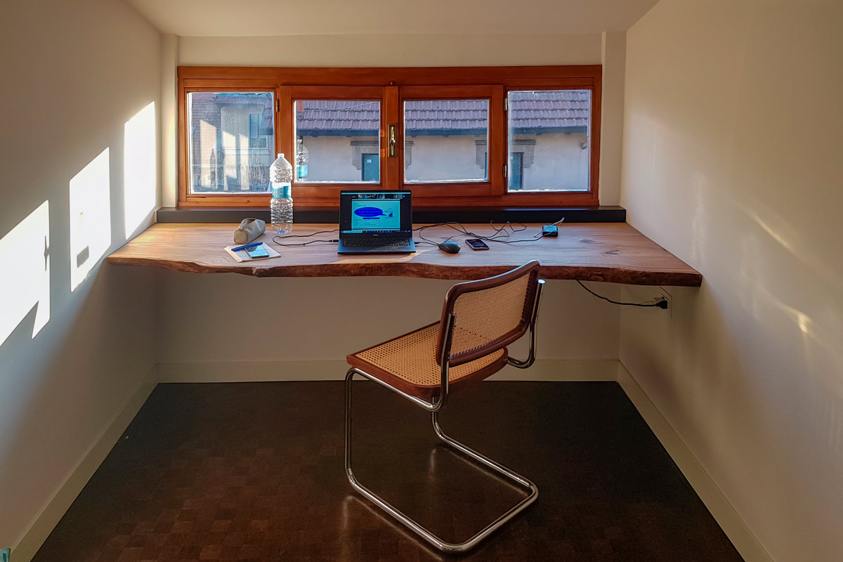
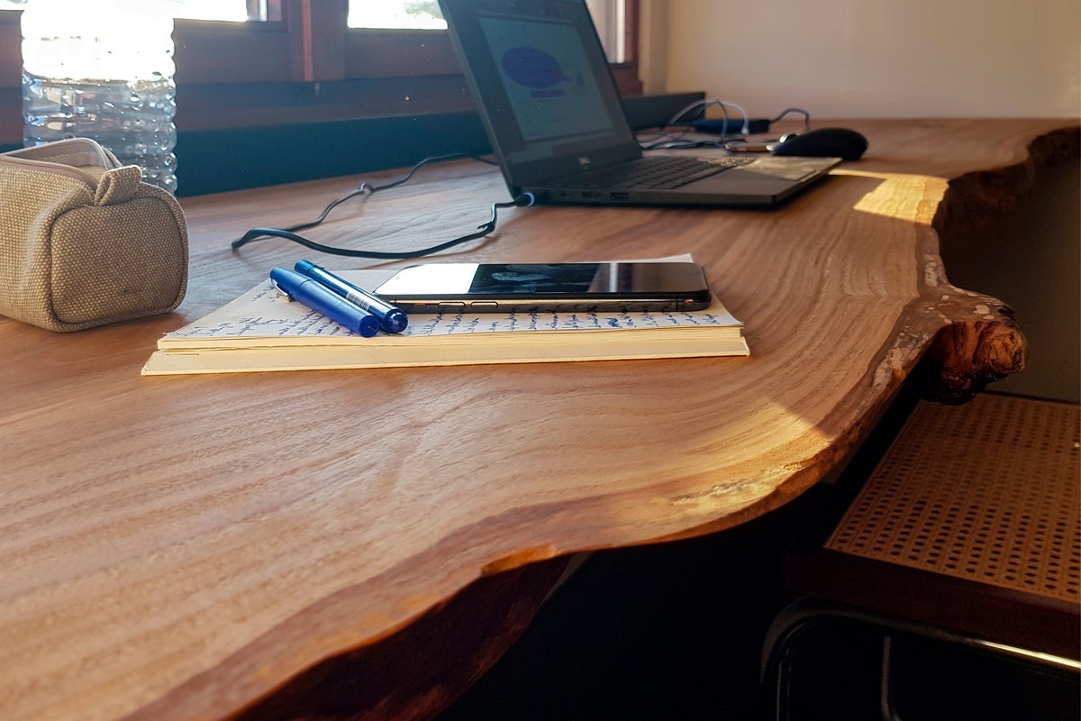
On the other hand, the solutions that take advantage of the reduced heights with rough and natural surfaces have a more romantic soul. In this example, a cherry wood worktop expresses all its material uniqueness with visible knots and a rustic profile, without sacrificing sophisticated details. However, the simple but incisive design line does not renounce practicality. For this reason, a hole has been provided for the passage of cables along the depth of the top, making it also functional for the electrical preparation.

 front view cherry wood desk smartworking

Modern furnishings and natural elements harmonize in this smartworking corner with an authentic soul

 smartworking cherry wood desk top details

A raw cherry wood top expresses all its naturalness

The smart working that has overwhelmingly spread in these difficult times will most likely not remain a transitory phenomenon but will increasingly become part of our life, it will become a necessary space in the home. We designers are ready not to forget it in the design phase and follow its evolutions.

Children in safety

Children in safety

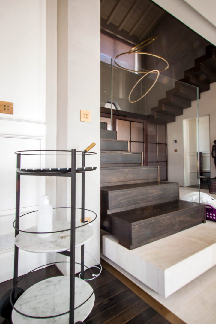
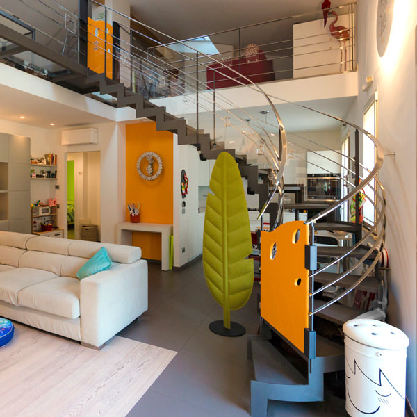
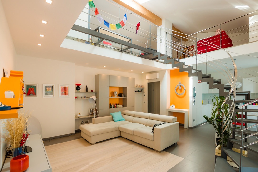
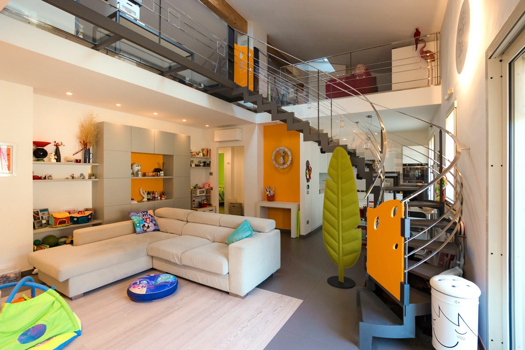
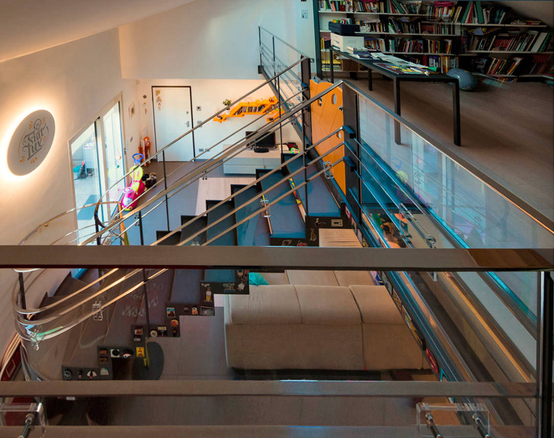
Not all environments may be suitable for the safety of children. Designers are used to designing solutions tailor-made for customers’s needs. However, these can change over the years. In this case, a beautiful aerial staircase in a stately home can become an element of danger with the arrival of the progeny. Here the project of the whole apartment.

house with aerial staircase

the staircase before the intervention

THE CHILDREN

The small creatures under the meter who are experimenting with the use of their body in fact do not yet have the sense of danger. All the elements and objects of the house must be reconceived with their eyes. What can be attractive but fragile and in their reach must be moved, dangerous edges and corners must be covered and empty spaces, in which one can slip and fall, closed or buffered. Every element such as stairs, furniture and hallways of the house must be secured. In this case the danger of the staircase was given by the open part under the middle stainless steel bands of the central barrier, which wind along the entire slope and on the gallery.

house with aerial ladder in child safety

the aerial ladder after

SECURITY

PLEXIGLASS

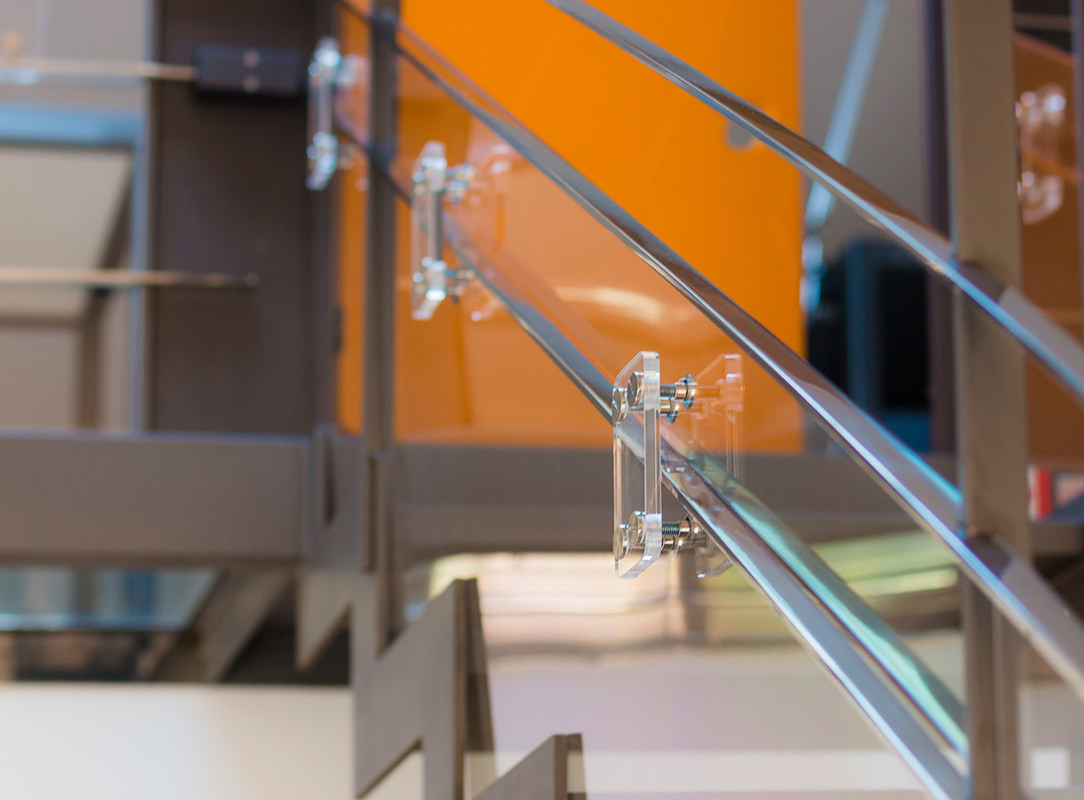
We have found an effective, very elegant, minimally invasive and inexpensive solution to solve this problem. To secure the ladder we have used 3 mm polycarbonate, sized, cutted and fixed to the inside of the barrier, leaving the handrail and the first band at child height free for the grip. Square elements in Plexiglas were then fixed with stainless steel design studs from the outside of the staircase, leaving the handrail and its central bands untouched and using them as a sandwich thickness. In this way, all the plastic part are fixed and safe. For the balcony we have used 1cm hardened Plexiglas that is more resistant in the case of heavy impacts with objects thrown without reason by our little users. As a fastening system the same as the ladder. Seeing the before and after photos you will notice that these plastic elements seem to disappear within the general view of the house. Only by looking carefully can you see the reflections of the Plexiglas and polycarbonate and the studded squares.

children's gate on steel structure
children's gate details
plexiglass details

SHAPED CHILDREN’S GATE

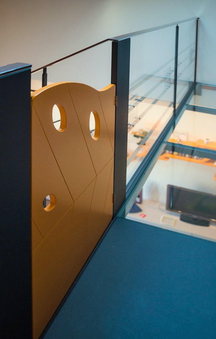
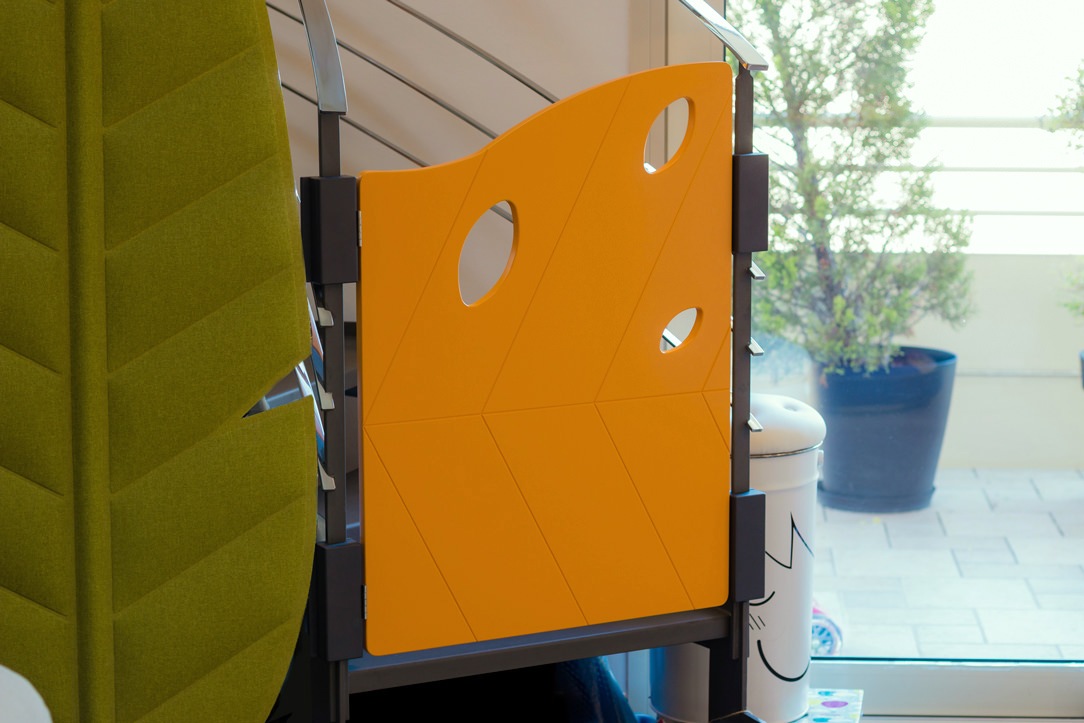
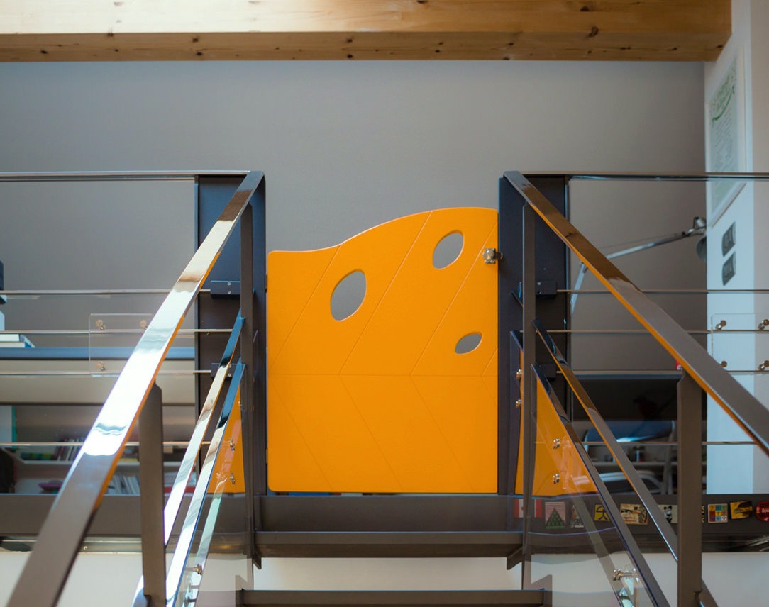
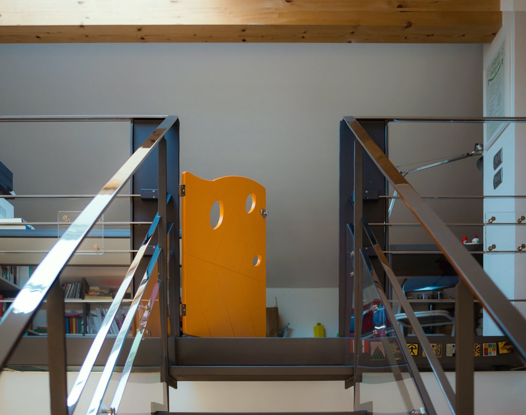
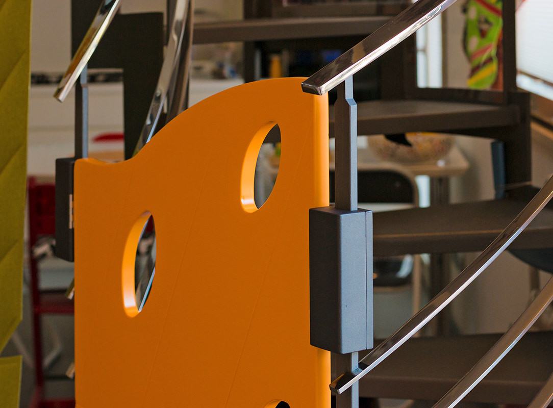
For access to the stairs custom-made gates have been designed: one for the lower access and a second for the upper part of the gallery. The gates were made of MDF, shaped and engraved with a numerical control machine and then lacquered with matte orange paint. In the same color tone the other points of orange present in the living area.

children's gate

The shape of the gates are that of an autumn leaf, its symmetrical veins remain in the center of the design while three holes, always recalling a leaf, are found in the upper part to lighten the element. There are no holes in the lower part to avoid climbing daredevil little climbers. Both gates were fixed to the staircase thanks to wooden blocks fixed together on the upright of the staircase and then painted in the same dark anthracite. At the back of the gates, in a strategic position not reachable by children, there is a sliding bolt for close and open them.

children's gate
children's gate

TEMPORARY

This intervention has absolutely not touched the existing staircase and when it will be disassembled everything will back as before. It is a temporary solution but satisfies the eye to the point that it could remain mounted more than necessary. For the moment, the important thing is that the children are safe, free to walk up and down the ladder independently and stay and play in the attic part of the house.

closing balcony and child safety gates

How a kitchen takes life: the phases of realization

How a kitchen takes life: the phases of realization

Discovering bespoke furniture, have you ever wondered what are the phases of realization that give life to a kitchen? We are ready to show you our creation and production process! The design of a custom-made kitchen is born from the meeting between the customer’s wishes and personality and the designer’s experience, capable of satisfying the functional and aesthetic needs of both. What the customer sees is the transformation of the project, shown in its most satisfying graphic form, into a finished and complete product. However, there is a world behind the creation of a kitchen: from the artisan production phase, with boards with strong resistance and workability, to the painting of the components, from transport with packaging to final assembly. Let’s follow the production process of this minimal kitchen.
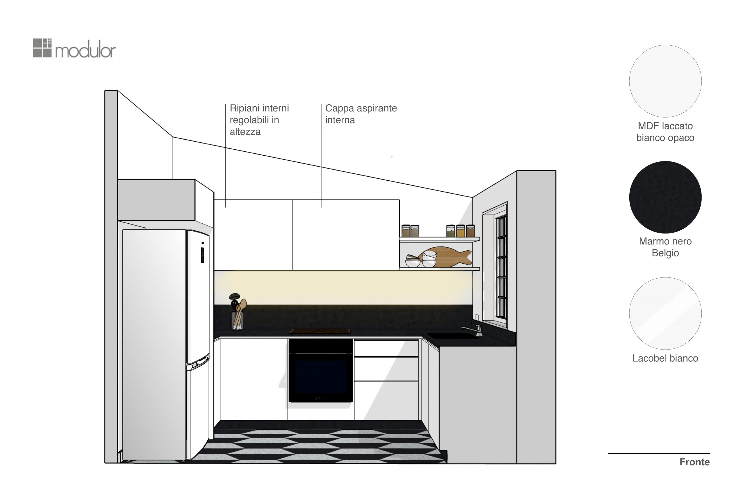
design phase perspective phase

The design: a continuous dialogue with the customer

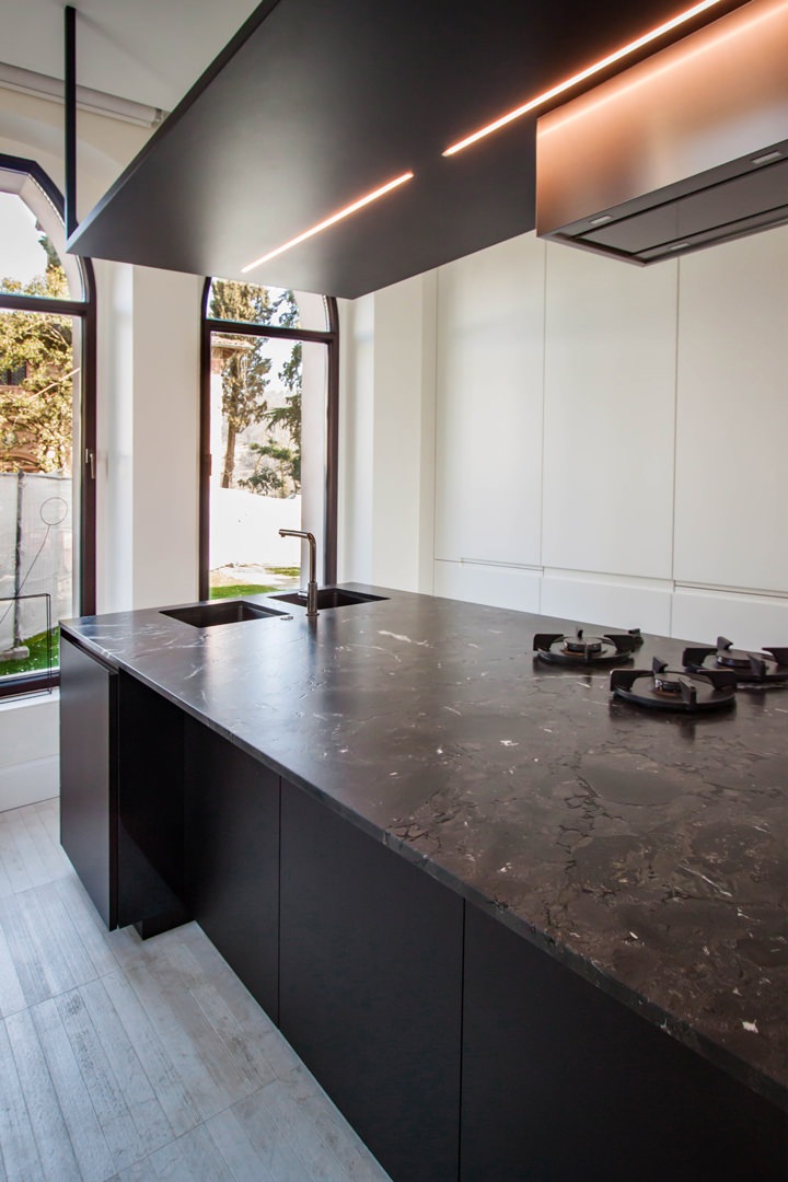
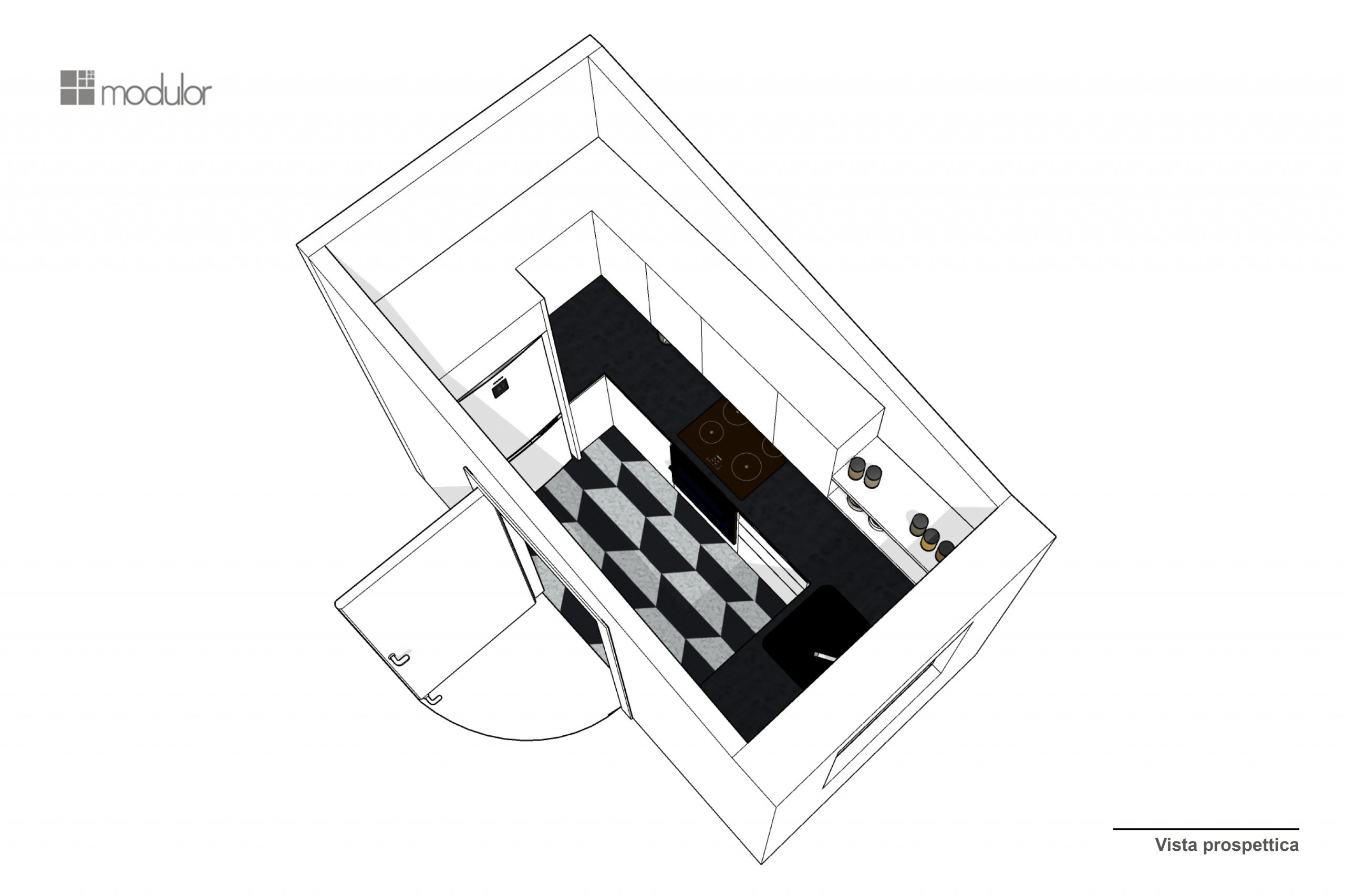
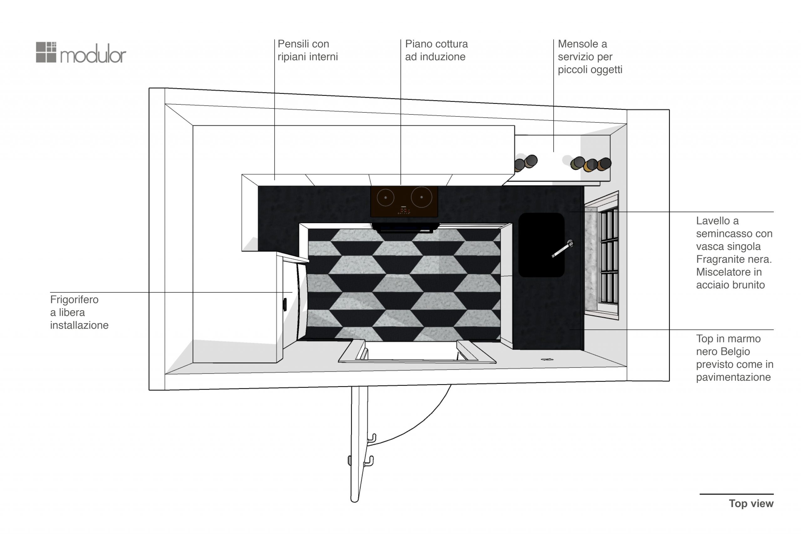
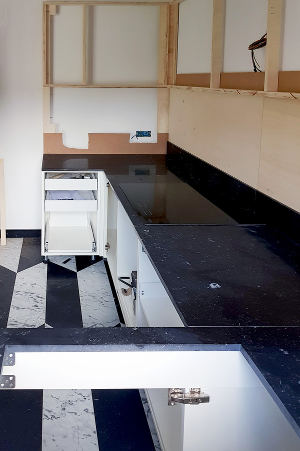
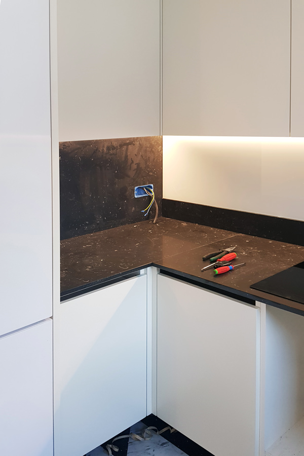
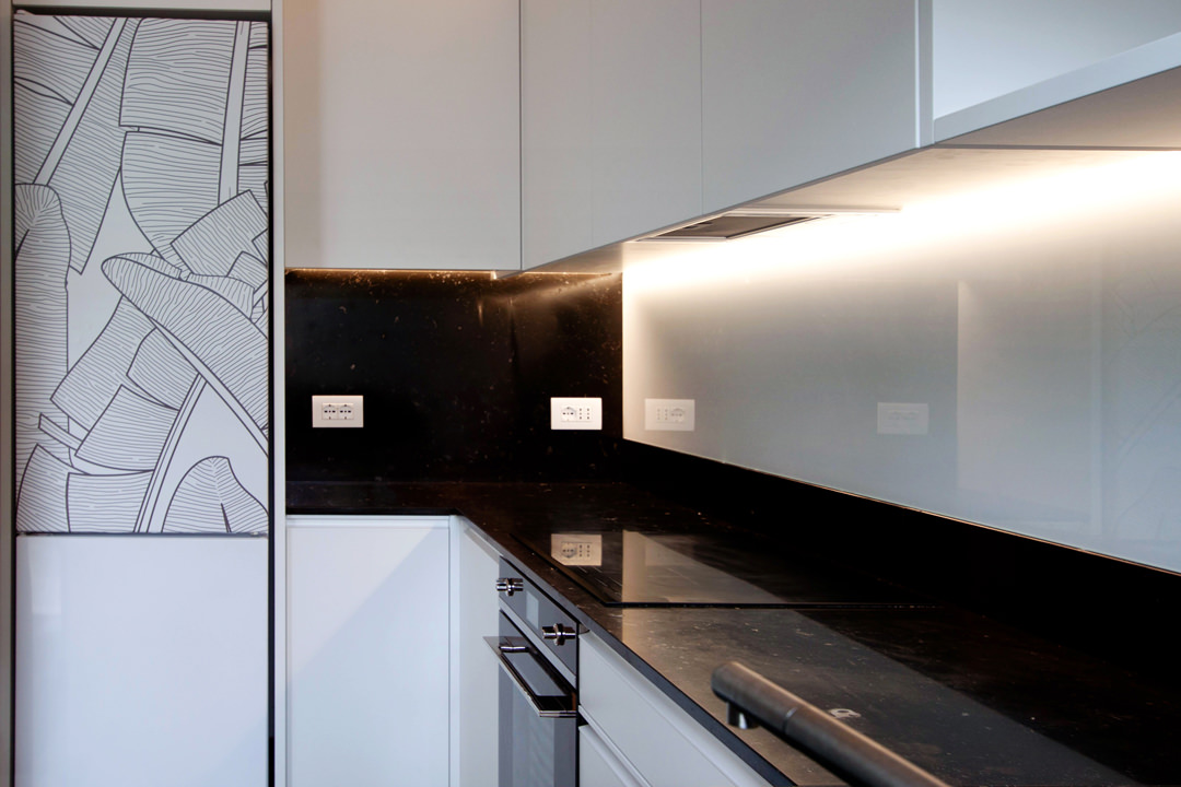
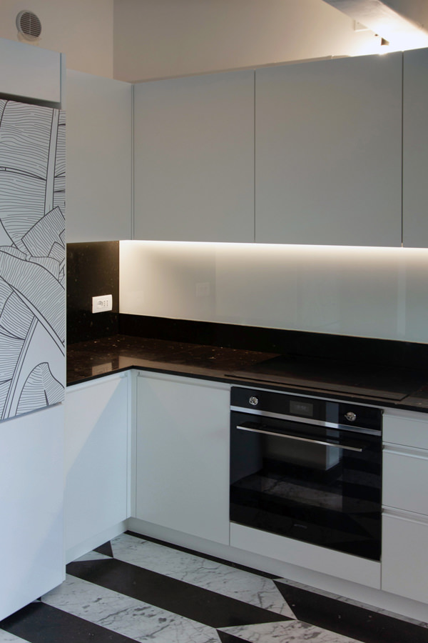
The design of this kitchen stems from the need to optimize spaces in an environment already strongly characterized by floors with geometric marble patterns. The presence of a relevant flooring has given rise to a project that responds to the same chromatic characteristics. In this way, the minimal line of this kitchen is born. Here, the lower volumes and upper wall units in matt white lacquered MDF give brightness and freshness. The black marble top houses the built-in sink and the induction hob, transforming into a splash back and side back. The vertical reading wall units holds the hidden lighting that is also reflected by the white Lacobel splash back. The graphic rendering of the project allows you to get an idea of ​​the general layout of the kitchen, studying the different components based on the best practicality. We try color and material combinations and studies alternatives in the volumetric composition. In this phase, the ability to read and interpret the client’s wishes is essential for the designer. On the other hand, the customer plays an active role, becoming an integral part of the design team. The best projects are in fact those that do not stop at the first solution, but undertake new design challenges, evolving from time to time following the brainstorming between the client and the designer.

design phase top view
Minimal kitchen Verona design  front

From the design offices to the lab: the executives

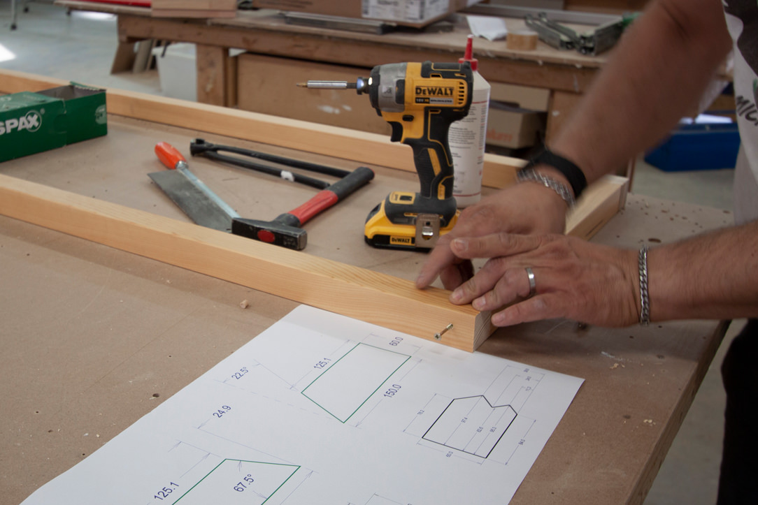
Once approved and defined in the smallest detail, the kitchen project goes directly to our laboratory, ready for the construction phase. The three-dimensional model developed during the design phase is reworked to take on a new look. From a graphic and realistic setting, it is transformed into a functional model from which the executive tables are processed to be addressed to our artisans. After an accurate on-site survey, where electrical predispositions, discharge and existing constraints are highlighted, the model is adapted and designed in detail. Extremely simple designs that give up their aesthetic presentation in favor of greater clarity of reading. Dimensions, cuts and joints are underlined to make the realization cleaner. Our kitchen is therefore broken down, from a three-dimensional model in digital format to A3 tables with plants and elevations so that the experience of our craftsmen can give life to the actual realization.

Between cuts and painting: the realization in laboratory

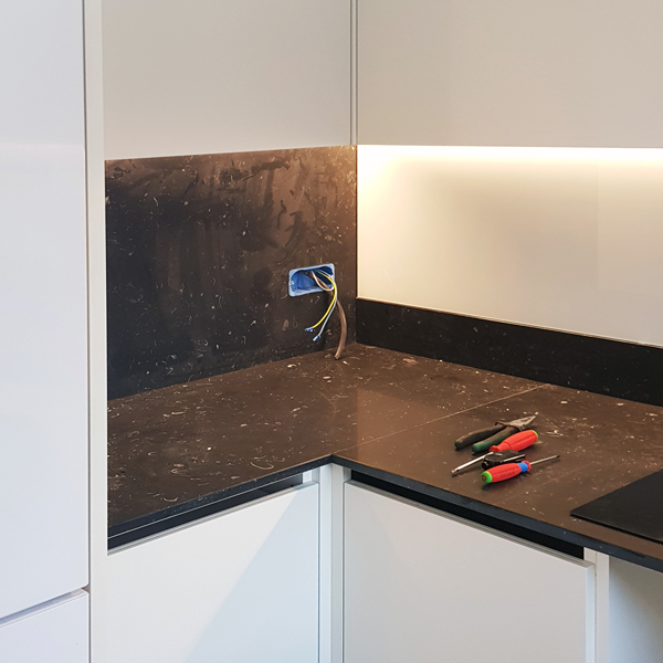
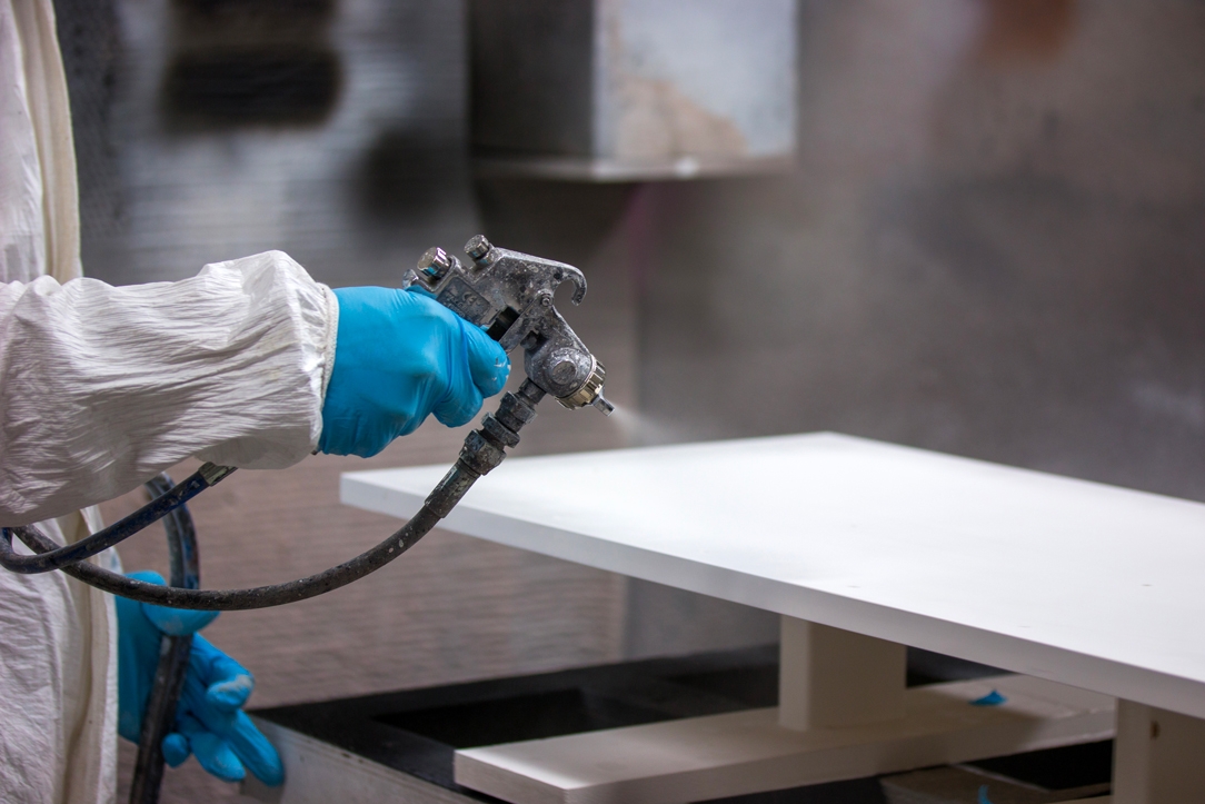
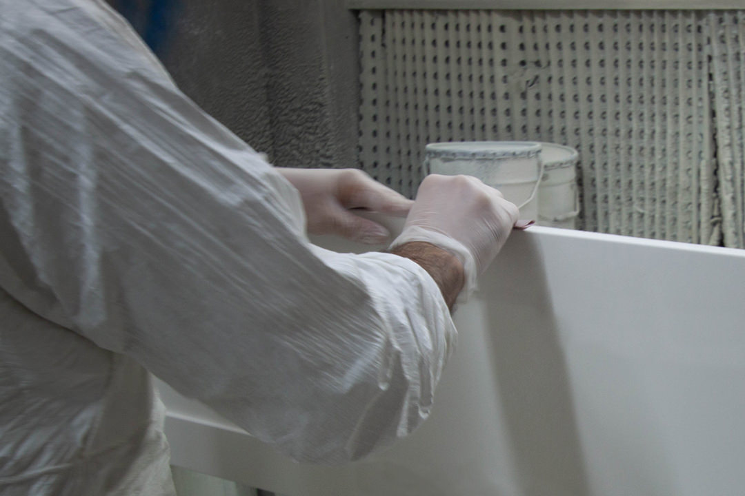
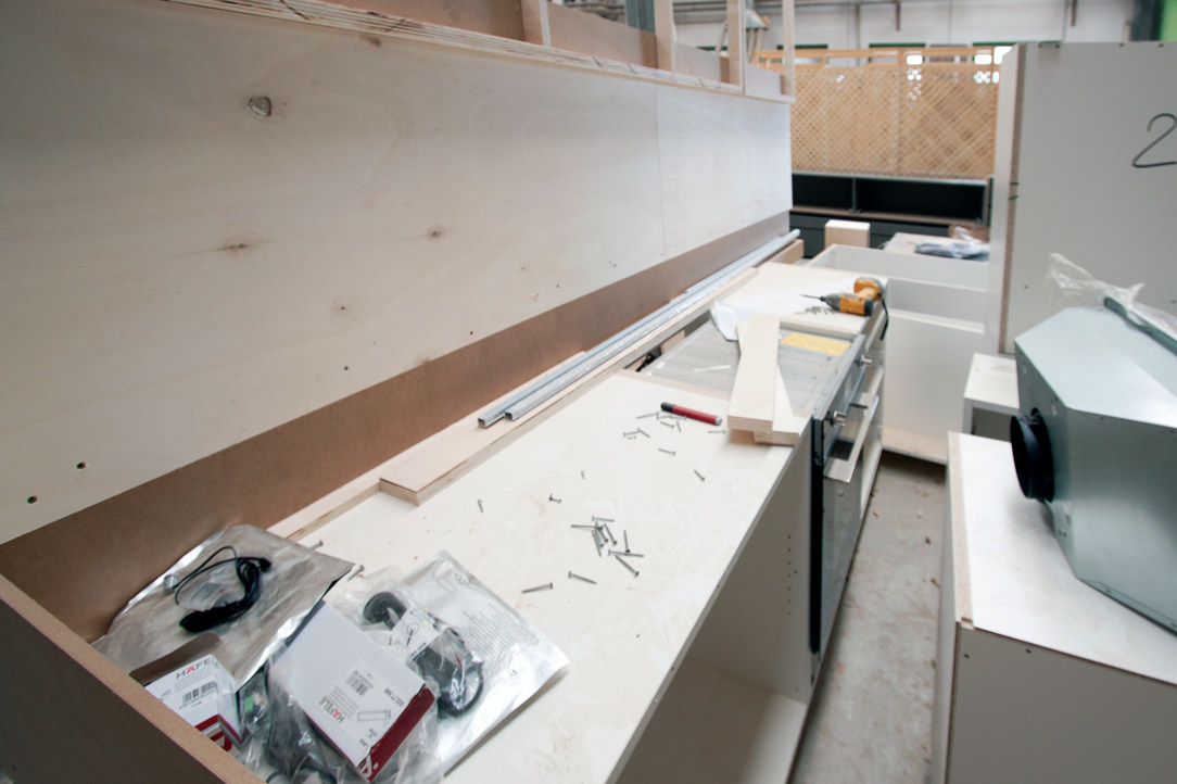
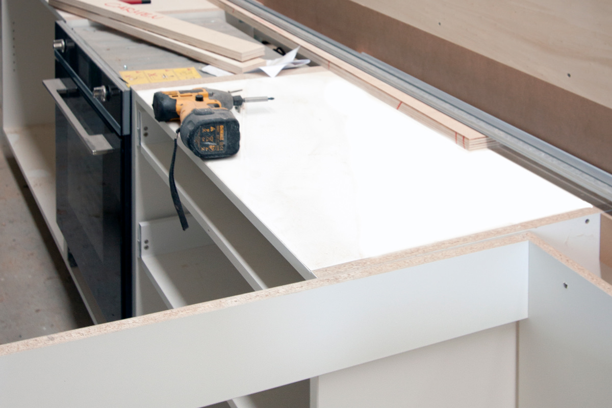
The MDF boards are cut with special machinery preparing the joints for household appliances and related attachment points. Any special processes are carried out with the numerical control machine or with the pantograph, at rest during this project. In the meantime, our guys in the internal painting department prepare the samples with the different chromatic shades. There are infinite shades of each color,. Even of white, that contextualized in an interior can give life to different effects and perceptions. Once the cutting of the single components is finished, the assembly test takes place. Screws, hinges and drawer guides now come into play by verifying the right composition of the kitchen, which is in full construction phase. If our bespoke furniture passes the assembly test, the components are broken down again and passed to the painting compartment.

minimal kitchen realization
painting laboratory
laboratorio piallatura
assembly test Minimal kitchen Verona
Assembly test laboratory

Traveling to the final destination

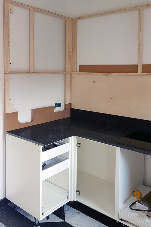
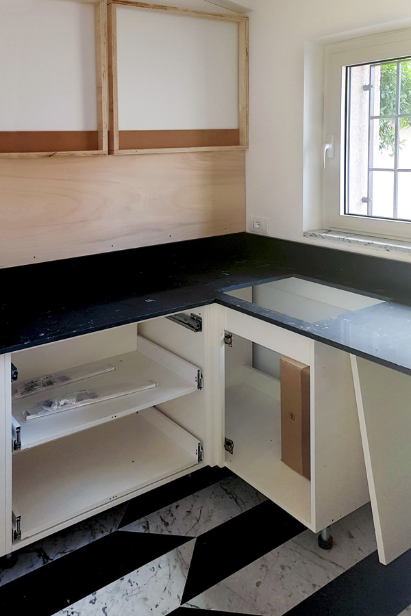
The different components are ready to undertake on their journey. The packaging is careful and punctual, ready to foresee and avoid damage during transport. The load is organized in order to optimize the movements, whether it is short distances or in the case of international travel. Packed properly and accompanied by all the appliances required, our kitchen leaves for Verona, ready for the big day of presentation to the customer. Expert hands and assembly tool kits quickly shape our minimal kitchen. The load-bearing structures for wall units and lower volumes are prepared, to which the various external components are gradually added. Lighting under the wall unit, handles with aluminum shell, shelves with rods for height adjustment. All details that now become fundamental for the final realization of the kitchen. Once the assembly is complete, broom hands, dustpan, vacuum cleaner and good hand works. Everything is cleaned from dust and work shavings, removing any protections and any construction site structures. And here it is, bright and minimal, functional and able to accommodate products and foods of all kinds.

assembly phase Minimal kitchen Verona 01
assembly phase Minimal kitchen Verona 02
assembly phase Minimal kitchen Verona 03
assembly phase Minimal kitchen Verona 04

A minimal kitchen: the final product

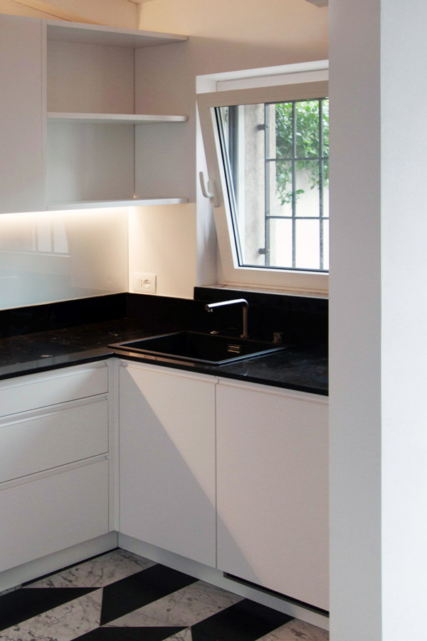
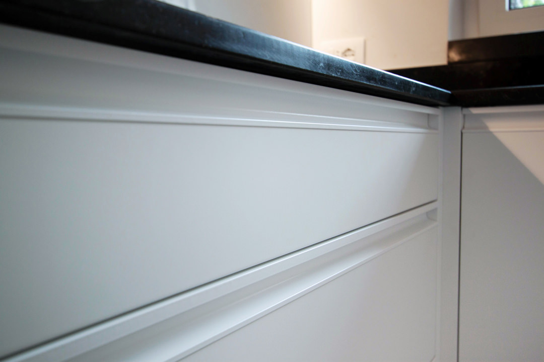
The day of the official presentations has finally arrived. The black marble top chromatically contrasts the lower volumes and white lacquered wall units. Different storage points ensure space optimization with removable trays and baskets but also height-adjustable internal shelves. The drawers for cutlery, table linen and pots are designed in different heights depending on their use. The recessed handle makes the aesthetic impact elegant and essential, while the white painted shell ensures greater durability and resistance over time. Upper shelves are perfect for small objects, visually lightening the terminal part of the wall units. In this way the natural light diffused by the side window spreads freely in the space giving a touch of freshness. After viewing the finished product with the customer, with a good handshake and the wish for a next collaboration, we come back to the base, ready for new challenges! Other projects are already under construction and willing to become reality. To continue your journey discovering the creation of a kitchen, you can learn more about the types of cladding: an Emperador marble kitchen and a kitchen entirely steel covered.

finished product minimal kitchen
windows view kitchen
refrigerator view minimal kitchen
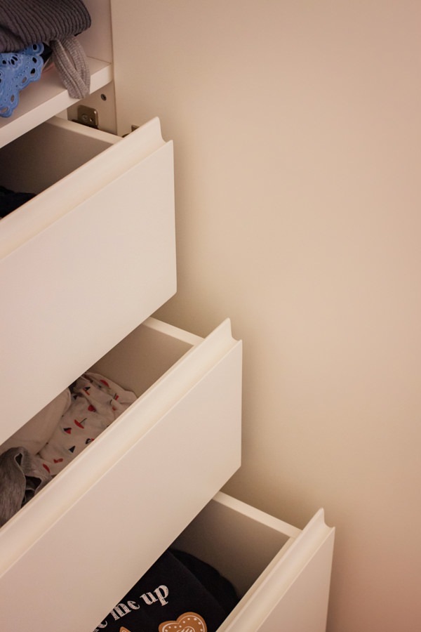
recessed handle drawers detail

A cerulean blue modern kitchen

A cerulean blue modern kitchen

The cerulean blue hue defines the stylistic firm of this modern kitchen, set on dark wood tones with brass finishes. The care of detail gives shape to an extremely elegant project, modern in aesthetics and contemporary in settings.

Modulor modern kitchen with dark tones_01

The on-view composition

An interior that becomes furniture. The design of this kitchen diverges from the traditional vision of the closed room to become an open space composed of different volumes.
The main block is a visual union of the low volume in ribbed wood set between wall units with a vertical subdivision and full-height columns.

The common thread that contain the perception of the environment is the brass base, taken from the light and linear handles.
The island block with rounded shapes and overhang countertop, elegantly conforms to the main volume, despite a stylistic change in the design forms.

Indeed, it is this difference between the straight and geometric shapes of the back unit and the rounding of the profile in the central island that defines the stylistic imprint of this kitchen.

The traditional closing shoulder is replaced by a recessed library that visually lightens the perception of the kitchen characterizing the furniture. A full-height bookcase compartment that alternates shelves in a well-balanced geometric composition.

recessed bookcase side abutment
bookcase abutment division sleeping area
Modulor modern kitchen with dark tones_02

Functionality and aesthetics in symbiosis

Not only the general volumetric setting, but also the internal organization demonstrates a perfect relationship between functionality and aesthetics.

As a demonstration of this, the central island is equipped with rounded corner doors in order to make the best use of each available corners.
Shaped white shelves stand out among the dark tones and blue doors of this modern kitchen, showing all their functionality. The choice of appliances is also avant-garde, as for example the induction hob with attached extractor hood that reduces the functional components to the essential in favor of visual essentiality without sacrificing the practicality.

Modular kitchen island ribbed wood
open door with shaped shelves

Colors and materials

Cerulean blue matt lacquered MDF, dark ribbed wood and brass are the protagonists of this modern kitchen in which dark tones are chosen for their elegance.

A rigorous environment that is being fascinated by contemporary functionality.

The chosen shade of blue, extremely modern, is enriched with a warm appearance especially when combined with the dark-dyed ribbed.

It is precisely the materiality in the latter’s finish that enriches the main volumes of the kitchen with movement and rhythm.

The brass of skirting boards and handles, underlines the design lines with a precious character that gives refinement to the project.

Modulor materialboard
Modulor modern kitchen with dark tones front view
Modulor materials finishes

Advice

The choice of colors and materials often defines the character of an interior. We are often intimidated by intense colors and dark tones, especially if imagined on large surfaces. The final impact can instead reserve great surprises, and give a touch of freshness and modernity.
Here is another example, in this case a dark gray kitchen with oak inserts.

How to equip a bathroom with laundry corner

How to equip a bathroom with laundry corner

A functional and aesthetic analysis of the laundry corner. An environment that in contemporary reality is forced to give up its autonomous room to blend in a small bathroom or equipped corridor. The aim is giving space to the services that define our daily life, making them aesthetically interesting.

laundry corner

Laundry corner with showed washing machine, basin and compartments furniture

equipped corridor

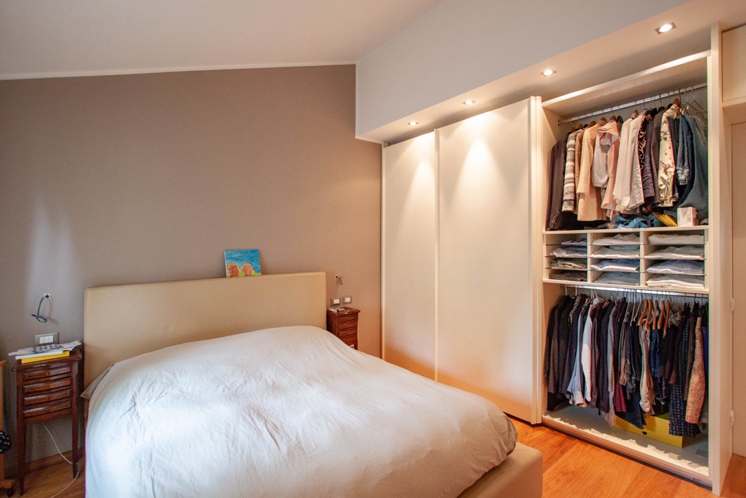
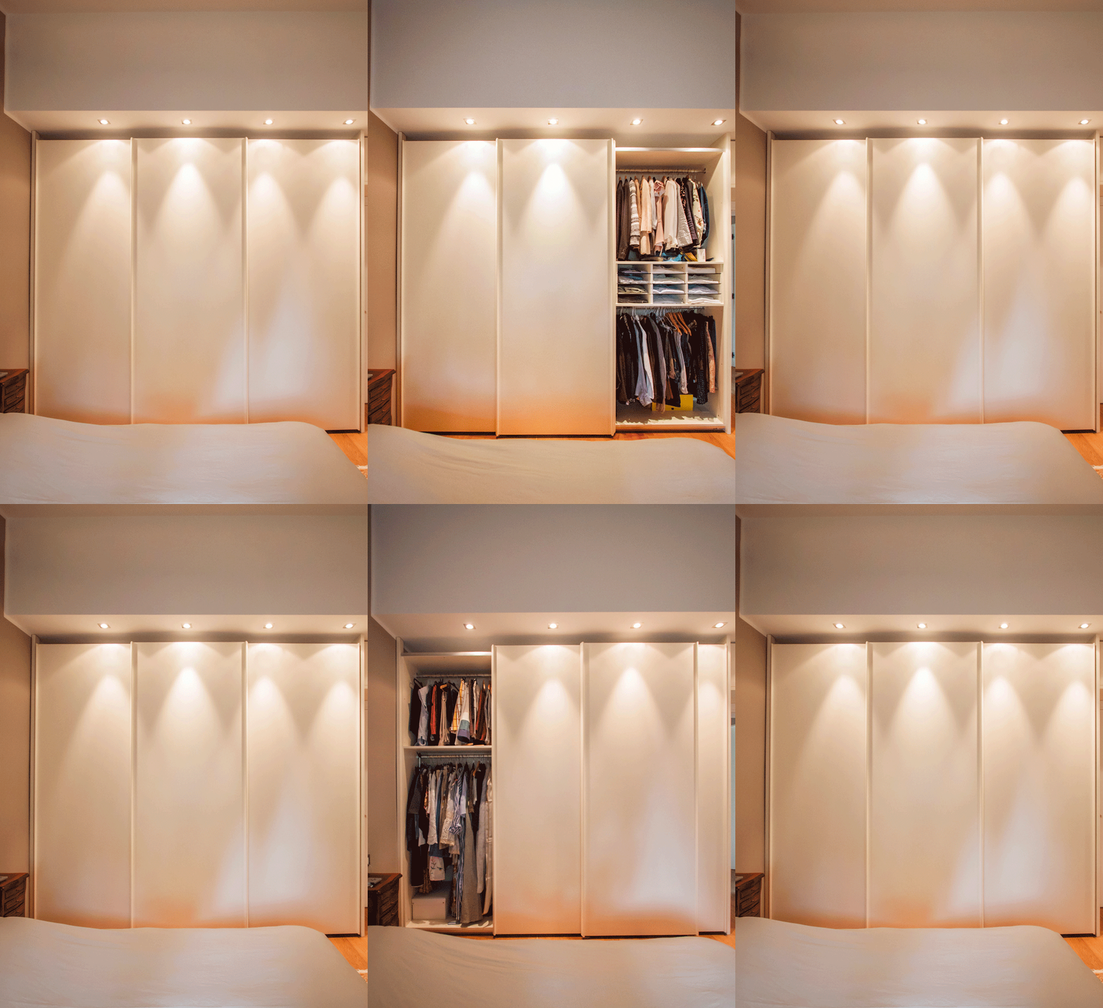
Optimize spaces equipping corridors with serviced wardrobes View the project

Space to services

Speaking of interior design, we are used to imagine elegant living rooms and modern kitchens, contemporary bedrooms and essential-style dining rooms. Over the past few years , the interior design has increasingly taken on the aesthetic meaning of architecture. Let’s remember, however, that design was born as the perfect combination between aesthetics and functionality. The morphology of furniture is nothing else than the natural result of perfect efficiency. It is exactly with this spirit that we want to highlight those “corners of the house” that we usually tend to hide because they are not “beautiful” even though they are basics in the functionality of our domestic spaces. The project layout of each house gets us used to dividing rooms between “living area” and “bedrooms”. The first includes all those rooms that are used to welcoming guests, designed with the aim of return the best public images of the owners. In the “sleeping area”, the most intimate and personal rooms of the owners come to life. However, in this typological distinction are missing all the rooms which, whether private or public, carry out a real function. Among these, just think of the laundry room, which over the years has changed its conformation adapting to the needs of the time.

washing machine recess

A laundry niche uses the available passage corner to house the washing machine and shelves View the project

From public washrooms to bathrooms equipped with laundry corners

Over the years, the home laundry has become increasingly important in private houses. Whole rooms were equipped with basins and ironing corners, which gradually witnessed the coming of appliances capable of simplifying manual work and obtaining excellent results. Private rooms that replaced the traditional public lavatories for an increasingly elitist concept of personal care and cleaning. The widespread use of washing machines, and modern dryers, has meant that laundry rooms take up less and less space inside private houses. Furthermore, in the contemporary vision of the house, open spaces have swarmed the architectural panorama more and more, reducing the functional closings to the bare minimum. As a consequence, to optimize space, the laundry room is often eliminated in favor of bathrooms equipped with washing machines, dryers and service cupboards. Making the appliances “invisible” was the next step. Here then come equipped wardrobes able to hold not only washing machines and dryers but also baskets and pull-out compartments for cleaning products.

laundry bathroom detail

A bathroom with contemporary wooden surfaces hide extractable functional elements. View the project

Composition of a laundry-corner

Equipping a bathroom with a laundry corner first of all means providing an insertion point for the washing machine. This can remain visible, favoring the opening of the porthole without interfering with any surrounding doors or being built-in the washbasin cabinet. To better hide the washing machine, however, it is necessary to provide a service cabinet that rests on the ground. It means excluding suspended solutions or light supports, and study a customed solution that allows the opening of the tray and the easily maintenance of the appliance. To this is often added a service cabinet with internal shelves and removable baskets that can contain cleaning products and accessories of different sizes. Often these latter two solutions come together in one, with folding or sliding doors, which act as a closure for the furniture element. Internal accessories such as dividers and hanging elements are additional options that can make the space more functional and optimize the overall dimensions.

bathroom with washing machine in view

The bathroom cabinet with wooden top and finishes houses the washing machine View the project

bathroom cabinet with open drawers

Drawers of different heights are extremely functional elements for organizing personal products View the project

bathroom service closet

A large service cupboard with internal shelves and removable basket for the bulky products View the project

It is the functionality that defines the composition of these equipped corners. Our task is to optimize spaces in the best possible way by creating practical and aesthetically satisfying solutions. Whether they are service points hidden in other rooms or clearly visible and recognizable elements, it is essential to be able to organize them in the best way, using all the available centimeters without however giving shape to narrow solutions.