SHAMPOO MILANO: A REVIVAL SHOP

SHAMPOO MILANO: A REVIVAL SHOP

A hairstylist salon in the heart of Navigli canals where the contemporaneity takes origin from the Fifties style and its retro taste.

entrance hairstylist retail
mirror hairstailist retail

THE CONTEXT

It’s commonly know that Milan is always gray, with this intervention we wanted to bring a color’s and freshness’s oasis! The Navigli canals are todays the heart of Milan’s nightlife, full of night clubs along the banks of canals, giving them lights and revival’s atmospheres. Up with the times and trends, they become undisputed ruler during the Milan Design Week and Fashion Week, holding events and installations that showcase the entire city. A contemporaneity that fits perfectly with the tradition of Milan. In fact, during the day, the small handcraft store comes to light with its traditionally setting that keep in time. Local craft shop and small atelier that looks to the contemporary tends with a careful production handed down during the time.

THE CONCEPT

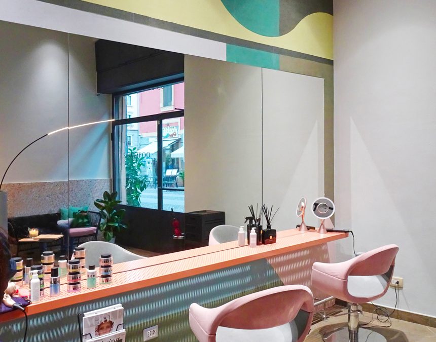
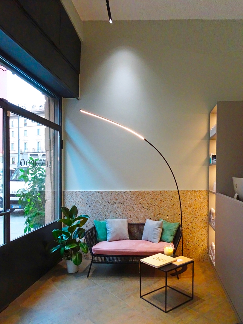
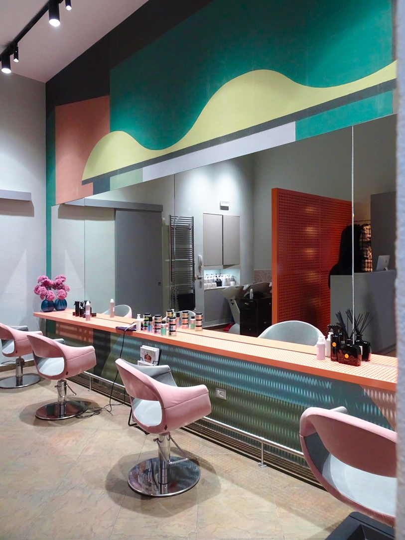
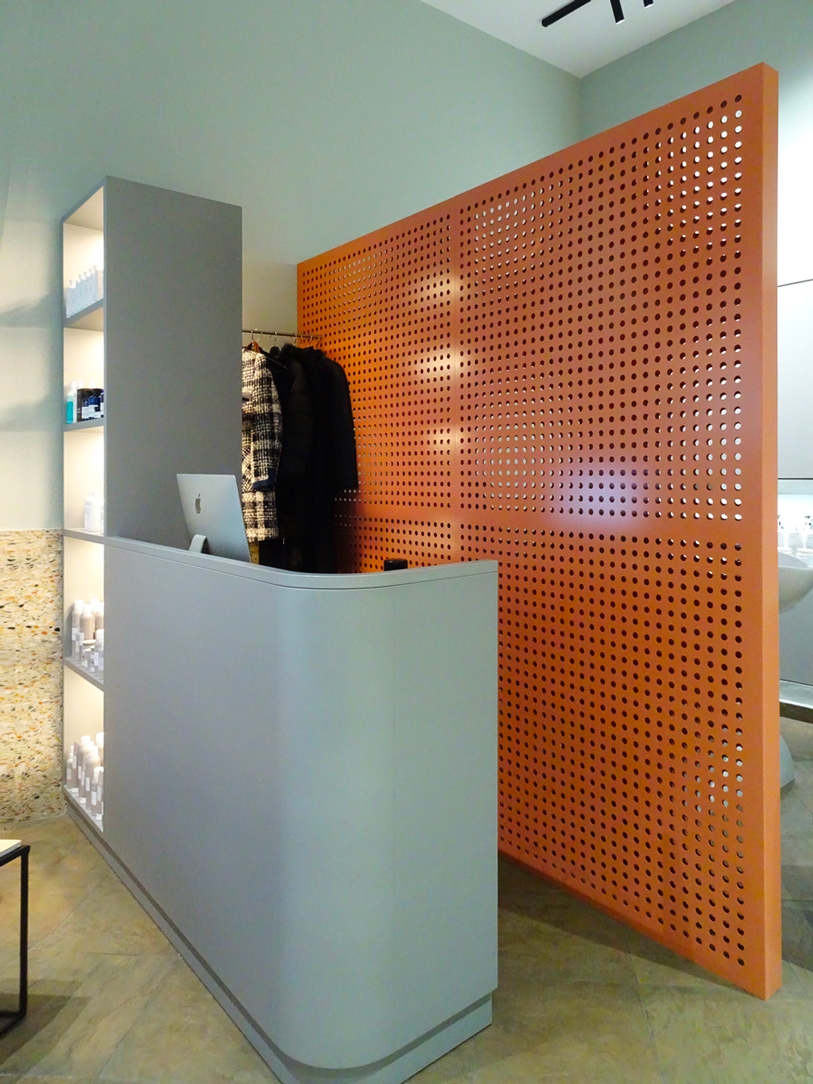
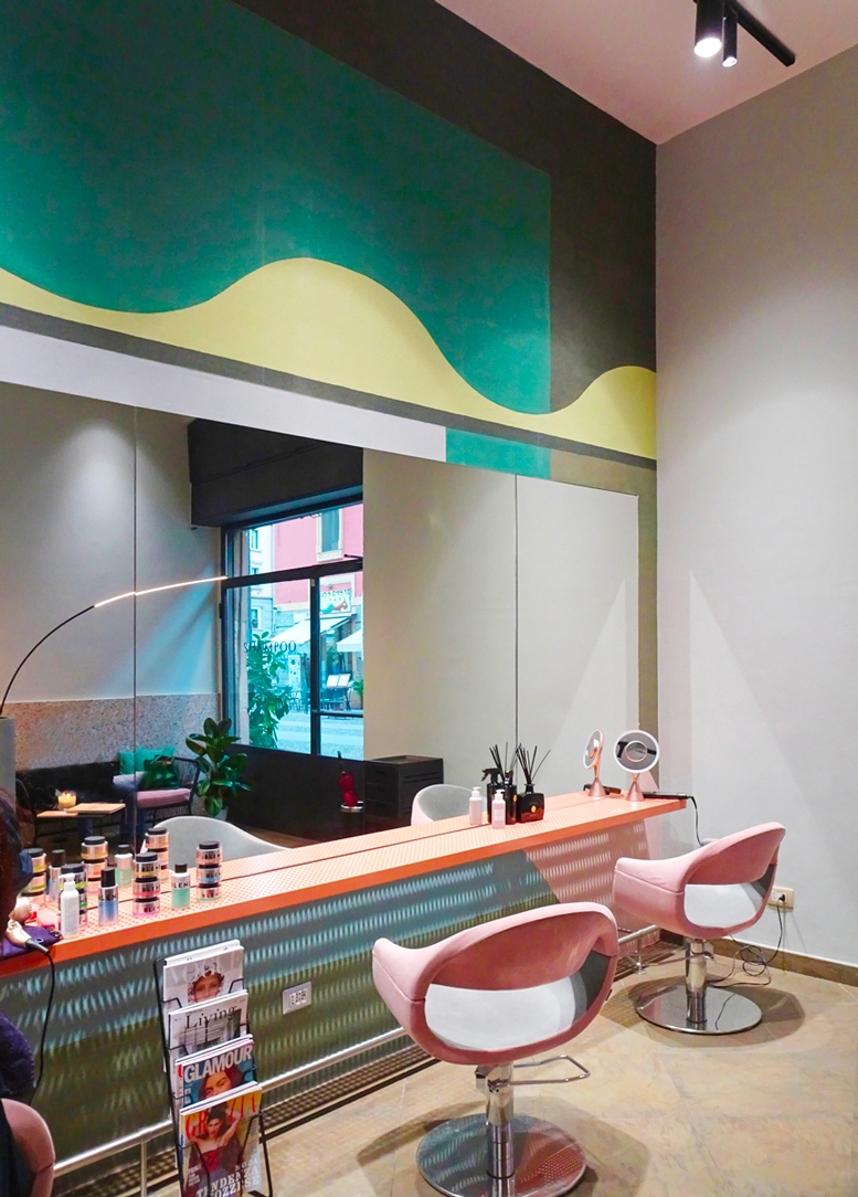
Know how to combine contemporaneity and historicity is also the key of this project, where the client’s request was exactly to make shape of a fresh and innovative location. A small space that clearly identify its internal room: starting from the clean and elegant entrance with its functional reception desk, passing to the essential but dynamic washing area, ending with the wide space for set and haircut and its large mirrors and spot lights.

 
entrance desk haistylist retail
mirror sheet

COLOURS, SHAPES AND MATERIALS.

The freshness of colours and the sinuosity of shapes refer themselves to the fifties interiors, reinterpreted in a contemporary view. The pastels shades are the starring role being able to strongly characterize the interiors, without giving up a touch of freshness and innovation. In this case, the salmon-coloured lacquering manages to take the perforated sheet off to the industrial context which it belongs and making it a characterize element of the environment. We find it again both in the back of the reception desk and in the support elements in correspondence with the mirrors. Added to this, the desk’s volume is designed to takes advance of its reduced spaces and at the same time bring out its functionally. The modern style gives a touch of elegance, without “grab the spotlight” to the perforated sheet.

THE ADVICE

Knowing how to identify each environment’s functionally it’s essential for a successful retail project. Sometimes a touch of colour it’s enough for bring to client’s attention and holding all the stylistic characteristic of the store.

Organize rooms with a secret library

Organize rooms with a secret library

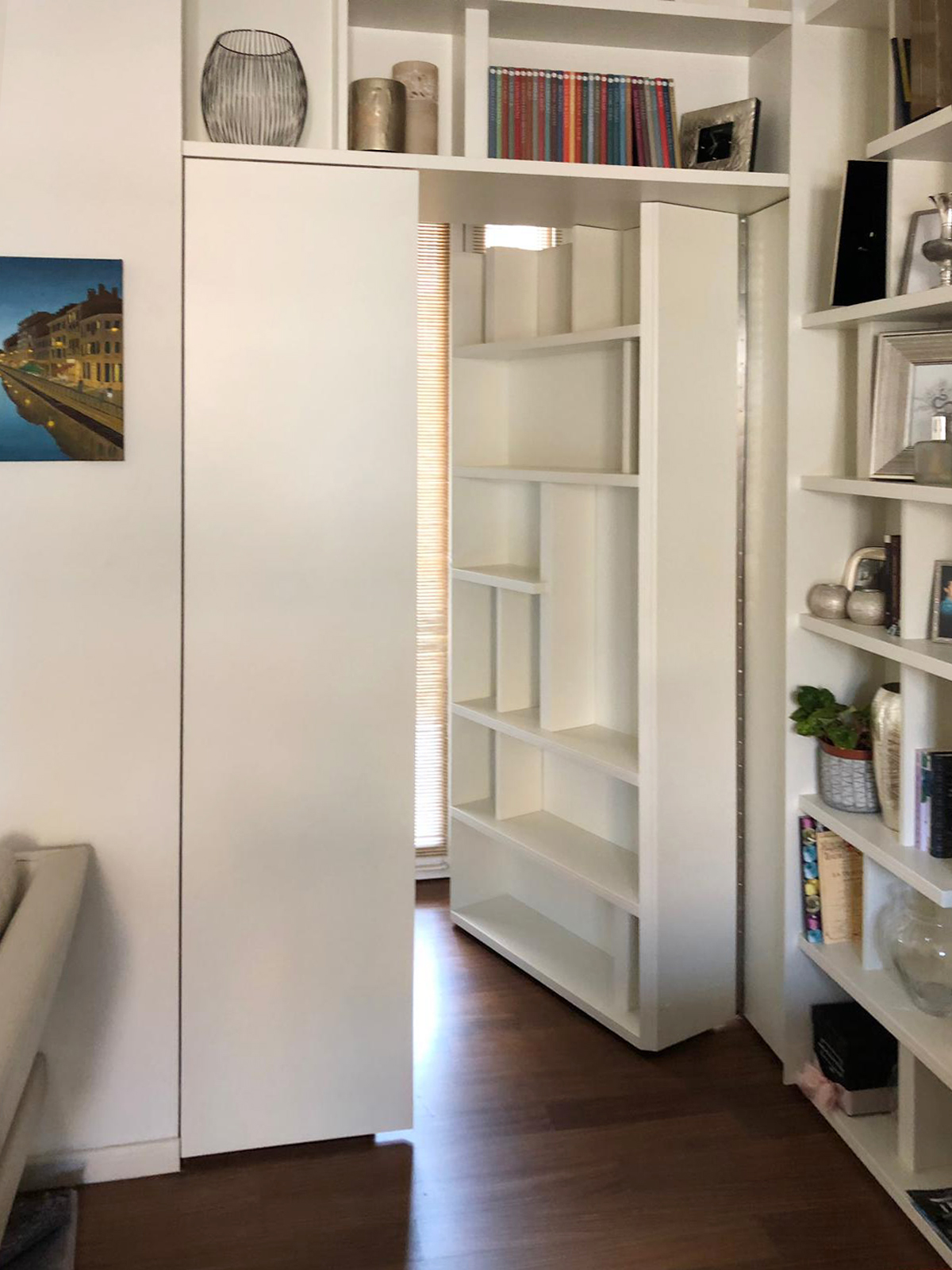
Organize the room can be a difficult task, especially if this room is small and not very functional, but often the solution is just around the corner: in this case, around a corner library which hosts a secret door. THE PROBLEM ANALYSIS THE PROJECT PROPOSAL COLOURS, SHAPES AND MATERIALS THE ADVICE  

THE PROBLEM ANALYSIS

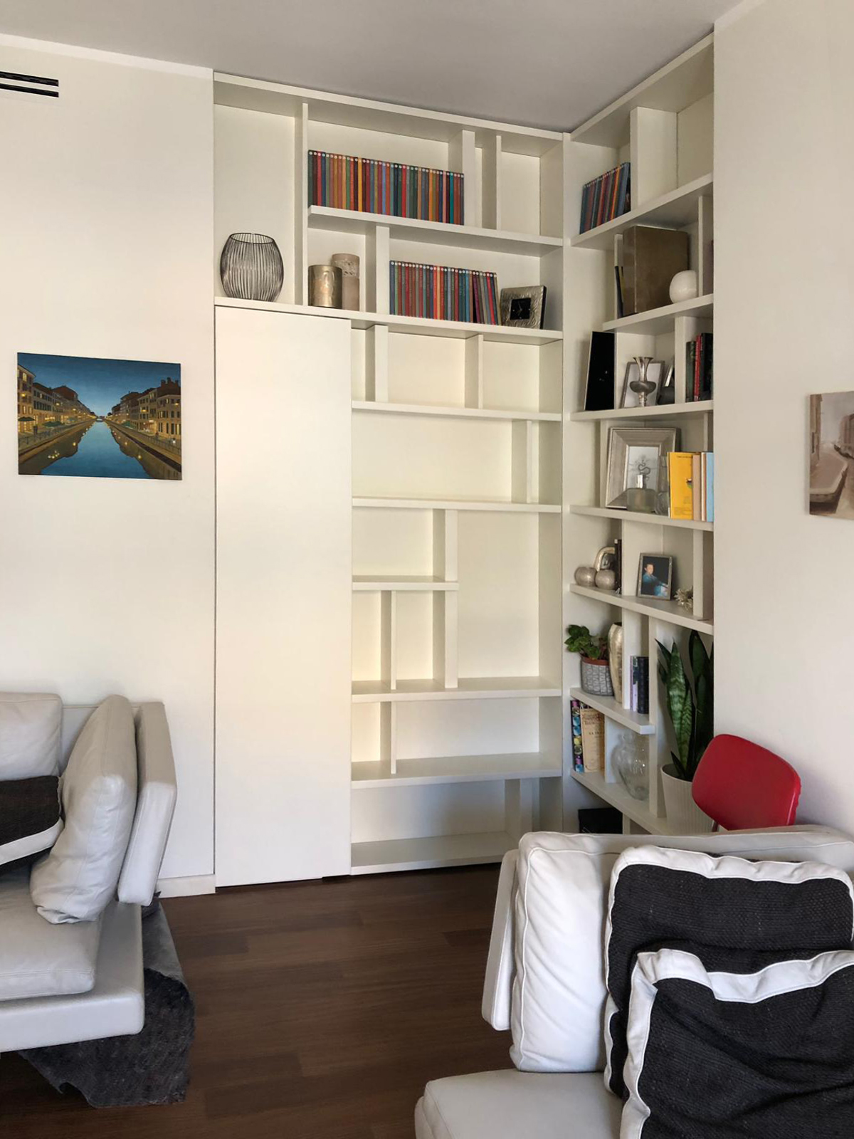
Living in big cities often means to interacts with the lack of space and environments with small dimensions. In those contexts, the functionality it’s an indispensable design element: It allows us to take the most advantage from each room without sacrificing comfort and aesthetic values, while at the same time it solves important problems. The functionality is not just the added value to our interiors, but first at all a stylistic key. A proof of that is this Milan’s apartment. The entrance overlooks a comfortable and contemporary living room characterized by light colours of walls and furniture which create a contrast with an elegant wooden dark floor with which it harmoniously communicates. The design challenge provide for two mainly solutions: on one hand the lack of a real library, which can easily become a characterized element of the room showing at the same time small design object and souvenir able to describe the personality of its inhabitants. On the other hand, the need of hide the bath entrance which is more intimate and private, whose door faces directly in the living room, in a contact view with the entrance hall.  

THE PROJECT PROPOSAL

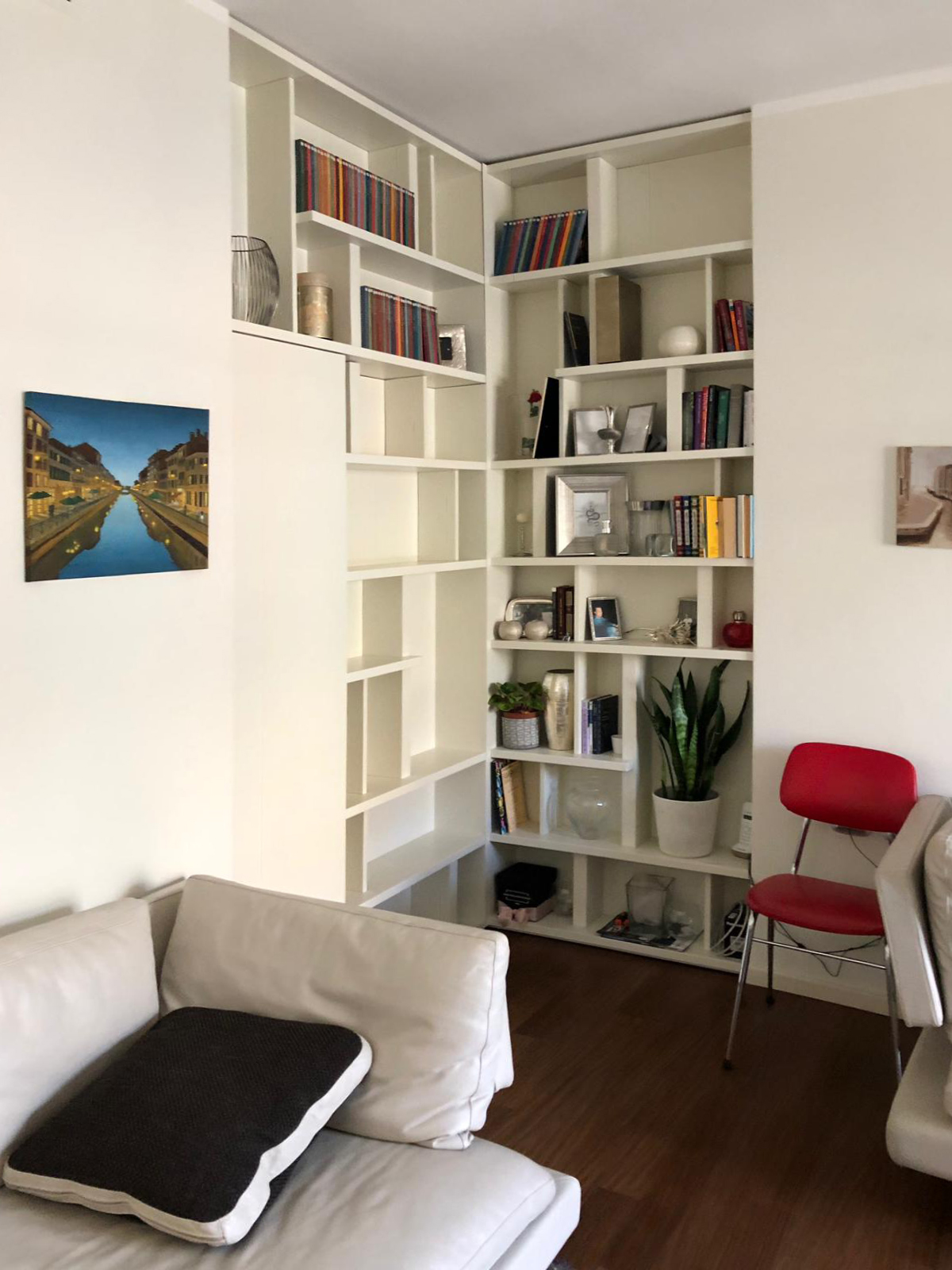
The design solution manages to solve both problems in a single functional element: a wall unit able to provide display support for books and small objects and, at the same time, combines the real bathroom’s door. A dynamic bookcase that reflects the intentionally asymmetric layout in both corner elements. Taking advantage from the corner position, in fact, the two different components of the bookcase are organized as autonomous elements whose shelves could easily become the stylistic line enable to give rhythm and harmony.  This, defines the internal recess of the library which allows the management of exposed elements as a costumed setting, a sort of display windows of the inhabitants’ personalities. The entrance to the bathroom takes place with complete discretion, as a sort of a real “secret passage”, activated by pressing. In particular, the door consists of a fixed narrower shutter, even equipped in the bathroom’s ambient, and a main shutter that in its external side has a considerably bigger thickness than the traditional in order to accommodate books and small objects.  

COLOURS, SHAPES AND MATERIALS

The contemporary imprint is visible both in the graphic layout of the library, which combines full and empty space in perfectly harmony as in a typographic composition, but above all for the material and chromatic choice. In particular, a white opaque lacquered MDF was chosen to create the partition wall. This because it allows a better versatility clearly visible for example, in the different thickness with which were made the numerous internal shelves. The 9010 white recalls the dining’s wall and the contemporary furniture, inserting itself without intrusiveness in the room but at the same time managing to define the stylistic print.  

THE ADVICE

No problems had to remains unsolved! Sometimes a furniture element becomes the custom-made solution able to solve in the best way different problems, as it can be the lack of space or the need to divide rooms.

The wall units perfectly combine elegancy and functionality and can also contain hidden mechanism to take the most advantage from its practicality. A mechanism that can also be fun! Divide the rooms has never been so easy, a library with a secret door it’s enough.

 
corner secret library
open door corner library
closed door corner library

An interior between soft pink, white and gray

An interior between soft pink, white and gray

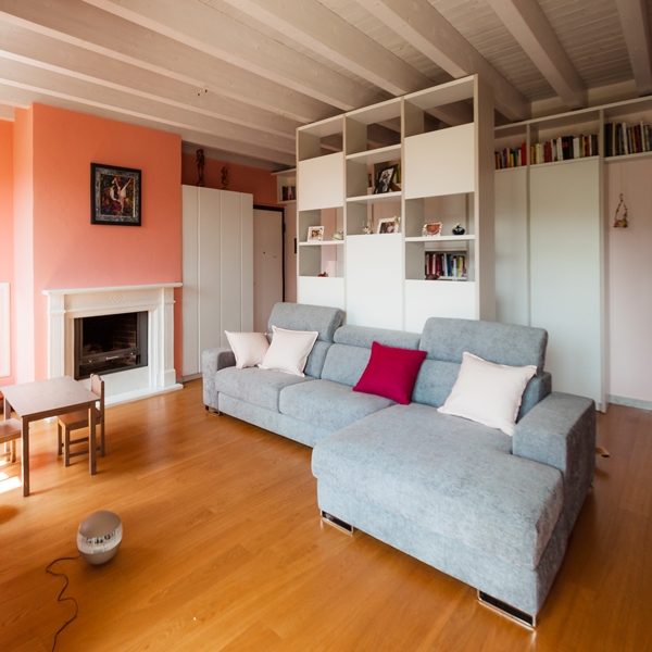
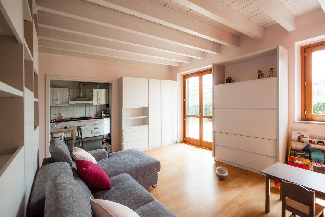
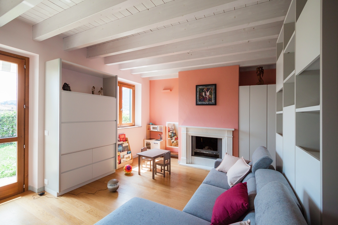
A warm and welcoming interior characterized by soft pink shades, capable of warming hearts of those who live there. Containing elements that divide the spaces match to these.

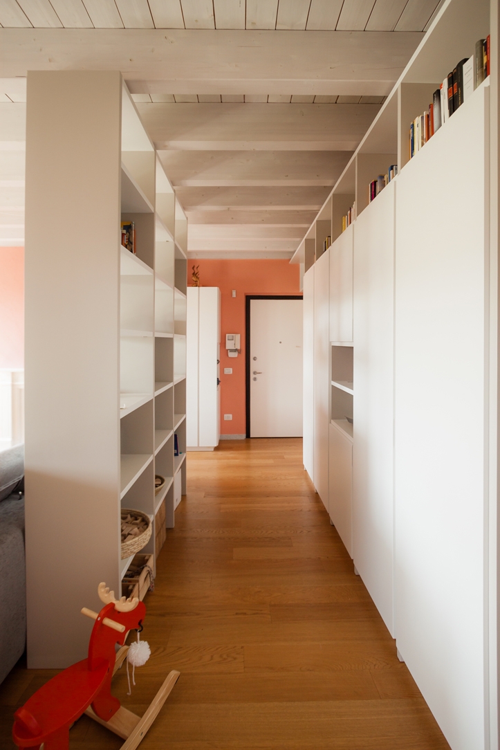
entrance hall pink and white with divider

CONCEPT

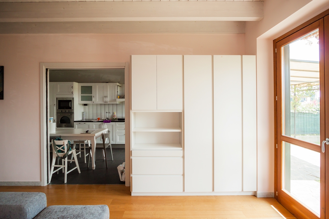
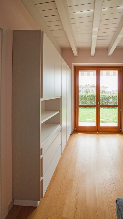
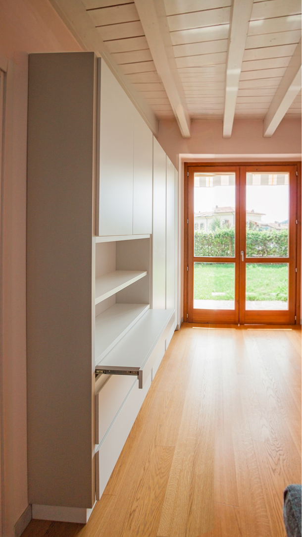
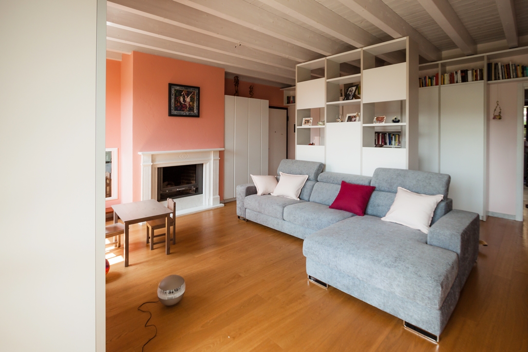
For the project we worked mainly on the very large and square-cut living room, which represents the most airy and used room in this apartment of a young family. We divided it into zones, a total of four, by identifying the activities that should have been carried out there. The first, at the entrance, is dedicated to the hospitality, with a two faces furniture: on one side, a pocket tray and shelves, for keys and objects to be placed as soon as you arrive home and on the other, a coat rack, for the coats and shoes of the family and guests. The second zone is reserved at the symbolic play of the childrens and their intimate reading moment. The third one is intended for the mother, as a work area. A retractable desk combined with storage elements on the side that can be used to serve the kitchen. The fourth, last but not least, is dedicated to relaxation. A large central island sofa that is illuminated by external light and frontally a cabinet with retractable TV and storage compartments. The need was also to have open libraries available in which to dispose of the wide range of family books and also storage spaces where to put games, but also everyday objects. For this reason, we have created a corridor at the entrance that screens the activities of the living area and welcomes the visitor and directs him to the other areas of the house.

living room pink and gray
living room pink and gray 02

COLORS AND MATERIALS

The main color chosen for the walls of the entire apartment is a soft pink, matches with walls of a slightly more decisive antique pink. Become fashionable once again, it is associated with positivity and the ability to drive away negative thoughts, from a symbolic point of view. In combination with it, for the furnishings of the living area, very modern elements have been chosen, with hidden recessed handles and push compartments. The shades of white with some soft gray inserts perfectly fit with pink illuminating the environment and making it timelessly elegant. In the master bedroom, on the other hand, the wardrobes facing the bed that go to the ceiling are soft pink like the rest of the walls and seem to disappear in the general environment; only the bedside tables with their strongest pink focus attention.

forniture living room
forniture living room close
forniture living room open
living room pink white gray

High ceilings and contemporary boiserie in a Ligurian apartment

High ceilings and contemporary boiserie in a Ligurian apartment

The interiors of the past were characterized by the presence of high ceilings, which in a contemporary perspective risk making houses disproportionate in the perception of spaces.

A possible solution can be to introduce a counter-wall capable of keeping the original structure intact but revolutionizing the interior spaces by providing them with a new height.


THE CONTEXT
THE INTERVENTION
LIVING ROOM AND KITCHEN
BEDROOM
BATHROOM
COLOURS AND MATERIALS


THE CONTEXT

Liguria is the sea with high, rocky and jagged coasts, but also the region with ancient culinary traditions and small towns close to the hills.

Characterized by small historical cities, it responds to a still traditional setting with houses often placed against each other and narrow passages to take the most advantage from the spaces.

For this reason, most of the interiors are currently dated and difficult to expand.

As in most old houses, the ceilings are very high and can modify the perception of the spaces.

Characteristic spreads throughout Italy, whose solutions can vary considerably depending on the context. Sometimes taking advantage of verticality can be the design choice capable of characterizing the project, as in the case of this New York Apartment

However, in case of small spaces, the already very high ceilings are further accentuated by the planimetric dimensions of the interiors.

dining room high ceiling

THE INTERVENTION

The design project aims to restore the right eight to each room, while giving a fresh and contemporary look. Working on the internal heights was possible through the use of a wall covering, a boiserie whose height of 240cm re-establishes the usual proportion of the rooms, allowing in the same time, to keep the original structure intact.

It is exactly on this fundamental feature that the renovation of apartment is based: building a sort of exoskeleton able to maintain the original ceilings and making it equipped where necessary. At the same time, it creates an internal setting that respond to the customer’s needs.

The intervention involved all the rooms of the apartment, of which however the kitchen and the bathroom were affected in a reduced way because they preserve original in the internal height.

wooden kitchen countertop
living room high ceiling recess glass shwcase
kitchen countertop wood
wood dining table high ceiling
high ceiling false ceiling closed
high ceiling false ceiling open

LIVING ROOM AND KITCHEN

Starting from the entrance, the new compact structure of boiserie encloses the false ceiling with zenithal lighting.

The difference between the original and the reconstructed height is still accessible and serves as a storage element. In doing so, it’s takes the most advantage from the existing space, providing greater functionality.

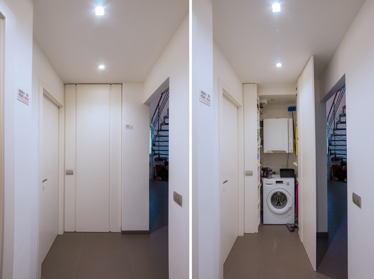
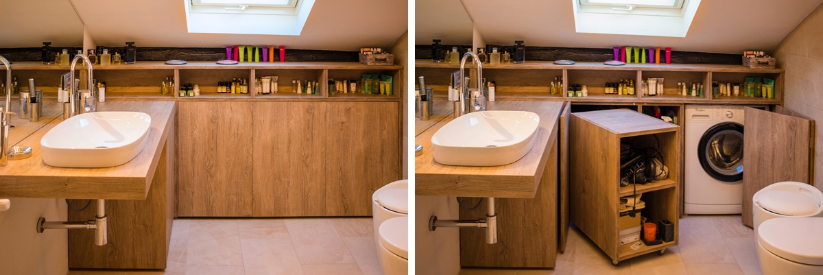
The living room was instead equipped with a niche used as laundry room, flanked by a small glass showcase embedded in the double wall.

Turning instead to the kitchen room, it is the shaped laminated wood with light colours that gives a touch of freshness and modernity, recalling the chromatic shade of wood used for the dining table. Wall and storage unites fill the remaining gaps by taking the most of every corner of the small apartment, without making it oppressive.

wardrobe open bedroom
bedroom boiserie
bedroom boiserie high ceiling

BEDROOM

The use of the full-height boiserie allows the bedroom to better hide the service wardrobes.

Organized along two corner walls, they consist of niches with multiple functions capable of containing drawers, hangers and shelves at different height. In the same way, the television is also included in a special custom-made niche.

The extreme functionality of the corner wardrobe becomes an extremely stylistic clean and contemporary element in this design system. Added to this, the backlit false ceiling is able to provide diffused and elegant lighting.

In order to give greater dynamism and personality to the boiserie, horizontal cuts were inserted to create an innovate stylistic linearity. It is also possible to equip these horizontal cuts with possible supports, to make the bedroom even more functional.

sink design Ligurian apartment
bathroom high ceiling
furniture bathroom drawers

BATHROOM

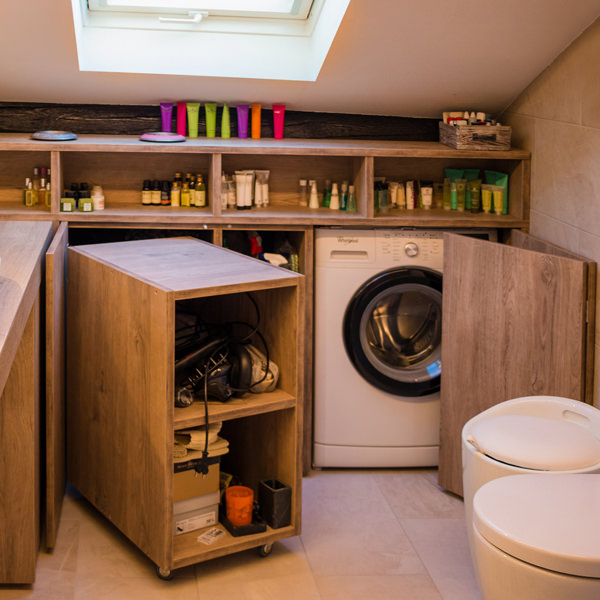
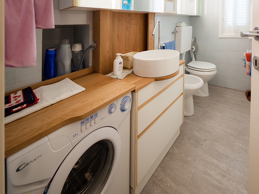
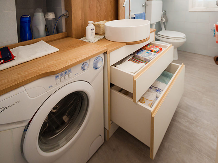
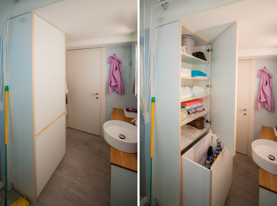
Evoking the use of laminated wood that characterizes the kitchen countertop and the display elements of the living room near the dining table. Even the bathroom is characterized by a contemporary and extremely fresh stylistic element. The storage units host a niche for the washing machine and a chest of drawers with marked edge that perfectly fits with neutral tones of the room.

COLOURS AND MATERIALS

Concerning the chromatic and material choice, we opted for a project in continuity between different rooms. The textured laminated wood was chosen for both the walls and furnishing elements, whose texture recalling that of the fabrics, gives greater domesticity and softness to the interiors. A contemporary aspect that can also be found in the neutral shades adopted: two different shades of gray which create a very elegant internal movement.

Finally, the introduction of laminated wood in the living room and in the bathroom gives a decisive touch able to make the environment younger. It is exactly in these two rooms that the high ceilings have been maintained.

dining table and glass showcase

One kitchen a week, part 2: fresh, gritty and lively

One kitchen a week, part 2: fresh, gritty and lively

lively kitchen front vew

A lively kitchen with a gritty character and a touch of freshness between games of bright reflections and alternation of full and empty spaces.  

THE PROJECT

Added in the context of the always dynamic Milan, the kitchen is reckonable for its lively and fresh imprint, with both a gritty and elegant soul. A kitchen with a thousand resources, capable of keeping attention in all its parts. Starting from the wall units, which alternate empty and full volumes in which a game of transparencies is played on several levels. The shelves visually lighten the volume in the kitchen in both ends: in the area adjacent to the window, from which natural light radiates, and in the inner corner between the two sides of the room. This last one, also takes advantage of what could considered a critical point for comfort and functionality. Instead, arranged in asymmetrical geometric volumes on both sides of the extractor fan, there are the opal glass wall units able to give a touch of fresh colour and dynamism from which the contests can be glimpsed. The central wall unit hiding the extractor fan and the lower containing volumes are instead reckonable for their extremely elegant simple lines. The fitted sinks are arranged on the corner, taking advantage of the attachment point of the snack bar. This is equipped to accommodate up to 4 sitting using both sides. The gritty setting is also visible in the choice of details, such as the hidden tap able to allow the opening of the back window. As always, functionality is a fundamental requirement, which is also visible in the door alongside the large design refrigerator. This houses inside functional shelves with different heights and six drawers with a wooden finish.   THE MATERIAL CHOICE The games of brightness and reflections able to restore the idea of restoring the idea of liveliness and freshness are obtained especially thanks to the choice of materials. In particular, a quartz granulate topping was use for the countertop. It is able to capture and mirror the light, recalling the cream tones on the kitchen. While for the remaining elements it is the glossy lacobel that gives elegance and contemporaneity.

snack bar lively kitchen
lively kitchen with drawers and shelves
lively kitchen high tap
lively kitchen hidden tap
lively kitchen perspective

Compare this kitchen with the contemporary pop’s one.