BLACK IRON IN FURNITURE

BLACK IRON IN FURNITURE

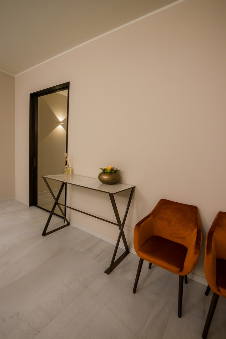
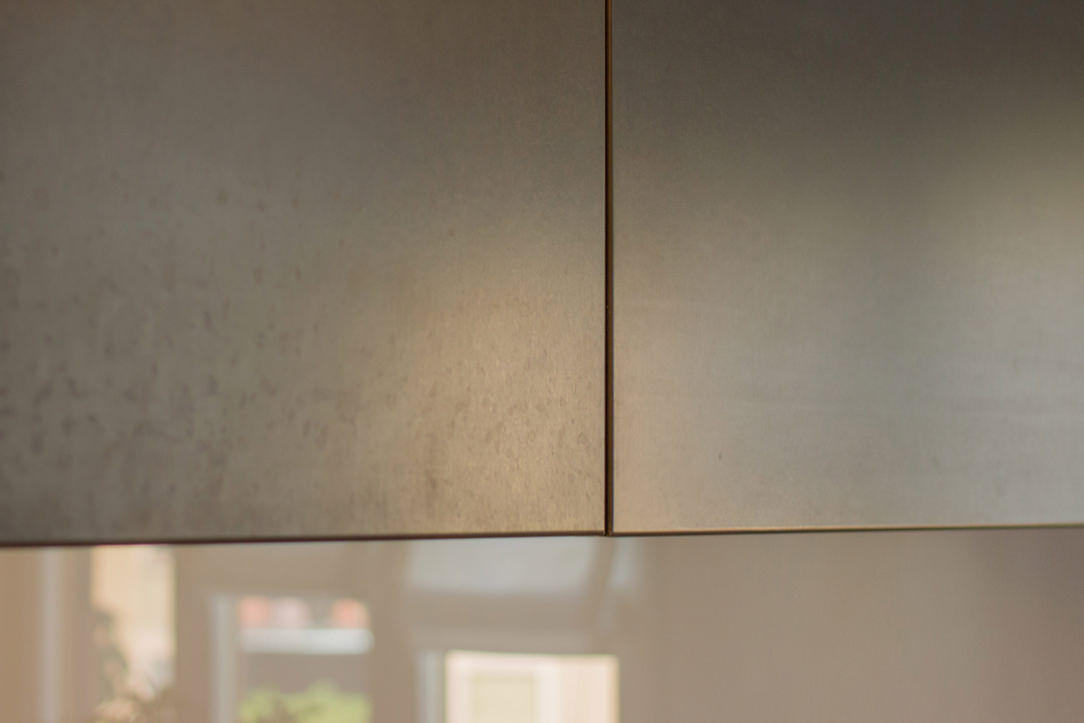
Nowadays the iron and the metals that are inserted in the furnishings have been returning to their natural finish, called in jargon “raw” (raw iron is commonly called black). This brings out the material with which the product was made and its natural imperfections make it even more alive and unique in its kind.

THE BLACK IRON

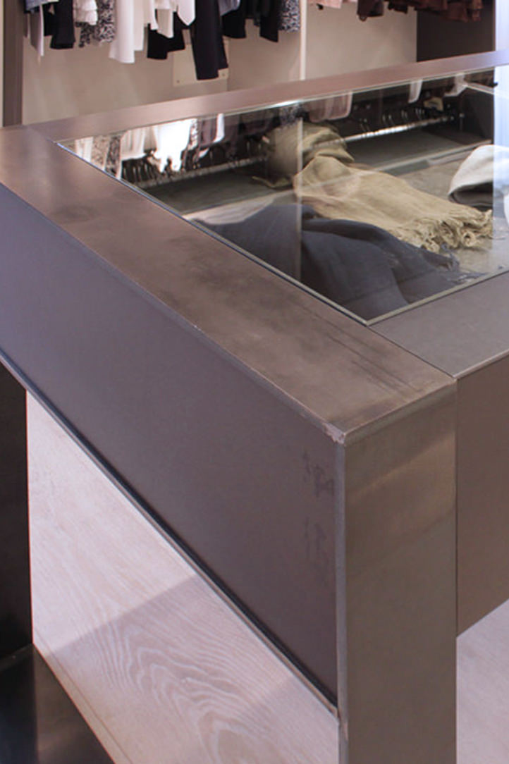
The word “iron” in common parlance is usually used to also indicate low strength “iron alloys” and mild steels which have a silvery-gray appearance. Very resistant, ductile and malleable, they are distinguished by black iron which is darker, more delicate and is used exclusively for indoor structures, therefore much less exposed to atmospheric agents. To preserve it from humidity and the risk of rust appearing even in sheltered environments, black iron is usually treated in a very natural way with beeswax or transparent varnish, both solutions make it slightly brighter and create a sort of film protective.

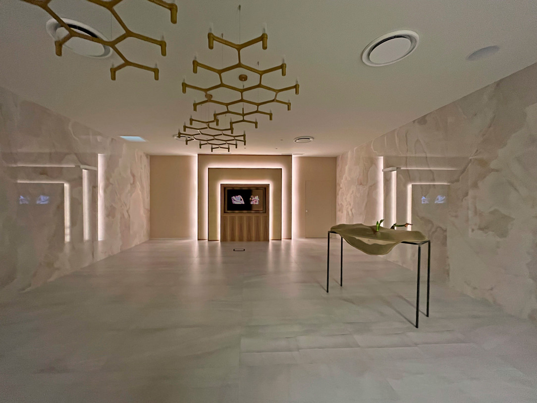
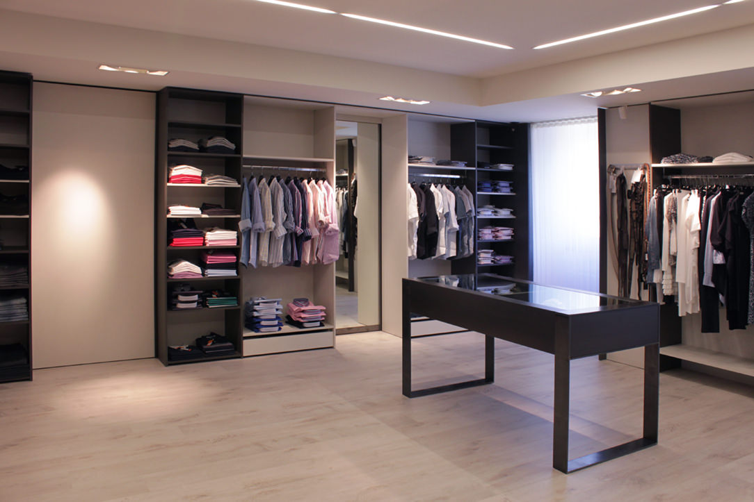
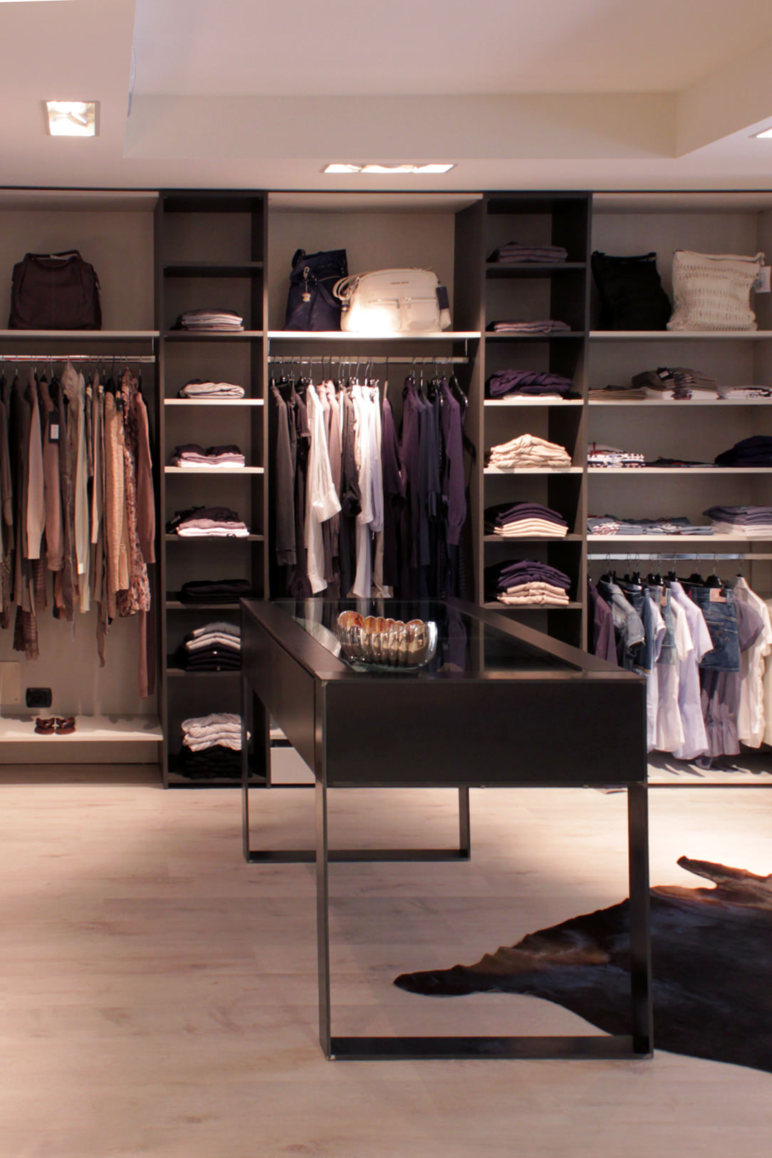
boutique made in black iron
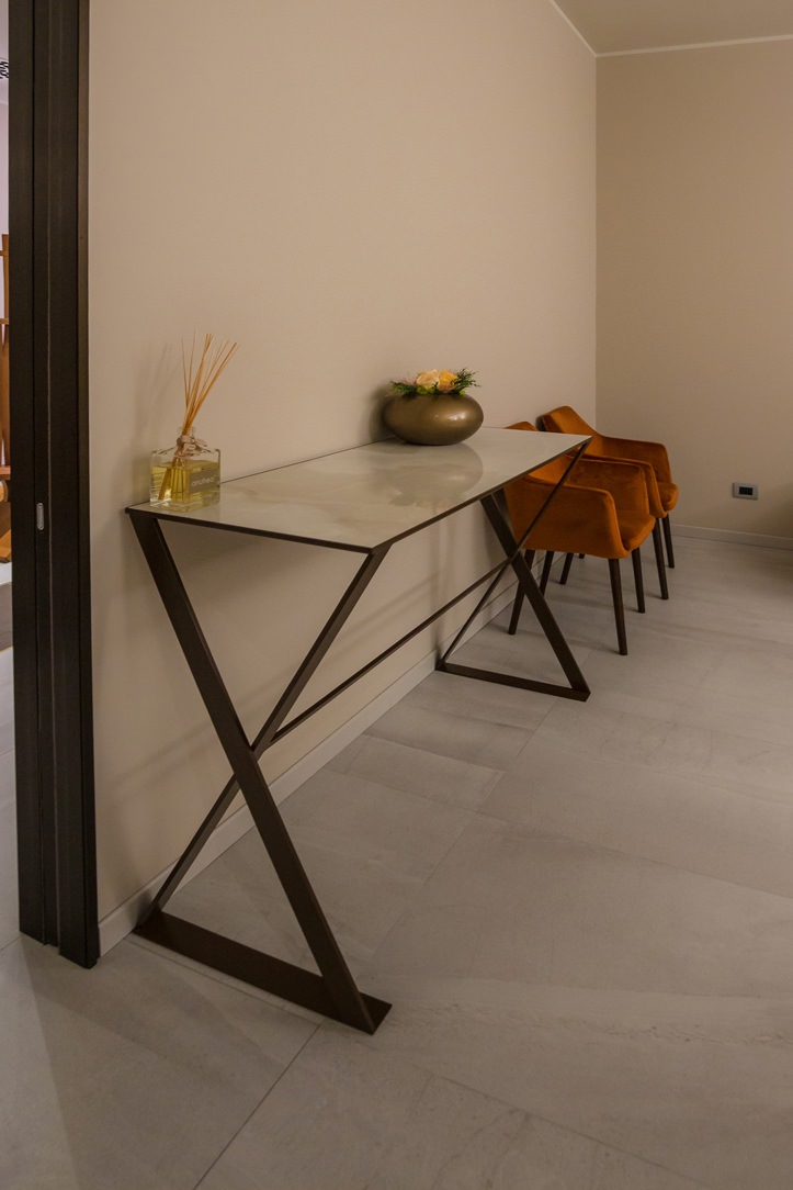
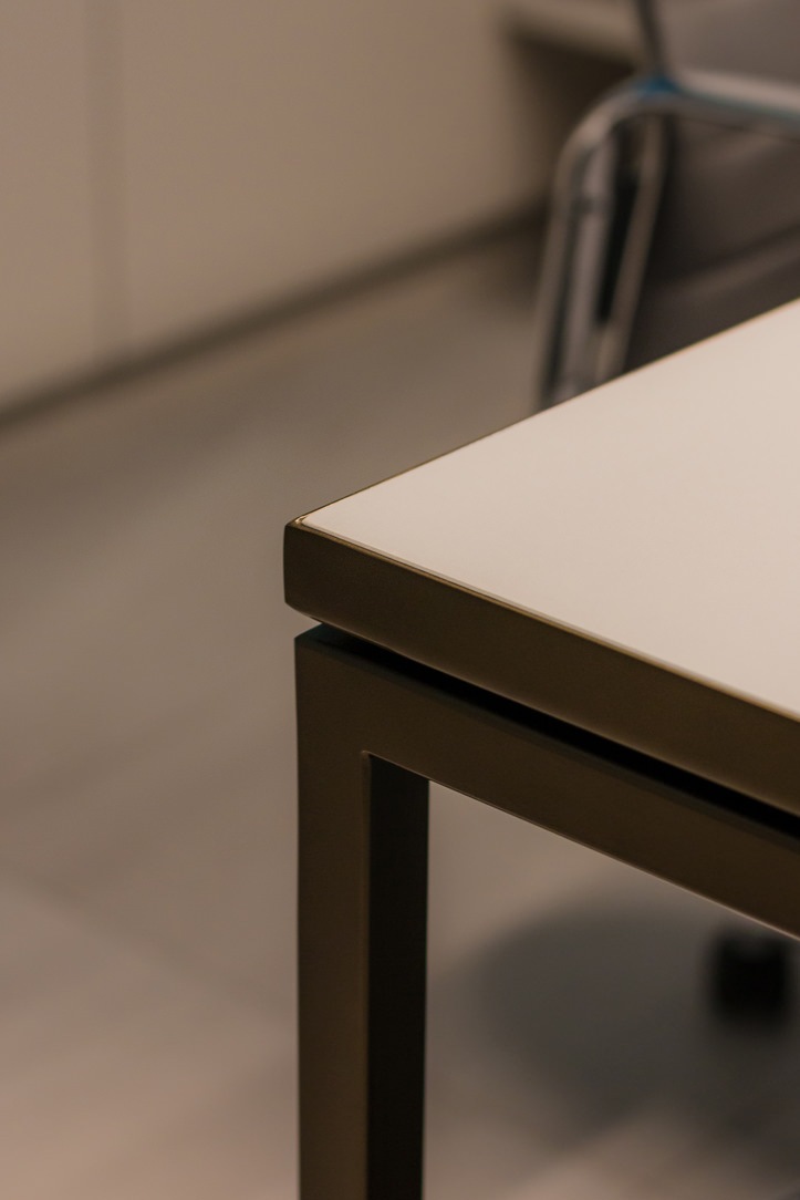
details black iron table

A Boutique realized where the concept Fil Rouge was precisely the combined black iron and material finishes

THE IRON IN THE STRUCTURES OF THE ELEMENTS

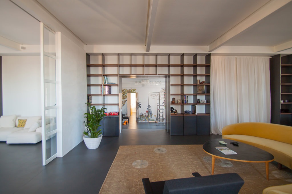
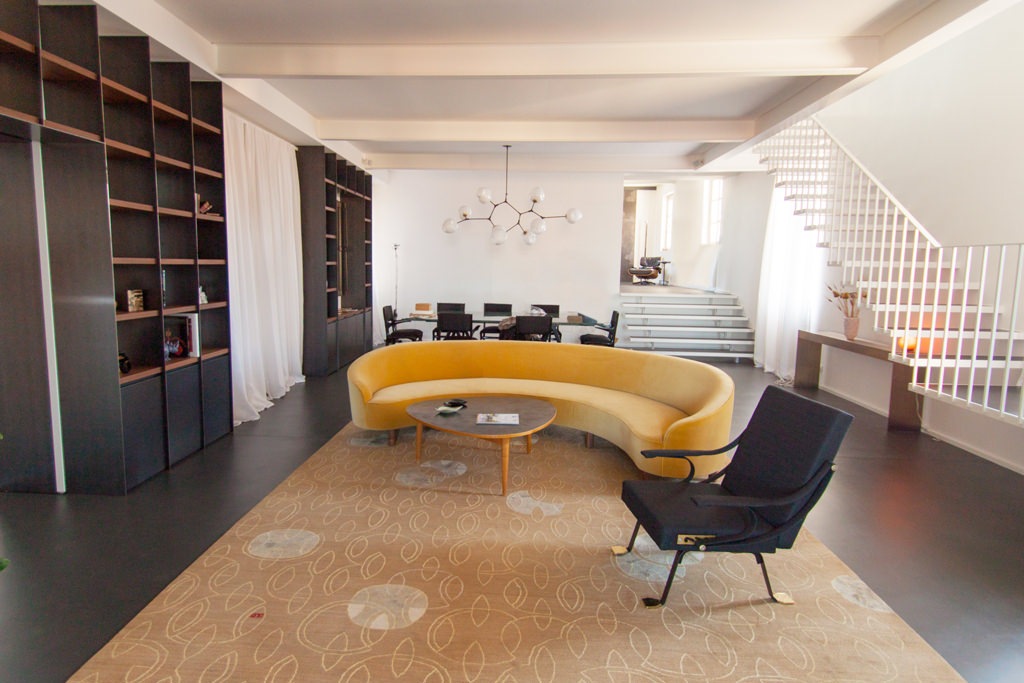
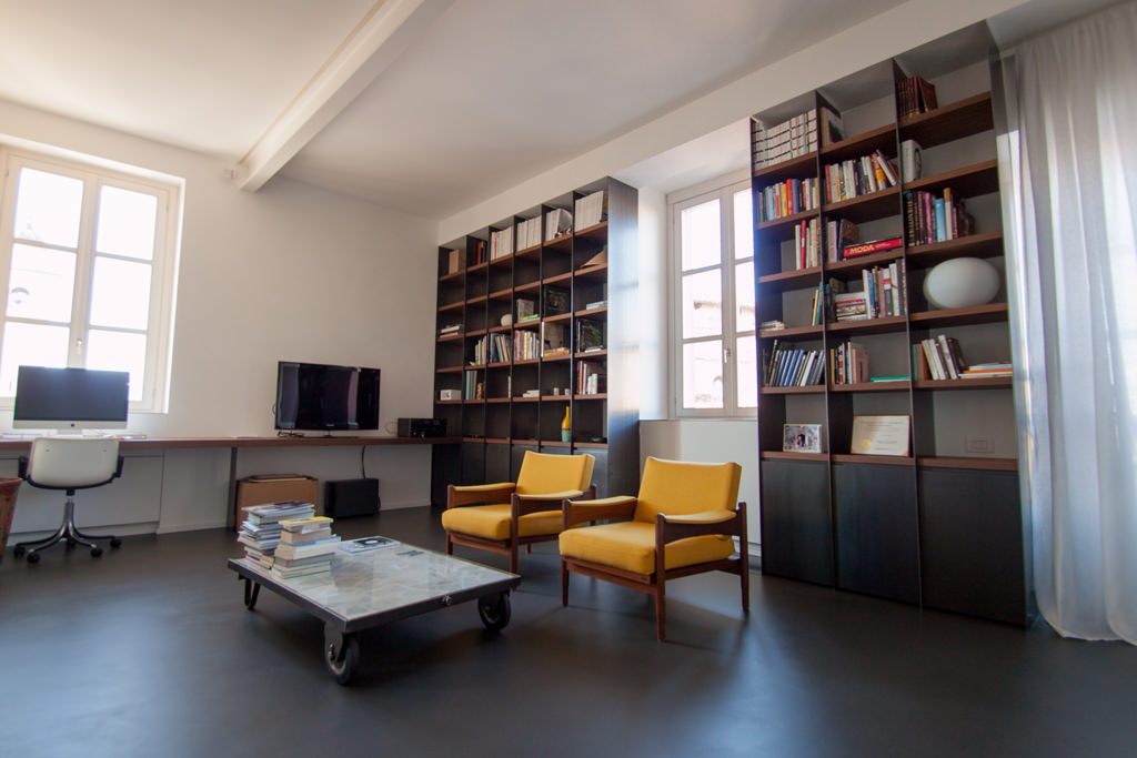
The peculiarity of polymaterial structures is that the different materials are harmoniously associated with their aesthetic and structural characteristics. In terms of resistance, what wood supports with its 2 cm, metal can do with a tenth of the thickness. This is why we like to use metals in load-bearing structures, such as the backs of bookcases or furniture. Black iron kept in its natural color can also act as a contrast with a very light lacquer or with a wood-colored essence. Below are some examples where you can see how the structure is light even if extremely dark.

bookshelf in black iron
environment in black iron
bookshelf in black iron

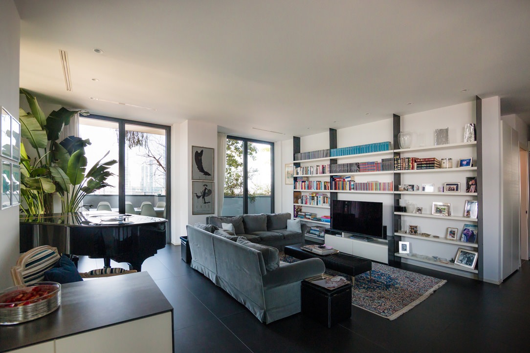
black iron bookcases populate the living area of this elegant apartment

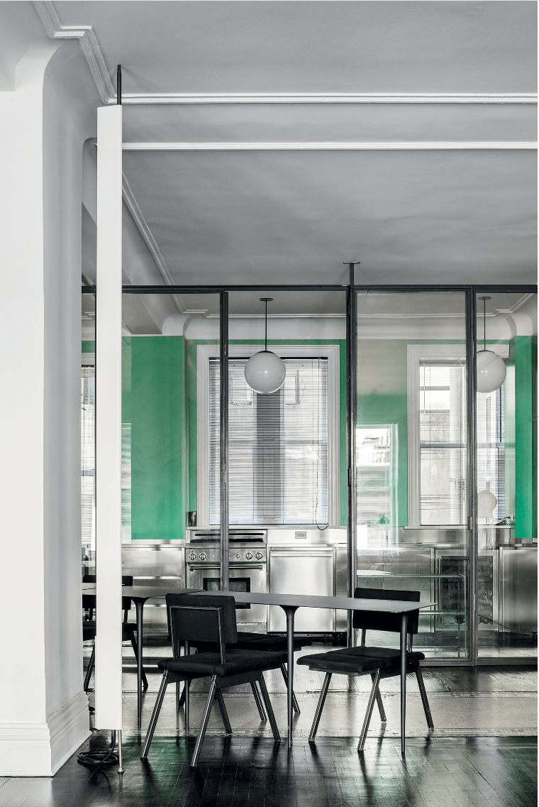
Also used for fixtures in its industrial spirit, it never abandons glass in combination with room dividers, as for the kitchen below which is separated from the living area. The shaped tops of the tables and the turned legs are also in very thin black iron sheet.

black iron fixtures and tables

partitions and tables in black iron in this Newyorkers Apartment

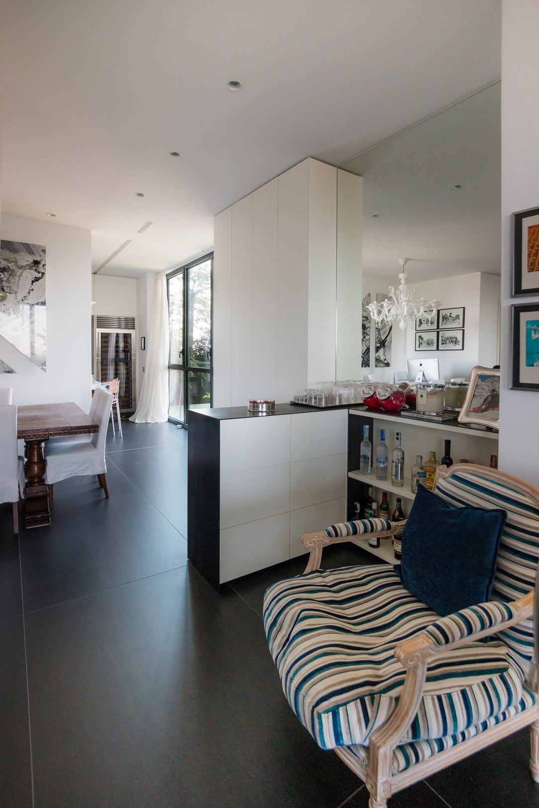
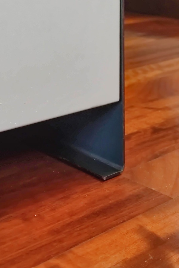
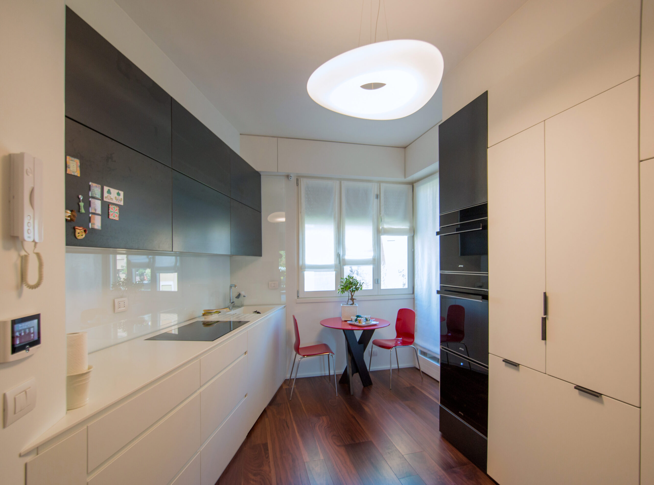
Black iron is also often used as a “lid” for furniture, a sort of thin blanket that envelops the entire element and sometimes reaches the floor, becoming a base. An example are the doors and the column of this kitchen and in the bar cabinet below, where the iron in addition to supporting it repairs the support surface, which, like all horizontal surfaces, is more subject to wear than vertical ones.

living room bookcase iron black
Iron and lacquered bar cabinet
 iron base detail
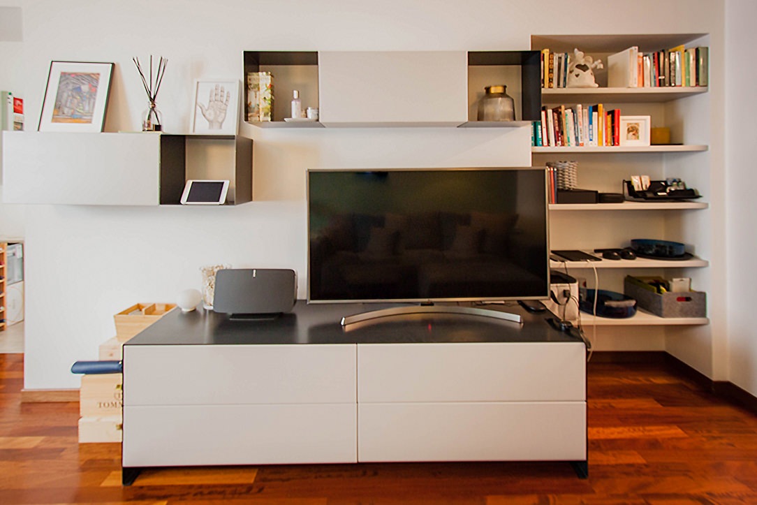
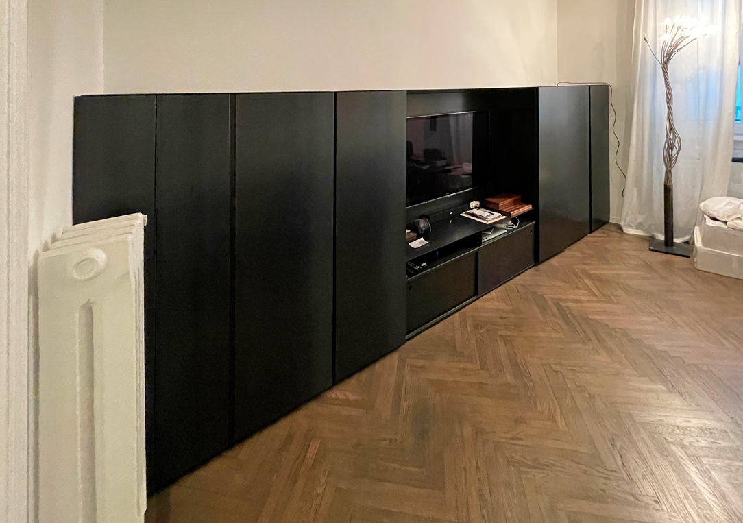
iron tv cabinet

Two Apartment, one in the center of Milan and one in Bergamo, where black iron structures bookcases and the top of the TV and bar cabinets.

Here, on the other hand, it is used as a covering for the doors and the niche of an elegant Kitchen in Milan.

 kitchen doors covered with black iron
covered doors detail
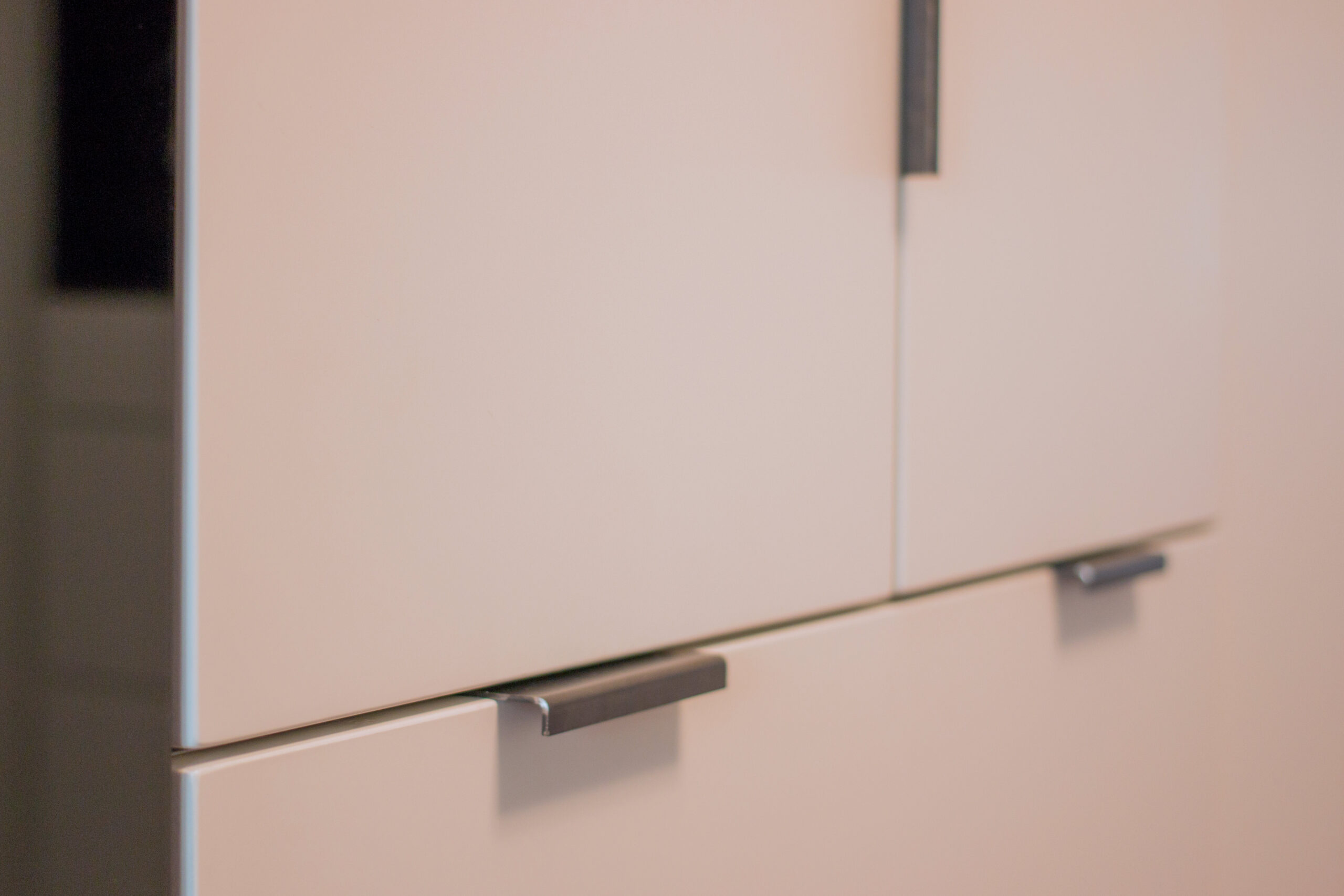
handles in black iron

THE BLACK IRON IN THE COVERINGS

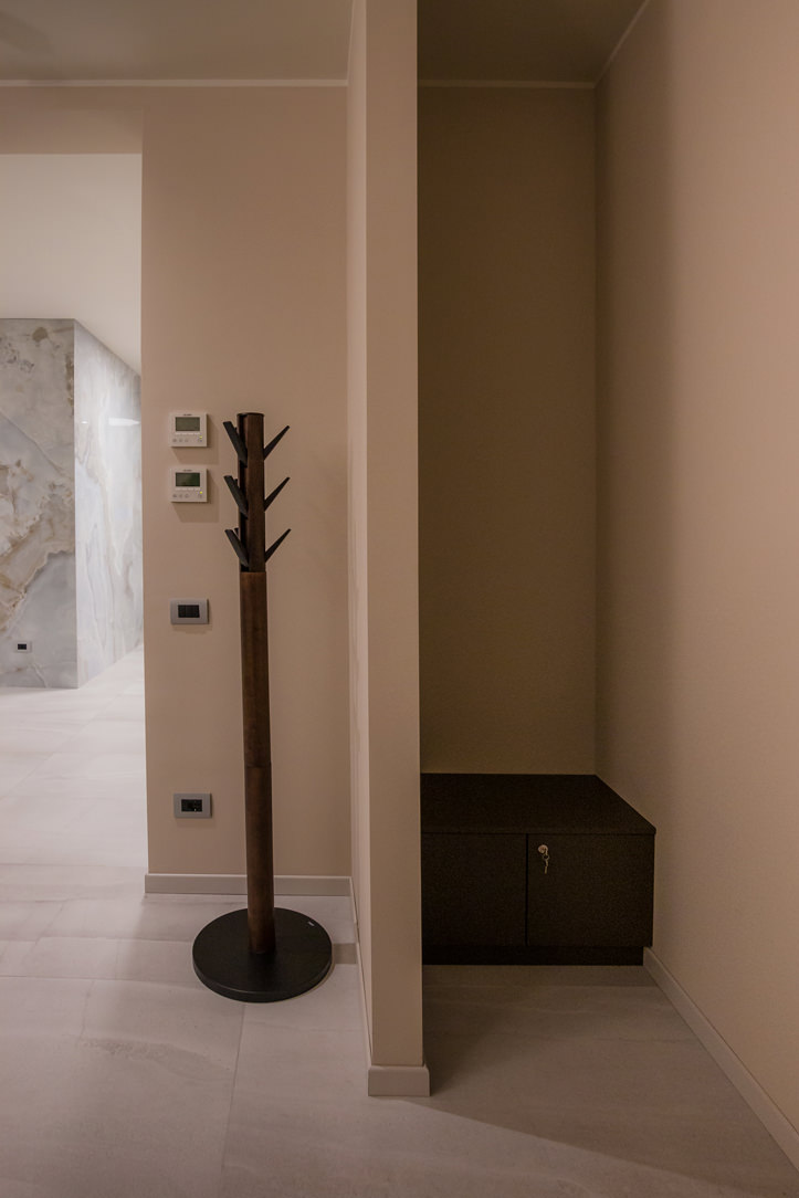
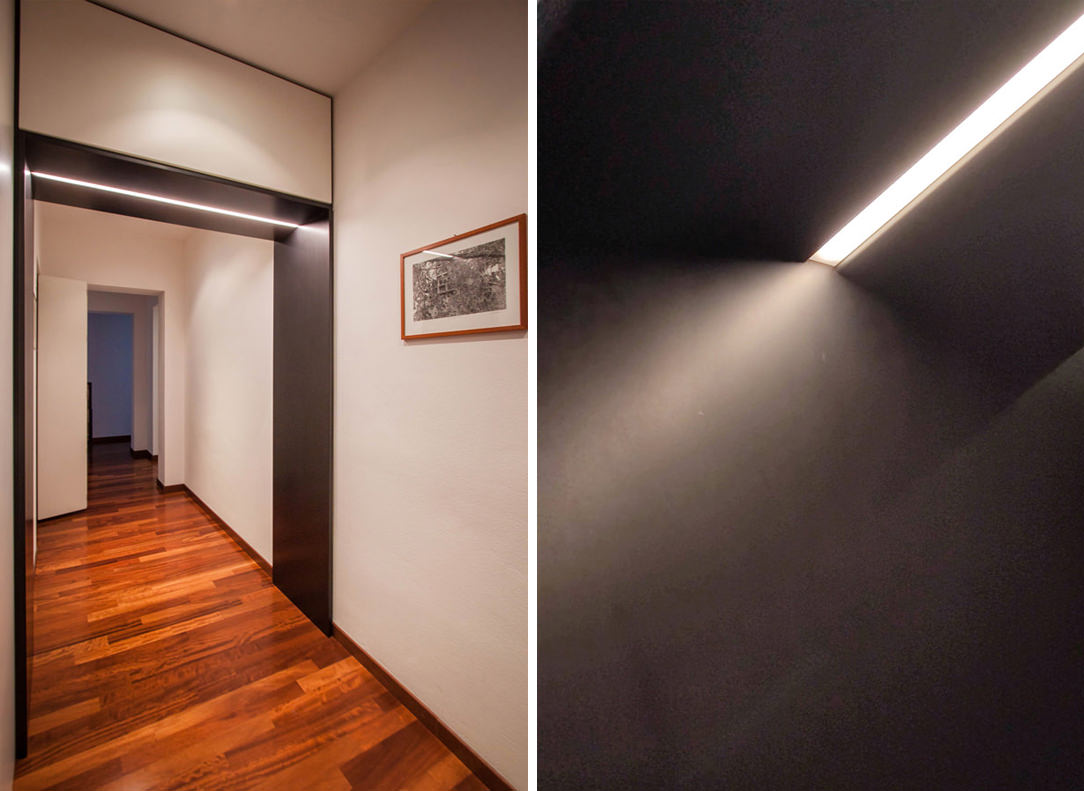
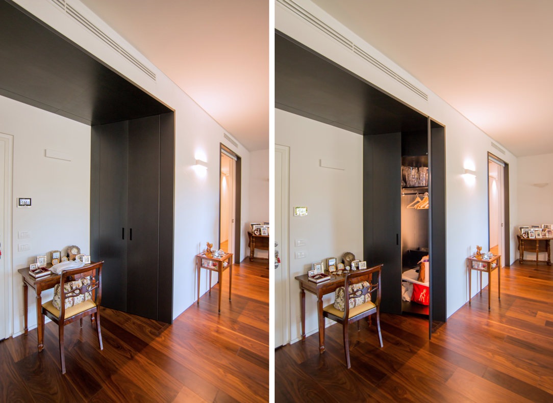
Due to its dark and irregular color, very masculine and elegant, black iron can also be used as a wall covering to create a sort of partition or portal. A portal to divide the rooms inside the house, at a symbolic level to make the user cross towards a place that will be able to express himself only when he crosses the black threshold, many times illuminated from above or sideways with LED strips. Here are some examples of portals, some inserted only in the doorway and others much more structured, with also an equipped part in which to hide some furniture at the service of the house.

lighted portals
equipped portal

Portals that act as partitions and equipped portals

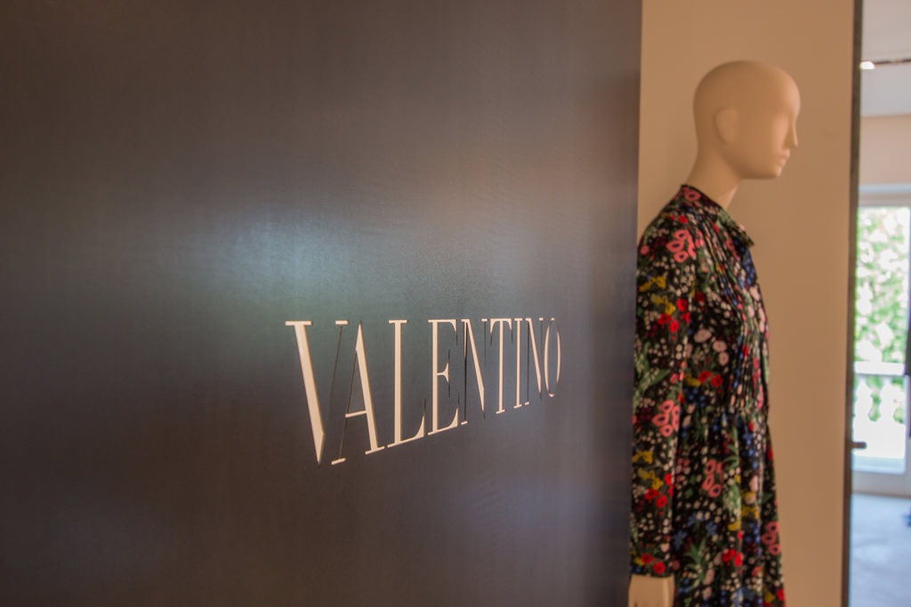
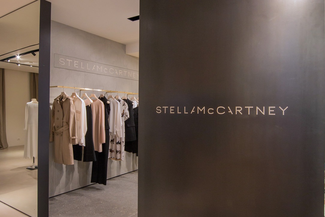
Branding paneling, on the other hand, is very common in the Retail sector, for example the corners of the Tiziana Fausti shop, in which the black iron panels visible from the central space have externally the laser engraved logo of the Brand which is located inside the box used for it.

brand logo in iron
external panel black iron

Laser cutted Brand’s logo on black iron partitionsin the Tiziana Fausti shop in Bergamo

ALL BLACK

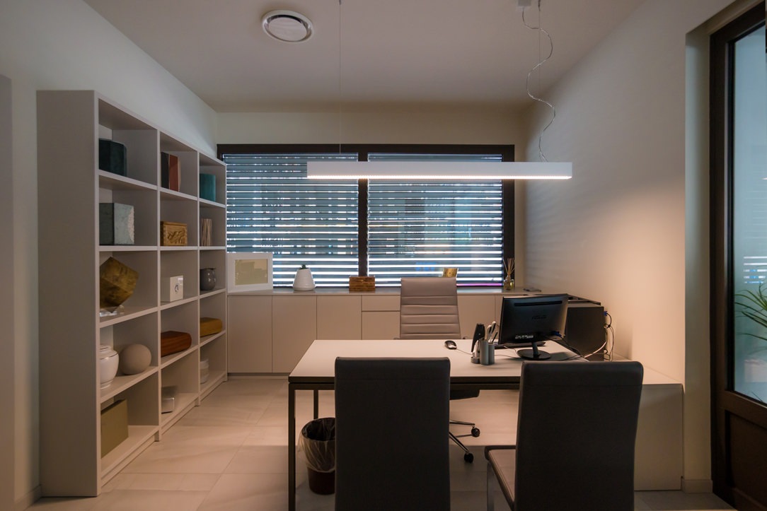
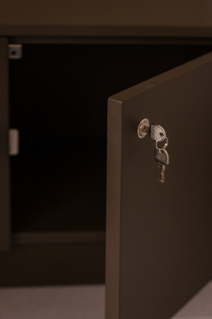
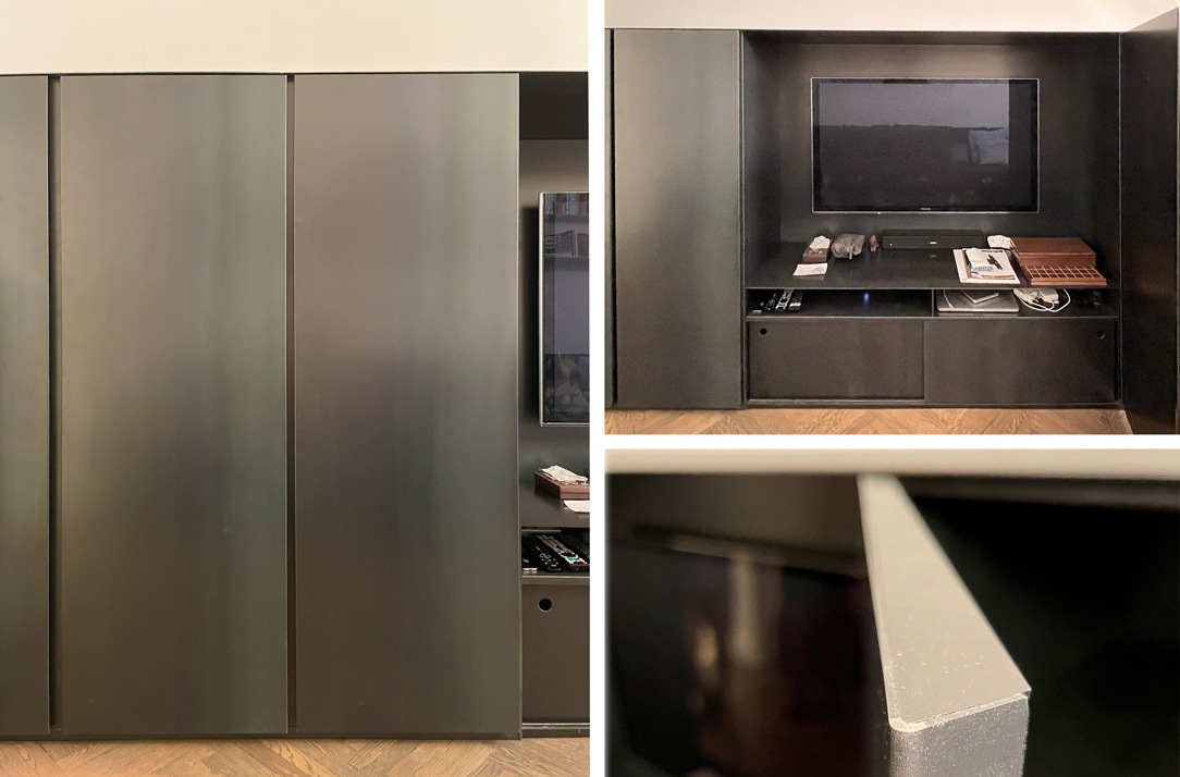
Having a furniture completely made of black iron is not only possible, but sometimes it is the right choice for certain types of environments and goes well with the rest of the furniture. Here is our realization of a niche furniture in which doors and structure, both external and internal, are covered or structured in black iron.

iron covered furniture
details black iron furniture

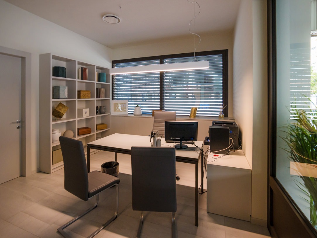
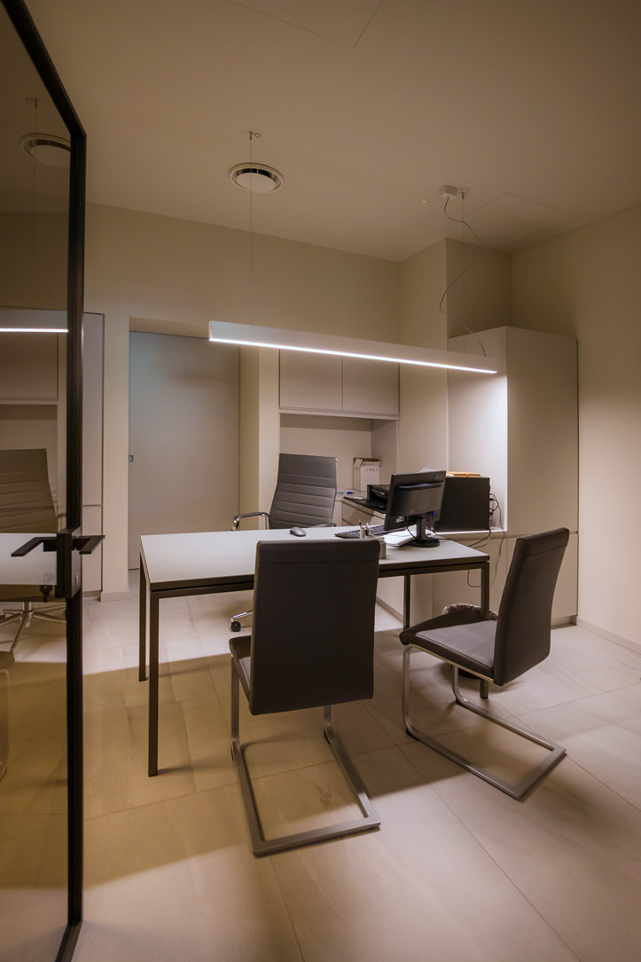
Here is also another example of a black iron structure with desks and tables in the same material made by Locatelli & Partners inside a church, their old operational headquarters. The contrast of the cold and dark material inserted in a context that does not belong to it, as in this case a Baroque church with warm tones and completely frescoed walls enhances the material and turns out to be a harmonious union.

THE BLACK IRON IN THE DETAILS

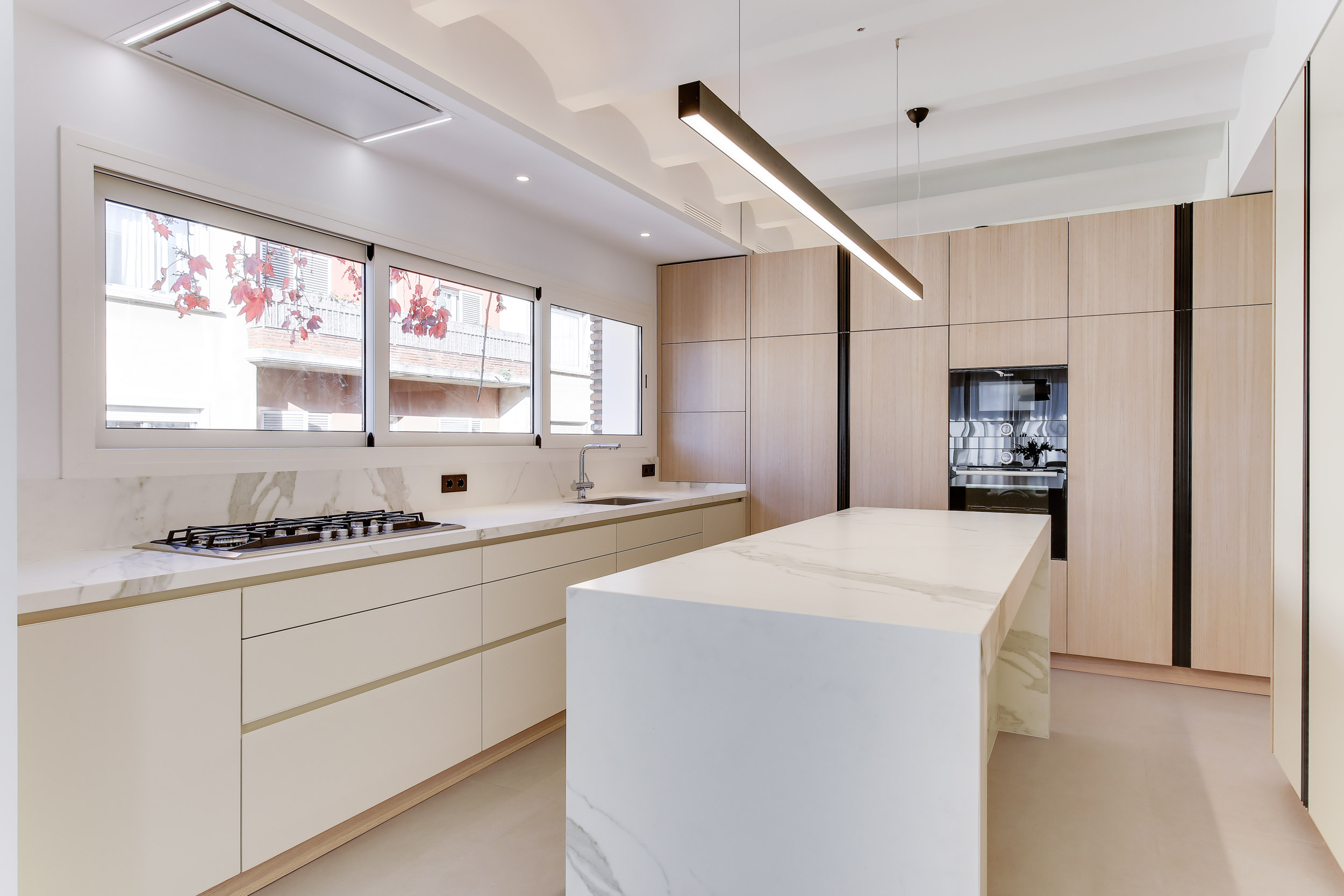
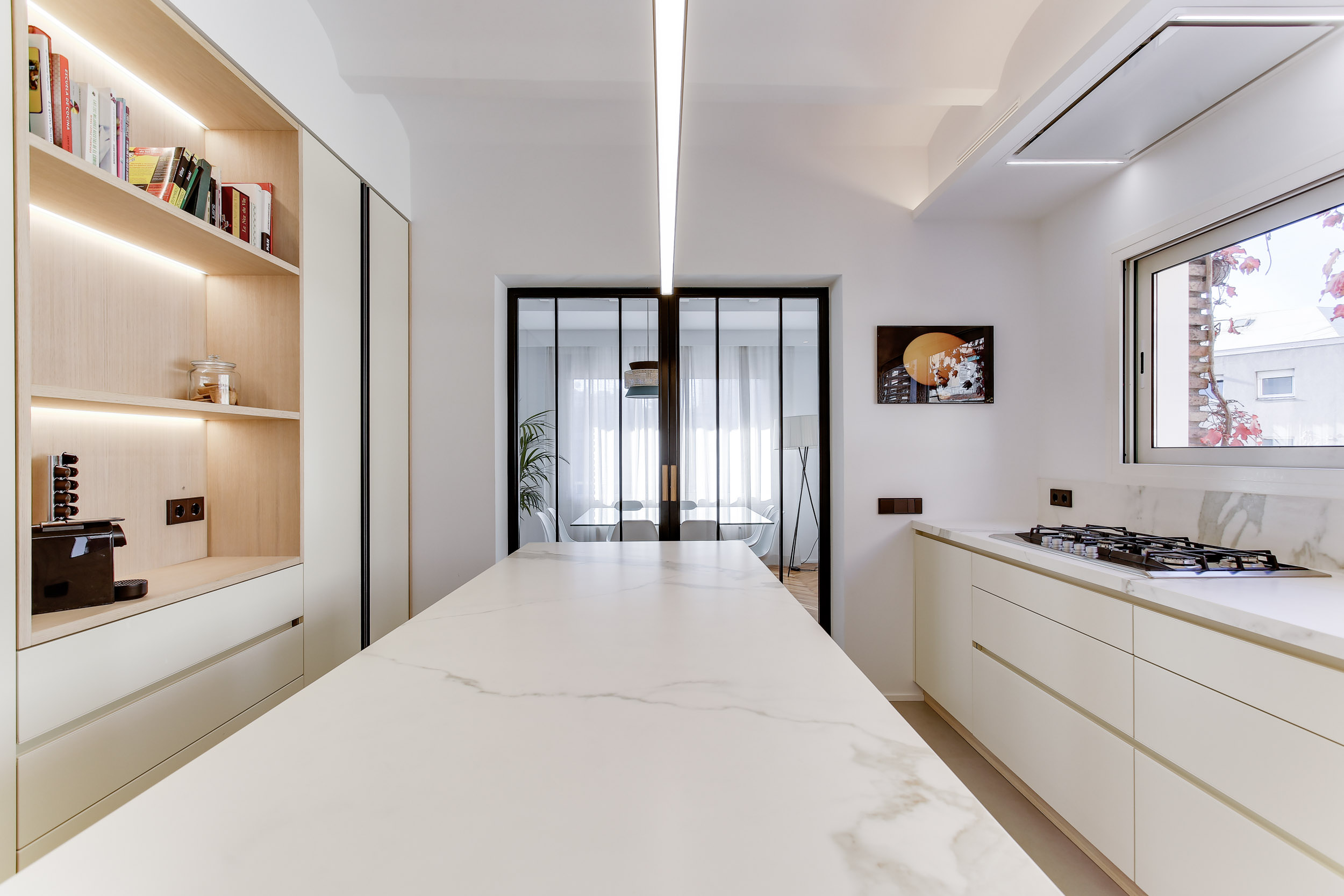
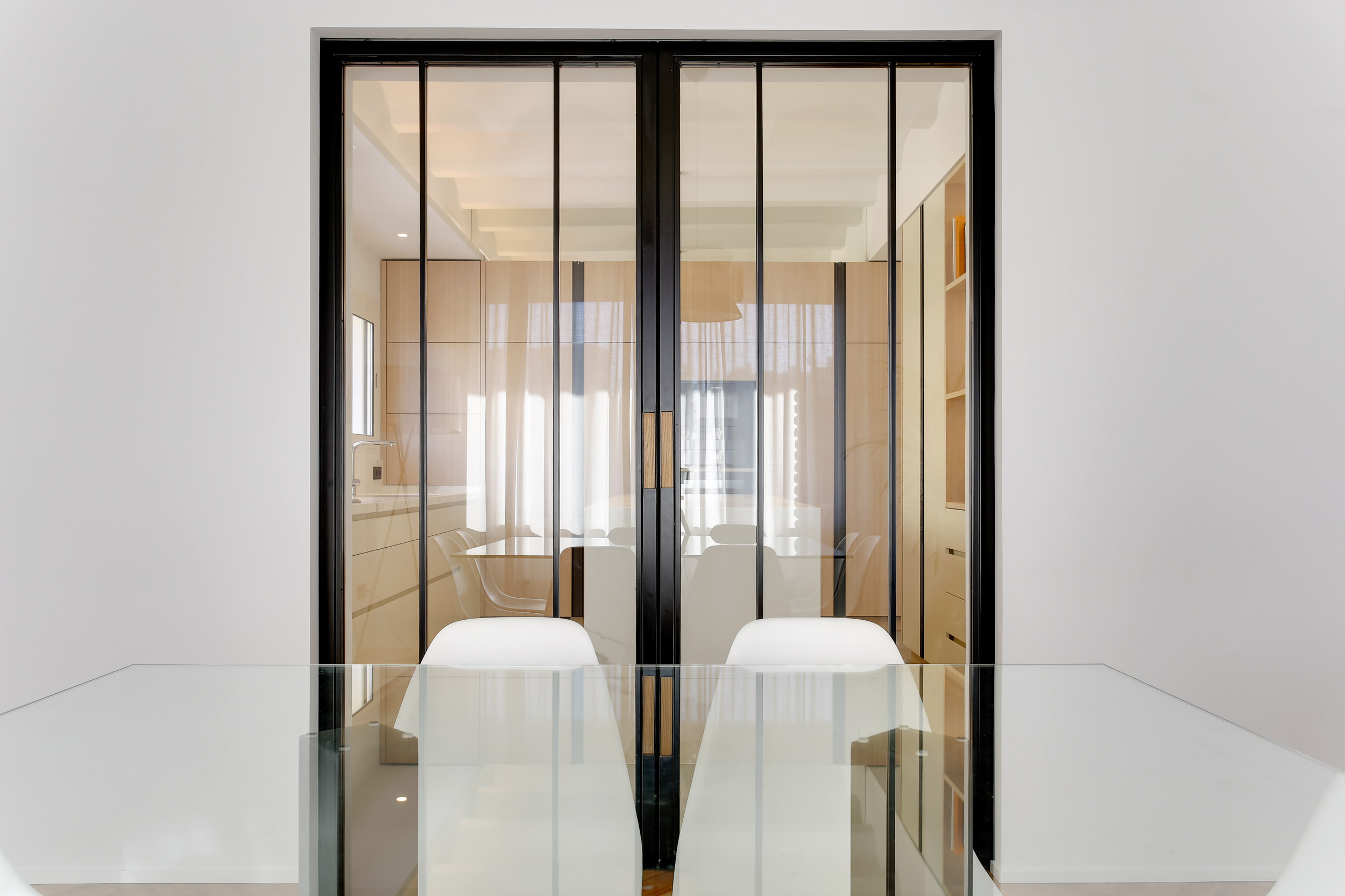
Black iron can also be found in small details and accessories, such as handles and frames. They turn out to be a touch of color and a detachment of fundamental material for some very clear and bright environments. The detail gives an extra touch of elegance to the environment and characterizes it, an example are these full-height handles that reflect the frame of the glass partition of this splendid kitchen made in Barcelona.

kitchen Barcellona black iron details
black iron handel
black iron kitchen details

MATERIAL FINISHES

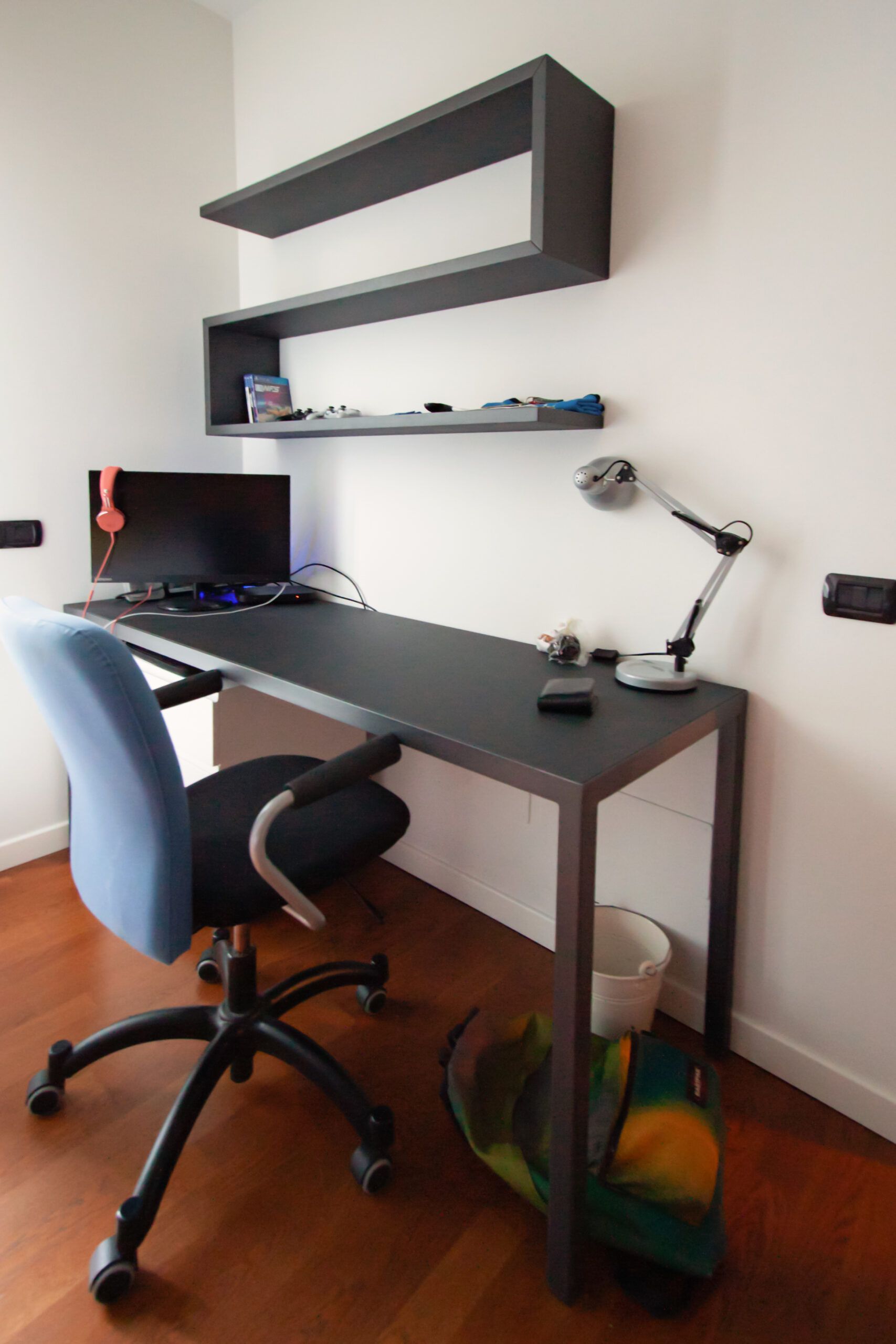
We have previously said that the surfaces of raw materials can be non-uniform and have defects such as scratches or changes in tone in the plate. Excellent for industrial-style interiors, black iron was in fact very common in production workshops at the height of the industrial revolution, sometimes even rusty and together with oxidized brass, ceramics, knotty solid wood and antiqued glass it became the symbol of those years. This raw effect of raw materials has become a trend of companies and design and architecture studios and in recent years it is in great demand. Precisely for this reason, numerous products have been created that reproduce the textures inspired by the essences of wood, black iron or natural stones for exclusive wall coverings or home furniture. The important thing about these finishes in addition to the visual aspect are the tactile emotions capable of arousing thanks to rough and often irregular surfaces, which together are called material finishes. Together with black iron, an anthracite-colored textured paint can give a hint of color and roughness to other elements in which iron is not present but which are in the same environment. An example are these shaped shelves associated with a black iron desk with a Linoleum desktop in the same shade of gray in the center of the top.

desk and shelves
bookshelf in dark gray

THE BLACK IRON IN THE PROJECTS

After all these examples we can only break a lance in favor of raw black iron, like a dark dress that is always in fashion its use, which is both bold and bold or minimized in small details in home furnishings makes it alive, vintage and fascinating at the same time.

Minimal style furniture for a youthful apartment in the city center

Minimal style furniture for a youthful apartment in the city center

An apartment in the city center shows all its freshness with bright interiors and light colors, while the minimal style furniture defines its elegance. Functional environments suitable for various needs and therefore excellent for short and long-term rentals. The geometric patterns and essential design lines return the idea of ​​freshness, presenting themselves as excellent companions in everyday life.
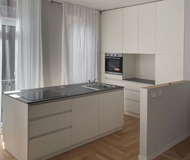
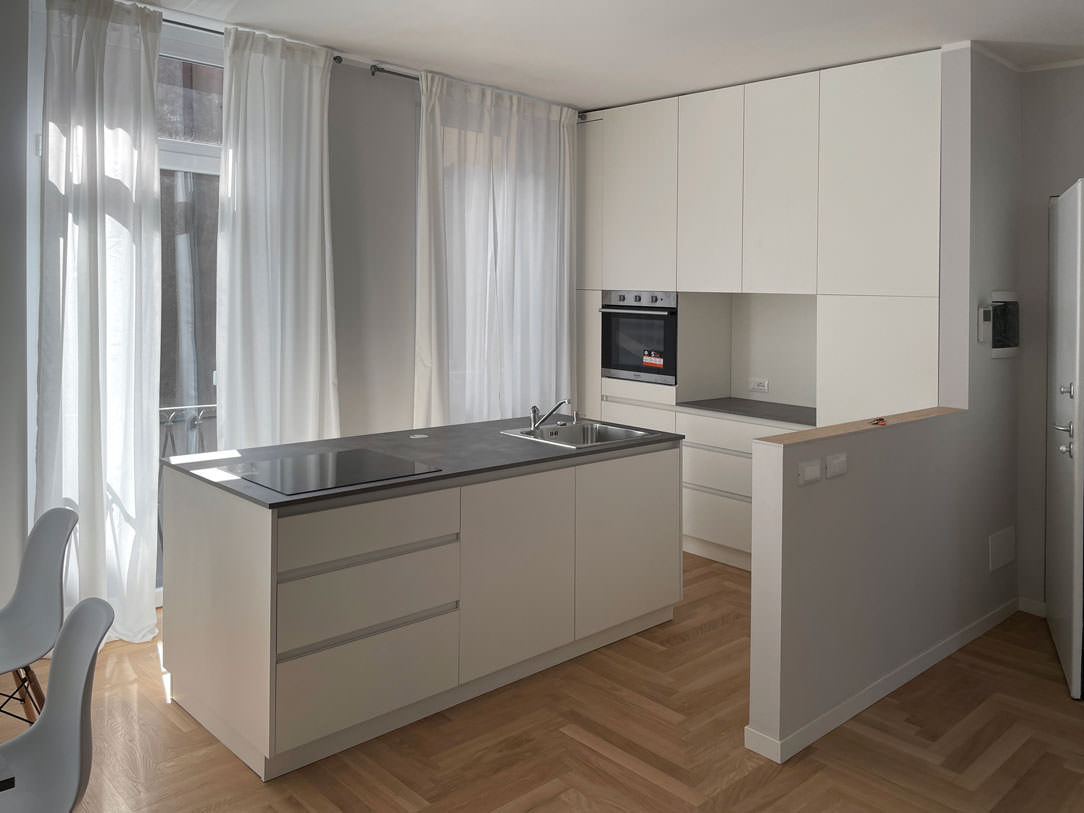
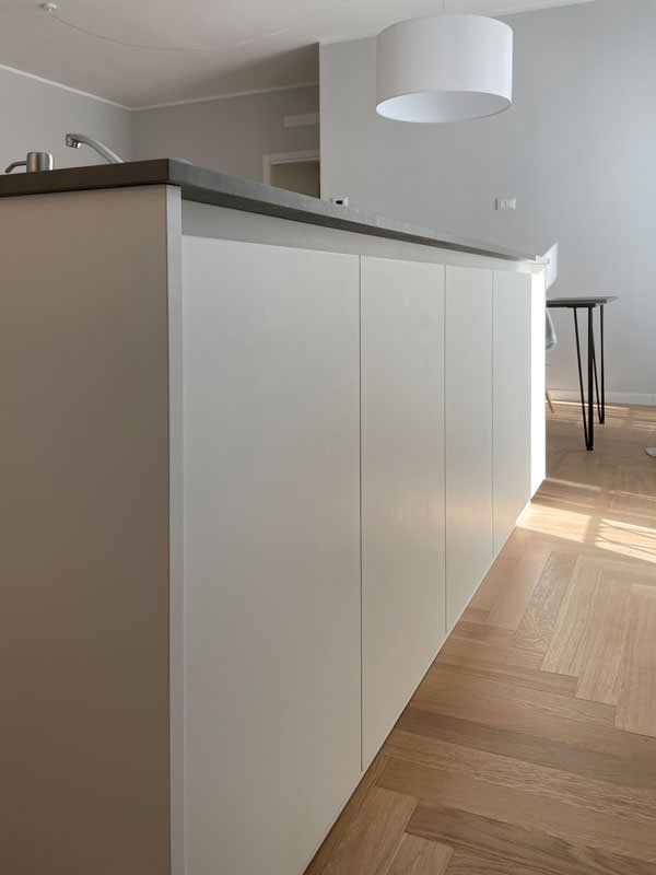
minimal style kitchen central island service columns

The living area: a minimal style kitchen with an industrial touch

The entrance to this apartment overlooks the living area illuminated by large windows located along the right side of the room.
The minimal kitchen also finds space here, divided from the living area by a half-height wall that acts as a conceptual filter for the two environments.

The development of the kitchen occupies the side adjacent to the entrance area with full-height columns and a central island. This becomes the functional element par excellence, acting as a pivot in the distribution of transit flows and welcoming the preparation, cooking and washing areas.
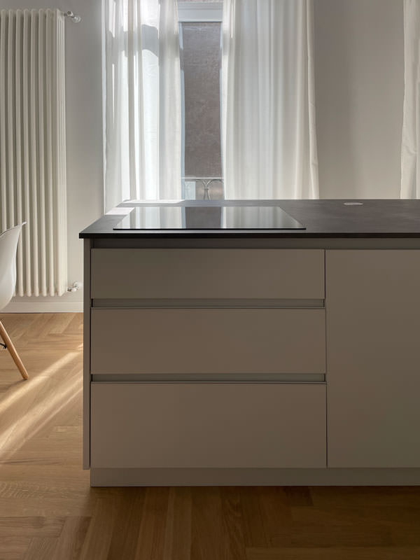
In the lower part, large drawers are placed under the induction hob, to house pots and accessories useful for cooking.
Beside them, two lacquered MDF doors house the countertop sink and the lower compartment for the differentiated waste bins.

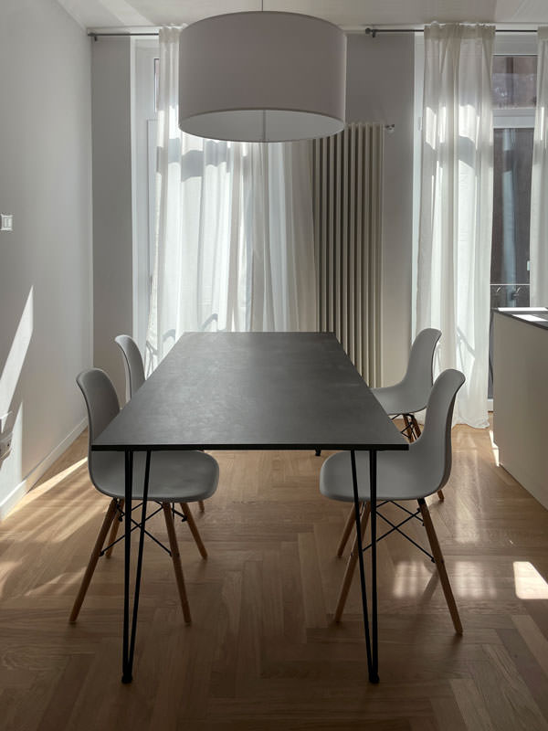
The worktop in practical bilaminate in a medium gray tone recalls the industrial scent of the dining table with its material surface.
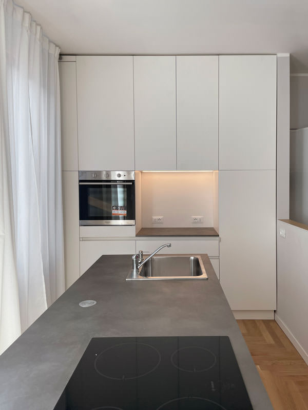
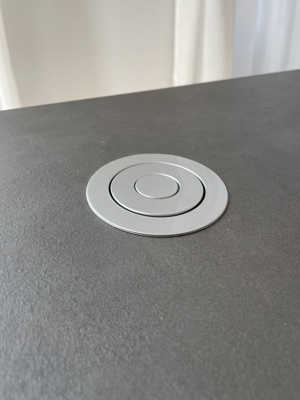
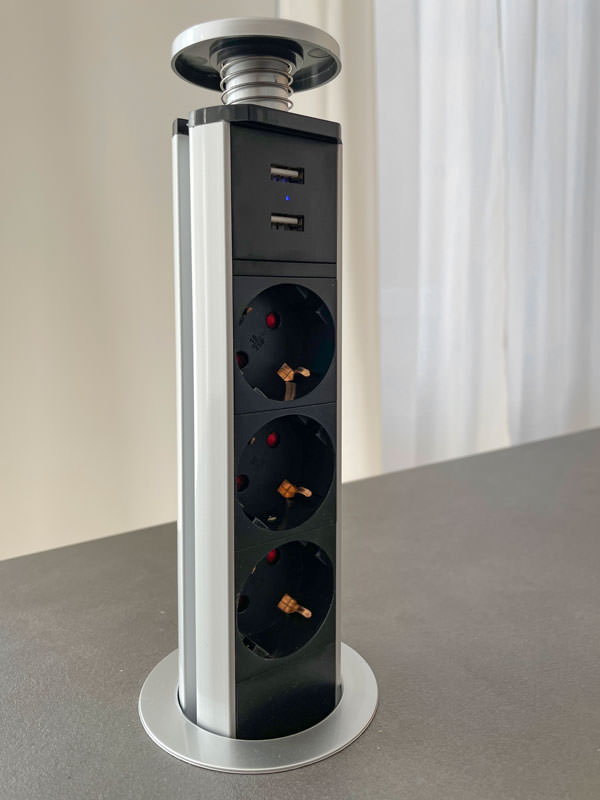
In the center between the cooking area and the washing area, the top is left free to allow the preparation of dishes. To facilitate the use of small appliances, a retractable socket tower.
On the column side, the built-in oven positioned at a comfortable height embrace, together with doors with internal shelves, the open compartment with bilaminate top and lacobel top. Element that acts as a useful support on the side of the oven or can be equipped with small appliances such as coffee machine and mixer, or Thermomix.
At the same time, it is also a significant aesthetic element, capable of attracting attention for the brightness that characterizes it.

The lacobel bottom reflects the light coming from the LED strip embedded in the upper part, giving further brightness.

 dining table metal structure industrial style top
furniture columns kitchen service minimal style bilaminate top lacobel day compartment
front view island drawers pans accessories induction cooking
white kitchen island retro doors detail
detail of the disappeared turret took a closed position
detail of the disappeared turret took the position of use

The functionality of the sleeping area with white furniture

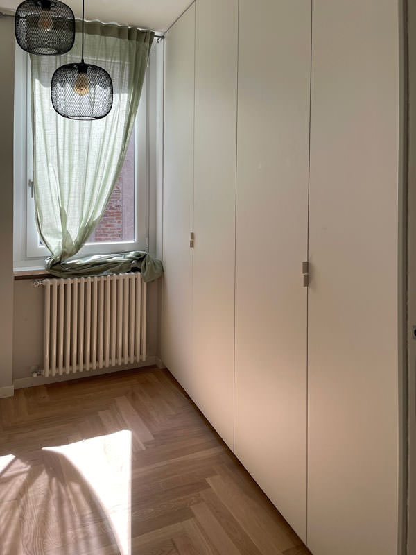
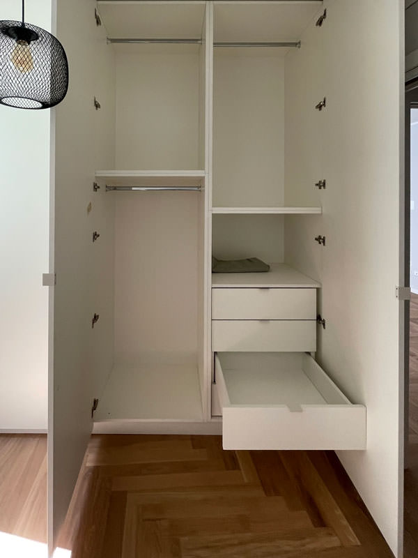
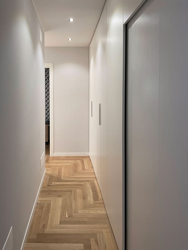
The access corridor to the sleeping area is equipped with a full-height wardrobe shaped internally to restore the correct alignment of the rear walls. Internally, shelves of different heights allow the organization of household products while respecting the existing electrical arrangements and the counter compartments.
A functional element capable of blending into the minimal furnishings of the apartment and at the same time serving as an equipped piece of furniture in a closet.

To complete the sleeping area, a second full-height wardrobe with white lacquered doors and handles in white folded sheet metal with a minimal look.
This internally houses hanging tubes and drawers for linen allowing you to keep the garments in order.
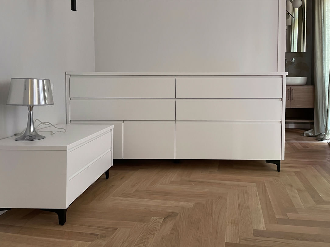
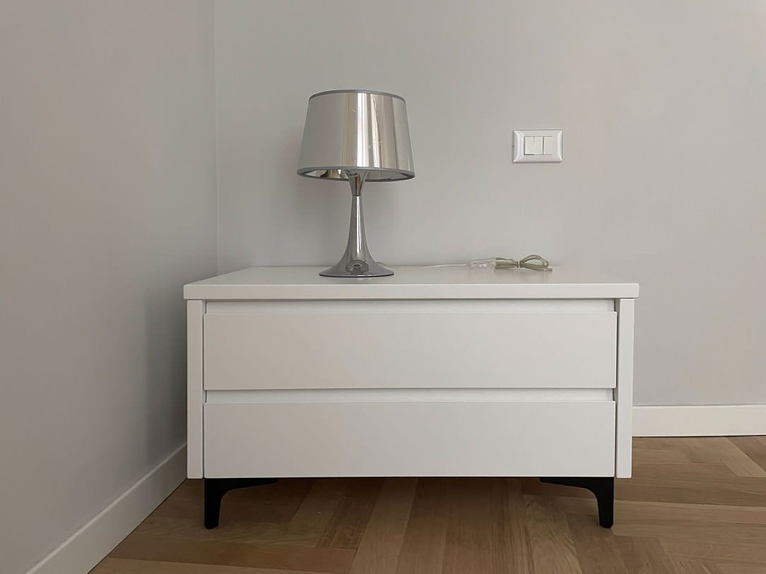
In the master bedroom, essential white lacquered furnishings placed including a pair of bedside tables with storage drawers and a large side chest of drawers with recessed handles.
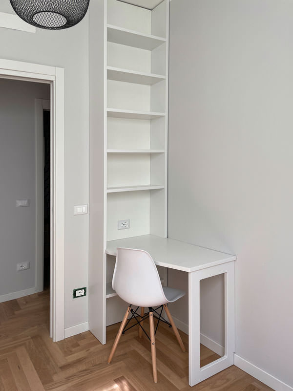
A desk, on the other hand, is inserted into a game of joints in a wall bookcase, creating an equipped point for smartworking.

full-height wardrobe doors sheet metal handles minimal furniture
internal wardrobe drawers linen tubes hangers
equipped corridor mobile closet minimal furniture
study corner bookcase wall desk shaped
chest of drawers bedroom minimal furniture white bedside tables
bedside table front view white lacquered handles hollow drawer black feet
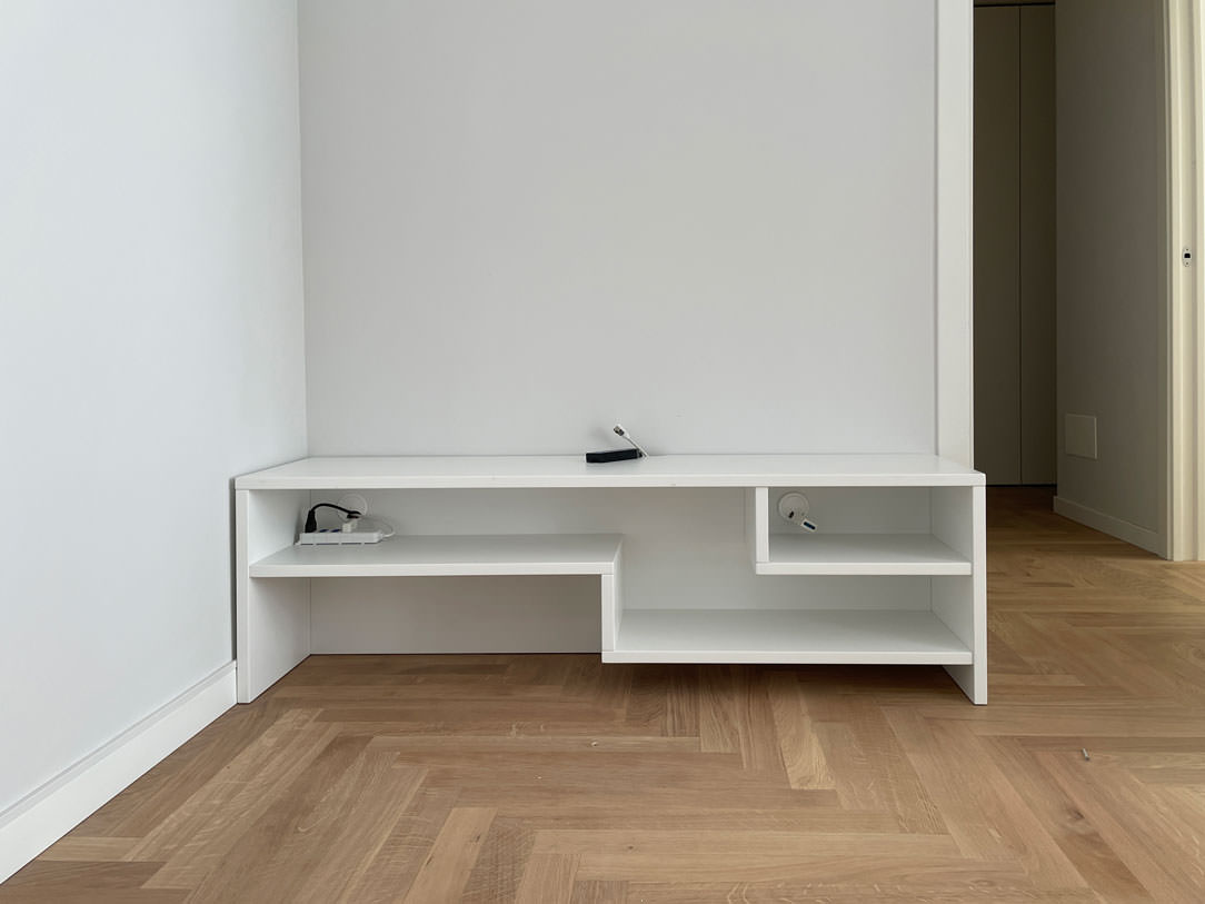
white lacquered shaped shelves furniture minimal style furniture

The natural touch of the bathrooms

The two bathrooms with bold graphics reflect the minimal style of the furniture, giving a touch of freshness.
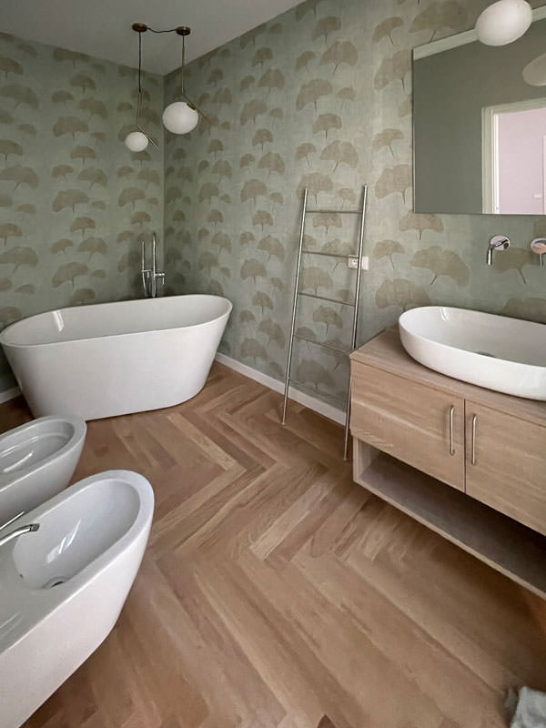
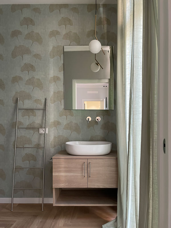
One, next to the master bedroom, incorporates the natural tones of green with a wallpaper with a vintage flavor. This is equipped with a cabinet with wooden finishes combined with a countertop washbasin with sinuous shapes. It is accompanied by a large designer bathtub that masters the corner of the bathroom and elegant furnishings.
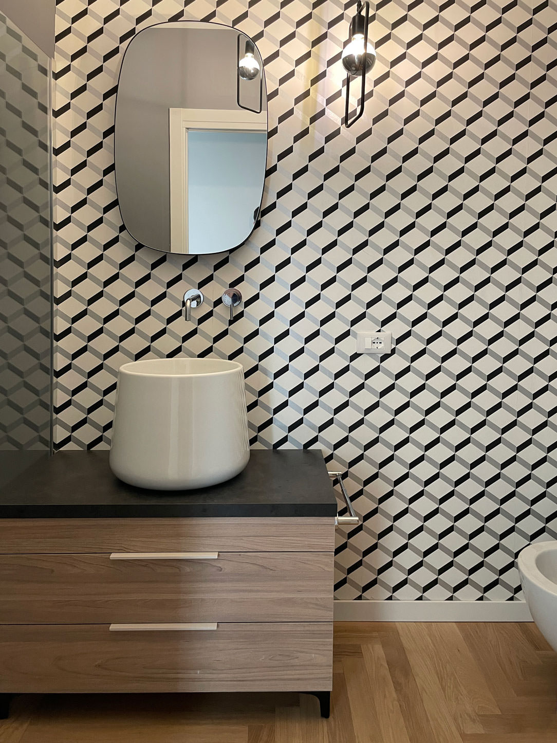
The second bathroom, on the other hand, plays on the geometric textures of the wallpaper with more decisive colors, matched with a bathroom cabinet with the same characteristics as the first.

bathroom tub design natural colors vintage wallpaper
bathroom cabinet wood white countertop washbasin green wallpaper
bathroom furniture wood sink design support wallpaper vintage geometric pattern

City apartments require flexibility from both a functional and aesthetic point of view.
For this reason, the minimal style is perfectly suited to satisfy the tastes of future tenants. Another example of this type is this studio apartment in the center of Milan!
To deepen the minimal style instead, we can delve into the retail world with this shop in the center of Bergamo. Enjoy the reading!

Hangers that give new life to Tiziana Fausti windows

Hangers that give new life to Tiziana Fausti windows

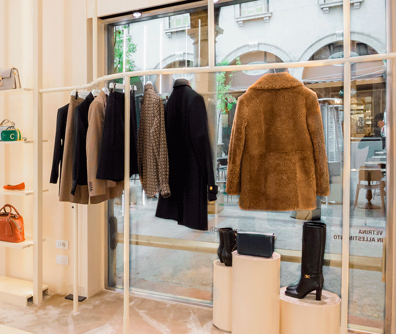
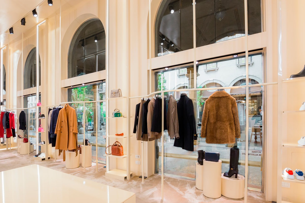
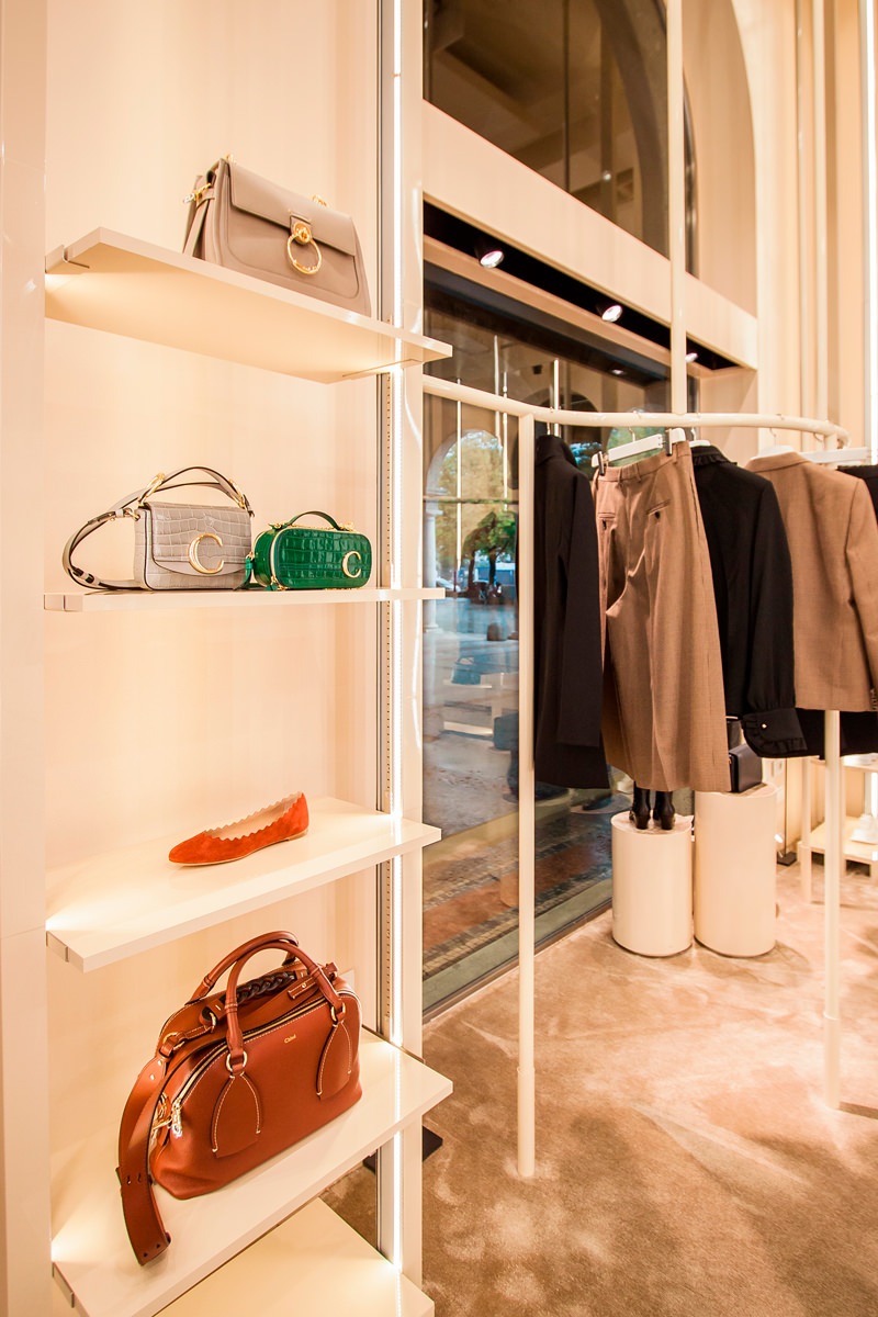
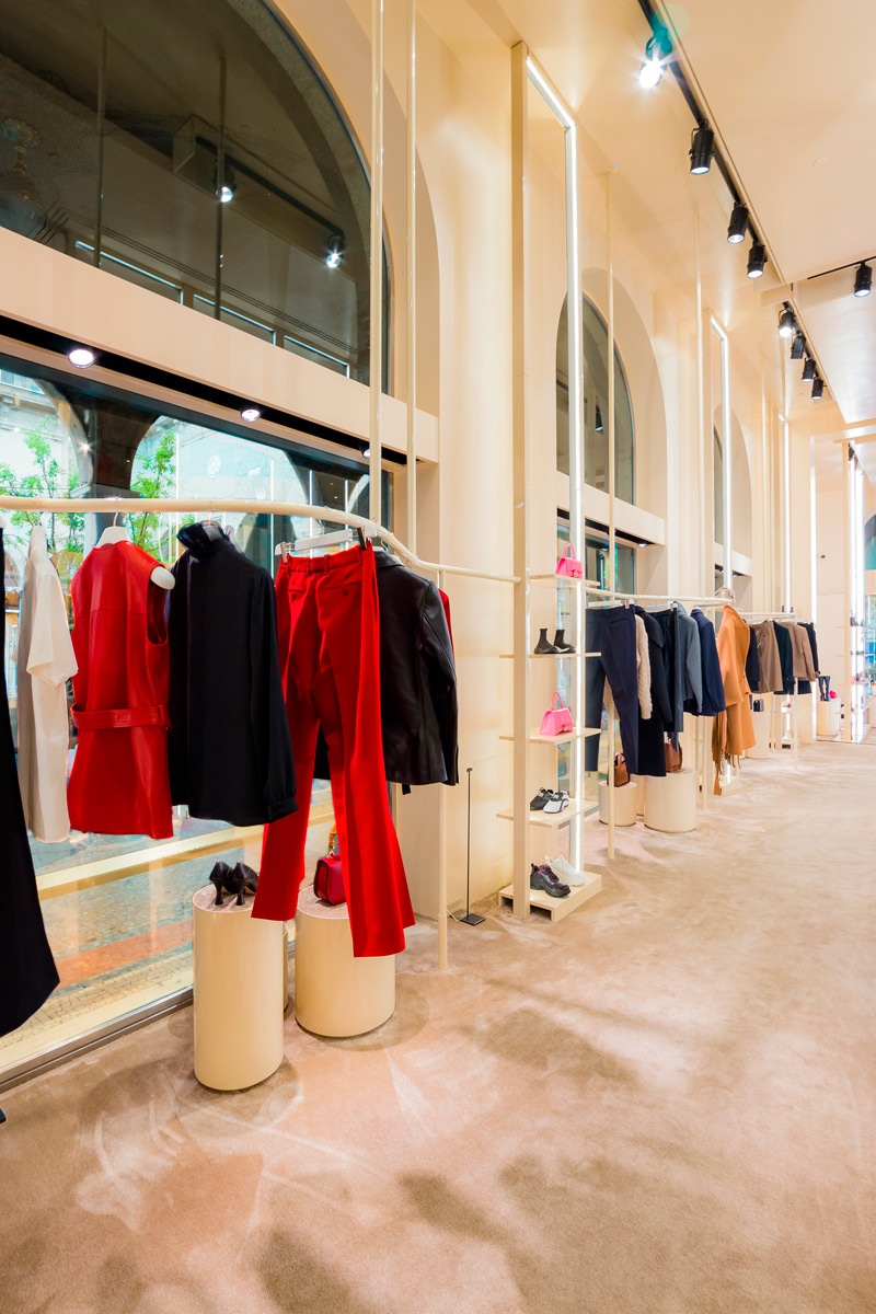
The new hanging system becomes the leitmotif for the windows of the Tiziana Fausti women’s and accessories shop. Linear elements that unfold in the air supporting the products displayed with elegance and lightness.

tubolar hangers windows
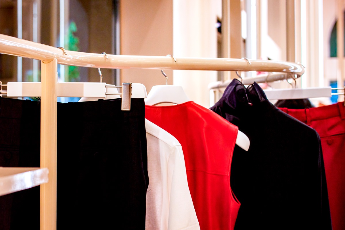
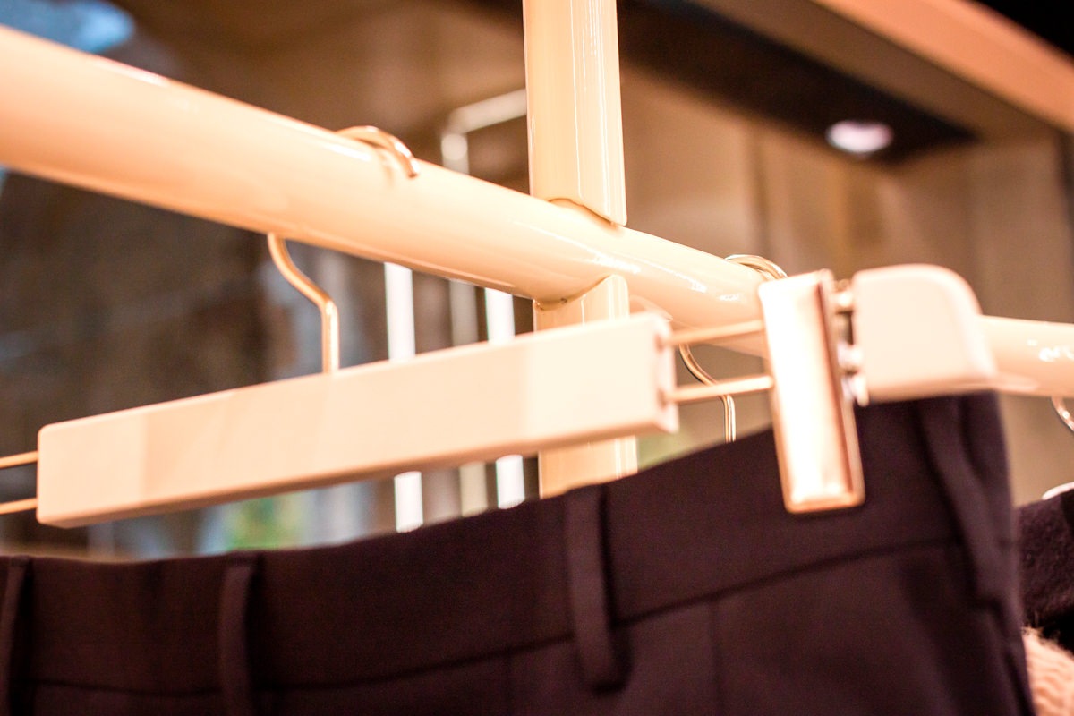
painted hangers detail neutral colors

Always in constant change

The new layout of the Kids department on the ground floor of the historic Tiziana Fausti building has also led to a series of changes in the women’s store.
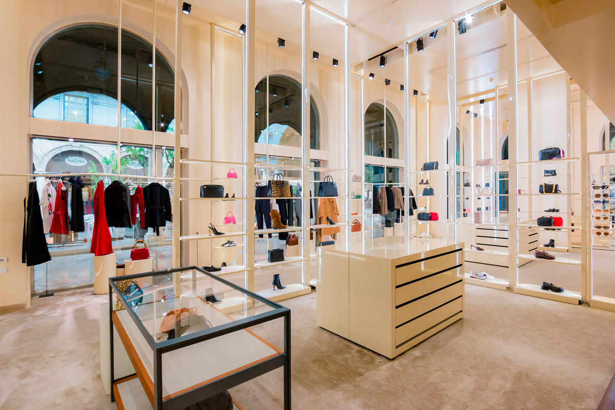
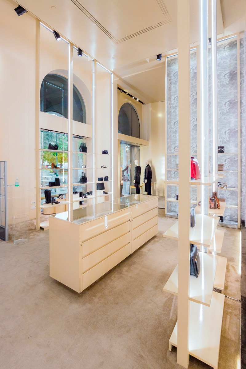
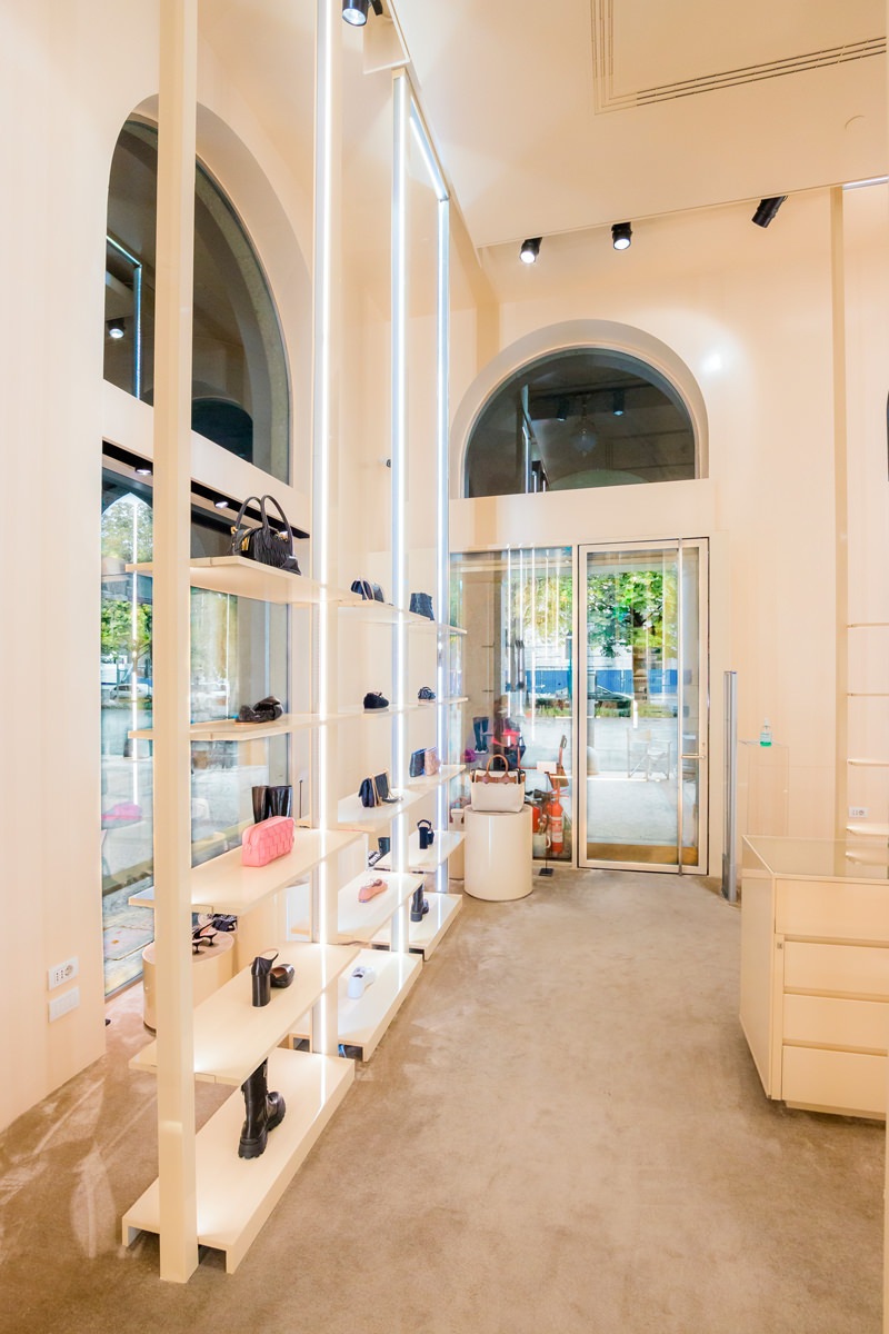
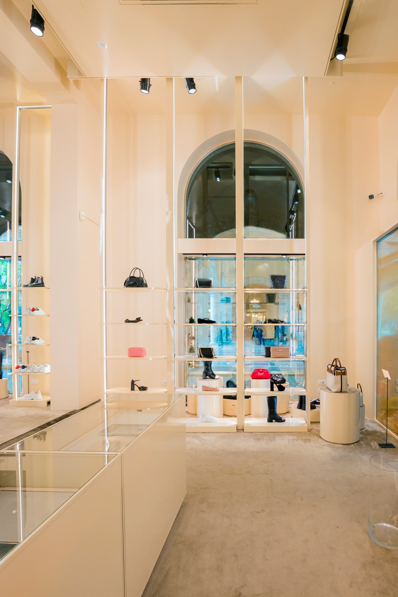
The latest fitting focused on the neutral tones of pink saw the prevalence of vertical elements that underline the large heights of the rooms.
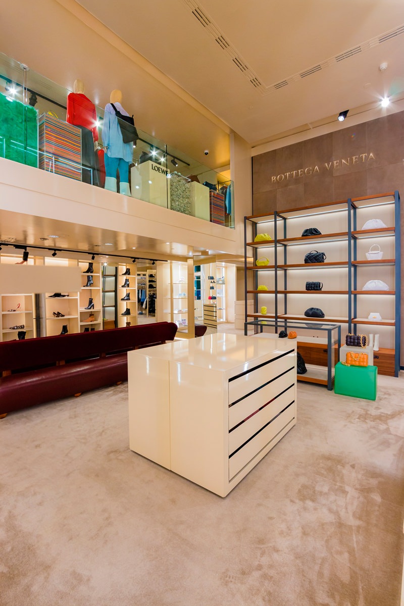
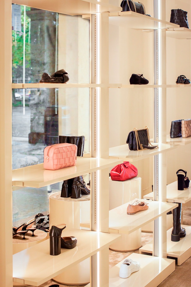
To make space for the Kids department and uniform it from a design point of view, it was necessary to move some elements. Among these, the important wall that houses the Bottega Veneta display cabinet, whose dark tones and a light industrial touch are recognizable for their aesthetics and character. The entire wall occupied by that display system has been recovered, with careful restoration work.
Designing furniture that can be disassembled and rearranged while preserving all the components in the best possible way is a fundamental requirement for retail designers.

new setting project woman department Tiziana Fausti
new windows setting 01
new Bottega veneta wall
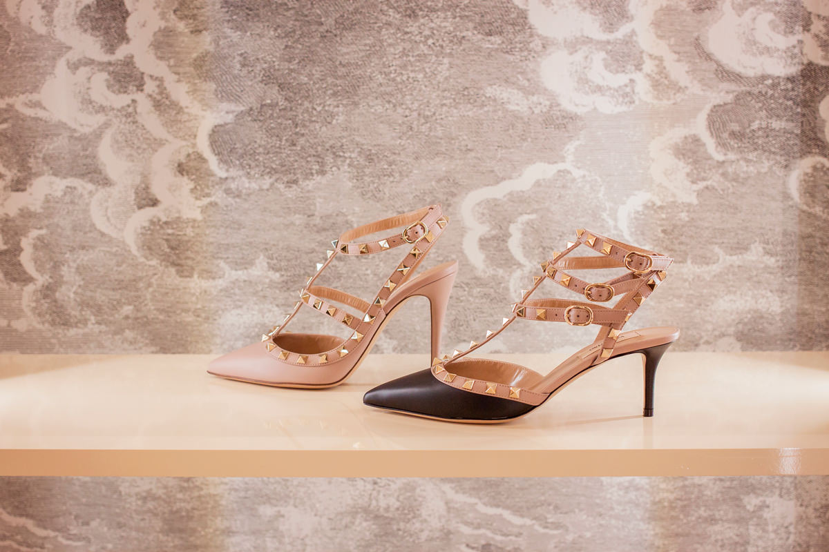
detail shelves film

The new display system for shop windows

Like sinuous lines, the new tubular hangers elegantly wind their way along the various side windows. To support them, vertical profiles that develop from the floor to the ceiling.
Exposed joints allow connections between the horizontal and vertical components, making the aesthetics of the display system essential. The soft color of the paint perfectly matches the existing furnishings.
A design line that introduces the theme of horizontality, in a set-up that emphasizes the vertical read.
To move the shop windows, cylinders with a velvet top covering in different heights.

new windows setting 02
painted tubolar hangers details
tubolar joint windows

A scenographic entrance

The changes made during the new layout also involved the entrance area, which now takes on greater importance.
If in fact in the previous configuration the two accesses to the floor could be equal in aesthetics and function, now it becomes essential to keep the women’s department separate from the Kids one.
To emphasize the scenographic setting of this strategic point, three exhibition totems have been added.
Just like the existing ones, the side lighting develops along the vertical profiles, illuminating the different shelves with soft pink film.
A sort of luminous wall that identifies all the design characteristics of the women’s department: essentiality, lightness and elegance.

volume detail entrance 01
volume detail entrance 02
shelve with light entrance
new display element side view entrance
new display element front view entrance

How a kitchen takes life: the phases of realization

How a kitchen takes life: the phases of realization

Discovering bespoke furniture, have you ever wondered what are the phases of realization that give life to a kitchen? We are ready to show you our creation and production process! The design of a custom-made kitchen is born from the meeting between the customer’s wishes and personality and the designer’s experience, capable of satisfying the functional and aesthetic needs of both. What the customer sees is the transformation of the project, shown in its most satisfying graphic form, into a finished and complete product. However, there is a world behind the creation of a kitchen: from the artisan production phase, with boards with strong resistance and workability, to the painting of the components, from transport with packaging to final assembly. Let’s follow the production process of this minimal kitchen.

design phase perspective phase

The design: a continuous dialogue with the customer

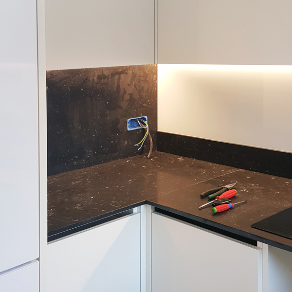
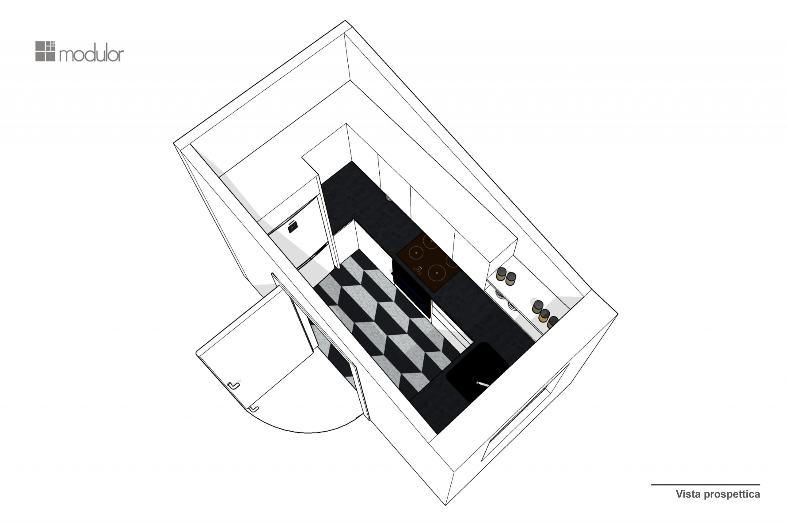
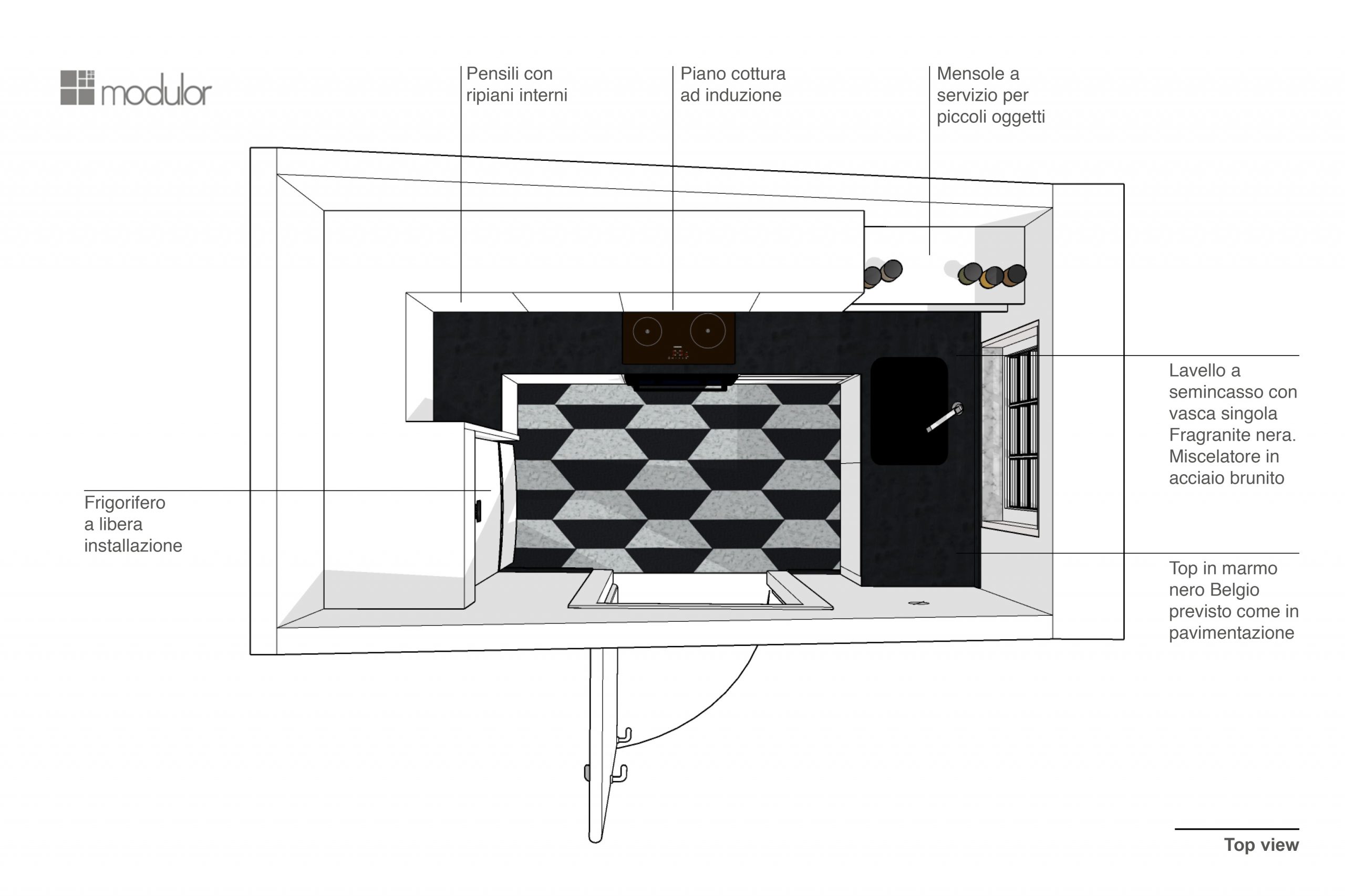
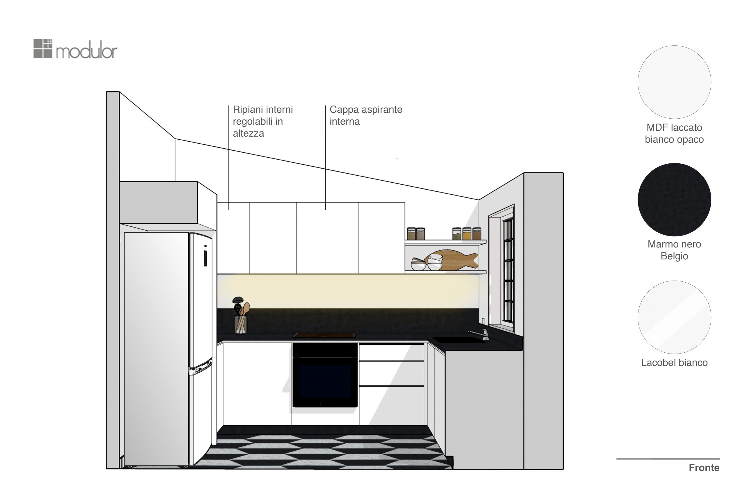
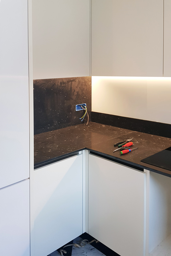
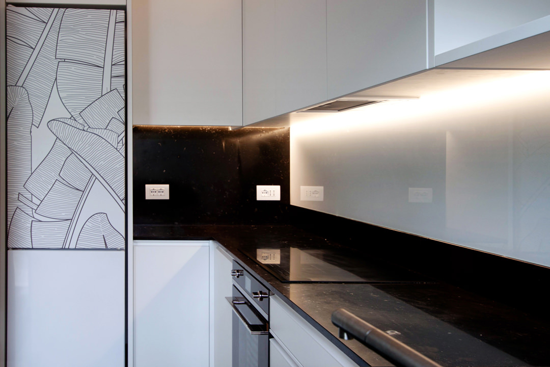
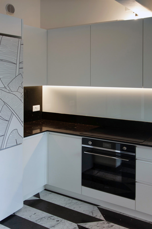
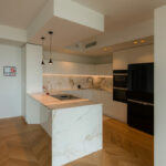
The design of this kitchen stems from the need to optimize spaces in an environment already strongly characterized by floors with geometric marble patterns. The presence of a relevant flooring has given rise to a project that responds to the same chromatic characteristics. In this way, the minimal line of this kitchen is born. Here, the lower volumes and upper wall units in matt white lacquered MDF give brightness and freshness. The black marble top houses the built-in sink and the induction hob, transforming into a splash back and side back. The vertical reading wall units holds the hidden lighting that is also reflected by the white Lacobel splash back. The graphic rendering of the project allows you to get an idea of ​​the general layout of the kitchen, studying the different components based on the best practicality. We try color and material combinations and studies alternatives in the volumetric composition. In this phase, the ability to read and interpret the client’s wishes is essential for the designer. On the other hand, the customer plays an active role, becoming an integral part of the design team. The best projects are in fact those that do not stop at the first solution, but undertake new design challenges, evolving from time to time following the brainstorming between the client and the designer.

design phase top view
Minimal kitchen Verona design  front

From the design offices to the lab: the executives

Once approved and defined in the smallest detail, the kitchen project goes directly to our laboratory, ready for the construction phase. The three-dimensional model developed during the design phase is reworked to take on a new look. From a graphic and realistic setting, it is transformed into a functional model from which the executive tables are processed to be addressed to our artisans. After an accurate on-site survey, where electrical predispositions, discharge and existing constraints are highlighted, the model is adapted and designed in detail. Extremely simple designs that give up their aesthetic presentation in favor of greater clarity of reading. Dimensions, cuts and joints are underlined to make the realization cleaner. Our kitchen is therefore broken down, from a three-dimensional model in digital format to A3 tables with plants and elevations so that the experience of our craftsmen can give life to the actual realization.

Between cuts and painting: the realization in laboratory

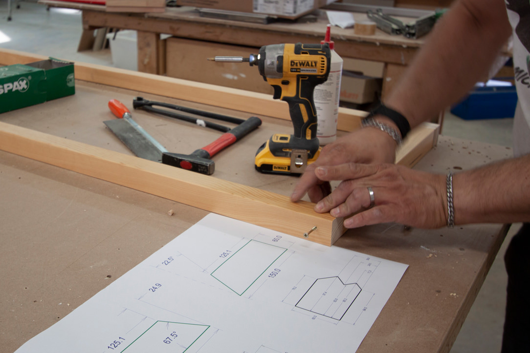
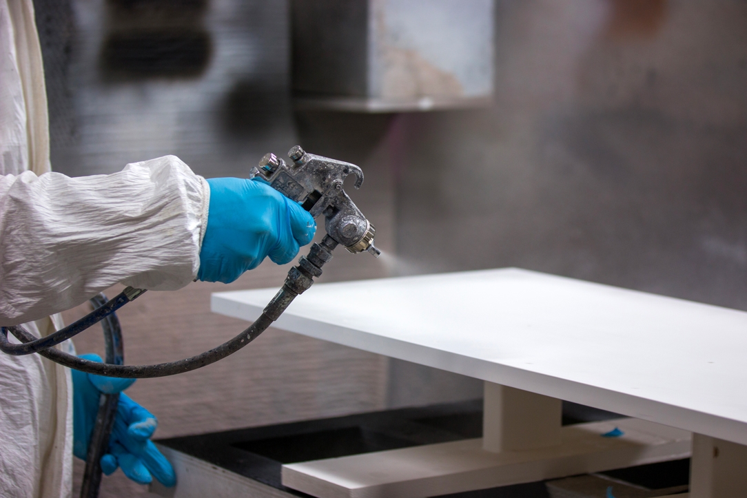
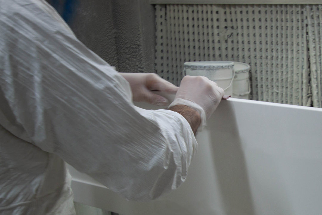
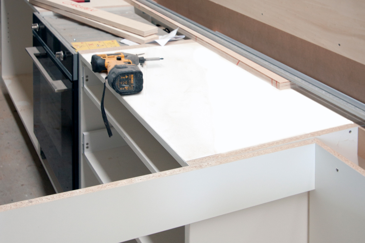
The MDF boards are cut with special machinery preparing the joints for household appliances and related attachment points. Any special processes are carried out with the numerical control machine or with the pantograph, at rest during this project. In the meantime, our guys in the internal painting department prepare the samples with the different chromatic shades. There are infinite shades of each color,. Even of white, that contextualized in an interior can give life to different effects and perceptions. Once the cutting of the single components is finished, the assembly test takes place. Screws, hinges and drawer guides now come into play by verifying the right composition of the kitchen, which is in full construction phase. If our bespoke furniture passes the assembly test, the components are broken down again and passed to the painting compartment.

minimal kitchen realization
painting laboratory
laboratorio piallatura
assembly test Minimal kitchen Verona
Assembly test laboratory

Traveling to the final destination

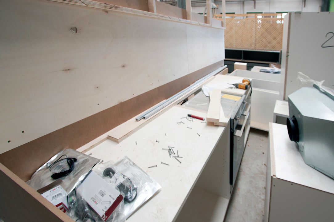
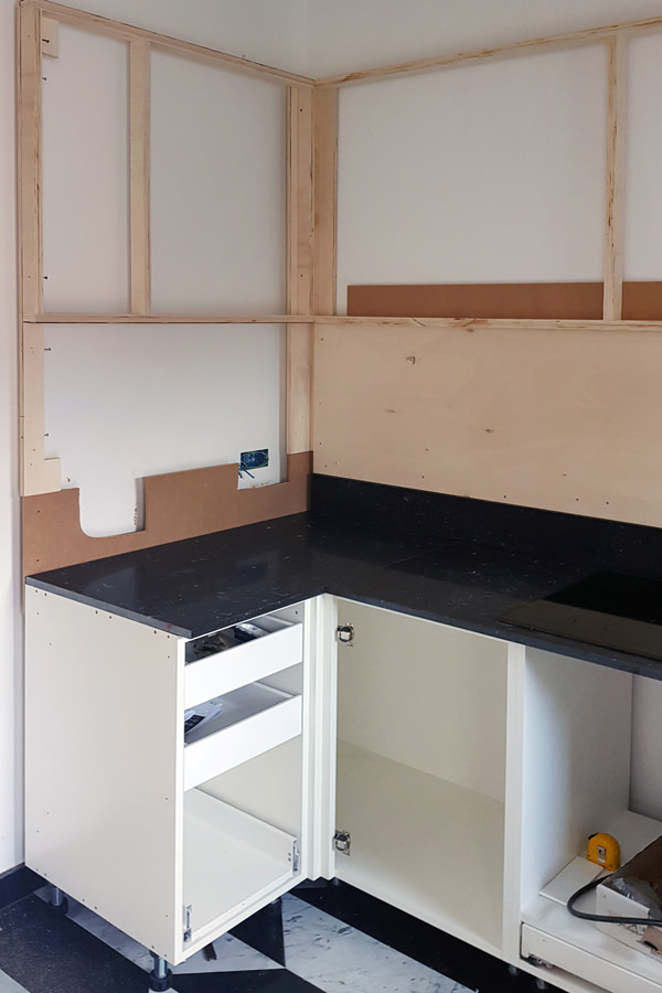
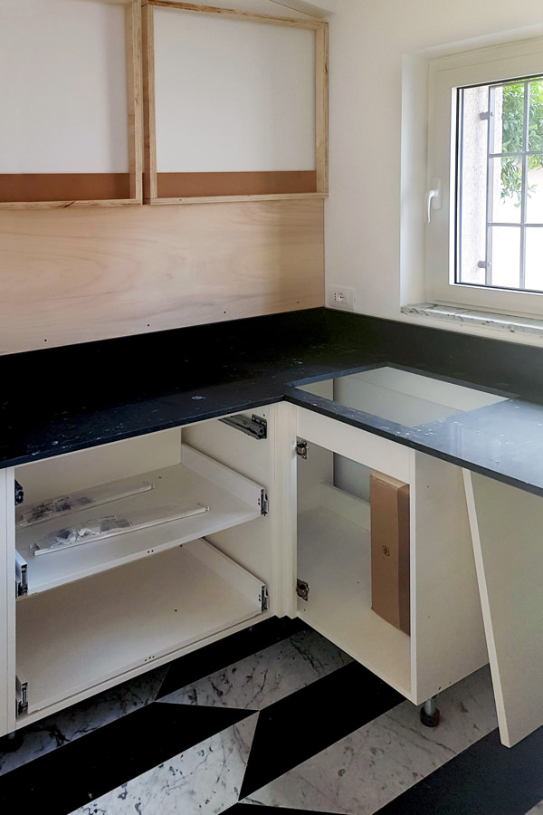
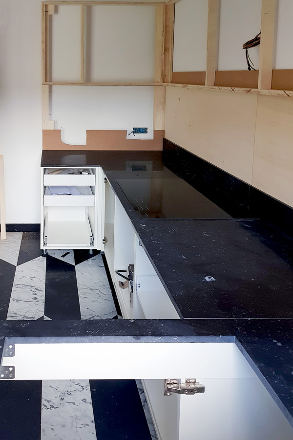
The different components are ready to undertake on their journey. The packaging is careful and punctual, ready to foresee and avoid damage during transport. The load is organized in order to optimize the movements, whether it is short distances or in the case of international travel. Packed properly and accompanied by all the appliances required, our kitchen leaves for Verona, ready for the big day of presentation to the customer. Expert hands and assembly tool kits quickly shape our minimal kitchen. The load-bearing structures for wall units and lower volumes are prepared, to which the various external components are gradually added. Lighting under the wall unit, handles with aluminum shell, shelves with rods for height adjustment. All details that now become fundamental for the final realization of the kitchen. Once the assembly is complete, broom hands, dustpan, vacuum cleaner and good hand works. Everything is cleaned from dust and work shavings, removing any protections and any construction site structures. And here it is, bright and minimal, functional and able to accommodate products and foods of all kinds.

assembly phase Minimal kitchen Verona 01
assembly phase Minimal kitchen Verona 02
assembly phase Minimal kitchen Verona 03
assembly phase Minimal kitchen Verona 04

A minimal kitchen: the final product

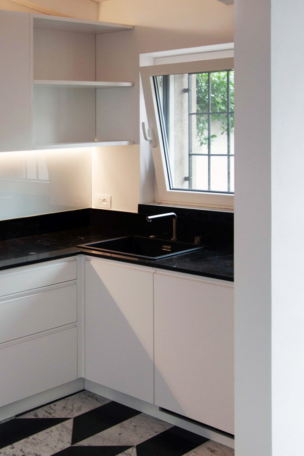
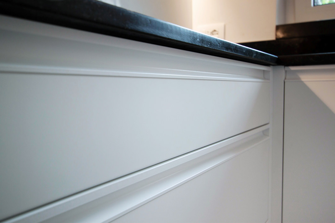
The day of the official presentations has finally arrived. The black marble top chromatically contrasts the lower volumes and white lacquered wall units. Different storage points ensure space optimization with removable trays and baskets but also height-adjustable internal shelves. The drawers for cutlery, table linen and pots are designed in different heights depending on their use. The recessed handle makes the aesthetic impact elegant and essential, while the white painted shell ensures greater durability and resistance over time. Upper shelves are perfect for small objects, visually lightening the terminal part of the wall units. In this way the natural light diffused by the side window spreads freely in the space giving a touch of freshness. After viewing the finished product with the customer, with a good handshake and the wish for a next collaboration, we come back to the base, ready for new challenges! Other projects are already under construction and willing to become reality. To continue your journey discovering the creation of a kitchen, you can learn more about the types of cladding: an Emperador marble kitchen and a kitchen entirely steel covered.

finished product minimal kitchen
windows view kitchen
refrigerator view minimal kitchen
recessed handle drawers detail

Discovering Scandinavian style: essential and functional

Discovering Scandinavian style: essential and functional

Being able to identify the style that best suits our personality is a strong point in the design of domestic interiors. For this reason, we have thought to collect for you a series of references that can best show the different styles of the interior design. Accompanying you in their discovery means setting the first references that will allow us to undertake customized solutions, in which different stylistic elements harmonize in a unique and identifying way. We start our journey with a Scandinavian style, essential but extremely functional. We will show you images of our creations matched with material and chromatic references and with extremely identifying design icons and interiors in order to give you the best overview of this style.

The Scandinavian style in its architectural settings

Scandinavian style has swarmed our home’ interiors in recent years. Originally from Northern European countries, it has fascinated us more and more with its essentiality and harmony with nature. It is from the latter that Nordic designers and architects, first of all Alvar Aalto and Arne Jacobsen, drew inspiration to create projects in perfect harmony and functional balance. Before on the furniture terms, the Scandinavian style analyzes the relationship between Man and Nature on an architectural level. From this, the choice of the orientation of the building and the relationship with natural light become of fundamental importance. This, at high latitudes, in the winter months becomes very scarce, if not completely absent. It is therefore essential being capable of making the most of what nature offers with large windows and bright surfaces.

Alvar Aalto Carrè House Scandinavian Style

Alvar Aalto, Maison Carrè

Arne Jacobsen St. Catherine's College

Arne Jacobsen, St. Catherine’s College

Colors and materials

Fresh and bright environments are the distinctive feature of the Scandinavian style. If on one hand the architectural conformation wants to make the most of natural light, on the other it is up to the chromatic choice the ability to illuminate and lighten the interior. Here then the white becomes the undisputed protagonist of the interior. The visual delicacy identifies this style and is obtained by adopting soft colors, preferring pastel shades. To these are added the natural essences of woods, a material certainly preferred in the Nordic interiors. But pay attention to this: wood is chosen for its naturalness and refinement. Therefore, painting and surface processing that alter the original perception of the material are excluded. Favor the natural essences of oak, walnut, oak, larch, ash and first of all birch.

Scandinavian style, reference 01

Sinuous lines for greater ergonomics of the furniture

Scandinavian style Modulor palette

Natural materials and chromatic palette in neutral tones

Modulor selection forniture and materials

light wood essence chosen for essential furniture

Scandinavian style kitchen

Pastel colors for a fresh touch and character

Modulor pastel colors palette

Pastel colors for a touch of grit without sacrificing delicacy

Lines and geometries

Above all the essentiality that characterizes this style is given by the conformation of the furniture and the interiors themselves. Simple and regular geometric lines are preferred, which allow themselves to be fascinated by the sinuous forms of nature but only if justified by greater ergonomics. Geometric patterns and organic lines influence each other to give shape to a light image, but first of all to respond to greater functionality.

traditional villa Sicily kitchen front view

White with its brightness is the color par excellence in the Scandinavian style, as this Modulor kitchen

Scandinavian style living room

Essential furniture and delicate colors for this living room

living room library

Recessed library between wooden essences and pastel colors

Conclusions

Choosing the Scandinavian style means choosing a delicate and fresh interior. If your personality is careful to detail and a lover of simplicity, you will surely be fascinated by it. Airy and bright spaces like your light thoughts and delicate and natural colors like your character, in symbiosis with nature and its perfection.