One kitchen a week, part 4: essential and elegant

One kitchen a week, part 4: essential and elegant

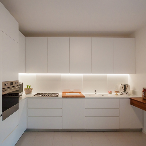
A contemporary and essential kitchen, which minimal lines define an elegant interior total white.

prospective essential elegant kitchen

THE PROJECT

The most elegant contemporary interiors are characterized by simplicity, created with opaque surfaces often white.

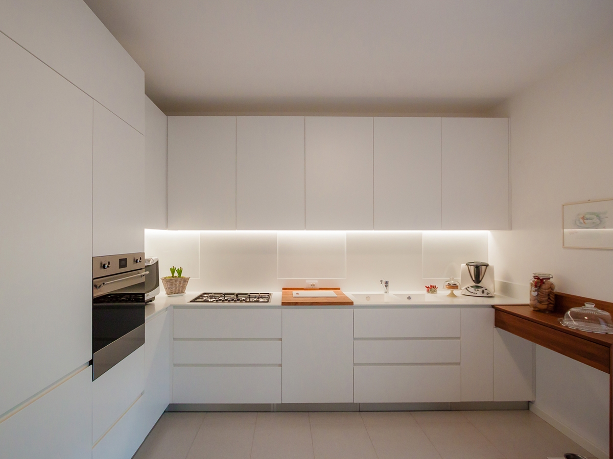
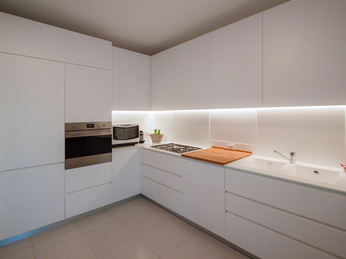
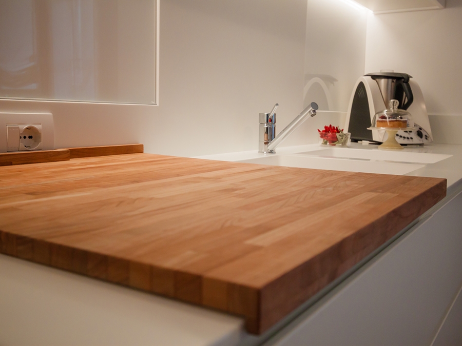
It’s the case of this kitchen, which essential setting does not give up contrasting elements such as the central cutting board and the snack bar on the right.

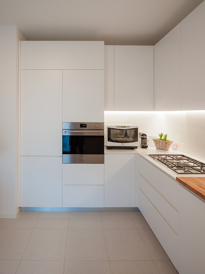
Placed at the angle, it has a visual and conceptual asymmetry that creates different visual solutions: on one side the full-height door holds containing shelves and drawers in a continuous visual surface.  The recess oven occupies the lateral part in communication with the countertop that uses the internal corner.

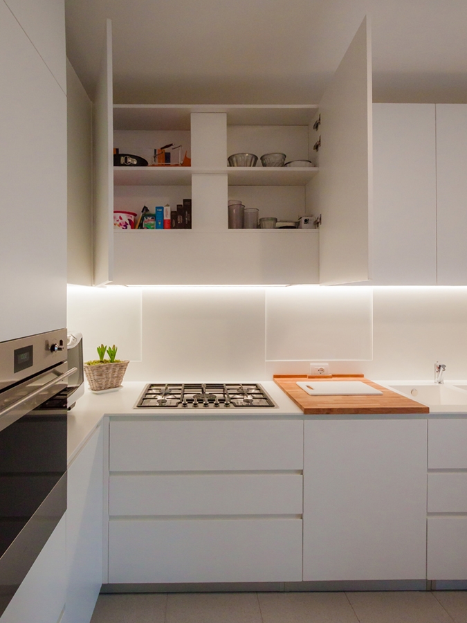
The main side is instead occupied by the horizontal subdivision between the upper wall units and the lower containing volumes. The linear lighting, hidden in the edge of wall units, creates a feeling of emptiness able to give lighten to the room’s perception.

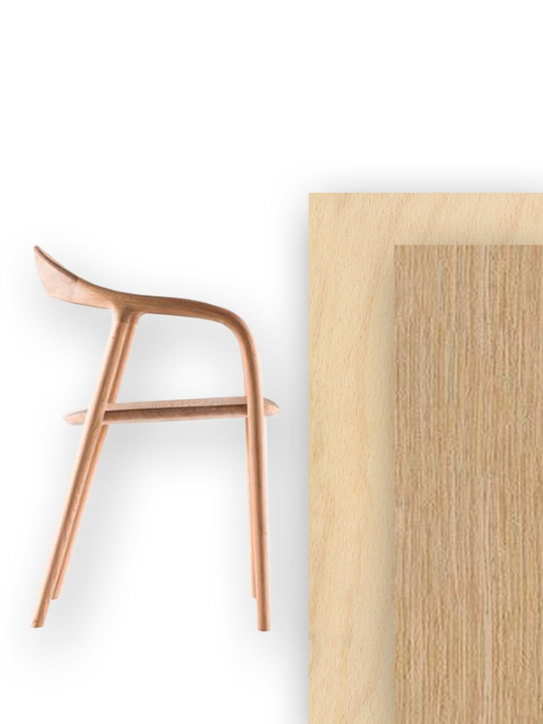
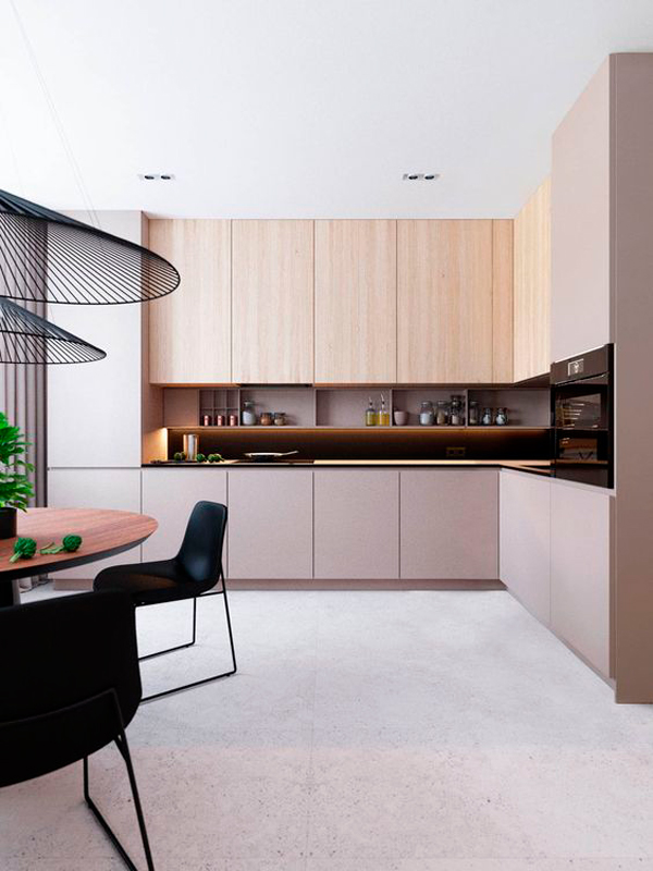
In particular, the upper wall units are made up of fixed-width doors with an extremely elegant profile, spaced from each other by a visual line obtained with a small slot. The lower part instead consists of two drawers with recessed handles symmetrically mirrored to the central door. This takes up the width od the warm-coloured wooden cutting board which creates an essential and extremely elegant contrast in the choice. On the right wall, ending the kitchen project, a wooden support takes origin whose abutment reaches the floor. It is precisely the latter that gives greater dynamism to the room by inserting a chromatic element in contrast with the surrounding neutrality. It also recalls  the finishes of the fixtures chosen for French-door on the side.


SHAPES, COLOURS AND MATERIALS

The elegance of this project lies precisely in the choice of essential stylistic lines: privileging straight lines to curved and dynamic shapes, the resulting visual composition is extremely simplified. Essentiality has therefore become the key-word to design furniture, which renounce exposed handles in favour of recessed edge. These are visible through the play od shadows created by the use of different depths.

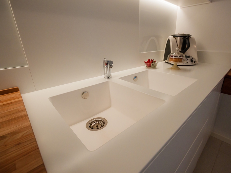
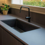
In an extremely contemporary project like this one, Corian is the obvious choice fot the kitchen countertop, which allows to hide edges, returning the idea of a very clean and elegant continuous surface.

The Corian countertop also continues on the back surface of the hob and sink, creating an interesting material alternation with the white lacobel. For the remaining surfaces, a textured matt lacquered MDF was chosen.

 
open wall units matt lacquered MDF
essential elegant kitchen ovens
wood cutting board essential kitchen
Corian sink essential kitchen
frontal view essential elegant kitchen

Living in small spaces: a minimal apartment in Milan

Living in small spaces: a minimal apartment in Milan

Living in small spaces means living the contemporaneity. Functionality is the key-word: knowing how to add take advantage of the interiors while being able to use all its potentialities.  

THE CONTEMPORARY PANORAMA THE CONTEXT THE WORK SHAPES, COLOURS AND MATERIALS


THE CONTEMPORARY PANORAMA

The increase in the number of the population necessarily interfaces with the problem of lack of space. In the contemporary architectural panorama, the solutions adopted use the verticality of the buildings, which tend to develop in height rather than in planimetry. An example of all is the spread of “capsule hotels” in the eastern continent. Without reaching the maximum expression of this architectural trend, even in the cities of our country there are various examples of reduction to minimum spaces. Living in small spaces means being able to optimize the rooms in the best way, managing to fit the different functions and reducing the furniture to the essentials. The minimal style perfectly interprets this need, succeeded in giving an aesthetic value to the most essential interiors.  

THE CONTEXT

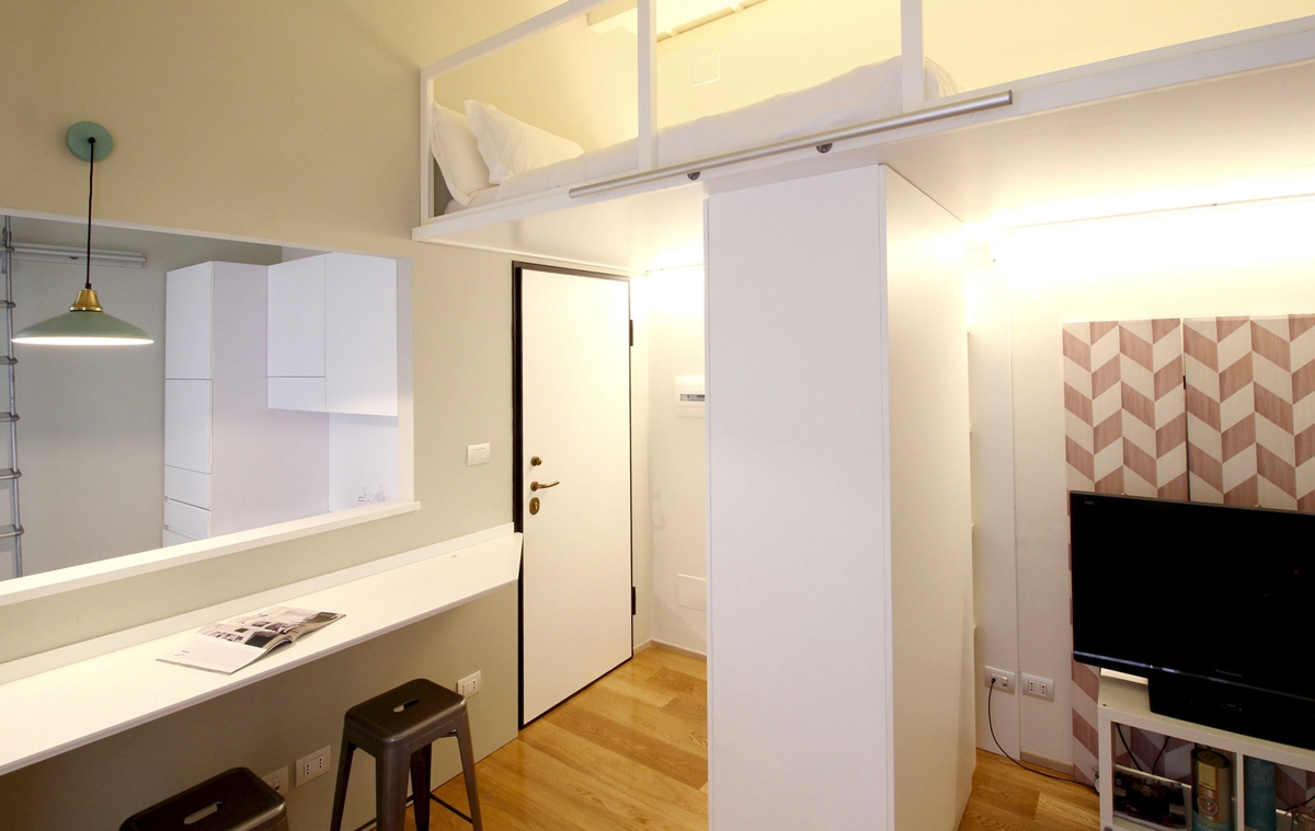
Integrated in a contemporary residential context focused on the shades of gray and green, the studio apartment in Corso San Gottardo is suitable for a space optimization project, because it is extrapolated from an existing apartment. In particular, it consists of a single room with small kitchenette and a mezzazine for the sleeping area, extracted from one of the main rooms of the old apartment. Being able to organize at the best the room without sacrificing comfort and aesthetic taste was the design challenge with which we interfaced to. The characteristic that allowed to reach the goal is the very wide height on the interior enhanced by suggestive exposed beams.

small spaces sofa and snack bar
entrance minimal apartment Milan

THE WORK

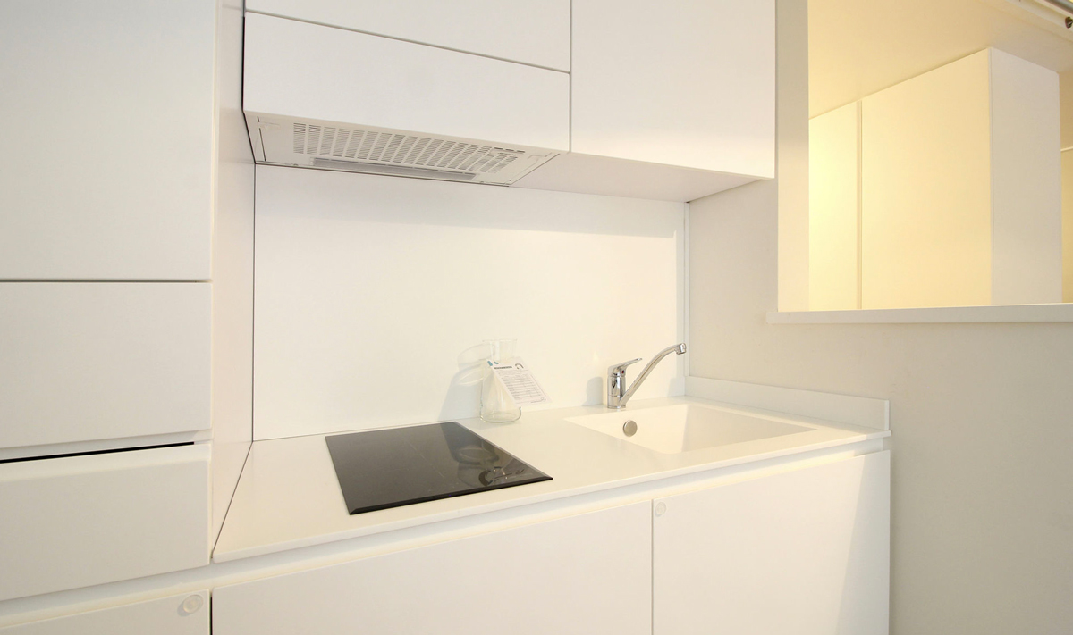
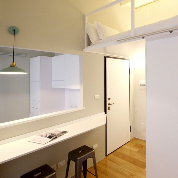
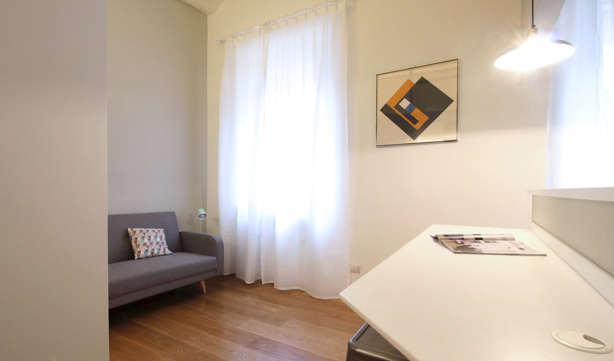
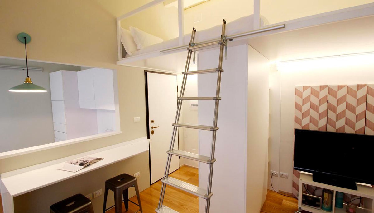
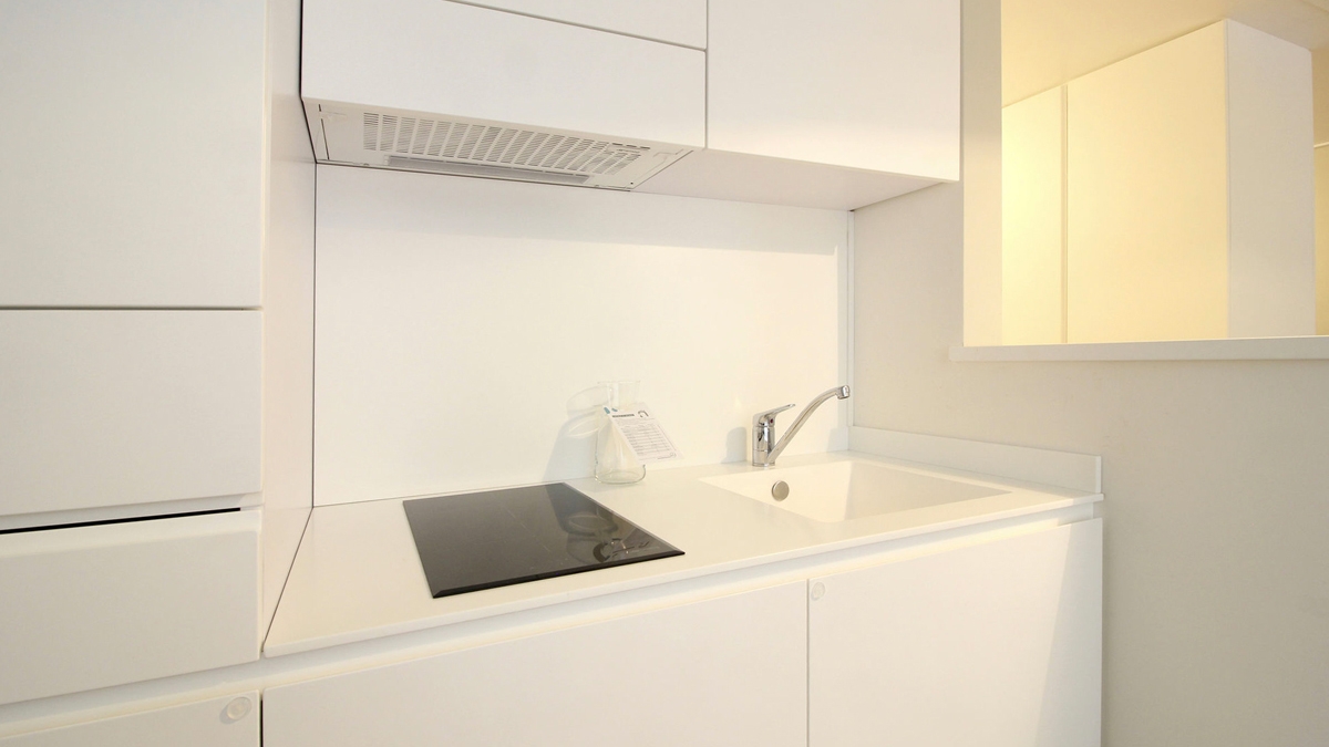
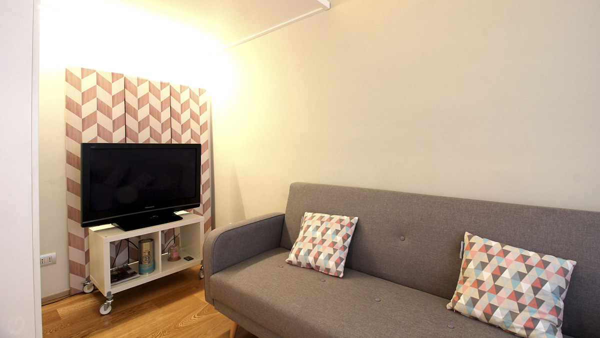
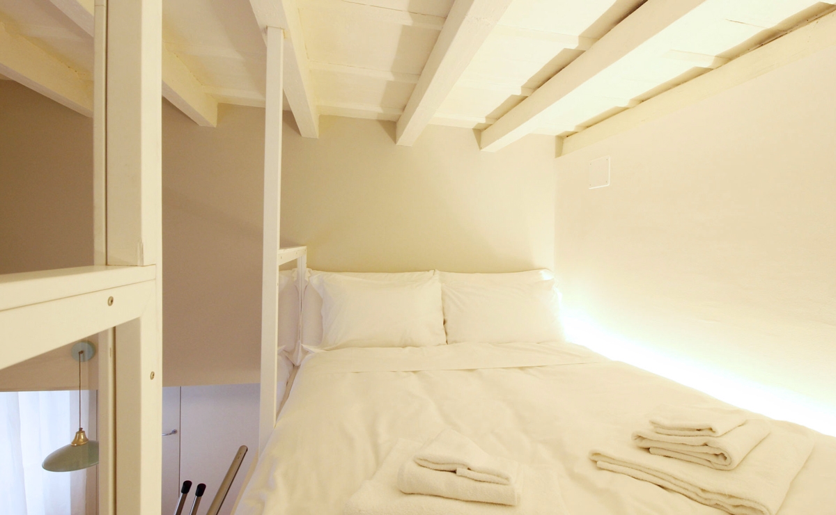
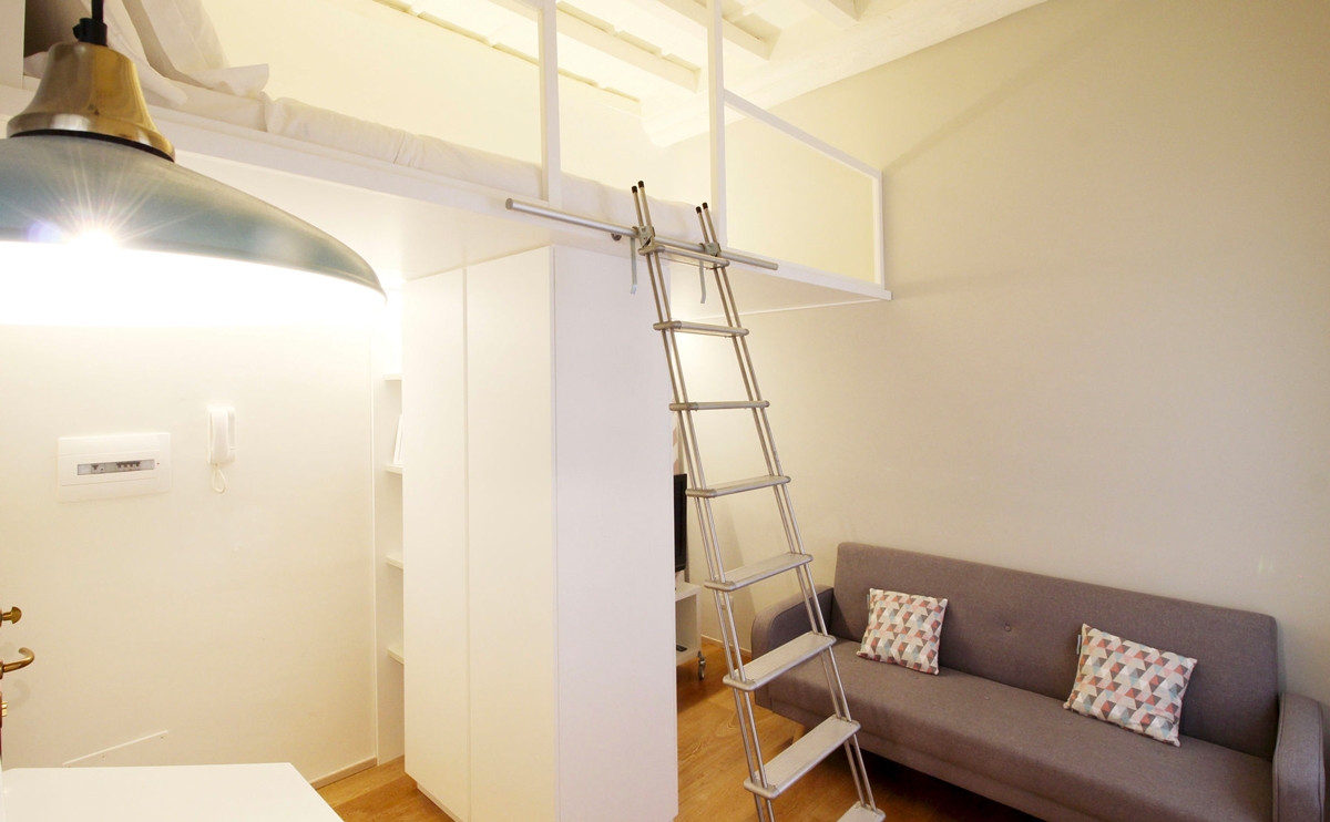
Taking advantage of the reduced spaces, it was possible to design the plan layout focused on a living area in visual contact with the small equipped kitchen with snack bar, and an elevated bedroom accessible through a service ladder. The kitchen is reduced to the essentials, but not for this reason is poorly equipped: in fact, it has a kitchenette with induction hobs of the minimum size, flanked by a built-in sink and container units in the remaining parts. A dividing wall with snack bar attached divides the kitchen from the living room, keeping at the same time the spaces visually open. This is also thanks to the presence fs the service windows, which creates a dynamic and contemporary cut in the room.  The surface used as a snack bar accommodates up to 3/4 people, and the shaped profile with a 45° cut is able to make it look more welcoming. The living room with a two-seated sofa leads to the upper level use as bedroom with a double bed and containing niches. The storage compartment is accessible as the mezzazine with a service ladder that leans against special rails. The mezzanine is back-lit by a linear profile capable of providing the correct illumination both the bedroom area above and the lower living room.

small spaces apartment Milan
kitchen apartment Milan
living room apartment Milan
double bedroom small spaces

SHAPES, COLOURS AND MATERIALS

The contemporaneity of the apartment is visible both in the choice of clean linear shapes and in the material’s one. In fact, Corian was chosen for the snack bar and the kitchen too. It is an extremely fashionable material nowadays due to its elegance reached with the uniform surfaces with hided joints. Made in the same light-shades, the kitchen furniture in textured white lacquered MDF refers itself to the idea of an essential but well-designed space.

bedroom access step-ladder

Functionality and small spaces transform this studio apartment into a reality of its own. It leads to becoming a love nest for its inhabitants, but it is also perfect to be used as a B&B for tourists and short stays.

Reflections and opacity of an apartment in Milano

Reflections and opacity of an apartment in Milano

With a panoramic view of the Milan skyline, reflections and opacities takes place in the renovation project by the architects Pierluigi Fasoli giving life to a rigorous apartment. A house that prefers to hide rather than show. Large full-height wardrobes and doors with storage points that characterize both the living area with the contemporary kitchen and the hallways, and the bright and austere bedroom.

REFLECTIONS

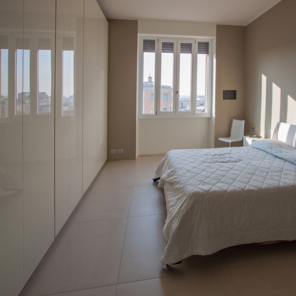
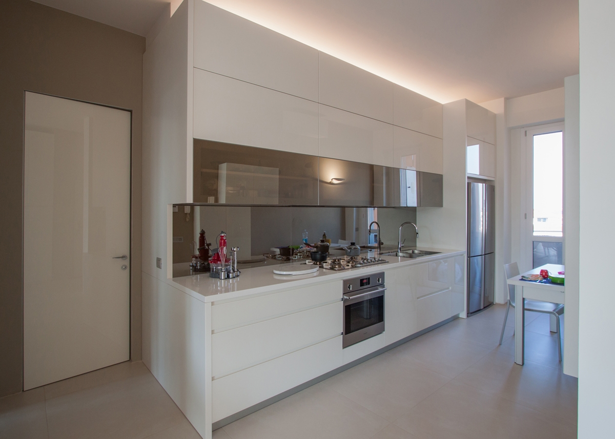
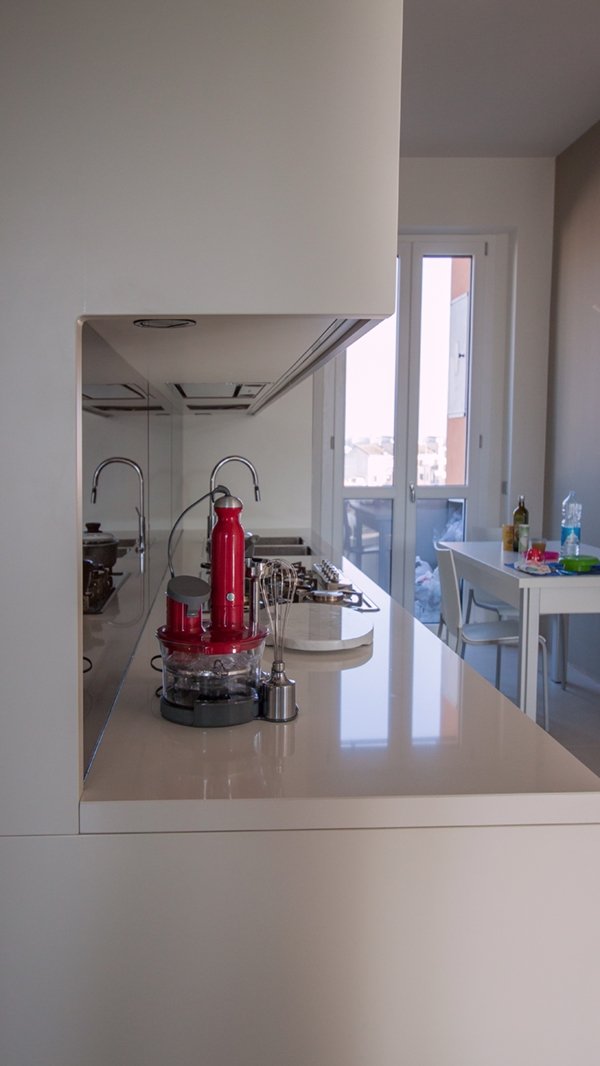
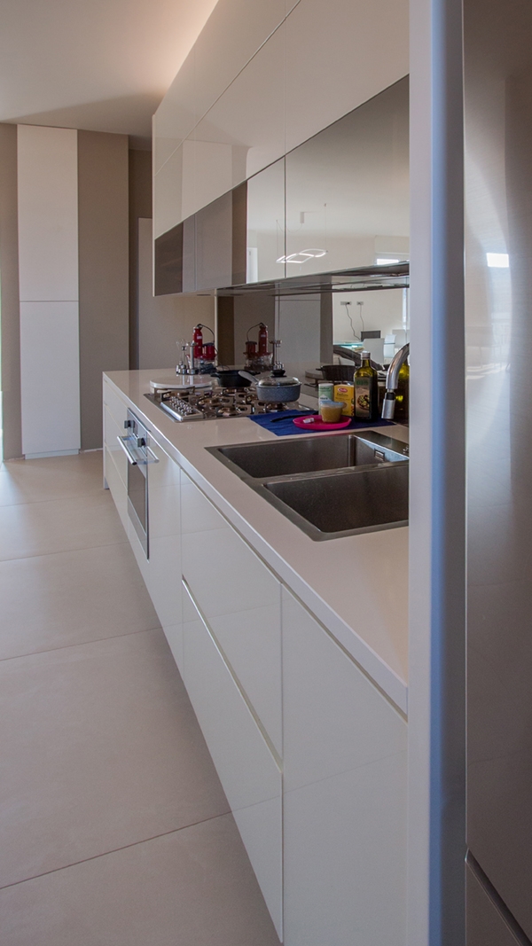
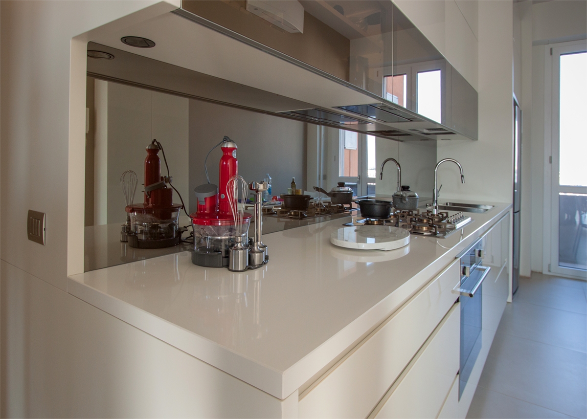
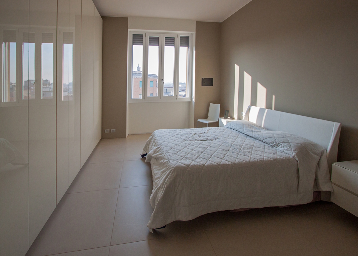
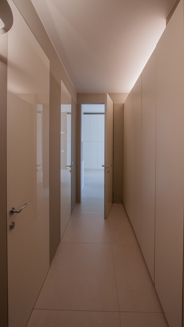
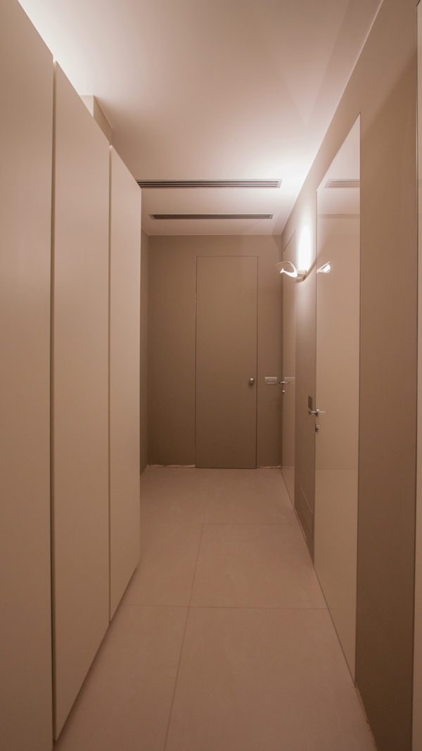
A rigorousness however animated by the material choice to alternate glossy and opaque surfaces, in a play of reflections that characterizes all environments. Starting therefore from the kitchen, focused on the choice of glossy white lacquered MDF for wall units and full-height doors. In correspondence with the first horizontal band of wall units, the reflections are underlined using a bronzed mirror, also applied in the back surface. Contemporary appliances with metal surfaces also integrate in this context. These include the refrigerator and the recessed oven, the double sink with a contemporary large tap and the hob with gas ovens. The design line of the kitchen follows a setting that prefers horizontality with recessed handle and upper vasistas-opening wall units. The play of reflections also involves all the doors of the apartment, the glossy lacobel of a white colour tending to light gray. The bedroom also responds to a material choice aimed at lucidity, with large full-height wardrobes and a vertical division of the doors. These elegantly harmonize with the dove-gray colour painting, a rigorous chromatic combination used in contemporary years. Verticality also taken up in the division of the window from which you can enjoy a panoramic view of Milan.

OPACITY

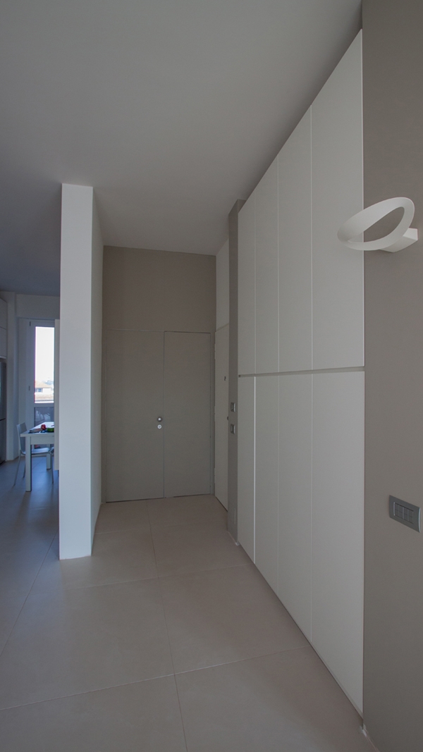
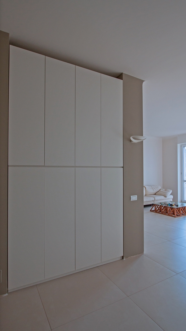
The hallway with service wardrobe and the entrance area with storage doors mostly represent the opaque component of this alternation. The first, alternates the glossy surfaces of the lacobel doors with the service cabinet in matt lacquered MDF of the same colour, detaching itself from the turtle dove-gray of the background paint. A vertical division underlined both by the dividing elements of the doors placed at regular intervals each other facing the back surface, and in the rhythmicity of the cabinet’s doors. The entrance area is also characterized by the same choice of alternation and chromatic contrast, with a recessed storage element that emerges from the drove-gray background with opaque white doors. The result is a formal and stylistic balance, underlined both by the chromatic contrast and by the geometric rigor of the forms.

 
apartment Milan reflections opacity_kitchen 01
kitchen detail 01
kitchen detail 02
kitchen detail 01
apartment Milan reflections_bedroom 01
apartment reflections opacity_hallway 01
apartment reflections opacity_hallway 02
Milan apartment entrance hall_01
Milan apartment entrance hall_02