Designing a smartworking corner according to Modulor

Designing a smartworking corner according to Modulor

During the last few months, our daily life has been completely changed by the global pandemic.
Not only our habits have changed, from small daily gestures to the way we use services, but also the working and private world have been seen from a different perspective.
If until recently, in fact, the coexistence between home and work life was a voluntary choice of a few people, now almost all families have faced concepts such as smartworking, DAD and online meetings.

But what does it mean at a spatial level to introduce smartworking? How have customers’ needs changed to cope with this now habitual type of work?

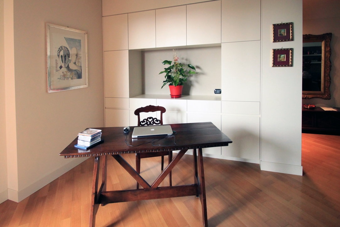
classic villa 01 corner of smartworking

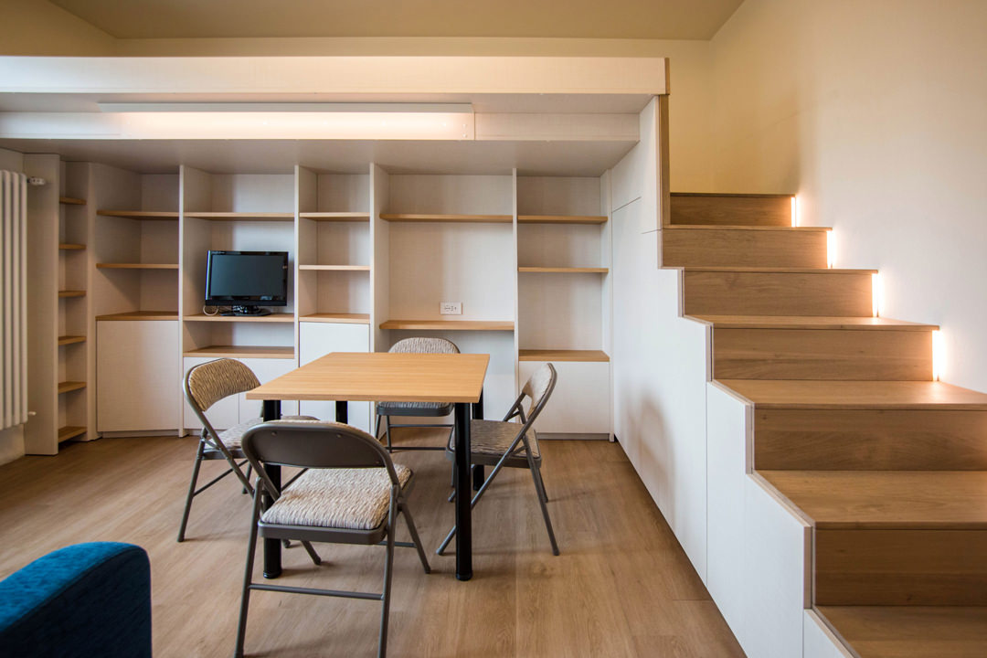
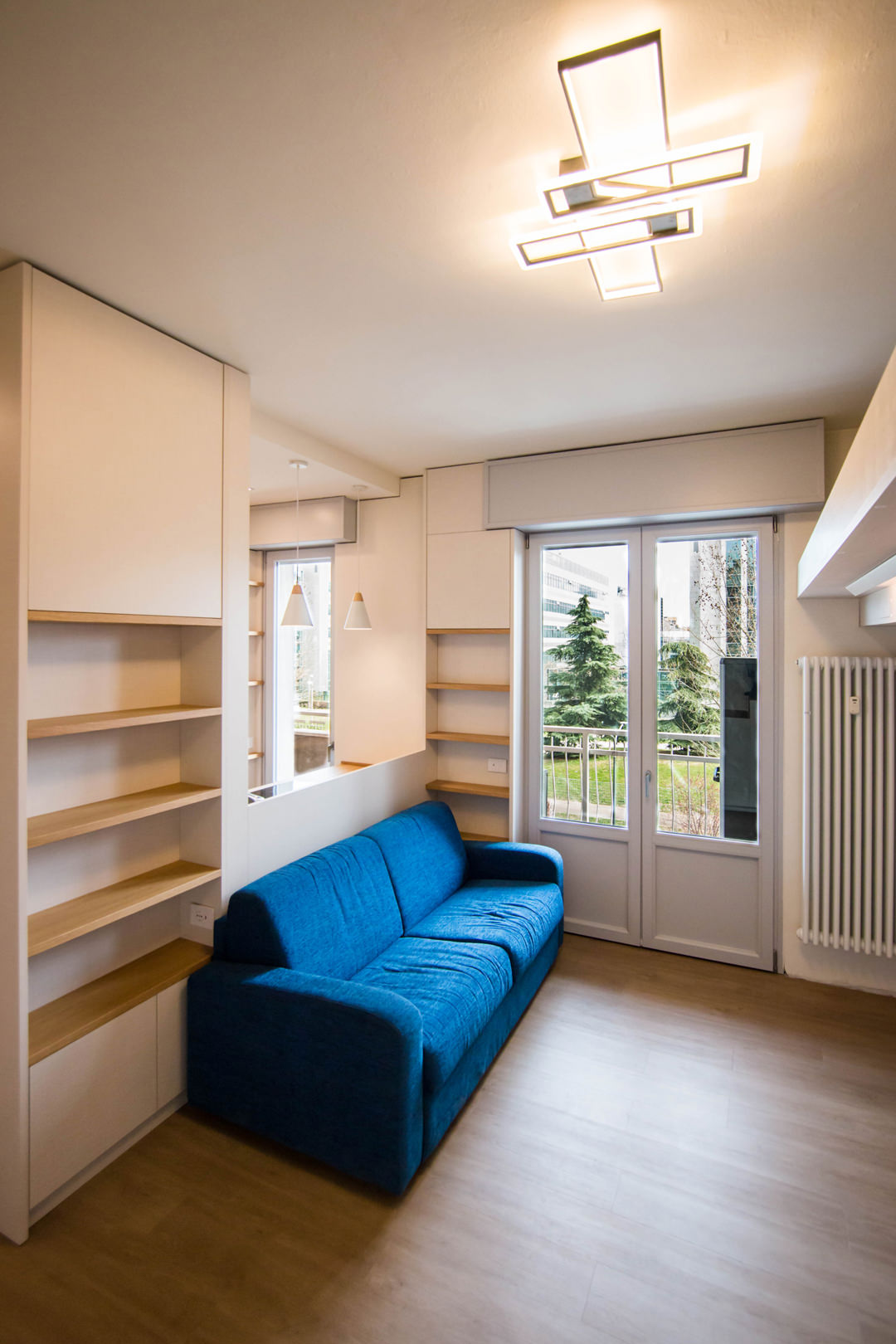
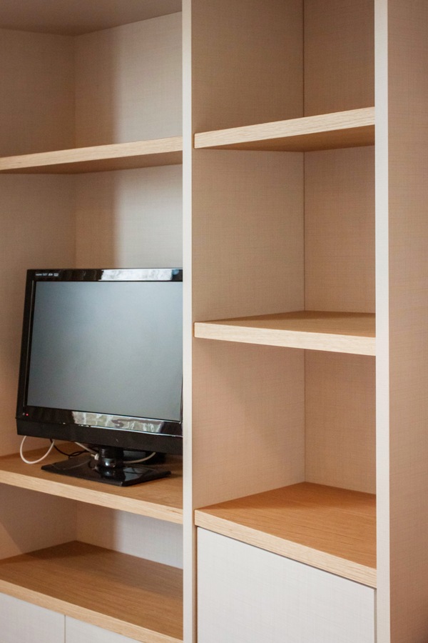
A retro-style wooden desk with a modern equipped wall for a classic and contemporary smartworking corner

THE COEXISTENCE BETWEEN THE PRIVATE SPHERE AND THE WORKING WORLD

The change in habits and lifestyles has involved all aspects of our daily life. From simple gestures such as shaking hands as a sign of knowledge and respect or greeting each other with a warm hug, to participating in cultural and recreational activities such as shows or concerts. The changes that have necessarily been introduced have certainly upset our perception of the private sphere and relating.

Added to this is a new conception of the working world that has increasingly entered our domestic environments.
Previously, in fact, working remotely had been a choice or opportunity for a few, who deliberately knew how to relate both aspects in a single environment. Whether reserving an entire room or dividing domestic spaces with a well-defined design logic.
This is the case, for example, of this studio-home whose design has followed the principles of Feng Shui to organize the internal activities.

From a refined choice, the introduction of a smartworking corner has now become a necessary requirement. All the more so if in the same household the different users need a computer station and well isolated settings to be able to carry out online lessons or conferences on Zoom without interference.
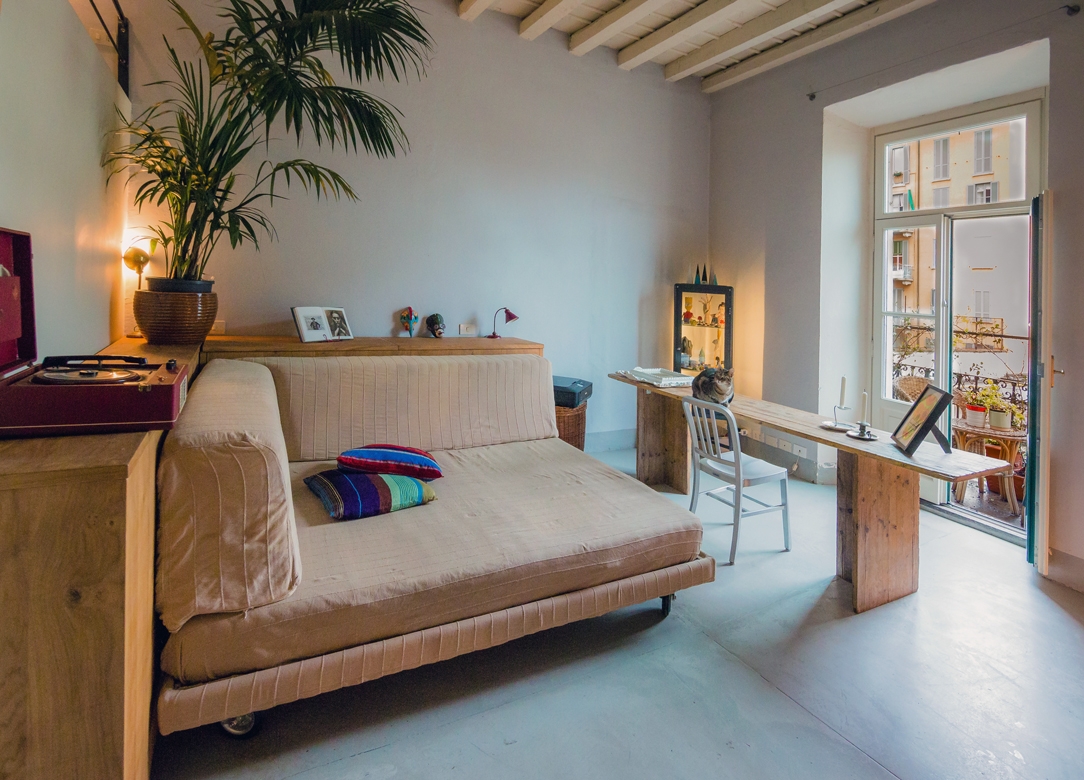
 Milan studio living room 03

Romantic and Shabby Chic atmosphere for this essential worktop

HOW HAVE CUSTOMER NEEDS CHANGED DURING LOCKDOWN?

The months of “confinement” between the first lockdown and the subsequent subdivision into regions according to the chromatic distinction have certainly influenced our way of living the house.
Just think of the number of hours spent at home in the last few months.

As a consequence of this, first of all, a critical vision of one’s own interiors has been introduced. Small improvements to be made, more refined aesthetic details, functional additions in each room.
To demonstrate this, it is enough to recalling the endless queues in the furniture megastores and DIY stores after the first opening in May 2020. More or less improvised solutions, which many times also involve a “self-taught” component to create greater satisfaction in the final result.
Even in custom-made furnishings, customers have followed this wave of changes with requests that could make the spaces in the home more functional. Whether it is a greater attention to the aesthetic impact or a technical improvement, it was certainly the way of seeing one’s home that changed. To all this is added the aforementioned parameter of necessity, and here is the most common request in recent months: providing a corner for smart working.

FROM THE LARGE WORK SPACES …

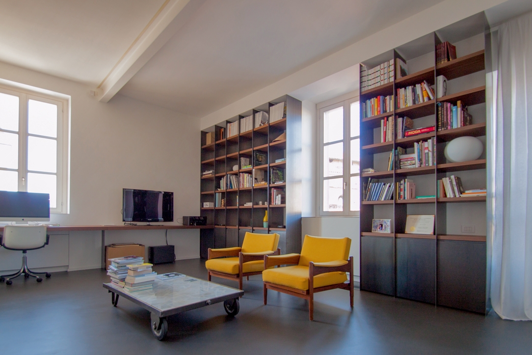
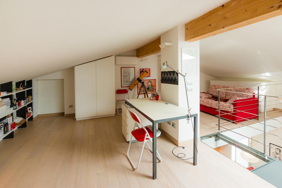
In our previous creations, we had already faced with study corners and walls equipped with desks to make the different rooms more functional. Surely bookcases and most of all desks have become the center of attention. In some cases, these have occupied an entire dedicated room with large and bright rooms. This is the case, for example, of this workstation with an industrial touch inserted in full-height bookcases. A linear element runs along the wall perforated by large windows providing a comfortable support and work points. To embrace the central relaxation area, bookcases with black waxed iron sides and wooden shelves. Another example is this gallery equipped as a study, which exploits the slope of the beamed ceiling to place an essential desk overlooking the living area, and a bookcase embedded in the lower heights.

Alba apartment 03

The oak worktop develops along the side wall with linearity and essentiality in the industrial interior of this apartment

loft studio

Equipping an attic as a study allows you to take advantage of the internal heights while respecting the brightness of the interior.
A minimalist desk overlooks the contemporary pop interior of this apartment

With the passage of time and changing needs, even the work spaces have adapted to the existing furnishings, making them as functional and essential as possible.

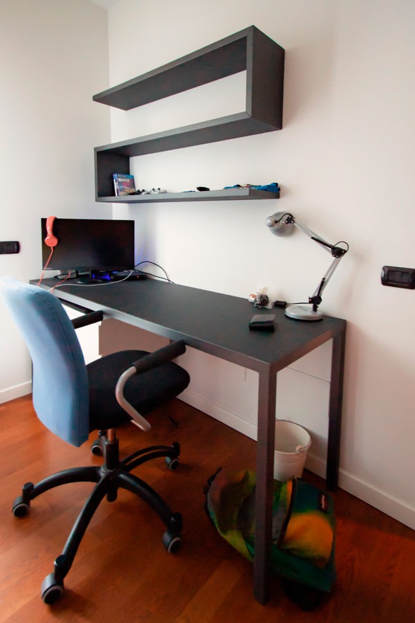
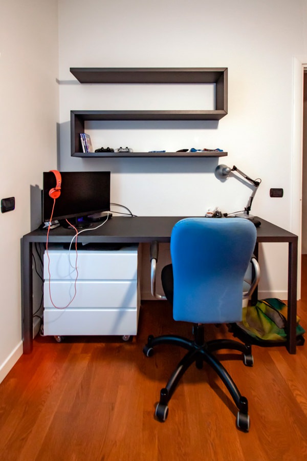
Among these, the classic large desks with drawers and a service bookcase. This version offers a material and chromatic combination with a masculine touch: anthracite gray linoleum top with painted iron supports. It is accompanied by a shaped shelf with black waxed iron covering that with simplicity and elegance provides a practical support for small objects or books.
On the side, a bookcase with shelves which is part of the compact structure which also includes the bed with a trunk opening and wardrobe with bridge component. The black waxed iron sides contrast with the matt lacquered MDF shelves, creating material and chromatic contrasts with a strong character.

 Smartworking anthracite metal desk
anthracite metal desk front view

A desk with an anthracite gray linoleun top and iron profiles defines the masculine stylistic imprint of this bedroom

Details MDF and metal bookcase

Details of the bookcase and shelves in black waxed iron and matt lacquered MDF.
Material and chromatic contrasts.

TO THE SMALL CORNERS OF SMARTWORKING

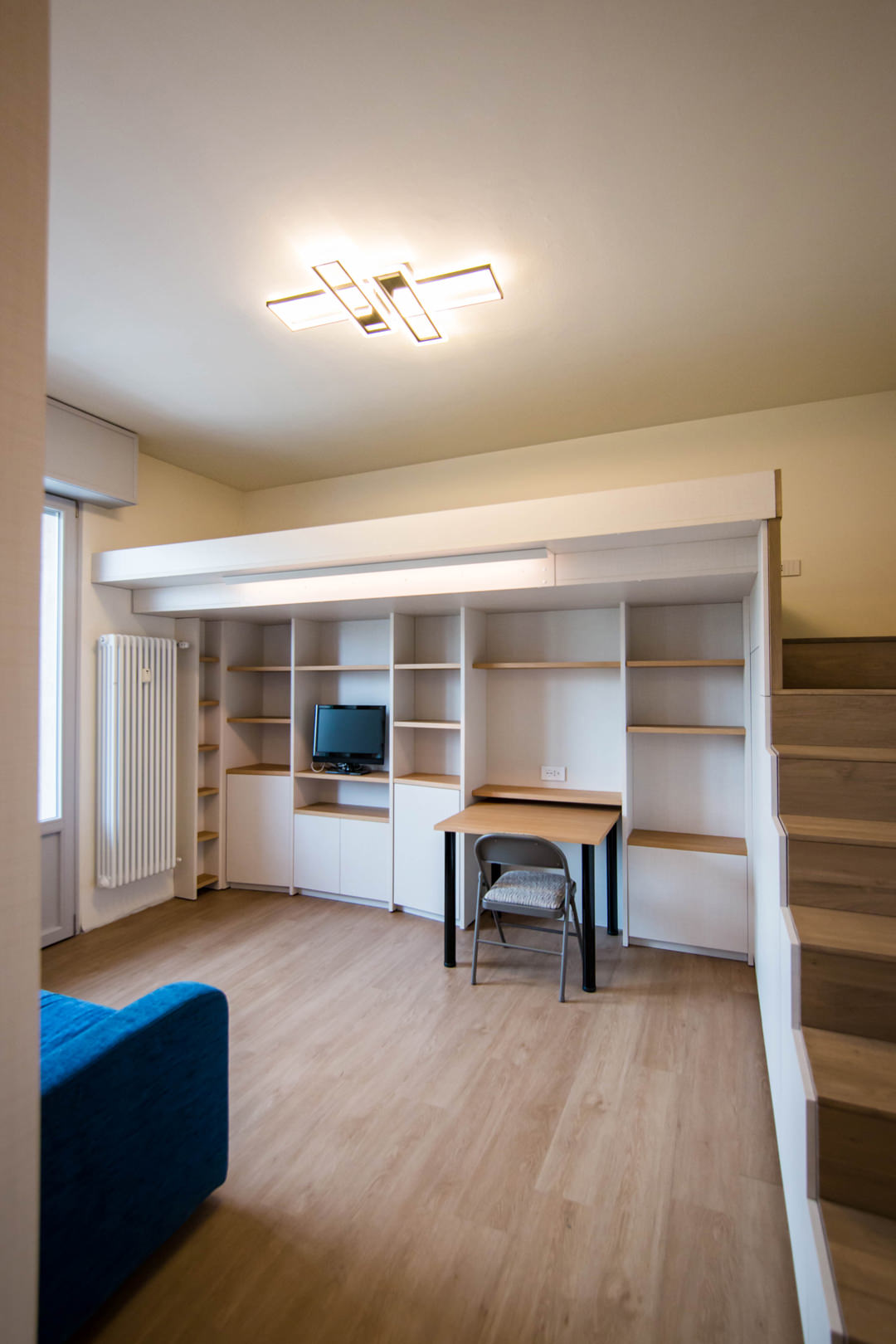
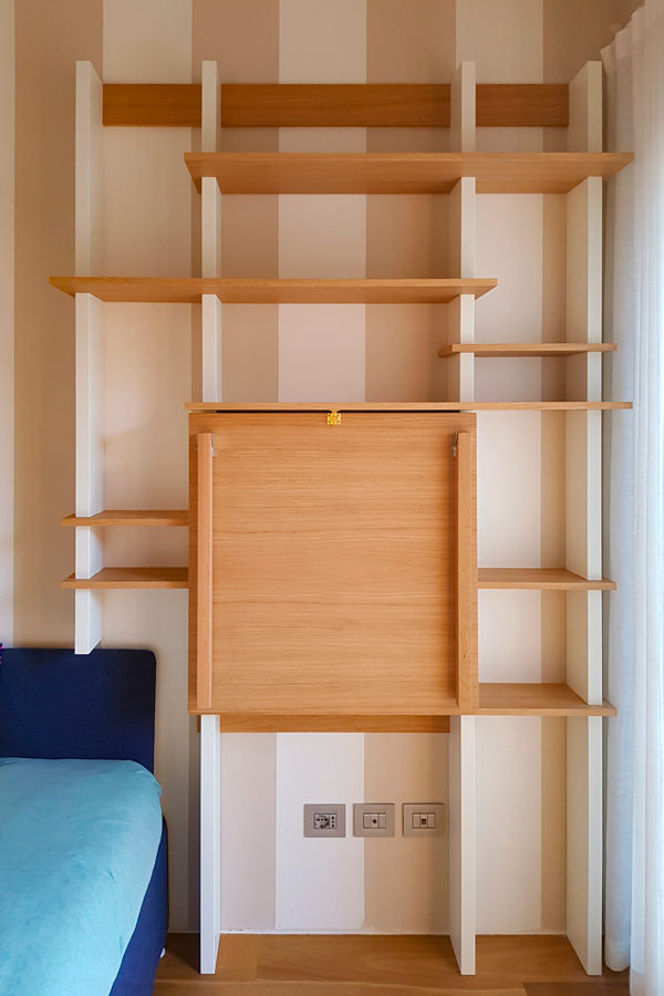
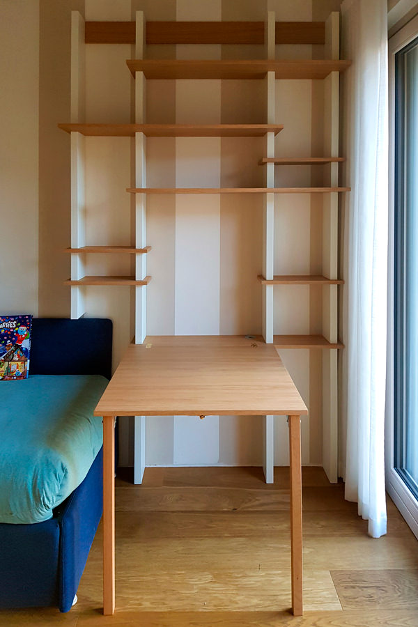
The passage of time has given rise to more essential projects, which also exploit small spaces with practical and compact solutions. Among these, a support surface with flap opening attached to the existing bookcase.
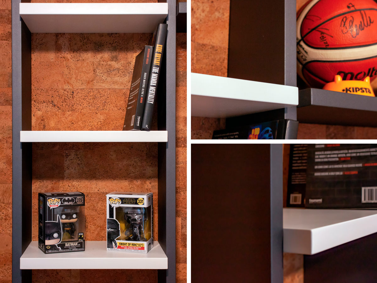
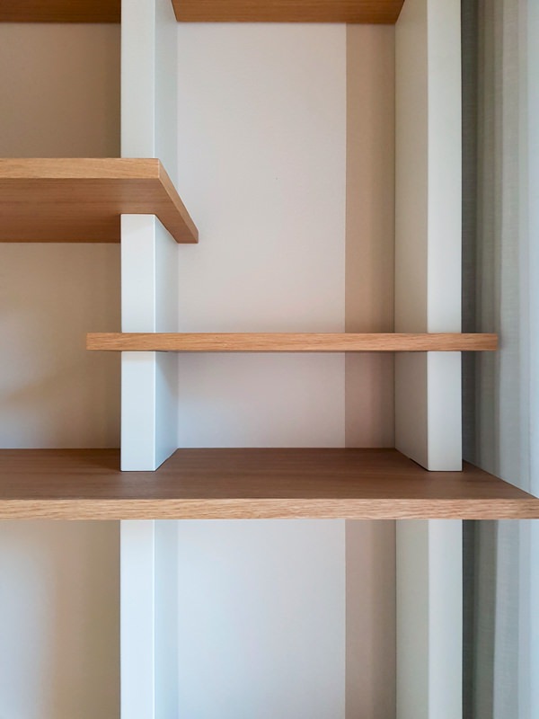
The wooden shelves become the key to horizontal reading, appearing almost set between the vertical sides in lacquered MDF. Games of depth and geometry give life to a room marked by an essential visual rhythm.

 bookcase with closed smartworking top
 bookcase with opened smartworking top

The top of this wooden bookcase exploits its flap opening to optimize the space

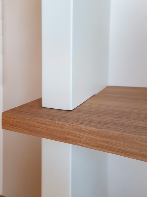
 detail tops in oak MDF shoulders
 detail front view of bookcase shelves

Material details with a strong aesthetic character: the wooden shelves are embedded in the shoulders by the vertical reading in MDF

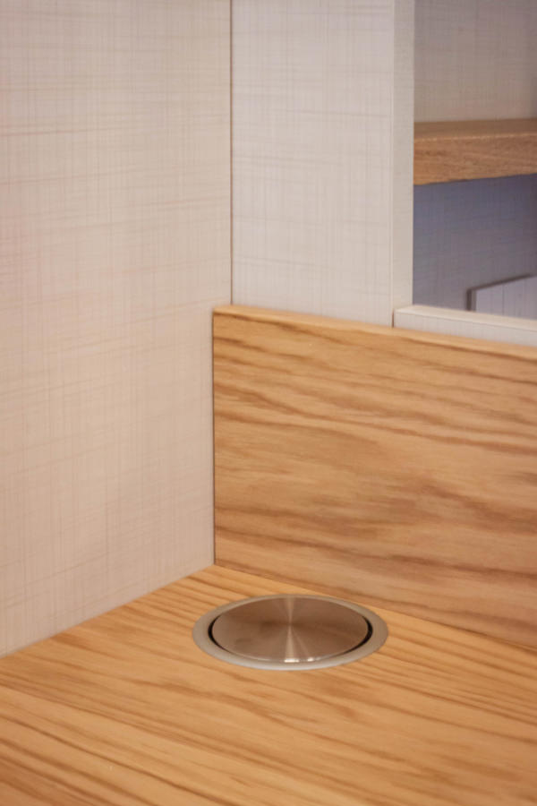
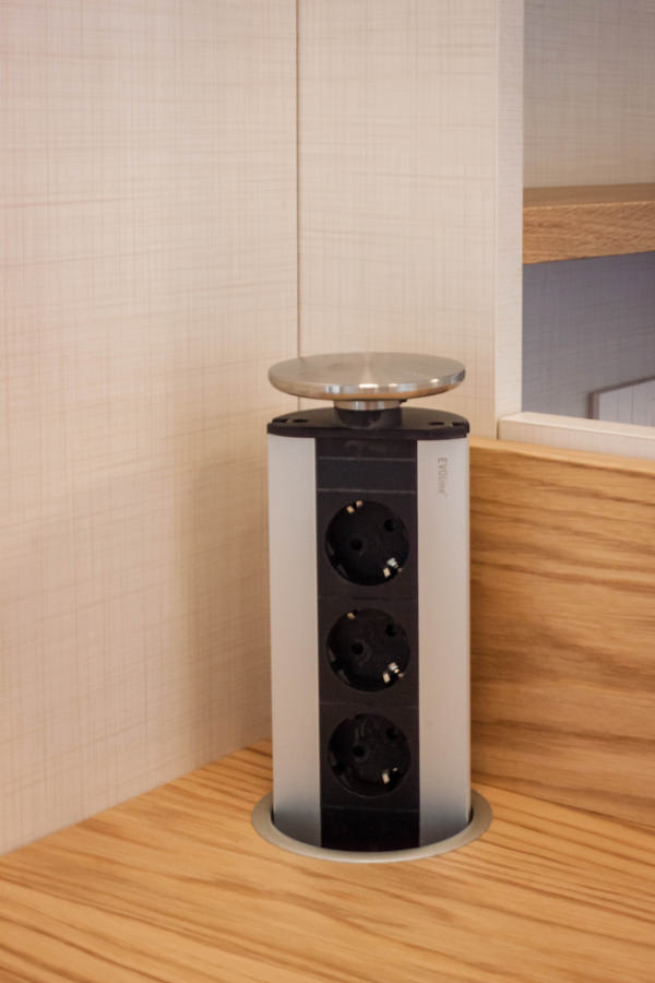
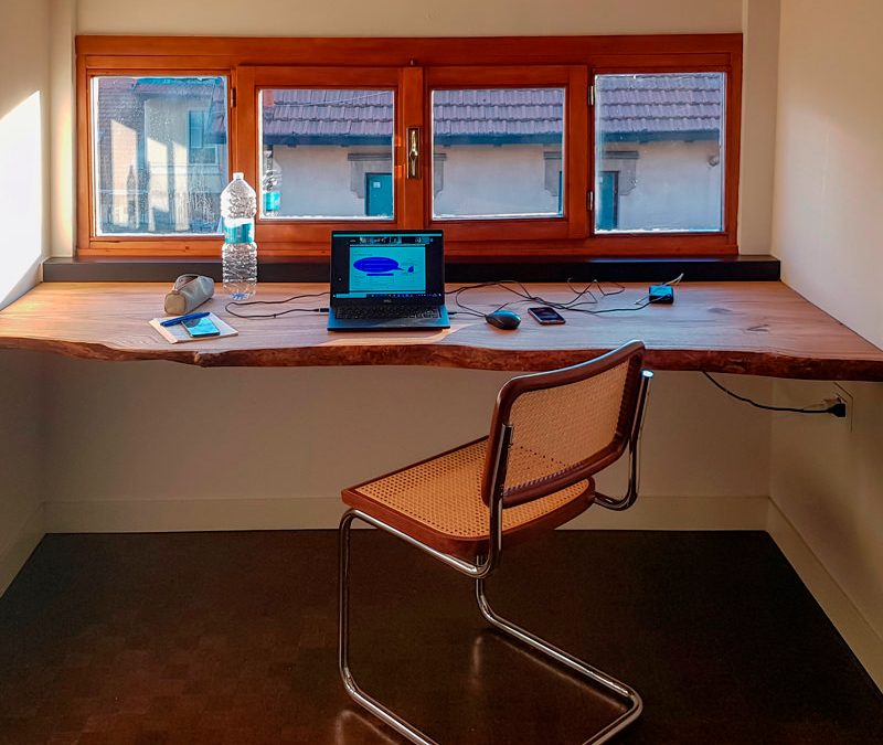
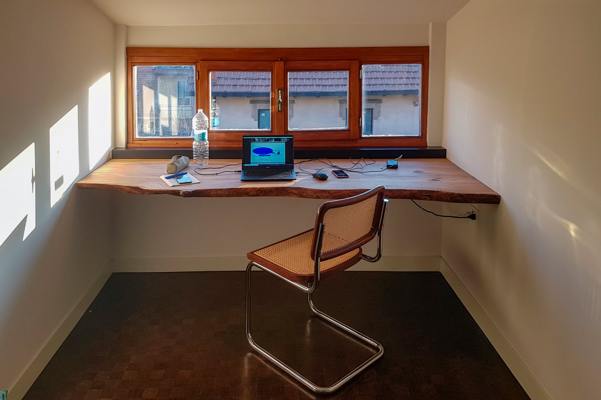
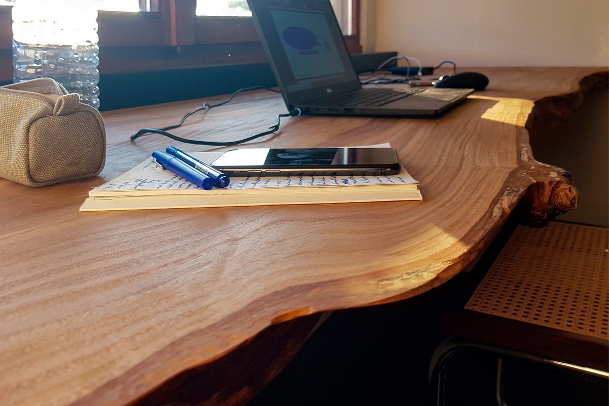
On the other hand, the solutions that take advantage of the reduced heights with rough and natural surfaces have a more romantic soul. In this example, a cherry wood worktop expresses all its material uniqueness with visible knots and a rustic profile, without sacrificing sophisticated details. However, the simple but incisive design line does not renounce practicality. For this reason, a hole has been provided for the passage of cables along the depth of the top, making it also functional for the electrical preparation.

 front view cherry wood desk smartworking

Modern furnishings and natural elements harmonize in this smartworking corner with an authentic soul

 smartworking cherry wood desk top details

A raw cherry wood top expresses all its naturalness

The smart working that has overwhelmingly spread in these difficult times will most likely not remain a transitory phenomenon but will increasingly become part of our life, it will become a necessary space in the home. We designers are ready not to forget it in the design phase and follow its evolutions.

Designing in details a customed wardrobe

Designing in details a customed wardrobe

From the needs of the customers and the type of clothing used, the project for a customed wardrobe is born, studied in its internal configuration in the smallest details. A careful choice of materials and finishes give importance and elegance to the project.

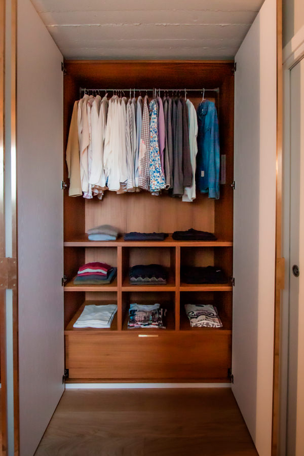
internal configuration wardrobe man shelves detail

Studying the internal configuration of a customed wardrobe

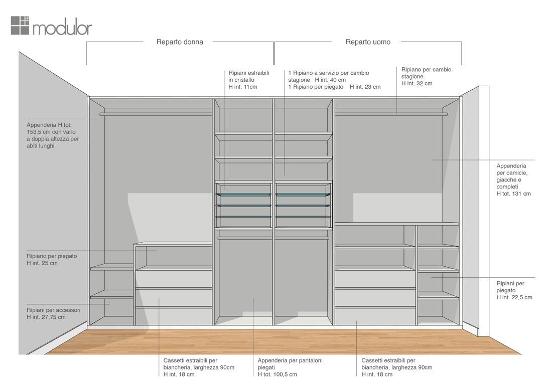
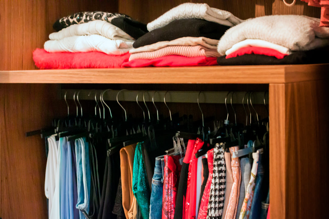
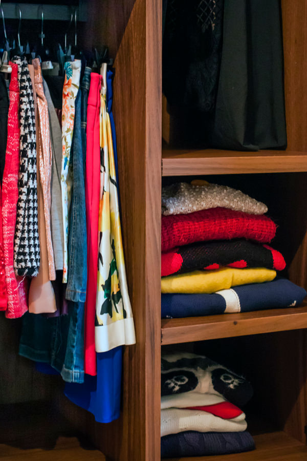
Studying the internal configuration of a wardrobe, it is essential, as a first step, to analyze the type of clothing owned. Tubular hangers and shelves for folded items are balanced to best meet the needs of customers, making the most of the space. In fact, shirts, jackets, trousers and dresses occupy different dimensions depending on how they are folded. For this reason, it would be counterproductive to design a “universal” wardrobe.
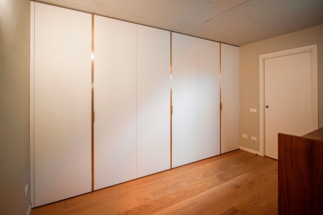
The first step in designing a made-to-measure wardrobe is therefore to study the customer: to know their habits, tastes and needs. In the case of this young couple, the six-door wardrobe has been divided equally into two compartments: the women’s section, in which the hanger certainly prevails, but in which there are also small shelves for folded items, and the men’s section balanced between folded and hung.

Each item has its own space

The next step in the design was to study different typological variants of the wardrobe product in order to maintain a uniform line of sight in both sectors, but at the same time find the optimal solution for the internal organization of the space.

The internal layout has been designed in such a way as to respect the two divisions and keep them mirroring each other. The pair of central doors was thus conceived with a symmetrical internal division reserved for folded items.

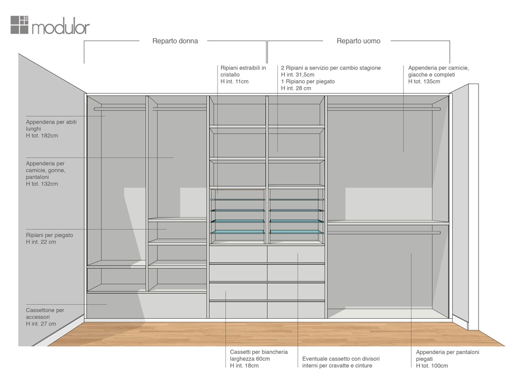
Modulor internal configuration wardrobe proposal 01


In the first solution, extractable glass shelves are designed for folded shirts and t-shirts in order to store them in a more orderly and elegant way. In the women’s department, the hanging division allows the set of long dresses on the left side, and short dresses with folded trousers on the right side. The women’s department is completed by a chest of drawers for bags and accessories and upper shelves. The conformation of the men’s department is instead characterized by fixed tubulars for trousers folded in the lower part, shirts and jackets in the upper part.

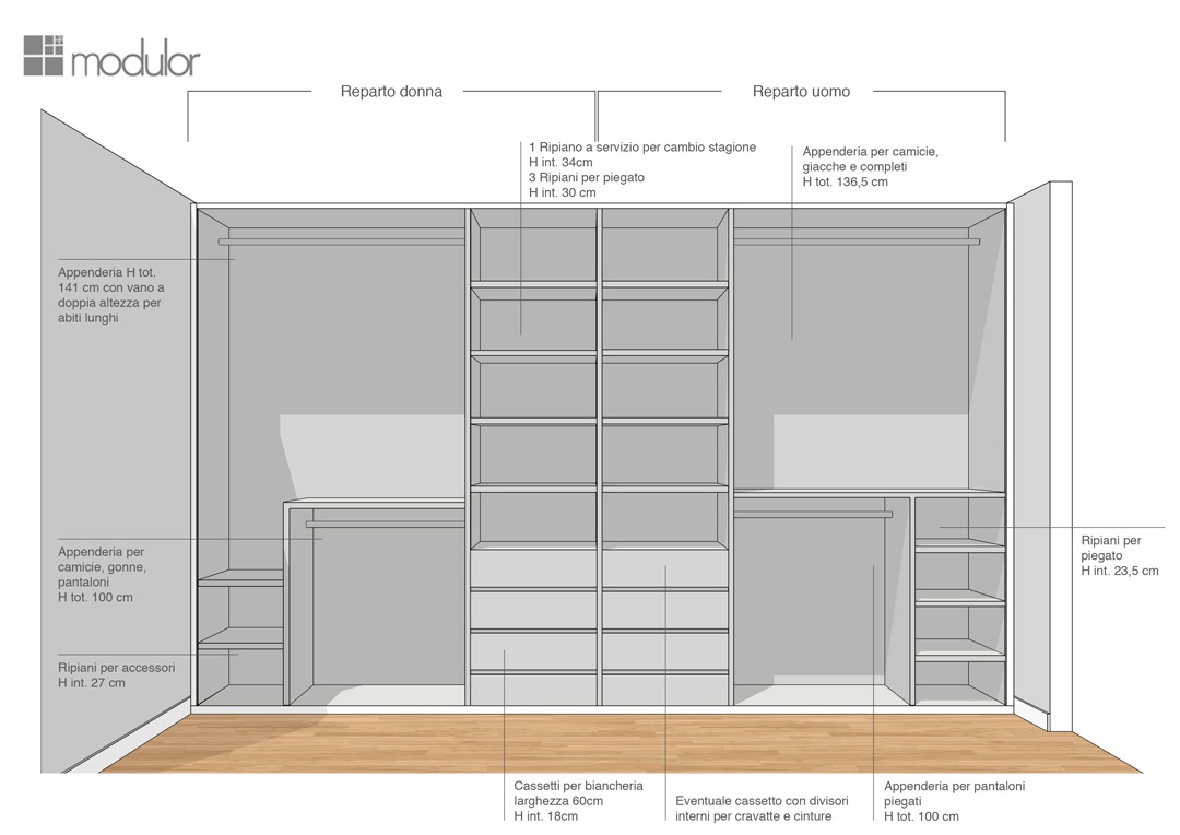
Modulor internal configuration wardrobe proposal 02
Modulor internal configuration wardrobe proposal 03
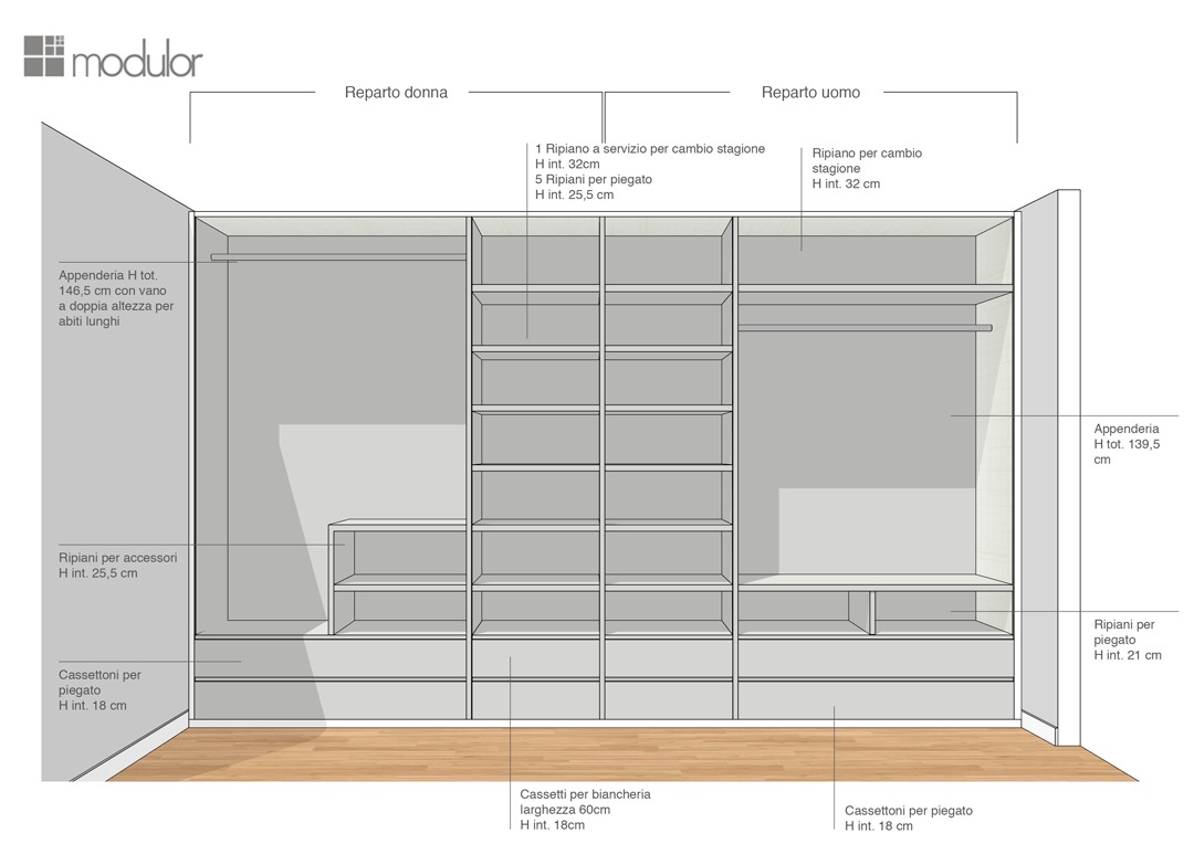
Modulor internal configuration wardrobe proposal 04

The second solution proposed sees both components configured in the same way. The only difference is in the women’s part, where a side shelf is eliminated to accommodate long dresses. The third and fourth solutions also see the alternation of shelves and tubulars in order to ensure the double height of the hangers on one side, and a good number of drawers for underwear on the other.

internal configuration wardrobe front view woman part

The definitive conformation.

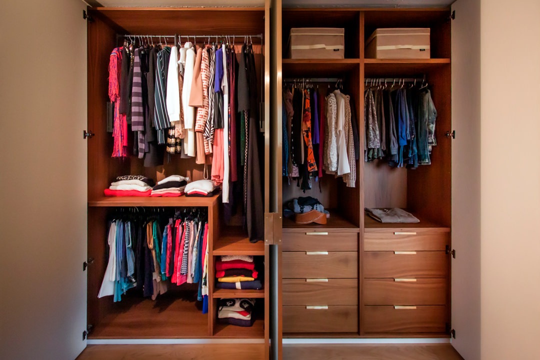
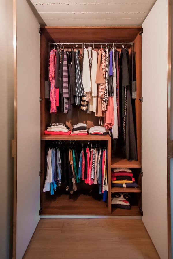
Among the various solutions proposed, after a comparison and mutual relationship with customers, the project proposal was born and then became reality. A configuration that respects the needs of each part, setting up a women’s department with hangers in the upper part that hosts dresses of different lengths. At the service of this, for greater practicality, a dark-toned side table with painted aluminum tubing that guarantees great resistance and capacity. In the lower part, a fixed tubular for skirts, blouses and shelves for sweaters and bulky items. 

Modulor internal configuration wardrobe woman
Modulor internal configuration wardrobe drawers
Modulor internal configuration wardrobe man

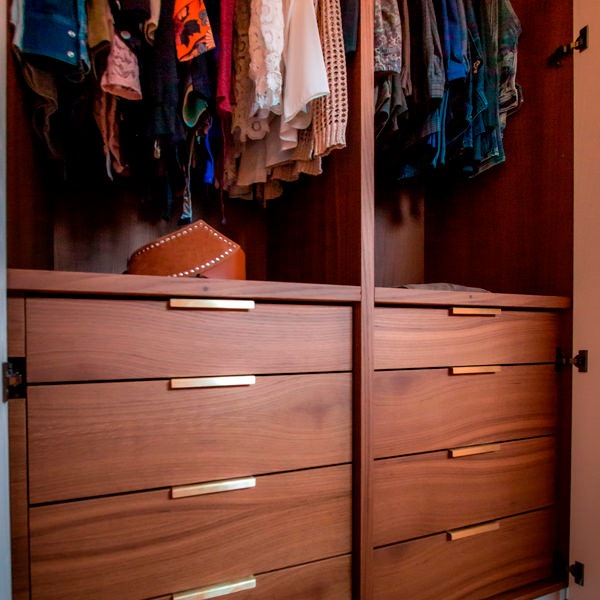
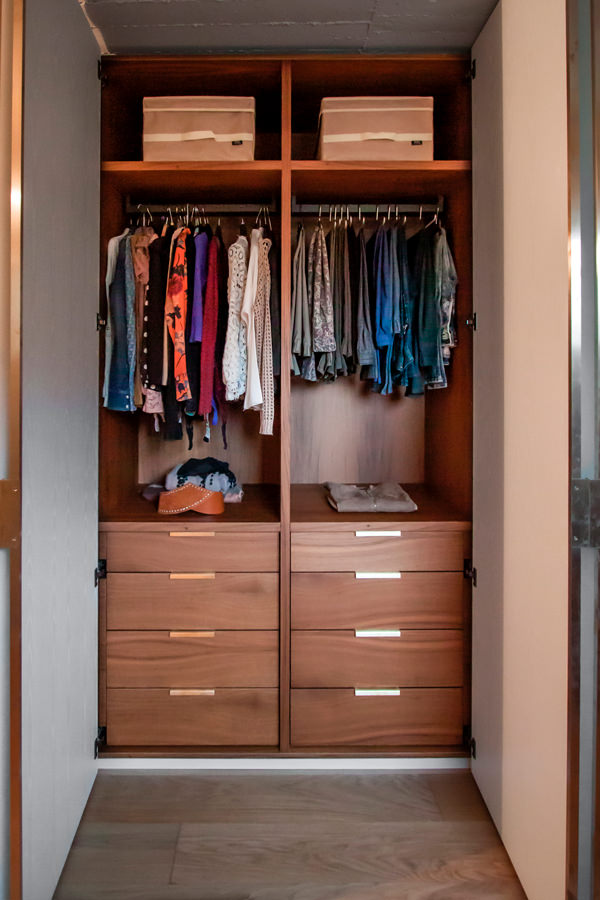
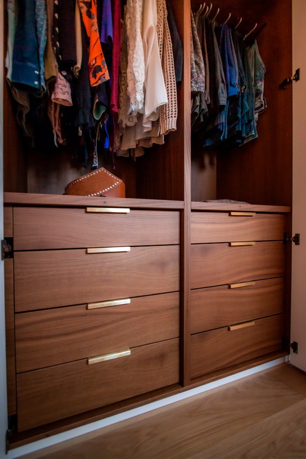
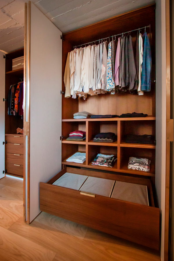
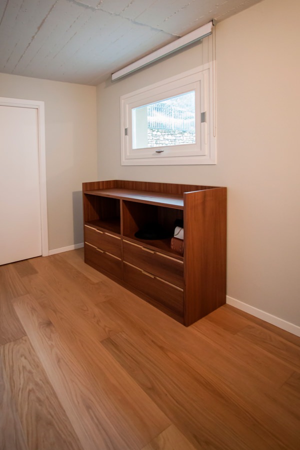
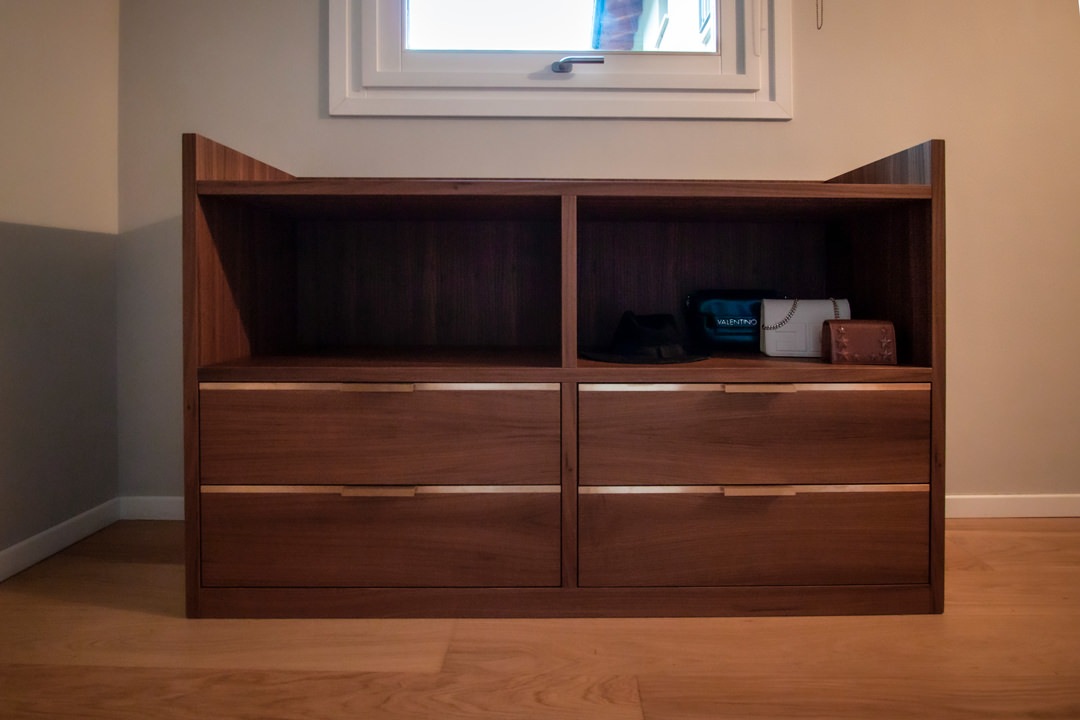
The pair of central doors, mirrored on both sides, has a fixed hanger for folded trousers in the upper part and linen drawers in the lower part. The first of these is characterized by the presence of internal dividers and velvet bottom to keep the belts in order. In the masculine part, the upper part with servetto is dedicated to jackets and shirts, while the lower part houses fixed shelves for folded items and a large drawer on the bottom for bulky. To accompany the whole, a chest of drawers with central compartment for accessories and upper service shelf.

Servetto brown detail
internal configuration wardrobe drawers with brass handles
open drawers detail internal configuration wardrobe man
internal configuration wardrobe woman hanger
oak shelves detail
chest of drawers side view
chest of drawers front view
chest of drawers detail

Materials and finishes

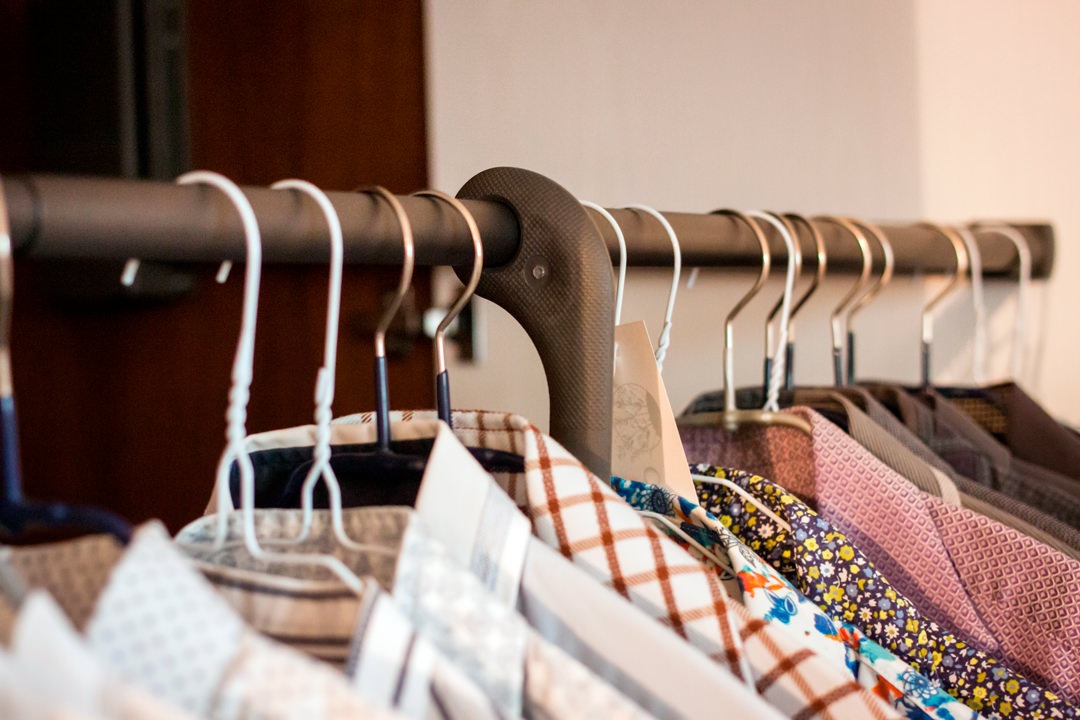
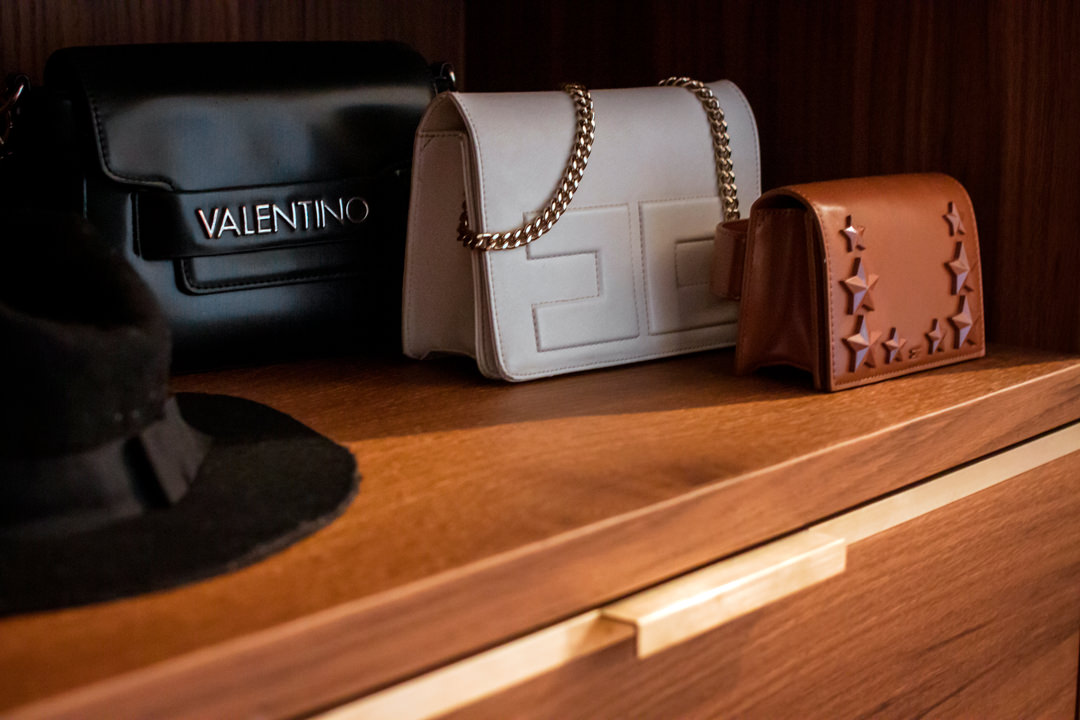
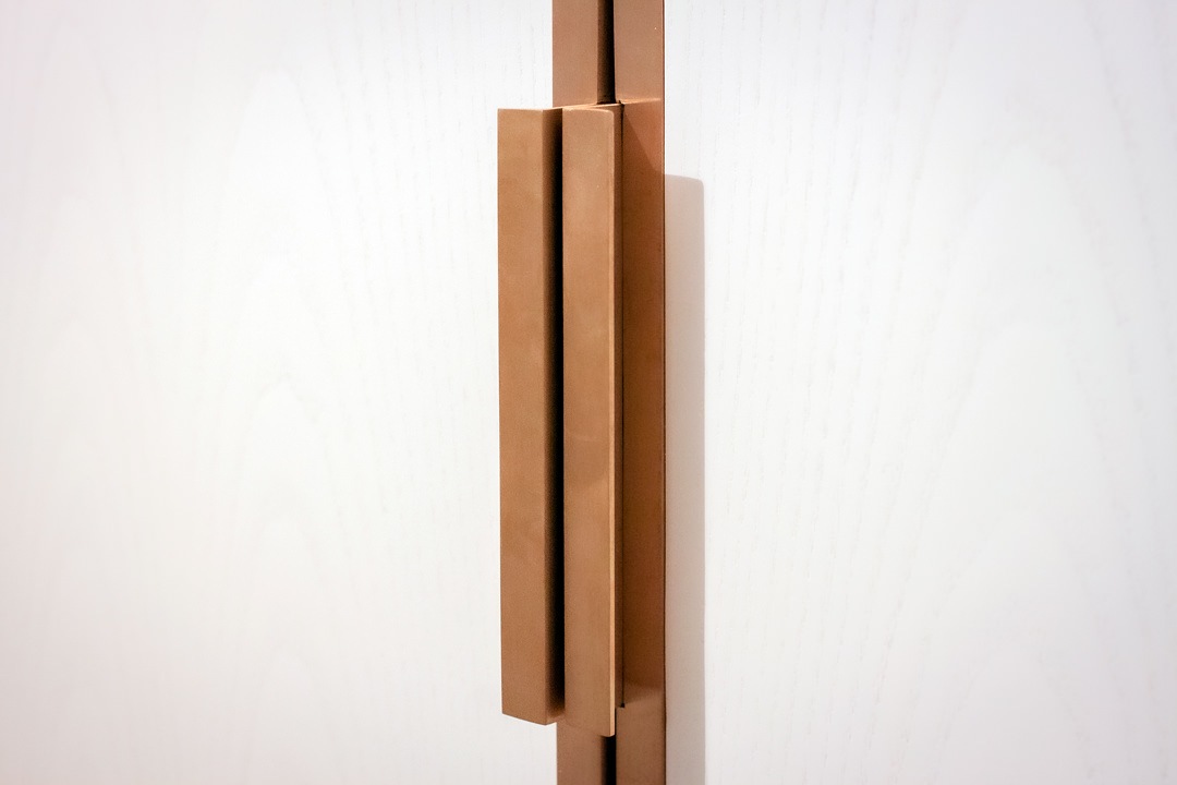
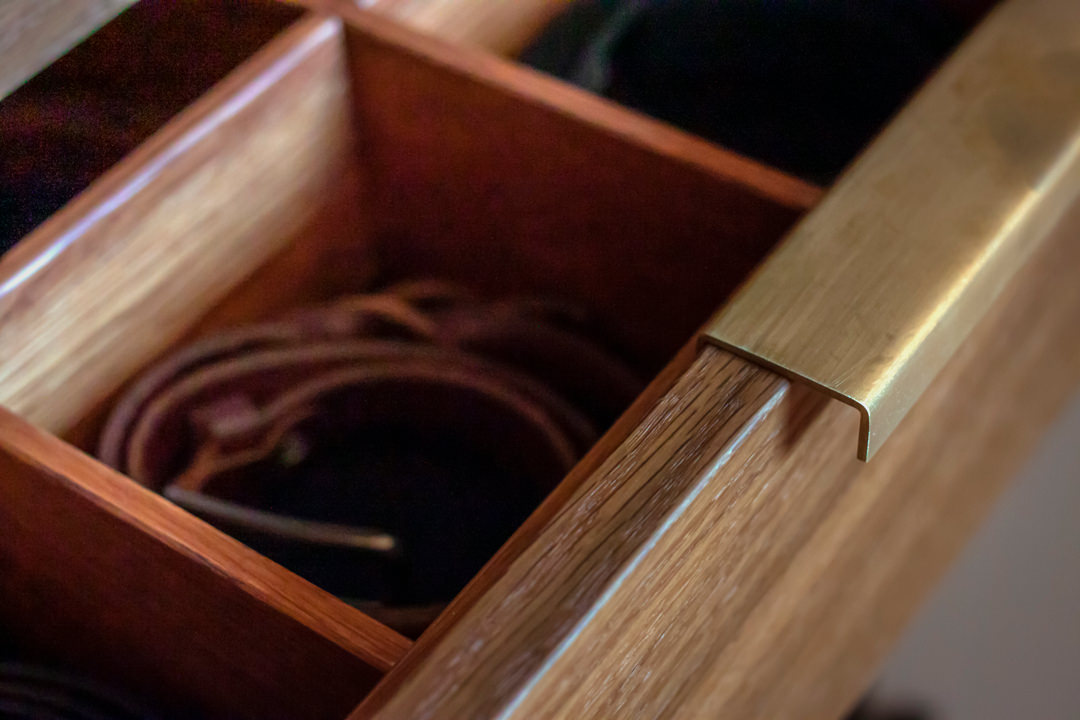
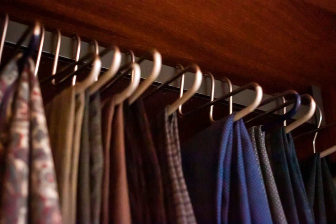
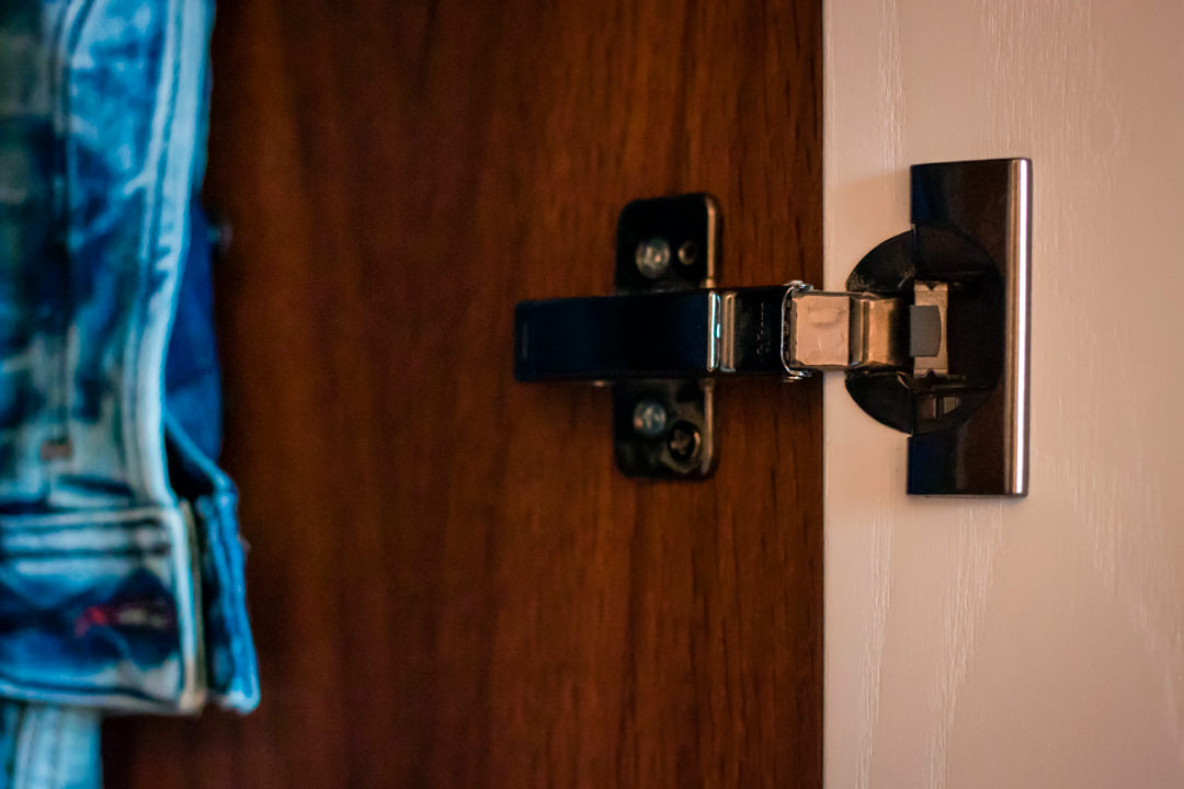
Even the choice of materials and finishes reflects a particular attention to detail and a refined taste. The doors in white-stained ash are combined with handles in satin brass sheet with joint and fold system that makes them elegant and refined. The same type of handles, with sheet metal coplanar with the wooden structure, is used in the external chest of drawers, whose development follows a horizontal rather than a vertical trend. The interior of the wardrobe and the structure of the chest of drawers are in smoked oak, whose warm and soft shades perfectly match the existing natural oak parquet. A reference to brass is also present in the internal drawers of the wardrobe, with very simple but elegant folded sheet metal handles that rest on the front of the drawers. Servetti with brown aluminum finish, fixed tubulars and hinges with black color finish complete the overall view with uniformity and elegance.

wardrobe doors white ash
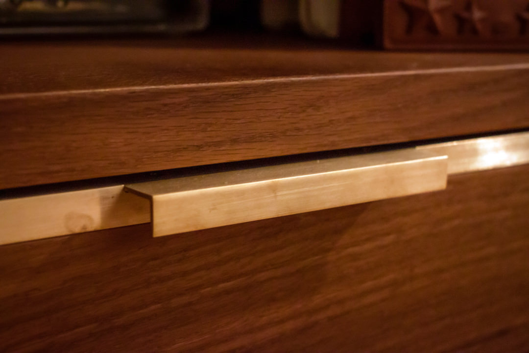
brass sheet handle detail
brass handle detail chest of drawers
internal divider detail belt tray
fixed hanger brown detail
black hinge detail

Designing a made-to-measure wardrobe means thinking about an internal conformation that best meets the needs and practicality of customers. Like an item of clothing, furniture must also perfectly fit the personality of the user.

A boutique dedicated to children: Tiziana Fausti Kids

A boutique dedicated to children: Tiziana Fausti Kids

The end of summer saw the inauguration of the Kids corner in the historic Tiziana Fausti boutique, reorganizing the spatial layout to host a retail space for children.
From the previous commercial space in Via Monte Sabotino, now reserved for the urban concept of THE F1RST sneakers, the outfitting for the Kids store moves to the historic women’s store, modernizing its image on a project by the Storage Associati architecture studio.

Tiziana fausti Kids entrance view
cash desk children boutique Tiziana fausti Kids
display volumes windows boutique Tiziana Fausti
transparent shelves windows boutique Tiziana Fausti

The exhibition layout

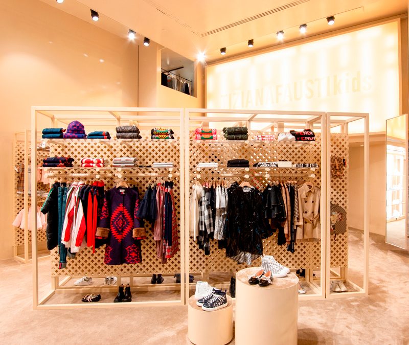
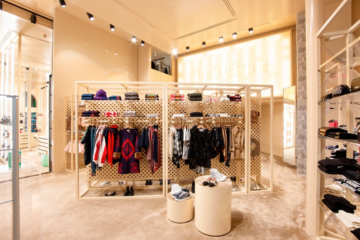
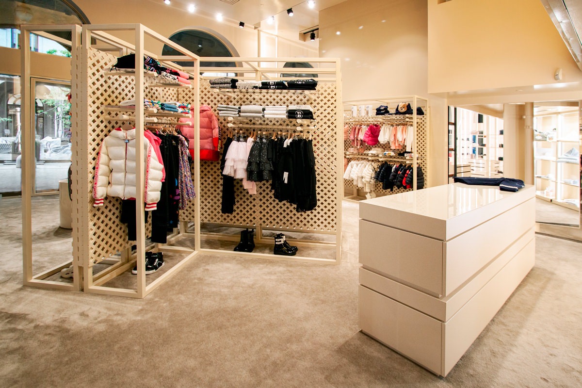
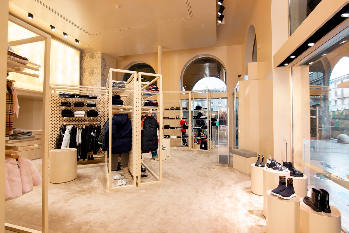
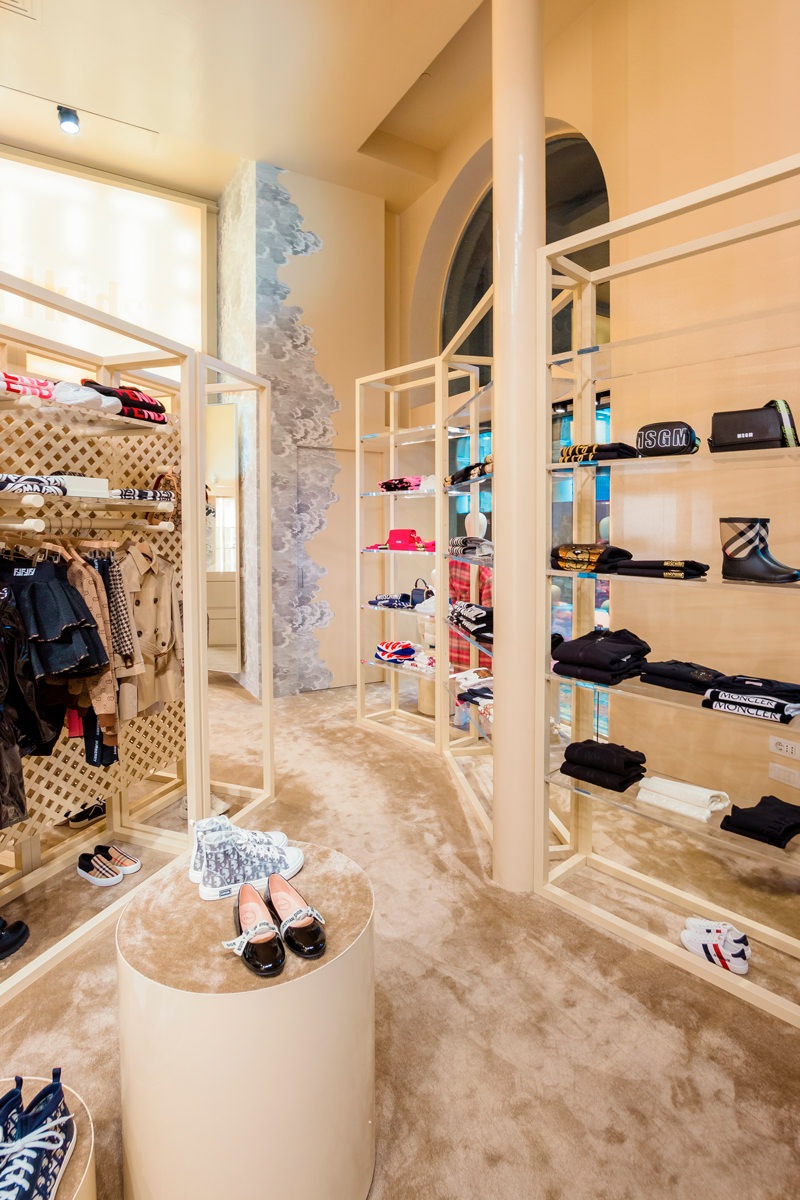
From a project by the Storage Associati studio, the retail space reserved to children takes on a dynamic and fresh configuration on the ground floor of the Tiziana Fausti boutique.
The display elements develop vertically, serving as a pivot in the center of the space.
The flow of customers is thus distributed in a circular way, avoiding spatial gaps.

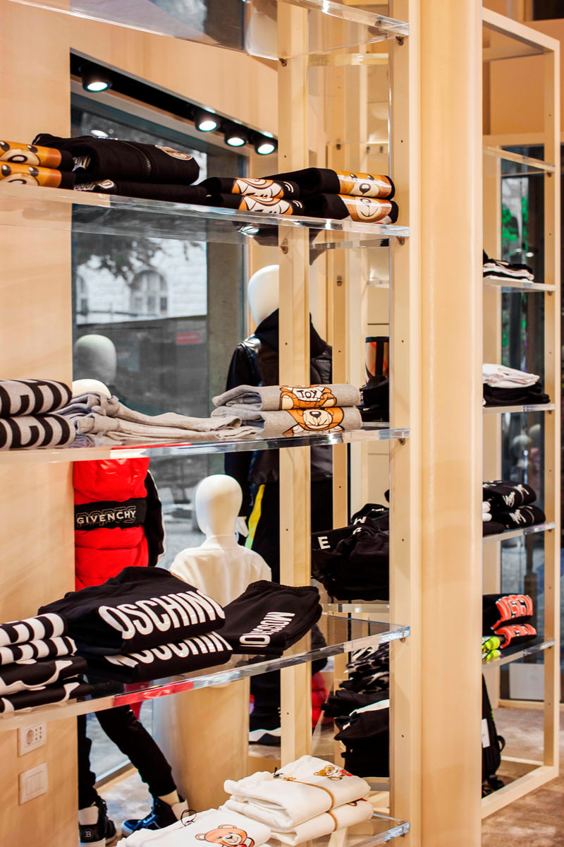
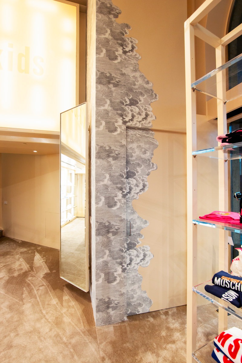
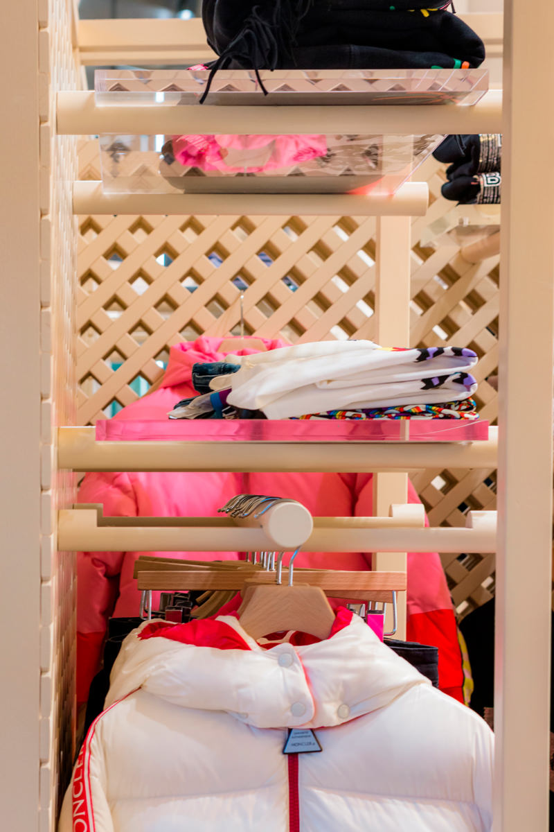
Along the side windows there are other vertical elements that exploit the double visibility both from outside and from inside for the product distribution. Transparent shelves that allow natural light to spread all over the interior space, struggling between the products on display.

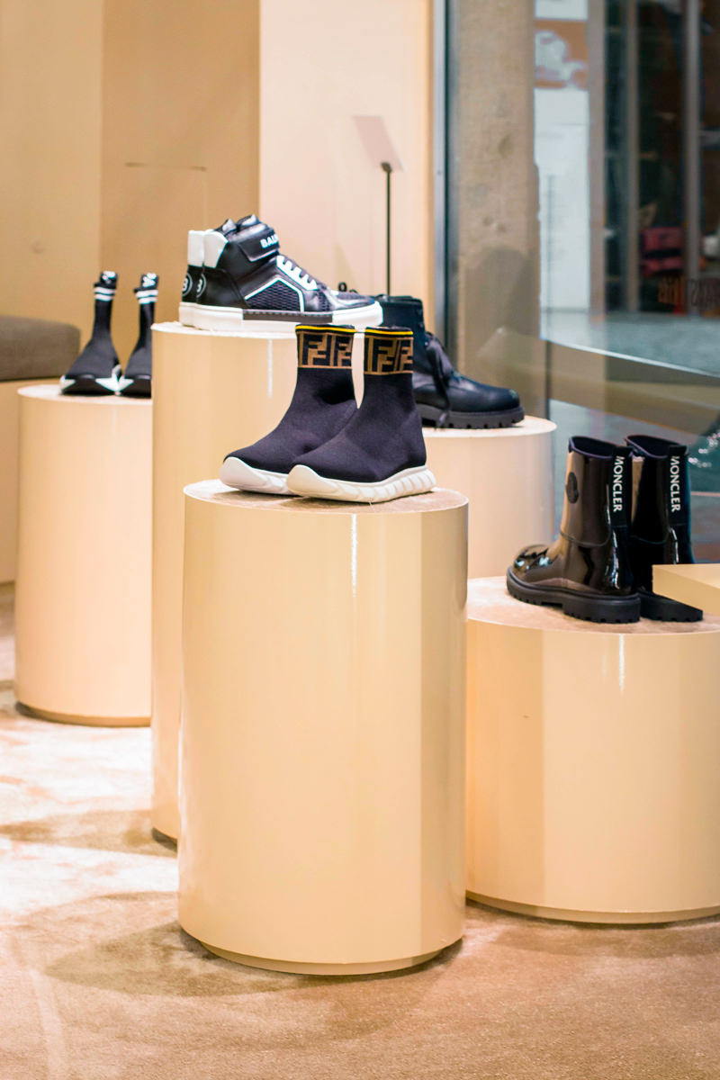
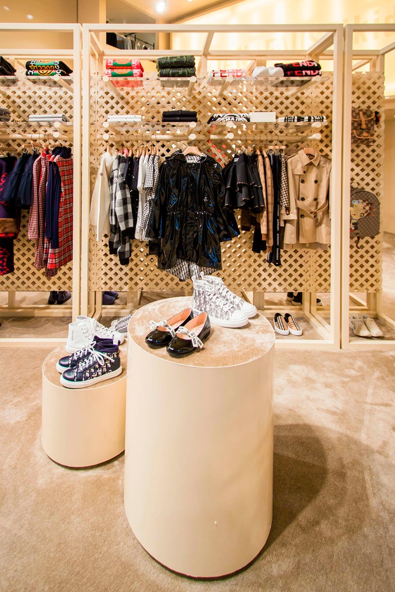
The showcase on the left of the entrance instead takes up the typology used in the women’s department with cylindrical volumes rising to different heights.
Taking advantage of their expressive essentiality, these volumes with a carpeted upper covering are also scattered throughout the retail space, enlivening the outfitting.

A store dedicated to children that is inspired by the world of the little ones, with dynamic and flexible display products configured with the interlocking theme.

display elements children boutique Tiziana Fausti
display windows children boutique
cylinder display moquette
window display back desk children boutique
wallpaper dressing room

Joint matters

The logic of the joint is certainly the basis of the retail design project. Just like in Lego constructions, even plexiglass and wooden tubular shelves fit together allowing different project configurations, which are in turn inserted into the bottom panel.

This simple and practical display logic focuses on the use of three different elements.

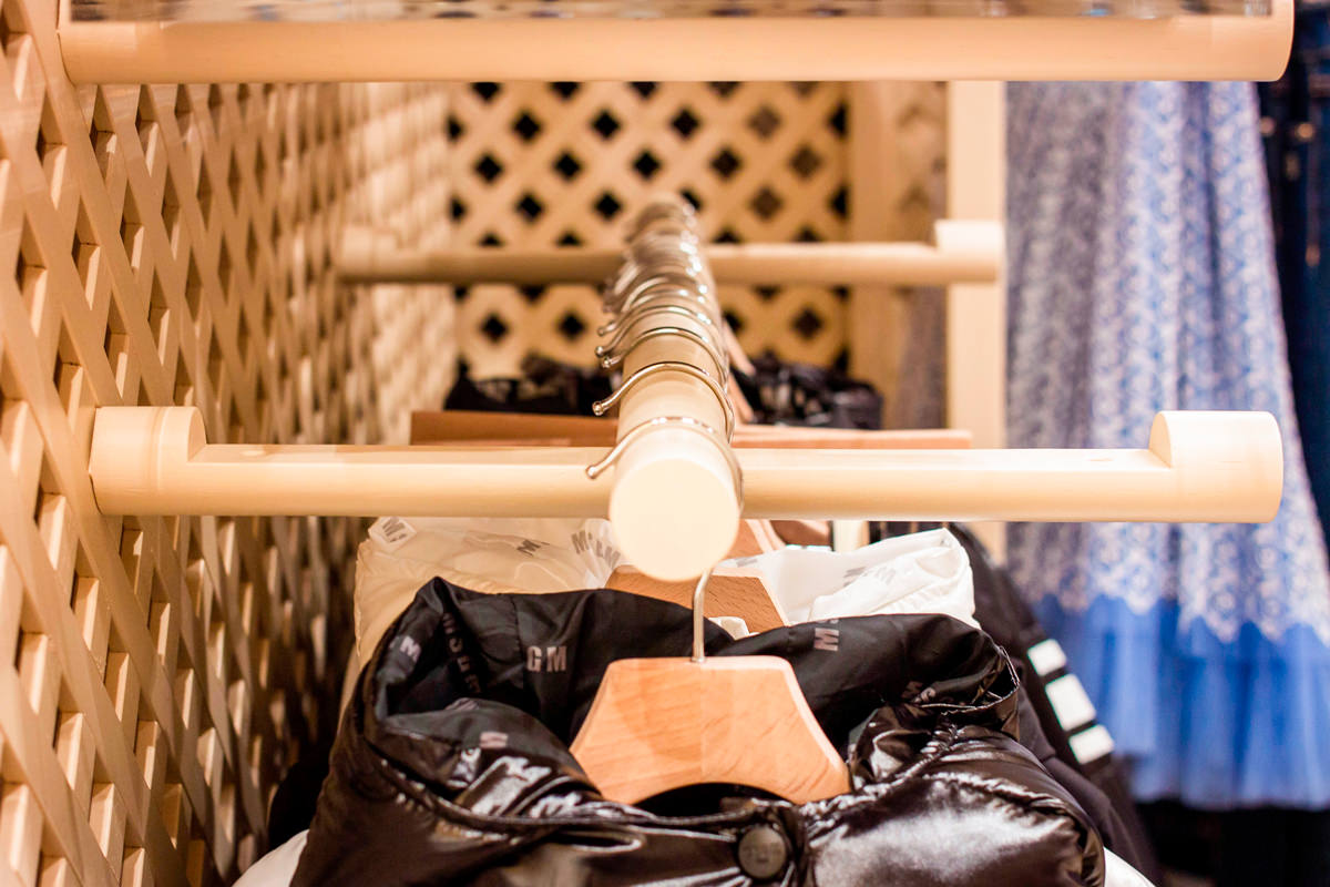
The first, and fundamental, is essential to define the different display heights, being the element that communicates with the back wall. It is in fact a wooden tubular with a shaped end so that it can be embedded in any point of the reticular bottom wall.
Its length was then worked through a specific section to be able to fit the other two display elements: plexiglass shelves and tubular hangers.

The first were obviously made of the same width as the tubular section, thus becoming visible light signs that are interchangeable with each other. On the other hand, the tubulars used for hangers, , take advantage of the negative of the shaping by bringing the interlocking elements along their diameter to ensure stability and visual linearity.

 tubular interlocking hangers
equipped wall front view
side view tubular interlocking

Give new life to the display elements

The world of retail design is constantly changing. To cope with the incessant succession of trends in the fashion world, even the spaces that host it must adapt by developing new configurations.
Therefore, it is fundamental to avoid waste of any kind to design furnishings that can undergo variations over time and become flexible to new changes.

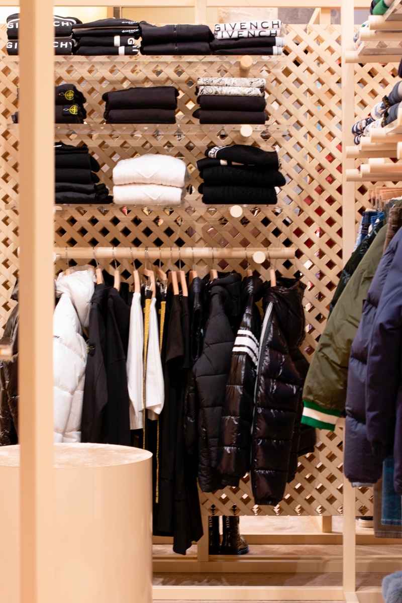
This is the case of the wall units chosen for the outfitting dedicated to children in the historic Tiziana Fausti boutique. Equipped walls that exploit the voids between the different crossed wooden panels to allow the interlocking of wooden tubes. Recovered from the original layout of the Kids store, the perforated wooden walls have been subjected to careful quality control with a meticulous recovery of the damaged features.

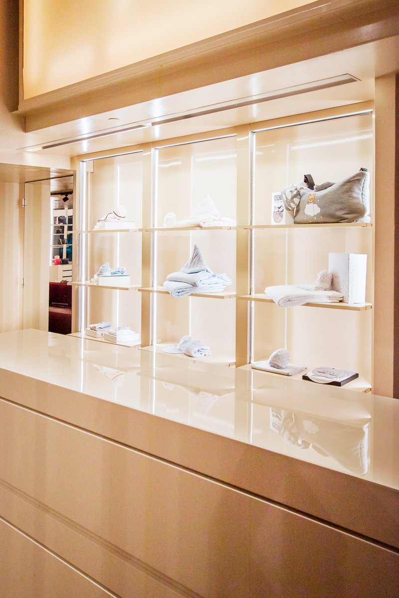
In the same way, some existing furnishings, such as the cash desk display cabinet, have received new grit through a new film, to make them uniform with the general aesthetics.

A new life that characterizes them with a fresh and dynamic soul, which fully reflects the sparkling character of children, reinterpreted in a design key for the historic luxury boutique in the heart of Bergamo.

film-covered shelves  detail

A studio house designed with Feng Shui

A studio house designed with Feng Shui

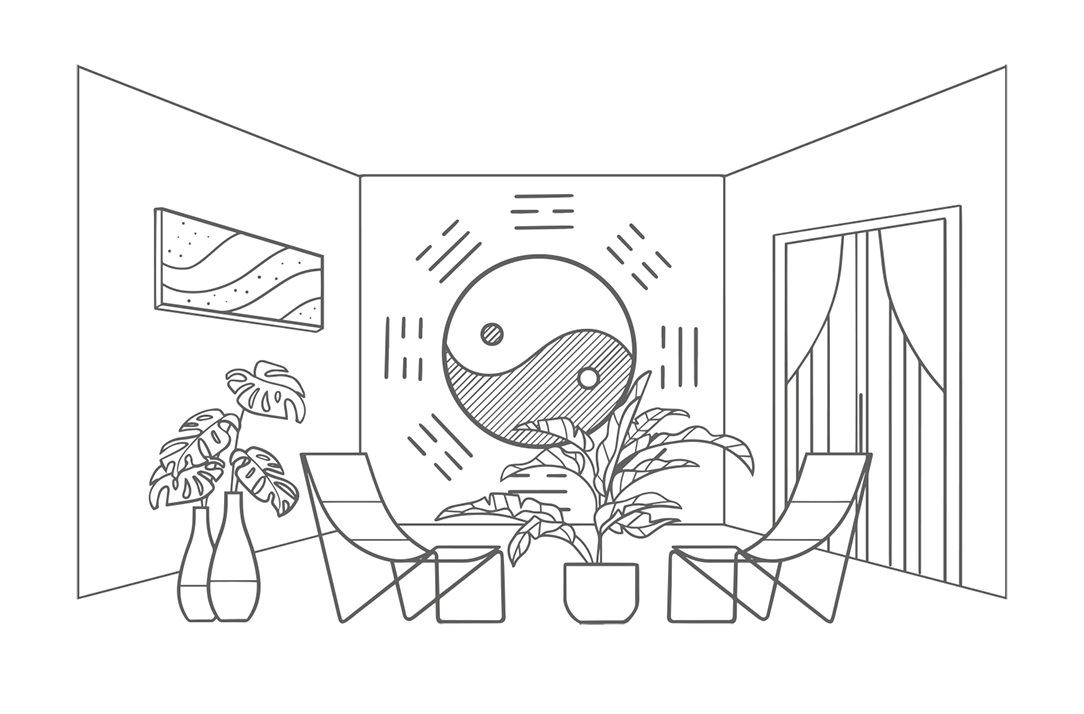
Spaces where we live, as well as representing us, must have a positive influence on the quality of our life and has to be studied and designed in the best possible way. Even more when, as in this case, life and work take place in the same environment. Designing a studio home with Feng Shui means making these two aspects coexisting harmoniously in everyday life and spaces.


THE FENH SHUI

We have often heard of Feng Shui, but what is it? It is certainly neither a philosophy, nor a religious or spiritual practice, it is not a style of furniture and not even a form of bio-architecture.

Feng Shui can be defined as the study of how natural and built environments influence our psychophysical conditions.
Practicing this discipline means understanding how the various elements of an environment that affect our physical conditions, our moods and our behaviors, are activated by our primordial instincts. These include: shape, proportions, symmetry, number, color, tactile sensations, sun exposure, artificial light, sound and attention paths.

Feng Shui literally means “wind and water”, in honor of the two elements that shape the earth. In fact, with their flow, they determine the characteristics of a particular place.
It could be said that the profound meaning of this discipline is “Creating the best conditions for the development of life”. Its goal is to make an environment suitable for the people who lives there or for the activities that take place there.

In fact, each of us relates to the room in a non-verbal way: what surrounds us inspires us with emotions or instinctive reactions of which we are almost always unaware and some of these are universal for the human species.

Matter of Feng Shui are these sensations and to work on the human psyche we act on the physical world.

feng shui

A STUDIO HOUSE

The greatest representation of the coexistence of home-work based on Feng Shui is this realization in the Lombard capital. Our client, a holistic operator, needed an ambivalent space in chaotic Milan to be used both as a residence and as a location for her courses.

For this reason, she turned to Marzia and Germana from SpazioUmano to make the apartment as suitable as possible for her needs through Feng Shui. The housing unit on two floors is located in the context of a condominium still under construction, chosen near the city center.

Having always been sensitive to Feng Shui, we have followed the two architects with pleasure. Reading and interpreting their design choices in the best possible way has been a source of inspiration for us and a professional challenge accepted with enthusiasm.

Each building has a recognable front and a back. This polarity determines the orientation of the house in the space that is symbolically guarded by two celestial animals: the black turtle and the red phoenix. The first is associated with protection and health and it is identified with the most intimate areas of the house such as the bedroom and bathroom. The red phoenix is ​​instead an indication of freedom and identified with the entrance and the “active” areas of the house.

The other two animals supporting the main ones are the green dragon, linked to our more rational left hemisphere and therefore synonymous with organization, home management and work, and the white tiger, linked to the more intuitive right hemisphere, therefore associated with emotionality and artistic activities.

THE PROJECT

Being a home-studio, the active areas of living and working had to coexist according to Feng Shui principles, in the part of the red phoenix, but still be separated from each other.

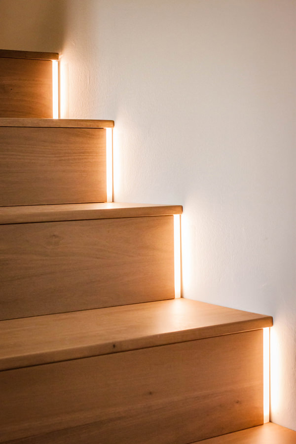
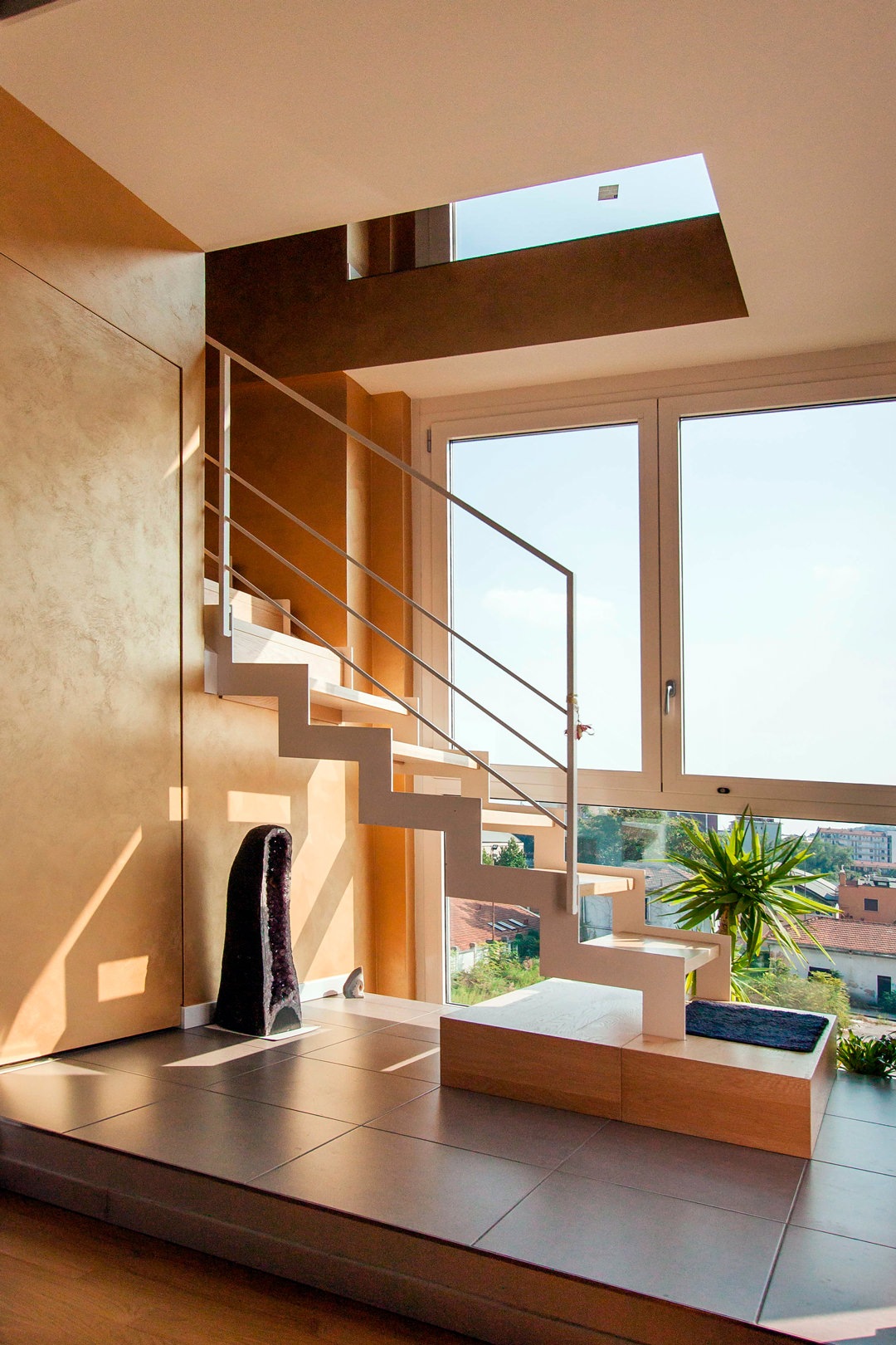
The access to the apartment is therefore characterized by a scenic aerial staircase illuminated on the right side by a large glass wall. This staircase, made with white painted aluminum support and wooden treads, leads to the upper floor used for holistic courses. The instinct is to go up, choosing to be accompanied on this almost emotional path of ascent.

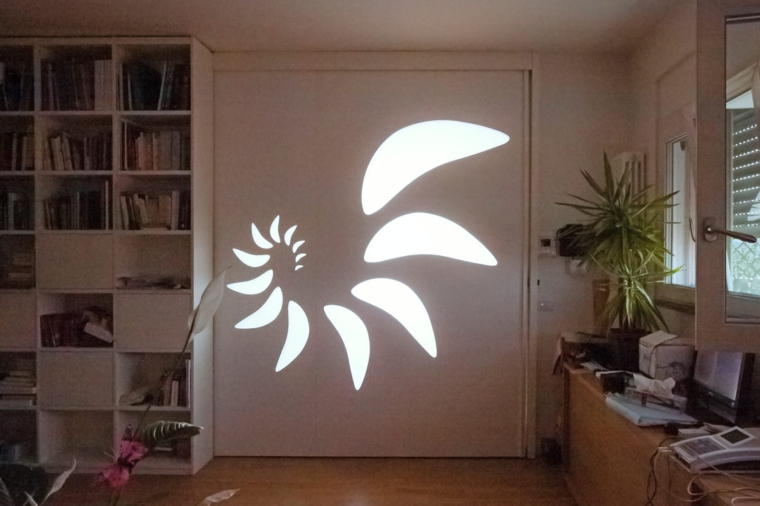
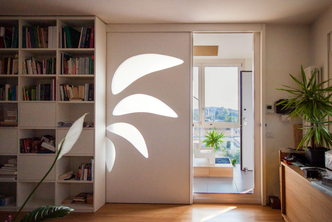
On the opposite side of the large window, the access to the private house is out of sight. A sliding wall decorated with a spiral geometric pattern with opal inserts hides the everyday life’ interior. The light coming from the outside filters through the opal shapes of the sliding wall, creating plays of light inside the apartment.

The living area that opens to the view is an open space with a square plan, whose kitchen is placed on the corner opposite the opening.

Feng Shui entrance
Sliding wall Feng Shui
Wall Feng Shui

A FENG SHUI KITCHEN

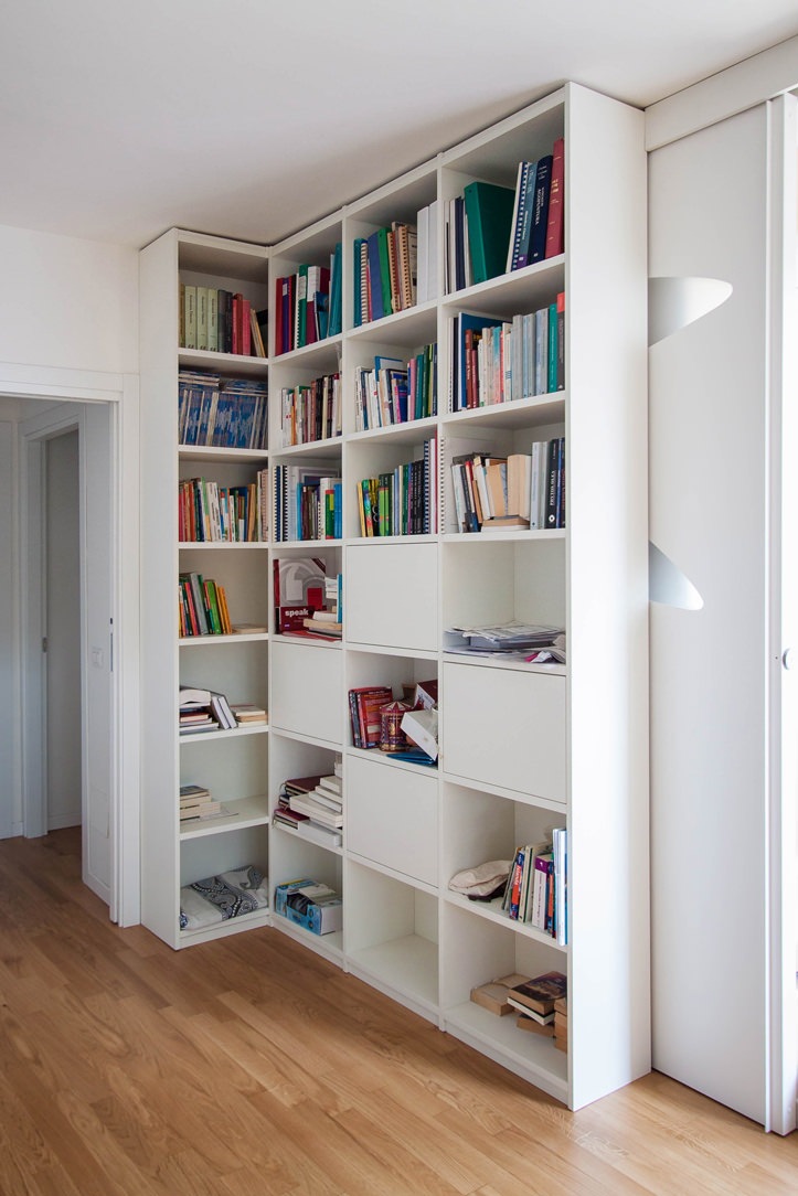
The entrance with living area is characterized by the presence of a full-height corner bookcase, where vertical and horizontal shelves gives rhythm. Small objects and books become the real protagonists, standing out among the matt lacquered MDF profiles of the bookcase.

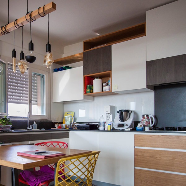
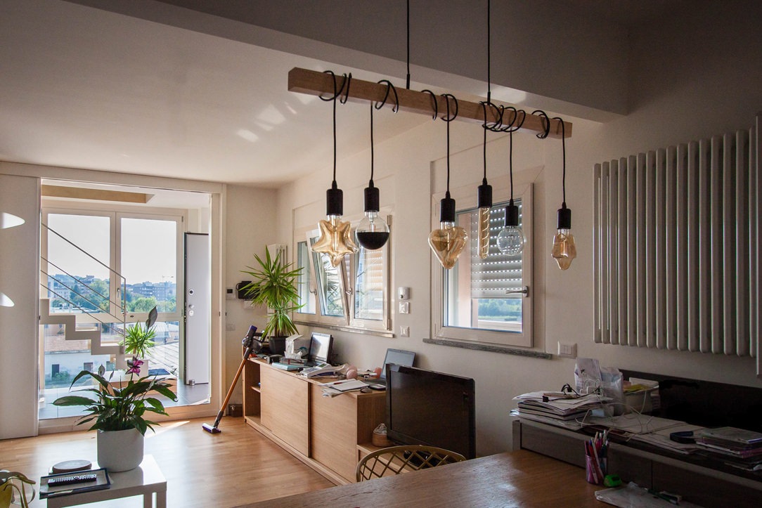
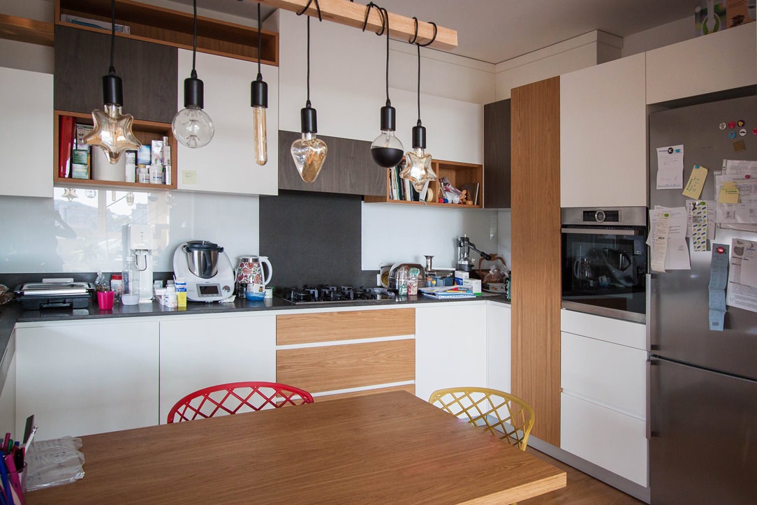
In front of this, the low open cabinet with doors and internal shelves visually closes the room by introducing the kitchen. The latter is arranged at an angle and anticipated by a large table in natural oak and support profiles in black iron. Above this, a witty and youthful light point with suspension elements of different shapes that intertwine on the horizontal support element.

Further element of character are the chairs that surround the table, with bright colors and simple profiles.

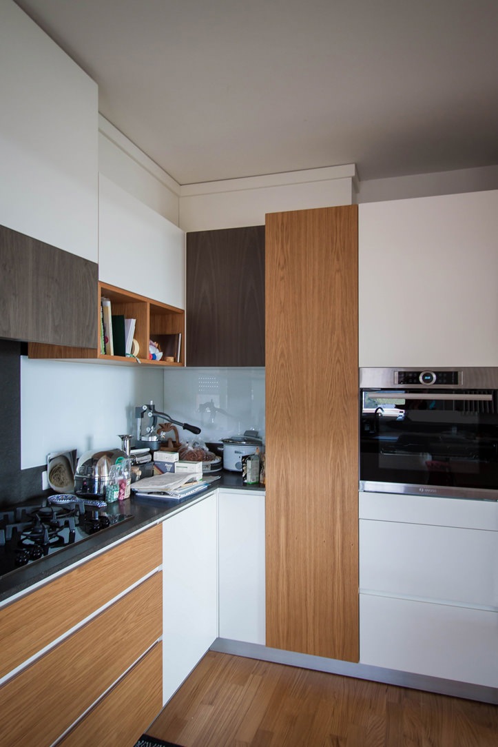
The actual block of the kitchen is made up of mutually intersecting volumes, creating a rhythm and visual dynamism also reflected in the material choice of the coverings. On the one hand, the block with service columns which also houses the free-standing refrigerator and built-in oven. Doors in matt lacquered MDF are interspersed with natural and dark-stained oak inserts, creating visual dynamism.

At the front, the basaltine countertop is transformed into a backsplash and back surface in the firing area, giving life to material and luminous contrasts with the uniform riser in white Lacobel.

The overlying wall units best express this play of intersected volumes with open compartments in natural oak that alternate doors in matt white lacquer and inserts in dark stained oak.

Natural materials with a soft touch blend perfectly with darker and rough inserts. Distinctive signs can also be recognized in the lower volumes, such as the drawers with oak fronts that underline the horizontal reading of the kitchen.

Feng Shui lights kitchen
Side kitchen oak doors
bookcase entrance laquered white
Kitchen table oak wood

ADVICE

Designing a multipurpose interior means being able to bring together different aspects of everyday life. Especially when it comes to connecting the working world to the private one, the home environment plays a fundamental role so that nothing can be left to chance. Choosing to design with Feng Shui involved in this example the coexistence of instincts belonging to two aspects of our life, in a single home-work environment.

We are ready to calibrate your daily and working space on the basis of your needs and desires, in order to create interiors in perfect harmony and balance even with your inner “I”.

How to equip a bathroom with laundry corner

How to equip a bathroom with laundry corner

A functional and aesthetic analysis of the laundry corner. An environment that in contemporary reality is forced to give up its autonomous room to blend in a small bathroom or equipped corridor. The aim is giving space to the services that define our daily life, making them aesthetically interesting.

laundry corner

Laundry corner with showed washing machine, basin and compartments furniture

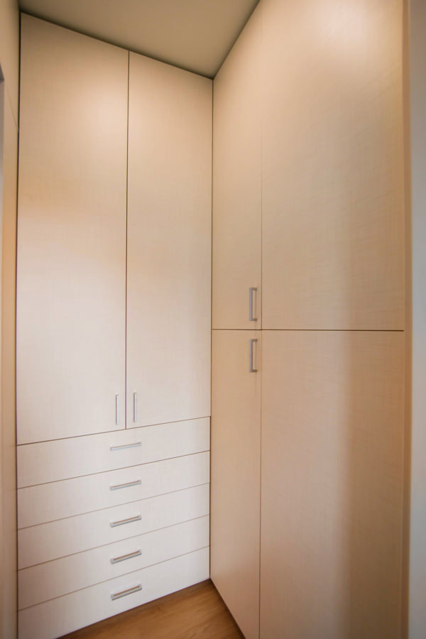
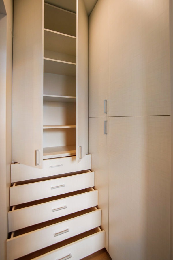
equipped corridor

Optimize spaces equipping corridors with serviced wardrobes View the project

Space to services

Speaking of interior design, we are used to imagine elegant living rooms and modern kitchens, contemporary bedrooms and essential-style dining rooms. Over the past few years , the interior design has increasingly taken on the aesthetic meaning of architecture. Let’s remember, however, that design was born as the perfect combination between aesthetics and functionality. The morphology of furniture is nothing else than the natural result of perfect efficiency. It is exactly with this spirit that we want to highlight those “corners of the house” that we usually tend to hide because they are not “beautiful” even though they are basics in the functionality of our domestic spaces. The project layout of each house gets us used to dividing rooms between “living area” and “bedrooms”. The first includes all those rooms that are used to welcoming guests, designed with the aim of return the best public images of the owners. In the “sleeping area”, the most intimate and personal rooms of the owners come to life. However, in this typological distinction are missing all the rooms which, whether private or public, carry out a real function. Among these, just think of the laundry room, which over the years has changed its conformation adapting to the needs of the time.

washing machine recess

A laundry niche uses the available passage corner to house the washing machine and shelves View the project

From public washrooms to bathrooms equipped with laundry corners

Over the years, the home laundry has become increasingly important in private houses. Whole rooms were equipped with basins and ironing corners, which gradually witnessed the coming of appliances capable of simplifying manual work and obtaining excellent results. Private rooms that replaced the traditional public lavatories for an increasingly elitist concept of personal care and cleaning. The widespread use of washing machines, and modern dryers, has meant that laundry rooms take up less and less space inside private houses. Furthermore, in the contemporary vision of the house, open spaces have swarmed the architectural panorama more and more, reducing the functional closings to the bare minimum. As a consequence, to optimize space, the laundry room is often eliminated in favor of bathrooms equipped with washing machines, dryers and service cupboards. Making the appliances “invisible” was the next step. Here then come equipped wardrobes able to hold not only washing machines and dryers but also baskets and pull-out compartments for cleaning products.

laundry bathroom detail

A bathroom with contemporary wooden surfaces hide extractable functional elements. View the project

Composition of a laundry-corner

Equipping a bathroom with a laundry corner first of all means providing an insertion point for the washing machine. This can remain visible, favoring the opening of the porthole without interfering with any surrounding doors or being built-in the washbasin cabinet. To better hide the washing machine, however, it is necessary to provide a service cabinet that rests on the ground. It means excluding suspended solutions or light supports, and study a customed solution that allows the opening of the tray and the easily maintenance of the appliance. To this is often added a service cabinet with internal shelves and removable baskets that can contain cleaning products and accessories of different sizes. Often these latter two solutions come together in one, with folding or sliding doors, which act as a closure for the furniture element. Internal accessories such as dividers and hanging elements are additional options that can make the space more functional and optimize the overall dimensions.

bathroom with washing machine in view

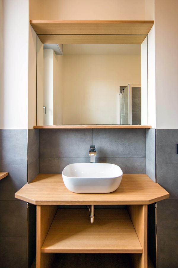
The bathroom cabinet with wooden top and finishes houses the washing machine View the project

bathroom cabinet with open drawers

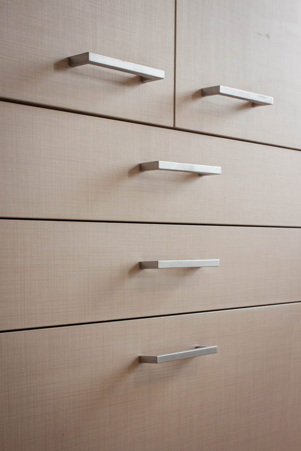
Drawers of different heights are extremely functional elements for organizing personal products View the project

bathroom service closet

A large service cupboard with internal shelves and removable basket for the bulky products View the project

It is the functionality that defines the composition of these equipped corners. Our task is to optimize spaces in the best possible way by creating practical and aesthetically satisfying solutions. Whether they are service points hidden in other rooms or clearly visible and recognizable elements, it is essential to be able to organize them in the best way, using all the available centimeters without however giving shape to narrow solutions.